Musings is an informal newsletter mainly highlighting recent science. It is intended as both fun and instructive. Items are posted a few times each week. See the Introduction, listed below, for more information.
If you got here from a search engine... Do a simple text search of this page to find your topic. Searches for a single word (or root) are most likely to work.
Introduction (separate page).
This page:
2018 (September-December)
December 12
December 5
November 28
November 14
November 7
October 31
October 24
October 17
October 10
October 3
September 26
September 19
September 12
September 5
Also see the complete listing of Musings pages, immediately below.
All pages:
Most recent posts
2026
2025
2024
2023:
January-April
May-December
2022:
January-April
May-August
September-December
2021:
January-April
May-August
September-December
2020:
January-April
May-August
September-December
2019:
January-April
May-August
September-December
2018:
January-April
May-August
September-December: this page, see detail above
2017:
January-April
May-August
September-December
2016:
January-April
May-August
September-December
2015:
January-April
May-August
September-December
2014:
January-April
May-August
September-December
2013:
January-April
May-August
September-December
2012:
January-April
May-August
September-December
2011:
January-April
May-August
September-December
2010:
January-June
July-December
2009
2008
Links to external sites will open in a new window.
Archive items may be edited, to condense them a bit or to update links. Some links may require a subscription for full access, but I try to provide at least one useful open source for most items.
Please let me know of any broken links you find -- on my Musings pages or any of my web pages. Personal reports are often the first way I find out about such a problem.
December 12, 2018
A record we noted earlier this year has already been broken. It's about the longest known bond between two carbon atoms.
* News story: World record for longest carbon-carbon bond broken. (D Bradley, Chemistry World, December 5, 2018.) Links to the article. The news story raises an interesting question about what kind of bond should "count". The molecule is complex, and it is not easy to see what is going on.
* Background post: The longest C-C bond (April 17, 2018). I have added a note about the new finding to that post.
December 11, 2018
Here is the basic finding, as reported in a recent article...
|
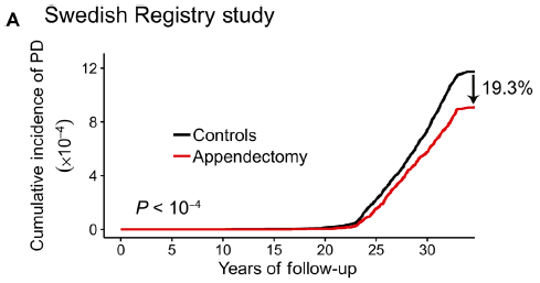
The graph shows the incidence of Parkinson's disease (PD) over time, for two groups of people.
The red curve is for people who have had their appendix removed. The black curve is for a matched control group. The people who had an appendectomy had about a 20% lower rate of PD. For the appendectomy group, the time scale is time since the operation. The controls are matched by age, sex, and location. This is Figure 1A from the article. |
It's a striking finding. What more did the scientists learn about this?
The results above are based on a huge database in Sweden. An analysis of a second group is consistent with the main finding.
Further analysis showed that the effect is greater for people in rural areas than in urban areas. If this finding holds up, it could be an interesting clue. Rural PD is more often associated with external effects such as pesticides.
The finding led the scientists to explore the human appendix. PD is associated with an increased brain level of an aggregated form of a protein called α-synuclein. The authors find that α-synuclein is abundant in the appendix -- of nearly everyone, including young people. Processing of the protein occurs there, and the aggregated form is found.
That is, apparently we all have -- in our appendix -- significant levels of the protein considered a key to PD. Removal of the appendix seems to reduce the chance of certain types of PD.
What's the connection? It's too early to say, but one must wonder whether the appendix is a source of the protein form that causes PD. Clearly, PD is a more complex disease than we used to think; involvement of non-brain regions, including the GI tract, is now accepted. The work here may make that connection even more important. Further work is needed!
We also note that other work has not found an association between the appendix and PD. The authors here suggest that their study is the best yet, because of the nature of the database, including its long time span. The disagreement between studies needs to be resolved.
News stories:
* Appendix identified as a potential starting point for Parkinson's disease -- Appendix acts as a reservoir for disease-associated proteins; appendectomy lowers the risk of developing Parkinson's. (Science Daily, October 31, 2018.)
* The potential benefits of missing an appendix. (The Science of Parkinson's, November 1, 2018.) Long, but very good. It explores many aspects of the topic, and tries to present it at a level suitable for the general audience.
The article, which may be freely available: The vermiform appendix impacts the risk of developing Parkinson's disease. (B A Killinger et al, Science Translational Medicine 10:eaar5280, October 31, 2018.)
More about the appendix: Appendix. Yours. (December 11, 2009)
More about PD:
* Metabolism of the Parkinson's disease drug L-DOPA by the gut microbiota (July 26, 2019).
* Possible role of gut bacteria in Parkinson's disease? (March 17, 2017).Is there a connection between the work in the two posts just noted and the current work? We can only note the question for now.
Also see... Involvement of the non-pregnant uterus in brain function? (February 11, 2019).
My page for Biotechnology in the News (BITN) -- Other topics includes a section on Brain. It includes a list of related posts.
December 10, 2018
There are various ways to organize a post. Commonly, one does things in a simple order, such as: a problem, a test, conclusions. But sometimes it seems good to work backwards, starting at the end: what are the conclusions, then how did we get to them. For the current topic, we start at the back end.
Look at the first movie file at the following site (which is also listed below as a news story): Image of the Day: Swish Swish. (It's a large file; be patient. And don't close that tab when done; we'll make further use of the page in a moment.) Now archived.
If you have trouble with that site, or just want a quick preview, here is a series of stills from the movie file [link opens in new window]. The three stills there were taken 0.33 second apart. This is Figure 1F from the article.
What is that thing? The authors, who are engineers, found similar devices on a variety of animals at their local zoo. They developed a mathematical model to describe the motion of such a device. It behaves as a double pendulum. To see what this means, see the second movie file on that page introduced above.
What does it do? It is likely a device to repel mosquitoes (and other flying insects). Sometimes, it may directly hit one -- the swat phase of its action. Beyond that, its motion, at about the same speed as the bugs, will severely disrupt the local environment, effectively shooing the bugs away; that's the swish phase. The role of that gentle breeze is the big finding here.
The work includes recording data from nature (e.g., from the wilds of Zoo Atlanta), as seen in the top movie. The authors report that they "were harassed by many insects while filming" (first paragraph of Results section). Theoretical analysis (presumably in the comfort of an air-conditioned lab free of flying insects) led to the construction of an insect-repelling device based on the mammalian tail. It works -- and is more energy-efficient than a commercial wind-based mosquito-repelling device.
News stories:
* Image of the Day: Swish Swish. (K Grens, The Scientist, October 16, 2018. Now archived.) This is the site used above as the source for the two movie files. There is only a brief text beyond those movies.
* Swishing tails guard against voracious insects with curtain of breeze. (EurekAlert!, October 15, 2018.) This appears to be a freely-available version of the news story from the journal, listed below.
* How Animals Use Their Tails to Swish and Swat Away Insects -- Findings could help engineers build better devices to repel mosquitoes. (J Maderer, Georgia Tech, October 16, 2018.) From the University.
* News story accompanying the article: Tails guard against voracious insects with curtain of breeze. (K Knight, Journal of Experimental Biology 221:jeb188888, October 2018.) See the EurekAlert! news story, above, for a freely available version of this item.
* The article: Mammals repel mosquitoes with their tails. (M E Matherne et al, Journal of Experimental Biology 221:jeb178905, October 2018.)
More from the same lab:
* How a cat tongue works (March 19, 2019).
* What is the proper length for eyelashes -- and why? (March 16, 2015).More about tail functions: An animal that walks on five legs (February 3, 2015).
Previous post about elephants: Carbon-14 dating of confiscated ivory: what does it tell us about elephant poaching? (February 10, 2017).
Other posts about repelling mosquitoes include:
* What is the purpose of the cat response to silver vine or catnip? (March 22, 2021).
* Can chickens prevent malaria? (August 12, 2016).
* A laser-based missile-defense system to bring down mosquitoes (May 18, 2010).More about dealing with mosquitoes... Blocking eggshell formation in mosquitoes? (February 8, 2019).
There is a section of my page Biotechnology in the News (BITN) -- Other topics on Malaria. It includes a list of related Musings posts, including posts more generally about mosquitoes.
December 7, 2018
Making vaccines against influenza (flu) is a messy issue. It is a guessing game each year for vaccine makers to choose a small number of strains to target in the new vaccine.
A recent article reports a new approach to making a "universal" flu vaccine. The work was done with the help of some llamas.
The following figure shows some information about the antibodies used here. It's a complex figure, but we will focus on one part of it, which is rather clear.
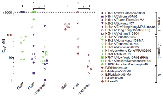
|
The graph shows the effectiveness of several antibodies against various flu virus strains in a simple lab test.
Effectiveness is shown on the y-axis as the value for IC50. IC stands for inhibitory concentration; the 50 means it is the concentration that inhibits the virus by 50%. Lower is better; a low value of IC means that less antibody is needed to inhibit the virus. Look at the right half of the graph -- the part with reddish symbols. Those symbols are for five strains of type B flu virus. (They are listed at the right, but don't worry about that.) Three antibodies are tested against the red-symbol flu viruses; they are shown along the x-axis (SD83...). The main observation is that the third (right-hand) antibody is the best. What is that third antibody? It is a combination of the first two; look at the names. The left side of the graph shows the same kind of experiment for antibodies against a collection of type A flu viruses. The big picture is about the same, though the data set is obviously more complex. This is Figure 1 from the article. |
What's going on? And what did the llamas do?
The llamas made the antibodies. More specifically, the llamas made the first two antibodies. The third, the combination antibody, was made in the lab by fusing the genes for the two individual antibodies. The new gene made a double-length antibody that is effectively the two single antibodies joined end-to-end into a single long protein.
In the work above, the scientists made two of these double-length antibodies: one combining two antibodies against type A flu strains (left) and one combining two antibodies against type B flu strains (right).
If combining two antibodies into a single long chain is good, as the graph above suggests, why not combine all four of them into one extra-long protein? They did.
Here is a test of the effectiveness of such an antibody...
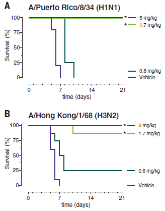
|
In this work, a 4-part combination antibody was tested against several flu strains -- in mice. It's a model system for real flu infections. The scientists measured the survival of the flu-infected mice over time, after various antibody treatments.
Results for two flu strains are shown here. For both viruses, the highest two antibody doses protected the mice completely, or nearly so. The low dose provided poor protection, with survival not much different from the "vehicle" treatment. |
|
What's important here is that the two viruses are very distinct, and yet we have a "single" antibody that is protecting against both of them about equally well. There are more viruses in the full figure. The general pattern holds. This 4-part antibody is effective against a wide range of flu strains. In the tests shown here, the mice were given the antibody directly, by injection. In other tests, they were given a constructed virus that carried the gene for the new antibody. This is part of Figure 4 from the article. | |
The results suggest that the scientists have made progress toward a universal flu vaccine: a "single" antibody that is widely effective against a variety of flu strains.
The work was done starting with antibodies from llamas, as we noted earlier. Why llamas? Those who recall the structure of common antibodies, such as those from humans and mice, may find this work extraordinary. Antibodies are complicated. Each antibody has four chains, including two types of chains. The active site is formed by multiple chains. Given that complexity, making a composite antibody with multiple active sites would be challenging.
But llamas don't make antibodies like that. Llamas (and more broadly, the camel family) make single-chain antibodies -- a single chain that folds up to make the active site. Making an extra-long gene that codes for two llama antibodies end-to-end leads to a long protein that contains two active sites. The two antibody parts, or domains, act more or less independently. That allows the construction of composite antibodies that carry domains against a variety of flu viruses.
The starting llama antibodies had rather broad activity (top figure). In fact, llama antibodies against flu virus tend be of broader specificity (than the usual antibodies), probably because of their smaller size.
The antibody parts of the composite antibody actually act better than independently. As the top figure shows, the composite antibody is not just as good as its components, but better. The components act synergistically.
No one knows why llamas make single-chain antibodies. But it certainly makes combining them genetically much easier. And it seems to offer a novel pathway to making a universal flu vaccine.
News stories:
* Llama antibodies could be key to universal flu vaccine. (T Puiu, ZME Science, November 2, 2018.)
* Tethered antibodies present a potential new approach to prevent influenza virus infections. (Science Daily, November 5, 2018.)
* Researches develop new protein for prevention of influenza virus infection. (L Heilesen, Aarhus University, November 2, 2018.) From the current institution of the lead author. Excellent overview.
The article: Universal protection against influenza infection by a multidomain antibody to influenza hemagglutinin. (N S Laursen et al, Science 362:598, November 2, 2018.)
Recent posts about flu vaccines or drugs:
* Baloxavir marboxil: a new type of anti-influenza drug (September 14, 2018).
* What's wrong with the flu vaccine? (February 16, 2018).More...
* A treatment for botulism -- using a modified botulinum toxin (February 8, 2021).
* A universal flu vaccine: phase I trial (February 1, 2021).
* Why the flu vaccine wanes: role of the bone marrow plasma cells (January 2, 2021).Many posts on various flu issues are listed on the supplementary page: Musings: Influenza.
A post about a similar problem with HIV: Should we make antibodies to HIV in cows? (November 14, 2017).
There are no previous posts about llamas, or about single-chain antibodies.
Most recent post about camels: Prions in camels? (June 18, 2018). Links to more.
December 5, 2018
1. Light pollution. A news feature, with a good overview...
* News story: The Vanishing Night: Light Pollution Threatens Ecosystems -- The loss of darkness can harm individual organisms and perturb interspecies interactions, potentially causing lasting damage to life on our planet. (D Kwon, The Scientist, October 2018, page 36.) Now archived.
* Background post: A world atlas of darkness (July 29, 2016). I have noted the current article there.
2. High lead content in spices, herbal remedies, and ceremonial powders. An intriguing little article, stimulated by finding that in one (US) county the blood levels of lead in children were not following the usual decreasing trend. Some of the products studied here are not intended for internal consumption, but people -- especially children -- may ingest them anyway.
* News story: Some spices may be a source of lead exposure in kids, study finds. (M A Schaefer, Medical Xpress, November 28, 2018.) Oddly, it does not link to the article, which is -- freely available: Lead in Spices, Herbal Remedies, and Ceremonial Powders Sampled from Home Investigations for Children with Elevated Blood Lead Levels - North Carolina, 2011-2018. (K A Angelon-Gaetz et al, Morbidity and Mortality Weekly Report (MMWR) 67:1290, November 23, 2018.)
December 4, 2018
A new article suggests that one feature of a restaurant inspection system has resulted in reduced levels of Salmonella cases.
Part of the analysis seems questionable, but it is still interesting and worth noting.
The article deals with two features of the restaurant inspection system in New York City (NYC). A scoring system itself was implemented in 2005. Then, starting in 2010, the results of the scoring system were displayed at the restaurant entrance in the form of a letter grade.
The scoring and posting features are specifically for the city. Thus the authors compare data for NYC with the rest of the state (NYS, New York state).
The main analysis in the article is summarized in the following figure...
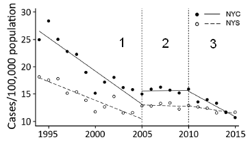
| The graph shows the number of reported cases of Salmonella (per 100,000 population; y-axis) vs year (x-axis). Data is shown for two regions: NYC (solid symbols and lines), and NYS (open symbols and dashed lines). |
|
The vertical dotted lines break the graph into three time periods. The break points correspond to the start of the scoring and posting steps. To start, compare the results for time periods 2 and 3 on the graph. For both regions, the rate of Salmonella cases was approximately constant during time period 2. The rate was significantly higher in NYC. Now look at time period 3, when the posting of letter grades was begun in NYC. You can see that the rate in NYC starts to decline. In fact, by the end of the period shown, the Salmonella rate in the city is about as low as in the rest of the state. This is slightly modified from the Figure in the article. I added the numbers 1-3 to make it easier to refer to the three time periods on the graph. | |
The comments above might suggest that the new policy, of posting the letter grades from restaurant inspections, led to a decline in the rate of Salmonella cases. That is the point the authors want to make.
However, the full graph is more complex. Look at time period 1. There is a jump -- a discontinuity in the curves -- between time periods 1 and 2. Now, that can happen. Perhaps there were changes in inspection or reporting procedures. Further, in time period 1 the rate was declining faster in NYC than in the rest of the state. Then, the rates were not only higher but also constant for 5 years in period 2. Period 2 is when the inspection scoring was begun; that was in NYC, but the curves change for both regions.
It is hard to know what to make of all this. It may be that the change between periods 2 and 3 is indeed what is important, and that posting of inspection grades in NYC led to a decline in Salmonella cases. That's a useful hypothesis, but the case here is not convincing. Not yet.
The authors briefly address the concern I have raised. Their explanations are not convincing; it may not even be possible to resolve the questions, which involve old data from public health records. My point is to raise the concern, and make clear that the article is interesting, but not necessarily the last word.
News stories:
* Letter grades for restaurants helped reduce Salmonella illnesses in New York City. (Food Safety News, November 23, 2018.)
* Letter Grade Program Linked to Declines in Salmonella Infections in New York City. (C Plain, University of Minnesota School of Public Health, November 21, 2018.) From the university.
The article, which is freely available: Restaurant Inspection Letter Grades and Salmonella Infections, New York, New York, USA. (M J Firestone & C W Hedberg, Emerging Infectious Diseases 24:2164, December 2018.)
Also see:
* Tracking food poisoning through online reviews (July 7, 2014).
* Are government safety inspections worthwhile? (June 12, 2012).My page Internet resources: Biology - Miscellaneous contains a section on Nutrition; Food safety. It includes a list of related Musings posts.
December 3, 2018
Children acquire language skills from the environment -- from those around them. Exactly how they do this is not at all clear.
It is a common observation that the language skills of children correlate with socioeconomic status (SES). The nature of the connection is not clear.
A recent article offers a new clue how this may work. It provides evidence that conversation plays a key role in brain development.
The following figure shows some data...
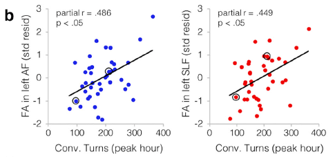
|
Each graph shows a measure of brain function (y-axis) plotted against a measure of the child's conversational experience (x-axis). The children in this work were ages 4-6.
Each graph shows a small but significant correlation. Importantly, this is the strongest correlation seen in the analyses. It holds independently of SES and the simple amount of adult speech. Remember, language is a complex trait; finding a factor that is one significant contributor can be a useful step. So what are these graphs showing? The x-axis is "conv[ersational] turns". It is based on recordings made in the natural environment at home; the recordings were then analyzed to find how many times the child and adult switched roles as speaker and listener; that is a conversational turn. The y-axes report two brain scan measurements, each showing connectivity in certain regions. This is Figure 2b from the article. |
The following figure maps the results onto the brain...
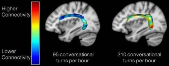
|
The colored band across each brain shows the degree of connectivity -- between two regions associated with language.
The brain on the left is for a child who showed a relatively low degree of conversation; the one on the right is for a child with a high degree of conversation. The band on the left is mostly blue, showing low connectivity; see the color key at the left. The band on the right has various "warmer" colors, showing a higher degree of connectivity. This is the figure from the Neuroscience News story listed below. It seems to be the same information as in Figure 2c of the article. Assuming that is so, the two samples shown here are those circled in the top graphs. |
That's it. That's the basic finding.
The authors also note that there was a modest but significant correlation between the child's conversational turns score and their score on a standard test of verbal skill.
There is no experimental manipulation or intervention in this work. But there could be; the work could lead to an intervention intended to facilitate a child's development of language skills. Take a group of children and increase their "conversation". Does that affect their language development? Seems practical to try, and it could be worthwhile.
Reading to the kids may be good; engaging them in lively conversation may be even better.
News stories:
* Adult-Child Conversations Strengthen Language Regions of Developing Brain. (Neuroscience News, August 14, 2018.)
* First paper published linking conversational turns with brain structure. (LENA, August 13, 2018.) LENA = Language Environmental Analysis; LENA software was used in the work.
The article: Language Exposure Relates to Structural Neural Connectivity in Childhood. (R R Romeo et al, Journal of Neuroscience 38:7870, September 5, 2018.)
Also see:
* Right-hemisphere processing of language in children (October 3, 2020).
* If you are talking with someone, how can you tell if they are paying attention? (May 8, 2017).
* Speech: Taking turns (August 17, 2011).
December 1, 2018
A recent article reports a set of measurements of the size of atomic nuclei; the purpose is to test a new model that allows prediction of the size.
Specifically, the scientists measured the size of the nucleus for 31 isotopes of a single element -- 31 different atomic nuclei, differing only by one neutron from one step to the next.
Cadmium (Cd; element #48). In this work, the scientists measured the size of the nucleus for 31 isotopes of Cd, from mass number 100 (52 neutrons) to 130 (82 neutrons).
The results...
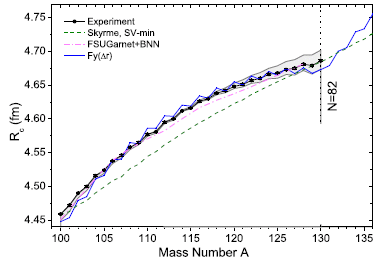
|
The graph shows the nuclear radius (Rc -- we'll explain the subscript later) on the y-axis and the mass number (A) on the x-axis. Note that the units for radius are femtometers (1 fm = 10-15 m). You might also note that their measurements are to the hundredth of a fm (though no error bars are shown here).
Look at the black line, with dots. The dots are the data points for the measurements. You can see that the nuclear radius increases, fairly smoothly, from about 4.45 fm to nearly 4.7 fm as we add 30 neutrons, going from A = 100 to 130. If you look carefully you can see a zig-zag; there is a regular effect of odd vs even mass numbers. We won't go into that further, but it is a well-known effect; that they can measure it is a testament to the quality of these measurements. Cadmium has lots of isotopes. The Wikipedia page lists isotopes for all mass numbers from 95 to 132. There are two isomers for some mass numbers, even three isomers in one case. Natural Cd contains eight isotopes at an abundance of (about) 1% or more. Six of those are stable; two are ultra-long-lived radioactive isotopes. This is slightly modified from Figure 2 from the article. I have removed an inset. (The vertical line, labeled N = 82, should go to A = 130 on the x-axis.) |
There's more. Three more lines -- for three theoretical predictions of the radius. All of them roughly agree with the data. But the green dashed line ("Skyme") is clearly the worst. It's more subtle, but the blue line [Fy(Δr)] is the best.
That blue line model [Fy(Δr)] is fairly new. The authors published it not long ago, They worked it out, building on earlier models, but carefully developing it to explain the size of nuclei for calcium isotopes.
Having developed the new model using one data set, it's time to test it on something different. That's the point of the Cd work. And the conclusion here is that the new model passes this new test quite well: it is the best fit to the data.
We won't try to explain the model here. The development of the model is mainly in earlier articles. The article here is mainly about the experimental measurements.
What are those measurements? How does one measure the nuclear radius? It is based on measuring something familiar: electronic transitions, the kind that one measures with an ordinary spectrophotometer. The point is that the exact energy of an electronic transition depends on other charges that may be nearby. In particular, it depends on the nuclear charge. The magnitude of the nuclear charge is the same for all isotopes of a single element. However, the charge density is lower for bigger nuclei (heavier isotopes). That's what they measure here: the effect of nuclear charge density, reflecting the nuclear radius, on electronic transitions. This is a special high-tech spectrophotometer, capable of extremely precise measurements. But the idea is relatively simple.
The method measures the size of the nucleus as reflected by its charge distribution. How this relates to the "physical" size of the nucleus overall is a separate question. We noted above that the graph axis is labeled Rc -- for the "charge radius".
Look carefully at that graph again, and there is a little teaser. The blue line is for the new model. Look what that line does just past the last data point. There is a steep rise in the predicted values for R. Why? It has to do with the shell structure of the nucleus. Nuclear particles have a shell system of energy levels, rather like that for electrons (s, p and so forth). At A = 130, a shell is filled. Going further opens a new shell; that's why there is an abrupt change in the slope of the curve. Will the scientists be able to measure this? There are two heavier isotopes; they have half-lives shorter than any measured so far.
It's an interesting article just based on what they did. It may also lead to a better understanding of atomic structure, even if that part is hard for us to appreciate.
News story: Towards a global model of the nuclear structure -- Researchers confirm theory by measuring nuclear radii of cadmium isotopes. (Technische Universität Darmstadt, September 5, 2018. Now archived.) From one of the (many) institutions involved.
The article, which is freely available: From Calcium to Cadmium: Testing the Pairing Functional through Charge Radii Measurements of 100-130Cd. (M Hammen et al, Physical Review Letters 121:102501, September 4, 2018.)
Even smaller radii: The proton -- and a 40 attometer mystery (March 17, 2013).
More cadmium: Unusual synthesis of cadmium telluride quantum dots (February 15, 2013).
My page of Introductory Chemistry Internet resources includes a section on Nuclei; Isotopes; Atomic weights. It includes a list of related Musings posts.
* * * * *
Update September 2023...
Scientists have made the heaviest known isotope of oxygen: O-28, with 20 neutrons. It's not very stable; lifetime is about 10-21 seconds - similar to that for O-27, also made in the new work. Its extreme instability was somewhat surprising. The combination of 8 protons and 20 neutrons is thought to be "doubly magic", which should lead to greater stability. Once again, new measurements illustrate that our understanding of nuclear structure is incomplete. (How does one make O-28? Make F-29, and kick out a proton. F-29 is relatively stable, with a half-life of about a millisecond.)
* News story: Exploring Light Neutron-Rich Nuclei: First Observation of Oxygen-28. (Tokyo Institute of Technology ("Tokyo Tech"), August 31, 2023.)
* News story accompanying the article: Nuclear physics: Heaviest oxygen isotope is found to be unbound -- The isotope oxygen-28 is expected to be 'doubly magic', with strongly bound neutrons and protons in its nucleus. Experiments now reveal that it exists in an unbound state - casting doubt on its magic status. (Rituparna Kanungo, Nature 620:958, August 31, 2023.)
* The article: First observation of 28O. (Y Kondo et al, Nature 620:965, August 31, 2023.)
November 28, 2018
Fungal confusion. What's the difference between Candida krusei and Pichia kudriavzevii? None, according to a recent article; just two different names for the same organism. Such confusion is not unusual with the fungi. Organisms -- and names -- have accumulated over the ages. If the same organism is isolated and characterized by different people in different contexts, the connection may not be noticed. But in this case, we have a common industrial fermentation organism, usually regarded as safe, that is actually a pathogen -- of some importance.
* News story: Two Fungal Species - One Pathogenic, One Benign - Are Actually the Same. (S Charuchandra, The Scientist, July 19, 2018.) Now archived.
* The article, which is open access: Population genomics shows no distinction between pathogenic Candida krusei and environmental Pichia kudriavzevii: One species, four names. (Alexander P Douglass et al, PLoS Pathogens 14:e1007138, July 19, 2018.)
November 27, 2018
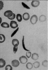
|
A blood sample showing some unusually shaped cells.
Magnification not stated. Human red blood cells are typically 6-8 micrometers diameter. This is the upper left part of the figure from the article. (The figure is not numbered in the original article. It is labeled as Figure 1 in the reprinted version.) |
That's from a 1910 article. The actual work, on Walter Clement Noel's blood, was done in 1904. The article described the unusual cells, as part of the patient's examination. But it offered no diagnosis or explanation.
The article is now recognized as the first report of what we now call sickle-cell anemia (SCA) or sickle-cell disease -- just over a century ago.
SCA is now well known. It was the first genetic disease to be characterized at the molecular level: it is due to a mutation that results in a single amino acid change in one of the hemoglobin subunits. The gene for SCA is prevalent in certain populations with a high incidence of malaria, such as parts of Africa. (Noel, from the Caribbean island of Grenada, was of African descent.) Having a single copy of the SCA allele protects against malaria; having two copies leads to a serious anemia. As much as we understand what is behind SCA, there is still no good treatment.
The news magazine "The Scientist" recently noted this 1910 article in their historical section "Foundations". Their story is worth a look. The article itself is freely available, in a reprinted form.
"News" story: Charting Crescents, 1910 -- James Herrick, a Chicago doctor, was the first to describe sickled red blood cells in a patient of African descent. (S Charuchandra, The Scientist, October 2018, page 68.) Now archived.
The article: Peculiar elongated and sickle-shaped red blood corpuscles in a case of severe anemia. (J B Herrick, Archives of Internal Medicine 6:517, November 1910.) A caution... Some of the language in the article reflects 1910 culture.
The article was reprinted in the Yale Journal of Biology and Medicine 74:179, May 2001. That reprint is freely available at PubMed Central: YJBM reprint of the article, freely available. The first page contains a note about the reprint, and also includes references to other historic articles about SCA.
An article about the article: Herrick's 1910 Case Report of Sickle Cell Anemia -- The Rest of the Story. (T L Savitt & M F Goldberg, JAMA 261:266, January 13, 1989.) The original article does not identify the patient, following common medical practice. However, given the historical importance of the article, others have uncovered the story. This article puts the original article into both medical and social context.
More about sickle-cell disease:
* Reactivating fetal hemoglobin production to treat β-hemoglobin problems - I (February 15, 2021).
* Sickle cell disease: a step toward treatment by activation of fetal hemoglobin (October 29, 2011).A post that connects hemoglobin and malaria: Malaria and bone loss (September 10, 2017).
More about blood cells: Progress toward a universal source for red blood cells, avoiding the need to match blood type (February 23, 2021).
There is a section of my page Biotechnology in the News (BITN) -- Other topics on Malaria. It includes a list of related Musings posts.
My page Internet resources: Miscellaneous contains a section on Science: history. It includes a list of related Musings posts.
November 26, 2018
The effects of climate change can seem rather distant and abstract. Now, an international team of scientists, from institutions including Peking University, University of Cambridge, and University of California, offer an analysis that tries to make climate change more relevant to the average person: the effect on the price of beer.
Not interested in the beer? Take it as an example of a specific consumer product, one from the "luxury" category.
Here is the connection...
- Climate change will lead to more extreme weather.
- That will reduce the yield of barley, a key ingredient of beer.
- That will make beer more expensive.
- That will reduce consumption.
Computers already know a lot about climate change models and the effect on weather. Give them a few more numbers, and they figure out the rest. The article reports the impact of climate change on beer price and consumption, for various standard climate change models.
Here are some examples of the findings...
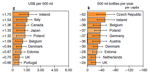
|
The figure shows two measures of the effect of climate change during this century. One is the change in the price of beer (part g; left side); the other is the resulting change in consumption (part k; right side).
The scientists focused on 26 countries, chosen as important in the beer or barley trades; the results are shown above for the top ten countries by each criterion. (Data for other countries was lumped into regional groups, and the results are shown in the Supplementary Information.) The numbers on the graph are changes. Compared to what? Figure 5 of the article gives some baseline data. For example, the price of beer in Ireland was (US) $2.51 (in 2016). And the consumption (per capita) in the Czech Republic was 274 bottles (2011). The numbers at the left are x-values for the country. For example, +1.70 at the upper left is the x-value for Ireland; read the bar length against the x-axis. The unit of beer here is the 500 mL bottle. That is about one pint (depending on the country), or 16 fluid ounces. The world's #1 country for amount of beer consumed? China, at 48.8 billion liters (2011). But there are a lot of people there, and it is not in the top-10 by per capita consumption. The graphs shown here are for one specific climate change model, called rcp6.0. (That's the model that predicts a global temperature increase of ~5 °C by 2100.) The article includes similar analyses for other models; the general message is the same. This is part of Figure 4 from the article. I modified the header for part k, to make it clear that the numbers are per capita. |
As we noted at the start -- and as the authors emphasize -- the point here is to do an analysis of the effect of climate change for something that people can relate to. Climate change is predicted to lead to more extreme weather events. That will lead to more extreme wildfires. That's serious, but as presented in articles, it's rather abstract. Even with our recent devastating wildfires here in California, it can be hard to make the connection between the big issue of climate and a specific fire. The price of beer is simple, and visible every day.
Will consumers make the connection between the increased beer prices they see and climate change? That's not at all obvious. After all, price increases are common. What the article does is to describe the effects of climate change using a common item of commerce, where people can appreciate the prediction.
The project is not as simple as it may sound. Barley is a complicated issue. It is grown in selected regions; the article includes maps. It is used to make beer, and for animal feed and human food. The relative roles of those uses vary widely. As examples, the leading countries for specific uses are... South Africa uses 94% of its barley for beer. France uses 91% for animal feed. India uses 77% for human food. (Those numbers are from Table SI-1, from the Supplementary Information file accompanying the article.) The modeling here takes into account all those local differences in production and use, and makes assumptions about the future.
News stories:
* Climate change is about to make your beer more expensive -- Extreme weather events are expected to reduce global barley production. (M Warren, Nature News, October 15, 2018.) In print, with a different title: Nature 562:319, October 18, 2018.
* Beer shortages? Study reveals climate change could affect global beer supply. (FoodIngredientsFirst, October 16, 2018.)
The article: Decreases in global beer supply due to extreme drought and heat. (W Xie et al, Nature Plants 4:964, November 2018.)
A recent post about the effects of climate change: Climate change and food insecurity (November 11, 2018).
More... A thermotolerant coffee plant, with high quality beans (June 8, 2021).
More about beer: The history of brewing yeasts (October 28, 2016).
November 16, 2018
The Hox family of genes code for body patterns. Perhaps most famously, one Hox mutation in fruit flies leads to there being an extra pair of legs -- up on the head where the antennae should be. Good legs, wrong place. Hox genes are widespread, occurring in nearly all higher animals, both vertebrate and invertebrate.
A recent article reports a new example of Hox genes providing body plan information.
The first figure provides some background. It shows where two of the Hox genes are expressed.
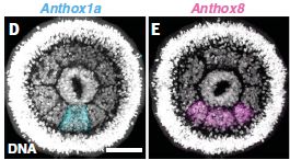
|
In part D (left), you can see that there is a signal (blue) in the bottom segment.
In part E (right), there is a signal (pink) in the bottom three segments. |
|
What does this mean? It may not be very clear, but there is a ring of eight segments. In the experiment for Part D, the sample was stained to show the expression (messenger RNA) of the Hox gene anthox1a. Part E is the same idea, but for the gene anthox8. The scale bar is 50 µm. This is part of Figure 1 from the article. | |
That tells us something about where the genes are expressed, but doesn't say anything about what they do. Now...
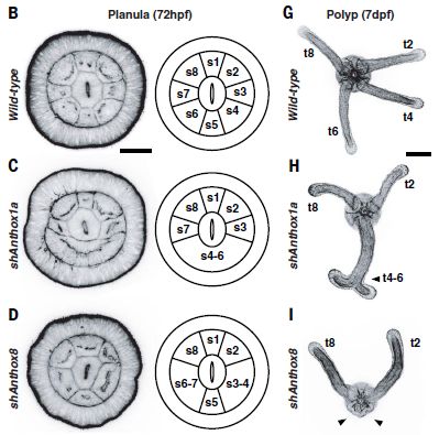
|
This figure shows three rows of information. The top row is for the wild type animal. The next two rows are for experiments in which the function of one Hox gene has been disrupted; the two rows examine the two Hox genes discussed in the first figure.
Let's start with the wild type, as the reference point. Top row (parts B and G). The first image (left) shows the same structure seen above. Next to it is a diagram, showing the eight segments -- numbered. At the right is a photo of another stage of the animal. There are four tentacles; they are associated with the four even-numbered segments. The second row (parts C and H) is for a case where the anthox1a gene function has been disrupted. This is the gene shown above to be active in the bottom segment (which we now call s5). You can see that segment s5 is disrupted; s4-s6 now all seem to be one big segment. At the right, you can see that we no longer have the expected two tentacles from this area. Instead, there is one tentacle, with an unusual terminal doubling. The third row (parts D and I) shows the effect of disrupting anthox8 function. This Hox gene is normally expressed in segments s4-s6. Disrupting this gene causes loss of segment boundaries -- again right at the edges of the segments where it should be expressed. And the tentacles that should develop from segments s4 and s6 are both missing. The scale bar is 50 µm on the left, and 100 µm on the right. The labels hpf and dpf (at the top) mean hours or days post fertilization. In these experiments, gene function was disrupted by adding an RNA that interfered with messenger RNA function. It is called short hairpin RNA. The "sh" on the labels (at the left) stands for short hairpin. This is part of Figure 2 from the article. |
Summarizing... Two Hox genes are shown to be expressed in specific locations; they affect both segment and tentacle formation in the region. The article contains such analyses for two additional Hox genes; they fit the general picture discussed here.
Hox genes affecting the body pattern. Just as we said at the top. Why, then, is this of special interest? The animal here is a sea anemone. Phylum Cnidaria; the jellyfish and corals are among its more famous members. The simplest animal in which Hox genes have been shown to affect body plan. In fact, Cnidaria are one of the simplest animal groups there is. Hox genes, with a role in specifying the body plan, have been in the animal kingdom since almost the beginning.
The animal here is the sea anemone Nematostella vectensis.
The life cycle is shown in Figure 1A of the article. Shown above are the larval stage, called a planula, and the polyp stage. The news story listed below has a nice picture of the adults.
News story: Ancient past of a body plan code probed -- Researchers identify the function of Hox genes in non-bilaterally symmetrical animals. (Science Daily, September 27, 2018.)
* News story accompanying the article: Development: Hox genes and body segmentation -- An ancient gene cluster controls the formation of repetitive body parts in a sea anemone. (D Arendt, Science 361:1310, September 28, 2018.)
* The article: An axial Hox code controls tissue segmentation and body patterning in Nematostella vectensis. (S He et al, Science 361:1377, September 28, 2018.)
More about sea anemones...
* The immune response of cnidarians (e.g., corals) (November 1, 2021).
* Can a sea anemone make you smile? (June 21, 2021).
* Restoring lost hearing: lessons from the sea anemone (November 15, 2016).Another story about simple animals: A novel nervous system? (July 20, 2014).
November 14, 2018
1. Bitcoin and climate change. Bitcoin requires extensive computer processing -- so much that it could become a major contributor to global warming. That's the claim of a new article, based on extrapolating current trends.
* News story: Study Warns Bitcoin to Push Global Warming Above 2C Threshold by 2033. (L Papadopoulos, Interesting Engineering, October 31, 2018.) Links to the article. The main criticism of the article seems to be their extrapolations; critics argue that the Bitcoin system will become more efficient. A reminder... A good way to find multiple -- and diverse -- news stories is to put the article title into your search engine.
2. The carbon-intensity of producing oil. How much does it cost to produce oil -- in terms of greenhouse gas emissions? It varies. A lot.
* News story, from the lead institution: Stanford study finds stark differences in the carbon-intensity of global oil fields -- Stanford researchers' comprehensive new assessment of climate emissions from crude oil production suggests avoiding the most carbon-intensive reservoirs and better management of natural gas could dramatically slash emissions. (J Garthwaite, Stanford News, August 30, 2018.)
* The article: Global carbon intensity of crude oil production. (Mohammad S Masnadi et al, Science 361:851, August 31, 2018.)
* There is more data in the Supplement; it is about 100 pages, including 40 pages of references. However, the news story gives a good overview of the key issues.
* For more about energy issues, see my page Internet Resources for Organic and Biochemistry under Energy resources.
November 13, 2018
Solar and wind energies are attractive sources of renewable energy; both are gaining market share. A fundamental problem with both of them is that they are intermittent. The supply is not controllable and may well not match the demand. As these energy sources become a larger fraction of the total energy supply, their intermittency becomes more and more important.
A solution to the problem of intermittent energy sources is to store the energy for later use. There is nothing new about the idea. Gasoline is a storage system for energy (as is sugar for us). One cannot store sunshine or wind, but one can interconvert energy from one form to another. Storage batteries are just one example.
A new article shows progress with a novel form of energy storage, designed for storing solar energy. Designed for using summer's sunshine to heat the house in winter.
Here's the scheme...
|
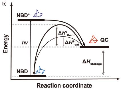
The graph shows the relative energies of three chemicals -- and some paths between them.
Start with the chemical at the lower left, labeled NBD. Low energy. It absorbs a photon, shown as hν. That "excites" the NBD; it is now in a high-energy ("excited") state, shown as NBD*. NBD* is not stable. It decays, not to the original NBD, but to the chemical shown at the right as QC. QC is a medium-energy chemical. The net result is that the low energy chemical NBD has been converted to the higher energy chemical QC, using light energy. Or, from another viewpoint, some of the light energy has been stored in the chemical QC. That's what is shown by ΔHstorage. So we have stored some of the solar (light) energy in QC. Now what? We want to use that energy. QC is higher energy than NBD; we just need a way to release that energy. The article reports development of a catalytic system that allows QC to degrade. It returns to being NBD, releasing energy as it does so; that energy can be used to heat water. Why doesn't QC just spontaneously degrade to NBD, releasing its excess energy? As is common, there is an energy barrier to that reaction; chemists call it activation energy. The graph shows that activation energy as ΔH‡therm and ΔH‡cat. The first of those is the "natural" activation energy, without catalyst. The second is the activation energy with catalyst. The second is low enough that the reaction now proceeds. The chemical structures shown are for the part of the molecules involved in the structural change; they are not the actual complete structures. NBD = norbornadiene; QC = quadricyclane. Again, those names refer to that part of the chemicals. NBD itself does not absorb light well. A key step was to develop a derivative that absorbed light, but otherwise retained the merits of NBD. This is Figure 1b from the article. |
There are no numbers on the energy scale above. That is a diagram, showing the scheme. The article reports development of a practical system, with specific chemicals and operating parameters.
In one experiment, the scientists showed that their system released heat and heated some water from 20 to 83 °C -- in less than three minutes. That's usefully hot water.
In another experiment, they showed that the system could be used over and over. Here are some results from that test...
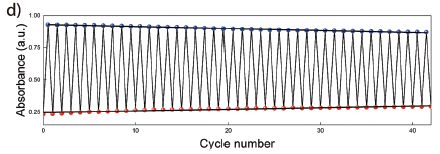
|
In this test, the system was repeatedly cycled between the NBD and QC states. Those two chemicals absorb light differently, so a simple measurement of light absorption describes the conversion.
You can see that the A values are not constant from one cycle to the next, but they are not far from it. The system is quite stable over the 40 cycles shown here. This is Figure 2d from the article. |
You might have many questions about the system. As usual, the post presents only some of the information from the current article. Further, parts of the system need further development. Nevertheless, it is an interesting approach that deserves consideration as one possible alternative for how to store solar energy.
And the name of the system? MOST. That's molecular solar thermal energy storage.
Is this a battery? No. Batteries involve electricity. But more broadly, there is a logical similarity. Both batteries and the current device involve interconverting energy from one form to another, and storing it as chemical energy.
News stories:
* Newly-developed fuel can store solar energy for up to 18 years. (A Micu, ZME Science, November 6, 2018.)
* Emissions-free energy system saves heat from the summer sun for winter. (Chalmers University of Technology, October 3, 2018. Now archived.) From the lead institution. It is an overview of the project, noting four articles published this year. The current article is #4 on the list here. #3 on that list offers a clue to the 18-year number, which is not from the current article.
The article, which is freely available: Macroscopic heat release in a molecular solar thermal energy storage system. (Z Wang et al, Energy & Environmental Science 12:187, January 2019.) Very readable.
Among other posts about storing energy:
* A solar cell that generates electricity at night (April 12, 2022).
* Storing energy from an intermittent source -- as compressed air under the sea (March 3, 2019).
* Flow battery (January 4, 2016).Among recent posts on solar energy...
* Solar energy: What if the Moon got in the way? (August 16, 2017).
* Using your sunglasses to generate electricity (August 14, 2017).
* Is solar energy a good idea, given the energy cost of making solar cells? (March 24, 2017).There is more about energy issues on my page Internet Resources for Organic and Biochemistry under Energy resources. It includes a list of some related Musings posts.
November 11, 2018
In an effort to reduce global warning, we may choose to take some mitigating steps. Is it possible that these mitigation steps could be worse, in some ways, than the warming they mitigate? That's the issue explored by a recent article.
The following graph summarizes some of the findings...
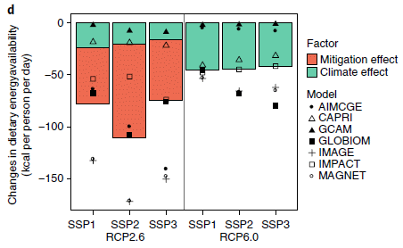
|
You might notice right away that the red bars are bigger than the green bars. The key says that the green bars are climate effects; the red bars are mitigation effects. That's the message: mitigation effects can be worse than the climate effects they mitigate. At least sometimes.
The graph is actually rather complex, with a lot of cryptic abbreviations. We'll try to sort through some of that, but that first impression stated above is the main idea; don't despair if you get lost in the detail. The y-axis is a measure of food insecurity: changes in food calories available to people. Negative values are food deficits, and thus are "bad". All the green bars are negative; the climate effects are bad for food, in general. The two halves of the figure are labeled with RCP numbers. The right side is for a climate scenario that would lead to a global temperature (T) increase of 2.7 °C. The left side is the result of mitigation to reduce the global T increase to 2 °C. The climate effects (green) are indeed smaller, but now there are mitigation effects (red). They are negative, too. And they are larger than the gains due to reduced climate effects. That is, the total bars after mitigation are worse than before the mitigation. There are three green bars on each side. They are for three SSPs: shared socioeconomic pathways. Since the conclusions are similar for all three, we need not worry about them for now. RCP? Representative Concentration Pathways. The "models"? Different models for calculating the effects; they vary -- a lot. This is Figure 1d from the article. |
That's the idea... Mitigation may have negative effects, too. Large negative effects.
What are we to do? The answer is not to give up, but to try to better understand the effects. It's all complicated. Climate effects are complicated. Some parts of the world may benefit in some ways from global warming. Some organisms will adapt just fine, at least if given enough time. There are many kinds of mitigation possible. The results shown above are for certain mitigations, and are not to be taken as "the answer" for what mitigation does.
Just as climate effects may not be uniform around the world, mitigation effects may not be uniform either. The authors explore this, and show that mitigation effects reducing food will be most severe in regions such as sub-Saharan Africa and South Asia -- where food shortage is already a concern.
What's the problem? The focus here is on a commonly proposed tool for mitigation: a carbon tax (a tax on emissions of CO2). A C-tax will hit agriculture hard -- and lead to reduced food. The authors suggest that the food story needs to be an explicit part of plans for dealing with climate change. They do not suggest that we avoid mitigation, but that we do it wisely; that means understanding how one or another mitigation policy works. The article is a step towards understanding the complexity of climate change mitigation.
News stories:
* Climate Change Mitigation Policy Risks Increased Food Insecurity -Study. (DevelopNig (Development in Nigeria), August 3, 2018. Now archived.)
* A blanket carbon tax could heighten food insecurity. (E Bryce, Anthropocene, August 3, 2018.)
* Global carbon tax in isolation could 'exacerbate food insecurity by 2050'. (Carbon Brief, July 30, 2018.)
The article: Risk of increased food insecurity under stringent global climate change mitigation policy. (T Hasegawa et al, Nature Climate Change 8:699, August 2018.)
Also see:
* A thermotolerant coffee plant, with high quality beans (June 8, 2021).
* Climate change and the price of beer (November 26, 2018).
* Predicting the "side-effects" of geoengineering? (September 23, 2018).
November 9, 2018
Tuberculosis (TB) is a major challenge. It is one of the world's great killers. Among features that make it difficult to fight...
- the causal bacteria grow very slowly;
- the bacteria tend to go into a latent phase in the body;
- antibiotic-resistant strains are becoming an increasing problem.
Vaccines against TB have always been questionable. Thus an article with some promising results from a clinical trial of a new vaccine candidate is attracting attention.
The following graph summarizes the key findings from the trial...

|
The graph shows the fraction of trial participants remaining TB-free vs time for the two groups: those given the candidate vaccine (M72/AS01E) and those given a placebo.
You can see that the fraction of people disease-free by the end of the trial is about 0.98 for the placebo group, but is a little over 0.99 for the vaccine group. Put that way, it doesn't sound like much. But the disease incidence dropped from about 2% to about 1% -- a reduction in TB incidence of about 50%. The observations noted above are based on what may seem to be the main graph, but which is actually an inset. The same results are plotted "full-scale" in the "outer" graph. At that scale, one can see essentially nothing. I wonder why they bothered to show that graph. This is Figure 2 from the article. |
The nature of the vaccine is of some interest. It is a subunit vaccine. That means it is based on using genes for specific antigens (rather than some form of the natural organism). Further, it uses an adjuvant, to enhance the immune response.
In the broad field of vaccines, 50% efficacy is not particularly good. However, TB is a difficult target, and 50% efficacy, if real, would be welcomed.
What are the reservations? First, that entire graph above is based on 32 cases of TB: 22 in the control group, 10 in the vaccine group. That's why the result is only marginally significant.
Second, the nature of the test group is perhaps distinctive. All of those in the current trial had latent TB infections. It is interesting that the vaccine was effective in preventing active disease in those who were already infected. But the latent infection may itself be promoting immunity.
Further, most of the trial participants had previously been vaccinated against TB using a common vaccine called BCG. A common but controversial vaccine. There is actually little evidence that it has much effect past infancy -- especially in areas with high levels of TB and presumably high levels of latent infection. Does it matter? We don't know. The role of prior infection, whether with BCG vaccine or natural TB, needs to be sorted out.
Interesting results for an interesting vaccine. It will take further experience before we are able to evaluate its significance. The current article is a progress report based on preliminary data from a Phase 2 trial. There will be more information from this trial. That will include analyses of blood samples from trial participants, which can explore the immune response.
News stories:
* Another New Promise for Tuberculosis Vaccines -- GlaxoSmithKline's tuberculosis vaccine candidate M72/AS01E produced 54% efficacy rate in adults. (D W Hackett, Precision Vaccinations, September 26, 2018.)
* GSK's Investigational Vaccine Candidate M72/AS01E shows promise for prevention of TB disease in a Phase 2b trial conducted in Kenya, South Africa and Zambia. (WHO, September 25, 2018.) Links to considerable related information.
* GSK candidate vaccine helps prevent active pulmonary tuberculosis in HIV negative adults in phase II study. (GSK, September 25, 2018.) From the company that developed the vaccine, and sponsored the trial. GSK = GlaxoSmithKline.
* Editorial accompanying the article: New Promise for Vaccines against Tuberculosis. (B R Bloom, New England Journal of Medicine 379:1672, October 25, 2018.)
* The article: Phase 2b Controlled Trial of M72/AS01E Vaccine to Prevent Tuberculosis. (O Van Der Meeren et al, New England Journal of Medicine 379:1621, October 25, 2018.) A copy of the article is available through PubMed Central.
Other posts that mention tuberculosis include...
* An improved procedure for vaccination against tuberculosis? (March 13, 2020).
* A look at Chopin's heart (January 9, 2018).
* How did tuberculosis get to the Americas? (January 24, 2015).
* Rats, bananas, and tuberculosis (March 11, 2011).More on vaccines is on my page Biotechnology in the News (BITN) -- Other topics under Vaccines (general).
November 7, 2018
Two extended "news" articles, consecutive in a recent issue of Nature. Both are useful overviews of interesting topics.
1. GWAS. That's genome-wide association studies -- looking for statistical correlations between genome sequences and characteristics such as disease prevalence. Useful but confusing, and prone to false leads. It's getting better, as both the data and experience increase.
* News feature: The approach to predictive medicine that is taking genomics research by storm. (M Warren, Nature, October 10, 2018.) In print, with a different title: Nature 562:181, October 11, 2018.
* A recent GWAS post: Ear lobe genetics: more complicated than you thought (March 23, 2018).
2. CubeSats. Discussion of developments in space technology, with an emphasis on the increasing role of tiny -- and relatively simple and inexpensive -- satellites.
* "Comment" story, written by scientists in the field: Explore space using swarms of tiny satellites. (I Levchenko et al, Nature, October 8, 2018.) In print: Nature 562:185, October 11, 2018.
* More about small satellites: The effect of Starlink satellites on astronomical observations (January 29, 2022).
November 6, 2018
Flores Island in Indonesia is the site where some unusual hominin fossils were found. Fossils of very small people, now usually classified as the species Homo floresiensis, and often referred to as "hobbits". Understanding the significance of these fossils has been a continuing challenge, and has been discussed in several Musings posts [link at the end].
In fact, there are small people living on Flores Island now. They are the Rampasasa pygmies; they are not as small as the hobbits, but they are distinctly small. Their home is actually very close to the site where the hobbit fossils were found.
Study of the hobbits has been hampered by the inability -- so far -- to find any DNA for them. However, the Flores pygmies are a living people. With arrangements, a team of scientists has collected DNA from some of the pygmies, and sequenced their genomes. The work, as reported in a recent article, provides some insight into the pygmy population, and by inference perhaps into the hobbits.
As so often with genome articles, there is massive data, analyzed by computers. We just look at some of the conclusions.
One issue the scientists examined was genetic variants that are associated with short stature. Using knowledge from accumulated human genomes, they find that the pygmy genomes are quite enriched for genes for shortness. They make a genetic prediction about the height of the pygmies.
The following graph shows how the actual height compared to the genetic predictor for height in their sample of the pygmy population.
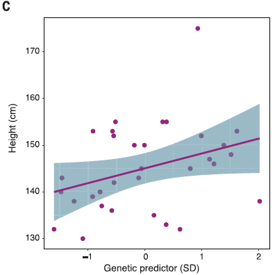
|
You can see that there is a general trend of agreement between actual and predicted heights. It's not perfect, of course. The environment, including nutrition, affects height. Further, the understanding of how the height genes interact is limited. The point is that the general trend suggests that the genes being studied here are in fact relevant to height, and that this population has undergone selection for genes for short stature.
One part of that deserves emphasis... The pygmies are enriched for short-stature variants that already existed (and are known in other populations). That is, their short stature is based on selection of appropriate alleles from the gene pool. (Whether there are also new mutations for shortness in the population is unclear.) For reference: 4 feet 6 inches = 137 centimeters; 5 ft = 152 cm. This is Figure 4C from the article. |
In another part of the work, the authors show that the pygmy population contains Neandertal and Denisovan DNA sequences, as expected. However, there is no significant amount of sequence of unknown origin. This leads them to suggest that there is no connection between the modern pygmy population and the earlier hobbits.
If indeed the pygmies and hobbits are unrelated, it means that populations of small people have arisen on Flores Island twice.
News stories:
* No evidence of 'hobbit' ancestry in genomes of Flores Island pygmies. (EurekAlert!, August 2, 2018.)
* The modern pygmies of Flores are not related to Homo floresiensis -- Modern people's stature evolved separately millennia after hobbits' extinction. (K N Smith, Ars Technica, August 2, 2018.)
* News story accompanying the article: Human evolution: How islands shrink people -- Evolutionary dwarfing affected living people on the island of Flores, and may explain the stature of the extinct hobbit. (A Gibbons, Science 361:439, August 3, 2018.)
* The article: Evolutionary history and adaptation of a human pygmy population of Flores Island, Indonesia. (S Tucci et al, Science 361:511, August 3, 2018.)
Background post about the hobbits: The little people of Indonesia (May 14, 2009). Links to more, perhaps a complete list of related posts.
Another unusual human group in Indonesia: Bigger spleens for a bigger oxygen supply in Sea Nomad people with unusual ability to hold their breath (July 2, 2018).
More from Indonesia... Oldest known picture of a pig (February 21, 2021).
More about human height: Is being tall bad for your health? (July 12, 2022).
There is more about genomes on my page Biotechnology in the News (BITN) - DNA and the genome. It includes an extensive list of related Musings posts.
November 5, 2018
Perhaps not literally, but the work in a new article evokes the idea. It's an interesting story.
The following graph shows a key result...
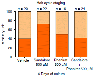
|
A quick glance... The title of the graph suggests this has something to do with hair. And one bar is distinctly high.
The bars show two types of hair follicle cells: active and inactive. The bright bars are for the active type. The y-axis is unhelpfully labeled "arbitrary unit". But I think we can take it as percentage. Each bar has two parts, totaling 100. Take the bottom (brighter) part as the active cells, the top (lighter) part as the inactive cells. Or just look at the main, bright bar, and think of this as an ordinary bar graph; that works fine. |
|
What are the bars for? The high bar is for skin samples treated with Sandalore; that gives the highest percentage of active cells (about 70). The other bars are all much lower, about 40. The most important of those is the bar at the right: Sandalore + Phenirat. The Phenirat inhibits the action of the Sandalore. The other bars are for controls: the "vehicle" alone, and the inhibitor alone; neither of those has any effect on its own. This is part of Figure 1b from the article. A similar graph, part of Figure 1e, is labeled in percentage. That suggests that the labeling of the graph above may be an error, and that it really is in percentage. | |
So, Sandalore promotes active hair follicles. There is a lot of evidence in the article on that point.
What is Sandalore? It is a synthetic chemical that mimics the odor of sandalwood. It's used in cosmetics; real sandalwood is an expensive material, as is its oil.
What's really interesting is how Sandalore acts. It acts via a protein called OR2AT4. OR? That stands for olfactory receptor. A receptor for detecting odors. An odor receptor in your skin -- your hair follicles. Doing something interesting and perhaps useful.
In fact, there are many examples of "olfactory receptors" in various odd places in the body. Physiological functions for some of them have been worked out. Beware your biases based on terminology. Olfactory receptors are receptors for specific chemicals. We have named one big family of such receptors after one common role. It might be better to think of them, broadly, as chemosensory receptors.
How do the scientists know that Sandalore is acting through this odor receptor? There are various lines of evidence, some of it in an earlier article. For example, the inhibitor used is known to be specific for that receptor. The ultimate test: the scientists removed this receptor genetically; that eliminated the effect of Sandalore.
Back to the piece of wood, alluded to in the title of this post. Would smelling a piece of wood -- or rubbing it on the skin -- elicit the hair-growth effect? Apparently not. The effect occurs with the synthetic sandalwood mimic, but not with any natural sandalwood ingredient.
The reason for the discrepancy between natural and synthetic materials may be investigated further, but it may be as basic as that they are different chemicals, and they do different things -- even though they have similar odors. In any case, Sandalore is a commercial cosmetic product, and it seems to have an effect that had not been anticipated.
Overall, we have here a story of an olfactory receptor, which one might have expected to be found in the olfactory system, in the hair-growing system. It responds to a cosmetic product that is on the market. What are the implications? A clinical trial of the product for hair growth is in progress.
There are also questions about the natural system. What is the natural role of the OR? What stimulates it naturally? The authors have some hint that it may be related to the microbiome of the hair follicles.
News stories:
* Synthetic sandalwood found to prolong human hair growth. (B Yirka, Medical Xpress, September 19, 2018.)
* Hair follicles Engage in Chemosensation - Olfactory Receptor OR2AT4 Regulates Human Hair Growth. (Monasterium Laboratory, September 18, 2018.) From the company that is the lead affiliation. (You might want to check the "Competing interests" statement in the article.)
The article, which is freely available: Olfactory receptor OR2AT4 regulates human hair growth. (J Chéret et al, Nature Communications 9:3624, September 18, 2018.)
Previous post about (fake) wood: Artificial wood (November 3, 2018). The previous post, immediately below.
More about hair growth: A treatment for senescence? (June 4, 2017).
Other posts about hair include:
* Why do many tarantulas have blue hair? (March 7, 2016).
* Cryptozoology meets DNA: No evidence for Bigfoot or Yeti or such (September 13, 2014).Posts on the complexity of olfaction itself:
* Is it possible to have a normal sense of smell without olfactory bulbs? (January 28, 2020).
* The chemistry of a tasty tomato (June 18, 2012).
November 3, 2018
Here is what an artificial word looks like, along with a natural wood...
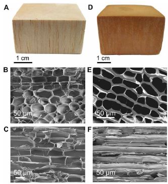
|
Each column is for one type of wood.
The top row shows a macroscopic view. Below that are two scanning electron micrographs of each wood, showing the cellular structure. One is perpendicular to the grain; one is parallel to it. Perhaps you have guessed that the one on the left is the natural wood; it is balsa. But the big picture is that they aren't very different. The new stuff looks passably like wood. This is part of Figure 2 from the article. |
Properties? Strength?
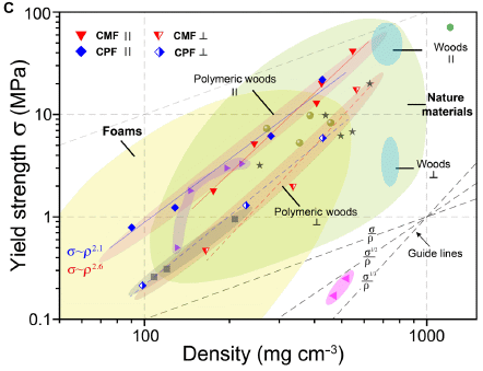
|
The graph shows strength (y-axis) vs density (x-axis) for numerous materials. Both are log scales.
There is a lot of information there; let's get some pieces of it. Towards the right are two small bluish ovals, labeled "Woods". Two? Parallel or perpendicular to the grain, as shown with the symbols under the word. Then there are two long narrow tannish ovals (or bands), labeled "Polymeric woods", awkwardly referring to the artificial woods that the scientists have developed. (Natural wood is polymeric, too.) Again, the two ovals are for the two directions. Perhaps the most striking finding is that they have materials over a very wide range of densities, with a consistent trend of strength vs density. When the materials are tested "parallel", the natural and artificial woods substantially follow the same pattern. When the materials are tested "perpendicular", the artificial woods are a little better, maybe about 4-fold stronger for the same density. That is, there is less difference in the strengths between directions for the artificial woods than for the natural woods. (Visually... the two ovals for artificial woods are closer together than for natural woods.) This is Figure 3C from the article. |
Overall, the scientists have made a range of wood-like materials. Perhaps a little stronger, especially in the direction where wood is weaker.
Other properties of the new stuff, compared to wood? More resistant to fire, and to some chemicals that attack wood, including water. Better as thermal insulation. Easier to make; you don't need to wait for it to grow for a few years. (Hmmm.)
How did they make these products? They used common materials, such as melamine and phenolic resins. They tried to use these familiar materials in novel ways, to make wood-like products.
The artificial wood may be tree-free, but it does have some shrimp in it. Chitosan, derived from the shells of shrimp (or other arthropods).
Why did they make these products? It might seem odd to make synthetic wood. The work is from China, a country that is a major importer of wood. That provides them a motivation. What makes the article noteworthy scientifically is that it enhances our toolkit for making diverse materials. Time will tell what is useful.
News stories:
* Making Wood Out Of Synthetic Resin -- Researchers in China have developed a family of bioinspired artificial wood from phenolic and melamine resin. (Asian Scientist, August 20, 2018.)
* Synthetic wood is fire and water resistant. (T Puiu, ZME Science, October 22, 2018.)
* Team develops a family of bioinspired artificial woods from traditional resins. (Phys.org, August 13, 2018.)
The article, which is freely available: Bioinspired polymeric woods. (Z-L Yu et al, Science Advances 4:eaat7223 August 10, 2018.)
More about wood and other building materials:
* Growing wood in lab culture (March 20, 2021).
* Transparent wood (March 6, 2021).
* Staying warm -- polar-bear style (July 23, 2019).
* Using old clothes as building materials? (February 5, 2019).
* Could smelling a piece of wood improve the growth of your hair? (November 5, 2018). The next post, immediately above.
* Making wood stronger (March 19, 2018). The article of this post is reference #8 of the current article.
* Stone age human violence: the Thames Beater (February 5, 2018).
* Building with wood: might it replace steel and concrete? (June 14, 2017).More about melamine: Melamine toxicity: possible role of gut microbiota (April 21, 2013). This relates to incidents where melamine was used to adulterate food products (leading to a false high value for protein content). Is melamine toxicity relevant to the current work? Using plastics based on melamine is well established. That's bound melamine, as in the current material. Whether the new material has any significant amount of free melamine, which might be of concern, remains to be tested.
October 31, 2018
In ordinary chemical bonds, the bonding electrons are localized between the two atoms being bonded. Would it be possible to artificially cause the electrons to be localized, so that they look like they are in a bond, even though there is nothing there to bond to?
A new article proposes that it may be possible -- and describes how to do it. A caution... it's all theoretical at this point, but the authors think that what they propose is experimentally testable.
The following figure gives an idea of what they are trying to do...
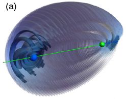
|
The green dot near the right shows the nucleus of an atom.
The blue region, mainly at the far left, shows the probability distribution for the bonding electron. That the electron is so asymmetrically distributed might suggest that it is involved in bonding to something out there. This is Figure 2a from the article. |
But there is no "something out there". There is no other atom at the left. What we have here is a ghost bond -- a bond to nothing.
How did the electron get out there? It was manipulated, by carefully designed magnetic and electric fields.
Or so it is proposed. Remember, the article is all theoretical; the picture is a computer image of what the scientists calculate will happen. However, they think that it is practical, that the confused atom might hang around long enough to detect (perhaps 200 microseconds), and that they know how to detect it.
You might have noticed that the electron is not only positioned asymmetrically, but that it is quite far from the nucleus. The green atom is very special. It is a Rydberg atom, with one electron excited to a very high energy level. It's a huge atom, with a thousand-fold bigger diameter than the unexcited atom. What's important here is that the excited Rydberg electrons are quite different from ordinary electrons in their energetics. It is that feature that allows the experimental manipulation.
Bonds similar to that shown above have been observed -- involving a Rydberg atom and a normal atom on the other end. What's new here is proposing that it may be possible to manipulate the electron distribution of the Rydberg atom, achieving what is shown above without having a bonding partner.
Let's hope that experimental physicists take up the challenge of actually making real ghosts.
Did the figure above remind you of an ancient fossil? In fact, the structure is known as a trilobite bond -- as you will see in the article title. Those who need to -- and want to -- can look up "trilobite".
News story: Synopsis: How to Create a Ghost Chemical Bond. (C Crockett, Physics (American Physical Society), September 12, 2018.) Good overview.
The article: Theoretical Prediction of the Creation and Observation of a Ghost Trilobite Chemical Bond. (M T Eiles et al, Physical Review Letters 121:113203, September 14, 2018.) There is a preprint freely available at ArXiv; it has a somewhat different title.
More about Rydberg atoms... Atoms within atoms? (May 25, 2018).
Previous posts that mention ghosts include: Is Harry Potter responsible for the increased owl trade in Indonesia? (August 6, 2017).
More unusual bonding:
* Y-Y: the first (May 5, 2019).
* How many atoms can one carbon atom bond to? (January 14, 2017). Links to more.Also see: Image of a carbon atom that isn't there (August 17, 2008).
October 29, 2018
There are numerous retroviruses in the human genome. Fortunately, most of them are now dead (with only fragments of the viral genome present), and not capable either of making virus particles or even jumping around in the genome.
However, one of those retroviruses still seems potentially active. In fact, we see evidence of its activity over the ages, because different people have copies at different places in the genome.
Does it matter? Do the viruses in our genome, or their genetic debris, have any effect? A new article provides some evidence suggesting that one such viral fragment may be associated with addictive behavior.
The following figure shows the situation...
|
Part A (top) shows a map of part of the gene. There is a lot of detail here, but we will note just some key pieces.
Exons are the parts of genes that actually code for protein. Exons 17 and 18 for this gene are shown (blue). Between those two exons is a gray region. That is for an intron, or intervening sequence. It will be removed from the RNA transcript before the protein is made. The intron here contains a "pre-integration site" for the virus. In the second form of the gene, a fragment of the virus, labeled LTR (red), has inserted at that position. The insertion of the viral LTR doesn't affect the sequence of the resulting protein, since it is in an intron. However, intronic sequences can affect the level of gene expression. |
|
Part B (bottom) shows how we can tell which form of the gene a person has. It involves using two DNA "probes", labeled s and p. (Each "probe" is an analysis by the polymerase chain reaction (PCR); the primers dictate which regions can be seen in an analysis.) The s probe detects the wild type version of the gene (upper line in part A). The p probe detects the version of the gene with the viral insert (lower line in part A). Look at the results for the first two patients, at left. Both patients show a positive result with the s probe. Patient 23 also gives a positive result with the p probe. Those results show that patient 92 has only the wild type version of the gene, and does not have the viral insert. Patient 23 is heterozygous, and carries a copy of the gene with the viral insert. Looking further, at the full set of results shown here... All the patients show the s band. Only patients 23 and 83 show a band for the version of the gene with the viral insert. This is Figure 1 parts A and B from the article. I added two-digit patient numbers for some of the patients, for ease of referring to them. | |
That sets the framework. We are looking for a viral insert at a specific place in the human genome, and we have a test for it.
The authors analyzed two groups of people to see how many had the viral insert. One group consisted of drug addicts. (It's a little more complicated than that, but that's the idea.) The second group was a control group, with no known addiction. 14% of the addict group carried a copy of the viral insert. 6% of the control group carried a copy. That is, the frequency of the viral insert was about 2.5 times higher in the addict group.
The authors then repeated the study, in another country, with a different type of addict group and a control group. The results were similar.
Overall, there seems to be an association between having this particular viral insert and addiction.
What is this gene RASGRF2? It's involved in dopamine signaling. It is known that the gene affects addictive behavior.
The scientists do an experiment to explore how the viral insert might affect the gene. Using laboratory cell lines, they make viral insertions very much like the natural ones. They find that the viral insert affects the transcription of the gene.
It is important to be cautious in describing this work. For one thing, it does not mean that the viral insertion causes addition. At most, it is one factor that could contribute to the development of addiction. Second, it is possible that the viral gene is a marker but not the actual player. That happens sometimes in genetic work; the factor we notice is close to something important, and it takes a while to sort them out.
Nevertheless, there are reasons why the story is plausible. The gene is related to the development of addiction, and the scientists have provided some evidence for how the viral insert works. In any case, the work here undoubtedly will be followed up. Importantly, it may be part of the story of understanding addictive behavior. That it also involves one of our endogenous retroviruses is just a little bonus, for fun.
News stories:
* Ancient retrovirus may make some people more prone to addiction. (T Puiu, ZME Science, September 27, 2018.)
* Evidence that addictive behaviors have strong links with ancient retroviral infection. (Science Daily, September 24, 2018.)
The article: Human Endogenous Retrovirus-K HML-2 integration within RASGRF2 is associated with intravenous drug abuse and modulates transcription in a cell-line model. (T Karamitros et al, PNAS 115:10434, October 9, 2018.)
Another report of an association between an endogenous virus and human neurology: Is a "dead" virus in the human genome contributing to the neurological disease ALS? (January 11, 2016). It's the same virus that is implicated here, but almost certainly a different copy.
And... Games genes play -- Alzheimer genes, in your brain (January 4, 2019).
Endogenous retroviruses are a broader issue. Concern about them is one factor limiting xenotransplantation. So... Laika, the first de-PERVed pig (October 22, 2017).
More about dopamine:
* Metabolism of the Parkinson's disease drug L-DOPA by the gut microbiota (July 26, 2019).
* The placebo effect: a mutation that makes some people more likely to respond (October 30, 2012).
* Do your genes affect your politics? (December 5, 2010).
October 26, 2018
Bonds between carbon and fluorine (C-F bonds) are very strong; they are among the strongest known chemical bonds. And it is a problem. Many materials contain C-F bonds. Teflon is an example, along with the fluorochemicals associated with it. How do we get rid of them?
Platinum (Pt) helps, as a catalyst, but it's not very good. A new article shows a better way to use Pt for this purpose: one atom at a time.
Some results...
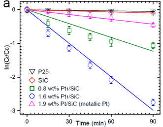
|
The graph shows the fraction of C-F bonds remaining (y-axis; ln scale -- natural logs) vs treatment time (x-axis).
Results for five treatments are shown. Let's start with the best one -- the curve at the bottom (blue circles). The curve shows three ln removal of C-F bonds over the 90 minute treatment. Three ln? One ln means that 1/e, or about 1/2.7 (37%), of the C-F bonds have been removed. Three ln means that about 95% of the C-F bonds have been removed. |
|
You can also see that the data points fit a straight line rather well, expect possibly for the last point. That is, the conversion is consistent over this time: exponential decay, with some hint that it is slowing down at the end. What's the treatment for this "best case"? It's the new catalyst that the authors developed here, using single Pt atoms. It's called Pt1/SiC. The "1" with the Pt is to show that the Pt atoms are isolated, single atoms. They are on a support of SiC (silicon carbide). (The SiC is more than an inert support; it is involved in the reaction mechanism, but we won't go into that here.) The second best curve? Green squares. Same catalyst, but half as much, as shown in the key. Next? Pink triangles. The Pt is now "metallic", not single atoms. It's ordinary Pt. And it's not nearly as good. The blue curve (new, single-atom catalyst, at about the same level) is ten times better. (Remember, it's a ln scale.) The top two curves... One of them is the SiC used to support the Pt. Alone, it does nothing. P25 is for a titanium dioxide catalyst that is sometimes used; very little happens. The substrate in these experiments is PFOA: perfluorooctanoic acid (C7F15COOH). PFOA is an environmental contaminant of interest. This is Figure 2a from the article. | |
The graph provides evidence that the new catalyst is much better than the old ones.
The following figure diagrams what the catalyst looks like...
|
Both figures show blue things on a gray-tan structure. The blue things are Pt atoms. The gray-tan structure is the SiC support.
You can see that the top catalyst has clusters of Pt atoms. The bottom catalyst has isolated Pt atoms. The reaction involves hydrogen atoms that are bound to the Pt. The authors suggest that the weaker bonding of H to single Pt atoms, rather than to clusters, allows the reaction to proceed faster. This is part of Figure 3b from the article. |
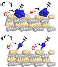
|
Overall, the article proposes an improved process for breaking C-F bonds. It provides lab data to show that the new process works well, and the authors have at least an idea why it works.
It's the ultimate in nanotechnology. Working out how to make the catalyst was an important part of the development.
News stories:
* Single atoms break carbon's strongest bond -- Single atoms of platinum can break the bond between carbon and fluorine, one of the strongest known chemical bonds. (Science Daily, October 2, 2018.)
* Pollution remediation with single atom catalysts. (K Haylor, Naked Scientists, October 23, 2018.) Interview with one of the authors, Eli Stavitski. Audio file available.
The article: Single-Atom Pt Catalyst for Effective C.F Bond Activation via Hydrodefluorination. (D Huang et al, ACS Catalysis 8:9353, October 5, 2018.)
More platinum:
* Added April 6, 2026. Exploring the potential of aluminum(I) compounds as replacements for expensive metals (April 6, 2026).
* Low temperature treatment for auto exhaust? (February 18, 2018).
* Self-powered micromotors for speeding up chemical reactions, such as destruction of chemical weapons (March 14, 2014).More catalysts: Air pollution: progress towards a process for ammonia oxidation (April 5, 2019).
More about C-F bonds: Getting rid of "forever chemicals" (perfluorinated organic acids) (October 25, 2022).
Previous posts about fluorine include:
* Is fluoride neurotoxic to the human fetus? (December 13, 2017).
* Early detection of brain damage in football players? A breakthrough, or not? (September 14, 2015).
October 24, 2018
G. A recent article reports two new measurements of the gravitational constant G. Both are high precision measurements, with extremely low uncertainties. What's interesting is that the two measurements do not agree with each other. There has long been suspicion that there are hidden systematic errors in measuring G. The work here may be a good place to study them, since we have the same group of scientists reporting two distinct results.
* News story: Two new ways to measure the gravitational constant. (B Yirka, Phys.org, August 30, 2018.) Links to the article (which in turn links to the accompanying "News and Views" item in the journal). A background post about the difficulty of measuring G: Does anyone know how strong gravity is? (September 16, 2014). I have noted this new work there as an update.
October 23, 2018
In the United States, there is a class of products called dietary supplements. They are widely available, no prescription required. It is a huge business -- over $35 billion annually (says the article)! Dietary supplements do not make a specific medical claim, though it may be "common knowledge" what they are for. They do not need to be tested for effectiveness (after all, they don't make a claim), and are not pre-approved by the Food and Drug Administration (FDA).
The FDA does have some power to address problems after the products are on the market.
One problem is products that contain ingredients beyond those stated. In particular, some products contain regular medical drugs -- ingredients that are subject to different rules. For example, a dietary supplement that is generally intended for weight loss (though that is not stated) may contain a drug that is used for weight loss.
A new article examines the record -- the FDA records on dietary supplement products that they have noted as suspect over a recent 10 year period. 776 of them. (That's 1-2% of all such products.) These are cases where regular medical drugs were found in dietary supplements -- which do not have a medical claim.
Regular medical drugs? It's not quite that simple. Some had ingredients that had been removed from the market because they were considered unsafe. And some had ingredients that were analogs of regular drugs.
What happens when such a case is discovered? In some cases, there is a recall -- a voluntary recall, stimulated by an FDA letter. About half the cases. The rest? Not much happens.
Why does the drug contamination occur? What should be done? Prior to marketing? After marketing? How effective are the recalls that are done? Lots of questions.
Comment...
This is a story of science and politics. The article itself is an analysis of data about contamination of popular products. More precisely, it is an analysis of FDA records about such problems -- and we don't know how big the gap is between what the FDA has and the full situation.
Is the contamination a problem? If nothing else, the product is now mislabeled. The extra ingredients, not disclosed, are active -- including having side effects. It seems likely that much of the contamination is intentional adulteration, with an intended effect. If there was an intent to deceive, that doesn't speak well for those behind the product.
The FDA is the product of politics. It operates under rules form Congress, which also provides its budget. Lest one jump to conclusions too quickly... The politics here are not simple partisanship. There are big business interests involved. Key politicians behind the current, weak regulatory system were from all across the political spectrum. The work in the article covers the time of three US Presidents. Improving the system is going to take some people addressing problems that have been identified. That's why the current article might be of interest.
News stories:
* Hundreds of Supplements Spiked with Pharmaceuticals. (A P Taylor, The Scientist, October 14, 2018.) Now archived.
* What is the Dietary Supplements fuss all about? (D Gamble, Skeptical Science, October 16, 2018.)
* Commentary accompanying the article; freely available: The FDA and Adulterated Supplements - Dereliction of Duty. (P A Cohen, JAMA Network Open 1:e183329, October 12, 2018.) The author is an involved party. See the "Conflict of Interest Disclosure"; further, he talks about his work in the field. In any case, this is a useful two-page overview of the new findings, with context.
* The article, which is freely available: Unapproved Pharmaceutical Ingredients Included in Dietary Supplements Associated With US Food and Drug Administration Warnings. (J Tucker et al, JAMA Network Open 1:e183337, October 12, 2018.)
The article is from the California Department of Public Health and some other state agencies. It uses publicly available databases from the US FDA, but that agency was not involved in the work.
* * * * *
Among many posts that include FDA issues...
* Triparental embryos: the FDA and the regulatory dispute (September 12, 2017).
* The rice-arsenic issue: Consumer Reports and the FDA weigh in (September 25, 2012).More about product adulteration...
* Melamine toxicity: possible role of gut microbiota (April 21, 2013).
* Happyness, a House, and a Mouse (September 12, 2010). See the third stanza.
October 22, 2018
There are few cases of polio anymore. However, there are cases of similar conditions, commonly called acute flaccid paralysis (AFP) or acute flaccid myelitis (AFM). In general, the cause of these cases is not known.
In 2014 there was a small but clear rise in such cases in the United Sates. Similar rises have been seen in alternate years since then, including an ongoing burst of cases. Why? We don't know, but there is circumstantial evidence that suggests a role for the enterovirus D68 (EV-D68). We introduced this possibility in earlier posts [link at the end].
A new article adds to the evidence about EV-D68.
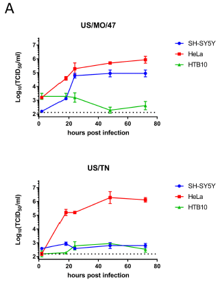
|
The figure shows how two strains of virus EV-D68 grow, in three different cell lines. Each curve shows virus production (y-axis; log scale) vs infection time (x-axis).
Start with the red lines, one in each graph. HeLa cells. Both virus strains grow well in the HeLa cells. Then the blue lines. SH-SY5Y cells. Importantly, the virus strain in the top frame grows well in this cell line; the virus strain at the bottom does not. (We can skip the third cell line. Neither virus strain grows in it.) This is part of Figure 1A from the article. The full Figure 1A shows one more virus strain. Its pattern is similar to the bottom one; it does not grow in the SH-SY5Y cells. (The horizontal dotted line near the bottom is the detection limit.) |
What's different about the two viruses? and the two cell lines?
The virus strain at the top -- let's just call it MO (Missouri) -- is a recently isolated strain, similar to strains that are associated with AFM. The virus at the bottom -- TN (Tennessee) -- is also a recent isolate, but one that does not carry any of the mutations found in strains such as MO; that is, it is like older strains.
The HeLa cells are a common cell line that "everything" grows in. A positive control. In contrast, the SH-SY5Y cells are specialized neuronal cells.
Putting those pieces of information together, we see that MO, the new type of EV-D68 strain, can grow in neuronal cells, whereas TN, the old type, cannot. That is, it seems that some strains of EV-D68 recently acquired the ability to grow in neuronal cells.
The article contains results for more viruses and more cell lines. The general pattern holds rather well. The results shown above are a sampling to show the nature of the key results.
The virus we skipped except for a brief mention didn't grow in the neuronal cells; it is in fact an "old" strain. The cell line we skipped (HTB10; green) is odd. It was derived from neuronal cells long ago. However, the results here along with other results suggest that it really does not behave as a neuronal line any more.
The following experiment looks at another piece of the story...
|
In this experiment, mice were infected with the same virus strains shown earlier. The mice were scored for motor impairment.
The MO strain caused motor impairment (red curve); That's the strain that grows in neurons, according to the top figure. The TN strain did not cause motor impairment (blue); that's the strain that did not grow in neurons. (Again, we will skip the third strain, except to note that it fits the pattern.) This is Figure 2A from the article. |
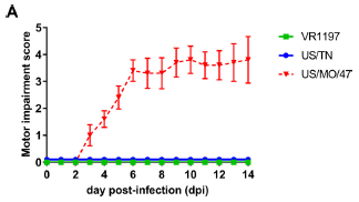
|
The graphs above show two lines of evidence, and they agree. Some newer strains of virus EV-D68 have acquired the ability to grow in neurons, where they can cause damage. It all supports the possibility that EV-D68 is emerging as a new virus that causes some paralytic disease.
The neuronal cell line used here should also be useful in further characterizing EV-D68 strains, and the genetic differences among them. As an example, in this work the authors tested whether free viral RNA from the various strains can infect the neuronal cells. It can, even when intact virus cannot. That is, one barrier to older EV-D68 strains infecting neuronal cells is the initial interaction of viral binding and entry. Among the mutations recently acquired are some that allow viral entry.
News story: CDC, partners probe 127 polio-like cases in 22 states. (L Schnirring, CIDRAP, October 16, 2018.) This story is broadly about the recent increase in cases of AFM. It briefly mentions the article that is the focus of this post.
The article, which is freely available: Contemporary Circulating Enterovirus D68 Strains Have Acquired the Capacity for Viral Entry and Replication in Human Neuronal Cells. (D M Brown et al, mBio 9:e01954-18, September 2018.)
A background post about EV-D68 and its possible connection to a polio-like disease: Polio-like disease without polio virus? Follow-up (February 11, 2015).
My page for Biotechnology in the News (BITN) -- Other topics includes a section on Polio. It includes a list of Musings posts on the topic.
October 20, 2018
We have previously noted the use of smartphones to identify parasites [link at the end]. The system makes use of the phone camera, and the ability to process data. A new article reports the use of smartphones to identify lead in drinking water.
Right. Lead ions are too small to see. But as some may have guessed, all we need to do is to precipitate the lead ions from the drinking water, leading to a solid that can be seen. The rest is detail -- making it work, and making it practical.
The following figure gives an idea how it turns out, at least qualitatively.
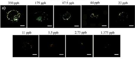
|
A series of water samples, with lead at various concentrations as labeled across the top, were tested using the smartphone system. The figure shows the picture at the end of the test.
The picture for the highest concentration, 350 parts per billion (ppb), has a distinct precipitate visible. The water samples are successive 2-fold dilutions of the dissolved lead. The amount of precipitate gets less and less. As I look at the photos in the published article, there seems to be a definite speck at the next-to-last sample, at 2.75 ppb. For reference, the current standard for drinking water in the United States is 15 ppb. That is, the smartphone test shown here is sensitive enough to detect lead in water below the current allowed limit. This is Figure 3a from the article. |
Of course, what you can see on your computer screen as you read this post depends on many things, and may not reflect the actual sensitivity of the test. In fact, the best way to read the test might be to have the phone analyze the sample directly, and report a score for how much of the solid it sees.
One more concern... Water hardness is an issue with this method; the authors modify the procedure to deal with it.
Here are some numbers from such an analysis with tap water. The phone reports the score...
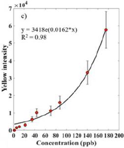
|
Intensity of the precipitate (which is yellow; y-axis), as measured by the phone. It is plotted against the concentration of the lead ions in the water (x-axis).
You can see that the intensity increases with concentration, in a reasonably regular way. (The line is for an exponential equation to fit the data.) As noted earlier, the current limit for lead in drinking water is 15 ppb in the US. The new test does a good job of detecting that level, even with tap water. The authors suggest that the proposed test can detect Pb ions in tap water at about 5 ppb. This is Figure 7c from the article. |
How does this test work? A water sample is placed on something like a microscope slide. A tiny drop of a solution containing chromate ions is added; if lead ions are present, they precipitate out as the yellow solid lead chromate.
The rest is up to the phone. It has been modified to get a better image, and has software for the analysis of yellow pixels.
How complicated is the modification of the phone? You'll need to print out a lens. The authors make the plans freely available (in an earlier article; see their reference 23).
There are test kits on the market that the consumer can use at home to test for lead. However, they are not sensitive enough to establish that current limits are being met. Proper lead testing requires sending a water sample to a lab. Now, imagine that some people in a community are able to spot check the water for lead, especially after some event that might be of concern. Put in context, this new phone-based system would seem to have promise: sensitive, inexpensive, and fairly simple.
Comment... I'm not at all sure that the proposed analysis would be easy for a home-user. But no matter. The key point is the development of a sensitive and inexpensive device. If a few people around can use it, following the procedure, that is a big step. The device would be a substantial step even if primarily used for rapid pre-screening by "the authorities."
News stories:
* With a few cheap changes, your smartphone can now detect lead contamination in water. ( A Micu, ZME Science, September 27, 2018.)
* Smartphone system to test for lead in water -- Unlike most commercially available tests, it can detect levels below EPA standards. (Science Daily, September 26, 2018.)
The article: Smartphone Nanocolorimetry for On-Demand Lead Detection and Quantitation in Drinking Water. (H Nguyen et al, Analytical Chemistry 90:11517, October 2, 2018 .)
Background post on using your phone to detect parasites: Using your phone to find Loa loa (August 14, 2015).
Other things you can detect with the phone...
* Can you detect the SARS-2 virus with your phone? (March 2, 2021).
* Using your smartphone to detect cosmic rays (April 7, 2015).A post about a recent lead problem: A real-world chemistry scandal: The Flint (Michigan) water supply (March 21, 2016). How would this incident have been different if simple lead testing had been available at an early stage?
October 17, 2018
Occupational exposure to lead. An article with a striking title. It's an interesting little article. I have not found any news story, but the article itself is short and readable: Notes from the Field: Lead Exposures Among Employees at a Bullet Manufacturing Company - Missouri, 2017. (D A Jackson et al, Morbidity and Mortality Weekly Report (MMWR) 67:1103, October 5, 2018.)
October 16, 2018
We have an interesting new article that raises the question of whether glyphosate affects bees. As so often, a caution: this is a preliminary and confusing report. (Glyphosate is the active ingredient of the commercial herbicide Roundup.)
The approach is to look at the gut microbiome of the bees. There is a logic to this. Glyphosate is a herbicide with a known action: it inhibits an enzyme commonly found in plants, but not in animals. Thus it acts against plants, but not against animals. That's the basic idea, and it explains much of what is seen with glyphosate. However, the real world is more complex. It turns out that some bacteria also contain the enzyme that glyphosate inhibits. Is it possible that glyphosate could affect bees by affecting their microbiome?
The following figure describes the results of a simple "top-level" test...
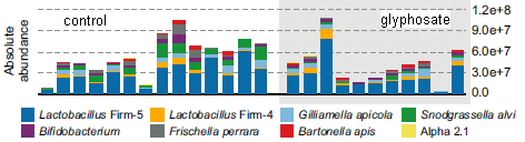
|
The figure shows analyses of the gut microbiome of some bees. Each bar is for one bee. The height of the bar shows the number of bacteria. The colored regions within a bar are for different types of bacteria. The key at the bottom shows the coding for the bacteria types, but those details don't matter for now.
The bars on the right side (gray background) are for bees treated with glyphosate. The bars on the left side (white background) are for control bees. There is huge variability. However, the results for the two sets of bees seem different. For example... - The middle dashed line is for 6E7 bacteria. Among the control bacteria, half of the bees (7 of 14) had a bacterial count that high. However, few of the treated bacteria did (2 of 11). - The bacteria coded with green are almost entirely gone in the treated bacteria. This is the bottom part of Figure 2A from the article. I added the labels for the two sides. |
Results such as those suggest that glyphosate affects the gut bacteria of the bees. It affects the total number, and the distribution (among types). The article has more data and some statistics. It's complicated. Some of the differences seem consistent -- and statistically significant. But some of the results may be just random variation. (The difference in total numbers seen here does not test as significant, but the noted change in composition is significant.) In another experiment, some results do not show a proper dose response curve, and that must make one cautious.
The following figure provides some evidence that the effect of glyphosate on the microbiome matters...
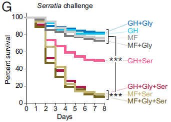
|
The graph shows survival curves for eight groups of bees. The variables include their microbiome (GH or MF -- we'll explain later), treatment with glyphosate (Gly), and a challenge from a pathogen, Serratia marcescens (Ser) bacteria.
We can usefully divide the results into three groups: high survival (top group of four curves); medium survival (one curve) and low survival (three curves at the bottom). |
|
Some of the curves are labeled GH. That effectively means that the bees started with a normal microbiome. (GH = gut homogenate-exposed bees; that refers to how the scientists provided the microbiome in this experiment.) Adding glyphosate had little effect on the survival; results for GH+Gly and GH are about the same. Treating GH bees with the pathogen reduces survival (GH+Ser, the middle curve). Importantly, the killing by Ser is greater if the bees were treated with Gly. That is, survival with GH+Gly+Ser is lower than with GH+Ser. MF? That means microbiome-free. Gly alone did not affect these bees. But Ser did. The MF bees were most sensitive to Ser, whether Gly was present or not. This is Figure 2G from the article. | |
A simple interpretation is that the normal microbiome protects the bees from the bacterial pathogen. Microbiome-free (MF) bees are sensitive to the pathogen. And so are normal bees treated with Gly, which alters the microbiome.
What is the bottom line? The article opens up some new territory, and there is good logic for doing that. The experiments are complicated. The results suggest that there is an effect of glyphosate on the bees -- mediated by the gut microbiome. Interesting. There are inconsistencies (such as the dose response curve), and uncertainty about the level used. That is, there are reasons to be cautious in interpreting the article. It would be hard to claim that the article proves anything. That's fine. In general, we don't let one article change our course. What's called for here is further work. Can the findings be reproduced? Can some of the concerns be addressed?
News stories. More stories than usual, given the complexity and controversy.
* Herbicide May Harm Microbiome of Bees. (I Kulbatsk, The Scientist, September 26, 2018.) A short overview; good, as far as it goes. Now archived.
* Common weed killer linked to bee deaths. (Phys.org, September 24, 2018.)
* Monsanto's global weedkiller harms honeybees, research finds. (D Carrington, Guardian, September 24, 2018.) This story notes some previous related work. It also provides a response from Monsanto (the company that sells Roundup).
* Glyphosate Bee Death Story Is Bee-S. (J Bloom, ACSH (American Council on Science and Health), September 26, 2018.) This story is largely an attack on the article (as the title might hint). The author raises several specific concerns about the article. The concerns are proper (and are raised in the article itself), but the presentation is not at all balanced. The story would seem to suggest the article should be discounted; instead, it is something that should be followed up. The web page contains an extensive set of comments from readers. One of those readers, who contributes many posts there, is a bee biologist. His comments, and his exchanges with the author of this story, are worth reading. Perhaps they even end up agreeing in part: the study is an interesting contribution, the significance of which is unclear at this point.
* Glyphosate and bees - Expert Reaction. (Science Media Centre, September 25, 2018.) Three brief and varying expert opinions. On one point, two of the experts disagree on the "facts".
The article, which is freely available: Glyphosate perturbs the gut microbiota of honey bees. (E V S Motta et al, PNAS 115:10305, October 9, 2018.) The article itself is difficult reading.
More about the bee microbiome: Could a better gut microbiome improve memory? (December 6, 2021).
Among recent posts on bees:
* The advantage of living in the city (July 27, 2018).
* Largest field trials yet... Neonicotinoid pesticides may harm bees -- except in Germany; role of fungicide (August 20, 2017).More... Why did many bees in the United States stop buzzing mid-day on August 21, 2017 (January 2, 2019).
More about glyphosate: Is glyphosate (Roundup) a carcinogen? (March 6, 2016). There is no obvious connection between that and the current work, except that both involve possible effects on animals.
Another post about an insect microbiome: How to preserve dead mice so they stay fresh and edible (January 18, 2019).
A reminder to be cautious in interpreting such work... Our microbiome: a caution (August 26, 2014).
October 14, 2018
Did you know that the writings of Robert Burns have a high content of citric acid?
|
The figure shows four manuscripts from the Scottish poet Robert Burns (1759-1796). They may or may not be authentic. For each, a portion of the mass spectrometry analysis is shown.
The same pair of peaks is found in the top two manuscripts. A different pair of peaks is found in the bottom two. In fact, it is known that the bottom two are authentic Burns manuscripts, whereas the top two are forgeries (from the same person). No, you're not expected to see anything by looking at the manuscripts themselves here. This is part of Figure 1 from the article. The full figure has two more examples. However, one of them is mislabeled in the article, so I skipped it here. Further, the figure legend incorrectly identifies the peaks. Beware, if you go to the article itself. |
There is more, of course. The bottom line is that the mass spec analysis does a good job of distinguishing authentic Burns manuscripts from one set of forgeries. The particular forger here, Alexander Smith, was prolific -- a century after Burns. Identifying his work is a serious matter.
What is it that is being analyzed? A small sample of an extract -- a two microliter extract -- from the paper. It largely includes ink. The treatment is simple and fast, and has minimal effect on the manuscript.
At the top I noted that Burns poems have a high context of citric acid. Of course, that refers to the mass spec analysis, and is probably identifying a component of the ink. (I'm skeptical of their identification on that point, but it doesn't matter much. The main point is that the analysis shows a clear distinction between the two manuscript sources.)
The current work is not the first with this approach. The authors emphasize that their analysis is improved, by using a simple extraction method, and by using high-resolution mass spec (note those m/z values with four decimal places!).
It is likely that the methodology will see refinement and use. In any case, the article is fun for its historical aspects.
News stories:
* Mass spectrometry technique helps identify forged Robert Burns manuscripts. (B Yirka, Phys.org, July 27, 2018.)
* Burns' works authenticated by new, minimally destructive scientific technique. (University of Glasgow, July 26, 2018.) From the lead institution.
The article, which is freely available: Minimally-destructive atmospheric ionisation mass spectrometry authenticates authorship of historical manuscripts. (J Newton et al, Scientific Reports 8:10944, July 26, 2018.)
More analyses of old manuscripts:
* Improved ostracon analysis reveals 2600-year-old request for wine (July 23, 2017).
* Stanford Linear Accelerator recovers 18th century musical score (June 22, 2013).A recent post involving mass spectrometry: Large organic molecules found on Enceladus (September 7, 2018).
More mass spec: Measurement of atomic mass of superheavy atoms (February 24, 2019).
More citric acid: Why some citrus fruits are so sour (April 22, 2019).
More poetry... The Mudville story, on its 125th anniversary (June 3, 2013). Hey, it's of seasonal interest! Links to more poetry, too.
October 12, 2018
A gigahertz. 60 billion revolutions per minute (rpm).
That is what was reported in a pair of recent articles. Here are some results, from one of then...
|
The graph shows the spinning speed obtained for an object (y-axis; blue data) vs the gas pressure in the chamber (x-axis). (Both axes use log scales.)
The first -- and most important -- observation is that speeds as high as 109 hertz (Hz) were obtained, at the lowest pressures. 1 Hz = 1 cycle per second. So that is 1 GHz = a billion cycles per second. 60 billion rpm. (The "billion" here is the American billion, a thousand million.) There is also an orange line (dashed). It is a theoretical line for how the speed should vary as a function of pressure. The agreement between theory and experiment is good at the higher pressures (towards the right side). At lower pressures, the observed spinning speeds were lower than theory predicts. The authors suggest that the discrepancy may be due to problems measuring these low pressures. That's an interesting commentary on how difficult these experiments are. Pressure is shown in millibars (mbar). A bar is about 1 atmosphere. Thus the right side of the scale, 10-1 mbar, is one ten-thousandth of an atmosphere. The left side, shown as 10-5 mbar, is about 10-8 -- a hundred-millionth -- of an atmosphere. This is Figure 2b from article 1. |
What is this object? And how did people get it to spin so fast? It's a nanoparticle of silica -- the stuff quartz is made of. About 100 nanometers diameter. The scientists irradiate it with circularly polarized light. Angular momentum is transferred from the light to the particle, setting the particle spinning.
Such experiments have been done before. The new work achieved spinning speeds a thousand-fold higher than in the earlier work, because they developed the ability to do the work at lower pressures.
It works rather well, as the agreement between theory and data above shows. (That largely holds even if we leave open the explanation for the discrepancy at low P.)
It's a cute experiment, and it sets a record for spinning. Beyond that, is it interesting or useful? The following figure, from the other article, offers a hint...
|
This figure is not an experimental result, but a model. It starts with the silica nanoparticle. You can see that they used a dumbbell-shaped nanoparticle in this case.
The high spinning force they found (similar to what was found in the other article, as shown in the top figure) will tend to make the particle fly apart. The color coding here shows the calculated pressure on the particle vs position (for a particular set of conditions). |
|
You can see that the pressure is greatest in the middle -- the thinnest part. In fact, they are surprised that the particle didn't fly apart. The pressure is far more than would be needed if it were ordinary glass. This dumbbell didn't fly apart, but other things might well. The scientists think that this device for inducing high speed spinning may be useful for studying the behavior of small particles. This is Figure 4d from article 2. | |
The technique may also allow study of the gravitational constant, and of the friction in a quantum vacuum.
A news story about article #2: World's fastest man-made spinning object could help study quantum mechanics. (Phys.org, July 20, 2018.)
News story about both articles, freely available, in the publisher's news magazine: Focus: The Fastest Spinners. (M Buchanan, Physics 11:73, July 20, 2018.)
The two articles, published together, are from two independent research teams. The main ideas are about the same, but there are differences in details.
1) GHz Rotation of an Optically Trapped Nanoparticle in Vacuum. (R Reimann et al, Physical Review Letters 121:033602, July 20, 2018.)
2) Optically Levitated Nanodumbbell Torsion Balance and GHz Nanomechanical Rotor. (J Ahn et al, Physical Review Letters 121:033603, July 20, 2018.)
Among posts about spin:
* CISS: separating mirror-image molecules using a magnetic field? (August 7, 2018).
* Gyroscopic seeds (June 15, 2018).
* The paperfuge: a centrifuge that costs 20 cents (April 17, 2017).
* Spinning gears -- driven by bacteria (February 1, 2010).
* Swirling tower (July 1, 2008). The first Musings post -- about something spinning.More about the gravitational constant: Does anyone know how strong gravity is? (September 16, 2014).
More about the quantum vacuum: Is the speed of light really constant? (May 20, 2013).
More glass: A new way to make impact-resistant glass (August 9, 2019).
October 10, 2018
1. A novel approach to inhibiting common cold viruses. Scientists have developed a drug that reduces reproduction of a broad family of cold viruses, the rhnoviruses. It does so by inhibiting a host enzyme that the virus needs. Since the enzyme is from the host, not the virus, it's probably hard for the virus to develop resistance. Is the host ok with its enzyme being inhibited? Apparently, at least for a short time during the treatment. It's an interesting, but preliminary lead.
* News story: Molecule that acts on human cells might provide hope for 'irresistible' cold cure. (Science Daily, May 14, 2018.) Links to the article.
2. Baloxavir marboxil -- follow-up. We recently noted this new flu drug. We now have a press release from the company, with further encouraging results. In particular, they announce results suggesting usefulness in treating the flu in high-risk patients.
* Press release: Positive phase III results for baloxavir marboxil in people at high risk of complications from influenza to be presented at IDWeek 2018. (Roche, October 4, 2018.) Formal publication will presumably follow -- as will FDA consideration. Background post: Baloxavir marboxil: a new type of anti-influenza drug (September 14, 2018). I have added this announcement to that post.
October 9, 2018
What if we could convert waste plastic to something useful? Maybe fuel. Hydrogen. A new article reports a scheme for doing so. It's interesting, but a big caution: it is very preliminary.
Here's the idea...
|
The graph shows the production of hydrogen gas (y-axis) from various plastics (listed along the bottom), using the new process, with and without a pre-treatment step.
The plastics are: polylactic acid (PLA), polyethylene terephthalate (PET; two sources), and polyurethane (PUR). Qualitative observations... - The process leads to production of H2 for all the plastics. - The plastics vary. - In some cases, the pre-treatment enhances H2 production. |
|
The pre-treatment involves treating with strong base. This leads to partial hydrolysis and dissolution of the plastic. Most of the plastic samples were pure lab materials. The PET Bottle is an example of a real-world plastic. At least for this case, it worked about as well as the pure plastic. This is Figure 2 from the article. | |
What is this process? It involves using solar energy and a photocatalyst, to "re-form" the plastics. The H2 is actually derived from the water; that step is part of the overall catalytic cycle, which leads to a partial oxidation of the plastic. The plastic is broken down to a zoo of small organic molecules.
The authors specifically note that their process does not use a noble (expensive) metal. However, it does use a toxic metal. (The photocatalyst is cadmium sulfide (CdS) quantum dots.) The importance of these points depends on the lifetime of the catalyst, and there is little information at this point.
Why should we take this as preliminary? Well, to some extent that is evident in the results shown above. The effectiveness has been tested for only a few plastics, and it varies.
The article contains no economic analysis. That's typical of academic research, especially at the early stages. It's not too important for now, but it does emphasize that this is early work. Solar energy may seem cheap and safe, but there is actually much more to the process.
It's an interesting article. Take it as opening up a new possibility.
The "Broader context" box near the top of the article concludes: This serves as a proof-of-concept for the ability of photoreforming to address two global challenges: plastic waste alleviation and renewable fuel production.
News stories:
* Sunlight converts plastic waste to hydrogen fuel. (A Friberg, Chemistry World, September 5, 2018.)
* Turning waste into power: the plastic to fuel projects. (S Evans, Power Technology, September 11, 2018.) Includes an overview of some other projects trying to make fuel from plastic.
The article: Plastic waste as a feedstock for solar-driven H2 generation. (T Uekert et al, Energy & Environmental Science 11:2853, October 2018.)
Among posts on the plastic problem...
* Could ships harvest plastic from the ocean -- and use it for fuel? (February 21, 2022).
* Consumption of microplastics by humans: the bottled water problem (September 20, 2019).
* Follow-up: bacterial degradation of PET plastic (April 25, 2018).
* History of plastic -- by the numbers (October 23, 2017). Links to more.Another example of using CdS as a photocatalyst: Using light energy to power the reduction of atmospheric nitrogen to ammonia (May 20, 2016).
October 8, 2018
Look...
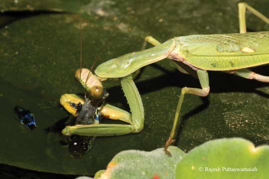
|
Mantis eats guppy.
The figure legend in the article: "Fig. 2. Hierodula tenuidentata eating Poecilia reticulata from the tail while the fish is still alive and breathing in the water. Photo by R. Puttaswamaiah." The mantis is about 5.6 centimeters (2.2 inches) long. This is reduced from Figure 2 of the article. (The mantis is 4-times bigger in the original.) At the lower right, the figure shows the copyright notice by the photographer, Rajesh Puttaswamaiah, who is also an author of the article. The article itself is open access; there is a link to it below, in the usual place. The article is not particularly clear, but giving the photographer and article proper credit is presumably acceptable use. That is indicated for the two supplementary figures posted with the article, but not for the article itself. |
You can't tell from the figure itself, but the mantis had just caught the fish -- from the water.
The scene is an artificial pond, maintained with fish, near a residence (in Bengaluru (Bangalore), India). The photographer observed the action, and recorded some shots over multiple repetitions of the action. The mantis came back, and was seen to catch and eat nine fish over five days.
Mantises have been known to eat many things -- usually things that are presented to them. What's novel here is observing the mantis catching the fish in a natural situation, and eating it -- and doing so repeatedly.
One might wonder... is this artificial pond at a residence actually a "natural" situation? In one sense, it's not. But from the viewpoint of the mantis, perhaps it is. This is not a captive mantis being fed by its keeper. It is a free-living mantis outdoors in a generally natural urban environment. There was plenty of other, more conventional food available. The mantis chose to catch the fish. Why? Curiosity perhaps, at least the first time. Or perhaps this was a pisciphilic mantis. (The authors refer to the environment as "semi-natural.")
This post is of interest for the pictures. There are two photos in the article, and two more posted as supplemental materials at the journal web site (click on the "Data" tab). And there is a fun story. But there is also some good science. The article is based on science's most fundamental activity: observing nature. The author saw something that had not been seen before. It leads to a better understanding of an insect that always seems to fascinate us.
News story: For the First Time, A Praying Mantis Has Been Caught Fishing. (N Scharping, Discover (blog), September 20, 2018.)
The article, which is freely available: The fishing mantid: predation on fish as a new adaptive strategy for praying mantids (Insecta: Mantodea). (R Battiston et al, Journal of Orthoptera Research 27:155, September 20, 2018 (online).) Short and quite readable.
The journal title may lead some to ask... Orthoptera? Loosely, the insect order that includes the grasshoppers. No, mantises are not Orthoptera. The journal includes articles about closely related orders, such as these Mantodea.
* * * * *
More about the feeding behavior of mantises:
* What can we learn by giving a praying mantis 3D glasses while it watches a movie? (March 12, 2016).
* A "flower" that bites -- and eats -- its pollinator (December 27, 2013).More about piscivory:
* A connection between eating fish and skin cancer? (June 20, 2022).
* Microraptor was piscivorous (May 25, 2013).A recent post about making food choices... The nutritional value of yogurt? (September 28, 2018).
October 7, 2018
Transition metals are characterized by having a partial set of d-level electrons. Calcium (atomic number = Z = 20), with an electron configuration of [Ar]4s2, is obviously not a transition metal.
A property of transition metals is that they form complexes with carbon monoxide; these are known as carbonyl complexes. There is a simple pattern to how many CO molecules complex with the metal atom. As an example, Cr (Z = 24) forms a complex Cr(CO)6. For an atom with Z higher by 2, there is one less CO: Fe (Z = 26) forms a complex Fe(CO)5.
For elements in the fourth row of the periodic table, the number of CO in such a complex is given by (36 - Z)/2. 36 is the number of electrons for krypton, the last element of the row. If you want to understand that formula, look at the periodic table.
Going the other way... For an atom with Z lower than Cr by 4, one might expect a complex with 2 more CO. That is, one might predict that calcium (Z = 20) would form the complex Ca(CO)8. However, calcium is not a transition metal, so you would not predict such a complex. In fact, you won't find that complex in your chem book.
So far.
The first figure here, from a recent article, provides evidence for CO complexes with calcium and specifically for that Ca(CO)8 complex...
|
In this work, a preparation of free calcium atoms was reacted with CO. The product was analyzed by infrared (IR) spectroscopy, a common tool for analyzing carbonyl complexes. The specific measurement here focuses on the nature of the CO bond, which is affected by complex formation. The graph at the left shows the result. Five spectra are shown; the experimental variations aren't important for now. The peaks are labeled. You can see the control peak for free CO, near the left, at about 2150 cm-1. The biggest peak (other than free CO), at about 2000, is for Ca(CO)8. This is Figure 1A from the article. |
|
Here is a model of a complex with 8 CO around a central metal atom (M). It is based on theoretical calculations.
The numbers show calculated estimates of the bond lengths, in Angstroms. We'll return to these later. This is Figure 2A from the article. |
The results shown here provide evidence for the complex Ca(CO)8. The scientists also provide evidence for similar complexes with other members of the alkaline earth family, group 2 of the periodic table.
Is there a "catch"?
These are not very "good" complexes.
The bond length between the C (of the CO) and the metal, shown above, is at least 2.6 A. (Three numbers are shown for each bond length. The scientists used three different models to estimate the properties. The agreement is close enough for the main purpose of establishing that these complexes occur.) Typical bond lengths for such a bond in regular CO complexes with transition metals is a little less than 2 A.
One more number... The estimated bond strength for the bond between the C and the M is about 10 kcal per mole. That's about double the strength of a good hydrogen bond. It is about 1/10 the strength of a good covalent bond.
The synthesis was done at 4 K. The various spectra shown above were taken at 13 K or lower. The "solvent" for the work was solid neon.
The long bond length and the low bond energy are related. Both show that the CO is quite weakly bonded to the M here. But it is bonded -- and for calcium and its alkaline earth friends, that is a new finding. Perhaps this is an early step toward a new type of chemistry for these elements.
News story: Chemists show that the 18-electron principle is not limited to transition metals. (B Yirka, Phys.org, August 31, 2018.) Not a particularly good story; it gets some things mixed up, such as 8- and 18-electron rules. Just use this item for a quick overview.
* News story accompanying the article: Organometallics: 18 electrons and counting -- The bonding rule for transition metal complexes now extends to alkaline earth octacarbonyls. (P B Armentrout, Science 361:849, August 31, 2018.)
* The article: Observation of alkaline earth complexes M(CO)8 (M = Ca, Sr, or Ba) that mimic transition metals. (X Wu et al, Science 361:912, August 31, 2018.)
For those who want to count electrons... Ca has two valence electrons. In the complex, it gains two electrons from each of the CO. For 8 CO, that's 16 electrons gained, giving it a total of 18. That's the number of electrons Kr has beyond the previous noble gas Ar.
* * * * *
More unusual bonding: How many atoms can one carbon atom bond to? (January 14, 2017). Links to more.
October 6, 2018
The gene editing tool CRISPR has been a hot story over recent years. It is already a major tool in research labs. Beyond that, there is an obvious goal of using it to treat people with gene defects. As so often with new developments, we are probably being too optimistic about how fast that can proceed.
A pair of recent articles report an interesting finding about the use of CRISPR in cells. It advances our understanding of CRISPR, but it also raises a concern about its use in people.
Let's look at a straightforward experiment...
|
In this experiment, various cell types were edited using a CRISPR system. All the cells carried a defective copy of the gene for green fluorescent protein (GFP).
Successful editing restored the function of GFP. The result, then, is shown on the y-axis as the percentage of GFP+ cells. The first two data sets (left side) are the important ones. You can see that they differ by about two-fold. Why? Look at the labels for the cells. The cells for the left set lack p53. They are genetically homozygous for a defective allele of the p53 gene: p53-/-. The next set of cells is wild type for p53 (+/+). |
|
The third set of cells ("Primary RPE") is another cell preparation that is also p53+. The results are about the same as for the first p53+ line. The final data set (right side) is a control where the CRISPR protein was omitted; a negative control. This is Figure 2a from article 1. | |
So, the main finding is that p53 reduces the frequency of successful CRISPR editing.
That leads to two questions: why? and so what?
The two articles provide considerable information on why p53 affects CRISPR editing. Briefly... CRISPR acts by making a cut in the DNA (at the targeted site). In the natural world, such a cut is a signal to a cell that its genome is damaged. p53 is a key player in that signaling. The presence of p53 induces a damage-response that makes cells unavailable for editing. There are fewer breaks that can go on to become successful edits. (In other words, p53 and CRISPR represent competing pathways. Remove p53, and there are more successful edits.)
So what? Well, there is a connection between loss of p53 and cancer. It's an old -- and common -- finding that cancers often lack p53. (p53 is commonly known as a tumor suppressor.) That lack of p53 relates to the genetic instability that is common with cancers. So the concern? Treat with CRISPR. Cells that lack p53 are more likely to be successfully edited. However, those cells are then more likely to become cancerous.
A new finding and concern. Better understanding is good, but it will take some time to digest the implications. When cells are treated outside of the body, it will be important to screen them to be sure they retain p53 before returning them to the body. And if we get to the point of wanting to do CRISPR treatment in the person, then we will need to think carefully about the implications of these new findings.
A little more background and context... Much lab work is done with "immortalized" cell lines; many of these are derived from cancers. It has been observed for some time that genome editing is less efficient with stem cells than with immortalized cells. The current work shows that p53 is a key difference. The immortalized cell lines often lack p53.
News stories:
* Genome-editing tool could increase cancer risk. (Science Daily, June 11, 2018.)
* Genome-editing tool could increase cancer risk in cells, say researchers. (University of Cambridge, June 11, 2018.) From one of the institutions involved.
* Expert reaction to using CRISPR/Cas9 and potential cancer risk in cells. (Science Media Centre, June 11, 2018.)
* News story accompanying the article: Gene therapy: A path to efficient gene editing. (F D Urnov, Nature Medicine 24:899, July 2018.)
* Two articles, published together:
1) CRISPR-Cas9 genome editing induces a p53- mediated DNA damage response. (E Haapaniemi et al, Nature Medicine 24:927, July 2018.) This article is the main basis of the current post.
2): p53 inhibits CRISPR-Cas9 engineering in human pluripotent stem cells. (R J Ihry et al, Nature Medicine 24:939, July 2018.)
Previous CRISPR post: CRISPR: Making specific base changes -- at the RNA level (February 20, 2018).
A CRISPR post, which includes a complete list of all Musings posts on CRISPR (and other gene editing tools)... CRISPR: an overview (February 15, 2015).
More about p53: Why do elephants have a low incidence of cancer? (March 20, 2016).
For some posts on GFP: Nobel prizes (October 8, 2008). Links to more.
My page for Biotechnology in the News (BITN) -- Other topics includes a section on Cancer. It includes an extensive list of relevant Musings posts.
October 3, 2018
1. Space debris. News feature: The quest to conquer Earth's space junk problem. (A Witze, Nature News, September 5, 2018. In print, with a slightly different tittle: Nature 561:24, September 6, 2018.) A background post: Cleaning up space debris (September 6, 2011). It's still a problem -- and getting worse. The news feature here is a nice update.
2. A newly recognized kind of chemical isomerism. Chemistry students have long learned about cis and trans isomers, and maybe even R and S isomers. But how about parvo and amplo isomers? Those are the terms suggested to describe the two chemical forms resulting from akamptisomerism.
* First new form of isomerism discovered in 50 years will be the last. (K Krämer, Chemistry World, May 22, 2018.) It includes an animated image to illustrate the phenomenon. It also links to the article.
October 2, 2018
You've heard of insulin. It's a small protein (peptide) hormone -- which promotes reproduction. That's the finding of a recent article -- on ants.
Ants have an unusual way of dealing with reproduction. In a typical ant species, one member of the colony -- the queen -- does all the egg-laying. Other members of the colony, known as workers, take care of housekeeping, including "the kids". How this eusocial system came to be is not at all clear.
In the first phase of the new work, the scientists simply looked. Specifically, they looked at gene expression in the brains of reproductive and non-reproductive (brood-caring) members of the colony, over several, diverse ant species. Is there some pattern, which might be a clue to something?
The following figure shows some results...
|
Focus on the graphs on the right side. Each graph is for one ant species, which is labeled and pictured to the left.
Each dot shows the level of ilp2 messenger RNA in the brain of one ant. ilp2 is the gene that codes for the protein ILP2: insulin-like protein 2. Results are shown separately for reproductive (R; left side; blue dots) and non-reproductive (NR; right side; orange) ants. The horizontal bar in each data set shows the mean. You can see that the data sets are rather different for the reproductive and non-reproductive ants in each species. This is part of Figure 1 from the article. |
The results above are for two species, as a sample. The full figure in the article shows results for seven species, along with a phylogenetic tree showing how they are related. The results for each of the seven species showed a difference that was significant (at the p = 0.05 level or better; bar across the top with one * or more).
Why are they showing results for ILP2? Because, of the 5600 genes they examined, it is the only one that showed a consistent difference between the reproductive and non-reproductive ants. This gene, they suggest, is related to reproduction in all ants.
The results above show a correlation between ilp2 expression and reproduction.
The experiment discussed below makes a causal connection.
This experiment was done with an ant species that has a little different system. There is no specialized egg-laying queen. Instead, most individuals can lay eggs, then switch to the non-reproductive -- or "brood care" -- phase. That phase switch is stimulated by the presence of larvae. For the ant species studied here, this behavior is apparently a secondary development; however, it is thought to be like an ancestral, subsocial, type of life cycle.
The ant species for this experiment is Ooceraea biroi, the clonal raider ant. One of the species shown in the top figure, Dinoponera quadriceps, has a similar queenless life cycle; note that the R and NR ants are not distinguished in appearance.
|
In this experiment, individuals in the brood care phase were given ILP2. As a control, some were instead given a portion of that protein, called the B chain.
The y-axis shows the size of the largest oocyte (egg cell) in each ant. That's a sign that the ant has moved toward the reproductive phase. You can see that the control ants (B chain; right-hand side) all had small oocytes; this is typical of the brood care phase. In contrast, ants injected with ILP2 developed large oocytes. This is Figure 3A from the article. |
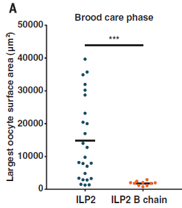
|
That is, ILP2 overrides the presence of larvae, promoting reproduction.
Putting it all together... A survey suggests that the insulin-like peptide ILP2 is of some general importance in distinguishing the reproductive and non-reproductive phases of ants. And in one species where individual animals switch between phases, that peptide is shown to play a major direct role.
It's still an incomplete story, but it is enough to help the authors propose a model -- a working hypothesis -- for how eusociality arose... Might it happen in a population of phase-switching ants that some individuals have unusually high levels of the insulin peptide? Could that be a step toward becoming a queen?
News story: Ant study sheds light on the evolution of workers and queens. (Science Daily, July 26, 2018.)
The article: Social regulation of insulin signaling and the evolution of eusociality in ants. (V Chandra et al, Science 361:398, July 27, 2018.)
Previous post involving insulin: Diabetes: types 1, 2, 3, 4, 5 (March 16, 2018).
Among many posts on ants...
* Ants with skeletons hardened by calcite (January 30, 2021).
* Who cleans up the forest floor? (November 3, 2017).
* Ants: nurses, foragers, and cleaners (May 24, 2013).Other things that affect the caste system in social insects... Drumming affects caste development (March 21, 2011).
There is a section on my page Biotechnology in the News (BITN) -- Other topics for Diabetes. It includes a list of related Musings posts, including "miscellaneous" posts about insulin.
September 30, 2018
What is the relationship between asteroids and planets? Is one a sub-class of the other? Or are they distinct types of objects? It turns out that astronomers' answer to that question changed over time. Why?
The question became prominent a decade ago, when a significant body out in the distant Solar System, which had been a "planet" for 70+ years, was demoted to the status of a "dwarf planet". That was done after a formal debate; the process included the development of rules to define a "planet". The event brought public attention to the field of planetary science.
In a new article, a team of scientists examines the history of classifying Solar System bodies. They are motivated, it seems, by concern about one particular aspect of the new rules.
One characteristic of a planet is based on its intrinsic properties. It should be "big" -- big enough that it forms a nearly spherical body, under the influence of its own gravity. (Many of the familiar asteroids look like broken pieces of something, not "ordinary" round bodies.)
However, the new rules also specify that a "planet" should be "alone". It should have cleared out its region of space, by attracting and collecting nearby smaller bodies. This, too, requires gravity, and therefore bigness. A feature of the original asteroid belt (between Mars and Jupiter) is that there is a zoo of bodies, of a wide range of sizes and shapes. Obviously, no body has succeeded in clearing out the region. In recent years we have come to understand that the region of space containing Pluto, now known as the Kuiper belt, is similarly crowded with diverse bodies. Some argued, then, that bodies in that region cannot be "planets" -- using the asteroid belt as their precedent.
The current authors ask whether the use of asteroids as a precedent here is actually proper. Is it really true, as a matter of history, that the "asteroids" were separated from the "planets" because they failed to clear the area?
The scientists go back to the early days of modern planetary science. They start with the work of William Herschel. They trace the discoveries of Solar System bodies. They examine the terms used to describe them -- and the reasons for the terms. Planets? Minor or small planets (presumably leading to the newer term dwarf planet)? Asteroids? Importantly, they look at how usage of the terms evolved since the early 19th century, as more information became available.
The article is about the nature of the Solar System bodies -- and the history of our discovery and understanding of them. That leads to classification systems. The classification itself is man-made, but the bodies have properties. Those properties are of interest, and we learn about them over time. I encourage those interested in the Solar System to at least browse this article. The Pluto story motivated the work, but the article stands on its own as a well-written and enjoyable tour of history.
News stories:
* New research suggest Pluto should be reclassified as a planet. (Phys.org, September 7, 2018.)
* Pluto is a planet after all, say planetary scientists. (T Puiu, ZME Science, September 10, 2018.)
The article: The Reclassification of Asteroids from Planets to Non-Planets. (P T Metzger et al, Icarus 319:21, February 2019.) There is a "preprint" freely available at ArXiv; I suspect it is very close to the final version.
It's fun to just browse the reference list in the article! And by the way, in the pdf, articles that are online have clickable links. That doesn't ensure that you will have access. However, I think that the four articles by Herschel are all freely available online. If you read the regular web page for the article, try clicking on "CrossRef" or "Scopus" for an item in the reference list to get to it online. At ArXiv, there is no linking to references; putting the title into Google Scholar is a good general approach for finding articles online.
* * * * *
A previous post about the work of William Herschel: The first report of a new planet (March 13, 2011). This was posted 230 years -- to the day -- after the discovery it refers to.
A post about a body that used to be called an asteroid: Ceres is leaking (February 18, 2014).
A recent post about Pluto: Dunes on Pluto? (June 29, 2018).
A book about the Pluto story, by one of the key players, is listed on my page of Book Suggestions: Brown, How I Killed Pluto -- and why it had it coming (2010).
More about asteroids: The first known Vatira (August 3, 2020).
September 28, 2018
Yogurt is thought of as a healthful food. However, a recent article suggests that caution is in order.
A team of scientists looked into the nutrient content of yogurts -- 921 kinds of them available from major supermarket chains in the UK. Their research was to read the labels. The article summarizes what they found.
Here is one data set, as an example...
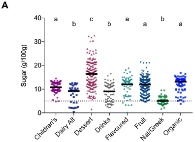
|
The graph shows the sugar content of the various yogurts -- as reported on the labels. "Sugar" refers broadly to the mono- and di-saccharides.
The yogurts are classified by the authors. Results are shown separately for each type. Each point is for one product. In each set, there is a black horizontal line; it shows the median. The dashed line near the bottom is the cut-off for claiming that a product is low-sugar (in the UK). For the categories... "Dairy alt" = dairy alternative. "Nat" = natural. This is Figure 2A from the article. |
A few observations...
- Very few yogurt products are "low-sugar".
- The highest sugar level is for the dessert class. Ok, perhaps there is some logic to that.
- The second highest sugar level is for the organic class. Hm, isn't the organic label supposed to signify higher quality?
- The class of yogurt intended for children is strikingly high in sugar. Hm, aren't we to be extra careful about feeding children nutritious foods? Using the median value for sugar, a single serving of a yogurt might well contribute half of a child's recommended daily intake of sugar.
- The natural/Greek yogurt is strikingly low in sugar.
It turns out that most yogurts have sugar added to them. Why? Well, you can imagine for some cases it just adds to the appeal. It may be reasonable that dessert yogurts are sweet. Beyond that, apparently most people don't like the taste of "plain" yogurt. It is naturally sour, with lactic acid. That's why even organic yogurt has sugar added: it is "necessary" in order to sell it.
Yogurt is a fermented dairy product, produced by the bacterium commonly known as Lactobacillus bulgaricus.
The authors note in the Discussion: "Consumers have been shown to prefer yogurt containing 10%-13% added sugar but may accept products with 7% added sugar while rejecting products with 5% or less added sugars as too sour, or adding sweeteners (caster sugar, jam or honey) themselves before consuming." (From page 8 of the pdf file, in the first new paragraph on right-hand side.)
We could spend a lot of time on the details, but perhaps that is not the best approach here. There are many issues; the sugar data shown above is just one part of the story. The article includes data on multiple nutrients. Further, this is an analysis of the products widely available in one country's grocery stores.
The point is that there is more to a product than image. If you look to yogurt as a healthful food, maybe it is and maybe it isn't. Have you checked the labels for the products you consume?
News stories:
* Sugar content of most supermarket yogurts well above recommended threshold. (Medical Xpress, September 18, 2018.)
* Most supermarket yogurt products contain too much sugar, new study warns. (M Andrei, ZME Science, September 19, 2018.)
The article, which is freely available: Evaluation of the nutrient content of yogurts: a comprehensive survey of yogurt products in the major UK supermarkets. (J B Moore et al, BMJ Open 8:e021387, August 2018.)
Previous posts on yogurt, or on anything with a Bulgarian connection: none.
Added November 19, 2025. Eventually... Ants in your milk? (November 19, 2025).
Among posts about dairy products:
* Cheese-making and horizontal gene transfer in domesticated fungi (January 19, 2016).
* Does it matter what time of day you milk the cow? (December 28, 2015).
* A clinical trial of ice cream (June 2, 2015). Includes a Lactobacillus.Another grocery store survey... DNA evidence in restaurants: is the fish properly labeled? (June 5, 2017). (Includes both restaurants and grocery stores.)
Next post about making food choices... Can an insect catch fish for its dinner? (October 8, 2018).
My page Internet resources: Biology - Miscellaneous contains a section on Nutrition; Food safety. It includes a list of relevant Musings posts.
September 26, 2018
Using graphene as a hair dye. It has merit, and might even be practical.
* News story: Scientists Have Found a Way to Use Graphene As... Hair Dye. (J Bowler, Science Alert, March 17, 2018.)
* The article: Multifunctional Graphene Hair Dye. (Chong Luo et al, Chem 4:784, April 12, 2018.)
- This work is also noted on my page Introduction to Organic and Biochemistry -- Internet resources in the section on Aromatic compounds. That section also contains a list of regular Musings posts on graphene and related topics.
- I learned of this at a "nano" seminar earlier this year by senior author Jiaxing Huang, Professor of Materials Science at Northwestern University. He thinks it is good to explore unusual ideas! Check out his "Teaching stories" page.
September 25, 2018
Yes, that's the idea. But the zipper we are talking about here is the one that keeps fat from being absorbed from the gut into your cells. Or the mouse cells, in this case.
Here's the "bottom line"...
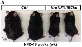
|
Two kinds of mice, fed a high-fat diet (HFD) for 16 weeks.
Control mice on the left ("Ctrl"; wild-type). Mutant mice on the right. We'll discuss what the mutations are later. The mutant mice didn't get as fat. This is Figure 1A from the article. |
Looking inside...
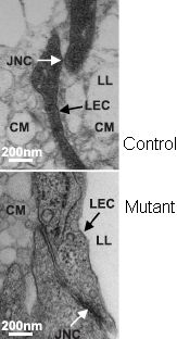
|
These are electron microscope images of the region where fat droplets are absorbed. The gut is on the left; the lymphatic vessel, which will carry the fat away, is on the right.
CM are chylomicrons, a type of fat droplet. JNC is the junction from gut to lymphatic vessel. You can see one in the control mouse (top image; white arrow). No JNC is visible in the mutant mouse (bottom image). You can also see that CM (fat droplets) are in the lacteal lumen (LL) on the right for the control mice. (The lacteals are special features of the lymphatic vessel providing a large surface area for interaction with the gut.) In contrast, no CM are seen in the LL for the mutant mice. The CM are unable to cross the lymphatic endothelial cell (LEC) to get to the LL. This is the right-hand panel of Figure 2G from the article. The full Figure 2G shows more such pairs of images. I have added the labels at the right. |
That is, the mutant mice do not absorb fat droplets from the gut because the channel through which the fat passes is blocked -- zippered up, as they say (this figure). That leads to reduced obesity (previous figure, above).
How'd they do that? What are those mutations? The name of the strain is complicated, but the idea is that two receptors for a growth factor called VEGF-A are removed -- but only in the gut epithelial cells upon a treatment. It's been known that VEGF-A is involved in fat uptake. The work here provides more information about how.
The ability to "knock out" a gene only in certain places at certain times is an interesting trick. One key part of it is an inducible promoter. The scientists add some substance (an "inducer") to activate the knock-out process. That is what determines the "when". Using a promoter that only works in certain tissues restricts the knock-out process to those tissues. The induction leads to a rearrangement of the gene that makes it inactive. It's a planned rearrangement that has to be built into the genome in advance, but it is activated only by adding the inducing agent.
Work with mutations can lead to complex effects. One always wonders whether one is interpreting the effects correctly. As one follow-up, the scientists go on and show that if they interfere with a key step of the zippering process, the result is junction formation and uptake of CM.
Overall, the article represents an advance in understanding fat absorption. This is in mice. What is the relevance to humans? At this point, we don't know. However, it seems likely that a similar process occurs. We're not going to knock out people's genes to keep them from getting fat. (What about extreme cases?) But maybe understanding fat absorption better, including specific proteins that are involved, will allow development of drugs that block the process. That is, the new article may open up new research pathways.
News stories:
* Lab 'failure' leads to potential treatment for obesity. (Medical Xpress, August 10, 2018.)
* Blocking intestinal fat absorption. (C Smith, Naked Scientists, August 14, 2018.) Interview with a scientist in the field, S Virtue from Cambridge University. (Podcast file available.)
* News story accompanying the article: Obesity: Tighter lymphatic junctions prevent obesity -- Zippering of cellular junctions in intestinal lacteals prevents fat uptake. (D M McDonald, Science 361:551, August 10, 2018.)
* The article: Lacteal junction zippering protects against diet-induced obesity. (F Zhang et al, Science 361:599, August 10, 2018.)
Previous post on obesity: Treating obesity: A microneedle patch to induce local fat browning (January 5, 2018).
For more about lipids, see the section of my page Organic/Biochemistry Internet resources on Lipids. It includes a list of related Musings posts, including posts on obesity.
September 23, 2018
Geoengineering is a term applied to possible ways of reducing the impact of climate change. One approach is to introduce sulfate aerosols into the atmosphere. That would disperse incoming sunlight, and reduce the temperature (T) of the Earth. The general effect of such aerosols on T is predictable. Further, experience with volcanic eruptions, which lead to substantial amounts of such aerosols, supports the idea that they reduce T.
However, there is a big caution about using any geoengineering technique. We know relatively little about the overall effect.
A recent article tackles a piece of that bigger problem: What is the overall effect of sulfate aerosols on crops? The article is of interest for the approach. However, it is still a very incomplete story, and the conclusions here should be taken with caution.
The general approach was to look at what happened to crop yields following two major volcanic eruptions. That information was used to predict what would happen if sulfate aerosols were used for geoengineering.
The following figure summarizes the findings...
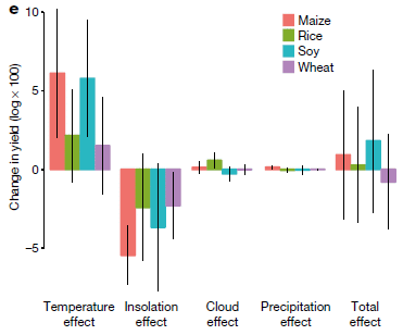
|
The figure shows the impact of various effects of aerosols on four crops.
The four crops are shown with different colors; there is a key at the upper right. The results are qualitatively similar for the four crops, and we will consider them all together here. Four types of effect are shown across the bottom. The final set of bars, at the right, shows the total effect. |
|
General observations... - The "temperature effect" of adding sulfate aerosols is positive. That is, adding the aerosols reduces T and that improves crop yield. That is expected. - The "insolation effect" is negative. We'll come back to this below. - The other two effects shown are negligible. We'll ignore them here. - The total effect is approximately zero, as shown at the right. It's the sum of those four effects to the left. To a good approximation, it is the sum of the first two -- one positive and one negative, and about the same magnitude. The error bars are huge, for the individual effects and for the total. This is Figure 4e from the article. | |
Let's be clear what the claim is. Climate change leads to higher T. That leads to reduced crop yield. (That point is not known a priori, but has been established.) That is the baseline for the current analysis. We now reduce T with the aerosols. The claim here is that there is no net effect of the aerosols on the crop yield -- no net benefit. The lower yields characteristic of the higher T will remain. That is because the aerosols lead to two effects, which balance each other out.
What is this "insolation effect" that reduces crop yield? Insolation refers to the amount of solar radiation; specifically here, it refers to the direct effect of light intensity on photosynthesis. How do sulfate aerosols reduce T? By reflecting sunlight away. That means less energy reaches the Earth surface. But it also means that less sunlight reaches the crop plants. The effect of light intensity on photosynthesis is complex. There is an optimum. Too little sunlight or too much may lead to reduced photosynthesis. Experts have debated whether the reduced sunlight from aerosols would help or hurt photosynthesis. The current work provides some evidence, based on analyzing what happened following two major volcanic events. Within the constraints of this analysis, the reduced light intensity following aerosols leads to reduced photosynthesis.
It is important to distinguish the two effects: temperature and insolation, as they are called here. Both are due to the aerosols reflecting sunlight away. But that reflection has two distinct consequences. One is the effect on T; the other is the effect on the plants. The first is a simple physical effect: less solar energy gets to the Earth. The second is more complicated, as it involves the biology of the plants; that's why the second effect is not easily predicted (and may well vary for different plants and different locations).
What's good about the study is that it is an attempt to address details of what happens when geoengineering is carried out. The big caution is that it is still very limited; one should not try to generalize from the findings here.
The error bars are a clue to some of the limitations of the current study. It is based on two volcanic events. Volcanoes are complex -- as is climate change.
Another limitation is that the article tries to reach a global conclusion. However, climate effects are not uniform, and the effects of sulfate aerosols may well not be either.
Finally, this is not an overall evaluation of aerosols, but rather one aspect. But just doing that is progress.
News stories:
* Assessing the impact of solar geoengineering: strategies to reduce global warming will not prevent crop damage. (S Dunphy, European Scientist, August 9, 2018.)
* Blocking sunlight to cool Earth won't reduce crop damage from global warming. (R Sanders, Universty of California Berekeley, August 8, 2018.) From the lead institution.
An article such as this one attracts a lot of attention. So it may be a good time to remind readers... If you would like more news stories about an article, one little trick is to paste the article title into your search engine, and explore. (For current articles, I often limit the output to the "last year".)
The article: Estimating global agricultural effects of geoengineering using volcanic eruptions. (J Proctor et al, Nature 560:480, August 23, 2018.)
Among many posts on parts of this topic...
* Rise of the Roman Empire: role of an Alaskan volcano? (July 28, 2020).
* Interaction of pollution sources: Can the whole be less than the sum of the parts? (March 9, 2019).
* Climate change and food insecurity (November 11, 2018).
* Aerosols and clouds and cooling? (August 27, 2017).
* Geoengineering: the advantage of putting limestone in the atmosphere (January 20, 2017). An alternative to sulfates.
* Climate engineering: How should we proceed? (March 4, 2015).
* SO2 reduces global warming; where does it come from? (April 9, 2013). Volcano effects.
* Why isn't the temperature rising? (September 12, 2011).
September 21, 2018
A recent article addresses the question, using high speed photography as the basis for quantitative measurements of droplet formation.
Here's an example of a device...
|
The figure shows a sprayer nozzle, with the resulting spray.
The scale bar (lower right) is 2 millimeters. This is Figure 1a from the article. |
So, can one predict the size of the droplets? Sure. Look...
|
The scientists did tests with a variety of different nozzles and conditions. The graph shows the median droplet size D50 (y-axis) from all those tests plotted against the key variable on the x-axis.
The median droplet size is awkwardly shown in meters; the numbers are all to be taken with x10-4, as shown at the top of the axis. That is, the top number on the y-axis scale is 4x10⁻⁴ m. That is 0.4 mm, or 400 µm. You can see that there is a quite good linear relationship. The slope is about 2 (actually, 1.95). This is Figure 6 from the article. |
What is that "key variable" on the x-axis? It is b(α-1/6)(We-1/3).
Those who want the details can check the article. But briefly... b is a measure of the geometry of the nozzle. α is a ratio of densities: ρair/ρliquid. And We is the "Weber number"; it includes various things including the velocity and surface tension of the liquid.
The Weber number is one of those (dimensionless) ratios that engineers use to characterize things. (You may have heard of the Reynolds number.) You can learn a little more about it from the Wikipedia page.
That may seem complicated. It may help to start with the qualitative description: droplet formation from the liquid sheets emerging from the nozzle involves a competition between the inertia of the liquid and its surface tension. We now have a quantitative model for the process. All the parameters are measurable. Thus one can estimate the median drop size for a spray with a given set of conditions. The good fit shown above means that the scientists have a good, widely-applicable model for how drops form. (The authors note some limitations of the model.)
News story: What determines the droplet size in sprays? (A Malewar, Tech Explorist, August 3, 2018.)
The article, which is freely available: What Determines the Drop Size in Sprays? (S Kooij et al, Physical Review X 8:031019, July 20, 2018.)
More about water drops -- including some rain drops, some over two billion years old...
* Speech droplets: Can you transmit an infection to someone by yelling "Stay healthy" at them? (June 14, 2020).
* Water droplets on a trampoline (April 9, 2016).
* The aroma of rain (June 13, 2015).
* Lyell on fossil rain-prints (May 6, 2012). (And the accompanying post, immediately above it.)
* Using music to control a machine (October 17, 2009).
* How big are rain drops? And why? (July 23, 2009).The Reynolds number was mentioned in an earlier fluid mechanics post: What is the proper length for eyelashes -- and why? (March 16, 2015).
As I finished writing this post, I realized that the authorship overlaps with that of the article discussed in a recent post: Why is ice slippery? (September 9, 2018).
September 19, 2018
1. Pressure inside a proton. A team of scientists has measured it. It's about 1035 pascals. That's at the center, and is repulsive, due to the quarks. So what holds the thing together? The strong force.
* News story: Internal pressure of proton is measured for the first time. (T Wogan, Physics World, May 17, 2018.) It links to the article.
* 1035 pascals is about 1030 times the Earth's atmospheric pressure. It is also 1011 yottapascals, using the largest SI prefix available at that time. Metric Prefixes - from yotta to yocto.
* For more about the proton: The proton -- and a 40 attometer mystery (March 17, 2013).
2. A major step towards promoting open access (OA) publishing. We recently noted an example of a funding agency that required OA publication of work it funded. We now have a major development from a consortium of eleven European countries.
* News story: cOAlition S: Making open access a reality by 2020 -- A declaration of commitment by public research funders. (Science Europe, September 4, 2018 (??).)
* Background post; see the part about the article, published in a new journal from the Gates Foundation: Can Wolbachia reduce transmission of mosquito-borne diseases? 3. A field trial, vs dengue (August 10, 2018).
* Update December 2019... cOAlition S is new, and a developing story. The link given above now transfers to a new site for the project. It's a good site, but not what was originally intended with this post. If you would like to see the earlier version, try the Wayback Machine, such as: archive of original page.
September 18, 2018
A map, from a recent article...
|
The darker the blue, the higher the RSSA score.
The darkest blue, representing RSSA >2%, is for the extreme northern lands, plus a scattering elsewhere. The lightest shading, for RSSA near zero, is apparent in northern Africa, some areas immediately to the east, Australia -- and much of the southwestern United States. This is Figure 4A from the article. |
You're suspecting that RSSA has something to do with water? Indeed. It is the river and stream surface area: the percentage of land covered by rivers and streams. (More specifically, it is the percentage of non-glaciated land. There are some other exclusions, noted in the article, with the intent of facilitating comparisons with earlier analyses.)
How do we know? Satellite observations. The work here is based on coverage from the Landsat satellite system.
Overall, the RSSA is about 0.6% (773,000 square kilometers). Interestingly, that is about 50% higher than the previous estimate, reported just five years ago.
Measuring the area covered by rivers is more complicated than it might sound. What do we even mean? The size of a river varies over time. The goal here is to consider the rivers at "mean annual discharge." That requires more than just a picture, but also some understanding of the river's behavior over time. The scientists coupled the Landsat information with field measurements on numerous rivers over time.
From all the information, the authors developed a database containing 58 million measurements of river widths (over about 2 million kilometers of river). It is called the Global River Widths from Landsat (GRWL) Database. Figure 1 of the article shows some of the images, at various resolutions; that figure is included in both news stories listed below.
On the Landsat images, one pixel represents about 30 meters. Rivers and streams narrower than that were estimated with modeling.
Rivers are an important part of the Earth's climate system. RSSA is small compared to lake area, but river surfaces are in motion, and contribute more than their share to exchange of CO2 and other gases with the atmosphere.
The article is an interesting step toward understanding the Earth. The authors await better data from newer observations.
News stories:
* Global Dataset of River Widths Developed from Landsat Imagery. (C Dempsey, GIS Lounge, July 1, 2018.) GIS? That's geographic information systems.
* Global surface area of rivers and streams is 45 percent higher than previously thought. (Phys.org, June 28, 2018.)
* News story accompanying the article: Geology: Measuring Earth's rivers -- Satellite images enable global tally of freshwater ecosystems and resources. (M Palmer & A Ruhi, Science 361:546, August 10, 2018.)
* The article: Global extent of rivers and streams. (G H Allen & T M Pavelsky, Science 361:585, August 10, 2018.)
A recent post about rivers: When rivers (or streams) join, what is the preferred angle between them? (April 18, 2017). Links to more.
Previous post with a map of the world: A world atlas of darkness (July 29, 2016).
More about global water resources: Evaluating the world's water resources (August 11, 2015). Also has a map of the world.
Another map based on satellite observations: Global map of ammonia emissions, as measured from space (January 22, 2019).
September 16, 2018
Phenylketonuria (PKU) is a genetic disease. Affected people are unable to break down the amino acid phenylalanine (Phe), which leads to major toxic effects. The standard treatment is to restrict the diet: restrict the amount of Phe in the diet. That's not easy; Phe is a standard amino acid, found in all natural proteins.
What about other approaches? Well, we might try to fix the genetic defect in the affected people. That's plausible, but not yet practical. Or perhaps we could add back the ability to metabolize Phe in some other way. Maybe we could get the microbes in the gut to do it.
A new article reports doing just that, with encouraging results in both mice and monkeys.
The following figure shows an example of the results, with monkeys.
|
In this experiment, the monkeys were given a big dose of Phe. The Phe dose was labeled, with the hydrogen isotope deuterium; that's what the "d5-Phe" in the key means. The deuterium labeling means that the added dose can be measured separately, without confusing it with any Phe already present.
There are two conditions. In one, the monkeys have been "infected" with the treatment bacteria, called SYNB1618. That strain has been designed to metabolize Phe; it is used here as a probiotic. In the other condition, the control, just the Phe is given. Part e (left) shows the level of the labeled Phe in the blood serum over time. You can see that the presence of the bacteria leads to substantially lower levels of Phe in the serum. Part f (right) shows the level of (urinary) excretion -- of a product derived from metabolizing the Phe. HA stands for hippuric acid; the added bacteria have been designed so that Phe ends up as HA. You can see that the infected monkeys excrete substantial amounts of labeled HA; the control monkeys excrete none. This is part of Figure 6 from the article. |
The results above, along with others in the article, show that the bacteria have promise for treating PKU.
The test shown above is with healthy monkeys. The mouse work included a PKU-model. The general point is that the added bacteria reduce the level of Phe in the blood.
The strain of Escherichia coli used here as the starting point for making the current probiotic is one that has long been used to treat humans. It has an excellent safety record, and does not persist in the treated people for more than a few days. Of course, any specific strain proposed for a treatment would need to undergo safety testing.
Translation of a product such as this from mouse and monkey to human is not trivial. The point is that the results are promising, and further work seems warranted. Testing in humans has begun, and a formal trial with PKU patients is starting.
News stories:
* Synthetic Bacteria Help Treat Phenylketonuria in Mice -- The genetically engineered probiotic, already in clinical trials, may ease patients' strict dietary regimes. (D Kwon, The Scientist, August 17, 2018.) Now archived.
* Have Researchers Developed a Potential Microbial Miracle for Phenylketonuria Patients? (C Jones, Science-Based Medicine, September 7, 2018.) From a pediatrician. A good overview of PKU, with caution about the current story. I find his caution about right. He understands the proposed treatment and the results so far. He just emphasizes that we don't yet know it will be useful in humans. Nothing wrong with doing the tests, but don't assume it will work.
The article: Development of a synthetic live bacterial therapeutic for the human metabolic disease phenylketonuria. (V M Isabella et al, Nature Biotechnology 36:857, September 2018.) The article is from the company developing the treatment.
Previous post about a probiotic: Would a probiotic reduce sepsis in newborn babies? (October 20, 2017).
More on the metabolism of phenylalanine: How bacteria make toluene (May 18, 2018).
Some Musings posts about amino acids are listed on the page Internet Resources for Organic and Biochemistry under Amino acids, proteins, genes.
September 14, 2018
There is a new drug on the scene to treat influenza (flu). A new article reports results from two clinical trials: Phase II and Phase III.
The new drug is called baloxavir marboxil, or just baloxavir. (It's trade name is Xofluza.) In the trials, it was compared not only to a placebo treatment, but also to the current popular drug oseltamivir (Tamiflu).
Use of the new drug soon after getting symptoms shortens the disease course, as judged by symptoms, by about a day. That's about the same as for Tamiflu. That is, both drugs are effective at alleviating the patient's symptoms -- if given very early (within a day or so of the first symptoms).
The second result is a little more interesting, and is shown in the following graph.
|
The graph shows the amount of virus (the "titer") in the patients over time.
The virus titer is shown relative to the baseline value, on day 1. It is shown on a log scale: "-1" means that the virus titer is 1/10 the baseline value. Results are shown for patients treated with the new drug (baloxavir; red triangles) or with the current drug (oseltamivir; blue circles). The main result of interest is the lower levels of virus on days 2 and 3 for those treated with baloxavir. That is, baloxavir appears to inhibit virus production more quickly than does oseltamivir. This should mean that the person is less able to transmit the virus to others. Is the better reduction of virus titer significant? The asterisks indicate that it is by the usual statistical tests. This is one trial, and it is clear that the variability is high. (The error bars show the standard deviations. There are about 350 patients for each drug.) One trial does not prove the case, no matter the statistics for that trial. But for now, all we can do is to present this one trial. This is Figure 3B from the article. |
So, the results suggest that the new drug is better at reducing virus titer, and about as good at reducing symptoms, as the current drug.
But there is another point to be made, which is why baloxavir is of special interest. It is a new type of anti-flu drug. Oseltamivir targets the enzyme neuraminidase, affecting the release of virus particles. Baloxavir affects replication of the viral nucleic acid. Affecting the earlier step is probably good, but simply having drugs with different actions is good. Resistance to the two drugs is likely to be independent; in fact, data so far shows that baloxavir is active against strains that are resistant to oseltamivir. (Resistance to oseltamivir has already been a problem. Resistance to baloxavir was seen in the current studies.) And using two drugs with different action together may sometimes be helpful.
Miscellaneous...
Another advantage of baloxavir... It remains active longer in the body, and can therefore be given as a single dose. In contrast, use of oseltamivir involves taking the drug twice a day for a few days. All else equal, taking a single dose is obviously easier. (I have no information on the cost of the two drugs.)
Baloxavir was approved for use in Japan earlier this year. It is currently being considered for approval in the US.
News stories:
* New single-dose antiviral cuts flu symptoms, viral loads. (S Soucheray CIDRAP, September 5, 2018.)
* New Flu Pill Stopped Influenza Virus Shedding in Just One Day -- Xofluza (baloxavir marboxil) was reported superior to Tamiflu (Oseltamivir). (D W Hackett, Precision Vaccinations, September 6, 2018.)
* News story accompanying the article: A Step Forward in the Treatment of Influenza. (T M Uyeki, New England Journal of Medicine 379:975, September 6, 2018.)
* The article: Baloxavir Marboxil for Uncomplicated Influenza in Adults and Adolescents. (F G Hayden et al, New England Journal of Medicine 379:913, September 6, 2018.)
An earlier post about oseltamivir: Transparency of clinical trials -- Is the flu drug Tamiflu worthless? (May 4, 2014). Be sure to see the follow-up post noted at the end.
Next flu post: Using antibodies from llamas as the basis for a universal flu vaccine? (December 7, 2018).
Many posts on various flu issues are listed on the supplementary page: Musings: Influenza.
Another new antiviral drug: Could we treat COVID by driving it to an error catastrophe? (June 30, 2020). The post is about coronaviruses, but the drug is broadly active against RNA viruses, including influenza.
* * * * *
Follow-up notes...
October 10, 2018...
We now have a press release from the company, with further encouraging results. In particular, they announce results suggesting usefulness in treating the flu in high-risk patients.
* Press release: Positive phase III results for baloxavir marboxil in people at high risk of complications from influenza to be presented at IDWeek 2018. (Roche, October 4, 2018.) Formal publication will presumably follow -- as will FDA consideration.July 17, 2019...
Baloxavir update: activity against diverse flu viruses. A new article reports that it is widely active against not only the common influenza A virus, but also flu viruses of types B, C, and D; this is based on lab testing in cell culture. The article also discusses the details of the target protein from various strains, with some consideration of the implications for drug resistance. Overall, the article extends our knowledge about this new type of flu drug, and is generally encouraging.
* News story: Study says baloxavir fights all 4 flu types, many animal flu viruses. (R Roos, CIDRAP, July 9, 2019.) Links to the article, which is freely available.
September 12, 2018
How did the first people get to the Americas? By crossing the Bering Strait from Siberia to Alaska. Somehow. Musings has noted pieces of the story, but it is hard to get the big picture from individual articles. A new review article tries to provide that big picture, discussing evidence for and against the various models. The general conclusion is that neither of the major proposed routes (inland or coastal) should be excluded from consideration at this point. It is even possible that both routes were used.
* A good news story: The Peopling of the Americas: Evidence for Multiple Models. (C Tarlach, Dead Things (blog at Discover), August 8, 2018.) It links to the article, which is freely available. Background post: Man's migration from Asia to America? Did it really happen by land? (August 16, 2016).
September 11, 2018
Testing of chemicals for safety is a big issue -- with no simple answer. Over recent years there has been an effort to develop computer programs that can predict chemical safety. A new article is a progress report on the effort. It's interesting and promising -- and very complicated.
The following figure illustrates one analysis with the new computer system, which is called Read-Across Structure Activity Relationships (RASAR).
|
The analysis here deals with the property of skin-sensitization. Thousands of chemicals, with known effect, were "tested" by the RASAR program. The program returns a "hazard probability" score, between 0 and 1; that is shown on the x-axis. The y-axis shows the "count" of chemicals with that score.
Results are shown separately for chemicals known to be negative (red bars) and positive (blue bars). As an example, look at hazard probability of 0.25. You can see that about 150 "negatives" gave this score, but only about 50 "positives". More generally, you can see that the distribution for the negatives is shifted toward the left (low scores), whereas the distribution for the positives is toward the right (high scores). This is Figure 6A from the article. (I added the labeling on the x-axis, based on how it is labeled at the bottom of the full figure.) |
That is, the RASAR computer program can predict whether a chemical is or is not a skin sensitizer. Well, sort of.
The important question is whether the quality of the predictions, as illustrated by one example above, is "good", or "worthwhile". One part of the answer is that the program results are similar to the results from animal testing. Such animal testing is now the key source of information about chemical toxicity before humans are exposed. But limitations of such animal testing have long been recognized. No animal is just like a human.
The principle behind the new work is straightforward: chemicals with similar structures are likely to have similar properties. The problem, of course, is working out the details.
The authors have collected toxicity data on about 80,000 chemicals, mainly using publicly available databases. That toxicity data comes from the type of animal testing noted above. They then developed algorithms to calculate the probability that a "new" chemical will show a specific toxic effect. Of course, running the test on known chemicals allows them to test how well their algorithms are doing.
The graph above shows one example of how well it does. Good, but not perfect. In a general sense, that is just like traditional animal testing. In some cases, the computer testing appeared to be correct more often than the animal testing, but it varied.
Computer testing of chemicals is fast, cheap, and safe. Animal testing is slow and expensive, and not safe for the animals used.
It seems likely that people will start using such computer models. A chemical that is considered unsafe by the computer, perhaps by more than one independent computer model, is probably not a good candidate for development. The computer prediction software should also find use in testing the vast number of chemicals that have long been in use without testing. Being fast and cheap and "pretty good" makes it suitable for that use.
Working out the limitations of the computer modeling, and how such tests should be used alongside animal testing, will presumably evolve over time. There is considerable hype about the new work, with some suggesting it is "the answer". However, it does not pretend to be. It only addresses certain tests at this point. And its accuracy, while good, is not understood.
News stories:
* Database analysis more reliable than animal testing for toxic chemicals. (Science Daily, July 11, 2018.)
* Software-Based Chemical Screen Could Minimize Animal Testing -- Researchers develop a machine-learning tool for toxicity analyses that is more consistent in predicting chemical hazards than assays on animals. (A Azvolinsky, The Scientist, July 13, 2018.) Now archived.
The article, which is freely available: Machine Learning of Toxicological Big Data Enables Read-Across Structure Activity Relationships (RASAR) Outperforming Animal Test Reproducibility. (T Luechtefeld et al, Toxicological Sciences 165:198, September 1, 2018.)
Among many posts dealing with toxicity issues...
* Largest field trials yet... Neonicotinoid pesticides may harm bees -- except in Germany; role of fungicide (August 20, 2017).
* Designing a less toxic form of an antibiotic (April 19, 2015).
* A better mouse -- it has a humanized liver (August 12, 2014).
* Is lipstick toxic? (July 2, 2013).
September 9, 2018
Some data, from a recent article...
|
It's a complicated figure. Just look at that "key", in the inner box. One thing at a time.
The x-axis is the temperature (T) -- of ice, There are multiple y-axes and types of things shown. The black-circle data points are for measurements of the friction between a piece of steel and the ice surface. The frictional coefficient μ is shown on the left-hand (black) y-axis scale. You can see that the friction is inversely related to T: less friction as the ice gets closer to melting. (That holds except very near the melting point, where the curve changes direction. We can ignore that. The blue curve relates to this point.) The values for μ at the warmer T are certainly indicative of slipperiness. The red-triangle points relate to the diffusion coefficient (D) of water molecules at the ice surface as a function of T. I say "relate to" because what is actually plotted is the reciprocal, D-1 (or 1/D). See the right-hand (red) y-axis scale. You may already see why they plotted the reciprocal; if not, hang on for a moment. This is Figure 1a from the article. |
Notice that the two sets of data points seem to follow the same curve. What is that curve? It's the green curve, for μd; the equation is shown in the key. It's the equation for something that follows a simple (Arrhenius) activation energy model. The green curve shown there is for an activation energy ΔE = 11.5 kJ/mol.
That's the point. As ice warms up, the surface molecules become more mobile; that's reflected in the higher diffusion coefficient (and lower D-1). That effect seems just enough to explain why the friction between a piece of steel and the ice is also reduced as the ice warms.
As the ice warms, more water molecules on the surface lose one hydrogen bond. That reduces their number of hydrogen bonds from three to two. The more weakly bound molecules with only two H-bonds are responsible for the increased mobility.
(The activation energy noted above is about half the energy of a typical hydrogen bond in the ice.)
The high mobility of surface molecules in "warm" ice has another consequence. Warm ice is self-healing. Scratch the surface, and the scratch will heal within minutes. Figure 3 of the article illustrates this. A deep scratch in ice at -10 °C is almost completely healed within 7 minutes. Unfortunately, they do not show results for any colder T.
Friction between steel and ice? Think ice-skating. You may have heard another explanation offered for why it works. The current work offers a new explanation, and the authors seem to have the numbers to support their case.
News story: A new study reveals why ice gets so slippery - and it wasn't what we expected. (A Micu, ZME Science, May 10, 2018.)
The article, which is freely available: Molecular Insight into the Slipperiness of Ice. (B Weber et al, Journal of Physical Chemistry Letters 9:2838, June 7, 2018.)
Most recent post that included ice: Large organic molecules found on Enceladus (September 7, 2018). That's the post immediately below.
Among other posts about ice:
* A new ice, with the density of liquid water (May 23, 2023).
* Why are some icebergs green? (May 11, 2019).
* Ice in your diamond? (April 23, 2018).
* How rocks travel (November 14, 2014).More from the same lab: What determines the size of liquid droplets from a sprayer? (September 21, 2018).
September 7, 2018
Collect a sample of stuff from deep underground on Enceladus, and run it through the mass spectrometer. A recent article reports the results: large organic molecules.
Here is an example of the mass spec analysis...
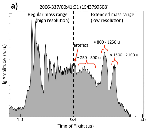
|
The y-axis is the amount detected, in arbitrary units ("a.u." on the axis scale). The x-axis is travel time in the mass spec, a parameter that relates to the mass of the particle. Some actual masses are shown on the figure itself. For example, the big peak on the right side is labeled "1500-2100 u", where u stands for atomic mass unit.
For perspective... Mass 2100 u would correspond to 175 atoms of carbon, if this were pure carbon. If it were an Earthly protein, it would have about 20 amino acids. The extreme right edge of the spectrum corresponds to mass about 8000 u. This is part of Extended Data Figure 5 from the article. (The Extended Data figures are not in the print edition. Figure 1 of the article itself shows the "high-resolution" part of the spectrum, out to 200 u.) |
The analysis here is from the Cassini spacecraft, which spent many years in the Saturn system.
How did the orbiting spacecraft get these samples from deep underground? Enceladus emits plumes of material -- mostly water, but with small amounts of other things from inside the moon.
The emphasis here is on finding high molecular weight material -- "macromolecular organic compounds", as the authors say in the title of the article. What are these compounds? They don't know. The high-mass part of the spectrum (to the right of the vertical dashed line in the figure above) is obtained at low-resolution; exact mass information is not available. However, for the lower mass part of the spectrum (to the left), there is a series of peaks that are about 13 u apart. That suggests almost pure carbon, with a very small amount of hydrogen. Something like benzene, or larger compounds of similar structure.
The plume material that is collected includes ice grains, from the crust. It is likely that the large organic molecules are carried on the ice.
The specific peaks seen in the high-res spectrum make it likely that some of the organic molecules contain O and N atoms.
Some spectra also contain peaks for rhodium. That comes from the collection device on the spacecraft.
There are no big conclusions, beyond finding large C-containing chemicals inside Enceladus. They are the largest organic molecules detected beyond Earth. As so often, we learn about our Solar System neighbors one small step at a time.
News stories:
* Complex organics bubble from the depths of ocean-world Enceladus. (Phys.org, June 28, 2018.)
* Complex Organic Molecules On Saturn's Moon Enceladus. (Heidelberg University, June 28, 2018.) From the lead institution.
The article: Macromolecular organic compounds from the depths of Enceladus. (F Postberg et al, Nature 558:564, June 28, 2018.)
Among posts about Enceladus:
* Briefly noted... Methane and life on Enceladus? (July 21, 2021).
* Is there food on Enceladus? (May 21, 2017).
* Enceladus and its plume (November 17, 2009).More from Cassini: Briefly noted... A river map for Titan (February 9, 2022).
More ice: Why is ice slippery? (September 9, 2018). Immediately above.
More mass spectrometry: Using mass spectrometry to analyze a poem (October 14, 2018).
September 5, 2018
1. How many moons hath Earth? Did you count 2006 RH120? Did you exclude it because it is not in Earth orbit any more? But it was for about 13 months. What about the numerous ones seen over Toronto on February 9, 1913? A recent review article surveys the field -- and suggests that there should be many more, though they largely remain undetected.
* News story: Earth may have 'mini-moons' that could answer some interesting astronomy. (T Puiu, ZME Science, August 16, 2018.) Links to the article, which is freely available. Much of the article is very readable -- and fun. And it includes a beautiful painting of that 1913 event in Toronto. (This is all about natural moons, not manmade ones. The article addresses the problem of distinguishing the two classes.)
* Also see...
- Yesterday: Earth got a new moon in orbit (September 30, 2024).
- Is Kamo'oalewa a piece of the Moon? (February 14, 2022).
- Briefly noted... 2. Earth's second moon (March 4, 2020).
- Formation of the moon: was the Earth surface molten? (June 16, 2019).
2. An update on the use of CRISPR for humans.
* News story: CRISPR Inches Toward the Clinic -- The gene-editing technology is already in trials for some rare conditions, with more human testing on the horizon. (S Williams, The Scientist, August 1, 2018.) Now archived.
* A background post: CRISPR: an overview (February 15, 2015). It includes a complete list of regular Musings posts on CRISPR and other gene-editing tools.
September 4, 2018
Diets low in carbohydrates ("carb") have attracted attention in recent years. There is evidence that they do promote weight loss.
But what about the long-term? A new article looks at the long-term effect of carbohydrate level in the diet. It is part of a larger study, involving thousands of people over 25 years. It uses a simple end-point: all-cause mortality, or death.
The following graph summarizes the results...
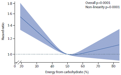
|
The x-axis is the percentage of carbohydrate in the diet. It is expressed here as percent by energy.
The y-axis is the hazard ratio -- the risk of dying. It is shown here relative to the risk at 50% carb in the diet. |
|
The blue line shows the best fit to the data; the shaded band shows a confidence interval. (It's probably 95%, but that isn't clear.) The picture is clear: There is an optimum, at about 50% carb. Mortality is higher at either higher or lower levels of carb. This is Figure 1 from the article. | |
It looks simple. But is it?
The work involved collecting data from 15,000 people over many years. 40% of them died during the study. The results were then analyzed taking into account all the things known about the people. The figure legend offers a clue to the complexity of the analysis: "Results are adjusted for age, sex, race, ARIC test centre, total energy consumption, diabetes, cigarette smoking, physical activity, income level, and education." (ARIC? Stands for the name of the study: Atherosclerosis Risk in Communities.)
Analysis of the ARIC data is the focus of the current article. The authors also did a meta-analysis, combining data from several studies. The big conclusions held over the larger data set. That full data set included 432,179 participants, with 40,181 deaths.
One of the sub-group analyses is striking. When the carb component of the diet is reduced, what replaces it? (Remember, the carb content here is by percent, not total dietary intake.) Less carb means more protein and/or fat. From what? Broadly, from plant or animal sources. Breaking down the overall data set suggests that replacement of carb by animal products leads to greater mortality. In contrast, replacement of carb by plant products leads to slightly reduced mortality. Not all protein or fat is equal. Or maybe it isn't the protein or fat that is the issue, but something else associated with the source. (And not all carb is equal either.)
Human nutrition is a complex and difficult topic. It's complex because we are fundamentally omnivorous, and need many things from our diet. Further, people vary in their metabolism; not everyone has the same nutritional needs or optima. Studying human nutrition is difficult; the current study is huge both in number of people and time. There are questions about the data, such as food intake being based only on self-reporting, and that only at certain times during the long study period.
Overall, the study offers some interesting results, but still raises questions.
News stories:
* Low-carb diets may be cutting years off your life, new study says. (T Puiu, ZME Science, August 17, 2018.)
* Moderate carbohydrate intake may be best for health, study suggests. (Science Daily, August 17, 2018.)
* Expert reaction to study looking at carbohydrate intake and health. (Science Media Centre, August 16, 2018.) Interesting, even amusing. Even the "experts" can get agitated over the topic of human nutrition.
* "Comment" accompanying the article: Evolving evidence about diet and health. (A Mente & S Yusuf, Lancet Public Health 3:e408, September 2018.) A useful overview, with discussion of limitations of the study.
* The article, which is freely available: Dietary carbohydrate intake and mortality: a prospective cohort study and meta-analysis. (S B Seidelmann et al, Lancet Public Health 3:e419, September 2018.) It includes a nice "Research in context" summary (page 2 of the pdf).
A post about a problem with meat: Red meat and heart disease: carnitine, your gut bacteria, and TMAO (May 21, 2013).
Another diet study, for a specific type of low-carb diet: The "paleo diet" -- a trial (August 11, 2019).
A caution about extreme diets... How the giant panda survives on a poor diet (August 2, 2015).
My page Internet resources: Biology - Miscellaneous contains a section on Nutrition; Food safety. It includes a list of related Musings posts.
My page Organic/Biochemistry Internet resources has a section on Carbohydrates. It includes a list of related Musings posts.
Older items are on the page Musings: May-August 2018 (archive).
The main page for current items is Musings.
The first archive page is Musings Archive.
E-mail announcements -- information and sign-up: e-mail announcements. The list is being used only occasionally.
Contact information Site home page
Last update: April 6, 2026