Home
> Musings: Main
> Archive
> Archive for September-December 2012 (this page)
| Introduction
| e-mail announcements
| Contact
Musings: September-December 2012 (archive)
Musings is an informal newsletter mainly highlighting recent science. It is intended as both fun and instructive. Items are posted a few times each week. See the Introduction, listed below, for more information.
If you got here from a search engine... Do a simple text search of this page to find your topic. Searches for a single word (or root) are most likely to work.
Introduction (separate page).
This page:
2012 (September-December)
December 28
December 18
December 12
December 5
November 28
November 20
November 14
November 7
October 31
October 24
October 17
October 10
October 3
September 26
September 19
September 12
September 5
Also see the complete listing of Musings pages, immediately below.
All pages:
Most recent posts
2026
2025
2024
2023:
January-April
May-December
2022:
January-April
May-August
September-December
2021:
January-April
May-August
September-December
2020:
January-April
May-August
September-December
2019:
January-April
May-August
September-December
2018:
January-April
May-August
September-December
2017:
January-April
May-August
September-December
2016:
January-April
May-August
September-December
2015:
January-April
May-August
September-December
2014:
January-April
May-August
September-December
2013:
January-April
May-August
September-December
2012:
January-April
May-August
September-December: this page, see detail above
2011:
January-April
May-August
September-December
2010:
January-June
July-December
2009
2008
Links to external sites will open in a new window.
Archive items may be edited, to condense them a bit or to update links. Some links may require a subscription for full access, but I try to provide at least one useful open source for most items.
Please let me know of any broken links you find -- on my Musings pages or any of my web pages. Personal reports are often the first way I find out about such a problem.
December 28, 2012
Using bacteria to promote self-healing
December 28, 2012
|
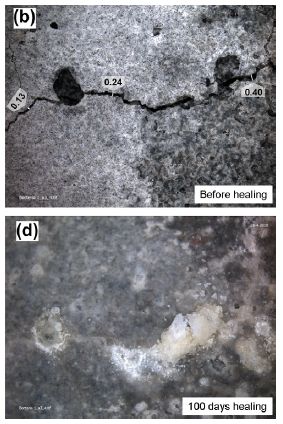
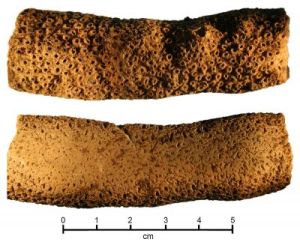
This pair of photos gives the idea.
Part b (upper) shows a piece of concrete with cracks in it. The numbers along the big crack show the width of the crack, in millimeters.
Part d (lower) shows the same piece after 100 days of healing using a new treatment. It may not seem pretty, but for a piece of concrete it is rather good. The cracks are filled in -- even over-filled. (As for "pretty", keep an open mind; more about this below.)
This is Figure 1 parts b & d from the article listed below. The other parts of the Figure show the results for cracked concrete without the treatment. There is some change over time, but not much.
|
The key to the healing treatment is a bacterium with some useful properties. It forms spores, so can lie dormant for years. When exposed to water and some nutrients, the spores germinate; the bacteria can now metabolize, generating CO2 -- which dissolves to form bicarbonate ions (HCO3-). There is calcium ion (Ca2+) around, so calcium carbonate (CaCO3) precipitates. A special feature of these bacteria is that they can thrive in the alkaline environment of concrete.
In real use, the process would look something like this... Bacterial spores plus some extra calcium, in the form of calcium lactate, are included in the mixture used to make the concrete. The spores will normally remain dormant. If a crack forms and water leaks in, the spores will germinate. The bacterial growth will lead to CaCO3, which fills in the crack, thus healing the concrete. The key benefit of the healing is to reduce corrosion of metals within the concrete; the cracks per se have little impact on the strength of the material.
So far, the scientists who developed this process have done lab work, such as shown above. This establishes the idea. Their data shows that healing of cracked concrete is enhanced by adding the bacteria. The BBC news story listed below says that they are about ready to begin real-world testing.
Here is another figure from the article, showing some detail of the healed concrete. Figure 2, parts a to e [link opens in new window]. Part a shows a top view of a region of the healed concrete. Part b shows a side view of the region that is boxed in a. Parts c-e are scanning electron micrographs (SEM) of parts of the region that is boxed in b. You didn't know how pretty concrete could be?
News stories:
* Key test for re-healable concrete. (BBC, October 30, 2012.) This recent news story is what caught my attention, and led me to look for more on the topic. It includes some comments on cost issues.
* Self-healing of Concrete by Bacterial Mineral Precipitation. A good informational page from the lead institution, the Delft University of Technology (TU Delft).
The article: Quantification of crack-healing in novel bacteria-based self-healing concrete. (V Wiktor & H M Jonkers, Cement & Concrete Composites 33:363, August 2011.)
More about concrete... Using the walls of a building as a rechargeable battery? (May 24, 2021).
More about cracks... Africa is falling apart (July 27, 2010). This story is about a big crack, with direct implications for the strength of the material.
Big cat, little cat: Taqpep determines coat pattern
December 27, 2012
|
Two domestic cats.
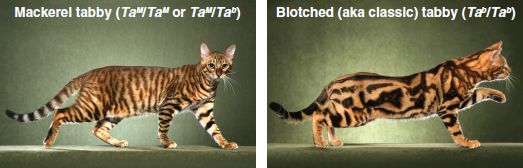
This is Fig 1A from the article listed below.
|
|
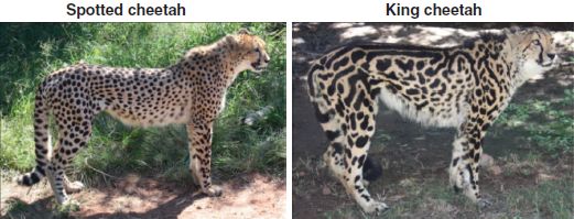
Two cheetahs.
This is Fig 2A from the article.
|
In each pair, the animal on the left has a regular coat pattern. In contrast, the one on the right has a more irregular pattern. Scientists now report that the genetic basis for the difference is the same in both sets of animals.
The figure above for the domestic cats shows that the blotched feature is recessive, occurring only when the cat has two copies of an allele (form of a gene) labeled simply as Tab. The Ta genetic region is poorly characterized.
In the new work, the scientists do a detailed analysis of the chromosomal region for Ta. They find that the mutation associated with Tab is in the gene for the enzyme transmembrane aminopeptidase Q (Taqpep).
Further exploration shows that the rare "king cheetah" (on the right, in Fig 2 above) also carries a mutation in the Taqpep gene. It seems likely that the Taqpep mutation in the cheetahs is responsible for the less regular coat pattern there, just as in the domestic cats. Domestic cats and cheetahs are distinct, though related, animals.
What does Taqpep do? They don't know. Clearly, it is only one part of the story of coat color, one that helps determine the pattern. What's of interest here is finding that it plays a similar role, leading to loss of the more regular coat pattern, in two distinct types of cats.
News story: How the Sub-Saharan Cheetah Got Its Stripes: Californian Feral Cats Help Unlock Biological Secret. (Science Daily, September 20, 2012.)
The article: Specifying and Sustaining Pigmentation Patterns in Domestic and Wild Cats. (C B Kaelin et al, Science 337:1536, September 21, 2012.)
More about cat coats: Monitoring the wildlife: How do you tell black leopards apart? (August 10, 2015).
More about cats:
* What is the purpose of the cat response to silver vine or catnip? (March 22, 2021).
* Loss of ability to taste "sweet" in carnivores (April 6, 2012).
* See cat run (March 14, 2012).
* Quiz: The monkey-cat (October 26, 2011).
* Pet Diary (September 25, 2009).
December 18, 2012
More resin for Christmas through better use of Boswellia
December 17, 2012
|
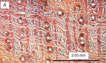
Cross section (stained) of a region of bark from a Boswellia papyrifera tree, from northern Ethiopia.
The white circles are cut ends of resin canals. Tapping into the resin canals allows the frankincense resin to drain out from the tree.
This is Figure 2a from the article listed below.
|
Ethiopia is one of the world's major suppliers of the resin known as frankincense. However, all is not well with frankincense production; the trees are suffering under heavy market demand.
The procedures used to tap the Boswellia trees are based on long traditions. One might guess that they have been adjusted some on the basis of observations about what works best. However, until now, it was apparently all done without any direct knowledge of where the resin is inside the bark. A new article provides some basic plant anatomy that begins to describe resin transport. This work may provide some basis for scientific development of better ways to use the trees. For example, the authors suggest that tapping be aimed into the main region where there are resin canals; this should lead to better retrieval of the resin, with less damage to the surface and therefore less ensuing damage from insects.
News story: Frankincense Collection Can Damage Trees, and Threaten the Livelihoods of Villages Who Depend On Them. (Science Daily, December 10, 2012.) Good overview.
The article, which is freely available: Resin secretory structures of Boswellia papyrifera and implications for frankincense yield. (M Tolera et al, Annals of Botany 111:61, January 2013.)
There are many kinds of Boswellia trees, many kinds of frankincense, and many uses for it. The Wikipedia page is a good introduction and overview for this topic. Wikipedia: Frankincense.
Other Christmas-related Musings posts include:
* A scientific article about Christmas in the journal Atherosclerosis (February 3, 2019).
* A Christmas present: Using concentrated sunlight to split water and CO2 (February 18, 2011).
* A candle for Christmas (December 20, 2010).
* The 12 Psychology Studies of Christmas (December 28, 2009).
What if dung beetles wore boots?
December 14, 2012
It would help keep their feet cool while walking on the hot ground.
Here is how we know...
|
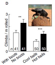
In this experiment, scientists compared beetles with and without boots on their front feet. They measured how often the beetles climbed their dung balls. This is shown, on the y-axis, as climbs per meter of rolling the ball.
Look at the two bars to the left, labeled "With boots" and "No boots". It is clear that the beetles "With boots" (white bar) climbed the balls less often.
The inset shows a picture of a beetle, with its boots, on top of a dung ball. (There is no clear information on size. The paper notes that the dung balls average 3-4 centimeters in diameter.)
This is Figure 1D from the article. (The other two bars are for a different experiment, which we will ignore for a moment.)
|
This is one experiment from a new article exploring the thermal response of dung beetles on the hot South African savannah. The primary finding is that the beetles interrupt pushing their dung ball and climb up on it. The scientists show that this is a response to heat, as sensed by the front feet of the beetles -- the feet that are on the ground during ball pushing (see movie S1 below). For example, the hotter the soil, the more often the beetles climb the ball. The experiment above tests the importance of the front feet in this behavior, by providing boots that insulate the feet.
There is another experiment shown on the graph above. In that experiment, the dung balls are either "cool" (~16 °C) or "hot" (~40 °C). The beetles climb the warm balls more often than the cool ones. It is not clear from this alone, but that is presumably because the cool balls are a better heat sink.
Beetles movies. There are two short videos accompanying the paper. The descriptions below in quotes are from the article. Both movies are also freely available at YouTube. If you haven't seen dung beetles in action, you should at least watch movie S1.
* "Movie S1. Dung beetle rolling its ball on hot ground. On hotter soil, beetles occasionally stop, climb onto their ball and perform a particular preening behaviour during which the front legs are repeatedly brought into contact with the beetles' mouth-parts." Movie S1, YouTube. This video shows the basics of what a dung beetle does. Note that the beetle is upside down while pushing its ball; its head is at the bottom. And its front feet are touching the ground -- which is why the front feet are implicated in the heat problem. Excellent!
* "Movie S2. Thermal video of a dung beetle rolling on hot soil. Infrared thermography shows that during each rolling phase, the surface temperature of the beetles' front legs (protibia) increases by as much as 10 °C and then decreases again when the beetle is on the ball." Movie S2, YouTube. This is an infrared video of the action. It is intended to help you see the temperature issues; there is a key at the lower right. However, it goes too fast to easily understand. If you want to try, focus on the color of the front feet.
News story: Beetles use dung balls to stay cool. (Phys.org, October 22, 2012.) Includes a larger version of the picture shown in the inset above.
The article: Dung beetles use their dung ball as a mobile thermal refuge. (J Smolka et al, Current Biology 22:R863, October 23, 2012.) This is a short paper (2 pages), and very readable. It provides a lot of information about the beetles, in addition to summarizing the experiments. Worth a browse.
More about dung beetles: Dung beetles follow the Milky Way (February 24, 2013).
More about animal thermoregulation:
* Staying warm -- polar-bear style (July 23, 2019).
* Why do koalas hug trees? (June 13, 2014).
More about heat transfer problems: What if your house could sweat when it got hot? (November 30, 2012). More evaporative cooling.
December 12, 2012
A blood test for autism?
December 11, 2012
Read the fine print!
Indeed, a group of scientists from Harvard and collaborating institutions has just reported work on a blood test for autism. It's very interesting, and worthy of serious follow-up. However, news media coverage suggesting that a practical blood test for autism is on the horizon is grossly exaggerated.
What the team did is logically straightforward -- though a tremendous amount of work. They looked at the RNA found in the blood of about 300 children, some of whom were diagnosed as having some type of autism spectrum disorder (ASD). By looking at the RNA, they were looking at which genes were functioning. That is, they were comparing the gene expression profiles (patterns) of children with and without ASD. Statistical analysis showed that there was a difference between the two groups.
Refinement showed that a "signature" based on 55 genes was good at identifying those with ASD. That is, the pattern of activity of 55 genes was able to distinguish those who did or did not have ASD. They then used this signature to predict the ASD status of a second group of children. Their predictions were about 70% right.
There are a lot of details and numbers, but that's basically it. The question is, what does this mean? Is this good news or not?
It's good news as scientific information, but that does not mean it is ready for clinical use in diagnosing ASD.
We might even note that 70% is a low C grade. It reflects some progress, but not a finished product. The authors note that this is the largest study of its type so far. It is promising. Not only does the test in its current form have a meaningful -- though not excellent -- correlation with ordinary clinical diagnosis, but the information about the specific genes involved may well be of interest to scientists studying the nature of ASD.
There are several areas of development that should be pursued. Does the blood test help with early diagnosis of ASD, when used along with the common clinical observations? Is it possible that the blood test can serve as an early test, before behavioral symptoms are recognized? Is it possible that the blood test will help subdivide ASD cases in some way that is useful in guiding treatment? Good questions, worth following up. The paper is of interest. It's just that we shouldn't exaggerate and suggest that they have a practical test at this point.
An interesting tidbit... Their test is for boys. The model is based on data from boys. It works to predict ASD status of boys; it works less well with girls. ASD in girls seems somewhat distinct from ASD in boys; that is not a new finding.
News story: Blood Test? Not Yet. (Autism Policy and Politics, December 7, 2012.) (I am unfamiliar with either the site or the author, but I liked this page as a good view of the work.)
The article, which is freely available: Characteristics and Predictive Value of Blood Transcriptome Signature in Males with Autism Spectrum Disorders. (S W Kong et al, PLoS ONE 7(12):e49475, December 5, 2012.)
* Previous post on autism: A drug treatment for an autism-like condition in mice (November 9, 2012).
* Next: DNA twisting and long genes -- and autism: Are there connections? (November 8, 2013).
A genetic test for autism? See the post Suggested genes for autism challenged (November 18, 2013).
More on autism is on my page Biotechnology in the News (BITN) -- Other topics under Autism. It includes an extensive list of related Musings posts.
Mid-life crisis
December 10, 2012
It's well known that humans tend to show a decline in happiness somewhere in middle age. Various reasons for this have been suggested, but none are accepted as being of general importance.
What about the apes? Do they show a mid-life crisis? A group of scientists has now explored this. They collected extensive information about hundreds of apes (chimpanzees and orangutans) in zoos and sanctuaries around the world. They summarize the data with a well-being score for each ape, and then plot the results as a function of age.
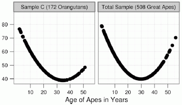
|
The left-hand graph shows the results for a group of orangutans. The right-hand graph shows the combined results for all the apes -- the orangutans plus two groups of chimpanzees.
The y-axis shows a measure of "well-being"; a high score is "better". You can see that both curves are U-shaped, with a low point around age 30.
This is part of Figure 1 from the article. The other parts show the results for the two groups of chimpanzees; those results are similar to the ones shown here.
|
Apes have a mid-life crisis, too. If this result is accepted, it suggests there is something in our basic biology that is leading to the mid-life crisis. Looking only at the stresses of human society may not give us the full story.
Interesting. I wonder what this means.
News story: Evidence of a 'Mid-Life Crisis' in Great Apes. (Science Daily, November 19, 2012.) Cute picture -- and a good overview of the work.
The article, which is freely available: Evidence for a midlife crisis in great apes consistent with the U-shape in human well-being. (A Weiss et al, PNAS 109:19949, December 4, 2012.) Both the beginning and end of the article discuss some of the possible reasons for the mid-life crisis -- some of which certainly are not relevant to the apes. Interestingly, this paper is in the section of the journal for "Economic sciences".
More about apes:
* Re-introducing captive animals into the wild: an orang-utan mix-up (June 27, 2016).
* The smartest chimpanzee? (September 29, 2012).
BPA: Effect on thyroid hormones in pregnant women and babies
December 8, 2012
Bisphenol A (BPA) is an environmental chemical of great controversy. We introduced it in an earlier post [link at end]. A new paper, from UC Berkeley, shows a biological effect of BPA in humans; the significance of the effect is unclear. Overall, the work is an illustration of how difficult it is to deal with low level effects.
The general approach here was observational. The scientific team observed a group of pregnant women, and their babies. They made various measurements. These included the level of BPA in the urine of the mother, and the levels of selected thyroid hormones in mother and child.
|
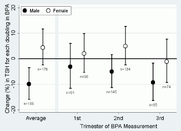
Here is one set of their results.
This graph shows the level of thyroid stimulating hormone (TSH) in the baby -- on a complex scale that we will explain in a moment -- versus the time that BPA was measured in the mother's urine. Results are shown separately for male and female babies.
Let's walk though some parts of this complex graph.
|
To start, look at the right-hand side, where the BPA measurement is for mothers in the 3rd trimester of pregnancy. Look at the result for males (solid circle symbol). It is about -10% according to the scale on the y-axis. What does this mean? It is a measure of how sensitive these babies are to the level of BPA in the mother. Take all the male babies where mother's BPA had been measured in the 3rd trimester, and plot that versus TSH in the baby. The more BPA in the mother, the less TSH in the baby; that general relationship gives the minus sign. The bigger the numeric value, the greater the effect. Yes, it is a complex measurement. If you don't follow all that, the point is that -10% is "bad" -- bad in that the BPA is having the biggest effect in this case.
Now look at the other data for males -- for the 1st and 2nd trimesters. It seems that the effect gets greater the later the BPA measurement is made. The large error bars make the significance questionable, but it may make some sense. BPA is not retained in the body; it is plausible that BPA exposure late in pregnancy may have more effect on the baby than an earlier exposure. (The left hand set of data, labeled "Average", combines all the times -- and ends up not helping much.)
The other part of the graph of interest is the comparison between male and female babies. Female babies seem to show little or no effect. There is some information from animal studies suggesting that females may metabolize the BPA faster than do the males. Whether that is the explanation for what is seen here is not known. In any case, there seems a clear difference between males and females here; that would seem to support that something is going on -- even if it is not clear what.
This is Figure 1 from the article.
|
To summarize their key finding... They show an effect of maternal exposure to BPA on thyroid hormone level in the baby. The effect is greatest for male babies, and best reflects BPA level late in pregnancy. In the paper, they show one more effect; we'll stick with the one discussed above.
What are we to make of this? There are several problems, mostly inherent in the type of study. The authors discuss some of them in the paper. Here are some of the reservations...
* The effects are small -- barely detectable, as you can see from the graph above.
* The effects are small in another sense, which is not shown above. Even though hormone levels varied, apparently related to BPA exposure, the hormone levels were within the range generally considered as normal for most of the people. So what does this mean? It is possible that there is a measurable effect of BPA exposure, but that it is without any biological consequence. It is also possible that our criteria for what is normal are inadequate, and that the small effects seen are important. The current work cannot address that, but the authors note other work that at least suggests there is reason for concern.
In the previous post we noted the controversy about BPA. The new paper provides more data -- about real people with real exposure. The problem is that it is very difficult to prove or disprove small effects. Thus the controversy remains. As you think about the BPA story, or other stories of low dose exposures, try to distinguish what is known for sure vs what remains unclear. Ambiguity is common in the real world; we make decisions based on incomplete evidence. In this case, we -- as individuals or as a society -- need to decide whether to limit the exposure of pregnant women to BPA. We may consider it reasonable that such limitations are warranted, pending further evidence. The caution is that we should not claim that harm has been shown; that would be an improper scientific claim.
News story: BPA Linked to Thyroid Hormone Changes in Pregnant Women, Newborns. (Science Daily, October 4, 2012.)
The article, which is freely available: Maternal Urinary Bisphenol A during Pregnancy and Maternal and Neonatal Thyroid Function in the CHAMACOS Study. (J Chevrier et al, Environmental Health Perspectives 121:138, January 2013.) Link is now to Internet Archive.
Background post: The bisphenol A (BPA) controversy (September 19, 2010).
More about thyroid function... How the giant panda survives on a poor diet (August 2, 2015).
Making big "molecules" from big "atoms"
December 7, 2012
Let's start by looking at some of what was made. We'll then ask why this is interesting and how it was done.
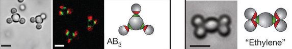
|
The three frames to the left are for one example. The first frame (left side, gray background) is a photograph of two 4-"atom" "molecules" (plus a couple of stray "atoms"). The "molecules" have a central "atom", with three "atoms" attached to it, about equally spaced (120° angles). The second frame (dark background) shows more of them; the colors show that the middle "atom" of each "molecule" is different from the others. The third frame (white background) is a diagram of this type of molecule. In beginning chemistry we call a molecule of this type AB3; that formula means that it contains 3 B atoms surrounding one A atom.
The two frames to the right are for another example. Again, there is a photograph and a diagram.
This is part of Figure 3 from the article. The full figure (which is available below) shows more examples, with various shapes.
|
Why is this of special interest? And what's with all those quotation marks? The photos have scale bars. Those scale bars are all 2 micrometers (µm). Those "atoms" are not atoms; they are about the size of common bacteria! The photos are taken with an ordinary light microscope.
What the scientists have done here is to develop a new way of doing constructions with particles. They took some ideas from the shapes of molecules in basic chemistry, and extended them to larger particles. Chemical shapes are due to atoms forming a specific number of bonds in specific orientations. What they did here was to work out a way to get large particles to show those special bonding features.
How they did this is shown in the following figure.
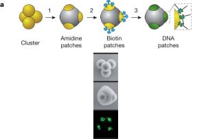
|
The top part of this figure diagrams the process. The lower part (read vertically) shows an example.
They start with particles shown here as yellow balls. In this case, these particles are about 0.5 µm in diameter. These particles have some tendency to stick together. When they do so, they form clusters, such as the 4-cluster shown in the figure (top, left). Importantly the shape of each cluster is not random, but is what one expects from simple geometry. This geometry is behind the shape of simple real molecules, as described by the VSEPR model.
|
They then "fill in" the clusters (step 1), so that just a tip of each underlying particle (yellow ball) remains exposed. The second frame, labeled "amidine patches" shows this (one patch is hidden from view). These patches, at the exposed tips, are the only reactive parts of the cluster remaining. These clusters with their reactive patches (tips) are the "atoms" of their work.
The reactive tips are the basis of further work to form "molecules". The scientists do sequential reactions in steps 2 and 3 to turn these tips into bonding sites that they can make use of to form well-defined structures, such as the "molecules" shown at the top of this post.
The lower part of the figure shows photographs of the 4-cluster. The top frame is the simple cluster; the lower two frames show a cluster after it has been filled in, so that only the reactive patches are exposed.
This is part of Figure 1 from the article. The full figure (which is available below) shows photos for more cluster sizes, from one to seven.
|
Here are full versions of the two figures shown above. All the main ideas are above, but each figure shows more examples.
* Figure 3 [link opens in new window] (This is the top figure above.)
* Figure 1 [link opens in new window] (This is the second figure above.)
What they have achieved here is the ability to form large structures in defined ways from small particles. Importantly, they did not need to intervene in any direct way to get the proper bonding; they made use of geometrical rules -- much as occurs with real atoms. In this work they used particles about the size of bacteria, because that makes them easy to see. However, what they did should be generally useful for various sizes of particles larger than real atoms, whether they might be called nanoparticles or colloids.
News story: Colloidal microparticles that self-assemble into novel 3D structures. (Kurzweil, November 1, 2012.) Now archived.
* News story accompanying the article: Materials science: Self-assembly gets new direction. (M R Jones & C A Mirkin, Nature 491:42, November 1, 2012.)
* The article: Colloids with valence and specific directional bonding. (Y Wang et al, Nature 491:51, November 1, 2012.)
More nano-structures:
* Nanolympiadane: chemical synthesis of the Olympic rings (October 11, 2020).
* Better enzymes through nanoflowers (July 7, 2012).
More about seeing atoms and molecules: Seeing molecules under a microscope (September 19, 2009).
I didn't note this issue above, but the actual linking of the various atoms in the work above was done by using DNA strands. Here is another example of developing technology making use of the complementary nature of DNA strands. Nanorobots: Getting DNA to walk and to carry cargo (August 7, 2010).
More DNA technology: Making an artificial ion channel from DNA (January 8, 2013).
December 5, 2012
Star formation has slowed down
December 4, 2012
If your great joy in life is watching new stars being formed, I have bad news for you. There is not much going on anymore. 95% of all the star formation that will ever occur (in our universe) is behind us.
That's the conclusion of a new article. Aside from the result, it is rather amazing that it is possible to address this at all.
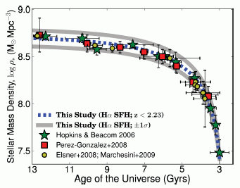
|
Here is a summary of the findings. The graph shows the density of star mass in the universe over time. That's the idea, even if the units are unfamiliar. The y-axis shows the density of stars, in solar masses per cubic parsec. It's a log scale; going from 7.5 to 8.5 means a 10-fold increase in stars. The x-axis is in gigayears; 1 Gyr is a billion (109) years. Note that the time scale runs "backwards"; "13" is "now".
The density of stars used to be low -- back when the universe was only three billion years old (lower right). The star density rose rapidly, and then began to taper off. It has risen rather little over the last four billion years (upper left).
|
The graph includes not only the new results, but also results from other scientists. These are plotted with various symbols, as shown in the key. There is good agreement. The new study provides more information than all the others combined, but overall they all fit together.
This is Figure 11 from the article.
|
What makes this study of particular interest is that it is a single large study, using a single method. As shown above, the results agree with previous work. However, that previous work was done by various people with various methods. These are complex measurements, subject to errors and assumptions. Finding agreement within a large homogeneous data set avoids certain comparisons, and finding agreement between data sets helps to build confidence that all are on the right track.
The data in the paper are about the past. But if they assume that the rate of star formation continues as suggested by the graph above, they estimate that we are at about 95% of the maximum star density that will ever be reached.
News stories:
* Star Formation Slumps to 1/30th of Its Peak. (Science Daily, November 6, 2012.)
* Time-Traveling with One Method Illuminates the Evolution of Star Formation in the Universe. (National Astronomical Observatory of Japan, November 5, 2012.) A press release from one of the participating organizations, the home of the Subaru telescope.
The article: A large Hα survey at z = 2.23, 1.47, 0.84 and 0.40: the 11 Gyr evolution of star-forming galaxies from HiZELS. (D Sobral et al, Monthly Notices of the Royal Astronomical Society 428:1128, January 11, 2013.) A copy of the manuscript as accepted for publication is at: ArXiv.
Another analysis of the rate of star formation, with a different prediction of the future: Most Earth-like (habitable) planets haven't formed yet (October 27, 2015).
More about stars:
* Observing the birth of quadruplets (March 29, 2015).
* Lead-rich stars (August 30, 2013).
* A galaxy far, far away: the story of MACS 1149-JD (October 12, 2012). This focuses on an even earlier era.
Mercury pollution from Arctic melting (February 19, 2019).
Also see: On the testability of scientific models (March 14, 2015).
Space shuttle: some final photos
December 3, 2012
Jakub sends some photos taken by a friend of his at NASA during the final days of the space shuttle at the Kennedy Space Center in Florida. They include various views of Atlantis and Endeavour, as well as observers taking in the scene. We offer them here, with little comment; each of you can provide your own memories.
#1
#2
#3
#4
#5
#6
#7
The shuttle Endeavour soon left for its final home, in Los Angeles. The final part of that trip showed us that the shuttle was not well-suited for traveling the streets of LA. From half-way around the world, Jai sent the following news story: Space shuttle Endeavour makes final journey through streets of LA. (Guardian, October 13, 2012.)
Picture #7 above seems to get attention. One reader wondered if this represented the future of space flight. Jakub has provided a brief comment about #7 [text file; link opens in new window].
Thanks to the contributors noted above -- and especially to the photographer.
Earlier shuttle photos from Jessica and Jakub: A small perk when living in Florida (November 23, 2009).
More on the shuttle: Photography from the space shuttle (June 4, 2012). And more linked there.
Among the achievements of the shuttle was its work with the Hubble Space Telescope (HST). A post about the HST: A galaxy far, far away: the story of MACS 1149-JD (October 12, 2012). And more linked there.
A dengue vaccine trial
December 1, 2012
We have noted some special issues regarding infections by the dengue fever viruses in previous posts [links at end]. In particular, a special feature of the dengue system is that a second infection, with a different strain, may be more deadly than the first -- apparently due to an unusual immune system interaction. This complexity has implications for making an effective vaccine.
We now have a report of the first major clinical trial of a vaccine against dengue fever. To make a long story short, the results are confusing. The vaccine, designed to stimulate antibodies against all four major dengue virus strains, did so. However, protection against infection occurred for only three of them. Once again, it would seem that the immune responses to the dengue viruses are interacting.
What next? There will be extensive episodes of head-scratching by scientists involved in dengue work.
Both the News story and Commentary listed here are rather good for general reading about the issues, without getting bogged down in the details of the trial.
News story: First dengue vaccine clinical trial finds low efficacy. (CIDRAP, September 11, 2012.) Excellent and readable overview. The news source here is one that specializes in infectious diseases.
* Commentary accompanying the article: Dengue vaccine development: a 75% solution? (S B Halstead, Lancet 380:1535, November 3, 2012.) An interesting commentary, by a scientist who works with dengue (but was not involved in this work). He raises the issue of whether a vaccine that provides good protection against three of the four strains might be useful. Given the interactions, he is unable to answer that.
* The article: Protective efficacy of the recombinant, live-attenuated, CYD tetravalent dengue vaccine in Thai schoolchildren: a randomised, controlled phase 2b trial. (A Sabchareon et al, Lancet 380:1559, November 3, 2012.)
Background posts about dengue:
* Dengue fever: an overview (February 28, 2011).
* Dengue fever -- Two strikes and you're out (August 10, 2010).
Follow-up: Dengue vaccine follow-up: Phase 3 trial (September 15, 2014).
More about dengue: A new type of dengue virus (October 27, 2013).
Recent post on vaccines: Does it matter what time of day you get a vaccine? (October 26, 2012).
More on vaccines is on my page Biotechnology in the News (BITN) -- Other topics under Vaccines (general).
What if your house could sweat when it got hot?
November 30, 2012
Well, it would help it stay cool. That's why we sweat, and it works the same way for a building. The evaporation of water requires a considerable amount of heat; that is heat that is carried away from us -- or from the house.
The idea of using evaporative cooling to cool a building is not new. Using passive systems, with no external energy needed to run them, has been considered. After all, it's normal for a material to hold water when it is cool and to release the water when it is hot. A recent article offers an interesting development. In this new work, the scientists use a material that is thermoresponsive; the material undergoes a structural change when it warms up so that it has an enhanced ability to release the water at higher temperature. Here is an example of how it works...
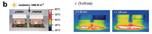
|
Part b (left) shows their set-up. The tiny houses are from model railroad sets; the surface area of each roof is 42 cm2 (about 7 square inches). Each roof is covered with a hydrogel material, which collects and releases water. The one on the left (pHEMA) is an ordinary hydrogel. The one on the right (PNIPAM) undergoes a change at about 32 °C so that it releases water better when warm.
Part c (right) shows infrared pictures of the houses, from the top, at two time points. In both cases, the roof of the house on the right is cooler than the one on the left. (See the color-heat scale next to the houses in part b.)
The figure above is part of Figure 1 from the article. It shows part b, and the bottom frames of part c. (The full part c includes more time points.)
|
These results illustrate the idea. Passive evaporative cooling can help cool a house. Using an improved material that releases water better when warm enhances the cooling.
How does this PNIPAM material work? As noted, it undergoes a structural change when it warms -- a change that makes it more hydrophobic. That is, PNIPAM is hydrophilic at low temperatures -- tending to hold water, and it is hydrophobic at high temperatures -- tending to release the water. The structural change, of course, is reversible.
Is this practical? It's a matter of cost. They address some of the cost issues in the paper. They estimate that a typical house might save 60% in summer cooling costs by using their new material. That also gives a 60% reduction in CO2 emission, by saving electricity. Of course, there are more issues, including the cost of the material, and that includes how long it lasts. They raise some of these points in their discussion.
The optimum situation for their material is when it rains at night, and gets hot in the daytime. What if it doesn't rain? Then you do with the roof what you do with the kids: just spray them down with the garden hose -- a well-known technology. They also note the desirability of developing a material that could usefully extract moisture simply from humid air when it is cool.
News story: Newly developed synthetic mat could one day cool buildings. (Phys.org, October 2, 2012.)
The article: Thermoresponsive Polymer Induced Sweating Surfaces as an Efficient Way to Passively Cool Buildings. (A C C Rotzetter et al, Advanced Materials. 24:5352, October 9, 2012.)
More about sweat:
* A thermal management system, based on carbon nanotubes, for your jacket (May 3, 2019).
* Why some people don't leave fingerprints (September 19, 2011).
More about humidity control: Upsalite: a novel porous material (September 6, 2013).
More about the roof-energy connection: Materials for solar cells (March 10, 2009).
More about heat transfer problems: What if dung beetles wore boots? (December 14, 2012).
More about home building... The back-door gene? (February 9, 2013).
and... How much energy are we saving with energy-saving houses? (February 5, 2017).
There is more about energy on my page Internet Resources for Organic and Biochemistry under Energy resources. It includes a list of some related Musings posts.
November 28, 2012
Quiz: What is it? Answer
November 27, 2012
Why mice don't get typhoid fever
November 26, 2012
There is an important update at the end.
The goal of medical science is to reduce disease. However, sometimes we learn by causing disease. A new article develops a mouse model for a famous deadly disease. The model may be useful in studying the disease in a small animal system. But perhaps most interesting is what they learned while developing the model. Salmonella Typhi, the bacterium that causes typhoid fever, does not normally grow in mice. Why not?
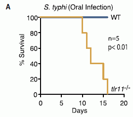
|
Here is one key experiment. Two kinds of mice were infected with the typhoid fever bacteria. One was wild type (WT). The other lacked the Toll-like receptor 11 (tlr11-/-; the symbolism means that it is "minus" for both copies of the gene for TLR11).
The graph shows survival of the mice over time. For the WT mice, survival is 100% over the entire time period. In contrast, the mutant mice died between days 10 and 16.
This is Figure 4A from the article.
|
Thus we see that that the gene for TLR11 is protecting mice from typhoid infection; knock out that gene and the mice become susceptible. What is this TLR11? It's a part of the innate immune system. The various TLRs respond to general signals of pathogens (rather than to specific antigens of specific pathogens), and stimulate a protective response. TLR11 recognizes flagella from bacteria such as Salmonella; hence the mice are protected from typhoid bacteria by TLR11. But that raises a question... If TLR11 is so good at preventing typhoid fever, why do we get the disease? Because humans don't have TLR11. Whatever the reason for that may be, what this paper shows is that a single gene with a well understood function plays a key role in determining that one species is susceptible to the disease and another species is not.
Implications -- beyond the understanding it provides? It should now be possible to test typhoid vaccines in mice. Further, TLR11 and its recognition of flagella may be relevant to other bacteria. The work is also a reminder of the uncertainties inherent in a model system, such as studying an infection in mice. The innate immune system is now recognized as a key player determining the course of an infection. The innate immune system of mice is similar to ours, but has distinct differences. It is important that we become aware of the differences.
News story: Scientists Create First Mouse Model of Typhoid Fever. (Science Daily, October 25, 2012.)
* News story accompanying the article: A Tollgate for Typhoid. (F C Fang & A J Bäumler, Cell 151:473, October 26, 2012.)
* The article: A Mouse Model of Salmonella Typhi Infection. (R Mathur et al, Cell 151:590, October 26, 2012.)
Other posts about the innate immune system and TLRs:
* How Ebola kills: a clue about a key protein (December 5, 2014).
* The role of the immune system in making stem cells (February 8, 2013).
* Does it matter what time of day you get a vaccine? (October 26, 2012).
* Obesity, gut bacteria, and the immune system (May 24, 2010).
And the similar phenomenon in plants... How the tomato plant resists the Cuscuta (November 4, 2016).
More about Salmonella...
* Towards a better understanding of Salmonella infections (May 25, 2012).
* Killer chickens (December 2, 2009).
You may have noticed that the name of the bacteria is written somewhat oddly: Salmonella Typhi. The "Typhi" is not a species name here; it is what is called a serovar. It is a distinct type of bacteria, but not at the species level. Confused? So is the world of microbiology. The classification of Salmonella was reworked a few years ago, and this is what came out. Beyond this case, we should note that the classification schemes for bacteria are often difficult.
Updated March 9, 2016...
A number of labs now report that they disagree with some of the findings in the article discussed above. The authors of that article respond; they defend some of their original findings, but also note that they have had trouble repeating some findings. Interestingly, there is some speculation -- but little real evidence -- that differences in the gut microbiota may be responsible for some of the differences in results.
There is no resolution at this point.
There are two short "Correspondence" items in Cell, the journal that carried the original report. The first is the challenge; the second is a reply by the authors of the original report.
* Absence of TLR11 in Mice Does Not Confer Susceptibility to Salmonella Typhi. (J Song et al, Cell 164:827, February 25, 2016.)
* Mice Lacking TLR11 Exhibit Variable Salmonella typhi Susceptibility. (R Mathur et al, Cell 164:829, February 25, 2016.)
2011: There was less water in the oceans
November 25, 2012
Climate change is a hot topic. A central problem in discussing it is that the effects are hard to measure over the short term, where effects are small, and are confounded by natural variations.
A new article is interesting because of the quality of the measurements it brings to bear on the issues. The scientists show that the ocean level dropped by about a half centimeter in 2011. They show that the lower ocean level was largely due to a loss of water, not to cooling (contraction). And they show that the water lost from the oceans largely ended up in Australia. The work involves multiple high precision measurements. Importantly, it involves showing how well the multiple measurements fit together.
Here is some of what they found...
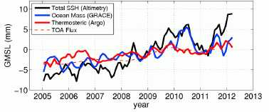
|
Start with the black curve. It shows the global mean sea level (GMSL, y-axis) over a period of several years (x-axis). GMSL is based on direct observation, by satellite-based altimetry. You can see that it fluctuates, but there is an overall upward trend. The trend is about 3 millimeters (mm) per year, over the longer term.
Look at what happened in 2011: there is a large drop in sea level, about 5 mm.
|
Some clarification of the y-axis scale and the labeling... They use the terms global mean sea level (GMSL) and sea surface height (SSH) interchangeably. Note that the y-axis is labeled GMSL, but the key shows SSH for the black line. The y-axis scale is relative change in sea level; it is not clear what zero refers to, but it doesn't matter here.
Why did sea level drop? It could be due to a loss of water (mass), or it could be due to cooling. They have measurements of each of these separately. The blue curve shows the ocean mass, based on gravity measurements; more precisely, it shows the change in GMSL that corresponds to the change in mass. The red curve shows the effect on sea level of changes in ocean temperature. You can see that the blue curve closely tracks the black curve around the 2011 dip. That is, the 2011 dip in sea level is largely due to loss of water from the ocean, not to cooling.
The figure here is the lower frame of Figure 2 from the article.
|
If water was lost from the oceans, where did it go? Onto land, by rainfall. In fact, they can account for the lost water by analyzing rainfall records. Most of it ended up in Australia (and nearby areas, such as Indonesia). Once again, the different types of measurement fit together; this helps build confidence in the individual measurements.
The period in question here is an event known as La Niña. Together with its opposite, El Niño, it is part of the El Niño Southern Oscillation (ENSO) pattern. A La Niña event results in high rainfall in areas such as Australia; that rainfall comes -- ultimately -- from the oceans. That is, La Niña moves water from the oceans to Australia. The 2011 event was an exceptionally large La Niña. Given the extreme event and all the modern instrumentation, they were able to take all these measurements, and show that they are in good agreement with each other, as well as with expectations. That is the big story here. It is a step toward being able to make very precise measurements of the oceans; it is a step toward being able to better understand annual climate variations.
News story: La Nina caused global sea level drop. (Phys.org, October 29, 2012.)
The article: The 2011 La Niña: So strong, the oceans fell. (C Boening et al, Geophysical Research Letters 39:L19602, October 4, 2012.)
The gravity measurements used here were done with the GRACE instrument, which was discussed in the post NASA weighs India, finds it deficient (October 2, 2009).
More... Regional changes in sea level: evidence from gravity measurements (February 26, 2016).
More about oceans, with an implication for climate change:
* Seismologists measure temperature changes in the ocean (October 6, 2020).
* Fertilizing the ocean may lead to reducing atmospheric CO2 (August 24, 2012).
More about oceans... Titan: tides, and the possibility of a sub-surface water ocean (August 4, 2012).
DNA: Watching the hopping supercoils
November 24, 2012
DNA consists of two strands wound around each other to form the familiar double helix. That double helix can itself get twisted, forming what are called supercoils. You may have seen something just like this with telephone cords or such; in fact, it is common to illustrate DNA supercoiling by using phone cords.
In a new article, scientists watch some DNA supercoils. They see that the supercoils move along the DNA chain, and sometimes hop from one place to another.
The following figure gives both the experimental approach and a sample of the results. Once you get the idea, go look at the video listed. The video builds on both parts.
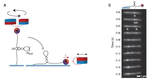
|
Part A (left) diagrams the experimental setup. The left part of A shows the DNA (vertical black line), tethered at the bottom end, with a magnetic bead at the top end (small red/blue ball). Above the DNA-bead are two magnets (red/blue cylinders), which are rotated to twist the molecule prior to the beginning of the observation. Since both ends of the DNA are secured, the molecule responds to the strain of twisting by extruding the supercoil (which is shown as a coiled projection to the side near the middle of the DNA). The right part of A shows the set-up during the measurement. The previously supercoiled DNA is held, with constant tension, by a magnet at the right.
Part C (right) gives a sample of the results -- in one single molecule over time. At each time point, the bright spots (some marked with arrows, to help you get started), show where the supercoils are. You can see that the positions of the supercoils vary. The variation can be accounted for by considering two types of movements. First, a supercoil may move (diffuse) along the chain. Second, a supercoil may "hop" from one place to another. Note that the time points are 0.02 seconds (20 milliseconds) apart.
How are they seeing the supercoils? The DNA is labeled with a "stain" -- in this case, a fluorescent dye. In the region of the supercoil, there is more DNA, hence more of the fluorescent dye; therefore, the supercoil appears as a bright band.
This is Figure 1 parts A & C from the article.
|
This work improves our understanding of the dynamic aspects of DNA. It's hard to know how directly relevant their work is to what DNA does inside cells, but it is a start. What DNA does in the cell is more complex, because the DNA is typically covered with proteins. The proteins will affect the energetics of all these processes. It may well be possible to extend the lab studies to include effects of bound proteins.
Video: Video. (YouTube.) This is the heart of this post. The video includes a nice mixture of diagrams, explanation, and real results. This video is included with both news stories listed below.
News stories:
* DNA with a Twist -- Researchers show that DNA supercoils are dynamic structures that can "hop" long distances, a phenomenon that could affect gene regulation. (The Scientist, September 13, 2012.)
* Research: Hopping DNA supercoils. (Phys.org, September 14, 2012.)
* News story accompanying the article: Biochemistry: A DNA Twist Diffuses and Hops. (M Y Sheinin & M D Wang, Science 338:56, October 5, 2012.)
* The article: Dynamics of DNA Supercoils. (M T J van Loenhout et al, Science 338:94, October 5, 2012.)
Thanks to Borislav for suggesting this item.
The original Watson-Crick paper on the structure of DNA (October 25, 2010). A post about the original description of the DNA structure, with a picture of the double helix.
More about DNA supercoiling: DNA twisting and long genes -- and autism: Are there connections? (November 8, 2013).
A historical -- and personal -- note. The idea of supercoiled DNA originated with two papers from Caltech in 1963 -- nearly a half century ago. They dealt with the unusual properties of the small DNA genome of the polyoma virus. The DNA was sometimes found in compact forms we now recognize as supercoiled. Both DNA strands were circular; this constrained the winding number (loosely, the twist) of the DNA: any changes had to be compensated for by supercoiling. One of the papers was from the lab of Jerry Vinograd, where I had started working, as an undergraduate, about a year before. That paper, freely available, is: The cyclic helix and cyclic coil forms of polyoma viral DNA. (R Weil & J Vinograd, PNAS 50:730, October 1963.) You'll find an electron micrograph of supercoiled polyoma DNA in Figure 5. If you scroll down to the acknowledgments section, you'll see my name mentioned. And reference 5 is my first scientific publication. I noted that there were two papers introducing supercoiled DNA; the other is reference 3; the lead author of that paper is Nobelist Renato Dulbecco, who communicated the Vinograd paper to PNAS.
* Previous history post... Silent Spring -- on its 50th anniversary (October 5, 2012).
* Next... Carl Woese and the archaea (January 12, 2013).
My page Internet resources: Miscellaneous contains a section on Science: history. It includes a list of related Musings posts.
November 20, 2012
Quiz: What is it?
November 20, 2012
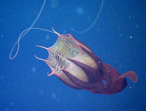
Consider the picture at the right.
Another view [link opens in new window]
1. What is it?
2. What is the thin light strand that wanders around in the upper left of the figure?
3. If you dangled a long sticky rope in the ocean, what do you think you would get?
|
|
Answers (and sources) next week. [See immediately below.]
|
Answer... (Posted November 27, 2012.)
It's the "vampire squid from hell" -- Vampyroteuthis infernalis. Despite its appearance and name, it's a peaceful animal from the depths of the oceans. Perhaps "peaceful" is not the right word; how about "lethargic"? It's lethargic because it lives at such depths that there is little oxygen. It has little energy. Little energy for feeding, and little for avoiding predators. Avoiding predators is not much of a problem; at the depths where this thing lives, there really aren't many predators. As for feeding... Well, it just dangles that long filament out into the ocean, and collects whatever happens to stick. The news stories listed below will give you an idea of what that is. From time to time, it reels in the filament, and effectively licks it clean.
The vampire squid has been known for over a century, but little was known of its life style. Now, scientists from the Monterey Bay Aquarium and Research Institute (MBARI) have observed it, both from deep-diving vessels and in captivity. The mysterious and threatening vampire squid is losing its mystery. And it doesn't seem much of a threat to anyone. And it doesn't eat blood.
News stories:
* Researchers Discover What Vampire Squids Eat: It's Not What You Think. (Science Daily, September 26, 2012.) The main figure above is from this story.
* The vampire squid is a garbage-eater that collects raining rubbish with living fishing lines. (E Yong, Not Exactly Rocket Science, September 25, 2012.) The "Another view" figure is from this story.
The article, which is freely available: Vampire squid: detritivores in the oxygen minimum zone. (H J T Hoving & B H Robison, Proceedings of the Royal Society B 279:4559, November 22, 2012.)
A relative... Briefly noted... X-ray analysis of a remarkably preserved fossil cephalopod, related to the vampire squid (July 20, 2022).
More squid...
* A new brain study (March 3, 2020).
* Captain Nemo anyone? -- Giant squid sighting (January 15, 2013).
More vampires...
* The biological basis of sanguivory (March 2, 2018).
* What can we learn by looking at the DNA in vampire bat feces? (May 27, 2015).
More cephalopods...
* Briefly noted... The Biden octopus (March 22, 2022).
* Sleep stages in octopuses -- do they dream? (July 13, 2021). Includes an extensive list of posts about octopuses and other cephalopods.
* Deceiving a rival male (August 28, 2012).
More from MBARI: See the previous quiz! Quiz: What is it? (October 31, 2012).
Previous quiz: Quiz: What is it? (October 31, 2012).
* Next: A quasi-quiz: The fate of bone and wood on the Antarctic seafloor -- and the discovery of new bone-eating worms (August 20, 2013).
Accumulation of mutations in the sperm of older fathers
November 19, 2012
A child gets half its genes from each parent. If a child has two different alleles (forms) of a particular gene, say A1 and A2 of a particular gene A, we start by assuming that it got one of them from the mother and one from the father. However, it is possible that neither parent originally carried A2, but rather that A2 arose at some point during formation of the gametes (egg or sperm). That is, it is possible that the child carries a new mutation, one that was not part of the previous generation.
How often does that happen? We now have a new article that looks systematically for new mutations in children. How? By determining the complete genome sequence for trios: mother, father, and child. The scientists did this for 78 trios. By comparing the genome sequence of the members of the trio, they determined which alleles were new for the child, and which parent each new mutant allele came from. The results also give us an estimate of the mutation rate in humans -- a better estimate than we have ever had. This is all made possible by the revolution in DNA sequencing, which makes practical a project involving 219 genomes. (Some families had more than one child analyzed. There were even a few cases where they analyzed three generations from the same family.)
What did they find? First, on average, each child had about 60 new mutations. Most of them (about 50) came from the father.
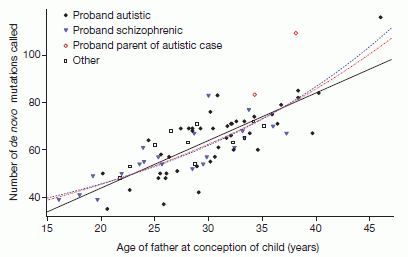
|
Second, the graph at the left shows an interesting effect. It shows the number of new mutations in a child (y-axis) plotted against the father's age (x-axis). (We'll ignore the types of symbols, which separate some of the mutations into classes.)
There is considerable scatter, but there is also a trend. The black line shows a linear trend line through the data. The slope of the line shows that, on average, each additional year of father's age leads to two more mutations in the child.
|
There are a couple of points at high age that might suggest that the mutation rate rises faster at high age. Obviously, there is not enough data here to make much of that, but they do show a couple of fit lines with that possibility included; these are the two dotted lines on the graph.
This is Figure 2 from the article.
|
The results, then, show that the father's role dominates in two ways. First, the father contributes most of the new mutations. Second, the number of new mutations increases with father's age. These effects fit with how gametes are made in the two sexes. Gametes are made continuously by males -- in large numbers; in contrast, females have a substantially complete set of egg cells -- in small numbers -- early in life. That is, there is more DNA replication going on for sperm formation than for egg formation, and it continues to go on for more years.
They also estimate the average mutation rate for humans, based on their data set. It is 1.2x10⁻⁸ per nucleotide per generation. That is about half of previous estimates. It's the best estimate of human mutation rates that we have, but it is a complex issue. They discuss how they find different mutation rates for different parts of the genome. Of course, as soon as they start dividing the data set into subsets, the numbers become smaller and less reliable. The estimate of mutation rate is useful to people trying to understand genetic diversity in the population, but there is much more to learn about it.
You may or may not find all the numbers here very interesting. Maybe they are overwhelming. That's fine. In some sense this project is interesting simply because it was done. It is a major advance toward understanding mutation in the human population. The numbers are inevitably preliminary. More studies of this type are likely, and the numbers will get better. Nevertheless, the main conclusion of the work is that older dads contribute more mutations; that conclusion seems well grounded.
News story: Parental Age, Especially The Father's, Is Linked To Genetic Mutations In The Child. (Alice G Walton, Forbes, August 24, 2012.) (The original news story is no longer available; this is a replacement. May 2022.)
News stories accompanying the article:
* Genetics: Fathers bequeath more mutations as they age. Genome study may explain links between paternal age and conditions such as autism. (E Callaway, Nature 488:439, August 23, 2012.) This item is freely available. Recommended.
* Genetics: The rate of human mutation. (A Kondrashov, Nature 488:467, August 23, 2012.)
The article: Rate of de novo mutations and the importance of father's age to disease risk. (A Kong et al, Nature 488:471, August 23, 2012.)
A post on recent developments in DNA sequencing, leading to major cost reductions: DNA sequencing: an overview of the new technologies (June 22, 2012).
Perspective... DNA sequencing: the future? (November 7, 2017).
A study similar to the current one, but in the context of an accident: Effect of Chernobyl exposure on the rate of new mutations in the next generation (June 1, 2021).
More about the mutation rate in humans, and its consequences: How much of the human genome is functional? (September 1, 2017).
More on human genomes: Genome sequencing of a human fetus (August 25, 2012).
Several posts on personalized, genome-based medicine, are listed at: Personalized medicine: Getting your genes checked (October 27, 2009).
There is more about genomes and sequencing on my page Biotechnology in the News (BITN) - DNA and the genome.
Mothers... Why human egg cells become increasingly defective as the mother ages (June 21, 2016).
File dates and human settlement in Polynesia
November 16, 2012
|
These are the files that are being dated.
The figure is from the news story listed below. It is probably the same as Figure 3. of the article.
|
These files are found on Polynesian islands, associated with the remains of the earliest human settlements. They are sometimes called nail files, but were likely used to smooth or sculpt various construction materials. The upper one is "new"; the lower one is well worn, presumably from use.
The files are made from coral. Therefore, they contain traces of uranium, which is in the ocean and is trapped within the calcium carbonate (CaCO3) skeleton. Uranium, of course, is radioactive, and decays over time. Thus, measurement of the isotopes in the coral-based files tells a story -- a story of the history of human settlement in the area.
What's remarkable in the new work is the precision of the dating. The oldest files are 2838 +/- 8 years old. Thus they date the oldest settlement, in Tonga, to a 16-year interval. By looking at the oldest files found at various locations, with dates ranging over 250 years, they suggest settlement dates for various sites.
The specific dating method is one developed rather recently, called uranium-thorium (U/Th) dating. It's based on measuring two specific isotopes in the complex uranium decay chain -- and on knowing that at "time zero" there was no Th, because it is insoluble in the ocean. That is, when the coral made its CaCO3 skeleton, it incorporated some U from the ocean, but no Th. Th accumulates over time, and the ratio of the specific Th to U isotopes provides an internal calibration.
News story: Coral files reveal time of first Polynesian settlements. (Phys.org, November 7, 2012.)
The article, which is freely available: High Precision U/Th Dating of First Polynesian Settlement. (D Burley et al, PLoS ONE 7(11):e48769, November 7, 2012.)
The precision of dating methods can be elusive. It is one thing to get what appear to be highly reproducible measurements, but it can be another to know exactly what they mean. For example, it seems clear that what is being dated here is when the coral made the skeleton, not when the humans made the files. It is a simple assumption that the humans used the youngest (most accessible) part of the coral, but it is good to note that it is an assumption. Another point we might make here is that one key part of the work is comparing the samples from various sites. If there is some systematic error in the entire work, for reasons we are not aware of, the comparison of samples may well still hold.
More from Tonga: The great Tonga earthquake: how many quakes were there? (September 12, 2010).
More about dating methods -- and their calibration: Tree rings, carbon-14, cosmic rays, and a red crucifix (July 16, 2012).
More about corals:
* Coral bleaching: how some symbionts prevent it (September 30, 2016).
* Can a coral adapt to a more acidic ocean? (September 29, 2013).
* Are the corals listening to the shrimp? (July 16, 2010).
More about uranium and thorium:
* The thorium anomaly: was the Arctic Ocean formerly a body of fresh water? (March 8, 2021).
* Analysis of uranium samples from World War II Germany (November 7, 2015).
This post is listed on my page Introductory Chemistry Internet resources in the section Lanthanoids and actinoids.
November 14, 2012
Alan Turing -- and the music of Iamus
November 14, 2012
We recently noted that 2012 is the centennial anniversary of the birth of Alan Turing [link at the end]. The University of Malaga (Spain) celebrated the Turing centennial with a concert, featuring the music of Iamus.

|
The figure shows Iamus on stage with a piano.
The figure is from the second news story listed below.
|
Below are links to that Malaga concert, and to some related news stories. It's ok to read first or listen first, but given the length of the video, you might want to browse the story first.
In discussing this prior to posting, a couple of us found this an interesting story, but were not particularly impressed by the music. That doesn't down play the feat, but is simply our opinion of the result so far. Perhaps this item is more for curiosity than for musical merit. It does seem that the result depends on what you tell Iamus to do; it is not clear what the rules were here, or what else we might expect from Iamus.
News stories:
* Iamus, classical music's computer composer, live from Malaga -- The first music composed by computer considered good enough for top-class musicians to play is to be performed to mark the 100th anniversary of Alan Turing's birth. (P Ball, Guardian, July 1, 2012.)
* "Algorithmic Rapture": Music Composed by a Computer. (Computing Community Consortium, August 23, 2012.)
The concert: Iamus concert. (YouTube, 30 minutes.) If you get bored with the introductory remarks, skip ahead to 6:32; that gets you to the more specific introduction to the music.
More music by Iamus is available by searching, or by checking the composer's Wikipedia page.
Background post: Alan Turing, computable numbers, and the Turing machine (June 23, 2012).
Among Musings posts on music:
* Stanford Linear Accelerator recovers 18th century musical score (June 22, 2013).
* Spiders and violins (May 4, 2012).
More about computers: A computer model of a cell (January 7, 2013).
There is more about music on my page Internet resources: Miscellaneous in the section Art & Music.
A possible hazard of using compact fluorescent light bulbs
November 13, 2012
Compact fluorescent lights (CFL) are becoming popular because of their energy efficiency, which is about four times better than the old-fashioned incandescent bulbs. However, there is a developing story of a possible hazard from CFL.
First, let's look at the principle behind how any fluorescent light works. The bulb contains mercury (Hg) vapor. Passing an electric current through the Hg causes it to emit light -- in the ultraviolet (UV). The inside of the bulb is coated with a phosphor, which absorbs the UV light and emits visible light. That serves two purposes: it provides the visible light that we want, and it also protects us from the UV light, which is harmful.
What's the problem? Testing shows that most CFL emit UV light -- perhaps enough to be of concern, especially with prolonged exposure at short distances. There have been reports of CFL use aggravating skin diseases. A new paper looks more directly at what the lights can do, under controlled lab conditions.
First, the scientists bought nine CFL bulbs, from ordinary retail shops, and simply tested them for UV emissions, using a light meter. All emitted UV, though they varied widely. They then used the bulb with the highest UV emissions for some further testing. The testing was done with cells from normal human skin.
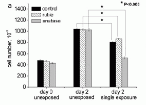
|
Here is an example of their results. It involves growing cells in the lab under various conditions, including with or without irradiation with a CFL. The y-axis shows the number of cells present at day 0 (left set) and day 2 (center and right sets).
Let's start with the black bars. The black bar at the left shows the number of cells present at the start (day 0). The black bar in the center set shows the number of cells present at day 2; substantial growth occurred. The black bar in the right-hand set shows the number of cells at day 2 for a culture that has been exposed to the CFL (under certain conditions, which are detailed in the paper). Comparing the center and right black bars, you can see that the CFL exposure reduced the number of cells present at day 2. This is an example of the basic phenomenon they report: CFL exposure affects the cells.
|
There are two other conditions reported here. They are similar, but involve also exposing the cells to one of two forms of titanium dioxide (TiO2). TiO2 is used in sunscreen products. You can see here that the results with TiO2 are similar, but the effect of the CFL may be larger with one form (anatase). Other data support this; we won't worry about it any more here.
No effect was seen with incandescent bulbs, using the same light intensity.
This is Figure 2a from the article.
|
Thus the work in the new paper shows that CFL bulbs may emit UV light -- enough to have biological effects. Because of the high variability of the bulbs and the artificial lab conditions, it is hard to know how to translate the results to the real world. However, as noted above, other work has implicated CFL in aggravating skin conditions.
What should be done? There are two levels of answer here. One is what the individual consumer should do, and one is what the manufacturers should do.
As to the consumer... It seems likely that there is some risk of UV irradiation from using CFL, and that the risk may be most serious for those who already have a skin disease. On the other hand, the risk seems low. Clearly, it would be a good precaution to avoid long term very close exposure to CFL. CFL that have an outer glass shell (hiding the complex CFL shape, making them look more like incandescent bulbs) may well have less leakage, due to the extra glass providing additional shielding against the UV. And if a CFL bothers you, stop using it!
The best answer would be for the manufacturers to improve the quality of the CFL. The authors suggest what the problem is: the complex curvature of the bulbs makes it hard to apply the phosphor coating. Work is needed to develop an improved process for coating the bulbs. Eliminating the source of the risk is a good strategy. Since multiple papers have shown that there is a problem, I suspect that this will get attention.
News story: Harmful Effects of CFL Bulbs to Skin; Energy-Efficient Bulbs Safest When Placed Behind Additional Glass Cover. (Science Daily, July 18, 2012.)
News story in another journal, on environmental issues. It is freely available: Nonionizing radiation: Ultraviolet Leaks from CFLs. (W Nicole, Environmental Health Perspectives 120:A387, October 1, 2012.) Link is now to Internet Archive.
The article: The Effects of UV Emission from Compact Fluorescent Light Exposure on Human Dermal Fibroblasts and Keratinocytes In Vitro. (T Mironava et al, Photochemistry and Photobiology 88:1497, November 2012.)
There is another hazard associated with CFL: exposure to Hg, which is toxic. This is a distinct issue. In ordinary use, a person would not be exposed to the Hg that is inside the bulb. If there is breakage, the amount of Hg from a single bulb is rather small; although any such exposure is best avoided, exposure to an occasional broken CFL is not a big problem. The Hg content of the CFL is an issue for how the bulbs should be disposed of.
Also see:
* CFL and LED lights: energy-efficient, but toxic (March 3, 2013).
* Light bulbs (July 1, 2009).
More on UV:
* Fish make their own sunscreen (September 29, 2015).
* Fair skin and cancer: What is the connection? (March 12, 2013).
More on mercury: Mercury pollution from Arctic melting (February 19, 2019).
My page of Introductory Chemistry Internet resources includes a section on Lighting: halogen lamps, etc.
Tarantulas in the trees
November 11, 2012
"Cute" is probably not the first adjective that comes to mind when you think of tarantulas. But there are many kinds of tarantulas, and some are rather trim and colorful -- as well as hairy.
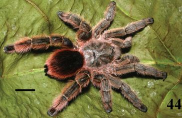
The one to the right is a female Pachistopelma rufonigrum, a tree-dwelling tarantula newly described in Brazil.
|
|
The scale bar (lower left) is 1 centimeter.
This is Figure 44 from the article.
|
This is one of nine new species of arboreal tarantulas reported in a new paper. The trimmer body is presumably an adaptation to the tree-environment.
The science here is the discovery of new species, and learning something about them. But this post may be mainly for the pictures. The article contains 183 figures; many are pictures of the diverse tarantulas of the Brazilian forests. Browse!
News story: Nine Colorful and Endangered Tree-Dwelling Tarantulas Discovered in Brazil. (Science Daily, October 30, 2012.)
The article, which is freely available: Revision, cladistic analysis and biogeography of Typhochlaena C. L. Koch, 1850, Pachistopelma Pocock, 1901 and Iridopelma Pocock, 1901 (Araneae, Theraphosidae, Aviculariinae). (R Bertani, ZooKeys 230:1, October 30, 2012.) Caution... This is a 94-page article -- and a 39 MB pdf file. Much of it is formal description of the various species. Give the file time to load, and browse it for the pictures.
More about tarantulas:
* Why do many tarantulas have blue hair? (March 7, 2016).
* Sharing microbes within the family: kids and dogs (May 14, 2013).
* Bat meets spider (March 29, 2013).
* What else are feet good for? (August 8, 2011).
A recent post about a new spider: Our newest spiders: the cave robbers (September 5, 2012).
More about spiders from Brazil: Spiders in the sky (February 20, 2013).
More from Brazil: Why would a plant have leaves underground? (January 21, 2012).
A drug treatment for an autism-like condition in mice
November 9, 2012
A new paper discusses a rare genetic disease of humans -- a disease that shows some features of autism. The work here uses a mouse model of the disease, and shows that a common drug reverses some of the autism-like symptoms.
The disease is called Dravet's syndrome (DS). It is now known to be caused by a mutation that causes loss of function of a sodium ion channel protein in the brain. Having two copies of the mutant gene (i.e., being homozygous, with total loss of function of the channel protein) is lethal; having one copy (i.e., being heterozygous) leads to various problems, including seizures and a range of social behaviors that are considered autism-like. In fact, the gene (called SCN1A) has been implicated in autism. These general features hold for mice with the corresponding mutations; that is, the mouse model does mimic some key features of the human disease.
The loss of the sodium ion channels disturbs the natural balance between excitation and inhibition of certain neurons. The authors of the new work suggest that a drug known to act to restore that balance might alleviate some of the symptoms. The drug they choose is a well known sedative, called clonazepam (CLZ).
|
Here is an example of what they found when testing CLZ on DS-mice.
The figure shows how the drug affects the behavior of the DS-mutant mice. The two frames are for different behavioral tests. Let's focus on part b, at the left.
|
The y-axis shows the behavioral response of the mice, in a test of their social interactions. (The details of the test are not clear from the paper alone.) The x-axis shows three time points. The middle one is for the treatment with the drug CLZ. The one to the left ("Pre") is before the treatment, and the one to the right ("Post") is after the treatment, by a week (long enough for the drug effect to wear off). There are two curves: one (squares) is for the DS-mutant mice, and one (circles) is for the wild-type mice, as a control.
If you look at the "Pre" results, you can see that the mutant mice score lower than the wild type mice. This reflects the poorer social interactions of the mutant mice. However, with the drug treatment, the two types of mice are similar. That is, the drug seems to have reversed the social deficit of the mutant mice. The final point, after the drug had worn off, is similar to the original "Pre" data, as one would expect.
Part c, at right, is the same idea, but using a different behavioral test. The general picture is about the same. I included part c because the test used here is one that we have noted before: it is the three chamber test, noted in a recent post [link below].
The figure here shows parts b & c from Fig 5 of the article.
|
What do we make of this? First, it is encouraging that they made a prediction, and the results supported it. That suggests that at least some of what we think we understand may be right. Second, mice with DS now have the prospect of a better life.
We want more than that -- but that is all we have for now. Does this drug help human DS patients? It's good to suggest it, but it needs to be tested. Might it help other patients with one or another kind of autism? There is little basis for addressing that at this point; remember that autism is a heterogeneous disease. As so often, we have an interesting result, whose full implications must now be explored.
News story: Low-Dose Sedative Alleviates Autistic-Like Behavior in Mice With Dravet Syndrome Mutation. (Science Daily, August 22, 2012.)
The article: Autistic-like behaviour in Scn1a1/2 mice and rescue by enhanced GABA-mediated neurotransmission. (S Han et al, Nature 489:385, September 20, 2012.)
* Previous post on autism: A mouse carrying a serotonin-transport gene that contributes to human autism (May 18, 2012). This post deals with another gene involved with nervous system function and its relationship to autism. It also presents the three-chamber sociality test.
* Next: A blood test for autism? (December 11, 2012).
More about ion channels: Making an artificial ion channel from DNA (January 8, 2013).
Posts on brains include: Is it possible that mental retardation could be prevented by a simple prenatal treatment? (January 14, 2013).
More on autism is on my page Biotechnology in the News (BITN) -- Other topics under Autism.
November 7, 2012
Cows on Mars?
November 7, 2012
How much methane is there in the atmosphere of Mars? Is there any?
Those are questions that occupy our planetary scientists. Methane is unstable under solar irradiation. If there is any methane present, it implies that there must be some source, replenishing the atmosphere. No good candidate source is known. However, one conceivable source would be life. Thus the question of methane on Mars impinges on the question of life on Mars. (A recent paper suggested that methane in the atmosphere might reasonably be from irradiation of meteorites on the Martian surface. Add this to the list of hypotheticals. But it is the "life" possibility that gets attention, especially at NASA.)
Measurements have been inconclusive. It's hard to measure. A news feature this past June in Science discusses what is known. It includes the various results that have been obtained. For those more technically inclined, it also includes some discussion of the technical difficulties.
And the cows? Well, the cow has become an informal unit to describe the amount of methane production. It lends a light touch to an article that is also very good on scientific grounds.
The Science feature was written with the realization that the new Curiosity rover would soon weigh in on the methane question. Curiosity has now reported its first measurements of methane in the Martian atmosphere. It's answer: none detected. We have little detail, and no formal publication at this point, so we just note the news.
News story: Curiosity Rover Finds No Methane on Mars - Yet. (Space.com, November 2, 2012.) The story cautions us that the result should be taken as preliminary. It also shows a chart of what Curiosity did find in the atmosphere.
NASA announcement NASA'S Curiosity Rover Provides Clues to Changes in Martian Atmosphere. (NASA, November 2, 2012.) This is a broader story about the Curiosity analysis. Among other things, it discusses the sensitivity of the methane analysis. Now archived.
Background news feature: Planetary science: Could a Whiff of Methane Revive The Exploration of Mars? (R A Kerr, Science 336:1500, June 22, 2012.)
Follow-up: Methane on Mars? Follow-up (November 11, 2013).
More: Methane on Mars: a day-night effect (July 12, 2021).
Other posts about Mars:
* Perchlorate on Mars surface, irradiated by UV, is toxic (July 21, 2017).
* Are DNA sequencing devices resistant to radiation? And why might we care? (July 16, 2013).
* NASA: It's InSight, not TiME (August 22, 2012).
More about measuring methane from space: Space-based observation of atmospheric methane -- and the Four Corners methane hotspot (December 29, 2014).
There is more about methane on my page Organic/Biochemistry Internet resources in the section on Alkanes.
More about cows... Reducing asthma: Should the child have a pet, perhaps a cow? (November 28, 2015).
Quiz: What is it? Answer
November 7, 2012
For the answer, see the original post: Quiz: What is it? (October 31, 2012).
A rodent that can't chew
November 5, 2012
It's a defining characteristic of rodents: their teeth. The "dent" part of "rodent" refers to their dentition. Rodents have well developed incisors, which are used for gnawing; rodent incisors wear away and re-grow throughout the life of the animal. And they have an extensive set of molars, for chewing what their incisors have collected.
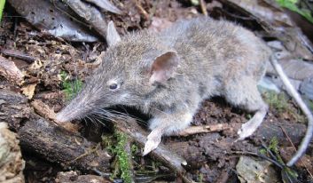
|
And then there is this guy (and yes, it is a guy -- says the article).
This is Figure 1 from the article. (It is probably also the picture used in the news story listed below.)
|
It's a Paucidentomys vermidax, a new species (and genus) of shrew rat. It's a rat (a rodent), but the snout is typical of a shrew, hence its common name. The key feature of this animal is that it has no molars; it is unable to chew anything hard. So what does this rat eat? Probably earthworms and such, for which its snout is ideal. Its rodentian incisors are specialized to scrape them in. Actually, the scientists don't know much about what this particular animal eats, but that seems likely, and is consistent with similar animals. The new genus name means few-toothed mouse; the species name means worm-eater.
There are several known species of shrew rats -- rats with snouts that eat soft food. What makes the new one noteworthy is its total loss of molars. The various shrew rats seem to be unrelated to each other. Each is an independent adaptation to the soft food lifestyle by a particular rodent line. One can easily imagine the co-development of the traits of less teeth and more snout leading to adaptation to eating worms.
News story: Newly discovered rat that can't gnaw or chew. (E Yong, Not Exactly Rocket Science (blog, now at National Geographic), August 21, 2012.) Excellent overview.
The article, which is freely available: Evolutionary novelty in a rat with no molars. (J A Esselstyn et al, Biology Letters 8:990, December 23, 2012.)
More about rats:
* Caltech engineer turns rat into jellyfish (September 22, 2012).
* Rats will free prisoners, and share their chocolate with them (January 18, 2012).
* Rats, bananas, and tuberculosis (March 11, 2011).
* A smart rat (November 30, 2009).
More about teeth:
* Helicoprion -- a fish with 117 teeth, arranged in a spiral (March 9, 2013).
* Growing new teeth (September 29, 2009).
More about shrews: Shrews downsize part of the brain for the winter (March 13, 2021).
Smart sutures
November 3, 2012
What is the purpose of a suture? To hold the loose pieces together while they heal? To measure the temperature of the wound, and heat it to the optimum temperature for healing? To call your doctor if the wound gets infected?
The first of those is routine. We now have work on the second: sutures that carry tiny electronic devices. The devices here are simple: temperature sensors and heaters; the goal is to establish the practicality of the idea of instrumented sutures. Let's look...
|
These pictures show some aspects of these smart sutures. Most are photos of actual devices.
The figure here is Figure 3 parts b and c from the article.
|
A good place to start is the middle frame of part c. It shows one suture strand wrapped around the edge of a glass sheet (a microscope slide). It gives you an idea of the sizes; note for example, the 5 mm scale bar at the upper right. There are red arrows to two platinum (Pt) sensors; the sensors are about 1 millimeter (mm) square. (The Pt sensors are for measuring temperature; the electrical resistance of the device varies with T.) The sensors are about 6 mm apart. Thus a sharp bend is ok; it is between the sensors.
The middle two frames of part b show a suture wrapped around an incision as it would be "in use". Once again, the spacing of the tiny sensors allows substantially free bending.
The scientists tested their temperature-sensing suture material on mice. It apparently worked ok, and gave what appeared to be good temperature readings.
Thus it seems they have made some useful steps in developing smart sutures. One goal of future work is to develop sutures that can deliver drugs -- on demand. What about my final stated goal (at the top of this post), that the suture can call the doctor when needed? That is probably simple enough, but the authors might suggest that the sutures will be so smart, they don't need to call the doctor.
News story: Smart Sutures That Detect Infections -- Plastic or silk threads covered with temperature sensors and micro-heaters could keep tabs on infections and provide therapy. (MIT Technology Review, August 24, 2012.)
The article: Thin, Flexible Sensors and Actuators as 'Instrumented' Surgical Sutures for Targeted Wound Monitoring and Therapy. (D-H Kim et al, Small 8:3263, November 5, 2012.)
Also see: Silk-clothed electronic devices that disappear when you are done with them (October 19, 2012). This post and the current one are based on work, in part, from the same labs.
More on suture materials: How porcupine quills work (January 5, 2013).
More on wound healing and such:
* Fixing the heart with some glue and light (July 27, 2014).
* Targeting growth factors to where they are needed (April 21, 2014).
Golden rice as a source of vitamin A: a clinical trial and a controversy
November 2, 2012
August 18, 2015...
The article that was the basis of this post has been retracted.
The journal retracted the article because of the ethical problems that were noted in the original post and its follow-up, all of which remain below.
Retraction notice... It is freely available from the page for the original article, which is now labeled "retracted". It is also available directly at Retraction notice, Am J Clin Nutr 102:715, September 2015. (The retraction notice was originally posted by the journal in July 2015.) It details the reasons.
News story about the retraction: Golden rice paper pulled after judge rules for journal. (Retraction Watch, July 30, 2015.)
There was a court proceeding in this case. The lead scientist challenged the journal's decision to retract the article. The court denied the request for an injunction to stop the retraction. The court decided on the basis of the journal's freedom to make the decision. That is, the court chose to not get involved. It is important to recognize that the court did not address the merits of the article, either scientific or ethical.
Comments...
Musings posted another retraction notice, with the post: Prejudice against outsiders -- in monkeys (May 10, 2011). The discussion there dealt with some general issues about retractions. Among the most important points... Retractions vary; be sure to read the reasons for a retraction. Be cautious about over-interpreting them; in particular, do not equate retraction with fraud.
The post, below, remains as it was originally, except for updating links.
Vitamin A (retinol) is needed to make the light receptor pigment in our visual system. Lack of vitamin A leads to blindness. (There are other effects, too, as noted in the article.) Beta-carotene (β-carotene), perhaps best known from carrots, is a metabolic precursor to vitamin A; that is, if you eat food containing β-carotene, the body converts it to vitamin A.
Golden rice (GR) is a rice that has been genetically engineered to make β-carotene in rice grains (where it is not normally present). The level of β-carotene is high enough that consumption of GR may provide a substantial portion of the vitamin A that is needed, especially in societies where rice is a staple food. And it is high enough to make the rice a golden yellow.
We now have a clinical trial comparing the effectiveness of GR, spinach, and pure β-carotene as vitamin A sources in children. The trial has also become the subject of an ethics dispute. Let's look at those two parts separately.
The trial
Simple, with a simple result. Groups of children (age 6-8) were given controlled amounts of GR, of spinach, or of pure β-carotene (capsules, in oil). The amount of vitamin A they made from each carotene source was determined. (In each case, the carotene was "labeled", to allow the measurement. The label was deuterium, or 2H, the non-radioactive, heavy isotope of hydrogen.)
The results showed that the children who had GR or pure β-carotene made about 0.5 milligram (mg) of vitamin A from a mg of β-carotene. Those who had spinach made vitamin A about 3-fold less efficiently. (The lower conversion of β-carotene from spinach, or from green leafy vegetables in general, is well-known.) That is, the β-carotene in the GR was used efficiently. We say that it is bio-available.
The result here is consistent with earlier work, including with adult humans. What's new is extending the findings to children. Since the β-carotene in the GR is used efficiently, the authors estimate that a 50 g portion (about 2 ounces) would provide about 60% of a 7-year-old child's daily need for vitamin A. (That 50 g is "dry" -- about a half cup of rice before cooking. It's apparently a typical serving size, and would supply about 200 Calories.) The numbers here are intended for general perspective, not a precise statement about the role for GR.
Strictly speaking, the results apply to Golden Rice grown and prepared as done in this paper. The questions of how nutrient content and "bioavailability" depend on growth and handling hold for any foods.
News story: Genetically modified Golden Rice prevents Vitamin A deficiency and Blindness. (Next Big Future, August 18, 2012.) Note the exaggerated title. This is a short term study of the conversion of the carotene to retinol; there is no direct information here about the long term benefit.
The article: β-Carotene in Golden Rice is as good as β-carotene in oil at providing vitamin A to children. (G Tang et al, American Journal of Clinical Nutrition 96:658, September 2012.) This article has been retracted; see the retraction notice at the top of this post.
The controversy
A charge has been made that the trial was not performed ethically. The charge involves disputed facts. I have no basis for determining the facts, hence no basis for evaluating the charge. The point here is simply to note the charge. Presumably, it will be formally evaluated, and we will hear more at some point.
The trial was a registered clinical trial, and -- according to the paper -- approved by the appropriate officials at the relevant institutions. Evaluation will involve carefully determining what was approved, and whether the approved procedures were actually followed. Evaluating such a charge should not be affected by what one thinks of the work or by the motives of those making the charge.
News story: China Investigates Claims That US Scientists Secretly "Used Chinese Children as Guinea Pigs" in GMO Golden Rice Trial. (Medical Daily, September 11, 2012.) Incidentally, this page has a picture of Golden Rice.
More, October 15, 2013...
Investigations have been conducted. Investigations in both China and the US have found deficiencies in how the trial was carried out. In general, the deficiencies might be classified as minor; no one was endangered, and there seem to be no questions about the results of the trial. However, that should not be considered good enough. Clinical trial standards are high, intentionally. It is important that we follow them. Hopefully, these reports serve to raise the quality of clinical trials. Here is one news story with an overview of the findings: Golden Rice Not So Golden for Tufts. (Science Insider, September 18, 2013.)
The role of vitamin A in vision was noted in the post An unusual eye? (June 6, 2012).
Carotenoids were featured in the post Red and green aphids (June 2, 2010). That post includes some information on the structures of various carotenoids and how they are made.
More... A better understanding of the basis of color vision (February 1, 2013).
A post on another rice modified to have a health benefit: Rotavirus: passive immunization via food (January 10, 2014).
Rice is discussed in many posts, including...
* A perennial rice (March 4, 2023).
* How rice leads to global warming, and what we might do about it (September 2, 2015).
* The rice-arsenic issue: Consumer Reports and the FDA weigh in (September 25, 2012).
In one of the earlier posts about rice and arsenic, the issue of bioavailability was raised -- in the context of a toxic substance. See the post What color is your rice? Rice, diabetes, and arsenic. (December 12, 2010), and go to the section Implications on the supplementary page.
A post that may or may or may not be about GMOs... Who's been genetically engineering the sweet potatoes? (June 28, 2015).
For more on GM crops, see my page BITN: Agricultural biotechnology (GM foods) and Gene therapy.
My page Internet resources: Biology - Miscellaneous contains a section on Nutrition; Food safety.
My page for Biotechnology in the News (BITN) -- Other topics includes a section on Ethical and social issues.
More about vitamins... Vitamin D: How much is too much? (July 9, 2013).
More about clinical trials: Chelation therapy -- a controversial clinical trial (December 13, 2013).
More about spinach... How do vegetables get contaminated? (August 31, 2013).
More about guinea pigs: Chagas: the guinea pig connection (September 15, 2015).
More about capsules: Making chemistry easier: single-serving capsules (October 30, 2015).
October 31, 2012
Quiz: What is it?
October 31, 2012
Answer... (Posted November 7, 2012.)
It's the newly discovered candelabra sponge, Chondrocladia lyra. The species name refers to the shape, reminiscent of a lyre (or harp). It's a beautiful animal. Beyond that, it is noteworthy because of its eating habits. Sponges are typically simple filter feeders, relying on plankton that is carried into its innards. The candelabra sponge is carnivorous. It obviously doesn't have much "innards", but it has many little hooks along its structures; these serve to catch small animals, which are apparently held and digested.
News story: The carnivorous candelabra sponge. (Zen Faulkes, Neurodojo blog, October 18, 2012.) The figure is from this story. It is probably the same as Fig 2D from the article. The full Fig 2 there shows a variety of specimens, with scale bars for some frames. The figure shown here is probably about 60 centimeters wide.
The article: An extraordinary new carnivorous sponge, Chondrocladia lyra, in the new subgenus Symmetrocladia (Demospongiae, Cladorhizidae), from off of northern California, USA. (W L Lee et al, Invertebrate Biology 131:259, December 2012.) The paper is, in part, from two local institutions: the California Academy of Sciences and the Monterey Bay Aquarium Research Institute (MBARI).
The hint picture is from: Sea World. (Top row.) This is a ping pong tree sponge, Chondrocladia lampadiglobus. It is a sister species to the new sponge, and is also carnivorous -- and beautiful. The source page notes that the figure is from Claire Nouvian, whose beautiful book on the deep sea The Deep - The Extraordinary Creatures of the Abyss is listed on my page of Book suggestions: Nouvian. (There is also a picture of one of these in the article, Fig 11C.)
Musings has noted Nouvian's book before -- in another post featuring a strange and beautiful creature of the sea: What is it? (December 28, 2010).
More about sponges and other simple animals:
* Briefly noted... Synapses in a sponge? (February 23, 2022).
* A novel nervous system? (July 20, 2014).
* Theonella's secret: Entotheonella (March 18, 2014).
* Bending a rigid rod (May 17, 2013).
* Bacteria induce simple "pre-animal" to become colonial (September 8, 2012).
* An unusual eye? (June 6, 2012).
* Croatian Tethya beam light to their partners (December 16, 2008)
More from CalAcad... Our newest spiders: the cave robbers (September 5, 2012).
More from MBARI:
* Where are the eyes? (December 16, 2009).
* Quiz: What is it? (November 20, 2012). The next quiz! See the answer.
* Previous quiz: Quiz: What is it? (March 6, 2012).
* Next: Quiz: What is it? (November 20, 2012).
The placebo effect: a mutation that makes some people more likely to respond
October 30, 2012
We have discussed placebo effects before [link at end]. Placebos intrigue and mystify the medical community. We now have a report showing that people with a particular genetic mutation are more susceptible to one kind of placebo effect.
The study involves the disease irritable bowel syndrome (IBS). In fact, it is an old study, on the nature of placebos. What the scientists did here was to go back and do a genetic test on a group of patients from the earlier trial. They had a hypothesis about the role of dopamine in the placebo response; they tested for a particular gene involved in determining dopamine levels.
|
The graph summarizes the results. The bars show the improvement of the patients for various treatments and genetics. There is a lot of data here, so let's go slowly.
The y-axis is a measure of how much the patients improved. Higher score (bigger bar) means more improvement. The x-axis shows three blocks of results, one for each of three "treatments" -- all of which were non-treatments of one kind or another. For each treatment, there are three bars, one for each of the genetic cases. These genetic cases are labeled by the amino acid found at a particular position in an enzyme that helps determine dopamine levels; the amino acid is either methionine (met) or valine (val).
|
Let's start with the right-hand treatment group, labeled "Augmented". These patients received a sham acupuncture treatment, with a practitioner who was very caring. As placebos go, this might be a very good one: an apparent treatment and nice care. The three bars are for the three genetic cases. The result is clear: met/met is best, val/val is worst, and the heterozygote met/val is in between. The more met alleles the person has, the more improvement they show -- even though there was no real treatment.
Now look at the left-hand group, labeled "Waitlist". These patients really received nothing. There is no effect of the genetic difference. Further, those in the "Augmented" group with at least one met allele did better than the "Waitlist" group. This point is important. The "Waitlist" group is a control for the placebo; the lack of effect here shows that the genetic effect relates to the placebo treatment, not just to the people feeling better.
The middle group, labeled "Limited", is intermediate. These people received the sham acupuncture, but in a "cold", business-like manner. There is perhaps some effect of the genetics, but a smaller effect than with the "Augmented" treatment, to the right. (The main findings of the article do not really depend on how you interpret this middle case.)
This is Figure 2 from the article.
|
So that's the story. People with the met mutation are more responsive to a good placebo. The met mutation leads to higher dopamine level. It makes some sense. Of course, making sense does not make it true, but the evidence here is a good start.
What happens next? The first question is simply whether the results here can be repeated. Beyond that, does this work for other conditions, or is IBS a special case? It is now easy enough to test a person for the mutation. I suspect we will see various tests of the result, with different diseases and perhaps different placebos. Long term? Well, simply understanding something is progress. Knowing that certain patients are more likely to be affected by a placebo is useful information. Perhaps people with different mutations will get different treatments. Perhaps dopamine levels should be measured. In clinical trials of new drugs, perhaps
"placebo status" should be taken into account. The article here offers a clue; we'll see what happens.
News story: Genetic Marker for Placebo Response Identified in IBS Patients. (Science Daily, October 23, 2012.) Good overview.
The article, which is freely available: Catechol-O-Methyltransferase val158met Polymorphism Predicts Placebo Effect in Irritable Bowel Syndrome. (K T Hall et al, PLoS ONE 7(10):e48135, October 23, 2012.)
More on placebos:
* Can we predict whether a person will respond to a placebo by looking at the brain? (February 21, 2017).
* Would a placebo work even if you knew? (January 31, 2014). More intriguing results, from the same lab.
* The placebo guy (January 9, 2013). A news feature about one of the lead authors of this work.
* The placebo: What is it? (May 6, 2011). Of course, placebos have been mentioned in various posts involving tests.
More about dopamine: A connection: an endogenous retrovirus in the human genome and drug addiction? (October 29, 2018).
Why you shouldn't frighten the grasshoppers
October 29, 2012
If the grasshoppers are frightened, it messes up the whole ecosystem. Frightened grasshoppers change their diet, and -- after they die -- are not as good "fertilizer" for the soil. As a result, decomposition of the plant litter is slower. A new paper makes that case, and provides evidence for steps along that path.
|
The graph shows the degradation of leaf litter (y-axis) over time (x-axis). There are two conditions. In both cases the leaf litter includes decomposed grasshoppers. In one case the grasshoppers had been raised with spiders -- modified so that they could not actually eat the grasshoppers. This is the case shown with the red curve, labeled "Predator". It is the condition they regard as "frightened grasshoppers", since they were continually exposed to -- and threatened by -- the predator spiders. The other case (black curve) is the "Control" grasshoppers, grown without the fearsome spiders.
|
The result is clear: the frightened grasshoppers lead to considerably lower degradation of the leaf litter.
The degradation of the grasshoppers themselves, which preceded measuring the leaf litter, was the same for both cases. (This is shown in Fig 1A in the paper.) That is, the frightened grasshoppers degraded about as rapidly as the control grasshoppers, but they promoted less degradation of the leaf litter.
This is Figure 1B from the article.
|
What's going on? The authors offer a hypothesis (a "working model"), with some evidence for parts of it. Their basic proposal is that the stressed grasshoppers alter their diet (consuming more carbohydrates and less protein) when they are stressed. If the chemical composition of the grasshoppers is different, then it follows that the effect of decomposed grasshoppers on the next step, the leaf litter decomposition, might be different.
There is nothing here about "good" and "bad", and there is nothing here about what "should" happen, or what is "natural". (It's natural for grasshoppers to have to deal with spiders, but the situation here is extreme!) Whether you buy the whole story or not, there is something going on here, and it impacts the complex ecosystem, which has more interconnections than we might have realized. This article reveals some of that complexity. But if you do find any spiders around the yard with their mouths glued shut, get rid of them; they are not "natural", and they could mess up the whole ecosystem.
News story: Grasshoppers Frightened by Spiders Affect Whole Ecosystem. (Science Daily, June 14, 2012.)
The article: Fear of Predation Slows Plant-Litter Decomposition. (D Hawlena et al, Science 336:1434, June 15, 2012.) The first page or so is a good overview of how they view their system. (Caution: If you start looking at their data in detail... They have a somewhat odd way of presenting the data. It leads to making effects perhaps look bigger than we might consider them (and to occasional negative values when that would seem impossible). It may be odd, but it is ok, and is clear in the figure legends.)
More about the underground: Transparent soil (October 13, 2012).
More about ecosystems: On restoring ecosystems: priorities? (December 5, 2020).
An extraterrestrial god: follow-up
October 28, 2012
Original post: An extraterrestrial god (October 9, 2012). Briefly, the post described a meteorite that had become an object of art. The scientific point was about the identification of the meteorite. The story of its historical and cultural aspects, murky in the article and noted in the post, provided an interesting context.
We now have a news story claiming that the art aspect of the object was incorrect, probably a fraud. The story links to a report from an expert in the cultural aspects. That report is intended as scholarly work, but is not yet formally reviewed or published. If you are interested in the art issues, look over the new article, but keep an open mind pending further information.
There seems no suggestion that the authors of the earlier paper were in any way involved with the alleged fraud, and there is no suggestion that the scientific work in the article -- presented in part in the post -- is wrong in any way.
I will add this new information to the original post.
News story: Meteorite Nazi Buddha Exposed as Likely Fake. (Der Spiegel, October 23, 2012.)
Does it matter what time of day you get a vaccine?
October 26, 2012
Let's look. We'll start with a simple picture, and add to it as we find it helpful.
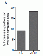
|
This figure shows a measure of the immune response to a vaccine as a function of the time of day the vaccine was given. The response is measured four weeks after the vaccine was given. There is a clear difference. Since there is a time-of-day effect, let's look more carefully at what is going on in this experiment.
This is Figure 4A from the article.
|
First, let's clarify what the graph shows. In this work, mice were given a vaccine. Two groups were given the vaccine at different times of day, denoted on the x-axis as ZT7 and ZT19. Without worrying about their ZT system, the numbers are hours through the day. That is, the two vaccine times are 12 hours apart. (The mice were also given a booster shot at two weeks, each group getting the booster at their proper time of day.) Then, at four weeks, immune system cells were collected from the mice, and stimulated in vitro with the antigen. (The "antigen" is what the mice were vaccinated against.) The y-axis shows the amount of growth of the immune cells after stimulation by the antigen. The graph shows that the two groups of mice differed by about 2-fold in the observed result. The time of day of the vaccination matters -- four weeks later.
Since we seem to have an interesting effect here, let's look in more detail at the nature of the vaccine. The vaccine contained the protein ovalbumin (OVA) plus an adjuvant that is recognized as bacterial by your immune system. The purpose of the vaccine is to stimulate production of an immune response against the OVA. OVA is a harmless protein; it is used just as a simple test antigen. The bacterial adjuvant signals the immune system that a pathogen is present, and that it should respond to the foreign OVA. The bacterial signal is recognized by a protein in your immune system called Toll-like receptor 9 (TLR9). (There is a story behind the odd name of this protein, but it's not helpful here.)
It's this TLR9 that is at the heart of the story. In other parts of this paper, they had shown that the amount of TLR9 varied during the day. Thus they predicted the result shown above; the result verifies that the daily rhythm of TLR9 expression is biologically relevant.
What are the implications? First, let's remember that the work here is with mice. It remains to be seen if the results also hold for humans. For now, let's assume that they do. I chose a title for this post that makes a fairly obvious point -- though one that probably strikes readers as novel. However, the big story is broader: the immune system varies during the day. Lots of things in the body vary during the day; the natural sleep-wake cycle is an obvious one. We now see that the immune system varies. Exactly how it varies will require further work -- in humans. Do humans make TLR9 with the same daily cycle that mice do? What about other proteins of the immune system? Does this mean that we are more susceptible to infections if we are exposed at certain times of day? The authors even wonder if perhaps we might be more resistant to diseases carried by mosquitoes at the times of day the mosquitoes are most active; that's just speculation at this point, but it is a reasonable question to raise. They note an old observation that people with a certain type of bacterial infection are most likely to die between 2 and 6 AM. There is no known explanation for this timing; perhaps they have a lead.
The immune system varies during the day. Vaccination at certain times of day may work better. Infections at certain times of day may "work better." Intriguing.
News story: Circadian Clock Governs Highs and Lows of Immune Response. (Science Daily, February 16, 2012.)
The article: The Circadian Clock Controls Toll-like Receptor 9-Mediated Innate and Adaptive Immunity. (A C Silver et al, Immunity 36:251, February 24, 2012.)
The discovery of the TLRs and their role in our immune system came only in the 1990s. It was recognized by the 2011 Nobel Prize in Physiology or Medicine, which was given in part to Bruce Beutler and Jules Hoffmann for their key work in this area. Nobel page. Click on the Press release for an overview.
More on daily (circadian) rhythms:
* Does it matter what time of day you milk the cow? (December 28, 2015).
* Light-dark (day-night) cycles affect pregnancy (August 10, 2012).
* Sleepy teenagers (July 23, 2010).
More on the innate immune system and TLRs:
* Why vaccine effectiveness may vary: role of gut microbiome? (February 27, 2015).
* Why mice don't get typhoid fever (November 26, 2012).
More on vaccines:
* Sleep deprivation and vaccine effectiveness (March 27, 2023).
* A dengue vaccine trial (December 1, 2012).
* Silk: Stabilizing vaccines and drugs (July 29, 2012).
* Why did the HIV vaccine work for some people? Follow-up (May 1, 2012).
More on vaccines is on my page Biotechnology in the News (BITN) -- Other topics under Vaccines (general).
More about TLR9 -- in a very different context: Role of DNA damage and inflammation in storing memories? (August 7, 2024).
October 24, 2012
How long does DNA survive?
October 23, 2012
Musings has noted sequence analysis of some ancient DNA samples, including from Neandertal and Denisovan humans [link at end]. The DNA is highly fragmented, but analysis is possible. How far back can we get useful DNA? We now have some experimental data that addresses this.
What makes this data set of interest is that the scientists have a range of well-dated fossils of one type of animal. The fossils all come from a small area. That is, this seems to be a rather homogeneous set of fossils, with one main variable: age.
The fossil bones analyzed here are leg bones from the extinct flightless bird, the moa. Samples were 600-8000 years old; they all came from a few kilometers area of New Zealand.
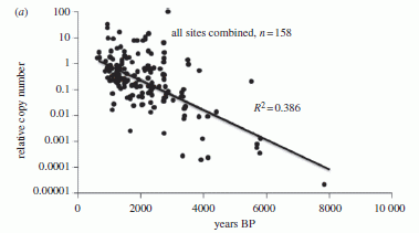
|
The graph shows what they found. The y-axis is a measure of DNA decay (on a log scale). The x-axis is time. Note that the x-axis scale runs backwards. Years BP means years before present. 0 is "now"; 10,000 is "long ago". There is less of the older DNA, which has had more time to decay.
This is Figure 3a from the article.
|
They show a "best fit" line through the data. The line represents a simple decay model, with random decay events. With this line, the half life of the DNA is about 500 years.
A striking feature of the graph is the scatter. The "best fit" line is not all that great. In fact (as shown on the graph), it has an R2 of about 0.4, which means that age accounts for only 40% of the variation in the decay rate. Thus they temper their point that the DNA decay is a simple decay, with the realization that more is going on. They also note that the decay rate will depend on other things, including temperature. They estimate that it might be possible to get DNA sequences as old as 1-2 million years, if is was preserved under optimum conditions. That's older than anything reported so far -- but makes finding dinosaur DNA very unlikely.
Is it possible that they have substantially underestimated the stability of DNA? There is one concern. They measure how much of each DNA sample remains and its age, but they cannot know that the storage conditions were constant or ideal during the whole time. Brief times of enhanced decay, including since the samples have been in human hands, could lead to underestimating the stability.
Despite all the reservations and complications, this is a start. It is probably one of the best decay curves for DNA from natural sources that we have.
News stories:
* DNA has a 521-year half-life. (Nature News, October 10, 2012.) The title of this news story is misleading. The number stated is for the particular situation studied here. The paper is clear that the half life will vary with "storage" conditions, and in fact the story here discusses that well. It's a headline problem!
* DNA's half-life identified using fossil bones. (New Scientist, October 10, 2012.)
The article: The half-life of DNA in bone: measuring decay kinetics in 158 dated fossils. (M E Allentoft et al, Proceedings of the Royal Society B 279:4724, December 7, 2012.) An interesting paper, worth browsing. The paper itself is good at noting the limitations.
A Musings post on ancient DNA: The Siberian finger: a new human species? -- A follow-up in the story of Denisovan man (January 14, 2011).
And... Uptake of small pieces of ancient mammoth DNA by bacteria: What are the implications? (May 13, 2014).
More birds: Of birds and butts (February 2, 2013).
Also see: Using DNA for data storage (March 5, 2013). That's storage of computer data.
There is more about genomes and sequencing on my page Biotechnology in the News (BITN) - DNA and the genome.
A newly described monkey species
October 22, 2012
|
An adult male lesula monkey, now classified as Cercopithecus lomamiensis.
Size? No information is given on the size of this particular animal. However, there is some information about the general size characteristics found, based on measuring a small number of killed specimens. For adult males, mass is about 5 kg. Body length (on all-fours) is about 1.2 m -- and that is half tail. Eye size is about 2.5 cm x 2.5 cm. Overall, it is a typical medium-size monkey.
The figure here is the upper right part of Figure 4 from the article. Other parts of the figure show another species for comparison, and side views.
|
It was in the news last month: the recognition of a new species of monkey from the Democratic Republic of Congo. Finding new species of large animals is not too common; this is only the second new monkey species from Africa in 28 years. And it isn't exactly new; it's well known locally, as the lesula monkey. (The animal shown above is a "captive". I suspect that more or less means "pet", though the authors avoid that word.) What's new is its formal recognition by biologists, and its classification.
A new monkey. I didn't give it much thought -- until I came across the picture shown here. The picture is the story.
News stories:
* New African Monkey Species Identified: Lesula Found in One of Congo's Last Biologically Unexplored Forest Blocks. (Science Daily, September 12, 2012.)
* Cercopithecus Lomamiensis: Lesula, New Primate Species With Blue Buttocks, Discovered In Congo (PHOTOS). (Huffington Post, September 13, 2012.) The title of this item notes another distinctive aspect of the appearance of the lesula monkeys -- of the males. See their slideshow, or Figure 7 of the article.
The article, which is freely available: Lesula: A New Species of Cercopithecus Monkey Endemic to the Democratic Republic of Congo and Implications for Conservation of Congo's Central Basin. (J A Hart et al, PLoS ONE 7(9):e44271, September 12, 2012.)
Audio files. Brief examples of the calls of the new monkey and of a related monkey are available. At the article web site (above), scroll down to Supporting Information, and then to two audio files. File "Audio S2" is for the new species.
Other posts about monkeys include... The first chimeric monkeys (February 5, 2012).
Another "new species" report: Our newest spiders: the cave robbers (September 5, 2012).
Also see: Big blue sticks (July 19, 2019).
A virus that could treat acne?
October 21, 2012
Acne is a complex skin disease. One part of the story is a bacterium called Propionibacterium acnes. A new paper raises the possibility of using a virus to treat acne -- a virus that kills the P acnes bacteria.
Viruses that attack bacteria are known as bacteriophages, or simply phages. The idea of using phages to combat bacteria is not new; in fact, it dates to the earliest days of phage work. However, it has not really caught on. The reasons for that are complex, and do not necessarily reflect poorly on the potential of the approach.
The current work involves the isolation and characterization of several phages that are specific for P acnes bacteria. Have a look...
|
Five of the P acnes phages studied in the paper. These five -- as well as the other six shown in the full figure, look similar.
The heads are about 50 nanometers (nm) across; the tails are about 150 nm long.
The figure here is part of Figure 1 from the article.
|
Not only do all the phages they find look about the same, but more detailed characterization suggests that they are indeed very similar.
What they don't do here is to test the phages to see if they affect acne. They simply find and characterize the phages, and suggest that they might be useful. Ok, but most reports of this work note the promise of using them to treat acne, and the paper actually contains no information on the application. That's not a criticism of the paper; it simply reflects the scope of this particular work. More work is needed.
News story: Going Viral to Kill Zits: Scientists Uncover Virus With Potential to Stop Pimples in Their Tracks. (Science Daily, September 25, 2012.)
The article, which is freely available: Propionibacterium acnes Bacteriophages Display Limited Genetic Diversity and Broad Killing Activity against Bacterial Skin Isolates. (L J Marinelli et al, mBio 3:e00279-12, September 25, 2012.)
More about the bacteria associated with acne:
* Acne, grapevines, and Frank Zappa (August 1, 2014).
* Propionibacterium acnes bacteria: good strains, bad strains? (April 1, 2013).
The possibility of using phage to treat bacterial infections was the subject of the 1925 novel Arrowsmith, by Sinclair Lewis. This book is listed on my page of Book Suggestions: Arrowsmith. It's a good book in any case, and it is relevant here.
A post about phage therapy: A phage treatment for inflammatory bowel disease (August 13, 2022).
There is more about phage therapy on my page Internet resources: Biology - Miscellaneous in the section Medicine/microbiology: phage therapy.
More about phage:
* Salvador Luria, on his 100th birthday: the Luria Delbrück experiment (August 13, 2012)
* Using viruses to make a better disinfectant (April 22, 2012)
P acnes is a normal inhabitant of our skin; it is part of our skin microbiota. We have discussed the human microbiota -- the collection of bacteria associated with the human body -- in numerous posts. Most have focused on the gut microbiota. Examples...
* A bacterial cocktail to fight Clostridium difficile (January 19, 2013).
* Antibiotics and obesity: Is there a causal connection? (October 15, 2012).
The oral microbiota. Bacteria on human teeth -- through the ages (March 24, 2013).
The nose microbiota. Can the Staph solve the Staph problem? (July 12, 2010).
More about skin: eSkin: Developing better sense of touch for artificial skin (November 29, 2010).
Silk-clothed electronic devices that disappear when you are done with them
October 19, 2012
* What happens to an electronic device that you get as a surgical implant? Do you need a new surgery just to remove it, or could it just "disappear"?
* How about an electronic sensor installed in some remote place, such as the ocean bottom?
* What if you could dispose of your old cell phone by, in effect, just flushing it down the toilet?
Whatever you may think of those questions, there is a theme behind them. Electronic devices are "forever". Need that be so? A team of scientists has addressed the question of whether they can make electronic devices that will dissolve when you are done with them. Their devices are based on the familiar silicon; it is the details of design that determine the fate.
Here is an example of what they have achieved...
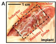
|
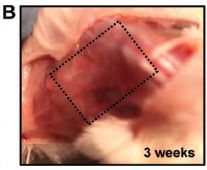
|
Part A shows an electronic device that has been surgically implanted into a mouse. Part B shows the same area three weeks later; there is little left of the device.
These are parts of Fig 4 from the article. More specifically, they are the left-hand frames of parts A and B of that figure.
|
How do they achieve this? By using very thin sheets of the main semiconductor material, silicon. And by wrapping the devices in silk. In lab experiments they show that can they control the lifetime of the devices. The mouse implant test shown above is a test of their approach in a real-world application; it is encouraging.
The work here opens the door to the development of degradable electronics. And to asking questions about when such devices would be of benefit.
News stories:
* 'Transient electronics': Biocompatible electronic devices dissolve in body, environment (w/ Video). (Phys.org, September 27, 2012.)
* Next up: Environmentally safe electronics that also vanish in the body. (University of Illinois News Bureau, September 27, 2012.) Now archived. This is from one of the multiple institutions involved in this work.
The article: A Physically Transient Form of Silicon Electronics. (S-W Hwang et al, Science 337:1640, September 28, 2012.)
Also see...
Stabilizing broken bones: could we use spider silk instead of metal plates? (June 24, 2018).
Biodegradation of an implant in the brain (April 5, 2016). Follow-up, from the same lab.
Using wood-based material for making biodegradable computers (July 21, 2015). Another approach.
Smart sutures (November 3, 2012). Another post based on work, in part, from the same labs.
How to dispose of unused medicines (September 10, 2012). Discussion of options for another disposal issue.
Heart damage: role of mitochondrial DNA (June 1, 2012). Another disposal issue.
Silk: Stabilizing vaccines and drugs (July 29, 2012). Another application of silk. This work is from one of the same labs as the current work (at Tufts).
A better way to deliver a vaccine? (July 25, 2010). Another problem for which "dissolve it" may a good answer.
Traffic congestion patterns analyzed from cell phone records (July 7, 2013). More about cell phones.
Several Musings posts about silk are listed on my page Internet Resources for Organic and Biochemistry under Amino acids, proteins, genes.
October 17, 2012
TALISE: A better boat for Titan?
October 16, 2012
We have noted a NASA proposal to send a boat to the Saturnian moon Titan; that proposal was recently tuned down [links at end].
We now have a new proposal, from European space scientists. They propose a better boat: one with a propulsion system. The proposed mission is called the Titan Lake In-situ Sampling Propelled Explorer (TALISE). (I hope their boat is better than their acronym for the project.)
News story: Paddleboat Mission to Titan Proposed. (Universe Today, September 27, 2012.) This page links to more information -- but remember, this is just a proposal, an incomplete proposal. The page includes pictures of some of the proposed boats, plus a beautiful image of the lake-river system that they want to visit.
Background posts about sending a boat to Titan:
* Quiz: NASA's boat (June 29, 2011).
* NASA: It's InSight, not TiME (August 22, 2012).
Among other posts about boats... Colloidal microswimmers: 3D printing a micro-boat (December 13, 2020).
More about Titan... Titan: tides, and the possibility of a sub-surface water ocean (August 4, 2012).
More about rivers: When rivers (or streams) join, what is the preferred angle between them? (April 18, 2017).
Another "fanciful proposal": Hyperloop: Ground transportation at near the speed of sound (August 19, 2013).
Antibiotics and obesity: Is there a causal connection?
October 15, 2012
Is it possible that the use of antibiotics promotes obesity? Here is the possible connection... Antibiotics change the gut microbiota (the collection of bacteria in the gut); different bacteria are associated with the gut microbiota of obese and lean people. Both parts of that statement are known to be true. What is not known is whether there might be any causal connection between the two points.
A new article provides some evidence that might support such a connection. What the scientists do is to collect information on antibiotic usage and obesity for a group of 11,000 children, and then look for a pattern. Here is an example of their findings...
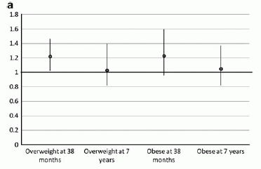
|
The graph shows the "odds ratio" (y-axis) for being overweight or obese for children who received an antibiotic treatment in the first six months of life.
For their purposes here, "overweight" and "obese" are defined by the body mass index (BMI), analyzed by age and gender. "Overweight" means that the BMI was in the range 85-94th percentile for the age and gender of the child; "obese" means that the BMI was 95th percentile or higher.
|
As an example of how to understand this graph... Consider the first (left-most) point. It is at 1.2 (y-axis) and is for the class "overweight at 38 months" (x-axis). The 1.2 is the odds ratio: the odds are 1.2 for those with antibiotic treatment compared to 1 for those without antibiotic treatment. In other words, the antibiotic treatment correlates with increased odds of being overweight at 38 months by a factor of 1.2, or by 20%.
You can see that the odds ratio is well above 1 for both measurement classes (overweight and obese) at age 38 months. However, there seems to be no effect at age 7 years. You can also see that the error bars are rather large.
This is Figure 2a from the article. Other parts of the figure show the results for calculated odds ratio for children with later antibiotic treatments (up through age 2 years). Those show little or no effect.
|
So what are we to make of this? The short answer is that we don't know -- yet. We should take this as a preliminary exploration, which has offered some clues. The clues need to be followed up.
What makes this confusing is that a significant effect is seen for only one condition (early antibiotic treatment), and the effect seems transient. Sometimes, if one measures many things, one of them seems to show an effect -- but it is just a statistical fluke. On the other hand, it is plausible that the one case that showed an effect here is the case most likely to do so, and this effect will be confirmed. (Why is this case "plausible"? It is the first stage of life, when the gut microbiota are least well established. Perhaps the gut is most sensitive to antibiotic effects at that time.) The only way to know is to follow this up. We need more observations on young children with antibiotic treatments. We need better observations, with more specifics... not just 0-6 months, but perhaps for each month. Particularly helpful might be observations by type of antibiotic, duration of treatment, and perhaps reason for treatment.
News story: Antibiotic Use in Infants Before Six Months Associated With Being Overweight in Childhood. (Science Daily, August 21, 2012.)
The article: Infant antibiotic exposures and early-life body mass. (L Trasande et al, International Journal of Obesity 37:16, January 2013.)
Microbiota? Microbiome? As near as I can tell, there is no clear difference between the two terms. I use them interchangeably.
Other posts on gut bacteria include:
* Artificial sweeteners: Saccharin and high blood sugar levels (December 7, 2014).
* Malnutrition: is more (or better) food the answer? (March 8, 2013).
* A bacterial cocktail to fight Clostridium difficile (January 19, 2013).
* Your gut bacteria: where do you get them? (July 30, 2010). This post deals with acquisition of bacteria by babies, depending on how they are born.
* Obesity, gut bacteria, and the immune system (May 24, 2010). Earlier work, with mice, suggesting a connection...
A post about our skin microbiota: A virus that could treat acne? (October 21, 2012)
More on obesity:
* Should obesity be redefined? (April 30, 2025).
* Why exercise is good for you, BAIBA (March 10, 2014).
* The junk food issue is global (April 7, 2012).
Also see: Antibiotics and viruses: An example of effectiveness (May 5, 2018).
Also see the section of my page Organic/Biochemistry Internet resources on Lipids. The list of Musings posts there includes more on obesity.
A recent post on antibiotics: Scorpion venom: a source of a novel antibiotic? (August 3, 2012)
More on antibiotics is on my page Biotechnology in the News (BITN) -- Other topics under Antibiotics.
Book. The following book is listed on my page of Books: Suggestions for general science reading. Blaser, Missing Microbes -- How the overuse of antibiotics is fueling our modern plagues (2014). The author of that book is the senior author of the article discussed in this post. The theme of Blaser's book is that we have changed our microbiota by our use of antibiotics, and that is causing problems. The article discussed in this post is an example of his evidence.
Transparent soil
October 13, 2012
Scientists who study the roots of plants have trouble seeing what they are doing. A new paper offers some help: transparent soil (TS).
|
The figure shows a tube containing soil -- the transparent soil reported in this new work.
This is part of Figure 1A from the article. The scale bar is 2.5 centimeters.
|
The idea behind the new soil is simple enough. The scientific team starts with a plastic-type material, in small pieces. They then find a liquid phase that matches the solid phase in refractive index (RI). The RI relates to the speed of light in the material, which determines how light refracts (bends) when it moves from one material to another. A solid object of matched RI is invisible; that is the basis of the transparency here.
How good is this new soil -- for the plants?
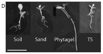
|
The figure shows small plants that have been grown in various "soils". The right-hand plant was grown in the new TS.
The general observation is that the plants vary, but that the plant grown in TS is not too different from those grown in soil or sand. (Arguably, it looks more "normal" than the plant grown in Phytagel, another artificial material sometimes used for growing plants.)
This is Figure 1D from the article. The scale bar (lower left) is 1 cm.
|
The authors do not claim that their new TS is identical to regular soil. Of course, regular soils differ. What they do is to show that it is a transparent soil, with properties that seem to be within the normal range for soils. The figure above is a qualitative example. The paper also contains detailed analyses of some properties. They hope the new TS will be useful, but it remains to be seen how well it mimics regular soil. It is certainly possible that variations can be developed.
News story: Transparent soil allows detailed study of roots. (Phys.org (University of Abertay Dundee), October 1, 2012.) (Replacement news story, December 2024.)
The article, which is freely available: Transparent Soil for Imaging the Rhizosphere. (H Downie et al, PLoS ONE 7(9):e44276, September 11, 2012.)
More about the usefulness of transparency when doing biology... The answer is cereblon (March 16, 2010). Part of the work here involves zebrafish embryos -- which are transparent.
and ... How to make yourself more transparent while you sleep (March 7, 2023).
More about the underground: Why you shouldn't frighten the grasshoppers (October 29, 2012).
More about light: Is the speed of light really constant? (May 20, 2013).
A galaxy far, far away: the story of MACS 1149-JD
October 12, 2012

|
The figure at the left is a composite image of a small region of the sky from the Hubble Space Telescope, marked up by the authors of a recent article.
The region of particular interest for us here is in the dark red circle, in the upper right part of the figure (very near the complex blip on the white curve). A galaxy known as MACS 1149-JD is in the red circle; MACS 1149-JD is a candidate for the most distant known galaxy.
This is reduced from Figure 2 from the article. More about the figure with the news story below.
|
You can't see anything in the red circle? That's fine. The authors look more carefully, with advanced image processing. They can just barely make out a "speck". And there is just barely enough information in that speck that they can analyze, to measure the redshift. The redshift is a measure of how much the color of the light has shifted from its natural color; it is very much like the Doppler effect that we all experience when an ambulance or train goes by. For astronomical objects, the redshift is a measure of how far away the object is. In this case, they find that z -- the redshift -- is about 9.6. That means that the light wavelengths have stretched by a factor of 10.6 (1+z), because of how fast the object is moving away from us. The key color lines they measure, for hydrogen, are normally in the ultraviolet; they are now in the infrared. (Ever wonder why it was such a big deal to equip the Hubble, and other space telescopes intended to explore the most distant regions, with IR analyzers?)
z = 9.6. From the known rate of expansion of the universe, that redshift dates the object to about 13.2 billion years ago. That is about 490 million years after the Big Bang. From further analysis, they suggest that the galaxy had been around for 300 million years. Thus the origins of this galaxy date back to around 200 million years after the Big Bang. This is a strong candidate for the oldest -- and thus most distant -- known galaxy. (Another galaxy at about the same distance was reported last year. The evidence in the new paper is stronger.) It represents the beginning of experimental observations of this early era of star and galaxy formation.
The figure above may have disappointed you by not showing the object of interest. However, it does show something that is important for the analysis here. In that figure, several objects are marked with green letters. For example, near the upper right there are three objects marked with a green B. These are the same object! Object B appears at three places in the image. Why? Because it is being viewed through what is known as a gravitational lens -- a cluster of galaxies which, following Einstein's ideas of space-time, bend light that passes through the cluster. Galaxy clusters are not nice, well-polished lenses; they tend to produce multiple images, and arc-shaped blurs, which you can see. They can also produce magnification. In the current work, the authors looked in regions of known gravitational lensing in order to take advantage of the possible magnification. Indeed, they suggest that the object they found here has been magnified by about 15-fold by the gravitational lens; even with this magnification, it is just barely detectable.
News story: Ultra-Distant Galaxy Discovered Amidst Cosmic 'Dark Ages': May Be Oldest Galaxy Ever. (Science Daily, September 19, 2012.) The figure in this news story is a variation of the one shown above; it includes additional frames, focused on smaller regions.
* News story accompanying the article: Astronomy: Searching for the cosmic dawn. (D Stark, Nature 489:370, September 20, 2012.)
* The article: A magnified young galaxy from about 500 million years after the Big Bang. (W Zheng et al, Nature 489:406, September 20, 2012.)
Also see:
* 3D printing: Make yourself a model of the universe (December 19, 2016).
* Chromatic aberration: is it how cephalopods see color with only one kind of photoreceptor? (October 14, 2016).
* Which is older, the center of the Earth or the surface? (September 7, 2016).
* Gravitational waves (February 16, 2016).
* Quark soup (August 15, 2011). An exploration of phenomena much earlier in the history of our universe.
* LEDA 074886 (April 2, 2012). Another galaxy story.
* How many moons hath Pluto? (July 20, 2012). More from Hubble.
* Space shuttle: some final photos (December 3, 2012).
* Star formation has slowed down (December 4, 2012).
* From WiFi to WiSee (June 18, 2013). Another example of Doppler shifts.
* What has six tails -- and is beyond Mars? (November 20, 2013). More from Hubble.
* We are all Laniakeans (October 21, 2014).
Thanks to Borislav for suggesting this topic -- and for suggesting the Star Wars line that is part of the title here. Thanks to Greg for some helpful discussion of gravitational lensing.
October 10, 2012
An extraterrestrial god
October 9, 2012

|
A sculpture. It is thought to show the Buddhist god Vaisravana. It may date from around the 11th century.
A new paper shows that the material used for the sculpture is a meteorite. Given that the meteorite material is difficult to sculpt, it is likely that the sculptor was aware that this was a special rock, from outer space, and that this had some special cultural significance.
The figure here is from the news story listed below. It is probably the same as Fig 3 (left side) from the article. The object is approximately 24 x 13 x 10 cm, and weighs 10.6 kilograms.
|
Here are some data on the composition of this rock (the "iron man"), and of a particular meteorite used for comparison ("Chinga"). The Chinga meteorite is a rare type, and is from an area near the Mongolia-Siberia border. The data here are part of what is reported in Table 1 of the article. (I have used the data shown in columns 11 and 12 of that table, for simplicity.)
|
Element
| Iron man
| Chinga
| Comments
|
|---|
| Fe (%)
| 83.4
| 83.1
|
| Ni (%)
| 15.98
| 16.38
| The Fe + Ni account for over 99.3% of both samples.
|
| Co (%)
| 0.60
| 0.55
|
|
|
| Cr (ppm)
| 896
| 810
| The data in this lower part of the table are in ppm. 1000 ppm = 0.1%.
|
| Ga (ppm)
| 0.22
| 0.18
|
| Ge (ppm)
| 3.12
| 0.08
|
| Mo (ppm)
| 6.85
| 7.42
|
| W (ppm)
| 0.61
| 0.57
|
The general picture from all the analyses is that the "iron man" closely resembles the Chinga meteorite. This holds for the major metals (top group), and for most of the trace metals shown (lower group). (The agreement for germanium (Ge) is not very good; they note this, and say that the Ge data are not very good.) Of course, you can't tell from this table alone that the composition distinguishes this meteorite from others. However, as noted above, the Chinga meteorite is an unusual type; they do suggest that the Chinga meteorite field might well have been the source of the stone used for this sculpture.
That's the main scientific finding: that the iron man is made from a meteorite, and that it may well be a meteorite from a particular area of some interest.
In addition, the paper discusses the sculpture -- what they call the "ethnological aspects". The history of the sculpture is interesting, but not entirely clear. One aspect of its recent history is that it ended up with the German Nazis. Did you notice the Buddhist swastika on the god's chest? (It can be hard to see at first. Try adjusting your viewing angle. If you still have trouble, check out the "enlarged" figure at the ScienceDaily site or the figure in the paper.) Interesting reading!
News story: Ancient Buddhist Statue Made of Meteorite, New Study Reveals. (Science Daily, September 26, 2012.) A good overview of both the scientific and cultural issues. It includes a higher-resolution figure; click on "enlarge".
The article: Buddha from space -- An ancient object of art made of a Chinga iron meteorite fragment. (E Buchner et al, Meteoritics & Planetary Science 47:1491, September 2012.) A copy is available at: pdf copy.
Another artefact with a meteorite connection: Libyan desert glass, King Tut, and the hazards of meteorite strikes (May 31, 2019).
For more about meteors and meteorites:
* The Moon: might it be a child with only one parent? (April 13, 2012). This post makes the point that meteors vary in composition.
* Earth: craters (August 19, 2012).
More ancient art: Images from 30,000-year-old motion pictures (July 22, 2012).
More statues: How to install a hat on a Rapa Nui (Easter Island) statue (February 1, 2019).
Update... The art aspects of this story have been challenged. See the post An extraterrestrial god: follow-up (October 28, 2012).
Male DNA found in human female brains
October 8, 2012
Hype alert? Not really. The title above is a fairly straightforward summary of what was found. Further, the result was not too surprising, and may well be just the tip of the iceberg.
A group of scientists from the Fred Hutchinson Cancer Research Center (and the nearby University of Washington) examined brain tissue from 59 women (upon autopsy). In about 2/3 of them, they found DNA from the Y chromosome -- the chromosome of males. Let's look at some questions raised by this finding...
Where did this male DNA in the female brains come from? It seems most likely that it came from male fetuses. One might expect, then, that the finding of male DNA would be more prevalent in women who had sons. Unfortunately, they have little data. They have pregnancy records for very few of the women, and the little data they do have is inconclusive. (Of course, a women may have had a male fetus, but not know it. Still, correlation with good records of known pregnancies would be a useful step.)
Are they saying that sons may have contributed DNA to the mother's brain, but that daughters did not? No, they are not saying that. The Y chromosome is distinctively male; it is a general test for male DNA. There is no analogous way of testing for female DNA; there is no general distinctive female DNA. If the issue becomes of interest, it should be possible to test for the DNA of a specific female, such as a specific daughter. With lab animals, it should be possible to test for female DNA by using strains with (genetically) "marked" DNA. Such tests could also be used to test for foreign DNA in male brains.
Is the result surprising? Not particularly. We recently noted that fetal DNA is in the maternal blood [link at end]. Evidence for male DNA in various maternal tissues, in both mouse and human, has been accumulating. What is new here is showing that the male DNA is in the human brain; crossing the blood-brain barrier is a more difficult step, and evidence on this point had been inconclusive.
Does the male DNA in mother's brain matter? Ah, the big question. They don't know. One thing they did here was to compare the frequency of finding male DNA in female brain in women with or without Alzheimer's disease (AD). The result did not show any significant effect, but the data are quite limited. The importance of this foreign DNA is an open question for now.
Are there ways male DNA might have gotten into the female brains other than via a male fetus? What if they find foreign DNA in male brains? Perhaps we should just leave these questions on the table for now. Let's see what the evidence shows. If the evidence shows that the fetus is not the sole source of foreign DNA, then we will be forced to consider these questions. We need evidence.
News story: Male DNA Commonly Found in Women's Brains, Likely from Prior Pregnancy With a Male Fetus. (Science Daily, September 26, 2012.)
The article, which is freely available: Male Microchimerism in the Human Female Brain. (W F N Chan et al, PLoS ONE 7(9):e45592, September 26, 2012.)
The phenomenon of having cells with different kinds of DNA is called chimerism; the type of chimerism here is called microchimerism -- a word used in the title of the article.
Fetal DNA in the mother's blood... Genome sequencing of a human fetus (August 25, 2012).
More on chimeras: The first chimeric monkeys (February 5, 2012). Includes links to more.
More on Alzheimer's disease:
* A mutation that reduces the chances of Alzheimer's disease (September 18, 2012).
* My page for Biotechnology in the News (BITN) -- Other topics includes a section on Alzheimer's disease. It includes a list of related Musings posts.
More about Y chromosomes: Men are losing their Y chromosomes, and some men are losing them faster than others -- does it matter? (February 25, 2020).
There is more about genomes and sequencing on my page Biotechnology in the News (BITN) - DNA and the genome.
Carnivorous algae -- that hunt large animals
October 7, 2012
"If we imagine an African savannah, this would roughly correspond to the grass suddenly jumping up, attacking and starting to eat the gazelle." So says the lead author of a new article (as quoted in the news story listed below).
The common idea is that plants photosynthesize; that includes both the land plants (plants, in the modern strict sense), and the algae, which can be thought of as the plants of the water-world. Of course, there are special cases. You have probably heard of carnivorous plants, such as the Venus fly-trap. [Links to Musings posts on carnivorous plants are at the end.] Now we have tiny algae that not only eat meat, but hunt down their prey! Of course, the algae have the advantage of not being tied down by roots.
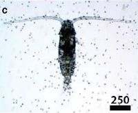
|
The figure shows Karlodinium armiger algae mixed with a copepod (a shrimp-like animal).
The scale bar is 250 µm. That is, the animal body is almost a millimeter long.
This is Figure 2c from the article. It is a frame from one of their videos.
|
The figure gives you an idea of the sizes involved: the unicellular algae and the small animal prey. The figure alone does not show you what is happening. Even with the movie files listed below, it is hard to see what is happening. The work described in the paper puts together extensive observations to make their point: that the algae swarm, hunt, kill, and eat the much larger animal prey.
An interesting part of the story is that the copepods eat the algae, too. Well, that might be expected. What's novel is that the algae eat the copepods; that is, they eat each other. Who eats whom is controlled by their ratio; at high densities of the algae, algae-eat-copepods becomes a significant process.
News story: Carnivorous killer algae found in Danish waters. (ScienceNordic, May 8, 2012.)
Movies. Five movie files accompany the article. They are freely available from the article web site, listed below. Choose "Supplementary Information". (Each movie file has its own accompanying doc file description. However, the movie files are labeled adequately, at least for casual viewing.) As an example, Movie S3 shows "... Karlodinium armiger swarming around immobilized copepods and accumulating to form feeding aggregates. ... The sequence is real time."
The article, which is freely available: Marine microalgae attack and feed on metazoans. (T Berge et al, International Society for Microbial Ecology (ISME) Journal 6:1926, October 2012.)
Other posts on carnivorous plants:
* How fast can a plant eat? (March 23, 2011).
* Why would a plant have leaves underground? (January 21, 2012).
* Carnivorous plants: A blue glow (March 16, 2013).
The opposite unusual case is that of photosynthetic animals. A recent post on this possibility is Are aphids photosynthetic? (September 17, 2012).
More about algae... The earliest biomineralization? (January 24, 2012).
More about meat:
* Growing meat without an animal? (April 11, 2018).
* The WHO report on the possible carcinogenicity of meat (December 12, 2015).
Silent Spring -- on its 50th anniversary
October 5, 2012
Rachel Carson's book Silent Spring was published 50 years ago last week -- on September 27, 1962. The book was revolutionary at the time. How does it look a half century later?
Carson was a biologist and writer; the book was both scientifically sound and well-written. It made the case that DDT -- something of a wonder drug (actually a wonder-insecticide) -- had major problems, which were going unrecognized. She successfully brought the problems to the attention of the general public. As a result, she effectively stimulated the development of the modern environmental movement, and of a better understanding of chemicals in the environment. Modern government oversight builds on Carsonism.
The book is not without controversy. It has been abused by people on both sides of the "political" divide. For the most part, that is not Carson's fault, but is due to inappropriate application of what she wrote.
DDT was indeed a remarkable agent. But it also had a major downside. The reasons are now well understood, and modern pesticides are designed to minimize the downside. Some want to take Silent Spring as an indictment of all pesticides, but that was not her intent. Carson awakened us to the need to better understand and test them, and use them with some understanding of their strengths and weaknesses.
It is best to take Silent Spring as a call to better awareness and understanding, than for any specifics. That way, the book will remain timeless.
Background: Wikipedia: Silent Spring. Caution: Wikipedia may be good at presenting facts, with references. It can also present a range of views. It is not so good at resolving controversies. When I looked at this page, it did a good job of presenting an overview of Silent Spring, and that is the intent here. Don't look to Wikipedia to weigh competing ideas for you (and remember that its content changes over time, with little guidance).
There are good analogies between our emerging understanding of the use of pesticides and use of other agents, such as antibiotics or herbicides. Here are examples of posts on those topics.
* Restricting excessive use of antibiotics on the farm (September 25, 2010).
* Genetically modified crops and the fate of the monarch butterfly (April 1, 2012).
More pesticides: Effect of food crops on the environment (November 20, 2015).
* Previous history post...
What does "Anopheles" mean? (August 27, 2012). Hm, not unrelated!
* Next: DNA: Watching the hopping supercoils (November 24, 2012). This is not primarily a history post, but there is a historical note at the end.
My page Internet resources: Miscellaneous contains a section on Science: history. It includes a list of related Musings posts.
Other Musings posts about books include Human violence (November 28, 2011).
This post is also noted on my page Book suggestions: Carson, Silent Spring.
October 3, 2012
The Heartland virus
October 2, 2012
A new virus.
Two people with serious infections. Analysis reveals a new virus. The two cases appear independent -- except that they are in the same area (same hospital!) and have the same virus. Beyond that, we know little at this point.
The Wired page captures the essence of the story. It is a useful perspective on the issue of emerging diseases. A New Tick-Borne Illness, and a Plea to Consider the Insects. (Wired, September 5, 2012.)
The article: A New Phlebovirus Associated with Severe Febrile Illness in Missouri. (L K McMullan et al, New England Journal of Medicine 367:834, August 30, 2012.)
The name of the virus might seem to reflect America's midsection, but it is actually more specific: The Heartland Regional Medical Center in St. Joseph, MO -- the only place where the virus has been seen. So far. Even the suggested transmission by ticks is just a guess.
Follow-up: The Heartland virus -- follow-up (March 30, 2014).
For more on emerging diseases see the post immediately below. [Is the Schmallenberg virus episode dying out on its own? (October 2, 2012)]
Also see:
* Chikungunya in the Americas -- are vaccines near? (March 17, 2015).
* A new SARS-related virus seems to be emerging -- and an "ethics" story (February 4, 2013).
Is the Schmallenberg virus episode dying out on its own?
October 2, 2012
The Schmallenberg virus emerged in European cattle in late 2011. A new report suggests that it may be dying out. We have noted it [link at end]; Schmallenberg virus may be an opportunity to track a new disease from beginning to end.
In the new work, the scientists measured the antibodies in cattle, in several regions of Belgium, not far from the outbreak. They found that a high percentage (78%) of the adult cattle carried antibodies to the virus -- in early 2012. Analysis of older samples, from the previous two years, showed no cattle with antibodies, thus confirming that the virus is new. Further, a quarter of the calves born during the study period had antibodies -- and no symptoms. Putting all this together, and comparing the situation with past experiences with related viruses, they suggest that the cattle are well on their way to establishing complete population immunity. They boldly suggest that the virus will be gone in 2012. We'll see.
The article, which is freely available via PubMed Central: Schmallenberg Virus in Domestic Cattle, Belgium, 2012. (M-M Garigliany et al, Emerging Infectious Diseases 18:1512, September 2012.) I didn't find a news story, but the article is short and straightforward.
Original post: Schmallenberg virus (January 20, 2012).
For more on emerging diseases see the post immediately above. [The Heartland virus (October 2, 2012)] As one new virus is perhaps fading away, another appears.
More about emerging diseases is on my pages for Biotechnology in the News (BITN): Emerging diseases. That discusses some general issues, and also links to some specific diseases that have emerged in recent decades.
Killer whales: menopause
October 1, 2012
A ten-thousand pound male killer whale (orca) may evoke the image of "macho". However, a new paper suggests that these giants are really mama's boys -- quite dependent on mother's care even as mature adults. The study is remarkable, regardless of the interpretation, so let's look.
Scientists have been observing natural populations of orcas off the coast of Washington state for many years. They can identify specific animals by body appearance (just as we do for humans). What the current work does is to construct survival curves, based on the many years of observations.
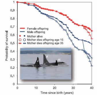
|
The graph here summarizes what they found. It shows survival as a function of age.
The red data is for females. For example, you can see that survival declines gradually to about 0.9 (that is, 90%) at age 20 -- and so forth. Something odd happens at the far right side of the red curve; let's leave that for the moment.
The blue data is for males -- and is the heart of their story. You can see that survival of males is lower than for females. You also see that the blue curve splits, at about age 15 on the graph. The upper blue curve is for males with a living mother; the lower blue curve (open circles) is for males whose mother has died. It's clear that the survival rate for males without mothers is much lower than for males with mothers.
Look further, and you see that the upper blue curve splits again, at age 35. The lower arm of this split is for males whose mother dies when they are adults -- and this curve has the steepest slope of all.
|
Go back and look at the red curves, for females. There is also a split at age 35. Adult females whose mothers die also suffer reduced survival. The effect is smaller than for males. There seems to be no split at the age 15 break point; the main red curve includes both open and closed circles.
The figure here is reduced from the one in Ed Yong's news post. That figure is probably the same as Figure 1 of the article. The inset shows two adult males (i & ii) traveling with their mother (iii).
|
Simply collecting the data for the figure is a noteworthy achievement. This is a huge dataset for a natural population of whales. Of course, given the data, we inevitably ask what it means. We must be cautious; much here is speculation. It is interesting, and it may guide further work, but we need to distinguish that these interpretations are not "facts".
The authors' discussion of what these results might mean centers around the idea of menopause: a period of later life during which females are unable to reproduce. Extended menopause is uncommon. In fact, among the few species to have such an extended menopause are orcas and humans. The results shown above may have something to do with orca menopause. The key observation is that older females promote the survival of their sons. The authors discuss -- speculate -- why this might reasonably be so.
Why do females have menopause, unable to reproduce? The results suggest that the benefit is care-giving. That general idea has also been invoked for humans. Why do males benefit more, for the orcas? Females benefit by helping both sons and daughters. But male orcas usually reproduce in a new group, whereas the females reproduce in the mother's group. Thus the males reproduce without competing with Mom for resources, whereas the females compete with Mom. This could be the basis of why the orca females invest more in their sons. Interesting ideas, but again remember that this part is largely speculation.
News stories:
* Long Menopause Allows Killer Whales to Care for Adult Sons. (Science Daily, September 13, 2012.)
* Why do killer whales go through menopause? (E Yong, Not Exactly Rocket Science (Discover blog), September 13, 2012.)
The article: Adaptive Prolonged Postreproductive Life Span in Killer Whales. (E A Foster et al, Science 337:1313, September 14, 2012.) The paper is one page. Again, it is noteworthy simply because they do it.
More about the role of menopause in killer whales... The advantage of menopause: grandma knows where dinner is (June 15, 2015).
* Previous whale post: Identifying whale songs: You can help (January 4, 2012).
* Next: A quasi-quiz: The fate of bone and wood on the Antarctic seafloor -- and the discovery of new bone-eating worms (August 20, 2013).
The smartest chimpanzee?
September 29, 2012

|
Her name is Natasha.
Testing of over 100 chimpanzees showed that Natasha got the highest score. In fact, her score was arguably enough higher than the rest that she stood out as exceptional -- higher than what one expected from a simple statistical distribution of test scores. Further, her keepers rated Natasha as one of their most intelligent chimps. This was based on their observations; they knew nothing of her test scores.
|
But that's not the point. What's important here are the questions that are asked, and the approaches taken to address them. Indeed, the scientific team has developed a set of tests for the chimps. And indeed, Natasha -- recognized by her human friends as exceptional -- tested #1. But what does it all mean? We discuss what IQ tests mean for humans; now they address these questions for the chimps. What will we learn about chimpanzees from such tests? What will we learn about human intelligence from testing these chimps? Questions such as these are what make this paper interesting.
News stories:
* Chimps' Answer to Einstein. (Science Now, August 28, 2012.)
* New intellectual testing regimen identifies 'exceptional' chimp. (Phys.org, August 30, 2012.)
* Natasha, 'Genius Chimp,' Aces Intelligence Tests. (Huffington Post, August 30, 2012.) The figure above is reduced from the one in this news story.
The article: Are there geniuses among the apes? (E Herrmann & J Call, Philosophical Transactions of the Royal Society B 367:2753, October 5, 2012.) Very readable. The discussion of the issues as well as most of the results are clearly presented. I encourage you to look over this article.
More about chimpanzees and other apes...
* Mid-life crisis (December 10, 2012).
* Speech: Are chimps good listeners? (July 25, 2011).
More about intelligence...
* SETI (October 20, 2009).
* Are childhood infections bad for brain development? (February 5, 2011).
* Deceiving a rival male (August 28, 2012).
* Mice with human brain cells (April 13, 2013).
At the edge of the solar system
September 28, 2012
What's at the edge of the solar system? We are. Not man directly, but a manmade mission: Voyager 1. The Voyager 1 spacecraft was launched on September 5, 1977 -- 35 years ago this month. Its primary mission was to fly by Jupiter and Saturn; I recall watching Voyager images that were broadcast by NASA soon after they arrived back on Earth. Then what? It just kept going, headed for -- well, headed for outer space.
35 years and 18 billion kilometers after launch, Voyager 1 seems to be at the edge of the solar system. And what, you ask, is the edge of the solar system? The idea is that is where the influence of the Sun stops; beyond the edge of the solar system is, indeed, outer space. What's it like at the edge of the solar system? No one knows; no one has ever been there before. But we are there now, with Voyager 1. The spacecraft is still quite alive, taking measurements and sending back data to Earth.
Nature recently published a news feature on the Voyager milestone. It's a nice overview of the Voyager mission -- and of the nature of the boundary between our solar system and the beyond. It is freely available: Voyager's long goodbye -- NASA probes find surprises at the edge of the Solar System. (R Cowen, Nature 489:20, September 6, 2012.)
A news story from the general news media about the anniversary... Voyager close to leaving solar system on 35th anniversary of launch -- Spacecraft launched in 1977 to explore Jupiter and Saturn on the verge of entering new frontier in the Milky Way. (Guardian, September 5, 2012.)
It's 35 years and counting for Voyager 1. There is also a personal story here. In 1972, Ed Stone, a (young) Caltech physicist, was appointed Project Scientist for the upcoming Voyager missions. He is still Voyager Project Scientist (head of the scientific team) -- the only one the project has ever had. It's 40 years and counting for Ed Stone as Voyager Project Scientist.
I have used the term "outer space" for the region beyond the solar system. Actually, that term gets used in various ways, depending on context. More precisely, Voyager 1 is headed for "interstellar space". But I like the term "outer space" here.
Another space trip -- a longer one: Planning a visit to the nearest star -- and to its "habitable" planet (February 22, 2017).
A photo of the planet Uranus is on my page Internet resources: Miscellaneous under Science -- Connections between science and art or music. It was taken by the sister spacecraft Voyager 2.
More, May 27, 2014...
Stone gave a talk to the UC Berkeley Physics Department March 2014. A video of the talk is available. Although such departmental seminars are typically at a fairly technical level, Stone reviewed the project from the initial planning through current developments. If you are interested in the Voyager story, I think you will find much of the talk accessible and worthwhile.
Video: The Voyager Journey To Interstellar Space; talk by Ed Stone. (50 minutes.) (Physics Department, University of California Berkeley, March 3, 2014.)
A search using Google Videos for the video name reveals other talks by Stone, including at least one, a little more recent, with the same name. I encourage you to check out a recent Ed Stone talk, even if it is not the one I listed above.
Information about other local science talks is included at the end of the following post: CITRIS: Zettl; new energy series (November 1, 2009).
Update, June 2024.
Ed Stone dies. Stone died earlier this month. The Voyager spacecrafts both continue. (Stone retired as Project Scientist in 2022.)
* News stories:
- Ed Stone, Former Director of JPL and Voyager Project Scientist, Dies. (Jet Propulsion Laboratory (JPL), NASA, June 11, 2024.)
- Voyager 1 Returning Science Data From All Four Instruments. (JPL/NASA, June 13, 2024.) It is recovering from an incident late last year.
* Fur current status of the two Voyagers... Voyager Mission Status. (JPL/NASA. Updated continuously.)
September 26, 2012
The rice-arsenic issue: Consumer Reports and the FDA weigh in
September 25, 2012
We have noted accumulating evidence that the arsenic level in rice may be of concern [link at the end]. The purpose of this post is to note two developments showing that the issue is getting attention.
1) Consumer Reports (CR) has posted a major report on arsenic in rice products. (CR is a consumer-oriented magazine with a large readership; it is generally well-regarded as an advocate for the consumer.)
2) The US Food and Drug Administration (FDA) has announced that it is considering the issue. Governmental rule-making is a slow process, but it is in progress; that is good -- and is the main point here.
Comments...
There is good groundwork for establishing limits for arsenic in food. The US already has a limit for arsenic in water. Thus the government has, in one context, weighed all the information and established a limit as to how much As we can "safely" consume. Food which provides more arsenic than that should also be restricted.
Arsenic is a concern, but this is not a panic situation. The water standard for As is low, and the amount of As in rice is low. This is not a health emergency, but it is something where we should be able to do better than we are doing now. Our knowledge of As in rice is new; we are now beginning to act on that new knowledge to reduce the hazard.
It is reasonable to take extra precautions for those at increased risk, such as children and pregnant women. However, remember that there are many potential risks around, and lowering one a bit but taking on something that is unknown may not really be of benefit.
* Arsenic in your food -- Our findings show a real need for federal standards for this toxin. (Consumer Reports, November 2012.) Good reading, if you want more about the problem.
* FDA releases preliminary data on arsenic levels in rice and rice products. (FDA, September 19, 2012. Now archived.) This reads like a government announcement. Ok, the point is that they are working on it.
Original background post on this topic: What color is your rice? Rice, diabetes, and arsenic. (December 12, 2010). It links to others.
Among other posts about rice:
* A perennial rice (March 4, 2023).
* Golden rice as a source of vitamin A: a clinical trial and a controversy (November 2, 2012).
More about the role of the FDA: Purity of dietary supplements? (October 23, 2018).
Grapefruit and medicine -- II
September 24, 2012
Previous post: Grapefruit and medicine (March 26, 2012). This post provides some general background on how grapefruit affects drugs. It might help to read that as background for the current post.
The general point is that grapefruit may interfere with the metabolism of some drugs. The previous post discussed some of the specific chemicals involved (and discussed the development of grapefruit that lack these chemicals). The common result is that the grapefruit causes the drug level to build up to higher levels, since it (the drug) is metabolized (removed) more slowly. This can have the effect of enhancing the toxicity of the drug.
A new paper shows a different outcome. Here they show that the grapefruit can make a drug more effective, so that lower does can be used -- and the drug then is less toxic.
This is very interesting, but it is also potentially confusing -- and even dangerous. The key point is that the grapefruit is acting the same way here as in the earlier work. The different result is because the drugs are different. In the new case, the reduced metabolism means that more of the drug goes into the bloodstream, where it is useful, and less goes into the gut, where it is toxic. This is due to the nature of this specific drug, and how grapefruit affects this specific drug.
Learning how drugs work and how they interact with other factors is important. However, there is a big concern here that people will use the information inappropriately -- because they have incomplete information. The effect of grapefruit on drugs is complex -- and variable. (The first batch of grapefruit juice they used had no effect!) The new paper shows a case where the grapefruit effect may be beneficial. However, to extrapolate from this and say, ah, grapefruit enhances cancer drugs would be inappropriate and dangerous. For users to take grapefruit on their own to affect medication is risky. Misleading news coverage, noted below, makes the situation worse.
News story: A Glassful of Grapefruit Juice Helps the Medicine. (R Mitchum, University of Chicago Medicine, Science Life blog, August 9, 2012. Now archived.)
The article: Phase I Studies of Sirolimus Alone or in Combination with Pharmacokinetic Modulators in Advanced Cancer Patients. (E E W Cohen et al, Clinical Cancer Research 18:4785, September 1, 2012.)
Caltech engineer turns rat into jellyfish
September 22, 2012
Really? No, not quite. It actually involved quite a team of scientists, including biologists from Harvard and Caltech. But the jellyfish? Well, let's look. What they really did is quite interesting.
Jellyfish are very simple animals. One thing they do -- and very well -- is to swim. The swimming seems quite analogous to the pumping action of the vertebrate heart. Further, the muscle tissue in a jellyfish is rather similar to that in the muscle tissue of vertebrates, such as rats. So what the scientists do here is to take some rat heart muscle tissue, and ask if they can make it behave like a jellyfish -- make it swim like a jellyfish. They end up with some success. Figuring out how to do it teaches them something about the jellyfish propulsion system. And that's the point. Further, their description of the work involves some interesting movies; if nothing else, look them over.
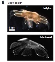
|
Photographs of a jellyfish and a medusoid. The medusoid (artificial medusa, made in this work) is designed to mimic the propulsion system of the jellyfish. It is made by growing rat heart muscle cells on a plastic substrate.
This is Figure 1e from the article.
|
News stories:
* Artificial jellyfish built from rat cells. (Nature News, July 22, 2012.)
* Bio-engineered Jellyfish Swim. (The Scientist, July 22, 2012.)
Movies:
* There are eight movies associated with the article. You can get to them by choosing Supplementary Information at the web page for the article, listed below. A pdf file available with the movies describes them (page 8). (The movies are numbered 1-8; the corresponding movie files are S2-S9; that discrepancy comes from the pdf file being labeled S1.) One good way to start is with Movie 5. This movie shows video sequences for a real jellyfish, for one of their successful medusoids, and for one that did not work. [DPIV? You'll see the term in the movie. It stands for Digital particle image velocimetry, describing their photographic system.]
* There is also a video featuring one of the lead players of the work, the Caltech engineer I alluded to in the title. It's not about the specific work here, but is more general. It seems to be part of a series, A Scientist's Story. John Dabiri - a Jellyfish Engineer. (YouTube; 8 minutes.)
The article: A tissue-engineered jellyfish with biomimetic propulsion. (J C Nawroth et al, Nature Biotechnology 30:792, August 2012.)
More about jellyfish...
With 24 eyes, can they see the trees? (June 11, 2011).
More about hearts... How good is "good cholesterol" (HDL)? (September 21, 2012). (immediately below)
More about rats... A rodent that can't chew (November 5, 2012).
More about swimming: Why don't penguins fly? (August 24, 2013).
Also see:
* Making better artificial muscles (March 13, 2018).
* Pumping tin (January 12, 2018).
How good is "good cholesterol" (HDL)?
September 21, 2012
"Not very" is the emerging answer.
Cholesterol in insoluble in water. In the blood, it is carried by lipoproteins; these are classified as low-density lipoproteins (LDL) and high-density lipoproteins (HDL). Long ago, studies showed relationships between the blood levels of these classes of lipoproteins and the risk of heart attack (myocardial infarction). However, while such studies show correlations, they cannot show whether the relationship is causal. Testing that requires somehow testing whether changing one factor alone, such as the level of HDL, affects the risk of heart attack.
For LDL, that next level of study has supported the original finding. The success of the statin class of drugs, which lower LDL and lower heart attack risk, is one part of that story.
However, for HDL, there has not been a clear conclusion. In fact, continuing studies typically fail to find any causal connection between HDL levels and heart attack risk. For example, drugs that increase HDL have failed to show benefit. We now have a new study, involving genetics, that fails to show any effect of HDL on heart attack risk. As so often, the details of the study are largely presented as complex statistics, which we can only briefly summarize.
The first issue is to establish that the mutations being studied affect HDL. That is shown, for one example, by the following graph.
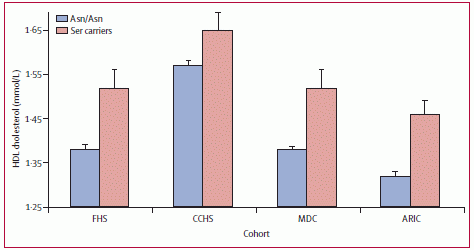
|
The graph shows the HDL levels (y-axis) averaged over a large number of people who do or do not carry one particular mutation, labeled here as "ser" (for the amino acid serine, which is present at a particular position). The four sets of data shown are for four large studies. You can see that each study shows that the ser mutation (pink bar) leads to significantly higher HDL level.
This is Figure 1 from the article.
|
The second issue is what effect such mutations -- which raise HDL -- have on the risk of heart attack. There are many studies of this, and they give widely varying results. The new paper combines all these studies, using statistics -- and finds that the risk of heart attack in people with such mutations is virtually identical to the risk in those without the mutations. For example, they find that the odds ratio is 0.99 for those with the ser mutation noted above -- compared to 1.00 for those without.
What are we to make of this? This is an example of something that comes up regularly. A scientific paper makes a point -- and it does not agree with what we thought we knew. As science, that is fine. A single paper may or may not be right; maybe it is right, but only part of the story. Over time, we figure it out. But the topic here is something that has immediate implications. Does your HDL level matter, or not? Does it matter under certain conditions -- and all the variables have not yet been sorted out? I noted above that experience so far with drugs that increase HDL has not been positive. For now, it is not at clear that modifying your HDL level reduces your risk of heart attack. This is science in progress -- the complex science of real humans.
I emphasize once again that Musings does not give medical advice. If the topic here is of personal interest, note this and perhaps talk with your doctor about it.
News stories:
* Not All 'Good Cholesterol' Is 'Good': Raising HDL Not a Sure Route to Countering Heart Disease. (Science Daily, May 16, 2012.)
* Good Cholesterol Not So Good? (Berkeley Wellness Letter, September 2012. Now archived.) A "plain English" overview.
* News story accompanying the article: Mendelian randomisation, lipids, and cardiovascular disease. (S C Harrison et al, Lancet 380:543, August 11, 2012.)
* The article: Plasma HDL cholesterol and risk of myocardial infarction: a mendelian randomisation study. (B F Voight et al, Lancet 380:572, August 11, 2012.)
Also see:
* A scientific article about Christmas in the journal Atherosclerosis (February 3, 2019).
* Mutations that lead to reduced risk for heart disease (November 21, 2014).
* Red meat and heart disease: carnitine, your gut bacteria, and TMAO (May 21, 2013).
* Caltech engineer turns rat into jellyfish (September 22, 2012). (the post immediately above)
* Cardiac stem cells as a treatment for heart damage: preliminary results are "very encouraging" (November 29, 2011).
For more about lipids, see the section of my page Organic/Biochemistry Internet resources on Lipids.
September 19, 2012
A mutation that reduces the chances of Alzheimer's disease
September 18, 2012
We have discussed Alzheimer's disease (AD) in several Musings posts. [A link to one is at the end.] AD is a complex story. Ideas abound, but answers remain unclear. AD is hard to study because it is a slowly progressing disease; it is quite likely that the disease is established long before anyone notices symptoms. Further, animal models are not entirely satisfactory.
A new paper reports finding a new mutation that helps protect against AD. The nature and implications of this mutation are interesting.
As key background for understanding the new work... A central player in AD is thought to be a type of peptide called Aβ (A-beta). (Specific Aβ peptides include Aβ-40 and Aβ-42; the number denotes the length of the peptide, in amino acids. For our purposes here we won't distinguish them.) It is a fragment of a larger protein, called amyloid precursor protein (APP). Aβ is cut from APP; the plaques that are so characteristic of AD are formed from Aβ. However, not all evidence supports the importance of Aβ; in particular, the role of Aβ-plaque is quite unclear.
The way the scientists found the new mutation reflects the developments in genome sequencing. (How many times have we said that recently!) That is, they simply looked at the genomes of a large number of people -- and found an allele (form of a gene) that is more prevalent in people who do not have AD (than in people who do have AD). That is, the new allele is associated -- statistically -- with a lower risk of AD. They then proceed to study the properties of the mutation.
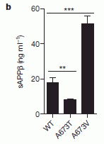
|
The graph at the left shows one property of the newly-found mutation -- at the biochemical level. This work was done in cell culture experiments, with cells containing various forms of the APP gene. The scientists measured the amount of a particular peptide made by three forms of the APP gene. The y-axis shows the amount of this peptide (called sAPPβ). The presence of this peptide reflects the first step in making the Aβ peptide.
The first (left-hand) bar is for the normal, wild type (WT) allele of the APP gene. The second bar is for the allele with the newly-found mutation, A673T; it shows decreased formation of the peptide. The third (right-hand) bar is for another mutant form of the gene, with the mutation A673V; it shows increased formation of the peptide.
|
Thus the primary result here is that the new mutation, which leads to reduced AD, leads to reduced processing of APP.
The comparison of the two mutations is also interesting. The two mutations are at the same site: note that their names both start with A673, indicating that these mutations are both at site 673 in the protein, where an alanine (A) is normally present. This site is very near one of the sites where APP is cut to make Aβ. One mutation at this site increases APP processing, and leads to increased AD. The other mutation at this site (the new one) decreases APP processing, and leads to decreased AD. Given our overall understanding of AD, this set of results strongly supports that APP processing is directly involved in the AD disease process.
Another finding they report is also intriguing. What we have discussed above is about the new mutation retarding the development of AD. We might then ask: What is its effect on people who do not have AD? That is, does the new mutation affect the cognitive abilities of those without AD? To address that...
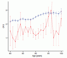
|
This graph plots the results of testing nursing home residents on the Cognitive Performance Scale (CPS). The y-axis shows the CPS score; the x-axis is the age of the person. There are two sets of points, red and blue. Note that both sets trend upward with age. You might expect that cognitive performance declines with age; indeed it does. For some reason, the CPS scale is defined "backwards": the higher the number, the poorer the cognitive performance.
The two data sets? The red set (the lower set) is for people who have one copy of this newly-found mutation; these people are "carriers" for this mutation. The blue (upper) set is for non-carriers. Importantly, people with AD have been excluded from this analysis. You can see that the red-set people have lower scores -- which means that they have less cognitive decline. That is, the mutation seems to protect against "ordinary" age-related cognitive decline.
|
Thus this result suggests that a mutation that leads to reduced AD also leads to reduced cognitive decline in older adults who do not have AD. This might suggest that AD and "normal" cognitive decline with aging are related. That is a question people have long wondered about. Is AD just an extreme case of normal aging? It's going to be interesting to see how this finding plays out over coming years.
News story: 'Natural' protection against Alzheimer's disease. (Medical Xpress, July 11, 2012.)
* News story accompanying the article: Alzheimer's disease: A protective mutation. (B De Strooper & T Voet, Nature 488:38, August 2, 2012.)
* The article: A mutation in APP protects against Alzheimer's disease and age-related cognitive decline. (T Jonsson et al, Nature 488:96, August 2, 2012.) The figures above are Figure 2a (first) and Figure 1 (second) from this article.
More about Alzheimer's disease:
* Making stem cells using brain tissue from dead people (June 2, 2014).
* Male DNA found in human female brains (October 8, 2012).
* A drug trial to prevent Alzheimer's disease (May 23, 2012).
My page for Biotechnology in the News (BITN) -- Other topics includes a section on Alzheimer's disease. It includes a list of related Musings posts.
Are aphids photosynthetic?
September 17, 2012
In an earlier post, we noted that some aphids contain carotenoid pigments -- and the genes needed to make them. [Link at end; the post includes pictures of red and green aphids.] At that point, they were the only animals known to make their own carotenoids. A new paper suggests that aphids with carotenoids may actually be "photosynthetic".
What does the claim mean? Remember that photosynthesis, as commonly seen in plants, is a complex process. Among other things, it involves 1) the use of light energy to make "high energy" compounds and 2) the fixation of CO2 from the atmosphere into organic compounds. In the new work, the scientists claim that the aphids can use the carotenoids to capture useful energy; they do not claim that the aphids fix CO2. In common photosynthetic plants, carotenoids are part of the light-harvesting apparatus. Thus there is nothing in the claim that is "improper"; it would just be novel to find carotenoids contributing to the energy budget in an animal.
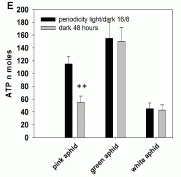
|
The figure here is a key part of their argument. They grow three types of aphids, each under two conditions: with or without light. They measure the ATP content of the aphids. Look at the left-hand set of bars, which is for "pink" aphids (also called orange in the paper). You can see that the ATP content for the light-grown aphids (dark bar -- confusing, isn't it) is much higher than for dark-grown aphids (light bar).
This is Figure 5E from the article.
|
Thus their claim is that, under one set of conditions (the pink/orange aphids), light harvesting by the carotenoids leads to ATP production. It's an interesting observation.
That's about it. They have other evidence on the reasonableness of their proposal, but there is no clear evidence that the carotenoids are actually contributing to the energy budget of the aphids. For example, in the experiment noted above, we see an effect of light, but there is no proof that the effect is due to the carotenoids. What kind of evidence do we want? Presumably a key part would be to detail the molecular mechanism for the proposed process. For now, I would be very cautious about what they claim, but it certainly is intriguing.
News story: Researchers find evidence of photosynthesis-like process in aphids. (Phys.org, August 21, 2012.)
The article, which is freely available: Light- induced electron transfer and ATP synthesis in a carotene synthesizing insect. (J C Valmalette et al, Scientific Reports 2:579, August 16, 2012.)
Background post: Red and green aphids (June 2, 2010). With pictures.
More about aphids...
* The aphid-bacterium symbiosis: a step toward manipulating it (May 15, 2015).
* Underground messaging between bean plants (July 29, 2013).
More about photosynthetic animals... Croatian Tethya beam light to their partners (December 16, 2008). Links to more.
The current post is on an animal that may behave like a plant. Here is one on a "plant" (actually an alga) behaving like an animal: Carnivorous algae -- that hunt large animals (October 7, 2012).
Acrobatic cockroaches inspire robot design
September 16, 2012
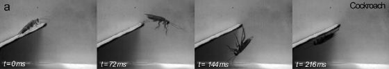
|
The figure shows four frames from a movie of a cockroach. The roach runs out to the end of the plank, then swings down and runs back along the underside.
This is Figure 1a from a recent article. Check the full figure in the paper, and you will see that part b of the figure shows similar behavior for a gecko. Then, part c shows similar behavior for a robot that the authors designed -- based on their understanding of the cockroach and gecko.
|
The basic story here is that they learned enough from watching the detail of how the small agile animals maneuver that they were able to design a robot that showed similar behavior. We can enjoy this as fun, but it is good science: learning how nature has solved a problem, and then applying what we learned. Making small maneuverable robots, for applications such as searching rubble, is an active field; the work here represents one step.
An interesting aspect of the work is how it was discovered -- quite by accident. The goal was not to study cockroach inversions, but to study how the animals crossed gaps. As the gap distance increased, the authors encountered a little mystery: the roach seemed to just disappear. Following-up led to the observations reported here.
News stories:
* Stealth Behavior Allows Cockroaches to Seemingly Vanish. (Science Daily, June 6, 2012.)
* Cockroaches and geckos disappear by swinging under ledges... and inspire robots. (E Yong, Not Exactly Rocket Science (Discover blog), June 6, 2012.) Now archived.
Movies. The article includes six movie files, all of which are freely available through the article web site listed below. The legends for the movies are near the end of the article. Most of the movies show cockroach, gecko, or robot doing its thing -- both at full speed, and then a slow motion version. (One movie shows a cockroach with a claw removed. That movie does not have a happy ending.) As examples:
* Movie S2. Cockroach.
* Movie S6. Robot.
The article, which is freely available: Rapid Inversion: Running Animals and Robots Swing like a Pendulum under Ledges. (J-M Mongeau et al, PLoS ONE 7:e38003, June 6, 2012.) Six videos are linked with the article, under "Supporting Information". Two of them are noted above.
The robot that served as the basis of the work here is the same one used as the basis of what was described in the post Wings for better walking (November 5, 2011). Last time, DASH got wings; this time, a bit of Velcro. DASH = Dynamic Autonomous Sprawled Hexapod. It's also known as the artificial cockroach. It's a Berkeley institution.
This is an example of bio-mimetic, or, better, bio-inspired engineering. The point is not to make an artificial cockroach, but to apply the principles we learn from studying the cockroach (in this case). Among other Musings posts that might be considered related:
* Progress toward an artificial fly (December 6, 2013).
* See cat run (March 14, 2012).
* A deceptive robot (September 4, 2012). In this case, the goal is something an octopus might do, though the method used is not learned from the animal.
For more about this emerging field, see my Biotechnology in the News (BITN) topic Bio-inspiration (biomimetics). It includes a listing of some other Musings posts in the area.
More about cockroaches...
* Why and how some cockroaches avoid glucose (October 11, 2013).
* Cockroach should be disinfected before eating it (February 12, 2013).
More about geckos... A story of dirty toes: Why invading geckos are confined to a single building on Giraglia Island (November 12, 2016).
A new, simple way to measure bone loss?
September 14, 2012
Bones are continually being remodeled. Old bone is broken down, and new bone is made. Proper bone health depends on these two processes being in balance. (In mid-life, the amount of bone is approximately constant.) In some diseases this balance is disturbed. In osteoporosis, bone loss exceeds the formation of new bone. In bone cancer, the formation of new bone exceeds bone loss.
A distinctive feature of bone is that it is "rock-like" -- a mineral, containing high levels of calcium (Ca). Thus the issue of bone balance can be thought of as bone mineral balance (BMB). How does one measure this BMB? Not very easily. X-ray is the common method. It's good at distinguishing the mineral deposits from the soft tissue, but it is not very good for making quantitative evaluations.
A recent paper offers a new approach for measuring a marker of BMB: the isotopes of calcium (Ca) that are secreted in the urine. Recall that isotopes are forms of an element that differ only in the number of neutrons. We sometimes say that the chemical behavior of various isotopes of an element is substantially the same -- that the neutrons do not affect the chemistry. But that is not completely true. The small difference in mass between the isotopes means that they move at slightly different speeds, and thus can behave slightly differently in some chemical reactions. Many cases are known where biological processes, using enzymes, preferentially use the lighter isotope. The effect is small, but measurable with modern mass spectrometers. The new work measures such an isotope effect that reflects BMB. The scientists had developed the method in earlier work. The purpose of this paper is to test the method in a real test.
Let's jump in and look at what they did. We'll then explain what it means.

|
In this experiment, 25 human subjects were given extended bed rest -- for a period of 30 days, as shown on the graph (at top). It is known that such bed rest leads to bone loss. The Ca isotopes in their urine were measured before, during, and after the bed rest. The graph shows the Ca isotope ratio versus time. The y-axis is a measure of these isotopes. Zero on the y-axis scale is the baseline ratio. Negative values mean that the urine contains lighter Ca than the baseline.
|
The variability of the measurements is rather high, as shown by the error bars. Nevertheless, you can see that the Ca isotope ratio is near the baseline value of zero for the days prior to the bed rest, and for the first few days of bed rest. However, within about 10 days of bed rest, the Ca ratio value declines markedly. (The gray bar shows the range that would be considered "zero".)
This is Figure 1A from the article.
|
The observation is the calcium isotope ratio. They see a decline in that ratio, indicating lighter calcium in the urine, at day 10. What does this mean? How is it related to BMB? From background work, they know that bone formation "fractionates" Ca: bone formation preferentially uses the lighter Ca isotopes. Then, when bone is broken down, this lighter mix of Ca is released and excreted. Thus lighter urinary Ca reflects bone loss. They develop a mathematical model to describe the effect quantitatively. And thus they interpret the result shown above as meaning that bone loss is detectable at about day 10.
10 days. Using their Ca isotope method, they can detect bone loss at 10 days; the standard method, using X-rays, would show nothing for about 12 weeks. That is, the new method is much more sensitive. It is also simple, and safer (no X-rays).
There are some things that may complicate the analysis. Food may provide a variable source of Ca isotopes. Further, natural bone metabolism varies with age. These effects were minimized in this study. But since they understand the basic phenomenon, they would be able to account for these real-world complications.
What might this method be used for? One use is simply what is done here, lab experiments. We lose bone in bed -- and in the weightlessness of space. It's a medical issue, but also an issue for astronauts. In fact, this work is a collaboration between multiple labs, including NASA. The method may also be useful for monitoring bone density of earthly humans, whether or not already diagnosed with bone disease. The current paper is exploratory, opening up the method for further work.
News story: Earlier Detection of Bone Loss May Be in Future: Isotope Analysis Rather Than X-Ray Used for Measurement. (Science Daily, May 28, 2012.)
The article, which is freely available: Rapidly assessing changes in bone mineral balance using natural stable calcium isotopes. (J L L Morgan et al, PNAS 109:9989, June 19, 2012.)
More about bone diseases: The role of zinc in arthritis (July 18, 2014).
More about bones:
* Human gracility (June 26, 2015).
* Do animal bones have something like annual growth rings? (August 7, 2012).
More about isotope analysis:
* Discovery of a chemical of biological origin from Mars? (January 2, 2015).
* The Moon: might it be a child with only one parent? (April 13, 2012). (The isotope analysis in this work was also done by mass spectrometry; that was not mentioned in the post.)
My page of Introductory Chemistry Internet resources includes a section on Nuclei; Isotopes; Atomic weights. It includes a list of related Musings posts.
Another post reporting a medical use of mass spectrometry: Coupling the surgeon's knife to a mass spectrometer (August 13, 2013).
More about calcium: Plants may be bad for Earth climate (April 17, 2012).
More about neutrons: Discovery of the neutron: 80th anniversary (February 27, 2012).
September 12, 2012
Have you ever installed a computer in an egg?
September 11, 2012
News story: the story. (Huffington Post (UK), August 14, 2012.) Worth it for the pictures alone.
If only we had more information! For now, this is basically "fun", but it is potentially good and interesting science.
How to dispose of unused medicines
September 10, 2012
You've probably heard that measurable levels of drugs (medicines) are found in the environment. And that you can avoid adding your unused drugs to the environment by returning them to a "take-back" station (such as a pharmacy), so that they can be incinerated. Seems like a good idea, doesn't it?
A new study raises questions about the value of such take-back programs. The study has gotten a lot of media attention. A big caution up front... The study raises interesting issues, but the conclusions are less clear than simple news stories may suggest. And that includes what I write here. Although I will summarize some of their conclusions, the main point is to raise questions, to show how complex the complete story is, and to introduce how you may approach analyzing all this. Be cautious about acting on any conclusions -- of theirs or mine -- at this point.
In the study, they compared three ways of disposing of unused medicines: trash, take-back, and toilet. (These lead, respectively, to the drug ending up mainly in landfill, being incinerated, or going through the waste water treatment system.) The following figure summarizes some of their results.

The figure shows analyses for five parameters (labeled across the bottom). For each, there are three bars, for trash, take-back, and toilet disposal; the color code is noted at the top. All the results are presented relative to current disposal (in the US), which is about half trash, half toilet.
The left hand frame is for API emissions. API = active pharmaceutical ingredient. That is, API is the drug itself. You can see that "toilet" is very high, take-back is essentially zero, and trash is low. It may also help to look a bit more carefully at the numbers. As noted above, the baseline is half toilet, half trash -- and this is defined as 1 on the scale. Since toilet is about 2 and trash is near 0, this makes sense.
The other four frames are for various non-API emissions, that is, for various other things besides the drug itself. As labeled here, they are respiratory effects, global warming, smog, and ozone depletion. In each case, take-back is the worst -- by far! This figure is part of Figure 2 from the article. The full figure includes five more non-API emissions, and the picture is the same: take-back is the worst.
So, one broad conclusion from the study is that take-back is the most effective way to get rid of the drug (since it is incinerated), but it is also the worst method by all other emission criteria examined. A trade-off! Understanding this further, and attempting to make practical recommendations, requires looking more carefully at some of the issues. Here are a couple of them...
First, there is a point about a basic premise. Most of us face this issue with the instinctive feeling that our disposing of unused medicines is a big concern -- is the reason why drugs are appearing in the environment. That may not be true. It may be that disposing of our unused drugs is only a minor contributor to the environmental load. (The main contributor? The drugs we -- and other animals -- do take, and excrete.) If disposal of unused drugs is not a big deal, then that affects how we may weigh the trade-off noted above.
Second, why is take-back such a polluting method? They say a major reason is the cost of driving to the take-back station -- especially for rural folks. Ah, so what about urban folks who could walk to the take-back station? Once again, the point here is to show that the analysis gets complex. In the paper they do begin to consider more complex scenarios.
I haven't given their recommendations here. I think I will leave it that way. It is true that medicines are appearing in the environment, and it is true that take-back systems have some merit in reducing drug release to the environment. The big story from their analysis is that it is more complex than you might think to evaluate what the best approach is. In fact, in some of the surrounding stories, the authors note that they intend their analysis primarily for policy makers, not for the consumer. I've addressed a couple of the complexities above; there are many more. As you read stories about this work, I hope you will go beyond the superficial conclusions, and see how many issues are involved. For example, one conclusion from their work is that more effective waste water treatment would be highly desirable. One result of their work, then, may be to drive further research.
News stories:
* New advice on medication disposal: Trash beats take-back, new study suggests. (University of Michigan News Service, May 16, 2012.) This is a news release from the institution reporting the work
* What to do with leftover prescription drugs. (Chemistry World, Royal Society of Chemistry, May 4, 2012.) Despite the title of this item, the work is about medicines in general, not just prescription drugs. In fact, aspirin and acetaminophen are among the top drugs studied in the paper.
Discussion: Environmental Emissions from the Disposal of Unused Medications. "This blog serves as a central location for the discussion of research article 'Life Cycle Comparison of Environmental Emissions from Three Disposal Options for Unused Pharmaceuticals' published in Environmental Science & Technology." This blog has some interesting discussion, including comments from the authors.
The article: Life Cycle Comparison of Environmental Emissions from Three Disposal Options for Unused Pharmaceuticals. (S M Cook et al, Environmental Science & Technology 46:5535, May 15, 2012.)
Also see:
* Drug degradation: A drug that reappears after being degraded (November 2, 2013).
* The bisphenol A (BPA) controversy (September 19, 2010).
Another example of "life cycle analysis", in a different context: Impact of watching movies on global warming (September 30, 2014).
More about water treatment: Reducing corrosion of sewage pipes (September 27, 2014).
Another disposal issue... Silk-clothed electronic devices that disappear when you are done with them (October 19, 2012).
Thanks to Borislav for raising the problem of drug disposal, and for some good discussions of the issues.
Bacteria induce simple "pre-animal" to become colonial
September 8, 2012
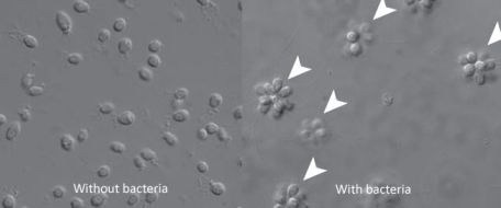
|
The two frames of this figure show two growth forms of Salpingoeca rosetta, a choanoflagellate.
On the left, most of the organisms are single cells. On the right, most have formed multicellular structures, called rosettes.
The figure here is reduced from the one in the news story listed below. It is similar to Figure 1 parts B and C from the article. The larger rosettes are about 20 micrometers across.
|
A couple years ago it was shown that rosettes form when the daughter cells do not fully separate from each other during cell division. That is, rosettes are formed "directly", not by previously separate cells coming together. Thus it seems that this organism can switch between growing as single cells or as a multicellular or colonial structures (the rosettes).
A new paper identifies a trigger for the transition to the rosette form. In nature these choanoflagellates feed on bacteria, and in the lab they are usually fed bacteria. When an attempt was made to clean up the choanoflagellate culture, by removing the bacteria, it was found that they no longer formed rosettes. The scientists followed on this clue, and found that the bacteria triggered the growth-form transition. Not just any bacteria, but one specific kind of bacteria found associated with the choanoflagellates. Go back to the figure above; the left side, with single cells, says "without bacteria", and the right side, with rosettes, says "with bacteria".
They went even further, and asked what part of the bacteria cause rosette formation. They found a particular chemical in the bacteria, a type of lipid, that causes the transition. So, they can now control the growth form of the choanoflagellate -- by whether or not they add a particular type of bacteria. Or by whether or not they add the specific inducing chemical from the bacteria. We presume that the interaction of bacteria with the choanoflagellates affects their growth form in nature.
Why is this so interesting? It's interesting at two levels. One is the direct level: we understand choanoflagellates better. Perhaps that doesn't excite you much -- especially if you have never heard of choanoflagellates. What are choanos (as they are sometimes called)? Ah, that brings us to the bigger reason why this is interesting. The organism here is a simple single-celled organism. No, actually, it is a rather complex single-celled organism. And it is thought to be the closest living relative of "animals". On a tree-of-life chart, the choanoflagellates are down near the base of "Animalia". It's not that people think animals developed from choanos, but more that the choanos are as close as we can get to a pre-animal. People are intrigued by what we can learn by studying choanos. For example, what "animal genes" do they contain? One key step in the development of "animal" was becoming multicellular. Is it possible that what is found here relates to the origins of the animal kingdom? Is it possible that bacterial signals helped cause a key step in the transition from single-celled to multicellular organisms? For now, we have no idea, though you will note plenty of speculation -- and hype -- on this point surrounding this story. Set the hype aside. People will be thinking about what this means, and what further tests might be done. As one example, people want to look at the role that bacteria may play in the development of sponges, a very simple animal.
Update, October 27, 2012...
The article has now officially appeared -- with a new title; it includes a brief "eLife digest", as an overview. It is also accompanied by a journal "Insight", which seems good. The information below reflects these developments. As noted, below, eLife is a new journal; this is the first time I have seen an eLife article in official final format. eLife is open access; the eLife links below are to PubMed Central. I have also added a link to a previous post about a new journal. And I've added one more news story; it appeared recently when the article became officially published.
News stories:
* Bacteria transform the closest living relatives of animals from single cells into colonies. (E Yong, Not Exactly Rocket Science (Discover blog), August 6, 2012.)
* Did Bacteria Spark Evolution of Multicellular Life? (Science Daily, October 23, 2012.) Excellent overview.
* "Insight" accompanying the article; it is freely available, via PubMed Central: Molecular clue links bacteria to the origin of animals. (M G Hadfield, eLife 1:e00242, October 15, 2012.)
* The article, which is freely available, via PubMed Central: A bacterial sulfonolipid triggers multicellular development in the closest living relatives of animals. (R A Alegado et al, eLife 1:e00013, October 15, 2012.) (I had originally linked to a pre-print available from the web site of UC Berkeley professor Nicole King, one of the leaders of the work.)
eLife? It's a new journal for Musings. But it is more. If you check the eLife web site, you will find that the total number of articles published in this journal is -- zero. eLife is not just a new journal for Musings, but it is a new journal -- one that has not yet published anything. They are accepting submissions, and accepting some articles for publication; journal launch will be later this year. The article above is noted as a preprint, and it is available not from the journal (which has no articles posted) but from the author (who has posted it with the journal's permission). eLife is an interesting development. It is intended as a prestige journal, fully open access. The Editor-in-chief is UC Berkeley's Randy Schekman -- who has served in that role for PNAS for several years. eLife is an interesting development -- as is the work reported here. Another Musings post about the first issue of a journal: Goethe, Huxley, and Nature (November 22, 2009).
This work shows how one organism sends developmental signals to another. With a bit of stretch, it involves a possible relationship between bacteria and animals. Here is a recent Musings post on the broader topic, with links to more: Getting along: animals and bacteria (August 6, 2012). Remember, in nature, organisms live together. It should not be surprising to find all sorts of relationships. We are increasingly learning about them.
More on multicellularity: The oldest known multicellular organisms? (August 21, 2010).
More on choanos: The choano-mouse: implications for understanding the origins of transcription factors that control stem cells (April 23, 2025).
More on simple animals:
* A novel nervous system? (July 20, 2014).
* Quiz: What is it? (October 31, 2012). See the answer.
For more about lipids, see the section of my page Organic/Biochemistry Internet resources on Lipids.
Analysis of teeth confirms that Regourdou was right-handed
September 7, 2012
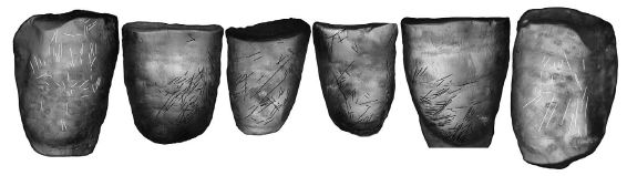
|
Regourdou's teeth. This is a front-view of his middle six lower teeth (four incisors and two canines).
This is Figure 4 from the article. You can see his complete lower teeth in Figure 3 of the article. If you want to see more of him, check out Figure 1 in the article. It's a front view -- I think.
|
As you can see, the teeth bear scratches. A new paper analyzes the scratches. What the scientists do is to measure the angle of each scratch, and then classify the scratches as right-leaning, left-leaning, horizontal, or vertical. The analysis is shown in the following figure, which is Figure 5 from the article.
|
In this figure, each column is for one tooth -- as labeled at the top. RC is right-canine, RI2 is right-incisor-2, and so forth.
The four colors are for the four scratch orientation categories, as labeled at the left. The size of the bar reflects the percent of the scratches with that orientation. The two categories of most interest are red, for R-oblique (i.e., right-leaning), and blue for L-oblique.
The key finding is that the red bar is bigger -- much bigger -- than the blue bar for each tooth. That is, there are more -- far more -- right-leaning scratches than left-leaning scratches.
|
They then argue that this is what one would expect if Regourdou is using his teeth as a third hand. (You've all done that, I suspect.) The bias of the scratch direction is because of the bias in holding most things with his dominant hand -- his right hand. Thus, analyzing the teeth scratches tells us the handedness of the person. (I suggest that you not worry too much about trying to follow their sign convention. What's important is to realize that a right-handed person and a left-handed person might well scratch their teeth differently.)
So, who is this Regourdou guy? (He is also called Regourdou 1.) He is a Neandertal man, from southern France. The time he lived is not stated here, but (from other sources) seems to be about 70,000 years ago. Analysis of his arms also suggested he was right handed; the point here is that the tooth analysis confirms the arm analysis.
For some context... About 90% of Neandertals have been found to be right-handed. Interestingly, that is about the same percentage as in modern human populations. Handedness reflects the lateralization of the brain -- different functions on the two sides; it is thought to be related to the capacity for speech. Thus the finding that most Neandertals are right-handed suggests that they may have had speech. That's a complex story -- controversial, and with little evidence. We note it in passing. The reason for noting this article is the clever idea of using tooth marks to help determine the handedness.
News story: Neandertal's Right-Handedness Verified, Hints at Language Capacity. (Science Daily, August 27, 2012.)
The article, which is freely available: Hand to Mouth in a Neandertal: Right-Handedness in Regourdou 1. (V Volpato et al, PLoS ONE 7(8):e43949, August 22, 2012.)
A previous post about Neandertals: What happened to the Neandertals? (October 8, 2010).
More on handedness:
* Handedness in kangaroos: significance? (July 31, 2015).
* On handedness in humans (September 30, 2013).
* On being ambidextrous (January 24, 2010).
More about Neandertal teeth... Barium, breast milk, and a Neandertal (June 17, 2013).
More about old teeth...
* The "hobbits": dentition suggests they were a distinct, dwarfed human species (November 30, 2015).
* The case of the missing incisors: what does it mean? (September 13, 2013).
* Helicoprion -- a fish with 117 teeth, arranged in a spiral (March 9, 2013).
More about teeth... How the teeth are sensitive to cold (June 14, 2021).
September 5, 2012
Our newest spiders: the cave robbers
September 5, 2012
|
Trogloraptor marchingtoni.
The body of the spider is about a centimeter long. With legs, it extends to about 7 cm (nearly 3 inches).
This is Figure 1 from the article.
|
This was a big news story around here. That's partly because the discovery is California-related -- though it is more from Oregon than California. Further, the work was led by a team from the California Academy of Sciences in San Francisco.
What's the story? Not just a new species of spider, or a new genus -- but a new family of spider. Opening up a new category at that high a level is uncommon. The spider was discovered in a cave near Grant's Pass, Oregon -- a few miles north of the California border. (One specimen, from California, may represent a different species.)
What's so interesting about this spider? For one thing, it is quite large, by spider standards. Second, the analysis suggests that it is a very ancient line of spider. Third, a distinctive feature is claws on its legs (at right; Figure 13 from the article). The scientists presume that the claws are used to catch food, perhaps insects that fly by the waiting spider. However, they have so far failed to see how this works. Attempts to feed a few of these spiders in captivity all failed; the spiders ignored all food, and died of starvation.
The genus name, Trogloraptor, means cave-robber, but in fact they know nothing of its life style at this point.
|
|
News story: New spider family identified in Oregon. (David Perlman, San Francisco Chronicle, August 15, 2012.)
The article, which is freely available: An extraordinary new family of spiders from caves in the Pacific Northwest (Araneae, Trogloraptoridae, new family). (C E Griswold et al, ZooKeys 215:77, August 17, 2012.) This is a 19 MB pdf file -- full of pictures!
More on spiders:
* Tarantulas in the trees (November 11, 2012).
* Spiders and violins (May 4, 2012).
More from the California Academy of Sciences:
* Quiz: What is it? (October 31, 2012). See the answer.
* The ant collector, with videos (July 16, 2009).
Another "new species" report: A newly described monkey species (October 22, 2012).
More from caves: Antibiotic resistance genes in "ancient" bacteria (February 11, 2017).
A deceptive robot
September 4, 2012

|
A robot on a pile of red leaves.
In the upper frame, you can easily see the whitish robot.
And in the lower frame? The robot is in the same place. See it?
The figure is part of Figure 2C from the article. The robot itself is 13 centimeters (5 inches) long.
|
This is a two-part story. Late last year, a team led by Harvard chemist George Whitesides published a new type of robot. It's a small, soft robot -- designed to be simple and inexpensive, not to mimic a common animal. You can see what it looks like above -- in the top frame. Now they add a new feature to their robot: camouflage. You can get an idea of the camouflage above -- in the lower frame.
This is delightful stuff, with numerous fun pictures and movies. It is also rather primitive. Although the goal is to build simple, inexpensive devices (which one would not mind losing in a real world application), these devices are probably too simple to see real use. For one thing, they are tethered to an external control system (which I carefully cut off as best I could for the pictures above). Using external controls makes it easier to do initial development work; it seems reasonable that autonomous devices of similar capability could be developed. The authors emphasize that the work here is a step in a new direction.
News story: Robots in disguise: soft-bodied walking machine can camouflage itself. (E Yong, Not Exactly Rocket Science (Discover blog), August 16, 2012. Now archived.) Includes a nice picture of the robot -- in a highly colored mode.
Movies: There are four movie files accompanying the article. You can get to them by choosing "Supplementary Materials" from the article web site, listed below. Movie S1 shows all the basics: a robot moves onto a bed of rocks, and then is camouflaged. The movie is about 5X actual speed; that is, about 2 1/2 minutes of action is shown there in a half minute.
The article: Camouflage and Display for Soft Machines. (S A Morin et al, Science 337:828, August 17, 2012.) The article contains several fascinating pictures; the one at the top of this post is trimmed from a much larger figure in the article. Further, there are four movie files, as noted above. The movie files should be freely available, whether or not you have access to the article itself.
The first part of this project, the basic development of the simple soft robots, was reported in late 2011. Here is a news story on that work; it links to the article. Gumby-like flexible robot crawls in tight spaces (w/ video). (Phys.Org, November 28, 2011.)
* Previous post on robots... Brain-computer interface: Paralyzed patients control robotic arm by their thoughts (June 16, 2012).
* Next: Acrobatic cockroaches inspire robot design (September 16, 2012).
More on deception and camouflage...
* Caterpillars can see color even if blindfolded (September 14, 2019).
* A "flower" that bites -- and eats -- its pollinator (December 27, 2013).
* Deceiving a rival male (August 28, 2012).
Also see... Chromatic aberration: is it how cephalopods see color with only one kind of photoreceptor? (October 14, 2016).
How a drug can cause an autoimmune reaction
September 1, 2012
Abacavir is a drug used to treat HIV. What concerns us here is that a few percent of those treated with the drug suffer a serious reaction. The reaction requires that use of the drug is terminated; otherwise, the reaction to the drug is life-threatening. A clue as to what is going on came, a few years ago, when it was found that people having the reaction carried the gene variant called HLA-B*57:01. A new paper shows why -- and it is verrrrrrrry interesting.
First, let's look at what HLA is about. HLA is a protein -- actually a whole family of proteins. It's part of your immune system -- perhaps the most complex and confusing part of your body.
At right is a cartoon to show what HLA does.
Let's start near the top. There are two gray bars. They represent cell membranes. One is the membrane of a T cell, and the other is the membrane of an APC -- an antigen-presenting cell. Each membrane contains a relevant protein, shown as a blue box. The T cell membrane contains a T cell receptor (TCR); the APC membrane contains an HLA protein. In between those two proteins is something called Peptide A, which seems to fit both proteins. In fact, the formation of this 3-part structure (HLA, Peptide, T cell receptor) is what activates the T cell, triggering an immune reaction (against Peptide A). We say that an APC presents an antigen to a T cell, activating the T cell to carry out an immune reaction. This is mediated by the HLA of the APC, "offering" the peptide, and the TCR of the T cell, which "receives" it.
|
|
Now look just below the APC membrane (near the middle of the figure). You see two Peptides (A and B). And then you see, just below them, an HLA. The cartoon suggests that Peptide A fits this HLA, but Peptide B does not. This step leads to the complex of HLA with Peptide A; that complex then binds to the T cell, as shown just above.
Thus we see that the HLA proteins are part of the process of presenting a peptide to the immune system. In fact they are part of choosing what gets presented -- and that is important. The HLA mentioned above, called HLA-B*57:01, is one of those proteins that helps antigens get presented to T cells.
One key aspect of the immune system is that it distinguishes self from non-self. The immune system is not supposed to attack your own proteins. How is this distinction achieved? During the early development of your immune system, it tests your proteins. It eliminates T cells that respond to your proteins. But to do that, the proteins (peptides) must first bind to an HLA, which "presents" them to the T cells.
(For now, skip the lower box part of this figure. We'll return to it later.)
This is Figure 1 from the article.
|
Ok, that is just some background about how the immune system works. Now, back to abacavir -- the drug that may provoke a immune reaction, for people carrying a particular form of HLA. The new finding is that the drug binds to that HLA -- right in that little pocket where the peptide binds. The drug changes what the pocket looks like -- changes what can bind to the HLA.
|
Here is an example of how the drug affects a peptide being recognized by the immune system. The graph shows the amount of peptide bound to HLA -- as a function of the amount of drug added. The y-axis shows the amount of peptide bound; the x-axis shows the amount of drug. The particular HLA tested here is the one implicated for this drug.
The graph shows that the amount of peptide bound to HLA increases as drug as added. No drug, no peptide bound. Add drug, and now the peptide is bound to HLA, where it could stimulate an immune reaction.
The figure here is part of Figure 2 from the article.
|
You might now go back to the first figure shown above. The bottom part of that figure shows some ways a small molecule, such as a drug -- shown there in red, could alter how HLA works. #3, at the right, is what they show is happening here... Drug binds to the pocket in HLA, thus altering what can bind to HLA. In their figure, Peptide B now binds to the HLA. If there is a T cell receptor for Peptide B, then we can have an immune reaction against Peptide B. This peptide was invisible to the immune system -- until the drug was added.
So here is the idea of what they think is happening... The drug can bind to one particular HLA variant. For those lacking this variant, there is no problem with the drug. But for those who have this variant, the drug binds -- and that changes what can bind to this HLA. Then what happens is that some "self" peptide binds to this HLA, and stimulates an immune reaction -- an auto-immune reaction, a reaction against your own proteins -- and that is bad. But you ask, if this is a "self" protein, why doesn't your immune system ignore it? That's because the drug has changed your immune system. Back when you were young and your immune system was learning what is "self", this protein did not bind to HLA, and thus was never recognized at all. Now, your immune system has changed, because of the drug binding to HLA; the peptide binds, and your immune system sees it as new, and reacts to it.
Part of that story may sound a bit familiar. If one gets an organ transplant, it may be rejected as "non-self". To help minimize this problem, the doctors try to match the immune system of donor and recipient, as best they can. What they are matching is the HLA system.
Implications? Beyond the immediate understanding of the effect of this particular drug, the authors note that the idea may lead to testing drugs against the HLA system. Further, I wonder if the idea could lead to new options in dealing with some auto-immune diseases. If the "offending" peptide -- and its HLA partner -- can be identified, perhaps the peptide-HLA interaction can be blocked (or modulated) by a drug designed to block the particular HLA.
News story: Mechanism Key in Drug Allergy Identified: New Way to Screen Drugs for Adverse Reactions Before Use? (Science Daily, May 29, 2012.)
The article, which is freely available: Drug hypersensitivity caused by alteration of the MHC-presented self-peptide repertoire. (D A Ostrov et al, PNAS 109:9959, June 19, 2012.)
Turns out that two groups studied this problem, reached similar conclusions, and published almost simultaneously. A news story on the other paper is: Research team uncovers mechanism behind drugs that cause altered immunity. (Medical Xpress, May 24, 2012.) This is a good brief news story, if you'd like a bit more at that level. It links to the article.
A recent Musings post on the complexities of the immune system: Heart damage: role of mitochondrial DNA (June 1, 2012).
More... If a cell needs more telomeres, can it get some from another cell? (November 15, 2022).
More on HIV... A simpler assay for detecting low levels of HIV, using gold nanoparticles (January 3, 2013).
My page for Biotechnology in the News (BITN) -- Other topics includes a section on HIV
Top of page
The main page for current items is Musings.
The first archive page is Musings Archive.
E-mail announcements -- information and sign-up: e-mail announcements. The list is being used only occasionally.
Contact information
Site home page
Last update: April 14, 2026
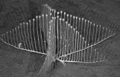