Home
> Musings: Main
> Archive
> Archive for September-December 2020 (this page)
| Introduction
| e-mail announcements
| Contact
Musings: September - December 2020 (archive)
Musings is an informal newsletter mainly highlighting recent science. It is intended as both fun and instructive. Items are posted a few times each week. See the Introduction, listed below, for more information.
If you got here from a search engine... Do a simple text search of this page to find your topic. Searches for a single word (or root) are most likely to work.
Introduction (separate page).
This page:
2020 (September - December)
December 16
December 9
December 2
November 18
November 11
November 4
October 28
October 21
October 14
October 7
September 30
September 23
September 16
September 9
Also see the complete listing of Musings pages, immediately below.
All pages:
Most recent posts
2026
2025
2024
2023:
January-April
May-December
2022:
January-April
May-August
September-December
2021:
January-April
May-August
September-December
2020:
January-April
May-August
September-December: this page, see detail above
2019:
January-April
May-August
September-December
2018:
January-April
May-August
September-December
2017:
January-April
May-August
September-December
2016:
January-April
May-August
September-December
2015:
January-April
May-August
September-December
2014:
January-April
May-August
September-December
2013:
January-April
May-August
September-December
2012:
January-April
May-August
September-December
2011:
January-April
May-August
September-December
2010:
January-June
July-December
2009
2008
Links to external sites will open in a new window.
Archive items may be edited, to condense them a bit or to update links. Some links may require a subscription for full access, but I try to provide at least one useful open source for most items.
Please let me know of any broken links you find -- on my Musings pages or any of my web pages. Personal reports are often the first way I find out about such a problem.
December 16, 2020
Briefly noted...
December 16, 2020
When did COVID-19 come to the United States? The common story is that the first case was reported in China in late December 2019. The first known case in the US is from late January 2020. However, there have been several reports suggesting that there may have been earlier cases -- in various places around the world. We now have an article reporting that some blood samples obtained in the US during mid-December 2019 (and into mid-January 2020), from routine blood donations, contained antibodies to the SARS-2 virus; positives were found among the samples from all states examined. The significance of such findings is open. It is possible that the observed antibodies originated as a response to some other coronavirus. The authors present evidence against this, but it is not conclusive. It is also possible that we still do not understand the origin and early spread of this virus. COVID mysteries abound -- and remain.
* News story: COVID-19 Possibly Arrived in the U.S. in Dec. 2019. (Carolyn Crist, WebMD, December 3, 2020. Now archived.)
* The article, which is open access: Serologic Testing of US Blood Donations to Identify Severe Acute Respiratory Syndrome Coronavirus 2 (SARS-CoV-2)-Reactive Antibodies: December 2019-January 2020. (Sridhar V Basavaraju et al, Clinical Infectious Diseases 72:e1004, June 15, 2021.)
* I have added this item to my BITN page section for SARS, MERS (coronaviruses).
* More about the early history of the virus: When did the SARS-2 (COVID-19) virus arise? A window into how a zoonosis starts (June 22, 2021).
How to clamp down to keep the partner from straying
December 15, 2020
Here's the idea...
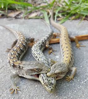
|
The figure shows (approximately) two lizards doing what biologists call a "mate holding". The one getting attention is a female.
They are southern alligator lizards, Elgaria multicarinata.
This is reduced and trimmed from the first figure in the New York Times news story, listed below.
The lizards used in the current work weighed about 50 grams, with a head length of about 2.5 centimeters (one inch).
|
The lizards can hold the pose for hours (even up to two days, in one recorded case).
The phenomenon raises several questions. A recent article addresses one of them: how do they do that? Vertebrate muscles usually don't work that way; they quickly fatigue.
Here is one test the scientists did in the lab on the jaw muscles of one of these lizards...
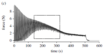
In this test, the muscle was stimulated. The force generated was measured. The main black curve on the graph shows the force (y-axis) vs time (x-axis).
For the first stimulation, the force rose, then quickly fell back to zero.
|
|
The stimulation was repeated, every three seconds. The pattern repeated -- except...
- The peak force declined. Muscle fatigue.
- After about a minute of rapidly repeated stimulations, a residual force remained after each cycle. This residual force gradually increased. It peaked at about 200 seconds (boxed region).
The graph here is a representative result, from a single animal.
This is Figure 2c from the article.
|
The experiment suggests there is some development of fatigue resistance in the jaw muscle.
Muscle fibers with that behavior, called tonic fibers, are not usually found in jaws. Preliminary biochemical investigation here suggested that the lizard jaw muscles contained such tonic fibers. Not much is known about the jaw muscles of reptiles, and the results here should be taken as preliminary. There is much more to be done to understand how this works -- much less why the lizards do it.
News stories. They include more pictures.
* Hold Me, Squeeze Me, Bite My Head. (Cara Giaimo, New York Times, September 29, 2020. Link is now to Internet Archive.)
* Male Southern Alligator Lizards Clamp The Heads Of Their Mates For Hours During Courtship -- This author observed a pair of southern alligator lizards in such an embrace for more than eight hours. (John Virata, Reptiles Magazine, October 1, 2020.)
The article, which is freely available: Fatigue resistant jaw muscles facilitate long-lasting courtship behaviour in the southern alligator lizard (Elgaria multicarinata). (A Nguyen et al, Proceedings of the Royal Society B 287:20201578, September 30, 2020.)
Among posts about jaws...
* Denisovan man: beyond Denisova Cave (May 7, 2019).
* How to eat if your jaw looks like a circular saw -- a follow-up (March 8, 2015).
Among posts about muscles...
* The basis of intersexuality in moles (November 28, 2020).
* Making better artificial muscles (March 13, 2018).
Among posts about lizards...
* The effect of hurricanes on lizards (August 14, 2018).
* Facultative endothermy: a lizard that is warm-blooded in October (February 1, 2016)
Colloidal microswimmers: 3D printing a micro-boat
December 13, 2020
Here is the boat...
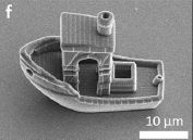
|
Transmission electron microscope (TEM) image of the boat. Note the scale bar.
This is part of Figure 1 from a recent article. Other parts of the full figure show other boats they made, including a starship and some simple boats.
|
The boat was made by 3D printing, along with some laser-assisted cutting and polymerization. The design here is one often used to test 3D printing skills; this is the smallest one yet, at about 30 micrometers length.
At this point, it might be good to watch a video. There are three boats in the following video, including the one shown above and a simple one. Movie, from the authors. (1 minute; no sound, but reasonably well labeled.)
The boat above shows off their printing skill, but a simpler microswimmer is more useful for now. The following figure shows the plan...
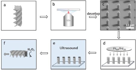
Part a shows the boat design. A simple spiral in this case. This is the second boat shown in the movie file.
Part b shows a surface, upon which an array of structures can be assembled. The cylinder at the bottom is a microscope lens.
Part c shows individual boats now all attached to the surface, endwise. TEM image. Look at those shadows!
Part d shows attachment of a platinum/palladium mixture to the free ends. That metal surface serves as a catalyst for the power-generating reaction.
Part e shows an ultrasound treatment, in water (blue). This removes the boats from the surface. Note that the top end is dark, representing the Pt/Pd from the previous step.
Part f shows one boat, now free, in action. Hydrogen peroxide (H2O2) is added; the Pt/Pd tip catalyzes its breakdown. That leads to production of oxygen gas (O2) at that end -- and resulting motion of the boat in the other direction. It's rocket science.
This is Figure 2 from the article.
|
Here are some examples of how the microswimmers behave...
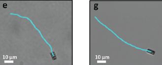
|
The figure shows single trajectories for two spiral microswimmers, like those of the previous figure, but with opposite twist directions. The two trajectories curve in opposite directions.
The speed is about 1 µm per second.
This is part of Figure 4 from the article.
|
The approach here allows the scientists to study the behavior of microswimmers of diverse shapes. Natural microswimmers include diverse bacteria and sperm cells, but previous artificial microswimmers were mainly spherical.
Anyway, that boat seemed worth a post.
News story: Physicists 3D Print a Boat That Could Sail Down a Human Hair. (John Biggs, Gizmodo, October 25, 2020.)
The article, which is freely available: Catalytically propelled 3D printed colloidal microswimmers. (R P Doherty et al, Soft Matter 16:10463, December 14, 2020.)
A previous post making use of the same kind of propulsion system: Self-powered micromotors for speeding up chemical reactions, such as destruction of chemical weapons (March 14, 2014).
Among posts about boats...
* Monitoring whales from space (June 23, 2019).
* TALISE: A better boat for Titan? (October 16, 2012).
Added April 14, 2026.
More about laser tools... Developing a laser saw for cutting bones (April 14, 2026).
Previous post about 3D printing: 3D printing: Make yourself a model of the universe (December 19, 2016). Links to more.
December 9, 2020
Briefly noted...
December 9, 2020
Phosphine on Venus -- follow-up #2. Briefly... Scientists recently claimed the detection of substantial amounts of phosphine (PH3) in the atmosphere of Venus. The amounts were too great to be explained by known (geo)chemistry, so they suggested it could be a sign of life. The work has generated considerable discussion and critique, just as should happen with surprising new claims. Among the developments... One of the data sets used for the analysis was found to be wrong (due to improper instrument calibration). Using the corrected data, the original authors have done a re-analysis, and posted a new preprint. The signal for phosphine is greatly reduced -- but not gone. The news story listed here, from last week, summarizes this and other developments.
* News story: Claim that there's phosphine on Venus comes under intense scrutiny. (Bárbara Pinho, Chemistry World, December 3, 2020.) Links to several things, including the new preprint (not peer reviewed) from the original authors. Items at ArXiv are always freely available.
* Background post: Briefly noted... Phosphine on Venus? Implications for the possibility of life on Venus? (October 7, 2020).
Making lonsdaleite -- with diamonds in it -- at room temperature
December 8, 2020
Diamonds are made naturally by the compression of carbon at high temperature and pressure, deep inside the earth. Diamonds are also made artificially by mimicking those conditions.
A new article reports making diamonds at room temperature. That in itself is an interesting development. The article is also of interest for how the diamonds are made, and for how the scientists characterized the process.
The following figure shows the product, and describes the story.
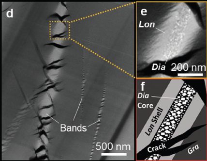
The basic process was to put some graphite-like C in a diamond anvil cell, and put it under high pressure. The temperature (T) was "ambient", unusually low for making diamonds.
Part d (left) shows am electron micrograph of the product. The original material gives a uniform gray background. And then there are several bands of new material, more or less aligned. (Don't get excited about the other prominent feature, the black regions.)
Part e (upper right) shows an expanded view of a small region of a band. You can now see that the band contains two kinds of material: a major material, and smaller pieces of a different material inside. The nature of these materials has been identified by various work in the article, and they are labeled: Lon, Dia. Lonsdaleite, diamond.
Part f (lower right) diagrams the band: a lonsdaleite shell, with a diamond core. The background is "gra" -- graphitic carbon. (And those prominent black features are cracks.)
This is part of Figure 2 from the article.
|
The scientists have made diamonds -- at room temperature. That is novel.
What's also novel is that they examined the material as it came out, prior to cleaning it up (separating the diamonds, or such). That offers information about the process. The diamond is made inside the lonsdaleite. Why?
They don't have an answer to that, but before even trying, we need to step back and talk a little about lonsdaleite. It is another form of carbon, originally discovered in a meteorite, where it was probably made upon Earth impact. It is like diamond, in that the C atoms are arranged tetrahedrally (sp3-hybridized), but with a different crystal structure. It is not well-studied, but theory suggests that it may be harder than diamond; it could actually be useful, if we had a way of making it. (Lonsdaleite is sometimes referred to as a form of diamond, or as diamond-like.)
So the new procedure makes not only diamond, but also lonsdaleite, which is worthy of study and potentially useful.
How do they get diamond to form at room T? The secret, they think, is providing shear (twist) during the high pressure treatment.
And what is the connection between making lonsdaleite and making diamond, which only appears inside the lonsdaleite? Again, the scientists don't know. It is unlikely that diamond is made from lonsdaleite under pressure. It is possible, however, that it is made during the decompression step.
So we have a novel and promising way to make diamonds as well as a related but less-studied material. The process is incompletely understood. More work!
News stories:
* Scientists Defy Nature: Making Diamonds in Minutes at Room Temperature. (SciTechDaily (Australian National University), November 20, 2020.)
* Diamonds created in minutes at room temperature. (Victoria Corless, Advanced Science News, November 20, 2020.)
The article: Investigation of Room Temperature Formation of the Ultra-Hard Nanocarbons Diamond and Lonsdaleite. (D G McCulloch et al, Small 16:2004695, December 17, 2020.)
More about making diamonds:
* Making diamonds in 15 minutes at ambient pressure. (June 5, 2024).
* Another Solar System planet -- revealed by its diamonds? (May 22, 2018).
More about the forms of C:
* A new form of carbon -- hard enough to scratch diamond (March 1, 2022).
* A new form of carbon: C18 (September 24, 2019).
Other posts on work with diamond anvil cells include:
* How much hydrogen is in the Earth's core? (May 22, 2021).
* Superconductivity at room temperature -- at last (October 18, 2020).
The oldest known identical twins
December 7, 2020
Here they are...
The twins themselves are shown in part a.
The items in part d were found on the individual at the right. One is a fox tooth; three are mollusks. The uniform holes in these (and other) items suggest they were strung together.
The bodies were found in 2005, at a site in Austria. A new article reports new analyses of them.
This is part of Figure 2 from the article.
|
Why do we say they are twins -- identical twins? Because, as reported in the new article, scientists have sequenced their DNA. The two individuals have "identical" DNA.
They are 31,000 years old -- the oldest-known identical twins.
A third individual was found nearby; he was -- by genome sequence -- probably a close cousin.
The article contains more, especially analyses of the teeth. That provides information on the age and feeding. One of the twins probably died shortly after birth. The other twin died at about 7 weeks of age. It is interesting that the twins were buried together, despite dying a few weeks apart. The cousin died at about 13 weeks of age. The lack of a good signal of breast-feeding in the cousin suggests there was a food shortage.
The family burial and the adornments attest to the human culture -- 31,000 years ago.
News stories:
* Earliest Known Case Of Identical Twins Found In Upper Palaeolithic Grave. (Rachael Funnell, IFLScience, November 9, 2020.)
* The world's oldest twin burial deciphered. (Austrian Academy of Sciences, November 11, 2020.)
The article, which is freely available: Ancient DNA reveals monozygotic newborn twins from the Upper Palaeolithic. (M Teschler-Nicola et al, Communications Biology 3:650, November 6, 2020.)
For more about twins...
* Identical twins: an epigenetic marker, which may allow people to tell if they are an identical twin (October 16, 2021).
* Unusual twins: neither monozygotic nor dizygotic, but... (March 11, 2019). Links to more.
* Twins (April 30, 2009). Links to more.
A post about a way to analyze teeth: Barium, breast milk, and a Neandertal (June 17, 2013). The methodology of this earlier post was one of the tools used in the current work.
More old things, with DNA analysis... What can we learn from 17,000-year-old cat feces? (September 16, 2019).
There is more about genomes on my BITN page DNA and the genome. It includes an extensive list of related Musings posts.
On restoring ecosystems: priorities?
December 5, 2020
There is a lot of interest in restoring ecosystems. We don't need to get into the background of how ecosystems become "degraded" from what we consider their natural state. (An area that has been deforested and converted into cropland would be an example.) The question at hand is... Given limited resources for a large task, which ecosystems are highest priority to restore?
A recent article addresses the question. It starts by noting that it is rarely addressed, with ecosystem restoration largely done on an ad hoc basis. The work starts by setting criteria by which to judge the value of a project, and then evaluating a large global set of possible projects. It is computer modeling.
The three criteria the authors used to rate the value of ecosystem restoration projects are:
- Increasing biodiversity;
- Reducing climate change (by reducing CO2 emissions);
- Cost (including loss of agricultural productivity).
The following figure shows an example of what they found...
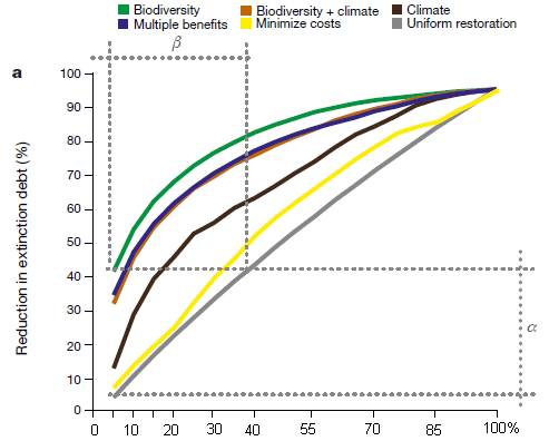
This figure compares different plans for their effect on biodiversity. It shows the biodiversity benefit (y-axis) vs extent of restoration (x-axis).
Start by comparing two of the curves... The gray curve (bottom) is for a random choice of restoration projects. The green curve (top) is for doing the projects in order by their biodiversity benefit. The green curve is better, which is not surprising.
What's more interesting is that there are two curves just below the green curve, which are almost as good. One of them is for choosing projects by two criteria jointly (biodiversity and climate); the other is for choosing projects by all three criteria jointly ("multiple benefits").
That is, the best way to get biodiversity benefit is to focus on biodiversity. But you can do almost as well for this one criterion by looking at multiple criteria.
This is part of Figure 2 from the article. I added the numbers on the x-axis; they are included in the article at the bottom of the full figure. (The unusual distribution of tic marks is from the original.)
|
Accompanying figures show similar analyses for effect on climate change and cost. The big picture that emerges is that ranking projects jointly by all three criteria leads to choices that serve all three purposes well (though not the very best for any one criterion). Certainly, the approach is better than random choices, by any criterion.
From the abstract... "We find that restoring 15% of converted lands in priority areas could avoid 60% of expected extinctions while sequestering 299 gigatonnes of CO2 - 30% of the total CO2 increase in the atmosphere since the Industrial Revolution. ... Cost effectiveness can increase up to 13-fold when spatial allocation is optimized using our multicriteria approach..."
Have they done all this right? Have they chosen the best criteria? That's not the main point. The details of their modeling can be subject to discussion, and exploring alternatives. The Discussion section of the article includes a major section on the limitations of the work. What is important is that they have begun to analyze projects by objective criteria. The benefits of ecosystem restoration will be greatest if projects are chosen by established criteria -- multiple criteria. That may not seem surprising, but the current article is a first step toward implementing such a system for choosing projects, and for doing so on a global scale.
News stories:
* Pinpointing high impact areas for ecosystem restoration. (International Institute for Applied Systems Analysis, October 14, 2020. Now archived.)
* Restoring 30% of the world's ecosystems in priority areas could stave off extinctions and absorb CO2. (Phys.org (PUC-Rio), October 14, 2020.)
* News story accompanying the article: Ecology: Prioritizing where to restore Earth's ecosystems -- Targets for ecosystem restoration are usually specified in terms of the total area to be restored. A global analysis reveals that the benefits and costs of achieving such targets depend greatly on where this restoration occurs. (S Ferrier, Nature 586:680, October 29, 2020.)
* The article: Global priority areas for ecosystem restoration. (B B N Strassburg et al, Nature 586:724, October 29, 2020.)
Among posts on ecosystem maintenance...
* Who cleans up the forest floor? (November 3, 2017).
* Why you shouldn't frighten the grasshoppers (October 29, 2012).
There is also a recent "briefly noted" item... Briefly noted... Trees, land use, food -- and more (May 29, 2019).
Among posts on biodiversity...
* The ultimate census: the distribution of life on Earth (June 22, 2018).
* Life that thrives on hot air (September 5, 2009).
December 2, 2020
Briefly noted...
December 2, 2020
1. mRNA vaccines. They have been in the news because of the announcements of results for vaccines against COVID-19. Using mRNA to make protein is normal biology. Using mRNA for vaccines has a big appeal: ease of making new versions. However, there have bean technical hurdles, and earlier work gave mixed results. A recent news story provides a nice overview of mRNA vaccines.
* News story: The Promise of mRNA Vaccines -- Long before Moderna and Pfizer's COVID-19 shots, scientists had been considering the use of genetically encoded vaccines in the fight against infectious diseases, cancer, and more. (Diana Kwon, The Scientist, November 25, 2020.) Now archived.
* This item is also noted on my page Biotechnology in the News (BITN) -- Other topics under Vaccines (general) and under SARS, MERS (coronaviruses).
2. A person who was discussed in Musings has been elected to the United States Senate.
* News story: Mark Kelly's Secret Weapon -- The newly elected senator from Arizona joins an exclusive club of astronauts turned politicians. (Marina Koren, Atlantic, November 6, 2020.)
* Background post: Briefly noted... 1. The effect of space travel on humans: a study of identical twins. (November 13, 2019).
* Another post noting an American astronaut who later became a politician: One way trip to Mars (September 22, 2009).
Why are some people "elite controllers" of HIV?
December 1, 2020 (World AIDS Day)
The human immunodeficiency virus (HIV) is a retrovirus. The RNA genome of the virus is reverse-transcribed to DNA, and the DNA copy is integrated into the host's genome. We now have various drugs that are quite effective at controlling replication of HIV, but they do not provide a cure, because the virus is integrated into the host genome. Stop the drugs, and the virus becomes active again.
A small percentage of people with HIV do not make virus after the usual drug treatment is stopped. They appear healthy, despite carrying the virus in their genome and not taking a drug against it. These people are known as "elite controllers". Why some people are elite controllers has long been an interesting mystery.
A recent article offers an explanation as to why some people are elite controllers. The following figure gives the idea. Caution... there is a lot of data here; we'll try to summarize the key points.
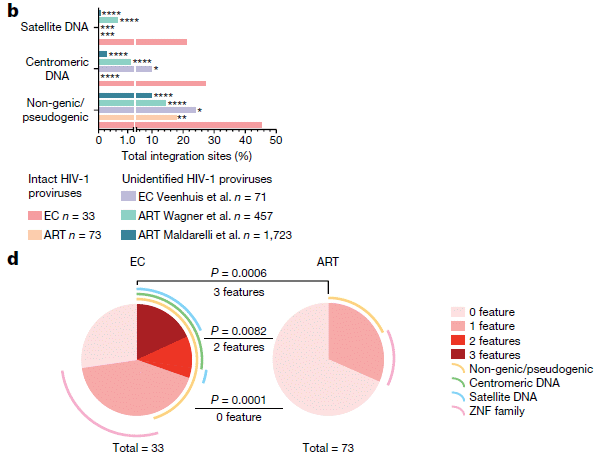
Let's start with part b. There are three sets of bars, labeled at the left. The last of those sets is labeled "non-genic/pseudogenic". There are five bars, but the bottom two will suffice for us here. They are for people who were elite controllers (EC; bottom bar) and people who were on anti-retroviral therapy (ART; next-to-bottom bar).
Each bar shows the percent of the HIV integration sites that were of this type (i.e., in non-genic/pseudogenic regions, for the bottom group).
For example... The last bar of part b shows that 45% of the viral integration sites in elite controllers were in non-genic/pseudogenic regions. In contrast, a bit under 20% of integration sites in the ART group were in those regions.
That is... EC were more likely to have viral integration sites in those regions. That, in a nutshell, is the big story. Why? Because those regions (non-genic/pseudogenic) tend to be repressed (non-functioning) in the genome. That is, elite controllers tend to be people who have HIV genomes that are probably highly repressed, because of where they are in the genome.
There is more data, but if you see that pattern from those two bars, the rest is just more of the same.
Most importantly, the other two sets in part b are for two other genome regions that tend to be repressed. In both cases, EC people are more likely to have viral integration sites in those inactive regions than are ART people. Part c of the figure (not shown here) deals with a fourth such type of repressed region. It's a more complex story, but the idea is, again, the same.
Part d summarizes the findings in two pie charts. For viral integration sites in the ART group (right side), most sites (about 3/4; lightest color; see key at the right side) had none of the features that lead to repression. About 1/4 of the sites had one such feature. For viral integration sites in the EC group, the picture is very different: only about 1/4 had no repression features, about 1/2 had one, and about 1/4 had more than one.
What about the other three bars in each set of part b? The two bars discussed above are for analyses done in the current work, where care was taken to consider only intact viral genomes. The first three bars are for analyses from other work; one is for EC and two are for ART. These analyses were not restricted to intact viral genomes, so their significance is less clear.
Infected individuals usually contain multiple copies of the HIV genome. For the EC, the average is about 20 viral genomes per host genome. It is higher in the ART group. The meaning of those numbers is complex; not all copies are complete.
This is part of Figure 4 from the article.
|
Integration of the HIV genome into the host genome is, to a first approximation, random. If the virus integrates into a site that is highly repressed, there is a good chance that the virus won't function. A person with no viral copies in more open regions has a better chance of staying disease-free, even without (or after) antiviral treatment. That is, being an elite controller is related to where the viral genomes are in the host genome.
But it is more complicated. If anything, integration into active regions of the genome is more likely; inactive regions are "buried" and inaccessible. It is likely that the observed pattern of integration sites is not what happens originally. The authors suggest that the immune system of the EC has managed to destroy all the cells with active copies of the virus, leaving only cells with inactive copies -- including intact copies in repressed (inactive) regions. Why that happens in a small percentage of people is open for now.
News stories:
* Unique HIV reservoirs in elite controllers. (Science Daily (Massachusetts General Hospital), August 26, 2020.)
* Elite controllers may self-vaccinate against active HIV infection, gene study suggests -- Authors say one of their subjects has probably 'cured herself' of HIV. (Gus Cairns, aidsmap, August 28, 2020.)
* News story accompanying the article: Virology: Deep-sleeping HIV genomes under control -- In a few people living with HIV, the virus remains under control without antiretroviral therapy. It emerges that, in these people, the viral DNA that is integrated into the host genome is in a deeply transcriptionally repressed state. (N Chomont, Nature 585:190, September 10, 2020.)
* The article: Distinct viral reservoirs in individuals with spontaneous control of HIV-1. (C Jiang et al, Nature 585:261, September 10, 2020.)
A recent post about HIV: Role of a receptor for HIV in stroke recovery (March 23, 2019).
My page for Biotechnology in the News (BITN) -- Other topics has a section on HIV. It includes a list of related posts.
There is more about genomes on my BITN page DNA and the genome. It includes an extensive list of related Musings posts.
How flies perceive optical illusions
November 30, 2020
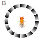
|
If a fly sees the ring pattern shown at the left, it will turn. (We'll show some data in a moment.) The pattern itself is stationary, but somehow it leads to the illusion of motion.
This is Figure 1B from the article.
|
Humans respond similarly to such patterns. So do other vertebrates, including fish. It is known that the regular light-dark shading, called a sawtooth gradient, is what is important, but attempts to explain how the illusion works have not yet yielded any good understanding.
This is a well-known type of optical illusion -- for humans. That it also works for flies is reported in a recent article. (The flies are fruit flies, Drosophila.) That's interesting. More importantly, that it works for flies allows the scientists to do genetic experiments on how it works.
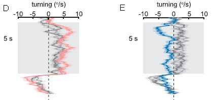
Here are some results...
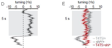
Part D (left) shows the results for normal flies. The graph shows how the flies turn as they see the pattern: turning rate (degrees per second; x-axis, labeled at the top) vs time (y-axis). Quite consistently, they turn to the "right", as shown in this graph. (That corresponds to clockwise rotation in the apparatus.) After five seconds, the nature of the display is changed, and the fly behavior is changed; we'll skip that part here.
Part E (right) is for flies that have been genetically modified, to eliminate the function of two types of neurons known to be involved in detecting motion. The red results are for these modified flies. (The gray results are for controls, and are similar to the left-hand graph.) The results are clear: flies lacking the function of two types of neurons that respond to motion don't turn when they see the pattern.
This is from parts D & E of Figure 1 from the article. (The full parts D & E have multiple sub-parts; what is shown here is the middle of each.)
|
That result shows that the flies respond neurologically as if the stationary pattern is moving. It is an optical illusion for the flies.
In the test above (part E), the scientists turned off two types of neurons, called T4 and T5, together. What if those types of neurons are turned off individually? The following figure shows the results...
The test is like those above. And the gray data for the controls generally agrees with the earlier controls.
But now look at the colored data in the two parts. In part D, the red data shows that the flies turned to the right. In part E, the blue data shows that they turned to the left.
In D, one type of neuron (T5) was silenced; in E, the other type (T4) was silenced.
This is part of Figure 5DE from the article.
|
The overall picture that emerges is that features of the stationary image are interpreted -- separately -- as clockwise and counterclockwise rotation. Those two signals don't cancel out. Therefore, the fly "sees" motion.
So what? There is evidence that humans (and presumably vertebrates in general) interpret the features about the same way. It would then follow that we see the illusion for the same reason the flies do. Can we test that hypothesis? The authors discuss the issue, and even do one simple test with people. There is more to be done, but there seems to be good reason to use flies as a model system, at least as a starting point, for studying how humans perceive optical illusions. There is little connection between fly and vertebrate brains; it seems that Nature has discovered similar solutions more than once.
How do T4 and T5 neurons work? Briefly, they are edge-detectors. The illusion has a systematic bias of light and dark edges. The responses to the different edge types are slightly different. That doesn't matter in nature, where edge types are random. But it does matter when there is a systematic pattern; the slight imbalance in response ends up being interpreted as motion.
News stories:
* Flies get mesmerized by optical illusions too - and this could explain the phenomenon. Although the lineages of flies and humans diverged half a billion years ago, we're both tricked by the same optical illusions. (Tibi Puiu, ZME Science, August 24, 2020.)
* Optical Illusions Explained in a Fly's Eyes. (Neuroscience News (Yale), August 24, 2020.)
The article: Mechanism for analogous illusory motion perception in flies and humans. (M Agrochao et al, PNAS 117:23044, September 15, 2020.)
For fun... Scroll this page so that the top figure (the ring) is visible. Now scroll it up and down. What do you see?
A post about an optical illusion: Bright lights and pupil contraction (March 2, 2012).
Other illusions...
* Why bats fly into windows (December 3, 2017).
* How to confuse a yeast -- a sensory illusion (January 15, 2016).
Previous post about using Drosophila as a model neurological system: Chronic pain in flies? (October 6, 2019).
A post about testing vision in another small arthropod: How to seat a spider in front of the computer (September 28, 2010). The set-up for the fly in the current work was similar to what is pictured in this earlier post.
The basis of intersexuality in moles
November 28, 2020
In many species of moles, the females are actually intersex, with gonads that have well-defined testis and ovary parts.
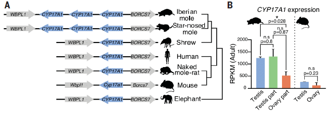
A recent article reports the genome sequence of the Iberian mole, Talpa occidentalis. The scientists then go on to explore how the intersex state develops. They also offer some suggestions about why it happens.
The following figure shows some of the findings...
Start with part B, at the right. It shows the level of expression of a particular gene, CYP17A1, involved m male development. Results are shown for mole and mouse.
The results for mouse are to the right of the dotted line. Higher in testis (blue) than in ovary, as might be expected.
The results for mole are to the left. There are three bars; all of them are higher than found in mouse. One bar is for testis, from real males. The other two bars are for the testis and ovary parts of the ovotestis found in females.
Part A of the figure (left) summarizes the genome information for this gene (highlighted in blue) for several mammals. The important result is that the two mole species shown (top two genomes) have three copies of the gene; all other mammals shown have only one.
This is part of Figure 1 from the article.
|
The results above offer a clue about why female moles have an unusually high level of maleness. We have known that they have ovotestes; we now have some information about the underlying genetics and resulting biochemistry.
Further analysis showed that the mole genomes contain a novel regulatory element, called an enhancer, for the CYP17A1 gene. The enhancer was actually more important than the multiple copies. As a test of the role of this regulatory element, the scientists constructed mice with the mole enhancer acting on the corresponding mouse gene. Here are some results from that test...
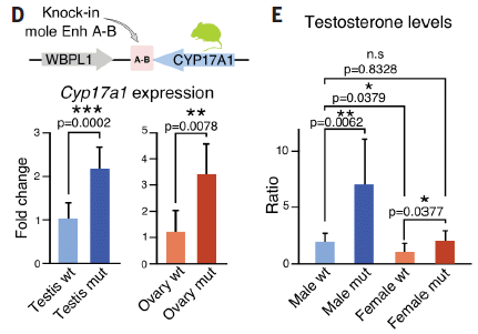
The genetic construct is shown at the top of part D. The enhancer from mole is inserted by the mouse CYP17A1 gene. It is labeled Enh A-B in the header, and just A-B in the gene diagram itself.
Mice carrying the mole enhancer for the gene that leads to more male hormone were then compared with wild type mice. They are labeled "mut" and "wt", respectively.
Part D shows results for the expression of the gene. In both male and female mice, adding the mole enhancer led to greater expression of the gene. That is, the effect of the enhancer shown in moles also held when the enhancer was tested in mice.
Part E (right) shows results for testosterone level. They confirmed the effect.
This is more of Figure 1 from the article.
|
Overall, the work discussed above uncovers a genetic feature that might reasonably be involved in the unusual sexual development of female moles. A test of this feature in mice supports the connection.
The article also includes another genetic feature that increases maleness in female moles. Once again, testing it in mice supports the connection.
The work suggests that the intersex nature of female moles is a genetic characteristic. Perhaps it was selected for. Why? Moles are diggers, and that requires muscle. Female moles have unusually strong muscles. Their intersex state may be a compromise between being good females and good diggers.
The testis tissue in female moles does not produce sperm. But it does produce male hormones, which are useful.
News stories:
* Mole genome reveals why females have both ovaries and testicles -- An in-between sex can exist in nature, and moles are a prime example. (Tibi Puiu, ZME Science, October 8, 2020.)
* Duplications and inversions of DNA segments lead to the masculinization of female moles. (Joint press release by Charité - Universitätsmedizin Berlin, the Max Planck Institute for Molecular Genetics, and the Max Delbrück Center for Molecular Medicine, October 8, 2020.)
The article: The mole genome reveals regulatory rearrangements associated with adaptive intersexuality. (F M Real et al, Science 370:208, October 9, 2020.)
More about moles (the animals)... What happens if you block the left nostril of a mole's nose? (April 19, 2013).
Another post about unusual sexual development:
On his right side, he is female (April 24, 2010)
More about muscles... How to clamp down to keep the partner from straying (December 15, 2020).
There is more about genomes on my page Biotechnology in the News (BITN) - DNA and the genome. It includes an extensive list of related Musings posts.
November 18, 2020
Briefly noted...
November 18, 2020
Measles history. Scientists have reported sequencing a measles virus genome recovered from a hundred-year old tissue sample. It is not only the oldest genome sequence for this virus, but also the oldest for any RNA virus that infects humans. Taken along with other data, it suggests that human measles split off from bovine rinderpest about 2500 years ago, more than a thousand years earlier than previous estimates. (That is when the viruses diverged. The date of first human infection must be more recent, and is not known.)
* News story: Measles Virus Much Older Than Previously Thought - Genome Sequenced From Century-Old Diseased Lung. (SciTechDaily (KU Leuven), June 28, 2020.) Links to the article.
* I have noted this story on my page Biotechnology in the News (BITN) -- Other topics under Measles. That section includes a list of related Musings posts, including one on the eradication of rinderpest a few years ago.
* A post, in this week's set, about the virus for another of the classic childhood diseases: What is in the rubella virus family? (November 15, 2020).
A robotic system that can figure out what to do by reading a scientific article
November 17, 2020
A common scientific activity is to repeat an experiment that has been published. One reads the published procedure, then carries it out in the lab. In modern labs, robots may assist with carrying out the experiment. Robots are good at transferring 15 mL of a designated solution into another container.
But what if the robot would just do the whole thing -- starting with reading the procedure? That is what is reported in a recent article.
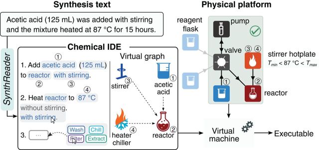
The following figure gives the idea...
At the upper left is some text from the source ("synthesis text").
Just below that, to the left, is the procedure proposed by the robot, in plain language. It has also been edited, by a human, to correct an error in what the robot proposed. This section is labeled "chemical IDE", for chemical integrated development environment. "SynthReader" (label at the left) is the program that translates the original text into instructions.
The rest of the figure fills out more detail. What is discussed above is the major development.
This is Figure 2 from the article.
|
For a longer version of the story, look at Figure 1 of the article [link opens in new window]. In particular, look at part B, which compares how a person would carry out the analysis (left side) with how the robotic system carries it out (right side). Note the icons used on the steps on the right side to show automated and manual steps; these icons are defined at the lower left of the entire figure.
The scientists carry out several syntheses using the system. As noted, humans intervene to check what the software proposes.
And yes, the current work is largely a software project. Robots that can do the experiment exist. The goal here is the front-end: getting the robotic system to read the article and figure out what to do. The resulting code is intended to be portable, capable of driving any of a number of robotic experimentalists.
One part of the work is the development of a software language for encoding chemical procedures. It is called ΧDL, for chemical description language. The first letter of ΧDL is a chi, the first letter of the Greek word for chemistry. ΧDL is a step toward better communication with robotic chemists.
Another part is the software to process human-written text, as in scientific articles, and analyze it for procedures.
Defining clear modules and establishing rules to make them portable (universal) are key parts of making this increasingly useful in the long run.
News stories:
* 'Digital chemistry' breakthrough turns words into molecules. (Phys.org (University of Glasgow), October 2, 2020.) Includes a link to the robot's web site.
* Can You Say "Chemputer"? (Kim Bellard, Health Care Blog, October, 28, 2020.)
The article: A universal system for digitization and automatic execution of the chemical synthesis literature. (S H M Mehr et al, Science 370:101, October 2, 2020.)
More robotics: A robot that can chew gum (March 30, 2021).
What is in the rubella virus family?
November 15, 2020
Ruhugu and rustrela viruses, according to a new article.
That's interesting, because prior to this new work, rubella (German measles) virus had no known close relatives. We lacked any understanding of its origin.
The following figure shows the relationship between the rubella virus and the two newly-discovered viruses. It also shows the animals known to be infected by them.
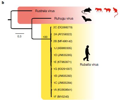
The genealogy chart is based on analysis of the viral genomes.
The yellow part of the figure shows several strains of rubella virus; they are very close genetically. And it shows that the only known host is man. The animal symbol is shown in black, to indicate that this is the major host, so far as we know.
Just above that is the ruhugo virus, which was discovered in cyclops leaf-nosed bats (Hipposideros cyclops) in Uganda. The bats showed no signs of illness. The bat species is found across a wide swath of Africa. Again, black symbol for the animal; it is the only known host.
Above that is the rustrela virus. Judged by genome sequence, rustrela might be an ancestor of both of the others. It was found in several animals in or near a small German zoo. That includes some sick zoo animals (donkey, capybara (a large rodent), Bennett's tree-kangaroo). It also includes wild mice found near the zoo. The mice carried the virus, but were not sick. The mice are common throughout Europe.
The mouse is shown in black; it is likely that this is the main host. The other animals, which got sick, are shown in red.
This is Figure 3b from the article.
|
So we have two new viruses, which appear related to rubella virus. Both are found in common animals with wide geographical distribution, and they don't seem to cause disease in those hosts. That's a recipe for spreading the virus. And in one case, we have a few animals that appear to be sick from the virus.
We're running out of facts. After all, this is the first article on the two new viruses. Did the zoo animals get the virus from local mice? We don't know, but it is a good hypothesis. (In fact, we don't know for sure that their illness was caused by the virus, but there is some reason to suspect so.)
Can either of these viruses infect humans, at any level? We have no evidence that they can. Of course, we have almost no evidence at all on the matter. But one of them is known to infect multiple species, causing disease in some.
We might wonder how many other members of the virus family remain to be found, and how many are widely distributed or at least are common in widely-distributed hosts.
And we might wonder whether we now have the first clues that could lead to understanding the origin of the rubella virus.
News stories:
* Researchers Identify First Known Relatives of the Rubella Virus at NMRC Lab. (Robert W Mitchell, (US) Naval Medical Research Center, October 26, 2020.) From one of the institutions involved.
* First relatives of rubella virus discovered in bats in Uganda and mice in Germany. Phys.org (Kelly April Tyrrell, University of Wisconsin-Madison), October 7, 2020.) Excellent overview of the work.
The article: Relatives of rubella virus in diverse mammals. (A J Bennett et al, Nature 586:424, October 15, 2020.)
Previous post mentioning rubella: none.
A post about a virus related to a mouse virus that was claimed to -- but doesn't -- cause disease in humans: Does XMRV cause CFS? We have a verdict. Maybe. (July 11, 2011).
There are many viruses from bats, including Ebola and SARS and their relatives. We don't commonly associate flu viruses with bats, but... Little yellow-shouldered bats -- and the Guatemalan bat flu (March 30, 2012).
A capybara sneaked into an earlier post: Fossil discovered: A big stupid rabbit (April 22, 2011).
There is a section on my page Biotechnology in the News (BITN) -- Other topics for Emerging diseases (general).
November 11, 2020
Briefly noted...
November 11, 2020
Why some people get the severe form of COVID -- an interferon clue. Severe COVID seems to be due to an improper response of the immune system. A pair of recent articles provide evidence that about 15% of those with severe COVID have one or another defect in the interferon response. Some have mutations in one of the genes of that system, and some have antibodies to the interferons. Possible implications... People could be screened for their chances of developing severe COVID; the interferons could be useful therapeutically. Further work may well uncover other factors that predict severe COVID.
* One tidbit... Excessive anti-interferon antibodies are found mainly in men. Why is not known, but it does correlate with men having a much higher level of severe COVID.
* News story: Immunity gene mutations and autoantibodies linked to severe COVID-19. (M Krause, BioNews, September 28, 2020.) Links to two other good news stories. Links to the two articles, from the same lab and published together. Both are freely available. Caution, they are complex articles.
* I have added this item to my BITN page section for SARS, MERS (coronaviruses).
* A post about another analysis of a cytokine storm: How does "cytokine storm" work? (April 28, 2020).
A rigid silk basket
November 10, 2020
Here is the basket...
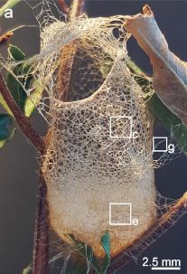
|
That's a spider "web". It's made by the Australian crab spider Saccodomus formivorus.
As the name suggests, this spider eats ants, which crawl into the basket.
Like spider webs in general, the basket web is made from silk. But this silk structure is unusually rigid.
This is Figure 1a from a recent article.
The lettered boxes show regions with expanded views in the full figure.
|
The basket web is unique among spiders. The spider and its unusual basket web have long been known, but little studied. We now have an article examining the web material in some detail.
Examination at various levels of microscopy suggested that a key feature of the overall thread structure is the use of fibers of different thickness. That is, the thread of the basket web is a complex composite material.
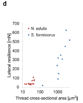
The following figure shows one mechanical property of spider silk threads as a function of thickness.
In this test a force was applied sideways to an extended thread. The force needed to break the thread was measured. That force, which they call the lateral resilience, is plotted (y-axis) against the cross-sectional area of the thread (x-axis).
Results are shown for silk threads from two kinds of spiders. One is our focus spider, S formivorus, with its basket web; the other is a typical orb weaver, Nephila edulis.
The big picture... Threads from S formivorus are stronger -- and thicker.
The diameters of the threads examined here: S formivorus, 14-80 µm; N eduli, 3-6 µm.
This is Figure 3d from the article.
|
|
We noted that the spider is not a new discovery. The idea that thicker threads make for stronger structures is not unusual, though no one had shown that spiders made much use of the idea.
As much as anything, this article is another story of the diversity of nature -- the diversity of silk structures in this case. The authors suggest that there should be more studies of uncommon but unusual spiders.
News stories:
* Scientists unravel mysteries of unique Aussie spider silk. (Mihai Andrei, ZME Science, October 19, 2020.)
* Secrets of the basket-web spider's silk -- The only spider known to weave a container to catch prey, researchers now have the first insights into the evolution and structure of the basket-web spider's rare silk. (Mark Elgar, University of Melbourne, October 19, 2020.) From one of the senior authors.
The article, which is freely available: Free.standing spider silk webs of the thomisid Saccodomus formivorus are made of composites comprising micro. and submicron fibers. (C Haynl et al, Scientific Reports 10:17624, October 19, 2020.)
More on enhancing the strength of silk...
* Stabilizing broken bones: could we use spider silk instead of metal plates? (June 24, 2018). In this work, the scientists made more rigid silk in the lab by combining it with other materials.
* How do you get silkworms to make stronger silk, reinforced with graphene? (October 24, 2016).
More silk... Medical safety: What if pills were better labeled, so your phone could verify them? (April 23, 2022).
Several Musings posts about silk are listed on my page Internet Resources for Organic and Biochemistry under Amino acids, proteins, genes.
Next spider post: The ogre-faced spider, with massive eyes but no ears, detects the sound of prey using its legs (February 9, 2021).
Bomb-sniffing grasshoppers?
November 8, 2020
A new article reports development of a device to detect odors of explosives, such as TNT. Here is a diagram of the device...
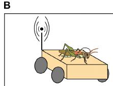
|
On top is a grasshopper, more specifically a locust, Schistocerca americana.
The orange thing under it serves two purposes. It is a cart, under remote control. Further, it receives the signals from electrodes in the animal, and transmits them to the observers.
This is the upper left part of Figure 1B from the article.
|
Does it work? The scientists test several locusts on several chemicals. The chemicals include TNT and some non-explosives.
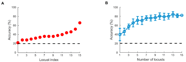
The following figure summarizes some results...
Part A (left) shows the accuracy of individual locusts. The dashed line shows the result that would be expected for "guessing": 20% (five chemicals).
The results for 15 individual locusts varied widely. One seemed to be just guessing, most were below 40% accuracy, and one genius locust reached 60%.
Part B shows what happens if you seek the "wisdom of the crowd". This involves combining the results from more than one locust. The graph shows the accuracy if results from some number of locusts (x-axis) are combined.
The results for a single locust, n = 1, average about 40%. But the accuracy improves as you take the consensus from more locusts. The accuracy reliably reaches 70% at about n = 7.
This is part of Figure 5 from the article.
|
Impressed? Well, it's a step. It is the first time an insect's odor sense has been exploited to this extent. Some problems have been addressed, but others can benefit from further work.
An important aspect of the current work was the development of improved, simplified surgical techniques for attaching the electrodes.
Other explosives that could be detected -- and distinguished -- include PETN, ammonium nitrate and RDX.
The measurements are fast: less than a second.
Direction? The locust takes measurements at multiple sites (recall the cart). How the signal strength varies with location provides information on the direction of the odor source.
Quality of the result? It's not clear whether the difference between locusts reflects actual differences between individual animals, or operational details, such as how the electrodes are positioned. In either case, it is reasonable that further work could lead to improved results.
News stories:
* Researchers use grasshoppers to detect explosive chemical vapors. (N Cohen, Tech Xplore, February 18, 2020.)
* One step closer to bomb-sniffing cyborg locusts -- Study found locusts can quickly discriminate between different explosives' smells. (Science Daily (Washington University in St. Louis), August 14, 2020.)
The article, which is freely available: Explosive sensing with insect-based biorobots. (D Saha et al, Biosensors and Bioelectronics X 6:100050, December 1, 2020.)
More about locusts...
* Understanding locust swarming: a chemical to deal with the problem? (October 13, 2020).
* Swarming locusts have bigger brains (August 29, 2010).
Another approach to using animals to detect odors: Rats, bananas, and tuberculosis (March 11, 2011).
A high-tech approach to monitoring odors: An electronic nose to monitor air quality on spacecraft (March 2, 2010).
Also see... How to fly a beetle (April 27, 2015).
November 4, 2020
Briefly noted... Decoy receptors
November 4, 2020
Decoys can be an effective way to defend against invaders, by distracting them. An article earlier this year shows that mammalian cells have figured this out. The cells use a decoy system to defend against bacteria that make certain toxins. Normally, the toxin would bind to a receptor on the cell surface, and kill the cell. But cells can be induced to make tiny membranous packages, called exosomes, carrying the toxin receptor on their surface. These exosomes with toxin receptors serve as decoys for the toxin molecules. They are effectively a sponge for the toxin. The finding helps to explain why many people do not get sick from the toxin-producing bacteria. Are there therapeutic applications? That remains to be seen. (One of the bacteria this applies to is methicillin-resistant Staphylococcus aureus (MRSA).)
* News story: Newfound cell defense system features toxin-isolating 'sponges'. (Science Daily (NYU), March 4, 2020.) Links to the article.
* More exosomes... An artificial organelle (October 2, 2021).
* More decoys... Making decoys that trap the SARS-2 virus (August 10, 2022).
Better bacterial conductivity
November 3, 2020
Electron transfer is fundamental to biological energy-yielding reactions. Interestingly, some bacteria can carry out such electron transfers with things outside the cell. That is, these bacteria lead to the flow of electrons outside the cell; that is electricity.
Microbial fuel cells (MFC) are based on using bacteria to generate electricity. Getting MFC to work well is still poorly understood.
A recent article reports a step toward making better MFC.
The two figures below show the issue -- and the solution. In both cases, a mixed culture was grown on an electrode, with the formation of a biofilm. The current density was measured in the biofilm over time.
Why a mixed culture? Because that mimics the intended use. It is envisioned to just put an electrode into some natural habitat, and harvest the electricity from the bacteria that attach to it. The major bacterial group active in making such electricity is probably Geobacter.
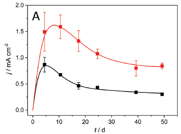
|
In this test, the electrodes were either copper (top; red) or graphite (bottom; black).
In both cases, the current density (y-axis; milliamps per square centimeter) rose as the biofilm developed, and then declined slowly over time (x-axis; days).
The important result is that the copper electrode led to a considerably higher current density (about double).
Note that the first actual measurement is at 5 days.
This is Figure 1A from the article.
|
Why did the copper electrode lead to better results? Analysis suggested that it was due to the formation of copper sulfides in the biofilm, increasing conductivity there.
Both copper(I) sulfide (Cu2S) and copper(II) sulfide (CuS) were found in the biofilms. The scientists discuss how they are formed in considerable detail. As one test, they grow the bacteria in sulfate-free medium. This prevents the formation of sulfide, and eliminates the advantage of Cu electrodes.
They focused on the CuS for further work.
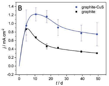
In fact, coating the Cu electrode with CuS improved the results. And then...
In this test, both electrodes were graphite. However, one was coated with CuS.
The results for the uncoated graphite electrode (black; bottom) were similar to those in the first test. The CuS-coated graphite electrode led to considerably higher current densities (blue; upper).
This is Figure 7B from the article.
|
|
CuS-coated graphite electrodes should be inexpensive and practical. In addition, understanding why such electrodes are an improvement can guide further work.
News story: Electric Bacteria. (Ishi Nobu, Spokes of the Wheel, September 5, 2020.)
The article, which is freely available: Copper-bottomed: electrochemically active bacteria exploit conductive sulphide networks for enhanced electrogeneity. (L Beuth et al, Energy & Environmental Science 13:3102, September 2020.)
More about Geobacter and biofilms... On sharing electrons (May 3, 2011). Links to more.
More about biofilms: Does E coli grow in a multicellular form? (January 31, 2023).
More copper biology: Bacteria that make atomic copper (May 8, 2021).
Another microbial fuel cell -- a complex one: A robot that can feed itself (February 3, 2017).
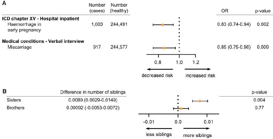
A gene from Neandertals that promotes human fertility
November 1, 2020
It is now generally accepted that Neandertals and modern humans (Homo sapiens) interbred -- and therefore exchanged genes. The effects of the mixing is an active subject of investigation.
A particular mutation in the gene for the progesterone receptor has attracted attention. The mutation seems to have arisen in Neandertals, and was transferred to modern humans. There has been conflicting evidence about its role. A new article re-examines the issue, using the extensive data set of the UK Biobank. Here are some of the results from that new article.
The first figure provides some background on the worldwide distribution of the mutation...
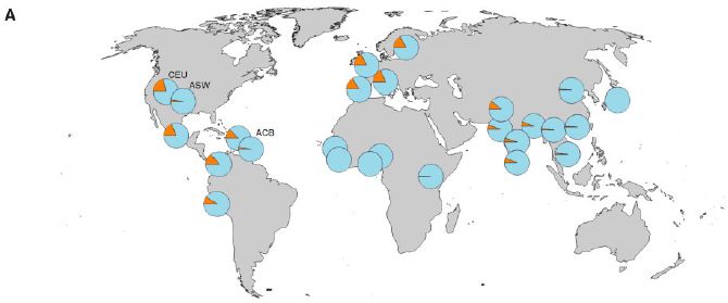
In each pie chart, the orange slice shows the frequency of the specific Neandertal mutation in people in a particular geographical region.
Look at the right side... The mutation is relatively common (about 15%) in Europe, low but measurable in Asia, and absent or rare in Africa. That pattern is consistent with a Neandertal origin. However, the frequency is on the high side, perhaps a hint that the mutation is being selected for -- that it is advantageous.
For the Americas, the picture is more complex, as expected for an area that was populated in waves from various places. Three of the American sites are labeled. The site labeled CEU (upper left) is for a population of mainly European origin. The other two labeled sites are for populations with a substantial African contribution. You can see that these American sites, when classified further, fit with the pattern on the right.
The frequencies discussed above refer to the allele, that is, to the specific mutant form of the gene. Since each person has two copies of the gene, a 15% frequency for a specific allele means that about 30% of people carry one allele with the mutation of interest.
The specific mutation studied here is V660L. That means that amino acid V (valine) at position 660 has been replaced by L (leucine).
This is Figure 1A from the article.
|
The next figure summarizes the effect of the mutation, using the UK Biobank data...
Part A is about two measures of pregnancy problems. At the left are labels and some raw data. What matters is the odds ratio (OR), the frequency of the effect in those with the mutation compared to those without it. That is shown graphically in the middle, with the numbers at the right.
In both cases, those with the mutation showed an odds ratio below one. That is, having the mutation led to decreased risk of these pregnancy problems.
Part B shows a measure of fertility. Those with the mutation had more female siblings (but not more male siblings).
Part C of the full figure shows that the mutant allele leads to higher levels of expression of the gene for progesterone receptor, as judged by the level of mRNA. (It is not clear why this should be so, given the nature of the mutation.)
This is part of Figure 3 from the article.
|
These results are consistent with the mutation acting by increasing the effective level of progesterone.
Taken together, the results suggest that the mutation, from Neandertals, is beneficial in modern humans. The effects appear to be statistically significant, based on the data available here. The change in fertility may seem small, but over thousands of generations these small differences add up.
News stories:
* European Women with Neanderthal Progesterone Receptor Gene Are More Fertile. (K Kamrani, Anthropology.net, May 27, 2020. Now archived.)
* Study: Women with Neanderthal Progesterone Gene Have Higher Fertility. (E de Lazaro, Sci-News.com, May 29, 2020.)
The article, which is freely available: The Neandertal Progesterone Receptor. (H Zeberg et al, Molecular Biology and Evolution 37:2655, September 2020.)
A background post. Contributions of Neandertals and Denisovans to the genomes of modern humans (July 6, 2016). This is from the early days, but does note some more recent developments.
More about our Neandertal inheritance: Susceptibility to severe COVID: role of a genetic region from Neandertals (February 20, 2021).
More about human fertility: A gene that reduces the chance of successful pregnancy: is it advantageous? (May 18, 2015).
More pregnancy problems: ELABELA deficiency and preeclampsia? (October 8, 2017).
October 28, 2020
Briefly noted... Turning trash into graphene
October 28, 2020
It's the miracle material of our time -- but too expensive to actually use. A recent article shows that graphene can be made inexpensively by heating most any carbon-containing material, including waste food and plastic, to 3000 K. The flash heating is done within a fraction of a second by the discharge of a capacitor. It's hot enough to break most of the chemical bonds in the material. Most of the non-C atoms are released as gases. Upon rapid cooling, most of the C forms high-quality graphene. The work in the article is at gram scale, but the authors think the method can be scaled up to tons/day -- and they have formed a company to do so. An interesting development; we'll see how it turns out.
* News stories...
- New method turns any carbon waste into graphene. (scientiststudy.com, February 2, 2020. Now archived.) Gives full article information, but without a live link.
- Behind the paper: Gram-scale bottom-up flash graphene synthesis -- A magic wand has been developed! A touch, a bolt of electricity, and a bright flash of light turns trash into the greatest of space-age materials: graphene. (J M Tour, Nature Research Device and Materials Engineering Community, February 3, 2020.) By the senior author.
* Direct link to the article: Gram-scale bottom-up flash graphene synthesis. (D X Luong et al, Nature 577:647, January 30, 2020.)
* This item is noted on my page Introduction to Organic and Biochemistry -- Internet resources in the section on Aromatic compounds. The section includes graphene and CNT; it includes a list of Musings posts on these materials.
* Added May 13, 2026.
A related historical note: Did Thomas Edison make graphene? (May 13, 2026).
* Another use of the flash heating process: A new way to recover valuable metals from discarded electronics (October 12, 2021).
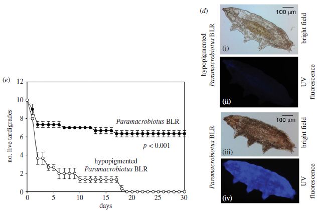
How some tardigrades are resistant to ultraviolet light
October 27, 2020
Tardigrades are microscopic animals, often called water bears, noted for their resistance to a range of environmental stresses. A new article explores how one strain is resistant to ultraviolet (UV) light.
Two of the tardigrade strains used in the study are shown in the following figure.
Shown here are the main strain, a species of Paramacrobiotus, and a variant, found in nature, with much less pigment.
Start with part d (right side), which shows the two strains. In fact, start with the bottom two images, which show the main strain. Image iii shows the main strain under ordinary light ("bright field"). Image iv shows it under UV light; it fluoresces. The top images are for the variant strain, labeled as "hypopigmented". It doesn't look very different under bright field (image i), though it obviously has less pigment; it does not fluoresce (image ii).
Part e (left) shows survival curves for the two strains after a dose of UV. They are dramatically different. The main (pigmented) strain survives much better than the hypopigmented strain.
The "UV" here is germicidal UV, with peak wavelength of 253 nm.
This is part of Figure 1 from the article.
|
The figure shows that one strain contains a fluorescent pigment, and that it survives better after UV irradiation. That does not prove a causal connection between those two traits, but does allow the hypothesis.
How are the two strains related? That is not clear; the authors refer to the hypopigmented strain as a variant. Both strains were isolated from nature, from the same site. By genome sequencing, they appear very closely related. Interestingly, the hypopigmented animals develop pigment within a few days in the lab.
The scientists also showed that another species of tardigrade, lacking pigment, is very sensitive to UV. Again, that is consistent with the pigment providing the UV-resistance, but does not prove it.
Here is another test...
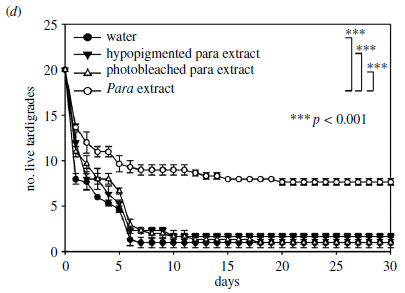
|
In this case, the scientists take the hypopigmented strain and incubate it with various solutions. They then do the UV survival test, as above (part e). You can see that one of the four solutions promoted resistance to the UV. What is that? An extract from the main strain.
The three solutions which gave low survival include water alone and an extract from the hypopigmented strain. The third inactive solution was an extract from the main strain, but bleached to render it inactive.
This is Figure 2d from the article.
|
This test shows that the pigment from the main (resistant) strain can protect another strain. It's not as rigorous as that sounds, but is a nice test. They also test some nematodes, and they, too are protected by the tardigrade pigment. In one sense, that is not a surprising result; what the pigment does in the extract is to reduce the amount of UV light that gets through.
The use of pigments to protect oneself from UV light is not new, though this is the first report of it in that odd and fascinating group of animals called the tardigrades. The authors note that the strain they study here was isolated from the surface of a concrete wall near their lab in tropical India, a site where the level of solar UV is known to be relatively high. Does such an area select for pigmented tardigrades? The work here leads to questions such as that.
News stories:
* Here's another tardigrade superpower: a fluorescent shield protects them from deadly UV radiation. (T Puiu, ZME Science, October 14, 2020.)
* We Just Found Another Trick Tardigrades Use to Be Basically Indestructible. (P Dockrill, Science Alert, October 14, 2020.)
The article: Naturally occurring fluorescence protects the eutardigrade Paramacrobiotus sp. from ultraviolet radiation. (H R Suma et al, Biology Letters 16:20200391, October 2020.)
Previous post about tardigrades: How the tardigrades resist desiccation (April 10, 2017). Links to more.
Posts about the biological effects of UV include...
* UV LEDs for the inactivation of viruses? (January 11, 2021).
* Perchlorate on Mars surface, irradiated by UV, is toxic (July 21, 2017).
* Fish make their own sunscreen (September 29, 2015). Links to more.
Carrot allergy
October 25, 2020
We have a new article on allergy to carrots. I could not recall having heard of carrot allergy, so I was intrigued.
The main message of the article is that carrot allergy is a complicated issue. There is a family of proteins that can cause allergic reactions -- and their behavior is quite varied. In particular, some of them survive heating very well. The methods used to explore the properties of allergens are perhaps interesting.
The first figure shows how two members of the carrot-allergen family respond to heating and cooling -- denaturation and renaturation.
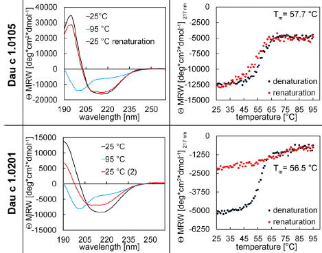
Each row of the figure is for one member of the Dau C family of proteins, the carrot allergens. The top row is for 1.0105; the bottom row is for 1.0201.
The left column shows circular dichroism (CD) spectra at three stages of the process.
CD involves measuring the optical rotation vs wavelength. Some aspects of protein structure, such as alpha-helices and beta-sheets, are asymmetric, and are changed by denaturation. Interpretation of CD is complicated, but for our purpose, you can think of it as a measurement of those organized structures in the protein.
Look at the top left graph. The black curve shows the CD spectrum of the protein at 25 °C. Heat it to 95°, and you get the blue curve, which is quite different. Let it cool back to 25°, and you get the red curve. The black and red curves are quite similar. This protein seems to renature rather well after being heated to 95°.
Now look at the lower left curve, the CD spectrum for the other protein. The first two curves are similar to the top set. But the red curve shows that this protein does not renature well when cooled following heating.
The right-hand graphs show the CD data plotted another way. These graphs show only the data for 217 nm; this is in a region of the curve where the optical rotation is very sensitive to the state of the protein. The optical rotation at that wavelength is plotted against temperature (T), as the protein is heated (black curve), then cooled (red). You can see that the two curves are similar for the top protein; cooling substantially reverses what heating had done. For the lower protein, that is not true; cooling does not reverse what heating had done.
That is, the two ways of looking at the CD data lead to the same conclusion: the top protein renatures rather well after heat denaturation (or "cooking"). The lower protein does not.
The label on the y-axes is complicated. The main point is that it is a Θ (theta), an angle -- of rotation. The rest just reflects how the angle is expressed; it's consistent, so the details don't matter here.
The T values shown on the right-hand graphs are the midpoints of the denaturation curves. They are similar for the two proteins. That is, denaturing the two proteins occurs at about the same T.
This is part of Figure 1 from the article.
|
CD is a measurement of the physical properties of the proteins. How about a measurement of their biological activity? The following figure shows results from one such test.
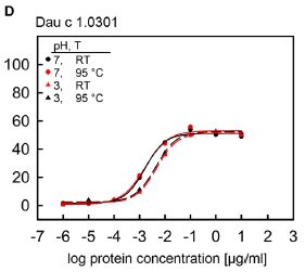
|
The test here is called a mediator release assay (MRA). It is a lab test measuring the ability of a sample (carrot protein in this case) to cause a common early step in an immune reaction.
The graph shows the response vs protein concentration under four conditions: normal and low pH, and cool vs heated. (The low pH is near stomach pH.) The main observation is that all four curves are similar. And the response occurs at quite low concentration. (If we take the midpoint of the response to be about -2 on the x-axis (log) scale, that means 10-2 µg/mL, or 10 ng/mL. That's not much.
There is a little less activity at pH 3. Most importantly, at both pHs, there is little effect of heating.
This is Figure 6D from the article.
|
For the physical measurements, using CD, I showed results for two members of the carrot allergen family, and they were quite different. For the biology test, again the results are different for different members of the family. The example I chose to show is a case where the allergenicity survives quite well regardless of heating or pH. Interestingly, the physical test for this particular allergen (not shown here) suggests that this protein does not renature when cooled. Thus the two tests give different pictures for the same protein.
If this is confusing, you are right. That seems to be the point. Carrot allergy is due to a family of related proteins, which behave differently. There is no simple answer as to how to get rid of them. The practical conclusion is that one cannot assume that cooking or processing eliminates the allergic response.
The carrot allergens are related to the allergens of birch pollen. Those who are allergic to birch pollen may show a response to carrots.
A caution... It is likely that different people with carrot allergy react to different members of the allergen family. Since the properties of the allergen family vary, what works for one person may well not work for another.
News story: Consumption of cooked carrots can also trigger allergic reactions, finds study. (E Henderson, News-Medical.Net, September 21, 2020.)
The article, which is freely available: Food Processing Does Not Abolish the Allergenicity of the Carrot Allergen Dau c 1: Influence of pH, Temperature, and the Food Matrix. (T Jacob et al, Molecular Nutrition & Food Research 64:2000334, September 2020.)
Previous post about carrots: What do chimpanzees think about cooking food? (August 30, 2015).
Previous post about a food allergy: Can eating peanut protein reduce the incidence of peanut allergy? (March 3, 2015).
Another food allergy: Red meat allergy (Alpha-gal Syndrome (AGS)), ticks, and urbanization (May 14, 2025).
I have listed this post on my page Internet resources: Biology - Miscellaneous under Nutrition; food and drug safety.
October 21, 2020
Briefly noted...
October 21, 2020
The effects of the SARS-2 virus, the causative agent of COVID-19, are complex and varied. Some of them extend beyond those actually infected. For example, we know that the presence of the virus in the community can lead to longer hair, even in those not infected. The regular Musings post immediately below is about the effect of the COVID pandemic on seismic activity. Here, briefly, are scientific articles on two other COVID-related phenomena.
1. COVID and birdsong. COVID has led to quieter cities, and that lets the birds sing better. It's actually some serious and interesting science. It is a local story, too.
* News story: Pandemic Shutdown Altered Bay Area Birdsongs -- As shelter-in-place orders quieted the city of San Francisco, its sparrow population developed softer, sexier songs. (R Williams, The Scientist, September 24, 2020. Now archived.) Excellent. Links to the article.
* Direct link to the article: Singing in a silent spring: Birds respond to a half-century soundscape reversion during the COVID-19 shutdown. (E P Derryberry et al, Science 370:575, October 30, 2020.)
2. COVID and toilet paper. What kind of people stockpile toilet paper? A team of scientists from three European institutions has studied the issue, and reported some findings in a scientific article. As you read their conclusions, it is important to note that what they found explains only a small fraction of the observed behavior.
* News story: Personality traits linked to toilet paper stockpiling -- High levels of emotionality and conscientiousness are indicators for stockpiling behavior. (Science Daily (Max Planck Institute for Evolutionary Anthropology), June 12, 2020.) Links to the article, which is freely available.
* Direct link to the article, which is freely available: Influence of perceived threat of Covid-19 and HEXACO personality traits on toilet paper stockpiling. (L Garbe et al, PLoS ONE 15:e0234232, June 12, 2020.)
Seismologists report that Earth is quieter because of COVID-19
October 19, 2020
Seismologists have recorded the COVID pandemic. The following figure shows some of the data...
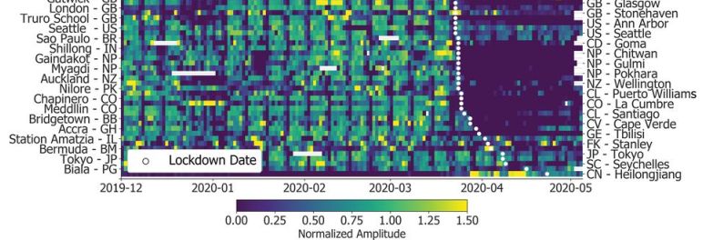
The figure shows the seismic activity recorded at many locations around the world, December 2019 to May 2020.
The color shows the seismic activity at the indicated location and time, on a relative scale. There is a color key at the bottom. Briefly, blue -- and especially dark blue/purple -- means low activity; green means about normal; yellow means high activity. (White means there is no data.)
The sites are in order by COVID lockdown date, which is shown with a white dot.
The locations are labeled on the two sides -- alternating. That is, from the bottom, the first three sites are Heilongjiang (label on right), Biala (left), Seychelles (right).
Main observation: a dramatic reduction in seismic activity for many sites, starting at about the time of the lockdown.
Some sites also show a significant reduction in late December/early January. This corresponds to the Christmas-New Years holidays, the effect of which varies between countries.
The results shown here are for a particular seismic noise frequency of interest (4-14 Hz),
This is the bottom part of Figure 2 from the article. I chose to show the bottom part, since it gives the idea, is fairly concise, and includes most of the labeling. For the full figure, see the next paragraph.
|
Here is the full Figure 2 [link opens in new window]. The comments above apply to the full figure. Note that the Christmas-New Year region is explicitly labeled near the top.
The full data set is based on measurements from 268 stations with usable data. Of these, 185 stations showed pronounced reductions during the pandemic.
It is a dramatic demonstration of what that little virus has done.
It is also a reminder of how human activity affects the Earth itself.
And for the seismologists, the pandemic is an opportunity -- to make measurements on the Earth with a greatly reduced background of human-induced noise. This is a serious article about real-world seismology.
News stories:
* The coronavirus-induced anthropause is now visible in seismic vibrations. (M Andrei, ZME Science, July 24, 2020.)
* COVID-19 pandemic causes a seismic noise quiet period in 2020. (McGill University, July 23, 2020.)
The article: Global quieting of high-frequency seismic noise due to COVID-19 pandemic lockdown measures. (T Lecocq et al, Science 369:1338, September 11, 2020.)
From the abstract: "The 2020 seismic noise quiet period is the longest and most prominent global anthropogenic seismic noise reduction on record."
More about humans affecting seismic activity: Earthquakes induced by human activity: oil drilling in Los Angeles (February 12, 2019).
Other things seismologists have been watching... Seismologists measure temperature changes in the ocean (October 6, 2020).
The page for BITN -- Other topics includes a section on SARS, MERS (coronaviruses). That section now includes COVID-19. It lists Musings posts on coronaviruses.
Superconductivity at room temperature -- at last
October 18, 2020
Update #1, November 18, 2022...
The article that was the basis of this post has been retracted.
The article claimed superconductivity at room temperature. Both the experimental work and the data analysis have become the subject of debate. The journal recently retracted the article, over the continuing objection of the authors. The debate will continue. The news story at Quanta is a useful start for the story.
Direct link to the retraction notice at the journal web site: Retraction Note: Room-temperature superconductivity in a carbonaceous sulfur hydride. (Nature 610:804, September 26, 2022.) If you link directly to the original article, the retraction is noted there.
The post, below the updates, remains largely as it was originally. I have updated the information for the news story at Quanta, which was updated to include the retraction.
Update #2, March 21, 2023...
New developments...
1) An updated article on the topic of the retracted article has been submitted, and is currently under review. More data, including some from other labs. The preprint, not yet peer reviewed, is posted at ArXiv: Observation of Conventional Near Room Temperature Superconductivity in Carbonaceous Sulfur Hydride. (Hiranya Pasan et al, ArXiv, February 22, 2023.)
2) An article has been published, by the same lab, on superconductivity in hydrides of lutetium. The results are even better than reported for the C-S-H materials. There is a Musings post about this article; a link to that post is at the end here.
Musings has noted reports of record-high temperature (T) for superconductivity before [links at the end]. We now have a new such report, and it is something of a milestone.
The general plan is as before, so we will skip most of the background here.
Here are some key results...
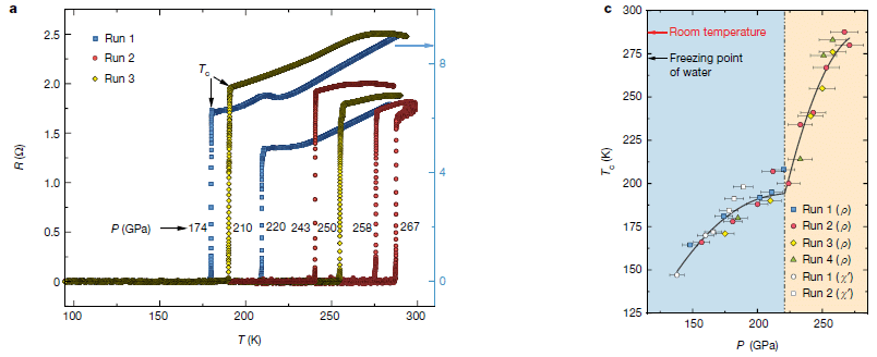
Part a (left) shows electrical resistance (R; y-axis) vs T (x-axis) for various tests of a new material. Some measurements were made during warming, and some during cooling; you can trace some of the paths, but it doesn't really matter. What matters is that each test showed a dramatic change in resistance at a particular temperature. That T is called Tc, the critical temperature for superconductivity. At T below Tc, the material shows zero resistance; that's superconductivity.
The pressure (P) was varied; the P (in gigapascals, GPa) for each test is shown on the graph.
As P increased, so did Tc.
The highest Tc was 288 kelvin, at P = 267 GPa. The T value comes from reading the x-axis, but I have used the value they state in the article (more precisely, 287.7 +/- 1.2 K). The P value is shown next to the curve.
Careful... The numeric values for T (in K) and P (in GPa) are similar; it's easy to get them mixed up.
This is part of Figure 1 from the article. We'll come back to part c in a moment.
|
That's a new record for high-T superconductivity. And, at 288 K (15 °C; 59 °F), it is at "room temperature". Yeah, that's a cool room, but still, this is a major milestone for the field.
Part c of the figure (right side) summarizes their measurements: Tc (y-axis) vs P (x-axis).
Observations...
- Tc increases with P, as before.
- The new high Tc is shown.
- There is no sign that the curve is leveling off. What higher Tc might be obtained, if only they could get to higher P?
- The line they show suggests a change in the behavior at about 225 GPa. Is this real? The authors think so. If it is real, it might reflect some structural transition in the material at that P.
- Look at the key. It shows that the graph includes data based on two kinds of measurements. The first four runs listed are based on measuring electrical resistance (here called ρ), as in part a. The final two runs are based on measuring the magnetic susceptibility (χ). Data for these runs are shown with white circles, and are only for P below about 200 GPa because of technical limitations. The agreement between the data based on the two types of measurements is only partial. This may be a clue that there is more to learn about this system.
What is this new material? The authors call it "a carbonaceous sulfur hydride". It builds on the earlier work with sulfur hydrides. That was done with H2S, but it is likely that something like H3S was the active form. In the current work, they use H2S + CH4. Actually, it is all done from elemental C, S, and H2. The mixture is subjected to the ultra-high P of a diamond anvil cell; the form of the material at high P is not clear.
So we have a new record for high-temperature superconductivity. And it is now at "room temperature". It still requires ultra-high pressure, so it is not practical for real-world use. But it is a step, and a milestone. The authors note that further development could lead to new materials that show superconductivity at more modest pressures. Using a three-element system and specifically introducing carbon are steps to be pursued.
News stories:
* Super-conductivity as 15 °C, but only at super-pressure. (S Bush, An Engineer In Wonderland (blog at Electronics Weekly), October 16, 2020.) Nice blog name.
* Superconductivity endures to 15 °C in high-pressure material. (H Johnston, Physics World, October 14, 2020.)
* Room-Temperature Superconductivity Achieved for the First Time. (C Wood, Quanta, October 14, 2020 (original post).) Includes an update -- that the article has been retracted, plus the original story. Note that the current version has a new title, reflecting the retraction.
The article: Room-temperature superconductivity in a carbonaceous sulfur hydride. (E Snider et al, Nature 586:373, October 15, 2020.)
Background posts:
* Superconductivity in lanthanum hydride: a new temperature record (June 8, 2019). Most recent post on superconductivity.
* What's the connection: rotten eggs and high-temperature superconductivity? (June 8, 2015). A post on superconductivity in sulfur hydrides.
More recent developments... Superconductivity near room temperature: let's try again, now using lutetium (March 21, 2023).
Also see:
* Making lonsdaleite -- with diamonds in it -- at room temperature (December 8, 2020).
* Metallic hydrogen -- new evidence (March 7, 2020). Metallic hydrogen is always lurking in the minds of those working on superconductivity.
October 14, 2020
Briefly noted...
October 14, 2020
1, GOA in science. GOA = growth of acronyms. Acronyms (and more broadly, abbreviations) can be useful -- and they can be frustrating. In a recent article, scientists query a database listing about 20 million biology article titles and abstracts over the last 70 years. The key finding is that the use of acronyms has grown sharply over that time. That is probably not particularly good, especially for the non-specialist trying to read the stuff.
* News story: WTF, when will scientists learn to use fewer acronyms? (Phys.org (C Gibson, USA, August 14, 2020.) Links to the article, which is freely available. It's a fun article, but there is a serious message about communicating clearly.
* The acronym in the news story title, as the authors found it in a scientific article, means water-soluble thiourea-formaldehyde. And Ms Gibson's affiliation, given above as an acronym, means University of South Australia.
* Comments about the use of acronyms or such in Musings are welcomed.
2. Phosphine on Venus -- follow-up. A 'briefly noted' item last week was about finding phosphine, PH3, on Venus. One interpretation is that the phosphine is a sign of life. There is a preprint with an estimate of how much life it would take to make the observed level of PH3. The answer is 'not much'. Take this, too, as an interesting contribution. Over time, we'll figure this all out. For now, it is just a fun story.
* News story: How Much Life Would Be Required to Create the Phosphine Signal on Venus? (M Cimone, Universe Today, September 20, 2020.) Links to the pdf of the article, which is freely available. It is currently a preprint, prior to peer review, at ArXiv. In fact, it is labeled as a "draft".
* Direct link to the article, which is freely available as a preprint at ArXiv: On The Biomass Required To Produce Phosphine Detected In The Cloud Decks Of Venus. (M Lingam & A Loeb, Draft, September 30, 2020.) This link is to the main page for the item; update information may be available there.
* Background post: Briefly noted... Phosphine on Venus? Implications for the possibility of life on Venus? (October 7, 2020).
Understanding locust swarming: a chemical to deal with the problem?
October 13, 2020
Swarming locusts are a serious problem. What might we do about them? A recent article uncovers a key part of the story of what makes them swarm.
The first figure identifies a small chemical molecule that is an attractant for the locusts...
The logic of the test is simple... There is a test chamber. A chemical of possible interest is put at one site. The amount of time the locusts spend at that site is measured, and compared with the amount of time they spend at a control site without chemical.
The six graphs above are for tests with six chemicals, all known to be made by the locusts. In each case, the bar to the right (red) shows the time spent with the chemical; the bar to the left (clear) shows the time spent at the control site.
In four cases, the bar heights are essentially the same. That means that the locusts had no behavioral response to the chemical, as measured by this test.
For two chemicals, the responses are different. For the first one (far left), the locusts spend more time away from the chemical than near it. That chemical is a repellent.
For the third chemical, the locusts spend more time near it than away. That chemical is an attractant.
The attractant chemical is the one we want. It is labeled there 4VA, for 4-vinylanisole. (It is also known as 4-methoxystyrene.) It has a benzene ring with two small groups attached, opposite each other: -OCH3 and -CH=CH2.
This is Figure 1c from the article.
|
The next figure shows a feature that makes 4VA not just an attractant, but one of special relevance to swarming...
|
This test measures the amount of 4VA made per locust (y-axis) vs the number of locusts in the cage (x-axis). The general trend is that the higher the population density of locusts, the more of the attractant each animal makes.
The letters above the data bars show statistical significance. The data bar marked 'a' tests as significantly different from the data not marked 'a'.
This is Figure 2c from the article.
|
That is, 4VA is an attractant, which can lead to the animals coming together. And the resulting increased density leads to making more attractant -- per animal. That positive feedback loop can lead to swarming.
The scientists identify the receptor for 4VA; it is a member of the olfactory receptor family. They then make animals lacking it (using CRISPR to make the mutation). The following figure shows that the mutation is effective in eliminating the response...
The test here is the same kind as in the top figure. The two graphs are for the wild type (WT) locusts and the mutant strain lacking the receptor. The latter is labeled Or35-/-, meaning that it is negative for both copies of the Or35 gene.
The wild type locusts show the attraction response to 4VA. The mutants do not.
This is Figure 3c from the article.
|
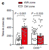
|
Overall, the article identities an attractant for the locusts, and shows that its behavior suggests a key role in swarming. Other tests show that it works outdoors, both in tests of lab organisms in an outside arena, and in a preliminary field test. The scientists also identify the receptor for the attractant.
Is this useful? Well, it is a step. A step toward understanding swarming, and perhaps to doing something about it.
The authors suggest a range of possible applications. For example, traps with the attractant could be useful for monitoring, as an early warning system for locust infestations. Such traps might also be used to capture locusts, which could then be killed. These are examples of uses of the attractant that do not involve its general release into the environment.
One can also imagine field use, of the attractant, or of possible analogs including ones that block the receptor. But that kind of application is much further off, and would require extensive testing.
The lab work here was done with the locust species Locusta migratoria. This is different from the locust of the current swarm in East Africa and South Asia, which is Schistocerca gregaria. It is not known how much of the current findings is relevant to the other species. In any case, the work may lay the groundwork for finding out.
News stories:
* Scientists have identified the scent that makes some locusts swarm. They could use the pheromone to trap and kill the insects. (A Woodward, Business Insider, August 12, 2020.)
* Sweet-Smelling Locust Pheromone Could Be Key to Stopping Their Swarms. (G Dvorsky, Gizmodo Australia, August 13, 2020. Now archived.)
* News story accompanying the article: Insect behaviour: Catching plague locusts with their own scent -- A pheromone molecule that makes crop-damaging locusts swarm has been identified. Could this pheromone, which is sensed by odorant receptors, be used to trap these insects and prevent the agricultural devastation that they cause. (L B Vosshall, Nature 584:528, August 27, 2020.)
* The article: 4-Vinylanisole is an aggregation pheromone in locusts. (X Guo et al, Nature 584:584, August 27, 2020.)
More about locusts:
* How locusts avoid cannibalism (May 30, 2023).
* Bomb-sniffing grasshoppers? (November 8, 2020).
* Swarming locusts have bigger brains (August 29, 2010).
Another anisole derivative: How a cork causes an off-flavor in a beverage (October 21, 2013).
This post is listed on my page Introduction to Organic and Biochemistry -- Internet resources in the section on Aromatic compounds. That section includes a list of related Musings posts.
Nanolympiadane: chemical synthesis of the Olympic rings
October 11, 2020
Look...
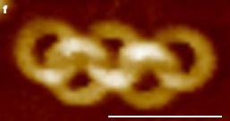
|
Atomic force microscopy (AFM) image of a molecule.
Scale bar is 50 nanometers.
This is Figure 3f from the article.
|
Why stop at five rings?
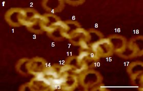
|
Scale bar is again 50 nm; the rings are the same size as above.
This is Figure 4f from the article. (Figure 4g shows one with 22 rings; it is even harder to follow than this one.)
|
The approach to making these catenated rings is shown in the following figure...
Start at the left, with one ring ("toroid") already formed. Now add ring-forming units. A new ring forms, threaded through the first ring.
That's the key idea. Just repeat.
The 2 or n in the name shows the number of rings. The ring system in the top figure is the [5]catenane. That chemical is nicknamed nanolympiadane.
This is part of Figure 4a from the article.
|
That leaves a number of questions, such as...
- What determines the ring size? (Why are the rings the same size?) That feature is built into the design of the ring-forming units. They have an intrinsic curvature, and thus will form a particular ring size. Designing the curvature into the precursors was a key step.
- Why does a new ring form linked to an old one? In part, it is probability. There's room, and so it might happen. Not all the new rings are linked to another, but many are. The subunits do have a tendency to interact with pre-existing rings; this is another point of chemistry built into the design.
- Why don't more rings form linked to one old ring, giving rise to more complex ("branched") structures? It may happen, but not often. (There may be a branch in the structure shown in the second figure above. It's not clear from that image, but it is mentioned as likely, at toroid 9, in the original figure legend. Otherwise, branching is not discussed in the article.)
- Do things go "wrong"? Indeed. In particular, not all attempts to form a ring actually work; not all close to form a ring. Pictures in the article show examples. Development of purification methods is part of the article.
Beyond that, it's largely empirical, working out conditions that give good product yields. The product is always a mixture of ring systems of various sizes as well as various failed structures. The article contains summaries of what was found under various conditions, as well as pictures. There is no process to make any specific product.
We'll skip the details of the chemistry, except to note one important point... The individual rings are not completely covalently bound. Instead, they are held together by hydrogen bonding, and other weak bonds -- much as in the double-stranded form of DNA.
One more chemistry note... The authors note that the stereochemistry of the [5]catenane molecule shown above is different from that of the Olympic symbol.
Why? It's fun. More seriously, chemists are working out tools and design principles. We don't know much about the properties -- and possible uses -- of such products, because we haven't had them to study.
News stories:
* 'Nanolympiadane' created from supramolecular building blocks. (K Welter, Chemistry World, July 17, 2020.)
* Scientists form nanoscale Olympic rings using new beamline. (UK Research and Innovation, July 21, 2020.)
* Nano-polycatenane synthesis achieved with molecular self-assembly. (Phys.org (Chiba University), July 15, 2020.)
* News story accompanying the article: Supramolecular chemistry: Molecules self-assemble into nanoscale chains -- Non-covalent interactions can assemble molecules into complex architectures, but with limited control of the resulting topology. A method for assembling nanoscale chains shows how specific architectures can be targeted. (G De Bo, Nature 583:361, July 16, 2020.) Excellent overview.
* The article: Self-assembled poly-catenanes from supramolecular toroidal building blocks. (S Datta et al, Nature 583:400, July 16, 2020.)
The Olympic rings chemical was mentioned in the post Zhemchuzhnikovite: a natural MOF (August 19, 2016). The point was that the chemical of interest there did not have the linked (catenated) rings.
Also see...
* Clippane (March 7, 2022).
* A novel type of polymer -- and its possible relevance to the origin of life (March 15, 2013).
* Making big "molecules" from big "atoms" (December 7, 2012).
For more AFM, see a section of my page of Internet Resources for Introductory Chemistry: Atomic force microscopy and electron microscopy (AFM, EM). It includes a list of some related Musings posts.
October 7, 2020
Briefly noted... Phosphine on Venus? Implications for the possibility of life on Venus?
October 7, 2020
A new article has gotten a lot of attention. The heart of the article is showing the presence of phosphine, PH3, in the clouds over Venus. The level is low, very near the limit of detection. That part is very technical. If we accept the detection, the question then becomes, what is the source of the PH3? The authors argue that there is no known abiotic source that is reasonable. That leaves the possibility that the PH3 is of biological origin. The biological production of PH3 is well documented, though specific organisms doing it are not yet identified. The article is interesting -- and provocative. It has gotten a lot of hype. The article itself is thorough in discussing the possibilities, and reasonably cautious in the conclusions. (I do suspect the authors are happy to push the case for biology.) Is the phosphine real? It is near the limit of detection, as noted, but the authors make a good case for it. If real, is it due to unknown chemistry or to unknown biology? That is open for further work.
* News stories:
- Hints of life on Venus. (Royal Astronomical Society, September 14, 2020.) Links to the article (near bottom of the page). You might also check the "Phosphine detection FAQ sheet", linked under Media resources.
- Phosphine, Life, and Venus. (D Lowe, In the Pipeline, September 15, 2020.)
* Update August 10, 2021. The article was accepted in September 2020 (prior to this post), but held when some issues arose. It finally appeared in print July 2021, along with an addendum and some exchange. Direct link to the article: Phosphine gas in the cloud decks of Venus. (Jane S Greaves et al, Nature Astronomy 5:655, July 2021.) Check Google Scholar and you may find a freely available copy; at least you will find the manuscript at ArXiv.
* Follow-up posts (oldest first)...
- Briefly noted... 2. Phosphine on Venus -- follow-up (October 14, 2020).
- Briefly noted... Phosphine on Venus -- follow-up #2 (December 9, 2020).
- Briefly noted... Phosphine on Venus -- maybe it is from volcanoes (Follow-up #3.) (July 28, 2021).
- Is there enough water in the clouds of Venus to support life? How about Jupiter? (August 7, 2021).
- Briefly noted... Does ammonia neutralize some of the sulfuric acid in the atmosphere of Venus, allowing life? (January 6, 2022).
Seismologists measure temperature changes in the ocean
October 6, 2020
Measuring the temperature (T) of the oceans is important for many purposes, including understanding climate change. But it is hard to measure ocean T on a large scale.
Earthquakes produce waves. You have probably heard of P and S -- primary and secondary -- seismic waves; seismologists have long measured these waves. A new article focuses on T -- tertiary -- waves. T waves travel through the oceans. Their speed depends on the temperature of the water (among other things). Therefore, T waves can be used to measure ocean temperature.
The following figure shows the idea. Caution, it is not a simple figure. Use it to get a framework, but don't worry about making sense of the entire figure at this point.
The figure shows P waves below the ocean floor and T waves in the ocean.
The speed of T waves depends on depth. See the color key, center near bottom (just below the ocean); the T waves travel at the "speed of sound".
DGAR (upper left) and Argo (in the water) are among the detectors.
The T waves arrive at the (DGAR) detector in this case about 32 minutes following the P wave (upper left).
This is Figure 1A from the article.
|
Imagine having a fixed source of T waves, and a fixed detector for them. The time for the T waves to go from source to detector may be a complex issue, but it should be constant, in the simplest model. Now add to that simple picture that the water T varies over time. In that case, the travel time of the T waves will vary -- and that variation of travel time is a measure of the ocean T.
In the real world... Having a fixed detector is fine. Just set it up in a comfortable lab on the coast. But the sources are not exactly constant; the sources are natural earthquakes. The distance from source to detector is not actually a constant, but the timing of the P waves gives a good measure of the location. In an area where there are many small earthquakes, there is a lot of data. The data set includes "repeater" quakes, which originate from the same place. Their waves travel the same path from source to detector. The key factor causing a difference in T wave travel time is the ocean T.
That is... If ocean T were constant, the results would be similar at various times. If the results for repeater quakes vary over time, that variation can be interpreted as changes in ocean T.
Sounds complicated? Indeed. The idea is not new. What the current article does is to make it work.
Here are some results...
The figure shows ocean T variations (y-axis; right-hand scale) over several years (x-axis), as measured by three detection systems.
One of those (blue) is the T wave system proposed here. The other two are T-sensing systems already in use.
The big picture is that the three systems substantially agree.
The left-hand y-axis scale shows the data for the T waves as the variation in travel time.
This is Figure 3A from the article.
|
The graph above shows that the proposed use of T wave travel time to measure ocean temperature works.
Parts B and C of the full figure show the same kind of analysis at higher time resolution. Part B shows the region that is boxed in part A. In Part C, the full x-axis scale is one month. Qualitative agreement between the methods generally continues to be good. (More detailed analysis suggests that the ocean warming as measured by the T waves is somewhat larger than from the earlier measurements. This is potentially important, but perhaps preliminary here.)
The authors suggest that their proposed measurement is better in some ways. It is actually simpler to implement. The current T sensors are installed in the oceans around the world, or are carried on ships. The sensors are basically ordinary (though fancy) thermometers, but the system is complex to install and maintain. Measuring T waves is done from standard ground-based labs. In fact, the analysis here was done on existing seismographic records. Further, the T waves broadly monitor the ocean, not just the specific sites of the standard thermometers.
Getting a lot of data for T waves requires a continuing supply. The current measurements were on a region of the East Indian Ocean near Sumatra (in Indonesia), where earthquakes below the ocean floor are common. There are many such regions around the world that should be suitable for large scale measurement of T waves.
News stories:
* Ocean acoustics confirm rising sea temperatures. (S E Kim, Temblor, September 21, 2020.)
* Undersea earthquakes shake up climate science. (Science Daily (California Institute of Technology), September 18, 2020.)
* News story accompanying the article: Oceanography: Advance in global ocean acoustics -- Earthquakes can be used to define changes in ocean heat content. (C Wunsch, Science 369:1433, September 18, 2020.)
* The article: Seismic ocean thermometry. (W Wu et al, Science 369:1510, September 18, 2020.)
More about ocean T and related matters:
* Earth is not as bright as it used to be (October 9, 2021).
* Climate change and sea level (October 2, 2017).
* 2011: There was less water in the oceans (November 25, 2012).
More seismic waves...
* Seismologists report that Earth is quieter because of COVID-19 (October 19, 2020).
* How seismic waves travel through the Earth: effect of redox state (June 8, 2018).
Or maybe signals that seem to be from seismic waves but aren't: What if a seismometer was "pointed" to the skies? (January 4, 2021).
Right-hemisphere processing of language in children
October 3, 2020
Language usage is usually associated with the left hemisphere (LH) of the human brain. Among the evidence... for adults, brain lesions in the LH may lead to loss of language skills. On the other hand, that asymmetry is not seen with children; lesions in either hemisphere are equally likely to lead to language loss. Children with brain lesions in language areas of the LH may retain language skills, and may use the right hemisphere (RH) for that purpose, even as adults.
A new article offers a new clue about how this may happen. The following figure shows some key evidence...
The figure shows functional magnetic resonance imaging (fMRI) of the brain for four individuals during language tasks.
The four individuals are from the four age groups considered in the article, from rather young at the left to adult at the right. (The age groups are labeled across the top.)
For each individual, the upper image is for the LH, and the lower image is for the RH. The RH image is "flipped". (Imagine that you are looking at the left side of the person's head (top image); then they turn around and you look at the right side (bottom).)
In each image, the colored areas are where brain activation was observed during a language task.
This is Figure 2 from the article.
|
The LH shows activation at all ages. But the results for the RH are quite different. The RH is very active in the youngest child shown here -- almost as active as the LH. (And the pattern is about the same; don't forget to flip one image.) Activity in the RH declines with age, and is gone by adulthood. That is, the results suggest that language lateralization, the asymmetric use of the brain for a function, develops over time. It does so by reducing use of the RH over time. This pattern is supported by measurements on several people in each age group. (See Figure 4 of the article for a summary.)
This pattern suggests that language is not lateralized in young children, but that lateralization develops later. That makes it easy to explain why children with LH brain lesions develop using the RH for language.
There are many complexities here, but the work seems to offer a new view of the development of the lateralization of language skills. What makes the new work significant is focusing on the patterns in individuals.
News story: The Superpower of Left Brain-Right Brain Flexibility -- Kids have more interhemispheric plasticity and recover from brain damage faster. (C Bergland, Psychology Today, September 9, 2020.)
The article, which is freely available: The neural basis of language development: Changes in lateralization over age. (O A Olulade et al, PNAS 117:23477, September 22, 2020.)
Also see:
* How children acquire language skill: the role of conversation (December 3, 2018).
* Imaging of fetal human brains: evidence that babies born prematurely may already have brain problems (March 10, 2017). fMRI
My page for Biotechnology in the News (BITN) -- Other topics includes a section on Brain. It includes a list of brain-related posts.
September 30, 2020
Briefly noted...
September 30, 2020
The oldest known piece of chewing gum that can be traced to a particular person. Have you ever come across a piece of chewing gum on the bottom of a chair, and wondered who put it there? The tools of modern molecular biology could allow you to find out... collect the gum, extract the DNA, and determine the person's genome. An article reports doing just that (well, it didn't come from a chair, I think) -- for a piece of gum that is 5,700 years old. The sample revealed not only a complete human genome, but also a good sample of the oral microbiome. It also showed that the person carried Epstein-Barr virus. It's a fun story, with plenty of good science.
* News story: Human Genome Recovered From 5,700-Year-Old Chewing Gum -- The piece of Birch tar, found in Denmark, also contained the mouth microbes of its ancient chewer, as well as remnants of food to reveal what she ate. (B Handwerk, Smithsonian, December 17, 2019.) Links to the article, which is freely available.
* More about chewing gum: A robot that can chew gum (March 30, 2021).
What if a hummingbird's body temperature dropped to below 10 °C on a cold night?
September 29, 2020
For hummingbirds high in the Andes, that may be their norm; in the morning they just warm up and go on about their lives.
Here are some data, from a new article, for the body temperature (T) of individual birds on cold nights...
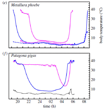
Each of the main curves shows the body T (y-axis) for one bird vs time (x-axis) over one night. Each graph also shows the air T. Note that 24 h on the time scale refers to midnight.
To do this... Several birds of each species were captured, and then maintained in an enclosure but exposed to the outside T. The figure here shows results for two of the six hummingbird species studied. For each species, results are shown for the bird with the most extreme (blue) and least extreme (pink) changes in body T.
The lower graph (part f) is for Patagona gigas. The two birds here were measured on the same night; the black curve at the bottom shows the air T for that night. You can see that the birds varied. (Remember, the two shown are the extreme responses. For this species, four birds were measured.) But both showed a rapid decline in body T, followed some time later by a rapid rise. One bird spent about 4 hours with a body T about 10 °C.
The upper graph (part e) is for Metallura phoebe. For each bird shown, there is a dashed line of the same color showing the air T. The body T of both birds declined to very near the air T for extended periods. Some of the bird T measurements were below 4 °C.
P gigas is a big bird, as hummingbirds go; it is known as the giant hummingbird. Average body weight of the birds measured was about 24 grams. (Weight of the specific birds shown is not indicated.) M phoebe, the black metaltail, averaged about 6 g. (A US dime, a small coin, weighs about 2 g.)
This is part of Figure 2 from the article.
|
In all cases, the T changes of the bird were rapid, both for cooling and warming. These are not passive changes, with the bird's T simply drifting. Something is triggering a shutdown of metabolism (i.e., of body heat production), and then something is triggering its return. There is no information on how this is happening. The birds of a species vary considerably, and the species also vary. It's not going to be easy to sort this out.
The testing here was done in early March, near the autumnal equinox, with a night length of 12 hours. What do the birds do during real winter? That is not addressed here.
Birds and mammals are warm-blooded animals, using metabolism to maintain a high body T. For small animals, with a high surface-to-volume ratio, it can be hard to maintain body T when it is cold. A temporary shutdown is known to occur for some small mammals. The hummingbirds are an example with birds, as shown here. An extreme example. The low body T measured here include the lowest ever measured for a bird. In fact, it is the lowest ever measured for a warm-blooded animal getting through a cold night unless in full hibernation.
News stories:
* Hummingbird reduces its body temperature during nightly torpor. (B Yirka, Phys.org, September 9, 2020.)
* High-Elevation Hummingbirds Evolved a Temperature Trick. (C Intagliata, Scientific American, September 15, 2020.) Podcast, with transcript.
The article: Extreme and variable torpor among highelevation Andean hummingbird species. (B O Wolf et al, Biology Letters 16:20200428, September 2020.)
More about hummingbirds... How can hummingbirds taste "sweet"? (September 26, 2014).
A post about hibernation... Underground hibernation in primates? (October 6, 2013). Hibernation is long-term, such as over the winter. The phenomenon of the current post, called torpor, is a short term response (daily in this case).
More about adapting to winter: Shrews downsize part of the brain for the winter (March 13, 2021).
More on the biology of the Andes: Life that thrives on hot air (September 5, 2009).
How about having your immune system remove senescent cells?
September 27, 2020
Caution...This is a complex story, bringing together two major developments of recent years, both individually complex and still only incompletely understood.
An exciting recent development in cancer biology has been learning how to get a patient's own immune system to attack the cancer. One approach is the use of CAR-T cells: T cells with a CAR -- a chimeric antigen receptor. Briefly, the idea is to modify some of the person's T cells so that they directly recognize -- and attack -- the cancer.
An exciting development in the field of aging has been the emergence of the idea of senescent cells. These are old cells, no longer providing useful function, and no longer dividing. But sometimes they hang around; they seem involved in various diseases commonly associated with aging.
Can you suggest how we might want to connect those two developments?
Could we make CAR-T cells targeted to senescent cells?
A recent article reports that scientists have done just that, and that it shows promise. Here we will look at some of the basics of their story, skipping most of the complexity.
The first figure shows the idea (part c), along with some perspective (a & b)...
Part a (left) shows a senescent cell and an immune-system cell. The former secretes a factor called SASP, which leads to the immune cell attacking the senescent cell. Good.
Part b shows what happens if that immune control of senescent cells can't keep up. Senescent cells accumulate, and can lead to disease. Two examples are shown.
Part c shows the proposal, as developed in the current article. Senescent cells are found to have a "marker" protein on their surface, a protein found on them, and not on other cells. It is called uPAR. So the scientists make CAR-T cells targeted to uPAR. Senolytic T-cells, able to recognize and lyse senescent cells.
This is Figure 1 from the news article (Wagner & Gil) in the journal.
|
The article is, broadly, about finding that uPAR is a marker for senescent cells, making CAR-T cells targeted to uPAR, and testing them. The "big picture" is that it works -- in their mouse model.
Here are some results from one test...
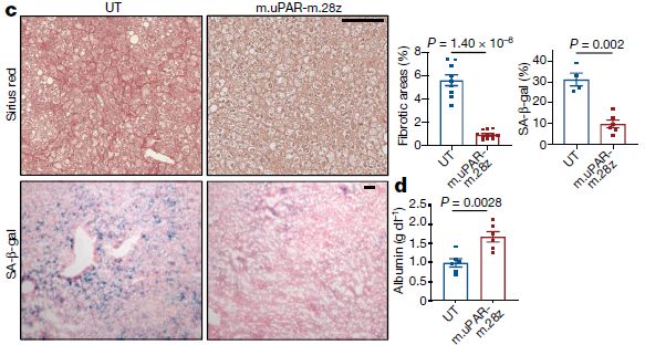
Let's start with the pictures. Mice were developed showing liver fibrosis, of a type associated with senescent cells. They were treated with the senolytic CAR-T cells (right) or a control (left; called UT). The images show stained tissue slices.
More specifically, the top row involves a general stain. The main observation here is to look for irregular fibrotic areas. You can see a couple of prominent fibrotic areas at the left, but none at the right.
The bottom row involves staining for a specific enzyme associated with the senescent cells. Blue represents that enzyme. A lot at the left, little at the right.
The two upper graphs show the results quantitatively. The top left graph shows fibrotic areas; the top right graph shows the enzyme level reflecting senescent cells. In both cases, treatment with the senolytic T-cells caused a reduction. Good.
The lower graph (part d) shows albumin production by tissue samples. That is a measure of liver function. It is higher in the samples from the treated mice. Good.
This is part of Figure 4 from the article.
If you try to navigate the figure legend in the article... Part c includes all the stained images plus the top row of graphs. Part d is only the bottom graph.
|
There are other tests in the article. In general, the results are encouraging.
This should all be taken as very early stage work. The experience with CAR-T cells in the treatment of cancer has shown that it is complicated. The authors of the current article discuss the likely complexities of their system. What they have done here is to lay out an approach, and then show that it has some merit. Practical implementation will be challenging.
News stories:
* Demonstrating a Senolytic Chimeric Antigen Receptor T Cell Therapy. (Fight Aging, June 25, 2020.) Brief, but very good.
* CAR T cells beyond cancer: Targeting senescence-related diseases. (Medical Xpress (Memorial Sloan Kettering Cancer Center), June 17, 2020.)
* News story accompanying the article: Immunology: T cells engineered to target senescence -- Senescence is a hallmark of cellular ageing and contributes to many diseases. A new method enabling immune cells to target senescent cells might offer improved therapeutic options. (V Wagner & J Gil, Nature 583:37, July 2, 2020.)
* The article: Senolytic CAR T cells reverse senescence-associated pathologies. (C Amor et al, Nature 583:127, July 2, 2020.)
More about senescence or, more broadly, aging:
* Hydrogen gas as an anti-aging agent? (January 24, 2024).
* A senolytic treatment for severe COVID (August 21, 2021).
* Treating senescent cells: an overview (November 29, 2017).
* A treatment for senescence? (June 4, 2017). The article of this post is reference 9 of the current article.
The page for BITN -- Other topics includes sections on Aging and Cancer. Each includes a list of related Musings posts. (There are no previous posts on the use of CAR-T cells.)
How bad will the upcoming COVID-era winter flu season be?
September 25, 2020
We may actually have some data on the matter. After all, the Southern Hemisphere just finished Winter. What is the experience Down Under?
A new article reports flu data for three Southern Hemisphere countries for the Winter that just finished. Here are the results for Australia...
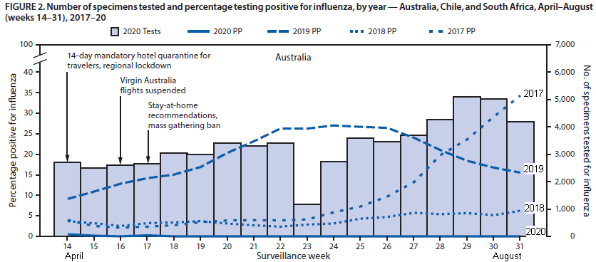
The four curves show the percentage of positive tests for flu (left-hand y-axis) for four years. The years are identified in the key at the top; I have also added year-labels at the right-hand end. (Ignore the shaded bars for now.)
The data here are for weeks 14-31 of the calendar year. That is roughly April through August -- Fall and Winter in the South.
Results vary by year, of course. But what is striking is the curve for 2020. It shows essentially zero flu for the entire period.
The shaded bars? Number of tests done in 2020 (right-hand y-axis). There is no big message here. By and large, there is a good number of tests.
This is the top part of Figure 2 from the article. The other parts are for the other countries listed in the Title of the figure. I have added some labeling: years for the curves (at the right end), and months along the x-axis.
|
As noted, the article contains similar graphs for two other Southern Hemisphere countries: Chile and South Africa. The pattern is the same: essentially zero flu for the entire period, as judged by this kind of testing.
The results above and for the other two Southern countries reflect a total flu case count of 51 for 2020. That is less than 1% of the annual average for the other years. The positivity rate was about 0.06% for 2020, compared to about 14% for the earlier years.
The article also contains a similar graph for the United States (Figure 1). Once again, near zero flu for mid-2020. But for the US, this time period is not flu season, and the numbers for the other years are quite low. 2020 gives the lowest numbers, but it is a different situation.
What does this mean? Was flu really low this past winter in the South, as the graph suggests? Or is there some artifact leading to the apparently low flu numbers? If flu was low, was that because of COVID?
Flu is commonly under-reported, but the graph shows four years of data collected by the same method. Is it possible that the nature of testing for flu was changed enough by the COVID situation to result in these low 2020 numbers for flu?
The anecdotal experiences being reported broadly agree with the numbers here: flu was very low during recent months.
Why might that be? The obvious reason is that the procedures implemented to reduce the spread of COVID also reduced the spread of flu. Both are respiratory diseases caused by viruses. They are, we might presume, spread similarly.
What are the implications for the upcoming Winter flu season in the Northern Hemisphere? Will we see the same reduction of flu in the US? There is a big difference. The time period covered in the graph above, southern Winter, was during peak COVID precautions. We are now coming out of that peak in the US, trying to return to "normal". (Whether we are doing it wisely is not for us here.) If we are backing off on precautions to reduce the spread of COVID, there would be no carry-over reduction of flu.
We will see.
Perhaps we should add a question... Are there implications for control of flu in "normal" years?
A reminder that Musings does not give medical advice. We typically discuss results reported in a single scientific article. The post here is not to be taken as a prediction that the upcoming flu season will be minimal. And we particularly note that we have not considered what happens if a person gets both viruses.
News stories:
* Flu season may be very mild this year, thanks to COVID-19 precautions. (R Rettner, Live Science, September 17, 2020.)
* Efforts to prevent COVID-19 led to global decline in flu. (E N Dreisbach, Healio, September 17, 2020.) The main news story is followed by a "Perspective" by A A Adalja.
* WHO Influenza Update #376 & MMWR: Decreased Influenza Activity During COVID-19 Pandemic. (M P Coston, Avian Flu Diary, September 18, 2020.) Discusses the article, plus a WHO report along the same lines.
The article, which is freely available: Decreased Influenza Activity During the COVID-19 Pandemic - United States, Australia, Chile, and South Africa, 2020. (S J Olsen et al, Morbidity and Mortality Weekly Report (MMWR) 69:1305, September 18, 2020.)
Another connection: Effect of the COVID pandemic on the incidence of dengue (May 24, 2022).
Next flu post: Why the flu vaccine wanes: role of the bone marrow plasma cells (January 2, 2021). This post, too, may be relevant to COVID.
Posts on flu are listed on the supplementary page Musings: Influenza.
Also see: Air filters that can kill (March 19, 2022).
The page for BITN -- Other topics includes a section on SARS, MERS (coronaviruses). That section now includes COVID-19. It lists Musings posts on coronaviruses.
September 23, 2020
Briefly noted... Improved ventilation to reduce COVID transmission
September 23, 2020
There are two aspects to this: how COVID is transmitted, and how indoor air can be better handled for improved safety. The story of how COVID is transmitted continues to develop, with increasing acceptance of the role of aerosol transmission. In any case, that is a well-known transmission route for many infectious diseases. Thus the ventilation issue is general, apart from COVID. The news story is good reading on its own; go on to the article if you want more.
* News story: Indoor spread of COVID-19 can be lessened, experts say. (M Van Beusekom, CIDRAP, May 28, 2020.) Links to the article, which is freely available.
* Direct link to the article, which is freely available: How can airborne transmission of COVID-19 indoors be minimised? (L Morawska et al, Environment International 142:105832, September 2020.)
* Also see:
- Improving ventilation reduces COVID (April 17, 2024).
- Air filters that can kill (March 19, 2022).
* COVID posts are listed on my page for BITN -- Other topics in the section SARS, MERS (coronaviruses).
If cows had eyes on the rump, would they be less subject to ambush attack by lions?
September 22, 2020
A scientific article addressing the issue appeared recently. The scientists ask a good scientific question, carry out a well-designed experiment, with controls, and examine the data. An answer seems to emerge, though, as with any study, there are limitations.
The focus here is on the back end of cows...
Part c (right) shows the control case, an unmodified back end (or "rump").
In part a (left), there is a pair of eyes; in part b there is a pair of crosses (X'es).
This is Figure 1 from the article.
|
The question is: are the cows with eyes by the tail less likely to be killed by lions in the field?
Here are the results, totaled over four years of observation...
| Condition
| part of
Fig above
| cows
| killed by
big cats
| percentage
|
| eyes
| a
| 683
| 0
| 0 (< 0.1%)
|
crosses
(control)
| b
| 543
| 4
| 0.7%
|
(none)
(control)
| c
| 835
| 15
| 1.8%
|
The "big cats" here are lions and leopards. (Mostly lions.)
This table is based on Table 1 of the article.
The full table shows the data for the four individual years.
|
It's quite clear... eyes in the back reduced the number of cows killed by the cats. And crosses (X'es) helped, too.
As you probably figured out by now, the extra eyes here are painted on. The authors refer to these as "artificial eyespots".
The colors of artificial eyespots and X'es varied, depending on the cow color. Colors of the markings were chosen for good contrast. The figure shows examples.
The idea behind the test is simple. There are, for example, butterflies that have "eyespots" on their wings. They deter predators, though scientists do not fully understand how they work, and it may be different in different cases.
The current article is apparently the first case of testing whether such unusual eyespots might work to deter attack by large mammals.
The results, as shown in the table above, are encouraging. Marking is a simple and inexpensive intervention, and it seems to save cow lives. It may also save lion lives, if the response to cattle predation is to kill lions. (The treatment needs to be repeated every month or so.)
There are limitations of the study, such as...
- Are the X'es effective? The results above are intermediate for the X'es. The X'es were studied in only two of the four years, with mixed results. It's an interesting issue: does it matter much what the marking is? Are the predators responding to "eyes", which might be watching them, or to "that's not what a cow looks like"? In any case, painting eyes is simple (using a stencil) and useful; the method can be used even while addressing why it works.
- Would the cats learn over time that it is ok to attack an oddly-marked cow? Don't know. (It would be interesting to know which cats carried out the killings, especially the four marked with X'es. Are certain cats learning, and repeating?)
- What would the cats do if all the cows were marked? In the current work, there were always unmarked cattle available; a skeptical lion could choose an ordinary-looking cow. The deterrent effect might be less if a hungry cat found a field with only odd-looking cows. The authors suggest that, for now at least, it might be best to mark only the higher-value animals in a herd.
Overall, this is good useful science -- and fun.
News stories:
* Painting eyes on cow butts can prevent predator attacks, study finds -- These cows are looking everywhere, even behind their backs. (F Koop, ZME Science, August 20, 2020.)
* Lions are less likely to attack cattle with eyes painted on their backsides. (The Conversation, August 7, 2020.) From the article's authors.
The article, which is freely available: Artificial eyespots on cattle reduce predation by large carnivores. (C Radford et al, Communications Biology 3:430, August 7, 2020.)
More about eyes on the wrong end: What if you had eyes on your tail? (July 27, 2013). But these eyes work!
Another post about cows dying: Another disease has been eradicated. GREP (February 2, 2010). Links to more.
A new sensor for barium ions -- could it lead to a better understanding of neutrinos?
September 20, 2020
Beginning chemistry students learn how to detect barium ions... just add a solution containing sulfate ions, and you get a nice precipitate of BaSO4.
But what if there was only one Ba2+ ion -- in a ton of gas?
A recent article demonstrates a new Ba2+ ion sensor that might be up to the task. Let's first look at how it works. Then we will discuss why such a sensor is of interest. (Hint... think ββ0ν.)
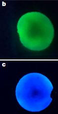
|
Fluorescence of the new barium ion sensor.
Part b (top) is the sensor alone, without Ba2+. Part c (bottom) is the sensor with Ba2+.
It is clear that the sensor responds to Ba2+.
The fluorescent sensor is excited with UV light (365 nm).
This is part of Figure 3 from the article.
|
There is no water in the test above. The sensor is bound to silica. The Ba2+ was provided in the gas phase, by the sublimation of a barium salt.
The following figure shows some of the chemistry of the sensor, in the context of the intended application...
The structure of the sensor molecule, with a Ba2+ bound to it.
The Ba2+ ion binds to a nitrogen atom in the ring system. (Ba-N bond length is 2.89 Å, as shown there.) The Ba2+ is also stabilized by several O atoms, shown in red to the upper right of the Ba, but it is the interaction with the N that is responsible for the optical properties.
That number -187 at the lower left? It is part of an energy diagram. -187 kcal/mol is the free energy change (ΔG) for the reaction: the formation of this complex from the free sensor and Ba2+Xe8. It's a quite favorable reaction. (The energy value shown here is from theory; it has not been measured.)
|
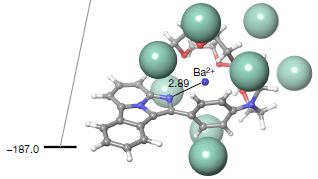
|
Those big greenish balls? Xe atoms.
If you want to see the details of the chemical structure, they are clearer in Figure 1; this is compound 7ca. (It's not a problem for this structure, but if you wander around more of Fig 1, be alert for an error. For some parts of compound 5, a ring atom is shown as X = H. That should be X = CH.)
This is the bottom part of Figure 4 from the article.
|
Ba2+Xe8? That's a "solvated" barium ion. We noted that the test shown in the top figure involved no water. In fact, the "solvent" for the intended test is xenon -- a high pressure xenon gas. Ba2+Xe8 is an estimate of the form of the barium ion under those conditions.
What is that intended test? We hinted earlier: ββ0ν. That stands for double beta decay, with no neutrinos (ν). Beta decay of an atomic nucleus is accompanied by emission of a neutrino (actually, an antineutrino). Double beta decay should be accompanied by emission of two (anti)neutrinos.
Theorists have suggested that there is an alternative: the process might occur without production of neutrinos. According to our common understanding of particle physics, that shouldn't happen. But there is a special case: if neutrinos are their own anti-particle, two neutrinos could effectively annihilate each other, just as we understand for matter and antimatter. Is that so? Are neutrinos their own anti-particles? It's a long-standing mystery of physics. That's why the experiment is so important. It has implications for our most fundamental understanding of matter.
Theoretical calculations suggest that the decay of the xenon isotope Xe-136 could be a favorable case. The half-life is at least 1026 years, but with tons of Xe atoms observed for years, it becomes a plausible experiment -- if only we could detect a very low level of the resulting barium ions. That's the context of the current work.
There is no work in the current article on Xe decay. The scientists don't actually show that their new sensor could detect a single ion, though they calculate that it could. That is, the work here is a step toward making a sensor that might be suitable for the decay test, a step toward a real test to see if double-beta decay occurs without neutrino production.
However the neutrino story turns out, the sensor molecule demonstrated in this article represents a new approach to making sensitive fluorescent sensors, acting effectively dry.
News stories:
* A blue spark to shine on the origin of the universe. (Phys.org (University of the Basque Country), June 23, 2020.) (Note a consistent format error in the formula of Ba2+.)
* How to detect the daughter atom of a neutrinoless double beta decay. (C Tomé López, Mapping Ignorance, June 25, 2020.)
The article: Fluorescent bicolour sensor for low-background neutrinoless double β decay experiments. (I Rivilla et al, Nature 583:48, July 2, 2020.)
A post about another exotic reaction that might involve neutrinos... Are electrons "forever"? (February 9, 2016).
and then... An unusual neutrino, from a novel type of black hole? (March 4, 2026). Added March 4, 2026.
More xenon... The 35 most famous xenon atoms (June 29, 2010).
A recent post about fluorescence: How to get common fluorescent dyes to work in the solid state (September 4, 2020).
More sensors: Making hydrogen visible (July 2, 2022).
More about barium: A better white paint, using BaSO4; it's cool (August 10, 2021).
September 16, 2020
Briefly noted...
September 16, 2020
Nitrogen-fixing maize (corn). Scientists have found and begun to characterize a strain of corn that fixes molecular nitrogen, N2, from the air. The strain has aerial roots that secrete a mucus that supports the nitrogen-fixing bacteria. The novel corn is cultivated in a region of Mexico with poor soil. If the trait could be transferred to other corns, it could be of considerable value.
* News story: The Corn of the Future Is Hundreds of Years Old and Makes Its Own Mucus -- This rare variety of corn has evolved a way to make its own nitrogen, which could revolutionize farming. (J Daley, Smithsonian, August 10, 2018.) Links to the article, which is freely available.
* This is a story from 2018, which I stumbled across last week. Very interesting, but too old for a regular Musings post. So we just note it here.
* A background post that seems relevant: Why growing maize (corn) is bad for us (June 25, 2019).
Growing on manganese ions as an energy source
September 15, 2020
Have you ever examined manganese dioxide, MnO2, up close? Here are some pictures, from a recent article...
Scanning electron micrographs of MnO2 nodules.
The scale bars at lower right of each part are, from left to right: 20, 10, 20 µm.
That is, the pieces shown here are on the order of 0.1 mm across -- tiny, but visible to the naked eye.
This is part of Extended Data Figure 4 from the article. (Not in print edition, but Figure 1f gives one example.)
|
What makes these MnO2 nodules of interest is that they were made by bacteria. The bacteria were growing on manganese ions, Mn2+, as their energy source, oxidizing the Mn2+ to Mn4+. The Mn4+ appears in the form of MnO2, which is insoluble. That is, the MnO2 nodules are the waste products from burning fuel.
Manganese is an abundant element on Earth, with much of it in the form of Mn2+. Oxidizing that to Mn4+ is good chemistry. In fact, the reaction is known to occur biologically. However, no organism was known that could exploit the reaction as its primary energy source.
(For comparison... Fe plays a major role in redox reactions for most organisms. Bacteria that get their energy by oxidizing one form of iron ion to another, Fe2+ to Fe3+, have long been known.)
One argument against the Mn2+ reaction becoming popular may be evident from the pictures above. We may find those pictures beautiful, but to the bacteria, it may be something like making a prison for oneself. But that is not an argument against it happening.
A few years ago, a team of scientists at Caltech (accidentally) found a bacterial culture that appeared to be carrying out the Mn2+ oxidation on a large scale. It was a mixed culture, of considerable complexity, so it was not clear what any particular bacteria were doing. They have now followed up, with substantial purification of the mixed culture. The current article is the first report of any (reasonably well characterized) life form growing using the energy from the oxidation of Mn2+ ions.
Interestingly, it is still a mixed culture, with two kinds of bacteria. Attempts to isolate a Mn2+-utilizing monoculture have failed; apparently, the second member of the culture has an essential role, though the scientists do not know what it is. The major member (80-90%) is thought to be the Mn-oxidizer.
It is common for microbes to grow together in Nature. Sometimes it is obligatory that they do so. Isolating pure cultures of individual organisms has long been a tradition in microbiology, but it is increasingly understood that it may not be appropriate for all organisms. It is still true that the overwhelming majority of bacterial species that we can recognize cannot be grown in the lab, singly or otherwise.
The microbe pair grow together, oxidizing Mn2+, and using the energy from that oxidation for growth. They use CO2 as their primary carbon source, just as photosynthetic organisms do, but here the energy for CO2-fixation comes from the chemical oxidation.
The scientists have sequenced the genomes and begun to analyze the transcriptomes (mRNA content) for both members. And they have offered names for both: Manganitrophus noduliformans and Ramlibacter lithotrophicus.
Use of Mn2+ as a primary energy source for a living system can now be considered an established fact.
News stories:
* Bacteria with a metal diet discovered in dirty glassware. (Phys.org (California Institute of Technology), July 15, 2020.)
* Serendipitous history in the microbial making. (K Freel, Molecular Ecologist, July 24, 2020.)
The article: Bacterial chemolithoautotrophy via manganese oxidation. (H Yu & J R Leadbetter, Nature 583:453, July 16, 2020.)
A post about some interesting speculations on the biology of manganese: Photosynthesis that gave off manganese dioxide? (July 21, 2013).
More manganese... Manganese(I) -- and better batteries? (March 21, 2018).
A post about an unusual chemoautotroph -- one that was made in the lab: Turning E. coli into an autotroph (using CO2 as sole carbon source) (December 9, 2019).
There is more about energy issues on my page Internet Resources for Organic and Biochemistry under Energy resources. It includes a list of some related Musings posts.
Life on 10 zeptowatts
September 13, 2020
It's census time in the United States, and also in the sediments below the ocean floor.
A recent article presents results from the latter, and some of them are intriguing. The following figure gets us started, with some results for three kinds of microbes (bacteria and archaea)...
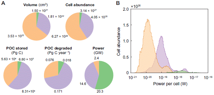
Look at two of the pie charts in part A. The one at the upper right shows the counts for these three types of microbe. The one at the lower right shows their rate of energy usage -- which is called power. The numbers are global totals; the types of microbe are identified only by their color codings for now.
Divide those two numbers and you get power per cell. For the "orange" microbes, that is 2.4 gigawatts divided by 6.27x1028 cells. That is 3.8x10⁻²⁰ watts/cell. About 40 zeptowatts/cell.
Part B shows the results differently, with the number of cells found (y-axis) vs power (x-axis). The peak is about 10-20 watts/cell. 10 zeptowatts/cell.
Note that the first number (40 zW/cell) is the mean, whereas the second (10 zW/cell) is the mode. The distribution has a significant tail on the high end, which is why the mean is higher than the mode.
The figure also shows results for two other kinds of microbe, green and lilac. We'll focus on the orange microbes, the ones with the lowest energy usage.
This is Figure 1 from the article.
|
Let's use the second number, 10 zeptowatts/cell. It's simple and in the ballpark.
That's not much energy. In fact, it's close to estimates of the theoretical minimum needed to maintain cells in suspended animation, without death. And it is about a hundred-fold less than previous measurements of the power needed to maintain cells.
Thus it would appear that these microbes are maintaining themselves in nature near the lower limit for life, in terms of energy usage.
It has long been suspected that there are microbes at the low energy limit. Well, logically there must be. But what is it? The current work extends our analysis of where microbes are on Earth to a case where they are surviving but not dividing, on an energy supply 1/100 of the previously measured limit.
There is an interesting implication, if all these numbers are actually correct. The sediments measured here are over a million years old. If these cells are simply maintaining themselves, without having enough energy to divide, that suggests that the current cells, the ones being measured, are the same cells originally deposited. That is, these cells are a million years old.
Don't take that as a claim. It is an implication, if the basic numbers and arguments are correct. There are many reasons they may not be. But it certainly is a challenge, and further work will undoubtedly try to shed more light on the question of long term maintenance of microbes in nature.
What is the basis of the measurements? Geologists drill deep into the ocean sediments, and extract "cores" -- long samples of material over a range of depths. (Some of these cores were originally made for exploring for minerals.) The cores can then be analyzed in the lab, by various methods. These analyses yield estimates of the numbers of cells and the amount of organic carbon metabolized. The latter can be interpreted in terms of energy consumed. The measurements are then fed to a computer model. (The details of what was measured are not clear from the article alone, and I can think of questions I might have about the analysis and assumptions. That uncertainty does not detract from the general description of what was accomplished.)
What are these three colors of microbes? The type of particular interest, shown in orange, is methanogens. Green is for aerobes (using oxygen). Lilac is for sulfate-reducing microbes. The three types reflect varying redox potential of the sediments. The orange microbes, the methanogens, are from the greatest depths, with lowest redox potential.
For fun, here is a map. It shows where the methanogens are found...
The map is color-coded by the cell power. The red and yellow areas of the map are for the methanogens with the highest power/cell.
Note that the power range shown here agrees with that in part B of the top figure.
This is Figure 2C from the article. Other parts of the full figure show the maps for the two other classes of microbes noted in Figure 1, above. They are all quite different.
|
News stories:
* New study reveals lower energy limit for life on Earth -- An international team of researchers led by Queen Mary University of London have discovered that microorganisms buried in sediment beneath the seafloor can survive on less energy than was previously known to support life. The findings have implications for understanding the limit of life on Earth and the potential for life elsewhere. (Queen Mary University of London, August 5, 2020.) Excellent overview of the work, despite a little hype near the end.
* Life at its limits -- Microbes in the seabed survive on far less energy than has been shown ever before. (EurekAlert! (GFZ GeoForschungsZentrum Potsdam, Helmholtz Centre), August 5, 2020.) (This page incorrectly refers to sulfate being oxidized; it is reduced. The main content of the page is fine.)
The article, which is freely available: Widespread energy limitation to life in global subseafloor sediments. (J A Bradley et al, Science Advances 6:eaba0697, August 5, 2020.)
For reference... Humans operate at about 100 watts. Divide that by the number of cells, about 30 trillion, and you get 3x10-12 W = 30 picowatts = 3x10⁹ zeptowatts.
More about methanogens: What caused the mass extinction 252 million years ago? Methane-producing microbes? (October 12, 2014).
More sulfate-reducing bacteria: Microbes that make elemental carbon (November 27, 2021).
A post about life at the bottom of the ocean: The hydrogen economy -- in the mid-Atlantic (August 30, 2011).
September 9, 2020
Briefly noted...
September 9, 2020
Does a grammar checker improve the readability of a text? Not according to a test reported in a recent article. It improves the grammar, but readability is a different issue. Perhaps that is not a surprising conclusion, but it is contrary to the claims of the company making the grammar checker.
* News story: Grammar tools do not improve readability. (O-J Øye, Science Norway, August 20, 2020.) Links to the article, which is actually a book chapter, based on a meeting presentation. Is it peer-reviewed? Don't know. (Careful... The publisher's page includes separate links for the book and for the chapter.)
Treating croplands so they take up more CO2 from the air
September 8, 2020
CO2 reacts with silicate rocks to form carbonates. It is a natural process, a type of weathering. It could be the basis for removing CO2 from the air. Musings has previously noted one proposal to make use of this chemistry for reducing atmospheric CO2 [link at the end].
A recent article explores using this approach on ordinary farms. If farmers spread silicate rock dust on their fields, there would be vast areas of CO2 uptake. How well would it work? How much would it cost? What might be the side effects, pro and con? The article does some modeling, and suggests that the approach is worth considering.
The following figure gives an idea of the potential...
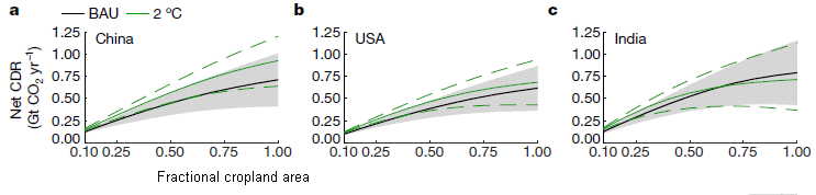
Each graph is for one country. The upper left graph (part a) is for China, the single largest contributor.
The black line shows CO2 removed from the air (y-axis) vs fraction of the country's cropland used for the removal (x-axis). Remember, this is modeling; the results here are calculations of what could be removed with one or another set of assumptions. (The shaded region around that line shows 90% confidence limits; the uncertainty is largely due to varying rock quality.)
As an example, consider 25% coverage of the country's farms. Look at 0.25 fractional coverage on the x-axis, and read the y-value: it is about 0.25 -- that is Gt/yr (gigatons of CO2 per year).
The values are similar for the other two countries shown here. The total for the three countries is probably about 0.7 Gt/yr (at 25% coverage).
CDR = carbon dioxide removal. "Net CDR" (on the y-axis label) means that they have taken into account the energy costs of the process (such as grinding the rock).
The black and green curves, each with 90% confidence limits, are for two different scenarios. The black is for BAU = business-as-usual. The green assumes policies have been set to limit the global temperature increase to 2 degrees. The results are similar for the two cases.
This is part of Figure 1 from the article. The full figure shows similar graphs for nine more countries. The set of 12 countries shown in the full figure includes the seven non-European countries with the largest potential contributions, plus the five with the largest contributions from Europe. (The largest European contributor would be about #6 worldwide.)
|
The scientists do the prediction worldwide. The three countries shown above are those that would make the largest contributions. The total for the world is about 1 Gt/yr. Again, that is at 25% coverage; by using more cropland, the number could double.
Table 1 of the article provides a different way of getting that perspective. The second section of that table is for a goal (total) of 1.0 Gt CO2/yr. You can see that the three big contributors each contribute about 0.25 Gt, at a coverage of about 25%. (The data used here is a little more complicated than just the black curve shown above, but the end result is similar.)
How significant is that amount? Commonly stated goals call for removing 10 Gt/yr of CO2. If the new proposal led to removing 1 Gt/yr, that would be a significant contribution.
What would it cost? They estimate (US) $80-180 per tonne of CO2. That cost is in the ballpark of other proposed methods for removing CO2 from the air. (Table 1 of the article, mentioned above, also shows cost numbers by country.)
Where does the rock dust come from? The authors note that it is common stuff, often just remaining in piles from other processes. New mining to produce the rock could be considered, but only as a last resort.
Side-effects? The rock dust is likely to be good for the soil, leading to improvements in agricultural yields. This is the kind of effect that could help promote acceptance. It is also possible that some rock sources could be toxic.
Bottom line... It is an interesting proposal, deserving further analysis and testing. The current article is entirely modeling. Though the basis of the method is well-known chemistry, there is no experimental work here.
News stories:
* Spreading rock dust on farmland could capture surprisingly large amounts of CO2, fast -- The technology and infrastructure already exist - and the strategy could provide a substantial income source for farmers. (E Bryce, Anthropocene, July 17, 2020.)
* Applying rock dust to croplands could absorb up to 2 billion tonnes of CO2 from the atmosphere. (Phys.org (University of Sheffield), July 9, 2020.)
* News story accompanying the article: Environmental science: Atmospheric CO2 removed by rock weathering -- Large-scale removal of carbon dioxide from the atmosphere might be achieved through enhanced rock weathering. It now seems that this approach is as promising as other strategies, in terms of cost and CO2-removal potential. (J Lehmann & A Possinger, Nature 583:204, July 9, 2020.)
* The article: Potential for large-scale CO2 removal via enhanced rock weathering with croplands. (D J Beerling et al, Nature 583:242, July 9, 2020.)
Background post... Capturing CO2 -- and converting it to stone (July 11, 2016). In that case, the CO2 was delivered into natural basalt formations. In the new work, the same chemistry is exploited, in a dispersed system. Links to more about geoengineering.
COVID-19: How well does the virus replicate in children?
September 6, 2020
The nature of COVID-19 in children is confusing. The big observation is that children seem less affected than adults. But not all the pieces fit.
Two new articles report that children tend to have higher levels of the virus than do adults, especially in the early stages of infection.
Let's look at some of the basic results from the two articles on viral load in children vs adults. The general approach is the same... The standard test... take a sample (often the famous nasal swab), and measure the amount of viral RNA by quantitative PCR. (The level of virus is assumed to closely correlate with the level of viral RNA.)
Here are the key results from article 1...
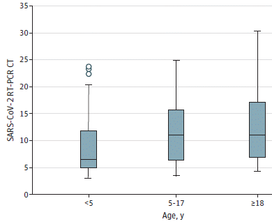
|
The graph shows the viral RNA vs patient age.
Viral RNA is shown here as CT. That is cycle threshold, the number of cycles of PCR required to reach the threshold for detection. The lower the CT, the more virus there was in the sample.
The horizontal line within each data set shows the median. Focus on that (while realizing that the data distributions are very broad). You can see that the viral load is highest for the young children and lowest for the adults.
The authors estimate that the difference in CT medians here corresponds to 10-100 fold difference in viral RNA level.
This is the Figure from article 1. (It is the only data presentation in this short article.)
|
Here are the key results from article 2...

|
This graph also presents viral RNA vs patient age, but the details are different.
First, the y-axis scale is indeed the amount of viral RNA, in copies per mL -- on a log scale.
(The lowest points shown are at 1, for 101 = 10 copies/mL. But these points actually mean <40 copies/mL. Why? The authors state that the limit of detection was 40 copies/mL; all values appearing to be zero were plotted as 10 copies/mL.)
The patients are divided into two major groups: pediatric (red), and adult (black). The dividing line is age 22.
Within each age group, there are three sub-groups, based on the time of onset of symptoms; see x-axis labeling. The first group is for measurements made 0-2 days after onset of symptoms.
Observations (again, focusing on the medians)...
- For each age group, the level of viral RNA declines during the infection. In fact, the highest viral RNA levels are seen at the very beginning of the symptomatic phase.
- Comparing the two age groups at a particular stage of infection... The pediatric patients have higher viral RNA level for two of the three stages. (I assume that the median for the right-hand group is in the big cluster of points at the bottom.)
This is Figure 2B from article 2.
|
The big picture from both studies is that children have high viral loads, perhaps even higher than adults.
The age categories are different for the two articles, and it's not obvious that the two sets agree. The distributions are broad, which is to be expected; comparison of medians and other measures of the middle data, helps to reduce the influence of outliners. Further, some of the data sets are quite small.
Despite the cautions, both articles point to children having high virus levels. Whether they have higher levels than adults is perhaps a weaker claim at this point, but not too important.
If children have high viral loads, they are potentially a source of virus transmission, though that has not been measured directly. Why they don't get as sick is a different issue; it is not due to having less virus.
As so often, the information about COVID is not simple.
The results shown in the second figure are also a reminder that virus levels are high early in the infection. It is not addressed here, but that is consistent with there being high virus levels prior to symptoms -- allowing for good viral transmission by people who are asymptomatic.
News stories:. The first two are specifically for article 1, which was published online in late July. The last two are specifically for article 2, which was published online in late August.
* News Scan for July 31, 2020 -- Kids 5 and younger could spread COVID-19 as much as adults, study finds. (CIDRAP, July 31, 2020.) First item on the page.
* Children Often Carry More Coronavirus than Adults Do: Study -- It's not clear if their high viral load makes kids more likely to infect others. (A Heidt, The Scientist, July 31, 2020.) Now archived.
* Researchers show children are silent spreaders of virus that causes COVID-19 -- Comprehensive pediatric study examines viral load, immune response and hyperinflammation in pediatric COVID-19. (EurekAlert! (Massachusetts General Hospital), August 20, 2020.)
* Kids with COVID have more viral RNA in their airways than adults do. (M Van Beusekom, CIDRAP, August 20, 2020.)
Two articles, which are probably temporarily freely available:
1) Age-Related Differences in Nasopharyngeal Severe Acute Respiratory Syndrome Coronavirus 2 (SARS-CoV-2) Levels in Patients With Mild to Moderate Coronavirus Disease 2019 (COVID-19). (T Heald-Sargent et al, JAMA Pediatrics 174:902, September 2020.) (In the pdf file, the article starts near the bottom of the first page, left column.)
2) Pediatric SARS-CoV-2: Clinical Presentation, Infectivity, and Immune Responses. (L M Yonker et al, Journal of Pediatrics 227:45, December 1, 2020.)
The page for BITN -- Other topics includes a section on SARS, MERS (coronaviruses). That section now includes COVID-19. It lists Musings posts on coronaviruses.
How to get common fluorescent dyes to work in the solid state
September 4, 2020
There are some very good fluorescent dyes that don't work -- don't fluoresce -- very well as solids. A new article solves the problem. The method should be widely applicable.
The following figure shows the problem -- and that it has been solved.
Start with the bottom row... five disks, each with a thin film of one dye. UV light is shined on the disks. Not much happens.
The top row shows the same dyes, now incorporated using the new method, called SMILES. Each dye tested now fluoresces more brightly.
(The oxazine fluorescence can be hard to see; adjust your viewing angle. It indeed is the least successful of the dyes tested here, but is far brighter in the SMILES form than alone. Quantitative data in the article confirm these points.)
This is Figure 5A from the article.
|
Why the dyes don't work in the solid phase is well understood. The fluorescent molecules are so close together that they quench each other. (That is, the electrons excited by the UV dissipate, through another molecule, without emitting any light.) Of course, that explanation makes evident how to solve the problem. It's just a matter of doing it, in a practical way.
The following figure shows the problem and the solution, with some chemical detail for one specific dye.
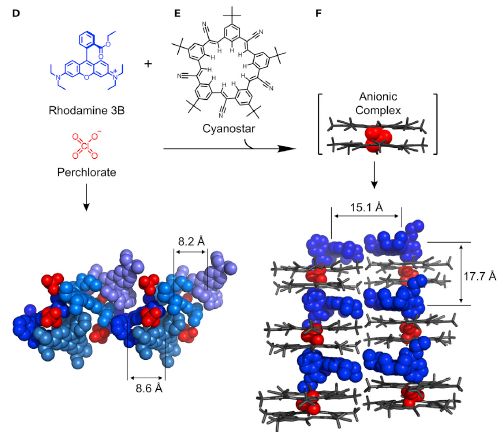
Part D (left) starts with the structure of the dye molecule. This dye is rhodamine 3B (R3B in the top figure, at the left). It is a cationic dye; there is a positive charge on the N at the lower right of the structure.
Since the dye is cationic, it must be incorporated into the solid with an anion; in this work the anion is perchlorate, ClO4-.
The bottom of part D shows the structure of the solid from these two ions. Note the color coding, used consistently in the figure: blue for the dye, with different shades of blue for convenience, and red for the perchlorate.
Two distances are marked, both 8-9 Å. That is the distance between two dye molecules. For now, just note them.
Part E shows the magic ingredient, a chemical they call cyanostar (after the five cyano groups on the outside).
The top of Part F shows how cyanostar does its magic: two cyanostars form a complex with one perchlorate in the center. This complex is the active anion in the final structure.
That leads to the next structure, just below in part F: the dye cation plus the cyanostar-perchlorate anion. They form a nice ordered structure, with the dye molecules held apart, due to the cyanostars. The cationic dyes align with the perchlorate anions, but the spacing of those anions is determined by the cyanostars.
Two distances are shown on this structure, one horizontal and one vertical. Both are about double the distances shown for the cyanostar-free structure (bottom of part D). It is this structure, with the dye molecules held apart, that led to the bright response in the top figure.
This is part of Figure 2 from the article.
|
The top figure shows that the cyanostar solution worked for five dyes tested, representing different chemical classes of dyes. The generality holds because what the cyanostar does is to space the perchlorate anions. Thus it works for a variety of cationic dyes. There is nothing in the method that is dye-specific (though of course it must fit, and be chemically compatible). The cyanostar itself is colorless; the optical properties of the product come from the dye.
The scientists go on to show that the benefits of the cyanostar are retained upon incorporation into common polymers. Figure 10 of the article shows examples. This is a step toward using the new method in real-world applications.
SMILES? Stands for small-molecule ionic isolation lattices. (They need acronym help.)
News stories:
* Chemists create the brightest-ever fluorescent materials. (Nanowerk News (Indiana University), August 7, 2020.)
* New Fluorescent Material Could Boost Optics Technology. (R Lea, AZoOptics, August 13 2020.)
The article: Plug-and-Play Optical Materials from Fluorescent Dyes and Macrocycles. (C R Benson et al, Chem 6:1978, August 6, 2020.)
A recent post about fluorescence: Electronic monitoring of plant health; it might even allow an injured plant to call a doctor (June 21, 2020). In this case, quenching was exploited in making the measurement.
Next: A new sensor for barium ions -- could it lead to a better understanding of neutrinos? (September 20, 2020).
Top of page
The main page for current items is Musings.
The first archive page is Musings Archive.
E-mail announcements -- information and sign-up: e-mail announcements. The list is being used only occasionally.
Contact information
Site home page
Last update: May 13, 2026