Home
> Musings: Main
> Archive
> Archive for January-April 2017 (this page)
| Introduction
| e-mail announcements
| Contact
Musings: January - April 2017 (archive)
Musings is an informal newsletter mainly highlighting recent science. It is intended as both fun and instructive. Items are posted a few times each week. See the Introduction, listed below, for more information.
If you got here from a search engine... Do a simple text search of this page to find your topic. Searches for a single word (or root) are most likely to work.
Introduction (separate page).
This page:
2017 (January-April)
April 30
April 26
April 19
April 12
April 5
March 29
March 22
March 15
March 8
March 1
February 22
February 15
February 8
February 1
January 25
January 18
January 11
January 4
Also see the complete listing of Musings pages, immediately below.
All pages:
Most recent posts
2026
2025
2024
2023:
January-April
May-December
2022:
January-April
May-August
September-December
2021:
January-April
May-August
September-December
2020:
January-April
May-August
September-December
2019:
January-April
May-August
September-December
2018:
January-April
May-August
September-December
2017:
January-April: this page, see detail above
May-August
September-December
2016:
January-April
May-August
September-December
2015:
January-April
May-August
September-December
2014:
January-April
May-August
September-December
2013:
January-April
May-August
September-December
2012:
January-April
May-August
September-December
2011:
January-April
May-August
September-December
2010:
January-June
July-December
2009
2008
Links to external sites will open in a new window.
Archive items may be edited, to condense them a bit or to update links. Some links may require a subscription for full access, but I try to provide at least one useful open source for most items.
Please let me know of any broken links you find -- on my Musings pages or any of my regular web pages. Personal reports are often the first way I find out about such a problem.
April 30, 2017
Synthetic stem cells?
April 30, 2017
Synthetic stem cells? That's in the title of both news stories below. What could that possibly mean? After all, the purpose of stem cells is to provide cells that can grow, and we don't really know how to make synthetic cells that can grow.
The work here addresses a special case. There has been a lot of work using cardiac stem cells, so-called adult stem cells, to treat heart damage. The results have been mixed, but over time scientists have come to understand that these stem cells may be of real benefit, but not by working the way we expected. These cardiac stem cells may act primarily by promoting growth of the host tissue, not by providing cells per se. They promote growth by providing growth factors -- and by stimulating the host cells by direct membrane interactions.
If the cardiac stem cells act primarily by providing those functions, perhaps we can make a substitute that will serve. And that's the idea in this new article.
The following figure shows some bottom line results...
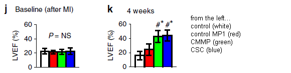
The experimental system here is with mice. They are given a lab-induced artificial heart attack (myocardial infarction, or MI), then groups are treated in one of four ways.
The bar height shows a measure of heart function. It is the left ventricular ejection fraction (LVEF).
The graph on the left (part j) shows the results before treatment ("baseline"). All four groups are about equal, with poor function. The graph on the right (part k) shows the results after treatment. There are two low bars, about as before, and two high bars, showing improvement. The two low bars are for controls. The two high bars are for cardiac stem cells (CSC; blue, at the right) and the artificial stem cells the scientists have prepared. The latter are called cell-mimicking microparticles, or CMMP (green).
That is, the synthetic stem cells, the CMMP, work about as well as the cardiac stem cells.
The red bars? They are for an incomplete form of the CMMP. Perhaps it showed a small effect, though it is not statistically significant.
This is Figure 4 parts j and k from the article. I have added a key at the right side.
|
What are these cell-mimicking microparticles? They are based on synthetic particles, but they contain growth factors from cardiac stem cells, and they are coated with membranes from cardiac stem cells.
If this result holds up, it supports the idea that cardiac stem cells may be useful, but not by providing cells per se. That is, work with the synthetic stem cells enhances out understanding of the system. Further, the CMMP may actually have advantages for treatment. They are robust and easily stored, and they avoid immunological concerns.
Whether the CMMP work in humans is open; the work is entirely with mice. And there is no implication here about stem cells in general -- except to remind us that stem cells may do different things in different cases.
News stories:
* Synthetic stem cells offer benefits of natural stem cells without the risks. (Kurzweil, January 13, 2017.)
* Synthetic stem cells repair damaged hearts. (P Waldron, BioNews, January 9, 2017.)
The article, which is freely available: Therapeutic microparticles functionalized with biomimetic cardiac stem cell membranes and secretome. (J Tang et al, Nature Communications 8:13724, January 3, 2017.)
A post about the use of cardiac stem cells: Cardiac stem cells as a treatment for heart damage: preliminary results are "very encouraging" (November 29, 2011).
A recent post about heart damage: The role of mutation in heart disease? (April 25, 2017).
Another post using a similar experimental system of artificial heart attacks in mice: Zebrafish reveal another clue about how to regenerate heart muscle (December 11, 2016).
and more...
* Heart regeneration? Role of MNDCMs (November 10, 2017).
* If an injured heart is short of oxygen, should you try photosynthesis? (June 25, 2017).
More about heart regeneration: Human heart organoids show ability to regenerate (May 2, 2017). That is the next post.
There is more about stem cells on my page Biotechnology in the News (BITN) for Cloning and stem cells. It includes an extensive list of related Musings posts, including those on the broader topic of replacement body parts.
Water desalination using graphene oxide membranes?
April 29, 2017
Sea water is, largely, a solution of sodium chloride in water. If we could simply filter it, so that the water went through but the salt stayed behind, we could make drinking water. However, filtering out something that is dissolved is generally difficult.
Work with graphene has suggested that filtration of salt water might work. However, in real experiments, the material swelled, and the salt went through the filter.
A new article reports further progress in the development of graphene membranes that might work for filtering the salt out of salt water.
The following graph shows some results...

|
The graph shows the filtration rates for three chemical species. Those rates are shown on the two y-axes; we'll come back to what the axes mean in a moment.
The x-axis is a measure of the effective pore size in the membranes. It shows the "interlayer spacing", the spacing between layers in the multi-layer membrane. We'll see a diagram of this below.
There are three data sets on the graph. The top two are for potassium ions (red symbols and dotted line) and sodium ions (black). You can see that these two lines are very similar. For simplicity, we'll focus on the Na+ line. (I suggest you ignore the error bars.)
|
The third line, with blue symbols, is for water.
At first glance, the water line may seem to be only a little less steep than the Na+ line. However, we need to look more carefully at the axis scales. The data for the ions use the y-axis scale on the left; the data for the water use the y-axis scale on the right. It's common to make a graph with multiple y-axis scales, but in this case, there is something special: the left scale is a log scale; the right scale is linear.
To get a feel for the effects, look at the difference between the results for the smallest and largest inter-layer spacings. For Na+, the rate increases by about 30-fold; for water, it increases by about 2-fold. More relevantly, look at it "backwards", from right to left... As the spacing becomes smaller, the rate of ion flow is reduced much more than the rate of water flow. That is, as the spacing becomes smaller, there is better separation of the water from the ions. That's exactly what we want.
Don't try to compare the rate numbers for water and ions. They are measured in different ways.
This is Figure 2b from the article.
|
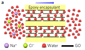
What are these membranes? The scientists used laminated graphene oxide (GO). People have tried that before, but, as we noted above, the material tends to swell in water; when swollen it allows the salt to pass. What they did here was to block the swelling.
Here's the idea...
Start with the horizontal black lines. Those are the sheets of graphene oxide. You can see that we have a basic structure of layers of GO.
The water molecules, shown in red, move between the layers of GO. They emerge on the right.
The ions, Na+ (purple) and Cl- (green), are unable to pass between the layers. They remain at the left.
|
|
Overall, the salt water on the left is converted to pure water on the right, by filtration between the layers of GO.
Note that the filtration is between layers, not through pores. Thus the spacing between layers is the critical issue. That is the x-axis variable in the top graph.
Learning to control the inter-layer spacing was the key development here. The scientists did that in two steps. First, they prepared the membranes at various humidities; that determines the swelling and thus the spacing. Then they encapsulated the material in epoxy, shown in yellow, to preserve the spacing.
This is Figure 1a from the article.
|
Let's go back to the top graph. A key point there is that the spacing affects ion movement much more than it affects water movement. Why? For water, we are talking about simple movement of the water molecules. Bigger spaces allow it to move faster. But for the ions, it is more complex. The ions in the water are surrounded by water molecules, often called water of hydration. The hydrated ions are quite large, and the water is tightly bound to the charged ions. In order to move through the filter, the ions need to be freed of (some of) their hydration, so they are small enough to pass. It takes energy to remove the water around the ions. That makes the ion movement more sensitive to the details of the filtration.
In principle, GO membranes with restricted swelling might be an economical way to do desalination. The energy requirements should be much lower than for reverse osmosis, the major current process. So far, we have only these early lab experiments, demonstrating the idea. The current article shows how to overcome one technical hurdle. We'll see what happens as development continues.
News stories:
* Graphene-based sieve turns seawater into drinking water. (P Rincon, BBC, April 3, 2017.)
* Graphene sieve turns seawater into drinking water. (Phys.org, April 3, 2017.)
* News story accompanying the article: Ion sieving and desalination: Energy penalty for excess baggage. (R Devanathan, Nature Nanotechnology 12:500, June 2017.)
* The article: Tunable sieving of ions using graphene oxide membranes. (J Abraham et al, Nature Nanotechnology 12:546, June 2017.)
More graphene...
* Added May 6, 2026.
How toothbrushes with graphene oxide kill bacteria (May 6, 2026).
* GO dough (April 9, 2019).
* Coloring with graphene: making a warning system for structural cracks? (June 2, 2017).
* A better way to get to Alpha Centauri? (March 15, 2017).
More about water treatment...
* Purifying water using fluorinated nanopores (August 16, 2022).
* Better membranes for water desalination (February 14, 2021).
* Reducing corrosion of sewage pipes (September 27, 2014).
Posts about graphene are listed on my page Introduction to Organic and Biochemistry -- Internet resources in the section on Aromatic compounds.
April 26, 2017
The quality of science news
April 26, 2017
The quality of news is itself a news item. Recent months have brought considerable attention to the topic, including much discussion of "fake news". Of course, we can raise the same issues about science news.
Two organizations that do science news have boldly put forth an analysis and summary. They are the American Council on Science and Health (ACSH) and RealClearScience. Both groups posted the summary, each with their own commentary. These are listed below as the news stories, which are the heart of this post.
I broadly agree with their ranking of news sources, for those I know about. I do think that their analysis made things too complicated at times. Criticizing Physics World, published by the Institute of Physics, because they only cover physics is a cheap shot -- and detracts from the main point that it is high quality coverage. But overall, that is a minor criticism. (I suggest that they use one ranking criterion: quality. Their other comments can be shown as characteristics, but they are not quality per se.)
The ACSH page also links to a story in which they attempt to characterize fake news. I think this is less successful; it is over-reliant on generalities. Nevertheless, it makes some good points. Read it if you want, but I suggest you not take it too literally.
Analyzing news quality is not simple, in science or in general. The organizations here deserve credit for tackling the issue, and for making good, if imperfect, contributions.
News stories:
* Infographic: The Best and Worst Science News Sites. (A Berezow, American Council on Science and Health, March 5, 2017.)
* Ranked: The Best & Worst Science News Sites. (R Pomeroy & T Hartsfield, RealClearScience, March 6, 2017.)
I learned of the analysis from an editorial in Nature: Science journalism can be evidence-based, compelling - and wrong. A ranking of the best science-news outlets misjudges the relationship between research and reporting. (Editorial; Nature 543:150 March 9, 2017) It is critical of the rankings. It makes some interesting comments, but overall seems unduly harsh.
A previous post about science news reporting: Media hype about scientific articles: Who is responsible? (March 9, 2015). The post includes some comments about how I choose news items for Musings.
More about news: Comparing how true and false news stories spread (June 5, 2018).
My page for Biotechnology in the News (BITN) -- Other topics includes a section on Ethical and social issues; the nature of science.
Musings has referred to a few news stories from ACSH, most recently: Update: Ebola vaccine trial (January 24, 2017).
The role of mutation in heart disease?
April 25, 2017
Mutations accumulate as we age. Cancer and heart disease (atherosclerosis) are, in large part, diseases of old age. It is well accepted that the accumulation of mutations as we age contributes to the development of cancer. Is it possible that this holds for heart disease, too?
A recent article offers some support for the idea, using a mouse model of heart disease. The scientists show that mutations in a particular gene lead to larger arterial plaques. They offer some explanation for the connection.
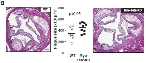
Here is an example of the results...
This experiment uses two strains of mice. One is wild type: WT. The other is labeled Mye-Tet2-KO. That means they lack the enzyme Tet2 in myeloid (bone marrow) cells. (KO stands for knock out.)
Other features of the experiment are designed to enhance plaque formation. The mice lack a receptor for low density lipoprotein, which is protective. And they are fed a diet high in fat and cholesterol.
The graph in the middle shows the plaque sizes in these two kinds of mice. You can see that the mutant mice had larger plaques, on average
The two photos, at the sides, show examples of the plaques from the two kinds of mice. The one on the left is for WT mice; the one on the right is for the mutant mice. There are dashed lines around the plaques. The plaques on the right are larger, though that may or may not be obvious by eye.
This is Figure 2B from the article.
|
The figure above suggests that lack of Tet2 can lead to greater formation of arterial plaques. What is Tet2, and how does it have this effect?
That's complicated. The name Tet2 is unhelpful: Tet stands for ten-eleven translocation. It is an enzyme that modifies DNA, but it probably has other roles, too. It has the potential to alter gene function. In any case, it is known to affect differentiation in the blood cell system.
In other experiments reported here, the scientists showed that Tet2-deficient mice preferentially developed more Tet2-deficient macrophages, and had higher levels of inflammatory signaling molecules. This work begins to make a connection between the mutation and a pathway leading to heart disease.
We emphasize that there is no direct evidence that Tet2 mutations lead to heart disease in humans. What we have here is some evidence from mice, and some logic. Many people with heart disease lack the common risk factors. And it is known that Tet2 mutations accumulate with age. It is plausible that such accumulation of mutations might be a factor in human heart disease. What next? Can we make a direct connection to heart disease in humans? Are people with atherosclerosis more likely to have Tet2 mutations? Is it possible that treatment of the Tet2 defect could reduce plaque formation?
The main point of the article is to focus attention on the possible role of mutations accumulated during aging on conditions other than cancer.
News story: A role for mutated blood cells in heart disease? (Medical Xpress, January 19, 2017.)
* News story accompanying the article: Cardiovascular disease: Hematopoietic stem cells gone rogue. (Y P Zhu et al, Science 355:798, February 24, 2017.)
* The article: Clonal hematopoiesis associated with TET2 deficiency accelerates atherosclerosis development in mice. (J J Fuster et al, Science 355:842, February 24, 2017.)
Heart posts include:
* Synthetic stem cells? (April 30, 2017).
* Zebrafish reveal another clue about how to regenerate heart muscle (December 11, 2016).
* The opah: a big comical fish with a warm heart (July 13, 2015).
* Red meat and heart disease: carnitine, your gut bacteria, and TMAO (May 21, 2013).
* Putting the MRI machine in the patient (June 15, 2009).
Immunization of devils: a treatment for a transmissible cancer?
April 24, 2017
We have another interesting development in the story of the Tasmanian devils and their common cancer, devil facial tumor disease (DFTD). This cancer is unusual in that it is directly transmissible from one animal to another. In fact, the devils transmit it efficiently; biting each other is a common behavior. The devils have become an endangered species.
Investigation of the cancer has suggested that one reason for its virulence is that it fails to induce an immune response, because it fails to display antigens properly. [Links to previous posts on the DFTD are at the end. The 2013 post is about this particular finding on the lack of immune response.]
A new article, from the same lab, builds on that finding. If there is a defective immune response, perhaps we can fix it. To try to do that, the scientists make DFTD cells that do display tumor antigens, and use those cells as a vaccine. It works, though it is more complicated than that statement might suggest.
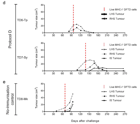
The following figure shows a sampling of the results...
|
The graphs show tumor size (volume, on the y-axis) vs time (x-axis) for several tumors.
It's a rather complex experiment, but fortunately one can get a useful overview with a quick inspection of the graphs.
In part e (lower graph), the tumor sizes increase steadily. In part d (the two upper graphs), the tumor sizes peak and then decline. What's the difference? The animals in part d had been immunized against the tumor. The animal in part e was a control, not immunized.
These are parts of Figure 3 from the article.
|
That is, the figure above shows a successful treatment of the cancer. Let's look further at what is going on.
A key point in following the procedures is to realize that there are two forms of tumor cells here. The usual form does not display tumor antigens. However, in the lab, the scientists can make a form that does display them. The latter are called MHC-I+ DFTD cells. You can see that name on the key in the graphs, by the vertical red dashed line. The term MHC-1 refers to the part of the immune system that had failed, but which they have "fixed".
Here is the basic procedure for part d...
- The animals were immunized by injecting them with dead MHC-I+ DFTD cells. That is, the immunization is against material that displays the tumor antigens in a form appropriate for an immune response. (The control animal, in part e, was not immunized. It received only the adjuvant, the carrier for the immunization, which helps stimulate the response.)
- The animals were injected with live tumor cells. This is at time zero on the graphs. You can see that this resulted in tumor growth in all the animals shown above over the following months. (There are two tumor injections, one on each side of the animal. LHS = left hand side. Qualitatively, the results are similar for both, so we won't worry about this point further.)
- After tumor growth was apparent, the animals were injected with live MHC-I+ DFTD cells -- that is, with live, antigen-displaying tumor cells. This was done at the time marked by the vertical red dashed line. In the immunized animals (part d), the tumors regressed soon after the injection of antigen-displaying cells.
There is one more tumor to consider; it is at the site of the injection of the live treatment cells, and is labeled IS. In the immunized animals, this happened in one of the two animals; the IS tumor remained small. In the non-immunized animal, the IS tumor continued to grow.
In summary... This is a two-step procedure. First, animals are immunized against the tumor antigens. Second, animals with tumors are treated with antigen-displaying cells. That lets the immunized animals mount a significant immune response against the tumors, which then regress. Although the tumor cells do not display antigens in the form that stimulates the immune system, they are susceptible to the immune response once it is turned on.
This is difficult work. It is with an endangered species, and the supply of animals for lab work is very limited. Each graph is for one animal; each line is for one tumor. The entire work in the article used nine animals -- over five years. Most of the experiments were isolated, without direct controls. Nevertheless, it's encouraging. If this holds up, immunization of animals prior to contracting the disease followed by immune stimulation after they have tumors may be effective in treating the devil facial tumor. Perhaps simpler treatments can be developed.
It could save the species. What is the right way to proceed?
News stories:
* Immunotherapy trial cures Tasmanian devils of DFTD. (Phys.org, March 9, 2017.)
* Breakthrough boosts hope for treating contagious cancer in Tasmanian devils. (S Dasgupta, Mongabay, March 14, 2017.)
The article, which is freely available: Regression of devil facial tumour disease following immunotherapy in immunised Tasmanian devils. (C Tovar et al, Scientific Reports 7:43827, March 9, 2017.)
Key background post on the DFTD immunity problem: Why the facial tumor of the Tasmanian devil is transmissible: a new clue (April 5, 2013). The article of this post is reference 10 of the current article.
Other posts on the DFTD:
* Tasmanian devils: Are they developing resistance to the contagious cancer? (September 6, 2016).
* The devil has cancer -- and it is contagious (June 6, 2011). Includes pictures; one is of an animal with a tumor.
Another transmissible cancer: Is clam cancer contagious? (April 21, 2015).
Also see:
* Predicting who will respond to cancer immunotherapy: role of high mutation rate? (October 6, 2017).
* Cancer and pain -- and immunotherapy (July 7, 2017).
My page for Biotechnology in the News (BITN) -- Other topics includes a section on Cancer.
What do bats argue about?
April 21, 2017
Food. Where to sleep (and with whom). And so forth, according to a new article.
Here is a summary of one part of the findings...
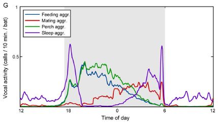
|
The frequency of different kinds of bat calls over a day.
This is Figure 1G from the article.
|
The graph shows that there are patterns of bat calls, during the daily cycle. But the big issue here is that to make that graph, the scientists had to be able to understand what the bats were saying. That's what the article is really about.
Bats are highly social animals. They live in stable groups for many years. And they make a lot of noise. Are they just noisy, or are they communicating?
To try to find out, the scientists made audio-video recordings in a small lab-based colony of Egyptian fruit bats, Rousettus aegyptiacus, for 75 days. That is, they recorded the sounds, and also what the bats were doing. They then analyzed the collection of sounds by computer, looking for patterns. Of course, that was a lot of sound and a lot of information. To help make connections, they focused on situations where only a small number of bats were involved. After all, if one bat refers to another by name, it is easier to figure that out if there are only a few bats around at the time.
Interestingly, the computer figured out a good portion of what was being said. You can see examples of the calls in the article along with some of the conclusions, but there is no way to see how the analysis was done. (The calls are presented as spectrographs, a picture showing the intensity of various frequencies vs time.)
The bats identified other individuals as friend or foe, and sometimes seemed to use names for individuals. They did talk about resources. And the kids would call in distress if left alone. In a sense, the findings of what the bats talked about aren't remarkable. What would you expect them to talk about? What's remarkable is that we are listening in on a colony of bats here, and we knew nothing of their language. The analysis to figure out the language is something like deciphering the Rosetta Stone. We knew nothing about the language, but we knew what it was about; with some effort, we could make the connection. Here, the analysis is high-tech, and the language is that of a bat, but the overall logic is the same.
How good is the analysis? Is it possible that the scientists introduced their own biases about what they expected? In fact, much of the analysis is presented with probabilities; they assign a certain meaning to a certain call -- with a certain probability. Some of the reported probabilities are not very high, even if they do appear to be statistically significant. Per se, that's not a criticism. After all, the data are limited at this point. It will be interesting to see what happens from here. For example, do the bats respond to artificial sounds, designed based on our understanding of their language, as we would expect? It would be nice to see independent replication of the work. And we must wonder... what about the languages of different bat colonies, or even species?
News stories:
* Study of bat vocalizations shows they are communicating with one another. (B Yirka, Phys.org, December 23, 2016.)
* Bat Calls Contain Wealth of Discernible Information. (Neuroscience News, December 30, 2016.)
The article, which is freely available: Everyday bat vocalizations contain information about emitter, addressee, context, and behavior. (Y Prat et al, Scientific Reports 6:39419, December 22, 2016.)
Posts about bats include:
* The use of wing clicks in a simple form of echolocation in bats (May 22, 2015).
* The tree where the West Africa Ebola outbreak began? (January 12, 2015).
* Baseball and violins (May 15, 2012).
* A plant that communicates with bats (September 7, 2011).
Posts about animal communication include:
* Can chimpanzees learn a foreign language? (March 10, 2015).
* Language: What do we learn from other animals? (August 3, 2010).
April 19, 2017
When rivers (or streams) join, what is the preferred angle between them?
April 18, 2017
It averages about 45° in very dry regions, and about 72° in humid regions.
How do we know? Because someone measured a million such angles, and published the analysis in a new article. The measurements were done with satellite photos that covered most of the "contiguous" United States (the original 48 states). Here is a summary...
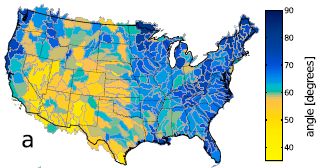
|
The map shows the United States, color-coded by the average river junction angle in the area. There is a color key at the right. Briefly, yellows are for low angles, blues for large angles.
Some readers may recognize that the regions dominated by yellows tend to be dry, whereas blue regions tend to be wet.
This is Figure 2a from the article.
|
In fact, the scientists compare the map of river angles with a map of aridity. Maps, for comparison [link opens in new window]. (That is Figure 2 parts a and b from the article.) The upper map there is the same as the one above. The lower map shows aridity across the country. The two maps are amazingly similar.
Their measure of aridity is a little more complex than one might expect at first. Their aridity index (AI) is the ratio of precipitation to transpiration. Qualitatively, that's fine, but the numbers won't be familiar.
Geologists have long thought about what affects river junctions, but had little systematic data. The results here suggest that, in dry regions, rivers tend simply to flow downhill. That is, they tend to be parallel, and joins are at low angles. In contrast, in wet regions, there is considerable spreading, accounting for joining at larger angles.
The correlation between river angle and climate is based on detailed analysis of the data summarized in the maps. This is, literally, real-world data. One might wonder whether other features of the landscape affect the river junction angles -- in addition to the aridity. Indeed, the authors examine several variables that have been offered as factors that might affect river junction angles. Their statistical analysis of all the data says that the aridity index is the most significant contributor.
The authors suggest that understanding how rivers join on Earth could help in interpreting observations from other bodies, such as Mars or Titan.
Most likely, you had not thought about this issue before.
News story: Stream Network Geometry Correlates with Climate. (T Cook, EOS, April 6, 2017.) From the American Geophysical Union.
The article, which may be freely available: Climate's watermark in the geometry of stream networks. (H Seybold et al, Geophysical Research Letters 44:2272, March 16, 2017.) Caution... It is a 21 MB pdf file for this 9-page article. Lots of high resolution maps.
River posts include...
* Earth: RSSA (September 18, 2018).
* Atmospheric rivers and wind (May 9, 2017).
* Groundwater depletion in the Colorado River Basin (October 3, 2014).
A post about a non-Earth river system... TALISE: A better boat for Titan? (October 16, 2012).
Hm, "AI" has multiple meanings... Is AI ready to predict imminent kidney failure? (August 24, 2019).
The paperfuge: a centrifuge that costs 20 cents
April 17, 2017
Three years ago, Musings presented a microscope that cost less than a (US) dollar [link at the end]. It's not a toy, just very simple -- and useful.
We now have a centrifuge costing less than a dollar -- about 20 cents. It can be used to separate blood cells and plasma, and can separate out malaria parasites. It's not a toy either, but was inspired by one. It is from the same lab.
Video: There is a video from Stanford University, where the work was done: Stanford bioengineers develop a 20-cent, hand-powered centrifuge. (YouTube, 3 minutes; narrated by the senior and lead authors.) The video illustrates the device. Since the point of the work is the operation of the device, that part is important. You might watch the video before proceeding, or at any point along the way as you read the description below.
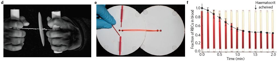
Part d (left) shows the device. The paper disc is spun by hand-power, using the twisted string between the disc and the hands.
Part e (middle) shows how capillary tubes, containing blood, are attached to the paper disc. (The second disk? In use, the two disks are face-to-face, with the samples in between.)
Part f (right) shows some results. The purpose here is to spin down the cells in the blood, leaving clear plasma at the top. The graph shows the fraction of the sample that is red cells (y-axis) vs time of centrifuging (x-axis). The size of that cell pellet, called the hematocrit, becomes stable after about 1.5 minutes of hand-operating the paperfuge. It ends up at about 40% (a "normal" value).
This is part of Figure 1 from the news story in the journal with the article. All three parts here are similar to figures in the article itself (Figures 1c, 3b, 3c, respectively).
|
The idea behind the paperfuge is not new. It is similar to a child's toy, called a whirligig. Figure 1a of the article shows a couple of examples of old ones. The authors note that such devices go back over 5,000 years.
The work here started by examining how the toy works. The article contains an extensive analysis of the principles behind the toy, with numerous equations and graphs. The scientists then used that analysis to develop a device optimized to serve as a simple centrifuge. It works about as well as standard lab centrifuges.
The result is a centrifuge that is simple and inexpensive to make and to use. And it works just fine. That's the point.
The authors have submitted their device to Guinness World Records. They claim it "is the fastest rotational speed reported via a human-powered device." (Page 1 of the pdf, referring to the 125,000 rpm speed.)
News stories:
* Ultra-low-cost, hand-powered centrifuge is inspired by whirligig toy. (M Allen, Physics World, January 11, 2017.)
* A low-cost, hand-powered paper centrifuge. (C Torgan, NIH, January 31, 2017. Now archived.) From the funding agency.
* News story accompanying the article: Diagnostics for global health: Hand-spun centrifuge -- A 20 cent centrifuge made of paper and string and operated by hand can separate plasma from blood in about 90 seconds. (M Bond & R Richards-Kortum, Nature Biomedical Engineering 1:0017, January 10, 2017.)
* The article: Hand-powered ultralow-cost paper centrifuge. (M S Bhamla et al, Nature Biomedical Engineering 1:0009, January 10, 2017.)
Senior author Manu Prakash gave a seminar at Berkeley a few weeks ago, at which he demonstrated, or at least played with, the paperfuge.
Background post... A ream of microscopes for $300? (June 22, 2014).
More inexpensive things: Making better artificial muscles (March 13, 2018).
... or, simpler things: Solar sterilization of medical equipment (February 6, 2021).
Another unusual centrifuge: A better way to un-boil an egg -- and why it might be useful (March 20, 2015).
More things spinning... A new record: spinning speed (October 12, 2018).
A perspective on POC... POCDx -- What's the barrier? (January 29, 2013). POC stands for point-of-care. Dx, in the title, stands for diagnostics. POC is not strictly synonymous with simple and inexpensive, but the terms overlap in common usage.
More about pulling strings: How bumblebees learn to pull strings (November 27, 2016).
Other posts about blood cells include... Progress toward a universal source for red blood cells, avoiding the need to match blood type (February 23, 2021).
Can antibodies to dengue enhance Zika infection -- in vivo?
April 15, 2017
Infection with one strain of dengue virus can make a subsequent infection with a different strain worse. Somehow, the antibodies against one strain enhance the infection with a different strain. The phenomenon is not well understood, but it does have a name: antibody-dependent enhancement (ADE).
Zika virus is rather closely related to dengue virus. Is it possible that prior infection with dengue affects Zika infection -- in any way? In particular, is it possible that dengue makes Zika worse, because of ADE between these two related viruses?
Musings addressed this issue about a year ago, with an article dealing entirely with cell culture. The work showed that dengue antibodies could enhance Zika infection [link at the end].
A new article addresses the question in a mouse model of Zika infection. Here is a key experiment...
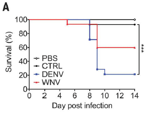
|
The basic design is that several groups of mice were infected with Zika, and their survival was followed.
The groups differed in the pretreatment prior to the Zika infection. Each group was injected with one or another sample. The main injections of interest were with blood plasma containing antibodies to dengue (DENV) or West Nile (WNV) viruses. There are also two controls, one with an injection of buffer (PBS), one with no injection (CTRL).
|
The two controls show high survival. The group given dengue antibodies shows low survival. The group given West Nile antibodies shows intermediate survival.
This is Figure 3A from the article.
|
That is, these results fully support a role for ADE in this system. Antibodies to the distinct but closely related dengue virus enhance Zika infection -- in a real animal. West Nile is also related to Zika, but less closely; it has a similar -- but smaller -- effect.
The scientists found that high levels of the anti-dengue antibodies protected against Zika infection. That is, the dose response curve is complex! There is also some evidence that Zika strains vary in their response.
Interestingly, some scientists do not accept that dengue enhancement of Zika is likely. Mice are poor predictors of human immune responses -- and the experimental system here is more complex than we have explained. Nevertheless, there is considerable evidence showing at least the plausibility of the effect: it happens in at least some in vitro and in vivo systems. It would seem prudent to take seriously the possibility that it happens in humans.
The possible role of ADE has implications for understanding the natural history of these virus infections; multiple members of this group of viruses, the flaviviruses, are often found in the same area. Of course, it also has implications for vaccines.
News story: Anti-Flavivirus Antibodies Enhance Zika Infection in Mice -- Researchers report evidence of antibody-dependent enhancement in a Zika-infected, immunocompromised mouse model. (A Azvolinsky, The Scientist, March 30, 2017. Link is now to Internet Archive.)
* News story in an earlier issue of the journal: Dengue may bring out the worst in Zika -- Mouse study offers evidence of antibody "enhancement," which could explain severity of human cases. (J Cohen, Science 355:1362, March 30, 2017.)
* The article: Enhancement of Zika virus pathogenesis by preexisting antiflavivirus immunity. (S V Bardina et al, Science 356:175, April 14, 2017.)
Background post: A Zika-dengue connection: Might prior infection with dengue make a Zika infection worse? (May 7, 2016). The article discussed here is reference 14 of the current article.
More... The effect of prior dengue infection on Zika infection (April 20, 2019).
A post about how subsequent infections with dengue can be more serious than the first: Dengue fever -- Two strikes and you're out (August 10, 2010).
and... Dengue vaccine: a step backwards? (December 6, 2017).
* Previous post about Zika: Why some viruses may be less virulent in women (March 1, 2017).
* Next: Why does Zika virus affect brain development? (August 11, 2017).
There is a section on my page Biotechnology in the News (BITN) -- Other topics on Zika. It includes a list of Musings post on Zika.
Gemmata obscuriglobus, a bacterium with features of a eukaryotic nucleus?
April 14, 2017
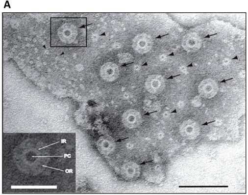
The following figure is from a recent article. According to the textbooks, the structure claimed here does not exist.
The figure shows an electron micrograph image of a membrane from Gemmata obscuriglobus. The membrane has pores.
The main type of pore is marked with arrows in the main figure. An enlarged view of the one that is boxed is shown in the inset at the lower left. PC = pore center; IR = inner ring; OR = outer ring.
The scale bars are 100 nanometers for the main figure, and 50 nm for the inset.
There is a second type of pore, marked with simple arrowheads. We won't comment on them further.
This is Figure 3A from the article.
|
The membrane is thought to be around the genome. That is, it seems to be a nuclear membrane. If the membrane is a nuclear membrane, then the pores are nuclear pores. In fact, more detailed analysis shows that the pores have features found in typical nuclear pores of eukaryotes.
So what's the problem? Gemmata obscuriglobus is a bacterium, and bacteria don't have nuclear membranes, much less nuclear pores.
The bacteria here are part of a recently described group called the Planctomycetes. It is clear that some of the Planctomycetes have extensive internal membranes, but there is no agreement on what they mean. The authors of the current article acknowledge that their work is controversial.
The authors do not suggest that the bacterial nuclear pores seen here are ancestral to eukaryotic nuclear pores. There are substantial differences, and sequence homology seems lacking. Instead, they suggest that these pores are the result of convergent evolution: the independent development of similar structures twice. If it arose more than once, it would suggest that it is not a difficult structure to get, despite its ultimate complexity.
What can we say for sure? This is another step toward characterizing the Planctomycetes, which is clearly an unusual group of bacteria. Some members of the group have features that seem eukaryotic-like.
Anything beyond that is speculation, for now.
But those nuclear pores are intriguing.
News story: Complex bacterium writes new evolutionary story. (Phys.org, February 1, 2017.)
The article, which is freely available: Nuclear Pore-Like Structures in a Compartmentalized Bacterium. (E Sagulenko et al, PLoS ONE 12(2):e0169432, February 1, 2017.)
Nuclear pores were mentioned in the post Origin of eukaryotic cells: a new hypothesis (February 24, 2015).
Another story of a prokaryote that is suspiciously rather eukaryotic... The Asgard superphylum: More progress toward understanding the origin of the eukaryotic cell (February 6, 2017).
This post is noted on my page Unusual microbes.
April 12, 2017
The nasal spray flu vaccine: it works in the UK
April 12, 2017
A recent article, from the UK, reports that the nasal spray flu vaccine works well. Why is this noteworthy? About a year ago, the (US) Centers for Disease Control (CDC) concluded that it did not work.
Why the discrepancy? No one knows. The purpose here is to note it -- a challenge to figure out.
Let's backtrack and get an overview of the flu vaccine. There are two broad types of flu vaccine. The traditional flu vaccine is based on inactivated virus, and is given by injection. The newer vaccine is based on modified flu virus; it can infect, but does not cause disease. This vaccine, known as live attenuated influenza vaccine (LAIV), is given as a nasal spray. In principle, the LAIV has two advantages. First, the live virus can promote antibody formation on a continuing basis. Second, it avoids the use of needles. With both vaccines, there is a problem of choosing which flu strains to target; the flu virus is notoriously variable, on a year-to-year basis. Both vaccines include a mixture of different virus strains.
The basic facts here are simple...
- Last summer, the US government, through the CDC, voted against the nasal spray vaccine, citing data that it was only 3% effective in children (ages 2-17). In contrast, the traditional flu shots were 63% effective. (All data for vaccine effectiveness have considerable uncertainties, but the simple numbers convey the message.)
- The current article shows that the nasal spray vaccine was 54% effective for children (ages 2-6) in the UK. The authors recommend its continued use.
There are a number of possible differences between the studies. The current article discusses them. The general conclusion is that there is no explanation at this time for the discrepancy.
It's a reminder that the flu vaccine situation is complex and confusing.
News story: Flu Scan for Jan 27, 2017. (CIDRAP, January 27, 2017.) Scroll down to second story: Study in UK kids shows modest LAIV protection against severe flu.
The article, which is freely available: Live attenuated influenza vaccine effectiveness against hospitalisation due to laboratory-confirmed influenza in children two to six years of age in England in the 2015/16 season. (R Pebody et al, Eurosurveillance, in Volume 22, Issue 4, January 26, 2017.) Since our main purpose here is to note the contradictory results, the most interesting part of the article may be the discussion. The authors analyze what they did, and compare their results to other work, including the US findings. As already noted, there is no resolution at this point.
A page from the CDC announcing the ineffectiveness of the nasal spray vaccine: ACIP votes down use of LAIV for 2016-2017 flu season. (CDC, June 22, 2016. Now archived at the CDC site.) ACIP = Advisory Committee on Immunization Practices. in the CDC.
The following item is for general information.
* A page about flu vaccines from the CDC, in Q-and-A format: Vaccine Effectiveness - How Well Does the Flu Vaccine Work? (CDC, February 15, 2017.) It does not specifically mention the nasal spray vaccine, or the current article.
The nasal spray flu vaccine was discussed in the post Predicting vaccine responses (August 22, 2011). In that case, it fared more poorly than the injectable vaccine.
More on flu vaccine problems: What's wrong with the flu vaccine? (February 16, 2018).
More on needleless delivery of vaccines: Aerospace engineers develop explosive device for supersonic delivery of vaccines (August 2, 2011).
and... Clinical trial of self-administered patch for flu immunization (July 31, 2017).
Posts on the flu virus are listed on the page Musings: Influenza (Swine flu).
More on vaccines is on my page Biotechnology in the News (BITN) -- Other topics under Vaccines (general). It includes a list of related Musings posts.
How the tardigrades resist desiccation
April 10, 2017
The microscopic animals called tardigrades (or, commonly, water bears) are fascinating. Among their unusual properties is that they resist drying. By drying we refer to loss of internal water; the term desiccation is often used.
A new article offers insight into the desiccation resistance of tardigrades.
The first experiment we discuss shows that desiccation resistance depends on how the animals are dried...
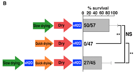
|
In this experiment, two different drying conditions were used: slow and fast.
In the top part, the animals were slow-dried, then rehydrated. The results bar shows that 50 of 57 animals survived. That is about 80% (scale at the top).
In the second part, the animals were fast-dried. There were no survivors.
In the bottom part, the animals were first slow-dried, then fast-dried. About 60% survived.
This is Figure 1B from the article.
|
That experiment shows that slow-drying is better. But it shows something more. The final part suggests that slow-drying allows time for something to happen -- perhaps for some genes to be expressed. If that happens, then they can survive fast-drying. That is, it's not the fast removal of water that is the issue, but whether the animals have some time to prepare.
The authors then look for genes that are expressed upon slow drying. This leads them to a number of candidate genes.
The following experiment summarizes some results to test those candidate genes.
The general plan is to inhibit the candidate genes, one at a time. This is done by giving the animals a special RNA that targets the specific gene and blocks it. That RNA is called RNAi, a term that appears in the figure titles.
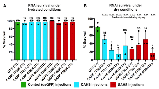
The figure shows the survival of animals with one or another gene blocked by RNAi. The set of genes was tested under two conditions.
Part A (left side) shows the results for ordinary conditions, that is, hydrated. Part B (right) shows the results for desiccation conditions.
The big picture... Under hydrated conditions, inhibition of any of these genes had no significant effect. ("ns" = not significant.) That is, these genes all appear to be non-essential. However, under desiccation conditions, there was reduced survival in many cases. Thus, as a generality, these genes seem involved in survival during desiccation.
Looking more closely...
- For one gene, survival was high under both conditions; see the green bar at the left of each set. This is in fact a control: green fluorescent protein (GFP), a gene that is not native to the animals, but which was added as a marker. Inhibiting it has no significant effect, wet or dry, as expected.
- Inhibition of each of the other genes seemed to lead to reduced survival. However, the effect was statistically significant only for some. These are the three lowest bars, all marked with one or more asterisks. The main point is that three of the candidate genes show a significant effect, judged from these results alone. That is, they have identified three genes that are involved in desiccation resistance. (The other genes can be studied further. For now, we make no claim about them.)
This is Figure 4 from the article.
|
The scientists do one additional type of experiment. For one of the proteins important for desiccation resistance in the tardigrades, they add it to yeast. Yeast with a tardigrade gene for desiccation resistance survive desiccation better. Survival increases from about 10-5 to about 10-3. Survival is still low, but it's 100-fold better with the one added protein. An intriguing result.
What do we know about these proteins? Interestingly, they seem to be proteins that lack a well-defined structure. Biochemists call them intrinsically disordered proteins. Upon drying, they form amorphous, glass-like structures. It may be that tardigrades survive drying because they are glassy, at least if they are given a little time to turn on their genes for glassiness.
News stories:
* Unstructured Proteins Help Tardigrades Survive Desiccation. (A Olena, The Scientist, March 16, 2017.)
* Tardigrades use unique protein to protect themselves from desiccation. (Phys.org, March 16, 2017.)
The article: Tardigrades Use Intrinsically Disordered Proteins to Survive Desiccation. (T C Boothby et al, Molecular Cell 65:975, March 16, 2017.)
A previous post on tardigrades: A space-faring bear that survives the vacuum of space -- and lay eggs normally (April 30, 2010). It is about desiccation resistance, but also links to some general information about the animals.
More...
* Tardigrade resistance to stress -- how do they do it? (March 27, 2024).
* How some tardigrades are resistant to ultraviolet light (October 27, 2020).
Another case of a desiccation-resistant animal... Lesbian necrophiliacs (March 8, 2010). The post presents a "reason" for the desiccation resistance -- and it ends with what we now recognize as Nobel-prize-winning music.
More about the disordered nature of glass: Turning metal into glass (September 21, 2014).
Staph fighting Staph: a small clinical trial
April 8, 2017
An interesting feature of infection with the pathogen Staphylococcus aureus is that most people who have it don't get sick. Two Musings posts have noted that part of the reason is that other bacteria, including other Staphylococcus strains, keep the pathogenic strains in check [links at the end].
A recent article takes the story a little further. The scientists study a skin disease called atopic dermatitis (AD). They show that it correlates with a higher level of S aureus, and a lower level of other "Staph" strains. Some of those other Staph make antibiotics, which inhibit the pathogenic Staph.
Would adding more "good" bacteria help restore the balance? The scientists show, with a mouse model, that treatment with "good" Staph strains reduces the colonization by the "bad" Staph.
Here is an example of the results...
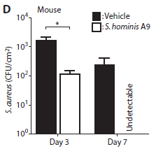
|
In this experiment, mice were given an experimental skin infection with S aureus. They were then treated with a suspension of "good" Staph (clear bars), or with the vehicle -- the same type of solution but lacking the bacteria being tested (dark bars).
The y-axis shows the number of S aureus found on the skin, per square centimeter, at two different times.
After three days, the number of pathogenic bacteria was reduced by about 10-fold. After 7 days, the bad Staph were undetectable (though they don't say what the limit of detection was).
This is Figure 4D from the article.
|
The results above show that, for this experimental Staph infection of mouse skin, treatment with "good" bacteria reduces the load of "bad" bacteria.
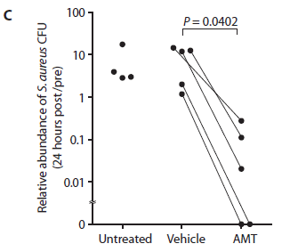
The scientists then do a small test with human subjects with AD. The general nature of the test is similar to the one shown above, except that this is with people who have the skin infection. It is, in effect, a small Phase I trial.
Three conditions are shown: untreated, vehicle only, and AMT (the treatment with "good" bacteria).
The bacteria used here were isolated from each patient's own skin microbiome. Individual strains shown to make useful antibiotics were used. That is, this is a personalized treatment.
The y-axis measures the number of "bad" bacteria on the skin. In this case, the authors use a relative scale, but the idea is the same.
There is a single measurement, 24 hours after the treatment.
You can see that the points for AMT are low.
|
|
Further, for the main group of people, one arm was treated with the AMT bacteria and the other arm was treated with just the vehicle (lacking bacteria). The two points for the same person are shown on the graph connected by a line. Each line points downward, going from vehicle to AMT. That is, the treated arm has fewer S aureus bacteria than the untreated (vehicle) arm, for each person.
The "good" bacteria used here are strains of Staphylococcus hominis and Staphylococcus epidermidis. (An S hominis was also used in the mouse experiment, above.)
The vehicle used here was a common skin cream.
The plotted value is the ratio of the bacterial count after the treatment compared to the count before the treatment.
There is a graph problem here, too. The bottom of the graph is labeled zero; there is no zero on a log scale. Again, the proper question is what the limit of detection was. At least qualitatively for our purposes, it doesn't matter.
This is Figure 7C from the article.
|
The bottom line is that the work provides evidence that use of good, antibiotic-producing Staph strains may be useful in treating Staph aureus infections in humans. Further testing is in order. Does the treatment actually reduce disease symptoms, or does it merely reduce the bacterial count? What strains should be used? (The type of personalized treatment used in this work seems impractical for general use. Surely it is not necessary?) What is the appropriate course of treatment? And what are the merits of treating with bacteria vs treating with one or more specific products (antibiotics) from the bacteria?
News stories:
* Next Generation: Personalized Probiotic Skin Care -- Scientists treat Staphylococcus aureus skin infections using lotions made with bacteria from atopic dermatitis patients' own microbiomes. (J A Krisch, The Scientist, February 27, 2017. Now archived.)
* Transplanting Good Bacteria to Kill Staph. (Y Galindo, UC San Diego, February 22, 2017.) From the lead institution. This story notes that a phase II trial is in progress.
The article: Antimicrobials from human skin commensal bacteria protect against Staphylococcus aureus and are deficient in atopic dermatitis. (T Nakatsuji et al, Science Translational Medicine 9:eaah4680, February 22, 2017.)
Background posts:
* Staph in your nose -- making antibiotics (October 9, 2016).
* Can the Staph solve the Staph problem? (July 12, 2010).
Another story of skin bacteria: Propionibacterium acnes bacteria: good strains, bad strains? (April 1, 2013).
Previous post on the development of a probiotic product: A clinical trial of ice cream (June 2, 2015).
Next: Would a probiotic reduce sepsis in newborn babies? (October 20, 2017).
More on antibiotics is on my page Biotechnology in the News (BITN) -- Other topics under Antibiotics. It includes an extensive list of related Musings posts.
April 5, 2017
Quiz: what is it?
April 5, 2017
Let's make this multiple choice...
A, A body in the Alpha Centauri star system; photo.
B, A body in the Alpha Centauri star system; artist's conception.
C. A moon of Saturn.
D. A walnut or ravioli, or such.
E. An artificial pollinator.
What do you think it is? The answer is immediately below, so make your choice before proceeding.
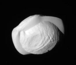
This is the first figure from the news story listed below.
Answer and discussion...
A hint? The image was recently returned by the Cassini spacecraft.
This is an image of the Saturnian moon Pan. (That's C, folks.) It is oddly shaped. It has been called a walnut or ravioli, among other things. The reason for its shape is unknown, but probably depends on its relationship with the ring system.
Cassini is near the end of its mission. It is being sent on more risky paths in these final months, with closer approaches to ring material than allowed earlier. In this case, it is about 25,000 kilometers from Pan -- itself about 35 km across.
In September, Cassini will be crashed into Saturn. After all, one would not want to leave it out-of-control in the Saturnian system, where it might crash into one of the moons. It is possible that some of those moons might have life; crashing a spacecraft into them would not be good.
There is no article yet with this photo. NASA releases many images as they become available, and they get noted by the news media. Here is one news story: Cassini, with only a half-year to go at Saturn, just keeps dropping awesome images. (J Davis, Planetary Society, March 9, 2017.) Includes some other recent images from Cassini.
Previous quiz... Quiz: What is it? (August 17, 2015).
* Previous post from Cassini: Venus: an unusual view (March 18, 2013).
* Next: Is there food on Enceladus? (May 21, 2017).
A recent post about the Alpha Centauri system: A better way to get to Alpha Centauri? (March 15, 2017).
Previous post about artificial pollinators: What if there weren't enough bees to pollinate the crops? (March 27, 2017).
Previous posts about walnuts or ravioli: none.
Another oddly-shaped thing out there: Twins? A ducky? Spacecraft may soon be able to tell (August 4, 2014).
The smallest radio receiver
April 4, 2017
It's advertised as a radio built from two atoms. There is a reason for that claim, but it is also an exaggeration, so beware. Nevertheless, it is an interesting radio. It's a radio housed in a diamond.
Listen... video: A diamond radio receiver. (YouTube, 2 minutes. Lots of sound; that's the point.) The music there is from this new radio. And the accompanying background text and pictures give a good idea of what it is about. Feel free to listen just once; you can study how it works later. (The video is also included in the Nanowerk news story.)
The radio makes use of a phenomenon we have encountered before [link at the end]. Diamonds with nitrogen vacancy (NV) defects are fluorescent. Shine green light on them, and they fluoresce red. What's new here is that the intensity of the fluorescence is modulated by radio waves. That is, the output of the radio -- the diamond-based receiver -- is red light whose intensity carries the radio signal. That light signal can be processed by the usual means, and connected to a loudspeaker.
What is an NV defect? A diamond has an orderly array of carbon atoms. Replace one C atom with an N atom, and then remove another C atom right next to it, creating a vacancy (V). That is, two adjacent C atoms of the diamond have been replaced by an N (atom) and a V; that gives an NV defect.
Is this really a two-atom radio? Well, the basic receiver unit is indeed a single NV vacancy, based on replacing two atoms in a diamond. The actual receiver is macroscopic, and contains billions of those units. Further, the part discussed here is just the receiver, not the entire radio. It's a stretch to talk about a two-atom radio, but there really is a key two-atom part.
An interesting point about this radio is its robustness. It is, after all, made of diamond. The authors test the radio at 350° C. It works, though with reduced signal strength above about 200° C. They suggest that their diamond-based radio receiver may be suitable for use in harsh environments, including corrosive environments and space.
The radio operates in the 2.8 gigahertz band. The authors note that other analogous materials, based on atomic defects, should operate at other frequencies.
News stories:
* World's smallest radio receiver has building blocks the size of 2 atoms (w/video). (Nanowerk, December 19, 2016.)
* Hacked Diamond Makes Two-Atom Radio. (D Maloney, Hackaday, December 20, 2016.) An interesting page. Browse the comments, too.
The article: Diamond Radio Receiver: Nitrogen-Vacancy Centers as Fluorescent Transducers of Microwave Signals. (L Shao et al, Physical Review Applied 6:064008, December 15, 2016.)
Background post, with another use of the fluorescence of nitrogen vacancies of diamonds: Where is the hottest part of a living cell? (September 23, 2013).
More about nitrogen: How many atoms can one nitrogen atom bond to? (January 17, 2017).
More about atomic vacancies: Progress toward an ultra-high density hard drive (November 9, 2016).
More about diamonds: Ice in your diamond? (April 23, 2018).
Is photosynthesis the ultimate source of primary production in the food chain?
April 2, 2017
Plants fix CO2, using light energy, and that is the start of the food chain. It's an old idea, and oft repeated. Repeated even when we should know better.
Some bacteria fix CO2 without using light energy. They are called chemoautotrophs. The "autotroph" part of the name refers to their use of CO2; "chemo" means they use chemical energy, rather than "photo" energy.
We have long known about chemoautotrophic bacteria. And for decades we have known there are animals that harbor such chemoautotrophs, and use them as their main food. These include organisms near thermal vents, such as the tube worms. Still, we are likely to say that photosynthesis provides the base of the food chain.
A recent article should help us appreciate the importance of the chemoautotrophs.
The following figure summarizes some of the findings. It shows certain isotopes found in Caribbean lobsters and in their likely food sources.
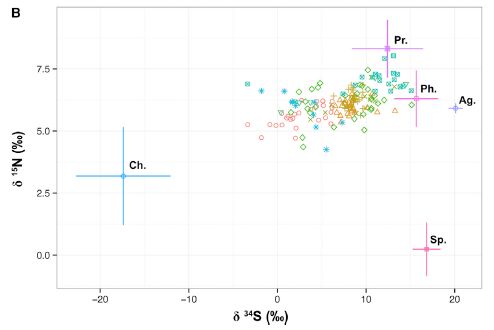
|
This figure shows data for a particular isotope of sulfur (S-34; x-axis) and one of nitrogen (N-15; y-axis).
In each case, the amount of isotope is shown as the difference (delta, δ) between the sample and a standard reference, in parts per thousand (‰).
Note the small numbers -- most less than 10‰ (1%); it requires modern instrumentation to get these measurements. Chemical reactions, including enzymatic reactions, may separate isotopes, but the effects are quite small.
|
There are two kinds of data here.
The crosses show the range of values typical of different types of food. For example, the cross at the left, well isolated from most of the rest of the graph, is what is found for chemoautotrophs, labeled Ch. The other important cross is one of those near the upper left, labeled Ph, for photosynthesis. The food sources differ in isotope ratios because the reactions they use separate isotopes differently. (This is largely an empirical finding.)
The data points are results for individual lobsters. The various colors are for lobsters from various geographical sites; we won't worry much about that.
You can see that the data for the lobsters is to the left of what would be expected if they mainly ate food based on photosynthesis. The lobster data suggests that a substantial fraction of their food is based on chemoautotrophs.
The other food sources shown in the figure are: Ag, algae; Pr, predator; Sp, sponge.
This is Figure 2B from the article. Part A of the figure shows a
similar analysis for C-13 vs N-15. The conclusions in the article are based on considering both sets of results together. I show Part B here because it is easier to see the effect visually.
|
Qualitatively, that's the point. The lobsters' food chain has a substantial contribution from chemosynthesis. They eat a type of clam that depends on chemoautotrophic bacteria. And since these lobsters are a major commercial crop, the work shows that the human food chain, too, has a significant contribution from chemosynthesis. People eat lobsters, which eat clams, which use a chemoautotrophic base. The food chain was suspected. What the current work does is to provide data showing that we can see the chemoautotrophic contribution in the lobster -- our food.
The analysis of the full data suggests that the contribution of the chemoautotrophs to the lobsters is about 10-30%, depending on the specific site.
The authors conclude... "As such, lobsters play a key role in transferring chemosynthetically fixed carbon from the deep sediment into the wider marine food web. Ultimately, this includes a contribution to human diets and prosperity in the form of lobster biomass that is worth US$17.4 million to the Bahamas fishery alone." (From the end of the Discussion, p 3397.)
News stories:
* Valuable Caribbean spiny lobsters get their food from an unexpected source. (EurekAlert, December 8, 2016.)
* Caribbean lobster fisheries sustained by 'dark carbon'. (A Merrington, Plymouth University, December 9, 2016.) From the lead university.
* News story accompanying the article: Ecology and Fisheries: Dark Carbon on Your Dinner Plate. (J M Petersen, Current Biology 26:R1277, December 19, 2016.)
* The article, which is freely available: Caribbean Spiny Lobster Fishery Is Underpinned by Trophic Subsidies from Chemosynthetic Primary Production. (N D Higgs et al, Current Biology 26:3393, December 19, 2016.)
More from the Caribbean: Chikungunya in the Americas, 1827 -- and the dengue confusion (April 3, 2015).
More about autotrophic bacteria: Turning E. coli into an autotroph (using CO2 as sole carbon source) (December 9, 2019).
My page of Introductory Chemistry Internet resources includes a section on Nuclei; Isotopes; Atomic weights. It includes a list of related Musings posts, including measurements of isotopes.
Also see:
* Growing food with artificial photosynthesis? (July 9, 2022).
* The new IUPAC periodic table; atomic weight ranges (August 1, 2017).
March 29, 2017
Making triangulene -- one molecule at a time
March 29, 2017
Here it is: a molecule of triangulene...
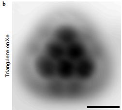
|
An image by atomic force microscopy (AFM) of one molecule of triangulene. It is resting on a piece of xenon. Yes, it's cold -- about 5 Kelvins.
This is Figure 3b from a new article.
|
What is triangulene? Start with a benzene ring. You may know that you can connect two benzene rings together, sharing a side; that gives naphthalene. Connect three together, side by side, and you get anthracene. Continue... Connect six together side by side, and you get a bigger molecule, which is still aromatic, like benzene. (It is called hexacene.) In particular, you can draw a structural formula with alternating single and double bonds.
Now, instead of connecting those six benzenes side by side, imagine piling them up: three in a base, two above that, and one on top. You get a triangular structure -- like what is seen above. (A structural formula in a moment.)
But there is a catch. You can indeed stack six hexagons that way, and get a big triangle. However, the resulting chemical is not aromatic: you cannot draw it with alternating single and double bonds.
For those who take that as a challenge, and want to try drawing it... I suggest you use a drawing program, such as ChemSketch. You can lay out the big triangle; that is no problem. But look at the bonding. And to make it clearer, I suggest that you turn on the display of all hydrogens. You will see at least one C that has 2 H on it, in addition to 2 C. That is a "saturated", sp3-hybridized C -- and a sure sign this is not one big aromatic ring system.
The anomaly of triangulene was recognized decades ago. Attempts to make it failed, presumably because it was unstable.
A new article reports a synthesis of triangulene. It's of interest for fulfilling the promise -- and for the unusual route of synthesis.
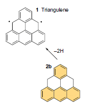
The following figure shows how the scientists made it; it also shows the strange feature of triangulene.
Triangulene is the upper compound in the figure, labeled compound 1. Below it is the compound the scientists made it from, labeled 2b.
The only difference is at the two positions with dots in triangulene. But to understand this, you need to remember a convention in drawing organic chemical structures: hydrogen atoms are often omitted. At those positions, there are two H in compound 2b -- but only one in compound 1. That is, in going from 2b to 1, two H were removed -- as it says on the arrow between them.
|
|
Those two dots on the triangulene? They represent unpaired electrons, left after removing a hydrogen atom at each position. Triangulene is a "radical", a chemical species with unpaired electrons. It is a di-radical.
How did the scientists remove the two H? They used an AFM tip to deliver a voltage to the molecule. The C-H bonds where there are two H are the weakest bonds in the molecule, resulting in loss of a hydrogen atom.
This is part of Figure 1 from the article. (The full figure shows some variations of the starting material. I chose to show only one: the one where it is easiest to see what is going on.)
|
Radicals, with their unpaired electrons, tend to be unstable. That is presumably why previous syntheses of triangulene failed. In this work, the triangulene molecules were stable over a few days of observation; that was under the extreme conditions of ultra-high vacuum and low temperature.
That's the synthesis of triangulene. A molecule that is more complicated than it might appear, now made one molecule at a time.
Some think that triangulene could be useful in electronics, including in quantum computers. Interestingly, some think that making it one molecule at a time might provide a useful supply.
News stories:
* Researchers use new approach to create triangulene molecule. (B Yirka, Phys.org, February 14, 2017.)
* Elusive triangulene created by moving atoms one at a time. (P Ball, Nature News, February 13, 2017.)
* News story accompanying the article: Graphene fragments: When 1 + 1 is odd -- Triangulene, an elusive open-shell magnetic molecule, is synthesized and characterized by electron microscopy. (M Melle-Franco, Nature Nanotechnology 12:292, April 2017.)
* The article: Synthesis and characterization of triangulene. (N Pavlicek et al, Nature Nanotechnology 12:308, April 2017.)
More about radicals: Science myths (February 23, 2016).
Also see:
* Hückel at 40 -- that's n = 40: the largest known aromatic ring (February 1, 2020).
* The longest acene (September 6, 2017).
This post is listed on my page Introduction to Organic and Biochemistry -- Internet resources in the section on Aromatic compounds. That section includes a list of related Musings posts.
A classic example of using the AFM to move atoms: The 35 most famous xenon atoms (June 29, 2010).
A recent example... A new form of carbon: C18 (September 24, 2019).
For more on AFM and related techniques, see a section of my page of Internet Resources for Introductory Chemistry: Atomic force microscopy and electron microscopy (AFM, EM).
What if there weren't enough bees to pollinate the crops?
March 27, 2017
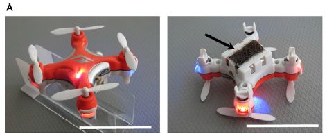
Perhaps we could use one of these, as described in a recent article...
It's probably clear how that device, as seen in the basic view on the left, could fulfill one bee function: flying.
What about pollinating? Turn it over and look at its bottom side -- shown at the right. The arrow points to a black strip. It is sort of a sticky tape, designed to pick up, carry, and release pollen. We'll come back to this in a moment.
The scale bar is 4 centimeters. The device is described as insect-sized. That's a rather big insect!
This is Figure 4A from the article.
|
The main scientific development in the article is to find materials suitable for the pollen transfer steps. The pollination pad is a hairy structure, coated with a sticky gel. The gel is based on ionic liquids. In fact, the article is in a chemistry journal, and is presented as an application of ionic liquid gels.
The article reports examples of using the ionic liquid gels. Ants coated with the gel collected pollen. Then, unmanned aerial vehicles (or drones), were equipped with hairs impregnated with the gel (as shown in the right-hand figure above); they served to transfer pollen from one flower to another. (The drone used here is a commercially available radio-controlled drone.)
The point, then, is that the authors have developed an artificial pollinator. It can fly around, alight on flowers, and transfer pollen from one to another. It's proof of principle.
It's cute, even clever. But is it a good idea? One of the news stories listed below is quite negative about the development. After all, if we take care of our bees, we could use natural pollinators. The title of this post plays into his concerns.
But maybe that's not the right way -- or, at least, the only way -- to think about this. We try to develop an artificial pollinator because we can. Maybe it will work. Maybe it will be cheaper or more reliable than the natural pollinator. Or maybe it won't. We might use automated pollination in cases where pollination is now done by hand. And, yes, we might use an artificial pollinator if the bees are not available. Taking care of the bees is a separate issue. (The way bees are maintained for commercial pollination is hardly a model for wise stewardship of our animals.)
This article may be not only cute and clever, but also thought-provoking. Enjoy -- at many levels.
News stories:
* Sticky gels turn insect-sized drones into artificial pollinators. (Phys.org, February 9, 2017.)
* Artificial pollinators are cool, but not the solution. (M Saunders, Ecology is not a dirty word, February 11, 2017.)
Video. There are various short video clips around. They are fun, but they are too fast to follow. Try them if you want; you might even try slowing them down.
* News story accompanying the article: Sticky Solution Provides Grip for the First Robotic Pollinator. (G J Amador & D L Hu, Chem 2:162, February 9, 2017.)
* The article: Materially Engineered Artificial Pollinators. (S A Chechetka et al, Chem 2:224, February 9, 2017.)
Recent post about bees: Bumblebees play ball (March 20, 2017).
Recent post about robots: A robot that can feed itself (February 3, 2017).
More drones:
* Using drones to count wildlife (May 15, 2018).
* Crashworthy drones, wasp-inspired (October 16, 2017).
Posts about pollinators include...
* Why growing sunflowers face the east each morning (November 8, 2016).
* A "flower" that bites -- and eats -- its pollinator (December 27, 2013). Hm, I wonder what would happen...
* Caffeine boosts memory -- in bees (April 12, 2013).
* Bees -- around you (June 11, 2009).
and maybe... Quiz: what is it? (April 5, 2017).
Also see: Progress toward an artificial fly (December 6, 2013).
A possible genetic cause for the large human brain
March 25, 2017
It's the gene ARHGAP11B.
The gene ARHGAP11B is unique to humans. It's very similar to a gene called ARHGAP11A, which is widespread in other organisms. A team of scientists has now explored the nature of these two genes, and has suggested a special role of ARHGAP11B in the development of the human brain.
For simplicity, let's refer to the genes as B and A.
The evidence suggests that the B gene arose a few million years ago by a duplication of the original A gene in an early member of the human lineage. Gene duplications are an important part of how organisms develop novel traits. With two copies of a gene, one can continue to play the original role, while the other is free to acquire some new function as mutations accumulate.
In this case, the B gene eventually acquired a mutation -- a single base change -- that led to a substantial change in its properties. The base change was in a critical site for mRNA splicing, and led to a substantial change in the resulting protein. The current article works out the role of this splice site mutation in determining the nature of the B gene protein.
The following figure shows some of what the scientists learned about the function of the B gene protein. It is based on a model system in mice. Normal mice do not have the B gene.
|
The test measures cell divisions in a certain part of the brain. Three kinds of mice were tested. They are normal mice, with an added gene.
The result is striking: one bar is high. That is the bar for the mice with a B gene added. They show about twice as much cell division as the two controls.
The controls? One had nothing added; it is a blank. The other had an ancestral B gene, lacking the mutation of interest.
This is Figure 3B from the article.
|
On the basis of such results, the scientists suggest that the B gene promotes cell division in this region of the brain, thus leading to a larger brain.
The brain region studied here is the neocortex, which plays an important part in the enhanced cognitive capabilities of the human brain. It is thought to be one of the more recently expanded parts of the human brain.
Emphasize that there are multiple parts to this story:
* One is the actual analysis of the genes as we find them in humans and other extant organisms.
* On the basis of that, the scientists infer how the genes are related to each other. This is fairly straightforward, given the data, but could be modified if further data become available.
* From what they observe about how the B gene functions, they infer that it has a role in the development of the large size of the modern human brain. This is a logical suggestion, but the evidence is limited. In particular, we do not know how complex the full story is, i.e., how many genes played some role in the story.
Clearly, the B gene -- the ARHGAP11B gene -- is interesting. It may well be important in the development of the human brain, but we have only hints of that for now.
The mutation leading to the modern B gene is an example of how a single base change can cause a major change in the protein function. It causes a major change in protein sequence, because it is in a splice site.
What will scientists do next to test the role of the B gene? What more can we learn about expanding the human brain from a mouse model?
News stories:
* Researchers find DNA mutation that led to change in function of gene in humans that sparked larger neocortex. (B Yirka, Medical Xpress, December 8, 2016.)
* A Tiny Change With Considerable Consequences. (Neuroscience News, December 9, 2016.)
The article, which is freely available: A single splice site mutation in human-specific ARHGAP11B causes basal progenitor amplification. (M Florio et al, Science Advances 2:e1601941, December 7, 2016.)
Also see:
* Can a "silent" mutation be harmful? (April 17, 2021).
* Developing a monkey with a gene for a human brain protein (July 6, 2019).
* Bird brains -- better than mammalian brains? (June 24, 2016).
* Sliced meat: implications for size of human mouth and brain? (March 23, 2016).
* As we add human cells to the mouse brain, at what point ... (August 3, 2015).
* Fish with bigger brains may be smarter, but ... (January 25, 2013).
* Swarming locusts have bigger brains (August 29, 2010).
More about brains is on my page Biotechnology in the News (BITN) -- Other topics under Brain. It includes a list of brain-related Musings posts.
Is solar energy a good idea, given the energy cost of making solar cells?
March 24, 2017
Solar energy is a form of energy that does not use fossil fuels, and thus does not make the greenhouse gas CO2. The use of solar energy has increased rapidly over recent years, with one explicit goal being the reduction of greenhouse gases.
That analysis is not entirely correct. Making solar cells requires energy, and we need to consider whether the cost of making the solar cells is repaid by the output of the solar cells. As part of this, the cost of making solar cells must be paid before we get benefit from them. Thus there is a lag in the benefit, one that is exaggerated if rapid growth leads to a rapid increase in production.
A recent article attempts to analyze the net efficiency of solar energy. Specifically, it is about the use of solar cells (photovoltaic, or PV, cells) to make electricity. The analysis is not easy. Some numbers that are needed are not readily available. The authors need to make assumptions.
The following graph summarizes some key findings...
|
The graph shows the overall energy efficiency of solar cells (y-axis) vs year (x-axis).
What do we mean by overall energy efficiency? The authors describe it, in the figure legend, as "Calculated cumulative net environmental impact of cumulative installed PV capacity. (a) Cumulative net energy output, in terajoules of primary energy equivalent." That is, it is an attempt to calculate the cumulative effect of solar cells, including the early experience with cells that were, relatively, expensive and inefficient.
There are several lines. We'll start by considering them as a set.
In each case, the line starts below zero, then rises above zero at some later date. For example, the worst line is quite low between about 2008 and 2013. Then it rises, crossing into positive territory in 2014 -- and apparently rising steadily after that. The other lines have a similar shape, but rise earlier.
|
That's the key idea. Solar cells used to be net-inefficient, but they are getting better. At some point they become net-efficient. The crossover time varies with the situation -- including the criteria and the assumptions. The examples here cross into positive territory between 2002 and 2014. Other cases cross over later.
What are the various curves? The key shows that they are for three geographic regions, each with two sets of assumptions in the analysis. The assumptions span a range from favorable to unfavorable.
The graph is not entirely clear. The code for the left-hand set of lines, labeled PRlow, is that the lines are dashed. You can see the dashed lines in the graph, but the dash feature is not clear in the key. Also, you can't really see all six curves. That is because the global and China curves are almost the same.
PR stands for performance ratio. The two PR considered are "increasing" (solid lines) and "low" (dashed lines). Those are intended as "worst case" and more realistic estimates of the solar cell performance.
Part b of the graph is similar, but looks at greenhouse gas emissions rather than energy efficiency. The general nature of the set of graphs is the same.
This is Figure 4a from the article.
|
As noted, the big message is that solar energy, in the form of PV cells to make electricity, has become a net producer of clean energy. One can quibble about the exact numbers, including what year the crossover occurred. (It is even possible, depending on details, that the crossover is a bit into the future. That doesn't change the big message, unless that extrapolation is just wrong.) Some may want to get into those details, but following the general nature of the development is most important. It is also good to understand the difficulty of doing the analysis, which is why there is uncertainty in the crossover date.
It's an interesting and readable article. The general lesson is relevant to new technologies. They may be expensive at first. With luck, they get better. But just because something, such as solar energy, sounds good, doesn't mean it is. Over time, solar cells have gotten better, and so has the technology for making them. An important issue is that the costs occur before the benefits; therefore, rapid growth of a new developing technology can create its own problems. How we should work through such a development process is not clear, but at least we need to be aware of the pitfalls.
News stories:
* Solar power will cross a carbon threshold by 2018. (P Patel, Anthropocene, December 8, 2016.) Also available in Spanish; see the link at the end of their main text.
* Solar panels have been benefitting the climate 'since 2011'. (S Yeo, Carbon Brief, December 6, 2016.)
The article, which is freely available: Re-assessment of net energy production and greenhouse gas emissions avoidance after 40 years of photovoltaics development. (A Louwen et al, Nature Communications 7:13728, December 6, 2016.)
A recent post about energy efficiency: How much energy are we saving with energy-saving houses? (February 5, 2017).
More solar energy:
* Solar cells: a new record for efficiency (May 26, 2020).
* Caffeine: is it good for solar cells? (May 13, 2019).
* MOST: A novel device for storing solar energy (November 13, 2018).
* Using your sunglasses to generate electricity (August 14, 2017).
There is more about energy issues on my page Internet Resources for Organic and Biochemistry under Energy resources. It includes a list of some related Musings posts.
March 22, 2017
What can we learn from a five thousand year old corn cob?
March 21, 2017
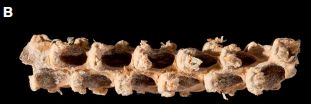
|
It.
It is 16 millimeters long, and about 3 mm in diameter.
|
The kernels are soft, an important step toward being edible.
It even has a name: Tehuacan162. (The name was assigned by museum staff, not its parents. I think.)
This is Figure 1B from the article.
|
The idea that corn (maize) was domesticated from teosinte, a crop native to Mexico, is now widely accepted. Genome analysis of modern corn varieties as well as modern wild teosinte leads to a list of differences. One can begin to understand the changes, but we have little idea of the course of domestication.
A recent article reports a genome analysis of a cob about 5,300 years old, from Mexico. That is during the early history of what we would now call corn.
The big picture is that this corn has many of the genes associated with modern corn, but not all. Since it is only part way to being modern corn, the authors suggest that the process of domestication may have been gradual.
We need to be cautious interpreting the results. It is exciting to have this early corn, but it is only one sample. We don't know how many types of corn were around at this time. We can never be sure that any particular sample is on the main pathway. In fact, the genome analysis suggests that this cob may be a distinct strain that split off from the ancestor of modern corn varieties.
The article is a step toward filling in the history of corn. We await additional genome sequences from other ancient corn cobs.
News story: DNA evidence from 5,310-year-old corn cob fills gaps in history. (Science Daily, November 17, 2016.)
The article: Genome Sequence of a 5,310-Year-Old Maize Cob Provides Insights into the Early Stages of Maize Domestication. (J Ramos-Madrigal et al, Current Biology 26:3195, December 5, 2016.)
More about teosinte and the origin of corn:
* How long have Americans been eating corn? (July 21, 2020).
* Atmospheric CO2 and the origin of domesticated corn (February 14, 2014).
Among other posts about corn...
* Why growing maize (corn) is bad for us (June 25, 2019).
* Development of insects resistant to Bt toxin from "genetically modified" corn (April 19, 2014).
* Pink corn or blue? How do the monkeys decide? (June 9, 2013).
More domestication: Domestication of the almond (August 26, 2019).
There is more about genomes and sequencing on my page Biotechnology in the News (BITN) - DNA and the genome. It includes an extensive list of Musings posts on the topics.
Bumblebees play ball
March 20, 2017
Just briefly, for fun...
|
Bee with ball.
This is trimmed from the figure in the QMUL news story.
|
Now go watch the action... Bumblebees learn to roll balls for reward. (YouTube; one minute; no sound -- not even applause.)
A few months ago, Musings noted an article showing that bumblebees could learn to pull a string in order to get their food [link at the end]. The post presented some of the experimental work. We now have another article, from the same lab, showing that the bees can learn to put a ball in the goal in order to get their food. The experimental work, in the article, is good, but is very much along the same line.
Interestingly, if given more than one ball, the bees would choose to move the one closest to the goal, even though distance was not part of their training.
As the authors note, the activity the bees learn here would seem to be quite beyond their normal activities.
News story: Ball-rolling bees reveal complex learning -- Bumblebees can be trained to score goals using a mini-ball, revealing unprecedented learning abilities, according to scientists at Queen Mary University of London (QMUL). (QMUL, February 23, 2017. Now archived.) From the university.
The article: Bumblebees show cognitive flexibility by improving on an observed complex behavior. (O J Loukola et al, Science 355:833, February 24, 2017.) There are several short video files posted with the article as supplementary information. I think they are freely available, regardless of access to the article itself. The video listed above is a montage of samples.
Background post: How bumblebees learn to pull strings (November 27, 2016).
Also see...
* Will a wolf puppy play ball with you? (February 7, 2020).
* Zero? Do bees understand? (July 20, 2018).
* What if there weren't enough bees to pollinate the crops? (March 27, 2017).
* Flow centrality: the key to a scientific analysis of the soccer game (July 11, 2010).
* Origin of gas warfare (September 11, 2009).
There is now an extensive list of sports-related Musings posts on my page Internet resources: Miscellaneous under Sports.
A book about animal behavior is listed on my page Books: Suggestions for general science reading. de Waal, Are we smart enough to know how smart animals are? (2016). It's a wonderful book, which encourages the study of what animals can learn, without judging it too much.
What to do if your telomeres get too long
March 19, 2017
You could zap them, using the protein TZAP.
Telomeres? The special structures at each end of each chromosome in eukaryotes.
A new article explores what TZAP does.
Here is one experiment to show the effect of TZAP...
Each frame of this figure compares the distribution of telomere (TEL) lengths in two populations of mouse embryonic stem (mES) cells.
The x-axis is a measure of TEL length, although it is an arbitrary experimental scale. The y-axis shows the relative frequencies of the different TEL lengths. (The y-axis scale may be in per cent. It is not clear, but doesn't matter, so long as we take it as relative.)
The left frame compares wild type cells (WT; gray bars) with cells lacking TZAP (genotype TZAP-/-; red bars).
The distribution of red bars is shifted toward the right. That is, cells lacking TZAP have longer TEL.
The result is also reflected in the labeled horizontal bars just above the bars, showing that the TZAP- cells have more than twice as many TEL with the extended length: 28% vs 12%. Further, the mean length is shown in the header; it is much higher for the TZAP- cells.
The right frame starts with those TZAP- cells (genotype TZAP-/-; red bars -- the same data, I think). The green bars are for the same kind of cells -- but with TZAP added back. You can see that the green distribution of the right-hand frame is similar to the gray distribution of the left-hand frame.
This is Figure 4F from the article.
|
The results show that TZAP reduces the length of telomeres.
The more interesting question, perhaps, is... why would one want to do that? The main thing we hear about telomeres is that we must not run out. Losing TEL is related to aging. With that mindset, it's not obvious why one would worry about TEL being too long. The longer the better, it might seem.
However, the role of telomeres is more complicated than that. Perhaps their original role was simply to protect chromosome ends from becoming too short. But in the modern world, TEL are important structures in their own right.
There are various proteins that bind to telomeres. Even if we don't understand all their roles, we can recognize that they are important. For example, proteins bound to TEL distinguish normal chromosome ends from the artificial ends of broken chromosomes. Extra-long telomeres can soak up proteins that are needed at regular sites. That might not be good. In fact, the scientists show that TZAP binds to telomere sequences that are otherwise free of regular proteins. That they are free is a signal that there is too much TEL; it's time to trim some off. That's what TZAP does.
There is nothing here about how TZAP works. It is likely that it is more of a regulator than a trimming enzyme itself. It may recruit the relevant enzymes to the long TEL. The point here is to recognize the process of trimming long telomeres, and to identify that TZAP is a key player in the process.
The abbreviation TZAP actually stands for telomeric zinc finger-associated protein.
News story: Scientists discover master regulator of cellular aging. (Medical Xpress, January 12, 2017.)
* News story accompanying the article: Chromosomes: TZAP or not to zap telomeres -- A protein triggers the trimming of overly long chromosomes. (G Lossaint & J Lingner, Science 355:578, February 10, 2017.)
* The article: TZAP: A telomere-associated protein involved in telomere length control. (J S Z Li et al, Science 355:638, February 10, 2017.)
More about telomeres:
* If a cell needs more telomeres, can it get some from another cell? (November 15, 2022).
* A 115-year-old person: What do we learn from her blood? (November 18, 2014).
* G (July 8, 2008).
My page for Biotechnology in the News (BITN) -- Other topics includes a section on Aging. It includes a list of related posts.
Possible role of gut bacteria in Parkinson's disease?
March 17, 2017
Parkinson's disease (PD) is a neurological disease associated with altered forms of the protein α-synuclein.
Is it possible that the bacteria in your gut -- the gut microbiota -- play a role in PD? A recent article provides evidence for such a role, using a mouse model of PD.
The following figure shows an example of the results...
|
The test measures the time it takes the mice to cross an apparatus. It is a test of the neurological status of the mice regarding their motor abilities.
The various bars are for different kinds of mice under different conditions.
For simplicity, we can say that there are two bar heights: two bars are high (near 10 seconds), and four are low (near 5 seconds).
|
Start with the two black bars, at the left. There are two strains of mice (in this pair of bars, and in each succeeding pair). WT is normal, wild-type mice. ASO is a special strain of mice: an alpha-synuclein over-producer. ASO mice are quite susceptible to developing PD; that's the basis of the mouse PD model. Below the mouse strain labels, it says SPF. That's a way of saying they have "normal" gut microbiota. (SPF means that they are known to be specific-pathogen-free.)
The WT mice give a low time. The ASO mice give a high time. That shows the basic nature of the ASO mice: they get PD, and have difficulty walking.
The white bars... These are for germ-free (GF) mice. Both types of mice give low times. In particular, the ASO mice, which we now know are susceptible to getting PD, don't show the PD motor deficit if they are germ-free. This is the type of experiment that shows that the gut microbiota play a role in developing PD.
Red bars... The mice are still germ-free (though you can't tell that from the label), but the scientists give them SCFA: short-chain fatty acids. Now the ASO mice get PD. This result suggests that it is the SCFA produced by the gut microbiota that play a role in the development of PD.
This is Figure 5C from the article.
|
The results shown above suggest a role for gut bacteria in the development of Parkinson's disease. They also suggest that the short chain fatty acids, commonly produced by gut bacteria, are part of the mechanism.
Remember, this work is with a mouse model for PD. Its relevance to human PD remains to be tested, though there is reason to suspect a gut-connection in PD. Beyond that, does the finding here lead to any diagnostic or therapeutic development? It's too early to say. If nothing else, the work is another reminder that body systems are interconnected in complex ways. For now, this is a novel and intriguing finding, of uncertain significance.
News stories:
* Gut microbiome contributes to Parkinson's, study suggests. (H Whiteman, Medical News Today, December 2 2016. Now archived.)
* Gut Microbes Linked to Neurodegenerative Disease -- Bacteria in the intestine influence motor dysfunction and neuroinflammation in a mouse model of Parkinson's disease. (A Olena, The Scientist, December 1, 2016. Now archived.)
The article, which may be freely available: Gut Microbiota Regulate Motor Deficits and Neuroinflammation in a Model of Parkinson's Disease. (T R Sampson et al, Cell 167:1469, December 1, 2016.)
Parkinson's disease was mentioned in the post Is Alzheimer's disease transmissible? (February 4, 2011).
More PD:
* Metabolism of the Parkinson's disease drug L-DOPA by the gut microbiota (July 26, 2019).
* Does the appendix affect the development of Parkinson's disease? (December 11, 2018).
Another post that is about the gut microbiota and short chain fatty acids: How intestinal worms benefit the host immune system (February 27, 2016). Interestingly, in this story, the SCFA are "good" for you (or, rather, for the mice). Further, in this article, the SCFA reduce inflammation, whereas in the current one they enhance it. If both stories hold up, it could be just another example of how the same chemicals can have both good and bad effects.
More about microbiome and lipid metabolism: Could a better gut microbiome improve memory? (December 6, 2021).
And a reminder... Our microbiome: a caution (August 26, 2014). The hype of microbiome research.
More about brains is on my page Biotechnology in the News (BITN) -- Other topics under Brain. It includes a list of brain-related Musings posts.
March 15, 2017
A better way to get to Alpha Centauri?
March 15, 2017
Musings recently noted a proposal to visit the nearby star Alpha Centauri, along with the possibly-habitable planet Proxima b that is in the same star system [link at the end].
The proposal rated well on speed: the time scale was well within a human lifespan. However, it had a significant weakness: there was no way to slow down the craft. Observation of star and planet would be made on the fly -- a challenge in itself -- and would be limited to a few hours before the craft had passed out of range.
A new article offers a solution to slowing a craft down, and even putting it in orbit around one of the Centauri system stars. How? Photons -- light pressure, from the stars. And gravity. I suspect the authors are not alone in suggesting the tools. What they did here was to run the numbers, and see what conditions would be needed.
The original proposal also used light pressure -- to accelerate the craft. The lights needed to do that would be lasers, more powerful than anything yet developed.
The slowdown procedure uses a large sail as a target for the photons. The effectiveness of the procedure depends on many things, including the nature of the sail. The bigger the sail, the more photons act on it. The lighter it is, the easier it is to slow it down with light pressure.
The following figure summarizes some of their findings about how it would work.
|
The figure shows three things:
- The minimum distance from the star, in stellar radii (y-axis; log scale). (If the craft gets too close, it will overheat.)
- The sail density, in grams per square meter (x-axis; log scale). Some specific materials are noted. For example, a graphene sail would have a density marked by the dashed line near the left, at about 0.001 g/m2.
- The time of the trip. This is shown by sloping lines across the graph. Each such line shows combinations of distance and sail density that could give that travel time.
This is Figure 5b from the article.
|
Let's look at an example... There is a sloping line near the left, labeled 100 years. That line shows combinations of distance and sail density that would give a 100 year trip. For example, look at a sail mass corresponding to graphene. Read up to the 100-year line. It's about 5 stellar radii. That is, if we used a graphene sail, we could plan a 100-year trip that would lead to closest approach of 5 solar radii. (There are other parameters specified in the article; more in a moment. The main point for now is the idea of the graph, and the comparisons.)
The slope of that 100-year line tells us about a tradeoff. If the sail were a little denser, it would get too close to the star. Too much gravity, too little effect of photon pressure.
To the right is another sloping line, for 1000 years. You can see that, if we are willing to make a 1000-year trip, we can use a sail in the range of the aluminum lattice. But that is a long trip.
The travel times shown reflect the initial velocity, which is maintained for most of the trip.
How big is the proposed sail? It is about 105 square meters in area. That would be a square about 300 m on a side. That is, it is the size of several football fields. It would weigh about 10 grams.
Using a low sail density is important. Something like a graphene sail, only atoms thick at most, is what makes the proposal practical. Practical? Well, no one has done it. The authors do suggest that the technical challenges of their proposal would be easier to meet than the technical challenges of the previous proposal.
So this article offers an approach for slowing down a craft at the Alpha Centauri star system, allowing observations for an extended time. The downside is already clear: it is a much longer trip. 100 years. The slowdown procedure is limited to fairly slow craft speeds, about 4% of the speed of light, c. (The previous proposal had the craft traveling at about 20% of c.) This would be a trip planned and executed over generations of scientists -- and observers.
As we have noted, the technology does not yet exist for either proposal. These are advanced proposals, which stimulate research to see if their challenges can be met. And they meet our needs for fantasizing about future space explorations.
News stories. Both of the following give good overviews of the article and its context; both are quite lengthy.
* Space travel visionaries solve the problem of interstellar slowdown at our stellar neighbor. (Science Daily, February 1, 2017.)
* A decelerating gravity slingshot and solar pressure could be used to slow an interstellar solar sail travelling up to 4.6% of lightspeed. (B Wang, Next Big Future, February 1, 2017.)
The article: Deceleration of High-velocity Interstellar Photon Sails into Bound Orbits at αCentauri. (R Heller & M Hippke, Astrophysical Journal Letters 835:L32, February 1, 2017.) Check Google Scholar for a preprint freely available at ArXiv.
Background post: Planning a visit to the nearest star -- and to its "habitable" planet (February 22, 2017).
A post that might be about Alpha Cenaturi: Quiz: what is it? (April 5, 2017).
* Previous post on graphene: How do you get silkworms to make stronger silk, reinforced with graphene? (October 24, 2016).
* Next: Water desalination using graphene oxide membranes? (April 29, 2017).
This post is listed on my page Introduction to Organic and Biochemistry -- Internet resources in the section on Aromatic compounds. That section includes a list of Musings posts on graphene and carbon nanotubes.
Finding Planet 9: You can help
March 13, 2017
We are looking for a planet. If you see it in the following figure, please call NASA immediately.

|
This is reduced from a figure in the Astronomy Magazine news story.
|
That's not really fair. You can't recognize a planet from a single image. What you do is to look for things in the sky that move over time, relative to the background. Planets are close-by, and move across the background of the distant stars.
But the point here is serious: NASA has announced a citizen-science project to help find a planet. The immediate interest is Planet 9, which was predicted about a year ago [link at the end].
Astronomers have turned many telescopes to look for Planet 9, but it is possible that there are images of it already on file. It's just a matter of looking. As a bonus, the search of old images might turn up other bodies of interest.
News story: NASA is enlisting the public to find Planet Nine -- Backyard World: Planet Nine can help you find a missing piece of our solar system from the comforts of your couch. (J Wenz, Astronomy Magazine, February 16, 2017.)
Project site: Backyard Worlds.
Background post, announcing Planet 9: A ninth planet for the Solar System? (February 2, 2016).
Another "new" planet... The first report of a new planet (March 13, 2011). Notes the idea of planets as wanderers.
Posts about citizen science include...
* Why did many bees in the United States stop buzzing mid-day on August 21, 2017 (January 2, 2019).
* A world atlas of darkness (July 29, 2016).
* The quality of citizen science: the SOD Blitz (September 28, 2015).
A novel enzymatic pathway for carbon dioxide fixation
March 12, 2017
In the common type of photosynthesis in plants, carbon dioxide is incorporated into a five-carbon sugar derivative, ribulose bisphosphate. This step is catalyzed by the enzyme commonly called Rubisco, which stands for ribulose bisphosphate carboxylase. The pathway is called the Calvin-Benson-Bassham cycle, or more simply, the Calvin cycle.
There are other ways to capture CO2. In fact, there are five other pathways for CO2 fixation in various autotrophic bacteria (those that can use CO2 as their sole or major C-source). And there are various other carboxylase enzymes around in nature.
A team of scientists has looked at all the enzymes they know, and developed a novel pathway that could be used for CO2 fixation in photosynthesis. It involves 17 steps, using enzymes taken from nine different organisms representing all three domains of life. The scientists claim that their novel pathway is more efficient than any current pathway.
Here is one key step, for the actual incorporation of CO2...
|
CO2 is captured by incorporation into crotonyl-CoA (crotonic acid bound to coenzyme A, as common in fatty acid pathways).
This is part of Figure 2A from the article. The full Figure 2A shows the complete pathway. I added the arrow.
|
That "first" enzyme is better than the common Rubisco. It works much faster, and oxygen does not interfere. (Why the quotation marks around first? The pathway is a cycle, but there is some logic to calling the point where CO2 enters as the first step.)
Not all the enzymes the team wanted to use worked very well. The following figure shows how they improved one of them...
|
The enzyme studied here is a dehydrogenase, which puts a double bond in the chain a couple steps further along.
The activity of the original enzyme was quite low. From studying the structure of the enzyme, the scientists proposed some mutations to improve it, and they tested them.
The graph shows how various mutant forms of the enzyme worked, in a lab test. It shows the enzyme activity (y-axis) vs the concentration of the substrate (x-axis).
The highest activity, by far, is with the triple mutant shown at the top. (The original, wild type, enzyme is not shown on this graph; it would be very low.)
|
That is, the graph shows that the scientists have substantially improved the activity of this enzyme.
Mutation names: T317G means that the amino acid T (threonine) normally at position 317 has been changed to G (glycine).
This is Figure 1C from the article.
|
The figures above show two small pieces of the story. Overall, the scientists have assembled a new biochemical pathway, with 17 steps. One key enzyme is much better than the more commonly used Rubisco. In another case, we see that they have been able to dramatically improve the enzyme in the lab. Further, they argue that the pathway is more efficient, energetically, than the common pathway for the process.
Is this useful? I don't know. The project shows how we can use our knowledge of diverse organisms to develop novel biochemistry. Whether anyone ends up using the particular pathway developed here, it's an interesting -- and very impressive -- exercise. It will be of particular interest to see whether they try to implement the pathway in a real organism, perhaps an alga.
News story: A synthetic biological metabolic pathway fixes CO2 more efficiently than plants. (Phys.org, November 22, 2016.)
A news video from the lead institution: Tobias Erb on Designing a More Efficient System for Harnessing Carbon Dioxide. (Max Planck Institute, 4 minutes.) A useful overview of the work, by the senior author. Amusingly -- but tastefully -- done.
* News story accompanying the article: Biotechnology: Fixing carbon, unnaturally -- A synthetic enzymatic pathway is more energy efficient than natural aerobic carbon fixation pathways. (F Gong & Y Li, Science 354:830, November 18, 2016.) Good perspective on the limitations of the work at this point.
* The article: A synthetic pathway for the fixation of carbon dioxide in vitro. (T Schwander et al, Science 354:900, November 18, 2016.)
A recent post on improving photosynthetic efficiency, in vivo: Improving photosynthesis by better adaptation to changing light levels (February 27, 2017).
A post about the history of the Calvin-Benson-Bassham cycle... Discovering how CO2 is captured during photosynthesis: The Andy Benson story (June 15, 2013). If you haven't seen the video, check it out.
More about artificial photosynthesis: An artificial forest with artificial trees (June 7, 2013).
More about CO2 fixation: Turning E. coli into an autotroph (using CO2 as sole carbon source) (December 9, 2019).
A recent post with another example of lab development improving an enzyme... Carbon-silicon bonds: the first from biology (January 27, 2017). The context here, too, is the development of a new biochemical pathway, though they actually have only one step for now.
Added October 22, 2025.
More thioesters: Role of thioesters in prebiotic RNA-based protein synthesis? (October 22, 2025).
Imaging of fetal human brains: evidence that babies born prematurely may already have brain problems
March 10, 2017
Brain scans are now common. Musings has presented articles using functional magnetic resonance imaging (fMRI) brain scans, even on dogs [links at the end].
A new fMRI article is fascinating for its subject matter, and then it offers a hint of an intriguing result.
The article reports fMRI of human fetuses, prior to birth. The method has been in development for about five years; this is probably one of the first articles to describe an application. In this article, the results of fetal brain scans are compared by when the baby was born: full-term vs pre-term.
Here is an example of the findings...

|
The figures summarize brain scans of fetuses of gestational age 22-36 weeks.
Brain regions that consistently lit up, as showing high connectivity, are shown in red and yellow.
The top pair of figures (part A) summarize the results for brains of fetuses that ended up being born full-term. The bottom pair (part B) is for fetuses that ended up being born pre-term (24-35 weeks).
This is Figure 1 parts A & B from the article.
|
Key observations...
- The brains of fetuses destined to be born early are different.
- The brains of fetuses destined to be born early are less developed.
The deficits in the brains of fetuses destined to be born early were in language regions, and in interconnectedness of the hemispheres.
It's well known that babies born prematurely have an increased risk for brain problems. There is extensive brain development during the late stages of pregnancy, and premature babies have missed this period in the natural environment. What this article suggests is more than that: it suggests that there is already an increased risk of brain problems in those fetuses that will ultimately end up being born early.
It is possible that inflammation or infection are common causes of the prematurity and the altered brain development, but there is little information at this point.
This is a small study, a pioneering step. Whether the results are reproducible or general remains to be seen. In any case, it is a fascinating development that we are now able to do brain scans on people prior to birth.
News stories:
* Brain Impairments in Preterm Infants May Begin in the Womb. (Neuroscience News, January 9, 2017.)
* Brain alterations in preterm babies may begin weeks before birth. (H Whiteman, Medical News Today, January 10, 2017. Now archived.)
The article, which is freely available: Weak functional connectivity in the human fetal brain prior to preterm birth. (M E Thomason et al, Scientific Reports 7:39286, January 9, 2017.)
Background posts on fMRI include...
* Can we predict whether a person will respond to a placebo by looking at the brain? (February 21, 2017).
* Dog fMRI (June 8, 2012).
More... Right-hemisphere processing of language in children (October 3, 2020).
More fetal imaging... The fetal kick (April 7, 2018).
Another type of brain imaging: If you are talking with someone, how can you tell if they are paying attention? (May 8, 2017).
More about premature birth:
* Kangaroo mother care for premature babies: start immediately (June 27, 2021).
* Using caffeine to treat premature babies: risk of neurological effects? (April 27, 2019).
More about brains is on my page Biotechnology in the News (BITN) -- Other topics under Brain. It includes a list of brain-related Musings posts.
March 8, 2017
A visit from a star?
March 8, 2017
In a recent post, we discussed planning for a mission to visit the star Alpha Centauri and its possibly-habitable planet Proxima b [link at the end].
What if a star visited us? We've discussed concerns about asteroids visiting Earth, and there is an active program to discover asteroids that seem to be headed for Earth. But a star?
A recent article discusses a star that is heading our way. It's not that it will hit Earth. It will just come near the outer Solar System. That's enough to be of concern. It's not entirely a new issue. We've known that this star, Gliese 710, is heading in our general direction for decades. However, new data refines the estimate, and suggests a much closer approach than previously suspected.
The work here is based on some of the first data from the Gaia mission (European Space Agency). That data is still limited. What the authors do is to take the information that is available, and run simulations to see what the orbit may look like.
The following figure shows the key findings of the new article...
|
The Solar System and environs. More specifically, it is a plane through the Solar System.
The red dot is the Sun. It is at (0,0); the distance scales are in parsecs. The blue circle is an outline of the Oort Cloud.
The green region is a collection of points for estimates of where star Gliese 710 will cross the plane of the Solar System. The blue point in that green region is the center of the estimates; that is, it is an attempt to summarize the currently available information with a single number as the best estimate of where the star will come. But the green region shows that there is a big uncertainty in that estimate.
The region of black dots is the same idea, but for the previous analysis. The yellow dot is its center.
This is Figure 2 from the article.
|
Key observations from the figure above...
- The new estimates (green region) of where the star will cross into the Solar System are much more tightly clustered than the old ones (black region).
- The new estimate is within the region predicted by the old study. But barely.
- The new estimate is much closer to the Sun than the old one, as judged by the center of each distribution (the central dots). Much closer.
There is still considerable uncertainty about where Gliese 710 will come. But it is almost certain that it will pass through the Oort Cloud. That's the birthplace of comets; the disruption due to the star may make it a good time for comets. The authors estimate that there may be ten new observable comets per year, for a few million years.
The estimated distance of close approach is about 13,000 AU (about 77 light-days), with an uncertainty of about 6,000 AU.
To help with the units... An astronomical unit (AU) is the distance between Earth and Sun. It is about 93 million miles. Pluto is about 40 AU from the Sun. A parsec is about 3 light-years. A light-year is about 63,000 AU.
The authors also note that the star will probably not significantly perturb any of the major bodies in the Solar System.
When will this happen? In 1.35 +/- 0.05 million years.
The article is a testament to the improving quality of our space observations. It is also a reminder that "things can happen" out there.
News stories:
* Incoming Star Could Spawn Swarms of Comets When It Passes Our Sun. (G Dvorsky, Gizmodo, December 22, 2016.)
* A star is hurtling towards our solar system and could knock millions of asteroids straight towards Earth. (L Dodgson, Business Insider, January 8, 2017.)
The article, which is freely available: Gliese 710 will pass the Sun even closer -- Close approach parameters recalculated based on the first Gaia data release. (F Berski & P A Dybczyński, Astronomy & Astrophysics 595:L10, November 2016.)
Background post... Planning a visit to the nearest star -- and to its "habitable" planet (February 22, 2017).
Also see: Of disasters, asteroids and meteors (February 19, 2013).
Is it worthwhile to require flu vaccination for health care workers?
March 6, 2017
One might think so. After all, health care workers (HCW) are well-situated to transmit disease from one person to another. In fact, there are studies to support such vaccination.
A new article re-examines those studies, and raises serious questions. Here are a couple of examples of the concerns raised in the new article.
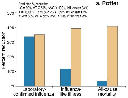
|
The graph shows the reduction in flu resulting from more extensive vaccination of HCW. This frame is based on the results reported by one of the earlier studies.
The y-axis is the percent reduction in deaths. There are three groups of bars, because there are three types of analysis; we'll come back to this. For each type, there are two bars: one bar (peach colored?) is what is claimed in the original study, and one bar (blue) is what is predicted.
The key observation is that there is a huge discrepancy between the claimed result and the predicted result for two of the three analyses. It is very suspicious.
This is Figure 1A from the article. This frame is based on the study by Potter, as shown at the top of the graph)
|
Let's go through an example of the discrepancy. We start with the left-hand analysis, where the agreement is good. This analysis is based on laboratory-confirmed influenza (LCI). That's the highest quality analysis; each case of flu in the study is confirmed in the lab by flu-specific tests. The observed reduction is about 35%. The predicted reduction is about the same.
Now look at the right-hand analysis. This is based on "all-cause mortality" -- the total death rate. It is estimated that about 10% of deaths are due to flu in this work. Think about it... If 35% of flu deaths are prevented, and we look at total deaths, then we would predict about 3% reduction. Instead, the study claims 40% -- about the same as in the previous analysis. That's unreasonable.
There is nothing wrong with using the total death rate. It's much easier, and allows a larger study. But it has implications for the analysis. Using all-cause mortality dilutes the flu effect. The claimed results defy that, and are therefore suspicious.
The following indented section goes through the basis of the prediction in a little more detail. You can read or skip it as you wish.
Calculation of the predicted result... The idea is important, but don't worry too much about the exact numbers.
The predicted reduction in deaths is the product of three terms:
- the vaccine effectiveness (VE), taken as 60%.
- the increased vaccine coverage in the study (ΔVC), reported as 56%.
- the quality, or "efficiency", of the assay.
Multiply those three factors together, and you get the prediction: 34%, for the LCI case. This calculation is shown at the top of the figure, as "Predicted % reduction". It is shown for each of the three analyses in the figure. The first two numbers are the same for each case. What's different is the "efficiency" of the assay for influenza. It's about 100% for the LCI, but only about 10% for the all-cause mortality.
The analysis shown in the middle of the graph is similar, just an intermediate case.
Here is a second example of an obvious problem with a reported study. One of the studies claims a NNV = 8 for the flu vaccine. What is NNV? It's the number needed to vaccinate to get one less flu death. It's a useful measure of the effectiveness of a vaccine. But let's look at that claimed number of 8. There are about 1.7 million health care workers in the US in institutions of the type where the original studies were done. If NNV = 8, vaccinating them all against flu would save about 200,000 deaths per year. That's impressive. Except for one thing... The actual number of flu deaths in the US is about 30,000 per year. The claim makes no sense. (The authors estimate that the NNV is at least 6,000, and more likely around 32,000. That's very different from the value of 8 that was claimed in the original study.)
We need to be clear what the new article claims -- and does not claim. The original hypothesis was that flu vaccination of HCW would reduce flu deaths. What the current article claims is that studies that appeared to support the hypothesis have serious flaws. The article does not claim that the hypothesis is wrong, only that the studies presented in its favor are defective.
Why does it matter? Some places have used the argument that there is benefit to require HCW to be vaccinated. There is a cost associated with implementing that, and it must be weighed against the value. That is, the claim is not merely qualitative, that there will be a reduction in deaths, but quantitative. The NNV value is an example of that quantitation. If the studies that claimed to not only support the hypothesis but also to provide quantitation have serious flaws, then they cannot be used to determine policy.
The main point of this article is to refute conclusions from previous studies -- and to explain why. This should not be the end of the story. It should be a step toward better trials with better analysis.
News stories:
* Health worker flu vaccine data insufficient to show protection for patients. (S Soucheray, CIDRAP, January 27, 2017.)
* Contentious flu vaccine policies at hospitals are based on flawed research, study says. (H Branswell, STAT, January 27, 2017.)
The article, which is freely available: Influenza Vaccination of Healthcare Workers: Critical Analysis of the Evidence for Patient Benefit Underpinning Policies of Enforcement. (G De Serres et al, PLoS ONE 12:e0163586, January 27, 2017.) The article has 11 authors, from several institutions in Canada, Australia and France.
More, March 8, 2017... A "rebuttal", labeled "Formal Comment", published along with the article, and also freely available: Influenza Vaccination of Healthcare Workers Is an Important Approach for Reducing Transmission of Influenza from Staff to Vulnerable Patients. (A C Hayward, PLoS ONE 12:e0169023, January 27, 2017.) The lead author of one of the studies disputed in the main article responds. One of his points is that de Serres et al over-interpreted the original study. But it is also clear that he realizes the statistics of the original work are not ideal. Reading the arguments made in the article and in the rebuttal will help you understand the issue. Resist the temptation to jump to a policy conclusion based on poor data. In the real world, that may be necessary at times, but the real point here is to look at how good the case is -- or not. (I did not see the rebuttal until after posting the original, so have added it two days later.)
A recent post on flu vaccines... A quick-response system for making new vaccines (September 24, 2016).
More abut trying to reduce flu virus transmission: Effectiveness of alcohol-based hand sanitizers? (September 28, 2019).
Posts on the flu virus are listed on the page Musings: Influenza (Swine flu).
Another discussion of vaccination of HCW... An Ebola vaccine: 100% effective? (August 7, 2015). However, the situation for Ebola is somewhat different. With Ebola, vaccination of HCW is intended first and foremost to protect those workers, who suffered inordinately in the recent outbreak. Since people infected with Ebola do not shed much virus until they are very sick, vaccination in this case may have less effect on transmission.
More on vaccines is on my page Biotechnology in the News (BITN) -- Other topics under Vaccines (general). It includes a list of related Musings posts.
I feel your pain -- how does that work?
March 4, 2017
If you get hurt, you may have pain. We understand that. But do you feel pain when someone else gets hurt? Sometimes we may say so, but it would seem a psychological point, reflecting empathy. After all, it is the other person who got hurt; we can't literally feel someone else's pain.
Or can we?
Let's look at the results of a simple experiment. It is with mice.
|
The test measures the ability of a mouse to hold on to an apparatus. The y-axis is labeled "mechanical threshold"; it is a measure of how hard the mouse can hold on. If a mouse is in pain, it can't hold on as well. Thus, the test, measuring "mechanical hypersensitivity", serves as a measure of pain.
Start with the results for the control mice... That's the line of open circles: the top curve of the graph. The control mice show about the same result at each time point tested.
Now look at the line of filled squares. That is for mice that are in pain from morphine withdrawal. Their performance declines over time, as expected.
The key experimental result is shown with the filled circles. That is for normal mice (that is, no morphine) -- co-housed with the morphine mice. They show a decline in performance, just like the morphine mice.
|
The labeling of the curves shows whether the mice received morphine (Mor) or merely a sham injection with the vehicle (Veh). It also shows whether the groups were housed together (co-housed) or separate. Finally, the WD at the end of the label for the Mor group shows that they are in withdrawal.
This is Figure 1C from the article.
|
That is, the mice without morphine performed as poorly as the mice suffering morphine withdrawal -- when they were housed together. In other tests, the pain-inducing stimulus was irritation to the foot pad or alcohol withdrawal; the results were similar. As judged by tests such as this, it appears that untreated mice can feel the pain of their comrades -- if they are together. The criterion is that the affected mice behave physiologically as if they are in pain.
What's going on? The experimental design above allows for variation to see what the key variables might be. In one test, the transfer of bedding from mice with pain to naive mice caused the latter to show the mechanical hypersensitivity that reflects their own pain. This result suggests that pain is being transmitted by volatile chemicals, or, loosely, by odor.
The authors note an additional implication of the findings, beyond the simple point of pain being transmitted by olfactory cues... In experimental work with mice, it is possible for physiological states to be transmitted from one animal to another.
News stories:
* Sensitivity attributable to pain found transferable to other mice. (B Yirka, Medical Xpress, October 24, 2016.)
* With a Whiff, Mice Can Transmit Pain to Each Other. (N Scharping, Discover, October 20, 2016.) One part is a little garbled, but overall this is a useful overview of the work.
The article, which is freely available: Social transfer of pain in mice. (M L Smith et al, Science Advances 2:e1600855, October 19, 2016.)
More about pain...
* Chronic pain in flies? (October 6, 2019).
* Cancer and pain -- and immunotherapy (July 7, 2017).
* Can we predict whether a person will respond to a placebo by looking at the brain? (February 21, 2017).
More about opioids...
* Lesson from a worm: An endogenous anti-opioid system? (January 5, 2020).
* Do you make morphine? (May 18, 2010).
Also see... Why male scientists may have trouble doing good science: the mice don't like how they smell (August 22, 2014).
Can a plant learn to associate a cue and a reward?
March 3, 2017
Imagine a test in a simple Y-shaped maze. Let's use mice, for now. A fan is turned on in one arm of the maze, to provide a little air motion. Later, some food is provided. For some mice, the food is on the same side of the maze as the fan. For other mice, the food is on the side opposite the fan. The mice would learn to make the association between fan and food. Upon feeling the air motion due to the fan, they would tend to go to the appropriate arm in expectation of the food.
The following figure shows such a test, in the context of a recent article...
|
Frame i (upper left) shows the Y-maze. There are two symbols at the left arm: a fan and a light bulb. Frame ii (below) is similar, except that the fan and light are at different arms.
The fan provides the air motion. The fan (or air motion) is of no value on its own; it is just a cue -- or conditioning stimulus (CS), in the Pavlovian sense. The light bulb represents food.
The test organism is trained on one or the other of the configurations at the left (same side or opposite sides). The question is whether it learns to associate the fan (the air motion) with the later appearance of the food.
|
In the test, the organism either makes a correct choice or an incorrect choice, as shown in the two right-hand frames. The test organism, a pea plant in this case, grows into one or the other arm. It would be good for it to anticipate which arm will have the light, so it can make food. A green arrow represents a good choice; a black arrow is a bad choice. For example, at the top (frame iii), the green arrow is to the right, toward the fan; in the training phase, fan and light were on the same side.
In the two basic tests, described above, the pea plants made the correct choice 62% and 69% of the time.
This is Figure 1A from the article.
|
Not bad -- for a pea plant.
That's the key experimental result of the article. Perhaps we should just leave it at that.
What concerns you? What controls are needed?
One caution... Avoid preconceptions about what you think pea plants can do. The question is what is shown, and how should we test it further. It's fine to question the claim, but it's not about rejecting it as impossible, but subjecting it to more rigorous testing.
News stories:
* Smart plants learn new habits. (D Stacey, Phys.org, December 6, 2016.)
* Can Plants Learn to Associate Stimuli with Reward? A group of pea plants has displayed a sensitivity to environmental cues that resembles associative learning in animals. (B A Henry, The Scientist, February 1, 2017.) A more thorough news story, with some background about such work in plants. Further, the discussion of the experiment is sufficiently detailed so that you will see why the result is even more impressive than suggested above. You might have thought that the observed result of about 65% should be compared to an expected value of 50%. In fact, due to clever experimental design, the expected value is actually zero.
* Pavlov's plants: new study shows plants can learn from experience. (P Gibson, The Conversation, December 6, 2016.) This news story provides an interesting introduction to the lead author of the article, who is no stranger to controversy.
The article, which is freely available: Learning by Association in Plants. (M Gagliano et al, Scientific Reports, 6:38427, December 2, 2016.)
"We propose that the ability to construct, remember and recall new relationships established via associative learning constitutes a universal adaptive mechanism shared by all organisms. The ubiquity of associative learning across taxa, including non-animal groups suggests that the role this learning process plays in nature is thus far underexplored and underappreciated." An excerpt from the last paragraph of the main part of the article, just before the Methods (p 5 of the pdf).
Another post about plants anticipating the light: Why growing sunflowers face the east each morning (November 8, 2016).
More about plant "neurobiology":
* The sounds that plants make (April 10, 2023).
* What should a plant do if it hears bees coming? (December 10, 2019).
Another post using a maze, this one really with mice: Mouse with human gene for language: is it smarter? (November 15, 2014).
March 1, 2017
Why some viruses may be less virulent in women
March 1, 2017
Some viruses are less virulent in women than in men. Why? It is sometimes suggested that it's due to differences in the immune system of men and women.
A recent article offers a different suggestion. The authors suggest that it is to the benefit of the virus to be gentler with women. After all, women better serve the virus by transmitting it further, via childbirth and breastfeeding.
Here is an interesting situation that the authors consider... A particular virus, called HTLV-1, eventually kills people by leukemia. In the Caribbean, it kills men and women in about a 1:1 ratio. In Japan, it kills about 2.5 times more men than women. Why the different sex ratio in two places? The authors correlate it with breastfeeding, which is much more extensive in Japan than in the Caribbean.
The article develops mathematical models for how sex-specific virulence could benefit a pathogen. However, there is no evidence to test the suggestion, comparing it to alternatives. The article offers a hypothesis, one that is testable and should be the subject of future work. For example, is the HTLV-1 virus different in Japan and the Caribbean, in a way that can explain why it behaves differently in those areas? For now, it is just a hypothesis -- an intriguing hypothesis.
The Smithsonian news story notes that Zika virus could be a good counter-example: a virus that women transmit, but which seems to affect women more than men. Again we emphasize that the current article offers a hypothesis, which may be one factor affecting sex specificity in some viruses. The contribution of the article is to offer the hypothesis, for further consideration. The challenge is to sort out the various factors, and see when they apply.
News stories:
* For Viruses, the Best Way to Infect Baby Is Through Mama. (B Panko, Smithsonian, December 14, 2016.)
* Viruses target men and women differently, research suggests. (Dentistry.co.uk, December 15, 2016.)
The article, which is freely available: The evolution of sex-specific virulence in infectious diseases. (F Úbeda & V A A Jansen, Nature Communications 7:13849, December 13, 2016.) This is a fairly readable and interesting article, even if you don't want to get into the math. Just skip over the math, and you can follow most of the development.
Posts on leukemia include...
* Effect of low dose radiation on humans: some real data, at long last (July 24, 2015).
* Is clam cancer contagious? (April 21, 2015).
More Zika... Can antibodies to dengue enhance Zika infection -- in vivo? (April 15, 2017).
Another case of sex differences in disease susceptibility... SNO and the higher prevalence of Alzheimer's disease in women (January 14, 2023).
My page for Biotechnology in the News (BITN) -- Other topics includes sections on Cancer and on Zika. Each includes a list of related posts.
Improving photosynthesis by better adaptation to changing light levels
February 27, 2017
Plants can be damaged by light. In fact, the photosynthetic apparatus can be damaged by light -- by excess light. At high light levels, plants turn on a system to dissipate the excess energy. That's good, a protective response. But what happens when the light level is reduced? The plants turn off the protective response, but rather slowly. The protective response causes loss of productivity when it continues into periods of lower light, when it is not needed.
A recent article reports modifying how the protective response is turned off. In the modified plants, it is turned off faster. This results in improvement of growth of the plants under field conditions.
The following figure shows some results from lab experiments...
Part A (left-hand frame) shows the protective response, called NPQ, vs time for four strains of the plant. [NPQ stands for nonphotochemical quenching (of chlorophyll fluorescence). The plant used here is tobacco, a common model system in plant biology.] The four strains are the wild type (WT, gray points) and three modified strains (various VPZ numbers and red points). The modified strains behave similarly.
The graph shows what happens to the level of NPQ over time when the plants are switched from high light to low light. You can see that the protective response declines, but not instantly. That is, the plant continues to dissipate some of the incoming light energy even when that response is no longer needed. NPQ declines faster for the modified strains than for the WT; that is what the modification was intended to do.
Part B (right-hand frame) shows the rate of CO2 fixation by these same strains. The various strains are about equal at the start, with high light. When the light is turned down, CO2 fixation decreases, as expected. However, the new rate is higher in the modified strains. In the WT, the protective response is continuing, causing a loss of productivity. In contrast, the modified strains turn down the protective response faster, allowing more of the light, now at lower intensity, to be used for photosynthesis.
This is Figure 3 from the article.
|
Overall, the scientists have made tobacco plants that, in short-term tests under lab conditions, show reduced diversion of light energy and, therefore, faster recovery of photosynthesis when the light level is reduced.
What happens in real-world conditions? The scientists do growth tests in the field under natural conditions, where the light fluctuates often, due to varying clouds and winds. These tests show that all of the modified plants do better, by about 15%, as judged by the total amount of growth, as well as leaf and root weights. That's encouraging. A 15% gain would be a significant contribution to agricultural productivity.
What was the modification? It involved increasing the levels of certain proteins that determine the level of NPQ.
The work here is with tobacco plants. The scientists suggest that what they did here should work with many plants, since the nature of the protective response is so similar. That remains to be tested. For now, we can only say that the work is a promising lead towards improving the efficiency of photosynthesis.
News story: Genetic Modification Improves Photosynthetic Efficiency. (R Williams, The Scientist, November 17, 2016.)
The article: Improving photosynthesis and crop productivity by accelerating recovery from photoprotection. (J Kromdijk et al, Science 354:857, November 18, 2016.)
Among posts on photosynthesis...
* A novel enzymatic pathway for carbon dioxide fixation (March 12, 2017).
* Coral bleaching: how some symbionts prevent it (September 30, 2016).
* More from the artificial forest with artificial trees (August 31, 2015).
* A whiff of oxygen three billion years ago? (April 6, 2015).
For more on genetically modified plants, see my Biotechnology in the News (BITN) page Agricultural biotechnology (GM foods) and Gene therapy.
Did the Neandertals make jewelry? Evidence from ancient proteins
February 26, 2017
Briefly noted...
How do we know if an archeological find of an ancient human culture is from modern humans or from Neandertals? Sometimes, it is clear from bone morphology, which was the original basis for making the distinction. But sometimes it is hard to tell.
We now have genome sequences for both types of humans, but getting genome sequences from archeological samples is still often limited. However, genomes code for proteins, and an interesting development is that it is becoming possible to analyze proteins from ancient samples.
In a recent article, scientists reported using information about the proteins to tell what kind of human remains were at a particular site. Neither morphology nor DNA information was very helpful, but the protein information helped them recognize the site as Neandertal. In one case, the form of collagen that was present helped the scientists identify a specimen as being from an infant.
The samples are from the Grotte du Renne, in France. They are from a culture known as Châtelperronian, in France and Spain. They are 40-50 thousand years old, from the time of the transition from Neandertal to modern human in Europe.
Jewelry? An interesting point about the site is that it seemed that the natives used jewelry. Associating the site with Neandertals, we now conclude that Neandertals used jewelry. At least, these Neandertals used jewelry. It's not just jewelry that is of interest from the site, but also the types of tools found there. Overall, the work is part of understanding the lifestyle and culture of Neandertals -- assuming that the data are correct, and the interpretations hold up. This is a field where it is a lot of work to get even small pieces of information, and big conclusions require accumulated data.
It's an interesting development. The article itself is considerably more complex than I have suggested here. But the news stories give useful overviews, with an emphasis on the context.
News stories:
* Researchers Identify Archaic Hominins Associated with Chatelperronian Tool Technology. (Sci.News, September 23, 2016.)
* Palaeoproteomics helps differentiate between modern humans and Neandertals -- Researchers decode ancient proteins of Châtelperronian Neandertals. (Max Planck Institute, September 16, 2016.) From the lead institution.
The article, which is freely available: Palaeoproteomic evidence identifies archaic hominins associated with the Châtelperronian at the Grotte du Renne. (F Welkera et al, PNAS 113:11162, October 4, 2016.)
Background post on ancient proteins: Dinosaur proteins (July 6, 2009); it links to more. The proteins of the current work are less than 1% of the age of the dinosaur proteins from this earlier work. It is interesting to see the use of information from old proteins here, but the age per se is not remarkable.
More... Denisovan man: beyond Denisova Cave (May 7, 2019).
Previous post about Neandertals... The lost Neandertal Y chromosome (August 13, 2016).
A post about people who shouldn't wear jewelry: Should you ask your doctor to go BBE? (May 12, 2014).
Using human stem cells to make chimeras in pig embryos
February 25, 2017
A few days ago a Musings post discussed making functional mouse pancreas tissue in rats [link at the end]. It showed the possibility of interspecies organogenesis.
About the same time, there was another article, from another group, on another aspect of the problem. This article had only preliminary results, and perhaps was not even very encouraging about the development of interspecies organogenesis. But the article got far more attention. Why? It dealt with the possibility of making human organs in other animals. Here we look at that article.
The following figure summarizes one key experiment. The basic plan of the experiment... Human pluripotent stem cells (iPSC) were injected into early pig embryos (blastocysts). The injected embryos were then implanted into surrogate sows for development. At a later stage, the developing embryos were checked.
|
The two frames here go together; they are two parts of the analysis of the same work.
For simplicity, let's focus on the first (left-hand) bar of each frame (labeled 2iLD).
Two features of the embryos were scored. First, was the growth normal or retarded?
Second, were human genes expressed, as judged by a fluorescence marker?
So, there were four types of embryos: all combinations of growth retarded or not, fluorescent or not. Those four types are shown in the two frames of the figure, using four different colors, as shown in the key at the bottom.
Frame D is for embryos that were fluorescence-positive (FO+), reflecting the presence of human cells. It shows the percentage of normal (blue) and growth-retarded (yellow) embryos among those that showed fluorescence. Frame E is similar for the embryos that were fluorescence-negative. The bar heights show percentage, but each bar segment has a number on it showing the actual number of embryos.
|
Two key observations...
* Qualitatively, all four types were seen. This means that some normal-sized pig embryos with human cells were found.
* The frequency of retarded growth was higher when the human cells were present. That's the size of the yellow part of each bar compared to the blue part. This finding suggests that the human cells are interfering with pig development.
This is Figure 5 parts D and E from the article.
|
What about all the other bars? The different bars are for different types of stem cell preparations. The big picture is that the results were qualitatively similar for all. (The differences between the types of stem cells will be important for follow-up work.)
There were signs that the human cells were differentiating into specific cell types as the embryo developed.
The scientists also showed that the human stem cells could form chimeras with cattle embryos. The efficiency of human cell incorporation was actually higher in the cattle system, but there are disadvantages to working with cattle.
Overall, the experiment shows that human stem cells can be incorporated into pig embryos. The resulting embryos are called chimeras, since they contain cells of two distinct origins. Human-pig chimeras. The experiment also shows that it isn't very efficient, and isn't very good for the pigs.
It's step one. It's not the first time that human stem cells have been shown to function during development in another type of embryo, but it is the first involving large animals, where the work might lead to organ farming.
News stories:
* Scientists Create First Human-Pig Chimeric Embryos. (D Kwon, The Scientist, January 26, 2017.)
* New findings highlight promise of chimeric organisms for science and medicine. (Phys.org, January 26, 2017.)
The article: Interspecies Chimerism with Mammalian Pluripotent Stem Cells. (J Wu et al, Cell 168:473, January 26, 2017.) There is much more in the article. This post focuses on one leading-edge line of work. The article also includes work with rodents; in general, the work here agrees with the work in the background post.
Background post: Making a functional mouse pancreas in a rat (February 17, 2017).
A post on the possibility of use of bona fide pig organs in humans: Organ transplantation: from pig to human -- a status report (November 23, 2015).
Posts on chimeras include:
* As we add human cells to the mouse brain, at what point ... (August 3, 2015).
* The first chimeric monkeys (February 5, 2012).
There is more about stem cells, and other issues of replacement body parts, on my page Biotechnology in the News (BITN) for Cloning and stem cells. It includes an extensive list of related Musings posts.
February 22, 2017
Planning a visit to the nearest star -- and to its "habitable" planet
February 22, 2017
The nearest star outside our Solar System is Alpha Centauri, about 4.2 light-years away. An article last year suggested that a planet there, Proxima b, may be in the habitable zone.
Let's visit.
In fact, a program to develop a mission to visit Alpha Centauri and its planet Proxima b is in progress. It's Breakthrough Starshot, with start-up funding of a hundred million dollars (US) from Russian investor Yuri Milner. That's enough to bring together key people and develop a serious plan, with milestones. An important part of the project at this point is to define what needs to be done to make it possible. For example, the idea of using lasers to accelerate the craft to its intended speed, about 20% of the speed of light, is fine -- except that suitable lasers do not yet exist.
Nature recently ran a news feature on the project. It almost reads like a science-fiction fantasy. But it's not. It's a serious effort to try to visit a star within about 50 years. Hopefully, some of those involved in the early development of the project will live to see data from the encounter.
If this works, the tiny spacecraft -- the size of a small coin -- will send back pictures during the 2060s. Of course, it will be a while until we see them. The pictures will take 4.2 years to return, traveling at the speed of light. However, the project should yield interesting technical developments in the coming decades. For now, that's the point.
It's a delightful little article.
News feature: First trip to the stars -- A wild plan is taking shape to visit the nearest planet outside our Solar System. Here's how we could get to Proxima b. (G Popkin, Nature 542:20, February 2, 2017.) (Online version has a different title.) Outlines the plan, with a suggested timeline. Includes extensive discussion of the hurdles.
An alternative... A better way to get to Alpha Centauri? (March 15, 2017).
A post about our most distant explorations so far: At the edge of the solar system (September 28, 2012).
A post about planning space missions: Quiz: NASA's boat (June 29, 2011).
A recent post about habitable planets... Habitable planets very close to a star (June 19, 2016).
Also see...
* Titanium oxide in the atmosphere? (December 9, 2017).
* A visit from a star? (March 8, 2017).
Can we predict whether a person will respond to a placebo by looking at the brain?
February 21, 2017
Placebos are fascinating, maybe even important. Sometimes people respond to a fake drug (a "sugar pill") as if it were real. For example, if you test a drug intended to reduce pain, the standard procedure is to use a fake pill as a control. Some people experience pain relief from this control or "placebo". There is increasing recognition that the placebo effect is real -- worthy of being understood in its own right. Musings has noted some aspects of the placebo effect before [links at the end].
A new article explores the basis of the placebo effect. The following figure shows the final claim...
|
In this work, patients with painful osteoarthritis of the knee were given a placebo pain killer. Their response, in terms of pain relief, was recorded.
Prior to the "drug" administration, the patients were given an fMRI test of the brain. On the basis of that, their response to the placebo was predicted.
The graph shows the analgesic response that was observed (y-axis) vs what was predicted (x-axis).
This is part of Figure 5B from the article.
|
You can see that there is a correlation between observed and predicted responses. The correlation coefficient is about 0.6; r2 is 0.36, indicating that the prediction accounts for about 36% of the observed variation in response.
What is this prediction? In the earlier parts of the work, the scientists did fMRI brain scans of patients, and looked for differences between those who responded to the placebo and those who did not. They found differences that appeared to be significant. In particular, the signal for certain brain regions was stronger in those who responded to the placebo. That is the basis of the work shown above. Based on what they had learned from the earlier tests, the scientists did the fMRI measurement, and predicted the response to the placebo. The figure above shows that their prediction was correct.
Correct, with reservations. The first reservation, of course, is that this is a single, fairly small test. Time will tell if the results seen here can be replicated by others. Further, the correlation is partial. It's an impressive correlation if you didn't think a prediction would be possible. But it is limited. Will it get better as we gain experience? Would the prediction be improved by combining measurements from multiple brain regions, as well as other information? Again, time will tell.
It's an intriguing result.
The authors suggest that their test might be useful during testing of new drugs. It can help distinguish true drug responses and placebo responses. Perhaps subjects who are more susceptible to placebo responses should be excluded from clinical trials of new drugs. At least, it is likely that they should be identified. More speculatively, I wonder if the new finding could lead to manipulation of the placebo response. After all, placebos are cheaper, and perhaps safer, than drugs.
News stories:
* Placebo sweet spot for pain relief identified in brain. (Science Daily, October 28, 2016.)
* The placebo effect: is there something in it after all? A study of the sometimes positive effects of taking drug-free pills suggests a biological factor at work. (S Connor, Guardian, November 6, 2016.) Excellent, with some review of related work on the basis of placebo responses.
The article, which is freely available: Brain Connectivity Predicts Placebo Response across Chronic Pain Clinical Trials. (P Tétreault et al, PLoS Biology 14:e1002570, October 27, 2016.) It's a long and complex article. I've pulled out one result to give the article some attention.
Background posts about placebos include...
* Would a placebo work even if you knew? (January 31, 2014).
* The placebo effect: a mutation that makes some people more likely to respond (October 30, 2012).
More fMRI...
* Imaging of fetal human brains: evidence that babies born prematurely may already have brain problems (March 10, 2017).
* Dog fMRI (June 8, 2012).
More brain scans... Brain imaging, with minimal restraint (June 2, 2018).
Instead of just treating the pain... Using your nose to fix knee damage (January 28, 2017).
More about pain: I feel your pain -- how does that work? (March 4, 2017).
More about brains is on my page Biotechnology in the News (BITN) -- Other topics under Brain. It includes a list of brain-related Musings posts.
More knees: The human body: Do you have fabellae? (August 17, 2019).
Do apes have a "theory of mind"?
February 19, 2017
Imagine two people together; call them A and B. They have a ball, and a couple of pots, one red and one blue. They put the ball in the red pot. Person A leaves the room. While A is away, the ball is moved to the blue pot. A returns, and looks for the ball. Where will A look: in the red pot or the blue one? More importantly for our purpose here, where does person B think A will look?
You probably expect that A will look for the ball in the red pot, where it was when he left the room. You know what A knows -- and so does B. B knows that the ball is in the blue pot, but also knows that A thinks it is in the red pot. A has a false belief, but B understands that A has that false belief -- and that he will act on it.
A young child wouldn't make that prediction. If B was a young child, the child would predict that A would look in the blue pot. After all, the child knows the ball is in the blue pot; why wouldn't A know? The child does not understand that A has a false belief.
The ability to make that distinction requires what is called a theory of mind. An adult B understands what A thinks, even though it is wrong. Children acquire the ability to make the distinction around age 4 (though it varies with the details of the test).
That's a long introduction to set the stage for a recent article -- which reports such a test with three species of apes.
The challenge is to figure out how to do the test. The general logic of the test is similar to what was described above. The problem is, how do you tell what ape B predicts for where A will look?
The scientists addressed that problem with a method used for children too young to tell the investigator their choice. It relies on eye-tracking. The investigators watched the eyes of the ape (just as they would when testing an infant). The eyes reveal what the ape (or infant) expects.
The following figure shows the results for the various apes tested over two tests.
|
29 apes participated in two tests. They are listed in the figure, grouped by species.
In each test, each ape either correctly predicted the target (red dot), predicted the wrong response (blue dot), or did not make a prediction (clear dot).
Of the 29 apes, eight made two correct predictions (two red dots). None made two wrong predictions (two blue dots), but four made no predictions at all.
This is Figure 3B from the article.
|
Overall, the eye tracking indicated that the apes made the correct prediction about 2/3 of the time -- significantly greater than chance. That is, the apes knew what A was thinking, even though they knew it was wrong. The apes appear to have a theory of mind, as judged by such a test.
The results here, suggesting that the apes have a theory of mind, disagree with previous work. The authors argue that they have a better test, one that finally shows what the apes really think. Is that correct, or is the current test, for some reason, giving a wrong answer? We can only await further testing, presumably with a range of tests.
News story: Apes understand that some things are all in your head. (Max Planck Institute, October 6, 2016.) From one of the institutions involved.
Videos. There are two videos posted with the article as Supplementary Materials. (2 minutes each, no sound.) They should be freely available. The videos show sequences from the testing. If you want to get into how the testing was done, the videos may be a good place to start; it's a little confusing from the article itself.
The article: Great apes anticipate that other individuals will act according to false beliefs. (C Krupenye et al, Science 354:110, October 7, 2016.)
Follow-up: Will a bonobo help a person find hidden food? (March 12, 2025).
A mind post: The animal mind (July 23, 2009).
A recent post about apes: Age-related development of far-sightedness in bonobos (January 10, 2017).
More... Is Bcbva anthrax a threat to wild populations of chimpanzees? (September 8, 2017).
My page Biotechnology in the News (BITN) -- Other topics includes a section on Brain. It includes a list of brain-related Musings posts.
Making a functional mouse pancreas in a rat
February 17, 2017
A new article reports an interesting development in organ transplantation.
Let's start with the bottom line. Here is what they accomplished...
|
The figure shows glucose tolerance tests with diabetic mice. The graph shows the initial level of blood glucose (time zero), and then the level at various times after giving a high dose of glucose. It's a standard test for diabetes.
The animals were divided into six groups. We won't go through all of them, but the results show two clear types of results.
- The three high curves have a high initial level of blood glucose (above 300 mg/dL).
- The three low curves have a low initial level of blood glucose (below 200 mg/dL).
The initial glucose levels are sufficient for our purposes here. The high blood glucose level reflects the diabetic state. The low level shows that the animals have been successfully treated.
|
The three groups that gave the high result were negatives. They included negative controls, which received treatments that were not expected to work. For example, one received a sham treatment.
One of the low groups received normal pancreas islets from healthy mice. This, of course, should -- and did -- work. A positive control.
The other two low groups, reflecting success, received mouse pancreas islets that the scientists had grown in rats.
The tests shown above were done 60 days after islet transplantation to the mice. Other data showed that low glucose level was maintained for over a year.
This is Figure 4d from the article.
|
The work is a demonstration that one can grow organs of one species in another, and then transplant them back to "where they belong". They work. The diabetic mice were successfully treated using mouse islets that had been grown in rats.
That's easy to say. But it is a tremendous technical accomplishment, encompassing years of work. We'll just outline the process. The following figure summarizes it.
Start with a rat embryo, at the left. It's a very special rat embryo; we'll come back to that.
Inject mouse stem cells into the rat embryo. The stem cells were induced pluripotent stem cells, commonly called iPSC.
Grow the rats.
Isolate the pancreas. More specifically, isolate the islets, which are the insulin-forming tissues from the pancreas.
Transplant the islets into the diabetic mice. The rat-grown mouse islets.
They work.
This is Figure 1 from the news story in the journal, by Zhou.
|
We've glossed over one step -- a key step. Why would the rats make a mouse pancreas? The mouse stem cells are pluripotent, capable of making anything. We noted above that the rat embryos were special. Why? They were unable to make a rat pancreas. The rats carried a mutation in a key gene for pancreas development. They were dependent on the mouse stem cells to provide the pancreas. That is, the system was designed to promote growth of a mouse pancreas in the rat.
The rat mutation to prevent normal pancreas formation was introduced by gene editing, using the TALEN method.
One of the failures -- high glucose curves -- in the graph above was for a rat that carried one copy of the mutation. That is, it was heterozygous for the gene, carrying one good copy and one bad copy. One good copy was enough to promote development of a rat pancreas, and the transplant to the mice failed.
It's a proof of principle that we can grow organs intended for transplantation in another species. "Interspecies organogenesis", as the article title says. Or organ farming.
Of course, what we would really like to do ...
Let's leave that for another post. In a few days. [This post is now listed below, for Feb 25.]
News stories:
* Lab-Grown Pancreas Reverse Diabetes In Mice. (Asian Scientist, February 8, 2017.) Good overview.
* Expert reaction to study reporting functional mouse pancreatic islets grown in rats and transplanted into mice. (Science Media Centre, January 25, 2017.) Comments from two expert scientists.
* News story accompanying the article: Regenerative medicine: Interspecies pancreas transplants. (Q Zhou, Nature 542:168, February 9, 2017.)
* The article: Interspecies organogenesis generates autologous functional islets. (T Yamaguchi et al, Nature 542:191, February 9, 2017.)
A (small) step toward making human organs by such a procedure: Using human stem cells to make chimeras in pig embryos (February 25, 2017).
A recent post on another approach to restoring pancreatic function: Treatment of Type 1 diabetes with encapsulated insulin-producing cells derived from stem cells (March 11, 2016).
More about diabetes...
* Treating obesity: A microneedle patch to induce local fat browning (January 5, 2018).
* Diagnosing diabetes in people of African ancestry: a race-dependent variable (January 3, 2018).
More about the pancreas:
* Pancreatic cancer: another trick for immune evasion (August 1, 2020).
* Role of neoantigens in surviving pancreatic cancer? (February 4, 2018).
More on diabetes is on my page Biotechnology in the News (BITN) -- Other topics under Diabetes. That includes a list of related Musings posts.
A post that includes a complete list of posts on gene editing (including using TALENs): CRISPR: an overview (February 15, 2015).
There is more about stem cells, and other issues of replacement body parts, on my page Biotechnology in the News (BITN) for Cloning and stem cells. It includes an extensive list of related Musings posts.
February 15, 2017
Why does a durian smell so bad?
February 14, 2017
A new article reports the major chemicals responsible for the odor of an interesting fruit. In order, starting with the most important, the odors are described as: fruity; rotten onion; roasted onion; rotten, cabbage; sulfury, durian; fruity; fruity; fruity; rotten, durian; fresh, fruity; roasted onion; roasted onion; skunky. The list goes on, but that's enough for now. Rotten egg is a few places further down the list.
What do we mean by order of importance? It's based on the odor activity value (OAV). That is the ratio of the concentration (in the fruit) to the odor threshold (the amount we can detect). For example, the odor ingredient at the end of the list above, described as skunky, is present at about 0.9 µg per kg of fruit. We can detect that chemical at 0.00076 µg/kg (in water). Therefore, its OAV, the ratio of those two numbers, is about 1200.
The information above is from Tables 2 and 3 of the article. Table 2 presents their results for the concentrations; the results are then summarized and presented in order by OAV in Table 3. The names of the chemicals are given in both tables. That skunky odor, for example, is due to 3-methylbut-2-ene-1-thiol.
Now that you know what this fruit smells like, would you like to try some? It's apparently a quite tasty fruit -- if you can get by its odor. It's the durian, more specifically the Monthong durian (Durio zibethinus L. 'Monthong').
One type of follow-up test is to make artificial mixtures of selected compounds, and see how people respond. In this case, the scientists found that a mixture of two of the major odor chemicals was identified by a panel of human testers as durian about as often as the real thing. The two chemicals used here were the first and third from the list above: one that is very fruity and one that smells of roasted onion.
News stories:
* Compounds responsible for world's stinkiest fruit revealed. (E Stoye, Chemistry World, January 25, 2017.)
* Chemists Identify Key Compounds Responsible for Durian's Pungent Odor. (N Anderson, Sci.News, January 19, 2017.)
The article: Insights into the Key Compounds of Durian (Durio zibethinus L. 'Monthong') Pulp Odor by Odorant Quantitation and Aroma Simulation Experiments. (J-X Li et al, Journal of Agricultural and Food Chemistry 65:639, January 25, 2017.)
A recent post about sulfur odors... Copper ions in your nose: a key to smelling sulfur compounds (October 10, 2016). Links to more about odors.
A post about the chemical responsible for the rotten egg part of the durian odor: What's the connection: rotten eggs and high-temperature superconductivity? (June 8, 2015).
Added September 23, 2025.
An onion post: Using onions to improve solar cells (September 23, 2025).
More about fruit ingredients...
* Is the lychee (litchi) a toxic food? (May 11, 2015).
* Grapefruit and medicine (March 26, 2012).
Hydraulic fracturing (fracking) and earthquakes: a direct connection
February 13, 2017
Fracking involves injecting liquids underground, at substantial pressures. There is concern that the process might cause slippage of fragile structure within the Earth -- that is, earthquakes.
There are actually two injection processes. The first is the injection used during extraction. The second is the injection of the waste water for disposal. The latter is the more substantial process.
Early experience with fracking led to anecdotal reports of earthquakes, but it was hard to make any sense of the reports. More recently, systematic reports have made clear that earthquakes can be associated with waste water disposal from fracking -- at some sites. This was discussed in an earlier post [link at the end].
We now have an article reporting earthquakes caused by the fracking injection itself. Interestingly, two different processes may be involved.
The new article is based on observations in an oil field in Alberta. Here is an example of the observations...
It's a complicated graph, showing several things (various y-axes) over the time period of December 2014 through March 2015 (x-axis). Here are the major things to see...
In the lower frame, the blue bars in December and January show injections at a particular site. The bar heights show the pressure of each injection (scale at the left).
In the upper frame, the red dots show earthquakes, very near that injection site. The vertical position of the dot gives the magnitude (scale at the left).
You can see that there was a swarm of earthquakes during the January injections. Most are small, detected only because the field is carefully monitored. However, the biggest quakes in the initial swarm are about magnitude 3, with some up to 4 later.
Now look at another curve: the red line in the lower frame. That shows the cumulative volume of the injections (scale at the right). One might suggest that the quakes began when the cumulative injection volume rose past a certain point.
This is part of Figure 3 from the article. The full figure shows data from other sites.
|
Our discussion of the graph above makes a connection between the fracking injection and earthquakes. However, it is important to emphasize that all that analysis can possibly show is a correlation. A single such data set cannot show a causal connection. That is, the graph above is presented to show the nature of the results and how they are described, not to prove that there is a connection.
Importantly, the article has multiple data sets of the type shown above, and more. From the analysis of all the data at hand, for various sites, the authors argue that there is a causal connection. Actually, two causal connections.
First, the effect noted above, that injection may lead to an immediate swarm of quakes near the injection site, seems to hold for various sites in the field. This is a direct effect of the injection.
Second, there is another, delayed effect... There may be small quakes, at greater distances from the original injection, a few weeks later. In the figure above, there are bursts of earthquakes at various times. The arrows across the top of the figure help to group those bursts of quakes. These quakes occur at considerable depth, and are clearly distinct from the first group of quakes, which were a direct local effect of the injection.
Overall, the article makes a strong case for connections between fracking injections and earthquakes, and explains how the connections work.
This is the best-documented case of earthquakes being directly associated with fracking itself -- as distinct from waste water disposal. But in some ways, the story is similar. Both activities may cause earthquakes, depending on the local ground structure. Monitoring is important, and warning signs should be heeded.
News story: Study reveals two seismic processes by which hydraulic fracturing induces tremors. (Phys.org, November 18, 2016.)
* News story accompanying the article: Geophysics: Understanding induced seismicity. (D Elsworth et al, Science 354:1380, December 16, 2016.)
* The article: Fault activation by hydraulic fracturing in western Canada. (X Bao & D W Eaton, Science 354:1406, December 16, 2016.)
Background post: Fracking: the earthquake connection (June 19, 2015). This is about quakes associated with waste water disposal. Links to more, both about fracking and about earthquakes.
And more... Fracking and earthquakes: It's injection near the basement that matters (April 22, 2018).
More about earthquakes... Detecting earthquakes using the optical fiber cabling that is already installed underground (February 28, 2018).
There is more about energy issues on my page Internet Resources for Organic and Biochemistry under Energy resources. It includes a list of some related Musings posts.
Antibiotic resistance genes in "ancient" bacteria
February 11, 2017
What if we had some bacteria that had not seen "modern civilization" for four million years? Perhaps they have not even seen animals during that time. Is it possible that they might be resistant to some modern antibiotics?
Of course, the answer is yes. After all, many of our antibiotics are natural chemicals, made by other microbes. These antibiotics undoubtedly play a role in competition between microbes in nature. It is natural that bacteria would develop resistance to them.
A team of scientists has been studying the bacteria in Lechuguilla Cave in New Mexico. (The cave is part of Carlsbad Caverns National Park.) From the nature of the situation, it is likely that these bacteria have been isolated from the surface world for four million years. Interestingly, one of the bacterial strains is resistant to most of our modern antibiotics.
The bacteria studied here are living modern bacteria. What's unusual is that, so far as we know, they have been isolated from the "outside world" for millions of years. They have not undergone genetic exchange with surface organisms, and have not been exposed to modern sources of pathogens or antibiotics. In that sense, they are "ancient".
In a new article, they explore the antibiotic resistance of this organism, called Paenibacillus sp. LC231. The study is based on analyzing the genome, and then doing follow-up biochemistry of genes of interest. For example, they studied the resistance genes they found in the cave Paenibacillus after transferring them to common Escherichia coli.
The basic finding is that numerous resistance genes were found. Some of them are similar to known modern genes, some appear to be novel. All of the resistance genes they found were on the main chromosome of the bacterium; none were on plasmids.
The scientists also found that most of these resistance genes from the cave bacteria were in some strains of the same type of bacteria from the surface. This raises a question about their origin.
It's an interesting view of an unusual situation. Finding resistance genes in ancient organisms is not a surprise. Importantly, it does not reduce our responsibility to monitor and limit modern antibiotic resistance. Antibiotics may have been around in ancient times, but human activity has increased their prevalence, and thus increased the pressure to develop resistance.
Nowadays, spread of antibiotic resistance is often via plasmids; it's easier to acquire a ready-made resistance from a neighbor than to make your own from scratch. The lack of plasmid-borne resistance genes in these cave bacteria is interesting.
News story: Multi-Drug Resistant Bacteria Found Deep in New Mexico's Lechuguilla Cave. (Sci.News, December 13, 2016.)
The article, which is freely available: A diverse intrinsic antibiotic resistome from a cave bacterium. (A C Pawlowski et al, Nature Communications 7:13803, December 8, 2016.)
Previous post about antibiotics: Staph in your nose -- making antibiotics (October 9, 2016).
Antibiotic resistance... On completing the course of the antibiotic treatment (September 19, 2017).
More on antibiotics is on my page Biotechnology in the News (BITN) -- Other topics under Antibiotics. It includes an extensive list of related Musings posts.
More from caves and such...
* Life -- and old carbon -- in a blue hole (March 21, 2020).
* Our newest spiders: the cave robbers (September 5, 2012).
* Images from 30,000-year-old motion pictures (July 22, 2012).
Carbon-14 dating of confiscated ivory: what does it tell us about elephant poaching?
February 10, 2017
In an earlier post, we noted a detailed calibration curve that allows carbon-14 (C-14) dating to an accuracy of about one year for recent samples [link at the end]. This high-resolution C-14 dating of essentially "current" materials is made possible by the burst of C-14 released into the atmosphere by atomic bomb testing in the 1950s.
One application of such dating proposed there was tracking the ivory trade. We now have an article on that application.
The work is based on 231 samples of ivory that were seized between 2002 and 2014. The samples are from 14 seizures, which are listed in the article. Samples of the newest ivory from each tusk were dated, using the C-14 calibration curve. That gave an estimate of the date of death. The time from the estimated date of death to the time of seizure is called the lag. The following graph shows the lags that were obtained for 230 samples.
The results are shown here for ivory from elephants from four regions of Africa. (The source of the ivory had previously been determined by DNA analysis.) For our purposes, the similarities of these four curves are more important than the differences. It is fine to focus on just one of the curves, at least at the start.
Lag time -- the time from death of the animal to the ivory seizure -- for 230 samples.
The actual counts (y-axis) are plotted. Note that the y-axis scales vary. Each red line shows a normal curve fitted to the data.
You can see that the peak counts are for lags of 12-24 months.
Only three samples shown have a lag greater than 60 months. One sample had a lag beyond the range on the graph: 231 months (19 years).
A few samples are shown with negative values for the lag. The largest such value is 10 months. That's within the uncertainty of the measurement, which is about +/- one year. A value of zero would mean that the ivory was seized at the time it was made; that is, the sample was fresh.
Tridom? That's the Tri-National Dja-Odzala-Minkébé. It's a transborder forest, officially recognized as a single protected area by Cameroon, Gabon and the Republic of Congo.
This is Figure 3B from the article.
|
The big picture? Almost all of the ivory samples were from animals killed within the five years prior to the ivory seizure.
That's important. One claim made by some in the trade is that much of the ivory is from stockpiles accumulated before trading was made illegal. That ban was instituted in 1989, 28 years ago. The data here are quite inconsistent with that claim. Only one sample here, out of 231, was even close to being old enough to have come from such stockpiles.
News stories:
* Clues in poached elephant ivory reveal ages and locations of origin. (myScience, November 8, 2016.)
* Most Ivory for Sale Comes From Recently Killed Elephants -- Suggesting Poaching Is Taking Its Toll. (R Nuwer, Smithsonian, November 7, 2016.)
* Most illegal ivory comes from recently killed elephants: new study. (S Dasgupta, Mongabay, November 8, 2016.)
The article, which is freely available: Radiocarbon dating of seized ivory confirms rapid decline in African elephant populations and provides insight into illegal trade. (T E Cerling et al, PNAS 113:13330, November 22, 2016.) Very readable, with good discussion of the measurements, and their implications for monitoring elephant populations.
Background post: Atomic bombs and elephant poaching (October 25, 2013). The article discussed there is reference 25 of the current article, and includes some of the same authors.
More... Briefly noted... Elephant poaching leads to selection for genes for tuskless elephants (March 23, 2022).
Recent post about elephants... Why do elephants have a low incidence of cancer? (March 20, 2016).
More... A mammalian device for repelling mosquitoes (December 10, 2018).
Next C-14 dating story... A bone from the original Santa Claus? (December 18, 2017).
My page of Introductory Chemistry Internet resources includes a section on Nucleosynthesis; astrochemistry; nuclear energy; radioactivity. That section links to Musings posts on related topics, including the use of radioactive isotopes.
February 8, 2017
Pangenomes and reference genomes: insight into the nature of species
February 7, 2017
The cost of genome sequencing has plummeted in recent years. That has allowed massive levels of sequencing, beyond what we might have dreamed of just a few years ago.
Sometimes, such massive sequencing may tell us more than we wanted to know.
In the early days of genome sequencing, getting one complete genome sequence for an organism was a significant achievement. We understood that genomes varied, but having one gave us a "reference genome" for the species.
However, cheap sequencing has allowed us to accumulate many genomes for a species, and sometimes there is a surprise. It's illustrated by the following cartoon.
The graph plots the number of genes found (y-axis) vs the number of samples of the species sequenced (x-axis).
There are two curves!
After sequencing one genome, we see that there are about 4000 genes. Traditionally, that genome -- that set of genes -- would be considered the reference genome for the species.
We now sequence a second genome for the same species. Let's say it also has about 4000 genes. However, it lacks 500 of the genes from the first genome, and has 500 genes not seen there. Now, a third genome. It, too, lacks a few hundred genes from before, and has a few hundred genes not seen before. And so on.
The upper curve shows the total number of genes found, even if in only one case; that number keeps rising. (It may eventually level off.) The lower curve shows the number of genes found in every case; that number keeps getting smaller.
This Figure is from the news feature listed below.
|
What's shown there is what is actually found, especially for genomes of microbes. The details (such as how fast the upper curve levels off -- if at all) vary.
The lower curve is now considered to be the core genome for the species. The upper curve reflects a new idea, the pangenome: the collection of all genes associated with the species.
In one case, the bacterial genus Prochlorococcus, analysis of 45 strains has revealed about 80,000 genes -- the pangenome. The core genome is about a thousand genes.
The Scientist recently ran a news feature on the emerging idea of the pangenome. It's an interesting -- and incomplete -- story. It challenges our notions of what a species is. In particular, we see that getting one genome may tell us very little about the species.
Feature story, which is freely available: The Pangenome: Are Single Reference Genomes Dead? -- Researchers are abandoning the concept of a list of genes sequenced from a single individual, instead aiming for a way to describe all the genetic variation within a species. (C Offord, The Scientist, December 2016, p 31. Now archived.)
Most recent post on the wonders from genome sequencing: The Asgard superphylum: More progress toward understanding the origin of the eukaryotic cell (February 6, 2017). That's the post immediately below.
A post on the cost of genome sequencing... The $1000 genome: we are there (maybe) (January 27, 2014).
A post about the possibility of getting too much genome information, though for a different reason: Are there genetic issues that we don't want to know about? (October 22, 2013).
There is more about genomes and sequencing on my page Biotechnology in the News (BITN) - DNA and the genome. It includes an extensive list of Musings posts on the topics.
One reason members of a species may have different genes is horizontal gene transfer (HGT), the direct transfer of genes between organisms. It's considered common in prokaryotes, but increasingly recognized to have some role in higher organisms. Here is an example: An extremist alga -- and how it got that way (May 3, 2013).
The Asgard superphylum: More progress toward understanding the origin of the eukaryotic cell
February 6, 2017
Less than two years ago, Musings presented a newly described group of microbes, the Lokiarchaeota. Genome evidence suggested that these archaea might be more closely related to eukaryotes than any prokaryote known so far [link at the end].
A new article extends the story. Scientists around the world, led by those who found the Lokiarchaeota, have looked for related organisms -- and found them. The catalog of these eukaryotic-like archaea now includes four phyla -- all named after figures in Norse mythology. They are now collected together in a superphylum called Asgard -- the home of the Norse gods.
Here is the current picture...
|
The figure shows a family tree for several groups of archaea.
Focus on the four groups highlighted in color. One of those (green) is the Lokiarchaeota, discussed previously. These four groups form the cluster that the scientists call Asgard.
And within the Asgard are the Eukarya.
The four groups highlighted are considered phylum level; Asgard is a superphylum.
If you compare this family tree with that shown in the background post, you will see that it is rather similar. The main point is that the eukaryotes are now associated with a superphylum of several groups of eukaryotic-like archaea, rather than just the Lokiarchaeota.
This is Figure 1b from the article.
|
The key point about the Asgards is that they contain genes for proteins usually considered characteristic of eukaryotes. The authors call them eukaryotic signature proteins (ESPs). The following figure summarizes some of the findings on this point. A caution... don't get bogged down with detail in this figure.
The figure lists several Asgards along the side. Across the bottom are several proteins considered to be characteristic of eukaryotes -- the ESPs. (These are shown in groups, labeled at the top.) It's not important that you pay attention to any of the labels.
The filled dots, whether gray or black, mean that there is evidence for the gene (shown at the bottom) in the particular organism (shown at the side).
You can see that the organisms listed, all Asgards, contain many of these genes. It is quite uncommon for prokaryotes, whether bacteria or archaea, to have any of these genes.
This is Figure 1d from the article.
|
The pattern above shows the distinctive feature of the Asgards: archaea containing genes considered characteristic of eukaryotes. That was a key feature that caught our attention earlier for the Lokiarchaeota. It is now extended to a group -- a superphylum -- of archaea.
The archaea were first recognized as a distinct group by Carl Woese in 1977. That was a landmark in microbiology, both for the discovery and for the molecular method used. Woese also suggested that the bacteria, the archaea, and the eukaryotes were three equally distinct groups -- the three domains of life. That was a bold proposal, based on very limited evidence. Since Woese's pioneering work, that three-domain model of life has been challenged by the suggestion that the eukaryotes emerged from within the archaea. The current article is the latest along that line. We now not only suggest that the eukaryotes emerged from the archaea, but the type of archaea involved is becoming increasingly specified. In his early work, Woese underestimated the diversity -- and importance -- of the archaea.
Despite this development, we must remember some limitations of the work and the conclusions. So far, none of these Asgard organisms have ever been seen. They have been inferred from metagenomic work: analyzing DNA found in the environment and inferring its source, without ever having the organism at hand. Scientists will now be highly motivated to try to find -- and hopefully even grow -- actual Asgard cells. It will not be easy. It's also important to emphasize that the relationship between Asgard and eukaryote is a proposal, a model. The evidence supports it; they seem to share some key genes. But there is a huge gap between the model and having any real description of what happened. We may never know what happened, but we can continue to seek clues.
News stories:
* 'Marvel microbes' illuminate how cells became complex. (Science Daily, January 11, 2017.) This is based on the press release from Uppsala University, the lead institution for the work.
* A Break in the Search for the Origin of Complex Life. (E Yong, The Atlantic, January 11, 2017. Now archived.) Good overview from an independent science journalist.
* Discovery of New Microbes Sheds Light on How Complex Life Arose. (M G Airhart, University of Texas College of Natural Sciences, January 11, 2017.) From one of the universities.
* News story accompanying the article: Microbiology: Mind the gaps in cellular evolution. (J O Mcinerney & M J O 'Connell, Nature 541:297, January 19, 2017.)
* The article: Asgard archaea illuminate the origin of eukaryotic cellular complexity. (K Zaremba-Niedzwiedzka et al, Nature 541:353, January 19, 2017.)
Background post: Our Loki ancestor? A possible missing link between prokaryotic and eukaryotic cells? (July 6, 2015). Links to more.
A major new development... An Asgard in culture (February 4, 2020).
Discovery of the archaea... Carl Woese and the archaea (January 12, 2013).
More about the nature of prokaryotic and eukaryotic cells: Gemmata obscuriglobus, a bacterium with features of a eukaryotic nucleus? (April 14, 2017).
Next post about genomes... Pangenomes and reference genomes: insight into the nature of species (February 7, 2017). Immediately above.
More metagenomics:
* The nanobacteria of Omnitrophota (June 5, 2023).
* Is there useful ancient DNA in the dirt? (August 8, 2017).
* More giant viruses, and some evidence about their origin (June 13, 2017).
There is more about genomes and sequencing on my page Biotechnology in the News (BITN) - DNA and the genome. It includes an extensive list of Musings posts on the topics.
This post is noted on my page Unusual microbes.
How much energy are we saving with energy-saving houses?
February 5, 2017
Not much, according to a new article.
The article deals with energy usage for houses in the State of California (CA), where a series of building regulations intended to reduce energy consumption was introduced starting in the late 1970s.
The following graph summarizes the basic data...
The graph shows annual energy usage (y-axis) as a function of the year the house was built (x-axis).
Energy usage is shown for both natural gas and electricity. Those are the two major energy sources used in CA homes.
The energy usage for each source is given in energy units: MBTU -- thousands of BTU. (Apparently, MBTU means thousands to some people, and millions to others. It is an amusing ambiguity of units.)
The vertical red line marks the year the state started introducing the energy-saving regulations that affected how new homes were built.
Importantly, the energy usage is for two specific recent years. For example, the energy used in 2009 for houses of various ages is part of the data set plotted above. Analyzing energy usage for the same year provides a control, though an imperfect one as we shall see.
The graph is based on data collected during surveys by a California state agency.
This is Figure 1 from the article.
|
What does the graph show? Well, if you wanted to argue that energy usage declined for houses built after the red line (the start of regulations), you might note that gas usage declines after that time, and electricity usage levels off. (It may be questionable whether these trends really correlate with the regulations, but let's not worry that.)
Overall, there seems to be a decline in energy usage for newer houses. Perhaps 15% for houses built since the regulations were introduced.
Here is how I estimated that number of a 15% decline. It is a rough estimate, but what follows does not critically depend on the exact value.
I estimated the values for gas and electricity from the graph, and added them together to get the total energy usage. For the oldest houses (extreme left data), I estimate 67 MBTU. For the houses just before the red line, I get 72 MBTU. For the newest houses (extreme right data), I get 62 MBTU.
Using those numbers, it appears that the newest houses use about 15% less energy than the houses built just before the regulations were introduced.
So, it would seem that the regulations for making houses more energy-efficient led to a 15% decline in energy usage.
When the regulations were introduced, it was predicted that they would lead to an 80% reduction in energy usage. And therein lies the problem. The energy reduction that resulted from the regulations is -- according to the new analysis -- far less than promised or expected.
Why the discrepancy? Is there something wrong with the analysis above, or have the savings really been far less than expected?
The author examines some possible problems with the analysis. For example... Maybe there is some other difference between new houses and old ones that affects their energy usage. Maybe new houses are in areas of the state that need more energy. Maybe people who live in newer houses are more affluent, and tend to use more energy. The author looks at these and some other possibilities, and does not find any major flaw in the analysis.
One might wonder whether there is a political motivation here. Perhaps the author is anti-regulation, and trying to show that regulations don't work. I have not examined the author's background. But importantly, in the end, it is data that matters. If the analysis is flawed, someone needs to show why.
The author has done his analysis, and published it. If others have objections, or alternative analyses, they should do the same. I did not find much comment on the article at this point, but it is early.
What's the point of this post? The article caught my attention as being about an interesting issue -- and it is about my home state. It's interesting, and fairly readable -- and it challenges us. In science, we do not take a single article as "the answer"; let's see what comes from this article. Perhaps this article along with its follow-up will lead to a better understanding of what works well and what does not.
News stories:
* Have green building codes succeeded in saving energy? Energy savings from efficiency requirements prove hard to find. (T Hyde, American Economic Association, October 19, 2016.) Good discussion.
* I'm Not Really Down with Most Top Down Evaluations. (M Auffhammer, blog at Energy Institute, Haas School of Business, University of California Berkeley, September 19, 2016.) A discussion of the problem of evaluating energy efficiency in the real world. It is not specifically about the current article, though the article is noted in the comments that follow.
The article, which may be freely available: How Much Energy Do Building Energy Codes Save? Evidence from California Houses. (A Levinson, American Economic Review 106:2867, October 2016.)
A post about reducing energy usage of a house: What if your house could sweat when it got hot? (November 30, 2012).
More about energy efficiency... Is solar energy a good idea, given the energy cost of making solar cells? (March 24, 2017).
There is a section of my page Internet Resources for Organic and Biochemistry on Energy resources. It includes a list of some related Musings posts.
A robot that can feed itself
February 3, 2017
The first step in eating is to open your mouth, as shown in the following figure...
|
The mouth is shown in gray. As you can see, it is open.
The open mouth allows food to flow into the digestive organ. In this case, that is a microbial fuel cell (MFC).
This is Figure 5b from the article.
|
That's a diagram, of course. A diagram used to guide making a robot. A robot that trawls the waters, finds food, and burns it in a fuel cell. A microbial fuel cell -- a bacterial culture that generates electricity while metabolizing. Overall, the robot, with its microbial stomach, makes electricity to run itself.
It works...
The figure shows the power output (y-axis) for two MFC over time (x-axis). They are set up similarly, except that one is set up as a robot stomach with the new mouth, and one serves as a standard lab control.
The solid line is for the stomach MFC; for the most part, it is the lower line. Results are shown here for two cycles of testing.
You can see that both MFC work. However, the power output for the stomach is less than for the control. The latter is under ideal lab conditions.
The y-axis scale is in microwatts; that is not clear on the label (even in the original pdf file).
This is Figure 12 from the article.
|
|
The emphasis in the current work is on development of the mouth, so that the MFC operates with isolated electrodes, as is necessary, but can also feed.
The primary motivation for this type of development is to get robots that are more autonomous. Common robots require a tether to provide electricity, or use batteries, which run down. Of course, a robot of the type developed here would require a food supply. Under bad conditions, such a robot could starve.
There is also some talk of how these robots could supply information about the environment, or even be useful in cleaning up algae. True, but those functions do not require the level of integration shown here.
News story: This Algae-Eating Robot Could Solve Water Contamination. (Nature World News, November 4, 2016. Now archived.)
The article: Toward Energetically Autonomous Foraging Soft Robots. (H Philamore et al, Soft Robotics 3:186, December 1, 2016.)
Previous robot post: An artificial hand that can tell if a tomato is ripe (January 3, 2017).
* Next: What if there weren't enough bees to pollinate the crops? (March 27, 2017).
Microbial fuel cells are noted in the posts...
* Better bacterial conductivity (November 3, 2020).
* A new source of electricity (November 10, 2009).
More fuel cells... Hydrogen fuel cell cars (June 8, 2010).
More about what robots eat... A robot that eats flies -- and more (August 4, 2008). There's not much here, but this seems to be about some earlier work from the same lab.
Previous post on the gut microbiome... How intestinal worms benefit the host immune system (February 27, 2016).
February 1, 2017
The Trump moth
January 31, 2017
|
Neopalpa donaldtrumpi sp. n.
It's a newly discovered moth, announced in an article published on January 17 -- three days before the inauguration of the new US President.
Scale bar is 2 millimeters.
This is Figure 1g from the article.
|
We note two sentences from the article, in the section where the author explains the name (page 89, bottom). The sentences are in the opposite order in the article.
* "The specific epithet is selected because of the resemblance of the scales on the frons (head) of the moth to Mr. Trump's hairstyle." You may want to check a close-up of the (moth's) head, in Figure 2cd of the article (or the news story).
* "The reason for this choice of name is to bring wider public attention to the need to continue protecting fragile habitats in the US that still contain many undescribed species."
The specimen is from a collection at the University of California, Davis. It was originally collected in Imperial County, at the southern end of California. The range of the moth is the southeast of California and the north of Baja California (Mexico), based on the few specimens found so far.
News story: New species of moth named in honor of Donald Trump ahead of his swearing-in as president. (Phys.org, January 17, 2017.)
The article, which is freely available: Review of Neopalpa Povolný, 1998 with description of a new species from California and Baja California, Mexico (Lepidoptera, Gelechiidae). (V Nazari, ZooKeys 646:79, January 17, 2017.)
A previous moth post: The story of the peppered moth (July 9, 2012).
Another Lepidoptera discovery: Which came first: butterflies or flowers? (March 9, 2018).
Also see:
* Briefly noted... The Biden octopus (March 22, 2022).
* The Obama lizard (March 20, 2013).
Rewritable W-based paper and a disappearing panda
January 30, 2017
For over a century, tungsten (or wolfram, as many say; symbol W) was the key ingredient of light bulbs. That use is being phased out, due to the inefficiency of ordinary incandescent bulbs.
A new article suggests that we might make paper out of tungsten. More specifically, that we make rewritable paper out of tungsten oxide, WO3.
Here's the idea...
|
The first frame of the figure shows how to write on the material. A mask for the desired image is placed over the membrane (the "paper"). UV irradiation leads to color development where the membrane is exposed.
The following frames show various images that were printed on a single membrane, in succession.
In each case, there are two steps. Step 1 is to erase the old image. This is done with either ozone or heat (shown as Δ). Step 2 is to write the new image.
You can see that the image quality is quite good, even with successive printings on the same membrane. (The authors report doing 40 cycles with some membranes, with minimal loss of quality.)
This is Figure 5d from the article.
|
The writing process takes about two minutes. The erasing processes take several minutes. This is not rewritable paper for routine note-taking. The authors suggest thinking in terms of posters and billboards as examples where the technology, with these parameters, might be useful.
They also say... "Such reprintable clothes can be printed with temporary marks or advertisements for athletic purposes of sports meets and games." (Last sentence of Results and Discussion section, p 29718.)
The chemical nature of both writing and erasure is known. Briefly, it involves the oxidation state of the W. The regular W(VI), in WO3, is colorless. W(V) is blue. The UV step shown above leads to reduction of the W from the 6+ state to the 5+ state, which is blue.
Erasure, then, involves oxidation of the blue W(V) back to colorless W(VI). Two methods of erasure are shown above. But common O2 works -- and so does air. The images are not all that stable under ambient conditions. The following figure shows an example.
|
The figure shows an image after various times, stored at ambient conditions.
This is Figure 4d from the article.
|
What is this "paper"? As noted above, the active ingredient is WO3, a material known to be photochromic -- to change color with light. The current work involves working out ways to build on this basic effect, and make it practical for rewritable paper. It's formed here into a paper-like material, with common polymers. The polymers electronically couple with the WO3; details of the composition affect properties such as ease of writing and how rapidly it fades in air.
The authors suggest that their rewritable paper is easily manufactured, inexpensive and non-toxic. We'll leave it to others to compare alternatives, but it's an interesting type of development.
News story: Rewritable material could help reduce paper waste. (Phys.org, November 2, 2016.)
The article: Electrospun Photochromic Hybrid Membranes for Flexible Rewritable Media. (J Wei et al, ACS Applied Materials & Interfaces 8:29713, November 2, 2016.)
Related... Windows: independent control of light and heat transmission (February 3, 2014). There are similarities between the work in this post and the current one. In both cases, energy (electrical or light) is used to -- reversibly -- change the optical properties of a material, to our benefit. In fact, WO3 has been used in smart windows, though not in this post.
Light bulbs... Light bulbs (July 1, 2009). Links to more.
Other panda posts include...
* Pandas: When did they become specialized to eat bamboo? (March 18, 2019).
* How the giant panda survives on a poor diet (August 2, 2015).
Previous posts about paper? Beats me. "Paper" is a horrible search term. But there is no mention of tungsten in Musings prior to this post.
Using your nose to fix knee damage
January 28, 2017
Cartilage damage in the knee is a significant health problem. There are various approaches to treating knee cartilage damage, but none are particularly satisfactory.
A recent article offers a new approach: use your nose. The structural material in the nasal septum is actually the same type of material as knee cartilage. Interestingly, the nasal chondrocytes (cartilage-forming cells) seem to have better regeneration capability than those from the joints. And it's much easier to get a sample from the nose than from the knee.
You might wonder about the size of the sample from the donor site. What the scientists do is to excise a small piece of the nasal septum, and then expand it in lab culture. The lab-grown material, derived from the nasal septum, is what is implanted into the knee.
The present study, a Phase I trial, is the first trial of the method in humans. It involved ten patients, with two years of follow-up. Analysis included MRI of the knee, as well as the patients' subjective evaluation of their status. Most of the results are encouraging. The article here is a preliminary report; the current trial will continue. A Phase 2 trial, comparing cell sources and procedures, is in progress. Nose-to-knee cartilage transfer seems a promising approach.
Pictures? There are many in the article, some with plenty of blood. Help yourself.
News stories:
* Engineered Autologous Nasal Chondrocytes Repair Articular Cartilage. (Rheumatology Advisor, October 24, 2016.)
* Nose cells could help repair damaged knee cartilage. (C Paddock, Medical News Today, October 21, 2016. Now archived.)
* "Comment" accompanying the article: Cartilage repair across germ layer origins. (N Rotter & R E Brenner, Lancet 388:1957, October 22, 2016.)
* The article: Nasal chondrocyte-based engineered autologous cartilage tissue for repair of articular cartilage defects: an observational first-in-human trial. (M Mumme et al, Lancet 388:1985, October 22, 2016.)
More cartilage...
* Making new cartilage, using stem cells (January 5, 2022).
* Humans may be more like salamanders than we had thought (limb regeneration) (February 11, 2020).
* The oldest known syrinx (December 4, 2016).
* The role of zinc in arthritis (July 18, 2014).
More knees:
* The human body: Do you have fabellae? (August 17, 2019).
* Can we predict whether a person will respond to a placebo by looking at the brain? (February 21, 2017).
* Jumping -- flea-style (February 21, 2011).
* Should you run barefoot? (February 22, 2010).
A recent nose post... Copper ions in your nose: a key to smelling sulfur compounds (October 10, 2016). Links to more.
Carbon-silicon bonds: the first from biology
January 27, 2017
Let's look at the reaction that is the focus of the work in a new article...
|
Start with the product, chemical #3 at the bottom. It contains a carbon-silicon bond. Further, the C of that C-Si bond is a stereocenter; the mirror image of the product shown is a distinct chemical.
That product is made from the two chemicals shown at the top. #1 has a silane group, with an Si-H bond. #2 is a diazo compound, with =N2 activating a C. The activated C attacks the Si of the silane group, leading to the product.
The figure shows "heme protein" acting as a catalyst. More about that as we continue.
This is Figure 1A from the article.
|
In the first part of the work, the authors explore a little. They find that heme itself catalyzes the reaction, though poorly. They then try some proteins that contain heme. They vary. One heme-protein they try stands out: not only does it enhance the rate of the reaction, but it makes mainly one of the two possible stereoisomers, a hint that this is an enzyme-catalyzed reaction. That successful protein is the cytochrome c from the bacterium Rhodothermus marinus.
They used that protein as the base for further work. They knew the structure of the protein; that let them focus on amino acids likely to be important. Trial and error work focused on those parts of the protein led to improvements. The following figure shows some results...
The figure shows the rate of the catalyzed reaction for four versions of the enzyme.
The rate (y-axis) is shown as the TOF (turnover frequency), in reactions per minute.
The four enzymes are shown across the bottom. WT = wild type, the original enzyme. The others have 1 to 3 mutations, as listed. (The details of the mutations are in the article but we'll skip them.)
You can see that the enzyme rate increases as they develop the improved versions of the enzyme. The rate for the enzyme with three mutations for improvement is about 7-fold better than the starting rate.
This is Figure 1E from the article.
|
|
We noted that the original enzyme was stereospecific, making mainly one of the two possible stereoisomer products. This feature was retained, and even improved a little, during the further development. The final enzyme produced more than 99% of one stereoisomer.
In summary, the scientists have developed an enzyme that catalyzes the formation of C-Si bonds. They found the activity in a natural protein, and then developed it further in the lab.
So far as they know, this is the first known case of the enzymatic formation of C-Si bonds. (There is no reason to think that the natural protein makes such bonds in nature.) The ability to make C-Si bonds in a stereospecific manner is of industrial interest; there may be a future for this enzyme. It offers the possibility of inexpensive C-Si bond formation under environmentally friendly conditions. Further, the work should serve as a model: if you want an enzyme to do something unusual, go look. There may be such an enzyme activity already in nature, even if not obvious.
There is one further experiment in the article that is of interest. They clone the enzyme into common E coli bacteria. The bacteria are now able to carry out the reaction. That is, the scientists not only made an enzyme that can make C-Si bonds, but they now have a living organism that can do so.
News stories:
* Engineered enzyme first to forge carbon-silicon bond. (J Durrani, Chemistry World, November 25, 2016.)
* Caltech scientists use bacterial protein to merge silicon and carbon and create new organosilicon compounds. (Kurzweil, November 25, 2016.) Interesting picture (at the top).
* News story accompanying the article: Biochemistry: Teaching nature the unnatural -- A reengineered enzyme catalyzes C-Si bond formation. (H F T Klare & M Oestreich, Science 354:970, November 25, 2016.)
* The article: Directed evolution of cytochrome c for carbon-silicon bond formation: Bringing silicon to life. (S B J Kan et al, Science 354:1048, November 25, 2016.)
Posts about silicon include...
* Silicates and gene expression -- a new way to induce making cartilage? (June 21, 2022).
* Square-planar silicon (September 18, 2021).
* A safer way to handle phosphorus: the bis(trichlorosilyl)phosphide anion (May 3, 2018).
* Black silicon and dragonfly wings kill bacteria by punching holes in them (January 28, 2014).
Enzyme development...
* Reconstructing an ancient enzyme (February 26, 2019).
* A novel enzymatic pathway for carbon dioxide fixation (March 12, 2017).
* Better enzymes through nanoflowers (July 7, 2012).
More cytochromes... On sharing electrons (May 3, 2011).
Also see: CISS: separating mirror-image molecules using a magnetic field? (August 7, 2018).
January 25, 2017
Update: Ebola vaccine trial
January 24, 2017
Original post: An Ebola vaccine: 100% effective? (August 7, 2015).
As the recent Ebola outbreak in West Africa waned, there was an important trial of an Ebola vaccine. It was a clever trial, focusing on those who were likely to be contacts of known cases, thus most likely to have been exposed. That strategy is called ring vaccination. Musings noted the preliminary report of the trial's results: the vaccine was 100% effective, though with small numbers.
The final report from the trial is now in. The short message is that the initial findings hold. In fact, the numbers are not much larger than in the preliminary report.
The original Musings post, which discussed the trial in some detail, still holds, too. I encourage you to read that for the general nature of the trial and its results. More, on the update, is below, but there is no big news in the update.
Perhaps the key limitation is that we do not know how well the current vaccine will do against other strains of Ebola, including those that develop during an outbreak. With that inevitable reservation, it appears that we now have an effective Ebola vaccine and a strategy for using it during an outbreak. Perhaps it will help to stop a new outbreak before it becomes serious.
Whether an Ebola vaccine should be used as a general preventive is another question. Ebola is still an uncommon disease. On the other hand, most Ebola has occurred within a fairly small area, and we now know that it can affect thousands of people in an outbreak. Public health authorities will need to consider whether general vaccination against Ebola is warranted in the affected areas.
News stories:
* Bye Bye Ebola? (J Bloom, American Council on Science and Health, December 23, 2016.) The question mark in the title is to emphasize an important point: the vaccine was tested in a particular situation, with a particular virus. We do not know how the virus will evolve, or what it will take to keep the vaccine effective.
* Ebola Vaccines Update. (Center for Vaccine Ethics & Policy, January 2, 2017.) A compilation of various things about the vaccine, including the announcement from WHO.
Both of the following are freely available.
* "Comment" accompanying the article: First Ebola virus vaccine to protect human beings? (T W Geisbert, Lancet 389:479, February 4, 2017.)
* The article: Efficacy and effectiveness of an rVSV-vectored vaccine in preventing Ebola virus disease: final results from the Guinea ring vaccination, open-label, cluster-randomised trial (Ebola Ça Suffit!). (A M Henao-Restrepo et al, Lancet 389:505, February 4, 2017.)
The background post for this topic is listed at the top of the post.
Most recent Ebola post: Ebola survivors: are they a risk to others? (June 5, 2016).
Next: The new Ebola outbreak (June 6, 2017).
and: Ebola vaccines: two brief updates (December 15, 2017).
Also see... An antibody treatment for Marburg virus disease? (May 14, 2017).
There is more about Ebola on my page Biotechnology in the News (BITN) -- Other topics in the section Ebola and Marburg (and Lassa). That section links to related Musings posts, and to good sources of information and news.
A post about science news, from one of the news sources listed above... The quality of science news (April 26, 2017).
Political bias in Internet access?
January 23, 2017
You may hear that the Internet is an equalizer, increasing access to information. On the other hand, in some countries Internet access is controlled primarily by the government. Is it possible, then, that disenfranchised groups may have less access than favored groups, because of political discrimination?
It's an interesting question -- and a complex one. A recent article addresses it, and it is interesting for that reason. The article is itself complex, and sometimes hard to follow. I suggest you emphasize the nature of the work, and not necessarily try to reach a conclusion from it.
The first figure shows Internet access in democracies and non-democracies. It is based on data for a substantial part of the world's population.
|
The y-axis is a measure of Internet access. (It's based on the number of active networks; the detail of the scale is not clear.)
You can see that Internet access, as defined here, has been increasing over recent years. Access is higher in democracies than in non-democracies.
This is Figure 2A from the article.
|
The next figure shows the gap in Internet access between favored and disfavored groups. The focus is on groups that are disfavored on an ethnic basis.
|
The access gap, too, has been increasing.
However, that is on an absolute basis. The previous figure, above, showed that access is increasing. When the gap is re-calculated on a percentage basis, it is nearly constant over the time period shown.
But there is a gap.
This is Figure 2C from the article.
|
The message from the figures above is that there is a gap in Internet access between favored and disfavored groups. On a relative basis, the gap may be stable. However, the finding argues against the notion that the Internet is necessarily liberating for disfavored groups.
What does this mean? Is there deliberate bias that limits Internet access for disfavored groups? Or, is this bias simply the result of other known biases, such as that lower economic classes have less access? That's an important question; as you can imagine, it is hard to get at. The authors argue that there is specific bias against disfavored ethnic groups, independent of the other factors. They do this using statistical analyses. I suspect that others will examine such analyses carefully.
For example... The authors' analysis shows that democracies are just as bad in limiting Internet access to excluded groups as are non-democracies. However, democracies usually have fewer people in such excluded groups.
It's hard to know what to make of this article. As noted, some of it is not very clear (and depends on data detailed in the literature, but not clear within this article). Perhaps we can agree that the question is worthwhile, and that the authors deserve credit for tackling it, and laying out what they did.
News stories -- several of them, with various strengths. If you read through some of these, I think you will get a good sense of what the article is about -- probably better than you will get from the article itself.
* Marginalized ethnic groups have less internet access. (Deutsche Welle, November 3, 2016.) A good overview, including an interview with the lead author.
* Study finds politically marginalized groups around the world are being systematically cut off from internet access. (A Sankin, Daily Dot, September 11, 2016.)
* Political Power Could Determine Certain Groups' Internet Access. (E Harfenist, Vocativ, September 10, 2016. Now archived.)
* Study: Ethnic groups' government influence and internet access go hand in hand. (A Khan, Phys.org, September 9, 2016.)
The article: Digital discrimination: Political bias in Internet service provision across ethnic groups. (N B Weidmann et al, Science 351:1151, September 9, 2016.)
Also see:
* Immigration and asylum-seeking (December 14, 2016).
* Using a smartphone as your extended brain (November 17, 2015).
Hydride-in-a-cage: the H25- ion
January 22, 2017
|
The red ball in the middle is a hydride ion, H-.
It is surrounded by 12 molecules of H2. The "inner" H of the 12 molecules of H2 form an icosahedron (20-sided structure), which serves as a cage for the hydride ion.
That's a proposed structure based on work reported in a recent article.
Overall, it is H25-.
This is from the news article in Physics.
|
Although the structure shown above is theoretical, there is evidence for the H25- ion.
The scientists made hydride ions from H2 dissolved in liquid helium, very near zero Kelvins. They measured the masses of what formed, using mass spectrometry. Here is what they found...
The graph shows how much material of each mass they found. The y-axis shows the amount, as "ion count". Under the assumption that everything they found has one H- ion plus some additional H atoms, each species can be described as Hn-. The x-axis shows n, the number of H in the ion.
The first finding is that only species with an odd number of H are found. (You can't see that clearly from this figure. But you can see that there are about five peaks in each n-interval of 10.) That is, each ion has one H-, plus an even number of additional H. It is likely that those n-1 additional H atoms are present as (n-1)/2 H2 molecules.
What you can see clearly from this figure is that a very wide range of species is found. And in particular, there is a peak at n = 25. That's H- with 12 H2.
This is the top part of Figure 2 from the article. I have added labels for the axes.
(The bottom part of the figure shows results for the same experiment but using deuterium, the heavy isotope of H with mass 2; the figure is very similar.)
|
That is, the measurement of the mass distribution suggests that H25- ion is a particularly stable species. That leads them to propose the structure shown above, which provides a highly symmetrical cage for the hydride ion.
There's more in the figure above. There seem to be smaller points of stability at n = 65 and 89. There aren't exactly peaks at those n values, but there is a noticeable drop off to the next value. The authors suggest that those n values define second and third levels of shells of H2 around the central ion.
There are no obvious points of stability beyond that, but there are certainly lots of bigger ions. The authors suggest this means there are no longer rigid structures, but that the ion is more fluid-like.
The graph provides evidence for ions as big as H129-. That would represent a species with a hydride ion plus 64 H2 molecules.
How stable are these cluster ions? As the authors note, all they know is that they are stable enough to measure in the mass spec. That takes a few microseconds.
The point of all this? It's basic chemistry. H+ ions have been studied a lot, but H- ions are harder to deal with. There has been no agreement on the structure of even fairly simply H- ions. The current work is the first to provide evidence for much larger ions. There is also speculation that such structures might occur in outer space.
News story: New form of hydrogen created. (E Conover, Science News, January 9, 2017.)
* News story from the publisher's news magazine. Freely available: Synopsis: Hydrogen Clusters Go Negative. (M Schirber, Physics, December 27, 2016.)
* The article: Anionic Hydrogen Cluster Ions as a New Form of Condensed Hydrogen. (M Renzler et al, Physical Review Letters 117:273001, December 30, 2016.)
More about (molecular) cages:
* Liquids with holes (January 30, 2016).
* The smallest water bottle (January 5, 2011).
* Vodka chemistry (July 23, 2010).
* Ice on fire (August 28, 2009).
Among many posts involving mass spectrometry:
* Is there food on Enceladus? (May 21, 2017).
* Blood vessels from dinosaurs? (April 22, 2016). The mass spec results are not in the post, but the idea of doing mass spec on dinosaurs is intriguing.
* Close-up view of an unwashed human (July 29, 2015).
* Iridium(IX): the highest oxidation state (December 14, 2014).
Geoengineering: the advantage of putting limestone in the atmosphere
January 20, 2017
One way to combat global warming is to do something that will cause cooling. An example is to add reflective particles to the atmosphere so that less solar energy reaches the Earth surface. We know this works: volcanic emissions of sulfate aerosols cool the Earth. Perhaps we could add sulfate aerosols to the atmosphere intentionally, and reduce CO2-induced warming.
It is actually a serious proposal, but one drawback is well understood: sulfates in the atmosphere lead to loss of ozone.
A new article proposes that we might add carbonates to the atmosphere, instead of sulfates. Specifically, calcium carbonate, or limestone. The particles would be effective at reducing solar radiation at the surface, but would not cause ozone loss.
The effect on ozone is well understood. Sulfates are acidic; it is the acidity that promotes ozone loss. CaCO3 is not acidic.
The following graph shows the effect of some aerosol materials, liquid or solid, on atmospheric ozone, according to calculations...
|
The graph shows the ozone effect (y-axis) vs the cooling effect (x-axis). Calculated results are shown for various aerosol materials.
A good place to start might be with the two curves for sulfur-based aerosols; these are the purple and yellow lines, and are labeled at the right. For both of these, as the cooling effect increases, the loss of ozone becomes greater. The ozone loss is about 10% by the right hand side of the graph.
In contrast, look at the curves at the top. These are for CaCO3. You can see that the effect on ozone is positive... There is an ozone gain of about 5% by the right hand side of the graph.
What's γ? It is a parameter for how reactive the CaCO3 is. The graph shows that the main result holds regardless of the value of γ. So we won't worry about it.
|
The x-axis goes to 2 watts per square meter. That's about the current amount of CO2-induced warming.
(There are also some results for diamond and aluminum oxide aerosols. As with the S-materials, they cause ozone loss.)
This is Figure 3 from the article. I have added labels at the right to identify some of the lines.
|
That graph is the basis for suggesting that CaCO3 (limestone) should be considered as a cooling material for the Earth's atmosphere, with the advantage that it would avoid ozone depletion.
Why does CaCO3 lead to some increase in ozone? CaCO3 is actually basic, and thus consumes some of the acidity otherwise in the atmosphere.
The article also discusses other issues relating to the atmospheric additions, including direct effects on heating and the implications of the additions falling back to Earth.
The authors suggest that testing is appropriate. They note that any large scale geoengineering should be tried cautiously. The article here is theoretical, and makes a prediction. Some parameters used in the prediction are uncertain, and it is possible that important factors have been omitted. That's why testing is needed. Aerosol additions are a good candidate for cautious testing. It is easy to test small amounts, and the additions are short-lasting.
News stories:
* Atmospheric limestone dust injection could halt global warming. (A King, Chemistry World, December 16, 2016.)
* Mitigating the risk of geoengineering -- Aerosols could cool the planet without ozone damage. (L Burrows, Harvard, December 12, 2016.) From the university.
The article, which is freely available: Stratospheric solar geoengineering without ozone loss. (D W Keith et al, PNAS 113:14910, December 27, 2016.)
Posts on geoengineering include:
* Predicting the "side-effects" of geoengineering? (September 23, 2018).
* Should we geoengineer glaciers to reduce their melting? (April 4, 2018).
* Capturing CO2 -- and converting it to stone (July 11, 2016).
* Climate engineering: How should we proceed? (March 4, 2015).
* Geoengineering: a sunscreen for the earth? (February 20, 2010).
A post about natural aerosols, and their effect on climate... SO2 reduces global warming; where does it come from? (April 9, 2013). Links to more.
More about the effect of dust clouds: The Great Dimming of Betelgeuse (July 24, 2021).
... and perhaps clouds over oceans: Earth is not as bright as it used to be (October 9, 2021).
More on ozone destruction:
* Briefly noted... how dust reduces ozone in the atmosphere (June 29, 2022).
* Effect of lockdowns on air pollution: it's not simple (June 7, 2020). Remember, ozone is complicated. In the upper atmosphere it is good for us; near the surface, it is not.
Next post on global warming: Was there a significant slowdown in global warming in the previous decade? (May 30, 2017).
More calcium carbonate: Underwater "lost city" explained (July 25, 2016).
January 18, 2017
Malaria history
January 18, 2017
A recent article explores a bit of the history of malaria. It is perhaps most interesting for how it was done.
By comparing genome sequences of related organisms, we can reconstruct their history. Sometimes we are even able to get genome sequences for extinct organisms. The development of genome sequences for Neandertal and Denisovan humans over recent years is an example; it has made a major contribution to our understanding of the history of our species.
We now have some genome sequences for extinct lines of the malaria parasite. The source of the samples is shown in the following figure...
|
A couple of slides of malaria parasites.
This is Figure 1A from the article.
|
Those slides date from 1942-4, and are from the collection of a leading Spanish physician, Dr. Ildefonso Canicio. The samples are of special interest, because there has not been any malaria native to Europe in several decades. Attempts, for example, to explain how malaria might have spread to the Americas from Europe have been hampered by lack of knowledge of what the European malaria actually was.
The scientists were able to recover parasite DNA from the slides. They found both of the common malaria species, Plasmodium vivax and P falciparum, and were able to relate them to other known strains.
We'll leave most of the detail; there are some complicated genealogy charts in the article. But we note that one of the P vivax strains the scientists found here is almost identical to one now found in the Americas. That supports the model that malaria was taken from Europe to the Americas, presumably sometime post-Columbus. (To be cautious... That is not a proof, only the simplest interpretation of the data at hand. Further, it is possible, even likely, that there many have been multiple introductions of malaria into the Americas.)
News stories:
* Missing Link in Malaria Evolution Discovered in Historical Specimens -- A family's collection of antique microscope slides became a trove of genetic information about the eradicated European malaria pathogen. (B A Henry, The Scientist, December 1, 2016.)
* Light shed on what European malaria was like, 50 years after its eradication. (Universitat Pompeu Fabra, September 27, 2016. Now archived.) From the lead institution.
The article, which is freely available: Mitochondrial DNA from the eradicated European Plasmodium vivax and P. falciparum from 70-year-old slides from the Ebro Delta in Spain. (P Gelabert et al, PNAS 113:11495, October 11, 2016.) The first paragraph of the Materials and Methods section tells the history of the samples. The news stories tell more of that history. At the end of the Discussion, the authors issue a plea for more slides of European malaria. We also note that the Introduction is a nice overview of what is known of the history of malaria.
A recent post about malaria: Can chickens prevent malaria? (August 12, 2016).
Next: A highly effective malaria vaccine -- follow-up (May 3, 2017).
More on malaria is on my page Biotechnology in the News (BITN) -- Other topics under Malaria. It includes a listing of related Musings posts. including posts about mosquitoes.
There is more about genomes and sequencing on my page Biotechnology in the News (BITN) - DNA and the genome. It includes an extensive list of related Musings posts.
How many atoms can one nitrogen atom bond to?
January 17, 2017
PCl3 + Cl2? They can react to form PCl5. You may have heard about that reaction in your beginning chemistry course.
NF3 + F2? N and F are in the same families as P and Cl (respectively). And F2 is a stronger oxidizing agent than Cl2. However, there is no reaction. Why not? Well, as a second row element N normally forms only three bonds. By using its lone pair of electrons it can form a 4th bond, as in NH4+. The P atom uses its d-shell electrons to form the additional bonds; N doesn't have any.
Since I've brought it up, you must wonder if there is a catch. Is there something wrong with that argument? Maybe, according to a new article.
A pair of theoreticians have considered the reaction. They have calculated what might happen. There are actually several possibilities, and the authors just explore. The following graph shows their results. Caution, it's a complicated graph; we'll look at small pieces of it.
|
Start with the key, at the lower right; it shows the possible products they considered. The first one listed is the original reactants, as if there was no reaction. The second one is the simple product NF5 that we hinted at above. And then there are some other possibilities, involving ionic species.
The scientists calculated the energy of the various possible products. The energy is shown on the y-axis. It's shown in a rather complex way, but what matters for now is to see which is the lowest energy state. Lower energy means greater stability.
What's novel -- and important -- is the x-axis. Pressure (in GPa, or gigapascals). They explore what happens to this reaction as the pressure increases. A quick glance shows that a lot happens!
|
At low pressure (left side), the black line is the lowest. That's for the reactants. That this is low reinforces what we said at the start: no reaction.
As P increases, the black line shoots up. Other lines do various things. Eventually, the green and orange lines show the lowest energy. Look at the key; those are the last two entries. Those forms share a couple of ions. One of the ions they share is NF6-. A N with bonds to 6 F, forming an ion with charge -1.
This is Figure 2 from the article.
|
That is, based on their calculations, the scientists predict that NF3 + F2 will react -- at high pressure. The expected product isn't the simple NF5 we might expect, but something more complex.
The following figure shows the calculated structure for one of those products -- the simpler one...
You can see that the compound consists of an array of the two ions, NF4+ and NF6-.
And you can see that the NF6- ion has a central N with bonds to 6 F. That octahedral structure is what one would expect for a species of that form. It's just that we didn't think N would do that.
This is part of Figure 1 from the article.
|
|
There is N with 6 bonds. But it hasn't been made. (The NF4+ ion accompanying it is a known species ) What's above is a prediction. They say, do the reaction with pressure, and it may work. How much pressure? The gray bar in the first figure above goes out to about 40 GPa. Get above that, and it begins to look promising for making the NF6- ion. 40 GPa is about 400,000 atmospheres. That sounds like a lot, but it is well within the range of pressures that chemists use regularly, in diamond anvil cells. The scientists make a prediction, based on their theoretical models, and they say it could be easily tested.
We await the test.
News story: Going against the grain -- nitrogen turns out to be hypersociable. (Phys.org, December 1, 2016.)
The article, which is freely available: Hexacoordinated nitrogen(V) stabilized by high pressure. (D Kurzydłowski & P Zaleski-Ejgierd, Scientific Reports 6:36049, November 3, 2016.)
A little more about the first graph... The energy scale on the y-axis is in electron volts (eV). More specifically, eV per molecule, as shown at the top. To put it in units more familiar to chemistry people, 1 eV per molecule is about 100 kJ/mole. That's about the energy of common covalent bonds.
What makes the graph a little confusing is that everything is shown relative to one of the possible products. The line for that product is zero at all pressures, because it is set that way. For our purposes, that's ok; all we really want is to see which structure is the lowest energy at any given P, and that's easy enough. What you can't tell from the graph is the energy of the reaction at any P.
The post immediately below has a title similar to this post, and perhaps a similar answer. But remember, the C post is about a measured structure for a chemical they made. The N post, here, is about a prediction. (Recall... we noted in the C post that two theoretical models gave different predictions.) How many atoms can one carbon atom bond to? (January 14, 2017).
More high pressure chemistry...
* What's the connection: rotten eggs and high-temperature superconductivity? (June 8, 2015).
* Novel forms of sodium chloride, such as NaCl3 (January 17, 2014). Includes a discussion of pressure units.
** Both of those involve pressures greater than needed to test the new prediction.
More about nitrogen: The smallest radio receiver (April 4, 2017).
How many atoms can one carbon atom bond to?
January 14, 2017
You've answered the title question, and wonder why we would bring it up? Look at the following structure, which was reported in a recent article.
|
The atoms are all C and H.
The C atoms are big and gray. The H atoms are small and white, For example, you'll see a regular methyl group, -CH3, at the left.
This is Figure 1 from the article.
|
The C at the top of the pyramid is bonded to six other C: five in the base of the pyramid, and the methyl C at the top.
So what is this thing? Is this a real chemical?
The second part first... It's real. The structure shown above comes from an X-ray analysis of a chemical the authors made.
What is it? That's where this gets complicated. A short answer is that it is the hexamethylbenzene di-cation. We'll walk through that in a moment, but first note that this is not a neutral molecule. It is an ion. It's an unusual ion, a double cation (2+ charge) of a hydrocarbon, a type of molecule that's usually not very good at making ions. And it is shown here free of its counter-ion, the anion it is paired with. That's fine; it simplifies the picture, but remember that this unusual structure exists within the context of a more complex structure.
Hexamethylbenzene. A common benzene ring, with a methyl group at each position on the ring. Nothing unusual about that. Now imagine removing two electrons from that starting chemical. That gives the di-cation we noted above. It's not easy to do, but it is easy enough to imagine. The resulting di-cation is stable -- stable enough to determine its structure, which is shown above.
You can see that one of the C of the original benzene ring has "popped out", to form the apex of a pentagonal pyramid. Up there, it is now bonded to six other C.
Let's count electrons. Focus on how the C atoms in the ring bond to each other; we will assume that the other bonding is normal. In an ordinary benzene ring, there are 6 single bonds and 3 double bonds between the C atoms. That's 9 bonds, or 18 electrons. The di-cation has lost 2 of those; it has only 16 electrons bonding the ring carbons. There are 5 single bonds in the new ring, using 10 electrons. That leaves 6 electrons -- for those 5 bonds between the apex C and the base.
Those 5 bonds (apex to base) are not ordinary C-C bonds. In fact, each is, in a sense, only 3/5 of a bond -- where a "bond" has 2 electrons. The apex C actually has the equivalent of 4 bonds... It has 5 of those 3/5 bonds to the base; that totals 3 bonds. Add in the regular bond to the methyl group above, and you get 4 bonds total. Each of the C on the base has three ordinary bonds, plus a 3/5 bond to the apex. Each of the ring C, then, has a charge of +2/5. Five C each with +2/5 charge... that's 2+ total charge. That is, the 2+ charge of this di-cation is spread around the base of the ring.
Would one have predicted this structure? That's an interesting question. The scientists ran some theoretical calculations on the structure of the cation under the relevant conditions. They used two different, well-respected models for calculating the structure. And they got different answers from the two models. One predicts the unusual structure they found, but one does not. If nothing else, that's a reminder of the limitations of computational chemistry. I'm sure people will be looking at this in detail, to see what they can learn about how the models are predicting the structure.
Scientists have caught C doing unusual things before. However, this does appear to be the first reported case of it forming bonds to six other C atoms. We also note that the "3/5" bonds may remind some of the bonds found in compounds of boron with hydrogen.
Making the di-cation was a piece of rather exotic chemistry in itself. The scientists didn't actually start with hexamethylbenzene, but rather an isomer of it. If you're intrigued by Dewar benzene and magic acid, look at how the di-cation was made. But the result doesn't depend on that.
News stories:
* Carbon can exceed four-bond limit -- Chemists confirm links to six other atoms in unusual molecule. (L Hamers, Science News, January 4, 2017.)
* Carbon seen bonding with six other atoms for the first time. (R Boyle, New Scientist, January 11, 2017.)
The article: Crystal Structure Determination of the Pentagonal-Pyramidal Hexamethylbenzene Dication C6(CH3)62+. (M Malischewski & K Seppelt, Angewandte Chemie International Edition 56:368, January 2, 2017.)
The post immediately above raises a similar issue for nitrogen. Caution, it is entirely a theoretical article -- for now. How many atoms can one nitrogen atom bond to? (January 17, 2017).
Other posts about unusual chemical bonding:
* A chemical bond to an atom that isn't there (October 31, 2018).
* Can calcium act like a transition metal? (October 7, 2018).
* An unusual hydrogen bond, involving boron (March 26, 2016). Also involves benzene.
There are many posts about carbon. Among them...
* The longest C-C bond (April 17, 2018).
* The mass of an electron (March 23, 2014). The C5+ ion -- a C atom that has lost 5 electrons.
* Image of a carbon atom that isn't there (August 17, 2008). A C atom that has lost everything.
This post is listed on my page Introduction to Organic and Biochemistry -- Internet resources in the section on Aromatic compounds.
A treatment for carbon monoxide poisoning?
January 13, 2017
CO (carbon monoxide) is deadly. It binds tightly to the hemoglobin in your blood, preventing it from carrying oxygen. Current treatments are not fully satisfactory.
The ideal treatment? Maybe something that binds CO even more tightly, with no ill effect. And that's what a new article claims.
Let's jump to the bottom line. At least, the mouse bottom line. Take some mice, give them a lethal dose of CO. Treat some with the new antidote, and measure the survival of treated and untreated mice. Here are the results...
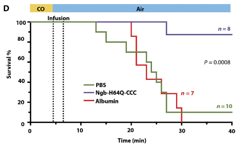
|
The experimental plan is shown at the top.
CO was given for the first 4.5 minutes (3% CO in the air), followed by "clean" air. Immediately after the CO, the drug was given -- during the time shown as "infusion".
Survival of the mice was followed for 40 days, for the drug-treated group and two control groups.
|
One group survived well; two did not. The group with high survival is the drug-treated group. Survival was 7 of 8 mice even at 40 days. Both control groups (one treated with PBS buffer and one with a control protein, albumin) showed poor survival, with 16 of 17 mice dying by day 30.
This is Figure 5D from the article.
|
The results are impressive. Other measurements, such as heart rate, blood pressure and lactic acid, support the survival observations.
What is this drug? Well, it says: Ngb-H64Q-CCC. Ngb stands for neuroglobin, another natural globin protein. It's been modified a little (genetically); that's what the rest of the name is about.
How does it work? As with other globin proteins, it has a heme that binds CO. But this one binds CO about 500 times more tightly than does hemoglobin (Hb). Biochemical experiments show that it effectively "pulls" CO off of the Hb -- which is the idea. What happens to the CO? Apparently, the Ngb is rapidly excreted, via the kidneys, with its CO attached.
The treatment with the modified Ngb is more effective in rapidly removing CO than currently available treatments. It is probably also at least as easy to administer "in the field".
The test shown above, even along with the other work in the article, leaves questions. (The article has no long term follow-up about the cognitive ability of the surviving mice.) But the authors think that the results are sufficiently encouraging that the drug should be studied further.
News stories:
* A Possible Antidote for Carbon Monoxide Poisoning. (J Bloom, American Council on Science and Health, December 8, 2016.)
* Team designs molecule that could be first antidote for carbon monoxide poisoning. (Medical Xpress, December 7, 2016.)
The article: Five-coordinate H64Q neuroglobin as a ligand-trap antidote for carbon monoxide poisoning. (I Azarov et al, Science Translational Medicine 8:368ra173, December 7, 2016.)
Added October 30, 2025.
Follow-up post: Update: A treatment for carbon monoxide poisoning? (October 30, 2025).
Previous post about carbon monoxide: Cooperation: a key to separating gases? (March 28, 2014). Links to more.
Other posts about hemoglobin include...
* Pop goes the hemozoin: the bubble test for malaria (January 24, 2014).
* Mammoth hemoglobin (February 1, 2011).
January 11, 2017
Age-related development of far-sightedness in bonobos
January 10, 2017
As people age, they lose the ability to focus at short distances. For example, they will tend to hold a newspaper further from their eyes as they age. It's rather reproducible; one can estimate a person's age from how they hold the newspaper (assuming that their vision is otherwise normal).
Bonobos don't read newspapers, but they do close-up work: grooming others. Scientists have now measured the distance a bonobo maintains from its grooming target -- as a function of age.
Here are some results...
|
The graph shows the focal distance (y-axis) vs age (x-axis).
The red points are for bonobos doing grooming. as observed in the new work.
The blue lines show the expected range for humans.
This is Figure 1B from the article.
|
It's rather clear: the results for bonobos are essentially the same as would be expected for humans.
The simple interpretation is that both human and bonobo inherited this vision-aging characteristic from a common ancestor.
For one of the bonobos, the authors happen to have a video from six years earlier. Analysis of that video, as best they can, suggests that this individual bonobo has developed farsightedness consistent with the curve shown above.
The authors note anecdotal evidence for similar farsightedness in older chimpanzees. They also note evidence for farsightedness in older rhesus monkeys, though these animals have a quite different scale for lifespan.
News stories:
* Just like humans, old bonobos suffer from long-sightedness. (M Andrei, ZME Science, November 9, 2016.)
* Aging bonobos in the wild could use reading glasses too. (Phys.org, November 7, 2016.)
Video. (0.4 minutes; no meaningful sound.) Two examples of bonobo grooming events. The bonobo at the far right is 45 years old. The one in the middle is 27. You can see the difference in the distances they maintain for grooming. A still from this video is in the article as Figure 1A; I found it hard to sort out what was in that figure. The video is clear.
The article: Long-sightedness in old wild bonobos during grooming. (H Ryu et al, Current Biology 26:R1131, November 7, 2016.)
Another post comparing bonobos and humans: The metabolic rate of humans vs the great apes: some data (August 1, 2016).
My page for Biotechnology in the News (BITN) -- Other topics includes a section on Aging. It includes a list of related Musings posts.
More apes...
* Do apes say "hello"? (September 14, 2021). Bonobos and chimpanzees.
* Is Bcbva anthrax a threat to wild populations of chimpanzees? (September 8, 2017).
* Do apes have a "theory of mind"? (February 19, 2017).
Improving soybean oil by using high voltage plasma
January 9, 2017
In the previous post (immediately below) we discussed why there is interest in reducing the content of polyunsaturated fatty acids in soybean oil, and presented one approach for doing so. We now present a second approach, also published recently. I suggest you read that post for the background, but otherwise this post substantially stands on its own.
The following figure diagrams the apparatus used in the new work to reduce the content of polyunsaturated fatty acids.
That's right, a high-voltage plasma chamber.
What's not shown there is the gas content of the chamber. It is 5% H2, 95% N2. The H2 is the "active ingredient"; the gas mixture is intended to be safe.
It is a novel way to partially hydrogenate the oil.
This is Figure 1a from the article.
|
Here are some results...
|
The graph shows the percent of each of several fatty acids (y-axis) over treatment time in the plasma chamber (x-axis).
The fatty acids listed here are the five major ones in soybean oil; their structures are shown in the previous post.
Two of the curves decline over time. These are the curves for the polyunsaturated fatty acids (18:2 and 18:3).
|
The amounts of the other fatty acids increase a little over time. Most of those are the fatty acids with fewer double bonds, as expected.
At the very bottom of the graph is a curve mysteriously labeled "a", which also increases. We'll discuss it below.
This is Figure 2 from the article. I have added labels for three of the lines; in each case, my label is just above the line.
|
Analysis shows no detectable levels of the trans fatty acids, which are commonly made during the traditional hydrogenation process. The low temperature of the new process probably explains why no trans fats are made.
The general conclusion, then, is that the primary goal is being met: the plasma treatment reduces the polyunsaturated fatty acid content, with no production of trans fats. There is a corresponding increase in the less unsaturated fatty acids. It's promising.
What about "a"? The scientists don't know what it is. They have considered some possibilities, but so far "a" doesn't match any of them. It's probably fairly routine chemistry to figure out what "a" is. Until then, it is a question mark, one that may or may not be important.
Let's make a few points comparing the work of this and the previous post.
* One method develops a new plant, whereas the other modifies the oil once collected. The latter is more flexible, and corresponds to the older practice of partial hydrogenation of the oil.
* The older practice of partial hydrogenation was abandoned (for food use) when it was realized that one of its products (the trans fats) was undesirable. In that context, the mystery component "a" above is of potential concern. (Of course, a genetic modification of the plant could produce an undesirable component.)
* At face value, the genetic manipulation is more effective in reducing the content of polyunsaturated fatty acids. However, the plasma method is new, and subject to further development.
* We have little information on the economics of either process at this point. The authors note that their plasma process uses less energy than the traditional hydrogenation process, but that would be only one part of the analysis.
For now, it is perhaps best just to note that the two approaches are tools, and are under development.
News story: Plasma-zapping process could yield trans fat-free soybean oil product. (J Merzdorf, Purdue University, December 1, 2016. Now archived.) From the lead institution.
The article: High-voltage Atmospheric Cold Plasma (HVACP) hydrogenation of soybean oil without trans-fatty acids. (X V Yepez & K M Keener, Innovative Food Science and Emerging Technologies 38:169, December 2016.)
Related post, immediately below: Improving soybean oil by gene editing (January 8, 2017). See that post for some general cross-links.
Another application of plasma: Using a plasma to kill norovirus (June 5, 2015).
For more about lipids, see the section of my page Organic/Biochemistry Internet resources on Lipids. It includes a list of related Musings posts. It also includes some links to items about trans fats.
Improving soybean oil by gene editing
January 8, 2017
Fatty acids differ in their chain length and the number of double bonds. (They may also differ in the position of the double bonds, but that is not an issue here.) These features affect various properties -- physical, chemical, and biological.
Plant "oils" are typically high in fats with double bonds -- called unsaturated fatty acids. In fact, some have a high content of fatty acids with more than one double bond -- the polyunsaturated fatty acids.
The polyunsaturated fatty acids are more easily oxidized, becoming rancid. Related to that, they are not suitable for baking. In the old days, scientists developed ways to reduce the content of polyunsaturated fatty acids, by partial hydrogenation: converting some of the double bonds to single bonds by reaction with hydrogen. It worked, but, as a side effect, also produced a novel type of fatty acid, called trans fatty acids (or trans fats). These have a double bond, but it is oriented the wrong way. It turns out that trans fatty acids are bad for people, and they have been substantially eliminated from foods,
That leaves a question: How can we use highly polyunsaturated plant oils, such as soybean oil, for applications where that feature is undesirable? Two recent articles address this, with very different approaches. We'll present one of them in this post, and one in the following post.
The first approach is a variation of an old standby: genetics. Develop a soybean plant that makes a lower level of the polyunsaturated fats. What makes the new work novel is that the scientists do it with the relatively new tool of gene editing. They use TALENs, not the newer CRISPR, but the basic idea is the same. Gene editing allows targeted knock-out of a specific gene. In this work, the scientists knock out three genes, sequentially, to achieve the desired strain.
The following figure shows the relevant fatty acids, and gives an idea of the results...
|
The first fatty acid shown, palmitic acid, has a 16-C chain, with no double bonds (C=C). In shorthand, it is 16:0; the two numbers give the number of C atoms and the number of double bonds. The other fatty acids all have 18 C, with 0-3 double bonds. thus they are 18:0 through 18:3.
The columns at the right show the composition of the oil from two soybean strains. One is the original (wild type; WT) strain. The other is a strain the scientists made in which the enzyme FAD2 has been removed by gene editing (fad2-1). FAD2 is the major enzyme that introduces the second double bond, as shown in the left side with the fatty acid structures.
|
The new strain has a greatly reduced content of linoleic acid (18:2); there is a corresponding increased content of oleic acid (18:1). This is what you would expect.
FAD stands for fatty acid desaturase.
Soybean contains two major genes for FAD2. Making the strain deficient in this enzyme required knocking out both of them. (Actually, soy contains a third gene for this step, but it has little effect on oil production.)
This is Figure 1a from the article.
|
That's the idea. That shows how gene editing can reduce the content of polyunsaturated fatty acids in a common plant oil.
Interestingly, all that was done prior to the current work. The same team of scientists now goes further... Using an additional round of gene editing, they remove the enzyme FAD3, shown as the enzyme between linoleic and linolenic acids (18:2 and 18:3). This reduces the level of polyunsaturated fatty acids even further, to about half the level shown above for the fad2-1 strain. (I chose to use the figure above because it is so clear, and it fully illustrates the idea, though not the final result.)
The work shows that it is practical to edit multiple genes to develop the intended characteristics. In this case, the early work edited two genes, and the current work edits a third gene.
We'll discuss another approach to reducing the content of polyunsaturated fatty acids in the next post, and then comment on the two articles together.
News story: Gene editing used to produce soybean oil with less trans fats. (Genetic Literacy Project, October 20, 2016.) This seems to consist entirely of selected excerpts from the article. That's ok, but it is misleadingly labeled, claiming more than that. The Genetic Literacy Project should do better than this. (To be clear, the content is ok, but the integrity is not.)
The article, which is freely available: Direct stacking of sequence-specific nuclease-induced mutations to produce high oleic and low linolenic soybean oil. (Z L Demorest et al, BMC Plant Biology 16:225, October 13, 2016.)
Related post, immediately above: Improving soybean oil by using high voltage plasma (January 9, 2017).
A previous post about work using TALENs: Polled cattle -- by gene editing (July 8, 2016).
A previous post about editing multiple genes. This used CRISPR, which is commonly regarded as easier to use. But it also targeted closely related genes, so a single guide could target many genes. In fact, editing the entire set of genes required only two guides. How to do 62 things at once -- and take a step towards making a pig that is better suited as an organ donor for humans
(January 17, 2016).
A post that includes a complete list of posts on gene editing (including using TALENs): CRISPR: an overview (February 15, 2015).
More about linoleic acid: Cats, fats, and Toxoplasma. And mice. (October 21, 2019).
For more about lipids, see the section of my page Organic/Biochemistry Internet resources on Lipids. It includes a list of related Musings posts. It also includes some links to items about trans fats.
Previous post about soybeans: Effect of food crops on the environment (November 20, 2015).
More...
* How soybeans set up shop for fixing nitrogen -- and how we might do better (December 2, 2019).
* A sticky pesticide (June 21, 2019).
More gene knockouts: Cataloging gene knockouts in humans (July 10, 2017).
Implementing improved agriculture
January 6, 2017
Scientists figure out ways to make things better, such as improving agricultural productivity. Do the improvements actually get implemented out in "the real world"?
A recent article shows how one university facility, in cooperation with the government, made a special effort to develop and implement improvements at the local level. The work here is about small farmers in rural China. The agricultural scientists lived in the community, and worked closely with the farmers to determine the local issues and help guide improvements.
The following graph summarizes the results...
|
The graph shows the agricultural productivity for three groups over several years.
The productivity is shown (y-axis) as the total yield of corn and wheat, in Mg/ha; that is megagrams (or tonnes) per hectare.
For each year, there are three bars. The left (red) bar is for the experimental station, the university "lab" where innovations were developed. The other two bars are for the local farmers. The middle (green) bar is for the best ("elite") farmers; the right (yellow) bar is the county average.
|
For each year, the productivity of the experimental station is set to 100%. That is not shown, but the bars for the local farmers are labeled with their percentage relative to the experimental station for that year.
For the first year shown (2008-9), the local farmers got about 65% of the productivity of the experimental station.
After that baseline year, the experimental station began a program to work with local farmers. You can see that both the absolute production (the bar height) and the percentage relative to the station were higher in the following years.
This is Figure 3 from the article.
|
Agricultural productivity varies from year to year, for many reasons, including weather. You can see some fluctuations in the graph above. Unfortunately, we have only one year used here as baseline. If that just happened to be a poor year, it could lead to a bias in the conclusions here. We have no way to address that, and will just accept the story at face value from the given data.
The article also includes data beyond the yield. Issues include fertilizer and water use, and labor requirements.
The work here can also be examined as part of the "big picture". Are the short term gains reported here due to changes that are wise in the long run? Is tweaking production of the current crops even the right question? Those are good questions. However, the goal of the current work was precisely to make short term improvements, so don't change the rules during the game. What such criticisms do is to remind us that the food supply issue is a big problem, with many aspects.
The nature of the results should not be a surprise. Nevertheless, it is good to see active effort to implement improvements, and data to support the effort. The article notes that such collaborative efforts are now active in 71 provinces, It is also good to see the broader issues being raised.
News story: Transferring innovation from universities to farms. (SciDev.Net, September 14, 2016.) Includes some discussion of the limitations of the work.
* News story accompanying the article: Food security: A collaboration worth its weight in grain. (L H Samberg, Nature 537:624, September 29, 2016.) The author of this item is quoted in the news story listed above, with some emphasis on her being skeptical of the significance of the work. Her own story here is more balanced and more thorough. For those who want to delve into this further, this story could be a good place to start.
* The article: Closing yield gaps in China by empowering smallholder farmers. (W Zhang et al, Nature 537:671, September 29, 2016.)
Also see...
* Why growing maize (corn) is bad for us (June 25, 2019).
* Doggy bags and the food waste problem (January 4, 2017). That's the post immediately below.
* Can growing rice help keep you from becoming WEIRD? (July 22, 2014). More about agriculture in China.
* What is the proper use of crop land? (August 23, 2013).
My page Internet resources: Biology - Miscellaneous contains a section on Nutrition; Food safety. It includes a list of related Musings posts.
January 4, 2017
Doggy bags and the food waste problem
January 4, 2017
It is generally recognized that there is a food shortage, which will only get worse as the population continues to increase. Interestingly, a lot of food gets wasted -- at various stages, from losses on the farm to the home -- or restaurant. One solution to the food shortage is to waste less food.
A new article addresses one part of the food waste problem, with some intriguing observations.
We like it when a restaurant serves generous portions. But those generous portions may encourage both over-eating and waste. What do you do with the food left after a generous meal? One option is to take it home; after all, you have paid for it. Most restaurants will provide a container; it's often called a doggy bag. (It sounds better to say that we'll take it home for the dog. But it doesn't matter who eats it; we all share substantially the same food supply.)
The article explores attitudes toward the use of doggy bags in two European countries. 20 consumers in each country were asked a series of questions. The article is quite informal. Everything is presented as narrative, with no tables summarizing the results. But the major findings were interesting.
So what did the scientists find? On the one hand, most people were opposed to wasting food, and they liked the concept of the doggy bag. On the other hand, those same people thought it was not socially acceptable to ask for their left-over food to be packaged for them -- especially in higher class restaurants. Interestingly, many thought that doggy bags were not appropriate for the food of their country, though it might be for others.
The authors summarize the findings as indicating that people's personal values favor the use of doggy bags, but that they perceive it as against social norms. A paradox, as the authors note. And that is what makes the article interesting. It's interesting sociology.
Neither country involved in the study has a tradition of using doggy bags. One is starting a program to reduce food waste. The results here suggest that there will be barriers to reducing the wastage of food that has been served.
Perhaps it should be restaurant policy to offer customers doggy bags. (The authors suggest this.) Now, should that be mandated by law?
The study here is small. It is reasonable to think of it as raising some issues, rather than providing final answers.
Editorial, which is freely available: Researchers serve up suggestions to reduce food waste. A change in cultural and social factors -- such as overcoming a distaste for doggy bags -- will be required to shift people's behaviour. (Nature, 540:8, December 1, 2016.) It was posted at the Nature News site the previous day.
The article: Understanding the antecedents of consumers' attitudes towards doggy bags in restaurants: Concern about food waste, culture, norms and emotions. (L Sirieix et al, Journal of Retailing and Consumer Services 34:153, January 2017.)
More about the food supply:
* Implementing improved agriculture (January 6, 2017). Immediately above.
* What is the proper use of crop land? (August 23, 2013).
More about sharing with the dog:
* Sharing microbes within the family: kids and dogs (May 14, 2013).
* It's a dog-eat-starch world (April 23, 2013).
More about bags: How to fold a bag (May 13, 2011).
An artificial hand that can tell if a tomato is ripe
January 3, 2017
A new article, in the first issue of a new journal, reports interesting progress in the development of an artificial hand.

|
A Cornell University graduate student, and co-author of the article, shakes hands with a robot.
This is trimmed from the figure in the Cornell news story. It may be the same as Figure 4B of the article. The full Fig 4 shows several pictures of the hand in use.
Their figure legend: "Doctoral student Shuo Li shakes hands with an optoelectronically innervated prosthesis."
|
Hands are much more complicated than feet. Hands have a sophisticated ability to hold (grip) things, and that is coupled with a complex sensory ability. Designing artificial hands that can mimic those abilities has been a continuing challenge.
The key step in the new work is to make use of optical systems in detecting sensory signals.
Here's the idea...
A diagram of a finger.
Note the three lights (LEDs, red) at the lower right, and the three detectors (photodiodes, yellow) just to their left.
Look carefully, and you will see there is an inverted-U structure from the front LED to the front photodiode. That is a waveguide for the light. In fact, there is such a waveguide between each light and its detector at the other end.
The design of the waveguides is such that these fingers can rapidly and sensitively detect small changes in the shape of the finger. Such changes would reflect, for example, touching something, causing deformation of the finger.
The waveguide at the finger bottom (or "back", in the figure) has a special role. It is on the palm side. This waveguide is in the position to sense touch at the finger tip.
Ignore "plane A" for our purposes. The full figure shows a cross-section of the finger at this plane.
This is part of Figure 1E from the article.
|
|
There are several movie files posted with the article, as Supplementary Materials. Most involve technical specifications, and they are not well-labeled. But do check out Movie S7, Object recognition (0.5 minute; no sound). It shows the robotic arm distinguishing three tomatoes and choosing the ripest one, by softness.
Measuring changes in the waveguide -- in the light path -- is a way to measure changes in the shape of the hand. That effectively makes it a way to measure touch. Recent developments in fabrication technology have made the waveguides practical. The authors argue that the optical system, with its rapid response, is an improved way to measure touch.
The hand is shown above as part of a robot. However, it could also be part of a human. It is being developed with both goals in mind: robotic hands, and prosthetic hands for humans.
News stories:
* A robotic hand with a human's delicate sense of touch. (Kurzweil, December 16, 2016.)
* Engineers get under robot's skin to heighten senses. (T Fleischman, Cornell Chronicle, December 8, 2016.) From the university.
The article: Optoelectronically innervated soft prosthetic hand via stretchable optical waveguides. (H Zhao et al, Science Robotics 1:eaai7529, December 6, 2016.)
The first post on prosthetic arms and hands: Prosthetic arms (September 16, 2009).
A post that focused on the issue of touch: eSkin: Developing better sense of touch for artificial skin (November 29, 2010).
There is more about replacement body parts on my page Biotechnology in the News (BITN) for Cloning and stem cells. It includes an extensive list of related Musings posts.
There is more to a good tomato than just softness... The chemistry of a tasty tomato (June 18, 2012).
More tomatoes... Could tomatoes be used as the source of a common drug for Parkinson's disease? (April 24, 2021).
Next post about robots... A robot that can feed itself (February 3, 2017).
Top of page
The main page for current items is Musings.
The first archive page is Musings Archive.
E-mail announcements -- information and sign-up: e-mail announcements. The list is being used only occasionally.
Contact information
Site home page
Last update: May 6, 2026