Home
> Musings: Main
> Archive
> Archive for May-August 2017 (this page)
| Introduction
| e-mail announcements
| Contact
Musings: May-August 2017 (archive)
Musings is an informal newsletter mainly highlighting recent science. It is intended as both fun and instructive. Items are posted a few times each week. See the Introduction, listed below, for more information.
If you got here from a search engine... Do a simple text search of this page to find your topic. Searches for a single word (or root) are most likely to work.
Introduction (separate page).
This page:
2017 (May-August)
August 30
August 23
August 16
August 9
August 2
July 26
July 19
July 12
July 5
June 28
June 21
June 14
June 7
May 31
May 24
May 17
May 10
May 4
Also see the complete listing of Musings pages, immediately below.
All pages:
Most recent posts
2026
2025
2024
2023:
January-April
May-December
2022:
January-April
May-August
September-December
2021:
January-April
May-August
September-December
2020:
January-April
May-August
September-December
2019:
January-April
May-August
September-December
2018:
January-April
May-August
September-December
2017:
January-April
May-August: this page, see detail above
September-December
2016:
January-April
May-August
September-December
2015:
January-April
May-August
September-December
2014:
January-April
May-August
September-December
2013:
January-April
May-August
September-December
2012:
January-April
May-August
September-December
2011:
January-April
May-August
September-December
2010:
January-June
July-December
2009
2008
Links to external sites will open in a new window.
Archive items may be edited, to condense them a bit or to update links. Some links may require a subscription for full access, but I try to provide at least one useful open source for most items.
Please let me know of any broken links you find -- on my Musings pages or any of my regular web pages. Personal reports are often the first way I find out about such a problem.
August 30, 2017
Fixing nitrogen -- can U help?
August 29, 2017
Nitrogen is an important part of life. There is an abundant supply of nitrogen: about 80% of air is nitrogen. However, it is the form of N2, which is very unreactive.
There are processes for "fixing" nitrogen: converting if from the N2 in the air to something useful, such as ammonia, NH3. Both the biological and industrial processes of nitrogen fixation require considerable energy, simply to break the triple bond in the raw material.
A recent article may open up a new approach. The scientists take steps toward developing a process for fixing nitrogen under mild conditions, at room temperature.
The following figure shows the idea. Caution.. In discussing the figure we will see a lot of oxidation states (or charges) on individual atoms. They are not easy to figure out from the figure. They are based, in part, on additional evidence not presented here. It will be good if, at the end, you see how the oxidation states changed, but otherwise don't get bogged down with them.
|
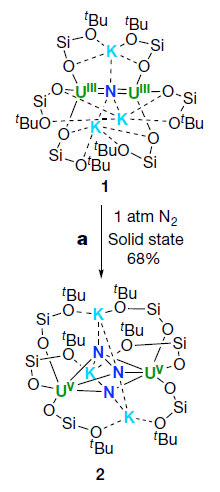
Compound 1, at the top, is the central player. It's complicated; just focus on a few atoms, shown in color.
There are two uranium atoms, in green. They are labeled UIII, meaning that they are in oxidation state +3.
There is a nitrogen atom (dark blue) between the two U atoms. That N is -3.
There are three potassium atoms (light blue) around that N. They are common K cations, +1.
The rest is just scaffolding.
Now look at the reaction... Expose that compound 1 to nitrogen gas, at atmospheric pressure and room temperature. They react to form compound 2, shown at the bottom.
What's the difference? First, there are now three N in the product. The top two are bonded together. That's the N2 that reacted. The two N are still together, but they are also bonded to other things. At least, that stable triple bond of the N2 has been broken. Those two N are now -2 each.
And the two U are now +5 each, UV.
This is part of Figure 2 from the article.
|
Overall, the N2 from the air has been incorporated into the big molecule. The very stable N2 has been partially broken; that's a big step.
The two N atoms of the original N2 have been reduced from 0 to -2. That is, they gained a total of four electrons. From where? From the uranium atoms, each of which was oxidized from +3 to +5.
And it all happened under quite mild conditions. That's what makes this of interest.
What next? The scientists try various things, with limited success. They add hydrogen gas, and make NH3. That would be nice, but it really isn't very efficient. They try other things; the full Figure 2 shows some of them (often without all the details). It shows there are possibilities.
Using uranium to reduce atmospheric nitrogen gas isn't a totally new idea. Fritz Haber was aware of the possibility a century ago. The new work seems to be the first case where a specific well-defined U compound has been shown to reduce N2 under mild conditions. It's a start; the scientists think it is the basis for further development.
News story: A uranium-based compound improves manufacturing of nitrogen products. (Phys.org, July 19, 2017.)
The article: Nitrogen reduction and functionalization by a multimetallic uranium nitride complex. (M Falcone et al, Nature 547:332, July 20, 2017.)
More nitrogen fixation...
* A better way to make ammonia, using lithium? (July 19, 2021).
* Using light energy to power the reduction of atmospheric nitrogen to ammonia (May 20, 2016).
* How soybeans set up shop for fixing nitrogen -- and how we might do better (December 2, 2019).
* The downside of nitrogen fixation? (November 4, 2017).
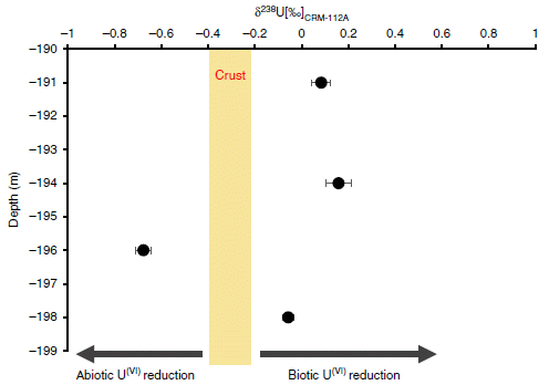
A recent U post: Role of biological processing in the formation of a uranium ore (June 30, 2017).
A post about another triple bond... A new form of carbon: C18 (September 24, 2019).
This post is listed on my page Introductory Chemistry Internet resources in the section Lanthanoids and actinoids.
The Paris climate agreement: How are we all doing?
August 28, 2017
The two posts preceding this (immediately below) are about aspects of the science and economics of climate change. In both cases, the message may be that the story is more complex than we might have thought.
At least we have the Paris agreement. The countries of the world have come together and agreed to solve the problem, or at least to make good progress. Right. That story, too, may be more complex than we might have thought.
The "essay" (or "comment" story) listed below caught my attention in that spirit. It's a provocative discussion of the nature of the Paris agreement and the action following. I encourage you to read it.
Comment story, freely available: Prove Paris was more than paper promises -- All major industrialized countries are failing to meet the pledges they made to cut greenhouse-gas emissions. (D G Victor et al, Nature 548:25, August 3, 2017.) The authors are from the US, EU and Japan (as listed at the end). That explains their emphasis on those areas.
The two posts immediately below are on climate change issues.
More about climate change: Climate change and sea level (October 2, 2017).
Aerosols and clouds and cooling?
August 27, 2017
You've probably heard that aerosols help cool the Earth, in part by their effect on clouds. That may be, but there is considerable uncertainty about how much effect they have.
A recent article reports some interesting results that help scientists test the effect of aerosols on clouds. The article is based on measurements made during an eruption of a volcano in Iceland. For six months, Holuhraun emitted sulfur dioxide into the atmosphere at a rate about equal to the entire SO2 emissions of the European Union. This is a fissure eruption, with a steady, non-explosive release of material through cracks in the volcano wall.
The resulting SO2 plume was easily tracked. The scientists have good data about how much SO2 was released. The question is, what were its effects? Here are a couple of examples...
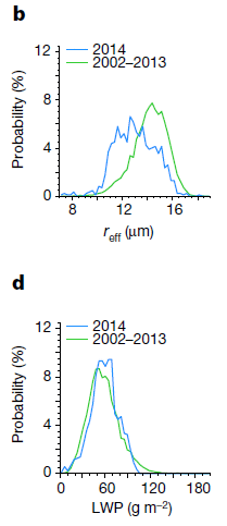
|
Frame b (top) shows the droplet size in the clouds for two time periods
The y-axis is the fraction of droplets at various sizes, as shown on the x-axis. reff is the effective radius of a droplet.
The two time periods are
- 2014 (blue), much of which included the eruption;
- 2002-13 (green), prior to the eruption.
The pattern is clear: the droplets were smaller in 2014. One way to see this... The peak of the curve for 2014 is about 12 µm; for the preceding reference (or "control") years, it is about 14 µm.
Frame d (bottom) is similar, except that what is plotted on the x-axis is the LWP. That's the liquid water path. It is the amount of water in a vertical column of a given area. (That's why it is in grams per square meter. Imagine a square meter area; the LWP is all the water in that area, regardless of how high it is (near the top of the cloud, or near the bottom).
The LWP is about the same for both periods.
This is from Figure 2 of the article.
|
To summarize, the two graphs above show that 2014 led to smaller droplets in the clouds, but no significant change in the amount of water.
The first result was expected, due to the major injection of SO2-based aerosols from the volcano. The second result was contrary to some expectations; many models suggest that aerosols have effects on clouds beyond simply changing drop size. The current work shows no evidence for such additional effects.
(The smaller drop size leads to greater reflectance. That is, it leads to cooling by reflecting the incoming sunlight. The effect is small.)
There is much about the article that is confusing, apparently even to experts in the field. The authors note that they do not know how general their result is. Therefore, conclusions must be tentative. That's fine. That's how science works. There are various models of what might happen. People collect data. We now have one data set on this matter. Is it representative? The only way to know is to get more data.
For the sake of discussion, let's accept the result here. It says that clouds are less affected by aerosols than some thought. As noted, current models for the effects of climate change have different predictions on this point. The results will help refine climate change modeling.
The authors also note that it may really be ok to clean up aerosol pollution. There has been some concern that doing so might enhance warming; if the current results hold, that may not be important.
News stories:
* Role aerosols play in climate change unlocked by spectacular Icelandic volcanic eruption -- Cloud systems 'well buffered' against aerosol changes in the atmosphere, research shows. (Science Daily, June 21, 2017.)
* Volcano reveals simpler than expected cloud-climate response to tiny aerosol particles. (R Allan, Climate Lab Book, July 7, 2017.) By an author of the article. The comment section at the end of the page is fairly high quality; this seems to be a page for experts. But also note that the conclusions are not clear.
* News story accompanying the article: Climate science: Clouds unfazed by haze. (B Stevens, Nature 546:483, June 22, 2017.)
* The article: Strong constraints on aerosol-cloud interactions from volcanic eruptions. (F F Malavelle et al, Nature 546:485, June 22, 2017.)
A post about aerosols and climate change: Why isn't the temperature rising? (September 12, 2011).
More about aerosols...
* Atmospheric aerosols from passive (non-erupting) volcanoes -- a re-evaluation (February 13, 2023).
* Predicting the "side-effects" of geoengineering? (September 23, 2018).
* Reducing diesel emissions from ships (March 3, 2018).
More about sulfur pollutants: The importance of HPMTF in the atmosphere (June 9, 2020).
There are three consecutive posts in the broad area of climate change: this one, and the ones immediately above and below.
More from Iceland: How horses learned to walk (September 21, 2016).
More about volcanoes: How frequent are volcanic eruptions that are truly catastrophic? (April 10, 2018).
Economic analysis of the damages (and benefits) from climate change
August 26, 2017
Climate changes. What difference does it make? Well, various things may happen.
Does it really matter?
One way to address that question is to do an economic analysis. What are the economic consequences of the changes? Not just the effect on one group, but overall, considering all possible effects. That's a standard approach in economics.
A new article presents a new economic analysis of climate change. It's probably the most advanced economic modeling yet developed in this field. One feature is that it addresses a quite fine scale: counties in the United States.
Here is an example of the results...
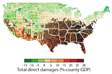
|
The map shows the economic effect of climate change from one model, projected to 2080-2099. The map is by county for the contiguous United States.
The effect is the projected change in gross domestic product (GDP). The magnitude is color-coded; see the key at the bottom. Reds show damage, greens show negative damage -- that is, benefit.
The big picture is clear: economic damage as high as 28% in the southeastern part of the country; economic benefit -- as high as 13%, but usually smaller -- in the north.
|
This is Figure 2I from the article. Parts A-H of the full figure each show a similar map for one type of effect. Those effects are agricultural yields, mortality rates, electricity demand, labor supply -- exposed to outdoor climate or not, coastal storms, property-crime rates and violent-crime rates. The map here, part I, shows the overall effect (with all the effects converted to economic terms, and weighted appropriately).
|
What's the model? It's complex, of course. If you want a sense of the design, here is a figure that gives an overall diagram of the model: The model [link opens in new window]. It shows the major modules in the model, and the types of data that go into the calculations.
This figure is from the news story by Pizer accompanying the article.
What do we make of this? Such models are one approach to seeing the consequences. But be careful. The model is intended to be comprehensive, or at least to show major effects. Maybe it is, or maybe not. The model makes assumptions, and uses data. Some of the assumptions may be wrong, or at least subject to differences in opinion. Outputs from such models are not objective facts. But they can be useful.
A simple example... The figure above shows that the economic damages vary with location. In fact, some places will benefit from a warmer climate. That's neither new nor surprising, but it is a point that sometimes gets lost in the rhetoric. The overall economic damage for the US is fairly small, according to their model: about 1.2% of GDP per degree (Celsius). But that small overall number hides huge effects, which are important.
One use of modeling is sensitivity testing. How do the results depend on various assumptions? For example, how much difference does it make whether the growing season in the north is extended by 5 days or 10 days? This kind of analysis is useful in understanding a complex system.
Modeling such as this should be part of the dialog. It is one tool for helping us project the future. Models should be critiqued and developed. In fact, the authors note that their model is flexible, making it easy to add features and data.
News stories:
* The American South Will Bear the Worst of Climate Change's Costs -- Global warming will intensify regional inequality in the United States, according to a revolutionary new economic assessment of the phenomenon. (R Meyer, The Atlantic, June 29, 2017.)
* Study maps out dramatic costs of unmitigated climate change in the U.S.. (K Maclay, University of California Berkeley, June 29, 2017.) From one of the institutions involved in the work.
* News story accompanying the article: Economics: What's the damage from climate change? -- Improved damage models put social cost of carbon estimates on a firmer footing. (W A Pizer, Science 356:1330, June 30, 2017.) A good, very readable overview of the work, including its strengths and limitations.
* The article: Estimating economic damage from climate change in the United States. (S Hsiang et al, Science 356:1362, June 30, 2017.) Check Google Scholar for a freely available copy. The article, too, is quite readable, perhaps surprisingly so given the inherent complexity. The authors describe the big issues, and spend considerable time discussing the uncertainties. Of course, there is vast detail about the modeling that is beyond the content of the article itself.
Most recent post on climate change: Was there a significant slowdown in global warming in the previous decade? (May 30, 2017).
There are three consecutive posts in the broad area of climate change: this one, and the two immediately above (August 27 and 28).
Among many posts about global warming...
* Global warming trend? Independent evidence (March 22, 2013).
* Global warming (August 3, 2008). Winners and losers.
More maps: A mosquito map for the United States (October 3, 2017).
August 23, 2017
Evidence for brain damage in players of (American) football at the high school level
August 23, 2017
Musings has discussed the problem of long term implications of head injuries for those who play (American) football [link at the end].
A new article adds to the data, with some evidence that those who play only at the high school level may be at risk.
The heart of the new work was to examine the brains of 202 people that had been donated to a brain bank. The criterion for inclusion in the current study was that the person had played football.
It's important to emphasize that this is not in any way a random sample. It is likely that the donation of a brain was influenced by the person having difficulties. (Most commonly, the brain is donated by the family after death. It is also possible for a person to register that their own brain be donated upon death.)
The brains were examined "neuropathologically" in the lab. Tissue slices were stained in various ways, and examined with a microscope. Standard procedures. The brains were scored for chronic traumatic encephalopathy (CTE).
Here is a summary of the findings.
| Highest level of play
| Total
| Mild CTE
| Severe CTE
|
| Youth
| 2
| 0
| 0
|
| High school
| 14
| 3
| 0
|
| College
| 53
| 21
| 27
|
| Semi-pro
| 14
| 4
| 5
|
| Canadian Football League
| 8
| 1
| 6
|
| (US) National Football League
| 111
| 15
| 95
|
| Total
| 202
| 44
| 133
|
The table shows how many of the brains examined showed signs of mild or severe CTE.
To illustrate how to read the table... Look at the row for the (US) National Football League (NFL). 111 of the brains examined were from people who had played in the NFL. Of these, 15 were found to have mild CTE, and 95 were found to have severe CTE. That's a total of 110 out of 111 that showed some signs of CTE.
Now look at the row for high school. This means that the highest level of football for the person was high school. Out of 14 brains examined at this level, three had CTE, at the "mild" level.
This is largely from Table 1 of the article. The numbers for the "Total" column are taken from the text on the preceding page. The full table includes other information about the people, including standard demographics and what position they played. CTE is more prevalent in lineman than in kickers. No surprise there.
The big trend is that players who have gone on to higher levels of football have more CTE.
Perhaps the most intriguing, or even most important, finding is that for the high school level. Even those who played football only through high school are at risk for CTE. As noted before, we can't make anything of the statistics because of the nature of the sample. Nevertheless, the results here suggest there is some association. This may be the first evidence that playing high school football can lead to long term brain problems.
News stories:
* High prevalence of evidence of CTE in brains of deceased football players. (Science Daily, July 25, 2017.)
* Will New CTE Findings Doom the NFL Concussion Settlement? (M McCann, Sports Illustrated, August 15, 2017.) This is a discussion of the implications of the new findings for a recent legal settlement between the NFL and the players regarding compensation for concussion injuries. The author of this page is a lawyer.
(The author byline on the page notes an upcoming symposium on the topic. It is September 13, and may be available on the web. I have not checked further, but a link is provided.)
* Editorial accompanying the article: Advances and Gaps in Understanding Chronic Traumatic Encephalopathy From Pugilists to American Football Players. (G D Rabinovici, JAMA 318:360, July 25, 2017.)
* The article: Clinicopathological Evaluation of Chronic Traumatic Encephalopathy in Players of American Football. (J Mez et al, JAMA 318:360, July 25, 2017.)
Background post: Early detection of brain damage in football players? A breakthrough, or not? (September 14, 2015).
More... Comparing the death rates of American football and baseball players (July 2, 2019).
More about trauma:
* Studying concussions in egg yolks (February 28, 2021).
* Head injuries in Neandertals: comparison with "modern" humans of the same era (February 22, 2019).
* Type O blood and survival after severe trauma? (July 7, 2018).
There is a section of my page Biotechnology in the News (BITN) -- Other topics on Brain. It includes a list of related Musings posts.
There is now an extensive list of sports-related Musings posts on my page Internet resources: Miscellaneous under Sports.
Sparing glucose for athletic endurance
August 21, 2017
If one does long-distance running, at some point you "run out of juice". Almost literally. You run out of glucose. Exercise training allows one to extend the time you can endure the activity; the body spares the glucose for its critical role. If you don't know what that critical role is, you may be surprised; more about that later.
A recent article explores the mechanism of how glucose can be spared, allowing extended endurance activity. It does this by using a drug that mimics the effect of the exercise training.
Some results... In the experiment here, mice were tested on a treadmill to see how long they could run. These were mice that had not trained for exercise; that is, they were considered "sedentary" mice.
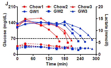
|
The solid lines on the graph show blood level of glucose (y-axis; left-hand scale) vs time (x-axis) during the treadmill run for the mice.
The dashed lines, near the bottom, are for lactic acid; see the right-hand scale.
The general trend for all the glucose lines is that glucose was maintained near 140 mg/dL for some time. It then declined, eventually falling below 70 -- a critical level below which the mice could no longer run.
|
The red lines are for control mice, fed regular chow. The blue lines are for mice given a drug called GW (short for GW501516).
The general result is that the glucose decline occurred later for all the blue curves -- for the mice given GW. It looks like the GW allowed the mice to run about an hour longer, on average; that's about 30%.
The lactic acid data show that all the curves are similar. That is, lactic acid is not an issue here. It's not the muscles running out of fuel that causes the mice to stop.
This is Figure 2J from the article.
|
The experiment shows that the drug GW increases athletic endurance, as judged by this treadmill test. In that sense, the drug mimics exercise training.
What's happening? The key player is a protein called PPARδ. That's short for peroxisome proliferator-activated receptor delta. Don't worry about that archaic name; you can just say "p-par-delta". PPARδ is a transcription factor, which regulates certain genes. Of relevance here, it regulates metabolism in muscle cells. When PPARδ is activated, the muscle cells switch to using more fat and less glucose as fuel. The glucose remains available to fuel the brain, which uses only glucose (but not fat). It's the brain running out of glucose that limits endurance exercise; sparing glucose in the muscles allows the brain to endure longer.
Much of the story has been known. Exercise training leads to that shift in muscle metabolism. What's new here is finding a small molecule, a "drug", that can activate PPARδ and spare the glucose for the brain.
It's not quite so simple. Earlier work had shown that the GW drug led to some of the effects, but, by itself, did not increase endurance. The current work used a higher dose of the drug, fed over a longer time. That resulted in improved endurance, as shown above. How many pieces are there to this story?
GW may be a useful tool for probing what happens during exercise training.
Or maybe the drug can just replace the exercise.
News stories:
* "Exercise in a Pill" Boosts Athletic Endurance By 70 Percent. (Neuroscience News, May 5,2017.) (The 70% number comes from Figure 2I. I see more like 30% from the figure above, but that is a rough estimate from the graph. The number doesn't really matter much for now. It's a substantial improvement.)
* The science of 'hitting the wall'. (EurekAlert!, May 2, 2017.)
The article: PPARδ Promotes Running Endurance by Preserving Glucose. (W Fan et al, Cell Metabolism 25:1186, May 2, 2017.)
Among posts on exercise:
* High-performing athletes: might they have performance-enhancing microbes in their gut? (June 28, 2019).
* Measuring the level of a non-existent hormone (April 10, 2015). Note that there is a rebuttal post for this.
* Would wild mice use an exercise wheel? (July 11, 2014).
* Why exercise is good for you, BAIBA (March 10, 2014).
* See cat run (March 14, 2012).
More about endurance running: Should you run barefoot? (February 22, 2010).
There is now an extensive list of sports-related Musings posts on my page Internet resources: Miscellaneous under Sports.
Largest field trials yet... Neonicotinoid pesticides may harm bees -- except in Germany; role of fungicide
August 20, 2017
Musings has discussed bee problems in numerous posts. A broad concern is population declines, sometimes called colony collapse disorder (CCD). A more specific issue is the use of a class of pesticide called neonicotinoids, nicknamed neonics ("neo-nics"). These pesticides are the subject of regulatory debates, because they may harm bees. The underlying biological data are mixed. Lab experiments show that they can harm bees; the issue is whether they actually do so under field conditions. There is a link to one background post on these issues at the end.
Two recent articles, published together, add to the evidence, and perhaps to the confusion. One of them may offer a glimmer of clarification. Let's look at them, in turn.
Article 1
Article 1 reports what is probably the most extensive field trial of the effect of neonic pesticides on bees yet done... Two neonic pesticides, tested at multiple sites in three countries. Fourteen parameters measured.
Here is a summary of the results...
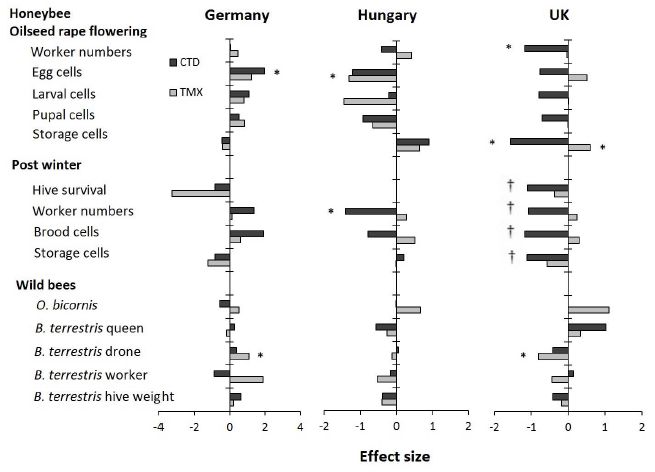
The table lists fourteen parameters at the left. The first two sets of parameters relate to honeybees; the third set relates to two types of wild bees.
The remaining columns are for the results for the three countries. (There were 3-4 sets of sites per country, where a set of sites includes one for each of the three treatments: control and two neonic pesticides.)
There are two neonic pesticides: clothianidin (CTD; dark bars) and thiamethoxam (TMX; light bars).
For each parameter-country-pesticide combination there is a result. That is, there are 14 (parameters) * 3 (countries) * 2 (pesticides) = 84 results possible. The results are all shown normalized: effect size, in standard deviations.
The big picture? Look for the asterisks; they mark results that are found to be statistically significant (p = 0.05).
Eight results have an *. There are two * for Germany, both showing that the pesticide was beneficial to the bees. There are two * for Hungary, both showing that the pesticide was harmful to the bees. And there are four * for UK, three showing harm and one showing benefit.
That is, few of the results are significant, and those that are significant do not yield any consistent picture. Except that the pesticides are beneficial in Germany but harmful in Hungary (and probably in the UK).
One group of results, for "post winter" for the UK, is marked with daggers (†). Survival was so poor for all conditions that there is no meaningful analysis.
This is Figure 2 from article 1.
|
What's going on? Remember, it is known that the pesticides can affect the bees. The question is whether the effect is significant "in the real world". This test was designed to be "real world", and the results are not simple.
Among plausible interpretations...
* It may be that little or nothing is really significant here.
* It may be that the test conditions are right at the edge of significance.
* It may be that there are hidden, or "confounding" variables. It seems unlikely that "country" affects how the pesticide acts on bees. But it may be that there are additional variables, not yet identified, that correlate here with country. If only we could identify those extra variables, it might lead to clarity. In fact, the authors emphasize this point. They also note that the bees in Germany were generally the most healthy; this supports the idea that the neonics may be an additional stress, which is most important when other stresses are also present.
Article 2
This article offers more field testing. But of most interest for us here is a lab experiment showing an interaction between the neonic pesticides and a fungicide that is sometimes used in the field. That is, this experiment may reveal one of the confounding variables.
The experiment measured the acute toxicity of the neonics, with the additional feature that two other chemicals were tested. Here are the results...
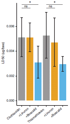
|
The y-axis shows the acute toxicity of the neonic as measured at 24 hours following an oral dose. The toxicity is shown as the LD50, the dose that kills half the bees (in 24 hours in this test). The two neonics used here are the same as those for article 1, above. The bars are for various conditions.
The first (left-hand) bar is for the neonic CTD. The bar height shows that its LD50 is about 0.005 µg per bee.
The next two bars are for the toxicity of the same neonic, but when a second chemical is also present. For the second (orange) bar, that extra chemical was the herbicide linuron, used at a dose considered typical of what the bees would encounter in the field. For the third (blue) bar, the extra chemical was the fungicide boscalid.
You can see that the second bar shows that the linuron had no significant effect on the toxicity of the CTD. However, the third bar shows that the boscalid made the bees much more sensitive to the CTD. (The boscalid alone did not affect the survival of the bees.)
The next group of three bars shows results for the same kind of experiments with a different neonic, TMX. The pattern is the same. In particular, the fungicide boscalid makes the bees more sensitive to the neonic.
This is Figure 3 from article 2.
|
The important result from article 2 is identifying a specific factor that affects how the neonics affect bees. It is common that various things are added to the crops, for various reasons. They are typically tested individually, but they act together. We now see an example of how a specific combination can have an effect that is not predictable from tests on the individual chemicals.
What's the big message from the two articles together? The effects of neonic pesticides on bees are complex and hard to predict -- even in realistic large scale field tests. We now see one specific example of why.
The issue of neonic pesticides has become political. It's important to understand that it needs to be addressed at two levels. One is the scientific level: what is going on, and why? The other is the political level. Regulatory decisions are made weighing various factors, including the best scientific information available. Sometimes, that "best scientific information" is incomplete or unclear, as in this case. Yet it is still necessary to make a political decision as to what is allowed; making no decision is not exactly an option, since it leads to the default, whatever that may be under the law. The regulatory process also weighs the benefits and alternatives, and may invoke societal values as well as objective facts. In this case, the scientific background has been confusing. The current articles don't change that, but perhaps offer a little hope that some clarity is possible. It is important to be clear which level is being discussed. The main goal with Musings is to discuss the scientific level.
News stories:
* First pan-European field study shows neonicotinoid pesticides harm honeybees and wild bees. (Phys.org, June 29, 2017.) Good overview of article 1.
* Exposure to neonics results in early death for honeybee workers and queens: study. (Phys.org, June 29, 2017.) Article 2. Note that we have discussed only one small piece of this article here. This page features a photograph of a bee with an RFID tag.
* Field Studies Confirm Neonicotinoids' Harm to Bees -- Two large studies find that, in real-world conditions, the insecticides are detrimental to honey bees and bumblebees. (A P Taylor, The Scientist, June 29, 2017. Link is now to Internet Archive.)
* Expert reaction to CEH study of the effects of neonics on honeybees and wild bees. (Science Media Centre, June 29, 2017.) A long and diverse set of comments! The comments focus on article 1, but some people also note article 2. There is a lengthy comment by a scientist from Syngenta, the manufacturer of the neonic pesticide TMX. Not surprisingly, he downplays the suggestion that the main effects are negative. Perhaps more importantly, he stresses the need for further work to understand what is going on.
* News story accompanying the articles: Agriculture: A cocktail of poisons -- The effects of sustained neonicotinoid exposure on bees depend on location, but are usually negative. (J T Kerr et al, Science 356:1331, June 30, 2017.)
* Two articles:
1) Country-specific effects of neonicotinoid pesticides on honey bees and wild bees. (B A Woodcock et al, Science 356:1393, June 30, 2017.) The work was funded by Syngenta and Bayer (another neonic supplier).
2) Chronic exposure to neonicotinoids reduces honey bee health near corn crops. (N Tsvetkov et al, Science 356:1395, June 30, 2017.)
Background post: Neonicotinoid pesticides and bee decline (July 12, 2014). Links to more.
Most recent post about bees... What if the caterpillars ate through the plastic grocery bag you put them in? (May 26, 2017).
More...
* Glyphosate and the gut microbiome of bees (October 16, 2018).
* The advantage of living in the city (July 27, 2018).
More about toxicity: Predicting the toxicity of chemicals (September 11, 2018).
More about fungicides/pesticides:
* Keanu Reeves and a broad-spectrum fungicide (March 6, 2023).
* What do we learn from the sulfur isotopes in the California vineyards? (June 28, 2022).
* A sticky pesticide (June 21, 2019).
August 16, 2017
Solar energy: What if the Moon got in the way?
August 16, 2017
Nothing hypothetical about it. We are having an eclipse of the Sun next Monday (August 21). The entire contiguous United States (except for the tips of Maine and Texas) will experience some time with at least 50% loss of sunlight. There will be a narrow band of totality from Oregon to South Carolina.
Nothing new about solar eclipses, but as our use of solar energy increases, the effect of the eclipse becomes greater. This will be the first time that managers of the electrical power grid in the US need to make significant adjustments because of an eclipse. There shouldn't be any big problems. California is the state that will have the biggest power loss, but it is still only a few percent of the total, and is manageable. North Carolina will lose about 90% of its solar power, but solar is an even smaller percent of the total there. Anyway, grid managers have had plenty of time to plan for the event.
But what about next time, when solar power is a much greater contributor to the total energy mix? The question is a sign of progress.
News stories:
* How Will the Eclipse Affect Solar Power? (J Prochnik, Natural Resources Defense Council, August 10, 2017.) General overview.
* California Prepares for Solar Power Loss During the Great Eclipse. (L Geggel, Live Science, June 8, 2017.)
* Solar eclipse on August 21 will affect photovoltaic generators across the country. (Today in Energy, from the US Energy Information Administration (EIA), August 7, 2017.) Includes a map of the eclipse, showing percent of totality across the US and major sites of solar power generation.
More about this eclipse: Why did many bees in the United States stop buzzing mid-day on August 21, 2017 (January 2, 2019).
More about solar energy:
* MOST: A novel device for storing solar energy (November 13, 2018).
* Using your sunglasses to generate electricity (August 14, 2017). The post immediately below.
There is more about energy issues on my page Internet Resources for Organic and Biochemistry under Energy resources. It includes a list of some related Musings posts.
Update October 2023...
This past weekend, we had an annular solar eclipse: the disc of the moon passed completely in front of the Sun, but was not big enough to block the entire solar disc. (In principle, the eclipse was visible where I am, but fog prevented actually seeing it.)
* Video of annular eclipse. Exploratorium video, posted at YouTube. It is just over 3 hours. Go to about 1 hr 30 min to get to the central event. Back off by three minutes, and then you can watch the final approach to the peak of the event.
* A couple of pages from the Exploratorium, with information and more videos. (I am not sure these are permanent pages.)
- Exploratorium: Watch Our Livestreams. Click on "Live Telescope View of Annular Solar Eclipse, Ely, NV" to get to the page listed next, which is devoted to this video.
- Live Telescope View of Annular Solar Eclipse, Ely, NV. This is the same video as listed above at YouTube.
Update November 2023...
* One more... Darkened by the Moon's Shadow. (Emily Cassidy, NASA Image of the Day, October 17, 2023.) Features a photo of North America during the eclipse -- as seen from a satellite in orbit above Earth.
Using your sunglasses to generate electricity
August 14, 2017
The first step in using solar energy to make electricity is to capture the sunlight. Sunglasses are a device to capture sunlight. So it would seem logical that sunglasses would be a good place to use solar energy.
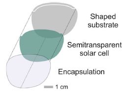
A new article reports building a solar power generator into sunglasses.

|
Energy-harvesting sunglasses.
This is the first figure in the Phys.org news story. (Fig 7 of the article is similar.)
|
The figure at the right shows the basic design. Conceptually, it is simple: a solar cell is sandwiched between two structural layers.
The solar cell, of course, is transparent. It is an organic solar cell.
This is part of Figure 4a from the article.
|
|
The article contains a lot of data, with tests under various conditions: indoor and outdoor lighting, of various intensities. The cell is capable of generating nearly a milliwatt of power; 200 microwatts is an estimate of what it can reliably generate under a range of reasonable conditions. A lot of numbers. 400 µW (2 lenses each with 200 µW) is enough to operate a calculator, a hearing aid, or perhaps a watch. That is, it is a meaningful amount of power.
The authors emphasize that their process for making the power-generating lenses is straightforward, and can be scaled up. It should be possible to make sunglasses of various colors, and it should be possible to integrate the solar cells with corrective lenses. Cost? I don't see any cost estimates in the article.
The article establishes that using sunglasses to generate solar power is possible. It is an example of using organic solar cells. It is another step in the arena of wearable electronics. Whether this is a useful product remains to be seen.
A chemistry note... Two of the chemicals used to harvest light are derivatives of fullerene (buckyballs).
News story: Glasses generate power with flexible organic solar cells. (Phys.org, August 3, 2017.) (The version I have gives the power output as 200 milliwatts; it should be 200 microwatts.)
The article: Solar Glasses: A Case Study on Semitransparent Organic Solar Cells for Self-Powered, Smart, Wearable Devices. (D Landerer et al, Energy Technology 5:1936, November 2017.)
A recent post on solar energy... Is solar energy a good idea, given the energy cost of making solar cells? (March 24, 2017).
Next: Solar energy: What if the Moon got in the way? (August 16, 2017). Immediately above.
And more... MOST: A novel device for storing solar energy (November 13, 2018).
Posts about flexible electronics include:
* An air-conditioner you can wear? (August 19, 2019).
* eSkin: Developing better sense of touch for artificial skin (November 29, 2010). The topics of flexible electronics and wearable electronics often interact. With the sunglasses, flexibility of the solar cell material is an issue in the manufacture.
There is more about energy issues on my page Internet Resources for Organic and Biochemistry under Energy resources. It includes a list of some related Musings posts.
The major source of positrons (antimatter) in our galaxy?
August 13, 2017
The positron is the antimatter counterpart of the electron. It is just like an electron, except that it has the opposite charge.
It is estimated that about 1043 positrons are destroyed every second in the Milky Way galaxy. Why? Because they collide with electrons; the matter-antimatter interaction leads to their mutual annihilation. A gamma ray is also given off, reflecting the conversion of the mass to energy. It's a distinctive γ-ray; astronomers have been aware of it in the galaxy since the 1970s.
What's not so clear is where all those positrons are coming from. A new article offers a solution.
There are many nuclear decays that give off positrons. An example that people may come across is fluorine-18, which is used in positron emission tomograpghy, commonly called PET scans. The problem is figuring out which processes are important in explaining what the astronomers see.
The following figure summarizes part of the argument. Caution... Although the figure is useful, part of it may also be confusing.
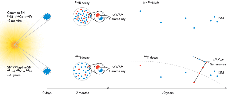
The story starts with a supernova (SN), at the left. A supernova is an exploding star; there are various types of SN. In supernovae, there are many nuclear fusion reactions, leading to heavier and heavier nuclei.
Many of these new nuclei, of course, are unstable, and decay. Some decay with the production of positrons. The figure shows two examples: nickel-56 (upper part) and titanium-44 (lower).
The type of SN that makes Ni-56 is common. It ends up making Fe-56, the heaviest stable isotope made by these fusion reactions. The type that makes Ti-44 is less common; this type is known as SN 1991bg.
Now look a bit to the right, where the x-axis is labeled "~2 months". What happens at this time is about the same in both cases. Both decays produce positrons (red) and electrons (blue). A collision, shown in the circle to the right, annihilates the particles, and gives off a γ-ray. But that γ-ray doesn't do us (on Earth) any good. After only two months, the collision will most likely be so close to the core of the SN that the gamma ray never gets out.
Further to the right is the scene at "~70 years". The situation is now different for the two SN types. In the lower part, with Ti-44 decay, there are still positrons, which collide with electrons in the interstellar medium (ISM) -- producing γ-rays. In the upper part, there are no positrons, no collisions, and no γ-rays. Why? Because there is no more Ni-56. The half-life of the Ni-56 decay chain is only about 2 months. It may make lots of positrons, and lead to many γ-rays -- but no longer. And the ones it did make earlier didn't reach Earth.
The confusion I alluded to earlier is that the horizontal dimension is used both for time and space. It's labeled for time. But within each time segment, it seems to show a spatial diagram. That may be, but overall the figure is not spatial. In particular, you can't tell that the γ-rays at the 2-month time can't escape from the source SN -- and that is a key point. I suggest that you think of the x-axis not so much as a scale of any type, but simply a guide. The figure shows some little diagrams of what happens at three times: zero, 2 months, and 70 years.
This is Figure 1 from the news story accompanying the article in the journal.
|
The conclusion from this discussion is that the common SN, with Ni-56 decay, doesn't make the positrons that we see on Earth. However, a less common SN type, with Ti-44, is a good candidate for the positron signal that we see. As a bonus, the same process may also be the major source of Ca-44. That's the second most common isotope of calcium, but its source has not been clear.
The type of supernova here involves the merger of two low-mass white dwarfs, followed by explosive "burning" (fusion) of helium. The article discusses more about the source, largely using computer modeling to show that the claim is plausible. However, questions remain, and the proposed source of galactic positrons can only be considered a promising hypothesis at this time.
News story: Astrophysicists Solve Mystery of How Most Antimatter in Milky Way Galaxy Forms. (Sci.News, May 30, 2017.)
* News story accompanying the article: High-energy astrophysics: A rare Galactic antimatter source? (N Prantzos, Nature Astronomy 1:0149, June 2, 2017.)
* The article: Diffuse Galactic antimatter from faint thermonuclear supernovae in old stellar populations. (R M Crocker et al, Nature Astronomy 1:0135, May 22, 2017.)
More positrons...
* Lightning and nuclear reactions? (January 28, 2018).
* Early detection of brain damage in football players? A breakthrough, or not? (September 14, 2015).
* What is the charge on atoms of anti-hydrogen? (July 15, 2014).
More about supernovae...
* How long does a supernova event last? (January 14, 2018).
* Could you find debris from a supernova in your backyard? (April 27, 2016).
Among posts about titanium...
* Titanium oxide in the atmosphere? (December 9, 2017).
* Photocatalytic paints: do they, on balance, reduce air pollution? (September 17, 2017).
* 3D printing for space: a titanium woov, and more (April 29, 2014).
* Titanium biology (September 29, 2008).
My page of Introductory Chemistry Internet resources includes a section on Nucleosynthesis; astrochemistry; nuclear energy; radioactivity. That section links to Musings posts on related topics.
Why does Zika virus affect brain development?
August 11, 2017
The Zika outbreak has peaked in some places, but is still important. Why? It isn't just the numbers. There are far more cases of Chikungunya than Zika. Early in the recent Brazilian Zika outbreak, we found that Zika was associated with microcephaly. Mothers infected with Zika during pregnancy were at increased risk of having children with microcephaly. Over time, it became clear that Zika causes a variety of brain development problems.
Why? A recent article uncovers one of the reasons. It's an interesting story.
Here is one key experiment...
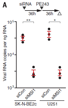
|
The graph shows the role of host protein Musashi-1, or MSI1, in Zika virus replication.
The y-axis shows the amount of viral RNA made. Log scale. Results are shown for four conditions.
There are two pairs of conditions; let's look at the first two sets (bars) of data for now. You can see that the first group of points (at the left) is fairly high (about 3x10⁴ -- halfway between 104 and 105 on the log scale). The next group is about 10-fold lower. The first group is for a control; the second group is for the virus growing in cells in which the MSI1 protein level has been reduced. That is, reducing MSI1 reduces Zika viral RNA production. That is one of the key results: MSI1 is needed for good virus replication.
That's the first pair of conditions. The second pair shows the same pattern. It's the same experiment, now in a different type of host cell.
|
How did the scientists reduce the level of MSI1 protein? They used a small RNA molecule that targeted that gene, preventing its mRNA from functioning. That RNA is called siRNA, for small interfering RNA.
There is a timeline for the experiment at the top of the figure. The SiRNA was added at time 0. 36 hours later, the virus (PE243) was added. 36 hr later, viral RNA was measured.
There were two kinds of SiRNA, as labeled at the bottom for each data set: siCon as a control, and SiMSI1 to knock down that gene.
Below the RNA labels are the labels for the two types of cell used. Both are neural cells, with high level expression of MSI1.
This is Figure 2A from the article.
|
What is this MSI1 protein? It is an RNA-binding protein -- known to be abundant in neural stem cells and involved in brain development. In fact, mutations in MSI1 have been associated with a rare genetic form of microcephaly. Scientists had recognized that the Zika virus genome contained possible binding sites for MSI1; the present article shows that they are functional, and that they matter.
The model that emerges from the work is that Zika virus grows preferentially in cells of the developing brain, where it makes use of the abundant MSI1 protein. The use of that protein by Zika virus makes it less available to the developing brain, leading to neurological problems.
There is another piece to the story, but it is incomplete at this point. The finding that Zika was associated with microcephaly in Brazil came as a surprise. No such association had previously been made. There were various possible explanations for the discrepancy. One of them is that the Zika virus strain in Brazil is different from the one most common elsewhere. The new work supports that suggestion. Analysis of various Zika strains shows that the Brazilian strain binds MSI1 more strongly than the other strains. Beyond that, we don't know; further work along this line might be fruitful.
The authors caution that their work does not preclude that other factors may be relevant. They have found what appears to be one part of the story of why Zika grows preferentially in the developing brain and causes defects there, but it is not yet clear what the full story is.
News stories:
* New insights into how the Zika virus causes microcephaly. (Science Daily, June 1, 2017.)
* Why Zika might offer a brain cancer cure. (C Smith, Naked Scientists, June 1, 2017.) As the title might suggest, this page goes beyond the basics, with some speculations about how the finding might be useful. Be careful with the speculations, but they are intriguing.
* News story accompanying the article: Neurovirology: Why are neurons susceptible to Zika virus? (D E Griffin, Science 357:33, July 7, 2017.)
* The article: Neurodevelopmental protein Musashi-1 interacts with the Zika genome and promotes viral replication. (P L Chavali et al, Science 357:83, July 7, 2017.)
Previous Zika post: Can antibodies to dengue enhance Zika infection -- in vivo? (April 15, 2017).
More Zika...
* A recent genetic change that enhanced the neurotoxicity of the Zika virus (December 1, 2017).
* Zika fallout: Should pregnant women receive immunizations? (September 30, 2017).
A post about looking for host genes needed for Zika infection: Finding host genes that are required for growth of Zika virus (and related viruses) (August 8, 2016). The current works seems to be independent of the work from this earlier post.
More siRNA: Targeted degradation of the viral genome as a treatment for COVID? (March 13, 2022).
There is a section on my page Biotechnology in the News (BITN) -- Other topics on Zika. It includes a list of Musings post on Zika.
A post about Chikungunya: Chikungunya in the Americas -- are vaccines near? (March 17, 2015).
August 9, 2017
Is there useful ancient DNA in the dirt?
August 8, 2017
We have a new article that makes a rather simple point -- one with potentially huge implications.
Studies of ancient organisms typically start with a visible piece of the organism -- a fossil, in the general sense. If we can isolate DNA from the specimen, then we can get some genome information about the ancient organism. As an example, we have considerable information about the genome of the type of human known as Denisovan. Yet all we have as a physical sample of Denisovan man is a piece of finger and a few teeth.
In some applications of genome sequencing, we don't need any particular physical sample of the organism. Forensics uses samples from crime scenes, sometimes free of any immediate biological context. And the emerging field of metagenomics looks at the DNA in the environment, and tries to infer what it is from.
Could we do that with ancient samples? Archeological metagenomics. That is what the new article tries -- and claims -- to do. The scientific team, one of the leading labs in ancient DNA work, analyzes cave sediments from seven well-characterized archeological sites in Eurasia.
The following figure is a pictorial summary...
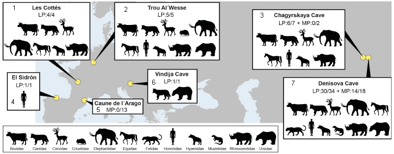
The figure is based on a map, showing the seven sites. For each site, there is a box of information.
For example, look at site 2, Trou Al'Wesse (in Belgium). The 2nd line of information says LP:5/5. LP means the site is dated as Late Pleistocene. 5/5 means that 5 of 5 samples tested yielded useful DNA-- DNA that could be identified as one or another animal group. The animals identified at the site are shown here by pictograms; there is a key at the bottom of the figure.
Look at the data labeled LP in the various information boxes. You will see that most LP samples yielded useful DNA sequences. These are all known sites, and the DNA data is consistent with what is known about them.
Three of the sites (3, 5, 7) also have some data labeled MP. That is Middle Pleistocene -- older samples. The success rate with MP samples was lower. Only at the Denisova Cave (site 7) did MP samples yield useful DNA.
LP is 12-126 thousand years ago. MP is 126-781 thousand years ago.
This is modified from Figure 1 of the article. I added numbers for the sites, for ease of reference. The numbers are at the left, usually upper left, of the information boxes.
|
One concern you might have... There might be plenty of DNA in cave sediments. How do we know that the DNA being analyzed isn't just from an early explorer, or from animals that frequent the cave? It's a good question, one that scientists who study ancient DNA have struggled with over the years. It turns out that DNA carries a "date of manufacture", and the scientists have learned how to read it. DNA collects damage; the chemistry of that damage is understood. The amount of damage in a DNA sample is a measure of its age. It is something those studying ancient DNA now pay attention to, helping them to avoid distraction from modern DNA.
Another experimental procedure helps the scientists find the rare pieces of useful DNA. They focus on the more abundant mitochondrial DNA (mtDNA), and use probes for various animal mtDNAs to capture those rare sequences from the bulk samples.
The conclusion is that there is useful ancient DNA in the dirt -- and that we have the tools to find it and sequence it. That will allow an additional level of study of archeological sites. Great care will be needed in the interpretation, and some false steps are probably inevitable. But the field of ancient DNA has dealt with these issues before. Caution, yes, but in the long run, this is likely to be a significant step.
News stories:
* Ancient human DNA found in Ice Age caves -- even when bones were missing. (A Potenza, Verge, April 27, 2017. Now archived.)
* Denisovan and Neanderthal DNA Uncovered in Caves without Skeletal Remains. (Sci.News, April 28, 2017.)
The article: Neandertal and Denisovan DNA from Pleistocene sediments. (V Slon et al, Science 356:605, May 12, 2017.)
The first Musings post about Denisovan man: The Siberian finger: a new human species? (April 27, 2010).
Here are examples of recent posts using metagenomic analysis. Each post notes that the conclusions are tentative because the genome information lacks any physical specimen at this point.
* More giant viruses, and some evidence about their origin (June 13, 2017).
* The Asgard superphylum: More progress toward understanding the origin of the eukaryotic cell (February 6, 2017).
More... What caused the extinction of the mammoths -- I (January 16, 2022).
Head injuries in Neandertals: comparison with "modern" humans of the same era (February 22, 2019).
There is more about genomes and sequencing on my page Biotechnology in the News (BITN) - DNA and the genome. It includes an extensive list of related Musings posts.
Is Harry Potter responsible for the increased owl trade in Indonesia?
August 6, 2017
That's the suggestion from a new scientific article.
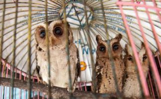
|
Owls for sale in a bird market in Indonesia. These are scops owls.
This is trimmed from the top frame of Figure 3 from the article. The full figure shows several such pictures, with various kinds of owls.
|
The following figure shows an example of the analysis...
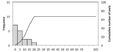
|
The scientists sampled bird markets on the Indonesian islands of Bali and Java. How many owls? The results are shown as a frequency distribution. For example, 7 samples had zero owls (left-hand bar); 5 samples had 1-5 owls (second bar). The line shows the cumulative total number of owls; see the scale along the right-hand y-axis.
You can see that most samples had 5 owls or less. And the total was about 65 owls, an average of 4 per survey.
This is the top frame of Figure 1 from the article. The full figure shows similar analyses for various time periods.
|
That graph is for 1996-1997. The results from surveys in 1999-2003 were similar (actually a little lower). For 2012-2016, the total owl count was over 1800, an average of about 17 per survey. Most (over 60%) of that last set of surveys yielded more than 5 owls, with several over 50. The fraction of total birds in the markets that were owls increased by about seven-fold.
The Harry Potter books and movies were introduced into Indonesia, in local languages, in 2000. The spike in owl trade, seen above, occurred a few years after the introduction of Harry Potter. The authors also note that owls, formerly called Burung Hantu (ghost birds) are now often called Burung Harry Potter.
The authors emphasize that the results show a correlation. They do not prove a causal connection. What else might be going on? One contributor could be the rise of the Internet -- and, later, social media. Of course, both could be involved, perhaps synergistically.
Is the increased interest in owls good? In some ways, perhaps yes. But it also raises questions about legality of the owl trade and conservation status. This is discussed some in the article and news reports, but I don't want to get into it here. There is also concern about how the pet owls are treated.
It's a fun story, with possible serious consequences. The authors note other examples of animals being introduced via literature and media, with a subsequent rise in the popularity of the animal itself. The time lag is similar in this case to those other experiences. The story here may be incomplete, but there is reason to believe that the general phenomenon can be real.
News stories:
* Harry Potter may have sparked illegal owl trade in Indonesia. (S Dasgupta, Mongabay, July 3, 2017.)
* Has Harry Potter mania cursed Indonesia's owls? (I Vesper, Nature News, June 28, 2017. In print: Nature 547:15, July 6, 2017.)
* The 'Harry Potter effect' on the Indonesian owl trade. (Oxford Brookes University, June 29, 2017. Now archived.) From the university. The page includes a comment which I take to be from Mr Potter's office on keeping owls as pets.
The article, which is freely available: The Harry Potter effect: The rise in trade of owls as pets in Java and Bali, Indonesia. (V Nijman & K A-I Nekaris, Global Ecology and Conservation 11:84, July 2017.)
Previous Musings posts referring to Harry Potter: none.
Recent post making a literature-science connection: Bob Dylan and biomedical research (January 20, 2016).
More from Indonesia: The little people of Indonesia (May 14, 2009). Links to more. (There is a literary connection here, too. The humans discussed here are commonly referred to as hobbits.)
More ghosts: A chemical bond to an atom that isn't there (October 31, 2018).
More conservation: Can we train animals to fear their predators? (July 14, 2019).
Methane hydrate: a model for pingo eruption
August 4, 2017
Musings has discussed various aspects of methane hydrate [links at the end]. Briefly, methane and water can form a solid, ice-like structure under certain conditions. Low temperatures and high pressures favor the formation of methane hydrate. Not surprisingly, methane hydrate is found below cold oceans.
It is possible that methane hydrate could be mined for the gas. But there is also a concern about the hydrate, one that follows from the description of where and why it occurs. What if conditions changed, and the hydrate became unstable? This could result in the release of methane into the water, and then presumably into the air -- perhaps at a catastrophic scale.
A new article analyzes the geological record, and develops a model for how such methane releases from hydrate may happen.
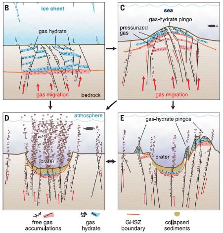
The following figure summarizes the model. It shows a site at four different times, as we progress from frame B to frame E.
Frame B shows the stable situation. A horizontal black line about half way down separates water (bluish) from rock (brownish). There is methane hydrate (also blue) just below the water, and free gas below that. Importantly, there is a layer of ice at the top. The ice serves as a cap.
Frame C shows what happens if the ice melts. Free of the pressure from the ice sheet, the gas pressure from below leads to a bulge -- a mound, called a pingo.
Frame D: The pingo can rupture, leading to escape of gas. And the place where there was a mound now has a crater.
Frame E: This shows a possible later stage. Continuing gas pressure can lead to the development of new pingos.
This is from Figure 3 of the article.
|
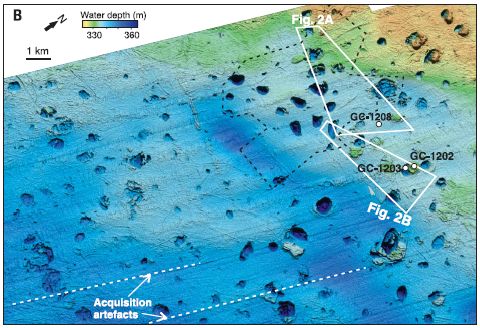
A major part of the work was a detailed analysis of the sea floor in a region known to have active methane hydrate. Here is a map of the study area -- a bathymetric map...
The map is coded by the bathymetric measurements: the depth of the water.
Of particular interest are the little roundish regions. They are about a kilometer across, and as much as 30 meters vertically. (See scale bar, near upper left.) Depending on whether they are darker or lighter than the background, they are craters or mounds (pingos). That is... A region known to be rich in methane hydrate is marked by craters and mounds. That's important background for the scientists' model.
Where is this? Bjørnøyrenna. That's Bear Island Trough, in the Barents Sea north of mainland Norway, right near Svalbard.
This is Figure 1B from the article.
|
Such craters and mounds have been seen before, and associated with methane deposits. The current work is the most extensive account, leading to the integrated model presented above.
The sea floor events studied here happened about 12-15,000 years ago, at the end of the last ice age. We are now in a new era of extensive melting of polar ice. What are the implications of the model presented here for current methane hydrate deposits under ice?
News stories:
* Ancient Arctic 'gas' melt triggered enormous seafloor explosions. (B Geiger, Science News for Students (now Science News Explores), June 13, 2017.) Includes videos and a glossary. This site is associated with the well-known Science News (SN). The page claims they provide "age-appropriate, topical science news to learners, parents and educators". (I thought that is what SN did. Anyway, perhaps it is worth noting the site. Certainly, this page is quite good.)
* Massive craters formed by methane blow-outs from the Arctic sea floor. (Science Daily, June 1, 2017.)
The article: Massive blow-out craters formed by hydrate-controlled methane expulsion from the Arctic seafloor. (K Andreassen et al, Science 356:948, June 2, 2017.) The article is from the Centre for Arctic Gas Hydrate, Environment and Climate (CAGE), at The Arctic University of Norway.
Among posts on methane hydrates...
* Recent craters in Siberia due to methane release from hydrates in the permafrost (January 15, 2025).
* Svalbard is leaking (March 7, 2014). From the area of the current work.
* Ice on fire (August 28, 2009). First post on the topic. Links to more.
More from the Arctic:
* Is Arctic warming leading to colder winters in the eastern United States? (May 11, 2018).
* Eye analysis: a 400-year-old shark (September 3, 2016).
Also see: Who cleans up the forest floor? (November 3, 2017).
August 2, 2017
The new IUPAC periodic table; atomic weight ranges
August 1, 2017
I recently had reason to look up the current periodic table (PT) from IUPAC. It reflects some developments that seem worth noting.
Of course, the table is current through the recent recognition and naming of the remaining elements from 113-118. It is now "full" up through element 118.
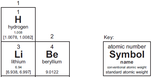
Here is a piece of the current IUPAC periodic table, so we can focus on one interesting development...
I chose this region to illustrate elements with and without an atomic weight range, and to show the key.
Start with beryllium. The layout of the Be box should look familiar. In particular, note the atomic weight on the last line of the box. The key identifies this line as the "standard atomic weight".
Now look at hydrogen. The last line, the standard atomic weight, says [1.0078, 1.0082]. The line above that has the more familiar value 1.008, and is labeled "conventional atomic weight".
|
What's going on? Why are atomic weights more complicated than before?
In a sense, they are not more complicated. It's just that an old problem is being dealt with in a new way -- more openly.
The basic idea of the atomic weight is that it reflects the weight of an average atom of the element, as found in nature. The mass of any specific atom is well defined, and known to high precision. But the atomic weight of an element deals with nature -- with the natural abundance of the isotopes. As a simple example... bromine has two major isotopes, one of mass 79 and one of mass 81. Natural bromine contains about 50% of each. Thus the atomic weight of bromine is about 80 -- the number you will see on the periodic table.
So what is the problem? Different natural samples of the same element may have different isotope compositions. That is, the (average) atomic weight of an element depends on the sample of it that you have. That is real variation among samples, not just measurement uncertainty.
There are various reasons for the differences in isotope composition. They include the role of radioactive decay processes in making specific isotopes, and the fact that chemical (and biochemical) processes may occur at different rates with different isotopes, thus changing the isotope composition of the products compared to the reactants. All these effects are small, usually well under 1%, but they are real -- and sometimes we want to know.
In the old days, scientists tried to come up with a single number that best represented the known natural samples. The new IUPAC recommendation is to openly recognize the variability. The value shown in brackets is the range of atomic weights found for the element. The value shown for hydrogen, [1.0078, 1.0082], means that there are samples of H where the average atom weighs as little as 1.0078, and samples as high as 1.0082. The square brackets are the mathematical symbol for an interval -- or range. IUPAC uses this range, when available, as the "standard atomic weight". Of course, that range is not so useful when you want to do a routine calculation without reference to a specific sample. So they also provide the old-style value, as a "conventional atomic weight".
There is another, smaller, change. Some elements have no natural abundance, at least on the modern Earth. It has been a tradition to show the mass number of the most stable isotope, in square brackets, in the space for atomic weight. However, for the newer elements, that information is uncertain, and may change. We really don't know what the most stable isotope is. In the new PT, IUPAC has dropped this. There is just a blank for the atomic weight. I think that's good.
I checked a couple of well-known web sites with periodic tables. They have not yet introduced any of the changes (other than updating for the new elements, of course). It remains to be seen how the new IUPAC changes are accepted.
Source: Periodic Table of Elements. (International Union of Pure and Applied Chemistry (IUPAC). Current version is dated November 2016.) Includes a PT as an image file, as well as pdf versions. The page is full of information on recent changes, as well as the procedures for accepting and naming new elements.
A post about the content of the periodic table: Nihonium, moscovium, tennessine, and oganesson (June 11, 2016). This is about the proposed names for the most recently accepted elements. Those names were officially recognized later in 2016.
Recent posts about variation in isotope composition include:
* Role of biological processing in the formation of a uranium ore (June 30, 2017).
* Is photosynthesis the ultimate source of primary production in the food chain? (April 2, 2017).
My page of Introductory Chemistry Internet resources includes several sections of relevance here, on new elements, naming, isotopes, atomic weights, and the periodic table.
Clinical trial of self-administered patch for flu immunization
July 31, 2017
Musings has noted the development of a flu vaccine that is delivered by a skin patch [link at the end]. We now have a small clinical trial of a dissolvable microneedle patch flu vaccine. It is the first trial in humans of such a vaccine. In general, the results are encouraging.
The following figure illustrates the system:
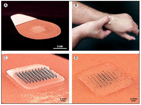
|
Part A shows the patch. In the middle is an array of 100 needles; this is clearer below.
Part B shows a person self-applying the patch.
Part C shows a close-up of the active part of the patch.
Part D shows that region after use; the needles are largely gone. The needles dissolve in the skin to deliver their payload. (As a result, the waste is not "sharp", and can be disposed of easily.)
This is Figure 1 from the article.
|
The trial is small and short-term. It's Phase I; the major goal is to ascertain safety.
The trial included four groups, 25 people each. One group received the traditional vaccine by injection. Two groups received the vaccine by the patch. In one of those groups, the patch was administered by a healthcare worker; in the other, the person applied their own patch. The type and amount of vaccine protein was the same in needle and patch vaccines. A fourth group used the patches, but they were placebo, with no vaccine antigens.
No major safety issues were seen. The patches did cause some local reaction -- as did needles. However, this was not a serious concern in either case.
The immune responses, as measured by antibody levels at one and six months, were similar for the vaccine groups. (The trial was too small to measure actual protection against infection. None of the study participants came down with the flu during the trial.)
Self-administration of the patches seemed to work fine. However, the robustness of the procedure is not clear. In this trial, those who were to self-apply the patch received brief training.
The scientists did lab tests on patches that had been stored at 40 °C for a year; they appeared to fully retain the antigens. That long term stability at ambient, even hot, temperatures is presumably because the patches are dry. In any case, that stability is good; it facilitates transport and use without requiring cold. That is especially important for use in remote areas. (The patches are stored in sealed envelopes prior to use.)
Overall, the trial suggests that the patch vaccine is safe and effective, with the additional advantages of being relatively painless, convenient, and stable. It is also low cost. Further testing will proceed.
News stories:
* Microneedle patch developed for flu vaccination. (Science Daily, June 28, 2017.)
* Microneedle flu vaccine patch passes phase 1 trial. (S Soucheray, CIDRAP, June 28, 2017.)
* Comment story accompanying the article: Influenza vaccine: going through a sticky patch. (K Höschler & M C Zambon, Lancet 390:627, August 12, 2017.)
* The article: The safety, immunogenicity, and acceptability of inactivated influenza vaccine delivered by microneedle patch (TIV-MNP 2015): a randomised, partly blinded, placebo-controlled, phase 1 trial. (N G Rouphael et al, Lancet 390:649, August 12, 2017.)
Background post on the vaccine patch system: A better way to deliver a vaccine? (July 25, 2010). The article here is, in part, from the same labs as the current article.
More... Printing microneedle patches for vaccine delivery to the skin (October 5, 2021).
Recent post about flu vaccines: The nasal spray flu vaccine: it works in the UK (April 12, 2017). A theme is looking for alternatives to the usual injection.
Posts on flu and flu vaccines are listed on the page Musings: Influenza (Swine flu).
More on vaccines is on my page Biotechnology in the News (BITN) -- Other topics under Vaccines (general). It includes a list of related Musings posts.
Another use of a microneedle patch: Treating obesity: A microneedle patch to induce local fat browning (January 5, 2018).
More microneedles: Treating a heart attack using a microneedle patch (January 11, 2019).
Diesel emissions: how are we doing at cleaning up?
July 30, 2017
Emissions from diesel engines are a major source of air pollution. Regulations are in place to reduce those emissions.
A recent article analyzes diesel emissions, with the general goal of examining how well we are meeting the regulations that are in place, and then looking to the future.
The following graph is an attempt to summarize a huge amount of information in a way that can be understood, yielding a sense of the big message.
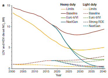
|
The graph shows diesel emissions vs year, for different types of vehicles and different scenarios.
There are two sets of lines. The solid lines are for heavy duty vehicles (HDV; trucks and buses). The dashed lines are for light duty vehicles (LDV; passenger cars).
The emission plotted is nitrogen oxides, commonly abbreviated NOx. It is shown in megatonnes (Mt). The numbers here are Mt for the year shown.
The scope of the analysis is 11 large markets for vehicles. One of those is the "EU-28"; the others are real countries. Together, these 11 markets are responsible for about 2/3 of the worldwide emissions from diesel vehicles (Fig 2b).
|
Let's start with the HDV, the solid lines. The two main curves are labeled "Limits" (yellow) and "Baseline" (red). "Limits" shows the amount of emissions predicted if regulations in place at that time were followed. It is based on lab measurements of the vehicle emissions. "Baseline" shows the actual emissions.
You can see that HDV emissions have been declining. However, the baseline curve is always higher than the limits curve. That is, actual emissions were always greater than expected, if regulatory targets had been met. The gap has been getting bigger -- in absolute terms, and even more so in percentage terms. For future years, the main curves assume that the gap continues.
Towards the right side are two additional curves, which show major declines in emissions. These are based on proposed regulations. If these regulations were successful, they would lead to major reductions in NOx emissions from diesel engines.
LDV (passenger cars). Look at the lower set of curves, with dashed lines. The LDV contribute considerably less emissions than the HDV. (The EU is an exception on that point.) Beyond that, most of the comments about HDV also apply to LDV.
This is Figure 2a from the article.
|
The big picture is that we are making progress, but not as much as we might think. Further progress is planned, but it remains to be seen whether we can achieve the new goals. (Yes, the article mentions the recent Volkswagen problem, where a company seems to have deceived the regulators. That contributes to the problem, but there are many causes.)
There are many assumptions and estimates in doing such analysis. Even the "limits" data have error bars. I chose the graph above because it is relatively simple, and properly presents the big picture. The article contains massive amounts of data, including data for individual countries.
How important is the problem, and how big is the contribution of the segment discussed here? We noted above that the 11 markets analyzed represent about 2/3 of the global NOx emissions from diesels on the road. Such diesels, overall, are about half of the total emissions from transport. That in turn is about half of the total anthropogenic NOx emissions.
NOx emissions lead to ozone and small particulate matter in the air; those are the pollutants that lead to most of the health concerns. The authors estimate that the excess NOx emissions from diesels -- the emissions in that gap region -- lead to about 38,000 deaths per year globally. That's not a huge number, in the context of total deaths, but if it is preventable, why not? Anyway, deaths are just one measure of the cost of the pollution; the article discusses various damages.
It's an interesting and provocative article. If the topic interests you, try browsing it. There are a lot of numbers; the extended pdf file for the 5-page article is 17 pages -- including an extra 9 pages of graphs and tables. Be careful you don't get overwhelmed. But the authors do a reasonable job of making the main points clear.
News stories:
* Diesels pollute more than lab tests detect -- Excess emissions kill 38,000 annually, study shows. (Science Daily, May 15, 2017.)
* New international study finds lab testing of diesel NOx emissions underestimates real-world levels by up to 50%. (Green Car Congress, May 15, 2017.)
* Impacts and mitigation of excess diesel NOx emissions in 11 major vehicle markets. (International Council on Clean Transportation (ICCT), May 15, 2017.) From one of the lead organizations in the study.
The article: Impacts and mitigation of excess diesel-related NOx emissions in 11 major vehicle markets. (S C Anenberg et al, Nature 545:467, May 25, 2017.)
More on pollution:
* Reducing diesel emissions from ships (March 3, 2018).
* What's the connection: ships and lightning? (October 14, 2017).
* Deaths from air pollution: a global view (October 23, 2015).
More NOx: A major algal bloom associated with the dinosaur extinction event? (May 13, 2016). NOx are made when air is heated; that is why high-temperature engines lead to NOx.
Studying predation around the world: What can you do with 2,879 fake caterpillars?
July 28, 2017
Are there broad ecological trends that correlate with big features such as latitude? More to the point, how does one address the question experimentally? After all, if you simply measure something across the Earth, there may be too many uncontrolled variables to figure out what is going on.
We need more controlled factors. How about fake caterpillars? Like this, for example...
|
This is part of Figure 1B from the article. It's shown there just below South America.
Size? Not stated in the article. Use your imagination. (The news story has a picture that will give you a sense of scale.
|
That is one of the predation targets used in a recent article -- along with its 2,878 identical siblings.
The purpose of the study was to look for trends in predation across the globe, such as predation vs latitude. Predation of what? How about an artificial prey, one that can be held constant, at 31 sites over six continents? That's the role of these plastic caterpillars.
Here are some results...
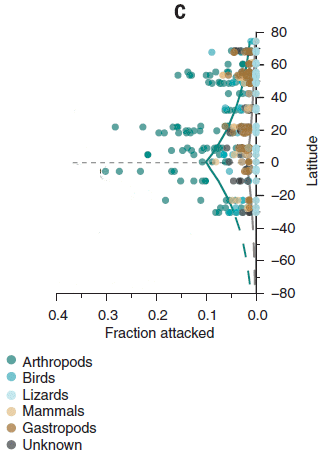
|
In this study, the model caterpillars were placed at diverse locations around the world. At intervals, they were examined to see if they had been attacked -- and by what. As the labeling of the first figure suggests, one can often tell the type of predator by the markings left on the prey.
The results are shown as the fraction of the prey that were attacked per day vs latitude. Each point is for one sampling plot; multiple plots were studied at each general location. Data are shown for different types of predators; see the key at the bottom (but don't worry much about it).
This is Figure 1C from the article. I have trimmed away most of the extraneous things, from the odd layout of the full figure.
Why does the x-axis scale run backwards? It's artistry; look at Figure 1 in the article. (For the record, here is the top half of that figure, which is the relevant part: Figure 1, top half [link opens in new window].)
|
One pattern you can see from that figure is that predation is greatest near the equator, and is reduced, on both sides, toward the poles.
Second, it is the arthropods that are the major player in determining this gradient. You may be able to see that from the figure, but the conclusion is based on the authors' statistical analysis of the data set. Predation by birds and mammals does not seem to show such a gradient.
Gradients in species diversity have long been known. The current work provides evidence for a functional gradient in interactions between species.
But the big story is those green fake caterpillars, which made the study possible.
If you have concerns about the methodology here, try to present them as questions -- which could be addressed by appropriate experimental work.
News story: Fake caterpillar study reveals global pattern in predation. (Science Daily, May 18, 2017.)
The article: Higher predation risk for insect prey at low latitudes and elevations. (T Roslin et al, Science 356:742, May 19, 2017.)
Recent post about predation... Venus flytrap: converting defense into offense (July 27, 2016).
Other caterpillar posts include...
* Effect of LED street lights on insects (September 4, 2021).
* What if the caterpillars ate through the plastic grocery bag you put them in? (May 26, 2017).
* Caterpillars that whistle (February 8, 2011).
Posts about fake animals? The following come to mind...
* Using drones to count wildlife (May 15, 2018).
* Elizabeth: How to climb a pile of sand (November 7, 2014).
* Does this count? Can giraffes swim? (August 6, 2010).
July 26, 2017
Bats and the coronavirus reservoirs
July 25, 2017
The coronaviruses used to be a rather obscure group. Then SARS came along (2002/3), and more recently MERS. Both of these diseases are caused by coronaviruses.
Where did these diseases come from? Beyond that, where are coronaviruses in general? And, what are the implications for the possibility of further coronavirus diseases?
Both the SARS and MERS viruses have been traced as probably originating in bats. But the general role of coronaviruses in nature has not been systematically investigated. In fact, most data for coronaviruses so far has come from samples of medical interest.
A recent article undertakes a broad search for coronaviruses in nature. The simple answer is that they are found mainly in bats.
The following table summarizes the data about where coronaviruses are found in nature...
| Host taxa tested
| Number of individuals tested
| Number of individuals positive
(at least one coronavirus)
| in %
| Number of distinct viruses
|
| bats
| 12,333
| 1,065
| 8.6
| 91
|
| non-human primates
| 3,470
| 4
| 0.1
| 2
|
| rodents and shrews
| 3,387
| 11
| 0.3
| 7
|
| humans
| 1,124
| 2
| 0.2
| 2
|
| total
| ** 19,192
| 1,082
| 5.6
| * 100
|
* The numbers above total 102. Two virus strains were found in two taxa.
** This total also does not agree with the numbers above it. I don't know why. It's about 5% off, and probably not important.
The table above corresponds closely to Table 1 of the article. The main difference is that I added the column for percent of animals.
The table is based on examining numerous specimens of several types of animals, in 20 countries in Latin America, Africa and Asia. These countries are considered hotspots for zoonotic disease emergence -- where diseases cross from other animals to humans.
The virus screening was based on examining the genome. The scientists focused on a small region of the viral genome known to be important for distinguishing strains. In particular, they used the polymerase chain reaction (PCR) to amplify that region from the DNA sample, such as feces or saliva, from the animal.
The big picture is clear: Coronaviruses are far more common in bats than in the other animals. Nearly 10% of the sampled bats were infected with a coronavirus; diverse viruses were found.
The authors extrapolate from their findings, and estimate that there may be over 3,000 coronavirus strains in bats.
The authors go beyond that, and examine the diversity of the coronaviruses. It seems that viral diversity correlates with bat diversity. Further, the viruses in the three regions examined are distinct, as are the bats.
Overall this article provides a background for a world view of coronaviruses. The goal, ultimately, is to be able to predict the emergence of new diseases. That requires understanding where viruses are, and how they transmit. It also requires understanding what is needed for any particular virus to make the jump to humans, and why some might be pathogenic if they do jump. The work here is just a start.
News stories:
* Bats are the major reservoir of coronaviruses worldwide. (Science Daily, June 12, 2017.)
* Bat, the ultimate host of the global lethal coronavirus. (Best China News, June 17, 2017. Now archived.) A news story from the country where coronaviruses first got our attention as a significant group of pathogens.
The article, which is freely available: Global patterns in coronavirus diversity. (S J Anthony et al, Virus Evolution, 3(1):vex012, June 12, 2017.)
Most recent coronavirus post: A MERS vaccine, for camels (January 22, 2016).
And more... The origin of SARS: getting closer (February 6, 2018).
A Musings post on the broad issue of diseases -- in humans and in other animals: One health (November 15, 2010).
Also see:
* Shrews downsize part of the brain for the winter (March 13, 2021).
* Monkey malaria in humans? (January 19, 2018). Another story of tracking down a zoonosis.
There is more about coronaviruses on my page Biotechnology in the News (BITN) -- Other topics in the section SARS, MERS (coronaviruses). It includes links to good sources of information and news, as well as to related Musings posts.
There is more about genomes and sequencing on my page Biotechnology in the News (BITN) - DNA and the genome. It includes an extensive list of related Musings posts.
Improved ostracon analysis reveals 2600-year-old request for wine
July 23, 2017
Reading ancient texts is important for historians -- and sometimes challenging. For example, consider the text in frame A (upper left)...
It's an ostracon -- a piece of clay with inked inscriptions. It is about 9 x 6 centimeters. It was found at an archeological site, the remains of a military fortress in the kingdom of Judah. It's about 2600 years old, from the time of Nebuchadnezzar.
The writing on one side was partially identified many years ago. But the side shown above may seem devoid of text; that has been the expert opinion since the piece was uncovered a half century ago.
In a new article, scientists report having "enhanced" the text, using some technology. You can see the enhanced version at the right (frame B). You can probably see that there are three lines of writing near the top.
The bottom frame (C) shows what the scientists think it says. There are a few places where they aren't sure. They fill in such gaps with what they think is likely; these "guessed" parts are shown in hollow characters (e.g., third line at the left).
This is Figure 4 from the article.
|
What did they do? Multi-spectral analysis. They examined the sample with a range of light. Using monochromatic light (with one wavelength) can be helpful in seeing obscure structure; using a range of such light increases the chances. The scientists had recently found they could use a set of ten filters, over the visible and infrared ranges. This gave them narrow spectral bands, not monochromatic light, but the system worked well, and was quite inexpensive.
So what does it say? Here is their translation...
|
This is Figure 6 from the article.
|
The approach used here for revealing text is flexible, and worth trying on other ancient sources, even if the ink has faded to the point of being invisible to the naked eye.
Whether the author of the ostracon got his wine is not (yet) known.
News stories:
* Multispectral imaging reveals ancient Hebrew inscription undetected for over 50 years. (Phys.org, June 14, 2017.)
* Advanced Imaging Technology Reveals 2,600 Year-Old Hebrew Inscription. (Sci.News, June 15, 2017.) The current analysis yielded an improved understanding of the front side, too. This item includes that part of the story, with pictures and translation.
* Ancient wine request uncovered on museum piece. (P French, The Drinks Business, June 20, 2017.)
The article, which is freely available: Multispectral imaging reveals biblical-period inscription unnoticed for half a century. (S Faigenbaum-Golovin et al, PLoS ONE 12:e0178400, June 14, 2017.)
Another example of recovering old writing... Stanford Linear Accelerator recovers 18th century musical score (June 22, 2013). The current post is about a much older source, and uses a simpler method.
More about old manuscripts: Using mass spectrometry to analyze a poem (October 14, 2018).
More about wine:
* A half-millennium record of climate change, from the grapes of Burgundy (November 9, 2019).
* The history of brewing yeasts (October 28, 2016).
Perchlorate on Mars surface, irradiated by UV, is toxic
July 21, 2017
There is now good evidence that perchlorate is common on the surface of Mars. What are the implications?
Perchlorates are chemicals containing the perchlorate ion, ClO4-. Perchlorate can be a strong oxidizing agent under some conditions, but in neutral solution it may be innocuous. Microbes might even use perchlorate to oxidize food, in effect using it as an oxygen source.
A new article provides evidence that perchlorate may be highly toxic on the Martian surface. The reason is that there is also a high flux of ultraviolet (UV) light there, the kind of UV that damages DNA and kills organisms. The new work shows that UV and perchlorate are synergistic.
Here is the basic finding...
The graph shows the survival of bacterial spores (y-axis) as a function of time of UV irradiation (x-axis).
There are two conditions. In one case, what is irradiated is simply a suspension of spores. In the other case, the suspension of spores also contains perchlorate. The black bars show the survival for simple UV irradiation; the open bars show the survival when perchlorate was also present.
The survival was much lower when perchlorate was present. You can see this clearly at the 20 second time point, where the open bar is much lower than the black bar. It's about 100 fold lower. After that time point, there is no measurable survival with perchlorate.
Perchlorate alone, without irradiation, had no effect on the viability, for an hour.
This is Figure 1 from the article.
|
That's the main point. Perchlorate enhances the killing by UV. What probably happens is that the UV helps convert the perchlorate to another chemical, which itself is toxic. Common bleach (hypochlorite) is one candidate. The authors talk about this a little, and present preliminary evidence.
What are the doses, for both the UV and the perchlorate? The doses were chosen to reflect what they understand about the surface of Mars.
There are some concerns.
First, if we take the experiment shown above as relevant to the Martian surface, it says that perchlorate reduces the time needed to kill all the bacteria from about 60 seconds to about 30 seconds. That may be interesting, and it certainly tells us something new about perchlorate. But, so what? There seems to be plenty of UV to kill rather well. Anyway, didn't we already believe that Martian life was most likely below the surface -- in part because of the UV?
Second, Mars is more complex than a solution of perchlorate. In fact, the authors address this, and do further experiments. They do survival experiments with bacterial spores in solid material that simulated ground-up rock, with various Martian rock components. Not surprisingly, there is less UV killing with the solids; UV doesn't penetrate rock very well. On the other hand, some of the other chemicals, including iron oxides, enhance killing along with perchlorate. It's not clear where all this leads.
It's an interesting article, because it raises an issue that we may not have considered: perchlorate can be toxic when irradiated. The article deserves note for showing that; it improves our understanding of the Martian surface. However, it is not clear that the implications for the possibility of Martian biology are much beyond what we already suspected.
The authors also note that their findings make the chances of Earth-to-Mars contamination via spacecraft less than we might have thought.
News stories:
* Mars covered in toxic chemicals that can wipe out living organisms, tests reveal. (I Sample, Guardian, July 6, 2017.)
* Chemical compounds found in Martian soil suggest the planet's surface is highly toxic. (T Puiu, ZME, July 7, 2017.)
The article, which is freely available: Perchlorates on Mars enhance the bacteriocidal effects of UV light. (J Wadsworth & C S Cockell, Scientific Reports 7:4662, July 6, 2017.)
Among posts that may relate to Martian biology:
* Could Deinococcus radiodurans survive on Mars? (November 6, 2022).
* Discovery of a chemical of biological origin from Mars? (January 2, 2015).
* Are DNA sequencing devices resistant to radiation? And why might we care? (July 16, 2013).
* Cows on Mars? (November 7, 2012).
More Mars...
* How to make bricks on Mars (May 21, 2022).
* Is Mars wetter than Earth -- underground? (February 9, 2018).
A post about chlorine bleach: Salmonella and food contamination; the biofilm problem (April 28, 2014). One of the findings here is that bacterial biofilms resist killing by bleach.
More UV... How some tardigrades are resistant to ultraviolet light (October 27, 2020).
July 19, 2017
Gravitational waves: a challenge to the announced discovery
July 19, 2017
A century ago, Einstein predicted the existence of gravitational waves.
A year ago, a scientific team called LIGO announced the first discovery of such gravitational waves. It was an amazing feat of technology, as discussed in the Musings post at that time [link at the end].
A month ago, another team of scientists questioned the discovery.
What's this about? It is important to remember that the LIGO scientists did not actually see a gravitational wave. What they saw was some squiggles on the computer screen -- some of which are shown in the earlier Musings post. They interpreted the squiggles as being the result of gravitational waves.
Is it possible that the squiggles, matched between the two detectors, were caused by something else? LIGO scientists analyzed the data extensively, and concluded that no other causes were plausible, and that the squiggles must have been due to gravitational waves. But is it possible that two scientists, one at each LIGO site, happened to cough at exactly that same instant? Or, presumably more relevantly, that certain equipment at each site "coughed" at exactly that instant? A new analysis of the original LIGO data suggests that something else might have happened to cause those matching squiggles.
We have no basis for judging the challenge at this point. The teams will be working together to see what they can find. (Their early public announcements don't suggest good cooperation, but in the long term, it will happen. The analysis and conclusions will be made public.) It is possible that one team or the other made an error in the analysis. It is also possible that the new analysis will create some doubt about the original announcement. In any case, our overall understanding will be enhanced by the process of challenge and evaluation.
Science in progress! It is what makes science so exciting -- and ultimately helps us develop confidence.
Below is one good news story about the challenge. It links to a preprint posted at ArXiv, for those who might want more.
News story: Strange Noise in Gravitational-Wave Data Sparks Debate. (M H Kim, Quanta Magazine, June 30, 2017.)
Background post: Gravitational waves (February 16, 2016). Links to more.
Olfaction and obesity?
July 18, 2017
If you block the olfactory system (sense of smell) of mice, they are less likely to become obese.
That might seem reasonable... if the mice can't smell their food, they may eat less. However, a new article says that is not the explanation.
Here is an example of the work from the new article...
The general plan is to feed two strains of mice a high fat diet. One of the strains carries a switch that allows the scientists to turn off the olfactory system of the mice. (We'll explain how a little later.)
Frame A (left) shows the weight of the two types of mice over time. You can see that the two strains gain weight about the same in the early weeks. At the times indicated by a little arrow labeled DT, the olfactory system is turned off -- in the mice labeled OMPDTR (red curve). The weight curves for the two types of mice now become different. The control mice (black curve) retain their weight for the remainder of the experiment. The test mice, with olfactory system turned off (red curve), lose weight. (Both strains are treated, but the "DT" acts only in the OMPDTR mice, because they have the switch built in.)
Frame C (lower right) shows the food intake of the two types of mice. They are essentially the same, especially after the treatment. That is, the test mice lose weight, but without changing their food intake.
Frame B (upper right) shows the fat and lean masses of the mice. (I assume this is at the end, but it is not labeled.) You can see that the two types of mice have about the same lean mass, but the test mice have less fat.
This is from Figure 5 of the article.
|
The experiment above shows that turning off the olfactory system leads to weight loss in obese mice, with no change in food consumption. (Other experiments showed similar results for turning off the olfactory system during the initial weight gain. In some cases, there was some reduction of food intake, but it was not sufficient to account for the reduced weight gain.)
What is this method for turning off the olfactory system? The scientists "throw the switch" by adding DT -- diphtheria toxin. The mice have been genetically modified so that their olfactory nerves have a receptor for the DT. Adding the toxin leads to killing of those cells. The toxin lifetime is limited, which is why the treatment is repeated. It's clever, in that it allows for the properties of the mice to be changed during the experiment. (OMP? That stands for olfactory marker protein. The promoter for the OMP gene was used to control DTR. )
What's going on? It's complicated -- more complicated than we imagined. First, the authors show that turning off the olfactory system leads to increased energy expenditure. That is the basis of the weight loss.
How does that occur? Mice with an inactivated olfactory system stimulate brown fat function; that is thermogenic fat, the type of fat that just burns food, without producing useful energy other than heat. It's not entirely clear, but that may be occurring via release of noradrenaline. And just for fun... If the olfactory neurons are modified to lack the receptor for a growth hormone, the mice have an enhanced olfactory response -- and get fatter.
Why? It's too early to say, but it would seem to be part of a coordination between smelling and eating. We anticipated a connection; we didn't anticipate its complexity.
Is this relevant to humans? There is evidence that our sense of smell is stronger when we are hungry. Beyond that, the authors have nothing to say about this. The results obtained with mice will lead to asking questions about humans.
News stories:
* Olfaction Determines Weight in Mice. (D Kwon, The Scientist, July 5, 2017. Link is now to Internet Archive.)
* Mice lacking a sense of smell stay thin. (EurekAlert!, July 5, 2017.)
* Smelling your food makes you fat -- Mice that lost sense of smell stayed slim on high fat diet, while littermates ballooned in weight. (Science Daily, July 5, 2017.)
The article: The Sense of Smell Impacts Metabolic Health and Obesity. (C E Riera et al, Cell Metabolism 26:198, July 5, 2017.)
Posts about obesity include...
* The Berkeley soda tax: does a "fat tax" work? (August 30, 2016).
* Breastfeeding and obesity: the HMO and microbiome connections? (November 14, 2015).
* An obesity gene: control of brown fat (October 2, 2015). The brown fat connection.
* Could we treat obesity with probiotic bacteria? (August 5, 2014). This one is about obese mice.
Among posts on olfaction: Is it possible to have a normal sense of smell without olfactory bulbs? (January 28, 2020).
Added October 15, 2025.
More about growth hormone in mice: Sleep and growth hormone (October 15, 2025).
Lamb-in-a-bag
July 14, 2017
Look...
Part b (left) shows a fetal lamb 111 days after conception. The label in the lower-left corner, GA-111, means gestational age 111 days. The lamb had grown in the mother's uterus for 107 days, and was then transferred to the bag as shown here.
Part c (right) shows the same lamb 24 days later. You can see that it has grown, and now has wool. In fact, it is quite normal for its age, after 28 days in the bag.
The lamb was "born" from the bag at that point, because that was the protocol for now. (Normal gestation is 145 days.) Lambs born from this procedure appeared fine, as judged by a variety of tests at various levels.
The lamb is somewhat bigger than a human newborn. I don't see any information on the dimensions of the apparatus, but it will need to be downsized for use with humans.
This is part of Figure 1 from the article.
|
That's the story... a system for maintaining an extremely premature fetus outside the mother. In effect, an artificial placenta and an artificial uterus.
Of course, the goal is to develop a way to allow something like normal development of human babies born very prematurely.
The key issue the scientists addressed is lung development. The bag is filled with fluid, and is suitable for the animal whose lungs are not yet ready to use air. Lung development is one important concern for human babies who are extremely premature. The lambs tested in the current work were the equivalent of 23-24 week-old human fetuses; birth at that age comes with a high risk of death or disability. Providing even a few weeks of uterine-like growth for such extremely premature infants could be of huge value.
A fundamental design feature of the circulatory system used here is that pumping is done entirely by the fetal heart, avoiding the stress of an external pump.
The article is full of technical information on what the scientists did, including improvements they made as the project progressed. As you can see from the picture, it's a complex bag. There is also much medical data on the developing lambs.
Overall, the article reports important progress in maintaining a mammalian fetus outside the mother during a critical early stage.
News stories:
* Unique womb-like device could reduce mortality and disability for extremely premature babies -- In animal studies, researchers design fluid-filled environment to bridge critical time from mother's womb to outside world. (Science Daily, April 25, 2017.)
* Expert reaction to supporting premature lambs in an external artificial womb. (Science Media Centre, April 25, 2017.) It contains only one comment, but that one is useful.
The article, which is freely available: An extra-uterine system to physiologically support the extreme premature lamb. (E A Partridge et al, Nature Communications 8:15112, April 25, 2017.)
A recent post on reproductive technologies: The boy with three parents -- an article is now published (May 17, 2017).
A previous placenta post: An advanced placenta -- in Trachylepis ivensi (October 18, 2011).
Another artificial uterus: Synthetic mouse embryos: made without sperm, egg cell, or uterus (October 1, 2022).
Another uterus post: The fetal kick (April 7, 2018).
A previous sheep post: What can we learn from reading (the DNA from) old parchments? (January 30, 2015).
More about using lambs in studies of early development... A prosthetic heart valve that can "grow" as a child grows (April 13, 2020).
Also see...
* Should bags be made from torrefied paper? (May 14, 2023).
* Kangaroo mother care for premature babies: start immediately (June 27, 2021).
* Using caffeine to treat premature babies: risk of neurological effects? (April 27, 2019).
* Making lungs in the lab -- and transplanting them into an animal (August 17, 2018).
* Pumping tin (January 12, 2018).
My page Biotechnology in the News (BITN) for Cloning and stem cells includes an extensive list of related Musings posts, including those on the broader topic of replacement body parts.
July 12, 2017
Human-wildlife conflict -- what is the proper way to get rid of a pest?
July 12, 2017
Humans encounter wildlife. This may happen when we go into the wild, or when the wildlife come where we are. The latter is enhanced by increasing human development, which encroaches into areas formerly claimed by the wildlife.
What happens? The wildlife may be a danger to the humans; at least, we may perceive them that way. Instinctively, perhaps, we want to get rid of the pests. How should we do that?
A new article addresses the question, and attempts to provide a framework for evaluating such situations. The article is based on a meeting of 20 "experts" in the field; they are the 20 authors of the article. They are from institutions around the world, though most are from Europe and North America. They are from humane societies as well as universities and governments.
The main output is a series of seven principles that the authors suggest should guide the choice of action.
It is an interesting article, from their intentions to their output. How useful is it? That's hard to tell. First, it is not clear that all the stakeholders are represented. Second, some of the considerations may be too abstract to be useful in practice. Nevertheless, it would seem to be a good start.
At the top of their recommendations: "... efforts to control wildlife should begin wherever possible by altering the human practices that cause human-wildlife conflict...". (from the abstract)
News stories:
* Ethical Wildlife Control: An International Perspective. (Faunalytics, March 29, 2017.) Includes a brief outline of the proposed guidelines.
* Episode 417: Evolving Ethics for Wildlife Control. (Fur Bearers, February 20, 2017.) Links to an audio file, which is an interview with the lead author of the article. Her affiliation is listed as the British Columbia Society for the Prevention of Cruelty to Animals and the University of British Columbia.
* New Paper Establishes Ethics for Wildlife Control. (Island Conservation, February 14, 2017.) One of the authors of the article is from this organization.
* How to kill wild animals humanely for conservation. (E Marris, Nature News, February 28, 2017. In print: Nature 543:18, March 2, 2017.)
The article, which is freely available: International consensus principles for ethical wildlife control. (S Dubois et al, Conservation Biology 31:753, August 2017.) It's a very readable article. Remember, this is not an ordinary article with research results. It discusses a topic and presents recommendations. It is a short summary, and reveals little of the discussion that led to the development of the principles.
Posts about the interaction of wildlife and humans include...
* Trains, grains, and bears (May 24, 2017).
* Security fences at national borders: implications for wildlife (August 29, 2016). Our geopolitics affect the wildlife.
* Are urban dwellers smarter than rural dwellers? (August 2, 2016).
* Chernobyl exclusion zone: mammal populations (October 24, 2015). Our disasters affect the wildlife.
* Jumping -- flea-style (February 21, 2011). Surely we can sneak in a post that notes the St Tiggywinkles Wildlife Hospital Trust.
* Berkeley wildlife (September 3, 2010).
More conservation: Can we train animals to fear their predators? (July 14, 2019).
Cataloging gene knockouts in humans
July 10, 2017
Humans have about 20,000 genes; we are still learning what they do.
One way we learn what genes do is to look at mutants carrying gene variants. Of particular interest are variants that fail to make any active product. In experimental organisms such as E coli and mice, we systematically make such mutants, known as knockouts. With humans we are not allowed to do that; we can only catalog what we find in natural human populations.
A difficulty is that we are diploid, and the effect of a mutation may be hard to see. With experimental organisms, we can deal with this, by controlled breeding.
We can improve the chances of finding an effect with humans by studying populations with relatively high levels of inbreeding. (This may happen for various reasons, including population size, geographical barriers, and cultural norms.)
The following figure shows some results from one such study published recently. The scientists sequenced the genes of 10,503 people in a population known to have substantial inbreeding.
|
Let's start with part b, at the right. It give some comparison of the study population with typical human populations.
It shows a measure of the amount of inbreeding for this population and for two general populations. The inbreeding is estimated from the amount of homozygosity observed. You can see that the "inbreeding coefficient" was much higher for the population of this study (called PROMIS) than for the control populations, European and African.
In common terms, the authors report that about 40% of the participants in the study were married to a first cousin.
|
Part a (left) shows how many cases were found where a person lacked a functional gene because they carried two copies of a non-functional -- or knockout -- allele. The authors use the term predicted loss-of-function (pLoF) mutation. For example, the first bar shows that 891 genes were found to be homozygous pLoF in only one person. That is, even with the relatively high inbreeding of this population, about 2/3 of the homozygous knockouts were found in only one person.
About 1/5 of the people were homozygous for at least one such pLoF mutation. That is about five times higher than would be expected for a typical population of humans.
This is from Figure 1 of the article.
|
Finding that a gene can be knocked out tells us that the gene is non-essential, at least in this population.
The following figure shows some analysis of one of the genes found in this study as non-essential. The gene is PLA2G7, which codes for the enzyme lipoprotein-associated phospholipase A2. The enzyme affects blood lipids; there had been some evidence that its level correlated with heart disease. It has been considered a possible drug target.
Part b (left) shows the enzyme activity found in people with 2, 1 or 0 functional copies of the gene. The data sets are labeled +/+ etc, where the + indicates a functional copy of the gene.
You can see that the enzyme level is directly related to the number of functional gene copies. In particular, people who are homozygous for the defective allele (-/-) have no detectable level of the enzyme.
|
|
So what is the effect of altered levels of this enzyme? Part c (right) shows the percentage of people with heart disease for those same groups. They are all about the same.
Caution... The -/- results here are based on two people. The authors say this clearly in the article, but do not show it on these graphs. The results for the -/+ heterozygote are based on 106 people, and should be fine.
This is from Figure 2 of the article.
|
|
The conclusion is that the gene has no observed effect on heart disease. That doesn't prove there is no effect. Perhaps the effect is too small to be seen here. Or perhaps the enzyme being studied interacts with other gene products, and the effect of a knockout depends on those other genes. It merely means that this study, whatever its features and limitations may be, does not show an effect. In fact, a recent drug trial involving an inhibitor of the enzyme failed to show any benefit.
The main purpose of this post is to illustrate how one can study gene knockouts in humans. This is the largest study of its kind that is focused on an inbred population. The authors describe their work as a "a roadmap for a 'human knockout project'... ". (abstract)
News story: Genetics of first-cousin marriage families show how some are protected from heart disease. (Medical Xpress, April 12, 2017.) Discusses a different gene as an example; in this case, the results support a role for the protein in cardiovascular health.
* News story accompanying the article: Biomedicine: Human genes lost and their functions found. (R M Plenge, Nature 544:171, April 13, 2017.)
* The article: Human knockouts and phenotypic analysis in a cohort with a high rate of consanguinity. (D Saleheen et al, Nature 544:235, April 13, 2017.)
An example of making gene knockout strains... Improving soybean oil by gene editing (January 8, 2017).
A post dealing with the idea of essential and non-essential genes: Do human genes function in yeast? Yeast-human hybrids. (August 21, 2015).
A recent post about heart problems... If an injured heart is short of oxygen, should you try photosynthesis? (June 25, 2017).
More about a lipase: How exercise benefits the brain (August 9, 2020).
Another example of looking at isolated populations for gene effects: A mutation, found in a human population, that extends the human lifespan (February 2, 2018).
There is more about genomes and sequencing on my page Biotechnology in the News (BITN) - DNA and the genome. It includes an extensive list of related Musings posts.
Mice that try to drink the laser light -- a study of the taste of water
July 9, 2017
What does water taste like? It's a surprisingly complicated question.
A new article explores the issue in mice, with some interesting experiments and some interesting results.
One approach is to see if water has any "taste" at all -- as judged by electrophysiology. The following experiment tests that...
|
In this test, the voltage response in the tongue was measured following several taste stimuli.
Each trace shows the voltage vs time for one stimulus. You can take the voltage scale (y-axis) as arbitrary; NR stands for normalized response.
|
The lower set of curves tests the five common tastes; they all work, as expected. (It's not important here to make any distinctions between the various responses.)
The upper set tests water and saliva. Water works; saliva does not. The water here is high purity, deionized water.
This is part of Figure 1a from the article.
|
The test above leads to two points. First, water gives a taste response, just like other taste stimuli do. Second, saliva does not; that is, the response is to water as distinct from saliva. The taste buds are normally covered with saliva; responding to it would not be very useful. Nevertheless, it's interesting that the taste system responds to water. After all, saliva is 99% water. How do the taste buds distinguish saliva and water?
The next phase of the work was logically straightforward. The scientists tested mice with one or another of the known types of taste receptors blocked. (The receptors were blocked by either a mutation or a drug.) The results? The response to water requires a taste receptor for sour (acid), which is one of the five common tastes. Mutants lacking a sour receptor do not respond to either sour or water.
In fact, acidity (pH) may be the key difference between the saliva and water. Saliva is usually slightly basic. Pure water is slightly acidic, due to dissolved CO2.
The following figure shows the results of a test of the role of the sour (acid) receptor in detecting water. It makes use of the developing tool of optogenetics. Briefly, the receptor of interest has been modified genetically so that it responds to light. That allows the scientists to stimulate the receptor with light. The light is delivered through the water bottle -- which lacks water.
|
What do mice do when their water (sour) receptor is stimulated by a light beam? They try to drink it. They lick the light source.
The bottom part of the figure (in red) shows how often the mice licked the light source. 367 times -- more or less continuously. In fact, the mice continued to try to drink the light for 10 minutes.
|
The other two rows are controls. In one (middle), there is no light. In the other (top), the mice lack the light receptor (labeled ChR2). In both of these cases, the mice licked the light source only occasionally, mainly at the start. The full response requires that they have the light receptor and that there be light.
This is Figure 4d from the article.
|
That experiment shows that stimulation of the water (sour) receptor leads to drinking behavior.
It also shows something else. Note that the "drinking" continues. If the mice were actually drinking water, they would soon stop; they become satiated with water. The light beam may stimulate drinking behavior, but drinking light doesn't actually satisfy the need for water.
That leads to another point... The mice used in that optogenetic test above were thirsty. They had been deprived of water. If they were not water-deprived, they did not respond to the light. (As controls... if they were deprived of other things, such as food, they did not respond to the light.)
Apparently, mice can taste water, using their "sour" receptor, but only if they are thirsty.
As we said at the top, the taste of water is a surprisingly complicated issue.
News stories:
* Does Water Have A Taste? Yes, But New Study Suggests It's Not What You Think. (D Dovey, Medical Daily, June 6, 2017.)
* Sour taste cells detect water -- Sour-sensing taste pathway also mediates water detection in mammalian tongue. (Science Daily, June 1, 2017.)
The article: The cellular mechanism for water detection in the mammalian taste system. (D Zocchi et al, Nature Neuroscience 20:927, July 2017.)
There are two videos posted as Supplementary Information with the article; they show the apparatus used for the optogenetics test. Movie S1 is for a modified mouse; S2 is for a wild type mouse. Note that the light is triggered by the mouse exploring the water bottle. The movies have no sound; S1 is about a minute long, S2 just a few seconds.
Posts about taste receptors include...
* Genes that make us human: genes that affect what we eat (February 18, 2015).
* How can hummingbirds taste "sweet"? (September 26, 2014).
* Loss of ability to taste "sweet" in carnivores (April 6, 2012).
A previous post making use of optogenetics What does blue light smell like? (July 18, 2010).
More tongues: How a cat tongue works (March 19, 2019).
Cancer and pain -- and immunotherapy
July 7, 2017
The proteins PD-1 and PD-L1 are getting attention because drugs targeted against them have proven to be useful in treating cancer. Why? Because some cancers exploit them to enhance their own growth. These two proteins work together -- and some cancers increase the production of PD-L1. One effect of that is to turn down the immune response, thus protecting the cancer. A drug that targets PD-1 allows the immune system to respond to the cancer; sometimes, that is very successful. Drugs targeted against PD-1 are examples of a new class of immunotherapy drugs. These are exciting, but still incompletely understood, drugs.
We now have an article on a different effect of PD-1, also with implications for cancer. PD-1 is involved in the response to pain.
The following figure shows evidence for the role of PD-1 in the pain response. The examples here have nothing to do with cancer.
|
Both parts of the figure show the effect of PD-1 on a pain response, in mice. The two parts are for different pain responses. In each case, there is a comparison of wild type animals (WT) with animals lacking PD-1 because they are genetically homozygous for a PD-1 mutation (Pd1-/-).
|
Frame c (left). This test involves a mechanical stress. The WT mice (left, blue) tolerated a larger mechanical load than the PD-1 mutant mice (right, red).
Frame d (right). This test involves a heat stress. At each of three temperatures, the WT mice tolerated the heat "better"; that is, they took longer before they withdrew from the hot surface.
This is from Figure 2 of the article.
|
In summary, in both tests, the WT mice tolerated more pain. Mutants lacking PD-1 were more sensitive to the pain. That is, PD-1 appears to dampen the pain response.
As noted, the experiment above has nothing to do with cancer. However, remember that cancers may make high levels of PD-L1, which acts through PD-1. Does that mean that such cancers further dampen the pain response -- presumably reducing the pain of the cancer? The authors provide evidence that is so.
The work goes on to show how PD-1 acts in the nervous system, and to provide some evidence that it works the same for humans.
The big story here is that PD-1/PD-L1 inhibits pain responses, and that is part of normal biology. PD-1 is already known to affect the immune system, and to be manipulated by some cancers. It is a drug target for cancer. PD-1 is complex -- and important. There is plenty here to follow up.
An intriguing implication is that the new finding might lead to a test of whether the immunotherapy targeted against PD-1 is going to be effective. A problem with this therapy is that it works only for a minority of patients. Perhaps a quick test of a patient's sensitivity to pain would indicate whether the treatment is likely to work. If the patient becomes more sensitive to pain as the treatment begins, it might be a sign that the treatment ultimately will be effective against the cancer. This suggestion remains to be tested.
News story: Immunotherapy target suppresses pain to mask cancer -- Cancer cells jam a cell receptor to prevent pain signals. (EurekAlert!, May 23, 2017.)
The article: PD-L1 inhibits acute and chronic pain by suppressing nociceptive neuron activity via PD-1. (G Chen et al, Nature Neuroscience 20:917, July 2017.)
A recent post about pain: I feel your pain -- how does that work? (March 4, 2017).
More pain... Chronic pain in flies? (October 6, 2019).
A recent post about cancer: Immunization of devils: a treatment for a transmissible cancer? (April 24, 2017). This is also about the immune response to cancer, but not about PD-1.
More about PD-1: Predicting who will respond to cancer immunotherapy: role of high mutation rate? (October 6, 2017).
My page for Biotechnology in the News (BITN) -- Other topics includes a section on Cancer. It includes an extensive list of relevant Musings posts.
July 5, 2017
Harvesting water from "dry" air
July 1, 2017
Musings has noted the use of metal-organic framework (MOF) chemicals to separate gases [link at the end]. One can think of a MOF as a large structure with molecule-size pores; metal ions in the structure play a major role in determining binding specificity. It is a broad area: over 20,000 MOFs have been studied.
A recent article demonstrates a MOF-based system that could carry out a very interesting task: removing water from "dry" air. Why? To drink.
Here are some of the results...
The general nature of both graphs is that they show the amount of water that will bind to the MOF (y-axis) vs the amount of water in the air (x-axis).
Frame A (left) shows how several MOF compounds behaved. In this case, the x-axis is relative humidity (RH). You can see that each compound has a critical RH at which it binds water. For example, the curve at the right shows almost no water binding until the RH gets to about 70%; then that MOF binds a lot. The one at the left shows water binding at about 10% RH, but that MOF doesn't bind as much. Since the goal here is to extract water from "dry" air, this is the one of interest for now.
Frame B (right) shows more data for that MOF, called MOF-801. It shows the water binding curves at two temperatures: 25 and 65 °C. The x-axis scale is now shown as the vapor pressure of the water, but the idea is the same.
Frame B shows that the water binding is poor at 65°. That is, water is bound at 25° but not at 65°. That is the basis of the proposed process.
This is from Figure 1 of the article.
|
You can now imagine what a process for collecting water would look like. The material adsorbs water. Then you heat it to release the water. How do you heat it? Simply heating it in the Sun is enough, thus allowing for an inexpensive process. No further energy input is needed for any step, and the device has no moving parts.
It's mostly lab work here. But it is interesting and encouraging. Water is a limited resource in some places, some of which have dry air, with RH around 20%. Being able to harvest water, inexpensively, from "dry" air could be useful. We'll see what happens if people try to translate this work to real-world use.
The work is a collaboration between UC Berkeley and MIT. The apparatus was developed at MIT. The MOF is from Berkeley; chemistry professor Omar Yaghi is the originator of the MOF field, and is co-senior author of this article.
News stories:
* How to condense water out of air using only sunlight for energy. (Kurzweil, April 13, 2017.)
* Water, water everywhere ... even in the air -- Scientists discover a way to harvest fresh water from air, including in arid regions. (D Chandler, MIT News Office, April 14, 2017.) From one of the institutions involved.
The article: Water harvesting from air with metal-organic frameworks powered by natural sunlight. (H Kim et al, Science 356:430, April 28, 2017.) Freely available: Author copy of pdf.
Background post on using MOFs for gas separation Cooperation: a key to separating gases? (March 28, 2014). Links to more about MOFs.
An update for the work in this post: Harvesting water from "dry" air -- an update (October 22, 2019).
More MOF: A novel device for measuring fluoride in water (March 1, 2019).
More about water-binding materials: Upsalite: a novel porous material (September 6, 2013).
A recent post about water shortages: Water loss from irrigated lawns (June 21, 2017).
Added October 28, 2025.
More about Berkeley chemist Omar Yaghi: Record: Most Nobel Prizes to people from one university system in one year? (October 28, 2025).
Role of biological processing in the formation of a uranium ore
June 30, 2017
When one thinks of biochemistry, uranium (U) is usually not an element that comes to mind. However, a new article suggests that some of the U that is mined was deposited by biological processes.
Uranium occurs in various forms. Of particular importance are the oxidation states VI (+6) and IV (+4). As a generality, U(VI) is soluble in water, but U(IV) is not. Thus, a key step in depositing U is reduction from the soluble 6+ state to the insoluble 4+ state.
It turns out that biological and non-biological processes deal with the major isotopes of U a little differently. Biological reduction of U(VI) reduces a little more of the heavy isotope U-238, whereas non-biological reduction reduces a little more of the light isotope U-235. These are tiny effects, in the parts per thousand range, but they are measurable with modern mass spectrometry.
Here is one key experiment from the new article...
The graph shows the isotopic composition of the U at various depths at a particular site in the American state of Wyoming.
The x-axis, labeled at the top, shows the isotopic composition, compared to a reference sample. Note that the scale is in parts per thousand, shown with the ‰ sign. The labeling at the bottom summarizes the expectation we noted above for biological and non-biological reduction.
The y-axis is the depth of the sample.
The yellow band in the graph shows the isotopic composition commonly found in the Earth crust. That is the starting material here.
You can see that three of the four samples have an isotopic composition to the right side, with a relatively high level of U-238, typical of biological reduction.
This is Figure 3 from the article.
|
The results shown above are part of the evidence suggesting that much of the U found in the region, an area of active U mining, is of biogenic origin. Other evidence includes analysis of how the U is bonded. Very little is in U-U bonds as expected if it were in the usual crystalline mineral; much is non-crystalline and bonded to organic material or to carbonate,
What is the biological process involved? It's probably simple and non-specific. Biological energy production depends on oxidizing a fuel; the resulting electrons must go somewhere. You and I send them to oxygen from the air, making water. However, some bacteria may use various things as an electron sink. Some enzymes for dealing with excess electrons are fairly non-specific reductases. It is known that some of them can reduce U compounds.
Why is one of the samples different? Let's assume that all the results are correct. It may well be that both biological and non-biological processes occur, and their relative importance depends on the details of the local conditions. That would include the availability of the microbes. An implication is that there is no prediction about the general significance of the result.
Why does it matter? First, it is a new finding. It had been thought that U deposits were non-biological, and largely in a particular crystal form. The new work says U may be in various forms. The biogenic U may be more accessible and more reactive, making it easier to extract, but also more likely to move in the environment.
News story: A new twist on uranium's origin story -- Mineral deposits in Wyoming have revealed a new form of biologically produced uranium. (Science Daily, June 1, 2017.)
The article, which is freely available: Biogenic non-crystalline U(IV) revealed as major component in uranium ore deposits. (A Bhattacharyya et al, Nature Communications 8:15538, June 1, 2017.)
More uranium:
* Fixing nitrogen -- can U help? (August 29, 2017).
* Analysis of uranium samples from World War II Germany (November 7, 2015).
Another post related to mining: Coal: a new source of rare earth elements? (April 6, 2016).
My page of Introductory Chemistry Internet resources includes sections on Nuclei; Isotopes; Atomic weights and Nucleosynthesis; astrochemistry; nuclear energy; radioactivity. The first of those emphasizes non-radioactive isotopes; the second emphasizes radioactivity. Note that the isotopes here are radioactive, but the measurement is by mass spectrometry, and the radioactivity itself is not relevant. Both sections include lists of related Musings posts.
This post is also listed there in the section Lanthanoids and actinoids.
Also see: The new IUPAC periodic table; atomic weight ranges (August 1, 2017).
June 28, 2017
The first Americans: Is it possible we have the date wrong by 100,000 years?
June 28, 2017
Caution... The main claim made in the article discussed here is likely to be wrong.
The first humans on the American continents arrived about 15,000 years ago -- maybe about 20,000. They came over from Asia (Siberia), perhaps walking on the land bridge known as Beringia, arriving in Alaska. There is general agreement on most of that, even while there is plenty of disagreement on the details, such as the exact date or how they got here. Musings has noted parts of the story, including contentious issues [link at the end].
A recent article claims that humans were in southern California 130,000 years ago. That is over 100,000 years earlier than the accepted date.
What is the evidence? Well, it's interesting, but very indirect.
Of course, the place to start would be with the suspected human bones. There aren't any.
So what is there? Things like the following...
|
An "anvil".
Note the dashed rectangle near the top in part a. Part b (lower) focuses on this region.
The scale bar in part a is 5 cm; the one in part b is 2 cm. (That's what the figure legend says. It doesn't look right. In any case, these numbers give you an idea of the size of the stone.)
This is Figure 4ab from the article.
|
That anvil was found in a pile of mastodon bones, at a site near San Diego, in southern California. The site has been dated to about 130,000 years ago.
The authors argue that features of the anvil -- and of numerous other "tools" and bones -- are not natural. Therefore, they infer that humans must have been present, making tools and working on mastodon bones (for example, to get to the nutritious bone marrow). That is, the scientists interpret their find as being due to human activity -- even though there is no direct evidence for humans being there.
It is fine to make such an argument. The problem is that most others in the field don't seem very convinced by the interpretation.
What's important here is to make a distinction between the evidence and the interpretation. The evidence is the artifacts they find, such as the one above. The scientists have an interpretation, which they explain quite clearly. They offer a hypothesis, and it should stimulate further work. We do not need to accept or reject their claim at this time; we simply note it as a hypothesis -- a bold hypothesis, which is subject to further testing. (Does that contradict my opening statement in the post? The intent of that statement was to start with a note of caution -- and to get attention. I don't reject the claim, but I am skeptical. It is evidence that will resolve the issue.)
The most exciting follow-up would be to find human remains that can be dated to the early date of the current site. People in the field are certainly now motivated to look.
An interesting side point... If it turns out that there were humans in North America 130,000 years ago, they were very likely not Homo sapiens. It's hard to imagine how the modern species could have gotten here that early. We also note that there has never been evidence for Neandertals or other earlier species of human in North America.
News stories. Both of these will tell you more about the evidence and the concerns. Still, don't expect to reach a conclusion. The best way to approach this story is to try to get a sense of what the questions are; the answers will come later -- maybe.
* Controversial study claims humans reached Americas 100,000 years earlier than thought -- Broken mastodon bones hint that Homo sapiens wasn't the first hominin to get to the New World. (E Callaway, Nature News, April 26, 2017.)
* Humans in California 130,000 Years Ago? Get the Facts -- A new study has dropped a bombshell on archaeology, claiming signs of human activity in the Americas far earlier than thought. (M Greshko, National Geographic, April 26, 2017. Now archived.)
* News story accompanying the article: Archaeology: Unexpectedly early signs of Americans. (E Hovers, Nature 544:420, April 27,2017.)
* The article: A 130,000-year-old archaeological site in southern California, USA. (S R Holen et al, Nature 544:479, April 27,2017.)
Background post about the arrival of the first Americans... Man's migration from Asia to America? Did it really happen by land? (August 16, 2016). Links to more.
Another mastodon: To kill a mastodon (November 15, 2011).
Another highway find: Whales in the Chilean desert -- the oldest known case of a toxic algal bloom? (April 13, 2014).
Peer review of scientific articles -- by crowd reviewing?
June 26, 2017
It's part of how science works... Before being published in a scientific journal, an article is read by other people in the field. These "peer reviewers" comment on the article, helping the editor decide whether the article should be published, and helping the author improve the article.
How well the peer review process works is the subject of debate. We need not get into the debate here, but simply note that many journals are experimenting with variations of the procedure.
A recent "Column" in Nature offers a new variation: letting a crowd have a chance to review the article. That's not just any crowd, but a collection of people in the field. Instead of the editor sending the article to three reviewers he or she chooses, the submitted article is posted and any of the journal's crowd of experts can contribute reviews. The author of the current item, who is the journal editor, claims it works rather well. For one thing, the reviewers are self-selected -- and they review articles they are interested in.
How well this procedure would work for larger and broader journals is open. It would probably be good to have pools of reviewers for different subject areas. In any case, it's an interesting idea, worthy of consideration. The one-page column is worth a browse, especially for those interested in how scientific articles get published.
Column, which is freely available: Crowd-based peer review can be good and fast. (B List, Nature News, May 30, 2017. In print edition 546:9, June 1, 2017)
Also see: Peer review: a Russian monument (July 5, 2017).
My page for Biotechnology in the News (BITN) -- Other topics includes a section on Ethical and social issues; the nature of science. It includes a list of related Musings posts.
If an injured heart is short of oxygen, should you try photosynthesis?
June 25, 2017
Sure. Photosynthesis produces oxygen. If the heart is short of oxygen, doing photosynthesis should help the heart function.
Look...
|
The experiment here used a lab model of a heart attack (ischemia). Rats; open the chest; clamp the coronary artery. That blockage leads to an oxygen shortage in the heart muscle.
The graph shows the oxygen level in the heart tissue (y-axis), under different conditions at different times. The times are: before the ischemia ("baseline"), after the ischemia (the injury), and two times after the treatment.
You can see that the oxygen level dropped drastically upon injury. It then rose substantially after one of the treatments: the photosynthesis treatment. It remained low in the two treatments that did not provide photosynthesis.
|
We will come back to the nature of these treatments below.
This is Figure 2A from the article.
|
You may have noticed... In the successful treatment, the oxygen level rose, but wasn't normal. But it was enough to significantly improve heart function...
This graph is similar in form to the one above, but the y-axis here is a measure of function: cardiac output. There is only one point after the treatment. Once again, the green line has the high value; the photosynthesis treatment significantly improved heart function.
There is a fourth line here. We'll come back to it in a moment after explaining the procedure further.
This is Figure 2G from the article.
|
|
The graphs above, and much more in the article, provide evidence that photosynthesis helps restore heart function following an ischemic injury. It does so, presumably, by providing oxygen.
How did the scientists get the rats to photosynthesize? They injected bacteria into the heart. Photosynthetic bacteria -- the kind that make oxygen as a by-product. Cyanobacteria, Synechococcus elongatus. And then they shined light on the heart.
Note that "light" vs "dark" are listed in the key describing the treatments. The controls include no bacteria, or bacteria but no light. In the 2nd graph, the dotted line at the top shows the effect of the bacteria in a control with no injury. It had no effect. (The conditions are not clear, but that's the idea.)
Where is this going? Who knows. It's very preliminary work, illustrating that a treatment with photosynthetic bacteria could provide an immediate benefit to heart function.
The bacteria used here have been studied extensively. The authors note that it would be possible to modify their ability to provide glucose, too, which might also be helpful. Further, there are cyanobacteria that can use infrared (IR) light, which might allow light to be provided from outside the body.
It's an intriguing idea.
News stories:
* Scientists explore using photosynthesis to help damaged hearts. (Medical Xpress, June 15, 2017.)
* Bright Lights and Bacteria Treat Rats' Heart Attacks -- Injecting photosynthetic microbes into oxygen-starved heart tissue can improve cardiac function in rodents. (R Williams, The Scientist, June 14, 2017. Link is now to Internet Archive.)
The article, which is freely available: An innovative biologic system for photon-powered myocardium in the ischemic heart. (J E Cohen et al, Science Advances 3:e1603078, June 14, 2017.)
A recent post on repairing heart damage: Synthetic stem cells? (April 30, 2017). This work also uses a system of artificial heart attacks in rodents.
More heart disease: Cataloging gene knockouts in humans (July 10, 2017).
More cyanobacteria:
* If your computer was powered by photosynthesis, would you have to water it? (August 29, 2022).
* A whiff of oxygen three billion years ago? (April 6, 2015).
More on animals using photosynthesis: Photosynthetic sea slugs; species vary (June 9, 2015).
Also see: Human heart tissue grown in spinach (September 5, 2017).
RNA editing is a major contributor to protein diversity in cephalopod brains
June 23, 2017
Five years ago Musings noted an unusual finding. Octopus species that live in cold waters are, of course, adapted to the cold. One adaptation is to have an ion channel protein that is more flexible, and better able to function at low temperature. The surprising finding was that the cold-water octopus achieved this not by a mutation in the gene for the protein, but by modifying the messenger RNA. Such RNA editing is a well recognized process, but uncommon in animals. You may want to review that background post at some point along the way here [link at the end].
We now have a follow-up article. The scientists now find that RNA editing is a major process in some cephalopods. Specifically, it plays a major role in providing protein diversity in the nervous system for those cephalopods that we consider behaviorally "advanced". That includes the octopuses and squids.
Here is the basic data: how often RNA editing occurs...
|
The main graph shows how many examples of RNA editing the scientists found for each di-nucleotide sequence. Results are shown for six animals, using different colored bars, according to the key at the upper right.
The sites for RNA editing were identified by finding differences between the sequences of RNA molecules and the genes they were from.
You can see that there is one big peak, at the di-nucleotide sequence AG. There is little elsewhere. In particular, note that there is little at GA, the reverse di-nucleotide. This is evidence that what is being observed is specific; the enzyme that edits the RNA is known to be specific for AG.
|
There is another important observation. As we noted, the graph contains data for six animals. But there are only four high bars at AG. If you check the key, you will see that they are for the first four organisms listed: the behaviorally advanced cephalopods, such as squid and octopus. (Sepia is a cuttlefish.) The last two are "other" -- the nautilus, a less advanced cephalopod, and the sea hare, a non-cephalopod mollusc; they lack the massive editing.
The inset shows the same results plotted another way. In this case, they are presented as a fraction of the total -- for each organism. The conclusions are the same.
This is Figure 1B from the article.
|
That's the big story. The octopus and its close relatives show a high degree of RNA editing, distinguishing them from other animals, including other cephalopods and other molluscs.
What more? The scientists show that the RNA editing occurs primarily in the nervous system, and that the editing sites are highly conserved from one species to another within the broad group of advanced cephalopods. They show that some of the editing leads to altered proteins.
These are fascinating organisms, starting with their appearance. More recently, we have come to understand that they are quite advanced organisms in some ways. The octopus may well be the most intelligent invertebrate. We now see that these are unusual organisms at the level of how their genes function -- their brain genes.
News stories:
* Science Reveals Yet Another Reason Octopuses and Squid Are So Weird. (Anna Vlasits, Wired, April 6, 2017.)
* Cephalopod Genomes Contain Thousands of Conserved RNA Editing Sites. (A Olena, The Scientist, April 6, 2017. Link is now to Internet Archive.)
The article: Trade-off between Transcriptome Plasticity and Genome Evolution in Cephalopods. (N Liscovitch-Brauer et al, Cell 169:191, April 6, 2017.)
Background post: How an octopus adapts to the cold -- by RNA editing (March 5, 2012). Links to more, including a delightful book about octopuses.
A recent post about another unusual feature of cephalopods: Chromatic aberration: is it how cephalopods see color with only one kind of photoreceptor? (October 14, 2016).
More about cephalopod brains:
* Sleep stages in octopuses -- do they dream? (July 13, 2021).
* A new brain study (March 3, 2020).
A recent post with another example of RNA-seq, the large scale sequencing of RNA molecules: Looking for genes for animal magnetism (June 11, 2017).
There is a section of my page Biotechnology in the News (BITN) -- Other topics on Brain (autism, schizophrenia). It includes a list of related Musings posts.
June 21, 2017
Water loss from irrigated lawns
June 21, 2017
Much of Southern California is arid. The coastal city of Los Angeles (LA) gets only about 14 inches (35 cm) of rain per year. That's not enough to support a dense population. The secret to LA's growth is importing water. That imported water supply is now under stress. A recent multi-year drought highlighted the problem. The population of the LA area is far beyond what was envisioned when the water supplies were arranged. Further, others now want that water, too.
The situation in LA is not unusual. Water is becoming a scarce resource in many parts of the world. It forces us to look more carefully at how we use water.
A new article analyzes the LA water situation. Some of the results are not particularly surprising, but the article improves the robustness of the analysis. One conclusion is that LA "wastes" a lot of water on lawns.
The main issue addressed in the article is loss of water to the air -- from plants. It's a normal part of how plants grow: they take in water at the roots, and give off water through the leaves to the atmosphere. The process is called transpiration. It may be a normal part of what plants do, but look at the context: we import scarce water; plants take it up and release it to the air. Are we getting enough value to warrant this use of water?
It is an issue any time we irrigate plants. For agricultural use, we at least get some food back. Whether that is a good use of the water is a question for another time. But in LA, what we get is a green lawn that looks pretty.
Estimating water loss by plants in the real world is complicated. It is easy enough to measure such loss for an individual plant or a small area, but the real world contains a mix of plants under complex and varying conditions. In the current work, the scientists develop a model for overall transpiration based on the simple measurements combined with knowledge about the area.
The following graph summarizes some of the findings. The graph itself may or may not be very interesting; we'll comment on some of the findings below.
The graph shows estimated water loss due to transpiration over the course of a year.
The top frame shows the loss according to type of plant. Water loss peaks during the summer, as expected. Summer water loss is about three times winter water loss. The black part of the bars is for turfgrass -- that is, lawns. It is the major source of water loss due to transpiration. Flowering trees are second (gray bars); coniferous (and other) trees are negligible. (Did you know that there are over ten million trees in LA, most of them non-native?)
What are the numbers? Don't worry much about them, for now. They show the water loss, or evapotranspiration (ET), in millimeters per day. For the y-axis scale at the left, this is shown per area of land with vegetation. For the y-axis scale at the right, it is per area of total land.
The lower frame compares their modeled estimates of ET (gray bars -- same data as in the top frame) with values from two other sources. Suffice it to say that their values for ET agree well with one source, and are consistently higher than the other. If nothing else, this illustrates that we still have an incomplete understanding of the water loss problem.
This is Figure 8 from the article.
|
The graphs above provide data. Of course, there is more in the article. What can we learn from the numbers?
How much water are we talking about? It's hard to relate to the numbers on the graphs. However, one can calculate that the summer rate of ET is about 100 gallons per day per person. That we can relate to. It's a lot. With a little effort, a person can reduce water use to 25 gallons per day for personal needs.
The top frame above shows that water loss is mainly from lawns, with trees second. That might reflect how much there is of each type of plant or the water efficiency of that plant. Turns out that both play a role. There are vast lawns in LA, and grass is inefficient with water. It is mostly leaf, and transpires rather freely. In contrast, trees transpire only from the leaf area, which is a small part of the tree. Further, trees regulate their water loss.
The rate of water loss is about the maximum expected for the plants -- all year long. This suggests that the lawns are over-watered -- all year long. Even if we think lawns are worthwhile when they require scarce water, they could get by just fine on less.
In an arid environment, the green lawn has become a symbol that we have conquered Nature. In fact, the authors show that water loss from plants correlates with income. ET is greatest in high income neighborhoods.
We need to think about our water usage. California, not just LA but most of the state, has just emerged from a major multi-year drought. Even a wet year such as we just had provides only temporary relief. Population continues to increase. And thus so does water demand, for personal use, agricultural use to feed us all, and recreational use such as lawns.
The article itself is a step forward in modeling water flow through plants in a complex urban environment. It discusses the improvements and limitations of the model. The practical output is better understanding of how one might reduce water usage. Even if some of the conclusions seem obvious, the modeling can provide good formal support, which helps to inform policy decisions.
News story: LA lawns lose 70 billion gallons of water a year. (P Gabrielsen, AGU blog, May 24, 2017.) "This post originally appeared as a press release on the University of Utah [the lead institution] website."
The article: Evapotranspiration of urban landscapes in Los Angeles, California at the municipal scale. (E Litvak et al, Water Resources Research 53:4236, May 2017.)
A post about one of those sources for LA water: Groundwater depletion in the Colorado River Basin (October 3, 2014).
More about transpiration: Plants and climate change (April 25, 2010).
Other posts about LA include...
* Earthquakes induced by human activity: oil drilling in Los Angeles (February 12, 2019).
* DNA evidence in restaurants: is the fish properly labeled? (June 5, 2017).
More about dealing with water shortages; Harvesting water from "dry" air (July 1, 2017).
A recent book about the Colorado River system is listed on my page Books: Suggestions for general science reading: Owen, Where the Water Goes -- Life and death along the Colorado River (2017).
Nuclear-mitochondrial interactions -- and the definition of a biological species
June 18, 2017
"Species" is an important idea in biology, yet there is much uncertainty about what it means. Biologists have many definitions of species; none of them are entirely satisfactory.
A classical idea of species is that two types of organisms are different species if they cannot interbreed. That idea requires sexual reproduction, and seems of no help when dealing with the vast numbers of organisms that lack this feature. Even with sexually reproducing organisms, we wonder what the basis of the separation is.
A recant article offers a new idea for what may cause organisms to be different species, that is, what may make them reproductively incompatible. It's an interesting argument, and certainly interesting biology.
The following cartoon lays the groundwork...
|
In this figure, the products of nuclear genes are shown in blue, and those of mitochondrial genes in green.
The top part of the figure shows, in cartoon form, complexes of the electron transport system (ETS). You can see that most of the complexes contain both "blue" and "green" pieces. That is, they contain proteins from nuclear genes and proteins from mitochondrial genes; these must all fit together in an integrated functional complex.
The bottom part shows that basic functions of the mitochondrial genome all require both nuclear and mitochondrial products.
This is part of Figure 1 from the article.
|
So far, there is nothing new above. We know that nuclear and mitochondrial genes work together for some functions, most notably the ETS. That requires that certain nuclear and mitochondrial genes be compatible. The mitochondrial genome is very small: only 37 genes for birds, and only 13 of those code for proteins. The mitochondrial gene products must function cooperatively with nuclear gene products.
What's new is suggesting that this mitonuclear compatibility is a key issue is speciation.
Evidence? Well, not really. Nothing very definitive. But the author, Geoffrey Hill, notes how we are unable to explain speciation in birds, and offers that mitonuclear compatibility is a plausible alternative. In addition to the interdependence noted above, Hill notes the high mutation rate for mitochondria, which would help promote divergence.
An example he dwells on is two species of warbler, that are visibly very different. Perhaps oddly, members of the two species mate with each other readily, but the progeny are of low fitness. Analysis of their genomes shows that the nuclear genomes are very similar, but that there are substantial differences in the mitochondrial genomes.
Hill is clear that the proposal is on the table to be tested further. It makes some clear predictions. For example, if mitonuclear incompatibility is a key issue in speciation, then we should be able to find specific mutations in specific genes that explain specific speciation events.
Following the proposal takes some patience with biology, including some basic genetics. But it seems a good story -- worthy of the testing that the author suggests.
One of the news stories listed below is a reply by the author to a critique. Hill goes through much of the proposal step by step. It's very readable.
It is not important that we try to judge whether the proposal is "right". It's an interesting and provocative proposal; that is fine for now. It should stimulate further work on the nature of nuclear-mitochondrial compatibility. That may help us understand speciation.
News stories:
* New species concept based on mitochondrial & nuclear DNA coadaptation. (Phys.org, March 8, 2017.)
* Defending the Mitonuclear Compatibility Species Concept. (G E Hill, Ornithologist's Blog, April 3, 2017.) This is by the author of the article. He responds to a critique of his proposal by a noted evolutionary biologist. Thus this page provides something of a pro/con on the proposal. In doing that, it serves to describe it well.
The article, described as a commentary (not a research article). It may be freely available: The mitonuclear compatibility species concept. (G E Hill, The Auk 134:393, April 2017.)
A recent post on mitochondrial function... The boy with three parents -- an article is now published (May 17, 2017).
A post on uniparental inheritance of mitochondria: How are mitochondria from the father eliminated? (September 20, 2016).
More about speciation: Making a new species in the lab (July 26, 2015).
Animal communities around bone-eating worms
June 16, 2017
The Osedax worm is a fascinating creature, both for what it does and how it does it. It is best known for eating whale bones. It does that without a gut; Osedax relies entirely on its bacterial symbionts for nutrition. Its appearance may fascinate, too; see the picture in the background post [link at the end].
A new article reports some interesting findings about what happens at a whale fall -- a dead whale on the sea floor. It is based on finding a whale carcass in an early stage of degradation. The article enhances our understanding of the ecological role of Osedax.
The authors made numerous observations on the whale carcass. The first observation was that one end of the vertebral column carried Osedax, and the other end did not. That observation served as the basis for most of what follows, which is a comparison of the animal communities on the two regions.
Animal abundance on several vertebrae was based primarily on detailed videos taken before the carcass was disturbed. Further work was done on the vertebrae in the lab. The scientists compared what was found depending on whether or not Osedax was present. The following figure is a summary...
Frame C (left) shows the number of species (y-axis) found. The left bar (red) is for vertebrae without Osedax; the right bar (blue) is for vertebrae with Osedax. It's a typical box-and-whiskers graph... the black line is the median; the main box shows the middle 50% of the distribution. It is clear that there are more species on the vertebrae with Osedax.
Frame D (right) is the same idea, but showing the number of individuals. The general pattern is the same.
Both y-axis parameters are per 100 cm3 of bone. The total number of vertebrae analyzed is 7; there are multiple samples.
This is from Figure 6 of the article.
|
That's the big story. The animal communities are different with vs without Osedax. The authors suggest that is a causal relationship: that Osedax promotes diversity and abundance in the animal communities.
One can certainly imagine why that might be. Osedax attacks the bone, and releases nutrients. Its burrowing modifies the physical structure, creating more exposed surface; that provides access for other animals, and for water.
There are some limitations to keep in mind. To start, there is a sample size of one here. That's not a criticism; it is quite an achievement to have done one, and it gets us started. Beyond that, I wonder why the initial pattern was established, with the Osedax on one end. The authors explicitly say they do not know. Is it possible that something caused this distribution of the worms -- and also caused the other effects that were seen? All we can do is to ask such questions -- while admiring what the scientists have accomplished so far.
In any case, it is an interesting study, a detailed analysis of the degradation of a single whale carcass. It's an example of studying an ecological succession, in this case, one in an environment that is usually inaccessible. It suggests that the already-fascinating Osedax is an ecological engineer, playing an important role in modifying the environment and thus influencing the succession.
News story: Eating bones and building habitats: the life of an ecosystem engineer. (E McLean, oceanbites, May 30, 2017.)
The article: Bone-eating Osedax worms (Annelida: Siboglinidae) regulate biodiversity of deep-sea whale-fall communities. (J M Alfaro-Lucas et al, Deep-Sea Research Part II 146:4, December 2017.)
Background post... A quasi-quiz: The fate of bone and wood on the Antarctic seafloor -- and the discovery of new bone-eating worms (August 20, 2013). Includes -- even features -- a picture of an Osedax (a different species). Links to more -- about Osedax, other worms, and whales.
More whales... A better way to collect a sample of whale blow (November 28, 2017).
June 14, 2017
Building with wood: might it replace steel and concrete?
June 14, 2017
Concrete and steel are the common modern materials for constructing large buildings. They replaced wood. Is it possible that wood will make a comeback?
A recent news feature discussed work being done to re-examine the use of wood. Improved understanding of plywood greatly enhances its potential.
A potential advantage of wood is environmental. This is a complex issue, as it requires taking into account all steps of the material's production and use. Briefly, so long as wood is grown sustainably, wood is appealing. It's known how to grow wood sustainably, but there is a temptation to over-harvest.
The article is an interesting overview of a topic you may not have thought about. Worth a browse.
News feature, freely available: The wooden skyscrapers that could help to cool the planet -- Large timber buildings are getting safer, stronger and taller. They may also offer a way to slow down global warming. (In print edition, with a different title: Nature 545:280, May 27, 2017.)
Also see (largely about wood and substitutes, and some about concrete):
* Capturing CO2 in concrete (April 4, 2023).
* Using the walls of a building as a rechargeable battery? (May 24, 2021).
* Transparent wood (March 6, 2021).
* Using old clothes as building materials? (February 5, 2019).
* Artificial wood (November 3, 2018).
* Making wood stronger (March 19, 2018).
* Using wood-based material for making biodegradable computers (July 21, 2015).
* A quasi-quiz: The fate of bone and wood on the Antarctic seafloor -- and the discovery of new bone-eating worms (August 20, 2013).
More giant viruses, and some evidence about their origin
June 13, 2017
Viruses have long had a confusing status in the tree of life. Viruses are diverse. All mammals are presumably related to each other, and all bacteria are presumably related to each other. But viruses are not. They apparently have multiple origins, with various initial events of a virus forming.
One feature of viruses seemed clear: they are simple. Small, with small genomes -- and (nearly) free of some of the hallmarks of cells, such as enzymes.
Of course, some viruses are more complex than others. Pox viruses are remarkably complex -- for a virus, but they are unmistakably viruses, not cells.
The discovery of giant viruses a decade ago has confused things further. These viruses are not only bigger, but also more complex. They have genomes bigger than those of some bacteria, and they have quite extensive sets of enzymes. Nevertheless, their lifestyle is clearly virus-like, not cell-like. We might accommodate these giant viruses as outliers among the viruses. However, the complex protein component of these viruses led some scientists to suggest that the giant viruses reflect a totally new type of organism, a fourth domain of life. That's a provocative proposal; the scientific community has been skeptical.
A recent article reports more giant viruses. Further, analysis suggests a story for their origin that is perhaps disappointingly simple.
The new viruses are from sewage treatment plants in Austria, especially one in the town of Klosterneuburg -- which gave the viruses their name: Klosneuviruses.
The viruses were identified by metagenomic analysis. That is, the scientists analyzed the DNA in the sewage treatment plants, and inferred the presence of viral genomes. Complicated viral genomes, giant virus genomes.
The heart of the work is the comparison of these Klosneuvirus genomes. The scientists developed a family tree, showing the most likely ordering of the viruses. A part of it is shown in the following figure...

|
The figure shows the best-fit family tree for two groups of giant viruses. One is the Klosneuvirus group, discovered here; it is shown with a yellowish background. The other is the Mimivirus group, the original giant virus family.
The tree is based on several genes that are common to all these viruses.
The details are hard to read, even in the original, but we can make a few points to illustrate the main observations. We'll focus mainly on the Klosneuvirus group; it includes four species, one of which is called Klosneuvirus.
|
The black circles with numbers in them... The number is the number of gene families in that virus; the size of the circle reflects that number. You can see that the four most recent viruses, to the right, have the biggest numbers (and biggest circles); that is, they have the most diverse gene sets.
That statement is reinforced by some of the other numbers, though they are hard to read. Look at the upper right. The number for the Klosneuvirus is 1272. The virus just before it in the tree has 611 gene families. To get from that to the final Klosneuvirus, there was a gain of 724 genes, and a loss of 63 genes -- numbers shown above/below the line joining them.
The genes that are gained in the various virus lines look like they came from different sources.
This is part of Figure 2 from the article.
|
In summary, if the scientists arrange the new viruses in the most likely family tree, using the usual tools of genetic analysis, it seems clear that these viruses started small, and gained genes -- from various hosts -- over time.
That pattern explains another feature: the gene sets in the various viruses are quite different from one to another. That makes sense if these viruses independently acquired multiple genes. We must note that we do not know why the viruses acquired the extra genes, or what the selective pressures are on them once acquired.
The results for the Mimivirus group are similar, but less dramatic.
Is this the end of the story? No. For one thing, the scientists here did not actually isolate any viruses. (They did see some pictures, which suggested the presence of large complex viruses.) These are hypothetical viruses, inferred from metagenomics. That is an established tool, but we are never quite sure what its limitations are. It would help if the scientists could find actual viruses -- and they plan to try to do just that.
It's still early in the story of giant viruses.
News stories:
* Klosneuviruses: New Group of Giant Viruses Discovered. (Sci.News, April 11, 2017.)
* New Giant Virus Group Reported -- A genomic analysis of "Klosneuviruses" suggests that they evolved from small viruses that accumulated genetic material over time, but not all virologists are convinced. (D Kwon, The Scientist, April 6, 2017. Link is now to Internet Archive.)
* Novel group of giant viruses discovered. (Phys.org, April 6, 2017.) A somewhat confusing news story, but it includes an animated gif file showing a virus going around acquiring genes from various host cells. It's cute, even if the main character doesn't look like a virus. (A green giant?)
* News story accompanying the article: Cell-like giant viruses found -- Pieced-together viral genomes contradict view that giant viruses represent a distinct branch of life. (M Leslie, Science 356:15, April 7, 2017.)
* The article: Giant viruses with an expanded complement of translation system components. (F Schulz et al, Science 356:82, April 7, 2017.)
Background post about giant viruses: The largest known virus (August 5, 2013).
The topic of giant viruses has long been on my page Unusual microbes in the section A huge virus. It includes information about the early work.
More sewage microbiology: Turning sewage into profit -- via rocket fuel (September 15, 2010).
More metagenomics:
* Is there useful ancient DNA in the dirt? (August 8, 2017).
* The Asgard superphylum: More progress toward understanding the origin of the eukaryotic cell (February 6, 2017).
The general nature of viruses... Making a virus "from scratch"? (August 28, 2021).
There is more about genomes and sequencing on my page Biotechnology in the News (BITN) - DNA and the genome. It includes an extensive list of related Musings posts.
Looking for genes for animal magnetism
June 11, 2017
A recent article on a magnetic fish is interesting not because of the answers (there aren't any), but because of the approach.
It's known that a brief exposure to a strong magnetic field disrupts navigation in rainbow trout. They then recover.
The basic approach in the new work is to find which genes become more active after a magnetic pulse. The work here looks at the genes active in the fish brain. The method compares gene expression after the magnetic pulse vs the control. It does that by collecting all the RNA that is made and sequencing it, a method commonly called RNA-Seq. Brute force, and nowadays quite practical. The motivation for doing this is that it seems likely that genes whose expression is affected by the magnetic pulse include those involved in establishing (or repairing) the fish's magnetic response system. That is, the experiment offers candidate genes for further study.
Here are some results...
|
The graph may seem complicated, but the basic idea is simple: it shows the effect of the magnetic pulse on the level of expression of each gene (y-axis) vs the expression level of the gene (x-axis).
The details are somewhat cryptic, but it is not critical you follow them.
The y-axis scale uses the ratio of RNA found with the magnetic pulse to that in the controls. That is plotted on a log scale -- base 2 logs. The value 4 on the y-axis means 24, or 16, times greater expression with the pulse. The log scale is symmetric: +4 means the gene is 16 times more active with the pulse; -4 means it is 16 times more active in the control. (Although we earlier suggested that we are looking for genes that are more active with the pulse, it is possible that genes that are less active might also be of interest. The method per se yields both.)
|
The x-axis scale is a measure of how active the gene is. It's also on a log scale -- base 10 in this case. The value 4 means 104, or 10,000. A gene plotted at x = 4 is 10,000 times more active than one plotted at x = 0. The axis is labeled FPKM. That stands for fragments per kilobase of exon per million mapped fragments. In plain English, it is a measure of how much RNA they found for the gene.
Whether you follow all those details or not, you can see that there is a general pattern -- and a small number of points that may be outside the pattern. The points shown in red are calculated to be significantly outside the main pattern. Those are candidates for further study.
This is Figure 1 from the article.
|
The work focuses attention on about 1% of the genes. We can describe those as genes whose expression level is significantly affected by a magnetic pulse. Many are genes involved in iron metabolism. It's not obvious that means these are genes involved in magnetism. After all, iron is magnetic, and it may be that anything involved with Fe will be affected by the magnetic pulse -- whether involved in magnetism or not.
No matter. The point for now is that the measurements lead to candidate genes for further study. It is an example of the "shotgun" approach, where the scientists look at "everything" and hope some candidates stand out. It is an approach that is becoming more common as costs of many molecular biology tools drop. The current work is apparently the first application to biomagnetism.
The authors plan to extend the work to other tissues and other organisms.
News stories:
* Candidate compass genes in fish. (B G Borowiec, oceanbites, May 31, 2017.) Good overview.
* Genes that help trout find their way home -- Study pinpoints genes to navigate by Earth's magnetic field. (Science Daily, April 26, 2017.)
The article: Candidate genes mediating magnetoreception in rainbow trout (Oncorhynchus mykiss). (R R Fitak et al, Biology Letters 13:20170142, April 2017.)
A recent post on bio-magnetism... The nature of a bio-compass? (June 10, 2016). Links to more.
Another example of RNA-seq, the large scale sequencing of RNA molecules: RNA editing is a major contributor to protein diversity in cephalopod brains (June 23, 2017).
On the spontaneous untying of shoe laces
June 10, 2017
A recent article from a group of engineers at the University of California, Berkeley, explores how it happens. The work uses high-speed video of normal walking and controlled lab experiments to provide evidence on how the shoe lace knot becomes untied. It is a two-step process.
The following figure looks at the first step. The experiment here involves an artificial system for studying shoe lace knots under controlled conditions. It uses a pendulum-like apparatus, with a tied shoe lace near the bottom. As the pendulum reaches the bottom of its stroke, it hits a solid barrier.
|
The apparatus is fitted with accelerometers. They record the acceleration in various directions.
From the figure legend (with format modified for clarity here)...
"The blue curve (labeled α) represents the accelerations experienced by the knot in the impact direction.
The green curve (labeled β) and red curve (labeled γ) represent off-axis accelerations in the vertical and lateral directions, respectively."
This is Figure 5 from the article.
|
The blue curve shows spikes of acceleration of about 7 times gravity -- upon each impact. That serves to loosen the knot. The magnitude of the accelerations seen here with the apparatus were similar to those found with a person walking.
Detailed observation of knots that are becoming untied spontaneously shows that once the knot is a bit loose, the flapping ends promote slippage as the legs swing -- until all is lost. The first phase, where the impact loosens the knot, can be very slow. The second phase, where flapping causes the loose knot to become completely lost, can be very fast, occurring within a few steps.
Is there hope? A critical step is the initial loosening of the knot, due to repeated impact. A knot that is tied in a way that resists this initial loosening is less likely to become untied on its own. The authors show that a square knot would be better than the usual shoe lace knot; why it is better is not clear.
News story: Shoe-string theory: Science shows why shoelaces come untied. (Phys.org, April 11, 2017.) Good overview.
The article: The roles of impact and inertia in the failure of a shoelace knot. (C A Daily-Diamond et al, Proceedings of the Royal Society A 473:20160770, April 2017.) The topic makes the article fun, but it is also good science, and the article is well-organized and well-written. I encourage you to at least browse it. This may be the first scientific article on the spontaneous untying of shoe laces, but knots are a big issue. The authors discuss knots and their applications. They express their hope that the work will lead to better theoretical modeling of shoe lace behavior. It is a good example of knots under dynamic stress.
Videos. There are two videos posted with the article as supplementary information. Each is about 2 minutes, with no sound. Caution... These are large files (122 & 175 MB). Here are direct links:
* Video 1. This is a video of a real shoe lace becoming untied, as the wearer runs on a treadmill. Slow motion.
* Video 2. This is a video of the pendulum apparatus.
More about the stresses on feet -- and therefore on shoes and shoe laces: Should you run barefoot? (February 22, 2010).
More about acceleronmeters The Quake-Catcher Network: Using your computer to detect earthquakes (October 14, 2011).
Also see: A shoe (August 9, 2010).
June 7, 2017
The new Ebola outbreak
June 6, 2017
The Ebola outbreak in West Africa, 2013-6, resulted in more cases and more deaths than all previous Ebola outbreaks combined. It also resulted in a burst of effort on Ebola treatment and prevention, including a vaccine. And it resulted in a critical examination of how the world looks as such outbreaks.
A new Ebola outbreak is in progress.
It is much more typical of previous outbreaks. It is in a remote region of the Democratic Republic of the Congo (DRC), a country familiar with Ebola.
Extensive testing was quickly implemented. The country has approved use of the new vaccine, to establish protection zones around contacts of those with Ebola (the "ring vaccination" strategy). It's good that the vaccine is available, and that the host country recognizes its possible value. Interestingly, the World Health Organization (WHO) has recommended against its use for now. Why? Well, the total number of deaths so far is three, and there have been no new cases in over two weeks. It is plausible that the outbreak has run its course. WHO says to prepare for vaccine use, but don't implement it. I don't see any point of trying to take sides for now; time will tell.
The big story here is that Ebola has our attention; even a small outbreak gets international attention. It's interesting to watch; have we learned our lessons?
With luck, there will be no follow-up to this post.
This post is based on a news story and a WHO report...
News story: DRC approves use of Ebola vaccine. (S Soucheray, CIDRAP, May 30, 2017.) CIDRAP notes news on the topic regularly. For updates, click on the Ebola link at the top of their page. The current page also includes more information on the vaccine, focusing on side effects.
Recent "Situation Report" from the WHO: Ebola virus disease -- Democratic Republic of the Congo -- External Situation Report 17. (WHO, May 30, 2017.) An 8 page pdf file summarzing the sitautoin and what WHO is doing. (This is one report more recent than the one noted in the news story above.)
Recent post about the Ebola vaccine: Update: Ebola vaccine trial (January 24, 2017).
Next: Ebola vaccines: two brief updates (December 15, 2017).
There is more about Ebola on my page Biotechnology in the News (BITN) -- Other topics in the section Ebola and Marburg (and Lassa). That section links to related Musings posts, and to good sources of information and news.
DNA evidence in restaurants: is the fish properly labeled?
June 5, 2017
If you order your favorite cut of beef, and the waiter brings you a chicken leg, you would notice, and complain. Yet something logically similar is common. If you order fish, you may well get a different kind of fish -- and you usually can't tell. It's a well-known problem, and it isn't getting better.
That's the essence of a new article. The experimental work was straightforward, though making use of the most modern methods. The scientists went into several sushi restaurants and grocery stores in the Los Angeles area to get fish. They took samples of what they got back to the lab, and analyzed the DNA to identify the fish. They used the approach called DNA barcoding, in which they look at the sequence for specific genes that have been shown to be useful for the problem at hand.
The scientists analyzed samples from sushi restaurants over a four-year period, 2012-5. For each year, the DNA analysis showed that 40-50% of the samples were mislabeled. They also analyzed samples from "upscale" grocery stores for 2014; 42% were mislabeled.
Qualitatively, the results were not surprising. However, reports of the frequency of mislabeling of fish vary widely: from less than 2% to 79% mislabeling, according to a table in the current article. The reason for the variation has not been clear.
The authors suspected that the mislabeling varied between types of fish. Therefore, they subdivided their results by that criterion. The following figure shows the results.
|
The graph shows the percentage of sushi samples that were mislabeled, by type of fish.
The numbers on each bar show how many samples were mislabeled and the total. That is, for the bluefin (left bar), 0 of 11 samples were mislabeled. For the halibut (right), 43 of 43 samples were mislabeled. As those two bars show, the results varied from 0 to 100% mislabeling for various types of fish.
This is Figure 2 from the article.
|
Overall, the article shows that about half of the fish are mislabeled, varying widely between types of fish. The four-year study from sushi restaurants suggests that the situation is not getting better, despite recent attention and the implementation of regulation.
Why does it matter? There are several reasons, starting with the basic point that you should get what you order. Issues beyond that include... Inexpensive fish may be passed off as more expensive fish, increasing someone's profits. Some fish, or even populations, are endangered, and mislabeling is a way to circumvent restrictions on harvesting some types of fish. In some cases, there may be health implications of having the fish properly identified.
The article concludes with discussions about the implications for conservation and policy. For example, the authors note that the current efforts in Los Angeles to reduce fish mislabeling seem ineffective.
News stories:
* Study Finds Significant Sushi Mislabeling, Part 1. (Slices of Blue Sky, February 12, 2017.)
* The Secret in Your Sushi. (A Yoon, Discover (blog), March 27, 2017.) Includes a flow chart of the general procedure used to identify the fish by DNA.
The article: Using DNA barcoding to track seafood mislabeling in Los Angeles restaurants. (D A Willette et al, Conservation Biology 31:1076, October 2017.) The samples were collected by students in an undergraduate course in marine science.
The following post introduced the problem, and showed the potential usefulness of DNA analysis: Tracking illegal fish (June 15, 2012).
There is more about DNA sequencing on my page Biotechnology in the News (BITN) - DNA and the genome. It includes an extensive list of related Musings posts.
Previous post about sushi: Sushi, seaweed, and the bacteria in the gut of the Japanese (April 20, 2010).
More fish... A connection between eating fish and skin cancer? (June 20, 2022).
* Previous post from Los Angeles: Los Angeles leaked -- big time! (April 29, 2016).
* Next: Water loss from irrigated lawns (June 21, 2017).
Another grocery store survey... The nutritional value of yogurt? (September 28, 2018).
A treatment for senescence?
June 4, 2017
An interesting development in the study of aging is the recognition that some cells go into a distinct stage called senescence. These senescent cells play a key role in the overall phenomenon of aging. Not only do these senescent cells fail to function properly, they interfere with normal functioning of other cells.
A recent article shows that a novel drug selectively kills senescent cells.
The following figure shows some results...
|
Part A (top) shows the basic effect, using lab cultures of the cells.
Two groups of cells were treated with increasing concentrations of the drug. The cells are control (Ctrl, black) or senescent (Sen, red).
The survival of the cells (y-axis) is plotted against the concentration of the drug, FOXO4-DRI (x-axis; micromolar).
It is clear that the Sen cells survive the drug poorly, compared to the Ctrl cells. For example, a concentration of 25 µM kills the senescent cells almost completely, with almost no effect on the control cells. A measure of the effect is the selectivity index (SI50), the ratio of concentrations needed to kill 50% of the two kinds of cells. The SI50 shown on the graph is 11.73; that is, it takes about 12 times more drug to kill the control cells compared to the senescent cells (as judged by the 50% points).
|
Part D (bottom) shows an experiment to help characterize the effect.
Three proteins are tested here. Each is tested at three concentrations (6.25, 12.5, and 25 µM); the little ramps at the bottom symbolize the increasing concentrations. The results for each protein are shown with a different color. The first bar (black) is a control (labeled "Mock"), and is set to 100% survival.
The bars vary. Look for bars with asterisks; they mark that the result is significantly different from the control. The only marked bars are the two red bars for the highest concentrations -- of FOXO4-DRI, the drug used above in Part A. That is, in this test, FOXO4-DRI again shows an effect that is consistent and dose-dependent. The other two proteins tested do not show a significant effect.
This is from Figure 3 from the article.
|
What is this drug, and what is it doing? Those are both complex questions, since the work here is a small part of this emerging complex story of senescent cells. We can only hint at the answers here.
The drug is a peptide. It is a variant of part of the natural protein FOXO4. An interesting variant, one made up of mirror image amino acids arranged in reverse order. The suffix DRI stands for D-retroinverso. That may seem odd, but there is work suggesting that peptides made that way are sometimes useful. It's a lead, with no certainty of success. But that is what they used here; it worked.
What is FOXO4? It is a regulatory protein. Its level is elevated in senescent cells, and it helps the protein p53 to enter the nucleus. The variant of FOXO4 that the scientists used here was designed to specifically inhibit the interaction of the normal FOXO4 with p53, so that p53 can't enter the nucleus. The build-up of p53 in the cytoplasm leads to apoptosis, and the cells die. That is, the drug leads to apoptotic death of the senescent cells. At least, that is what they think is happening, and there is considerable evidence in the article to support that model. Regardless of the details, which are complicated, the FOXO4-DRI drug does seem to selectively kill senescent cells (as shown above), and the scientists at least partially understand why.
What are the other proteins in Part D, above? The second one (green) is the "normal" form of that same segment of FOXO4; "normal" means it was made with the regular L-amino acids. The right-hand protein (gray) is based on another member of the FOXO family, and made in the DRI form.
What happens in an animal? The scientists did some tests with mice, both a strain with accelerated aging and normal mice. They found that some physiological features associated with aging, such as kidney function, were improved by the drug. That is, the drug may promote healthier aging in some ways. It encourages them to study the system further.
The story of senescent cells is intriguing, but poorly understood at this point. The work here offers some understanding of part of the process of aging. It may seem to offer the hope that one might treat some aspects of aging by treating senescent cells with a drug, but this early lab work in mice is far too preliminary to make that anything but speculation.
News stories:
* Peptide targeting senescent cells restores stamina, fur, and kidney function in old mice. (Science Daily, March 23, 2017.)
* Expert reaction to study reporting the effect of a potential anti-ageing peptide therapy in mice. (Science Media Centre, March 23, 2017.)
The article: Targeted Apoptosis of Senescent Cells Restores Tissue Homeostasis in Response to Chemotoxicity and Aging. (M P Baar et al, Cell 169:132, March 23, 2017.)
A previous post about trying to modify aging... Extending lifespan by dietary restriction: can we fake it? (August 10, 2016).
More about senescence:
* Briefly noted... A good role for "senescent cells"? (February 1, 2023).
* How about having your immune system remove senescent cells? (September 27, 2020).
* Briefly noted... Role of senescent cells in neurodegeneration? (March 13, 2019).
* A mutation, found in a human population, that extends the human lifespan (February 2, 2018).
* Treating senescent cells: an overview (November 29, 2017).
More about apoptosis, including the role of p53: Why do elephants have a low incidence of cancer? (March 20, 2016).
More about hair growth: Could smelling a piece of wood improve the growth of your hair? (November 5, 2018).
My page for Biotechnology in the News (BITN) -- Other topics includes a section on Aging. It includes a list of related posts.
Coloring with graphene: making a warning system for structural cracks?
June 2, 2017
Some things have different colors when we look at them from different angles. We call that property iridescence. The basis of the color change is understood. It has to do with the physics of light. Consider a fish with thin scales -- thin, on the order of the wavelength of visible light. Light reflects off the fish, but exactly how varies with how we look at the fish. The layer of scales reflects different colors differently, and that is very sensitive to just how the scales are arranged and to our angle of observation.
What if we made bridges that were iridescent like fish?
A new article reports progress toward doing just that. Why? Iridescence might serve as a warning system for structural damage in a bridge. Iridescence for safety.
The idea is to coat the bridge with graphene nanoplatelets (GNP). If these are designed right, the layered coating is much like the fish scales: iridescent. In particular, changes in the structural material of the bridge, such as cracks, would distort the GNP -- and change the color of the bridge.
The following figure shows the idea and lays the groundwork.
The figure has two parts. The main part is a graph of some data. The inset is essentially a cartoon to show the idea.
The basic system involves a coating of graphene nanoplatelets. The coating is stressed, so that it becomes thinner. What is the effect on its color?
The inset cartoon shows three situations. As you go from left to right, you can see that the coating is thinner. Look at the colored arrows, and you can see, qualitatively, that which colors are reflected changes as the coating becomes thinner.
The graph? The x-axis is the strain on the coating, labeled εc. The value 5% (the right-hand end of the x-axis) means that the coating has been stressed so it is 5% thinner. Two measurements are plotted:
- d, the thickness of the GNP coating (left-hand scale);
- λr, the wavelength of the peak reflectance (right-hand scale).
You can see that both of these parameters vary with the strain. That is, the material deforms, and the deformation can be detected by the color change.
This is Figure 3b from the article.
|
There is a little bonus in using the graphene-based system. Graphene conducts electricity. Crack the coating and it will lose its conductivity. Thus a pair of simple measurements, color and conductivity, should work in concert to monitor bridge integrity.
It's an interesting idea, and the scientists have shown, in lab-scale work, it might work. This isn't the first approach for making a self-diagnosing structure, but it seems to deserve consideration.
Amusingly, in the simple implementation of the proposal, the coating would change from red when safe to green when unsafe.
News story: Graphene coating that changes color when deformed or cracked. (B Yirka, Phys.org, April 10, 2017.)
The article: Variable structural colouration of composite interphases. (Y Deng et al, Materials Horizons 4:389, May 2017.) It's an interesting article, but quite difficult.
A recent post about graphene: Water desalination using graphene oxide membranes? (April 29, 2017).
More... GO dough (April 9, 2019).
Posts about graphene are listed on my page Introduction to Organic and Biochemistry -- Internet resources in the section on Aromatic compounds.
The authors describe their work as bio-inspired, with the analogy to fish scales (and other materials). See my Biotechnology in the News (BITN) topic Bio-inspiration (biomimetics). It includes a listing of Musings posts in the area, and has additional information.
More about such iridescence or "structural color": How to "dye" carbon fiber -- with titanium dioxide (January 20, 2018).
Another bridge post: Happy Birthday (May 27, 2012).
May 31, 2017
A step toward doing cephalosomatic anastomosis in humans?
May 31, 2017
A new article reports transplanting a head onto a rat, making a rat with two heads.
I'll skip the picture here. It is in the article, and in many of the news stories.
Actually, the picture is not particularly disturbing. But the story around the work might be.
There is nothing new about grafting a new head onto an animal. Scientists have been working on it for over a century. Making a two-headed animal is just one way of doing it, without removing the original. But this is now serious work, with a goal: doing a cephalosomatic anastomosis in humans. "Ceph" refers to head, "soma" to body, "anastomosis" to joining. In plain English, a head transplant.
Musings has recently noted work to develop embryos derived from three parents, in order to avoid mitochondrial diseases [link at the end]. That story has two parts. First, there is the science... understanding the problem and the approach to solving it, and then the testing to see how the new solution is working. Second, there are the ethical questions as the work progresses into humans. Do we, as a society, approve of such work? If so, how should it proceed? The ethical issues get highlighted when some scientists in the field seem to look for ways to avoid them, avoiding public debate and regulation.
So it is here, too. The new article indeed has technical advances that may interest some readers. The main development in this article is that the scientists used a third rat to help maintain the blood supply during the transplant.
However, the big story around the article is that the scientists have announced that a human head transplant is imminent (perhaps late this year). Are we ready for this? Is the science ready? And the ethical questions? Will the work be regulated appropriately -- whatever that means? Remember, establishing regulations, at least in countries such as the US, requires public debate.
I don't see any need to elaborate here. The issues are clear enough. I encourage you to look over some of the news stories. Some are listed below, as usual for Musings. If you want more, from a variety of sources, try searching on the article title, or on human head transplant, or on the name of the key scientist. (If you want to impress the people at Google who execute your searches, you can search on cephalosomatic anastomosis.)
How are the two-headed rats doing? They were euthanized within two days, so we will not get information on long-term effects. Up to that point, function seemed ok, though the information is limited.
News stories:
* Rat Head transplant test leading to human head transplant. (B Wang, Next Big Future, May 2, 2017.)
* Scientists Carry Out Rat Head Transplant. (H Osborne, Newsweek, April 28, 2017.) An item from the general news media. It's actually quite good.
The article: A cross-circulated bicephalic model of head transplantation. (P-W Li et al, CNS Neuroscience and Therapeutics 23:535, June 2017.)
The article contains a statement that the work was approved by the host institution. We should emphasize that there is no claim, so far as I know, that the scientists did anything illegal. The question may be whether that is a sufficient standard.
Most recent post in the story of tri-parental embryos: The boy with three parents -- an article is now published (May 17, 2017).
My page Biotechnology in the News (BITN) for Cloning and stem cells includes an extensive list of related Musings posts, including those on the broader topic of replacement body parts.
My page for Biotechnology in the News (BITN) -- Other topics includes a section on Ethical and social issues; the nature of science. And there is a section Brain (autism, schizophrenia). Each section includes a list of related Musings posts.
Was there a significant slowdown in global warming in the previous decade?
May 30, 2017
Global warming is a long-term phenomenon. Over a few years or even a decade, our weather varies, for various reasons. The effect of changes in greenhouse gases, such as CO2, is significant only over longer periods. The general prediction of most experts in the field is that the warming trend will continue for many decades, and will probably lead to an overall increase of more than two degrees (Celsius).
During the first decade of the 21st century, the global temperature (T) seemed to be leveling off. For those who were skeptical of the overall phenomenon of global warming, this was evidence that it had stopped.
The last three years have been the warmest on record. For those who want to press the panic button, what better evidence could there be?
A new article steps back, and looks at the big picture, the long-term trend.
The following graph shows the record of global T using five different data sets, going back well into the 19th century.
First, all five lines are fairly similar (at least, since about 1900). So, let's treat them as the same. (The article discusses some of the differences between the data sets, but that doesn't matter for us at the moment.)
The curves have long regions that are approximated by straight lines. There are three regions where the lines change direction. These are marked by (barely visible) vertical stripes on the graph, with the dates indicated. The most recent such change in direction is 1964-1982.
The current linear region extends right through the 2000-10 decade, which certainly does not look unusual on this graph. The authors also do statistical testing, and show that a group of low years, such as found shortly after 2000, is not at all unexpected given the observed variability.
The most recent points (2014-6) aim high, but there is no evidence -- yet -- that a new trend has begun.
This is Figure 2 from the article.
|
That's it. A long-term perspective on global T. Over the short term, T fluctuates. We are interested in long-term trends, but it is hard to see what is significant over the short term.
We got through the 2000 decade, and the observed reduction in warming appears to not be significant. It is still fine to discuss factors that might have contributed to reduced warming in those years; that may be interesting or even useful. However, from the perspective of long-term trends, the short-term variations weren't significant. Recent years seem high. If one wants to suggest it is prudent to consider that these recent years might turn out to be significant, ok. But don't claim that there is evidence for a significance increase in the rate of warming. It will take a few years before we will be able to judge whether the recent increases are significant.
It's easy to see why the public can be confused. We tell people to look at the facts -- the data. They see the data, and then we try to explain that the data may not be significant.
News stories:
* Global warming trend with ups and downs, but without slowdown or speed-up. (Potsdam Institute for Climate Impact Research (PIK), April 25, 2017. Now archived.) From the lead institution.
* Expert reaction to climate hiatus statistics. (Science Media Centre, April 25, 2017.) A collection of comments by some experts.
The article, which is freely available: Global temperature evolution: recent trends and some pitfalls. (S Rahmstorf et al, Environmental Research Letters 12:054001, April 25, 2017.) A quite readable article. There is some math, even some equations, but the authors explain what they do in plain English. I think that is their purpose, to explain the analysis.
A post about that low-T decade of the 2000s: Why the lull in global warming? (February 11, 2014). Links to more.
A recent post about global warming: Geoengineering: the advantage of putting limestone in the atmosphere (January 20, 2017).
Other posts about global warming include...
* Economic analysis of the damages (and benefits) from climate change (August 26, 2017).
* How rice leads to global warming, and what we might do about it (September 2, 2015).
* Global warming (August 3, 2008).
There is more about statistics on my page Internet resources: Miscellaneous in the section Mathematics; statistics. It includes a listing of related Musings posts.
What if the caterpillars ate through the plastic grocery bag you put them in?
May 26, 2017
A beekeeper cleans up an infested hive, and puts the worms (caterpillars) in a plastic grocery bag. Later, she notices that the worms have eaten through the bag. The beekeeper happens to be a scientist, and realizes that the finding could be of interest. A new article reports some results.
Here is an example from lab testing of what these worms can do...

|
An ordinary plastic grocery bag. It contained 100 worms for 12 hours. This image focuses on a corner of the bag, including one handle.
This is Figure 1B from the article.
|
Plastic grocery bags are made from polyethylene (PE), a plastic that is normally considered not biodegradable. PE has become a serious waste problem, and the use of such bags is restricted in many places. Finding a process for the biodegradation of PE would be of interest.
What makes the finding here of particular interest is the nature of the worms. They are the larvae of Galleria mellonella, and are commonly called wax worms. They eat the honeycomb of beehives. Not the honey, but the wax. (They are a pest, as hinted in the opening above.) Beeswax contains various chemicals, but some are very much like polyethylene -- basically a hydrocarbon chain. It is plausible that the wax worms eat PE just as they eat the beeswax. That is, it may be that Nature has indeed solved the PE problem, in the guise of beeswax.
The article here has limited evidence, but it is encouraging. The scientists see the degradation of the PE bag, and show that the process does not require intact worms; an extract, presumably containing enzymes, will do. A preliminary analysis suggests there is a chemical modification of the PE in a way that is consistent with biodegradation.
Let's assume that the basic finding holds up: wax worms degrade polyethylene. Could this be useful? That's a more difficult question. Could a pile of worms be the basis of a practical economic process for biodegradation of PE? We can guess that the process is carried out by microbes, by enzymes from those microbes. The more promising approach probably would be to look for those microbes, and for their enzymes. Can we develop them, the key players in what the worms are doing? The authors of the current work plan to pursue this project, so over time we may find out.
News stories:
* Caterpillar found to eat shopping bags, suggesting biodegradable solution to plastic pollution. (Phys.org, April 24, 2017.)
* Plastic-eating worms could help wage war on waste. (I Sample, Guardian, April 24, 2017.)
* Plastic-eating bugs? It's a great story - but there's a sting in the tail. (P Ball, Guardian, April 25, 2017.) This page was written as a rebuttal to the one immediately above. It may be over-stated, but the main point is good. Ball emphasizes that using the worms would probably not be good for a practical process. However, he appreciates the interest in the work, and agrees that use of the microbes or enzymes might work. Read both of these and you get a good sense of what this is about.
The article: Polyethylene bio-degradation by caterpillars of the wax moth Galleria mellonella. (P Bombelli et al, Current Biology 27:R292, April 24, 2017.)
More about this system: Briefly noted... Follow-up: wax worms that degrade polyethylene (October 19, 2022).
An earlier post on biodegradation of a plastic: Polystyrene foam for dinner? (October 19, 2015). Links to more.
More about polyethylene... Degradable polyethylene isn't (October 17, 2011).
More about beeswax... Bee history (February 13, 2016).
A broad view... History of plastic -- by the numbers (October 23, 2017).
More about bees... Largest field trials yet... Neonicotinoid pesticides may harm bees -- except in Germany; role of fungicide
(August 20, 2017).
More about caterpillars: Studying predation around the world: What can you do with 2,879 fake caterpillars? (July 28, 2017).
More bags: Should bags be made from torrefied paper? (May 14, 2023).
May 24, 2017
Trains, grains, and bears
May 24, 2017
The following figures show a problem...

|

|
Part c (left) shows a grizzly bear on the railroad tracks. Part b (right) shows one of the reasons. Trains, carrying agricultural products, leak and spill food on the tracks. Bears learn that the tracks may be a source of easy food.
These are trimmed from parts of Figure 1 from the current article. (In the figure legend in the article online, the descriptions of 1a and 1c are reversed; perhaps this will get corrected at some point.)
|
Trains kill bears. It is an increasing problem in parts of the Canadian Rockies. One might think the connection would be obvious, but it is just getting attention, and scientists are analyzing it.
The current article starts by measuring the amount of grain left on the tracks as trains cross through two national parks (Banff and Yoho) carrying shipments from the rich agricultural regions of central Canada. It is about 1.6 grams per square meter per day. That may not sound like much, but it totals about 110 tons over a year. That is about equal to the total needs of the entire population of grizzlies in the area. That doesn't mean it is their entire diet, but it shows that grain spillage from trains is potentially a significant contributor to the bears.
The authors did not find specific causes of grain loss from the trains, beyond the simple point that the hopper cars leak. I suspect that they may be over-filled, with a tendency to spill when the trains accelerate, including when they go around bends.
What do the authors suggest? First, fix the train cars to reduce grain spillage. That would seem simple in principle. Maybe the real first is to recognize the problem and give it full attention. The article is a step in keeping the bears off the train tracks.
News story: Following tracks to steer grizzlies from trains. (D Kobilinsky, Wildlife Society, February 17, 2017.) Includes some information and ideas beyond what is in the current article.
The article: Grain spilled from moving trains create a substantial wildlife attractant in protected areas. (A Gangadharan et al, Animal Conservation 20:391, October 2017.)
More on Banff wildlife...
* Why the bear used the overpass to cross the highway (May 11, 2014).
* Super Squirrel (September 19, 2009).
And locally... Berkeley wildlife (September 3, 2010).
The work here is part of the broader topic of the interaction of wildlife with humans.
* Musings has noted examples of such work with birds, e. g., Airport food: What do the birds eat? (May 24, 2014).
* And at a different level...
* Human-wildlife conflict -- what is the proper way to get rid of a pest? (July 12, 2017).
* Security fences at national borders: implications for wildlife (August 29, 2016).
We've noted before that we consider bears important... Bears (May 25, 2010). It's easy to poke a little fun at some aspects of the current work. But seriously, what's really important is that they are doing it. In California, we have immortalized the grizzly on our flag, but that's all we have left of that bear. The scientists doing this work may help save the grizzlies in the Canadian west.
Scientific curiosity -- and politics
May 22, 2017
A recent article explores an interesting connection hinted at in the title. It is hard to know what to make of the article. The authors provocatively put some issues on the table, but they are actually quite cautious in reaching conclusions. Let's look at some of the points they make.
The authors have recently developed a way to measure scientific curiosity. It is the Science Curiosity Scale (SCS). This in itself is something of an accomplishment, because it has been a rather vague idea in the past, with some claiming it couldn't be measured. Of course, developing a measurement doesn't tell us what it means -- or that it has any importance.
The current article explores what the SCS means. Here is an example...
|
In this test, the authors have viewers watch 10 minute segments of various movies. Two of the movies are science documentaries. One is a Hollywood gossip show.
The viewers are free to stop watching as they wish. That is what is measured here: how long they watch each movie. That is plotted (y-axis) vs the SCS (x-axis). Be careful with the x-axis; it is scaled oddly. It makes sense for something with a "normal" distribution. Don't worry much about that, though. The main point is to look for the general nature of any trends, and don't worry about the exact shape.
This is Figure 5B from the article.
|
The basic observation from that graph is that those with greater scientific curiosity spend more time watching the science shows -- and less time watching the gossip show. The article includes other measures of the viewers' interest in the movies; they all give the same general pattern.
The following figure connects the SCS to politics...
A question is asked, shown at the top. Participants give their rating, using a common type of classification of risk. That risk rating is shown on the y-axis scale.
The responses for risk are then plotted two ways. In each case, the responses for "liberal democrats" and "conservative republicans" are shown separately. In one graph (right side), the two curves are parallel; in the other (left side), they show opposite effects.
What are these two graphs? On the left, risk scores are plotted against a measure of scientific intelligence (that is, knowledge); on the right, risk scores are plotted against the curiosity score -- the SCS.
This is the top frame of Figure 8 from the article.
|
The authors suggest that scientific understanding, as measured here by the risk score, correlates with "curiosity" -- and does so across the political spectrum. Political views are still evident, but curiosity seems to have a consistent effect on top of that. In contrast, scientific understanding does not correlate with scientific "knowledge".
I noted at the start that I am not sure what to make of all this. I can think of many questions that I would want to ask before accepting the conclusions. The authors, too, are cautious. And I have presented here only parts of two figures, so you should be even more cautious.
That "curiosity" correlates with open-mindedness is plausible, but it may not be simple. That scientific curiosity may correlate with an openness on issues that are politically controversial is intriguing. More work is needed -- which is what the authors themselves say.
News stories. Both of the following are good overviews of the article. They are fairly low in overt hype, but they do lack skepticism and critique.
* How curiosity can protect the mind from bias. Neither intelligence nor education can stop you from forming prejudiced opinions - but an inquisitive attitude may help you make wiser judgements. (T Stafford, BBC, September 8, 2016.)
* Arousing Curiosity May Help Take the Politics Out of Science. (C Bergland, Psychology Today, February 1, 2017.)
The article, which is freely available: Science Curiosity and Political Information Processing. (D M Kahan et al, Advances in Political Psychology 38 Suppl. 1:179, February 2017.) If you're intrigued about the topic, I encourage you to look over the article. It's rather long, and not always easy. But for the most part it is well-written. (One of the authors may be known to some readers. Kathleen Hall Jamieson, from the University of Pennsylvania, is often on news shows as a commentator.)
Scientific curiosity has been invoked in many posts, such as... Ribosomes with subunits that are tethered together (October 5, 2015).
A post about the political spectrum: The political leapfrog (January 24, 2011).
My page for Biotechnology in the News (BITN) -- Other topics includes a section on Ethical and social issues; the nature of science. It includes a list of related Musings posts.
Is there food on Enceladus?
May 21, 2017
We now have about 30 seconds of evidence. Look...
The graph shows data collected by the Cassini spacecraft in its most recent -- and last -- fly-by of Enceladus.
The y-axis shows the amount of food. That is plotted against the time of the observation; zero on the x-axis is the time of closest approach of the spacecraft to the moon. The graph shows data from about 15 seconds before closest approach to 15 seconds after closest approach.
There is a zoo of data points. Perhaps you will see a pattern: quite a bit of food was detected from about -5 seconds to +5 seconds.
But the graph is more complicated, and actually rather interesting. This is high tech data for something not easily measured. And there isn't much of it. The scientists are carefully presenting the data in great detail. The green points (which seem to merge into short segments) are the background counts from the instrument. That is, the instrument sends back a small signal even when no food is actually present. The open circles are data points from the fly-by that are not significantly different from that background. Then there are blue circles; these are data points that are (more than) 1 standard deviation (σ) above background. And then there are some points marked as being 2σ or even 3σ above background; these points are almost all within 5 seconds of closest approach.
The y-axis scale is split. In the lower part, the scale is linear. In the upper part, it is a log scale. The split scale allows the authors to present the low points in detail, yet still show the full range of higher points.
This is Figure 2 from the article.
|
What is this food, and how did the scientists measure it? Look at the label on the y-axis... it says "Mass 2". That is hydrogen gas, and the label might suggest they used mass spectrometry. (The label also says OSNB counts per IP. OSNB is the name for the method, and IP means integration period.)
Recall that Enceladus is the moon that sends out plumes of water [links at the end]. Cassini flew through the plumes; its mass spec, open to the outside, measured the gas it found. The graph shows the data for the amount of H2 found in the plumes during the few seconds of closest approach. There was some, though most of the measurements were barely above background.
H2? Not your idea of dinner? But it is a good energy source for some bacteria. We already knew Enceladus has water, probably even an ocean. That immediately started us thinking about the possibility of life. We now have some evidence for a food, a fuel. None of this is evidence for life on Enceladus; it only allows for life. It is intriguing.
There are more tidbits and much speculation here. The mass spec also shows there is CO2. The presence of H2 and CO2 together says that the system is not at chemical equilibrium. That's nice, and it allows for life processes, but it also raises questions about where these chemicals are coming from. There may be interesting geochemistry going on inside Enceladus. It is likely that the H2 is being made, on an ongoing basis, by the interaction between the ocean and the rock below.
Cassini has taught us much about Enceladus over recent years, but each answer raises new questions. For some scientists, Enceladus is now the #1 candidate for a body beyond Earth with life.
News stories:
* Scientists discover evidence for a habitable region within Saturn's moon Enceladus. (Phys.org, April 13, 2017.)
* Hydrogen Gas Detected in Plume on Saturn's Moon Enceladus. (Deep Carbon Observatory, April 25, 2017. Now archived.)
* Hydrothermal Activity in The Seas of Enceladus: Implications For Habitable Zones. (K Cowing, Astrobiology, April 11, 2017.) A good discussion of the implications.
* News story accompanying the article: Planetary science: Detecting molecular hydrogen on Enceladus. (J S Seewald et al, Science 356:132, April 14, 2017.)
* The article: Cassini finds molecular hydrogen in the Enceladus plume: Evidence for hydrothermal processes. (J H Waite et al, Science 356:155, April 14, 2017.)
Background posts about Enceladus:
* A water fountain for Saturn (October 23, 2011).
* Enceladus and its plume (November 17, 2009).
More... Large organic molecules found on Enceladus (September 7, 2018).
More about hydrogen as a food:
* Was hydrogen the energy source for the origin of life? (February 1, 2022).
* The hydrogen economy -- in the mid-Atlantic (August 30, 2011). The work discussed here also involved mass spectrometry to measure H2.
More about hydrogen: Storing hydrogen in salts (such as potassium formate) (November 7, 2022).
A recent post involving mass spectrometry of unusual forms of hydrogen... Hydride-in-a-cage: the H25- ion (January 22, 2017).
A recent post about results from Cassini: Quiz: what is it? (April 5, 2017).
May 17, 2017
The boy with three parents -- an article is now published
May 17, 2017
Last Fall there were two Musings posts on tri-parental embryos [links at the end]. Briefly, tri-parental embryos involve the use of a third parent, who provides the mitochondria to the embryo. The method is also called mitochondrial replacement therapy (MRT). The purpose is to avoid mitochondrial disease carried by the mother. At some level, the method works, but there are considerable uncertainties. The first post discussed some recent lab studies with the method. The second, a week later, announced the birth of the first human baby from such a procedure. As discussed in those posts, the topic involves interesting scientific issues, and also involves ethical questions, about its application to humans.
The details have now been published in a regular scientific article. An editorial accompanying the article may be of particular interest.
Aside from the technical details, the article notes that the parents have decided that some medical testing of the child will be restricted, unless there are adverse symptoms. It is their right to make such a decision, but it does raise some questions about how the people were selected and informed about the procedure. The use of MRT is experimental. Is it reasonable to expect that the medical team would take great care that the family fully understands the experimental nature of the work, and the importance of the follow-up?
Comment... It may appear that I am expressing opinions about the work, here and in the previous posts on the topic. So I want to emphasize that the main intent is to raise questions, not to answer them. The questions here come up regularly with medical development, and it is good to think about them. They are not easy questions.
For now... The child is seven months old and healthy (as of the writing of the article). He has a measurable level of defective mitochondria, which currently is well below the level that would promote disease symptoms.
News stories. I've included multiple stories here, with a range of views, especially on the ethical questions. Some people may want to delve into the technical issues, but the ethical aspects of this may be of most interest for most readers. Those who have access are encouraged to read the editorial that accompanies the article. Otherwise, the news stories listed here will give you a good overview.
* Method behind first successful mitochondrial replacement therapy revealed. (H Robertson, BioNews, April 3, 2017.) As usual with BioNews, this story links not only to the article (and editorial), but also to other news stories.
* It's a Boy: Ethical Implications of the First Spindle Nuclear Transfer Birth. (E Armstrong, Voices in Bioethics, March 2, 2017. Now archived.) Armstrong refers to an item in the journal Fertility and Sterility from last Fall. That is only an abstract, for a meeting talk. The article listed below is the first full scientific publication of the work. By the way, Armstrong has an extensive list of references, including many news stories. One item, which she discusses briefly, is an article in a law journal; it apparently questions whether the procedure was in fact legal in the country where it was carried out. I have not checked this further.
* Expert reaction to study explaining technique behind first mitochondrial replacement therapy baby. (Science Media Centre, April 3, 2017.) A collection of comments by various people in the field. They are varied!
* Editorial accompanying the article: First birth following spindle transfer for mitochondrial replacement therapy: hope and trepidation. (M Alikani et al, Reproductive BioMedicine Online 34:333, April 2017.)
* The article: Live birth derived from oocyte spindle transfer to prevent mitochondrial disease. (J Zhang et al, Reproductive BioMedicine Online 34:361, April 2017.)
Background posts:
* Tri-parental embryos: the first human birth (October 1, 2016).
* Tri-parental embryos for preventing mitochondrial diseases (September 23, 2016).
More about mitochondria: Nuclear-mitochondrial interactions -- and the definition of a biological species (June 18, 2017).
More on reproductive technologies: Lamb-in-a-bag (July 14, 2017).
Also see: A step toward doing cephalosomatic anastomosis in humans? (May 31, 2017).
My page for Biotechnology in the News (BITN) -- Other topics includes a section on Ethical and social issues; the nature of science. It includes a list of related Musings posts.
Information storage: One atom, one bit
May 15, 2017
Holmium atoms have one of two spin states, which we call up and down. In principle, we could store information using those spin states. In principle, each Ho atom, through its spin -- up vs down, could carry one bit of information.
To be useful, of course, we would need a way to "write" and "read" those Ho spin bits.
A recent article reports progress in doing exactly that. The following figure shows a memory device based on the use of Ho atomic spin. It is a 2-atom device.
Frame a (left) shows the setup. Two atoms of holmium and one atom of iron. The Ho atoms are the memory device, and the Fe atom is the sensor.
Note that the Fe atom is closer to one Ho atom than to the other. As a result, the HoA atom has more of an effect on the Fe.
Frame b (right) shows some measurements. They show a type of absorption spectra for the Fe, as influenced by the spins of the nearby Ho atoms. You can see that the four scans show peaks in four different places. The diagram to the right shows the spin states of the two Ho atoms responsible for each of the four curves. Each possible combination of spin states can be distinguished.
This is Figure 3 from the article.
|
The conclusion? We can measure the spin states of individual Ho atoms. One atom, one bit -- and we can measure it.
The authors also note that the spin states are stable, at least over a period of a few hours. It is likely that the way the Ho atoms are attached to a surface, magnesium oxide in this case, helps promote the stability.
The work here is done in an atomic force microscope, in high vacuum and near absolute zero. The atoms are about a nanometer apart, but the equipment needed to operate the device would fill a small room. The authors conclude that they have shown that using one atom to store one bit of information is possible. They do not claim it is useful. Yet.
News story: IBM-led international research team stores one bit of data on a single atom -- Could lead to 1,000 times higher storage density in the future. (Kurzweil, March 9, 2017.)
* News story accompanying the article: Nanoscience: Single-atom data storage. (R Sessoli, Nature 543:189, March 9, 2017.)
* The article: Reading and writing single-atom magnets. (F D Natterer et al, Nature 543:226, March 9, 2017.)
More about data storage: Progress toward an ultra-high density hard drive (November 9, 2016). There are similarities between that and the present work. This post approaches the use of one atom per bit, by using the presence or absence of the atom at a particular site. It is also run with an atomic force microscope. The links there are also generally relevant here.
More on detecting magnetism... The nature of a bio-compass? (June 10, 2016).
Previous posts mentioning holmium: none.
However, there was a post about its neighbor in the periodic table... Penidiella and dysprosium (September 11, 2015).
This post is listed on my page Introductory Chemistry Internet resources in the section Lanthanoids and actinoids.
An antibody treatment for Marburg virus disease?
May 14, 2017
A simple experiment. Four groups of animals were infected with Marburg virus. The survival curves for the four groups are shown in the following figure...
|
For two groups, survival was poor. All the animals were dead by 13 days after infection. These are the control groups, with no treatment.
For the other two groups, survival was better. In fact, for one group, all the animals were still alive by the end of the experiment (day 28). These groups were treated -- with one or another monoclonal antibody to the virus (#191 or 78, as labeled at the right side).
This is modified from Figure 1A in the article. I added labels to identify the treatments.
|
Simple experiment. Simple result: the treatment works. So let's look at what this is about.
Marburg virus? It's a filovirus, a cousin of Ebola. As with Ebola, it is largely found in occasional outbreaks in Africa, there is no established prevention or treatment, and it is deadly.
Animals? The work shown above was done in guinea pigs as an animal model of the disease. The common Marburg virus doesn't grow in guinea pigs, so the scientists used a modified virus that had been adapted to that host.
Based on results such as those, the scientists conducted a similar test with rhesus macaques, using the better of those antibodies. The results were the same, with no survival of the controls and high survival of the treated animals. Treatment was initiated as late as 5 days after infection.
How many? One of those curves is suspiciously steep. For one of the control groups, the entire group died on day 10. One animal. The other control curve shows their "historical control" of animals without treatment. (The two treatment groups had five animals each.)
Survive? Those animals that survived -- are they actually ok? Yes, there is considerable data in the article suggesting that they are healthy. They gain weight normally, and they are virus-free.
The antibodies? They were derived from antibodies found in a survivor of Marburg infection. That source does not guarantee they are useful, but it seems to help. (Similar work has been done for Ebola.)
Specificity? Antibodies tend to be specific, and there is a strong selection for mutant viruses that can avoid them. Is that likely to be a problem here? In this work, the scientists also used a second virus, called Ravn; it is a strain of Marburg, but distinct. The same antibodies were as effective against Ravn as against Marburg. One treated macaque did die from the infection; why is not clear, but there was no evidence that it developed resistance. Those are encouraging points, but we don't know how much to make of them. Resistance to drugs or antibodies is probably inevitable; the real question is whether it is slow enough to be a manageable problem.
Problems? One of the simplest tests of an antibody is neutralization of the virus in the lab. Testing of the antibodies used here by that test did not agree with the ranking from the animal tests. It's not known why, but it does complicate screening for antibodies.
Bottom line? The recent Ebola outbreak made clear the need for a treatment against this type of virus. The use of antibodies is one possibility. Results to date have been mixed; the current work is encouraging. We need to be cautious about saying anything stronger. We can't do ordinary clinical trials with these viruses; testing in humans may well end up being done in the context of a real outbreak.
News stories:
* Monoclonal antibody cures Marburg infection in monkeys. (Medical Xpress, April 5, 2017.)
* Monoclonal antibody cures Marburg infection in monkeys. (NIH, April 5, 2017. Now archived.) From one of the funding agencies.
The article: Therapeutic treatment of Marburg and Ravn virus infection in nonhuman primates with a human monoclonal antibody. (C E Mire et al, Science Translational Medicine 9:eaai8711, April 5, 2017.)
Previous post about Marburg virus: Ebola virus: ancient origins? (November 4, 2014).
Recent post about a filovirus: Update: Ebola vaccine trial (January 24, 2017). The vaccine trial was done in the context of the recent Ebola outbreak.
There is more about Marburg and the related Ebola on my page Biotechnology in the News (BITN) -- Other topics in the section Ebola and Marburg (and Lassa). That section links to related Musings posts, and to good sources of information and news.
Evidence for dinosaur protein extended by a hundred million years
May 12, 2017
Musings has discussed claims of finding dinosaur protein, from specimens as old as about 80 million years [link at the end]. A new article claims evidence for dinosaur protein from a specimen that is 195 million years old. The article uses some novel methodology and offers a suggestion for the remarkable preservation.
A caution... This is not easy to follow. The merit of work in this field is debated by experts; don't be surprised if you find yourself wondering about some of it. Fortunately, we can summarize some of the key ideas without being too technical, but let's start with some actual data.
|
The graph shows some infrared (IR) spectra for various materials.
The green curve (second from top) is for a bona fide sample of the protein collagen -- modern ("extant") collagen.
The red and blue curves (just above and below the known collagen) are for two samples from the dinosaur. The spectra are very similar to that for the known collagen sample in certain key places. For example, look at two peaks near 1600 on the x-axis. One is labeled amide I (1647) and one is labeled amide II (1545). Those two peaks are in the spectra for the known collagen and for the two dinosaur samples. Those two peaks are features we expect for collagen.
The other three curves are for various things that are not collagen -- not protein. They don't show those peaks.
This is Figure 2 from the article.
|
The graph above, then, shows evidence for the protein collagen in the dinosaur sample. Whether you find that convincing or not doesn't matter much for now. As usual, we just say that the authors claim it is so, and this is some of the evidence.
There are other reasons why this particular report is of particular interest...
- They use novel methodology. In the current work, the spectra were measured on pieces of the fossil, rather than on material extracted into solution. There are probably advantages to both methods. The method here allows them to see the protein in the context of the overall structure. That's important. The collagen is seen in blood vessels, not in bone -- where it originally was most common.
- The specimen here is about 195 million years old. That's about a hundred million years older than the specimens for which dinosaur protein has been reported previously.
- Perhaps most intriguingly, the authors offer an explanation for the long term preservation of the protein. We noted that they find the collagen in blood vessels. Further, the preserved protein is associated with hematite, a form of iron oxide. That could derive from blood -- from the hemoglobin of the blood. They suggest a connection -- that the hematite is protecting the protein.
Previous reports of dinosaur protein have been met with considerable skepticism, even as the evidence grows -- slowly. Most of the work has been from one lab, and their collaborators. The work here seems to be independent, and it has some noteworthy aspects. Whether any of it is right remains to be seen.
Fascination with dinosaurs now extends to the molecular level.
News stories:
* More Dinosaur Proteins Found -- Evidence of Preserved Collagen in the Early Jurassic Dinosaur Lufengosaurus. (Everything Dinosaur, February 1, 2017.)
* Dino rib yields evidence of oldest soft tissue remains. (Phys.Org, January 31, 2017.)
The article, which is freely available: Evidence of preserved collagen in an Early Jurassic sauropodomorph dinosaur revealed by synchrotron FTIR microspectroscopy. (Y-C Lee et al, Nature Communications 8:14220, January 31, 2017.)
Background post: Dinosaur proteins (July 6, 2009). Links to more.
Previous post about dinosaurs... Red color vision in dinosaurs? (October 17, 2016).
More old collagen: Pandas: When did they become specialized to eat bamboo? (March 18, 2019).
More collagen: Repairing corneas, using modified medical-grade pig skin collagen (April 25, 2023).
More IR spectra: The real carbonic acid, at last? (January 10, 2015).
Added January 14, 2026.
And now, old RNA: The oldest known RNA (January 14, 2026).
May 10, 2017
Atmospheric rivers and wind
May 9, 2017
Atmospheric river (AR) is a colorful term for an apparent channel of exceptionally high water content. Those who have been in a rain storm resulting from an atmospheric river know how appropriate the term is. Such storms are common in mid-latitude areas, including the western United States and Europe.
A recent article shows that ARs may bring not only extreme rain but also extreme wind. The following figure summarizes some of the findings...
Start with part d, on the right. It is a map of major wind storms. In particular, look at the ones marked by circles; the size of the circle reflects the economic loss from the storm.
If the circle is filled in with red, it means that the storm was associated with an atmospheric river.
You can see that six of the nine circles are red, including the two largest ones (the two with the largest damages).
The three graphs on the left side offer an explanation for that pattern. Start with the top graph (part a). It shows the probability of various levels of wind. The x-axis is cryptically labeled BWS; that stands for the Beaufort wind scale. Suffice it to say that BWS numbers of 8 or higher are for winds that might cause damage; 12 is hurricane-force winds.
There are two curves. One (blue) is for all conditions. One (red) is specifically for times when there is an AR in the area being measured.
Look at the results for high BWS numbers. You can see that the red curve is a little higher than the blue curve. A little? It's a log scale, and the red curve is actually about 10-fold higher. That is, winds high enough to cause damage are about 10-fold more common when there is in AR.
The three graphs on the left are for different areas: land, coast, and ocean. The big picture is similar for all of them.
This is Figure 4 from the article.
|
Atmospheric rivers are important not only for their rain, but also their wind.
News story: Atmospheric rivers found to carry more wind than thought. (B Yirka, Phys.org, February 22, 2017.) Don't spend much time trying to parse that title. The animated gif at the top of the page shows an AR in action; looks like it made a mess here.
The article: Extreme winds and precipitation during landfall of atmospheric rivers. (D Waliser & B Guan, Nature Geoscience 10:179, March 2017.)
AR information from NOAA: Atmospheric River Portal. (Earth System Research Laboratory, (US) National Oceanic and Atmospheric Administration.)
A specific page that used to be there, but is now archived: Atmospheric River Q & A.
A recent post about rivers: When rivers (or streams) join, what is the preferred angle between them? (April 18, 2017).
More about winds:
* Wind energy: effect of climate change? (January 30, 2018).
* At what wind speed do trees break? (April 2, 2016).
* What is the proper length for eyelashes -- and why? (March 16, 2015).
More about floods:
* Flooding in The Netherlands: natural or manmade? (September 19, 2015).
* How to survive flooding by making a waterproof raft (May 27, 2011).
Also see: What happens to a snow-based water supply as the climate warms? (April 2, 2019).
If you are talking with someone, how can you tell if they are paying attention?
May 8, 2017
You could scan both your brain and theirs, and see if they are synchronized. To do that, you both wear a headband equipped for functional near infrared spectroscopy (fNIRS). So reports a new article.
Let's start with something a little simpler. In this first experiment, two test subjects listened to stories. The scientists measured the correlation between the brains of the two listeners. Specifically, they measured the level of oxygenated hemoglobin (HbO) at various places in the brains, using the fNIRS method.
The results are shown on a map of the brain. Each little cross (+) represents the location of one sensor, called an optode. A black cross indicates that the brain activities of the two listeners were significantly correlated at that site.
A pattern is clear... In two of the tests, there are many black crosses. In the other two, there are no black crosses. What's the difference? For the two tests at the left, the stories were told in Turkish -- and are labeled with T. For the two tests at the right, the stories were told in English -- and are labeled with E. The listeners understood only English.
That is, in the E tests, the listeners understood the speaker. Activity in the two listeners' brains was correlated, because they were both doing the same thing at the same time. In contrast, they did not understand the stories in Turkish; whatever their brains were doing, they were different and not correlated.
The brain activities recorded here probably relate to language, though their precise role is not clear.
Why Turkish? The senior author is Turkish. (He is at an American university: Drexel, in Philadelphia.)
This is the top part of Figure 1 from the article.
|
The results above show that the brains of two people listening to and understanding the same story are synchronized. The figure also shows the basic experimental design.
Now, let's look at an experiment comparing the brain responses of speaker and listener. This is more complicated. Why? Because the speaker and listener responses may not occur at exactly the same time. There might be a time lag between the speaker and listener. Therefore, looking for a possible time lag is part of the analysis.
In this case, the authors present the results with all the tests, both T and E, on a single graph -- a 3D graph...
|
The measurement is summarized by the z-axis, which shows the number of "significantly coupled optodes". (That is, it is like the count of the black crosses from the previous figure.)
The y-axis shows lines for individual stories, in T or E. The x-axis shows the time delay.
For the T stories, the count of significant correlations is zero. But for the E story, there is a high count if a time delay of about 5 seconds is included.
This is the right-hand part of Figure 2a from the article.
|
The conclusion here is that the brain activities of the speaker and listener are correlated, but with a short time delay.
The conclusions about correlations between speaker and listener brains are not entirely new. Previous work had led to such conclusions -- using functional magnetic resonance imaging (fMRI). The real advance here is using a much simpler method, the fNIRS. fMRI requires that the subject lie still inside a complex machine. fNIRS uses a headband and relatively portable equipment. The new method, which the authors have been developing, may allow such brain measurements to be made on people during ordinary interaction. It also makes it practical to measure multiple people at the same time.
News stories:
* Brain-imaging headband measures how our minds mirror a speaker when we communicate. (Kurzweil, February 28, 2017.) Includes a picture of the headband device.
* Brain-synching: What Happens When You Converse with Other People. (J Rocheleau, nerve blog, March 1, 2017.) Short, but very nice.
* Brain imaging headband measures how our minds align when we communicate . (Science Daily, February 27, 2017.)
The article, which is freely available: Measuring speaker-listener neural coupling with functional near infrared spectroscopy. (Y Liu et al, Scientific Reports 7:43293, February 27, 2017.) A very readable article.
A recent post about advances in brain imaging: Imaging of fetal human brains: evidence that babies born prematurely may already have brain problems (March 10, 2017). fMRI.
More about listening... Speech: Are chimps good listeners? (July 25, 2011). I wonder, would the new method of the current post be a useful tool here?
Also see: How children acquire language skill: the role of conversation (December 3, 2018).
There is a section of my page Biotechnology in the News (BITN) -- Other topics on Brain (autism, schizophrenia). It includes a list of related Musings posts.
Accumulation of deleterious mutations in the last mammoths
May 6, 2017
Two years ago, Musings noted the report of complete genome sequences for two woolly mammoths [link at the end]. One was from an animal about 45,000 years old; the other was from one about 4,300 years old. By that time, there were no mammoths on the mainland; only a few island populations survived. Extinction followed a few hundred years later.
The original report used the genome data to estimate the population sizes. The later population, on the island, was quite small.
A recent article reports further analysis of those two mammoth genome sequences. The basic question asked is: how many deleterious mutations did each animal have? The scientists examined the sequences, and looked for several types of mutation. They focused on types of mutation that, with high probability, would inactivate the gene.
The following table summarizes some of the results.
| Mutation type
|
Mammoth #1 (old)
source: Oimyakon (Siberia)
age: 45,000 years
|
Mammoth #2 (recent)
source: Wrangel Island
age: 4,300 years
|
Ratio (recent/old)
|
| Deletions
| 21,346
| 27,228
| 1.28
|
| Retrogenes
| 2,130
| 2,853
| 1.34
|
| Genes with exons deleted
| 1,115
| 1,628
| 1.46
|
| Stop codons
| 503
| 819
| 1.63
|
The columns for the two mammoths show the number of mutations of each type, shown at the left. The final column, at the right, shows the ratio for the two genomes.
"Retrogenes" refers to genes that contain an insert from a transposable element. "Stop codons" refers to cases where a gene contains an extra stop codon that is early enough in the gene that it probably prevents formation of an active gene product.
The table shows some of the results from Table 1 of the article. I added the column showing the ratio. I omitted the footnotes clarifying what some of the numbers mean.
The last column gives the bottom line. The recent mammoth, one of the last of the species, had about 30-60% more deleterious mutations than the earlier mammoth. There is considerable uncertainty about exactly what the numbers mean, but the general picture seems clear enough.
The article also includes some discussion of specific gene losses. For example, the Wrangel mammoth has extensive loss of olfactory genes. One can imagine how that loss could have been detrimental to survival. However, it is also possible that it simply reflects that the island environment was different. The authors note loss of one particular gene that might have led to the coat providing less protection from the cold.
Do these numbers explain why the mammoths went extinct? That would be an over-statement. In fact, the authors would emphasize the other side of the story: small populations make it harder to eliminate deleterious mutations. What we can say, from this work and that in the background post, is that the last mammoths -- at least as judged by this one specimen -- had reduced genetic diversity and a higher level of mutations that are likely to be deleterious. Certainly, that's not good. It is plausible that unfavorable conditions, including isolation, led to smaller populations that were less able to adapt. There would then be a positive feedback loop, accelerating the decline. The decline in genetic diversity, which is now measurable, is one part of the story.
The work shows that animals from small populations may not represent the best of a species. This has implications for conservation work. It's not a new point, but the work here provides experimental evidence.
News story: Woolly mammoths experienced a genomic meltdown just before extinction. (Phys.org, March 2, 2017.)
The article, which is freely available: Excess of genomic defects in a woolly mammoth on Wrangel island. (R L Rogers & M Slatkin, PLoS Genetics 13:e1006601, March 2, 2017.)
Background post: Comparing woolly mammoth genomes over time (June 1, 2015). The article of this post is reference 4 of the current article.
More mammoth stories...
* What caused the extinction of the mammoths -- I (January 16, 2022).
* Briefly noted... The oldest known genome: a new record (August 31, 2021).
There is more about genomes on my page Biotechnology in the News (BITN) - DNA and the genome. It includes an extensive list of related Musings posts.
May 4, 2017
Watching ice form: new developments in nucleation
May 4, 2017
Well, watch... video of ice forming on a crystal of feldspar. (MP4 file. Movie S2 with the article listed below. 17 seconds; no sound.)
If that link doesn't take you directly to the movie file, try page for supplementary information for the article. Then scroll down to Movie S2.
If you can't get to the movie, the top figure in the news story is a good substitute.
That video is the reason for the post.
What's the story behind it? The freezing point of water is 0°C. Cool some water, and you night expect that it will freeze when it gets down to 0°C. But it's not that simple. In fact, it is easy enough to cool water below that without it freezing; the result is called supercooled water. Why? Because it is difficult to form the first ice.
One way to get the ice to form is to add a little piece of ice. That serves as a nucleus, or nucleation site, for further ice. However, other things can serve as nucleation sites, too, and it's not well understood how they work.
A recent article reports studies of ice nucleation on a mineral called feldspar. It's known that it is a good nucleation material for ice formation, but how it works has been unclear. It is important: feldspar contributes to ice formation in clouds, and hence to rainfall.
The movie above shows it in action.
The scientists do more, of course. The following figure summarizes some of the results...
|
The figure is a composite.
The basic underlying figure is an electron micrograph of one face of a feldspar sample.
That sample was allowed to serve as a surface for ice nucleation. In fact, that was done several times, allowing the ice to evaporate off in between.
|
The colored dots on the surface mark the sites where ice formation started. That is, the colored dots mark the nucleation sites. You can see that the nucleation sites are not random. They are on features, which turn out to be cracks and steps.
The colors of the dots reflect how long it took for ice to start forming at a site. There is a color code at the right side. But, frankly, the times don't matter much. Just seeing the overall pattern of where the dots are serves our purposes here.
This is Figure 2A from the article.
|
And that's the point...There are specific atomic features that act as ice nucleation sites. They are not on ordinary surfaces, but at surface defects. The movie is fun; it is a reflection of the deeper understanding that follows.
News story: Cloud formation -- how feldspar acts as ice nucleus. (M Landgraf, Phys.org, December 9, 2016.)
* News story accompanying the article: Atmospheric chemistry: Cracking the problem of ice nucleation -- Electron microscope data explain why feldspars are key to nucleating ice particles in clouds. (B J Murray, Science 355:346, January 27, 2017.)
* The article: Active sites in heterogeneous ice nucleation-the example of K-rich feldspars. (A Kiselev et al, Science 355:367, January 27, 2017.) There are four movie files posted with the article, as Supplementary Materials. One is linked at the start of this post. But you might enjoy watching all of them. Movie S4 is a close-up.
More on ice formation:
* An anti-freeze story: Why a tick carries a human pathogen (October 29, 2010).
* Ice nucleation -- by airplanes (September 24, 2010).
* Developing improved degradation of organophosphate pesticides (September 7, 2010).
A highly effective malaria vaccine -- follow-up
May 3, 2017
In 2013, Musings reported results from a small trial of a vaccine against malaria [link at the end]. The results suggested that the vaccine was extremely effective. In fact, in this small trial, it was 100% effective. The vaccine was novel, in that it made use of whole but irradiated malaria parasites -- injected directly into the bloodstream.
Scientists -- from the company Sanaria, which is behind the vaccine, and their collaborators -- have recently reported more results, with variations of the procedure. We note here one article with one approach. The vaccine uses ordinary -- and live -- malaria parasites, but is administered along with an anti-malaria drug. That is, the vaccine is effectively an attenuated infection, with the attenuation coming from the drug.
The results are encouraging, but complicated. At the highest dose used, a sequence of three injections over two months led to 100% protection -- with 9 subjects. (They were challenged with a lab infection ten weeks after the last vaccine dose.) A more accelerated schedule, which would be more convenient in the field, led to about 60% protection. That's respectable, and perhaps even better than the leading vaccine candidate now being tested. But perhaps they can do better; the procedure certainly has not been optimized.
As before, the results are intriguing. The optimistic view is that they may have a relatively simple vaccine and procedure that is highly effective. Infection with whole organisms allows exposure to all the antigens of the life cycle; that is undoubtedly good in establishing robust immunity. Giving live normal organisms is risky, though the use of a drug appears to effectively limit disease.
There is still only limited data, and the optimum procedure is still unclear. A longer term field trial is planned.
News stories:
* New malaria vaccine effective in clinical trial -- Researchers achieve protection of up to 100 percent using fully viable malaria parasites. (Science Daily, February 15, 2017.)
* Progress with Sanaria's Plasmodium falciparum sporozoite vaccines. (I van Schayk, Malaria World, March 17, 2017. Now archived.) This news story discusses several recent related articles, including the focus article here.
The article: Sterile protection against human malaria by chemoattenuated PfSPZ vaccine. (B Mordmüller et al, Nature 542:445, February 23, 2017.)
Background post: A vaccine against malaria -- with 100% efficacy? (October 20, 2013).
Most recent post about malaria: Malaria history (January 18, 2017).
Next: Malaria and bone loss (September 10, 2017).
More on malaria is on my page Biotechnology in the News (BITN) -- Other topics under Malaria. It includes a listing of related Musings posts, including posts about mosquitoes.
Human heart organoids show ability to regenerate
May 2, 2017
Some things can regenerate following injury, some cannot. For vertebrates, we know that the zebrafish can regenerate heart tissue, whereas mammals generally cannot. However, newborn mice can.
What about blobs of heart tissue grown in lab culture? Heart tissue from human cells. Beating heart tissue. What if such a blob had a heart attack? Could it regenerate?
We're talking about organoids: small pieces of differentiated tissue developed in the lab from pluripotent stem cells. The organoids here are human cardiac organoids, or hCO.
A new article reports testing the ability of hCO to regenerate following injury.
Here is an example of the results...
Part A (top) outlines the plan. The hCO were injured at time zero. They were then tested twice: 6 hours and 14 days following the injury.
How do you injure an organoid? How do you give an hCO a "heart attack"? What the scientists did was to give the hCO a cryoinjury: they froze a bit of it. That killed cells, in a small area.
Each graph in Parts B and C shows the results for one type of organoid, at the indicated time. A "type" of organoid refers to the use of one particular stem cell line. The graph compares the force generated by an injured hCO (right bar in each graph; gray) vs an uninjured control (left; black).
Part B shows the results 6 hours after injury. In each case, the injured sample is considerably lower than the uninjured control. (The result for the middle hCO does not quite meet the usual test for statistical significance.)
Part C shows the results 14 days after injury for two of those types of hCO. Now, the injured sample has recovered, and is about the same as the uninjured control.
This is part of Figure 4 from the article.
The full figure shows an additional test at 14 days, in Part D. That test was done with all three hCO types, and all showed normal force generation.
|
Overall, the work shows that human cardiac organoids can regenerate following an injury in the lab.
This is the early days of work on heart organoids. The authors note that there is currently no good model system for studying human heart development and regeneration in the lab. They also caution that there are clear differences between this system and real hearts in humans. For example, there is no immune system interacting with the hCO. Perhaps the work here will turn out to be part of a useful system. It does suggest that there is some innate ability to regenerate human heart tissue. Perhaps further study will reveal how that ability to regenerate is turned off in human hearts.
News story: Scientists create 'beating' human heart muscle for cardiac research. (Medical Xpress, March 17, 2017.)
The article: Development of a Human Cardiac Organoid Injury Model Reveals Innate Regenerative Potential . (H K Voges et al, Development 144:1118, March 15, 2017.) It's part of a special issue on organoids.
A recent post on natural heart regeneration: Zebrafish reveal another clue about how to regenerate heart muscle (December 11, 2016).
A recent post on repairing heart damage: Synthetic stem cells? (April 30, 2017). That is the previous post.
Posts on organoids (and such) include:
* Multi-organ lab "chips" (April 14, 2018).
* An organoid for the gut: at last, a culture system for norovirus (October 30, 2016).
* Autism in a dish? (September 4, 2015).
An alternative: Human heart tissue grown in spinach (September 5, 2017).
Also see: Making better artificial muscles (March 13, 2018).
There is more about regeneration on my page Biotechnology in the News (BITN) for Cloning and stem cells. It includes an extensive list of related Musings posts, including those on the broader topic of replacement body parts.
Top of page
The main page for current items is Musings.
The first archive page is Musings Archive.
E-mail announcements -- information and sign-up: e-mail announcements. The list is being used only occasionally.
Contact information
Site home page
Last update: January 14, 2026