Home
> Musings: Main
> Archive
> Archive for September-December 2011 (this page)
| Introduction
| e-mail announcements
| Contact
Musings: September-December 2011 (archive)
Musings is an informal newsletter mainly highlighting recent science. It is intended as both fun and instructive. Items are posted a few times each week. See the Introduction, listed below, for more information.
If you got here from a search engine... Do a simple text search of this page to find your topic. Searches for a single word (or root) are most likely to work.
Introduction (separate page).
This page:
2011 (September-December)
December 28
December 14
December 7
November 30
November 22
November 16
November 9
November 2
October 26
October 19
October 12
October 5
September 28
September 21
September 14
September 7
Also see the complete listing of Musings pages, immediately below.
All pages:
Most recent posts
2026
2025
2024
2023:
January-April
May-December
2022:
January-April
May-August
September-December
2021:
January-April
May-August
September-December
2020:
January-April
May-August
September-December
2019:
January-April
May-August
September-December
2018:
January-April
May-August
September-December
2017:
January-April
May-August
September-December
2016:
January-April
May-August
September-December
2015:
January-April
May-August
September-December
2014:
January-April
May-August
September-December
2013:
January-April
May-August
September-December
2012:
January-April
May-August
September-December
2011:
January-April
May-August
September-December: this page, see detail above
2010:
January-June
July-December
2009
2008
Links to external sites will open in a new window.
Archive items may be edited, to condense them a bit or to update links. Some links may require a subscription for full access, but I try to provide at least one useful open source for most items.
Please let me know of any broken links you find -- on my Musings pages or any of my web pages. Personal reports are often the first way I find out about such a problem.
December 28, 2011
Heart health and python blood
December 28, 2011
A recent paper might seem to lead to the suggestion that drinking the blood of a well fed python could be good for your heart.
Some background... Burmese pythons carry the idea of feast or famine to an extreme. They are able to fast for a year, but can down a rather large animal -- equal to their own body weight -- in one meal. A meal is a big event for a python. The metabolic rate may increase 40-fold upon eating, and the heart may enlarge by 50% over a couple days.
In the new work. scientists explored the molecular basis of this heart growth. In one set of tests, they examined heart growth under various conditions. They found...
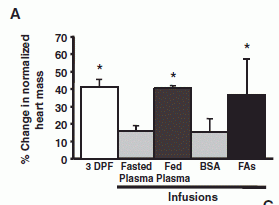
|
Each bar is for a particular treatment. The height of the bar shows the amount of heart growth found.
The left hand bar shows the heart growth after feeding. ("3 DPF" means 3 days post-feeding.)
The remaining treatments were done with fasted pythons, and involved infusing the snake with some test sample.
The first two used plasma (the liquid part of blood) from fasted or fed pythons. You can see that the plasma from the fed python mimics the effect of feeding.
|
Analysis of the "fed plasma" showed remarkable levels of triglycerides (50 times normal), with no observable ill effect. Analysis of these lipids (fats) in the python blood suggested three fatty acids (FAs) that might be of particular importance. So, they tried a mixture of those three FAs (dissolved with the help of the protein BSA). This mixture of fatty acids (right hand bar, "FAs") stimulated heart growth about as well as the fed-plasma or the feeding. (The BSA bar is a control without the FAs.)
|
So we have learned something about an interesting issue of python biology. Not only does the heart grow rapidly following a meal, but the effect can be mediated by the plasma of a fed python, or by some key fatty acids.
They did one more experiment -- one that takes this beyond the realm of python biology. That fatty acid mixture that mimicked the effect of feeding and stimulated python heart growth -- they gave that same fatty acid mixture to mice. They found...
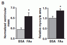
|
There are two experiments here -- with mice. The basic idea is the same. Mice were given the same fatty acid mix found to work with the pythons; the BSA solution serves as the control. Two measurements of heart growth were made. By both criteria, the FA mix stimulated heart growth in the mice.
|
Thus we see that a fatty acid mix found to stimulate heart growth in pythons also stimulates heart growth in mice. Does that mean it might also work in humans? Would that be good? Those questions are beyond the current work. (And my opening sentence, designed to get your attention, is beyond the current work in another way. They gave the mice the FA mix -- one based on what they learned from the pythons. They did not feed the mice python blood. Would that have worked? Interesting question.)
Overall, this is a fun story. Python biology is fun, and the new work begins to uncover part of the molecular basis of that story. Intriguingly, one of their findings seems to have some relevance to a mammalian system. Is there any relevance to humans? Who knows. It's fun to make the connection.
News story: Python Study May Have Implications for Human Heart Health. (Science Daily, October 27, 2011.)
The article: Fatty Acids Identified in the Burmese Python Promote Beneficial Cardiac Growth. (C A Riquelme et al, Science 334:528, October 28, 2011.) The figures above are Figures 4A and 4B from this paper.
More on triglycerides... Mutations that lead to reduced risk for heart disease (November 21, 2014).
More on heart health:
* Heart damage: role of mitochondrial DNA (June 1, 2012).
* Cardiac stem cells as a treatment for heart damage: preliminary results are "very encouraging" (November 29, 2011).
More about snakes and blood:
* Snakes and humans: who eats whom? (January 23, 2012).
* How to find the blood (August 29, 2011).
* Why is there an advantage in being left-handed -- if you are a snail? (January 18, 2011).
For more about lipids, see the section of my page Organic/Biochemistry Internet resources on Lipids.
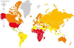
The Happy Planet Index
December 27, 2011
|
Now there's a map that gets your attention.
Countries are color-coded. Green is good, red is bad.
The worst countries -- bright red -- are the USA and much of Africa. Australia, Canada, and much of western Europe are in the second worst category.
The best countries? Careful... Green -- bright green -- is the top category. There are no bright green countries on this map. There are some countries that are light green, the second best category; they are in or near Central America.
|
What's this all about? Simply, the map shows how well countries fare on the various components of the Happy Planet Index (HPI). We should note right upfront that the purpose of the HPI is overtly political. Some aspects are even a bit contrived, in order to make a point. But it has a purpose, which I hope we would recognize as good.
There are various measures of a country's success. A common one is the gross domestic product (GDP); it is a measure of economic activity. The HPI takes a different approach: it is a ratio -- with something "good" in the numerator and something "bad" in the denominator. The HPI uses a measure of happiness (not economic wealth) in the numerator; it uses a measure of resource usage in the denominator. A good HPI comes from more happiness with less consumption. More specifically, the HPI is Happy Life Years (HLY) divided by Ecological Footprint (EF). Let's look at these two terms.
The numerator, a measure of the success of the country, is HLY. This is calculated by multiplying together two terms: the average life expectancy and the life satisfaction score. Life expectancy is a standard measurement. It currently ranges from 41 to 82 years for various countries. Life satisfaction? How does one determine how satisfied people are? One approach is to ask them. The HPI uses a short set of questions that lets people express how satisfied they are. Multiply life expectancy by life satisfaction (expressed as a fraction), and one gets HLY. The idea seems reasonable, though it is hard to know whether the specifics are optimal.
The denominator is the EF. How much resources does the country use? Perhaps we have seen tables showing how much energy various countries use; the EF is the same idea, but broader -- all resources. It's expressed as area of land required to provide those resources. On a bigger scale, we can state that as planets (earths) worth of land. It turns out that all of us together, over the world, are consuming resources that take about 1.3 earths to provide. But we have only one earth. For us to require 1.3 earths is not a sustainable situation. Further, some countries are using much more than average -- with the US being one of the worst. If all the world consumed resources the way the US does, we would need more than 4 earths worth of resources!
So there we have it: the HPI is a measure of the efficiency with which we achieve a good life. The map at the top of this post follows from that (though in a complex way). The red countries either are not achieving happiness, or they are doing so inefficiently -- and unsustainably. Green countries are efficiently achieving happiness. The report, at the HPI web site, discusses some of the greenest countries. I'm not sure I buy all their analysis. However, the big story here is the beginning of the development of a measure that rewards efficiency. If you have criticisms, then suggest improvements.
Web site for the Happy Planet Index.
A news story: Time to legislate for the good life -- Charles Seaford argues that a clear measure of well-being should be devised to help people judge how government policies affect their quality of life. (C Seaford, Nature 477:532, September 20, 2011.) This is a "Comment" article -- an opinion piece. It is how I first came across the HPI. It includes a graph that is about as striking as the map shown at the top of this post.
Also see...
* Energy wastage: The set-top box (August 1, 2011).
* Happyness, a House, and a Mouse (September 12, 2010).
* Are you happy? (July 5, 2008).
December 14, 2011
Engineering E coli bacteria to convert cellulose to biofuel
December 13, 2011
A team of scientists led by UC Berkeley's Jay Keasling has achieved an interesting milestone in the development of biofuels. At the outset we must note that this is nowhere near being economically practical, and there is no assurance that it will become practical. Let's enjoy their science, and their bold approach to a new generation of biofuels.
They engineer Escherichia coli bacteria to grow on plant material, such as cellulose, and make biofuels. Ordinary E coli can do neither of those. The cellulose does require a pretreatment, but not one involving enzymes. Thus their process uses only one organism. They actually make variants, to produce three different kinds of biofuels. The following figure diagrams the process. (This is Figure 1 of the paper.)
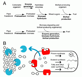
|
Part A shows two simple flowcharts: for a conventional process (upper) and for their "consolidated" process (lower). Both start with "plant feedstock" and a "pretreatment" step; both end with "fuel". Count the arrows for a simple view of the steps: the upper process has four arrows, whereas the lower process has two. Three distinct steps of the upper process (enzyme generation, biomass hydrolysis, biofuel production) have been combined into one step in the lower process.
Part B diagrams their engineered E coli, and shows what it does. Hexagons represent sugars; the chains at the left would be cellulose, for example. The big oblong object to the right represents the cell. The cell makes two types of enzyme to degrade the cellulose:
* Blue enzymes are secreted outside the cell; they break the cellulose down to 2-sugar units.
* Red enzymes are retained with the cell; they break the 2-sugar units down to simple sugars (1-sugar units), which enter ordinary metabolism.
The cell then converts the simple sugars to three biofuels. (Any one type of cell would make only one of the biofuels.)
|
A major part of this work, then, is in building the bacterial strains. In some sense, this is simple: they use known genes from other organisms, and transfer them to E coli. That's what genetic engineers (also sometimes called "synthetic biologists") do. Doing it for pathways involving multiple genes is more work, but no new principles. Extra work is required to get the pathways to work smoothly; it's one thing to get a gene to work, but it is another to get multiple genes to function in a coordinated way. For now, getting this to work at all is the goal. They will optimize it later.
An important step here is their pretreatment process. They treat the cellulosic material by dissolving it in an ionic liquid (IL). This is a gentle and very effective way to break down the crystalline structure of the cellulose, which is a serious impediment to its degradation. They recognize that this IL treatment is rather expensive at this point, but for now this is a demonstration. As with so many aspects, one can hope that costs will be reduced with experience. (In the case of IL, an important part of the economics is learning to recycle it efficiently.)
What are we to make of this? Scientifically, it is a major achievement. In terms of practical use, it is hopeless at this point. They consider the work here a milestone -- a technical milestone; that seems a proper view. Will it become useful? The only way to find out is to continue the development work. The economics of fuel production are difficult. Even the well-developed process of making ethanol from sugar (or corn starch) is only marginally viable economically. Making biofuel from cellulose is likely to always be more expensive. On the other hand, over the long term, the price of fuel is likely to rise. So let's welcome this as a milestone, and see what happens. Even if the process proposed here never comes to fruition, perhaps some parts of it will be useful.
News stories:
* E. coli bacteria engineered to eat switchgrass and make transportation fuels. (PhysOrg, November 29, 2011.)
* JBEI researchers engineer E. Coli to produce gasoline, diesel and jet fuel substitutes or precursors directly from switchgrass without external enzyme assistance. (Green Car Congress, November 29, 2011.)
The article, which is freely available: Synthesis of three advanced biofuels from ionic liquid-pretreated switchgrass using engineered Escherichia coli. (G Bokinsky et al, PNAS 108:19949, December 13, 2011.)
Also see...
* A tower of (solar) power -- which makes kerosene (August 22, 2022).
* Some fun reading: Fuel cell gadget and growing diesel (December 13, 2008). Part of this post talks about a fungus that converts cellulose to fuel; no information on its economic utility is available. The post also introduces Keasling's work -- his now-classic work to make the anti-malaria drug artemisinin, and the early ideas about the current project.
* Making biofuels from cellulose (May 17, 2010). Discussion of a process involving chemical degradation of cellulose, after dissolving it in an ionic liquid. Includes some discussion of the economics.
* Cellulosics for energy: an update (October 30, 2010). Overview of the use of cellulosics -- and the slow progress being made.
* Cellulose: improved processing (February 25, 2011). This post offers two improvements in cellulose processing.
* A better way to divide 6 by 2: A more efficient way to use sugar (November 10, 2013).
There is more about energy on my page Internet Resources for Organic and Biochemistry under Energy resources. It includes a list of some related Musings posts.
Human birth: When to cut the cord?
December 11, 2011
When should be umbilical cord be cut upon human birth? Should it be cut as soon as possible -- within seconds of birth? Or should one wait for three minutes or so? Interestingly, there are arguments on each side. We need to weigh the competing arguments. Since the arguments per se do not lead to a clear conclusion, we need to collect data comparing the methods.
Among the issues... In the minutes immediately following birth, blood continues to flow from the placenta to the baby. The key question is whether this is good or bad. It may be good if this blood represents an important portion of the baby's blood supply. It may be bad if it results in the baby having too much blood, or if it causes harm to the mother. Part of this is the iron level for the baby. Iron is an essential mineral, but also one that can cause problems. Too little or too much iron can be bad.
A new paper does a controlled trial comparing the two methods. The data support waiting. The key points are that babies with the delayed cut have a lower incidence of iron shortage at 4 months, and no ill effects are seen. As one goes through this, it is important to note the various arguments, so one can evaluate whether the results warrant a strong conclusion.
News story: Delayed Cord Clamping Protects Newborn Babies from Iron Deficiency, Research Finds. (Science Daily, November 15, 2011.)
* Editorial accompanying the article: Delayed cord clamping and improved infant outcomes -- Enough evidence exists to encourage a routine change in practice. (P van Rheenen, BMJ 343:d7127, November 15, 2011.) Good overview of the issues. The author reaches a clear conclusion; I do not know how widely that conclusion is shared.
* The article, which is freely available: Effect of delayed versus early umbilical cord clamping on neonatal outcomes and iron status at 4 months: a randomised controlled trial. (O Andersson et al, British Medical Journal (BMJ) 343:d7157, November 15, 2011.)
Also see:
* An advanced placenta -- in Trachylepis ivensi (October 18, 2011).
* The problem of human birth (July 8, 2011). This post deals with the timing of human birth, both compared to other animals and the problem of premature birth.
Does XMRV cause CFS? Wrap-up.
December 10, 2011
Update February 6, 2012
In October 2009, a report appeared claiming an association between xenotropic murine leukemia virus-related virus (XMRV) and the mysterious human illness chronic fatigue syndrome (CFS). This turned out to be a contentious finding. Musings noted the finding and the beginnings of the dispute in the post A virus that is or is not associated with chronic fatigue syndrome (February 12, 2010). That post also links to some follow-up posts, including developments earlier this year that cast considerable doubt on the association of the virus with the disease.
We now have a more official wrap up -- accompanied by an excellent summary. The original issue is whether people with CFS have a virus called XMRV (or similar) in their blood. Different labs were reporting different results. Since many things can affect such studies, a good way to resolve the dispute is to centrally prepare a set of standard samples, and have all labs test the same samples. This has been done, with the participation of all labs that had reported results, positive or negative, during the dispute; all labs are represented on the authorship of the paper. The results are clear... Most labs found nothing. The two labs that reported some positive results had no consistency in their findings. That is, the occasional positives they reported were for both control and CFS samples, and the two labs did not agree on which samples were positive. This is a well-designed study -- a good example of how such disputes should be handled.
Overall, the XMRV-CFS story is a good case study in how a scientific dispute is handled.
News story: XMRV, Related Viruses Not Confirmed in Blood of Healthy Donors or Chronic Fatigue Syndrome Patients. (Science Daily, September 22, 2011.)
* News story accompanying the article: False Positive. (J Cohen & M Enserink, Science 333:1694, September 23, 2011.) On the article itself, the title is actually written as False Posi±ive. This major "newsfocus" summarizes the entire XMRV-CFS story. It is an excellent overview, and would be a good place for a newcomer to start. It was published in print at the time the following article was accepted for publication and posted online.
* The article: Failure to Confirm XMRV/MLVs in the Blood of Patients with Chronic Fatigue Syndrome: A Multi-Laboratory Study. (G Simmons et al, Science 334:814, November 11, 2011.)
For an idea of the results, look at Table 1 of the article. The rows of the table are for various types of tests and various labs. The first column is for control patients; the next two columns are for CFS patients for whom the virus had been detected earlier. You will see that the table contains mostly zeroes; a scattering of non-zeroes has no particular pattern. The last column (at the right) is a positive control: samples have been "spiked", by adding the virus. Most labs detected all of these spiked samples. Interestingly, the only lab that failed to detect all of the positive controls is the one that reports the virus in other samples.
More, February 6, 2012...
The two main papers in support of the association of XMRV with CFS have been retracted. One was the original report, which was partially retracted by the authors, and then officially retracted by the journal. A second report that had offered positive but conflicting evidence has been retracted by the authors.
Musings noted a retracted paper in the post Prejudice against outsiders -- in monkeys (May 10, 2011). In that case, the retracted paper had been the focus of the post; that is, the post was about the paper as a new development. Subsequent retraction effectively negates the post.
Cleaner cars: the Honda Civic Natural Gas car
December 9, 2011
Our automotive writer sends his review of an interesting new car: a model of the venerable Honda Civic designed to run on natural gas.
The review: 2012 Honda Civic Natural Gas [pdf file; link opens in new window]. (Brian Sy, November 2011.)
You may wonder how fuel usage is compared for gasoline vs natural gas. The convention is to use energy content. That is, a gallon-equivalent of natural gas has the same energy as a gallon of gasoline. Wikipedia: Gasoline gallon equivalent.
Brian's review of the 2010 Aptera 2e is part of the post Electric cars (May 9, 2009). The post focuses on the Tesla cars. Update, December 2011... Brian notes that Aptera has recently gone out of business. This does not necessarily reflect on the merits of the car, but does reflect on the difficulties of the market. Aptera closes its doors. (CNet, December 2, 2011.) (I have added this update to the original Aptera post.)
December 7, 2011
How were the Gamburtsevs formed?
December 7, 2011
Do I need to first explain what the Gamburtsevs are? It might seem odd that educated readers would not be familiar with one of Earth's great mountain ranges, sometimes compared to the Alps. However, this mountain range is in a remote area. Further, even if you were there, you would not be able to see the Gamburtsev Mountains; no human has ever seen them. The Gamburtsev Mountains are in Antarctica -- buried under a thick sheet of ice. They were discovered only in the 1950s, by radar. The Gamburtsevs are our least understood mountains.
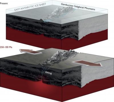
|
Here is a pair of diagrams, giving an idea of what the Gamburtsevs looked like long ago (bottom) and what they look like now (top).
The lower diagram shows land masses, with a crack in the middle, labeled "rifting". The mountains rise through this crack. More about this below.
The upper diagram is substantially the same, but with a layer of ice on top. (The ice layer is about 3 km thick.) It's hard to see the ice, but note the label near upper left. The ice, of course, is the typical land cover in Antarctica. There is enough ice to completely cover the mountains, which are now labeled "Gamburtsev Subglacial Mountains".
This figure is from the PhysOrg news story listed below.
|
A team of scientists has now studied the Gamburtsevs more extensively. Their tools? Airplanes -- with ice-penetrating radar, gravity meters and magnetometers. From their findings, they propose how these mountains developed. One part of the story is shown in the lower part of the figure. Modern Antarctica is part of a rift system -- a place where two parts of the land mass pull apart. (A famous rift system is that of East Africa.) The big arrows in the lower diagram show the rifting. This rift system is what split India from Antarctica. The roots of ancient mountains lay buried, but the rifting events of 100 million years or so ago created an opening that allowed a new generation of mountains to rise. This is the best analysis yet of the history of the Gamburtsevs, based on a major round of measurements. It leads them to propose a model. I'm sure this is just the first step of working out the full story. It may be incomplete and preliminary, but it is just fun to read about that buried mountain range.
News story: Gamburtsev Subglacial Mountains enigma unraveled in East Antarctica. (PhysOrg, November 16, 2011.) Browse this for a nice overview of a complex story.
* News story accompanying the article: Geophysics: Earth's longest fossil rift-valley system. (J Veevers, Nature 479:304, November 17, 2011.)
* The article: East Antarctic rifting triggers uplift of the Gamburtsev Mountains. (F Ferraccioli et al, Nature 479:388, November 17, 2011.)
There is a small animation showing the breakup of the supercontinent Pangaea in Wikipedia. It's too small and too fast to work well, but still gives you some idea. You can't see Antarctica very well in it, but you can see India breaking off and racing northward. Wikipedia: Pangaea. (Gondwana is a part of Pangaea that splits off the southern end.)
More about African rifting: Africa is falling apart (July 27, 2010).
More about measuring local gravity: The potato we call home: a study of the earth's gravity (May 3, 2011). The post notes how local gravity is affected by mountains.
More about mountains: Our mountains are growing (May 19, 2012).
More from Antarctica:
* What do microbes eat when there is nothing to eat in Antarctica? (April 2, 2018).
* IceCube finds 28 neutrinos -- from beyond the solar system (June 8, 2014).
* Life in an Antarctic lake (April 22, 2013).
More from Gondwana:
* Did selenium deficiency play a role in mass extinctions? (February 5, 2016).
* Quiz: What is it? (August 17, 2015).
* The oldest known plants (November 2, 2010).
More about super-continents: Briefly noted... America and Asia are getting closer (March 15, 2023).
Therapy based on embryonic stem cells: the first clinical trial -- follow-up
December 5, 2011
Original post: Therapy based on embryonic stem cells: the first clinical trial (October 23, 2010).
Geron (the company behind this trial) has announced that they are getting out of the stem cell business. They blame it on economic factors, with no indication that there is any scientific setback per se. It is hard to know what is really behind the decision, so we simply note this as an addendum to the initial post. The trial is a high-risk -- and expensive -- venture, partly because it is the first step into a new area. Patients who have already been treated will continue to be monitored; that means we will get some information about the treatment.
News story: Stem cell trial halted. (BBC, November 15, 2011.) As I understand it, the title here is a bit misleading. As noted above, monitoring of patients that have already been treated will continue.
Geron's announcement: Geron to Focus on its Novel Cancer Programs. (November 14, 2011.) Geron has removed most of their pages on the stem cell work; the page is now archived, at: Geron announcement.
And then... Geron sells its stem cell business (January 23, 2013).
For more on stem cells:
* Cardiac stem cells as a treatment for heart damage: preliminary results are "very encouraging" (November 29, 2011).
There is more on stem cells on my page Biotechnology in the News (BITN) - Cloning and stem cells.
Chemical elements 114 & 116: flerovium, livermorium (proposal)
December 5, 2011
Chemical elements 114 and 116 were recently officially recognized: Chemical elements 114 and 116 officially recognized (June 8, 2011). IUPAC has now formally announced proposed names for these two elements. Both of these elements were discovered (or, more precisely, synthesized) in collaborative work between the Flerov Laboratory of Nuclear Reactions at the Joint Institute for Nuclear Research, in Dubna, Russia, and Lawrence Livermore National Laboratory (LLNL), in Livermore, California (about 40 miles southeast of San Francisco). The proposal names one element after each of the two laboratories. The proposed names and symbols are
* element 114: flerovium (Fl);
* element 116: livermorium (Lv).
There is an official period for comments on the proposal. The names will probably be officially adopted in mid-2012. [See below.]
News release from one of the labs: Livermore and Russian scientists propose new names for elements 114 and 116. (LLNL, December 1, 2011.) (August 15, 2012... The news story originally listed is no longer available. This is a replacement.)
Follow-up: Chemical elements 114 & 116: flerovium & livermorium are now official names (June 5, 2012).
More on the elements...
* Naming: Element #112: Copernicium (July 15, 2009).
* Discovery: Chemical element #117 (April 13, 2010).
Leopard horses
December 2, 2011

|
The picture at the left shows two spotted horses. The picture is based on a painting on the wall of a cave in France, and is thought to be 25,000 years old.
Larger picture [link opens in new window].
Such horses, called leopard horses, are known. However, many scientists thought that they did not exist 25,000 years ago. Were that true, it would imply that these paintings were works of the imagination by the ancient cave painters.
|
Now, a team of researchers has provided some new evidence. They tested DNA from 31 horses of that same era, and found the gene for leopard spotting in six of them. The conclusion, then, is that leopard horses did exist at that time; therefore, the cave paintings may well have been based on what the artists saw.
It's an interesting use of DNA technology.
News story: Prehistoric Cave Paintings of Horses Were Spot-On, Say Scientists. (Popular Archaeology, November 7, 2011. Now archived.) The page contains several beautiful pictures -- including the one shown above.
The article: Genotypes of predomestic horses match phenotypes painted in Paleolithic works of cave art. (M Pruvost et al, PNAS 108:18626, November 15, 2011.)
Other posts on prehistoric art include:
* The oldest known dog leash? (January 23, 2018).
* Images from 30,000-year-old motion pictures (July 22, 2012).
* Early American art: a 13,000 year old drawing of a mammoth (July 18, 2011).
Other posts that deal with horses:
* How horses learned to walk (September 21, 2016).
* The oldest DNA: the genome sequence from a 700,000-year-old horse (August 4, 2013).
* Can giraffes swim? (August 6, 2010).
* Stripes protect zebra against horseflies -- another story of polarized light (February 26, 2012).
There is more about art on my page Internet resources: Miscellaneous in the section Art & Music.
There is more about sequencing on my page Biotechnology in the News (BITN) - DNA and the genome. It includes a list of Musings posts on sequencing and genomes.
Also see: Monitoring the wildlife: How do you tell black leopards apart? (August 10, 2015).
November 30, 2011
Does dry cleaning cause cancer?
November 30, 2011
The title should get your attention. It's an important question. A recent paper takes a stab. It's also interesting because of how the work got started, based on the initiative of a high school student. However, there is no clear conclusion -- as the authors realize, and is so often the case with issues of environmental contaminants. So let's look at what they did -- realizing at the outset that this is an incomplete story.
One common solvent for dry cleaning is perchloroethlyene (PCE, Cl2C=CCl2). It works, but it is also known to be toxic. It may even cause cancer, though this has not been clearly established. The use of a toxic solvent raises two safety issues. One is for the workers, and the other is for the consumers. As typical of many chemical exposure issues, workers using it may be exposed to high levels for long periods, and then there is the possibility of consumers getting some exposure to residues. That second part is what is explored here. Are consumers exposed to harmful levels of PCE by having their clothes dry cleaned? The question was posed by a high school student, who then sought out university researchers to help her with the problem. They did some nice work, but it is only part of what we need to know -- the easy part.
What did they do? They sent out samples of four different fabrics to seven local dry cleaners. They then analyzed the cleaned fabrics for PCE. That is, they asked if clothes that are dry cleaned retain some of the solvent. The following figure summarizes the results.
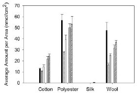
|
The y-axis shows the amount of PCE found. The bars are grouped by fabric type, with one bar for each of the seven dry cleaners for each fabric.
Main observations:
* Silk does not retain PCE.
* There are only five bars per fabric group, not the seven I said. That's because two of the dry cleaners gave results with zero PCE for all samples. They say these are dry cleaners who advertise themselves as "green".
* The other fabrics at the other dry cleaners all yielded PCE. The differences between them are not important for us here.
|
A bit of fine print...
* They raise the possibility that the negative result for silk is an artifact of their method, but they think that unlikely. It can be tested at some point by trying an alternative method.
* The two "green" cleaners apparently do not use PCE. The authors deduce what solvents these places do use (but seem not to ask the cleaners to confirm their science).
The figure above is Figure 4 from the paper.
|
In other parts of the work, they show that the level of PCE on the fabrics increases with multiple washings. They also show that the PCE can "off-gas" -- come off the fabric.
A simple summary, then, is that the common dry-cleaning solvent PCE can be retained on fabrics. We may be exposed to PCE, known to be toxic, either by direct contact, with adsorption through the skin, or by breathing air into which the PCE has off-gassed. (Imagine for example that the cleaned clothes are left in a hot car.) The key question, then, is whether any such exposure is likely to be at high enough level to be significant. They discuss aspects of this at some length, but the bottom line is that they don't know. That's partly because little is clear about the possible carcinogenicity of PCE. A useful outcome of this work would be if it led to improved study of PCE toxicity.
The situation here is all too typical. Toxicity issues are a matter of dose. Simply saying that something is toxic and that we are exposed is not very helpful. We need to know something about the levels involved -- and that information can be hard to get.
What about those "green" cleaners? This paper does not contain any serious discussion of their pro and con issues, so there is no basis here for discussing this. PCE serves as a reminder of one big concern. PCE itself was introduced as "better" than the previous solvent used for dry cleaning, which was found to be contributing to ozone depletion. Solving one problem sometimes leads to another. We need information.
In the meantime, you can greatly reduce your exposure to PCE by allowing dry-cleaned items to off-gas for a few days -- in a ventilated space. Or you can wear silk.
* News story: Cleaning up: Fabrics retain remnants of dry cleaning fluid. (Spectroscopy Now, November 1, 2011.)
* Press release: High Levels of Carcinogens in Dry-Cleaning, Study Shows. (Georgetown University, August 30, 2011. Archive copy.) This page notes the role of the high school student who proposed the study.
The article: Quantification of Perchloroethylene (PCE) Residues in Dry Cleaned Fabrics. (K S Sherlach et al, Environmental Toxicology and Chemistry 30:2481, November 2011.)
Also see:
* The role of combinations of chemicals in causing cancer? (September 21, 2015).
* Are government safety inspections worthwhile? (June 12, 2012).
* The bisphenol A (BPA) controversy (September 19, 2010). Another example of controversy about the risks of a chemical in our environment.
My page for Biotechnology in the News (BITN) -- Other topics includes a section on Cancer.
Cardiac stem cells as a treatment for heart damage: preliminary results are "very encouraging"
November 29, 2011
A heart attack (myocardial infarction) leads to reduced heart function, due to loss of functional heart muscle. The human body is poor at regenerating replacement heart muscle. What if we could stimulate the body to do so? It's an active research topic, and stem cells are one approach. A new paper reports very preliminary results of a clinical trial using one type of stem cell; the results are "very encouraging".
The work uses cardiac stem cells (CSC). These are cells found in heart tissue that have the capability of growing and differentiating into the various types of heart cells. That is, these would seem to be the cells that would normally lead to heart muscle formation. (Of course, that leads to the question of why they do not normally do so very well. Is this simply a matter of numbers, or does it involve signals? Those questions remain unanswered.) Further, each patient is treated with his or her own stem cells. Thus we already see two good features of this approach: the type of cell used "makes sense", and immunological problems are avoided by using the patient's own cells. Of course, predicting that these are good features does not mean they will work.
What they do is to take a sample of heart tissue from the patient (during a surgery that is otherwise scheduled). They grow out the cells ("expand" them, as they say), and isolate the CSC. These expanded CSC are then injected into the patient's heart.
A Phase 1 clinical trial, the first test of this procedure in humans, is in progress, and preliminary results are being reported.
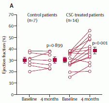
|
Here is a key set of results. This is Figure 4A of the paper.
The y-axis shows a measure of the heart function: the "ejection fraction", as measured by echocardiographic imaging of the heart during a beating cycle. Results are shown for the control patients (left side) and the patients treated with CSC (right side). For each group, there are results for time zero (baseline) and 4 months. Results are shown for individual patients (the lines), and for the group averages (the squares).
Let's start with the group averages, shown with the red squares. For the control patients, the red square is at about 30% both at baseline and 4 months. For the CSC-treated patients, the baseline value is also about 30%, but at 4 months it is near 40%. This is not only a statistically significant improvement, but also one that is of meaningful benefit to the patient.
|
Also shown are the results for each patient. For example, on the left are seven lines, one for each of the seven control patients. You can see that the patients varied -- in each group. However, it is clear that there are several patients in the CSC-treated group with better results than any of the control patients. (It also looks to me like the patient with the worst result was one of the treated patients.)
|
The results above suggest that the treatment results in benefit, on average, but also cautions us that there is considerable variability.
Other parameters measured lead to a similar conclusion. Further, limited data for some of the patients suggest that the benefit shown above is retained at 12 months; it may even be a bit better.
An interesting feature of the trial is that it is treating old damage. The average age of the infarcts (damaged areas) was over 3 years. If this part of the study holds up, it means that this is not simply a first-line treatment, which must be administered promptly, but one that can be administered "at will". It is also possible that repeated treatments, perhaps over a time span of years, would lead to further improvement; that is completely beyond the current trial, but is worth testing.
Conclusion? This is where we need to be very careful. This is a Phase 1 clinical trial. In fact, it is only part of that trial -- early data on some of the first patients. The trial is neither double-blind nor placebo-controlled. The primary purpose of a Phase 1 trial is to test safety, and a simple protocol is common. (Safety? No serious problems have been seen.) Measuring efficacy is secondary. The authors call their results here "very encouraging". What that means is that they want to proceed to further, more thorough testing. The ultimate verdict on the method comes from the continued testing. It is common that the judgment of a treatment or drug becomes more complex as more data become available. For now, the very limited data we have suggest that the use of CSC is promising; it is worth testing it more.
News stories:
* Using Heart's Own Stem Cells To Treat Heart Failure. (Medical News Today, November 15, 2011.)
* First Clinical Trial of Autologous Cardiac Stem Cells Shows Positive Results. (GEN, November 14, 2011.)
* News story accompanying the article: SCIPIO brings new momentum to cardiac cell therapy. (G Heusch et al, Lancet 378:1827, November 26, 2011.)
* The article: Cardiac stem cells in patients with ischaemic cardiomyopathy (SCIPIO): initial results of a randomised phase 1 trial. (R Bolli et al, Lancet 378:1847, November 26, 2011.)
Also see:
* Stem cell treatment of heart damage: a new interpretation (March 31, 2020).
* Synthetic stem cells? (April 30, 2017).
* How good is "good cholesterol" (HDL)? (September 21, 2012).
* Using patient-specific stem cells to study Alzheimer's disease (February 24, 2012).
* Heart health and python blood (December 28, 2011).
* Therapy based on embryonic stem cells: the first clinical trial -- follow-up (December 5, 2011).
* Using stem cells to study a heart condition (April 19, 2011).
Human violence
November 28, 2011
We're all aware of human violence. It's in the news constantly, and it is in our history. We may even think it is increasing. Of course, human population is also increasing, as is our awareness of the world around us. In a new book, Harvard psychologist Steven Pinker argues that human violence is decreasing, and he then explores the reasons. A short article based on the book appeared in Nature, and is listed below. There are two issues... The first, whether violence is decreasing, involves facts -- data. Controversial data, perhaps, but data. The second is the reason(s) for such a decline -- if indeed there is a decline. This, too, is interesting and provocative, but more subjective.
I hope that this item stimulates some serious thinking. It's not to quickly decide whether he is right or wrong, but to think about individual issues that he raises. Do reasonable data support the suggestion that human violence is decreasing, at least in some cases? Do we learn something about human society from some of his suggested reasons? The book itself is a massive tome; it's not on my agenda to tackle it. If we are going to learn about Pinker's views from secondary (and perhaps biased) presentations, it is important to read some range of them, and to be cautious about reaching judgment.
The article: Taming the devil within us -- We are getting smarter, and as a result the world is becoming a more peaceful place, says Steven Pinker. (S Pinker, Nature 478:309, October 20, 2011.) It says: "This article is adapted from his new book The Better Angels of Our Nature: The Decline of Violence in History and its Causes (Allen Lane, 2011)." It's quite short. Please read it.
Here is one book review, which gives a good sense of the issues: Is Violence History? (P Singer, New York Times, October 6, 2011.)
I wanted to find a review that offered substantive criticism of the book. While looking, I came across the following page, which notes a range of reviews. Briefing note: The Better Angels of Our Nature by Steven Pinker. (The Omnivore, October 29, 2011.) You might check the listed review in the Washington Post for an interesting negative review of the book. While negative, this review talks of much that is good about the book. It may be a fair summary that the book is useful in how it will provoke better discussion of the issues; it is not "the last word".
Other Musings posts about books include Silent Spring -- on its 50th anniversary (October 5, 2012).
This post is also noted on my page Book suggestions: Pinker, The Better Angels of Our Nature.
More about human violence:
* In the aftermath of gun violence... (January 8, 2018).
* Violence within the species -- in various mammals; implications for the nature of humans (December 6, 2016).
* The earliest human warfare? (February 17, 2016).
November 22, 2011
Royal Society opens its historic journal archives to free access
November 22, 2011
The Royal Society (of London) claims to be the world's oldest scientific publisher. Its peer-reviewed journal Philosophical Transactions of the Royal Society dates from 1665. In October the Society announced that it is now providing free access to its entire collection of old journals -- for those older than 70 years.
The Royal Society announcement listed below gives you some idea what this historic collection contains. One of the examples they note is featured in the accompanying post, below.
News story: Royal Society journal archive made permanently free to access. (Royal Society, October 26, 2011.)
More about their first journal: Happy birthday, Phil Trans (March 25, 2015).
More from the Royal Society: Royal Society suggests science books (July 27, 2009).
Benjamin Franklin and the electrical kite
November 22, 2011
The Royal Society has opened access to its historic collection of scientific journals, dating back to the 17th century. This was noted in the accompanying post, above. One of the articles they featured in their announcement was a letter to the Society by one Benjamin Franklin of Philadelphia, concerning an electrical kite. I'm sure you've all heard about this; now you can read what Franklin wrote.
The article: A Letter of Benjamin Franklin, Esq; to Mr. Peter Collinson, F. R. S. concerning an Electrical Kite. (Benjamin Franklin, Philosophical Transactions 47:565, 1752.) It's quite short, and generally readable (so long as you remember that most of those characters that look like f are really s).
With restraint and reluctance, I have avoided applying an adjective of nationality to Franklin. The paper here dates from 1752 -- 24 years before the English colonies on the eastern coast of North America declared their independence from Mother England.
For more about Franklin the scientist, see my page of Book Suggestions: Charles Tanford, Ben Franklin Stilled the Waves: An informal history of pouring oil on water with reflections on the ups and downs of scientific life in general. 1989.
A post about an article that is a follow-up to Franklin's work: High-voltage thunderstorms: how high? (April 29, 2019).
More about the journal: Happy birthday, Phil Trans (March 25, 2015).
* Previous post about a historic paper: Central Dogma of Molecular Biology (August 16, 2011).
* Next history post: Quiz: What's the connection... (February 14, 2012).
My page Internet resources: Miscellaneous contains a section on Science: history. It includes a list of related Musings posts.
Are some languages spoken faster than others?
November 21, 2011
When you hear someone speak in another language, does it seem that they speak very fast? Is that real, or is it just a perception due to unfamiliarity? And if they really are speaking faster, does that mean they are communicating information faster?
If we are going to answer those questions with some objectivity, we need to define our terms carefully, and then take careful measurements. A recent paper does just that, and offers some intriguing findings.
For speed, the authors choose to count syllables. That is, they express speaking speed in syllables per second. Expressing the information content is tricky; they choose to do it by comparing the same texts translated into several languages. That is, they do not attempt to measure information content in any absolute sense, but simply assume that it is the same for the given text in different languages. They use several text samples, and several speakers per language. The speakers are either native speakers of the language, or considered to be fluent.
They present their results in both a table and a graph. Interestingly, I think the table is clearer, so here it is.
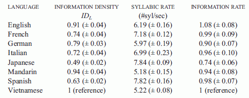
|
Let's look at two rows in detail, to illustrate what the table shows. I'll choose Mandarin and Spanish, which are adjacent in the table -- and happen to be near the extremes of what they observe.
This is Table 1 from the paper. Figure 2 is equivalent. However, I found the figure less clear; a better choice of marking the bars for different parameters might have enhanced the visual impact.
|
The simplest data column is the middle one, labeled "syllabic rate #syl/sec". This is the measured speaking speed, in syllables per second. You can see that Mandarin is spoken at about 5 syllables per second, whereas Spanish is spoken at about 8 syllables per second. These are very near the extremes they found in this set of eight languages. Thus we already see that, in this sense, some languages are spoken faster than others.
The first data column is the information density in the language, IDL. One might think of this as the amount of information conveyed per syllable. Since they have no specific measure of information, it is expressed here on a relative scale. IDLfor one language (Vietnamese) is set to 1, for "reference"; IDL values for the other languages are given relative to Vietnamese. This is done, as introduced above, by comparing how many syllables it takes to convey the same texts translated into the various languages. If you look at the table for our two focus languages, you can see that Mandarin has an information density of 0.94, whereas Spanish has an information density of 0.63. Once again, these are near the extremes.
Example... In the Appendix of the paper, they show one of their texts translated into each language. For the first sentence, the English text is 13 syllables, whereas the Spanish text is 18 syllables. That is, it takes Spanish more syllables to say the same thing; the information density is lower for Spanish. Of course, my one sentence example may not be representative. In the paper they show the result averaged over all the texts. The table shows that indeed IDL is lower for Spanish than for English. (Actually, my example sentence is very close to being representative.)
Ok, Spanish is spoken with more syllables per second than Mandarin. But Mandarin has more information per syllable than Spanish. If you multiply these two together -- and again normalize so that Vietnamese is set at 1 -- you get the rate of speaking information, which is shown in the right hand data column as "Information rate". It is just about the same for Mandarin and Spanish; the difference is small compared to the uncertainties shown in parentheses.
|
That's the big idea here. Yes, some languages are spoken faster than others: more syllables per second. But in terms of information, they may come out about even. If you look at the third column of the table, you can see that most of the languages they studied have about the same information rate. However, Japanese is clearly rather different.
There are only eight languages here, so this is just a start. But it offers an intriguing idea, and also suggests that not all languages may fit the main pattern. There is much here for further study.
News story: Language Speed Versus Efficiency: Is Faster Better? (Science Daily, September 1, 2011.)
The article: Across-language perspective on speech information rate. (F Pellegrino et al, Language 87:539, September 2011.) (Put the title in Google Scholar, and you may find a freely available copy.)
For more about language...
* Deciphering the inscription on an old comb (November 27, 2022).
* Do dolphins talk to each other? (November 19, 2016).
* Mountains and human language? (June 28, 2013).
* Speech: Are chimps good listeners? (July 25, 2011).
* Language: What do we learn from other animals? (August 3, 2010).
* Is it language? (July 9, 2009).
* Spleling (June 11, 2009). I suspect this is related to the current post.
* Language development (May 7, 2009).
* Musings: Bilingual. This is a supplementary page, consolidating multiple posts on issues of being bilingual.
November 16, 2011
To kill a mastodon
November 15, 2011
Dead mastodon. Wound in rib. Let's look...
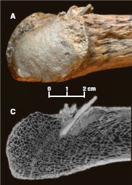
|
The bone within the bone. Two views:
* Part A (upper) shows an ordinary photograph of a part of the rib bone, with the projectile sticking out.
* Part C (lower) shows a CT scan (X-ray) of the same region.
This is Figure 1, parts A and C, from the paper. Note that the scale bar is for both of these parts.
|
It's that second picture that got me to post this item. A CT scan of a 14,000 year old animal, showing quite spectacularly the embedded weapon. Of course, it took more than this one spear to kill the animal. The point (no pun intended) is not to present a complete story about this animal's death, but to see what we can learn from it.
The real story, to the scientists doing this work, is about what humans did -- and when they did it. This kill has implications for our understanding of the early history of humans in North America. This animal had been uncovered in the 1970s, at a site on the Olympic Peninsula, west of Seattle, Washington. An age of nearly 14,000 years was presented, but many were skeptical. Why? Well, there were no humans in that area that long ago -- according to established view. What's new here is definitive evidence to support the dating to 13,800 years ago, making this the oldest known hunting weapon from North America. It comes at a time of increased willingness to accept that man's history in North America does date back that far.
Testing of DNA and protein samples indicate that the weapon tip, as well as the killed animal, is mastodon. That's further evidence that this was from a human attack, not an accident.
News story: Paleo CSI: Early Hunters Left Mastodon Murder Weapon Behind. (LiveScience, October 20, 2011.)
* News story accompanying the article: Archaeology: Pre-Clovis Mastodon Hunters Make a Point. (A Lawler, Science 334:302, October 21, 2011.)
* The article: Pre-Clovis Mastodon Hunting 13,800 Years Ago at the Manis Site, Washington. (M R Waters et al, Science 334:351, October 21, 2011.)
A recent post was also on the topic of proboscideans and evidence for early man in North America: Early American art: a 13,000 year old drawing of a mammoth (July 18, 2011). That post links to a book suggestion on the topic.
And more... Did the First Americans eat gomphothere? (July 29, 2014).
Another mastodon: The first Americans: Is it possible we have the date wrong by 100,000 years? (June 28, 2017).
More on wounds: Targeting growth factors to where they are needed (April 21, 2014).
Cystic fibrosis: treating the underlying cause -- for some people
November 13, 2011
Cystic fibrosis (CF) is a genetic disease -- the most common genetic disease among Caucasians. The gene for CF codes for a protein that transports chloride ion (Cl-) across the cell membrane. The protein and its gene are known as cystic fibrosis transmembrane conductance regulator (CFTR). There are varied effects, but CF patients show deteriorating lung function, which is ultimately fatal.
As so often, treatment is typically symptomatic, not dealing with the cause. However, a new drug, ivacaftor, has been developed which addresses the cause. The drug binds to and restores function of the mutant CFTR protein. A new paper reports results from a phase 3 clinical trial of the new drug.

|
Here is an example of the results.
The graph shows the results of a test for lung function over time, for patients treated with the drug and for control patients treated with a placebo. You can see that the patients treated with the drug showed a rapid improvement, which remained constant during the study. In contrast, the placebo group showed no change (or perhaps a slight decline).
This is Figure 1A from the paper. Other parts of Figure 1, as well as Figure 2, show similarly positive results for other parameters that were measured.
|
The results are generally impressive: good benefit, and no significant side effects. I would not be surprised if the drug receives approval soon.
Despite the favorable results, we must remember that any such clinical trials have limitations. We might consider them in two classes.
* Numbers. A certain number of people were treated for a certain period of time. Thus the test would not show "rare" effects, and says nothing about long term use. This is a general issue for all clinical trials. That is why evaluation of a drug continues after formal approval.
* Disease target. The drug was designed to interact with a particular mutated form of the CFTR protein. All patients tested here carried the particular mutation, called G551D. (The mutation name means that amino acid #551 of the protein is changed from G to D; amino acids G and D are glycine and aspartic acid, respectively.) People with this mutation make an altered form of the CFTR protein; it is inserted into the membrane, but just does not function well. Unfortunately (in this context), that is a relatively uncommon CF mutation. Thus the drug is applicable for only a small subset of CF patients. The drug will be tested on people with other mutations, but there is no clear prediction about its usefulness. A particular issue is that the most common CF mutation leads to a protein that does not even enter the cell membrane; a drug such as ivacaftor, which improves protein function, is useless if the protein is not there.
The second point, on disease target, illustrates a general feature of "personalized medicine"; drugs that have been customized to meet the needs of certain people have a narrow audience. Nevertheless, the drug here seems to be a useful step, and is likely to benefit real patients.
News story: Cystic fibrosis drug ivacaftor offers patients new hope -- Vertex Pharmaceuticals' ivacaftor reduced pulmonary flare-ups by 55% compared with a placebo. For now it applies to those with a certain genetic mutation, but the pool of patients could grow. (Los Angeles Times, November 2, 2011.)
* Editorial accompanying the article: Therapy for Cystic Fibrosis - The End of the Beginning? (P B Davis, New England Journal of Medicine 365:1734, November 3, 2011.)
* The article: A CFTR Potentiator in Patients with Cystic Fibrosis and the G551D Mutation. (B W Ramsey et al, New England Journal of Medicine 365:1663, November 3, 2011.)
More on cystic fibrosis:
* Restoring ion transport in cystic fibrosis patients -- using a pore-forming drug? (April 12, 2019).
* How our immune system may enhance bacterial infection (September 19, 2014).
Several posts on personalized, genome-based medicine, are listed at: Personalized medicine: Getting your genes checked (October 27, 2009).
A microscope small enough that a mouse can wear it on its head
November 12, 2011
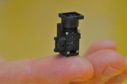
|
There it is -- sitting on a person's finger.
It is 22 millimeters high -- just under an inch. It weighs 1.9 grams -- about the weight of the smallest US coin.
This figure is from the PhysOrg news story listed below.
|
To see a mouse wearing the microscope on its head, see the movie file that is linked to the article web page, below. The left side of the movie shows the mouse, with attached microscope, doing various activities. The right side shows the image obtained from the microscope during the same time. The mouse had received an intravenous injection of a fluorescent dye, which labels the blood plasma. Thus the microscope allows the observers to watch the blood flow inside the head while the mouse goes about its usual activities. (The scale bar for the right side is 100 micrometers.)
Attachment of the microscope is not as simple as it might sound. The microscope cannot see through the skull. What is done is to surgically remove a portion of the skull, and replace it with a piece of glass. The glass provides a window into the head; the microscope is attached over the window.
This is a technology story (and the article is from a "methods" journal). The microscope capability here is novel, allowing good observation of an animal that is substantiality free. A table in the paper compares the specs to those of available technologies. Further, the microscope here is simple. They argue that it could be inexpensively mass produced, though I don't see any specific costs.
News stories:
* Stanford group creates miniature self-contained fluorescence microscope. (Phys.Org, September 12, 2011.)
* Cheap, portable mini fluorescence microscope eyes in-vivo and in-vitro applications. (Laser Focus World (was BioOptics World), September 13, 2011.)
The article: Miniaturized integration of a fluorescence microscope. (K K Ghosh et al, Nature Methods 8:871, October 2011.) The movie file is linked to the article web page under Supplementary information.
A post about work making use of such a system: What happens to capillary blood flow in the brain during sleep -- and why? (November 8, 2021).
A previous post on microscope technology: Connecting a cell phone and a microscope (September 2, 2009).
Another small microscope: A ream of microscopes for $300? (June 22, 2014).
Also see a section of my page Internet resources: Biology - Miscellaneous on Microscopy.
Another way to see what is going on inside the head of an animal... Observing inside animals with an improved bioluminescence system (April 6, 2018).
More about making holes in the skull: Skull surgery: Inca-style (August 21, 2018).
We've used the US dime as a frame of reference for weight before... Graphene by the roll -- and soon in your living room (July 31, 2010). The small coin is also useful as a reference for size: The smallest frog (January 31, 2012).
The dime has even been the subject of a post: Money question (May 20, 2009).
November 9, 2011
Is whole genome sequencing a useful medical tool?
November 9, 2011
The idea of personalized medicine is that people are different -- including in their genes. It follows, then, that at least some aspects of medical treatment might best be customized to the individual -- including their genes. We have discussed various aspects of personalized medicine, often emphasizing that this is a very new area, and there is much uncertainty. Of particular note is the post Genome sequencing to diagnose child with mystery syndrome (April 5, 2010), which links to a follow-up. This is about a young child whose genome was sequenced in order to help diagnose his condition; he now seems to be thriving as a result.
So, is this the future? A better answer is that it is a tentative and uncertain step toward that future. Nature has recently published a "news feature" exploring this topic. It properly offers both hope and caution. I encourage you to read it, for a snapshot of today's perspective on an emerging technology.
The article, which is freely available: Genomes on prescription: The first clinical uses of whole-genome sequencing show just how challenging it can be. (B Maher, Nature 478:22, October 6, 2011.)
One of the driving forces behind this is the rapidly declining cost of DNA sequencing. This was discussed in the post The $1000 genome: Are we there yet? (March 14, 2011).
Several posts on personalized, genome-based medicine, are listed at: Personalized medicine: Getting your genes checked (October 27, 2009). The items listed there include both technical advances and other discussions of the difficult birth of this new field.
There is more about sequencing on my page Biotechnology in the News (BITN) - DNA and the genome. It includes a list of Musings posts on sequencing and genomes.
Diagnosis of prostate cancer in a 2100 year old man
November 8, 2011
Cancer is a major disease in modern society. What about ancient times? There is little evidence, and that leaves plenty of room for speculation. Some think that there were fewer carcinogens long ago, so there would have been less cancer. Of course, people did not live as long -- and most cancers are diseases of old age. The issue of ancient cancer was discussed in the post Cancer in the ancient world (November 1, 2010).
A new paper, which Thien called to my attention, adds a bit to the story. It uses high resolution CT scanning of mummies, and provides evidence for a case of metastatic prostate cancer in an ancient Egyptian.

|
Left: The guy. He is thought to have lived sometime in the 1st-3rd centuries BC. He probably died in his 50s.
Right: Imaging of his spinal column. The white spots on the squarish plates are considered lesions from bone cancer.
These are Figures 1 and 4 from the paper.
|

|
The evidence that this is from prostate cancer is indirect. What they are observing are the metastatic lesions, which seem typical of that disease. The paper considers alternatives, and concludes that metastatic prostate cancer is the most likely explanation of what is observed.
The importance of the work is the methodology. They apply improved technology and find something new. It reminds us that we really do not know the incidence of this condition from ancient times. Finding this case does not add to our general understanding of the frequency of ancient cancer.
News stories. Both of these are useful overviews of the new work. You will find some discrepancies between them; mostly, these represent differing interpretations of things that are not known.
* Mummy Has Oldest Case of Prostate Cancer in Ancient Egypt. (Science Now, October 26, 2011.)
* Cancer Found in 2,000-Year-Old Mummy. (Discovery News, November 2, 2011.)
The article: Case Study: Prostate metastatic bone cancer in an Egyptian Ptolemaic mummy, a proposed radiological diagnosis. (C Prates et al, International Journal of Paleopathology 1:98, October 2011.)
More on mummies:
* How to make a mummy (May 7, 2023).
* A new approach for testing a Llullaillaco mummy for lung infection (August 17, 2012).
* The Most Remarkable Funeral Treasures (September 1, 2010).
Here are two other posts on prostate cancer. Note the ambiguity inherent in the titles of both.
* Is folic acid good for you or bad for you? (April 10, 2010).
* A virus that is or is not associated with chronic fatigue syndrome (February 12, 2010). This is about the virus that was claimed to be associated with CFS. It had also been proposed to be associated with prostate cancer. Neither story has held up; the post listed here is my first on the topic of the virus.
An even older tumor... A tumor in a Neandertal (July 8, 2013).
More on prostate cancer: SyAMs: Synthetic drugs that act like antibodies (May 31, 2015).
More about metastatic cancer: Anti-oxidants and cancer? (October 18, 2015).
My page for Biotechnology in the News (BITN) -- Other topics includes a section on Cancer.
My page Internet resources: Biology - Miscellaneous contains a section on Medicine: history. It includes a list of some related posts.
Electronic devices that can work under water
November 7, 2011
Water and electricity don't mix. You know that. Getting an electrical device wet is likely to lead to a short circuit. Of course, we can make an electrical device waterproof by enclosing it in some container or case that keeps water out.
The question is, can we design an electrical device that is fundamentally resistant to water? A device that we could immerse in water with its innards exposed, and have it work just fine? A team of scientists claim to have done just that. Let's look...
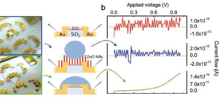
|
The figure here compares the regular device with their special non-wettable device. The figure is complex, so let's break it down, and go through it slowly.
The figure has three sections. From left to right, there are photos, diagrams, and graphs.
|
Let's start with the diagrams (middle). The top diagram shows the device. Some details are shown, but we don't need them here. The second diagram shows the modified device. The modification is the presence of the zinc oxide nano-rods (ZnO NR), the vertical red bars. The diagram also shows a water droplet, in blue. The bottom diagram is the original (unmodified) device, now with a water droplet. The diagrams show the different behavior of the water droplets; let's look at the data behind that difference.
The photos at the left show the water droplets on modified (top) and unmodified (bottom) devices. The photos show that the water wets the unmodified device (and therefore spreads out), but just sits on top of the modified device (without getting to the electrical contacts). If you can't see this clearly here, you might try the figure as shown in the pdf file, perhaps at high magnification.
More importantly, perhaps, the graphs at the right show an electrical measurement that reflects the water behavior. The y-axis of each frame shows the current across the device, as voltage is applied. There shouldn't be much -- unless the water causes a short. Look at the bottom frame -- for the wet device. As the voltage increases, the current increases -- rather clearly. The other two graphs look very different. It's easy to see that the current doesn't vary smoothly with the voltage applied. But to really appreciate the result, you need to look at the numbers on the y-axis for the three cases. The top two frames show currents around 10-13 A (ampere). The bottom frame shows a current that goes up to about 10-10 A; that is a thousand times more than in the top two. Thus we see that the bottom frame shows a substantial current, whereas the top two do not. The bottom device is obviously wet. The top one is obviously dry. But the middle one shows a drop of water, and yet the device remains -- functionally -- dry. Their modification of the device made it inherently water repellent -- or superhydrophobic, as they say.
|
This is new work -- research. Will it turn out to be useful? They think their process is practical. We'll see.
News story: Waterproofing electronic nanodevices. (Nanowerk, October 5, 2011.)
The article: Overcoming The Water Vulnerability Of Electronic Devices: A Highly Water-Resistant ZnO Nanodevice With Multifunctionality. (S Lee et al, Advanced Materials 23:4398, October 11, 2011.) The figure shown above is part of Figure 1 of this paper.
More about hydrophobic materials...
* Nanotechnology leads to the development of a superoleophobic polypropylene -- and a better shampoo bottle (November 6, 2016).
* Water droplets on a trampoline (April 9, 2016).
* A box that will fold up upon command -- heat- or light-actuated switches (September 3, 2011). This discusses another example of the use of hydrophobic materials.
More about ZnO nanorods: Could vibration (or loud music) improve the performance of a solar cell? (December 11, 2013).
Wings for better walking
November 5, 2011

|
UC Berkeley's DASH has been fitted with wings.
DASH = Dynamic Autonomous Sprawled Hexapod. It's also known as the artificial cockroach.
This figure is from the authors' news story. It is probably the same as Figure 1a of the paper. From the figure legend in the paper: "Robot length (excluding the tail) is 10 cm; wingspan is 30.5 cm."
|
New work shows that the wings help DASH walk better. Let's look at some results.
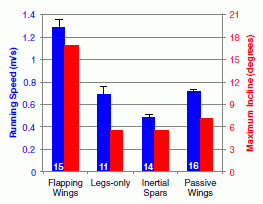
|
The graph shows two types of measurements for the robot with flapping wings and for three control robots. Even before we get to the details, you can see that the robot with flapping wings (left set of bars) gives the highest results for both types of measurement (blue bars and red bars). In both cases, high is "good".
Each pair of bars is for one type of robot. The blue bars (y-axis scale on left) show the maximum speed the device could achieve running on a flat surface. The red bars (y-axis scale on right) show the maximum incline angle that the device could climb.
|
As noted, the left set of bar is for the winged robot, pictured above. The next set, labeled "legs-only", is for the "parental" robot, without wings. Simply comparing these first two sets gives the basic conclusions: wings help. For example, the winged robot can climb an incline of about 17°, whereas the legs-only robot can only climb an incline of about 6°.
The other two sets of bars are for two more controls. "Inertial spars" means that only the metallic framework of the wings is present; this has most of the weight. And "passive wings" means the same winged robot, but with the wings turned off (not flapping). Both of these controls give results similar to the "legs-only" case. Pictures of all the robots are in the paper, and at the author web site. Videos showing many of the results are available.
This is Figure 4 of the paper.
|
The main implications of this work are direct: the role of wings in helping a robot walk. The paper also addresses the biological question of how wings might have arisen. What good were primitive wings before they were capable of flight? This part of the paper seems to be an afterthought, but those interested can read that story. (Another suggested role for primitive wings is as heat radiators.)
Videos:
There is a set of three videos that accompany this work. There is one for each of the two effects discussed above, and one showing that the wings stabilize the walking robot against roll instability. The videos are less than one minute each, and are very nice. They are available at the author site listed below, well-labeled. They are also available with the article at the journal site, under "Supplementary data"; unfortunately, these files have uninformative names -- but they seem to be the same movies.
News stories:
* Robotic Bug Gets Wings, Sheds Light On Evolution of Flight. (Science Daily, October 17, 2011.)
* Publicity information for: K. Peterson, P. Birkmeyer, R. Dudley, R. S. Fearing, A wing-assisted running robot and implications for avian flight evolution, Bioinspiration and Biomimetics, October 18, 2011 6 046008. Author site. Good source for pictures and the movies.
The article, which may be freely available: A wing-assisted running robot and implications for avian flight evolution. (K Peterson et al, Bioinspiration & Biomimetics 6:046008, October 17, 2011.)
Most recent post on robots: Berkeley Bionics: From HULC to eLEGS -- Follow-up (July 26, 2011).
More on wings:
* Introducing Supersonus -- it stridulates at 150,000 Hz (June 16, 2014).
* Butterflies and UV vision (June 29, 2010).
More on walking... How horses learned to walk (September 21, 2016).
A book about flying -- and therefore about wings -- is listed on my page Books: Suggestions for general science reading. Alexander, On the Wing -- Insects, pterosaurs, birds, bats and the evolution of animal flight (2015).
More on DASH: Acrobatic cockroaches inspire robot design (September 16, 2012).
See my Biotechnology in the News (BITN) topic Bio-inspiration (biomimetics). It includes a listing of Musings posts in the area.
November 2, 2011
Quiz: The monkey-cat -- answer
November 2, 2011
I have updated the original post to include the "answer", with source information. Go to the original post: Quiz: The monkey-cat (October 26, 2011).
An old eye
November 1, 2011
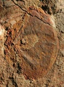
|
An eye. A compound eye, typical of the eye of an arthropod (such as insect or crustacean).
This one is about 515 million years old.
The figure is from the news story listed below. It seems to be a version of Figure 1a from the paper. The figure width represents about 6 millimeters.
|
The eye here is comparable in complexity to that of modern arthropods. The key is to look at the ommatidia, the individual vision units; these are seen as individual "dots", in a regular pattern. With the compound eye, the number of these ommatidia is an indicator of how good the eye is. The eyes found in this study have around 3000 ommatidia.
These eyes are some 80 million years older than the oldest such eyes previously known. They date back to the "early days" of arthropods. The conclusion is that high quality eyes were an early development in the arthropods. The original owner of these eyes is unknown, but the authors suggest it was a large and active predator.
News story: New Fossils Demonstrate That Powerful Eyes Evolved in a Twinkling. (Science Daily, June 29, 2011.)
The article: Modern optics in exceptionally preserved eyes of Early Cambrian arthropods from Australia. (M S Y Lee et al, Nature 474:631, June 30, 2011.)
Animal vision is a fascinating topic. A recent post...
Where are the eyes? (August 19, 2011).
Halloween special: The largest (known) pumpkin
October 31, 2011
Source, with story: World's Largest Pumpkin On Display At New York Botanical Garden. (Huffington Post, October 21, 2011.) The story explains how the pumpkin was grown. There is indeed a science to it; the explanation here may be superficial.
The end of that story tells the fate of this pumpkin. To see the results... Halloween: Worlds Largest Pumpkin Carving. (Visual News, October 29, 2011. Now archived.) Note that the results included a second pumpkin as well as the one above; the second one was considerably smaller -- only 1693 pounds. (The "person" with the black shirt at the bottom of this page may be real. In fact, I wonder if that is the sculptor.)
Previous post on zombies: Death-grip scars from zombie ants, 48 million years ago (November 9, 2010).
The youngest (known) planet?
October 30, 2011
Stars and planets condense out of rotating disks of gas and dust. So astronomers have inferred. Of course, the process is too slow to watch directly, and we have actually observed almost nothing about planet formation. Now we have some new images, which are interpreted to be a stage in planet formation. The planet is at an earlier stage of formation than any seen before.
The basic data are simple enough. Collecting the data was a tremendous feat of astronomy technology.
|
The evidence for the birth of a planet.
The left hand frame sets the stage. It shows the region around the star LkCa 15. The picture shows the protoplanetary disk -- the dust cloud. The hole in the middle is an area where things have already condensed; a star has formed.
The right hand frame is a closer view of that central area. It shows two types of results, using observations from two techniques superimposed into one figure. The blue shows the planet, or "protoplanet"; the red shows the cloud from which the planet is condensing.
|
The figure is from the news story listed below. It is probably the same as Figure 3 of the paper. The scale bars show distances in AU; 1 AU (astronomical unit) is the distance between the Earth and Sun. Saturn and Pluto are about 10 and 40 AU from the Sun, respectively. Thus the new planet being formed here is at about the same distance from its star as Saturn is from the Sun. [The figure also shows the distance in mas (milliarcsecond), the angular separation.]
|
That's it. Lots of technology, to block the bright starlight, and to distinguish various features. But here is, they suggest, a planet -- at a very early stage of formation. They estimate its age at about 2 Myr (Myr = million years). The overall process of planet formation may take 10 Myr or so. We eagerly await their continued observations of this planet over the next 8 Myr. As you can see, the way we really see the process of planet formation is to catch various systems at different stages, then try to piece together a story that fits them. This is a common problem with processes that occur over very long time scales (geological time or evolutionary time; in this case, astronomical time).
News story: Youngest planet seen as it's forming. (PhysOrg, October 19, 2011.)
The article: LkCa 15: A young exoplanet caught at formation? (A L Kraus & M J Ireland, Astrophysical Journal 745:5, January 20, 2012.) A pre-print is freely available at the arXiv: pre-print.
Among other posts on discovering planets...
* Discovery of Neptune: The one-year anniversary (July 12, 2011).
* The Kepler Orrery (June 3, 2011).
Also see: Lutetia: a primordial planetesimal? (February 13, 2012).
Sickle cell disease: a step toward treatment by activation of fetal hemoglobin
October 29, 2011
Sickle cell disease (SCD) is encountered in textbooks. It was the first genetic disease to be understood at the gene level: a single base change mutation causes a single amino acid change in the β chain of adult hemoglobin. Further, it is an interesting example of how an allele (form of a gene) that is obviously detrimental can be maintained in the population at high level because it also has a good effect. In this case, having one copy of the mutant gene results in considerable protection from malaria, whereas having two copies results in the sickle cell disease. Thus the mutant allele accumulates in populations that have high exposure to malaria.
More importantly than being a textbook disease, SCD is a real -- and debilitating -- disease for many people. Despite knowing its genetic basis, we have made little progress on an effective treatment. SCD remains a challenge for medical science.
One clue to a possible approach to treatment has long been around. SCD symptoms begin to appear at around 6 months of age -- about the time the fetal form of hemoglobin is replaced by the adult form. As noted, the SCD mutation is in a gene for adult hemoglobin; so long as the person is not yet making adult hemoglobin, they are fine. Further, it is normal for adults to make small amounts of fetal hemoglobin, along with their regular adult hemoglobin. For people with SCD, the more fetal hemoglobin they make, the less severe their disease. Thus the suggestion has long been... If only we could turn on the fetal hemoglobin gene in SCD people, we might be able to reduce the severity of the disease. (Making fetal hemoglobin as an adult seems to be without any significant side effect.)
A new paper offers an interesting test of this suggestion, with encouraging results. The work is in mice -- mice that have been genetically modified to make human hemoglobin, of the SCD type. These modified mice develop a disease that closely mimics the human SCD. The work focuses on a protein called BCL11A, which recent work suggested is a key player in regulating the production of fetal hemoglobin. BCL11A represses the production of fetal hemoglobin; inactivating it should allow fetal hemoglobin to be made. So, the authors inactivated ("knocked out") the BCL11A gene in blood-forming cells. They found three key things:
* Substantial production of fetal hemoglobin, as predicted by removing a repressor.
* Essentially complete elimination of SCD symptoms, as hypothesized might occur if fetal hemoglobin production is stimulated.
* No ill effects.
|
Here is an example of their results. The figure shows blood smears from three mice: a normal mouse (control), a mouse with the sickle cell disease (SCD), and a mouse with SCD but treated by inactivating the BCL11a repressor, thus allowing production of fetal hemoglobin (SCD/Bcl11a-/-).
|
You can see that the treated sample (right) looks similar to the control sample (left) -- and much better than the SCD sample (center).
This is Figure 3A from the paper.
|
It's an impressive result. It is a proof-of-principle that turning on the production of fetal hemoglobin might well be useful in dealing with SCD. Further, it points to a particular target for turning on fetal hemoglobin.
The work has important limitations. Some of these are pointed out by the authors themselves in the paper, but they do get lost at times in the media coverage.
* First, the work is in mice. We don't know it will hold in humans. For example, we don't know if the inhibition of BCL11A will be without side effects in humans. (They already restricted the inhibition to the blood-forming cells; inhibiting it generally does have side effects.)
* Second, we don't know how to inhibit this protein in humans. What they did in the paper was to inhibit it by genetic engineering. This approach is not applicable to humans -- at least for now.
Impressive proof-of-principle, but no way to implement it? Sort of, for now. But at least we know a good target, probably for drug development. It is progress, but not one that leads to any immediate benefit.
News stories:
* Reversing Sickle Cell Anemia by Turning On Fetal Hemoglobin. (Science Daily, October 13, 2011.)
* Young Blood to the Rescue. (Science Now, October 13, 2011.)
The article: Correction of Sickle Cell Disease in Adult Mice by Interference with Fetal Hemoglobin Silencing. (J Xu et al, Science 334:993, November 18, 2011.)
Some of the background of sickle cell disease is introduced in the post: Why African-Americans have a high rate of kidney disease: another gene that is both good and bad. (August 17, 2010).
A trial in people of a variation of the method used here: Reactivating fetal hemoglobin production to treat β-hemoglobin problems - I (February 15, 2021).
More sickle cell disease: Walter Clement Noel and his peculiar sickle-shaped blood cells (November 27, 2018).
More on hemoglobin: Mammoth hemoglobin (February 1, 2011).
A post about a much more complex disease: Can we make sense of the many genes involved in autism? (January 16, 2015).
October 26, 2011
Quiz: The monkey-cat
October 26, 2011

|
The question is: What is the sex of this cat? Explain.
To elaborate... The question asks what is the most likely sex for the cat, based on the information visible here. Those with some biology background should try to offer an explanation in terms of mechanism, not simply an observed correlation.
(Assume that the question can be answered from the information available here -- the picture -- using "common" biology knowledge.)
Answer (and source) next week.
[see immediately below].
|
Answer (posted November 2, 2011):
The simple answer is that the cat is probably female. The key observation is the patchy coloration of the coat. Such cats are known as calico; the term tortoiseshell is also used for some variations.
The question then is, why are most cats with patchy fur coloration female? What is the relationship between sex and patchy fur? The answer is that it has to do with the nature of sex chromosomes -- but nothing to do with sex per se. It's a side effect of how some animals compensate for the different number of sex chromosomes.
To elaborate a bit... In mammals, females are XX (i.e., they have two X chromosomes), and males are XY (one each X and Y chromosome). This creates a problem, completely distinct from their role in sex determination. The X chromosome contains regular genes -- genes with ordinary functions, unrelated to sex determination. If females have twice as many X chromosomes, one might wonder whether they make twice as much of things coded for by the X chromosome, compared to males.
In fact, they do not. Males and females make about the same amount of product from genes on the X chromosome -- even though females have more copies of the X. Somehow, there must be some dosage compensation going on. In mammals, one X chromosome is turned off. What makes this interesting is that (in "higher" mammals -- but not the marsupials) this is done randomly -- at an early stage of development. Once one X has been turned off, it stays off for all cells derived from that cell. The result? Patches -- random patches -- where one or another of the X chromosomes is active. If the X codes for fur color, and the two X's in a female code for different colors, we see patches -- seemingly random patches -- of the colors. The color patches correspond to which X has been inactivated in that patch. This is the basis of calico (or tortoiseshell) cats. We suspect it is the basis of the monkey cat shown here, though we do not know.
This started with sending this figure to a few people, just for fun. It's a cute picture. The idea of turning it into a Musings quiz question developed as we discussed it. For those who would just like to enjoy the picture for now... The source is an article in a local newspaper, with nice pictures of several animals encountered during travels. (Do you know about the penguin that is endangered by deforestation?) Ariel Soto-Suver's world of animals. (A Soto-Suver, San Francisco Bay Guardian, July 12, 2011. Now archived.)
* Previous quiz: Quiz: What is it? (October 5, 2011).
* Next quiz: Quiz: What's the connection... (February 14, 2012).
Other posts on cats include:
* Big cat, little cat: Taqpep determines coat pattern (December 27, 2012).
* Pet Diary (September 25, 2009).
More about sex-linked genes... Gene therapy: Could we now treat Queen Victoria's sons? The FIX Fix. (January 6, 2012).
More about sex chromosomes... Twenty percent of the females are genetic males (October 6, 2015).
If terms like monkey-cat intrigue you -- or confuse you -- why not try: Monogamy (January 30, 2013).
and maybe... Do monkeys make stone tools? (December 18, 2016).
What is Denisovan man telling us about Asian-Pacific man?
October 25, 2011
We have noted Denisovan man before. A key recent post is The Siberian finger: a new human species? -- A follow-up in the story of Denisovan man (January 14, 2011). Briefly, scientists have found evidence for a new type of human, based largely on a finger bone found in a Siberian cave. The genome sequence found for this finger bone is distinct from both modern human and Neandertal human. Earlier work showed that modern humans from Polynesia and New Guinea had a small amount of Denisovan DNA sequence in their genome; they interpret this as indicating ancient interbreeding between the Denisovans and the ancestors of those groups.
A new paper reports a more extensive analysis of the presence of Denisovan DNA in a range of Asian and Pacific populations. The results are provocative. The following figure summarizes the key findings.
|
The figure is based on a map of much of Asia (upper left), extending down to the "top" of Australia (bottom center). Each circle is the source of one type of human DNA, from a population considered native to that area. Importantly, the blackness of the circle is a measure of how much Denisovan DNA they found in the genome from that area. This is a relative scale: fully black is the largest amount of Denisovan DNA they found (four samples near bottom center); half black means half that amount.
The location of Denisova itself is marked by a big star (upper left). This is, for now, the only place where Denisovan man has been found.
This is Figure 1 of the paper. Here is a larger version, which lets you read the labels on the various points and the key that identifies them. However, the main ideas are fully apparent from the smaller figure shown here.
|
There are two major observations, based on this figure:
* First, look at all the circles -- and how black they are. They clearly fall into two groups, in distinct geographical areas. There are circles with some blackness, indicating some Denisovan DNA; they are to the lower right. And there are circles with no blackness, indicating no measured Denisovan DNA; they are to the upper left.
* Second, look at where Denisova is. The only known site of Denisovans is nowhere near where we now find Denisovan DNA.
The authors interpret the first point as suggesting that there were two waves of migration of early man into Asia. One interbred with Denisovans, and ended up in the southeastern areas on this map (what we might call the Pacific island areas). The other did not interbreed with Denisovans, and ended up in what is now China and nearby areas. The possibility of two waves of migration into Asia is not new, but this is apparently the first genetic evidence for it.
The second point must mean that someone was elsewhere else -- if the presence of Denisovan DNA really reflects interbreeding. Remember, the only Denisovans we know about are in Siberia -- in one cave in Siberia. In fact, in terms of the nuclear genome, we know of only one individual. Among the possibilities is that the Denisovans were widespread in Asia -- but we have not yet found them.
I've cautioned before, but it is important to repeat it... The ideas proposed here are hypotheses. They are fascinating ideas, but they need to be tested. Denisovan man is fascinating, but we still know very little about it; further data may reinforce what we have found so far, or it may not.
News stories:
* Humans reached Asia in two waves -- Some early migrants interbred with mysterious Neandertal sister group. (Science News, September 22, 2011.)
* Asia Was Settled in Multiple Waves of Migration, DNA Study Suggests. (Science Daily, September 26, 2011.)
The article: Denisova Admixture and the First Modern Human Dispersals into Southeast Asia and Oceania. (D Reich et al, American Journal of Human Genetics 89:516, October 7, 2011.)
Here is a second, related, article, which complements the first. I did not intend to refer to it, but it is noted by the Science News item listed above. An Aboriginal Australian Genome Reveals Separate Human Dispersals into Asia. (M Rasmussen et al, Science 334:94, October 7, 2011.) Figure 2 of this paper is an interesting map, diagramming the migration waves suggested by this work. (It does not take into account the results of the Reich paper, above. The idea is the same, but the map is perhaps simpler than you might expect if you have looked at Reich.)
More about Denisovans: DNA from a 400,000-year-old "human" (December 9, 2013).
A water fountain for Saturn
October 23, 2011
A fountain that produces water continuously can make quite a contribution to local humidity.
Now imagine a fountain that produces 250 liters of water (that's about 70 gallons) each second. Better yet, just look at such a fountain -- at the right.
That's a lot of water. Several billion liters each year. Enough to account for most of the water in the upper atmosphere of the planet Saturn. So says a recent paper.
|

|
The picture above -- the motivation for this post -- is of the Saturnian planet Enceladus. (Diameter about 500 kilometers.) At the bottom -- the South Pole -- you can see the water fountains. The picture was taken by the Cassini spacecraft, back in 2009 (actually, Christmas Day 2009). Enceladus, with its fountains -- or "plumes" -- was the subject of an earlier post: Enceladus and its plume (November 17, 2009). As suggested there, the Enceladus plumes, discovered only recently, fascinate planetary scientists. The question raised in the earlier post now has a likely answer: yes. Another solar system body that may have an ocean, even if underground.
The key new observation is that the water from the plumes is found in a ring ("torus") around the planet. Further, this ring may be the source of the water for Saturn's upper atmosphere. At least, they estimate that the amount of water given off by Enceladus can account for what is found in the Saturnian upper atmosphere. (However, it is not enough to account for the water found in Titan's atmosphere. Another puzzle.)
The observations of the water ring were made by the Herschel Space Observatory (European Space Agency, ESA). What they did was to detect the absorption of light by the ring of water. The wavelengths used -- in the infrared -- are distinctive for water. What made the observations difficult prior to this detection is the viewing angle. The time was right to get a good view of the water ring. (Similarly, the rings of Saturn are easier or harder to see depending on how Saturn is tilted with respect to Earth.)
News story: Herschel confirms Enceladus as primary water supply for Saturn atmosphere. (Space Daily, July 27, 2011.) The picture above is from this news story; it is originally from NASA, and is widely included in stories about Enceladus.
The article: Direct detection of the Enceladus water torus with Herschel. (P. Hartogh et al, Astronomy & Astrophysics 532:L2, August 2011.) It's rather technical!
More from the plumes of Enceladus: Is there food on Enceladus? (May 21, 2017).
If you have forgotten why a space telescope would be named after Herschel, see: The first report of a new planet (March 13, 2011).
More from the Herschel mission, also on water measurements: Were comets the source of Earth's water? (February 3, 2012).
More water plumes in the solar system: Europa is leaking (February 10, 2014).
How is this related? Rings for Chariklo (May 9, 2014).
More about IR spectra: The real carbonic acid, at last? (January 10, 2015).
Would young blood be good for your brain?
October 21, 2011
Our ability to make new brain cells declines with age, and this probably has functional significance. Recent work with mice offers a clue about one reason for the decline.
A key experiment involves connecting two mice together, so that they share one circulatory system. The two partners in this parabiosis are one old mouse joined together with one young mouse. Thus the old mouse get some younger blood, and the young mouse gets some older blood. As controls, they also make parabiotic pairs with two mice of the same age -- both young or both old.
The three types of parabiotic pairs are shown at the right.
The word isochronic simply means "same age". There are two quite distinct types of isochronic pairs: both young (yellow) and both old (gray).
|
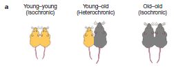
|
|
This is Figure 1a from the paper.
|
Some key results are shown in the next figure.
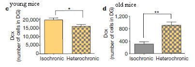
|
The height of each bar is a measure of the number of new neurons made in a particular brain region of interest.
|
Part c, at the left, is for young mice. You can see that the young mice make fewer new brain cells in the heterochronic pair than in the isochronic pair. That is, the old blood seems inhibitory to brain cell production in the younger partner.
Part d, at the right, is for old mice. You can see that the old mice make more new brain cells in the heterochronic pair than in the isochronic pair. That is, the young blood seems stimulatory to brain cell production in the older partner.
Note that the vertical scales are very different for parts c and d. Old mice make fewer new brain cells than young mice. That was already known. The point here is the effect of the partner.
The bars in parts c and d are labeled isochronic and heterochronic. These terms may be confusing here, as they refer to different animals in the two parts. I've added labels at the top of each part to make clear that part c is about young mice, and the influence of an older partner, and part d is about old mice, and the influence of a younger partner.
This is Figure 1 parts c and d from the paper.
|
The results above go beyond showing that young and old mice differ in their ability to make new brain cells. They show that there is something in the blood that affects making new brain cells.
In the rest of the paper, they begin to explore the nature of this effect. In particular, they find one signaling protein that inhibits the production of new brain cells and is more abundant in older mice. Of course, there is more to be done. One important question is to find out if the results here, with mice, are relevant to humans.
News story: Scientists Discover Blood Factors That Appear to Cause Aging in Brains of Mice. (Science Daily, September 9, 2011.) Good overview. And what a delightful opening sentence!
* News story accompanying the article: Ageing: Blood ties. (R M Ransohoff et al, Nature 477:41, September 1, 2011.)
* The article: The ageing systemic milieu negatively regulates neurogenesis and cognitive function. (S A Villeda et al, Nature 477:90, September 1, 2011.)
Follow-up post, on work from the same lab: How exercise benefits the brain (August 9, 2020).
More mouse blood: Alzheimer's disease: a blood treatment? (January 9, 2023).
More about aging: Methuselah's secret: methionine? (February 12, 2010).
My page for Biotechnology in the News (BITN) -- Other topics includes a section on Aging. It includes a list of related Musings posts.
October 19, 2011
An advanced placenta -- in Trachylepis ivensi
October 18, 2011
There is nothing novel about an animal's fetal tissue invading maternal tissue and establishing intimate contact with it. Each of you has done it. So what is novel here? It's finding this in Trachylepis ivensi -- a lizard.
The placenta is an organ for feeding the developing fetus. It develops largely from the fetal tissues, then establishes an intimate connection with the maternal tissues. In the best cases, intimate contact between the circulatory systems of fetus and mother allows for good exchange of nutrients (and wastes). Mammals with this kind of advanced placental development are called eutherian mammals. Most of the mammals we are familiar with are eutherian mammals (unless you are from Australia); we may even think of the placenta as being characteristic of mammals. However, the marsupials and monotremes are classes of mammals that do not have placentas.
Reptiles have quite diverse modes of reproduction. Some reptiles lay eggs, whereas others give birth to live young. The latter, called viviparous, vary widely. Some make shelled eggs that then "hatch" and develop internally; they may be nourished primarily by the egg yolk. Some of the viviparous reptiles develop a placenta. The connection of the placenta to maternal tissue varies widely; sometimes the eggshell fragments limit the exchange between fetus and mother, and nourishment comes mainly from egg yolk. But in other cases the placenta is rather well developed, and is the basis of nourishment.
A new report shows the most well-developed reptilian placenta yet found. It establishes close contact with the mother's blood supply as a source of nutrition. It appears to be about as well developed a placenta as found in mammals.
This work was done by the analysis of museum specimens. Perhaps it will be followed up with observations of live animals. The lizard studied here is rare, so this may not happen soon. Nevertheless, the work suggests that reptilian reproduction is even more diverse than we had thought. Further, it suggests that a feature thought to have developed only in mammals had developed in at least one other animal line. The authors emphasize that the reptilian placenta is not "just like" the mammalian placenta; it is clearly an independent development, with its own special features. The point here is not the name of the organ, but the nature of the relationship between fetus and mother. (They suggest that advanced placentas may have developed multiple times in reptiles, though the information is incomplete.)
News story: Zoologger: The first reptile with a true placenta. (New Scientist, October 6, 2011.) Good overview.
The article: Invasive Implantation and Intimate Placental Associations in a Placentotrophic African Lizard, Trachylepis ivensi (Scincidae). (D G Blackburn & A F Flemming, Journal of Morphology 273:137, February 2012.)
For more on lizards...
* Facultative endothermy: a lizard that is warm-blooded in October (February 1, 2016).
* Twenty percent of the females are genetic males (October 6, 2015).
* When should the eggs hatch? (June 11, 2013).
* The Obama lizard (March 20, 2013).
* Development of a new species of lizard in the lab (May 20, 2011).
For more on placentas...
* Lamb-in-a-bag (July 14, 2017).
* Human birth: When to cut the cord? (December 11, 2011).
More about maternal care: The earliest known example of maternal care? (May 2, 2016).
More about pregnancy... Pregnancy in males: It's similar to pregnancy in females (February 22, 2016).
Degradable polyethylene isn't
October 17, 2011
As we become increasingly aware of resource limitations, we are questioning the use of plastics. Plastic is a broad term, covering a range of materials with distinct properties. The particular focus here is polyethylene (polythene). The concern regarding polyethylene is that it is not easily degraded. Thus, used and discarded polyethylene accumulates -- in landfills or just out in the environment. Perhaps you have seen pictures of masses of plastic floating in the ocean. -- or of a bird caught in a piece of plastic.
Some have tried to improve the degradability of polyethylene, by various modifications. The article listed below addresses how well this works -- and the short answer is: not very well. The problem is that polyethylene really is rather inert. The modifications may introduce weak points, allowing it to be partially broken down. The result is smaller pieces, but they are about as inert as the basic polyethylene. Thus we are now accumulating masses of small pieces rather than masses of large pieces.
Simply saying that something is degradable (or biodegradable) is not sufficient, because it does not say anything about the time scale required for meaningful degradation. This seems to be a weak point of current standards.
The main purpose of this post is to introduce the issue. Degradability of plastics is not a simple problem. The news story here is a good introduction and overview. If this post makes you more aware of the problem of degradability of plastic, then it has served its purpose.
News story: Marine Microbes Not Much Help Degrading Ocean-Floating Plastics. (Microbe 8:336, August 2011.) A good overview of the topic.
The article: Degradable Polyethylene: Fantasy or Reality. (P K Royet al, Environmental Science & Technology 45:4217, May 15, 2011.) This is the article referred to by the news story above. It's actually a review article, rather than one reporting new primary results. So, it is rather dense.
More about plastics:
* Cross-linking unreactive polymers, using carbenes (January 12, 2020).
* History of plastic -- by the numbers (October 23, 2017).
* What if the caterpillars ate through the plastic grocery bag you put them in? (May 26, 2017).
* Polystyrene foam for dinner? (October 19, 2015).
* A simpler way to make styrene (July 10, 2015).
* The bisphenol A (BPA) controversy (September 19, 2010).
Degradation of cellulose: Cellulosics for energy: an update (October 30, 2010). Cellulose is, in principle, biodegradable. Yet as a practical matter it is very difficult to degrade; poor degradability is limiting our use of cellulose as, say, an energy source. There is some analogy with the current post on polyethylene. Simply making it "degradable" is not enough. Degradability is not a simple yes/no criterion. What matters is how easily it is degraded.
Another example of degradation of recalcitrant chemicals in the environment: Developing improved degradation of organophosphate pesticides (September 7, 2010).
Also see: Drug degradation: A drug that reappears after being degraded (November 2, 2013).
School of Ants -- you can help
October 16, 2011
Update February 26, 2021...
The School of Ants project has been completed. The link below is updated. Otherwise, the post remains as it was originally.
The School of Ants wants to learn about your local ants. You can help them. Suitable for children -- of all ages. Check the news item or their web site.
Open to USA residents only -- for now. They want to extend it to other countries, and say they will soon have a list of countries. So, check it out, regardless of where you live. The problem with adding countries? Postal regulations. Sending ants through the mail is not an accepted practice. Apparently even dead ants.
News story: Scientists Want You to Track Ants in Your Neighborhood. (Wired, August 16, 2011.)
Other Musings posts on ants include:
* How the spider avoids being attacked by the ants (January 10, 2012).
* How to survive flooding by making a waterproof raft (May 27, 2011).
Would you rather help with whales? Identifying whale songs: You can help (January 4, 2012). Also see the post accompanying this one, which is about a piece of music inspired by whale songs.
More "citizen science"... Using your smartphone to detect cosmic rays (April 7, 2015).
The Quake-Catcher Network: Using your computer to detect earthquakes
October 14, 2011
Let's start with a question for you...
|
|
The graph shows the z-direction (vertical) readings of a seismometer near the beginning of the great Chilean earthquake of 2010. Zero time is the start of the quake -- the first detected motion. The question for you is... What happened at t = 13 seconds (where there is a spike in the graph)? We'll come back to this question below.
|
Earthquake detectors -- seismometers -- detect the motion of the ground. You've probably heard about major seismographic stations, such as those at Caltech and Berkeley. They are big and expensive installations. Is it possible that modern electronics, including communication networks, offer some alternatives? Is it possible that you could have a useful seismometer at home -- not just for personal fun, but as an integral part of a serious monitoring network?
The Quake-Catcher Network (QCN) is exactly such an effort -- made practical by the development of tiny electronic devices and the Internet. What is a seismometer? What does it detect? It detects motions, or changes in motion; the y-axis of the graph above shows the acceleration. We've noted the development of MEMS (Microelectromechanical Systems) devices before. Among MEMS devices are tiny accelerometers. Such accelerometers can serve as seismometers. See the post Smart dust: A central nervous system for the earth (July 20, 2010). One of the items referred to there notes their possible use as seismic detectors. It's just a matter of doing it -- and now someone has begun to do it.
The QCN system uses a MEMS accelerometer on your computer, some local software to filter the raw data and focus on motions that might be quakes, an Internet connection to send the occasional "hits" to the central QCN system, and then QCN processing of all the data it gets from its many sensors.
|
An example of an accelerometer used by the QCN, just to give a sense of the size. The standard USB plug should serve as a good reference point. (Interestingly, their full figure includes a US coin for reference. I might suggest that the USB plug is better -- in widespread use around the world.) This is from Figure 2 of the 2009 paper listed below. They give the price of the device as about 40 USD.
|
|
The QCN has taken a couple of approaches. One is to try to establish dense networks of sensors in quake-prone areas. One such area is California, the home state of QCN, but the longer term goal is worldwide quake monitoring.
A second approach is the topic of the current paper. A major quake occurs. We know that it will be followed by numerous aftershocks over the coming weeks, with some of the aftershocks themselves being significant events. How well can QCN mobilize their efforts and install a useful set of sensors in the quake area, to better monitor the inevitable aftershocks? The 2010 Chilean quake offered an opportunity. The QCN had contacts -- and at least one instrument (not fully installed) -- there. Within a couple weeks they had a network of about a hundred sensors installed over the quake region. The paper reports their experiences in doing this rapid installation, and discusses the quality of the data that was obtained.
Their major lessons include that the slow step in making the installation was making the necessary contacts, and that the network performed well. Overall, this is a positive story -- a good example of how new developments in miniaturized electronic devices can be put to practical use.
Some of you may already have a computer with a seismometer built in. Why? In recent years, some notebook (laptop) computers have come with accelerometers, in order to detect the computer falling; they quickly park the drive head to minimize damage. The accelerometer built into notebook computers is the same type of device that QCN provides. QCN has software to use the data from the built-in accelerometers of certain notebook models for their earthquake monitoring.
Recall the figure at the start of this post, and the question that was posed. What happened at t = 13 seconds? Well, they think that what happened was that the sensor, which had been sitting on the desk by the computer it was plugged into, fell off the desk onto the floor.
The readings listed below are on various aspects of the QCN project. It was the use in Chile, as reported in the 2011 paper, that stimulated me to write this up. But the general nature of the project as well as the technology behind it are of interest.
News stories:
* Ordinary Laptops Act as Earthquake Detectors. (LiveScience, March 23, 2010.) Good overview. It emphasizes the role of the built-in sensors in laptops. That's not the preferred device, but it played an important role in the development. (Why is the built-in laptop accelerometer not preferred? The external device connected to a desktop is attached to the floor; thus it is coupled to the ground, and it has a fixed -- and known -- location and orientation. The laptop device has none of these features, because the computer itself is mobile. However, an unattached device can still give some useful information -- as the figure at the start of this post shows.)
* 'Citizen-seismologists' sought to host tiny earthquake sensors on their computers. (Stanford Report, July 7, 2011. Now archived.) This news story is about the QCN in general, and the attempt to establish a dense sensor network in quake-prone areas. It does not discuss the Chile effort.
The article: The Quake-Catcher Network Rapid Aftershock Mobilization Program Following the 2010 M 8.8 Maule, Chile Earthquake. (A I Chung et al, Seismological Research Letters 82:526, July 2011.) Check Google Scholar for a freely available copy.
An earlier article: A Novel Strong-Motion Seismic Network for Community Participation in Earthquake Monitoring. (E Cochran et al, IEEE Instrumentation & Measurement Magazine 12(6), December 2009, p 8.) Check Google Scholar for a copy. This is the source for the picture of the device, above. It's a "news feature", and is a good readable introduction to the project, as of 2009.
Interested in being part of the QCN? Check out the QCN website; see next paragraph. The software is freely available. If you need a sensor, you can buy one from them. (If you live in one of their immediate target areas, they may even provide it free.) They have a special price for schools, and they provide educational materials.
Update November 2019...
The Quake-Catcher Network has moved; it is now at the Southern California Earthquake Center (SCEC) and the Incorporated Research Institutions for Seismology (IRIS).
Update October 2023...
The Quake-Catcher Network no longer exists as a separate entity, as of mid-2023. Of course, the science behind it and the resulting technology is sound. For an overview of the history of QCN: Wikipedia: Quake-Catcher Network.
Thien tells me that there is a program, SeisMac, to display data from the accelerometers on MacIntosh laptops in "seismic format". In fact, QCN folks apparently built on this program as part of developing QCN. That is, QCN uses something like SeisMac to handle the sensor data, and something like SETI to share the data on the network. SeisMac website.
Other posts on earthquakes include:
* Detecting earthquakes using the optical fiber cabling that is already installed underground (February 28, 2018).
* Could we block seismic waves from earthquakes? (June 23, 2014).
* Are large earthquakes occurring non-randomly? (February 10, 2012).
* The great Tonga earthquake: how many quakes were there? (September 12, 2010).
* Chile earthquake caused the day to become shorter (March 8, 2010).
A post about SETI -- the Search for Extra-Terrestrial Intelligence. SETI (October 20, 2009). Why is this relevant here? SETI is perhaps the best known example of a distributed computing system. SETI collects data, and then sends it out to volunteers who donate a portion of their computer capacity to analyze the data. The QCN is similar in some ways; in fact, it operates on the same basic software system. But there is a key difference... Imagine that SETI sent each volunteer a small telescope (or radio receiver) and asked you to turn it toward the sky, and collect data -- then report anything interesting. That's what QCN is doing. You get a tiny seismometer -- but a very good one in this day of microelectronics. Your seismometer collects data, and your computer processes it. Only if the motion passes some threshold does your computer send in a signal, which is then compared with other signals from your area.
More "citizen science"... Using your smartphone to detect cosmic rays (April 7, 2015).
More microscale technology: Windmills for your cell phone? (January 21, 2014).
More accelerometers: On the spontaneous untying of shoe laces (June 10, 2017).
October 12, 2011
Where are the keys to the soul?
October 10, 2011
The secret life of pronouns. (J W Pennebaker, New Scientist, September 7, 2011.)
It's fun. It's a bit from a new book presented here as an article in a science magazine. It's more of an essay than a scientific article; it reflects or summarizes some of the author's views. Enjoy it; don't take it too seriously.
Hawaii's hot spot(s)
October 9, 2011
You may know the idea that the Hawaiian Islands were formed, one at a time, as the Earth's crust moved over a volcanic hot spot below. As more evidence accumulated, a more complex model emerged: there seem to be two hot spots, each forming a chain of land above. Now, new analysis suggests the same holds for other island groups in the Pacific.

|
The map shows the volcanic region of the Hawaiian islands studied here. Two areas are outlined, in red (upper, to the north) and black (lower, to the south). These two regions are those found to have arisen from different hotspots, as discussed below.
This is Figure 1a of the paper. Other parts of the figure show similar maps for the other island groups studied, the Samoan and Marquesas islands. These latter two groups are a few degrees south latitude.
|
What did they do? They examined the chemical composition of volcanic material (lava) from many places throughout each island group. More specifically, they examined the isotopes of two elements, lead (Pb) and neodymium (Nd). In each case, the isotope measurement is something of a fingerprint reflecting the geological history.
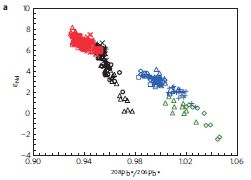
|
Here is a sampling of their data, for two of the island groups.
Each point represents the analysis of one sample. The point is plotted according to its isotope analysis: Nd (εNd) on the y-axis, Pb (208Pb*/206Pb*) on the x-axis.
To start, look at the left hand clusters of symbols -- the red and black symbols. The red and black are for the two regions of Hawaii (Fig 1a, above). You can see that the red and black symbols form rather distinct clusters. This supports the idea that the two regions have distinct isotope signatures, hence distinct origins.
|
The right hand clusters show the same, for Samoa. Blue and green points are for the two regions, and again they have distinct isotope signatures.
This is Figure 2a of the paper.
|
The big picture, then, is that each of these island groups seems to have two distinct regions, based on chemical composition. These regions are thought to reflect their geological origins. A simple view is that there might be two hot spots, as suggested above. A simple alternative is that there is one hot spot of magma (molten rock) deep underground, but two plumes from that hot spot to the surface.
News stories:
* The dual nature of Hawaiian volcanos. This is at a blog site called WryHeat, by Jonathan DuHamel. The story here is probably one that was originally posted in the Tucson Citizen, February 15, 2012. That site is no longer available, but it appears that the author has reconstructed some posts, such as this one. Anyway, this seems a good news story; it is about two articles on the Hawaiian volcano system.
* Pacific volcanoes share split personality -- Dual chemistry of island chains reflects variations in their deep source. (Science News, September 19, 2011.) This article is no longer freely available.
The article: Geochemical zoning of volcanic chains associated with Pacific hotspots. (S Huang et al, Nature Geoscience 4:874, December, 2011.)
More geology from the South Pacific: The great Tonga earthquake: how many quakes were there? (September 12, 2010).
The following posts are partly about Hawaii...
* Bird lays egg (March 19, 2011). This one is partly a geology story.
* Spiders (December 21, 2009).
More about volcanoes...
* What caused the dinosaur extinction? Did volcanoes in India play a role? (April 13, 2015).
* Sulfur dioxide in the atmosphere of Venus (February 16, 2013).
* Reasons to hide tonight? (February 11, 2013).
My page of Introductory Chemistry Internet resources includes a section on Nuclei; Isotopes; Atomic weights. It includes a list of related Musings posts.
This post is also listed on that page in the section Lanthanoids and actinoids. This listing reflects the use of Nd in the work.
Life at age 34,000?
October 8, 2011
You find a crystal of halite (NaCl, sodium chloride -- ordinary table salt). There is a small liquid droplet in it (an "inclusion". You carefully clean the crystal, to remove any surface contamination, and dissolve it in a medium suitable for microbial growth. After some incubation period, microbes grow. It seems that the microbes that grew were from the fluid droplet within the crystal. The crystal is shown to be 34,000 years old; the fluid contents had not been in contact with the outside world for 34,000 years. Thus one concludes that the microbes that grew up came from cells 34,000 years old -- from cells that had been alive for 34,000 years.
What's wrong with this story? Indeed that is the question. People have done what was described above -- and reported that microbes grew. (There has even been a claim of growing microbes from crystals that were 250 million years old.)
Why should we doubt the claims? Because biologists are quite certain that complex bio-molecules, such as DNA and proteins, cannot survive that long. The suggestion that the cells have remained truly dormant for thousands of years is suspect. Of course, if the cells have not been truly dormant -- if they have been metabolizing, and repairing damage -- then perhaps they can survive for thousands of years.
A new paper lends some credibility to the story by suggesting how the cells survive. The paper shows that the inclusions also contain algae; the algae have excreted glycerol, which can serve as an energy source for the bacteria.
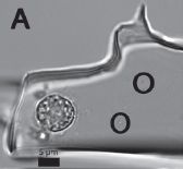
|
The figure shows an example of what can be seen in an ancient halite crystal. In this case, the crystal is estimated to be 150,000 years old. The complex round structure near the lower left is an algal cell. The two dark circles to the right are marks around tiny prokaryotic cells. (The cells themselves are barely visible within those dark circles.)
The cells are within a fluid inclusion in the crystal. You can see the irregular boundary between fluid and crystal over much of the figure.
The scale bar (bottom, near left) is 5 µm.
|
Note that there is nothing in the picture above that tells you that the cells are alive. In fact, only about a half percent of the ancient crystals they tested yielded live cells in the growth test.
The crystals studied in this work are from Death Valley and nearby Saline Valley, in eastern California. The crystal shown above is from Saline Valley.
This is Figure 5A from the paper.
|
A few years ago, scientists reported measurements of very low metabolism in bacteria in cracks within the Antarctic ice. They suggested that such metabolism, perhaps amounting to a few chemical reactions per day, was reasonable, and was enough to allow survival. This work is noted on my Unusual microbes page, under Briefly noted; scroll down to Microbes survive the cold. The current story invokes the same kind of argument, but in a more extreme form.
Bottom line? The idea that cells might remain alive for thousands -- or millions of years -- is fascinating. More specifically, the proposal is that the cells do not really grow, but simply carry out a very low level of damage-control, to maintain themselves. The principle is reasonable. I think it is fair to say that biologists generally lean toward skepticism. However, work of the type reported here strengthens the case, at least over the time span of 34,000 years. The claim of reviving cells in a 250 million year old crystal has virtually no support at this point.
News stories:
* 34,000-Year-Old Organisms Found Buried Alive! (LiveScience, January 13, 2011.)
* Pleistocene Microbes Recovered from Halite Inclusions Prove Viable. (Microbe 6:260, June 2011. Link may come up with wrong date.)
The article, which may be freely available: Microbial communities in fluid inclusions and long-term survival in halite. (T K Lowenstein et al, GSA Today 21(1):4, January 2011.)
The following two posts deal with the isolation of molecules from ancient organisms. The difficulties and skepticism are testament to the perceived low likelihood of survival of ancient bio-materials.
* The Siberian finger: a new human species? -- A follow-up in the story of Denisovan man (January 14, 2011). This post deals with the isolation and sequencing of DNA that is a few tens of thousands of years old -- about the age of the microbes of the current post. The poor quality of the DNA is a big issue. Successful sequencing requires piecing together results from many tiny and partially degraded fragments.
* Dinosaur proteins (July 6, 2009). Includes follow-up posts. The claim of finding even small fragments of actual dinosaur protein, from 80 million or so years ago, is even more controversial.
A 30,000 year-old plant, with an assist from a squirrel (March 10, 2012). This deals with the resuscitation of a plant from a 30,000 year old source.
And more: Recovery of live, infectious virus from 30,000 year old permafrost (March 25, 2014).
More about Death Valley:
* How rocks travel (November 14, 2014).
* Hottest temperature ever recorded on Earth? Libya or Death Valley (California)? (June 30, 2013).
More about crystals of sodium chloride: Novel forms of sodium chloride, such as NaCl3 (January 17, 2014).
October 5, 2011
Quiz: What is it?
October 5, 2011
I'll post answer, with proper source information, next week.
[see immediately below].
* * * * *
Answer (posted October 12, 2011):
It's a frog. If you didn't see it... much of the upper right quadrant of the figure is the frog. (Interestingly, on a computer screen the ease of seeing the frog varies with viewing angle.)
Source:
It's a very special frog -- and a very special photograph. I'll leave it to National Geographic to tell you about them. Rainbow Toad Rediscovered, Photographed for First Time. "Extinct" amphibian seen for first time in 87 years. (National Geographic, July 14, 2011. Now archived.)
* Previous quiz: What are they? (September 14, 2011).
* Next quiz: Quiz: The monkey-cat (October 26, 2011).
More about frogs:
* The smallest frog (January 31, 2012).
* Eating frog legs -- and why the hind legs taste better (July 16, 2009).
The Northwest Passage is open -- to whales
October 3, 2011
The Northwest Passage is the stuff of legends -- including novels and films. The Northwest Passage is the sea route across the northern part of North America, through the Arctic Ocean, between the Atlantic and Pacific oceans. Unfortunately for shipping, the Northwest Passage has been blocked by ice for most of man's recent history in North America. However, in recent years, the passage has been open for brief periods, presumably reflecting general global warming.
Of course, if the Northwest Passage is open, it will be traversed by more than ships. A recent paper reports whales from Pacific and Atlantic populations meeting along the way.
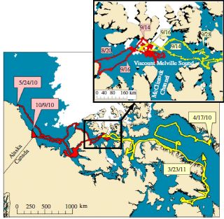
|
Here are the key observations.
The main (lower) map shows the path of two whales. One started in Alaska, one in Greenland. They met in the middle. The inset map shows some detail of the meeting area. The full records show that both whales were present in the same area for about a week (September 11 to 18, 2010). Thus we conclude that the Northwest Passage was open.
This is Figure 1c of the paper.
|
This is not the first report of recent travel through the Northwest Passage, but it is probably the most direct. Tagged whales were observed making the trip. No individual whale was observed crossing from one ocean to another, but the fact that two whales, one from each side, were able to meet in the middle is proof that the entire passage was open.
There is no information about what the two whales here said to each other, or about any interaction. (Both of these whales were males.) All that was recorded was their position. The animals had been tagged, and their signals were being received by satellite.
News stories:
* Whales take Northwest Passage as Arctic sea-ice melts. (BBC, September 21, 2011.) This story includes some discussion of the relationship of these whales to human culture.
* Bowhead whales using the Northwest Passage. (PhysOrg, September 22, 2011.)
The article, which is freely available: The Northwest Passage opens for bowhead whales. (M P Heide-Jørgensen et al, Biology Letters 8:270, April 23, 2012.)
More about whales... Tracking new songs as they cross the Pacific (June 21, 2011).
More about the arctic...
* Mammoth hemoglobin (February 1, 2011).
* Frozen Planet (November 14, 2011).
Does the Christ child lead to war?
September 30, 2011
This is something of a head-scratcher. Let's start with the key results of a new paper, so we can see what we are scratching our heads about.
As background, we need to know about El Niño (Spanish for the Christ child). It is a well-known climate pattern that leads to warming in certain parts of the world. Climate variations are discussed here in terms of El Niño effects.
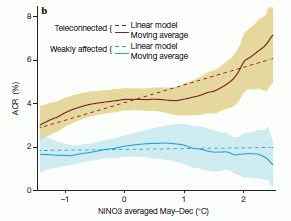
|
Ok, there it is. Figure 2b of the paper. There are obviously two sets of data, one of which is considerably higher. And despite some jargon, it is fairly straightforward what the graph shows: wars (y-axis) vs temperature (T; x-axis). The two sets of data? The upper one is for countries that experience the El Niño effect, the lower one is for countries that do not.
The key observation is that for countries that experience the El Niño effect, wars increase with increasing global T -- by a factor of two over the range shown. Countries that do not experience the El Niño effect do not show a dependence of wars on T -- something of a "control".
|
The fine print...
ACR, plotted on the y-axis, is the "annual conflict risk". It is "the probability that a randomly selected country in the set experiences conflict onset in a given year" [first page of the paper]. That is, it is a measure of the frequency of wars.
NINO3, on the x-axis, is a measure of the temperature change for a year. That is, "2" on the x-axis refers to years where the average T change (May-December, in a certain geographical area) was +2 °C (an El Niño year).
"Teleconnected", on the graph, refers to countries where the El Niño effect is substantial. As is clear from the context there, it contrasts with "weakly affected".
Thus, despite the jargon, the graph shows wars vs temperature, for countries which are or are not affected by El Niño. Simple.
|
So, war and climate are related, they claim. That is not a completely new idea, and is not unreasonable. The problem is pinning it down. Here they show that years with El Niño (i.e., warm years) have more wars -- in countries where the climate effect is actually felt. There are two main types of questions to ask. The first is whether the apparent conclusion is really true. The second is what it means.
We have no basis here for questioning the basic graph. All their data is based on publicly available information. If there is something wrong, or misleading, here, people with expertise will point it out. (Some will wonder whether they used an appropriate measure of T. They address this a bit, but it is beyond the scope of this post to deal with it in any useful way.) Let's, for the sake of discussion, assume that their basic graph, shown above, is valid. Higher T correlates with more wars.
Thus we go to the second question, the more important one. What does this mean? Simply, I have no idea. Further, neither do the authors. Remember, correlation does not imply causation. The graph shows that the two variables plotted seem to be correlated; that does not mean that one causes the other. The paper discusses some possible connections, but nothing stands out as likely. Does that diminish the value of this paper? Not at all. They do a data analysis, and show a relationship. This is step 1. Let's see where people go with this.
News story: Climate Cycles Are Driving Wars: When El Nino Warmth Hits, Tropical Conflicts Double. (Science Daily, August 24, 2011.)
* News story accompanying the article: Environmental science: Climate for conflict. (A R Solow, Nature 476:406, August 25, 2011.)
* The article: Civil conflicts are associated with the global climate. (S M Hsiang et al, Nature 476:438, August 25, 2011.) The paper is surprisingly readable, despite some jargon in the data presentation. The introduction to the paper gives good background information. The final sections present some of their ideas on what this might mean, without any particular conclusion.
A recent post on climate change: Why isn't the temperature rising? (September 12, 2011).
More about floods: Flooding in The Netherlands: natural or manmade? (September 19, 2015).
September 28, 2011
Why did the HIV vaccine work for some people?
September 27, 2011
This post presents a very preliminary account of some intriguing results that were reported at a meeting last month.
As key background, about two years ago Musings posted about a trial of an HIV vaccine: HIV vaccine trial -- and quibbling about statistics (November 2, 2009). The trial showed about a 30% reduction in HIV infection. That's very small -- but the best yet for an HIV vaccine. The new story is that scientists have done extensive analyses of people who did and did not get infected in the trial, and found some interesting differences in their immune responses.
It is hard to comment much when all we have is a brief news summary. However, the idea that the population is heterogeneous, and that people respond differently to any given treatment -- including a vaccine -- is an important emerging idea.
We recently noted two somewhat similar stories for influenza virus:
* Predicting vaccine responses (August 22, 2011);
* Who gets sick from the flu? (September 20, 2011).
In both of these cases it was shown that people respond differently to the flu virus. In one case, the virus was a vaccine virus; in the other it was an infectious challenge. In both cases, the scientists examined gene function, and found differences. In the first case, these gene function differences probably correlate with how good an immune response the person develops after the vaccine. In the second case, the gene function differences correlate with the severity of disease symptoms. Both stories are very preliminary.
An important limitation of the findings so far, here and earlier with the flu vaccine report, is that we do not know the reason for the different responses. Are they due to genetic differences between the people? To some other medical issue? Or is it just "random"? Could we predict which people will and will not respond to the vaccine?
On the other hand, the information in the news story below suggests that one specific finding may be revealing useful information about how the vaccine works. There is even a hint that understanding the different responses might lead to an improved vaccine.
News story: Clues emerge to explain first successful HIV vaccine trial. (Nature News, September 16, 2011.) This is about all we know for now. In due course, the work will get published. For now, let's just understand that further analysis of the HIV vaccine trial may have yielded some interesting and potentially important clues. We'll see.
We now have a full paper published on this story: Why did the HIV vaccine work for some people? Follow-up (May 1, 2012).
My page for Biotechnology in the News (BITN) -- Other topics includes a section on HIV
The smallest electric motor
September 26, 2011
A group of scientists from the Chemistry Department at Tufts University have reported the smallest electric motor. Chem department? Aren't motors made by engineers? or at least by physicists? Well, this one is just made by chemical synthesis. Sort of. And how small is this smallest motor? One molecule. Containing 18 atoms. Mass is 104 atomic mass units -- about equal to that of six familiar water molecules. Imagine a millionth of a millionth of a millionth of a gram; that's the mass of 5000 or so of these motors all together. Length? About 1 nanometer -- a billionth (10-9) of a meter.
Unfortunately, it's hard to see this little motor. That means it's hard to take measurements of it. It's also hard to control it. And it's hard to explain how it works. So, it's an exciting and fascinating development -- but it is hard to describe. Be forewarned.
The molecule -- which is the rotor of the motor -- is butyl methyl sulfide: CH3-CH2-CH2-CH2-S-CH3. In shorthand, that is BuSMe, where Bu and Me refer to the butyl and methyl groups, respectively.
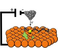
|
Here's the idea...
The orange balls represent copper (Cu) atoms. Thus we have the surface of a piece of Cu. On that is a single BuSMe molecule. It has a sulfur (S) atom (in yellow), connected through one of the S lone electron pairs (black dot) to a Cu atom (orange). Also on the S atom are the two carbon (C) chains, with the methyl group on the left in this case and pointing a bit to the back. The pyramidal gray thing at the top is the probe tip of a scanning tunneling microscope (STM); the tip ends in a single atom -- and can deliver electrons.
The figure is reduced from one in the Next Big Future news story. Similar figures are common in various stories on this work. It is similar to Figure 3A of the paper.
|
Two features of this set-up are important.
* Look at the copper surface -- the orange balls. Each Cu atom is surrounded by six other Cu atoms. As a result, the BuSMe molecule can rotate over the surface through six equivalent positions.
* The BuSMe molecule bound to the Cu surface is asymmetric; it can have two mirror image forms, which are called R and S. (Those who have taken some organic chemistry can figure this out; it follows the normal rules.)
What they do is to stimulate the bound BuSMe (the rotor), using the probe tip. They find different results for the R and S forms (the two mirror image forms of the asymmetric rotor). In one case, they find that the rotation is biased -- occurring more in one direction than the other. In the diagram above, this is shown by the larger green arrow for one rotation direction. This biased rotation of the molecule is the basis of the claim that this is a motor. The following figure shows an example of these results. This is Figure 3b of the paper.
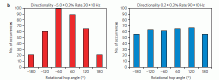
|
Each frame shows how the rotor molecule rotated upon being stimulated. As noted above, it rotates in 60 degree increments. The figure shows the frequency of each possible type of rotation. There is one frame for each of the two mirror image rotor molecules. The striking result is that the two frames are very different.
|
On the right, the results seem basically random: all hop sizes are about equally frequent. But on the left, there is clearly something going on. What's particularly important to them is the preference for negative rotations. You can see this by comparing the -60 and +60 peaks; clearly, the -60 peak is bigger. They analyze the entire data set, and show that negative hops are about 5% more frequent than positive hops; this is noted at the top of the figure where it says "Directionality -5.0"%. (The similar analysis for the right side shows 0.2%.) That's their key result, showing that this device can act as a motor, with a signal (electron delivered through the probe tip) causing a preferential motion in one direction.
From their results they infer that the probe tips are asymmetric, and that different tips have different handedness.
|
That's not very impressive, perhaps. But remember, this is the first attempt to make an electric motor with a one-molecule rotor. It's a start. We await further work.
Would such a motor be useful, if it worked well? Well, if we can control the motion of a tiny rotor, it could turn something else. That is, such a rotor could be the start of a tiny mechanical device. Surely we would figure out uses for tiny mechanical devices, if only we could make them.
News stories:
* Electric motor made from a single molecule. (BBC, September 5, 2011.)
* World's smallest electric motor made from a single molecule. (Kurzweil, September 6, 2011.)
* Demonstration of a single-molecule electric motor. (Next Big Future, September 5, 2011.)
* News story accompanying the article: Molecular motors: Powered by electrons. (S De Feyter, Nature Nanotechnology 6:610, October 2011.)
* The article: Experimental demonstration of a single-molecule electric motor. (H L Tierney et al, Nature Nanotechnology 6:625, October 2011.)
Also see:
* Molecular rings: little rings slip through big rings (July 17, 2018).
* There's plenty of room at the bottom (March 1, 2010). This post notes Richard Feynman's famous article, from 1959-60, which is sometimes considered the beginning of nanotechnology. One of his points was to offer a challenge: to make an electric motor that would fit in a cube 1/64 inch on a side. That's 0.4 millimeter on a side. The new motor is about a million times smaller -- in its linear dimension. (There is some confusion here. The size of the new motor, a single molecule, refers only to the rotor. That's quite an achievement, but the comparison is not completely fair.) (Feynman's challenge was met within a few months -- by standard means, not using nanotechnology.)
* The 35 most famous xenon atoms (June 29, 2010). More on scanning tunneling microscopy (STM). STM is a type of atomic force microscopy (AFM).
For more on AFM, see a section of my page of Internet Resources for Introductory Chemistry: Atomic force microscopy and electron microscopy (AFM, EM). It includes a list of other Musings posts on AFM.
SquarePants on Borneo
September 24, 2011
|
Spongiforma squarepantsii, a newly discovered species of mushroom. The figure shows the fruiting body -- the equivalent for this fungus of the common mushroom structure that we see.
The ruler numbers are millimeters.
The figure is in both news stories listed below. It is probably the same as Figure 1 of the paper.
|
In addition to being a fun item, this is interesting in what it tells us about the fungi. This mushroom has lost its typical cap and stem. The purpose of those structures is to maintain moisture and to aid dispersal. The new fungus, living in a wet climate, maintains moisture by its rubbery tissue. And the authors suspect that this new fungus is dispersed by animals, rather than by wind; its fruity odor is a clue.
News stories:
* SpongeBob lends name to new mushroom species. (BBC, June 22, 2011.)
* 'SpongeBob' Mushroom Discovered in the Forests of Borneo. (Science Daily, June 15, 2011.)
The article: Spongiforma squarepantsii, a new species of gasteroid bolete from Borneo. (D E Desjardin et al, Mycologia 103:1119, September 2011.) The "Etymology" section of the paper explains the name.
Spongiforma squarepantsii has its own Wikipedia page: Wikipedia: Spongiforma squarepantsii.
A previous post of work from the same lab, at San Francisco State University: Lux aeterna: Mushrooms; Mozart (December 7, 2009)
More fungi:
* An antidote to the mushroom toxin α-amanitin (June 12, 2023).
* Better violins through better fungi? (March 4, 2013).
More from Borneo...
* Underground pitchers (September 6, 2022).
* Re-introducing captive animals into the wild: an orang-utan mix-up (June 27, 2016).
September 21, 2011
Who gets sick from the flu?
September 20, 2011
The flu virus hits, and you are down for a week. The same virus (same dose) hits someone else, and they show little or no effect. Why?
A new paper shows some intriguing differences between the responses of those two types of people -- at the level of function of individual genes involved in such things as inflammation. The basic approach here was to take a group of volunteers under lab-controlled conditions, infect them with a specific dose of flu virus, and watch -- and measure. What they did measure? The level of gene function for essentially the entire human genome, using a common technique of microarray analysis. It's brute force. Lots and lots of data, and then the computer looks for relationships -- in this case, between the degree of severity of each person's symptoms and their gene expression levels. There is so much data that papers such as this are almost incomprehensible! The goal here is to give you just a taste of what they found. Fortunately, such results lend themselves to some simple and useful pictorial representations, which give you a sense of what is going on, though hiding the details.
|
asymptomatic
|
symptomatic
|
|
|
Here is an example of the patterns that they found. The figure here is a small part of Figure 1C of the paper.
Right away, you should quickly see that the results here -- whatever they mean -- are quite different for the asymptomatic and symptomatic people. Sounds encouraging, so let's look further.
|
Each row is for one (human) gene. Each box in a row represents the level of expression of that gene at a particular time. Time runs from 0 to 108 hpi (hours post infection -- that's out to nearly five days), left to right. Using a color scheme that has become standard for such work, red means high expression, blue means low expression. (This type of picture is often called a heat map for gene expression. And it's all relative, for each gene; there is no information about one gene vs another, only about each gene over time.)
For example... The gene shown in the first row is expressed at a low level (blue) in the asymptomatic people, but at a high level (red) in the symptomatic people. In contrast, the gene shown in the second row is expressed at a high level (red) in the asymptomatic people, but at a low level (blue) in the symptomatic people.
Some of the patterns are more complex, with changes over time. The important point is that each gene -- each row -- is quite different for those without or with the symptoms. Further, in each case, the difference is evident at the early times. That is, shortly after infection, they can tell who will get symptoms and who will not by looking at the gene expression pattern.
(The genes chosen for this figure are those with big effects. The experiment examines several thousand genes, and sorts out which few of them are most interesting.)
|
What is happening?
What is the significance of this? Well, in the narrow sense, it means we have learned something about the difference between asymptomatic and symptomatic infections. But we need to stress that there is no information here about why the differences occur. Is it because the people are genetically different? Is it because of some environmental factors for each person (something they ate recently, or a stress level)? Would the same pattern be seen with another virus? None of the answers to these questions are known. The work shown here is an important step, in that it begins to describe the difference between asymptomatic and symptomatic infections, but it does not explain the reason for the difference.
News stories:
* Wide Gap in Immune Responses of People Exposed to the Flu. (Science Daily, August 27, 2011.) (The story originally listed here is no longer available; this is a replacement.)
* Breakthrough: Researchers find wide gap in immune responses of people who did or didn't get the flu after exposure. (University of Michigan press release, August 25, 2011.)
The article, which is freely available: Temporal Dynamics of Host Molecular Responses Differentiate Symptomatic and Asymptomatic Influenza A Infection. (Y Huang et al, PLoS Genetics 7(8):e1002234, August 25, 2011.)
Also see: Predicting vaccine responses (August 22, 2011). This post deals with variability of vaccine responses between individuals. The current post deals with the variability of infection responses between individuals. The approach is similar for the two papers. Is there any actual connection between what is being studied? Interesting question. I don't think we can tell at this point.
And more... Why vaccine effectiveness may vary: role of gut microbiome? (February 27, 2015).
Posts on flu and flu vaccines are listed on the page Musings: Influenza (Swine flu).
Why did the HIV vaccine work for some people? (September 27, 2011). This post raises some similar issues for an HIV vaccine.
Why some people don't leave fingerprints
September 19, 2011
|
Those fingers don't leave fingerprints.
This is Figure 1A from the paper listed below. It is also in one of the news stories listed.
|
The fingers here illustrate a genetic condition -- a very rare genetic condition, called adermatoglyphia. Only four families are known in which this condition occurs. The affected persons lack the epidermal features that we call fingerprints, but are otherwise mostly normal. (They have a reduced number of sweat glands.)
Scientists have now analyzed a single such family in detail. They find a genetic difference between the DNA of the affected and unaffected members of the family. The affected gene is a regulatory gene, which controls other genes. Beyond that, however, they do not know much about the gene or how the mutant form affects fingerprint development.
News stories:
* Mutation Linked With the Absence of Fingerprints. (Science Daily, August 8, 2011.)
* Mutated DNA Causes No-Fingerprint Disease -- Genetic difference found in people with immigration-delay disease. (National Geographic News, August 9, 2011. Now archived.)
The article: A Mutation in a Skin-Specific Isoform of SMARCAD1 Causes Autosomal-Dominant Adermatoglyphia. (J Nousbeck et al, American Journal of Human Genetics 89:302, August 12, 2011.)
Adermatoglyphia is colloquially known as immigration-delay disease. People with this condition have trouble crossing national borders.
More about fingerprints: Can one tell if a fingerprint is from a male or a female? (December 4, 2015).
Another genetic disease affecting the skin: Gene therapy and stem cells: A child gets new skin (January 22, 2018).
More about sweat: What if your house could sweat when it got hot? (November 30, 2012).
More about immigration: Immigration and asylum-seeking (December 14, 2016).
How to board an airplane
September 16, 2011
In 2008 a scientist at the world-renowned Fermilab Center for Particle Astrophysics, in Illinois, proposed a model that has practical implications for most of us. Now we have a real test -- carried out on a Los Angeles-area sound stage; the results support the model.

|
Let's just jump ahead and look at the proposed "answer".
The diagram at left shows the passenger cabin of an airliner. There are 12 rows of 6 seats each, with an aisle (shaded) down the center. The numbers show a proposed order of boarding; the order is intended to promote efficiency: less time needed to fill the plane. The first six passengers to board, 1-6, are those in alternate rows by the window on one side. The next six, 7-12, are those in the corresponding positions on the other side. The next six, 13-18, fill in the remaining alternate window seats on the first side. And so forth. The figure shows the proposed boarding order for the first 28 passengers; the reader can fill this in for the rest.
This is Figure 4 of the main paper listed below.
|
How do we know this is the best approach? It is what the author's model predicts. And in a "real" test, 72 "passengers" boarded this "plane", stowed their "luggage" in the overhead rack, and sat down -- in 3 minutes 40 seconds (which we will write as 3:40). Other methods tested required 4:21 to 6:56. Common methods used by major airlines were the worst. Random boarding order -- just letting the passengers get on as they wish -- was nearly as good as the best.
Why is the boarding plan shown above good? In a 2008 paper, the author developed a mathematical model of the boarding process. To do that, he needed to carefully consider the process in detail. What are the steps, and how much time does each take? The results of modeling are no better than the information fed into the model. A key realization was that what slows down boarding is people competing for space while stowing their luggage in the overhead racks. Of course, once we realize that, it is not surprising that the best way to board is to avoid having people in adjacent seats board together. In the solution shown above, we see that each person boards quite some distance away from the previous person -- plenty of time to stow luggage without interference. (The solution shown in the figure is not unique. Many solutions are approximately equivalent, so long as they spread out the boarding passengers.) We can also understand the result for random boarding. That process will lead to most, but not all, passengers boarding some distance away from the previous boarder.
Why is our Fermilab physicist studying boarding patterns in airplanes? Because he was curious. His web page, now at his new home, is a nice overview of his story: Jason Steffen on airplanes.
News story: Tests show fastest way to board passenger planes. (BBC, August 31, 2011.) Thanks to John for sending me this delightful news story.
The article: Experimental test of airplane boarding methods. (J H Steffen & J Hotchkiss, Journal of Air Transport Management 18:64, January 2012.) A preprint is freely available at the arXiv: copy of preprint.
There are two older articles that may be of some interest. These are the two references shown as Steffen (2008) in the new paper, listed above.
* Optimal boarding method for airline passengers. (J H Steffen, Journal of Air Transport Management 14:146, May 2008.) This is the paper that presents the model tested above. It is an interesting and very readable paper on modeling. The author carefully discusses the assumptions and other issues along the way. Since the subject matter is something most people will understand, it is easy to follow what he is doing.
* A statistical mechanics model for free-for-all airplane passenger boarding. (J H Steffen, American Journal of. Physics 76:1114, December 2008.) This is a companion to one part of the previous paper. He applies an approach taught to advanced chemistry or physics students to the problem of people boarding the plane randomly. Again, because the situation is one we can visualize, the analysis may make more sense -- as an example of the approach. That is his purpose here -- in this article from a journal for physics teachers. If you've struggled with Boltzmann distributions, this may be good for a bit of insight -- and a smile.
More about airplanes...
* Ice nucleation -- by airplanes (September 24, 2010).
* Can you run an airline? (January 11, 2009).
More about flying: Why don't penguins fly? (August 24, 2013).
September 14, 2011
What are they?
September 14, 2011
|

|
Well, that's simple... What are they?
(Color is not significant.)
|
I'll post answers, with proper source information, next week.
[see immediately below]
* * * * *
Answers (posted September 21, 2011):
Left: Mimas, a moon of Saturn. Diameter ~400 kilometers.
Right: A human egg. Diameter ~100 micrometers.
Mimas is approximately a billion (109) fold larger (in diameter) than the cell.
Obviously, it would be hard for most people to make the very specific identifications listed above. If you recognized that one was an astronomical body and the other related to a different type of body, that is good.
Sources:
* The picture of Mimas is from Views of the Solar System: Mimas. (Site by Calvin J. Hamilton.) Scroll down to "Mimas in 3D", a shot taken by the Cassini spacecraft in 2005.
* The picture of an egg cell is from Fertility: Growth of egg freezing blurs 'experimental' label. (A Motluk et al, Nature 476:382, August 25, 2011.) This is a news feature about freezing human eggs. Most people still consider this an "experimental" procedure; however some are paying good money for it. The figure of the egg there is striking.
Another human egg: This could be you (July 8, 2008).
To see the fate of the egg: The egg -- nine months later [link opens in new window]. (That's from figure source, now archived. Scroll down to this figure.)
More about the egg... In the beginning... It's Izumo1 + Juno (May 23, 2014).
More about eggs... What is the proper shape for an egg? (September 18, 2017).
Other quizzes, including "What is it?" features:
* Previous: What is it? (May 25, 2011).
* Previous: Quiz: Barack Obama and polar bears (July 20, 2011).
* Next: Quiz: What is it? (October 5, 2011).
Cultural transmission of fishing techniques among dolphins
September 13, 2011
|
A dolphin, with its rostrum (nose or beak) inside a conch shell.
The figure is from the news story listed below.
|
Dolphins have been observed as shown above. What's going on? It seems likely that the dolphin is using the shell for fishing. The shell serves as a net for catching fish, and then the dolphin shakes the fish out.
What makes this of particular interest is that it seems that this behavior is being learned by other dolphins, by watching. If so, then this is an example of tool use and of cultural transmission by a non-human animal.
The story is quite incomplete, as so often with animal behavior work. Read the news story below for a good overview. The paper notes some other hypotheses that have been raised for the "conching" behavior". Or just enjoy the picture.
News story: Ingenious fishing method may be spreading through dolphin. (PhysOrg, August 24, 2011.)
The article: Why do Indo-Pacific bottlenose dolphins (Tursiops sp.) carry conch shells (Turbinella sp.) in Shark Bay, Western Australia? (S J Allen et al, Marine Mammal Science 27(2):449, April 2011.) (Put the title in Google Scholar, and you may find a freely available copy, from the authors.)
Among their acknowledgments, the authors thank the Useless Loop community for their help.
More about fishing...
* Why might it be good to put lights on fish nets? (September 9, 2013).
* Tracking illegal fish (June 15, 2012).
More about feeding on fish... Can you feed a man for life by giving him a fish? A story of microfinance (March 23, 2012).
More on dolphins...
* Do dolphins talk to each other? (November 19, 2016).
* Dolphins, bulls, and gyroscopes (September 10, 2010).
More on tool use by non-human animals: Complex tool use by birds (May 28, 2010).
More on culture transmission by non-human animals:
* How bumblebees learn to pull strings (November 27, 2016).
* Use of instructional videos -- in the wild (November 3, 2014).
* Pink corn or blue? How do the monkeys decide? (June 9, 2013).
Why isn't the temperature rising?
September 12, 2011
Two new papers offer a clue about a problem with our understanding of climate change.
The simple story of "global warming" is that the carbon dioxide level in the atmosphere is rising, and that leads to global warming. However, for the last decade or so, the global temperature (T) has not risen. It has not been clear why; this points to a gap in our understanding of climate change.
The new papers argue that we haven't been properly considering sulfur (S) emissions. More specifically, they argue that S emissions have been high during that period. High S emissions would lead to more cooling than expected.
That S emissions can cause cooling is not new. What's new here is the argument that short term fluctuations in S emissions have significant effects on short term climate variation. Sulfur emissions are included in most models of global warming. However, this is typically done by making simple assumptions about the S emissions. The new work argues that those simple assumptions are not adequate: there may be fluctuations in the S emissions that are important over short time scales. That is, the current discrepancy between prediction and observation may be explained by the S emissions being higher than assumed in the modeling. If this explanation holds, it could help to close one gap in our understanding.
The relevant form of the sulfur in the upper atmosphere is probably an aerosol of sulfuric acid droplets, which reflect incoming sunlight. Various kinds of S emissions into the atmosphere can lead to the formation of sulfuric acid droplets. One example is sulfur dioxide, SO2, which results from the combustion of S-containing materials -- including "dirty" coal.
Not only is it already known that sulfur emissions can provide cooling, some have proposed that we intentionally increase S emissions into the upper atmosphere as a way to combat global warming, at least in the short term. This was noted in the Musings post Geoengineering: a sunscreen for the earth? (February 20, 2010).
The two papers, which seem to represent independent pieces of work, have points of similarity and points of difference.
The major point of similarity is pointing to sulfur emissions from activities on earth as a factor contributing to reduced warming during the recent decade. More specifically, they both claim that S emissions are not following the simple assumptions that have commonly been made, and that the discrepancy between actual and assumed S emissions is significant.
Points of difference include:
* One is based primarily on modeling, given estimates of emissions. The other is based on measurements of aerosols, without knowing their cause.
* One emphasizes the combustion of S-rich coal (especially in China), whereas the other emphasizes the contribution of small volcanic eruptions. (Large volcanic eruptions are well known to cause measurable cooling.) Note that one of these is a man-made source of S-emissions, whereas the other is natural.
Here is an example of the results. Caution... This is a fairly complex -- and subtle -- story. That is typical of climate change science. Try to follow and see where the effect is; you will begin to appreciate why it can be hard to understand what is known about climate change.
The graph plots the Total radiative forcing (TRF) over time, for various models. The TRF is a measure of the total greenhouse effect -- the rate of adding energy (per unit area of the Earth's surface).
|
|
The upper two colored curves (green and blue-green, at the left), which are approximately linear, show the estimated TRF based on two simple models: one assumes "no strat[ospheric] aerosols", and the other assumes a normal "background" level. Importantly, these simple models assume that the aerosols are constant. (Of course, it is rising CO2 that is causing the lines -- the TRF -- to steadily increase.)
|
The black curve -- up to about the year 2000 -- shows the TRF taking into account two major volcanic eruptions. You can see that these caused major reductions in the total TRF; these resulted in overall T changes of about 0.2 °C cooling. You can also see that the effect of these volcanic eruptions is short-lived; this is characteristic of S emissions. The black curve then rises to the level of the upper curve, for no stratospheric aerosols -- by assumption!
What's important -- and the point of the paper -- is the blue curve, labeled "satellite". This shows the TRF using their new measurements of actual aerosols. You can see that the TRF taking actual aerosols into account is significantly lower than assumed for no aerosols. Further, for part of the time, it is even lower than if we assume normal background. That small difference between the blue "satellite" curve and the curves above it is the point. More specifically, the change in slope of the blue curve is the point. That change in slope comes from measuring actual aerosols, rather than simply assuming they are constant. And that small change is enough to bridge the gap between model and data, over these short time periods. The extra S -- more than assumed in simple models -- is about enough to explain the discrepancy in temperature predictions noted at the top.
This is the top half of Figure 4 of paper #2, below (Solomon et al). The lower part of this figure (in the paper) shows the same information plotted as T changes. The curves there are for the same models, but that graph is not as well labeled.
|
The effect of the aerosols on temperature is small -- less than 0.1 °C over the range of the blue curve. However, over that period of a decade or so, this is a significant fraction of the total effect. This illustrates one of the problems that has long plagued climate research: effects are small over short time periods, and it is hard to distinguish real effects from the natural variability. Simply asking whether T has changed significantly over the decade is a non-trivial question. The new work suggests that we need real data on aerosols (S emissions) in order to understand the details of short term climate fluctuations. For now, including actual aerosols improves the agreement between modeling and real data for the recent decade. Hopefully, the improvement will carry over to predictions about the future.
A caution... One should not think of the S effect here as "good" or "bad". It simply "is". The point here is to identify an effect that is important enough that it needs to be considered in climate models. The cooling by high S emissions in recent years is not a solution to global warming, but is merely covering it up for a while. The S emissions are relatively short lived, and thus have a short term effect. (In fact, that is one of their merits when it is proposed to use S emissions intentionally. Since the S effect is short lived, if we don't get it right at first, we can make adjustments on a fairly short time scale.)
The news stories indicate that the two groups will work to combine their ideas, and improve the understanding.
#1
News story: Global warming pause linked to sulfur in China. (Phys.Org, July 4, 2011.)
The article: Reconciling anthropogenic climate change with observed temperature 1998-2008. (R K Kaufmann et al, PNAS 108:11790, July 19, 2011.) They also note a previous example of the type of effect they claim here. In the 1970s the West began major efforts to reduce sulfur emissions; this correlates with a rise in global T.
#2
News stories:
* Small volcanoes add up to cooler climate -- Airborne particles help explain why temperatures rose less last decade. (Science News, July 21, 2011.)
* NOAA study: Increase in stratospheric aerosols has offset some recent climate warming. (Green Car Congress, July 21, 2011.)
The article: The Persistently Variable "Background" Stratospheric Aerosol Layer and Global Climate Change. (S Solomon et al, Science 333:866, August 12, 2011.)
Thanks to Borislav for much help writing this post!
A follow-up: SO2 reduces global warming; where does it come from? (April 9, 2013).
More about aerosols:
* Predicting the "side-effects" of geoengineering? (September 23, 2018).
* Aerosols and clouds and cooling? (August 27, 2017).
For more about global warming...
* Why the lull in global warming? (February 11, 2014). This focuses on another explanation for the current lack of rising T.
* Climate change: Should we focus on methane? (March 24, 2012).
* Does the Christ child lead to war? (September 30, 2011).
* Where is the control knob for global warming? (November 16, 2010).
More about possible effects of volcanoes: What caused the dinosaur extinction? Did volcanoes in India play a role? (April 13, 2015).
A post about atmospheric SO2 on Venus: Sulfur dioxide in the atmosphere of Venus (February 16, 2013). SO2 is a million time more abundant in the atmosphere on Venus than in ours.
More about the effects of aerosols: Speeding up a chemical reaction by dividing up the container (February 28, 2014).
Who mismeasured man -- and why?
September 9, 2011
A scandal, it seems. One that involves a scientist who became a significant public figure for how he popularized science, in his books and in the broadcast media. His charming personality, and his propensity to talk as much about baseball as science, endeared him to the public.
Let's look at the story. In giving a brief overview here, I stress that I am not giving enough information for you to reach a judgment. Rather, I am trying to briefly outline what the key points are. Here is the essence of the story, greatly condensed...
* In the mid-19th century, Samuel George Morton reported measurements of skulls from several hundred humans. He concluded that skulls for various racial groups differed in size.
* In 1978, Stephen Jay Gould reported that Morton had made errors. In particular, Gould claimed that the racial differences were not correct; he further suggested that Morton's results were due to bias -- to unconscious bias.
* Now, 2011, we have a new paper, which reports a careful examination of Gould's claims, and a remeasurement of many of the skulls that Morton measured. The primary conclusion is that Gould's charges are unfounded. Further, they suggest that Gould's analysis was sloppy -- and perhaps affected by his own biases.
The story can be read at several levels. First, of course, is the history, including our understanding of humans and racial groups. Second is determining which results and conclusions are valid in this case. To do that well requires specialized expertise; anyway, the whole question is perhaps not as important now as it was in the 19th century. Finally, it is a story of how science works -- and sometimes does not work. Importantly, in the long run, facts win in science; that is the heart of science.
I encourage you to read at least some of this paper. It is short and well-written. Little is very technical; skip over such parts if you wish. The four blue "Box" sections focus on key charges. The final section, Biased Scientists Are Inevitable, Biased Results Are Not, is important.
News stories:
* The Mismeasures of Stephen Jay Gould. (Wired, June 14, 2011.)
* Morton Collection of Skulls at Center of Controversy. (University of Pennsylvania Museum of Archaeology and Anthropology, June 8, 2011.) Press release, from the museum that holds the skulls at issue, and where the new work was done. Obviously, this is not an unbiased source, but it is a useful source, and includes various links. Updated March 28, 2017... The original link is no longer active, and no item is available at the Internet Archive for that link. However, the following archived item is related: Penn Museum's Morton Skull Collection at Center of Scientific Dispute.
The article, which is freely available: Historical and Philosophical Perspective: The Mismeasure of Science: Stephen Jay Gould versus Samuel George Morton on Skulls and Bias. (J E Lewis et al, PLoS Biology 9(6):e1001071, June 7, 2011.)
Lest I create further confusion... Gould did not himself measure the skulls (or direct any work to do so). He analyzed available information. My title for this post uses forms of the word measure in the general sense. Gould introduced the word mismeasure in his work on Morton; as you can see above, many are now playing off his title.
More about human skulls: An interesting skull, and a re-think of ancient human variation (November 12, 2013).
My page for Biotechnology in the News (BITN) -- Other topics includes a section on Ethical and social issues.
More baseball... The Mudville story, on its 125th anniversary (June 3, 2013).
There is an extensive list of sports-related Musings posts on my page Internet resources: Miscellaneous under Sports.
September 7, 2011
A plant that communicates with bats
September 7, 2011
The inability to get around limits the lifestyle of plants. For one thing, it makes it hard to find a mate. Many plants rely on one or another animal to help them with the mating process: the animal carries pollen from one plant to another. Plants pay for the service, typically with food. In fact, the food -- nectar -- serves to attract the pollinating animal.
One plant has developed another little trick to help attract its pollinator. A vine called Marcgravia evenia is pollinated by bats. Bats find the plant -- their dinner -- by echolocation (sonar). So how do you attract an echolocating bat? By holding up a "mirror" that reflects the bat's signal. The following figure sets the stage.
In this figure, B is the flower -- with pollen. A is the special reflecting leaf. Above that is a stem and regular leaves. C is a reservoir of nectar below the flower.
Unfortunately, it is hard to get a good picture showing the difference between the special and regular leaves. As you look at various pictures, including some good ones in the news stories listed below, you will get the idea.
|
|
This is Figure 1 of the paper.
|
Does it work? Here is an example of one experiment they did to test that.
The experiment is simple. They set up a test system with a hidden sample of nectar. They tested three bats to see how long it took them to find the nectar. They then added a leaf to the set-up -- either a regular leaf or a reflecting leaf. They measured how the leaf affected the time to find the nectar.
|
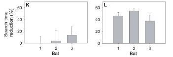
|
The graph shows the reduction in search time needed to find the nectar, for each of the three bats. The left side (part K) is for the normal leaf; there is no significant change in search time. The right side (part L) is for the reflecting leaf; there is a major reduction in search time.
The figure here consists of parts K and L of Figure 2 from the paper.
|
In other experiments, they directly measured the reflecting ability of the two types of leaves, and showed that the reflecting leaves were indeed better at making direct reflections. They also note that these leaves are less efficient at photosynthesis; thus they argue that the benefit of reflecting the pollinator's signal outweighs the loss of photosynthetic ability. This, of course, is simply a hypothesis for now, but it shows the line of thinking that develops with this work.
News stories. Both of the following include some good pictures.
* How to Invite Bats for Dinner. (Science Now, July 28, 2011.)
* Bats Drawn to Plant via "Echo Beacon" -- Leaves act like satellite dishes for bat sonar. (National Geographic News, July 28, 2011. Now archived.)
* News story accompanying the article: Ecology: The World Through a Bat's Ear. (M B Fenton, Science 333:528, July 29, 2011.) (This news story deals with two articles about bats; the one that is directly relevant to this post is listed below.)
* The article: Floral Acoustics: Conspicuous Echoes of a Dish-Shaped Leaf Attract Bat Pollinators. (R Simon et al, Science 333:631, July 29, 2011.)
Also see:
* What do bats argue about? (April 21, 2017).
* Jamming of bat sonar, by bats (January 20, 2015).
* Could we block seismic waves from earthquakes? (June 23, 2014). More mirrors.
* A plant that mimics the leaves of its host (May 30, 2014).
* On a similarity of bats and dolphins (September 15, 2013).
* Should bees eat honey? (July 12, 2013).
* Little yellow-shouldered bats -- and the Guatemalan bat flu (March 30, 2012). More on bats.
* How to find the blood (August 29, 2011). Most recent post on bats -- and another detection issue. Links to more on bats.
* What's around the corner? (January 7, 2011). Another use for echolocation.
* Water: a bat's view (December 3, 2010). Bats and reflective surfaces.
* Warfare: the tymbal (September 3, 2009). This post is about an animal that has a "trick" to avoid being detected by the bat sonar.
During discussion of this item before posting it, a reader suggested that the following page might be of some interest: Wikipedia: Zoophily. Zoophily is the pollination of plants by vertebrates; many vertebrates are involved, including birds and bats.
Cleaning up space debris
September 6, 2011
It's getting messy out there in space. Debris from previous space missions. Even worse when objects break up, for one reason or another; each fragment is now a concern. About 15,000 objects are being tracked. Much of the debris is in places where it is potentially a hazard for active satellites or spacecraft.
An Italian space scientist has a proposal for cleaning up space.
|
A simple diagram of his proposed device "in action". This is Figure 4 of the paper.
At the left (with numbers 1 and 2) is the space debris. At the right is the proposed satellite to target the debris for destruction. Upon rendezvous, its upper arm (5) holds the debris; Its lower arm (6) attaches a de-orbiting device (3, 4) to the debris. The satellite decouples, and the de-orbiting device is activated. This targets the debris to burn up in the earth's atmosphere.
|
Sounds slow and tedious? Indeed. It has to be programmed for each specific target. The author has thought that through. He proposes about 40 specific debris objects, and a specific 7-year mission to destroy them. That may seem like it is making only a small dent. He argues that it is a good step, especially since it removes large objects -- which if left unattended may break into a huge number of small objects, each of which is a hazard.
Is this a good idea? I don't know. The news coverage suggests that people think it is worth serious discussion. For now... It's a fun paper. He describes the problem, and describes his approach to dealing with it. Have a look.
News stories:
* Space junk could be tackled by housekeeping spacecraft. (BBC, August 8, 2011.)
* Aerospace engineer proposes arm-equipped satellite to affix propellant kits to space junk to send it back home. (Phys.Org, August 12, 2011.)
The article: Active space debris removal - A preliminary mission analysis and design. (M M Castronuovo, Acta Astronautica 69:848, November 2011.)
The problem here is distinct from dealing with asteroids that are on target to hit Earth. However, you may find parallels. Here is a post on the latter topic: Gravity tractor: protection from asteroid collisions (October 26, 2009).
A box that will fold up upon command -- heat- or light-actuated switches
September 3, 2011
A recent post was on How to fold a bag (May 13, 2011). One reader made it clear he was quite unimpressed. So, we will try again. Now we have a self-folding box. It is from engineers at UC Berkeley.
|
The box that folds itself.
|
|
The open form of the box is put in water at 48 °C. Over about 35 seconds, it folds up into a cube (a box) -- simply due to the heat.
The darker strips, easily seen on the open box at left, are the "hinges." These consist of a special material designed to change shape when the temperature (T) is changed. The material binds water well at low T (that is, it is hydrophilic) but poorly at high T (that is, it is hydrophobic). Therefore, when the T is raised, it expels water. That changes the volume; because of the way the hinge material is attached to the box, it changes the shape.
This is Figure 3B of the paper. The entire Figure 3 is also in the news story listed below. Part A of the figure is a diagram of the process. Part C shows the reverse process: the box unfolds when put into cold water (20 °C).
|
The paper also shows a more complex device -- a flower. It has two kinds of hinges, which fold at different rates. See Figure 4 of the paper.
There are a couple of problems. One is that the box is wet. The other is that it is small. The box above has a volume of about 1 cm3 (1 mL). I suspect that the method is hard to scale up to large volumes.
But no matter. Folding boxes is not the real goal. The goal is making switches -- small switches that can be activated by an external stimulus (heat, or also light, which they use in one experiment). (The researchers are part of the Berkeley Sensor & Actuator Center.) The research work involves designing the materials and learning how to use them. The box that folds itself is just a simple model system for showing off their achievements. Their box here folds faster than previous such boxes.
News story: Nano-actuators respond to both light and heat. (Nanotechweb.org, July 27, 2011. Now archived.)
The article: Optically- and Thermally-Responsive Programmable Materials Based on Carbon Nanotube-Hydrogel Polymer Composites. (X Zhang et al, Nano Letters 11:3239, August 10, 2011.) There is a copy freely available from the author's web site: Author's pdf.
Another article from the same team at Berkeley, led by engineering professor Ali Javey, was presented in the post eSkin: Developing better sense of touch for artificial skin (November 29, 2010).
The post Smart dust: A central nervous system for the earth (July 20, 2010) is also related, in sharing the broad theme of actuators and sensors. As noted there, that work had its genesis with Kris Pister, in the same department at UC Berkeley.
And... How to fly a beetle (April 27, 2015).
A post that presents another example of the use of hydrophobic materials... Electronic devices that can work under water (November 7, 2011).
More about carbon nanotubes: Characterization of carbon nanotubes (December 3, 2013).
More flowers: Better enzymes through nanoflowers (July 7, 2012).
More about folding... A ream of microscopes for $300? (June 22, 2014).
This post is listed on my page Introduction to Organic and Biochemistry -- Internet resources in the section on Aromatic compounds. That sections lists Musings posts on graphene and carbon nanotubes.
Archaic human genomes: update
September 2, 2011
Svante Pääbo gave a talk at Berkeley on August 30. Pääbo, of the Max Planck Institute for Evolutionary Anthropology, Leipzig, is a pioneer in the study of ancient DNA. The talk was on the broad topic of ancient human genomes. Most of what he said was from published material; the Musings post The Siberian finger: a new human species? -- A follow-up in the story of Denisovan man (January 14, 2011) is a good status report.
He made a few points that were new to me. (Whether they actually have been published, I don't know offhand.) They all relate to the Denisova cave.
* One bone found in the cave yielded mitochondrial DNA (mtDNA) that is Neandertal. Thus the cave has yielded evidence of three kinds of humans: modern, Neandertal, Denisovan. Unfortunately, good dating is not available, so we can't say much more at this point.
* Another tooth has been found there -- which is as unusual as the earlier one. It yielded mtDNA that is clearly Denisovan. Therefore, there are now two distinctive teeth with Denisovan DNA. This is the total extent of evidence connecting morphology and DNA for the Denisovans -- but it is twice as much as we had in the earlier post.
* There are now three sequences for Denisovan mtDNA. They form a cluster distinct from modern or Neandertal mtDNA. However, they are quite different from each other. In fact, the three Denisovan mtDNA sequences show an amount of variation comparable to the difference between European and African modern humans. This would seem to be an odd finding.
He also noted the new paper, which just appeared, suggesting that some important alleles of genes for our immune system seem to have come from Neandertals and from Denisovans. A news story on this is at: Humans Picked Up Ancestral Immunity -- Modern immune systems harbor signs of interbreeding with ancient hominins. (The Scientist, August 25, 2011.)
Remember, this is leading-edge work. Little DNA is available; little information is available. Everything is preliminary. Errors are possible -- and a single error can be a significant part of the story when little information is available. So, enjoy the show, but be cautious about interpreting it.
Pääbo has written a book, which is listed on my page of Book suggestions: Pääbo, Neanderthal Man -- In search of lost genomes (2014).
Top of page
The main page for current items is Musings.
The first archive page is Musings Archive.
E-mail announcements -- information and sign-up: e-mail announcements. The list is being used only occasionally.
Contact information
Site home page
Last update: December 30, 2025