Musings is an informal newsletter mainly highlighting recent science. It is intended as both fun and instructive. Items are posted a few times each week. See the Introduction, listed below, for more information.
If you got here from a search engine... Do a simple text search of this page to find your topic. Searches for a single word (or root) are most likely to work.
Introduction (separate page).
This page:
2018 (May-August)
August 29
August 22
August 15
August 8
August 1
July 25
July 18
July 11
July 3
June 27
June 20
June 13
June 6
May 30
May 23
May 16
May 9
Also see the complete listing of Musings pages, immediately below.
All pages:
Most recent posts
2026
2025
2024
2023:
January-April
May-December
2022:
January-April
May-August
September-December
2021:
January-April
May-August
September-December
2020:
January-April
May-August
September-December
2019:
January-April
May-August
September-December
2018:
January-April
May-August: this page, see detail above
September-December
2017:
January-April
May-August
September-December
2016:
January-April
May-August
September-December
2015:
January-April
May-August
September-December
2014:
January-April
May-August
September-December
2013:
January-April
May-August
September-December
2012:
January-April
May-August
September-December
2011:
January-April
May-August
September-December
2010:
January-June
July-December
2009
2008
Links to external sites will open in a new window.
Archive items may be edited, to condense them a bit or to update links. Some links may require a subscription for full access, but I try to provide at least one useful open source for most items.
Please let me know of any broken links you find -- on my Musings pages or any of my web pages. Personal reports are often the first way I find out about such a problem.
August 29, 2018
A Neanderthal-Denisovan hybrid. DNA analysis of an ancient human bone shows that it came from a person whose parents were one Neanderthal and one Denisovan. A milestone, yet inevitable.
* News story: Mum's a Neanderthal, Dad's a Denisovan: First discovery of an ancient-human hybrid -- Genetic analysis uncovers a direct descendant of two different groups of early humans. (M Warren, Nature News, August 22, 2018. In print, with a different title: Nature 560:417, August 23, 2018.) It links to the article.
* A background post... A person who might, just possibly, have met his Neandertal ancestor (June 30, 2015).
* and then ... Denisovan man: beyond Denisova Cave (May 7, 2019).
August 28, 2018
About 14,000 years old.
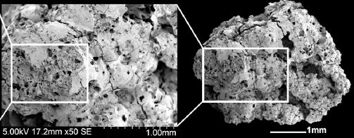
Here is what it looks like...
|
The figure shows images of a piece of bread, at two magnifications.
Start at the right. The boxed part is shown at higher magnification to the left. This is part of Figure 3A from the article. |
That's the stuff. It was found in a "fireplace" at an ancient archeological site in Jordan.
What is bread? Well, take some grain (cereal), process it to make some kind of flour, add water, and bake. The structure seen in the images above shows the porosity typical of bread. (This would be a "flatbread", unleavened.)
Why is this interesting -- assuming that the basic claim is correct? The date. It's from a hunter-gatherer society, 4,000 years before farming. At least in this case, it seems that the development of a processed food preceded intentional cultivation of the crop. Bread-making is a complex process; the nature of the bread material studied here suggests great care in its preparation.
The article concludes with some speculation on the purpose of the bread. It is possible that the bread, difficult to make and expensive, was a luxury food used for special feasting. But that is indeed largely speculation at this point.
The work is also interesting for the approach. The authors note that the study of charred food remains from archeological sites is unusual.
News stories:
* Archaeologists discover bread that predates agriculture by 4,000 years. (Phys.org, July 16, 2018.)
* Ancient Bread: 14,400-Year-Old Flatbreads Unearthed in Jordan. (S D Pfister, Biblical Archaeology Society, July 25, 2018.) Excellent overview of the entire story.
The article, which is freely available: Archaeobotanical evidence reveals the origins of bread 14,400 years ago in northeastern Jordan. (A Arranz-Otaegui et al, PNAS 115:7925, July 31, 2018.)
Figure 2 of the article is a nice picture of the fireplace -- with a sunset in the background. (That figure is also in the news story by Pfister.)
* * * * *
More old food: The oldest known piece of cheese (April 25, 2014).
More from ancient Jordan: The case of the missing incisors: what does it mean? (September 13, 2013).
More from a hunter-gatherer culture: The earliest human warfare? (February 17, 2016).
August 26, 2018
The common yeast, Saccharomyces cerevisiae, has a haploid chromosome number of n = 16. (Humans have n = 23.) Two new articles, published together, report the construction of yeast strains with only one or two chromosomes. In these strains, all of the usual small chromosomes have been fused into one or two big chromosomes, which contain the same information.
We'll focus here on article #1, which reports n = 1. Article #2 reports n = 2; however, the similarities between the articles are more important than the differences, at least for now.
The yeast genome is well characterized. Logically, the task is straightforward: just combine all the short pieces of chromosomal DNA into one long piece. Extra copies of special chromosome features, such as centromeres and telomeres need to be removed. That's all logical. Of course, it is a huge technical achievement to get it all done. (Hint... They used CRISPR.)
Why would one want to do this? Well, we really don't know what would happen. Simple principles of genetics suggest that the number of chromosomes shouldn't matter. On the other hand, molecular biologists are increasingly learning about how chromosomes are organized within the cell. It's not at all clear that making a major change in chromosome organization is allowed. Let's try it and see.
So they do it. The resulting strains grow -- almost as well as the original strains, but not quite. Both parts of that are of interest.
The first figure here shows the technical success...
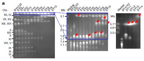
|
Each (vertical) lane shows the results of electrophoresis of the intact chromosomes of one yeast strain. Smaller chromosomes move through the gel faster; larger ones get caught up and move more slowly.
Each lane is labeled at the top with the strain number. Lanes labeled "marker" have DNA pieces of known size; these are used to calibrate the gel. (Mb = megabases.) There is no marker lane in the first gel. The smallest yeast chromosome is about 0.23 Mb. |
|
Big picture... Strain BY4742, at the left, is the original strain, with 16 chromosomes. In some cases, two chromosomes are about the same size, and run together as a single band. So there aren't 16 bands, but there are quite a few -- labeled with the chromosome numbers. Strain SY14, at the right, is the final constructed strain, with one big chromosome. There is only one band, at the very top. Results for several intermediate strains are also shown. In general, as you go from left to right, small bands (for old chromosomes) disappear and big bands (for new chromosomes) appear. Bands for new chromosomes are marked with red arrows. This is Figure 2a from article 1. | |
The chromosome bands above show that the scientists succeeded. They started with a strain with 16 small chromosomes, and made one with one big chromosome.
There is a little bonus. They couldn't have done that final analysis unless the strain grew. The mere fact that we have an analysis of strain SY14 means that the new strain grew -- at least well enough to grow up a culture to analyze.
How well does it grow? The following graphs provide some basic results...
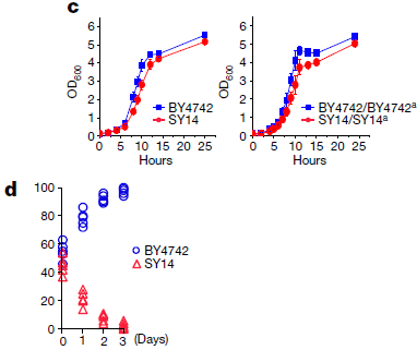
|
The two graphs in part c (top) show growth curves for the original and new strains. The left-hand graph is for the haploid forms; the right-hand graph is for the diploid forms. In both cases, the growth curves for the two strains are similar. However, it is also true that the new strain (SY14; red curves) grows a little worse. Is that a significant difference? One way to test that is to grow the two strains together, so that they actually compete with each other. |
|
Part d shows a competition test. The y-axis shows the percentage of each strain in the mixed culture over time. The culture starts with about 50% of each. You can see that the percentage of the old strain rises and the percentage of the new strain falls. After three days, the old strain has taken over. For part d, I said that the y-axis is the percentage of each strain. It is not explicit on the graph or in the article, but I am fairly sure that I have interpreted it correctly. This is part of Figure 5 from article 1. | |
So, the new strain grows -- rather well, but not as well as the original strain.
Why doesn't the new strain grow as well as the original? The article provides considerable characterization of the new strain, but does not provide an answer at this point. We can only briefly note some possibilities.
There are two broad types of reasons why the new strain doesn't grow as well as the original strain. One is that there is some mistake along the way. A new mutation might have been introduced, for example. The scientists note a possible problem with the promoter for one gene, but have not yet resolved it.
The other type of reason is that there is something unfavorable about the new chromosome. We might subdivide that further: explanations of detail, such as two genes now being near each other and functioning poorly that way; explanations that fundamentally involve having only one chromosome.
Further work will presumably reveal information about why the new single-chromosome strain doesn't grow as well as the multi-chromosome parent. It may or may not be interesting.
One type of experiment is to let the new strain grow and see what mutations develop to improve its growth. This is an artificial selection in the lab, mimicking what would happen in nature.
There is another point to note about the new strain. It is quite defective in completing the sexual cycle when mated with the original strain. It is, in effect, a new species. (This issue is discussed most extensively in article 2.)
The new strain, a Saccharomyces with only one chromosome in its haploid set, raises many questions. It will be the subject of much study in the coming years.
News stories:
* Researchers Fuse Chromosomes to Create New Yeast Strains. (D Kwon, The Scientist, August 1, 2018.) Now archived.
* Gene editing crunches an organism's genome into single, giant DNA molecule -- The yeast seem to grow just fine with all their genes on a single piece of DNA. (J Timmer, Ars Technica, August 3, 2018.)
* Creating a functional single chromosome yeast. (X Xue, Nature Research Bioengineering Community, August 1, 2018.) By one of the authors of article 1.
News story accompanying the two articles: Genome editing: Chromosomes get together. (G Liti, Nature 560:317, August 16, 2018.)
Two articles:
1) Creating a functional single-chromosome yeast. (Y Shao et al, Nature 560:331, August 16, 2018.) Produced a strain with n = 1.
2) Karyotype engineering by chromosome fusion leads to reproductive isolation in yeast. (J
Luo et al, Nature 560:392, August 16, 2018.) Produced a strain with n = 2.
Another example of developing reproductive isolation in a yeast: Making a new species in the lab (July 26, 2015). The yeast here is Schizosaccharomyces pombe.
Among other posts about yeasts:
* What if a yeast cell contained a bacterial cell? A step toward understanding the evolution of mitochondria? (January 29, 2019).
* The history of brewing yeasts (October 28, 2016).
* How to confuse a yeast -- a sensory illusion (January 15, 2016).There is more about genomes on my page Biotechnology in the News (BITN) - DNA and the genome. It includes an extensive list of related Musings posts.
August 24, 2018
The broad topic of water on Mars remains controversial. For one thing, there are multiple parts to it. Surface water, or sub-surface? Long term, or transient? And of course, solid or liquid?
A new article claims finding a sub-surface lake on Mars. It's probably not very convincing, but it is interesting.
The argument has two parts. The first part is finding an unusual reflection, by radar. Here's that evidence...
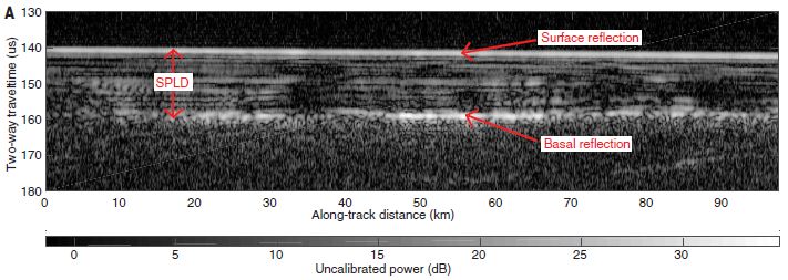
|
The Mars Express spacecraft is orbiting Mars. In this work, it is sending out radar signals, and measuring the strength of the signal that is reflected back.
The graph axes effectively are vertical position (e.g., height or depth; y-axis) vs horizontal position along the surface (x-axis). (We'll clarify the y-axis scale below.) The x-axis shows that a swath over the surface of about 100 kilometers was examined here. The color (or shading) encodes the strength of the signal sent back as a radar reflection. The whiter (brighter) the color shown, the stronger the signal. (The calibration bar at the bottom of the figure shows the detail.) Look at the y-axis value of 140. There is a bright line across the entire surface at that "height". A rather uniform bright line. That's the planet surface, as labeled (red arrow). There are various other horizontal streaks. Of particular interest, there is a bright streak at y-axis = 160 and x-axis = 45 to 65. It's labeled "basal reflection". This is Figure 2A from the article. The y-axis is labeled in time units. It is the time for the radar signal to travel to its target and back. Thus it is a measure of the distance from the radar source (in the orbiting spacecraft) to the reflecting structure. Since the signal travels through various materials, with different speeds, the relationship between time and distance is complex. However, the scientists can estimate the depth. Part B of the figure plots the same results as power vs position. In the figure above, power is encoded in the shading, as shown in the bar at the bottom. In B, it is shown as a numerical value, on the y-axis. SPLD? (The vertical red arrow near the left.) South Polar Layered Deposits. |
That "basal reflection" is the focus of the story. It is about 1.5 km (or one mile) underground. That's part one of the argument: there is an unusual reflection; you can see it in the figure above.
Part two? The authors argue that the observed reflection is due to liquid water -- a lake. More specifically, they argue that it is due to a boundary between water and rock.
How do they get to water as a conclusion? It involves trying to understand the signal strength, which depends on the properties of the material. In particular, it depends on an electronic property called the dielectric permittivity. The analysis is complicated, because the radar signal passes through various materials. What the authors do is to model the radar path, and make some estimates and assumptions. The permittivity of liquid water is distinctively high; the modeling strongly suggests that a layer of such high permittivity is part of the path. Thus they conclude that there is a layer of liquid water. It may be more like slush than simple water, but still, something that has some basic properties of liquid water.
The reflection is clear. The interpretation is difficult. The authors have put it out there, to be studied further.
News stories:
* First firm evidence for liquid water on Mars. (K Krämer, Chemistry World, July 25, 2018.)
* Underground Lake Found on Mars? Get the Facts. (N Drake, National Geographic, July 25, 2018. Now archived.)
News stories in the journal:
* Planetary science: Lake spied deep below polar ice cap on Mars. (D Clery, Science 361:320, July 27, 2018 (the preceding issue).)
* Planetary science: Liquid water on Mars -- A water body exists below the martian south polar ice cap. (A Diez, Science 361:448, August 3, 2018.)
The article: Radar evidence of subglacial liquid water on Mars. (R Orosei et al, Science 361:490, August 3, 2018.)
More about water on Mars:
* Water on Mars? InSight finds none (September 19, 2022).
* Another underground lake on Mars -- near the equator? (April 5, 2022).
* Is Mars wetter than Earth -- underground? (February 9, 2018).
* Water at the Martian surface? (August 27, 2011).More about Mars: Mars wobbles, too (January 24, 2021).
More about sub-surface water "out there": Europa is leaking (February 10, 2014).
... and "here": Life in an Antarctic lake (April 22, 2013).
August 22, 2018
1. The May 2018 Ebola outbreak in the Democratic Republic of the Congo (DRC) is over. About three months from first reported cases to a formal declaration of the end. In general, the DRC and partners around the world are getting high marks for how they handled the outbreak, which seemed to have the potential to become very serious. The experimental vaccine and ring vaccination protocol were used here. As far as we know, no vaccinated individuals got Ebola; it is hard to know the significance of that result, since there was no control group. News story: DRC declares end to Ebola outbreak. (L Schnirring, CIDRAP, July 24, 2018.) The bad news... A few days after the official end of the May outbreak, a new Ebola outbreak in the DRC was reported; it is an independent outbreak -- and shows signs of becoming very serious. I have added the information in this note to my page Biotechnology in the News (BITN) -- Other topics in the section Ebola and Marburg (and Lassa).
2. Direct-to-consumer genetic testing. It's not (quite) practical yet to test your own genes, but it is practical -- and inexpensive -- to pay a company to do genetic tests for you. It has become quite a business. Here is a bioethics column with a skeptical view: Opinion: Consumer DNA Testing Is Crossing into Unethical Territories -- Data don't support many direct-to-consumer products, from telomere assessments to bespoke diets based on genetic sequences. (J D Loike, The Scientist, August 16, 2018. Now archived.) This is one person's view. As so often, it is best read for the questions it raises. I have added this article to my page Biotechnology in the News (BITN) -- Other topics in the section Ethical and social issues; the nature of science.
August 21, 2018
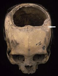
|
A human skull. Much of the top has been removed.
It dates to about 300 BC, and came from what is now Peru. It is presented in a recent article as an example of ancient Inca skull surgery. This is Figure 3 from the article. The arrow marks a depressed region. It is presumably from an injury, perhaps the one that was behind doing the current surgery. |
The article is fascinating -- and a little weird. It is a survey of trepanation in Peru, over 2000 years. It is based on analysis of skulls found in collections as well as from the authors' own field work.
Here is the opening of the article: "Trepanation, or trephination, the scraping, cutting, or drilling of an opening into the cranium, was practiced in various parts of the world in prehistoric times, dating back 5000 years ago in Europe and to around 2500 years ago in the New World. Interestingly, more prehistoric trepanned crania have been found in Peru than any other location in the world. And even more interesting, the survival rates for the ancient procedure in Peru rival those for trepanation done during other ancient and medieval times and through the American Civil War in the 19th century, ..." (It then goes on to discuss possible complications.)
From examination of the skulls, the authors suggest the purpose of the surgery, and comment on other injuries they see. They estimate survival, by looking for signs of healing. That leads them to the survival estimates noted above. How good are those survival estimates? How representative is the available skull sample of the entire surgical experience? It's hard to know. But the authors do suggest conclusions, such as that the survival rate was better for the Incas in the 15th century than for the Americans in the Civil War (19th century). How much that comparison might be affected by the nature of the injuries is not addressed.
It is interesting medical history.
News stories:
* Holes in the head. (M Bell, Phys.org, June 8, 2018.)
* The Incas were better at skull surgery than Civil War doctors. (M Andrei, ZME Science, June 8, 2018.)
The article: Trepanation Procedures/Outcomes: Comparison of Prehistoric Peru with Other Ancient, Medieval, and American Civil War Cranial Surgery. (D S Kushner et al, World Neurosurgery 114:245, June 2018.) The article is described as a "Historical Vignette".
Want more? The authors have a recent book on the subject. See #1, by Verano, in the reference list in the article. The article also notes (but does not list) an earlier book on the topic, by Hippocrates (460-377 BC).
* * * * *
More about skull injuries:
* Head injuries in Neandertals: comparison with "modern" humans of the same era (February 22, 2019).
* Stone age human violence: the Thames Beater (February 5, 2018).Posts about making, using, or fixing skull holes include:
* Need a new bone? Just print it out (November 13, 2016).
* A microscope small enough that a mouse can wear it on its head (November 12, 2011).More historic skulls: An interesting skull, and a re-think of ancient human variation (November 12, 2013).
More from the Incas: A new approach for testing a Llullaillaco mummy for lung infection (August 17, 2012).
My page Internet resources: Biology - Miscellaneous contains a section on Medicine: history. It includes a list of some related posts.
August 19, 2018
The following figure shows a family tree for animals of the phylum Cnidaria -- the phylum that includes the jellyfish, sea anemones, corals, and more. Simple animals, without an organized brain. Of particular interest are the blue boxes; they show which groups include animals that have eyes.
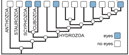
|
Five of the groups shown across the top are marked with blue boxes. That's five out of 13.
Those groups with eyes seem to have arisen independently. None of the ancestral groups (below the top row) have blue boxes; none of them are thought to have had eyes. This is part of the graphical abstract from the article. |
The more complete results within the article suggest that eyes arose (at least) eight times within the Cnidaria.
Eyes use a protein called opsin. Opsin proteins, in fact, serve as light receptors for animals without eyes; they may be universal in cnidarians. Opsin proteins -- and some ability to detect light -- came first; eyes, using opsins, came later. Makes sense. Interestingly, the authors found that the family tree for opsins agreed with the family tree for eyes. That supports their claim that the many cnidarian eyes developed independently.
This is a big-picture story: a broad survey of the features of 1100 species of cnidarians. It reveals some patterns. It remains for future work to work out the details of eye types and functions in these simple animals. But the big picture is that there is a complex story of eye origins in animals as simple as jellyfish, just as there is in more complex animals.
News stories:
* The eyes have it! (K Freel, Molecular Ecologist, July 20, 2018.)
* Without Batting an Eye. (J Cohen, University of California Santa Barbara, July 19, 2018.)
The article: Prolific Origination of Eyes in Cnidaria with Co-option of Non-visual Opsins. (N Picciani et al, Current Biology 28:2413, August 6, 2018.)
Musings has discussed the eyes of the box jellyfish (Cubozoa): How many eyes does it have? (March 12, 2010). Links to more -- both about this animal and about other unusual animal eyes.
More about opsins: A better understanding of the basis of color vision (February 1, 2013).
More about cnidarians: The immune response of cnidarians (e.g., corals) (November 1, 2021).
August 17, 2018
A new article explores another way to make replacement organs. It's rather preliminary, but interesting and encouraging.
The idea is to grow organs in the lab, from cells. To aid in forming an organ in the lab, the cells are grown on a scaffold consisting of an empty organ. What's an empty organ? It is an organ that has been decellularized: all the original cells have been removed. That is, it provides structure, but no biological function beyond that.
Here is the general plan for the new work... A lung was removed from a dead pig. The lung was decellularized; that gives the scaffold. A lung was then removed from an animal destined to be the recipient. Cells from that lung were used to re-seed the scaffold. After a month of development in the lab, the new, bioengineered lung (BEL) was transplanted back into the animal. The animal also has, of course, a normal lung (NL). Several aspects of lung development were measured at various times; the NL in the same animal serves as a reference for each BEL.
In this work, the cells are from the animal that received the new organ. In a sense, the animal received a transplant from itself. However, there are key steps outside the animal, and immunological compatibility is not to be taken for granted.
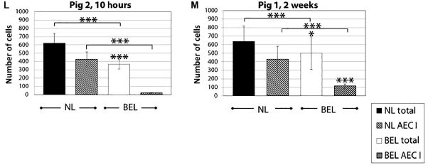
|
Each of the two graphs above is for one animal, sacrificed at the age shown at the top. For one animal, that was at 10 hours (after transplantation of the new lung); obviously, little has happened. It is sort of a zero point. The other graph is for an animal sacrificed at two weeks.
Each graph has data for the NL (left) and the BEL (right). There are two kinds of cell counts. One is for total cells; the other is for alveolar epithelial cells type I (AEC1), a type of lung cell. From the 10 hr graph... You can see that the BEL is smaller, and has only a small number of the AEC1 cells. Compare with the two week pig... The BEL is stable, maybe even a little larger. Importantly, it has considerably more of the specialized AEC1 cells. This is part of Figure 5 from the article. |
That's an example of evidence that the lungs were developing properly upon transplantation to the recipient animal. It's not exactly overwhelming evidence, but it is good as far as it goes.
Of course, the article contains much more evidence. There are two more pigs, one each analyzed at one and two months. There are many pictures showing tissue structure. There is evidence of vascularization (formation of blood vessels), an important issue with lab-grown materials. And there is evidence that a proper lung microbiome is being established. No big problems were seen (though there were some small problems).
You may have noticed that the figure shown above contains parts L and M of Figure 5. The full article contains eight figures, five of which have parts up through J or more. A lot of evidence, indeed.
Did the transplanted lung provide respiratory benefit to the recipient? No. In fact, it wasn't even "hooked up"; the pulmonary artery, between heart and lung, was not connected for the new lung.
Bottom line... The approach of using a decellularized organ as a scaffold for making a new lung in the lab has passed some early tests in a pig model.
News stories:
* Researchers successfully transplant bioengineered lung. (Medical Xpress, August 1, 2018.)
* Expert reaction to study attempting to create better bioengineered lungs in pigs. (Science Media Centre, August 1, 2018.) One expert's comments.
The article: Production and transplantation of bioengineered lung into a large-animal model. (J E Nichols et al, Science Translational Medicine 10:eaao3926, August 1, 2018.)
Musings has discussed the possible use of pig organs transplanted to humans. That's not what this is about. The role of the pig here is as a model. If we can get this to work with the pig, then we can try to get it to work to make human organs: a human-derived scaffold, seeded with human cells.
* * * * *
Also see:
* Can human lungs that are too damaged to be transplanted be fixed? (August 22, 2020).
* Human heart tissue grown in spinach (September 5, 2017). Another example of using a cell-free scaffold for growing organs.
* Lamb-in-a-bag (July 14, 2017). Lung development.My page Biotechnology in the News (BITN) for Cloning and stem cells includes an extensive list of related Musings posts, including those on the broader topic of replacement body parts.
August 15, 2018
1. Underwater landslides are a poorly understood but important phenomenon. One of the mysteries is why they sometimes occur at places where the slope is quite small. A new article suggests that a particular combination of materials may be responsible: a layer of diatoms (algae) topped by clay.
* News story: Diatom ooze: the weak link in submarine landslides? (D Petley, Landslide Blog (American Geophysical Union), February 13, 2018.) Links to the article.
* More about diatoms: Communication in diatoms (February 6, 2022).
* More about what causes landslides... How hot is a landslide? (April 16, 2019).
2. How many genes do humans have? The latest count is 21,306 (for protein-coding genes). That's about 1000 more than commonly accepted values. The following news story discusses the history and problems of gene counts; it links to the new article (currently a preprint, freely available at BioArXiv): New human gene tally reignites debate -- Some fifteen years after the human genome was sequenced, researchers still can't agree on how many genes it contains. (C Willyard, Nature News, June 19, 2018. In print, with a different title: Nature 558:354, June 21, 2018) This is for perspective on the issue of gene count. There is no attempt to judge or analyze any particular estimate.
August 14, 2018
Fall 2017 brought devastating hurricanes to the Caribbean. The lizards that survived the hurricanes were stronger than typical of the original population. They were better able to hold on to tree branches during the winds. That's the message of a new article.
Here is an example of what the scientists found...

|
The graphs show the size of the toepads on the front limbs of the lizards (y-axis) vs the size of the animal (x-axis). The two graphs are for the animals at two different locations in the Caribbean island nation of Turks and Caicos. The animals are Anolis scriptus, a common small lizard.
The timing of the measurements is defined by two major hurricanes (Irma and Maria), close together in the Fall of 2017. The open circles and dashed lines are for the data on animals captured before the hurricanes. The solid circles and solid lines are for the data on animals captured after the hurricanes. In both graphs, you can see that the animals captured after the hurricanes have larger toepads. The gray regions show the 95% confidence intervals for the lines to fit the data points. Approximate timeline, in weeks: "before" measurements (0); hurricanes (1, 3); "after" measurements (6). This is the lower left frame of Figure 2 from the article. The full figure includes three other frames, with other such measurements. Each one shows a clear after-vs-before effect. |
The observations seem simple enough. Animals that survived the hurricanes have larger toepads.
What does it mean? The observations are interesting, but we should be cautious about interpreting them.
It's easy enough to imagine that larger toepads allowed some lizards to hang on to trees better, thus increasing their chances of survival. But is there any evidence that supports that interpretation? Are there alternative explanations?
First, we should understand that this was not a carefully controlled experiment. The authors had been in the Islands making measurements on the lizards as part of another project. They left as the storms approached. Later, they realized that the situation presented an opportunity: go back and measure the lizard population again, and see if it has changed. That's the basis of the current work. But there can be questions about how the initial and final populations are related. The authors note some of these in their discussion.
For now, for the sake of discussion, let's assume that the two sets of measurements are samples from the proper related populations. It would seem that the hurricanes resulted in a selection for lizards that are "stronger" -- specifically, better able to hold on to the branches.
Does this mean that next year's lizards will be like the "after" sample above? No; there is nothing in the observations that says the differences noted above are due to genetics. It would certainly be interesting to continue the observations, and see what happens over the coming generations.
There is another question... In discussing the work, we suggested that larger toepads means the lizards can hang on better during a wind storm, and thus survive the winds better. It is known that toepad area relates to clinging ability. However, it is not known if clinging would be the natural response of the lizards to high winds. In fact, some thought that the main survival strategy would be to scurry to a protected area (which is what the scientists did).
That question led the authors to do some testing, with some artificial wind (from a leaf blower). That work showed how the lizards respond to wind. They found that the lizards tried to hang on -- and that bigger toepads helped them do so. It also led to some understanding of one of the results that at first didn't seem to make sense. The experimental work is just hinted at in the main article.
It's an interesting article. Serendipity. A natural disaster just happened to occur while some work was in progress. The scientists were able to take advantage of the situation, and make additional measurements, showing how the disaster affected the lizards. That led to some experimental work. Overall, we know more about how lizards respond to hurricane-force winds, but many questions remain.
News stories:
* Leggy lizards don't survive the storm. (Phys.org, July 25, 2018.)
* After Last Year's Hurricanes, Caribbean Lizards Are Better at Holding on for Dear Life. (E Yong, Atlantic, July 25, 2018.) Now archived.
* Behind the paper: Hurricane-induced selection on the morphology of an island lizard. (C Donihue, Nature Research Ecology & Evolution Community (blog), July 25, 2018.) From the lead author of the article.
Video: Natural selection in a hurricane - The lizards that won't let go. (3 minutes; narrated.) A promotional video, from the journal (linked here via YouTube). Perhaps useful, and even a little amusing.
The article: Hurricane-induced selection on the morphology of an island lizard. (C M Donihue et al, Nature 560:88, August 2, 2018.)
A post about hurricane effects: Recovery from natural disaster: can the poor benefit? (July 22, 2011).
More about winds and animals: Wind-borne mosquitoes repopulate the Sahel semi-desert after the dry season (October 14, 2019).
More about lizard toes: A story of dirty toes: Why invading geckos are confined to a single building on Giraglia Island (November 12, 2016).
More about lizards: How to clamp down to keep the partner from straying (December 15, 2020).
August 12, 2018
Recent years have seen huge decreases in the cost of DNA sequencing, driven largely by the introduction of novel technologies. However, the state of synthesizing DNA has not improved much. Some groups have made heroic efforts with the old technology and made some small chromosomes. However, many scientists feel that the field of DNA synthesis is ripe for a major transformation -- fundamentally new technology.
What about using DNA polymerase? Ordinary DNA polymerases only copy DNA. What we want here is new ("de novo") DNA: DNA with the sequence determined by the person placing the order (not by a pre-existing DNA template).
A recent article offers a novel -- and interesting -- approach to making DNA. It establishes the principle. Whether the method can fulfill the promise of being a revolutionary development is for the future.
Here is the idea. (It is summarized in the figure below, but I think it may be good to go through the key steps before introducing the figure.)
The key player is an enzyme, called terminal deoxynucleotidyl transferase, or TdT (or terminal dNTP transferase). Its natural enzymatic activity is to add one nucleotide to the end of a DNA chain -- a single strand of DNA. How does it know which nucleotide to add? It doesn't. This enzyme adds a nucleotide at random to the end of the chain. TdT is a DNA polymerase, but -- unusually -- it is template-independent.
How do the authors solve this problem (#1)? They make four batches of the TdT enzyme, each bound to one of the four nucleotide triphosphate precursors. For example, they make TdT-dATP, where the TdT enzyme has the nucleotide triphosphate for A (dATP) bound to it. This particular batch of the enzyme can add only A. Problem #1 solved.
That leads to problem #2... The enzyme as described above should add A, then another A, and so on. We don't want that; we want it to add just one A -- and then we decide which nucleotide to add next by adding another batch of the enzyme.
How do the authors solve problem #2? They stop the enzyme after one addition. How? We said that the enzyme is bound to the nucleotide triphosphate, such as TdT-dATP. The trick is that it is bound "permanently" (covalently). After the enzyme adds its nucleotide, it is stuck. There is now a separate step to release the enzyme. Solving problem #2 was the key breakthrough of the new work.
The following figure is a cartoon of the strategy. Add one nucleotide at a time, using a form of the enzyme covalently bound to the correct nucleotide triphosphate precursor. Then release the used enzyme, and go on to the next nucleotide.
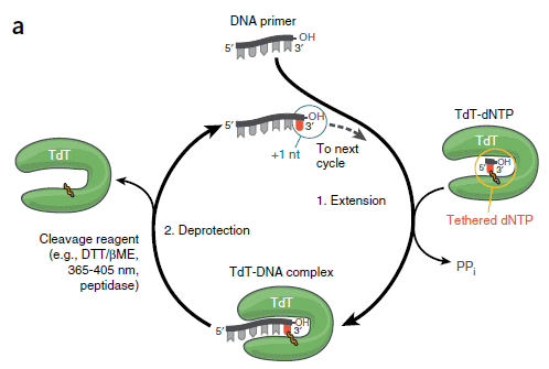
|
Start at the top, with the primer (length 5, in this case). As with all DNA polymerases, TdT adds nucleotides only onto a pre-existing chain.
At the right side is a green "horseshoe"; that is the enzyme TdT. Inside it is one dNTP nucleotide triphosphate, which is "tethered" to the enzyme. The base itself is shown in red. At the bottom, the enzyme with its nucleotide binds to DNA. The base is transferred to the end of the DNA chain. The DNA chain is now length 6, with the last base in red. At the left, remove the enzyme. Repeat the cycle. This is Figure 1a from the article. |
That's the idea. Does it work? The scientists report some small tests. They add as many as ten new nucleotides onto a DNA chain. The accuracy is good, but not good enough yet for actual use.
The authors argue that the method has the potential to be faster and cheaper than the current methods for making DNA.
An interesting feature of the proposed method is that the enzyme is consumed. It indeed carries out what would normally seem to be a catalyzed reaction, adding one nucleotide to the chain. But because of the special bound form of the enzyme, the enzyme is then destroyed. The enzyme has now become a consumable reagent. Is that practical or economical? The authors argue that enzymes are now so inexpensive that it is.
If you are concerned about the tedium of the cycle, adding one reagent or another at each step... This is how DNA is made now. It's just that different reagents are used. The user enters the desired sequence into the computer that controls the synthesizing machine. That same strategy would be used here, just with different reagents.
It's an interesting approach. Further work will tell us whether it is useful.
News stories:
* New DNA synthesis technique promises rapid, high-fidelity DNA printing. (Phys.org, June 18, 2018.)
* Faster, Cheaper, Better: A New Way to Synthesize DNA. (J Chao, Lawrence Berkeley National Laboratory, June 18, 2018.) From one of the institutions involved.
The article: De novo DNA synthesis using polymerase-nucleotide conjugates. (S Palluk et al, Nature Biotechnology 36:645, July 2018.)
Why is there an enzyme like TdT -- an enzyme that makes DNA without sequence specificity -- in nature? It's part of the vertebrate immune system, where it helps to generate diversity.
* * * * *
A post involving extensive de novo DNA synthesis: What is the minimal set of genes needed to make a bacterial cell? (July 9, 2016). The largest DNA chains made by de novo synthesis are about 200 base pairs. With effort, they can be assembled into larger chains. The largest products made from that approach are about 1.5 million base pairs, in work making synthetic yeast chromosomes. The DNA discussed in this 2016 post is a little less than that. These projects are pushing the limits of current DNA synthesis technology. However, the smallest of the human chromosomes is more than 20-fold larger.
A post about the cost of DNA sequencing: DNA sequencing: the future? (November 7, 2017).
August 10, 2018
As the numbering in the title suggests, this is a follow-up to two previous posts, which introduced Wolbachia [links at the end]. They explained the idea behind using Wolbachia, and gave some data that was encouraging. We now have the largest trial yet of Wolbachia-infected mosquitoes in the field; it, too, is encouraging.
Wolbachia bacteria infect insects, and are transmitted to the offspring. Interestingly, infection with Wolbachia often limits the growth of pathogens in the insects. Wolbachia infection of mosquitoes is not common is nature, but can be established. The earlier work showed that the infection is maintained -- and that the infected mosquitoes have a reduced capacity to maintain the pathogens tested. In particular, one post showed lab data suggesting that Wolbachia reduced Zika virus.
In the current test, Wolbachia-infected mosquitoes were released in a medium-sized city, where dengue -- a virus related to Zika -- has been prevalent. There was a major reduction in the incidence of locally-acquired dengue over a four-year study period.
At this writing we have only a preliminary version of the article, which has been submitted for peer review. More about this later, but we just want to note that the article is not yet in final form -- and might change.
The following figure shows the main results of interest.
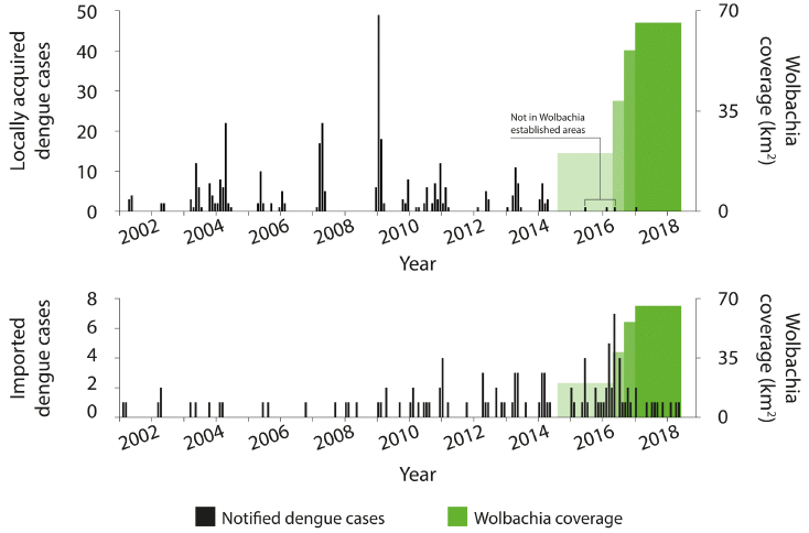
|
Look at the top frame. The black bars show the number of locally-acquired cases of dengue (y-axis scale at the left), over time (x-axis).
The green bars at the right show the implementation of the Wolbachia-infected mosquitoes, which are supposed to reduce virus transmission. The implementation was done in four stages, starting in late 2014; the height of the green bar shows the area covered at various times (y-axis scale at the right). You can see that there are bursts of dengue cases -- up through early 2014. Since the program was started, there have been only four cases. The first three of those are marked as not being relevant. The fourth case (early 2017) is discussed in the article; its origin is not clear. In any case, even if you counted all of those cases since 2014, there is a substantial reduction. The bottom frame is a "control". It is laid out in the same fashion, but this frame shows "imported" cases of dengue during the same time -- cases in the area that are likely due to the person acquiring it elsewhere. You can see that imported dengue continues more or less as usual during the test time. The reduction in locally acquired dengue is not due to a general downturn in dengue incidence. (Caution... The y-axis scales are different in the two frames. For the green areas, it is the same information, but at a different scale on the graph.) This is Figure 4 from the article. |
That's it. The largest field test yet of Wolbachia-infected mosquitoes, and there is a major reduction in locally acquired dengue, over the four-year study.
It's an encouraging result.
It's important to note that each specific area was treated only during one phase. That the first area treated remained dengue-free over four years reflects that the Wolbachia are being maintained in the mosquito population.
Much of the article is about how the scientists worked in the community to build acceptance of the program.
News story: Dengue fever outbreak halted by release of special mosquitoes. (S Boseley, Guardian, August 1, 2018.) Good overview, though some details are a bit hyped.
The article, which is freely available: Scaled deployment of Wolbachia to protect the community from Aedes transmitted arboviruses [version 1; referees: awaiting peer review]. (S L O'Neill et al, Gates Open Research 2:36, version 1: August 2, 2018.)
Some comments on the journal and how it handles articles...
This is a new journal, from the Gates Foundation, which was a major funding source for the work. Gates requires that the work they fund be published open access; their new journal is a vehicle.
The journal makes the articles public at all stages of the process of consideration. In this case, the current version is what was submitted; it has not yet been peer-reviewed. That information is included in the title of the article -- on the journal web site, and in my listing here. You may, of course, find a later version at the journal site. (I think that they maintain all versions, so that a reader can check how things changed, if that seems to be an issue.)
On August 10, one referee report was posted at the web site. (It is public; you can read it.) The article title was modified to reflect the development, but the article itself was not changed. I note this largely to give an idea how the web site works for a journal such as this.
There is a some interest in making preliminary versions of articles public, clearly labeled. This may be of particular importance in the public health field, where time may be an issue in responding. Since the status of the article is clear, those who might want to make use of any information in it are aware that they should double check any key points of interest. (Preprint servers, such as ArXiv and BioArXiv, are used in various ways, but sometimes host early versions of articles.)
* * * * *
Background posts on Wolbachia in mosquitoes:
* Can Wolbachia reduce transmission of mosquito-borne diseases? 1. Introduction and Zika virus (June 14, 2016).
* Can Wolbachia reduce transmission of mosquito-borne diseases? 2. Malaria (June 17, 2016).Previous post on dengue: Antibiotics and viruses: An example of harm (May 6, 2018).
Another approach: What if the mosquitoes carried immunity to the dengue virus? (March 8, 2020).
More on dengue is on my page Biotechnology in the News (BITN) -- Other topics under Dengue virus (and miscellaneous flaviviruses). It includes a list of related Musings posts.
August 8, 2018
Two new genomes. Genome articles are both fascinating and frustrating. The work in them is almost entirely computer analysis; reading about that analysis is not much fun. The resulting genome is potentially a gold mine. Genome articles typically offer comments about why the genome seems interesting, though any such comments should be taken as preliminary. The news stories give the idea.
1. News story: A genetic bed of roses: scientists sequence the complete genome of the rose. (M Andrei, ZME Science, April 30, 2018.) Links to the article, which is freely available.
Also see: A step toward roses without thorns (August 28, 2024).
2. News story: Cracking the genetic code of koalas. (Science Daily, July 2, 2018.) Links to the article, which is freely available.
August 7, 2018
The following figure shows samples of a peptide (short chain of amino acids) adsorbed onto a magnetic surface, as reported in a recent article.
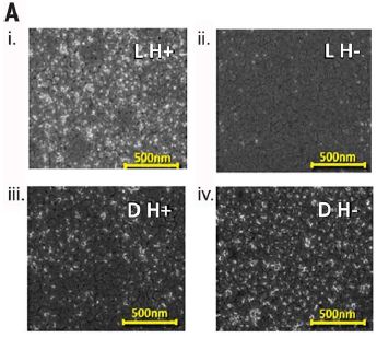
|
There are two variables here. One is the handedness of the stereocenters in the peptide. They are either all L or all D. The other variable is the direction of the applied magnetic field. H+ and H- refer to opposite orientations of the magnetic field.
The top two frames (i, ii) are for the L isomer. You can see that it adsorbs better when the field is H+ (left, i). In contrast, the D isomer (lower: iii, iv) adsorbs better when the field is H- (iv). This is Figure 1A from the article. |
That is, the two enantiomers (mirror-image isomers) adsorb differently on the surface, depending on the direction of the magnetic field. Just in case you get lost somewhere along the line here, which is likely, this is the main point. The figures above show that this is true. There shouldn't be any debate about that point.
If the above point is true, then it should be possible to use the method to separate enantiomers. In fact, the authors go on to show such a separation.
That could be useful. If this really works, it could be an inexpensive way to separate enantiomers. It's simple. And it may be fairly general, not requiring customization to individual cases.
How does this work? It has to do with electron spin -- which is probably a clue that we won't have a clear explanation. The two enantiomers have electron clouds that are mirror images of each other. The surface, too, has an electron cloud. The applied magnetic field polarizes the electron cloud in the magnetic surface. For one isomer, the effect is that the electrons of the approaching molecule are spin-aligned anti-parallel to those in the surface; this makes for a more favorable interaction. For the other isomer, the electron-spin alignment is parallel (to that of the surface), which is less favorable. That's the basis of the separation.
The separation is kinetic. That is, it affects the rate at which the two enantiomers approach the surface. It does not affect the final binding strength. Using the method requires finding the optimum time that maximizes the separation.
The figure (above) shows that the separation worked better for one isomer than the other. The authors note this, and do not have a simple explanation.
In the authors' words (from the abstract)... "Here we show experimentally that the interaction of chiral molecules with a perpendicularly magnetized substrate is enantiospecific. Thus, one enantiomer adsorbs preferentially when the magnetic dipole is pointing up, whereas the other adsorbs faster for the opposite alignment of the magnetization. The interaction is not controlled by the magnetic field per se, but rather by the electron spin orientations, and opens prospects for a distinct approach to enantiomeric separations."
Understand it or not, the method has a name: chiral-induced spin selectivity. That leads to a nice acronym, which you can figure out -- and check with the title of this post.
It's not a completely new idea, but the work here seems more promising than any previous work. Since it has potential to be useful, as well as theoretically intriguing, it is likely that this will be pursued.
News stories:
* Magnetic fields could fish out enantiomers -- Spin-state effect could lead to new way to run chiral separations on racemic mixtures. (S Lemonick, C&EN, May 11, 2018.) The figure at the top of this story may help. Note that the bottom electrons shown for the two isomers have opposite spins. For the one on the left, it is anti-parallel to the spins on the surface; that promotes binding. (The figure is similar to Figure 4B of the article.)
* Chiral Separations With Magnets. No, For Real. (D Lowe, In the Pipeline (blog at Science Translational Medicine), May 17, 2018.)
The article: Separation of enantiomers by their enantiospecific interaction with achiral magnetic substrates. (K Banerjee-Ghosh et al, Science 360:1331, June 22, 2018.)
Posts that mention issues of stereoisomerism include:
* Carbon-silicon bonds: the first from biology (January 27, 2017).
* Doing X-ray "crystallography" without crystals (September 18, 2016).
* The answer is cereblon (March 16, 2010). A classic example of the importance of stereoisomerism in drug development, though that aspect is not discussed here. One stereoisomer is a useful drug; another is dangerous.A recent post on magnetic fields: Brain imaging, with minimal restraint (June 2, 2018).
Also see... A new record: spinning speed (October 12, 2018).
This post is noted on my page Internet Resources for Organic and Biochemistry under Stereochemistry (Chirality).
August 5, 2018
Let's start with some simple lab experiments. They explore how an animal responds to various colors of light. Then we will try to interpret the results in the context of the natural environment of the animal.
The animal here is the marine ragworm, Platynereis dumerilii. Specifically, the scientists study the planktonic larvae. The animal has six small eyes, plus additional photoreceptors in the brain.
The following graphs show the vertical swimming speed of the animals as a function of the wavelength(s) of light. The speed is shown (y-axis) in millimeters per second. However, for the most part it is sufficient just to note whether the response is positive or negative: upward or downward swimming in response to the light.
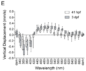
|
The graph at the left shows the response of the animals to various wavelengths of light.
There are two types of symbols. They are for larvae of different ages. For example, 41 hpf means 41 hours post fertilization. Qualitatively, the results are similar for the larvae of different ages. There are differences in detail, which need not concern us here. |
|
The first bars, at the left, are for darkness. There is no vertical movement. The next few bars show a downward (negative) swimming response. These are for short wavelengths, in the ultraviolet (UV). The next bars show an upward (positive) swimming response. These are for wavelengths corresponding to blue (and a little beyond). Longer wavelengths lead to little swimming response. This is Figure 3E from the article. | |
Thus we see that the vertical swimming response of the animals depends on the color of the light. UV leads to downward movement; blue to upward movement.
What if we provided two types of light, ones that promote different responses? That's the basis of the next experiment...
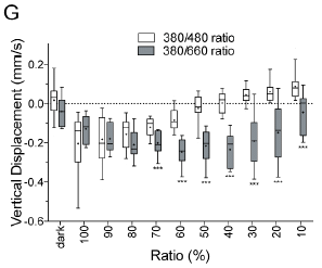
|
Look at the open symbols. Here, light of 380 and 480 nm was used. One of those promotes downward swimming, whereas the other promotes upward swimming.
The x-axis shows the relative amounts of the two kinds of light. It is confusingly labeled as "ratio (%)". It shows the percentage of the light that is 380 nm (UV). That percentage is based on the number of photons. |
|
If the light is mostly UV (to the left), the downward response dominates. If the light is mostly blue (to the right), the upward response dominates. (Open symbols only, for the moment!) Somewhere along the way, the response is zero, and the larvae do not swim vertically at all. That is, the two signals -- one to swim upward and one to swim downward -- cancel. That occurs at about 50% on this scale. There is a second data set, which is something of a control. It's shown by the shaded bars. In this case, the light is a mixture of 360 and 660 nm light. The latter provides no response (see top graph). The result is that there is a downward response over most of the range of light mixtures. At the very right, that response is reduced, probably because the UV light is less intense. This is Figure 3G from the article. | |
How does that get us to a depth gauge? It turns out that different wavelengths of light penetrate into water differently. Thus the ratio of UV to blue light varies with depth. The authors don't actually demonstrate the depth gauge, but it follows from the responses shown above. The animals will swim upward or downward in the ocean until they reach the depth where the two signals cancel. That's the prediction.
The article contains much more about the biology of these worms. It discusses the two types of photoreceptors, one in the eyes and one in the brain, and how the brain integrates the two signals. But that is beyond our scope here. Even the behavioral responses to light are more complex than discussed here. What we have done in this post is to focus on one aspect of how the worms respond to light.
News story: 'The eyes have it' - Photoreceptors in marine plankton form a depth gauge to aid survival. (Phys.org, June 27, 2018.)
The article, which is freely available: Ciliary and rhabdomeric photoreceptor-cell circuits form a spectral depth gauge in marine zooplankton. (C Verasztó et al, eLife 7:e36440, May 29, 2018.) There is a short "eLife digest", intended as an overview. In the pdf file, it is on page 2, embedded within the Introduction.
Another study on these larvae: Melatonin and circadian rhythms -- in ocean plankton (November 24, 2014). Includes the UV-avoidance response. The article of this post is referred to in the current article.
Also see a section of my page Internet resources: Biology - Miscellaneous on Medicine: color vision and color blindness.
August 3, 2018
Imagine the following experiment... A wheat farmer and a rice farmer meet at Starbucks. As they proceed to their table, there is a chair in the way. Which of them is more likely to move the chair out of the way?
A recent article addresses the matter. The authors didn't do exactly the experiment I described above, but what they did should lead you to a clear prediction.
You might also make a good prediction if you recall an earlier Musings post [link at the end] on the nature of wheat- and rice-farming.
Here are results from one experiment in the new article...
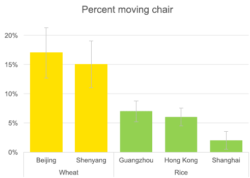
|
The experiment here was not a competition, as presented in my opening. However, it is based on a designed experiment. The authors arranged that visitors at various Starbucks locations would face a situation in which moving the chair out of the way would seem to be advantageous (though not strictly required).
The experiment was done in five cities. In two of the cities, about 15% percent of the people moved the chair out of the way. In the other three cities, fewer than half that many moved the chair. As you can see from the labeling, the cities with higher numbers of chair movers (yellow bars) are from the wheat-growing region of China. The cities with lower numbers (green bars) are from the rice-growing region. The people being observed and recorded here were ordinary customers, who had no knowledge of the "experiment". This is Figure 5 from the article. |
Taken alone, the story here might seem rather odd. However, it is part of a larger story, one that Musings has noted before [link at the end]. Wheat- and rice-farming are very different kinds of activities. Different regions of China have been doing one or the other for millennia. Researchers have found that the cultures in those areas are also different. That is, there is a correlation between major grain crop and some cultural features.
In this case, the authors predicted that people in wheat-farming regions, who tend to be more individualistic (rather than collectivistic or cooperative), would be more likely to move the chair. The argument is that people in individualistic cultures are more likely to try to control the environment -- and that means moving the chair to suit their needs. In contrast, those with rice-farming traditions, who tend to adapt themselves to what they find, would more often squeeze through, rather than move the chair.
The individuals who were observed are not necessarily themselves farmers. In fact, the study sites, in Starbucks cafes in big cities, would seem biased toward middle class urban residents. The analysis is about regional characteristics.
As a small validation test... The authors did the same test in the United States and Japan. The percentage of chair movers was about 20% in the US, the more individualistic culture. It was about 8% in Japan, the more collectivist culture.
You don't need to buy all that. But let the authors make their case. Ultimately, it will take much evidence to sort out which of the interpretations are most broadly useful. Surely, it is plausible that long standing cultural practices, developed in the context of farming, affect other aspects of life -- including modern life at Starbucks.
As usual, this post presents one experiment from a larger article. The purpose is as much to raise the questions and show some examples of what is being done as to reach conclusions. It's science in progress. Be cautious about reaching conclusions, especially from the post alone.
News stories:
* In China, traits related to traditional rice or wheat farming affect modern behavior. (EurekAlert!, April 25, 2018.)
* Behavioral differences between Northern v. Southern Chinese linked to wheat v. rice farming, study shows. (University of Chicago, April 25, 2018.) From the lead institution.
The article, which is freely available: Moving chairs in Starbucks: Observational studies find rice-wheat cultural differences in daily life in China. (T Talhelm et al, Science Advances 4:eaap8469, April 25, 2018.)
Background post: Can growing rice help keep you from becoming WEIRD? (July 22, 2014). The article discussed here is from the same research team; that article is reference 1 of the current article. I encourage you to read this earlier post for background and perspective for the current post.
More rice... A perennial rice (March 4, 2023).
More wheat... Disease transmission by sneezing -- in wheat (July 29, 2019).
Previous posts mentioning Starbucks: none.
August 1, 2018
1. Plastics are useful, but we now also understand that they become hazardous waste after their useful life. What if plastics were designed, from the start, with recyclability in mind? Not just one cycle, but with the ability to be used and recycled over and over, without loss of quality. A recent article explores the approach. The results so far seem modest, but the idea is worth noting.
* News story: New Plastic Can Be Recycled Infinitely. (P Patel, Anthropocene, May 3, 2018.)
* The article: A synthetic polymer system with repeatable chemical recyclability. (Jian-Bo Zhu et al, Science 360:398, April 27, 2018.)
* A background post: History of plastic -- by the numbers (October 23, 2017).
2. How many moons hath Jupiter? 79 is the current count. News story: A dozen new moons of Jupiter discovered, including one "oddball". (Carnegie Institution, July 16, 2018.) Includes a nice video of the Jupiter moon system; be sure you see how Valetudo fits into the picture. (Movie: 1 minute; music, but no useful sound.) The new work has apparently not yet been published. Interestingly, the new discoveries came out accidentally during a search for Planet 9.
* Background post: A ninth planet for the Solar System? (February 2, 2016).
* More: Briefly noted... Now, 92 for Jupiter (February 22, 2023).
July 31, 2018
On August 24, 2014 (nearly four years ago), we had a significant local earthquake. Magnitude 6, centered near the "wine country" town of Napa a few miles north of the San Francisco Bay Area.
A new article explores some of the background to that quake, making use of the extensive instrumentation that monitors our quake-prone area.
The following figure reveals a "smoking gun"...
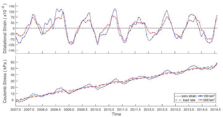
|
The top frame shows strain that was recorded by GPS monitors in the area. Focus on the blue curve, which is for a region of 100 km2 around the epicenter of the quake. (The red curve is the same idea, but over a larger area.)
It's a strikingly periodic curve. It peaks in about August of each year over the entire time period studied. The bottom frame shows that same data expressed another way. Here it is expressed as the pressure on the fault. The black line shows the continual build up of pressure due to the usual plate movements. The additional pressure due to the varying seasonal strain (shown in the top frame) is small, but still clear. This is Figure 4 from the article. |
The Napa quake occurred at the very end of the time shown in those figures. That's the time when the pressure was highest, with the seasonal strain adding onto the accumulated fault strain.
Does that mean that the seasonal strain caused this quake? No, that would be beyond what the data can show. Anyway, strain was building up, and if the quake hadn't occurred at that time, it seems likely it would have occurred soon. But it might at least suggest that the specific timing of the quake was affected by the seasonally varying strain. That in itself would be interesting. Further, the periodic fluctuation of the seasonal strain would seem to be continually flexing the Earth crust; surely that is not good for it.
What causes the seasonally varying strain? The scientists favor the possibility that it might be due to seasonally fluctuating groundwater levels. In any case, they refer to the effect as "non-tectonic" strain.
The authors examine the database of earthquakes in the region over several years. Is there a seasonal pattern? The analysis does not support such a claim. That is, there is no big trend that quakes in the area occur significantly more often in August (or in the summer). (However, other work has shown such an effect, so this should be considered an open question. A negative result for such an analysis merely shows that the statistical evidence does not support such a claim in general; it does not disprove that it is relevant to some specific cases. The authors note that the Napa area has many active faults; that may make it less likely that a specific effect, acting on one fault, will appear as statistically significant in the overall quake record.)
Once again we have some tantalizing evidence about things that may be affecting the occurrence of earthquakes. And once again, the story is incomplete.
News story: South Napa Earthquake linked to summer groundwater dip. (L Lester, GeoSpace (AGU -- the American Geophysical Union), June 12, 2018.)
The article: Seasonal Nontectonic Loading Inferred From cGPS as a Potential Trigger for the M6.0 South Napa Earthquake. (M L Kraner et al, Journal of Geophysical Research: Solid Earth, 123:5300, June 2018.) Caution... pdf file is 31 MB, with some very hi-res maps.
Among quake posts...
* Another million earthquakes for California (June 30, 2019).
* Earthquakes induced by human activity: oil drilling in Los Angeles (February 12, 2019).
* Fracking and earthquakes: It's injection near the basement that matters (April 22, 2018).
* Detecting earthquakes using the optical fiber cabling that is already installed underground (February 28, 2018).
* Does the moon affect earthquakes? (October 21, 2016).More about our groundwater: Groundwater depletion in the nearby valley may be why California's mountains are rising (June 20, 2014).
July 29, 2018
Here are some results for a new type of battery presented in a recent article...
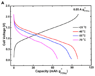
|
The black curve (rising toward the upper right), shows the charging of the battery. The main number of interest is the capacity, as shown on the x-axis. In this case, it's a little over 90. (Units? That's 90 mAh/g -- milliamp-hours per gram. The subscript on the g identifies the battery anode material.)
The other three curves (the ones that decline) show discharge cycles at three temperatures (T). |
|
The orange (top) curve is for the warmest T. You can see that the entire charged capacity is recovered at that T, which is -40 °C. At the lowest T tested, -70 °C (purplish curve), about 2/3 of the battery capacity is recovered. (Actual numbers, from the article: 69/99 = 70%.) The battery was charged at room T (25 °C) for all tests. This is Figure 4a from the article. | |
Those are remarkable results. Most ordinary batteries are pretty much dead by -40 °C.
To develop a low-T battery, the scientists made two major changes. One was to use a liquid electrolyte with a low freezing point (FP). It's ethyl acetate, a readily available chemical with a FP of -84 °C. It's still quite polar, an important requirement for conducting electricity within the device.
The second improvement was the development of organic electrode materials that worked well at the low T.
The battery at this point offers unprecedented low-T performance. It contains inexpensive materials, and is environmentally benign. However, its capacity (charge per battery mass) is low.
The authors do not claim that they have achieved a practical low-T battery, only that they have made good steps toward that goal. Work continues.
News story: New lithium-ion battery operates at -70 C, a record low. (T Puiu, ZME Science, February 27, 2018.)
The article: Organic Batteries Operated at -70°C. (X Dong et al, Joule 2:902, May 16, 2018.)
Among posts on battery development...
* Why can't lithium metal batteries be recharged? (October 1, 2019).
* Manganese(I) -- and better batteries? (March 21, 2018).
* Making lithium-ion batteries more elastic (October 10, 2017).
* What happens when a lithium ion battery overheats? (February 19, 2016).There is more about energy on my page Internet Resources for Organic and Biochemistry under Energy resources. It includes a list of some related Musings posts.
July 27, 2018
Bees that live in the city do better than those on the farm.
That's the finding from a new article. Here is an example of the results...
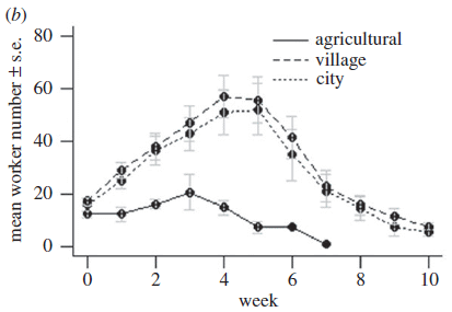
|
Bee colonies were maintained in three environments, as labeled on the figure. The number of worker bees (y-axis) was counted over time (x-axis).
The animals here are bumblebees, Bombus terrestris. The clear result is that the "agricultural" bee colonies (solid line; bottom curve) did considerably worse than the ones in populated areas. Several other parameters that reflect bee health are reported; the general observation is the same for all measures. This is Figure 2b from the article. |
That's interesting.
How did the scientists do this? The basic plan is that they established colonies at the various locations starting with individual queens, all from one central source. (That was apparently an urban source. Does that matter?)
Why is this happening? The authors don't know, but they do address the question.
What about pesticides? That's an issue much in the news for bees these days. Perhaps the work compares a high-pesticide agricultural environment to a low-pesticide urban environment. The authors discuss this at some length, noting some reasons why that's not at all clear given their specifics. But there is no data.
Another possibility is that modern agricultural lands, with controlled crops, are not reliable sources of food to the bees throughout the year.
The article provides an interesting experimental system. It's simple, and offers a window into bee health. The basic plan should allow for considerable experimental variation. For example, the scientists could set up colonies that are urban, but are accompanied by a fair amount of soil from the agricultural area.
News stories:
* Bumblebees found to do better in urban settings than in agricultural areas. (B Yirka, Phys.org, June 27, 2018.)
* Bumblebees thrive in towns more than countryside. (N Davis, Guardian, June 26, 2018.)
The article, which is freely available: Lower bumblebee colony reproductive success in agricultural compared with urban environments. (A E Samuelson et al, Proceedings of the Royal Society B 285:20180807, June 27, 2018.)
Previous bee post: Zero? Do bees understand? (July 20, 2018).
Bees and pesticides: Largest field trials yet... Neonicotinoid pesticides may harm bees -- except in Germany; role of fungicide (August 20, 2017).
... or herbicides: Glyphosate and the gut microbiome of bees (October 16, 2018).
More city bees... Bees -- around you (June 11, 2009).
More bees... Why did many bees in the United States stop buzzing mid-day on August 21, 2017 (January 2, 2019).
More about city living: Are urban dwellers smarter than rural dwellers? (August 2, 2016).
July 25, 2018
Determining the relationships between various primates can be difficult and sometimes contentious. A new article reports that the Lorax is most closely related to Erythrocebus patas. News story. (C Barras, Nature News, July 23, 2018.) It links to the article -- and includes a dissent. (If you have access... The 3-page article is quite good. Perhaps having an English professor among the authors of a scientific article helps.)
July 24, 2018
Increasing CO2 in the atmosphere is leading to an increased global temperature (T). That CO2 comes largely from burning fossil fuels. To limit the T increase, we need to reduce the amount of CO2 in the air. We can do that by burning less fossil fuel and/or by removing CO2 once produced. We can reduce fossil fuel use by replacing such fuels with those that don't produce CO2 -- or by just using less fuel.
A recent article suggests that we can achieve major reductions in CO2 emissions by aggressively improving the efficiency of fuel usage.
The following figure provides an example of what they have in mind. It is perhaps both instructive and amusing.
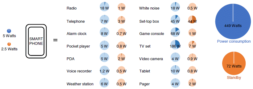
|
In the big middle part of the figure there is a list of numerous common devices around us. The energy usage of each is shown: the blue circle shows power consumption when in use, and the reddish circle shows power consumption in stand-by mode. (The full figure in the article actually shows a few more devices -- 18 total. I think I have included the major ones here.)
The two big circles at the right show the totals (for the entire set of devices shown in the article). At the left is a smart phone. The authors argue that it can replace all those devices in the middle, with much lower energy usage, as shown by the tiny blue and red circles at the left. During use, its power consumption is about 1/100 that of the devices in the middle; during stand-by, about 1/30. Look at the blue circle for the TV set. It has a darker blue wedge in it. That shows the portion of the total that this device represents. That is, the TV set accounts for nearly half of the power consumption shown in the full figure. Most of those wedges are individually rather small. Energy? Power? Power is the rate of using energy. Consider that TV set: about 200 watts. Use it for 5 hours, and you have used 1000 watt-hours of energy. That's 1 kilowatt-hour (kwh). Electricity is typically billed by the kilowatt-hour. (Other forms of energy are billed differently, but in each case, the energy usage could be re-calculated as kwh.) For qualitative discussion, it doesn't matter much whether we talk about energy or power here. But in calculation, it is important to keep them straight. It's the amount of energy used that matters. A heater will have a high power rating. Turn it off, and its energy usage is zero. This is part of Figure 2 from the article. As noted, the full figure contains a few more devices in the middle section. |
The idea is that a single low-energy device is replacing older higher-energy devices. This is a trend in place as a result of technology development, not (necessarily) driven by energy considerations.
There is much to quibble about with that figure. But that would miss the point. The replacements suggested above may not be entirely fair, and smart phones do not dominate the energy scene. However, smart phones can improve the overall energy scene.
The authors do a thorough analysis of energy usage, over various sectors of the economy and geographical regions. They conclude that overall energy usage could be substantially reduced by 2050 by moving toward more energy efficiency. Their conclusion holds even in the face of increasing population and greater overall development.
Increasing energy efficiency reduces fuel use. As a corollary, that makes it easier for low-CO2 fuels, such as renewables, to become a larger fraction of the total.
It's rather rosy! In fact, their bottom line is one of the very best reported for reducing atmospheric CO2. Of course, it is all modeling.
What do we make of this? Reducing the global T increase involves a combination of scientific understanding, technological development, and political decisions. It's not for Musings to take political positions (though we do express opinions sometimes). We present individual articles, each of which makes one contribution to the overall story. Is this a good story? Qualitatively, it would seem to be. The idea that smart phones increase our energy efficiency is reasonable, whether you buy all the details or not. That smart phone of course is just a token. The full analysis addresses the entire energy economy. Most of us probably won't want to go very far in the details of the analysis. Experts will do so, looking at the specifics as well as the general structure of the modeling.
Perhaps the point is that the new article shows how technology developments can improve our energy efficiency, maybe enough to make a substantial contribution to reducing atmospheric CO2 levels. That's good. However, improvements in energy efficiency won't happen automatically, and we should not assume they will happen as the authors say. With attention, such improvements could become an important part of the CO2-reduction story. The article should provide an incentive for directing effort at improving energy efficiency.
News stories:
* World can limit global warming to 1.5C by 'improving energy efficiency'. (Carbon Brief, June 4, 2018.) Includes more of the specifics.
* Transforming how we move around, heat our homes and use devices could limit warming to 1.5C. (Tyndall Centre for Climate Change Research, University of East Anglia, 2018.) From one of the institutions involved in the work. At the end of this story, there is a link to an "open access" copy of the article, presumably from the authors.
* Transforming our lives can limit global warming to 1.5C without new technology. (H Dunning, Imperial College London, June 4, 2018.) From one of the institutions involved in the work.
The article: A low energy demand scenario for meeting the 1.5 °C target and sustainable development goals without negative emission technologies. (A Grubler et al, Nature Energy 3:515, June 2018.) For a freely available copy, see the Tyndall Centre news story, above.
Ideas compete! One alternative approach is to remove CO2 from the air, a process called carbon capture, perhaps coupled with sequestration. That's what "negative emission technologies" in the article title refers to. The article specifically suggests that their approach could be better than carbon capture. However, a recent post showed that the cost of carbon capture may be considerably less than had been thought: CO2 capture from the air: an improved estimate of the cost (July 16, 2018).
In the figure above, a major player is the set-top box, by far the largest power drain during stand-by. That device was the villain of a previous post: Energy wastage: The set-top box (August 1, 2011).
There is more about energy on my page Internet Resources for Organic and Biochemistry under Energy resources. It includes a list of some related Musings posts.
July 23, 2018
Let's start with a picture. It's a bit of a side story, but still relevant.

|
Do you recognize this person, shown here in 1900?
She was in the news last year, securing a notable position on the timeline of humankind. What did she do in 2017 that warranted the attention? This is from the Wikipedia page about her. (Don't peek.) |
She died. The death of this person on April 15, 2017, marked the end of an era. At that point, there was no longer any person alive who had lived in the century of the 1800s. That is, she had been the last person from the 1800s living.
Did you realize back in early 2017, just over a year ago, that there was a living person around who had been born in the 1800s?
This lady, Emma Morano, was born on November 29, 1899, in the Kingdom of Italy.
Her claim is not about the "19th century", which ended in 1900, but rather about the century of the 1800s, ending in 1899.
She is also the fifth-longest-living human known.
All such claims of age and dates are, of course, based on the best information available.
Now, on to the new content...
In 2016, Musings posted about an article claiming that there seemed to be an upper limit to the human lifespan [link at the end]. As noted there, the article stirred controversy.
A new article carries out a similar analysis, and reaches the opposite conclusion. In particular, it suggests that at some point the risk of dying per year becomes constant (rather than increasing with increasing age). As before, there is limited data behind the analysis, though the authors argue that their data set is better.
The data set for the new work is centenarians from Italy. That gives the authors a more homogeneous data set. Interestingly, Italians tend to be long-lived. Of course, Emma Morano is included in this analysis (though not named in the article).
I first learned of the new article from the news story in Nature, which is listed below. It's an excellent 2-page overview of the controversy. Highly recommended. Only those most dedicated to statistical analysis of human longevity will want to spend much time with the article itself.
News story, which is freely available: There's no limit to longevity, says study that revives human lifespan debate -- Death rates in later life flatten out and suggest there may be no fixed limit on human longevity, countering some previous work. (E Dolgin, Nature News, June 28, 2018. In print (with a slightly different title): Nature 559:14, July 5, 2018.) It includes a picture of Emma Morano that is not dated, but is presumably quite recent. Its reference 1 is the new article noted below. Its reference 2 is the article discussed in the background post.
The article: The plateau of human mortality: Demography of longevity pioneers. (E Barbi et al, Science 360:1459, June 29, 2018.)
Background post: How long can humans live? (November 29, 2016).
A recent post about the same issue for another mammal: Do naked mole rats get old? (April 20, 2018).
My page for Biotechnology in the News (BITN) -- Other topics includes a section on Aging. It includes a list of related Musings posts. Actually, two lists. I've included this item in "list 2" there, since it does include some focus on a particular centenarian.
July 20, 2018
A recent article suggests that bees -- ordinary honey bees -- understand what zero means. In particular, they understand that 0 < 1. It's an intriguing article.
First, let's look at how the scientists test the bees.
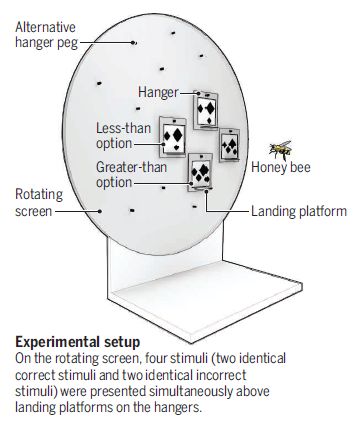
|
The bees are faced with this apparatus.
The key parts are those hangers, each with a few spots. In this case, two of the hangers have three spots and two of them have four spots. Each hanger has a landing platform on it. The bee makes its choice, and lands on one of the landing platforms. If it lands on one of the platforms for the smaller number of spots (that's three in this case, folks), it gets a reward: a little sugar solution (artificial nectar). This is part of the figure in the news story (by Nieder) accompanying the article. I have included some of the labeling at the bottom. |
Phase 1 of the work, then, is to train the bees. With training, the bees get to the point where they land on a correct platform about 80% of the time.
The test as described above is a "less than" test. There is also a "more than" test, which is similar, but the bees are rewarded for choosing a hanger with more spots. We'll be discussing only "less than" tests here.
Now we have trained bees. What can they do? The following graph summarizes some tests of trained bees. We should note that the training (for this test) was done with hangers that showed 2-5 spots.
|
The top part of the figure at the right shows some tests; the bottom part shows some results. We'll focus on the results.
The left hand bar shows routine testing under the same conditions used for training. You can see that the bees made the correct choice a little over 70% of the time. (The example shown here, the "Learning test", is 3 vs 5 spots.) The other bars are for two novel tests. Both tests involved one hanger value of zero spots; the other hanger value in these tests was 1 or 2. Note that 1 was also new to the bees; the training had been done with 2-5 spots. The results are intriguing. The bees correctly chose that 0 is less than 1 over 60% of the time. That's a statistically significant result. However, they did not make a significant choice between 0 and 2 spots, a greater difference. This is mostly Figure 1D from the article. The top, showing the tests, is part of Figure 1B, which is immediately above 1D in the article. I added the label for the "right answers". |
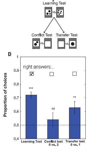
|
Here is how the authors interpret those results...
- Both 0 and 1 are novel choices. The bees interpreted that situation in terms of the concept they had just learned: choose the smaller value. They chose 0 -- correctly, with some statistical significance.
- 0 vs 2 presents a conflict. 0 is novel; 2 is familiar, and was always correct during training. (After all, 2 is less than any of the other values used during training.) Thus this test yielded a mixed result.
I chose to present this particular test because the result is complex. The interpretation is not entirely satisfying at this point.
Of course, the full article has more tests. Looking at it all, I have little doubt that the bees are choosing the smaller number, including zero, in some of the work.
As I suggested at the start, it is an intriguing article. I think the proper approach is to try to understand what the scientists did, and then look at the results. It may be best to avoid strong conclusions at this point. But if you go through the article carefully, I think you will find that the bees have some math skills you might not have expected.
News stories:
* Honey Bees Grasp the Concept of Zero Finds Study. (L Papadopoulos, Interesting Engineering, June 9, 2018.)
* Bees Appear Able to Comprehend the Concept of Zero -- The insects correctly ordered an absence of black dots as "less than" a group of black dots. (A Yeager, The Scientist, June 7, 2018.) Now archived.
* News story accompanying the article: Organismal biology: Honey bees zero in on the empty set -- Honey bees join a select number of animals shown to understand the concept of nothing. (A Nieder, Science 360:1069, June 8, 2018.)
* The article: Numerical ordering of zero in honey bees. (S R Howard et al, Science 360:1124, June 8, 2018.)
Next bee post... The advantage of living in the city (July 27, 2018).
More bee-math: Do bees count left-to-right? (January 3, 2023).
Posts on things bees can do include...
* Bumblebees play ball (March 20, 2017).
* How bumblebees learn to pull strings (November 27, 2016).
* The traveling bumblebee problem (January 11, 2011).
* Origin of gas warfare (September 11, 2009).Number of previous Musings posts about the concept of zero: zero.
There is more about math on my page Internet resources: Miscellaneous in the section Mathematics; statistics. It includes a listing of related Musings posts.
July 18, 2018
1. Tupanvirus -- the new record-holder for largest known virus.
* News story: These Viruses Found in Brazil Are So Huge They're Challenging What We Think a 'Virus' Is. (P Dockrill, Science Alert, February 28, 2018.)
* The article, which is freely available: Tailed giant Tupanvirus possesses the most complete translational apparatus of the known virosphere. (J Abrahão et al, Nature Communications 9:749, February 27, 2018.)
* Comment... The distinction between virus and cell is based on the latter carrying out life processes. As fascinating as these new viruses are, I don't think they obscure the distinction. Who knows what else is to be found.
* I have also noted this work on my page Unusual microbes in the section A huge virus. That section provides some background, and also links to other Musings posts on the subject.
2. An amusing juxtaposition to the post in this week's set on CO2... News story: Europe Is Running Low on CO2. (S Zhang, The Atlantic, July 6, 2018.)
July 17, 2018
Look at these dumbbells and rings...
|
The basic features of the figure are what they seem, with one special point... On the blue bar there are two blue spots. Those are specific attachment sites for the ring(s).
In part a, there is one ring and two attachment sites. The ring can be at either attachment site, and can move between them. (For the moment, ignore the labeling.) In part b, there are two rings and two attachment sites. There is no way a ring can get to another attachment site. Therefore, there is only one stable result. Part c is similar to part b, except that the rings are now different sizes. The small ring can pass through the big ring. Therefore, the two rings can switch places; there are two stable results. This is the first figure in the Chemistry World news story listed below. It is probably the same as Figure 1 from the article. |
A recent article demonstrates what is shown above -- at the molecular level. In particular, the big and small rings of part c are molecular rings.
In fact, the whole dumbbell system can be considered a molecule. The bar has big fat ends (called "stoppers") that keep the ring(s) from falling off the axle. Therefore the dumbbell with one or two rings is a molecule of distinct composition -- even though there is no ordinary bond between ring and dumbbell. Such molecules are known as rotaxanes; they have been the subject of considerable interest -- and a recent Nobel prize.
Now that we have described the top figure in terms of molecules, we can explain some terms used there...
Saturated means that there are enough rings to fill all the attachment sites. Unsaturated means that there are extra attachment sites.
The number in front of the name "rotaxane" indicates the number of components it has. For example, the first one is a [2]rotaxane, since it contains one dumbbell and one ring.
Shuttling refers to a ring moving to another position.
We'll leave most of the chemistry details to the fine print below. For now, let's jump to the question of how the scientists could show that the small molecular ring could pass through the big molecular ring.
Here is the logic of the measurement... The two rings interact differently with the attachment site. That can be detected by nuclear magnetic resonance (NMR), focusing on the attachment site. If there are different kinds of rings at the two sites, there are two kinds of interaction -- and two NMR peaks. However, if the rings rapidly switch positions, then if you look slowly, the two attachment sites appear equivalent -- and there is only one NMR peak.
What does "look slowly" mean? It refers to the speed of the measurement -- the NMR measurement. If the rings switch positions during the measurement, the distinction between them becomes blurred. If they switch repeatedly during the measurement, they end up all looking the same: one peak.
The scientists measured the NMR spectrum at various temperatures (T). The following figure shows two of those spectra, for the highest and lowest T tested.
|
|
This is for the molecular version of what is shown in part c of the top figure: a system with big and small rings.
Only one part of each spectrum is shown, focusing on where the rings interact with the dumbbell. |
| |
|
At the low temperature (231 K, bottom), there are two peaks -- one for each ring. At the high temperature (297 K, top), there is only one peak. The two rings are switching positions fast enough that the NMR cannot distinguish them. The spectra are labeled (at the right) with the position-switching rates that the scientists calculate. The blue curves are the spectra they expect; you can barely see the blue curves, because they are so close to the actual results (red). The x-axis scale is in ppm, as typical for NMR spectra. These are two of the NMR spectra, from Figure 5a of the article. | |
The spectra show that the two attachment sites have become equivalent at the high T. Thus the scientists infer that the two rings are rapidly switching positions, by the small one moving through the big one. They have no direct observation of such an event, but they see the consequences.
Ring-through-ring is an addition to the toolkit for those who study rotaxanes and molecular machines.
If you want a little more of the chemistry...
Here is the structure of that "part c" chemical -- molecular dumbbell with two rings of different sizes [link opens in new window].
The main features of interest are the two rings. The small one (in red) is a simple crown ether, with eight repeats of -C-C-O- in a ring. The big ring (yellow) has two additional features. The important one is the 18 additional C atoms in the ring, at the bottom. That's what makes this a big ring. There is also a benzene ring, at the top. That affects the NMR spectrum to help distinguish the two rings.
On the axle of the dumbbell, inside the area where the ring is shown, there is an N-H. That's the H that is the focus of the NMR work.
News story: Exchange of rings shows off molecular machine's clever trick. (M Fellet, Chemistry World, May 2, 2018.)
The article: Ring-through-ring molecular shuttling in a saturated [3]rotaxane. (K Zhu et al, Nature Chemistry 10:625, June 2018.)
The Nobel: The Nobel Prize in Chemistry 2016 -- press release. (Nobel, October 5, 2016.) The big story is molecular motors. One of the three recipients was Fraser Stoddart, who was the first to make rotaxanes.
* * * * *
Previous post on rotaxanes: Making lithium-ion batteries more elastic (October 10, 2017).
Posts on other interlocked molecules include... Clippane (March 7, 2022).
More on molecular motors: The smallest electric motor (September 26, 2011).
July 16, 2018
A recent post was about CO2 capture [link at the end]. The key point there was to use the captured gas to make a high-value product.
A new article re-examines the cost of CO2 capture. The conclusion is perhaps surprising: it may not be as expensive as we had thought.
In fact, estimates of the cost of CO2 capture have varied widely. One issue is the input for the process. It is intuitive that it would be cheaper to capture CO2 from a CO2-rich exhaust gas than from air. Further, there is little actual experience with such processes, thus leading to a wide range of assumptions about how they would work.
The new article is about capturing CO2 from air. What makes the article of particular interest is that it is based on real experience with a pilot plant. With their experience, the authors are able to include many "real" numbers; the result is an encouraging "bottom line" for capturing CO2 from air.
The article is largely detailed process and economic analysis, and I don't think it would be productive to go through that here. Those who want more than the bottom line will need to work through the analysis. In any case, do realize that there is still considerable uncertainty. That is, this may be an important updated analysis, but it is still preliminary.
The authors discuss some of the specific reasons why their cost estimate is substantially lower than previous well-accepted estimates.
Even with the best numbers from the current analysis, the authors do not suggest they have a process that would be profitable without subsidy. However, they do suggest that they could make a fuel that could be sold competitively in some markets at this point. That's a lot better than with previous estimates of the cost of capturing CO2 from air.
The article is long and complex, but it is also well organized and quite readable. If you are interested in the topic, I encourage you to read the opening pages of the article. The problem is that, after that, it includes large amounts of process detail and number crunching. That comes from the actual work; it is all important, but it's perhaps not easy for casual reading.
The following Figure diagrams the process. It's quite simple chemistry. Air enters at the upper left; CO2 exits at the upper right. There are four process modules; each is shown here as a numbered box. CO2 is collected in an alkaline solution, where it becomes carbonate ion (step 1). The carbonate is converted to calcium carbonate, a solid (step 2). Heating the calcium carbonate drives off the CO2 (step 3). The final step shown does not directly involve the CO2, but is part of recycling the other materials (step 4). The authors have worked on each of these process modules, tuning paper plans to make things work; that's the real world of process development.
Using things efficiently, including energy, is a key to making the process economical.
| This is Figure 1 from the article. |
News stories:
* Maybe we can afford to suck CO2 out of the sky after all -- A new analysis shows that air capture could cost less than $100 a ton. (J Temple, MIT Technology Review, June 7, 2018.)
* This Gasoline Is Made of Carbon Sucked From the Air -- A Harvard-affiliated Canadian company is making a liquid fuel that is carbon neutral, and they hope the economics will be in their favor. (S Leahy, National Geographic, June 7, 2018. Now archived.)
* Sucking carbon out of the air won't solve climate change -- But it might fill in a few key pieces of the clean energy puzzle. (D Roberts, Vox, June 14, 2018.) Link is now to Internet Archive. This lengthy story provides a broad perspective on the CO2 problem.
The article, which is freely available: A Process for Capturing CO2 from the Atmosphere. (D W Keith et al, Joule 2:1573, August 15, 2018.)
The article is from a company called Carbon Engineering. The lead author is one of its founders, and a Harvard professor.
* * * * *
Background post: Making carbon nanotubes from captured carbon dioxide (June 3, 2018). Links to more.
More on CO2 capture: Precipitating CO2 from air (July 30, 2022).
Another way to reduce CO2: A path toward reduced global warming based primarily on improving energy efficiency? (July 24, 2018).
July 13, 2018
Some dinosaurs protected their eggs in nests, much as modern birds do. For a large dinosaur, that would seem a tricky operation.
A recent article offers a solution.
The following figure shows three fossilized dinosaur nests with eggs.
|
In each case there is a ring of cylindrical eggs. Of particular interest here is the size of the empty region in the middle. That's called the "inner clutch diameter"; see the labeling in part a.
The nest in part a (left) has an empty region about the size of the scale bar; let's call it 10 cm. The nest in part b (middle) has an empty region about twice the size of the scale bar; let's call it 20 cm. The nest in part c (right) has a much larger empty region. It is several times the scale bar (which is different for this part). I estimate the empty region to be about ten times the scale bar: 150 cm, or 1.5 meters. This is part of Figure 1 from the article. |
Those three nests are for dinosaurs of increasing size.
The authors infer that the parent sat in the middle -- not directly on the eggs. The bigger the dinosaur, the bigger the space in the middle of the nest for the mother to sit in. (For the smaller dinosaurs, it's not clear whether the parent might have sat on the eggs.)
Does sitting in the middle of a ring of eggs keep them warm? That's not clear, but it should at least provide some protection.
The article has substantial data on dinosaur weight and nest parameters. It includes various graphs, to make the point quantitatively.
The article also provides some analysis of the eggs themselves. Eggs from large dinosaurs were actually weaker than those from small dinosaurs. That is another indication that the big parent did not sit directly on the eggs.
Interestingly, the adaptation shown here does not occur in birds. It may be that the maximum size of birds is limited by their need to sit on the eggs.
A fun little article! Most of the authors are from museums in Japan and China. The lead author is from the Japan Society for the Promotion of Science, Nagoya University Museum.
News stories:
* Hefty dinosaurs had a trick for sitting on eggs safely -- Laying a clutch in the shape of a hollow ring let dinos warm their eggs without squashing them. (C Gramling, Science News Explores, July 3, 2018.)
* How does a one-tonne dino hatch its eggs? Carefully. (M Hood, Phys.org, May 16, 2018.)
The article: Incubation behaviours of oviraptorosaur dinosaurs in relation to body size. (K Tanaka et al, Biology Letters 14:20180135, May 2018.)
More about dinosaur eggs and such...
* The oldest dinosaur embryos, with evidence for rapid growth (May 7, 2013).
* Dinosaurs in Tamil Nadu (December 7, 2009).More nests:
* A bird nest (September 9, 2014).
* Of birds and butts (February 2, 2013).Also see: What is the proper shape for an egg? (September 18, 2017).
July 11, 2018
1. In a recent post we noted that testing of the US blood supply for Zika virus was proving to be expensive and unproductive. The FDA has now announced a revised policy, which allows for testing of pooled blood samples. News story: FDA revises Zika testing for blood donations to allow pooled screening. (L Schnirring, CIDRAP, July 6, 2018.) That links to the FDA announcement. Background post: Should we screen the blood supply for Zika virus? (May 20, 2018). I have noted this new information with that post, with a little more comment.
2. I added a new book listing on my page Books: Suggestions for general science reading -- and noticed that both co-authors had already been noted in Musings. Cham & Whiteson, We Have No Idea -- A guide to the unknown universe (2017). It's an excellent book, combining humor with serious science.
3. How do we judge the importance of a scientific article? One way is to count how many times it is cited in other articles. Adding to the debate on the question, a recent article shows little correlation between citation rates and perception of importance. Blog entry, which links to a freely-available article: The academic papers researchers regard as significant are not those that are highly cited. (R Borchardt & M R Hartings, blog at London School of Economics, May 14, 2018.) This is by two of the authors of the article.
July 9, 2018
Should we give antibiotics to young children so they don't get sick and die?
Here's some data...
|
In this trial, an antibiotic was administered to a large number of children on a routine basis; a control group received a placebo instead of the antibiotic. It is a broad-spectrum antibiotic, azithromycin (Zithromax).
The figure shows the overall mortality, antibiotic vs no antibiotic, for different age groups. (Note that the age scale is in months.) The results are shown for three countries; the data at the left is for the combined results. The y-axis scale is reduction in mortality. Positive values are "good". The error bars show 95% confidence limits. Key observations... - The antibiotic reduced mortality. - The effect is largest for the youngest children (age 1-5 months). - For two of three countries, that is the only age group for which there was an effect. The antibiotic was administered every six months for two years. The age shown above is the starting age for each child. Mortality was followed through the two year trial. This is Figure 3 from the article. |
For the sake of discussion here, let's not quibble about the error bars. Let's assume that there is a benefit -- fewer deaths -- at least for the youngest children.
The results suggest that it would be good to give young children the antibiotic, as a general prophylactic treatment to reduce disease. On the other hand, this represents a use of antibiotics that goes against current trends. Giving antibiotics promotes development of antibiotic resistance, reducing the usefulness of the drug for the future. Giving antibiotics to people who are not infected would seem to enhance the development of resistance without benefit.
That's the dilemma raised by the article. There is a benefit to the prophylactic treatment, but there is also a risk.
The current trial is an offshoot of a program to control blindness-inducing trachoma, which is caused by chlamydia. Mass distribution of the antibiotic azithromycin has resulted in significant reductions in trachoma. The data from such work has suggested that there might be reductions in mortality. There are also signs of antibiotic-resistant bacteria developing.
What is the proper trade-off between broad use of an antibiotic to reduce childhood mortality in areas with poor medical care and the risk of the development of antibiotic resistance over the longer term? What is the proper role for such a treatment compared to other improvements in the health-care system?
News stories:
* African study on pre-emptive antibiotics in kids spurs resistance debate. (C Dall, CIDRAP, May 2, 2018.) Excellent overview, including the dilemma.
* Groundbreaking Study Could Revolutionize Public Health. (Carter Center, April 26, 2018.) The Carter Center has promoted the earlier background work on the use of azithromycin to prevent trachoma. One author of the current article is from the Center.
* Preventive Use of Common Antibiotic Reduces Child Mortality in Sub-Saharan Africa -- Study Shows Giving Drug 'At Scale' Is a Life-Saving Intervention for Vulnerable Children. (L Kurtzman, University of California San Francisco, April 25, 2018.) From the lead institution.
The article: Azithromycin to Reduce Childhood Mortality in Sub-Saharan Africa. (J D Keenan et al, New England Journal of Medicine 378:1583, April 26, 2018.) Check Google Scholar for a copy freely available at PMC.
A previous post about the strategy for antibiotic use and the development of antibiotic resistance... On completing the course of the antibiotic treatment (September 19, 2017).
Prophylactic use of antibiotics for farm animals: Restricting excessive use of antibiotics on the farm (September 25, 2010). Links to follow-ups.
More on antibiotics is on my page Biotechnology in the News (BITN) -- Other topics under Antibiotics. It includes an extensive list of related Musings posts.
That BITN page also includes a section on Ethical and social issues; the nature of science.
July 7, 2018
Scientists have examined the records of two tertiary critical care medical centers. (That probably corresponds to the American term "emergency room".) 900 cases over three years.
The best predictor of overall (all-cause) mortality was blood type. 28% of those with blood type O died; 11% of those with other blood types died.
Why? They don't know. However, there are a couple of clues. Death following trauma is often due to blood loss. Further, people with type O blood have a reduced level of one clotting factor. You can see where those clues are going, but work needs to be done to see exactly what the connection is.
The effect is not due to something "trivially" related to blood, such as availability of donor blood for transfusion.
Table 1 of the article shows results for each blood type, but the main analysis is type O vs other.
It's an intriguing finding, one that is of concern. It needs to be followed up. Is it really true, or is it some statistical fluke? Does it hold generally, or only for the studied population? (The study involved only Japanese people.) And of course, if it is true, why -- and what can we do about it? If the clues given above are significant, what is the connection between blood type and clotting?
In the meantime... If you are type O, drive carefully.
News stories:
* Blood type O patients may have higher risk of death from severe trauma. (Science Daily, May 1, 2018.)
* One Blood Type Is a Risk For Bleeding Out After Trauma. (MedicalResearch.com, May 5, 2018. Now archived.) A short interview with the lead author.
The article, which is freely available: The impact of blood type O on mortality of severe trauma patients: a retrospective observational study. (W Takayama et al, Critical Care 22:100, May 2, 2018.)
Among posts about bleeding and clotting:
* Mechanism of blood clotting: how the von Willebrand factor works (May 18, 2021).
* Which direction does blood flow in an astronaut? (January 7, 2020).
* A mutation, found in a human population, that extends the human lifespan (February 2, 2018).
* Gene therapy: Could we now treat Queen Victoria's sons? The FIX Fix. (January 6, 2012).Among posts about traumatic injuries:
* Stone age human violence: the Thames Beater (February 5, 2018).
* Evidence for brain damage in players of (American) football at the high school level (August 23, 2017).More blood: Converting Type A blood so that anyone can receive it (September 17, 2019).
July 6, 2018
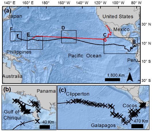
|
The black line shows Anne's journey. Part a (top) shows the entire trip. Right to left; start at "B", at about 10° N. The other parts of the figure focus on selected regions.
The map coordinates shown are for part a only. This is part of Figure 2 from the article. The full figure shows detail for the other boxed regions of part a. |
Anne was tagged on September 16, 2011, in the Coiba National Park in Panama by the authors' team. Her travels were tracked for 841 days, until January 14, 2014. At that point she was in the Mariana Trench, across the Pacific Ocean -- 13,819 kilometers (straight-line distance) from where she was tagged. Her estimated travel was a little over 20,000 km.
It's the longest documented migration for Anne's species, Rinchodon typus, the whale shark. In particular, it is substantially longer than the previous record, reported in 2001 and shown by the red line in part a above.
The whale shark is the largest known fish. Specimens may reach 12 meters (40 feet) in length and weigh about 20 tons. Anne is a female about 7 m long.
Previous work had suggested that the whale sharks on the two sides of the Pacific were -- genetically -- part of the same population. These two migrations provide some evidence to support that.
Both migrations appeared to follow the North Equatorial Current for a substantial part of the trip. Thus the work also helps to make a specific connection between the biology of the animals and the nature of the ocean.
The work is an interesting application of communication technology. It took some planning to get tracking over 841 days from a device rated to last only a third as long.
News stories:
* Longest recorded whale shark migration eclipses 20,000 kilometers. (Mongabay, May 14, 2018.)
* Whale Shark Logs Longest-Recorded Trans-Pacific Migration. (Marine Biology News, April 30, 2018.) Now archived.
The article, which is freely available: Longest recorded trans-Pacific migration of a whale shark (Rhincodon typus). (H M Guzman et al, Marine Biodiversity Records 11:8, April 19, 2018.) A short and very readable article.
Among other shark posts...
* Eye analysis: a 400-year-old shark (September 3, 2016). Just to be clear, that refers to a live shark.
* Cuttlefish vs shark: the role of bioelectric crypsis (May 10, 2016).More about migrations...
* Man's migration from Asia to America? Did it really happen by land? (August 16, 2016). Links to more.
* Magnetic turtles (July 5, 2015).More about tracking individual animals...
* Improved high altitude weather monitoring (July 18, 2016).
* Ants: nurses, foragers, and cleaners (May 24, 2013).
July 3, 2018
The formation of chemical compounds involves electrons. Or maybe it doesn't. A new article claims that, at high pressure, helium can form compounds mainly by serving as a spacer between repelling charges on other atoms. Their theory explains the recent report of making Na2He, and makes some specific predictions that should be testable. If true, it could have implications for the possible existence of helium reservoirs deep in the Earth. News story, which links to the freely-available article: Study suggests helium plays 'nanny' role in forming stable chemical compounds. (C Hsu, University at Buffalo, SUNY, March 20, 2018.) From one of the institutions involved. A background post on high-pressure chemistry: How many atoms can one nitrogen atom bond to? (January 17, 2017).
July 2, 2018
The Bajau people, often referred to as the Sea Nomads, have long been recognized as having an unusual talent. Their lifestyle is based on diving; they regularly make long dives to considerable depths. They hold their breath for extended periods, well beyond what most people can do.
A recent article explores the biology of the Sea Nomads. It offers evidence for a genetic change that enhances their ability to dive.
The following figure gives an overview...
|
Part A (left) shows the sizes of the spleens from representatives of two groups of people. The Bajau group here is from the Indonesian village of Jaya Bakti. As a reference group, the scientists studied Saluan people, from another seaside village only a few miles away.
For each distribution, the thick horizontal line in the middle shows the median size. The box shows the range for the middle 50%. You can see that the people in the right-hand group have larger spleens. The median spleen size is about 50% larger for them -- the Bajau, the divers, the Sea Nomads. Part B (right) shows the effect of a mutation the scientists found in the Bajau. Look at the first two distributions, for 0 and 1 copy of the mutation. Having 1 copy of the mutation leads to a considerably larger spleen, on average. There are only two people in the sample with two copies of the mutant gene; they have large spleens. The spleen-size data is based on ultrasound measurements. Note that the y-axis scales are similar but different for the two parts. This is Figure 1 from the article. |
The spleen is part of the blood system. Upon oxygen-deprivation (hypoxia), it releases more oxygenated red blood cells into the bloodstream. Plausibly... The Bajau have a mutation that leads to a larger spleen, which leads to blood with a larger capacity to hold oxygen, which leads to an enhanced ability to hold one's breath and dive for extended periods. Plausibly, such a mutation could have been selected for in a population that depends on such diving.
How does the Bajau mutation work? A likely explanation... It increases the level of thyroid hormone, which leads to the increased spleen size -- as is known for mice.
The article notes other genetic differences in the Bajau people, and discusses the possible implications of some of those differences for diving ability.
The information is limited, as you can see with the graphs above. But the article is intriguing, and opens up areas for further study.
News stories:
* 'Sea nomads' adapted abnormally large spleens to dive to unheard of depths. (T Puiu, ZME Science, April 19, 2018.)
* How Asia's Super Divers Evolved for a Life At Sea -- Scientists are starting to uncover the genetic basis of the Bajau people's incredible breath-holding abilities. (E Yong, Atlantic, April 20, 2018.)
* Enlarged spleen key to diving endurance of 'sea nomads'. (R Sanders, University of California Berkeley, April 19, 2018.) From one of the institutions involved in the work.
The article: Physiological and Genetic Adaptations to Diving in Sea Nomads. (M A Ilardo et al, Cell 173:569, April 19, 2018.)
Also see:
* If lungs fail, can you breathe with your intestines? (July 16, 2021).
* Failure to regenerate heart tissue: role of thyroid hormone (May 14, 2019).
* The modern pygmies of Flores Island (November 6, 2018). Another distinctive population in Indonesia.
* A smart insulin patch that rapidly responds to glucose level (October 26, 2015). A post that mentions hypoxia.
* Why don't penguins fly? (August 24, 2013). Diving efficiency.
* Prion diseases -- a new concern? (March 19, 2012). Spleens.
July 1, 2018
A team of scientists in France has built a house, and reported what they did in a journal published by the American Vacuum Society.
Here's the house...
|
It's sitting atop a mountain. Actually, atop the end of a fiber optic cable.
This is Figure 10 from the article. |
Technologically, it's a marvel. The scientists seem especially proud of the chimney. (They say winters are very cold where they are.)
Of course, the purpose of the work is to develop the technology needed to make such intricate things at that scale.
In large part, they combined known technologies, such as ion beams to remove material and vapor deposition to add material. They used a microrobotic system operating inside the vacuum chamber of an electron microscope -- a miniature clean room. Overall, they could carry out construction with accuracy to a few nanometers.
What's inside? Nothing, I think. The authors even note that their new house is "not even able to accommodate a mite" (quoted from their final section). Perhaps they will now construct some nano-scale organisms that can live in the house -- perhaps some nano-mites. Or perhaps they will use the talents they have demonstrated here to go on and do other nano-scale constructions. They also note, in that same section: "This new technology is an emergent one, which can be used for producing micro- and nanosystems for the future."
News story: Nanorobotic assembly of the world's smallest house. (Nanowerk News, May 18, 2018.)
The article: Smallest microhouse in the world, assembled on the facet of an optical fiber by origami and welded in the lRobotex nanofactory. (J-Y Rauch et al, Journal of Vacuum Science & Technology A 36:041601, July 2018.)
A previous post about a house -- actually an apartment building: Swirling tower (July 1, 2008). That is the first Musings post -- ten years ago today.
Previous post on robotic assembly: A robot that can assemble an Ikea chair (May 23, 2018).
June 29, 2018
Some dunes, from a recent scientific article...

|
Part A (top) shows an image from the surface of Pluto.
Part C (bottom) is from Earth. The Earth image is for a region of known sand dunes. That Pluto image does look similar, doesn't it? The lower image is from Google Earth. The top image was taken by the New Horizons spacecraft during its 2015 fly-by of Pluto, our first close-up observations of that distant dwarf planet. (Or is it from Google Pluto? Check the article if you want to verify the source.) This is part of Figure 4 from the article. |
Photos such as that suggest the presence of dunes on Pluto. Much of the article provides arguments to support that interpretation.
These are not sand dunes, but (most likely) methane dunes.
So there appear to be dunes -- methane dunes -- on Pluto. But how do they form? A key ingredient to make dunes is wind -- a moving atmosphere. Pluto doesn't have much of an atmosphere.
The following figure explores the problem...
|
The figure shows the wind speed (y-axis) needed for dune formation on Pluto. It is plotted against particle size (x-axis).
There are two curves. The bottom (black) curve shows the wind speed needed to move a particle through the air. The top (red) curve shows the wind speed needed to initiate particle movement, that is, to pick up a particle. It should seem reasonable that it takes more energy (higher wind speed) to pick up a particle from the surface than to move a particle that is already airborne. The pair of lines shows that is true: it takes 10-100 times higher wind speed to pick up a particle than to move it once it is airborne. What is the wind speed on Pluto? The horizontal dashed line at 101 m/s provides an estimate of the "maximum likely wind speeds at Pluto's surface" (quoted from the figure legend). There is enough wind to move a certain size of particles. Just barely, but it seems to be enough. And the particles subject to wind movement are sand-sized. However, there is not enough wind to initiate transport -- to pick up particles from the surface. That wind speed, 10 m/s, is 36 km/h. This is Figure 5 from the article. |
If we take the graph at face value, the situation is unclear. Is there some other way to get the process started? The authors suggest that there is. They suggest that surface ices (especially nitrogen) may be regularly cycling between the solid and gas phases, by sublimation and condensation. As sublimation proceeds, there is an upward "draft" that may help other surface particles rise into the air. Prevailing winds could move the newly-lofted methane particles and form dunes.
That's the story... We see things on the surface of Pluto that look like dunes. It is plausible that they form from surface methane particles by the combined action of sublimation-condensation cycles and the winds of Pluto's thin atmosphere. It's an interesting working hypothesis.
It's more than we had before New Horizons.
News stories:
* Pluto Has Dunes, But They're Not Made of Sand. (M Wall, Space.com, May 31, 2018.)
* How did Pluto form its mysterious dunes? -- Despite its puny atmosphere, Pluto still musters enough wind to create dunes like those found on Earth. Of course, the dunes are made of methane, not sand. (J Parks, Astronomy.com, June 1, 2018.)
* News story accompanying the article: Planetary science: Dunes across the Solar System -- Despite a very thin atmosphere, dunes may form on Pluto. (A G Hayes, Science 360:960, June 1, 2018.)
* The article: Dunes on Pluto. (M W Telfer et al, Science 360:992, June 1, 2018.)
A post about the Pluto region: How many moons hath Pluto? (July 20, 2012). It mentioned the New Horizons mission, and dealt with an issue of making sure the spacecraft had a clear path.
Also see: Why aren't asteroids considered planets? Implications for Pluto? (September 30, 2018).
More dunes: How sand dunes communicate (March 2, 2020).
June 27, 2018
What's the chance of a car falling out of the sky? News story: Orbiting Tesla Roadster has 6 percent chance of hitting Earth in the next million years. (MIT Technology Review, February 21, 2018.) It links to a preprint of the article posted at ArXiv. That's fine, but the preprint is labeled that the article was being submitted to MNRAS. That's not where it ended up. The published article, which is freely available: The random walk of cars and their collision probabilities with planets. (H Rein et al, Aerospace 5:57, May 23, 2018.) The article is part of a special issue "Space Debris: Impact and Remediation".
June 26, 2018
You collect some mosquitoes, and want to know if they carry the Zika virus. The gold-standard is to use the polymerase chain reaction (PCR) on a sample from the mosquito, and measure the viral genomes. It's a good method -- but is neither easy nor cheap.
What if you could just pick up the mosquito, shine a light on it, and look to see if it carries virus? A new article reports a new procedure for testing mosquitoes for Zika; it's not quite as simple as that -- but if it really works, it's not far from it.
Let's jump in and look at some results...
|
The graph shows a virus-prediction score (y-axis) for a few hundred mosquitoes examined using the proposed method.
The general plan is that batches of mosquitoes were infected with Zika virus, and examined at three time points following infection. Each point shows the result for one mosquito. Big picture... Look at the data for the first time point, which is 4 days post infection (dpi). There are two clusters of points. The filled circles on the left are for the infected mosquitoes; the open circles to the right are for control, uninfected mosquitoes. It's quite clear... the virus-prediction scores were generally higher for the infected mosquitoes. The results for the other two time points were similar. Whatever they did here -- and whatever that y-axis value means -- the test is doing a good job of distinguishing Zika-infected and uninfected mosquitoes. The red horizontal line within each data cluster shows the mean for that cluster. The dotted horizontal line across the graph at score 1.5 is a proposed cut-off for classifying a mosquito as infected or not. This is Figure 2B from the article. |
It works. What is it that they did?
They measured the spectrum of the mosquitoes in the infrared (IR). The following figure shows the idea...
|
The graph shows the IR spectra for Zika-infected (red curve) and uninfected (blue) mosquitoes.
The two spectra are different -- but not very different. The spectra shown above start at 350 nm; they cover the visible and IR ranges. However, in their analysis, the scientists only use the data above 700 nm, and the first useful wavelength is 1000 nm. Thus we refer to the work as involving IR spectra. This is Figure 3 from the article. |
Is there enough information in those curves to allow us to tell if an individual mosquito is infected? The curves shown above are the average over a few hundred mosquitoes. To know whether the differences might be useful, we would need to know how consistent the results are from one mosquito to another.
Of course, the scientists have all that information -- the individual spectra for the several hundred mosquitoes. Statistical analysis of all that data showed that some of the differences appeared quite significant. They chose eight wavelengths that appeared to be significant, and used the data for those eight wavelengths to calculate the probability that the mosquito is infected. That's the basis of the y-axis number shown in the top graph. As we say there, it works -- with about 90% accuracy.
The authors say that their method is "18 times faster and 110 times cheaper" than the common PCR method for detecting virus-infected mosquitoes. (Quoted from the Abstract, near the end.)
Is it really this simple? No. The authors note some limitations of the work at this point. For example...
- This was all done with lab-grown mosquitoes, which are probably rather uniform. Mosquitoes out in the real world may vary more. Would the increased variability of wild mosquitoes reduce the ability to distinguish infected and uninfected mosquitoes? This is an important biology question that must be addressed.
- The IR analysis requires an instrument that is fairly expensive ($60,000). That precludes local use in many situations. However, there is little cost beyond that, and screening of large numbers of mosquitoes at central labs should be practical. The authors also note the prospect of less expensive instruments becoming available.
Overall, this is an interesting development. We'll see whether it turns out to be useful in the real world. It will also be interesting to learn why it works: what is the IR measurement actually detecting that relates to virus infection?
What is it measuring, in biological terms? The short answer is that they don't know at this point. They suspect two of the peaks may be due to increased levels of glycoproteins, but even in this case, they don't know if those glycoproteins are from the virus or from the insect.
News stories:
* Zika detection breakthrough a potential lifesaver. (Medical Xpress, May 23, 2018.)
* Simple Beam of Light Can Tell if Mosquitoes Carry Zika. (J LeMieux, American Council on Science and Health (ACSH), May 25, 2018.) (Beware the typos!)
The article, which is freely available: Rapid, noninvasive detection of Zika virus in Aedes aegypti mosquitoes by near-infrared spectroscopy. (J N Fernandes et al, Science Advances 4:eaat0496, May 23, 2018.)
Previous Zika post: Should we screen the blood supply for Zika virus? (May 20, 2018). Also about detection of Zika, but in a different context. Is it possible that the new proposal is relevant here? There is no information at this point to allow a prediction.
There is a section on my page Biotechnology in the News (BITN) -- Other topics on Zika. It includes a list of Musings post on Zika.
More assay development: Ultra-fast PCR (March 14, 2023).
June 24, 2018
Silk, whether from silkworms or spiders, is an interesting structural material. A recent article reports developing a product based on spider silk that might be used instead of metal plates to stabilize broken bones.
Silk may be strong, but it is not rigid. The new work develops a rigid material that is a composite of silk along with other ingredients, including hydroxyapatite (HA), a key component of bone.
The following figure outlines the procedure to make the new material...
|
The important parts of this for now are the first steps. The scientists start with silk thread, and then run it through a suspension of two other ingredients: hydroxyapatite (HA) as noted above, and polylactic acid (PLA). That step is referred to as dip-coating. The other ingredient shown there is dichloromethane (DCM), the liquid used for the suspension; it gets removed at the next step.
The rest of the figure summarizes the steps in forming the product, which consists of fibers of silk and PLA, reinforced by HA. This is Figure 1 from the article. |
A major part of the current work is to determine the optimum amounts of the various ingredients. That involved making a range of products, and testing them.
For example... The HA provides rigidity -- as it does in normal bone, but it can also affect strength in more complex ways. The following figure explores the effect of the level of HA.
|
In this experiment, the scientists test three composites that differ in the amount of HA: 0, 16% and 24%. They test the strength of the three materials; it is a test of bending.
What's important in these curves is the point where there is an abrupt change in behavior of the material. The best result -- the top curve -- shows a smooth response up to over 400 MPa. At that point, the material changes behavior, but does not break. The other materials break at lower stresses. This is Figure 8 from the article. |
That experiment leads to using HA at 16%.
The overall result is developing a material that may be suitable for reinforcing bones. It's strong. It's bio-compatible, probably better than the metals commonly used. And it is resorbed over time, so does not require a final surgery to remove it.
News story: Spider silk key to new bone-fixing composite. (Science Daily, April 19, 2018.)
The article: High performance resorbable composites for load-bearing bone fixation devices. (B Heimbach et al, Journal of the Mechanical Behavior of Biomedical Materials 81:1, May 2018.)
Among previous posts on silk, regardless of silk source...
* A rigid silk basket (November 10, 2020).
* How do you get silkworms to make stronger silk, reinforced with graphene? (October 24, 2016).
* Silk-clothed electronic devices that disappear when you are done with them (October 19, 2012).
* Spider silk: Can you teach an old silkworm new tricks? -- Update (February 11, 2012).Several Musings posts about silk are listed on my page Internet Resources for Organic and Biochemistry under Amino acids, proteins, genes.
More about fixing bones: Need a new bone? Just print it out (November 13, 2016).
Also see... The strongest bio-material? (May 30, 2018).
June 22, 2018
How much life is there on Earth? 550 gigatonnes-of-carbon worth, according to a new article.
Here is the breakdown...
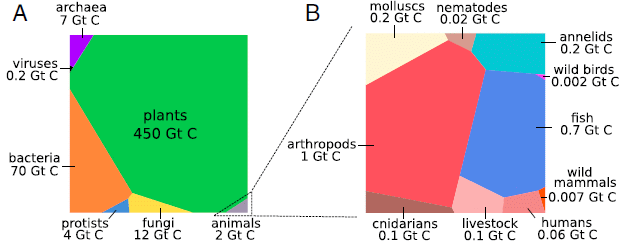
|
Part A (left) shows the relative amounts of life, by "big groups", such as plants and animals.
Part B (right) shows the relative amounts of different kinds of animal life. Animals account for about a half percent of the total, as shown at the lower right corner of part A. That half percent, total animals, is now broken down to show some of the animal groups in part B. The graphs are Voronoi diagrams; they are like pie charts, but pieces of a square rather than sectors of a circle. The authors note it is easier to show a wide range of values this way. (There is no significance to the shapes of individual pieces.) The graphs provide a quick visual comparison of the amounts of different groups of organisms. But they are also labeled with values. In both parts, the measure of the amount of life is the amount of carbon in it. "Gt C" means gigatonnes of carbon. This is Figure 1 from the article. |
These are not easy numbers to come by. The authors have undertaken an extensive search of the literature to come up with the best numbers they can. They describe what they did in detail; we are looking only at the summary. They include estimated uncertainties for most of their numbers. The total amount of life is probably within a factor of 2. The amount of bacteria has an uncertainty of about a factor of 10.
The Supplementary Information Appendix accompanying the article is 113 pages. It includes 64 pages of text describing the details, and has over 300 references.
Major observations? Well, each person can look at it as they wish. But a few points...
Plants dominate. In one sense, that may seem reasonable. Primary producers should dominate. But aren't the bacteria (in particular, the photosynthetic cyanobacteria) the main primary producers? The analysis here says no. However, the plant measure includes a lot of biomass that is not active, such as tree trunks. Further, there is a huge uncertainty in the amount of bacteria, as noted before. Nevertheless, the authors argue that the dominance of plants will hold.
Animals. About half the animal biomass is arthropods. Mosquitoes, for example. Well, mosquitoes and their relatives. Animals with segmented appendages. That includes the insects and spiders. But it is the marine arthropods, such as the crustaceans (lobsters and such), that dominate that number (about 80%; Table 1).
Humans. About 1/10,000 (or 0.01%) of Earth's biomass is human. That's about 3% of the animal biomass. The amount of our livestock is about twice the amount of us. So is the amount of cnidarians; that's the jellyfish and their relatives.
There is another piece to the story. One striking number is that the mass of humans is greater than the combined mass of all wild mammals. By a factor of ten. The amount of our livestock is similar to our own mass, as already noted. Humans have come to dominate. The effect of humans on biodiversity, more broadly, on life on Earth, is an important -- and complex -- story.
Presentations such as this are for perspective. We're trying to get a big picture of the universe, in this case, of the biological world (at least that part of it on Earth). We have already noted that the uncertainties are large. In some cases, those concerned about specific points may be motivated to try to come up with better numbers.
In any case, it is fun.
News stories:
* Humans just 0.01% of all life but have destroyed 83% of wild mammals - study. (D Carrington, Guardian, May 21, 2018.)
* In a New Biomass Census, Trees Rule the Planet. (Weizmann Institute of Science, May 21, 2018.) From the lead institution.
* News story accompanying the article: The scale of life and its lessons for humanity. (M G Burgess & S D Gaines, PNAS 115:6328, June 19, 2018.)
* The article, which is freely available: The biomass distribution on Earth. (Y M Bar-On et al, PNAS 115:6506, June 19, 2018.)
A little check... The figure says that humans have 0.06 Gt of C. Divide that among 7 billion people, and we get an average of about 9 kg C per person. Humans are about 20% C (says Wikipedia), so that would suggest an average weight of about 45 kg (100 pounds). That seems reasonable. Remember, we're talking about all humans, including children. And the calculation here involves a lot of one-digit numbers.
We can get something else from the number for humans. What is a gigatonne of carbon? It's 1015 grams, but that number probably doesn't help much. Let's explore... if there is about 0.06 Gt C in humans on Earth, it would take about 16 such Earths to have one gigatonne of carbon. That is, 1 Gt C is about 16 Earth's worth of humans. 1 Gt C = 16 Ewh.* * * * *
A post that says that microbes represent half the biomass on Earth: Microbes -- some thoughts (February 9, 2010).
A post that notes that ants may be a quarter of the animal biomass in tropical rain forests... Who cleans up the forest floor? (November 3, 2017).
A post where chlorophyll is used as a measure of biomass... Fertilizing the ocean may lead to reducing atmospheric CO2 (August 24, 2012).
More about the effect of humans on biodiversity: The 6th mass extinction? (April 4, 2011).
And... On restoring ecosystems: priorities? (December 5, 2020).
Also see:
* Briefly noted... How many ants are there? (December 10, 2022).
* T rex census (May 25, 2021).
* Counting trees on Earth from space -- at one-tree resolution (January 12, 2021).
* Worm count (August 27, 2019).
June 20, 2018
1. Genome sequencing may be of benefit for a sick child. The cost has plummeted in recent years, but still may be beyond the resources of many. Here is a news story that discusses one approach... Understanding What Makes a Successful Crowdfunding Campaign -- Researchers at the Rare Genomics Institute look at how families finance the cost of diagnostic exome sequencing. (J Daley, The Scientist, May 2018, page 17; title in print edition is different. Now archived.) That links to an article, which is freely available. Key background post: Genome sequencing to diagnose child with mystery syndrome (April 5, 2010).
2. More evidence for an ocean and water plumes emanating from Europa. As with some of the earlier evidence, this comes from a re-examination of measurements from the Galileo spacecraft. News story, which links to the article: Europa's ocean: New evidence from an old mission. (J Lynch, University of Michigan, May 14, 2018.) Background post: Europa is leaking (February 10, 2014).
June 19, 2018
In 2014 the Rosetta spacecraft visited comet 67P/Churyumov-Gerasimenko, and took lots of pictures, along with scientific measurements. Now, a Twitter user has offered a collection of images from that Rosetta mission, with some interesting suggestions about what is in the background.

|
The news story listed below features that collection as a movie -- an animated gif file, consisting of a sequence of 26 images taken from the spacecraft. The images show the comet surface and -- strikingly -- the background.
The movie at the left is a version of that movie with images reduced in size. (The full movie file is about 2 MB.) This is greatly speeded up. One loop of the animated gif corresponds to about 15 minutes of real time. |
Remember, this is from a Twitter feed, not a scientific article. The person who did this may well be an amateur astronomer with good knowledge of the material. But we have no way to know. Enjoy the figures, but don't worry too much about the discussion. (Over time, serious scientific comment may accumulate somewhere.)
News story: A short new movie of a comet's surface is pretty incredible. (E Berger, Ars Technica, April 25, 2018.) Includes discussion of what is going on in "the background".
Check out the Twitter feed that is linked in that story. Many more pictures, many of them of the comet surface. There is some discussion (some not in English), but little that is substantive.
Thanks to Borislav for all this, including the smaller movie file shown above.
* * * * *
Other posts about the Rosetta mission...
* Twins? A ducky? Spacecraft may soon be able to tell (August 4, 2014).
* Lutetia: a primordial planetesimal? (February 13, 2012).
* Rendezvous with Lutetia (August 14, 2010).
June 18, 2018
A new article reports the occurrence of prion disease in dromedary camels (Camelus dromedarius).
The evidence starts with symptoms that remind the scientists of other prion diseases, such as BSE. Such symptoms were found in about 3% of the camels at one slaughterhouse in Algeria over a two-year period. Three symptomatic animals were tested further, along with one asymptomatic control. Histological examination of the brain showed classical signs of prion disease. Protein analysis showed the disease form of the prion protein. Circumstantial evidence suggests that the prion disease may be infectious.
There is no evidence about whether the disease might be transmissible to other animals, including humans.
The disease is called camel prion disease (CPD).
The evidence is rather preliminary. And camels may seem exotic to many of us. The authors' point is that camels are important over a major part of the world. A possible serious infectious disease of camels warrants attention -- even if the evidence so far is limited.
News stories:
* 'Mad camel' disease? New prion infection causes alarm. (S Soucheray, CIDRAP News, April 18, 2018.)
* Camels in Africa may have been quietly spreading prion disease for decades. (B Mole, Ars Technica, April 26, 2018.)
The article, which is freely available: Prion Disease in Dromedary Camels, Algeria. (B Babelhadj et al, Emerging Infectious Diseases (EID) 24:1029, June 2018.)
Most recent post on prion diseases... Mineral licks and prion transmission? (May 8, 2018).
For more about prions, see my page Biotechnology in the News (BITN) - Prions (BSE, CJD, etc). It includes a list of related Musings posts.
MERS is a human disease that occurs primarily in the Middle East. It seems likely that camels are a reservoir for the MERS virus. There is more about MERS on my page Biotechnology in the News (BITN) -- Other topics in the section SARS, MERS (coronaviruses). It lists related Musings posts.
More about camels, not related to MERS: Cloning: camel -- update (June 11, 2012).
... and the camel family: Using antibodies from llamas as the basis for a universal flu vaccine? (December 7, 2018).
June 15, 2018
Some plants eject their seeds with considerable force; it is a dispersal mechanism. A recent article reports an analysis of one example, making use of high speed video (up to 20,000 frames per second) to observe the seed ejection and flight processes.

|
A fruit of the Hairyflower Wild Petunia (Ruellia ciliatiflora). It has dehisced -- a botanical term that means it has broken open to release its contents. In this case, it was constrained during dehiscence, so you can see the insides. Each seed is on a little "hook"; you can also see some free hooks above the seeds.
The seeds are disc-shaped, about 2 millimeters diameter and a half millimeter thick This is Figure 1b from the article. There is a scale bar on another part of the figure, showing the seeds. But the seed dimensions are also stated in the article. |
The seeds are ejected by mechanical forces during the explosive dehiscence. The seeds leave with an average speed of about 10 meters/second (40 km/h, about the speed of cars on city streets!). And they rotate at about 1000 rpm, even as high as 1660 rpm, making them the fastest spinners known in biology. They may travel several meters before landing.
The observations also made clear that the seeds that traveled the furthest upon ejection were those with the highest rotation speeds. This led the authors to suggest that the spin was providing gyroscopic stabilization to the seeds during flight. reducing the drag. They explored this with some theoretical analysis; the following graph summarizes the findings.
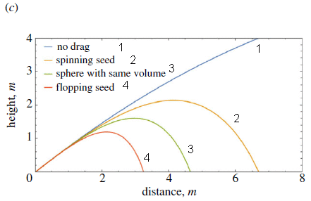
|
Each curve shows the calculated trajectory for a seed of specified properties. The trajectory is shown as height vs distance after ejection.
Start with the curves for spinning vs flopping seeds (curves 2 & 4). The spinning seed goes much further. Thus the modeling here fits the observations. The other two curves are for reference. Curve 3 is for a spherical seed of the same size. Curve 1 is for an idealized seed with no drag. This is Figure 3c from the article. I added the number-labels for the curves, both on the key and on the lines. |
The modeling for spinning and flopping seeds agrees with the observations. The interpretation is that the spinning serves to counteract drag.
Videos. There are two short videos posted with the article as supplementary materials. They are both available at videos. (Less than a half minute each; no sound.) I encourage you to check out at least the first one. It shows you the ejection of one group of seeds; note that some seeds take a high trajectory -- and some flop.
News stories:
* Gyroscopic spin with petunia seeds helps them fly farther. (B Yirka, Phys.org, March 7, 2018.)
* New Study: Incredible Backspin Is Secret to Wild Petunia Species' Launch of High-Speed, Disc-Shaped Seeds. (M Kendall, Pomona College, March 7, 2018. Now archived.)
The article: Gyroscopic stabilization minimizes drag on Ruellia ciliatiflora seeds. (E S Cooper et al, Journal of the Royal Society Interface 15:20170901, March 2018.)
More about spinning seeds:
* The smallest manmade flying devices (December 12, 2021).
* Miniature helicopters -- and botany (July 6, 2009).More gyroscopes:
* A simpler bicycle (May 23, 2011).
* Dolphins, bulls, and gyroscopes (September 10, 2010).More things spinning... A new record: spinning speed (October 12, 2018).
June 13, 2018
1. In an earlier post, we noted that certain features on Mars, called recurring slope lineae (RSL), might be due to flowing water. More recent work, from the same scientists, makes it more likely that they are due to flowing sand. Key evidence is that the flows are found only at substantial slopes. In any case, RSL are still of interest. News story, which links to the article: Recurring martian streaks: flowing sand, not water? (Phys.org, November 20, 2017.) Background post: Water at the Martian surface? (August 27, 2011); I have noted this new information there.
2. A new crop of companies is appearing with the goal of helping you make money from your genome. Newspaper story: Need a little extra money? You'll soon be able to sell and rent your DNA. (G Robbins, San Diego Union-Tribune, June 5, 2018.) One of the featured companies is in the San Diego area.
June 12, 2018

|
Composite optical image of galaxy NGC1052-DF2, from the Gemini Observatory in Hawaii.
The galaxy is that grayish diffuse blob. (The distinct objects are, for the most part, not part of our target galaxy. In fact, some of them are behind the galaxy, which is rather transparent.) You cannot see the dark matter in the galaxy. Dark matter is invisible in optical imaging. And in this case... This is the figure from the Phys.org news story, trimmed and reduced a bit. |
A team of astronomers has estimated the amount of dark matter in this galaxy; it is, at most, about 2.8x1038 kg. That's about 140 million times the mass of the Sun. We can write that as 1.4x10⁸ M☉, where M☉ is the symbol for the solar mass, a convenient mass unit in astronomy.
In other words, the amount of dark matter in this galaxy is approximately zero.
How did they come up with this result -- and the approximation? It is based on two types of measurements -- two ways to measure the mass of the galaxy. One is based on the ordinary images of the galaxy, such as the figure above; this method gives the total visible mass -- the mass of ordinary matter. The other is based on measuring the speed of star-clusters within the galaxy. That is a measure of their gravity -- and thus their total mass.
The visible mass is about 2x10⁸ M☉. The heart of the new article is reporting measurements of the total mass; it is, at most, 3.4x10⁸ M☉. The difference is about 1.4x10⁸ M☉. What does that mean? That difference is what is taken as dark matter -- matter not visible by optical measurements.
The "ordinary" imaging referred to there is not just for visible light, but for any wavelengths of electromagnetic (EM) radiation. Dark matter is matter that we recognize because of its gravitational effect, but which cannot be detected by any ordinary interaction with any type of EM radiation.
If we take those numbers at face value for the moment, it would suggest that the ratio of dark matter to visible matter is about 1:1 for this galaxy. That's very interesting... The expected ratio for galaxies of this size is about 400:1. This galaxy seems quite short of dark matter. In fact, the authors say that the mass of dark matter is 1.4x10⁸ M☉, at most. It might be zero.
Some headlines for stories about this article say that the galaxy lacks dark matter. In fact, the article title itself says that. That's more than the real claim. What's important is that the galaxy appears to have a very low level of dark matter -- less than 1% of what might be expected based on our current understanding. It's true that the value could be zero, but that's a stretch, and not important.
The article has come under considerable criticism. The main concern is not so much that the scientists made any error as that their data is insufficient to make a convincing case. They have made a bold claim: a galaxy that goes against all we know at this point. It will take more data to sort this out. The news story by Mandelbaum for Gizmodo discusses the criticism.
There is an amusing side point here. No one has ever seen dark matter; we don't know what it is. Dark matter is inferred based on calculations such as those presented here. There is some lurking concern that there is just something wrong with the whole approach. Perhaps dark matter is just an artifact of a calculation. Perhaps there is something about galaxy data that leads to the appearance of a dark matter discrepancy. The current work violates all the patterns we have seen so far. This galaxy seems different. Therefore, this galaxy, which seems to be remarkably short of dark matter, provides support for the concept of dark matter. Other galaxies, which appear to have dark matter, are different from this one; perhaps that means their dark matter is real.
News stories:
* Dark matter 'missing' in a galaxy far, far away. (Phys.org, March 28, 2018.)
* Dark Matter Goes Missing in Oddball Galaxy. (NASA, March 28, 2018.) I don't agree with their first sentence, but perhaps it is not important.
* Heated Debate Surrounds Galaxy Seeming to Lack Dark Matter. (R F Mandelbaum, Gizmodo, April 16, 2018.) A good discussion of the doubts about the article discussed here. It links to some of the dissenting materials, including articles posted at ArXiv.
The article: A galaxy lacking dark matter. (P van Dokkum et al, Nature 555:629, March 29, 2018.)
More about dark matter:
* Added March 4, 2026. An unusual neutrino, from a novel type of black hole? (March 4, 2026).
* Briefly noted... A claim for the possible detection of dark energy (September 22, 2021).
* What if there isn't any dark matter? Is MOND an alternative? (December 12, 2016).
* Where is the dark matter? (May 11, 2012). Includes some brief background on the dark matter problem.More about gravity: Measuring a weak gravitational interaction (June 7, 2021).
June 10, 2018
People vary in their natural circadian rhythms. Some people find it easy to get up in the morning, some don't. What are the implications of such variation?
A recent article takes an interesting approach to investigating the question, and comes up with some findings that might have implications for how colleges schedule classes.
The work is done using the student population at a large university where there is a high level of use of the university computer system throughout the day. The authors suspect that the records of when the students log in to the system are a very good indication of when they are awake.
They compare the login records of the students on days they have classes and days they do not. They suggest that the latter reflects the students' natural circadian rhythms -- and that the difference between the two reflects the degree to which classes affect when they get up.
For each student, they find the difference in login times between class days and non-class days. This difference is used as a measure of what is called social jet lag (SJL). Half the students appear to be night owls by this criterion; they log in earlier on class days. About 40% show little difference between the two types of days. About 10% log in later on class days. Continuing the ornithological analogy, the latter two groups are called (day) finches and (morning) larks, respectively. Collectively, the three patterns are called chronotypes.
The following graph is one simple example of their analysis...
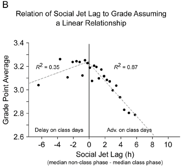
|
The graph plots the average student grade point average (GPA; y-axis) vs their SJL (in hours; x-axis).
Students with zero SJL have an average GPA about 3.2. Students with a positive value of SJL, meaning they get up earlier on class days, have lower GPAs. The relationship is approximately linear. |
|
The effect is smaller and of uncertain significance on the other side, for students who get up later on class days. Grades are shown here on a common American scale, where 4 = A = excellent; 3 = B = good; 2 = C = average. This is Figure 3B from the article. | |
The graph above suggests that students who are night owls get lower grades than other students.
Here is another analysis, with perhaps more surprising results...
|
This 3D graph shows the average class grades (z-axis) for students with different combinations of chronotype (x-axis) and class time (y-axis).
(These are not overall student GPAs. They are grades for the specific classes with the specific combination of student type and class time indicated.) For example, the blue bar at the front left shows that (morning) lark students taking morning classes got an average grade of about 2.8. |
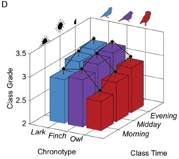
|
|
There are a couple of patterns in this graph... - Students in each of the three chronotypes do better later in the day. - Owls do more poorly than the other groups, at any time. Asterisks indicate that the value tests as significantly different from the adjacent bars that are connected by a line. In this graph, most bars test as different from their neighbors. This is Figure 4D from the article. | |
Both of those patterns are intriguing. I wonder what they mean. The Discussion section of the article offers some suggestions that could be tested. For example, it is common that students have their first class at various times on different days. That may be more stressful to night owls.
We noted at the top that the scientists here used login records to characterize the chronotype of the students. That's a clever development... it is an objective measurement, which is readily available for the entire university population. It is a working assumption that the chronotype determined this way is a measure of the underlying circadian rhythms. Indeed, the article shows that various effects correlate with the chronotype determined this way. Some of these might be effects that were expected, others perhaps not. Overall, it is an intriguing article -- about important issues.
News stories. The following two stories are from the two universities involved in the work.
* Universities, students should consider biological rhythms during class scheduling, study finds. (Northeastern Illinois University, March 29, 2018.) Now archived.
* Poor grades tied to class times that don't match our biological clocks. (Y Anwar, UC Berkeley, March 29, 2018.) Now archived.
The article, which is freely available: 3.4 million real-world learning management system logins reveal the majority of students experience social jet lag correlated with decreased performance. (B L Smarr & A E Schirmer, Scientific Reports 8:4793, March 29, 2018.)
Related posts include...
* Daylight savings time: night-owls have more difficulty adapting (August 1, 2021).
* The effect of delaying school start time on students: some actual data (March 12, 2019).
* The genetics of being a "morning person"? (April 15, 2016).
* Sleepy teenagers (July 23, 2010).
June 8, 2018
The propagation of seismic waves is complex. Of course, seismic waves follow the laws of physics, just as other waves do. However, they travel through a very complicated medium, the Earth. Measuring seismic waves can offer clues as to the nature of the Earth "down there".
One phenomenon is that seismic waves dissipate -- more so through some types of rock than others. Why? It has been thought that the water content of the rocks is a key factor -- that rocks with more water dissipate seismic waves more effectively. There is some evidence to support that idea, but the evidence is mainly from lab work at water concentrations far higher than normally found in rocks.
A team of scientists set out to look at the water effect at more realistic levels. They found no effect of water on seismic wave dissipation, under realistic conditions. However, somewhat accidentally, they found another factor that could account for the observed difference.
Here are some results...
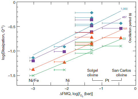
|
This is a difficult figure. Let's slowly work through some of it.
Start with the green data and the line through that data. (That's the bottom set of data.) You should see that there is plausibly a straight line relationship here. So what's being plotted? In simple terms, it is the energy dissipation (y-axis) vs the oxygen concentration (x-axis). We'll try to explain the axes in more detail below in the fine print, but that is the basic idea. The higher the oxygen level, the higher the energy loss as the seismic waves travel through the rocks. This is Figure 3 from the article. |
That's the key finding: oxygen leads to dissipation of seismic waves. More specifically, propagation of seismic waves is reduced in rocks that are more oxidized.
Why would that happen? That is, why would the oxidation state of the rock affect seismic wave propagation? Some metal ions are quite sensitive to the redox state. Iron ions provide an important example: Fe2+ or Fe3+, depending on how oxidizing the conditions are. The rock chemistry changes as the redox state changes; the rock structure changes along with it.
We have focused on the green data set. That is for one particular condition: one particular oscillation period (wave frequency). The figure has results for four oscillation periods, shown by the four colors. The results are similar for the four periods: the slopes of the lines are about the same.
The data sets are labeled near the upper right. There are small colored numbers, corresponding to the color used for the data. The numbers are for the oscillation period, in seconds.
What were the scientists measuring here? These are lab experiments. A rock sample is put under extreme conditions of temperature and pressure, thought to reflect natural conditions in the Earth's mantle. The scientists then subjected the samples to artificial waves (oscillations), and measured energy transmission.
What makes this interesting is that they used various kinds of "sleeves" to hold the rock sample -- and the results depended on the type of sleeve used. The scientists related this to the oxidation state. After all, under the extreme conditions used for the measurements, the metal sleeves were not entirely inert. This was the clue that led them to their main conclusion.
Patterns of seismic wave transmission through the Earth have been used to help understand the Earth's interior. If the new findings are confirmed, old results will need to be re-interpreted.
Let's look at the axes again. The basic idea presented above, that the graph is energy loss vs oxygen level, is fine. But here is more detail.
The y-axis is energy dissipation. You can think of it as energy lost divided by total energy. (It's plotted on a log scale.) The authors make it seem more complicated by saying it is 1/Q -- without being clear what Q is. Q is, I think, the "quality factor" -- which is essentially the reciprocal of the energy dissipation (ignoring a constant term).
The x-axis, also on a log scale, is a measure of the oxygen concentration. It is the oxygen fugacity, fO2. Fugacity is a term used to represent the effective concentration of a gas. It is given here relative to a standard mineral, called fayalite-magnetite-quartz, or FMQ. That is, ΔFMQ means the difference from the mineral FMQ. What matters here is the relative fO2, more oxidized to the right.
The nature of the sleeves is also shown on the x-axis of the figure above (just inside the graph box).
News stories:
* Scientists helping to improve understanding of plate tectonics. (Science Daily, March 14, 2018.)
* Scientists find seismic imaging is blind to water -- Findings may lead scientists to reinterpret seismic maps of the Earth's interior. (J Chu, MIT News, March 14, 2018.) From one of the institutions involved in the work.
* News story accompanying the article: Earth science: Oxidation softens mantle rocks -- Seismic waves that propagate through a layer of Earth's upper mantle are highly attenuated. Contrary to general thinking, this attenuation seems to be strongly affected by oxidation conditions, rather than by water content. (T Irifune & T Ohuchi, Nature 555:314, March 15, 2018.)
* The article: Redox-influenced seismic properties of uppermantle olivine. (C J Cline II et al, Nature 555:355, March 15, 2018.)
More seismic waves...
* Seismologists measure temperature changes in the ocean (October 6, 2020).
* Fracking and earthquakes: It's injection near the basement that matters (April 22, 2018).
* What caused the extinction of the dinosaurs: Another new twist? (January 26, 2016).
* Could we block seismic waves from earthquakes? (June 23, 2014).More about the redox state of iron ions in minerals: A battery for bacteria: How bacteria store electrons (May 2, 2015).
June 6, 2018
This is the first of a new feature in Musings. A "Briefly noted..." section will list one or more items as "one-liners". One link, and a short text (1-2 sentences? Certainly, only a short paragraph.) about why readers might find it of interest. No figures.
Because these are short items, none of the usual policies on Musings items will necessarily hold here. Older items are fine, if you think they are still of interest. Items that are news but lack a current scientific article are ok, if the content is of interest. (Items that are just speculation are not so good; let's try to emphasize the science.) And so forth. We'll see how it works.
Because of the brevity, this may be a good place for occasional items that are mainly for fun. But it may include things that are important, but which, for some reason, we don't write up in full. Perhaps this is also a good place for items that are a quick update to previous posts.
Items listed here will usually not cross-link with other posts.
Contributions, please. We can experiment with details.
Here is the first installment...
1. A rocket launch disturbed the atmosphere -- enough to cause GPS measurements to be off by one meter. News story, which links to an article: August 2017 SpaceX rocket launch created large circular shock wave. (L Lipuma, GeoSpace (AGU blog), March 21, 2018.)
2. Cell phones can be used to track mosquitoes; they can even distinguish mosquito species by the wing sounds. It's more from Manu Prakash at Stanford. News story, which links to a freely-available article: Tracking mosquitoes with your cellphone. (Science Daily, October 31, 2017.)
June 5, 2018
Let's jump in and look at some data...
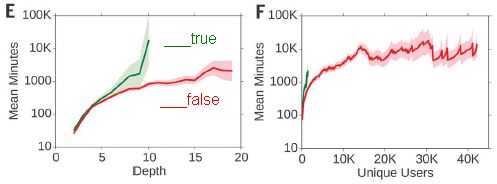
|
The graphs show how long it takes for news stories to spread on Twitter, as judged by two parameters. Results are shown for true stories (green) and false stories (red).
Frame E (left) shows how long it takes (y-axis -- log scale) for a tweet to achieve the depth shown on the x-axis. What is depth? It's the number of sequential retweets from unique users. As an example of how to read these graphs... Look at depth 10. For false stories (red curve), the average time it takes for a tweet to reach depth 10 is about 1000 minutes (17 hours). For true stories (green curve), that average is about 10K minutes (10,000 minutes, or 7 days). True stories take longer to get around. Further, the green curve does not extend beyond depth about 10. False stories may achieve greater depths, but true ones only get as far as depth 10. Frame F (right) shows how long it takes (y-axis) for a tweet to reach the number of users shown on the x-axis. The general form of the graph, and the general pattern of results is the same as for frame E. A subtlety... The analysis focuses on "cascades". A cascade is a single initiating tweet and its retweets. A particular news story may (and typically does) have multiple cascades. The results above are for individual cascades. This is part of Figure 2 from the article. I added the labeling of the curves. |
The big picture from the graphs above is that false news spreads faster than true news.
What did the scientists do here? They collected an extensive set of records from Twitter. They had outside experts classify each news story as to whether or not it was true. Then, they analyzed how the news item spread; the graphs above are just a sample of that analysis.
Among other findings in the article, briefly...
- The conclusions hold both for political and non-political stories. The effect is larger for political stories.
- Robots are not major factors in the difference between true and false news.
- False posts are more likely to be considered "novel", and novelty is likely to make a story more interesting -- and more worthy of spreading further. Hm.
- The authors make an attempt to analyze readers' emotional reactions to posts with true and false content. They suggest this may be a factor in people choosing whether or not to retweet an item. This may be an interesting approach, but at this point the results are limited.
Comments...
This article is of interest simply because it is there. We hear so much about "fake news" (a term the authors carefully avoid), and here is an article, in a top journal and from a top science university (MIT), attempting a serious analysis of it. But news quality is not just a political issue, and not just a new issue from Twitter. Indeed, Twitter provides a huge data set for analysis; the authors note that their study is the largest study ever of these issues.
I would be cautious about reaching conclusions from this article. As usual, one article does not a truth make. It is an intriguing article, with an interesting approach. The final sentence of the article is a plea for more work in the field. We'll see what comes of work such as this over time.
News stories:
* On Twitter, false news travels faster than true stories, study finds. (Science Daily, March 12, 2018.)
* False news spreads faster than truth online thanks to human nature. (D Coldewey, Techcrunch, March 8, 2018.)
* The Grim Conclusions of the Largest-Ever Study of Fake News. (R Meyer, Atlantic, March 8, 2018.) A long and in-depth discussion of the article. Excellent, and worth the time, if you want to pursue this story. Notes various limitations of the work at this point.
* News story (Policy forum) accompanying the article: Social science: The science of fake news -- Addressing fake news requires a multidisciplinary effort. (D M J Lazer et al, Science 359:1094, March 9, 2018.) A broad discussion of the issue.
* The article: The spread of true and false news online. (S Vosoughi et al, Science 359:1146, March 9, 2018.) Check Google Scholar for a freely available copy. The abstract of the article, which should be freely available, is an excellent overview. I encourage everyone to read that.
Those who are interested in the privacy aspect should read the Acknowledgments section of the article. The authors state the role of Twitter, which included funding the study. They also discuss availability of the data.
The Science Daily news story notes that one of the authors was Twitter's Chief Media Scientist, 2013-17.
Two of the news stories note that Jonathan Swift compared the speed of transmission of true and false information -- back in 1710.
* * * * *
Posts about quality of news, focusing on science...
* The quality of science news (April 26, 2017).
* Media hype about scientific articles: Who is responsible? (March 9, 2015).A previous post that referred to Twitter news: NASA: Life with arsenic -- follow-up (June 7, 2011).
My page for Biotechnology in the News (BITN) -- Other topics includes a section on Ethical and social issues; the nature of science.
June 3, 2018
There is too much CO2 in the atmosphere. Perhaps we could capture it, and ... And what? Bury it underground? Or convert it to something useful, such as a fuel? There are various proposals. One general consideration is how much they would cost. Capturing CO2 is not cheap.
A new article proposes capturing CO2 and converting it into something valuable: carbon nanotubes (CNT).
Here's the idea, diagramatically...
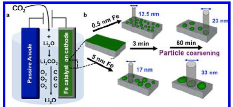
|
Frame a (left) shows the main steps. CO2 is captured in molten lithium oxide, to form the carbonate. The carbonate -- molten -- is then subjected to electrolysis, producing C and O2.
The C is made at the cathode (shown in green). The trick is to get the C product in a useful -- or even valuable -- form. That is a function of the electrode material. Here, it is a layer of iron (Fe), which serves as the catalyst for making CNT. Part b (right) shows that two kinds of Fe catalyst were used; they differ in the thickness of the Fe layer: thin (0.5 nanometers; top) and thick (5 nm; bottom). Results are sketched for both kinds of Fe catalysts at two times. The labeled sizes are diameters of the CNT. The figure shows that the CNT are smaller (in diameter) with the thin catalyst. That holds at both reaction times shown. (This figure is a diagram, but the numbers are based on actual experiments.) This is part of Figure 1 from the article. |
Here are examples of the products...
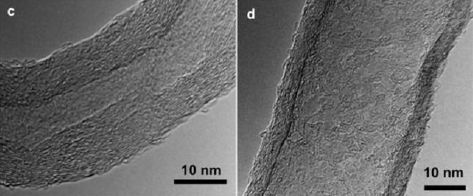
|
The figure shows electron microscope images of one CNT from each of the two catalyst conditions. Note that the scale bars, both for 10 nm, are not quite the same size.
Frame c (left) shows one CNT made with the thinner catalyst; frame d (right) shows one CNT made with the thicker catalyst. You can see that the CNT on the left, made with the thinner catalyst, has a smaller diameter. (In the figure, it is smaller. Measure it! Further, the 10 nm scale bar is larger.) You can also see that the walls are somewhat thicker for the smaller CNT. The authors discuss this finding; for now, it is an interesting but unexplained observation. This is part of Figure 3 from the article. |
One conclusion stated above is that the thinner catalyst leads to smaller diameter nanotubes. That's interesting -- and important. These are, by far, the most valuable CNT.
The ability to control CNT diameter, using a thin catalyst layer and short times, leads to a product of enhanced value -- high enough value that the process may be economical.
What are we to make of this? Some opinion... First, as a scientific article, it represents progress in understanding the synthesis of CNT. Is this a good process? It is interesting that they have a process that might make CO2 capture profitable (that is, not needing a subsidy). Nothing proposed previously has met that criterion, to my knowledge. How does it compare to other ways of making CNT? The authors seem to think they are ahead on that point, too. If the process makes economic sense, both in getting CO2 out of the atmosphere and in making a product of value, that's good. But the CO2 problem still needs to be addressed, one way or another. I doubt that the CNT market is big enough to make much of a dent in atmospheric CO2.
News story: High-quality carbon nanotubes made from carbon dioxide in the air break the manufacturing cost barrier. (Kurzweil, May 24, 2018.) Good overview. It also gives a taste of the hype surrounding the work; beware.
The article: Toward Small-Diameter Carbon Nanotubes Synthesized from Captured Carbon Dioxide: Critical Role of Catalyst Coarsening. (A Douglas et al, ACS Applied Materials & Interfaces 10:19010, June 6, 2018.)
The scientists have a spin-off company, SkyNano (love the name!), to develop and market the process. This is noted in the article as a financial interest, and discussed in the news story.
* * * * *
Among previous posts on CNT... Supercapacitors in the form of stretchable fibers -- suitable for clothing (May 2, 2014).
Posts about graphene and carbon nanotubes are listed on my page Introduction to Organic and Biochemistry -- Internet resources in the section on Aromatic compounds.
Posts that deal with CO2 capture, and possible use...
* Capturing carbon dioxide using gallium (April 4, 2022).
* CO2 capture from the air: an improved estimate of the cost (July 16, 2018).
* Capturing CO2 -- and converting it to stone (July 11, 2016).
* Making use of CO2 (November 10, 2015).
June 2, 2018
There are various reasons an article attracts initial attention. Sometimes, it is a picture. Such as this one...
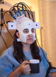
|
Turns out there is an interesting story with this picture.
It's from the first page of a recent article in Nature. This is Figure 1d from the article. |
The topic here is brain imaging -- the type known as magnetoencephalography (MEG). It involves measuring, at the scalp, the magnetic fields that result from electrical activity in the brain.
Brain imaging requires that the positions of the sensors be known precisely. Commonly used sensors are part of large complex machines. As a result, the person being scanned must put their head inside a machine, and remain perfectly still.
The figure above shows a different approach. The person wears a helmet, which includes the sensors. The person can now move around; what matters is that the helmet is precisely positioned on the person's head.
Here are some results...
|
Look at those two graphs... They're pretty much the same. That's the point.
The two graphs are for two sets of MEG brain scan measurements, using the new device. For part a (top), there was very little head movement (less than 1 cm). For part b (bottom), the person carried out some normal activity, including nodding and drinking; head movement was about 10 cm. Despite the difference in head movement, the results were essentially the same. In each graph, the blue curve shows the brain scan results when the subject carried out a simple well-defined task. The red curve shows a background measurement. (The two parts have independent sets of measurements, so they are not identical. What matters is that the main features are the same.) This is part of Figure 2 from the article. Specifically, it is the right side of parts a and b. I have added the labels (a and b) at the upper left of each frame. The full parts contain more information for that condition, including a record of the head movements. |
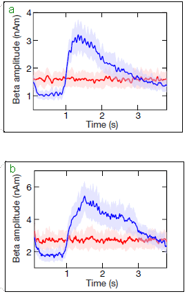
|
There is a third set of data in the full figure (part c). It is for the conventional MEG machine, with the person's head immobilized in the machine. That set, too, is about the same. That is, not only does the new helmet-based device work regardless of head movement, the results are similar to those obtained using the current standard machine.
What makes this possible? In this case, it was the development of a new class of sensor, which did not have to be within the large machine.
That's a big step, but it doesn't mean we can measure the brain while a person walks down the street. This is a measurement of very weak magnetic fields, and must be done in a room that is itself quite high-tech, to achieve magnetic isolation from the environment. But within the confines of that special environment, the person can move normally.
In fact, the person can move their head only within a specially protected area. It's a cube about 40 centimeters (16 inches) on a side. That's not a lot, but it is a lot more than the movement allowed within the conventional machine. It does allow some normal movement. It is likely that the allowed range of movement can be extended with further development.
In one way, the results with the new device are better than with the conventional machine. The spatial resolution is a little better with the new device. That's because the sensors are actually closer to the scalp.
The conventional MEG cannot be used with those unable to lie still, such as babies. The new device should allow brain scans on such people, as well as on people doing at least some range of ordinary activities.
Video: There is a nice video included with both news stories listed below. (Narrated by two of the authors; 3 minutes.) It is a useful introduction to the work; it's not too technical, but it will help you visualize the experiments. Also available directly at YouTube.
News stories:
* A New Wearable Brain Scanner -- A helmet records wearers' brain activity using magnetoencephalography (MEG) while they move around. (E Waltz, IEEE Spectrum, March 21, 2018.)
* MEG in motion: a wearable brain scanner. (T Freeman, Physics World (IOP), March 22, 2018.)
The article: Moving magnetoencephalography towards real-world applications with a wearable system. (E Boto et al, Nature 555:657, March 29, 2018.)
A recent post involving brain scans: Can we predict whether a person will respond to a placebo by looking at the brain? (February 21, 2017).
Dogs have been trained to lie still in a brain scanner: Dog fMRI (June 8, 2012).
More magnetic fields: CISS: separating mirror-image molecules using a magnetic field? (August 7, 2018).
More wearables:
* An ultrasound device you can wear (September 17, 2022).
* An air-conditioner you can wear? (August 19, 2019).My page for Biotechnology in the News (BITN) -- Other topics includes a section on Brain (autism, schizophrenia). It includes a list of brain-related posts.
May 30, 2018
A new article enhances the status of cellulose in the competition for "strongest materials".
We know cellulose is strong; it holds trees up. But it is usually not considered a top contender for our use if strength is the key issue. The new work develops a new way to process cellulose, and that leads to its enhanced strength.
The underlying structural units of natural cellulose are "nano"-scale cellulose fibrils, which have impressive strength. However, assembly into larger structures with retention of the strength is difficult. The new article reports a solution. The key is to carefully align the nanofibrils. This is done by developing a process where the alignment is guided by flows.
One step in the proposed process is a pH adjustment. The fibrils have some acid groups (carboxyl groups, -COOH) on the surface, due to a treatment step. At neutral pH, the acid groups are charged (-COO-). The fibrils can line up in the same direction due to the flow pattern, but they don't get too close to each other, because of charge repulsion. The pH is then lowered; the acid groups become neutral. The nanofibrils, which are already aligned, now interact with each other, forming a well-aligned larger-scale fiber.
The following figure shows the resulting fibers...
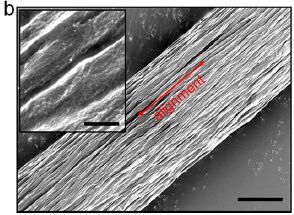
|
Scanning electron microscope (SEM) image of a "macroscopic" fiber that is made out of cellulose nanofibrils (CNF).
You can see that the individual CNF are well aligned in the macro fiber. Scale bars: 3 µm (main) and 400 nm (inset). This is Figure 1b from the article. |
Here is a summary of the strength characteristics of the new material, along with numerous other materials...
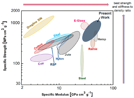
|
Big picture... The graph shows how numerous materials rate on two types of measurement. The new cellulose fibers, labeled "present work", are near the upper right; that means they rate highly by two different criteria. Both are expressed here per unit density.
The specific strength (y-axis) measures the force needed to break the material upon stretching it. The specific modulus (x-axis) is the stiffness. This is Figure 4 from the article. |
The article is part of the continuing quest for "better" materials, as judged by various criteria. Scientists look at both natural and synthetic materials. Natural materials may be just the starting point for further developments.
The process reported here seems simple (though working out the details of how to do it was not). The authors have commented that it should be economically practical, given the quality of the product, which may be suitable for applications from furniture to airplanes.
News stories:
* Newly-Developed Biomaterial is Stronger than Steel and Spider Silk. (Sci.News, May 22, 2018.)
* World's strongest bio-material outperforms steel and spider silk. (Nanowerk News, May 16, 2018.)
The article, which is freely available: Multiscale Control of Nanocellulose Assembly: Transferring Remarkable Nanoscale Fibril Mechanics to Macroscale Fibers. (N Mittal et al, ACS Nano 12:6378, July 24, 2018.)
A post about the strength of natural and modified woods, compared with some metals. The results here are reported as specific strength, as on the y-axis above. Making wood stronger (March 19, 2018).
More about cellulose nanofibrils: Using wood-based material for making biodegradable computers (July 21, 2015).
More about holding trees up: At what wind speed do trees break? (April 2, 2016).
More on silk strength:
* Stabilizing broken bones: could we use spider silk instead of metal plates? (June 24, 2018).
* How do you get silkworms to make stronger silk, reinforced with graphene? (October 24, 2016).My page Organic/Biochemistry Internet resources has a section on Carbohydrates. It includes a list of related Musings posts.
May 25, 2018
Atoms consist of a dense nucleus surrounded by a cloud of electrons. We say that an atom is mostly empty space. There are some nuances to that, but the idea has merit.
If an atom is mostly empty space, might it be possible for big atoms to contain small atoms inside?
The following diagram shows the idea; it is an overview of the work reported in a recent article.

|
The figure shows a collection of atoms. Strontium (Sr) atoms. Most of them are shown in green. The big one in the middle is in blue. The big one? The physicists "blew it up" for the work. After all, it would be easier to fit other atoms inside if the host atom were very big.
For that big blue atom... The nucleus is in the middle, in red. The outer electron, the one that defines the size of the atom, is the small blue dot at the very top of the big blue atom. You can see that there are several regular-size green Sr atoms within the big blue Sr atom. In one case, the scientists reported having more than 160 regular Sr atoms inside one big expanded Sr atom. Those "regular"-size Sr atoms... They're not all the same size. Many of them are somewhat excited. That will make more sense below, but isn't particularly important. This is the figure in the Phys.org news story. |
How did the scientists do this? There are two main technical tools, both well-known to physicists. First, the work was done at a very low temperature -- about 150 nanokelvins (less than a millionth of a Kelvin). That reduces the motion of the atoms to extremely low levels, allowing very weak interactions to persist.
Second, the outer electron of the host atom was "excited", so that it moved further away from the nucleus. For example, in the experiments summarized in the graph below, one of the electrons was excited from its usual energy level n = 5 to n = 38. In other experiments, it was excited to energy levels as high as n = 72.
- The ultra-low temperature state is called a Bose-Einstein condensate (BEC).
- An atom with one electron excited to an extremely high energy level is called a Rydberg atom.
How do the scientists know what happened? They actually developed a theoretical model, based on quantum mechanics. The model predicts small interactions between the excited electron and the internalized atoms. They can measure this; it's essentially an absorption spectrum.
Here are some results...
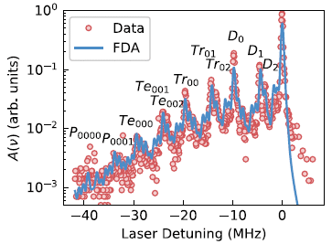
|
The graph shows the signal vs the laser input.
It includes data points (red circles) and a prediction (blue line). (The line is labeled FDA, which stands for functional determinant approach.) |
|
The big picture is that the data substantially agrees with the prediction. That is, the experimental data are what is expected from their model of Sr atoms within a big excited Sr atom. What are all those labeled peaks? They are for specific structures. For example, D is for dimers (one atom within the host atom), Tr for trimers. This is Figure 2 from the article. | |
So the work provides evidence that atoms can be within atoms. These new structures are called Rydberg polarons; they represent a new form of matter. And the scientists have a theoretical framework that predicts such structures, and can guide further work.
News story: Researchers report the creation of Rydberg polarons in a Bose gas. (Phys.org, February 26, 2018.)
The article: Creation of Rydberg Polarons in a Bose Gas. (F Camargo et al, Physical Review Letters 120:083401, February 23, 2018.)
More Rydberg atoms... A chemical bond to an atom that isn't there (October 31, 2018).
Other posts on unusual atoms include... What is the charge on atoms of anti-hydrogen? (July 15, 2014).
More strontium...
* Atomic clock measurements of the difference in gravity over one millimeter (May 4, 2022).
* Revealing the alabaster sources of ancient artists (March 7, 2018).
May 23, 2018
Watch... Video. (2 minutes. No narration, but there is background music.) The video is well-labeled. In particular, note the speed-up rate, shown at the lower left; it varies during the video.
There is a fun aspect here. But this is also about serious issues of robot development. In particular, note that the robot here assembled a kit intended for humans. This is not about designing a kit that is optimal for robotic assembly.
News stories:
* Assembling Ikea furniture should be a new benchmark for robot dexterity. (J Vincent, Verge, April 18, 2018. Now archived.) Compares the current work to previous attempts to have robots assemble Ikea furniture.
* A Robot Does the Impossible: Assembling an Ikea Chair Without Having a Meltdown. (M Simon, Wired, April 18, 2018.)
The article: Can robots assemble an IKEA chair? (F Suárez-Ruiz et al, Science Robotics 3:eaat6385, April 18, 2018.) The video linked above is essentially the same as the one provided as Supplementary Materials with the article.
Previous robotics post... Exoskeletons: focus on assisting those with "small" impairments (April 16, 2018).
Next post on robotic assembly: A small house (July 1, 2018).
Previous posts about Ikea: none.
May 22, 2018
The following figure shows a sample from a Solar System planet that was destroyed over four billion years ago.
|
This is the top figure in the Phys.org news story. The numbers on the ruler are presumably centimeters, but I don't see anything that says that. |
That is the claim made in a recent article. It's a fascinating argument. Let's walk through some of the key steps.
The sample shown above is from a meteorite that landed on Earth in 2008.
The sample contains diamonds, interspersed with graphite. That was shown in 2015.
The current work builds on that. In particular, the authors study the nature of the inclusions in the diamonds.
All the points so far are pretty much "facts" -- things that can be observed or measured. The question now is, how did these diamonds form? Of course, we don't know. We now go to hypotheses, even speculations.
Using their understanding of the various ways diamond can form as well as the particular properties of these diamonds, the authors argue that these diamonds could have formed only with sustained high pressure. (A shock wave, such as from an impact, can lead to diamonds. But these diamonds are too big to have come from such a brief process.) That means inside a planet-sized body -- one at least as big as Mercury, probably considerably larger.
The meteorite that landed was considered an asteroid, and likely from the common asteroid belt between Mars and Jupiter. However, an ordinary asteroid would not be big enough to produce such diamonds; it would not have had the high pressure needed to make these diamonds. We need a planet.
Which planet? The overall chemistry of the samples, including the inclusions in the diamonds, is not consistent with any known planetary source.
Those points lead to the suggestion that the sample was originally part of a larger body -- a planet. The diamonds formed while in the larger body. That body may have been part of the large mess during the early stages of the Solar System. Crashes were common back then, and most large bodies were broken up. The planets and asteroids we now see remained. But this body, which spent four billion years in the asteroid belt, was once part of a planet-sized body large enough to make diamonds. It then delivered those diamonds to Earth upon another collision just a decade ago.
Are we really supposed to believe all this? It's a scientific hypothesis. It's based on evidence, and then logic. The arguments are of interest. We can't find a planet that no longer exists. But scientists can critique the logic, examine other materials, and explore alternative hypotheses.
News stories:
* Study: Diamond from the sky may have come from 'lost planet'. (F Jordans, Phys.org, April 17, 2018.)
* This Meteorite Contains Diamonds From a Lost Planet. (Science Page, April 21, 2018. Now archived.) Be patient with the English here, but overall this is a useful presentation of the story.
The article, which is freely available: A large planetary body inferred from diamond inclusions in a ureilite meteorite. (F Nabiei et al, Nature Communications 9:1327, April 17, 2018.)
A previous post about this meteorite: Asteroid hits earth (April 3, 2009).
More about the early mess in the Solar System: Birth of the Moon: Is it possible that Theia was similar to Earth? (June 20, 2015).
Another unseen planet in the Solar System: A ninth planet for the Solar System? (February 2, 2016).
More diamonds...
* Making lonsdaleite -- with diamonds in it -- at room temperature (December 8, 2020).
* Ice in your diamond? (April 23, 2018).
May 20, 2018
Zika virus is causing serious problems, including brain defects in newborns. Zika can be transmitted by blood -- usually with the aid of a mosquito. A blood test for the virus is now available. Screening blood donations for Zika virus should reduce the problems.
The logic seems clear. How is it working out?
A new article provides results from the early experiences with testing blood donations in the US for Zika. The overall result is that the cost has been about 5 million dollars (USD) per detection of a blood donation that was Zika-infected.
Is that "good"? What does "good" mean here? Is the value of a medical intervention (in this case, a screening) to be measured in monetary units?
The article is (mainly) from the American Red Cross. They are a major player in the US blood supply; they carry out the tests that are mandated -- and thus incur the costs. In the article, they present their data. They also present their analysis. They make clear that they think the screening is not a good use of their funds.
The article is accompanied by a Commentary, which turns out to be a quite extensive discussion of the matter. It explores numerous issues involved in choosing a screening strategy; it does this without getting bogged down in the nuances of the tests per se.. I particularly encourage people to read that Commentary.
There is no intent here to reach a conclusion. The point is to think about the issues -- and to recognize the overall complexity. Balancing the considerations is not simple. The conclusion may change over time; Zika is still a developing story. And although I posed a yes/no question as the title here, a better question might well be: how should we do screening?
The focus is on the US. The issues to consider are general, but how they get weighed may not be. The US has been at the edge of the Zika zone, with a relatively minor impact. The number of US Zika cases reported in 2017 due to local transmission was two. (Cases in travelers are a different problem.)
As to "how"... One alternative is to screen the blood in small pools, for example, 16 blood samples mixed together for a single test. (If the pool test is positive, then the members of the pool are tested individually.) This leads to a substantial cost reduction, with a reduction in sensitivity (due to dilution). Is this ok? It's actually done for some other tests, and the data available so far suggests it might be sufficient for Zika -- but the data is limited.
News stories. Caution... As you read about the article, you may see numbers that seem inconsistent for how many positives were found. They are probably referring to different specific findings. It doesn't matter much; the point is that the number of positives is very small.
* Are Zika Blood Tests Worth the Cost? (D W Hackett, Zika News (Precision Vaccinations), May 10, 2018.) Now archived.
* Study: Zika blood donation screening costly, finds few cases. (L Schnirring, CIDRAP News, May 9, 2018.) Good overview of both the article and the accompanying Commentary.
Both of the following may be freely available...
* Commentary accompanying the article: Revisiting Blood Safety Practices Given Emerging Data about Zika Virus. (E M Bloch et al, New England Journal of Medicine 378:1837, May 10, 2018.) Highly recommended.
* The article: Investigational Testing for Zika Virus among U.S. Blood Donors. (P Saá et al, New England Journal of Medicine 378:1778, May 10, 2018.) In addition to the summary numbers, noted above, there is considerable discussion of the types of Zika tests, such as nucleic acid and antibody tests. There is also discussion of classes of Zika cases and donors, such as cases due to local transmission vs travel. Those interested in these other issues may find the article worth a read, regardless of the specific numbers here.
|
Update July 10, 2018... The FDA has now announced a revised policy, which allows for testing of pooled blood samples. News story: FDA revises Zika testing for blood donations to allow pooled screening. (L Schnirring, CIDRAP, July 6, 2018.) That links to the FDA announcement.
Did the article discussed in this post influence the decision? Well, the information in the article had been made available to the FDA, and was part of their evaluation. The new policy includes flexibility. Testing of pooled blood samples is appropriate for now, but circumstances may change. The new policy statement tries to anticipate possible changes. |
* * * * *
Previous Zika post... A recent genetic change that enhanced the neurotoxicity of the Zika virus (December 1, 2017).
Next: An easier way to tell if a mosquito carries Zika virus? (June 2, 2018).
A recent post about testing blood: A blood test that detects multiple types of cancer (March 30, 2018).
There is a section on my page Biotechnology in the News (BITN) -- Other topics on Zika. It includes a list of Musings post on Zika.
May 18, 2018
Toluene is a major industrial chemical. It's made from petroleum. A new article explores the possibility of bio-toluene.

|
A lake near the University of California Berkeley campus.
This is reduced from the figure in the Phys.org news story. |
The following figure gives an example of the biological production of toluene. It also shows the key chemicals.
|
This was done with a sample of lake sediment serving as the catalyst. That is, the action here is due to a mixed culture of microbes from the lake. Anaerobic, as one might expect for the lake bottom.
Phenylacetate was added to the culture. The amounts of both it (blue) and the product toluene (red) were measured over time. You can see that the phenylacetate declines and the toluene increases. The data is consistent with a simple conversion of one to the other. Casual reading of the graph suggests that about 90% of the input was converted to toluene. |
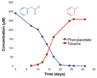
|
|
The structures of the two chemicals are shown at the top. The conversion occurs by loss of the CO2 from the carboxylate ion of the phenylacetate. (An H+ ion from the medium -- or, more likely, from the cell cytoplasm -- is used to complete the reaction.) This is Supplementary Figure 1 from the article. (That is, it is from the Supplementary Information file accompanying the article.) | |
The basic phenomenon had been seen before, but work to understand what is going on was not successful. Now, with new tools, the scientists were able to isolate both the enzyme and its gene, and to characterize the enzymatic reaction. One major tool was metagenomics, the sequencing of bulk DNA in the community. But to sort that out and find the gene of interest, it helped to have a sense of what they were looking for.
Biochemical work using crude extracts of bacteria suggested that the toluene-producing enzyme had properties of a class of enzymes known as glycyl radical enzymes (GRE). Only a few examples of GREs are known, but they provided some clues as to what the gene sequence might look like.
The scientists had two microbial communities that produced toluene. One was from the lake sediment; another was from sewage sludge. DNA sequencing revealed that each contained about 300,000 genes. Restricting the search to genes that plausibly might code for GREs was the key in narrowing the number of targets. Importantly, when they were done, they had an appropriate gene (actually, two genes), and could demonstrate that the resulting enzymes carried out the process.
Is it possible that this work could lead to a process for making toluene biologically, rather than from petroleum? The authors are certainly interested in that possibility. But it is a long way from showing a reaction in the lab to making a process that is practical at a large scale. The current article is interesting biology. Whether it leads to anything useful, short term or long term, is open.
And that lake at the top of the post? The figure legend says it is one source that the scientists used for the bacteria studied here.
Why do bacteria make toluene? At this point, the scientists have no idea. They offer some speculations, including that it might serve as a toxin. The breakthrough in this work is "how". "Why" will have to wait.
Where does the phenylacetate come from? It is a known degradation product of the standard amino acid phenylalanine.
News story: Enzyme discovery enables first-time microbial production of an aromatic biofuel. (Phys.org, March 26, 2018.)
The article: Discovery of enzymes for toluene synthesis from anoxic microbial communities. (H R Beller et al, Nature Chemical Biology 14:451, May 2018.)
More on phenylalanine metabolism: Using bacteria to treat phenylketonuria? (September 16, 2018).
This post is listed on my page Introduction to Organic and Biochemistry -- Internet resources in the section on Aromatic compounds.
May 16, 2018
Some molds, of the group Mucor, can grow straight up. How do they know where "up" is?
The top part of the following figure shows an example of such growth. The bottom part shows their gravity sensor.
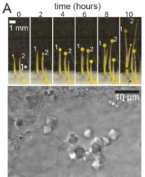
|
The top part shows the fungus (mold), Phycomyces blakesleeanus, during fruiting body formation. Successive images show that the stalk elongates by several millimeters over the hours. That stalk is a single cell, with a packet of spores at the top. Of particular importance, the stalk grows "up".
The lower part shows how the stalk knows where "up" is. You can see crystals -- of a protein that weights the stalk vacuole down. The crystals are about 5 micrometers (µm) across. This is trimmed from Figure 1A of the article. |
A role for those crystals in gravity sensing by the mold has seemed likely for several years. Mutants defective in the gravity response fail to make those crystals.
A new article explores this gravity-sensing protein further.
One part of the work is looking for similar proteins -- and their genes -- in diverse microbes. Analysis of many forms of the protein suggests that the current gene in these fungi came from bacteria by horizontal gene transfer (HGF). That follows because there is no clear pattern for the gene within the fungi; the distribution is best explained by suggesting that it has been transferred multiple times, to various fungi.
What did the original protein do in the bacteria? It is quite unlikely that it was a gravity sensor. The crystals shown above are considerably larger than the bacteria. Further, no gravity response is known in bacteria.
Both the bacterial and fungal forms of the protein aggregate in lab experiments. However, the fungal protein forms larger aggregates. From these results, it seems that the fungi acquired a gene for a protein that had a tendency to aggregate. Then, selection within the fungal context led to more aggregation -- and an effective gravity sensor.
The authors suggest, then, that this is an example of HGT followed by re-purposing the protein for another use. Most HGT uncovered so far has resulted in the direct acquisition of a function from the donor. Transfer of antibiotic resistance by HGT is a commonly discussed example.
It's an interesting story. I would emphasize that parts of it are quite speculative at this point. In particular we really don't know what the original protein did, and perhaps we don't know all of its functions in the fungi. Nevertheless, the story is worth noting; perhaps further evidence will be developed to test the ideas presented here.
News stories:
* Fungus Repurposed a Bacterial Gene to Sense Gravity with Crystals. (V Callier, The Scientist, April 24, 2018.) Now archived.
* This fungus senses gravity using a gene it borrowed from bacteria. (M Andrei, ZME Science, April 24, 2018.)
The article, which is freely available: Evolutionary novelty in gravity sensing through horizontal gene transfer and high-order protein assembly. (T A Nguyen et al, PLoS Biology 16:e2004920, April 24, 2018.)
More about HGT in fungi: Cheese-making and horizontal gene transfer in domesticated fungi (January 19, 2016).
I don't see any previous posts about gravity in a biology context. The closest, perhaps... The potato we call home: a study of the earth's gravity (May 3, 2011). Links to more about gravity.
May 15, 2018
Counting wildlife is an important task in biology. The traditional way is that a person finds a place with a good view, without disturbing the animals, and counts what they see; they may use binoculars or such for magnification.
Modern technology allows us to fly a drone (remotely-piloted airplane) over the field and take a photograph, which can be analyzed later. In fact, people have been doing this, but without much effort at optimizing the procedure.
A new article explores the use of drones to count birds on the ground. Here is the scene...
|
Three views of a field of wildlife.
Frames a and b (main parts) are from a drone, at two different altitudes (30 meters in a; 60 m in b). Frame e (bottom) is what a human observer would see, from a position commonly used to count the animals. The insets for frames a and b show an enlarged view of one animal. You can see that it becomes more blurred but still distinct at the higher altitude. What are these wildlife? Fake birds, in this case. Plastic ducks. This is part of Figure 1 from the article. The full figure also has views for two additional elevations of the drone. (Part e is trimmed here.) |
Here are some results, comparing the counts obtained by observers on the ground and from analysis of photographs from the drone...
|
The figure summarizes the results over ten trials. In each trial, there was an artificial colony of fake birds -- several hundred of them. It was counted by the usual experts on the ground, and also from photographs from the drone at four different altitudes. The graph above is a summary of the results for the ground counts and the lower two elevations (just as in the top figure).
The data are presented here as absolute count errors: how far the count was from the known value. That's the x-axis. The various conditions are plotted in regions above, and labeled along the left side. To start, just consider the graph as having two parts; ground (at the bottom) and drone. The main observation is that the errors from the drone-based measurements are much smaller than from the ground-based measurements. Given the views, as shown in the first figure, that shouldn't be a surprise. This is part of Figure 3a from the article. Again, the full figure also has results for two additional elevations of the drone. |
Further analysis of what the scientists did may be interesting, but does not lead to any clear conclusions.
Some of the drone-based images were very good and some were not. (The reason is not entirely clear. The poorer ones may have been due to wind, but they aren't sure.) To take this into account, the scientists separately analyzed the data for the six trials that gave high quality images. In the figure, the shaded results are for the total set of ten trials; the unshaded results are for the six trials with high quality images. The results are better with high quality images. Not a surprise, perhaps, but it is part a complete report of what happened here. It also makes clear that the problems that led to some imaging being poorer need to be addressed.
Another issue is how to count the animals in the photographs from the drone. One way is to manually count the spots in a photo. Another is to develop image-analysis software to count the spots. Each set of drone data in the figure has two parts, labeled AUTO and MAN. The latter is the manual (human) count of the spots on the photo. The AUTO data was acquired using a semi-automated procedure... Software is trained with human assistance, and then turned loose to do the counts.
There is perhaps no clear picture for how to count the drone-based photos -- except that photo quality matters. Software training is still a work in progress, and will presumably improve. Importantly, automated counting is simpler, and that is particularly important for large data sets.
Overall, the article supports use of aerial drones and trained software for counting wildlife. Getting consistently good image quality is an issue that still needs work. Image analysis software is important. It undoubtedly has to be customized to each job, so learning how to train it will be important.
News stories:
* Duck! It's a drone! (J John, Wildlife Society, February 27, 2018.)
* 'Epic Duck Challenge' shows drones can outdo people at surveying wildlife. (J Hodgson et al, The Conversation, February 14, 2018.) From the authors of the article.
The article, which is freely available: Drones count wildlife more accurately and precisely than humans. (J C Hodgson et al, Methods in Ecology and Evolution 9:1160, May 2018.)
More drones:
* A better way to collect a sample of whale blow (November 28, 2017).
* Crashworthy drones, wasp-inspired (October 16, 2017).
* What if there weren't enough bees to pollinate the crops? (March 27, 2017).More fake wildlife: Studying predation around the world: What can you do with 2,879 fake caterpillars? (July 28, 2017). Links to more.
More about watching the animals:
* Monitoring the wildlife: How do you tell black leopards apart? (August 10, 2015).
* Ants: nurses, foragers, and cleaners (May 24, 2013).
May 13, 2018
The World Health Organization (WHO) has recently released their updated list of major concerns: diseases that should be top priority "for research and development in public health emergency context". These are "diseases that pose a public health risk because of their epidemic potential and for which there are no, or insufficient, countermeasures". (Quotes are from the WHO page noted below.) Eight such diseases -- including such familiar ones as Ebola, MERS and Zika -- are on the list.
On the list this time is Disease X.
The WHO project to define disease priorities began a few years ago in the wake of the West African Ebola outbreak. It's interesting that they now explicitly include Disease X.
An announcement from WHO: List of Blueprint priority diseases. (WHO, March 14, 2018.) This is based on a WHO meeting on February 6-7. This page links to a fuller meeting report.
News stories about the WHO announcement:
* 'Disease X' Added to the R&D Blueprint List -- R & D Blueprint committee reviews viruses, bacteria, and infectious disease to consider potential epidemics and pandemics. (D W Hackett, Precision Vaccinations, March 11, 2018.)
* Mysterious 'Disease X' Could Be The Next Deadly Global Epidemic, WHO Warns. (P Dockrill, Science Alert, March 12, 2018.)
How many diseases are on the list of eight? The WHO announcement includes eight items, some of which combine related diseases. Others present the list differently. You will see various numbers; it's the same basic list.
* * * * *
Also see:
* The role of WHO: the view of its director (December 1, 2015). The person interviewed here is Margaret Chan, who was WHO director-general at that time.
* After Ebola, what next? and how will we react? (September 5, 2015).There is a section on my page Biotechnology in the News (BITN) -- Other topics for Emerging diseases (general). That page also contains sections for some of the specific diseases; see the Table of Contents of the top of that page.
May 11, 2018
The Arctic has been warming. The winters on the east coast of the United States have become more severe. Is this all really true? Is there some connection? Are those in the East going to be buried under more and more snow as Earth warms?
A recent article explores these questions. The findings are rather chilling -- especially for those in the East.
The following graph summarizes the observations for three sites. Caution... the graph is somewhat odd.
|
Quick glance... The green lines tend to be below the blue lines, especially toward the right side.
That shows that bigger snowstorms have become more common. But to see that, we need to make sense of what is plotted. The x-axis scale is the snowstorm size, in inches of snow. The y-axis scale is the time between snowstorms. (Both axes are the same for all frames.) That is, the smaller the number, the more frequent the storms. The two lines are for two time periods, as labeled at the right. The green line is for recent years -- for years since the clear trend of Arctic warming began. The blue line is for the earlier reference period, with a colder Arctic. |
|
As an example... Look at the middle frame, for New York. For 18-inch snowstorms, the interval was about 14 years (blue), but is now about 6 years. That is, such storms are now more frequent. Overall... For recent years, the green line is below the blue line. That is especially true towards the right, which is for larger snowstorms. The lower green line means that the storms are more common in recent years (fewer years between them). What does it mean if a graph line stops before the right side? For example, look again at the New York frame. The blue line stops at 18 inches of snow; the green line continues. This means that in the blue period there were no such storms. The interval between such storms is big. If something were to be shown, it would be off the scale at the top. That is, missing points are high values -- given the nature of this y-axis scale. Where are these three sites? Loosely, the cities of Boston, New York and Washington. All right along the Atlantic coast. The first is at a state park near Boston; the other two are at airports. This is slightly modified from part of Figure 9 from the article. The full figure contains four such columns of graphs, for a total of 12 sites across the country. The figure above shows the right-most column of those graphs, for the sites on the east coast. I have added all the labeling at the right side. | |
The graph, then, shows a correlation: since Arctic warming began, winters along the US east coast have had more severe snowstorms.
Climate change is complex. The overall effect is warming of Earth, but there is local variation. Some of it has been predicted. The current work helps to document an example.
How can something like this happen? Global warming -- the overall effect -- reflects that there is more energy around. But local weather depends on local atmospheric conditions. Circulation patterns couple weather in one place to weather in another. In this case, the coupling is negative, with one region getting warmer and another getting colder. There is nothing wrong with that -- as a possibility. It's getting the evidence that such coupling actually occurs that is the challenge. Weather data is messy, as we all know. The current article makes a claim of finding such a coupling, a negative coupling.
If you compare the results shown for the three cities above, the effect seems smallest for Boston. That is the most northern -- and snowiest -- of those cities, and there is only a small effect, at the highest snowfalls. For the more southerly cities, the weather is less severe, but there seems to be a larger effect. Is this significant? It's hard to say, based on these data. We can only note the observation, and hope that further data, for more sites and longer times, will test the idea.
The authors analyze data for other cities across the US. The general pattern is that the effect becomes less at one moves west; it may even reverse near the west coast. The full Figure 9 of the article shows that full data set.
The negative effect of the Arctic may also occur in Eurasia. That's briefly noted in the current article, but the focus is on the eastern US.
Caution... As with much climate research, there is controversy. The authors here have long promoted the idea of a coupling between Arctic warming and northern-US cooling; this work supports their consistent position. But not everyone agrees. As so often, this is a story still in progress. The work here is an interesting contribution, but it may or may not turn out to be the full story.
News stories:
* Arctic Warm Spells Linked to Nasty Winter Weather on East Coast -- Evidence builds for controversial idea linking Arctic temperature spikes to changing weather patterns. (C Harvey, Scientific American, March 14, 2018.)
* Warm Arctic means colder, snowier winters in northeastern US, study says. (Phys.org, March 13, 2018.) Interesting photo. Read the caption; "first author" there refers to the article itself.
The article, which is freely available: Warm Arctic episodes linked with increased frequency of extreme winter weather in the United States. (J Cohen et al, Nature Communications 9:869, March 13, 2018.)
Among other posts on arctic warming...
* Should we geoengineer glaciers to reduce their melting? (April 4, 2018).
* Methane hydrate: a model for pingo eruption (August 4, 2017).A previous post about Boston: Boston is leaking (February 13, 2015). That leak should be warming the place.
Also see: What happens to a snow-based water supply as the climate warms? (April 2, 2019).
For perspective... Global warming (August 3, 2008).
May 8, 2018
Briefly noted...
Chronic wasting disease (CWD) is a prion disease of deer and related animals. The incidence and range of CWD have expanded rapidly in the last two decades. In captive populations, it is transmitted both by direct contact and indirectly through the environment. Little is known about transmission in the wild.
A new article looks at one possible factor affecting CWD transmission in the wild. Is it transmitted -- via the environment -- in areas where the animals congregate? More specifically, the scientists ask whether mineral licks (sometimes called salt licks) contain prions.
What they did was to look for prions at or near 11 mineral licks in areas where there is a high incidence of CWD in the deer. It seems simple enough, but making any measurements of prions in the environment is technically demanding.
The results? Nine of the 11 mineral lick sites had detectable CWD prions.
The significance of the results is not clear, as the authors go to great length to make clear. Given the difficulty of making these measurements at all, much remains open.
Taken at face value, the results suggest that prions are present in the environment where animals congregate. Further, providing places for them to congregate, such as mineral licks, may promote direct transmission (e.g., by saliva).
If prions accumulate at sites where animals congregate, there is also the potential for transmission to other species, including local livestock. So far, there is no evidence for transmission of CWD beyond the deer and related animals (cervids). but it remains a concern.
There is no evidence that CWD is transmitted to humans, by any route, including eating infected meat. However, it is impossible to exclude the possibility of such transmission, and people are discouraged from eating meat from infected animals. (You may recall... variant Creutzfeldt-Jakob disease (vCJD) is the human form of bovine spongiform encephalopathy (BSE), resulting from eating prion-infected beef.)
News story: CWD prions discovered in soil near Wisconsin mineral licks for the first time. (E Hamilton, University of Wisconsin, May 3, 2018.) From the university where the work was done. Good overview, including the uncertainties.
The article, which is freely available: Mineral licks as environmental reservoirs of chronic wasting disease prions. (I H Plummer et al, PLoS ONE 13:e0196745, May 2, 2018.)
More about CWD: Unusual nature of CWD; implications for transmission to humans (September 24, 2022).
A previous post that included CWD: Prion diseases -- a new concern? (March 19, 2012).
Previous prion post: Can prions, which cause brain disease, be transmitted by skin? (January 26, 2018).
For more about prions, see my page Biotechnology in the News (BITN) - Prions (BSE, CJD, etc). It includes a list of related Musings posts.
May 6, 2018
This post is related to the preceding one, immediately below. Both involve effects of antibiotics on virus infections.
Some data from the current article...
|
This is about a model lab infection, with West Nile Virus (WNV). The experimental animal is shown at the upper right. (There are 23 of those things in the graphical abstract, alone.)
The graph shows survival curves for two conditions. In one case, the animals were treated with a mixture of antibiotics -- labeled as VNAM, for the four antibiotics (vancomycin, neomycin, ampicillin, metronidizole). The other was a control, with only the "vehicle", the buffer. The results are clear: survival was much worse with the antibiotic treatment. In this experiment, antibiotic treatment started 14 days before virus infection, and continued throughout. This is Figure 1B from the article. |
Further work showed that the effect is general for flaviviruses: not only WNV as shown above, but also dengue and Zika. The effect appears to be mediated via the host microbiome. That is, the antibiotics are acting directly on bacteria, and leading to secondary effects -- in this case, an enhancement of the virus. (How does changing the microbiome affect the virus? Probably via the immune system.)
The result here is the opposite of that from the previous post. In that case, the antibiotics were effective against the viruses, thus reducing disease. In this case, the antibiotics promoted the viral infection, thus harming the animals. Of course, the big point for the pair of posts is that neither result agrees with the simple prediction that antibiotics should be irrelevant for viral infections.
Overall, the two posts show that antibiotics may have various effects on viruses, using various mechanisms. That's not to overthrow the conventional wisdom. There is a reason for it: antibacterial agents typically act with some specificity on bacteria. However, as so often, biology is more complicated than we thought. Antibiotics act against bacteria, but that action may itself have secondary effects, and the antibiotics may in some cases do other things in addition to their simple role against bacteria.
In particular, it should be clear that nothing here is intended to promote use of antibiotics if you think you have "a virus". The other post showed a benefit, but the scope is not yet clear; this post showed harm.
If you are a little confused, that may mean you got the point. The big lesson from the pair of posts is that the relationship between antibiotics (anti-bacterials) and viruses is more complicated than we usually say. For now, it is unclear what the general messages may be.
Of particular interest to the authors was the possibility that one reason people respond differently to a viral infection is their microbiome status, which can be influenced by antibiotic usage. The work supports that connection. How big a factor it is in the real world remains open.
News stories:
* Antibiotics Increase Mouse Susceptibility to Dengue, West Nile, and Zika -- The drugs' disruption of the microbiome makes a subsequent flavivirus infection more severe. (S Williams, The Scientist, March 27, 2018.) Now archived.
* Antibiotic use increases risk of severe viral disease in mice. (T Bhandari, Washington University School of Medicine, March 28, 2018.)
The article, which is freely available: Oral Antibiotic Treatment of Mice Exacerbates the Disease Severity of Multiple Flavivirus Infections. (L B Thackray et al, Cell Reports 22:3440, March 27, 2018.)
Accompanying post: Antibiotics and viruses: An example of effectiveness (May 5, 2018). Immediately below; includes more links to other posts.
More on antibiotics is on my page Biotechnology in the News (BITN) -- Other topics under Antibiotics. It includes an extensive list of related Musings posts.
Next post on dengue: Can Wolbachia reduce transmission of mosquito-borne diseases? 3. A field trial, vs dengue (August 10, 2018).
That page also has a section on West Nile virus. There is also a new section on Dengue virus (and miscellaneous flaviviruses). It's incomplete, but will be a good place for posts such as this one that include multiple flaviviruses.
May 5, 2018
You probably know the basic story... Antibiotics act against bacteria. If you have a virus infection, don't take antibiotics. They are not relevant -- and their overuse can lead to the development of antibiotic resistance, which makes things worse for those with real bacterial infections.
Terminology confusion... The word antibiotic can be confusing. We use terms such as anti-virals or anti-fungals for agents against viruses or fungi, respectively. But the seemingly broad term antibiotic refers to agents against bacteria. There is no logic to that; it's a historical accident. (The term anti-bacterial is also used.)
Of course, in biology, things are not always as simple as we might think. We now have two recent articles that illustrate the complexity of the antibiotic-virus connection. The effects are very different, and the mechanisms are very different. We'll present one here, and the other in the next post.
Some data...
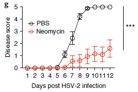
|
The graph shows results from a lab model system. It uses a herpes virus, HSV-2, infecting mice.
The y-axis shows a measure of the disease, called disease score. Results are shown for two conditions. In one, the antibiotic neomycin was applied (red symbols; lower curve). The other condition is a control, called PBS (for the buffer used). |
|
You can see that the neomycin reduced the disease score. It's a clear result. This is Figure 1g from the article. | |
Let's repeat that... the antibiotic (anti-bacterial agent) neomycin substantially reduced the severity of an infection with a herpes virus in mice. That's contrary to the common wisdom.
There is considerable work in the article characterizing the scope and mechanism of how this works. Among the findings...
- The effect occurs for some other antibiotics of the same family as neomycin (aminoglycosides).
- The effect occurs for Zika and flu infections. That is, it occurs for a range of viruses.
How does it work? The gut microbiome is not relevant; the effect is similar with germ-free mice. However, the host's own anti-viral agent interferon is relevant. For some reason, neomycin, best known as an antibiotic, has a second effect: inducing the anti-viral agent interferon. The effects of neomycin as an anti-bacterial agent and as an anti-viral agent, acting via interferon, appear to be independent.
Preliminary experiments showed that neomycin also reduces viral replication in lab culture of human cells. That effect, too, seems to be mediated by interferon.
News stories:
* Topical antibiotic triggers unexpected antiviral response. (Phys.org, April 9, 2018.) (Don't worry about the initial figure.)
* Some Antibiotics Rev Up Host Immune Response to Viruses. (S Williams, The Scientist, April 9, 2018.) Now archived.
* News story accompanying the article: Antivirals: New activities for old antibiotics. (J I Cohen, Nature Microbiology 3:531, May 2018.)
* The article: Topical application of aminoglycoside antibiotics enhances host resistance to viral infections in a microbiota-independent manner. (S Gopinath et al, Nature Microbiology 3:611, May 2018.)
Antibiotics and viruses: An example of harm (May 6, 2018). This accompanying post, immediately above, shows a different effect of antibiotics on virus infections.
Posts that might hint at some of the complexity shown in this and the accompanying post...
* How our immune system may enhance bacterial infection (September 19, 2014).
* Antibiotics and obesity: Is there a causal connection? (October 15, 2012).More about aminoglycoside antibiotics: Designing a less toxic form of an antibiotic (April 19, 2015).
More on antibiotics is on my page Biotechnology in the News (BITN) -- Other topics under Antibiotics. It includes an extensive list of related Musings posts.
May 3, 2018
The following figure gives an overview of the P world...
|
The major source of phosphorus (P) is rocks. Rocks containing insoluble phosphates.
P is used in two general ways. Most of it is used as fertilizer. For that purpose, the phosphate form is fine; most of the P in biology is phosphate-P. It's just a matter of dissolving the insoluble phosphate; some acid does the trick, making phosphoric acid. Some P is used to make specialty chemicals, such as drugs. It's about 1% of the total. In phosphate, P is bonded only to oxygen. In these other chemicals, the P is bonded to other atoms, such as C or F. It's not easy to get those bonds. The right side of the figure shows that it is normally done by first making white phosphorus, a form of the pure element. That works, but white phosphorus is nasty stuff. Further, the whole process in environmentally unfriendly. Is there a better way? A recent article reports a way to get to the specialty chemicals from phosphoric acid, avoiding the need to go through elemental P. That's what the box in the middle is about, a better way of getting from phosphoric acid to "phosphorus chemicals". This is Figure 1 from the article. |
What's the secret? It's that bis(trichlorosilyl)phosphide anion.
The following figure summarizes the chemistry...
|
Start with the box in the middle. That's the guest of honor, also noted there as compound 1.
Look to the left, and you will see how it is made. Trimetaphosphate is a readily available form of phosphoric acid (or phosphate), It's reacted with trichlorosilane, HSiCl3 -- a chemical well known to those who work with silicon. That gives the anion that is shown; it can be thought of as a derivative of the simple phosphide ion, P3-, but this one is nice and stable -- and useful. The rest of the figure shows some things they made from the bis(trichlorosilyl)phosphide anion. All are of interest, and they are diverse. And the reaction conditions are relatively mild. (The "thermal process" referred to in the top figure for making elemental P is done at temperatures above 1400 °C.) This is Figure 2 from the article. |
A novel reaction. The authors suggest they have a general approach to making P chemicals, an approach that is safer and simpler than what is done now. As so often, this is step 1; time will tell how it works in practice.
Some chemistry notes...You may recognize the reducing agent here, HSCl3, as the silicon analog of chloroform. It is sometimes called silicochloroform.
The anion I was isolated as a salt. The cation was tetrabutylammonium, chosen for other reasons. Interestingly, for some work, it was not necessary to purify the anion -- further simplifying the process of making P-chemicals.
The anion is stabilized by the six Cl carrying some of the charge. Nevertheless, the P is negative, and an effective nucleophile. That property is important for the further work.
News stories:
* A less hazardous means to create phosphorus compounds -- Phosphoric acid as a precursor to chemicals traditionally synthesized from white phosphorus. (EurekAlert!, February 8, 2018.)
* Perfecting the phosphorous process -- The Cummins Group investigates the efficiency and environmental impact of industrial phosphorus processing. (T-L Vu-Han, Lab of the Week, The Tech (MIT), March 8, 2018.)
* News story accompanying the article: Inorganic chemistry: From rock-stable to reactive phosphorus -- A low-temperature route converts phosphate into an anion useful in chemical synthesis. (J D Protasiewicz, Science 359:1333, March 23, 2018.)
* The article: Phosphoric acid as a precursor to chemicals traditionally synthesized from white phosphorus. (M B Geeson & C C Cummins, Science 359:1383, March 23, 2018.)
Other posts on phosphorus include...
* A sponge that will soak up phosphate pollution from water (August 14, 2021).
* The origin of reactive phosphorus on Earth? (July 5, 2013).
* A phosphorus shortage? (September 29, 2010).
* How do you make phospholipid membranes if you are short of phosphorus? (November 1, 2009).Among posts about silicon... Carbon-silicon bonds: the first from biology (January 27, 2017).
Older items are on the page Musings: January-April 2018 (archive).
The main page for current items is Musings.
The first archive page is Musings Archive.
E-mail announcements -- information and sign-up: e-mail announcements. The list is being used only occasionally.
Contact information Site home page
Last update: March 4, 2026