Home
> Musings: Main
> Archive
> Archive for May - August 2021 (this page)
| Introduction
| e-mail announcements
| Contact
Musings: May - August 2021 (archive)
Musings is an informal newsletter mainly highlighting recent science. It is intended as both fun and instructive. Items are posted a few times each week. See the Introduction, listed below, for more information.
If you got here from a search engine... Do a simple text search of this page to find your topic. Searches for a single word (or root) are most likely to work.
Introduction (separate page).
This page:
2021 (May-August)
August 31
August 25
August 18
August 11
August 4
July 28
July 21
July 14
July 7
June 30
June 23
June 16
June 9
June 2
May 26
May 19
May 12
May 5
Also see the complete listing of Musings pages, immediately below.
All pages:
Most recent posts
2026
2025
2024
2023:
January-April
May-December
2022:
January-April
May-August
September-December
2021:
January-April
May-August: this page, see detail above
September-December
2020:
January-April
May-August
September-December
2019:
January-April
May-August
September-December
2018:
January-April
May-August
September-December
2017:
January-April
May-August
September-December
2016:
January-April
May-August
September-December
2015:
January-April
May-August
September-December
2014:
January-April
May-August
September-December
2013:
January-April
May-August
September-December
2012:
January-April
May-August
September-December
2011:
January-April
May-August
September-December
2010:
January-June
July-December
2009
2008
Links to external sites will open in a new window.
Archive items may be edited, to condense them a bit or to update links. Some links may require a subscription for full access, but I try to provide at least one useful open source for most items.
Please let me know of any broken links you find -- on my Musings pages or any of my web pages. Personal reports are often the first way I find out about such a problem.
August 31, 2021
Briefly noted... The oldest known genome: a new record
August 31, 2021
An article earlier this year reported extensive (but not complete) genome sequencing from a mammoth that is over a million years old. It is a technical milestone, made possible in part by excellent preservation in the Siberian permafrost. Further, the mammoth is a previously unknown species, and provides insight into mammoth history.
* News story: Million-year-old mammoth genomes shatter record for oldest ancient DNA -- Permafrost-preserved teeth, up to 1.6 million years old, identify a new kind of mammoth in Siberia. (Ewen Callaway, Nature, February 17, 2021. In print: Nature 590:537, February 25, 2021.) Links to the article, and also to the accompanying "news and views" item in the journal.
* A post about the previous record holder: The oldest DNA: the genome sequence from a 700,000-year-old horse (August 4, 2013).
- ... and the next ... Briefly noted... The oldest known sequenced DNA: another new record (December 13, 2022).
* Previous post about mammoths: Accumulation of deleterious mutations in the last mammoths (May 6, 2017).
- Next: What caused the extinction of the mammoths -- I (January 16, 2022).
* There is more about genomes and sequencing on my page Biotechnology in the News (BITN) - DNA and the genome. The page includes a list of some related Musings posts.
How to light a cave
August 30, 2021
A recent article is about ancient lighting -- how people found their way in caves thousands of years ago.
A couple of pictures will give the idea.
|
A torch found in a Bronze Age mine at Hallstatt (Austria).
It is probably about 3,000 years old. (I don't see specific date information in the article.)
It is partially burnt at the top. This is taken as evidence that the object had been used as a torch.
This is Figure 1C from the article.
|
The full figure shows several ancient lighting devices, or their remains. The devices are broadly classified as torches, grease lamps (similar to candles), or fireplaces. The article discusses the criteria used to decide that an artifact is indeed a lighting device.
Now, something more modern...
Part A (left) shows the torch made by the scientists here, as a test.
The rest of the figure shows it lit, shows embers falling from it where they create torch debris on the floor, and shows charred regions on the wall. Wall? The test was done in a cave.
This is part of Figure 6 from the article.
|
The scientists collected data on the illumination properties of the various kinds of lights. There is a lot of data in the article, much of it in the Appendices.
And they make observations, such as... "The torches produced variable light intensity and functioned irregularly. This meant that the holder of the torch had to oxygenate it periodically and supervise it continuously. Fast transit favored combustion and oxygenated the torch. Oxygenation was also easily carried out by repeated semicircular movements with a certain intensity from left to right. After this action, the illuminance increased from 5 to 28 lux (measured at 20 cm) and 1.5 to 4.3 lux (measured at 40 cm)..." (From page 15 of the pdf file, second paragraph.)
An interesting article, about human cultural history. It combines traditional archaeology with experimental work. Fun to browse. The 9-page Introduction is a fascinating overview of the field.
News stories:
* Light in Darkness: Experiment Recreates Paleolithic Cave Lighting. (SciTechDaily (PLOS), June 21, 2021.)
* Conquering the Dark: Finding the Light Behind Paleolithic Cave Art. (Rudra Bhushan, Ancient Origins, June 19, 2021.)
The article, which is open access: The conquest of the dark spaces: An experimental approach to lighting systems in Paleolithic caves. (M Ángeles Medina-Alcaide et al, PLoS ONE 16:e0250497, June 16, 2021.)
Among many posts about lighting...
* Effect of LED street lights on insects (September 4, 2021).
* Effect of artificial lighting on the environment (September 3, 2015).
Among posts on cave art... Images from 30,000-year-old motion pictures (July 22, 2012). The connection to lighting? The existence of art deep within caves implies that the caves were lit. In fact, cave art was a major driving force behind the current work. This earlier post also makes the connection.
Also see: Using abandoned mines to store energy (January 30, 2023).
My page of Introductory Chemistry Internet resources has a section on Lighting: halogen lamps, etc. It includes a list of related Musings posts.
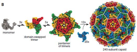
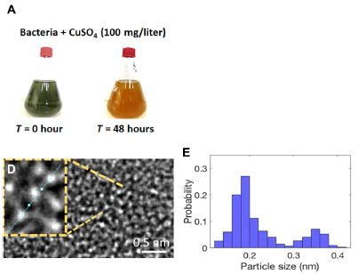
Making a virus "from scratch"?
August 28, 2021
Where do viruses come from? For our purposes here, a virus, at its simplest, is a piece of nucleic acid wrapped in a protein coat; the nucleic acid codes for the coat protein. It is thought that viruses arise from cells, with a gene somehow escaping and forming a virus. But there is little evidence on the matter.
A recent article explores part of the process of how a virus might arise.
Here is the result. Specifically, look at the right hand part of the following figure...
The object at the right is a "virus". It consists of a protein coat, containing 240 copies of a protein, which self-assembles into the "virus". It also contains an RNA molecule (not visible here), which codes for the coat protein.
The first parts of the figure show a reasonable pathway for the virus particle assembling. The last step involves 12 15-mers and 20 3-mers, for a total of 240 copies of the monomeric coat protein.
The "virus" is about 30 nanometers across.
The "virus" is not infectious (so far as we know).
What is shown here is a computer model.
This is Figure 3B from the article.
|
Scientists made this "virus" in the lab.
The story starts with a bacterial protein that naturally aggregates into a rather large cage-like structure. The question is, can this be developed further so that it is a "virus"?
For simplicity, we'll drop the quotation marks, and just call this thing a virus.
A key step is that the virus needs to package some RNA. More specifically, it needs to package the RNA that codes for its coat protein. To this end, the scientists designed recognition features into the RNA and the protein.
The following figure provides information about the viral RNA. It also describes how they developed the virus.
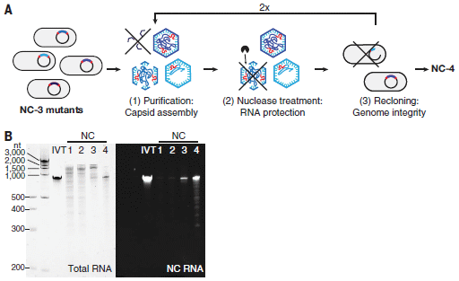
Let's start with part B (bottom). For this part, the RNA from the virus was isolated, run on a gel, and tested.
The left-hand set of results (light background) shows the size of the RNA. There are six lanes. The left lane is size markers. There are four lanes under the NC heading, for NC1 through NC4. NC4 is the final virus; the others are earlier versions during the work. IVT (in vitro transcript) is the authentic RNA, made in the lab.
Key observations:
- The RNA in NC4 looks like the authentic IVT RNA.
- The RNA in earlier versions of the virus is not so good. That is, the nature of the RNA got better as development proceeded.
The set of results to the right (dark background) shows the same lanes, now tested for a specific feature of the intended RNA: the recognition site. It is present in the authentic IVT and in NC4.
Part A (top) is a cartoon showing part of the process for making the virus, specifically for getting NC4 from NC3.
The process starts with the gene of interest on a plasmid in bacteria. The plasmid is heavily mutated.
Some of the resulting versions make capsids (virus particles). Those that do not are discarded.
Some of the capsids lose their RNA if treated with a nuclease. Not good if the goal is to make a virus. These are discarded.
The RNAs are checked to see that they are intact and correct.
The process is repeated. The general plan here is fairly typical lab evolution, with the details adjusted for the current situation.
This is part of Figure 1 from the article.
|
So, what have they accomplished?
First, they succeeded in making a container that codes for itself. That in itself is a significant technical achievement. A key step in this was building recognition sites into the RNA and the protein it codes for.
Is this a virus? Not exactly. For example, it is not infectious. The scientists can get the RNA to make coat protein, but the thing itself has no mechanism for infecting cells so it can do that on its own.
Does the process here reflect how viruses arise? Of course, we don't actually know how viruses arise. But what they did here may mimic some steps of the process as we suspect it.
News stories:
* Team Explores How Viruses Evolve. (Technology Networks (University of York), June 11 2021.)
* Understanding the evolution of viruses. (Fabio Bergamin, ETH Zurich, June 11, 2021.)
The article: Evolution of a virus-like architecture and packaging mechanism in a repurposed bacterial protein. (Stephan Tetter et al, Science 372:1220, June 11, 2021.)
The question addressed here is very different from, say, how did the virus for COVID-19 arise? That virus arose from another virus. The current question is about "the first virus", when a virus arose from a non-virus.
A post with some discussion of the nature of viruses: More giant viruses, and some evidence about their origin (June 13, 2017).
Other posts dealing with making small containers include... Making a small container that has an opening in it (September 10, 2019).
August 25, 2021
Briefly noted... Using CRISPR to make better bananas
August 25, 2021
Bananas are vulnerable. They are propagated by cuttings, and have very little genetic diversity -- over the entire world. Infectious diseases seem poised to devastate the world's banana crop. Now, a team at the International Institute of Tropical Agriculture (Nairobi, Kenya) has used CRISPR to introduce mutations into a gene known to promote resistance to pathogens. The best isolates show considerable resistance to Banana Xanthomonas wilt, but otherwise seem normal in lab tests. Field tests should follow.
* News story: African scientists used CRISPR to edit bananas and make them more resilient to disease. (Mihai Andrei, ZME Science, August 10, 2021.)
Links to the article, which is freely available.
* A complete list of Musings posts on various gene-editing tools, including CRISPR... CRISPR: an overview (February 15, 2015).
* More bananas (?): Food security: the potential of enhanced cultivation of enset (February 22, 2022).
A new type of carnivorous plant
August 24, 2021
Some pictures, to get us started...
Part A shows our plant of interest, Triantha occidentalis, in its natural environment (Cypress Provincial Park, British Columbia).
Parts B and C show stems, at different magnifications. The white arrows point to insects.
Part D shows a preserved specimen. There are insects on it.
Part E shows an electron micrograph of a stem. Tiny hairs are clearly visible.
The scale bar for part A (showing the whole plant) is 1 cm. (The plant can reach 80 cm in height.)
All the other scale bars are 1.5 mm.
This is Figure 1 from the article.
|
So, there are bugs on it. And hairs -- sticky hairs -- on the stem. The insects get trapped on the sticky hairs.
Trapping insects on sticky hairs is unusual. Does it suggest that the plant is eating the insects it traps? In general, carnivorous plants catch their prey in a container of some kind, where they can be digested.
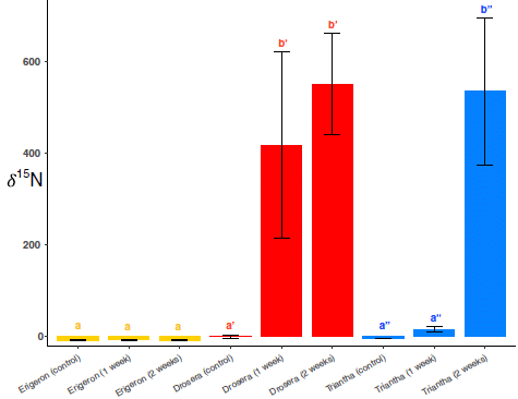
To see whether the plant eats the insects, the scientists did a test, which is the heart of the current article. They exposed the plant to some fruit flies. The fruit flies had been labeled, with the heavy nitrogen isotope N-15. If N-15 showed up in plant tissue, it would be a sign the plants ate the flies.
Here are some results...
Let's start with the controls -- tests with other plants.
The middle set of three bars, in red, is for a known carnivorous plant, Drosera rotundifolia. The two big bars are for N-15 in the plant after being exposed to N-15-labeled flies for 1 or 2 weeks, respectively. The first bar, just to the left of those two bars, is a control using unlabeled flies; there is no N-15 in the plant, even after 2 weeks.
The set of three bars to the left (yellow) is for a plant that is not carnivorous, Erigeron peregrinus. There is essentially no incorporation of N-15 into the plant, exposed to N-15 labeled flies (or to unlabelled flies).
The right hand set of bars (blue) is for our current plant. You can see it incorporates N-15 when exposed to labeled flies. By the 2-week time point, it has eaten as much N-15 as the known carnivore (middle; red)
This is Figure 2 from the article.
|
The results provide good evidence that the plant not only traps insects, but digests them. Further, they found some digestive enzymes at the sites where insects were stuck.
Prior to this discovery, only 11 lines of carnivorous plants were known. This one makes #12. The plant's way of capturing insects is unusual, as noted above.
The scientists note a couple other things about this plant...
- The plant captures insects very close to its flowers, which are pollinated by insects. Does it eat its pollinators? That would not be good; the pollinators are supposed to pick up pollen and take it to another plant. It seems likely that the pollinators here are large insects, and the prey are small insects (able to stick to small hairs). Evolutionary trial and error presumably worked this out.
- The plant itself is in plain sight; it is a well-known plant, but no one had looked to see if it ate the insects it trapped. This point makes them wonder what else is out there in the open that we haven't noticed.
News story: New Carnivorous Plant Discovered in North America - Balances Trapping Prey and Being Pollinated. (SciTechDaily (University of Wisconsin-Madison), August 9, 2021.)
The article: A new carnivorous plant lineage (Triantha) with a unique sticky-inflorescence trap. (Qianshi Lin et al, PNAS 118:e2022724118, August 17, 2021.)
A recent post about a carnivorous plant... Look who's dining on baby salamander (November 3, 2019).
Did changes in Earth's rotation promote the rise of oxygen-evolving photosynthesis?
August 23, 2021
Earth's early atmosphere had very little oxygen, O2. It is generally accepted that the subsequent rise in O2 level was due to oxygen-evolving photosynthesis, by cyanobacteria.
Recent years have seen an increase in information about that rise in O2. It appears to have taken a complex time course, which is poorly understood.
A recent article offers a new argument: that changes in the rate of Earth's rotation played a significant role in the increase in O2 level in the atmosphere. It is an interesting argument, but should be taken as speculation at this point.
That Earth's rotation slowed is well recognized, though, again, the details are not well understood. It is possible that the early Earth had days as short as 6 hours. (Why does the rotation of the Earth change? Interaction with the Moon.)
The immediate question is, what is the connection between Earth's rotation rate and the accumulation of atmospheric oxygen?
Here is the idea... For simplicity, we'll assume that days are half daylight. Let's compare day lengths of 12 hours and 24 hours. With 12-hour days, there would be two daylight periods of 6 hours each over 24 hours. With a 24-hour day, there would be one 12-hour daylight period every 24 hours. It would seem that there are 12 hours of daylight per 24 hours either way, hence 12 hours for photosynthesis. However, the real world may be more complex, the authors suggest. What if it takes an hour to get photosynthesis started during each period? That would give two hours of unproductive daylight per 24 hours for short days, but only one hour of unproductive daylight per 24 hours for long days. That is, long days would be more productive.
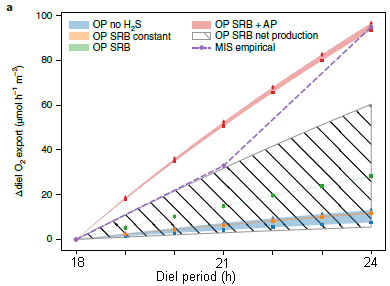
The following figure illustrates this...
The figure shows oxygen productivity (y-axis) vs the day length (called the diel period). The various curves are for various detailed scenarios. Most of the curves are for computer models.
It is sufficient to compare two curves -- the top two. The top curve is for a particular mixture of microbes, thought to be a simple but reasonable candidate for what might have actually been present.
The second curve, the dashed line, shows some experimental results. The results are from lab tests using a sample from a lake bottom; the sample is thought to be similar to what might have been present in the early days of oxygen production.
What's important is that both curves show an increase in O2 production with longer days.
The other curves are for computer models for a wide range of conditions. All show the same general trend.
This is Figure 2a from the article. I have added labeling for the x-axis.
|
That a real sample and various computer models show that we can have increased productivity with longer days leads the scientists to put the model on the table for further consideration. That it might happen does not mean it did happen. The point is that it is a possibility to consider.
Their observations of the modern sample offer an explanation for why the effect occurs. In nature, we don't have a simple pure culture of the cyanobacteria, but a complex ecosystem, probably a mat of cyanobacteria along with other microbes. The scientists can see changes in the structure of the microbial mat over the course of a light-dark cycle. Such changes could easily cause the kind of delay we hypothesized earlier.
There is another tidbit in the article. We noted that both the rise in O2 and the increase in day length were complex. In particular, both went through a phase of about a billion years of being about constant. Those billion-year constant periods were at about the same time for both O2 and day length. Is that a clue that they might be related?
News stories:
* Earth's rotational slowdown may have led to life as we know it -- The transition towards longer days may have allowed cyanobacteria enough breathing room to produce enough oxygen to dramatically and forever alter Earth's atmosphere. (Tibi Puiu, ZME Science, August 2, 2021.)
* A Slowdown in Earth's Rotation Could Have Affected the Oxygen Content of the Atmosphere. (SciTechDaily (Max Planck Institute for Marine Microbiology), August 2, 2021.)
* Lake Huron sinkhole surprise: The rise of oxygen on early Earth linked to changing planetary rotation rate. (Science Daily (University of Michigan), August 2, 2021.)
The article, which is freely available: Possible link between Earth's rotation rate and oxygenation. (J M Klatt et al, Nature Geoscience 14:564, August 2021.)
Posts about the oxygenation of the atmosphere, and related matters...
* A primitive cyanobacterium (October 25, 2021).
* Briefly noted... The early development of oxygen-evolving photosynthesis? (June 9, 2021).
* A whiff of oxygen three billion years ago? (April 6, 2015). Links to more.
More about Earth's rotation:
* Briefly noted... A record short day (August 23, 2022).
* Chile earthquake caused the day to become shorter (March 8, 2010).
A senolytic treatment for severe COVID
August 21, 2021
COVID-19 can be more serious in older people, where a severe inflammatory response may occur.
Older people have "senescent cells", a recently recognized fairly distinct class of cells. Among their features is that they tend to be inflammatory.
Is it possible that the more severe form of COVID in older people involves those senescent cells, already prone to inflammation?
A new article tests this hypothesis, in a mouse model. The results support the hypothesis, and open up a new approach for treating severe COVID.
Let's start with something of a bottom line test...
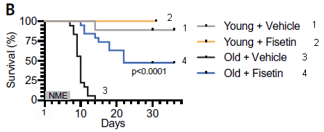
In this test, mice were exposed to a coronavirus of the same general type as the current SARS-2 virus, which causes COVID-19. Their survival (y-axis) was measured over time (x-axis).
Separate tests were done with young and old mice. In each case, the effect of a drug, called fisetin, was tested.
The key observation... Look at curves 3 and 4, for the old mice. For the controls (treated only with "vehicle", the solvent for the drug; curve 3), all the mice died between (about) days 7 and 14. For the mice treated with the drug (curve 4), survival was much better, with half the mice surviving over the time period shown.
Curves 1 and 2 are for young mice. Survival was good, and the drug had little effect.
The virus used here is mouse hepatitis virus (MHV), a β-coronavirus that is similar to the SARS viruses.
Mice were exposed to virus by including it in their bedding.
Drug treatment started three days after initial exposure to the virus.
This is Figure 4B from the article. I have added numbers for the curves, for ease of referring to them.
|
Overall... the model system, involving a coronavirus, leads to a serious problem for old mice; a drug reduces the problem.
The drug is known to be senolytic; it kills senescent cells.
There is a lot of supporting data in the article. For example, they showed that exposure of human senescent cells in the lab to some viral materials promoted increased production of inflammatory factors.
Here is a bit more about what happened when mice were treated with the drug...
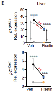
|
The figure shows the levels of two different proteins (top and bottom graphs), in the liver, under the same four conditions as the first figure. Both proteins are markers of senescent cells.
Key observation... The top two points are for old mice, without (left) and with (right) the drug treatment. You can see that the drug treatment reduced the level of both proteins.
The lower two points are for young mice. There were low levels of the senescence proteins, and the drug had little effect.
This is part of Figure 4E from the article. The full Figure 4E shows similar results for these proteins in kidney, lung and spleen.
|
This is interesting and encouraging. The work offers a type of drug that could reduce the effect of "severe COVID" in older people. It also is a step toward understanding "severe COVID".
More generally, it improves our understanding of senescent cells. The idea is that they are a step towards inflammation -- and then some agent, such as a virus, stimulates them to become more inflammatory.
In other words... severe COVID is a disease of hyper-inflammation. Old people (or mice) are more susceptible to hyper-inflammation. It may be that a special class of cells known as senescent cells, already inflammatory, are key in developing the hyper-inflammatory response.
A caution... This is in a model system. Mice, treated with a virus of the same general type as the virus for COVID-19. Work such as this offers clues, which can be followed up in the more difficult but more relevant system. Both the general ideas and the COVID specifics need to be tested and developed further.
The scientists plan to try their drugs, which seem to have a good safety profile, in humans.
News stories:
* COVID-19's Toll on the Elderly May Be Halted by Targeting Cell Senescence. (GEN, June 9, 2021.)
* Preclinical study suggests new approach to reduce COVID-19 death among the elderly. (Science Daily (University of Minnesota Medical School), June 8, 2021.)
* News story accompanying the article: Coronavirus: Targeting aging cells improves survival -- Drugs that remove senescent cells cut coronavirus deaths in old mice. (Lynne S Cox & Janet M Lord, Science 373:281, July 16, 2021.)
* The article: Senolytics reduce coronavirus-related mortality in old mice. (Christina D Camell et al, Science 373:eabe4832, July 16, 2021.)
A recent post about senescent cells: How about having your immune system remove senescent cells? (September 27, 2020). Note the "caution" statement at the top. It applies to the current post, too. Links to more.
Posts about severe COVID include:
* Susceptibility to severe COVID: role of a genetic region from Neandertals (February 20, 2021).
* Briefly noted... 1. Why is COVID-19 severe in some people? (April 29, 2020).
There are BITN sections for SARS, MERS (coronaviruses) and Aging. Each includes a list of Musings posts in the field.
August 18, 2021
Briefly noted... Concussions in women athletes
August 18, 2021
Work on head injuries in athletes is dominated by studies of men. A recent news feature raises the issue for women athletes. There are more questions than answers at this point; that in itself is part of the problem. One study showed that head injuries are twice as common for female athletes. Reasons may include anatomy, physiology, or even the way games are played.
* News feature, which is freely available: Why sports concussions are worse for women -- As women's soccer, rugby and other sports gain popularity, scientists are racing to understand how the female brain responds to head injury. (Katharine Sanderson, Nature, August 3, 2021. In print: Nature 596:26, August 5, 2021.)
* Among posts about concussion or the broader topic of traumatic brain injury...
- Studying concussions in egg yolks (February 28, 2021).
- Traumatic brain injury: long term effects? (October 8, 2019).
* and next ... Briefly noted... A non-invasive test for concussion (November 9, 2021).
* More about women's sports: Briefly noted... Is professional soccer (football) designed for men? (November 30, 2022).
* My page for Biotechnology in the News (BITN) -- Other topics includes a section on Brain. It includes a list of brain-related posts.
There is now an extensive list of sports-related Musings posts on my page Internet resources: Miscellaneous under Sports.
Metallic water
August 17, 2021
This is really about a picture, with a story behind it. Here is the picture...
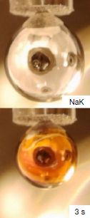
|
Top: A small metal ball. It is hanging at the end of a tube. (Ignore the tube.)
Bottom: The same metal ball, now covered with a thin film of gold-colored water.
The metal ball is about 5 millimeters diameter.
This is part of Figure 1 from the article. The full figure shows images at one second intervals for ten seconds. This is the image at 3 seconds (3 s).
|
Why is the water gold-colored? Because it is metallic water. It contains a high concentration of electrons dissolved in it. (None of the other chemicals are colored.)
How'd they do that? That is the perhaps the most interesting part of the story.
The metal ball is labeled above as being made of sodium and potassium (NaK). Both metals react with water, giving off hydrogen gas -- and a fair amount of heat, which often causes the H2 to ignite. Hydroxides (NaOH and KOH) are left, in solution. (The particular NaK alloy used here was chosen so they could have a drop of liquid metal.)
The reaction involves multiple steps. The first step, which is very fast, is release of electrons from the metal into the water. If we could just stop the reaction at that step, we would have a solution of electrons in water -- metallic water. Of course, under ordinary conditions the other steps follow so fast that we don't see that first step.
If only we could slow things down... And that is what they did. How? Instead of adding the metal to some water, they hung the ball inside a chamber, and allowed a very tiny amount of water vapor to enter. The water slowly condensed on the surface of the metal ball, and immediately took an electron. Other steps occurred more slowly, and new water molecules condensed on the surface over time. Thus the water-with-electrons is apparent on the surface for a few seconds.
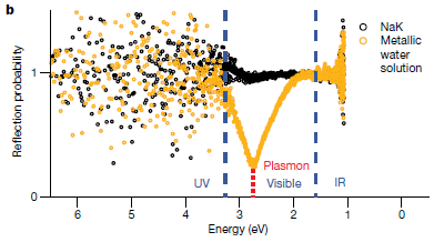
The gold color stayed around long enough that the scientists could not only see it by eye, but also could actually measure it -- as shown in the following figure...
The graph shows the reflectance spectra for the original metal ball (dark data points) and the ball with the metallic water coating (yellow, or gold).
The x-axis is related to the wavelength of the light. The physicists plotted the data vs the energy, in electron volts (eV).
The two curves are similar, except for an extra peak, where the golden water absorbed some light. It is at about 2.7 eV. That corresponds to about 450 nm light.
This is Figure 3b from the article.
|
How do they know this is metallic water? The color is about what is expected. Otherwise, there is no direct evidence on that. They just know what they did and what it must mean. It is the first time anyone has made metallic water. Further work will be done!
The authors estimate the free electron density in the water at about 5x10²¹/cm3. That is about 8 M (moles per liter). If the water is similar to ordinary liquid water, that would be about one electron per seven water molecules.
News stories:
* Researchers transform water into a metallic material that conducts electricity. (Amit Malewar, Inceptive Mind, August 2, 2021.) Includes the full Figure 1 from the article.
* Metallic water prepared for the first time under terrestrial conditions. (Nanowerk News, July 28, 2021.) Links to the video of the sequence.
The article: Spectroscopic evidence for a gold-coloured metallic water solution. (Philip E Mason et al, Nature 595:673, July 29, 2021.)
More about the reaction: The explosive reaction of sodium metal with water (April 20, 2015). From some of the same scientists. (The article of this earlier post is reference 11 of the current article.)
Metallic hydrogen has been made by putting the material under ultra-high pressure. A recent post on that: Metallic hydrogen -- new evidence (March 7, 2020). It is estimated that making metallic water that way would take three times as much pressure, well beyond any available technology.
Domestication of rabbits
August 16, 2021
People have dealt with rabbits, including eating them, for ages. But only one rabbit species has been domesticated. (That is Oryctolagus cuniculus.)
Why? A recent article offers some ideas on that point. The authors focus on American vs European rabbits. There are many kinds of rabbits in the Americas; none have been domesticated. There is only one European rabbit; it is the one noted above as domesticated.
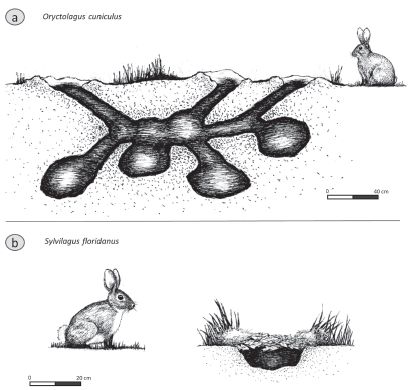
The following figure shows one of their key pieces of "evidence"....
The figure shows drawings of a European rabbit (part a, top) and an American rabbit (part b, bottom) -- and the burrows (nests) for each.
The key point: The European rabbit is social; the American rabbit is solitary.
Part a shows the European rabbit, Oryctolagus cuniculus.
Part b shows the eastern cottontail, Sylvilagus floridanus, the most common rabbit in North America.
The scale bars are 40 centimeters (a) and 20 cm (b).
This is Figure 1 from the article.
|
The authors argue that it is hard to domesticate an animal that prefers to be solitary.
One of the authors has studied rabbits in an ancient Mexican city. It is clear from the nature of the remains that many types of rabbits were raised together, but there is no evidence that any were fully domesticated. The authors suggest that the presence of multiple species reduced the attention each one got, reducing the chance of domestication. (Perhaps, but I can think of other reasonable interpretations.)
That's about it. The figure above is the only figure or table in the article, and it is a drawing.
It's a fun little article. It deals with a question I didn't even know was a question. It provides some interesting discussion. It's a nice way to learn more about rabbits.
News stories:
* Archeologists may have figured out why American rabbits were never domesticated -- It seems to boil down to "they don't play nice with others". (Alexandru Micu, ZME Science, July 22, 2021.)
* Why weren't New World rabbits domesticated? -- Archaeologists find the answer in rabbit social behavior. (Holly Ober, University of California, Riverside, July 21, 2021.)
* Wild and Domestic Rabbits Are Not the Same. (Amanda Puitiza, Abandoned Rabbits, August 19, 2020.) Not about this particular article, but a nice little page from an interesting source.
The article, which is freely available: Why were New World rabbits not domesticated? (Andrew D Somerville & Nawa Sugiyama, Animal Frontiers 11:62, May 2021.)
A previous rabbit post... Fossil discovered: A big stupid rabbit (April 22, 2011).
More about domestication...
* Added November 5, 2025.
Why horses are rideable: GSDMC (November 5, 2025).
* Will a wolf puppy play ball with you? (February 7, 2020).
A sponge that will soak up phosphate pollution from water
August 14, 2021
A recent article reports a simple way to remove phosphate from water, using a sponge. The sponge has been modified to specifically bind phosphate.
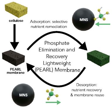
The first figure shows the plan...
The heart of the process is shown by the two sponges with the two curved arrows between them. One form has bound phosphate on it; the other has no phosphate. The "clean" sponge can be used to bind phosphate, which can then be released, thus regenerating the "clean" sponge.
At the upper left is a simple cellulose sponge. It is treated with MNS to make the active sponge, called PEARL (explained in the middle).
MNS is the binding agent for phosphate. You can see it bound to phosphate at the upper right, and free, ready to bind phosphate, at the lower left.
This is Figure 1 from the article.
|
What is this MNS stuff? The abbreviation stands for multifunctional nanostructures -- which doesn't help much. The point is that the basic cellulose structure of an ordinary sponge is coated with a small amount of a material that binds phosphate. The sponge provides a large surface area, and the coating provides for binding, with specificity. In this case, the nanoparticle coating is based on iron oxide, Fe3O4.
The article contains lots of data about how the sponge works. Here is an example...
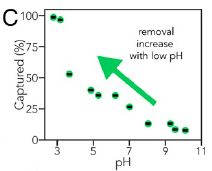
|
This experiment measures the ability of the sponge to capture phosphate as a function of pH. Remember, phosphoric acid is a weak acid. It exists in various forms as the pH is changed.
The results show that the sponge works best at low pH. That is, the sponge preferentially binds the less-dissociated forms of phosphoric acid.
This is Figure 3C from the article.
|
Another test is for the effect of pH on the release of phosphate from the sponge. High pH is best for that step. The two tests agree -- and also provide a control over the system. Bind the phosphate from the polluted water at low pH, and then release it at high pH. The phosphate is released in a form making it reusable, thus promoting recycling of a resource that is now recognized as limited.
Another test shows that the sponge is specific for phosphate. Binding of several other pollutant ions was near zero (and they did not interfere with phosphate binding). This point also opens up the possibility of designing similar sponges that are specific for other chemicals.
The authors suggest that their system for removing phosphate from polluted water is effective -- and practical.
News stories:
* Nano-coated sponge soaks up phosphate pollution. (John Kosowat, American Society of Mechanical Engineers, July 20, 2021.)
* 'A nanoscale solution to a gigaton pollution problem' -- Researchers invent a lightweight, reusable sponge that can soak up phosphorus pollution - and release it for recycling and reuse later on. (Emma Bryce, Anthropocene, June 4, 2021.)
* The 'PEARL' Membrane and How it Works to Remediate Water Pollution. (Joan Nugent, AZo Cleantech, June 18, 2021.) Interview with two of the authors of the article, Stephanie Ribet and Vinayak Dravid.
The article: Phosphate Elimination and Recovery Lightweight (PEARL) membrane: A sustainable environmental remediation approach. (Stephanie M Ribet et al, PNAS 118:e2102583118, June 8, 2021.)
Among posts on phosphate (or phosphorus)...
* A safer way to handle phosphorus: the bis(trichlorosilyl)phosphide anion (May 3, 2018).
* The origin of reactive phosphorus on Earth? (July 5, 2013).
* A phosphorus shortage? (September 29, 2010).
* Developing improved degradation of organophosphate pesticides (September 7, 2010).
Among posts about sponges...
* A better catalytic sponge: degrading plastics, and more (August 11, 2020)
* Cancer metastasis: An early detection system? (October 20, 2015).
August 11, 2021
Briefly noted...
August 11, 2021
Was thanatosis the origin of near-death experiences? What is thanatosis, you ask? Death-feigning: an animal feigns death to avoid a predator (who may prefer a live catch). Thanatosis is widespread in the animal kingdom; it seems of survival value, and may well have a genetic basis. So maybe we have genes for thanatosis. In a recent article, a team of scientists reports examining the records for several hundred near-death experiences. They found that about 15% involved some form of attack, whether from wild animal or a human (or car). That's about it for data. The article offers an intriguing idea, makes a logical case for a possible connection, and then offers a tidbit of data. It's not very convincing -- at this point. What now, to test the idea further?
* News stories. Both link to the article, which is freely available. (The journal is "Published by Oxford University Press on behalf of the Guarantors of Brain." Huh?)
- Near-Death Experiences Might Be an Unlikely Survival Strategy, Study Claims. (Clare Watson, ScienceAlert, July 2, 2021.)
- Neuroscientists find evolutionary origin of near-death experiences -- Animals have been feigning death as a defence mechanism for eons. Humans took it to the next level. (Tibi Puiu, ZME Science, July 2, 2021.)
* An earlier post about near-death experiences: Near-death experiences: are the memories real? (August 11, 2013).
A better white paint, using BaSO4; it's cool
August 10, 2021
Is it possible that paint could promote cooling of a building?
A new article reports a paint that does just that. It is based on using barium sulfate, BaSO4. The following figure shows the idea...
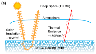
|
There are two things going on here.
* First, some of the solar irradiation is reflected. White paint reflects much of the incident light. The solar irradiation and the reflected part are shown at the left.
* Second, the surface, like any material, emits energy. Turns out that some of it is emitted at wavelengths to which the atmosphere is quite transparent. That is, part of this "thermal emission" is effectively emitted to "deep space"; this is shown at the right.
This is Figure 2a from the article.
|
That thermal emission is essentially free cooling; it is called radiative cooling. The idea is not new; the basics of the process are well known.
The goal is to make the net effect of the paint to cool -- even in the sun. To do that, the radiative cooling must be greater than the energy absorbed from the sunlight (that is, greater than the amount not reflected).
The figure shows some typical numbers for the incident sunlight and radiative cooling. The sunlight energy is much greater than the radiative cooling. If the paint is to have a net cooling effect, the key is that it must reflect away nearly all the solar radiation. White paint. And BaSO4 is about as white as it gets.
The following figure shows an example...
The figure shows a day in the life of a painted surface.
There are three temperature (T) curves; see the y-axis scale on the left.
And there is some sunlight, shown as the reddish peak in the afternoon. The energy from the sunlight is shown on the y-axis scale at the right.
|
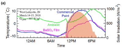
|
The main point is simple. Look at the T curves during the time of maximum sunlight. The blue curve is above the pink curve. The blue curve is for conventional paint; the pink curve is for a BaSO4 film. That is, the surface coated with BaSO4 is cooler.
Now look at the green curve. It is the ambient T. The surface with BaSO4 is cooler than ambient, even during the afternoon.
This is Figure 3a from the article.
|
The comparison of the three curves during the afternoon illustrates the value of the BaSO4 coating in cooling the surface. It is better than the conventional paint because of its ultra-high reflectivity.
One design issue is that the paint uses BaSO4 particles with a wide range of size. That enhances the reflectivity. Overall, as much as 98% of the incident solar irradiation is reflected by the BaSO4 paint. (That compares to 80-90% for conventional paints.)
Use of such a highly reflective paint could reduce the need for energy-consuming air conditioning.
There are limitations of the comparison shown in the figure. One is that it uses a BaSO4 film, not a true paint. Another is that the results are for a cool day. Both limitations are addressed in the article; I chose the one figure that compares three T profiles together, but the basic points hold. It is not claimed that a surface with BaSO4 paint will always be cooler than ambient, but it should be cooler than if it had a conventional paint (if the sun is shining).
Hm, on a cool day such as that, it might have been good if the paint were less reflective.
News stories:
* New Barium Sulfate-Based Paint is Whitest Yet. (Sci.News, April 20, 2021.)
* The whitest paint is here - and it's the coolest. Literally. (Nanowerk (Kayla Wiles, Purdue University), April 16, 2021.)
The article: Ultrawhite BaSO4 Paints and Films for Remarkable Daytime Subambient Radiative Cooling. (Xiangyu Li et al, ACS Applied Materials & Interfaces 13:21733, May 12, 2021.)
Follow-up: A lightweight white paint (January 23, 2023).
More about making paint: Photocatalytic paints: do they, on balance, reduce air pollution? (September 17, 2017).
Among other posts about paint: Did the Pioneer spacecraft violate the law of gravity? (July 15, 2012).
Among posts about barium: A new sensor for barium ions -- could it lead to a better understanding of neutrinos? (September 20, 2020).
Is there enough water in the clouds of Venus to support life? How about Jupiter?
August 7, 2021
The question of whether there might be life in the clouds of Venus has gotten much attention since the article last Fall claiming the discovery of phosphine, PH3, in the atmosphere. The article has stimulated a lot of discussion -- and work. Both the basic claim and the interpretation that it is a bio-signature have been the subject of debate [Musings link at the end].
A new article addresses the life-on-Venus question from another approach. Is there enough water in the clouds on Venus to support life -- at least, life as we know it? And once one learns how to address that issue, one can ask the same question for other places.
The following figure summarizes the key findings...
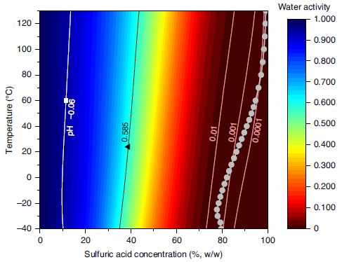
The graph shows the water activity as a function of temperature (T; y-axis) and sulfuric acid concentration (x-axis). The water activity itself is shown by color, according to the key at the right. Briefly, blue is high water activity, red is low water activity. The temperature range was chosen to be about that compatible with life on Earth.
"Water activity", aw, is a technical term. It is a measure of the amount of water. aw = 1 is pure water; aw = 0 would mean no water. Water activity results are based on measurements of the humidity (the amount of water in the gas phase).
The big trend... the more sulfuric acid there is, the less water. That's reasonable, of course. The work here puts numbers on it.
We now need two more numbers:
* One is the amount of sulfuric acid in the Venusian atmosphere. That is shown by the gray curve near the right. It is about 80% or higher over the entire graph.
* The other is the amount of water needed for life. That is aw = 0.585, in the green region, based on what we know on Earth.
This is Figure 1 from the article.
|
As a result of the sulfuric acid level, aw is well below 0.1, just from a quick check of the colors. In fact, it is below 0.01, as shown by the vertical line labeled with that number. That is far below the aw needed for life.
The conclusion is clear: There is not nearly enough water in the atmosphere of Venus to support life. That's life as we know it, from Earth; we can't know how big a loophole that point is.
Put another way, the limit for life is about 40% sulfuric acid (depending on T; see the green band), based on its effect on water activity alone. The amount of sulfuric acid in the clouds at Venus is about twice that.
Once the scientists have taught the computer to calculate water activities in planetary atmospheres, it is easy enough to aim the computer to other planets. Jupiter, for example...

|
Water activity (y-axis) vs temperature (x-axis) for the clouds of Jupiter.
The graph starts at aw about 0.6. That is enough water for life, though it is rather cold. High water activity, above that value, continues until T gets to about 10 °C.
This is Figure 4 from the article.
|
Looks like the possibility of life in the clouds of Jupiter has passed one test.
The authors note that the James Webb Space Telescope should provide data that will allow estimating the water activity in the atmospheres of some planets beyond our Solar System.
News stories:
* Clouds of Venus Too Dry to Sustain Even Extremophile Life Forms, Study Says. (Sci.News, June 29, 2021.)
* Planetary scientists discover that Venus's clouds cannot support life. (University of Aberdeen, June 28, 2021.)
The article: Water activity in Venus's uninhabitable clouds and other planetary atmospheres. (John E Hallsworth et al, Nature Astronomy 5:665, July 2021.) Fun to read!
Background post: Briefly noted... Phosphine on Venus? Implications for the possibility of life on Venus? (October 7, 2020). Links to follow-up posts.
More, including some direct response to the water activity issue: Briefly noted... Photosynthesis on Venus? (November 17, 2021).
Musings has not discussed life on Jupiter (I think). However...
* Who is perturbing the orbit of Halley's comet? (October 3, 2016). A post about the influence of Jupiter.
* Nuclear-powered bacteria: suitable for Europa? (March 27, 2018). Life in the Jovian system has been considered.
August 4, 2021
Briefly noted...
August 4, 2021
Of cats and boxes. Cats like to get into boxes. Or squares. Or things that sort of look like squares. What is it that the cat seeks? Is this an issue of optical illusions? A recent article explores all this. It is "citizen science": a group of cat owners tested their own cats in the familiar environment of their own homes, following instructions from the university lab. The authors realize that the work lacks some rigor, but it is suggestive -- and fun.
* News stories. Both link to the article.
- Scientists Find That Cats Love to Sit Inside Squares - Even Fake Ones. (Ed Cara, Gizmodo, May 5, 2021.)
- The "If I fits, I sits" instinct: Cats will sit in a box even it's an illusion (cat pics inside). (Jason Goodyer, BBC Science Focus Magazine, May 6, 2021.)
* The article:
If I fits I sits: A citizen science investigation into illusory contour susceptibility in domestic cats (Felis silvestris catus). (Gabriella E Smith et al, Applied Animal Behaviour Science 240:105338, July 2021.) Check Google Scholar for a freely available copy.
A new role for RNA
August 3, 2021
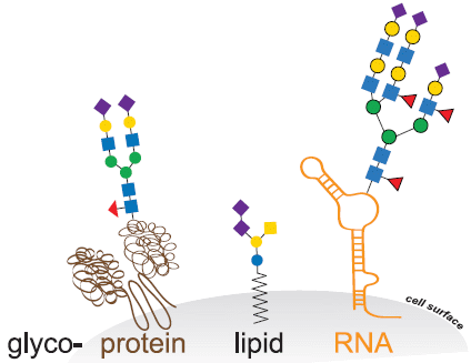
Let's start with a cartoon overview. It includes some common knowledge -- and a new finding...
The gray part at the bottom is part of a cell; the white above it is the outside world. The gray-white boundary is the cell surface (labeled at the right).
The little colored squares and such are sugars. It is well known that the surface of our cells is decorated with sugars.
The sugars are not directly on the surface. They are attached to other molecules embedded in the cell membrane. Glycoproteins are proteins with "glyco" (sugars; think glycogen) on them. And you can see there are also glycolipids and glycoRNA.
This is the graphical abstract from the article.
|
GlycoRNA? You won't find that in the textbooks. Glycosylation of proteins and lipids was established long ago, but the idea of glycoRNA is new -- reported in a recent article.
The article is complicated; there are many things to check. But there are two main claims:
- finding glycosylated RNA.
- showing that it is on the cell surface.
Here is some evidence on the first point...
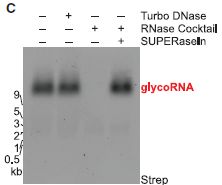
|
The basic plan... Isolate the cellular RNA, electrophorese it on a gel, and then "stain" the gel (or a "copy" of it, called a "blot").
The "stain" used here detects sugars. It does not detect the ribose sugar of the RNA itself. Instead, it detects a special sugar that has been incorporated into the experiment. The main finding is that one band lights up.
|
The various lanes show that the material is RNA. The first lane (left) is the basic detection. There are no extras; see the key at the top. In the second lane, they add DNase; no effect. Then RNase; that eliminates the band. Finally, RNase plus an inhibitor of the RNase (called SUPERaseIn); the band is present.
The glycoRNA is at about 9 kb (kilobases), based on size markers for RNA. But the RNA part of the glycoRNA is actually quite small (similar to transfer RNA). It runs slowly in the electrophoresis because of the attached sugars.
This is part of Figure 1C from the article.
|
Overall... The band contains sugar (what the detection system found) and RNA (as judged by sensitivity to RNase). That is, it appears to be glycoRNA.
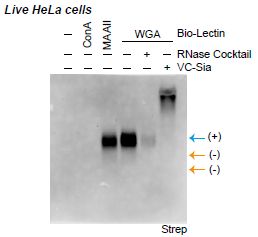
Here is some evidence on the second point, that the glycoRNA is on the cell surface...
The key idea is that a lectin was used to mark certain sugars on the cell surface. (Lectins are, for our purposes, proteins that bind carbohydrates.)
To start, look at the set of lanes labeled WGA, a lectin that is known to target the particular sugar of interest here. The first WGA lane shows that WGA "lights up" a band -- at the expected position for the glycoRNA. A simple view is that this result shows that the glycoRNA is at the cell surface. The rest is controls.
The other two lanes of the WGA set... One involves use of the RNase, as above. Destroys the RNA; no band. The other lane (VC-sia) involves use of an enzyme that removes the sugar. Doing that eliminates the expected band. (The sugars, now free of the RNA, stay at the top of the gel.)
|
|
To the left of the WGA set are lanes for two other lectins, which target sugars differently. One lights up the glycoRNA band, one does not. In both cases, the result is what is expected for the specific sugars in the glycoRNA.
At the right are two yellow arrows, pointing to "nothing". These arrows mark the positions for the two types of ribosomal RNA. That they do not light-up is good; it means that the result seen for glycoRNA is specific.
This is part of Figure 5F from the article.
|
The scientists found glycoRNA on a variety of mammalian cells, both from animals and grown in cell culture. How it is made and what it is for are open questions. Glycans on the cell surface are important in defining cell recognition; RNA may be part of that story -- a part previously unrecognized.
News stories:
* Some RNA Molecules Have Unexpected Sugar Coating. (HHMI, May 17, 2021.)
* Stanford researchers make 'bombshell' discovery of an entirely new kind of biomolecule -- A newfound biomolecule, consisting of RNA modified by sugars, could be present in all forms of life and might contribute to autoimmune disease. (Adam Hadhazy, Stanford News, May 17, 2021.)
The article: Small RNAs are modified with N-glycans and displayed on the surface of living cells. (Ryan A Flynn et al, Cell 184:3109, June 10, 2021.)
A post about surface glycoproteins: An Ebola vaccine: 100% effective? (August 7, 2015).
Also see: Briefly noted... Carolyn Bertozzi Nobel prize (October 7, 2022).
My page Organic/Biochemistry Internet resources has a section on Carbohydrates. It includes a list of related Musings posts.
Daylight savings time: night-owls have more difficulty adapting
August 1, 2021
The term "circadian rhythms" refers to the natural daily cycles of biological systems, including humans. Left to our own, we tend to sleep and wake up at about the same time each day. Long distance travel can stress our natural rhythms, by suddenly transporting us from one time environment to another. We call that "jet lag".
People differ in their natural cycles. Some people are "morning people", some are "evening people" (or "night owls"). There is evidence that such differences are due to genetic factors.
A new article provides evidence that people with different natural rhythms respond differently to stresses to their daily rhythms.
The scientists investigated the effect of the change to daylight savings time on the sleep of a group of people who were classified as morning people or evening people.
What is daylight savings time (DST)? Each Spring, we set our clocks forward one hour; in the Fall, we set them back an hour. The purpose is to give an extra hour of daylight in the Summer evening, at the expense of an hour of daylight in the early morning. The hour of daylight is more "useful" in the evening. (DST has also been promoted for energy efficiency.) DST is a common ritual at medium latitudes; details vary.
There are two effects of the transition. For the forward transition in the Spring, there is an immediate loss of an hour of clock time. At 2 am (the official time of the change here), it becomes 3 am. This is often referred to as a loss of an hour of sleep. Further, events occur an hour earlier than one's body clock expects, until one adapts.
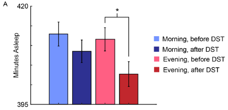
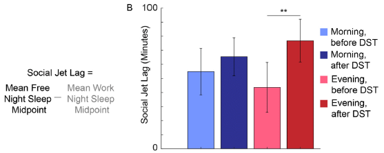
The following figure shows the results from one test...
The graph shows the time asleep in the week before and after the start of DST.
The two blue bars are for morning people; light blue for "before". Similarly, there are two red bars for evening people.
You can see that there is a small reduction in sleep for both groups in the week following the transition. The reduction in sleep is larger for evening people; that result tests as statistically significant.
Sleep results were based on instrument measurements.
Individuals were classified as morning or evening people based on their genomes.
About 830 people were studied. Subgroups at each extreme (morning vs evening preference, as judged by their genetics), were used for the main analyses.
This is Figure 2A from the article.
|
That test seems to show that evening people are affected more by the DST change than are morning people. The effect is small. In any case, the test gives an idea of the experimental system here.
The next figure shows results for another test...
The general nature of this test is as above. However, what is measured here is social jet lag (SJL). That is, broadly, the difference between how you would like to sleep and how you do sleep on a regular schedule. Specially here, they compare the midpoint of sleep on weeknights vs weekends.
The pattern is broadly similar to that from the first test, but the difference between morning and evening people is much larger.
This is Figure 3B from the article.
|
Overall, we have two tests here that show that evening people are more affected by the change to DST than are morning people. Other results in the article show that evening people take longer to adapt to DST.
Even if you see limitations to the study, the results are intriguing. Evening people ("night-owls") are different, and it matters. And since being an evening person is due to genetics, the work shows that people vary genetically in how they respond to stresses to our circadian rhythms.
The state of California recently voted to eliminate DST transitions. One reason for the vote was evidence that they do harm, as indicated by measures such as an increased rate of auto accidents. The vote puts the state in conflict with national law. We'll see how it plays out.
News stories:
* Why Daylight Saving Time Is More Difficult for Night Owls. (Sarah Shoen, Sleep Foundation, July 23, 2021. Now archived.)
* 'Springing forward' affects early birds less than night owls. (Science Daily (University of Michigan), July 20, 2021.)
The article, which is freely available: Genomic heterogeneity affects the response to Daylight Saving Time. (Jonathan Tyler et al, Scientific Reports 11:14792, July 20, 2021.)
Related posts include...
* Effect of corticosteroids on brain function (May 20, 2023).
* The effect of delaying school start time on students: some actual data (March 12, 2019).
* Circadian rhythms and class time? (June 10, 2018). The work here also uses the idea of social jet lag. It is measured differently here, but the underlying idea is the same.
* The genetics of being a "morning person"? (April 15, 2016). An early report, which has been extended by further work.
July 28, 2021
Briefly noted...
July 28, 2021
Phosphine on Venus -- maybe it is from volcanoes. (Follow-up #3.) Two recent posts, including last week's "Briefly noted" post, have been about methane on Mars and Enceladus, with possible implications for life in those places. We now return to the story of phosphine on Venus, which was introduced last fall -- and already has had two follow-up posts. The article made two main points. First, there was a claim of finding PH3 in the atmosphere of Venus. Second, an argument was made that it was a sign of life. A key part of that second point was excluding known non-biological sources of phosphine, leaving biology as the only option. Specifically, volcanism was excluded as a source. A new article makes a case that low levels of phosphine could be due to recent explosive volcanism. Is there any evidence? The authors suggest that observations of Venus over the years support explosive volcanism. The original case for life on Venus continues to weaken, but it is generating some interesting work. Stay tuned -- and keep an open mind.
* News story: Phosphine in Atmosphere of Venus Points to Explosive Volcanic Activity. (Sci.News, July 13, 2021.) Links to the article (in the first paragraph), which is freely available.
* Background posts:
- Briefly noted... Phosphine on Venus? Implications for the possibility of life on Venus? (October 7, 2020). Links to two other follow-up posts.
- Briefly noted... Methane and life on Enceladus? (July 21, 2021). Links to the Mars-methane post.
Effect of exercise on developing ALS
July 27, 2021
Exercise may accelerate the development of ALS (amyotrophic lateral sclerosis; also known as MND = motor neuron disease).
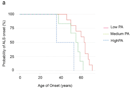
Here are some results from a recent article...
The graph shows the frequency of onset of ALS vs age, for three groups of people. The three groups are for three levels of physical activity (PA): low, medium, high.
The curves go down as people develop ALS. (We won't address whether this is what you would expect from the y-axis labeling.)
You can see that the high exercise group develops ALS at a younger age, followed by the medium and low exercise groups.
This is Figure 4a from the article.
|
It is an intriguing result. What do we make of it?
First, let's tell the rest of the story... This is for a sub-group of ALS people who carry a particular mutation that increases the risk of ALS. That is, there seems to be an interaction between exercise and genetics, so that certain people may be sensitive to exercise.
The effect of exercise on age of onset was much weaker for "other" ALS. That there seems to be some effect might be a clue that the collection of "other" ALS is heterogeneous on this point.
Do the scientists have any idea what is going on? A little... They provide evidence that the expression of the gene in question is affected by exercise -- reduced, in this case. Ok, we know that some genes are affected by exercise, and this seems to be one of them. And it would seem that, for this mutant allele... it promotes ALS; making less of the mutant protein promotes ALS more. If the residual activity of the mutant protein is limiting, making less of it could enhance the limitation.
Beyond that, they know little. The main point of the article is that they now have one more piece of the puzzle for ALS, but it is still mostly a mystery. Importantly, attempts to identify environmental risk factors must take genetics into account.
The possibility that exercise is a risk factor for ALS has been raised before, but with inconclusive evidence. What is new here is separating ALS people by their genetic factors.
The authors explicitly note that the findings should not be taken as any general argument against exercise.
News stories:
* Frequent Strenuous Exercise Increases the Risk of Developing ALS in Certain People. (Neuroscience News (University of Sheffield), June 12, 2021.)
* Frequent, Intense Exercise May Promote ALS in Those With Risk Genes. (Steve Bryson, ALS News Today, July 8, 2021. Now archived.)
* Expert reaction to study looking at physical exercise as a risk factor for motor neurone disease (MND). (Science Media Centre, June 11, 2021.) Only two entries in this set, but one of them is extensive.
The article, which is freely available: Physical exercise is a risk factor for amyotrophic lateral sclerosis: Convergent evidence from Mendelian randomisation, transcriptomics and risk genotypes. (Thomas H Julian et al, EBioMedicine 68:103397, June 1, 2021.)
More ALS...
* Tau and ALS (February 19, 2022).
* Triplet-repeats: Do they act through the RNA? (September 24, 2017). The specific ALS mutation of the current article is indeed a repeat mutation -- the one studied in this earlier article. (In this case, the repeat is actually a hexamer.)
* Is a "dead" virus in the human genome contributing to the neurological disease ALS? (January 11, 2016).
* How BMAA may cause motor neuron disease -- a clue? (July 1, 2014). An ALS-like disease.
Among posts about exercise...
* Artificial exercise, using a robotic device glued to the muscle (May 2, 2023).
* How exercise benefits the brain (August 9, 2020).
Cauliflower math
July 26, 2021
This is the first Musings post about cauliflower. It is based on an article in Science earlier this month. Importantly, the team of scientists on this work includes a mathematician.
Let's start with some pictures...
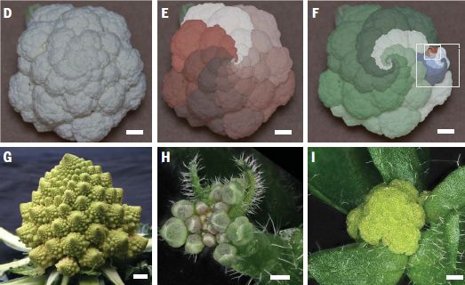
Part D (upper left) shows a common cauliflower, from Brassica oleracea var. botrytis ("Bob", for short), as you see it in the store. The two other parts in the top row show how a mathematician would mark it up. First, there are the spirals, very regular. And the insets at the right show that the thing looks about the same as you blow it up. That is, the structure repeats at smaller scales. Yes, fractals.
Part G (lower left) shows another kind of cauliflower, called a Romanesco. (It really is green. Cauliflowers have a variety of colors.) It's very similar, except that it is conical. Imagine the common cauliflower but now growing in the vertical dimension, too.
Part H (lower middle) is a small, related plant that is very popular for lab work, Arabidopsis thaliana. Part I (lower right) is an Arabidopsis carrying mutations in two genes that regulate growth. It looks like a cauliflower. (One of the mutant genes is known as the CAULIFLOWER (CAL) gene.)
Scale bars. Careful...
- The scale bars for the foods (parts D-G) are all 2 centimeters.
- The scale bars for the little lab plant are 500 micrometers = 0.5 millimeter = 0.05 centimeter.
This is part of Figure 1 from the article.
|
What's going on? Briefly... The cauliflower is basically flower bud tissue. Flower buds that are defective at forming flowers. When flower formation fails, the bud grows a bit more stem, and tries again -- with the same result. Ultimately, we get a big mass of flower bud tissue.
Arabidopsis is a model system for plant biology. Biologists know much about its genetics and regulation of growth.
Using their understanding of what cauliflowers seemed to be doing along with their knowledge of Arabidopsis growth, the scientists were able to develop a more complete model of how cauliflowers develop. In fact, they showed that cauliflower strains carry mutations in some of the same genes that promote development of the cauliflower structure in Arabidopsis. (The cauliflower strains were compared to cabbage, the ancestor of cauliflower.)
Part of the work used a computer model of the regulatory networks. In their computer model, they got the Arabidopsis to make Romanescos. Using that experience, they put a mutation with a similar effect into an Arabidopsis strain that made cauliflowers; the result was a more conical structure, reminiscent of the Romanescos. The following figure shows this...
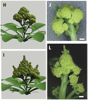
|
On each side, the top shows an ordinary cauliflower structure; the bottom shows a Romanesco-type structure.
Parts H and I (left side) are for the computer model.
Parts J and L (right side) are for Arabidopsis plants, carrying mutations intended to mimic what was learned from the computer model.
The scale bars for the real plants are 500 µm (as in the first figure).
This is part of Figure 4 from the article.
|
There is no claim that the work here will affect how much you like cauliflower, but at least you will understand it better. Certainly, plant scientists understand it better.
News stories:
* How the cauliflower got its mesmerizing fractals -- The cauliflower really wants to grow flowers but just ends up with more buds growing out of its buds that grew out of other buds.... (Tibi Puiu, ZME Science, July 9, 2021.)
* Why do cauliflowers look so odd? We've cracked the maths behind their 'fractal' shape. (Etienne Farcot, Conversation, July 8, 2021.) From an author of the article -- the mathematician.
The article: Cauliflower fractal forms arise from perturbations of floral gene networks. (Eugenio Azpeitia et al, Science 373:192, July 9, 2021.)
Other posts about using Arabidopsis include...
* Using microneedles for drug delivery (March 25, 2023).
* Electronic monitoring of plant health; it might even allow an injured plant to call a doctor (June 21, 2020).
* Inter-plant communication via the Cuscuta parasite (September 15, 2017).
* Can plants calculate how long their food supply will last? (August 9, 2013).
More fractals:
* A fractal molecule in nature (July 17, 2024).
* More milk (October 16, 2008).
There is more about math on my page Internet resources: Miscellaneous in the section Mathematics; statistics. It includes a listing of some related Musings posts.
The Great Dimming of Betelgeuse
July 24, 2021
Betelgeuse went dim in early 2020. The following sequence of images is from a recent article...
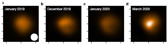
|
High resolution images of Betelgeuse.
You can see the dimming, and you can see evidence that it is most pronounced in the southern hemisphere.
The first image (January 2019) is before any signs of dimming.
These are processed images, but they give the idea. In fact, the general dimming was apparent with the naked eye: Betelgeuse dimmed to about a third of its usual brightness. The images here show dimming of 90% in the southern part of the star.
This is trimmed from Figure 2 of the article, to focus on the images.
|
That is quite a dimming -- worthy of the designation The Great Dimming of Betelgeuse (note the capitalization).
What happened? The article models some things that might have happened, given the understanding of the life of a red supergiant star. What seems likely here, the scientists suggest, is that a big gas bubble rose from inside the star, but encountered a cool spot near the surface. The lower temperature caused some of the gas contents (such as silicon) to condense, forming a dust cloud. That is, the Great Dimming was due to a dust cloud.
It is the norm for the outer parts of a red supergiant star to be relatively cool. Such stars are huge, and of low density. The surface is far from the center of active fusion. Of course, the surface temperature varies.
In this case, a patch of the surface may have been as cool as 3200 Kelvins or so. The gas cloud itself may have cooled to 1600 Kelvins, leading to the dust cloud.
Betelgeuse looked rather normal by April, shortly after the last image shown above. There is no reason at this point to suspect that the Great Dimming was any kind of sign of the star's imminent death, as some had speculated at the time. But it may be evidence of how such a star gives off dust on a regular basis -- stardust, which gets ejected, and may later condense into planetary material.
The analysis leads to a better understanding of how such stars lose mass in discrete events. In any case, the images are remarkable. It is rare to see a star as anything other than a point of light.
News stories:
* Dust Cloud Caused Betelgeuse's Great Dimming Event, Astronomers Say. (Sci.News, June 17, 2021.)
* New images help solve the mystery of Betelgeuse's dimming. (Victoria Corless, Advanced Science News, June 16, 2021.)
* Mystery solved: Dust cloud led to Betelgeuse's 'Great Dimming'. (Science Daily (Harvard-Smithsonian Center for Astrophysics), June 16, 2021.)
* News story accompanying the article: Astronomy: Great Dimming of Betelgeuse explained -- Observations suggest that an unexpected dimming of the massive star Betelgeuse resulted from dust forming over a cold patch in the star's southern hemisphere. This finding improves our understanding of such massive stars. (Emily M Levesque, Nature 594:343, June 17, 2021.)
* The article: A dusty veil shading Betelgeuse during its Great Dimming. (M Montargès et al, Nature 594:365, June 17, 2021.)
Follow-up: Briefly noted... Follow-up: The Great Dimming of Betelgeuse (December 12, 2022).
Among posts about the effects of dust clouds...
* Rise of the Roman Empire: role of an Alaskan volcano? (July 28, 2020).
* Geoengineering: the advantage of putting limestone in the atmosphere (January 20, 2017).
July 21, 2021
Briefly noted...
July 21, 2021
Methane and life on Enceladus? Last week we noted some recent developments in the story of methane on Mars. We now have an article on methane on the Saturnian moon Enceladus. There is methane on Enceladus, along with hydrogen gas and water. What the new article does is modeling. The scientists ask whether it is reasonable that the amounts of methane found on Enceladus are consistent with it being of biological origin. And their answer is, broadly, yes. Of course, they make assumptions along the way, and note limitations. They cannot say that it is biological methane, only that it could be. It's an intriguing result, which has gotten hyped in some news coverage. Remember, it is modeling. Interesting modeling.
* News stories. Both link to the article.
- Methane on Enceladus could be a sign of Earth-like hydrothermal vents, including microbes -- We're not saying there's life on Enceladus... but there * could be * life on Enceladus. (Mihai Andrei, ZME Science, July 9, 2021.)
- Behind the paper: Bayesian analysis of Enceladus' plume data to assess methanogenesis. (Antonin Affholder, Nature Portfolio Astronomy Community, June 7, 2021.) From the lead author of the article.
* Background posts...
- Methane on Mars: a day-night effect (July 12, 2021).
- Large organic molecules found on Enceladus (September 7, 2018).
* More... Briefly noted... Phosphine on Venus -- maybe it is from volcanoes (July 28, 2021).
* There is more about methane on my page Organic/Biochemistry Internet resources in the section on Alkanes.
SpillOver: predicting zoonoses
July 20, 2021
Sometimes a virus that normally grows in one host jumps to another -- including humans. Sometimes that leads to disease, maybe even a serious disease outbreak. The current COVID-19 pandemic is an example of such a zoonosis; the virus causing COVID-19 is -- very likely -- a virus from bats that has jumped to humans, even though we don't know how.
Can we predict which viruses are more likely to jump to humans? It is a question many have asked. We now have an article describing a specific approach, and presenting an app available on the web for making such predictions.
Here is the idea... The scientists made a list of 31 "risk factors" (characteristics of the virus or its host, etc.). They then asked a panel of 65 experts to rate these risk factors as to how important they were in predicting which viruses would jump to humans.
The following figure shows part of the response...
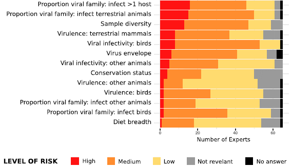
The risk factors are listed at the left. For each, the responses of the 65 experts are shown, by dividing the bar into four colored segments.
The key at the bottom shows what the four colored segments mean. (A fifth color, black, appears occasionally at the far right, to indicate that an expert had no answer for a particular risk factor.)
For example... The next-to-bottom bar is for the proportion of the viral family that infects birds. Virus families vary on this point. The question is, does it matter? If a virus is of a type that makes it more likely it can infect birds, does that make it more likely it will jump to humans? The color bar shows that the main response on this point was that it was of "low" relevance. Very few thought it was of "high" relevance; some ranked it as "medium".
The risk factors are listed here in order by the overall estimate of their importance.
Even the risk factors at the top of what is shown here were ranked as "high" relevance by fewer than a third of the experts.
So it is time to reveal... The table is large, and I posted only part of it -- the bottom part, for the risk factors that ended up at the bottom.
This is the bottom part of Figure 1 from the article.
|
If you look at the full figure... The top 10 (most important) risk factors were rated as "high" relevance by more than half the experts. Further, those top 10 were rated as "high" or "medium" by almost all the experts. (At the top: transmission from animal to human.)
That table (the full version) allows for a predictive system. Rate a new virus by that table, and see whether, overall, it seems to be of high concern.
That is what their new app, called SpillOver, does.
They ran SpillOver on a set of 887 viruses. That ranks the virus by how likely they think the virus is to spill over into humans. (Table 1 of the article shows the top 50 viruses.)
How good is it? Well, we won't know until it happens. But... The top 12 viruses on their list have already spilled over to humans. That includes Ebola, both SARS viruses, and rabies. Maybe that is a good sign that their program is giving meaningful results, though one can be concerned that it is something of a circular argument.
What should we do with the ranking? What can we do about viruses we suspect might become a problem? We can keep an eye on them. Surveillance systems should focus on the viruses considered higher risk. And maybe we could do more. One of the viruses high on their list is another coronavirus from bats. Maybe we should go ahead and make an mRNA vaccine for it, and do some testing of it in lab animals. Should we make large quantities and stockpile it? That is an economic question; maybe it is worth discussing.
This article and the accompanying app are now part of the discussion about predicting new viral diseases.
Just to be explicit... The discussion here is about predicting whether a virus will jump to humans. It does not address how serious the virus would be in humans.
News stories:
* Research Collaboration Announces New Tool To Calculate Zoonotic Disease Risk. (EcoHealth Alliance, April 5, 2021.)
* Worried about a new pandemic? This app classifies the viruses most likely to jump to other species -- This online tool ranks the scariest animal-borne viruses that either crossed or have the potential to cross species barriers. (Tibi Puiu, ZME Science, April 6, 2021.)
* Ranking Virus Spillover Risk -- New Web App Ranks Spillover Risk for Newly Detected Viruses. (Kat Kerlin, University of California Davis, April 5, 2021.)
The article, which is freely available: Ranking the risk of animal-to-human spillover for newly discovered viruses. (Zoë L Grange et al, PNAS 118:e2002324118, April 13, 2021.)
There is a section on my page Biotechnology in the News (BITN) -- Other topics for Emerging diseases (general). It includes a list of some related Musings posts. Browse that list and you will see previous posts that attempt to address the future. The current article frames some of its discussion in terms of WHO's "disease X".
A better way to make ammonia, using lithium?
July 19, 2021
Ammonia is an important industrial chemical. The major current process for making it develops an equilibrium between nitrogen and hydrogen gases, over a metal catalyst. The basic plan, known as the Haber-Bosch process, has been around for a century.
How about a different approach? How about using lithium? That metal has the unusual property of reacting with nitrogen gas, to form a nitride: Li (s) + N2 (g) --> Li3N (s).
Could we build a process for making ammonia from that step? Some chemists think we can. In one sense, it is easy... Reaction of Li3N with H+ yields the ammonia, NH3. But it is not that simple. It's not enough to just show a sequence of reactions; we want a practical commercial process.
A recent article claims some substantial progress. The following figure summarizes the proposed scheme. Caution... the figure is not entirely clear.
A good place to start is the reaction we started with above. Near the lower left (just above the word "copper")... Li + N2 --> Li3N. (That is how the reaction is described in the figure legend. Whether that is exactly what happens is not entirely clear, and certainly the figure is not clear.)
Whatever the mechanistic details, that gives a layer of lithium nitride.
Then, near lower right, we get NH3 + Li+. (That last + really is for a lithium ion.)
Where did the H (actually H+) come from? From the phosphonium cation shown above the Li3N, to the left. Note the arrows showing those two coming together. And note the green H in the phosphonium cation.
This is Figure 1 from the article.
|
That gets us to ammonia, but the description is incomplete.
The key step is providing the hydrogen for the reaction. It is done with electrochemistry, and then a proton shuttle. Hydrogen gas is oxidized; the resulting H+ attaches to the right-hand form of the phosphonium compound (the "ylide"), to make the phosphonium cation. The phosphonium compound is cycling back and forth between the two forms. It gets H+, from H2, to form the cation, which then donates the H+ to the lithium nitride.
The electrons from oxidizing H2 end up reducing the N2. (Whether they do this by first reducing Li+ may be an open question.)
Here is a little data for the system...
|
The system worked with no signs of breakdown for 20 hours. Ammonia was produced at a constant rate (left-hand y-axis). The electrical efficiency was constant over that time (right-hand y-axis).
All good, so far.
This is Figure 4A from the article.
|
The main claim in the article is that they substantially improved the rate of ammonia production for a sustained lithium-based scheme by implementing the phosphonium shuttle for handling the protons. It's not yet good enough, but there are opportunities for further development.
There is an important general point about this work. The current Haber-Bosch production of ammonia is environmentally dirty. It requires much energy, and has a bad carbon footprint (because the hydrogen comes from fossil fuels). The authors think the kind of process they are developing can be "green" (environmentally friendly). It works at room temperature and moderate pressure; it may well work fine in small, relatively simple reactors. Refrigerator-sized reactors, even on individual farms. And at that scale, it may be practical to make the hydrogen locally using renewable energy to electrolyze water. Of course, it remains to be seen whether they can make this all work out as practical, but there is a real incentive to continue the development.
News stories:
* World-first discovery could fuel the new green ammonia economy. (Science Daily (Monash University), June 10, 2021.)
* Chemists unlock secret to making green ammonia from renewable energy in refrigerator-size reactors -- The new, efficient technique could slash agricultural and transportation carbon emissions and be rolled out in communities and on individual farms. (Prachi Patel, Anthropocene, June 17, 2021.)
* The Ammonia Academic Wrap: a new new [sic] breakthrough for eNRR research and more. (Julian Atchison, Ammonia Energy Association, June 29, 2021.) eNRR = Electrochemical nitrogen reduction reaction. A brief item, but it is part of a larger page highlighting several recent articles about ammonia.
* News story accompanying the article: Electrochemistry: Is lithium the key for nitrogen electroreduction? -- Why lithium appears critical for electrochemical ammonia synthesis remains elusive. (Olivia Westhead et al, Science 372:1149, June 11, 2021.)
* The article: Nitrogen reduction to ammonia at high efficiency and rates based on a phosphonium proton shuttle. (Bryan H R Suryanto et al, Science 372:1187, June 11, 2021.)
More about making ammonia (with links to related issues):
* A novel and simple way to make ammonia? (February 12, 2025).
* Fixing nitrogen -- can U help? (August 29, 2017).
* Using light energy to power the reduction of atmospheric nitrogen to ammonia (May 20, 2016).
If lungs fail, can you breathe with your intestines?
July 16, 2021
If a person's lungs fail, they may be put on a machine that forces oxygen into the body. We heard a lot about such artificial ventilators in the past year; severe COVID-19 often led to the need for such devices, and shortages occurred. COVID or not, mechanical ventilators are a part of medicine.
What about alternatives? What if we injected oxygen into the lower end of the gastrointestinal (GI) track?
It is known that some fish can breathe that way, absorbing oxygen via the intestines. Whether it works in mammals has been an open question. A recent article addresses the issue, with encouraging results.
Here are the results from a couple of the experiments...
|
In this test, mice were deprived of oxygen, then treated with oxygen gas, injected into the anus. The graph shows the survival, over about an hour.
The control curve (left) shows that the oxygen deprivation was severe. All the mice quickly died.
|
The survival curves for both groups of mice given intestinal oxygen were better. One was rather good. What are these two groups? One was a simple treatment with injected gas. The other included abrasion of the cells that were to take up the oxygen. Abrasion helped -- a lot.
EVA = enteral ventilation via anus. g-EVA means that the EVA was delivered as a gas.
This is Figure 1E from the article.
|
That result established that intestinal oxygen can help. However, the need for abrasion is a serious negative. The scientists then switched to an alternative way of delivering the oxygen: dissolved in a perfluorocarbon. It has long been known that oxygen is quite soluble in such perfluorocarbons, and there has been much medical experimentation, including their use as a blood substitute. The general safety of the materials is well established.
A perfluorocarbon is a chemical in which all of the hydrogens have been replaced by fluorines. To take a simple example... methane is CH4; perfluoromethane is CF4.
Here is a test using oxygen dissolved in a perfluorocarbon. It is a simple, practical test...
What is measured is how much the mice walked.
There are two groups of mice: one treated with the oxygen-carrying liquid, and one sham-treated. You can see that the mice with oxygen fared much better.
l-EVA means that the EVA was delivered as a liquid (O2 dissolved in perfluorodecalin).
This is part of Figure 2B from the article.
|
|
The results shown above are for practical outcomes: survival and activity. The article also includes more technical data, including blood oxygen levels. Broadly, the results are encouraging, with no significant side effects.
Both of these tests were with mice. Other tests reported in the article were with rats and pigs. The scientists think the background reported here warrants testing in humans.
An alternative -- simpler -- way of delivering oxygen to people in respiratory distress may be forthcoming.
News stories:
* A Surprising New Solution For Low Oxygen: Breathing Through the Rectum. (New York Stem Cell Foundation, June 7, 2021.)
* Mammals can use their intestines to breathe. (Science Daily (Cell Press), May 14, 2021.)
The article: Mammalian enteral ventilation ameliorates respiratory failure. (Ryo Okabe et al, Med 2:773, June 11, 2021.)
More about lung problems:
* Can human lungs that are too damaged to be transplanted be fixed? (August 22, 2020).
* Recovery of breathing following spinal cord injury (July 29, 2011).
More hypoxia: Bigger spleens for a bigger oxygen supply in Sea Nomad people with unusual ability to hold their breath (July 2, 2018).
July 14, 2021
Briefly noted...
July 14, 2021
TLDR. A new piece of software that generates a one-sentence summary of a scientific article. For now, it works only with computer science articles. It is installed at Semantic Scholar.
* News stories...
- short: tl;dr: this AI sums up research papers in a sentence -- Search engine's tool for summarizing studies promises easier skim-reading. (Jeffrey M Perkel & Richard Van Noorden, Nature, November 23, 2020.)
- more technical: An AI helps you summarize the latest in AI -- Semantic Scholar, a scientific literature search engine, is using recent breakthroughs in natural-language processing to give researchers the tl;dr on papers. (Karen Hao, MIT Technology Review, November 18, 2020.)
* The article. Both news stories listed above link only to a preprint at arXiv. The article (a meeting presentation) is freely available: TLDR: Extreme Summarization of Scientific Documents. (Isabel Cachola et al, Findings of the Association for Computational Linguistics: EMNLP 2020, page 4766, November 16-20, 2020.)
* tl;dr: TLDR.
Sleep stages in octopuses -- do they dream?
July 13, 2021
Have you ever watched an octopus sleep?
Here are frames from a video over 36 seconds of sleep for one octopus, as reported in a recent article...
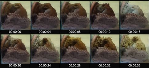
|
That is "active sleep".
This is a Brazil reef octopus, Octopus insularis.
This is Figure 2D from the article.
|
After recording four specimens sleeping, the scientists conclude that the octopuses have stages (or states) of sleep, including "quiet" and "active" stages. Those are something like the well-known non-REM and REM stages of sleep found in mammals and some other vertebrates.
The following figure compares the alertness of the octopuses during various sleep stages...
In each test, an octopus was given a visual stimulus. The time to respond, called "latency", was recorded (y-axis).
The results are summarized by stage. "Alert" refers to an octopus that is awake. The other groups are stages of sleep: quiet and active, as noted above, and a stage where one eye is open.
For each group, the individual results are shown as a bar graph (sideways). There is also a box plot summarizing the results.
All the sleep stages show a slower response than the alert stage.
The active sleep stage shows a dramatically slower response than the other stages.
This is part of Figure 3A from the article.
|
That's about it. Octopuses have a variety of sleep stages. One sleep stage is quite active, perhaps something like REM sleep.
Finding these multiple sleep stages in an octopus adds to the evidence that cephalopods have the most complex brains among the invertebrates.
Are the octopuses dreaming? Well, there is no direct evidence on that point. How would you tell? How would you test or measure if an octopus was dreaming? But the nature of the active sleep certainly makes one wonder.
News stories:
* Sleeping Octopuses May Have Dreams, But They're Probably Brief. (Nell Greenfieldboyce, NPR, March 25, 2021.)
* Octopuses, Like Humans, Have Quiet and Active Sleep States. (Sci.News, March 26, 2021.)
* Sleeping octopuses might experience fleeting dreams - new study. (Alexandra Schnell, Conversation, April 1, 2021.)
The article, which is freely available: Cyclic alternation of quiet and active sleep states in the octopus. (Sylvia Lima de Souza Medeiros et al, iScience 24:102223, April 23, 2021.) There are several short videos posted with the article. These may be most useful by comparing stages.
A recent post about dreaming: Conversing with dreamers (July 6, 2021). A week ago. Links to posts about sleep, including in jellyfish.
More about sleep in an invertebrate: Evidence for a REM stage of "sleep" in spiders? (October 11, 2022).
Posts about octopuses and other cephalopods include:
(This list is being developed as "complete". In progress.)
* If a fish doesn't cooperate, is it ok to hit it? (November 20, 2024).
* Briefly noted... Do octopuses throw things at each other? (November 16, 2022).
* Briefly noted... X-ray analysis of a remarkably preserved fossil cephalopod, related to the vampire squid (July 20, 2022).
* Briefly noted... The Biden octopus (March 22, 2022).
* Aging without memory loss in cuttlefish (October 4, 2021).
* A new brain study (March 3, 2020).
* RNA editing is a major contributor to protein diversity in cephalopod brains (June 23, 2017).
* Chromatic aberration: is it how cephalopods see color with only one kind of photoreceptor? (October 14, 2016).
* Cuttlefish vs shark: the role of bioelectric crypsis (May 10, 2016).
* Why don't your arms get entangled or stuck together? (June 10, 2014).
* Captain Nemo anyone? -- Giant squid sighting (January 15, 2013).
* Quiz: What is it? (November 20, 2012).
* Deceiving a rival male (August 28, 2012).
* How an octopus adapts to the cold -- by RNA editing (March 5, 2012).
* Octopus will only pay attention to television if it is "high definition" (August 20, 2010).
* The octopus and the coconut (December 28, 2009).
My page for Biotechnology in the News (BITN) -- Other topics includes a section on Brain. It includes a list of brain-related posts.
More, August 30, 2023... Another article about sleep stages in octopuses. The article provides more evidence about similarities between sleep in octopuses and humans -- despite the very different brains.
* News story: Octopus sleep is surprisingly similar to humans and contains a wake-like stage. (Science Daily (Okinawa Institute of Science and Technology), June 28, 2023.)
* The article, which is open access: Wake-like skin patterning and neural activity during octopus sleep. (Aditi Pophale et al, Nature 619:129, July 6, 2023.)
Methane on Mars: a day-night effect
July 12, 2021
Is there methane on Mars? If so, why? Is it a sign of life? Musings discussed this a few years ago, with inconclusive results that have long been typical of the field [link at the end].
A new article offers new data -- and a clue...
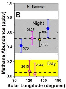
|
The figure summarizes a set of methane measurements at one site (Gale crater) during Martian northern-summers. The measurements were made from the Curiosity rover. The results are separated into two blocks: night vs day (gray and yellow areas of the figure, respectively).
The level of atmospheric methane varies with the time of day. That finding is made possible by the three pink points; those recent measurements include the first from this instrument during daytime.
The horizontal dashed lines show the averages for the two blocks of measurements. The "day" measurements are not significantly different from zero.
The numbers on the data points are dates: sols (Martian days) after the spacecraft landed. (Table 2 of the article provides Earth dates for each point.)
This is Figure 1B from the article.
|
That's a big clue -- though it is not at all clear clue to what. It certainly supports that the methane is real; the day vs night effect serves as an internal control.
Importantly, the result explains why another instrument, ESA's Trace Gas Orbiter, has failed to find methane in the Martian atmosphere. That instrument operates only during daytime -- and we now know that matters. (In fact, the daytime measurements reported here were done to test the suggestion that the difference between what the two instruments were reporting might be due to a day-night effect.)
The authors suggest that there is continual seepage of methane from underground. At night, the methane can accumulate in low-lying areas, such as Gale crater. It dissipates during the day. The new work says nothing about what the source of the methane is. (However, the scientists have done extensive testing of the possibility that the spacecraft is the source of the methane; there is no evidence to support that.)
So we now know a bit more about Martian methane -- but not much. It is pretty much beyond dispute that there is methane there, with some regular patterns. How the methane is produced and destroyed are still open questions.
News stories:
* Curiosity Sheds New Light on Martian Methane Mystery. (Sci.News, July 1, 2021.)
* Mars methane mystery? Depends on the time of day. (Paul Scott Anderson, EarthSky, July 3, 2021.) Includes a figure showing a suggested seasonal cycle of methane levels, as measured by the Curiosity rover.
The article, which is freely available: Day-night differences in Mars methane suggest nighttime containment at Gale crater. (Christopher R Webster et al, Astronomy & Astrophysics 650:A166, June 2021.)
Background post: Cows on Mars? (November 7, 2012). And see follow-up post linked there.
More about methane "out there"... Briefly noted... Methane and life on Enceladus? (July 21, 2021).
There is more about methane on my page Organic/Biochemistry Internet resources in the section on Alkanes.
More from Mars... Another underground lake on Mars -- near the equator? (April 5, 2022).
Antibiotic action: effect of hydrogen sulfide
July 9, 2021
Antibiotics sometimes work, sometimes don't. What is the role of hydrogen sulfide, H2S, in this process?
A recent article suggests that bacterial production of H2S can protect them from antibiotic action. Inhibiting bacterial production of H2S can enhance antibiotic action.
Here is an example of the findings...
There are two sets of results here. The qualitative results at the right will get us started.
Cultures of the bacterium Staphylococcus aureus were spotted onto nutrient agar at various dilutions (shown at the top). Growth did or did not occur, as judged visually. (Reading the results yes/no is fine.)
You can see that the bacteria from all conditions except one grew. The conditions are labeled in the little table in the middle. The condition that prevented growth is labeled +NL1+Gm.
The top row is for the bacteria alone, without any treatment; they grew, as expected. The next two rows are for NL1 and Gm separately; neither alone prevented growth. The bottom row is for the effective combination plus one more addition: NaHS (sodium hydrogen sulfide).
This is Figure 2D from the article.
|
What are Gm and NLI, the active agents in that test? Gm is an antibiotic, gentamicin (misspelled in the article as gentamycin). NL1 was developed in the work reported here; it is an inhibitor of H2S production by the bacteria. Gm and NL1 work together to inhibit the bacteria. The final row supports this... NaHS is a source of HS-, an ionized form of H2S. Adding NaHS effectively negates the role of NL1, and restores growth.
The growth curves at the left show the same effect, with quantitative data. The conditions tested are the same as before; follow the colors. The one condition that fully inhibits growth is +NL1+Gm (yellow).
The article shows a similar effect with Pseudomonas aeruginosa, also using Gm and NL1. Two tests in mouse infection models also showed benefit from using NL1 along with Gm.
What's going on? The basis of the response is not entirely clear. However, the authors suggest that H2S promotes the bacteria going into an antibiotic-tolerant state, where they persist (survive) with little growth. Since the antibiotic kills cells that are growing, pausing active growth while the antibiotic is present effectively promotes survival. NL1 blocks production of H2S, thus preventing the bacteria from becoming tolerant to the antibiotic.
The authors provide some evidence that NL1 works with a variety of bactericidal antibiotics.
The work provides a lead toward development of a new class of agents that could help with treating bacterial infections. Further, it is a reminder that antibiotics are not simple; they interact with what is going on in the cells. And it is also a reminder that H2S is truly a molecule of biology.
News stories:
* Antibiotic-Tolerant Bacteria Vulnerable to Hydrogen Sulfide Pathway Blockers. (GEN (Jennifer Oosthuizen, CDC), June 10, 2021.)
* Researchers Discover Critical Role of Hydrogen Sulfide in Ability of Bacteria to Survive Antibiotics. (NYU Langone Health, June 10, 2021.)
* News story accompanying the article: Microbiology: Giving antibiotics an assist -- Inhibiting endogenous hydrogen sulfide production makes bacteria more susceptible to antibiotics. (Thien-Fah Mah, Science 372:1153, June 11, 2021.)
* The article: Inhibitors of bacterial H2S biogenesis targeting antibiotic resistance and tolerance. (Konstantin Shatalin et al, Science 372:1169, June 11, 2021.)
Another post about finding anti-microbials that target antibiotic tolerance: Killing persisters -- a new type of antibiotic (January 3, 2014). This post may be good background for some of the terminology, including the distinction between antibiotic resistance and tolerance.
More about aminoglycosides, the class of antibiotics that includes gentamicin: Designing a less toxic form of an antibiotic (April 19, 2015).
A post about the biology of hydrogen sulfide: Garlic or rotten eggs? (February 8, 2010).
More on antibiotics is on my page Biotechnology in the News (BITN) -- Other topics under Antibiotics. It includes an extensive list of related Musings posts.
July 7, 2021
Briefly noted...
July 7, 2021
Where are the bees? The importance of bees is being increasingly recognized. One might think we would know where they are, but it's not easy. There are over 20,000 species, many hard to tell apart. Familiar honeybees and bumblebees are not typical. There are, literally, millions of records -- full of errors, not to mention biases. A team of scientists has worked through it all, and come up with the first comprehensive and, hopefully, reasonably accurate map of the distribution of bee species. They then discuss some of the factors that determine bee distribution.
* News story: Scientists Create a Buzz With the First Ever Global Map of Bee Species -- Most of the insects avoid the tropics and choose treeless environments in arid parts of the world. (Corryn Wetzel, Smithsonian, November 19, 2020.) Includes a link to the article, but it is currently broken.
* The article, which is freely available: Global Patterns and Drivers of Bee Distribution. (Michael C Orr et al, Current Biology 31:451, February 8, 2021.)
Conversing with dreamers
July 6, 2021
In lucid dreaming, a person is aware that they are dreaming. For some people, lucid dreaming comes naturally; for some others it can be induced.
Can you carry on a conversation with a person who is having a lucid dream? A new article suggests that you can.
Here is an example of what the scientists did and found...
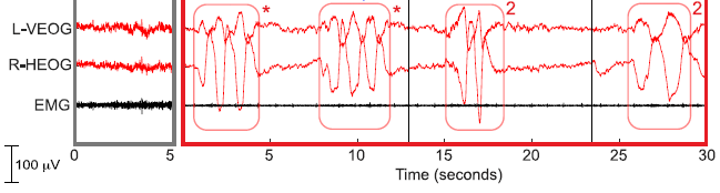
The figure shows various electrical signals from the subject (y-axis) vs time (x-axis).
The key observations are at about 15 and 25 seconds: the two boxed regions marked "2".
In each box there are two big blips. Two -- the person's answer to the question that was asked. The question was, what is 8-6?
Brain measurements showed that the person was in REM sleep during the test.
The small block at the left (gray border) shows background signals, measured prior to the experimental test itself.
During the first 13 seconds, the subject sent pre-arranged signals (marked with *) to indicate that they were in a lucid dream.
VEOG = Vertical Electrooculogram. It is a well-established way of measuring eye movements.
The figure legend in the article includes the following, which is partly quotation from the subject:
Upon awakening, the participant reported dreaming about his favorite video game: ''I was in a parking lot at night. then suddenly it was daytime and I was in the video game.. I thought, okay this is probably a dream. And then something weird.. I lost control of all my muscles. There was a roaring sound of blood rushing to my ears.'' The experimenter asked him whether he remembered hearing any math problems, how many he answered, and what he answered. The subject reported, ''I think I heard three [problems].. I answered '2' for all of them, but I don't remember what the first one was. I just remember the last one was '8 minus 6.'''
This is part of Figure 2B from the article.
|
That's the idea... A person in a lucid dream is asked a question, and answers it. That is two-way communication with a person during a dream.
The article contains results from four research groups, using different ways of asking questions and giving answers. For example, in the work shown above, the question was given verbally, and the dreamer responded with eye movements. Among other variations, questions were given with flashing lights conveying Morse code, and answers by other facial movements.
The figure above shows two correct responses. Overall, dreamers correctly answered the question in 18% of the trials. They gave incorrect answers in 3% of the trials. That is a 6:1 ratio in favor of correct answers. But many trials yielded ambiguous answers, and most yielded no response at all.
Conversing with a person who is dreaming would be interesting. Our scientific understanding of dreaming -- and of sleep -- is limited, partly because we can't communicate with those doing it. It will be interesting to see how the four teams of scientists build on the clues from this article.
News stories:
* People Answer Scientists' Queries in Real Time while Dreaming -- Researchers demonstrate that during REM sleep, people can hear - and respond to - simple questions such as "What is eight minus six?" (Diana Kwon, Scientific American, February 18, 2021.)
* Scientists have two-way conversations with lucid dreamers while they sleep -- Interactive dreaming is a thing for some people. Here's what's going on. (Tibi Puiu, ZME Science, February 18, 2021.)
* Researchers Exchange Messages with Dreamers -- Dreamers answered experimenters' questions or solved simple math problems, showing that complex two-way communication between the dreaming and waking world is possible. (Asher Jones, The Scientist, February 18, 2021. Link is now to Internet Archive.) An interview with one of the scientists.
The article, which is freely available: Real-time dialogue between experimenters and dreamers during REM sleep. (Karen R Konkoly et al, Current Biology 31:1417, April 12, 2021.)
There is a useful Wikipedia page on lucid dreams. It includes some historical background. Although the term was coined only in 1913, aspects of the phenomenon were recognized millennia ago. In the section "Scientific research", there is a brief mention of the current article, under the heading "Two-way communication". Wikipedia: Lucid dream.
And then... Sleep stages in octopuses -- do they dream? (July 13, 2021). A week later.
Another post about sleep in an invertebrate: Evidence for a REM stage of "sleep" in spiders? (October 11, 2022).
There are no Musings posts on the nature of dreams. Among posts on sleep...
* Evening light: how it affects our sleep (July 30, 2019).
* The effect of delaying school start time on students: some actual data (March 12, 2019).
* Association of mother's sleep disorders with premature birth? (October 13, 2017).
* When do jellyfish sleep? (September 29, 2017).
* What if a lion came into your hotel room while you slept? (July 20, 2016).
My page for Biotechnology in the News (BITN) -- Other topics includes a section on Brain. It includes a list of brain-related posts.
A vaccine against asthma?
July 3, 2021
No, asthma is not an infectious disease. But it is associated with high levels of certain proteins. Perhaps we could lower the levels of those proteins with some antibodies.
In fact, antibody treatments are being used to treat asthma. The results are encouraging, but it is a very expensive treatment. Perhaps we could stimulate the person to make their own antibodies, by giving them a vaccine. A new article reports some lab results with vaccinating mice against asthma; the results are encouraging.
Let's describe the experimental system... Mice. The asthma trigger is HDM = house dust mites. Exposure to the HDM material leads to a response recognized as asthma. At the molecular level, there is an increase in a particular kind of antibody that is targeted to the HDM. That is IgE, which is thought to be the immediate trigger of the asthmatic response. As intermediaries, the levels of two cytokines, IL-4 and IL-13, are increased; those are thought to play important roles.
The plan is to vaccinate against the two cytokines. The mouse will then have reduced levels of those cytokines, and reduced production of IgE targeted at the HDM. That should lead to reduced asthmatic symptoms.
Here is a test of one part of the plan. Does vaccination against a cytokine lead to antibodies against it?
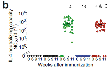
|
The graph shows the level of antibody against the cytokine IL-4 (y-axis) under various conditions.
The x-axis is odd. You'll notice that a group of four numbers is repeated several times across the x-axis. Each of those repeats is actually a separate graph; the five graphs, side-by-side, are oddly run-on. So look at each separately.
The numbers are times: weeks since the vaccination.
|
What is more important is what the various pieces of the graph are for. The first two groups are for controls, with no vaccination. One expects no anti-IL-4 antibodies, and there were none.
The next three groups are for three types of vaccination: against IL-4 (green), IL-13 (blue), or both (red). You can see that the two groups of mice that were vaccinated against IL-4 made antibodies against it. The group vaccinated against only IL-13 did not.
Each point shows the antibody level from one mouse.
This is slightly modified from Figure 1b of the article. I added some labeling of the vaccine groups at the top.
|
So far, so good. Vaccination against IL-4 leads to the production of antibodies against it. An accompanying graph shows similar results for IL-13.
The next step is to see if that has any effect on the disease process. The following figure shows results for the IgE antibodies directed against HDM. These are the "bad actors", thought to be the immediate trigger of asthma symptoms.
The graph shows the level of the IgE against HDM (y-axis) under various conditions.
At the left, some controls; they show only low (background) levels of the HDM-specific IgE.
The first set with a response (purple) is for HDM but no vaccine. Trigger, but no treatment. Big response; this is the baseline for the treatments that follow.
The final three data sets are for HDM plus a vaccine: against IL-4, IL-13, or both. (Left-to-right; the color-coding is the same as for the first figure.)
A simple observation is that all three vaccines led to improvement: less IgE directed against the HDM.
|
|
To help see the improvement in all the vaccine groups...
- Each data set contains a small black horizontal bar, at the average (mean). The highest such bar is for the "no treatment" group.
- The three p values at the top, with a horizontal bracket, compare the results for the "no treatment" group with one vaccine group. All three of those p values are significant.
- (The p values on the individual data sets test them against the controls.)
This is Figure 2b from the article.
|
There is more data in the article showing that the vaccines reduce the asthma. For example, the vaccinated mice make less mucus.
In the graph above, vaccination against IL-4 had a greater effect. However, the relative importance of the two cytokines varied with the parameter being measured. Overall, addressing both was best.
The big picture is that vaccination leads to reduced asthmatic symptoms, as judged by various criteria. In mice. The vaccination is against two cytokines that are part of the asthmatic process.
It's an encouraging step.
News stories:
* Dual Vaccination Prevents Allergic Asthma in New Mouse Study. (Ruairi J Mackenzie, Technology Networks, May 11, 2021.)
* An Asthma Vaccine Effective in Mice. (Institut Pasteur, May 12, 2021.)
The article, which is freely available: Dual vaccination against IL-4 and IL-13 protects against chronic allergic asthma in mice. (Eva Conde et al, Nature Communications 12:2574, May 11, 2021.)
Among related posts...
* Treating asthma with a hookworm protein? (December 2, 2016).
* Reducing asthma: Should the child have a pet, perhaps a cow? (November 28, 2015).
* Is Helicobacter pylori good for you or bad? (April 10, 2012). Includes the HDM test system in mice.
More on vaccines is on my page Biotechnology in the News (BITN) -- Other topics under Vaccines (general). There is a list of related Musings posts.
June 30, 2021
Briefly noted...
June 30, 2021

|
A fluorescent rodent.
It is an African springhare, Pedetes capensis. (This specimen lives in an American zoo.)
Photographed under UV light. The smaller inset is the same animal photographed with ordinary light.
It is the first known example of a fluorescent mammal from the "old world". Like many fluorescent animals, it is nocturnal. The biological implications of fluorescence, if there are any, are unknown.
|
News stories:
* Springhares Glow Orange and Red under Ultraviolet Light. (Natali Anderson, Sci.News, February 23, 2021.) Links to the article, which is freely available.
* When Mammals Glow in the Dark. (Justine E Hausheer, Cool Green Science (Nature Conservancy), April 5, 2021.) A broader view of color in animals, with many references.
The figure is part of Figure 3 from the article, which is also the top figure of the first news story..
|
The molecular shape of OgTs4
June 29, 2021
There are a lot of chemicals with four atoms attached to one central atom. We might, generically, call them AB4. (It doesn't even matter if the four attached B are all the same.)
In general, there are two shapes possible for AB4 molecules, as shown in the following figure...
|
The two general shapes of AB4...
- tetrahedral (left), or
- square planar (right).
This is Figure 1 from the current article. Ignore the other stuff in the figure for now.
|
The simplest AB4 is CH4 (methane). It is tetrahedral, probably the first example of a tetrahedral molecule that a student learns about. An interesting example of a square planar AB4 is XeF4, the first compound that was made from a noble gas.
Can we predict that those two AB4 molecules will have different shapes? It is actually straightforward. Just draw a standard Lewis (electron dot) structure, showing the valence electrons of the two kinds of atoms.
For CH4, it is simple: just the four bonded atoms around the C. Tetrahedral.
XeF4 has two lone pairs on the central Xe, as shown at the right. That means there are six sets of electrons around the Xe, in an octahedral arrangement. The four bonded atoms on the Xe are then square planar.
This figure is from the web page Chemistry School: XeF4 (Xenon tetrafluoride) Lewis Structure.
|
|
Another AB4 is the subject of a recent article: oganesson tetratennesside, OgTs4. No one has actually made any, but scientists are thinking about it -- and trying to predict its shape.
You might start by drawing its Lewis structure. Or just note that OgTs4 is much like XeF4... a central noble gas atom surrounded by four halogen atoms. Seems that we would predict the shape would be square planar, as for XeF4.
But things are more complicated with OgTs4. There are 586 electrons in that five-atom molecule. (Methane has 10 electrons.) More to the point, each atomic nucleus of this molecule has a positive charge of 117 or 118 pulling on the electrons. That strong pull affects the energetics, and can only be dealt with by calculation including relativistic effects.
That is the heart of the new article. The scientists calculate the expected stability of OgTs4, in one shape or the other. More specifically, they calculate it with and without considering the relativistic effects on the electrons.
Their calculations are clear...
- The OgTs4 molecule should be stable. That refers to chemical stability; the atomic nuclei are not stable, but that is another issue.
- The tetrahedral shape should be more stable. (However, it is a distorted tetrahedron.)
- The relativistic effects are huge. Both of the previous statements require relativistic calculations.
We now await an experimental test of their conclusions. I wonder if it will ever come.
In the article, energies are given in electron-volts (eV). 1 eV, which is per molecule, is equivalent to about 100 kilojoules per mole (kJ/mol). For example, the tetrahedral shape is calculated to be about 1 eV more stable than the square planar shape.
In the top figure above, the distances shown are the predicted bond lengths. The first number is from the preferred relativistic calculations; the second, in parentheses, is from the non-relativistic calculations. The labels at the upper left of each part are the symmetry group designations.
The title of the article includes the conventional expected equation for making OgTs4. However, many of the results presented are for the product relative to full atomization, i.e., to 2 Ts.
News story: Introducing oganesson tetratennesside -- Superheavy pentatomic molecule pushes theoretical chemistry to extremes. (Mitch Jacoby, C&EN, June 20, 2021.)
The article: Relativistic effects for the superheavy reaction Og + 2Ts2 --> OgTs4 (Td or D4h): dramatic relativistic effects for atomization energy of superheavy Oganesson tetratennesside OgTs4 and prediction of the existence of tetrahedral OgTs4. (Gulzari L Malli et al, Theoretical Chemistry Accounts 140:75, June 1, 2021.)
The superheavy elements discussed here were introduced in the post Nihonium, moscovium, tennessine, and oganesson (June 11, 2016), along with the background post listed there.
A post about the predicted properties of another superheavy element, also affected by relativistic effects: Is copernicium noble? (January 3, 2020).
More about AB4-type molecules: Square-planar silicon (September 18, 2021).
My page of Introductory Chemistry Internet resources includes a section on New chemical elements (112 and beyond). It includes a list of related Musings posts.
Kangaroo mother care for premature babies: start immediately
June 27, 2021
Kangaroos are born at a very early stage of development. They are then held close to the mother for an extended period.
Is there a lesson in that for us? Perhaps human babies born prematurely would benefit from an extended period of close contact with the mother.
In fact, it is already known that KMC -- kangaroo mother care -- is good. It is recommended that premature babies be given KMC soon after their medical condition has stabilized. However, the first hours after birth are critical; might KMC help there, too? We now have an article reporting a clinical trial of KMC being implemented immediately after birth, even prior to the common medical stabilization.
In this trial, newborn premature babies were randomly assigned to one of two groups. In the intervention group, the baby was with the mother (or a surrogate) almost continuously starting immediately -- within 1-2 hours -- after birth. In the control group, the babies were first stabilized, before being allowed extended contact with the mother. Both groups received regular care.
The following table summarizes the results...
The first row of results shows that the death rate over 28 days was reduced by 25%, with high significance. (Risk ratio = 0.75 means that the death rate with intervention was 75% of the death rate in the control group.)
The second row shows the reduction in death rate over the first three days. It is similar, but the numbers are too small to show statistical significance. Also note that over 1/3 of the total deaths (first row) occurred in the first three days (second row).
The median daily duration of skin-to-skin contact in the neonatal intensive care unit was 16.9 hours ... in the intervention group and 1.5 hours ... in the control group. From the abstract, slightly condensed.
This is the top part of Table 3 from the article.
|
The next table shows that the benefit was seen over various sub-groups of babies.
For background...
- Average normal birth weight is about 3.5 kilograms; the focus here is on babies weighing less than 1.8 kg.
- The standard gestation time is 40 weeks.
The right side of the figure shows the results visually. The vertical black line is at a risk ratio of 1; the vertical red dashed line is at 0.75, the average, as seen in the first table.
For all sub-groups here, there is a reduced risk of death for the babies with the immediate KMC intervention. The numbers are small for the sub-groups. If all we had was one of these rows, we would not claim statistical significance. Here we have many such sets; the totals are significant, and the sub-groups are similar.
This is the top part of Figure 2 from the article.
Other sub-groups included in the full table are: Type of delivery (Vaginal or Cesarean), Singleton or twins, Size for gestational age, Site (country). (Only one sub-group fails to show a benefit, as judged by the average: the Ghana site.)
|
The results are encouraging. In fact, the trial was stopped before its scheduled completion, so that all eligible babies could receive the improved care.
The immediate-KMC care is not without its own challenges. ICU units designed for premature babies need to be expanded to accommodate the mothers.
News stories:
* Immediate skin-to-skin contact after birth improves survival of pre-term babies. (EurekAlert! (Karolinska Institutet), May 26, 2021.)
* Kangaroo mother care started immediately after birth critical for saving lives, new research shows. (WHO, May 26, 2021.)
* 'Kangaroo Mother Care' - A Lifeline for Preemies? (Physician's Weekly, May 31, 2021. Now archived.) Includes more details.
The article: Immediate "Kangaroo Mother Care" and Survival of Infants with Low Birth Weight. (WHO Immediate KMC Study Group, New England Journal of Medicine 384:2028, May 27, 2021.)
Among posts about premature birth and related issues...
* Using caffeine to treat premature babies: risk of neurological effects? (April 27, 2019).
* Association of mother's sleep disorders with premature birth? (October 13, 2017).
* Lamb-in-a-bag (July 14, 2017).
* Imaging of fetal human brains: evidence that babies born prematurely may already have brain problems (March 10, 2017).
* The problem of human birth (July 8, 2011).
* Maternal mortality (May 7, 2010).
Among posts about kangaroos: Handedness in kangaroos: significance? (July 31, 2015).
June 23, 2021
Briefly noted... Vitamin D and COVID-19?
June 23, 2021
The possibility that vitamin D might protect against COVID has been raised. Experimental tests have yielded inconsistent and inconclusive results. The current article takes an interesting approach. It turns out that people vary in how much vitamin D they have, for genetic reasons. In this work, the authors look for a relationship between people's vitamin D genes and their COVID status (e.g., infection, hospitalization), using available databases. The simple answer is that they found no correlation. That's interesting. However, the study does not specifically look at people who are known to be deficient in vitamin D, so that is still open. (The study also was substantially limited to Caucasians.) Although the study seems excellent and shows no effect of vitamin D on COVID, it is also important to recognize the complexity of the issue, and the limitations of the study; a single article is not the whole story.
* News story: Vitamin D may not provide protection from COVID-19 susceptibility or disease severity, study suggests. (Science Daily (PLOS), June 1, 2021.) Links to the article, which is freely available.
* The article, which is freely available: Vitamin D and COVID-19 susceptibility and severity in the COVID-19 Host Genetics Initiative: A Mendelian randomization study. (Guillaume Butler-Laporte et al, PLoS Medicine 18:e1003605, June 1, 2021.)
* I have listed this post on my BITN page section for SARS, MERS (coronaviruses). (Note that is a procedure change. I will now list "briefly noted" posts normally.)
* Also...
- Do Vitamin D supplements prevent bone fractures? (August 8, 2022).
- Vitamin D, omega-3 fatty acids, and autoimmune disease? (March 29, 2022).
When did the SARS-2 (COVID-19) virus arise? A window into how a zoonosis starts
June 22, 2021
A recent article makes an interesting contribution to the story of the origin of the SARS-CoV-2 virus (SARS-2. for short), the causal agent of the current COVID-19 pandemic. The article is also of interest for its broad perspective on how such pandemics start. In fact, the general implications are probably more important at this point than any specifics for the current virus.
The first step of the current work was to take the genome sequences of all known early samples of the virus, and extrapolate backwards to estimate the time of their common ancestor. This is now a fairly routine type of analysis, but it should be cautioned that the results depend on the input data that is available, and on some general assumptions about the rate at which such viruses evolve.
Here is what the scientists found by this analysis...
The graph shows the likelihood of the date of virus origin ("density"; y-axis) vs time (x-axis).
The colored region shows the estimated date for the common ancestor; the width shows the range for the 95% confidence limits. The peak of the distribution is December 9 (2019); the range is from mid-November to mid-December.
This is Figure 1 from the article.
|
The first cases we heard about were announced at the very end of December, and were associated with a particular market. We now know more, with retrospective analysis. A case as early as December 11 seems well-documented. with news accounts suggesting cases back through mid-November. It is clear that the initial transfer of the virus to humans happened before late December.
The analysis above points to an origin of the virus around early-December. But things might have been more complicated. That analysis is about the earliest common ancestor of the viruses known from early cases; that may not have been the first virus to appear in humans.
More specifically... We noted that there was a well-documented case of COVID-19 on December 11. But the graph above suggests that the current virus might have originated after that date. That contradiction can be resolved within the confidence limits, but the issue continues with the suspected cases that go back to November. We stress that this point does not prove what happened, but it raises issues.
We've heard about variant (mutant) viruses, at least some of which are more fit than the original. More fit variants may replace the original strain. It is possible, even reasonable, that something like that happened in the earliest days. A virus may have jumped to humans -- and fared poorly. In fact, many such jumps to humans probably die out quickly, with few people being infected. But occasionally, the initial virus may mutate to one that is more successful in humans. The initial virus dies out, but leaves offspring that continue in humans. The analysis above points to the common ancestor of known viruses in humans, but not necessarily to the first virus in humans.
That kind of thinking led the scientists to some more complex modeling. When did the original virus jump to humans -- even if that original virus is no longer around?
The following figure gives an example of what the computer suggested, for one such scenario...
This graph suggests that the original virus, no longer around, is probably from mid-November, though it could be from October. (The two colorings on the graph are for 95% and 99% confidence ranges.)
This is part of Figure 3 from the article.
|
Overall, the article provides some perspective on the early days -- the silent history -- of the current virus. But it provides no specific answers, and one shouldn't try to interpret the findings with specifics.
More broadly, the work provides perspective on how new diseases develop. There will be more of them. We want to detect them early; analyses such as this teach us what to look for.
An interesting point is that one major feature of the SARS-2 virus made it hard to detect early: it killed very few people. (Further, its symptoms were not distinctive.) A small number of cases in a large society had little visible impact, but allowed the virus to reproduce -- and mutate to become more fit.
News stories:
* Modeling Predicts SARS-CoV-2 Circulated Earlier Than Previously Thought. (GEN, March 22, 2021.)
* Novel coronavirus circulated undetected months before first COVID-19 cases in Wuhan, China -- Study dates emergence to as early as October 2019; Simulations suggest in most cases zoonotic viruses die out naturally before causing a pandemic. (Science Daily (University of California - San Diego), March 18, 2021.)
The article: Timing the SARS-CoV-2 index case in Hubei province. (Jonathan Pekar et al, Science 372:412, April 23, 2021.)
A brief note about early sightings of the current virus: Briefly noted... When did COVID-19 come to the United States? (December 16, 2020). We should note that the authors of the current article are skeptical of some reports of early sightings of the SARS-2 virus far from China.
A post about the origin of the first SARS virus: The origin of SARS: getting closer (February 6, 2018).
Posts about extrapolating genomes back in time include... UCA passes test (June 6, 2010).
There is a BITN section for SARS, MERS (coronaviruses). It includes a list of Musings posts in the field.
Can a sea anemone make you smile?
June 21, 2021
It is common to smile when you see the distinctive striping of the clownfishes. A recent article reports that the stripe pattern is induced by sea anemones.
Here are some data...
I suggest you start at the right side, with part C. This graph summarizes the results. It shows the average number of white stripes (the authors call them bars) per fish (y-axis) vs age (x-axis).
The fish grow in close association with sea anemones. The two colored lines are for two different kinds of sea anemones.
You can see that one type of sea anemone led to faster development of white stripes than the other. (The data points show that there is a lot of variability. The colored bands show confidence limits; the two curves seem significantly different.)
The first two graphs show the raw data behind the summary graph of part C. Parts A and B are for the two types of sea anemones, respectively. In each case, the bars (of the graph) show the percentage of fish with 1, 2, or 3 white stripes. That is plotted against the age of the fish (x-axis). (Fish were divided into four age groups for this analysis.) The lightest segment of each bar is for fish having only one white stripe; that region declined over time, for both parts A and B. The darkest segment is for fish with three white stripes; it increased over time -- especially in part B.
This test was done "in the field", studying clownfish in their natural habitat.
This is part of Figure 1 from the article.
|
The results above show that sea anemones influence the development of white stripes in the clownfish. What's going on?
Further analysis suggests that thyroid hormones play a role in stripe development -- as they do in other aspects of fish metamorphosis. The scientists then show that the anemones are affecting the thyroid hormone levels of the fish.
Here are some results for experiments directly testing the effect of thyroid hormones on the development of white stripes...
These graphs, like Part A and B above, show the percentage of fish with various numbers of white stripes.
The four bars of the graph in part E (left) are for four levels of thyroid hormone (T3) injected into the fish; that includes the first bar, with no hormone (just a solvent control). More thyroid hormone led to more white stripes on the fish (over this short time period).
In part F, the fish were followed for a longer time. There is some development of white stripes in the solvent control. But now, adding "MPI" reduced the formation of white stripes. What is MPI? It is a mix of inhibitors of thyroid function.
This test was done in the lab, with a different species of clownfish.
This is part of Figure 3 from the article.
|
Those tests show the importance of thyroid hormone for stripe formation. The first figure shows that one type of anemone is better at inducing stripe formation. Of course, so far, that is an incomplete story.
What is the role of the anemones? That is not entirely clear. As likely as anything at this point is that the anemones are causing stress to the fish, affecting their hormone production. That stress varies with the type of anemone. In fact, the scientists find that one gene involved in thyroid hormone production is induced to a higher level by the anemones that speed up the development of white stripes more. There is more to be done.
News stories:
* How do clownfish earn their stripes? -- The distinctive white stripes in clownfish form at different rates depending on their sea anemone hosts. (Science Daily (Okinawa Institute of Science and Technology), May 24, 2021.)
* Metamorphosis: The Fascinating Secrets of How Clownfish Earn Their Stripes. (SciTechDaily, May 25, 2021.)
The article: Thyroid hormones regulate the formation and environmental plasticity of white bars in clownfishes. (Pauline Salis et al, PNAS 118:e2101634118, June 8, 2021.)
More about clownfishes: CO2 emissions threaten clowns (September 20, 2010). Includes a picture; the stripes appear bluish here. Caution... the article of this earlier post has proven to be controversial; that is noted near the end.
Among posts about thyroid hormones... Failure to regenerate heart tissue: role of thyroid hormone (May 14, 2019). Links to more.
More about smiles: How a dolphin signals it wants to play (December 11, 2024).
Other posts about sea anemones...
* The function of Hox genes in cnidarians (November 16, 2018).
* Restoring lost hearing: lessons from the sea anemone (November 15, 2016).
How to mold glass
June 19, 2021
Plastic products are commonly produced in intricate shapes by injecting melted plastic into a mold. A simple high-throughput process.
The high melting point of glass precludes such a process.
But look...
|
Small, intricate glass products, made by injection molding, as reported in a recent article.
Both scale bars are 1 centimeter.
Part A (upper) focuses on the point that the products can be mass produced. About one every five seconds in this case. (That is the time for the injection molding step per se. The total production time is much longer, but other steps are done in bulk.)
Part D (lower) focuses on the intricacy that can be obtained.
This is part of Figure 3 from the article.
|
How did they do that? The simple answer is that they lowered the melting point of the glass, so that the glass could be melted as easily as common plastics. About 130 °C in this case.
That leads to the question, how do you lower the melting point of glass -- by a thousand degrees? That is what the article is about.
The approach is to use tiny glass beads, 50-100 nanometers across. Bind them together with plastic-like material (organic polymers). The bulk melting point of the composite material is determined by the organics; the glass beads are in uniform suspension, almost like solutes.
Melt the composite material, and put it into the mold. Standard molds, standard procedures for working with plastic.
After the molded product is made, remove the organic binders. This is done in two steps. One is simple solvent extraction (in fact, using water). The remaining binder is removed by heat. A final heating fuses the glass beads together.
The result is what you see above: intricate glass products, made by a process suitable for mass production. The product is high quality glass, similar to quartz. Surface roughness is that of the mold. The process is probably suitable for making lenses.
Further, the process requires half the energy commonly needed to shape glass products.
Interesting and promising. In fact, the authors have a company to commercialize the process; see the "Competing interests" statement.
News stories:
* Injection molding process developed for glass. (Ashton Edwards, Techzle, April 12, 2021.)
* Glass injection molding. (Science Daily (University of Freiburg), April 9, 2021.)
* Mouldable glass that could replace plastic -- A new technique has been developed that allows glass to be shaped via injection moulding. (Eva Higginbotham, Naked Scientists, April 13, 2021.) Interview with Frederik Kotz, a senior author of the article.
* News story accompanying the article: Materials science: Preshaping clear glass at low temperatures -- Pelletized glass-forming composites enable rapid injection molding and facile binder recovery. (Rebecca Dylla-Spears et al, Science 372:126, April 9, 2021.)
* The article: High-throughput injection molding of transparent fused silica glass. (Markus Mader et al, Science 372:182, April 9, 2021.)
Among posts about rethinking glass...
* Transparent wood (March 6, 2021).
* Making a small container that has an opening in it (September 10, 2019).
* A new way to make impact-resistant glass (August 9, 2019).
* Turning metal into glass (September 21, 2014).
* Long-term data storage in glass (August 14, 2013).
Also see... GO dough (April 9, 2019).
June 16, 2021
Briefly noted...
June 16, 2021
The blackest skin.

|
A small piece of skin from the back of a deep-sea fish.
This is trimmed from the second fish in the ZME news story.
|
The scientists found 16 species of fish that reflected less than a half percent of the light off their skin. The darkest skin reflected about 0.05%. It's good for camouflage, in the darkness of the deep sea, where the main light is from luminescent organisms. Some of these ultra-black fish are only distantly related, suggesting that nature has discovered the skin structure needed for this phenomenon multiple times. (A picture cannot capture the reflectance.)
* News stories. Both have pictures of fish. The second also discusses the skin structure, with a good set of pictures. Both link to the article.
- These bizarre deep-sea fish have the blackest skin ever seen -- The fish absorb up to 99.95% of the light that hits them. (Tibi Puiu, ZME Science, May 21, 2021.)
- Biologists Identify 16 Deep-Sea Fish Species with Ultra-Black Camouflage. (Sci.News, July 16, 2020.)
How many types of Alzheimer's disease are there?
June 15, 2021
Dementia is a condition that can be measured. One type of dementia is called Alzheimer's disease (AD). We have some description of that disease, but still with an incomplete understanding. It is often said that the only definitive diagnosis of AD comes after death, by examination of the brain.
Things gave gotten a little better in recent years. Brain imaging, such as PET scans, can now detect some of the deposits characteristic of AD.
A recent article takes brain imaging a step further. It suggests that there are distinct sub-types of AD, based on the pattern of how the protein tau is deposited.
The following figure shows the idea...
Part a shows four scans. They are PET scans of brains of people with AD, stained for tau. All we need for now is to recognize that they are different.
The four scans of part a were obviously chosen by the authors as cases that look different. Are these meaningful distinctions? The detailed scans provide vast amounts of data. One can then ask how well each case fits one or another of the four types suggested in part a.
Part b shows that analysis. For each patient, they calculated the likelihood that the pattern of tau deposits was type S1, type S2, etc. That four-parameter result is shown in part b.
For example... Start with type S2, at the left. An idealized case with a 100% likelihood as S2 and a 0% likelihood of any other type would be at the corner.
In fact, there is a subset of cases very near that S2 corner. These are cases that the computer has classified as S2-type. There are also clusters near the other corners.
Points within the internal square scored less than 50% likelihood for any subtype.
Part a is labeled: Tau+: 38.8%. About 2/3 of those examined did not have tau deposits by this test; that is common. The results shown here are for those with tau deposits.
This is part of Figure 1 from the article.
|
Impressed? Skeptical? I suggest what is more important for now is to ask whether the suggested classification has any implications.
The following figure suggests it does...
|
Look at the right-hand group of results. These are for people with AD; the four data sets in the AD group are for people with the four sub-types, based on the pattern of tau-deposition.
The results for the four types are different.
What is being plotted? The rate of cognitive decline. For example, people in the S3 sub-type have a slower rate of decline than people in S4. (A large negative number means a high rate of decline.)
|
The other groups here? CN = cognitively normal. MCI = mild cognitive impairment.
MMSE = Mini-Mental State Examination, one test of cognitive function.
This is Figure 3d from the article.
|
The heterogeneity of AD has been recognized before, with some attempts at classification of AD types. The current work is the biggest and boldest classification yet, made possible by increasing use of PET scans and the availability of machine learning systems to analyze massive amounts of data.
Recognition of sub-types of AD leads to two broad classes of questions. One is how the sub-types arise. The other is the implications, including prognosis (see graph above) and susceptibility to intervention.
Further work will tell us how good the classification is, and will undoubtedly lead to refinement of the classification system. But imagine the possibility of a drug that is highly effective against -- only -- one sub-type. Its effect could be hard to see if measured over the broad group of AD patients; subdividing the patients would make clear the benefit for a sub-type.
This article could turn out to be an important step in understanding -- and treating -- Alzheimer's disease.
News stories:
* Alzheimer's has four distinct types; scientists find using machine learning [details] -- An international team of scientists has found that Alzheimer's disease, a progressive neurodegenerative disease, has more than one distinct subtype, leveraging Machine Learning (ML). (Jeevan Biswas, International Business Times, India Edition, May 2, 2021.)
* Alzheimer's disease is composed of four distinct subtypes. (Lund University, April 29, 2021.)
* Forget Typical Alzheimer's: AI Finds Four Types. (Alzforum, April 30, 2021.) More technical, but well written. Includes comments from experts in the field.
The article: Four distinct trajectories of tau deposition identified in Alzheimer's disease. (Jacob W Vogel et al, Nature Medicine 27:871, May 2021.)
A recent post about using PET scans to diagnose tau conditions... Brain imaging to detect and distinguish tauopathies, including Alzheimer's disease (January 18, 2021).
Other posts about tau include...
* Sleep genes and Alzheimer's disease? (May 28, 2022).
* Tau and ALS (February 19, 2022).
My page for Biotechnology in the News (BITN) -- Other topics includes a section on Alzheimer's disease. It includes a list of related Musings posts.
How the teeth are sensitive to cold
June 14, 2021
You know the idea... You eat (or, commonly, drink) something cold, and you get an extreme response from your teeth. It isn't a universal response, and it is enhanced in damaged teeth. What's going on? A recent article explores it, in mice. We'll look at a couple of pieces of the story here.
The first figure compares the responses of teeth and skin, in a lab test of cold sensitivity...
Start with Part D (right side). This graph tests the temperature (T) required to get a cold response -- the threshold. It's not very different for tooth and skin. In fact, it is slightly higher for skin. That is, it is easier to stimulate a cold response by lowering T in the skin.
Parts B and C show two measures of the magnitude of the response, when a cold stimulus occurs. By both measures, the response is much greater for tooth.
An innovation here was the use of jaw-nerve systems for electrophysiological measurements.
This is part of Figure 3 from the article.
|
What genes are involved in the response? The following figure looks at the role of two genes for cold sensors in the first step of the response: detecting the signal.
|
The test here is similar to that in part D above, looking at the threshold T.
Four types of mice were tested. They are labeled -- not very clearly -- at the bottom. At the left is the wild type mice. The middle two sets are for two strains with one cold-sensor knocked out, in both copies (-/-). The right-hand set is for the double-mutant strain, with both of those cold sensors knocked out.
A simple view of the results is that there was a dramatic effect with the double knockout strain. There was very little response to T with that strain, until the T got down to about 15 °C.
|
In the x-axis labeling...
- C57BL/6J is the mouse strain -- the wild type in our context.
- TRP stands for transient receptor potential ion channel. The two middle data sets have TRP A1 or C5, respectively, mutated out.
- At the right, C5A1 DKO means a double knockout (DKO) of both C5 and A1.
This is part of Figure 4 from the article.
|
That's a start: two fairly straightforward experiments. The article goes on to show that the sensitivity is in the dentine layer, below the enamel. That helps to explain why damaged teeth are more sensitive. Further, upon inflammation, there is an unusually high level of one of the cold-sensing channel proteins (TRPC5, see above). The scientists provide some evidence that the final point also holds in humans.
News stories:
* Scientists Figure Out How Teeth Sense Cold. (Sci.News, March 29, 2021.)
* How teeth sense the cold. (Medical Xpress (Howard Hughes Medical Institute), March 26, 2021.)
The article, which is freely available: Odontoblast TRPC5 channels signal cold pain in teeth. (Laura Bernal et al, Science Advances 7:eabf5567, March 26, 2021.)
Among posts about teeth...
* Bacteria on human teeth -- through the ages (March 24, 2013).
* Helicoprion -- a fish with 117 teeth, arranged in a spiral (March 9, 2013).
* Analysis of teeth confirms that Regourdou was right-handed (September 7, 2012).
* Growing new teeth (September 29, 2009).
A post about another temperature-sensing channel protein: How to find the blood (August 29, 2011).
Not graphene: a new flat form of carbon sheets
June 12, 2021
Graphene is now a widely studied form of carbon. A distinctive feature is that a sheet of graphene is one atom thick. In fact, the original way to get graphene was to peel off a single layer from a piece of graphite.
The structure of graphene is hexagonal. That's it. Are there other ways to get C to form sheets that are only one atom thick? Theory suggests there should be, and now we have a report of one such alternative flat form of C.
Start at the bottom... The lower part of the figure shows an actual (scanning probe microscopy) image of the new material.
The upper part shows its structural formula. Each dot is a carbon atom.
This is the Figure from the news story at SciTechDaily; it is credited there to the universities. Variations of this figure are found in most news stories.
|
How did they do that? The following figure summarizes the synthesis...
The molecule at the left is the starting material. DHTP = 4,4''-dibromo-2,2',2'',5,5',5''-hexafluoro-1,1':4',1''-
terphenyl. (Loosely, the D-H-T-P stands for di-hex-ter-phenyl.) The Br and F allow for two types of reactions to follow.
In the first step, the DHTP are joined end-to-end, in a reaction that removes the Br. Take two molecules of DHTP, turn them sideways, and join them end-to-end. The middle structure shows three such chains lying side-by-side; there is nothing yet holding the chains together. (PFPP = poly(2,5-difluoro-para-phenylene).)
In the second step, the HF are removed, joining the chains. If you count the C, you will see that this leads to alternating rings of four and eight C atoms. The colored regions guide you. The result is the final structure, shown at the right; one atom thick -- and containing only C atoms.
The reactions are carried out on a smooth gold surface.
Missing atoms? It is common that formulas of organic chemicals omit some hydrogens. So, is this really all-C? For the precursor shown at the left, two H on each ring are omitted, one next to each F. In the middle structure, those H are now shown, because they are important in the next step. In fact, no atoms are missing in the middle and right-hand structures. There is a C at each corner. Period.
This is Figure 1C from the article. (The right-hand part is trimmed.)
|
Properties of the new material? Thin strips, 21 atoms wide, are metallic. That is different from graphene. The material could be used as electrical wire.
And its name? Biphenylene network. (But perhaps it is sufficient for now to simply call it "not graphene", as does one of the news stories listed below.)
It is a novel material, with novel properties. It is worthy of further study, and the success here will encourage exploration to try to make other novel forms of flat carbon.
News stories:
* Not Graphene: New Type of Atomically Thin Carbon Material Discovered. (SciTechDaily (Aalto University), May 26, 2021.)
* Enter biphenylene, a flat conductive carbon alternative to graphene -- European scientists have made biphenylene, a theoretically predicted two-dimensional carbon material similar to graphene, but made of octagons, hexagons and squares instead of just hexagons. (Steve Bush, Electronics Weekly, May 21, 2021.)
The article: Biphenylene network: A nonbenzenoid carbon allotrope. (Qitang Fan et al, Science 372:852, May 21, 2021.)
Previous post about graphene: What if CRISPR teamed up with graphene? (September 6, 2019).
More C...
* A new form of carbon -- hard enough to scratch diamond (March 1, 2022).
* A new form of carbon: C18 (September 24, 2019).
Posts about graphene, carbon nanotubes, and such are listed on my page Introduction to Organic and Biochemistry -- Internet resources in the section on Aromatic compounds. That listing will now be expanded to include developments such as the current one.
June 9, 2021
Briefly noted...
June 9, 2021
The early development of oxygen-evolving photosynthesis? Modern plants use a type of photosynthesis that produces oxygen, O2. The organelle that carries out this process, the chloroplast, seems to be derived from cyanobacteria, the only modern prokaryotes that do it. It has long been thought that oxygen-evolving photosynthesis came along relatively late. However, a new article suggests that it may actually be as old as other basic processes. The conclusion is based on comparison of evolutionary rates in various proteins. Such arguments are difficult, but interesting. It may be best to take the work as suggesting an alternative, but not as any strong proof of it.
* Photosynthesis could be as old as life itself. (Science Daily (Imperial College London), March 24, 2021.) Links to the article, which is freely available.
* Did changes in Earth's rotation promote the rise of oxygen-evolving photosynthesis? (August 23, 2021).
A thermotolerant coffee plant, with high quality beans
June 8, 2021
Climate change -- global warming -- may have many effects on human society. Among them, the reduced availability of high quality coffee may be one of the more important effects.
Commercial coffee is broadly classified as Arabica or robusta. The former is generally regarded as the higher quality. But there is a problem ahead with Arabica coffee: it does not grow well at high temperatures (T).
A recent article looks at another type of coffee, and suggests that it might be worth considering as a new commercial coffee, a worthy successor to Arabica, but better suited to a warmer world.
The coffee studied here is Coffea stenophylla, a wild coffee found only in certain hot regions of West Africa. There have been anecdotal reports that it makes good coffee, but it apparently has not been studied in modern times.
The first figure shows a comparison of the "new" coffee with the older ones for various sensory characteristics.
|
A complex graph, showing many features of four kinds of coffee. Each feature is based on sensory evaluations by a panel of experts.
A key to reading the graph is that each feature is shown as one spoke. In each case, higher scores are shown toward the outside of the graph.
A good place to start is with the spoke at the top, for overall quality. The four coffees are, from the top: one of the Arabica coffees, at 7; the stenophylla at 6, another Arabica just above 5, and a robusta just below 5. That is, the new coffee is between the two Arabica coffees, and is quite good.
The three spokes to the right are for features considered good. For the first two, fruity and acidity, the pattern is similar to that for the overall quality. For the third, body, the four coffees are all similar.
|
The other four features (left and bottom) are undesirable: lower scores are better. The stenophylla coffee is first or second for each feature, and is generally close to the better Arabica.
This is Figure 3 from the article.
|
The following figure gives an idea of the temperature ranges for some coffees...
The graph shows a measure of the growth of each coffee (y-axis) vs T (x-axis).
At the left is the range for Arabica (blue). At the right is the range for stenophylla (pink). You can see that the stenophylla prefers a T that is several degrees higher.
(The graph includes two other coffees. They are both thermotolerant, but they are lower quality coffees. C canephora is robusta.)
Caution... The y-axis is labeled density. It is not clear what this means. The y-axis shown above is what they show; the caption says nothing. I've tried to extract the information from the methods, but without success. I think it is a statistical measure of some kind (not something like trees per area). All that matters for us at the moment is that it is some valid indicator of the growth T.
This is the top part of Figure 2 from the article. I have added labeling for the x-axis.
|
A thermotolerant plant that makes good coffee. Worthy of consideration for development.
News stories:
* Rare Wild Coffee Species Has Arabica-Like Flavor, Greater Tolerance to Higher Temperatures. (Natali Anderson, Sci-News.com, April 20, 2021.)
* 'Forgotten' coffee species could help to futureproof the coffee industry under climate change. (CIRAD, April 19, 2021. Now archived.)
* Climate change threatens coffee - but we've found a delicious wild species that could help save your morning brew. (Aaron P Davis, Conversation, April 19, 2021.) From the lead author of the article.
The article: Arabica-like flavour in a heat-tolerant wild coffee species. (Aaron P Davis et al, Nature Plants 7:413, April 2021.)
Among coffee-related posts (and they link to more):
* Lab-grown coffee (March 6, 2024).
* Caffeine: is it good for solar cells? (May 13, 2019).
* Why you should freeze the coffee beans before grinding them (May 29, 2016).
* Good news on the coffee front: Coffee is good for you (March 15, 2016).
More about climate change and plants:
* Climate change and the price of beer (November 26, 2018).
* Climate change and food insecurity (November 11, 2018).
* Plants may be bad for Earth climate (April 17, 2012).
Measuring a weak gravitational interaction
June 7, 2021
All objects attract each other gravitationally. The gravitational attraction between Earth and Sun is enough to keep Earth from flying off into space. The gravitational attraction between two specks of gold, about the size of a BB, is, well, small. In fact, it had not been measured -- before a recent article.
Here is the set-up...
Part c (right side) shows the apparatus. It is simple. One gold sphere is on the end of a (blue) rod that can rotate. Another gold sphere is held nearby.
The goal in the measurement is to see how the gold spheres affect each other. More specifically, the goal is to see how the fixed sphere affects the rotation of the one on the rod.
The gold spheres are about 2 millimeters across, and weigh about 90 milligrams. They are about 3 mm apart.
For a sense of scale... part b (left) shows one of the gold spheres sitting on a euro cent coin.
This is part of Figure 1 from the article.
|
The general approach is not novel. It is about what has been done for over 200 years for lab measurements of gravity; see the background post [link at the end]. What's new here is the small size of the objects; the work presses the limits of measurement.
Here is a summary of their measurements...
What's shown here is the value of the gravitational constant G calculated from each test (y-axis), plotted vs the measurement date (x-axis). Most of the measurements were made over the Christmas break (and during the night), in order to reduce seismic interference from both foot and vehicle traffic nearby.
The value of G is calculated from the experimental measurements assuming that Newton's Law of Gravity holds.
You can see that the measurements vary -- a lot. But most of them are in a broad band around 6.
They also show the official (CODATA) value. And the dashed lines mark a region that they think covers their systematic uncertainties. They explicitly note that they do not claim that their result is different from the accepted value.
This is Figure 4 from the article.
|
It is the weakest gravitational attraction yet measured. Newton's Law still seems to hold. The test is not perfect, but it is an impressive feat. And the scientists think they can do better. They think they can, with further development, measure the gravitational attraction between objects 1/1000 the size of the current spheres. That's getting near the range where quantum effects become significant. Measuring gravity at the quantum level could open up the possibility of finally unifying gravity with the other fundamental forces.
News stories:
* Quantum physicists measure the smallest gravitational force yet. (Science Daily (University of Vienna), March 10, 2021.)
* Scientists measure the smallest gravitational field yet -- The experiment showed Newton's law of gravity holds true even between tiny masses measuring just 90 milligrams. (Tibi Puiu, ZME Science, March 10, 2021.)
* News story accompanying the article: Physics: Ultra-weak gravitational field detected -- An experiment shows that Newton's law of gravity holds even for two masses as small as about 90 milligrams. The findings take us a step nearer to measuring gravitational fields that are so weak that they could enter the quantum regime. (Christian Rothleitner, Nature 591:209, March 11, 2021.) Excellent, both for its presentation of the experiment and putting it in perspective.
* The article: Measurement of gravitational coupling between millimetre-sized masses. (Tobias Westphal et al, Nature 591:225, March 11, 2021.)
Background post on measuring gravity: Does anyone know how strong gravity is? (September 16, 2014).
There is no guarantee that Newton's Law of Gravity is the complete answer... What if there isn't any dark matter? Is MOND an alternative? (December 12, 2016).
Among other posts about measuring gravity:
* Mars wobbles, too (January 24, 2021).
* A galaxy that lacks dark matter? (June 12, 2018).
Visualizing atoms with electron ptychography -- approaching the theoretical resolution
June 5, 2021
Look at the following images, from a recent article...
Any of the images in the top row will do. We'll focus on the one at the left for discussion.
It's a simulated electron micrograph of a crystal of praseodymium orthoscandate, PrScO3. A "structural model" of the chemical is shown at the lower right. Caution... the model and the images show two-dimensional projections.
In the upper left image, three atoms are marked, near the lower right. We'll go through them more slowly in a moment, but, for reference, the markings are: a blue square around an O, a pink triangle around a Sc, and a black circle around a Pr.
Among the features in the image are the bright doublets, or "dumbbells". Those are close pairs of Pr atoms. 59 picometers apart. Again, that is in the 2D projection. Pr atoms are several times that size, but a top view of a crystal shows two of them very close together in the 2D projection.
The single bright spots are Sc atoms. The lighter spots are O atoms. You can also see that the Sc atoms overlap with O atoms. Again, that is the 2D projection, and is shown in the structure at the right.
The four images in the top row are of similar quality. They are for samples of different thicknesses, as labeled at the top. And now we are getting to the advance of the new work. The second row shows what one gets with the previous type of image processing; you can see that the image quality degenerates as the sample thickness increases. The new image processing developed here leads to the improved images of the top row.
What do we mean that the images above are simulated? They are based on a data set that would be obtained from scanning such a crystal. The point of the set of images is to compare the techniques for processing such data. Other images in the article are from experimental data, and are similar.
The scale bar (lower right of the full figure) is 2 Å (200 pm).
This is Figure 1D from the article.
|
How did they do this?
Ptychography. Electron ptychography. It's all about computer processing of the raw data from the EM scans. A simple view is that the beam (electron beam, in this case) goes through the sample; we measure how much gets through. But it is more complex than that. What gets through also depends, for example, on scattering. The computer analysis takes the raw data, and sorts that out. Ptychography has been around for a while, with continual improvements. The advance here is improved ptychography -- analyzing thin slices of the sample. Ptychography is expensive, computationally, but it does lead to a clearer final processed image.
There is a Wikipedia page on the general technique of ptychography: Wikipedia: Ptychography.
How do you pronounce ptychography?... The simple way is to treat the initial p as silent.
Overall, the scientists' analysis suggests that the resolution is now about as good as it can be theoretically. The uncertainty about an atom's location is now almost completely due to its thermal motion.
Here is an example of the data they can generate...
|
The figure summarizes many measurements of the distance between Pr atoms. The distribution has a mean of 59 pm (shown on the x-axis scale as 0.59 Å). The standard deviation of the measurements is 0.7 pm, or about 1.2%.
This analysis is from real EM data, analyzed by the methods developed in the article.
This is Figure 3E from the article.
|
That's pretty good. It's probably good enough, the scientists suggest, to allow visualizing individual odd atoms in a structure, such as dopants in a semiconductor.
News stories:
* Scientists image atoms with record resolution close to absolute physical limits -- The resolution is so fine-tuned, the only blurred thing in the image is the thermal jiggling of the atoms themselves. (Tibi Puiu, ZME Science, May 21, 2021.)
* Cornell researchers see atoms at record resolution. (David Nutt, Cornell Chronicle, May 20, 2021.)
The article: Electron ptychography achieves atomic-resolution limits set by lattice vibrations. (Zhen Chen et al, Science 372:826, May 21, 2021.)
Previous posts that mention ptychography: none
Previous posts that mention praseodymium: none
Among posts on high-resolution electron microscopy...
* Imaging Re2 molecules (March 10, 2020).
* Image of a carbon atom that isn't there (August 17, 2008).
... and high-resolution microscopy... Super-resolution microscopy -- without special labels (May 15, 2022).
For more, see a section of my page of Internet Resources for Introductory Chemistry: Atomic force microscopy and electron microscopy (AFM, EM). It includes a list of some related Musings posts.
This post is also listed on that page in the section Lanthanoids and actinoids.
June 2, 2021
Briefly noted...
June 2, 2021
An unusual sex-linkage effect. The common result with mutations in genes on the X chromosome is that males are more severely affected, because they have only one copy. However, with mutations leading to loss of the PCDH19 (protocadherin-19) protein, it is the other way around: the males are fine, but the females are affected. A recent article shows why. It turns out that what is bad is heterozygosity: having two forms of the gene. Males are fine with one copy of either wild type or mutant alleles. But females with one copy of each are affected. Some cells express the protein and some do not (remember that in females only one copy of the X chromosome is expressed in a cell). The two cell types do not interact with each other properly.
* News story: Mismatch in a Neurodevelopmental Disorder. (Erin Johnson-Venkatesh & Hisashi Umemori, Harvard Brain Science Initiative, May 6, 2021.) From the authors of the article. Very brief, but useful. Links to the article.
* News story accompanying the article: Neuroscience: Mosaic synapses in epilepsy -- Mismatch of synaptic cadherins perturbs hippocampal circuitry. (Belal Shohayeb & Helen M Cooper, Science 372:235, April 16, 2021.) Check Google Scholar for a freely available copy.
* The article: Female-specific synaptic dysfunction and cognitive impairment in a mouse model of PCDH19 disorder. (Naosuke Hoshina et al, Science 372:eaaz3893, April 16, 2021.)
* More epilepsy: Treating epilepsy with Mozart (December 4, 2021).
Effect of Chernobyl exposure on the rate of new mutations in the next generation
June 1, 2021
What are the risks to people with direct exposure to major nuclear accidents, such as Chernobyl? In the short term, there is obviously harm: radiation sickness, cancer, deaths.
A new article looks at one possible long-term effect. The scientists asked whether those exposed at Chernobyl passed on more mutations than usual to their children. They did the comparison by genome analysis of 130 children and their Chernobyl-exposed parents. That is, they looked for de novo mutations in the children: mutations found in the children's genomes that were not in their parents' genomes.
The following figure shows two of the analyses...
The top graph shows the number of new mutations in each child's genome (y-axis) vs the paternal radiation dose (the radiation dose received by the father from Chernobyl exposure).
The bottom graph is the same idea, but now plotted against the birth year. At the left are birth years soon after the accident (in 1986).
Four types of mutations were considered, with the color coding shown at the top. Two of the colors are clear. There are tiny bars at the bottom for a third.
In no case is there any evident trend. That is, for no mutation type and no x-axis variable is there any evidence of a trend. That holds for the two graphs shown here, and for the others shown in the full figure.
The two major classes of mutations shown here: SNV = single nucleotide variants; indel = (small) insertions/deletions.
The study involved 130 children, with 105 sets of parents. The parents of interest had high exposures, which could be estimated; many of them had been involved in site clean-up.
This is part of Figure 1 from the article.
|
That is, the analysis provides no evidence that Chernobyl exposure increased the mutation rate in the children of those exposed. At our level here, that is based on visual inspection of the graphs; the article contains statistical analyses of the data sets.
Importantly, it is not claimed that Chernobyl did not cause mutations. The claim is that the number of mutations caused by Chernobyl is not large enough to be detected statistically. Mutations are part of life; Chernobyl did not cause a significant increase in mutations, as judged by this analysis.
The authors note a small effect of pre-conception maternal exposure on the telomere length found in adult children. This needs to be examined further.
News stories. Two of these also discuss a second article, which is noted below.
* Children of Chernobyl parents have no higher number of DNA mutations -- Study was one of the first to evaluate alterations in human mutation rates in response to manmade disaster. (Linda Geddes, Guardian, April 23, 2021.)
* No Transgenerational Effects of Chernobyl Radiation Found -- The genomes of the children of people exposed to fallout from the Chernobyl nuclear accident appear to carry no trace of the incident. (Abby Olena, The Scientist, April 22, 2021. Link is now to Internet Archive.)
* International research teams explore genetic effects of Chernobyl radiation. ((US) National Cancer Institute, April 22, 2021.)
* The article: Lack of transgenerational effects of ionizing radiation exposure from the Chernobyl accident. (Meredith Yeager et al, Science 372:725, May 14, 2021.)
There is a second article, from an overlapping team of scientists, published along with this article. It addresses the occurrence of thyroid cancer following Chernobyl. The incidence of such cancer increased substantially; the article shows that the cancer-related mutations found in people with thyroid cancer following Chernobyl were distinctive. This is a different issue from the topic of the current post, but it does make clear that Chernobyl caused damage. Radiation-related genomic profile of papillary thyroid carcinoma after the Chernobyl accident. (Lindsay M Morton et al, Science 372:eabg2538, May 14, 2021.)
Previous posts about Chernobyl...
* Chernobyl exclusion zone: mammal populations (October 24, 2015).
* Are birds adapting to the radiation at Chernobyl? (August 3, 2014).
A post about one of the first articles to examine the number of new mutations in children by full genome analysis... Accumulation of mutations in the sperm of older fathers (November 19, 2012). The article of this earlier post is reference 2 of the current article.
A post about thyroid cancer from the Fukushima nuclear accident: Did the Fukushima nuclear accident lead to a burst of thyroid cancer? (July 17, 2016). Relates to the second article, noted above.
There is more about genomes and sequencing on my page Biotechnology in the News (BITN) - DNA and the genome. The page includes a list of some related Musings posts.
My page of Introductory Chemistry Internet resources includes a section on Nucleosynthesis; astrochemistry; nuclear energy; radioactivity. It includes a list of related Musings posts.
Treating malnutrition by improving the gut microbiome
May 29, 2021
Our gut microbiome is involved in digesting our food. It changes, depending on what we eat. Is it possible that improving our gut microbiome would be beneficial -- to children who are malnourished?
An earlier post hinted at such an effect [link at the end]. But there have been many claims about the microbiome; we need good evidence to see which actually hold.
A new article provides some evidence. It reports a controlled clinical trial with malnourished children. The approach is interesting. It does not involve giving the kids microbes. Instead, the foods were chosen because background work showed that they improved the microbiome. That is, the foods led to population shifts to favor microbes associated with good growth.
The following graph summarizes the results for one measure of growth...
The children in the trial were 12-18 months old at the start, and lagging in growth. The y-axis is a measure of the growth status. The x-axis is time in the trial.
Two diets were compared. RUSF is a diet commonly used to treat malnourished children; it is the control or reference here. MDCF-2 is the new, experimental diet.
Both groups of children improved, as judged by the measure used here. The important finding is that the children in the experimental group improved more: the slope of the top line is higher.
RUSF = ready-to-use supplementary food.
MDCF = microbiota-directed complementary food. (Interestingly, it actually contains fewer calories than the RUSF diet.)
The y-axis numbers are z scores. A value of -2 means that the child is two standard deviations below the mean for this measure of growth.
The stated difference of 0.011 is per week. If this improvement rate continued for a year, the child would improve by about a half standard deviation.
This is Figure 1B from the article.
|
That's about it. A diet chosen to cause shifts in the gut microbiota toward those associated with better growth gave better growth. The article contains other measures of growth, as well as analyses of the microbiota and of plasma proteins associated with good development.
If you are not impressed with the magnitude of the change... It is one of the first tests in people -- children -- of this experimental intervention. It is a small trial, over three months. The conclusion is that it is promising, and deserves further attention.
News stories:
* Microbiota-Directed Food Intervention Promotes Growth in Malnourished Babies. (Physician's Weekly, April 8, 2021. Now archived.)
* For malnourished children, a new type of microbiome-directed food boosts growth -- New food is designed to nurture healthy gut microbes. (Julia Evangelou Strait, Washington University School of Medicine, April 7, 2021.)
* Editorial accompanying the article: Microbial Nourishment for Undernutrition. (Wendy S Garrett, New England Journal of Medicine 384:1566, April 22, 2021.)
* The article, which may be freely available: A Microbiota-Directed Food Intervention for Undernourished Children. (Robert Y Chen et al, New England Journal of Medicine 384:1517, April 22, 2021.)
Background post: Malnutrition: is more (or better) food the answer? (March 8, 2013). Links to a good sampling of posts about the microbiome.
More about microbiomes:
* Triclosan: an explanation for its gut toxicity (January 30, 2022).
* Could a better gut microbiome improve memory? (December 6, 2021).
May 26, 2021
Briefly noted...
May 26, 2021
Cultured meat -- using spinach. A recent article ties together two things we have discussed before. In one, scientists showed that decellularized spinach leaves could be used as an artificial substrate for growing heart tissue. The leaf veins serve as a vascular system for the animal tissue. They now use the same system for growing "cultured meat". The results are encouraging, but very preliminary.
* News story: Decellularized spinach serves as an edible platform for laboratory-grown meat -- The veiny skeleton of a spinach leaf shows for the first time it can support the growth of artificial meat. (Science Daily (Boston College), March 31, 2021.) Links to the article, which is freely available.
* Background posts...
- Tuning the protein and fat content of cultured meat (February 2, 2021).
- Growing meat without an animal? (April 11, 2018).
- Human heart tissue grown in spinach (September 5, 2017).
T rex census
May 25, 2021
How many Tyrannosaurus rex were around in their heyday? How many were there total?
A team of biologists has addressed those questions, and come up with some numbers. How they got them is an interesting story in itself.
To start, here are some of the final numbers...
Look at the second row of numbers -- the "middle value" of the estimates. The second column of numbers is n, the "standing population size" (that is, the number around at one time). 20,000. A few columns further is N, the "total number of T rex". 2.5 billion.
The rows just above and below that give an idea how good the estimates are. Those rows are for the high and low tails of the estimates. The final row is the ratio of those two tail estimates, as an estimate of the uncertainty. So for n, we see it could be from 1,300 to 328,000, about a 250-fold uncertainty.
This is Table 2 from the article.
|
How did they get those numbers?
There is a well-known relationship in biology... Big animals are found in smaller numbers than small animals. There are fewer elephants than mice on Earth. Interestingly, the relationship is quantitative -- though with considerable variability. It is called Damuth's Law.
Part A (upper left) shows the relationship. The graph shows population density (y-axis; individuals per km2) vs body mass (x-axis) -- on a log-log scale. Not bad! It is labeled neontological, meaning that it is based on organisms that are around now.
If we knew the body mass of the T rex, we could estimate their density, using that graph.
In fact we do know their size; many specimens have been measured. It is length and such that we can measure, but then biologists make reasonable estimates of the body mass from the physical size. Part C (upper right) shows the growth curves (body mass vs age), based on fossil measurements.
Part B (under A), summarizes the adult body mass distribution, deduced from the fossil measurements. Then, using that information, they read the population density from the graph in Part A. 20,000.
This is the upper part of Figure 2 from the article.
|
20,000 -- give or take a factor of 10 either way. Interestingly, most of that uncertainty comes from the uncertainty in the relationship, for modern organisms (Part A).
There is more, as you can see from the other graphs shown in the figure portion above, which is less than half the full figure.
The article brings together an interesting collection of ideas, and gives us a better idea of the history of T rex.
News stories:
* How Many Tyrannosaurus rex Individuals Ever Roamed Earth? (Sci.News, April 16, 2021.)
* How many T. rexes were there? Billions. (Robert Sanders, UC Berkeley, April 15, 2021.) Includes a version of Fig 2A (above) with some interesting additional labeling.
The article: Absolute abundance and preservation rate of Tyrannosaurus rex. (Charles R Marshall et al, Science 372:284, April 16, 2021.)
Also see:
* The ultimate census: the distribution of life on Earth (June 22, 2018).
* The mystery of the first dinosaur found in the state of Washington (June 12, 2015).
* Were dinosaurs cold-blooded or warm-blooded? (August 23, 2014).
* Do animal bones have something like annual growth rings? (August 7, 2012). Links to more about dinosaurs
Using the walls of a building as a rechargeable battery?
May 24, 2021
It's common now that a building has solar cells on the roof. But how do we store the electricity from those solar cells for use at night?
How about storing it in the walls?
A recent article shows how to turn a concrete wall into a rechargeable battery. At least, it offers some steps toward that goal.
Concrete is not very conductive. To improve its electrical conductivity, we could incorporate some carbon fibers. The following figure shows some results.

|
The figure shows the resistivity of the concrete (y-axis) vs the content of CF (carbon fiber; x-axis).
You can see that adding about 1% CF leads to a major reduction in resistivity.
The different symbols reflect some other variables, which are not important at the moment.
This is Figure 5 from the article.
|
One problem solved.
After several such improvements, the authors came up with a workable battery. The following figure shows its performance...
A concrete battery was put through multiple daily cycles of charge and discharge. The graph shows the voltage (blue; left-hand y-axis) and current (yellow; right-hand y-axis) over six cycles (x-axis, time).
So far, pretty good.
This is Figure 12 from the article.
|
|
It is the best concrete battery yet, and the first that is rechargeable.
What does it look like? Here is a diagram...
It has three layers: two electrodes with an electrolyte between them. The electrodes have metal-coated carbon fibers.
And the whole thing is made of concrete, with a little CF in it.
It is a few centimeters across.
This is Figure 3 from the article.
|
The authors are modest in their claims. They present the work as proof-of-concept. They have taken steps towards a rechargeable battery that could, in the long run, operate within the concrete walls of a building. It could also operate within concrete structures such as highways, to allow low-power monitoring.
The energy density of the battery is not very high, but in the context of a concrete building, it is significant. Of course, the battery is subject to further improvement.
There is nothing in the article about the structural integrity of the concrete in such a battery, and very little about the cost.
News stories:
* World-First Concept for Rechargeable Cement-Based Batteries -- Imagine a 20-Story Building That Stores Energy Like a Giant Battery. (SciTechDaily (Chalmers University of Technology), May 18, 2021.)
* Rechargeable cement-based battery could let buildings store energy. (Amit Malewar, Inceptive Mind, May 19, 2021.)
The article, which is freely available: Rechargeable Concrete Battery. (Emma Qingnan Zhang & Luping Tang, Buildings 11:103, March 2021.)
Among posts about concrete...
* What if the sidewalk would remove the snow for you? (May 8, 2024).
* Capturing CO2 in concrete (April 4, 2023).
* Building with wood: might it replace steel and concrete? (June 14, 2017).
* Using bacteria to promote self-healing (December 28, 2012).
Previous battery post: A lithium-ion battery that might be good for a million miles? (October 29, 2019).
There is more about energy resources on my page Internet Resources for Organic and Biochemistry under Energy resources. It includes a list of some related Musings posts.
How much hydrogen is in the Earth's core?
May 22, 2021
It is a question with implications for understanding Earth history and for studying how seismic waves propagate. But we cannot get direct evidence.
What we can study, experimentally and theoretically, is how hydrogen would distribute between two types of material: metallic iron, as in the core of the Earth, and silicates, typical of higher layers.
Here is a summary of some results, both experimental and theoretical, that have appeared over the years, as assembled in a new article...
|
The graph shows how hydrogen distributes between iron and silicates (y-axis, log scale), as a function of temperature (T; upper x-axis). (The temperature is also shown as an inverse T on the lower x-axis, which is linear.) The different symbols are for different studies.
A value of 1 on the y-axis scale means that the hydrogen has no preference for one material or the other. A high value, such as 100, means that the hydrogen will preferentially appear in the iron phase (such as the core).
|
Big picture: The preference for iron is, loosely, between 100 and 1/100. The graph is a mess.
The pressures studied were 30-60 gigapascals (GPa).
This is Figure 2a from the article.
|
Why bring this up? The new article reports some new results: the red circles near the upper left of the graph. And the authors think they are right.
We can't critique the numbers; it is common enough for new improved experiments to supersede old ones. Time will tell. (The figure legend in the article identifies all the symbols. The blue and green + are among the theoretical estimates.)
What they did in the new work is logically simple, though technically very demanding. The work is done in a diamond anvil cell, to achieve the high pressures of the core. The material is analyzed by X-ray diffraction.
If the new measurements are correct, the amount of hydrogen in the Earth core could be huge. Using plausible estimates of the amount of water in the early Earth, the authors estimate that the hydrogen in the metallic core is about 50 times the amount in all the Earth's oceans.
Expanding on that a bit... One of the mysteries about the early Earth history is, what happened to all the water? It seems likely that the primordial Earth contained a lot of water, but we can't account for it. The known water, including the oceans, is only a drop in the bucket -- compared to what geologists think should be present. If the hydrogen in the metallic core is 50 OC, that helps with the hydrogen-balance. OC? Ocean content; one OC is the amount of hydrogen in the oceans.
What is the chemical form of the hydrogen in the molten iron core? We just noted that the source of the hydrogen was water, but what happens at the conditions of the core is uncertain. The authors offer equation 1 as a guide...
The equation uses superscripts to show the phases. Further, it does not make explicit the chemical form of the H in the metal phase. (Also note the unusual way of showing water.)
How much hydrogen are we talking about? About 0.5%, by weight, in the iron core. Remember, H is a very light atom... If there were 2% H in Fe by weight, that would be about 50% on a mole basis.
News story: Where on Earth is all the water? There may be up to 70 times more hydrogen in Earth's core than in the oceans. (Science Daily (University of Tokyo), May 14, 2021.) [70? I said 50 above. The article actually says 37-73. I chose to use the average, but "up to 70" is also fine.]
The article, which is freely available: Experimental evidence for hydrogen incorporation into Earth's core. (Shoh Tagawa et al, Nature Communications 12:2588, May 11, 2021.)
More about the core of the Earth: Which is older, the center of the Earth or the surface? (September 7, 2016).
More high-pressure work using diamond anvil cells...
* Iron-helium compounds, which might be reservoirs of helium in the Earth core (May 21, 2025). From the same labs.
* Making lonsdaleite -- with diamonds in it -- at room temperature (December 8, 2020).
* Metallic hydrogen -- new evidence (March 7, 2020).
May 19, 2021
Briefly noted...
May 19, 2021
Two items here; they are related, in that both involve studying early mammalian development outside the womb. Both are interesting achievements, with tons of technical details in the articles. Both also raise ethical questions.
1. In vitro development of human blastoids. Start with adult cells, and make something like an embryo. The current work follows the development in the lab further than done previously with humans, to the equivalent of the blastocyst stage. The resulting structures are called blastoids, or i-blastoids. (The i, for induced, follows from iPSC.) This level of work had been done before with mice.
* Stem cells form human tissue that behave like early-stage embryos. (Christina Burke, BioNews, March 22, 2021.) A brief story, with many links... It links to two recent articles in Nature, along with two news stories there. There are also two preprints with similar content at BioRxiv, and more news stories. The story from Monash University is not only a good presentation of the work, but includes four short videos, with some good visuals along with some commentary.
2. Mouse organogenesis -- ex utero. Even later stages of development. Interestingly, they start the work in the womb, and then remove the embryo and study further development, with significant organ formation, in the lab.
* News story: Lab-Grown Mouse Embryos Form Limbs and Organs -- The embryos completed one-third of their total gestation outside of a uterus. (Lisa Winter, The Scientist, March 19, 2021. Link is now to Internet Archive.) Links to other good news coverage. The item at MIT Technology Review makes a connection between this work and the human blastoid work.
* The article: Ex utero mouse embryogenesis from pre-gastrulation to late organogenesis. (Alejandro Aguilera-Castrejon et al, Nature 593:119, May 6, 2021.)
My page Biotechnology in the News (BITN) for Cloning and stem cells includes an extensive list of related Musings posts, including some on the broader topic of reproductive technologies.
Mechanism of blood clotting: how the von Willebrand factor works
May 18, 2021
The von Willebrand factor (VWF) is a key trigger for blood clotting. However, it is not clear how it works. A new article provides some insight.
Let's start with the model the authors develop...
Start with the middle row of the figure.
The key players are two parts of the VWF, called A1 and AIM. The big gray circle is labeled A1; it is the active part of VWF. In fact, at the right, you can see A1 interacting with GPIba (a black crescent). That interaction initiates clotting.
The catch is that VWF, or more specifically, A1, is usually held back so it can't interact with GPIba. You can see that at the left. There, two lines at the bottom, one blue and one orange, are keeping A1 in check. Those two colored lines are part of the same protein; collectively they are known as the auto-inhibitory module (AIM, not labeled in the figure). Then, look at the right side: the AIM (both parts) has been stretched out so it is no longer inhibiting A1.
How did the AIM get stretched out? In this case (normal biology, middle row), it is because of blood flow: the force exerted by an excessive blood flow. The label over the arrow says F > Fcrit. That is, normal clotting, say in response to a cut, is mediated by the excessive blood flood acting physically on the AIM, so that it does not block A1. Free of that block from AIM, A1 now binds to GPIba, starting the clot response.
The top and bottom parts of the figure show some perturbations of the normal situation.
In the top part, something happens to destabilize AIM, so that it stretches out prematurely: F < Fcrit. In this case, it is due to an antibody (shown at the lower right). However, it can also be due to some other drug type or a destabilizing mutation. If AIM is destabilized, clotting is initiated prematurely.
In the bottom part, something happens to stabilize AIM, so that it does not stretch out at normal forces. (It does so only at high force, F >> Fcrit.) In this case, you can see a green blob that is bound to the AIM. That green blob, of course, could be some other drug or protein. If AIM is stabilized, clotting is inhibited.
More specifically, the green blob is VHH81, as labeled at the top. That is the active antibody subunit of a drug called Caplacizumab, which was recently approved for use in treating certain conditions involving excessive clotting. Its mechanism of action has not been clear; our current article clarifies its action.
This is Figure 8 from the article.
|
That's the idea. One segment of VWF, called AIM, holds it in check. In normal use, blood flow releases the inhibitory module, allowing VWF to initiate clotting. Various things, including drugs and mutations, can affect AIM inhibition, and make it easier or harder to initiate clotting.
What is the evidence that leads to this model? Here is an example...
In this test, the optical density (turbidity) of a suspension of platelets is measured. If clotting is activated, the platelets aggregate and settle to the bottom, thus reducing the optical density.
Part E (left) is for A1 with its intact AIM. The top curve is at 60 nM A1, about what is found in vivo. Nothing happens; the curve is flat, near 100%, for the entire test.
Higher concentrations of the protein lead to some decline in optical density. Further, addition of ristocetin, a drug that is used to stimulate clotting, promotes loss of optical density. (Ristocetin is noted in the top part of the first figure.)
Part F (right) is for A1 with a disrupted AIM. Look at the 60 nM curve; it is much lower than in part E. (The top curve here shows the effect of EDTA, which inhibits aggregation.)
The tests here were done with a fragment of the VWF, consisting of only A1 and the adjacent AIM regions. That is the "intact" protein in this context.
This is part of Figure 2 from the article. I have added some labeling at the top.
|
The figure shows that disruption of the AIM leads to platelet aggregation, an early step in clotting. That is, it supports the role of AIM as an inhibitor of clotting.
The article contains numerous such experiments. Overall, they lead to the model shown in the top figure here. The model helps explain some drugs in current use, and may guide further drug development.
News stories:
* Scientists identified a specific mechanism of a blood-clotting protein -- The discovery could lead to new antithrombotic drugs. (Pranjal Mehar, Tech Explorist, April 28, 2021.)
* Scientists' discovery of blood clotting mechanism could lead to new antithrombotic drugs. (Science Daily (Lehigh University), April 30, 2021.)
The article, which is freely available: Activation of von Willebrand factor via mechanical unfolding of its discontinuous autoinhibitory module. (Nicholas A Arce et al, Nature Communications 12:2360, April 21, 2021.)
Among posts on blood clotting...
* Why bears don't get blood clots during hibernation (May 9, 2023).
* COVID and cardiovascular events (blood clots) (October 3, 2022).
* An improved bandage, based on superhydrophobic carbon fibers (January 21, 2020).
* Type O blood and survival after severe trauma? (July 7, 2018).
* Blood thinning: a new approach (February 2, 2015).
* Gene therapy: Could we now treat Queen Victoria's sons? The FIX Fix. (January 6, 2012).
Nanopore sequencing of DNA using synthetic membranes
May 15, 2021
Nanopore sequencing of DNA is a fascinating process. In simple terms, one simply threads a DNA strand through a tiny pore in a membrane, and measures the electrical conductivity across the pore. The conductivity depends on the DNA base that is in the pore at any moment. So the conductivity measurements as the DNA is threaded through the pore can be converted into a base sequence. It is simple; inexpensive sequencers are available using this approach.
The problem is that it doesn't work very well. Nanopore sequencing has a high error rate, due to technical limitations in the actual implementation. For example, there may be more than one base in the pore at any given moment. Further, the movement of the DNA is not well controlled. (Current devices depend on the statistical analysis of a large number of replicate measurements.) Background posts, listed at the end, describe nanopore sequencing and some of its limitations.
A recent article addresses some of the limitations, and offers some improvements. A caution... They have not yet actually built a better sequencer.
The work here is based on using synthetic membranes, rather than the biological molecules (proteins) used in current devices. That offers potential advantages, but also raises new challenges.
The following figure diagrams the new device...
|
The device contains two chambers, with a membrane between them. The membrane contains a pore. You can see that one of the DNA molecules is being extended, and then threaded through the pore.
One important feature is the nature of the membrane. It is very thin. The dots are atoms; the layer of dots is a layer of boron nitride, BN, only two atoms thick. On top of that is a thin layer of titanium dioxide, TiO2; it is shown here as a thin gray rectangle on top of the dots. The thin membrane limits the amount of DNA in the pore.
|
The other major feature is the nature of the solvents in the two chambers. The lower solvent is simple enough: a common salt in water. But the upper solvent is [bmim][PF6]. That is an ionic liquid; it has very different viscosity and electrical properties from the lower solvent. What is particularly important is the interface. For example, the high viscosity of the upper layer slows down the DNA molecule -- in a controllable way. And the transition between solvents promotes the molecule stretching out.
[bmim][PF6] is 1-butyl-3-methylimidazolium hexafluorophosphate. The large organic cation leads to a melting point that is quite low for an ionic compound, so that it is a liquid at room temperature.
The ionic liquid in the upper chamber also contains 3% water -- an important development. The water improves the solubility of the DNA, and also improves the electrical signal.
In actual experiments here, a double layer of BN was used. The TiO2 layer was about 0.5 nm thick.
This is Figure 2B from the article.
|
Here is an example of results with this system...
The graph shows the current (y-axis) vs time (x-axis). The DNA molecule here is very short, only ten nucleotides long. It is a test system.
The results show ten distinct steps. It is actually the extended flat sections that are for the bases, with a blip between the bases.
This is Figure 3D from the article.
|
|
The graph shows good resolution for the ten bases, in this test system.
How about reading the base sequence? You'll notice that the steps in the graph above are all the same. In fact, the test system cannot distinguish the bases. The authors address this, and suggest that the pore size is too large in this system. That is the next feature they need to address.
Overall, the current article reports improvements in using synthetic membranes for nanopore DNA sequencing, but it does not yet provide an improved sequencing device. Stay tuned.
News story: Nanopore sequencing platform can detect the building blocks of DNA and RNA. (Nanowerk (Kim Horner, University of Texas at Dallas), April 29, 2021.)
The article: Detection of nucleotides in hydrated ssDNA via 2D h-BN nanopore with ionic-liquid/salt-water interface. (Jung Soo Lee et al, Electrophoresis 42:991, April 2021.)
Background posts about nanopore sequencing include...
* Nanopore sequencing of DNA: How is it doing? (November 13, 2017).
* Better nanopore DNA sequencing by using better nucleotides (May 6, 2016).
* A DNA sequencing machine you can carry with you (April 14, 2015). The picture includes a couple of the devices; look carefully.
* Nanopores -- another revolution in DNA sequencing? (June 22, 2012). Good description of the method.
A novel sensor for infectious viruses, using nanopores lined with aptamers (November 6, 2021). A different use of nanopore membranes.
Also see: Briefly noted... Nanopore sequencing of proteins (March 30, 2022).
More boron nitride: A lightweight white paint (January 23, 2023).
My page Biotechnology in the News (BITN) - DNA and the genome includes an extensive list of Musings posts on the topic.
May 12, 2021
A new energy-generating organelle
May 11, 2021
Mitochondria are near-universal organelles of eukaryotic cells. They play an important role in energy metabolism, and are thought to be derived from bacteria. Much the same could be said for chloroplasts in plants.
A recent article reports what seems to be a new such organelle.
|
That's the host. It is a ciliate, which has not been fully characterized.
The scale bar is 5 micrometers.
This is Figure 1a from the article.
|
It is an anaerobic ciliate, from the depths of Lake Zug in Switzerland. It lacks mitochondria. But it contains hydrogenosomes, organelles that can produce ATP while producing hydrogen. Hydrogenosomes seem to be derived from mitochondria.
The cells of this ciliate also contain bacteria, which were identified and characterized in the new work. The bacteria are called Candidatus Azoamicus ciliaticola (where the leading word denotes a provisional name).
|
Another cell of the ciliate. It has been tested for the DNA of this bacterium, by hybridization; the yellow shows where the bacterial DNA bound.
The cell is also stained with DAPI, which shows DNA. Among the things stained with it is the macronucleus (MAC).
The scale bar is, again, 5 µm.
This is Figure 1c from the article.
|
What is this bacterium doing? It seems to be promoting nitrate-based respiration, sometimes called anaerobic respiration. That is much like ordinary respiration, but uses nitrate instead of molecular oxygen as the oxidant. The depth where the ciliate is found is below where there is any significant oxygen, but there is substantial nitrate there.
Are these really organelles, or are they just intracellular bacteria, perhaps obligate endosymbionts? Well, what is the distinction? What the scientists can say is that the genome contains only about 300 genes; there is no evidence that the bacteria can exist on their own. Further, the genome suggests that it exports ATP to the host; if confirmed, that would be a sign of its integration.
What happened? The following figure shows the working model...
At the upper left is the ciliate, with its hydrogenosome. Below that is a free-living bacterium.
At the right is new ciliate, with the features of the original, plus nitrate metabolism from the new bacterial symbiont.
This is Figure 1c from the news story in the journal, accompanying the article.
|
Of course, that is a cartoon, summarizing what we think must have happened. We don't know, any more than we know how mitochondria came to be.
The symbiosis reported here is new. In particular, it is a new example of a symbiosis based on energy transfer, rather than nutrients. That in itself makes it worthy of some attention. Beyond that, it is a story with many questions, some of which will be the subject of further work.
News stories:
* Strange microbe "breathes" nitrates using a mitochondria-like symbiont -- A relatively recent symbiosis is reminiscent of the 'powerhouse of the cell.' (Doug Johnson, Ars Technica, March 17, 2021.)
* "Unprecedented" New Form of Symbiosis Discovered. (SciTechDaily (Max Planck Institute for Marine Microbiology), March 3, 2021.)
* News story accompanying the article. It may be freely available. Evolutionary microbiology: A microbial marriage forged in nitrate -- Symbiotic interactions between organisms have aided major evolutionary transitions. The interaction between two microorganisms has parallels with the evolution of mitochondria - key organelles in eukaryotic cells. (William H Lewis & Thijs J G Ettema, Nature 591:375, March 18, 2021.) Excellent for perspective.
* The article, which is freely available: Anaerobic endosymbiont generates energy for ciliate host by denitrification. (Jon S Graf et al, Nature 591:445, March 18, 2021.)
Also see (they link to more):
* A purple-green protist, with an unusual set of endosymbionts (September 25, 2021).
* An Asgard in culture (February 4, 2020).
* What if a yeast cell contained a bacterial cell? A step toward understanding the evolution of mitochondria? (January 29, 2019).
* A new organelle "in progress"? (September 13, 2010).
Does Europa glow?
May 10, 2021
A team of scientists say it should. And a model of Europa glows.
Here's the model...

|
It's a ball of ice, in a darkened room.
It is glowing, as you can see.
Why? Because it is being irradiated with an intense beam of electrons.
This is part of Figure 1 from the article.
|
Why is that an interesting model? The Jovian moon Europa is something like a ball of ice; at least, it has an icy surface. And it is continuously irradiated with an intense electron beam, resulting from the strong magnetic field of Jupiter.
The scientists go on to show that the details of the glow depend on the chemical composition of the ice. The following figure shows some spectra for different conditions...
The glow spectra for ice of different compositions, under electron irradiation. Emission intensity (y-axis; log scale) vs wavelength (x-axis).
It's a noisy figure. For simplicity, you can think of the curves as having two main peaks (at about 300 and 5-600 nm). The middle part of the spectrum, including the right-hand peak, is in the range of visible light. (The 300 nm peak is in the UV.) The ratio of these two peaks varies.
For example... The black curve is for ice from pure water. The light blue curve (at the top) is for ice made from a solution of epsomite (magnesium sulfate); both peaks are shifted a bit, and the right-hand peak is relatively stronger. In contrast, in the light brown curve (bottom), the right-hand peak is almost gone; this is for a solution of sodium carbonate.
The spectra were measured in the ICE-HEART -- the Ice Chamber for Europa High-Energy Electron and Radiation-Environment Testing.
The temperature (T) was about 100 K; another test showed that emission at the UV-peak is sensitive to T.
This is Figure 3 from the article.
|
The scientists conclude that we should be able to measure the glow of Europa. Further, doing so would yield useful information about its composition. The direct measurement would be of the ice on the surface, but that may be a clue about what is in the liquid ocean presumed to be below.
That's not an abstract claim. There is a planned mission, the Europa Clipper, scheduled to arrive at Europa in 2030. The authors analyzed the capability of its instruments, and suggest that it could make the observations needed to test the ideas presented here. Photographing the back side of the moon in the dark not only seems a good idea, but may be imminent.
News stories:
* Twinkle, twinkle, little ... moon? Jupiter's icy moon Europa glows in the dark, researchers find. (Mihai Andrei, ZME Science, November 10, 2020.)
* Europa: Night-time Glow a New Tool for Analysis. (Paul Gilster, Centauri Dreams, November 11, 2020.)
The article: Laboratory predictions for the night-side surface ice glow of Europa. (Murthy S Gudipati et al, Nature Astronomy 5:276, March 2021.)
Among posts about Europa:
* Nuclear-powered bacteria: suitable for Europa? (March 27, 2018).
* Europa is leaking (February 10, 2014).
Bacteria that make atomic copper
May 8, 2021
A lot of copper mining is done using bacteria. The bacteria take copper ore, in the form of insoluble copper(II) salts (such as CuS), and make it soluble, as Cu2+. They do that, for example, by oxidizing insoluble anions to a more soluble form (such as sulfide to sulfate).
That leaves us with copper ions in solution. It's not the stuff of copper wires. Some industrial processing is required, reducing the Cu2+, Cu(II), to neutral Cu, Cu(0).
A recent article reports that some bacteria can do that step, too.
The following figure starts with an observation of the phenomenon...
Part A starts with a culture flask of bacteria, with some copper(II) sulfate (CuSO4) dissolved in it. The blue-greenish color is typical of Cu2+ in solution. (Don't worry about the exact color; this is not a simple solution.)
Two days later, the flask is, well, copper-colored -- the color of metallic copper.
It looks like the bacterial culture has converted copper ions to neutral copper. A finding worth following up.
This is part of Figure 1 from the article.
|
Part D shows an electron micrograph of part of a bacterial cell at the end of this process. There is a high magnification inset of one region at the left. There is a scale bar at the lower right, but I suspect it belongs with the inset.
Look at those white specks, especially in the inset. The scientists measured the size (radius) of thousands of them, and plotted the size distribution in Part E. There is a big peak centered at about 180 picometers (0.18 nm) -- about the size expected for a single copper atom. Cu ions would be about a third of that size. (The width of the peak reflects the difficulty of making these measurements.) There is a second peak, at about twice that size -- reasonably a pair of Cu atoms together. (The images will include pairs with various degrees of overlap, depending on the viewing angle. Presumably there are some larger clusters of Cu atoms, including some large enough to account for the observed color of the culture.)
What are the bacteria doing? The scientists provide evidence that they are transferring electrons using a common protein, ferritin, that carries iron ions. The reaction is perhaps something like Cu2+ + 2 Fe2+ --> Cu0 + 2 Fe3+.
What's in it for the bacteria? The strain, a Bacillus, was found in a copper mine. It is likely that the reduction of the Cu ions provides Cu-resistance to the bacteria.
It's too early to say whether the process shown here will be useful. Regardless, it is an interesting finding -- and it started by simply observing an unexpected color change in a bacterial culture. That much of the product is atomic copper is intriguing; that is a form not easily made in the lab.
News stories:
* Bacteria from a Brazilian copper mine work a striking transformation on an essential metal. (Kate Baggaley, Academic Times, April 23, 2021. Now archived.)
* Researchers show how bacteria convert toxic copper ions to stable metallic copper. (Green Car Congress, April 25, 2021. Now archived.)
The article, which is freely available: Copper mining bacteria: Converting toxic copper ions into a stable single-atom copper. (Louise Hase Gracioso et al, Science Advances 7:eabd9210, April 23, 2021.)
Among posts about copper biology...
* Better bacterial conductivity (November 3, 2020).
* What's the connection: histones and copper ions? (August 15, 2020). More copper-resistance, by reducing it -- in this case, to Cu(I).
* Copper ions in your nose: a key to smelling sulfur compounds (October 10, 2016).
More copper: Effect of water quality on the formation of microplastics (March 15, 2022).
Another post about the possible use of a microbe in mining: Penidiella and dysprosium (September 11, 2015). In this case, the process may involve only binding of the metal ions, with no chemical change.
Also see: Using abandoned mines to store energy (January 30, 2023).
May 5, 2021
Briefly noted...
May 5, 2021
The permafrost and its microbes. As the Arctic permafrost increasingly thaws, its microbes increasingly become an active part of the biosphere. Those microbes have the potential to make greenhouse gases. Permafrost is hard to study, but it is getting attention. A recent news feature gives a nice overview.
* News feature, freely available: How microbes in permafrost could trigger a massive carbon bomb -- Genomics studies are helping to reveal how bacteria and archaea influence one of Earth's largest carbon stores as it begins to thaw. (Monique Brouillette, Nature, March 17, 2021. In print, with a different title: Nature 591:360, March 18, 2021.)
Good enzymatic degradation of polyesters, by manufacturing the plastic with the enzymes in it
May 4, 2021
Plastics are generally not easily degraded -- and we are increasingly recognizing that as a problem. We have noted occasional reports of improved degradability; some of them are interesting, perhaps useful leads, but there is not much to show for it yet.
A new article offers another approach, and some interesting results. Look at the following figure...
|
The left-hand frame shows a piece of plastic in a vial of liquid. Skip to the right-hand frame: it shows the same container after 36 hours. The plastic is gone.
The middle frame shows a different view, with a control. The treated plastic is visibly much more degraded than the untreated plastic after 24 hours.
The plastic is PCL (polycaprolactone). The piece here is a filament about 1.5 millimeters in diameter.
This is part of Figure 4a from the article.
|
How'd they do that? They included an enzyme in the plastic. And they designed the material so that the enzyme could be switched on when desired. The switch is simple, and the digestion is rapid, under mild conditions. The liquid in the vial is just a buffer. Basically, it's warm water, and the plastic degrades. Household tap water works fine.
If enzymes are used, one would suspect the process is limited to certain plastics. Indeed. The plastic here is a polyester, and the scientists use a lipase for its degradation. (They also report some work with polyethylene and polystyrene, without success at this point.)
The article does not contain information on the longevity of the modified plastic or on most of its properties. The work does show that thin films have good transparency.
It's probably the best plastic digestion reported so far, and it is compatible with common composting. We'll see how it does in the real world.
The "Competing interests" statement notes that some of the authors have filed a patent for the process, and one has started a company for further development.
News stories:
* New process makes 'biodegradable' plastics truly compostable. (Robert Sanders, UC Berkeley, April 21, 2021.)
* New process breaks down biodegradable plastics faster -- Invention could solve waste management challenges on the battlefield. (Science Daily (US Army Research Laboratory), April 21, 2021.)
The article: Near-complete depolymerization of polyesters with nano-dispersed enzymes. (Christopher DelRe et al, Nature 592:558, April 22, 2021.)
Among related posts...
* Building the bio into a biodegradable plastic (September 18, 2024). In this case, spores for a bacterium capable of degrading the plastic were incorporated into the plastic.
* Briefly noted... Enzymes for degrading plastics may correlate with presence of plastics (January 26, 2022).
* A better catalytic sponge: degrading plastics, and more (August 11, 2020).
* Follow-up: bacterial degradation of PET plastic (April 25, 2018)
* History of plastic -- by the numbers (October 23, 2017). Links to more.
This post is listed on my page Internet Resources for Organic and Biochemistry in the section for Carboxylic acids, etc.
Using lab-grown organoids in medical treatment
May 3, 2021
Organoids are lab-grown structures that have characteristics of actual organs. Organoids are typically grown from some kind of stem cell. We are now at the stage of considering using organoids for medical treatment. A recent article offers an example.
The organoids here are bile ducts, a part of the liver. They are grown from gall bladder cells. Bile duct failure is a significant factor in the need for liver transplants, and bile ducts may not survive the transplantation process well.
The first figure illustrates the system, with a mouse model...
Part A. The left-hand frame shows an expanded view of a portion of the mouse liver (pink), showing that the bile ducts are intact ("healthy"). The mouse was then given a treatment to damage the bile ducts.
The center frame shows that the bile ducts have been damaged. The mouse was then injected with the lab-grown bile duct organoids. The right-hand frame shows that the ducts have been repaired, by engraftment of the organoids.
That's a cartoon diagram of the experiment. Part B shows some results: survival curves for the mice with and without the treatment. It worked.
The organoids used here are from human cells; the mice are immunodeficient.
This is part of Figure 3 from the article.
|
Such work raises questions about cell differentiation and gene expression. The scientists show that cells from the engrafted organoids adapt, and have gene expression patterns specific to a variety of local environments. Primary cells do not show this flexibility. That is, it is necessary to go through the lab stage of de-differentiation and organoid formation in order to achieve the cell-type flexibility needed for a simple treatment.
The following photograph shows part of a test with humans...
|
Well, there is a human liver in there somewhere. As in a transplant process.
The scientists compared the functional status of human livers (isolated from cadavers, and, in principle, en route to a recipient), with and without an injection of lab-grown human bile duct organoids. The treated livers functioned better, for example as measured by bile volume produced and its pH.
This is Figure 4B from the article.
|
It is a step toward application of lab-grown organoids in medical treatment. The specific example above, treating isolated organs to be used for transplantation, is indeed a potential use. Further, as the mouse example above illustrates, one could use lab-grown organoids to treat an individual with diseased bile ducts, avoiding transplantation. The organoids might even be grown from the individual's own cells.
News stories:
* Lab-grown 'mini-bile ducts' used to repair human livers in regenerative medicine first. (Science Daily (University of Cambridge), February 18, 2021.)
* Organoids Repair Bile Ducts -- Researchers determined that when introduced into damaged mouse or donated human livers, these lab-grown tissues could integrate into bile ducts and function normally. (Abby Olena, The Scientist, February 18, 2021. Link is now to Internet Archive.)
* News story accompanying the article: Cell therapy: Emerging cell therapy for biliary diseases -- Gallbladder organoids repair bile ducts in mouse and human liver. (Simone N T Kurial & Holger Willenbring, Science 371:786, February 19, 2021.) Discusses a variety of related work.
* The article: Cholangiocyte organoids can repair bile ducts after transplantation in the human liver. (Fotios Sampaziotis et al, Science 371:839, February 19, 2021.)
Also see:
* Human cortical organoids can survive -- and function -- in rat brains (October 22, 2022).
* Can human lungs that are too damaged to be transplanted be fixed? (August 22, 2020).
* Snake venom gland organoids (March 17, 2020).
* Multi-organ lab "chips" (April 14, 2018).
* A better mouse -- it has a humanized liver (August 12, 2014).
There is more about stem cells and such, including replacement body parts, on my page Biotechnology in the News (BITN) for Cloning and stem cells. It includes two extensive lists of related Musings posts.
Would weather forecasting be improved by considering the isotopes in atmospheric moisture?
May 2, 2021
Is weather forecasting science or art -- or simply magic? Well, it has gotten better. That is due to more data being available, along with more complex computer models to analyze the data.
The satellites that now measure atmospheric moisture are capable of providing data on the isotopic composition of that moisture. Would it be useful to include that isotope information in the forecasting models? Water molecules may contain a heavy atom, H-2 (commonly called deuterium) or O-18. As a result, the thermodynamic properties are slightly different, and the heavier molecules move a bit more slowly than the common type of water molecules.
A recent article addresses the question of whether including isotope data could improve weather forecasting. It is all simulation: computer calculations using artificial data.
|
The graph shows the quality of temperature predictions, for four cases. The results are presented as "skill" (y-axis), which is the improvement over the baseline case (dashed line at zero). The x-axis is the lead time: the time of the forecast compared to the predicted outcome. At the right side, 120 hr is a weather prediction five days in advance.
Here are the three cases tested vs the baseline case. I list them here in order from the top of the figure; however, it may be helpful to look at them in the opposite order, from the bottom.
- including both moisture content and isotopes (purple);
- including moisture content (green);
- including moisture isotopes (orange).
|
Looking at the orange results, you can see that including the isotope data led to a 5-10% improvement in temperature predictions. Including, instead, the moisture content data (green) led to a larger effect, about 10-20%. Including the isotope data along with the moisture data led to a few percent further improvement (purple). That is, including both types of data was the best.
The work here considers only the H-2 content of the water. That isotope content is expressed in the article as δD, how different the deuterium content is from "standard" ocean water.
Moisture content here refers to the high quality measurements from modern satellites. Note that the moisture content and moisture isotope data are from paired measurements.
This is Figure 4d from the article. I have added labels on the axes.
|
The results suggest that isotope data improves the predictions, even when moisture content is included.
That is the general conclusion from many such analyses, for different parameters.
A small effect? Sure, but weather is complicated, and uncovering a small effect is a useful step. The authors suggest that it is a step toward including the data on the isotopes in atmospheric moisture in real weather forecasting systems.
In their own words, while recognizing the limitations of their modeling, the authors conclude the article: "Despite these practical considerations, we anticipate that the significance of water vapor isotopes demonstrated in the current study will further facilitate developments in modeling and observing isotopic processes. We envision that the inclusion of water vapor isotopes will become a mainstream practice for the weather forecasting industry worldwide and will significantly improve the weather forecasting accuracy on a global scale." (End of Section 4, page 8.)
News story. I don't see any for this article. But it is a fun item, and the article itself is open access.
The article, which is freely available: Potential of Mid-tropospheric Water Vapor Isotopes to Improve Large-Scale Circulation and Weather Predictability. (Kinya Toride et al, Geophysical Research Letters 48:e2020GL091698, March 16, 2021.) The first couple of pages provide a readable introduction and overview.
Among posts about weather forecasting and related matters:
* Lightning and nuclear reactions? (January 28, 2018).
* Improved high altitude weather monitoring (July 18, 2016).
* Is the weather getting better or worse? (May 23, 2016).
* Weather forecast: Clouds will form near North Pole within two years (April 9, 2012).
Among posts about deuterium: Separating isotopes of hydrogen using a MOF (April 18, 2022).
My page of Introductory Chemistry Internet resources includes a section on Nuclei; Isotopes; Atomic weights. The list of Musings posts includes some that involve isotope analysis.
Top of page
The main page for current items is Musings.
The first archive page is Musings Archive.
E-mail announcements -- information and sign-up: e-mail announcements. The list is being used only occasionally.
Contact information
Site home page
Last update: May 18, 2026