Musings is an informal newsletter mainly highlighting recent science. It is intended as both fun and instructive. Items are posted a few times each week. See the Introduction, listed below, for more information.
If you got here from a search engine... Do a simple text search of this page to find your topic. Searches for a single word (or root) are most likely to work.
Introduction (separate page).
This page:
2013 (May-August)
August 31
August 28
August 21
August 14
August 7
July 31
July 24
July 17
July 10
July 3
June 26
June 19
June 12
June 5
May 29
May 22
May 15
May 8
Also see the complete listing of Musings pages, immediately below.
All pages:
Most recent posts
2026
2025
2024
2023:
January-April
May-December
2022:
January-April
May-August
September-December
2021:
January-April
May-August
September-December
2020:
January-April
May-August
September-December
2019:
January-April
May-August
September-December
2018:
January-April
May-August
September-December
2017:
January-April
May-August
September-December
2016:
January-April
May-August
September-December
2015:
January-April
May-August
September-December
2014:
January-April
May-August
September-December
2013:
January-April
May-August: this page, see detail above
September-December
2012:
January-April
May-August
September-December
2011:
January-April
May-August
September-December
2010:
January-June
July-December
2009
2008
Links to external sites will open in a new window.
Archive items may be edited, to condense them a bit or to update links. Some links may require a subscription for full access, but I try to provide at least one useful open source for most items.
Please let me know of any broken links you find -- on my Musings pages or any of my regular web pages. Personal reports are often the first way I find out about such a problem.
August 31, 2013
We have discussed food poisoning in various posts, most commonly about microbial contamination of meat [link at the end]. However, contamination of plant products (produce; fruits and vegetables) is also a problem. In fact, it may be more of a problem in one sense: produce is often eaten raw.
A recent article analyzes the sources of contamination in a vegetable crop: spinach. The scientists made a model of the spinach production process, showing a large number of factors one might think of as possibly being relevant. Then they collected lots of data, and correlated the contamination against the features of their model.
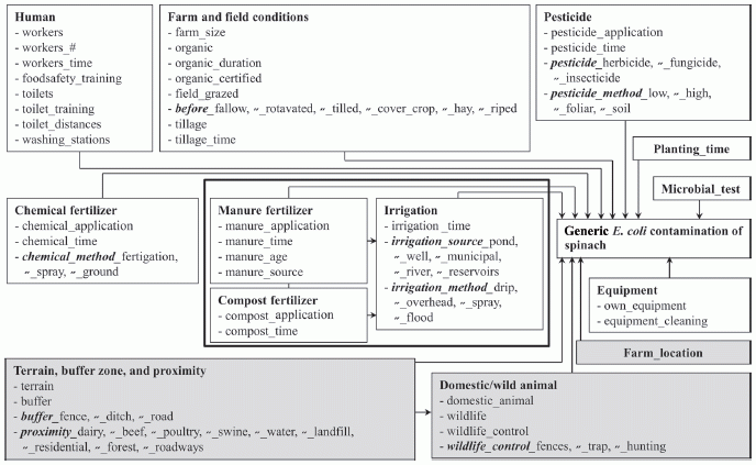
The following flow chart shows the possible sources of contamination that they considered. To help you focus, notice the box at the right, about half way down, which says "Generic E coli contamination of spinach". There are a lot of arrows pointing to that box. The chart is a collection of possible factors, which might lead to that box. (There is no need to read it in any detail.)
|
This is Figure 2 from the article. |
Data? The scientists studied 12 farms, over two states, and collected 955 samples of spinach over two years. They measured whether E coli bacteria were present in the spinach samples; about 7% of the samples showed this contamination. (E coli contamination is commonly taken as an indicator of fecal contamination.) They collected information about all the factors shown in the chart above. They then ran statistical tests to see which factors in their model were most correlated with contamination of the spinach.
What did they find? Interestingly, some of the factors they found most important were related to animals being around. For example, a spinach farm close to a poultry farm was predictive of contamination. They also found that measures to keep workers clean, such as portable toilets with hand washing facilities, helped to reduce contamination.
What does this accomplish? It leads to suggested improvements. If farmers act on the factors most correlated with contamination, it may lead to reduced contamination. Simply doing a study such as this, alone, does not solve anything; the study provides some guidance. In particular, it helps to set priorities about what the most important factors may be. The ideas generated by such a study need to be implemented -- and tested. That is, follow-up is needed to see that making desired changes leads to improvement -- and to identify what further measures might be called for.
News story: Factors That Influence Spinach Contamination Pre-Harvest Determined. (Science Daily, June 20, 2013.)
The article: Generic Escherichia coli Contamination of Spinach at the Preharvest Stage: Effects of Farm Management and Environmental Factors. (S Park et al, Applied and Environmental Microbiology 79:4347, July 2013.)
Background post about contaminated food: Killer chickens (December 2, 2009). Links to several related posts. Most are about contaminated meat, but one implicates flour.
Previous post about spinach: Golden rice as a source of vitamin A: a clinical trial and a controversy (November 2, 2012).
Previous post about agriculture: What is the proper use of crop land? (August 23, 2013).
My page Internet resources: Biology - Miscellaneous contains a section on Nutrition; Food safety.
August 30, 2013
Scientists have recently reported finding two stars that are rich in the element lead.
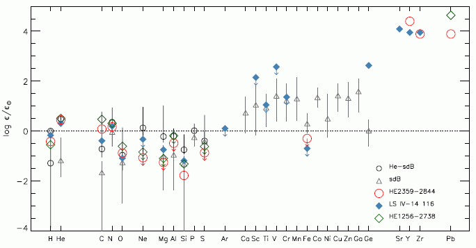
The following graph summarizes key data. If the graph seems complicated, start by noting that there is something special in the upper right corner. We'll fill out the story below.
|
The graph shows the amount of certain elements found in certain stars (or types of stars). The elements are listed across the x-axis; they are in order by atomic number. The y-axis is a measure of how abundant the element is. Before explaining the scale in detail, let's check that upper right corner again. There are data for four heavy elements, including lead (Pb). All the data points shown for those elements, for three individual stars, are quite high on this graph. To understand how high they are, we need to understand the y-scale. It shows how abundant each element is -- compared to our Sun, and on a log scale. 0 on the scale means that the amount of the element on the star is the same as on the Sun. 1 means it is 10-fold more abundant on the star than on the Sun -- and so forth. If you want the details... The y-axis scale is labeled "log ε/ε☉". ε (epsilon) is the abundance of the element in the star of interest; ε☉ is the abundance in the Sun. (The ☉ is a symbol for Sun.) That is, the ratio is the abundance of the element compared to that in the Sun. Then, the ratio is shown as a logarithm (base 10). 0 on the scale means the element has the same abundance on the star as on the Sun (ratio = 1; the log of 1 is 0.) 2 on the scale means the element is 100 times more abundant on the star (ratio is 100; the log of 100 is 2.)Most of the data in this figure are between +2 and -2; that is, the abundances are within about a factor of 100, one way or the other, from the Sun. The exceptions? Those points at the upper right, at about 4 -- meaning those elements are 10,000 times more abundant on those stars than on the Sun. This is Figure 6 from the article. |
The two points shown for Pb are results from the new article. These are the highest levels of Pb ever found for stars -- 10,000 times higher than on the Sun. That is the key observation for this new article.
The blue diamonds are for a star described in a previous article from the same lab. You can see that the blue-diamond star has high levels of strontium, yttrium and zirconium (Sr, Y, Zr). They referred to that star as a "zirconium star". One of the "lead stars" from the current paper is also high for those elements.
The first two symbols shown are for sets of stars, of particular types; the data points, with error-bar lines, show the range of values found for each element.
What do these discoveries of heavy metals mean? That is not entirely clear, and the authors spend considerable time discussing possibilities. Importantly, note that the measurements reported in such work are from the star's atmosphere; the comparison is the atmosphere of the star to the atmosphere of the Sun. It is likely that what they are seeing are "clouds". The question for stellar astronomers is why these metal-rich clouds form in some cases. For now, simply finding them is a step forward. For now, we have a zirconium star and a couple of lead stars.
With lead levels given as 10,000 times that in the Sun's atmosphere, you might wonder how high the level is. In the sun's atmosphere, the Pb is about one part in ten billion. In the atmosphere of the lead stars, it may be about one part in a million. They may be, relatively, lead-rich, but they are not balls of lead.
News stories:
* Astronomers Discover Two Heavy Metal Stars. (Sci.News, August 2, 2013.)
* Under leaden skies - where heavy metal clouds the stars. (Royal Astronomical Society, August 1, 2013. Now archived.)
The article, which is freely available: Discovery of extremely lead-rich subdwarfs: does heavy metal signal the formation of subdwarf B stars? (Naslim N et al, Monthly Notices of the Royal Astronomical Society 434:1920, September 21, 2013.) (The form of the first author's name used here reflects her preference, as shown in the paper.)
More about stars... Star formation has slowed down (December 4, 2012).
More about lead...
* Should physicists be allowed to use lead from ancient Roman shipwrecks? (December 2, 2013).
* CFL and LED lights: energy-efficient, but toxic (March 3, 2013).More about strontium... Revealing the alabaster sources of ancient artists (March 7, 2018).
More about yttrium... Y-Y: the first (May 5, 2019).
This post is listed on my page Introductory Chemistry Internet resources in the section Lanthanoids and actinoids.
August 27, 2013
The confined environment of a long plane trip may promote transfer of infectious organisms. Face masks may reduce such transmission. However, there is little real-world data on these effects. Thus a new article is interesting, even if not very conclusive.
The article is about a 24-hour flight sequence from New York to Hong Kong, and on to Fuzhou (China), during the 2009 flu event. Nine people were recorded as coming down with the flu in a time frame suggesting they acquired it on the plane. Authorities investigated; the new article is their report.
A key finding was that use of a face mask correlated with reduced chances of acquiring the flu. However, the data are extremely limited. The authors are cautious in their interpretation, and mainly encourage other such studies.
Here are their key data, as summarized in the abstract: "None of the 9 case-passengers, compared with 47% (15/32) of control passengers, wore a face mask for the entire flight..." Among the limitations of the study are that only 32 control passengers (those who did not come down with illness) were interviewed, and the type of face mask used is not recorded.
This article makes a modest contribution. It is perhaps interesting to look it over just to see how they did the study. The problem is important: the 2009 flu virus was disseminated around the world largely by plane; the geographical range of the novel and limited SARS epidemic a few years ago was defined largely by plane trips. Some fear what would happen if someone with Ebola managed to make a plane trip; is our main protection against this only that people with Ebola are too sick to travel, even at the earliest stages?
A preview (it's not quite a "news story"): CDC EID: Protection by Face Masks against Influenza A(H1N1)pdm09 Virus on Trans-Pacific Passenger Aircraft, 2009. (Pandemic Information News, August 23, 2013.)
The article, which is freely available at PubMed Central: Protection by Face Masks against Influenza A(H1N1)pdm09 Virus on Trans-Pacific Passenger Aircraft, 2009. (L Zhang et al, Emerging Infectious Diseases 19:1403, September 2013.)
Next post on the flu: Google tracks the flu -- follow-up (April 11, 2014).
More abut trying to reduce flu virus transmission: Effectiveness of alcohol-based hand sanitizers? (September 28, 2019).
Many posts on various flu issues are listed on the supplementary page: Musings: Influenza.
Also see: Should you get a rabies vaccination before boarding an airliner? (May 7, 2012).
And... Should you ask your doctor to go BBE? (May 12, 2014).
More about airplanes... Airport food: What do the birds eat? (May 24, 2014).
More about emerging diseases is on my pages for Biotechnology in the News (BITN): Emerging diseases. That discusses some general issues, and also links to some specific diseases, including SARS, that have emerged in recent decades.
August 26, 2013
Bach-deficient mice have defective immune systems.
More specifically, mice lacking the gene for the protein BACH2 have distinctive immune system problems. They tend to get inflammatory auto-immune diseases. So reports a recent article
Why did scientists look at the effect of BACH2 in mice? Human biology was offering hints. Many people with autoimmune diseases or allergies have small changes in BACH2. However, there has been no understanding of what this protein is doing. That is, analysis of humans suggested that BACH2 might be of interest, so the scientists checked in mice. The experimental mouse system allows them to introduce known mutations in a specific gene.
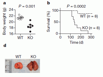
The following figure shows some of the results. The general plan is that the scientists made mice in which the Bach2 gene had been inactivated -- or knocked out, as they say; these mice are shown as KO. In each part, KO mice are compared with wild type (WT) mice.
|
Part a (upper left) shows the weight of the mice (at 3 months of age). You can see that the wild type (WT) mice grew better than the Bach2 knock-out (KO) mice.
Part b (upper right) show the survival curves. You can see that all of the KO mice died between about days 100 and 300. During that time, most of the WT mice survived. Part d (lower left) shows the lungs of one of each kind of mice at death. You can see that the lungs of the KO mouse are enlarged -- due to inflammation. This is Figure 1 parts a, b & d from the article. |
The Bach2 gene codes for a transcription factor, a protein that regulates the function of other genes. The effect of that BACH2 protein is complex; it affects the balance between various types of immune system cells. The current article shows that lack of BACH2 leads to rampant inflammation -- in mice. The observation that various small changes in Bach2 are associated with a variety of human immune system disorders is consistent with this. It will take a lot more work to sort out the details.
News story: NIH scientists find link between allergic and autoimmune diseases in mouse study. (National Cancer Institute, June 2, 2013. Now archived.) The news story contains a statement from the lead scientist of the project making the connection between the BACH protein and another Bach.
The article: BACH2 represses effector programs to stabilize Treg-mediated immune homeostasis. (R Roychoudhuri et al, Nature 498:506, June 27, 2013.)
What is a Bach protein? It took some effort, but I did track it down. Bach stands for "BTB and CNC homology". Not very helpful, is it? It's part of an attempt to classify proteins by common structural features. Whatever thoughts may have come to mind initially, the point is that Bach proteins may be important.
More about immune systems...
* Can eating peanut protein reduce the incidence of peanut allergy? (March 3, 2015).
* Should bees eat honey? (July 12, 2013).
* Exploiting the bacterial immune system as a tool for genetic engineering: The Caribou approach (May 4, 2013).
* Why the facial tumor of the Tasmanian devil is transmissible: a new clue (April 5, 2013).
* The role of the immune system in making stem cells (February 8, 2013).For more about Bach... Visualizing music (June 18, 2009).
August 24, 2013
We might frame that as a multiple-choice question...
A. They don't like to travel much.
B. Tuxedos are not appropriate for flying.
C. It's too expensive.
A new article provides evidence for answer C.
The idea of flightless birds is intriguing. After all, isn't flight a key characteristic that defines birds? However, there are various flightless birds. For flightless seabirds, such as penguins, we know they travel huge distances. Why don't they fly?
It's long been suspected that swimming and flying don't mix. Wings aren't good for swimming; flippers aren't good for flying. However, the experimental evidence to support this was minimal. The new article analyzes birds that seem intermediate: they swim well but still can fly. The scientists measure their energy usage -- and show that their flying is very expensive energetically.
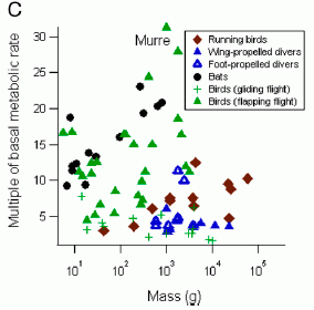
|
This figure shows the metabolic rate of various birds (and some bats) doing their major activity. That metabolic rate is shown here as a multiple of the basal (resting) metabolic rate (y-axis). This is shown against the body size (x-axis), though that ends up not being too interesting here.
Look at the highest value. It's at metabolic rate 31 times basal -- and is labeled "murre". The next highest point, about 28, is for the cormorant. This is Figure 1C from the article. |
Murre and cormorant. Two birds that do both fly and swim (or dive). They are well-adapted for the latter. They retain an ability to fly, but they are now the least-efficient fliers among the birds. Is this a pattern -- part of a shift from flying to swimming? The scientists suggest it is -- and that the penguins represent the next step, where ability to fly has been lost.
The authors take the story one more step. The murres are more efficient at diving than the cormorants are; for flying, it is the other way. The murres use their wings (flippers) for diving; the cormorants use their feet. Both of these birds are inefficient fliers. The murres are the least efficient, because they now completely rely on their "wings" for diving; for cormorants, the transition to diving is partial.
A caution... The headlines (including mine) about this work are about penguins. However, there is no work with penguins in the article. The experimental work is with the murres and cormorants. Their bigger story is about the energy needs for flying and diving; the scientists put together a hypothesis about how some birds are losing or have lost the ability to fly as they become better swimmers (or divers).
News story: New evidence suggests some birds gave up flight to become better swimmers. (Phys.org, May 21, 2013.)
The article: High flight costs, but low dive costs, in auks support the biomechanical hypothesis for flightlessness in penguins. (K H Elliott et al, PNAS 110:9380, June 4, 2013.) (Auks? For our purposes here, the auks include the murres.)
More about penguins... Does penguin language conform to the laws of human language? (February 18, 2020).
More about seabirds: Bird lays egg (March 19, 2011).
More about flying:
* What is the proper shape for an egg? (September 18, 2017).
* Progress toward an artificial fly (December 6, 2013).
* How to board an airplane (September 16, 2011).
* The traveling bumblebee problem (January 11, 2011).More about swimming or diving:
* Bigger spleens for a bigger oxygen supply in Sea Nomad people with unusual ability to hold their breath (July 2, 2018).
* Caltech engineer turns rat into jellyfish (September 22, 2012).
* Can giraffes swim? (August 6, 2010).More about anatomy and energy: The origins of baseball -- two million years ago? (August 18, 2013).
A book about flying is listed on my page Books: Suggestions for general science reading. Alexander, On the Wing -- Insects, pterosaurs, birds, bats and the evolution of animal flight (2015). The book includes a chapter on animals that have lost flight.
August 23, 2013
A new analysis of the use of crop land has just appeared. It's interesting. The authors start with the basics: on a global scale, we have an impending food shortage. They explore one consideration: how efficiently do we use crop land?
We commonly judge agricultural productivity by how many tonnes of crop we get per hectare. (Related measures, such as calories or protein are also used; the new article uses all of these.) However, not all of the crop is used to feed people. For example, some of the crop is used as animal feed. We may eat the resulting animal, but in terms of efficiency of use of crop for human food, that is a loss. Some crop is now used to make fuel. Whatever the merits of that may be, it's a loss of human food. These are the key points explored in the new article.
Some general remarks at the start... First, these ideas are not new. However, they are perhaps more fully developed here, with numbers, than we usually see. Second, look at this paper for its ideas, and avoid quick or simple judgment. The story of human food is complex; what's here is part of it. Try to see what their point is, and also try to see what the limitations are of their analysis.
Here are two of their figures, to provide a sense of their presentation.
The first figure shows what fraction of the food that is grown reaches the population. For this figure, they use calories to measure the amount of food. The calorie delivery fraction is, literally, the fraction of what the crop land produces that reaches the human population as food. It is corrected primarily by the two factors noted above: use for animal feed and use for fuel.
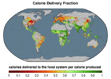
|
As an example of what this means...
If crops are directly eaten, then the fraction shown in the figure is high. Regions shown in green are efficient in delivering crop calories to the people. If crops are grown and then used to feed cows, the delivered food is low, because cows inefficiently process the crop. Regions shown in red are inefficient in delivering crop calories to the people. The American midwest, noted for beef production, is a good example. This is Figure 1 from the article. |
The next figure shows how many people are fed per hectare of crop land. As noted above, we might typically measure agricultural productivity by how much food is produced per hectare; the authors want to shift the emphasis to how many people are fed. This takes into account the inefficiencies of crop use noted above.
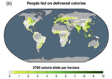
|
Note that the color scale used here is different from the one above. This one runs from green through yellow to white. (Wouldn't it be nice if they used the same scale in different figures.)
For perspective... The world average is about 6 people fed per hectare of crop land. |
|
As examples... In the first figure, a striking red area is the US midwest, and a striking green area is India. However, the current figure shows that they end up feeding about the same number of people per hectare of cropland. (Detailed numbers given for the entire countries agree with that.) Another green area in the first figure is southern Africa; however, it is one of the poorest regions in the current graph. This is Figure 3b from the article. | |
The relationship between the two graphs is complicated and interesting. At least in part, inefficient use of crop land is a choice -- one dictated by a preference for meat. The authors note that societies tend to move to greater meat consumption as they become more affluent.
The authors say that their main goal is to move the focus toward how much food reaches the people. Use of crop land for animal feed diverts crop production away from human food. It's a good point, but it is not the whole story. The authors point out many limitations of their analysis. For example, they ignore food waste. That is also an important issue, just not one they choose to deal with here. They note that their criticism of using crop land for animal feed is not a criticism of eating animals per se. Animals grown "wild" (not competing for human food) are not included in their analysis. Again, the authors recognize such limitations; it's important that readers do, too.
Somehow I end up wondering... What if people planned? Period. It's not that this paper is right or wrong, but that it is an attempt to plan. It's only part of what should be considered, but it is planning.
News story: Food for 4 Billion More People: How Reallotting Croplands Could Offer Solution to World Hunger. (Medical Daily, August 3, 2013.)
The article, which is freely available: Redefining agricultural yields: from tonnes to people nourished per hectare. (E S Cassidy et al, Environmental Research Letters 8:034015, August 1, 2013.)
The "Supplementary Information" file, linked to the article at the journal web site, includes a table showing how each country in the study uses its crop land. Quickly scanning the table, it looks like the percentage of crop calories allocated to human food ranges from a low of 19% (Finland) to a high of 99.9% (Barbados). (If you check out this table, note that the countries are listed alphabetically by their country code, not by their name.)
A recent post about crop efficiency: DEEPER ROOTING leads to deeper rooting -- and to drought tolerance (August 16, 2013).
More about the food supply...
* Implementing improved agriculture (January 6, 2017).
* Doggy bags and the food waste problem (January 4, 2017).
* How do vegetables get contaminated? (August 31, 2013).More about Barbados... Are urban dwellers smarter than rural dwellers? (August 2, 2016).
August 20, 2013
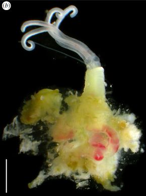
|
|
This is an Osedax. The name means that it eats bones. Whale bones, in particular. It's a new species of Osedax, just discovered in the Antarctic and reported in a new article.
The purpose of the work was to explore the fate of bone and wood on the Antarctic seafloor. The approach was experimental: the scientists put pieces of whale bone and wood on the seafloor; they came back a year later, collected the materials, and examined them.
The main finding was that the whale bone was populated by Osedax worms (and more), whereas the wood was largely untouched.
Osedax worms were discovered only a decade ago, but are now known to be widely distributed. They are found on bones, especially whale bones, on the ocean floor around the world. Osedax worms are interesting organisms. They secrete acid to bore through bone, and establish themselves attached to it. They then eat what is inside. Eat? These worms have no mouth. They have no digestive tract. What do they do? They carry bacterial symbionts -- in that root-like structure you see above, the part that penetrates the bone. The bacteria eat, and the worms grow on the bacterial products. The lifestyle of Osedax worms -- incompletely understood -- seems similar to that of the tube worms found at deep sea vents. The new work found Osedax worms on the whale bone: two new species, perhaps specialized for the cold waters of the Antarctic. The worm shown above is an Osedax antarcticus.
The lack of growth on the wood is interesting, too. Antarctica lacks wood -- and has lacked wood for millions of years. The surrounding seafloor may lack wood, too -- except for the small amount deposited by man as shipwrecks. The ocean currents around Antarctica may make it hard for larvae to enter the surrounding waters. The lack of wood and poor circulation may mean that wood digesters are rare in the region. Does this mean that old wooden shipwrecks there may be in good condition? This article may provoke people to find out. Ernest Shackleton's Endurance has been lying there since 1914; will someone now go after it?
Whales and wood. Weird worms. The waters of the Antarctica. The promise of recovering shipwrecks. It's an interesting article!
News story: Bone-eating worms thrive in the Antarctic. But wood-boring counterparts did not turn up in the frigid waters. (Nature News, August 14, 2013.)
The article, which is freely available: Bone-eating worms from the Antarctic: the contrasting fate of whale and wood remains on the Southern Ocean seafloor. (A G Glover et al, Proceedings of the Royal Society B 280:20131390, October 7, 2013.) If nothing else, browse it for the pictures.
More from Antarctica:
* IceCube finds 28 neutrinos -- from beyond the solar system (June 8, 2014).
* Life in an Antarctic lake (April 22, 2013).* Previous whale post: Killer whales: menopause (October 1, 2012).
* Next: On a similarity of bats and dolphins (September 15, 2013).More about whale bones: Whales in the Chilean desert -- the oldest known case of a toxic algal bloom? (April 13, 2014).
More about the role of Osedax in the degradation of whale carcasses: Animal communities around bone-eating worms (June 16, 2017).
More about Osedax: What did Osedax worms eat before there were whales? (May 30, 2015).
The Osedax is a member of the phylum of Annelids. Here are other posts about Annelid worms:
* Melatonin and circadian rhythms -- in ocean plankton (November 24, 2014).
* Unusual synthesis of cadmium telluride quantum dots (February 15, 2013).And more worms -- and their association with bacteria... How does worm "fur" divide? (January 4, 2015).
More about shipwrecks...
* Should physicists be allowed to use lead from ancient Roman shipwrecks? (December 2, 2013).
* An ancient navigation device? (April 16, 2013).* Previous quiz... Quiz: What is it? (November 20, 2012). More unusual fauna from the oceans.
* Next... Quiz: What are they? (September 27, 2013).More about bacterial symbionts... The aphid-bacterium symbiosis: a step toward manipulating it (May 15, 2015).
More about wood: Building with wood: might it replace steel and concrete? (June 14, 2017).
More floors: How does a robot know the floor is clean? (October 30, 2021).
August 19, 2013
Los Angeles and San Francisco. About 400 miles (640 km) apart. It's a seven hour drive, or an hour flight. It's one of the most heavily traveled intercity routes in the world, with not much in between. Hyperloop would cut travel time to about a half hour, and would be cheaper than current or other proposed alternatives.
Hyperloop is a proposed transportation system. The heart of it involves capsules holding 28 passengers traveling through an evacuated tube at near the speed of sound.
Musings wouldn't normally present something that is simply a fanciful proposal. However, a couple of things make this proposal different. First, its father: the proposal is from Elon Musk. Musk is founder of Tesla Motors and SpaceX; he has a track record of technical innovation. Second, the proposal is being put out to the public for comment; it's an open source proposal, as Musk describes it. He has no plans to work on it; it's out there for consideration. Looking at the Hyperloop proposal is not about declaring it good or bad, but about analyzing it, and perhaps deciding what needs to be done.
The announcement: Hyperloop. (E Musk, Tesla Motors blog, August 12, 2013. Now archived.) This is a short introduction. It links to the full proposal, a 57 page pdf file. The first few pages of that is a general overview, not too different from the blog page. The rest is more technical. However, I encourage you to continue with the pdf proposal, if you want more. Much of it is a very readable description of the system. There may be some details you want to pass over, but it is generally good.
A news story: Musk's Hyperloop Plan Draws Praise, Skepticism -- Is 'fifth mode' of transportation just hype? (National Geographic, August 13, 2013. Now archived.) The announcement of the Hyperloop proposal received much news attention -- most of it of little value. After all, what do we want to know, beyond the basic description? We want to know if the proposal is worth pursuing. Instant analysis has little to offer; even engineers need time to work through it. I chose this one news story as an example. It does quote one engineer, who says all the parts sound plausible, but that it would be quite a project to put it all together. Fair enough.
Anyway, it's fun.
Tesla Motors was mentioned in the post Electric cars (May 9, 2009).
A post about problems with current transportation systems: Traffic congestion patterns analyzed from cell phone records (July 7, 2013).
Among other "fanciful proposals" to make Musings... TALISE: A better boat for Titan? (October 16, 2012).
More about traveling... Exoplanet Travel Bureau (February 21, 2015).
More about capsules: Making chemistry easier: single-serving capsules (October 30, 2015).
August 18, 2013
A recent post pushed our story of the history of cancer back by about 100,000 years [link at the end]. A new article may push our story of the history of baseball back by two million years.
The new article is about throwing -- an activity that only humans do well. It's based in part on measurements of baseball pitchers, leading to some understanding of the anatomy that allows a fast pitch (over 100 miles per hour -- as most Americans would know).
The scientists take high speed video of trained pitchers, and analyze the motions. A key finding is that much -- perhaps half -- of the energy in the pitch has been stored in the shoulder.
In another part of the work, they examine anatomical differences between man and chimp. Chimps do not throw much; apparently, they can be trained to throw accurately, but not very hard. The scientists end up focusing on something called the humeral torsion -- an anatomical feature, relating to how the arm is attached.
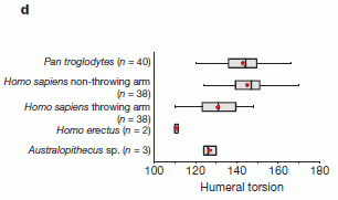
|
The figure offers an interesting point about the humeral torsion.
It shows the range of humeral torsion found in various animals. The graph shows what they know, for chimps (Pan), humans (with separate data for the two arms), and for two extinct hominins. |
|
The figure shows that the humeral torsion is lower for the throwing arm than for the non-throwing arm. It also suggests that it is lower for humans than for chimps -- for the throwing arm (the dominant arm). And it suggests that the lower value for this angle may be an ancient trait, found in samples of extinct hominins. It is plausible that better throwing was important for early humans -- either for improved hunting, or for more rapid promotion to the major leagues. This is Figure 4d from the article. | |
If you want to take some of those points with some skepticism, that's good. The graph shows what they have. That graph is the basis of the suggestion that a trait needed for good throwing might be very ancient. Even if you don't buy the data at this point, it is something that may well be testable with further data. Regardless, their basic findings are about how humans throw, and that part stands.
News stories:
* Origins of human throwing unlocked. (BBC, June 26, 2013.) Includes some views of scientists who are skeptical of the authors' interpretation.
* How Humans Evolved to Throw a Fastball. (Discover, June 26, 2013.) Includes a little more about the chimps.
* Pitching Science: Why Apes Make Bad Pitchers. (BetterPitching.com, July 2, 2013.) This is not an ordinary science news site, but this page is fun -- and actually rather well done.
Movie. There is a 2 minute promotional video about the article, from the journal. It gives a useful overview of the work -- and has some cute footage. Why chimps don't play baseball. (YouTube, from Nature magazine.)
The article: Elastic energy storage in the shoulder and the evolution of high-speed throwing in Homo. (N T Roach et al, Nature 498:483, June 26, 2013.) Check Google Scholar for a freely available copy.
Background post, on early cancer: A tumor in a Neandertal (July 8, 2013).
Among other posts about baseball:
* Effect of climate change on baseball games (June 10, 2023). Links to more.
* Comparing the death rates of American football and baseball players (July 2, 2019).
* The Mudville story, on its 125th anniversary (June 3, 2013).
* Baseball physics (July 31, 2011).There is now an extensive list of sports-related Musings posts on my page Internet resources: Miscellaneous under Sports.
More about anatomy and energy: Why don't penguins fly? (August 24, 2013).
Also see:
* Can chimpanzees learn a foreign language? (March 10, 2015).
* On handedness in humans (September 30, 2013).
August 16, 2013
Drought is a serious problem for plants -- and for those who grow plants for their use. A new article offers an advance in dealing with drought for one of the world's most important crop plants.
The background is that rice varieties vary in their drought tolerance. In the new work, the scientists find one gene that plays a key role in promoting drought tolerance. They cross this gene into another rice variety -- and it works: the new rice strain is now drought tolerant.
The gene they find affects the nature of the root system of the rice plants, in a fairly simple way. Some varieties of rice have shallow roots, whereas some have deep roots. The deeper roots allow the plant to tap deeper water, and thus promote drought tolerance. The gene for this trait is called DEEPER ROOTING 1, or Dro1 for short.
Here is what the two kinds of root systems look like.
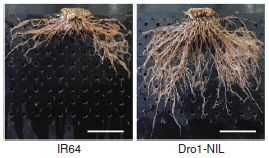
|
The figure shows the root systems of two plants.
IR64 (left) is a standard, widely used rice variety. Its roots are shallow. Dro1-NIL (right) is a strain they constructed by crossing IR64 with another variety, which carried the deep-rooting allele for Dro1. This is part of Figure 1a from the article. The scale bar is 10 cm |
Here are some results showing how the new Dro1 allele affects the response of rice to drought.
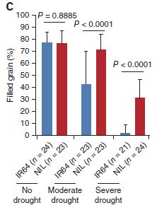
|
The figure shows the grain yield per plant, under various conditions.
The conditions are no drought, moderate drought, and severe drought -- as labeled at the bottom. For each condition, they tested the same two strains shown above: IR64 (blue bars) and Dro1-NIL (now called simply NIL; red bars). |
|
In the "no drought" condition, the two strains produce about the same amount of rice. (If you look carefully, you can see that the yield for the new strain is a bit lower, but it is not statistically significant. Further testing is needed to be sure.) In the "moderate drought" condition, the new strain makes as much rice as before, whereas the original strain is substantially reduced. In the "severe drought" condition, both strains show reduced yield. However, the new strain does much better than the original strain. This is part of Figure 5c from the article. | |
In summary, the new strain does as well as the original strain under normal conditions, and does better under drought conditions. That's encouraging.
Is there any downside to using the new deep-rooting Dro1 allele? So far, they don't see any problems. In particular, the growth of the strains with and without the deep-rooting allele seems similar when water is plentiful. The scientists attribute the observed effects to changes in the Dro1 gene, but do not have proof of that at this point. Dro1 seems to affect the angle at which roots form, but they do not know how this occurs. As always, further work should proceed with caution, being alert for unexpected findings, including unexpected effects under real conditions in the field.
News stories:
* Rice Gene Digs Deep To Triple Yields In Drought. (Asian Scientist, August 6, 2013.)
* Newly-discovered rice gene goes to the root of drought resistance. (International Center for Tropical Agriculture (CIAT), August 6, 2013. Now archived; ignore the message about the site moving.) This is from one of the participating institutions.
The article: Control of root system architecture by DEEPER ROOTING 1 increases rice yield under drought conditions. (Y Uga et al, Nature Genetics 45:1097, September 2013.)
Glossary entry: Allele.
A post about the opposite problem for rice: What to do if you are about to drown (September 23, 2009).
Another post about drought tolerance: Plants need bacteria, too (October 9, 2010).
More about rice:
* A perennial rice (March 4, 2023).
* How rice leads to global warming, and what we might do about it (September 2, 2015).
* Can growing rice help keep you from becoming WEIRD? (July 22, 2014).More about crop efficiency -- the big picture: What is the proper use of crop land? (August 23, 2013).
August 14, 2013
A news headline touts 5D-storage and a million year lifetime for a new type of data storage medium. What's real? What's hype? It's hard to tell, but the story is interesting.
What's the story? The scientists use a high energy laser to write to glass. The laser energy modifies the structure of the glass; the changes -- the data -- can be read with a microscope. Thus the data is stored in local structural changes of the glass itself. The new report provides technical developments in the laser writing system, plus a little demonstration.
5D? Three of the dimensions are the spatial coordinates of the spot in the glass. Two involve the optical properties of the altered spot. In common data storage, there is one bit of information (0 or 1) at a particular site (address). In the demonstration reported below, it is three bits per spot. They may intend higher data storage at some point.
Storage life? There is nothing in the current work about storage life, except for some references to earlier work.
The immediate reason the story comes up is that the scientists recently gave a talk about the work. As usual when a post is based primarily on a meeting report, information is limited, and we'll be brief. The point is to note something of interest. The team has been working on this for some time, and background information is scattered throughout the literature. From looking at a couple of the papers, it seems the system is quite experimental. They have only limited understanding of how it actually works. The demonstration reported is a first, but is a modest step. A story in progress; a story worth watching.
News story: 5D nanostructured quartz glass optical memory could provide 'unlimited' data storage for a million years. (Kurzweil, July 10, 2013.)
The text of the meeting talk, which is freely available: 5D Data Storage by Ultrafast Laser Nanostructuring in Glass. (J Zhang et al, Conference on Lasers and Electro-Optics (CLEO), June 2013.) The actual accomplishment was recording -- and then reading -- a 300 kb text file.
Another post exploring an approach to long term data storage: Using DNA for data storage (March 5, 2013).
More about data storage: Progress toward an ultra-high density hard drive (November 9, 2016).
More about silica: Croatian Tethya beam light to their partners (December 16, 2008). This post is about silica-based sponge spicules being used for light transmission -- in the sponge.
More about glass:
* How to mold glass (June 19, 2021).
* Turning metal into glass (September 21, 2014).More about memory: A mouse that remembers an event that did not happen (September 3, 2013).
Thanks to Borislav for suggesting this item.
August 13, 2013
Surgical removal of a tumor is complex. The surgeon wants to remove the entire tumor, but little normal tissue. How does one tell? A common approach is that samples of the tissue that are removed are sent out to the pathology lab, where they are analyzed -- while the surgeon waits. The pathologist reports back, for each sample, that it is tumor or normal. This can take a half hour or so.
A new article offers the prospect of "instant" analysis of the removed tissue to see if it is tumor or normal. The trick is to send the sample to the chemistry lab, rather than to the pathology lab. More specifically, the tissue removed by the surgeon's knife is sent directly to a machine for chemical analysis.
The following figure is a cartoon of the scheme.
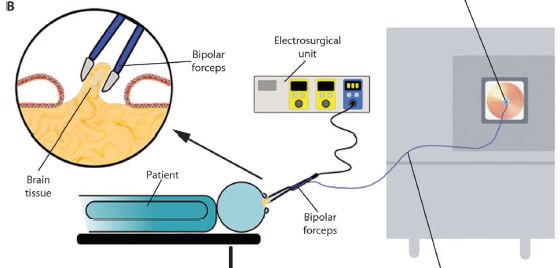
|
|
You might start with the patient -- bluish, at the bottom (and labeled). The round part at the right is the head. It's open, because they are doing brain surgery. You can see the "bipolar forceps", a tool that is inserted into the head, and is also connected to instrumentation. A control unit is at the top -- the "electrosurgical unit"; the big box to the right is a mass spectrometer (commonly called "mass spec"). The forceps is the tool for removing tissue; it is a type of surgical "knife". You can see more detail about it in the circled part at the upper left. The forceps (or knife) removes a bit of brain tissue. The tissue is burned. This is all standard. What's new is that the vapors -- or smoke -- from the removed tissue can exit via the forceps and go to the mass spec for analysis. That is, the scientists have attached a mass spec to the current "knife" the surgeons use. They call their new device an intelligent knife, or iKnife. Of course, it's not the knife that is intelligent, but the mass spec. This is Figure 1B from the article. |
The mass spec -- a chem lab instrument -- is the key here. It measures the mass of the molecules in the smoke. With a little luck, it even identifies what they are; however, that really doesn't matter much here. What the scientists do is simple pattern matching. The pattern of molecules in smoke from cancer tissue is different from the pattern from normal tissue. The mass spec computer compares the surgeon's sample with its database of tumor and normal tissues, and reports back whether the sample is tumor or normal. It does this within a few seconds.
Here is an example of what the analysis looks like, and how it distinguishes normal and cancerous tissue.
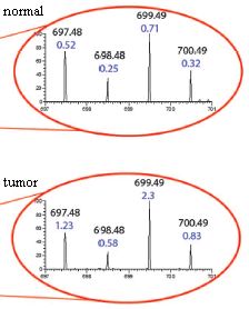
|
Two samples were analyzed here. One is a sample from normal liver; the other is a sample from a tumor that has metastasized to the liver from a breast cancer. The small part of the mass spectrum shown here has four peaks. Two numbers are shown for each peak. The upper number is the mass for this peak (e.g., 697.48 for the left-hand peak). (That's the molar mass, or molecular weight, of the chemical of this peak.) The lower number is the amount of material in this peak. This is expressed on a relative scale, where "1" is the amount of another peak not shown here (but well marked in the full figure in the article).
You can see that there is about twice as much of the left-peak chemical (697.48) in the tumor sample (1.23) compared to the normal sample (0.52) -- and so forth. If this strikes you as tedious and difficult... remember, the actual analysis is done by the computer and is based on many peaks. |
|
This is slightly modified from part of Figure 2 B & C from the article. In the article, part B shows the complete mass spectrum for the "normal" sample; part C shows the complete mass spectrum for the "tumor" sample. Then, one small region of each is expanded; that is what is shown here. I have added the labels "normal" and "tumor". The red lines have no significance at this point; in the full figure, they show where these expanded regions come from. | |
The iKnife is a surgeon's knife now connected to a mass spec, so that the surgical sample can be instantly analyzed. The new article is the first test of this device during human surgery, and it scored well.
News stories:
* Next Generation: Smoking Out Cancer -- Researchers analyze smoke generated during surgical tumor removal to distinguish healthy and diseased tissues in real time. (The Scientist, July 17, 2013. Now archived.)
* 'Intelligent knife' tells surgeon if tissue is cancerous in 3 seconds. (Kurzweil, July 19, 2013.)
The article: Intraoperative Tissue Identification Using Rapid Evaporative Ionization Mass Spectrometry. (J Balog et al, Science Translational Medicine 5:194ra93, July 17, 2013.)
More about brain surgery: 3D printing: Neurosurgeons can practice on a printed model of a specific patient's head (December 16, 2013).
My page for Biotechnology in the News (BITN) -- Other topics includes a section on Cancer. It includes a list of some other Musings posts on cancer.
Another post reporting a medical use of mass spectrometry: A new, simple way to measure bone loss? (September 14, 2012).
More mass spectrometry:
* Close-up view of an unwashed human (July 29, 2015).
* Iridium(IX): the highest oxidation state (December 14, 2014).
August 11, 2013
Near-death experience (NDE) is what is reported by people who have been, well, near death but survived. Intriguingly, many such people report experiences that seem rather similar. A recent article explores the "quality" of these NDE "memories".
Caution... Some of what is reported here may be met with skepticism. My goal is to describe what the scientists did and what they claim. Try to understand what it is they did. If it raises questions, that is fine. This is a controversial field. Experts do not agree what is going on. The current article is an interesting contribution to the field, but neither the authors not I claim it is "the answer".
The general idea behind the new work is to ask whether "memories" of NDE are "real". There are standard tests to measure the quality or strength of memories. Here the scientists apply those tests to NDE "memories", along with some other types of memories for comparison. As background, it is known that memories that are imagined rate lower on these tests than real memories.
The tests were run on four groups of people. The first three were people who had been in a coma. These were subdivided into three groups:
* those who had NDE,
* those without NDE but with memories of the coma,
* and those with no memory of the coma.
* A fourth group was a control group of "normal" people, without coma experience.
Each person was asked to recall certain things, and their recollections were rated by the standard tests.
Here are the results of one test. In this test, each person was asked about a "target" memory. People in the NDE group were asked about the NDE; people in the coma group (with memories of it) were asked about the coma. Others were asked about a childhood experience. (Hm, I wonder how good a control that is. Anyway, that's what they did.)
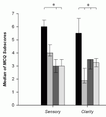
|
The graph shows what they found. Look at the left block of bars, the block labeled "sensory". This compared the four groups of people described above. Those four are, in order from the left:
* NDE -- the darkest bar, at the left * coma (and memory of it) * none (coma, no memory of it) * control -- the lightest bar, at the right |
|
You can see that the NDE group (left bar of each data set) showed the strongest response. Whatever it is that the test is measuring, the NDE memories scored highly. That's true here for the "sensory" category (left data set) and for the "clarity" category (right data set). The full figure shows five such data sets; NDE gave the highest result in four of them. (In one, the four test groups were about the same.) This is part of Figure 2 from the article. I have shown only the two categories on the left side of the published figure. | |
Another test compared these same people for different kinds of memories. These included the target memories, discussed above, as well as other real and imagined memories. The general result was that the NDE memories rated highly -- higher than other real memories and certainly higher than imagined memories.
What do we learn from this? The general picture is that NDE memories are real, not imagined. The authors say, near the end of the abstract, that " ... their physiological origins could lead them to be really perceived although not lived in the reality." The work suggests that there is some biological basis behind NDE memories.
News story: Memories of Near Death Experiences: More Real Than Reality? (Science Daily, March 27, 2013.) Good overview.
The article, which is freely available: Characteristics of Near-Death Experiences Memories as Compared to Real and Imagined Events Memories. (M Thonnard et al, PLoS ONE 8(3):e57620, March 27, 2013.)
More about NDE:
* Briefly noted... Was thanatosis the origin of near-death experiences? (August 11, 2021).
* Brain activity at the time of death: Do rats have "near-death experiences"? (March 8, 2014).
* Near-death experiences: the CO2 connection (April 28, 2010).More about memory:
* More about memory: A mouse that remembers an event that did not happen (September 3, 2013).
* Caffeine boosts memory -- in bees (April 12, 2013).My page for Biotechnology in the News (BITN) -- Other topics includes a section on Brain (autism, schizophrenia). It includes an extensive list of brain-related Musings posts.
August 9, 2013
If you knew how much money you had in your pocket and how many days it had to last, you could divide the two, and calculate how much you could spend each day. If you knew how much energy reserve you had and how many hours it had to last until your next meal, you could divide the two, and calculate how fast you could use your energy without running out. According to a new article, the tiny plant Arabidopsis apparently does just that.
Arabidopsis uses light energy during the day. Among other things, it makes some starch, which is held as an energy reserve for the night. It then uses the starch as its energy source during the night. Running out would be bad; having much left over would represent an inefficiency.
Here is an example of how this little plant makes and consumes starch...
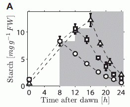
|
The graph shows the starch content of the plants (y-axis) versus time of day (x-axis), for three conditions. The plants were grown in light for the first part of the day (light region of graph), and then switched to darkness (shaded region).
In the three conditions, the lights were turned off at various times: 8, 12, or 16 hours. (All the plants had been maintained with a 12 hour light - 12 hour dark cycle prior to the experiment itself.) |
|
For example... The circle points are for plants that were grown for 8 hours in light, then 16 hours in the dark. You can see that the starch level rises during the period of light, then declines during the darkness. The rate of using starch (the slope of the line during the dark period) is about constant in each case; by the end of the night, each plant has about used up its starch. That is, the plant adjusts its nighttime usage of starch, depending on how much it has and how much darkness is coming. That means that the plant knows how much darkness is coming. This is Figure 1A from the article. | |
Should we be surprised by the result? In one sense, no. It clearly is of benefit to the plant to use its starch judiciously. However, it's less clear why the plant would be able to adapt so readily to sudden major changes in day-night length.
How can the plant do such math -- or at least appear to do so? One can imagine various strategies. Here is one simple possibility... Imagine that the plant makes two signaling molecules: one is a measure of the amount of starch, and the other is a measure of darkness. The first is simple enough: it might even be the amount of starch itself, although using a small soluble molecule might work better. The second? What if, during the light period, the plant made a molecule that controlled the rate of degradation of starch. The longer the light period, the more of the degradation signal it makes. That leads to long days -- which have short nights -- having fast usage of the starch.
The signal for degradation might be the enzyme that degrades starch. That's logical, but may be expensive. More efficient might be a small molecule that controls the starch-degrading enzyme. The main purpose for now is to see the logic of how a system might work -- how a plant may appear to carry out math.
The plant does not literally do math. But it does measure things. The amount of a particular chemical may well be a measure of how long the plant has been making it. The relative amounts of chemicals can determine process rates. And natural selection, acting on such processes, can lead to plants having useful behaviors, which promote their survival.
The authors present some models, to explain the graph above and the other work they report. The models are not answers, but ideas; they are a framework for further work. What should follow is analysis to find out the molecular components of these signals. They begin such analysis in the paper.
News story: Plants do sums to get through the night, researchers show. (Phys.org, June 23, 2013.)
The article, which is freely available: Arabidopsis plants perform arithmetic division to prevent starvation at night. (A Scialdone et al, eLife 2:e00669, June 25, 2013.)
Posts on math abilities of animals include: Making smarter flies (July 18, 2012).
Also see: Multiplication tables, bamboo, 2300 years old (January 13, 2014).
Posts on how organisms tell time include: Light-dark (day-night) cycles affect pregnancy (August 10, 2012). I didn't use the term above, but the Arabidopsis work discussed here is an example of circadian (daily) rhythms.
Among other posts about using Arabidopsis... Cauliflower math (July 26, 2021).
August 5, 2013
Here are photographs of the largest known virus, as reported in a new article.
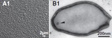
| |
|
The left frame (A1) shows a collection of the viruses as photographed under the light microscope. Note the 2 micrometer scale bar; these things are about the size of common small bacteria. The right frame (B1) shows one virus particle, as observed by electron microscopy. It's about 1 µm long (consistent with part A1). (The arrowhead? It points to a dot; the authors don't know what the dot is.) This is part of Figure 1 from the article. | |
These viruses grow in amoebae. They are part of a story that has developed over the last decade or so of finding larger and larger amoeba viruses. The new article reports two new amoeba viruses, which the authors call pandoraviruses. They are not only large, but complex. The bigger one, the virus shown above, has a genome of 2.5 million base pairs, with 2500 genes. Both those numbers are more than half of what the common bacterium Escherichia coli has.
A biologist's first instinct is that any infectious agent this big is likely to be a cell. After all, viruses are small; few are visible at all with a light microscope. Yet this is a virus -- unmistakably. It does not grow and divide, as a cell would. It empties its contents into a host cell, where a hundred or so progeny are then made. It's pretty much a typical virus life cycle. What's novel is the size and complexity of this virus.
The authors make another, more speculative point about these new viruses. Most of the genes (95%) are unrelated to anything they know. These viruses aren't even related to other amoeba viruses known so far. That's odd. What does it mean? The authors speculate that these viruses may be remnants of some unknown life form. They even speculate it might be something completely distinct from the three domains of life we know about (bacteria, archaea, eukaryotes). Interesting speculations -- with little to go on at this point. It's also possible that we just haven't found the relatives of these viruses. These speculations appear in the final paragraph of the article. Unfortunately, the speculations dominate much of the news coverage. Speculations aside, these are the largest known viruses -- and they raise interesting questions.
News stories:
* New Giant Viruses Break Records. (The Scientist, July 22, 2013.)
* Changing View on Viruses: Not So Small After All. (C Zimmer, New York Times, July 18, 2013. Link is now to Internet Archive.) Excellent.
* News story accompanying the article: Microbiology: Ever-Bigger Viruses Shake Tree of Life. (E Pennisi, Science 341:226, July 19, 2013.) Beware the hype.
* The article: Pandoraviruses: Amoeba Viruses with Genomes Up to 2.5 Mb Reaching That of Parasitic Eukaryotes. (N Philippe et al, Science 341:281, July 19, 2013.) The article should be freely available at the journal web site, with registration. Also, check Google Scholar for a copy.
This is the first Musings post on the large viruses of amoebae. However, the topic has long been on my page Unusual microbes in the section A huge virus. That contains background on the nature of viruses, and some of the earlier work on the amoeba viruses.
More about such viruses...
* More giant viruses, and some evidence about their origin (June 13, 2017).
* Recovery of live, infectious virus from 30,000 year old permafrost (March 25, 2014).More about amoebae...
* Capsaspora owczarzaki and you or Where did animals come from? (April 10, 2011).
* Farming by amoebae (February 15, 2011).More about the three domains of life... Carl Woese and the archaea (January 12, 2013).
A previous "largest"... The spruce genome: it's big (July 1, 2013).
There is more about genomes on my page Biotechnology in the News (BITN) - DNA and the genome. It includes a list of Musings posts on sequencing and genomes.
Thanks to Borislav for suggesting this article.
August 4, 2013
A recent article reports the genome sequence of a horse. A horse that may be 700,000 years old. It's the oldest genome yet sequenced, by about a factor of five.
The article is of interest for two reasons. One is the information it provides about the horse lineage. The other is the implications for sequencing ancient genomes.
Horses...
The primary focus of the article is determining the genome sequence for a fossil horse bone that was recently found at Thistle Creek in Canada's Yukon Territory. The bone is estimated to be about 560-780 kiloyears (kyr) old. Sequencing this Thistle Creek sample was a technical achievement, which we'll return to in a moment. Having a genome sequence for such an old sample helps in setting out genealogy charts. To assist further, the scientists sequenced several other horse samples.
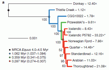
|
This figure shows the relationships they infer between various kinds of horses, based on the available DNA sequence information -- much of it from this article.
Numbers such as 12.40X, shown for the donkey, indicate the extent of the DNA sequencing; 12.40X means that the amount of sequencing done covered the genome, on average, 12.4 times. Most modern genome sequencing uses several-fold coverage; 10X or so is common in the figure. The high coverage helps to reduce errors. However, the Thistle Creek sample was sequenced only 1.1X -- due to shortage of material. Another sample was sequenced less than 2X; it, too, is from an old fossil: 50 kyr in that case. |
|
The authors show their best estimates of how the various horses are related. The first branch point they show is between the donkey and the horse group. They now date this split at about 4 million years. That's further back than earlier estimates, but such estimates depend on assumptions that are hard to test. That branch point is marked by a dark dot on the genealogy chart, near the upper left. It is described, with a date estimate, in the figure legend at the lower left. MRCA = most recent common ancestor. This is Figure 3a from the article. | |
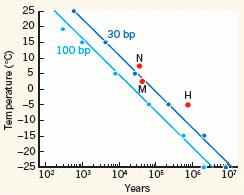
Ancient genomes...
The Thistle Creek horse genome is the oldest genome yet sequenced, with an estimated age of 700,000 years. It was done with the latest technologies for sequencing degraded DNA. Importantly, it was possible because of how the bone it came from had been stored over the ages. The colder the better -- and this Arctic bone was stored cold.
So what does the future hold? What if we find fossils from even colder storage? The "News and Views" item accompanying the article explores this, and presents a graph...
|
This figure at the right shows the stability of DNA (x-axis) vs storage temperature (y-axis). Stability of DNA is shown as the half-life of the DNA. There are two curves, for two different lengths of DNA chains. 30 base pair (bp) chains are now useful in genome sequencing.
These curves are based on various data, including success of sequencing DNA from samples found at various T. A point labeled H is for the newly-sequenced horse. It's the oldest DNA yet sequenced -- and the coldest. |
|
|
What's intriguing of course is extrapolating those lines. What if we could find DNA samples that had been maintained at even lower T? It seems that we might get even older DNA sequences: perhaps as old as a million years -- or more. This is Figure 2 from the Nature "News and Views" story accompanying the article. | |
If you're interested in horses, look over the first figure above. If you're interested in the future of sequencing of ancient genomes, savor that second figure -- the lower right corner.
News stories:
* Ancient horse bone yields oldest DNA sequence. (BBC, June 26, 2013.)
* Horse Genome Is Oldest Ever Sequenced -- By sequencing the genome of a 700,000-year-old horse, researchers have pushed back the time of DNA survival by almost an order of magnitude. (The Scientist, June 26, 2013. Now archived.)
* A 700,000-Year-Old Horse Gets Its Genome Sequenced. (Science Daily, June 26, 2013.)
* "News and Views" story accompanying the article: Ancient DNA: Towards a million-year-old genome. (C D Millar & D M Lambert, Nature 499:34, July 4, 2013.) Interesting title. The second graph above, about old DNA, is from this story.
* The article: Recalibrating Equus evolution using the genome sequence of an early Middle Pleistocene horse. (L Orlando et al, Nature 499:74, July 4, 2013.)
Records are made to be broken... Briefly noted... The oldest known genome: a new record (August 31, 2021).
Recent posts about sequencing and genomes include:
* Are DNA sequencing devices resistant to radiation? And why might we care? (July 16, 2013).
* The spruce genome: it's big (July 1, 2013).More old DNA: DNA from a 400,000-year-old "human" (December 9, 2013).
And... A claim of finding dinosaur DNA (May 31, 2020).
And perhaps old chromosomes... Chromosomes -- 180 million years old? (April 18, 2014).
And ancient proteins... Blood vessels from dinosaurs? (April 22, 2016).
A book, listed on my page Books: Suggestions for general science reading: Shapiro, How to clone a mammoth -- The science of de-extinction (2015). The book author is one of the authors of the article discussed in this post.
Perspective... DNA sequencing: the future? (November 7, 2017).
There is more about sequencing on my page Biotechnology in the News (BITN) - DNA and the genome. It includes a list of Musings posts on sequencing and genomes.
More about horses...
* How horses learned to walk (September 21, 2016).
* Leopard horses (December 2, 2011). This also involves investigation of an ancient horse using DNA technology.
August 2, 2013
Cars kill birds. The evidence is left on the road; it is commonly called roadkill.
A team of scientists in the American midwest has been examining the roadkill for one bird species in one area. They have recently published some interesting observations. They count the birds -- roadkill and total population. And they measure the wing length -- roadkill and total population. They've been doing this for nearly 30 years.
During the study, the number of roadkill birds per year has generally declined (by about 80% over the study period). That's not due to declining bird populations; in fact, they show that the bird population increased (by about 2-fold).
What about wing lengths?
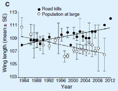
|
The graph shows the average wing length in the bird population over the period of the study (open symbols, dashed line).
It also shows the average wing length of birds killed by cars over the same time (solid symbols, solid line). |
|
You can see that the average wing length in the bird population has been decreasing over the period of the study. For simplicity, they fit a straight line to the data set over the entire period. I wonder if there might have been a more abrupt change around 1996, but that doesn't matter much for now. What about the killed birds? Their wing length does not decline over the study period; in fact, it seems to be increasing. This is Figure 1C from the article. | |
What does this mean? They don't know for sure, but they offer some comments. First, birds with longer wings are less agile; they may be less able to avoid cars. That is, it is reasonable that wing length may be functionally related to the chances of getting killed by a car. Therefore, it is reasonable that the birds have evolved during the study period to have shorter wings, thus promoting their survival in the face of their auto enemy. Why that would lead to the killed birds having longer wings is not clear. We also note that, at the beginning, the killed birds were not those with the longest wings; this fact does not easily fit with the simple model.
They discuss a number of technical issues about the measurements as well as alternative interpretations. It's not conclusive. They have no evidence about the bird's genetics. The possibility that the birds have evolved during the study period, with selective pressure from cars, is reasonable -- as a hypothesis, subject to further testing.
News story: Where, Oh Where, Has the Road Kill Gone? (Science Daily, March 18, 2013.)
The article: Where has all the road kill gone? (C R Brown & M B Brown, Current Biology 23:R233, March 18, 2013.) Check Google Scholar for a freely available copy.
Previous post about cars: Traffic congestion patterns analyzed from cell phone records (July 7, 2013).
Previous post about birds: Of birds and butts (February 2, 2013). Interestingly, it is also about the interaction of birds with the human environment.
And... Airport food: What do the birds eat? (May 24, 2014).
More on wing adaptations: Introducing Supersonus -- it stridulates at 150,000 Hz (June 16, 2014).
July 31, 2013
Old Faithful Geyser (OFG), in Yellowstone National Park, sprays water a hundred feet into the air every 90 minutes -- day and night, summer and winter. Why? Yellowstone is a volcanically active area. Boiling water from underground makes its way through cracks in the Earth to the surface. However, an understanding of the regular geyser eruptions has been emerging only gradually.
A new article reports analysis of seismic activity around OFG. Based on this information, the scientists propose a more detailed model of the plumbing that makes the geyser work.
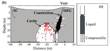
|
Part b of the figure (left side) summarizes their current view of what the Old Faithful site looks like underground. The y-axis is depth; 0 is the surface of the ground. The x-axis is horizontal distance; 0 is the geyser vent.
Part c (right) is a simple model of how the geyser works. |
|
Look at part b. The surface opening, the vent, of OFG is labeled. Below it is a near-vertical channel; it is shown partly in black. This channel has been explored with instruments -- even video cameras -- in the past. A bit below the surface is a constriction in the channel; obviously, that constriction plays a key role in determining an eruption event. To the left of the vertical channel is a cavity, partly marked with red. Discovering this cavity is the major finding of this article. The cavity is connected to the vertical channel. Steam and hot water can accumulate in the cavity. It is a "recharge cavity", where the pressure builds up. The red dots in the cavity mark the locations of tremors, as determined by the new analysis. These tremors result from events such as bubble collapse against a wall. You can see how the pattern of events shows a flat roof for the cavity. (Similarly, the black of the main vertical channel is made up of dots marking tremor sources there.) The model in part c is simple. There is a column of liquid, with gravity holding it down, and hot gas acting like a spring below it. At some point the upward pressure is enough that the liquid column breaks through the constriction; the geyser erupts. The model is simple; the geyser is simple. That's why it is regular (though not as regular as I suggested at the start). The basic model of this figure is not new; it is an idea without specifying the parts. The scientists suggest that the newly-discovered cavity is a key part of the "spring". This is Figure 3 parts b and c from the article. | |
This article enhances our understanding of one of Earth's great natural shows. The discovery of the cavity and the simple model of how OFG works are probably right; however, we should emphasize that the details remain conjecture.
News story: Newfound chamber below Old Faithful may drive eruptions. (American Geophysical Union, April 12, 2013.)
The article, which may be freely available: The plumbing of Old Faithful Geyser revealed by hydrothermal tremor. (J Vandemeulebrouck et al, Geophysical Research Letters 40:1989, May 28, 2013.)
For the basics about Old Faithful Geyser, with some pictures, see Wikipedia: Old Faithful.
Yellowstone National Park was mentioned in the post Did life start in a geothermal pond? (February 28, 2012).
July 29, 2013
Good warning systems enhance survival. We use smoke detectors in our homes; societies set up systems, in the castle tower or in high-flying satellites, to watch for possible signs of attack.
The immediate question at hand... How do bean plants learn of impending attacks from aphids?
We've known some about this for some time. When a plant is attacked by an insect, a defense system is activated. This includes the release of volatile chemicals into the air; these chemicals can be received by nearby plants, which then activate their defense systems in advance of attack. But what if air communication is blocked? The plants still seem to respond when their neighbors are attacked. A new article suggests that the plants are signaling underground, using fungi to carry their messages. Let's look at how the scientists figured this out. It's quite clever.
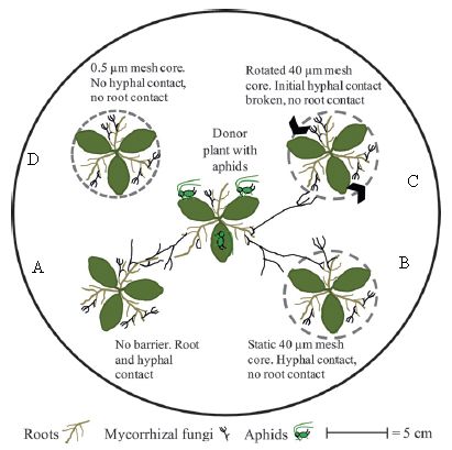
|
The figure shows the experimental arena. It's aphids vs beans.
The arena contains five plants. The central plant will be attacked by aphids; the general question is whether the others respond. Because the central plant is the one that might be emitting warning signals, it is called the "donor" plant. The others are "receivers". No air communication is allowed between the plants, thus blocking one known type of signaling. However, they might communicate underground, either via roots or via the fungi that associate with roots -- the so-called mycorrhizal fungi. To block these contacts, the scientists put a mesh around some plants, as detailed in a moment. They have two kinds of mesh. A 40 µm mesh blocks roots but not the fungal strands, (called hyphae). A 0.5 µm mesh blocks both. A mesh is shown as a dashed line around a plant. |
|
Plant A (lower left) has no mesh. It can communicate with the donor plant in the center by both roots and fungal hyphae. Plant A is a "normal" control. Plant D (upper left) has the small mesh, which blocks both roots and hyphae. Plants B and C (right) have the larger mesh, which blocks roots but allows hyphae. For plant C, they then rotate the mesh, to break the hyphal contact. The black arrowheads on the dashed mesh show this rotation. This is slightly modified from Figure 1 of the article. I have added the letters A-D to label the four outer plants; this is for ease of discussion. | |
That's the set-up. The scientists put aphids in the arena with the central plant -- the donor. They then sampled the air around each plant; that air is known as the "headspace". They did two kinds of tests on the headspace.
In one test, they measured the amounts of chemicals known to be defense chemicals. In another test, they measured whether aphids were attracted to or repelled by the headspace gases. Both tests showed that plants A and B behaved like the donor plant, whereas plants C and D did not. A and B are the plants with hyphal contact with the donor. Thus they conclude that plants can communicate signals without sharing air -- if the fungal network is intact.
Here is an example of their data, for one of the defense chemicals, methyl salicylate:
Level around donor plant: 1.46.
Level around plants A and B, with hyphal contact: 1.42, 1.85 (about the same as for the donor).
Level around plants C and D, without hyphal contact: 0.41, 0.06 (much less than for the donor).
Data are in nanograms of the chemical per gram plant. These results are from Table 2 of the paper, which includes error bars.
Those numbers show that fungal contact is mediating the signal. That is the general picture that emerges from the entire article.
News story: Plants use underground networks to warn of enemy attack. (Phys.org, May 10, 2013.)
The article: Underground signals carried through common mycelial networks warn neighbouring plants of aphid attack. (Z Babikova et al, Ecology Letters, 16:835, July 2013.)
More about aphids...
* The aphid-bacterium symbiosis: a step toward manipulating it (May 15, 2015).
* Are aphids photosynthetic? (September 17, 2012).
* Red and green aphids (June 2, 2010).More about plant defenses...
* Inter-plant communication via the Cuscuta parasite (September 15, 2017).
* How the tomato plant resists the Cuscuta (November 4, 2016).
* Grapefruit and medicine (March 26, 2012).
* A plant that cheats (July 6, 2009).
July 27, 2013
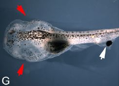
|
A one-eyed tadpole. The eye is on the tail (white arrow). The natural eyes have been removed (red arrows).
This is Figure 1G from the article. |
Making such a tadpole is straightforward surgery. The new eye is transplanted from a separate donor animal (early in development). What's interesting here is whether the tadpole can see.
In a recent article, scientists report that they tested about a hundred of these one-eyed tadpoles. A few were able to learn a behavior requiring vision. Those few did as well as normal tadpoles; tadpoles without eyes could not do this test (though they could sense light).
A few. What does that mean? Were they flukes of some kind, or special? Further analysis made it likely that they were special. Most of the one-eyed tadpoles that passed the test showed innervation of the eye into the spinal cord. That is, these eyes seemed to be connected to the central nervous system. Almost none of the flies lacking such apparent connection of the eye to the spinal cord passed. (There was one exception; for now, it is a mystery.)
It's an intriguing finding. The simple interpretation of most of their results is that some of the transplanted eyes managed to send out nerves that reached the spinal cord, a part of the nervous system -- and that this resulted in transmission of functional visual information to the brain. Of course, the first question is whether this basic finding is valid. Can this be replicated? Assuming it is valid... How does the brain know that this signal from the transplanted eye, coming to the brain by an unusual route, is visual information? Do eyes send data that are labeled?
The finding is possibly relevant to human biology. Can we learn how to connect data sources to the brain in novel ways -- if the data is properly labeled. That's a long way off. However, this new work puts the question on the table -- and raises lots of interesting questions.
News stories:
* Eyes Work Without Connection to Brain: Ectopic Eyes Function Without Natural Connection to Brain. (Science Daily, February 27, 2013.)
* Tadpole Sees Through Eyeball on Its Tail. (National Geographic, April 4, 2013. Now archived.)
* News story accompanying the article; it is freely available at: Plugging into the spine gives the gift of sight. (N Stead, Journal of Experimental Biology 216(6):ii, March 15, 2013.)
* The article: Ectopic eyes outside the head in Xenopus tadpoles provide sensory data for light-mediated learning. (D J Blackiston & M Levin, Journal of Experimental Biology 216:1031, March 15, 2013.)
The post immediately following is very different -- but is also about vision. It links to other Musings posts on vision. What if there was a gorilla in the X-rays of your lungs? (July 26, 2013).
More on animal vision: Color vision: The advantage of having twelve kinds of photoreceptors? (February 21, 2014).
And human vision... The limits of the human visual system: can humans detect single photons? (October 7, 2016).
The last tadpoles to make Musings... Eating frog legs -- and why the hind legs taste better (July 16, 2009).
More Xenopus: Designing reconfigurable organisms (January 19, 2020).
An example of providing unusual input to the brain: Can rats touch infrared light? (February 25, 2013).
More about eyes on the wrong end: If cows had eyes on the rump, would they be less subject to ambush attack by lions? (September 22, 2020).
More on the brain is on my page Biotechnology in the News (BITN) -- Other topics under Brain (autism, schizophrenia).
More about tails: An animal that walks on five legs (February 3, 2015).
July 26, 2013
Look...
|
Here is an example of the X-ray images that observers were asked to evaluate, in an experiment recently reported.
This is part of Figure 1 from the article; It is "slice 3". The slices vary in the opacity of the gorilla; the one shown here is maximum. More importantly, in actual testing, the observer sees a stack of such slices, and presumably notices continuities between them. |
Two groups of observers were asked to examine the X-rays, looking for nodules (light spots), which might indicate cancer. One group consisted of non-experts (people without medical training); they were briefly trained to look for nodules. The other group consisted of expert radiologists -- people who make a living reading such X-rays.
The non-experts didn't do very well. Overall, they averaged finding about 20% of the nodules. And they did not note anything unusual.
The expert radiologists averaged finding about half the nodules -- apparently a reasonable result. 17% of them reported an unusual finding. 83% did not.
I've noticed that the unusual finding can be hard to see with some computer monitors. In one case, I could not see it at all -- even knowing it was there. Was this an issue in the experiment itself? No. The experimenters ran controls to ensure that the observers could see it.
What's the point? The experiment described here is a variation of a classic experiment in psychology. The experiment shows that if a person is focusing their attention on something, they may well not see something else that is in plain sight. The phenomenon is called inattentional blindness. The new experiment extends that finding to expert observers.
Is this good or bad? Is it good that the radiologist focuses on the task at hand, and ignores something that is obviously irrelevant? But what if the patient did have some unusual feature, even if not this one? I do think the test here is a bit extreme, but those who question it should follow up with a better test. In any case, the phenomenon of inattentional blindness is clear, and it can happen with experts. It's unsettling.
News story: Inattentional Blindess [sic]: Why 83% Of Radiologists Couldn't See The Gorilla. (Medical Daily, July 21, 2013.)
The article: The Invisible Gorilla Strikes Again: Sustained Inattentional Blindness in Expert Observers. (T Drew et al, Psychological Science 24:1848, September 2013.)
More about radiologists: Can pigeons diagnose cancer by reading patient X-rays? (December 29, 2015).
Other posts about vision include:
* What if you had eyes on your tail? (July 27, 2013). (Immediately above.)
* Carnivorous plants: A blue glow (March 16, 2013).
* A camera-based device to restore vision (February 25, 2013).
* A better understanding of the basis of color vision (February 1, 2013).Previous post from the same journal: Child development: nature vs nurture? Year 2 as a window of opportunity. (March 5, 2011).
More lungs... A better way to collect a sample of whale blow (November 28, 2017).
July 23, 2013
Different physiological states of your cells may have different chemicals -- such as proteins -- in them. In some cases, knowing the levels of certain molecules may be diagnostically useful. In other cases, we don't know enough yet to make use of the information.
Methods for measuring these molecules have limitations. We typically measure one type of molecule at a time, and do it on bulk samples, such as blood. Can we do better?
What if we just took some cells, put them under the microscope, and looked to see what molecules each cell contains? We could measure many molecules, and we would be measuring individual cells, rather than a mixture. It would offer the possibility of distinguishing different kinds of cells in the sample.
Easier said than done, of course. One cannot see individual molecules with an ordinary microscope -- without some tricks. A recent article reports some progress is making the kinds of measurements we might like. Let's look at their approach.
|
|
The figure shows key parts of their approach. The figure may seem complicated. Interestingly, it is less complicated than it looks. We'll look at the red things in the figure. When you see what the red things do, you've got it. The rest is exactly the same, but for green things and so forth. In fact, that is one of their key points. Look at the left frame, and look at the lower left corner -- where there are red things. There is a red ball (with some hooks on it) and a red Y-shaped thing (whose color is not very clear here). These are the key players. Just below them is a combined red ball-Y; we'll get to that in a moment. The red ball is a quantum dot (QD) -- a tiny (molecule-sized) object that gives off colored light when stimulated. In this case, it gives off red light, but they have numerous kinds of QDs of various colors. The QD -- more precisely, the light emitted by the QD -- is what they measure. The Y-shaped object is an antibody (Ab) -- to the molecule they want to detect. They buy the antibodies; there are many of them commercially available nowadays. In the first step, they attach the red ball to the red Y; that is, they attach the QD that they can measure to the Ab that can bind to the molecule being detected. This gives a QD-Ab complex -- a red QD-Ab complex in this case. That is the key step. They develop a method that is flexible and robust; it can be used broadly to attach QD to Ab. With many QDs and many Abs readily available, providing a general method for connecting them is progress. You can see the red QD-Ab complex just below the individual parts (in a small bluish "test tube"). Look at the other corners of the left frame; each corner is the same -- for a different color. That is they have a red QD-Ab complex, a green QD-Ab complex, and so forth. Four of them here. Next, they mix the four QD-Ab complexes together; that's the big bluish tube in the middle of the left frame. Finally, to the right frame. They add the mixture (or "cocktail") of QD-Abs to a cell. The red detection system binds to the red things in the cell; it will emit red light when stimulated. And so forth. That's it. In this case, four types of molecules being detected at once, in a single cell using an ordinary fluorescence microscope (which provides the stimulation). This is reduced from a figure in the Kurzweil news story. It's about the same as Figure 1 part b (left) and part c (right) from the article. |
What's the big story here? It is that they have designed a system that is flexible and robust, capable of measuring many molecules at once in individual cells. How many? The cartoon figure shows four. They think they could do ten at once. Further, they can do multiple cycles with the same cells: add a QD-Ab cocktail, measure the molecules, wash away that cocktail, and add another. They think they could do ten cycles. Ten cycles with ten molecules at each cycle would give them 100 molecules. They use that number for discussion, but they haven't actually done that yet. (The news media are often missing on that point.) 100 is a goal -- a reasonable goal. They haven't done it, but they have laid the groundwork in establishing a method that perhaps can be extended to 100. We'll see how further development proceeds.
News story. Caution... It confuses what the authors have done and what they suggest can be done. Again, the article does not report measuring 100 molecules, but suggests that number could be done using the method. The purpose of the current work is to introduce the method, not to show a full implementation.
* Novel quantum dot-based technique sees 100 different molecules in a single cell -- Better diagnosis and treatment of cancer could hinge on the ability to rapidly map out networks of dozens of molecules in individual tumor cells. (Kurzweil, July 16, 2013.) Good overview of the methodology.
The article, which is freely available: Quantum dot imaging platform for single-cell molecular profiling. (P Zrazhevskiy & X Gao, Nature Communications 4:1619, March 19, 2013.)
More about quantum dots: Unusual synthesis of cadmium telluride quantum dots (February 15, 2013).
More about advances in light microscopy: Characterization of carbon nanotubes (December 3, 2013).
Also see a section of my page Internet resources: Biology - Miscellaneous on Microscopy.
More about antibodies: SyAMs: Synthetic drugs that act like antibodies (May 31, 2015).
July 22, 2013
The results of many clinical trials don't get reported. It's a problem; it means that we judge a treatment using less information than what is known. We noted this problem in an earlier post: The problem of clinical trials not getting reported (February 4, 2012). I encourage you to read this earlier post as background.
A group of researchers has now made a move -- a confrontational move. They have obtained massive amounts of unpublished clinical trials data, using various (legal) tools. They are now threatening to publish this data -- unless the original owners do so on their own.
The article presenting their proposal is listed below; it's freely available. The editorial accompanying the article is an endorsement by two major open access publishers of medical journals. The article may be longer than most want, but you can get the idea by looking it over, reading the abstract and section headings. The news story and editorial are also good introductions. This post is not about a scientific discovery, but about the integrity of our system for testing medical treatments. Read about it!
News story: Experts Propose Restoring Invisible and Abandoned Trials 'to Correct the Scientific Record'. (Science Daily, June 14, 2013.)
* Editorial accompanying the article; it is freely available: Restoring the integrity of the clinical trial evidence base. (E Loder et al, BMJ 346:f3601, June 13, 2013.) The authors of the editorial are from the journals BMJ and PLoS Medicine. (They note that they would benefit from more complete reporting, since they make money by publishing the papers. Things aren't simple.)
* The article, which is freely available: Restoring invisible and abandoned trials: a call for people to publish the findings. (P Doshi et al, BMJ 346:f2865, June 13, 2013.) The article title explains the acronym in the title of this post. It's their acronym.
There is more. Go to the web site for the article, and choose "Related content". You will see the editorial and article, and more. The "Feature" by Tucker includes discussion of some alternative approaches, as well as views of various stakeholders. All content at BMJ is freely available.
More about clinical trials:
* Transparency of clinical trials -- Is the flu drug Tamiflu worthless? (May 4, 2014).
* Chelation therapy -- a controversial clinical trial (December 13, 2013).
July 21, 2013
In a recent post, we noted the discovery of an unusual mineral [link at the end]. The discovery itself was noteworthy, but it also had implications for early life. We stressed that it was important to keep those points separate; the implications for the story of life are speculative.
We now have another case. Another unusual mineral -- at least in context -- and with it a speculation about its significance for the story of life.
What the scientists found is rocks containing very high levels of manganese (Mn) -- as high as 16%. It was in the form of manganese carbonate, MnCO3. The scientists argue that this is a secondary mineral; it was originally manganese dioxide, MnO2. It's the MnO2 that makes this of interest. MnO2 per se is not all that unusual; it's easy enough to make from various forms of Mn by reaction with oxygen gas O2. What makes this MnO2 noteworthy is that it so old, it seems certain that it was made before there was any significant amount of O2 around. In fact, they go to great lengths to show that other aspects of the rocks point to the near absence of O2 at the time of formation. Bottom line... They suggest that the original mineral was MnO2 -- made in the absence of O2. That's interesting!
Why is this of interest to the biologists? Because it might help solve a mystery...
Modern oxygen-evolving photosynthesis is a remarkable process. It involves splitting water to yield the equivalent of hydrogen gas plus oxygen gas. (The hydrogen gas is not released as such; the hydrogen atoms are retained in the cell in a reactive form. This reactive hydrogen is used to reduce carbon dioxide, or for other cellular needs.) The splitting of water is quite unfavorable energetically, as anyone who has done electrolysis of water knows; of course, this is where the light energy comes in. The reaction is not only unfavorable, it's dangerous. It takes the transfer of four electrons to make a molecule of O2. Transferring anything less, in some incomplete reaction, produces a highly reactive by-product. Sloppy oxygen-evolving photosynthesis is not a good idea.
How did such a complex system develop? That's been quite a mystery. The development of O2-evolving photosynthesis is often considered one of the great breakthroughs in the story of life, but we have little idea how it occurred. The new article -- the new mineral finding -- may offer a clue.
Turns out that Mn is involved in photosynthesis. It is a key catalyst involved in the electron transfer reactions. It is indeed a catalyst -- being used over and over in a cycle. But imagine... What if, in the early days, Mn's role was different: a true reactant. Mn2+ (the common form in the ocean) in, MnO2 out after losing two electrons from each Mn. MnO2-evolving photosynthesis! Perhaps it was an intermediate step prior to modern O2-evolving photosynthesis.
Is any such form of photosynthesis known? No. It's just an idea; finding MnO2 that predates atmospheric O2 is perhaps a hint, but it hardly is evidence. But it is enough of a hint that they want to look for such photosynthesis, perhaps make it in the lab (from modern O2-evolving photosynthetic organisms). We eagerly await their results.
The experimental work in this new article is extremely complex. I've hinted at some of this above. The work is so complex, I wouldn't be surprised if some of it is questioned. The validity of their mineral findings will be tested by further work. However, their proposal stands. The work here leads them to look seriously for MnO2-evolving photosynthesis. If someone can make this from modern organisms, that will be interesting. We also note that whether or not they can make it from a modern organism does not directly tell us the story of what happened billions of years ago, but it will be useful information. The idea that MnO2-evolving photosynthesis was a step toward modern O2-evolving photosynthesis is intriguing, even appealing.
What would this novel type of photosynthesis look like chemically? They don't give any details, but I would imagine it would be something like...
Mn2+ + 2 H2O --> MnO2 + 2 [H] + 2 H+
The symbol [H] is used to mean reactive hydrogen (or "reducing power"), without specifying its exact form. It is a common symbol in both organic chemistry and biochemistry..
News story: Manganese Oxidation Played Key Role In Formation Of Oxygen On Earth. (Red Orbit, June 27, 2013.)
The article, which is freely available: Manganese-oxidizing photosynthesis before the rise of cyanobacteria. (J E Johnson et al, PNAS 110:11238, July 9, 2013.)
More about manganese:
* Growing on manganese ions as an energy source (September 15, 2020).
* Manganese(I) -- and better batteries? (March 21, 2018).Background post, about another unusual mineral... The origin of reactive phosphorus on Earth? (July 5, 2013).
More about photosynthesis...
* When does global warming occur: day or night? (October 28, 2013).
* Discovering how CO2 is captured during photosynthesis: The Andy Benson story (June 15, 2013).
* An artificial forest with artificial trees (June 7, 2013).Another post that introduced the idea of reactive H being shown as [H]: The miracle of Methylomirabilis (May 10, 2010). Interestingly, this post also involves an oxygen mystery.
And... Are birds adapting to the radiation at Chernobyl? (August 3, 2014).
Another example of catalyst development... A simpler way to make styrene (July 10, 2015).
Another post about a carbonate material: Upsalite: a novel porous material (September 6, 2013).
Some of the work here was done using the X-ray source at the Stanford Linear Accelerator (SLAC). A recent post about other X-ray work at SLAC: Stanford Linear Accelerator recovers 18th century musical score (June 22, 2013).
Also see: A whiff of oxygen three billion years ago? (April 6, 2015).
July 19, 2013
Imagine that you were asked to figure out if a person is alive or not -- simply by listening. You could probably do it, though at first you might be unsure that your method was completely reliable.
But that's not the problem at hand. What we really want you to do is to figure out if some bacteria are alive or not -- simply by "listening". (Notice those quotation marks.) A new article claims to have done that -- more or less. Let's jump in and look at some results. Then we'll try to figure out what this means.
|
|
The graph shows the deflection of a tiny lever (y-axis) over time (x-axis -- with an inconsistent scale). There are several conditions tested over the 60+ minutes of this experiment. Starting from the left... * PBS. PBS is a salt solution. This is a control; there are no bacteria present. The line is flat, at zero; nothing happens. * Bacteria in PBS. With bacteria present, the cantilever (that tiny lever) vibrates. * Bacteria in LB. LB is a good growth medium. With bacteria present, the cantilever vibrates. * Ampicillin. This is an antibiotic, which inhibits bacterial growth. It is added to the "bacteria in LB" from the previous frame. The vibrations are greatly reduced. * LB wash. The sample from the previous frame is "washed", with fresh LB. LB is the growth medium, and the wash removes the ampicillin drug. Vibrations do not resume. The drug has killed the bacteria; the effect is not reversible. This is part of Figure 2a from the article. |
Most of the experiment can be interpreted by saying that the vibrations indicate that growing bacteria are present.
What's going on? First, let's look a bit more at the set-up. I referred to a cantilever. If you know about the tips used for atomic force microscopes, that's what they are using. But you can also think about the cantilever as a tiny tuning fork. Tiny? It's about 0.2 millimeter long. The vibrations observed are a few nanometers; the y-axis of the graph above is labeled in nanometers. The scientists watch the cantilever by seeing how a laser beam bounces off it; vibrations of the cantilever cause the laser beam to be deflected. The laser beam is their "ear" for "listening" to the cantilever vibrate. Bacteria readily bind to the cantilever (starting with the second frame of the experiment above). The set-up allows them to flush various solutions into the chamber (as you see above with the various frames). So, the basic idea is that they watch the vibrations of the cantilever under these various conditions: with or without bacteria and with various solutions. The presence of growing bacteria results in the cantilever vibrating. Growing bacteria.
It's interesting. It's potentially useful for rapidly determining whether bacteria are sensitive or resistant to an antibiotic. That's something that can take a day or so; doing it in minutes has some appeal.
There is a problem with this, however. It's not obvious why this is happening. What is it that is vibrating, and why? Or perhaps more precisely, why do bacteria cause a lever to vibrate? Growing bacteria. Why are there vibrations in the PBS, which is simply a salt solution, not a growth medium? Why is the antibiotic effect so fast? There are other results in the paper that seem odd. There may be good answers to all these questions about the work. Importantly, there is an incentive to find out. The paper presents something new, something fascinating and maybe even useful. It may be mysterious, but the data say it happens.
News story: Microscopic 'Tuning Forks' Could Make the Difference Between Life and Death in the Hospital. (Science Now, June 30, 2013.)
Movies. There are two short movie files posted with the article at the journal web site, as "Supplementary materials". They should be freely available. Movie 1 (30 seconds) is an animation of the experimental set-up. It lacks any explanation (labeling or narration), and seems more glitz than useful; give it a try for fun, but don't expect much from it. Movie 2 (2.5 minutes) is "real"; it records 16 hours of bacteria on a cantilever, speeded up 400-fold. The main message is that the bacteria stay well attached for most of that time. It's fine to stop early with this one.
The article: Rapid detection of bacterial resistance to antibiotics using AFM cantilevers as nanomechanical sensors. (G Longo et al, Nature Nanotechnology 8:522, July 2013.)
More about antibiotics and the problem of antibiotic resistance: Restricting excessive use of antibiotics on the farm (September 25, 2010).
More on antibiotics is on my page Biotechnology in the News (BITN) -- Other topics under Antibiotics.
More about vibrations...
* The golden ear: A nano-ear based on optical tweezers (July 13, 2012).
* Loudspeakers: From gold-coated pig intestine to graphene (April 27, 2013).
* When should the eggs hatch? (June 11, 2013).As noted, the cantilevers used here are those used for atomic force microscopy (AFM). For more about AFM, see a section of my page of Internet Resources for Introductory Chemistry: Atomic force microscopy and electron microscopy (AFM, EM). It includes a list of other Musings posts on AFM.
July 16, 2013
A recent article reports testing whether a particular type of device for sequencing DNA is resistant to radiation. The following figure summarizes the main results.
|
DNA sequencing chips that had been irradiated in various ways were tested by sequencing a standard bacterial DNA.
The y-axis shows the error rates obtained, for two different types of sequencing errors (dark and light bars). The bars are labeled at the bottom by type and amount of radiation. Three types of radiation were used, each at two doses: 1 and 5 grays (Gy). The bars at the left and right are for controls, using chips that had not been irradiated. |
|
You can see that all the dark bars are about the same height, and all the light bars are about the same height. That is, none of the radiation conditions affected the performance of the sequencing chips. That's the main conclusion. This is Figure 3D from the article. | |
Why did they do this? Let's quote from the paper (the Introduction): "In the present study, we characterized the ability of semiconductor sequencing chips to withstand simulated space radiation conditions associated with a 2-year mission to Mars."
News story: Detecting DNA in space -- Researchers, in a step toward analyzing Mars for signs of life, find that gene-sequencing chip can survive space radiation. (MIT, July 9, 2013.) This is the press release from the lead institution. Good overview, including the context.
The article: Radiation Resistance of Sequencing Chips for in situ Life Detection. (C E Carr et al, Astrobiology 13:560, June 2013.)
DNA sequencing: an overview of the new technologies (June 22, 2012). The article listed there includes the sequencing method tested here. This method uses a semiconductor chip to detect the protons released during addition of a nucleotide to a DNA chain.
A genome post: The oldest DNA: the genome sequence from a 700,000-year-old horse (August 4, 2013).
There is more about sequencing on my page Biotechnology in the News (BITN) - DNA and the genome. It includes a list of Musings posts on sequencing and genomes.
More about Mars:
* Perchlorate on Mars surface, irradiated by UV, is toxic (July 21, 2017).
* Cows on Mars? (November 7, 2012)
July 15, 2013
Pluripotent stem cells are cells that can give rise to any of the many cell types of the body. The original source of pluripotent stem cells was developing embryos. Obviously, these embryos normally give rise to an entire body. The isolation of embryonic stem cells (ESC) from early embryos was a technical achievement, but logically quite expected.
More recently, scientists have learned how to convert cells such as skin cells from an adult body to a pluripotent state. This is done by "reprogramming" the nucleus so that it functions as an embryonic nucleus rather than a skin cell nucleus. Interestingly, this was achieved by using a fairly small number of specific factors that affect gene expression. These reprogrammed cells are known as induced pluripotent stem cells (iPSC). They are nominally equivalent to ESC, though research has shown that there are differences between ESC and iPSC; the importance of these differences is not clear.
A new article reports another way of making human pluripotent stem cells. It involves transferring the nucleus of an adult cell (again, think skin cell as an example) into an egg cell (whose original nucleus has been removed). As with iPSC, this requires reprogramming. In this case, the reprogramming is done by the egg cell. The egg cell then begins embryonic development, now with a new nucleus; ESC can be isolated as in the "classical" ESC procedure. The authors refer to this procedure as NT-ESC, where the NT indicates the nuclear transfer step.
The development of NT-ESC was expected. The basic procedure is well-established -- and is used for cloning work, such as with Dolly the sheep. However, until recently, the procedure had never worked with primates. The new work focused on the detailed steps of making NT-ESC, in both monkeys and humans. The changes needed to make it work in primates were technical, and are not well understood. However, the scientists did achieve a reasonably efficient process for making pluripotent stem cells by the nuclear transfer process.
The technical details are not particularly interesting. Instead, I'd like to use this as an opportunity to provide some perspective on the various types of stem cells, especially the pluripotent stem cells.
There are now three types of pluripotent stem cells:
* Original, bona fide embryonic stem cells (ESC).
* The stem cells reported here, made by nuclear transfer into an egg. These are called NT-ESC.
* Induced pluripotent stem cells (iPSC), made by reprogramming adult cells in the lab.
There are also various types of adult stem cells, with more limited abilities. I won't talk about them here, but they are part of the big picture. Further, the ability to reprogram cells in the lab may blur the distinction between cells of various potencies.
What might we do with stem cells? There are several broad areas of work we might identify:
* Research. Examples of research areas might include... Learning about how cells differentiate into specialized cell types. Learning about the effects of mutations that are found in people with certain diseases.
* Therapy. Using cells as a treatment for people with genetic diseases, or "merely" to provide fresh cells.
* Cloning. Dolly was made by a process that started with the nuclear transfer step. Cloning does not involve isolation of stem cells, but is a related process -- one that gets attention. Animal cloning for research use, for the development of animals with desired characteristics, or simply to replace a pet are all done by this same basic procedure. In principle, one might clone humans this way, too, and it is understandable that people who object to human cloning (and that seems to be most people) are concerned that the development of nuclear transfer procedures for humans might lead to cloning. However, cloning is inefficient, and the clones often have abnormalities. Perhaps these limitations could be overcome, but that would require experimentation on human cloning. It is unlikely that any proposed work aimed at human cloning would be approved by those who must approve human research. If society feels strongly enough, they can legislate a ban on cloning; however, this should be done in a way that does not impact the other uses of stem cells. Making such a distinction is not hard. Enough said about human cloning.
What are distinctive features -- advantages and disadvantages -- of the various types of stem cells? I should stress at the outset that this section does not lead to any simple conclusions. The different procedures have different features, and may be useful for different applications.
* Both ESC and NT-ESC (but not iPSC) require a donor egg. This limits large scale use of these procedures.
* Both NT-ESC and iPSC (but not ESC) start with an adult cell and involve "reprogramming" it back to the pluripotent state. In one case, the reprogramming is done by putting the nucleus of the donor cell into an egg; in the other, reprogramming is stimulated by added factors.
* Both NT-ESC and iPSC (but not ESC) allow the development of person-specific lines of pluripotent stem cells. A specific important aspect of this is the ability to make a stem cell line from individual patients.
* NT-ESC (but not ESC or iPSC) result in cells with nucleus and mitochondria of different origin. That is because the nuclear transfer step does not affect the mitochondria of the egg cell. This distinction allows work to separate nuclear and mitochondrial effects.
* The iPSC procedure offers a variation in which one type of adult cell is directly reprogrammed to another type of adult cell, without an intervening pluripotent stage. For example, skin cells might be reprogrammed to heart muscle cells.
I noted above that ESC and iPSC are nominally equivalent, but that they seem to have some differences. We can now include NT-ESC in this picture. All three types are nominally equivalent (except for the mitochondria), but the issue of differences is open.
These procedures have various practical differences, such as cost and time. We won't go into those here.
Overall, we now have three ways to make pluripotent stem cells for humans. The best situation is for research on all of them to proceed in parallel. We need to understand all of them in more detail, and learn about the differences in cells obtained by the various methods. It is too early to declare winners and losers.
News story: New Stem Cells on the Block. (The Scientist, May 15, 2013. Now archived.)
* News story accompanying the article (in a sister journal): Pluripotent Stem Cells from Cloned Human Embryos: Success at Long Last. (A Trounson & N D DeWitt, Cell Stem Cell 12:636, June 6, 2013.)
* The article: Human Embryonic Stem Cells Derived by Somatic Cell Nuclear Transfer. (M Tachibana et al, Cell 153:1228, June 6, 2013.) (Put the title into Google Scholar, and you may find a copy freely available.)
A concern. Significant errors in the paper have been reported -- and acknowledged by the authors. For the moment, the dominant opinion seems to be that the work may be ok, but that the paper needs correction. In the long run, the question is whether others can reproduce the main findings of this article. Since I did not go into any of the details of the work, there is no point of addressing the paper's problems here. One news story about the situation: Stem-cell cloner acknowledges errors in groundbreaking paper -- Critics raise questions about rush to publication. (Nature News, May 23, 2013.) The story also deals with the concern that the sloppy paper was due to a rushed effort -- both by the authors and by the journal.
There is more on stem cells on my page Biotechnology in the News (BITN) - Cloning and stem cells. It includes a list of related Musings posts.
July 14, 2013
April 2019... The web page and videos listed here are apparently no longer available.
Those who enjoy watching hour-long videos of talks may find a new series of interest. It is a series of public talks, intended for college students and the general public, at a local community college, Berkeley City College. The series is sponsored by the California Institute for Regenerative Medicine. I discovered this series this past Spring, and attended a few of the recent talks; all were good.
Web page: https://www.berkeleycitycollege.edu/wp/blog/category/science-seminars/. Science Seminar Series, Berkeley City College. The page and videos are apparently no longer available.
A couple of the recent speakers have been noted in Musings posts:
* Do animal bones have something like annual growth rings? (August 7, 2012). The journal news story here is by UC Berkeley biologist Kevin Padian, who gave a talk on dinosaur growth and vertebrate flight.
* Quiz: What is it? (March 6, 2012). See the answer. This featured a photo of foraminifera by geologist Howard Spero, of the University of California at Davis. Spero gave a talk about ancient climate records.Other series of talks noted in Musings...
* Astronomy talks (June 22, 2009). What started as a series of talks for the International Year of Astronomy has continued as Science@Cal, a broad-based science series at UC Berkeley.
* CITRIS: Zettl; new energy series (November 1, 2009). CITRIS has multiple series of talks.
July 12, 2013
Bees are often fed an artificial "bee candy". Although this may be adequate as a nutrition source, there may be another implication. Bees may need honey, derived from pollen, to stimulate their defense systems. Bees detoxify foreign chemicals, such as pesticides, using an enzyme system known as cytochrome P450 oxygenases. Turns out that pollen contains chemicals that induce the production of these enzymes. Bees lacking adequate pollen intake may, therefore, lack detoxification enzymes.
A new article fills in one piece of the story. The scientists isolate specific chemicals from honey (and originating from pollen), and show that they induce the formation of the cytochrome P450 oxygenase enzymes.
|
Here is an example of their results. In this experiment, they measured the effect of two chemicals isolated from honey on the expression of one specific detoxifying enzyme. Each chemical was tested over a range of doses.
The x-axis shows the doses; the chemicals were included in the bee candy. The y-axis, labeled RQ (relative quantification), is a measure of enzyme production. (It is not clear how RQ is calculated, and it seems to mean different things on different graphs. Nevertheless, all we really need here is that higher RQ means more enzyme was made.) |
|
What do we see from the graph? First, look at the black bars, which are for one particular chemical (p-coumaric acid). You can see that this chemical causes increased production of the detoxifying enzyme; the effect increases with increasing dose. This looks "good": the results show a clear effect for a "well-behaved" inducer. Now look at the light bars, which are for another chemical (pinocembrin). This chemical also shows induction, which increases with dose over the first three levels. However, it's not as good an inducer as p-coumaric acid, and at the highest dose its effect declines. It's an inducer, but not as good as p-coumaric acid. This is Figure S1 from the "Supporting Information" with the article. | |
Overall, the paper finds four chemicals, isolated from honey and derived from pollen, that induce the enzyme. Of these, p-coumaric acid is the best. Remember, the broader story is that earlier results showed that honey increases the ability of the bees to detoxify some pesticides. The new work identifies specific chemicals in the honey that are responsible for the effect. That is, this article increases our understanding of an effect that has been observed.
What are the implications of this finding? That's hard to know at this point. Claims in some news stories that the finding explains the decline of bee populations are speculation well beyond what is known. On the other hand, this work (and the larger story it supports) do increase our understanding of bee biology, and suggest experiments that might be done. The suggestion that bees be fed p-coumaric acid may be worth testing, but it would be inappropriate to suggest that is "the answer". As noted in the beekeeper blog post listed below, the work may have implications for how bees are grown in the lab, as well as in the field.
News stories:
* Honey essential for bee health. (Naked Scientists, May 2, 2013.) A brief overview.
* Substances in honey increase detoxification gene expression, team finds. (University of Illinois, May 1, 2013.) From the university where the work was done.
* Paper Pick: On Corn Syrup, Honey, and Honey Bee Health. (Frozen Bees! blog, May 2, 2013. Now archived.) This is a blog post by a person who identifies himself as a beekeeper and biologist; I know nothing of him beyond this. It is a well-written and useful take on the work. He makes a point of distinguishing what was actually done from what is implied by some of the news coverage. He questions some of the implications suggested, but notes that the finding may be relevant to lab work on bees, where an artificial sugar source is often used.
* Commentary accompanying the article: Healing power of honey. (W S Leal, PNAS 110:8763, May 28, 2013.)
* The article: Honey constituents up-regulate detoxification and immunity genes in the western honey bee Apis mellifera. (W Mao et al, PNAS 110:8842, May 28, 2013.) (The "Supporting Information" is freely available from the journal web site.)
An earlier post raised the issue of pollen being an important part of the bee diet. More specifically, the work noted in that post shows that the bees had better disease resistance if they were fed multiple types of pollen rather than just one. That might mean that different pollens contain different inducers, perhaps for different aspects of disease resistance. If so, that would mean that the current work should be thought of as revealing an inducer, not the inducer. Why are the bees dying? (January 26, 2010).
Another side of the bee-pollen story: Bees: Why pollen might be bad for them (November 4, 2013).
More about bees:
* Sharing resources: How to get a bird to help you find honey (September 4, 2016).
* Neonicotinoid pesticides and bee decline (July 12, 2014).
* Bees and flowers: A 30-volt story (June 21, 2013).More about pollen:
* Did the earliest dinosaurs like flowers? (October 14, 2013).
* A plant that communicates with bats (September 7, 2011).More about cytochrome P450 enzymes: Reconstructing an ancient enzyme (February 26, 2019).
More about immune systems: Bach and the immune system (August 26, 2013).
July 10, 2013
|
An early prototype of the device (shown here without cable). Size? It fits in your hand.
This is trimmed from a figure in the Kurzweil news story. The first formal description, which is freely available: US Patent 3,541,541. |
Doug Engelbart, who invented the computer mouse, died last week. Although the mouse is Engelbart's claim to popular fame, his visionary role in the computer industry was far greater than that. The news stories below give useful overviews. They are not just the story of one man, but the story of an industry -- and a culture. It's a story that has played out over recent decades, a story that we have all watched unfold. Those of you who have worked in the computer industry or have developed tools that you published or shared more informally have all helped make it happen.
News stories:
* Douglas C. Engelbart, inventor of the computer mouse, dies at 88. (Kurzweil, July 3, 2013.) A quickie.
* Douglas C. Engelbart, 1925-2013. Computer Visionary Who Invented the Mouse. (New York Times, July 3, 2013. Link is now to Internet Archive.) More depth.
Here is a page of historical materials from the Doug Engelbart Institute: History in Pictures. Look around the site for more.
* Previous history post... Discovering how CO2 is captured during photosynthesis: The Andy Benson story (June 15, 2013).
* Next: Does anyone know how strong gravity is? (September 16, 2014).Previous post about computer history... Alan Turing, computable numbers, and the Turing machine (June 23, 2012).
My page Internet resources: Miscellaneous contains a section on Science: history. It includes a list of related Musings posts.
More about inventions... National Inventors Hall of Fame: 2014 inductees (March 11, 2014).
For poetry about the mouse: Happyness, a House, and a Mouse (September 12, 2010).
July 9, 2013
Warning... The article noted here is controversial. It's also interesting -- both in its own right, and as an example of the difficulty of determining the optimum amounts of nutrients we need.
A new article makes a bold claim: high levels of vitamin D are bad. They analyze a large group of people over four years, and measure a risk parameter as a function of the vitamin D levels in the people.
The following graph summarizes the main findings. It shows the risk associated with each vitamin D level.
|
The y-axis shows the risk. Risk of what? MACS -- a parameter that combines mortality (M) for any reason with acute coronary syndrome (ACS). The risk is shown as the hazard ratio. This is the ratio of MACS at each vitamin D level compared to the best level. (That is, the lowest possible hazard ratio is 1, by the way they defined it.)
The x-axis shows the vitamin D level found in the serum. More specifically, it shows the level of one particular form of vitamin D. |
|
For example, the first (left-most) value for the hazard ratio is about 3 (at very low vitamin D). This means that, in this study, people with vitamin D at that low level had about 3 times more MACS than did those with the optimum level. The numbers across the top of the graph show what percentage of the people in the study had a vitamin D level in the range shown by the shading. The first number is 12; this means that 12% of the people had a vitamin D level in that very low region shown by the first shaded box (below about 6 ng/mL). This is Figure 2 from the article. | |
What do we conclude from this? First, we should note that this is, in some ways, quite an impressive study. They have vitamin D serum levels for over 400,000 people in their target age group (age >45; from a national health service); there were over 16,000 MACS events. However, there are two types of concern we need to note. One is the apparent implications of the results here, and the other is the limitations of the study.
As to the apparent implications... The results suggest that there may be such a thing as too much vitamin D. That shouldn't be too big a surprise; it's true for most things. However, it's important to note that the risk of having too little vitamin D is more than the risk of having too much. Even if the effects at high levels are real, they are relatively small.
Beyond that, it is important to understand the limitations of the study. It is not a controlled trial, in which well-matched sets of people did or did not receive vitamin D. This is an observational study. Even if the effects observed here are real, they may or may not be due to the vitamin itself. This is a point that the critics of the study emphasize -- and it is the reason we prefer randomized clinical trials to survey studies such as this.
The authors are aware of the limitations of the study; see their Discussion. It's some of the news media that are hyping this article. There's nothing new about hype about vitamin D (or other nutrients). One of the news stories below is from an organization promoting vitamin D; it's a useful story, but has its own hype. The best response to this article would be for scientists to do the well-controlled randomized clinical trials that are needed. In the meantime, what are individuals to do? (And what are doctors to recommend?) The article serves to remind us that the story of the proper level of vitamin D is an open question. Perhaps some caution about high level supplementation is appropriate. There is no good evidence that high levels are helpful, and perhaps they are above the optimum.
News story: Researchers Pinpoint Upper Safe Limit of Vitamin D Blood Levels, Study Suggests. (Science Daily, April 30, 2013.)
* Editorial accompanying the article. It is freely available: When Is a U-Curve Actually a J-Curve? Is It Really Too Much of a Good Thing? (J A Eisman, Journal of Clinical Endocrinology & Metabolism 98:1863, May 2013.)
* The article: Vitamin D Levels for Preventing Acute Coronary Syndrome and Mortality: Evidence of a Nonlinear Association. (Y Dror et al, Journal of Clinical Endocrinology & Metabolism 98:2160, May 2013.) I encourage those with a serious interest in the issue to read at least the Discussion section of this article, as well as the accompanying Editorial.
More Vitamin D:
* Do Vitamin D supplements prevent bone fractures? (August 8, 2022).
* Vitamin D, omega-3 fatty acids, and autoimmune disease? (March 29, 2022).
* Malaria and bone loss (September 10, 2017).Another example of the difficulty of determining a suitable dose for a nutrient... Is folic acid good for you or bad for you? (April 10, 2010).
And more generally... Should you take a vitamin (or mineral) supplement? (July 14, 2014).
More about vitamins...
* Golden rice as a source of vitamin A: a clinical trial and a controversy (November 2, 2012).
* A virus associated with obesity? (October 4, 2010). Vitamin D.My page Internet resources: Biology - Miscellaneous contains a section on Nutrition; Food safety. It includes a list of relevant Musings posts.
July 8, 2013
Briefly noted...
We previously noted a case of cancer found in a 2100 year old man [link at the end]. It's one of the oldest cancers reported. We now have a tumor that is older -- by something over 100,000 years.
The new report is based on observations of a bone of a fossil human. Various types of observation, including X-ray, suggest there is a region where the bone has been destroyed. The scientists interpret this as probably resulting from a benign tumor, of a type known to occur in modern humans. The fossil is that of a Neandertal, and has been dated to about 120,000 years. It's the oldest tumor, benign or cancerous, that has been identified in the human lineage.
News story: Over 120,000-year-old bone tumor in Neandertal specimen found. (Phys.org, June 5, 2013.)
The article, which is freely available: Fibrous Dysplasia in a 120,000+ Year Old Neandertal from Krapina, Croatia. (J Monge et al, PLoS ONE 8(6):e64539, June 5, 2013.) The article includes some nice pictures, where you can see damaged bone. Unfortunately, there are no controls, so it is hard for the non-expert to be sure how much of what is seen is due to the tumor.
Background post: Diagnosis of prostate cancer in a 2100 year old man (November 8, 2011).
The issue of ancient cancer was discussed in the post Cancer in the ancient world (November 1, 2010).
More about Neandertals... Barium, breast milk, and a Neandertal (June 17, 2013).
My page for Biotechnology in the News (BITN) -- Other topics includes a section on Cancer.
Also see: The origins of baseball -- two million years ago? (August 18, 2013).
Thanks to Borislav for suggesting this item about one of his ancient countrymen.
July 7, 2013
Traffic. It wastes not only time but also energy, so we should all be concerned.
A recent article offers a new approach to evaluating traffic. The scientists look not only at where the traffic bottlenecks are, but also where they come from. That is, they look to identify the source of the drivers who cause congestion.
Their experimental approach is to examine cell phone records. The working assumption is that a representative sampling of drivers use their cell phones while driving. Locating cell phones during commute time tells them where commuters are. For each phone associated with a commuter, they look for consistent evening usage; that tells them, with high probability, where the driver is from. It's that second step that provides new information.
The procedure may raise some questions or concerns. We'll skip most of that here. Some of these issues are addressed in the paper. For example, all the cell phone data they collect is anonymous.
What they discover is that significant congestion is created by clusters of drivers from the same area all trying to get on the same road at about the same time. You might think of a "bedroom suburb", with many of the residents trying to commute from the same "source" to the same "destination" at about the same time. This "plug" of commuters exceeds the highway capacity, thus causing the congestion. Their analysis allows them to identify these congestion sources.
Identifying sources of congestion leads to suggestions for improving traffic. In one analysis (for Boston), the Berkeley news story notes that "... canceling the trips of 1 percent of drivers from carefully selected neighborhoods would reduce the extra travel time for all other drivers in a metropolitan area by as much as 18 percent." That's several times more improvement than just general reduction of driving trips. (That's based on the Discussion section of the paper.) For example, neighborhoods that are important congestion sources might be key places to install metering lights, which limit the flow of cars onto the highway. So far, none of their work has been tested.
The new work is an interesting and potentially useful contribution of new methodology for analyzing traffic. Surely, they and others will build on this and test and improve the models and recommendations.
News stories:
* Key source of Bay Area traffic headaches revealed by top researchers. (San Jose Mercury News, January 8, 2013.)
* Cellphone, GPS data suggest new strategy for alleviating traffic tie-ups. (UC Berkeley, December 20, 2012.) News release from one of the participating institutions. Good overview.
The article, which is freely available: Understanding Road Usage Patterns in Urban Areas. (P Wang et al, Scientific Reports 2:1001, December 20, 2012.)
Thanks to Brian for bringing this up. He recognized some of the traffic congestion points they discuss from personal experience here in the San Francisco Bay Area, and he sent me the "Merc" news story as local news. I was amused to find a study of our local traffic coming from MIT; in fact, the lead author is in China. (UC Berkeley was also involved.) The paper discusses two traffic systems, one here in the San Francisco Bay Area and the other in the Boston area (MIT territory). Of course, the topic is, unfortunately, relevant to urban areas around the world, and the general approaches in the paper are interesting.
More about cell phones:
* Silk-clothed electronic devices that disappear when you are done with them (October 19, 2012).
* Effect of cell phone on your brain (April 11, 2011).
* Connecting a cell phone and a microscope (September 2, 2009).More about traffic: What if the cars controlled the traffic lights? (May 17, 2016).
More about cars: The effect of cars on birds (August 2, 2013).
More about transportation: Hyperloop: Ground transportation at near the speed of sound (August 19, 2013).
More from Boston... Boston is leaking (February 13, 2015).
July 5, 2013
Phosphorus (P) is one of the major elements required for life as we know it. P is in all nucleic acids and in a zoo of related compounds, such as adenosine triphosphate (ATP). ATP is a direct precursor used to make RNA, and is also a key energy metabolite.
The common form of P in nature is the phosphate ion, PO43-. There is phosphate around, but much of it is insoluble. Further, phosphate ion is not very reactive. The limited availability and low reactivity of phosphate have left some to wonder how the central role of phosphate was established.
A new article may have implications for this mystery. It's important to separate the actual finding from the interpretation, so let's start by looking at what they found.
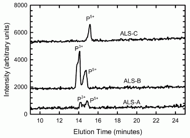
|
This graph shows the key experimental result. It shows the types (species) of phosphorus (P) present in three rock samples. The analysis was done by chromatography of a solution prepared from each rock.
The top sample (ALS-C) shows a peak only at P5+. The two lower samples (ALS-A & ALS-B) show two peaks: one at P3+ as well as the one at P5+. This is Figure 4 from the article. |
What does this mean? The numbers on the P are oxidation states. P5+ represents the phosphate ion, PO43-; P3+ represents the phosphite ion, HPO32- (also called the phosphonate ion). Finding phosphite on Earth is unusual; there isn't much around.
That's what makes this interesting. Where are they finding this phosphite-bearing rock? In Australia. In rocks dated at 3.5 billion years old. The authors make a point of showing that the phosphite is found only in these very old rocks. That's the experimental finding: very old rocks contain phosphite.
Why is this interesting? Why is there phosphite in very old rocks? At that time Earth was being bombarded with huge amounts of meteorites -- known to contain mineral phosphides (with P in even lower oxidation states, as low as -3). Earlier work showed that these mineral phosphides react with water to form various less common forms of P, such as phosphite. Thus the authors suggest that the phosphite they find in the ancient rocks is from the so-called "late heavy bombardment" of that era. (In fact, they had predicted finding the phosphite in these old rocks. That's why they did these analyses.)
They make an additional point, a more speculative point, but an intriguing one that takes us back to how we started this post. Is it possible that this phosphite is the missing reactive P needed to get life started? Lab work shows that the mineral phosphides can serve as a form of reactive P, presumably by first dissolving in the form of phosphite. Finding phosphite in ancient rocks, presumably resulting from bombardment of Earth with mineral phosphides, offers a form of reactive P on the early Earth.
Again, make the distinction between what they found and the interpretation. They found phosphite in ancient rocks -- and that is a novel finding. It is reasonable to suggest that this arose from the meteor bombardment of that era. And it offers interesting new possibilities about how the early steps in developing living systems might have occurred.
The possible involvement of phosphite in forming life has been discussed before. The problem was that no good source was known. The possibility that meteoric P might be the source was considered, but there was no evidence for it. Now there is evidence for it.
News story: Life-producing phosphorus carried to Earth by meteorites. (Chemistry 2011, June 4, 2013. Now archived.)
The article, which is freely available: Evidence for reactive reduced phosphorus species in the early Archean ocean. (M A Pasek et al, PNAS 110:10089, June 18, 2013.)
For more about phosphorus problems...
* A sponge that will soak up phosphate pollution from water (August 14, 2021).
* A safer way to handle phosphorus: the bis(trichlorosilyl)phosphide anion (May 3, 2018).
* NASA: Life with arsenic (December 7, 2010). The claim made in this work is now rejected by most scientists. Be sure to see the follow-up posts.
* A phosphorus shortage? (September 29, 2010).
* How do you make phospholipid membranes if you are short of phosphorus? (November 1, 2009).More about meteors: Of disasters, asteroids and meteors (February 19, 2013).
Another mineral story with implications for the story of life: Photosynthesis that gave off manganese dioxide? (July 21, 2013).
Other posts that may relate to the origin of life include...
* The magnesium dilemma: a step toward understanding how RNA might have been made in "protocells" (February 22, 2014).
* A novel type of polymer -- and its possible relevance to the origin of life (March 15, 2013).
* Did life start in a geothermal pond? (February 28, 2012).A good book on the origin of life is noted on my page Books: Suggestions for general science reading: Deamer, First Life (2011).
More from Australia: Why do koalas hug trees? (June 13, 2014).
July 2, 2013
In the US there is little regulation of cosmetics. Do they contain toxic chemicals? Are users at risk? A group of researchers now reports some information about the metal content of several lipstick and lip gloss products. The products chosen for testing were recommended by a group of teenage girls at a local neighborhood center; that is, they should reflect what is in ordinary use.
At the simplest level, the scientists analyzed the products to see how much of the various metals they contain. This is routine chemistry. However, it is only step one. Any real understanding of the risk requires understanding how much of the products is used, how much might get ingested, and how toxic each metal is. It turns out that the interpretation of the analytical results, involving those later steps, is complicated.
|
The figure is a summary of their findings, for seven metals, which are listed across the bottom. It's complicated, so we'll go through it slowly. After a general description, we'll look at some specific examples.
For each metal, there is a "box and whiskers", which represents the range of values they found in the various products. What's important is to understand the y-axis scale. It is a percentage, designed to reflect the risk. That is, 100% on the y-axis is, for each metal, the amount considered risky. More specifically, the value on the y-axis is the Relative intake index (RII). It is based on the Estimated daily intake (EDI) divided by the acceptable daily intake (ADI). The RII is shown on a log scale. Example... If eating 10 carrots per day would be bad for you (acceptable limit, ADI), and you eat 6 carrots per day (your EDI), that would be 60% on the RII (relative) scale. |
|
The graph is for the person whose usage of the product is average; some people use much more or much less. That is, the EDI is assumed to be "average". Confusing? Let's look at some specifics. The left-hand metal is aluminum (Al). The first observation is that the amount of Al in the products varies widely. The top whisker is well above 20%; the lowest point is below the 0.01% mark. The mean level (the diamond in the box) is about 5%. That is, if an average user uses an average product, their lip cosmetic will provide about 5% of the daily dosage considered toxic. Is that ok? It's not obvious. What other sources of Al does the person have? What are the major sources of Al? Further, again note that word "average". Some people use several times more product than average. Some products contain several times more Al than average. What if we had an above-average user using a product with an above-average content of Al? The highest values shown on the graph are for chromium (Cr). Does that mean that these products contain high levels of Cr? No. Remember, the y-axis is a measure of how close the product is to being risky. Cr comes in at the top by that measure. The actual levels of Cr are (typically) only 1/1000 the levels for Al, but Cr is far more toxic. Even an average user may be approaching the level considered risky for Cr. This comparison of Al and Cr may help to illustrate how the various metals are shown on the graph in terms of their risk, not their amount. This is the left-hand side of Figure 2 from the article. (The right-hand side shows a similar graph for a higher level of product usage.) | |
The article is perhaps most interesting because of its approach. It not only reports analyses, but tries to put the analyses in perspective by discussion of such things as usage levels and toxicities. There is no "smoking gun" -- no case where the products seem to represent a major threat. However, some values are fairly high -- high enough to get attention; the discussions of Al and Cl offer examples.
One way to look at this is that it serves as some baseline for evaluating product toxicity. It's not clear that an individual user should worry much (though reducing exposure is always good -- and perhaps easy). However, the numbers offer guidance as to what should be measured and watched further, and what questions should be raised about developing safer products. Integrating these results with other exposures is necessary to fully understand the significance. A regulatory hand may be called for to do that integration, and to provide a stimulus for product improvement.
News story: Poison Lips? Troubling Levels of Toxic Metals Found in Cosmetics. (Science Daily, May 2, 2013.)
The article, which is freely available: Concentrations and Potential Health Risks of Metals in Lip Products. (S Liu et al, Environmental Health Perspectives 121:705, June 2013.) The article may seem confusing. That is perhaps because they try to do so much. If you look over this article, try to get the big picture: what it is they are trying to do.
More about toxic metals:
* CFL and LED lights: energy-efficient, but toxic (March 3, 2013). The "human-toxicity potential" used there is something like the y-axis scale here (the "Relative intake index").
* Unusual synthesis of cadmium telluride quantum dots (February 15, 2013).More about cosmetics: Did Neandertals use cosmetics? (January 24, 2010).
More about toxicity: Predicting the toxicity of chemicals (September 11, 2018).
July 1, 2013
We recently noted publication of the genome sequence for a plant known as the bladderwort [link at the end]. That genome was noteworthy because it is so small -- and compact: about 97% of the bladderwort genome codes for proteins. At about the same time, the genome of another plant was published: the spruce tree. It's the largest genome sequenced so far; in fact, one major point of the paper is simply the technical achievement of sequencing such a large genome. We note it here briefly, mainly to make the juxtaposition.
The spruce genome is about 260 times larger than the bladderwort genome. However, the number of genes is about the same in both plants. How can that be? As noted above, the bladderwort genome has very little non-coding DNA; that was what made it of special interest. In contrast, the spruce genome is mostly non-coding DNA -- the kind of DNA loosely called "junk".
Two general factors can lead to large genomes. One is large numbers of transposons or viruses; these are entities that replicate themselves within the genome. The other is duplication of whole chromosomes, or even of the whole genome. Analysis of the spruce genome shows it is large because of a huge number of transposons.
Genome analysis is still an emerging subject. Publication of two plant genomes, for the bladderwort and spruce, serve to highlight that we are just beginning to learn how genomes are built.
News story: Norway Spruce Genome Sequenced: Largest Ever to Be Mapped. (Science Daily, May 22, 2013.)
The article, which is freely available: The Norway spruce genome sequence and conifer genome evolution. (B Nystedt et al, Nature 497:579, May 30, 2013.)
Background post: bladderwort genome: Junk DNA: message from the bladderwort (June 4, 2013). (The spruce genome was actually published the week before the bladderwort genome. The latter seems more interesting in its own right, and we posted about it first. We note the spruce genome mainly for contrast.)
Another genome post: The oldest DNA: the genome sequence from a 700,000-year-old horse (August 4, 2013).
There is more about genomes on my page Biotechnology in the News (BITN) - DNA and the genome.
Another "largest"... The largest known virus (August 5, 2013).
More Norwegian trees... Ancient forests of tropical Norway (April 19, 2016).
* * * * *
More, August 15, 2013... This post claims that the spruce genome is the largest genome yet sequenced. Later I realized that I had made the same claim for the poplar genome -- for a quite different reason. The spruce genome has about 20 billion base pairs, and about 29 thousand genes. The poplar genome has a half billion base pairs -- and 46 thousand genes. Spruce has more base pairs than any other genome yet sequenced; poplar has more genes. Both are proper criteria, but they are quite different -- as you can see with these two examples. (Of course, numbers change over time. The numbers reported for these genomes will change some, and more genomes will be sequenced.) The following post mentions the poplar genome: The mouse genome (June 5, 2009).
June 30, 2013
On July 10, 1913, the temperature at Greenland Ranch (now known as Furnace Creek Ranch) in Death Valley, California, reached 56.7°C (134°F). That event is now recognized as the hottest temperature ever recorded on Earth. (That refers to official meteorological measurements of surface temperature.) Why is this a story at this point -- nearly a century later? Because another event, a few years later in Libya, has been claimed as the record. However, a recent article undermines -- and officially overthrows -- that later claim.
The new work presents multiple arguments that the Libya measurement is incorrect. The arguments fall into two general classes. One involves how the measurement was made, by an inexperienced person using a tricky instrument. The other involves the result itself, which seems inconsistent with other data. With all their arguments, they conclude it is most likely that the observer read the wrong part of the instrument, and was high by 7 C°. The article is from the World Meteorological Organization (WMO), the official record keeper for such matters. The WMO now declares the Libya measurement invalid; that makes the Death Valley measurement the official record holder.
Here is one of the arguments...
|
|
The graph shows the maximum daily temperatures (°C, y-axis) recorded at several sites in Libya during September 1922 (days shown along the x-axis). The red line is for the site in question. The other sites, all fairly close, are shown with various other lines. You can see the high T that was recorded on September 13; it is 58°C. You can also see that the red line seems to jump several degrees, relative to the cluster of other lines, just two days before that; it remains relatively high for most of the rest of the month. The jump to higher readings at that one site occurs when a new and inexperienced person takes over reading the temperatures. Is that high value for real? It's suspicious. This is Figure 4 from the article. |
We must stress that the point above is not a proof that the high value is wrong. It is an argument that the value is suspicious. Overall, several arguments are presented. Based on the weight of the evidence, the WMO has decided to officially reject the September 13, 1922, Libya measurement.
Is their conclusion correct? As always, scientific arguments are subject to challenge from better arguments. The article here joins the scientific literature. We'll see how it is accepted over time.
News stories:
* World's hottest temperature cools a bit. (Arizona State University, September 13, 2012.) News release from one of the lead institutions involved in the work.
* A Record Worth Wilting For: Death Valley Is Hotter Than .... (New York Times, December 28, 2012. Link is now to Internet Archive.) This tells the story of how the issue was raised, culminating in this official paper from the WMO. It links to the blog post that originally presented the arguments; the author of that post is an author of the paper. It also notes that the Death Valley claim, too, may be open to question, but that is another story.
More from the person who raised the issue... World Heat Record Overturned--A Personal Account. (C C Burt, Weather Underground, September 13, 2012. Now archived.) Aside from the science, this is an interesting story.
The article, which is freely available: World Meteorological Organization Assessment of the Purported World Record 58°C Temperature Extreme at El Azizia, Libya (13 September 1922). (K I El Fadli et al, Bulletin of the American Meteorological Society 94:199, February 2013.) The paper is interesting to look over, and much of it is quite readable. You will learn about weather stations, and will be led though some interesting and fairly clear arguments.
The 100th anniversary of that record hot day in Death Valley is less than two weeks away. We are now in a major heat wave in the southwestern US. National news broadcasts raise the question of what might happen in Death Valley. On June 29 (the day before posting this), the forecast for both June 30 and July 1 is for a high of 129°F = 54°C (and a low of 96°F = 26°C). Maybe the record will stand for now.
More about Death Valley:
* Briefly noted... Heat waves: Sleep advice (and a "local" note) (September 14, 2022).
* How rocks travel (November 14, 2014).
* Life at age 34,000? (October 8, 2011).More from the Libyan desert: Libyan desert glass, King Tut, and the hazards of meteorite strikes (May 31, 2019).
More about thermometers: Where is the hottest part of a living cell? (September 23, 2013).
Also see: Weather forecast: Clouds will form near North Pole within two years (April 9, 2012).
June 28, 2013
Mountains and human language? What is that supposed to mean? Let's clarify the question... If a human language develops in the mountains (high elevation), would it have differences from languages that develop near sea level? Language involves associating sounds with meanings; would humans at high elevations naturally tend to make different sounds than those at low elevations? You still find it an odd question? Let's look at some data from a recent article...
|
|
The language feature of relevance here is the ejective. An ejective is an odd sound; it's hard to explain what it is. English has no ejectives, and that may also be true for other major languages. You can get an explanation and example of ejectives from the audio file linked to the news story listed below. The graph shows the percentage of languages that have ejectives (y-axis) as a function of the geographical elevation at which the language is spoken (x-axis). (For reference, Denver -- the "mile-high city" -- is at about 1600 meters elevation.) This is Figure 4 from the article. |
The pattern is clear enough: languages spoken at high elevation are more likely to have ejectives.
Why? What does this mean? It's an observation that comes from looking at the data. The author suggests that it may have to do with the reduced air pressure at high elevation, but, for now, that is largely speculation.
Check the audio file with the EurekAlert news story, so you know what an ejective is. Then you can just file this away as an odd finding. (Several of the findings in previous language-related Musings posts, listed below, might be considered odd.) I wonder what else this author will find as he analyzes hundreds of languages.
News story: Does altitude affect the way language is spoken? University of Miami anthropological linguist discovers a connection between elevation and speech. (EurekAlert!, June 12, 2013.) This links to an audio file (2 minutes), in which the author gives an overview of the work. He includes examples of the type of sound he is analyzing in this work. Here is a direct link to that audio file: audio file.
The article, which is freely available: Evidence for Direct Geographic Influences on Linguistic Sounds: The Case of Ejectives. (C Everett, PLoS ONE 8(6):e65275, June 12, 2013.) Much of this is quite readable!
Other posts about language include:
* Briefly noted... Does the word 'rough' sound r-r-r-rough? (May 11, 2022).
* Does penguin language conform to the laws of human language? (February 18, 2020).
* How long does it take to invent a new language? (February 9, 2020).
* Mouse with human gene for language: is it smarter? (November 15, 2014).
* Is there a gene for "It's on the tip of my tongue"? (July 6, 2012).
* Can French baboons learn to read English? (May 13, 2012).
* Are some languages spoken faster than others? (November 21, 2011).
* Speech: Taking turns (August 17, 2011). Monkeys.
* Language: What do we learn from other animals? (August 3, 2010).
* Is it language? (July 9, 2009).More about mountains: Our mountains are growing (May 19, 2012).
June 26, 2013
We have noted some developments in the Myriad case [links at the end]. Briefly, Myriad was issued a patent for certain human genes, which were the basis of diagnostic tests developed by the company. The patent was challenged, with the key point of contention being whether genes could be patented. After all, they are "natural", not an invention. On the other hand, it takes skill and effort to get a gene isolated and into a usable form.
The case has gone through the courts, with some decisions on each side. Finally, the US Supreme Court accepted the case. A few days ago, the Court issued its ruling: natural genes cannot be patented. It was a unanimous ruling. It is "the last word", in that the Supreme Court is the highest court in the country, and has the final say on what a law means.
It's the last word unless, of course, Congress chooses to change the law. Remember, the Court does not decide what is "good". The Court's job is to interpret what the law says. However, Congress can change the law -- if they do not like the Court's interpretation (and if they can agree on a new law).
Those interested in the legal aspects may enjoy looking over some of the new press on this. The earlier posts link to some of the legal arguments. Biotechnology, like everything else, is subject to the legal system -- and it can get messy and complex. Since I had posted earlier parts of this story, including conflicting decisions, I felt I should include the Supreme Court decision, for some closure.
News stories:
* Supreme Court rules on Myriad's "gene patenting" case. (Krista Conger, Stanford University, June 13, 2013.) Now archived.
* Justices, 9-0, Bar Patenting Human Genes. (New York Times, June 13, 2013. Link is now to Internet Archive.)
Background posts:
* Can genes be patented? The Myriad case (April 2, 2010).
* Can genes be patented? The Myriad case -- follow-up (November 8, 2010).
* Can genes be patented? The Myriad case -- legal issues (November 28, 2010).
* Can genes be patented? The Myriad case -- Reversal (August 10, 2011).
June 25, 2013
Another story of what can be learned by analyzing old DNA.
In 1845, the Irish population was devastated by severe famine. The cause? An infection of the staple potato crop by an organism now known as Phytophthora infestans. The population of Ireland still has not recovered from that event -- and P infestans is still an important threat to potato crops worldwide.
What kind of organism is Phytophthora? It's a water mold, more technically an oomycete. Superficially, oomycetes look similar to fungi, but they are quite unrelated. Classification of the oomycetes is debated, but considering them along with photosynthetic microbes is reasonable. Lest that last point confuse you... Oomycetes are not photosynthetic, but they do have cellulosic cell walls.
How are modern strains of P infestans related to the 1845 strain? In particular, is the strain that was most common in Europe in the 20th century descended from that 1840s strain? A recent article provides some evidence on that matter. A key step was finding that DNA could be extracted from samples of the organism available in herbaria; this allowed the scientists to examine strains from 19th century outbreaks. The older DNA was quite degraded, but the tools now available for analyzing ancient degraded DNA made it possible to analyze these old specimens, along with modern strains.
Overall, they analyzed the genomes of 11 strains from herbaria samples and 15 modern strains. The herbaria samples were from Europe and North America and dated from the 1840s through the end of the 19th century. The modern strains were from a range of sites around the world. Comparison of the genomes of all these strains suggested how they were most likely related.
The following map summarizes their findings. The focus is on two strains of Phytophthora infestans : one, called HERB-1, is the strain that caused the 1845 Irish famine; the other is the modern strain US-1, which was the predominant strain that infected potato crops worldwide for much of the 20th century.
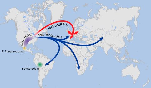
|
|
The map shows the origin and early spread of P infestans in North America (US-Mexico area); they have little information about the details. The origin of the potato in South America is also shown. The red line shows the spread of strain HERB-1 to Europe, including Ireland, in (or around) 1845. The blue lines show the spread of strain US-1 at later times to various places, including Europe. This is Figure 11 from the article. |
Their major point is that the Irish famine strain and the modern strain seem to have developed independently in North America. The latter is not derived from the former.
The conclusions here are based on DNA analyses of strains they found in herbaria as well as modern strains. Such work is never complete; the point is that this is what the evidence so far says. However, they emphasize the importance of analyzing the full genome, rather than only a few genes.
News story: 'Whodunnit' of Irish Potato Famine Solved. (Science Daily, May 21, 2013.)
The article, which is freely available: The rise and fall of the Phytophthora infestans lineage that triggered the Irish potato famine. (K Yoshida et al, eLife 2:e00731, May 28, 2013.)
More about ancient DNA analysis: Bacteria on human teeth -- through the ages (March 24, 2013).
More about potatoes...
* What are these? (September 25, 2008).
* Boiled batteries (July 19, 2010).
* The potato we call home: a study of the earth's gravity (May 3, 2011).Phytophthora infestans is the agent of potato blight, but other Phytophthora species are also important plant pathogens. Sudden oak death (SOD) is a major current issue in northern California; it is caused by Phytophthora ramorum, first recognized in 1995. See my page Biotechnology in the News (BITN) -- Other topics under Sudden Oak Death.
A post about SOD: The quality of citizen science: the SOD Blitz (September 28, 2015).
There is more about genomes on my page Biotechnology in the News (BITN) - DNA and the genome.
Thanks to Borislav for suggesting this item.
June 24, 2013
There are two common treatments for depression: drugs and cognitive therapy. Neither has a particularly high success rate. It is likely that some people would respond better to one or the other. However, there is no way to predict that, so the choice of initial treatment tends to be arbitrary.
A new article offers a hint of how we might predict which patients will respond to which therapy for depression. It involves measuring the activity in various regions of the brain, using positron emission tomography (PET).
The following figure gives an idea of what the scientists found. It's a simple but perhaps confusing figure. Let's start by looking at the bottom line, and then we'll fill in the details.
| In the top frame there are two lines, with different symbols (triangles and circles). One line has a positive slope and one has a negative slope. In the bottom frame they are reversed. For example, the line with circles has a positive slope in the top frame but a negative slope in the bottom frame. That's the point. Now let's look at what the curves are for. |
|
Graph symbols, for the two treatments:
triangles: Escitalopram (a drug) circles: CBT (cognitive behavioral therapy) |
|
There are three variables here: the brain region, the treatment, and the response. The two graphs are for two different brain regions (as labeled near the top left of each graph). The two lines on each graph are for different treatments (as shown at the right of the graphs). The two points on each line are for the two recorded responses: remitters and nonresponders (left and right, respectively; labeled on the lower x-axis). We might call these successes and failures. The y-axis is a measure of brain activity, from the PET scan. It is reported here in z-units. A z score of +1 means the value is 1 standard deviation above the average. If you don't understand the z score, don't worry. All you need to know here is that it is a way of showing the response on a consistent scale. The graphs above are part of Figure 2 from the article, with slight editing. I've shown here two of the six brain regions that are in the full Figure. I chose one with each type of relationship (e.g., circles line going up or going down). I then edited the figure to show the x-axis labels. | ||
So, let's go back and look at what the graphs are saying. Above we noted that "... the line with circles has a positive slope in the top frame..." What does that mean? The line with circles is for treatment CBT. The top frame is for a particular brain region (right inferior temporal). And the positive slope here means that the nonresponders had a higher brain activity in this region than did the remitters. That is, remitters and nonresponders show different brain activities, and in this case the nonresponders were higher. The other treatment (drug; triangles) shows the opposite relationship.
Now look at the lower frame, which is the same idea but for a different brain region. You will see a similar pattern of results. More precisely, it is exactly the opposite. Thus again we see that the brain activity measurements distinguish remitters and nonresponders; this time, the way they are distinguished is different.
The big message... The study suggests that people who do or do not respond to one treatment or the other are biologically different -- and that this can be measured. Overall, they found six brain regions that yielded this kind of useful information. A measurement in one region makes the distinction. (One might suggest that combining the information from multiple regions would improve the distinction.)
There is an important caveat about this work. The purpose is to find a measurement that will predict treatment success. But that is not what they did here. They did not predict anything here. They did treatments and made measurements. They found some patterns, and they suggest that these patterns might be useful. That's the next step, then... do a study that involves predictions, a prospective study as it is known. That is, take the brain measurements and use them to assign treatments; see if the success rate is higher than it is now.
It's common for medical studies to be done this way, with simple observations being correlated with results at first. However, it is only the second type of study, the prospective study, that really tells us if this works. Thus we interpret the present study as suggesting an interesting "marker" that might predict what treatment should be used. Further studies will show if it actually works.
News stories:
* Study Suggests 'Brain Type' Biomarker-Based Treatment for Depression. (GEN, June 13, 2013.)
* Scan predicts whether therapy or meds will best lift depression. (NIH, June 12, 2013. Now archived.) From the funding agency.
The article, which is freely available: Toward a Neuroimaging Treatment Selection Biomarker for Major Depressive Disorder. (C L McGrath et al, JAMA Psychiatry 70:821, August 2013.)
For more on the use of brain PET scans, see...
* Early detection of brain damage in football players? A breakthrough, or not? (September 14, 2015).
* Effect of cell phone on your brain (April 11, 2011).More about brains is on my page Biotechnology in the News (BITN) -- Other topics under Brain (autism, schizophrenia).
June 22, 2013
|
This is a page from the score to the opera Medea, composed in 1797 by Luigi Cherubini.
|
The method used here is straightforward, and has been adapted for use on other old manuscripts. The basic idea is that different materials differ in how they interact with various types of X-rays -- just as they differ in how they interact with various colors of light. The analysis here made use of the fact that Cherubini's ink contained a high level of iron, and the staff lines on his music paper contained a high level of zinc. The X-ray analysis mapped the locations of iron and zinc: notes and music staff lines.
Why SLAC? Particle accelerators produce X-rays as a by-product. Lots of them; strong X-rays. X-ray beams from particle accelerators are mainstream tools in the sciences today.
News stories:
* SLAC X-rays resurrect 200-year-old lost aria. (Stanford University, June 10, 2013. Now archived.) Includes a link to the music (about 5 minutes; piano version).
* Cherubini opera restored after 200 years. (BBC, June 14, 2013.) I first learned about this story from an item on the BBC World Service news; this page is about what I heard.
We have only news stories such as these. I do not know if a formal publication of the scientific work is planned. The music apparently has been published.
More about music and technology: Alan Turing -- and the music of Iamus (November 14, 2012).
A post about recovering old writings: Improved ostracon analysis reveals 2600-year-old request for wine (July 23, 2017).
A post about restoration of old recordings: Restoration of old sound recordings (July 23, 2011).
A post about authenticating old manuscripts: Using mass spectrometry to analyze a poem (October 14, 2018).
Next music post... Quantum gravity: the musical version (September 25, 2013).
There is more about music on my page Internet resources: Miscellaneous in the section Art & Music. A sub-section there is on "Historic recordings"; it includes work on restoring old recordings.
More from SLAC:
* Added October 8, 2025. Measuring the temperature of ultra-hot atoms -- and uncovering a new way to not melt gold (October 8, 2025).
* Photosynthesis that gave off manganese dioxide? (July 21, 2013).Also see: What can we learn from reading (the DNA from) old parchments? (January 30, 2015).
June 21, 2013
How do bees find flowers? Color? Odor? Yes and yes. A new article suggests that the electric field of the flower may also be part of the story.
The background for this finding is reasonable enough. Flowers are negatively charged; pictures in the article show how they can be coated with a positively charged dye. Bees acquire a positive charge as they fly. Flowers and bees could be attracted to each other by an electrical force. Is there any evidence that such an attraction is biologically relevant?
To address the issue, the scientists did an experiment where they measured the attraction of bumblebees to "E-flowers" (artificial flowers) with or without an electric field. Here is an example of what they found...
|
In one test, bees were given a choice between two "E-flowers":
* one, maintained at 30 volts, offered a sugar reward; * one, with no voltage, offered a bitter solution. If the bees chose the E-flower with the electric field and sugar, that was counted as a correct response. They also did a test with E-flowers at 10 volts. They chose the two voltage levels based on their estimates of what electric fields the bees would naturally encounter. |
|
The left side of the graph, labeled "ON", shows the results for the 30-volt E-flower (red diamonds) and the 10-volt E-flower (blue circles). You can see that with a 30-volt E-flower the bees learned to be attracted to it. That is, they learned to associate the electric field with the reward. In contrast, with a 10-volt E-flower, performance was near 50% (random) for the entire time. When the voltage was turned "OFF" (right side of the figure), the bees that had learned to recognize the 30-volt E-flower lost their improved performance. This is Figure 2A from the article. | |
This experiment would seem to establish that bees can use an electric field as part of their characterization of a desirable food source. How relevant is this in the real world? That may be harder to test, but at least it now seems plausible -- and worth testing.
The authors note that as bees (positively charged) approach flowers (negatively charged), the charge on the flowers is lost -- rapidly. This is undoubtedly the most rapid response of the flowers. Is it relevant? Is it possible that discharging the flowers is a way to reduce crowding at a particular flower? Just an idea.
News stories:
* Floral Signs Go Electric: Bumblebees Find and Distinguish Electric Signals from Flowers. (Science Daily, February 21, 2013.)
* Bees Can Sense the Electric Fields of Flowers. (E Yong, Not Exactly Rocket Science (National Geographic blog), February 21, 2013.)
The article: Detection and Learning of Floral Electric Fields by Bumblebees. (D Clarke et al, Science 340:66, April 5, 2013.)
Follow-up: How bumblebees detect the electric field (October 22, 2016).
A recent post on how bees are attracted to flowers... Caffeine boosts memory -- in bees (April 12, 2013).
Also see:
* Electric insects (February 27, 2023).
* What should a plant do if it hears bees coming? (December 10, 2019).More about bees: Should bees eat honey? (July 12, 2013).
More flowers: Better enzymes through nanoflowers (July 7, 2012).
More bio-voltages:
* Cuttlefish vs shark: the role of bioelectric crypsis (May 10, 2016).
* Electric fish: AC or DC? (October 12, 2013).
June 18, 2013
Is ordinary transmission of WiFi (wireless) signals affected by people moving around or waving their arms? Apparently not; the widespread use of WiFi attests to its robustness in the face of such common events.
However, that is not the whole story. WiFi signals are affected by environmental motions; small changes in air currents cause small Doppler shifts in the frequency of the signal. The wireless system tolerates those shifts, since it works in a completely different frequency range. What if we used a system that was sensitive to such motions? We could then send a signal via the wireless system by waving our hands. And we could do it with a device in the next room, since wireless passes through walls.
That's the idea behind a new system of gestural control being proposed by a group in the Computer Science department at the University of Washington. They call it WiSee. The idea is to intercept the tiny fluctuations in the WiFi signal that are due to -- intentional -- human motions, and use them. In their testing, they use the motions for purposes such as changing the TV channel or turning out the lights.
In their initial work, they explore what it takes to get a meaningful signal. They test the system with several gestures and test for interference from background motions by other humans.
This is very much a work in progress; even the paper listed below is in progress. Using gestural control of devices is not new; what is new here is integrating it into the common wireless system. It's quite basic at this point, It will be interesting to watch their progress.
News story: Using your WiFi for gesture recognition. (Kurzweil, June 5, 2013.)
WiSee web project site: WiSee.
* It includes a linked paper: Q Pu et al, Whole-Home Gesture Recognition Using Wireless Signals. It is labeled as a "Working Draft", and has not been peer-reviewed. It is planned for presentation at a meeting this coming Fall. The paper describes the system at various levels, with some basics, but also some technical information for those so inclined.
* It also includes a short video (with narration), which explains and illustrates the system. The video is also available at: YouTube.
More about wireless: Quiz: What's the connection... (February 14, 2012).
More about Doppler effects: A galaxy far, far away: the story of MACS 1149-JD (October 12, 2012).
Also see: Can computers talk to each other? Could it be a new type of security threat? (June 18, 2014).
June 17, 2013
How long did a Neandertal mother breast-feed her child? A new article gives an answer.
Let's look at the results; then we will discuss how the method works.
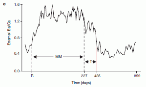
|
The graph shows the results for a single tooth. It plots the barium (Ba) content of the tooth enamel on the y-axis vs "time" -- the tooth age -- on the x-axis.
The Ba value is shown as the ratio of barium to calcium (Ba/Ca). It is shown times 104; that is, the upper value of 1.6 is actually 1.6x10⁻⁴. (It's not well-labeled! No matter, the graph clearly shows what we want, which is how Ba varies over time.) |
|
Time -- tooth age -- refers to the age an individual layer of the tooth was laid down. It's all one tooth here. Teeth, like trees, have growth zones. For teeth there is a daily cycle of growth; careful analysis can measure the age of each part of the tooth to about one day. For the x-axis, B is birth, at time = 0. The numbers are days. You can see that the Ba content of the tooth increases starting at birth, and then decreases starting at about day 227, with a further decline at about day 435. This is Figure 3c from the article. | |
The tooth studied above is from a Neandertal child, who died at age 8 about 100,000 years ago.
What does this all mean? Before doing this analysis of the Neandertal tooth, the scientists had been making similar measurements on modern children, both human and monkey. Those measurements led them to associate the high content of the mineral barium in teeth with breast milk. The developing fetus, feeding off the maternal circulation, has low barium. And the older child, eating solid food, has low barium. The high barium level indicates the time of breast feeding.
That's what they found with the moderns, and thus they suggest it holds for the Neandertal child, too. Thus they infer the time of birth, shown as B on the graph: it's the time when the Ba level starts to rise. The high Ba level starts to decline at day 227, which they suggest marks the start of a gradual change away from milk. Finally, there is a drastic drop in Ba at day 435. This marks the end of drinking mother's milk -- perhaps a sudden and catastrophic end. (The label MM means "maternal milk", and the label T means "transition".)
This is all about one child and one tooth, so let's avoid making big stories out of this about Neandertal lifestyle. The paper develops an interesting new method, and shows how it can be applied. And it begins to analyze the life of a being who lived 100,000 years ago at one-day resolution. The method will undoubtedly be applied to museum samples of diverse primates.
News stories:
* Scientific Tooth Fairies Investigate Neanderthal Breast-Feeding. (NPR, May 22, 2013.)
* Researchers Determine Age of Weaning in Neanderthals. (Sci.News, May 24, 2013.)
The article: Barium distributions in teeth reveal early-life dietary transitions in primates. (C Austin et al, Nature 498:216, June 13, 2013.) Check Google Scholar for a copy.
Another post making use of this method: The oldest known identical twins (December 7, 2020).
More about Neandertals and their teeth... Analysis of teeth confirms that Regourdou was right-handed (September 7, 2012).
More about Neandertals... A tumor in a Neandertal (July 8, 2013).
More about growth zones: Do animal bones have something like annual growth rings? (August 7, 2012).
More about breastfeeding: Breastfeeding and obesity: the HMO and microbiome connections? (November 14, 2015).
More milk history... The oldest known piece of cheese (April 25, 2014).
More on mothering: Predicting success in training guide dogs -- role of good mothering (November 27, 2017).
June 15, 2013
Chemist Andy Benson is the Benson of the "Calvin cycle". The "Calvin-Benson cycle" -- except that the shorter name is more commonly used, so Benson's role is sometimes forgotten. It's the common pathway for CO2 fixation in photosynthesis. The work that elucidated the Calvin-Benson cycle started in the 1940s and was done largely at UC Berkeley and the Lawrence Radiation Lab (now the Lawrence Berkeley National Laboratory). It made pioneering use of C-14, a radioactive isotope of carbon, as a tracer. Benson, now in his 90s, is emeritus at Scripps.
We have here a recent video interview of Benson. It is by UC Berkeley biochemist Bob Buchanan. It develops some of the history of the discovery of the Calvin-Benson cycle, and gives a glimpse of the science style of the day. It also reveals some of the personalities. (Benson is quite tactful, though gets in a few zingers about his more famous colleague.)
The half hour video was edited from a couple days of interviewing. It was given its first showing at a seminar of the UC Berkeley Energy Biosciences Institute (EBI) in mid-2012. That seminar itself was of some historical interest. It was in the Calvin Lab (originally the Laboratory for Chemical Biodynamics), which opened in 1964 to house the Calvin group. (It's a round building, by the way.) Further, the seminar marked the end of the building as a science building. EBI opened its own new building in late 2012, and the Calvin Building has apparently been designated for other uses.
Buchanan spoke a bit about the process of the interview and doing the video, and then showed it. The video is quite delightful, but was not immediately publicly available. Now they have released it. It's worthwhile, both for its historical and scientific aspects.
News story and video: New Interview With Biochemist Andrew Benson Is Online. (College of Natural Resources, UC Berkeley, November 9, 2012. Link is now to Internet Archive.) It links to the video, or go directly to video at YouTube. (It's about 30 min.)
Some of Benson's papers are freely available through an electronic archive at the University of California. The following link gives you a search of that site for his name. Escholarship: search on Andrew Benson.
More about photosynthesis and CO2 fixation:
* Turning E. coli into an autotroph (using CO2 as sole carbon source) (December 9, 2019).
* A novel enzymatic pathway for carbon dioxide fixation (March 12, 2017).
* Photosynthesis that gave off manganese dioxide? (July 21, 2013).
* An artificial forest with artificial trees (June 7, 2013). A reminder that we commonly use the term photosynthesis as an overview of two rather distinct processes. One is the set of "light reactions", in which light energy is captured. The other is the set of "dark reactions", in which energy is used to fix CO2. Benson studied the dark reactions; the earlier post is primarily about the light reactions.More about C-14: Tree rings, carbon-14, cosmic rays, and a red crucifix (July 16, 2012). This involves a different use of C-14. Benson used C-14 as a tracer. He added a chemical with C-14 in it, and then measured what chemicals contained the C-14. The earlier post is about determining the age of a sample by measuring how much of the C-14 has decayed. Both methods make use of C-14 being a radioactive isotope.
* Previous history post... The Mudville story, on its 125th anniversary (June 3, 2013).
* Next... A device for controlling the cursor on the computer screen (July 10, 2013).My page Internet resources: Miscellaneous contains a section on Science: history. It includes a list of related Musings posts.
June 14, 2013
A fascinating article seems to offer a relatively simple way to delay aging and loss of brain function.
Let's look at the key claims, and then we'll note the important limitations of the work. (You did notice the question mark in the title?)
As background, we have noted before that caloric restriction (CR) can extend lifespan in numerous organisms [link at the end]. It's not simply living longer but living longer with good health that is important. In the new work, scientists find that CR improves brain function in a mouse model of brain degeneration. Further, they show that a drug acting on a well-known protein can mimic the effect of CR on the neurodegeneration.
Here is an example of their results...
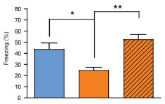
|
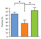
| These are Figures 3D (left) and 6G (right) from the article. |
|
The two graphs above are rather similar. Each starts with a blue bar (at the left), followed by an orange bar (middle) that is shorter. The blue bar is a control; the orange bar shows a problem. Finally, each graph has a third bar (right) that is similar to the blue bar in height. That third bar shows what the treatment does -- different treatments in the two graphs. Both treatments restore the response from the level of the low orange bar to the higher blue bar. That's the point, so let's look further at what's happening here. The test is a behavioral test to see how well the mice remember a previous experience. It's called the Contextual fear conditioning test; a higher score (more freezing) is better. The blue and orange bars are for two types of mice, grown normally. The blue-bar mice are normal (control mice). The orange-bar mice carry a genetic modification that leads to neurodegeneration; these mice have been well-studied in other work. You can see that in each test here the mutant mice (orange bar) perform less well than the control mice (blue bar). The third bars. Treatment. In each case, the mutant mice were treated -- and in each case their function was improved to approximately the control level. In the experiment on the left, the mutant mice were treated by caloric restriction; in the experiment on the right they were treated with a drug that activates a protein called SIRT1, which is known to be involved in the response to CR. | ||
That's the basic idea. In a nutshell, they have mutant mice that show neurodegeneration. Two treatments reduce the neurodegeneration. One is caloric restriction, and the other is a drug that affects the CR pathways.
The results shown above are just a sampling, as usual here. The article has many results, with the same general message: CR reduces neurodegeneration, and a drug can mimic the effect of CR.
What are the limitations of this work? First, it is done in mice, and it is done in a particular lab model for neurodegeneration. It is unknown how the results would hold for any other type of neurodegeneration, including other disease processes or normal human aging -- whatever that might mean. Further, the class of protein involved here, known as sirtuins, has a confusing track record; there have been heated disputes about experimental results with sirtuins. Regardless of the details, the point is that this is an interesting finding, which must -- and surely will -- be followed up. However, it would be inappropriate to suggest that anything useful is at hand based on this work. We have noted this type of situation before: a single article can suggest something very interesting, but must be followed up before we understand the significance. Some such findings never pan out.
News story: Reducing Caloric Intake Delays Nerve Cell Loss. (Science Daily, May 21, 2013.)
The article: A Dietary Regimen of Caloric Restriction or Pharmacological Activation of SIRT1 to Delay the Onset of Neurodegeneration. (J Gräff et al, Journal of Neuroscience 33:8951, May 22, 2013.)
Background post about caloric restriction -- in fruit flies: Methuselah's secret: methionine? (February 12, 2010).
The same kind of behavioral test was noted in the post Mice with human brain cells (April 13, 2013).
The story of sirtuins starts in yeast. A key figure is Lenny Guarente, who did pioneering work in yeast and has become one of the great popularizers of the SIR story. He tells that story in a book, which is listed on my page Books: Suggestions for general science reading: Lenny Guarente, Ageless Quest - One scientist's search for genes that prolong youth (2003).
More on CR... Extending lifespan by dietary restriction: can we fake it? (August 10, 2016).
My page for Biotechnology in the News (BITN) -- Other topics includes sections on Aging and Brain (autism, schizophrenia). Each of those includes a list of related Musings posts.
Thanks to Borislav for suggesting this item.
June 11, 2013
For the small lizard known as the delicate skink, it would be about 46 days (at 25 °C). Unless, of course, the embryo in the egg feels threatened, in which case it may get out a bit early.
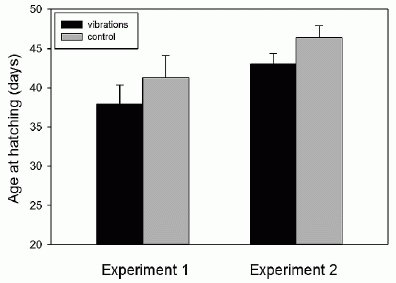
|
Here's some data...
In these experiments, skink eggs were incubated in the lab. Some eggs were subjected to a vibration. The graph shows the age at hatching of the eggs that were or were not vibrated, in two separate experiments. In each experiment, you can see that the vibrated eggs (dark bars) hatched about three days earlier. |
|
The vibration treatment was done by putting the eggs on a lab shaker for one minute each day, starting at day 32. The conditions of the two experiments were somewhat different, leading to the different times for the controls. However, the effect of the vibrations was about the same in both. This is Figure 1 from the article. | |
The main conclusion from the above graph is that vibration causes earlier hatching. The vibration is thought to mimic the presence of a predator. The skinks that hatched early because of vibration were somewhat smaller, and left more yolk in the egg. It is possible that they would be at some disadvantage. Nevertheless, they were well-formed and active; upon leaving the egg, they quickly scampered away.
The work shows that skinks can have a type of premature birth, when egg conditions seem unfavorable. It is an example of environmental cueing of hatching. That's not a new idea, but one important aspect of this work is that it is done under well-controlled lab conditions. The experiments here raise many questions; controlled lab work should be suitable for addressing some of them.
News stories:
* An Emergency Hatch for Baby Lizards. (Science Now, April 4, 2013.)
* Environmentally Cued Hatching in a Lizard. (The Wandering Herpetologist, April 7, 2013.)
Video. There is a video with the news stories. It is not part of the current work, but it does show an example of how vibration can stimulate emergence of a lizard from its egg. The video is also available at YouTube. (1 minute; includes narration).
The article: Hitting the Ground Running: Environmentally Cued Hatching in a Lizard. (J S Doody & P Paull, Copeia 2013 Issue 1:160, March 2013.)
More about reproduction in lizards:
* Twenty percent of the females are genetic males (October 6, 2015).
* An advanced placenta -- in Trachylepis ivensi (October 18, 2011).Another unusual reproductive feature: Cannibalism in the uterus (May 31, 2013)
More about birth problems:
* Using caffeine to treat premature babies: risk of neurological effects? (April 27, 2019).
* The problem of human birth (July 8, 2011).More about lizards... Why chameleons change color (and get thin) (March 31, 2014).
More about vibrations: A rapid test for antibiotic sensitivity? (July 19, 2013).
More about egg yolks: Studying concussions in egg yolks (February 28, 2021).
June 9, 2013
Studies of animal behavior are often fun. The one discussed here is of particular interest because it involves primates -- in the wild. It shows the cultural transmission of information among monkeys.
The experiment is simple and elegant. In the training phase, monkeys were offered two kinds of corn: pink and blue. One of them had been made distasteful. (Which one was distasteful varied from one experiment to another, providing a control against color being the key variable.) The monkeys soon learned that one color corn (say, blue) is good to eat, but that the other (pink, in this case) is not. Not surprisingly, this behavior continued even when corn without the bad taste was given.
|
This photo, from the lead author, gives an idea of the set-up.
This is from the Why Files story. See the movies for more. |
The real question was how newcomers -- monkeys that had never been exposed to the distasteful corn -- would behave. The first such observations occurred when the original monkeys had babies. The babies ate what the mothers ate -- even though both kinds of corn were fine. An important experimental point here was that the scientists simply observed what the monkeys did; there were no organized tests. (The scientists did, of course, put out the corn.)
Even more interesting was the behavior of migrating males that joined the group. In almost every case, the male followed the lead of the locals, and ate what they ate -- regardless of what he had done in his own group.
That's about it. The monkeys, in the wild, learned what to eat by following group norms. It's probably best to avoid trying to interpret this too much for now. However, if you read the linked materials below, you'll find plenty of attempts at interpretation. (I wonder... If the monkeys were hungry, would they try the other food? Which of them would try it first, those who had experienced the distasteful corn or those who had only learned the social custom from others?)
News stories:
* Monkeys found to conform to social norms. (Phys.org, April 25, 2013.)
* Monkey see, monkey do -- Study: Monkeys ape the behavior of their group. (Why Files, April 25, 2013. Now archived.)
Movies. There are two movie files with the article. Go to the article web site, and choose Supplementary Materials. That page describes and lists the two movies. They are useful in depicting the experimental set-up, even if you don't follow the short explanation of what they show.
* News story accompanying the article: Behavior: Animal Conformists. (F B M de Waal, Science 340:437, April 26, 2013.) (This news story also discusses a new article on cultural transmission in whales.)
* The article: Potent Social Learning and Conformity Shape a Wild Primate's Foraging Decisions. (E van de Waal et al, Science 340:483, April 26, 2013.)
Other posts on cultural transmissions by non-human animals include:
* Cultural transmission of fishing techniques among dolphins (September 13, 2011).
* Tracking new songs as they cross the Pacific (June 21, 2011).More about monkeys:
* Do monkeys make stone tools? (December 18, 2016).
* Monkey math (June 1, 2014).
* Rukwapithecus and Nsungwepithecus (June 1, 2013).
* Monogamy (January 30, 2013).
* Prejudice against outsiders -- in monkeys (May 10, 2011).More on animal behavior: If the elephant can't find its dinner, should you help by pointing to it? (October 18, 2013).
More about corn...
* What can we learn from a five thousand year old corn cob? (March 21, 2017).
* Alternative microbial sources of insecticidal proteins (December 9, 2016).
* Atmospheric CO2 and the origin of domesticated corn (February 14, 2014).A book about animal behavior is listed on my page Books: Suggestions for general science reading. de Waal, Are we smart enough to know how smart animals are? (2016). The author is the de Waal who wrote the Nature news story listed above.
June 9, 2013
Energy metabolism involves the chemical processes of oxidation and reduction, processes involving electron transfer. We may have a general sense of how these processes occur in higher organisms. For example, our lungs and circulatory system serve to distribute oxygen -- an oxidizing agent -- throughout the body, where it can accept electrons from the food we burn.
As so often, the microbial world presents us with a wide variety of electron transfer processes. Some of them involve the cooperation of what we might have thought were independent organisms. A recent news story surveys some of these processes. Among other things, the authors provocatively suggest that sharing electrons might be a step toward the development of multicellular organisms. It's a good browse, even if you want to skip over some of the specifics.
News feature, freely available: Live Wires. (M Y El-Naggar & S E Finkel, The Scientist, May 2013, p 38. Now archived.)
The title of this post might suggest that the topic has come up before... On sharing electrons (May 3, 2011).
Also see... A battery for bacteria: How bacteria store electrons (May 2, 2015).
The cooperative behavior of bacteria discussed here involves the formation of complex structures known as biofilms. Posts on the medical relevance of biofilms include:
* Salmonella and food contamination; the biofilm problem (April 28, 2014).
* Towards a better understanding of Salmonella infections (May 25, 2012).
* Can the Staph solve the Staph problem? (July 12, 2010).More about biofilms... Arsenic and photosynthesis (September 9, 2008).
A post about electron transfer -- oxidation and reduction: An artificial forest with artificial trees (June 7, 2013). (This is the post immediately below.)
June 7, 2013
|
| |
|
The forest.
Scale bar = 10 micrometers. |
A tree.
Scale bar = 1 µm. |
These are parts a and d of Figure 3 from the article. Scanning electron microscope (SEM) images; false color (in part a). |
It's a step toward artificial photosynthesis.
Photosynthesis is complex, with many steps that have to be integrated. Artificial photosynthesis -- the use of man-made systems to capture solar energy and make useful fuels -- is also complex. Light energy is captured, and multiple reactions need to be carried out -- while avoiding unwanted side reactions. A new article is of interest because it offers a framework for making that overall integrated system.
The system includes photoreceptors, for the initial step of capturing the light energy, and catalysts, for carrying out the desired chemical reactions. Importantly, all these are organized to promote the overall desired result. The major structural features you can see above are the silicon trunks and titanium dioxide branches. Both the Si and TiO2 serve as photoreceptors -- for different light wavelengths. The chemical reactions here are designed to make hydrogen. Doing that requires the difficult step of splitting water. That step is where the energy is used, but it is a particularly difficult step -- in both natural and artificial photosynthesis: the reaction requires four electrons for completion, and incomplete reactions produce harmful byproducts.
Does it work? Yes. Does it work well? Not really, if you mean economically. It's currently operating at about 0.1% efficiency. It's the big picture here that matters; individual pieces along the way need improvement. The system is modular, and better pieces can be inserted as they become available.
Is this the right approach to developing artificial photosynthesis? It seems one reasonable and logical approach. The problem is huge, and diverse approaches are needed. Practical large scale use of solar energy to make fuel is still a way's off.
News stories:
* Artificial Forest for Solar Water-Splitting: First Fully Integrated Artificial Photosynthesis Nanosystem. (Science Daily, May 16, 2013.)
* First fully integrated artificial photosynthesis nanosystem. (Kurzweil, May 20, 2013.)
The article: A Fully Integrated Nanosystem of Semiconductor Nanowires for Direct Solar Water Splitting. (C Liu et al, Nano Letters 13:2989, June 12, 2013.)
Follow-up posts about this project:
* More from the artificial forest with artificial trees (August 31, 2015).
* The artificial trees in the artificial forest are now fixing CO2 (and making high-value products) -- naturally (May 13, 2015).More about artificial photosynthesis: Joint Center for Artificial Photosynthesis (JCAP) (August 16, 2010). (The current work may be part of the JCAP project. It is from the lab of Peidong Yang at University of California, Berkeley.)
More about photosynthesis...
* A novel enzymatic pathway for carbon dioxide fixation (March 12, 2017).
* Photosynthesis that gave off manganese dioxide? (July 21, 2013).
* Discovering how CO2 is captured during photosynthesis: The Andy Benson story (June 15, 2013).More about hydrogen as a fuel: Hydrogen fuel cell cars (June 8, 2010).
More about solar energy: Could vibration (or loud music) improve the performance of a solar cell? (December 11, 2013).
More about electron transfer reactions... On sharing electrons -- II (June 9, 2013). (This is the post immediately above.)
For more about bio-mimetic, or, better, bio-inspired engineering, see my Biotechnology in the News (BITN) topic Bio-inspiration (biomimetics). It includes a listing of some other Musings posts in the area.
There is more about energy on my page Internet Resources for Organic and Biochemistry under Energy resources. It includes a list of some related Musings posts.
June 4, 2013
Junk DNA. That's a loaded term, isn't it? What does junk DNA do? If you're tempted to say "obviously, nothing, or it wouldn't be called junk", slow down. "Junk DNA" is a poorly defined term, often meaning DNA that has no known function. In particular, it refers to the huge amount of DNA in higher organisms that does not code for protein or RNA and lacks any known regulatory function. In humans, that's over 95% of our DNA -- with no known function. No known function. Well, what about unknown functions? It's a murky subject.
Since junk DNA -- loosely meaning large amounts of non-coding DNA -- is so ubiquitous, it's tempting to suggest that it must have some function, even if not yet understood. Maybe it is even important. Maybe it is even required for higher organisms.
And that brings us to the bladderwort.
The plant Utricularia gibba, known as the bladderwort, has a remarkably small genome. Although the plant is unusual in being carnivorous, in broad terms it would seem to be a fairly normal plant (distantly related to tomato and grape). However, its genome size has been estimated to be only about 80 million base pairs -- only a few percent of ours. Is the bladderwort genome mostly junk?
A new article reports the sequence of the bladderwort genome. 28,000 protein-coding genes -- rather typical for plants. More to the point, about 97% of the genome codes for protein. Junk? Not much!
This result says that it is possible to have a complex higher organism with little junk DNA. There is apparently no universal need for large amounts of junk DNA to make a higher organism.
There is an important caution here. The result for the bladderwort does not mean that our "junk" DNA has no function. That must remain open to study. Some of the news reports have not distinguished this point. It is one thing to note that the bladderwort has little junk DNA; it is another to say that no organism needs it. The subject of junk DNA remains almost as open as before.
News story: Carnivorous bladderwort genome contradicts notion that vast quantities of noncoding DNA crucial for complex life. (Phys.org, May 12, 2013.)
The article, which is freely available: Architecture and evolution of a minute plant genome. (E Ibarra-Laclette et al, Nature 498:94, June 6, 2013.)
More about the bladderworts: How fast can a plant eat? (March 23, 2011). It includes a picture, with flowers.
Another plant genome: The spruce genome: it's big (July 1, 2013).
More about junk DNA: How much of the human genome is functional? (September 1, 2017).
There is more about genomes on my page Biotechnology in the News (BITN) - DNA and the genome.
June 3, 2013
We celebrate a poem by Ernest Lawrence Thayer -- a poem first published in a local newspaper here 125 years ago today. Here it is, from National Public Radio's Morning Edition last Wednesday: One More Swing. (NPR, May 29, 2013.) The page links to an audio file ("Listen..."; 5 minutes, featuring Frank Deford); recommended. It also has the text of the poem.
Background: Casey at the Bat. (Wikipedia.) Includes the text.
More about the science of baseball:
* Effect of climate change on baseball games (June 10, 2023). Links to more.
* The origins of baseball -- two million years ago? (August 18, 2013).
* Baseball and violins (May 15, 2012).
* Who mismeasured man -- and why? (September 9, 2011).
* Baseball physics (July 31, 2011).There is now an extensive list of sports-related Musings posts on my page Internet resources: Miscellaneous under Sports.
More poetry:
* Using mass spectrometry to analyze a poem (October 14, 2018).
* An unusual scientific paper (August 29, 2012).
* Happyness, a House, and a Mouse (September 12, 2010).
* Poetry (July 23, 2009). Of historical interest.* Previous history post... Carl Woese and the archaea (January 12, 2013).
* Next... Discovering how CO2 is captured during photosynthesis: The Andy Benson story (June 15, 2013).
June 1, 2013
|
Two newly described species of primates -- artist's conceptions:
Left: Rukwapithecus fleaglei Right: Nsungwepithecus gunnelli This is trimmed from the picture in the Science Daily news story. |
Why are these of interest?
* First, the fossils these pictures were based on are from about the same area and the same geological age. Both are about 25 million years old.
* Second, these two animals represent two different branches of the primate group. Rukwapithecus (left) is on the ape branch, and Nsungwepithecus (right) is on the old world monkey branch.
If all that is correct, then we have apes and monkeys together -- same time and same place -- 25 million years ago. Thus we know that the ape and monkey lines split more than 25 million years ago. That is the real story here. Scientists have not known for sure when the split occurred. DNA evidence suggested it occurred nearly 30 million years ago, but the oldest fossils dated back only 20 million years. Now we have fossil evidence that the split had occurred by 25 million years; that is a substantial closing of the gap.
Such evidence must always be taken with caution. Both systems of dating, the molecular clock of DNA and the geological dating of fossils, are subject to considerable uncertainties. They are also cross-checked against each other. A good way to look at this is that the big story looks better with the new data. But still, the amount of data is small, and these stories get modified as new findings become available.
News stories:
* Oldest Evidence of Split Between Old World Monkeys and Apes: Primate Fossils Are 25 Million Years Old. (Science Daily, May 15, 2013.)
* Oldest Fossil of Ape Discovered -- Two new fossils of ancient primates shed light on the divergence of apes and Old World monkeys. (The Scientist, May 15, 2013. Now archived.)
The article: Palaeontological evidence for an Oligocene divergence between Old World monkeys and apes. (N J Stevens et al, Nature 497:611, May 30, 2013.)
As noted, the pictures above are artist's conceptions. The actual fossils consist of only teeth and some jaw pieces. Experts in anatomy can use these small pieces to determine the type of organism, and some of its general features. Considerable imagination goes into making the pictures.
Tarsiers, lemurs, and the controversial Ida go back even further on the primate line. For a start on these, see... Tarsier; eukaryotic cells (August 31, 2009).
More on monkeys: Pink corn or blue? How do the monkeys decide? (June 9, 2013).
May 31, 2013
Most people are born singly: one birth per pregnancy. However, that does not necessarily mean you were alone during the entire pregnancy. There might have been a sibling embryo that died. Or there might have been a sibling embryo and you ate it. For sand tiger sharks, that latter possibility is the norm.
The reproductive cycle of the sand tiger shark is unusual. Females can mate over a period of several weeks. Egg cells get fertilized and start development at various times. Each fertilized egg develops in a capsule with yolk, much like a bird egg -- except that the developing egg capsules are retained within the mother shark. Each uterus of the shark may contain several developing egg capsules, each at its own stage of development. (The shark, like many animals, has two uteri.) Then, one developing shark "hatches" -- breaks through its egg capsule, while still inside the uterus. It is presumably the best developed of all those in the uterus, whether or not the first to start. This "hatchling" eats the other developing embryos in the uterus (and any unfertilized eggs it can find). Interestingly, this first-to-emerge hatchling has well-developed eyes and teeth -- characteristics not commonly considered important for growth in the uterus. Eventually, this one surviving embryo is born -- one live birth per uterus, or two per shark.
This life cycle is one variation of ovovivipary, a word that conveys the ideas of both eggs and live birth. The events within the uterus are called intrauterine cannibalism or embryonic cannibalism. We can think of this as a kind of competition. Multiple embryos compete; the one that develops first "wins". The natural biology of these sharks is not well understood, and we cannot be sure what the main "purpose" of this may be.
A new article provides some genetic evidence about these unusual pregnancy cycles of the sand tiger sharks. The scientists do paternity testing, using DNA, of all the embryos. They find that, in some cases, a shark may carry embryos from multiple fathers but give birth to two babies from the same father. They note, then, that finding that born-siblings have the same father does not necessarily mean that the female mated with only one male.
The conclusion may seem modest. This is a very difficult system for the scientists. They are not growing these animals in the lab, and they are not observing or collecting live animals from the sea. Their sole source of material for observation is sharks that die on the beach. Over a four-year period of study, they collected 15 litters. Of these, five were at the stage prior to embryo cannibalism, and contained multiple embryos per uterus. Those five were the basis of the results and claim noted above.
News stories:
* For sand tiger sharks, a deadly, cannibalistic battle inside the womb is part of evolution. (Washington Post, April 30, 2013.)
* Shark Dads Lose Babies to Unborn Cannibal Siblings. (E Yong, Not Exactly Rocket Science (National Geographic blog), April 30, 2013.) Good pictures, too.
The article: The behavioural and genetic mating system of the sand tiger shark, Carcharias taurus, an intrauterine cannibal. (D D Chapman et al, Biology Letters 9:20130003, June 23, 2013.) A copy is freely available, linked to the Washington Post news story listed above, or directly at pdf copy.
Among the authors' institutions involved in this work... the Kwa-Zulu Natal Sharks Board, in Durban, South Africa.
Also see:
* How to avoid cannibalism (May 25, 2019).
* The fetal kick (April 7, 2018).
* Predicting success in training guide dogs -- role of good mothering (November 27, 2017).
* Pregnancy in males: It's similar to pregnancy in females (February 22, 2016).
* Shark skin inspires design of a new material to reduce bacterial growth (March 13, 2015).
* When should the eggs hatch? (June 11, 2013).
* Twins (April 30, 2009).
* Cannibalism (April 27, 2009).Thanks to Borislav for suggesting this item.
May 29, 2013
Briefly noted...
They are everywhere - and the new methods make it easy to find them. The survey of microbes in our environment continues. In this case, scientists survey the microbes found on various kinds of produce (fruits, vegetables, mushrooms), mainly kinds that are often eaten raw.
They buy produce from the grocery store, and sample the surface. They then analyze the DNA, looking for genes that characterize different types of bacteria.
There is no big answer here. The work establishes a base. What determines the microbes found on produce? What might be important, for food quality or taste, or for human health? These are questions that will require focused experiments, building on what is shown here. They note several questions at the end of their Discussion section.
One variable they examine is conventional vs organic produce. They find differences, but at this point it is hard to know either their causes or significance.
News story: Diverse Bacteria On Fresh Fruits, Vegetables Vary With Produce Type, Farming Practices. (Science Daily, March 27, 2013.) Good overview.
The article, which is freely available: Bacterial Communities Associated with the Surfaces of Fresh Fruits and Vegetables. (J W Leff & N Fierer, PLoS ONE 8(3):e59310, March 27, 2013.)
A recent genomics post: Sharing microbes within the family: kids and dogs (May 14, 2013).
More about vegetables...
* Both ways (November 18, 2008). Includes mention of vegetables as source of pathogenic microbes.
* The sounds of vegetables (March 31, 2010). Does not include mention of vegetables as source of pathogenic microbes.More about farming: The case of the missing incisors: what does it mean? (September 13, 2013).
There is more about sequencing on my page Biotechnology in the News (BITN) - DNA and the genome. It includes a list of Musings posts on sequencing and genomes.
May 28, 2013
You may know that mosquitoes are attracted to humans; they can smell us. A new article says that mosquitoes carrying the malaria parasite smell us even better.
It's a short simple article, with one experiment. To model "us" the scientists use nylon stockings -- worn or not worn by a human. That is, they test the mosquitoes' attraction to the stockings (not to live humans). There are only two variables: whether or not the stockings have been worn (i.e., carry human scent) and whether or not the mosquitoes are infected.
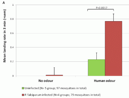
|
Here are their results.
There are four conditions: * The test material either did not have human odor (left side) or did have it (right side). * The mosquitoes were either uninfected (green bars) or infected with malaria parasites (red bars). The bar height (y-axis) is the average number of landings per mosquito in a three-minute test. |
|
You can see that the mosquitoes were more attracted to the samples with human odor than to those without odor. (One bar for "no odor" is apparently zero, and the other is tiny.) If you compare the two sets of mosquitoes for attraction to human odor, you can see that the red bar is much higher than the green bar. That is, the malaria-infected mosquitoes are much more attracted to the odor than are the uninfected mosquitoes. This is Figure 1A from the article. | |
Assuming that the test conditions properly mimic the real world, this work suggests that the malaria parasites manipulate the mosquitoes for their own advantage. They make the mosquitoes more likely to find a new home for the parasites.
A practical implication is that if we want to study mosquito attraction to humans because of its relevance to disease transmission, we need to study infected mosquitoes -- which we now see behave differently. At this point we don't know if the mosquitoes are more sensitive to some component they normally smell, or are detecting something new. If we want to design mosquito traps to reduce disease transmission, it matters what infected mosquitoes do. Further, the work raises the question about mosquitoes infected with other agents that would like to get to us.
A short simple paper, with practical implications.
News stories:
* Malaria parasite lures mosquito to human odour. (BBC, May 16, 2013.)
* Malaria Infected Mosquitoes More Attracted to Human Odor Than Uninfected Mosquitoes. (Science Daily, May 15, 2013.)
The article, which is freely available: Malaria Infected Mosquitoes Express Enhanced Attraction to Human Odor. (R C Smallegange et al, PLoS ONE 8:e63602, May 15, 2013.)
More about malaria or mosquitoes...
* Why don't black African mosquitoes bite humans? (December 19, 2014). Odor.
* A vaccine against malaria -- with 100% efficacy? (October 20, 2013).
* An easier way to get infected with malaria (January 18, 2013).
* Checking mosquito saliva (November 19, 2010). A surveillance system, to see if local mosquitoes carry disease. Uses a type of mosquito trap.More about detecting odors...
* Hard seeds or soft seeds? (April 26, 2013).
* An electronic nose to monitor air quality on spacecraft (March 2, 2010).The situation here seems to be an example of a parasite affecting the behavior its host -- apparently for its own benefit. We have seen other examples, including... A parasitic fly that causes hive abandonment in bees: Is this relevant to CCD? (January 27, 2012).
and ... Virus infection may make you more attractive to mosquitoes (July 16, 2022).
Also see: More on the story of p (March 2, 2014).
And... Should you ask your doctor to go BBE? (May 12, 2014).
More on malaria is on my page Biotechnology in the News (BITN) -- Other topics under Malaria. It includes a listing of related Musings posts.
May 25, 2013
Microraptor was a small dinosaur, with feathered wings; it was a flying dinosaur (but not one related to modern birds). Here's one -- a remarkably well-preserved specimen about 120 million years old.
|
Part A (upper) shows the entire fossil. Scale bar (black bar at the left) is 10 centimeters.
Part C (lower) shows part of the gut at high magnification. This is a small region within the B box of part A. Scale bar (black bar at the right) is 0.5 millimeter. The red arrows in part C point to fish bones. This is part of Figure 2 from the article. |
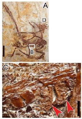
|
There are fish remains in the dinosaur gut. This is the evidence that this dinosaur ate fish -- was piscivorous. Previous work had provided similar evidence that Microraptor dinosaurs ate birds and small mammals.
What the scientists cannot tell is whether the dinosaur caught live fish or scavenged dead ones. They recognize this limitation, but suggest the former; they think that the teeth were well-adapted to catching squirming fish.
This article is a good example of how we learn what ancient animals ate. One clue at a time; some clues hold up with further work, but some do not. For now, it is clear that Microraptor ate many kinds of small animals; how it caught them is open.
News stories:
* Fish was on the menu for early flying dinosaur Microraptor. (Phys.org, April 22, 2013.)
* There's Something Fishy About Microraptor. (B Switek, National Geographic blog, April 22, 2013.) This story gets off to an odd start, with Switek trying to argue that Microraptor was cuddly like a cat. Overall, however, it's a quite good news story.
The article: Piscivory in the feathered dinosaur Microraptor. (L Xing et al, Evolution 67:2441, August 2013.) A copy of the article is available from the author: author pdf.
Previous dinosaur post: The oldest dinosaur embryos, with evidence for rapid growth (May 7, 2013).
* Next: Did the earliest dinosaurs like flowers? (October 14, 2013).
* More: How the birds survived the extinction of the dinosaurs (June 6, 2014).A previous post on small dinosaurs such as Microraptor: Mini dinosaurs (March 19, 2009).
Previous fish post: Helicoprion -- a fish with 117 teeth, arranged in a spiral (March 9, 2013).
Previous post containing any form of the word piscivory: none.
Next: Can an insect catch fish for its dinner? (October 8, 2018).
May 24, 2013
How do you tell which ant does which job in a colony? You watch them. Of course, people find it hard to tell one ant from another, so it would help to put name tags on them first.

|
Here are some ants wearing "name tags", with a close-up of a couple of the tags.
This is part of Figure S2 from the article (from the Supplementary Materials). |
With name tags in place, the experimental design is straightforward. Watch the ants, and record what they do. The scientists watched six colonies, each with about 150 ants, over 41 days. Overall, they recorded nine million interactions. With a video camera and computer, of course. Photographs every half second.
Upon analyzing the ants' behavior, they found that they could classify the ants into three groups, which they called nurses, foragers, and cleaners. The following figure is an example of the different behaviors of these three classes of worker ants.
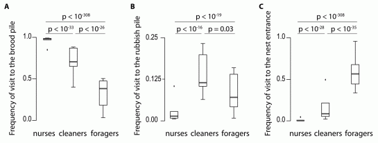
|
|
Look at frame A (left), for example. The y-axis shows that the graph records the interactions of the ants with the "brood pile" (where the queen is). There are three data sets, one for each of the three classes of ants. You can see that the ant class called "nurses" visited the queen at high frequency; the other classes did do less frequently. Parts B and C show similar data for ants visiting the rubbish pile ("cleaners") or the nest entrance ("foragers"). This is Figure 2 from the article. |
The most important aspect of this work is perhaps the technology of doing it. They have recorded an unprecedented amount of information about ant colonies; the analysis per se is preliminary.
As an example of the complexity of the biology, note that the y-axis scale is different for the middle frame: it goes only to 0.25. If you look closely, you will see that the "cleaners", which clearly spend more time at the rubbish pile than the other groups do, actually spend more of their time -- by far - visiting the brood pile. Are most of their visits to the rubbish pile preceded by a visit to the brood pile? The scientists should be able to analyze this from the recorded data. If so, is this a clue as to what they are cleaning? If this is correct, it's still true that they visit the brood pile far more often than the rubbish pile. Are these ants really primarily cleaners, or are they a sub-class of nurses? Perhaps this illustrates how the type of work here can be used to formulate new questions.
News story: Tracking whole colonies shows ants make career moves. (Nature News, April 18, 2013.) The title of this story refers to another finding, not discussed above. (You might be surprised at the order the ants take through the three roles.)
Movies. There are three movie files posted with the article. Go to the article web site, and choose "Supplementary Materials". The movies are described in the supplementary pdf. Movie 1 is included with the news story listed above.
The article: Tracking Individuals Shows Spatial Fidelity Is a Key Regulator of Ant Social Organization. (D P Mersch et al, Science 340:1090, May 31, 2013.)
Do the name tags affect the ants? The authors discuss this (pages 2-3 of the Supplementary pdf file). The tag is 1-18% of the weight of the ant (depending on the size of the ant). Since ants can carry several times their body weight, the authors suggest the tag is not a problem. They do note that the ants showed "increased self-grooming behavior in the hour after" being tagged, but otherwise seemed to behave normally. They also found increased mortality of tagged ants, though they say it was not statistically significant until day 25. Since the main set of observations lasted 41 days, this seems of some concern. Perhaps the tagging system, including the glue, should be tested further if more work is done with this system.
A picture of the senior author: Laurent Keller [link opens in new window]. (Source: Laurent Keller. Now archived.)
More on tracking insects:
* Radio-tagged ants (May 13, 2009).
* Tracking termites (February 26, 2010).... and other animals:
* Anne's journey across the Pacific (July 6, 2018).
* Using drones to count wildlife (May 15, 2018).Posts about ants include...
* Insulin: role in reproduction in ants (October 2, 2018).
* The advantage of washing with formic acid (August 8, 2014).
* Prospecting for gold -- with help from the little ones (March 1, 2013). It's really more about termites than ants.
* TIGER discovers smallest known fly; does it live in the head of tiny ants? (July 31, 2012).Thanks to Borislav for suggesting this item.
May 21, 2013
It's generally recognized that consumption of red meat is associated with an increased risk of cardiovascular disease (CVD -- includes heart and artery diseases). However, the reason for the association is not clear. The cholesterol and fat contents of red meat have been suspected, but careful analysis shows that they cannot fully account for the observed effects.
A new article implicates a less well-known factor from red meat, called carnitine. Interestingly, the gut bacteria play a major role in mediating the effect of carnitine. The article suggests that those who eat red meat not only get more carnitine, but have higher levels of the gut bacteria that degrade carnitine into a harmful metabolite.
There are two key chemicals in this story. One is carnitine, which is a normal part of all biological systems -- but found in especially high levels in red meat. The second is trimethylamime oxide (TMAO), the "harmful metabolite" mentioned above. TMAO is made by degrading carnitine; in other words, consuming carnitine may lead to making the harmful TMAO.
* Chemical structures of carnitine and TMAO [link opens in new window]. However, you can follow the main ideas of the story without worrying about the chemical details.
Here is an example of the carnitine effect -- and how it interacts with the dietary habits of the consumer.
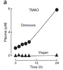
|
This test involves two individuals, one an omnivore and one a vegan. That is, one consumes red meat regularly, and one consumes it rarely. Both were fed a beef steak (plus a carnitine supplement). The level of TMAO was measured in their blood. The graph shows blood (plasma) level of TMAO (y-axis), vs time after eating the steak (x-axis).
There are two important observations. First, at time 0, the omnivore had a higher level of TMAO than the vegan. Second, the level of TMAO in the omnivore increased over the 24 hours of measurement, whereas the level in the vegan did not. This is part of Figure 2a from the article. |
This is one piece of evidence that carnitine can be converted to TMAO, and that some people convert it more than others do.
The article contains many experiments. With all the experiments considered together, the authors develop a hypothesis about the role of carnitine. What they propose is complex -- but very interesting. Here is a summary...
* Carnitine itself is not harmful.
* Carnitine can be converted (degraded) to TMAO.
* TMAO is harmful.
* The degradation of carnitine to TMAO is done by certain gut bacteria.
* Eating red meat leads to increased levels of bacteria that degrade carnitine to TMAO.
Here is another summary, showing more of the steps along the pathway. It should be taken as a working hypothesis. Most of the data is consistent with it, but it is far from proven, and lacks details.
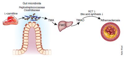
|
This is Figure 1 from the News story accompanying the article. Here is a larger version, including the original figure legend [link opens in new window]. One point of particular interest... "RCT" on this figure means reverse cholesterol transport. That is, the effect of TMAO may also involve cholesterol. |
Putting that all together, it seems that red meat may act by a two-step mechanism:
* first, causing increased levels of certain bacteria;
* second, those bacteria converting carnitine, found at high levels in the meat, to the harmful substance TMAO.
The paper provides some evidence for each part of the story. However, much remains open, requiring further work. Can others confirm that the proposal is correct, and relevant to humans? What part of the overall effect of red meat is accounted for by this pathway? Are there competing effects that we should know about? (Does TMAO have benefits, too?) What is the time scale of these effects? It would be particularly interesting to know how rapidly the gut microbiota adapt to the carnitine.
What should you do with this information? Probably nothing. In part, this is for general reasons. As always, Musings is not a source of medical (or nutritional) advice. The article suggests several interesting findings, but none of them have yet been proved or accepted. That's not a criticism; that's the way science works. They rather boldly suggest some new ideas. People will follow up on this work, in various ways. Even if entirely correct, it is one part of a story. What more pieces are there to the story? Do people vary in one or another step of the process? Perhaps some day this will lead to something practical, but for now it is simply one article, which raises some interesting points, worth pursuing. That red meat may be bad for you, at least at high levels, is not news. Perhaps some of you make some effort to reduce red meat consumption; that may be good, but the new article does not change the basics behind that.
One point that may arise... Some people take carnitine as a supplement. The benefits of carnitine are questionable; now we have an indication of its possible harm. Those who take carnitine as a supplement night want to re-evaluate the possible benefits and harm.
News stories:
* Red meat + wrong bacteria = bad news for hearts -- Microbes turn nutrient in beef into an artery-clogging menace. (Nature News, April 7, 2013.)
* Red Meat-Heart Disease Link Involves Gut Microbes. (NIH (a funding agency), April 22, 2013. Now archived.)
* News story accompanying the article: Meat-metabolizing bacteria in atherosclerosis. (Fredrik Bäckhed, Nature Medicine 19:533, May 2013.) An excellent overview. The summary figure above is from this news story.
* The article: Intestinal microbiota metabolism of L-carnitine, a nutrient in red meat, promotes atherosclerosis. (R A Koeth et al, Nature Medicine 19:576, May 2013.) A very dense article.
More about TMAO: The "paleo diet" -- a trial (August 11, 2019).
and maybe... The importance of choline as a dietary nutrient (April 15, 2023).
Other food-related posts include:
* Vegan diet increases risk of broken bones (January 9, 2021).
* Low-carb diets: Long-term effects? (September 4, 2018).
* The WHO report on the possible carcinogenicity of meat (December 12, 2015).
* How good is "good cholesterol" (HDL)? (September 21, 2012).
* Cooking pork (June 4, 2011).
* What to eat (November 13, 2009). Vegetarian diets.More on the gut bacteria... The examples linked here are on specific effects.
* Could we treat obesity with probiotic bacteria? (August 5, 2014).
* Melamine toxicity: possible role of gut microbiota (April 21, 2013). Another example that implicates the gut microbiota in mediating the toxicity of an ingested chemical.
* Sushi, seaweed, and the bacteria in the gut of the Japanese (April 20, 2010). An example where the gut bacteria do something that is good.More about heart disease:
* The role of mutation in heart disease? (April 25, 2017).
* Mutations that lead to reduced risk for heart disease (November 21, 2014).
* Chelation therapy -- a controversial clinical trial (December 13, 2013).
May 20, 2013
It's been drilled into us since Day 1, yes? In fact, the speed of light is now a defined quantity -- a good indication that it is considered constant.
In a recent article, a team of scientists has suggested it may not be true. They have an explanation of why the speed of light should vary. They even have a prediction of how much it should vary -- and they think they can measure the variation.
Now, some caution. First, we all know that the speed of light really does vary. Light goes through different materials at different speeds. That difference is responsible for the property of refraction, which is the basis of ordinary lenses. When we say that the speed of light is constant, what we are referring to is the speed of light in a vacuum. Not a near vacuum, but a theoretical ideal perfect vacuum. A vacuum with nothing in it.
We also need to be cautious because the topic of the speed of light has been subject to some odd and even flaky conjectures over the years. In fact, my first concern when I heard about the new work is whether it should be taken seriously. Yes, apparently so -- for two reasons. First, it actually builds on some well-known physics. Second, they think it is testable. That latter point is important. If they want to propose something odd and we will never know, then what is served by worrying about it? But if their proposal leads to a test, well, that is a mark of good science: testing hypotheses. Right or wrong, the tests may be interesting.
What is this well-known physics that leads the authors to suggest that "c", as the speed of light is commonly known, varies? I laid the groundwork for it above with a short innocent statement that used to seem perfectly sensible -- but which modern physics knows is not really correct. A vacuum with nothing in it. Modern physics -- quantum physics -- teaches that particles are popping in and out of existence in the vacuum. Each event involves a particle and its anti-particle. For example, one event might involve the creation of an electron and its anti-particle, the positron; these quickly annihilate each other. Each cycle of production and annihilation is brief, but there are particles in the vacuum. And if there are particles in the vacuum, then there is something for light to interact with. And since the production and annihilation of those particles is random, the density of particles varies -- and therefore c might vary. Should vary.
If you buy the story of particles in the vacuum, with a random and fleeting existence, then their proposal makes some sense. What makes it particularly interesting is that they make the argument quantitative. Part of the paper is a mathematical derivation to predict the properties of a vacuum that affect c; since the particles are created randomly, they then predict the variability. The variation is tiny, but they think it is big enough to measure.
Example... Consider a 6000 meter trip. Light makes it in about 2x10⁻⁵ seconds (20 µs). The authors predict that that time -- the time light takes to travel 6000 m -- should vary by about 4x10-15 s (4 fs). That's a variation of less than 1 part in a billion. They think they can measure it.
So what do we have here? A prediction based on some exotic but known physics, a prediction they think they can test. We don't know if it is correct, but it seems worth noting; we eagerly await their tests.
News stories:
* Ephemeral vacuum particles induce speed-of-light fluctuations. (Phys.org, March 25, 2013.)
* Science and the Media -- Journalists look for big speed-of-light news in two physics papers. (Physics Today, March 26, 2013.) This item focuses on the news coverage of the paper. Interesting.
The article: The quantum vacuum as the origin of the speed of light. (M Urban et al, European Physical Journal D 67:58, March 21, 2013.) There is a copy of the paper, as accepted, freely available at arXiv.
The article discussed above was published along with another article that is somewhat related. Much of the news coverage discusses the two articles together. I've chosen to focus on one, but if you're intrigued by that one, you might have a look at this one, too... A sum rule for charged elementary particles. (G Leuchs & L L Sanchez-Soto, European Physical Journal D 67:57, March 21, 2013.) There is a copy of the paper, as accepted, freely available at arXiv.
Thanks to Greg for helpful discussions of this work.
More about the properties of the vacuum, as understood by modern quantum mechanics: How would you die if you visit a black hole? (May 6, 2013).
More about the properties of light:
* Transparent soil (October 13, 2012).
* What's around the corner? (January 7, 2011).More about anti-matter: What is the charge on atoms of anti-hydrogen? (July 15, 2014).
Also see... A new record: spinning speed (October 12, 2018).
May 19, 2013
In vitro fertilization (IVF) involves just what it says: mix egg and sperm in the lab, and fertilize the egg. Some development is allowed in the lab, and the embryo is then implanted in the mother's uterus to continue pregnancy normally. The process is inefficient; it is common to implant multiple embryos in order to reduce the chance of complete failure. Unfortunately, this ends up leading to an increased incidence of multiple births -- twins and more.
A new report suggests that a team of scientists has developed embryo screening to the point that it is now practical to implant only one fertilized egg. We have only a meeting report at this point, so will leave it at that for now. The news story listed below clearly describes the basic idea and gives some useful data; it does not describe the details of the screening.
News story: Transferring Single Prescreened Embryo in IVF Offers Excellent Delivery Rates. (American College of Obstetricians and Gynecologists, May 8, 2013. Now archived.) This news report is from the professional organization that sponsored the meeting where the report was given.
A previous post on screening for better embryos in IVF: In vitro fertilization: an improvement and a Nobel prize (October 15, 2010). Good general background for the current post; however, I think the screening is different. The post also noted the Nobel Prize award to Robert Edwards, co-developer of IVF for humans. Edwards died last month.
A post on IVF ethical issues: Medical ethics: pregnancy reduction (August 20, 2011).
Also see...
* Tri-parental embryos for preventing mitochondrial diseases (September 23, 2016).
* A gene that reduces the chance of successful pregnancy: is it advantageous? (May 18, 2015).
* In the beginning... It's Izumo1 + Juno (May 23, 2014).
* Twins (April 30, 2009).
May 17, 2013
Have a look at the following movie: Movie (1 minute; no sound). You will see a small vertical rod being bent into a U-shape, and then released. Upon release, it returns to nearly its original upright shape.
That vertical rod is a piece of "rock" -- a mineral. Specifically, it is a piece of calcite, a crystalline form of calcium carbonate, CaCO3. Calcite is quite brittle. A recent post was about what had been a nice calcite crystal that was recovered from a 400-year-old shipwreck. (It probably had been used as a sunstone for navigation.) The authors of that work noted that survival of pure calcite subjected to sea-bottom events for 400 years is surprising [link at the end].
So what is going on in the movie?
Some sponges make calcite skeletons. And some make silica skeletons. In both cases, the animal lays down the mineral on a protein scaffold. What the authors of a new article did was to take the protein used to make silica skeletons, and -- in the lab -- deposit CaCO3 on it. It is then aged, which promotes crystallization. The product is the calcite they used in the movie above.
What is this "calcite"? It contains 10-15% protein -- the scaffold. The combination of calcite nanocrystals and the protein results in the rubbery material you see in the movie. Calcite? Well, one property of interest is its ability to serve as a waveguide, as a fiber optic cable. It seems to work fine, even in the bent form. So, at least in some operational sense, they have made a flexible form of calcite.
Remember that the protein they used here as the scaffold for making calcite is the one sponges use to make silica. Ordinary sponge calcite spicules, made on a protein intended (by the sponge) as a scaffold for calcite, has a low protein content, and is not flexible.
This is an example of making a composite material with a novel combination of properties. It is also an example of bio-inspired development: they make a novel material inspired by the way sponges do it, but they do it with their own variations to make something that is new. Can they go beyond this and make something big enough (long enough) to be useful? (Did you notice... the one in the movie is about 200 micrometers long.) That is the next challenge.
News story: Inspired by Deep Sea Sponges: Creating Flexible Minerals. (Science Daily, March 15, 2013.)
Movies. The movie file listed at the start is movie 2 from the supplementary materials with the article.
* News story accompanying the article: Materials science: Creating Flexible Calcite Fibers with Proteins -- Fracture-resistant calcium carbonate fibers were made by using a protein that normally directs silica spicule formation in sponges. (I Sethmann, Science 339:1281, March 15, 2013.)
* The article: Flexible Minerals: Self-Assembled Calcite Spicules with Extreme Bending Strength. (F Natalio et al, Science 339:1298, March 15, 2013.)
Background post about calcite... An ancient navigation device? (April 16, 2013).
More calcite: Ants with skeletons hardened by calcite (January 30, 2021).
More about sponges...
* Theonella's secret: Entotheonella (March 18, 2014).
* Quiz: What is it? (October 31, 2012). See the answer.
* An unusual eye? (June 6, 2012).
* The Antikythera device: a 2000-year-old computer (August 31, 2011).
* Croatian Tethya beam light to their partners (December 16, 2008). This post is about silica-based sponge spicules being used for light transmission -- in the sponge.More about optical fibers: A novel type of optical fiber (November 8, 2014).
A recent post on bio-inspired (or bio-mimetic) development: How porcupine quills work (January 5, 2013).
For more about this emerging field, see my Biotechnology in the News (BITN) topic Bio-inspiration (biomimetics). It includes a listing of some other Musings posts in the area.
May 14, 2013
Briefly noted...
We've long known that our body -- any animal body -- includes vast numbers of microbes. Modern DNA sequencing has resulted in an explosion of investigating those microbes. Studies range from simple cataloging of what is found in various body locations to associating the presence of certain microbes with one or another physiological state. Occasionally, the work has progressed to showing that replacing the microbes can correct a problem. [Links at the end.]
Of course, microbes are transmissible -- by direct contact or through a shared environment. A new article examines patterns of sharing of microbes within a family unit. "Family units" were based on a pair of adults living together -- with children, dogs, both, or neither. (There were other pets, too, including a tarantula, but they were not considered in the analysis.)
A general finding was that family members tended to have microbiota that resembled each others' more than they resembled the microbiota of other people. That is, those who live together share their microbes. The association was particularly strong for the microbiota of the skin -- and it was stronger if the household included dogs.
The article is perhaps best considered a survey at this point. They looked at lots of things. Many of the effects are small, and there is no major finding with health impact. The work is symbolic of the emerging study of the relationship between microbe and macrobe; it helps to set a base that people can build on. Finally, it's fun to browse.
News story: New study looks at microbial differences between parents, kids and dogs. (Phys.org, April 17, 2013.)
The article, which is freely available: Cohabiting family members share microbiota with one another and with their dogs. (S J Song et al, eLife 2:e00458, April 16, 2013.)
Here is a sampling of Musings posts about our microbiota. Most link to others.
* Close-up view of an unwashed human (July 29, 2015).
* Melamine toxicity: possible role of gut microbiota (April 21, 2013). Most recent such post. It implicates the gut microbiota in mediating the toxicity of an ingested chemical.
* Propionibacterium acnes bacteria: good strains, bad strains? (April 1, 2013). Skin bacteria.
* Bacteria on human teeth -- through the ages (March 24, 2013). The oral microbiota.
* A bacterial cocktail to fight Clostridium difficile (January 19, 2013). An example where replacement microbes are used to treat an infection.
* Your gut bacteria: where do you get them? (July 30, 2010). This post deals with acquisition of bacteria by babies, depending on how they are born.
* Plants need bacteria, too (October 9, 2010). It's not just animals!More about dogs and asthma -- and more... Reducing asthma: Should the child have a pet, perhaps a cow? (November 28, 2015).
More about dogs:
* Doggy bags and the food waste problem (January 4, 2017).
* It's a dog-eat-starch world (April 23, 2013).More on disease transmission... Should you ask your doctor to go BBE? (May 12, 2014).
A recent post about tarantulas: Tarantulas in the trees (November 11, 2012).
More genomics: Microbes on your fresh fruits and vegetables? (May 29, 2013).
There is more about sequencing on my page Biotechnology in the News (BITN) - DNA and the genome. It includes a list of Musings posts on sequencing and genomes.
May 13, 2013
We have discussed the deposits of methane (natural gas) that are found at the ocean bottom in structures known as methane hydrate or methane clathrate [link at the end]. These deposits contain huge amounts of methane, but are considered very difficult to access. Recently, Japanese scientists have made a serious attempt to extract methane from these deposits. A brief news report summarizes what they did. It's an interesting first step.
News story, which is freely available: Energy: Japanese test coaxes fire from ice -- First attempt to extract methane from frozen hydrates far beneath the ocean shows promise. (Nature 496:409, April 25, 2013.)
Background post: Ice on fire (August 28, 2009).
Also see...
* Svalbard is leaking (March 7, 2014).
* BP oil spill incident: the methane hydrate crystals (May 18, 2010).
May 11, 2013
|
|
Looks like some kind of genealogy chart, showing who is related to whom? Indeed it is. It is for a story, a folk tale. It shows the relatedness of variations of a particular folk tale in different cultures throughout Europe. This is reduced from the figure in the Phys.org news story; it also seems to be Figure 2 from the article. |
The authors of a new article use the techniques of genomics to evaluate transmission of a folk story. They map 700 variant traits in 31 populations. The figure above summarizes one aspect of what they found.
Analyses such as this are not entirely new to those studying culture. In fact, genealogy charts are used in the analysis of languages -- and not without controversy. The new work studies a more specific cultural artifact, a single story. The goal, broadly, is to study the variations of a cultural phenomenon both within and between populations.
Genetic information is transferred from parent to child, with some mutations along the way for novelty. Genealogies may be more complex if there is lateral transfer. For genetics, this horizontal gene transfer (HGT) is usually thought to be small for higher organisms (but a big issue for microbes). However, lateral transfer of cultural traits might be thought to be easier; one of their goals is to be able to take it into account.
They show that both geographical and cultural factors (such as language) affect the transmission of the story. And they show that the rate the story acquires variations (mutations) is slower than the rate the population acquires genetic variations. That is, when two cultures encounter each other, they exchange genes faster than they exchange their folk lore.
News stories:
* Study shows cultural flow may be slower than genetic divergence. (Phys.org, February 7, 2013.)
* Humans Swap DNA More Readily Than They Swap Stories -- A new study looks at how changes in a widespread folktale moved around Europe. (National Geographic News, February 6, 2013. Now archived.)
The article, which is freely available: Population structure and cultural geography of a folktale in Europe. (R M Ross et al, Proceedings of the Royal Society B 280:20123065, April 7, 2013.)
More on tracking cultural evolution...
* In what year was the word "slavery" most used in books? (February 23, 2011).
* Tracking new songs as they cross the Pacific (June 21, 2011).A recent post on horizontal gene transfer (HGT): An extremist alga -- and how it got that way (May 3, 2013).
May 10, 2013

|
The American snowshoe hare changes its coat color with the seasons, so that it is white when there is snow on the ground and brown when there is no snow.
Or does it? This is Figure 2A from the article. |
A new article explores this issue. What are the implications of climate change for the snowshoe hare's camouflage system? How does that system work? That is, what triggers the growth of a different color coat?
There are two parts to the work. First, the scientists watched to see when a population of hares changed color; they did this over three years. Second, they looked at the snow predictions of models for climate change for the area.
As to the hares, the key finding was that the population changed color at about the same time each year, regardless of the weather. This suggests some built-in clock, perhaps responding to day length, rather than a temperature trigger.
The following graph summarizes how this fits with the snow predictions.
|
The mismatch problem, now and in the future. This is an interesting but complicated graph. let's go through some parts of it slowly.
The x-axis is date. It has a broken scale, with Fall dates to the left, then a gap, then Spring dates to the right. They make the x-axis this way because the focus is on the snowy season. Two things are plotted on the y-axis -- but only one is labeled. The y-axis scale is the percentage of hares that are white. Snowfall is also plotted, but it is basically all-or-nothing. There is a dotted line across each graph at 60% white hares. They use this at a cutoff; populations above that line -- more than 60% white -- are considered white. (The 60% is arbitrary, but their general argument holds no matter the choice.) |
|
Look at the top panel, for "Recent past". The black curve shows the percentage of white hares, based on their recent measurements. It rises in the Fall, and declines in the Spring -- as expected. The blue line marks the snow season. The presence of white hares before there is snow is a mismatch -- a time when the hares are more easily seen, and thus more susceptible to predation. The gray bar shows the mismatch interval -- white hares but no snow; it is a short time period starting (arbitrarily) when the population reaches 60% white until the snow comes. Now look at the middle panel, for "Mid-century". The black curve is the same; it's the same hare data. But now, their climate change projections show that there will be a shorter snow season. The red and orange bars show two projections. The gray bars again show the mismatch interval (using the red-line snow projection). You can see that there is a longer time of mismatch in the Fall. Further, there is now a mismatch in the Spring. The bottom panel is a similar analysis for the end of the 21st century. There are even greater effects. This is Figure 5 from the article. | |
It's all very logical, and interesting. It makes a point about one effect of climate change: changing snow patterns, and their implications for animals. In fact, the authors tout their system for its simplicity. However, it is also quite incomplete, as they recognize. The understanding of the hare biology is incomplete. What about hares at different latitudes? Do they change color at the same day lengths? What happens if hares are moved from one latitude to another? Can they adapt? How long does it take? What do we know about the effects of natural snow variations on hare populations? And so forth. As often true with scientific papers on new topics, this one may raise as many questions as it answers. This paper should be taken as provocative; it should open up some new lines of research.
News story: Study finds change in snow cover patterns making snowshoe hare more vulnerable. (Phys.org, April 16, 2013.)
The article, which is freely available: Camouflage mismatch in seasonal coat color due to decreased snow duration. (L S Mills et al, PNAS 110:7360, April 30, 2013.)
I thank L S Mills, the lead author of the article, for comments, which led to an improved post.
More about climate change: SO2 reduces global warming; where does it come from? (April 9, 2013).
More about lagomorphs: Fossil discovered: A big stupid rabbit (April 22, 2011). The lagomorphs include the hares and rabbits. Not only are the two groups closely related, the terms often get used interchangeably.
May 7, 2013
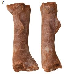
|
Leg bone (femur); two views. About 1.7 centimeters long.
Animal: dinosaur, probably Lufengosaurus. Life stage: embryo. [The adult animal might reach about 8 meters (27 feet) long.] Age of specimen: 190 million years This is Figure 2f from the article. |
A new article reports analysis of a bed of dinosaur bones. The bones are of dinosaur embryos, scattered around a small area along with remnants of eggshells. The bed is of interest as the largest such collection ever found -- and one of the oldest: 190 million years.
In addition to the general description, the article makes two specific claims that have caught attention. It's not clear how solid either claim is, despite some news hype; let's note the claims and offer some perspective.
1) The article claims that these dinosaurs grew faster than any other known animal -- live or extinct. The claim is for the embryo stage, of course, since that is what these bones are from. What is the basis of that claim? There is no direct measurement of dinosaur growth rates. What they can measure in the fossil bones is the cavity in the bone -- where the vasculature (blood system) is. Previous work has shown that the size of the vasculature cavity relates to the growth rates. For example, modern warm-blooded animals, which grow fast, have a high percentage of vasculature in this measurement, whereas slow-growing cold-blooded animals, such as reptiles, have low amounts. Measurement of other dinosaur bones, showing a large vasculature cavity, has provided important evidence that dinosaurs were warm-blooded.
With the dinosaur embryo bones in this new report, they find a much higher percentage of vasculature than in any of the previous work -- much more than in birds, mammals, or other dinosaurs that have been studied. If the relationship holds, this indicates a remarkably high growth rate. But I must say, the new measurements are so much higher than the previous ones that I wonder if something is amiss. Perhaps the relationship does not hold as well back at 190 million years. I don't know. There are actual results in the paper; you can see the bones and the cavity. However, the statement about growth rates is an inference; we don't really know how good that inference is.
2) The article claims to have found "organic" matter in the bones, which they suggest might be dinosaur protein. Interestingly, this claim is noted in the article title. What's the basis of this claim? Analysis of the bone material shows evidence of the chemical linkage known as an amide bond; this is the type of bond that connects the amino acids in proteins. They argue that the most likely source for their amide signal is dinosaur protein remaining in the fossil bone. That's a provocative claim, and will be met with considerable skepticism. We have noted previous claims of finding dinosaur proteins [link at the end]. Those claims are controversial, as we have noted. The authors suggest that their work here supports that claim. I would be cautious about that. Pending further analysis, I'd suggest we say only that they claim to have detected amide bonds.
The fascination of dinosaurs! This article adds to that, with a couple of bold claims.
News stories:
* Dinosaur Embryo Graveyard -- A treasure trove of fossilized dinosaur embryos shows signs of extremely fast growth. (The Scientist, April 10, 2013. Now archived.)
* Oldest Dinosaur Embryos Discovered in China, Organic Remains Found inside Embryonic Bones. (Sci.News, April 11, 2013.) This story leans toward over-interpretation of the real facts; nevertheless, it is a useful story.
The article: Embryology of Early Jurassic dinosaur from China with evidence of preserved organic remains. (R R Reisz et al, Nature 496:210, April 11, 2013.)
Background post on dinosaur proteins: Dinosaur proteins (July 6, 2009); it links to more. The basic claim is that they find small pieces of collagen in their dinosaur fossils -- collagen that they attribute to the dinosaurs. Many are skeptical of the claim, and it is hotly debated. The new work is with dinosaurs twice as old, making survival of protein even less likely. But the new claim is more modest: simply amide bonds. Keep an open mind on this issue.
A post supporting the notion that dinosaurs were warm-blooded: Do animal bones have something like annual growth rings? (August 7, 2012).
Or perhaps not... Were dinosaurs cold-blooded or warm-blooded? (August 23, 2014).
More about dinosaur eggs:
* How did a one-ton dinosaur incubate its eggs? (July 13, 2018).
* Dinosaurs in Tamil Nadu (December 7, 2009).... and dinosaur growth: A tiny titan (May 9, 2016).
* Most recent post about dinosaurs: The Obama lizard (March 20, 2013).
* Next: Microraptor was piscivorous (May 25, 2013).Thanks to Borislav for alerting me to this article.
May 6, 2013
No one knows. The theories of physics are inconclusive on the matter. Despite the perhaps frivolous title, the issues are of fundamental importance in physics. In fact, the question involves one of the great mysteries in modern physics: how quantum mechanics and relativity connect.
A recent news feature in Nature discussed the debate. It's generally rather readable, though I'm sure most will find they need to skip over some parts. (If you think you follow it all, you missed the point!) Give it a try. Fun and instructive.
News feature, freely available: Fire in the hole! Will an astronaut who falls into a black hole be crushed or burned to a crisp? (Z Merali, Nature 496:20, April 4, 2013.)
More on black holes...
* Mayhem at the center of the Milky Way (August 23, 2011).
* Black hole: simulation (March 15, 2010).Also see: Is the speed of light really constant? (May 20, 2013).
May 4, 2013
Molecular biologists often want to change the genome of an organism. This may be for research work, or for the type of treatment referred to as gene therapy. Of course, it is important that the change occur where we want it to; that is, we need to target the gene change. This turns out to be difficult. How do we get the incoming DNA to go to exactly the right place in the chromosome?
Those who have taken some biology may wonder whether the common process of homologous recombination would work. That is, shouldn't it be "natural" for an incoming piece of DNA to align and recombine with the corresponding region of the chromosome -- the region that looks very similar? That's a good idea. However, in higher organisms, with large genomes, it turns out that this process competes with other processes, and actually does not work very well at targeting added DNA. Therefore, molecular biologists have worked to find other ways to target added DNA. One approach is the use of zinc finger nucleases (ZFN). The idea is to design a ZFN that will make a cut in the genome at a specific position; that cut serves to target the incoming DNA. The use of ZFN was discussed in a previous post [link at the end].
ZFNs are good, but they are hard to use. The search for better methods continues -- and we now have a new entry.
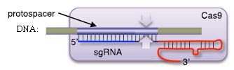
|
Here is a cartoon that illustrates the basic idea of this new system for targeting genes.
There are three players in this diagram: a piece of DNA; a protein, called Cas9; and a piece of RNA, called sgRNA. |
|
The DNA is the target; the goal is to cut the DNA at a particular site. The combination of Cas9 protein and sgRNA is the device for targeting the DNA. In the figure, the DNA is shown as a thin horizontal bar. (I added the label "DNA" to the original figure.) The pair of white arrows show where the DNA will be cut. The Cas9 protein is shown by the large purplish rectangle. The sgRNA is shown, inside Cas9 and near the bottom, as a blue and red line. That sgRNA is the key. The sgRNA guides Cas9 to the right spot on the DNA. In fact, you can see that the blue end of sgRNA is lined up with the target region of the DNA. That's the point. That is how this device targets the region of the DNA to cut. This is the top part of Figure 1 from the Segal news story in eLife. | |
The role of sgRNA is what makes this system so practical. To target a new DNA site, all you need to do is design a new sgRNA. And to design the new sgRNA, all you need to do is to modify the sequence of one small region to match the desired target DNA region.
Where do Cas9 and sgRNA come from? They are based on the CRISPR system of some bacteria; CRISPR functions something like an adaptive immune system. Cas9 is the protein that mediates the immune reaction. The bacteria acquire, maintain, and use a collection of RNAs against various targets. Now, molecular biologists use Cas9, and make their own modified RNAs to order, to target a chromosomal site for a recombinational event.
Why is this Cas9-mediated system better than ZFNs? The general idea is the same. However, the new system uses an RNA molecule to target the chromosome, whereas the ZFN system uses a protein. It's easier to design a new sgRNA and it's easier to make it, compared to the ZFN system. After all, the design rules are simply the common base-pairing rules, and nucleic acid synthesis is relatively simple.
This post, like most, was motivated by a new article, which is listed below. In the new article, the scientists show that the Cas9-sgRNA system -- based on bacteria -- works in human cells. This is a milestone in developing the system, and showing its potential for use with higher organisms. We've focused above on setting the stage for Cas9; we'll leave it at that for now.
News story: Cheap and Easy Technique to Snip DNA Could Revolutionize Gene Therapy. (Science Daily, January 7, 2013.) This news story refers to multiple papers, including the one noted below. It's a popular field, with many labs making rapid progress.
* News story accompanying the article; it is freely available: Genome engineering: Bacteria herald a new era of gene editing -- The demonstration that nucleases guided by bacterial RNA can disrupt human genes represents a landmark in the rapidly developing field of genome engineering. (D J Segal, eLife 2:e00563, published alongside the article.)
* The article, which is freely available: RNA-programmed genome editing in human cells. (M Jinek et al, eLife 2:e00471, January 29, 2013.) The paper is from Jennifer Doudna's lab at UC Berkeley.
Doudna, with lead author Jinek and other colleagues, has founded a company to commercialize the system. Caribou Biosciences. The web site is currently on hold.
Background post: Gene therapy: Curing an animal using a ZFN (August 9, 2011). The post provides some good background, and describes some success with ZFN.
A post about CRISPR, the bacterial immune system: A virus with an immune system -- stolen from a host? (March 25, 2013).
More about CRISPR:
* CRISPR: an overview (February 15, 2015).
* CRISPR: the legal battles begin (February 1, 2015).
* A step towards correcting mutant genes with CRISPR (October 7, 2014).
* CRISPR: What's it doing to help bacteria carry out infections? (September 8, 2013).More about immune systems: Bach and the immune system (August 26, 2013).
Central Dogma of Molecular Biology (August 16, 2011). A key idea of the Central Dogma is that nucleic acids -- DNA and RNA -- speak the same language, by the common base-pairing rules. That's behind the appeal of the Cas system described here.
More about gene therapy is on my Biotechnology in the News (BITN) page Agricultural biotechnology (GM foods) and Gene therapy.
May 3, 2013
Organisms that grow under very unusual conditions are often called extremophiles. Examples of those extreme conditions might include very high (or very low) temperature or acidity. It is a useful generalization that such extremophiles are found primarily among the prokaryotes -- the bacteria and archaea.
Galdieria sulphuraria is an alga that is something of an extremophile. It grows under various extreme conditions. Further, it is capable of growth under quite diverse conditions -- more diverse than common for such algae. That is, this alga is unusual among its type -- unusual in several ways. A new article reports the genome analysis of this extremist alga, and reveals its secret: it has "stolen" many genes from prokaryotes.
When we refer to genes being "stolen", we are referring to horizontal gene transfer (HGT). The "normal" process of gene transfer is from parent to offspring. However, biologists are recognizing more and more examples of gene transfer that does not follow that pattern. HGT involves a gene showing up in an organism but not in its parents. How it got there is usually not clear, though agents such as viruses are suspected; there may be multiple mechanisms possible. Such HGT is now recognized as common among the prokaryotes -- so common that it might even obscure their simple genealogy. HGT is thought to be relatively uncommon with eukaryotes. However, the genome analysis of Galdieria sulphuraria suggests that 5% of its genes appear to be prokaryotic genes. Further, many of these genes seem likely to be responsible for its unusual properties.
How do we tell that a gene has come from HGT? That is, how do we tell that it is foreign to the organism? There are various clues; the following figure illustrates one of them.
|
The analysis of this algal genome shows 6623 total genes. Of those, 337 genes are thought to have arisen by HGT.
The graph shows the distribution of introns in those two sets of genes. For example, if you look at the bars for 0 introns (left bars), you see that about 28% of "All Genes" (blue bar) have 0 introns. However, over 50% of "HGT Candidates" (red bar) have 0 introns. (The average number of introns per gene is 2.06 for all genes. but only 0.8 for genes thought to have arisen by HGT.) This is Figure S6 from the article (from the supplement with the article). |
You can see that genes thought to be "foreign" (from prokaryotes) have fewer introns than typical of this alga's genome. In fact, low intron number is a general characteristic of prokaryotes. This illustrates how genes can reveal that they have unusual characteristics, suggesting an unusual origin.
You may be thinking that the evidence above is weak. The number of introns varies, in both prokaryotic and eukaryotic genes. You are right. The argument above is to give one example of how genes may differ from one type of organism to another. I chose this particular example to present because there was a nice graph to illustrate it. In the article, they present various such arguments about the nature of the genes. Further, one can never show for sure that a particular gene is foreign; one can only argue that a gene has unusual features, and is likely to be foreign -- given the weight of the evidence.
Bottom line... An unusual alga, with some novel capabilities; it seems to have acquired the genes for these novel capabilities by horizontal gene transfer from prokaryotes.
News stories. Both of the following include pictures of this alga in its natural environment, as well as lab cultures.
* Algae Get Help to Go to Extremes -- A red alga appears to have adapted to extremely hot, acidic environments by collecting genes from bacteria and archaea. (The Scientist, March 7, 2013. Now archived.)
* How the Lord of the Springs Survives Where Most Things Die. (E Yong, Not Exactly Rocket Science (National Geographic blog), March 7, 2013.)
* News story accompanying the article: With a Little Help from Prokaryotes -- Red algae can adapt to extreme conditions through horizontal gene transfer from free-living prokaryotic extremophiles. (E P C Rocha, Science 339:1154, March 8, 2013.)
* The article: Gene Transfer from Bacteria and Archaea Facilitated Evolution of an Extremophilic Eukaryote. (Gerald Schönknecht et al, Science 339:1207, March 8, 2013.)
More about horizontal gene transfer:
* Pangenomes and reference genomes: insight into the nature of species (February 7, 2017).
* Uptake of small pieces of ancient mammoth DNA by bacteria: What are the implications? (May 13, 2014).
* A virus with an immune system -- stolen from a host? (March 25, 2013).
* UCA passes test (June 6, 2010) This post addresses the concern that HGT may conceal the simple genealogy of prokaryotes.
* Lesbian necrophiliacs (March 8, 2010). Another case where HGT may be common in a eukaryote. See discussion of "paper 2" on the supplementary page for this post.Also see: Cultural evolution: How a common folk tale takes on local characteristics (May 11, 2013).
Older items are on the page
Musings: January-April 2013 (archive).
The main page for current items is Musings.
The first archive page is Musings Archive.
E-mail announcements -- information and sign-up: e-mail announcements. The list is being used only occasionally.
Contact information Site home page
Last update: July 10, 2026