Musings is an informal newsletter mainly highlighting recent science. It is intended as both fun and instructive. Items are posted a few times each week. See the Introduction, listed below, for more information.
If you got here from a search engine... Do a simple text search of this page to find your topic. Searches for a single word (or root) are most likely to work.
Introduction (separate page).
This page:
2016 (January-April)
April 30
April 27
April 20
April 13
April 6
March 30
March 23
March 16
March 9
March 2
February 24
February 17
February 10
February 3
January 27
January 20
January 13
January 6
Also see the complete listing of Musings pages, immediately below.
All pages:
Most recent posts
2026
2025
2024
2023:
January-April
May-December
2022:
January-April
May-August
September-December
2021:
January-April
May-August
September-December
2020:
January-April
May-August
September-December
2019:
January-April
May-August
September-December
2018:
January-April
May-August
September-December
2017:
January-April
May-August
September-December
2016:
January-April: this page, see detail above
May-August
September-December
2015:
January-April
May-August
September-December
2014:
January-April
May-August
September-December
2013:
January-April
May-August
September-December
2012:
January-April
May-August
September-December
2011:
January-April
May-August
September-December
2010:
January-June
July-December
2009
2008
Links to external sites will open in a new window.
Archive items may be edited, to condense them a bit or to update links. Some links may require a subscription for full access, but I try to provide at least one useful open source for most items.
Please let me know of any broken links you find -- on my Musings pages or any of my regular web pages. Personal reports are often the first way I find out about such a problem.
April 30, 2016
Xenotransplantation: using an organ from a different species as a replacement. In particular, pigs are considered as potential organ donors for humans. Musings has discussed the topic [links at the end].
A new article reports progress in a model system; we note it briefly as an example of work being done.
The model system involves addition of a pig heart to a baboon. By "addition" we mean that the transplanted heart is not a replacement heart, but rather an additional heart; the main purpose is to examine the survival of the pig heart. Variables include genetic modifications to the pig donor, and the immunosuppression regime used in the recipient.
The short summary is that four pig hearts were transplanted to baboons in the new work. Median survival was 298 days; the longest was 945 days. (A fifth transplant was omitted from the analysis; the baboon died from an infection of unknown origin.) Those numbers are better than in their previous work, in which the median and longest survival were 180 and 500 days, respectively.
What is the basis of the improved results? As the title of the article might suggest, the details are quite technical, but they represent progress in understanding the immune response. The donor pigs have been genetically modified to eliminate certain known problems. Then the scientists experiment with how to maintain appropriate immunosuppression in the recipients.
News story: Much longer survival for heart transplants across species -- Study involved transplanting pig hearts into baboons. (Science Daily, April 6, 2016.)
The article, which is freely available: Chimeric 2C10R4 anti-CD40 antibody therapy is critical for long-term survival of GTKO.hCD46.hTBM pig-to-primate cardiac xenograft. (M M Mohiuddin et al, Nature Communications 7:11138, April 5, 2016.)
Background posts include...
* How to do 62 things at once -- and take a step towards making a pig that is better suited as an organ donor for humans (January 17, 2016). This addresses another problem with pigs: their endogenous retroviruses.
* Organ transplantation: from pig to human -- a status report (November 23, 2015). Links to more.More: Laika, the first de-PERVed pig (October 22, 2017).
And one that is a direct follow-up to the current post: Pig hearts can sustain life in baboons for six months (January 7, 2019).
An alternative: Human heart tissue grown in spinach (September 5, 2017).
There is more about replacement body parts on my page Biotechnology in the News (BITN) for Cloning and stem cells. It includes an extensive list of related Musings posts.
More about baboons... Can French baboons learn to read English? (May 13, 2012).
April 29, 2016
Another story of a leak of natural gas (methane). A big event, a disaster, one that was headline news in California for several months. (And one that was only about ten miles up the road from a place I lived long long ago.)
The leak in this case was in a storage container for natural gas. That storage container was an old oil field. Yes, the gas company stored gas underground, in the Earth. It's a common practice, and it usually works ok. But this gas field sprang a leak, associated with a particular well. The leak spewed natural gas into the air in northern Los Angeles (LA) for several months.
Here are some numbers...
|
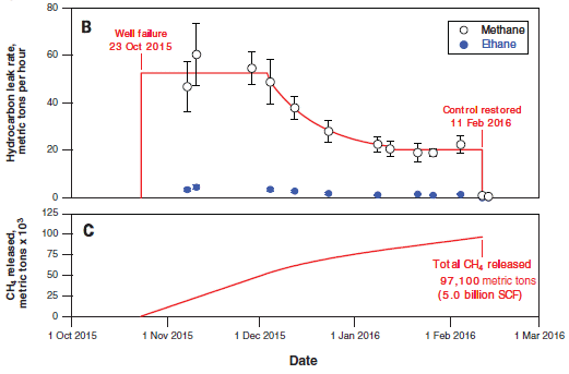
Part B (top) shows the rate of leakage of two hydrocarbons, in tonnes (metric tons) per hour. The data points are from actual measurements, taken from airplane monitors. The open symbols are for methane, CH4.
(The closed symbols, near the bottom, are for ethane, C2H6. Ethane is about 5% of natural gas. We won't deal with it further.)
For methane, the graph includes a red line; that is the scientists' best estimate what the overall curve looked like.
Part C (bottom) shows the cumulative amount of methane released, in thousands of tonnes. Part C also provides the detail for the x-axis time scale. To help you connect the two parts... A loss rate of 40 tonnes per hour is about a thousand tonnes per day. In round numbers, the field released about 40 tonnes of methane per hour, or a thousand tonnes per day, for a hundred days. That would be 100,000 tonnes. That's close to their best estimate: 97,100 tonnes, shown on the graph for part C. The decline in leakage rate starting about December 1 was due to reduced pressure in the field. The company moved much of the gas out of the leaking field. This is Figure 2 parts B & C from the article. |
Numbers. What do they mean?
The event is the second largest known accidental release of methane in the US. During the time of the event, it approximately doubled the methane release rate in the LA area.
On the other hand, such large releases are uncommon. Although the release doubled the LA area methane emission over that time period, it would be only a blip when looked at over a long time period.
Will such releases continue to be uncommon? If a similar event occurred, would we do a better job of containing it? Have we learned something from this event and others that would help reduce the risk in the future? Those are the types of questions we should be asking. Certainly, scientists are asking the questions. But implementing the answers is a political matter, too.
In addition to being a report on the Los Angeles leak, the work shows the value of using small airplanes carrying instrumentation for monitoring. The results from airborne monitoring were quickly made available to relevant parties, and guided what needed to be done on the ground.
News stories:
* California gas well blowout caused nation's largest methane release, study finds. (Phys.org, February 25, 2016.)
* Study: California's Aliso Canyon blowout led to largest U.S. methane leak ever. (NOAA, February 25, 2016.) From one of the government agencies involved in the work.
The article: Methane emissions from the 2015 Aliso Canyon blowout in Los Angeles, CA. (S Conley et al, Science 351:1317, March 18, 2016.) Check Google Scholar for a freely available preprint. (In the news media, the event was commonly described as being near Porter Ranch, the nearby community.)
Among previous leak reports: Boston is leaking (February 13, 2015).
A previous post about understanding and dealing with the leak problem: Methane leaks -- relevance to use of natural gas as a fuel (April 7, 2014).
Also see... Emissions from gas stoves, even when 'off' -- air pollution implications (February 21, 2023).
There is more about energy issues on my page Internet Resources for Organic and Biochemistry under Energy resources. It includes a list of related Musings posts.
An interesting story about a natural leak: Underwater "lost city" explained (July 25, 2016).
By the way, not all leak reports are about methane... Europa is leaking (February 10, 2014).
More from Los Angeles...
* Earthquakes induced by human activity: oil drilling in Los Angeles (February 12, 2019).
* DNA evidence in restaurants: is the fish properly labeled? (June 5, 2017).
April 27, 2016
I don't know about your yard, but a new article provides evidence for supernova debris on Earth.
In classical astronomy, a supernova is an extremely bright object that appears suddenly in the sky. We now understand that a supernova is an exploding star. A supernova event sends debris through the interstellar medium.
Would supernova debris hit Earth? Sure, why not?
How often? And would it do harm? Astronomers estimate that supernovae occur in the Milky Way galaxy about twice per century, on average. Perhaps there are supernovae in our neighborhood (within, say, a few hundred light-years) every few million years. What hits Earth would depend on the size of the event and its distance from us, but one might imagine this could be bad for Earth.
How would we recognize supernova debris? That debris includes unusual atomic nuclei that are made under the extreme conditions of the stellar explosion. Perhaps we could detect such unusual nuclei. The new work uses Fe-60, an isotope of iron. There is minimal "natural" Fe-60 on Earth. It is a radioactive isotope, with a half-life of about 3 million years. Any Fe-60 dating back to the formation of the Earth would have long since decayed, and there is no source for it on Earth. There is a substantial amount of Fe-60 in supernovae; finding Fe-60 on Earth might be taken as an indicator of supernova debris.
That's the idea. It's not entirely new; Fe-60 has been found before, and a supernova source suggested. In article #1 listed below, the scientists show that they find Fe-60 at about the same depth in sedimentary rocks under three oceans. By "same depth" we mean sedimentary material that dates to about the same age. Finding Fe-60 of about the same age in various places suggests it got deposited from some external source; a supernova would do nicely. Specifically, the scientists report finding Fe-60 in rocks about 2-3 million years old and about 7-9 million years old.
If we take the Fe-60 as evidence for supernova debris hitting Earth, then it means we have been subjected to such debris attacks at about those times. Did they do any harm? That's not obvious, but the question remains open.
Since the half-life of Fe-60 is about 3 million years, the method is not likely to detect debris attacks that are much older than those found here. The new work provides evidence for two attacks within the last ten million years; it doesn't limit the full story in any way.
There are actually a pair of articles, published together. Article #1 provides the evidence for Fe-60, dating it to certain times. Article #2 does a theoretical analysis of the debris attacks, and tries to put them in the context of the history of our neighborhood. That's beyond our scope here, but some of the news stories note both articles.
Bottom line... These articles develop an interesting story of detecting debris from supernova on Earth. There are plenty of questions remaining.
News stories:
* Nearby Supernovae Showered Earth with Radioactive Debris 2 to 8 Million Years Ago. (E de Lazaro, Sci.News, April 8, 2016.)
* Supernovae showered Earth with radioactive debris. (Science Daily, April 6, 2016.) For article #1.
News story accompanying the articles: Stellar astrophysics: Supernovae in the neighbourhood -- Detailed measurements of radioisotopes in deep-sea deposits, plus modelling of how they reached Earth, indicate that many supernovae have occurred near enough to have potentially influenced evolution. (A L Melott et al, Nature 532:40, April 7, 2016.)
The articles:
1) Recent near-Earth supernovae probed by global deposition of interstellar radioactive 60Fe. (A Wallner et al, Nature 532:69, April 7, 2016.)
2) The locations of recent supernovae near the Sun from modelling 60Fe transport. (D Breitschwerdt et al, Nature 532:73, April 7, 2016.)
More supernovae:
* How long does a supernova event last? (January 14, 2018).
* The major source of positrons (antimatter) in our galaxy? (August 13, 2017).A post that might be (but probably isn't) about a supernova: Tree rings, carbon-14, cosmic rays, and a red crucifix (July 16, 2012).
More about the Milky Way: Dung beetles follow the Milky Way (February 24, 2013).
My page of Introductory Chemistry Internet resources includes a section on Nucleosynthesis; astrochemistry; nuclear energy; radioactivity. That section lists Musings posts on related topics.
April 25, 2016
A person gets hit in the head. Is there a brain injury, such as a concussion? It's a question that is getting much attention, particularly in the context of athletes. And it's not easy to tell.
What about a blood test for brain injury? Perhaps the level of certain proteins in the blood would indicate the status of brain injury. These might be proteins released as a result of injury, or proteins induced by the injury as part of a repair response.
A new article reports some encouraging results; the following figure is an example. It is a real-world test, monitoring a couple of candidate proteins that had been identified previously.

|
The figure shows results of testing the blood for two proteins, shown by two different colored curves. The curves show blood level of each protein (y-axis) vs time after injury (x-axis).
All of the people being tested have had a trauma; some have evidence for a concussion. The concussion is more formally called mild to moderate traumatic brain injury (MMTBI). (Sometimes we just say traumatic brain injury, or TBI.) Results for those without MMTBI are in the top frame; results for those with MMTBI are in the bottom frame. (That is labeled at the right-end end.) Therefore, what you want to compare is the results between top and bottom frames. A quick glance shows that the protein levels are higher for those with MMTBI (bottom frame) at the beginning, say for a couple days. That's encouraging. Let's look more closely. The yellow curve (protein UCH-L1) rises very quickly following a brain injury. This could be very useful in distinguishing trauma cases with and without brain injury soon after the event. The blue curve (protein GFAP) rises more slowly following a brain injury. It becomes dramatically higher after a day or so. Importantly, the blue curve remains higher for those with MMTBI out to the end of the study (180 hours, 7 1/2 days). To see this, you need to look carefully at the y-axis scales. In the top frame, y=0 is offset a little from the bottom; the results for the blue curve are essentially zero for all times past 48 hr. For the lower curve (people with MMTBI), they are significantly above zero for the entire time span. The x-axis is labeled "time after injury". I suspect what the authors meant was time after first examination. The article says that this was within 4 hours of the injury. This is Figure 2B from the article. I have added the labels to identify what proteins the yellow and blue curves are for. However, the nature of the proteins is not important for now; they are just "markers". |
The results are encouraging. It may be that a simple blood test immediately following a trauma could provide quick information about whether the person has suffered a brain injury. Further, the test can still be very useful even if the person is not examined for a few days after the trauma. That's also important, because it is common for brain symptoms to be delayed, and for people to not seek immediate treatment after seemingly minor trauma.
News stories:
* Concussions In Sports: Simple Blood Test Could Diagnose Traumatic Brain Injury In 7 Days, Help Prevent CTE. (J Caba, Medical Daily, March 29, 2016.)
* Simple blood test can detect evidence of concussions up to a week after injury -- Biomarker released by the brain during injury found to stay in the bloodstream for 7 days. (Science Daily, March 28, 2016.)
The article: Time Course and Diagnostic Accuracy of Glial and Neuronal Blood Biomarkers GFAP and UCH-L1 in a Large Cohort of Trauma Patients With and Without Mild Traumatic Brain Injury. (L Papa et al, JAMA Neurology 73:551, May 2016.)
A post on the problem of evaluating brain injury... Early detection of brain damage in football players? A breakthrough, or not? (September 14, 2015). This and the current post address different parts of the problem. The new post is about immediate evaluation of possible brain injury following a trauma. The earlier post is looking for accumulated damage in the brain.
... and on doing something about it ... Role of a receptor for HIV in stroke recovery (March 23, 2019).
More about trauma: Studying concussions in egg yolks (February 28, 2021).
My page for Biotechnology in the News (BITN) -- Other topics includes a section on Brain. It includes a list of brain-related posts.
April 23, 2016
Traveling along a curve is different from traveling in a straight line. That's true whether you are driving or running.
Track events, such as the 200 meter race, are commonly run with a counterclockwise (CCW) curve. Does that matter? Well, it shouldn't matter much. After all, the human body is bilaterally symmetric, so even if we slow for curves when running, the effect should be about the same regardless of the direction of the curve.
A new article addresses an interesting variation of the question. What about runners who have one natural leg and one prosthetic leg? They are not bilaterally symmetric. Do they run curves the same regardless of curve direction? Is the common CCW track fair for both right- and left-leg amputees?
The Paralympics provides professional competition for athletes with disabilities. The authors of the new work wanted to investigate their question for the best of the athletes, so they got together a group of Paralympic runners and compared right- and left-leg amputees on tracks with both clockwise (CW) and CCW curves. The authors used the usual technologies of analyzing athletes, in particular high-speed videos.
The result? Most runners slow on curves. But asymmetric amputees slow more when their prosthetic leg is on the inside of the curve. The effect was about 4%. That could affect race time by 0.2 seconds, which might be important.
What should happen now, besides collecting further data? This is a scientific article, which provides information. It will be interesting to see whether there is any response to the finding. A simple possibility is to have those who might be at a disadvantage to run in the outer lanes, with a larger radius of curvature. (The scientists have not shown that the effect depends on the radius of curvature, but it is likely, and can be tested.) It's also an interesting question whether the new knowledge might help guide the development of better prosthetics.
A caution... The work here uses a small number of athletes, and the data sets are limited. The athletes vary, of course. For example, the results for the right- and left-leg amputees are quite different. Some of the effects reported are small. As noted above, a small effect, if real, could be important in a real race. So the caution is that this story may or may not hold up. It's an interesting project, which at least raises questions. I encourage those who may find this of serious interest to examine the data carefully; some of it is in the "Supplementary information". (And the article itself has detailed data on the nature of the strides.)
News stories:
* Why Paralympic sprinters have trouble with curves. (H Thompson, Student Science (Now Science Explorers, Society for Science & the Public), April 11, 2016.)
* Paralympic track sprinters are slowed by curves -- Left-leg amputee sprinters on inside lane of indoor track lose valuable time. (Science Daily, March 16, 2016.)
* News story accompanying the article: Paralympic sprinters' prostheses impair curve-running performance. (K Knight et al, Journal of Experimental Biology 219:769, March 15, 2016.) (In the pdf file, this is the first item.)
* The article: Maximum-speed curve-running biomechanics of sprinters with and without unilateral leg amputations. (P Taboga et al, Journal of Experimental Biology 219:851, March 15, 2016.)
More about running... Should you run barefoot? (February 22, 2010).
There is now an extensive list of sports-related Musings posts on my page Internet resources: Miscellaneous under Sports.
My Biotechnology in the News (BITN) page for Cloning and stem cells lists Musings posts not only in the title area, but more broadly posts about replacement body parts including prosthetic devices.
April 22, 2016
Look...

|

|
|
The figures show samples that have been stained using antibodies against the muscle protein myosin. Start with the "control", frame K (right). The sample here is blood vessels from an ostrich. The green color shows where the anti-myosin antibody bound; the green aligns with the vessel material. The sample in frame I (left) is from a dinosaur fossil. Looks pretty good. These are parts of Figure 5 from the article. The scale bars are 20 µm. |
That's the heart of the story from a recent article. Samples from a dinosaur fossil have identifiable proteins, consistent with them being from dinosaur blood vessels. The figures above show the evidence for myosin; the full figure includes similar evidence, using antibodies, for three other proteins. The article also includes analysis of the proteins by mass spectrometry.
It is a startling claim, because scientists have been skeptical that proteins can survive that long -- on the order of a hundred million years.
This is not a completely new story. It is part of an ongoing effort to identify proteins in dinosaur fossils. Musings has noted earlier work [link at the end].
Work with ancient DNA went through a time of serious skepticism. In fact, some of the early work was wrong. The problem is not the measurements per se. It's clear that the dinosaur sample above stains for myosin. The concern is sample integrity. Is the sample really what is claimed, or has it -- somehow -- been contaminated with other materials, either in the field or in the lab? Over time, the ancient DNA scientists have worked out procedures and standards for such work; the ancient protein scientists are trying to follow. Much of the current article discusses the integrity issue.
The current work is framed around a rather modest issue. Some have suggested that the protein material in the dinosaur fossils is from bacterial biofilms. The work in the article provides good evidence that these are animal proteins, not bacterial proteins. But there is much more to wonder about.
What's the take home lesson? I suggest that we simply note it. A team of scientists reports that structures and proteins in dinosaur fossils appear to be from blood vessels. Others will work on this, addressing every possible concern. Perhaps we will see independent confirmation. Perhaps someone will identify fatal flaws in the work. Perhaps finding flaws will lead to improved procedures. For now, all we can do is report what has been claimed, and await further developments. Science in progress.
News stories:
* Paleontologists Find Mineralized Blood Vessels in 80-Million-Year-Old Hadrosaur Fossil. (E de Lazaro, Sci.News, December 1, 2015.)
* Dinosaur Blood Vessels Survived 80 Million Years Without Fossilizing. (L Geggel, Live Science, December 9, 2015.)
The article: Mass Spectrometry and Antibody-Based Characterization of Blood Vessels from Brachylophosaurus canadensis. (T P Cleland et al, Journal of Proteome Research 14:5252, December 4, 2015.)
Background post: Dinosaur proteins (July 6, 2009). Links to more.
Most recent post about dinosaurs... What caused the extinction of the dinosaurs: Another new twist? (January 26, 2016).
Posts about blood vessels include... Peripartum cardiomyopathy -- a heart condition associated with pregnancy (June 30, 2012).
Some posts about the ancient DNA field...
* Ancient DNA: an overview (August 22, 2015).
* Chromosomes -- 180 million years old? (April 18, 2014). The claim here is based on visible features; there is no claim of old DNA.
* The oldest DNA: the genome sequence from a 700,000-year-old horse (August 4, 2013). I think this still stands as the oldest DNA that has been sequenced.More mass spec: Hydride-in-a-cage: the H25- ion (January 22, 2017).
April 19, 2016
Briefly noted...
A team of scientists has recently reported identification and dating of three fossil forests in Svalbard, in northern Norway.
They are tropical forests of primitive trees, as one might expect for 380 million years ago -- back when Norway was on the equator.
That was a time of extremely high CO2 in the atmosphere, several times present levels. It is thought that an era of vigorous growth by a new group of organisms known as trees played a key role in reducing CO2 to modern levels. Perhaps tropical Norway played a key role in reducing the CO2 level to something more acceptable to the modern animal life, which did not yet exist.
It's a fun little story, a reminder of how things change -- and move.
News stories:
* Paleontologists Unearth Tropical Fossil Forests in Norway. (N Anderson, Sci.News, November 19, 2015.)
* Ancient fossil forest unearthed in Arctic Norway. (Science Daily, November 19, 2015.)
The article, which is freely available: Lycopsid forests in the early Late Devonian paleoequatorial zone of Svalbard. (C M Berry & J E A Marshall, Geology, 43:1043, December 2015.)
More Norwegian trees... The spruce genome: it's big (July 1, 2013).
More from Svalbard... Svalbard is leaking (March 7, 2014).
More forests: The downside of nitrogen fixation? (November 4, 2017).
April 18, 2016
Huntington's disease (HD) is a progressive neurodegenerative disease. It is caused by mutations in the gene for a protein called huntingtin (HTT). Interestingly, the mutations involve expansions of a three-base (triplet) repeat, leading to repeats of the amino acid glutamine in the protein. How the mutant protein causes disease is not understood.
What if we put the mutant huntingtin gene into a songbird?
Let's look at what was reported in a recent article...
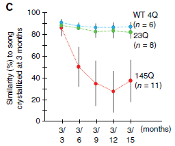
|
In this experiment, zebra finches with various forms of the huntingtin protein were studied. The key variable is the number of consecutive glutamines in the protein. This is shown by a number such as 4Q, meaning a repeat of 4 glutamines. (Q is the code for glutamine.)
In the test here, the birds learned their song by three months of age. They were then followed to see (hear?) how well they remembered it later. This is shown as a similarity score (y-axis), plotted against time (x-axis). You can see that the 4Q and 23Q birds remembered their songs rather well, but the 145Q birds performed poorly over time. This is Figure 3C from the article. |
The results show that birds with mutant HTT protein, with a large Q repeat, have song defects. Much of the article elaborates on this story.
Let's fill in some details... First, the birds naturally have a HTT gene, which is quite similar to that in humans. In fact, the birds labeled 4Q are normal, wild-type (WT) birds, with that normal bird HTT gene. (That is, 4Q is the normal repeat for these birds.) The birds with 23Q have the human wild-type HTT gene added. (23Q is about normal for humans, but it varies.) The birds with 145Q have an added HTT gene from a human with the disease.
HD is a dominant disorder. Thus, adding the human HTT gene to the birds (not replacing their natural copy) is appropriate.
The experiment described above shows that adding the wild-type human HTT has little effect. (Some of the experiments reported do show some effect of adding 23Q.) Adding the form of the HTT gene that causes disease in humans disrupts song in the birds.
Interestingly, the song birds with the 145Q HTT protein are generally normal, except for their problems with song. In fact, the authors note that their birds are "the first experimentally created, functional mutant songbirds" (abstract).
What does one do with this finding? That's not clear yet. Might it be useful in studying the nature of Huntington's disease? Might it be useful in studying bird song? For now, it is an intriguing new finding.
Why study HD in songbirds? The birds, like humans but unlike other common lab animals, make vocalizations that are learned.
News stories:
* Songbirds Could Be Used as Valuable Tool to Study Brain Neurodegeneration, Huntington's Disease. (M Ammam, Huntington's Disease News, October 7, 2015. Now archived.)
* Finches offer researchers a new tool to study Huntington's disease. (Rockefeller University, October 5, 2015. Now archived.) From the lead institution.
The article: Human mutant huntingtin disrupts vocal learning in transgenic songbirds. (W Liu et al, Nature Neuroscience 18:1617, November 2015.)
Previous post about HD: Huntington's disease: Is it an amino acid deficiency? (October 4, 2014).
and more...
* An "antidote" for Huntington's disease? (February 29, 2020).
* Triplet-repeats: Do they act through the RNA? (September 24, 2017).More about songbirds...
* The oldest known syrinx (December 4, 2016).
* Are urban dwellers smarter than rural dwellers? (August 2, 2016).
* Bird brains -- better than mammalian brains? (June 24, 2016).My page for Biotechnology in the News (BITN) -- Other topics includes a section on Brain (autism, schizophrenia). It includes a list of brain-related posts.
April 17, 2016
The heart of the CRISPR system is a nuclease, Cas9, which cuts DNA at a target site. The targeting is achieved by a guide RNA. The use of an RNA for targeting is what makes CRISPR so easy to use; it is easy to make an RNA complementary to any DNA region of interest. What happens after the cut depends on how the system is being used.
A simple use of CRISPR is to restrict the growth of a virus, such as HIV. In this case, the guide RNA targets a critical region of the viral genome; Cas9 cuts at the targeted site. It is left to normal cellular processes to repair the cut; the expectation is that such repair will make the virus unable to grow.
Maybe. Here is an example of what happens, as reported in a new article...
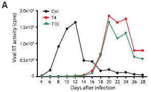
|
The graph shows HIV virus produced vs time of infection, for three conditions. (Actually, the scientists measured the amount of one viral enzyme, the reverse transcriptase (RT).)
The cellular host contained the Cas9 nuclease; the three conditions differed in what the targeting guide RNA was. |
|
In the control ("Ctrl"), there was no guide RNA. In effect, this is a normal virus infection. There is a peak of virus production at 10-12 days. For the other two conditions, there was a guide RNA targeted to a critical region of the virus. You can see that normal virus production was indeed stopped. Testing two different guides, targeted to different critical sites, helps to show that the result is of some generality. However, keep looking, and something else happens. Ten days later, there is a burst of virus. It is as if the HIV has overcome the CRISPR, and finally made virus. This is Figure 2A from the article. | |
That's the basic observation. Given some time, HIV seems to overcome CRISPR. The rest of the article explores why this happened.
The short version of the story is that, while most events repairing the Cas9 cut inactivated the virus, a few made a virus that could replicate. Those viruses, by the way, were no longer susceptible to the original guide RNAs.
What's the big message? CRISPR is a new tool, and we are still learning about it. For some uses of CRISPR, we carefully test what the result is before putting the resulting cells into a live organism. That helps protect against undesired events such as seen here. For direct use of CRISPR in organisms, we will need to think carefully about what unexpected consequences might happen.
News stories:
* HIV overcomes CRISPR gene-editing attack -- Virus can quickly develop mutations that resist attack by DNA-shearing enzymes. (E Callaway, Nature News, April 7, 2016.)
* How HIV Can Escape an Experimental CRISPR Therapy. (T Lewis, The Scientist, April 7, 2016. Now archived.)
The article, which is freely available: CRISPR/Cas9-Derived Mutations Both Inhibit HIV-1 Replication and Accelerate Viral Escape. (Z Wang et al, Cell Reports 15:481, April 19, 2016.)
A CRISPR post, which includes a complete list of all Musings CRISPR posts... CRISPR: an overview (February 15, 2015).
Next HIV post: Should we make antibodies to HIV in cows? (November 14, 2017).
My page for Biotechnology in the News (BITN) -- Other topics has a section on HIV. It includes a list of related posts.
April 15, 2016
You've probably heard the terms. Someone says they are a "morning person"; another is a "night person". Are these real characteristics? Are they determined, even in part, by our genes?
A new article reports finding some genes that may be associated with being a morning person. It's an interesting story. As usual, it is very preliminary.
The article is from a company that does "personal genomics", namely 23andMe. You send the company some cells and some money; they test your DNA, and send you back a report. Companies such as 23andMe collect vast amounts of human genome information. They also ask their customers to provide some information, so they are in a position to see if there is any correlation between certain genome sequences and certain characteristics.
Analysis of the company database suggests there is a correlation between certain sequences and being a morning person.
Here is how the results are presented...
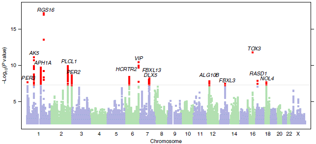
|
The x-axis is the human genome, laid out on one line. It is labeled by chromosome number.
The y-axis is a probability number. It's shown here in a way such that the higher the number, the more likely there is an association -- according to the statistics. There is a horizontal line at 8; that corresponds to a probability value of 10-8. Values above that (with lower p) are suggested to be significant; the cutoff is somewhat arbitrary, but based on experience. Points -- genome sequences -- with those higher values are shown in red. The type of analysis here is called a GWAS, or genome-wide association study; it is a common type of study in this age of vast genome libraries. The type of graph above is called a Manhattan plot. Why? Because it reminds some people of the Manhattan skyline. This is Figure 1 from the article. |
That's it. There are several red points, above the cutoff line. There appears to be a correlation between having these genome sequences and being a morning person.
Now what? Each of those candidates needs to be tested, to see if the association is real. If so, what is the mechanism? Some of them will prove to be false positives, but some may prove interesting. That's the nature of GWASes; they can only offer hints, but they are very good at doing that.
There is a little more information than that, but be careful about reading too much into it at this point. The scientists can look at the regions of the genome where those candidate sequences occur. Sometimes we know a little about the genetic region, sometimes not. For some of these candidates, there is already some reason to suspect they have some relationship to sleep or to circadian rhythms.
News stories:
* Genetic links to being a 'morning person', says 23andMe study. (B Czub, BioNews, February 8, 2016.) (This story says that morning people are more likely to sleep soundly; they got that backwards.)
* Can Your DNA Determine If You're a Morning Person or Night Owl? (GEN, February 3, 2016. Now archived.)
The article, which is freely available: GWAS of 89,283 individuals identifies genetic variants associated with self-reporting of being a morning person. (Y Hu et al, Nature Communications 7:10448, February 2, 2016.)
The principle behind what companies such as 23andMe do is sound. There is some controversy about the information they send back to the customers, and the company has been challenged by the FDA. The issue is not the hard facts, but how much interpretation they do, and how much "medical advice" they offer. At least the better of the companies do good science, and are trying to learn how to build an acceptable business based on personal genomics.
The work here is a research activity of the company, not something they are reporting to the customers.* * * * *
A recent post on sleep and circadian rhythms: How caffeine interferes with sleep (December 11, 2015). It mentions the idea of morning people.
Also...
* Daylight savings time: night-owls have more difficulty adapting (August 1, 2021).
* Evening light: how it affects our sleep (July 30, 2019).
* Circadian rhythms and class time? (June 10, 2018).
* What if a lion came into your hotel room while you slept? (July 20, 2016).
* Sleepy teenagers (July 23, 2010).More circadian rhythms: Why growing sunflowers face the east each morning (November 8, 2016).
A post about personalized medicine... Personalized medicine: Getting your genes checked (October 27, 2009). This includes an extensive list of related posts.
Previous GWAS post... A gene that reduces the chance of successful pregnancy: is it advantageous? (May 18, 2015).
More from 23andMe: Ear lobe genetics: more complicated than you thought (March 23, 2018).
There is more about genomes and sequencing on my page Biotechnology in the News (BITN) - DNA and the genome. It includes an extensive list of related Musings posts.
April 12, 2016
A short note about a story that can largely speak for itself.
A new report provides data on the percentage of women members in national academies of science around the world. In addition to providing the basic numbers, there is discussion of what is behind the numbers. There are comparisons with the percentage of women in science, and discussions of what is being done. It's all interesting, but there are many questions you might raise.
News story: Women under-represented in world's science academies -- Fewer than half of academies have policies in place to boost gender equality in membership. (E Gibney, Nature News, February 29, 2016.)
The announcement of the report, which links to the report itself: Women underrepresented in world science report finds. (Academy of Science of South Africa, February 29, 2016. Now archived.) The report is a 100+ page pdf file, very slick as one might expect. There are data tables, but there is more than just the numbers. If you are willing to browse the report, perhaps starting with the table of contents, you can get a lot of information from it.
The report is actually a composite, based on two surveys. The main one was carried out by the South African Academy, named above as the author of the report. The other was carried out in the Americas, by the Inter-American Network of Academies of Sciences (IANAS). IANAS notes how the gender balance in the US National Academy of Sciences has changed. In 1990, it was 4% women; in 2014, 13%. Why? Because the Academy made a conscious effort to admit more women members. In the intervening years, the percent women admitted each year has varied between 8% and 31%; that has led to the gradual but generally consistent increase. The IANAS report is included (in summary form, I presume), in the main report, starting on page 75 of the pdf file. The numbers I quoted here are from data on pages 79-80.
* * * * *
Also see: The man who established the (US) National Academy of Sciences (February 12, 2016).
My page for Biotechnology in the News (BITN) -- Other topics includes a section on Ethical and social issues; the nature of science. It includes a list of related Musings posts.
April 11, 2016
Making ethanol from biomass is a well-known process. However, hydrocarbons are generally considered a better transportation fuel than ethanol.
A recent article addresses how to make hydrocarbon fuels from ethanol. It raises some interesting issues.
The following figure shows a key result...
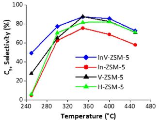
|
The general nature of the experiment is that ethanol is treated under conditions to convert it to hydrocarbons.
For convenience, the scientists divide the hydrocarbon products, a complex mixture, into two types, depending on the number of carbon atoms per molecule: C2 and C3+. C2 includes ethylene, a well-known product of simply dehydrating the ethanol molecule. C3+ refers to all larger hydrocarbons (with three or more C atoms). It is a simplification, but for the current context... the more C3+, the better. |
|
The graph shows the percentage of the C3+ products (y-axis) vs the temperature of treatment (x-axis). The various curves are for various catalysts. The first observation is that all the curves have the same general shape: the percentage of C3+ products increases with temperature (T), up to around 360 °C. It then declines some with higher T. Next, we see that one curve shows the best results. The curve with blue diamonds is highest, or very nearly so, at all T. In fact, one key finding from the work is that the catalyst used for the blue-curve test is the best catalyst so far. Some chemistry detail... All the catalysts have ZSM-5 in the name. That refers to a class of zeolites. The front part of the name identifies the added elements. The best catalyst is the InV one -- which is better than In or V alone. The InV catalyst contains both indium and vanadium; it is a heterobimetallic catalyst, as identified in the article title. This is the right-hand side of Figure 2 from the article. | |
The results above show that a new catalyst helps in making a larger hydrocarbon product, which is useful for transportation fuels.
The scientists also address the mechanism of the reaction. It is well known that ethanol can be dehydrated to make ethylene. In chemical terms... CH3CH2OH --> H2C=CH2 + H2O. In that process, the H of the alcohol group goes to the water, and does not end up in the hydrocarbon product.
In the current work, the scientists test this mechanism, by using alcohol with the isotope deuterium (D) replacing ordinary hydrogen in the alcohol group. To their surprise, the D got incorporated into the hydrocarbon products. This suggests that dehydration is not the first step in their process. The result has implications for how development proceeds, but for now, it is rather murky what is going on.
News stories:
* Energy-efficient reaction drives biofuel conversion technology. (Science Daily, November 3, 2015.)
* ORNL team discovers mechanism behind direct ethanol-to-hydrocarbon conversion; implications for energy efficiency and cost of upgrading. (Green Car Congress, November 4, 2015. Now archived.)
The article, which is freely available: Heterobimetallic Zeolite, InV-ZSM-5, Enables Efficient Conversion of Biomass Derived Ethanol to Renewable Hydrocarbons. (C K Narula et al, Scientific Reports 5:16039, November 3, 2015.)
Some of the authors are involved in a start-up company that is working to develop the process described here.
A post about catalyst development, in the context of biomass: Turning lignin into a useful product (April 11, 2015).
Another post about zeolites: Upsalite: a novel porous material (September 6, 2013). Zeolite is a term for a broad group of chemicals; there is no connection between the functions in the two zeolite posts.
More: A better catalytic sponge: degrading plastics, and more (August 11, 2020).
More vanadium: A better membrane for vanadium-based flow batteries (March 11, 2022).
There is more about energy issues on my page Internet Resources for Organic and Biochemistry under Energy resources. It includes a list of some related Musings posts.
April 9, 2016
Watch... video (23 seconds; no sound). Pay attention to the water droplet on the left; it is about one millimeter across. (This video is also included with the news story listed below.)
What's happening? A water droplet is jumping up and down. Why? and what is powering it? Ah, that's what makes this interesting. It is spontaneous; there is no external power. The conditions are adjusted so that the interaction between the water droplet and the surface is very weak; then, the thermal energy of the water is enough to allow the droplet to escape. It rises, only to fall due to gravity -- and so forth. Exactly why the droplet trampolines -- jumps higher and higher -- was a puzzle for the scientists to work out.
This work was reported in a recent article. How did the scientists achieve the conditions that allow this trampolining behavior? The first key step is that the surface is extremely hydrophobic; it is called superhydrophobic. You may recall that hydrophobic things avoid water. The surfaces used here do so to an extreme degree. That is the basis of making the interaction very weak. The scientists then lower the pressure, thus making it easier for the water droplet to escape.
You may wonder... Is the phenomenon here related to evaporation? Yes, indeed, but there is an important difference. Evaporation is about individual molecules; the trampolining reported here is about water droplets -- big enough to see by eye. Evaporation is one part of the story.
Why is this of interest? Well, it's a new finding; who knows what people will make of it. One goal that the scientists have in mind is de-icing of airplane wings. Using superhydrophobic wing coatings to reduce the tendency of water to stick could be a good step. Now, can they get this to work without having to reduce the pressure?
News story: Trampolining water droplets. (Nanowerk News, November 4, 2015.) Includes two movies, one of which is noted at the top of this post.
* News story accompanying the article: Materials science: Droplets leap into action. (D Vollmer & H-J Butt, Nature 527:41, November 5, 2015.)
* The article: Spontaneous droplet trampolining on rigid superhydrophobic surfaces. (T M Schutzius et al, Nature 527:82, November 5, 2015.) There are additional movie files posted with the article as Supplementary information; they should be freely available, regardless of your access to the article. The first one is quite good, but you need to work through it slowly.
More about hydrophobic materials...
* Disease transmission by sneezing -- in wheat (July 29, 2019).
* A superhydrophobic fly -- that can survive in highly alkaline water (February 25, 2018).
* A biodegradable agent for herding oil slicks (September 18, 2015).
* Electronic devices that can work under water (November 7, 2011).More droplets: What determines the size of liquid droplets from a sprayer? (September 21, 2018).
April 8, 2016
Here is the armadillo:
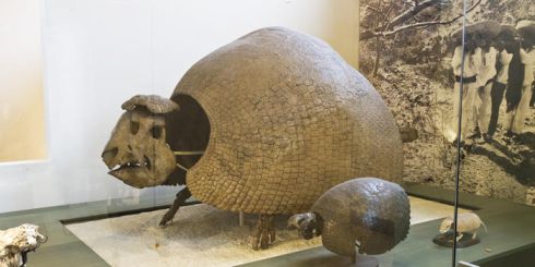
|
A fossil glyptodont.
This is reduced from a figure on a web page from the American Museum of Natural History: Glyptodonts. |
If you don't know how big a beetle is, go check the Volkswagen web site.
Glyptodonts were armored animals that lived over many millions of years in South America; they probably became extinct about 10,000 years ago. The largest ones fit in with the age of megafauna. The fossils have been known for nearly two centuries; Charles Darwin may have been one of the first to note them. It has long been suspected that the glyptodonts were closely related to armadillos, but classifying fossils is always hard.
A new article reports recovery of DNA from a glyptodont fossil. about 12,000 years old. Sequencing showed that it is indeed an armadillo.
News stories, which will let you see the tail:
* Extinct glyptodonts really were gigantic armadillos, ancient DNA shows. (Phys.org, February 22, 2016.)
* Researchers Sequence Mitochondrial Genome of Glyptodont. (N Anderson, Sci.News, February 22, 2016.)
The article: The phylogenetic affinities of the extinct glyptodonts. (F Delsuc et al, Current Biology 26:R155, February 22, 2016.) The article itself, only two pages, is largely sequencing and its analysis; as typical of genome papers, it is not easy reading. You can look at the family tree, if you want.
Other posts about armadillos...
* An armadillo's distress call (October 15, 2019).
* Leprosy: the armadillo connection (May 14, 2011).
* Twins (April 30, 2009).Among many posts on beetles... How to preserve dead mice so they stay fresh and edible (January 18, 2019).
There is more about genomes and sequencing on my page Biotechnology in the News (BITN) - DNA and the genome. It includes an extensive list of related Musings posts.
April 6, 2016
A recent article offers some intriguing science about a topic with two layers of politics. We note it briefly.
The rare earth elements (REE) are a group of about 17 metals, mostly in the lanthanoid row of the periodic table. They are hard to separate, and used to be considered rather obscure -- until people began to find uses for them. Now, our modern high-tech society depends on the REE -- and they are in short supply.
The new article shows that byproducts of coal mining contain significant amounts of REE. Further, it shows that a simple extraction method is quite effective at recovering them. (The geology of coal varies. The work here focuses on coal fields in the eastern United States.)
The extraction method is the heart of the new article. The method is called ion exchange. Briefly, the REE ore is washed with a solution containing lots of ions; inexpensive and non-toxic ammonium sulfate, (NH4)2SO4 works fine. The ions in the solution exchange with the desired metal ions. This works because the REE ions are apparently simply bound to the surface of the ore material, so they are easily exchanged. A benefit of the coal byproduct material is that it is already finely ground; the process occurs mainly at the surface, and the smaller the particles the better.
Ion exchange is well known, and has in fact been used for REE. What's new here is the application to coal byproducts.
So, with some optimism, perhaps the work opens up a new supply of REE. The scientists don't claim to have a practical economic process at this point, but they think it can be done. New supplies of REE would, in general, be welcomed.
The politics? Well, first there is the issue of using coal. Then, there is the issue of the world supply of REE currently being dominated by one country. We won't go into those political issues here, but they will inevitably be part of the conversation if the new REE process begins to be considered seriously.
News story: Extracting rare-earth elements from coal could soon be economical in US. (Science Daily, February 2, 2016.)
The article: A Study on Removal of Rare Earth Elements from U.S. Coal Byproducts by Ion Exchange. (P L Rozelle et al, Metallurgical and Materials Transactions E 3E:6, March 2016.)
Another approach: Briefly noted... Extracting rare earth elements from coal fly ash: use of various supercritical solvents (April 1, 2023).
Previous post on a REE: Penidiella and dysprosium (September 11, 2015).
A post that notes issues in the use of coal... Electric cars and pollution (April 5, 2011).
More mining: Role of biological processing in the formation of a uranium ore (June 30, 2017).
This post is listed on my page Introductory Chemistry Internet resources in the section Lanthanoids and actinoids.
April 5, 2016
Is that a good idea? It might be if you don't need the implant anymore. It might be better than having a second surgery to remove it.
A new article reports such a device -- an implant that will disappear. It follows on much work learning what happens to materials in the body.
Here is a test...
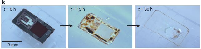
|
In this test, the device was put into a buffer solution at pH 12, and observed over 30 hours.
You can see what the device looks like initially in the left-hand frame (t = 0 h). You can see that it has substantially disappeared by 30 hours (right-hand frame). This is Figure 1k from the article. The device is a pressure sensor, intended to monitor pressure within the brain following an injury. |
The test shown above establishes the principle of a device that can disappear, but it is a quite artificial test. It is an accelerated test. The lab may be able to relate it to natural conditions; the test itself is artificial -- but fast.
Here is some testing under more relevant conditions...
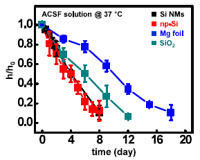
|
In this test, individual materials used to make devices were incubated in artificial cerebrospinal fluid (ACSF) at 37 °C.
The y-axis reports h/ho, the relative thickness of the material, over time (x-axis). The ratio starts at 1, by definition, and declines to zero when the material is gone. You can see that each material tested "disappears" over the time course of the observations. That's the main point. |
|
The materials are: Si NMs: silicon nanomembranes; np-Si: nanoporous Si; Mg foil: magnesium foil; SiO2: silicon dioxide. This is Figure S16 from the "Supplementary Information" accompanying the article. | |
Most of the article is about the performance of the devices, in rats. Not surprisingly, they perform well. The more interesting part of the work, perhaps, is the ability of the material to disappear, in a safe manner. The materials used have been tested before. The two graphs shown above are examples of data on device stability from the new article.
In the title I used the term biodegradable. That term is questionable, if you think about how we commonly use it. I use it more loosely to mean "degrades in the body". The authors use the term bioresorbtion, which may be fine if you understand it -- and if that is what happens. In fact, it's not entirely clear what happens to all the material -- except that it "disappears", in the body. Don't worry much about the details of how for now.
The story is that we are closer to having devices that can be implanted in the body, even in the brain, to take measurements, and which will somehow disappear without ill effect when no long needed.
News story: Tiny electronic implants monitor brain injury, then melt away -- Eliminate the need for additional surgery to remove monitors and reduce risk of infection and hemorrhage. (Kurzweil, January 19, 2016.)
The article: Bioresorbable silicon electronic sensors for the brain. (S-K Kang et al, Nature 530:71, February 4, 2016.)
More on electronics that can disappear when no longer needed...
* Using wood-based material for making biodegradable computers (July 21, 2015).
* Silk-clothed electronic devices that disappear when you are done with them (October 19, 2012). Earlier work from the same lab.My page for Biotechnology in the News (BITN) -- Other topics includes a section on Brain (autism, schizophrenia). It includes a list of brain-related posts.
April 3, 2016
A recent Musings post was about the biodegradation of polystyrene plastic [link at the end].
A new article reports the isolation of bacteria that can degrade another plastic: a common polyester, poly(ethylene terephthalate) (PET).
How did the scientists find such bacteria? They isolated bacteria from PET debris, and screened them to find those that could "live on" the plastic -- use it as their main carbon and energy source. It's actually a rather traditional approach to finding bacteria with a specific metabolic ability.
Degradation of PET isn't entirely new; others have found fungi that can degrade it. However, the newly isolated bacteria do it much better; under lab conditions they can actually completely degrade the plastic over several weeks.
In one sense, PET shouldn't be hard to degrade. After all, the main linkages between its subunits are ester bonds, a type of bond that is common and easy to hydrolyze. However, the physical form of PET is about as uninviting as you can get. Bacteria are not good at using knives and forks, or even chewing things. Usually.
An interesting question will be how the bacterial enzymes gain hold, so they can effectively digest the plastic. There is precedent for such special chewing processes in bacteria, for example, in some that degrade cellulose. Maybe something like that happens here.
Another interesting question is on the "pure science" side. The bacteria use two enzymes to degrade PET. What is their origin? Analysis of these enzymes suggests they are quite specialized for using PET, and quite distinct from general esterases. It seems likely that these enzymes have evolved as a response to the presence of PET, which first appeared about 70 years ago. What might we be able to produce in the lab using artificial selection -- now knowing the general form of the solution?
There is another interesting possibility for how this story could play out. The basic finding is that the new bacteria can degrade PET. To what? To its monomers, ethylene glycol and terephthalic acid. What then? The bacteria eat the monomers, as energy source (just as common bacteria eat sugar). But what if we could block the process so that the bacteria simply break down the plastic and make the monomers. Those monomers could then be collected, and used to make new plastic. That could move the plastic toward being a sustainable product. There are questions we would need to think about, but modifying the degradation so that the monomers accumulate is probably easy in this case. It's an intriguing possibility.
Caution... All this work on biodegradation of plastics is at the earliest stages of research. As research, it is interesting. It may or may not be possible to develop practical processes from any of them. These discoveries should not be used to justify release of plastic waste into the environment. For now, for the most part, there is effectively no natural biodegradation.
News story: Ideonella sakaiensis: Newly-Discovered Bacterium Can Break Down, Metabolize Plastic. (S Prostak, Sci.News, March 11, 2016.)
* News story accompanying the article: Microbiology: Feeding on plastic. (U T Bornscheuer, Science 351:1154, March 11, 2016.)
* The article: A bacterium that degrades and assimilates poly(ethylene terephthalate). (S Yoshida et al, Science 351:1196, March 11, 2016.)
Background post on biodegradation of plastic: Polystyrene foam for dinner? (October 19, 2015). Links to more. You might wonder if this process could be one arm of a sustainable process. Good question. So far we have no idea what the actual biochemical process is. However, it is quite likely that it damages the monomer units. The prediction -- and it is just that -- is based on the nature of the specific plastic.
Follow-up on current post: Follow-up: bacterial degradation of PET plastic (April 25, 2018).
There is a section on my page Internet Resources for Organic and Biochemistry for Carboxylic acids, etc. Esters are an example of the carboxylic acid derivatives. The section lists a good resource for polymers. It includes a list of some related Musings posts.
This post is noted on my page Unusual microbes.
A broad view of plastics: History of plastic -- by the numbers (October 23, 2017).
April 2, 2016
42 meters per second.
Here are some data, reported in a new article. The data are based on a major storm, called Klaus, in France in 2009.
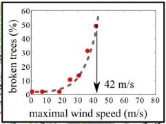
|
The figure shows the percentage of trees that were broken (y-axis) as a function of wind speed (x-axis).
You can see that the percentage of broken trees is low at low wind speed. It then rises -- with increasing steepness -- as the wind speed increases. The midpoint of the curve is at about 42 m/s (90 miles per hour). This is the inset from Figure 2b in the article. |
The scientists were intrigued by the seemingly simple curve. After all, trees vary in both diameter and height, and there are different kinds of wood structures.
They then did some experimental work in the lab, measuring the breaking point of logs. They could measure the effects of diameter and height. Most real trees, it seems are in the range where these effects tend to cancel out. That is, most real trees have similar sensitivity to breaking.
What does this mean? I wonder... Perhaps it means that trees have adapted to the environment over the ages. They survive common winds well, but not extreme winds. If this is so, then it might be that similar work in other places would yield different critical values. That is testable.
Don't go away from this with just "the answer". (Admittedly, there is some appeal to "The answer is 42.") It's a nice story of how some good observations in the field can lead to interesting exploratory lab science. And maybe to more.
Why does this matter, beyond being fun? Wood strength matters. Climate change will probably lead to more severe storms. Can we understand storm damage better? Further, mankind uses wood, in part for its strength.
This is not a new field of inquiry. The reference list goes back over 500 years, to a work by L da Vinci [ref 13]. In fact, the reference list includes several items dating back to the 18th century or earlier, some from familiar names. Remember Hooke's Law?
News stories:
* Trees break at fixed wind speed, irrespective of size or species. (I Randall, Physics World, February 10, 2016.)
* Oddly enough, all trees regardless of size break at the same wind speed. (T Puiu, ZME Science, February 9, 2016.)
The article: Critical wind speed at which trees break. (E Virot et al, Physical Review E 93:023001 February 2, 2016.) Check Google Scholar for a copy.
Posts about wind include...
* Atmospheric rivers and wind (May 9, 2017).
* What is the proper length for eyelashes -- and why? (March 16, 2015).
* How rocks travel (November 14, 2014).Posts about trees include...
* The quality of citizen science: the SOD Blitz (September 28, 2015).
* More from the artificial forest with artificial trees (August 31, 2015).
* Why do koalas hug trees? (June 13, 2014).More about wood and such:
* The strongest bio-material? (May 30, 2018).
* Making wood stronger (March 19, 2018).
March 30, 2016
Evidence from Brazil suggests that Zika virus can lead to microcephaly in children born to mothers who had Zika infections during pregnancy. Oddly, there is little evidence for an association between Zika and microcephaly except for the current Brazil outbreak.
Why might we have such a discrepancy? One type of explanation suggests that the main reason is simply lack of data. The other type of explanation suggests that there is something special about Brazil.
We now have an article on a recent outbreak of Zika in French Polynesia (e.g. Tahiti). Scientists have gone through the health records carefully; they now provide a thorough analysis.
The outbreak lasted seven months; about 2/3 of the population became infected.
The incidence of microcephaly was best explained with a model with the following features:
* Background rate of microcephaly: 2 per 10,000 babies.
* Rate of microcephaly when mother was infected during first trimester: 95 per 10,000 women. That is about 1%. (Note that is expressed a little differently than the first one; it shouldn't make much difference.)
* For infection during other trimesters, the data is inconclusive.
That's all interesting. It is the kind of analysis we have wanted. It would seem to provide good support for a connection between the virus and microcephaly, outside Brazil.
The main problem with the analysis is that it is based on a total of eight cases. It is a reminder that we still have only limited data about Zika.
Many estimates of the frequency of microcephaly from Brazil are far higher than that given here. Much of the data from Brazil should be taken as preliminary; there are reasons it may be an over-count. Thus we cannot claim to have completely solved the problem presented at the start -- only to have made a useful start with a nice piece of work.
News story: French Polynesia study gauges Zika microcephaly risk in early pregnancy. (L Schnirring, CIDRAP, March 15, 2016.) Good overview.
* Commentary accompanying the article: Microcephaly and Zika virus infection. (L C Rodrigues, Lancet 387:2070, May 21, 2016.)
* The article: Association between Zika virus and microcephaly in French Polynesia, 2013-15: a retrospective study. (S Cauchemez et al, Lancet 387:2125, May 21, 2016.)
Previous post on Zika: Zika virus can infect and inhibit neural progenitor cells (March 14, 2016).
Zika is mentioned in the post How long is a yawn? (December 16, 2016).
There is a section on my page Biotechnology in the News (BITN) -- Other topics on Zika. It includes a list of Musings post on Zika. (This is the second.)
March 28, 2016
A brain-computer interface (BCI) allows a person to control mechanical operations using their thoughts. During training, the computer learns what brain signals mean. It can then act on the user's thoughts.
The principle of the BCI is now well-established. Musings has noted an example of a basic BCI [link at the end], as well as other examples of using the information content of brain waves.
However, BCI devices do not work very well -- yet. The dream of a disabled person being able to carry out activities by thinking about them is not yet fulfilled. One of the problems is that the device is not very robust, and requires frequent re-calibration.
A new article takes a useful step. Re-calibration occurs continually during normal use of the device.
The following figure shows some results.
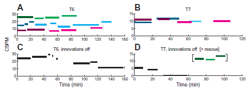
|
The general plan here is that quadriplegic typists, using a BCI to control a typewriter with their thoughts, typed at their own pace. The graphs show their typing speed vs time.
The key variable is whether or not the new "self-calibration" software is used. We'll come back to that in a moment. Data is shown for two participants. Data in the left and right sides is for persons T6 and T7, respectively, as labeled at the top. The y-axis is a measure of typing speed. It is labeled CSPM, which stands for correct selections per minute. You can think of it as correct keystrokes per minute. (With the computer system used here, a single keystroke may result in various numbers of characters.) Let's look at some results for T6 (left side). In frame A (top), there are some green bars across the top. These are for parts of a single session. You can see that typing speed is maintained more or less steady during the "green" session. The other two sets of colored bars are for two other sessions. Again, the key observation is that typing speed is substantially constant during each session. (It is not clear what the different shadings mean in the figure. But I am rather sure the main idea noted here is ok.) Now, look at frame C (bottom). It's also for T6. Black bars. In this case, typing speed decreases over time. Why? Because the software "innovations" were turned off. That is, comparison of the results in frame A, with new software doing continual re-calibration, and frame C, without it, shows the effect of the calibration software. The right side (frames B and D) shows similar results with person T7. However, there is one interesting twist. In the lower frame (black bars), the typing speed quickly dropped to zero with the calibration software turned off. The scientists turned it back on, and the typing speed soon returned to a normal range, as shown by the later bars. (Those bars are colored to show that the software was on.) This is Figure 5 from the article. |
The best typing speeds seen here are 2-3 times the best previously reported. Importantly, they can be sustained, without outside intervention (from lab staff).
The nature of the continual re-calibration is not particularly novel. It's an extension of the original calibration, just based on data while the person is doing real typing. What's important is they have implemented it, and it helps.
News story: Self-calibration enhances BrainGate ease, reliability. (Science Daily, November 11, 2015.)
The article: Virtual typing by people with tetraplegia using a self-calibrating intracortical brain-computer interface. (B Jarosiewicz et al, Science Translational Medicine 7:313ra179, November 11, 2015.) Check Google Scholar for a copy available from the authors. Caution... it is not easy reading.
More on BCI:
* Brain-computer interface -- without invasive electrodes (December 28, 2016).
* Brain-computer interface: Paralyzed patients control robotic arm by their thoughts (June 16, 2012). From the same lab as the current post.My page for Biotechnology in the News (BITN) -- Other topics includes a section on Brain (autism, schizophrenia). It includes a list of brain-related posts.
March 26, 2016
A familiar example of a hydrogen bond is that between two molecules in liquid water; such bonds are responsible for some of the remarkable properties of water. (And very similar hydrogen bonds are responsible for how information is stored in DNA and for some aspects of the structures of proteins.)
Here is how we might draw such a hydrogen bond, in simple text:
H-O-Hδ+ --- δ-OH2
We have two water molecules there; they are shown differently to facilitate lining them up for a hydrogen bond. The dashed line is the hydrogen bond between the two molecules (intermolecular). We've also shown the basis for the bond: the two atoms have small opposite charges, and thus attract. (The δ, the lower case "delta", is usually interpreted as meaning "slightly".) Why do those atoms have slight charges? O atoms hold electrons more tightly; we say that the O atom is more electronegative.
In general, hydrogen bonds occur when an H is between two atoms that are highly electronegative (and quite small).
Here is another hydrogen bond, as reported in a new article.
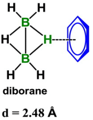
|
The dashed line in the figure shows a hydrogen bond between a H atom in diborane, B2H6, and the side of a benzene ring.
That's different. Let's deal with the benzene ring first. That aspect is actually not new. The side of a benzene ring has a slight negative charge; think about those π electrons. It's the other end of this hydrogen bond that is quite novel. It is an H attached to a B; in fact it is an H attached to 2 B atoms. B? 2 B? B is not a highly electronegative atom. In fact, it is more positive than H. One might expect a B-H bond to be polarized Bδ+- δ-H. |
|
Why, then, is this H δ+? Because there are two B atoms pulling electrons away from the H. That in itself makes compounds such as this unusual; the whole field of B-H chemistry is full of things that came as quite a surprise given our basic understanding of bonding. This is from the "graphical abstract" accompanying the article at the journal web site. | |
That's the idea. What do the authors do? They do theoretical calculations and experimental measurements. Together they support the story above: an H bonded to two B atoms can be δ+, and capable of serving as a hydrogen bond donor. The resulting bond is similar in strength and length to a common H bond between water molecules.
News story: New type of hydrogen bond discovered. (D Bradley, Chemistry World (RSC), March 9, 2016.)
The article: B-H...π Interaction: A New Type of Nonclassical Hydrogen Bonding. (X Zhang et al, Journal of the American Chemical Society 138:4334, April 6, 2016.)
As noted above briefly, boron chemistry gets quite fascinating. Those who think that chemical bonds contain two shared electrons will not be able to make sense of the diborane structure shown above. Hint... The five bonds in the middle, between the two B atoms, contain a total of four electrons.
A post about hydrogen bonding: Life's newest DNA base pair: 5SICS-NaM (June 4, 2014).
More about boron... Paleobioboron (January 26, 2011).
More unusual bonding: How many atoms can one carbon atom bond to? (January 14, 2017).
March 23, 2016
Man has a large brain, compared to other animals (taking size into account). However, our overall energy expenditure is about the same. It follows, therefore, that we must spend less energy on some other activity in order to fuel the energy-intensive brain. A good candidate is digestion. Man has a smaller digestive system than other animals. That includes a smaller mouth and teeth.
How can we get by with less of a digestive system? By eating food that is more easily digested. It has been proposed that the invention of fire was important in this regard. Cooked meat is more easily digested than raw meat. Moving toward cooked meat would have allowed ancient hominids to divert energy resources away from gut toward brain.
A new article offers another possibility.
To get an idea of the main results from the new work, we look at what is in the mouths of the participants.
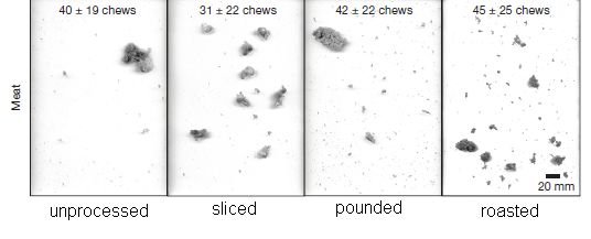
|
In this experiment, the (human) participants were given a piece of meat to chew on. Goat meat. (Meat from modern domestic meat animals is much more tender than wild meat. Apparently, raw goat meat is quite difficult to chew.) The meat was processed various ways before giving it to the participants. They chewed the meat until they were ready to swallow; that was personal choice.
At the time chosen for swallowing, a sample of the mouth contents was laid out -- and photographed. The four photos above are examples of the results, one for each meat treatment condition, as labeled at the bottom. Qualitatively... The photo at the left shows that the basic raw meat sample -- unprocessed -- is still largely one big chunk, even after an average of 40 chews (see top). In contrast, chewed samples of both sliced meat and roasted meat were substantially broken down to smaller pieces. (That happened faster with sliced meat than with roasted meat.) There is also a fourth sample, in which the meat was pounded. As judged by the photos above, this didn't have much effect. Pounding was more relevant to the other part of the study, on eating root vegetables. This is the lower part of Figure 1 from the article. I have added the labels at the bottom. |
That's it. Slicing meat, as well as cooking it, can make meat more digestible. It is a clever lab experiment.
So, which was it? Which innovation for improving meat played the key role in allowing humans to develop larger brains -- if indeed that is the correct model? The work here does not address that; it merely offers the possibilities. What actually happened is some historical fact, and requires some historical evidence to solve.
The authors suggest that the tools for slicing meat were available earlier than the tools for cooking it. But it's not at all conclusive.
If some ancient hominids had tried using their stone knives on their meat, would they have realized any benefit? The results above show that slicing made the meat easier to chew, so they might have liked it even if they did not measure energy expenditure.
From this work, it becomes plausible that learning to slice meat contributed to the development of human intelligence -- and to the development of a smaller mouth. It is now time for the archeologists to get more facts -- but that will not be easy.
News stories:
* How sliced meat drove human evolution. (L Wade, Science magazine, March 9, 2016.)
* The benefits of food processing: Processing food before eating likely played key role in human evolution. (Science Daily, March 9, 2016.)
The article: Impact of meat and Lower Palaeolithic food processing techniques on chewing in humans. (K D Zink & D E Lieberman, Nature 531:500, March 24, 2016.)
More about the history of meat-eating...
* Carnivory in human ancestors: when did it start? (April 2, 2022).
* Did Lucy butcher a cow? (February 11, 2011).More meat: Growing meat without an animal? (April 11, 2018).
More about the brain size-gut size problem:
* The metabolic rate of humans vs the great apes: some data (August 1, 2016). This post challenges the assumption that the overall energy expenditure of humans is at the same level as the other apes.
* Fish with bigger brains may be smarter, but ... (January 25, 2013). This is more directly relevant to the current post than you might guess.More about brain size: A possible genetic cause for the large human brain (March 25, 2017).
My page for Biotechnology in the News (BITN) -- Other topics includes a section on Brain (autism, schizophrenia). It includes a list of brain-related posts.
More about chewing: A robot that can chew gum (March 30, 2021).
More about goats: Q or Beware of goats bearing infections or It's one health. (February 20, 2010).
Also see: Can we distinguish monkey tools and human tools? (April 17, 2023).
March 21, 2016
It has been a huge story over the last year. The water supply in the US city of Flint, Michigan, has a very high level of lead, as well as numerous other problems. The incident began when the city switched the water supply, and apparently neither planned carefully nor monitored the water supply for problems.
It's chemistry -- real-world chemistry, but much of what matters is at the level a freshman chemistry student should be able to understand. C&EN, the news magazine of the American Chemical Society, recently ran an in-depth news story on Flint's water. You can read it at various levels, from a basic description of the problem, to considerable discussion of the relevant chemistry.
News story: How Lead Ended Up In Flint's Tap Water -- Without effective treatment steps to control corrosion, Flint's water leached high levels of lead from the city's pipes. (M Torrice, C&EN, February 11, 2016.)
I don't want to get into the politics, but you'll get a taste from the public comments at the end.
Those comments have quite a range of quality, as typical of such open sections. However, we note that a couple are from a person self-described as "an operator" at the Flint facility. (You can search for the term in quotes to find his main comment.)
* * * * *
New developments in testing for lead: Testing for lead in drinking water: a quick and inexpensive test using a smartphone (October 20, 2018).
March 20, 2016
Elephants are big, and they live a long time. Those are both risk factors for cancer. However, their incidence of cancer is similar to that of other mammals. Why do elephants have a relatively low incidence of cancer, given their large size and lifespan?
A recent article offers a clue.
The idea developed in the new work is that elephants are better at dealing with DNA damage. They do this by killing off damaged cells better, by a process known as apoptosis. One important protein controlling apoptosis is called p53. Elephants have more p53, so they are better at killing off damaged cells -- so says the argument. In fact, elephants seem to have 40 copies of the p53 gene, an odd finding in itself.
Apoptosis is sometimes called programmed cell death. It is easy to understand that some cells may die because they are damaged so they can't grow anymore. But that's not apoptosis. In the present case, the cells have been damaged so they grow too well, uncontrollably-- with the potential to cause cancer. Apoptosis is an active process to kill cells that are identified as harmful or somehow unwanted.
Here are some results for one part of the story. In this experiment, various types of cells were damaged with radiation. The cells differed in how many copies of the p53 gene they have. The amount of apoptosis was measured.
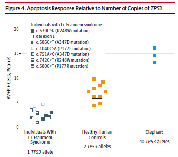
|
The y-axis shows the amount of apoptosis.
The x-axis shows the three types of cells used here: * In the middle are normal human cells, with two copies of TP53, the gene that codes for p53. * At the left are some human cells with only one copy of TP53; they are from people with a genetic disease called Li-Fraumeni syndrome. (The details of the samples for this disease are shown in the inset; we can ignore all that, since they all gave similar results.) * At the right are elephant cells, with 40 copies of the TP53 gene. |
|
Look at the results... the more copies of TP53, the more apoptosis there is. This is Figure 4 from the article. | |
That is one piece of evidence for the story: the more p53, the more of the irradiated cells die. That death is presumably a way to weed out damaged cells, and thus reduces cancer. Elephants have more p53 than we do; that reduces their cancer incidence.
It's all reasonable. p53 has long been recognized as important for preventing cancer. The mutant cells with reduced p53 are from people who have a high incidence of cancer. There have even been attempts to develop p53-based therapies. However, the story is complex and incomplete. For example, you can see in the figure above that going from one copy of TP53 to two copies doubles the response, but going to the 40 copies of the elephant only doubles it again. That may be ok, but we don't understand it. (For one thing, it isn't clear that all 40 copies are active.)
The bottom line? We have a model for why elephants have a low incidence of cancer. It's a plausible model building on ideas of damage and repair that make sense. Data in the new article lend support to the model, which can now be tested further.
News story: How elephants avoid cancer -- Pachyderms have extra copies of a key tumour-fighting gene. (E Callaway, Nature News, October 8, 2015.) This story also links to a second, related article; to my knowledge, it has not yet been formally published.
* Editorial accompanying the article: Evolutionary Adaptations to Risk of Cancer Evidence From Cancer Resistance in Elephants. (M Greaves & L Ermini, JAMA 314:1806, November 3, 2015.)
* The article: Potential Mechanisms for Cancer Resistance in Elephants and Comparative Cellular Response to DNA Damage in Humans. (L M Abegglen et al, JAMA 314:1850, November 3, 2015.) Check Google Scholar for a copy.
Follow-up: More about elephants, cancer, and p53 (August 30, 2022).
Why are size and long life risk factors for cancer? Because it means that there are more cell divisions. At least one source of mutation for cancer is cell division. This was discussed in the following post. The focus article of the post was challenged, but the general point that cell divisions are risky holds. Why are some types of cancer more common than others? (February 6, 2015).
Another post about an animal with a low incidence of cancer: A clue about cancer from the naked mole rat? (January 18, 2014).
Another post about apoptosis, also in the context of cancer: A cancer drug with a switch: it acts only in a cancer cell (September 26, 2010).
More about apoptosis and p53: A treatment for senescence? (June 4, 2017).
More p53: CRISPR connections: p53? cancer? (October 6, 2018).
My page for Biotechnology in the News (BITN) -- Other topics includes a section on Cancer. It includes a list of related posts.
* Previous post about elephants and such... Did the First Americans eat gomphothere? (July 29, 2014).
* Next... Carbon-14 dating of confiscated ivory: what does it tell us about elephant poaching? (February 10, 2017).
March 18, 2016
The common view has long been that mankind came to the Americas from Asia, via a land bridge from Siberia to Alaska. Good evidence for human developments in the western United States dated to about 13,000 years ago; that served as a major reference point for most discussions.
Later, analysis of a site in Chile known as Monte Verde provided evidence for human settlement dating back to about 15,000 years. If man arrived in the Americas at the northern end, then one would expect the time of earliest settlements to be older in the north and more recent in the south. Of course, the record is incomplete, but at least the Monte Verde site was a challenge. In fact, it was long disputed.
And now... Further analysis of Monte Verde dates human activity there back 19,000 years.
There are various possible ways to resolve the apparent paradox. They fall into two general classes...
* The conventional view is correct, but incomplete. Mankind arrived early in the north, and quickly moved south to Chile. We have little evidence for early intermediate steps.
* Mankind arrived in Chile by an event unrelated to his arrival in the north. People have speculated about this, but there is no evidence to support it. So far as I know, the modern era of genetic findings has not lent any support.
The problem is that we lack information. The arrive-north-migrate-south model seems most likely, but when did this all happen? So far, we have little evidence of the arrival and migration on any time scale that is compatible with Monte Verde.
Further, the time scale is constrained by evidence suggesting that the original arrival can't go back too far. Genetic evidence suggests that the Americans-to-be separated from the Siberians less than 23,000 years ago, though genetic dates are always soft. Further, if we propose a migration across a land bridge from Siberia to Alaska, it would help if it occurred during a time when that land bridge passageway was both present and passable.
What's the answer? We don't know. That's fine; scientific stories are often incomplete. That our record of the earliest human settlements is incomplete should be no surprise. But we should remind ourselves that the common view is probably incomplete; it might even be wrong.
To be continued.
News stories:
* Oldest stone tools in the Americas claimed in Chile. (A Gibbons, Science magazine news, November 18, 2015.) Good overview; notes reasons for caution about accepting the new report.
* New clues emerge about the earliest known Americans. (L Entman, Vanderbilt University, November 18, 2015. Now archived.) From the lead university. Includes more about the new findings.
The article, which is freely available: New Archaeological Evidence for an Early Human Presence at Monte Verde, Chile. (T D Dillehay et al, PLoS ONE 10(11):e0141923, November 18, 2015.)
An earlier post about the origin of the First Americans: The First Americans: the European connection (February 8, 2014).
More... Man's migration from Asia to America? Did it really happen by land? (August 16, 2016).
For a book on the earliest Americans, see my Book Suggestions page: Meltzer, First Peoples in a New World -- Colonizing Ice Age America (2009).
March 15, 2016
Briefly noted...
A major study now reports that coffee does not increase the risk of death. In fact, it seems to lower it a bit (10% or so). Some effect is seen even with consumption of one cup of coffee per day, and it is probably maximal by about three cups per day. Importantly, the effect continues with higher levels of coffee consumption. The effect holds for both regular and decaffeinated coffee.
The one big exception is for smokers. The conclusions stated above are for never-smokers. For smokers, there seems to be some interaction, with higher levels of coffee consumption leading to higher mortality for smokers. Sorting out the effect of smoking was the big step forward here, compared to earlier such studies.
The study followed about 200,000 people for as long as 30 years, as part of large ongoing studies. During the course of the study, about 15% of the participants died. The current work involved statistical analysis of the data about the subjects. Isolating single variables, such as coffee consumption, is a tool of statistics. The findings are statistical correlations, and provide no information about causes.
I doubt that anyone drinks coffee to extend their life. Further, the effects seem small. So the main point is that a large study shows no evidence for adverse effects of coffee. That's for non-smokers. For smokers, there may be a complex interaction at high doses.
News story: Moderate coffee drinking may be linked to reduced risk of death. (Science Daily, November 16, 2015.)
Both of the following may be freely available:
* Clinical Summary accompanying the article: Association of Coffee Consumption With Total and Cause-Specific Mortality in 3 Large Prospective Cohorts. (Circulation 132:2287, December 15, 2015.) The file is a collection of summaries for several articles; scroll down to this item.
* The article: Association of Coffee Consumption With Total and Cause-Specific Mortality in 3 Large Prospective Cohorts. (M Ding et al, Circulation 132:2305, December 15, 2015.) The article comes as a 66 page pdf file; 55 of those pages are the supplement, consisting almost entirely of tables. Only dedicated statisticians will delve far. But you can get the main ideas from the abstract and introduction (pages 1-2), and perhaps Figure 1 (on page 5).
For more on coffee (or caffeine)...
* A thermotolerant coffee plant, with high quality beans (June 8, 2021).
* Why you should freeze the coffee beans before grinding them (May 29, 2016).
* How caffeine interferes with sleep (December 11, 2015).
* Brain-computer interface: Paralyzed patients control robotic arm by their thoughts (June 16, 2012).
* Your desire for caffeine: It may be in your genes (May 31, 2011).
March 14, 2016
The disease of the moment is Zika. Zika virus has been known for several decades, but has attracted little attention. Zika has been considered a mild viral infection. In areas where it is endemic, people presumably become immune, so that even mild Zika becomes uncommon in adults. A few outbreaks in new areas have been noted in recent years, but even those seemed of no great consequence.
In 2015 Zika got to Brazil, and something new happened. We started getting reports of a high incidence of microcephaly in babies born to women who had contracted Zika during pregnancy. Microcephaly literally means small head; it's actually a poorly defined term, but at least some of those born with microcephaly will have serious deficiencies in brain development.
Now there is something serious about Zika.
Here is a new article that offers a clue about the role of Zika virus in microcephaly. We must caution that it is only a clue. The Zika-microcephaly story has many mysteries, and the new work is incomplete. Nevertheless, it is worth noting, as a small step, a possible piece of the puzzle.
The work started with human stem cells; they were differentiated in the lab to develop as cells of the nervous system. Cells at various stages of differentiation were tested to see if they could be infected with Zika virus. The heart of the new work is summarized in the following graph.
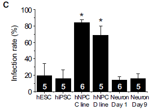
|
The figure shows the infection rate of various cell lines with Zika virus.
The two high bars, with 70-80% infection, are for hNPC, which stands for human neural progenitor cells. The four low bars, with about 20% infection, are for two types of stem cells (hESC = human embryonic stem cells; hiPSC = human induced pluripotent stem cells) and neurons. This is Figure 1C from the article. |
The results show that Zika virus infects different kinds of cells with different efficiency. Further, the best infection is with the cells most like those of the early developing brain. The scientists go on to show that the virus inhibits the growth of those cells, and may even kill some of them.
There is no proof here. There are many limitations of the work -- starting with the fact that the Zika virus used here is not the same strain as the one currently circulating in Brazil. What the work does is to get us started with a line of inquiry that could yield information about how Zika promotes microcephaly.
News story: Zika Infects Neural Progenitors -- Scientists provide a potential biological link between Zika virus infection and microcephaly. (R Williams, The Scientist, March 4, 2016. Now archived.) Good overview.
* News story accompanying the article: Understanding How Zika Virus Enters and Infects Neural Target Cells. (J J Miner & M S Diamond, Cell Stem Cell 18:559, May 5, 2016.)
* The article: Zika Virus Infects Human Cortical Neural Progenitors and Attenuates Their Growth. (H Tang et al, Cell Stem Cell 18:587, May 5, 2016.)
I have added a new section on Zika to my page Biotechnology in the News (BITN) -- Other topics. There isn't much there yet, but there are links to good sources of information, both background and current news. I will maintain a list of Musings post on Zika there.
Next post on Zika... Zika: An estimate of the risk of microcephaly, outside Brazil (March 30, 2016).
There is more about stem cells on my page Biotechnology in the News (BITN) for Cloning and stem cells. It includes an extensive list of related Musings posts.
March 12, 2016
|
That is a praying mantis -- wearing 3D glasses.
The color scheme of the glasses is different from what you may be used to. That accommodates the range of colors best seen by these insects. It's a fun picture, and there are more of them. But this is serious science. It's off to the movies. This is trimmed and reduced from the first figure in the news story from the University. |
Mantises are adept at catching flying insects. How do they do it? There is evidence that they use stereopsis, or 3D vision, but the experimental systems used previously are difficult. The use of 3D glasses makes it easier to test mantises for 3D vision. With 3D glasses, different images can be presented to the two eyes.
With the test system, a mantis is shown a movie of a flying "insect". If the mantis is fitted with the 3D glasses, the insect appears to be floating in front of the screen. If the separate images shown to each eye are designed to provide a 3D image, the mantis strikes at the "prey".
Study of 3D has been almost entirely restricted to vertebrates. Development of this test system will allow detailed study of 3D vision in an invertebrate for the first time.
News stories:
* Bug Eyed: Tiny 3D Glasses Help Confirm 3D Vision in Insects. (Neuroscience News, January 8, 2016.)
* Bug eyes: Tiny glasses confirm 3D vision in insects. (Newcastle University, January 7, 2016.) From the lead institution. It's about the same story as above (which is derived from this university press release), but it has more pictures. Includes a slide show just below the main text. Recommended.
The article, which is freely available: Insect stereopsis demonstrated using a 3D insect cinema. (V Nityananda et al, Scientific Reports 6:18718, January 7, 2016.)
Posts about vision in (non-human) animals include:
* A see-shell story (February 21, 2016).
* How to seat a spider in front of the computer (September 28, 2010).
* Octopus will only pay attention to television if it is "high definition" (August 20, 2010).A post about the advantages of seeing things in 3D: 3D printing: Sculplexity -- and a printed model of a forest fire (December 29, 2013).
More about predation by mantises:
* Can an insect catch fish for its dinner? (October 8, 2018).
* A "flower" that bites -- and eats -- its pollinator (December 27, 2013).
March 11, 2016
In Type 1 diabetes, there is no insulin production. There is much interest in providing people who have this disease replacement cells that can make insulin. One source is stem cells -- using insulin-producing cells derived from them. This has been done, but there are problems. The best approach seems to be to provide the cells in little capsules, which protect the cells. However, the capsule material itself is causing problems.
A new article reports an advance in this area. The scientists develop a modified capsule material that seems to be able to allow good function of the transplanted cells for many months -- at least in a mouse model system.
The following figure shows how well blood glucose level is controlled in diabetic mice treated with two preparations of insulin-producing cells.
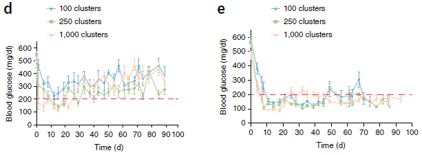
|
These graphs show the blood glucose level (y-axis) vs time after treatment with the insulin-producing cells (x-axis). The dashed red line shows the common cutoff level for acceptable sugar level.
Quick inspection... The graph on the left (part d) shows poor control of blood sugar level; the graph on the right (part e) shows good control. So let's look more closely at what was done, and what the difference is between the two graphs. The cells used here are insulin-producing cells derived from human embryonic stem cells. They're not just insulin-producing; they make insulin with proper regulation. That is, they have been differentiated to become pancreas beta-cells, like normal insulin-producing cells in the body. The authors call these SC-β cells, for stem cell-derived beta cells. The cells were injected into the abdominal cavity of the mice, in capsules -- called "clusters" on the graph. We'll come back to the nature of the capsules in a moment. Treatment was done with three different levels of cells, as shown by the colors of the lines, with the color key at the top. (We won't make much of that here.) The initial glucose level is about 500 mg/dL; that is very high, reflecting that the mice are diabetic. Treatment with the insulin-producing cells leads to a decline in blood sugar level. However, as time goes on, acceptably low glucose levels are seen only on the right. What's the difference between the two graphs? It is how the cells were encapsulated. In part d, the capsule material was a standard alginate; in part e, the capsule material was the modified material (TMTD alginate), which is less visible to the immune system. In part d, you can see that blood sugar level declines early, but then rises. This reflects degraded performance of the cells over time. The improved capsule material allows the insulin-producing cells to maintain good activity longer. This is Figure 1 parts d-e from the article. |
In this experiment, blood sugar level was maintained within a normal range for three months. In other experiments in the article, good results continued for six months, which is about as long as the mouse model works. Examination of the mice at that time showed no tissue damage from the material, in contrast to what was seen with the standard material.
It is an encouraging result. Remember, however, that this is in a mouse model of diabetes; no testing has yet been done in humans, and that must proceed with great caution. Further, other approaches to providing insulin-producing cells are being tested.
News stories:
* No more insulin injections? -- Encapsulated pancreatic cells offer possible new diabetes treatment. (Science Daily, January 25, 2016.)
* New Type 1 Diabetes Treatment Allows Insulin-Producing Cells to Thrive. (P Inacio, Diabetes News Journal, February 1, 2016. Now archived.) This also refers to a second, related article. That article focuses on the development of the new capsular material.
The article: Long-term glycemic control using polymer-encapsulated human stem cell-derived beta cells in immune-competent mice. (A J Vegas et al, Nature Medicine 22:306, March 2016.)
A recent post on diabetes: A smart insulin patch that rapidly responds to glucose level (October 26, 2015).
And next, with an alternative approach... Making a functional mouse pancreas in a rat (February 17, 2017).
More on diabetes is on my page Biotechnology in the News (BITN) -- Other topics under Diabetes. That includes a list of related Musings posts.
There is more about stem cells, and other issues of replacement body parts, on my page Biotechnology in the News (BITN) for Cloning and stem cells. It includes an extensive list of related Musings posts. It is an interesting reflection on how far stem cell work has come that the current work just takes the stem cells for granted; the issue here is how to deploy them.
March 9, 2016
Original post: Why mice don't get typhoid fever (November 26, 2012).
In that post, evidence was presented to show that mice had a component of the innate immune system that recognized Salmonella Typhi and allowed the mice to resist infection.
A number of labs now report that they disagree with some of the findings in the article discussed there. The authors of that article respond; they defend some of their original findings, but also note that they have had trouble repeating some findings. Interestingly, there is some speculation -- but little real evidence -- that differences in the gut microbiota may be responsible for some of the differences in results.
There is no resolution at this point.
I have attached this update, with the new references, to the original post.
March 8, 2016
Perhaps you have heard of TYC 9486-927-1 and 2MASS J21265040.8140293. They are our neighbors, only 100 light-years or so away. (I wonder... Do astronomers have a formal definition of what they mean by the "solar neighborhood"?)
Astronomers have known of these bodies for several years. A new article reports something not previously recognized: 2MASS J21265040.8140293 seems to be orbiting TYC 9486-927-1. The main evidence for that is based on careful tracking of their motions, which appear to be coupled. The scientists now suggest that the former is a planet orbiting the latter.
What makes this particularly interesting is that the distance between them is nearly 7000 AU. (1 AU is the distance from Earth to Sun.) For reference, Pluto is about 40 AU from our Sun, and the recently proposed Planet 9 is expected to be a few hundred AU away. The orbit of planet 2MASS J21265040.8140293 is the largest planetary orbit known -- by far. It takes the planet about 900,000 years to complete one orbit about its star.
Both of these objects seem quite young. The scientists estimate their age at 10-50 million years.
The numbers above allow us to calculate how many times the planet has orbited its star. If we take the lower estimate of its age (ten million years), and take the orbit as about a million years, we see that this planet may have orbited its star only about ten times. (For comparison... Earth has orbited its star, the Sun, about 4.5 billion times.)
There is another way to say that. The calculation above is in years -- Earth-years. A year is the time it takes to complete one orbit around the star. An Earth-year is the time it takes Earth to orbit the Sun. However, from the point of view of planet 2MASS J21265040.8140293, a year is the time it takes to orbit its star. Thus we note that, from the viewpoint of that planet, which has orbited its star perhaps only ten times, it is only ten years old.
We can have more fun with the length of their year. For the sake of conversation here, let's assume that the planet is otherwise much like Earth, and that the inhabitants there are very much like us. (We know little about the planet except some basic measurements. For example, its mass is about 10 times that of Jupiter.)
Earthlings live about 100 years. On planet 2MASS J21265040.8140293, the equivalent beings (shall we call them 2MASS J21265040.8140293-lings?) would live 0.0001 years. A child born in mid-summer would never know anything but mid-summer (without traveling).
If they have a moon -- and a moon-based month -- like ours, a year would have about 10 million months.
News story: Astronomers Discover Planet with Largest Orbit Ever. (Sci.News, January 26, 2016.) Includes a map -- with a scale bar of 4000 AU.
The article: A nearby young M dwarf with a wide, possibly planetary-mass companion. (N R Deacon et al, Monthly Notices of the Royal Astronomical Society 457:3191, April 11, 2016.) Check Google Scholar for a copy; there is one at arXiv.
Also see:
* A ninth planet for the Solar System? (February 2, 2016). The suggested orbit of this undiscovered distant planet is only about a tenth of that of the planet in the current post.
* Discovery of Neptune: The one-year anniversary (July 12, 2011).
* Steppenwolf: Life on a planet that does not have a sun? (July 2, 2011). A post about "rogue" planets, though our current planet has just escaped from that status.
March 7, 2016
Some tarantulas are quite pretty, at least as judged by color. Some are a nice blue. For example...
|
A greenbottle blue tarantula, Chromatopelma cyaneopubescens.
This is reduced from the first figure in the news story; it contains pictures of some others. The article contains more, but with quite small pictures. |
A recent article explores blue tarantulas. The blue color is due to reflections off crystals in the hairs, not absorption by pigments. However, the details of those reflecting structures are quite diverse. Interestingly, the blues of different blue tarantulas are very similar, despite the structural differences. Is there some reason for this convergence?
The work suggests that the color is not something the animals themselves sense. In fact, they seem rather colorblind. (They have only one kind of photoreceptor, and generally poor vision -- despite having eight eyes.) The colors do not change during the mating season, suggesting that a role in mating is unlikely. Another possibility is that the color is to protect them from others. For now, there is no evidence on that point.
The big conclusion? We still don't know why many tarantulas are blue -- a very specific blue.
News story: Study suggests blue hue for tarantulas not about attracting a mate. (B Yirka, Phys.org, November 30, 2015.) More pictures.
The article, which is freely available: Blue reflectance in tarantulas is evolutionarily conserved despite nanostructural diversity. (B-K Hsiung et al, Science Advances 1:e1500709, November 27, 2015.)
More on tarantulas:
* Tarantulas in the trees (November 11, 2012). Also features a picture.
* What else are feet good for? (August 8, 2011).More hair: Could smelling a piece of wood improve the growth of your hair? (November 5, 2018).
More blue animals: Big blue sticks (July 19, 2019).
More about such iridescence or "structural color": How to "dye" carbon fiber -- with titanium dioxide (January 20, 2018).
More about reflectance: Earth is not as bright as it used to be (October 9, 2021).
March 6, 2016
Roundup is a widely used herbicide; its active ingredient is a chemical called glyphosate. Does it cause cancer? That is a reasonable question to ask.
We now have two recent reports from reputable agencies reaching a conclusion on the matter. One says yes, one says no.
Briefly...
Last Fall the European Food Safety Authority (EFSA) issued a report carried out in conjunction with approving the herbicide for use in the European Union. The report concludes that "glyphosate is unlikely to pose a carcinogenic hazard to humans."
Earlier in the year there was another report, from the International Agency for Research on Cancer (IARC) of the World Health Organization (WHO). That report 'classified glyphosate as "probably carcinogenic to humans".' (Both this quotation and the one above are from materials listed below.)
I don't have a resolution. The point is to highlight the contradiction, and the difficulty. And we can look at some questions that arise.
What is the basis of the IARC classifying glyphosate as carcinogenic? There is minimal evidence for it causing cancer in humans. (There is one report, which is contested.) That is not conclusive; it is hard to get data that something causes cancer in humans. On the other hand, some animal studies have shown carcinogenesis, and there is information on how it works to support the claim.
Since both agencies had access to the same data, how did they reach different conclusions? First, they emphasized different parts of the data set. In particular, the IARC uses only formally published trials and government reports. They exclude the trials from industry that are the basis for approval; these are not publicly available. This is an interesting conundrum. We can appreciate the concern about possible bias of industry trials, but simply excluding those results, rather than seeking resolution, seems odd. If these reports were public, everyone could take them into account. All this cancer testing is expensive. Maybe it is time to rethink how it is done, so we all get the maximum benefit from whatever testing is done.
Second, the agencies actually look for different things. The IARC does not evaluate the importance or potency of a carcinogen; they merely classify a chemical yes/no/maybe. In this case, "probably". In contrast, the EFSA deals with exposures. Some people (those who manufacture and use the agent) may receive high exposure, whereas the consumer is exposed mainly through residues on food. EFSA addresses exposure limits. This is useful -- assuming that they have at least a reasonable estimate of what the potential harm might be. Do they, or have they missed the point?
The bottom line? Glyphosate is an important (widely used) chemical. The question of its possible harm would seem important. Yet not only do we not know the answer here, it's not even clear we know how to address the question. Apparently, no one has the authority to ask for and help design a study that would address the contradictions. Isn't that what is needed? For now we have inadequate information and a flawed process.
1) EFSA study
News story: Popular herbicide doesn't cause cancer, European Union agency says. (G Vogel, Science magazine, November 12, 2015.) Provides some comparison with the earlier IARC report. Again, emphasize sorting out the issues, and be cautious about trying to reach conclusions.
Two items from the EFSA:
* News story: Glyphosate: EFSA updates toxicological profile. (EFSA, November 12, 2015.)
* Announcement and summary: Conclusion on the peer review of the pesticide risk assessment of the active substance glyphosate. (EFSA, November 12, 2015.) Links to more, including the full report, which is in the EFSA Journal 13:4302, November, 2015. It is freely available there.
2) IARC/WHO study
News story: Widely used herbicide linked to cancer. (D Cressey, Nature News, March 24, 2015.)
Brief announcement of the report, in a medical journal: Carcinogenicity of tetrachlorvinphos, parathion, malathion, diazinon, and glyphosate. (K Z Guyton et al, Lancet Oncology 16:490, May 2015.) As you can tell from the title, this report also addresses some other herbicides; glyphosate is the one of interest here.
Follow-up: Is glyphosate (Roundup) a carcinogen? Follow-up (June 7, 2016).
Recent posts on cancer include:
* BRCA1 (the breast cancer gene) and Alzheimer's disease? (February 8, 2016).
* The WHO report on the possible carcinogenicity of meat (December 12, 2015). Another report from the same agency as report #2 above. In this post we noted some of the idiosyncrasies of their reports.
* The role of combinations of chemicals in causing cancer? (September 21, 2015). This post gets into the issue of cancer mechanisms, which relates to how the WHO/IARC makes their evaluations.My page for Biotechnology in the News (BITN) -- Other topics includes a section on Cancer. It includes a list of related posts.
Glyphosate was noted in the post: Genetically modified crops and the fate of the monarch butterfly (April 1, 2012).
More ... Glyphosate and the gut microbiome of bees (October 16, 2018).
March 4, 2016
You've heard the stories... Young athlete drops dead after a workout, and is found to have a mutation that leads to excessive growth of heart muscle, which somehow leads to defective function -- and sudden death.
The condition is called hypertrophic cardiomyopathy (HCM). It is caused by mutations in a gene for a heart muscle protein. In some people, the condition is silent until the sudden death.
Mutations most commonly lead to reduced function. One might think that HCM involves loss of heart muscle function, and that the excessive growth (hypertrophy) is a compensatory response. However, that may not be true here. It seems that HCM involves over-activity of a muscle function; that leads to the excessive growth. If so, it might be possible to have a drug that inhibits the activity.
There is such a drug under development. Here are some results -- in a mouse model of HCM...
|
In this experiment, one manifestation of the disease was measured: the left ventricular wall thickness
(LVWT). That is the thickness of (one part of) the heart wall.
The measurement was made for four conditions. There are two kinds of mice -- normal and mutant. Each was tested with and without the drug. |
|
Quick analysis... You can see that one curve is high, and the other three are low and similar. The high curve is for the untreated mutant mice. The three lower curves are for the wild type mice, treated and untreated, and for the treated mutant mice. In more detail... The two black curves are for the normal mice. The dashed black curve is for untreated mice; the solid black curve is for mice treated with the drug the same way as for the mutant strain. The similarity of those two curves shows that the drug has no ill effect on the normal mice (as judged by this criterion). The red and blue curves are for the mutant mice. The red curve is for untreated mutant mice. The blue curve is for mutant mice treated with the drug. You can see that the mutant mice develop heart wall thickening. The thickening reaches about 50%, compared to the normal mice. The increase in thickness is substantially reduced by the drug treatment. R403Q in the lower right corner identifies the specific mutation studied in this experiment. The coding means that the amino acid R (arginine) at position 403 has been changed to a Q (glutamine). That is in the β-cardiac myosin heavy chain. That change is a known mutation causing the condition in humans. Here, it has been moved into the corresponding mouse gene. The mice are heterozygous for the mutant form of the gene: they carry one copy each of the mutant and normal alleles. The drug was given throughout the time shown. (The article also contains some results for experiments in which the drug was given only after considerable thickening had developed. Those experiments gave mixed results.) Heart wall thickness was measured in live animals by echocardiography. This is Figure 2B from the article. I have added labeling on the axes. (The original labeling was lost when I trimmed this part from the larger figure.) | |
The figure above shows that the drug substantially reverses one effect of the mutation. The article contains other work on other effects.
Such drug experiments play two roles. First, they help us understand the disease process. The scientists understand what the drug does (or at least think they do). The results are best explained by the model that the mutation leads to an increased activity, which the drug can inhibit, thus restoring normal growth. Of course, it is far more complicated than just the one experiment shown above, but the use of drugs to help understand diseases is important.
Second, it is possible that this is a useful drug. However, it is much too early to know. The work here is with mice, and an artificial test system in the mice. Even if the basic story about the disease process carries over to humans, there is no assurance that the drug will be effective -- and safe -- there.
The article is, in part, from the company that makes the drug. The company plans to take the drug to clinical trials in humans. That's fine. However, only a small percentage of drugs that go to clinical trials lead to useful drugs. For now, this is more about using a drug as a tool to help us understand a disease than about having a clinically useful drug.
News story: MyoKardia Publishes Article in Science Demonstrating That MYK-461 Prevents and Reverses Disease in Genetic Mouse Models of Hypertrophic Cardiomyopathy. (MyoKardia, February 4, 2016.) A press release from the company. It is posted here at Globe Newswire, at NASDAQ. It is more business than science, but it is good as far as it goes.
* News story accompanying the article: Heart disease: Throttling back the heart's molecular motor. (D M Warshaw, Science 351:556, February 5, 2016.)
* The article: A small-molecule inhibitor of sarcomere contractility suppresses hypertrophic cardiomyopathy in mice. (E M Green et al, Science 351:617, February 5, 2016.)
Recent heart-related posts include...
* Increased risk of congenital heart defects in offspring from older mothers: Why? and can we do anything about it? (July 18, 2015).
* The opah: a big comical fish with a warm heart (July 13, 2015).
* Can we pinpoint a specific molecular explanation for tissue damage following a heart attack? (March 24, 2015).
March 1, 2016
How do we choose items for Musings? Sometimes an article seems important, sometimes interesting, sometimes provocative -- or sometimes just fun. Sometimes a picture is striking, and serves as the starting point for developing a story.
This post starts with a figure. I'm still not sure I get much from the article, but the figures in it are irresistible. The following is typical of a large set of figures that dominate a recent article and its news stories:

|
The figure shows ten characters of a proposed new alphabet.
This is part of Figure 7Ai from the article. It is the middle example from the top row. |
What is the story around this figure? Well, the figure is part of a challenge, and you can play... Your task is to provide more characters. How about ten more?
The rules? Just what is above.
You can take a break here, and spend some time developing your set of characters. But before you do, you should be aware that the authors of the article don't care much about your efforts. They know what humans can do with such a challenge.
What the authors care about is how computers deal with the challenge. Many of the character sets shown in the article were created by a computer, after being given a prompt such as the one shown above. The authors imbed questions for you: can you tell which character sets were offered by a human, and which by a computer? If you can't tell, that's good. It means they have succeeded. And they claim the computer is getting more efficient
So we now have computers that can generate new alphabets? Why? It is an example of improving the ability of computers to analyze concepts, and that is important.
It's a story of artificial intelligence (AI), if you want to get into it. Otherwise, it is just a rather odd collection of pictures. The news stories will give you the idea.
News stories:
* When machines learn like humans -- Probabilistic programs pass the "visual Turing test". (Kurzweil, December 10, 2015.)
* Scientists teach machines to learn like humans. (Phys.org, December 10, 2015.) Check out the videos.
The article: Human-level concept learning through probabilistic program induction. (B M Lake et al, Science 350:1332, December 11, 2015.) Check Google Scholar for a copy.
More on alphabet design... The nano-alphabet (June 29, 2012).
Another Turing test: Eugene Goostman and his Turing test (June 17, 2014).
More AI: Is AI ready to predict imminent kidney failure? (August 24, 2019).
February 29, 2016
The common view is that the Moon was formed in a collision of another body, called Theia, with the early Earth. The energy of the collision led to the ejection of a big chunk; it became Moon.
However, as evidence has become available, we have come to recognize that one common prediction of the basic model seems incorrect. The model predicts that Earth and Moon should differ in details of their chemical composition. That assumes that the two colliding bodies were different; since most Solar System bodies are different, that has generally been considered likely. There have been several comparative analyses of Earth and Moon, based on measurements of isotopes of various elements. Most of the evidence says that the composition of the Moon is very similar to that of Earth. This has led some to consider whether it is realistic that the two colliding bodies might have been similar. That suggestion and other background is in previous Musings posts [link at the end].
A new article presents another way to resolve the apparent contradiction that there was a collision of two dissimilar bodies giving rise to two similar bodies. What if the collision was so violent that the two bodies mixed thoroughly before one portion was ejected? Then the two resulting bodies would be similar to each other -- but different from both parents. Remember that we have no evidence about the parent bodies; we can only look at the current Moon and Earth -- and they seem similar.
The work here is largely computer simulation. With computer simulation of collisions, the authors show that such a scenario is possible. According to this article, we should consider the possibility that Theia and Earth met "head-on", a collision of maximum violence, which would give thorough mixing of the material from the two bodies. This contrasts with previous models, which generally suggested more of a glancing blow that preserved the identity of the two bodies.
If you are trying to envision the collision... The authors even suggest that Theia might have been about the same size as Earth.
There is experimental work in the current article. It includes further analyses, which support that the Earth and Moon are similar. In particular, the authors refute one recent article claming to find small differences of possible significance. The main interest in the new article is the model that is presented.
A reminder, of course, that the computer simulations -- and the model -- don't tell us what happened. Instead, they help to define what the possibilities are. The work here and in the background post show distinct scenarios that are plausible. Perhaps further evidence will distinguish them.
News story: Moon was produced by a head-on collision between Earth and a forming planet. (S Wolpert, UCLA, January 28, 2016.) From the lead institution.
The article: Oxygen isotopic evidence for vigorous mixing during the Moon-forming giant impact. (E D Young et al, Science 351:493, January 29, 2016.)
Background post on how the Moon was formed: Birth of the Moon: Is it possible that Theia was similar to Earth? (June 20, 2015). Links to more.
More... Formation of the moon: was the Earth surface molten? (June 16, 2019).
My page of Introductory Chemistry Internet resources includes a section on Nuclei; Isotopes; Atomic weights. It includes a list of related Musings posts.
Another Musings post with a February 29 date: An "antidote" for Huntington's disease? (February 29, 2020).
February 27, 2016
The hygiene hypothesis proposes that the lack of infections that used to be common is adversely affecting our immune systems. That is, we are -- in some ways -- worse off now because we are cleaner. It is an intriguing idea, and there is plenty of circumstantial evidence to support the broad idea. However, specifics are generally lacking.
A recent article develops a rather detailed story of how an intestinal worm interacts with the host immune system to reduce inflammation. The work here is with mice.
Here is an example of the findings...
|
The y-axis shows the level of a molecule called interleukin-5 (IL-5); it is a marker for inflammation. The IL-5 level is measured under various conditions.
The left-hand bar is the control (Ctrl). |
|
The next two bars show the IL-5 level (inflammation) after exposure to "HDM". That is an extract from house dust mite; it is an irritant, which can lead to inflammation. You can see that it induces IL-5 in one case, not the other. What's the difference? The tall bar (middle) is for just that: the effect of HDM. For the right-hand bar, the mice had been infected with a helminth worm (Hpb), then given the irritant HDM. You can see that the worm completely prevented the IL-5 increase due to the HDM. The worm used here, labeled Hpb, is Heligmosomoides polygyrus bakeri. (The mice not infected with the worm are called "naive".) This is Figure 1D from the article. | |
Of course, that is just one piece of evidence. After many experiments, the authors suggest the following scenario...
* Infection with the worms leads to changes in the gut microbiome.
* The worm-adapted microbiome makes a higher level of short chain fatty acids (SCFA).
* The SCFA interact with a specific protein of the immune system.
* As a result, there is less inflammatory activity mediated by the immune system.
The major new point from the current article is the role of the microbiome in mediating the effect of the worm on the immune system.
The reduced inflammation presumably benefits the worms. It also helps protect the host from excessive inflammation, such as seen in asthma.
The basic work in the new article focuses on a particular worm and a particular host (mice). However, it appears that the conclusions hold for a range of helminth worms and a range of mammalian hosts. Thus the article offers a detailed model of how the hygiene hypothesis plays out.
News story: Intestinal worms 'talk' to gut bacteria to boost immune system. (Science Daily, October 27, 2015.) The word "boost" in the title is a poor choice. Note that the authors use "modulate" in the article title.
The article, which is freely available: The Intestinal Microbiota Contributes to the Ability of Helminths to Modulate Allergic Inflammation. (M M Zaiss et al, Immunity 43:998, November 17, 2015.)
More on the hygiene hypothesis:
* Treating asthma with a hookworm protein? (December 2, 2016).
* Are lab mice too clean to be good models for human immunology? (May 21, 2016).
* Reducing asthma: Should the child have a pet, perhaps a cow? (November 28, 2015).
* Are girls too clean? (February 26, 2011).A post about treating worm infections: How to administer Bt toxin to people? (May 16, 2016).
More asthma: Is Helicobacter pylori good for you or bad? (April 10, 2012). The "good" is that Helicobacter may help prevent asthma, by its effect on the immune system. This has some similarity to the hygiene hypothesis in that it involves our microbiome affecting our immune system. It is different in that Helicobacter infection is not considered related to hygiene.
A recent post about the microbiome: Breastfeeding and obesity: the HMO and microbiome connections? (November 14, 2015).
More on the gut microbiome...
* Possible role of gut bacteria in Parkinson's disease? (March 17, 2017).
* A robot that can feed itself (February 3, 2017).Also see: What can the mites on your face tell us about your ancestry? (May 31, 2016).
February 26, 2016
As the Earth warms, sea level rises. That is often noted. However, it is more complex. There are multiple factors that affect sea level, and the overall effect varies by region.
A new article provides more analysis of the details of sea level change than ever before.
In general, there are two types of reasons for sea level rising. First, water expands when it warms. That is, the existing water has an increased volume. Second, water may be added to the oceans, for example by melting of glaciers and ice sheets (most famously from Greenland and Antarctica).
How can we distinguish these? One way is gravity measurements: changes in gravity at a location are commonly interpreted as changes in the amount of water. A key part of the new article is using the extensive gravity measurements over the entire Earth in the last decade (actually 2002-2014).
Some of the above ideas have been introduced in earlier posts [links at the end].
The following figure summarizes much of the findings from the new article.
|
There are many pie charts around the map. Each summarizes the change in sea level at about the place it is shown (or where its line points to). The size of the pie chart (usually) reflects the overall rise in sea level; the sectors of the pie chart summarize the contributions. (There are some negative pies and negative sectors. That is an unusual feature of their pie charts. It is reasonably labeled. In particular, negative sectors are separated a little from the main pie, and are bounded with a dotted line.)
As examples... The largest pie is near the right side, off the coast of East Asia. It is labeled 14.7, meaning that sea level rose 14.7 mm in that area over the course of the study. The "smallest" pie is at the left, in the mid-Pacific. It is labeled -1.4; sea level has dropped a little there. (I put "smallest" in quotes because that pie marks the place with the smallest value for sea level rise, or the largest decline. But pie charts are not good with negative pies; I'm not sure what they did.) Let's look at some of the sectors. There is a key at the lower left. One sector is labeled "steric", and colored in orange. The steric contribution to sea level change is the part due to warming (or cooling). For the large pie, it is quite large; for the small pie, it is negative. That is, the former is in a region where the ocean warmed; the latter is in a region were the ocean cooled. Look over the figure, and you will see that the steric contribution is highly variable; in fact, it accounts for much of the differences in sea level rise between various places. Differences in ocean temperature at different places is a major contributor to differences in sea level rise. This is Figure 2 from the article. |
The contribution of the "steric" effect is the focus of the article. The authors show that previous estimates of ocean warming have underestimated it.
That gives you the idea. The article represents a very detailed analysis of how the oceans are behaving -- and why they are doing so. That is our main point.
News story: Climate change: Ocean warming underestimated -- Researchers at Uni Bonn: Ocean warming plays a bigger role than previously believed. (EurekAlert! (University of Bonn), January 25, 2016.)
The article: Revisiting the contemporary sea-level budget on global and regional scales. (R Rietbroek et al, PNAS 113:1504, February 9, 2016.) The article is not easy reading, in part because of excessive jargon (and odd things such as negative pies). But you can get the ideas by browsing it.
Background posts...
* Sea level: 2011: There was less water in the oceans (November 25, 2012).
* Using gravity measurements to measure water: Evaluating the world's water resources (August 11, 2015). Links to more.More about sea level: Climate change and sea level (October 2, 2017).
More about climate change: Is the weather getting better or worse? (May 23, 2016).
More about gravity: Which is older, the center of the Earth or the surface? (September 7, 2016).
February 23, 2016
Nature ran an intriguing news feature a couple months back. It deals with "science myths" -- things we think we know, but which are wrong, or at least questionable. The issues are important enough that we should try to get it right, and not just keep repeating the myth. I found the article interesting. It is certainly well-intentioned, but the choice of myths is odd. In fact, the article has become somewhat controversial for its choices. Perhaps that goes with the territory: we should be asking questions about our common beliefs, but some of them may turn out to be ok. I encourage you to browse the article, mainly for the big idea.
News feature, freely available: The science myths that will not die. False beliefs and wishful thinking about the human experience are common. They are hurting people -- and holding back science. (M Scudellari, Nature 528:322, December 17, 2015.)
As an example of the complexity... One of the myths discussed in the article is "Myth 2: Antioxidants are good and free radicals are bad". Here are two Musings posts about anti-oxidants. If their conclusions are correct, then it is clear that anti-oxidants have good and bad sides. If the conclusions are taken as tentative findings, which is reasonable, then it is clear that we do not fully understand anti-oxidants.
* Are birds adapting to the radiation at Chernobyl? (August 3, 2014).
* Anti-oxidants and cancer? (October 18, 2015).More radicals: Making triangulene -- one molecule at a time (March 29, 2017).
My page for Biotechnology in the News (BITN) -- Other topics includes a section on Ethical and social issues; the nature of science. It includes a list of related Musings posts.
February 22, 2016
Humans are viviparous, meaning that they give birth to live young. (In contrast, birds lay eggs.) Viviparity seems to have arisen independently over 150 times among the vertebrates, over 20 times in fishes alone. It is interesting to compare the process of pregnancy in diverse animals in which viviparity arose independently.
A recent article examines pregnancy in a fish, and then compares it to pregnancy in humans and more generally in mammals.
The scientists measured the level of gene expression at various stages during pregnancy. About 3000 genes showed some difference in expression during pregnancy. The scientists found that the genes could be grouped into nine clusters based on the pattern of gene expression. The following figure illustrates this, summarizing results for two of those clusters.
|
Look at the left-hand frame, for cluster 2. These genes show a peak of expression during early pregnancy. The stages of pregnancy they looked at are labeled along the x-axis. For cluster 3 (right-hand frame), there is a peak of expression during mid-pregnancy.
The labeling at the top shows that cluster 2 contains 123 genes. About half of them are "annotated", meaning that the gene function is known. What is actually plotted here? Gene expression here means the level of transcription: the amount of messenger RNA present for each gene. What is plotted is the change in expression level. What do the y-axis numbers mean? That is hard to explain, but the basic pattern is clear: a higher value means higher expression. (The y-axis values have been normalized so that the average expression change is zero.) This is part of Figure 3 from the article. The full figure shows nine such clusters, each with a different pattern of expression. |
That's the basic framework: there are groups of genes with specific patterns of expression during pregnancy in this fish.
The authors then go on to look at the lists of genes with known function. The patterns of gene expression observed here are similar to those for mammals. The general picture they develop is that pregnancy in this fish seems rather similar to that in mammals. The pregnant parent provides similar functions in both cases, and many of the same genes are involved, presumably in similar ways.
The article provides mostly qualitative discussion of the genes. It makes the comparison and finds considerable similarity in the nature of the pregnancies.
Except for one thing... In the fish studied here, it is the male that gets pregnant and carries the brood during internal development. The fish is Hippocampus abdominalis, commonly known as the seahorse.
It's unusual for males to get pregnant; it seems to happen only in the seahorse and some closely related fishes. How that got started is not known. But it is interesting that, once the animal took the course of developing pregnancy in males, the nature of that pregnancy is rather like other pregnancies.
If you don't know what a seahorse looks like, go look for a picture. They are rather silly-looking things. And if the belly looks distended, don't jump to conclusions. They look like that normally. (There is a good picture in the news story listed below, but you can probably find better.)
We should be clear... The work here does not mean that pregnancy is the same in the diverse animals. Pregnancy seems to have originated independently many times. Each case is different. However, there appears to be a basic tool-kit of pregnancy genes that tends to get used over and over once the animal embarks on viviparity. There is much more to be learned about all this, in diverse animals.
News story: Male seahorse and human pregnancies remarkably alike. (Science Daily, September 2, 2015.)
The article: Seahorse brood pouch transcriptome reveals common genes associated with vertebrate pregnancy. (C M Whittington et al, Molecular Biology and Evolution 32:3114, December 2015.)
Other posts about pregnancy include...
* A gene that reduces the chance of successful pregnancy: is it advantageous? (May 18, 2015).
* Cannibalism in the uterus (May 31, 2013). Another fish.
* Light-dark (day-night) cycles affect pregnancy (August 10, 2012).
* An advanced placenta -- in Trachylepis ivensi (October 18, 2011).Another silly-looking fish... CO2 emissions threaten clowns (September 20, 2010).
February 21, 2016
What is a see-shell? It is a shell you can see with. A chiton shell. (A chiton is a mollusk, the same phylum as clams.)
Chiton shells have eyes. Lots of eyes. A new article investigates the optical properties of the eyes. Here is an example...
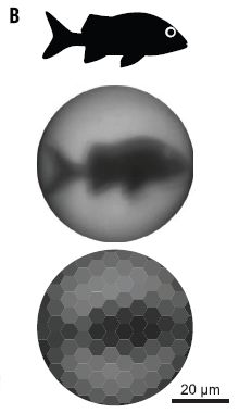
|
The top frame shows a fish, side view.
The middle frame shows the image of the fish that is obtained using a lens from a chiton shell eye. The measurement here is in a lab situation, using an isolated lens. It is equivalent to what would be found with a "20-cm-long fish that is 30 cm away" [p 954, right column]. The bottom frame shows what the scientists think the animal may actually perceive. It's not as good as the direct image itself. That is, the lens is not limiting. (What is limiting? The spacing of the photoreceptors, in the "retina" layer below the lenses.) This is Figure 3B from the article. |
The shell of the chiton is made of calcium carbonate. It is designed for strength. At least, most of it is. But there are hundreds of specks on the shell. These also contain calcium carbonate, but arranged differently. In fact, they look like little lenses. Their physiological relevance has been uncertain. The present work adds to the argument that the eyes in the shell are part of the sensory system of the animal. The calcium carbonate crystals are the lens part of these eyes.
The authors also discuss the phenomenon of the shell containing two distinct regions, based on the same material, but optimized for different purposes. The eyes do weaken the shell, but they improve the vision.
News story: Chitons See with Ceramic Eyes, New Research Shows. (E de Lazaro, Sci.News, November 23, 2015.) Features a close-up picture of a chiton shell. The dark bumps are the eyes. (As the caption there notes, you can also see other sensory organs -- of unknown function. There is more to learn about these shells!)
* News story accompanying the article: Biomaterials: Crystalline eyes of chitons inspire materials scientists -- Mollusk makes hundreds of eyes from shell mineral. (E Pennisi, Science 350:899, November 20, 2015.)
* The article: Multifunctionality of chiton biomineralized armor with an integrated visual system. (L Li et al, Science 350:952, November 20, 2015.) Check Google Scholar for a preprint freely available from the authors.
Other examples of unusual eyes include...
* An eye that forms an image using a mirror (February 13, 2018).
* Where are the eyes? (August 19, 2011).The chiton eyes are called ocelli. So we might make note of the following post: Is the warnowiid ocelloid really an eye? (October 12, 2015).
More about animal vision: What can we learn by giving a praying mantis 3D glasses while it watches a movie? (March 12, 2016).
A post about the optical properties of calcium carbonate: An ancient navigation device? (April 16, 2013).
A post about the structural properties of calcium carbonate: Armor (February 5, 2010).
February 19, 2016
It may catch on fire, a well-known risk with this battery type. But what if it sensed the heat and just shut down?
A new article reports a design for lithium ion batteries that does just that. It is based on a simple principle: most things expand when they are heated. What if the expansion of a warmed battery caused it to break a contact, and shut down? What the scientists have done is to develop a practical implementation based on that idea. And it is reversible. When the battery cools down, contact is re-established, and battery function resumes. That is, they have built a fuse for the battery -- a fuse that is reversible.
The fuse is based on a tape-like material, which can be installed somewhere in the battery circuit. For example, the tape may cover an electrode.
The bulk of the tape is a plastic polymer, such as polyethylene. Embedded in the polymer are spiky nanoparticles, which are conductive. At low temperature (T), the particles form a conducting network, and the battery functions. At high T, the particles are further apart, and the conducting network is broken; the battery stops.
The following figure illustrates, in cartoon form, how the fuse works.
|
The blue rectangle shows the polymer. The conductive nanoparticles are shown as spiky yellow blobs, labeled as GrNi (for graphene and nickel). Upon heating, the polymer material expands, and the conductive particles become farther apart. At low T (top frame), the conductive particles are largely touching, making the tape as a whole conductive. At high T (bottom), the conductive particles don't touch much; the tape as a whole is no longer conductive. The dashed lines within the polymer area show pathways that electrons might follow. Each red X marks a blockage in the pathway, due to polymer expansion. The authors use the term percolation to refer to the conduction process. (Ignore the dashed lines at the left side; they relate this frame to a previous part of the full figure.) This is Figure 1c from the article. (The right-hand side of Figure 1a of the news story in the journal is essentially the same figure.) |
The following figure shows the fuse in action, in an artificial test situation.
|
Each frame shows parts of an electrical circuit.
There is a light bulb near the lower right corner. It is ON in two frames, OFF in frame 2 (middle). The black rectangle shows the fuse material. It is labeled TRPS film. (TRPS = thermoresponsive polymer switching.) It is normal in frame 1 (left). Then it is heated, with a heat gun; this causes the light to go off (frame 2). The heat source is removed, and the fuse cools; the light comes back on (frame 3). This is Figure 3e from the article. |
The authors show that they can make various forms of the fuse material, which will melt at various specific temperatures between 50-100 °C. The general requirement is that the fuse material breaks the circuit before overheating cases structural loss of the battery material. That happens a little above 150 °C, and can lead to a fire.
The change in resistance when heated is about 108-fold. The fuse has minimal effect on the battery performance during normal use, but responds quickly to T changes when needed.
It looks like a promising way to improve the safety of the ubiquitous lithium ion battery. It will be particularly important to see how well the system scales up to large batteries.
News story: A battery that shuts down at high temperatures and restarts when it cools. (Kurzweil, January 11, 2016.)
Video: Safe & reliable lithium-ion battery. (YouTube, 2 minutes.) Narrated by the senior author; good diagrams of how it works, and an example.
* News story accompanying the article: Batteries: Polymers switch for safety. (K Amine, Nature Energy 1:201518, January 2016.)
* The article: Fast and reversible thermoresponsive polymer switching materials for safer batteries. (Z Chen et al, Nature Energy 1:20159, January 2016.) Check Google Scholar for a copy from the authors. The article is from the first issue of a new journal.
Previous post on batteries: A flow battery that uses polymers as the redox-active materials (January 8, 2016).
Previous post on lithium batteries: Fast charging batteries (March 13, 2009).
More...
* A low-temperature battery (July 29, 2018).
* Making lithium-ion batteries more elastic (October 10, 2017).Previous post on lithium: Quiz: What is it? (March 6, 2012).
There is more about energy issues on my page Internet Resources for Organic and Biochemistry under Energy resources. It includes a list of some related Musings posts.
Also see... In the aftermath of gun violence... (January 8, 2018).
February 17, 2016
Let's start with some evidence. Examination of the bodies showed individuals with...
* Projectile embedded in cranium
* Perforating lesions on vertebrae
* Blunt force trauma on left temporal bone
* Projectiles within body cavity
Those are extracts from Table 1 of the article. There are pictures in the news stories listed below.
The victims included men, women -- one of them pregnant -- and children. Several of the individuals appear to have been bound.
It's clearly the scene of a massacre.
The best estimate of the date is about 10,000 years ago. The people involved are hunter-gatherers, nomads.
It's the oldest known case of human warfare -- of inter-group violence. The scale and complexity of the find makes it almost certain that this was a planned event.
The origin of human warfare is an interesting and contentious issue. The work reported here is a piece of the story. But be careful with it; we have little idea what the piece means at this point. We do not know the purpose or circumstances. And we do not know whether such warfare was common or unusual 10,000 years ago.
News stories:
* 10,000 Year Old Hunter-Gatherer Massacre Uncovered. (M Andrei, ZME Science, January 21, 2016.)
* An Ancient, Brutal Massacre May Be the Earliest Evidence of War. (B Handwerk, Smithsonian, January 20, 2016.)
* Evidence of a prehistoric massacre extends the history of warfare. (University of Cambridge, January 20, 2016.) From one of the institutions.
The article: Inter-group violence among early Holocene hunter-gatherers of West Turkana, Kenya. (M Mirazón Lahr et al, Nature 529:394, January 21, 2016.)
Also see:
* Violence within the species -- in various mammals; implications for the nature of humans (December 6, 2016).
* Bee wars (March 1, 2015).
* Human violence (November 28, 2011).More from a hunter-gatherer culture: The oldest known bread (August 28, 2018).
February 16, 2016
|
The photo at the right shows two pipes lying on the ground near Hanford, Washington. The pipes are each about four kilometers long and one meter in diameter.
This is reduced from the first figure in the Quanta news story. |

|
Imagine that we wanted to know the exact length of one of the pipes. We could measure it by shining a laser beam down the pipe, and seeing how long it takes to reach the other end. (Or, we could put a mirror at the far end, and measure how long it takes for the light beam to make a round trip.) Since we know the speed of light, we could calculate the length of the pipe. We'll make this more complicated a little later, but that's the idea for now.
Now imagine that we make such measurements continuously. Suddenly we notice that the pipe length starts changing, in a rhythmic fashion.
While we are making these measurements, another team is measuring the length of a similar pipe 3000 km away near Livingston, Louisiana. At "exactly" the same time we notice those changes in length of the Hanford pipe, the other team observes exactly the same changes in length of the Livingston pipe.
That all really happened -- on September 14, 2015, at 09:50:45 UTC. The results, after careful analysis, were announced last week. Here is what the results look like...
|
The graph shows the fluctuations in the lengths of the two pipes vs time. Each of the colored lines is for one pipe.
The y-axis is labeled "strain". 1 on this scale means that the pipes changed length by 1 part in 1021. That is about 4 attometers (for the 4 km pipe). |
|
You can see that there is some background noise. At about 0.35 seconds, the fluctuations in length become noticeably larger, and are the same at both sites. Another tenth of a second... it's all over. This is reduced from a figure in the Quanta news story. It is probably the equivalent of the upper right part of Figure 1 from the article. Why does it say "shifted" in the labeling for the Hanford data? The data have been corrected for the distance between the two sites. This is also why I put "exactly" in quotation marks above. | |
Why are two pipes 3000 km apart fluctuating in length -- in exactly the same way? Because the structure of space is changing. A gravitational wave passed by -- a gravitational wave perhaps from the collision of two black holes.
Einstein predicted such gravitational waves a century ago, as part of the theory of general relativity. The results shown above are the first observations of such gravitational waves. They are from a project called the Laser Interferometer Gravitational-Wave Observatory (LIGO).
Scientists have long wondered how they might measure the gravitational waves that Einstein predicted. Einstein himself thought it might not be possible to measure them. Over recent decades, sensitive instruments have been built to try to make the measurements; we now have a success.
Why is it so difficult? Look at those numbers with the graph. The change in length is one part in a billion trillion. An infinitesimal change in the length of a 4 km-long pipe. The change is a tiny fraction of the size of the nucleus of an atom.
At the start we suggested how one might determine the length of the pipe by measuring how long a laser beam takes to travel its length. That's sort of what the scientists did, but that simple measurement would not be nearly good enough.
Recall that there are two pipes at each site, at right angles to each other. Because the pipes are at right angles, an encounter with a gravitational wave would affect the two pipes differently. What the scientists really did was to measure the difference between the lengths of the two pipes. They allow the light beams from the two pipes to interact with each other. This interaction, called interference, is extremely sensitive to tiny changes; that is what they measure.
Recent upgrading of the LIGO observatory led to reducing background noise by about 3-fold. While the scientists were testing the upgraded LIGO, a gravitational wave just happened to pass by that September morning. Without the improved (reduced) noise level, they would not have seen it.
If the current story is really all true, we should expect more reports of gravitational waves, from LIGO and from other gravitational wave observatories that are being developed. We are, it would seem, at the beginning of the era of using gravitational waves as a tool for observing the universe.
News stories. A lot has been written about this story, an indication of its perceived importance. At some level, it is easy to understand, but it also gets very technical. I've included multiple news stories, in approximate order of their level. Videos, both interviews and animations, are in some of them. Browse!
* Einstein's gravitational waves 'seen' from black holes. (P Ghosh, BBC, February 11, 2016.)
* Gravitational waves detected 100 years after Einstein's prediction. (Science Daily, February 11, 2016.)
* Gravitational Waves Discovered at Long Last -- Ripples in space-time have been detected a century after Einstein predicted them, launching a new era in astronomy. (N Wolchover, Quanta, February 11, 2016.) Includes an animation of what gravitational waves do to space-time. It's mesmerizing, whether you understand it or not.
* LIGO detects first ever gravitational waves -- from two merging black holes. (T Commissariat, Physics World, February 11, 2016.)
* News story in the publisher's news magazine; it is freely available: Viewpoint: The First Sounds of Merging Black Holes. (E Berti, Physics 9:17, February 11, 2016.) Includes a video describing the measurement system.
* The article, which is freely available: Observation of Gravitational Waves from a Binary Black Hole Merger. (B P Abbott et al, Physical Review Letters 116:061102, February 11, 2016.)
The article authorship includes the LIGO team as well as collaborators from other gravitational wave teams around the world. The list of authors and their affiliations takes 5 of the 16 pages of the article; three of the authors are dead.
There is a second article, focusing on the black hole merger that is thought to be the source of the gravitational waves observed here. That article is also freely available. The Physics World news story, above, links to it.* * * * *
Follow-up: Gravitational waves: II (July 12, 2016).
and ... Gravitational waves: What caused them, and how do we know? (November 1, 2016).
and ... Gravitational waves: a challenge to the announced discovery (July 19, 2017).
Posts about gravity include...
* Which is older, the center of the Earth or the surface? (September 7, 2016).
* Does anyone know how strong gravity is? (September 16, 2014).
* A galaxy far, far away: the story of MACS 1149-JD (October 12, 2012). Includes gravitational lensing.Another post that notes interference of light waves: Graphene bubbles: tiny adjustable lenses? (January 15, 2012).
Posts about black holes include: Mayhem at the center of the Milky Way (August 23, 2011).
On my page of book suggestions, this work is noted in the listing for the book: Gribbin & Gribbin, The Cat in the Box -- A history of science in 100 experiments (2017).
February 13, 2016
There have been several Musings posts on bees, with the main focus being the current decline in bee populations known as colony collapse disorder [link at the end].
A new article asks how long bees have been associated with humans. The main analysis is to look for beeswax associated with human cultural remains. That is, finding beeswax on a container used by a human population is taken as evidence for an association of bees and humans.
The authors examined pottery samples from 154 archeological sites in Europe and neighboring areas.
The following figure summarizes what they found.
|
The x-axis is a time scale, dating back to 7000 BC (that is, 9000 years ago). The y-axis is a list of sites where beeswax has been found. (It is not important, at least for the moment, if you have trouble reading the list.)
Each bar shows the age of samples from that site that had beeswax. That is, a bar shows that there is evidence for bees at that time and place. One important finding is shown by the two bars at the upper left. These two bars are for samples dated to 8-9000 years ago. (Both are from what is now Turkey.) This is Figure 3b from the article. Part a of the figure is a map, showing where the sites are. They are identified on the map by the letter before the site name. For the map and a larger version of the above figure... Figure 3 (complete: map and timeline) [link opens in new window]. Many of the findings are new, from this work. Some of the sites in the list have superscript numbers; these are reference numbers for previous findings. |
The previous oldest human-bee site is line d of the list. The new work extends the time scale of known human-bee associations by about two thousand years, to nearly 9000 years ago.
Identification of the samples for line a as beeswax is uncertain. Thus the more cautious interpretation is that the work provides good evidence for man-bee associations back 8500 years.
There are other interesting findings, including some negative results. The authors caution that negative results must be taken with skepticism, since they can be an artifact of poor preservation. However, the authors note that they found no evidence for bees at northern latitudes (north of Denmark). They suspect that this may be real -- the limit of the bees' natural distribution at that time.
News story: Early farmers exploited the honeybee at least 8,500 years ago. (Popular Archaeology, November 11, 2015.)
The article: Widespread exploitation of the honeybee by early Neolithic farmers. (M Roffet-Salque et al, Nature 527:226, November 12, 2015.) Check Google Scholar for a preprint from the authors.
Background post... A recent post about decline of bee populations: Neonicotinoid pesticides and bee decline (July 12, 2014). Links to more.
More about bees...
* What if the caterpillars ate through the plastic grocery bag you put them in? (May 26, 2017).
* How bumblebees detect the electric field (October 22, 2016).
* Sharing resources: How to get a bird to help you find honey (September 4, 2016).
* Bee wars (March 1, 2015).For more about lipids, see the section of my page Organic/Biochemistry Internet resources on Lipids. It includes a list of related Musings posts.
February 12, 2016
It is his birthday today. We note the event with a 272-word speech.
Why 272 words? Why do we even note the length? Because that man gave a famous 272-word speech -- in the same year he established the National Academy of Sciences (NAS). Many of our American readers have memorized all or part of that speech; many do not know that the author was also the man behind one of the most prestigious science institutions in the world.
In 2013, the 150th anniversary of the speech, a number of Americans, from various walks of life, were asked to commemorate the occasion -- in their own 272 words. One of the resulting speeches recently surfaced as an editorial in Science. It tells the story, and links to a video of the author delivering his speech.
The editorial, with video of the speech, is freely available: America's science legacy. (N d Tyson, Science 350:891, November 20, 2015.) The page includes his editorial describing the situation, a link to the video of the speech, and the text of the speech, "The Seedbed", at the bottom.
We also have some music. It includes some of the text of the original 272-word speech. Music (YouTube, 16 minutes).
Most recent post based on an article from the NAS journal: Do oil dispersants work? Is biodegradability bad? (January 9, 2016).
My page Internet resources: Miscellaneous contains a section on Science: history. It includes a list of related Musings posts. It also includes a list of books that deal with science history. Of particular relevance here may be books that deal with science and American leaders, such as Shachtman (2014), Tanford (1989), and Thomson (2012).
That page also has a section on Art & Music. It includes a list of related Musings posts.
This post is 318 words (between the horizontal lines).
* * * * *
Text here and below was added later, and is not included in the word count shown above.
More about national academies of science: Women in science: How about at the highest level, the national academies? (April 12, 2016).
February 9, 2016
Electrons are stable particles; they do not decay into other things. So say the laws of physics. But the way we find out whether the laws we think we know are correct is to test them.
A new article looks for the decay of electrons. That's not new, but this is the best electron-decay search yet done.
What did the scientists find? Nothing.
The scientists' analysis of the measurement system suggests that they would have detected electron decay if the lifetime of an electron were less than 6.6x1028 years. That's about 1018 times the age of the universe. It's also 66,000 yottayears; the SI prefix yotta, which we don't get to use very often, means 1024.
This new lower limit for the electron lifetime is about 100 times longer than the previous lower limit -- reported by the same group 13 years ago. That's why the new article is getting attention. Measuring things better is one part of doing science. Even measuring things that don't happen.
The laws of physics survived this test just fine.
The scientists look for a specific type of decay of the electron: to a neutrino plus a photon. That is a hypothetical reaction -- one that violates the laws of physics. Why? Because it produces two uncharged particles from a charged particle, and that violates the law of conservation of charge. (There is no known particle smaller than an electron that can carry charge.)
They use the Borexino neutrino detector, in Italy. A neutrino detector works by recording photons resulting from neutrino interactions. It's very sensitive. In the present case, the scientists are looking directly for the photons emitted by the hypothetical decay reaction. They made measurements over about a year -- measurements of a system containing about 1032 electrons.
The key to doing this kind of work is to understand the detection limits of the system, and the background sources of neutrinos. Much of the article is error analysis.
News stories:
* Electron "Lifespan" is at Least 5 Quintillion Times the Age of the Universe. (G Dvorsky, Gizmodo, December 11, 2015.)
* Lifetime expectancy for electrons just went up -- and it's a lot. (A Micu, ZME Science, December 11, 2015.) The title of this post plays off his introductory sentence.
The article: Test of Electric Charge Conservation with Borexino. (M Agostini et al, for the Borexino Collaboration, Physical Review Letters 115:231802, December 4, 2015.) Check Google Scholar for a freely available preprint.
More about electrons:
* The mass of an electron (March 23, 2014).
* How round are electrons? (June 24, 2011).More about neutrino detectors: IceCube finds 28 neutrinos -- from beyond the solar system (June 8, 2014). The detectors in this post and the current post work on the same principles.
More neutrinos -- maybe: A new sensor for barium ions -- could it lead to a better understanding of neutrinos? (September 20, 2020).
For more on the less common metric prefixes, see my page Metric Prefixes - from yotta to yocto. The page includes examples to give a sense of scale for most of the prefixes.
February 8, 2016
BRCA1 is a gene well known for its effect on breast cancer. Women with one copy of the mutant allele are at increased risk for breast cancer.
A new article makes a connection between the BRCA1 gene and Alzheimer's disease (AD).
Here are the basic results that got the story started...
|
This test involves two kinds of mice. One is normal; the other also has hAPP -- the gene for the human amyloid-beta (Aβ) protein that is a feature of AD.
Mice with hAPP are a model system for studying AD. |
|
The absence or presence of hAPP is shown by - or + in the top row of the figure. The rest of the figure shows the amounts of various proteins present in brain tissue from the two kinds of mice. The intensity of a band is a measure of how much protein is present. The proteins from each kind of mouse were separated by electrophoresis, and identified with antibodies. This is a procedure known as a Western blot. For presentation here, the bands of interest have been cut out and shown together in a single montage. The labeling at the right side shows the size of each protein, in kDa (kilodaltons). The first protein shown is BRCA1. You can see that there is less of it when hAPP is present. That's the key result. Most of the other proteins shown are about the same in the two strains. (Me2H3 is present in larger amounts with hAPP; that is beyond our discussion here.) This is Figure 1a from the article. | |
This experiment makes a connection between the BRCA1 protein and AD... At least in this mouse model, there is less BRCA1 in the AD mice. That's intriguing, but, by itself, says nothing about why -- or about human AD.
The article goes on to look further. Among the findings...
* Reducing the level of BRCA1 by other means causes damage to the nervous system in mice. This result suggests there is some functional relevance of the BRCA1 reduction.
* Examination of post-mortem brain samples from some AD patients suggests that they, too, had reduced levels of BRCA1. This result begins to make the connection between the mouse model and the human disease.
How can a single gene affect two diseases as different as breast cancer and AD? It is now known that BRCA1 is involved in DNA repair. Perhaps DNA repair is somehow involved in both diseases. That a DNA repair gene is involved in cancer is reasonable; we know that cancer involves the accumulation of mutations. There is evidence for DNA damage in AD and other neurodegenerative diseases, but how DNA repair is involved is not clear at this point.
The results here suggest there is a role for BRCA1 in AD; they deserve to be followed up.
News stories:
* Alzheimer's Linked to Protein that Repairs DNA -- Researchers find low levels of BRCA1 in brains of Alzheimer's patients. (M Ammam, Alzheimer's News Today, December 4, 2015. Now archived.)
* Breast Cancer Gene Implicated in Alzheimer's. (G D Zakaib, ALZFORUM, December 4, 2015.)
The article, which is freely available: DNA repair factor BRCA1 depletion occurs in Alzheimer brains and impairs cognitive function in mice. (E Suberbielle et al, Nature Communications 6:8897, November 30, 2015.)
Are people who carry BRCA1 mutations at increased risk for AD? The evidence currently available suggests that they are not. This is an issue that will need to be resolved.
* * * * *
More on BRCA1:
* Distinguishing pathogenic and benign BRCA1 mutants: a high-throughput test (January 26, 2019).
* A gene for breast cancer: what does it do? (May 4, 2010).Next cancer post: Is glyphosate (Roundup) a carcinogen? (March 6, 2016).
Recent post on AD: Transmission of Alzheimer's disease in humans? (September 27, 2015).
More about cancer and AD: What's the connection: Alzheimer's disease and cancer? (October 31, 2022).
My page for Biotechnology in the News (BITN) -- Other topics includes sections on Alzheimer's disease and Cancer. Each includes a list of related posts.
February 6, 2016
There is a global effort to eradicate polio. Musings has noted progress in several posts [link at the end]. In 2015, only 73 cases of polio resulting from wild type viruses were reported; I assume this is the lowest ever. More progress.
However, there is more to the polio story. Biologists have long known that there are complexities, and have considered how to deal with them. The complexities become increasingly important as we near eradication.
Some background... There are two general classes of polio vaccine. One is the inactivated polio vaccine (IPV). This uses a killed virus, and is given by injection. (The "I" of IPV means inactivated or injected, as you wish.) The other is the oral polio vaccine (OPV). This uses a live virus that has been "attenuated" so it does not cause disease, and is given orally. The IPV and OPV are also called the Salk and Sabin vaccines, respectively.
The OPV is easier to administer, since it is given orally. It is well suited for mass vaccination campaigns. However, it has a problem. With the OPV, the vaccine virus grows in the vaccinated person. That's good, in that it promotes continuing immunity. It may even be good in spreading in the community. What's the problem? The OPV virus can revert -- mutate back to being harmful -- and causing polio. And since it is live and can be transferred, the reverted virus becomes a source of polio infections. This has occurred numerous times. When you look at the polio data carefully, you will see that cases from wild virus and vaccine-derived virus are listed separately.
In 2015, there were 28 cases of vaccine-derived polio worldwide, along with the 73 cases of wild-derived polio. The vaccine-derived polio was in countries where there is now no wild-derived polio.
If there is a lot of wild polio around, the contribution of vaccine-derived polio is small. As wild polio gets reduced, the vaccine-derived polio becomes increasingly important. It has long been recognized that the current OPV is incompatible with eradication. The plan is to switch back to the IPV for the final phase of polio eradication.
However, that raises another concern. The IPV is based on a highly virulent virus -- which gets killed before becoming a vaccine. Making the IPV vaccine is a hazardous process.
And now... What if we had an IPV based on a non-virulent strain of polio? That is the problem addressed in a new article. Here is some data -- showing the advantage of a new poliovirus strain.
|
The y-axis shows the reduction in virus growth, compared to the reference T, on a log scale. That is, a 10-fold reduction is shown as 1; a million-fold reduction as 6. The top curve is for a poliovirus strain called Saukett, which is the strain currently used to make IPV. It grows the same regardless of T. A little below that (on the right) are two curves that are close together. The lower of those is for the current Sabin (OPV) strain. (We can ignore the other one here.) These two strains show a small effect of T on growth. Skipping one more... The lower two curves (or the left-most two) show two strains that are the most sensitive to T. These are labeled S19 and S18. This is Figure 2a from the article. I have added some labeling to the curves. |
What if we made IPV from a strain such as S19 or S18? These are the two strains most sensitive to T. We could make the vaccine at, say, 31°. If some escapes, it can't grow in humans. That would reduce the hazard of making the IPV.
How did the scientists get these new viruses? They designed them, based on their understanding of the virus. It's an encouraging development that they are able to do that.
It seems a good idea. Is it going to be worthwhile to put effort into thorough testing of the new strains, to get them approved? We'll see how this gets followed up.
News story: Creating safer polio vaccine strains for the post-eradication era. (Science Daily, January 4, 2016.)
The article, which is freely available: New Strains Intended for the Production of Inactivated Polio Vaccine at Low-Containment After Eradication. (S Knowlson et al, PLoS Pathogens 11(12):e1005316, December 31, 2015.)
Recent post on polio eradication: Polio eradication: And then there were two (July 27, 2015). The story presented here still holds.
My page for Biotechnology in the News (BITN) -- Other topics includes a section on Polio. It includes a list of Musings posts on the topic. It also includes a link to a page with current polio statistics; the numbers I quote above are from that source. (It is possible for 2015 statistics to change slightly, as late reports come in.)
February 5, 2016
There have been five mass extinctions through the history of life on Earth. Musings has discussed the possible causes of some of them. The most recent event, 66 million years ago including the dinosaurs, has gotten the most attention. As a recent post made clear, our understanding of any extinction is incomplete. [Background links at the end.]
A new article raises an intriguing point, the significance of which is hard to judge. So we just note it. A team of scientists suggests that deficiency of the trace nutrient element selenium may be related to extinctions.
Here is an example of what they find...
|
It's not an easy graph! Let's go slowly...
The x-axis is a time scale. Ma means millions of years ago; here, time runs the right way -- and the numbers run backwards. Just above the numeric scale are some labels for geological periods. In particular, note the Triassic and Jurassic, with a vertical line between them, at about 201 Ma. In some form, that line extends upward through the entire graph; it marks the extinction event. In fact, it is labeled ETE, which means end Triassic extinction. |
|
Just to the left of that ETE line is an arrow, pointing downward, labeled "rapid Se drop". That refers to a curve, purple with red diamonds, near the arrow. That curve shows the amount of Se found in rocks of various ages. You can see that the curve indeed falls dramatically just before the ETE line. In the two points before the extinction line, the Se level falls from its highest value to near its lowest value. This is Figure 6 from the article. | |
That's the key point: there was a dramatic drop in selenium just before the extinction. The rest is filling in details. Since we now have your attention -- that this might be interesting -- let's look at some of those details.
The Se decline was more than 10-fold. The Se levels are shown using the left-hand scale, labeled "Se pyrite (ppm)"; the unit ppm means parts per million. It is a log scale. Also, there is a horizontal line, labeled "Current Se level"; it is just above 102. The low part of the Se curve, at the extinction, is about 100-fold lower than the current level.
The graph also shows O2 and CO2 levels. These use the scale on the right side, which is not a log scale. I don't think we need to go through those here. We do note that there was an O2 decline, but the timing does not match the extinction very well. Their point in the article is that it is the Se level that matches the extinction.
The graph above focuses on one extinction event. In their full analysis, the scientists find a major Se decline associated with three of the five mass extinction events.
Selenium is an interesting trace nutrient. Is it possible that it plays such a critical role that it influences life on the scale of mass extinctions? The authors argue that the Se levels fall below what many organisms need.
There is a geology connection, too. Geological activity, such as volcanoes and earthquakes, affect selenium levels.
It is also possible that the Se is not the key component, but simply correlates with it. In fact, the article shows changes in other trace minerals. The Se effect was the largest and clearest, but that doesn't mean it was the most important. It could be that it is a "marker", but not the key variable. The graph above shows a correlation; causation is a separate question.
Finding the correlation -- between selenium levels and mass extinctions -- is an interesting novel finding. The biology, chemistry, and geology of Se are all complex; it is hard to know where this will go.
News story: Tiny Molecules May Have Caused Ancient Mass Extinction Events, Says New Theory. (A Laguipo, Tech Times, November 5, 2015.) This is somewhat awkwardly written in some parts, but overall gives a reasonable overview of the work.
The article: Severe selenium depletion in the Phanerozoic oceans as a factor in three global mass extinction events. (J A Long et al, Gondwana Research 36:209, August 2016.)
Background posts about mass extinctions include:
* What caused the extinction of the dinosaurs: Another new twist? (January 26, 2016).
* What caused the mass extinction 252 million years ago? Methane-producing microbes? (October 12, 2014).
* The 6th mass extinction? (April 4, 2011).More selenium biology: Selenium and neurodegenerative diseases? (June 25, 2022).
This is the first Musings post from the journal Gondwana Research. If you don't remember what Gondwana was, check the post How were the Gamburtsevs formed? (December 7, 2011).
February 2, 2016
Big news story! A new planet for our Solar System.
Predicted. It hasn't been found; the pictures you see of it are "artist's conceptions".
There is nothing new about predicting the existence of a planet, because the observed orbits of known bodies don't seem quite right. One can predict that there must be some other body, not yet known, whose gravity is affecting the observed orbits. Neptune was first predicted, using such an argument; later it was found.
Many such predictions have been made; only Neptune was found. Caltech planetary scientist Mike Brown recently said of such a prediction, "If I read this paper out of the blue, my first reaction would be that it was crazy." That's from the news story in Nature, listed below. The paper he was referring to is the one that is the subject of this post -- and he is a co-author. He goes on, "But if you look at the evidence and statistics, it's very hard to come away with any other conclusion." Perhaps, but we'll believe it when we see it -- the planet.
The following figure gives an idea of the basis for the prediction.
|
The figure legend is: "Orbital clustering in physical space." That's the point. Even without the details, you can see that the orbits that are shown cluster off to one side.
The figure is a diagram of part of the Solar System. There are two circles in the figure, a small one and a big one. The big one has a scale bar to the right: 250 AU. (1 astronomical unit (AU) is the distance from Earth to Sun; Pluto is about 40 AU from the Sun.) I'm not sure what the smaller circle is; it may be near the orbit of Neptune, about 30 AU from the Sun, and marking the beginning of the Kuiper belt. The Sun would be in the middle -- a tiny dot. |
|
The ellipses are the orbits of known bodies in the outer part of the Solar System. They are clustered. Why? That is the question the authors address. Planet Nine is their proposed answer. A massive object off to the other side; its gravity is a major determinant of the distribution of objects "out there". This is the right-hand frame of Figure 2 from the article. | |
That's the idea. I caution you that the article is much more complex. The prediction may seem like hand-waving here, but is based on detailed mathematical analysis, which leads to a specific prediction about the orbit.
The article is exciting because of its prediction. Not only a ninth planet, but a big one -- and way out there in that mysterious region of the Kuiper Belt. But be cautious. Until someone finds it, it is just a prediction -- and most predicted planets don't show up. (It would be nice to get back to having nine planets, wouldn't it?)
What are the prospects of finding it? We know the orbit, but we don't know where it is in the orbit -- which is big. It's a faint object. The good news is that it is within the range of some telescopes, with better ones coming online soon. The astronomers think there is a good chance of finding Planet Nine within a decade. If it is there.
News stories:
* Evidence grows for giant planet on fringes of Solar System -- Gravitational signature hints at massive object that orbits the Sun every 20,000 years. (A Witze, Nature News, January 20, 2016.) This news story contains a version of the above figure -- with the proposed orbit of Planet Nine also shown. The story also includes a listing of some other planetary predictions; look at the section, partially hidden, called "Solving for X".
* Astronomers say a Neptune-sized planet lurks beyond Pluto. (E Hand, AAAS, January 20, 2016.)
The article, which may be freely available: Evidence for a distant giant planet in the solar system. (K Batygin & M E Brown, Astronomical Journal 151:22, February 2016.) Not easy reading!
More about Planet 9:
* Briefly noted... Cataloging the outer solar system (April 27, 2022).
* Finding Planet 9: You can help (March 13, 2017).The planet Neptune was predicted because of the odd orbit of Uranus. The following post notes the discovery, but does not talk about the prediction. Discovery of Neptune: The one-year anniversary (July 12, 2011).
More about planetary orbits: A planet that may be only ten years old? (March 8, 2016).
More planets: Another Solar System planet -- revealed by its diamonds? (May 22, 2018).
Author Mike Brown played a key role in the developments a few years ago about the status of Pluto. I list his book on the Pluto story on my page of Book Suggestions: Brown, How I Killed Pluto -- and why it had it coming. The listing there notes another Musings post about his work.
Another book about predicting planets: Levenson, The Hunt for Vulcan -- And how Albert Einstein destroyed a planet, discovered relativity, and deciphered the universe.
February 1, 2016
We maintain our body temperature (T) at about 37°C, regardless of the environmental T. That's called endothermy, or warm-bloodedness. Mammals and birds are common examples. Some animals don't maintain their body T, which is then about that of the environment. That's called ectothermy, or cold-bloodedness. Reptiles and fishes are common examples.
But is it that simple? And in any case, how and why did endothermy arise?
There is debate about whether dinosaurs were warm- or cold-blooded. Since we have no direct measurements, it is something to be inferred from evidence that survives -- in fossils. And at least one fish is warm-blooded, contrary to the norm for its group. Musings has noted these topics before [links at the end].
Lizards are reptiles -- ectotherms. A new article reports a lizard that is... Well, let's look.
The lizards are Salvator merianae, known as black and white tegu lizards. They are apparently native to Argentina. The work reported here was done in Brazil; the first results we will examine are for June -- the beginning of winter. Here are those results...
|
Start with frame B, the lower part. Look at the results for June (third frame). There are three curves, each showing temperature (T) over the course of a day. (Each curve shows the T vs time of day averaged over the days of the month.) Most importantly... The black curve is for the body T of the animal, a tegu lizard; the green curve is for the T of its burrow. They are very similar; that is what you would expect for a cold-blooded lizard. (The yellow curve shows the outside T in direct sunlight -- or at least where the sunlight would be if the sun were out.)
Now look at the analogous set of curves in the next (right-hand) frame. The animal body T is several degrees higher than the burrow T. It's October, and the animal now seems to be warm-blooded. That's the heart of the story. This lizard seems to be cold-blooded in June, warm-blooded in October. The other two frames fill out the year. The difference between body and burrow temperatures declines over time. Part A of the figure (top) shows the life cycle of the animal. In particular, the warm-blooded behavior occurs during the reproductive season. This is part of Figure 1 from the article. |
Why is this of interest? It's an example of an animal on the borderline of endo- vs ecto-thermy. It is a lizard-like ectotherm most of the time, but does a little endothermy when that seems of benefit. It tells us that even an individual species can be both. We must wonder if what this lizard does might relate to the origins of endothermy.
The endothermy is related to reproduction. We know that reproduction requires a higher level of energy production, but that alone is not sufficient to explain the heat rise. It seems likely that the heat rise itself is of benefit. Is this a clue to the origin of endothermy?
We've opened up a lot of speculation in the last two paragraphs. Remember, the graph above is data. That is what the animal does. What it means is open.
The lizard is now described as a facultative endotherm. Facultative in this context means that it is optional.
To be clear... We are not suggesting that humans are derived from tegu lizards. What we suggest -- or at least wonder about -- is whether what this lizard did is an example of an early step in developing "true" endothermy. If tegu lizards developed facultative endothermy, it is likely that other animals did, too. Some may still be around, waiting for us to do this test on them. Some may be extinct. It would be nice to study the genetic and biochemical basis of multiple facultative endotherms. For example, did different species develop facultative endothermy for the same "purpose"? Using the same mechanism?
News stories:
* Lizard found to heat itself during mating season. (B Yirka, Phys.org, January 25, 2016.)
* Tegus get hot and bothered during the breeding season. (Reptipage, January 22, 2016.)
The article, which is freely available: Seasonal reproductive endothermy in tegu lizards. (G J Tattersall et al, Science Advances 2:e1500951, January 22, 2016.)
Background posts about endothermy:
* The opah: a big comical fish with a warm heart (July 13, 2015).
* Were dinosaurs cold-blooded or warm-blooded? (August 23, 2014).More... Failure to regenerate heart tissue: role of thyroid hormone (May 14, 2019).
Other posts about lizards include:
* How to clamp down to keep the partner from straying (December 15, 2020).
* A story of dirty toes: Why invading geckos are confined to a single building on Giraglia Island (November 12, 2016).
* Twenty percent of the females are genetic males (October 6, 2015).
* An advanced placenta -- in Trachylepis ivensi (October 18, 2011).
January 30, 2016
A recent article describes how to make porous liquids: liquids with holes in them.
What does that mean? Start by thinking of porous solids: solids with holes in them. Swiss cheese or a sponge, for example. It's the same idea for a liquid. But since it is the nature of liquids to flow, the holes move around within the liquid just as anything else does.
You might think of bubbles in the liquid. That's good, but bubbles are usually not stable. We want stable holes. They need a structure -- a wall. To be useful, the wall needs to allow things to get in and out. (But not the solvent, perhaps; else the hole would be filled.)
That's just to give you an idea what we mean by a porous liquid.
Here is an approach for making a porous liquid...
|
Frame a shows a diagram of a cage molecule. That's a molecule that is like a cage; it has an "inside", where you can put things. These are now routine in chemistry, but they tend to form solid structures -- porous solids.
Frame b shows how one might make it less able to form a solid: add floppy tails to the outside of the cage. The tails disrupt interactions between neighboring cage molecules, making it harder to form a solid. Unfortunately, the tails also tend to clog the pores in the wall of the cage. Frame c shows a cage with un-floppy tails. They don't block the pores. There are details of the chemistry, but that's the approach. (For example, in going from b to c, we not only tie down the tails but also switch from alkyl (hydrocarbon) tails to ether tails. The oxygen atoms of the ether promote solubility of the cage in the solvent being used.) Just to be clear... In each frame above, what is shown is a single molecule. This is Figure 1 from the news story in Nature. |
The scientists show that they can make a solution that is nearly half cage by weight. It flows like a liquid, and dissolves several times more methane than the pure solvent.
The solvent is a large molecule, too large to enter the cage. The cage is used here for collecting small methane molecules, which can go through the cage wall -- into the otherwise empty inside of the cage.
Why is this good? A simple view... We have converted methane into a liquid at ordinary temperature and pressure. That has advantages for handling.
The current porous liquid is a solution, not a pure substance. Logically, that's fine, but if a pure porous liquid material could be developed, it would perhaps lead to increased capacity. The authors estimate that only about 1% of the volume in the current liquid is open cavity available for gas storage.
The article presents the first porous liquid; it is a promising start.
News stories:
* First 'porous liquid' invented. (Phys.org, November 11, 2015.)
* First permanently porous liquid created. (K Welter, Chemistry World (RSC), November 13, 2015.)
* News story accompanying the article: Materials chemistry: Liquefied molecular holes. (M Mastalerz, Nature 527:174, November 12, 2015.)
* The article: Liquids with permanent porosity. (N Giri et al, Nature 527:216, November 12, 2015.)
A post on porous solids: Cooperation: a key to separating gases? (March 28, 2014). The porous material here is an example of the type of cage structure used as the starting material for the current post.
More molecular cages: Hydride-in-a-cage: the H25- ion (January 22, 2017).
January 29, 2016
The latest issue of the journal Odonatologica contains a single article. It is 230 pages. Surely, devoting an entire issue to one big article suggests that the article is important. So let's look.
Here are two of the findings...

|
|
|
Ceriagrion banditum, the band-eyed citril.
The species name refers to its apparent mask, not to its behavior. | Zygonyx denticulatus, the pale cascader. |
|
This is trimmed and reduced from Photo 21 of the article. |
From Photo 76. |
|
Size? Each is probably 3-4 cm long. (Some figures in the article have scale bars.) | |
You might recognize these as odonates: the dragonflies and damselflies. But you probably haven't seen these particular ones before. They are newly described species, reported in the current article -- along with 58 other new odonates.
And that's the story: 60 new species of dragonflies and damselflies, all from Africa. It's another step toward cataloging Earth's life.
One point the article makes is that it wasn't all that hard to find these.
Keep looking.
What's the difference between a dragonfly and a damselfly? Well, damselflies tend to have a skinnier body and to fold their wings behind them when not flying. Look at the two specimens above. The one on the left is a typical damselfly on these criteria; the one of the right is a typical dragonfly.
News story: The need to name all forms of life: 60 new species of dragonflies described from Africa. (Phys.org, December 10, 2015.) It briefly describes the work, and discusses the importance of the odonates, which depend on fresh water. The story is also a plea for support of work to find and classify life forms. The story here is based on a press release from the Naturalis Biodiversity Center.
The article, which is freely available: Sixty new dragonfly and damselfly species from Africa (Odonata). (K-D B Dijkstra et al, Odonatologica 44:447, December 2015.) The introductory section is very readable, and is an overview of the importance of the work. It starts: "Unnamed species are anonymous to conservation." The bulk of the article contains the formal taxonomic descriptions, but there are many pictures of both animals and habitats. Good browsing.
More about dragonflies:
* Black silicon and dragonfly wings kill bacteria by punching holes in them (January 28, 2014).
* Eating frog legs -- and why the hind legs taste better (July 16, 2009).More about African insects: Why don't black African mosquitoes bite humans? (December 19, 2014).
January 27, 2016
We note technical developments with the gene-editing tool CRISPR, but we also note some of the stories around it. Here are a few of the latter, some news stories from recent weeks that go "behind the scenes".
Discussions of who gets the credit for what intrigue us. We might suggest that they can be left for the judgment of history. However, patent offices and Nobel committees do not have that luxury.
News stories, all freely available:
* Who Owns CRISPR, Cont'd -- The US Patent and Trademark Office declares a patent "interference" and will seek to determine who has rights to the gene-editing technology. (J Akst, The Scientist, January 14, 2016. Now archived.)
* Credit for CRISPR: A Conversation with George Church -- The media frenzy over the gene-editing technique highlights shortcomings in how journalists and award committees portray contributions to scientific discoveries. (B Grant, The Scientist, December 29, 2015. Now archived.)
* Genome-editing revolution: My whirlwind year with CRISPR. (J Doudna, Nature 528:469, December 24, 2015.) Personal reflections of one of the CRISPR pioneers.
Disclosure... The last of those reminds us that UC Berkeley is one of the big players in CRISPR. I don't intend to take sides in controversies, but it is probably inevitable that I will appear to do so at times.
* * * * *
Most recent post on CRISPR: How to do 62 things at once -- and take a step towards making a pig that is better suited as an organ donor for humans (January 17, 2016).
CRISPR: an overview (February 15, 2015). Includes a complete list of all Musings posts on CRISPR.
January 26, 2016
The common view has been that the dinosaur extinction was caused by a meteorite that slammed into the Yucatan peninsula of Mexico. Some have argued that the extreme volcanism in the Deccan Traps of India was a major cause. This was long a minority view; however, recent improved dating of the Deccan Traps has made that case more plausible. This was discussed in a Musings post a year ago [link at the end]; that is good background reading for the current post.
A recent article reports more analysis of the Deccan Traps volcanism. The work supports another suggestion: the meteorite impact may have "caused" the Deccan Traps volcanism.
That's a startling idea, isn't it? Let's elaborate.
The Deccan Traps volcanism occurred over a long time span. The claim is not that the impact caused the volcanism per se, but that it caused a huge increase. That is, the suggestion is that it greatly enhanced the volcanism, perhaps making it catastrophic. Sorting this out required a refinement in the dating of the Deccan Traps volcanism, coupled with information on the amount of volcanic activity over time.
Here is some of the data...
|
This is a double figure; the two sides are two distinct but related parts, labeled A and B.
The left side, part A, shows the results of dating the lava at various levels of the formation. This is critical background for the analysis, but all we need here is that the results seem smooth. (The middle parts of the figure name the layers; I won't refer to them.) Note that the time scale, in both parts, runs backwards. The x-axis shows Ma = millions of years ago. Bigger numbers, to the right, mean longer ago. The right side, Part B, shows the amount of volcanic eruption. The y-axis shows the volume of lava erupted -- the cumulative volume. The rate of eruption is the slope of that curve. There is a general trend: the curve gets steeper at younger ages (going to the left). That is, the eruption rate increases over time. Two rate numbers are on the graph: the more recent cluster (upper left) has about 2 times the eruption rate as the earlier cluster (lower right). The time of the dinosaur extinction, known in geological terms as the KPB, is shown by the vertical line very near 66 Ma. This is Figure 2 from the article. |
From what is above, you can see some trends. And you can see that there was an increase in volcanic activity around the KPB. That's interesting. And we must admire the work needed to generate all these results.
The analysis above does not establish a causal relationship between the KBP (for this purpose taken as the meteorite impact) and volcanism, and only hints at the exact timing. However, the scientists make further analysis. In particular, they think that the enhanced rate shown above is due to fewer but much larger eruptions. The larger eruptions have the potential to be catastrophic. Then they offer speculation. It's not so much that they claim to have shown a causal connection but that it becomes plausible. They have evidence that the Deccan magma system changed at about the time of the impact; it is plausible that the seismic effect of the impact caused that change.
Interestingly, geophysicists are not too surprised. They had predicted that such a connection might have occurred, with a time scale of perhaps thousands of years between the trigger and the effect.
The dinosaurs are gone, whatever the reason. Trying to understand what caused this mass extinction event has led to a series of fascinating findings. Finding that the two proposed causes of this extinction event may actually be linked -- not just coincident but mechanistically linked -- is just the latest twist. Surely, this is not the end of the story.
News stories:
* Double Catastrophe Wiped Out Dinosaurs: Deccan Traps Volcanism and Chicxulub Impact. (Sci.News, October 2, 2015.)
* Deccan Trap sprung by bolide? (S Drury, Earth-Pages, October 15, 2015.)
The article: State shift in Deccan volcanism at the Cretaceous-Paleogene boundary, possibly induced by impact. (P R Renne et al, Science 350:76, October 2, 2015.) Check Google Scholar for a copy.
Background post on the Deccan Traps system: What caused the dinosaur extinction? Did volcanoes in India play a role? (April 13, 2015).
More on the dinosaur extinction event:
* Briefly noted... Dinosaur extinction: What time of year was it? (May 10, 2022).
* How the birds survived the extinction of the other dinosaurs, why birds don't have teeth, and how those two points are related (July 30, 2016).
* A major algal bloom associated with the dinosaur extinction event? (May 13, 2016).More extinctions: Did selenium deficiency play a role in mass extinctions? (February 5, 2016).
Next dinosaur post... Blood vessels from dinosaurs? (April 22, 2016).
More seismic waves... How seismic waves travel through the Earth: effect of redox state (June 8, 2018).
January 24, 2016
Briefly noted...
Original post: Why are some types of cancer more common than others? (February 6, 2015).
That post compares the frequencies of different types of cancers. A key point the authors made was that cancers of tissues with more cell divisions tended to be more common than those with fewer cell divisions. At the top of that post I cautioned that the article was controversial, in part due to misinterpretation of what it showed.
We now have a follow-up article, from a different group. It offers further analysis. I am almost tempted to suggest that the purpose of the article is to refute what the first article did not claim. But that is not really fair. It's a good analysis in its own right, and admittedly the first article caused confusion, for whatever reason.
The point emphasized by the new article is that most cancers probably have an external cause (such as smoking for lung cancer). The authors of the first article would agree with that.
If you just look over the news stories below, you will get an idea what the issues are, what the controversy is, and what the main conclusions probably should be. All would agree that cancer is complex, with many factors, both intrinsic and extrinsic, contributing to the incidence. Do be cautious about simplistic interpretations.
Neither article is easy reading, but those with a serious interest in the issue may find it worth some effort to try them. Both add to our understanding.
As I re-read my original post in the light of the new article, I think I got it about right. I wanted to note this new article because it is good to present various parts of controversial topics.
News stories:
* Environment, behavior contribute to some 80 percent of cancers, study reveals. (Science Daily, December 16, 2015.) As usual with this source, this story is based on the press release from the university. The other two stories include analysis.
* Cancer Causation: Environment, Not Bad Luck, Study Says. (G Ross, American Council on Science and Health, December 17, 2015.)
* Most cancers due to 'bad luck'? Not so fast, says study. (S Begley, STAT, December 16, 2015.) Includes comment from the authors of the earlier article.
The article: Substantial contribution of extrinsic risk factors to cancer development. (S Wu et al, Nature 529:43, January 7, 2016.)
Previous post on cancer: Can pigeons diagnose cancer by reading patient X-rays? (December 29, 2015).
My page for Biotechnology in the News (BITN) -- Other topics includes a section on Cancer. It includes a list of related posts.
January 22, 2016
The MERS outbreak continues. There is no good preventive or therapeutic treatment. About a third of the reported cases are fatal.
A new article reports some interesting progress: a vaccine against MERS -- for camels.
The vaccine is based on a poxvirus, a vaccinia strain commonly used for vaccine work. A gene from the MERS virus has been inserted into the vaccine strain. Previous work showed that the vaccine protected mice from MERS infection. Now we have a test in camels.
The following figure shows some results...

|
The figure shows the level of anti-MERS antibodies made by some camels that had received one or another vaccination. There are results for three time points following vaccination.
Before getting into details, let's look at the key result. There are four points, upper right with red squares, that stand out as the highest points on the graph. These are the results for the antibody level found in four camels 7 weeks after receiving the vaccine. That's it; the camels getting the vaccine made antibodies against the MERS virus. All the rest of the graph is time points and controls. |
|
Now that you know the graph shows something interesting, here is some detail... The y-axis is labeled VNT. That means virus-neutralizing titer. It is a measure of the amount of antibody -- against the MERS virus, as the label says. It is a log scale; each number is twice the preceding number. The horizontal dashed line is the detection limit. Most values are essentially zero. The x-axis is for camels; each column is for one camel. The label on the x-axis shows what the camel was vaccinated with. The first two got PBS, the buffer solution. The next two got MVA-wt; that is the poxvirus vector, with no MERS gene added. The last four (the four on the right) got MVA-S, the vaccine. (The S stands for the "spike" protein of the MERS virus, a protein on the virus surface that induces antibodies.) Results are shown for three time points, with symbols as shown in the key. None of the controls (buffer or poxvirus vector) showed any measurable antibodies to MERS at any time point. The four camels that got the vaccine showed increasing levels over time. This is Figure 1A from the article. | |
The figure shows that the vaccine induces antibodies against the MERS virus. In other work in the article, the scientists showed that the vaccine reduced shedding of virus by the camels. It also reduced their runny noses, their main symptom of MERS infection.
MERS does not seem to cause serious problems for camels. The reason we would vaccinate camels against MERS is to reduce transmission to humans. (That is similar to vaccinating dogs against rabies to prevent the disease in humans.) That the scientists observed reduction in virus shedding is encouraging, but we don't know how useful that would be in reducing transmission.
The vaccine might have one more benefit. As noted above, the vaccine is based on a poxvirus. It induces antibodies to poxviruses, too -- including camelpox. It is possible that will be considered of some value; camelpox is a serious disease in camels.
The vaccine will also now be tested in humans.
News stories:
* MERS virus: Drying out the reservoir. (Science Daily, December 18, 2015.)
* New vaccine against MERS virus tested successfully on dromedary camels. (Universitat Autònoma de Barcelona, December 18, 2015.) From one of the institutions involved. It includes a video (2 minutes), narrated in Spanish (?). The video has some interesting footage, including showing some camels in the lab; it may be worthwhile even if you don't understand the narration.
* News story in the journal prior to print publication: Infectious disease: Camel vaccine offers hope to stop MERS -- Vaccinated animals shed less virus, but is that good enough to prevent human outbreaks? (K Kupferschmidt, Science 350:1453, December 18, 2015.)
* The article: An orthopoxvirus-based vaccine reduces virus excretion after MERS-CoV infection in dromedary camels. (B L Haagmans et al, Science 351:77, January 1, 2016.) Check Google Scholar for a copy.
Recent posts about MERS:
* How the MERS virus spread in Korea: role of super-spreaders (November 3, 2015). This is about the largest MERS outbreak outside the Middle East. No camels here.
* Camels and the transmission of MERS: blame the kids? (March 30, 2015).A post more broadly about coronaviruses: Bats and the coronavirus reservoirs (July 25, 2017).
A non-MERS camel post... Cloning: camel -- update (June 11, 2012).
There is more about MERS on my page Biotechnology in the News (BITN) -- Other topics in the section SARS, MERS (coronaviruses). It includes links to good sources of information and news, as well as to related Musings posts.
That Biotechnology in the News (BITN) -- Other topics page also includes a section on Smallpox (poxviruses)
Also see: A better strategy for distributing rabies vaccine? (April 26, 2021).
January 20, 2016
The content discussed here has been around for a while. Now we have an article in a scientific journal on the matter, so it meets the standards for a regular Musings post.
Just check out the news story, and the (short) article if you wish. What more could I say?
News story: Increased citing of Bob Dylan in biomedical research. (K Sternudd, Karolinska Institute, December 15, 2015. Now archived.)
The article, which is freely available: Freewheelin' scientists: citing Bob Dylan in the biomedical literature. (C Gornitzki et al, BMJ (British Medical Journal) 351:h6505, December 14, 2015.)
Would I do such a thing? See the post Lesbian necrophiliacs (March 8, 2010). Specifically, go the end of the supplementary page for this post.
Also see: Is Harry Potter responsible for the increased owl trade in Indonesia? (August 6, 2017).
There is more about music on my page Internet resources: Miscellaneous in the section Art & Music. It includes a list of related Musings posts.
January 19, 2016
A recent article reports sequencing the genomes of ten strains of Penicillium fungi. Two of them were strains used in cheese-making: Penicillium roqueforti and P. camemberti. The genomes of the two cheese-making fungi contained some interesting surprises.
The genomes of both cheese-making fungi contained regions that were not typical of the species. Further, those regions carried genetic marks that suggested they had "jumped" there. That is, these regions appeared to be the result of horizontal gene transfer (HGT). As a reminder, HGT is inheritance by means other than from the parents; for example, it may be due to viruses or transposons carrying the genes from one organism to another.
Is there any significance to finding "foreign" genes in two cheese-making fungi? As a test, the scientists compared two strains of P. roqueforti which differed mainly in whether or not they contained two of those HGT-regions.
The following figure shows an example of what they found...
|
The figure shows how two fungal strains grew under two different test conditions.
The two strains are both P. roqueforti. One is W+C+ and the other is W-C-. W and C are two of those regions in the cheese-making genomes that seem to be from HGT. The two growth conditions are a common lab medium and the material used to make cheese. |
|
Look at the results... On the medium used for making cheese (right side), the W+C+ strain (top) grew better than the W-C- strain. For the lab medium (left side, labeled MM), the opposite was true. The W-C- strain (bottom) grew better. This is Figure 3A from the article. | |
The conclusion is that the W+C+ regions help the fungi grow in the cheese medium. That would explain why they are found in the two cheese-making strains.
What do we make of this? Here is what the scientists suggest might have happened... At some point in history, humans developed cheese-making. Certain fungi were useful for the process. The fungi did the job, but were not ideally adapted to grow on the cheese-making materials. With selection pressure applied by humans, strains that did better for cheese-making developed. Some of the genetic changes that improved the fungi came from other strains, by HGT. Overall, then, they suggest that mankind domesticated the fungi for cheese-making, and some of the changes along the way were due to HGT.
Remember, the article provides some data on the fungal genomes. The rest is building a story around the data. Over time perhaps we will find more data to support the story -- or not.
News story: The life and times of domesticated cheese-making fungi. (Phys.org, September 24, 2015.)
The article, which is freely available: Adaptive Horizontal Gene Transfers between Multiple Cheese-Associated Fungi. (J Ropars et al, Current Biology 25:2562, October 5, 2015.)
Previous cheese post: What's the connection: blue cheese, rotten coconuts, and the odorous house ant? (August 24, 2015). This may also be the previous post on a Penicillium.
Some cheese history... The oldest known piece of cheese (April 25, 2014).
More dairy: The nutritional value of yogurt? (September 28, 2018).
A recent post about HGT: Who's been genetically engineering the sweet potatoes? (June 28, 2015).
More about HGT in fungi: A gravity sensor in a mold: a story of horizontal gene transfer? (May 16, 2018).
More about domesticated fungi: The history of brewing yeasts (October 28, 2016).
There is more about genomes and sequencing on my page Biotechnology in the News (BITN) - DNA and the genome. It includes an extensive list of related Musings posts.
January 17, 2016
We briefly note an article that relates to several things Musings has discussed recently. These include...
* The possibility of using pigs as organ donors for humans.
* Endogenous retroviruses.
* CRISPR, the gene-editing tool.
Background posts about each of those are listed at the end.
One of the concerns about using pigs as organ donors is that they contain endogenous retroviruses. The term PERV refers to porcine endogenous retroviruses. Even though scientists are fairly sure these viruses would not be of concern, that's not good enough. The article we noted recently about the possible role of a human endogenous retrovirus in a neurodegenerative disease reminds us of the uncertainties in the field. And that was a human endogenous virus. Who knows what a PERV might do in humans.
And now? CRISPR to the rescue. In a single experiment, a team of scientists has inactivated all of the PERVs in a pig cell line. All 62 of them. It is certainly a wonderful demonstration of what CRISPR can do.
62 things at once? That's 62 copies of very similar viruses. In fact, those 62 copies fall into two classes. The scientists made two guide RNAs for CRISPR. Those two guide RNAs were enough to inactivate all 62 copies. That worked. We should note that it worked in only a few percent of the cells tested. Many cells showed little virus inactivation, but a few showed complete inactivation. Of course, the ones that worked were the ones that got followed, but this shows that use of CRISPR is not yet fully understood. This kind of incomplete action could be serious if one was attempting to use CRISPR in an organism (rather than in cell culture).
We should also note some limitations of their product, none of which undermine the idea. First, there may be questions about the details or completeness of their strategy for inactivating the PERVs. Second, they edited a cell line, and have not made a pig yet. Third, the possibility of side effects of the editing remains open for further investigation; that is always an issue with any genetic changes. These are all areas for further work. What the current article does is to show an approach towards complete elimination of endogenous pig retroviruses, using CRISPR to change 62 things at once.
News stories:
* CRISPR-Clean Pig Genome Could Mean Safer Pig-to-Human Transplants. (GEN, October 14, 2015.)
* Researchers modify more than 60 pig genes in effort to enable organ transplants into human. (B Wang, Next Big Future, October 19, 2015.) This story alludes to work beyond that in the article.
The article: Genome-wide inactivation of porcine endogenous retroviruses (PERVs). (L Yang et al, Science 350:1101, November 27, 2015.) Check Google Scholar for a copy from the authors. Some of the authors, including the senior author, are associated with a company called eGenesis Biosciences, which works on the development of xenotransplantation.
Background posts...
* Organ transplantation: from pig to human -- a status report (November 23, 2015). Links to more.
* Is a "dead" virus in the human genome contributing to the neurological disease ALS? (January 11, 2016).
* CRISPR: an overview (February 15, 2015). Links to more.Major follow-up: Laika, the first de-PERVed pig (October 22, 2017).
Next post on xenotransplantation: Long term survival of a pig heart in a baboon (April 30, 2016).
Next post on CRISPR: CRISPR commentary (January 27, 2016).
More on editing multiple genes (using TALENs): Improving soybean oil by gene editing (January 8, 2017).
January 15, 2016
You are probably familiar with optical illusions: you think you see something, but it turns out to be not real. Optical illusions are an example of sensory illusions.
We now have an example of a sensory illusion in yeast.
Osmotic stress occurs when yeast are switched to a medium with a high concentration of solutes. They can adapt, and then grow somewhat more slowly.
The following figure shows some examples of how yeast behave as the osmolarity of their growth medium is changed. (The osmolarity is a measure of how much stuff is dissolved in the growth medium.)

|
There are two main columns of information here. The left column is labeled "Osmotic input". It shows the experimental conditions: the osmolarity of the growth medium over time. The second column is labeled "Growth"; it shows how the yeast grow under the osmotic regimen of the first column. (We'll ignore the right-hand column for the moment.)
The top row shows the control, with low osmolarity, and therefore "no stress". The growth is "normal". The second row, labeled "constitutive", shows what happens after the cells have adapted to high osmolarity. In the growth curve, the heavy blue curve is for this condition; the upper line is the growth curve for the control (from the top row). The yeast grow, though not quite as well as with the control. The remaining three rows are for conditions where the osmolarity varies. In the first of these, the osmolarity is varied rapidly: every minute it is alternately increased or decreased. The three conditions where the osmolarity is varied differ in the frequency of the variation. In the first, it is every minute, in the second it is every 8 minutes, and in the third it is every 32 minutes. These three period lengths are illustrated in the "osmotic input" column. Look at the "growth" results for those three cases of periodically varying osmolarity. For the first one (1 minute) and the last (32 minutes), the yeast behave about the same as they did under constitutive osmotic stress. For the middle case (8 minutes), the yeast grow very poorly -- the poorest growth of any case shown. The pictures at the right side show the cells from two cases, at time zero and after 9 hours. You can see that the case with 8 minute variation leads to poor growth. This is trimmed from the figure in the news story. It is probably the same as Figure 1B from the article. |
That's the finding. The yeast can adapt to fast or slow oscillations; they interpret either of those as high osmolarity, regardless of the period of the variation. Oddly, they cannot adapt to intermediate oscillations. They seem quite confused by that condition.
Explanation? What are the yeast thinking? The authors go on to study the mechanism of osmotic adaptation, at the level of gene control. They actually find what the problem is. With the intermediate oscillations, the cells are taking each increase as a new stress, but not responding to the decreases. Why they do that has to do with some details of gene regulation. Of course, this is an artifact of the unusual experimental conditions. Yeast do not normally get 8-minute oscillations of osmolarity in nature; if they did, they might have developed the ability to adapt to it. By exposing them to a non-natural stimulus, we create a sensory illusion, and confuse them. It's the same argument we make for why we can be confused by an optical illusion.
News story: A sensory illusion that makes yeast cells self-destruct. (Kurzweil, November 20, 2015.)
The article: Oscillatory stress stimulation uncovers an Achilles' heel of the yeast MAPK signaling network. (A Mitchell et al, Science 350:1379, December 11, 2015.)
Posts about optical illusions:
* How flies perceive optical illusions (November 30, 2020).
* Bright lights and pupil contraction (March 2, 2012).And an acoustic illusion... Why bats fly into windows (December 3, 2017).
Among other posts on stress...
* How balloons burst (December 20, 2015). Physical stress.
* Are birds adapting to the radiation at Chernobyl? (August 3, 2014). Oxidative stress.More about yeasts:
* What if yeast had only one chromosome? (August 26, 2018).
* On genome duplications (September 10, 2015).
January 12, 2016
The new elements are those with atomic numbers 113, 115, 117, and 118. What makes this an especially interesting development is that it completes the seventh row of the periodic table, in its common form. That is, we now have all elements from 1 to 118, and 118 is the end of period 7.
|
The lower right corner of the main part of the periodic table. I have highlighted the four new elements discussed here in yellow.
This is cut and colored from my own periodic table, which is at pt.pdf [link opens in new window]. |
These elements aren't exactly new; they were all made over recent years, and some have been discussed in Musings. What's new is that the International Union for Pure and Applied Chemistry (IUPAC) has officially recognized the "discoveries". (None of these were found in nature. They were all synthesized artificially in the lab.) To officially recognize new elements, IUPAC scrutinizes the claims, including the reproducibility, and decides that the claim appears valid. Given the difficulty of making these elements, it's a big deal.
Over the coming months, the discoverers will propose official names for the new elements, which IUPAC will then evaluate and assign. It is likely that these elements will get permanent names later this year.
The announcement: Discovery and Assignment of Elements with Atomic Numbers 113, 115, 117 and 118. (IUPAC, December 30, 2015.) Formal articles, with details of the analyses, will follow, in IUPAC's open access journal Pure and Applied Chemistry.
News story: Four chemical elements added to periodic table. (R Van Noorden, Nature News, January 4, 2016.) This includes an interesting time line showing the years of original claim and official recognition for all the elements from 110 onwards.
The next step is the announcement of proposed names for the new elements: Nihonium, moscovium, tennessine, and oganesson (June 11, 2016).
Previous post recognizing new elements: Chemical elements 114 and 116 officially recognized (June 8, 2011).
My page of Introductory Chemistry Internet resources includes a section on New chemical elements (112 and beyond). It includes a list of related Musings posts.
January 11, 2016
Mammalian genomes, including the human genome, contain debris from viruses and other "foreign" genetic elements. The simplest to think about are retroviruses, where the virus genome routinely integrates into the host genome. An occasional infection of the germ line can lead to the virus becoming a permanent part of the human genome. What are the consequences? It's commonly thought that, one way or another, the viral genome is rendered inactive or at least harmless. This may be done by the viral genome accumulating mutations that inactive it, or by the host genome developing regulatory mechanisms that keep the virus harmless.
As we learn more, from more sophisticated experiments, we may need to question that assumption.
Let's look at what was reported in a recent article. It deals with a particular retrovirus that is part of the human genome: human endogenous retrovirus K (HERV-K). And it deals with the neurological disease amyotrophic lateral sclerosis (ALS; also known as motor neuron disease -- and as Lou Gehrig's disease). Here is one result...

|
The figure compares two brain tissue samples, stained for a protein from the virus.
The upper frame (part D) is for a sample from a person who died with ALS. The lower frame (part I) is for a control sample from a person who died with Alzheimer's disease. The cells from the ALS sample, but not from the control, show staining for the protein. The staining is in the membrane area, as would be expected for this protein. The scale bars are 50 micrometers. Ignore the box in part D. It is to show that a higher-magnification of this part is in the full figure (as part E). These are parts of Figure 1 from the article. |

|
That is, the person with ALS shows evidence for activity of a gene from one of those "dead" viruses.
Now, that doesn't prove much. We have a sample size of 1. Maybe the gene just, somehow, gets activated from time to time. It just happened to be in a person with ALS this time. However, the article goes on, and presents more evidence.
The additional evidence is along two lines, which we note just briefly... First, there is considerable evidence that the viral gene expression is specific for some people with ALS, and does not occur in controls, including those with other brain diseases. Second, experiments in lab cultures and in mice suggest that the protein can be neurotoxic.
What does this all mean? Is this protein from a "dead" endogenous retrovirus part of the ALS disease process? What is cause and what is effect here? The authors are cautious, and others are even skeptical. What the article does is to raise the question, and focus attention on the possibility that an endogenous retrovirus in our genome is important.
News story: Is an ancient virus responsible for some cases of Lou Gehrig's disease? (J Cohen, Science magazine news, September 30, 2015.) Includes a good discussion of the skepticism that scientists have about what this work means.
The article: Human endogenous retrovirus-K contributes to motor neuron disease. (W Li et al, Science Translational Medicine 7:307ra153, September 30, 2015.) Check Google Scholar for a preprint at arXiv.
More ALS:
* Effect of exercise on developing ALS (July 27, 2021).
* Triplet-repeats: Do they act through the RNA? (September 24, 2017).A post on an ALS-like disease... How BMAA may cause motor neuron disease -- a clue? (July 1, 2014).
More about possible effects of endogenous retroviruses in humans: A connection: an endogenous retrovirus in the human genome and drug addiction? (October 29, 2018).
Concern about endogenous retroviruses is an issue in considering the possibility of using pigs as organ donors to humans. See the post: Pigs as organ donors for humans (February 16, 2010). More linked there.
New developments... How to do 62 things at once -- and take a step towards making a pig that is better suited as an organ donor for humans (January 17, 2016).
My page for Biotechnology in the News (BITN) -- Other topics includes a section on Brain (autism, schizophrenia). It includes a list of brain-related posts.
January 9, 2016
Oil spill. To help get rid of it, we add what is called a dispersant. It is a type of detergent, which leads to break-up of the oil.
Is this a good idea? Where does the dispersed oil go?
A new article explores these issues. A caution... The results are confusing. Be careful about drawing conclusions.
Here is the general idea of the experiments... The scientists took a sample of ocean water. They added various things to it, such as oil (petroleum), a dispersant, or both. The microbes naturally in the ocean water were given time to work -- over about six weeks. The scientists measured what happened.
Some results...
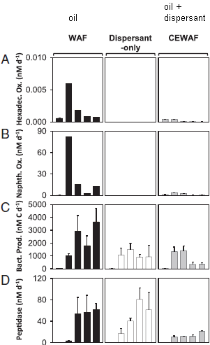
|
There are three kinds of additions to the ocean water; these are labeled across the top. The left column is for oil (they call it "WAF"), the middle column is for dispersant, and the right column is for oil + dispersant (or "CEWAF").
Each row of the table is for a particular type of measurement. The first two (rows A and B) are measurements that reflect degradation of oil. The last two (rows C and D) are measurements that reflect total bacterial growth. Each box contains five bars, which show the measurements at five time points over six weeks. (You don't see five bars? Many are "zero".) This is part of Figure 3 from the article. I have added some labeling at the top. The full figure contains more rows and one additional column; the part shown here is enough to make all the main points. |
Look at the first two rows (A and B) together. Both are intended to reflect oil degradation, and the results are qualitatively similar. In the first column, + oil, there is degradation of the oil at all time points past time zero. There is nothing in the column for + dispersant. That's fine; there is no oil present. Now look at the right-hand column, with oil + dispersant. Oil degradation is poor. There is less oil degradation with oil + dispersant than with oil alone.
Now, the last two rows (C and D). These reflect bacterial growth. It's good with oil alone or dispersant alone. It is reduced when both are added.
The primary result, then, is that use of the dispersant actually inhibits microbial degradation of the oil. In another part of the experiment, they show that the dispersant stimulates growth of bacteria that eat the dispersant. When both oil and dispersant are added, dispersant-eating bacteria grow well, but oil-eating bacteria do not.
Why the dispersant inhibits the oil-eating bacteria is not clear from this work. But the bottom line is that the effect of the dispersant is bad, at least as judged by this criterion.
In the title of the post, I posed two questions. Let's revisit them.
* Do oil dispersants work? That may depend on what you mean by work. They may disperse the oil, which was perhaps the original goal. But the new work says the dispersants may inhibit degradation -- and that's not so good.
* Is biodegradability bad? Well, that's not clear. We don't know why the dispersant inhibited oil degradation. However, one possibility is that the dispersant-eating microbes out-compete, or somehow inhibit, the oil-eating microbes. If so, then the biodegradability, in this sense, is bad.
The use of dispersants to help clean up oil spills is well-intentioned. The current article suggests that they are not working as intended. This work should lead to re-thinking the role of dispersants.
News stories:
* Study: Dispersants did not help oil degrade in BP spill. (S Borenstein, Phys.org, November 9, 2015.)
* Oil dispersants can suppress natural oil-degrading microorganisms, new study shows. (A Flurry, University of Georgia, November 9, 2015.) From the lead institution.
The story of the news stories... If you read both of the stories listed above, you will see that they are similar in many ways. That's mot a surprise; Phys.org tends to base their posts on the University news release. But what is interesting is that the Phys.org story completely misses a key point: that the dispersants stimulated growth of microbes that ate the dispersant.
The article, which is freely available: Chemical dispersants can suppress the activity of natural oil-degrading microorganisms. (S Kleindienst et al, PNAS 112:14900, December 1, 2015.) Caution... This paper is not easy to read, partly because of jargon.
Also see:
* The man who established the (US) National Academy of Sciences (February 12, 2016). A post about the journal.
* Oil in the oceans: made there by bacteria (January 3, 2016).
* A biodegradable agent for herding oil slicks (September 18, 2015). Herding agents and dispersants are different ways to deal with oil.There is more about alkanes on my page Organic/Biochemistry Internet resources in the section on Alkanes. It links to a list of some related Musings posts.
January 8, 2016
In a recent post, we introduced the idea of a flow battery [link at the end]. That is a type of battery that stores the chemicals in holding tanks, separate from the electrode area. Flow batteries are thought to be suitable for use with large scale but intermittent energy sources, such as solar or wind.
Here we have another recent article on flow batteries. The point of this article is a particular design improvement.
|
Part a (top) of the figure diagrams the new flow battery.
As with the previous flow battery, there are holding tanks on each side, and an electrode-membrane area in the middle. This figure is logically similar to the one in the previous flow battery post. However, this one is more complex, because of what is emphasized here. If you find this figure confusing, I suggest you go back to the simpler one in that previous post to get the idea. Look at the central part, with the electrodes and membrane. Among the things there are some worm-like features. These are polymer molecules. They have two important features. First, they are large. Second, they contain chemical groups that engage in the battery chemistry of oxidation and reduction. The point? Look at the membrane. It has rather large holes in it. Yet the redox-active polymer molecules cannot get through. It is fundamental to the operation that the redox materials must not cross the membrane. Usually, that requires a very expensive membrane to get holes small enough to keep the materials separate. But with redox-active large molecules (polymers), a simple inexpensive membrane is sufficient. That is, the use of redox-active polymers allows a cheaper membrane, and thus a cheaper battery. This is Figure 1 from the article. |
The authors note some problems with their system. For example, the polymer solutions are more viscous and harder to pump. They suggest that further work will yield polymers that are more suitable. Nevertheless, the article illustrates work that is going on to develop flow batteries.
If you want more chemistry... Part b of the figure (bottom) shows the chemistry of the two redox reactions. "R" shows where these structures connect to the polymers. That is shown more in part a; the structures shown in the holding tanks give an idea of the chemical structures of the polymers, incorporating the groups shown in part b. (In previous flow batteries, the redox-active materials would be small molecules similar to those shown in part b, but with very small "R".)
News story: Chemists present an innovative redox-flow battery based on organic polymers and water. (Phys.org, October 21, 2015.)
The article: An aqueous, polymer-based redox-flow battery using non-corrosive, safe, and low-cost materials. (T Janoschka et al, Nature 527:78, November 5, 2015.)
Background post on flow batteries: Flow battery (January 4, 2016).
More about flow batteries: A better membrane for vanadium-based flow batteries (March 11, 2022).
More about batteries:
* Making lithium-ion batteries more elastic (October 10, 2017).
* What happens when a lithium ion battery overheats? (February 19, 2016).More about viscosity... A better way to make chocolate, inspired by brake fluid (August 23, 2016).
There is more about energy issues on my page Internet Resources for Organic and Biochemistry under Energy resources. It includes a list of some related Musings posts.
January 5, 2016
Musings has discussed fracking in various posts; see the links at the end, which link to more.
American Scientist magazine recently ran an interview with a scientist who does fracking research. It covers a range of issues, and is very readable. The scientist addresses the public debate, but tries to emphasize scientific knowledge -- and uncertainty. (He even raises the question of how research on controversial subjects should be funded.) Those interested in the topic may find this worthwhile.
Interview, which is freely available: Hydraulic Fracturing and Water Quality -- First Person: Avner Vengosh. (American Scientist 103:312, September 2015.)
Other posts about fracking include:
* Fracking: the earthquake connection (June 19, 2015).
* Fracking: Implications for energy usage and for greenhouse gases (October 26, 2014).There is more about energy issues on my page Internet Resources for Organic and Biochemistry under Energy resources. It includes a list of some related Musings posts.
January 4, 2016
Batteries do two things. They store energy in a chemical form, and they carry out reactions to convert that stored chemical energy into electrical energy. Rechargeable batteries also carry out the reaction to convert electrical energy into stored chemical energy.
A flow battery does all that, but there is a separation between where energy is stored and where it is converted. This provides more flexibility in battery sizing. The following figure illustrates the idea of a flow battery.

|
Start with the big features: a big tank on each side. Between them are some thin vertical plates; they include electrodes and a membrane.
That's the key point. The battery contains electrodes for carrying out the reactions, and chemicals that react. But the chemicals are stored in holding tanks. The big advantage of the flow battery design is the ability to control the power and the energy independently. If you want the battery to hold more energy, you make bigger tanks. If you want to it to work faster (that's "power"), you provide more electrode. This is from the news story; it is probably the same as Figure 1A from the article. |
That figure was what caught my attention for this item. It is a good way to introduce the idea of flow batteries.
Flow batteries may find a role in storing energy from large scale intermittent energy sources, such as wind or solar. In fact, you can see those sources in the figure above, at the top. The ability to hold large amounts of energy in the holding tanks is important for that use.
If flow batteries are to become important for large scale energy storage, they must be low cost and robust. Commercialization of flow batteries is in the early stages; it's not clear that a really good solution is at hand. The current article offers some new choices for the chemistry. The authors argue that their flow battery would be lower cost and contain less toxic chemicals. We'll skip the details; the main purpose here is to present the idea of the flow battery.
News story: Alkaline flow battery charges up renewable energy storage. (M Gunther, Chemistry World (RSC), September 25, 2015.)
* News story accompanying the article: Batteries: Expanding the chemical space for redox flow batteries -- Flow batteries offer low-cost electricity storage for grid-scale renewable power sources. (M L Perry, Science 349:1452, September 25, 2015.)
* The article: Alkaline quinone flow battery. (K Lin et al, Science 349:1529, September 25, 2015.) Check Google Scholar for a preprint (manuscript-format) available from the authors.
More about flow batteries:
* A better membrane for vanadium-based flow batteries (March 11, 2022).
* A flow battery that uses polymers as the redox-active materials (January 8, 2016).Among other Musings posts on batteries, illustrating their diversity...
* A battery for bacteria: How bacteria store electrons (May 2, 2015).
* A simple way to make a supercapacitor with high energy storage? (January 6, 2014).
* Fast charging batteries (March 13, 2009).Alternatives:
* Storing energy from an intermittent source -- as compressed air under the sea (March 3, 2019).
* MOST: A novel device for storing solar energy (November 13, 2018).There is more about energy issues on my page Internet Resources for Organic and Biochemistry under Energy resources. It includes a list of some related Musings posts.
Another post about oxidation and quinones... How the rain and cars in Seattle are killing the fish (January 26, 2021).
January 3, 2016
Oil in the oceans mainly gets our attention when there is an accident. However, the presence of oil (hydrocarbons, mostly alkanes) in the ocean is normal. Why? Because microbes make them there.
A new article provides some perspective. The scientists estimate how much hydrocarbons the microbes make. They start by measuring how much selected microbes contain under laboratory conditions. Combining that with some other numbers, about how many there are and how fast they grow, the scientists estimate how much oil the microbes make in the oceans. It's a huge amount.
Despite that huge production of hydrocarbons, the amount of it in the oceans is low. That's because there are also abundant microbes that degrade the hydrocarbons, using it as fuel -- just as we use petroleum as a fuel.
That is, hydrocarbon synthesis and degradation are normal and major biological processes in the ocean. There is an important natural cycle. The following figure shows the idea...
|
The big picture is the "short term hydrocarbon cycle": photosynthesis on the left and hydrocarbon (alkane) metabolism on the right -- both carried out by marine bacteria. Are you surprised to see alkanes on a biochemical flow chart? Alkanes are not part of common metabolism. However, they are only one step away. Common fatty acids are alkanes with a single functional group attached. On the right side, you will see alkanes shown as one step from fatty acids. On the left, it's shown differently, but the idea is about the same. Alkanes are shown one step from "acyl-ACPs". ACP stands for acyl carrier protein; the acyl group is what we call that fatty acid chain when it is attached to something. That is, the acyl group on the ACP is the biochemical intermediate between alkane and fatty acid. At the bottom is some oil -- real oil (petroleum). Some seeps into the ocean from below. It can be degraded by the same hydrocarbon-degrading organisms that are part of the main (short term) cycle. This is Figure 3 from the article. |
One important consequence... The reason oil spills get degraded by microbes in the ocean is that those hydrocarbon-degrading microbes are already there, doing their natural role. They can expand their population to degrade a spill, just as they deal with a seep as shown in the figure. Of course, spills are irregular and may be large; this natural degradation may be slow, and it may help little with oil that has gotten onto the land.
More comments...
* There are large uncertainties in the analysis. It's interesting to read how the scientists made the estimate, but don't take the numbers as precise.
* The work raises questions about why bacteria make alkanes. That's not addressed in the article (but is discussed in the Commentary). Simply recognizing that they do, at a rather large scale, is the key finding.
* Making the point that oil in the oceans is natural does not minimize the importance -- and possible catastrophic consequences -- of accidents, which cause a large local disruption of the natural cycle.
It's easy to get lost in the numbers, so I have avoided them above. However, for some perspective...
The amount of hydrocarbons made by the two major groups of cyanobacteria in the oceans is somewhat more than Saudi Arabia produces (on the same time scale, e.g., annually). (That's from the commentary article by Valentine, listed below.)
The amount of oil spilled in the big BP (Deepwater Horizon) oil spill is what the ocean's bacteria make in a day. So why was the spill such a big deal? That amount of oil was in a small area, rather than over the entire ocean. Further, some got onto land; that's a distinct problem. (Source for size of BP oil spill, as about 5 million barrels, or a million tonnes: Wikipedia: Deepwater Horizon oil spill.
And if you want some numbers... Each cell of the cyanobacterium Prochlorococcus contains about half a femtogram of "oil". A femtogram is 10-15 gram. These are tiny cells, but there are a lot of them; it's a big ocean. By count, they are the most abundant organism on Earth: about 3 x 1027. Given their growth rate, that means they, collectively, make a million tonnes of oil per day.
News story: Bacteria in the world's oceans produce millions of tons of hydrocarbons each year. (Science Daily, October 5, 2015.)
* Commentary accompanying the article: Latent hydrocarbons from cyanobacteria. (D L Valentine & C M Reddy, PNAS 112:13434, November 3, 2015.)
* The article: Contribution of cyanobacterial alkane production to the ocean hydrocarbon cycle. (D J Lea-Smith et al, PNAS 112:13591, November 3, 2015.)
Posts about oil spills...
* Do oil dispersants work? Is biodegradability bad? (January 9, 2016).
* A biodegradable agent for herding oil slicks (September 18, 2015).
* BP oil spill incident: the methane hydrate crystals (May 18, 2010).A post that notes a microbe that makes fuel-type hydrocarbons: Some fun reading: Fuel cell gadget and growing diesel (December 13, 2008).
and... Making hydrocarbons -- with an enzyme that uses light energy (November 17, 2017).
A recent post that may be about cyanobacteria... A whiff of oxygen three billion years ago? (April 6, 2015).
Also see: Underwater "lost city" explained (July 25, 2016).
There is more about alkanes on my page Organic/Biochemistry Internet resources in the section on Alkanes. It links to a list of some related Musings posts.
Older items are on the page Musings: September-December 2015 (archive).
The main page for current items is Musings.
The first archive page is Musings Archive.
E-mail announcements -- information and sign-up: e-mail announcements. The list is being used only occasionally.
Contact information Site home page
Last update: July 14, 2026