Home
> Musings: Main
> Archive
> Archive for September - December 2021 (this page)
| Introduction
| e-mail announcements
| Contact
Musings: September - December 2021 (archive)
Musings is an informal newsletter mainly highlighting recent science. It is intended as both fun and instructive. Items are posted a few times each week. See the Introduction, listed below, for more information.
If you got here from a search engine... Do a simple text search of this page to find your topic. Searches for a single word (or root) are most likely to work.
Introduction (separate page).
This page:
2021 (September - December)
December 15
December 8
December 1
November 17
November 10
November 3
October 27
October 20
October 13
October 6
September 29
September 22
September 15
September 8
Also see the complete listing of Musings pages, immediately below.
All pages:
Most recent posts
2026
2025
2024
2023:
January-April
May-December
2022:
January-April
May-August
September-December
2021:
January-April
May-August
September-December: this page, see detail above
2020:
January-April
May-August
September-December
2019:
January-April
May-August
September-December
2018:
January-April
May-August
September-December
2017:
January-April
May-August
September-December
2016:
January-April
May-August
September-December
2015:
January-April
May-August
September-December
2014:
January-April
May-August
September-December
2013:
January-April
May-August
September-December
2012:
January-April
May-August
September-December
2011:
January-April
May-August
September-December
2010:
January-June
July-December
2009
2008
Links to external sites will open in a new window.
Archive items may be edited, to condense them a bit or to update links. Some links may require a subscription for full access, but I try to provide at least one useful open source for most items.
Please let me know of any broken links you find -- on my Musings pages or any of my web pages. Personal reports are often the first way I find out about such a problem.
December 15, 2021
Briefly noted... Bees that eat chicken
December 15, 2021
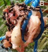
|
Vulture bees, genus Trigona.
In this picture, they are dining on raw chicken hung in a tree -- a trap intended to collect them.
We think of bees as consumers of nectar, but some will eat some meat. And a very few types, such as this one, are obligate carnivores.
This is Figure 1B from the article. The figure credit is to the lead author of the article.
|
News story: Meat-eating bees have something in common with vultures -- These insects evolved special gut bacteria to help them safely snack on rotting flesh. (Sharon Oosthoek, Science News Explores, December 8, 2021.) Links to the article, which is open access. The article is about the gut microbiome of these bees; that issue is discussed in the news story. But the picture is the main purpose here, along with the idea of carnivorous bees.
* Previous post about the microbiome of bees: Could a better gut microbiome improve memory? (December 6, 2021). Last week.
* More about vultures: Improved high altitude weather monitoring (July 18, 2016).
Kidney regeneration in small rodents
December 14, 2021
The animals of interest here are called spiny mice (Acomys cahirinus). They are rodents, but rather distinct from common mice (Mus musculus); the two lineages probably separated 25 million years ago.
It has been known that spiny mice heal skin wounds without scarring. A new article reports that they can heal serious internal damage much better than ordinary mice.
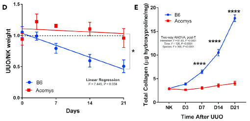
The figures below deal with two kinds of lab-inflicted kidney damage, and compare the recovery of spiny mice and common mice.
In this test, one ureter was cut.
Part D (left) compares the weights of an animal's two kidneys over time. What is plotted on the y-axis is the ratio of their weights: bad kidney relative to good one. UUO = unilateral ureter obstruction; NK = normal kidney.
The lower curve (blue) is for the common mice (labeled B6, from the strain name). You can see that the relative weight of the injured kidney declines steadily over time. In contrast, the ratio of the two kidney weights remains very near 1 for the spiny mice (labeled Acomys; upper curve, red).
Part E (right) shows the collagen in the injured kidneys over time. Collagen is a sign of fibrosis -- scarred repair of the damage. You can see that the collagen increases steadily in the B6 mice, but not at all with the spiny mice.
This is part of Figure 1 from the article.
|
In that test, two measures show that the spiny mice are better than the common mice at repairing a UUO kidney injury. However, there is no test of function with that experimental system.
In the next test, there is a different experimental injury: ischemia reperfusion injury (IRI; blood flow blocked for 40 minutes). In this case, the scientists measured recovery of kidney function. The labeling is substantially the same as above.
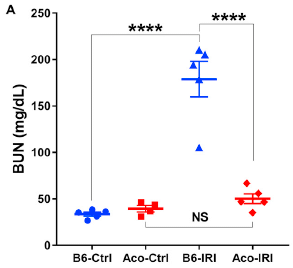
|
BUN = blood urea nitrogen. The kidneys are supposed to remove it. Low BUN is good.
The results show that three of the four data sets are low; one is high. The high set is for the common mice following the injury. That is, the injury interfered with kidney function for the common mice (Ctrl vs IRI; blue), but not for the spiny mice (red).
The measurements here were made at day 16 following the injury.
This is Figure 8A from the article.
|
So, spiny mice can not only heal skin injuries without scarring, they can recover from two types of serious kidney damage.
How do they do it? The scientists examined gene function, and found that the spiny mice have distinctive differences in how they respond. For example, more DNA repair and less inflammation. The story is preliminary, but it seems likely that they respond to injury by promptly turning on constructive regenerative responses.
Implications? Who knows. But this is good regeneration is an animal relatively close to humans -- a mammal. Further study of this system will be of interest.
News stories:
* Spiny mice regenerate damaged kidneys without scarring. (Science Daily (Cell Press), November 3, 2021.)
* These adorable mice can regenerate their kidneys without scarring. (Mihai Andrei, ZME Science, November 3, 2021.)
The article, which is open access: Spiny mice activate unique transcriptional programs after severe kidney injury regenerating organ function without fibrosis. (Daryl M Okamura et al, iScience 24:103269, November 19, 2021.)
Among posts about kidney problems...
* Is AI ready to predict imminent kidney failure? (August 24, 2019).
* WAK: Early clinical trial is encouraging (July 1, 2016).
More collagen: Repairing corneas, using modified medical-grade pig skin collagen (April 25, 2023).
There is more about stem cells and related topics, including regeneration, on my page Biotechnology in the News (BITN) for Cloning and stem cells. It includes two extensive lists of related Musings posts.
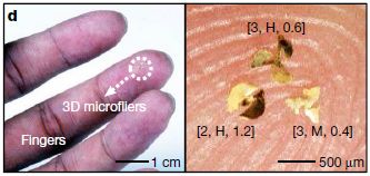
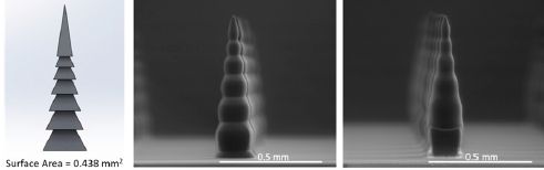
The smallest manmade flying devices
December 12, 2021
You can see some of them in the following figure, from a recent article...
Three microfliers, sitting on a fingertip.
At the left, the white arrow points to them.
At the right is a higher magnification view. Each microflier is labeled to describe the type. For example, the one at lower right is labeled [3, M, 0.4]. That means three wings, membranous wings, and an aspect ratio (height to width) of 0.4. Note the scale bar: 500 µm = 0.5 millimeter.
This is Figure 1d from the article. The next part of the full figure shows 100 of them.
|
It might be good at this point to check out one of the videos associated with the article. Here is a direct link to Supplementary Video 4 (18 seconds; no sound).
The following figure shows some data based on movies such as that one...
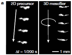
|
The two parts are for two kinds of devices. One is flat (2D; at left), one has twisted wings (3D; right), The latter spins, falls more slowly (the images shown are equally spaced in time), and follows a straighter path.
Falls? This is not powered flight.
This is Figure 3a from the article.
|
All in all, the scientists have developed an improved flying device, in part by using the twisted wings.
How did they get the idea to use twisted wings? From maple tree seeds (and such); these are tiny "propeller seeds" that are well suited for dispersal by wind. The authors built on that, and produced tiny flying devices that are even better than the seeds.
Why would one do this? The devices can be instrumented to collect and transmit data as they fly (or fall). The article gives examples. The authors refer to their devices as flying microchips.
There are various types of wind-dispersed seeds in nature. The current article explores a variety of small manmade fliers, over a range of sizes and features. The main focus of the article is aerodynamics. There is also some consideration of production methodology and applications using electronics.
News stories:
* Flying Microchips The Size Of A Sand Grain Could Be Used For Population Surveillance. (Scott Neuman, NPR, September 23, 2021.) Includes a model of a device with electronics and wings.
* Engineers create microflier, a smallest-ever human-made flying structure. (Amit Malewar, Inceptive Mind, September 23, 2021.) For the top picture there... The thing that looks like an ant? It's an ant; it is for scale. The little thing at the lower right is the microflier.
* News story accompanying the article: Engineering: Seed-inspired vehicles take flight -- Many plant seeds have shapes that aid their efficient dispersal by wind. Inspired by these seeds, a range of fliers have been constructed that could have applications from environmental monitoring to wireless communication. (E Farrell Helbling, Nature 597:480, September 23, 2021.)
* The article: Three-dimensional electronic microfliers inspired by wind-dispersed seeds. (Bong Hoon Kim et al, Nature 597:503, September 23, 2021.)
Video set posted with the article: Videos. (7 video files. One is noted above. All short, no sound.) May require subscription access.
More tiny seed-inspired fliers: Environmental sensors that can be dispersed by the wind and land upright (May 9, 2022).
More about spinning seeds:
* Gyroscopic seeds (June 15, 2018).
* Miniature helicopters -- and botany (July 6, 2009).
A recent post about a small drone with some novel flight characteristics: A mosquito-like robot (August 18, 2020).
For more about bio-inspiration, see my Biotechnology in the News (BITN) topic Bio-inspiration (biomimetics). It includes a listing of Musings posts in the area.
December 8, 2021
Briefly noted... A volcano that erupts when sea level is low
December 8, 2021
It's the Santorini volcano, on a Greek island. The geologic record, of both eruptions and sea level, allowed for an analysis over 360,000 years. The pattern was clear: 99% of the eruptions occurred at low sea level (about 40 meters lower than present). Such a correlation is not a surprise, but the quality of the analysis here is striking.
* News story: Greece's Santorini volcano erupts more when the sea level drops -- Data showing this association go back at least 360,000 years. (Maria Temming, Science News Explores, August 24, 2021.) Links to the article.
* Direct link to the article: Eruptive activity of the Santorini Volcano controlled by sea-level rise and fall. (Chris Satow et al, Nature Geoscience 14:586, August 2021.)
Could a better gut microbiome improve memory?
December 6, 2021
A new article offers evidence that it can -- in bumblebees.
Let's look at some of that evidence...
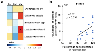
Start with part b, at the right. It shows the amount of a certain type of bacteria in the bee gut (y-axis) vs the score on a memory test (x-axis). Each point is for one bee.
There is a correlation, with r about 0.6. The correlation tests as significant.
The bacteria here are a sub-group of Lactobacillus, labeled at the top as Firm-5.
The bees are buff-tailed bumblebees, Bombus terrestris.
And the test? Briefly, bees were trained to associate certain flower colors with good or bad taste (sweet vs bitter). They were then tested a few days later to see whether they remembered.
Part a (left) puts this result in some context. The scientists did 15 such tests. The tests were various learning and memory tests (cryptically labeled at the top), with the five major types of bacteria found in the bee gut (right side). Each little square in the big box shows the correlation found for that test; see the color code at the bottom.
The two strongest correlations (positive or negative) are shown by the dark red squares in the memory test column (MM), One of those is the test with Lactobacillus Firm-5, for which the actual results are in part b.
This is part of Figure 2 from the article.
|
If you want to quibble about the quality of the data in part b... Let's just take it as a hypothesis that the result is biologically meaningful, and build on it with further experiments.
For example... If the test above suggests that a higher frequency of Lactobacillus Firm-5 bacteria promotes memory, what if we added more of those bacteria to the bee gut (via their food)? Here are the results from such a test...
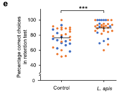
|
The graph shows the results of the memory test (y-axis) for two groups of bees: controls (left) and bees given extra Lactobacillus apis. That species is one of the Lactobacillus Firm-5 group.
The bees given extra Lactobacillus apis did better.
|
The horizontal lines in the two sets are the means. Giving the bees Lactobacillus apis raised their mean score. However, we should note that the mean is not a good statistic here. There is a maximum possible score on the test, and many bees got it, in the test group. That suppresses the possible mean score. It would be better to use the median, which is not affected by such a barrier. Ii is clear that the improvement would appear larger if judged by the medians.
The two colors are for bees from two different colonies. The results seem the same for both.
This is another part of Figure 2 from the article.
|
Why do the Lactobacillus apis promote memory? The scientists have at least a partial explanation. Analysis of the bees showed that the level of a particular lipid in the haemolymph (the insect equivalent of blood) was increased by the bacteria that promoted memory. This led to a direct test of the effect of that chemical on memory; it worked.
What are the implications for other organisms? The details must be tested for each case, but the work provides an example of how the chemistry of the gut microbiome can affect brain activities.
News stories:
* Scientists Discover Gut Bacteria in Bees That Can Improve Memory. (SciTechDaily (Queen Mary University of London), November 25, 2021.)
* Study: Gut Bacteria Improve Long-Term Memory in Bumblebees. (Sci.News, November 25, 2021.)
The article, which is open access: Gut microbiome drives individual memory variation in bumblebees. (Li Li et al, Nature Communications 12:6588, November 25, 2021.)
More about the bee microbiome:
* Briefly noted... Bees that eat chicken (December 15, 2021).
* Glyphosate and the gut microbiome of bees (October 16, 2018).
Another post about a connection between the gut microbiome and brain, in mammals: Possible role of gut bacteria in Parkinson's disease? (March 17, 2017). Links to more.
More about microbiomes:
* Triclosan: an explanation for its gut toxicity (January 30, 2022).
* Treating malnutrition by improving the gut microbiome (May 29, 2021).
A recent post about bees: How to get bees to make better venom (September 20, 2021).
My page for Biotechnology in the News (BITN) -- Other topics includes a section on Brain. It includes a list of brain-related posts.
Treating epilepsy with Mozart
December 4, 2021
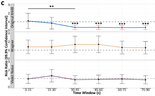
The following figure shows the effect of playing a Mozart sonata on brain activity associated with epileptic events...
The three graphs are for three different sound sources. For each, the y-axis shows the relative frequency of the relevant brain events. The x-axis is for the "treatment" time: exposure to the sound.
The top graph is for a recording of the Mozart sonata. The number of events decreases over time. After a half-minute of exposure, the effect is maximal, with about a 60% reduction.
The other two graphs are for other sounds; they show no benefit. (One is music from Wagner's Lohengrin. The other is "purple noise". Purple noise is random noise, something like white noise, but enriched for higher frequencies.
The Mozart music used here is the Sonata for Two Pianos in D major, K 448.
This is Figure 3C from the article.
|
Taken at face value, the figure suggests that this Mozart music reduces the frequency of brain events associated with epilepsy.
Claims of one or another benefit of listening to Mozart -- a "Mozart effect" -- have been around for many years. In general, the claims have not been reproducible. The K448 Sonata is central to many of the claims.
There is an important technical advance here. The measurements were done on people who had electrodes implanted in the brain. (They were people with severe epilepsy, not responding to common medication.) Thus the scientists here had better access to brain activity than in previous work.
There is some work in the article trying to dissect out what the important features of the music might be. They are largely based on electronic analysis and modification. The scientists suggest a role for transitions within the music, where the beneficial effect comes from the unexpected. They also suggest that the response is innate, not related to personal musical preferences.
Comment... Since it takes only a half minute of the music to achieve maximal effect, I would think it would be straightforward for a pianist (for example) to dissect out musical features, which could then be tested using their improved experimental system.
The work is intriguing; hopefully it gets good follow-up. In the meantime, we can all can enjoy the sonata; a link to it is below.
News stories:
* Dartmouth Researchers Examine the Mozart K448 Effect in Epilepsy. (Susan Green, Geisel School of Medicine, Dartmouth, September 16, 2021.) (Yes, the medical school at Dartmouth really is named after Dr Seuss -- an alum of the college and long-time donor.)
* New study revives a Mozart sonata as a potential epilepsy therapy. (Elizabeth Cooney, STAT, September 16, 2021.) Includes an interview with the lead author, Robert Quon.
The article, which is open access: Musical components important for the Mozart K448 effect in epilepsy. (Robert J Quon et al, Scientific Reports 11:16490, September 16, 2021.)
For a video of a live performance of the Mozart Sonata: video at YouTube. Martha Argerich and Daniel Barenboim. (25 minutes.)
A recent post about epilepsy: Briefly noted... An unusual sex-linkage effect. (June 2, 2021).
My page for Biotechnology in the News (BITN) -- Other topics includes a section on Brain. It includes a list of brain-related posts.
Other Musings posts about Mozart...
* There is Mozart in the air -- encoded in orbital angular momentum (April 25, 2015).
* Lux aeterna: Mushrooms; Mozart (December 7, 2009)
My page Internet resources: Miscellaneous includes a section on Art & Music. There is a list of numerous Musings posts on those subjects.
December 1, 2021
Briefly noted... CO2 shortage
December 1, 2021
It's a fun story, and instructive.
* News story: CO2 shortage: why a chemical problem could mean more empty shelves. (Mark Lorch (Professor of Science Communication and Chemistry, University of Hull), Conversation, September 20, 2021.)
A gene that promotes susceptibility of people to a certain bird influenza virus
November 29, 2021
H7N9 is a type of influenza virus. It is common in birds, and is occasionally transmitted to humans. It causes severe disease in humans, but sustained transmission between people has not been seen. H7N9 seems a potentially serious situation, which is not understood.
A recent article offers a clue as to what is happening in people for this virus.
The question posed was: Are there genetic differences that make some people susceptible to H7N9 flu? The authors sequenced the genomes of about 200 people with H7N9 flu, and compared those sequences with those of the general population. Indeed, they found a candidate gene, which they then validated.
The following table summarizes the genetic finding...
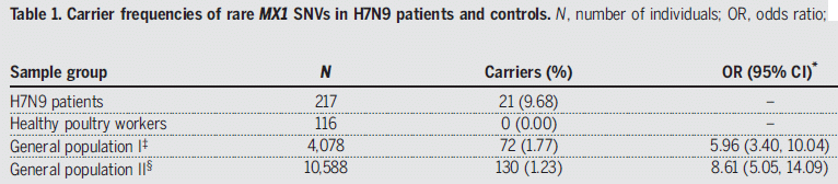
The table shows the frequency of mutations in a gene called MX1 in four groups of people.
The first group consists of about 200 people with H7N9 flu. Over 9% of them carried a mutation in the MX1 gene.
The last two rows are for the general population, using data from two databases. In both cases, the frequency of MX1 mutations was less than 2%. The right-hand column shows the OR (odds ratio): the frequency of such mutations in H7N9 patients relative to the general population. The numbers in parentheses show the 95% confidence interval, taking into account the sample sizes. It is clear that H7N9 patients have an increased frequency of such mutations.
The remaining group (2nd row) is another control: healthy poultry workers. No such mutations. The sample size is small, so there is no OR. But if the healthy poultry workers had shown the mutations at the same frequency as those with H7N9 flu, it might have implicated exposure to birds as an issue.
SNV (in the title) = single-nucleotide variants.
This is most of Table 1 from the article.
|
The table provides evidence for an association between mutations in the MX1 gene and having H7N9 flu. Whatever the statistics, such an association is only a lead. The scientists go on to directly test the role of that gene in such infections.
The MX1 gene is well known; it is associated with resistance to other viruses. It affects flu viruses in mice. What is new here is finding an association between MX1 and a specific type of flu, one that is of concern.
The following figure shows its effect on H7N9 infections...
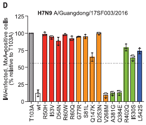
|
The test uses lab cultures of human cells with various forms of the MX1 gene. The cells were infected with H7N9 virus, and the frequency of infected cells measured.
The bars are for various forms of the MX1 gene. The bar height shows the frequency of infected cells (normalized; see below). The first two bars are for controls: a mutant MX1 gene known from previous work to eliminate its function, and the wild type. They are called T103A and wt, respectively. The result for T103A was set to 100%.
You can see that the wild type MX1 gene substantially reduced the frequency of infected cells. This is consistent with the general idea that the wild type gene promotes viral resistance.
|
The other bars are for 15 of the MX1 mutations found in people infected with H7N9 flu. You can see that most of those mutations (12 of the 15) promoted viral infection.
Bar colors are for the domains of the protein from the MX1 gene. (The protein is called MxA.) We simply note that mutations of interest were found in all domains of the protein.)
The title of the graph shows the name of the virus strain.
This is the main part of Figure 1D from the article.
|
The figure shows that MX1 mutations found in people with H7N9 flu promote infection of human cells by that virus. In other words, those mutations increase susceptibility to H7N9 flu.
The scientists did a follow-up test, with cells that were heterozygous: one copy of a mutant allele and one copy of the wild type allele. The general picture was the same as above. That is, carrying one copy of a mutant allele was enough to allow viral infection. (In genetic terms, we say that the mutations are dominant negative. The negative allele, which eliminates function, is dominant. How can that happen? In this case, the active form of the protein is a complex of multiple copies; it is likely that one bad copy prevents proper function of the complex.)
The general conclusion is that some people, with one mutant copy of the MX1 gene, are more susceptible to infection with the H7N9 flu. We also note that most of those infected with H7N9 flu did not show MX1 mutations. MX1 is one part of the story of how H7N9 gets to humans.
News story: Rare variants in the MX1 gene increase susceptibility to zoonotic H7N9 avian influenza. (AZoLifeSciences, August 23, 2021.)
The article: Rare variant MX1 alleles increase human susceptibility to zoonotic H7N9 influenza virus. (Yongkun Chen et al, Science 373:918, August 20, 2021.)
Posts on flu are listed on the supplementary page Musings: Influenza.
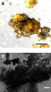
Microbes that make elemental carbon
November 27, 2021
Complete combustion of things containing carbon leads to carbon dioxide. However, if the oxidizing agent, such as O2, is in short supply, we may get incomplete combustion. That can give various products, such as carbon monoxide or even soot, which is basically pure C.
Look at part D (bottom) of the following figure, which is from a recent article...
|
Soot.
Part B (top) shows a similar scene, but before breaking open the cells.
Scale bars: 200 micrometers (top), 10 µm (bottom; about 10-fold higher magnification). These are light microscope images.
This is part of Figure 1 from the article.
|
Cells? Microbes. Trying to oxidize methane -- and not doing very well. They are making pure C -- soot -- apparently due to their incomplete oxidation of the methane.
It's a novel finding.
It is also complex. The "microbes" are a consortium, including archaea that can oxidize methane and sulfate-reducing bacteria that are doing the oxidation. There is no O2. Such anaerobic oxidation of methane was discovered a few years ago, and is still only partially understood.
A simple view of the current finding is that it is an incomplete oxidation, with some C being oxidized only to C(0) -- elemental carbon. Whether this is a well-defined step or just an accident is not clear at this point.
Characterization of the microbial C shows that most of it is amorphous carbon, loosely soot. Some is similar to graphite.
The microbes studied here were isolated from deep ocean sediments, highly anaerobic. Production of C was observed in lab work. It is not known if they produce C in nature.
The authors also provide evidence for the production of elemental C by methanogens -- microbes reducing CO2 to methane. We should note that the anaerobic oxidation of methane and the production of methane follow the same biochemical pathway, operating in opposite directions.
Elemental C, of course, has oxidation number (ON) = 0. But the ON alone is not the issue here. Sugars, with the general formula (CH2O)n, also have C at ON = 0. What is novel here is making elemental C -- biologically.
News stories:
* Discovery of first carbon-producing microbes presents biochemical mystery. (Frances Addison, Chemistry World, November 10, 2021.)
* Microorganisms produce elemental carbon -- Purely biological: Researchers identify a new kind of pure carbon production by microorganisms. (Science Daily (MARUM - Center for Marine Environmental Sciences, University of Bremen), October 27, 2021.)
The article, which is open access: Biogenic formation of amorphous carbon by anaerobic methanotrophs and select methanogens. (Kylie D Allen et al, Science Advances 7:eabg9739, October 27, 2021.)
More sulfate-reducing bacteria -- often associated with the limits of life:
* Life on 10 zeptowatts (September 13, 2020).
* Nuclear-powered bacteria: suitable for Europa? (March 27, 2018).
A post about the anaerobic oxidation of methane -- in this case, using O2: The miracle of Methylomirabilis (May 10, 2010).
More soot: Y-Y: the first (May 5, 2019).
November 17, 2021
Briefly noted... Photosynthesis on Venus?
November 17, 2021
Ideas about the possibility of life on Venus continue to develop. We now have an article that argues for the possibility of Earth-like photosynthesis in the clouds of Venus. There is good light, and the UV level is reasonable. (There may even be photosynthesis at night, based on thermal radiation.) What about other conditions needed for life? The scientists address a recent article about the low water content in the Venusian clouds; that article was discussed in the Musings post listed below. They offer an alternative interpretation of the data, which allows for both water content and acidity within the ranges known for Earth-life. Alternative interpretation? That's the name of the game with Venus. What we need is better data. And that is the authors' point here. They argue that the questions are still open, and missions to get better data for Venus should be on the table. In the meantime, such articles may be fun to read.
* News story: Photosynthesis in Venus' atmosphere? (Paul Scott Anderson, EarthSky, October 11, 2021.) Links to the article, which is open access.
* Previous post about life on Venus: Is there enough water in the clouds of Venus to support life? How about Jupiter? (August 7, 2021).
* More: Briefly noted... Does ammonia neutralize some of the sulfuric acid in the atmosphere of Venus, allowing life? (January 6, 2022).
An antibody to protect against getting malaria?
November 15, 2021
Vaccines stimulate the production of antibodies. Why don't we just give people antibodies in the first place? Sometimes we do, but they don't last very long, and are often expensive (especially modern monoclonal antibodies). They are best used for special cases, where an immediate dose of antibody is called for.
A recent article reports results from a small early-stage clinical trial providing evidence for a prophylactic antibody with long-lasting effect.
The work here used a monoclonal antibody against the malaria parasite.
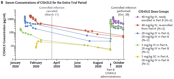
The first figure gives a sense of what was done...
In the first months, people were recruited into the trial, and given the antibody at various dosage levels. The details are shown at the right, but don't matter much for us here. (Most treatments were IV = intravenous. The last one listed was SC = subcutaneous.)
The figure shows antibody levels over time in individuals given various antibody regimens.
The big picture is that antibody levels declined over the months, but were still significant even after several months. (Half-life of the antibody was about 56 days.) Remember, these antibody levels came solely from the antibody injection; the body cannot make more. The rise in September was due to a second injection, for some individuals.
We'll come back to the vertical lines in a moment.
This is Figure 2B from the article.
|
Are those antibodies useful?
In October, at the time shown by the right-hand vertical line above, individuals were given a malaria challenge. The following figure shows how they responded...
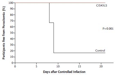
|
The presence of parasites in the blood was measured by PCR. The y-axis shows the percentage of individuals free of parasites.
The lower (black) curve is for the control individuals, who had not received antibody. Most became infected at about day 9, as expected.
The upper (red) curve is for people who had received antibody. None became infected, even over 21 days.
|
The numbers here are small: six people in the control group, nine people who had received antibody. Most of those had received a second dose of antibody, but two had received only the initial dose, in January.
How do you challenge with malaria? Five qualifying bites from infected mosquitoes.
The first vertical line in the top figure, in March? A planned challenge with the parasite; the plan was canceled due to COVID restrictions.
This is Figure 4 from the article.
|
The antibody was developed with two goals in mind. First, it targets a region of the parasite that is highly conserved. Second, it was modified to have a long life in the body.
The stability of this antibody in the body is unusually good. The infection results at least hint that it provides protection against malaria infection for nine months.
No safety concerns came up during the trial.
A phase II trial is in progress.
News stories:
* Monoclonal antibody may prevent malaria. (Science Daily (NIH), August 11, 2021.) (June 2023... This is a replacement for a story that is no longer available.)
* Monoclonal Antibody Prevents Malaria in First-in-Human Clinical Trial. (GEN, August 12, 2021.)
The article: A Monoclonal Antibody for Malaria Prevention. (M R Gaudinski et al, New England Journal of Medicine 385:803, August 26, 2021.)
There is a section of my page Biotechnology in the News (BITN) -- Other topics on Malaria. It includes a list of related Musings posts.
Fidelity of protein synthesis: a factor in aging?
November 13, 2021
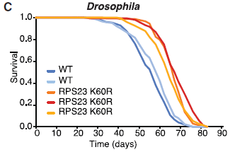
A new article offers some fascinating -- and provocative -- results, with possible implications for aging. Here is a sampling of the results...
|
The purpose of this test is to measure the accuracy of protein synthesis.
The specific test measures readthrough at a stop codon. If readthrough occurs, a longer protein is made; its amount is measured, and plotted on the y-axis.
There are two strains here -- strains of the common lab fruit fly, Drosophila melanogaster. For now, we will just call them wild type (WT; blue bars) and mutant (orange bars). There are two conditions: young and old flies.
|
Major observations:
- For wild type flies, the error rate (readthrough) is much higher in old flies.
- For old flies, with a high error rate for wild type, the mutant flies show a quite low error rate.
This is Figure 1E from the article.
|
Results such as those show that the mutation reduces the error rate in protein synthesis, at least for this type of error.
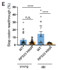
So? Well, look at the next figure...
This figure shows the survival curves for five batches of flies.
The three curves to the right (red-orange) are independent constructs of the mutant strain used above.
The two curves to the left (blues) are for two lab batches of the wild type flies.
Key observation: The mutant flies live longer.
This is Figure 3C from the article.
|
|
Overall, a mutant strain shows both increased fidelity of protein synthesis and longer lifespan.
The same mutation was tested in two other organisms: a yeast, Schizosaccharomyces pombe, and a worm, Caenorhabditis elegans. Similar results were obtained for those, too.
What is this mutation? It is called RPS23 K60R. The first part of that identifies the protein: it is protein 23 in the small ribosomal subunit. K60R means that the K (lysine) at position 60 has been replaced by R (arginine). That position is known to be part of the "accuracy center" of the ribosome.
Why did the scientists choose to test this particular mutation? An analysis of extensive genome databases showed that most organisms have K at this position. The exceptions were several archaea, all hyperthermophiles. A hint, perhaps? A rare gene change associated with a stress that probably affects the accuracy of protein synthesis. Maybe it would improve the accuracy in other organisms, too? Worth testing.
What is the significance of the finding? One important point is that they have not done any testing in any mammal, much less in humans. Whether anything here carries over to humans is speculation at this point. Further, be sure to distinguish questions such as...
- Can one improve the accuracy of translation?
- Are there beneficial effects of doing so?
- Are there detrimental effects of doing so? In fact, the scientists here observed detrimental effects, indicating that this is a complex problem.
The article also contains some work on drugs that improve the accuracy of protein synthesis.
News stories:
* Scientists Demonstrate Direct Link between Reducing Errors in Protein Production and Lifespan. (GEN, September 15, 2021.)
* Getting Proteins Right to Live Longer -- The accuracy of protein synthesis appears to be a critical part of lifespan in model organisms. (Sedeer el-Showk, Lifespan Extension Advocacy Foundation, September 23, 2021.)
The article, which is open access: Increased fidelity of protein synthesis extends lifespan. (Victoria Eugenia Martinez-Miguel et al, Cell Metabolism 33:2288, November 2, 2021.)
A post about aging in flies: Briefly noted... How flies protect their aging brains (January 6, 2021).
... and in worms: Extending lifespan by dietary restriction: can we fake it? (August 10, 2016). Links to more.
There is a BITN section for Aging. It includes a list of Musings posts in the field.
November 10, 2021
Briefly noted... An mRNA vaccine against COVID-19 that didn't work well -- why?
November 10, 2021
Last week we noted a news feature on the history of mRNA vaccines. One of the mysteries along the way is the CureVac COVID vaccine. It "failed", at least in comparison with other COVID vaccines. Why is not clear. The following item is a brief overview; it discusses possible reasons for the poor performance of this mRNA vaccine.
* News story: CureVac COVID vaccine let-down spotlights mRNA design challenges -- Scientists are searching for explanations to disappointing final-stage trial results. These insights could help guide the future development of mRNA vaccines. (Elie Dolgin, Nature, June 18, 2021. In print, with a different title: Nature 594:483, June 24, 2021.)
* Background post: Briefly noted... mRNA vaccine history (November 3, 2021).
* There is a BITN section for SARS, MERS (coronaviruses). It includes a list of Musings posts in the field.
Briefly noted... A non-invasive test for concussion
November 9, 2021
Musings has discussed head injuries in sports in several posts. Diagnosis is an issue. A team of scientists now reports a test based on a simple saliva sample. The current version requires that the saliva sample be sent to a lab for PCR, but even simpler versions are in development. The test is based on a correlation between certain molecules found in the saliva with clinical concussion. Why the molecules are there is not clear; for now, they are just "biomarkers". The test is not as good as the best clinical evaluation, but it is very good -- and should be practical at the school and community levels. The test was developed for rugby players, but presumably it would work for athletes in other sports; a new name for the test might be needed.
* News story: Distinct chemical 'signatures' for concussion identified in spit of elite rugby players. (Medical Xpress (University of Birmingham), March 24, 2021.) Links to the article, which is open access. The news story includes the rugby-related acronym for the name of the test.
* A recent post about concussions: Briefly noted... Concussions in women athletes (August 18, 2021).
* My page for Biotechnology in the News (BITN) -- Other topics includes a section on Brain. It includes a list of brain-related posts.
There is now an extensive list of sports-related Musings posts on my page Internet resources: Miscellaneous under Sports.
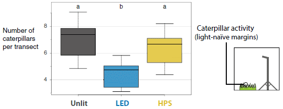
What happens to capillary blood flow in the brain during sleep -- and why?
November 8, 2021
A recent article makes some interesting observations about blood flow in the brain during sleep.
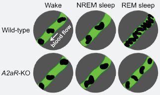
The following cartoon figure summarizes some of the main findings...
|
The green tube-like structure is a capillary, in the brain of a mouse. The dark things in it are red blood cells (RBC). The number of RBC shown reflects the blood flow through the capillary.
There are six conditions, labeled at the top and left side. The three columns are for two stages of sleep -- non-REM and REM. There is an awake control at the left. The two rows are for wild-type mice and a particular type of mutant mice.
|
The big picture: Most of the results are similar (with 2-4 RBC shown here). The blood flow increases significantly during REM sleep. And that increase is much less in the mutant mice.
We'll leave open whether any of the other differences are significant.
This is the top part of the graphical abstract from the article.
|
How do you do that? You just watch the blood flow. Look through a window in the mouse's head, using a microscope. If you don't remember how to do that, see the background post [link at the end].
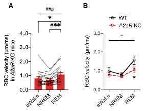
Some specifics, some data? The data are actually rather messy; here is an example...
Start with part B (right side). It is laid out like the first figure, and summarizes real data for the two strains and three conditions. There is a substantial increase in RBC velocity in the wild-type mice, much less of an increase in the mutant mice.
Part A (left) shows data for individual RBC in the mutant mice (I think; it is not entirely clear). They vary -- a lot. The red bars summarize the results for each condition. (Figure 2A in the article shows such data for the wild type mice.)
The RBC velocity is literally just that, the speed at which an individual RBC is observed to move, in micrometers per millisecond. There are other measures of blood flow.
This is part of Figure 4 from the article.
|
|
The article discusses previous work on blood flow in the brain, in both mice and humans. It is not all consistent, and it remains to be seen what the "best answer" is. Of particular importance is the current finding of a specific gene that is involved in determining blood flow.
What is that gene? It is for an adenosine receptor. The label A2aR-KO means a knockout of the adenosine 2a receptor. The finding may suggest that adenosine modulates sleep quality. And it might suggest a drug target for treating sleep problems.
The "why" in the title of this post refers to this finding, about the role of an adenosine receptor.
I think it is best for now to just present some pieces of this story, and not spend too much time analyzing it. It's difficult work, even with a window in the head. But it potentially offers increased understanding of sleep.
News stories:
* Your brain is cleaning itself while you're dreaming, new research suggests. (Alexandru Micu, ZME Science, August 31, 2021.)
* Brain refreshing: Why the dreaming phase matters. (Science Daily (University of Tsukuba), August 25, 2021.)
The article, which is open access: Cerebral capillary blood flow upsurge during REM sleep is mediated by A2a receptors. (Chia-Jung Tsai et al, Cell Reports 36:109558, August 17, 2021.)
Background post, on the viewing system: A microscope small enough that a mouse can wear it on its head (November 12, 2011).
An earlier post about fluid flows in the brain: Sleep and the brain drain (November 17, 2013). There has been a lot of follow-up work on this, including in humans. The connection to the current work is unclear. Again, we can think of all this as the beginnings of what must be some interesting stuff about cleaning the brain, role of sleep, and so forth.
A post about adenosine in the nervous system: How acupuncture works: another clue (September 2, 2010). Links to more, including the caffeine connection.
More about sleep:
* Evidence for a REM stage of "sleep" in spiders? (October 11, 2022).
* Sleep genes and Alzheimer's disease? (May 28, 2022).
My page for Biotechnology in the News (BITN) -- Other topics includes a section on Brain. It includes a list of brain-related posts.
A novel sensor for infectious viruses, using nanopores lined with aptamers
November 6, 2021
There are various methods used to detect and/or measure virus in a sample. All methods have limitations. One important limitation is that most methods cannot distinguish whether a virus is infectious or not. One can directly measure that, but it is often slow, taking several days.
A new article addresses the issue.
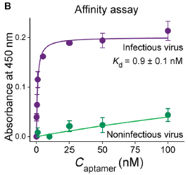
The following figure shows the basis of the method...
|
For now, let's just call the detection tool "aptamer"; we'll explain it later.
There are two virus samples. One is the original infectious virus, and one has been inactivated, using chlorine.
The binding of the aptamer to each virus sample was measured. The graph shows binding (y-axis) vs concentration of aptamer (x-axis).
The results show that binding of the aptamer to the infectious virus is very good (upper curve); binding to the inactivated ("noninfectious") virus is not good (lower curve).
|
The labeling says that Kd is about 1 nanomolar. (It is so low that you can't really read it off this graph, but that looks reasonable.) That is the concentration needed to bind 50% of the virus. The binding curve for the inactivated virus never gets to 50%, even at 100 nM aptamer. That is, the binding is at least 100-fold weaker for the inactivated virus.
Kd is the dissociation constant for the aptamer-virus pair. We sometimes loosely call it the binding constant, but it is calculated for the other direction, dissociation. The lower it is, the stronger the binding.
This is Figure 1B from the article.
|
That is, they have an agent, the "aptamer", that preferentially binds to infectious virus. That phenomenon is the basis of the assay for infectious virus.
What is an aptamer, and how did the scientists get one with this property?
In this case, the aptamer is a piece of single-stranded DNA. Like any polymer, a piece of DNA may fold up into a specific 3D shape. We don't normally think of DNA that way, but an aptamer is a piece of DNA developed to have precisely that property. The DNA aptamer used here was developed to distinguish infectious and noninfectious viruses, by binding only to the former. (Aptamers can be made of various biological polymers. The one here is DNA, so we will stick to that for simplicity. What is important is its recognition ability -- or specificity.)
How did they get this special aptamer? Well, they just made a large pool of DNA molecules, and then pulled out the one they wanted. That is logically fairly easy: just expose the DNA pool to the infectious viruses, and take the DNA molecules that bind. Now expose those DNA molecules to inactivated viruses, and discard the ones that bind. Repeat, to improve the separation.
The general method for getting good aptamers is called SELEX = systematic evolution of ligands by exponential enrichment. The method was developed three decades ago. Most DNA molecules don't fold into a well-defined shape, and most that do fold don't have the right shape. SELEX is a powerful tool for finding a rare useful aptamer needle in a large DNA haystack. The DNA pool used contained over 1014 DNA sequences. (If you want more on such aptamers or the methods used to gets them, check out the Wikipedia page for aptamer,)
Now what?
The next step is to develop a practical assay format. They use membrane filters, with nanopores. They line the pores with the aptamers. In effect, infectious virus is held on the filter.
The following figure shows some results...
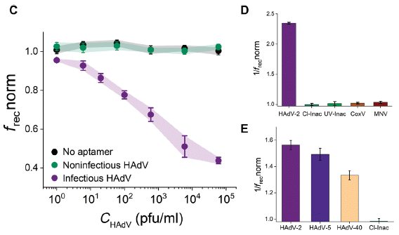
Part C (left) shows the main result. Retention of virus on the filter was measured. The purple curve is for infectious virus (in this case, a human adenovirus). You can see there was a response as the virus concentration (x-axis) increased. The response is shown on the y-axis as a cryptic frecnorm.
There are also two control curves. One is for inactivated virus. The other is for infectious virus retained on a membrane lacking the aptamers. Neither showed a response; good.
Parts D & E (right) provide some information on the specificity. In these graphs, 1/f is plotted on the y-axis; higher is better.
In D, the first bar is the response to the infectious virus. The next two bars are the responses to two types of inactivated viruses. One is inactivated with chlorine, one with ultraviolet light. In both cases, inactivation of the virus led to loss of binding to the aptamer. (Remember, the aptamer was developed using virus inactivated with chlorine.) The final two bars are for two unrelated viruses (coxsackievirus B5 (CoxV) and murine norovirus (MNV)); lack of response shows that the assay is specific for adenovirus, as expected from how the aptamer was developed.
Part E also shows the response to two other strains of adenovirus. These related viruses showed a partial response.
What is frecnorm? That stands for normalized rectification efficiency. Suffice it to say that it is a measure of virus collected on the filter. Let's leave it at that.
This is part of Figure 2 from the article.
|
The article also contains some work on the SARS-2 virus, the causal agent of COVID-19.
One aspect of the work is a bit mysterious... How does the aptamer, binding to the outside of the virus particle ("virion") know whether the virus is infectious or inactivated? The inactivation techniques affect the surface -- enough to reduce binding to the aptamer. That may be, but it is not obvious that an aptamer chosen to discriminate against one kind of inactivation would discriminate against another kind of inactivation.
The results shown above, in part D, for chlorine- and UV-inactivated viruses show that the cross-discrimination they claim works in this case.
However, I think it would be good to make the distinction... The method here does not know whether the virus is infectious. It detects certain surface properties. It seems likely that it would detect some kinds of inactive virus particles. It might even fail to detect some infectious particles. The work in part E above with the various adenovirus strains is relevant here; some mutant strains might not be detected, and of course, surface decorations could matter. Surface and infectiousness are related, but not equivalent, in general.
Despite my reservation on that point, this seems a useful approach. The authors suggest, as an example, it would be useful in testing the effectiveness of inactivation of samples with chlorine. In such a case, one is dealing with a specific inactivation, and can test the system. The generality remains to be seen.
Importantly, the test is fast and simple. And it addresses the issue of distinguishing infectious virus, even if there are limitations.
News stories:
* DNA sensor quickly determines whether viruses are infectious. (Liz Ahlberg Touchstone, University of Illinois, September 22, 2021.)
* New sensor for SARS-CoV-2 and other viruses based on single-nanopore membranes. (Nanowerk News (GSI Helmholtzzentrum für Schwerionenforschung), October 8, 2021.)
The article, which is open access: Direct detection of human adenovirus or SARS-CoV-2 with ability to inform infectivity using DNA aptamer-nanopore sensors. (Ana S Peinetti et al, Science Advances 7:eabh2848, September 22, 2021.)
A recent post on virus detection: Can you detect the SARS-2 virus with your phone? (March 2, 2021). It is actually a test for viral RNA. We also note that the authors of the new work suggest that their assay could be interfaced to a smartphone.
Another post about membranes with nanopores: Nanopore sequencing of DNA using synthetic membranes (May 15, 2021). Except for the term, there is no connection with the current work.
More from GSI, one of the research centers for the current work: Element #112: Copernicium (July 15, 2009). What is a center for Schwerionenforschung (heavy ion research) doing here? They use ion beams to make the nanopores in the membranes.
There is a BITN section for SARS, MERS (coronaviruses). It includes a list of Musings posts in the field.
November 3, 2021
Briefly noted... mRNA vaccine history
November 3, 2021
The COVID vaccines were developed fast! Among the reasons...
- mRNA vaccine technology had been under development for many years.
- The virus was from a family that had already gotten attention. The 2 in its name (SARS-CoV-2) is a clue. Note this applies to all types of vaccines, not just mRNA vaccines.
- There have been many advances in molecular biology over recent decades. Genome sequencing and CRISPR are just a couple of note.
If you would like a nice overview of mRNA vaccine history...
* News feature: The tangled history of mRNA vaccines -- Hundreds of scientists had worked on mRNA vaccines for decades before the coronavirus pandemic brought a breakthrough. (Elie Dolgin, Nature, September 14, 2021. In print: Nature 597:318, September 16, 2021.) Includes a timeline.
* I have listed this item on my BITN - Other topics page for both SARS, MERS (coronaviruses) and Vaccines (general). Both sections include a list of related Musings posts.
* A new development... Naked mRNA vaccines (without the lipid coat)?
* Also see: Briefly noted... An mRNA vaccine against COVID-19 that didn't work well -- why? (November 10, 2021).
Update added October 5, 2023.
* And now... News story: The Nobel Prize in Physiology or Medicine 2023. (Nobel press release, October 2, 2023.)
Briefly noted... An old crab
November 2, 2021
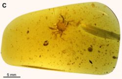
|
There it is. (In the middle, toward the top, just in case you missed it.) It is a Cretapsara athanata.
The yellowish stuff? A piece of amber. About 99 million years old.
The crab is substantially intact. (One leg is broken off, but is next to the body.)
It is a remarkable find.
|
News story: 99-Million-Year-Old Modern-Looking Crab Found in Burmese Amber. (Sci.News, October 21, 2021.) Links to the article, which is open access. The figure above is from the news story; it appears to be Figure 1C from the article.
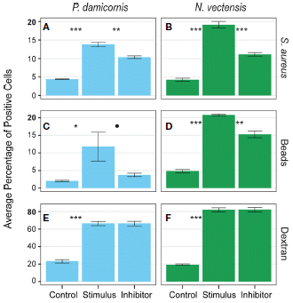
The immune response of cnidarians (e.g., corals)
November 1, 2021
How do simple animals, such as corals and sea anemones, defend themselves against pathogens? They just eat them.
A recent article describes some aspects of the process.
The following figure shows some of the results. Let's look, with little explanation or interpretation the first time through...
|
Start with part A (upper left). It is a test with the coral Pocillopora damicornis, challenged by some particles. In this case, the particles were dead bacterial cells (Staphylococcus aureus). See the organism and challenge labels at the top and far right, respectively.
There are three bars (labeled at the bottom). The first is a control: no challenge. For the second, the "stimulus" particles were added. That resulted in an increased response. For the third bar, an inhibitor was added; that reduced the response.
Part B (upper right) is the same kind of test, but with a different organism. The test organism here is the sea anemone Nematostella vectensis. Both corals and sea anemones are cnidarians (along with the jellyfish). The results were qualitatively similar for the sea anemone.
|
The second row (C & D) is a similar set of tests, except that the challenge was small beads. The results were qualitatively similar to those of the first row.
The bottom row (E & F) is similar, too, except for one important difference. The challenge here was with a polymer (dextran); it is a large molecule, but soluble and much smaller than the cell-sized challenges of the first two rows. The challenge stimulated a response, but the inhibitor had no effect. There is something different about the response to the soluble material. (Also... the response was greater than for the big particles; look at the numbers on the y-axis scales. Again, this is a different type of response.)
Bar heights show uptake of the challenge agent by phagocytic cells, as measured by fluorescence.
This is part of Figure 4 from the article.
|
The big picture is that a variety of stimulants were taken up. But the inhibitor test shows that the big-particle stimulants and the small stimulant behaved differently.
The inhibitor interferes with actin-based filaments. With this clue (and more evidence in the article), the interpretation is that the big particles are taken up by phagocytes (cells that eat things). But the small soluble stimulant is not taken up by that process.
I used the term "qualitatively similar" in comparing sets of results above. This reflects the statistical tests, indicated by asterisks; the more *, the higher the significance. In each graph, the stimulus bar was significantly higher than the control bar. For all tests in the first two rows, results with inhibitor were significantly lower than for the stimulus alone. For the third row, the inhibitor result was not significantly different. We are not concerned with the magnitude of the effects.
What happens to the particles that are phagocytosed? They are delivered to lysosomes, where they are degraded.
The work is a step toward understanding the health of these simple animals. Corals are a big concern; coral reefs under thermal stress are subject to infection.
Beyond that... This is a way to get rid of pathogens. It is a primitive immune system. It can be thought of as the forerunner of our modern innate immune system.
News story: Scientists identify live immune cells in a coral and sea anemone. (Science Daily (University of Miami), August 17, 2021.)
The article, which is open access: Functional Characterization of Hexacorallia Phagocytic Cells. (Grace A Snyder et al, Frontiers in Immunology 12:662803, July 2021.)
Posts that mention phagocytosis include...
* A purple-green protist, with an unusual set of endosymbionts (September 25, 2021).
* An Asgard in culture (February 4, 2020).
Posts that mention the innate immune system include...
* Stem cell treatment of heart damage: a new interpretation (March 31, 2020).
* How the tomato plant resists the Cuscuta (November 4, 2016).
Posts about cnidarians include...
* The function of Hox genes in cnidarians (November 16, 2018).
* The eyes of Cnidaria (jellyfish): the big picture (August 19, 2018).
More actin: A second Asgard in culture, with an actin-based cytoskeleton (February 19, 2023).
How does a robot know the floor is clean?
October 30, 2021
Perhaps the same way you know.
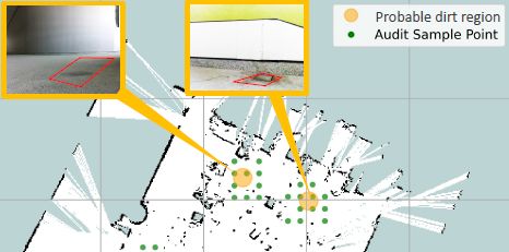
"A vision-based dirt-probability-driven exploration is proposed to empower a mobile robot with an audit sensor on-board to perform auditing tasks effectively. The quality of cleaning is quantified using a dirt density map representing location-wise audit scores, dirt distribution pattern obtained by kernel density estimation, and cleaning benchmark score representing the extent of cleanliness." That's from the abstract of a recent article offering a robot that judges the cleanliness of the floor. That is about how you do it, yes? It's just expressed here in the terms needed for designing a robot.
Here's the device...

|
This is Figure 4b from the article.
|
The general approach of the device is to use a small piece of adhesive tape to sample the floor. (That's similar to what a person would do, using a wet finger tip.) The device takes a photograph of the tape, which can be analyzed by whatever procedure is chosen to look for dirt. For now, it counts dust particles on the tape and looks for colored stains. It then moves on to the next sampling site.
Here's an example of its work...
The robot sampled the area at the points marked with green dots ("audit sample points"; see the key at upper right).
Based on what it saw, it suggested that the orange areas were "probable dirt regions".
Higher-resolution photographs of those areas, shown in the insets, confirmed the robot's judgment.
The distance between grid lines is about 5 meters. So the width of the figure is ~25 m. The robot itself is presumably leas than a meter across.
This is part of Figure 6 from the article. There is a scale bar in the lower right-hand corner of the full figure; I have not included it here.
|
The article contains further examples of the dirt the inspector robot found. It also contains data on performance -- and suggestions for future work. For example, the authors suggest that a smell detector could be integrated into the device.
In "Trial 1", the robot checked an area of 247 square meters (equivalent to a square just over 15 m on a side) in 1580 seconds (26 minutes). That is 9.4 m2/min. The rate varied over the trials, at least in part due to the nature of the surfaces. Data here is from Table 1.
The article starts with a discussion of robotic cleaners. The authors note that one area that had been largely neglected was evaluation of their performance. This article is a step toward filling that need.
Stop laughing. The cleaning-related industry generates nearly 300 billion dollars (US) a year, and is growing rapidly (from their introduction).
News stories:
* New sensor lets autonomous robots know when floors are clean. (Amit Malewar, Inceptive Mind, September 25, 2021.)
* How robots can tell how clean is 'clean' -- By giving the touch-and-inspect method a smart update, SUTD researchers have designed a sensor for autonomous cleaning robots that can quantify the cleanliness of a given area. (EurekAlert! (Singapore University of Technology and Design), September 23, 2021.)
The article, which is open access: An Autonomous Robot-Aided Auditing Scheme for Floor Cleaning. (Thejus Pathmakumar et al, Sensors 21:4332, July 1, 2021.)
Posts about floor-cleaning include:
* Who cleans up the forest floor? (November 3, 2017).
* A quasi-quiz: The fate of bone and wood on the Antarctic seafloor -- and the discovery of new bone-eating worms (August 20, 2013).
A recent robotics post: A robot that can chew gum (March 30, 2021).
October 27, 2021
Briefly noted... The Merck drug for COVID
October 27, 2021
It has been in the news, with the approval process imminent. We note it here because it is closely related to a drug discussed in Musings a year ago, a drug that causes an error catastrophe. The Merck drug is a derivative of the main drug discussed there. It is a pro-drug, modified for better delivery. But once incorporated into the viral genome, it is the same drug. (In fact, this pro-drug was briefly mentioned in the earlier post.) So the general ideas from the earlier post hold for the Merck drug.
* News story: How Molnupiravir Moved to the Head of the 'COVID Pill' Pack -- Work on the broad-spectrum antiviral started over a decade ago at Emory. (Veronica Hackethal, MedPage Today, April 28, 2021. Now archived.) Good background, but not up-to-date. Fortunately, the drug has an odd name; searches on "Molnupiravir" will yield more recent information, on trial results and the approval process.
* Bavkground post: Could we treat COVID by driving it to an error catastrophe? (June 30, 2020).
* There is a BITN section for SARS, MERS (coronaviruses). It includes a list of Musings posts in the field.
A trap to attract -- and kill -- mosquitoes
October 26, 2021
It looks like blood. It "smells" like blood, at least to mosquitoes. And it kills them, while being harmless to us. That's the idea of a mosquito trap reported in a new article.
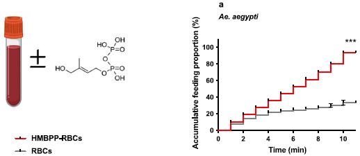
The secret is HMBPP.
Here is some background...
The left side shows the structure of HMBPP, (E)-4-hydroxy-3-methyl-but-2-enyl pyrophosphate.
Part a (right side) shows a test of its attractiveness to mosquitoes. Mosquitoes wee offered blood with and without HMBPP. The graph shows the cumulative percentage of mosquitoes that fed on the sample over time. The red curve is for blood with the additive; it is much higher than the control.
This test is with Aedes aegypti mosquitoes. The full figure also includes data for other mosquito species, with similar results. The mosquitoes tested, over three genera, include all the common mosquito vectors.
This is part of Figure 1 from the article. Oddly, the left part does not have a part designation.
|
Where does this HMBPP come from? From malaria parasites, which, it seems, make it to attract mosquito vectors. That finding gave the scientists the idea to try it as an attractant.
They developed a "synthetic blood", based on beetroot juice. It includes the attractant, and was developed to promote feeding. It also includes a toxin, which kills the mosquitoes that feed on it.
The following figure shows parts of the story.
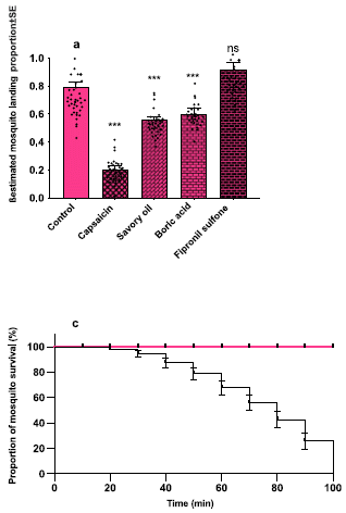
|
Part a (top) surveys some possible toxins. The issue here is to see if they interfere with feeding behavior. They are added to the candidate feed mix.
The bar height shows the fraction of the mosquitoes that fed. It is about 0.8 for the control (left-hand bar). And it is about that good for the toxin tested at the right, fipronil sulfone. Good. That is the toxin they choose. The other toxins tested reduced feeding behavior, thus negating the effect of the toxin (middle bars).
Part c (bottom) is the bottom-line test. Mosquitoes were offered the new feed, with and without toxin. Survival (y-axis) was measured vs time (x-axis).
The mosquitoes offered the food with toxin were all dead within two hours (black curve).
This test was with Anopheles gambiae mosquitoes. The full figure shows results with two other mosquito species. They too are killed, though more slowly.
This is part of Figure 4 from the article.
|
A feature of this system is that it is may be specific for mosquitoes. That follows from how they found the HMBPP; it is from the malaria parasite, which (apparently) use it to attract mosquitoes. The article shows that it works to attract a variety of disease-carrying mosquitoes, but does not test other insects.
The authors suggest that it might be good to add human odor to their trap.
As so often, it is an interesting story -- but not a product. We'll see what happens.
News stories:
* Blood-mimicking eco-insecticide baits and kills malaria-carrying mosquitoes -- The newly developed cocktail is harmless to humans. It could be sprayed across regions where malaria and other mosquito-borne diseases are prevalent. (Fermin Koop, ZME Science, October 13, 2021.)
* An eco-friendly toxic cocktail could be a new weapon against malaria. (Science Daily (Stockholm University), October 12, 2021.)
The article, which is open access: Plasmodium metabolite HMBPP stimulates feeding of main mosquito vectors on blood and artificial toxic sources. (Viktoria E Stromsky et al, Communications Biology 4:1161, October 7, 2021.)
Among other posts on mosquitoes:
* Virus infection may make you more attractive to mosquitoes (July 16, 2022).
* Do mosquitoes remember encounters with sub-lethal levels of pesticides? (February 26, 2022).
* What is the purpose of the cat response to silver vine or catnip? (March 22, 2021). A mosquito repellent.
* Biological control of mosquitoes, using a modified fungus (July 8, 2019).
There is a section of my page Biotechnology in the News (BITN) -- Other topics on Malaria. It includes a list of related Musings posts, including some posts generally dealing with mosquitoes.
A primitive cyanobacterium
October 25, 2021
A recent article describes a newly discovered species of cyanobacteria.
Here is a picture of one, from electron microscopy...
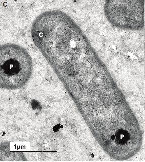
|
Its name is Anthocerotibacter panamensis.
But there is something wrong here. It doesn't look like a cyanobacterium. Something is missing.
Do you recognize what's missing?
(The general shape is not important. Cyanobacteria come in various shapes.)
C = carboxysome. P = polyphosphate granule. (Neither of them is an issue here.)
This is Figure 1C from the article.
|
If you need a hint, look at the next picture. It shows a diagram of a cyanobacterium, featuring a distinctive part.
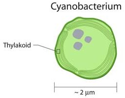
|
Layers of internal membrane, called thylakoids. Used for photosynthesis. A near-universal feature of cyanobacteria, and the chloroplasts that derived from them.
This is trimmed from an image from the Office of Biological and Environmental Research of the U.S. Department of Energy Office of Science: image source (now archived).
|
Our newcomer is a cyanobacterium lacking thylakoids.
That's interesting. Very few such cyanobacteria are known; it is hard to put together a good map of how they are related.
Of course, there are lots of questions. One is, why do the scientists call it a cyanobacterium? They present much evidence on this point. The heart of it is that it is prokaryotic (bacterial), and does carry out oxygen-evolving photosynthesis.
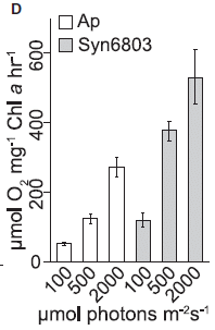
The following figure shows some data for photosynthesis by this new cyanobacterium.
The figure shows the rate of oxygen production (y-axis) for three different light intensities (x-axis).
The set of clear bars (left side) is for the new organism, labeled here Ap. The shaded bars (right) are for a reference cyanobacterium, a Synechocystis labeled Syn6803.
Both strains make more O2 as the light intensity increases. Ap makes less O2 than the reference strain.
This is Figure 5D from the article.
|
|
The authors suggest that the new organism is a primitive cyanobacterium, which diverged from typical modern cyanobacteria before the development of the internal membrane system that is so characteristic of both cyanobacteria and chloroplasts. They also address some other features, and they discuss the uncertainties in such analyses.
The article presents a new organism that is unusual. It appears to fill a gap in our knowledge of the cyanobacterial family tree; it offers clues to the history of photosynthesis, Still, the evidence is limited; the discovery of other related organisms would be welcome.
News storiy: New Cyanobacteria Species Spotlights Early Life. (Aaron J Bouchie, Boyce Thompson Institute, May 14, 2021.)
The article: A novel thylakoid-less isolate fills a billion-year gap in the evolution of Cyanobacteria. (Nasim Rahmatpour et al, Current Biology 31:2857, July 12, 2021.)
Previous posts about thylakoids: none.
Among posts about cyanobacteria...
* If your computer was powered by photosynthesis, would you have to water it? (August 29, 2022).
* Did changes in Earth's rotation promote the rise of oxygen-evolving photosynthesis? (August 23, 2021). Links to more about the role of cyanobacteria in oxygenating the Earth's atmosphere.
* Engineering cyanobacteria to make high-value chemicals (September 21, 2010).
* An unusual cyanobacterium (December 11, 2008).
A recent post about photosynthesis: A purple-green protist, with an unusual set of endosymbionts (September 25, 2021).
Also see: What are they? (September 12, 2009).
A hydrogel tablet for rapid water purification
October 23, 2021
A recent article presents a new approach for water purification. It uses hydrogen peroxide -- generated on the spot. It's an interesting idea.
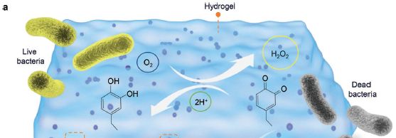
Here is a cartoon diagram of part of the process...
Look at the two ring-based chemical structures. The first (on the left) is a catechol: two adjacent -OH groups on an aromatic ring. Catechols are easily oxidized.
There is an O2 nearby (from the air, dissolved in the water). It oxidizes the catechol. The result is that both -OH become =O; that makes it a quinone. But in this case that is not what we care about. What matters here... the O2 is reduced -- to hydrogen peroxide, H2O2 (circled in light green, upper right).
The H2O2 can now act to kill bacteria.
This is trimmed from Figure 1a from the article.
|
If you're now worried about the benzoquinones ending up in the water... The catechols are attached to a solid network, a hydrogel. What we have here is a tablet. Add the tablet to the water, and the oxygen from the air (and dissolved in the water) oxidizes the catechols. That makes hydrogen peroxide, which acts to sterilize the water. It takes an hour. No power or other chemicals are needed. There are no toxic by-products.
When done, collect the used tablets, which can be re-charged for another round of use.
It's a little more complicated than that. There are actually two reactive groups on the hydrogel, and the other one serves to remove sulfur compounds from the water.
The following figure shows the effectiveness of the tablets in killing bacteria...
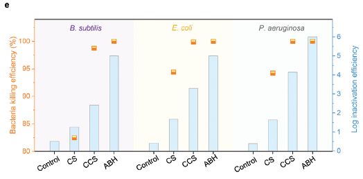
The figure shows results for three different kinds of bacteria. Start with the data set on the left, for Bacillus subtilis.
There are four treatment groups, labeled along the x-axis. The first is a negative control. The last is ABH, referring to the tablets we have been talking about. ABH = antibacterial hydrogel. (We'll come back to the other two in a moment.)
The data are plotted two ways. The orange markers show the percent killing; see the orange y-axis scale at the left (and note that it starts at 80%, which is why there is no point shown for the control). The ABH gave a lot of killing.
More useful is to use a log scale. Blue bars; see the blue y-axis scale at the right. You can see that the control gave less than one log of killing. The ABH gave about 5 logs of killing.
The other two treatments? They test parts of the system. CS = chitosan, the support material. CCS = catechol-functionalized chitosan, the material we discussed above. The difference between CCS and the complete ABH is due to the second component, removing sulfur compounds.
The results for the other two kinds of bacteria are similar. The set of three bacteria includes both gram-positive and gram-negative, and includes a couple of important pathogens.
This is Figure 3e from the article.
|
This is an interesting development. Whether it leads to a better process for water purification is hard to tell; that requires careful comparison with other processes. But the nature of the process here seems good; with development, where will it lead?
The authors suggest that the tablets could also be used to reduce fouling in a solar evaporation apparatus. They test this. The ABH not only reduce fouling, but also improve the performance. That is because the materials of the ABH lead to absorbing a wider range of the solar spectrum.
News story: Hydrogel tablet can purify a liter of river water in an hour. (Nanowerk News (University of Texas at Austin), October 6, 2021.)
The article: Molecular Engineering of Hydrogels for Rapid Water Disinfection and Sustainable Solar Vapor Generation. (Youhong Guo et al, Advanced Materials 33:2102994, September 2, 2021.)
Another approach to generating H2O2 as needed for disinfection: A light-activated coating that can kill bacteria on surfaces (July 14, 2020).
A recent post making use of catechol chemistry: An artificial organelle (October 2, 2021).
October 20, 2021
Briefly noted... Ebola transmission from long-term survivors?
October 20, 2021
The big Ebola outbreak in west Africa a few years ago killed more people than all previous (known) outbreaks combined. It also left us with more Ebola survivors than ever before. And that means the possibility of transmission of Ebola from an apparently healthy survivor is an issue to consider.
* Earlier this year there was a small outbreak of Ebola in Guinea, one of the countries at the heart of that recent outbreak. A new article reports genome analysis on a set of Ebola virus genomes from the new outbreak. Based on those genomes, the most likely origin of the new outbreak is a survivor from the previous outbreak. There is no smoking gun; the origin has not been identified. It is an argument about what best fits the genome data. It's an interesting -- and complicated -- story.
* News story: Analysis of 2021 Ebola outbreak reveals long-term dormant infections. (Michael Greenwood, News-Medical.net, September 19, 2021.) Links to the article (but not to the accompanying news story).
* News story accompanying the article: Virology: Ebola virus can lie low in human survivors -- A genomic comparison of Ebola virus from the 2021 outbreak in Guinea with sequences from the West African outbreak that ended in 2016 suggests that the virus can remain latent in human survivors for an extended period of time. (Robert F Garry, Nature 597:478, September 23, 2021.)
* The article: Resurgence of Ebola virus in 2021 in Guinea suggests a new paradigm for outbreaks. (Alpha Kabinet Keita et al, Nature 597:539, September 23, 2021.)
* There is more about Ebola on my page Biotechnology in the News (BITN) -- Other topics in the section Ebola and Marburg (and Lassa). That section links to related Musings posts, and to good sources of information and news.
* There is more about genomes on my BITN page DNA and the genome.
Watching barnacles move
October 19, 2021
Look...
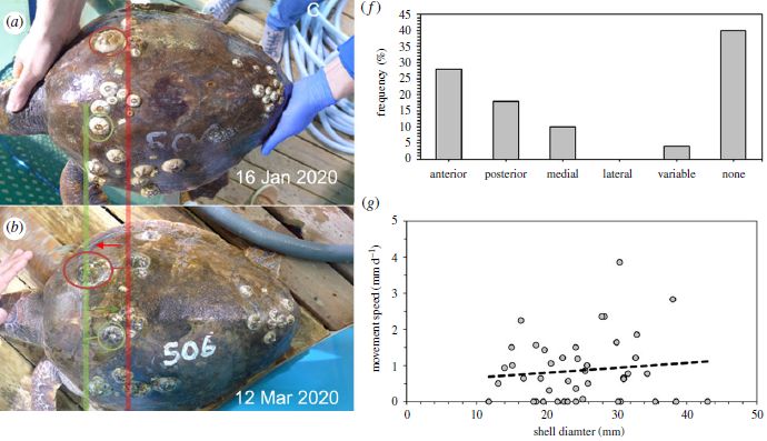
Part a (upper left) shows a loggerhead turtle -- with some barnacles attached. Turtle barnacles, Chelonibia testudinaria.
Two of them are circled, one each in red and green.
Part b (just below that) shows the same turtle two months later. The two circled barnacles have moved. Vertical red and green lines help you see what happened.
How far did they move? The article does not clearly say. However, the length of the turtle carapace (its "back") is given as about 52 cm. Based on that, I estimate the distance between the red and green lines as about 10 cm. If each barnacle moved about half that distance, that would be about 1 mm/day.
The two graphs on the right give some data for barnacle movements, based on observing five loggerhead turtles maintained in the lab over four months.
Part g (lower) shows the rate of motion that was measured (y-axis) vs the size of the barnacle (x-axis). You can see that the movement was about one millimeter per day. (That is consistent with my estimate above for the two marked barnacles in parts a and b.) At that rate, a barnacle could travel one meter in about three years. The slight trend with barnacle size was not significant.
Part f (upper) shows the direction of movement. Movement in various directions was observed, and some barnacles changed direction. But perhaps most common, for those that moved at all, was movement toward the front of the turtle (anterior). This point has implications for understanding the reason for the movement.
This is part of Figure 2 from the article.
The final parts of the full figure in the article show photos of a green sea turtle observed over five months in nature. It carries a barnacle, which has moved. Again, distances are not shown. A nice pair of pictures.
|
Barnacle movement was first reported a decade ago. The current work confirms the finding, and offers some preliminary observations on its nature.
How do the barnacles move? Adult barnacles secrete a cement (or glue) that bonds them to their substrate. That is why they don't move -- according to common knowledge.
The type of barnacle studied here is a bit unusual. It is indeed cemented to its substrate, but its bottom surface is membranous, not solid. This may well be important. Observation of barnacles attached to a transparent plastic surface shows some evidence for the barnacle peeling away between layers of cement. There is some suggestion that the cement of this species is different.
Why do the barnacles move? Much of the movement is against the water current, so it seems to be an active movement. The way they move suggests they may be getting into a better position for feeding. There is no indication that their movement affects reproduction.
There is more to be done. The work requires patience.
News story: "Surfing" barnacles research earning Citadel scientist international attention. (The Citadel Today, October 8, 2021.) Includes parts of two other news stories, one of which includes an interview with the senior author, John Zardus.
The article, which is open access: Five hundred million years to mobility: directed locomotion and its ecological function in a turtle barnacle. (Benny K K Chan et al, Proceedings of the Royal Society B 288:20211620, October 13, 2021.)
Previous post about barnacles: none.
Among recent posts about turtles...
* Why robo-turtles may be useful (April 25, 2020).
* Red color vision in dinosaurs? (October 17, 2016).
Among posts about other sticky animals: How ticks stick (March 26, 2025).
Project Baby Bear: Is it worthwhile to sequence the genomes of babies with mysterious ailments?
October 18, 2021
In 2010 a team of scientists did something unusual: they sequenced a substantial portion of the genome of a sick child who was not responding to treatment. The genome analysis led to a better diagnosis, and the person is now doing well. It was the first time that extensive genome sequencing was used for diagnosis of a mystery ailment; it probably cost a million dollars, given the state of sequencing at that time. See a background post on this incident [link at the end].
The cost of genome sequencing has since plummeted. The inevitable question is, when should genome sequencing be used as a diagnostic tool?
A recent article summarizes the findings of a systematic trial of the value of sequencing genomes of babies with mysterious ailments.
The following table summarizes some of the results...
184 children were enrolled, over a two year period. The basic requirement was that the baby had a medical condition that was not responding to treatment, thus leading to the baby being classified as having an unknown condition.
The table shows what happened as a result of genome sequencing. rWGS = rapid Whole Genome Sequencing.
The first row of data shows that a change in treatment was implemented for 58 of the infants -- about a third of them.
The following rows show, in general terms, the nature of those changes. For example, the last section shows that about 30 days of hospital stay were avoided.
There were an additional 16 cases where the sequencing led to an improved diagnosis, but with no effect on treatment.
This is Table 2 from the article.
|
The following table analyzes the cost of the genome intervention...
The table shows the cost savings of doing the genome sequencing, both overall and per child.
Start with the first set of data (on the left), labeled 3-day turnaround. There are two columns of estimates, low and high. The low estimate is that about $12,000 per child was saved by doing the genome sequencing.
The reduced hospital stays, noted above, were the major factor in the cost savings.
The cost of the sequencing program was about $9,500 per child.
Overall, the program resulted in a net cost savings, about $2,500 per child as a minimum estimate.
That 3-day turnaround, which is what they did in the current work, may be hard to achieve. So the authors have made estimates for the cost savings if the turnaround was slower. The table shows that the cost savings is reduced.
This is Table 3 from the article.
|
The overall conclusion is that genome analysis for babies with mystery ailments can be justified based on cost.
This post focuses on costs; indeed, so does the article. If that seems an inappropriate emphasis... The point is that genome sequencing is no longer exotic and hopelessly expensive.
There is no claim that everyone who is sequenced benefits. For half the babies, the sequencing yielded no useful information. For a few, sequencing led to an improved understanding of the child's condition, but with no effect on treatment. Some of these cases are discussed in the article (and news stories). Some things work, some don't. The conclusion is that the cost-benefit analysis puts genome sequencing of babies with mysterious ailments within the realm of ordinary medical care. That is, the article is a step toward establishing genome sequencing of sick babies as a "routine" tool, which doctors can consider when they think it is appropriate.
The current work was mandated by the California state legislature. The legislature is now considering how to follow up, making genome sequencing a recognized treatment. The news stories note this issue.
News story: Rady Children's Hospital Study Shows Rapid WGS for Critically Ill Babies Leads to Better Health Outcomes and Lower Medical Costs. (Rady Children's Institute for Genomic Medicine, June 4, 2021.)
The article: Project Baby Bear: Rapid precision care incorporating rWGS in 5 California children's hospitals demonstrates improved clinical outcomes and reduced costs of care. (David Dimmock et al, American Journal of Human Genetics 108:1231, July 1, 2021.)
Background post: Genome sequencing to diagnose child with mystery syndrome (April 5, 2010). Links to several related posts.
An early post about personalized medicine... Personalized medicine: Getting your genes checked (October 27, 2009). This includes an extensive list of related posts.
There is more about genomes on my page Biotechnology in the News (BITN) - DNA and the genome.
Identical twins: an epigenetic marker, which may allow people to tell if they are an identical twin
October 16, 2021
This post should be of particular interest to anyone who is -- or might be -- an identical twin. Might be? Wouldn't you know? It is actually likely that most identical twins don't know, because the other twin did not survive, even to birth, and was never recognized.
Pretty much everything about identical twinning is a mystery. But a new article offers a clue -- and perhaps a test that could allow a single identical twin to be identified.
This is a story about epigenetic marks: methyl groups that decorate the genome. At least some of them affect gene activity.
Remember, the formal name for identical twins is monozygotic twins (MZ); they arise from a single fertilized egg, or zygote. In contrast, fraternal twins are dizygotic (DZ); they are from two separate zygotes, and, genetically, are just ordinary siblings.
Here is a key part of the story...
Start with parts c and d (the two graphs to the right). They are different. That is the main point, so let's look at what these two graphs are for.
Each graph compares genome methylation patterns for four groups of twins.
The four groups of twins are listed below part c. Group 1 is DZ. The others are all MZ; we'll focus on group 4 for the moment, and explain this later.
The key observation is that, in part c, groups 1 and 4 give different results. The results are the agreement in methylation patterns for a subset of methylation sites. Part d is a control, showing the results for all methylation sites; there is no difference between the types of twins (at least for the position of the peaks). (The other two groups of MZ twins give intermediate results.)
DMP = differentially methylated positions. Note that these may be either more methylated or less methylated than usual; the point is that the twins are more similar to each other than to the average.
Part b describes the three types of MZ twins. This is interesting, but is not needed for our basic point here. Briefly... Identical twins occur when a fertilized egg splits and becomes two separate organisms. Depending on when this occurs, there may be various arrangements within the uterus. These are shown in part b, labeled at the top by time of twinning. The results in part c show that each type of MZ twin gave a different result. Importantly, all types of MZ twins showed an effect. We focused on the type that gave the most extreme result.
This is part of Figure 2 from the article. I have added numbers for the four typos of twins, for ease of referring to them. The numbers are shown in the key, and in some parts of the main figure.
|
That is, the methylation patterns in MZ (especially group 4 MZ) are distinct. In particular, there is a set of sites (about a thousand of them, out of 400,000 sites tested) that are methylated the same way in most MZ -- measured in adults, decades after the twinning occurred.
This methylation pattern seems to be associated with twinning. What it means is unknown at this point, but clearly it will be a target of further work.
The finding also provides a test to see if someone is a MZ twin. Take an adult, measure their methylation pattern. If it best fits the right-hand distribution of part c above, that is evidence that they are a MZ twin (of type 4). Obviously, that is probabilistic, but the point is that no such test is currently available; what is shown here opens up the possibility of doing such testing.
News stories. Caution... Some of the coverage, especially in headlines, suggests a causal connection between methylation and twinning. At this point, there is no evidence about what the relationship is. To quote the article itself: "Whether these methylation differences represent a cause, effect, or byproduct of the MZ twinning event remains to be determined." (last sentence of the Discussion)
* Unique epigenetic profile found in identical twins. (Molly Godfrey, BioNews, October 4, 2021.) As usual for BioNews, it links to more information, including news stories.
* New leads in research into the origin of identical twins. (Vrije Universiteit Amsterdam, September 28, 2021. Now archived.)
The article, which is open access: Identical twins carry a persistent epigenetic signature of early genome programming. (Jenny van Dongen et al, Nature Communications 12:5618, September 28, 2021.)
Among other posts on twins...
* The oldest known identical twins (December 7, 2020).
* Unusual twins: neither monozygotic nor dizygotic, but... (March 11, 2019).
* A DNA test that can distinguish identical twins (July 17, 2015). Links to more. This post also deals with genome methylation, but a different aspect.
* Twins (April 30, 2009). Links to more.
October 13, 2021
Briefly noted... Lakes that explode -- II
October 13, 2021
This is a follow-up to Lakes that explode (October 13, 2009)
Lakes that accumulate gas (carbon dioxide or methane, along with some hydrogen sulfide) to high pressure may explode, sometimes with devastating effect. In the earlier post we discussed two such lakes, Nyos and Kivu. Now we have an updated news feature on them, focusing on Kivu. Engineers have now completed a vent system on Nyos, which should relieve the build-up of pressure. Kivu is still a concern, but it is not clear how big the risk is. An interesting issue is that methane is now being harvested from the lake and used as fuel; whether this is being done "properly" is a matter of debate. In any case, the news feature is good reading, whether you are familiar with the topic or not. It is interesting -- and important -- geology, biology, and engineering. And politics.
* News feature: How dangerous is Africa's explosive Lake Kivu? -- An unusual lake in central Africa could one day release a vast cloud of greenhouse gases that suffocates millions of people. But it's not clear whether the threat is getting worse. (Nicola Jones, Nature, September 23, 2021. In print: Nature 597:466, September 23, 2021.)
A new way to recover valuable metals from discarded electronics
October 12, 2021
Recovery of metals from electronics waste (e-waste) is an issue. Some of the materials are scarce and expensive, some are toxic. But recycling them is difficult.
A new article offers a promising approach to recovering metals from e-waste. Simplified, the idea is to vaporize the material.
The following figure gives an example of some results...
|
The purpose of this particular test was to see how the presence of sodium fluoride, NaF, affected the recovery of some metals.
Recovery results are shown for four precious metals, listed along the bottom of the figure.
|
For each metal, there are two bars.
The left-hand bar (orange) shows the recovery, as a percentage. See the left-hand y-axis.
The right-hand bar (green) shows the effect of the additive. See the right-hand y-axis. What is plotted is Y/Yo, the ratio of recovery (yield) with and without additive.
For example, for rhodium, the first metal, recovery with the additive was over 80%, and it was enhanced about 20-fold by the additive.
Results vary for the metals, but are at least good for all except gold. In two cases, the additive made a big improvement.
The colors of the two y-axes correspond to the bar colors.
If you are concerned about the use of a toxic salt here... The full figure contains results with various additives. The general picture is similar: halide salts help. NaCl is actually quite good. I chose to show part a here because it is more fully labeled.
This is Figure 2a from the article.
|
That's the idea.
What kinds of temperature are we talking about here? And how long does it take? The following figure shows temperature-time profiles from some test runs...
The top curve, for 150 volts, shows that the peak temperature was over 3300 K (about 3000 °C) after about 1/50 of a second.
At such temperatures, the metals are volatilized, but the carbon is not. That is a key point for the separation. Addition of metal halides (see first figure) leads to the metal halides, which are even more volatile.
This is Figure 1e from the article.
|
|
That is flash heating.
The scientists then add a step, leaching the residue. They find that metals can be more easily leached from the residue than from the original material.
Overall, they achieve good recovery of several valuable metals. It isn't shown above, but they even get good recovery of gold. They also get good separation of toxic metals, which generally are more volatile than the precious metals. The residue is thought to be clean enough that it could be put on agricultural land. That hasn't been tested, but whether it is literally true or not, there is a high degree of separation.
Is it practical? Time will tell. The authors estimate that the energy input for the process is about 1% of current processes. They have scaled it up to the 10 kilogram/day level in the lab.
There are complexities. It helps to powder the e-waste. The first test above shows that additives can help, but the answer is not simple. And of course, there is downstream processing to recover much of the material. Clearly, work is needed to tune the process. But it looks worth pursuing.
The work is from the same lab that developed a flash heating process for making graphene from waste carbon-containing material. See the background post listed below.
News stories:
* Flash heating recovers precious metals from e-waste in seconds. (Amit Malewar, Inceptive Mind, October 8, 2021.)
* Urban mining for metals flashes electronic trash into treasure -- Flash Joule heating by Rice lab recovers precious metals from electronic waste in seconds. (Rice University, October 4, 2021.)
The article, which is open access: Urban mining by flash Joule heating. (Bing Deng et al, Nature Communications 12:5794, October 4, 2021.)
Background post about another flash heating process developed by the same lab: Briefly noted... Turning trash into graphene (October 28, 2020).
The e-waste problem was also addressed in the post Using wood-based material for making biodegradable computers (July 21, 2015).
A step toward a practical thermoelectric converter: get the oxide out
October 11, 2021
Thermoelectric conversion? It is the conversion of heat energy to electrical energy. In principle, one could convert waste heat, which is generally of low value, to useful electrical energy. However, developing a practical economical way of doing this has proved elusive.
A recent article presents a significant improvement in thermoelectric (TE) conversion, with an explanation of why it works.
The work is with tin selenide, SnSe. This material has shown promise for TE conversion, but, again, practical implementation has been elusive.
The following figure presents the bottom-line results, along with some of the evidence...
|
Start with the bottom graph. It plots ZT vs temperature (T).
What is ZT? It is a parameter commonly called the figure of merit for TE conversion. It is thought that a ZT above 2 would be required to make the process practical. (We'll come back to the nature of ZT in a moment.)
You can see that the red curve looks promising, with ZT even above 3. In contrast, the green curve is poor.
What's the difference? They are both for SnSe. That material tends to have some tin oxides, labeled here as SnOx, in it; those oxides prevent effective TE conversion. The red curve is for SnSe lacking tin oxides. It makes a big difference.
|
Why does it matter? That gets us back to ZT. Without getting into the mathematical details, the feasibility of TE depends on the ratio of electrical conductivity to heat conductivity. Remember, the goal is to convert heat to electricity. One wants low thermal conductivity, so the heat can't easily escape. And high electrical conductivity, so the electricity can easily "escape".
The top frame of the figure shows the thermal conductivity, κtot , of the two materials. You can see that removing the oxides greatly reduces the thermal conductivity. That is good, and is the key here.
- The κ is a Greek "kappa".
- It isn't shown here, but there is little effect on the electrical conductivity.
- The figure legend in the article mixes up the curves; the labeling on the figure itself, which is all that is shown here, is correct.
This is the right-hand part of Figure 1 from the article.
|
That's the main message. Improving the quality of the SnSe, by reducing the amount of tin oxides in it, lowers the thermal conductivity, and enhances the TE conversion efficiency, as reflected in a high ZT.
The next figure is "for fun"...
The figure shows two pieces of SnSe, stained for tin oxide. The SnOx shows up as red.
I realize that color resolution varies, but I'll let you decide which is which here.
The white dashed lines indicate grain boundaries. That is where the oxides tend to be.
Scale bars (lower right) are 10 micrometers.
The yellow lines are related to analyses shown in later parts of the figure; you can ignore them.
This is part of Figure 2 from the article.
|
|
The ZT of over 3 for tin selenide with an ultra-low content of oxides is the highest value ever reported. The material is inexpensive, and the processing seems practical. It is a promising development.
The envisioned application is recovering useful energy from waste heat from high-temperature industrial processes. Care will be needed to keep the device free of oxygen during long-term use. That is probably a solvable design problem. And worth it, given the huge amounts of such energy potentially available.
News stories:
* Researchers make an inexpensive material that efficiently turns waste heat to electricity -- The practical, efficient tin-based material could be a way to harness immense amounts of heat thrown out by factories, power plants, and cars. (Prachi Patel, Anthropocene, August 12, 2021.)
* Cheap material could help convert waste heat into electricity -- More than 65% of the energy we use is wasted as heat. (Tibi Puiu, ZME Science, August 3, 2021.)
* New material offers ecofriendly solution to converting waste heat into energy -- Purified tin selenide has extraordinarily high thermoelectric performance. (Science Daily (Northwestern University), August 2, 2021.)
* News story accompanying the article: Thermoelectrics: Breaking thermoelectric performance limits -- Through meticulous care for detail, researchers have now shattered the ceiling on thermoelectric performance, achieving a figure of merit above 3 for bulk SnSe polycrystalline powder. (Bo Brummerstedt Iversen, Nature Materials 20:1309, October 2021.)
* The article, which is open access: Polycrystalline SnSe with a thermoelectric figure of merit greater than the single crystal. (Chongjian Zhou et al, Nature Materials 20:1378, October 2021.)
A post about a very different application of thermoelectrics: An air-conditioner you can wear? (August 19, 2019).
More about thermoelectric generation: A solar cell that generates electricity at night (April 12, 2022).
More tin: Pumping tin (January 12, 2018).
More selenium: Selenium and neurodegenerative diseases? (June 25, 2022).
There is more about energy issues on my page Internet Resources for Organic and Biochemistry under Energy resources. It includes a list of some related Musings posts.
Earth is not as bright as it used to be
October 9, 2021
What do we mean by brightness of Earth? Here we are talking about its reflectance, or albedo. Shine a light on Earth; the Sun will do. How much light is reflected?
It's a bit tricky to measure, because the original light gets in the way. So you have to stand off to the side, so you can see the reflected light, without the original light interfering.
It's worth doing, because it tells us something about the Earth's energy budget. Changes in brightness may be related to climate change.
A new article reports measuring "earthshine", the reflected light from Earth lighting up the back side of the Moon.
The following figure summarizes the results, and compares them with measurements from another system...
The y-axis shows the amount of reflected light -- in energy terms, which can be derived from the reflectance measurements. The y-axis scale is relative; that is, changes are of interest, but the absolute values are not.
Look at the black points, and the black dashed line. The black data set is for the current work, based on measuring earthshine over two decades from an observatory in California. Each point is the average over a year of measurements. The dashed line is the linear best-fit for those annual averages. You can see that the dashed line does a reasonable job of fitting most of the points. And it shows a decline in reflected light corresponding to about 0.5 watts per square meter over the two-decade period.
The gray region shows the complexity of the measurements. That gray region indicates the error bars, based on individual measurements during the year. Reflectance varies a lot, but the annual average seems fairly consistent.
The blue data? Independent measurements of Earth reflectance, from a satellite, over approximately the same period. (The data is from the CERES instrument records at NASA.) The blue dashed line is similar to the black one, with about twice the slope.
This is Figure 3 from the article.
|
So we have two independent sets of measurements of how bright the Earth has been over the last two decades. They are done by independent methods, and are subject to different problems. They are in reasonable agreement.
There is some attempt at interpretation. The reduced reflectance seems to correlate with reduced cloud cover over a warming ocean. If this is correct and causal, it would represent a positive feedback loop: a warming ocean leading to lower energy loss by reflectance, thus leading to more warming.
The authors here argue that their approach, using a ground-based observatory, is easier. You may or may not want to make much of the results shown above. Perhaps more importantly, the current work may pave the way for more such measurements, from multiple sites.
News stories:
* Climate change is making the Earth dimmer, which, in turn, warms up the climate -- Our planet is reflecting less sunlight into outer space. (Alexandru Micu, ZME Science, October 2, 2021.) Mixes up what makes the Moon bright at night, but generally a useful overview of the article.
* Earth is dimming due to climate change -- Warming oceans cause fewer bright clouds to reflect sunlight into space, admitting even more energy into earth's climate system. (AGU, September 30, 2021.)
The article, which is open access: Earth's Albedo 1998-2017 as Measured From Earthshine. (P R Goode et al, Geophysical Research Letters, 48:e2021GL094888, September 8, 2021.)
Among other posts about reflectance:
* Why are some icebergs green? (May 11, 2019). Discusses the term albedo.
* Why do many tarantulas have blue hair? (March 7, 2016).
A post about "geoengineering", to increase Earth reflectance, and promote cooling. Geoengineering: the advantage of putting limestone in the atmosphere (January 20, 2017).
A post about measuring ocean temperature: Seismologists measure temperature changes in the ocean (October 6, 2020).
October 6, 2021
Briefly noted... Are birthdays a risk factor for COVID-19?
October 6, 2021
Yes, according to a recent article. An extensive statistical analysis shows a significant increase in COVID within two weeks of birthdays. The authors are not able to directly measure how much of the effect is due to birthday parties, but there are suspicions. On a serious note, this could be evidence for the importance of informal social gatherings in COVID transmission.
* News story: Birthdays and COVID-19: New Analysis Reveals a Link. (SciTechDaily (Harvard Medical School), June 21, 2021.) Links to the article, which is temporarily freely available.
* I have listed this post on my BITN page section for SARS, MERS (coronaviruses).
Printing microneedle patches for vaccine delivery to the skin
October 5, 2021
Musings has noted the development of microneedle patches as an alternative to the conventional hypodermic needle for the delivery of vaccines [link at the end]. There have been promising results, but the technology has not taken off. Using the patches is easy, but producing them is not.
A new article reports progress with that step, using a version of 3D printing to make the microneedle patches. It's rather high-resolution stuff for 3D printing.
The following figure gives the idea, though without the technical advances, which were largely developed in an earlier article.
The left-hand frame shows the design pattern. Conventional needles are smooth; that is what ordinary molds can make. 3D printing allows for the production of more complex shapes. The ridged needle allows for absorption of more antigen.
The next two images are scanning electron micrographs of a needle without and with antigen bound (middle and right frames, respectively).
The scale bar on the needle images is 0.5 millimeters. The needles are about 700 µm high. They are printed in a 10x10 array on a patch that is 1 cm on a side.
The full figure in the article compares these needles with needles of a more traditional shape (square pyramidal). The surface area of these more complex needles is about 20% greater. The amount of antigen absorbed is about 36% greater.
This is part of Figure 1A from the article.
|
The article contains results from tests with mice showing that the new microneedle patches work.
One of the tests is particularly intriguing. It involves looking at the T-cell response.
|
In this test, the production of interferon-γ (IFNγ) was measured, to reflect the T-cell response. What is shown is the number of cells making IFNγ.
The left-hand data is for "untreated" mice; no inoculation, and no IFNγ.
The next two data sets are for the use of traditional needles, giving the antigen either subcutaneous (SC) or intradermal (ID). OVA = ovalbumin, the antigen for these tests. CpG is an oligonucleotide used here as an adjuvant, which stimulates the immune response. Note that ID is better.
The next data set is for the current microneedle (MN) patch. It is much better. Note that the patch is a type of ID injection, but it is much better than the traditional ID injection.
The final (right-hand) data set is for the use of alum. It is also an adjuvant. It is used here as a variation of the traditional SC injection. It does indeed improve the response, but not much.
This is Figure 5A from the article.
|
In general, the testing shows that the new microneedle patch is effective. By some tests, it is very effective. And the scientists here think they have made a significant step toward making such patches practical, by improvements in how they are made.
News stories:
* Vaccine-coated, 3D-printed patches may soon replace a syringe near you -- No jab, and more efficiency. (Alexandru Micu, ZME Science, September 25, 2021.)
* 3D Printed Vaccine Patch Offers Vaccination Without a Shot -- Outperforms Needle Jab in Boosting Immunity. (SciTechDaily (University of North Carolina at Chapel Hill), September 25, 2021.)
The article, which is open access: Transdermal vaccination via 3D-printed microneedles induces potent humoral and cellular immunity. (Cassie Caudill et al, PNAS 118:e2102595118, September 28, 2021.)
Background post about vaccine patches: Clinical trial of self-administered patch for flu immunization (July 31, 2017). The article of this earlier post is reference 27 of the current article.
More about microneedles: Treating a heart attack using a microneedle patch (January 11, 2019). Links to more.
More on vaccines is on my page Biotechnology in the News (BITN) -- Other topics under Vaccines (general). There is a list of related Musings posts.
Aging without memory loss in cuttlefish
October 4, 2021
Among the invertebrates, the "smartest" seem to be the cephalopods, such as octopus, squid and cuttlefish. Study of their capabilities and brains may be revealing.
A recent article suggests that cuttlefish do not lose their memory as they age, in contrast to mammals, including humans. The work is specifically about episodic memory, the ability to remember details of specific events.
Here are the key results...
|
The general nature of the test is that the animals were trained where to expect food. They were then tested one or three hours later, to see if they remembered. The y-axis is the fraction of responses that were correct.
There were two groups of animals: aged-adults, and sub-adults.
The results are about the same for both the old and young animals.
This is Figure 5b from the article.
|
What is the significance of the finding? We don't know. For now, it is just an interesting observation. Mammals would not fare so well with such a test. How can these things do better? Is there something we should know about the advantages of a cephalopod brain? The only way we will know ...
Are we making too much of the finding, given that the cuttlefish only live for about two years? Well, let's not make too much of it. This is an animal very different from mammals; its braininess is unusual for invertebrates. Let's just continue to learn more about them.
News stories:
* Unlike Humans, Cuttlefish Retain Sharp Memory of Specific Events in Old Age. (SciTechDaily (Jacqueline Garget, University of Cambridge), August 17, 2021.)
* The Best Kind of Aging Brain -- Unlike humans, cuttlefish can form crystal-clear memories even in their final weeks. (Katherine J Wu, Atlantic, August 17, 2021.)
The article, which is open access: Episodic-like memory is preserved with age in cuttlefish. (Alexandra K Schnell et al, Proceedings of the Royal Society B 288:20211052, August 25, 2021.) A very readable article, with much discussion of the context. A caution... the actual experiments are complex.
Posts about cephalopods include:
* Briefly noted... Do octopuses throw things at each other? (November 16, 2022).
* Sleep stages in octopuses -- do they dream? (July 13, 2021).
* A new brain study (March 3, 2020).
* Cuttlefish vs shark: the role of bioelectric crypsis (May 10, 2016).
* Deceiving a rival male (August 28, 2012).
My page for Biotechnology in the News (BITN) -- Other topics includes a section on Brain. It includes a list of brain-related posts.
An artificial organelle
October 2, 2021
Can we make a new organelle from scratch, in the lab? A recent article describes doing just that.
The article is quite complex. We'll just hit some highlights here. We'll start with the plan, then show one result for a test case, making a simple organelle. We'll then sample the results for a complex organelle that the scientists made.
Here is the plan...
Even the plan is complex. Let's start with the final step, to the right of the big bracket with a red "metal ion" next to it. There are two small structures with membranes around them; the structures are called exosomes. Just to their right, a dashed oval shows a blow-up of how they come together. Each has on it a catechol -- a benzene ring with two adjacent phenol groups. The red metal ion joins the two catechol groups, effectively holding the two structures together. That allows their membranes to fuse, making one larger structure, with a mixing of the contents.
That is the key step. The final fused exosome (FEx) is the new "organelle".
That FEx has in it the little structures from both of the small exosomes that fused together. Together, those things do something new. In this case, which is just a test, they can fluoresce. The fluorescence can be detected, as evidence that fusion occurred. This is shown here in cartoon form. The point is that the new "organelle" has new functional capabilities because of the mixed contents.
The left side shows how the exosomes that fuse, the catechol-engineered exosomes (CEx), are made. Briefly, exosomes are harvested from cells growing in lab culture, then loaded with cargo. The most interesting step, perhaps, is attaching that catechol group. That is done by attaching the catechol to an antibody against a protein on the exosome surface. When the antibody binds to the exosomes, it brings along the catechol, which ultimately is the key to directing the fusion.
Fe3+ ions were most commonly used to promote fusion, though a number of other ions tested also work.
The preferred fusion is between one of each kind of exosome (with different contents). The procedure as described so far would give random fusion. To give a higher frequency of the preferred fusion product, fusions were done in tiny droplets prepared by mixing dilute streams of the two CEx types; such droplets were most likely to contain different types of CEx.
This is Figure 1a from the article.
|
The following figure shows evidence that the plan worked...
|
The figure shows electron micrograph images of examples of exosomes before and after fusion: small CEx and big FEx, respectively.
The Au prefix on the labels is not needed for our discussion.
This is part of Figure 1e from the article.
|
The article contains data on the size distributions, and also on the new function when the contents of the two kinds of exosomes were mixed. Bottom line: the test case worked.
The authors then went on to try to establish a more complex function: production of ATP. The following figure shows some results...
In this case, fused exosomes were put in cells. ATP production was measured.
There are five curves.
The top curve (red circles) is for cells with fused exosomes and the two key materials (glucose and DTT).
The next two curves show that providing only one of those two key materials led to some, but reduced, activity.
The bottom two curves are negative controls:
- cells without added exosomes, or
- cells with exosomes, but neither of the key materials.
This is Figure 5d from the article.
|
|
Overall, the scientists have shown that they can fuse exosomes with certain activities to create fused exosomes with novel activities. These fused exosomes can function inside cells; they are effectively artificial organelles. In particular the scientists made a new organelle that can make ATP inside cells.
No, they can't replicate.
News story: UNIST scientists created artificial organelles -- The technology can be used to construct artificial organelles that can supply ATP. (Amit Malewar, Tech Explorist, September 15, 2021.) UNIST = Ulsan National Institute of Science and Technology, South Korea.
The article: Programmed exosome fusion for energy generation in living cells. (Sumit Kumar et al, Nature Catalysis 4:763, September 2021.)
A recent post on unusual endosymbionts or organelles... A purple-green protist, with an unusual set of endosymbionts (September 25, 2021). Last week. Links to more.
A previous mention of exosomes: Briefly noted... Decoy receptors. (November 4, 2020).
Another post using catechol chemistry: A hydrogel tablet for rapid water purification (October 23, 2021).
September 29, 2021
Briefly noted... Improved control of gene therapy
September 29, 2021
The general plan of gene therapy has been clear for decades, but making it work well with real people remains a challenge. It is complex, and it all has to work right. A new article develops a system to control the level of gene expression. The key development here is to use a small molecule drug that controls the splicing of the messenger RNA. The drug itself can be given orally to effectively turn the gene on; the drug level determines how much protein is made. It is a known drug, developed to treat a condition that involves a splicing defect. What the current authors have done is to exploit their understanding of how the drug works in the disease case so that the delivered gene responds to the drug in a way that promotes effective gene therapy, by allowing fine tuning of the level of activity. The control system itself is portable, and can be attached to any gene of interest.
* News story: Researchers develop 'dimmer switch' to help control gene therapy -- Delivery system fine tunes gene therapy expression levels and may pave the way for a new wave of gene therapies to treat rare and complex diseases. (Science Daily (Children's Hospital of Philadelphia), July 28, 2021.) Links to the article.
* More about gene therapy is on my Biotechnology in the News (BITN) page Agricultural biotechnology (GM foods) and Gene therapy. It includes a list of related Musings posts.
Milky seas: now observable from space
September 27, 2021
The following figure shows a reconstructed image of what was seen in a region of the Indian Ocean on the night of August 3, 2019.
|
The bright oblong object near the top is the island of Java. It is bright from the lights of human society.
The region below is the ocean. Some of it is dark, as expected at night. But much of it is distinctly glowing. Why? From the bioluminescent bacteria in the sea.
The figure was reconstructed from actual light measurements -- taken by a set of satellites. What's special is that the satellites are very sensitive to light, and can record what might seem a faint -- though quite visible -- glow. A faint glow, but not what one expects from a body of water. (The intensities shown in the figure are scaled logarithmically from the actual intensities.)
The lit-up area of the ocean was about 100,000 square kilometers. (The area of Java is about 150,000 km2.)
This is Figure 4e from the article.
|
There is nothing new about bioluminescence in the ocean. What is unusual is the large luminescent area, visible over days or even weeks. Such events are sometimes called "milky seas". Ships have reported milky sea events over the ages. Now, improved light detection systems allow satellites to observe them systematically from 830 km above. The sensitivity of the new detectors is about 1/10,000 of the intensity of reflected moonlight.
The detection system was partially implemented in 2011, and became mature in about 2018. Analysis of data on hand allowed the identification of 12 such events from December 2012 through January 2021. The current article reports on three of those events. Now, the system allows detection of events in real time. The satellites collect extensive data, tracking an event for days. Importantly, it may be possible to send research teams to the event site in some cases. Prior to the current satellite system, there was little but anecdotal reports of milky seas.
The 2019 Java event was followed from July 25 to August 9, before being lost to moonlight. It was picked up again from August 25 to September 7.
The following figure shows some aspects of the historical record...
Part c (left) shows the distribution of reports of such events in this general region -- dating back to 1796. The blue dots are reports from ships.
The distribution of events appears non-random. That is even clearer from part a of the full figure in the article, which shows a worldwide view. It is dominated by a cluster of points just south of the Arabian peninsula.
Part d (right) shows the distribution of reported events (worldwide) over the months. They are most common in August, followed by January. In some places, there seems to be a correlation with the monsoon seasons.
This is part of Figure 7 from the article.
|
The satellite system ushers in a new era of studying these milky sea events -- structures at the thousand-kilometer scale formed from micrometer-sized objects. The scientists estimate the number of bacteria in the event shown above at about 1023 -- or about a sixth of a mole!
News stories:
* Scientists unravel mystery of 'milky seas' made by billions of trillions of luminous bacteria -- Milky seas have fascinated sailors and scientists alike. Now we know how they form. (Tibi Puiu, ZME Science, September 21, 2021.)
* Chasing the light from elusive 'milky seas': Unraveling mysteries of the ocean from space. (Science Daily (Colorado State University), July 29, 2021.)
* Scientists are using new satellite tech to find glow-in-the-dark milky seas of maritime lore. (Steven D Miller, Conversation, August 26, 2021.) From the lead author. Excellent.
The article, which is open access: Honing in on bioluminescent milky seas from space. (Steven D Miller et al, Scientific Reports 11:15443, July 29, 2021.)
Among posts on bioluminescence:
* Observing inside animals with an improved bioluminescence system (April 6, 2018).
* Xystocheir bistipita is really a Motyxia: significance for understanding bioluminescence (May 9, 2015).
There is a section of my page Internet resources: Chemistry - Miscellaneous on Chemiluminescence. It includes a list of related Musings posts.
A purple-green protist, with an unusual set of endosymbionts
September 25, 2021
Look...
That's a Pseudoblepharisma tenue.
Purple and green regions are clearly evident.
Scale bar = 10 micrometers.
This is Figure 1A from the article. It is turned sideways from how it appears in the article.
|
The protist was first described nearly a century ago; its unusual symbionts were noted. We now have an article addressing what is going on inside.
The short answer is that it contains two photosynthetic symbionts. One is a purple bacterium, and one is a green alga. It also has mitochondria, of course. (Purple and green are the names used for the types of organisms, so we do not need to quibble about what color things seem to be.)
The purple bacterium is of particular interest. Such bacteria, of the family Chromatiaceae, are known for carrying out non-oxygenic photosynthesis. Finding eukaryotes harboring purple bacteria is rare. The current case also carries a green alga symbiont, a Chlorella species. DNA sequencing shows that the bacterial genome is significantly reduced. It is likely that these purple bacteria are obligate intracellular symbionts, not capable of living free.
What does this collection of endosymbionts do? The big story is that it provides flexibility. The host is a single-celled microbe, commonly found in habitats low in oxygen and rich in organics. It can both respire and ferment. And it can photosynthesize, under a range of conditions because of its pair of photosynthetic symbionts.
The cell shown above has a contractile vacuole (CV), at the right end. That suggests that the organism also feeds by phagocytosis.
The scientists still have difficulty maintaining the organism in lab culture. Therefore, they have done little to experimentally test their ideas of what it can do.
It is another example of the diversity of metabolism found in nature.
News stories:
* An unusual symbiosis of a ciliate, green alga, and purple bacterium. (Science Daily (University of Cologne), June 14, 2021.)
* A Protist Hosts Both Green Algae and Purple Bacteria Symbionts -- Having two different endosymbionts may allow the ciliate Pseudoblepharisma tenue to live in both oxygen-rich and oxygen-poor zones of the muddy bogs of southern Germany. (Abby Olena, The Scientist, June 11, 2021. Now archived.)
* A microbial eukaryote with a unique combination of purple bacteria and green algae as endosymbionts. (Sergio A Muñoz-Gómez, ISEP (International Society for Evolutionary Protistology), June 12, 2021.) A brief overview by the lead author of the article.
The article, which is open access: A microbial eukaryote with a unique combination of purple bacteria and green algae as endosymbionts. (Sergio A Muñoz-Gómez et al, Science Advances 7:eabg4102, June 11, 2021.)
Among posts on unusual endosymbionts or organelles...
* An artificial organelle (October 2, 2021).
* A new energy-generating organelle (May 11, 2021).
* Briefly noted... What organisms carry genes for bacterial cell walls (peptidoglycan)? (April 1, 2020).
* What if a yeast cell contained a bacterial cell? A step toward understanding the evolution of mitochondria? (January 29, 2019).
More about purple bacteria: Arsenic and photosynthesis (September 9, 2008).
More about food for ciliates: Virovory (January 28, 2023).
Also see: A primitive cyanobacterium (October 25, 2021).
More about phagocytosis: The immune response of cnidarians (e.g., corals) (November 1, 2021).
September 22, 2021
Briefly noted... A claim for the possible detection of dark energy
September 22, 2021
A team working on detecting dark matter recently claimed to detect a signal somewhat above background. Now, a group of theoretical physicists argue that dark matter is an unlikely explanation for the signal. They suggest that the signal -- if it is real -- could, more reasonably, be due to dark energy particles. There is no answer here. The story starts with a weak signal. It then goes on to complex competing theories. This is very much a science-in-progress item, about a fascinating and difficult set of topics.
* News story: XENON1T Experiment May Have Directly Detected Dark Energy. (Sci.News, September 16, 2021.) Links to the article, which is open access.
* A recent post about dark matter: A galaxy that lacks dark matter? (June 12, 2018). Links to more.
Briefly noted... Tiny plastics in the environment
September 21, 2021
We are increasingly recognizing how much plastic is in the environment. Among the questions... How harmful is the stuff? Of course, that may be complex, with different answers for different materials and different sizes. (The very smallest pieces, referred to as nanoplastics, are presumably most likely to get deep into tissues.) Here are two items addressing parts of the story. The big message is how much needs to be learned.
1. A news feature on "microplastics", freely available: Microplastics are everywhere - but are they harmful? Scientists are rushing to study the tiny plastic specks that are in marine animals - and in us. (XiaoZhi Lim, Nature, May 4, 2021. In print: Nature 593:22, May 6, 2021.)
2. A news story on "nanoplastics": Tiny plastic particles in the environment: Nanoplastics - an underestimated problem? (Nanowerk, May 4, 2021.) It links to an article, which is labeled Perspective.
A background post: History of plastic -- by the numbers (October 23, 2017). Links to more.
How to get bees to make better venom
September 20, 2021
Bee venom is a valuable commercial product. However, production is rather casual. That is, people just collect what they get; there is no good developed process for making bee venom.
A new article takes a step toward changing the situation. The general approach was to test the effect of a range of variables on the production of bee venom. Both the amount and composition were measured.
The following figure shows one of the more dramatic results...
The bars show the amount of venom made by two groups of bees: "active" bees vs "docile" (calm) bees.
This is Figure 6 from the article.
|
Bees make more venom when they are excited -- or angry!
The scientists also looked at other factors. For example, they found differences between venoms from various sites; temperature is undoubtedly a controlling factor. But the important point is that a variable within their control -- disturbing the bees -- resulted in a major increase in the amount of venom.
Further, the scientists also measured the composition of the venom. They identified 99 components of bee venom, many of which had not been previously identified. Factors that affect the amount of bee venom can also change its composition. Further work needs to sort out which components are of particular interest, and how they can be controlled.
Much use of bee venom is not well-grounded in evidence. The current work should be a step toward high-quality systematic investigation.
News stories:
* Feisty bees make more potent venom, which makes for better medicine -- Temperature and geographical location of the hive also have an effect. (Alexandru Micu, ZME Science, August 16, 2021.)
* Angry Bees Produce Richer, More Protein-Dense Venom, Study Finds. (Sci.News, August 16, 2021.)
The article, which is open access: Factors driving the compositional diversity of Apis mellifera bee venom from a Corymbia calophylla (marri) ecosystem, Southwestern Australia. (Daniela Scaccabarozzi et al, PLoS ONE 16:e0253838, June 30, 2021.)
More about venom production... Snake venom gland organoids (March 17, 2020). Links to more, including a book.
A recent post about bees: If a bee visits a plant and there are no flowers, can the bee place an order? (June 23, 2020).
Next... Could a better gut microbiome improve memory? (December 6, 2021).
Square-planar silicon
September 18, 2021
A few months ago Musings discussed the shape predicted for oganesson tetratennesside, OgTs4. It is an example of a molecule having a central atom with four things attached. Structures of that general type, AB4, may be tetrahedral or square planar. Theoretical calculations for OgTs4 suggest that it might not have the shape predicted by our common simple models. That post [link at the end] includes pictures of the general shapes.
A new article reports another case of an AB4 with an unexpected shape.
Carbon and silicon are two elements that commonly form AB4 molecules. CH4 and its silicon analog SiH4 are both tetrahedral, just as one would expect.
But look...
The structure in part D (right) shows the shape of a new molecule, which is quite complex. The structure shown here is based on actual measurement, using X-ray crystallography.
Look at the silicon atom, in the middle (pink; labeled S1). It is bonded to four nitrogen atoms (blue; N1-N4). They are arranged in a plane around the Si.
There are no lone pairs on the Si. The two dashed lines upward from the Si are to show the distances; they may reflect weak interactions.
A bit about the other parts of the figure in a moment.
This is part of Figure 2 from the article. The figure legend in the article gives bond lengths and angles around the Si.
|
It is the first known case of an ordinary Si atom bonded to four other atoms in this square planar geometry. The chemical may be complex, but it is stable -- stable enough to form crystals that can be measured.
A brief tour of the other parts of the figure...
- Part C (bottom center) shows a top view of the same structure.
- The structure at the top (in part A of the full figure) is a conventionally drawn structural formula. It shows the layout of the atoms, but is not intended to show shape.
- Part B (lower left) shows some crystals, as seen under the microscope.
Why does this Si show square planar bonding? It is due to the surrounding structure, which has a strong tendency to be planar. The four outer rings are planar, as are the bonds outward from those rings. So we have a planar framework with an Si that would generally be tetrahedral. Something has to give. The results show that the Si gives -- and bonds square planar in this case. Apparently, it is easier to distort the Si bonding than the surrounding framework.
The authors provide theoretical calculations that agree with what is seen.
Chemists would normally think of the square-planar geometry as representing a high-energy transition state of Si during a reaction. The current work stabilizes that high-energy state in an isolable compound. Thus the work should open up new approaches to silicon chemistry.
News stories:
* Researchers Synthesize Square-Planar Silicon-IV. (Sci.News, July 27, 2021.) (Erratum... The statement beginning with "To create..." is not about how the molecule was made, but about how the shape was determined.)
* Silicon with a two-dimensional structure -- Chemists succeed in producing synthesis and complete characterization. (Science Daily (University of Heidelberg), July 22, 2021.)
The article, which is open access: An isolable, crystalline complex of square-planar silicon(IV). (Fabian Ebner & Lutz Greb, Chem 7:2151, August 12, 2021.) The article also notes other types of unusual silicon bonding that have been found; see their Figure 1. (In that Figure 1, the legend items for B and C are switched.) The current case is the first unusual geometry for Si in AB4 molecules.
Background post about AB4-type molecules: The molecular shape of OgTs4 (June 29, 2021).
More unusual silicon chemistry: Carbon-silicon bonds: the first from biology (January 27, 2017). Links to more about silicon.
September 15, 2021
Briefly noted... Endometriosis: a target for treatment?
September 15, 2021
Endometriosis is a disease of uterine tissue. It is complex, with limited treatment options. There has been evidence for a genetic component. A new article used a variety of genetic approaches, studying humans and monkeys, to pinpoint a gene that makes a substantial contribution to the heritability of endometriosis. That finding led the authors to a drug that targets that gene product. The drug work is all lab-level, including treatment of mice, at this point, but it is a promising lead. Overall, the work identifies a target that is associated with endometriosis, and shows that a drug against that target has potential. The drug used here is not itself clinically useful; it provides a lead for further work.
* News stories. Both link to the article.
- Scientists identified genetic cause of endometriosis -- New insight into how to treat this debilitating disease. (Pranjal Mehar, Tech Explorist, August 26, 2021.)
- A New Drug Target for Endometriosis Treatment? (Molly Campbell, Technology Networks, August 25, 2021.) Includes an interview with two of the authors.
Do apes say "hello"?
September 14, 2021
When you meet up with someone, there are usually some preliminaries before starting what is planned. Saying "hello" is an example. Similarly, when you separate, there is usually some exchange.
A recent article explores whether two kinds of apes do this, too.
The following table summarizes the main results. Caution, it is complicated; we'll walk through parts of it. (The table title is also too complicated; leave it until you have an idea what the table is about.)
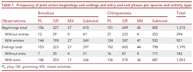
Let's look at a specific set of data.
The first column is labeled PL (play events), for bonobos. The first number is labeled "beginnings total". The number means that the scientists recorded 156 cases of two bonobos coming together and then playing. Of those, 144 began with "entries"; 12 did not.
What is an entry? It is a "hello" -- an ape form of hello. The scientists looked for interactions including gazes, physical gestures, and vocalizations. That is, most of the time, a play event began with some form of greeting. This established what the scientists call a "joint commitment", a personal bond between the two. Play followed.
The bottom numbers in that column are for the "endings". Once again, most meetings ended with some form of personal gesture that the scientists consider an "exit" -- an ape form of good-bye.
Now, the big picture...
The left half of the table is for bonobos. The right half is for chimpanzees.
The individual columns are for different kinds of activity, as listed at the bottom. The column labeled subtotal is the total for bonobos or chimpanzees. There is a total at the right, summing all the results for both types of ape.
Look over the various data sets... totals, subtotals, beginnings and endings for each activity. The general picture is the same, and is what we said above. Most beginnings and endings were accompanied by some form of "joint action", marking the start and finish of the joint commitment session.
In fact, the ratio of with to without some such joint action is about 10;1 for most of the larger data sets. The main exception is chimpanzees-grooming, where it is only 2:1.
The animals studied here are in zoos.
This is Table 1 from the article.
|
From such results, the authors suggest that "joint commitments" are part of our genetic legacy.
Importantly, this is not about whether animals do things together. It is about the extent of their coordination and commitment when they do so.
The scientists also explored how such interactions depended on social structure.
It's a fun story -- and rather confusing. I suggest you take the article as opening up an idea. As so often, we'll see how it develops with further work.
News stories:
* Like humans, apes communicate to start and end social interactions. (Science Daily (Cell Press), August 11, 2021.)
* Apes signal 'hello' and 'farewell' when starting and exiting social interactions -- Our closest living relatives on the tree of life may also exhibit complex social cues that are paramount to joint commitment. (Tibi Puiu, ZME Science, August 11, 2021.)
* Animals Say "Hi" and "Bye" to Communicate What They Want -- A new study shows how bonobos and chimpanzees coordinate playing and grooming. (Marc Bekoff, Psychology Today, August 16, 2021.) This item offers a different interpretation of the findings. The author here notes that other animals, including dogs, seem to have such signals to mark the ends of social interactions. Note that he does not question the findings, but their interpretation. (Hm, are dogs special because of their relationship, even if non-genetic, with humans?) Again, there is more to be done. The item includes some references.
The article, which is open access: Assessing joint commitment as a process in great apes. (Raphaela Heesen et al, iScience 24:102872, August 20, 2021.)
More about apes:
* A new species of orangutan? (January 16, 2018).
* Age-related development of far-sightedness in bonobos (January 10, 2017).
* What do chimpanzees think about cooking food? (August 30, 2015).
* Speech: Are chimps good listeners? (July 25, 2011).
Using an electrical conductor as an insulator
September 12, 2021
Insulation of high voltage power lines is an issue. Even low losses can accumulate, with a significant overall impact.
Here is a test of how an additive affects the conductivity of power line material...
The graph shows conductivity (log scale; y-axis) vs the electric field (x-axis).
The upper curve (triangles) is for the basic material, low density polyethylene (LDPE). For the other curves, the LDPE also has a small amount of an additive, called P3HT.
Observations:
- The additive reduces the conductivity. The effect is as much as three-fold.
- The lower concentration of additive is more effective. Interesting.
- The amount of additive is very small. 0.0005% by weight is 5 ppm (parts per million).
The work here is with direct current (DC).
This is Figure 3c from the article.
|
What is this P3HT stuff? The following figure shows it, with some context...
The top part is a diagram of a cable. It's complicated. But for now... There is a conducting wire in the middle. And one insulation layer is polyethylene, which is shown just below.
Also shown there is P3HT, which stands for poly(3-hexylthiophene). Thiophene is the ring, with a sulfur; it is an aromatic ring, using the lone pair electrons of the S. The polymer is an electrical conductor.
This is Figure 1a from the article.
|
The authors define efficiency of an insulator additive as the reduction in conductivity per weight. By that standard, P3HT is the most efficient insulator additive known. On the other hand, the amount of improvement (reduced conductivity) is fairly low (3-fold, as noted above), because it only works at very low amounts.
The efficiency of the P3HT is nearly ten times better than the previous record-holder, graphene oxide. In contrast, zinc oxide can give a 300-fold reduction in conductivity, but only at a much higher concentration (3%); its efficiency is only 1/60 that of the P3HT.
How does this electrical conductor reduce conductivity under these circumstances? That is not at all clear.
It's all quite intriguing. A conductive polymer, which efficiently improves electrical insulation. It will be interesting to see where this leads.
News story: More efficient electricity distribution thanks to new insulation material. (Science Daily (Chalmers University of Technology), August 26, 2021.)
The article, which is open access: Repurposing Poly(3-hexylthiophene) as a Conductivity-Reducing Additive for Polyethylene-Based High-Voltage Insulation. (Amir Masoud Pourrahimi et al, Advanced Materials 33:2100714, July 8, 2021.)
More about electrical insulation:
* The SF6 story: an emerging greenhouse gas? (August 25, 2020).
* Stretchable electric wires (January 22, 2013).
A post about conductive organic polymers: What if you pulled on the ends of a ladderene? (September 26, 2017).
Posts about graphene, including the oxide, are listed on my page Introduction to Organic and Biochemistry -- Internet resources in the section on Aromatic compounds. Added May 5, 2026.
September 8, 2021
Briefly noted... The infection process for the SARS-2 (COVID-19) virus
September 8, 2021
A recent Nature news feature is a useful overview of the infection process, describing what is known and what is not known. The article includes comparison with other coronaviruses, and includes information on some of the "variants". If you would like to step through the process, try this item.
* A tidbit... There are two ways for the virus to enter cells. One pathway is inhibited by (hydroxy)chloroquine. Some early lab work was done with cells using that pathway. However, that is not the major pathway used in vivo. That discrepancy may explain why there was some early indication, from lab work, that the drug might work, but it did not work in the real world.
* News feature, freely available: How the coronavirus infects cells - and why Delta is so dangerous -- Scientists are unpicking the life cycle of SARS-CoV-2 and how the virus uses tricks to evade detection. (Megan Scudellari, Nature, July 28, 2021. In print, with a slightly different title: Nature 595:640, July 29, 2021.) The online version starts with a beautiful animated gif of the virus.
* Does post-exposure administration of hydroxychloroquine prevent Covid-19? A clinical trial (June 16, 2020).
* I have listed this post on my BITN page section for SARS, MERS (coronaviruses).
Making better muscles using bacteria -- and inteins
September 7, 2021
The following figure shows the toughness of a wide variety of materials...
They are grouped into three major classes: man-made, natural, and microbial materials. And then there is one more material at the right, in red. It is called "UHMW titin". It is about the best in the figure.
Toughness is one measure of the strength of a material. It is, loosely, the ability to absorb energy without being damaged.
This is Figure 3c from the article.
|
What is this UHMW titin stuff? And why doesn't it fit into the first three classes?
Titin is actually a common protein. It is part of your muscles -- vertebrate muscles, contributing to their springiness. People have long been interested in making titin. However, that is hard; it is a huge protein, and very complex.
Titin is the largest protein known, with a molecular weight over 3 million.
A new article reports a process for making a titin derivative in bacteria. The product is called UHMW titin; UHMW = ultra-high molecular weight.
The following figure diagrams the process...
The box at the upper left is a diagram of part of the protein. It consists of four purple blobs linked together. Each purple blob is one "Ig" -- immunoglobulin domain, but we won't worry about that connection. The point is that this 4Ig unit, which is found like this in titin, is what promotes its strength. What we might like is more Ig.
So, let's make 4Ig units -- with "hooks" on both ends.
Drop down to the big blue boxed region. At the upper left of that box is the 4Ig with hooks on both ends. That protein is called IntC-4Ig-IntN. The two Int regions are the hooks. We'll explain the hooks in a moment. For now, let's just look at the result.
Just below that is a titin dimer. 8Ig, with hooks on both ends. To get this, two of the units shown just above are joined together, using the hooks. (The left-over hook pieces are also shown, just above the dimer.)
The process can continue, connecting together more and more 4Ig blocks. The result: a long protein with many Ig subunits. It's all done within bacteria.
This is Figure 1b from the article.
|
The authors report making UHMW titin with a wide range of molecular weights, some as large as or larger than natural titin. (The 4Ig monomer unit has a molecular weight about 43,000.) Those molecules could be spun into fibers. The first figure shows one property of the UHMW titin fibers.
What are those Int hooks? Int stands for intein. It refers to an uncommon process called protein splicing. That is logically much like the better-known RNA splicing, but actually involves splicing of proteins, removing an intervening region. The two Int regions are the signals for protein splicing. That is, a key step here is exploiting the signals for natural protein splicing, so that the protein produced in the bacteria splices itself together to make longer chains.
So, the scientists have made an interesting material. Further, they have developed an interesting tool for joining proteins together.
News stories:
* Synthetic Microbial Process Produces Muscle Fibers That Are Stronger than Kevlar. (GEN, August 30, 2021.)
* Microbes build synthetic muscle fibres stronger than Kevlar. (BioTechScope, September 1, 2021.)
The article, which is open access: Microbial production of megadalton titin yields fibers with advantageous mechanical properties. (Christopher H Bowen et al, Nature Communications 12:5182, August 30, 2021.)
Other posts about muscle include... Making better artificial muscles (March 13, 2018). Links to more.
Effect of LED street lights on insects
September 4, 2021
Data...
The figure compares the number of caterpillars (moth larvae) found in similar areas, depending on the type of lighting.
Each narrow bar is for a pair of sites considered similar except for the lighting. The bars are grouped by the type of lighting, and by the type of landscape.
A specific example... The first group of narrow blue bars at the left compares sites with LED lights vs similar unlit sites; the sites here are all with hedgerows. Each bar shows the ratio (caterpillars in lit site)/(caterpillars in unlit site); low values mean that there were fewer caterpillars in the lit area. You can see that all six (narrow) bars in that part of the figure are like that. The next bar -- same color, but wide -- shows the average for that set.
In fact, the general pattern is the same for all the data sets: fewer caterpillars with lighting. The data sets to the left of the vertical dashed line for are sites with hedgerows; the data sets to the right are for sites with grass. Lighting groups are LED (light-emitting diodes), HPS (high pressure sodium), and LPS (low pressure sodium -- on the right side only).
The article contains statistical analyses of these data.
This is Figure 1 from the article.
|
That's a rather impressive pattern.
One limitation of the study is that the paired sites were chosen "as is". The scientists classified existing sites based on whatever lighting they had. Is it possible that the sites differ in some other way, which is what really matters?
That calls for an experimental test...
In this test, lighting was added to two of three similar sites.
The results are shown as number of caterpillars. The bar on the left is for the unlit sites; the other two bars are for two types of lighting.
The results for the sites with LEDs are significantly lower than for the control unlit sites. The sites with HPS lights are a bit lower than the controls, but that difference is not statistically significant. (Different letters at the top indicate statistically significant differences. That is, the set labeled b tests as significantly different from those labeled a.
This is Figure 3 from the article.
|
The major conclusion from the two experiments together is that LED lights reduce the activity of these caterpillars. The higher intensity and broader spectrum of current LEDs may contribute. How the light affects the insects is not understood.
How does this fit in the big picture? How should the work here affect our street lighting programs? Things to think about, but we won't address them here.
News stories. A long set, sampling the diverse interests. As common, the first one listed is perhaps the simplest overview, and the last is the most complete.
* Light pollution from street lamps linked to insect loss. (Helen Briggs, BBC, August 26, 2021.)
* LED streetlights are hurting insect populations. (Steve Bush, Electronics Weekly, August 27, 2021.)
* Dim Those Lights: Bright Streetlights Decrease Insect Populations -- They might be energy-efficient, but white LED lights are far worse for insects than the traditional sodium bulbs they are replacing, says new study. (Maureen Nandini Mitra, Earth Island Journal, August 31, 2021.)
* Streetlights reduce moth populations. (Richard Fox, Butterfly Conservation, August 26, 2021.) From an author of the article.
* LED streetlights reduce insect populations by half. (UKRI_News, August 26, 2021.)
The article, which is open access: Street lighting has detrimental impacts on local insect populations. (Douglas H Boyes et al, Science Advances 7:eabi8322, August 25, 2021.) A short, very readable article. The one-page Introduction is good.
Among posts about caterpillars...
* Caterpillars can see color even if blindfolded (September 14, 2019).
* Studying predation around the world: What can you do with 2,879 fake caterpillars? (July 28, 2017). Links to more.
Among posts about lighting:
* How to light a cave (August 30, 2021).
* Effect of artificial lighting on the environment (September 3, 2015). This post also notes special concerns about LEDs.
My page of Introductory Chemistry Internet resources has a section on Lighting: halogen lamps, etc. It includes a list of related Musings posts.
Top of page
The main page for current items is Musings.
The first archive page is Musings Archive.
E-mail announcements -- information and sign-up: e-mail announcements. The list is being used only occasionally.
Contact information
Site home page
Last update: May 5, 2026