Home
> Musings: Main
> Archive
> Archive for May-August 2012 (this page)
| Introduction
| e-mail announcements
| Contact
Musings: May-August 2012 (archive)
Musings is an informal newsletter mainly highlighting recent science. It is intended as both fun and instructive. Items are posted a few times each week. See the Introduction, listed below, for more information.
If you got here from a search engine... Do a simple text search of this page to find your topic. Searches for a single word (or root) are most likely to work.
Introduction (separate page).
This page:
2012 (May-August)
August 29
August 22
August 15
August 8
August 1
July 25
July 18
July 11
July 3
June 27
June 20
June 13
June 6
May 30
May 23
May 16
May 9
May 2
Also see the complete listing of Musings pages, immediately below.
All pages:
Most recent posts
2026
2025
2024
2023:
January-April
May-December
2022:
January-April
May-August
September-December
2021:
January-April
May-August
September-December
2020:
January-April
May-August
September-December
2019:
January-April
May-August
September-December
2018:
January-April
May-August
September-December
2017:
January-April
May-August
September-December
2016:
January-April
May-August
September-December
2015:
January-April
May-August
September-December
2014:
January-April
May-August
September-December
2013:
January-April
May-August
September-December
2012:
January-April
May-August: this page, see detail above
September-December
2011:
January-April
May-August
September-December
2010:
January-June
July-December
2009
2008
Links to external sites will open in a new window.
Archive items may be edited, to condense them a bit or to update links. Some links may require a subscription for full access, but I try to provide at least one useful open source for most items.
Please let me know of any broken links you find -- on my Musings pages or any of my web pages. Personal reports are often the first way I find out about such a problem.
August 29, 2012
An unusual scientific paper
August 29, 2012
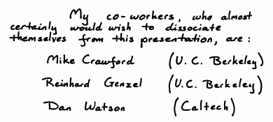
|
At left is a handwritten note from the first page of the article. (It was originally an oral presentation, but later appeared in print.)
Just go look... It is freely available at article.
|
This was posted in the chemed discussion group. The poster's source: source.
More poetry... The Mudville story, on its 125th anniversary (June 3, 2013).
Deceiving a rival male
August 28, 2012
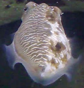
|
That is a male mourning cuttlefish (Sepia plangon).
On the left side he has male coloration (the "stripes"); on the right side, he has female coloration.
The cuttlefish is not a fish. It is a cephalopod -- a group that includes the octopus and squid. Cephalopods are known to be able to change their coloration, typically for camouflage.
The figure here is trimmed from the full size figure in the Science Now news story listed below. That figure is probably the same as Figure 1 of the article.
|
Such males, with mixed-sex coloration, are found only in a specific social context. The mixed-sex male is between a female and another male. That is based on extensive observations of the cuttlefish in a natural setting, according to a new paper. The findings are summarized in the following graph.
The graph is somewhat confusing. The key is to start with the x-axis. It shows several social groupings, with M and F having the usual meanings. For example, the right-most group, MMMF, means three males in a row, with a female to one side.
Two measurements are plotted for each social grouping. One is shown with bars, the other with points and a line. (The line doesn't really mean anything; this is just a bar graph, with two values being plotted for categories shown along the x-axis. It makes no sense to connect the dots between two categories.)
|
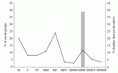
|
Let's start with the gray bars. Make that, the gray bar. It shows the percentage of animals with the deceptive coloration. Read this bar on the right-hand scale; it is about 40%. For what group? Look at the x-axis: it is MMF -- two males plus a female to one side. Importantly, there are no other gray bars. That is, they observe this coloration pattern only for the one grouping, MMF. (It is not clear exactly what the 40% number refers to. Is this the percentage of males with this mixed coloration, or the percentage of groups with a mixed color male? Fortunately, it doesn't matter much, to get the main idea of the paper.)
The graph line, read on the left-hand scale, shows the percentage of "groups" of each type. (For their purposes here, a "group" contains one or more animals.) You can see that only 10% of the groups they saw are of the MMF type, yet this accounts for all the deceptive displays.
Using the labels on the x-axis and reading the left-hand scale, you can see that about 20% of the groups were just one male (M), 10% were two males (MM), and so forth. But, again, the deceptive coloration was observed only in the MMF groups.
This is Figure 2 from the article.
|
Why is this happening? The authors suggest that the male is courting the female (showing her his male side), and deceiving a possible rival male on the other side (showing him his female side).
Interestingly, they also suggest that the male cuttlefish is controlling the coloration as a matter of intelligence -- evaluating the situation, and modifying its coloration only when it seems useful. They don't really present much evidence for that interpretation, but they do note that the cephalopods are noted for their intelligence. I suggest we keep an open mind on this interpretation. For now, simply establishing the phenomenon is a step forward -- and an interesting finding. Their interpretation may guide further work, but should not be taken as a conclusion.
News story: Two-Faced Fish Tricks Competitors. (Science Now, July 3, 2012.)
The article: It pays to cheat: tactical deception in a cephalopod social signalling system. (C Brown et al, Biology Letters 8:729, October 23, 2012.)
More about cephalopods...
* Aging without memory loss in cuttlefish (October 4, 2021).
* Sleep stages in octopuses -- do they dream? (July 13, 2021). Includes an extensive list of posts about octopuses and other cephalopods.
* Chromatic aberration: is it how cephalopods see color with only one kind of photoreceptor? (October 14, 2016).
* Cuttlefish vs shark: the role of bioelectric crypsis (May 10, 2016).
* How an octopus adapts to the cold -- by RNA editing (March 5, 2012).
* Quiz: What is it? (November 20, 2012). See the answer.
More mollusks... Is clam cancer contagious? (April 21, 2015).
Another camouflage story: The story of the peppered moth (July 9, 2012).
Another animal with a 2-sex appearance -- for a completely different reason: On his right side, he is female (April 24, 2010).
More on deception:
* A "flower" that bites -- and eats -- its pollinator (December 27, 2013).
* A deceptive robot (September 4, 2012).
More about animals that change color... Why chameleons change color (and get thin) (March 31, 2014).
Next post on intelligence: The smartest chimpanzee? (September 29, 2012).
What does "Anopheles" mean?
August 27, 2012
A bit of etymology -- and history.
The article -- just a paragraph or so, freely available: Etymologia: Anopheles. (Emerging Infectious Diseases 18:1511, September 2012.)
For a picture, see the related post: Genes that protect against malaria (January 19, 2010).
More Anopheles... Can Wolbachia reduce transmission of mosquito-borne diseases? 2. Malaria (June 17, 2016).
More on mosquitoes. Mosquitoes are delectable things to eat (August 21, 2010). This post addresses the issue of the good vs bad of mosquitoes, a topic perhaps prompted by the content of this new item.
* Previous history post...
Frank Oppenheimer, on his 100th birthday: the Exploratorium (August 14, 2012).
* Next... Silent Spring -- on its 50th anniversary (October 5, 2012). Not unrelated!
My page Internet resources: Miscellaneous contains a section on Science: history. It includes a list of related Musings posts.
Genome sequencing of a human fetus
August 25, 2012
People have been examining the human fetus for many years. In the amniocentesis procedure, a sample of fluid is obtained from within the uterus. This is an invasive procedure, and carries risks of its own. Ultrasound is an example of a non-invasive procedure, but it provides limited information.
The discovery that there is fetal DNA in the mother's blood opens up new possibilities. Obtaining the mother's blood is non-invasive to the fetus, and a routine minor invasion for the mother. Making use of this fetal DNA has moved forward with the development of DNA testing in general. Tests looking for specific genetic abnormalities have been developed and approved. Now, we have the first report of a "complete" genome sequence of a fetus, based on analysis of the blood from the mother.
There is a problem with this approach. The fetal DNA is typically about 10% of the DNA in the mother's blood; that is, the sample being sequenced is mostly (about 90%) maternal DNA. Thus the problem is sorting out what the "raw" sequencing results mean. Of course, the scientists can sequence the mother's genome -- and the father's too. They then collect lots (!) of sequencing data. Computer analysis sorts out which results are for the fetus.
There are a couple of issues in analyzing for the fetal genome. For the most part, the fetal genome follows Mendel's laws. At each spot on the genome, the fetus should have the sequence from the mother or the sequence from the father. This part of the analysis is logically straightforward, if both parental sequences are known. It's just a big computational problem.
In addition, the fetus may carry new mutations -- sequences not in either parent. Although such novel sequences are relatively infrequent, they may be of particular interest. What does the child carry that is unexpected? It's also difficult, because the frequency of mutations is not very different from the error frequency for sequencing.
|
Here is an example of how one might see new mutations -- individual base sequences not carried by either parent. The figure at the right shows the sequencing results for a short segment from the mother, father, and offspring (fetus -- but the data shown are for mother's blood).
|
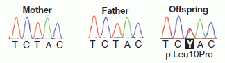
|
Look first at the result for the mother (at left, in the figure). The colored peaks represent raw sequencing data for a particular five-base segment of the genome, with a different color for each base. The result is then shown as base sequence directly underneath. The results for the father (middle) are the same. That is, both parents carry only this one DNA sequence at this site.
We would expect the child (fetus) to show this same result. However, that is not quite so. Look carefully at the result for the DNA from the blood of the pregnant mother (at the right in the figure, labeled "offspring"). The peak for the middle position is more complex: it has two colors. It's not important that you can see all the detail, but the computer records show that out of 93 sequencing "reads" for this position, 90 were T and 3 were C. (In the base sequence, this is shown as Y, where Y is the code for "T or C") What does that mean? Remember, the DNA sampled here is about 90% maternal. In this case, they found that it is 87% maternal and 13% fetal. Of the 93 reads, we might expect 12 to be from the fetus -- six from each of the two fetal copies of the gene. Finding three C at this position suggests that some of the fetal DNA has picked up a new mutation. After the child was born, they verified that the child indeed carries this mutation. (From knowing where this site is, they know the mutation would lead to a particular leucine amino acid in a protein being changed to a proline. They are concerned this mutation might be detrimental.)
The figure here is part of Figure 1 D from the article.
|
Well, it took several paragraphs there to explain what is going on for a five base sequence. Hopefully, it gives the idea. In this case, detailed analysis of the DNA from the mother's blood reveals that the fetus carries a novel mutation. Stepping back to the big picture, they have achieved the first sequencing of a child's genome prior to birth, using a non-invasive method. They are at the forefront of using the new DNA technologies, including the computer processing that is so critical to all sequencing. The authors do not suggest that this is very practical at this point, but it certainly opens the door.
News story: Baby's Genome Deciphered Prenatally from Parents' Lab Tests. (Science Daily, June 6, 2012.)
The article: Noninvasive Whole-Genome Sequencing of a Human Fetus. (J O Kitzman et al, Science Translational Medicine 4:137ra76, June 6, 2012.)
This work was made possible by recent developments in DNA sequencing, leading to major cost reductions. A recent post on this topic was: DNA sequencing: an overview of the new technologies (June 22, 2012).
A post on the ethics of learning about the fetus: Let parents decide (May 14, 2010).
Several posts on personalized, genome-based medicine, are listed at: Personalized medicine: Getting your genes checked (October 27, 2009).
More about fetal DNA: Male DNA found in human female brains (October 8, 2012).
More about DNA in the blood: A blood test that detects multiple types of cancer (March 30, 2018).
More human genome sequencing: Accumulation of mutations in the sperm of older fathers (November 19, 2012).
There is more about genomes on my page Biotechnology in the News (BITN) - DNA and the genome.
Thanks to Borislav for raising the topic of fetal DNA sequencing.
Fertilizing the ocean may lead to reducing atmospheric CO2
August 24, 2012
The southern oceans are deficient in iron. As a result, few algae -- the major photosynthetic organisms of the oceans -- grow there. What if we added iron to these oceans? We might predict that it would stimulate the growth of algae. Further, if the algae settled to the ocean floor (rather than being quickly recycled), this would result in carbon from the air being deposited at the ocean bottom. This could be a form of carbon sequestration, reducing the CO2 in the air. Some have suggested that this might be worth doing, as a way to combat global warming; it is a type of geoengineering.
Does it work? In fact, some small studies have suggested that adding iron to iron-deficient oceans does stimulate algal growth. A new paper confirms this, and also suggests that the algae settle.
|
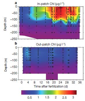
Here is an example of their results, showing the first point.
The scientists measure chlorophyll to represent the amount of biomass. The amount of chlorophyll is shown by color, according to the key at the bottom. Each graph shows the chlorophyll as a function of depth (y-axis; meters) and time after the fertilization with iron (x-axis; days). Part a (upper) is for the area within their study patch ("in-patch"); part b (lower) is for the area outside the study patch ("out-patch").
It may be simplest to start with part b. This is the "control" -- the area not fertilized. All the colors shown here are for low levels of chlorophyll, and there is little change over time.
|
Now look at part a, for the fertilized patch. You can see that the graph has many brighter areas, indicating higher concentrations of chlorophyll. This shows that the iron fertilization stimulated the growth of biomass. If you look more closely, you will see that the chlorophyll began to rise noticeably a few days after fertilization, continued to rise until about day 24, and began to decline near the end of the study time. You will also see that significant increases in chlorophyll were found at even 100 meters water depth.
The figure here is Figure 2 parts a and b from the article.
|
The graph above shows that iron stimulates algal growth. Per se, that is not enough to show that such fertilization would reduce atmospheric CO2. What happens to the algal biomass? The decline in chlorophyll (or biomass) shown above toward the end could be due to the algae settling -- or due to them being eaten. Distinguishing those requires a complex analysis of a huge data set of many parameters. They conclude that over half of the algal biomass sinks.
Thus this work supports the idea that stimulating algal growth by fertilizing iron-deficient oceans with iron could serve to reduce CO2 in the air. More specifically, it provides some evidence for the two steps that are needed: stimulation of algal growth, and settling of the algae. I should caution -- even emphasize -- that most scientists do not feel that enough is known about the system to employ it as a real geoengineering application to combat global warming. The information available is just too limited at this point. The general consensus is that more experimental work should be done, asking more questions about the system -- including carefully looking for unintended side effects. For now, this is interesting science, but should not be considered a practical tool.
News story: Sinking Carbon: Researchers Publish Results of an Iron Fertilization Experiment. (Science Daily, July 18, 2012.)
* News story accompanying the article: Biogeochemistry: The great iron dump. (K O Buesseler, Nature 487:305, July 19, 2012.)
* The article: Deep carbon export from a Southern Ocean iron-fertilized diatom bloom. (V Smetacek et al, Nature 487:313, July 19, 2012.)
A broad overview of geoengineering: Geoengineering: a sunscreen for the earth? (February 20, 2010).
More... Climate engineering: How should we proceed? (March 4, 2015).
Another post dealing with the iron limitation in the southern ocean: The effect of defecation by whales on global warming (August 2, 2010).
and maybe... Why are some icebergs green? (May 11, 2019).
More about CO2: Making use of CO2 (November 10, 2015).
More about iron as a limiting nutrient: The iron war (May 17, 2015).
More about our oceans: 2011: There was less water in the oceans (November 25, 2012).
Posts about diatoms include: Communication in diatoms (February 6, 2022).
More about measuring biomass: The ultimate census: the distribution of life on Earth (June 22, 2018).
August 22, 2012
NASA: It's InSight, not TiME
August 22, 2012
NASA has just announced its choice for the next "low-cost" planetary mission of the Discovery series. It's a mission to explore the core of Mars; the mission is called Interior exploration using Seismic Investigations, Geodesy and Heat Transport -- or InSight.
Among the losers was the proposed mission to visit the lakes of Titan, the mission called Titan Mare Explorer -- or TiME. We note the NASA choice here because the TiME mission was the subject of a Musings quiz (link below).
News story on the NASA announcement: NASA Unveils New Mars Mission to Probe Red Planet's Core. (Space.com, August 20, 2012.)
The Musings quiz about TiME: Quiz: NASA's boat (June 29, 2011).
More about Mars:
* Cows on Mars? (November 7, 2012)
* Mars: craters (August 11, 2012).
TALISE: A better boat for Titan? (October 16, 2012). A new chapter begins?
What about the H5N1 flu?
August 21, 2012
The H5N1 bird flu has been in the news a lot recently, with the controversial publication of two papers on its potential to jump to humans. As this incident winds down, Nature has published a nice short overview of where we are with H5N1 flu. It's worth a browse.
News feature, which is freely available: 5 Questions on H5N1. (E Yong, Nature 486:456, June 28, 2012.)
Posts on flu and flu vaccines are listed on the page Musings: Influenza (Swine flu).
NASA: Life with arsenic -- Follow-up #2
August 20, 2012
The article that was the basis of the original post has been retracted. See the Retraction note at the top of the original post for more information. Added August 28, 2025.
Original post: NASA: Life with arsenic (December 7, 2010). And... NASA: Life with arsenic -- follow-up (June 7, 2011).
The original paper made two main claims. First, they claimed they had a bacterial strain that would grow with arsenic (As) instead of phosphorus (P). Second, they claimed that these bacteria contained biochemicals with arsenic replacing phosphorus. (Those two claims complement each other. The first says that the organism seems to grow with As; the second says that indeed they find As in it, in specific biochemicals they might expect.) The paper was featured at a NASA press conference, which made the extreme claim that they had found (or would make) a new form of life. The basis of that claim was that P is one of the essential elements for all life as we know it; finding or making a life form that did not use P would indeed be novel. That press conference gained extra attention -- and scrutiny -- for the paper.
Among reasons to be suspicious of the original work... First, the growth media they used contained low (residual) levels of P. Second, what is known about the chemistry of As makes it unlikely that As could replace P in biochemistry. (Arsenate analogs of many phosphate compounds tend to be quite unstable.) The paper noted these concerns, and did not make the extreme claims that came from the press conference.
We now have two new papers following up on the original work. The general conclusion from the two papers is that the bacteria cannot grow without P, and that there is little As replacing P in the biochemicals of the cell. They did this by doing experiments similar to those of the original paper, but taking care to lower the residual P level even further. In addition, they extended the analytical measurements, and took extra care in purifying materials before analyzing them.
Thus at the moment there seems to be no basis for the claim that the bacteria can grow without P. Even when fed a very high ratio of As to P, there is little As in the cell biochemicals. Is this the last word? The original authors say they will report new results soon. Let's see what they say.
Despite the negative tone of the new work, the new bacteria may be of some interest. It is extremely resistant to As. It grows even when As is present at a level a thousand times higher than the P. Ignoring As at such a high level is itself a trick that may be worthy of further study. Further, there may be interest in studying the low level of As incorporation that is seen.
News story: Scientists say NASA's 'new arsenic form of life' was untrue. (Phys.org, July 9, 2012.)
The articles:
* GFAJ-1 Is an Arsenate-Resistant, Phosphate-Dependent Organism. (T J Erb et al, Science 337:467, July 27, 2012.)
* Absence of Detectable Arsenate in DNA from Arsenate-Grown GFAJ-1 Cells. (M L Reaves et al, Science 337:470, July 27, 2012.)
Earth: craters
August 19, 2012

|
Some readers may recognize this crater. Some may have been on its floor.
The crater is about 1.2 kilometers across.
|
That is Barringer Crater, often called Meteor Crater. It is in the US state of Arizona, about 100 miles (160 km) north of Phoenix. This crater was made by a meteor about 50 meters across, impacting with an energy of about 10 megatons TNT. The impact happened about 50,000 years ago -- well within the human era on Earth -- though there is no evidence for humans on this continent that early.
Last week I posted about a database of craters on Mars -- a database with a few hundred thousand entries (a link is below). Now we have an Earth crater -- from a database of Earth craters. Geologists have been working on this Earth Impact Database since 1955. It has 182 entries.
The young Earth should have been bombarded about as hard as Mars and the Moon. Why are there so few craters found on Earth? The major reason is that the Earth is so geologically active. Plate tectonics has erased most of our early history. The news story with the Mars crater post discusses this; that news story would be very suitable here.
The database: Earth Impact Database. I suggest you browse the home page and then look at the FAQ -- listed in the main text at the right. (The menu at the left is for the institute, not for this database.) Or explore other options, as you wish. For example, you might sort the list by crater size or age, to put the Barringer crater in perspective. The database is maintained by the Planetary and Space Science Centre, University of New Brunswick, Canada.
The photo above is reduced from figure #3 on their page for Barringer crater: Earth Impact Database: Barringer.
Mars database: Mars: craters (August 11, 2012).
A post on collisions of asteroids with earth: Gravity tractor: protection from asteroid collisions (October 26, 2009).
For more about meteorites: An extraterrestrial god (October 9, 2012).
A new approach for testing a Llullaillaco mummy for lung infection
August 17, 2012

|
"The Maiden", as she is known. Died, age 15 -- sacrificed to Pachamama, the Inca earth goddess, about 500 years ago. She was discovered, as an extraordinarily well preserved mummy, in 1999 near the 6,739 meter (about 22,000 feet) summit of Llullaillaco, in Argentina.
This is Figure 1A from the article. Mummies of two other children were also discovered there. One of them was analyzed by the same methods discussed here, and was negative on all tests.
|
Previous radiological examination of the Maiden had revealed various lesions, including in the lungs. Visual inspection revealed nasal mucus under the nostrils.
The key new step in this work was to apply a method that is just emerging: total analysis of all the proteins, or "shotgun proteomics". This is done by mass spectrometry; as with so many modern methods, it provides a "computer full" of data that is beyond ordinary comprehension. In this case, analysis of the proteins from the Maiden's mouth showed proteins of the immune system, which would be expected for someone with an active infection. Some of these proteins were characteristic of mycobacterial infections. Mycobacteria include the species that causes tuberculosis (TB), Mycobacterium tuberculosis.
With evidence of lung damage and evidence of infection, perhaps mycobacterial, the authors did an additional test. They looked at the DNA in the same samples from the Maiden. Preliminary DNA analysis seems to show DNA from mycobacteria, but is insufficient to point to a specific member of the group. All the evidence together suggests that the Maiden had an active mycobacterial infection.
An important point is the value of having the different kinds of evidence. DNA evidence is "in vogue", but simply finding DNA from an organism would be insufficient to indicate active disease. Many people carry the TB bacterium, for example, without active disease. The key contribution here is the protein work: analyzing the proteins from the mouth shows that there is an immune reaction to a pathogen. They then couple the protein findings with the radiological examination of the lung and the DNA evidence to suggest a diagnosis.
News stories:
* 'Maiden' Inca Mummy Suffered Lung Infection Before Sacrifice. (Live Science, July 25, 2012.)
* Disease Diagnosed in a 500-Year-Old Mummy. (New York Times, July 30, 2012. Now archived.)
The article, which is freely available: Detecting the Immune System Response of a 500 Year-Old Inca Mummy. (A Corthals et al, PLoS ONE 7:e41244, July 25, 2012.)
More about analyzing ancient diseases...
* A look at Chopin's heart (January 9, 2018). Not so ancient, but still...
* Musici Ambulanti: Ancient art and ancient microbiology (January 17, 2012).
* Diagnosis of prostate cancer in a 2100 year old man (November 8, 2011).
More mummies: How to make a mummy (May 7, 2023).
Analyzing ancient proteins: Dinosaur proteins (July 6, 2009). Caution... They refer to this work as if it were well accepted. I'm not at all convinced it is. The uncertainty about the analysis of dinosaur proteins in no way diminishes the new work.
More about mycobacteria:
* How did tuberculosis get to the Americas? (January 24, 2015).
* Leprosy: the armadillo connection (May 14, 2011).
More lungs... A better way to collect a sample of whale blow (November 28, 2017).
More mucus: Effectiveness of alcohol-based hand sanitizers? (September 28, 2019).
More from the Incas: Skull surgery: Inca-style (August 21, 2018).
Thanks to Borislav for suggesting this item.
August 15, 2012
Frank Oppenheimer, on his 100th birthday: the Exploratorium
August 14, 2012
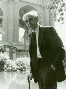
|
Frank Oppenheimer, founder and long-time director of the Exploratorium, San Francisco.
Born August 14, 1912; died February 3, 1985.
Shown here in front of the Palace of Fine Arts, the original home of the Exploratorium.
This figure is from The Aesthetic of Frank Oppenheimer. (Exploratorium. Now archived.)
|
For a sense of Frank Oppenheimer, and his view of science education: The Exploratorium: A Playful Museum Combines Perception and Art in Science Education. (F Oppenheimer, American Journal of Physics, 40:978, July 1972.)
The paper is also freely available from the Exploratorium, at Exploratorium copy; now archived. It is available there both as a web page and as a pdf. This page and the page listed above as the figure source are part of a "history" section at the Exploratorium web site.
In addition to his role in developing the world's greatest science museum, Frank Oppenheimer was a physicist, a member of the Manhattan project, a victim of McCarthyism, a rancher, a high school teacher -- and the younger brother of perhaps a more famous Oppenheimer.
* Previous history post... Salvador Luria, on his 100th birthday: the Luria Delbrück experiment (August 13, 2012).
* Next: What does "Anopheles" mean? (August 27, 2012).
Another birthday: Happy birthday, Phil Trans (March 25, 2015).
My page Internet resources: Miscellaneous contains a section on Science: history. It includes a list of related Musings posts.
Salvador Luria, on his 100th birthday: the Luria Delbrück experiment
August 13, 2012
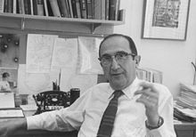
|
Sal Luria, Nobel prize-winning molecular biologist.
Born August 13, 1912; died February 6, 1991.
This figure is from Wikipedia: Salvador Luria.
|
Luria was not just a molecular biologist; he was one of the founders of the field. He is particularly famous for an experiment reported in 1943, an experiment that has its own Wikipedia page. The experiment addressed a very fundamental question in genetics: does a selective pressure for some trait cause the trait to happen, or does it select for rare variants (mutants) that already have the trait? To make that more concrete... Imagine that bacteria are exposed to a drug (e.g., an antibiotic). Most die. A few survive; they are found to be resistant to the drug. The question is: Did the drug cause the resistant variants to occur, or were there some rare resistant variants already present, and they were allowed to dominate when the drug was added?
The Luria-Delbrück experiment, published by Luria with another distinguished scientist (and co-Nobelist) Max Delbrück, addressed this with an elegant experiment. The general idea of the experiment can be described simply, though full evaluation of the real experiment uses mathematical models for the two possibilities being distinguished, and statistical analysis of the experimental results.
Here is the main idea... Imagine that you do the experiment described above -- on challenging bacteria with a drug -- many times, and measure how many drug-resistant mutants you get each time. If the virus is causing (inducing) the mutations, you may expect about the same number each time. On the other hand, if the virus is merely selecting for rare variants that are already there, the number you get may fluctuate wildly -- depending on how many virus-resistant variants happen to be present. (The Luria-Delbrück experiment is sometimes also called the fluctuation test.)
|
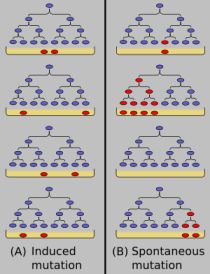
Here is a cartoon of the Luria-Delbrück experiment; it is from Wikipedia: Luria-Delbrück experiment. The general plan is that small samples of bacteria are grown, and then put on petri dishes ("plates") that include a virus. (The virus -- or bacteriophage -- here plays the role of a drug; it is exactly the same idea.) Only bacteria resistant to the virus can grow on the plates. The resistant bacteria are shown in red.
The figure describes the two models and the expected results. On the left is the model that the virus (drug) causes the mutations to occur. In this case, there are no virus-resistant bacteria present during the growth phase, and about the same number occur on each plate when the virus challenge happens. (In the cartoon here, two red colonies appear in each of the four frames.) On the right is the model that resistant bacteria arise -- randomly -- during the growth phase. Then, upon challenge with the virus on the plates, the number of resistant colonies varies widely. (In the cartoon here, the number of red colonies is 1,4, 0, and 2 in the four frames. And the number of red colonies equals the number of red cells already present before the virus challenge.)
|
As an example... In one experiment they did 12 samples. The numbers of resistant colonies were: 1, 0, 0, 7, 0, 303, 0, 0, 3, 48, 1, 4. I think it is "obvious" that the results vary widely. That wild fluctuation supports the second model: the variants (mutants) already existed, in varying numbers; the virus challenge simply allowed them to dominate, when all the original sensitive bacteria were killed off. Although I have presented a small set of data here for inspection, their full analysis involved many such experiments, and a statistical analysis of the data. (This is experiment 17 from Table 2 of the paper.)
The Luria-Delbrück experiment established that mutations occur in the absence of the selective pressure. Selection acts on pre-existing mutants; it does not create them. This is a basic tenet of modern biology, and is generally well understood within the framework of DNA and how it replicates. But this experiment was done before we knew that DNA was the genetic material -- a discovery published the following year.
The original Luria-Delbrück article: Mutations of bacteria from virus sensitivity to virus resistance. (S E Luria & M Delbrück, Genetics 28:491, November 20, 1943.) The paper is freely available through PubMed Central: copy at PMC.
Nobel site: The Nobel Prize in Physiology or Medicine 1969 was awarded jointly to Max Delbrück, Alfred D. Hershey and Salvador E. Luria for their discoveries concerning the replication mechanism and the genetic structure of viruses.
Another Musings post on molecular biology history... The original Watson-Crick paper on the structure of DNA (October 25, 2010).
More about phage: A virus that could treat acne? (October 21, 2012)
* Previous history post...
On a new method of treating compound fracture... (July 11, 2012).
* Next: Frank Oppenheimer, on his 100th birthday: the Exploratorium (August 14, 2012).
My page Internet resources: Miscellaneous contains a section on Science: history. It includes a list of related Musings posts.
Mars: craters
August 11, 2012
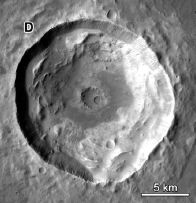
At the right is a crater on the surface of Mars.
This is part of Figure 5 from paper #1.
The scale bar is 5 kilometers.
|
|
Here are 384,342 more of them: Martian craters. (From the authors of the papers listed below.)
That's really the point there. A group of scientists have pored through vast amounts of data, from numerous missions, and come up with a catalog of known craters on Mars. (The number listed depends on the specific criteria used, such as size.) Two of their papers are listed below. The first is basically an announcement of the catalog. The second offers some exploration of their properties. Simply browsing it and looking at figure legends will lead to admiration of what they have accomplished -- even if there are no clear take home lessons at this point.
News story: Impact atlas catalogs over 635,000 Martian craters. (American Geophysical Union, June 11, 2012.) Good overview of the background and possible uses, with some broader perspective.
The articles:
* A new global database of Mars impact craters ≥1 km: 1. Database creation, properties, and parameters. (S J Robbins & B M Hynek, Journal of Geophysical Research 117:E05004, May 15, 2012.)
* A new global database of Mars impact craters ≥1 km: 2. Global crater properties and regional variations of the simple-to-complex transition diameter. (S J Robbins & B M Hynek, Journal of Geophysical Research 117:E06001, June 5, 2012.)
Another recently noted catalog... Habitable Exoplanets Catalog (July 27, 2012).
And... Earth: craters (August 19, 2012).
And... 124,993 and counting: cataloguing plant species in the Americas (February 26, 2018).
More about Mars...
* What causes gullies on Mars? (September 8, 2014).
* NASA has announced its choice... NASA: It's InSight, not TiME (August 22, 2012).
* Water at the Martian surface? (August 27, 2011). Includes links to more.
More craters...
* MESSENGER orbits Mercury, shoots Debussy (June 10, 2011).
* Lutetia: a primordial planetesimal? (February 13, 2012).
* Fossil raindrops and the density of the ancient atmosphere (May 6, 2012).
Light-dark (day-night) cycles affect pregnancy
August 10, 2012
Under natural conditions, we are exposed to alternating blocks of light and dark, approximately 12 hours each. Body rhythms are coordinated with that. If the light-dark signals are altered, the body typically continues to behave as if the old signals were still there. That is, the body has an endogenous cycling system, which is coordinated with the external light-dark cycle. This is called the circadian rhythm. (circa dia: about day.) Some aspects of the circadian rhythm are understood, in part by the study of mutations that disrupt the natural cycles.
Some external events disrupt our light-dark cycles. Changes in day length during the year occur slowly, and are generally compensated for. However, quick changes in the light-dark cycle, as occur during fast long-distance travel, cause physiological disturbances for a few days ("jet lag"), until the body's endogenous rhythm adjusts to being coordinated to the new cycle. Further, people whose daily cycle is very different from the common cycle may have problems. So called shift-workers, working at night and sleeping in the day, are an example; changing between schedules is an extra stress.
A new study looks at the effects of "jet lag" on pregnancy in mice. The experiment is simple, with one well-controlled variable. They took a group of pregnant mice, and housed them during pregnancy under three different conditions. One set had regular 12 hour light-dark cycles; this is the "control" set. For the other two sets of mice, the light cycles were shifted every four days, with the lights coming on either six hours later or six hours earlier. The results were dramatic. For the pregnant mice on the regular cycles, 90% gave normal birth. For the two groups with altered lighting cycles, only 50% or 22% (respectively) gave normal birth.
Readers who are not mice may be wondering how this applies to them. What makes this a good experiment is that it was a well-controlled experiment: well-defined conditions, with a clear experimental variable. But it is with mice. If you are intrigued, read the opening section of the paper, which brings together a range of observations with various mammals, including humans, suggesting that disruption of the natural circadian rhythm affects pregnancies. As they note, the problem with many of the observations, especially with humans, is that they are unclear. The current work with mice is clear, and the broader context suggests it might be relevant.
News story: Women trying to have babies face different clock problem. (Medical Xpress, May 23, 2012.)
The article, which is freely available: Environmental Perturbation of the Circadian Clock Disrupts Pregnancy in the Mouse. (K C Summa et al, PLoS ONE 7:e37668, May 23, 2012.)
More on body rhythms:
* Does it matter what time of day you get a vaccine? (October 26, 2012).
* What's a dia? Bumblebees and reindeer don't agree. (December 6, 2010).
* Sleepy teenagers (July 23, 2010).
In plants... Can plants calculate how long their food supply will last? (August 9, 2013).
More about pregnancy... Pregnancy in males: It's similar to pregnancy in females (February 22, 2016).
August 8, 2012
The genome of Musa acuminata
August 8, 2012
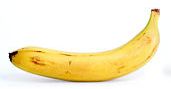
I don't really have much to say about this. I just wanted to re-use the picture shown above.
Seriously, we are in an era of an explosion of genome information, as we have noted regularly. The information reported here will be useful to those working on bananas, and to those studying evolution of plants. However, there are no immediate exciting messages for most of us from the work.
News story: Full genome reveals banana crop secrets. (Futurity, July 13, 2012. Now archived.)
The article, which is freely available: The banana (Musa acuminata) genome and the evolution of monocotyledonous plants. (A D'Hont et al, Nature 488:213, August 9, 2012.)
Previous post featuring the same figure...
Measuring radiation: The banana standard (April 17, 2011).
Previous genomics post...
In humans, rare mutations are common (July 24, 2012).
There is more about genomes and sequencing on my page Biotechnology in the News (BITN) - DNA and the genome. It includes an extensive list of Musings posts on the topics.
Do animal bones have something like annual growth rings?
August 7, 2012
The most familiar annual growth rings are probably those in trees. Perhaps you have seen them. A recent post on carbon (C-14) dating talked about tree rings, since comparing C-14 dating against tree ring counts is a good way to calibrate the C-14 dating method. (Link at end.) The growth rings reflect seasonal variation in growth rates, due to favorable vs unfavorable conditions, such as temperature. Careful analysis of the rings even provides information about the climate!
What about animals -- animals that grow over many years, thus encounter the same range of conditions as the trees? Do their bones show annual growth rings?
It's not that obvious what one should predict. After all, animals are not trees. But so-called cold-blooded animals share one feature with the trees: their body temperature is largely determined by the external environment. So we might predict that cold-blooded animals, such as reptiles, might show annual growth rings in their bones.
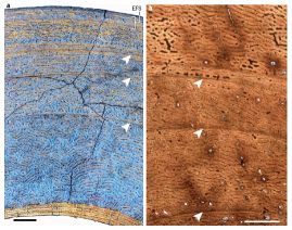
Here are a couple of pictures of animal bones.
Bigger picture [link opens in new window]
Just look at part a (left side of the figure) for now. The arrows point to annual growth rings in these animal bones.
This is Figure 1 of the Nature news article (Padian). The scale bar for the left side (black bar, lower left) is 0.5 millimeter. The scale bar for the right side (white bar, lower right) is 1.0 millimeter.
|
|
What kind of animal is this bone from? A deer -- a mammal, warm-blooded. In fact, a new paper has analyzed the bones of a wide range of ruminant mammals (cows, deer, and such -- animals that digest woody material in a rumen). The key finding is that they all contain such growth rings in the bones. It isn't the first finding of growth rings in warm-blooded animals, but it is the first thorough systematic study.
What about that other picture above -- part b, on the right? It also has growth rings, again marked with arrows. It's from a dinosaur fossil.
That brings us to the context of the new work. There is an ongoing debate about whether dinosaurs were cold-blooded or warm-blooded. The old idea is that they were cold-blooded, as typical of reptiles. Newer evidence has been mixed, but there is a trend toward the view that the dinosaurs were warm-blooded. However, one piece of evidence that seemed to favor the conclusion that dinosaurs were cold-blooded was the presence of growth rings in the fossilized dinosaur bones. The new work shows that this is not a valid argument. Growth rings are found in warm-blooded animals, too -- all of the wide range of ruminants in this careful study. Caution... The new work does not show that dinosaurs were warm-blooded; it merely shows that a particular argument suggesting they were cold-blocked is invalid. The presence of growth rings per se is not an argument one way or the other.
That warm-blooded animals show growth rings in their bones is interesting. Sometimes we just naively talk about warm-bloodedness as if it meant complete and perfect control of body temperature, oblivious to the outside environment. But it is not. Warm-blooded animals sense the outside environment, and respond to it. Making heat is expensive. It is reasonable that a warm-blooded animal allocates resources differently depending on the outside temperature. Thus this work is a reminder that warm-bloodedness is not a simple phenomenon.
News stories:
* Dinos Not Necessarily Cold-Blooded. (The Scientist, June 27, 2012.) The featured picture is quite interesting.
* How Sweet! Dinosaurs May Have Been Warm-Blooded After All. (Live Science, June 27, 2012.)
* News story accompanying the article: Evolutionary physiology: A bone for all seasons. (K Padian, Nature 487:310, July 19, 2012.) This is an excellent overview of the new work and its implications. (It is by UC Berkeley biologist Kevin Padian.)
* The article: Seasonal bone growth and physiology in endotherms shed light on dinosaur physiology. (M Köhler et al, Nature 487:358, July 19, 2012.) The article is difficult reading!
More about growth zones:
* Briefly noted... Dinosaur extinction: What time of year was it? (May 10, 2022).
* Tree rings, carbon-14, cosmic rays, and a red crucifix (July 16, 2012).
* Barium, breast milk, and a Neandertal (June 17, 2013).
More about bones:
* Human gracility (June 26, 2015).
* A new, simple way to measure bone loss? (September 14, 2012).
More about dinosaurs:
* T rex census (May 25, 2021).
* A tiny titan (May 9, 2016).
* Were dinosaurs cold-blooded or warm-blooded? (August 23, 2014).
* The oldest dinosaur embryos, with evidence for rapid growth (May 7, 2013).
* The Obama lizard (March 20, 2013).
* A dinosaur in color (April 5, 2010).
More about maintenance of body temperature (warm-bloodedness): Mammoth hemoglobin (February 1, 2011).
Also see... Global warming trend? Independent evidence (March 22, 2013).
For a video of a talk by Kevin Padian (who wrote the Nature news story) on dinosaur growth and vertebrate flight... Lecture videos: Berkeley City College (July 14, 2013).
Thanks to Borislav for suggesting this item.
Getting along: animals and bacteria
August 6, 2012
We may naively tend to think about individual organisms in isolation. Yet that is not how nature works. Nature involves communities of organisms, with complex interactions. In some cases, the associations are intimate and essential. As examples in humans...
* Our mitochondria, which are derived from bacteria, are essential components of our energy metabolism -- and are involved in disease processes.
* Our gut bacteria are essential to our well-being, in an emerging area we understand poorly.
A recent feature article in Microbe, the news magazine of the American Society for Microbiology, provides a nice gentle and readable overview of animal-bacteria relationships. Recommended!
The article, which is freely available: "Can't Live without You:" Essential Animal-Bacterial Relationships. (A E Douglas, Microbe 7:273, June 2012.)
Also see:
* Heart damage: role of mitochondrial DNA (June 1, 2012).
* Sushi, seaweed, and the bacteria in the gut of the Japanese (April 20, 2010).
There are similar associations beyond those involving bacteria and animals. Examples...
* A photosynthetic salamander? (August 24, 2010). This one involves a eukaryotic alga with an animal. This post links to other possibilities.
* A new organelle "in progress"? (September 13, 2010). This one involves a bacterium with a fern (a simple plant).
* Plants need bacteria, too (October 9, 2010).
And perhaps more speculatively... Bacteria induce simple "pre-animal" to become colonial (September 8, 2012).
Titan: tides, and the possibility of a sub-surface water ocean
August 4, 2012
As the Moon goes around the Earth, its gravitational pull on a particular place varies. We see this as the tides: water levels rise and fall due to the varying effect of the Moon. Of course, the effect works both ways. The Earth's gravitational pull on a particular place on the Moon also varies, though we usually pay no attention to this.
Similarly, the planet Saturn and its moon Titan exert varying gravitational pulls on each other. Now, NASA scientists report that measurements made by the Cassini spacecraft in orbit around Saturn allow them to begin to describe the tides on Titan. Further, they use their estimates of the tides on Titan to make inferences about the structure of Titan. Interestingly, they suggest that the tides are best explained if Titan contains a sub-surface ocean -- a water ocean.
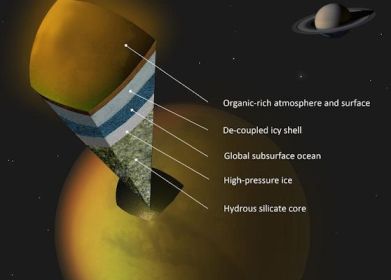
|
The figure shows a model of what they think Titan might look like. Note the darker blue layer, labeled "Global subsurface ocean".
It's important to distinguish what they actually measured, and what is model or hypothesis. They measured the tides -- the changes in shape of Titan as it orbits Saturn. This is a remarkable technical achievement. They measured tides of 10 meters (30 feet) -- ten times more than expected if Titan were solid rock. Thus it seems that Titan is "squishy" -- more deformable than they expected. They interpret this as indicating that Titan contains some highly deformable innards. And they suggest a sub-surface water ocean as that deformable layer. That is their working hypothesis for now. But it would be improper to say that they have shown there is such an ocean.
The figure is reduced from one in the NASA story listed below.
|
This work represents a small step toward understanding the structure of another solar system body. As the news stories below note, it has implications for understanding the Titan atmosphere, rich in the unstable chemical methane.
News story: Titan's Underground Ocean. (NASA, June 28, 2012.)
* News story from the journal in advance of the article: Planetary science: Cassini Spies an Ocean Inside Saturn's Icy, Gassy Moon Titan. (R A Kerr, Science 336:1629, June 29, 2012.)
* The article: The Tides of Titan. (L Iess et al, Science 337:457, July 27, 2012.) The article itself is mostly a technical analysis of the results. The final part includes a brief discussion of some alternative interpretations.
More about Titan...
* Briefly noted... A river map for Titan (February 9, 2022).
* TALISE: A better boat for Titan? (October 16, 2012).
* Weather forecast: Clouds will form near North Pole within two years (April 9, 2012).
The following post notes that the tidal interactions between Jupiter and its moon Europa may be the moon's primary heat source. Steppenwolf: Life on a planet that does not have a sun? (July 2, 2011).
More from Cassini: Venus: an unusual view (March 18, 2013).
More about tides... Does the moon affect earthquakes? (October 21, 2016).
More about oceans: 2011: There was less water in the oceans (November 25, 2012).
Another titan... A tiny titan (May 9, 2016).
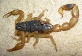
Scorpion venom: a source of a novel antibiotic?
August 3, 2012
Antibiotics are our miracle drugs that protect us against bacteria. However, the bacteria "fight back": antibiotic resistance is undermining our use of antibiotics. We need new antibiotics.
Biologists at Wuhan University in China have taken a new approach to combat the problem.
Their approach is shown at the right.
The figure is trimmed and reduced from the feature figure of the Wired news story.
|
|
A scorpion sting could help cure an infection? Sort of. Among the things a scorpion injects with its sting are antibiotics. (Some speculate that the purpose of the antibiotics is to protect the animal's dinner from decay before it gets to eating it.) In the new work, the scientists have taken a scorpion venom antibiotic -- and then improved it. There is some "theory" behind this, but let's start by looking at the result.
|
The left frame (part C) shows the effectiveness of several antibiotics against two test bacteria (dark and light bars). The y-axis is the concentration of antibiotic needed to prevent the bacteria from growing; lower is better. (MIC = minimal inhibitory concentration.) The left hand pair of bars is for the original antibiotic from the scorpion (called BmKn2); the right hand pair of bars is for the improved antibiotic (called Kn2-7). (There are also results for some others they tried; we'll ignore those.)
|
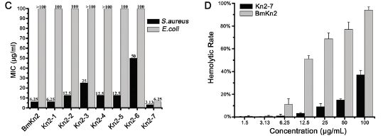
|
Compare the bars for the two kinds of bacteria for the original and improved antibiotic... Both bars are lower for the improved Kn2-7; one of them is much lower (for E. coli).
So far, so good. But there is often a problem with this type of antibiotic: it tends to kill our cells, too. A practical test of this is to see if it lyses red blood cells, a test called hemolysis. The right hand frame (part D) compares the original and improved antibiotic in a hemolysis test. The y-axis shows the rate of hemolysis; smaller is better. The x-axis is the level of the antibiotic. The light and dark bars are for the two antibiotics. For each, hemolysis increases with higher antibiotic levels; this would be expected. However, at any level, the improved antibiotic (dark bars; Kn2-7) shows less hemolysis than the original antibiotic. Thus the improved antibiotic, which is more effective against two kinds of bacteria (frame C) is also less toxic (frame D). (You can't tell from the graph whether it is good enough.)
The figure here is part of Figure 1 from the article.
|
Do we understand why their new antibiotic is better? Not completely, but there are some ideas that guided them in making Kn2-7. Here is an example.
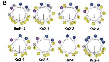
|
The figure here shows one view of the various antibiotics discussed here. (This shows the complete set, as in frame C above; again, we'll discuss only two of them.) These antibiotics are small proteins (peptides), and they have a tendency to fold up into a helical (spiral) chain. The view here is looking at the helix end-wise. About all you see is which amino acids are sticking out in which direction. (You can try to follow the line showing their order, but it really doesn't matter here.)
|
One feature thought to be good for this type of antibiotic is to have the basic amino acids (those with a positive charge) all on one side. In this figure, those amino acids are coded as dark blue dots. You can see here that the original antibiotic (BmKn2, upper left) has two of those near the "top"; the improved antibiotic (Kn2-7, lower right) has five of them. It's also good to have a separation between those basic amino acids (blue dots) and the hydrophobic amino acids, which tend to avoid water (shown as yellow dots). Again, you can see that Kn2-7 looks better by this criterion, too.
This figure is also part of Figure 1 from the article.
|
Thus they have made an improved antibiotic, starting with one found in scorpion venom. It is improved by two tests (top figure, above). They also have some understanding of why it is improved (second figure). None of that ensures that the new drug is actually useful; there are many drug candidates that pass early tests and fail later ones. In this case, they do a test with mice, and show that the new drug is effective for treating skin infections. This is encouraging. They propose that further work should be done with the new drug.
News stories:
* Scorpion Venom Heals Drug-Resistant Bacteria Infection. (Wired, July 11, 2012.)
* Study finds scorpion venom able to heal bacterial infections in mice. (Phys.Org, July 13, 2012.)
The article, which is freely available: Antibacterial Activity and Mechanism of a Scorpion Venom Peptide Derivative In Vitro and In Vivo. (L Cao et al, PLoS ONE 7:e40135, July 5, 2012.)
More about antibiotics and antibiotic resistance...
* Restricting excessive use of antibiotics on the farm -- follow-up #2 (April 16, 2012)
* Antibiotics and obesity: Is there a causal connection? (October 15, 2012).
Posts about other venoms include... Snake venom gland organoids (March 17, 2020). Links to more, including a book.
More on antibiotics is on my page Biotechnology in the News (BITN) -- Other topics under Antibiotics.
August 1, 2012
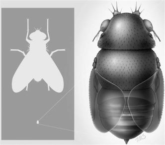
TIGER discovers smallest known fly; does it live in the head of tiny ants?
July 31, 2012
A scientist at the Los Angeles County Natural History Museum reports the smallest known fly.
The right hand part of the figure here shows a drawing of the fly. But its key feature is its size. The left hand frame shows an ordinary house fly at the top and this new fly at the bottom -- to scale. The new fly is about 1/15 the size of the house fly -- about 0.4 millimeters long.
The report goes on to talk about the lifestyle of the fly.
The figure at the right is reduced from one in the MSNBC news story listed below. It is probably the same as Figure 2 of the article.
|
|
This is an interesting story, but one that also illustrates the importance of being careful to distinguish what was actually found or done from what is suspected or hypothesized.
The real facts here are minimal. A single adult fly was discovered -- during a training course for TIGER, the Thailand Inventory Group for Entomological Research. The article listed below describes the fly. Since it seems distinct from all previously known flies, the author assigns it to a new species, which he calls Euryplatea nanaknihali. He discusses some of the features of this fly, and speculates on more.
The fly is of a type known to parasitize ants. Does this one parasitize ants? That's an interesting question. The author notes that there are some tiny ants, which were thought to be too small for flies to parasitize. But this new fly could reasonably do so. This reasoning leads to the part of the title of the article about small size not being sufficient to protect the ants (from parasitism by flies). The news stories pick up on this. Importantly, there is no information about whether this new fly parasitizes ants. There is only one specimen of the fly, found as an adult. It's the larval stage that parasitizes flies; no one has ever seen a larval stage for this new fly. How it develops is completely unknown. All the discussion of what it might do is interesting. Such ideas, even speculations, can guide further work. However, it is beyond what is now known. The title of the article emphasizes the speculation, and the titles of the news stories state things that are not known. (Remember that headlines are often written by someone other than the author. Headlines are to get attention. Always be careful about accepting them as factual. That includes titles of posts in Musings.)
News stories. Beware the hyped titles (as noted above), but otherwise these are both good overviews of the work and its implications.
* World's tiniest fly decapitates ants -- then lives in their heads. (J Welsh, MSNBC, July 2, 2012.)
* Tiny fly decapitates insect after growing inside of them. (Bunsen Burner, July 3, 2012.) Now archived.
The article, which is freely available: Small Size No Protection for Acrobat Ants: World's Smallest Fly Is a Parasitic Phorid (Diptera: Phoridae). (B V Brown, Annals of the Entomological Society of America 105:550, July 2012.) The article contains several drawings, but only one photo -- and that is of surprisingly poor quality.
An earlier post about a phorid fly -- also a parasite: A parasitic fly that causes hive abandonment in bees: Is this relevant to CCD? (January 27, 2012).
Another parasite of ants... Death-grip scars from zombie ants, 48 million years ago (November 9, 2010).
More about being small... What to do if your brain won't fit in your head (February 18, 2012).
More flies... A superhydrophobic fly -- that can survive in highly alkaline water (February 25, 2018).
And more...
* Ants: nurses, foragers, and cleaners (May 24, 2013).
Thanks to both Thien and Borislav for alerting me to this item, and sending the news stories listed above.
Metallic hydrogen? -- follow-up
July 30, 2012
Original post: Metallic hydrogen? (March 16, 2012). The post reported recent work which claimed to make metallic hydrogen. As we noted there, such claims are not new, and are likely to be controversial. Indeed, this claim has proved controversial. Nature has a recent "news feature" on the article and the controversy surrounding it. I should stress that there is no further solid information, thus there is no confirmation or disproof. However, those who find the story of metallic hydrogen intriguing may find this news feature worth a look. As with so much of what Musings presents, this is science in progress.
News story, which is freely available: Metallic hydrogen: Hard pressed -- Two physicists say they have forced hydrogen to become an exotic metal thought to exist only in the hearts of giant planets. Now they must face their critics. (Nature 486:174, June 14, 2012.)
Silk: Stabilizing vaccines and drugs
July 29, 2012
Many biological materials need to be stored cold. This adds cost. Further, in some cases, simply maintaining long term cold storage is difficult. Delivering vaccines to remote areas would be an example. A new article offers a simple solution: store the materials adsorbed onto silk.
|
Here is an example of the results. This is for measles vaccine, prepared in three different ways and tested for stability at two temperatures. The y-axis shows the "residual potency" (i.e., the stability); the x-axis is storage time.
|
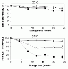
|
First, compare the general pattern for the two temperatures: 25° C (upper) and 37° C (lower). All three preparations are fairly stable at 25° C, but distinct differences are clear at 37° C.
The three preparations? Squares are for the normal vaccine preparation, circles and diamonds are for two variations of vaccine combined with silk. It's clear that the normal prep is much less stable at 37° than either of the silk-treated preps. (Perhaps silk also helps at 25°, though the effect is small.) The "circles" treatment is for vaccine simply adsorbed onto silk fibers. The "diamonds" treatment includes a lyophilization (freeze-drying) step, which seems beneficial.
The figure here is part of Figure 2 from the article.
|
That is a typical result from the paper: storage of the vaccine with silk, preferably lyophilized, greatly increases the stability of the vaccine. The article includes data up to 45° C, with similar results. Results for two other vaccines they tested are similar. And they also tested two antibiotics; both showed enhanced stability when stored on silk.
Do they understand why this works, why silk stabilizes the materials? Yes and no. For the vaccines, which are proteins, it is likely that the silk immobilizes the material, protecting against heat-induced changes of shape that would cause the vaccine proteins to lose activity. It's also likely that the binding to silk puts the materials in a water-free environment, which may be protective. Even if these general ideas are correct, the scientists do not understand the details, and cannot predict which materials will benefit. Nevertheless, the results so far are encouraging, and the method may well be practical.
News story: New silk technology stabilizes vaccine and antibiotics so refrigeration is not needed. (Phys.org, July 9, 2012.)
The article: Stabilization of vaccines and antibiotics in silk and eliminating the cold chain. (J Zhang et al, PNAS 109:11981, July 24, 2012.) The Introduction is a very readable overview of the work, including the background about the problem of loss of biomaterials due to heat inactivation.
More on vaccines:
* Does it matter what time of day you get a vaccine? (October 26, 2012).
* A better way to deliver a vaccine? (July 25, 2010). This post is on the development of a vaccine delivery system that avoids the use of the traditional needles. I note it here because the authors of the current paper are also working in that area -- and they think the silk-based vaccines would be quite compatible with their delivery system.
The measles vaccine was noted in the post Ten Great Public Health Achievements, 2001-2010 (June 26, 2011).
More measles: What if Mickey Mouse got measles? (January 27, 2015).
More on silk:
* Silk-clothed electronic devices that disappear when you are done with them (October 19, 2012).
* Spiders and violins (May 4, 2012).
Several Musings posts about silk are listed on my page Internet Resources for Organic and Biochemistry under Amino acids, proteins, genes.
More on vaccines is on my page Biotechnology in the News (BITN) -- Other topics under Vaccines (general). There is also a section on that page on Measles.
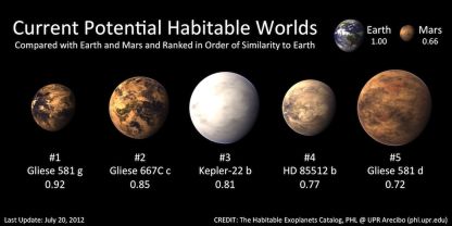
Habitable Exoplanets Catalog
July 27, 2012
This post is of interest for a couple of reasons. First, the Habitable Exoplanets Catalog exists!
The following figure shows the main part of the Habitable Exoplanets Catalog (HEC). (It is reduced from a figure featured on the HEC main page, listed below. The figure is found at many other pages, both at the HEC site and in stories about HEC.)
The top row provides some background: Earth and Mars, with scores of 1.00 and 0.66, respectively. Scores for what? The Earth Similarity Index (ESI), a measure of habitability. Presence of liquid water, for example. The Earth, at 1.00, is the reference point.
The second row shows the only five extra-solar planets now considered to be in the habitable zone -- in order by their ESI score. They have scores from 0.92 to 0.72 -- all better than Mars.
|
|
There are only five planets outside our solar system now considered potentially habitable. That is out of 777 confirmed exo-planets, according to a table on the HEC main page. Only five! But remember, only two decades ago, the number of exoplanets we knew about at all was zero. We now know of 777 (confirmed), and 5 of those seem potentially habitable. Look at the table further, and you will see that there are about 2500 exoplanet candidates that have not yet been confirmed; 29 of these may also be candidates for habitability. (It seems that about 1% of exoplanets are being rated as potentially habitable.) Further, they predict there may be 41 habitable moons around those exoplanets. All in all, the catalog suggests there may be 75 habitable exoplanets or exomoons. Remember, this is based on exoplanets that we have some evidence for -- and only a tiny region of space has been carefully examined.
The second reason this is so interesting? Look at the first exoplanet listed. It is Gliese 581g. That exoplanet has already made Musings twice (links at the end). The first time was to report the claim for its discovery, and noting that it may be in the habitable zone. The second time was to report that other scientists questioned whether it existed.
There is a new paper on Gliese 581g, by those who originally claimed its discovery. They address the criticisms, and present more evidence to support their claim. Is this the last word? I doubt it. Thus we are left with an interesting situation: Gliese 581g may be the most Earth-like exoplanet known, or it may not exist. We'll see.
The HEC folks do not pretend to judge this dispute. They catalog what has been reported. The catalog will evolve as new results come in. That there is a catalog of habitable exoplanets is an interesting development. That we are not at all sure what belongs in it is a reflection of the early stage of the field.
HEC web site: Habitable Exoplanets Catalog. (Planetary Habitability Laboratory, University of Puerto Rico, Arecibo.) From the main page: "The Habitable Exoplanets Catalog (HEC) is an online database for scientists, educators, and the general public focused on potential habitable exoplanets discoveries. The catalog uses various habitability indices and classifications to identify, rank, and compare exoplanets, including potential satellites, or exomoons."
Press release about the current work: Five Potential Habitable Exoplanets Now. (HEC, July 19, 2012. Now archived.) This discusses both the catalog and the new paper.
The new article about Gliese 581g. GJ 581 update: additional evidence for a Super-Earth in the habitable zone. (S S Vogt et al, Astronomische Nachrichten (Astronomical Notes) 333:561, August 2012.) There is a preprint, probably in near-final form, freely available at arXiv: copy at arXiv. The paper is, in part, from the Lick Observatory; the Lick, in the San Francisco Bay Area, is associated with the University of California Santa Cruz.
Previous posts about Gliese 581g:
* The first truly habitable exoplanet? (October 12, 2010).
* The first truly habitable exoplanet? Follow-up. (October 26, 2010). (The content of this post has also been integrated into the post listed above.)
Recent post about Kepler mission: A new trick for the Kepler planet-hunters (June 25, 2012).
Another catalog... Mars: craters (August 11, 2012).
And... 124,993 and counting: cataloguing plant species in the Americas (February 26, 2018).
Also see...
* Habitable planets very close to a star (June 19, 2016).
* Most Earth-like (habitable) planets haven't formed yet (October 27, 2015).
* Exoplanet Travel Bureau (February 21, 2015).
July 25, 2012
A Lovelock update
July 25, 2012
We have noted the contributions and views of biologist James Lovelock in previous posts, which are consolidated on the supplementary page Gaia and James Lovelock.
As he approaches his 93rd birthday (tomorrow -- July 26), Lovelock is in the news again. He is writing another book and giving talks and interviews. Among the events was an interview with Jim al-Khalili, a UK physicist who runs the BBC Radio show A Life Scientific. The interview is broad -- about Lovelock's long career. It presents Lovelock as a real person, in his own voice. He is fun -- and provocative.
The BBC interview with Lovelock is available as an MP3 podcast: Lovelock interview. (Jim al-Khalili, BBC, May 8, 2012.) It's a half hour interview; listening to even part of it is a useful introduction to Lovelock. (You can also go to the web page for the program series, and scroll down to the Lovelock interview, May 8, 2012. A Life Scientific.)
Lovelock has been getting recent media attention for modifying some of his views on climate change. Since we alluded to some of his earlier views, it seems proper to note the update. However, I am not sure that one should make much of this. As noted, Lovelock enjoys being provocative. If he brings people into the debate, that is good. But if he becomes the subject of the debate, then that is less good. Lovelock's conclusions, then and now, are his opinions -- opinions of one with much knowledge of the field. But the field is one of great complexity and great uncertainty, and any firm conclusions are questionable. So, get involved, listen to Lovelock's reasons -- and to those of others. Don't put much weight in the opinions of any single person.
News story: Gaia creator rows back on climate. (BBC, May 8, 2012.) One attempt to note Lovelock's views. This story coincides with the above interview, but is based on much more. (The BBC interview noted here actually has very little on climate change.) Again, don't worry much about Lovelock's opinions, but use his provocative pronouncements as an excuse to get more into the complex debate.
This post is listed on the supplementary page Gaia and James Lovelock.
In humans, rare mutations are common
July 24, 2012
That does sound a bit odd, doesn't it. But it makes an important point. It's based on a trio of recent papers, all made possible by the rapidly increasing practicality of sequencing human genomes. The new work reveals some new features simply because there is so much more data than before; we can now see things that are rare.
It is common knowledge that some diseases are caused by our genes. Sickle cell anemia and cystic fibrosis are a couple of examples. In these cases, we know the specific gene variants (alleles) that are responsible, and we can sometimes follow the inheritance of the mutant alleles through families. The frequency of the mutant allele can be substantial -- several percent.
What has been less clear is the importance of alleles that are at very low frequency in the population -- so-called rare alleles. How often do rare alleles cause disease? How much do rare alleles in combination cause some effect? A broader form of the question might be: how many rare alleles are there? Or, how common are rare alleles?
The new papers address the question. The basic approach is massive detailed sequencing. Here is an example of one of the analyses. In this work, the scientific team analyzed 202 genes from 14,002 people. They also took great care to get high quality sequencing data. When looking for rare mutations it is easy to get misled by sequencing errors. The following graph summarizes a massive amount of data from this study.
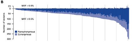
|
The graph shows the number of variants (mutations) found in each gene (y-axis) plotted against gene number (x-axis).
The y-axis is a bit unusual. It has a "zero" point, but then the numbers are positive in both directions from 0. It's really a double graph. One thing is plotted upward from 0, and one thing is plotted downward from 0. But what is plotted is itself a simple positive number, in both cases. It is the number of variants (mutations) found in each gene.
Start with the downward part of the graph, which is most visible. We'll look at the total number of mutations found, ignoring the two colors they show.
What they did was to measure the number of variants in each gene, and then list the genes in order by that number. The graph shows how many variants they found in each gene -- starting with genes with few variants on the left to genes with around 300 variants on the right. That is, the x-axis is simply the rank of the gene, in order by number of mutations found. The curve is a smooth curve, because they designed it that way. It gives a quick visual impression of how many mutations they found.
Now let's look at what the top and bottom parts of the graph are for. They are labeled MAF > 0.5% and MAF ≤ 0.5%. MAF means "minor allele frequency." That is, the lower curve is for rare alleles -- and there are a lot of them. The upper curve is for more common alleles -- and there are few of them. (The cutoff at 0.5% is arbitrary, but is common. Note that if a particular allele is present at 0.5%, it means that 1 in 100 of us have it -- since we each have two copies of each gene.)
As an example... Look at the gene at the extreme right; that would be gene #202 of their study. There are approximately 300 "rare" variants (read the graph downward), but only "a few" of the common variants (read the graph upward). There are far more rare variants than common variants. And that's the point. That general pattern holds for almost every gene in the study.
If you want to study the importance of variants of gene #202, it is easy to follow a few major alleles. It is hard to follow alleles that are rare. Yet most of the variation consists of rare alleles. If you carry a mutation in gene #202 (whatever that gene may be), it is likely that your mutation is rare -- and that it is not well-studied.
The figure above is Figure 1B from the paper by Nelson et al.
|
There are three independent papers on this, all appearing at about the same time. Each has its own approach to generating a large amount of data, but they all end up with about the same conclusions, at least for the basic points. I list here all three papers, with a news story for each; the numbers correspond for the stories and papers. For the basic idea, reading any one of the news stories is good; if you read more of them, all the better. You will see that what I have presented above is just the tip of the iceberg of what these papers say. In addition to the simple conclusion that rare variants are common, they interpret the development of human populations in the light of this information. Be forewarned: it gets pretty heavy! (But it is also fascinating.)
News stories.
1) 'Rare' Genetic Variants Are Surprisingly Common, Life Scientists Report. (Science Daily, May 18, 2012.)
2) Slew of Rare DNA Changes Following Population Explosion May Hold Clues to Common Diseases. (Science Daily, May 17, 2012.)
3) As population exploded, more rare genes entered human genome. (Medical Xpress, May 11, 2012.)
News story accompanying articles 1 & 2: Genetics: Human Genetic Variation, Shared and Private. (F Casals & J Bertranpetit, Science 337:39, July 6, 2012.)
The articles:
1) An Abundance of Rare Functional Variants in 202 Drug Target Genes Sequenced in 14,002 People. (M R Nelson et al, Science 337:100, July 6, 2012.) The example above is from this article.
2) Evolution and Functional Impact of Rare Coding Variation from Deep Sequencing of Human Exomes. (J A Tennessen et al, Science 337:64, July 6, 2012.)
3) Recent Explosive Human Population Growth Has Resulted in an Excess of Rare Genetic Variants. (A Keinan & A G Clark, Science 336:740, May 11, 2012.)
This work was made possible by recent developments in DNA sequencing, leading to major cost reductions. A recent post on this topic was: DNA sequencing: an overview of the new technologies (June 22, 2012).
Posts on "simple" genetic diseases include:
* Cystic fibrosis: treating the underlying cause -- for some people (November 13, 2011). This example notes that many mutations may cause the disease; the particular mutation studied here is a rare one.
* Sickle cell disease: a step toward treatment by activation of fetal hemoglobin (October 29, 2011).
* Why African-Americans have a high rate of kidney disease: another gene that is both good and bad. (August 17, 2010).
Several posts on personalized, genome-based medicine, are listed at: Personalized medicine: Getting your genes checked (October 27, 2009).
Next genomics post...
The genome of Musa acuminata (August 8, 2012).
There is more about genomes and sequencing on my page Biotechnology in the News (BITN) - DNA and the genome. It includes an extensive list of Musings posts on the topics.
Images from 30,000-year-old motion pictures
July 22, 2012
|
An 8-legged bison. The drawing is from the walls of the Chauvet Cave in France; it is about 30,000 years old.
The authors of a recent article argue that this is the composite of two views of a bison at different points in its stride. The complete figure [link opens in new window] has three frames. The left frame is the actual drawing found on the wall; this is what is shown here at the left. The other two frames (middle and right) are what the authors consider the two parts of that left frame. In other words, superimpose the middle and right frames, and you get the actual drawing, the left frame.
The figure at left is part of Figure 2 from the article. The "complete figure" linked above is the complete Figure 2.
|
The authors suggest, then, that the purpose of the ancient drawing of the 8-legged bison, above, was to show the bison in motion. They also note that the illusion of motion in the composite drawing is enhanced by moving a small light cross it -- as the cave inhabitants might well have done.
They also present examples of two other types of motion in ancient art. One involves a sequence of drawings side by side showing what would seem to be successive stages of the moving animal.
Their other example of motion is different. The two examples above show how static images can create the illusion of motion. The final example shows how motion can be used to create the illusion of a novel static image. It involves using small discs with an image on each side. If you rotate the disc slowly, you see the two sides separately, in alternation. If you rotate the disc rapidly, then you begin to see a single image that consists of the two sides superimposed. Such a device, known as a thaumatrope, was invented in 1825; it has been a popular toy, and is sometimes considered a prelude to the movie camera. The authors suggest that it had been invented tens of thousands of years earlier.
What are we to make of this? The art exists. The authors here are offering an interpretation or hypothesis, and they make their case. I don't know. I have not heard what others might say to the contrary. So, I am intrigued, but will just keep an open mind. Perhaps most importantly, seeing this paper has opened up a subject to me that I knew nothing about. I will be alert for more.
The web site for the article (below) links to a short video. The video gives some examples of how they think the drawings show motion. For each example, they show the drawing, their dissection of the drawing, and then an animation showing the motion. The examples include the bison that is at the start of this post. The video is also available at YouTube: video at YouTube (2 minutes; no sound). There is another video from them, somewhat longer, with more examples. It is labeled in French (with the labels oddly out of focus), but perhaps it doesn't matter much. longer video, at YouTube (6 minutes; no sound).
Unfortunately, neither of the authors' videos (above) includes a thaumatrope. However, if you want to see what a (modern) thaumatrope looks like, there are numerous videos available; just search on something like
thaumatrope video
Here is one example, which shows you how to make one for yourself: a thaumatrope video, at YouTube (2 minutes).
News stories:
* Caveman "Movies" Discovered in France! (Young Hollywood, June 14, 2012.) My original source.
* Archaeology - Stoneage Artists Created Prehistoric Movies. (Discovery News (now Seeker), June 8, 2012.)
The article: Animation in Palaeolithic art: a pre-echo of cinema. (M Azéma & F Rivère, Antiquity 86:316, June 2012.) It links to the video noted above. I encourage you to browse the article. It is quite readable, and full of pictures.
More ancient art...
* Oldest known picture of a pig (February 21, 2021).
* The oldest known dog leash? (January 23, 2018).
* An extraterrestrial god (October 9, 2012).
* Leopard horses (December 2, 2011).
* Early American art: a 13,000 year old drawing of a mammoth (July 18, 2011).
A post about an optical illusion: Bright lights and pupil contraction (March 2, 2012).
More from caves:
* How to light a cave (August 30, 2021).
* Antibiotic resistance genes in "ancient" bacteria (February 11, 2017).
There is more about art on my page Internet resources: Miscellaneous in the section Art & Music. It includes a list of related Musings posts.
How many moons hath Pluto?
July 20, 2012
My astronomy book says one. And that's because a dedicated author (Jay Pasachoff) managed to sneak in the discovery of a bump on a picture of Pluto taken just a few months before his 1979 book was published. That bump was determined to be a moon, called Charon.
The latest from the Hubble Space Telescope (HST) shows five moons around Pluto -- the fifth being discovered just a few days ago. In fact, the Hubble is responsible for the discovery of all the Pluto moons since Charon, with #4 just last year.

|
The figure here is a composite image from the HST, July 7, 2012. (A darker filter was used for the central part, because of the presence of two relatively bright objects.)
The photo shows Pluto and five moons -- including the newly identified "P5". P5 is estimated to be about 10 miles (16 kilometers) across.
The figure is from the Hubble Site announcement listed below. Larger versions are available there.
|
A spacecraft is on its way to Pluto for detailed close observations. HST is scouting the territory, to help ensure that New Horizons has a safe path. P5 is just the latest discovery about Pluto -- and we can be sure that New Horizons itself will bring much more about the distant former planet. (New Horizons is scheduled to arrive at Pluto in July 2015.)
How many moons hath Pluto? Five, you say, showing off your new knowledge? The better answer might be "at least five", or "five that we know of already".
News story: Hubble Discovers a Fifth Moon Orbiting Pluto. (Hubble site, July 11, 2012.)
Follow-up: How many moons hath Pluto? Follow-up (March 26, 2013).
More about Pluto -- from the New Horizons mission... Dunes on Pluto? (June 29, 2018).
More from the Hubble Space Telescope:
* A galaxy far, far away: the story of MACS 1149-JD (October 12, 2012).
* Discovery of Neptune: The one-year anniversary (July 12, 2011).
For more about Pluto, see Mike Brown's recent book, listed on my page of Book Suggestions: Brown, How I Killed Pluto -- and why it had it coming.
More, August 7, 2013...
The two new moons of Pluto now have official names: P4 is now Kerberos; P5 is Styx. News story: Names for New Pluto Moons Accepted. (Science Daily, July 2, 2013.)
July 18, 2012
Making smarter flies
July 18, 2012
We have noted work on the abilities of animals other than humans to count. (Links below.) We now have some information about the mathematical abilities of fruit flies. Just a hint -- just a news story about a meeting presentation, but it is worth noting.
Scientists have developed a math test for flies. The test is described in the news story. Briefly, the idea is to see whether the flies can distinguish the numbers 2, 3, and 4 -- presented as that number of flashes of light. Apparently, they don't do very well. However, after 40 generations of selection, the flies do better. I presume that what the scientists do is to take the best flies from each test and breed them to make the next generation. Now that they have these "smarter" flies, they can do genetic analysis and see what the mutations were that led to this new ability. We await more information.
News story: Geneticists Evolve Fruit Flies With the Ability to Count. (Wired, July 12, 2012.)
Some posts on animal counting...
* On the Evolution of Calculation Abilities (June 20, 2011).
* Animals counting -- more (July 13, 2009).
And plants doing math... Can plants calculate how long their food supply will last? (August 9, 2013).
Another example of using fruit flies (Drosophila) as a model system: A human protein that can sense magnetic fields (July 15, 2011).
More about flies...
* Progress toward an artificial fly (December 6, 2013).
* The benefit of providing alcohol to the eggs (March 30, 2013).
Also see... Mice with human brain cells (April 13, 2013).
Tree rings, carbon-14, cosmic rays, and a red crucifix
July 16, 2012
This post is about two related stories. In the first, a team of scientists reports an anomaly in the carbon-14 (C-14) content of 1237-year-old tree rings. They note that they know of no cause. In the second, a college student finds a historical reference to an event that might be the missing cause.
The idea behind C-14 dating is simple enough. We know that C-14 has a half-life of about 5700 years. If we find a sample with half of the initial C-14 level, we know it is 5700 years old. If we find a sample with 1/4 (1/2 * 1/2) of the initial C-14 level, we know it is 11400 (2 * 5700) years old. And so forth. But there is a catch. What is that initial C-14 level for the sample? We know how much C-14 is in the air now, but how much was there 5700 years ago (or at any other time)? That's not an easy question to answer; it has caused a lot of problems with C-14 dating. There is no reason to expect that C-14 should be constant in the air. It is made as a result of cosmic ray bombardments, and those are known to vary. The best we can do is to measure it -- to calibrate the C-14 results against another measurement. Against what? Tree rings. There are extensive collections of tree rings at least for a few thousand years; these often have one-year resolution.
While measuring the C-14 content of tree rings, a team of scientists from Nagoya University found something odd.
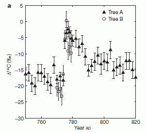
|
Here is some of their data for the C-14 content (y-axis) of tree rings vs age (x-axis). Results for rings from two trees are shown; they are in good agreement.
What is striking is that there is a discontinuity in the graph between years 774 and 775.
[It's not important that you understand the exact nature of the C-14 numbers, but if you are curious... C-14 is shown by comparison with a reference sample. The numbers are in ‰ ("per mil" -- or per thousand). That is, values at -20 on this scale have 20‰ less C-14 than the reference. If you want, divide the ‰ value by 10 to get it in percent: 20‰ is 2%.]
This is Figure 1a from the article (Miyake et al).
|
The main point of the work is the finding of that C-14 "blip", at year 775. That is an experimental result. (They provide some argument to support it from other reports, but it's probably fair to say that their finding needs rigorous confirmation.)
That leads to the question of why? What caused the dramatic jump in C-14 in a specific year? The usual suspects would be increased cosmic rays from a solar outburst or a supernova. As far as they can tell, no such event at that date is known. Thus the paper ends by leaving open the question of the source of the excess C-14.
News story: In tree rings, Japanese scientists find 8th-century mystery. (Phys.Org, June 4, 2012.)
The article: A signature of cosmic-ray increase in AD 774-775 from tree rings in Japan. (F Miyake et al, Nature 486:240, June 14, 2012.)
But now there is a second part to this story. Jonathon Allen, a student at the University of California Santa Cruz with interests in both history and science, was intrigued by the above report, and the question of the unknown cause. He did a little searching on his own -- and found a mention of an unusual celestial event in the year 774. He sent his finding to Nature, which promptly published it as "Correspondence".
The clue Allen found is from the Anglo-Saxon Chronicle. In modern English, it reads: "A.D. 774. This year the Northumbrians banished their king, Alred, from York at Easter-tide; and chose Ethelred, the son of Mull, for their lord, who reigned four winters. This year also appeared in the heavens a red crucifix, after sunset; the Mercians and the men of Kent fought at Otford; and wonderful serpents were seen in the land of the South-Saxons." Allen's source: The Anglo-Saxon Chronicle: Eighth Century. (Avalon Project - Documents in Law, History and Diplomacy; Yale Law School.) Scroll down to the year 774.
Is the "red crucifix" that Allen uncovered a supernova? Is it the source of the cosmic rays needed to explain the C-14 anomaly discussed above? We don't know. Allen has found something, a lead -- and it will be carefully analyzed. Historians can comb other documents of the time for confirmation, clarification, or additional information. Astronomers can look for physical clues of the event. We'll see what turns up. For now, it's a fun story.
News stories:
* Ancient text gives clue to mysterious radiation spike -- Eighth-century jump in carbon-14 levels in trees could be explained by "red crucifix" supernova. (Nature News, June 27, 2012.)
* Red Crucifix sighting in 774 may have been supernova. (Phys.Org, June 30, 2012.)
The letter: Clue to an ancient cosmic-ray event? (Jonathon Allen, Nature 486:473, June 28, 2012.) In the pdf file, this is the item at the lower right.
Jonathon Allen was not the only person to uncover this 774 story. Allen sent his finding to a scientific journal, so has formal publication priority, and Nature has given his contribution some publicity. The comments section of the web page for the Nature News story listed here notes other reports. It also includes a comment from Allen; scroll down to June 30. And it includes a comment from someone checking Chinese records for the relevant time period for any mention of such an event (June 28).
Thanks to Borislav for his contributions to this post.
Follow-up: What caused the C-14 increase in the year 775 AD? (March 11, 2013).
Other posts about C-14 dating:
* How old is Venice, Italy? Evidence from peaches (March 24, 2018). The work here is affected by the C-14 calibration anomaly discussed above.
* Atomic bombs and elephant poaching (October 25, 2013).
* What happened to the Neandertals? (October 8, 2010).
More about tree rings: Do animal bones have something like annual growth rings? (August 7, 2012).
Another dating method: File dates and human settlement in Polynesia (November 16, 2012).
A post about a different use of C-14... Discovering how CO2 is captured during photosynthesis: The Andy Benson story (June 15, 2013).
More cosmic rays... Using your smartphone to detect cosmic rays (April 7, 2015).
More about supernovae: Could you find debris from a supernova in your backyard? (April 27, 2016).
My page of Introductory Chemistry Internet resources includes a section on Nucleosynthesis; astrochemistry; nuclear energy; radioactivity. That section links to Musings posts on related topics, including the use of radioactive isotopes.
Did the Pioneer spacecraft violate the law of gravity?
July 15, 2012
The Pioneer 10 and 11 spacecraft, launched in 1972-3, were our earliest explorers of the outer solar system. They have long since stopped sending signals back to Earth, though they continue their journey. Despite their silence, one aspect of these Pioneers has long concerned scientists. The spacecraft accelerated a bit more slowly than expected. That didn't cause problems with the missions, but is annoying. After all, we know how a body is supposed to accelerate, and Pioneer didn't do it. What's wrong? The discrepancy between predicted and observed acceleration of the Pioneers is known as the Pioneer anomaly.
Some even wondered if the law of gravity might not be right. On the other hand, mission scientists began to realize that the answer might be more mundane: heat being emitted from the spacecraft. The thermal emission would be met with a "recoil", and that acceleration needs to be taken into account. So the question is, does the magnitude of the thermal emission effect agree with the observed Pioneer anomaly? It's not enough to offer that heat might be the answer; we would like to know if it explains what was observed -- quantitatively.
So, call up the computerized model of the spacecraft, and put in all the known heat parameters of each part. Just calculate it all out, and see what the heat emission is. Ok, but there are some problems. First, the Pioneer spacecraft preceded the days of computerized design; there are no computer models of it. In fact, the old paper blueprints are not entirely clear. Second, the heat parameters are not all known. For example, it is not entirely clear what the paint on the power generators is, much less what its properties are. Ah, the problem of deciphering ancient history -- from the 1970s!
|
Nevertheless, scientists from the Jet Propulsion Lab (JPL) did the best they could, and developed heat models of the craft. The figure at left is an example. This one is for the Pioneer 10 spacecraft at the time when it was about 40 AU from the Sun, in about 1987. (AU = astronomical unit; 1 AU is the distance between Earth and Sun. At 40 AU it is near the orbit of Pluto.)
This is a computer model of the spacecraft, with their best estimate of what the temperature (T) is inside the craft at various locations. For this figure, the T is scaled between -16° C in blue and +10° C in red.
|
In making the model, they considered two major heat sources. One is the power source for the spacecraft: a pair of plutonium blocks that give off heat as the Pu decays. The other is the electrical system within the craft.
It's not important that you make much of any of the details. The main points for us here are that they can make such a detailed analysis, and that the T in the craft is non-uniform.
This figure is part of Figure 1 from the article.
|
With models such as the one above, they are able to estimate the heat emission of the spacecraft. From the design of the craft, they estimate which direction the heat is given off. Thus they can estimate what acceleration they expect from the heat. They compare that with the observed anomaly.
|
Here is part of what they find. The graph shows the acceleration anomaly (y-axis) vs position of the spacecraft (in AU from the Sun).
The solid line (from about 20-70 AU) shows the measured anomaly. The points show their estimates of the anomaly based on the heat models, such as the one shown above.
|
The general pattern is that the predicted anomaly is about 80% of what was observed. The error bars on their predictions are quite large. (The largest single source of uncertainty is how the paint on the power sources degrades over time.)
This figure is part of Figure 3 from the article.
|
Bottom line? It's not definitive, but it seems likely that heat emissions were responsible for the anomaly. The agreement between prediction and observation is within the errors bars. That's a rather mundane explanation, and it is probably what most scientists have expected in recent years. However, it is good to check. To some, the anomaly suggested that there was some unexplained physics going on -- something we fundamentally did not understand (such as some novel gravity effect). The analysis suggests that no extraordinary explanation is needed.
We should emphasize that the analysis does not disprove "novel" explanations (as some of the surrounding hype might suggest). It merely makes them unnecessary. The predictions are not significantly different from what was observed. That doesn't mean it is all correct, but it means there is no evidence that any further explanation is needed.
News stories. Both of these have some excesses in their interpretation, but overall are useful.
* Research team appears to solve the Pioneer anomaly. (Phys.org, April 18, 2012.)
* A more detailed story... Exotic explanation for Pioneer anomaly ruled out. (Physics World, April 16, 2012.)
The article: Support for the Thermal Origin of the Pioneer Anomaly. (S G Turyshev et al, Physical Review Letters 108:241101, June 12, 2012.) There is a also a preprint of the paper, probably in final form, freely available at the arXiv: copy at arXiv.
There is some analogy here to a recent biology post: The story of the peppered moth (July 9, 2012). In both cases, scientists checked to see whether a likely explanation was indeed correct. In both cases, it was (as far as they could tell). But what is important is to ask the questions and to collect evidence. Sometimes we uncover something new that way. Other times we confirm what we thought. But we must check.
More paint:
* A better white paint, using BaSO4; it's cool (August 10, 2021).
* Photocatalytic paints: do they, on balance, reduce air pollution? (September 17, 2017).
This post is listed on my page Introductory Chemistry Internet resources in the section Lanthanoids and actinoids.
The golden ear: A nano-ear based on optical tweezers
July 13, 2012
Sound is due to waves of changing pressure in the air (or other medium). A detector for sound is, then, simply a pressure detector. Ears and microphones use the same general principle: a material detects the vibrations in the air.
A new ear is noteworthy for how small it is -- and how sensitive. It's based on a tiny cluster of gold atoms -- about 60 nanometers in diameter -- suspended in laser beams (so called optical tweezers). The suspended gold cluster moves a bit if some other force acts on it. In the new work, that other force is sound waves.
Here is an example of the gold cluster (the nano-ear) detecting sound.
|
In this experiment, the scientists simply watch the nano-ear and note its position over time. The graph is just the x,y position of the cluster; note that the scale is in nanometers.
Part b (upper) is with the sound off. You can see that the gold cluster moves around a bit, just due to normal thermal motions. This is the control, or baseline.
Part c (lower) is with the sound on. You can see that the gold cluster moves around more, due to the sound. You can also see that the additional motion is largely in the x-direction; this reflects the direction of the sound source. The gold cluster, then, is acting as an ear -- detecting sound.
This is part of Figure 2 from the article.
|
The experiment described above establishes the basic idea that the gold cluster can detect sound. But how sensitive is this nano-ear? To test that, they use a very weak sound signal. It is one millionth of what the human ear can detect. It is so weak that they cannot sense it with the kind of measurement shown above, simply watching the overall movement of the nano-ear.
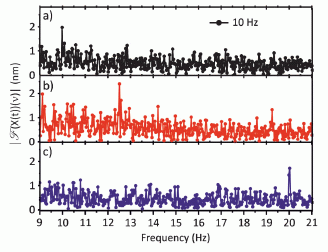
|
However, mathematical analysis of the motion of the nano-ear shows that it can detect this weak sound. Look at part a (upper) of the graph at the left. This shows the analysis of the motion as a function of the frequency (shown on x-axis). It's a rather noisy graph. But notice a blip at about 10 Hz? In fact, it was 10 Hz sound that they used in this experiment (as labeled on the graph). The frequency analysis showed just the right frequency.
Try your hand at this. Look at parts b and c. What do you think was the sound frequency used in each of these experiments? The actual frequencies are "hidden" here. When you think you have decided what the graph shows, move your cursor over the "answer" for the given part, and check yourself. (Do not click.)
answer for part b (middle);
answer for part c (bottom).
This is modified from Figure 4 of the article. (I modified it only to remove the labels for parts b and c.)
|
It worked! And that is the point. They have made a tiny ear that can detect tiny vibrations. This opens up the possibility of listening to the movements of bacteria, or detecting tiny vibrations of micro-electronics.
News story: Physicists develop nano-level sound detector. (Phys.Org, January 12, 2012.)
* "Viewpoint" accompanying the article (freely available): A Trapped Nanoparticle Listens In. (J Y Park & D K Yoon, Physics 5:1, January 3, 2012.) Nice article. It gives some background on the nature of optical tweezers. It also includes a special link to a freely available pdf of the article itself.
* The article, which is freely available -- if you use the special link from the "Viewpoint" story: Optically Trapped Gold Nanoparticle Enables Listening at the Microscale. (A Ohlinger et al, Physical Review Letters 108:018101, January 3, 2012.)
More about sound: Loudspeakers: From gold-coated pig intestine to graphene (April 27, 2013).
More about "listening": A rapid test for antibiotic sensitivity? (July 19, 2013).
More about gold... Prospecting for gold -- with help from the little ones (March 1, 2013).
Another ear: 3D printing of human tissues: the ITOP (May 24, 2016).
More tweezers: The smallest tweezers -- for pulling single molecules out of cells (March 30, 2019).
July 11, 2012
On a new method of treating compound fracture...
July 11, 2012
"The frequency of disastrous consequences in compound fracture, contrasted with the complete immunity from danger to life or limb in simple fracture, is one of the most striking as well as melancholy facts in surgical practice."
Thus begins a historic paper in the practice of medicine. The author goes on to note the contributions of a M. Pasteur, "who has demonstrated by thoroughly convincing evidence that it is not to its oxygen or to any of its gaseous constituents that the air owes this property [of promoting 'decomposition of organic substances'], but to minute particles suspended in it which are the germs of various low forms of life..." He then goes on to describe several cases where he treated the open wound of a compound fracture with carbolic acid (what we now commonly call phenol); that treatment with an antiseptic prevented suppuration -- pus formation due to infection.
This paper, written in 1867 by Lister, is generally recognized as marking the introduction of antiseptic treatment into surgery. This year marks the 100th anniversary of the death of Joseph Lister (died February 10, 2012).
The article: On a new method of treating compound fracture, abscess, etc., with observations on the conditions of suppuration. Part I. On compound fracture. (Joseph Lister, Lancet 89:326, March 16, 1867.)
The paper listed above was the first of a series of five in The Lancet in which Lister described his early studies of antiseptics. These papers are available at the journal web site, but unfortunately require subscription for access. However, later the same year, Lister gave a talk about antiseptics to the British Medical Association. The talk was published as an article in the British Medical Journal, and that article is freely available via PubMed Central: On the antiseptic principle in the practice of surgery. (Joseph Lister, BMJ 2:246, September 21, 1867.)
* Previous post about a historical event: Alan Turing, computable numbers, and the Turing machine (June 23, 2012).
* Next: Salvador Luria, on his 100th birthday: the Luria Delbrück experiment (August 13, 2012).
* Next post on medical history: Chikungunya in the Americas, 1827 -- and the dengue confusion (April 3, 2015).
My page Internet resources: Biology - Miscellaneous contains a section on Medicine: history.
More on wound healing: Targeting growth factors to where they are needed (April 21, 2014).
A post about the bacteria named after Lister: Food poisoning outbreak: Listeria infections from caramel apples and fresh apples (January 14, 2015).
The story of the peppered moth
July 9, 2012
This is an interesting little story about how science works. The conclusion is not new: what we thought was true seems to be true. What makes this of interest is how the story has survived a challenge, and emerged better than ever.
There is a type of moth sometimes called a peppered moth or sooty moth. It has dark patches, due to localized melanin production. The amount of dark patches varies; that is, there are dark moths and light moths. Some time ago it was noticed that the frequency of dark moths had increased -- and that this occurred at the same time local trees were getting darker because of pollution. Later, pollution was reduced. The trees became lighter -- and the frequency of light moths now increased. This seemed to be a nice little example of natural selection in action: the moths were better camouflaged if their color matched the tree bark they were on. Thus, darker trees meant that darker moths were more likely to survive. Survive what? Predation by birds. Experiments were set up to test the prediction, and they seemed to support it. The story of peppered moths became a mainstay of presentations of evolution.
Over time, as people looked at the work more carefully, with a better understanding of the moths, some began to question the experiments. It became clear that the conditions of the experiments were at least questionable, if not irrelevant to the real world of moths and birds. As a result, the story of the peppered moths as a nice example of natural selection began to be questioned, and sometimes even rejected.
It's important to note that no one claimed the experiments showed otherwise; it was just that the experiments now seemed irrelevant. Finally, a few years ago a scientist decided to revisit the story of the peppered moths. He looked at the criticism of the early experiments, and embarked on new experiments that met those criticisms. That is, if the conditions of the old experiments now seem wrong, let's re-do the experiment under the proper conditions. Thus Michael Majerus did a modern version of the peppered moth experiment. The results fully supported that this was a story of natural selection. He talked about the results at a meeting -- and then died before they were formally published. What we now have is a paper by colleagues of Majerus, publishing his last experiment.
Here is a taste of the new results. In this work, Majerus released peppered moths into a rural environment, and allowed them to settle down -- protected by netting. This procedure addressed a key concern about the earlier experiments, where the moths were restricted to tree trunks -- a location later thought not to be the moths' prime territory. Majerus then removed the netting, and watched for loss of moths by predation.
|
Results for survival of dark and light moths -- on light trees.
The blue curve shows survival of light moths over a period of several years. The red curve shows the survival of dark moths. You can see that the light moths survive better. (This is not so clear at the end, where there are very large error bars -- because the number of dark moths is so small. Each year he did this test, he started with a ratio of dark to light moths that was typical of the area the previous year.)
This is Figure 1 of the article.
|
There are several levels to this story, including the personal story about Majerus. The experiment itself may seem small. The big story is about how science progresses. It is based on evidence. We make the best conclusions we can from the evidence that is available. Sometimes old evidence gets questioned, in the light of new information. And then there is new evidence -- in this case, acquired to respond to criticism of the old. That is, the criticism was a constructive part of the process, leading to better work being done. Here, the new evidence supports the old conclusions. The more important point is to see the process of the continual development of the story, sometimes in small steps.
News story: Mighty Moth Man -- An evolutionary biologist's posthumous publication restores the peppered moth to its iconic status as a textbook example of evolution. (The Scientist, May 1, 2012.) Good overview of the story -- the history and the new work.
The article, which is freely available: Selective bird predation on the peppered moth: the last experiment of Michael Majerus. (L M Cook et al, Biology Letters 8:609, August 23, 2012.)
More about moths, including their competition with other organisms:
* The Trump moth (January 31, 2017).
* A plant that cheats (July 6, 2009). How a plant defends itself against a moth.
* Warfare: the tymbal (September 3, 2009). How a moth defends itself against a bat.
Other camouflage stories:
* Caterpillars can see color even if blindfolded (September 14, 2019). This is about the same animal -- at a different phase of its life cycle. And it is a very different camouflage story.
* Deceiving a rival male (August 28, 2012).
Another example of testing whether the most likely explanation for a phenomenon is indeed true: Did the Pioneer spacecraft violate the law of gravity? (July 15, 2012).
Another case of very rapid evolution under extreme pressure: The Black Death: implications for the development of auto-immune diseases? (January 21, 2023).
More birds: Of birds and butts (February 2, 2013).
Other posts about melanin include:
* Monitoring the wildlife: How do you tell black leopards apart? (August 10, 2015).
* Are birds adapting to the radiation at Chernobyl? (August 3, 2014).
* A dinosaur in color (April 5, 2010).
Better enzymes through nanoflowers
July 7, 2012
|
An attention-getting figure! And this is half the size of the source I first saw, the Science Now story listed below. Half the size of what I first saw, but much much larger than life-size. The lack of color may be a clue. This is an electron micrograph of a "nanoflower"; each "flower" is about a micrometer across -- about the size of a bacterium, just barely visible as a speck with a high power optical microscope.
If the picture above appears on your computer screen about 10 centimeters across, then it is about 100,000 times bigger than actual size.
|
Is this just a pretty picture, or is it something interesting and useful? The authors think it may well be useful.
These nanoflowers have nothing to do with plants; they are made in a chemistry lab. They contain both inorganic and organic materials: a copper phosphate precipitate embedded with a protein. Apparently, the original observation was quite by accident, but they followed up. They have made several types of nanoflowers, using various enzymes. What makes these flowers of interest is that the enzymes in them were highly active and quite stable. Stabilizing enzymes by attaching them to something is a common technique, but there is usually a significant loss of activity. Here they get the advantages of attachment without the disadvantages. The nano-structure, with high surface area, is probably responsible for the high activity.
The scientists are not entirely sure why this happens, but the observations are intriguing. It is worth follow-up. This could result in useful technology -- as well as pretty pictures for those who observe the world through an electron microscope.
Making nanoflowers is not new. What is new here is embedding proteins in them. And that is what they think may make these useful.
News story: ScienceShot: Nanoflower Isn't Just for Looks. (Science Now, June 5, 2012.)
* News story accompanying the article: Hybrid nanomaterials: Not just a pretty flower. (J Zeng & Y Xia, Nature Nanotechnology 7:415, July 2012.)
* The article: Protein-inorganic hybrid nanoflowers. (J Ge et al, Nature Nanotechnology 7:428, July 2012.) The article contains many more pictures, some of which contain real flowers for comparison.
Added December 10, 2025.
More nanoflowers: What if your clothes could listen to what you say? (December 10, 2025).
More flowers...
* Why growing sunflowers face the east each morning (November 8, 2016).
* pH and the color of petunias (March 26, 2014).
* Bees and flowers: A 30-volt story (June 21, 2013).
* A 30,000 year-old plant, with an assist from a squirrel (March 10, 2012).
* A box that will fold up upon command -- heat- or light-actuated switches (September 3, 2011).
Other nano-structures... Making big "molecules" from big "atoms" (December 7, 2012).
More enzyme development: Carbon-silicon bonds: the first from biology (January 27, 2017).
Is there a gene for "It's on the tip of my tongue"?
July 6, 2012
"It's on the tip of my tongue." That's an expression that suggests that we know what we want to say, but just can't -- quite -- think of the word. We all have that feeling at times. Did it ever occur to you that some people might have that problem a lot more -- and that it might be due to a genetic condition? A chance finding suggests this might be so.
The story started rather accidentally. A mother brings her child to a clinic, complaining that the boy has problems remembering words. The clinical interview reveals that child and mother have some similar problems of recall. An alert doctor checks further, and finds that eight living members of the family, over four generations, seem to have the same, distinctive memory problems. The condition is dubbed JR (apparently for the family). The finding leads to some systematic testing of the eight JR cases.
Here is an example of such a test...
|
In this test, the scientists studied the ability of the subjects to recall the details of a story they had been told. The subjects tested were the eight people with JR, plus "matched controls" -- people not from the same family but with similar general characteristics (such as age) as the JR cases.
The JR cases are on the right; the controls are on the left. The y-axis is "percent correct." The bar heights show the average for the adults in each group. You can see that the JR cases score lower.
(The lines connect a particular JR person with that person's control. Dashed lines are for the children -- two of the eight JR cases.)
|
All the JR individuals had normal intelligence; they seemed to have a specific problem linking words to meaning -- "a specific deficit in linking semantic knowledge to language" [as the abstract puts it]. As another example, wrong answers tended to be words that almost had the right meaning rather than words that almost sounded the same. That is, JR cases were groping for the right word for the meaning.
Here is what really intrigued them...
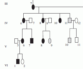
|
As noted, they had eight JR cases from four generations of the same family. They constructed a genealogy of the family, part of which is shown at the left. (Ovals are for females, squares are for males.) Even without explanation of the figure, you can see that the genealogy suggests a trait that is passed down in the family. It seems to be a simple dominant trait; that is, everyone who gets one copy of the relevant gene gets the JR condition.
Now, this genealogy is not as simple as it may seem. The black symbols are for individuals known to have the JR condition. However, the open symbols mean "unknown" and the gray symbols mean "suspected". (An example of an individual "suspected" to have the condition is #11 of generation IV -- denoted in the paper as IV, 11.) Thus the interpretation of the genealogy as indicating a simple dominant inheritance is a hypothesis. The point here is that the genealogy is suggestive.
|
What's the bottom line? We have several members of a family with a rather specific language defect. There is reason to suspect that this is a genetic condition. Now, can they find the gene? And what will it tell us?
News stories:
* Gene mutation sought to explain mysterious language problem -- A family that struggles to recall words could provide a window into the biology of language cognition. (Nature News, June 20, 2012.)
* British family's problems hint at a gene involved in linking language and meaning. (E Yong, Not Exactly Rocket Science (blog, now at National Geographic), June 19, 2012.)
The article: A specific cognitive deficit within semantic cognition across a multi-generational family. (J Briscoe et al, Proc. R. Soc. B 279:3652, September 22, 2012.) The figures above are parts of Figures 2 and 1, respectively, from this article.
Also see:
* How a cat tongue works (March 19, 2019).
* Mountains and human language? (June 28, 2013).
* Can French baboons learn to read English? (May 13, 2012).
* A smart rat (November 30, 2009).
July 3, 2012
Where is the front of the circle? How a brittle star moves
July 3, 2012
Before we get to the brittle star, it may be useful to take a moment and think about how our familiar four legged animals (tetrapods) move. (You can include yourself as an example, on all fours.) The animal has five appendages that are relevant: a head, which is "in front", and four limbs, involved in locomotion. We recognize front limbs and rear (or hind) limbs, left limbs and right. To make a turn, we rotate our body, so that the head appendage is now pointing in the new direction we want to go; the limbs play the same roles as before. But what if... all these five appendages were actually interchangeable; heads and limbs were just different functions, but any appendage could play any role. Then to make a turn, we would not need to rotate the body. Just designate a different limb as "head", and the others fall into place as right and left, front and rear limbs as appropriate. Simpler, yes?
That's about what happens for the brittle star, shown at the right. The brittle star is an echinoderm, the group of organisms that includes the common starfish. You can see that this animal shares the five-fold symmetry of the starfish. The five arms of the brittle star are organs of locomotion, used to "row" or swim.
Well, four of them are organs of locomotion; the other points the way "forward". But the limbs all look about the same. Which one points forward? The one that is going the way the animal wants to go. And when it wants to make a turn (change direction), it just reassigns functions, so that the one pointing in the right direction is the head limb; the ones nearby to either side are the front limbs, and so forth. That is, this brittle star moves about the way we imagined in the opening paragraph of this post.
|
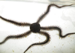
|
How do we know how brittle stars move? Because Henry Astley, a student at Brown University, has just made some careful observations of them. He made movies of the animals moving across the sand in a pool, and he carefully analyzed the movies. Before this, people had suggested various possibilities for how the brittle stars move; Astley's careful observations and analysis give us a good model. You can check some his movies yourself; see below.
Why do we care -- aside from it being fun? (Well, "fun" is important.) The echinoderms are unusual, in having a circular body plan (most have the familiar five-fold radial symmetry). Most animals, including us and those other tetrapods, are bilaterally symmetrical -- with similar left and right sides. Interestingly, echinoderms are bilaterally symmetrical in their larval stages; it is the adult form that is radially symmetrical. And yet, we now see that this brittle star moves as if it were a bilateral animal. It's unusual in that it can declare the left-right axis anywhere, but at any given moment it moves as if it were bilateral.
And the brain? Well, echinoderms don't really have a distinct brain. They have a circular nerve-ring that serves the animal's needs. A circular nerve-ring is symmetric around the whole animal. Echinoderms have not gotten to the stage of development where brain (or nervous system) means head. So the idea that five limbs (one in front and four locomotory limbs to the sides) are all interchangeable is fine. We think the head is special, and do not interchange head and limbs. We pay a price for that "advance": we need to turn our body in order to change direction.
News story: Five-Limbed Brittle Stars Move Bilaterally, Like People. (Science Daily, May 10, 2012.) Recommended! The animal shown above is from this news story.
Movies. Three movies files are linked to the web site for the article; see below. They are all short (about 2 minutes total), and clearly show some key aspects of the brittle star locomotion.
* Movie 1. Rowing. Note that one arm is pointing in the direction of the motion, and the two limbs nearby (right front and left front) are doing the rowing.
* Movie 2. Reverse rowing. Note that one arm is pointing opposite to the direction of the motion, and the two limbs opposite (right rear and left rear) are doing the rowing. (I didn't discuss this variation above.)
* Movie 3. Turns. Twice during this sequence the brittle star changes direction -- but does not rotate.
The article: Getting around when you're round: quantitative analysis of the locomotion of the blunt-spined brittle star, Ophiocoma echinata. (H C Astley, Journal of Experimental Biology 215:1923, June 1, 2012.) The movies are linked here under "Supplementary material".
A previous post on echinoderms: Where are the eyes? (August 19, 2011).
More: Arm problems in the stars (June 6, 2016).
More about "walking" with five "limbs": An animal that walks on five legs (February 3, 2015).
A chemist's guide to eating in New York City
July 2, 2012
Blog post: The Key to the Gustavademecum. (H Merwin, June 15, 2012.) The article here is by Merwin. The Gustavademecum for the Island of Manhattan -- A Check-List of the Best-Recommended of Most Interesting Eating-Places, Arranged in Approximate Order of Increasing Latitude and Longitude is by chemist Robert Browning Sosman.
The two figures showing samples from the book may or may not be readable. The underlying files are readable (though barely); just use your browser to display the figure at full size.
This was posted in the chemed discussion group, with the comment: "I don't suppose this helps demonstrate to students that chemists are people too, but perhaps helps with they're weirder than they think, and in ways they don't imagine."
Peripartum cardiomyopathy -- a heart condition associated with pregnancy
June 30, 2012
About 1 in 1000 women suffer a heart problem in late pregnancy or shortly after delivery. Half of them die or suffer lasting harm. These are women who were apparently healthy. This condition is called peripartum cardiomyopathy (PPCM); peripartum means around delivery and cardiomyopathy refers to heart muscle damage. The underlying basis of PPCM has been largely mysterious.
A new paper may provide a clue. The authors suggest that the condition is due to an imbalance in angiogenesis -- the formation of blood vessels. It is triggered by an anti-angiogenesis factor made late in pregnancy, perhaps to minimize bleeding during birth. Understanding what triggers PPCM allows them to take steps to prevent it. Most of the work here is in a mouse model, but they offer some evidence suggesting its relevance to humans.
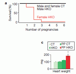
|
Here are examples of their results.
In this figure, HKO means heart-knockout. It refers to a specific gene being studied; the HKO mice have been genetically engineered so that they fail to make the particular gene product in the heart. CT means control; these lack the HKO change. Both parts of the figure here compare HKO and CT mice; the second variable is different for the two parts.
Part a (top) shows survival curves for four groups of mice. They are HKO and its CT control, males and females. There are four survival curves, but you see only two lines. That is because three of the curves are the same: straight across the top, with full survival. The only deaths are seen with the HKO females (red curve), which die with an increasing number of pregnancies. (What the x-axis, number of pregnancies, means for males is not clear. But it doesn't matter. The point is that HKO leads to deaths -- in females and increasingly over multiple pregnancies.)
|
Part c (bottom) shows one measure of heart health in four groups of mice. The four groups involve the HKO mice and their CT controls. The other variable here is non-pregnant vs post-partum (PP). Again, you can see that three of the results are very similar. The fourth result shows an enlarged heart -- for the post-partum HKO mice (red bar). (If you look closely... the control mice also show an increase in heart size after delivery, but the increase is very slight, and not statistically significant.)
The figures here are parts a and c of Figure 1 from the article.
|
So what is this gene that is causing the problem here? It's called PGC-1α. It's a regulatory gene; among other things, it stimulates angiogenesis. Knocking it out reduces the formation of blood vessels. The results above might suggest that reducing angiogenesis in the heart of peripartum females is bad.
Now, it's not that simple. As noted, PGC-1α is a regulatory gene; it does lots of things. Thus the results shown so far are actually rather general, and further work is needed to pinpoint what is going on. That reduced angiogenesis in the heart may relate to PPCM is simply one possible interpretation of these results -- one hypothesis. In fact, they do some further work, which seems to support the idea. For example, treatment with a pro-angiogenesis factor counteracts the ill effects of the HKO anti-angiogenesis.
What about the human disease? What they have shown here is that a particular gene can cause a condition in mice similar to the PPCM seen in a few people. That does not mean that this gene is involved in the human PPCM. It may be that the human condition relates to this gene; it may be that the pathway has some relevance; or this finding may have no relation at all to the human condition. The mouse model system offers a clue; now we need to see how that clue might apply to the human condition. What the mouse model does is to allow them to test specific ideas, under conditions where the effect occurs at high frequency, and they are allowed to do experimentation.
They do offer one hint of the relevance of their story to human PPCM. It is known that the human placenta secretes an anti-angiogenic factor late in pregnancy. Analysis of plasma samples shows that higher levels of this factor correlate with clinical PPCM. This supports the idea that PPCM may be due to an imbalance in angiogenesis. And it supports the idea of trying a pro-angiogenesis treatment of PPCM.
News story: Important Clues to a Dangerous Complication of Pregnancy: Data Strongly Suggests That Peripartum Cardiomyopathy Is a Vascular Disease. (Science Daily, May 9, 2012.)
The article: Cardiac angiogenic imbalance leads to peripartum cardiomyopathy. (I S Patten et al, Nature 485:333, May 17, 2012.)
A recent post on heart disease... Heart damage: role of mitochondrial DNA (June 1, 2012).
More blood... Blood vessels from dinosaurs? (April 22, 2016).
More pregnancy problems: ELABELA deficiency and preeclampsia? (October 8, 2017).
The nano-alphabet
June 29, 2012
|
The alphabet (and a bit more), as recently published by a group of Harvard scientists.
|
Each image above is about 150 nanometers on a side. Each structure is made entirely of DNA -- from a set of short DNA strands that spontaneously come together to form a tiny structure of the desired shape. And that's the point. They have developed what they think is a powerful method to make well-defined nano-structures. The letters are just to show off the method. (Here is the complete figure from which that was cut: the complete figure.)
Here is the idea...
The basic structure they make is a rectangle. They then make other structures by leaving out parts of the rectangle; that is, the other structures are "sub-structures".
The figure at the right shows the design of the rectangle (part b, top) and two examples of sub-structures (part c, bottom)
Let's look more closely...
|
|
First, the rectangle (part b, top). They show two diagrams of the rectangle. The one on the right, labeled 'brick-wall' diagram, is a good place to start. It shows that the rectangle is made of a set of blocks (bricks): mostly "big" blocks, but with "small" blocks along the top and bottom. What are the blocks? Each is a piece of DNA; this aspect is better shown at the left, in the strand diagram. It looks more complicated, but it's actually rather straightforward: each big block is a U-shaped piece of DNA, and each small block is a simple line of DNA (about half of a U). The DNA blocks interact by the usual base pairing rules for DNA. The set of blocks (DNA strands) is designed so that when all the strands are mixed, they will form the rectangle by the way they interact with each other. (The colors simply show that each block is different.)
Part c (bottom) shows two simple sub-structures. Each is shown with two diagrams, one a strand diagram and one a brick diagram -- just as in part b. The one at the left is (approximately) a triangle, consisting of the lower right part of the rectangle. To make this, they leave out all the DNA pieces for the upper left. The remaining pieces now spontaneously assemble to form the lower right part of the rectangle -- a triangle. The sub-structure at the right is a "rectangular ring"; they leave out the middle pieces.
To form the letter A, they simply leave out all the pieces except those needed for the A. Same idea.
|
People have made complex shapes by the "self-assembly" of DNA before. Why is this work an improvement? Previous work usually involved designing and synthesizing a large DNA molecule for the specific project. The new work involves making things from a toolkit of standard parts. Once they make all the DNA pieces needed for the rectangle, they can make all the sub-structures that are within the rectangle. The pieces of the toolkit are all short DNA molecules; making them is fairly routine now.
Is it really that simple? No. Here are a couple of the complexities -- one of which is easily dealt with.
* First, when they simply leave out certain pieces, they find that the remaining pieces start interacting in undesirable ways. This is easily solved: they made "edge protectors": short pieces of DNA to protect sequences that become exposed as a result of the omissions. This makes the toolkit larger (in fact, it makes it 5 times the size!). But the effect is predictable and fixable, so it is not a big problem.
* Second, not everything works, and this is not well understood. (Of the first 110 designs they attempted, 103 worked on the first try. The @ sign was one of their initial failures -- though a tweaked design subsequently worked.) In fact, the dynamics of the formation of structures is not well understood. Although it is all logical, it's actually a complex problem of chemical kinetics to form the desired structure. It's nice that it usually works, but we can't hide that we don't understand it well. Thus the process seems useful, as shown here, but we do not know its limits.
News story: Nanodevice Manufacturing Strategy Using DNA 'Building Blocks'. (Science Daily, May 30, 2012.)
* News story accompanying the article: Nanotechnology: The importance of being modular. (P W K Rothemund & E S Andersen, Nature 485:584, May 31, 2012.)
* The article: Complex shapes self-assembled from single-stranded DNA tiles. (B Wei et al, Nature 485:623, May 31, 2012.) The two figures shown above are parts of Figures 4 and 1, respectively, of this article.
Earlier posts on DNA technologies...
* Nanorobots: Getting DNA to walk and to carry cargo (August 7, 2010).
* What is it? (May 25, 2011).
More about alphabets: Help design a new alphabet (March 1, 2016).
June 27, 2012
A new trick for the Kepler planet-hunters
June 25, 2012
Previous posts have noted the discovery of new planets. But I have posted little on the subject since results from the Kepler mission started coming in. (One link is at the end.) Kepler was a game changer; it uses a systematic exploration of a region of the sky, to find everything that fits its criteria. Kepler has announced over 2000 candidate new planets -- far more than all previous methods combined. The candidates need to be confirmed by independent measurements; that is a slow process, but the estimate is that over 90% of Kepler candidates will be validated as planets.
Kepler's methodology is simple: it watches for dimming of the light of a star as a planet passes in front. If a consistent dimming occurs at regular intervals, that is evidence for a planet -- one that "transits" its star, dimming the star's light, once during each orbit of the planet around the star. The logic is simple; what makes Kepler so productive is the extreme sensitivity of its instruments, as well as its pristine viewing perch, above the Earth's atmosphere.
A key limitation of the Kepler method is that it can only find a planet that passes directly in front of its star, as viewed by Kepler. That is, the transit is seen only if Kepler (the viewer), the planet, and the star all line up. (It's just like for eclipses. An eclipse of the Sun by the Moon might occur each month. But we only see it when our position as the viewer lines up with the Moon and Sun. Similarly, the transit of Venus earlier this month was an event of note because it meant that Venus passed in front of the Sun -- as viewed by an observer on Earth.) Now we have the first detailed report based on Kepler of a planet that does not transit its star.
Planetary orbits are determined by the law of gravity. A small object follows a regular orbit around a large object. Kepler's normal role is to report candidate planets precisely because they have regular orbits, as judged by regular transit patterns. But if there are more objects, each body affects the path of each other object. For example, planets affect each other's orbits. That is, one planet can cause small perturbations of the orbit of another. That is what Kepler has now seen. Scientists have analyzed Kepler data and reported a planet that does not transit its star, but which perturbs another planet's orbit.

|
Here is what they found -- in an artist's conception.
The big bright thing is a star, called KOI-872. "Planet b" is passing in front of the star; that is a transit, and is what Kepler detects, because the transiting planet reduces the amount of starlight that is seen. But there is also a "Planet c"; it does not transit the star, but it affects the orbit of Planet b enough that the time between transits of b varies.
What Kepler observed was that the transit timings of b varied by as much as two hours (out of 34 days), one of the largest transit timing variations (TTV) they saw.
This figure is from the ScienceDaily news story.
|
|
The existence of TTV for b suggested that another body was gravitationally perturbing its orbit. That might be a moon around b (which is what they were looking for), another planet, or even another star. At this point there is a lot of math. They develop models of how each of those types of bodies would perturb the motion of b. Turns out that the most likely model was one with another planet, called c. They have enough data from the Kepler observations -- 15 transits in this case -- that they are actually able to predict the size and orbit of the unseen planet (c). Further, they predict what TTV should be observed over the coming cycles. That's a good part of the scientific process: they claim a discovery, and predict something that will be testable over coming years. The validity of their discovery will be tested -- and fairly soon.
The graph at right deals further with the issue of lining up start, planet and observer so the transit is visible.
The graph plots the inclination of the orbit over time, for both planets b (red) and c (blue). This is based on what they have found so far about these planets. Time 0 is "now"; the graph is about the future. The gray region at the bottom marks the "transit zone", the allowed region where the transit can be observed. According to this graph, Kepler would never see Planet c transit its star. The graph does show Planet b in the transit zone -- but it won't be there for long. We are lucky that Kepler can see the transit of Planet b at all!
This is Figure 3D from the article.
|
|
The new work reported here is an interesting development for the Kepler mission. Kepler is already amazingly prolific, but it may offer even more, from a more complex analysis of the data. As with any of Kepler's candidate planets, those based on the new method need to be confirmed.
News story: Unseen Planet Revealed by Its Gravity. (Science Daily, May 10, 2012.)
* News story accompanying the article: Astronomy: Evidence of Things Not Seen. (N W Murray, Science 336:1121, June 1, 2012.)
* The article: The Detection and Characterization of a Nontransiting Planet by Transit Timing Variations. (D Nesvorny et al, Science 336:1133, June 1, 2012.)
More from the Kepler mission...
* How many exoplanets are known? Three (four?) fewer than we thought (May 31, 2022). A re-evaluation.
* The Kepler Orrery (June 3, 2011). A post about the Kepler mission. It also links to other posts on discovery of planets.
Discovery of Neptune: The one-year anniversary (July 12, 2011). That an unknown planet might be causing perturbations in the orbit of another is an old idea. Indeed, that is how people predicted the existence of a planet beyond Uranus. They noted irregularities in the orbit of Uranus, and predicted that another planet could be causing them. And they found Neptune just about where the calculations suggested it should be.
More about orbit complexities: Who is perturbing the orbit of Halley's comet? (October 3, 2016).
More about exo-planets: Habitable Exoplanets Catalog (July 27, 2012).
More on Venus: Sulfur dioxide in the atmosphere of Venus (February 16, 2013).
More about transits: Rings for Chariklo (May 9, 2014).
And... The largest -- and most distant -- planetary ring system (February 9, 2015).
Alan Turing, computable numbers, and the Turing machine
June 23, 2012
|
Today is the 100th anniversary of the birth of the British mathematician and computer scientist Alan Turing. Beyond academic circles, Turing is known for his role in breaking the German codes in World War II, and for the Turing machine and the Turing test. As we note the anniversary, Greg takes a look at the Turing machine, providing some insight into the dawn of the computer age. He writes...
|

|
At right: Alan Turing.
Source: reduced from Wikipedia: Alan Turing.
|
"On computable numbers, with an application to the Entscheidungsproblem" is a paper written by Alan Turing in 1936, when he was aged just 24. But what exactly is a computable number? And what's the big deal?
Turing answers the first of these questions as the first sentence of
the paper: 'The "computable" numbers may be described briefly as the
real numbers whose expressions as a decimal are calculable by finite
means'. That sounds straightforward -- until you remember that in 1936
there were no electronic computers or calculators. Turing was
interested in the principles of automated computing: what could be
automated, if the technology were available?
(It's worth noting that Turing's paper refers to a computer as "he",
e.g. on page 253. At that time, a computer was a person who carried
out calculations, not an automated machine.)
The first section of Turing's paper ("Computing machines") describes a
simple "machine" -- later known as a Turing machine -- that has:
* a one-dimensional "tape" on which the machine can read/write symbols
(numbers);
* a "head" that can read or write numbers on the tape, and can move the
tape one space to the left or right;
* a set of "configurations" or states (e.g. a number that the machine
remembers);
* a table of instructions that tell the machine what to do -- write a
number or move the head -- for each possible pair of (current state,
current number on tape).
|
You can watch a "real" Turing machine at A Turing Machine. (Mike Davey.)
The photo at the left shows the machine from that page. There is a roll of tape, with spools at each side. The "business part" of the machine is the device in the middle.
|
That page includes descriptive material and examples, as well as a five minute video. The video is beautifully done, but is probably not enough to explain what is going on -- at least in a single viewing. If you really want to understand how it works, read the "examples" pages and watch it count or subtract.
The video alone is also at YouTube video: A Turing Machine - Overview.
|
This is the importance of the machine: Turing proved in "On computable
numbers" that this simple machine, given the right table of instructions
and a long enough piece of tape, can calculate any computable number.
In fact, he showed that a Turing machine can do the same computation
that any other Turing machine can do. All that was needed, to do any
computation, was a device with the properties of a Turing machine. This
set the stage for the development of the first computers.
Your computer is also a Turing machine. The little machine in the video
reading 1s and 0s from a tape might be slow, but it could do exactly the
same calculations as the computer you're using to read this.
The article: On Computable Numbers, with an Application to the Entscheidungsproblem. (A M Turing, Proc. London Math. Soc. Series 2, 42:230-265, November 12, 1936.) (The date given is the date the article was read at the Society meeting. That date is shown on the article; however, the journal issue was published in 1937. The article is sometimes referred to as being from 1936 or from 1937.) There is also a pdf of the article at copy. Caution: The article is highly mathematical!
* Previous history post...
Lyell on fossil rain-prints (May 6, 2012).
* Next: On a new method of treating compound fracture... (July 11, 2012).
More computer history -- pre-Turing!
* The Antikythera device: a 2000-year-old computer (August 31, 2011).
* From my page of Book suggestions: Swade, The Cogwheel Brain - Charles Babbage and the Quest to Build the First Computer (2000).
More computer history.
* A device for controlling the cursor on the computer screen (July 10, 2013).
More from World War II: Analysis of uranium samples from World War II Germany (November 7, 2015).
My page Internet resources: Miscellaneous contains a section on Science: history. It includes a list of related Musings posts.
More about the Turing centennial: Alan Turing -- and the music of Iamus (November 14, 2012).
Another aspect of Turing's work is the Turing test. Posts about the Turing test...
* Eugene Goostman and his Turing test (June 17, 2014).
* Computer reads CAPTCHAs with 90% accuracy (November 25, 2013).
Nanopores -- another revolution in DNA sequencing?
June 22, 2012
Imagine reading the sequence of a piece of DNA by simply looking at it, say under a microscope. After all, there are four different bases. Can't you tell them apart by looking at them? People have actually tried this approach, using electron microscopy, and base-specific stains. Bottom line, it never worked well enough to use. All the DNA sequencing we commonly use is based on chemical -- or biochemical -- reactions, and we see which base reacted.
Now we have a new approach to reading the base sequence of DNA by simply "looking" -- or at least making a simple physical measurement of the DNA. Actually, the approach is not all that new; it's been around for a couple decades, without much success. But now we have a report of some actual sequence measurements -- and an announcement that a commercial product will be out by year's end. That doesn't mean it's a success, but perhaps it is close and it is time to take a look.
Imagine a membrane with a small pore in it. How small? Just barely big enough to allow a single strand of DNA to thread through it. It's called a nanopore, to reflect its atomic dimensions. Arrange the membrane with some electronics so that we measure the electrical conductivity of the solution in the pore. Of course, electrical conductivity depends on what is in the solution, such as charged particles. Thread the DNA chain through the pore, and measure the conductivity of the solution as the chain proceeds. The conductivity depends on which DNA base is in the pore at any given moment. As the DNA threads though the pore, the conductivity varies depending on the DNA sequence. Record the conductivity, and simply compare the conductivity at each point to what one expects for each base. Thus we get the DNA base sequence, simply by moving the DNA through a pore, and measuring the electric current.
|
Here is a cartoon giving an idea of what this looks like.
The horizontal bluish bar near the bottom is the membrane. Embedded in the membrane is a protein (gray), with a pore in it. That is one protein, shown here as a cutaway. In the pore is one strand of a DNA molecule (the "red" strand); the "lollipops" on the strand represent the four different DNA bases. This is the "business part" of the system: DNA moving through that pore across the membrane; what is measured is the electric current through the pore -- which varies depending on the base sequence of the DNA. At the top of the gray protein is another protein -- holding the DNA; this protein is responsible for controlling how fast the DNA moves through the pore. This is an important technical development, but it does not affect the basic logic.
This is all sub-microscopic. The DNA and the membrane are each about 2 nanometers across.
This figure is Figure 1a from the Nature Biotechnology news article (Schneider).
|
The idea is simple enough. Does it really work? Well, it hasn't until recently. Recent developments have included better pores, better control of how the DNA moves (that upper protein), better electronics -- and of course better computing to handle the masses of data. Let's look at an example of the results from a new paper...
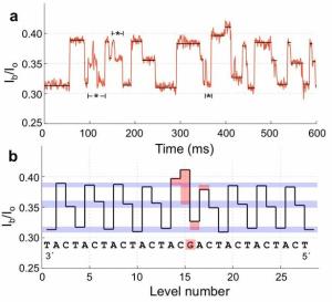
|
This figure illustrates what the results of nanopore sequencing look like.
The two parts of this figure show the same information, in different forms. Part a, the upper curve, shows the raw data: current vs time. Part b, the lower curve, shows a smoothed and interpreted version of the current plotted against the base number. (Note that the two curves are not aligned.)
For simplicity, let's look at the smoothed data, in the lower curve. You can see that, except in the very center, the current varies in a regular way, with three steps that are marked by horizontal blue bars. Each of those blue bars seems to be the current for one particular base; the bottom blue bar, just above a current level of 0.3, is for the base T -- and so forth. Thus we can read the bases T, C, A -- repeating, from the right end. (By convention, DNA sequences are usually reported from the 5' end, shown here at the right.)
|
Now look at the center part, where some of the data is marked with orange. If you look at the sequence, you will see that there is a single G base (replacing one of the T bases in the repeat). The orange markings show that the current at four positions is affected by this one G. This shows that the current at a particular moment is probably due to a central base plus one or two on each side of it. That is, it's a bit more complex than what we suggested above. However, the computer analysis can take into account that the measured current is not simply due to one base, but to a small group of bases in the sequence.
This figure is from the ScienceDaily news story; it seems to be Figure 3 of the Manrao article.
|
Are you supposed to be impressed by this? I'm not sure. It is apparently the first published example of a real sequence determination by this technology. But it still seems limited and complex. The good news is that we can see and understand the progress. And then we have that announcement: a commercial version of nanopore sequencing of DNA later this year. Maybe they won't make it, but it sounds like they think they have it working. Indeed some of the things they have claimed (but not published) are impressive. The carrot(s) here? They suggest that nanopore sequencing will be cheaper than other sequencing methods. It measures the sequence of individual molecules, not just collections of molecules. And they hint at being able to sequence a complete human genome in 15 minutes (by using an array of such devices, with the total cost less than current sequencing machines). Nanopore sequencing is an interesting approach. Maybe it is almost there.
News story: Tiny Reader Makes Fast, Cheap DNA Sequencing Feasible. (Science Daily, March 26, 2012.)
Video: Video 1. This is Supplemental Video 1 that accompanies the Cherf paper listed below. It gives you an idea of how the process works. (In the video, note that the DNA strand actually passes through the pore twice, once going down and once going up. They can measure the conductivity each time, thus this actually results in determining the sequence twice. How this double read is achieved is beyond what I want to explain here.)
* News story accompanying a pair of articles: DNA sequencing with nanopores -- Major hurdles in the quest to sequence DNA with biological nanopores have now been overcome. (G F Schneider & C Dekker, Nature Biotechnology 30:326, April 2012.)
* The articles:
1) Automated forward and reverse ratcheting of DNA in a nanopore at 5-Å precision. (G M Cherf et al Nature Biotechnology 30:344, April 2012.) This article is the source of the video listed above.
2) Reading DNA at single-nucleotide resolution with a mutant MspA nanopore and phi29 DNA polymerase. (E A Manrao et al Nature Biotechnology 30:349, April 2012.) This is the article with the sequencing results that are shown above.
The discussion above focuses on two new papers, both from university labs. We also noted a product announcement from a company, called Oxford Nanopore. We have no hard information from them. However, they have announced their intent to market such a sequencer during 2012. An announcement is not a product, but it is a step, and it lends some credibility to the idea that nanopore sequencing is imminent. Here is their press release: Oxford Nanopore introduces DNA 'strand sequencing' on the high-throughput GridION platform and presents MinION, a sequencer the size of a USB memory stick. (Oxford Nanopore, February 17, 2012. Now archived.) Note that their development of nanopore is for a broader range of work; DNA sequencing is simply one application of their nanopore technology. Company home page; includes technical information.
Nanopore sequencing was featured in the MIT Technology Review as an "Emerging Technology". The story is brief, but has a nice diagram of one of the proposed processes. Nanopore Sequencing. (Amanda Schaffer, Technology Review, April 25, 2012.)
Science ran a "News focus" story on nanopore sequencing. It includes the history of the field, as well as the current paper and what we know from Oxford Nanopore. I encourage those interested in the field to look over this article. Genome sequencing: Search for Pore-fection -- At long last, nanopore sequencing seems poised to leave the lab, promising a new and better way to decode DNA. (E Pennisi, Science 336:534, May 4, 2012.)
Also see the accompanying post (immediately below), which is an overview of new DNA sequencing technologies, including nanopore sequencing: DNA sequencing: an overview of the new technologies (June 22, 2012).
Artificial nanopores: Making an artificial ion channel from DNA (January 8, 2013).
The $1000 genome: we are there (maybe) (January 27, 2014). An announcement, from a supplier of sequencing equipment. It also notes that the nanopore device discussed above has not yet shipped.
More on nanopore sequencing...
* Nanopore sequencing of DNA using synthetic membranes (May 15, 2021).
* Nanopore sequencing of DNA: How is it doing? (November 13, 2017).
* Better nanopore DNA sequencing by using better nucleotides (May 6, 2016).
* A DNA sequencing machine you can carry with you (April 14, 2015).
There is more about genomes and sequencing on my page Biotechnology in the News (BITN) - DNA and the genome.
DNA sequencing: an overview of the new technologies
June 22, 2012
The accompanying post (immediately above) is on a new technology for sequencing DNA using nanopores: Nanopores -- another revolution in DNA sequencing? (June 22, 2012).
We also have a news story that is an excellent gentle overview of this and other emerging technologies for sequencing: Sons of Next Gen -- New innovations could bring tailored, fast, and cheap sequencing to the masses. (T Ghose, The Scientist, June 1, 2012.)
Among previous posts on this topic: The $1000 genome: Are we there yet? (March 14, 2011).
And since then...
* Are DNA sequencing devices resistant to radiation? And why might we care? (July 16, 2013).
* Accumulation of mutations in the sperm of older fathers (November 19, 2012).
* Genome sequencing of a human fetus (August 25, 2012).
* In humans, rare mutations are common (July 24, 2012).
There is more about genomes and sequencing on my page Biotechnology in the News (BITN) - DNA and the genome.
June 20, 2012
Bear photography
June 19, 2012

|
The story and more pictures (full-size): D4... GRIZZLY Proof! (May 18, 2012.)
Thanks to Borislav for sending this item.
|
More about bears...
* Why the bear used the overpass to cross the highway (May 11, 2014).
* Loss of ability to taste "sweet" in carnivores (April 6, 2012).
More wildlife photography... Super Squirrel (September 19, 2009).
More photography... Photography from the space shuttle (June 4, 2012).
The chemistry of a tasty tomato
June 18, 2012
It's "common knowledge" that the taste of tomatoes is not as good as it used to be. This supposedly resulted from breeding for handling characteristics such as shelf life, with little consideration of the taste. A new paper investigates what is responsible for the taste of tomatoes. The results are complex, but perhaps also hopeful.
In this work, the scientists collect a large number of tomato varieties, most of them predating the modern breeding programs (so-called heirloom tomatoes). They do chemical analyses on them, and they also have consumer panels do taste testing. The consumers rated such factors as texture and sweetness, and also gave an overall "liking" score. This produces a massive data table (see below). Computer analysis of the results suggests that certain factors are most important. That is, the results show -- upon mathematical analysis -- that levels of certain chemicals are correlated with a higher rating by the consumer.
One general aspect of the results was expected: we judge a food by both taste and odor -- by taste receptors in the mouth and odor receptors in the nose. The nose is even more complicated: we inhale volatiles through the nostrils, but we also get volatiles into the nasal cavity via the throat (retronasal olfaction). Some refer to this complex of taste and odor as flavor. It was not surprising to find that the tomato has rather complex flavor features, but some of the specifics were surprising. For example, some of the major volatiles, which had been assumed to be important, seemed to have little influence on the consumer rating. Particularly interesting was the finding that certain volatiles affect our perception of sweet taste. Such interactions are known, but this seems to be a novel natural example. It will be interesting to learn more about how this works. Is it possible that we could satisfy some of our sweet-tooth by adding aroma compounds of minimal caloric value?
Do these results solve the problem? No, they only offers clues. The work suggests some goals for further development, whether by traditional breeding or by genetic engineering. That is, the results give them an idea what to look for. However, the ideas are only hypotheses, and must be tested. As one test, they engineer a new strain guided by what they learned. The results are about as expected, but the particular case they tested, a simple one to test, was not aimed at making a better tomato. The challenge is to somehow come up with a variety that has desirable characteristics, both for taste (or flavor) and handling.
That massive data table I mentioned above... The results from their analyses of the tomato varieties are summarized in Figure 1 of the article as a "heat map". Here is that figure: Figure 1 [link opens in new window]. The main box of the figure contains rows for each variety of tomato and columns for each chemical (or other feature) tested. The color is a measure of the result, with brighter colors meaning higher readings. Importantly, along the left side is the overall "liking" score for each type of tomato. It's complex, but computer analysis reveals some patterns.
Some of the varieties shown here are "supermarket" tomatoes. Some of them actually score well on the taste test.
News stories:
* The Secret to Good Tomato Chemistry. (Science Daily, May 24, 2012.)
* The Scientific Search for the Essence of a Tasty Tomato. (Wired, May 24, 2012.)
* Commentary accompanying the article: Taste: Unraveling Tomato Flavor. (A B Bennett, Current Biology 22:R443, June 5, 2012.)
* The article: The Chemical Interactions Underlying Tomato Flavor Preferences. (D Tieman et al, Current Biology 22:1035, June 5, 2012.)
Other posts about flavor (taste + odor) and such include...
* Is it possible to have a normal sense of smell without olfactory bulbs? (January 28, 2020).
* Is it ok to eat while standing up? (January 14, 2020).
* Could smelling a piece of wood improve the growth of your hair? (November 5, 2018).
* Better chocolate? Use better yeast? (May 3, 2016).
* How can hummingbirds taste "sweet"? (September 26, 2014).
* How a cork causes an off-flavor in a beverage (October 21, 2013).
* Loss of ability to taste "sweet" in carnivores (April 6, 2012).
More tomatoes...
* Could tomatoes be used as the source of a common drug for Parkinson's disease? (April 24, 2021).
* An artificial hand that can tell if a tomato is ripe (January 3, 2017).
* How the tomato plant resists the Cuscuta (November 4, 2016).
* Red and green aphids (June 2, 2010).
Brain-computer interface: Paralyzed patients control robotic arm by their thoughts
June 16, 2012
|
Lady drinks coffee.
She lifted the coffee bottle from the table and brought its straw to her lips -- using the robotic arm, which was controlled by her thoughts. It was the first time that she had taken a drink "by herself" in 15 years, since being paralyzed by a stroke.
This is the third of four frames of Figure 3 from the article. That figure contains frames from the video.
|
|
The electrode array, which is implanted into the patient's brain. It reads the brain waves, and sends them to a computer, which controls the robot. The overall result is that the patient controls the robot by thoughts.
The array is 4x4 millimeters, with 96 electrodes. It is shown here against the background of a US dime coin, which is 2 centimeters across.
The figure is trimmed from one in the Science Now news story.
|
The pictures tell the story. For more, check out the video.
The results announced here are from a formal clinical trial of the device. This is not the first thought-controlled robot result, but it is apparently the first in which a real human patient gains a useful mobility function. Of course, this is all made possible by modern high speed computing, along with the miniaturized electronics -- and all the scientists' work. That is, these results are evolutionary, not revolutionary -- and the work is not over. Still, it is an exciting milestone -- as documented by the look on the lady's face at the end. (See either the figure in the paper or the video.)
Among points of interest in the new work...
* One patient has had the electrode implant for five years. It is encouraging that implants may have a substantial useful life.
* Both patients tested in this paper had not been able to use their limbs for many years. It was, therefore, not certain that they would retain the proper thought processes that would allow them to properly control the robot.
* The first figure above is the dramatic outcome. However, much of the work involves simple tasks, such as reaching for and grasping a ball. The paper contains data on success rates. The simple answer is that there is still much room for further work.
Video: Thought control of robotic arms using the BrainGate system. (YouTube. ~4 minutes.) This is a publicity video, but it includes some serious content showing use of the device. Both news stories listed below also include short videos, which include some key footage from the testing.
News stories:
* Mind Control of Robot Arm. (The Scientist, May 16, 2012.)
* Paralyzed Patients Control Robotic Arm With Their Minds. (Science Now, May 16, 2012.)
* News story accompanying the article: Neuroscience: Brain-controlled robot grabs attention. (A Jackson, Nature 485:317, May 17, 2012.) This has a timeline showing some of the developments along the way to achieving this result.
* The article: Reach and grasp by people with tetraplegia using a neurally controlled robotic arm. (L R Hochberg et al, Nature 485:372, May 17, 2012.)
More from the same project: Progress toward a practical brain-computer interface: self-calibrating software (March 28, 2016).
Project web site: BrainGate -- Turning Thought into Action.
Terminology: Tetraplegia and quadriplegia mean the same thing.
More in Musings on mind-controlled devices:
* Brain-computer interface -- without invasive electrodes (December 28, 2016).
* Music-making technology -- for the physically disabled (April 23, 2011). It links to other relevant posts.
Next post on robots: A deceptive robot (September 4, 2012).
More...
* Can rats touch infrared light? (February 25, 2013).
* Using your brain waves to log on to the computer (April 29, 2013).
More on coffee... Good news on the coffee front: Coffee is good for you (March 15, 2016).
More drinking straws: Making better straws (February 11, 2023).
More about brains is on my page Biotechnology in the News (BITN) -- Other topics under Brain (autism, schizophrenia). It includes a list of brain-related Musings posts.
Tracking illegal fish
June 15, 2012
You buy some fish. What is the likelihood it is the type of fish the label says? This is not just a matter of you planning your meal. Many fish stocks are endangered. This may refer to certain species, but may also refer to specific breeding populations within a species. There may be regulations about catching one or another type of fish, but they are hard to enforce. After all, if you see a piece of fish in the store or restaurant, how can you tell what kind of fish it is -- or where it came from? Well, just check its DNA. The possibility of using a DNA fingerprint has seemed likely for some time; now, someone has made substantial progress toward making it work.
As with so many recent advances, this is another tribute to the drastic decline in the cost of DNA sequencing. The test itself does not involve sequencing the genome of the test fish. What they did was extensive sequencing to establish a database about the different fish populations. That allowed them to find sites where there were differences that are useful in distinguishing the populations. The actual test requires them only to measure those individual sites.
|
The figure at left gives an idea of the approach, and some results. This figure is for populations of sole. The white circles show the locations of the populations used for establishing the database. Then, they tested fish from the locations marked with colored circles. As shown on the figure, about 93% of the individual fish were assigned to the correct population based on the DNA analysis.
This is Figure 1c from the article. The other three parts of the figure show the results for populations of other commercially important fish. The example shown here, for sole, gave the poorest results of the four cases they tested.
|
They estimate the cost of the analysis at about 25 USD per fish. Clearly, this is not a test the consumer does on the dinner at the restaurant. It is for regulatory agencies checking harvests. Further work can tune the tests, using more specific DNA sites, to improve the accuracy.
The project is called FishPopTrace. Perhaps they could work on improving that name.
News story: New Means of Safeguarding World Fish Stocks. (Science Daily, May 22, 2012.) This gives an overview of the problem, and of the specific European regulatory context. It says little about the method itself.
The article, which is freely available: Gene-associated markers provide tools for tackling illegal fishing and false eco-certification. (E E Nielsen et al, Nature Communications 3:851, May 22, 2012.)
We briefly noted an article on conservation of fish stocks in the post: Fish story (June 4, 2009).
More... DNA evidence in restaurants: is the fish properly labeled? (June 5, 2017).
More on fishing: Cultural transmission of fishing techniques among dolphins (September 13, 2011).
More on fish: Did you see what the sawfish sawed? (April 27, 2012).
There is more about genomes and sequencing on my page Biotechnology in the News (BITN) - DNA and the genome. The page includes an extensive list of related Musings posts.
June 13, 2012
Chemistry cartoon
June 13, 2012
Cartoon.
If you don't get the joke, try reading the cartoon aloud.
Source: I got this from the Chemed discussion group. Original source unknown. [If you put the first line into a search engine, you will find various sources of the cartoon on the web.]
Are government safety inspections worthwhile?
June 12, 2012
A common criticism of government programs is that no one bothers to check if they work. That a program is well-intentioned and "makes sense" is no guarantee it will work. In science, we offer hypotheses -- and test them. Similarly, businesses track whether programs achieve the intended goals. On the other hand, the effectiveness of government programs typically is not tested.
Here we have a paper, in Science magazine, testing a government program. The testing was done by academics, with the lead author being from the business school at UC Berkeley. The program they test is the random safety inspections of businesses carried out in California by the state OSHA (Occupational Safety and Health Administration). Their overall conclusion is that the inspections lead to reduced injury, but not to increased costs.
Parts of the paper are difficult reading, with tables of statistical results that are hard to sort out. However, the general flow of the paper does a good job of describing what they do. They also compare their analyses to others that have been done (with varying results), and discuss the limitations of the work. If you find the topic of interest, browsing the paper may be worthwhile.
Is this the last word? Well, in science the details of an analysis are subject to challenge. Others may do tests that reach other conclusions; can we understand why? The point is that this work seems a useful step. It would be nice to see more such analyses of programs.
News stories:
* It's Official: Random Inspections Improve Workplace Safety. (Science Now, May 17, 2012.) Good overview of the experimental design, which emphasized having a proper control group for the analysis.
* New study finds that OSHA inspections reduce worker injuries while saving employers money. (OSHA Quick Takes, May 29, 2012. Now archived.) This gives an overview of the results, in plain English. It is from the US government OSHA.
The article: Randomized Government Safety Inspections Reduce Worker Injuries with No Detectable Job Loss. (D I Levine et al, Science 336:907, May 18, 2012.)
Other posts on safety include:
* Should the results of restaurant inspections be posted by the door? (December 4, 2018).
* Does dry cleaning cause cancer? (November 30, 2011).
* Killer chickens (December 2, 2009).
Cloning: camel -- update
June 11, 2012
Long ago, back before Musings formally started, we noted a news account of the first cloning of a camel: Cloning: camel (June 19, 2009). The work is from the Camel Reproduction Centre in Dubai. We now have a current news story suggesting how they want to proceed with the development of camels for making drugs. While checking for more info, I found a paper on the original cloning work.
The possibility of making protein drugs by genetic engineering of an animal to produce the drug in its milk has been considered before. Some work has been done with making drugs in goat milk. So far, this has not worked out well. I am not sure why. So we can only watch as they try to do something similar with camels. Do camels have an advantage? Does a different economic model allow them to succeed?
News story: Genetically modified camels to act like pharmacies. (The National (Dubai), June 1, 2012.)
The article: Production of the First Cloned Camel by Somatic Cell Nuclear Transfer. (N A Wani et al, Biology of Reproduction 82:373, February 1, 2010.) I have added this paper to the original post.
Note that the news story here is current. The article is from 2010, and documents the news story noted in the earlier post.
More about camels:
* Prions in camels? (June 18, 2018).
* A MERS vaccine, for camels (January 22, 2016).
* Do camels transmit MERS to humans? (January 21, 2015).
* Where is the MERS virus coming from? (September 22, 2013).
* Can giraffes swim? (August 6, 2010).
This item is also noted on my page for Biotechnology in the News (BITN) Cloning and stem cells.
PAPupuncture -- an improved acupuncture
June 10, 2012
An earlier Musings post (link below) provided evidence for how acupuncture results in pain relief. The finding was that acupuncture causes production of the small molecule adenosine, which relieves the pain.
If adenosine is the key to relieving pain, why not just inject adenosine? Or an enzyme that makes adenosine? The latter is the idea behind a new paper -- and the results are encouraging.
As another piece of background, they knew that adenosine monophosphate (AMP, a form of adenosine carrying a phosphate group) was elevated near acupuncture points. This led them to try an enzyme that would remove that phosphate group. They inject the enzyme at the acupuncture point; it makes adenosine. It works: pain relief -- in their mouse model system -- is evident; it's better than the pain relief from ordinary acupuncture.
The enzyme they use is prostatic acid phosphatase (PAP); a phosphatase is a general term for an enzyme that removes phosphate groups. (The enzyme initials also lead to the nickname for their procedure.) They use the human PAP, denoted hPAP.
|
This figure summarizes some aspects of the work.
Part A shows how long pain relief lasted with various treatments. Acupuncture and CPA (a drug that activates the adenosine receptor) each give relief for a couple hours. A low dose of PAP enzyme gives relief for 3 days, a high dose gives relief for 6 days. The bottom row shows that two low doses, with the second dose at day 3, gives extended protection.
|
Part B summarizes the pathway -- for how acupuncture works, and how the enzyme treatment works. At the top is AMP, which is converted to adenosine by the PAP enzyme. The adenosine acts via a receptor (green) in a membrane (gray), followed by an enzyme called PLC. The two chemicals shown in red inhibit those steps -- and inhibit pain relief. (The sideways T, shown here in red, is a common symbol to show an inhibition.) (CPA, in part A, and CPX, in part B, are different chemicals. One activates the receptor, one inhibits it.)
This is Figure 6 from the article.
|
The general picture is that use of the PAP enzyme shows good results, with pain relief for several days. They feel that they have a good understanding of the process and why the enzyme is effective. This is all in mice, as was the earlier work. They plan to move toward testing in humans.
News story: Pain Relief With PAP Injections May Last 100 Times Longer Than a Traditional Acupuncture Treatment. (Science Daily, April 23, 2012.)
The article, which is freely available: PAPupuncture has localized and long-lasting antinociceptive effects in mouse models of acute and chronic pain. (J K Hurt & M J Zylka, Molecular Pain, 8:28, April 23, 2012.)
The earlier post showing that adenosine is involved in how acupuncture works: How acupuncture works: another clue (September 2, 2010). If you are going to read the current paper, please read this earlier post and perhaps its paper. The two posts -- and papers -- are closely related. As noted above, the new work really follows, in part, from the work in the earlier paper. This earlier post gave some useful terminology and some chemical structures for following the subject. (One of the authors of the new paper wrote the Nature news story for the previous paper.)
More about pain: Alcohol consumption, an "ethnic" mutation, and a possible new drug (October 28, 2014).
Dog fMRI
June 8, 2012
Functional magnetic resonance imaging (fMRI) is a form of MRI that is used to probe brain function. It makes use of the difference in magnetic properties of blood (of the hemoglobin in the blood) depending on whether or not the oxygen level is high. High oxygen level is indicative of brain activity. Thus, doing an fMRI scan shows which regions of the brain are active.
We now have a report of doing fMRI with dogs -- dogs that are awake and unrestrained. How can one achieve that? By training the dogs to be still in the environment of the machine. It took a few months of training, but it worked well; it was apparently done within the usual procedures for how one trains dogs.
The figure at the right shows Callie inside a training box that mimics the MRI machine.
|
|
|
This is Figure 1A from the article.
|
What does one do with a dog trained to lie still in an MRI machine? Test their brain activity, of course. In this case, they do a simple test. The trainer has two hand signals. One means the dog will get a "treat"; the other means "no treat". The trainer gives the hand signal, and they do a series of fMRI scans -- as the dog lies still. They get a consistent result: a particular region of the dog brain "lights up" in the fMRI scan for the "positive" signal.
|
The figure at left summarizes the responses of the two dogs tested.
The left frame is a "heat map" summarizing the fMRI responses to the "positive" signal. Brighter color means more response. You can see that distinct regions light up.
|
The right frame analyzes that quantitatively. The y-axis shows the amount of fMRI signal. (BOLD = Blood Oxygen Level Dependent signal.) The x-axis is time after the signal, shown here as scan number. The solid line shows results for the positive hand signal; the dashed line shows results for the negative hand signal. You can see that the difference peaks around scans 2-4 (3-5 seconds after the signal), which is about what they expected for the time response.
This is Figure 3 (bottom part) from the article.
|
The region that lights up the most is the caudate region ("CD", with the green arrow, in the figure). In humans, this region is associated with rewards. Thus the result here "makes sense" for this early work.
Conclusion? It's "proof of principle". They have shown that dogs can be trained to be still in an MRI machine, and that fMRI scans can then be used to probe the dog's brain. Let's see where people go with this.
Videos. There are several videos associated with this work. Two of them are useful as overview. (Each is 5-6 minutes.)
* Training video. In addition to showing some of the training, it gives you an idea of the set-up, and of the tests. This is "movie S1" from the "Supporting Information" for the article. You can get to it from the article site, listed below, or use this direct link: Training video.
* An interview with the professor who led the project. It includes good footage of some of the work. It's more of a promotional video from the university than science per se, but it is a good overview. It's available from the university news release, but here is a direct link to this video at YouTube: What is your dog thinking? Brain scans give glimpse.
News stories:
* What Is Your Dog Thinking? Brain Scans Unleash Canine Secrets. (Science Daily, May 4, 2012.)
* What is your dog thinking? Brain scans unleash canine secrets. (eScienceCommons, Emory University, May 4, 2012.) From the host institution. More pictures.
The article, which is freely available: Functional MRI in Awake Unrestrained Dogs. (G S Berns et al, PLoS ONE 7(5):e38027, May 11, 2012.) Among the "Supporting Information" provided with the article are three movie files. Movie S1 is a "training video", which was noted above. The other two show MRI sequences from the two dogs.
More on fMRI:
* Imaging of fetal human brains: evidence that babies born prematurely may already have brain problems (March 10, 2017).
* Can we predict whether a person will respond to a placebo by looking at the brain? (February 21, 2017).
* Should the music industry use MRI scans to predict the success of new songs? (June 28, 2011). (This is from the same lab as the current paper.)
* Fructose and your brain (January 28, 2013).
More about dogs:
* It's a dog-eat-starch world (April 23, 2013).
* Do dogs respond to their owner's yawns? (May 29, 2012).
* Pet Diary (September 25, 2009).
More imaging...
* A new brain study (March 3, 2020).
* Brain imaging, with minimal restraint (June 2, 2018).
* Observing inside animals with an improved bioluminescence system (April 6, 2018).
My page for Biotechnology in the News (BITN) -- Other topics includes a section on Brain. It includes a list of brain-related posts.
June 6, 2012
An unusual eye?
June 6, 2012
|
Cover photo from a recent journal.
It's a larva of a sponge, called Amphimedon queenslandica. The bluish tuft is a ring of ciliated cells, responsible for swimming.
This striking figure is misleading in a couple of ways. First, the larva is almost microscopic; it is probably about a half millimeter across. Second, the color is from staining, and is not the natural color of the larva. Nevertheless... They feature this photo because of an article in the issue about vision in these sponge larvae. It's an incomplete story, but an interesting one.
This is from the cover of the journal issue for the article. The figure is with the news story.
|
Vision? Sponges -- the simplest of animals - have eyes? Well, the larvae swim, and their swimming is affected by light. That is, they are phototactic. So there is some kind of system for detecting light, and using it to affect behavior. Isn't that what a visual system does?
The problem is that these larvae lack two features of all known eyes in animals. First, they lack a nervous system, of any kind. Eyes affect behavior via the nervous system -- in all other animals. Second, they lack the type of photoreceptor protein that is found in all animal eyes. It is called opsin, and acts in concert with a small molecule that responds to light. (For us, that small molecule is retinal, derived from vitamin A.)
In the new work, the scientists analyze the sponge genome and find that it contains two genes for another type of protein, called cryptochrome. Cryptochromes can also serve as photoreceptors, but they are not the primary visual pigment in other animal eyes. One of the cryptochromes they find is closely associated with the ciliated cells. So we have a protein that could function as a light receptor associated with the cells that respond to light. Suggestive, isn't it? The scientists have not gone further at this point.
There it is. A striking picture that gets our attention. And a suggestion that these sponge larvae have a very simple visual system, quite unlike anything known in the eyes of other animals.
Are these sponge eyes? I suggest that we emphasize learning what the sponges do, including how they respond to light. The name we apply to the structure matters less. Single-celled microbes, including both bacteria and protozoans, respond to light. They have photoreceptor proteins, and somehow light reception is coupled to behavior. That seems true with these sponge larvae, too, though the specific connection suggested here needs to be checked. In more complex animals, the light receptor is coupled to behavior via the nervous system, and we call the anatomical structures with the photoreceptor eyes. But isn't it the development of the nervous system that allows the more complex visual system?
* News story accompanying the article, freely available: Sponge larvae could be guided by cryptochrome. (K Knight, Journal of Experimental Biology 215(8):ii, April 15, 2012.) Good overview.
* The article: Blue-light-receptive cryptochrome is expressed in a sponge eye lacking neurons and opsin. (A S Rivera et al, Journal of Experimental Biology 215:1278, April 15, 2012.)
A previous post about cryptochrome proteins -- of humans. A human protein that can sense magnetic fields (July 15, 2011). We should just briefly note that cryptochrome proteins are not new. However, as their name might suggest, we know little about what they do -- at least until recently.
Among other posts on animal vision...
* Caterpillars can see color even if blindfolded (September 14, 2019).
* Color vision: The advantage of having twelve kinds of photoreceptors? (February 21, 2014).
* A better understanding of the basis of color vision (February 1, 2013).
* Golden rice as a source of vitamin A: a clinical trial and a controversy (November 2, 2012).
* With 24 eyes, can they see the trees? (June 11, 2011).
* Butterflies and UV vision (June 29, 2010).
More about sponges:
* Bending a rigid rod (May 17, 2013).
* Quiz: What is it? (October 31, 2012). See the answer.
* Croatian Tethya beam light to their partners (December 16, 2008)
Chemical elements 114 & 116: flerovium & livermorium are now official names
June 5, 2012
We noted the official recognition of chemical elements 114 and 116, and the proposed names for them. The naming proposal is in the post: Chemical elements 114 & 116: flerovium, livermorium (proposal) (December 5, 2011). The proposed names and symbols have now been officially adopted. These names and symbols are
* element 114: flerovium (Fl);
* element 116: livermorium (Lv).
Here is an announcement: Element 114 is Named Flerovium and Element 116 is Named Livermorium. (IUPAC, May 30, 2012. Now archived.)
I have noted this development on my page of Internet Resources for Introductory Chemistry under Names of elements. The new names are now on my periodic table, at Chemistry and molecular biology -- Files available for download: Periodic table.
Photography from the space shuttle
June 4, 2012

|
Two astronauts, during a cargo transfer operation between the space shuttle and space station.
This is reduced from one of the many space photographs in the article featured here. Borislav sent the article, and writes...
|
To appreciate what this article is about, I will give you an intro, and than write a bit of a comment about a photographer's perspective.
Getting anything off the face of the Earth requires tremendous effort, for human or for nature.
- For nature, that means that a really violent event needs to happen; to release a tiny amount of planet's mass, an impact by an asteroid (a very big hunk of space rock), or something bigger needs to hit it (say a rogue moon, or dwarf planet, like Pluto).
- For human, that means that you need to engineer a way to put a tiny object (payload) on top of a humongous object (rocket), that utilizing a controlled explosion lifts the object to Earth orbit.
Anything done up in orbit, while managing to stay alive is something fantastic. Space is not meant for humans, as we have not evolved tiny bit to roam the space, so we need to engineer our technology to help us survive. Just imagine going to toilet while in weightlessness (hint: nasty).
The article on Space Photography on Luminous Landscape is a fantastic read, because that is a rare occasion in which an astronaut doesn't talk about stuff related to the flight or the immediate tasks related to spacecrafts and experiments they need to do, but art (photography).
As the spaceflight is literally out of this world, people that got there always wanted to share the images of what they see with the citizens of Earth. They always had the best equipment, but getting good imagery is not easily done. Even the best technology (Nikon D3s is best DSLR camera today) is very often not good enough, and to learn how to do photography one needs years of training.
This article is written by an astronaut who is taught photography, and the article itself is written for photographers.
Now, proceed to read it, and appreciate the effort. This is not only the work of astronauts, but also an army of engineers that made the flight and the equipment used possible.
The story: Photography In Space. (Captain Alan Poindexter, Luminous Landscape, April 20, 2012.) Poindexter was an astronaut, and was commander of a shuttle mission to the International Space Station in 2010.
As we were discussing how to write this item, we wondered whether it is possible to give an idea of the size of the space shuttle -- and of the amount of fuel needed to send it off. Let's explore... The familiar part of the shuttle -- the part we see flying or landing, or attached to the space station -- is officially known as the orbiter. The orbiter weighs about 75 tonnes empty; loaded for flight, it weighs about 100 tonnes. As some frame of reference for those numbers, they are similar to a medium-sized airliner (such as a Boeing 737) -- or to a big blue whale or large dinosaur. The comparison to a medium-sized airliner is even appropriate. Not only is the orbiter something of an airliner of sorts, but at times it gets transported on the back of a 747, a much larger plane. Pictures of that piggyback arrangement give you an idea of the size. But the whole space shuttle contraption on the launch pad includes two booster rockets and a fuel tank -- with lots of fuel. The entire assembly weighs about 2000 tonnes -- 20 times more than the orbiter itself. The fuel alone weighs 16 times more than the orbiter itself! That fuel is needed to lift the shuttle upward -- against the force of Earth's gravity.
Other posts about the space shuttle:
* Space shuttle passes in front of the sun (May 19, 2009).
* One way trip to Mars (September 22, 2009).
* A small perk when living in Florida (November 23, 2009).
* Space shuttle: some final photos (December 3, 2012).
More about astronauts: Which direction does blood flow in an astronaut? (January 7, 2020).
The Moon may have formed in the kind of event suggested at the start of this post, though little is known, The Moon: might it be a child with only one parent? (April 13, 2012).
More photography... Bear photography (June 19, 2012).
More July 5, 2012... Alan Poindexter, the author of the story featured here, was killed in a boating accident on July 1, 2012. NASA Mourns Tragic Death of Retired Astronaut Alan Poindexter. (Space.com, July 3, 2012.)
A polar bear update
June 3, 2012
Briefly noted...
In previous posts (listed at the end) we noted some pioneering work on the ancestry of the polar bear, based on genome sequences. We noted that the papers had limited information, and were providing only a start to the analysis of the problem. We now have more.
The papers discussed in the earlier posts used sequences of the mitochondrial DNA (mtDNA) from various samples, including an ancient fossil. They suggested a range of possible scenarios for the history of the polar bear. One analysis suggested that the polar bears might have split off from the brown bears only 150,000 years ago.
The new paper presents nuclear genome sequencing from a range of bears. Thus there is more information -- by sampling the whole genome rather than just the mtDNA. Further, the nuclear genome includes the contributions of both parents, whereas mtDNA is inherited through only the mother. Not surprisingly, they get a different picture of the history of the bears -- because they have used more information.
The emerging picture is that the polar bears and brown bears separated much earlier, perhaps 600,000 years ago. Their ancestry is complicated by inter-breeding and population bottlenecks.. It may well be that the mtDNA of modern polar bears resulted from some such inter-breeding much more recently. I'll leave it for those who are interested to check the details; the big message is to be cautious about family trees based on limited information.
News story: Polar Bears Evolutionarily Five Times Older and Genetically More Distinct: Ancestry Traced Back 600,000 Years. (Science Daily, April 20, 2012.) Includes another wonderful polar bear picture.
The article: Nuclear Genomic Sequences Reveal that Polar Bears Are an Old and Distinct Bear Lineage. (F Hailer et al, Science 336:344, April 20, 2012.)
Previous posts on polar bear ancestry:
* Polar bears: ABC (May 11, 2010).
* Quiz: Barack Obama and polar bears (July 20, 2011).
One issue here is that having full genome information, including the nuclear genome, is better than having only the mitochondrial genome. We saw something like this happen with the Denisovan human sample, where the picture originally proposed based on mtDNA was revised when the nuclear genome became available. The Siberian finger: a new human species? -- A follow-up in the story of Denisovan man (January 14, 2011).
There is more about genomes on my page Biotechnology in the News (BITN) - DNA and the genome. It includes a list of related Musings posts.
More about bears...
* Staying warm -- polar-bear style (July 23, 2019).
* Why the bear used the overpass to cross the highway (May 11, 2014).
Also see... Why does Santa Claus prefer the North Pole? (December 22, 2016).
Heart damage: role of mitochondrial DNA
June 1, 2012
The work discussed here suggests one part of the complex process of heart damage. The idea is that mitochondrial DNA (mtDNA) released in damaged cells may provoke an inappropriate immune response, thus amplifying the damage. That is, the initial damage may trigger an immune response, which causes further damage.
Using a mouse model system, the scientists make a heart injury. Most mice recover, but some do not. Mice lacking a particular enzyme, a DNase, that degrades DNA survive more poorly. What's the connection? Why is degrading DNA relevant to survival from heart damage? What they argue is that the initial injury causes some cells to be damaged. Cleaning up after the damaged cells is a complex biological process. One part of it is that the mitochondria must be properly disposed of. However, if the mitochondria release their DNA (the mtDNA), it may stimulate an inflammatory response, which is detrimental to heart function. What's the problem with mtDNA? It has some characteristics of bacterial DNA, reflecting the ancestry of the mitochondria. Mammals respond to bacterial DNA by promoting inflammation; that is part of our immune response that protects us against bacterial infection. We respond to free mtDNA the same way -- and that can be bad. The DNase degrades the mtDNA, thus minimizing the inflammatory repose it might otherwise cause.
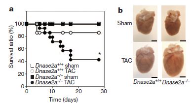
|
The article presents many experiments, to support various parts of this story. Here are two examples of their results, showing the basic phenomenon.
The experiment here simply tests the effect of the DNA-degrading enzyme on survival from the heart injury. There are four conditions, with all combinations of two variables. One variable is TAC vs sham. TAC means thoracic transverse aortic constriction; it is a surgical way of inducing excessive pressure in the heart. Sham is a "control" for the surgery; they did the surgery, but did not do the TAC. The other variable is whether the mice have a gene for a particular DNA-degrading enzyme, DNase II. The mice labeled Dnase2a+/+ are normal; the mice labeled Dnase2a-/- lack this enzyme.
|
Part a (left) shows survival curves -- survival vs time -- for the four conditions. Most interesting are the curves for the TAC-treated mice, with and without the DNase. You can see that the TAC-treated mice with DNase (open circles) survived fairly well; those without the enzyme (closed circles) survived poorly. (The two sham groups both gave 100% survival; it's hard to see, but the upper line is really two lines, for those two sham groups.)
Part b (right) shows the appearance of the hearts for the four conditions. The key point is that the TAC-treated mouse lacking the DNase enzyme shows a markedly enlarged heart (lower right). You can compare it with the TAC-treated heart with enzyme at the left, or the sham-treated mouse lacking enzyme at the top. (The scale bar is 2 mm.)
The figure here shows parts a and b of Figure 1 of the article.
|
The experiment discussed above implicates DNase II in promoting survival from a heart injury. (Why DNase II? It is in the lysosomes, the cellular compartment where one would expect degradation of damaged mitochondria to occur. That is, they focused on the particular DNase that seemed most likely to be relevant to the proposed process.) In another part of the work, they show that blocking the immune system response to bacterial DNA counteracts the effect of the lack of DNase II.
What is the significance of this finding? Well, the current work was done in a model system in mice. Whether it holds for natural heart disease processes -- chronic or acute -- in humans remains to be seen. Model systems give us ideas to test. However, we note that inflammation is increasingly recognized as relevant to heart disease, and the source of the inflammation is not always clear. Does this work provide a clue? If mtDNA is relevant to heart disease, can we identify people more at risk from this process? Can we do anything about it? Lots of questions!
News story: 'Rogue DNA' Plays Key Role in Heart Failure, Study Shows. (Science Daily, April 25, 2012.)
* News story accompanying the article: Cardiovascular biology: Escaped DNA inflames the heart. (K Konstantinidis & R N Kitsis, Nature 485:179, May 10, 2012.)
* The article: Mitochondrial DNA that escapes from autophagy causes inflammation and heart failure. (T Oka et al, Nature 485:251, May 10, 2012.)
An earlier post on the ability of mtDNA to simulate a bacterial infection. Can you die from an infection without being infected? (March 19, 2010).
More about hearts...
* Peripartum cardiomyopathy -- a heart condition associated with pregnancy (June 30, 2012).
* Heart health and python blood (December 28, 2011).
More autophagy: An "antidote" for Huntington's disease? (February 29, 2020). In this case, scientists made use of the autophagy system to remove a disease-causing protein.
Also see:
* Silk-clothed electronic devices that disappear when you are done with them (October 19, 2012). Another disposal issue.
* How a drug can cause an autoimmune reaction (September 1, 2012). More on the complexity of the immune system.
* Getting along: animals and bacteria (August 6, 2012).
May 30, 2012
Do dogs respond to their owner's yawns?
May 29, 2012
Yawning is contagious. Everyone knows that -- and it is even true. It's true in humans, in various primates (apes and monkeys) -- and in dogs. But there is something special about yawn contagion with dogs: dogs can "catch" yawns from humans. It's the only known example of cross-species yawn contagion.
A new paper explores the nature of this human-dog yawn contagion. It's an interesting experimental system; it is not at all clear what the results mean.
The test here involves using recorded sounds of yawns. That is, the test dog is exposed to the sound of a yawn, not to the yawning person. Does the dog respond to the sound of a yawn? If so, does the dog know who is yawning? What the scientists do here is to test each dog with four types of sounds. These include familiar and unfamiliar yawns. The familiar yawn is that of the dog's owner. They also use two non-yawn sounds, one of which is familiar to the dog.
The key findings are that the dogs are more likely to yawn in response to a recorded yawn than to a non-yawn. Further, they are more likely to respond to a familiar yawn than to an unfamiliar yawn.
So... dogs can catch yawns from humans. They can even catch them by simply hearing the recorded yawn. That's interesting. And in responding to recorded yawns, they preferentially respond to the yawn of their owner rather than to that of a stranger. That's very interesting. One possible interpretation is that the yawn response is an empathic response to the familiar person.
The authors note that an independent study had not shown that dogs respond preferentially to their owner's yawn. They note some differences in the experimental design. Further work can explore how the result may depend on the details of the experiment.
News story: Dogs Feel Your Pain. (Science Now, May 7, 2012.) Bad title, but the story does include a nice picture of a dog yawning.
The article: Auditory contagious yawning in domestic dogs (Canis familiaris): First evidence for social modulation. (K Silva et al, Animal Cognition 15:721, July 2012.)
More about yawns: How long is a yawn? (December 16, 2016).
More about dogs:
* Predicting success in training guide dogs -- role of good mothering (November 27, 2017).
* Pet Diary (September 25, 2009).
* Dog psychiatry: Implications for humans (October 3, 2010).
* Dog fMRI (June 8, 2012).
Happy Birthday
May 27, 2012

|
The Golden Gate Bridge.
The bridge opened on May 27, 1937 -- 75 years ago today. (That does count as a birth, doesn't it?)
The figure here shows the bridge's distinctive orange color, along with a hint of the fog that is so common -- as well as the beautiful environment.
Source: reduced from Wikipedia File: The Golden Gate Bridge Fog.jpg.
|
News story: Golden Gate celebrates 75th with help of engineers. (Sydney Morning Herald, May 22, 2012.) I thought it was clever to provide a news story for this event from such a distant source. However, it seems to be a syndicated AP story. No matter. It does a good job of introducing the engineering marvel that joins the city of San Francisco to Marin County, less than a mile north across the entrance to San Francisco Bay. It also includes a couple of nice pictures, including one showing how the bridge appears all too often on what passes for summer afternoons here.
I encourage you to put Golden Gate Bridge into your search engine for images, and just enjoy browsing. As a bonus, add the search term fog. And remember, if you visit San Francisco during the summer, be sure to bring a warm jacket.
Previous post about a bridge: How the spider avoids being attacked by the ants (January 10, 2012).
Another... Coloring with graphene: making a warning system for structural cracks? (June 2, 2017).
Previous post about the San Francisco area: Genetically modified crops and the fate of the monarch butterfly (April 1, 2012).
Previous birthday post: Happy birthday (November 4, 2009).
And more... Happy birthday, Phil Trans (March 25, 2015).
Novelty-seeking behavior
May 26, 2012
Honey bees have a complex society. Among the behavioral features of a colony... Certain bees take the lead in finding food or a site for a new home; these individuals are known as scouts. Scouts go out and observe, and then return and report their observations to the colony (by the famous "waggle dances"). A new paper explores how scouts are different from the average individual -- at the molecular or biochemical level. Intriguingly, the scientists find that the bee scouts, which carry out exploratory behavior, share some features that are associated with novelty seeking in vertebrates.
In an early part of the work, they compared gene function in scout and non-scout bees. They did this by looking at the amount of messenger RNA (mRNA) made for each gene. They found many differences, including in genes involved in neurotransmitters. To test whether these changes are significant for the behavior, they tested the effect of directly administering the neurotransmitter to bees.
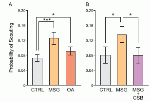
|
Here is an example of what they found.
The basic test is to take a group of bees, and see what fraction of them behave as scouts for food; that is, what fraction of them seek out a new food source.
The bar at the left is a control (CTRL); you can see that about 0.08 of the bees (8%) behave as food scouts in such a test. The next bar shows the effect of feeding the bees MSG (monosodium glutamate, a neurotransmitter); the fraction of bees behaving as scouts rises to about 0.12. The effect of MSG is consistent between the experiments in parts A and B of the figure.
|
Now look at the final (right-most) bar. This is labeled MSG + CSB. CSB (Chicago Sky Blue) is known to block transport of glutamate. Indeed, adding the CSB reverses the effect of the MSG. That is, MSG + CSB is about the same as the control. This supports the suggestion that the original effect was indeed due to the MSG.
The figure shown here is part of Figure 3 of the article. I skipped one bar in discussing the results. The compound octopamine (OA) also shows a small stimulation of scouting; OA operates differently than MSG.
|
The results shown above suggest that glutamate induces scout behavior in bees. Adding glutamate leads to more scouts; inhibiting the effect of glutamate leads to fewer scouts. Glutamate is a known neurotransmitter for vertebrates -- and is sometimes associated with novelty-seeking behavior.
What are we to make of this? I suggest that we take it at face value. The paper provides evidence for biochemical relationships involved in bee behavior. That's interesting; it opens up a new line of work. It may also be fun to note similarities between bees and vertebrates, but there is little to go on here; don't make much of it for now.
News story: Honey bees study finds that insects have personality too. (Phys.Org, March 8, 2012.)
The article: Molecular Determinants of Scouting Behavior in Honey Bees. (Z S Liang et al, Science 335:1225, March 9, 2012.)
More on bees:
* Caffeine boosts memory -- in bees (April 12, 2013).
* How do you tell if bees are pessimistic? (August 5, 2011).
The article here is, in part, from the lab of Tom Seeley at Cornell. A recent book by Seeley on honeybee behavior is listed on my page of Book Suggestions: Seeley, Honeybee Democracy, 2010. Recommended!
More about familiar neurotransmitters being involved in behavior in arthropods: Should you give Librium -- an anti-anxiety drug -- to crayfish? (October 6, 2014).
More about glutamate as a neurotransmitter: An artificial neuron? (November 6, 2015).
My page for Biotechnology in the News (BITN) -- Other topics includes a section on Brain (autism, schizophrenia). It includes an extensive list of brain-related Musings posts.
Towards a better understanding of Salmonella infections
May 25, 2012
John Pravin, who has sent a number of items for Musings, sends the following paper -- of which he is a co-author. The paper is part of learning how Salmonella bacteria infect animals (including humans), and what we might do about it. One approach is to systematically examine proteins that are part of the bacterial surface. As examples of questions one might ask... Are they required for virulence? Do they promote interaction of the bacteria with other bacteria? with the host cells? Do they promote an immune reaction? If so, is it protective? In this paper they focus on one Salmonella protein, called SadA.

|
Here is one experiment on the role of SadA.
The purpose of the test is to see whether the SadA protein promotes aggregation (clumping) of the bacterial cells. To do this, they put an ordinary suspension of bacteria in a tube, and watch. The bacterial suspension is turbid (cloudy) because of the cells. If the bacteria aggregate, the bigger clumps settle to the bottom; the tube of liquid becomes clearer. They can measure this with an instrument -- and they can also observe the settling by eye.
The graph, then, shows the turbidity (OD, optical density, measured here with 600 nm light) vs time allowed for settling.
|
Five bacterial strains are tested. You can see that four of them are very similar in this test: the OD is more or less constant over the observation period, meaning that no settling occurred. One strain showed a decline in OD, indicating that the cells of this strain aggregated and settled.
Let's focus on two of the five for the moment -- the last two listed in the legend, both labeled M15. These are strains of the closely related bacterium Escherichia coli (E coli). One, labeled M15pQE60, lacks SadA. The other, labeled M15pDR03, makes SadA -- and that is the one that showed aggregation. Its control, otherwise identical except lacking SadA, is one of those at the top (and it doesn't matter whether you can tell which of those is which).
Now look at the two pictures. They are for these two strains. What you can see there is the clump of cells at the bottom of one tube -- where aggregation occurred. Indeed, you see that "pellet" at the bottom for strain M15pDR03 -- the one with SadA.
Thus the two results here for the pair of E coli strains, using OD measurement and using visual observation, agree: SadA promotes bacterial aggregation.
But it is not that simple. The first three strains listed are Salmonella strains, some with and some without SadA. None of them show aggregation. (The first one is their normal strain, which has SadA; the Δ in the name of the second strain tells you that the gene for SadA has been deleted; and the third strain has that pDR03, discussed above, which adds back SadA. That is, similar experiments in Salmonella and E coli give different results.
This is Figure 3A from the article.
|
I chose this experiment to present here because it is one of the easier ones to explain. Yet you can see that the results are complex. The protein being studied here seems to be able to promote aggregation, when studied in E coli, but seems to not do so in its normal host, Salmonella. This is typical of what they find, over many types of experiments, and leads to their cautious conclusion that this protein may have various roles, but seems not to be a dominant player. They also discuss a number of possible complications; they will explore some of these later.
Overall, this paper is a good example of much basic science that gets done. It involves careful systematic study of things we know little about. The significance of the results is not immediately clear. Not all scientific findings are exciting. As information accumulates, more useful conclusions may emerge.
The article, which is freely available: SadA, a Trimeric Autotransporter from Salmonella enterica Serovar Typhimurium, Can Promote Biofilm Formation and Provides Limited Protection against Infection. (D Raghunathan et al, Infection and Immunity 79:4342, November 2011.)
An earlier post from the same lab about Salmonella: Why are HIV-infected people more susceptible to Salmonella infection? (May 21, 2010).
More on Salmonella: Why mice don't get typhoid fever (November 26, 2012).
More on biofilms... On sharing electrons -- II (June 9, 2013).
May 23, 2012
A drug trial to prevent Alzheimer's disease
May 23, 2012
This post is about an announcement of a clinical trial. There are no results; the point is that the trial will happen. The purpose of the trial is to test whether a drug can prevent (or slow) the development of Alzheimer's disease (AD).
What makes this trial special is that it deals with an unusual population: an extended family that carries a mutation for AD. Members of the family who carry this mutation develop the disease with 100% certainty -- early in life. DNA testing allows the scientists to know who has the mutation and who does not. (During the trial, investigators working with the participants and the data, as well as the participants themselves, will not know who carries the mutation, or who has received active drug.)
AD is a complex disease; it is still not understood what the key steps are, either in initiating the disease process or in causing pathology. Attempts to intervene with drugs have shown limited success. One problem with such drug interventions so far is that they involve people with active AD. It is plausible that by the time AD is diagnosed, it is too late to intervene. One key point of the new trial is that it starts early -- before there are symptoms. And because it deals with a population certain to develop disease, within a few years, it should yield good information about whether drug vs placebo benefited the people carrying the mutation. Whether the information gained is relevant to other forms of AD (e.g., that caused by other mutations, or the common AD that simply occurs with aging) will be an open question. The current trial deals with a situation that is favorable to getting an answer; understanding that answer will take further work.
We eagerly await results from this novel trial.
News stories:
* New Drug Trial Seeks to Stop Alzheimer's Before It Starts. (New York Times, May 15, 2012. Now archived.) This links to an earlier NYT article, which provides useful background information about the family.
* Family with Alzheimer's gene to test Genentech drug. (San Francisco Chronicle, May 16, 2012.)
You may wonder how this trial differs from testing a vaccine or a prophylactic drug (e.g., against malaria). After all, these involve preventing a disease. There are two points. One is that these examples typically deal with an infectious agent. The disease process starts with an infection; the vaccine or drug is to deal with the infection. With AD, we do not know how -- or when -- the disease process starts. It may be necessary to treat "early", but we do not know when "early" is. At least in this trial, the treatment is before there are symptoms -- but we have reason to believe the disease will develop "soon". A second difference has already been noted: the treatment is on a group that will get the disease with a very high frequency. That makes evaluation of results easier.
* Previous post on AD: Using patient-specific stem cells to study Alzheimer's disease (February 24, 2012).
* Next: A mutation that reduces the chances of Alzheimer's disease (September 18, 2012).
We noted the problem of getting good results for preventing something that occurs at a low frequency in the post Why did the HIV vaccine work for some people? Follow-up (May 1, 2012).
My page for Biotechnology in the News (BITN) -- Other topics includes a section on Alzheimer's disease. It includes a list of related Musings posts.
Possible transmission of norovirus via reusable grocery bag
May 21, 2012
Caution... This item is not dinner-item reading.
This is about an incident of gastroenteritis (or food poisoning), which is interesting for various reasons. The virus involved is one of the most common food poisoning agents. The analysis of the case is a good example of how outbreaks are studied. And one of the conclusions is that reusable grocery bags are implicated in the transmission.
|
In brief, the story is that a group of 21 people -- students and their adult chaperones -- went on an overnight trip. Apparently, one was already infected with norovirus. By the end of the trip, seven of the remaining 20 (or 35% !!) had become sick. None of those had direct contact with the original victim since she showed symptoms -- which is when virus would likely be spread. Investigation by the public health officials showed that a likely route of transmission was via a reusable grocery bag.
|
|
|
At right... noroviruses, as seen by electron microscopy. The scale bar is 50 nanometers. (Common bacteria would be about 20 times longer than the scale bar.)
Source: Norovirus. (Wikipedia.)
|
There is more to the story, including unpleasant details -- and holes in the argument. Some of the details may seem egregious. Ok, but remember that 35% of the people became infected. Whatever exactly happened, this is an example of a major transmission between people not directly exposed to each other. It is what is called transmission by fomites -- inanimate objects. Whatever the exact role of the grocery bag was, the story should call our attention to the possible role that such a reusable vessel could have.
Comments...
Although one purpose here is to call attention to the possible problem with the reusable grocery bag, it is only fair to note that the particular scenario here might have turned out the same regardless of the nature of the bag. Different types of surfaces might be better or worse at maintaining infectious virus, but we have no information on that.
At the outset I described the incident as involving "gastroenteritis (or food poisoning)". Although we do tend to use the terms somewhat interchangeably, they are distinct. Gastroenteritis describes what the person has -- a disorder of the GI track; it hints at the symptoms. Food poisoning suggests a cause, or route of infection. Gastroenteritis can be acquired from food, but can also be acquired otherwise. In this case, we do not know how the original victim acquired the virus. The main group of victims acquired the virus -- apparently -- from the first victim. The pathway of transmission from the first victim to the others is not entirely clear, but seems to have involved inanimate objects. It also seems food-related, but not due to inherent contamination of the food itself.
Norovirus is a major cause of gastroenteritis. The editorial below offers some numbers, for the US and worldwide. Among them... over 20 million cases per year in the US, and over 200,000 deaths of children per year worldwide. It is a "mild" disease, at least for those who are generally in good health. However, its ability to rapidly spread means it can devastate a group. Norovirus is the agent commonly associated with cruise ship outbreaks. The virus has numerous features that make it a problem. It's hardy, surviving many treatments that would kill most agents. Among these features is its ability to withstand drying; norovirus can remain on surfaces in an infectious form for several days -- a feature probably relevant to the current case.
News story: Reusable Grocery Bags Kept in Bathroom Implicated in Norovirus Outbreak. (Science Daily, May 9, 2012.) A good overview.
I encourage you to read both the editorial and article here. Both are short -- and both are featured on the journal web page as "Editor's Choice". The editorial is a good overview of the norovirus problem, as well as of this case. The article itself is a good example of how an outbreak is investigated. There are some technical things in it, but you can skip over those and get the big picture.
* Editorial accompanying the article, freely available: Noroviruses: The Perfect Human Pathogens? (A J Hall, Journal of Infectious Diseases 205:1622, June 1, 2012.)
* The article, freely available: A Point-Source Norovirus Outbreak Caused by Exposure to Fomites. (K K Repp & W E Keene, Journal of Infectious Diseases 205:1639, June 1, 2012.)
More on norovirus:
* An organoid for the gut: at last, a culture system for norovirus (October 30, 2016).
* Using a plasma to kill norovirus (June 5, 2015).
More on food poisoning...
* Killer chickens (December 2, 2009). This is about Salmonella and Campylobacter, bacterial agents of food poisoning. As with noroviruses, these are very common agents, which typically cause "mild" disease in healthy people. There are several posts on this topic, linked here.
* Don't eat the cookie dough? Or the flour? (February 20, 2012). This is about E coli O157:H7, a toxin-producing bacterium. It is a less common but potentially deadly agent.
More on disease transmission...
* Can you get sick from the street cleaning truck? (December 10, 2017).
* Should you ask your doctor to go BBE? (May 12, 2014).
More on bags: Should bags be made from torrefied paper? (May 14, 2023).
Our mountains are growing
May 19, 2012
How do we know? People are watching them. In one case, a particular part of a mountain is now 9 millimeters (about 1/3 of an inch) higher than it was just five years earlier (when they started watching).
In the title I referred to our mountains. The mountains studied here are the Sierra Nevadas, along the east side of California. More broadly, the area studied includes these mountains and areas to the east, in the state of Nevada -- home of the university that led the work. The methods used here, allowing study of mountain elevations over the time span of a few years, should be generally applicable.
What's mind boggling is simply that they can see this happen. So let's look a bit, getting the idea of how modern technologies allow them to watch the elevation of a mountain and see tiny changes -- over a time span of a few years. One of the methods they used was based on the GPS (global positioning system), pushed to its limits.
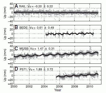
|
Some data from the GPS analysis, at four specific sites...
Each frame of the figure shows actual data for the elevation at a particular site, determined by high resolution GPS measurements over 5-10 years. The elevation is shown relative to an arbitrary "zero" point; what's important is to note the scale: the numbers on the y-axis are in 20 millimeter increments. In each frame, there is also a black line, which is the best fit to the data. Further, near the top left of each frame is the calculated Vu (velocity upward, in millimeters per year), as determined from the data. Let's look at a couple of the frames more carefully.
|
Look at frame A. I think you will agree that the line is quite flat. That is, the elevation did not change over the observation period (a bit over 10 years in this case). The calculated Vu is -0.20 mm/yr. With an indicated uncertainty of 0.22, that's more or less zero. Anyway, 10 years at that velocity would give a change of only 2 millimeters (downward, in this case) -- quite consistent with what you see by looking at the line.
Now look at frame C. The elevation data are drifting upward -- a bit. Agree? The calculated Vu is 1.47 mm/yr -- and that is well above the uncertainty shown. 10 years at that velocity would give a change of about 15 millimeters (upward) -- quite consistent with what you see by looking at the line.
Frames B & D cover shorter periods, but each is similar to the one just above it.
This is Figure 2 from the article.
|
The bottom two frames (C & D) are for sites in the mountains, at elevations of 3-4 thousand meters. The top two frames (A & B) are for sites to the east, in the "Great Basin" area of Nevada. These sites, along with many more they measured, lead to a big picture: the mountains are rising, relative to the basin. They are rising fast enough that we can see the change even over measurement periods of 5-10 years. Figures in the paper, such as the map of Figure 1B, show the big picture: elevation trends over a large region of Nevada and eastern California.
The motions observed here are the ordinary motions due to plate tectonics. To the scientists, the goal here is to better understand the underlying structure of the Earth -- and the movements of its crust.
News stories:
* Sierra Nevada mountains still reaching for the sky. (San Francisco Chronicle, May 8, 2012.) This story includes the issue of how old the Sierras are. From the rate of growth as reported here, we can calculate how long it would have taken the entire mountain range to rise at that rate. However, there is no reason to assume that it has grown at that rate over its entire history, and in fact that seems unlikely.
* Rapid Sierra Nevada uplift tracked by scientists at the University of Nevada, Reno -- Nevada Geodetic Lab uses GPS and radar for most precise measurements over entire mountain range. (Nevada Today, May 3, 2012.) From the lead University.
The article: Contemporary uplift of the Sierra Nevada, western United States, from GPS and InSAR measurements. (W C Hammond et al, Geology 40:667, July 2012.)
More on this story: Groundwater depletion in the nearby valley may be why California's mountains are rising (June 20, 2014).
More about mountains:
* Whales in the Chilean desert -- the oldest known case of a toxic algal bloom? (April 13, 2014).
* Mountains and human language? (June 28, 2013).
* How were the Gamburtsevs formed? (December 7, 2011).
A mouse carrying a serotonin-transport gene that contributes to human autism
May 18, 2012
Autism is a major disease, which affects brain function. Little is understood about its underlying basis. It is likely that there is a genetic component to autism. Several genes show some association with autism, but there is no simple one gene-one disease relationship. Autism (or, more broadly, autism-spectrum disorders) is undoubtedly heterogeneous -- a family of diseases with various causes contributing.
An old finding is that some people with autism show alterations in metabolism of the neurotransmitter serotonin. Among the genes associated with autism is one that affects serotonin transport -- called SERT. In a current paper, a team of scientists has made a mouse carrying a particular SERT mutation that has been found in some cases of autism. The results are intriguing.
They introduce a mutation in the mouse SERT gene, corresponding to a mutation found in some human autism. The mutation is G56A, which means that the amino acid G (glycine, or Gly) at position 56 in the protein chain has been replaced by A (alanine, or Ala). They do various tests, biochemical and behavioral, comparing the wild type (Gly56) and the mutant (Ala56).
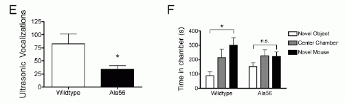
|
The two frames here show examples of their results for behavioral tests.
|
In part E (left), they measure the vocalizations when a mouse pup is removed from its mother (7 days after birth). You can see that the mutant mice (black bar, right) make fewer vocalizations. (The y-axis shows the number of vocalizations observed during a defined test period, which is 5 minutes. The * indicates that the result tests as statistically significant.)
In part F (right), they use the "three-chamber Crawley sociability test". In this test, one chamber (left side, as labeled on the graph) has a novel inanimate object and one chamber (right) has a novel mouse. The central chamber of the test box is a "neutral" reference point -- and the common entry to both boxes of novelty. They measure the amount of time a test mouse spends in each chamber. The results are that the wild type mice spend much more time checking out the novel mouse than the novel "object". In contrast, the mouse with the altered SERT gene spends about the same amount of time with each -- actually about the same time in each of the three chambers..
These are parts of Figure 2 from the article.
|
Both of the behavioral tests above are considered tests of sociability. In both cases, the mice with the mutant SERT gene are less sociable. Other tests they do are in agreement. That is, a mutation that is associated with some cases of autism in humans seems to result in some autism-like behavioral changes in mice.
What are we to make of this? Let's be cautious. It is an interesting experimental finding in a model system. Let's not draw any big conclusions beyond that for now. Nevertheless, one wonders whether the shortage of brain serotonin caused by the mutation studied here is somehow part of the autism disease process, at least in some cases. (The particular mutation studied here leads to increased serotonin in the blood, but decreased serotonin in the brain.) As so often, further work is needed.
News story: Novel Mouse Model for Autism Yields Clues to a 50-Year-Old Mystery. (Science Daily, March 20, 2012.)
The article: Autism gene variant causes hyperserotonemia, serotonin receptor hypersensitivity, social impairment and repetitive behavior. (J Veenstra-VanderWeele et al, PNAS 109:5469, April 3, 2012.)
More on autism:
* A drug treatment for an autism-like condition in mice (November 9, 2012).
* Early detection of autism (June 14, 2011).
More on autism is on my page Biotechnology in the News (BITN) -- Other topics under Autism.
More about serotonin: Should you give Librium -- an anti-anxiety drug -- to crayfish? (October 6, 2014).
May 16, 2012
Baseball and violins
May 15, 2012
A recent post was about an unusual way to make a violin: Spiders and violins (May 4, 2012). It reminded me of an earlier news story about another unusual violin. I think I distributed it privately to some of you, but it now seems worth noting it in Musings for the record.
Video: National Anthem. (YouTube.)
News story: A Swing and A Hit for Violinist -- Musician Plays Instrument Crafted From Baseball Bat. (Washington Post, July 4, 2009.) (This may appear with the title "Glenn Donnellan Plays National Anthem on Violin Made Out of Baseball Bat"; seems to be same article.)
It is a tradition that the national anthem is played just prior to the start of baseball games in the US. The bat-violinist was invited to play at a game of the Washington DC team a month or so after the above story and the original video. Here is a video from that event. The sound is not as good as above, but for those who want "flavor"... Glenn Donnellan playing National Anthem at Washington Nationals game on his bat-violin. (YouTube.)
More baseball...
* Effect of climate change on baseball games (June 10, 2023). Links to more.
* The Mudville story, on its 125th anniversary (June 3, 2013).
* Baseball physics (July 31, 2011).
More bats:
* What do bats argue about? (April 21, 2017).
* Bat meets spider (March 29, 2013).
There is more about music on my page Internet resources: Miscellaneous in the section Art & Music. It includes a list of related Musings posts.
There is now an extensive list of sports-related Musings posts on my page Internet resources: Miscellaneous under Sports.
The Iceman's blood
May 14, 2012
|
A red blood cell. 5300 years old. It is from Oetzi (or Ötzi), the Iceman. The image here is by atomic force microscopy.
This is Figure 1e from the paper. The full figure compares Oetzi's red blood cells with those of modern humans, observed by the same methods.
|
What's this all about? Oetzi is the man whose frozen body was discovered in the Alps in 1991. The body was dated to about 5300 years ago; it is remarkably well preserved. Study of Oetzi has become quite an active field.
Much is now known about Oetzi's diet -- and about how he died. He now stands as the oldest known murder victim. Oetzi's genome was recently sequenced. And here we have an examination of his red blood cells, found near the wound that presumably led to his death. They are the oldest known human blood cells -- by about 3000 years. They look remarkably like modern blood cells. In a sense, that is no surprise, but it is a thrill to see them.
Further examination of the blood cells provided evidence for hemoglobin -- and for the clotting protein fibrin.
Oetzi fascinates us. It was an accident that he died under circumstances that promoted good preservation -- as generally true with fossils. Now we have Oetzi, and we have modern technologies to study him. Oetzi is our window into an ancient era of humankind.
News story: Iceman Mummy: 5,000-Year-Old Red Blood Cells Discovered -- Oldest Blood Known to Modern Science. (Science Daily, May 2, 2012.)
The article, which is freely available: Preservation of 5300 year old red blood cells in the Iceman. (M Janko et al, J. R. Soc. Interface 9:2581, October 7, 2012.)
More about ancient humans...
* Inuk, a 4000 year old Saqqaq from Qeqertasussuk (March 1, 2010).
* The Siberian finger: a new human species? -- A follow-up in the story of Denisovan man (January 14, 2011).
More about ancient blood and ancient proteins...
* Mammoth hemoglobin (February 1, 2011).
* Dinosaur proteins (July 6, 2009).
Other posts about blood cells include... Progress toward a universal source for red blood cells, avoiding the need to match blood type (February 23, 2021).
Update November 16, 2023.
A new article reports a high quality genome sequence for the Iceman. Of particular note, it disagrees with an earlier, lower quality, genome sequence reported a few years earlier (and noted in the post above). It is a lesson in sequence quality, and a testament to the major improvements in the last decade or so.
* News stories:
- Fresh look at DNA from Oetzi the Iceman traces his roots to present day Turkey. (Maddie Burakoff, Phys.org, August 19, 2023.)
- Ötzi the Iceman's DNA reveals his looks and ancestry -- The guy was balding, dark-skinned and didn't have the ancestors scientists had expected. (Tina Hesman Saey, Science News Explores, October 9, 2023.)
* The article, which is open access: High-coverage genome of the Tyrolean Iceman reveals unusually high Anatolian farmer ancestry. (Ke Wang et al, Cell Genomics 3:100377, September 13, 2023.)
* Because of the focus on the genome in this update, I have added this post to the list of genome and sequencing posts on my page Biotechnology in the News (BITN) - DNA and the genome.
Can French baboons learn to read English?
May 13, 2012
A strange story. I must admit that I am still not sure what is going on here. Let's have a look at what they did, and what they claim. It's especially important with something like this to be sure we look at what the article actually says, and minimize being biased by news coverage or headlines (including mine!). Keep an open mind.
Here is the basic experimental design. Baboons have a computer console. They are presented with a four letter item -- and asked to tell whether it is a "word" or a "non-word". If they are right, they get a food reward. It's a fairly straightforward and common type of experiment. You can see it in action in the video listed below; the video is worthwhile. The baboons are first trained on known words and non-words, and then tested on items they have not seen so far. They do rather well, making the right choice 75% of the time.
All items contained four letters, with exactly one vowel. What distinguished the words and non-words was the combinations of adjacent letters, called bigrams. Non-words contained bigrams that were relatively uncommon. For example, "bent" is a word, but "beng" is not. (These are actual examples taken from the word list that accompanies the paper.)
|
Some data...
The graphs show accuracy of choice (y-axis) vs how far the item is from being a word (x-axis; bigger number, to the right, means less word-like). What does that mean? We noted above that they distinguish words and non-words for their study by the frequency of adjacent letter combinations (bigrams). That can be stated quantitatively. That is, one can calculate how far a given non-word is from being a word.
|
In this experiment, the data is for accuracy when presented with non-words.
Part A (at left) is for the baboons. Data for six individual baboons is presented separately. You can see that the individuals differ, but there is a general trend. As a generality, the baboons are better at correctly recognizing a non-word the further the item is from being a word. That is "logical".
Part B (right) is for humans (from work previously reported). The general nature of the result is about the same (though humans seem better -- even better than the super-smart baboon Dan).
This is Figure 4 from the article.
|
In one sense, this is impressive. The baboons are doing something -- and that is interesting. But what is it they are doing? I find the use of the term "word" confusing, perhaps even distracting. Above we noted the example of "beng" as a non-word. I agree it is a non-word -- but I don't really see why. It follows the general pattern of words. If someone invented a new word, beng, no one would object that it just doesn't seem like a word.
Now, the authors are clear to define what they mean by a word, in terms of bigrams. Is that a sufficient answer to my confusion? The baboons are recognizing patterns -- patterns that involve letters. Let's focus on patterns, not "words". Perhaps, but I sense that the authors think that what they are studying is relevant to the development of reading skills. They present some argument for this. As a non-expert in their field, I cannot really judge it.
No matter. They have an interesting experimental system. They will be pursuing it. As we get more information, we can all judge what the significance is.
News story: Baboons Display 'Reading' Skills, Study Suggests; Monkeys Identify Specific Combinations of Letters in Words. (Science Daily, April 16, 2012.)
Video: Monkey see, monkey read. (YouTube.)
* News story accompanying the article: Psychology: Monkey See, Monkey Read. (M L Platt & G K Adams, Science 336:168, April 13, 2012.)
* The article: Orthographic Processing in Baboons (Papio papio). (J Grainger et al, Science 336:245, April 13, 2012.) (The paper is from France -- thus explaining part of my title.)
Among other posts about language...
* Can chimpanzees learn a foreign language? (March 10, 2015).
* Mountains and human language? (June 28, 2013).
* Is there a gene for "It's on the tip of my tongue"? (July 6, 2012).
* Speech: Are chimps good listeners? (July 25, 2011).
* Language: What do we learn from other animals? (August 3, 2010).
* Is it language? (July 9, 2009).
More on baboons: Long term survival of a pig heart in a baboon (April 30, 2016).
Where is the dark matter?
May 11, 2012
Dark matter. Scientists estimate that most -- over 80% -- of the matter in the universe is invisible by our ordinary observational methods. We call it dark matter. If we can't see it, how do we know it is there? And what is it?
The first question is fairly straightforward. It is matter. It has mass -- and thus follows the law of gravity. If we observe a system of moving bodies, such as a galaxy, it must follow the law of gravity. From the observed motions, we can infer how much mass there must be. And, for large astronomical collections, that amount is typically far more than what we can account for by observation. To explain this discrepancy between the amount of mass inferred from the law of gravity and the amount observed, we invoke "dark matter" -- something that has mass but is not observed. This discrepancy, and hence the postulate of dark matter, dates back to observations by Fritz Zwicky in 1933; numerous observations support the general idea. As to the second question... the nature of dark matter remains unknown.
Now a team has estimated the amount of dark matter in a region of space near our Sun. Their basic approach is as before: calculate what gravity requires, and calculate what they can see. What is really new here is the thoroughness of their observations. The striking finding is that there is no finding. They don't find dark matter in this region. That is, the amount of mass required by gravity is fully accounted for by what they can see. Models of how our galaxy formed make predictions about the amount of dark matter that should be in this region; they don't see it.
What is the significance of this new finding (or non-finding)? Who knows. It is part of the continuing mystery of dark matter. Perhaps there is something wrong with this analysis. Perhaps the distribution of dark matter in our galaxy is different from what we expected. Or ??? Dark matter was originally postulated to address a discrepancy between theory and observation. This is another piece of the puzzle -- not one that leads to a solution, but one that must be addressed at some point. Their own final sentence in the paper is "Indeed, we believe that our results do not solve any problem, but pose important, new ones."
There is an interesting consequence of their finding... If it is really true that our local region is short of dark matter, that will hamper efforts to examine the nature of dark matter by earth-bound experiments. It's hard to find something that is invisible. It's even harder if it is not there.
What they do in the new work is to set an upper limit for how much dark matter is in this region of space. They give that limit as a density. They find that the amount of dark matter is less than 1 milli-solar-masses per cubic parsec. (The expected value is 5-13, in the same units.)
News stories:
* Serious Blow to Dark Matter Theories? New Study Finds Mysterious Lack of Dark Matter in Sun's Neighborhood. (Science Daily, April 18, 2012.)
* Has Dark Matter Gone Missing? (Science Now, April 19, 2012.) This story includes more discussion of alternative interpretations of the significance of the new work.
The article... Kinematical and chemical vertical structure of the Galactic thick disk II. A lack of dark matter in the solar neighborhood. (C Moni Bidin et al, Astrophysical Journal 751:30, May 20, 2012.) A preprint is freely available at the arXiv: copy at ArXiv.
More about gravity:
* Does anyone know how strong gravity is? (September 16, 2014).
* The potato we call home: a study of the earth's gravity (May 3, 2011).
More about galaxies: LEDA 074886 (April 2, 2012).
More about dark matter...
* A galaxy that lacks dark matter? (June 12, 2018).
* What if there isn't any dark matter? Is MOND an alternative? (December 12, 2016).
* Should physicists be allowed to use lead from ancient Roman shipwrecks? (December 2, 2013).
May 9, 2012
Should you get a rabies vaccination before boarding an airliner?
May 7, 2012
I think I'll let this item largely speak for itself. Read the news story: Passengers on 'Bat' plane cleared of rabies risk. (Medical Xpress, April 12, 2012.)
This incident ended without harm, and it is easy to look on this story as odd. Yet the issues are important. What if ... ??? Remember, they still don't know the complete list of passengers. (And the little thing tied up one of the bathrooms for over half the flight!)
The news story is plenty, but if you do want more... (As usual, I try to include a scientific article, so you know the story is grounded in serious work. But most posts do not depend on reading the article.) The article, which is freely available: Rabies Risk Assessment of Exposures to a Bat on a Commercial Airliner -- United States, August 2011. (J Kazmierczak et al, Morbidity and Mortality Weekly Report (MMWR) 61:242, April 13, 2012.) As usual with MMWR, the main part of the article is followed by an "Editorial note", which is a plain-language overview, and puts the item in perspective. The Editorial Note can be a good place to start.
More on bats: Bat meets spider (March 29, 2013).
More on rabies: A better strategy for distributing rabies vaccine? (April 26, 2021).
Also see: Face masks and flu virus transmission on airplanes: an analysis of a flight (August 27, 2013).
Fossil raindrops and the density of the ancient atmosphere
May 6, 2012
Fun. A recent article reports measurements of fossil raindrops -- more specifically, of the little "craters" left when a raindrop hits the ground. From the sizes of these fossil raindrops -- or fossil "rain-prints", if you like -- they make inferences about the density of the atmosphere when those raindrops fell -- 2.7 billion years ago.
There is a reason for wanting to know the density of the ancient atmosphere. In those days, the Sun was less bright than it is now, yet Earth temperature was not much different than now. Assuming those two statements really are true, there is a gap in our understanding. One way we could have a dim Sun and a warm Earth would be for there to be high levels of greenhouse gases. Some have suggested that the atmosphere back then might have had twice the density, or more, than our modern atmosphere. So, examining the ancient atmospheric density is of interest. And their approach is fun -- and logical. Whether it gives a good result is hard to tell, but let's look at the idea.
The heart of their work is finding geological samples that have rain-prints. They measure the sizes of the individual prints, and from a calibration curve determine the density of the air the drops must have fallen through. In some ways, that is fairly straightforward: rain drops fall far enough that they all reach a terminal velocity that is rather simply related to the density of the atmosphere.
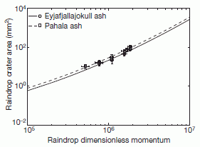
|
Here is their calibration curve for size of rain-print versus the properties of the raindrop. They made this calibration curve by dropping water drops of known size onto a surface of the appropriate soil material, and measuring the size of the imprint. The y-axis is the size of the imprint -- the "raindrop crater area", in square millimeters. The x-axis is a measure of the momentum of the drop. Basic momentum is mass x velocity; they make it a bit more complex here, but it doesn't matter for now.
This is Figure 2 of the article.
|
As you can see there is a simple relationship between the momentum of the drop and the imprint it leaves. So, they can measure the size of a fossil rain-print and use this calibration curve to estimate the momentum of the raindrop that created it. Knowing the momentum gives them the velocity of the drop (but see next paragraph); knowing the velocity gives them the density of the air the drop fell through.
Simple. Logical. And cute. But it isn't quite that simple. The problem is that the momentum involves both mass and volume. For their calibration tests, they use drops of known size; for the fossil drops, they have to make some assumptions. Of course, the rain-print size also depends on the type of soil the rain hits. Again, they make assumptions. With all these assumptions, it is not clear how useful the result is. Nevertheless, the approach is interesting; perhaps such tests can be done with other geological samples of rain-prints, and over time a clearer picture may emerge.
For the record... With their assumptions, they estimate that the density of the atmosphere 2.7 billion years ago was not much different than ours -- perhaps even a little less. If this is valid, it argues against a thick atmosphere with lots of CO2.
My comments about the assumptions in the paper and therefore its limitations are not intended as "criticism". The paper presents clearly what they did, including the assumptions I note here. They are quite clear about how their conclusions depend on the assumptions. This paper makes a contribution: it introduces a new type of measurement and provides some example of its use. That's a useful step. Single scientific papers typically do not make huge steps. Over time, we integrate what we learn from a wide variety of work. Looking at single papers lets us see science in progress. And this paper is fun and readable.
There is another neat part to this story. As background, they state, "The idea of using raindrop imprints as a proxy for air density was suggested by Lyell14 in 1851 but has hitherto been unexplored." So we have a current paper that points to a mid-19th century paper by one of the founders of modern geology. We'll look at what Lyell said in that reference #14 in the accompanying post, below.
News stories:
* Fossil Raindrop Impressions Imply Greenhouse Gases Loaded Early Atmosphere. (Science Daily, March 28, 2012.)
* Primeval Precipitation: What Fossil Imprints of Rain Reveal about Early Earth. (Scientific American, March 28, 2012.)
* Ancient Raindrops provide Insight into our Early Atmosphere. (Naked Scientists, April 2012.) An interview with one of the authors. Good overview of the work.
* News story accompanying the article: Geoscience: Fossil raindrops and ancient air. (W S Cassata & P R Renne, Nature 484:322, April 19, 2012.)
* The article: Air density 2.7 billion years ago limited to less than twice modern levels by fossil raindrop imprints. (S M Som et al, Nature 484:359, April 19, 2012.)
As noted, the post immediately following, Lyell on fossil rain-prints (May 6, 2012), is closely related. That post also includes more crosslinks to related Musings posts -- related to both this post and that one.
More raindrops:
* What would raindrops be like on other planets? (April 13, 2021).
* The aroma of rain (June 13, 2015).
More old things... Claim of oldest fossilized cells refuted (May 3, 2015).
Lyell on fossil rain-prints
May 6, 2012
This post is closely related to the one immediately above. That post refers to the paper listed here as an early example of the basic logic they use. The paper here stands on its own as a historic paper -- one that is very readable and enjoyable.
In this 1851 paper, Sir Charles Lyell examined and compared modern and ancient rain-prints.
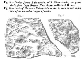
|
Fossilized rain-prints from the carboniferous era (some 300-350 million years ago). These are Figures 5 and 6 from the article; I have included Lyell's figure legends.
The roundish depressions are from rain drops. (The trails are apparently from worms.)
There is no clear indication of size (though there is on another figure). Just assume these are from ordinary rain drops.
The arrow at the lower right? It shows the wind direction. How do we know the wind direction? From the angle of the rain-prints.
|
One of the issues Lyell addressed was whether the cavities he observed might be due to air bubbles that had been trapped in mud, and then burst. He discussed this with "Mr. Faraday" and also did some experimental work. He concludes that rain-prints and burst air bubbles are easily distinguished.
In the final paragraph, Lyell notes "... it is satisfactory to obtain positive proofs of showers of rain, the drops of which resembled in their average size those which now fall from the clouds. From such data we may presume that the atmosphere of one of the remotest periods known in geology corresponded in density with that now investing the globe, ...". This is the tie to the new paper, in the accompanying post (directly above). The new paper reaches back further in time. Much further.
The article, which is freely available: On fossil rain-marks of the recent, triassic, and carboniferous periods. (Charles Lyell, Quarterly Journal of the Geological Society 7:238, 1851.)
The crosslinks here to related Musings posts are intended to be for both this post and the related accompanying post, which is immediately above: Fossil raindrops and the density of the ancient atmosphere (May 6, 2012).
More Faraday...
* A candle for Christmas (December 20, 2010).
* Nobel prize in physics for the rediscovery of fiber optics (October 12, 2009).
* Tesla coils -- music (May 31, 2009).
More rain...
* What would raindrops be like on other planets? (April 13, 2021).
* Weather report from Titan: Clouds? Puddles? Does that mean it rained? (April 6, 2011).
* How big are rain drops? And why? (July 23, 2009). This is directly related to the new work, in which they deal with the distribution of sizes of rain drops.
More about wind direction: Improved high altitude weather monitoring (July 18, 2016).
More craters... Mars: craters (August 11, 2012).
More droplets: What determines the size of liquid droplets from a sprayer? (September 21, 2018).
* Previous historical post: Blueprint of a seaweed (1843) (May 2, 2012).
* Next: Alan Turing, computable numbers, and the Turing machine (June 23, 2012).
My page Internet resources: Miscellaneous contains a section on Science: history. It includes a list of related Musings posts.
Spiders and violins
May 4, 2012
A Japanese physicist-violinist, Dr Shigeyoshi Osaki of Nara Medical University, has announced a new development in making violins. He employed a group of about 300 collaborators to help develop a new material for violin strings.
|
A member of the team.
This is from the BBC news story.
(I do not know that the specific individual shown here participated in the work.)
|
He collected the silk from spider webs, and twisted the silk filaments into long strings -- violin strings. He then studied the physical and musical qualities of the strings. His basic conclusion was that the spider-silk strings gave the violin a novel tone, one judged by some to be richer. The following analysis shows why.
|
The figure shows frequency spectra for spider and steel strings (left and right, respectively). The first peak is the fundamental tone, 293 Hz. You can see that the sound produced with the spider string (left) was richer in overtones.
This is Figure 3 parts a and b from the article. The full figure also includes the spectrum for gut strings.
|
Overall, this work provides an interesting combination of biology, physics and music. Will anything useful come of it? Who knows; new developments in silks (see below) will provide new options to try. In any case, it is a fun exploration.
News stories:
* Spider silk spun into violin strings. (BBC, March 4, 2012.)
* Spider silk spun into violin strings. (New Scientist, March 5, 2012.) Includes a short video comparing the sound of the violin with various types of strings.
Additional video: YouTube: Spider Silk Violin Strings. Audio only (but the background figure is cute). A one minute sample from the violin with strings made of spider silk.
The article: Spider Silk Violin Strings with a Unique Packing Structure Generate a Soft and Profound Timbre. (S Osaki, Physical Review Letters 108:154301, April 13, 2012.) The paper includes more about the physics of the strings, including the deformation caused by the twisting.
More on violins:
* The smallest violin (November 16, 2009).
* Baseball and violins (May 15, 2012).
* Better violins through better fungi? (March 4, 2013).
More music: Alan Turing -- and the music of Iamus (November 14, 2012).
There is more about music on my page Internet resources: Miscellaneous in the section Art & Music.
* Previous post on spider silk: Spider silk: Can you teach an old silkworm new tricks? -- Update (February 11, 2012). This could be directly relevant to the current post, by supplying a range of silks.
* Next: How a spider can help you do better microscopy (September 9, 2016).
More on silk: Silk: Stabilizing vaccines and drugs (July 29, 2012).
More on spiders... Our newest spiders: the cave robbers (September 5, 2012).
May 2, 2012
Blueprint of a seaweed (1843)
May 2, 2012

|
Fucus vesiculosus var. linearis. The picture is a "cyanotype" -- commonly called a blueprint. This figure is scanned from a copy of Photographs of British Algae: Cyanotype Impressions, Part XI, by Anna Atkins.
I am not sure of the date of this particular picture, but the first part of the book was published in 1843. It may be the first book published with actual photographs.
|
The blueprint process, as with other "early" photographic processes, depends on photosensitive chemicals. In this case, iron salts are used. Exposure of the iron-impregnated paper to sunlight causes it to turn blue -- except where the object is, protecting that area from the light. Thus, in this case, the area where the seaweed lies remains white.
The blueprint process was invented by John Herschel, in 1842. His friend Anna Atkins soon began to experiment with the process for making pictures of biological materials. The picture above, and the book it is from, are the results.
Botanical Blueprints, circa 1843 -- Anna Atkins, pioneering female photographer, revolutionized scientific illustration using a newly invented photographic technique. (C Luiggi, The Scientist, February 2012, p 72.) This article is how I learned of Anna Atkins and her blueprints. The figure shown above is reduced from the one featured in this article. The online version includes more pictures.
For more background on Atkins, and more pictures: Wikipedia: Anna Atkins.
* Previous historical post: Glenn Seaborg centennial (April 18, 2012).
* Next: Lyell on fossil rain-prints (May 6, 2012).
That name Herschel should sound familiar. John was the son of William, the discoverer of Uranus: The first report of a new planet (March 13, 2011).
More about iron chemistry... 2 + 2 = 4: Chemists finally figure it out (October 9, 2015).
My page Internet resources: Miscellaneous contains a section on Science: history. It includes a list of related Musings posts.
Why did the HIV vaccine work for some people? Follow-up
May 1, 2012
In 2009 we were intrigued by the results of a trial of an HIV vaccine. The vaccine gave about 30% protection against infection. That's low, but it is the best found for an HIV vaccine. In 2011 we noted a preliminary announcement that scientists had found differences between people who were protected and people who were not protected. (Links to the earlier posts are at the end.) We now have some details of that story, and it is indeed an interesting story.
It is important to emphasize that the claims here are more hypotheses than answers. They are based on statistical analyses of small data sets. The analyses suggest certain things; some of these things may make some sense, but they need to be tested.
|
Here is an example of one of their analyses.
The type of graph here is one that is common in dealing with diseases or treatments. The y-axis shows the incidence -- or probability. In this case, it is the probability of acquiring HIV -- on a scale of 0 to 1. The x-axis is time, shown here relative to a particular step in the vaccine trial.
The graph is "double". There is the main graph, with axis labels along side and bottom. And then there is an inner graph, often called an inset. This type of graph is used to allow one to see both the "big picture" (main graph) and a detail (inset). In this case, there is a special reason for doing that.
|
Start by looking at the main (big, outer) graph. Do you find the data points? They are all along the very bottom. The incidence of HIV in the trial is so low that it is almost invisible on a normal scale. Thus the main graph here actually shows no useful information -- and that is their point.
So, to the inset, with an expanded scale. The y-axis, showing the incidence, now runs from 0 to 0.008 -- still less than 1%. Now you can see curves -- four of them. There is a key to the curves across the top. Start with the black curve; this shows when HIV cases were first diagnosed for the placebo (unvaccinated group; the "control" or "reference"). Then, there are three curves for parts of the vaccinated group. They are for those who had low, medium, or high response to the vaccine -- as judged by one particular immune system criterion. You can see that one curve shows a distinctly lower incidence of HIV; check the legend and you will see that curve is for those with a high response. (If you check further, you will see that the three curves for the vaccinated group are actually in order -- low, medium, high -- but the difference between the first two is small.)
This is Figure 3A from the article.
|
Thus we see, from the graph above, that there is a correlation between a particular type of immune response and the apparent effectiveness of the vaccine. Higher response is correlated with less HIV infection. This may seem "logical" to you; caution, we have not said what the particular response is, and have not discussed the other responses. We do not know why this occurs. In particular, we do not know that the particular immune response measured here is the actual cause of the reduced infection rate. What we have is a correlation -- and that allows them to generate hypotheses that can be tested further.
The particular immune response tested here is labeled "IgG Antibodies Binding to V1V2". IgG is the major class of antibodies. V1 and V2 are two particular regions of the protein on the viral coat. It is intriguing that antibodies against this region might be particularly effective.
In the paper, they explore several immune responses, and test six of them in the same type of detail as shown above. One shows a reverse effect: more immune response is correlated with more HIV infection. That's "bad" -- backwards from what one wants. They suggest this might be due to a particular antibody interfering with the effectiveness of good antibodies. Four of the immune responses they measured show no effect. Thus it does seem that the response presented in the figure above is especially interesting at this point. Why do some people show more of this response? Is it because of innate differences between the people. Is it "random", due to how the immune system works? In either case, it is possible to develop a vaccine that would provide more of this response? Questions. for the future.
News stories:
* Possible clues found to why HIV vaccine showed modest protection. (Medical Xpress, April 4, 2012.)
* RV144 HIV Vaccine Trial Give Clues About Protection from HIV. (Science Daily, April 4, 2012.)
* Editorial accompanying the article: The Road to an Effective HIV Vaccine. (L R Baden & R Dolin, New England Journal of Medicine 366:1343, April 5, 2012.)
* The article: Immune-Correlates Analysis of an HIV-1 Vaccine Efficacy Trial. (B F Haynes et al, New England Journal of Medicine 366:1275, April 5, 2012.) The paper is rather difficult -- full of statistics. Those seriously interested may find the beginning and end of the article more accessible. Most readers will want to content themselves with the main ideas, from the post here or perhaps one of the news stories.
The vaccine trial:
* The original post was HIV vaccine trial -- and quibbling about statistics (November 2, 2009). It links to various follow-ups. The key one for now is the one listed below.
* Preliminary information about the analysis of individual responses: Why did the HIV vaccine work for some people? (September 27, 2011).
Also see a recent post on an unusual approach to making an HIV vaccine. A novel approach to providing immunity to HIV (March 12, 2012). This approach could be relevant if work such as described above leads to the desirability of providing a particular kind of antibody.
The underlying issue here is how people differ in medically relevant ways. The increasing role of genome information has been a major catalyst for this field. Several posts on personalized are listed at: Personalized medicine: Getting your genes checked (October 27, 2009).
Here is another post involving an immune response that works backwards from what we want. Why are HIV-infected people more susceptible to Salmonella infection? (May 21, 2010).
A drug trial to prevent Alzheimer's disease (May 23, 2012). Another example that raises the issue of testing an intervention when the disease is at low frequency.
More on vaccines: Does it matter what time of day you get a vaccine? (October 26, 2012).
Top of page
The main page for current items is Musings.
The first archive page is Musings Archive.
E-mail announcements -- information and sign-up: e-mail announcements. The list is being used only occasionally.
Contact information
Site home page
Last update: December 30, 2025