Home
> Musings: Main
> Archive
> Archive for January-April 2019 (this page)
| Introduction
| e-mail announcements
| Contact
Musings: January-April 2019 (archive)
Musings is an informal newsletter mainly highlighting recent science. It is intended as both fun and instructive. Items are posted a few times each week. See the Introduction, listed below, for more information.
If you got here from a search engine... Do a simple text search of this page to find your topic. Searches for a single word (or root) are most likely to work.
Introduction (separate page).
This page:
2019 (January-April)
April 30
April 24
April 17
April 10
April 3
March 27
March 20
March 13
March 6
February 27
February 20
February 13
February 6
January 30
January 23
January 16
January 9
Also see the complete listing of Musings pages, immediately below.
All pages:
Most recent posts
2026
2025
2024
2023:
January-April
May-December
2022:
January-April
May-August
September-December
2021:
January-April
May-August
September-December
2020:
January-April
May-August
September-December
2019:
January-April: this page, see detail above
May-August
September-December
2018:
January-April
May-August
September-December
2017:
January-April
May-August
September-December
2016:
January-April
May-August
September-December
2015:
January-April
May-August
September-December
2014:
January-April
May-August
September-December
2013:
January-April
May-August
September-December
2012:
January-April
May-August
September-December
2011:
January-April
May-August
September-December
2010:
January-June
July-December
2009
2008
Links to external sites will open in a new window.
Archive items may be edited, to condense them a bit or to update links. Some links may require a subscription for full access, but I try to provide at least one useful open source for most items.
Please let me know of any broken links you find -- on my Musings pages or any of my web pages. Personal reports are often the first way I find out about such a problem.
April 30, 2019
Briefly noted...
April 30, 2019
Ricequakes. Studying the real world is important. But studying model systems can be easier, cheaper, and safer. A good model system reveals at least some aspects of the real world system. Example... Studying how rock-filled dams may fail is important. Studying the structure of a bowl of cereal is easier and cheaper (and presumably safer). A recent article is about the latter. It's fun -- and good science.
* News story: Using puffed rice to simulate collapsing ice shelves and rockfill dams. (B Yirka, Phys.org, October 15, 2018.) Links to the article, which is freely available. Included there (as "Supplementary materials") are an audio file and a video file. The audio file lets you listen for two minutes to a model dam collapse system. The five-minute video is speeded up 15x (no sound there). Be patient.
High-voltage thunderstorms: how high?
April 29, 2019
How about 1.3 billion volts?
That's the claim in a recent article. It is based on observations during a major thunderstorm on December 1, 2014, near Ooty, India (elevation 2200 meters, or about 7200 feet). Observations made by GRAPES. Observations of muons.
Here are some results...
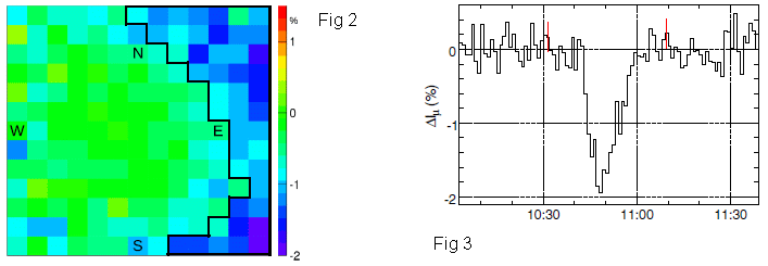
The left-hand frame (Fig 2) shows a map of the sky. It is color coded to show the intensity of the muon stream detected during the storm; the intensity is given here as the difference from normal; see the color key at the right. Briefly, green means that the muon stream is normal. Blue means it is low, by as much as 2%. Red would mean an enhanced muon stream, but there are no such readings.
The big picture... There is a region to the right side of the map that is, in general, blue. A region of the sky where the muon stream was less than normal.
As to the sky-map... It is shown as a 13x13 array, giving 169 measurements.
The right-hand frame (Fig 3) summarizes the results over time. The y-axis is the intensity of the muon stream; as in Fig 2, it is shown as the difference from normal: ΔIμ. The x-axis is clock time, shown as universal time (UT) on the day of the big thunderstorm.
You can see that the muon intensity was markedly low for about 20 minutes, from 10:40 to 11:00.
These are Figures 2 (left) & 3 (right) from the article.
|
That's the muon intensity. This is a muon-observing station. GRAPES = Gamma Ray Astronomy at PeV EnergieS. (It's actually GRAPES-3, for Phase 3 of the project.)
Why? The muons are from cosmic rays; Their energy is altered by the electric potential of the thunderstorm cloud. There is a lot of theory behind that, and some empirical calculations. Bottom line... The scientists argue that the observed drop in muon intensity corresponds to a voltage drop of about 900 million volts from top to bottom of the thunderstorm; about 0.9 GV (gigavolts).
Further analysis at high resolution suggested that the voltage drop was as high as 1.3 billion volts (1.3 GV).
Voltage differences in the gigavolt range have long been predicted for such storms, but never observed. In fact, the 1.3 GV observed here is about 10-fold higher than the previous high voltage measurement.
The finding here is certainly interesting. But importantly, the current article opens the door to much further work. The modeling done to relate the observed muon intensity to the structure of thunderstorms will undoubtedly be developed further. And the connection between this kind of measurement, which integrates information over an entire cloud, and the traditional localized measurements from balloons will be explored.
News stories:
* Indian Scientists Measure 1.3-Billion-Volt Thunderstorm, the Strongest on Record. (R F Mandelbaum, Gizmodo UK, March 15, 2019.)
* Focus: Muons Reveal Record-Breaking Thunderstorm Voltage. (M Rini, Physics 12:29, March 15, 2019.)
* How a Space Telescope's Accidental Discovery Overturned Everything we Thought we Knew About Lightning Storms. (E Hook, Physics Central - Physics Buzz Blog, March 11, 2019. Now archived.) Relatively technical, but still very readable. (We also note that this blog item was posted by a Positron.)
The article: Measurement of the Electrical Properties of a Thundercloud Through Muon Imaging by the GRAPES-3 Experiment. (B Hariharan et al, Physical Review Letters 122:105101, March 15, 2019.)
Reference 1 of the current article is an article they note as the "first authoritative study of thunderstorms". Musings, too, has noted that article (though not in a timely manner): Benjamin Franklin and the electrical kite (November 22, 2011).
A recent post about thunderstorms... Lightning and nuclear reactions? (January 28, 2018). This post deals with gamma rays made during thunderstorms. The current article notes that the production of high energy gamma rays requires the high voltages that they have observed.
More about detecting muons... Using your smartphone to detect cosmic rays (April 7, 2015).
Also see... What do we learn from the sulfur isotopes in the California vineyards? (June 28, 2022).
Using caffeine to treat premature babies: risk of neurological effects?
April 27, 2019
Premature babies are at risk for a variety of problems, physical and neurological. The risk increases with earlier delivery.
One risk is apnea, a stoppage of breathing. Apnea is perhaps best known for the form called sleep apnea. The current issue is "apnea of prematurity". A standard treatment for apnea of prematurity is caffeine.
There has been little information about the long term effects of caffeine on neurological development. A new article addresses this issue. The article compares the neurological outcomes depending on whether caffeine was given in the first two days after birth or only after that.
The following table summarizes some key findings...
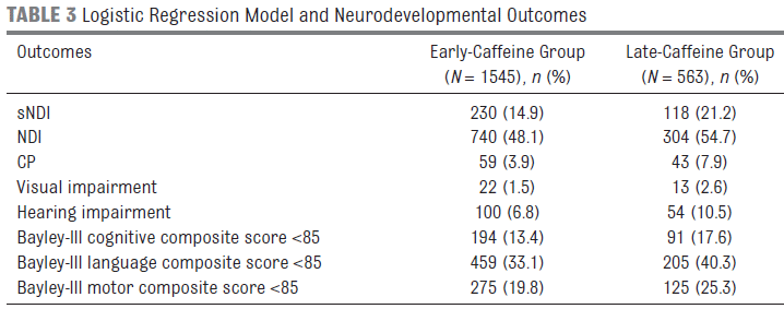
The table shows the outcomes for two groups of babies, depending on when caffeine treatment was started. "Early" caffeine means that caffeine treatment was started within two days after birth. Each entry is shown as a number and a percentage of the group. For example, the first data entry is 230 (14.9). That means that 230 babies in the early-caffeine group showed the outcome sNDI. That is 14.9% (of the total group of 1545).
For a quick overview, compare the percentage numbers in the two columns. For each outcome, they are somewhat smaller for the early-caffeine group.
What are the outcomes measured? NDI = neurodevelopmental impairment. That's an umbrella term; it's not clear from looking at the table, but all the other outcomes listed are sub-types of NDI. sNDI = significant neurodevelopmental impairment. CP = cerebral palsy.
The premature births considered here were those occurring at less than 29 weeks.
The analyses here were carried out at about two years of age.
This is trimmed from Table 3 of the article.
|
The big picture, then, is that premature babies with early caffeine treatment fared slightly better than those who were treated only later. The effect is small, and at least some of the results are not statistically significant.
The work reported here is not from a controlled double-blind study. It is based on analyzing the records available.
Considering the two previous points, the authors are positive but cautious. They conclude that the early caffeine appears helpful; importantly, it is not harmful. Early intervention with caffeine is clearly helpful for lung function; there is no indication it is harmful to neurological development. Additional, more controlled, studies would be welcomed.
News stories:
* Developing Brains of Preterm Babies Benefit From Caffeine Therapy. (Neuroscience News (University of Calgary), December 12, 2018.)
* Caffeine. Give it and give it early. (All Things Neonatal, January 10, 2019.) This is a blog page by an anonymous author who is clearly in the field. The page includes earlier posts on the topic by the same person, dating back to 2015. The current article is the subject of the first blog (at least for now).
The article: Early Caffeine Administration and Neurodevelopmental Outcomes in Preterm Infants. (A Lodha et al, Pediatrics 143:e20181348, January 2019.)
More about premature birth...
* Kangaroo mother care for premature babies: start immediately (June 27, 2021).
* Association of mother's sleep disorders with premature birth? (October 13, 2017).
* Lamb-in-a-bag (July 14, 2017).
* Imaging of fetal human brains: evidence that babies born prematurely may already have brain problems (March 10, 2017).
* When should the eggs hatch? (June 11, 2013).
* The problem of human birth (July 8, 2011).
Among posts on caffeine... How caffeine interferes with sleep (December 11, 2015).
More... Caffeine: is it good for solar cells? (May 13, 2019).
More about brain-related issues is on my page Biotechnology in the News (BITN) -- Other topics under Brain (autism, schizophrenia). It includes a list of related Musings posts.
April 24, 2019
Briefly noted...
April 24, 2019
Cassava poisoning. Cassava is a major starch crop. The part that is eaten is a tuber, similar to a potato. It contains high levels of cyanogenic glycosides (cyanide attached to sugars). Those compounds are part of why cassava is a relatively pest-resistant crop. They are also why cassava is quite poisonous. Even modern low-cyanide varieties must be treated to remove toxins before being eaten. The article noted here is about an incident where that obviously did not happen. (Cassava is perhaps best known to Americans in the form of tapioca.)
* I have no news story, but the article is short, quite readable, and freely available: Outbreak of Cyanide Poisoning Caused by Consumption of Cassava Flour -- Kasese District, Uganda, September 2017. (P H Alitubeera et al, Morbidity and Mortality Weekly Report (MMWR) 68:308, April 5, 2019.) The article contains a photo of cassava tubers, and also a nice figure with some important epidemiological data.
* More cyanide from our food: Domestication of the almond (August 26, 2019).
Can Google Translate properly translate medical instructions?
April 23, 2019
A patient receives instructions upon leaving the hospital. What if the discharging physician doesn't speak the patient's language? One possibility is to run the doctor's instructions through a computerized translation system, such as Google Translate (GT).
A recent article examined how well GT works. The current analysis was stimulated by a recent upgrade to GT.
The general approach was to take actual English instructions, from recent experience in the authors' hospital, and have GT translate them into Spanish and Chinese. Experienced humans then translated the GT translations back into English. Each resulting back-translation was compared to the original.
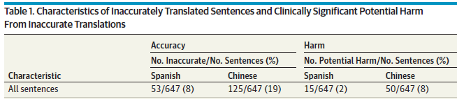
Here is a summary of what was found...
Two results are shown for each language tested: the frequency of inaccurate translations, and the frequency of translations that could be harmful.
The overall result is that most, but not all, of the instructions were translated accurately. And some of the inaccurate translations could be harmful.
For example, out of 647 sentences translated to Spanish, 53 (8%) were judged to be inaccurate. About a quarter of those (15; 2% of the total) were judged to be potentially harmful.
The data set examined was 100 discharge instructions, consisting of 647 sentences.
This is the top of Table 1 from the article.
|
What is the conclusion? The authors are positive, with caution. (And the results are better than in previous tests, with earlier versions of GT.) But perhaps focusing on the numbers misses the point. Do we really want the discussion to be about what level of harm due to translation errors is acceptable?
In fact, the authors go on and look at the nature of the errors. The rest of the Table classifies them. A second table gives some examples (some of which are included in the news stories listed below).
What's striking in the analysis is how many of the translation problems originate from poorly written originals. Problems range from simple typos (GT translates what it sees, without judgment) to complex, jargon-laden sentences.
Perhaps Google Translate should include a probability score giving its confidence in its translation. A low score would trigger a re-examination of the original. Perhaps at times the translating computer should even say... Doc, I have no idea what you are trying to say. Perhaps even instructions for English speakers should be run through Google Translate simply as a clarity check.
News stories:
* Can Google Translate be trusted for medical advice? (SiliconIndia, February 27, 2019.)
* Google Translates Doctor's Orders into Spanish and Chinese with Few Significant Errors -- Study Finds Most Errors Occur When Doctors Write Long, Jargon-Filled Sentences. (L Kurtzman, University of California San Francisco, February 25, 2019.) From the university.
The article: Assessing the Use of Google Translate for Spanish and Chinese Translations of Emergency Department Discharge Instructions. (E C Khoong et al, JAMA Internal Medicine 179:580, April 2019.)
Why some citrus fruits are so sour
April 22, 2019
You may think you know why (some) citrus are very sour. They are acidic, and the acidity is due to citric acid. That's not incorrect, but it is insufficient to explain what is observed. The pH of some citrus fruits, such as sour oranges or lemons, is lower than can be maintained by ordinary cells.
A recent article explores the basis of acidity of citrus. The scientists find that the very sour fruits pump hydrogen ions (protons) into the cellular vacuoles.
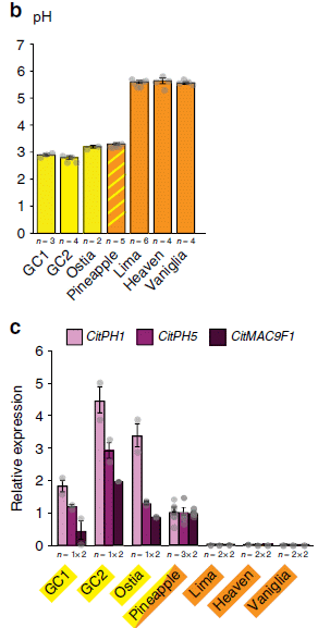
The following figure provides some of the evidence...
|
This pair of figures is for seven varieties of oranges.
Part b (top) shows the pH of the fruits. They fall into two groups: low pH (near 3) and high pH (near 6). Those are for oranges known to be sour or sweet, respectively.
Part c (bottom) shows the level of expression for three genes. These are labeled across the top, and the results are shown in three shades of purple. For now, just consider them all together. All three of these genes show high expression in the first four oranges (to the left), and extremely low expression in the last three (to the right).
The level of gene expression was determined by measuring the amount of messenger RNA.
The high pH for some oranges means that they are "not sour". They are often called sweet, by comparison, simply meaning non-sour. (Some have a high sugar content.)
This is part of Figure 5 from the article.
|
What are these three genes? Two of them (CitPH1 and CitPH5) are known to code for "proton pumps". These proteins use energy to lower the pH of the cellular vacuoles. (One of the three genes is not well characterized.)
It's interesting that the sweet oranges have near zero levels of all three of the genes being examined. How does a single mutation do that? It involves a regulatory mutation. A low level of a protein required to activate all three genes could give such a pattern. In fact, the article provides evidence to identify the regulatory genes that are affected.
The article contains similar data sets for lemons, pummelos, and limes. The general pattern holds for each case. The same genes seem to be involved in all citrus groups.
All the sweet citrus variants have a low content of citric acid. The emerging story is that low pH is caused by the proton pumps, which acidify the vacuoles. The steep pH gradient then promotes entry of citrate. That is, the high content of citric acid in sour citrus is a consequence of acidification, not the cause.
This story may sound familiar. The same proton transporters are involved in determining the color of petunia flowers. That was the subject of an earlier Musings post [link at the end]. The current citrus work was guided by earlier petunia work in the same lab. (The regulatory genes for these proton pumps, too, seem to be the same in petunia and citrus. Various mutations can occur to reduce proton pump activity, leading to higher pH.)
News stories:
* UvA biologists solve the long-standing riddle how lemons can be so extremely sour. (University of Amsterdam, February 26, 2019.) From the lead institution.
* Source of citrus' sour taste is identified. (Science Daily (University of California Riverside), March 5, 2019.)
The article, which is freely available: Hyperacidification of Citrus fruits by a vacuolar proton-pumping P-ATPase complex. (P Strazzer et al, Nature Communications 10:744, February 26, 2019.)
Background post: The petunia connection... pH and the color of petunias (March 26, 2014).
More about citrus...
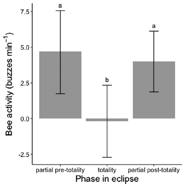
* Caffeine boosts memory -- in bees (April 12, 2013).
* Grapefruit and medicine (March 26, 2012). Links to more.
More citric acid... Using mass spectrometry to analyze a poem (October 14, 2018).
The effect of prior dengue infection on Zika infection
April 20, 2019
Dengue and Zika are related viruses (of the flavivrrus group). It is known that their antibodies cross-react. Thus one might wonder whether prior infection with dengue would protect against Zika. But the story is more complicated, because of an unusual phenomenon in dengue: infection with one type of dengue virus can make a subsequent infection with another type of dengue worse. Does this phenomenon carry over to Zika? If so, how?
Musings has noted some relevant lab work on these questions [link at the end]. However, ultimately what matters is what happens in actual human populations. A recent article addresses that. A team of scientists was studying the health of the population in a small neighborhood in a Brazilian city when Zika came along. They already had a large collection of serum samples with high coverage of the population. A study of the dengue-Zika interaction built on that collection. (Dengue was already common there.)
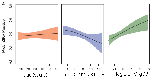
The following graph summarizes what they found. I should emphasize that the graphs here are not experimental data, but modeling results that followed analysis of the large and complex data set.
The y-axis for all the graphs is the probability of Zika infection. Zika infection is judged here by the presence of Zika-specific antibodies.
Th left-hand graph shows the expected age distribution. Not particularly interesting.
The other two graphs show the probability of Zika infection as a function of one or another measurement of pre-existing antibodies against dengue. The two curves are very different! One shows dengue antibodies correlating with reduced Zika; the other shows the dengue antibodies correlating with increased Zika infection.
This is slightly modified from Figure 4A of the article. I have added back the x-axis labeling (which was below Part B).
Note that both scales for levels of antibodies against dengue are log scales.
|
What are these two dengue measurements? One is the overall level of antibody against a particular viral protein. That's what the middle graph is about. Overall, having antibodies against dengue correlates with protection against Zika. It is likely this is due to the dengue antibodies directly protecting against Zika.
The right-hand graph is for a particular dengue antibody, called IgG3. Higher levels of this antibody correlate with a higher probability of Zika infection.
What does this mean? We don't know. It's not even clear that it relates to the already-known phenomenon of interaction between dengue strains. For now, the antibody IgG3 is a biomarker: it correlates with something interesting, but we don't know why. The authors note that this antibody is a marker for a recent dengue infection. Again, the relevance of that observation is not clear. (For example, it might mean that people with recent dengue infections have a higher exposure to mosquitoes, and hence to mosquito-borne diseases.)
The work here shows us, once again, that the dengue-Zika system is complex.
The analysis produced one further result, one not entirely unexpected. Most people are now immune. That's why the Zika epidemic in that area is largely over.
The current article does not address the severity of the Zika infections. That aspect will be addressed in future analysis of the study group.
News stories:
* Prior dengue infection protects against Zika. (Science Daily (University of Pittsburgh), February 7, 2019.)
* Dengue Immunity Provided Protection Against Zika Virus. (SciTechDaily (M Greenwood, Yale University), February 11, 2019.)
The article: Impact of preexisting dengue immunity on Zika virus emergence in a dengue endemic region. (I Rodríguez-Barraquer et al, Science 363:607, February 8, 2019.)
A background post about the interaction of dengue and Zika viruses, in an animal model: Can antibodies to dengue enhance Zika infection -- in vivo? (April 15, 2017).
Exploring another possible interaction between different flaviviruses: Does vaccination against yellow fever affect incidence of severe dengue? (October 4, 2019).
More about the viruses is on my page Biotechnology in the News (BITN) -- Other topics under Dengue virus (and miscellaneous flaviviruses) and Zika. Each of those sections includes a list of Musings posts.
April 17, 2019
Briefly noted...
April 17, 2019
A new form of calcium carbonate. It's a well-known chemical, and yet we now learn of a new form of it. Anhydrous CaCO3 forms three types of crystals (calcite, aragonite, and vaterite). Two hydrates are also known, with one or six waters per CaCO3 unit. Now, scientists report a third hydrate, called a hemihydrate, with one water molecule per two CaCO3 units: CaCO3.(1/2)H2O. (They even have a hint of another hydrate, CaCO3.(3/4)H2O, but with limited evidence so far.)
* News story: A new calcium carbonate crystalline structure. (Max Planck Institute of Colloids and Interfaces, Potsdam-Golm, March 1, 2019.) Refers to the article; here is the article link.
How hot is a landslide?
April 16, 2019
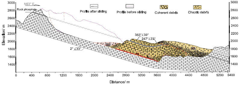
In 2008, a chunk of rock slid down Daguangbao mountain (China), triggered by a major earthquake. The following figure, from a recent article analyzing what happened, summarizes the event...
The figure is a side-view diagram of the event. Elevation is shown on the y-axis, horizontal position on the x-axis.
The simple story is that a chunk of land, shown in color, slid down to where it is shown here -- from the position immediately "above" that (and to the left) in the figure. (The source region, roughly oval, is outlined.)
Much of the chunk is substantially intact; that is coded here by the regular brick pattern.
This is Figure 2 from the article.
|
There is nothing particularly unusual about the general picture; that's the nature of landslides. But this event was an unusually large landslide, with over a cubic kilometer (109 cubic meters) of material sliding down.
In an effort to understand how such mega-landslides work, a team of scientists has developed a lab model, in which they can observe lab-scale events under their control.
The following figure shows an example of their results. The experimental conditions were chosen to mimic the forces thought to be involved in a mega-landslide such as the one shown above.
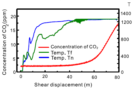
|
The figure shows two types of measurements during one such simulated landslide.
The x-axis, labeled "shear displacement", records the course of the event.
Two of the curves are for the temperature (T) at two locations. These are the two higher curves (blue and green). See the right-hand y-axis for the T scale.
One curve (the lower one, in red) is for the concentration of carbon dioxide. See the left-hand y-axis for the CO2 scale.
|
You can see that T rises to 1200 °C. And that CO2 rises.
This is slightly modified from Figure 8c of the article. I added the label T for the right-hand y-axis scale.
|
Such an event generates heat. It comes from the friction, of course. But the amount of heat generated is perhaps surprising: enough to decompose the carbonate-containing rock (limestone and dolomite), releasing CO2.
From the lab and field observations together, the scientists estimate that the actual T at the sliding surface during the event was at least 850 °C.
Such information led the scientists to suggest that minerals are decomposing -- and re-crystallizing -- during the sliding. That led them to examine some of the material from the actual event; they saw clear signs of such mineral changes.
The scientists suggest that superheated steam, the CO2 (supercritical) fluid, and the complex process of mineral decomposition and re-crystallization are all part of what reduces the friction, promoting further movement of the landmass.
That is, one can begin to put together a story of what happens in such an event... The earthquake knocks loose a piece of rock. It slides down, with considerable friction, generating heat. The heat is enough to cause changes in the rock, which lead to reduced friction -- and enhanced acceleration of the sliding rock. It is the special nature of a large landslide that it generates enough heat to cause these changes, and thus lead to the additional acceleration -- and devastation if anything is in the way.
Studying landslides is not easy. The article here is pioneering work to develop a lab model. It's fascinating, and apparently productive.
News story: The giant Daguangbao landslide: superheated steam and hot carbon dioxide. (D Petley, Landslide Blog (AGU), February 18, 2019.) Excellent overview.
The article: Superheated steam, hot CO2 and dynamic recrystallization from frictional heat jointly lubricated a giant landslide: Field and experimental evidence. (W Hu et al, Earth and Planetary Science Letters 510:85, March 15, 2019.)
A previous post that mentioned landslides: Lutetia: a primordial planetesimal? (February 13, 2012).
A possible cause of certain unusual earthly landslides is presented in the post: Briefly noted... item #1 (August 15, 2018).
The rising rate of caesarean section births: an intriguing correlation
April 15, 2019
Caesarean section (C-section) birth allows a baby to be born when the natural process would be medically impossible or unwise. It also allows birth to be arranged for the convenience of those involved (other than the baby).
The frequency of C-section births has risen over recent decades. The reasons are not entirely clear, and may be complex.
A recent article makes an interesting observation about the frequency of C-section births. The authors show that it correlates with the rate of change of height in the (adult) population.
The following graph shows the trend, and gives us a chance to explain what the height variable means.
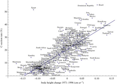
|
The graph shows the frequency of C-section births (y-axis) vs (adult) body height change 1971-1996, in centimeters per year (x-axis).
Each country's data is shown as a single point. Country names are shown, though you can't read most of them here.
The striking observation is that there really is a trend, which holds for almost all countries examined.
There is no formal definition of outliers here. One could make the case that only one country is far off the main trend line. Or perhaps three -- all with higher than expected rates of C-section births.
|
The data for frequency of C-section births is for 2005-2017. At least approximately, women giving birth during that time were born during the period of the growth data.
This is reduced from Figure 2 of the article.
If you want to see more detail, here is the full-sized Figure 2 [link opens in new window].
In the article pdf, the text labels on the figure (i.e., the country names) are searchable.
|
What does the x-axis variable mean? It is about the average height of the (adult) population. For example... Consider a country where the average height of its people increased by 2.5 cm (about 1 inch) over the period examined. That is a 25 year period, so the population height increase is 0.1 cm/yr.
In some countries, the average population height is decreasing, by as much as 0.17 cm/yr. If that trend continues, the people of such a country would be 1 meter shorter in about 600 years -- and would reach height zero in about a thousand years. Extrapolation is fun!
What's going on? Why is the rate of C-section births related to population height? One might guess that it has something to do with the development status of the country. Increasing height might reflect better nutrition, for example.
The authors do some statistical manipulations, to try to sort out other possibly relevant factors. They correct their data for some variables relating to the country status. (These include, without details here... "obesity and diabetes rates, mean age of the mother, average female body height, HDI, HAQ Index and national HE." (from second paragraph of "Results")
That leads to Figure 3, which is linked here in the full-size version: Figure 3 [link opens in new window].
Figure 3 shows what is left after correcting for other known variables. You can see that there is still a similar trend line. The statistics suggest that the current variable, change in population height, accounts for about a third of the change in C-section frequency.
The authors suggest a reason for the effect. In a time of improving conditions, the fetus will be "more improved"; it is one generation younger than the mother. Thus a mismatch between the size of the fetus and the mother (the birth canal) is more likely. Note the distinction here between good conditions and improving conditions; the latter results in the mismatch between mother and fetus.
We should clarify and caution... What the re-analysis shows is that about 2/3 of the effect can be accounted for by other variables. About 1/3 is not accounted for by the other variables they examine. Since height is their focus, for the moment the effect seems correlated with height. But maybe there is something else, correlated with height, that is actually the more relevant factor. The statistical analysis helps us sort out the importance of some variables, to the extent we have good data for them. But it can't say anything about variables that are not tested.
Data. Statistics. Correlation. What does it mean? Scientific articles usually offer interpretation, not just data. Indeed, the authors here have an interpretation, as we noted. Whether their interpretation is correct or not, the data and the correlation are there. People will be intrigued by them, and will explore what they mean.
News stories:
* Caesarean rates related to better maternal nutrition, study finds. (NutraIngredients, February 12, 2019.)
* Changes in Height Linked to Increased C-section Rates -- Countries with populations whose average adult height grew late last century are more likely to have high rates of babies delivered surgically. (A Olena, The Scientist, February 6, 2019. Now archived.) Includes a good discussion of what it might mean.
The article: Secular changes in body height predict global rates of caesarean section. (E Zaffarini & P Mitteroecker, Proceedings of the Royal Society B 286:20182425, February 6, 2019.)
More about birth problems: The problem of human birth (July 8, 2011).
Posts on the implications of C-section delivery for the babies' gut microbiome:
* The microbiome of babies born by C-section (November 2, 2019).
* Your gut bacteria: where do you get them? (July 30, 2010).
More about human height: Is being tall bad for your health? (July 12, 2022).
Restoring ion transport in cystic fibrosis patients -- using a pore-forming drug?
April 12, 2019
Cystic fibrosis (CF) is a genetic disease, caused by mutations in the gene CFTR. It's sometimes said that CFTR codes for a channel for chloride ions; in fact, a common feature of CF patients is that their sweat is quite salty. But the CFTR channel does more than transport chloride. It seems to be a fairly general channel for anions. Of particular importance, it transports bicarbonate ion (HCO3-); CF patients have an altered pH of their cellular secretions because of the lack of bicarbonate transport.
CFTR? That's cystic fibrosis transmembrane conductance regulator.
A new article offers a new approach for treating CF. It's almost as simple as... punch some holes in the cell membranes so the anions can get through.
The following figure illustrates the problem -- and the suggested approach. The experiment here is in vitro, with cultured lung tissue from people with a particular form of CF.
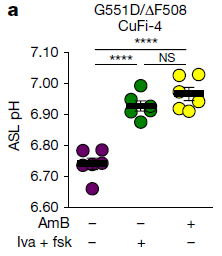
|
The figure shows the pH of the ASL for such CF tissue, under different conditions. ASL? That's airway surface liquid.
You can see that the pH for the first (left-hand) condition is low, whereas the next two have higher pH.
The first is with no treatment (both "minus" in the key at the bottom).
The middle condition involves a drug combination labeled "Iva + fsk"; the right-hand condition involves "AmB". Both work. Both raise the pH by about 0.2 units.
This is Figure 1a from the article.
|
Both work. But there is an important difference, which you cannot tell from what has been presented so far. The first of those drugs is an established treatment for CF -- but it works only for people with certain specific CF mutations. The second drug is what they are focusing on here. It might be expected to treat CF regardless of the mutation. Indeed, further work in the article supports that prediction.
The header for the graph identifies the cell line and the CF mutations it carries. CuFi-4 is the cell line. It is heterozygous for each of two CF mutations: G551D/ΔF508. The CFTR protein resulting from the first of those mutations can be rescued by the Iva drug.
That second drug, AmB, is amphotericin B. It is a well-known drug, for reasons that have nothing to do with CF; it's an anti-fungal agent. It's known to make membranes leaky, though its effect on fungi is more complicated than that. It's also known to be very toxic, and must be given with great care.
Can a drug that makes membranes leaky be used to treat CF patients? There is some logic, but it should also be clear that this could be a risky approach. The preliminary tests, such as the one shown above, are encouraging.
The following figure shows a test in an animal model...
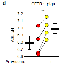
|
In this test, pigs carrying mutations for cystic fibrosis were used. The drug tested here is AmBisome, a commercial formulation of amphotericin B.
Data for ASL pH is shown for each pig separately. There is a red point before giving the drug and a yellow point after the drug; the two points for each pig are connected by a line.
You can see that the pH increased in each pig tested, by an amount consistent with the in vitro experiments. (The black bars show the mean for each treatment.)
This is Figure 3d from the article.
|
These are interesting and encouraging results. Drugs such as ivacaftor ("iva" in the top figure) have established the possibility of restoring channel function in CF patients. But drugs of this type act by stabilizing a particular mutant form of the CF protein. The current work opens up the possibility of a general stimulation of ion transport, independent of the specific defect that caused the problem.
I have focused on the pH effect here. Some of the discussion of the work is about restoring anti-bacterial defenses. That's important, of course; it follows from restoring the pH.
Whether amphotericin B itself will turn out to be a practical drug for this use remains to be seen. It is a drug we know a lot about, including its toxicity. The type of long-term use needed for treating CF patients must be of some concern. The authors suggest that our understanding of the toxic effects of AmB has progressed to the point where it can be managed. But whether AmB itself is the answer, it seems to be at least a clue, which can guide the development of better pore-forming drugs.
News stories:
* Scientists find new approach that shows promise for treating cystic fibrosis -- NIH-funded discovery uses common antifungal drug to improve lungs' ability to fight infection. (NIH, March 13, 2019.) From the major funding agency. (The page gives incorrect authorship for the article, referring to the group leader rather than the lead author. The information and link is otherwise fine.)
* Amphotericin Holds Promise as Treatment for All CF Patients, Preliminary Study Shows. (A Pena, Cystic Fibrosis News Today, March 19, 2019.)
* News story accompanying the article: Medical research: Fighting cystic fibrosis with small molecules. (D N Sheppard & A P Davis, Nature 567:315, March 21, 2019.)
* The article: Small-molecule ion channels increase host defences in cystic fibrosis airway epithelia. (K A Muraglia et al, Nature 567:405, March 21, 2019.)
More on cystic fibrosis:
* How our immune system may enhance bacterial infection (September 19, 2014).
* Cystic fibrosis: treating the underlying cause -- for some people (November 13, 2011). This post is about the type of mutation-specific CF drug used as the control in the first figure here. In fact, it is about the specific drug used here, ivacaftor.
April 10, 2019
Briefly noted...
April 10, 2019
Denisova Cave. It's best known to many as the source of the finger bone that still defines the Denisovan line of man. In fact, it has proven to be the source of diverse human fossils, yet much about the cave and about the bones still is mysterious. A recent news feature explores the significance of the cave.
* News feature, freely available: Siberia's ancient ghost clan starts to surrender its secrets -- A mysterious group of extinct humans known as Denisovans is helping to rewrite our understanding of human evolution. Who were they? (E Callaway, Nature News, February 27, 2019.) In print, with a different title: Nature 566:444, February 28, 2019.
* Among posts about Denisovans... The Siberian finger: a new human species? -- A follow-up in the story of Denisovan man (January 14, 2011).
* and... Denisovan man: beyond Denisova Cave (May 7, 2019).
GO dough
April 9, 2019
You know what you can do with bread dough. Now just think what you might be able to do with GO dough.
For many years, graphene has seemed to be a wonder material. However, it has achieved limited use, partly because it is so hard to handle. Now, a team of scientists reports making a dough form of graphene oxide (GO).
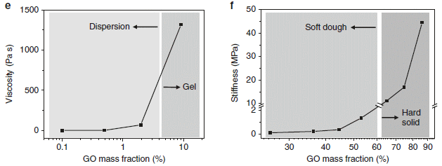
The following figure shows some properties of mixtures of GO and water, over a range of concentrations.
The left side (part e) shows the viscosity of the mixtures. The right side (part f) shows the stiffness. In both cases, the x-axis is the mass percent of GO in the mixture, but the two graphs are for different concentration ranges.
The viscosity graph shows a rapid rise, starting at about 2% GO. Instead of having a free-flowing mixture, a gel is formed at higher concentration of GO.
The stiffness graph shows a second rise, starting at about 50% GO. The mixture becomes solid above 60% GO.
Between about 20% and 60% GO the mixture is effectively a "soft dough".
This is part of Figure 1 from the article.
|
Dough. GO dough.
You know what you can do with dough.
The following figure shows some examples, with the authors' own figure legend as explanation...
This is Figure 3 from the article.
Here is the figure legend from the article... "Fig. 3 GO doughs are highly processable and versatile. GO doughs can be readily reshaped by a cutting, b pinching, c molding, and d carving. GO doughs can be easily connected together d, e or with other solid materials d using the wooden sticks as an example. f A tubular GO structure can be prepared by molding a GO dough around a rod, demonstrating the versatility of using GO doughs to make 3D architectures that are otherwise challenging to obtain. Scale bars in b, c, d, and e are 1 cm."
If you don't see a couple of dark dots near the top of the structure in part d, try a different viewing angle.
|
GO dough has no ingredients other than the GO and water. There are no "binders" that need to be removed for later use.
Making GO dough is not quite as simple as it looks above. It required some development to learn good procedures for moving between the various GO forms. But now it should be practical and useful. GO dough is a step toward making GO, a common precursor for graphene itself, convenient.
News stories:
* Graphene Play-Doh: New Plasticine-Like Formulation Could Significantly Boost Graphene Industry. (D O'Donnell, Evolving Science, January 29, 2019.) Some of the writing is awkward, but overall this is a good overview of the new work, with good context.
* GO dough stands poised to bring graphene and its awesome properties into your life. (A Micu, ZME Science, January 31, 2019.)
The article, which is freely available: Binder-free graphene oxide doughs. (C-N Yeh et al, Nature Communications 10:422, January 24, 2019.)
Recent posts on graphene and GO include...
* Coloring with graphene: making a warning system for structural cracks? (June 2, 2017).
* Water desalination using graphene oxide membranes? (April 29, 2017).
Also see: How to mold glass (June 19, 2021).
Posts about graphene are listed on my page Introduction to Organic and Biochemistry -- Internet resources in the section on Aromatic compounds.
That section also notes other graphene work from the same lab, specifically the development of graphene for use as a hair dye. That lab, led by Jiaxing Huang, Professor of Materials Science at Northwestern University, has a knack for doing things that are both "fun" and serious science. (That work was also noted in Musings: Briefly noted... (September 26, 2018).)
What if we gave mosquitoes anti-malarial drugs?
April 7, 2019
Reducing the incidence of malaria in mosquitoes may not strike you as a priority issue. I'm not even sure it is a problem for the mosquitoes. But they do get infected -- and they then transmit the parasite to people. If we could reduce growth of the parasite in the mosquitoes, it should reduce disease transmission.
A new article explores the possibility, with some encouraging results. For example...
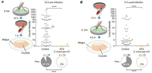
The figure shows the results from two experiments to test whether an anti-malaria drug could reduce the growth of the parasite in the mosquitoes.
Let's jump to the results; we'll fill in the experimental details later.
Look at the main graph for part c (left side; labeled "24 h pre-infection"). There are two sets of data points there, one for the control (left set), and one for a treatment with an anti-malaria drug ("ATQ" = atovaquone). The data points are for counts of the parasite in individual mosquitoes; the y-axis is labeled, a bit cryptically, "oocyst intensity".
There are a lot of parasite cells (the oocysts) in the control mosquitoes. There are none in the treated group.
Underneath the graph are pie charts. They show the "prevalence": the percentage of the mosquitoes with parasite oocysts. 87% in the control, zero in the treated mosquitoes.
Counting oocysts, in the mosquito gut, is for convenience. That's not the form of the parasite that is transmitted to humans by the bite.
This is part of Figure 2 from the article.
|
Treatment of the mosquitoes with an anti-malaria drug worked.
Part d (right side) shows a second experiment; it is similar, but a little different. The results are qualitatively the same.
What did the scientists do in the experiment discussed above? And what was the difference between the two experiments?
Each part of the figure has a little cartoon at its left side, outlining the experiment. For part c, it starts with a mosquito and a green dish with some material treated with the drug. The mosquitoes are exposed to the drug-treated surface for six minutes. 24 h later, the mosquitoes get some malaria-infected blood (red dish). And 7 days later they are analyzed for the load of parasites.
The experiment for part d was similar, except that the order of the two dishes is reversed. (The timings are a little different.) The mosquitoes are first fed the infected blood. 12 h later, they get exposed to the drug-treated surface.
The headings for the two graphs describe the drug treatment: 24 h pre-infection in part c; 12 h post-infection for part d. Both work, about equally well. That is, these results suggest that treatment with the drug before or after the mosquito is infected can be effective.
What do the scientists have in mind for making use of this information? People in areas where there is high transmission of disease by mosquitoes often use bed nets. The nets physically limit the mosquitoes' access to their blood meal. Effectiveness of the bed nets is enhanced by impregnating them with insecticides, to kill the mosquitoes. That helps, but it also leads to the development of resistance by the mosquitoes. What the scientists envision is adding the anti-malaria drug to the bed nets. The current work doesn't use bed nets, but it tests the approach -- and suggests it is worth pursuing further.
One can imagine limitations of this approach; the authors discuss several of them. It's not offered as "the answer", but as a step toward one more tool in the battle against mosquito-borne disease.
Some details..
- The malaria parasite studied here is Plasmodium falciparum.
- The mosquito is Anopheles gambiae.
- The drug ATQ is an inhibitor of mitochondrial cytochrome b.
News stories:
* Promising New Bed Net Strategy To Zap Malaria Parasite In Mosquitoes. (J Lambert, NPR, February 27, 2019.) Good perspective.
* Malaria Bed Nets Could Hold Disease Cure. (GEN, March 12, 2019.)
* News story accompanying the article: Medical research: Malaria parasite tackled in mosquitoes. (J Hemingway, Nature 567:185, March 14, 2019.)
* The article: Exposing Anopheles mosquitoes to antimalarials blocks Plasmodium parasite transmission. (D G Paton et al, Nature 567:239, March 14, 2019.)
A recent post about mosquito control: What if one gave appetite-suppressing pills to mosquitoes? (March 15, 2019).
A post that discusses the role of bed nets: Can chickens prevent malaria? (August 12, 2016).
More anti-malaria posts:
* Biological control of mosquitoes, using a modified fungus (July 8, 2019).
* Artemisinin: an improved source? (June 4, 2019).
There is a section of my page Biotechnology in the News (BITN) -- Other topics on Malaria. It includes a list of related Musings posts, including posts more generally about mosquitoes.
Air pollution: progress towards a process for ammonia oxidation
April 5, 2019
Ammonia is a very noticeable pollutant. It can be removed by oxidation, but that can yield various products. It would be nice to oxidize ammonia (NH3) to nitrogen gas (N2). (The H? It will end up as water.) But some oxidation conditions lead to oxides of nitrogen, such as N2O. (Oxides of N are sometimes collectively called Nox.) That's not so good; we have just traded one pollutant for another. Another consideration is temperature (T). At least for some purposes, it would be ideal to be able to get rid of ammonia at room T.
That is, what we want is a process to oxidize NH3 to N2 at room temperature.
Here are some results from a new article...
The two frames show results from a series of experiments testing four possible catalysts for the reaction, over a range of temperatures. (The T-scale, on the x-axis, is the same for both frames.)
The left frame (part a) shows the percent conversion of the NH3. Three of the catalysts show significant conversion even at the lowest T (about 20 °C). Two (red and green circles) show about 20% conversion at that T. All four of them give (near) 100% conversion at higher T. The black curve at the bottom is for an ineffective material. (We'll come back to what the catalysts are in a moment.)
The right frame (part b) shows what is called the selectivity of the reaction: what percentage of the product is the desired N2. All of the catalysts show near 100% selectivity, making only N2, at low T -- up to about 100 °C. One of them (red circles) continues to make (almost) only N2 even up to about 200 °C.
This is Figure 2 from the article.
|
Those are encouraging results. They suggest that we can convert NH3 selectively to N2, with minimal Nox, over a wide range of T. And that we can achieve modest rates for doing so even at room T.
So what are these catalysts? They are based on gold nanoparticles, on a support of niobium oxide, Nb2O5. There are three physical forms of niobium oxide, shown by the suffixes DO, T and A; see the key in part b. The one sample without gold is the ineffective control at the bottom of part a. And there are two different loadings of the Au onto the Nb2O5: 1% (in most cases) and 2.5% (the red circles).
The suffixes for the forms of niobium oxide stand for amorphous (A), orthorhombic (T), and deformed orthorhombic (DO).
The niobium oxide should formally be called niobium(V) oxide.
Not only does the Nb2O5 support work in general, there is a clear ranking of the forms. Nb2O5-DO is the best.
The niobium oxide has different kinds of acidic sites. Investigation suggested that some of those acidic sites were especially important for initiating the reaction pathway that led to the desired product N2. In particular, Bronsted acid sites and Lewis acid sites seem to promote different pathways of oxidation. Such information may be useful in further catalyst development.
This work could open a pathway towards developing simple canisters for removing ammonia pollution from buildings or other localized environments with high ammonia levels. Further work is needed. The 20% conversion seen at room T is encouraging but inadequate for a real process. (There is nothing in the current article about the lifetimes of the catalyst, which would be an important consideration for its cost.)
News story: Breakthrough in air purification with a catalyst that works at room temperature. Nanowerk News (Tokyo Metropolitan University), March 23, 2019.)
The article: Role of the Acid Site for Selective Catalytic Oxidation of NH3 over Au/Nb2O5. (M Lin et al, ACS Catalysis 9:1753, March 1, 2019.)
More about niobium...
* Would NbP be better than Cu? (March 5, 2025).
* Windows: independent control of light and heat transmission (February 3, 2014).
A post about the opposite reaction: Using light energy to power the reduction of atmospheric nitrogen to ammonia (May 20, 2016).
A recent post about (non-enzymatic) catalyst development: Breaking C-F bonds? (October 26, 2018).
More gold...
* A light-activated coating that can kill bacteria on surfaces (July 14, 2020).
* Prospecting for gold -- with help from the little ones (March 1, 2013). Includes a list of gold-related posts.
* A simpler assay for detecting low levels of HIV, using gold nanoparticles (January 3, 2013).
More about ammonia pollution: Global map of ammonia emissions, as measured from space (January 22, 2019).
April 3, 2019
Briefly noted...
April 3, 2019
Who is eating the world's biggest organism? Perhaps more interesting for the moment... What is the world's biggest organism? It's name is Pando. It may weigh as much as six million kilograms; it covers many square miles of the US state of Utah. To a casual visitor, it looks like a grove of trees. However, biologists have evidence that all the "trees" are part of one large organism, genetically identical "sprouts" off a common root system. Plants do things like that; it's not so much that Pando does novel biology, just that it is big. Unfortunately, Pando is an herbivore's delight.
* Two news stories, focusing on different issues...
- Massive organism is crashing on our watch -- First comprehensive assessment of Pando reveals critical threats. (Science Daily (Utah State University), October 17, 2018.) Links to the article, which is freely available.
- Pando, the World's Heaviest Organism, is an Ever-Growing Witness of an Ancient Earth. (Naturalis Historia, September 18, 2018.) Focuses on the history and nature of Pando. Links to much information, including the current article, which is Rogers & McAvoy (2018).
What happens to a snow-based water supply as the climate warms?
April 2, 2019
In California, there is a poor match between water supply and demand. A major part of the supply is from snow, which falls largely in the mountains in the north and east of the state -- in the winter. Water usage is greatest in the regions with high levels of agriculture or population, in the central and western parts of the state -- all year (but especially in the summer).
The state has complex systems for managing its water; included are numerous large dams. For our story here, the purpose of the dams is to store water. But the dams are only one part of the water storage system.
A recent article looks at what will happen to a snow-based water supply upon global warming.
The article is about the California water supply, but we will minimize the local details, and emphasize the main general point.
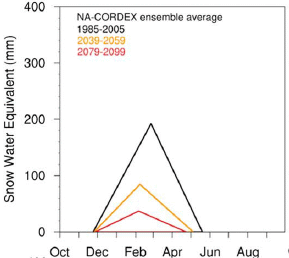
|
The graph shows the snowpack in the mountains (y-axis) vs time of year (x-axis), for three different time periods.
The top curve (black) is the typical current snowpack. The other two curves are modeling estimates for the snowpack at about mid-century (orange) and the end of the century (red).
The results summarized here are averaged over several climate models and over the state as a whole. Results from individual models are shown in the article; qualitatively, they are all similar. The full analysis in the article also shows results for several regions throughout the state, examining, for example, the role of elevation.
This is the upper left frame of Figure 1 from the article.
|
The main observation is simple: the snowpack will decrease as the climate warms. Also, the peak snowpack comes a little earlier.
Why? The warming may affect the amount of precipitation. In addition, it may affect how the precipitation is received, with more of it coming as rain rather than as snow. (The article here focuses on the snowpack itself, and does not address how much of the missing snow will be replaced by rain.)
Does it matter? The snowpack is itself a storage device. It collects water during the winter, and releases it during the spring.
Planning of water systems, including dams, takes the storage effect of the snowpack into account. Global warming will require rethinking the water storage system, even if the amount of precipitation doesn't change. (Dams, of course, are also designed to prevent flooding during the melt part of the cycle. That's not relevant to the main issue here.)
Global warming may affect our water supply by changing not only the amount but also the form of precipitation. In California, or anywhere else with a snow-based water system.
News stories:
* The Changing Character of the California Sierra Nevada as a Natural Reservoir -- Understanding how mountain snowpack may change upstream of California's major surface reservoirs. (A D Jones, Earth and Environmental System Modeling, US Department of Energy, December 7, 2018. Now archived.) A brief summary from one of the authors.
* Sierra Snowpack Could Drop Significantly By End of Century -- Berkeley Lab working with water managers to produce "actionable science". (J Chao, Lawrence Berkeley National Laboratory, December 11, 2018.)
The article: The Changing Character of the California Sierra Nevada as a Natural Reservoir. (A M Rhoades et al, Geophysical Research Letters 45:13008, December 16, 2018.)
More about California's water and mountains: Groundwater depletion in the nearby valley may be why California's mountains are rising (June 20, 2014). Links to more, including some more generally about water resources.
Atmospheric rivers and wind (May 9, 2017). A substantial fraction of California precipitation comes from "atmospheric rivers", which are exceptionally wet storms that come in from the tropical Pacific. As that might suggest, these storms are also rather warm; whether they yield snow or rain in the mountains is quite sensitive to the ambient temperature -- and therefore quite sensitive to climate change. Here is a previous post about these storms.
More about the effect of global warming on snowfall: Is Arctic warming leading to colder winters in the eastern United States? (May 11, 2018).
The genetic basis of why parrots seem so human
March 31, 2019
One feature that makes the parrots stand out among the birds is shown in the following figure...
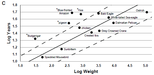
The graph shows the life expectancy (y-axis) vs size (x-axis) for a number of birds. It's a log-log scale, but don't worry about that.
Life expectancy here seems to be longest life observed. (The details behind the graph are actually in other work.) That is, the intent here is to show the potential of each bird, not its average survival success. This graph is for birds in captivity. The full figure contains a similar graph for birds in the wild. We won't consider it here; it doesn't impact anything below.
The main point is that there is a general trend: bigger birds tend to have longer life expectancies. And then there a few birds that are above the main range. Four of them shown here, each marked with an asterisk.
Those are long-lived birds. And three of the four long-lived birds shown here are parrots. (The pigeon is not a parrot.)
The authors define long life expectancy here as being more than 20% above what is expected from the weight. The upper dashed line shows the cut-off.
This is Figure 1C from the article.
|
As a group, parrots are long-lived -- as compared to other birds of similar size. In fact, the blue-fronted Amazon parrot (Amazona aestiva) shows the biggest discrepancy on the graph of any of the birds here. It has almost the longest life of any bird here, just a bit less than the much-larger ostrich (which lives considerably less than expected).
A recent article reports sequencing the genome of the blue-fronted Amazon parrot. It is the most complete parrot genome so far. Much of the article, then, is about looking for genes involved in longevity. This involved comparing this genome with what information is available for other birds, with both normal and long life expectancy. The authors also focus on another trait that distinguishes the parrots: their cognitive skills.
The article leads to a list of genes (and other sequences, such as regulatory sites) that appear to correlate with long life expectancy or cognition. Many of the genes found here are new in this context. Not all of these candidates will turn out to be significant; this kind of correlational work generates candidates for further study.
The title of the post suggested a broader comparison than simply the parrots among birds. It turns out that some of the genes that make the parrot distinctive among the birds match those thought to be involved in longevity and cognition for humans. Parrots and humans are not closely related. That they may share certain solutions is an example of convergent evolution, where more than one organism has independently "discovered" the same solution to a problem.
There is a fair amount of speculation or even hype in the commentary about this article. Genome articles tend to do that. There are a lot of facts, largely poorly understood. And yet, genome analysis ultimately will tell us so much. Seeing parallels between the parrots and us is just for fun and a little perspective for now. But the article is a step toward understanding another fascinating group of organisms. It may also lead to some general ideas about how cognition develops.
News stories:
* Parrot Genes Reveal Why the Birds Are So Clever, Long-Lived. (M Solly, Smithsonian, December 10, 2018.)
* Parrot genome analysis reveals insights into longevity, cognition -- Genome of blue-fronted Amazon parrot compared with 30 other long-lived birds. (Science Daily (Carnegie Mellon University), December 6, 2018.)
The article: Parrot Genomes and the Evolution of Heightened Longevity and Cognition. (M Wirthlin et al, Current Biology 28:4001, December 17, 2018.)
A post about parrot virtues... Bird brains -- better than mammalian brains? (June 24, 2016). Links to more.
More parrots: Briefly noted... How parrots use social media (June 27, 2023).
There is more about genomes on my page Biotechnology in the News (BITN) - DNA and the genome. It includes an extensive list of related Musings posts.
My page for Biotechnology in the News (BITN) -- Other topics includes sections on Aging and Brain (autism, schizophrenia). Each of those includes a list of related posts.
The smallest tweezers -- for pulling single molecules out of cells
March 30, 2019
Look...
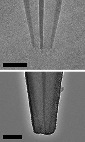
|
Two images of a newly designed set of tweezers, as described in a recent article.
The main thing you need to know for now is that the scale bars are 20 nanometers. The images here are from electron microscopy.
This is part of Figure 1b from the article.
|
Tweezers? The article uses the term tweezers in a general sense: a device to pick up something small. This device may look more like a pipet or eye-dropper, which can play the same role in retrieving a small item from liquid. But it doesn't work that way; it doesn't suck.
How does it work? It works by using an electric field to attract small things, which bind at the tip (rather than inside). The top picture, above, shows the basic structure; it is made of quartz. The bottom picture shows it after deposition of the carbon electrode material.
What is it for? Retrieving little things from inside cells. The scientists guide the tweezers to a desired site, watching what they are doing with a microscope. (The sample may be stained, to help them see particular kinds of molecules or structures.) They then push the tip through the cell membrane, turn on the electric field, and capture the desired object. The cell membrane recovers just fine, and the cell seems generally fine. In fact, one important point is that the same cell can be sampled over and over.
What have they done so far? Retrieved pieces of DNA -- and shown that they are intact and unaltered. Retrieved proteins -- and even mitochondria. The work so far is with cells in culture dishes. It should be possible to apply the method to cells in animals.
The current article presents a new tool. There are no findings of significance here. We now await "real" use of the new tool.
News stories:
* Electro-tweezers let scientists safely probe cells -- They allow repeated sampling of materials from the same living cell over time. (M Temming, Science News Explores (formerly Science News for Students), December 10, 2018.)
* Nanoscale tweezers can perform single-molecule 'biopsies' on individual cells. (Phys.org (H Dunning, Imperial College London), December 3, 2018.)
* Nanotweezers Allow For Extraction of Single Molecules From Living Cells. (Bioscription, December 9, 2018.) Includes useful perspective.
Video: Nanoscale Tweezers for Single Cell Biopsies. (Promotional video from the journal and the authors; 3 minutes; narrated. At YouTube.) Useful overview of the work, despite the immaturity of the narrators. (You can figure out who they are, I think, from the credits page at the end of the video. Maybe it is just that the narrator image is distracting.)
The article: Nanoscale tweezers for single-cell biopsies. (B P Nadappuram et al, Nature Nanotechnology 14:80, January 2019.)
More tweezers: The golden ear: A nano-ear based on optical tweezers (July 13, 2012).
More about examining the insides of a cell: Where is the hottest part of a living cell? (September 23, 2013).
Also see:
* Clippane (March 7, 2022).
* How to fill a small pipet (February 24, 2020).
March 27, 2019
Transmission of mitochondria from the father -- in humans
March 26, 2019
It's well known... Mitochondria are transmitted only by the mother.
There are some exceptions, especially with "simple" organisms. Occasional examples of transmission of paternal mitochondria have been reported in higher animals (mice and sheep). But for humans, the story has remained nearly absolute (with occasional reports of exceptions usually considered as lab errors).
Until now. A recent article reports studies of three unrelated families in which there are multiple cases of paternal mitochondria being transmitted, at high level.
The following figure shows a genealogy chart for one of those families...
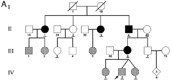
The chart shows individuals from four generations, numbered at the left I to IV. The black symbols are for individuals who carry both paternal and maternal mitochondria, as judged by analysis of the mitochondrial DNA (mtDNA). There are four such individuals here.
There are two people in generation I. Unrelated, so they have 1- vs 2-digit "names". Since these numbers get re-used, an individual is designated by a two-part name, generation and individual. Thus the two parents are I-1 and I-10.
They have four children; each child has a single-digit name to show that they are a descendant from the previous generation. But they all have II in their name, showing that they are second generation. That is, the four children of the first generation parents are II-1 through II-4. Three of them have black symbols, meaning that they have mitochondria from both parents. High levels -- roughly half -- of their mitochondria are from each parent.
Each of those (1-digit) children has an unrelated (2-digit) partner. In particular, II-4, with unrelated partner II-40, has two children. One of those, III-6, also has biparental mitochondria.
Some of the symbols shown above are "hatched" (striped). The individuals with hatched symbols had a different, but related, condition. They had two types of mtDNA, but not the two expected by getting mtDNA from both parents. Instead, they had the two types from the parent who had biparental mitochondria. (In fact, in each case, that parent was female (circle symbols); thus the mitochondria here showed simple maternal transmission.)
This is Figure 1A from the article.
|
In summary, to see the main points...
- Focus on people with single-digit names; they are part of the main family lineage.
- There are four individuals with black symbols, meaning that they have mitochondria from both parents. All of these are descended from a male of the main family.
- There are other individuals with hatched symbols, meaning they have mitochondria from two parents of the main family, but from an earlier generation. All of these are directly from females of the main family. They did not themselves get mitochondria from their two parents, but they reflect an earlier such event.
The main result is the evidence that some people have received mitochondria from the father, as well as from the mother. Similar data for two other families is presented in the article. It is the first clear documentation of biparental transmission of mitochondria in humans.
The scientists are now estimating that transmission of paternal mtDNA may occur once in about 5,000 births.
Why did they do this work? It started with testing person IV-2 from the chart above; there was some suspicion that he might have mitochondrial disease. In fact, he did have an unusual combination of mtDNAs, but did not himself inherit those from his two parents. That is, the "index case" here pointed to something unusual in the family history.
That index case, IV-2, is noted with an arrow in the figure above. You can see that his box is hatched, indicating a mixture of mtDNAs. But further analysis showed that it was his mother and her father who actually received paternal mitochondria.
At this point, there is no indication of any pathology associated with having biparental mitochondria, either for that child or for any of the other black-symbol individuals in any of the families.
How does paternal transmission of mitochondria happen? The simple answer is that they don't know. Little is known about how paternal mitochondria are eliminated normally, and the details are thought to be different in different organisms.
It is interesting that paternal transmission may occur in consecutive generations. Three of the children in generation II, above, have paternal mtDNA. One of those is male (square symbol); he then shows paternal transmission to the following generation. Other examples were seen in the other two families studied. This may hint at a mutation that allows for such paternal transmission.
Could this be useful? Well, one might imagine... Mother has defective mitochondria. Why not turn on paternal transmission? It's plausible, but for now it is just a speculation. Studying what is behind the cases reported here may reveal how paternal transmission of mitochondria occurs, and may allow some control of the process.
News stories:
* Not Your Mom's Genes: Mitochondrial DNA Can Come from Dad. (K J Wu, WGBH (public television), November 26, 2018.) There is a small mix-up with some of the scientific details about the first case, but overall this is a useful story.
* Fathers Can Pass Mitochondrial DNA to Children. (A Azvolinsky, The Scientist, December 4, 2018.) Now archived.
* Opinion: The Central Dogma of Mitochondrial Genetics Needs Rewriting. (J D Loike, The Scientist, December 12, 2018. Now archived.) A discussion of the implications.
The article: Biparental Inheritance of Mitochondrial DNA in Humans. (S Luo et al, PNAS 115:13039, December 18, 2018.) Check Google Scholar for a freely available copy.
Update March 30, 2019...
Guess what... The current article has been challenged. The journal web page for the article notes, at the very top, that there is a letter there challenging the new finding, along with a reply from the original authors. The challenge offers another interpretation: that the mtDNA observed was actually integrated into the nuclear genome. In their reply, the authors argue against that suggestion, but they would agree that further data would help.
The challenge interpretation is itself interesting. There is precedent for finding mtDNA in the nuclear genome. (Historically, such transfer events must have occurred during mitochondrial evolution, but that is a different time scale.) But the specifics here make it seem unlikely for the current evidence.
It is a good dialog. Science proceeds by testing and rejecting odd ideas. But sometimes they are not wrong, and sometimes the testing itself leads to more that is of interest.
The challenge and the reply are each about one page, and fairly readable. You can get to them from the article web page in the post.
A post about the elimination of paternal mitochondria -- in a worm: How are mitochondria from the father eliminated? (September 20, 2016). The article discussed in this earlier post is reference 28 of the current article.
Another approach for dealing with mitochondrial disease: Tri-parental embryos for preventing mitochondrial diseases (September 23, 2016).
Another claim about mitochondria... Mitochondria in the blood? (April 5, 2020).
Role of a receptor for HIV in stroke recovery
March 23, 2019
This post is about recovery from a stroke, and the role of a protein called CCR5 in that recovery.
We'll start with some data showing that there is a connection -- and that we might be able to help...
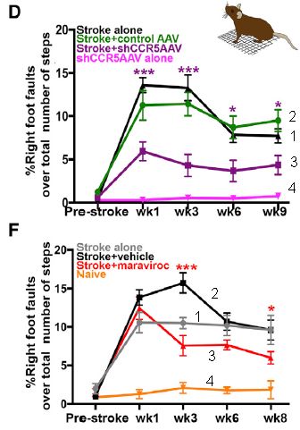
|
The graphs show the results from two, related, experiments. We'll start by emphasizing the similarities.
In both cases, mice are given an experimental stroke. There is also a treatment, which is different for the two cases. The mice are tested for their physical agility. The y-axis is a measure of damage: foot faults. The x-axis is time: mostly, weeks after the stroke.
Curve 4 (bottom of each graph) shows the error rate of normal mice: near zero.
Curve 1 ("stroke alone") shows the effect of the stroke. In both cases, the stroke leads to major loss of agility: more foot faults.
Curve 3 ("stroke +" the treatment, the nature of which we have not yet described) shows the results for the treated mice. The treatment leads to improvement, as judged by this test. Curve 3 is below curve 1 at most time points following the stroke (7 out of 8).
|
Curve 2? It is for a mock treatment. It's hard to explain at this point, since I have not yet described the treatments. The point is that the qualitative statements above still hold.
The graphs have some asterisks on them. These are presumably to show that certain pairs of points test as significantly different. Oddly, the article seems to not say exactly what the * mean. It is a reasonable guess that they are for the significance of the points for curves 1 and 3.
This is slightly modified from parts of Figure 2 from the article. I have added numbers to the curves, for ease of referring to them.
|
Overall, the graphs suggest that the scientists are doing something that helps the mice recover from the stroke. The article contains other tests, including one of cognitive function. The general picture is the same as above.
So what's this about? CCR5. Both treatments involve reducing the activity of CCR5 following the stoke.
CCR5? You may have heard of it. It is the receptor for HIV. People lacking CCR5 are resistant to being infected by HIV. What does that have to do with stroke? Nothing. A virus receptor is often an "ordinary" protein that some virus has hijacked to use as a receptor to gain entry into cells. In the case of the HIV receptor CCR5, we know little about what the protein normally does.
What are the treatments shown above? Both treatments decrease the activity of CCR5 in neurons, but by different methods. The first uses a virus to deliver an RNA that inhibits the gene function -- and does so specifically in neurons, effectively knocking out the gene there. The second uses a drug treatment. Since CCR5 is involved in HIV infection, scientists have developed drugs that act at the first stage of infection, binding to CCR5. Thus the second test above (part F; bottom) shows that a drug we already have, developed for another purpose, may be useful in treating stroke. The drug is maraviroc.
The article also shows that reducing CCR5 activity helps with recovery from traumatic brain injury.
This is all in lab mice. Will it work in humans? The only way to know is to try it. That the drug used here is already an approved drug facilitates its testing for a new use.
It's an interesting lead.
A couple of questions that may occur to you...
We noted above that people lacking CCR5 are resistant to HIV. How do they do with strokes? The article includes some data showing that people lacking normal CCR5 recover better from strokes than do people with wild type CCR5. The data are limited at this point, but it is an intriguing claim.
What does CCR5 do? Why does blocking it affect stroke recovery? We don't really know. What seems to be happening is that the brain injury induces CCR5 activity, and that increased CCR5 reduces the formation of brain connections. You can see, then, why blocking CCR5 is good for recovery from stroke. But our understanding of CCR5 is very limited. We mainly know about its bad effects.
News stories:
* Human Gene Linked to a Better Recovery From Stroke. (Technology Networks (UCLA), February 22, 2019.)
* Nixing Neuron Receptor Improves Recovery from Stroke, Trauma. (G D Zakaib, AlzForum, February 22, 2019.)
* China's CRISPR twins might have had their brains inadvertently enhanced -- New research suggests that a controversial gene-editing experiment to make children resistant to HIV may also have enhanced their ability to learn and form memories. (A Regalado, MIT Technology Review, February 21, 2019.) Another possible interconnection: the recent gene-edited babies, which I have carefully avoided mentioning in Musings... They were edited to remove CCR5. The stated purpose was to make them resistant to HIV. If CCR5 is involved in brain function, then the CCR5-edited babies may have altered brain function -- perhaps even for the better. This news story, from a news source generally regarded as high quality, looks at this aspect of the current article, including whether the baby-editing scientist knew that there might be a brain effect. It's a messy story.
The article: CCR5 Is a Therapeutic Target for Recovery after Stroke and Traumatic Brain Injury. (M T Joy et al, Cell 176:1143, February 21, 2019.)
More about recovery from stroke damage:
* Exoskeletons: focus on assisting those with "small" impairments (April 16, 2018).
* Can we pinpoint a specific molecular explanation for tissue damage following a heart attack? (March 24, 2015). (It says heart attack, but the testing described here was done on oxygen-deprived brain tissue.)
A post on traumatic brain injury: Measuring brain injury after head trauma? (April 25, 2016).
More about HIV:
* Why are some people "elite controllers" of HIV? (December 1, 2020).
* The CCR5 mutation that protects against HIV may be bad for people (June 17, 2019).
My page for Biotechnology in the News (BITN) -- Other topics includes sections on Brain (autism, schizophrenia) and on HIV. Each section includes a list of related posts.
March 20, 2019
Briefly noted...
March 20, 2019
Collecting the energy from ocean waves? Solar energy collection is improved by first concentrating the light waves. Why not do the same for ocean waves? Here is a report of some progress.
* News story in the journal publisher's news magazine: Focus: More Energy from Ocean Waves -- A new structure concentrates water wave motion and could lead to improved techniques for harvesting this renewable energy resource. (M Buchanan, Physics 11:89, September 7, 2018.) Includes videos, and a link to the article.
How a cat tongue works
March 19, 2019
A team of scientists has studied how a cat tongue works. As a result, they have designed and filed a patent for a new type of hair brush for people.

|
A cat's tongue. Close up.
There is no scale given, but the "needle" height is usually about 2 millimeters.
This is Figure 1B from the article.
|
Those needles, called papillae, have a groove that holds water. The grooves on the stiff papillae allow the tongue to carry saliva all the way to the skin below the hair. That seems to be the key idea behind how the cat tongue works.
The amount of water in the grooves is small, compared to that on the tongue surface. The importance of the grooves is that they deliver saliva to the skin surface below the hair.
The approach is conserved from small house cats to lions. The length of the papillae is about the same for six cat species, over a 30-fold range of body mass. There are occasional exceptions, such as Persian cats, which have more hair than their tongue can deal with. The authors describe Persian cats as "ungroomable" for that reason.
The authors design a hair brush based on the cat-tongue principle, and show that it is effective, and more gentle than our usual brushes.
From the Abstract... The unique shape of the cat's papillae may inspire ways to clean complex hairy surfaces. We demonstrate one such application with the tongue-inspired grooming (TIGR) brush, which incorporates 3D-printed cat papillae into a silicone substrate. The TIGR brush experiences lower grooming forces than a normal hairbrush and is easier to clean.
For those who want some numbers... During grooming, the domestic cat's tongue traveled a distance of Lgroom = 63 +/- 20 mm at an associated speed of vgroom = 220 +/- 9 mm/s and a frequency of 1.4 +/- 0.6 licks per second. Moreover, the tongue pressed down on fur with 0.13 +/- 0.13 N of force. (From second paragraph of Results.)
News stories:
* Cool for cats: that spiny tongue does more than keep a cat well groomed. (The Conversation, November 18, 2018.)
* Spiny Tongues Help Cats Keep Cool, Says New Study. (Sci.News, November 23, 2018.)
The article: Cats use hollow papillae to wick saliva into fur. (A C Noel & D L Hu, PNAS 115:12377, December 4, 2018.)
Videos. There are four videos posted with the article; you should be able to access them regardless of subscription access to the article itself. Choose "Figures & SI", and then scroll down to the "Supporting Information". The most fun (and longest -- two minutes) is #2, showing a variety of cats, large and small. (Hm, maybe you don't need a hair brush; just get a leopard.) #4 shows the hair brush described in the article; it mainly shows how to clean it. (None of these videos have any meaningful sound.)
Other Musings posts about tongues...
* Mercury pollution from Arctic melting (February 19, 2019).
* Mice that try to drink the laser light -- a study of the taste of water (July 9, 2017).
* Is there a gene for "It's on the tip of my tongue"? (July 6, 2012).
More from the same lab: A mammalian device for repelling mosquitoes (December 10, 2018). It's the lab of David Hu, an engineering professor at Georgia Tech. Musings has noted other work from that lab. They seem to have a lot of fun uncovering the science behind how animals work.
More about cats:
* Added March 11, 2026.
The origin of modern European domestic cats (March 11, 2026).
* What is the purpose of the cat response to silver vine or catnip? (March 22, 2021).
Pandas: When did they become specialized to eat bamboo?
March 18, 2019
Musings has noted the unusual feeding habits of the giant panda [link at the end]. It's an herbivore in a group that is generally carnivorous. Not just an herbivore, but a specialist, eating only bamboo. So specialized that it has an unusual thumb structure that makes it easier to hold the bamboo.
How long has this been going on? The common view is that the panda has specialized in bamboo for millions of years. A recent article provides evidence that challenges that view.
The general approach was to look at the isotope ratios in collagen from modern and ancient pandas. Collagen is an abundant and relatively well-preserved protein; isotope ratios reflect the food the animal ate.
The following two figures illustrate the findings...
This figure shows the isotope ratios found for the collagen from a variety of modern animals.
The axes show the isotope ratios for N and C. For example... Look at the small red cluster near the bottom. It is at δ14N about zero (y-axis) and δ13C about -22 (x-axis). (The numbers refer to an arbitrary reference. It doesn't matter what they are; what matters is how samples compare to each other.)
That cluster is for Ailuropoda melanoleuca, the giant panda.
In fact, most of the points fit into three clusters. The top cluster (triangles) is for carnivores. The middle cluster is for herbivores. The bottom cluster is for the panda. (Each cluster shows points for individual samples. Then there is a symbol showing the mean, and some dashed lines to summarize the cluster size.)
This is Figure 2A from the article.
|
That figure gives you an idea of what the scientists measured.
More specifically, it shows that carnivores and herbivores have distinctive isotope ratios, reflecting the different food they eat. And the giant panda has an isotope ratio that is closer to that of herbivores, but certainly distinctive.
The next figure shows such data for modern and ancient pandas. The "ancient" pandas studied here were from fossils a few thousand years old.
The data are presented the same way as in the first figure. The green data are for modern pandas; these are the data behind the panda cluster shown earlier. The red data are for ancient pandas.
The oval around each data set is an attempt to show its scope.
The two data sets are clearly different.
Other data show that the isotope ratios for general carnivores and herbivores are about the same for the two time periods.
This is Figure 3A from the article.
|
The scientists draw two conclusions from this figure (along with additional evidence). They suggest that the panda diet from that ancient period was different than for the modern pandas. That follows from the difference between red and green sets. Further they suggest that the ancient panda diet was more varied than for the modern pandas. That is based on the larger size of the red oval -- the larger range of data found for the ancient pandas.
If those suggestions are correct, it follows that as of that ancient period, 5-10 thousand years ago, pandas had not yet fully restricted their diet to bamboo. That goes against the common view noted at the outset.
There is more evidence in the article. It's not all clear or convincing, but it is interesting to see the story develop. Isotope analysis through food chains is an established method, but it is not always simple. Nevertheless, the article provides new information about how the panda diet developed; it may be more complicated than we had thought. It may be that the specialization to eat bamboo developed over stages, and reached its current degree of specialization only recently -- within the last five thousand years or so. Future work will develop and distinguish between the competing stories.
News stories:
* Ancient pandas weren't exclusive bamboo eaters, bone evidence suggests. (Science Daily (Cell Press), January 31, 2019.)
* Battle over when giant pandas started their bamboo diet heats up -- Switch to such restricted fare probably happened thousands of years ago, not millions, as some research has suggested. (E Rodríguez Mega, Nature News, January 31, 2019.)
The article: Diet Evolution and Habitat Contraction of Giant Pandas via Stable Isotope Analysis. (H Han et al, Current Biology 29:664, February 18, 2019.)
Background post about the panda diet, and the biological questions it raises: How the giant panda survives on a poor diet (August 2, 2015).
Other panda posts, both including panda pictures...
* The panda genome (January 11, 2010).
* Rewritable W-based paper and a disappearing panda (January 30, 2017).
More old collagen: Evidence for dinosaur protein extended by a hundred million years (May 12, 2017).
More bamboo: Multiplication tables, bamboo, 2300 years old (January 13, 2014).
My page of Introductory Chemistry Internet resources includes a section on Nuclei; Isotopes; Atomic weights. It includes a list of related Musings posts.
What if one gave appetite-suppressing pills to mosquitoes?
March 15, 2019
Some people take appetite-suppressing drugs in order to eat less. What if we gave such drugs to mosquitoes?
Someone has tried it, and reported the results in a recent scientific article. It works. The mosquitoes eat less. Given how mosquitoes eat, simply doing less of it could lead to less disease transmission.
The work is specifically about the blood-feeding behavior of female Aedes aegypti mosquitoes.
The following figure is a simple overview of some pieces of the story, both known and new...
The figure shows the percentage of the test mosquitoes that took a meal from a mouse that was provided, for several conditions.
Conveniently, the results fall into two general types: some results were high (median 50-75%), some were low (near zero).
The figure can be thought of as showing results from three experiments...
Experiment 1 (at the left) establishes the underlying phenomenon. Mosquitoes that have not had a recent blood meal gave a high result (bar 1a); a high percentage fed on the mouse. Those that had a recent blood meal gave a low result (bar 1b); few fed on the mouse.
Experiment 2 (middle) is all with mosquitoes without a recent blood meal. They should feed on the mouse. Bar 2a shows exactly that; it is the control here. Skip to bar 2c, labeled 18 at the bottom; it is low. Why? They had been given a drug (drug #18). The results here show that this drug is an appetite suppressant for the mosquitoes. (Bar 2b? Here the mosquitoes got drug 18C, an analog of drug 18 that is not very effective.)
Experiment 3 (right). In this experiment the mosquitoes carried a mutation in a particular receptor. The control mosquitoes fed on the mouse (bar 3a). So did those given drug 18, which should have blocked their appetite (bar 3b). That is, the receptor that is mutated here seems to be part of the appetite pathway. (The label at the lower right shows that these mosquitoes carry two copies of the defective allele for NPYLR7. Caution... That's not the receptor for the drug, but for one part of the pathway.)
At the top of each bar is a letter, A or B. Bars with the same letter are statistically the same. Bars with A are high; bars with B are low.
NPYLR7? Neuropeptide Y-like receptor #7. Neuropeptide Y is one of a family of small peptides known to be involved in regulating appetite in diverse organisms.
This is slightly modified from Figure 7B from the article. I have added labeling to make it easier to refer to the three experiments and the individual bars.
|
Those experiments show three things...
1. Mosquitoes have an appetite response.
2. The scientists have a drug that interferes with the response.
3. And they know one mosquito gene that is required for the response.
The drug would seem to be potentially useful. More about this in a moment,
There is also the "fun" side of the story, which we have only hinted at. The scientists started the work by using appetite-suppressing drugs that are given to humans. Some of them worked. And that gene they mutated out in experiment 3... Similar genes are part of the pathway for appetite suppression in humans, too. That is, appetite suppression in humans and mosquitoes is rather similar -- even if they do have different diets.
It might not be good to use a drug against mosquitoes that was also active in humans. After getting the initial leads, the scientists went on to develop drugs specific for mosquitoes.
The article does not discuss the possible activity of the drug against other organisms, including beneficial insects. That is, the work here should be taken as an example of how one can get such drugs; the current drug they developed is a useful step, but not necessarily a useful final product. In any case, the current work is progress towards understanding how mosquitoes work.
News stories:
* 'Dieting' mosquitoes for disease control. (J Gracie, Naked Scientists, February 8, 2019.)
* New findings could make mosquitoes more satisfied -- and safer to be around. (Rockefeller University, February 7, 2019.) From the lead institution.
* News story accompanying the article: The Perfect Appetizer: A Pharmacological Strategy for a Non-biting Mosquito. (J S M Gesto & L A Moreira, Cell 176:679, February 7, 2019.)
* The article: Small-Molecule Agonists of Ae. aegypti Neuropeptide Y Receptor Block Mosquito Biting. (L B Duvall et al, Cell 176:687, February 7, 2019.)
A recent post about dealing with mosquitoes... Blocking eggshell formation in mosquitoes? (February 8, 2019).
A post about controlling the pathogen itself: What if we gave mosquitoes anti-malarial drugs? (April 7, 2019).
More about appetite: YY in the mouth? (April 4, 2014). The peptides of that post and the current post are related.
There is a section of my page Biotechnology in the News (BITN) -- Other topics on Malaria. It includes a list of related Musings posts, including posts more generally about mosquitoes.
March 13, 2019
Briefly noted... Role of senescent cells in neurodegeneration?
March 13, 2019
Clearing of senescent cells from the brain prevents development of symptoms considered characteristic of Alzheimer's disease (AD). Benefit is seen at various levels of analysis, from biochemical to behavioral. That's in mice. It's nice work, and others have achieved such results, too. It will take a while to figure out whether or how this translates to other animals of interest. Even in mice, it is not yet known if anti-senescent treatment will block or reverse development of symptoms once they have begun.
* News story: Zombie Cells Found in Mouse Brains Prior To Cognitive Loss. (Neuroscience News (Mayo Clinic), September 19, 2018.) Links to the article.
* A background post on senescent cells: A treatment for senescence? (June 4, 2017).
* My page for Biotechnology in the News (BITN) -- Other topics has a section on Alzheimer's disease.
The effect of delaying school start time on students: some actual data
March 12, 2019
Musings has noted the problem of teenagers getting up in the morning [link at the end]. It leads to the suggestion that it would be better for the students if school started later, especially at the high school level (age about 14-18).
Does it work? That is, is there any evidence about how changing school time affects students? In fact, there has been little data. A new article is the best analysis yet.
The school district in Seattle, Washington, changed the start time for high school students so that school started one hour later. The article reports a comparison of how the students did in that year (2017) versus the previous year (2016; old schedule).
Here are two examples of the data in the new article. The first shows the effect of the new schedule on sleep...
This figure compares how the students slept. Focus on part B (left side), which is for school days. The x-axis is clock time; 22 is 10 o'clock at night. The colored bars show what time the students went to sleep (left end) and woke up (right end) for the two years (labeled at far right). The length of each bar shows the duration of the night's sleep. Error bars are shown on each end of each bar.
You can see that there is a small but significant increase in how long the students slept in 2017, with the later school start time. The overall effect is almost entirely due to sleeping a little later in the morning (right end of the bars).
Part D (right side) is the same idea but for non-school days. No effect.
Sleep times were measured with wrist bands that monitor activity. That's better than using only self-reported sleep.
This is slightly modified from the bottom part of Figure 1 from the article. I have added some labeling.
|
More sleep. That's good.
The second data set is for student performance...
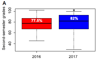
|
This graph shows that the students' grades were better in 2017, with the delayed start time. The * indicates that the difference tests as statistically significant.
This is Figure 3A from the article.
|
So we have some evidence that a later school start time has resulted in more sleep and higher grades. The article also shows that the change resulted in better attendance -- at one of two schools studied. The authors suggest that this difference might be related to the socioeconomic status of the students. Regardless of the explanation, which can only be a hypothesis at this point, it is a reminder that this is an incomplete story.
Impressed? Well, it's a small data set. And it was a one hour change in school time. That led to a 34 minute increase in sleep on school nights. And to a small, but seemingly significant, increase in grades.
It's the best data we have. Perhaps encouraging. Hopefully, we will get more data, from diverse school districts.
News stories:
* Later school start times may help improve school performance. (SITN Boston, Harvard, December 21, 2018.)
* Teens get more sleep with later school start time, researchers find. (Science Daily (University of Washington), December 12, 2018.)
The article, which is freely available: Sleepmore in Seattle: Later school start times are associated with more sleep and better performance in high school students. (G P Dunster et al, Science Advances 4:eaau6200, December 12, 2018.)
Background post: Sleepy teenagers (July 23, 2010).
Related... Circadian rhythms and class time? (June 10, 2018).
More from the Seattle education system... Computer scientist thinks; psychologist moves finger (September 24, 2013).
Among other posts about sleep...
* Daylight savings time: night-owls have more difficulty adapting (August 1, 2021).
* Conversing with dreamers (July 6, 2021).
Unusual twins: neither monozygotic nor dizygotic, but...
March 11, 2019
The story here starts with an early ultrasound of a pregnant woman. Twins. In one chorionic sac; apparently monozygotic (identical) twins. A few weeks later, an ultrasound showed that one fetus was male and one was female. That's not possible for identical twins -- at least in any ordinary way. These kids were already the objects of scientific curiosity.
The children were subjected to extensive genetic analysis. The conclusion? They are sesquizygotic -- or "semi-identical" -- twins. (The prefix sesqui means 1 1/2.) They resulted from the fertilization of one egg by two sperm. It is only the second such case ever reported.
A reminder... Twins are commonly classified as either monozygotic or dizygotic. Monozygotic twins result from a single ordinary fertilization event, with subsequent division of the one early embryo into two -- identical -- twins. Dizygotic twins result from two separate fertilizations: two sperm and two eggs. Dizygotic twins are, genetically, just like ordinary siblings.
Sesquizygotic twins are half way "in between" those two classes. One egg, two sperm. Since the sperm contributes the sex-determining chromosome, it is possible for the resulting twins to be of different sexes.
The authors suggest a sequence of events that could lead to sesquizygotic twins. Note that this is a hypothesis, with no evidence for any of it -- except that we have the twins at the end. Here are two of the steps they suggest happened...
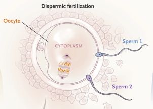
|
Top... The first step is the fertilization of a single egg cell (oocyte) with two sperm cells.
|
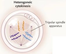
|
Bottom... That doubly-fertilized egg cell tries to divide. In attempting mitosis, it forms a mitotic apparatus -- with three poles, one for each of the three parental sets of chromosomes.
The chromosome sets from the three parental cells are shown in different colors.
The frame is labeled Heterogoneic cytokinesis. The term heterogonesis refers to this type of process of segregating multiple genome sets. It is a recent term; a reference to its first usage is given below.
|
These are the first and third parts of Figure 3 from the article.
If you want to follow this in more detail, here is the complete Figure 3 [link opens in new window]. It includes the two frames shown above, plus more.
|
What next? The cell divides into three. Each daughter cell contains two chromosome sets, which is good. (Using the previous figure... Each chromosome set follows the available spindle fibers to the nearest pole.) Two of those cells have the common maternal set plus one or the other paternal set. The third cell has one chromosome set from each of the sperm. That paternal-only cell probably does not survive (due to imprinting effects). The other two cells both develop, resulting in a chimeric embryo (with two kinds of cells). At some point, the chimera divides into two embryos, more or less as happens in the process of forming monozygotic twins.
Each cell in the resulting children has two chromosome sets, one maternal and one paternal. However, each child may have both kinds of cells -- and is therefore a chimera.
That may all seem odd. It is odd. Both steps shown above are contrary to ordinary biology.
There have been occasional reports of people developing from apparently dispermic fertilization. That would presumably involve the unusual cell division shown above. However, the current case is only the second case of apparently sesquizygotic twins. (And it is the first where the evidence started during pregnancy). Of course, it is possible that it has occurred without being noticed. It takes genome analysis to diagnose this sesquizygosity. Even in recent decades when that was possible, there could have been cases where there was no suspicion of anything unusual.
How are the kids? Four kids, from the two reported cases. There are medical issues of concern. Does that mean that sesquizygosity is likely to result in medical problems? At this point, we have no way to know.
News stories:
* Extremely Rare Sesquizygotic Twins Identified in Australia. (Sci.News, March 4, 2019.)
* Scientists stunned by discovery of 'semi-identical' twins. (N Davis, Guardian, February 27, 2019.)
The article: Molecular Support for Heterogonesis Resulting in Sesquizygotic Twinning. (M T Gabbett et al, New England Journal Of Medicine 380:842, February 28, 2019.)
Heterogonesis. The term was coined in a 2016 article on cow embryos. The article is freely available, so I'll note it, just in case anyone is curious and wants to explore... Zygotes segregate entire parental genomes in distinct blastomere lineages causing cleavage-stage chimerism and mixoploidy. (A Destouni et al, Genome Research 26:567, May 2016.)
Among posts on twins...
* Identical twins: an epigenetic marker, which may allow people to tell if they are an identical twin (October 16, 2021).
* The oldest known identical twins (December 7, 2020).
* A DNA test that can distinguish identical twins (July 17, 2015).
* Twins? A ducky? Spacecraft may soon be able to tell (August 4, 2014).
* Twins (April 30, 2009).
Another type of "tri-parental" embryo: Tri-parental embryos for preventing mitochondrial diseases (September 23, 2016). Links to more. Note that in the current case of sesquizygosity there are three gametes but only two people involved.
Among posts on chimeras... The first chimeric monkeys (February 5, 2012). Links to more (but these are the cutest).
More ultrasound:
* An ultrasound device you can wear (September 17, 2022).
* Using ultrasound to recharge an implanted medical device (October 19, 2019).
Interaction of pollution sources: Can the whole be less than the sum of the parts?
March 9, 2019
We like the aroma of pine trees, but the chemicals responsible for that odor are actually significant pollutants.
The production of volatile chemicals by trees is a complicated story. A recent article helps to clarify one part of that story.
Of particular concern here is a chemical called isoprene. It is a C5 (five-carbon) hydrocarbon. It is a common biochemical; among other things, plants make various small molecules, called terpenes, from isoprene. Simple terpenes are made by combining two isoprene units; they have 10 C atoms. These simple (or mono-) terpenes are usually volatile, and often quite aromatic, as with the pine tree odors. There are also larger terpenes, made from larger numbers of isoprenes; as they get larger, they are less volatile. At the extreme, some plants make a very long isoprene polymer, which is an important industrial product; it is called rubber. And plants can emit isoprene itself to the atmosphere.
We'll focus here on C5 and C10 compounds, isoprene itself and the monoterpenes. Both are volatile. They are also chemically reactive, with double bonds. They can lead to pollution problems in the atmosphere. In particular, both can lead to aerosols, which have both climate and health effects. Interestingly, the monoterpenes are considerably worse at causing aerosol formation than isoprene itself. It's not clear why.
The new article explores what happens with mixtures of these C5 and C10 compounds. How much aerosol production do we get from a mixture of two pollutants? The results are perhaps surprising.
The following figure shows the idea...
The graph shows aerosol production (y-axis) vs the level of the "good" pollutant (x-axis). That needs further explanation, but you can see the big trend: the higher the level of the good pollutant, the lower the overall effect.
Here is a little more explanation, but if you have trouble following it all, don't worry much.
The general nature of the experiment was to measure aerosol formation with various mixtures of isoprene and the terpene α-pinene.
The y-axis is labeled yactual/yonly. "y" is a measure of the amount of aerosol made. The numerator is the amount of aerosol made for the specific ("actual") case. The denominator is the amount with no isoprene -- that is, with "only" the terpene.
The x-axis is labeled Δisoprene/Δα-pinene. That is, it is the ratio of isoprene to pinene. But it is the ratio of the amounts consumed in the experiment; that's what the Δ refers to. "0" on the x-axis is for pinene alone; it is the "only" condition referred to for the y-axis. "1" is for an equal mixture (by mass).
The graph has two different kinds of symbols, for different conditions. The main effect we are noting here is similar for both conditions.
This is Figure 2 from the article.
|
The results in this article show that the combination of two pollutants has less effect than expected from studying the pollutants individually. That is because the pollutant with the smaller effect interferes with how the other pollutant works.
The scientists have some information on how this works. It involves a molecule known as the hydroxyl radical, with the formula OH. Not the common OH- (hydroxide) ion, but the neutral molecule with those atoms. (The formula is often written as OH., with the raised single dot representing an unpaired electron, which is the feature defining it as a radical.) OH is a highly reactive chemical, one that is known mainly from atmospheric chemistry. Reaction of terpenes with OH leads to aerosols; much less aerosol is produced from isoprene. What we see here is that isoprene not only produces less aerosol on its own, but also reduces what is made from the terpene. One reason for that is simply that the more OH reacts with isoprene, the less is left to react with the terpene. The full story is more complex, with reaction products interacting to further reduce aerosol formation from the terpene. As a result, isoprene reduces the amount of terpene consumed, and also reduces the amount of aerosol made from that which is consumed.
The work reported here is under controlled lab conditions. It's not easy to extrapolate to what happens in nature, where complex and variable mixtures of these -- and other -- pollutants occur. However, the work at least provides some perspective for understanding how these pollutants interact. Climate scientists will now try to integrate these new findings into their models of the role of aerosols in climate.
News stories:
* Jülich Study Provides New Insights into Aerosol Formation in the Atmosphere. (Forschungszentrum Jülich, January 30, 2019. Now archived.)
* Unexpected link between air pollutants from plants and humanmade emissions. (Science Daily (University of Manchester), January 30, 2019.)
* News story accompanying the article: Atmospheric chemistry: Aerosol formation assumptions reassessed. (F Yu, Nature 565:574, January 31, 2019.) An excellent and very readable overview of the work, including some of its complexities and limitations.
* The article: Secondary organic aerosol reduced by mixture of atmospheric vapours. (G McFiggans et al, Nature 565:587, January 31, 2019.)
A few weeks ago, we noted a news feature about the effects of trees on climate change. One issue there was the production of pollutants by trees. Briefly noted... Do forests mitigate global warming? (February 20, 2019).
and more... Briefly noted... Trees, land use, food -- and more. (May 29, 2019).
More about trees and pollution: The changing nature of aerosol pollution in Los Angeles (April 3, 2021).
More trees... Counting trees on Earth from space -- at one-tree resolution (January 12, 2021).
More about aerosols... Predicting the "side-effects" of geoengineering? (September 23, 2018). Aerosols are complicated. Of course, there are different kinds, as well as different effects.
Isoprene is found in diverse organisms. Here is a post about a function for it that may be common: How flippase works (September 25, 2015).
A post about making rubber: Could a common food plant be used to make rubber? (March 27, 2015).
Also see: ROOOH (July 5, 2022).
More about the hydroxyl radical: Spontaneous formation of hydrogen peroxide from water (October 26, 2019).
March 6, 2019
Briefly noted...
March 6, 2019
How to feed a cat. The experts at the AAFP (American Association of Feline Practitioners) have published an article giving best practices for feeding a cat so that you satisfy its emotional needs. For example, it is good to make your cat work for its dinner.
* News story: Veterinary community releases tips and tricks on how to properly feed your cat. (A Micu, ZME Science, October 31, 2018.) Links to the article, in the Journal of Feline Medicine and Surgery; it is freely available.
Disease outbreak from pasteurized milk
March 5, 2019
Pasteurization is a remarkable process. Strong enough to kill most anything that might be harmful, yet not so strong as to substantially damage a delicate material.
However, pasteurization does not protect against subsequent contamination.
An outbreak of food poisoning due to Listeria bacteria in the Canadian province of Ontario a couple years ago provides an interesting story, reported in a new article.
Any cluster of food poisoning cases promotes investigation, but pasteurized milk is usually not a prime suspect. In this case, at some point along the way, investigators found Listeria at a patient's home, in some commercial -- and pasteurized -- chocolate milk. An unlabelled container of chocolate milk; we'll come back to this point in a moment. The Listeria in the milk matched the outbreak strain, by genome analysis. A breakthrough.
The investigators eventually figured out the source. Examination of the production facilities revealed a site of contamination -- downstream of pasteurization in equipment used only for chocolate milk. They even found the Listeria there. The company has dealt with the underlying reason for the contamination.
Back to that unlabeled chocolate milk, which was an initial but incomplete clue... Why was it unlabelled? One common way to sell milk in Canada is in bags. It's a two-part system, with an inner bag carrying the milk but no labeling. That bag is inside a labeled container. It's common for the consumer to take out the bag of milk and discard the outer container. The authors suggest that the system should be reconsidered. Perhaps it should be required that inner containers carry identification, so that authorities can track a food source when needed.
News story: Beach Beat: Can you see me now? (C Beach, Food Safety News, February 6, 2019.) An oddly-written item, but it is from a generally good source and seems useful. It's largely about the availability of information about the incident from the government. (It's also the only news story I found.)
The article, which is freely available: Listeria monocytogenes Associated with Pasteurized Chocolate Milk, Ontario, Canada. (H Hanson et al, Emerging Infectious Diseases (EID) 25:581, March 2019.)
A post about another Listeria outbreak, posted while the outbreak was still in progress: Food poisoning outbreak: Listeria infections from caramel apples and fresh apples (January 14, 2015).
Previous post about milk: Provision of milk and maternal care in a spider (January 13, 2019).
Most posts about food poisoning issues are listed with the post
Killer chickens (December 2, 2009).
Storing energy from an intermittent source -- as compressed air under the sea
March 3, 2019
Some renewable energy sources, such as solar and wind, have a serious problem. They are intermittent, and we can't control the source. (In contrast, fossil fuels are easily stored until needed.) As these renewable sources come to play a larger role, their intermittency becomes more of a problem. It is an issue over short time scales, such as hours, and longer time scales, such as months -- or seasons.
Logically, a simple solution is to store the energy from the sun in batteries when the sun is bright, then use the batteries at night. Ordinary batteries are not practical at a large scale, but that's the idea. Another possibility is to use the available energy to pump water up to a storage tank. Later, the flow of the water downhill from the tank becomes an energy source, which can drive a generator. This method, called pumped hydro storage (PHS) is currently the major way to store intermittent energy.
And then there is compressed air. A can of compressed air, such as that used to clean electronics, obviously stores energy. Is this practical at a larger scale? In fact, some energy is being stored as compressed air on a small scale, using underground caverns.
A recent article explores the possibility of storing large amounts of energy as compressed air. The authors suggest that it would be practical for the United Kingdom to store enough energy in compressed air to cover two winter months. They would make use of the porous rocks underneath the North Sea (and some other coastal areas near the UK).
The article is all modeling. It discusses the criteria for successful air storage, and focuses on one area geologists know well. It includes some diagrams, even maps. And it includes some cost estimates, as shown in the following table...
The table considers several technologies for storing energy, listed at the left. Conventional batteries are shown for general reference. PHS = pumped hydro storage, as noted above. CAES = compressed-air energy storage. Two values are shown for onshore CAES, for different types of storage. The values for offshore CAES are from the current work.
For each technology, there are three cost estimates: low, high and mid-range. Qualitatively, the cost comparisons are similar within each column. For simplicity (and optimism), we'll look here at the low estimates.
Some observations...
- Even the lowest numbers shown in the table would contribute significantly to the price of electricity.
- Onshore/underground storage using CAES is actually a bit cheaper than PHS, which is the dominant storage mode at present.
- Offshore CAES looks expensive. But this is for a major storage system, to provide two months worth of electricity. It's not clear what the cost would be for smaller systems, perhaps using the most favorable situations. The offshore system needs to be considered, because its potential capacity is ten-fold higher than onshore capacity.
Two of the numbers in the table seem inconsistent with each other. The values are form different sources, and the discrepancy is small.
This is Table 2 from the article.
|
Bottom line? Perhaps we had not thought about storing solar energy as compressed air. The article here reminds us that the method is already being used in limited cases. And it tells us that large-scale storage, storing month-scale energy under the sea, is challenging but worth considering further.
The article also notes concerns about using this energy storage technology. More broadly, the authors' suggest that it be studied further, and implemented with caution. Long-term large-scale success undoubtedly depends on cost reductions, which may occur with experience.
News stories:
* The North Sea could become the UK's largest battery -- one that lasts for the whole winter. (A Micu, ZME Science, January 22, 2019.)
* How compressed-air storage could give renewable energy a boost -- Compressed-air energy storage isn't carbon neutral, but it's a lower-carbon option. (M Geuss, Ars Technica, January 24, 2019.)
* Storing energy in undersea rock. (Naked Scientists, January 29, 2019.) Chris Smith interviews one of the authors, Stuart Haszeldine, University of Edinburgh. Audio file available.
* News story accompanying the article: Energy storage: A porous medium for all seasons. (M Bentham, Nature Energy 4:97, February 2019.)
* The article: Inter-seasonal compressed-air energy storage using saline aquifers. (J Mouli-Castillo et al, Nature Energy 4:131, February 2019.)
Other posts that address the problem of storing energy from an intermittent source include...
* A solar cell that generates electricity at night (April 12, 2022).
* MOST: A novel device for storing solar energy (November 13, 2018).
* Flow battery (January 4, 2016).
There are no previous posts about compressed air, but there is one about hot air: Sustainable Energy - without the hot air (September 16, 2009).
There is more about energy issues on my page Internet Resources for Organic and Biochemistry under Energy resources. It includes a list of some related Musings posts.
A novel device for measuring fluoride in water
March 1, 2019
There is considerable controversy about fluoride in drinking water. It is beneficial, in reducing tooth decay, and it is harmful, in various ways. In some places we add fluoride to the drinking water, in order to increase the benefit. In other places, the natural level of fluoride is already harmful. There is not much difference in the levels needed for good and bad effects.
A recent article offers a new way to measure the amount of fluoride (F-) in water.
Let's start with some data, so you can see that the assay works. We'll then come back and explain what happens.
|
The inset summarizes the findings... The response (y-axis) is proportional to the fluoride concentration (x-axis).
The y-axis scale is I/Io, the ratio of the light intensity for the sample (I) to the reference value with zero fluoride (Io).
The x-axis scale is concentration of fluoride, in parts per million (ppm; see the key at the upper right of the full figure). The benefits and harm of fluoride come into play in the 1-2 ppm level. Therefore, the assay seems to work over a useful concentration range.
|
The slope of the response curve is backwards from what you might have expected: higher concentrations of F- lead to a lower response.
The main graph shows the spectra obtained at various F- concentrations. What's used is the height of the large peak towards the right (625 nm). You can see that this peak gets smaller as the F- concentration increases. We'll see why in a moment.
This is Figure 2a from the article.
|
The assay is complex, clever, and interesting. The following figure gives an idea of how it works...
The figure shows the sensor molecule, in two states: without (left) and with (right) a fluoride ion bound. (See the two arrows in the middle, for adding or removing the F-.)
The form of the sensor on the left (without F- bound) glows -- at the upper right. The sensor on the right (with F-) does not glow. That is, binding of the fluoride ion to the sensor molecule reduces light emission; that is what was shown in the first figure.
Why does the molecule emit light at all? Fluorescence. The sensor molecule contains europium ions, Eu3+ (or EuIII, which is how it is written in the article). The sensor is irradiated with UV light (shown at the left as "UV excitation" and "hν1"). Upon UV excitation, the Eu ions emit red light, hν2. (Emission from Eu3+ was used for red in color CRTs, for television sets or computer monitors.)
Why does fluoride ion reduce light emission? It binds to a boron atom in the sensor. (Remember Lewis acids and bases?) The right-hand side shows the big blue F- approaching the orange B. That binding blocks the energy transfer from the UV irradiation to the Eu3+. And that means no fluorescence. The more F- bound to the sensor, the less light the Eu3+ emits.
This is the inset of Figure 1 from the article.
The chemical structure shown above is part of a larger structure, known as a metal-organic framework (MOF). The main part of the figure shows a bigger view of the MOF structure.
|
The figure suggests that the binding of fluoride is reversible. That was an explicit goal in this work. The weak (non-covalent) interaction of the F- with the B allows for its easy removal. In fact, the authors show that the same sensor can be used repeatedly: with ten cycles of use and washing, there was no change in the response.
One issue with any proposed assay is its specificity. The work above shows that the assay responds to fluoride, and it shows how that occurs. But in the real world water contains other things. Do they affect the assay? The authors designed the sensor material to allow access only to very small ions. However, the article contains only limited testing of specificity. There is one test that shows that other common ions do not affect the sensor -- at the same concentration. But what about higher concentrations, which may well be present in real water samples? There is a test with some commercial bottled mineral waters; it seems encouraging, but the information is incomplete. Overall, the issue of the specificity of the assay, and the possibility of interactions, needs work.
The authors suggest that their new assay for fluoride could be better than assays commonly used. If this works out, it is a simple, reusable device that can be used outside of a lab setting for routine field work. It needs more work, but it is an interesting approach.
News stories:
* New device makes it easy to see when water has too much fluoride. (ZME Science, February 14, 2019.)
* New device simplifies measurement of fluoride contamination in water. (Science Daily (Ecole Polytechnique Fédérale de Lausanne), February 11, 2019.)
The article: Selective, Fast-Response, and Regenerable Metal-Organic Framework for Sampling Excess Fluoride Levels in Drinking Water. (F M Ebrahim et al, Journal of the American Chemical Society (JACS) 141:3052, February 20, 2019.)
A post about fluoride, with some discussion of why its level is important: Is fluoride neurotoxic to the human fetus? (December 13, 2017).
Among posts about MOFs:
* Harvesting water from "dry" air (July 1, 2017).
* Cooperation: a key to separating gases? (March 28, 2014). Links to more.
More about water quality: Consumption of microplastics by humans: the bottled water problem (September 20, 2019).
This post is listed on my page Introductory Chemistry Internet resources in the section Lanthanoids and actinoids.
February 27, 2019
Briefly noted...
February 27, 2019
Zoonosis in reverse? A zoonosis is a disease transmitted to humans from other animals. A reverse zoonosis... well, just think about it. Animals in remote locations, with little contact with humans, might be especially susceptible to reverse zoonoses upon occasional human contact. A recent article presents evidence that seabirds in the Antarctic carry bacteria that most likely came from humans. There nay not be evidence of actual disease transmission at this point, but it's an issue worth noting.
* News story: The fauna in the Antarctica is threatened by pathogens humans spread in polar latitudes -- When the human species infects other living beings. (Science Daily, December 10, 2018.) Links to the article.
* A background post for some perspective: One health (November 15, 2010).
Reconstructing an ancient enzyme
February 26, 2019
As more and more genomes get sequenced, we can work backwards and "guess" what the ancestral genomes looked like. That's fun. And interesting. And maybe even useful.
It is likely that early organisms were adapted to higher temperatures than modern organisms. Thus we might wonder if their enzymes were more thermostable. Industrial processes are best with thermostable enzymes; making more thermostable enzymes based on extrapolating backwards from modern genes could be one approach.
A recent article reports two examples of making ancestral enzymes, and finding that they are indeed more thermostable.
Here is some data for one case...
|
The graph shows the stability (y-axis) of five versions of the enzyme CYP3 vs temperature (T; x-axis). The stability is shown here by the half-life of the enzyme activity.
Four of the enzymes are from modern animals (vertebrates). The fifth enzyme, called N1, is the one the scientists designed, by extrapolating from the sequences of many modern enzymes (including the four shown here).
The results are clear: The new enzyme, N1, is much more stable over the entire T range tested. For example, at the lowest T, 50 °C, the original enzymes all have half-lives less than 10 minutes. The new enzyme has a half-life of about 10 hours (600 minutes).
This is Figure 1d from the article.
|
What is this enzyme? It's one of the family of enzymes known as cytochromes P450. As a group, they react with many things, typically to help detoxify them.
Cytochrome P450 enzymes, often referred to as monooxygenases, add an oxygen atom into a C-H bond -- and do so with some specificity (depending on the specific member of the enzyme class). It is a type of reaction that chemists still find difficult, but it is very useful. Making use of nature's tools is a good step toward carrying out these reactions in industrial scale syntheses, but the natural catalysts are not very stable.
In this case, the scientists have succeeded in reconstructing what appears to be an ancestral form of the enzyme. They estimate that this enzyme might have been present in early vertebrates a half billion years ago. That ancestral enzymes are thermostable is a common finding, but not well understood. (The conditions on Earth probably weren't much different a half billion years ago than they are now. However, earlier life may well have faced higher T.) The authors discuss previous work to try to develop more thermostable variants of P450 enzymes; the improvement they obtained here was more than from all previous lab work. And it is relatively simple to do, once the genome sequences are available.
There is no strong claim that the specific enzyme they made actually occurred in ancient organisms. The method points to a set of likely amino acid differences. The specific enzyme they made was perhaps the most likely combination, but many other combinations might have occurred. Further, there is no claim that their approach will always succeed in producing a useful product (the desired thermostable enzyme). Nevertheless, it is logical and promising. We work out genealogy charts for individuals, and learn about their ancestors. Why not do the same for enzymes?
As noted, the method used to determine the ancestral enzyme sequence is probabilistic. It generates a variety of candidates. The authors studied a sampling of them, in addition to the one, "most likely", sequence discussed above. Some had even greater thermostability than the one studied here. And other properties, including enzyme specificity, varied. The method is perhaps best thought of as generating a pool of candidate enzymes for further study and development.
News story: Ancient enzymes the catalysts for new discoveries. (Phys.org (University of Queensland), October 22, 2018.)
The following news feature is about the general technique of reconstructing ancient proteins. It was published a few months before the current article, and does not mention this work. This item is interesting for its overview of the field. There is a range of views about what is going on. That's fine, it is still a new field. Beware of well-intentioned overviews of the method -- such as mine in this post. Scientists Bring Ancient Proteins Back to Life. (A Dance, The Scientist, July 1, 2018.) Now archived.
The article: Engineering highly functional thermostable proteins using ancestral sequence reconstruction. (Y Gumulya et al, Nature Catalysis 1:878, November 2018.)
A post about enzyme development in the lab: Carbon-silicon bonds: the first from biology (January 27, 2017).
More about cytochrome P450 enzymes:
* Domestication of the almond (August 26, 2019).
* Should bees eat honey? (July 12, 2013).
More about ancient proteins: Denisovan man: beyond Denisova Cave (May 7, 2019).
There is more about genomes on my page Biotechnology in the News (BITN) - DNA and the genome. It includes an extensive list of related Musings posts.
Measurement of atomic mass of superheavy atoms
February 24, 2019
All chemical elements with atomic numbers (Z) 1-118 are now known, officially accepted, and named. The later steps of that process have been noted in Musings for some of the heaviest elements, sometimes called superheavy elements [link at the end].
The information about even the most recently discovered superheavy elements includes specific isotopes. And that might lead one to ask: how do we know which isotopes have been produced? How do we know the masses of superheavy atoms?
In general, there are various possible answers. Some masses have been measured directly, by mass spectrometry. In some cases, the decay chain of a superheavy nucleus ends with a measurable nucleus; a strong inference can be made about the earlier atoms in the chain.
But for the heaviest elements, there is no solid evidence about the mass. The nuclei have too short a lifetime to be measured, and the decay chains, while plausible, are hypotheses.
A recent article reports direct mass measurements for atoms of two superheavy elements. It is a technical tour-de-force that the scientists were able to do mass measurements on these ultra-short-lived atoms. The work involves a complex apparatus that integrates production of the superheavy atoms with the mass measurements. Detection of the alpha particles from the decays also helped establish what the measurements meant.
The mass measurements were done by a variation of mass spectrometry. It measures the ratio of mass to charge. That ratio is called A/q in this case, where A is the mass number and q is the charge on the atom. In traditional mass spec, the presence of a magnetic field bends a particle's path. The greater the mass, the less it is bent; the higher the charge, the more it is bent. That's the idea here, though the apparatus is novel.
The following graph summarizes the key findings...
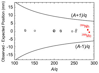
The graph shows the position where the particle was detected (y-axis) vs the mass-to-charge ratio A/q (x-axis).
The y-axis values are presented here as deviation from the expected position, in each case. That is convenient; it means that the expected value is zero -- always.
Indeed all the data points (black circles and red squares) are very near zero.
What does "very near" mean? That's where the two black lines, above and below zero, come in. Those lines show the positions expected if the mass number A were off by one mass unit.
So, we can make the point made a moment ago even stronger: all the data points are very near zero deviation from what was expected -- and not close to what would have been expected if the mass were off by 1.
The two red-square points are for atoms of 284-nihonium (Nh, Z = 113) and 288-moscovium (Mc, Z = 115). The measurements here confirm the mass assignments that had been made earlier. These two atoms are now the heaviest to have their masses directly measured.
The black-circle points are "controls". They are for various other atoms, all with well-known mass.
Error bars? For the black-circle controls, the error bars are smaller than the points. The red squares are data points for single events.
This is Figure 3 from the article.
|
So what do we learn from this article? In a sense, nothing. The article confirms what we thought, for the masses of two superheavy isotopes. Nothing new, but it means that the indirect approaches to assigning mass numbers have been working. That's good news.
News stories:
* Masses of superheavy elements nihonium and moscovium measured. (E Stoye, Chemistry World, December 4, 2018.)
* Synopsis: Pinning Down Superheavy Masses. (M Schirber, Physics, November 28, 2018.) From the news magazine of the journal's publisher.
The article: First Direct Measurements of Superheavy-Element Mass Numbers. (J M Gates et al, Physical Review Letters 121:222501, November 30, 2018.)
A background post about the superheavy elements discussed above: Nihonium, moscovium, tennessine, and oganesson (June 11, 2016). The names proposed here were officially recognized later in 2016.
My page of Introductory Chemistry Internet resources includes a section that addresses the original announcement of making Elements #113 and 115. Another section of that page includes announcements of the naming, for these and other elements over recent years, plus other information about element names: Names of elements.
Previous post using mass spec... Using mass spectrometry to analyze a poem (October 14, 2018).
Head injuries in Neandertals: comparison with "modern" humans of the same era
February 22, 2019
It's often said that the Neandertals were a violent people. The frequency of skull injuries, as seen in fossils, is presented as evidence.
How good is that evidence? Frequency of skull injuries in Neandertals compared to what?
A recent article looks at the evidence more systematically. Here are some of the findings...
Part a (left) shows the frequency of skull injuries in two groups of fossils, from approximately the same period: Neandertals (NEA) and modern humans (Homo sapiens, labeled UPH = upper Paleolithic humans.
The results are about the same for the two groups.
Part b (right) shows similar comparisons for some sub-groups: male vs female and young vs old. The latter refers to the age of the person at death, as judged from the fossil; the cutoff is an estimated age of about 30.
The results show that skull injuries were less frequent in females than in males, for each sub-group. They also show a difference between the two types of humans for people who died young (triangles, dashed lines), but not for those who died old (circles, solid lines). The differences suggested here test as statistically significant (not indicated in the figure).
The analysis here is by "skeletal element" (loosely, by bone). There is also an analysis by individual; the big picture is the same.
This is part of Figure 2 from the article.
|
Interesting! But before we make much of the results, we need to note some of the specifics behind those graphs.
The numbers... About 100 individuals were examined for each group of humans. 836 "skeletal elements". The numbers in sub-group analyses were smaller; the age or sex of some specimens could not be determined. The numbers here, while small, are larger than usual for such analyses; the authors have collected as much data as is currently available.
The y-axes labels above include the word "predicted". The results shown there are based on complex analysis. A key part of the analysis was taking into account the preservation status of each sample. That is a big issue with fossils. The current study, by comparing different human groups from about the same time, allowed preservation status to be included as part of the analysis.
So, what's the point? At the top we raised the question of whether Neandertals were more violent than modern humans, and asked for data. Here's some data -- about the best we can do at this point. The key point is the attempt to compare the fossils from two groups of humans from about the same time. There is no evidence here for an overall difference in violence between Neandertals and modern humans.
News stories:
* Study: Neanderthals faced risks, but so did our ancestors. (M Ritter, Phys.org, November 14, 2018.)
* Not so dangerous: Neanderthals and early modern humans show similar levels of cranial injuries -- Tübingen researchers reject the long-held hypothesis of more traumatic injuries among Neanderthals. (University of Tübingen, November 14, 2018.) From the lead university.
* News story accompanying the article: Palaeoanthropology: The not-so-dangerous lives of Neanderthals. (M Mirazón Lahr et al, Nature 563:634, November 29, 2018.)
* The article: Similar cranial trauma prevalence among Neanderthals and Upper Palaeolithic modern humans. (J Beier et al, Nature 563:686, November 29, 2018.)
Among posts about Neandertals...
* Is there useful ancient DNA in the dirt? (August 8, 2017).
* Did Neandertals use cosmetics? (January 24, 2010).
More about head injuries:
* Skull surgery: Inca-style (August 21, 2018).
* Stone age human violence: the Thames Beater (February 5, 2018).
* Evidence for brain damage in players of (American) football at the high school level (August 23, 2017).
February 20, 2019
Briefly noted...
February 20, 2019
Do forests mitigate global warming? The common wisdom is that they do. After all, trees take carbon dioxide from the atmosphere, and that is good. However, as so often, the full story may be more complicated, and it certainly is interesting. Nature ran a News Feature on the question recently; I encourage you to look it over, to get a sense of the complexity and the questions being asked. Keep planting trees, and keep trying to reduce deforestation. However, you should also come to understand that not all trees are equal. It may be good to have modest expectations for the actual effect of trees on climate change.
* News Feature, which is freely available: How much can forests fight climate change? -- Trees are supposed to slow global warming, but growing evidence suggests they might not always be climate saviours. (G Popkin, Nature News, January 15, 2019.) In print, with a different title: Nature 565:280, January 17, 2019.
* This story is referred to in the post Interaction of pollution sources: Can the whole be less than the sum of the parts? (March 9, 2019).
Mercury pollution from Arctic melting
February 19, 2019
This post is about the effects of RTSs. RTS = retrogressive thaw slump.
Here is an RTS...
|
The photograph shows a stream in the foreground (labeled "upstream" and "downstream").
Above the stream is an RTS, cryptically marked with an arrow labeled "b". That's an area of slush -- partially melted permafrost mixed with soil. The melt can then run off into the stream. The "debris tongue" is a barrier that retards such runoff.
|
This site, labeled FM3 in a recent article, is in the Northwest Territories, Canada. The full figure in the article shows the broader region under study.
This is inset "a" from Figure 1 of the article.
|
The melted permafrost can release things, including pollutants. Things long stored in permafrost, but now mobile in liquid water.
The article looks at the effect of such RTSs on mercury (Hg) levels in streams. Here's some data...
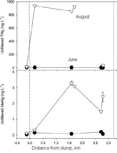
The upper graph shows the amount of mercury (y-axis; THg = total mercury) found in the stream vs distance from where the RTS runoff enters the stream (x-axis). The first (left-most) point has a small negative distance, meaning that it is for an upstream site, just before the runoff joins the stream. Positive x values are for downstream sites, beyond where the RTS runoff enters.
There are two curves, for measurements taken about two months apart. The June measurements (solid circles) are all very low, near zero. In August (open triangles), the total Hg is still about 0 before the RTS runoff, then very high downstream. (If you notice an odd point, see the fine print below for a comment.)
June? August? In between, the RTS site thawed. That is, taken at face value, the results suggest that the thawing of the permafrost released mercury into the stream. A lot of it.
The lower graph is the same idea, but now for one particular form of mercury, called methyl mercury (MeHg). The numbers are lower (be sure to read the y-axis scales), but the general picture is the same. And methyl mercury is an extremely toxic form of Hg.
There is a bad point on the graph, which needs a note. On the upper graph (total Hg), look at the August point (open triangle) for the high distance (2.8 km). It is at about zero, which doesn't fit the main picture. In the figure legend, the authors note that this point failed on quality control criteria, and is excluded from their analysis. That is, the authors show the result, and note that there is a problem with it. That is a good way to handle a bad data point.
The data here are for a different site than the one shown in the top figure.
This is slightly modified from the left half of Figure 5 of the article. I have added some labeling, mainly to replace what I cut off.
|
More findings...
- The two graphs above both include the word "unfiltered" on the y-axis. That is, the scientists simply collected water from the stream and measured it. But they also filtered a portion of the water; the results for filtered water are shown in the right half of the Figure in the article (not included here). The values are all quite low, and a bit lower on the downstream side. This shows that most of the Hg is bound to large particles (allowing it to be easily filtered out). That most of the Hg is bound means that it is probably not bio-available, at least at that point.
- The effect on downstream Hg levels is largely due to the amount of permafrost material transported. The permafrost material itself was fairly typical permafrost; it was not unusually high in Hg.
- The amount of methyl mercury is higher when the melt had time to sit around. A "debris tongue", shown in the top figure, allows the melt to remain in the RTS longer; areas with a substantial tongue had higher levels of methyl mercury. This suggests that some of the methyl mercury is being made in the melt, presumably by bacteria.
The article includes similar work from various sites in the Northwest Territories. It's a region generally considered pristine, though it is known that there is a lot of mercury in the permafrost.
Increasing arctic temperatures are leading to more melting of the permafrost. We now see that the melting leads to release of mercury. The highest levels the scientists observed in this work, immediately downstream of RTS runoff, are about 70 times higher than the highest Hg levels previously seen in areas of Canada considered uncontaminated.
Given what was known about the permafrost, the results here are not surprising. But now there are some numbers. The implications are not clear at this point, but having some specific numbers helps people to think about the situation.
News stories:
* Record levels of mercury released by thawing permafrost in Canadian Arctic. (K Willis (University of Alberta), Phys.org, December 6, 2018.)
* Thawing Canadian Arctic permafrost is releasing "substantial amounts" of mercury into waterways. (A Micu, ZME Science, December 13, 2018.)
The article: Unprecedented Increases in Total and Methyl Mercury Concentrations Downstream of Retrogressive Thaw Slumps in the Western Canadian Arctic. (K A St Pierre et al, Environmental Science & Technology 52:14099, December 18, 2018.)
More from permafrost:
* Recovery of live, infectious virus from 30,000 year old permafrost (March 25, 2014).
* A 30,000 year-old plant, with an assist from a squirrel (March 10, 2012).
More about Arctic ice: The thorium anomaly: was the Arctic Ocean formerly a body of fresh water? (March 8, 2021).
Most Musings posts that refer to mercury are either about the planet or from a local newspaper. Here is one that mentions the element, and its toxicity: A possible hazard of using compact fluorescent light bulbs (November 13, 2012).
and ... Developing a gut microbe that protects against a toxic form of mercury (August 20, 2025). Added August 20, 2025.
My page Biotechnology in the News (BITN) -- Other topics has a section on Vaccines (general). It includes a short discussion of thimerosal, a mercury-containing compound used as a preservative in some vaccines.
Previous use of the word "slump" in Musings: Star formation has slowed down (December 4, 2012).
More tongues: How a cat tongue works (March 19, 2019).
An ion-drive engine for an airplane?
February 15, 2019
An airplane with no moving parts? No propellers, no turbines. And no combustion. Well, children make them all the time. But this is a real airplane, self-powered.
Here's the plane...
This is Figure 1b from the article.
|
There are short videos of the plane in action with each of the news stories. Steady, level flight. At least for a bit.
It's small -- and sparsely outfitted. But it flies. And it raises some questions.
What is an ion-drive engine? It's a type of electrical engine. The system has two electrodes. Air is ionized in an electric field at one electrode. The ions are ultimately captured by the second electrode. It is the flow of ions between the electrodes that provides the thrust. An ionic wind; that's the common term.
The idea has been around for a century, but with little practical use.
What is the challenge in actually making use of such systems? The usual for airplanes: getting enough thrust to move the plane forward. And that means that weight (power density) is a key issue. So is cost, though that isn't really addressed in this study.
Much of the work involved developing a model on the computer. Only after the computer analysis suggested some proper parameters did the engineers make -- and fly -- a prototype.
The plane weighs about 2.5 kilograms (5 pounds). That includes the battery pack -- and the transformer; the ion-drive engine here operates with a potential difference of 40,000 volts. It has a 5 meter (16 feet) wingspan. Flight speed is 4.8 meters/second (17 km/hr, 11 mi/hr).
What can we expect for the future? Make a bigger one and put some seats in? A commercial ion-drive plane for passenger travel? That may be a stretch, but the authors note areas that are open for development. They think it is reasonable to make a range of smaller, unmanned planes, suitable for monitoring. Better drones; quiet drones. It is also possible that ion-drive technology can be combined with other power technologies. Hybrid devices... One technology for take-off, another for steady-state flight. (The current test plane was launched with a bungee cord.)
The efficiency of the current plane is low. Only about 2% of the energy delivered by the battery is converted to moving the plane forward. That's actually better than previous ionic wind devices. Interestingly, they should get more efficient with larger devices, but further basic improvements are needed
The authors note that the initial flights, reported here, were longer than the first Wright brothers flight, in both time and distance. (And the distance here was limited by the size of the building -- the university gymnasium -- used for the flight testing.)
It's the dawn of the era of electroaerodynamics (EAD). At least, it's a fun story, exploring a novel way to make airplanes.
News stories:
* First ever plane with no moving parts takes flight. (A Hern, Guardian, November 21, 2018.)
* MIT engineers fly first-ever plane with no moving parts. (J Chu, MIT, November 21, 2018.) From the lead institution.
* News story accompanying the article: Engineering: Flying with ionic wind. (F Plouraboué, Nature 563:476, November 22, 2018.)
* The article: Flight of an aeroplane with solid-state propulsion. (H Xu et al, Nature 563:532, November 22, 2018.)
Among posts on airplanes...
* Can you make a 777 by printing it? (May 9, 2015).
* Ice nucleation -- by airplanes (September 24, 2010).
Among other posts on flying... How to fly a beetle (April 27, 2015).
More on wildlife monitoring: Monitoring whales from space (June 23, 2019).
February 13, 2019
Briefly noted... Does having a cat affect entrepreneurship?
February 13, 2019
A recent article reports that people infected with the parasite Toxoplasma gondii are more likely to be entrepreneurial. That is a parasite carried by and often acquired from cats. It's just statistics -- correlation. But the same parasite causes mice to lose their fear of cats. What do we make of this? It's hard to know for now. Hopefully, people will follow this up as an intriguing but uncertain lead.
* News story: There's a Really Weird Link Between Cats And Entrepreneurs -- Is this for real? (M McRae, ScienceAlert, July 25, 2018.)
* The article: Risky business: linking Toxoplasma gondii infection and entrepreneurship behaviours across individuals and countries. (Stefanie K Johnson et al, Proceedings of the Royal Society B 285:20180822, July 25, 2018.)
* More Toxoplasma:
- Briefly noted... Toxoplasma and the social structure of wolves (February 7, 2023).
- Cats, fats, and Toxoplasma. And mice. (October 21, 2019).
Earthquakes induced by human activity: oil drilling in Los Angeles
February 12, 2019
Earthquakes are natural phenomena, not affected by human activity. Or so we thought. On the other hand, in recent years we have debated whether the process for oil and gas recovery commonly called fracking can induce earthquakes. It probably does, in some cases. The debate has shifted from "whether" to "how" and "when" our activity may affect quakes.
Earthquakes are about forces between rocks within the Earth. Anything that changes those forces may affect quakes. Moving things in or out of underground storage is a possible influence.
A new article considers the possibility that a cluster of earthquakes in the Los Angeles area around 1940 was caused by ordinary oil drilling activity.
Here is part of the story...
The figure shows the earthquakes of M (magnitude) 3 or higher that occurred in a particular part of the Los Angeles area over a period of about four decades. Each point shows one quake, of the indicated magnitude (y-axis) during the year (x-axis). (So do the stars, which you can ignore for our purposes here.)
The figure starts with a major series of quakes in 1933 (at Long Beach). The primary quake was M 6.4, well off the top of this graph. The graph does show numerous aftershocks during that year, and shortly thereafter.
Of particular interest... Look for quakes with M above 4. There are some associated with the 1933 event. Beyond that? Several around 1938-1945. None since, on this graph.
This is Figure 12 from the article.
|
What's the deal with the cluster of quakes with M >4 around 1940? A common view was that they were more aftershocks from the 1933 quake. However, this graph makes that seem unlikely. The aftershock swarm stopped well before this cluster.
Is there another explanation? The authors note that the time of this cluster coincided with a rapid rise in oil production in the area, from newly-drilled wells.
The authors examine some of those quakes in detail. They are able to make improved estimates of the quake epicenters. (Seismometers of the day were rather crude. In particular, their clocks were poorly coordinated.) Much of the work involved analyzing "macroseismic" data: damage reports. In some cases, their new estimates of the quake epicenter placed it closer to the oil fields than previously thought -- remarkably close.
They also make estimates of the pressure changes that were likely to have resulted from the oil drilling; the estimates are consistent with the observed quakes.
Overall, the authors build a case of circumstantial evidence: they suggest that oil drilling induced earthquakes -- of significant magnitude. In making the case, they provide insight into the industry and seismology of that era. It's another example of trying to understand how human activity may affect earthquakes.
News story: Oil extraction likely triggered mid-century earthquakes in Los Angeles. (L Lester, GeoSpace (AGU Blog), November 19, 2018.) Good overview.
The article: Revisiting Earthquakes in the Los Angeles, California, Basin During the Early Instrumental Period: Evidence for an Association With Oil Production. (S E Hough & R Bilham, Journal of Geophysical Research: Solid Earth 123:10684, December 2018.)
Among other posts about earthquakes, including their causes and interactions, with links to more...
* Added February 11, 2026.
Do earthquakes enhance algal blooms?(February 11, 2026).
* Another million earthquakes for California (June 30, 2019).
* A significant local earthquake: identifying a contributing "cause"? (July 31, 2018).
* Fracking and earthquakes: It's injection near the basement that matters (April 22, 2018).
* How PBRs survive major earthquakes; why being near two faults may be safer than being near just one (September 22, 2015).
More about humans affecting seismic activity: Seismologists report that Earth is quieter because of COVID-19 (October 19, 2020).
Among other posts about Los Angeles:
* The changing nature of aerosol pollution in Los Angeles (April 3, 2021).
* Water loss from irrigated lawns (June 21, 2017).
* Los Angeles leaked -- big time! (April 29, 2016). More from the fossil fuel industries.
Involvement of the non-pregnant uterus in brain function?
February 11, 2019
The commonly known function of the uterus is to carry a developing fetus. In humans, that takes about nine months.
What does the uterus do the rest of the time? Is it just there, unused? That's a common view. However, in a way, that should seem odd. Nature abhors a vacuum, it is said. In biology, an unused organ should be suspect. Perhaps it does something, but we haven't figured it out.
Perhaps a person could store memories in the uterus, when it is not otherwise occupied.
A recent article explores the function of the non-pregnant uterus, in a rat model. The motivating factor for the scientists is that many women have their uterus removed, but there has been little study of what the side effects might be.
The focus here is on brain function. The general approach is to test memory functions of female rats that have undergone one or another type of surgery on their reproductive organs. Don't take my suggestion above too literally, but it might occur to you as you read this article.
Here are the results from one experiment, the most intriguing one...
|
The graph shows how four groups of female rats scored on a particular test. The test made heavy demands on their working memory. The bar height shows the number of errors made. WMI = working memory incorrect.
The four groups of rats all underwent surgery. The left-hand bar is for rats with a sham surgery; they underwent the procedure, but no organs were actually removed. The other bars are for rats who had their ovaries, uterus, or both removed. Ovx = removal of ovaries (also called oophorectomy or ovariectomy); hysterectomy = removal of uterus.
|
The results are striking. The bars are about the same for three conditions. However, rats that underwent the hysterectomy (alone) fared much worse -- in this test of memory.
The statistical testing shown on the figure with the asterisks shows that the hysterectomy result is significantly different from each of the other results.
This is Figure 7A from the article.
|
What's going on here? The article has several experiments, but there is no particular answer to that question. What the article does is to address the issue of the interaction of uterus and brain in a systematic way, in an animal model. That's novel. Further work can explore the effects revealed here, and whether the story is relevant to humans.
News stories:
* Hysterectomy may be linked to brain function -- Rat model of hysterectomy finds the procedure may cause short term memory loss. (EurekAlert! (Endocrine Society), December 6, 2018.)
* Hysterectomy linked to memory deficit in an animal model. (Medical Xpress (Arizona State University), December 6, 2018.) Includes a brief description of the memory tests.
* Hysterectomy Can Impair Short Term Memory (at least in rats). (MedicalResearch.com, December 6, 2018. Now archived.) Interview with the senior author of the article.
The article: Hysterectomy Uniquely Impacts Spatial Memory in a Rat Model: A Role for the Nonpregnant Uterus in Cognitive Processes. (S V Koebele et al, Endocrinology 160:1, January 2019.)
Previous uterus post: The fetal kick (April 7, 2018). Links to more.
Previous hysterectomy post: This could be you (July 8, 2008).
A post about an organ long thought to have no function: Does the appendix affect the development of Parkinson's disease? (December 11, 2018).
There is a section of my page Biotechnology in the News (BITN) -- Other topics on Brain (autism, schizophrenia). It includes a list of related Musings posts -- though generally not posts about the uterus.
Blocking eggshell formation in mosquitoes?
February 8, 2019
You may know that disrupting eggshell formation is not good for birds.
What about mosquitoes? Might we control mosquitoes by disrupting the formation of mosquito eggshells?
Look at some results from a new article...
|
The bar height shows the percentage of eggs that hatched, for three conditions.
The left-hand bar is for untreated mosquitoes. The middle bar is for a negative-control treatment that was not expected to affect the eggs. (Derails later.)
The right-hand bar is for the experimental treatment to disrupt eggshell formation. It worked. Quite well.
This is Figure 1G from the article.
|
What is this treatment? The effective treatment involves inhibiting the gene EOF1. EOF = eggshell organizing factor. The way the scientists did the inhibition here was to inject the mosquitoes with an RNA that interfered with function of that particular gene. RNAi = RNA interference; the added RNAi interacts with the messenger RNA, preventing its normal function. (The negative-control treatment was to inject an RNA targeted at another gene, not relevant to egg formation; in fact, it was targeted to a gene not present in the mosquitoes. That RNA had no effect, showing that the treatment process per se was not having an effect.)
The overall result was actually better than shown above. Inhibition of the EOF1 gene leads to fewer eggs being produced, a smaller percentage hatching (shown above), and to poor development of those few that do hatch. The authors say that the reduction in viable offspring due to the treatment is essentially 100%.
How did the scientists find this candidate gene? They started by searching the genome databases for genes found only in mosquitoes. They then screened 40 such genes, using the RNAi approach. The result was one gene, EOF1, with the desired property: inhibition of that gene resulted in a large decrease in offspring. Starting by looking only at mosquito-specific genes was clever: the authors suggest that targeting this gene would be safe (without side effects on other animals, including other insects); of course, there is no certainty that would be true, and it must be directly tested at some point.
The function of EOF1 is not known. The article contains some exploration of what it does. The following figure shows a top-level observation: what the eggs look like...
Light microscope images of the eggs, for the three treatments shown in the top figure.
You can see that the pigmentation of the eggs is severely affected by inhibition of EOF1. The variability of pigmentation (melanization) in the treated mosquitoes suggests that there is some general disruption of eggshell formation.
Electron microscope observations show further alterations of the eggs.
Egg size? It doesn't say, but mosquito eggs are typically a little less than a millimeter long.
This is Figure 1H from the article.
|
Interesting, and perhaps promising. Remember that this work shows an approach, but not a practical implementation. The authors' claim is that they have identified a target that should be studied further. The work here is all done by injection of individual mosquitoes. The question may now be, can we find a drug that will inhibit this protein?
News stories:
* Mosquito-specific protein may lead to safer insecticides. (EurekAlert! (PLOS), January 8, 2019.)
* Fighting human disease with birth control ... for mosquitoes. (Science Daily (University of Arizona), January 8, 2019.)
The article, which is freely available: Identification and characterization of a mosquito-specific eggshell organizing factor in Aedes aegypti mosquitoes. (J Isoe et al, PLoS Biology 17:e3000068, January 8, 2019.)
More about dealing with mosquitoes...
* What if one gave appetite-suppressing pills to mosquitoes? (March 15, 2019).
* A mammalian device for repelling mosquitoes (December 10, 2018). Links to more.
More about eggs: What is the proper shape for an egg? (September 18, 2017).
More about small RNAs inhibiting gene expression: How soybeans set up shop for fixing nitrogen -- and how we might do better (December 2, 2019).
There is a section of my page Biotechnology in the News (BITN) -- Other topics on Malaria. It includes a list of related Musings posts, including posts more generally about mosquitoes.
February 6, 2019
Briefly noted...
February 6, 2019
Rats and robots. We have previously noted work showing that rats will release other rats from restraints. A new article shows that rats will also release robots from restraints, and are more likely to do so if the robot had been friendly and helpful to the rats.
* I have not found a freely available news story, so I have chosen to only note this item briefly. Here is the article, which is freely available: When Rats Rescue Robots. (L K Quinn et al, Animal Behavior and Cognition 5:368, November 2018.) Background post: Rats will free prisoners, and share their chocolate with them (January 18, 2012). I have added a note about this new work to that post.
* There are some nice videos with this article. They seem to be available only from links within the pdf file.
Using old clothes as building materials?
February 5, 2019
A recent article addresses the problem of wastes from the textiles industry. The first point is that it is a problem -- a big problem. 10% of the world's carbon emissions is from this industry. The authors note that in the first sentence of their abstract, and elaborate on it in the first paragraph of the article.
Textiles is a big field, and diverse. The following figure summarizes the sources of textiles wastes...
|
This is Figure 1 from the article.
|
The scientists then explore a use for textile wastes: making building materials. In particular, they explore the possibility of making particleboard from textile wastes.
What is particleboard? It is an engineered wood product, based on wood wastes. The raw materials, such as wood chips or sawdust are pressed and bound together. There are various kinds of particleboard; it is typically less strong than wood, but cheaper.
They make five kinds of textile-based particleboard material, and subject them to various tests. The following figure shows an example of the results...
The graph shows the elasticity of the five materials, called panels. The three bars for each material are for separate samples.
The horizontal dashed lines show the official requirements for three different grades of particleboard. (GP = general purpose; LB = load-bearing; HLB = heavy load-bearing.)
The "big-picture" observations... Some of the materials they tested are in the right ballpark for this property. Further, samples of a given material vary -- quite a bit.
This is part of Figure 11 from the article.
|
That may seem rather vague, but it may be the right point for now. The scientists tried something new: making particleboard from textile wastes. The results are encouraging, but it is early in the game.
There are other tests reported in the article. The big picture is about the same, but it is worth noting that "panel B", the best as shown above, tended to be the best over various tests.
What is "B"? Let's start with "A", which they consider their base case. "A" is made from mixed textiles fleece (MTF). The major difference for material "B" is that it includes 40% polypropylene textile fleece (PPT). Polypropylene? Look at the top figure. You'll see it explicitly in a material such as "Supermarket PP shopping bags", and implicitly in things such as "Disposable lab coats".
The article seems a useful step toward a new way of dealing with textile wastes. The complexity and diversity of the waste materials will make it a challenging project to come up with reproducible products, but it is worth trying. Some day, instead of throwing away an old pair of jeans, you may make a cabinet from them.
News stories:
* A constructive solution for old clothes. (P Patel, Anthropocene, November 22, 2018.)
* Turning old clothes into high-end building materials. (S Snell (University of New South Wales), Phys.org, December 19, 2018.) Includes some general discussion of the work at the Centre for Sustainable Materials Research and Technology, known as the SMaRT Centre (UNSW, Sydney). Includes a link to another recent article from the same lab, on making use of waste glass.
The article: Cascading use of textile waste for the advancement of fibre reinforced composites for building applications. (C A Echeverria et al, Journal of Cleaner Production 208:1524, January 20, 2019.)
Some posts about wood products and possible substitutes...
* Artificial wood (November 3, 2018).
* Building with wood: might it replace steel and concrete? (June 14, 2017).
* Better violins through better fungi? (March 4, 2013).
More about jeans...
* A better way to make (the dye for) blue jeans, using bacteria? (March 5, 2018).
* Skinny jeans: How tight is too tight? (July 8, 2015).
More polypropylene... An antiviral coating for medical textiles (July 12, 2020).
A scientific article about Christmas in the journal Atherosclerosis
February 3, 2019
You guessed it. It's about the effects of eating habits during the holiday season on health, specifically on cholesterol level.
At least, it is about seasonal changes in cholesterol level. Whether those changes are due to Christmas may be an open question.
The scientists measured the cholesterol levels of 25,000 people in a major metropolitan area. The following figure summarizes the findings...
The graph shows cholesterol levels measured over the annual cycle. The results are shown relative to a reference month: May-June. (A "month" here is from the middle of one calendar month to the middle of the next. The measurements are from a period of a little over three years. That is, the bar for each month include measurements from three or four years.)
There is a clear seasonal pattern, with a peak in December-January: about 15% higher than in the reference month.
Importantly, the curve is not based on repeated measurements of the same people, but on measurements of randomly-selected people, each measured once. That is, the graph shows the population average for each period, based on sampling. It does not show how any individual's cholesterol level varies over time.
There is some data for people for whom there is an earlier measurement (from an earlier study a decade earlier). As presented in another figure, that set of data is consistent with the seasonal trend.
The survey measured adults. People taking medication to control cholesterol level were excluded.
This is part of Figure 3 from the article. A second graph in the Figure shows a similar analysis for LDL-cholesterol, so-called bad cholesterol; the pattern is similar.
|
The pattern is clear enough. The question is what it means. The authors suggest that Christmas eating is a key part of it. The decline starting shortly after Christmas is consistent with that. However, the broader nature of the distribution makes that explanation less likely. The authors note that Christmas partying starts in December. However, the rise in cholesterol starts in July!
Comment...
I am bothered by the lack of discussion of other possible reasons for the result. The pattern seems interesting, perhaps worth looking at further. But to do that, one should start with an extensive list of possible factors, not a list of one -- and, at that, one that doesn't fit very well.
There is no information on how much celebrating each person did. It may be understandable that they did not think to ask that at the start. However, it would be easy enough to do in a follow-up. It would also be interesting to look at the cholesterol pattern in a population with different seasons (such as in the Southern hemisphere).
The Discussion section of the article compares the current findings with previous reports that might have shown seasonal variation in cholesterol levels. It's a mixed picture, and confusing.
The authors do note (end of page 122): "... only white individuals of Danish descent mainly with a Christian upbringing are examined; naturally not all people of Danish descent are active Christians, but essentially all celebrate the Christmas holidays." That addresses my point, but not helpfully.
Overall... an interesting idea with an intriguing result -- and a questionable interpretation.
News story: Study shows high cholesterol levels after Christmas. (Medical Xpress (University of Copenhagen), January 2, 2019.)
The article: The Christmas holidays are immediately followed by a period of hypercholesterolemia. (S Vedel-Krogh et al, Atherosclerosis 281:121, February 2019.) The formally-accepted article was originally posted online six days before Christmas.
More about cholesterol: How good is "good cholesterol" (HDL)? (September 21, 2012).
For more about lipids, see the section of my page Organic/Biochemistry Internet resources on Lipids. It includes a list of related Musings posts.
Among other Christmas posts: More resin for Christmas through better use of Boswellia (December 17, 2012).
How to install a hat on a Rapa Nui (Easter Island) statue
February 1, 2019
Here's an example of one of those statues...
|
This is a photo of an engraving that was based on a sketch made by a visitor during an expedition in 1786.
No information is given about the size of this specific statue. Below we will see an example of one that is 8 meters tall (full body height).
This is part of Figure 2 from the article.
|
How did people get the pukao (hat) up there? A recent article develops a model, and provides both theory and physical evidence to support it.
The following figure diagrams the model...
The general idea is that the pukao is pulled up a ramp to the top of the statue.
There are two groups of people on the ramp. Each group holds one end of one rope that goes around the pukao. The other end of each rope is fixed to an anchor. As people pull (towards the right), the pukao rolls up the ramp.
The device is called a parbuckle; the word is used as a verb in the labeling on the figure.
The labeling is hard to read, even in the original pdf file. Here are some of the numbers:
- Height of statue: 8 meters.
- Diameter of the pukao: 2.35. Meters, presumably.
- Length of this ramp: 45 m.
- Slope of this ramp: 12°
This is part of Figure 10 from the article.
|
The idea of pulling the pukao up a ramp is logical. The question is, is it practical?
The authors do some basic physics calculations to estimate how many people it would take to raise the hat to the top of the statue, using the method shown above. The following figure summarizes their findings...
The graph shows the force needed (y-axis) to pull up the pukao, as a function of ramp length (x-axis). The ramp length, of course, depends on its angle of incline (slope). A short ramp would be very steep, requiring a high force to be applied.
The four black curves are for four pukaos. We'll focus on #1, the heaviest one; its estimated weight is about 11 tonnes. The force required is very high for short ramps, much lower for longer ramps, as expected.
Now look at the horizontal red lines. The bottom red line, labeled 5, shows the force that five (average) people could be expected to apply. (The other two red lines show the force that 10 or 15 people could apply.)
You can see that five people could pull up the heaviest pukao (#1) if the ramp were about 165 meters (550 feet) long. With 15 people, only a 50 m ramp would be needed. (The smallest pukao here weighs only about 4 tons.)
This is Figure 9 from the article. The weights stated here are from Table 1.
|
The analysis shows that rolling the pukao up a ramp to the top of the statue would have been practical. Of course, that doesn't show it was actually done.
The authors go on to show some evidence supporting their proposal. First, the pukaos were cylindrical; they could be rolled. Further, they have markings consistent with the proposal, and lack markings that would be expected from sliding. And the authors showed that the materials needed to make the ramps were readily available in sufficient amounts. None of this proves what was actually done, but it does support that the proposal is reasonable.
The statues of Rapa Nui have long fascinated the outsiders who encountered them. Making the statues, including raising the hats, would seem to be a huge task. People developed notions of vast populations on the island, needed to support statue construction. And that led to the question of why those populations collapsed; there aren't many people there now. The new work suggests that the statue-building people of Rapa Nui were clever; large numbers of people were not needed. Perhaps there never were such large populations.
News stories:
* Easter Islanders used rope, ramps to put giant hats on famous statues. (EurekAlert!, June 4, 2018.)
* Hats on for Easter Island statues. (Science Daily, June 4, 2018.)
* New study may put a cap on the mystery of Easter Island's hats. (J Barlow & A E Messer, Around the O (University of Oregon), June 7, 2018.) Includes some interesting information about how the project got started, led by an undergraduate anthropology student -- the lead author of the article.
The article: The colossal hats (pukao) of monumental statues on Rapa Nui (Easter Island, Chile): Analyses of pukao variability, transport, and emplacement. (S W Hixon et al, Journal of Archaeological Science 100:148, December 2018.)
More statues:
* Did the First Americans eat gomphothere? (July 29, 2014).
* An extraterrestrial god (October 9, 2012).
January 30, 2019
Briefly noted...
January 30, 2019
Human endogenous retroviruses (HERV). Overview of a range of work, on possible roles for HERVs in various human diseases. Most of the work is preliminary, but some is tantalizing. Remember, finding an association between two things does not prove a causal connection; that next step is critical but difficult. The item here is a news feature-type article, in the current issue of The Scientist. Some of it gets rather detailed; I suggest you browse it once as a start.
* News feature: Can Viruses in the Genome Cause Disease? The subtitle: Clinical trials that target human endogenous retroviruses to treat multiple sclerosis, ALS, and other ailments are underway, but many questions remain about how these sequences may disrupt our biology. (K Zimmer, The Scientist, January 1, 2019. Now archived.) In print, with a different title: January issue, page 22.)
* A recent post about HERV: A connection: an endogenous retrovirus in the human genome and drug addiction? (October 29, 2018). (The current news story notes the work discussed in this post.)
What if a yeast cell contained a bacterial cell? A step toward understanding the evolution of mitochondria?
January 29, 2019
Long, long ago a bacterial cell got inside another cell, one that was rather different. The usual outcome of such an encounter was that the bacterium got eaten; perhaps in some cases it survived and caused disease. Somehow, on this occasion, the bacterium managed to negotiate a deal with the host cell -- and they (and their descendants) have lived together ever since. That's part of our story of the origin of mitochondria and of eukaryotic cells. It may seem vague, but we really don't know much beyond that.
A team of scientists is trying to mimic that early interaction. They recently reported making a novel cell with an Escherichia coli bacterium inside a Saccharomyces cerevisiae yeast cell. The two cells are now dependent on each other. In some formal sense, what they did was something like that early event alluded to above. Whether any of the details have any connection to the earlier event is quite unknown, but it's an interesting story.
The following figure diagrams the novel cell and the nature of the interdependence...
The yeast cell (the host) is shown by the outer black line; the little "bud" at the right tells us this is a budding yeast.
The bacterial cell is shown by the little green box (labeled E coli) near the lower left -- within the yeast cell.
Two possible carbon sources are shown at the left. If these cells are fed glucose, they can grow using the yeast machinery alone, by fermentation (shown as glycolysis, making ATP). But that has an X through it; there is no glucose for the key experiments. (The X through the word glucose, outside the cell, means that it is not supplied. The X through ATP, inside the cell, means it is not made.)
The carbon source of interest is glycerol. This C-source cannot be fermented (using glycolysis alone). Growth on glycerol depends on oxidative (respiratory) metabolism -- such as from mitochondria or a bacterial cell. But the mitochondrion in this yeast (the colored oval, labeled M) is defective; the yeast cannot, by itself, grow on glycerol. That possibility also has an X.
However, the bacterial cell can carry out the oxidation of glycerol -- and release ATP, which it shares with its yeast host.
So the yeast are dependent on the bacteria (for growing on glycerol). What about the bacteria? Right next to the bacterial cell, it says B1, with an arrow toward the bacterium. The bacteria used here are defective at making vitamin B1 (thiamin). The yeast cell provides B1 to the bacteria.
This is Figure 1B from the article.
|
The scientists succeeded at making such a cell. They did various tests to show that the new hybrid cells grow as a unit.
Here is one type of evidence...
|
The right-hand side of the figure shows some of their novel cells, grown on glycerol, and stained both for yeast and bacteria.
The blue is for yeast. The purple is for bacteria. The purple stain is not easy to see; a couple of cells with purple regions are marked with arrowheads. Look carefully and you will see others. However, not all the cells stain purple; other work showed that not all contain the bacteria.
|
The left side? Control yeast cells, without bacteria. (It is actually the parent yeast strain used to make the hybrid. Grown on glucose, of course.) No purple, as expected.
NB97 is the name of the yeast strain. ΔthiC shows that a gene for making thiamin has been deleted in the E coli bacteria.
The scale bar (bottom middle of right-hand picture) is 10 micrometers.
This is part of Figure 4B from the article.
|
Overall, the article provides good evidence that the scientists have established an endosymbiosis.
So what? There is little connection between what was done here and how mitochondria originated, except superficially. On the other hand, it is an accessible experimental system. The scientists have shown that they can establish the symbiosis under one set of conditions; they can now explore other conditions. Further, they can study how the endosymbiosis evolves over time. We know that modern mitochondria are very different than their presumed bacterial ancestors. A lot happened to establish the modern form of the symbiosis. Will the evolution of this new symbiosis reveal any clues about how modern mitochondria developed? It will be interesting to see where this new work leads.
News stories:
* Microbes Engineered to Model Endosymbiosis. (GEN, October 30, 2018.)
* Synthetic microorganisms allow scientists to study ancient evolutionary mysteries -- Scientists use the tools of synthetic biology to engineer organisms similar to those thought to have lived billions of years ago. (Science Daily, October 29, 2018.) This news story is about two, related articles. This post is about article #2.
The article: Engineering yeast endosymbionts as a step toward the evolution of mitochondria. (A P Mehta et al, PNAS 115:11796, November 13, 2018.)
How did the scientists get the bacterium inside the yeast? It's an artificial lab procedure, with no claim that it is relevant to how such an event happened in nature. Briefly, it involved fusing the cells, after removing the cell wall from the yeast.
Among posts about endosymbiosis and such...
* A purple-green protist, with an unusual set of endosymbionts (September 25, 2021).
* A new energy-generating organelle (May 11, 2021).
* An Asgard in culture (February 4, 2020).
* Origin of eukaryotic cells: a new hypothesis (February 24, 2015). Links to more.
A recent post about yeast: What if yeast had only one chromosome? (August 26, 2018). Another example of trying to make unusual yeast strains.
How a "low-gluten" diet may benefit those who are not gluten-sensitive
January 27, 2019
Gluten is a component of some grains (most notably, wheat). It is a protein complex that tends be poorly digestible. Some people are very sensitive to gluten, and must restrict their diet to avoid it.
Somewhat oddly, the use of gluten-free diets by those without any known gluten-sensitivity has achieved some popularity. There are at least anecdotal claims of benefit, though there is no apparent reason for any effect.
A recent article explores the effects of low-gluten diets on those without known gluten-sensitivity. It provides evidence for benefit, and leads to a hypothesis about why.
Caution... The article -- and particularly some of the news coverage -- is confusing. There is a tendency to over-state what was found. We'll come back to the confusion later.
Here is the general nature of the test... A group of "normal" people was tested on two diets. "Normal" here means specifically that they have no known sensitivity to gluten. The two diets were low-gluten and high-gluten; other aspects were made equivalent as much as possible.
Here's some data -- some relatively simple data...
|
The graph shows the weight change shown by each participant during each phase of the testing.
You can see that the participants tended to lose weight on the low-gluten diet, compared to the high-gluten diet. The * at the top shows that the two distributions are significantly different.
You can also see that the results vary widely.
This is Figure 5a from the article.
|
Whether you find the results convincing or not is not very important for now. The point is simply that the results do at least suggest a difference between the two diets. And if you consider lower weight the benefit, then the results suggest a benefit for the low-gluten diet.
The more important results in the article are for the gut microbiomes. It's hard to present those (very complex) results, but there were characteristic changes in the microbiome for each diet. In particular, people tended to develop a microbiome that was more characteristic of eating a high-fiber diet while on the low-gluten diet. This would seem to be a subtle point, since the fiber contents of the two diets were nominally the same. And gluten itself is not "fiber".
The authors suggest that the benefit of the low-gluten diet (for those who are not gluten-sensitive) may be a fiber effect. It may be fiber "quality", not simply amount.
So, where are we?
The work appears to be a good study, but small. Further, people vary -- just look at that one graph above. It does support the idea that at least some people may benefit from a "low-gluten" diet, even though they are not what is commonly called gluten sensitive.
But it may not be the gluten content that matters.
The work suggests that fiber content, or perhaps fiber "quality", is important for the effect of low-gluten diets. Importantly, they do not test that here. The work offers a hint; the next step is to test that hint. In the meantime, it is all too easy to summarize the article's main finding and make it sound like a conclusion (that has been shown) rather than a hypothesis (that is to be tested).
News stories:
* Low-Gluten Diet Alters the Human Microbiome -- A study of Danish adults reveals moderate changes in the abundance of multiple gut bacteria species, but the results might not be due to reduced gluten per se. (C Offord, The Scientist, November 13, 2018.) Now archived.
* A low-gluten, high-fiber diet may be healthier than gluten-free. (Medical Xpress (based on press release from University of Copenhagen), November 16, 2018.)
The article, which is freely available: A low-gluten diet induces changes in the intestinal microbiome of healthy Danish adults. (L B S Hansen et al, Nature Communications 9:4630, November 13, 2018.)
In one of the news stories, an author of the article cautions that not all low-gluten diets have high fiber. Those who might choose to explore the implications of this work should explicitly take into account the fiber content of any diet they choose, not just the gluten content. And remember, the ideas here are hypotheses not yet validated. Even if they turn out to be true, people vary. And finally, the usual caution... Musings does not give medical or nutritional advice. Discussion of an individual article can seem to lead to advice, but, explicitly, that is not proper and is not the intent.
Previous posts that mention gluten: none
More about dietary fiber: The role of dietary fiber (April 11, 2021).
Another diet study: The "paleo diet" -- a trial (August 11, 2019).
A recent microbiome post... How to preserve dead mice so they stay fresh and edible (January 18, 2019).
A post about the human microbiome and carbohydrates: Breastfeeding and obesity: the HMO and microbiome connections? (November 14, 2015).
More microbiomes... High-performing athletes: might they have performance-enhancing microbes in their gut? (June 28, 2019).
More wheat... Disease transmission by sneezing -- in wheat (July 29, 2019).
My page Internet resources: Biology - Miscellaneous contains a section on Nutrition; Food safety. It includes a list of related Musings posts.
Distinguishing pathogenic and benign BRCA1 mutants: a high-throughput test
January 26, 2019
Mutations in the gene BRCA1 are associated with an increased risk of breast and ovarian cancer. Therefore, we might screen women to see if they carry BRCA1 mutations; we could then advise the women about their risk. However, it's not that simple. Some mutations in the gene are serious (pathogenic), some are not (benign). Over time, we accumulate information about which are which, but it is slow.
What if we just made a collection of all possible BRCA1 mutations, and tested them to see which are serious? A new article reports doing something like that. It's an interesting development.
The scientists here didn't really make all possible mutations, but they made a large collection. They focused on selected regions of the gene, those considered most likely to give rise to serious mutations. Within those regions, they made all possible single-base changes. That is, if the original base at a particular position was C, they made mutant forms of the gene with A, T, or G at that site. These mutations are called SNVs, where SNV = single-nucleotide variant. (They did not look at other types of mutations, such as insertions or deletions.)
They made about 4000 mutant forms of the gene, far more than had been studied before. They developed a "function score" for each mutant gene, based on a lab test. We'll say more about the test later.
How do we know that these lab-based function scores mean anything? To test that, they compared the function scores with what is already known. Based on experience, known BRCA1 mutations are categorized as pathogenic, benign, or uncertain. The following figure gives some examples of what was found in such comparisons.
|
Part a (top) looks at all BRCA1 SNV-mutant genes already known to be pathogenic or benign. 375 of them. The graph shows how many of these known SNVs (y-axis) have each function score (x-axis). And the mutant genes are color-coded: two shades of red for the ones that are considered pathogenic, and two shades of blue for the ones that are benign.
You can see that most of these mutant genes fall into one or another cluster, based on function score. One cluster is almost entirely red, whereas the other cluster is almost entirely blue.
The scientists established the two vertical dashed lines as cutoffs. Pathogenic on the left, uncertain in the middle, benign on the right. The agreement with the known data was 96% -- excellent for such tests.
Part c (bottom) shows a similar analysis, but now for the known mutants for which there is not yet any clear conclusion about pathogenicity. Based on function score, most of these mutants fall into two clusters, just like those in part a.
That is, the lab test suggests that most of these mutations are clearly functional or not -- even though clinical experience has not yet made that clear.
This is from Figure 3 of the article.
|
Part a of the figure serves to validate the test. A few mutants have a function score that makes the wrong prediction, and a few have an intermediate function score that does not allow any prediction. However, overall, the function scores correlate well with what is known about the clinical effect.
From what is known about BRCA1, this correlation is reasonable. The general idea is that BRCA1 mutations lead to cancer when the gene product is non-functional. However, it is not clear what the limitations of the correlation are. Can we, over time, learn why some of the mutations went against the correlation? And will that high correlation continue into the vast world of mutations that have not yet been characterized?
Part c extends the testing to mutants that are known but not yet clearly characterized. The function score seems to classify these into the same categories as in part a. We can't know yet whether the classification is correct, but perhaps it is useful information, to be considered along with whatever else is known so far.
The scientists go on to classify all the BRCA1 mutants they made by the lab test and function score. For the rest of them, we know nothing about their effect in real people. The function score is the best information we have to predict their effect. In fact, for now, it is the only information.
The authors suggest that the test is ready for immediate use. That doesn't mean it can't be developed further, but for now it is the best information we have to predict the effect of BRCA1 mutations for which we have no real-world experience. On the other hand, the medical community may be reluctant to base advice on the lab test alone. We'll see how this plays out.
What did the scientists do to establish the results summarized above? We can describe the logic in two general steps: making the mutants and then testing them. However, what they actually did was a clever all-in-one.
Making the mutants is done with magic -- that is, by using CRISPR.
The test itself is done with a cell line that grows only if the BRCA1 gene is functional. So they tested each mutant form of the gene in that cell line, to see if the cells grew. If the cells failed to grow, it was evidence that the BRCA1 mutation tested there was not functional; it was classified as pathogenic. If the cells grew, the mutation was considered benign.
The actual, clever combination test? They did both steps together. They started with the test cell line, and invoked CRISPR in such a way that it would make all possible SNVs within a specific region. (Different regions of the gene were tested in different experiments.) They then grew up the entire batch of cells, and sequenced all the copies of the BRCA1 gene, one-by-one, from the entire population. The key logical point here is that mutant forms of the gene that are not functional would prevent cells carrying it from growing. That is, sequencing the entire population of BRCA1 gene sequences directly told them which forms were functional and which were not.
There may seem to be a small contradiction above. If the test is scored yes/no for growth, why does the function score distribution appear to be continuous? In fact, the scoring is more complex than yes/no.
So, the test is to see which BRCA1 mutations appear non-functional as judged by a lab test. Does this actually tell us which mutations are pathogenic, in real people? The test reported in part a of the figure above says it does, with 96% accuracy. Will that accuracy hold for the other mutations, the ones for which we don't yet know the clinical outcome? Time will tell.
The authors note that their test can probably be extended to some other cancer genes. Each case will take some development, but the approach is worth a try.
News stories:
* Genome editing key gene gives breast cancer insights. (M Krause, BioNews, September 17, 2018.)
* Huge genetic-screening effort helps pinpoint roots of breast cancer. (H Ledford, Nature News, September 12, 2018.)
* News story accompanying the article: Cancer: Thousands of short cuts to genetic testing. (S J Chanock et al, Nature 562:201, October 11, 2018.)
* The article: Accurate classification of BRCA1 variants with saturation genome editing. (G M Findlay et al, Nature 562:217, October 11, 2018.)
More about BRCA1:
* BRCA1 (the breast cancer gene) and Alzheimer's disease? (February 8, 2016).
* A gene for breast cancer: what does it do? (May 4, 2010).
A post about personalized medicine... Personalized medicine: Getting your genes checked (October 27, 2009). This includes an extensive list of related posts.
More about CRISPR: CRISPR: an overview (February 15, 2015). Includes a complete list of posts on CRISPR.
My page for Biotechnology in the News (BITN) -- Other topics includes a section on Cancer. It includes an extensive list of relevant Musings posts.
January 23, 2019
Briefly noted...
January 23, 2019
At what age do people first show signs that they will be altruistic? By seven months, according to a recent article. It develops an interesting experimental system. It uses functional near infrared spectroscopy (fNIRS), a type of neuroimaging that makes it practical to do brain scans on infants. A key finding is that infants who, at age seven months, specifically respond to fearful faces, are more likely to behave altruistically at age 14 months.
* News story: Sensitive babies become altruistic toddlers -- Infants' attention to fearful faces predicts later altruism. (Science Daily, September 25, 2018.) Links to the article, which is freely available.
* A previous post on the imaging method: If you are talking with someone, how can you tell if they are paying attention? (May 8, 2017).
Global map of ammonia emissions, as measured from space
January 22, 2019
The technology just keeps getting better...
|
Part a (top) shows a map of ammonia in the atmosphere, world view. The map is based on measurements from satellites.
There is a color key at the very bottom (of part b); red is for the highest concentrations, as one might guess. Yellow is medium; blue is low.
There are two large regions with high atmospheric ammonia: one in west Africa, one in northern India. However, local hotspots are of interest; ammonia affects air quality locally.
The concentration is given on an area basis; the color-scale bar is labeled in molecules per square centimeter. The satellite measures the total amount of ammonia in the column of air between the satellite and the ground; it does not know the elevation of the signal. (This is a common way to report measurements of atmospheric gases taken from above.)
Part b (bottom) shows a higher resolution view, focusing on the US and central America.
The color coding is the same as for part a. However, there is now additional information. The size of the circle shows the rate of accumulation of ammonia at many sites.
The white rectangles mark source areas that were identified and studied further. There are even-higher resolution pictures later for some of these; see below.
This is part of Figure 1 from the article.
|
Zooming in further, looking at one of those white-rectangle areas...
The top part shows an even-higher resolution view of a small area near the town of Eckley (Yuma County) in the US state of Colorado. This is an area marked but hardly particularly noteworthy in the previous figure. The entire figure here covers only about a half-degree of longitude -- about 50 kilometers.
Near the middle is a small white rectangle. The bottom part is an ordinary aerial photograph of that white-square region. You can see the individual cattle.
The scale bars are 8.3 km (top) and 18 m (bottom).
This is Figure 2a from the article. The full Figure 2 in the article includes similar figures for eight sites, with a variety of source types.
|
|
The mapping is based on nine years of satellite data. It is the best overview of the world's atmospheric ammonia we have ever had.
Most of the hotspots (point sources) they found were not previously recognized as ammonia sources. And about a third of all those ammonia hotspots were due to dense populations of farm animals. Most of the rest were from industrial sources, largely fertilizer plants.
Ammonia is made by natural processes, including degradation of biomass. Overall, natural ammonia production is a major contributor. However, most of it is diffuse. In only one case was an ammonia hotspot associated with what seems to be a natural source: a soda lake, interestingly named Lake Natron, in Tanzania.
The authors compare their "top-down" analysis with attempts to analyze ammonia emissions "bottom-up", by listing and estimating sources. They show that the latter approach, while useful in principle, so far has fallen short. Over time, the two approaches should complement each other.
Among the questions raised by the work is why it did not detect any hotspots due to large bird colonies, known to be significant ammonia hotspots.
The work is a major step toward documenting -- and hence understanding -- ammonia pollution.
News stories:
* Pollution: New ammonia emission sources detected from space. (Phys.org (from CNRS), December 5, 2018.) Good overview of the findings.
* First global map of atmospheric ammonia distribution. (S Dunphy, European Scientist, December 5, 2018.)
* News story accompanying the article: Environmental science: Ammonia maps make history. (M A Sutton & C M Howard, Nature 564:49, December 6, 2018.) This news story starts with an earlier report of ammonia pollution -- from an industrial source in the tenth century.
* The article: Industrial and agricultural ammonia point sources exposed. (M Van Damme et al, Nature 564:99, December 6, 2018.) The pdf file is 33 MB -- just full of pictures such as those above.
More about ammonia pollution:
* Why growing maize (corn) is bad for us (June 25, 2019).
* Air pollution: progress towards a process for ammonia oxidation (April 5, 2019).
More ammonia: Using light energy to power the reduction of atmospheric nitrogen to ammonia (May 20, 2016).
A recent post with a world map based on satellite observations: Earth: RSSA (September 18, 2018).
More about measuring atmospheric chemicals from space: Space-based observation of atmospheric methane -- and the Four Corners methane hotspot (December 29, 2014).
... or about measuring animals from space: Monitoring whales from space (June 23, 2019).
More about air pollution: The SF6 story: an emerging greenhouse gas? (August 25, 2020).
Correction, January 22... In the original post, I incorrectly attributed the area of the second figure to Yuma, Arizona. That has been corrected. The error also led to an inappropriate cross-link, which has been removed.
Identifying people from public DNA databases -- even if they are not included
January 20, 2019
It was a big news story here in Northern California about a year ago... Authorities arrested a suspect in the case of the Golden State Killer. That refers to a crime spree, including multiple murders -- back in the 1980s. The crimes remained unsolved; the case had gone "cold". Now, decades later, an arrest. What happened? DNA evidence. Crime-scene DNA was tested against a publicly available genome database, based on results submitted from direct-to-consumer DNA testing. That led to the suspect. Importantly, the suspect was not in the database. However, a relative was. A distant relative, a third cousin. Not the right person, but a big clue.
A recent article looks at the numbers behind getting such identifications. It includes a list of several such cases in which public genome databases assisted in identifying suspects. All the identifications listed are from 2018; most were "cold" cases.
The case of the Golden State Killer has not gone to trial. As a matter of law, we do not know if the person arrested is guilty as charged. He remains a suspect, not a convicted criminal. That is probably true for most of the cases listed in the article. This post is about making connections through publicly available genome databases, not about any particular person. (But the arrest really was a big news story, and it did help to bring attention to the issue.)
The first figure here summarizes the main findings...
|
The graph shows the probability of a match (y-axis) vs the fraction of the population included in the database (x-axis). That is, if we do a test with a DNA sample (such as crime scene DNA), what is the chance we will find someone who matches the sample, and who therefore may be related to the "suspect"?
Results are shown for first cousins (1C) through fourth cousins (4C).
An example... Look at 0.02 on the x-axis. That means that 2% of the population is included in the database. (We'll come back to that choice of 2% in a moment. For now, it is just an example.) At 2%, the probability (p) of finding a first cousin is about 20%; the p of finding a second cousin is a little over 60%. And the p of finding a third or fourth cousin is essentially 100%.
This is Figure 1B from the article.
|
That is, by the time the database has grown to include 2% of the population, it is almost certain that everyone has relatives in it -- third or fourth cousins.
2%? The number of genomes currently available in such databases is probably about a half percent (0.005 on the graph scale). Use of these databases is increasing rapidly. It is likely that 2% coverage is imminent (that is, within a few years). Even with current database coverage, there is a good chance of finding a match, making the approach worthwhile for the authorities.
We focused on third and fourth cousins above. How useful is that information? (How many of your cousins of those degrees do you know?) The following figure works through an example, and shows that it can be very useful information.
The flow chart start with 325 million people (the US population). Peek ahead to the extreme right, and you will see that they end up with 1-17 suspects, depending on the details. That's potentially useful information. Let's work through their steps.
The first step is the "genealogical match", using the DNA database. Let's say we find a match. That match leads to 855 possible relatives. It's a rule of thumb that a high fraction of serial criminals live within about 40 km (25 miles) of the crime scene. That clue -- conservatively implemented in the model as 100 km -- reduces the pool of candidates to 369. Remember, this is all about having crime scene DNA, so we definitely know the sex; that reduces the pool by half. And we usually have some information about the age of the suspect; it may be a fairly broad estimate or there may be a rather specific age suspected. The right hand parts of the figure show how this can reduce the pool to 1-17 people.
This is Figure 2E from the article.
|
How solid are these numbers? Well, they all based on modeling of populations. The authors note simplifications they have included in the models. They emphasize that these are not exact numbers, but ballpark. These are not numbers to be used in determining that a person is guilty; they are estimates of how many candidates may emerge from such a test. The message is that using such DNA databases can be useful in guiding authorities toward suspects -- when used along with other information. That is, the announcement of the arrests for the Golden State Killer and for the other cases noted in the article is reasonable. (We should emphasize that we do not know how many times the method has been tried without success. We can only guess that authorities are happy enough with the success rate so far to continue trying the method.)
Comments...
Among the assumptions in this work... What defines a match? In the current article, they use a particular criterion, without any consideration or testing of its quality.
What are these publicly available genome databases? There seem to be two types. The ones used in the current work are databases in which people put their own genome data, generally for the purpose of exploring their ancestry. Use of the databases is entirely voluntary. It is not clear how well users understand the privacy implications. There are also research databases. In general, there is an expectation of privacy with these databases. The authors suggest some procedural changes to enhance that privacy.
News stories:
* Can most Americans be identified by a relative's DNA? Maybe soon. (Phys.org, October 12, 2018.)
* You don't have to sequence your DNA to be identifiable by your DNA. (L Vaas, Naked Security, October 18, 2018. Now archived.)
The article: Identity inference of genomic data using long-range familial searches. (Y Erlich et al, Science 362:690, November 9, 2018.)
Also see: Identifying individuals from their genomes: a controversy (December 5, 2017).
There is more about genomes on my page Biotechnology in the News (BITN) - DNA and the genome. It includes an extensive list of related Musings posts.
How to preserve dead mice so they stay fresh and edible
January 18, 2019
Modern humans rely largely on refrigeration to preserve food for later use.
A new article reports that one type of beetle may use antibiotics for that purpose. Antibiotics from its gut microbiome.
Part A shows photographs of two pieces of mouse carcass. They are labeled "Untended carcass" (UC) and "Tended carcass" (TC). Tended by whom? By a pair of beetles. Burying beetles, Nicrophorus vespilloides.
Compare the two... the TC is in much better condition. The UC shows considerable signs of degradation, including having a white mold growing on it. That is, the beetles have kept the mouse carcass in good condition.
Why? That's easy. The carcass is food for their offspring, beetle larvae. Preventing the natural degradation of the carcass is good for the survival of the beetles. They preserve the meat for use by their family.
How? Part B of the figure gets us started. The diagram at the right shows a piece of carcass, in blue. Just inside that, in yellow, is a feeding cavity, which is "installed" by the beetles. You can see a couple of beetle larvae feeding. More importantly, there are all those little black things in the feeding cavity, on the surface of the carcass tissue. Those represent bacteria. The story that the authors develop is that the parent beetles establish the feeding cavity and inoculate it with bacteria from their own gut. These bacteria make antibiotics, which help preserve the carcass -- thus keeping it as good food for the larvae.
This is slightly modified from Figure 1 in the article. I have added the labels UC and TC at the top of part A. (The authors use those abbreviations extensively in the article.)
|
Does it matter? Here are some data for how the larvae grew...
|
The graph shows the weight of the larvae under two conditions. One is the normal condition of a tended carcass; this is labeled "matrix control". For the other condition, the bacterial layer (or "matrix") in the feeding cavity was removed.
The larvae gained about 40% more weight in the control condition, with the normal tended carcass. Removal of the bacterial layer reduced larval growth.
Note that the two conditions here are not the same as in the top figure. The current figure shows that the beetles have enhanced the food value of the carcass. It does not directly show the value of preventing decomposition per se.
This is Figure 5A from the article.
|
Above we have shown two parts of the story: that the beetles reduce carcass degradation and that the tended carcass has higher food value. There is more to the work... In particular, the authors show that the bacteria in the feeding cavity come from the beetles' gut, and that these beetle-bugs inhibit the microbes responsible for deterioration of the carcass. It is inferred, but not shown directly, that the effect is, at least in part, due to antibiotics made by the beetles' bacteria inoculated into the feeding cavity.
Whatever the details, it is an interesting story about how mature works -- how these beetles preserve meat for their kids.
News story: How beetle larvae thrive on carrion -- Burying beetles rely on their gut symbionts in order to transform decaying carcasses into nutritious nurseries for their young. (Science Daily, October 15, 2018.)
The article, which is freely available: Microbiome-assisted carrion preservation aids larval development in a burying beetle. (S P Shukla et al, PNAS 115:11274, October 30, 2018.) Much of the article is quite readable, especially for the parts relating to how the organisms interact. (The parts on the composition of the microbial communities get rather detailed.)
A recent post about an insect microbiome: Glyphosate and the gut microbiome of bees (October 16, 2018).
More about microbiomes... How a "low-gluten" diet may benefit those who are not gluten-sensitive (January 27, 2019).
Among posts on beetles...
* An armadillo the size of a beetle (April 8, 2016).
* Polystyrene foam for dinner? (October 19, 2015).
* How to fly a beetle (April 27, 2015).
* Dung beetles follow the Milky Way (February 24, 2013).
More on antibiotics is on my page Biotechnology in the News (BITN) -- Other topics under Antibiotics. It includes an extensive list of related Musings posts.
January 16, 2019
A flexible system for making small batches of pharmaceutical-quality proteins
January 15, 2019
Making drugs is complicated. There are many steps, including synthesis and purification. Each step must be done according to established standards, ensuring product quality and safety. It is a major effort to develop, test, and document a process. No wonder that drug manufacturers want high-volume drugs.
What if it were practical to make drugs in small quantities? A recent article offers an approach.
The basic idea is to have a simple generic production system. Plug in a gene for the desired protein, and let the system make it.
The following figure shows the manufacturing facility...
That's it. The full system shown above is less than two meters across, and about a meter high -- on a bench top.
The modules include production (synthesis) and purification, as noted above. The final module, at the right, is formulation: packaging into the final form.
This is Figure 1b from the article.
|
The scientists report results for producing three proteins, all of which are approved drugs. In each case, the product from the new system meets established specifications.
The article includes much data... multiple production runs for those three protein products. There is information on process details, and on characterizing the products to show that they are satisfactory. We could show some of those results here, but that would miss the point. The big picture is the collection of results, which show that their system works well overall, for a variety of products.
In general, it takes them a few weeks to tune the process for a new product, and a few days to do a single production run. The scale is making 100-1000 doses.
The system may be suitable for making drugs needed for rare conditions. That's a niche not well served by drug manufacturers at present. It may also be useful for making small quantities of experimental or variant drugs.
There is no claim that the proposed system will work for everything. First, it focuses on drugs that are single proteins -- made from a single gene. Then, the process uses common modules. Proteins with special or more complex requirements won't work here. That's okay; the system described here is a start. Many proteins are made in similar processes, and a system that works using common steps is a big step toward being able to make small amounts of high-quality pharmaceutical proteins.
The authors call their system InSCyT, for Integrated Scalable Cyto-Technology.
News stories:
* Manufacturing small batches of biopharmaceuticals on demand -- Portable biopharmaceutical drug manufacturers could be the future method of producing the drugs on demand for outbreaks of disease. (I Farooq, European Pharmaceutical Review, October 1, 2018.)
* A new way to manufacture small batches of biopharmaceuticals on demand. (A Trafton (MIT), Phys.org, October 1, 2018.)
The article: On-demand manufacturing of clinical-quality biopharmaceuticals. (L E Crowell et al, Nature Biotechnology 36:988, October 2018.)
Provision of milk and maternal care in a spider
January 13, 2019
Milk (more specifically, mammary glands) is a defining feature of mammals. However, milk (in some general sense) occurs in a few non-mammals. A new report describes the role of milk -- and maternal care -- in a spider; it may be the most advanced example of milk among non-mammals.
The spider here is Toxeus magnus, a jumping spider. The scientists noticed that some nests had one adult female and several juveniles. That's an unusual situation for a spider. They investigated further...
On the left is Mom.
On the right is a higher magnification picture of what her abdomen looks like after you press on the red square.
Does she look like an ant? Indeed, this spider is considered an ant mimic. But count the legs!
This is Figure 2 from the article. Note the red scale bars, 1 millimeter, at the lower right of each part.
|
The figure above shows milk. Does it matter? The following figure shows what happen when the baby spiders are deprived of milk.
The figure shows survival curves for four groups of spiderlings, under different conditions related to milk.
Curve #1 is a control, with ordinary maternal behavior. That gives the highest survival curve.
Curve #4 shows what happens if spidermom's milk is blocked at day 1. All the baby spiders die within a few days.
Curve #2 shows what happens if milk is blocked at day 20. This curve is about the same as the control curve (#1). Comparison with curve #4 shows that blocking the milk early is very bad, but blocking it at day 20 has little effect.
Curve #3 is about another way to stop the milk supply. In this case, Mom was removed from her babies at day 20. Survival is a little worse than for simply blocking milk (curve 2). The comparison of curves 2 and 3 provides some evidence for maternal care beyond supplying milk.
How does one block milk? By painting over the body opening it comes from. With "correction fluid."
This is modified from Figure 3A from the article. I added numbering for the conditions, both in the key at the top and on the corresponding curves. I also labeled the x-axis (which is labeled in the article at the bottom of the full Figure 3).
|
What is spider milk like? It's full of nutrients -- more nutrient-dense than cow milk.
The work uncovers some novel findings. Not just the milk, but the extensive maternal care, which extends into young-adulthood. Nothing like this has been seen in spiders before.
News stories:
* Jumping Spiders Produce Milk to Feed Their Young. (D Kwon, The Scientist, November 29, 2018.) Now archived.
* Spider milk is a thing, and it's 4 times more nutritious than cow's milk. (T Puiu, ZME Science, November 30, 2018.)
The article: Prolonged milk provisioning in a jumping spider. (Z Chen et al, Science 362:1052, November 30, 2018.)
More milk... Cockroach milk (August 21, 2016).
And more recently... Disease outbreak from pasteurized milk (March 5, 2019).
A recent spider post: The spider with the mostest ... (and such) (January 2, 2018).
more... Evidence for a REM stage of "sleep" in spiders? (October 11, 2022).
More about parenting: The earliest known example of maternal care? (May 2, 2016).
Treating a heart attack using a microneedle patch
January 11, 2019
Mammalian hearts do not recover well after injury. Multiple approaches to improving recovery are being explored.
A recent article makes use of a type of device we have noted before, and repurposes it to promote heart recovery.
Here's the idea...
|
The figure shows a microneedle patch attached directly to an injured heart.
The patch contains heart cells ("cardiac stromal cells"), which release growth factors into the heart via the microneedles.
This is Figure 1A from the article.
|
Some results...
The graphs show a measure of heart function at two times following an artificial heart attack in lab rats. In each graph. the four bars are for different treatments.
In the key, for the treatments... MI = myocardial infarction; MN = microneedle patch; CSC = cardiac stromal cells. MN-CSC means MN with CSC.
The left-hand graph shows the results shortly following the heart attack. The four bars are all about the same. That's not surprising, since there has been almost no actual treatment time.
The right-hand graph shows the results after three weeks of recovery and treatment. The right-hand (red) bar is for the full treatment, using a patch with the cells. Heart function is considerably higher than in the control condition (black bar at the left, labeled simply MI). It is also a little better than the baseline value. (In contrast, function has decreased compared to baseline for some conditions.)
The middle two bars are for two more conditions, each of which has only one part of the treatment. The results with the patch alone (without cells) are not significantly different from the untreated control. The results with the cells alone (without patch) are somewhat higher than the untreated control, but not as high as the full treatment, which allows the cells to gradually release their products over time.
This is part of Figure 4 from the article.
|
Taken at face value, the results shown above are encouraging. They suggest that a continual supply of the needed factors can be good. The novel aspect of using the patch here is the inclusion of cells, which supply the factors over an extended time.
The article also contains some early work with pig hearts.
There has been controversy over the years about methods for promoting heart recovery. We need not get into that here. The current article can be taken as preliminary work, which needs to be followed up. It may be that the improved delivery system, using the microneedle patches, will finally allow cell-based therapy based on secretion of factors to become effective.
News stories:
* Cardiac cells integrated into microneedle patches to treat heart attack. (EurekAlert!, November 28, 2018.)
* Microneedle patch heals heart attack damage. (H Siaw, Physics World, December 19, 2018.) It's interesting that this physics-oriented source picked up this article.
The article, which is freely available: Cardiac cell-integrated microneedle patch for treating myocardial infarction. (J Tang et al, Science Advances 4:eaat9365, November 28, 2018.)
More on microneedles:
* A better way to get a blood sample, using a leech-like device (September 11, 2024).
* Using microneedles for drug delivery (March 25, 2023).
* Printing microneedle patches for vaccine delivery to the skin (October 5, 2021).
* Treating obesity: A microneedle patch to induce local fat browning (January 5, 2018).
* Clinical trial of self-administered patch for flu immunization (July 31, 2017).
* A smart insulin patch that rapidly responds to glucose level (October 26, 2015).
* A better way to deliver a vaccine? (July 25, 2010).
More about dealing with heart problems:
* A gold-based spray to treat heart damage (May 17, 2022).
* Pig hearts can sustain life in baboons for six months (January 7, 2019). Just a little below.
* Fixing the heart with some glue and light (July 27, 2014). Another patch.
January 9, 2019
Briefly noted...
January 9, 2019
Pancreas cell size and lifespan. Scientists observed that in mice the pancreas grew primarily because the cells got larger. In contrast, in humans the increase in pancreas size is primarily due to an increase in cell number. This contrast led them to look further -- at 24 mammalian species. There was a correlation: animals with large pancreas cells had shorter lifespan. Interesting.
* News story: Pancreatic cell size linked to mammalian lifespan, finds zoo animal analysis. (EurekAlert!, June 18, 2018.) Links to the article.
Pig hearts can sustain life in baboons for six months
January 7, 2019
A new article reports progress in heart transplantation from pig to primate.
The following figure summarizes the results -- and shows the hearts...
|
Part a (top) shows survival curves for three groups of baboons that received heart transplants from pigs.
Quick inspection shows that the results got better and better going from group I to II to III. This was, it seems, due to improved procedures. We'll comment on the procedural development later.
The survival curve for group III is a little more complex than it may seem. There are three "tic" marks on the curve: one at about 100 days, and two near the end. Those marks indicate that animals that appeared to be healthy were removed and euthanized for testing. Two animals were removed at the time of the first tic mark (three months). That was the originally-planned end of the experiment, but two animals were maintained for another three months. Those final two animals, still apparently healthy, were euthanized at 182 and 195 days. That is, it is true that only one animal in this group of five died for health-related reasons. But it is not true that 80% survived to the end.
|
Part e (bottom) gives an example of a donor pig heart (left) and a normal baboon heart (right). There is no scale bar, but other parts of the full Figure include a ruler. The heart sizes here are presumably a few inches.
For part a, each group contained 4-5 animals.
This is part of Figure 1 from the article.
|
A reasonable view is that the survival in groups I and II was "poor", but that the survival in group III was "very encouraging." All recipients in the first two groups died with health problems within two months; that is consistent with earlier work. Most of the recipients in group III survived in good health until they were sacrificed for testing, at 3-6 months.
What did the scientists do differently that allowed the group III animals to do so much better? The changes were in two main areas:
- They used an improved procedure for maintaining the organs while they were out of an animal. Traditional procedure is simply to keep the organs ice-cold. However, the use of more biological conditions, including oxygenation, improves survival.
- Steps were taken to keep the pig heart from growing to its normal full size in the baboon recipient, which is somewhat smaller. This size-match issue is less important for pig-to-human transplants, but still needs to be considered. Controlling organ growth also interacts with immunosuppression procedures.
The details are fairly technical; we'll skip them here. What's important is that the scientists think they understand why the procedural changes led to better survival.
This work, in a primate model, showed survival, in good health, of most recipients of a pig heart for as long as they were followed, up to six months. Work will continue. How close are they to doing such a test with a human recipient? What criteria must be met before one would try such a transplantation with a human recipient? The success of the current work suggests that it is time to address those questions seriously.
News stories:
* Progress made in transplanting pig hearts into baboons. (B Yirka, Medical Xpress, December 6, 2018.)
* Pig Hearts Provide Long-Term Cardiac Function in Baboons. (R Williams, The Scientist, December 5, 2018.) Now archived.
* Expert reaction to study looking at long-term function of genetically modified pig hearts transplanted into baboons. (Science Media Centre, December 6, 2018.) Several comments from experts in the field.
* News story accompanying the article: Medical research: Success for cross-species heart transplants. (C Knosalla, Nature 564:352, December 20, 2018.)
* The article: Consistent success in life-supporting porcine cardiac xenotransplantation. (M Längin et al, Nature 564:430, December 20, 2018.)
A post about earlier work on pig hearts in baboons: Long term survival of a pig heart in a baboon (April 30, 2016). In this earlier work, the baboons kept their own heart. In the new work, the pig heart replaced the baboon heart.
Also see:
* Treating a heart attack using a microneedle patch (January 11, 2019).
* Laika, the first de-PERVed pig (October 22, 2017). Another development toward making pig donors better: the removal of their endogenous retroviruses. This feature was not included in the current work.
* Organ transplantation: from pig to human -- a status report (November 23, 2015). Perspective.
There is more about replacement body parts on my page Biotechnology in the News (BITN) for Cloning and stem cells. It includes an extensive list of related Musings posts.
Games genes play -- Alzheimer genes, in your brain
January 4, 2019
Genes are regions of DNA that code for protein. The genes are transcribed (copied) into messenger RNA (mRNA), which is then used to dictate protein production. The genes themselves remain in the DNA, unchanged. So we are told.
A recent article extends a story that has been developing... Some people with Alzheimer's disease (AD) have extra copies of a key AD gene in their brain cells. Further, those copies carry diverse mutations; some of the mutations are of a type likely to enhance the disease.
It's a startling claim -- one that could turn out to be important.
There are many questions...
- What's the evidence?
- How does it happen?
- Why does it happen?
- Does it matter?
- What might we do about it?
What's the evidence?
Here is one type of evidence: direct visualization of the mutant genes...
Part j (left) shows pictures of brain cell nuclei that have been stained for a particular type of mutant AD gene. Specifically, the nuclei were stained with a DNA probe -- a small piece of DNA -- that can bind only if two parts of the gene, not normally together, are now together: exons 16 and 17. (In the normal gene, there is an intron between them.)
The reddish specks show places where the probe bound. The top frame of part j shows many such specks. In the bottom frame, the specks are (largely) gone. Why? The sample was treated to destroy any such DNA, using a restriction enzyme (RE). (The top and bottom parts are labeled ‑RE and +RE. Remember, ‑RE is "normal" here; the test for the mutant gene. Adding the restriction enzyme, the +RE condition, is intended to destroy the mutant gene, and eliminate the signal. It's one type of control, to see if the probe is binding to what we intend.)
Part k is a quantitation of those results, showing the number of specks seen in each case. The result for ‑RE is set to 1; you can see that the number is greatly reduced by the +RE treatment.
The next two parts (l and m) show the results of another such test. Same AD gene, different mutation. In this case, exons 3 and 16 are directly together. The observations are about the same as for the first mutation.
Part n (right side) is a control to see whether the probe results found in the earlier parts are associated with normal genes. That is, is the mutation part of an otherwise normal gene (a gene with some normal features, as well as the mutation) -- or distinct from it? Two probes were used together. The red probe is for a feature of a normal gene (the boundary between intron 2 and exon 3). The green probe is for one of the two mutations tested earlier. It's hard to see the actual specks, but hopefully the red and green arrows are shown fairly. You can see that the two types of probe light up at quite different places in the nuclei. This control suggests that the probes for mutant genes are lighting up distinct structures -- different copies of the gene; extra copies.
DISH (in the figure headings)? That's DNA in situ hybridization.
This is part of Figure 2 from the article. The scale bars are 10 µm.
|
That is some of the evidence for the presence of mutant forms of the AD gene. The probing in parts j and l provides evidence for gene copies that have two exons joined together. The probing in part n suggests that these are from extra copies of the gene.
If you have reservations about the conclusions above, that's fine. The claims are indeed quite extraordinary, and require extraordinary evidence. What's shown above are pieces of the evidence. The controls, too, are only small pieces of the story. I hope you can see the logic: how the evidence is consistent with the claims. But accepting the claims requires far more. Indeed, the article provides much more, as do the earlier articles it builds on.
Overall, the case is getting strong: people have extra copies of an AD gene in their neurons, and those extra copies carry diverse mutations.
One further important result... These mutant genes are more prevalent in brain samples from people with AD than from AD-free controls of similar age. That is, there is some connection between the presence of extra and mutated AD genes and the AD disease. However, there is no actual evidence what that connection is. In particular, there is no evidence at this point that what is found here is causal to the disease.
No evidence. But if you are suspicious or at least wondering, you are not alone.
How does it happen?
In general terms, it is fairly clear what the process is. The new gene versions lack introns. This suggests that the genes have gone through a stage of being like messenger RNA. The mRNA copy of the original gene is then reverse-transcribed back into DNA and recombined into the genome; somewhere along the line in that process mutations -- major ones -- get introduced.
Reverse-transcribed? That's what happens with retroviruses. In fact, the reverse transcriptase (RT) enzyme that makes the new gene copies reported here almost certainly comes from one of the retroviruses that is part of the human genome.
Why does it happen?
The short answer is that we don't know.
There are at least two specifics issues here. One is why RT is present in neurons; the other is why the AD gene is particularly subject to the process of expansion-with-mutation. We don't really have much to say about either part.
Does it matter?
Ultimately, this is the key question. How is this newly-recognized process relevant to the disease process? In particular, is it a cause of AD? One can easily imagine how it could be. Importantly, at this point there is no information. A new phenomenon has been discovered. It involves an AD gene, but we do not have any evidence that the new process actually matters. There is no evidence it doesn't matter. It's just that, for now, we don't know.
What might we do about it?
Studying AD is not easy. It is a disease that develops slowly, perhaps over decades. It is likely that considerable disease development has occurred before symptoms are evident, thus complicating intervening early in the disease -- or even observing the early stages. No animal model is accepted as definitive.
So, how do we proceed here, testing a new idea about the development of AD? The good news is that the nature of the process suggests a treatment.
The proposed process has a key role for the enzyme RT. Hey, we have drugs that inhibit that enzyme -- drugs that have been tested and approved for use on humans (in particular, for the treatment of HIV). Is it possible that RT inhibitors would be effective in preventing (or slowing) AD?
The article includes some use of an RT inhibitor, in cell culture experiments. It does reduce the accumulation of defective copies of the AD gene in such experiments. The authors also note that AD is uncommon in those who have received RT inhibitors for long periods.
I suspect that AD and retrovirus experts are considering how to test an RT inhibitor for its effect on AD in humans.
In any case, it is a fascinating story -- and one that might be important. It is a story of how the retroviral debris in our genome is really doing something -- very likely not for the better. But we also must wonder what if any role there is for the lower level of such activity in healthy people. Is this an aspect of normal brain function, maybe even good?
News stories:
* HIV drugs may help Alzheimer's, says study proposing an undiscovered root cause. (B J Fikes, Medical Xpress, November 23, 2018.)
* Could Rogue APP Variants Invade Genome of Individual Neurons? (ALZFORUM, November 21, 2018.)
* News story accompanying the article: Alzheimer's disease: A mosaic mutation mechanism in the brain. (G Chai & J G Gleeson, Nature 563:631, November 29, 2018.) Excellent.
* The article: Somatic APP gene recombination in Alzheimer's disease and normal neurons. (M-H Lee et al, Nature 563:639, November 29, 2018.)
Previous post about AD: Alzheimer's disease: What is the role of ApoE? (November 6, 2017).
Next: Formation of new neurons in adults: relevance to Alzheimer's disease? (May 21, 2019)
Previous post about endogenous retroviruses: A connection: an endogenous retrovirus in the human genome and drug addiction? (October 29, 2018). Links to more. Note that the current story and this earlier story about possible effects of our endogenous retroviruses are very different. In the current case with AD, the suggestion is that a gene product from the retrovirus, the RT, is relevant. In the previous case, it was the presence of a viral sequence within a gene that seems relevant.
Another post about genetic mosaicism: Men are losing their Y chromosomes, and some men are losing them faster than others -- does it matter? (February 25, 2020).
My page for Biotechnology in the News (BITN) -- Other topics includes a section on Alzheimer's disease. It includes a list of related Musings posts.
Why did many bees in the United States stop buzzing mid-day on August 21, 2017
January 2, 2019
The Moon did it.
Seriously. Bees fly in daylight. And on August 21, 2017, the Moon blocked the Sun's light from reaching the surface during part of the day. A swath of the Untied States was in total darkness for a few minutes during this solar eclipse. Scientists took advantage of the opportunity to see what the bees did. They stopped flying.
To be more precise, what the scientists measured was that the bees stopped buzzing. That's ok... most bee buzzing is due to wing motion during flying. And it is easier to measure buzzing than flying (especially when it is dark). The scientists had prepared for the event by installing microphones -- near flowers -- along the eclipse path.
From page 22... "Microphones were protected with wind screens (Movo WS10n Universal Furry Outdoor Microphone Windscreen Muffs; Los Angeles, CA)... "
The following graph summarizes the key results...
The graph shows how many buzzes were recorded (per minute) during three time periods: before, during, and after total darkness.
The pattern is clear: buzzing -- and hence flying -- pretty much stopped during the period of totality.
The graph shows some statistics -- and they are not properly done. The y-axis is a bounded measure: the lowest possible value is zero. However, the statistical analysis failed to deal with this properly. Visual inspection suggests that the conclusion from the data is fine. However, this should also be a little lesson in statistics. Not good.
This is Figure 2 from the article.
|
The result is not a surprise. But it is good to see that someone has tested a prediction with quantitative data.
The article is of special interest because it involved a team of about 400 people, including elementary school teachers and their students. It is a nice example of "citizen science", including outreach to local schools. (It would have been better if the adult academics had provided proper data analysis in the formal presentation.)
News story: Bees Stopped Buzzing During the 2017 Total Solar Eclipse. (Entomology Today (Entomological Society of America), October 10, 2018.) Includes a field photograph that shows the microphone -- with its furry wind screen. It also includes some artwork drawn by a fifth-grader; there is more in the article itself.
The article: Pollination on the Dark Side: Acoustic Monitoring Reveals Impacts of a Total Solar Eclipse on Flight Behavior and Activity Schedule of Foraging Bees. (C Galen et al, Annals of the Entomological Society of America 112:20, January 2019.)
More about this eclipse: Solar energy: What if the Moon got in the way? (August 16, 2017).
Among recent posts on bees:
* Glyphosate and the gut microbiome of bees (October 16, 2018).
* The advantage of living in the city (July 27, 2018).
More citizen science: Finding Planet 9: You can help (March 13, 2017). Links to more.
Top of page
The main page for current items is Musings.
The first archive page is Musings Archive.
E-mail announcements -- information and sign-up: e-mail announcements. The list is being used only occasionally.
Contact information
Site home page
Last update: March 11, 2026