Musings is an informal newsletter mainly highlighting recent science. It is intended as both fun and instructive. Items are posted a few times each week. See the Introduction, listed below, for more information.
If you got here from a search engine... Do a simple text search of this page to find your topic. Searches for a single word (or root) are most likely to work.
Introduction (separate page).
This page:
2021 (January-April)
April 28
April 21
April 14
April 7
March 31
March 24
March 17
March 10
March 3
February 24
February 17
February 10
February 3
January 27
January 20
January 13
January 6
Also see the complete listing of Musings pages, immediately below.
All pages:
Most recent posts
2026
2025
2024
2023:
January-April
May-December
2022:
January-April
May-August
September-December
2021:
January-April: this page, see detail above
May-August
September-December
2020:
January-April
May-August
September-December
2019:
January-April
May-August
September-December
2018:
January-April
May-August
September-December
2017:
January-April
May-August
September-December
2016:
January-April
May-August
September-December
2015:
January-April
May-August
September-December
2014:
January-April
May-August
September-December
2013:
January-April
May-August
September-December
2012:
January-April
May-August
September-December
2011:
January-April
May-August
September-December
2010:
January-June
July-December
2009
2008
Links to external sites will open in a new window.
Archive items may be edited, to condense them a bit or to update links. Some links may require a subscription for full access, but I try to provide at least one useful open source for most items.
Please let me know of any broken links you find -- on my Musings pages or any of my web pages. Personal reports are often the first way I find out about such a problem.
April 28, 2021
Flying from Latvia to Spain. On a jetliner, it's a few hours. Without one, it will take much longer -- especially if you weigh only 10 grams. But you might get written up in a scientific journal.
* News story: 2,200 km transcontinental migration of a Nathusius' Pipistrelle (Pipistrellus nathusii) across Europe. (SECEMU, October 31, 2020. Now archived.) The link there to the article is out of date.
* The article, which may be freely available: Transcontinental 2200 km migration of a Nathusius' pipistrelle (Pipistrellus nathusii) across Europe. (Juan Tomás Alcalde, Mammalia 85:161, March 2021.)
April 27, 2021
Fecal transplantation is just what it sounds like. The general intent is to "upgrade" the microbiota in the intestinal tract. In fact, the emerging term is fecal microbiota transplantation, or FMT. The procedure has achieved some success in treating persistent infections with Clostridium difficile.
How about using FMT to treat cancer? Two recent articles report using FMT as part of a cancer treatment, with results that are encouraging.
The two articles, which appear to represent independent work, were published together. They cover similar ground. We'll focus here on article #2, largely because their key figure is easier to explain.
Here is a summary of some key results...
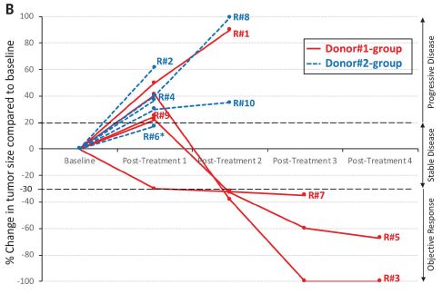
|
The figure shows tumor progression in ten patients. The baseline tumor size is set to zero for each. Curves go up if tumor size increases, and they go down if the tumor size decreases.
Three of the ten curves go down: three of the five red curves (odd numbers). None of the five blue curves (even numbers) go down. The two colors are for two different FMT donors. This is Figure 1B from article #2. |
There are no controls within the study, but this is a good response. At least an interesting response.
The cancer here is melanoma. All of the patients had been receiving immunotherapy, with declining success. Here the immunotherapy was continued -- along with FMT.
Taken at face value, the FMT allowed the immunotherapy to work again, at least in three people. Interesting. Further, two FMT donors led to apparently different results. Both donors had themselves successfully been treated with the immunotherapy; that is, they were responders -- and perhaps good candidates to be donors. Their FMT samples seem different, but it is possible that is not a significant result.
One of those three "good" red curves is somewhat odd. That is R#7, the highest of those three on the graph. Remember, the y-axis is tumor size; high is bad. R#7 gave the weakest response of the three we are calling responders; in fact, the scientists classify it as tumor stasis, not improvement. Further, R#7 is the only one in the entire set to show a tumor decline at the very first test time; the significance is not clear.
The article includes some analysis of the immune responses, which broadly supports that the size results shown above are significant. The two articles contain both similarities and differences in procedure and results. In any case, the big story is that some melanoma patients who got FMT showed improved responses to their immunotherapy treatment.
This is an intriguing finding, which will certainly get attention to figure out what is happening and why.
News stories:
* Fecal Transplant Could Boost Immunotherapy to Treat Melanoma -- The results from two Phase 1 trials bolster the case that the gut microbiome plays a role in response to the drug. (Shawna Williams, The Scientist, February 12, 2021. Link is now to Internet Archive.)
* Fecal Transplants May Quash Anti-PD-1 Resistance in Melanoma
-- In small study, patients with refractory disease responded after stool donation from responders. (Diana Swift, MedPage Today, February 4, 2021.)
* News story accompanying the articles: Cancer Immunotherapy: Modulating gut microbiota to treat cancer -- Fecal microbiota transplantation is evaluated in melanoma patients resistant to immunotherapy. (C H Woelk & A Snyder, Science 371:573, February 5, 2021.) Includes a good overview of FMT, as well as the limitations of the current studies. Recommended.
* Two articles:
1) Fecal microbiota transplant overcomes resistance to anti-PD-1 therapy in melanoma patients. (D Davar et al, Science 371:595, February 5, 2021.)
2) Fecal microbiota transplant promotes response in immunotherapy-refractory melanoma patients. (E N Baruch et al, Science 371:602, February 5, 2021.)
Recent post about cancer immunotherapy: Pancreatic cancer: another trick for immune evasion (August 1, 2020).
Previous post about melanoma: Anti-oxidants and cancer? (October 18, 2015).
More about fecal transplantation: Fecal transplantation as a treatment for Clostridium difficile: progress towards a biochemical explanation (February 8, 2015).
Another example of the gut microbiota affecting medical treatment: Metabolism of the Parkinson's disease drug L-DOPA by the gut microbiota (July 26, 2019).
My page for Biotechnology in the News (BITN) -- Other topics includes a section on Cancer. It includes an extensive list of relevant Musings posts.
April 26, 2021
Imagine you are in charge of a vaccination campaign. The goal is 70% coverage, with efficient use of resources. What is the best strategy? How do you deploy resources? A recent article addresses the issue.
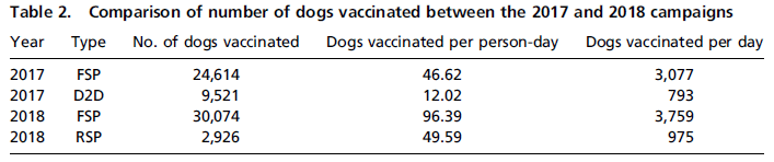
The following table summarizes two years from their vaccine program...
|
There are two rows of results for each of the two years. That is, the vaccination campaign had two phases, called "types", in each year. We'll discuss what those phases were later.
The total number of dogs vaccinated in each year was about the same. (3% less in 2018.) Resources were used much more efficiently in 2018, as judged by the column "dogs vaccinated per person-day". In fact, the numbers for both parts of the 2018 campaign were better than the numbers for both parts of the 2017 campaign. Also, more dogs were vaccinated per day, for each phase of the campaign. This may make more sense after we describe the phases. This is Table 2 from the article. |
What are these phases, and how did people improve the campaign?
2017 illustrates the traditional procedure. Phase 1 is SP: static point; more specifically, FSP: fixed static point, with a set of sites that are fixed for the entire campaign. Phase 2 is D2D: door-to-door. This second phase is very expensive, as you can see from the efficiency numbers.
The key question that the scientists asked in analyzing the vaccine distribution program was, how can we improve SP-type phases? The main answer was to better match the availability of the sites to what the people needed.
They found that people were much more likely to go to a site if it were within about 800 meters of home -- close enough for an easy walk. Providing more sites, so that people did not have to travel as far, resulted in considerable improvement. Not all the sites were full time. There was a core of the usual fixed sites, though more of them. And then they added roaming sites (RSP = roaming static points), which served specific areas for a short time. The use of roaming sites allowed them to put some sites in areas of low population density, for a day. Further, the location of some roaming sites was determined by real-time data on vaccination coverage.
As a result, the second phase, which had been D2D, was replaced by this new type of static site: roaming sites. The use of more fixed sites let them get much closer to more people than before. And the use of roaming sites let them target sites to areas of need for a short time.
Check the table again. You can now see that phase 1, FSP in both years, was done more efficiently in 2018, and also reached more dogs. For the second phase, roaming sites replaced door-to-door, and operated much more efficiently. Overall, there was about the same level of vaccination, but with much less cost and effort than going D2D.
This is about a campaign to vaccinate dogs against rabies, in a city in Malawi. Are there lessons here that we might apply to other campaigns, perhaps involving vaccination of humans? As a hint, I might suggest... it isn't the dogs that choose when or where to go for a vaccination.
News story: Smart vaccine scheme quick to curb rabies threat in African cities. (Science Daily (University of Edinburgh), January 19, 2021.)
The article, which is freely available: Using data-driven approaches to improve delivery of animal health care interventions for public health. (Stella Mazeri et al, PNAS 118:e2003722118, February 2, 2021.)
Previous posts that mention rabies include:
* A MERS vaccine, for camels (January 22, 2016).
* Should you get a rabies vaccination before boarding an airliner? (May 7, 2012).More on vaccines is on my page Biotechnology in the News (BITN) -- Other topics under Vaccines (general). There is a list of related Musings posts.
April 24, 2021
The major drug for Parkinson's is L-DOPA. It is made largely by chemical synthesis. Could we use tomatoes instead?
You can see where this is going... Let's make tomatoes with a high level of L-DOPA. That is the idea behind a recent article, with significant success. But there is more to the story, as always.
L-DOPA is a simple biochemical...
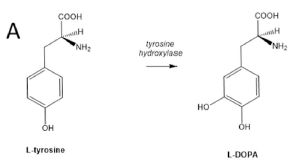
|
The amino acid tyrosine has one hydroxyl group on the ring. Add another hydroxyl, and you get DOPA. The enzyme that does that step is called tyrosine hydroxylase.
DOPA = dihydroxyphenylalanine, with an O in the acronym for the oxygen of the hydroxyl group. The initial L identifies the stereochemistry. This is Figure 1A from the article. |
Tyrosine itself is universal in biology, as one of the standard amino acids in proteins. DOPA is common, but with various roles in various organisms. In humans, it is used to make the neurotransmitter dopamine. L-DOPA has been studied much less in plants, but one role is to make pigments.
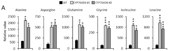
A plant gene for making L-DOPA was identified recently; in the current work, it has been transferred into tomatoes. The gene construct was designed to promote synthesis in the fruit.
Here are some results for the L-DOPA content of various kinds of tomatoes...
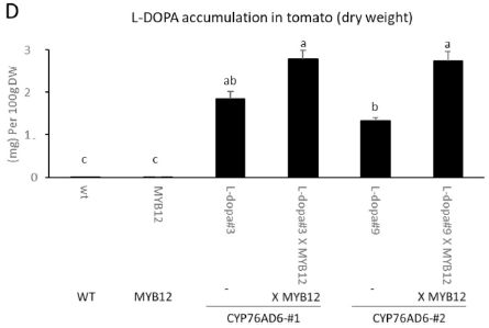
|
The bars show the content of L-DOPA, as milligrams per 100 grams dry weight.
The first two bars (to the left) are for plants lacking the gene for making DOPA (the norm for tomatoes). The next four bars are for plants with that gene, called CYP76AD6. (#1 and #2 refer to two separate tomato lines that were developed; they behave substantially the same.) Clearly, providing the gene for making L-DOPA results in a major increase in L-DOPA content. There is a second gene involved here. It is called MYB12; it enhances the production of tyrosine. The six bars are actually three pairs, one with and one without MYB12. For the plant lacking the gene for making L-DOPA, MYB12 makes no difference. For the plants with the gene for making L-DOPA, also having MYB12 enhances the production. The level of L-DOPA in the wild type plants, which appears to be about zero in the graph, is 0.005 mg/100 g dry weight (Table 1). This is Figure 5D from the article. |
How normal are those tomatoes, other than making more L-DOPA? Here is part of one test...
|
The figure shows the amounts of some other metabolites, without (dark bar, left side of each set) and with the gene for making DOPA.
In each case, the results are different for the plants making DOPA. The ones shown here have higher levels in the tomatoes that made DOPA. The full set shows some metabolites with lower levels in the DOPA-containing tomatoes. This is part of Figure 3 from the article. The full figure shows more such data, for more metabolites. |
The high-DOPA tomatoes are different. They are also different in color and firmness. They may have a better shelf life.
None of the results suggest anything bad about the modified tomatoes, but they are different.
In fact, the authors intend that the DOPA be extracted from the tomatoes. Because DOPA dose is very important, having people simply eat high-DOPA food is probably not a good idea. The authors think that tomatoes could be an inexpensive and practical source of L-DOPA; tomatoes are easy to grow, and the drug is easy to extract. But they note -- and we stress -- that they have not yet shown a full scale process that is economical.
Overall? We have an idea, and some initial results. Indeed, one can make tomatoes with a high content of L-DOPA. But the results also raise many questions, which need to be studied further.
What about the high content of other nutrients and the improved shelf life? Is this a step toward a better tomato? Intriguing leads.
News stories:
* Scientists Engineer Tomato That Could Be Low-cost Source of Levodopa. (Steve Bryson, Parkinson's News Today, December 10, 2020. Now archived.)
* Tomato engineered to be rich in L-DOPA offers cheap avenue for global production. (Nutrition Insight, December 14, 2020.)
The article, which is freely available: Metabolic engineering of tomato fruit enriched in L-DOPA. (Dario Breitel et al, Metabolic Engineering 65:185, May 2021.)
More about Parkinson's disease: Metabolism of the Parkinson's disease drug L-DOPA by the gut microbiota (July 26, 2019).
More about brains is on my page Biotechnology in the News (BITN) -- Other topics under Brain. There is a list of related Musings posts.
More about transgenic plants is on BITN page Agricultural biotechnology (GM foods) and Gene therapy. It includes a list of related Musings posts.
Among posts about tomatoes:
* An artificial hand that can tell if a tomato is ripe (January 3, 2017).
* The chemistry of a tasty tomato (June 18, 2012).
April 21, 2021
The lightest fluorine. Element #9, with 9 protons in the nucleus. There is only one stable isotope of fluorine; that is F-19, with 10 neutrons. But there is quite a zoo of fluorine isotopes known, from F-14 to F-31. F-14, for example, has only 5 neutrons -- and a reported hall-life of less than 10-21 seconds. And now... a claim of having detected F-13, with only 4 neutrons.
* News story: New Exotic Isotope of Fluorine Discovered: Fluorine-13. (Enrico de Lazaro, Sci.News, April 5, 2021.) Links to the article.
* I have listed this item on my page Internet resources: Introductory Chemistry under Nuclei; Isotopes; Atomic weights.
* Another light isotope: Briefly noted... The lightest uranium (November 30, 2021).
April 20, 2021
Let's start with some results...
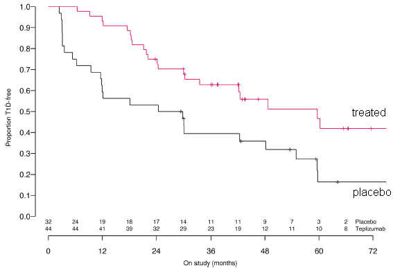
|
A group of people considered at risk for type 1 diabetes was divided into two sub-groups. One was treated with an experimental drug; the other was given a placebo (control group).
They were followed for up to six years. The graph shows the fraction who remained free of type 1 diabetes (y-axis) vs time (x-axis). The drug treatment delayed the onset of the disease, by about two years. This is slightly modified from the main part of Figure 1 from the article. I have added labeling on the curves. The numbers just above the x-axis? The initial values are the number of people in each arm of the trial. After that, I don't know. |
What's going on?
Type 1 diabetes is an auto-immune disease. The body makes antibodies against its own pancreas cells (which make insulin to control blood sugar levels).
The drug here is an antibody that inhibits this autoimmune response. It is thought to interfere with T cells that destroy the pancreatic cells. It has been tested as a possible way to delay disease progression in people with newly-diagnosed type 1 diabetes. The current trial shows that it could delay the onset of the disease, in people at high risk.
The drug is called Teplizumab. Its Wikipedia page provides a brief overview. Its background is not without controversy.
It's a complex story; the point is that the test here is encouraging. More work, folks.
The article contains other data, on metabolic functions. It broadly supports the main point, that the drug is useful.
The drug treatment here was a single two-week infusion. That single treatment appears to have resulted in benefit over six years.
News stories:
* Defying the "inevitable" development of type 1 diabetes. (Raquel Barroso Ferro, Antibody Society, March 7, 2021.)
* Immunotherapy drug delays onset of Type 1 diabetes in at-risk group. (Medical Xpress (Yale University), March 3, 2021.)
The article: Teplizumab improves and stabilizes beta cell function in antibody-positive high-risk individuals. (Emily K Sims et al, Science Translational Medicine 13:eabc8980, March 3, 2021.)
Previous post on diabetes: Diabetes: types 1, 2, 3, 4, 5 (March 16, 2018).
More on diabetes is on my page Biotechnology in the News (BITN) -- Other topics under Diabetes. That includes a list of related Musings posts.
April 18, 2021
It's war. Plants make toxins to protect themselves against insects eating them. And insects make enzymes to inactivate the toxins, so they can continue to eat the plants. It's easy to see the selective advantage of each action.
A recent article investigates one case, and finds the source of the gene for the enzyme that the insect uses to defend itself. The insect got the gene from the plant.
The data behind that claim is not easy to present. It is genomics. The finding is that the insect genome has a gene for the toxin-inactivating enzyme. Comparison of that gene with the ever-expanding genome databases shows that the gene is closely related to a gene from plants. It is almost certain that the insect gene came from plants.
The following figure summarizes the findings, with some details...
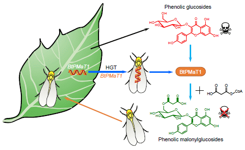
|
The figure shows a whitefly (bottom) landing on a plant (left), and going away with a plant gene (upper whitefly).
The insect is Bemisia tabaci, the whitefly (not a true fly). The gene is called BtPMaT1. And the process is called HGT = horizontal gene transfer; that refers to acquiring a gene from someone other than your parents. The current work is the first known case of an insect acquiring a gene from a plant. How and when it happened are unknown; perhaps a virus did it, and perhaps 30 million years ago, after this species diverged from its relatives. The figure also shows what the enzyme does. The top chemical structure (red) is an example of a toxin; it has a sugar attached to a phenol. The enzyme modifies the sugar part of that, by adding a malonyl group to it; that eliminates the toxicity. This is Figure 7 from the article. |
As one part of characterizing the system, the scientists made tomato plants that can prevent the insects from making the enzyme. They did that by giving the tomatoes a gene for an RNA that binds to the messenger RNA for the enzyme. The tomatoes make the "antisense" RNA, and the insects eat it. The antisense RNA prevents the mRNA from being read, and thus eliminates production of the enzyme.
Here are some results...
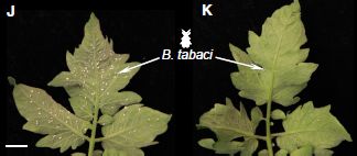
|
The leaf in part J (left) is wild type; the leaf in part K (right) is making the antisense RNA, to prevent the insects from making the enzyme that inactivates the toxin.
You can see that the antisense RNA protected the plant from the insects. This is part of Figure 6 from the article. |
The result validates that the enzyme is in fact allowing the insect to feed on the plant.
The authors go on to suggest that making transgenic plants expressing this RNA could be useful in protecting plants against the whitefly, which is an agricultural pest. They provide some evidence for its specificity against this particular insect, but stress that more needs to be done.
In some sense, there is no particular connection between the two parts of the article discussed above. However, that the whitefly got its resistance gene from plants may make it more likely that the RNA treatment will be specific, but that does need further testing.
News stories:
* Silverleaf Whiteflies Carry Plant-Derived Detoxification Gene, New Study Shows. (Sci.News, March 26, 2021.)
* First known gene transfer from plant to insect identified -- Discovery that a whitefly uses a stolen plant gene to elude its host's defences may offer a route to new pest-control strategies. (Nature News, March 25, 2021.)
The article: Whitefly hijacks a plant detoxification gene that neutralizes plant toxins. (Jixing Xia et al, Cell 184:1693, April 1, 2021.)
Among posts about HGT to organisms other than microbes:
* Who's been genetically engineering the sweet potatoes? (June 28, 2015).
* More on photosynthetic sea slugs (February 20, 2015).
* Red and green aphids (June 2, 2010).More on novel sources of insecticides: A long worm with a novel toxin (April 28, 2018).
More about transgenic plants is on my Biotechnology in the News (BITN) page Agricultural biotechnology (GM foods) and Gene therapy. It includes a list of related Musings posts.
April 17, 2021
Consider a gene containing the codon GGT, which codes for the amino acid glycine (Gly). A mutation occurs, changing the codon to GGG. What is the effect? If you check the genetic code, you will see that the mutant codon also codes for Gly. That is, the mutation is to a synonymous codon, and should not affect the sequence of the protein.
Such synonymous mutations are sometimes called silent mutations, since the simple prediction is that there will be no effect.
The real world is more complex than that. A recent article describes a case where a synonymous mutation may be far from silent.
The first figure gives some background -- and raises a question...
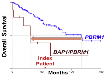
|
The graph shows survival curves for people with a type of kidney cancer. The blue curve shows the survival of people with a particular mutation, called PBRM1. The brown curve to the left shows survival if they also have a mutation in BAP1. You can see that having a BAP1 mutation substantially decreases survival of people with PBRM1-associated kidney cancer. (Don't worry about what either of those genes does.)
That's background. There is also an "index patient" (just above 50 on the x-axis). That person has PBRM1-associated kidney cancer. And they have a mutation in BAP1. But their BAP1 mutation is a synonymous mutation, the one we discussed at the start; the mutant gene codes for Gly just as the wild type does. This is part of the graphical abstract from the article. Figure 1A is similar, but more complex. |
The index patient had a fairly short survival for people with PBRM1. Did their BAP1 mutation affect survival? From the survival result alone for this person, we can not reach any conclusion; people vary in their survival. But we can think about it... The result is intriguing. Is it possible that this synonymous mutation decreased survival?
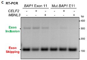
That question led the scientists to do some testing. They suspected that the mutation, while not affecting the codon itself, may affect mRNA splicing, and therefore the size of the mRNA. Here is one test...
|
In this test, they made two lab versions of the gene, one with and one without the suspect BAP1 mutation. They made mRNA from both versions, and did a PCR test for a particular region. That shows how much RNA is made -- and, by running it on a gel, how big it is.
Before we get to details, a quick look at the graph. There is a faint band near the top for the first three lanes (to the left); that band is missing in the next three lanes (right). That's it. The mutation reduced the amount of good RNA made. |
|
|
Let's look more carefully. The two lab genes are labeled at the top, somewhat cryptically. "BAP1 Exon 11" is for the wild type version; "Mut BAP1 E11" is for the mutant version. Below that are a couple of variables, which turn out to be unimportant, so let's skip them. We simply take the first three lanes as three tests with the wild type gene. You can see that it gives two bands, a faint upper band and a strong lower band. The two bands are due to how the RNA is spliced. The upper band is the good RNA. Interestingly, with the wild type gene, most of the RNA is spliced in a way that interferes with its function -- but a small amount is in good form. For the mutant gene, at the right, the RNA is completely spliced in a way that causes loss of function. That is, the BAP1 mutation affects splicing, and reduces or eliminates good RNA for the gene. This is part of Figure 3C from the article. | |
From this and other evidence, the scientists conclude that the BAP1 mutation here, while "synonymous" (coding for the same amino acid), is not "silent": it affects splicing of the messenger RNA, and reduces the activity.
Here is what they think is happening...
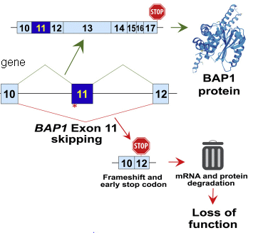
|
Start with the middle part, labeled "gene". This shows a portion of the BAP1 gene. Specifically, it shows three exons (regions that code for protein), and the introns between them. There is also a red asterisk by exon 11, showing the site of the mutation discussed here.
Above the gene is the functional mRNA for the wild type gene. Those three exons have properly been spliced together. More is shown, including a stop codon at the end. A functional protein is made, as shown at the right. Below the gene is what happens with the mutant gene. The mutation disrupts the splicing site. As a result, exon 10 is spliced to exon 12. Exon 11 is skipped. Further, the splicing of exon 10 to 12 disrupts the reading frame, and creates a premature stop codon. The overall result is that the mutation leads to no functional protein being made. This is part of the graphical abstract from the article. I added the label "gene". Figure 4G is similar. |
Putting it all together... A synonymous mutation was found in a person who showed rather short survival with a kidney cancer. Investigation of the mutation showed that it affects splicing of the mRNA, and reduces gene function. The mutation is synonymous, apparently coding for the same amino acid, but it is not silent.
We cannot know how the mutation affected the particular individual (the index patient), but we are now alert to a possible effect of this synonymous mutation. Beyond that, the work also offers a caution about not paying attention to mutations that lead to synonymous codons.
Another point comes out of this work. The middle figure above shows that the splicing of BAP1 mRNA isn't very good in the wild type. What are the implications of this finding? Would it be good if we could improve the splicing, to make more BAP1 protein? As so often, the work here raises new questions.
News story: "Silent" Mutation Linked to Worse Kidney Cancer Outcome -- A synonymous mutation in the tumor suppressor gene BAP1 can result in loss of function of the protein without altering its amino acid sequence. (Katarina Zimmer, The Scientist, February 17, 2021. Link is now to Internet Archive.) Note that the subtitle isn't quite right. The synonymous mutation is predicted to not alter the amino acid sequence, but it actually does, due to the splicing problem.
The article, which is freely available: A BAP1 synonymous mutation results in exon skipping, loss of function and worse patient prognosis. (Jennifer Niersch et al, iScience 24:102173, March 19, 2021.)
We have noted cases where a mutation affects splicing before. What is new in the current article is that the mutation is synonymous. Previous posts on mutations affecting splicing include...
* Treating progeria by editing the gene (March 23, 2021). In this case, the mutation leads to a disease.
* A possible genetic cause for the large human brain (March 25, 2017). In this case, the mutation is part of what distinguishes humans.My page for Biotechnology in the News (BITN) -- Other topics includes a section on Cancer. It includes an extensive list of relevant Musings posts.
April 14, 2021
Iron rain. Spectroscopic observations of a hot planet suggest that it is raining there each night. Raining iron. The iron evaporates from the planetary surface during the day, and rains back during the night. The analysis was done using ESPRESSO: the Echelle SPectrograph for Rocky Exoplanets and Stable Spectroscopic Observations. Published a year ago; I note it now, because I allude to it in the post immediately below.
* News story: Observed: Giant, Ultra-Hot Planet WASP-76b Where It Rains Iron. (SciTechDaily (Instituto de Astrofísica de Canarias (IAC)), March 15, 2020.) Links to the article. Just reading the abstract may be worthwhile.
April 13, 2021
You may have heard that the grass is greener on the other side of the fence. How about the raindrops? Would you expect raindrops to be different over there -- or on other planets?
A new article addresses the question. It is an interesting bit of theoretical physics.
We'll look here at part of the story: how the size of raindrops depends on physical conditions.
The first figure addresses the minimum possible size of raindrops...
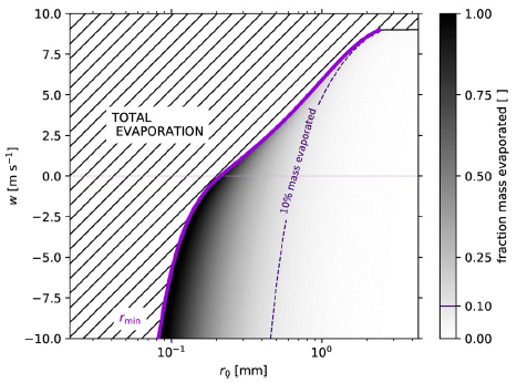
|
Raindrops evaporate. If they are too small, they will evaporate completely. If there is an upward wind ("updraft"), they will remain in the air longer, with more time for evaporation.
Look at the solid purple line in the graph (next to the dark region). It shows the minimum size of a raindrop (ro, x-axis) needed to survive evaporation vs the vertical wind speed (y-axis). For w = 0 (no vertical wind), ro is about 0.2 millimeters. Smaller drops will evaporate completely (region of the graph to the left). To the right, the graph is shaded to show the percent evaporation. Dark is for high evaporation, and so forth; see the color key at the right side. The dashed purple line shows the size for 10% evaporation. That is, only drops to the right of the dashed line will hit the ground with at least 90% of their original mass. At w = 0, that is ro about 0.6 mm. With an updraft (w > 0), drops must be larger in order to survive long enough to reach the ground. With a downdraft (w < 0), drops can be smaller. The highest magnitude of w shown there, 10 meters/second, is 22 miles/hour = 30 kilometers/hour. This is Figure 3 from the article. |
The following figure addresses the maximum drop size...
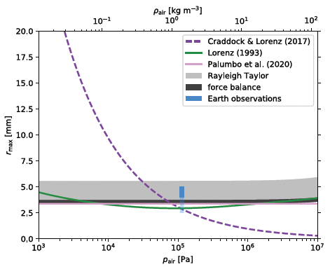
|
The figure shows the maximum drop size allowed (y-axis) vs the air pressure (x-axis). (The upper x-axis shows the same information as air density.)
It is complicated! There are five estimates of the relationship, from theory. They are shown by lines or bands. Four of those five predictions are in reasonable agreement, with near-horizontal lines (or bands) at about 3-5 mm. These all predict that the maximum drop size is more or less independent of air pressure. In the middle, at 105 Pa, is some actual data for Earth rain (blue). The largest drops observed are in agreement with those predictions. And then... There is one theoretical curve that is very different. The authors address this, and suggest errors in the analysis that led to that curve. This is Figure 5 from the article. |
If we tentatively accept the rejection of the odd prediction, the results here suggest there is a maximum raindrop size of about 3-5 mm, regardless of air pressure.
Taken together, the two graphs above suggest that raindrops can occur only in a fairly narrow range of sizes.
There are more such analyses in the article, looking at many variables. The broad conclusion is that raindrops will be rather similar everywhere. How raindrops are formed, in clouds, is complex and poorly understood. But the nature of the drops in rainfall stands on its own.
The general conclusions apply not just for water-rain, but also for rain of other compositions, including methane (on Titan) and liquid iron (on WASP-76b).
News stories:
* Raindrops are remarkably similar across different planetary environments. (Amit Malewar, Tech Explorist, April 6, 2021.)
* Alien raindrops surprisingly like rain on Earth. (EurekAlert! (American Geophysical Union), April 6, 2021.)
* Raindrops on other worlds are surprisingly like our own -- Earth isn't the only place to experience rainfall and raindrops. Elsewhere in the universe must be intriguingly similar, say physicists. (Astronomy.com (Physics arXiv Blog), March 3, 2021.)
The article, which is freely available: The Physics of Falling Raindrops in Diverse Planetary Atmospheres. (Kaitlyn Loftus & Robin D Wordsworth, Journal of Geophysical Research: Planets 126:e2020JE006653, April 2021.) Much of the article is a very readable discussion of rainfall, and of the simplifications that allow the current analysis.
For more about iron rain, see the Briefly Noted post, immediately above.
* * * * *
More about rain (with links to more)...
* Fossil raindrops and the density of the ancient atmosphere (May 6, 2012).
* Lyell on fossil rain-prints (May 6, 2012).
* Weather report from Titan: Clouds? Puddles? Does that mean it rained? (April 6, 2011).
* How big are rain drops? And why? (July 23, 2009).More about liquid droplets: How water droplets damage hard surfaces (June 18, 2022).
April 11, 2021
You may know that dietary fiber is important. But why it is important is actually unclear. A new article explores one aspect of the role of fiber.
The following figure shows some results...
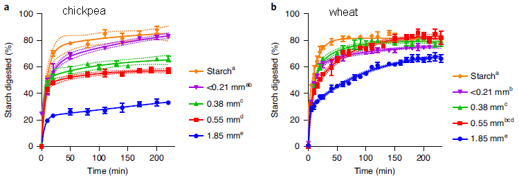
|
In these experiments, the scientists measured how well the starch inside plant cells was degraded for two types of cells, with different types of fibrous cell wall.
The two materials are from chickpea (part a, left) and wheat (part b, right). The graph shows percent of the starch degraded (y-axis) vs time (x-axis). Degradation was done with pancreatic alpha-amylase, a common digestive enzyme. For each part, focus on two curves: the highest and lowest. The high curve (orange) is for isolated starch. The low curve (blue) is for plant material that has been milled to 1.85 millimeters (average particle diameter). You can see that the two isolated starches were degraded about the same (orange curves, top); both reach over 80% degraded by 50 minutes. However, for the 1.85 mm particles (blue curves, bottom), the wheat starch was degraded much more than the chickpea starch (about 60% vs 30% by the end). The other curves support that picture, with smaller particles from the milling. Starch degradation of the milled particles was greater for smaller particles, as one might expect. The big picture remains: particles from chickpea show slower starch degradation than particles from wheat. The dotted lines show confidence intervals for the main lines. This is slightly modified from Figure 1 of the article. I have added labeling at the top, to identify the plant sources. |
It appears that the fiber in the chickpea protected the starch from degradation.
This can be seen visually in the following images....
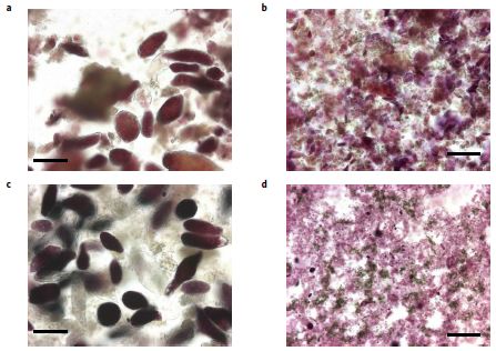
|
The figure shows samples of the two types of material before (top) and after (bottom) degradation with the amylase enzyme. After the enzyme treatment, the materials were stained for starch.
As in the top figure, the left side is for chickpea, and the right side is for wheat. This is part of Figure 3 from the article. |
Once again, you can see that the starch was degraded more in the wheat sample.
The scientists did further studies, in artificial duodenum and stomach devices. The conditions more closely reflect natural digestion. The results followed the same pattern.
Implications... As a result, the release of free sugar (glucose) should be slower when chickpea fiber is consumed, compared to wheat fiber. Therefore, an expected benefit of fiber is that it should slow build-up of glucose in the blood. In this regard, chickpea fiber would be better than the wheat fiber. Further, it is important that preparation (and cooking) preserve the cellular structure, in order to slow starch degradation.
News story: Uncovering how physical structure of dietary fibre underpins its benefits to health. (Quadram Institute, March 22, 2021.)
The article: Structure-function studies of chickpea and durum wheat uncover mechanisms by which cell wall properties influence starch bioaccessibility. (Cathrina H Edwards et al, Nature Food 2:118, February 2021.)
The news story for the current article leads to a second article, also newly published. It is from an overlapping group of authors. This second article reveals that they have developed and patented a chickpea product for use in making breads. The article tests this product in bread rolls, and looks at blood sugar levels following consumption by healthy volunteers.
Here is some information for that article...
* News story: New legume flour improves blood glucose response to white bread. (Flora Southey, Food Navigator, January 13, 2021.)
* The article, which is freely available: The impact of replacing wheat flour with cellular legume powder on starch bioaccessibility, glycaemic response and bread roll quality: A double-blind randomised controlled trial in healthy participants. (Balazs H Bajka et al, Food Hydrocolloids 114:106565, May 2021.)It is also interesting to note the conflict of interest statements in the two articles.
* * * * *
A recent post that may be about dietary fiber: How a "low-gluten" diet may benefit those who are not gluten-sensitive (January 27, 2019).
My page Internet resources: Biology - Miscellaneous contains a section on Nutrition; Food safety. It includes a list of related Musings posts.
April 7, 2021
Are pulse oximeters racially biased? Yes. It is actually well understood, but it has not been communicated very well. A pulse oximeter is an instrument to measure the amount of oxygen in the blood. It is a simple and inexpensive instrument; it has become popular during the COVID pandemic, because low blood oxygen can be a symptom of COVID. The pulse oximeter works by shining a light through the skin. And that is the problem... With darker skin, less light gets through. That doesn't affect the basic idea, but it does affect the numeric result. The apparent oxygen level is increased by dark skin. Taking a single reading could lead a dark-skinned person to not realize they have an oxygen problem. On the other hand, if a person uses the instrument regularly, a drop in the apparent oxygen level may well be useful information.
* News story: Racial Bias with Pulse Oximetry? (Salim Rezaie, REBEL EM - Emergency Medicine Blog, December 20, 2020.) Includes the major figure from the article, comparing the oximeter readings of black and white patients as a function of actual blood oxygenation. (ABG = arterial blood gas, a more complex but more reliable measure of blood oxygen.) Links to the article, via PubMed.
* The article, which may be freely available: Racial Bias in Pulse Oximetry Measurement. (Michael W Sjoding et al, New England Journal of Medicine 383:2477, December 17, 2020.) There is an exchange of correspondence posted with the article. It is about the terminology of racial bias. Instructive.
April 6, 2021
The Earth's magnetic pole wanders, and the magnetic field fluctuates. The field can even reverse, so that a common "north-pointing" compass would point south. Since the magnetic field protects Earth from cosmic rays, there is concern about what would happen if we were to experience such an excursion. But there is little evidence.
A new article provides some evidence. Coupled with some modeling, the article enhances the concerns.
The article is complex -- and subject to hype. Let's focus on the actual data.
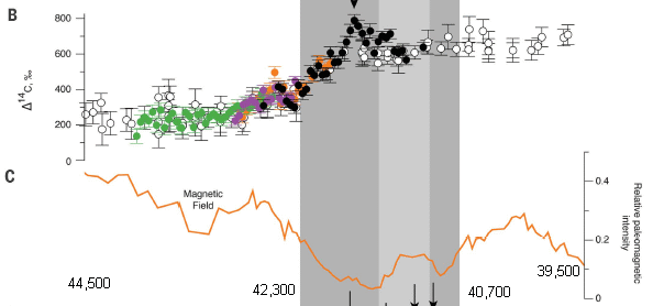
|
That's the data.
The heart of the study is based on analyses of 40,000-year-old logs from kauri trees in New Zealand. Part B (top) shows the C-14 content of the trees (y-axis) vs time (x-axis). Tree-sample age is established from tree rings. The C-14 content is shown here as the difference from what would be expected for that age. Part C (bottom) shows the magnetic field vs time. The shaded part of the figure is for the time generally associated with this magnetic field excursion. Start with the magnetic field data, part C. You can see that the field strength dips dramatically and approaches zero. Then look at the C-14 data, part B. The C-14 is approximately flat at both ends, but in the shaded region -- the time of the magnetic field excursion -- the C-14 changes substantially, and sometimes wildly. (There is even an arrowhead shown at the peak.) Remember, the C-14 graph is showing the difference from what is expected. That is, the C-14 is steady for long periods, at both ends, but increases in an erratic way in between. This is modified from part of Figure 1 from the article. I have put some numbers near the bottom edge to show the age scale, at least approximately. The numbers shown are for the ends of the x-axis scale and for the time of the shaded region. The fully labeled x-axis scale is at the bottom of the full figure in the article. Ignore the pieces of arrows at the bottom; these refer to the next part of the full figure. |
That behavior of the C-14 during the magnetic field shift is the key finding of the article. Why is it of interest? C-14 is produced in the atmosphere under the influence of cosmic rays. The high C-14 content of the kauri logs is evidence for an increased flux of cosmic rays during the time of the magnetic field shift.
Further, the high resolution dating, some of it from a single log that spanned the entire shaded period (on the graph), provides a level of time resolution well beyond what was previously available. This is helpful in integrating previously available information from around the world during the same time period.
The authors go on and do some modeling of the effects of the magnetic field shift. The models suggest that the effects could be bad for life. If you read that part of the article, remember, that is modeling, with a number of assumptions, which they discuss. The graph above is data -- new and interesting data.
Among the speculations... The historical record shows the beginnings of cave art a little over 40,000 years ago. That is sometimes interpreted as a stage in human development. The authors suggest that it could, instead, mark humans moving indoors to protect themselves from cosmic rays and high levels of ultraviolet radiation. If that seems a bit extreme... Remember, the point of the article is to try to tie together diverse findings from around the world, to consider what the implications of a magnetic field shift might be.
The experimental work in the article is interesting. The subsequent discussion is provocative.
News stories:
* Earth's Magnetic Field Reversal 42,000 Years Ago Triggered a Global Environmental Crisis. (SciTechDaily (AAAS), February 19, 2021.)
* Ancient trees hint at Earth's global environmental crisis 42,000 years ago. (Thomas Peter et al, ETH Zurich, February 23, 2021.)
* Earth's magnetic field broke down 42,000 years ago and caused massive sudden climate change. (Chris Fogwill et al, The Conversation, February 18, 2021.) From the authors of the article.
* News story accompanying the article: Earth science: Kauri trees mark magnetic flip 42,000 years ago -- Researchers say cosmic ray bombardment unleashed by weaker field drove climate shift. (Paul Voosen, Science 371:766, February 19, 2021.)
* The article: A global environmental crisis 42,000 years ago. (Alan Cooper et al, Science 371:811, February 19, 2021.) Check Google Scholar for a freely available copy.
A previous post about a magnetic pole excursion: What if your compass pointed south? (October 24, 2014). Useful background information.
April 5, 2021
Eagles have been dying mysteriously, with neurodegeneration, for 30 years. Why?
A new article reports the culprit...
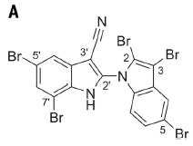
|
That's it. Aetokthonotoxin, or AETX.
Biologists may recognize what standard amino acid the toxin is made from. This is Figure 3A from the article. |
We'll come back to the chemistry later. For now, let's fill out the big picture.
Here is some evidence for what this compound can do to a bird brain...
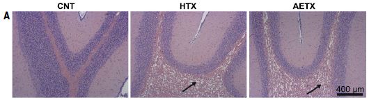
|
Chickens were given AETX. After an 8-day exposure, brain sections were examined.
The image at the left is for brain tissue from chickens exposed only to a solvent control (CNT). The other two images are for chickens exposed to a crude extract (HTX, middle) or pure toxin (AETX, right). Both specimens treated with toxin show extensive vacuolization. What is observed with the lab chickens is similar to what is seen in dead eagles. In fact, the illness has been named avian vacuolar myelinopathy (AVM). The chickens did not seem to show any behavioral signs of illness, probably because of the fairly brief treatment. This is Figure 5A from the article. |
What happens in nature? The toxin is made by a cyanobacterium, which grows on plants in fresh water lakes. Water birds eat the plants, and therefore ingest the toxin. They may become easier prey because of the effects of the toxin. The eagles eat the contaminated birds -- and die from the toxin.
That basic flow had been worked out previously, but there was no specific toxin known. The current work shows what the toxin is and how it is made.
The toxin is related to the standard amino acid tryptophan (Trp). The toxin is a bi-indole, with two copies of the double-ring indole system from the side chain of Trp. Of particular interest is that the toxin has five bromines. The scientists work out part of the pathway for making AETX from Trp.
The story is more subtle than what we might have suggested above. This all happens only under certain conditions -- uncommon conditions. A specific plant is involved as the host for the cyanobacteria, and it shows up here as an invasive plant, not in its natural habitat. And all that bromine? Not common; the bromine may come from pollution; the plants concentrate it. The connection to pollution may itself be of interest.
Notes...
The cyanobacterium is now called Aetokthonos hydrillicola; the genus name means "eagle killer". (The species name refers to the plant it grows on, Hydrilla verticillata.) The toxin name means "poison that kills the eagle".
An important issue is what other organisms are affected by the toxin, besides birds. The article provides evidence for effects on a variety of animals. However, other results have been contradictory (but limited).
News stories:
* What Killed These Bald Eagles? After 25 Years, We Finally Know -- A perfect confluence of events created a stealth killer. (Sarah Zhang, The Atlantic, March 25, 2021.) Incorrectly refers to the cyanobacteria as algae, but generally a good story.
* Bald Eagle Killer Identified -- After a nearly 30-year hunt, researchers have shown that a neurotoxin generated by cyanobacteria on invasive plants is responsible for eagle and waterbird deaths from vacuolar myelinopathy. (Abby Olena, The Scientist, March 25, 2021. Now archived.)
The article: Hunting the eagle killer: A cyanobacterial neurotoxin causes vacuolar myelinopathy. (Steffen Breinlinger et al, Science 371:eaax9050, March 26, 2021. Not in print edition.)
Another story of a cyanobacterial toxin and a complex food chain... Don't eat the bats. or An ALS story: Guam and New Hampshire; food chains and biomagnification; cyanobacteria, cycad trees, and flying foxes; pond scum; and BMAA. (October 6, 2009).
Another halogeneated bi-indole: Royal purple E coli (January 19, 2021).
Previous post about eagles: Eagles (November 10, 2008).
April 3, 2021
Los Angeles is famous for its air pollution. The major source? Well, some people may think that LA is short for "Land of the Automobile."
Things are changing, as reported in a new article...
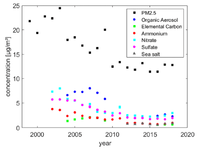
|
The graph shows the concentration of some pollutants in the air (y-axis) at one particular site in the Los Angeles area over time (x-axis).
The top data set (black squares) is for PM 2.5 (sometimes written as PM2.5), small particulate matter, which is considered a particular health hazard because it can get deep into the lungs. You can see that the level of PM 2.5 declined, by about half over the time period shown. The other data sets are for particular classes of pollutants, which contribute to that PM 2.5 total. Of particular interest here is organic aerosols (OA; dark blue circles). There is limited data for OA (only 2004-2009 and 2016-2018), but it appears that there is a substantial decline in this class. This is part of Figure 2 from the article. |
That is, the data shows a substantial decline in particulates in recent years, and suggests that a decline in organic aerosols is a significant contributor to that overall decline.
The authors go on to look at the data another way. Level of pollutants vs temperature (T). Here is an example of the findings...
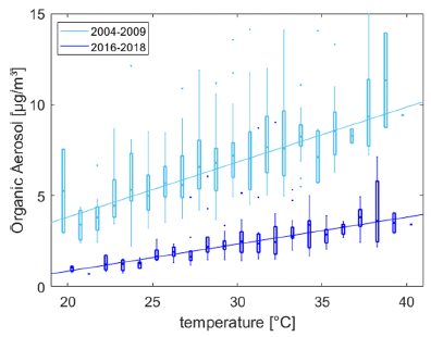
|
The graph shows OA levels vs T. There are two sets of data, for two time periods. The upper set (lighter color) is for the early years; the lower set (darker color) is for recent years.
Observations: - The level of OA is lower for the recent years. This is a repeat of what we saw in the top figure. (It is the same data, just plotted a different way.) - The slope of the curve, OA vs T, is different. This is part of Figure 5 from the article. |
That second observation is the heart of the new article. The effect of temperature on air pollution is changing.
In fact, pollution experts know a lot about how T affects different types of pollutants. It is a complex story.
Primary pollutants are those directly from a process, such as combustion products that emerge from a car. Secondary pollutants are those formed in the air from primary pollutants; formation of secondary pollutants is often dependent on sunlight, and thus likely to be affected by T. Of course, in some cases, volatility directly contributes to dependence on T.
There has been a major effort in recent years to reduce emissions from cars. The decline in pollution is largely due to the success of such effort.
So what is the major contributor now to the PM 2.5 level in Los Angeles? The changing dependence on T offers a clue, though the full analysis is complex. Plant emissions, such as isoprene and terpenes, are good candidates. The authors estimate the pollution that results from some of the more-polluting types of palm trees, and find they are likely to be significant contributors to the overall levels of pollution.
Emissions from household and industrial chemicals are also becoming a more significant part of the total. But the trees may be the big player.
There has been a shift toward less-polluting cars. Perhaps it is time for a shift toward less-polluting trees.
The article is a step toward better understanding of air pollution, including how it is changing. Caution... There is much complexity and uncertainty. The conclusions of the article should be taken as hypotheses that can be tested as they guide further work.
News stories:
* Air Quality in the Los Angeles Basin Increasingly Dependent on Temperature. (NOAA, March 16, 2021.)
* With drop in LA's vehicular aerosol pollution, plants emerge as major source. (Robert Sanders, University of California, Berkeley, March 23, 2021.)
The article: Impact of OA on the Temperature Dependence of PM 2.5 in the Los Angeles Basin. (Clara M Nussbaumer & Ronald C Cohen, Environmental Science & Technology 55:3549, March 16, 2021.)
A recent post about the complexity of aerosols: Interaction of pollution sources: Can the whole be less than the sum of the parts? (March 9, 2019). It is about the contribution of plant emissions.
Among other posts about Los Angeles: Earthquakes induced by human activity: oil drilling in Los Angeles (February 12, 2019). Links to more.
March 31, 2021
A new record: the largest known animal genome. And it is for an animal that may be close to the human lineage. The new record holder is the Australian lungfish (Neoceratodus forsteri), one of the few living examples of air-breathing fish. It is thought that a member of this group was the ancestor of all terrestrial vertebrates. The genome is about 14 times larger than the human genome, and 30% larger than the previous largest-known animal genome. Interestingly, the number of genes is not very different from that of other higher animals, but there are far more mobile elements (transposons and such).
* News story: The World's Largest Animal Genome. (Universität Würzburg, January 19, 2021.) Notes the article, but lacks a link.
* The article, which is freely available: Giant lungfish genome elucidates the conquest of land by vertebrates. (Axel Meyer et al, Nature 590:284 February 11, 2021.)
* There is more about genomes on my BITN page DNA and the genome. It includes an extensive list of Musings posts.
March 30, 2021
Another interesting development from the world of robotics. It not only chews gum, but does so as much like humans as possible. That is, it is designed to mimic human chewing.
First, does it work? Here are some data...
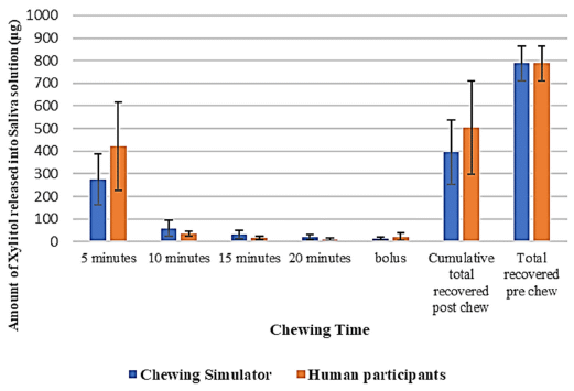
|
The figure shows the release of xylitol from the gum into the saliva. The blue bars are for the new device, labeled here as "chewing simulator". The orange bars are for humans.
Big picture: It works. One data set is labeled "bolus". That is for the amount left in the gum. This is Figure 6 from the article. |
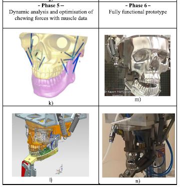
What did they do? Well, that's complicated, but the following figure, which the authors call a Table, tells part of the story...
|
Design was based on detailed analysis of a human skull model, followed by translation into a mechanical model.
The figure here shows the last two of the six phases of the design process. Here is the accompanying summary of Phase 5: "In phase 5, dynamic analysis and optimisation of chewing forces with muscle data was carried out. Table I k shows the digital humanoid skull model with chewing trajectory and mechanical muscle actuators, where muscle insertions and origins were selected on both the mandible and maxilla respectively. Table I l shows isometric view of the alternate bilateral chewing bionic design with functional springs after removal of unnecessary skull features." The figure is part of Table 1 from the article. The summary of Phase 5 is from the following page of the article. I made minor punctuation changes in that summary. |
|
Why? Well, why not? Chewing is complicated, and we don't understand it all that well. The robot-that-chews can be a tool for studying chewing. Further, it may be useful, For example, the pharmaceutical industry could use it to study controlled release of drugs from medicated chewing gums. In fact, the research team intends their work to help in the development of such applications.
It may be the best artificial mouth available.
News stories:
* Chewing robot developed to test gum as a potential drug delivery system. (Alexandru Micu, ZME Science, July 15, 2020.)
* Robot with Built-in Humanoid Jaws Could Help Develop Medicated Chewing Gum. (AZo Robotics, July 15, 2020.)
The article: Development of a Chewing Robot with Built-in Humanoid Jaws to Simulate Mastication to Quantify Robotic Agents Release from Chewing Gums Compared to Human Participants. (K Alemzadeh et al, IEEE Transactions on Biomedical Engineering 68:492, February 2021.) The Introduction section is quite interesting.
A recent post on the expanding capabilities of robots: A robotic system that can figure out what to do by reading a scientific article (November 17, 2020).
More robots... How does a robot know the floor is clean? (October 30, 2021).
Posts about chewing include...
* Sliced meat: implications for size of human mouth and brain? (March 23, 2016).
* Trogocytosis -- How an amoeba chews its food (May 16, 2014).A recent mention of chewing gum: Briefly noted... The oldest known piece of chewing gum that can be traced to a particular person. (September 30, 2020).
March 28, 2021
Scientists have recently reported an updated genome sequence for the giraffe. As usual for genome articles, it has a lot of almost impenetrable data. It also has some interesting clues.
A background post discusses some giraffe issues, and some earlier work on the giraffe genome and its implications [link at the end].
The new work, combined with more known genome sequences for ruminants, suggests a few hundred genes that are distinctive in the giraffe.
A particularly intriguing finding was for the giraffe version of the gene FGFRL1. (FGFRL1 = fibroblast growth factor receptor-like protein 1. That is, it looks like a receptor for a growth factor.) The giraffe version has a cluster of seven mutations in one region, compared to other ruminants. To see what this might mean, the scientists modified mice to have the giraffe version of the gene.
Here are some results...
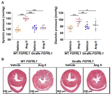
|
Part A (top) shows the blood pressure of the mice. The left-hand graph is for systolic pressure; the right-hand graph is for diastolic pressure. The pattern is the same for both; we'll focus on the systolic pressure, where the effects are cleaner.
The first two bars are for wild type mice; the next two bars are for mice with the giraffe version of FGFRL1. For each kind of mouse... The treatment of interest is "Ang II"-- angiotensin II, which induces high blood pressure. The bar to the left is a control treatment, labeled "vehicle". Comparing the first two bars, for wild-type mice, you can see that the angiotensin treatment led to a substantial increase in blood pressure, as expected. For the giraffe-modified mice, the vehicle control is about the same (as for the wild type), but there was no increase in blood pressure upon angiotensin treatment. Part B (bottom) summarizes some results from staining slices of heart tissue for those same four conditions. Of interest are the thin white regions, indicating fibrosis (deposition of collagen). The pattern is similar to Part A... Angiotensin treatment led to a large increase in heart fibrosis in the wild type mice. For the giraffe-modified mice, there was some increase, but it was quite small. (The full figure in the article contains a graph quantifying the data.) The modified mice generally appeared similar to wild type mice. In particular, the fully grown adults had the same size and body weight. This is part of Figure 2 from the article. |
Other work in the article shows that the mice with the giraffe version of the gene have a higher mineral density in their bones. This result suggests that the FGFRL1 gene plays a role in giving the giraffe an unusual combination of fast bone growth and high bone strength.
We won't try to interpret the findings at this point. It is just an interesting study. Giraffes have quite high blood pressure, and we now see how one protein in the blood pressure system is different. And we learn that we can study at least some aspects of giraffeness in little mice.
News stories:
* "Giraffe-Type" Gene-Edited Mice Are Resistant to High Blood Pressure. (Molly Campbell, Technology Networks, March 17, 2021.)
* Giraffes: The trouble with being tall. (Science Daily (University of Copenhagen), March 17, 2021.)
* Genome Reveals Clues to Giraffes' "Blatantly Strange" Body Shape -- The physiological demands of that long neck get support from a gene involved in strengthening bones and blood vessels, researchers find after inserting the sequence in mice. (Amanda Heidt, The Scientist, March 19, 2021. Link is now to Internet Archive.)
The article, which is freely available: A towering genome: Experimentally validated adaptations to high blood pressure and extreme stature in the giraffe. (Chang Liu et al, Science Advances 7:eabe9459, March 17, 2021.)
Background post: Genetics of the giraffe neck (May 27, 2016). Earlier work on the giraffe genome. The article discussed in this earlier post is reference 7 of the current article. The current work provides an improved genome sequence, along with more context. And it introduces testing of an interesting gene -- the "Experimentally validated adaptations" of the title.
More giraffes... Can giraffes swim? (August 6, 2010).
There is more about genomes on my BITN page DNA and the genome. It includes an extensive list of related Musings posts.
March 24, 2021
Bird lays egg - II. See the original post, which is from almost exactly ten years ago; I have added an update. Bird lays egg (March 19, 2011).
March 23, 2021
Progeria is a rare condition involving premature aging. It is due to a genetic mutation. See the background post for the basics [link at the end].
A recent article explores a new way to deal with progeria: edit the genome to eliminate the mutation. The editing is done with an enzyme that specifically changes an A base to a base that behaves like G; the enzyme is called adenosine (or adenine) deaminase.
Progeria involves a protein called Lamin A. In progeria, an altered protein, called progerin, is made. We should note that the mutation has a more complex effect than might be simply predicted for a single base change; the mutation leads to altered splicing of the mRNA, and then to a quite distinct protein.
The following figures show the effects in a mouse model. The mice have been genetically modified to have the human progeria mutation. They are treated 14 days after birth by an injection of the (gene for) adenine deaminase enzyme.
The first figure shows the effect on the production of the messenger RNAs for the normal Lamin A gene and the mutant progeria gene.
|
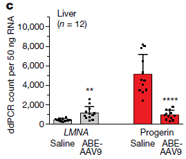
The gray bars (left) are for the normal mRNA (LMNA is the gene name). The red bars are for the mRNA for the mutant progeria gene.
ABE-AAV9 is the treatment; saline is the control. (ABE = adenine base editor; AAV = adeno-associated virus, used as a vector to carry the ABE gene.) You can see that the level of the normal LMNA mRNA is increased and the level of the mutant progerin mRNA is decreased by the treatment. The results here are for liver tissue. The full figure also includes data for heart tissue; the pattern is similar. This is part of Figure 3c from the article. |
That figure shows that the editing treatment results in improvement at the level of mRNA expression. The ratio of good mRNA to bad mRNA is improved. The scientists also show a corresponding improvement in the ratio of good protein to bad protein.
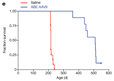
The following figure tests if the editing leads to an improved lifespan...
|
The figure shows survival curves for the treated and untreated mice.
The treatment led to substantial increase in lifespan. Full lifespan for wild type mice is about two years. Many of the treated mice ended up with cancer, likely caused by the viral vector. This is thought to be a mouse-specific issue, not a problem in humans. But that needs to be clarified. This is Figure 4e from the article. |
|
Interestingly, the level of successful gene editing was not particularly high: at best, around 25%. The progeria situation allows even modest improvements at the gene level to lead to significant improvements at the organism level. But this also illustrates how complex such treatments can be. What will happen in humans?
Lab work shows that treatment of human progeria cells in culture with the base editor works. Step 1.
So, we have evidence that another type of treatment for progeria has promise. In this case, the treatment is at the genetic level.
The base editor used here has been engineered so that it is guided by a CRISPR-type guide RNA. An advantage of using the base editor rather than CRISPR itself for the editing is that the base editor does not break the main DNA chain (the phosphodiester backbone). Thus the chances of side effects of editing should be reduced.
News stories:
* DNA-editing method shows promise to treat mouse model of progeria. (Prabarna Ganguly, NIH, January 6, 2021.)
* Base editing successfully treats progeria in mice -- An illustration of the adenine base editor and guide RNA targeting a DNA sequence Correcting the mutation that causes progeria with base editing leads to strong symptom reduction and longer lifespan in an animal model. (Karen Zusi, Broad Institute, January 6, 2021.)
* Doubling lifespan with in vivo base editing of genetic disease. (BioTechScope, January 7, 2021.)
* News story accompanying the article: Biotechnology: Base editor repairs gene of premature-ageing disease -- No cure exists for the lethal premature-ageing condition Hutchinson-Gilford progeria. A gene-editing tool - adenine base editors - offers a way to treat the condition in mice. Could this approach lead to an effective therapy? (Wilbert P Vermeij & Jan H J Hoeijmakers, Nature 589:522, January 28, 2021.)
* The article: In vivo base editing rescues Hutchinson-Gilford progeria syndrome in mice. (Luke W Koblan et al, Nature 589:608, January 28, 2021.)
Background post on progeria: Premature aging: a treatment? (January 5, 2014).
More about progeria: Drug may extend life in progeria patients (October 17, 2014).
My page for Biotechnology in the News (BITN) -- Other topics includes a section on Aging. It includes a list of related Musings posts.
A post about using an enzyme with a related activity: CRISPR: Making specific base changes -- at the RNA level (February 20, 2018). The enzyme used in this earlier work modifies A in RNA; the current work modifies A in DNA. In both projects, a CRISPR-type guide is used to guide the A editor.
A post with a complete list of Musings posts on various gene-editing tools, including CRISPR, TALENs and ZFNs... CRISPR: an overview (February 15, 2015).
Another mutation that affects splicing: Can a "silent" mutation be harmful? (April 17, 2021).
March 22, 2021
The cat response to these plant materials is striking; the cats seem to go crazy. They rub the stuff and roll in it. The response is commonly seen with house cats, but is also widespread in the cat family. Why?
According to a recent article, the active agent is a mosquito repellent.
We noted two plants in the title. Many people will be more familiar with one or the other; they have different geographical distributions. The underlying chemistry is probably similar for both.
The new work started with traditional chemistry, extracting the silver vine leaves, and fractionating the extract. The following figure shows a test of six fractions, to see which contained the active ingredient...
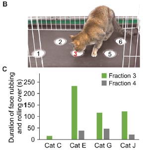
|
Fraction 3, as is clear from Part B (top).
Such assays can be quantified. Part C shows an example of data comparing the responses of four cats to fractions 3 and 4. The bar height shows the time the cat spent responding to the material. Responding means rubbing its face against the material or rolling in it. Again, fraction 3 is the more active fraction. This is part of Figure 1 from the article. |
The active material includes nepetolactone and some derivatives; some of these chemicals had previously been identified as the active ingredients of catnip. Most active seems to be nepetolactol, in which the carbonyl of the lactone has been reduced to a hydroxy group.
Direct testing of the nepetolactol showed that it repelled mosquitoes. That led the scientists to test whether it protected cats from mosquitoes. The following figure shows some results...
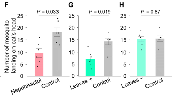
|
Start with Part F, at the left. Two cats were in a chamber, exposed to some mosquitoes. One cat was treated with nepetolactol; the other was an untreated control. The number of mosquitoes that landed on each cat's head (in ten minutes) was recorded.
You can see that the nepetolactol treatment reduced the number of mosquitoes by about half. |
|
|
Part G shows a similar test. In this case, the treated cats were treated with silver vine leaves. Thr results are similar. Part H shows a control test, with two untreated cats. Both bars are similar to those for untreated cats in the other tests. This is part of Figure 5 from the article. | |
The results show that nepetolactol, the major active ingredient of silver vine, protects cats from mosquitoes. Does that mean that is why cats developed the response to silver vine (and catnip)? One cannot make that claim, but the story certainly is suggestive.
Some additional comments...The article includes some testing of big cats, from local zoos. And it includes some pictures from those tests.
The authors show that the nepetolactol acts through the opioid pathway. In particular, the response is blocked by naloxone, the agent used to block overdoses of opioid drugs.
A historical note... The current work is from Japan. The authors note that the first report of the cat response was from Japan; the reference list includes the 1704 item (in Japanese). It also includes the first report for catnip, from 1768.
News stories:
* Intoxicating Chemicals in Catnip Don't Just Give Cats Joy - They Help Repel Mosquitoes. (SciTechDaily (Iwate University), January 20, 2021.)
* Bioactive Compounds Found in Catnip and Silver Vine Protect Cats against Mosquito Bites. (Sci.News, January 21, 2021.)
Movies: There are six short movies posted as supplementary materials with the article. They are freely available there. (1-2 minutes each; no sound; well-labeled, except for the last one, where the labeling is deliberately hard to read.) Each shows an example of the response. #1 shows the basic assay, like that in the top figure above. #3 shows some larger cats, plus a couple of uninterested non-cats. #5 shows that cats will go to considerable effort for this reward.
The article, which is freely available: The characteristic response of domestic cats to plant iridoids allows them to gain chemical defense against mosquitoes. (R Uenoyama et al, Science Advances 7:eabd9135, January 20, 2021.)
Other posts on cats include:
* How a cat tongue works (March 19, 2019).
* Big cat, little cat: Taqpep determines coat pattern (December 27, 2012).Posts on dealing with mosquitoes include:
* A trap to attract -- and kill -- mosquitoes (October 26, 2021).
* Could we repel mosquitoes by playing loud music they don't like? (May 18, 2019).
* A mammalian device for repelling mosquitoes (December 10, 2018).
March 20, 2021
If you want to make a wooden table, you grow a tree, harvest it, then process the materials, much of which ends up as waste. Why not just grow a table?
A recent article addresses the possibility. The idea is to culture plant tissue in the lab, in a way that directly leads to the desired product.
Here is the plan...
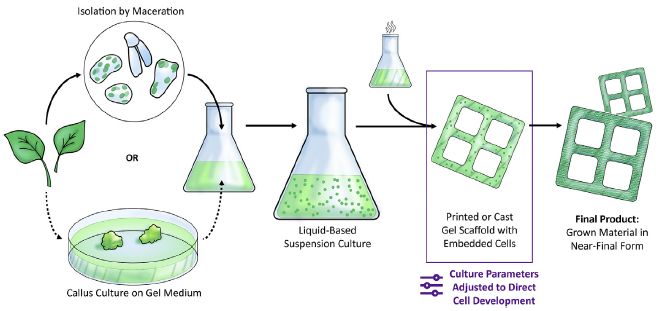
|
The figure shows three general phases. From the left...
- Get cells from the plant. - Grow them up, in a bio-reactor (here, a flask). - Form the product, by having the cells grow within a scaffold. In this case, the desired product seems to be a window frame. This is Figure 1 from the article. |
The basics of growing plant tissue in lab culture are well-developed, though the details are different for different plants. What's new here is the focus on the final step, making a product.
One aspect of the current work is optimizing the conditions. The following figure shows an example of such work...

|
The figure shows one aspect of the growth as a function of the levels of two hormones.
One hormone is NAA = α-naphthaleneacetic acid. Its level is shown on the y-axis. The other hormone is BAP = 6-benzylaminopurine (x-axis). What is measured here is the lignin content. That result is color-coded onto the grid for each combination of hormone levels. The color code is at the right. Briefly, yellow is for high lignin level, purple for low. For those familiar with plant hormones, the two used here are an auxin and a cytokinin. The hormone levels are given in terms of the volume of a stock solution used. The lignin content is shown as %-1. It is the number of cells with lignin divided by the percentage of the area with cells (following a standard procedure). This is Figure 2b from the article. |
They can tune the lignin content by controlling the growth conditions, in this case, the hormones. If the goal is to maximize the lignin content, which is good for strength, it is clear how to do that.
Here is an actual product they made...
|
It is a window frame. I think. A small one, a couple centimeters across.
This is Figure 8 from the article. |
The authors stress that this is probably the first work towards the goal of "growing a table" -- directly producing a wood product from lab culture. So we shouldn't be harsh in judging the current product. What matters is that they have started. Such work can be interesting, and even instructive, regardless of whether it achieves a commercially useful product.
News stories:
* Researchers find a way to grow wood in a lab, and it could curb global deforestation -- Your future furniture might be produced with lab-grown wood. (Fermin Koop, ZME Science, March 5, 2021.)
* Could lab-grown plant tissue ease the environmental toll of logging and agriculture? -- MIT researchers grow structures made of wood-like plant cells in a lab, hinting at the possibility of more efficient biomaterials production. (Science Daily (MIT), January 21, 2021.)
The article, which is freely available: Tunable plant-based materials via in vitro cell culture using a Zinnia elegans model. (Ashley L Beckwith et al, Journal of Cleaner Production 288:125571, March 15, 2021.)
Among many wood-related posts...
* Transparent wood (March 6, 2021).
* Artificial wood (November 3, 2018).A post about cultured meat: Tuning the protein and fat content of cultured meat (February 2, 2021). There is a good analogy between cultured meat and cultured wood. There are many issues, but at the top: Can we usefully make things under controlled culture conditions. Developing anything practical will involve a good understanding of the systems, and will be economically challenging.
March 17, 2021
COVID and Elon Musk. The guy gets around. He is often in the news for transportation on the ground and far above (Tesla and SpaceX). He has been noted in Musings for transportation below ground (Hyperloop) as well as brain research. And now, a virology paper, with Musk as a co-author. The simple story behind his involvement here was that he realized that SpaceX could be quite vulnerable to disruptions by the pandemic; he was therefore interested in learning more about monitoring his employees. At that point, there was little known, so he offered SpaceX as a study population. As to the article itself... it offers more detail about the antibody response to natural infection, including in mild cases. Among the findings is the importance of antibodies to one particular region of the Spike protein, the region that actually binds to the receptor.
* News story: Antibody testing is key to understand immune response to SARS-CoV-2. (News-Medical.net, February 17, 2021.) Links to the article, which is freely available.
March 16, 2021
It's a big story in the United States... Use of force by the police, with patterns that appear to reflect racial discrimination. Of course, individual news stories are typically about individual events. Some are well documented, with the event captured live (by cell phone cameras). However, individual events are not objective data about patterns.
Is there such data?
A recent article provides one of the best analyses yet available. It is based on a careful examination of detailed records for a big city police department over multiple years.
In this work, the police officers were classified in two ways. For the main study, about racial bias, officers were classified as black, Hispanic, or white. The work also includes a comparison of female and male officers. Three measures of police action were analyzed: stops, arrests, and use of force.
The following figure summarizes the findings...
|
Each graph is for one measure of police action, From left to right: stops, arrests and use of force (labeled at the bottom). Each graph shows the result for each of the three comparisons (labeled at the left).
For example.. The upper left data line compares black officers vs white officers for number of stops made during patrol. The data point is -15; that is stops made per 100 shifts. That is, per 100 shifts on duty, black officers made 15 fewer stops than white officers. There is an error bar, for the uncertainty of the result. The graph shows differences. Over the full figure, the results for black officers are about 20-30% lower than for white officers. The lower line of that graph shows no difference between female and male officers for stops. Major observations: - The three graphs show nine such comparisons. All but the one just noted show a significant difference. - In each graph, the largest difference is for black officers vs white officers. This is Figure 3 from the article. |
The big message from that figure is that white officers make more stops, make more arrests, and are more likely to use force than are black officers. The results for Hispanic officers vs white officers are similar, though with smaller effects. The results for female vs male officers are more complicated; we'll leave them for now.
The figure above is about race of the officer; race of the civilian encountered is not considered. The following figure addresses that issue. For simplicity here, I am showing only one part of the full figure, for arrests.
|
The top group of three lines is for an encounter with a black civilian. The color coding for the three data lines is shown at the bottom. The red line shows that black officers made fewer arrests than white officers -- for this case of encounters with black civilians. In fact, black officers made fewer arrests than white officers for all five sets shown here: three of them by race of the person encountered, and two by type of crime.
This is part of Figure 4 from the article. Other parts of the full figure are for the criteria of stops and use of force. The sub-classes are not the same for each of those. The pattern for stops is the same as above; for use of force, it is a little more complex. |
The results above, based on examination of police records over recent years, show that officers of different races have different results. (They also show effects of the gender of the officer, which we won't discuss here.)
The full article contains more analysis; it is broadly consistent with what is shown here. Of particular interest is that much of the effect is due to differences in handling "minor" problems, such as making stops because of "suspicious behavior", where there is considerable room for officer discretion. There was much less difference for handling major crimes.
As noted, the numbers above are differences per 100 shifts. The error bars suggest that the results are significant. How big are the actual numbers? The article contains a summary of the total data pool. We note it here for the record...
|
The Table legend refers to pruning the data. What is that about? Two types of things... One is making sure that records are clearly identified. Duplicate names or badge numbers are an issue. Further, there was considerable emphasis on getting data for different officer races but otherwise comparable conditions. For example, records for beat cops were used, but not records for specialized activities, such as gang patrols (where the activity may inherently have a racial component).
This is Table 1 from the article. |
We will leave it at that. It is a scientific article that analyzes data from police records.
News stories:
* Diversity in policing can improve police-civilian interactions. (Phys.org (Princeton University), February 11, 2021.)
* Chicago's Black and Hispanic police use force less than white officers - study. (Alexandra Villarreal, Guardian, February 11, 2021.)
* Police accountability. (University of California, Irvine, March 3, 2021.) An interview with the first author.
* Two news stories accompanying the article:
- Science and the law: Study: Police diversity matters -- Landmark analysis of 7000 Chicago police shows nonwhite and female officers make fewer stops. (Douglas Starr, Science 371:661, February 12, 2021.)
- Social science: Asking the right questions about race and policing -- When is policing the right tool, and when is it the problem? (Phillip Atiba Goff, Science 371:677, February 12, 2021.)
* The article: The role of officer race and gender in police-civilian interactions in Chicago. (Bocar A Ba et al, Science 371:696, February 12, 2021.)
More about police: Police training (July 19, 2020).
March 13, 2021
Winter can be hard. Especially for small animals, which have a high metabolic rate and low reserves.
A recent article looks at how one tiny animal deals with the stress of winter. The animal is the Etruscan shrew, Suncus etruscus. It is the smallest known terrestrial mammal, with a body weight about 2.5 grams (similar to a US dime).
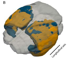
|
The figure superimposes two MRI scans of the cortex of the brain of a shrew. The blue part was from summer; the orange part was from the following winter.
It shrank. This is Figure 1B from the article. |
Further work showed that a particular layer of the cortex, somatosensory layer 4, was thinner.
Here is one way to see that...
|
The figure shows the density of neurons in layer 4 calculated two different ways.
It may help here to visualize looking down on the layer, and looking at a particular area. In effect, you are looking down a particular column of the brain layer. |
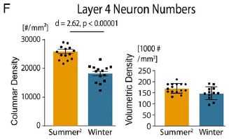
|
|
The graph on the left shows the number of neurons in that area -- for the entire thickness of the layer. That is the columnar density. It is lower in the winter. The graph on the right shows the number of neurons in that area -- per unit volume. That is the volumetric density. It is about the same summer and winter. Note the different units for the two kinds of density. The volumetric density is what you might expect, neurons per volume. But the columnar density is neurons per area; it is for the entire thickness of the layer. This is Figure 2F from the article. | |
If there are fewer neurons there in the winter, but the volumetric density is the same, it follows that there is less volume. That is, the layer is thinner in the winter.
The decline in shrew brain size during the winter was known from previous work. What's new here is localizing the change to a particular brain area.
What does layer 4 do? It is part of the system for finding food. The shrew finds food, in part, by detecting it with its whiskers; that response is analyzed in this brain layer.
The brain is one of the most energy-intensive areas of the body. Reducing brain activity is one way to save energy during a time of energy shortage. Downsizing a region of the brain that plays a central role in acquiring food may seem an odd choice, but that is what this animal does.
A little more...
This work on winter stress was done without any actual winter stress. The work was done with a lab colony of shrews, maintained under constant and plentiful conditions throughout the year. This suggests that the responses are programmed; the animal has a genetic program to develop this way. (Or is it somehow picking up cues about the season from some other source? The authors raise this as a possibility.)
The scientists also imposed stress. For example, they limited the food supply to some shrews -- during the summer. The shrews responded with a decrease in brain volume. Thus the animal can also respond to the environment.
Studies of individual types of neurons suggested that the largest loss was for inhibitory neurons. Therefore it is possible that the smaller winter brain actually provides an advantage for feeding, especially when the food supply is limited.
This is clearly a complex phenomenon.
News stories:
* Shrew Brains Shrink During Winter -- The animals kill off around one-quarter of the neurons in their somatosensory cortex, perhaps to save energy, and the cells appear to return the following summer. (Abby Olena, The Scientist, December 3, 2020. Now archived.)
* Researchers Reveal Seasonal Plasticity in Mammalian Brain. (Chinese Academy of Sciences, December 18, 2020.)
The article, which is freely available: Seasonal plasticity in the adult somatosensory cortex. (S Ray et al, PNAS 117:32136, December 15, 2020.)
A recent post about dealing with winter: What if a hummingbird's body temperature dropped to below 10 °C on a cold night? (September 29, 2020).
Previous post mentioning shrews: Bats and the coronavirus reservoirs (July 25, 2017).
A post about an animal that looks like a shrew, but isn't: A rodent that can't chew (November 5, 2012).
My page for Biotechnology in the News (BITN) -- Other topics includes a section on Brain. It includes a list of brain-related posts.
March 10, 2021
Gut microbes and the brain? Microbes grow in your gut. How could they affect your brain? Well, as one example, they secrete metabolic products, as do any cells. And some of those get into the bloodstream, and can get to the brain. It is a controversial field, with a variety of claims, some not standing up to further work. A recent news feature gives an overview of the field. Useful for perspective; don't get too bogged down in specifics.
* News feature, which is freely available: How gut microbes could drive brain disorders. (Cassandra Willyard, Nature, February 3, 2021. In print, with a different title: Nature 590:22, February 4, 2021.)
* I have listed this news feature on my page for Biotechnology in the News (BITN) -- Other topics in the section on Brain. It includes an extensive list of brain-related posts.
* A Musings post that is related... Metabolism of the Parkinson's disease drug L-DOPA by the gut microbiota (July 26, 2019).
March 9, 2021
Chemical element #99, Es. It is in the actinoid series, usually shown at the bottom of the periodic table.
Actinoid? The article uses the term actinide. The two terms refer to the same set of elements. Actinoid is now considered the preferred term; it is interesting that the article, from a major lab, uses the older term.
All isotopes of Es are radioactive. What makes Es of special interest to chemists is that it is the heaviest element where there is some chance of doing ordinary lab chemistry. The isotope Es-254 can be made in significant amounts, and has a half life of about nine months (276 days).
A recent article reports the most complicated chemical containing Es made so far, in lab work using about 200 nanograms of the element.
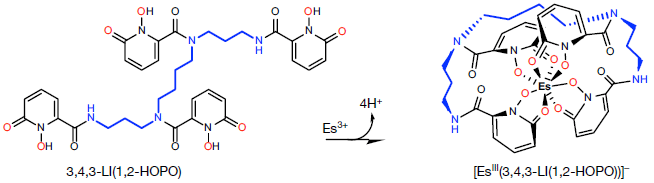
|
The reaction.
It's not as messy at it looks. That starting material at the left is highly repetitive. It contains four identical rings, each with two attached O atoms that are able to bind with the Es. Those O atoms are shown in red. The four rings are attached to N atoms in a backbone molecule, shown in blue. (There is another O involved in joining each ring to the backbone.) That molecule binds to Es3+ ions. It binds through the eight red O atoms on the four rings. One O from each ring can bind directly. The other is part of an -OH group; it binds to the Es after losing H+. The resulting complex, at the right, has a charge of 1-, which is shown in the name at the bottom. That charge comes from the 3+ of the Es ion, and loss of 4 H+ from the -OH groups. We'll avoid the full name of the complex (and of the complexing agent). But the authors have a shorthand formula for the complex: [EsIII(HOPO)]-. This is Figure 1 from the article. |
The scientists are then able to make some measurements on the new chemical. For example...

|
The graph compares the complex shown above with similar complexes of nearby elements. The elements are all members of the actinoid series, numbers 95, 96, 98, 99 from left to right in the graph.
The graph plots the length of the M-O bond (y-axis; M = metal) vs a measure of the ionic radius for M3+ (x-axis). That is the bond between the central actinoid ion and the O. The x-axis is, more specifically, the reciprocal of the ionic radius. That is, the ion size decreases from left to right, with increasing atomic number. The M-O bond length increases, then decreases as ion size decreases. The last two measurements have (relatively) high uncertainties. This is Figure 2d from the article. |
It' may seem a modest result. But it is a new finding, and it is pushing the limits of traditional lab chemistry.
News stories:
* Einsteinium: Scientists Reveal Chemical Secrets of Elusive Transplutonium Element. (Sci.News, February 4, 2021.)
* Discoveries at the Edge of the Periodic Table: First Ever Measurements of Einsteinium -- Experiments by Berkeley Lab scientists on this highly radioactive element reveal some unexpected properties. (Julie Chao, Lawrence Berkeley National Laboratory, February 3, 2021.)
The article: Structural and spectroscopic characterization of an einsteinium complex. (Korey P Carter et al, Nature 590:85, February 4, 2021.)
More about actinoids: A protein that can assist with handling actinium (January 9, 2022).
This post is listed on my page Introductory Chemistry Internet resources in the section Lanthanoids and actinoids.
March 8, 2021
The Arctic Ocean is a part of the global ocean system. Its water is typical ocean water. A recent article suggests that it is not always so.
Here is the evidence...
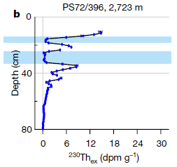
|
The graph shows the content of thorium, specifically the isotope Th-230 (x-axis) vs depth in the sediment below the ocean floor (y-axis).
You can see that there are two regions of the sediment where the Th content dips to near zero. These are marked with blue bands. (The Th content is also zero at lower depths, probably because it has decayed over the longer times that those depths represent.) |
|
This graph is for a particular site. The full figure shows such analyses for several sites in the Arctic Ocean. The results are similar. The x-axis label shows "ex", for "excess" thorium. The raw measurements of Th content are corrected for that expected from Th production in the sediment. This is Figure 1b from the article. | |
Those results show that the Arctic Ocean contained no salt at certain times in its history. That is the argument made by the authors of this article.
How do we get from Th-free sediment to salt-free ocean? Here is the connection... The Th is produced from soluble uranium in the salt water; it is well documented that Th production correlates well with the salinity of the water. However, Th is quite insoluble, and quickly ends up in the sediment; that occurs on a time scale of decades -- short on the geological time scale. Thus the Th content of the sediment indicates the salinity of the water. Very low -- or zero -- Th in the sediment indicates very low -- or zero -- salt in the water.
The sediments, such as that of the figure above, can be dated. The dates of the low-Th regions are in good agreement over several sites. That is, it appears that the sediments are Th-free over the Arctic Ocean floor at certain times in geological history. And those times are times of heavy glaciation -- recent times, within the last 150,000 years.
The authors suggest that during such glaciations, the Arctic Ocean was covered by an ice sheet, which prevented mixing with the main ocean waters. The Arctic Ocean itself is fed by freshwater runoff, and the ice sheet blocked inflow of salt water. Thus the Arctic Ocean became fresh water during these glaciations.
There is nothing novel about ice in the Arctic Ocean. What is novel is proposing an ice cover that blocks water flow to the "outside" oceans, thus isolating the Arctic Ocean.
The following figure shows that they think happened...
|
Look at the ice "shelves". They sit on land at both "ends" (as seen here). In particular, at the right side, the ice sheet prevents ordinary ocean salt water from entering the Arctic Ocean area.
At the left is a small map. Top view; that is, from the North Pole. The central white region is the Arctic Ocean. The red line shows the region studied here. This is the figure from the Earth Logs news story. It is probably the same as the figure in the news story in the journal (by Hoffmann). That figure is a modified version of Extended Data Figure 5 from the article, which labels some of the geographical features. |
Upon warming, the ice cover would melt, at least partially, enough to allow mixing of the fresh water and salt water oceans. Such rapid flows could have significant effects on climate.
It's a new, and rather radical, idea. The Th data is the best yet available, but the rest of the story is "interpretation". Scientists will be looking for evidence to test the ideas raised in this article.
News stories:
* The Arctic Ocean was covered by a shelf ice and filled with freshwater. (Science Daily (Alfred Wegener Institute, Helmholtz Centre for Polar and Marine Research), February 3, 2021.)
* When the Arctic Ocean was filled with fresh water. (Earth-logs, February 17, 2021.)
* News story accompanying the article: Palaeoceanography: Evidence of a freshwater Arctic Ocean -- A geochemical study of sediments suggests that, during recent glacial periods, the Arctic Ocean was completely isolated from the world ocean, with fresh water filling the basin for thousands of years. (Sharon Hoffmann, Nature 590:37, February 4, 2021.)
* The article: Glacial episodes of a freshwater Arctic Ocean covered by a thick ice shelf. (Walter Geibert et al, Nature 590:97, February 4, 2021.)
Among posts dealing with Arctic ice:
* Rise of the Roman Empire: role of an Alaskan volcano? (July 28, 2020).
* Mercury pollution from Arctic melting (February 19, 2019).More thorium: File dates and human settlement in Polynesia (November 16, 2012).
This post is listed on my page Introductory Chemistry Internet resources in the section Lanthanoids and actinoids.
March 6, 2021
A window made of wood?
Look...

|
A piece of wood, which has been processed to make it transparent.
If you're not sure what the figure shows... A person is holding the piece of wood, with gloved hands. The piece of wood is a bit smaller than the blue background. There is a scale bar, 10 cm, at the lower right. This is Figure 1B from the article. |
The idea of making wood transparent is not new. A recent article reports an improved process for doing it.
The process involves decolorizing the lignin; that removes the yellowness. It's done here with hydrogen peroxide, H2O2. It's a simple process, with the peroxide solution brushed onto the wood to bleach it; that greatly reduces the amounts of solutions needed, compared to previous processes that required immersing the wood. Since peroxide produces only water as a by-product and the lignin itself is not removed (just decolorized), there is minimal toxic waste. Ultraviolet light is needed for the bleaching; direct sunlight works fine, reducing the need for electricity.
You can see the result above. The article provides quantitative data on the transparency throughout the visible region of the spectrum.
There is also data on the strength of the transparent wood. It is stronger than the original wood. Much stronger. Why? First, the lignin was not removed; lignin contributes to the strength of wood. Second, they fill the channels in the wood with epoxy. One purpose of that is to enhance transparency, but it also enhances the strength. Windows that are baseball-proof? hurricane-proof? Maybe.
As noted, the main point here is that this is an improved process. The following figure shows some of the numbers...
|
The figure compares old and new processes for several parameters. Blue and red, respectively.
The x-axis scale is odd, but what matters is comparing the lengths of the blue and red bars. In each case, the red bar is shorter. Much shorter in most cases. That's the bar for the new process. It is better by each parameter considered here. This is Figure 5D from the article. |
Overall, the article seems to be a step toward a practical process for making transparent wood. The process itself is simpler, safer and cheaper. And the product is better.
News stories:
* Transparent wood is coming, and it could make an energy-efficient alternative to glass. (Steve Eichhorn, Conversation, February 10, 2021.)
* A new way to make wood transparent, stronger and lighter than glass. (Bob Yirka, Phys.org, February 2, 2021.)
The article, which is freely available: Solar-assisted fabrication of large-scale, patternable transparent wood. (Qinqin Xia et al, Science Advances 7:eabd7342, January 27, 2021.)
Among many wood-related posts...
* Wooden transistors (June 20, 2023).
* Growing wood in lab culture (March 20, 2021).
* Progress toward making a homogeneous product from diverse lignins (May 17, 2019).
* Artificial wood (November 3, 2018).
* Making wood stronger (March 19, 2018).
* Building with wood: might it replace steel and concrete? (June 14, 2017).Among posts involving H2O2: A light-activated coating that can kill bacteria on surfaces (July 14, 2020).
Also see:
* How to make yourself more transparent while you sleep (March 7, 2023).
* How to mold glass (June 19, 2021).
March 3, 2021
Looking for a better place to live? You might check out KOI 5715.01. The temperature there is uncertain, and it is about 3000 light years away -- if it is confirmed to exist. But it might be one of the best choices. It is one of 24 places that might be super-habitable, according to a recent article. The idea is to get away from our common geocentric view, and simply ask where are the best places for life. Developing the criteria is the heart of the work. Scientists then screen the Kepler catalog of exoplanets, looking for candidates. (KOI = Kepler Object of Interest.) They suggest that these places should go to the top of the list for further exploration.
* News story: Astronomers identify 24 possible superhabitable worlds. (Paul Scott Anderson, EarthSky, October 15, 2020.) Links to the article, which is freely available.
March 2, 2021
Here is the idea...
|
A short version of the story... If viral RNA is present, light is produced; your phone can detect it.
Let's go through that more slowly. It may be easiest if we work "backwards". Look at the "Reporter RNA" (upper middle). The two ends are shown as red and green. To the lower right, you can see this same reporter RNA -- but now it is split. The red end can now emit light (when irradiated; it is fluorescent); that is the light that indicates presence of virus. The green end is a quencher, which prevents the red end from fluorescing. That is, the reporter RNA starts with the red end being quenched by the green end; no signal. When the reporter RNA is cut, the red and green ends are separated; no quenching, and there is now a signal. The phone camera detects the signal. How does the reporter RNA get cut? Well, it is, as the name says, an RNA. It gets cut by an RNase. Namely, CRISPR. More specifically, CRISPR that has been activated by the viral RNA, the "target". The orange thing in the middle is CRISPR. It includes a small guide RNA (red, with a hairpin at the left end). The black line is the viral RNA, labeled "target RNA" at the left. What is shown here is CRISPR being "guided" to bind to the viral RNA target. That activates the RNase activity of CRISPR, and it cleaves whatever is around. In this case, it cleaves the reporter RNA that is part of the reaction mix. You may recall CRISPR as a DNase. In fact, there are various types of CRISPR systems. They all help their normal host bacteria evade pathogens, but they vary in details. The CRISPR system here uses Cas13, which works by cleaving RNA. This is Figure 1A from the article. I have added some labeling. |
The next figure shows an example of the system at work...
|
The figure shows light produced (y-axis) vs time (x-axis) for several tests.
Start with the two curves in the middle (blue and black). In both cases, the system contains IVT RNA and a RNP. - IVT RNA is viral RNA -- the target. (The IVT means it is "in-vitro-transcribed", a lab copy of the viral RNA.) - RNP = ribonucleoprotein. That's CRISPR with one or another guide RNA (2 or 4). Those two curves are similar. Light is produced, at an approximately linear rate, for the entire period shown (two hours). The signal at 30 minutes is very good. And if you "squint", you can even see the signal at 5 minutes. |
|
The top curve (green) is for the use of two guides (2 and 4). There is approximately twice as much light. That is, using multiple guides increases the sensitivity of the assay. The curves at the bottom are for controls. No viral RNA target (IVT). And there is no signal. The "guides" are also called crRNA, for CRISPR RNA. In the test with two kinds of RNP, the total amount of guide was the same as in the tests with one kind. That is, the increased response was due to having two kinds, not more RNA. Much of the lab work, such as this experiment, was done detecting the light output with standard lab instruments. The article also includes some work using a phone camera to detect the light. This is Figure 2B from the article. | |
It works. There are various tests in the article, including tests with real-world samples. The big picture is that the assay is simple to run, fast, quantitative, and quite sensitive.
An important feature of the current assay is what it does not need: pre-amplification of the target. Amplification takes time, and can interfere with quantification; having a high sensitivity assay without that step is good.
The work here is with the SARS-2 virus, for COVID-19. But the approach should be general. All it takes is figuring out a new set of guide RNAs for a new virus.
News stories:
* CRISPR Test Uses Cell Phone Camera to Detect SARS-CoV-2. (Conn Hastings, Medgadget, December 7, 2020. Now archived.)
* Direct and sensitive detection of SARS-CoV-2 through a Cas-13a-based assay. (Miguel Gómez Fontela, Molecular Cloud, October 25, 2020.)
The article, which is temporarily freely available: Amplification-free detection of SARS-CoV-2 with CRISPR-Cas13a and mobile phone microscopy. (P Fozouni et al, Cell 184:323, January 21, 2021.)
A novel sensor for infectious viruses, using nanopores lined with aptamers (November 6, 2021). More about virus detection.
There is a BITN section for SARS, MERS (coronaviruses). It includes a list of Musings posts in the field.
More about CRISPR: CRISPR: an overview (February 15, 2015). Includes a complete list of posts on CRISPR.
Other things you can do with your phone...
* Medical safety: What if pills were better labeled, so your phone could verify them? (April 23, 2022).
* Testing for lead in drinking water: a quick and inexpensive test using a smartphone (October 20, 2018).
* Using a smartphone as your extended brain (November 17, 2015).
* Using your phone to find Loa loa (August 14, 2015). The lab behind this earlier work was part of the team for the current work.
* Using your smartphone to detect cosmic rays (April 7, 2015).
March 1, 2021
The metronome is a pendulum device that marks time for musicians. It has an adjustable weight, which determines the beat frequency.
A recent article explores some metronome history.
|
An early metronome, from 1816.
This is Figure 1a from the article. |
Beethoven admired and used the metronome. It is likely that he had one much like that shown above. But it is not clear that he knew how to use it.
|
Part a (left) diagrams the device, and includes an expanded view of the scale.
How do you read the scale? Is this 120 bpm (beats per minute), the number at the bottom of the weight, or 108, the number at the top? Apparently, Beethoven wasn't sure, either. Part b (right) shows one of his scores, with a handwritten note at the top: "108 oder 120." (Oder is the German word for or.) This is Figure 4 from the article. |
Musicians and musicologists have long debated Beethoven's tempi. Of course, people differ in their preference. But one issue is, what did the composer intend?
The authors collected some data, by analyzing recordings of Beethoven works. The following figure is instructive...
|
The figure shows the performance tempo (y-axis) vs the metronome marking in the score (x-axis) for recordings by various conductors.
There is an excellent correlation. It is hard to tell what the correlation is from the labeling shown here, or even from the original in the article. But the authors say that the performance tempo is about 13 bpm slower than the marked tempo. For example, a score labeled 120 bpm is, on average, played at 107. That difference is just about the difference between "right" and "wrong" readings of the metronome; see the previous figure. The figure is labeled "romantic" at the top. That indicates a style of performance. All the conductors in this analysis were of that same general style. This is part of Figure 3 from the article. I have added some labeling. |
Modern conductors generally prefer a tempo slower than what Beethoven wrote. The article here offers a clue as to how this came to be. One score shown above suggests that Beethoven was not sure how to read the metronome. But most of the time, he simply wrote the higher number. In effect, modern musicians suspect he meant the lower number -- because he didn't know how to read the device.
News story: Big Data will analyse the mystery of Beethoven's metronome. (Universidad Carlos III de Madrid, December 17, 2020.)
The article, which is freely available: Conductors' tempo choices shed light over Beethoven's metronome. (A Martin-Castro & I Ucar, PLoS ONE 15:e0243616, December 16, 2020.)
Thanks to Greg for alerting me to this article, a day after it was published, and for helping with the post.
* * * * *
Previous Musings mention of Beethoven: Briefly noted... Beethoven's dream (January 8, 2020).
Previous mention of metronomes: none
My page Internet resources: Miscellaneous includes a section on Art & Music. There is a list of numerous Musings posts on those subjects.
February 28, 2021
A human brain is a blob of soft matter, covered by a membrane, floating in a liquid phase that is covered by a hard shell.
So is the yolk of a bird egg.
Soft matter is easily deformed. especially when floating in liquid. People suffer injuries called concussions when the brain is rapidly accelerated within its shell. Presumably, egg yolks react similarly -- and they would be easier to study in the lab.
A recent article explores what happens to egg yolks when subjected to the kinds of stresses that might cause concussions.
The following figure shows some results...
|
Each row of the figure shows what happens to a stressed yolk over time. Each row is for a different kind of stress. Time is shown below each photo; the time sequences are different for each row.
Row A (top) is for a translational (linear) stress, from the top in this case. Rows B and C are for rotational stresses; B is for acceleration and C is for deceleration. You can see that the linear stress moved the egg (the device with the egg in it), but caused little change in its shape. On the other hand, the two rotational stresses both caused significant deformations of the yolk. Especially the deceleration (row C). The egg consents used here were removed from the original egg shell, and put in a transparent rigid container, for ease of viewing. This is Figure 3 from the article. |
The finding that rotational forces are more important than linear forces agrees with our understanding of concussions. That is, the yolk work reproduces one aspect of brain work. Not just reproduces it, but demonstrates it in a very visible and dramatic way.
The authors go on and develop a model for how the deformation depends on the properties of the soft blob and the surrounding medium.
Is the egg yolk a good model system for studying the brain? We'll see where this work leads.
News stories:
* Accelerating egg yolks shed light on brain injuries. (Sam Jarman, Physics World, January 20, 2021.)
* A Team of Mechanical Engineers From Villanova University and Pennsylvania State University Turns To Eggs To Model Concussion and to Better Understand Sudden Impact Brain Injuries -- First-of-its-kind findings uncover the critical role of the brain's cerebrospinal fluid during impact, and show promise for advances in brain biomechanics. (Villanova University, January 19, 2021.)
The article: How to deform an egg yolk? On the study of soft matter deformation in a liquid environment. (J Lang et al, Physics of Fluids 33:011903, January 2021.)
Among posts about concussions or, more generally, brain injuries:
* Briefly noted... Concussions in women athletes (August 18, 2021).
* Evidence for brain damage in players of (American) football at the high school level (August 23, 2017).
* Measuring brain injury after head trauma? (April 25, 2016).Previous post about egg yolk: When should the eggs hatch? (June 11, 2013).
Previous posts involving use of a Golden Goose Egg Scrambler. None, I think.
My page for Biotechnology in the News (BITN) -- Other topics includes a section on Brain. It includes a list of brain-related posts.
February 24, 2021
COVID: Should we clean surfaces? This is an informational post, with a recent news feature from Nature updating us on various routes of virus transmission and what precautions we should take. Thinking has changed since the early days of COVID. Briefly, transmission through the air is most common; transmission from surfaces is not common, but cannot be excluded. Cleaning surfaces, especially "high-touch" surfaces, is not unreasonable, but generally should not be a dominant activity. (This is about inanimate surfaces. Hands can play an active role in virus transmission; frequent hand washing is good.)
* News feature, freely available: COVID-19 rarely spreads through surfaces. So why are we still deep cleaning? -- The coronavirus behind the pandemic can linger on doorknobs and other surfaces, but these aren't a major source of infection. (Dyani Lewis, Nature, January 29, 2021. In print, with a slightly different title: Nature 590:26, February 4, 2021.) Good read!
February 23, 2021
Blood is a major item of commerce. And it is all natural. The problem is that the supply is limited, and one must be careful to match blood types and avoid pathogens.
How about synthetic blood? Scientists have been trying to develop blood substitutes for a long time, with only limited success.
What about making blood cells "from scratch"? Stem cells. Induced pluripotent stem cells (iPSC; an initial h refers to human). Grow them up, and differentiate them into blood cells. Of course, if we are going to use iPSC, we can choose them to make blood cells with desirable properties. Type O, and Rh-negative; the universal donor.
We know how, at least in general terms. It's just that no one has come up with a practical process for doing it at a large scale.
A new article reports progress. It is perhaps also striking for its limitations. We note here two parts of a major figure about the process. The first part diagrams the process, and gives some summary numbers.
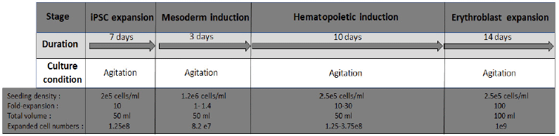
|
The top part of the figure shows four phases of the process. Briefly, grow up stem cells, differentiate them (two distinct phases), and then grow up the erythroid cells. Takes about a month here. Of particular note for the new work, all steps were done with agitation: cells growing in suspension, with shaking or stirring. Much work with animal cells is done with unagitated surface growth; that's what animal cells generally "prefer", but agitated cultures allow for making more cells, and for uniform conditions. Doing the entire process with agitated cultures is a step forward here.
The bottom part shows some numbers. They are hard to read, with the odd color scheme of the figure, and we'll see more numbers in a moment. But we just note... At the end (lower right), we have about 109 cells (in a culture volume of 100 mL). That is about a thousandth of what is needed for a transfusion. This is (most of) Figure 3A from the article. |
The procedure shown above does not yield red blood cells (RBC) per se. RBC lack nuclei and do not grow. What is made above are the precursors, called erythroblasts, which undergo a final step of enucleation. That step is addressed in the article, but we'll skip it here.
The following graph shows some numbers during some production runs, using approximately the schedule shown above...
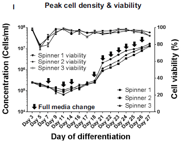
|
The lower set of lines shows the growth curves for three replicates. Each reaches about 107 cells/mL; see the left-hand y-axis.
The upper set of lines is for the cell viability. It is usually near 100%; see the right-hand y-axis. This is Figure 3I from the article. |
Encouraging results. The authors believe that what they have done could be extended to larger bioreactors, but they have not yet done so. They measure a range of biochemical characteristics of the cells, and most are within the normal range for such cells. But they have not yet tested these cells by transfusing them into a real animal.
The work is a step toward a supply of synthetic blood (not requiring direct donations). There is more to be done.
The process generates cells that largely make fetal hemoglobin (HbF). This is probably fine; we note it here, since we have recently discussed HbF [link at the end].
News stories:
* Designer Blood for All, Now Manufacturable. (A*STAR (Agency for Science, Technology and Research, Singapore), January 22, 2021.) From the organization where the work was done.
* New Protocol Advances Toward Lab-Made Universal Red Blood Cells -- Researchers report a new way of generating the cells from induced pluripotent stem cells in hopes they will one day be used in blood transfusions. (Diana Kwon, The Scientist, December 17, 2020. Now archived.)
The article, which is freely available: A Scalable Suspension Platform for Generating High-Density Cultures of Universal Red Blood Cells from Human Induced Pluripotent Stem Cells. (Jaichandran Sivalingam et al, Stem Cell Reports 16:182, January 12, 2021.)
Background post, about fetal hemoglobin: Reactivating fetal hemoglobin production to treat β-hemoglobin problems - I (February 15, 2021).
Among other posts about blood and blood cells...
* Converting type B blood to type O (June 19, 2024).
* Walter Clement Noel and his peculiar sickle-shaped blood cells (November 27, 2018).
* The paperfuge: a centrifuge that costs 20 cents (April 17, 2017).
* A 115-year-old person: What do we learn from her blood? (November 18, 2014).
* The Iceman's blood (May 14, 2012).There is more about stem cells on my page Biotechnology in the News (BITN) for Cloning and stem cells. It includes an extensive list of related Musings posts.
February 21, 2021
|
It is on a wall of the Leang Tedongne cave on the island Sulawesi, in Indonesia.
A recent article dates it to about 45,500 years ago. (That is actually a lower limit for the age of the painting. What the scientists dated was calcite that has deposited on the painting over time. It is possible that the painting is older.) This is part of Figure 2D from the article. Details of the pig allow it to be classified as a Sulawesi warty pig, Sus celebensis. (The "warts" on the head are just barely visible here; they are clearer in an expanded view, in Figure 3C of the article.) The full figure contains parts of 3 or 4 pigs. In some areas, the crumbling of the wall surface substantially reduces what is clear. However, the authors suggest that the panel is intended to show a scene involving multiple pigs interacting. And, yes, there are a couple of hand prints. The authors think these were actually drawn around human hands. The dating of the hands is less clear; they may not be the same age as the pigs. |
The cave area contains many such paintings, some of which have been described before. The painting discussed here appears to be the oldest -- so far.
The oldest (known) drawing of a pig. In fact, the oldest drawing of any animal. 455 centuries ago, people were drawing animals on the walls. People. The only animals who do such things (we think), and they were doing it 45,500 years ago. What kind (species) of human? We don't know (but the authors suspect they were Homo sapiens). Whoever they were, humans had become artists by that time.
Why?
News stories:
* The world's oldest known cave painting in Indonesia shows a chonky wild pig. (Mihai Andrei, ZME Science, January 14, 2021.)
* World's oldest known cave painting found in South Sulawesi. (Jakarta Post (Issam Ahmed, Agence France-Presse), January 14, 2021.)
The article, which is freely available: Oldest cave art found in Sulawesi. (A Brumm et al, Science Advances 7:eabd4648, January 13, 2021.) There are several pictures of historic art in the article, as well as maps.
Among posts on prehistoric art... Images from 30,000-year-old motion pictures (July 22, 2012). Links to more.
Among posts about the peoples of Indonesia... The modern pygmies of Flores Island (November 6, 2018). Links to more.
There is more about art on my page Internet resources: Miscellaneous in the section Art & Music. There is a list of related Musings posts.
Previous post involving pigs... Can human lungs that are too damaged to be transplanted be fixed? (August 22, 2020).
February 20, 2021
One might expect that our genes affect our susceptibility to COVID. Indeed, people have looked for genetic associations. Little is clear at this point, but one recent article makes an interesting claim. It examines a genetic region that has been implicated in making us more susceptible to severe COVID -- and argues that it came to modern humans from Neandertals.
The following figure shows some of the data that focused attention on the particular genetic region.
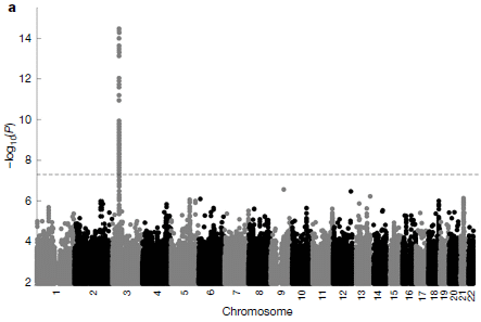
|
The general idea here is to look at the genomes of a large number of people, and simply do statistics: are there genetic signatures that correlate with an effect? In this case, the effect was hospitalization due to COVID. A p value is calculated for each region.
The results are shown as the negative log of the p value (y-axis) vs chromosome map position (x-axis). Higher numbers on the scale, towards the top, are for lower p. As usual with such p values, the lower the better; for the plot shown here, that means higher numbers. That is, the p value measures the likelihood that the finding is due to chance. The dotted line at about 7 (for p about 10-7) is the cutoff commonly used for such work. One chromosomal site, on chromosome 3, stands out as significant. This is Figure 1a from the article; it is based on earlier work implicating the chromosome 3 region in severe COVID. |
The figure above is not high resolution, but the underlying data is. The result implicated a region of about 50,000 base pairs, carrying six genes. There are several mutations within the region -- and they tend to stay together.
Examination of DNA sequences from ancient humans gave a striking result. Most of the mutations in that region, which seems associated with more severe COVID, were found in a European Neandertal. (More specifically, 11 of the 13 mutations in the region were found in both copies of the Neandertal genome.)
That finding does not prove that we inherited the sequence from the Neandertals. For example, it could have been in a common ancestor of both groups. The authors argue against that alternative, using genome statistics. It is most likely that the region arose in Neandertals, and was transferred to modern humans by interbreeding.
What does the region do that affects our susceptibility to COVID? There is no information at this point. (Two of the genes are thought to have functions that may affect viruses, but there are no specifics for now.) The work should lead to more attention for the genes in the region.
A story such as this is fun, in suggesting specific connections to Neandertals. But we should also note that the story is statistical, and some such claims do not hold up. Time will tell. Further, one should not label the genetic variants as good or bad. If the current story holds up, it shows an ill effect of this sequence under one set of conditions; that may be only part of the big picture for the genes.
The prevalence of this genetic sequence in the modern human population varies; over 50% of some populations carry a copy. The variation of this prevalence around the world is similar to the pattern already established for genes from Neandertals. The Neandertal variant increases the risk of hospitalization from COVID by about 60%.
News stories:
* Neanderthal genes increase risk of serious Covid-19, study claims -- Strand of DNA inherited by modern humans is linked to likelihood of falling severely ill. (Ian Sample, Guardian, September 30, 2020.)
* The ancient Neanderthal hand in severe COVID-19. (Science Daily (Okinawa Institute of Science and Technology (OIST) Graduate University), September 30, 2020.)
* News story accompanying the article: Genetics: Neanderthal DNA raises risk of severe COVID -- A genetic analysis reveals that some people who have severe reactions to the SARS-CoV-2 virus inherited certain sections of their DNA from Neanderthals. However, our ancestors can't take all the blame for how someone responds to the virus. (Y Luo, Nature 587:552, November 26, 2020.)
* The article: The major genetic risk factor for severe COVID-19 is inherited from Neanderthals. (H Zeberg & S Pääbo, Nature 587:610, November 26, 2020.)
More about this genetic variant: Briefly noted... A mutation that makes COVID worse protects against HIV (March 9, 2022).
More about our Neandertal inheritance: A gene from Neandertals that promotes human fertility (November 1, 2020). The article of this earlier post is reference 27 of the current article; the two articles have overlapping authorship.
More about severe COVID: A senolytic treatment for severe COVID (August 21, 2021).
Also see: Briefly noted... Svante Pääbo Nobel prize (October 5, 2022).
A book by Pääbo... See my page of Book suggestions: Pääbo, Neanderthal Man -- In search of lost genomes (2014).
There is more about genomes on my BITN page DNA and the genome. It includes an extensive list of related Musings posts.
There is a BITN section for SARS, MERS (coronaviruses). It includes a list of Musings posts in the field.
February 17, 2021
How sensitive is Earth climate to the level of CO2? We know that the CO2 level is increasing, and that the CO2 increase causes T to rise. But the quantitative real-world relationship is known only roughly. A new article reports the fruits of a four-year study of the relationship by a number of experts, bringing together multiple lines of evidence. The result is a 92 page article -- and a slight narrowing of the likely range for the effect. Few will want much detail, but the overall story is an interesting part of our understanding of climate change. The news story listed here is a summary by the authors. It will give you a good feel for the work.
* News story: Guest post: Why low-end 'climate sensitivity' can now be ruled out. (Piers Forster et al, Carbon Brief, July 22, 2020.) From the authors of the article. Links to the article; check Google Scholar for a copy that is freely available.
February 16, 2021
The previous post, immediately below, shows some results for treating people with severe sickle cell disease to reactivate their production of fetal hemoglobin (HbF).
In the same issue of the journal, another article reports another trial along the same lines, but using a different method. The difference is how they inactivate the repressor that prevents formation of HbF. In the previous post, that was done by using a viral vector that codes for an RNA that blocks production of the repressor. In the article here, they use CRISPR to edit out a site where the repressor binds, thus blocking its action.
There is a second difference between the two reports. The previous post was about treating sickle cell disease. In the current article, they treat people with two different diseases: sickle cell disease and β-thalassemia. But what is important is that both of those are due to problems with the β chain of hemoglobin, and in both cases making HbF is beneficial.
Here are some results...
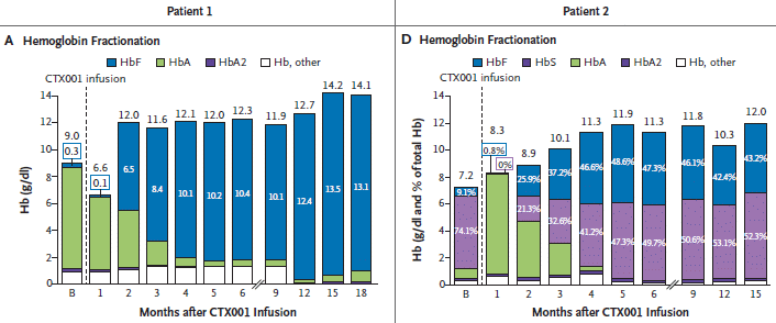
|
There are two patients. Patient #1 (left) has β-thalassemia; #2 (right) has sickle cell disease.
The y-axis scale is the concentration of Hb. The parts of each bar show the amounts of various types of Hb. (Oddly, the numbers on the bar segments are concentration for #1 and percentage for #2.) Key observations... - For both patients, the total level of Hb (the overall bar height) increases after the treatment, and becomes steady. - The amount of fetal hemoglobin (the blue part of the bar) increases substantially after the treatment. For the thalassemia patient, the Hb is almost all HbF by the end. The person is unable to make HbA; the initial level of HbA is from transfusion. This is part of Figure 2 from the article. |
Both patients showed substantial improvement in their quality of life.
There is much more here. These are very sick people, undergoing very complex experimental treatments. The point for us is that both articles are encouraging, in showing that gene therapy has the potential to usefully treat people with β-hemoglobin deficiencies. And the current article is a direct therapeutic application of CRISPR.
News stories. Some note results beyond those presented here and in the article; the work was reported at a meeting of the American Society of Hematology in December, with data from more patients. In fact, that extended data is briefly noted in the Discussion section of the article. Some stories also discuss or note the paper from the other post.
* CRISPR-Cas9 Gene Editing May Be Effective in β-Thalassemia, Sickle Cell Disease. (Jonathan Goodman, Hematology Advisor, December 28, 2020.)
* CRISPR-Driven Treatment Proves "Transformative" for Patients With Sickle Cell Disease, Beta Thalassemia. (Mary Caffrey, AJMC, December 6, 2020.)
* CRISPR gene therapy shows promise against blood diseases. (Heidi Ledford, Nature News, December 8, 2020. In print: Nature 588:383, December 17, 2020.)
The article: CRISPR-Cas9 Gene Editing for Sickle Cell Disease and β-Thalassemia. (H Frangoul et al, New England Journal of Medicine 384:252, January 21, 2021.)
Background post, about related work: Reactivating fetal hemoglobin production to treat β-hemoglobin problems - I (February 15, 2021). This is the previous post, immediately below.
More about gene therapy is on my Biotechnology in the News (BITN) page Agricultural biotechnology (GM foods) and Gene therapy. It includes a list of related Musings posts.
More about CRISPR: CRISPR: an overview (February 15, 2015). Includes a complete list of posts on CRISPR.
* * * * *
Update added December 11, 2023...
The Food and Drug Administration (FDA, US) has just announced approval of two gene therapy treatments for sickle cell disease. They follow the general logic of what was presented in this post (and the accompanying one). They both use modified blood stem cells from the patient. They both result in providing a replacement Hb. (They do not correct the underlying genetic defect, a task that would be more difficult.) One of them uses CRISPR to allow expression of HbF, as outlined in this post. It is the first FDA approval of a CRISPR-based treatment. (The other uses a virus to deliver an alternative Hb gene.) Both treatments are complex and expensive, but they are significant steps.
* News story: FDA approves first gene-editing treatment for human illness. (Rob Stein, NPR (National Public Radio, US), December 8, 2023.) Focuses on the CRISPR-based therapy.
* FDA press release: FDA Approves First Gene Therapies to Treat Patients with Sickle Cell Disease. (FDA, December 8, 2023.)
February 15, 2021
A decade ago, Musings reported a trial in mice of a possible treatment for sickle cell disease [link at the end]. Briefly, the idea is to promote the reactivation of the gene that makes fetal hemoglobin (HbF; Hb is a general symbol for hemoglobin). That is done by a genetic manipulation that leads to loss of a repressor for the HbF gene. Fetal hemoglobin can reasonably replace the function of normal "adult" hemoglobin. Further, the presence of a substantial amount of the HbF reduces sickling, even though the sickle hemoglobin continues to be made.
The treatment, in its current form, uses a retrovirus, which integrates into the genome. Blood cells were treated with the virus outside the body, then returned to the patient. The virus codes for a small RNA that inhibits production of the repressor for fetal hemoglobin. That is, the RNA promotes production of fetal hemoglobin.
A new article reports using the method to treat six patients with severe sickle cell disease. The results are encouraging.
The following figure shows a biochemical measure of the treatment, the percentage of HbF in the patients' blood over time.
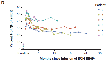
|
Each curve shows the percentage of HbF in the blood of one patient over time following the treatment.
Note that the levels of HbF before treatment, shown as "baseline" on the graph, are all below 10%. For all patients, the level of HbF seems to stabilize after a few months, to about 20-40%. This is part of Figure 1 from the article. |
That's biochemistry. Technically, the treatment worked, and increased the amount of HbF. Does it help the people?
The following table shows some clinical measures...
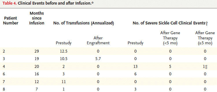
|
Two columns show the number of blood transfusions for each patient, before and after the treatment. These numbers are annualized. Prior to the treatment, all of the patients had been receiving transfusions to treat their sickle cell disease. After the treatment, five of the six did not get transfusions, including two of those who had been getting transfusions almost monthly.
One patient still got transfusions after the treatment, but only about half as many. The three columns to the right show another clinical measure of the treatment: severe sickle cell events. Prior to the treatment, three of the six had been experiencing such events. Two of those experienced no such events following the treatment. The third experienced fewer such events, with a declining frequency. This is Table 4 from the article. |
Obviously the data set is very limited; that is the nature of early trials of complex treatments. But the results are encouraging. Both the biochemical markers and the clinical outcomes showed benefit.
News stories:
* Post-Transcriptional BCL11A Silencing for Sickle Cell Disease. (Physician's Weekly, December 10, 2020. Now archived.)
* BCL11A Inhibition to Induce Fetal Hemoglobin Shows Promise in Sickle Cell Disease. (Jonathan Goodman, Hematology Advisor, December 29, 2020.)
The article: Post-Transcriptional Genetic Silencing of BCL11A to Treat Sickle Cell Disease. (E B Esrick et al, New England Journal of Medicine 384:205, January 21, 2021.)
Background post: Sickle cell disease: a step toward treatment by activation of fetal hemoglobin (October 29, 2011). The article of this earlier post is reference 28 of the current article.
Closely related... Reactivating fetal hemoglobin production to treat β-hemoglobin problems - II (February 16, 2021). This is the next post, immediately above.
More sickle cell disease: Walter Clement Noel and his peculiar sickle-shaped blood cells (November 27, 2018).
More about fetal hemoglobin: Progress toward a universal source for red blood cells, avoiding the need to match blood type (February 23, 2021).
More about gene therapy is on my Biotechnology in the News (BITN) page Agricultural biotechnology (GM foods) and Gene therapy. It includes a list of related Musings posts.
February 14, 2021
Desalination makes drinkable water from salt water. One major process is reverse osmosis (RO): water is pushed across a membrane that rejects the salt. Since the water is being moved from a region of low concentration to one of high concentration ("reverse" to its natural flow down a concentration gradient), energy is required. Even with modern developments, RO is still expensive, but it is used in places where there is a serious shortage of potable water.
A recent article offers a clue for how to make better RO membranes for desalination.
Here are some key results...
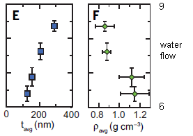
|
In these graphs, four membranes, with different properties, were tested. In each case, water flow through the membrane is shown on the y-axis (labeled at the right).
The units of water flow are liters meter-2 hour-1 bar-1. The m2 term is for the area of the membrane. The bar term is for the pressure across the membrane. |
|
In part E (left), water flow is plotted against the thickness of the membrane. The result is clear: as thickness increases, so does water flow. Surprised? So were the authors. In part F (right), water flow is plotted against density. There is an inverse relationship: denser membranes give lower water flow. As expected. This is part of Figure 2 from the article. I have added some labeling for the y-axis. | |
Those results, along with others based on advanced electron microscopic observation of the membrane structure, led to a simple explanation... Thicker membranes are thicker not because they have more material in them, but because they are "looser". Thicker membranes are less dense, allowing more water flow.
And real membranes, in commercial use, have a variable structure, with regions of low and high density. The irregularity of real RO membranes is limiting their efficiency.
The following cartoon figure illustrates the point...
| This is the Figure in the news story in the journal accompanying the article. |
We should note that the rejection of salt is the same in all cases. The differences in membrane thickness affect water flow, but not water quality.
The findings point the way to better membranes for reverse osmosis: make them less dense. Do we know how to do that, for large scale production of commercial membranes? That is not clear at this point; it is best to think of this work as advancing our understanding of how the nanoscale structure of RO membranes affects their performance.
News stories:
* Researchers Make Progress Toward High-Performing Water Desalination Membranes. (Sci.News, January 1, 2021.)
* Nanoscale Control of Desalination Membranes Could Lead to Cheaper Water Filtration. (SciTechDaily. (UTA), January 2, 2021.)
* News story accompanying the article: Membranes: Why polyamide reverse-osmosis membranes work so well. (Geoffrey M Geise, Science 371:31, January 1, 2021.)
* The article: Nanoscale control of internal inhomogeneity enhances water transport in desalination membranes. (Tyler E Culp et al, Science 371:72, January 1, 2021.)
Also see:
* Purifying water using fluorinated nanopores (August 16, 2022).
* Water desalination using graphene oxide membranes? (April 29, 2017)
February 10, 2021
Mapping sourdough bread. What can one learn from sequencing the microbial genomes of 500 sourdough starter cultures from around the world, as reported in a new article? That's actually not very clear at this point. The cultures are diverse, and relationships between the nature of the starter culture and the nature of the resulting product seems to be quite complex. The current work could lay the groundwork for experimental studies, making and testing starter cultures.
* News story: The microbial life of sourdough. (Science Daily, (North Carolina State University), January 26, 2021.) Links to the article, which is freely available.
February 9, 2021
Spiders are good for many a story.
The following figure introduces the main character of the current story, and shows a couple of its distinctive features...
|
It is Deinopis spinosa, commonly known as the ogre-faced spider. Part A shows off that face, featuring the largest eyes among the spiders.
Part B shows a whole specimen, with its net. It is a rectangular net, which the spider holds with its front four legs. To capture prey, the spider attacks the victim with its net. This is part of Figure 1 from the article. |
Deinopis is a nocturnal spider. Its big eyes provide it with good vision in the dark.
But it doesn't need vision to catch prey. It can also hear prey. The following figure provides some characterization of its hearing...
|
Part A (top) shows a frequency response. Decibels vs frequency. Note that the y-axis scale is inverted: smaller numbers at the top. The smaller the number, the more sensitive the response.
The spider is quite sensitive to low frequencies, shown here starting at 1000 Hz. There is another peak at about 2500 Hz. Part B shows an example of the response for one spider leg for one particular frequency (1000 Hz) vs intensity. This is part of Figure 4 from the article. |
The spider responds to sound. But, as usual with spiders, it does not have ears. The responses here are being detected by a leg. "Dampening" the leg reduces the response (which is why part A of the figure is labeled "before dampening").
Testing of spiders in the lab or in the field showed that low frequency tones often led to a behavioral response, as if an insect had just flown by.
The low frequency response is suitable for hunting insect prey. The authors speculate that the high frequency peak might be for listening to birds -- to avoid being caught by them.
Another good spider story.
News stories:
* Big-eyed spiders that cast nets like gladiators can hear prey despite lacking ears -- These freaky looking spiders can sense incoming prey from more than two meters away. (Tibi Puiu, ZME Science, October 29, 2020.)
* This Ogre-Faced Spider Can Hear Prey Through Its Legs -- The tropical net-casting spider Deinopis spinosa joins several other arachnid species that can hear sounds from afar without the help of a web, or even ears - an ability that aids its unique hunting tactics. (Katarina Zimmer, The Scientist, October 29, 2020.) Now archived.
The article: Ogre-Faced, Net-Casting Spiders Use Auditory Cues to Detect Airborne Prey. (J A Stafstrom et al, Current Biology 30:5033, December 21, 2020.)
Video: There is a "video abstract" posted there along with the article. It is about 8 minutes, narrated by the first author. It is worthwhile for the pictures, including sequences showing the spider in action.
Among many posts on spiders...
* Spider uses an external antenna to enhance hearing (April 9, 2022).
* A rigid silk basket (November 10, 2020). Most recent spider post.
* How to seat a spider in front of the computer (September 28, 2010). On spider vision.Another animal noted for having big eyes... Tarsier; eukaryotic cells (August 31, 2009)
Another organism that seems to hear without ears: What should a plant do if it hears bees coming? (December 10, 2019).
A post about an arthropod that really is wearing glasses: What can we learn by giving a praying mantis 3D glasses while it watches a movie? (March 12, 2016).
February 8, 2021
Botulism is caused by the bacterium Clostridium botulinum. The bacteria make a toxin, which enters neurons, and inactivates them. Once symptoms have begun, antibiotics against the bacteria would have little use; the toxin is already active. And the toxin is already in its target cells, so it is hard to get to it.
What if we could act against botulinum toxin when it is already in its target cells? That would require targeting an agent to enter the neurons. Well, we know one way to do that: botulinum toxin. Maybe we could target an agent to neurons to combat the toxin by combining the agent with some toxin.
Two new articles report work doing just that, with encouraging results.
The following figure shows some results for the treatment...
|
Start with part B (right). The graph shows survival curves for some groups of mice. All were given botulinum toxin. Five hours later, they were treated -- in various ways.
The black curve is for the control group, with a "blank" treatment; all the mice were dead after 2 days. The orange curve is for the mice treated with the new agent; most of them survived out to the end of the observations. There are two other curves. These are for other controls, using things that shouldn't work; they don't. Since we have not yet discussed the pieces of the treatment, we'll leave the details. Part A (left) shows some background. It shows the toxicity of the normal toxin (black) and of the modified form used for the treatment (red). The curves show survival (y-axis) vs dose (x-axis). A quick glance shows that there is a huge difference between them; the numbers show that the treatment form is a million-fold less toxic. (LD50 is the dose that kills half the mice. It is the mid-point of the curve.) This is part of Figure 3 from article #2. |
It works.
What is "it"? The idea is what we said at the start... a modified form of botulinum toxin, which can still enter neurons but is not toxic -- and now carries an agent that inactivates the normal toxin it encounters inside the cells. The idea is straightforward; scientists have been working on how to actually do it for years.
The following figure diagrams the normal and treatment toxins...
|
Part A (top) diagrams the normal toxin, labeled here as BoNT. Part B (bottom) shows the modified toxin used for treatment; it is labeled B8C1ad.
Key points... - The toxin contains three major domains. - The modified toxin is similar. It contains the same three domains; one (LC) has multiple changes. And it contains one additional domain (B8, at the left end). This is part of Figure 1 from article #2. |
What are the differences? The domain of the toxin that makes it toxic (LC) has been inactivated. The domains that promote transfer into the neurons (TD, RBD) are retained. And the new domain that has been added (B8)... It is the active part of an antibody against the toxin.
You can now go back and look at the other two controls in part B of the top figure. One is the antibody domain alone. The other is the inactive form of the toxin, without the antibody domain. Neither of those pieces alone works.
The antibody is the single-chain type, from llamas. More specifically, what was used was a fragment that bound to and inactivated the LC domain. Clearly, engineering single-chain antibodies is much easier than working with the more common 4-chain antibodies.
The article also contains a test with non-human primates (macaques). That test, too, is encouraging.
The work seems on track to providing a treatment for botulism. Further, it represents an approach that may be of more general use.
As noted, there are two articles, published together. They have overlapping lists of authors. The specifics discussed above are from #2, but both, in general terms, accomplish about the same, but using different systems. At the end of each news story listing, it says which article(s) the story is about.
News stories:
* Botulism antidotes. (Charles Shoemaker, Tufts University, undated.) (1, 2) A web page for a person who is a co-author of both articles. It provides a brief and useful overview of the work.
* Fighting botulism with botulism. (BioTechScope, January 11, 2021.) (1, 2)
* CytoDel successfully delivers neuronal antibody in animal models of botulism. (News-Medical.net, January 7, 2021.) (2) This is a press release from the company developing the product.
* Botulism breakthrough? Taming botulinum toxin to deliver therapeutics -- Treatment reverses paralysis in mice; offers a general delivery platform for neurologic drugs. (Science Daily (Boston Children's Hospital), January 8, 2021.) (1)
The articles:
1) Delivery of single-domain antibodies into neurons using a chimeric toxin-based platform is therapeutic in mouse models of botulism. (S-I Miyashita et al, Science Translational Medicine 13:eaaz4197, January 6, 2021.)
2) Neuronal delivery of antibodies has therapeutic effects in animal models of botulism. (P M McNutt et al, Science Translational Medicine 13:eabd7789, January 6, 2021.)
More botulism: A new botulinum toxin -- and a story of how we deal with dangerous things (July 11, 2015).
A post about single-chain antibodies: Using antibodies from llamas as the basis for a universal flu vaccine? (December 7, 2018).
February 6, 2021
An autoclave is a device to sterilize medical equipment and waste. The material to be sterilized is treated with steam at high pressure. The combination of high temperature and wetness kills even bacterial spores that are notoriously heat-resistant. It takes a lot of energy to provide the steam; the energy is commonly provided by electricity.
A recent article describes the development of an autoclave that does not require electricity. It runs directly off solar energy.
The following figure describes the device, and shows some results...
|
Part A (left) describes the device. The sterilization chamber is at the top (pink). A water supply is at the lower right. The water is heated by a solar collector (purple).
Part B (right) shows a run. The lower graph shows the temperature (T; left-hand Y-axis) and pressure (P; right-hand Y-axis) during the run. The T is maintained in a range suitable for sterilization. It's similar to a run with an ordinary autoclave. The top graph of Part B shows the energy source, the ambient GHI (global horizontal solar irradiance) from the Sun. The mid-day Sun, on a hazy day. This is part of Figure 5 from the article. |
The key development here is to design a solar collector suitable for this application. Using solar energy to heat water is already common, but making it efficient enough to provide a steady reliable source of steam is more challenging. Concentrating the solar energy is one approach, but expensive. Here, they focus on minimizing heat loss, rather than capturing more solar energy. They used a novel insulation, a silica-based aerogel, which the senior author had developed. Importantly, the aerogel is a good thermal insulator, but transparent to light. Its use led to approximately doubling the efficiency of use of the solar radiation.
Is this ready for real-world use? Not quite. The aerogel insulation is not commercially available, and is difficult to make. But they are working on that.
It is another step toward separating good medical care from high technology.
News stories:
* System can sterilize medical tools using solar heat -- Device could provide pressurized steam to run autoclaves without the need for electricity in off-grid areas. (David L Chandler, MIT, November 18, 2020.)
* Solar-powered device sterilizes medical equipment. (Andrew Williams, Physics World, December 16, 2020.)
The article: A Passive High-Temperature High-Pressure Solar Steam Generator for Medical Sterilization. (L Zhao et al, Joule 4:2733, December 16, 2020.)
Another example of simpler medical instruments... The paperfuge: a centrifuge that costs 20 cents (April 17, 2017).
There is more about energy resources on my page Internet Resources for Organic and Biochemistry under Energy resources. It includes a list of some related Musings posts.
February 3, 2021
Smart band-aids. Scientists have developed a band-aid that can detect if a wound is infected, and, if so, whether the bacteria are antibiotic sensitive. It turns color to report its findings. And it initiates treatment. If this works in practice, it could be a simple and inexpensive way to deal with wounds.
* News story: Color-Changing Paper-Based Bandages Sense, Selectively Treat Bacterial Infections. (Sci.News, January 29, 2020.) Links to the article, which is freely available.
February 2, 2021
Cultured meat is one approach to making a substitute for ordinary meat. It involves growing animal tissues artificially, using the techniques developed for cell and tissue culture.
The common approach is to grow skeletal muscle tissue, which is the major part of what we think of as meat. A new article expands that, to provide muscle and fat. That may allow for the development of cultured meat that is closer to natural meat in taste and texture.
The scientists grow thin sheets containing muscle cells and fat cells, in various ratios. They also try various protocols for growth of the sheets. They then stack the sheets, to build up "thick" meat.
The following figure shows how the properties of the resulting meat vary...
|
The figure shows the protein content (left) and lipid (fat) content (right) of cultured meats using a variety of procedures.
There are two main types of variables. One is the ratio of muscle and fat cells. This is shown under each group of bars. For example, 1:3 means that the ratio of muscle-forming cells to fat-forming cells was 1 to 3. Further, there were three protocols for growing the meat. They are labeled P1 through P3; we'll come back to what they mean in a moment. |
|
The results are shown as "relative change". It is not clear what this means; I suspect they mean relative amount. Relative to what? They don't say. It will probably be sufficient for us here to take the first bar of each graph as 1; most of the bars are higher than that, meaning they have more protein or fat. Observations: - For each group of bars, the results are in the order P3 > P2 > P1. - Interestingly, both protein and fat content increase when more fat cells are included. This is Figure 2c from the article. | |
The following figure shows the protocols used for making the individual sheets...
|
The D numbers across the bottom show days, relative to day zero (D0) at the transition between the two phases.
P3 is longer and more complex than the others. It includes two changes in conditions, rather than just one. What are those changes? In P3, the first change is from F-D to F-M media: fat differentiation to fat maintenance. It is not clear what the second change is. What is important for now is that a variety of procedures were tested, and they affect the product. The problem is that the two cell types, have different requirements. That leads to the two-phase procedure, in which some differentiation occurs prior to bringing the two cell types together. This is Figure 1b from the article. |
The big picture here is the ability to tune the nature of the product by changing the conditions. That is based on developing conditions that allow proper development and co-growth of two types of cells. Further, it is done here without any additional "scaffolding" materials, which would need to be removed.
We should note that all the work here is with mouse tissue. It is reasonable that the general lessons will carry over to types of meats more commonly consumed by humans, but the details will need to be worked out.
News stories:
* New approach to lab-grown meat creates more realistic, more customizable steaks. (Alexandru Micu, ZME Science, January 20, 2021.)
* Novel Cultivated Meat Created From Sheets of Cells. (Technology Networks (McMaster University), January 20, 2021.)
The article: Engineering Murine Adipocytes and Skeletal Muscle Cells in Meat-like Constructs Using Self-Assembled Layer-by-Layer Biofabrication: A Platform for Development of Cultivated Meat. (A Shahin-Shamsabadi & P R Selvaganapathy, Cells Tissues Organs 211:304, June 2022.)
Some background about cultured meat: Growing meat without an animal? (April 11, 2018). Links to more about meat.
and more...
* On reducing meat consumption: Evaluation of alternatives (January 28, 2025).
* Briefly noted... Cultured meat -- using spinach. (May 26, 2021).Also see:
* Lab-grown coffee (March 6, 2024).
* Growing wood in lab culture (March 20, 2021).
February 1, 2021
The flu virus is notoriously variable -- and unpredictable. That is why a new version of the vaccine is needed each year, and sometimes it doesn't work very well.
The dream is a universal flu vaccine, one that works for all flu strains, or at least for a wide range of them.
A new article reports a clinical trial of a new candidate "universal" flu vaccine. The big idea is to use a series of vaccinations with genetically engineered flu viruses, designed to stimulate antibody responses to the more conserved regions of the virus. The results are encouraging.
Caution, the immune system is complicated and the flu virus is complicated. The story here is complicated.
The following figure introduces the vaccine strategy...
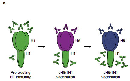
|
The figure shows the famous hemagglutinin (HA) protein of the flu virus. It has a head and a stalk.
Making chimeric (hybrid) HAs is central to the work here. The hybrid HAs have a head from one flu virus and a stalk from another. All of the HA used here have a stalk from H1 (green); they vary in the head part. For example, in the middle frame, cH8/1N1 means that the HA is a hybrid of H8 and H1 -- an H8 head and an H1 stalk. At the left there is an ordinary type 1 HA. Most adults have been infected with H1 flu viruses, and have made antibodies to it -- to both the head and stalk. The antibodies are shown here as little Y-shaped things, color-coded to their target type. You can see there are more of them at the head than at the stalk. That reflects what happens... People make more antibodies to the head region than to the stalk; we say that the head is immunodominant. That's the problem. The head region is much more variable than the stalk. With ordinary flu viruses, whether from natural infections or vaccines, we focus our antibodies on the most variable part of HA; those antibodies may be useful in the short term, but are least likely to be useful in the long term. The hybrid HAs address this problem. Each has a new type of head (H8 or H5). But they all have the same stalk, H1. A vaccine against such a hybrid HA stimulates a new antibody response to the new head, but a boost response, building on memory, to the common stalk. The amount of antibody against the stalk builds up. This is Figure 1a from the article. |
It helps. Sequential vaccination with those two hybrids, following natural infection with the original H1N1, leads to a broader immune response, since the stalk is less variable.
The scientists have been working on this system for some time. The current article reports results from a phase I clinical trial. Real vaccine candidates and real people. Phase I is primarily about safety, but they do get measurements of the antibody responses.
The following figure summarizes some key results. Caution... The labeling is hard to read.
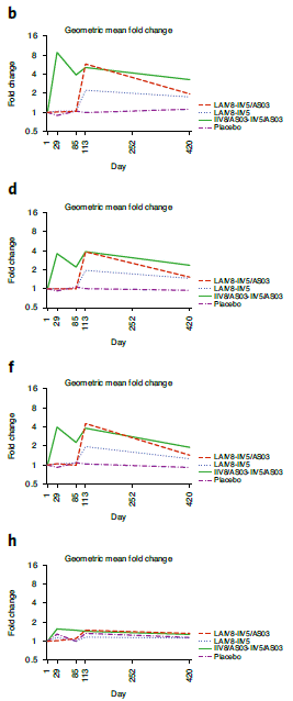
|
Blood samples were taken over time from those vaccinated. The blood samples were tested for antibodies against a panel of HAs from four flu viruses. (The way the test was done made it effectively a test for antibodies against the stalk.) Each graph here is for one of those four viruses.
The y-axis shows the average antibody titer against that virus. It is plotted relative to the initial value, on a geometric scale. There are four lines on each graph, for four variations of the vaccine procedure. The x-axis is time since vaccination, also shown on a geometric scale. Observations: - The first three graphs (b, d, f) are similar. - In each of those, three lines show an increase in antibody titer, which is substantially maintained until the end. And one line shows no effect. - The bottom graph (h) shows no response. The graphs here go out to day 420. There is also limited data in the article showing that the responses continue out to day 588 (19 months). This is part of Figure 4 from the article. |
What does that all mean?
Let's start with the three successful cases (b, d, f). In each of those, three of the curves are for various vaccination procedures using the two hybrid HAs introduced in the first figure. The fourth curve is for a placebo vaccine; it gave no response. The placebo curve (purple; bottom in each case) essentially stayed at 1 throughout. All the other vaccine procedures worked. One can even make some judgments about which worked better, but we'll leave that for now.
What about the bottom case (h), with no response? Well, remember that the person has received stalks of types H1, H5, H8. None of the viruses tested here were any of those. But the vaccine was effective in raising antibodies that deal with these other viruses. Except for one. The virus in the bottom test was the most distantly related to the three viruses used for immunization. In fact, it is not even an influenza A virus at all, but an influenza B virus.
Overall, it appears that the new vaccine, targeted to the HA stalk by using viruses with engineered hybrid HAs, induces antibodies to a substantial range of flu viruses. It seems to be a step toward a "universal" flu vaccine. Further testing is warranted.
We emphasize that this is only a phase 1 trial, with no results on disease prevention.
As noted, the main purpose of this phase I trial was safety. So we note... no major safety issues were found.
News stories:
* News Scan for Dec 08, 2020. (CIDRAP, December 8, 2020.) Scroll down to 3rd item: "Universal flu vaccine found safe, immune-producing in phase 1 trial".
* Strong Results for Advanced Universal Flu Vaccine in Clinical Trials. (SciTechDaily (Mount Sinai School of Medicine), December 7, 2020.)
The article: A chimeric hemagglutinin-based universal influenza virus vaccine approach induces broad and long-lasting immunity in a randomized, placebo-controlled phase I trial. (R Nachbagauer et al, Nature Medicine 27:106, January 2021.)
A post about another approach to making a universal flu vaccine: Using antibodies from llamas as the basis for a universal flu vaccine? (December 7, 2018).
and... Briefly noted... Progress toward a universal mRNA-based flu vaccine (February 15, 2023).
Posts on flu are listed on the supplementary page Musings: Influenza.
January 30, 2021
Calcite is a crystalline form of calcium carbonate. It is a good material for hard skeletons, in a range of organisms.
A recent article reports the first known example of a calcite skeleton in an insect, the leaf-cutter ant, Acromyrmex echinatior. It's not a very thick piece of calcite; after all, it is on an ant. But it does provide advantage to those carrying it.
The first figure shows a physical test of the hardness of the skeleton.
|
The figure shows the measured hardness of the cuticle (outer layer) of various insects.
Hardness was measured by nanoindentation, monitored in an electron microscope. The top bar shows a hardness that is 2-3 times greater than for the others. This bar is for the current ant. The bar just below that is for the same ant, grown under conditions where it does not add a calcite layer. That is, the top two bars are for the same kind of ant, with and without the calcite layer. The figure also shows the results for some other insects, including some other ants. This is part of Figure 4 from the article. |
That figure shows that the calcite layer provides a substantial increase in hardness. It does so with little extra thickness; the calcite layer is about 2 micrometers thick, on top of the usual 30 µm chitin cuticle.
The following figure shows the biological advantage of the calcite layer...
|
Combat.
The leaf-cutter ants, with or without calcite layer, were tested with another kind of ant. The results are shown here as body parts lost (y-axis) vs time (x-axis). The two curves are for the two forms of the leaf cutters. As you might guess, the lower curve (orange) is for the ones with a calcite layer. This is another part of Figure 4 from the article. Another part of the figure shows the survival; it is much higher in the ants with the calcite layer. |
The figures above show that the calcite provides physical hardness and a biological advantage.
We have not shown the evidence on the identification of calcite. The ants do have some visible white specks, but it is not clear what they are. The identification of the material involved high tech analyses of tiny amounts of material. We also note that the calcite here is a high-magnesium calcite; that, too, may be interesting, but that is another story.
News stories:
* Scientists discover the first insects with a shell-like armor -- Leaf-cutter ant workers have a magnesium-rich biomineral armor that you'd expect to see in crustaceans rather than insects. (Tibi Puiu, ZME Science, November 24, 2020.)
* Leaf-Cutter Ants Have Biomineral Armor. (Natali Anderson, Sci.News, November 26, 2020.)
The article, which is freely available: Biomineral armor in leaf-cutter ants. (H Li et al, Nature Communications 11:5792, November 24, 2020.)
Posts about calcite in skeletons include...
* Bending a rigid rod (May 17, 2013). A complex calcite-based material was made in the lab, inspired by the skeleton of a sponge.
* Armor (February 5, 2010).
* Increased CO2: effect on animals that make carbonate skeletons (January 11, 2010).Among many posts about ants: Insulin: role in reproduction in ants (October 2, 2018).
January 27, 2021
Mining healthcare records for genetic clues. Finding the genes behind a condition can be difficult, especially when many genes play a role and when the condition is rare. Data, data, data. A recent article reports progress in combining genome data from healthcare databases along with data generated during research to uncover candidate genes. The expanded data supply allowed the scientists to compare the exomes (protein-coding sequences) of 31,058 people with medically important conditions with the sequences from their parents. They found 28 new genes associated with the conditions -- and estimate that there are a thousand more genes to be found. It is progress in our understanding of human genetics.
* News story: Study linking 28 genes to developmental disorders to mean diagnoses for about 500 families -- Researchers estimate another 1,000 genes linked to developmental disorders still to be found. (Science Daily (Wellcome Trust Sanger Institute), October 14, 2020.) Links to the article.
* A background post... Accumulation of mutations in the sperm of older fathers (November 19, 2012). An article from about a decade ago, comparing genomes of child-parent trios. 68 of them. The current article compares 31,000 such trios. (The earlier article examined complete genomes; the current one examined exomes, about 2% of the genome. Still, the current article examined 10-fold more DNA sequences -- and focused on protein-coding regions.)
January 26, 2021
Here are the villains...
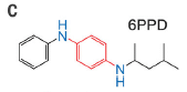
|
These are the top and bottom structures from Figure 2C from the article. |
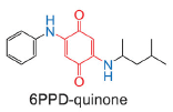
|
Let's step back for some context... Coho salmon (Oncorhycchus kisutch) in the Seattle area (in the US state of Washington) migrate into man-made channels, including storm drains, to breed. When there is a rainstorm, many of the fish die. Sometimes, most of them die -- before laying their eggs.
It has long been suspected that the fish deaths might be due to toxic run-off into the storm drains when it rains. In fact, the phenomenon has a name: urban runoff mortality syndrome (URMS). But a name is not an explanation; what is actually happening has been unknown.
A new article reports some interesting detective work, which seems to provide an answer. Briefly, a chemical in ordinary car tires is leaching out. The form of the chemical put in the tires during manufacture is not toxic, but it is easily oxidized by the air, and the oxidation product is toxic to the salmon. The toxic form ends up in the storm drains during storms. (It may be that what washes into the drains is actually particles sloughed off by worn tires, i.e., "rubber crumbs"; the chemical leaches out later.)
The top chemical in the figure above is what is put in the tires; it is labeled 6PPD. The bottom chemical there is the toxic oxidation product, 6PPD quinone.
(6PPD = N-(1,3-dimethylbutyl)-N'-phenyl-p-phenylenediamine.)
The oxidation involves the ring in the middle of the structure, shown in red. Two O atoms are added, each connected to the ring by a double bond. Scientists can make the quinone oxidation product in the lab by treating the parent compound, 6PPD, with ozone, O3. Presumably, that is about what happens to the 6PPD when exposed to urban air.
Here are some results about the toxicity of the quinone to fish...
|
The two parts of the figure are similar; they show fish deaths (y-axis) vs concentration of the quinone (x-axis) in a standardized lab test. A quick glance at the smooth curves... you can see that the results are similar in the two parts of the figure.
Start with part B (bottom). This shows the results using a "pure" sample of the quinone, made in the lab. The higher the concentration of the quinone, the more fish die. It is common to characterize such a response by the amount needed for a 50% effect. In this case, that is called the LC50, where LC stands for lethal concentration. In B, with the pure chemical, the LC50 is about 0.8 micrograms per liter; see the dashed lines. Part A uses some samples from the real world. In each case, the quinone concentration in them was measured, and the result is shown on the graph using that quinone concentration. Two of the samples here are run-off samples from Seattle. Two are "TWP leachate" -- samples prepared in the lab by leaching tires. TWP = tire wear particles. This is Figure 3 from the article. |
The big picture is that, as we noted, the two sets of results are similar. That is, the toxicity of the real-world samples in A closely corresponds to the toxicity of the pure quinone (B).
Why is this chemical in tires? To protect them. 6PPD is an anti-oxidant. It is added to the tires to prevent the oxidation of the basic structural material. So it is no surprise that it is easily oxidized. What is new is making the connection that the oxidized product gets out -- and kills fish.
Now what? If this story holds up, the search is on for an anti-oxidant that can protect tires, but not kill fish.
Miscellaneous...
The article includes some testing of storm run-off in other places. The quinone product is found in these other samples. The additive is pretty much universal in tires, so the toxic quinone probably is, too.
Is the toxicity limited to salmon? There is some information that the particular type of salmon found in the Seattle area is unusually sensitive to the quinone, even compared to other salmon. But there is little information, so it is prudent to assume that the toxicity of the quinone may be more general.
We also note that we have no information at this point on how the quinone causes harm to the fish.
News stories:
* Tire-related chemical is largely responsible for adult coho salmon deaths in urban streams. (Science Daily (University of Washington), December 3, 2020.)
* Researchers discover that a ubiquitous tire rubber-derived chemical is killing coho salmon in urban waterways: 6PPD-quinone. (Green Car Congress, December 4, 2020. Now archived.)
* Q&A: Tire Rubber Preservative Harms Coho Salmon, Study Suggests -- 6PPD, a tire preservative, reacts with ozone to produce a compound that the researchers say may be responsible for large die-off events. (Max Kozlov, The Scientist, December 7, 2020. Now archived.) An interview with one of the authors of the article, Edward Kolodziej.
The article: A ubiquitous tire rubber-derived chemical induces acute mortality in coho salmon. (Z Tian et al, Science 371:185, January 8, 2021.)
More posts about salmon...
* Why robo-turtles may be useful (April 25, 2020).
* Berkeley RadWatch: Radiation in the environment (February 24, 2014).Another post about an oxidation-reduction cycle involving quinones: Flow battery (January 4, 2016).
January 24, 2021
Earth is like a spinning top. But it is not an idealized top; it wobbles, in a regular way. Earth is not a perfect sphere; even worse, its contents move around, changing the mass distribution.
A recent article reports measurements of the wobble of Mars. The work is based on observations of Mars from numerous spacecraft, with better and better sensitivity, over nearly two decades.
The following figure summarizes the conclusions.

|
The four ellipses in the figure are four estimates of the path of the "north pole" of the rotational axis.
Big picture: You can see that the rotational axis of the planet traverses an ellipse about 0.1 meter (10 cm) from the central position, (0.0). Three of the curves show the axis path based on data from individual satellites. The blue curve (in the central cluster) is the best overall estimate, combining all the data. Two of the individual sets agree very well with that. The third gives a somewhat different result, but certainly is consistent with the general picture. The inset at the lower left shows the period for the wobble. (This is not the period for the planetary rotation, which would be the Martian day. Rather, it is the period for the wobble, the time it takes for the rotation axis to go around the ellipse shown in the figure.) Big picture: Three of the values shown are in excellent agreement, at 207 days. One value is a bit larger. That is for the MGS (Mars Global Surveyor), the same satellite that gave a somewhat different result in the main figure. That satellite is known to be the least sensitive of the ones studied here. The other observations are from the Mars Odyssey (Ody) and Mars Reconnaissance Orbiter (MRO). In the inset, one dataset is labeled MRO120F. That is for a second type of measurement from the MRO. This is part of Figure 1 from the article. |
It's the first time such a wobble has been measured for any celestial body beyond Earth.
How is the wobble measured? It is complicated; it is all about gravity. The orbiting spacecraft make extensive measurements of their precise distance from the planetary surface. The data show how the spacecraft orbit is affected by Mars; this can be analyzed to yield information about what Mars itself is doing.
Why is Mars wobbling? We don't know. At the top, we noted some general ideas about why a body may wobble, but it is hard to figure out the details. We don't really understand the wobble of the axis rotation of Earth, though geological activity is presumably a player. Mars is not very active geologically. In fact, the wobble found here is quite small compared to that of Earth. For now, the wobble is another clue about the nature of Mars. And it is an impressive achievement.
News stories:
* Mars is also a wobbly planet like Earth, and we don't know why. (Alexandru Micu, ZME Science, January 7, 2021.)
* First Detection of a Built-In Wobble on Another Planet -- Spacecraft find that Mars oscillates 10 centimeters off its axis of rotation. (Jack Lee, Eos, January 4, 2021.) From the journal publisher.
The article: Detection of the Chandler Wobble of Mars From Orbiting Spacecraft. (A S Konopliv et al, Geophysical Research Letters 47:e2020GL090568, November 16, 2020.)
Posts about Mars include: A lake on Mars? (August 24, 2018).
More about measuring gravity with spacecraft: The potato we call home: a study of the earth's gravity (May 3, 2011).
More about measuring gravity: Measuring a weak gravitational interaction (June 7, 2021).
January 20, 2021
The causes of sea level rise during the 20th century. Rising temperature is causing sea level to rise. It will continue to rise, and will increasingly cause problems in low-lying areas. We broadly understand that the major contributors are ice (glaciers) melting, adding water to the seas, and the thermal expansion of the seas. But when examined in detail, the numbers did not add up. A recent article brings in more data, and does the best analysis yet. And now, the numbers do add up. We can, within measurement errors, explain the observed pattern of sea level rise since 1900. That doesn't mean we understand it all, but it does suggest that we are close. An interesting aspect of the work is that the discrepancy over one time period turned out to be largely due to a burst of dam building, which kept water out of the seas. The article has a lot of technical detail; many will be content to get the main ideas from one or more news stories.
* News story: Nagging sea level-rise mismatch solved --
Improvements closed gap between estimated causes and measure[d] change. (Scott K Johnson, Ars Technica, August 19, 2020.) Links to the article.
* A background post: Climate change and sea level (October 2, 2017). The dam effect noted above would be part of "TWS" from that post; the discrepancy addressed here is before the time period covered by the earlier article.
January 19, 2021
Tyrian Purple, sometimes called Royal Purple, has been a highly prized dye since antiquity. Its perceived value comes, in part, from the difficulty -- and expense -- of getting it. It is isolated from certain sea snails in the Mediterranean.
There is also a chemical synthesis of the dye, but it is inefficient and environmentally harsh.
A new article may cut the cost of Tyrian Purple.
|
Pieces of various kinds of cloth dyed with Tyrian Purple made by a new process.
The color of the wool is that commonly associated with the dye. This is Figure 5a from the article. |
What's the new production system? E coli bacteria.
The scientists did not transfer snail genes into the bacteria. In fact, they don't know how the snails make the dye. What they did here was to design a pathway from first principles, using (genes for) known enzymes from various sources. The key step is an enzyme known to halogenate tryptophan, using halide ions from the growth medium.
The tryptophan halogenase enzyme is hard to work with, as it is insoluble. The current article develops a practical way to handle the enzyme as part of an overall process. Whole cells are used; the bacteria take care of the complexity of providing the cofactors needed. Further, the process involves two kinds of bacteria, carrying out sequential steps.
Fabric dyeing was done with whole cells, without any purification of the dye.
The process uses an enzyme that specifically modifies the indole ring system of the tryptophan at the "6" position. The scientists also tried related enzymes, which halogenate the ring at different positions. By adding different halide ions to the culture medium, they can get the enzymes to add either Br or Cl. As a result, variations of the process allow the production of a variety of related dyes. Here are some results from that part of the work...
|
The top row shows cell suspensions that made indigo (left) and six different di-halogenated indigos.
The second row shows the structures of the compounds: indigo, three di-chloro derivatives, and three di-bromo derivatives. The integer numbers under the structures are simply the ID numbers used in the article. Number 4, near the right, is the Tyrian Purple. The last row of numbers is the concentration of the dye in the cultures shown. The main point for now is that modification of the procedure allows for the production of quite a variety of dyes. If you look at the structures and the resulting colors, you will see that the position of the halogen atoms is more important than the identity of the halogen. Interesting. This is Figure 6c from the article. |
Overall, the article opens up the possibility of a relatively simple, controlled process for making what has been a scarce and expensive dye. It also allows for the controlled production of variant dyes.
Tyrian blue has also been used in solar cells. A practical production process may allow that work to proceed.
News story: Harnessing bacteria to become royalty. (Beverly Fu, Chembites, November 17, 2020.)
[If that link fails, try the archive copy.]
The article: Production of Tyrian purple indigoid dye from tryptophan in Escherichia coli. (J Lee et al, Nature Chemical Biology 17:104, January 2021.)
A post on the microbial production of indigo: A better way to make (the dye for) blue jeans, using bacteria? (March 5, 2018). The article of this earlier post is reference 44 of the current article. The current authors suggest that there may be merit in combining the key steps of the two articles.
Another halogeneated bi-indole: What is killing the eagles? (April 5, 2021).
January 18, 2021
Altered forms of a brain protein called tau are involved in Alzheimer's disease (AD), and some other neurodegenerative diseases collectively called tauopathies. Although the importance of tau is increasingly recognized, it is still poorly understood.
Brain imaging, using positron-emitting probes that bind to tau, is becoming increasingly useful. PET = positron emission tomography.
Here are some results from a new article, using a new PET probe...
|
PET scans of brains of real living people.
As usual, brighter colors are for greater responses. There are color keys at the bottom, but your qualitative observations are probably sufficient for now. (SUVR = standardized uptake value ratio.) The rows of images are for: - top: HC = healthy control; - middle: AD = Alzheimer's disease; - bottom: PSP = progressive supranuclear palsy. Two PET probes are used. The first three columns are for imaging with the new probe, PM-PBB3, at three different viewing angles. The right-hand column is for another probe, PBB3. The two columns at the right are at the same viewing angle, for the two different probes. As you might guess from the names, the new probe is a derivative of the old one. The new one was designed to be more stable in the body. The two probes use different positron-emitting isotopes (F-18, C-11). That is not important here. This is part of Figure 3A from the article. |
Observations...
- It is easy to distinguish these three cases.
- Three views are better than one.
- Of particular interest, the new probe gives a lower background for the healthy control. That is a good feature (even if not critical in this example).
The article goes on to show more conditions. The superiority of the new probe, in providing cleaner results, holds. The new probe could reliably detect some types of tau pathology for the first time.
PET is too expensive for routine screening. Further, at this point, we do not know how to intervene at the early stages of tauopathies. Nevertheless, PET is an important research tool, including in studying potential therapies. Advances in PET are welcomed.
News stories:
* [Press Release] Brain imaging for early detection of Alzheimer's disease and other dementias. (QST, October 30, 2020. Now archived.) QST? That's the National Institutes for Quantum and Radiological Science and Technology, in Japan.
* Brain imaging of tau protein in patients with various forms of dementia . (EurekAlert! (Cell Press), October 29, 2020.)
* New Tracer Gives Clear Picture of Alzheimer's and Other Dementias -- An imaging agent reveals aggregated tau protein in the brain during PET scans and could improve the diagnosis of neurodegenerative diseases, particularly tauopathies. (Ian Le Guillou, The Scientist, October 29, 2020.) Now archived.
The article: High-Contrast In Vivo Imaging of Tau Pathologies in Alzheimer's and Non-Alzheimer's Disease Tauopathies. (K Tagai et al, Neuron 109:42, January 6, 2021.)
Previous post about AD: Alzheimer's disease: a blood test that might be used for people with some signs of cognitive decline (January 16, 2021). It is the previous post, immediately below.
Previous post about tau: How tau gets around (June 28, 2020).
A recent post about PET scans: Traumatic brain injury: long term effects? (October 8, 2019). Links to more, both about PET and tau.
More... How many types of Alzheimer's disease are there? (June 15, 2021).
My page for Biotechnology in the News (BITN) -- Other topics includes a section on Alzheimer's disease. It includes a list of related Musings posts.
January 16, 2021
In 2014 Musings noted the development of a new test for Alzheimer's disease (AD). The test used cerebrospinal fluid, and looked for misfolded forms of the amyloid-beta (Aβ) peptide. The article provided some intriguing data, but did not actually do any tests in the medical context.
We now have an article that represents a significant advance in the story. A new type of test for misfolded Aβ is run on blood, a much more practical source for large-scale testing. And there is data on real patients.
The following figure shows the key results...
|
The big idea is straightforward, though there are many details to fill in. The test starts with measuring the Aβ in 203 people who reported some decline of cognitive ability. That is, they had SCD = subjective cognitive decline. A few years later, these people were scored for AD. The figure subdivides them, MCI/AD (on the right) or not (left), showing their original Aβ score on the y-axis. (MCI = mild cognitive impairment (MCI), which may be an early stage of AD.)
The Aβ scores are actually misfolding scores. The results are classified as normal (top; green), low misfolding (yellow), or high misfolding (red); the cutoffs are based on earlier development work with the test. Observations: - 23 of the original group went on to develop either full-fledged AD or MCI. - Most of those people had high scores on the early Aβ test. - Statistical analysis showed that those in the red group were 19 times more likely to develop AD (compared to those in the green group). - Those in the red group developed AD earlier than those in the yellow group (2.2 vs 3.4 years). - There was one person in the green group who developed AD. That case was recorded 9 years after the initial report of SCD, an unusually long time in the context of this study. This is Figure 2 from the article. |
Overall, the results suggest that the test has predictive value. Further, by being run on a blood sample, it is practical for large scale screening.
So what are those test scores on the y-axis? Some readers might note that they look suspiciously like infrared (IR) frequencies. In fact, that is exactly what they are.
The test involves IR analysis of the Aβ in the blood. It turns out that the IR spectrum of Aβ is shifted in the misfolded forms, reflecting a structural change from alpha-helix to beta-sheet. The value shown is the peak found for the C=O of the amide bond in the peptide. It varies from 1655 cm-1 in normal monomeric Aβ, to 1624 cm-1 in misfolded and aggregated Aβ.
Is this useful? Well it seems to have predictive value. So what? Can we do something about it? For now, an important use may be in testing treatments during the early stages of AD development.
It is also possible that the development of multiple tests for early stages of AD will lead to even better predictions. The current work also includes analysis of the ratio of Aβ forms (size 40 and 42) in the blood. That improves the predictions.
What about the people with high scores, in the red region, who did not progress to MCI/AD in this study? Will they convert? In fact, the observation time in the work reported here is fairly short; observations continue.
News stories:
* New blood test can determine who's at risk of Alzheimer's years before symptoms begin. (Alexandru Micu, ZME Science, January 7, 2021.)
* A prognostic Alzheimer's disease blood test in the symptom-free stage -- Memory deficit is a normal side effect of aging; at what point does memory loss become pathological? (Science Daily (Ruhr-University Bochum), January 6, 2021.)
The article, which is freely available: Amyloid-β misfolding as a plasma biomarker indicates risk for future clinical Alzheimer's disease in individuals with subjective cognitive decline. (J Stockmann et al, Alzheimer's Research & Therapy 12:169, December 24, 2020.)
Update... A corrected version of the article was posted on January 15, 2021. It includes corrections to Figures 1, 2 and 4; understanding some aspects of those figures in the original version of the article was compromised by errors in publication. If you have a pdf of the article... You can identity the corrected version by looking at the first sentence of the copyright statement at the bottom of page 1; it notes that it is a corrected version. I have posted the corrected Figure 2 above, but it doesn't impact what is discussed here.
* * * * *
Background post: An early-detection system for Alzheimer's disease? (June 28, 2014).
Next post about AD: Brain imaging to detect and distinguish tauopathies, including Alzheimer's disease (January 18, 2021). It is the next post, immediately above.
More about biomarkers for AD: Biomarkers for Alzheimer's disease (March 13, 2023).
My page for Biotechnology in the News (BITN) -- Other topics includes a section on Alzheimer's disease. It includes a list of related Musings posts.
January 13, 2021
Inactive ingredients -- are they? Consumer products, including drugs, may contain "inactive ingredients". What does that mean? A recent article re-examines a large number of ingredients, commonly accepted as inactive, analyzing them by modern techniques. Some do not seem to be inactive. It's a big and complex study, which raises some questions.
* News story: Activities Discovered for Some Inactive Drug Ingredients -- Screens of hundreds of drug excipients reveal that some can interact with biological targets, contradicting their FDA categorization as inert. (Ruth Williams, The Scientist, July 23, 2020.) Now archived.
* The article: The activities of drug inactive ingredients on biological targets. (Joshua Pottel et al, Science 369:403, July 24, 2020.)
January 12, 2021
A team of scientists recently reported the number of trees in a part of northwestern Africa, ranging from the southern edge of the Sahara desert into wetter areas to the south. 1,837,565,501 trees, over an area of 1.3 million km2.
It's a stunning technical achievement, of considerable scientific interest.
A figure will serve to introduce both aspects...
|
The figure includes two maps and two photos; the photos have been marked.
It may be good to start with the two photos, at the bottom. Each starts with an aerial photo of a small ground area. The green spots on them mark trees -- as determined by a computer system from the photo. The scale bar at the bottom is for both photos. The two photos are for regions of very different tree densities, near the extremes for the overall study area. Stepping back, for context... Part a (upper left) shows a map of Africa. It is colored to show the extent of tree cover; see the key just below it, to the left. The region in the red box (upper left) is expanded in the map to the right. That map, too, is color coded by tree density. But the color code is different; see the right-hand key below part a. ("Part b" includes the right-hand map, plus the photos.) The two photos at the bottom are from specific regions of that map, as shown by the black lines connecting the photos to the map. (And you can see two other black lines coming from the map -- to photos I have not included here.) The approximately-horizontal wiggly blue lines in the upper right figure? They divide the map into regions by average annual rainfall. Above the top line, it is less than 150 millimeters per year. The next two lines are 300 and 600 mm/yr cutoffs. This is part of Figure 1 from the article. The full figure shows more trees, from more regions of the map. |
The technical advances fall into two categories, as hinted above. One is simply the quality of the aerial photos, from satellites, which are good to about a half-meter. Second, the trees were identified by the computer system, after extensive training. That is actually the heart of the current article.
The scientific advance from the count? There are far more trees in the dry regions than we had thought. Lower resolution imaging from above doesn't pick them up, and ground counts are limited.
The work, then, is a step toward a better understanding of the biology of dry regions. It is also a step toward a complete count of Earth's trees, but that will remain a daunting task.
News stories:
* Barren no more: study finds millions of trees dot deserts. (Sara Hussein, Phys.org, October 14, 2020.)
* It's greener than you thought: New tree count in Sahara shows surprising results. (Mihai Andrei, ZME Science, October 14, 2020.)
* NASA Uses Powerful Supercomputers and AI to Map Earth's Trees, Discovers Billions of Trees in West African Drylands. (SciTechDaily (Jessica Merzdorf, NASA), November 22, 2020.)
Related...
* An unexpectedly large count of trees in the West African Sahara and Sahel. (Greg Shirah, NASA's Scientific Visualization Studio, October 16, 2020.) Movies and pictures.
* News story accompanying the article: Ecology: Satellites could soon map every tree on Earth -- An analysis of satellite images has pinpointed individual tree canopies over a large area of West Africa. The data suggest that it will soon be possible, with certain limitations, to map the location and size of every tree worldwide. (N P Hanan & J Y Anchang, Nature 587:42, November 5, 2020.)
* The article: An unexpectedly large count of trees in the West African Sahara and Sahel. (M Brandt et al, Nature 587:78, November 5, 2020.)
More about the biology of the Sahara/Sahel area: Wind-borne mosquitoes repopulate the Sahel semi-desert after the dry season (October 14, 2019).
Other counts include:
* Worm count (August 27, 2019).
* The ultimate census: the distribution of life on Earth (June 22, 2018).A post about trees -- and their ecological impact: Interaction of pollution sources: Can the whole be less than the sum of the parts? (March 9, 2019).
Also see: Monitoring whales from space (June 23, 2019).
January 11, 2021
The use of ultraviolet (UV) light to kill infectious agents has long been common. Will modern light-emitting diodes (LEDs) replace older technologies for this application, as they have with so many other types of lighting?
The problem is that extending LED technology to short wavelengths lags. UV LEDs are expensive. And the shorter the wavelength, the more expensive they are.
A recent article reports what might be some useful progress: maybe the wavelength needed isn't quite as short as we thought.
Here are the key results...
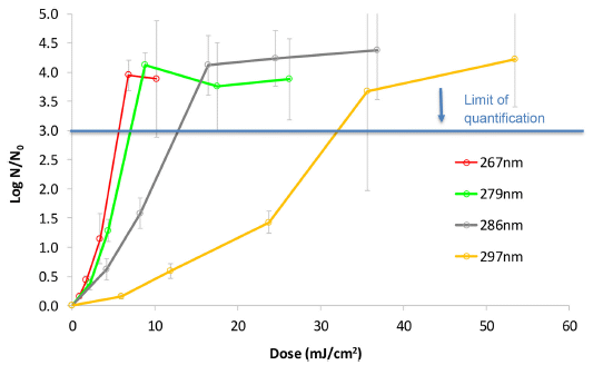
|
Killing curves, as a function of wavelength.
Samples of a virus were treated with various doses of UV light. The UV was supplied by four different UV LEDs, each with a peak emission as labeled on the key (lower right). The results are shown as killing (log scale; y-axis) vs dose (energy per square centimeter; x-axis). Caution... The killing curves are upside-down. The graphs make it look like things are growing; no, they are dying. Further, the axis scale seems backwards. The numbers on the y-axis scale should all be negative; that follows from their expression for killing, shown on the axis label. In turns out... in the Methods section, they say that they use No/N. The graph fits with that, but the axis label is wrong. But none of this matters much. The general nature of the curves is fine, and the error does not affect the comparisons. The main point... The first two curves are very similar. Killing with the 279 nm LED is almost as good as with the 267 nm LED. The other two LEDs, with longer wavelengths, are not as good. It takes more energy to kill with them. But they do work. The virus here is a coronavirus, one of the human cold viruses. It is likely that the results would apply to the SARS-2 virus. What is that horizontal line at 3 on the y-axis? It is labeled as the quantification limit. Given the size of their virus sample, there is little virus left above that line. The error bars increase, because the numbers are small, and the curves level off, because the viruses are largely gone. The full emission spectra of the four LEDs are shown in Figure 1 of the article. This is Figure 3 from the article. |
12 nm different. Does it matter? As noted, this is an emerging technology, and shorter wavelengths are more difficult. So, yes, 12 nm may well matter, in allowing the technology to become practical. Even the LEDs with longer wavelengths might be useful. The authors do not discuss this in any detail, but they are clearly aware of UV LED technology developments.
Germicidal LEDs are coming. Maybe sooner than expected.
News story: UV-LEDs can efficiently, quickly kill coronavirus. (News-Medical.Net, December 14 2020.)
Also relevant... UV Light Might Keep the World Safe From the Coronavirus - and Whatever Comes Next. If researchers can build better UV-C lights, they will be frontline weapons against the next pandemic. (Mark Anderson, IEEE Spectrum, September 28, 2020.) This is a more general discussion about using various kinds of UV against pathogens. It is an excellent overview of the field -- past, present, and future. It includes the possible use of UV LEDs, but does not mention the current work.
The article: UV-LED disinfection of Coronavirus: Wavelength effect. (Y Gerchman et al, Journal of Photochemistry & Photobiology, B: Biology 212:112044, November 2020.)
More UV LEDs... Why might it be good to put lights on fish nets? (September 9, 2013).
An old post, which says that white LEDs are not very good yet... Light bulbs (July 1, 2009).
An example of killing curves using germicidal UV lamps... How some tardigrades are resistant to ultraviolet light (October 27, 2020).
My page of Introductory Chemistry Internet resources has a section on Lighting: halogen lamps, etc. It includes a list of related Musings posts.
There is a BITN section for SARS, MERS (coronaviruses). It includes a list of Musings posts in the field.
January 9, 2021
Some people follow vegetarian diets, broadly defined as avoiding meat, especially red meat. There are variations within the broad class of vegetarian diets. At one extreme are vegan diets, which avoid all animal products (specifically eggs and dairy).
It is hard to evaluate diets. Humans are omnivorous, and will survive at least reasonably on a wide range of foods.
There is evidence that people on vegetarian diets have lower bone density than meat-eaters do. Is that a problem? That has not been clear.
A recent article looks at the incidence of bone fractures in people following various vegetarian diets. The work is part of a large study following health outcomes of 65,000 people over about 18 years. The following figure summarizes the results...
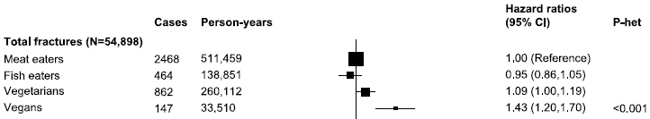
|
You can get the main idea by looking at the "picture", a set of horizontal lines (and boxes). These lines summarize the risk of bone fracture for people on various diets, listed at the left.
The top row is for meat eaters, the "control" or "reference" for this study. Their value for incidence of bone fractures is set to hazard ratio = 1. The long vertical line through that value is for relative risk = 1. The last row is for vegans. You can see that the vegan result is substantially shifted to the right -- to higher risk. To the right of the picture are the actual numbers. For vegans, the hazard ratio is about 1.4, with a 95% confidence interval of 1.2 to 1.7. This gives a p value that is highly significant: the vegan results and the meat-eater results are significantly different. Vegans have about 40% more broken bones than do meat eaters. The "picture" is actually labeled, with numbers, at the bottom of the full figure in the article. We'll use it here qualitatively. The key numbers are shown to the right. The two middle rows are for fish eaters and vegetarians. The effects for these groups are not significant. The N value shown is the number of people in this analysis. This is the top part of Figure 1 from the article. The remaining parts of the full figure show subsets of the data for specific types of fracture. One of those is shown next. |
The following figure shows one subset of those results -- the subset showing the largest effect: hip fractures.
|
This figure shows the subset of the data for hip fractures (as labeled at the left). Otherwise, the column headings of the top figure apply here.
The general pattern is as above for the total data set -- except that the magnitude of the increased risk is much higher for vegans. Vegans have more than twice the risk of hip fractures as do meat eaters. The effect for the other two diet classes is small. It may be most important that the vegan class stands out as different from the other vegetarian classes. This is the part of Figure 1 from the article that shows the results for this one type of fracture. |
Overall, the study shows that vegans have a significantly higher incidence of broken bones than do meat-eaters. A larger-than-average effect is seen for the important subclass, hip fractures. This suggests that the lower bone density previously observed for vegans is functionally important.
As always with such statistical studies... There are a lot of issues hidden in the summary numbers. The statistical analysis is corrected for a range of factors. That is all done with good intentions, but the full story is more complicated.
The article discusses these issues at length. Although the specific numbers depend on the statistical model, the general pattern presented above seems robust.
What underlies the effect? It could be due to something general, such as inadequate protein intake, or could be something specific, such as calcium or vitamin D. Work to understand the effect could enhance our understanding of human nutrition.
News stories:
* Results show higher fracture risks for vegans, vegetarians and pescatarians than meat eaters. (Oxford University, November 23, 2020.)
* EPIC-Oxford Results: Fracture Risks Higher in Vegans, Other Vegetarians. (Physician's Weekly, November 26, 2020. Now archived.)
The article, which is freely available: Vegetarian and vegan diets and risks of total and site-specific fractures: results from the prospective EPIC-Oxford study. (T Y N Tong et al, BMC Medicine 18:353, November 23, 2020.)
There have been a variety of Musings posts about diet. It is a confusing topic. Here are a couple of posts that include vegan diets; they link to more.
* Red meat and heart disease: carnitine, your gut bacteria, and TMAO (May 21, 2013).
* What to eat (November 13, 2009).
January 6, 2021
If DNA damage accumulates in non-dividing brain cells, there is no process of renewal via cell division. A recent article shows that fly (Drosophila) brain cells tend to become polyploid with age. Further, polyploidy seems to be induced by DNA-damaging stress, and -- importantly -- promotes survival. Sounds like a good idea. In fact, there is evidence for some polyploidization in mammalian brains, but no understanding of its mechanism or significance.
* News story: Stress-Induced Chromosome Changes Protect Flies' Aging Brains -- Brain cells in older Drosophila tend to have more than two complete sets of chromosomes, and that polyploidy most likely has a protective function, a study shows. (Lisa Winter, The Scientist, December 1, 2020. Now archived.)
* The article, which is freely available: Polyploidy in the adult Drosophila brain. (S Nandakumar et al, eLife 9:e54385, August 25, 2020.)
* More about aging in flies: Fidelity of protein synthesis: a factor in aging? (November 13, 2021).
* My page for Biotechnology in the News (BITN) -- Other topics includes a section on Aging. It includes a list of related Musings posts.
January 5, 2021
Aedes aegypti mosquitoes are the major carriers of the Zika virus. Both the mosquito species and the virus are thought to have originated in Africa. However, Zika is not a major disease in Africa.
A recent article tests mosquito and virus strains from around the world. How well do the various mosquito strains carry the various virus strains? The following figure shows some of the results...
|
In these tests, various mosquito strains were fed blood carrying increasing amounts of various Zika virus strains. The graph shows the fraction of the mosquitoes that became infected (y-axis) vs the dose of the virus in the blood meal (x-axis). (Viral dose is shown as FFU/mL, log scale. FFU = focus-forming units, a measure of the virus count.)
Each box shows the results for one virus strain, as labeled at the top. The colored lines in each box are for different strains of mosquitoes; they are listed at the right by country of origin. Big picture... In each box, the lines seem to fall into two groups: high and low. High and low levels of infection. Example... Look at the left-hand box, for the Zika strain from Puerto Rico (2015). Look at the first data points, for 106 FFU/mL. The three low points show about 0-10% of the mosquitoes were infected. The four high points show about 40-60% infection. Now look at which mosquitoes those lines are for. Most of the lines in the low group have "warm" colors (reds and such); these are for countries in Africa. All of the lines in the high group have "cool" colors (blues, greens); these are for countries outside Africa. This is part of Figure 1A from the article. The full Figure 1A includes a top row, with three more virus samples. In the figure shown above, only one line violates the main pattern. In the right-hand box, the Colombian mosquitoes showed a low level of infection. The pattern is the same in the top half (not shown). And again, only one line goes against the main pattern. The same Colombian mosquitoes gave one more low result. Some of the boxes include results for only seven of the eight mosquito strains. |
Overall, the results suggest that the African strains of Aedes aegypti are different from the non-African strains in their ability to carry Zika virus. The non-African strains do it better. It is part of the story of the relationship between a virus and one of its hosts. In particular, it is part of the story of the complexity of Aedes aegypti.
The work raises questions, including how that happened and what the implications are. The Colombian mosquitoes may raise more questions. But what is shown above is the main point of the article.
In fact, there is more. The article includes some comparison of different mosquito subspecies within Africa. And it includes some genetic analysis, tentatively finding a mosquito genetic region that relates to sensitivity to Zika.
News stories:
* Mosquitos in Asia and the Americas More Susceptible to Zika Virus -- A study explains how Zika was present among mosquitoes in Africa for decades without causing the harm to human health seen outside the continent in recent years. (Abby Olena, The Scientist, November 19, 2020.) Now archived.
* Mosquito genetics could explain lack of large Zika outbreak in Africa. (Eamon N Dreisbach, Healio, November 24, 2020.)
The article: Enhanced Zika virus susceptibility of globally invasive Aedes aegypti populations. (F Aubry et al, Science 370:991, November 20, 2020.)
Others have addressed aspects of the variability of Zika. The answers vary, perhaps because they address different questions. Among previous posts on this...
* Asian Zika in Africa (October 12, 2019).
* A recent genetic change that enhanced the neurotoxicity of the Zika virus (December 1, 2017).More about variation within the Aedes aegypti group: Why don't black African mosquitoes bite humans? (December 19, 2014).
There is a section on my page Biotechnology in the News (BITN) -- Other topics on Zika. It includes a list of Musings post on Zika.
January 4, 2021
Auroras are colorful displays in the sky related to disruptions in the magnetic field of the Earth.
The following two photos are of an aurora borealis, or northern lights, event in Alaska...
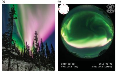
|
Part b (right) shows what was captured by an all-sky camera, doing routine monitoring of the sky.
Part a (left) shows a photo taken by an observer who saw the event in progress. The two photos were taken at approximately the same time (within a minute of each other). It was just after midnight, local time. This is the top part of Figure 2 from the article presented here. |
The following figure shows what two scientific instruments recorded around that time...
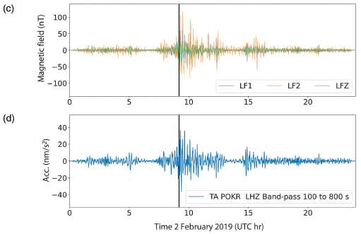
|
The two traces show the instrument responses (y-axis) vs time (x-axis). The vertical line at about 9 o'clock on the time axis shows the time the top photos were taken.
The main observation is that the two instrument traces are very similar. What are the instruments? The one in part c (top) is a magnetometer, whose purpose is to record changes in the magnetic field. It is a good detector of auroral events. The one in part d (bottom) is a seismometer, whose purpose is to detect earthquakes. The response scale for part d is labeled ACC, for acceleration. This is the bottom part of that same Figure 2 from the article. |
So Alaska had an earthquake coincident with the aurora? Or maybe the seismometer, designed to monitor what is happening deep underground, can detect auroras in the sky? In fact, the seismometer is effectively a magnetic instrument, making the latter possibility plausible.
The main purpose of the article is to explore whether the seismometer data contains useful information about aurora events. The figure shown above, in two parts, begins to make the point. The article includes further data showing how well seismometers record auroras.
Does it matter? Look at where the various types of instruments are installed in Alaska...
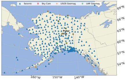
|
A map of Alaska.
The squares show where all-sky cameras are installed. There are six of them. The circles show where magnetometers are installed. There are 13 of them. And the triangles? Seismometers. More than 200 of them. This is Figure 1 from the article. |
Alaska is an area of high earthquake activity. Because of the practical importance, there is an extensive network of seismometers throughout the state. Seismologists have recognized that the Earth magnetic field can interfere with earthquake measurements, and have learned to filter out extraneous noise. The current work shows that the noise from these devices is itself worthy of attention, and can contribute to our study of the sky.
News stories:
* Alaskan seismometers record the northern lights. (Science Daily (Seismological Society of America), July 29, 2020.)
* Scientists record aurora using earth-monitoring tools in Alaska. (Fritz Freudenberger, University of Alaska Fairbanks, July 28, 2020.)
The article: Recording the Aurora at Seismometers across Alaska. (C Tape et al, Seismological Research Letters 91:3039, November 2020.)
Previous posts about auroras: none.
More about the overlap of seismometry with other technologies: Detecting earthquakes using the optical fiber cabling that is already installed underground (February 28, 2018).
We've caught the seismologists straying from earthquakes before. For example... Seismologists measure temperature changes in the ocean (October 6, 2020).
Among previous posts about Alaska: Rise of the Roman Empire: role of an Alaskan volcano? (July 28, 2020).
January 2, 2021
How long does immunity last? You may have heard that it lasts for a lifetime, but that is not always true. In fact, it is quite variable. Immunity to influenza acquired by vaccination is substantially lost after a year or so in most people.
The need for annual flu vaccination is partly due to the changing nature of the flu virus. That's a different issue. Our current topic is the lifetime of a useful immunological response to a specific virus.
A recent article examines the time course of immunity to the flu virus after vaccination -- and does so at a level deep inside the immune system. The scientists sample the bone marrow of people getting the flu vaccine, and look at the level of plasma cells making anti-flu antibodies.
The following figure shows some results...
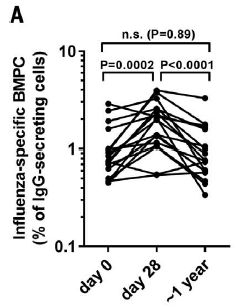
|
The graph is somewhat cluttered, but the main idea is simple. Bone marrow from a number of volunteers was tested at three times: zero (the time of receiving the vaccine), and about one month (28 days) and one year afterwards. The results are shown as the percentage of bone marrow plasma cells (BMPC) making flu antibodies (y-axis) vs time (x-axis). Each line on the graph is for one person for a particular year.
The trend is fairly clear... The percentage of BMPC making anti-flu antibodies increased from time 0 to 1 month; that's good. It then decreased by 1 year. After a year the level of such cells was about the same as before vaccination. The scientists also did some testing of the specificity of the anti-flu antibodies. The results suggest that levels of pre-existing types of antibodies (from previous infections or vaccines) remain constant. The changes observed here are due to the vaccine strains. This is Figure 3A from the article. |
The work extends our understanding of the response to the flu vaccine. Not only does the level of antibodies decrease over a year, but that reflects what is happening to a key player in maintaining the long term response, the bone marrow plasma cells that make the specific antibodies of interest. As always with the complex immune system, this is a simplification; the challenge is to figure out the significance of this new piece of information.
Thr results here raise the question of whether anything could be done to extend the lifetime of the BMPC, and hence the effective protection. The article contains some discussion of this, but for now it is speculative, just a guide for further work.
Does it matter how long the flu vaccine lasts, if the virus changes each year anyway? Perhaps not, if it were that simple. But there is interest in developing flu vaccines that are universal (acting against all strains, or at least a wide range). For such universal flu vaccines, the effective useful lifetime night well be limited by the lifetime of the BMPC.
Further, one must wonder whether what is learned about the lifetime of flu vaccine responses would apply to other immune responses.
For example... The issue of how long immunity lasts, whether acquired from a natural infection or a vaccine, has been much in the news in the context of COVID. Of course, we have little experience with the current virus for COVID-19, which has been known for only a year. And we have limited experience with coronaviruses in general. One might hope that there is some underlying story from the new work that has broad implications, but we don't know at this point.
News stories:
* Why is flu vaccine induced immunity short-lived? (Cheleka A M Mpande, Immunopaedia. Undated, but specifically refers to the current article.)
* Seasonal flu vaccinations don't 'stick' long-term in bone marrow. (Medical Xpress (Emory University), August 13, 2020.)
The article: Influenza vaccine-induced human bone marrow plasma cells decline within a year after vaccination. (C W Davis et al, Science 370:237, October 9, 2020.)
Previous post about flu... How bad will the upcoming COVID-era winter flu season be? (September 25, 2020).
Previous post about flu vaccines -- and the possibility of a universal flu vaccine... Using antibodies from llamas as the basis for a universal flu vaccine? (December 7, 2018).
Posts on flu are listed on the supplementary page Musings: Influenza.
Older items are on the page Musings: September-December 2020 (archive).
The main page for current items is Musings.
The first archive page is Musings Archive.
E-mail announcements -- information and sign-up: e-mail announcements. The list is being used only occasionally.
Contact information Site home page
Last update: May 22, 2026