Musings is an informal newsletter mainly highlighting recent science. It is intended as both fun and instructive. Items are posted a few times each week. See the Introduction, listed below, for more information.
If you got here from a search engine... Do a simple text search of this page to find your topic. Searches for a single word (or root) are most likely to work.
Introduction (separate page).
This page:
2022 (September - December)
December 14
December 7
November 30
November 16
November 9
November 2
October 26
October 19
October 12
October 5
September 28
September 21
September 14
September 7
Also see the complete listing of Musings pages, immediately below.
All pages:
Most recent posts
2026
2025
2024
2023:
January-April
May-December
2022:
January-April
May-August
September-December: this page, see detail above
2021:
January-April
May-August
September-December
2020:
January-April
May-August
September-December
2019:
January-April
May-August
September-December
2018:
January-April
May-August
September-December
2017:
January-April
May-August
September-December
2016:
January-April
May-August
September-December
2015:
January-April
May-August
September-December
2014:
January-April
May-August
September-December
2013:
January-April
May-August
September-December
2012:
January-April
May-August
September-December
2011:
January-April
May-August
September-December
2010:
January-June
July-December
2009
2008
Links to external sites will open in a new window.
Archive items may be edited, to condense them a bit or to update links. Some links may require a subscription for full access, but I try to provide at least one useful open source for most items.
Please let me know of any broken links you find -- on my Musings pages or any of my web pages. Personal reports are often the first way I find out about such a problem.
December 14, 2022
Musings has discussed earlier work to develop a synthetic minimal bacterium -- the smallest gene set that supports a functioning organism. A new article builds on that by asking how many genes must be added to develop an organism capable of motility. The scientists added a set of seven genes from Spiroplasma; these genes are thought to be responsible for the simple form of motility shown by these bacteria. Indeed the resulting bacteria now showed the characteristic helical shape and motility of the Spiroplasma. Further work suggested that two of the seven genes were sufficient. Those two genes code for cytoskeletal proteins, both bacterial actins.
* News story: Smallest mobile lifeform created -- Understanding of cell motility's evolution swims forward! (EurekAlert! (Osaka Metropolitan University), November 30, 2022.)
* The article, which is open access: Reconstitution of a minimal motility system based on Spiroplasma swimming by two bacterial actins in a synthetic minimal bacterium. (Hana Kiyama et al, Science Advances 8:eabo7490, November 30, 2022.)
* More about synthetic minimal bacteria: What is the minimal set of genes needed to make a bacterial cell? (July 9, 2016). The strain used as the starting point of the current work is "syn3", discussed in the earlier post.
December 13, 2022
A year ago, Musings noted a new record for sequencing old DNA: a report of a genome sequence of a mammoth from about a million years ago. A new report breaks that record -- by a lot. The authors were surprised to find readable DNA over two million years old. It is likely that it was stabilized by adsorption onto mineral surfaces. The DNA in this case was environmental DNA, rather than DNA from a fossil of an individual organism. The work, with much technical complexity, thus offers insight into life in Greenland two million years ago, a time of very different climate from now.
* News stories:
- DNA that was frozen for 2 million years has been sequenced -- The ancient DNA fragments come from a Greenland ecosystem where mastodons roamed among flowering plants. It may hold clues to how to survive a warming climate. (Antonio Regalado, MIT Technology Review, December 7, 2022.)
- 2-million-year-old DNA reveals surprising Arctic ecosystem -- The oldest DNA ever retrieved, preserved in sediments in northern Greenland, reveals that Arctic and temperate species once commingled in an ecosystem unlike anything that exists today. (Alissa Greenberg, NOVA (PBS), December 7, 2022.)
* The article, which is open access: A 2-million-year-old ecosystem in Greenland uncovered by environmental DNA. (Kurt H Kjær et al, Nature 612:283, December 8, 2022.)
* Background post: Briefly noted... The oldest known genome: a new record (August 31, 2021).
* More about DNA sequencing is on my page Biotechnology in the News (BITN) - DNA and the genome.
* Added January 14, 2026.
And now, old RNA: The oldest known RNA (January 14, 2026).
December 12, 2022
Musings reported on the Great Dimming of Betelgeuse a year ago. Although some recovery had been seen at that point, the event was still generally mysterious. A recent article provides an update and more thorough analysis. If nothing else, it is noteworthy simply that such an event was observed.
* News stories:
- Betelgeuse recovers - for now. Nanowerk News (Leibniz Institute for Astrophysics Potsdam), August 11, 2022.)
- Hubble Sees Red Supergiant Star Betelgeuse Slowly Recovering After Blowing Its Top. (NASA, August 11, 2022.)
* The article, which is open access: The Great Dimming of Betelgeuse: A Surface Mass Ejection and Its Consequences. (Andrea K Dupree et al, Astrophysical Journal 936:18, September 1, 2022.)
* Background post: The Great Dimming of Betelgeuse (July 24, 2021).
December 10, 2022
For those who just want the answer... about 2x10¹⁶ (20 quadrillion), according to a recent article.
* That's about two million per person. (Check your kitchen, and you may agree.) Of course, they are small. By mass, the combined mass of all the ants on Earth is about 1/5 the mass of all the humans. (That is mass of carbon, a common way to compare diverse organisms.)
* Of course, there is much more in the article. How was such an estimate made? How does it compare to previous estimates, and why? How are the ants distributed? Articles such as this not only offer some bottom-line numbers, but also interesting stories.
* News story: Earth harbours 20,000,000,000,000,000 ants - and they weigh more than wild birds and mammals combined. (Mark Wong et al, Conversation, September 19, 2022.) From a group of authors from the article.
* Commentary accompanying the article. It is open access: Improving estimates of global ant biomass and abundance. (Tom M Fayle & Petr Klimes, PNAS 119:e2214825119, October 5, 2022.) Good for both overview and context.
* The article, which may be freely available: The abundance, biomass, and distribution of ants on Earth. (Patrick Schultheiss et al, PNAS 119:e2201550119, September 19, 2022.)
* Also see:
- The role of ants in agricultural pest control (September 12, 2022)
- Worm count (August 27, 2019).
- The ultimate census: the distribution of life on Earth (June 22, 2018).
December 7, 2022
Face mask waste. It has become an issue in recent years. Various uses for discarded face masks have been suggested. In the article noted here, the scientists show that the carbon from them can be used to make carbon nanotubes (CNT). Among uses for the CNT is making ethernet cable. The authors argue that their process is practical and economical. The work has broader implications beyond face masks, in the context of recycling waste materials.
* News story: Researchers transform discarded face masks into Ethernet cable. (Ashwini Sakharkar, Inceptive Mind, October 20, 2022.)
* The article, which is open access: Upcycling of face masks to application-rich multi- and single-walled carbon nanotubes. (Varun Shenoy Gangoli et al, Carbon Letters 32:1681, September 30, 2022.)
* Posts about CNT and related structures are listed on my page Introduction to Organic and Biochemistry -- Internet resources in the section on Aromatic compounds.
* There is a BITN section for SARS, MERS (coronaviruses). It includes a list of Musings posts in the field.
December 6, 2022
It's common wisdom... New mutations that occur in the body (somatic) cells of an animal are not passed on to offspring by sexual reproduction. Only mutations in the germline (cells that go on to make gametes) can be passed on. A recent article reports that this does not hold for certain corals. The authors provide good evidence that somatic mutations can be passed on to the offspring. The reason is simple... In most animals, the germline is separated from the somatic cells very early in development. In the corals, that is not true; the germline develops late, and thus can carry mutations from the somatic cells. Logically, then, the new finding is not a big deal. It seems big because we often lose sight of the assumptions behind our simple views. By the way, late separation of the germline is not entirely restricted to "simple" animals. There are a few animals of various complexity, including some chordates, with the late separation seen in these corals. We also note that the ability of somatic mutations to get to the germline would seem to allow for some selection of mutations to occur based on their value to the soma.
* News story: Coral Can Pass Somatic Mutations Down to Offspring. (Molly Campbell, Technology Networks, September 1, 2022.)
* The article, which is open access: Inheritance of somatic mutations by animal offspring. (Kate L Vasquez Kuntz et al, Science Advances 8:eabn0707, August 31, 2022.)
December 5, 2022
Sustainability. It has become something of a buzzword. If a human activity consumes a scarce resource, it will not be sustainable in the long run. We may have not have noticed before, because the resource limitation was not apparent, or did not seem significant. However, as the population increases and becomes more affluent (consuming more), the limitation becomes an issue.
Sustainability of food systems is one part of that.
A new article offers a review of what has been claimed about the sustainability of novel food systems in recent years. The big message of the article is that we need to develop a well-thought-out framework for discussing what sustainability means. Claims of sustainability are often made with little behind them, or with narrow perspectives.
The emphasis, in the article and here, is not about reaching conclusions, but rather about developing a framework for evaluating sustainability.
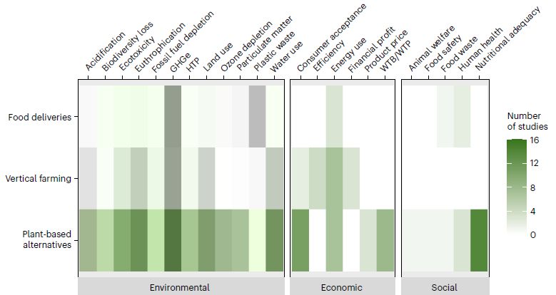
The following figure shows the territory. The data in the figure is the number of articles they found that consider one or another issue. We note the figure here to lay out what those issues are.
|
The three layers of the figure show three of the four major food technology areas considered in the article. These areas are labeled along the left side. (The fourth area is blockchain technology; the articles they found in this area offer interesting suggestions, but no real empirical data.)
Three broad categories of sustainability issues are shown at the bottom. Individual issues are shown across the top. Aside from showing the issues, the big message may be how little has been covered so far. Abbreviations at the top: HTP, human toxicity potential; WTB, willingness to buy; WTP, willingness to pay. Extended Data Fig. 1 (page 10 of the pdf) summarizes the dates of the articles the authors found on these topics. Even for the "most-popular" topic (plant-based alternatives), there were few articles before about 2014. For the other topics, the low level of articles continued even later. This is Figure 3 from the article. |
From the Conclusions section of the article... (FSTs = food system technologies) Guiding transformative investments necessitates a more rigorous, quantitative assessment of the sustainability implications of FSTs, encompassing broad environmental, economic and social indicators, to safeguard against undesirable effects. We hope that the findings of this review provide a starting point to build such a sustainability assessment framework to assess recently introduced FSTs, to inform political guidelines and to guide the development of and investments into long-term sustainable solutions.
News stories:
* Researchers query sustainability of plant-based: Is the category's performance any better than meat and dairy? (Flora Southey, Food Navigator, November 25, 2022.) (Is a word missing from their title? I think so.)
* Sustainability claims behind booming food technologies lack evidence. (Stockholm Resilience Centre, Stockholm University, November 3, 2022. Now archived.)
The article, which is open access: A systematic scoping review of the sustainability of vertical farming, plant-based alternatives, food delivery services and blockchain in food systems. (A Charlotte Bunge et al, Nature Food 3:933, November 2022.)
A post on the complexity of agricultural systems: Why growing maize (corn) is bad for us (June 25, 2019).
The following recent posts note items (such as news stories) with titles including some form of the word "sustainability" -- perhaps rather casually:
* What do we learn from the sulfur isotopes in the California vineyards? (June 28, 2022).
* Food security: the potential of enhanced cultivation of enset (February 22, 2022).My page Internet resources: Biology - Miscellaneous contains a section on Nutrition; food and drug safety. It includes some posts on food security.
December 3, 2022
There are biological risks with space travel. Radiation is one concern, but simply the absence of gravity may also be an issue, as Musings has discussed before [link at the end].
A recent article explores the gravity issue using fruit flies (Drosophila) as a model system. The basic idea was to send fruit flies to the International Space Station (ISS). Some of the flies were housed in a centrifuge, providing them with "artificial gravity". These flies were compared with the non-centrifuged flies, which experienced only the usual micro-gravity (µg) of the ISS. The two groups of flies from the ISS were analyzed, along with control flies from Earth, in various ways, both during and after the flight.
Differences in behavior were clear. The flies on the ISS in micro-gravity were more active than the flies with artificial gravity. Upon return to Earth, the space-flies showed deficiencies in normal behavioral responses.
The following figure shows some results at the cellular and molecular levels...
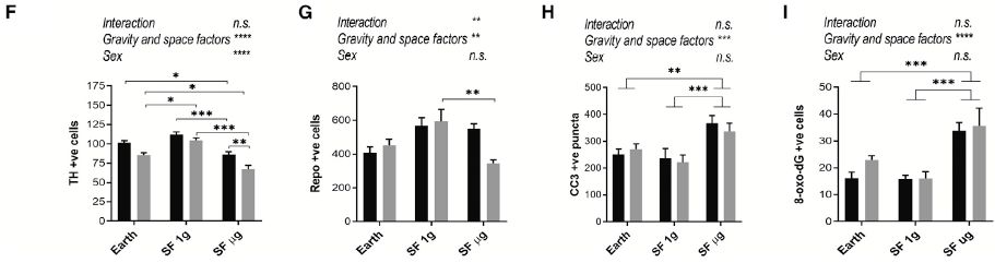
|
Each part shows the results for one type of measurement of the fly brains after the ISS flies returned to Earth. In each part, there are three pairs of bars, one pair of bars each for the Earth controls, along with the ISS flies (SF = space flight) at 1g (centrifuged) or µg (standard ISS micro-gravity). The two bars of each pair show the results by sex of the flies: dark bars for females, light bars for males (as labeled in part A of the full figure). (We won't discuss that part here.)
Start with part I, at the right. This is for a measure of oxidative DNA damage, and gives one of the cleaner results. The high bars are for micro-gravity on the ISS. The Earth flies and the ISS flies with gravity were similar. That is, the flies on the ISS with micro-gravity had a problem, and supplying some gravity remedied the problem. The results shown in part H are similar. This is for apoptosis. The results in the first two parts are more complex. Part F is for dopaminergic (DA) neurons, Part G is for glial cells. This is part of Figure 2 from the article. |
The big picture from the work is that at least some of the detrimental effects of space travel seem to be due to low gravity -- at least as judged by the fruit fly model.
It's also clear from the figure that it is not all that simple. But the work does offer an interesting system for studying the effects of space travel.
And, yes, NASA is considering the use of centrifuges to provide some gravity for astronauts.
News stories:
* Artificial Gravity Provides Partial Protection for Biology in Space. (Frank Tavares, NASA, September 6, 2022.)
* Want to Stay Healthy in Space? Then you Want Artificial Gravity. (Matt Williams, Universe Today, September 12, 2022. Now archived.)
The article, which is open access: Artificial gravity partially protects space-induced neurological deficits in Drosophila melanogaster. (Siddhita D Mhatre et al, Cell Reports 40:111279, September 6, 2022.)
Background post on a biological effect of micro-gravity... Fidelity of DNA replication in micro-gravity (January 11, 2022). Links to more.
Also see: Briefly noted... Do fighter pilots suffer the same problems that astronauts do? (May 10, 2023).
November 30, 2022
The equipment seems to be designed for them. For example, the boots are clearly for men's feet. A new article discusses several specifics. It notes progress as well as problems.
* News story: St Mary's Researcher Finds Female Footballers are using Unfit Technology -- New research published today by Dr Katrine Okholm Kryger, Sport Rehabilitation academic at St Mary's University, Twickenham, has found that female footballers are being left behind in sports technology. (St Mary's University (UK), November 15, 2022.)
* The article, which may be freely available: Ten questions in sports engineering: technology in elite women's football. (Katrine Okholm Kryger et al, Sports Engineering 25:25, November 16, 2022.) Authors include the Captain of the England Women's National Team.
* More about women's sports: Briefly noted... Concussions in women athletes (August 18, 2021).
* More soccer: Flow centrality: the key to a scientific analysis of the soccer game (July 11, 2010). Links to more.
There is now an extensive list of sports-related Musings posts on my page Internet resources: Miscellaneous under Sports.
November 29, 2022
The (major) causal agent of leprosy (Hansen's disease) is Mycobacterium leprae. It is a difficult bacterium to deal with. It has a degenerated genome, and is an obligate intracellular parasite; it cannot be grown in lab culture free of host cells. In nature, it grows in only a few animals, including humans -- and nine-banded armadillos.
A new article reports some unusual features of infection of armadillos with the leprosy bacterium. It almost seems as if these bacteria and these animals have a symbiotic relationship.
The following figure shows what got the scientists' attention...
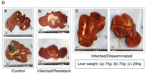
|
Livers. Armadillo livers. One liver (part a; two views) is from a control (uninfected) animal. One (b) is from an animal that has been infected but is resistant to the infection. And one (c) is from a productive infection.
The liver from the infected animal is much larger. (All the livers are at about the same scale; the scale bars are 1 centimeter.) In addition to the visual estimation of size, the weights of the livers are shown (box at lower right). The infected liver here is about 4-fold heavier. But it's more than that. It's not just that the infected liver is big, but that it looks quite normal and healthy. In humans, the leprosy bacteria grow largely in the skin. In these armadillos, which have a rather low body temperature, it grows in various internal organs, including the liver. This is Figure 1D from the article. (Note that lower case letters are used for the sub-parts of Figure 1D.) |
Here are some images at the cellular level, with two different stains...
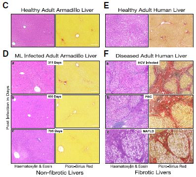
|
The left side (parts C and D) is for armadillo livers. The top images (C) are for uninfected armadillos. The lower images (D) are for various times during an infection, out to about two years.
The right side is for human livers. Again, the top images (E) are controls, for normal human livers. The lower images (F) are for human livers with various pathologies. From the top... chronic infection with hepatitis C virus (HCV); granulomatous injury (primary biliary cholangitis [PBC]); and metabolic injury with lipid accumulation, non-alcoholic fatty liver disease (NAFLD). The striking observation is that the infected armadillo livers look quite normal (other than their size, as seen in the first figure). The images of the diseased human livers show what diseased livers often look like. Note that leprosy infection is not included here; the leprosy bacterium does not grow in the liver in human infections. This is part of Figure 4 from the article. |
What's going on here? The scientists report some work at the molecular level. They think that the bacteria are inducing a stem-cell-like state (or, at least, a liver-cell-progenitor state) in the armadillos. This allows an orderly expansion of the organ, in a healthy form. Of course, it also creates more space for the bacteria to grow.
Might it be useful to know how leprosy bacteria induce orderly expansion of a mammalian liver? We'll see. (How armadillo-like are we?) It certainly makes for an interesting story.
News stories:
* In armadillos, leprosy expands healthy liver tissue. Could that tell us something about regenerating our own? (Eric Boodman, STAT, November 17, 2022.)
* Leprosy Causing Bacteria Drive Liver Cells into a Normal Regenerative State. (GEN, November 16, 2022.)
* Expert reaction to study looking at leprosy bacteria and regenerating liver cells in armadillos. (Science Media Centre, November 15, 2022.)
The article, which is open access: In vivo partial reprogramming by bacteria promotes adult liver organ growth without fibrosis and tumorigenesis. (Samuel Hess et al, Cell Reports Medicine 3:100820, November 15, 2022.)
Also see: Leprosy: the armadillo connection (May 14, 2011). Links to more -- about armadillos, leprosy, and other Mycobacteria.
There is a BITN page for Cloning and stem cells. It includes lists of posts, including on regeneration.
November 27, 2022
Here's the comb, which was featured in a new article...
|
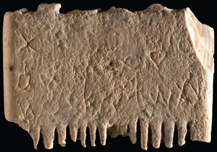
It is made of ivory, and is about 3.7 x 2.5 cm (also see next figure). All the teeth, on both sides, are broken.
It is one of several combs found during archeological expeditions at Lachish, about 40 km southwest of Jerusalem. It is thought to be about 3,700 years old. There are markings on the comb. That there is text was not obvious until later observation at higher magnification. More about this below. This is Figure 14 from the article. The comb here is comb "A" in the article. |
Here is the inscription, as written out by the scientists...
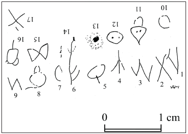
|
The individual letters are numbered -- in order. You need to turn the page around after reaching the end of the first row.
Regions of uncertainty are shown with dashed lines (characters 13, 14). Translated to modern English: May this tusk root out the lice of the hai[r and the] beard. The part in brackets is inferred for the uncertain regions from context. Note that the letters in the first row are smaller as you go across the row. And that the second row did not end well. This is Figure 18 from the article. |
Maybe that's funny. But that's not the point. The article is serious science, an analysis of an ancient cultural artefact. The language is Canaanite, which is one of the first languages to use an alphabet. The dating of the comb suggests this is very early Canaanite. The sentence found here is perhaps the oldest known sentence from an alphabet-based language.
The article describes several steps of the process...
* Reading what is on the comb.
* Interpreting that as letters in the Canaanite alphabet. It is a painstaking process, one letter at a time, comparing the letters here with other samples from the language.
* Recognizing letter groups as words, and developing the meaning, using their understanding of the Canaanite language.
There is much uncertainty along the way, discussed at length in the article.
The article provides some insight into an early stage in the development of human languages. It also offers a bit of insight into the problems of an ancient time.
Canaanite? Modern Hebrew is a form of the early Canaanite language. Other modern alphabetic languages evolved from it over time. For some background on the Canaanite languages: Wikipedia: Canaanite languages.
News stories:
* Oldest known sentence written in first alphabet discovered - on a head-lice comb -- Timeless fret over hygiene picked out on engraved Bronze age comb from ancient kingdom of Judah. (Ian Sample, Guardian, November 9, 2022.)
* First sentence ever written in Canaanite language discovered: Plea to eradicate beard lice. (Science Daily (Hebrew University of Jerusalem), November 9, 2022.)
The article is open access. Direct link to the pdf file (only format available, I think): A Canaanite's Wish to Eradicate Lice on an Inscribed Ivory Comb from Lachish. (Daniel Vainstub et al, Jerusalem Journal of Archaeology 2:76, 2022.)
Among posts on linguistics (they link to more)...
* Does penguin language conform to the laws of human language? (February 18, 2020).
* Are some languages spoken faster than others? (November 21, 2011).More about combs: A novel nervous system? (July 20, 2014).
November 18, 2022
Retraction notice. The article that was the basis of a Musings post from 2020 has recently been retracted. The article claimed superconductivity at room temperature. Both the experimental work and the data analysis have become the subject of debate. The journal retracted the article, over the continuing objection of the authors. The debate will continue. The news story at Quanta, with the original post, is a useful start for the story.
* Direct link to the retraction notice at the journal web site: Retraction Note: Room-temperature superconductivity in a carbonaceous sulfur hydride. (Nature 610:804, September 26, 2022.)
* I have added this update to the original post, at the top, as a retraction box. That post is: Superconductivity at room temperature -- at last (October 18, 2020).
November 16, 2022
A team of scientists made extensive videos of a group of octopuses. One type of observation got special attention, and became the subject of a new article. The videos are what matters here. Check them out; see the first news story listed.
* News stories:
- Octopuses caught on video throwing silt and shells around themselves and at each other. (Phys.Org (PLOS), November 9, 2022.) Includes a video, probably including all the short videos posted with the article, and assembled to accompany news stories. (2 minutes. Music, but no narration. Video segments are well-labeled.) Direct link to the video, at YouTube.
- 8 Arms to Throw Things at You -- Octopuses throw debris, sometimes seeming to target other octopuses. (Mary Bates, Psychology Today, November 9, 2022.)
* The article, which is open access: In the line of fire: Debris throwing by wild octopuses. (Peter Godfrey-Smith et al, PLoS ONE 17:e0276482, November 9, 2022.) Very readable; I enough you to read at least the first couple of pages.
* Among posts about octopuses and other cephalopods: Aging without memory loss in cuttlefish (October 4, 2021).
* More about octopuses: Sleep stages in octopuses -- do they dream? (July 13, 2021). Includes an extensive list of posts about octopuses and other cephalopods.
November 15, 2022
Telomeres are the special DNA structures at the ends of (eukaryotic) chromosomes. They are unable to replicate completely by ordinary DNA replication, so they get depleted during cell division. That depletion leads to limits on how many cell divisions a cell can carry out.
Cells with extended division somehow bypass that limitation. Such cells include the normal germ line -- and cancer. One way to bypass the limit is to use the enzyme telomerase, a specialized DNA polymerase that restores telomeres.
A new article explores another case of cells with extended division capability -- and discovers a new way to maintain telomeres.
Some cells of the immune system do a lot of division. The article shows that they get extra telomeres by transfer from other cells. Here are some data...
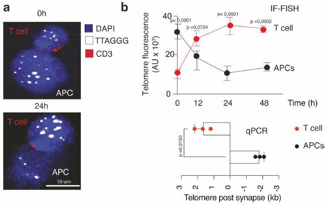
|
Start with the top of part a (upper left). It shows two cells. The top one is a T-cell (red label at upper left; may be hard to see). The other is an APC = antigen-presenting cell. An APC presents antigens to a T-cell.
There are three colors shown for information. The color of interest at the moment is white, which lights up a specific short DNA sequence in the cells. That is the telomere sequence. (Method... Add some DNA of this sequence, and it binds to telomere sequences in the cells. That binding is detected by fluorescence. The method is call FISH, for fluorescence is situ hybridization.) Now compare the top part (t = 0) with the bottom part, which shows the same two cells 24 hr later. Much of the white stuff has moved from the APC to the T-cell. That is, telomere sequences have moved from the APC to the T-cell. Part b shows some quantification of the telomere transfer. The upper right graph shows the fluorescence vs time in the two cells (averaged over multiple cell pairs, and shown with error bars). The red curve, for T cells, increases; the black curve, for APC, decreases. (The y-axis is in AU = arbitrary units.) The lower right graph shows how much the telomere lengths changed n the two cells, measured by PCR. Each point is the change in telomere length from 0 to 24 hr. CAUTION... The x-axis scale runs backwards. ( I have no idea why.) The three red points are for T cells; they got longer by about 2 kilobases (kb). The three black points are for APCs; they got shorter by about 2 kb. This is part of Extended Data Figure 1 from the article (p 19 of the pdf). |
Overall, the figure shows transfer of telomere sequences from one cell to another. Further, it shows that the transferred telomere sequences are actually part of the telomeres in the recipient cell. Such transfer of telomere DNA between cells is novel.
The following figure summarizes some of what the scientists found about how this telomere transfer happens. We'll just note it briefly...
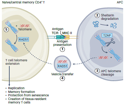
|
T cell on the left; APC on the right.
There are two things going on between them. At the top, labeled with the circled 1, is antigen presentation. It is a very specific and long-characterized interaction. It involves the TCR (T cell receptor) on the T cell, and the MHC protein, carrying the antigen, on the APC. At the bottom, labeled 4, is an extracellular vesicle. It contains some DNA (red), and RAD51, the enzyme needed to recombine the DNA into the recipient chromosome. In the APC, telomere sequences are cut off, by the enzyme TZAP, regulated by shelterin (shown at the top, but with little clarity about its role). In the T cell, the telomere sequences received via the vesicles are recombined into the existing telomeres, thus extending them. (Changes in telomere length are not shown in the figure.) This is Figure 1 from the news story (by Carey) accompanying the article. |
Is this transfer important? Most of the work in the article was done with mouse cells in vitro. Limited experiments with human cells gave similar results. Further, limited in vivo testing suggested that telomere transfer leads to improved survival of the T cells and to improved immune response in the animal.
Why do telomere transfer? Well, these T cells -- memory cells -- do a lot of dividing. That is why they need more telomeres. Why they get them this way is an open question.
The article is exciting in providing a quite novel observation. It may have practical implications. Telomere-containing vesicles can be isolated, and might be useful therapeutically. There is much more to be done to characterize and understand -- and maybe exploit -- the new finding.
News stories:
* 'Unexpected discovery' that could extend life of immune system. (British Society for Haematology, September 20, 2022. Now archived.)
* New mechanism extends life of immune system. (Science Daily (University College London), September 22, 2022.)
* News story accompanying the article: Immunology: Telomeres are a life-extending gift -- Cellular senescence induced by DNA replication and telomere attrition contributes to organ dysfunction, inflammation and impaired immunity. A study reveals that antigen-presenting cells provide telomeric DNA to CD4+ T cells in synaptic contact, which enables the suspension of senescence, T cell expansion and long-lived immunity. (Anna Carey et al, Nature Cell Biology 24:1449, October 2022.)
* The article: An intercellular transfer of telomeres rescues T cells from senescence and promotes long-term immunological memory. (Alessio Lanna et al, Nature Cell Biology 24:1461, October 2022.)
Among posts about telomeres: What to do if your telomeres get too long (March 19, 2017). Introduces TZAP, shown in the second figure above.
More on antigen-presentation: How a drug can cause an autoimmune reaction (September 1, 2012).
My page for Biotechnology in the News (BITN) -- Other topics includes a section on Aging. It includes a list of related posts.
November 12, 2022
COVID-19 (infection with the SARS-2 virus) sometimes leads to heart problems. A new article explores the nature of this effect. It leads to a suggestion for a drug treatment.
The work starts in fruit flies (Drosophila). It is actually known that heart development is similar in flies and mammals. It is relatively straightforward lab work to ask which viral genes affect the fly heart.
To look for candidate viral genes, the genes of the SARS-2 virus were individually cloned into flies, and expressed specifically in the heart. The following graph shows their effect on fly survival...
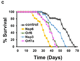
|
The black curve (at the right) shows the survival for wild-type flies. The other four curves show survival for flies with one SARS-2 gene; all showed reduced survival. The rest of the article focuses on Nsp6, which gave the biggest reduction (yellow curve).
(Several other viral genes tested showed no effect on fly survival. They are not shown on this graph, but are listed in the accompanying table, in part b of the full figure.) This is Figure 1c from the article. |
That test, easily done in flies, focuses attention on the Nsp6 protein of the SARS-2 virus.
The next phase of the work was to explore how the Nsp6 protein harms the flies. A simple summary is that it activates glycolysis inappropriately, and probably leads to excessive production of reactive oxygen species (ROS). In particular, the glucose analog 2-deoxyglucose (2DG) provides some protection against the toxic viral protein.
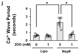
Does this fly finding have any relevance to us, or at least to a mammal? The scientists did a test with mouse cells in lab culture: heart muscle cells (cardiomyocytes). The following figure shows some results...
|
The response tested was the periodicity of calcium ion absorption.
The first bar (at the left: Lipo, 2DG = 0) is the control level. The third bar (Nsp6, 2DG = 0) shows the effect of the viral protein Nsp6. It led to a longer period, i.e., to slower Ca2+ absorption; that is not good. The other two bars are for tests with the drug 2DG added (2DG = 1 mM). The drug does not affect the control case ("Lipo"), but it reverses the effect of Nsp6. This is Figure 6j from the article. |
|
Overall, the article provides interesting clues about the effect of COVID-19 on the heart, based on a simple system in fruit flies. It then provides at least preliminary evidence that the findings carry over to mammals. It offers a type of drug that might be of benefit, and even a specific example of such a drug.
A clinical trial of 2DG is planned. In the US, doing such a trial would normally require some evidence that suggests efficacy in an animal system. The current work is at least a step toward providing that evidence.
The authors note that the omicron variant of the SARS-2 virus carries mutations in Nsp6. It also causes less severe disease. Is there any connection between those two statements? That is an open question for now.
News story: How a SARS-CoV-2 virus protein damages the heart -- Drug lessens harm and may serve as a potential COVID-19 therapy. (EurekAlert! (University of Maryland School of Medicine), November 7, 2022.)
The article, which is open access: SARS-CoV-2 Nsp6 damages Drosophila heart and mouse cardiomyocytes through MGA/MAX complex-mediated increased glycolysis. (Jun-yi Zhu et al, Communications Biology 5:1039, September 30, 2022.)
There is a BITN section for SARS, MERS (coronaviruses). It includes a list of Musings posts in the field.
November 9, 2022
Is music actually a pain killer? A recent article addresses the question in mice. Indeed, a variety of sounds acted as pain killers (analgesics). Most important was the intensity of the sound, not the type. The intensity could be very low, something like a whisper. The scientists went on to explore the brain circuitry behind the response. Is this relevant to humans? Hard to know at this point, but the work provides a level of detail that could not be easily obtained in human studies. It can serve as a base for further work -- in mice and humans.
* News story: How sound reduces pain in mice -- Newly identified brain circuits may point to more effective pain therapies. (Science Daily (NIH), July 7, 2022.)
* News story accompanying the article: Neuroscience: Sounding out pain -- A circuit for sound-induced analgesia has been found in the mouse brain. (Rohini Kuner & Thomas Kuner, Science 377:155, July 8, 2022.)
* The article: Sound induces analgesia through corticothalamic circuits. (Wenjie Zhou et al, Science 377:198, July 8, 2022.)
November 8, 2022
A recent article reports interesting developments about Down syndrome (DS). Let's start with a bottom-line test -- in humans...
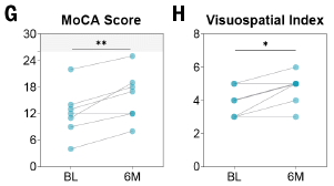
|
Seven adult males with Down syndrome were treated with a hormone procedure over six months. They were given several tests of cognitive ability before and after the treatment.
The figure shows the results for two of those tests. Each line is for one person, before and after the six months of treatment. BL = baseline; 6M = six months (of treatment). |
|
The big picture is that most of the lines slope upward, showing an improvement with the treatment. One of the seven people tested showed little response, as judged by any of the tests. This is part of Figure 7 from the article. The full figure shows results from six such cognitive tests, as well as other measurements (biochemistry and brain structure). | |
What is this all about? It is a complex article. Down syndrome is due to having a third copy of chromosome 21. That's a small chromosome, but, still, it carries numerous genes. Sorting out what actually causes DS has been a long and difficult story. In fact. DS has various features, and it is likely that the extra chromosome has various effects.
The hormone studied here is gonadotropin-releasing hormone (GnRH). It is best known for its role in reproduction, which is indeed one issue in DS. However, it is becoming clear that the effects of GnRH are more diverse. The work here suggests that the role of this hormone in cognition is a distinct branch of its function.
There is a mouse model for DS; it is thought to substantially mimic the effect of having a third human chromosome 21. Most of the work reported in the article was done with the mouse model.
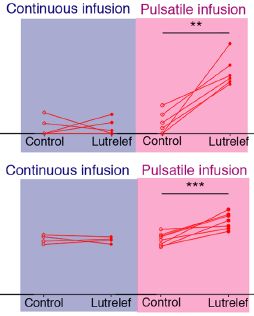
The following figure shows the results of a pair of mouse tests done as background to the human test reported above; they illustrate a special feature of the treatment...
|
The top and bottom halves of the figure are for two different tests -- in the mice. Results are shown for the hormone treatment and a control. The hormone treatment is labeled Lutrelef (a commercially available form of the hormone).
The main variable in each case is whether the hormone is given on a continuous basis, or as pulses. There is little effect on the left side, for continuous infusion of the hormone. For pulsatile infusion (right side), most of the lines slope upward, showing an improvement. This holds for both tests. The pulsatile infusion involved giving a pulse of the hormone every three hours for two weeks, using a pump worn on the body. (With the human patients, top figure, the pulses were every two hours over six months.) The two tests here involved odor discrimination (top) and object recognition (bottom). This is part of Figure 6 from the article. |
|
This post can only touch the surface of what is in the article. DS is complex, with many manifestations, and the mouse model is different from the human condition. What is presented in the article is intriguing and encouraging. The mouse work led the authors to do one small test with a few human cases, and the results are encouraging. It is the first work to report a treatment that improves the cognitive function of people with DS. A larger trial is imminent.
News stories:
* Treatment improves cognition in Down Syndrome patients. (Isabelle Tourne & Daniel Lawler, Medical Xpress, September 4, 2022.)
* A Hormone May Boost Cognition in Down Syndrome -- The hormone GnRH may have potential for improving language, memory and other intellectual functions in people with Down syndrome, according to a pilot study. (Simon Makin, Scientific American, September 1, 2022.)
* New Therapy Improves Cognition in Down Syndrome Patients. (SciTechDaily (INSERM), October 1, 2022.)
* News story accompanying the article: Medicine: Boosting cognition with a hormone -- A hormone enhances cognition in mouse models of Alzheimer's disease and Down syndrome. (Hanne M Hoffmann et al, Science 377:1042, September 2, 2022.)
* The article: GnRH replacement rescues cognition in Down syndrome. (Maria Manfredi-Lozano et al, Science 377:abq4515, September 2, 2022. Not in print edition.)
More about Down syndrome: Down syndrome: Could we turn off the extra chromosome? (November 15, 2013). Links to more.
November 7, 2022
Hydrogen has considerable appeal as a fuel. It is a clean fuel; the only by-product of burning hydrogen is water. But hydrogen has its own challenges. Among them is storing (and transporting) it. In the common gas form, it has a low density. And it is expensive to make the more compact liquid form. Both require great care in choosing storage containers.
What if we could store hydrogen in a simple way -- such as in a box of salt? A new article explores how this might be done. The results are intriguing, though the end result here is not yet useful.
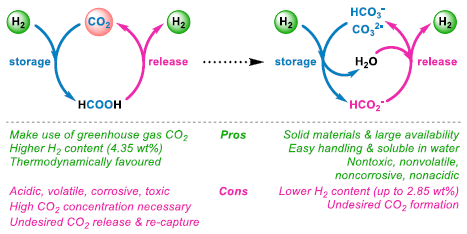
|
The figure shows two schemes. The one on the left has been around a while. The one on the right is similar; it can be thought of as a step from the first one. It is the focus of the current article.
Let's write equations for the two schemes. For the one on the left... H2 + CO2 ⇄ HCOOH (formic acid) (1) The forward (rightward) reaction is for hydrogen storage; the reverse reaction is for release. Note this is a redox reaction: the hydrogen is reducing the CO2 in the storage reaction. (The C is reduced from +4 to +2.) The one on the right is the same idea, but a bit more complicated -- partly because they include two possible starting materials. Let's focus on one, bicarbonate... H2 + HCO3- (bicarbonate ion) ⇄ HCOO- (formate ion) + H2O (2) The redox aspect of this reaction is the same as in equation 1. Equation 2 has a couple of ions in it. Let's add some potassium ions, so we can make neutral chemicals... H2 (g) + KHCO3 (aq) (potassium bicarbonate) ⇄ HCOOK (aq) (potassium formate) + H2O (l) (3) The general picture is the same using carbonate (rather than bicarbonate), though the details of operating conditions would be somewhat different. At the bottom of the figure, the authors give some pro and con of the two processes. Perhaps most important for the moment, equation 3 (for the scheme on the right) involves a couple of simple salts. They are shown in the equation as aqueous (dissolved in water). But both are readily obtained as solids -- inexpensive, quite safe, and easy to transport. In particular, potassium formate has become a source of hydrogen. In a meaningful sense, we are storing hydrogen in a box of salt. The colors in the text at the bottom (pro/con) have no relationship to the colors in the figure itself. This is Figure 1 from the article. |
The article reports progress toward making the second scheme practical. Of particular importance is developing a catalyst -- one based on inexpensive metals. They try various things; one, based on manganese and called Mn-2, seems promising.
The following figure summarizes some results using various formate salts, and looking at the ability of the system to run for multiple cycles...
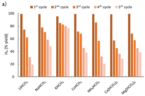
|
You can see that most of the salts gave nearly 100% recovery of the H2 in the first cycle. However, the yield dropped considerably with repeated cycles. Interestingly, the one that looks best overall, that is, for the five cycles run here, was actually a bit low for the first cycle. That salt is potassium formate, which we have noted earlier. (They write it as KHCO2; earlier I wrote it as HCOOK. Those are just two ways to write the same thing.)
This is Figure 5a from the article. |
The best salt is giving about 80% recovery after five cycles. It's not obvious that the yield has leveled off, so it is not at all obvious that we have a practical process here.
But it is a start, with a good goal, and some encouraging progress.
The authors conclude... Both the hydrogen acceptor and donor are nontoxic, nonvolatile, noncorrosive, and nonacidic and show high solubility in water. While the reported study paves the way for building up a new H2 storage release method, for larger scale applications, it is desirable to improve the catalytic efficiency even if an Earth abundant metal-based catalyst is applied. (End of last paragraph of the article.)
News story: Researchers store hydrogen fuel in salts. (Green Car Congress, October 27, 2022. Now archived.)
The article, which is open access: Manganese Promoted (Bi)carbonate Hydrogenation and Formate Dehydrogenation: Toward a Circular Carbon and Hydrogen Economy. (Duo Wei et al, ACS Central Science 8:1457, October 26, 2022.)
Among posts about hydrogen as a fuel:
* Storing hydrogen in magnesium diboride nanosheets (May 15, 2023).
* Solar hydrogen -- with near 100% efficiency? (July 26, 2020).
* Is there food on Enceladus? (May 21, 2017).There is more about energy issues on my page Internet Resources for Organic and Biochemistry under Energy resources. It includes a list of some related Musings posts.
November 5, 2022
If we want to think about how microbes might survive on Mars, a good place to start might be Earth organisms with high resistance to environmental stresses. Deinococcus radiodurans comes to mind. It is exceptionally resistant to radiation -- a big issue on Mars, which lacks a magnetic field to deflect cosmic radiation.
A new article explores how well D radiodurans survives under conditions that might be met on Mars. All the work is with Earth microbes (this Deinococcus and others) and done on Earth, but the thinking is focused on Mars.
The following figure shows the results of the main test with this bacterium...
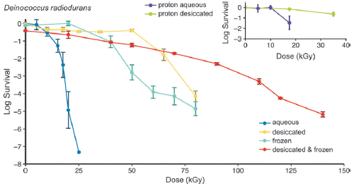
|
Focus on the main part of the figure. It shows survival (y-axis; log scale) vs dose of gamma rays (x-axis). The dose is in kGy = kilograys, a unit of radiation; 1 Gray (Gy) = 1 Joule/kilogram = 100 rad.
The curve to the left (blue) is for an ordinary aqueous suspension of the bacteria. One can think of this as the control case here. The curve to the right (red) is for bacteria that were both frozen and desiccated. You can see that they survived the radiation much better. The two middle curves are for bacteria that received one or the other of the two treatments. They gave intermediate results. The inset shows a limited test of survival following irradiation with a proton beam (to mimic solar radiation). This test uses only the control case (aqueous) and desiccated bacteria. The desiccated bacteria show better survival. The results agree qualitatively with the main graph. This is Figure 1 from the article. |
Both treatments reflect conditions in the Martian soil. The results above suggest that both enhance the survival of this already-resistant organism, and that the combination of the two conditions is even better. That is, Martian soil conditions would seem to promote survival of D radiodurans, at least as judged by radiation resistance.
The next figure shows the results of a similar experiment using Bacillus subtilis.
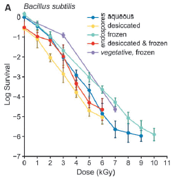
|
Most of this test is with the endospores of this bacterium, and the same treatments as above; the curves are color-coded the same way as in the first figure. There is also one curve for vegetative cells (not spores).
The big picture is that the curves are not very different in this case. In particular, the blue and red curves (control and doubly-treated) are quite similar. The curve for vegetative cells (frozen) is not very different, either. |
|
If you look at the numbers on the x-axis scale, you can see that the D radiodurans is much more resistant to the gamma irradiation than is the B subtilis. The highest dose on this graph, 10 kGy, gives about 6 logs killing here, but has almost no effect in the top graph under any condition. This is Figure 3A from the article. | |
Why the difference between the two kinds of bacteria? The authors' answer to this lies in the current understanding of why D radiodurans is already so resistant to radiation. It has multiple copies of the genome, and they are arranged in a way that makes it easy to assemble a complete functional genome in the event of damage. Desiccation and freezing presumably lead to lower levels of reactive oxygen species, leading to the enhanced resistance seen in the current work.
The authors discuss the implications for Mars. One issue is possible contamination between planets. If we accidentally sent D radiodurans to Mars, we can predict that they could survive there for hundreds of millions of years, once beneath the surface.
That same calculation leads to optimism about being able to find bacteria that might have grown there long long ago. It is unlikely that sustained growth has occurred in the last two billion years or so, but occasional growth might have occurred during periods of transient melting. Further, even if viable (or visibly intact) cells have not survived, perhaps at least their bio-molecules did, buried a few meters underground. There is a lot of hand-waving in there, but the article provides some real and interesting data -- fuel for speculation.
News stories:
* Chances of Finding Ancient Bacteria on Mars are Better than Previously Expected: Study. (Natali Anderson, Sci.News, October 27, 2022.)
* Earth's Hardiest Bacteria Could Survive Hundreds of Millions of Years Just Under the Surface of Mars. (Evan Gough, Universe Today, October 27, 2022. Now archived.)
* Ancient bacteria might lurk beneath Mars' surface -- New study finds the chances of uncovering life on Mars are better than previously expected. (Amanda Morris, Northwestern University, October 25, 2022.)
The article, which is open access: Effects of Desiccation and Freezing on Microbial Ionizing Radiation Survivability: Considerations for Mars Sample Return. (William H Horne et al, Astrobiology 22:1337, November 2022.) The Introduction gives an overview of the radiation hazards on Mars.
Previous posts mentioning Deinococcus radiodurans: none. I am a little surprised at that, but the bug seems to have survived the lack of attention here.
Among posts that might relate to living on Mars...
* MOXIE: Making oxygen gas on Mars (October 12, 2022).
* How to make bricks on Mars (May 21, 2022).
* Perchlorate on Mars surface, irradiated by UV, is toxic (July 21, 2017).
* Discovery of a chemical of biological origin from Mars? (January 2, 2015).
November 2, 2022
There are rules for establishing official names of organisms (such as Homo sapiens or Escherichia coli). For prokaryotes (bacteria, archaea), one part of the rules is that a culture of the organism must be deposited. It has long been recognized that most prokaryotes (perhaps 98%) have not been cultured. How can we establish names for them if they have not been cultured? If we don't know about them, it is a non-issue. But in the modern world, it is becoming increasingly common to identify organisms simply through genomics. Genomes of prokaryotes, substantially complete, are inferred from metagenomics, such as the analysis of environmental DNA. A team of scientists has now come up with a mechanism for establishing official names for such organisms, with the same general rigor applied to naming cultured organisms. It is a step forward in organizing our knowledge of nature, incorporating the recent developments in genomics.
* News story: Scientists Unveil New System for Naming Majority of the World's Microorganisms -- The SeqCode is a universal system, created through collaboration of hundreds of scientists, to formally register and name single-celled microorganisms known as prokaryotes. (Tony Allen, University of Nevada Las Vegas, September 20, 2022.) Excellent overview.
* The article, which is open access: SeqCode: a nomenclatural code for prokaryotes described from sequence data. (Brian P Hedlund et al, Nature Microbiology 7:1702, October 2022.) The details of the program, in the article, are probably not of much general interest. What is most important is the step -- moving toward formal recognition of microbes without cultivation.
November 1, 2022
A new article proposes that the rings of Saturn were formed upon the destruction of Chrysalis. There have been many proposals about how -- and when -- the rings were formed. Now, a team of scientists, with data from the Cassini spacecraft, offer a new model. They propose that Saturn had one more moon, which they name Chrysalis. About a hundred million years ago, Chrysalis disintegrated upon a close encounter with the planet. Most of Chrysalis became part of the planet, but some of the debris was scattered, ending up as the rings we now see. It is a fun story, a good discussion of the factors that need to be considered -- including the roles of Titan and Neptune. It is also a reminder that the Solar System is dynamic -- and incompletely understood.
* News story: Chrysalis, the lost moon that gave Saturn its rings. (Robert Sanders, University of California Berkeley, September 15, 2022.) Excellent overview. (The lead institution was MIT.)
* News story accompanying the article: Solar system: How Saturn got its tilt and its rings -- The destruction of a hypothetical moon may help explain the origin of both. (Maryame El Moutamid, Science 377:1264, September 16, 2022.)
* The article: Loss of a satellite could explain Saturn's obliquity and young rings. (Jack Wisdom et al, Science 377:1285, September 16, 2022.)
* Among many posts about the rings and moons of Saturn, and about the Cassini mission: Venus: an unusual view (March 18, 2013).
October 31, 2022
Numerous studies have suggested that people with cancer have a lower incidence of Alzheimer's disease. Musings has noted one study in the field [link at the end]. The effect is small, but might be of real interest.
A recent article adds to the evidence. The scientists here measured the incidence of various specific pathologies, and showed that the incidence of brain pathologies related to Alzheimer's disease is lower in those with cancer. The work is based on autopsy analysis, with the cases being subdivided by whether or not the person had cancer.
There are a lot of numbers in the article. The following little table just shows two small sets, to illustrate the nature of the findings.
| Neuropathology characteristics | Cancer diagnosis
(n=190) | No cancer diagnosis
(n=595) |
|---|---|---|
| Neuritic plaques | ||
| None/sparse | 90 (47.4%) | 165 (27.8%) |
| Moderate/frequent | 100 (52.6%) | 316 (72.2%) |
| Atherosclerosis | ||
| <50% Occluded | 91 (47.9%) | 279 (46.9%) |
| ≥50% Occluded | 98 (51.6%) | 302 (50.8%) |
| This table shows selected data from Table 3 of the article. | ||
The first set of data is for neuritic plaques, a brain pathology related to Alzheimer's disease. The data is divided by whether the level of pathology was None/sparse (that is, low) or Moderate/frequent (high). Look at the percentages. For those with cancer, the percentages with low or high pathology are similar. For those without cancer, the percentage with high pathology is much higher. That is, cancer correlates with less Alzheimer's-related brain pathology.
You can also see this by comparing the numbers on one row. For those with low pathology, the percentages are in the ratio of about 2:1. For those with high pathology, the percentages are in the ratio of about 2:3.
The second data set is for atherosclerosis. This is brain-atherosclerosis, a pathology that is not Alzheimer's-related. There is no correlation between cancer and the incidence of this pathology.
Don't get too bogged down in judging the numbers. They are just examples. The article contains multiple data sets. The general trend, based on measuring various pathologies, is that there is some connection between cancer and pathologies associated with Alzheimer's disease. They are inversely correlated. This is a statistical point, and, alone, does not say why.
Of course, the question is, why? If there is a connection, what is it? The background post, listed below, provides some evidence that the BRCA1 gene might be a player; the work described in that post was done in a mouse model system, and there is no direct evidence that the gene affects human Alzheimer's disease. The current authors show that the APOE4 allele, which famously leads to an increased risk of Alzheimer's disease, also leads to a reduced level of cancer. They do not have significant data for other APOE alleles.
Overall, there seems to be about a 10% lower risk of Alzheimer's disease in people with cancer. That may be a small effect, but with a common condition, it really is a significant number of people. And if we could figure out how the effect works, perhaps we could do something.
News story: Cancer Tied to Reduced Risk of Alzheimer's Disease -- Observational evidence for the connection is solidifying, and some clues are emerging about the mechanisms that may explain it. (Dan Robitzski, The Scientist, April 14, 2022. Now archived..)
The article: Cancer diagnosis is associated with a lower burden of dementia and less Alzheimer's-type neuropathology. (Shama D Karanth et al, Brain 145:2518, July 2022.) The work is from, in part, the UK-ADRC. UK there stands for University of Kentucky. ADRC = Alzheimer's Disease Research Center.
Background post, on the cancer-Alzheimer's connection: BRCA1 (the breast cancer gene) and Alzheimer's disease? (February 8, 2016).
A post about the APOE gene: A mutation in ApoE that protects against Alzheimer's disease? (February 22, 2020).
My page for Biotechnology in the News (BITN) -- Other topics has sections on Alzheimer's disease and Cancer. Each includes a list of related posts.
October 29, 2022
The first figure shows a map of the state of California...
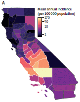
|
The map shows the 58 counties, color-coded by the incidence of a particular disease.
The big picture is that the disease is most prevalent in a central region of the state, which is largely the San Joaquin Valley. It's an area generally known for being hot and dry. One county, at the southern end of the valley, dominates the incidence. That is Kern County -- where I lived for several years as a kid. The disease is coccidioidomycosis. If you can't say that, just call it valley fever. That's the common name, and was the only name we knew for it growing up. |
|
For perspective... The incidence is reported here as cases per 100,000 population -- per year. Incidence of Covid-19 is commonly reported in cases per 100,000 population -- per day. For example, the incidence of valley fever for Kern County is 170 cases per 100,000 population annually, or about a half-case per day. This is Figure 1A from the article. | |
We have a new article about valley fever. Aside from my personal connection to this relatively unknown -- but sometimes serious -- disease, the article is interesting in revealing a pattern of how weather affects a disease.
What is valley fever? It is a respiratory infection, a type of pneumonia, caused by spores of fungi such as Coccidioides immitis. These are soil fungi; the spores can be acquired by breathing dust. Fungal respiratory infections are hard to treat.
The following figure introduces the pattern that the team of scientists found for the incidence of valley fever. (They studied the incidence in the region bounded by white on the map above -- roughly, the valley.)
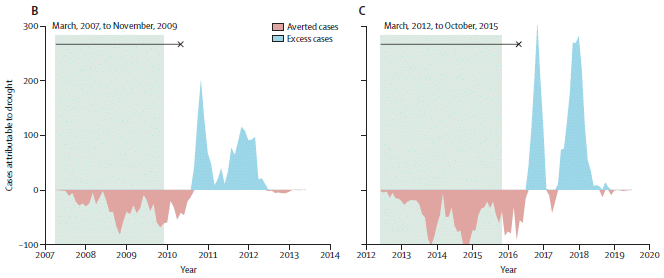
|
Part B (left) shows the incidence vs time during a multi-year drought and the years immediately following. The disease incidence is shown on the y-axis as "cases attributable to drought". For a start, you can think of it as deviation from the average.
The region shown in green is a drought. You can see that the disease incidence is low during the drought, and then high after the drought -- after a lag. Part C (right) shows analysis of another drought period, a few years later. The pattern is similar. This is part of Figure 4 from the article. |
That figure shows a connection between drought and the disease. But let's go a bit further with what the figure means.
The y-axis is based not simply on the average incidence. It is based on a model that takes into account temperature and rainfall. In particular, the blue part of the curve means that there are more cases in the years following a drought than would be expected simply from the wetness.
That is, based on their modeling, considering many variables, the sequence of drought-rainfall leads to more cases of valley fever than expected from either phenomenon alone. The rebound after the drought more than makes up for the decline in cases during the drought.
Why? They don't know. It is easy to speculate about cycles of both fungi and small animals that may carry them, but it really is mostly speculation at this point.
A caution... The whole story is more complex than the point made above. In wetter areas, incidence of valley fever is most sensitive to temperature.
News story: Drought exacerbates emerging infectious disease in California: Berkeley study -- UC Berkeley researchers show that Valley fever's rise in California is linked to drought and warming temperatures in the state. (UC Berkeley Public Health, October 5, 2022.)
The article, which is open access: Effects of precipitation, heat, and drought on incidence and expansion of coccidioidomycosis in western USA: a longitudinal surveillance study. (Jennifer R Head et al, Lancet Planetary Health 6:e793, October 2022.)
More from the San Joaquin Valley, also water-related: Groundwater depletion in the nearby valley may be why California's mountains are rising (June 20, 2014).
I mentioned my own personal connection to the land of valley fever. Among others you may know from Bakersfield, the main city of Kern County, are Kevin McCarthy, the minority leader in the US House of Representatives; Earl Warren, former governor of California and Chief Justice of the United States; and Frank Gifford, football great and sportscaster. All of us attended Bakersfield High School (earlier known as Kern County Union High School), and all were presumably exposed to valley fever.
October 26, 2022
Preprint servers have become increasingly common, following the success of the original physics ArXiv. There has been much discussion, even debate, about their role. The COVID pandemic brought fresh attention to preprint servers. Expediting communication became unusually important. It therefore became unusually important whether preprints were "right".
* A new article looks back, and examines one part of the issue of preprint quality. The scientists looked at a group of papers that were originally posted as preprints, and then got published. They asked whether the key data on things such as disease incidence were substantially correct. The simple answer is yes, the data in the final published version closely tracked the original data in the preprint. That's good, but do note that this is only one aspect of preprint quality.
* News story: Most preprint studies of COVID-19 hold up through peer-review. (EurekAlert! (University of Wisconsin-Madison), October 11, 2022.)
* The article, which is open access: Robustness of evidence reported in preprints during peer review. (Lindsay Nelson et al, Lancet Global Health 10:e1684, November 2022.)
* I have listed this post in my BITN sections for Ethical and social issues; the nature of science and SARS, MERS (coronaviruses).
What about preprints and Musings? I have done various things, but tend to prefer to wait for a published article. Time is not of the essence here.
* As a specific example... The recent post about the bacterium one can see by eye, laid out on a coin. I knew about that as a preprint, and wanted to post it. However, I chose to hold it until the published article appeared. It is such a remarkable finding, let's make sure it at least passes one round of basic peer review.
* On the other hand, I posted one of the very first articles about a SARS-2 (COVID-19) "variant", based on a preprint. It was an important issue, with some time value. Further, there was no reason to question the basic point of the article, even if some data or interpretation might change. The original post made clear that the article had not yet been peer-reviewed. I added the reference to the final published article when it became available.
* The posts just mentioned...
- Thiomargarita magnifica, the biggest -- and most complex -- bacterium (September 28, 2022).
- Spike D614G: An emerging mutant strain of the virus that causes COVID-19 (May 12, 2020).
October 25, 2022
The C-F bond is strong and inert. Further, it is rare in biology, so there are not enzymes to break it.
Perfluoro carboxylic acids (PFCAs; also called perfluoroalkyl carboxylic acids) have all the usual C-H bonds replaced by C-F. They are stable chemicals -- and there is concern about their effects. They have acquired the nickname "forever chemicals."
A recent article offers a new way to degrade PFCAs. It's interesting chemistry. The following figure summarizes the chemistry and some results...
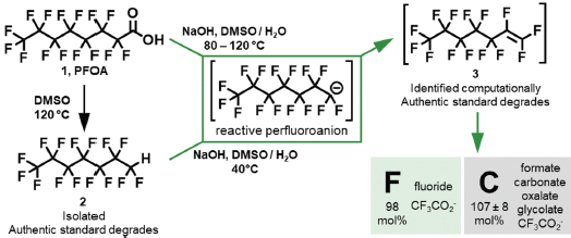
|
Compound 1 (upper left) is perfluoro octanoic acid (PFOA), an example of the general class of PFCA.
It is already known that mild heating of this chemical in the solvent dimehtyl sulfoxide (DMSO) leads to decarboxylation -- loss of the CO2 from the carboxylic acid group. This reaction is shown at the left, leading to compound 2 (lower left). You can see that the CO2 of the -COOH group is gone, but that the H has been retained. It is still a stable chemical, another recalcitrant pollutant. The new finding is that a variant of that procedure leads to a very different result. The key is adding sodium hydroxide, a strong base. The NaOH captures that H, leaving the anion shown in the green box. (Compound 2 also gives that anion under the same conditions -- actually, even milder conditions.) That anion from the green box does further chemistry, resulting in substantial degradation. The boxes at the lower right show the final chemicals -- the final fates of the F and C atoms. Most of the F is now fluoride ion, F-. Most of the C is now small F-free chemicals such as those listed. CF3COOH is shown for both F and C, but it is only about 10% for each of them. (Amounts are not shown on this figure, but are elsewhere in the article.) The recalcitrant "forever chemical" has been degraded to chemicals that people know how to deal with. CF3COOH degrades more slowly than the longer chain compounds, but the amount does decline over time. This is Figure 1 from the article. |
That's the idea. The article contains experimental work supporting the final outcome. Modeling leads to the suggestions of how it all happens. It's novel -- and interesting -- chemistry. Compound 3 (upper right, above) hints at the proposed pathway.
The two chemicals shown in square brackets have not been found in the experimental tests that start with the PFCAs; they are proposed intermediates in the degradation pathway, based on modeling. (The perfluoro alkene, compound 3, can be obtained and tested; its subsequent degradation follows what is suggested in the article.)
This method proposed here for degrading PFCAs is simpler and cheaper than alternatives proposed so far. The authors suggest that it would be useful for treating concentrated sources. It wouldn't work directly on the low levels commonly found in water. However, it could be used to destroy what has been removed from the water by other methods.
News stories:
* Subset of "Forever Chemicals" Destroyed by Efficient New Method. (Sarah Whelan, Technology Networks, August 18, 2022.)
* 'Forever chemicals' destroyed by simple new method. (Amanda Morris, Northwestern University, August 2022.)
* News story accompanying the article: Environmental chemistry: Taking the "F" out of forever chemicals -- The right solvent mix breaks down perfluorinated organic acids. (Shira Joudan & Rylan J Lundgren, Science 377:816, August 19, 2022.)
* The article: Low-temperature mineralization of perfluorocarboxylic acids. (Brittany Trang et al, Science 377:839, August 19, 2022.)
Also see:
* Added August 13, 2025. Accumulation of PFAS ("forever chemicals") by bacteria in the human gut (August 13, 2025).
* How polar bears keep their fur free of ice (April 16, 2025).
* Breaking C-F bonds? (October 26, 2018).
October 24, 2022
We have previously noted that ordinary human speech can generate aerosols, which potentially could carry viruses [link at the end]. It is, then, an interesting question... How about musical instruments? Wind instruments?
A team of scientists at a university in Philadelphia has now reported results from actual testing, done in collaboration with their local symphony orchestra.
There is no virus in the current work. It is all about measuring aerosols: tiny droplets in the air. (That was also true for the background post on speech droplets.)
The first figure shows some of the data...
|
Each graph shows the aerosol counts found under three conditions. The black curve (triangles) is for measurements made near the bell of a trumpet. The white curve (circles) is for measurements made near the tone holes in the body of a clarinet. The blue curve is for a control condition, with no instrument.
The three graphs are for different size aerosol particles. The smaller ones in particular are in the range most relevant to virus transmission. (The SARS-2 virus (the COVID agent) is about 0.1 µm.) The data are messy, not unreasonable for this type of measurement. But the general picture is that the aerosol counts associated with both instruments are higher than the control, especially for the smaller sizes. This is part of Figure 1c from the article. |
The following figure summarizes the results for several wind instruments...
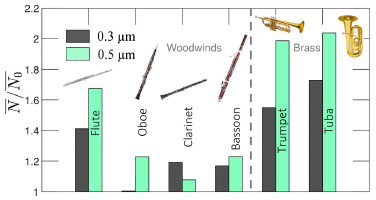
|
The results are shown as N/No: the count found for the instrument divided by the control count. (The horizontal bars over the symbols indicate that these are averages.)
The two bar colors are for two sizes of aerosol droplets. Most of the bars show some increase in aerosol production from the instrument, with N/No >1. (One exception.) The brass instruments show larger effects than the woodwinds. (The flute is an exception; it is played differently than the other "woodwinds".) Those larger effects are about two-fold. The results from the woodwinds are smaller. This is Figure 2 from the article. |
The general conclusion from the authors is that the risks from wind instruments are not much different than the risks from human speech.
What that conclusion seems to omit is that one might be exposed to a few tens of these wind instruments for an hour or so. Further, distance matters. Orchestra members, very close to multiple wind instruments, might get substantial exposure. Audience members might get little, especially in a well-ventilated room.
News stories:
* Do wind instruments spread Covid-19? (Andrei Ionescu, Earth.com, August 16, 2022.)
* Music-making and the flow of aerosols. (EurekAlert! (University of Pennsylvania), July 14, 2022.) (Mis-identifies the journal at one point; odd.)
The article: Flow and aerosol dispersion from wind musical instruments. (Quentin Brosseau et al, Physics of Fluids 34:087115, August 2022.)
Background post, about aerosols from ordinary speech: Speech droplets: Can you transmit an infection to someone by yelling "Stay healthy" at them? (June 14, 2020).
My page Internet resources: Miscellaneous includes a section on Art & Music. There is a list of related Musings posts.
There is a BITN section for SARS, MERS (coronaviruses). It includes a list of Musings posts in the field.
October 22, 2022
In the lab, stem cells can be induced to form 3D clumps, known as organoids, that begin to develop as some organ. A new article extends the work on human brain organoids, by transplanting them into young rats, and showing that they develop further and function there.
The following figure shows the general plan, in the context of one such experiment...
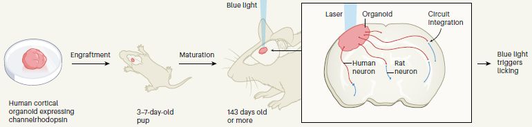
|
The work starts by growing organoids in the lab. In this case, the cells of the organoid have been modified so that they respond to blue light.
The organoids are transplanted into young rats; the rats are tested a few months later. The rats are immune-deficient, so immunological rejection is not an issue here. Channelrhodopsin (noted under the left frame of the figure) is the protein that responds to blue light. This is Figure 1 from the news story accompanying the article (Camp & Treutlein). |
The use of very young rats was an important development. It gives the organoids, which are themselves immature, an environment appropriate for development into a mature brain.
In this case, the rats were trained to associate the availability of water from a spout with a blue light stimulus. The next figure shows some results...
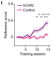
|
The graph shows fraction of correct responses (y-axis) vs time of training (x-axis).
The top curve is for the rats with the human cells that have been modified to respond to blue light. The bottom curve is for control rats. The rats that have been modified to respond to blue light do so; the control rats do not. This is Figure 5l from the article. |
That result shows that the human brain organoids affect the rat behavior, in a way that is expected. It is inferred that the organoids have been integrated into the rat brain as functional elements.
The next experiment shows a test with organoids from cells from people with Timothy syndrome (TS). TS is a rare single-gene disorder, which includes neurological problems, and may be related to autism.
|
What is measured here is the dendrite length, comparing organoids made from people carrying a mutation for TS and from control people. In this case, the two organoids were introduced into the same rat, one on each side of its brain.
The distributions are different for the two types of human cells. This is the main part of Figure 3c from the article. |
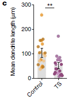
|
This test shows that human organoids carrying mutations may show distinctive features in the rat system. These features are not apparent in the organoids themselves in the lab. There is no intent here to interpret the effect of the mutations, merely to demonstrate the potential of the experimental system.
This is a complex article, and much of the data is complex. I chose two figures that show relatively clean results.
The big story here is the development of the experimental system. Organoids are interesting, but they have limitations. Implanting them into young rats opens up further experimentation. The final figure shows that the system may be useful in understanding genetic mutations that affect the nervous system.
No detrimental or unexpected effects of the human organoids on the rats were observed.
Work such as this raises ethical questions, which will be subject to continuing discussion.
News stories:
* Human Cerebral Organoids Transplanted Into Newborn Rats Integrate With Their Brain. (Ruairi J Mackenzie, Technology Networks, October 12, 2022.)
* Human cortical organoids forge functional circuits in rat brains. (Peter Hess, Spectrum (Autism Research News), October 12, 2022.)
* Human brain cells transplanted into rat brains hold promise for neuropsychiatric research share -- Lab-grown clusters of human brain cells integrate so well into young rats' brains they enable researchers to study neurodevelopmental disorders' molecular and circuit underpinnings. (Bruce Goldman, Stanford University, October 12, 2022.)
* Expert reaction to study looking at integrating human stem cell-derived brain-like tissue in the brains of newborn rats. (Science Media Centre, October 12, 2022.)
* News story accompanying the article: Neurodevelopment: Human brain organoids influence rat behaviour -- Human tissue resembling the brain's cortex can be grown from stem cells in vitro. Transplanting this tissue into a developing rat cortex enables it to mature, integrate into neuronal circuits and influence behaviour. (J Gray Camp & Barbara Treutlein, Nature 610:265, October 13, 2022.)
* The article, which is open access: Maturation and circuit integration of transplanted human cortical organoids. (Omer Revah et al, Nature 610:319, October 13, 2022.)
Among recent posts about organoids:
* Briefly noted... Brain organoids grow eye precursor structures (March 2, 2022).
* Using lab-grown organoids in medical treatment (May 3, 2021).
* Snake venom gland organoids (March 17, 2020).For the use of such organoids in testing prions... Testing CWD prions in human organoids (May 29, 2024).
There is a BITN page for Cloning and stem cells. The BITN Other topics page has sections on Autism and Brain. Each includes lists of related posts.
October 19, 2022
In an earlier post, we noted the discovery that wax worms, which commonly live in beehives, can degrade polyethylene. A new article shows that the saliva of the worm carries out the activity. The scientists further identify two enzymes that are key players. It seems likely that the degradation of the plastic is due to enzymes of the animal itself, not to microbes it carries. This continues to be a system of interest.
* News story: Plastic gobbling enzymes in worm spit may help ease pollution. (Patrick Galey, Phys.org, October 4, 2022.)
* The article, which is open access: Wax worm saliva and the enzymes therein are the key to polyethylene degradation by Galleria mellonella. (A Sanluis-Verdes et al, Nature Communications 13:5568, October 4, 2022.)
* Background post: What if the caterpillars ate through the plastic grocery bag you put them in? (May 26, 2017).
October 17, 2022
Amphibian populations (e.g., frogs, salamanders) worldwide have been devastated over recent decades by a fungus, Batrachochytrium dendrobatidis (Bd). A new article looks at whether the amphibian decline might have affected the incidence of malaria.
The following figure summarizes the main analysis...
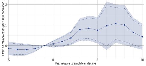
|
The y-axis is the effect: zero means that the malaria incidence was normal. The y-axis is time, with zero being the time of the amphibian decline in a particular area.
You can see that the effect was very near zero prior to time zero. It then increased steadily in the first three years after the decline of the amphibian population. The effect continues through the ten years examined, though it may be declining toward the end. (That decline, if real, is probably due to improvements in malaria control, not a recovery of the amphibians.) You can also see that the confidence limits (shaded region) are broad. This is a difficult study to do at all, requiring local data on both the timing of the fungal attack and on malaria incidence. For perspective, the maximum effect sizes seen here represent 50-100% increases in the incidence of malaria. The analysis is for a large part of Costa Rica and Panama, where the Bd fungus caused a wave of disease, west to east, over about three decades centering on the 1990s. This is Figure 3 from the article. |
Let's assume, for our purposes here, that the effect is real. Why? The authors suggest it could be because the amphibians eat mosquitoes, which transmit malaria. They lack evidence on the mosquito populations, so this can only be a hypothesis at this point, but it is a reasonable idea.
Their bigger point is about biodiversity. A fungus strikes the amphibians. Do we care about the amphibians? Some people do, at the abstract level. If the argument made here is correct, we have a direct stake in the amphibians.
It's an interesting little article. The data analysis is quite complex, and the authors discuss its limitations. It also makes us think about the complexity of nature.
News stories:
* Malaria spike linked to amphibian die-off -- Study highlights the importance of biodiversity to human health. (Science Daily (University of California - Davis), September 20, 2022.)
* When a frog disease is prevalent, humans also get sick, why on earth? (GIGAZINE, October 16, 2022.)
The article, which is open access: Amphibian collapses increased malaria incidence in Central America. (Michael R Springborn et al, Environmental Research Letters 17:104012, October 2022.)
My page Biotechnology in the News (BITN) -- Other topics has a section on Malaria. It includes a list of Musings posts on the topic.
Among posts on amphibians...
* How to make yourself more transparent while you sleep (March 7, 2023).
* Look who's dining on baby salamander (November 3, 2019).
October 16, 2022
About 66 million years ago, an asteroid hit near the coast of Mexico, and wiped out the (non-avian) dinosaurs. There are some details we could add, but what matters for now is that the event also caused a tsunami.
It's no surprise, of course, that there was a tsunami, but we don't know much about it. A new article models the tsunami, at a global level -- the most extensive analysis of the tsunami attempted so far.
The first figure gives a glimpse of what happened in the first minutes...
|
Brown is for crust, yellow for sediment, and blue for ocean water.
The y-axis scale is in kilometers. relative to the quiet surface. The x-axis is horizontal distance, from the center of the event. Note the height to which crust material rose in the first minutes (top graph). This is Figure 1 from the article. |
That's early and local.
If you think that looks dramatic, look at Movie 1 with the article, which shows that 10 minute sequence in more detail. In particular, look at what happens before the top graph shown above. (The movie is labeled in seconds; 2.5 minutes = 150 seconds.)
The local event set off waves, which traveled around the world. Wave heights could have been hundreds of meters, even briefly a kilometer or more. Among the effects could have been disruptions of the ocean floor.
|
The figure shows an analysis of ocean sediments from around the world. The y-axis scale shows the percentage of samples which appeared complete for the time of the impact (the K-Pg (Cretaceous-Paleogene) boundary). None in the Caribbean, near the event. Various numbers from around the world. The highest values (the least-disrupted samples) are for the Mediterranean, far from the central event and protected from the worst waves.
The numbers on the bars are the number of samples examined. This is Figure 6 from the article. |
The results suggest that the tsunami disrupted the ocean floor around the world, especially near the central event, but also to some extent far beyond.
The whole asteroid event was a big deal. The resulting tsunami was a big deal -- the largest tsunami event for which we have any significant information. (It is thought to have been driven by about 30,000 times more energy than the 2004 Indian Ocean tsunami, one of the largest well-documented tsunamis.) What is new here is trying to model it -- and that in itself is a big deal. They use three different models, dividing the event into two time segments, and then comparing two models for the later part. There is more to be done, but the challenge of trying to model and understand the tsunami is on the table.
Movies 3 and 4 show the global spread of the tsunami. Very impressive -- and easier to digest than the single views in the article.
News stories:
* Dinosaur-Killing Chicxulub Impact Produced Global Tsunami, New Research Suggests. (Enrico de Lazaro, Sci.News, October 5, 2022.)
* End-Cretaceous asteroid caused massive global tsunami, peaking at a mile high -- First global models of the impact tsunami at 66 million years ago show worldwide extent of waves, hint at widespread coastal flooding. (AGU (American Geophysical Union), October 4, 2022.)
* Dinosaur-killing asteroid triggered global tsunami that scoured seafloor thousands of miles from impact site. (University of Michigan, October 4, 2022.)
The article, which is open access: The Chicxulub Impact Produced a Powerful Global Tsunami. (Molly M Range et al, AGU Advances 3:e2021AV000627, October 2022.)
Among posts about tsunamis...
* What if a fishing dock fell into the ocean off the east coast of Japan? (October 29, 2017).
* Earthquakes: increasing? (March 30, 2010). Briefly notes the 2004 Indian Ocean tsunami, which is used as a reference point in the current article.Recent post on the dinosaur extinction event: Briefly noted... Dinosaur extinction: What time of year was it? (May 10, 2022). Links to more.
October 12, 2022
Making oxygen gas on Mars will be important for human exploration there. People will need it to breathe. Even larger amounts will be needed for the trip home.
In a recent article, scientists report results from a trial of an oxygen generator on Mars. The device, called MOXIE, is on NASA's Perseverance rover.
The first figure shows the chemistry -- and the approach and one of the challenges...
|
The general idea is to make O2 from CO2, which is relatively abundant on Mars. The process is electrolysis: use an electrical current to break up the CO2. This can happen in two steps, the first leaving CO, and the second leaving C.
You might think CO would be a bad side product, but it is actually the C that is bad. The apparatus naturally separates the desired O2 from the undesired CO, but if carbon is made, it can make a mess -- all over the apparatus. The two reactions are shown at the bottom and top of the figure, respectively. The graph shows the voltage needed for the two steps. There is a lot of detail, which we don't really need. The big picture is that if you look at the voltages, there is a fairly small window between the bottom and top sets of curves: only about 0.1 volt between the desired (lower) curves and the undesired (upper) curves. Getting the voltage right is important, and it does depend on the operational details. The x-axis is flow rate of the input gas. The family of curves is for various rates of production of O2. The scientists have set a target of making 6 g O2 per hour with this device. This is Figure 3 from the article. |
The operating conditions on Mars are also a challenge. There are wide variations in temperature and the pressure and density of the atmosphere. The following graph illustrates one of those parameters...
|
The graph shows the density of the atmosphere (y-axis) vs sol (x-axis). (A sol is a Martian day. The graph covers one Martian year.)
It varies -- by almost a factor of two. The scientists carried out several O2-producing runs, each for about an hour. The runs are shown on this graph by black dots, with OC numbers. The runs shown here cover most of the density region. (A run at the maximum density is planned for later, and is marked by a star.) This is Figure 2 from the article. |
So what happened? The device worked, consistently over the runs, under various conditions. The target of 6 grams of oxygen gas per hour was met overall; results for individual runs were close to it.
This is a small device. It needs to be scaled up to a few thousand times the current size. But operationally, it seems fine so far.
This is also a story of nested acronyms... MOXIE stands for Mars Oxygen ISRU Experiment. The ISRU in there stands for In Situ Resource Utilization.
News stories:
* NASA successfully produces oxygen out of Martian air --
Such tech will underpin any future colonies on the red planet. (Alexandru Micu, ZME Science, September 1, 2022.)
* MIT's MOXIE experiment reliably produces oxygen on Mars -- Day and night, and across seasons, the instrument generates breathable oxygen from the Red Planet's thin atmosphere. (Jennifer Chu, MIT, August 31, 2022.)
* MOXIE Might Be the Most Exciting Thing Perseverance Has Brought to Mars -- It might not be able to fly or drill or shoot lasers, but MOXIE is how humans are going to get to Mars and back. (Evan Ackerman, IEEE Spectrum, May 28 2021.) This is an essay about the MOXIE device, written early in the mission.
The article, which is open access: Mars Oxygen ISRU Experiment (MOXIE) - Preparing for human Mars exploration. (Jeffrey A Hoffman et al, Science Advances 8:eabp8636, August 31, 2022.)
Recent post about Mars: Water on Mars? InSight finds none (September 19, 2022).
Next... Could Deinococcus radiodurans survive on Mars? (November 6, 2022).
More from Perseverance: Briefly noted... Recorded live, on Mars (February 8, 2023).
October 11, 2022
A recent article reports that spiders at rest have regular movements of their eyes.
|
The scientists made video recordings of about 30 early-stage spiders. At that stage, the spiders are sufficiently transparent that movement of the retinas can be seen. The scientists scored the recordings, for how long eye movements lasted, and the interval between bursts of eye movement.
Look at row 1 (top). The left-hand distribution is for the duration of a "bout" of eye movements. The right-hand distribution is for the interval between bouts. These are not random movements! One can reasonably say that bouts of eye movement last for about one minute, and occur about every fifteen minutes. There are three rows of data, labeled 1-3. They are for three successive four-hour time periods, labeled as phases. The big lesson is that the results are similar in each row. There may be a trend that both duration and interval get a bit longer as the night goes on, but we won't worry about that aspect. The animals are jumping spiders, Evarcha arcuata. This is Figure 1D from the article. |
Further analysis showed that the eye movements were often accompanied by other body movements. With adult spiders, where one can (usually) no longer see the retinas, the other body movements still occurred at regular intervals.
The authors realize that the significance of their observations is not clear. Are the spiders even "sleeping"? If they are "sleeping", are these eye movements something like the rapid eye movements (REM) of human sleep, reflecting an active phase of sleep? That is, the work shows that there are rapid eye movements in these spiders while resting, but whether those eye movements have anything to do with sleep or with our familiar REM are open questions.
It will take further work to sort all this out, and even to consider the possibility that the REM-like activity reflects dreaming. It would be excessive to suggest that the article provides evidence for dreaming in spiders, though clearly that is an intriguing possibility, which the authors note. What it does is to provide novel observations that seem to open the door to studying sleep or sleep-like phenomena in spiders.
Videos. There are several movie files posted with the article at the journal web site. Some of them are time-lapse videos of the spiders; they are about one minute each (no sound). Videos 2-4 show the young spiders. The retinas (actually, the retinal tubes)? The two short vertical lines near the bottom.
News stories:
* Jumping spiders may experience REM sleep. (Andrei Ionescu, Earth.com, August 11, 2022.)
* Do spiders sleep? Study suggests they may snooze like humans. (Maddie Burakoff, Phys.org, August 8, 2022.)
* To sleep, perchance they dream? (Juan Siliezar, Harvard Gazette, August 9, 2022.) Interview with two of the authors.
* Commentary accompanying the article: A sleeping paradox may extend to the spider. (Barrett Anthony Klein, PNAS 119:e2211216119, August 9, 2022.) A nice overview of the broad issue of sleep.
* The article, which is open access: Regularly occurring bouts of retinal movements suggest an REM sleep-like state in jumping spiders. (Daniela C Rößssler et al, PNAS 119:e2204754119, August 8, 2022.)
Among other posts about sleeping or dreaming, in humans and other animals...
* What happens to capillary blood flow in the brain during sleep -- and why? (November 8, 2021).
* Sleep stages in octopuses -- do they dream? (July 13, 2021).
* Conversing with dreamers (July 6, 2021).
* When do jellyfish sleep? (September 29, 2017).Previous post about jumping spiders (another species): Provision of milk and maternal care in a spider (January 13, 2019).
Another post about transparency in an animal: How to make yourself more transparent while you sleep (March 7, 2023).
October 8, 2022
A recent article reports an advance in making modified proteins.
Let's start with an example of what was accomplished. We will then step back and look at how the scientists did it.
|
Chimadanin is a protein that inhibits blood clotting, by inhibiting thrombin.
The graph shows the inhibition results for four forms of chimadanin: thrombin activity (y-axis) vs concentration of the chimadanin inhibitor (x-axis). The concentration required to reach 50% inhibition, IC50, is a useful measure of the potency. |
|
The right-hand curve is for the WT (wild type) form of chimadanin. The IC50 is a little below 10-6 M. The other three curves are for three modified forms made in the current work. They are all more potent: the inhibition curves are shifted to the left, to lower concentration. The most potent has IC50 below 10-8 M; that is about 100-fold better than the WT protein. What are these modified proteins? They have sTyr at positions 28 or 31 of the protein -- or both. The best one has both modifications. sTyr? Sulfotyrosine, with a sulfate group on the phenolic -OH of the standard amino acid tyrosine (Tyr). This is Figure 5e from the article. | |
How did the scientists do this? They modified E coli bacteria so they did it.
That required the following steps:
1. Putting the gene for the protein into the bacteria.
2. Modifying the bacteria so they read a special codon as sTyr. (This involves making a special tRNA and a special version of the enzyme that attaches the amino acid to the tRNA.)
3. Modifying the gene (see #1) so it has the special codon for sTyr (#2) at the desired position(s).
4. Modifying the bacteria so they can make sTyr.
The first three of those are "old news". Steps 2-3 involve artificial expansion of the genetic code to allow the programmed use of a novel ("non-canonical") amino acid. That has been done many times. However, there is a problem: supplying the novel amino acid can be difficult. For experiments in vitro, the novel amino acid can just be added to the reaction mixture. For work in vivo, the amino acid might be added to the culture medium, but transport of such chemicals into the cells is problematic.
Why not get the cells to make their own amino acid? That is a biochemistry challenge. In this case, it required finding an enzyme that could add sulfate to the Tyr.
There are many enzymes that add sulfate to things. They are broadly called sulfo-transferases; they transfer the sulfate from a donor molecule that looks something like an ATP that includes a sulfate group.
The scientists did their homework on sulfo-transferases, with extensive analysis of genome databases as well as computer modeling of the protein structures. At some point...
|
The graph shows a test of four candidate enzymes to see if they can transfer sulfate to tyrosine in the desired way.
One of them worked. NnSULT1C1. This is Figure 2f from the article. We'll skip the details of how the assay worked; it is complicated. |
|
Of course, once they found an enzyme with the desired activity, the gene for that enzyme was transferred to the bacteria.
The system was also developed for eukaryotic (mammalian) cells, where it functioned fine. This may be a useful tool for studying the role of natural sulfation of proteins.
Where did this enzyme come from? The leading Nn in the enzyme name stands for the source: Nipponia nippon, the Japanese crested ibis (or toki). See Wikipedia: Crested ibis for a nice picture, as well as the conservation story for this endangered species.
The scientists want to continue, and develop the biosynthesis of other novel amino acids that could be useful for such work. Each of those will have to be worked out on its own, but the scientists think their experience here will help them with the approach for other cases.
News stories:
* Engineered Cells Become Drug Factories with Avian Assistance. (GEN, September 20, 2022.)
* Bird's enzyme points toward novel therapies -- Rice University scientists imbue cells with 'noncanonical' pathway to make own drugs. (Mike Williams, Rice University, September 22, 2022.) This story is sloppy with some details, but is a useful overview from the source.
The article, which is open access: Unleashing the potential of noncanonical amino acid biosynthesis to create cells with precision tyrosine sulfation. (Yuda Chen et al, Nature Communications 13:5434, September 16, 2022.)
Another approach to expanding the genetic code: Life's newest DNA base pair: 5SICS-NaM (June 4, 2014).
A post that mentions sulfated tyrosine: How rice recognizes a Xoo infection (August 28, 2015).
A recent post on blood clotting: COVID and cardiovascular events (blood clots) (October 3, 2022).
Some Musings posts about amino acids are listed on the page Internet Resources for Organic and Biochemistry under Amino acids, proteins, genes.
October 7, 2022
Two days later (see previous post immediately below)... Carolyn Bertozzi is a leader in glycobiology, carbohydrate chemistry on cells. The prize is for work done while Bertozzi was a chemistry professor at Berkeley.
* Press release: The Nobel Prize in Chemistry 2022. (October 5, 2022.) There are three recipients.
* A recent post about Bertozzi's work (though her name, as senior author, was not in the original post): A new role for RNA (August 3, 2021).
* Added October 28, 2025.
Next Nobel post: Record: Most Nobel Prizes to people from one university system in one year? (October 28, 2025).
October 5, 2022
The first Nobel announcement of the season... to the scientist who is an acknowledged leader in the field of ancient DNA, especially its application to understanding human evolution.
* Press release: The Nobel Prize in Physiology or Medicine 2022. (October 3, 2022.)
* A recent post about Pääbo's work: Susceptibility to severe COVID: role of a genetic region from Neandertals (February 20, 2021).
* A book by Pääbo... See my page of Book suggestions: Pääbo, Neanderthal Man -- In search of lost genomes (2014). Links to other posts in the field.
* Also see the next post, immediately above.
October 4, 2022
A team of scientists has developed a test to measure the sense of humor of children as young as one month old.
One version of the test was given in a lab setting. The following table shows some of the types of "questions". In each case, the child is presented with a series of "controls", then a "joke" case. The question is, does the child respond differently to the joke case? (That may be by laughing, but other responses may also be appropriate.)
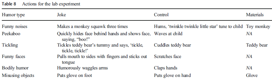
| This is the top part of Table 8 from the article. The full table shows twenty types of questions. |
Another form of the test was given online, administered by a parent. This version simply asked the parent to indicate whether the child responded to or produced the various types of humor. It is this simple version, called the Early Humor Survey (EHS), that is intended for routine use. (A link is given in the article, but, as far as I can tell, the test is not available there -- or online at all.)
Here are some conclusions from the online test...
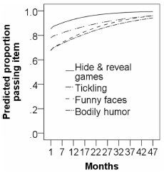
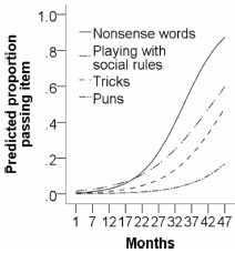
|
They test twenty types of humor, and present the results in five small graphs, with four humor types each. Each curve shows the overall response for one type of humor vs age.
The upper graph is for the four humor types that develop earliest. For each of these four, about 80% of the children test positive at one month of age. The percentage rises after that, approaching 100% by the end of the study, age 47 months. The lower graph is for the four humor types that develop last. The responses on these are about zero at age 1 month. They increase over time, at various rates. The y-axis is labeled "prediction". The lines on the graph are their regression curves based on the actual data, which is apparently not shown. These are the upper left and lower left parts of Figure 4 from the article. If you can't figure out which curve is which, don't worry about it. The difference between the two graphs is most important for us at the moment. |
There are probably no big surprises in the results here. What is important for now is that the scientists have developed such a test. It is practical, and the results seem reasonable. They can now use this test as a base for further work.
The online and lab tests do not entirely agree. Note that one involves a researcher testing a child's response; the other involves a parent reporting their experiences with the child. This issue is considered at some length in the Discussion, and will need to be examined further.
News stories:
* Scientists capture humour's earliest emergence. (University of Bristol, November 19, 2021.)
* Connoisseurs of Silly: Babies Start Laughing Early - And They Think Your Material Is Great. (K C Compton, Early Learning Nation, June 2, 2022.)
The article, which is open access: The Early Humor Survey (EHS): A reliable parent-report measure of humor development for 1- to 47-month-olds. (Elena Hoicka et al, Behavior Research Methods 54:1928, August 2022.)
Other posts on child behavior include...
* How long does it take to invent a new language? (February 9, 2020).
* Child development: nature vs nurture? Year 2 as a window of opportunity. (March 5, 2011).
* Did Neandertal children hate broccoli? (November 22, 2009).
October 3, 2022
There have been stories about blood clots associated with COVID-19. Is there anything to them?
A new article reports an extensive analysis. Here is a piece of that analysis, which illustrates both the approach and some typical results.
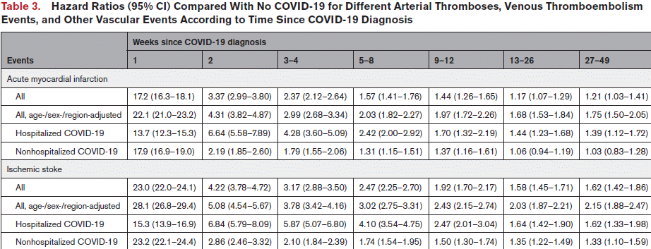
|
Results shown here are for two conditions: acute myocardial infarction (top) and ischemic stroke (bottom; misspelled in the table). We'll focus on the top section.
Start with the first row, labeled "All". The numbers are the hazard ratio (HR), along with 95% confidence limits. The columns are for time after diagnosis of COVID. For example, the results show HR = 17.2 for week 1, generally declining over time to 1.21 for weeks 27-49. That is actually the big picture, broadly similar over all conditions and rows. The risk is relatively high shortly after diagnosis, and declines over time. For that first row, a person is at 17 times greater risk of having the condition at week 1 of a COVID infection, and still at >2-fold greater risk through week 4. All the HR results in that row appear statistically significant; there appears to be some increased risk even through 49 weeks. (There are occasional HR numbers in the table that are not statistically different from one for the last time points.) Such analyses always involve statistical corrections, such as for age and sex. There can be debate about how to do them. The first row, "All", uses their standard analysis. The second row uses a second analysis. The general picture is pretty much the same, even though some detailed numbers are different. The last two rows subdivide the results into hospitalized and non-hospitalized cases. Both rows follow the same trend noted above. For the most part, the HR is greater for the hospitalized cases, which are in general more severe. Interestingly, this does not hold for the first value (week 1). Also note that the results for "All" are similar to the results for non-hospitalized; most of the cases in the analysis were not hospitalized. The work is based on analyzing the medical records of about 48 million people (most of the adult population of England and Wales) over about a year (most of 2020 -- prior to availability of vaccines). About 1.4 million were diagnosed with COVID-19. This is the top part of Table 3 from the article. The rest of the Table shows similar data for other cardiovascular conditions. The general picture is the same; the maximum HR shown (for week 1) varies from about 6 to 40. |
These are statistics, not explanations. The authors even note that the increases seen here are not unusual for infectious diseases, and may reflect some general issue with inflammation.
The findings of increased risk upon infection is consistent with other work. This is perhaps the first good study of the extended risk.
The authors suggest that the association deserves attention. For example, it may be that special attention should be given to those being released from the hospital after such an infection. Do they have a tendency toward such events? Should they be given some prophylactic treatment?
For a sense of the absolute numbers... The authors estimate that COVID led to about 10,000 additional cases of such events in the study population, out of about 1.4 million COVID cases.
The Discussion section of the article includes discussion of the strengths and limitations of the study. It is interesting reading, which makes clear the difficulty of such studies.
News stories:
* Population-wide cohort study detects increase in major arterial and venous thrombotic events immediately after COVID-19 diagnoses. (Chinta Sidharthan, News-Medical.net, September 21, 2022.)
* Blood clot risk remains elevated nearly a year after COVID-19. (Michael Merschel, American Heart Association News, September 19, 2022.)
* Risk of blood clots remains for almost a year after COVID-19 infection, study suggests. (University of Bristol, September 20, 2022.)
The article, which is open access: Association of COVID-19 With Major Arterial and Venous Thrombotic Diseases: A Population-Wide Cohort Study of 48 Million Adults in England and Wales. (Rochelle Knight et al, Circulation 146:892, September 20, 2022.)
More about blood clotting...
* Why bears don't get blood clots during hibernation (May 9, 2023).
* Modifying bacteria, with help from a bird, so they can make and use an unusual amino acid (October 8, 2022).
* Mechanism of blood clotting: how the von Willebrand factor works (May 18, 2021). Links to more.There is a BITN section for SARS, MERS (coronaviruses). It includes a list of Musings posts in the field.
* * * * *
The current article is about the effect of COVID infection on blood clots. It is not about vaccines in any way. (As noted, the time period of the current study is before vaccine availability.) Here is a web page with an overview of both vaccine and COVID effects on blood clots. Blood Clotting, COVID-19 and Vaccines. (University of Utah Health, September 16, 2022.)
October 1, 2022
Work on stem cells and developing embryos in the lab often gets attention. A new article in the field certainly is getting that attention.
Briefly, the scientists have made mouse embryos from stem cells, without using gametes (sperm or egg cells). And they have maintained the developing embryos in the lab for about a third of normal gestation, without a uterus.
Much of the article is very technical. It seems best to just give the idea here, with little attempt to get at the details.
The first figure gives an overview...
|
I have numbered some steps, for ease of referring to them.
1. Start with embryonic stem cells (ESC). 2. Treat portions to start them developing in certain directions. (Two portions were treated; a third portion was used without treatment.) 3. Mix those three batches of cell lines. Some of the cells aggregated, forming the beginnings of a new embryo. (A very small percentage of the added cells participated in this step. It is not known why. What matters for now is that, in some cases, a structure formed that was capable of further development.) 4. Incubate the new structures in the lab. (Development of the lab incubator was reported by this team a year ago.) The bottom row shows sketches of what was found from day 4 (#5, at the right) through day 8 (#6). The big story is that they look pretty much like mouse embryos at the same ages. (Normal gestation for mice is 20 days, so this is over a third of the gestation cycle.) This is the graphical abstract from the article. I added numbers for some steps. |
The authors refer to the developing structures as synthetic embryos, or sEmbryos.
Much of the article is about working out how to do that. And much is about the characterization. Here is one example of the characterization...
|
The top two rows are two views of an sEmbryo at day 8. The bottom two rows are similar views for a mouse embryo of about the same age.
The big picture is that they are quite similar. This is Figure 4B from the article. |
Overall, the evidence shows that the scientists have succeeded in producing and growing structures that are, in many ways, much like mouse embryos -- without gametes to form them, and without a uterus for incubation.
There is no claim that these structures are normal. In fact, they failed to develop further. There is more to do, and we do not know how far such work can proceed.
Why do this? A simple basic reason is to better understand early development. A long term goal is that such a system might be used to make organs suitable for transplantation, and matched to the donor.
News stories:
* Scientists create world's first 'synthetic embryos' -- Researchers use stem cells from mice to form embryo-like structures with intestinal tract, beginnings of a brain, and a beating heart. (Ian Sample, Guardian, August 3, 2022.)
* Without egg, sperm or womb: Synthetic mouse embryo models created solely from stem cells. (Nanowerk News (Weizmann Institute of Science), August 6, 2022.)
The article, which is open access: Post-gastrulation synthetic embryos generated ex utero from mouse naive ESCs. (Shadi Tarazi et al, Cell 185:3290, September 1, 2022.)
A recent post about using ESC: Making new cartilage, using stem cells (January 5, 2022).
Another attempt at an artificial uterus: Lamb-in-a-bag (July 14, 2017).
There is more about stem cells and related topics on my BITN page for Cloning and stem cells. It includes two extensive lists of related Musings posts.
* * * * *
Update October 3 & 29, 2022...
There is a related article, from another lab. The general approach and results are similar. That there is this second independent article reinforces that the work is of serious interest, and that the results are generally reproducible.
* News story: Scientists Grow "Synthetic" Embryo With Brain and Beating Heart - Without Eggs or Sperm. (SciTechDaily (University of Cambridge), August 27, 2022.)
* News story accompanying the article: Developmental biology: From stem cells to embryo models in the laboratory -- Two groups have grown self-organizing models of mouse embryos from stem cells in vitro. The models mimic mid-gestation embryos, providing an unparalleled opportunity to study early embryonic development. (Neal D Amin & Sergiu P Pasca, Nature 610:39. October 6, 2022.) This news story covers both articles (the one discussed in the post above and the one added here).
* The article, which is open access: Embryo model completes gastrulation to neurulation and organogenesis. (Gianluca Amadei et al, Nature 610:143, October 6, 2022.)
September 28, 2022
Each thread in the top part of the following figure is one bacterial cell...
|
The length of some threads is about half the diameter of the coin.
The coin (a US dime) is about 1.8 cm diameter (just beyond the bottom of this figure). The threads here vary in length, but some are about 1 cm long. In fact, the scientists behind this work, which was reported in a recent article, have seen some specimens 2 cm long. This is the main figure in the news story at Interesting Engineering. (Looks reversed? All versions of the figure I have seen are this way; the scientists probably provided it this way. No effect on the main point here.) |
The article reports finding these things, and characterizing them. They are bacteria, based on their genomes. They have the provisional name Thiomargarita magnifica, which places them along with some previously known big bacteria in the genus Thiomargarita.
Other Thiomargarita have been seen as large as about 0.8 mm. The new bacteria are much bigger. (20-50 fold, depending on what numbers you use.)
Here are a couple of views inside one of these cells. TEM (transmission electron microscopy).
|
Part E (left) shows a cross section of a region of a cell. There is a constriction, which might be an attempt at cell division. However, these things rarely fully divide; they just get longer and longer.
There is not much in it. In fact, the bulk of the inside is a vacuole (V). There is just a bit of "cytoplasm", right next to the outer layer. Part F shows a close-up of the region that is boxed in E (near upper right). Now you can see the "stuff". Lots of things, including sulfur granules (S), which collect a major product of energy metabolism. I assume that the scale bar in E is supposed to be 20 µm. This is part of Figure 1 from the article. |
|
A comment about the cell width... Remember that common bacteria are about 1-2 µm in their largest dimension (length). This cell is about 40 µm in its shortest dimension (width in the images; diameter of the cell). This thing is huge -- in both diameter and length.
Then there is the DNA story, introduced in the following figure...
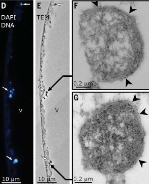
|
Part D (left) shows part of one cell stained for DNA (with DAPI). Three regions light up, in blue (white arrows).
Part E shows a TEM image of the same region. The DNA regions from D are again marked with white arrows; they appear to be associated with some type of particle. Parts F and G show two of those DNA regions at higher magnification. Both show particles surrounded by membranes. The black arrowheads mark places where the membrane bilayer is particularly clear. This is part of Figure 2 from the article. |
The authors conclude that the genome of this bacterium is in membrane-bounded particles, which they call pepins. The pepin membrane is active in ATP synthesis, and the pepin includes active ribosomes.
Having a membrane-bounded genome (whether "nucleoid" or "nucleus") is not supposed to happen in bacteria. The figure above gives an idea of the evidence for such a structure, but, alone, is not sufficient. The totality of evidence in the article makes a stronger case, but, still, it will be important to see what happens upon further investigation.
As to the genome itself... It is about 12 million base pairs, with about 12,000 genes. Those numbers are high for bacteria, and about half of the genes are not readily identifiable.
The figure above shows multiple DNA centers along the cell. The authors suggest that there may be about 37,000 genome copies per millimeter of filament. That would be 37 copies per micrometer, much higher than what the figure above suggests. But remember, this cell has a large diameter, and only a tiny portion is shown above. Their value for the density of genomes per mm would give about 740,000 copies for a 2-centimeter cell. Polyploidy indeed.
Comments about the vacuole...
* The vacuole probably carries nitrate, an oxidizing agent. This bacterium lives in anaerobic environments, probably using nitrate as the main electron acceptor; it carries nitrate with it.
* There is a fascinating question of how large a bacterial cell can be. Bacteria have little internal transport other than diffusion, and typically lack compartmentalization (which can localize chemicals); these factors seriously limit their growth. Thiomargarita may be big, but the active part of the cell is limited to a small layer of cytoplasm near the outer layer -- because of the vacuole compressing it. The cytoplasmic layer is about 3 µm thick, not much more than the thickness of typical bacteria. (You can see that in the middle figure above.)
* Both points noted here are common in Thiomargarita species.
It is a fascinating finding. Bigger than any known bacterium, by far (though it is in a genus of big bacteria). The membrane-bounded DNA center is striking, and deserves further attention. Everything about this bug deserves attention.
News stories:
* The world's largest bacteria is visible to the naked eye -- The new discovery is 50 times bigger than the previous record-holder. (Grant Currin, Interesting Engineering, June 23, 2022.)
* Scientists discover world's largest bacterium, the size of an eyelash -- At about 1cm long, Thiomargarita magnifica is roughly 50 times larger than all other known giant bacteria. (Hannah Devlin, Guardian, June 23, 2022.)
* Magnificently long : Thiomargarita magnifica. (Christoph Weigel, Small Things Considered, May 16, 2022.) An excellent discussion, more technical than the others here. It specifically notes that the claim of membrane-bounded DNA is not clearly proven.
* News story accompanying the article: Microbiology: A bacterium that is not a microbe -- A new discovery challenges the prevailing view of the boundaries of bacterial cell size. (Petra Anne Levin, Science 376:1379, June 24, 2022.)
* The article: A centimeter-long bacterium with DNA contained in metabolically active, membrane-bound organelles. (Jean-Marie Volland et al, Science 376:1453, June 24, 2022.) Check Google Scholar for a freely available copy.
There is more about big bacteria on my page Unusual microbes in the section Big bacteria. Another Thiomargarita is discussed there.
Also see: Briefly noted... How reliable are preprints? (October 26, 2022).
September 26, 2022
|
From the new James Webb Space Telescope. Includes six of Neptune's moons, labeled. The visible features on the planet itself are clouds.
* For scale, Despina has a diameter of about 150 km. * Trimmed from a version of the main figure in the news story: New Webb Image Captures Clearest View of Neptune's Rings in Decades. (NASA and colleagues, September 21, 2022.) The full figure also includes the giant moon Triton. * A previous post about Neptune: Discovery of Neptune: The one-year anniversary (July 12, 2011). * More about rings in the Solar System: Rings for Chariklo (May 9, 2014). |
September 24, 2022
CWD = chronic wasting disease, a prion disease of cervids (deer, elk, and such). It is the cervid version of BSE (bovine spongiform encephalopathy).
BSE passed from cows to humans, resulting in the human prion disease vCJD (variant Creutzfeldt-Jakob disease). Will CWD, too, pass to humans?
That question has been on the table ever since CWD appeared, and was understood to be a prion disease. There is still no clear answer. There are no known cases of CWD transmission to humans, but lab experiments have given various results. Overall, they seem to show that CWD has the potential to be transmitted to humans, perhaps inefficiently.
A new article offers further lab work on the question. The results confirm the possibility of transmission of CWD to humans. Perhaps more importantly, the work offers some new ideas on what the disease might look like if it gets transmitted to humans.
The basic tool in the work is "humanized mice". In this case, "humanized" means that the mice carry the human form of the prion gene. These mice are then injected, directly in the brain, with CWD material from deer.
The following figure shows that something happened...
|
As background for the immediate test... Humanized mice were infected with cervid CWD material. Mouse feces were collected. The mouse feces were then tested by infecting bank voles. That is "1st passage". The graph here is for the bank voles.
The right-hand curve shows the survival curve from that 1st passage test. You can see that the voles died, over time. |
|
Brain homogenate material from one of those infected voles was then used for a second round of bank vole-infections, called 2nd passage. The left-hand curve shows those survival results. All the voles died, rather rapidly (compared to the 1st passage). In the figure title, FH = fecal homogenate; BV = bank vole. This is Figure 6a from the article. | |
The results above show that cervid material carrying CWD can infect humanized mice -- and lead to mouse feces that can further transmit prion disease, to bank voles. (Note that many controls you might want are not shown here.)
There is already one surprise in that story. Feces have not previously been recognized as a prion transmission route from mice. This prion disease, based on human prions, is behaving differently than other (humanized) prion diseases in such mice.
And that is the big story: the disease seems to have a number of unusual features in the humanized mice. We can't say those features would be the same in real humans, but the work offers a hint that the properties of this prion disease, if it occurs in humans, might be unexpected. Further, it might be hard to detect, if we relied on the usual prion assays. (Of course, prion diseases vary, even though they all derive from the same basic prion protein. But this one might be very different.)
CWD continues to spread in nature, including in deer that people consume. Its possible spread to humans is a serious concern. Lab work suggests a low but significant probability of the protein conversion occurring between cervid CWD prion protein and the normal human protein. The current work suggests that we might have trouble recognizing the disease if it happened.
The article title refers to the "zoonotic potential" of CWD. (A zoonosis is a disease that gets to humans from another animal.) Although there is still no evidence that CWD has been transmitted to humans, there is nothing in the known properties of CWD that excludes that transfer.
News stories. Both of the following largely consist of excerpts from the article.
* Transmission of Cervid Prions to Humanized Mice Demonstrates the Zoonotic Potential of CWD. (Wisconsin Sportsman, April 21, 2022.)
* Transmission of cervid PrP to humanized mice demonstrates the zoonotic potential CWD. (BrainTalk Communities, August 26, 2022. Now archived.) Also discusses another recent article on CWD.
The article, which is open access: Transmission of cervid prions to humanized mice demonstrates the zoonotic potential of CWD. (Samia Hannaoui et al, Acta Neuropathologica 144:767, October 2022.)
Among posts about CWD:
* Testing CWD prions in human organoids (May 29, 2024).
* Possible transmission of CWD to humans? (April 24, 2024).
* Can ticks transmit CWD prions? (May 28, 2023).
* Mineral licks and prion transmission? (May 8, 2018).For more about prions, see my page Biotechnology in the News (BITN) - Prions (BSE, CJD, etc). It includes a list of related Musings posts.
More voles: Role of oxytocin in monogamy in prairie voles (May 22, 2023).
September 21, 2022
The immunosuppression that comes with organ transplantation has life-long consequences. A possible alternative approach is to transplant the donor immune system along with (actually, prior to) the donor organ. It is not simple, but it is showing some promise. A new article is a report of trying this procedure for three children. The results are encouraging. At the time of the article, 22 to 34 months after the kidney transplantation, the children are thriving, without using immunosuppressive drugs. The children in this study had an immunological disorder, which made the procedure easier. The FDA has approved further development.
* DISOT = dual immune/solid organ transplant.
* News story: Stanford pediatricians transplant kidneys without need for immune-suppressing drugs share -- Using a method they developed for stem cell transplants, a Stanford team has enabled children with immune disorders to receive a new immune system and a matching kidney from a parent. (Erin Digitale, Stanford Medicine, June 15, 2022.)
* The article: Sequential Stem Cell.Kidney Transplantation in Schimke Immuno-osseous Dysplasia. (Alice Bertaina et al, New England Journal of Medicine 386:2295, June 16, 2022.) Links to an editorial.
* There is more about stem cells and related topics on my BITN page for Cloning and stem cells. It includes two extensive lists of related Musings posts.
September 20, 2022
A lot of ALDFG, according to a new article. ALDFG? Abandoned, lost and discarded fishing gear.
The North Pacific Garbage Patch, you may recall, is an area of the Pacific Ocean where massive amounts of trash, including plastic, are accumulating. It's clear that the accumulation is the result of ocean currents. It's not so clear what the actual source of the material is.
An expedition collected over 500 kg of the stuff, sorted it, and tried to identify it -- what it was and where it was from. Here is a summary of the findings...
|
The two pie charts show the distribution of the material over several categories, listed at the left. Part a (center) classifies the stuff by mass; part b (right) classifies it by count of pieces. The order of pie slices is the same for both charts, and is the order listed at the left.
Big picture... The first two categories are fishing stuff. The last two are unknown. The others are miscellaneous, and could come from a variety of sources -- including fishing boats. Roughly, each of those categories (fishing, miscellaneous, unknown) is about a third of the distribution, by mass or count. This is Figure 2 from the article. |
The authors try to identify the origin of the pieces, using labeling that is visible. The following chart shows what they found...
|
The table shows the current results (2019 expedition; second row), and also results from an earlier analysis (2015 expedition; top row).
It's fine to just look at the percentages in the final row. (The results for the two expeditions are similar, at least for now.) The big picture is that 90% of the identifiable pieces came from five countries. In fact, 83% came from just three countries. A big reservation: they were able to identify the origin for fewer than 10% of the pieces. This is the top part of Table 2 from the article. |
Where are they going with this? The countries that are major contributors to the North Pacific Garbage Patch are major fishing countries. The results correlate better with fishing activities than with other measures of the countries.
There are other arguments in the article, leading the authors to suggest that over 80% of what is in the North Pacific Garbage Patch is from fishing.
It's very interesting. Is it convincing? That is not so clear. But regardless of the secondary arguments, it seems likely that fishing is a substantial contributor to the Garbage Patch. Whether it is 30% of 80% matters less at this point. What matters is to focus attention on a "point source", one identifiable activity, one that might well do better with some focused attention.
The current work makes a distinction between the general level of plastic in the ocean and the plastic in the Garbage Patch. The general level is from land sources (via rivers). But what is in the Garbage Patch seems to be from marine activity, such as fishing. The work focuses attention on the fishing source, but does not minimize the land source.
News stories:
* More than 90% of identifiable trash in North Pacific Garbage Patch comes from just six countries. (Bob Yirka, Phys.org, September 2, 2022.)
* Ocean 'garbage patch' is filled with fishing gear from just a few places -- The bulk of large plastic bits in the North Pacific garbage patch have been lost or discarded by fishing vessels. (Freda Kreier, Nature News, September 1, 2022.)
* An Ocean of Plastic - Fishing Gear. (Kip Hansen, Watts Up With That?, September 10, 2022.) A "contrary" view. Reading such things can be useful; just try to distinguish facts and opinions, as always.
The article, which is open access: Industrialised fishing nations largely contribute to floating plastic pollution in the North Pacific subtropical gyre. (Laurent Lebreton et al, Scientific Reports 12:12666, September 1, 2022.)
A recent post related to the North Pacific Garbage Patch: Could ships harvest plastic from the ocean -- and use it for fuel? (February 21, 2022). Links to more about the plastics problem.
September 19, 2022
Is there water on Mars? If so, where? It is a subject of debate. Some previous posts on the matter are listed at the end.
A new article takes a new approach. The InSight lander made seismic measurements at its site, from natural events such as marsquakes. The site is near the equator. Analysis of those seismic measurements offers a way to explore the question of whether there is water under-foot. Such water, in the form of solid or liquid water between rock grains or as part of hydrated minerals, would affect the behavior of seismic waves. (In general, effective "cement" would increase the velocity of seismic waves. That should seem reasonable.)
Here is some of the analysis...
|
Each graph has a pair of lines with results for a seismic velocity, Vp, (x-axis) vs depth (y-axis). This pair of lines, in black and gray, is the same on all five graphs. Each graph also has one or two colored bars, showing what would be expected for a specific condition, labeled at the top. The general question is, do the colored bars (prediction) agree with the lines (results)?
But things are actually more complicated. First, there are two lines of results. Why? The Vp values are calculated from seismic measurements. Two different models are used for that calculation. Similarly, there are two models for the predictions, leading to two colored bars (in most cases). Further, the results vs depth show two different behaviors, which we can describe as low and high Vp. Mostly low, except for the region around 70-170 m. This is the same in all the graphs, but is perhaps clearest in part j (right side), where the colored bars are out of the way. The regions of low and high Vp are interpreted as different geology: sediments and fractured basalt, respectively. The set of graphs shown here is to compare results and predictions for the sediment layer, with low Vp. You can see that the agreement is very poor in part j, where the sediment is assumed to be filled with ice. The agreement is very good in part f, where the sediment is assumed to be filled with gas. It is also not good in the three middle graphs. Vp = compressional wave velocity. Vs (introduced below) = shear wave velocity. This is the lower part of Figure 2 from the article. |
The graph does not support the idea that there is much water, liquid or solid, in the sedimentary material in the 300 m region analyzed here.
The upper part of the full Figure 2 shows a similar analysis for Vs. The picture is broadly similar.
The article also contains an analysis for the high Vp region, presumed to contain fractured basalt. This is a different and more complex analysis, but once again the conclusion is that there is no evidence for substantial amounts of water.
Bottom line... There is no evidence for any water underneath the InSight lander (for 300 m). The soil seems very loose.
News stories:
* Mars InSight Doesn't Find any Water ice Within 300 Meters Under its Feet. (Andy Tomaswick, Universe Today, August 21, 2022. Now archived.)
* Surprise, surprise: Subsurface water on Mars defy expectations. (Nanowerk News (Steven Koppes, University of California - San Diego), August 11, 2022.)
The article: A Minimally Cemented Shallow Crust Beneath InSight. (Vashan Wright et al, Geophysical Research Letters 49:e2022GL099250, August 16, 2022.) Check Google Scholar for a freely available copy (preprint).
Background posts about water on Mars include:
* Another underground lake on Mars -- near the equator? (April 5, 2022).
* A lake on Mars? (August 24, 2018).
* Is Mars wetter than Earth -- underground? (February 9, 2018).More about Mars: MOXIE: Making oxygen gas on Mars (October 12, 2022).
September 17, 2022
Ultrasound is a useful tool for imaging inside the body. But it requires great care to get good images.
A recent article reports progress in developing an ultrasound device that can be worn on the body, allowing continuous imaging for 48 hours.
The first figure shows a key aspect of the new development...
|
Part A (left) shows current wearable ultrasound devices. They are flexible, conforming to the skin.
Part B (right) shows the new device. It is rigid. It fits on the skin using an intermediate material, which is compliant with the skin but rigid on the top where it supports the device. It is the development of this part of the device that is central to the new work. This is part of Figure 1 from the article. |
The following figure summarizes the performance of the new device, and compares it with previous wearable ultrasound devices.
|
The figure shows the performance by two criteria. The y-axis shows how long it will work (providing continuous imaging). The x-axis shows the resolution. Note that the x-axis is log-scale, and that small numbers (at the right) mean high resolution.
The red stars at the upper right are for the new device. It worked for 48 hours. The better results gave resolution as good as anything shown here. The previous devices shown gave various resolutions, some rather good. But none worked for more than about two hours. This is also part of Figure 1 of the article. |
The article contains technical information on the developments. It also includes some images; those who can judge ultrasound images can look at them in the article.
The approach is called bio-adhesive ultrasound, or BAUS. The device is about the size of a postage stamp, about 2 cm on a side -- and is referred to as a sticker. It can work on a person during normal activities. However, the current device needs to be plugged in (to a computer), a limitation that should be overcome in the next development phase. The device now could be used for continuous monitoring of a patient in the hospital. That in itself could be a useful step; ultrasound traditionally requires a highly trained operator, and is used for short-term measurements. Further development would allow it to be used on people without constraints.
Overall, this is a good step toward a wearable medical device that can provide useful imaging during a person's ordinary activities. It may be ready for formal testing in controlled trials, leading to FDA approval.
News stories:
* This Sticker Looks Inside the Body -- A new stick-on ultrasound patch can record the activity of hearts, lungs and other organs for 48 hours at a time. (Sophie Bushwick, Scientific American, July 29, 2022.)
* Sensory stickers bring us closer to fully-wearable, fully-convenient ultrasound investigations -- Such stickers will allow for round-the-clock monitoring of internal tissues anywhere, anytime. (Alexandru Micu, ZME Science, August 11, 2022.)
* Engineers develop stickers that can see inside the body -- New stamp-sized ultrasound adhesives produce clear images of heart, lungs, and other internal organs. (Science Daily (Jennifer Chu, Massachusetts Institute of Technology), July 28, 2022.)
* News story accompanying the article: Medical imaging: Seeing inside a body in motion -- Adhesive ultrasound patches can provide medical imaging for patients on the go. (Philip Tan & Nanshu Lu, Science 377:466, July 29, 2022.)
* The article: Bioadhesive ultrasound for long-term continuous imaging of diverse organs. (Chonghe Wang et al, Science 377:517, July 29, 2022.) Check Google Scholar for a freely available copy.
Among posts about ultrasound:
* Added July 9, 2025. "3D printing" inside the body, using ultrasound (July 9, 2025).
* Which direction does blood flow in an astronaut? (January 7, 2020).
* Using ultrasound to recharge an implanted medical device (October 19, 2019).
* Unusual twins: neither monozygotic nor dizygotic, but... (March 11, 2019).
* Added July 9, 2025. Putting the MRI machine in the patient (June 15, 2009).More wearables:
* An air-conditioner you can wear? (August 19, 2019).
* Brain imaging, with minimal restraint (June 2, 2018).
* WAK: Early clinical trial is encouraging (July 1, 2016).
September 14, 2022
The news story listed here showed up a few days ago -- during a major heat wave. Extreme heat is a serious health hazard, and high temperatures at night can be of special concern. The article may be of practical interest.
* News story: How to Deal With Sleep Problems During Heat Waves. (Neuroscience News (Wiley -- the journal publisher), September 8, 2022.)
* The article, which is open access: How to deal with sleep problems during heatwaves: practical recommendations from the European Insomnia Network. (Ellemarije Altena et al, Journal of Sleep Research 32:e13704, April 2023.)
* Our recent California heat wave peaked in Death Valley, with an official reading of 127 °F (53 °C) on September 1. That is a record for a September day, anywhere on Earth. News story: California Heat Wave Breaks Records, Strains Grid -- Death Valley records Earth's highest September temperature ever. (Olivia Rosane, EcoWatch, September 6, 2022.)
* Another post about the heat in Death Valley: Hottest temperature ever recorded on Earth? Libya or Death Valley (California)? (June 30, 2013).
September 13, 2022
The aggregation of amyloid-beta, such as Aβ-42, is exothermic. A recent article shows this in living cells.
Here is a key result...
|
The graph shows the average temperature (T) for cells, with various treatments. (These are lab cultures of cells, not organisms or even tissue slices.)
The first data set (left side) is for control cells. About 30 °C, if we use the little bar in the middle; read T on the left-hand y-axis. The next group is for cells with Aβ-42 added. About 3° warmer. The third group has Aβ-42, but also MJ040X, which inhibits aggregation. T is about the same as for the control; it shows that the inhibitor of aggregation has inhibited the T rise. That is evidence that the T rise is due to aggregation. |
|
The final two bars (the reddish ones, on the right) have another drug, called FCCP. It damages mitochondria, and leads to heat production. It worked, as a control that the system measures heat production. Note that the Aβ-42 had no effect here. What about the right-hand y-axis scale? See the discussion, just below, about the nature of the thermometer. This is Figure 1e from the article. | |
How did they do this? They put a thermometer inside the cells. The thermometer is a fluorescent molecule, which behaves differently as a function of T. What they measured was something called τM, which is actually the relaxation time of the fluorescence. That is what is shown on the right-hand y-axis scale of the graph above. The scientists have calibrated the measurement of τM, so that they can also display the result as T.
The thermometer is an example of a fluorescent polymeric thermometer (FPT). For those who must know, it is N-{2-[(7-N,N-dimethylaminosulfonyl)-2,1,3-benzoxadiazol-4-yl](methyl)amino}ethyl-N-methylacrylamide. DBD-AA, for short.
Does this actually happen during the ordinary disease process? That is not clear. Of course, the aggregation reaction will give off the same amount of heat (assuming it really is the same process, which is likely). Whether that would raise the T inside the cells by a measurable amount is less clear. That depends on the rate of heat production, and the ability of the cells to respond. In the current experiment, the cells were given a dose of Aβ-42. It is likely to be more than they would get at once during the disease process, but that must remain an open issue for now.
It is possible that small local heat production could be significant, in accelerating the rate of further aggregation of Aβ-42. Even slight increases in that rate could be significant in a disease process that takes years.
The claim that the process is like frying eggs is excessive, even as a figure of speech. The point of the analogy is that heat production could promote protein damage and further aggregation. But the scale of the process is quite different. The extreme T rise seen in some cases (right side, above graph) has nothing to do with Aβ-42. The fry-eggs analogy occurs in many of the news stories, including the press release from the University; it is not well-explained.
In addition to the heat-release issue, is this work still interesting? Yes indeed. First, the thermometer they developed is a useful tool. Secondly, the ability to study the aggregation process inside cells, and compare to it to folding outside cells, is likely to be useful in understanding what Aβ-42 does. And that drug, MJ040X, which inhibits aggregation -- could that be a useful drug?
News stories:
* Alzheimer's disease causes brain cells to overheat and 'fry like eggs' -- Researchers have shown that an essential protein involved in Alzheimer's causes cells to overheat, which may explain how the disease appears. (Michelle Petersen, ZME Science, June 21, 2022.)
* Researchers have shown that aggregation of amyloid-beta, one of two key proteins implicated in Alzheimer's disease, causes cells to overheat and 'fry like eggs'. (University of Cambridge, May 31, 2022.)
The article, which is open access: Intracellular Aβ42 Aggregation Leads to Cellular Thermogenesis. (Chyi Wei Chung et al, Journal of the American Chemical Society 144:10034, June 8, 2022.)
More about thermometers inside cells: Where is the hottest part of a living cell? (September 23, 2013).
My page for Biotechnology in the News (BITN) -- Other topics has a section on Alzheimer's disease. It includes a list of related Musings posts.
September 12, 2022
Agricultural crops (that is, crops grown by us for our use) are affected by pests. We attack the pests in various ways. These include using other organisms that serve as biological control agents (perhaps by eating the pests, but there are various mechanisms), as well as chemical agents (pesticides).
The pragmatic concern is, how well do biological control agents work?
A new article offers a meta-analysis of 52 studies on the effectiveness of ants in the agricultural context. A meta-analysis attempts to find overall effects. That is its strength. Its weakness is that it looks for general effects, when in fact, biological controls often have specific effects. Therefore, such an analysis can be interesting, but not necessarily definitive.
Here are some of the findings...
|
This graph is something of a grand summary. It looks at four issues, and uses all the data in the available studies. Each bar shows the average effect (colored dot), with 95% confidence limits (bar length). The effect size (x-axis) is given by a parameter called Hedges g, which is similar to standard deviation. The number on each bar is the number of effects included in that analysis. Perhaps the most important effect is crop yield (bottom). You can see that there is an increase in crop yield (about 0.3 standard deviation). That effect seems to be statistically significant; the line, showing 95% confidence limits, does not cross zero. Above that is plant damage. In this case, a negative effect is good, and there appears to be a significant effect. So far, so good. The top two bars are for counts of pests. We'll leave these. This is Figure 1b from the article. |
The next graph breaks down one of the sets from the first graph.
|
This graph is for crop yield, but subdivided by type of crop: shaded or monoculture. (Those are not the only possibilities, but they are two for which significant data was available.)
The graph shows different effect sizes for the two crop types. There is a bigger effect for shaded crops. The effect for monocultures is not significant. The better result here is twice as big as the crop size effect in the first graph. It also has a very long line. This is Figure 3c from the article. |
|
Another example where the analysis sub-divided an effect... Ants actually increase the prevalence of some pests, such as aphids. These insects secrete a nectar-like substance known as honeydew. The ants like it, and effectively cultivate the aphids.
The next graph offers another clue about why the results are so variable (as reflected in the wide confidence limits above)...
|
This graph, too, is for crop yield.
The effect size here is plotted against the duration of the experiment. Each point is for one case. The line is a best-fit regression line for the entire data set on the graph. Is there a reason for the trend with duration? Perhaps it is just that the ants are slow. In any case, the graph reveals another source of variability in the studies. This is Figure 5 from the article. |
There is much more in the article -- more variables. There is a sense that ants are promising, and even some hints about when they are most effective. What this type of analysis lacks is focus. Is any specific effect reproducible? That is another story.
Much of the news coverage compares ants and chemical pesticides. The article itself says little about chemical pesticides.
News stories:
* Replacing pesticides with ants to protect crops. (Bob Yirka, Phys.org, August 19, 2022.)
* Ants can be better than pesticides for growing healthy crops, study finds. (Guardian, August 17, 2022.)
The article, which is open access: The effects of ants on pest control: a meta-analysis. (Diego V Anjos et al, Proceedings of the Royal Society B 289:20221316, August 31, 2022.)
Among posts about ants...
* Briefly noted... How many ants are there? (December 10, 2022).
* Who cleans up the forest floor? (November 3, 2017).
* Why a tree cultivates ants (October 3, 2010).Recent posts about pesticides...
* What do we learn from the sulfur isotopes in the California vineyards? (June 28, 2022).
* Do mosquitoes remember encounters with sub-lethal levels of pesticides? (February 26, 2022).
September 10, 2022
Modern technology, including the screens of many of our electronic devices, expose us to more blue light than we might otherwise get. You may have heard that this can disrupt sleep patterns.
There is evidence that blue light may be worse than that.
A recent article explores some of the effects of exposing fruit flies (Drosophila) to continuous blue light. The scientists used eyeless flies, so that effects mediated by the visual system were not involved.
Be cautious about interpreting results from the article. It uses extreme conditions. It may offer clues to what might happen, but should not be taken to indicate what does happen upon "normal" human exposures.
Here are results from two tests...
|
Part A (left) shows the effect of blue light on survival.
Start with the extremes. The curve at the right (black) shows the survival curve for flies maintained in continuous darkness. The curve at the left (blue) shows the survival curve for flies maintained in continuous blue light (labeled "BL"). You can see that there is a major decrease in survival with blue light. If we take the time at 50% survival as an indicator, it falls from about 80 days to about 20 days. The three middle curves are for transfer tests. The flies were maintained with BL for a specified number of days, then transferred to darkness. The longer the time in BL, the lower the survival. And the test with 16 days of BL (purple) showed a complex response. Some of the flies (about a quarter) were extremely sensitive to this treatment. Part B (right) shows a measure of brain damage. The scientists measured vacuoles (holes) in slices of brain tissue, after three times -- for flies maintained in darkness (labeled "DD") or BL. The bar height gives the average area of vacuoles per fly. (The numbers on the bars? They show the number of flies measured.) The first two bars (left side) are for 10 days. There is no significant difference in the brains of flies from BL vs DD. The middle pair of bars is for the same test at 14 days, and the right-hand pair is for 16 days. Both of those sets showed much more brain damage for flies in BL than for flies in darkness. This is part of Figure 1 from the article. |
Those two graphs show that blue light is bad for survival and bad for the brain.
The scientists measured many specific metabolic features of the flies. Here is one example...
|
The general plan is the same as for Figure 1B above. In this case, the level of ATP was measured.
There is not a significant difference between BL and DD at 10 days. However, at 14 days flies maintained in BL had substantially lower levels of ATP than the flies in darkness. This is Figure 5C from the article. |
The authors measured many metabolites, and found many differences, including lower levels of some neurotransmitters in the BL flies. One of the metabolites most elevated in BL flies was succinate. Correspondingly, the level of the enzyme succinate dehydrogenase was reduced in the BL flies. Succinate is a central metabolite; the succinate results might relate to the lower levels of ATP.
The work raises questions, which need further investigation. Some of the effects could be due to drastic over-exposure, with little relevance to ordinary conditions. On the other hand, some could be relevant to humans at real-world exposure levels.
News stories:
* Blue light from smartphones and computer screens may accelerate aging -- Another reason to monitor your screen time. (Tibi Puiu, ZME Science, September 1, 2022.)
* Blue Light from Screens and Gadgets Accelerates Neurodegeneration, Aging in Preclinical Model. (GEN, August 31, 2022.)
The article, which is open access: Chronic blue light leads to accelerated aging in Drosophila by impairing energy metabolism and neurotransmitter levels. (Jun Yang et al, Frontiers in Aging 3:983373, August 31, 2022.)
Among posts about blue light...
* Communication in diatoms (February 6, 2022).
* What does blue light smell like? (July 18, 2010).My page for Biotechnology in the News (BITN) -- Other topics includes sections on Aging and Brain.
September 7, 2022
It's a belt of small rings -- with a twist. The chemistry is complex, and the flat pictures are hard to follow. But it is quite an accomplishment. Is it just a curiosity, or will it turn out to be useful?
* The Möbius strip nanobelts are chiral, as expected. The authors separated the initial product into two fractions, using chiral chromatography.
* News story: A Moebius band constructed solely by carbon atoms. (Nanowerk News (Nagoya University), May 19, 2022.) Good picture.
* News story accompanying the article: Carbon nanomaterials: Carbon nanobelts do the twist. (Tavis W Price & Ramesh Jasti, Nature Synthesis 1:502, July 2022.) (I have not seen this item. Oddly, UC Berkeley lacks subscription access to new journals from Nature. The article itself, below, is open access, so this is not an issue.)
* The article, which is open access: Synthesis of a Möbius carbon nanobelt. (Yasutomo Segawa et al, Nature Synthesis 1:535, July 2022.)
* A recent post about another new form of C: A new form of carbon -- hard enough to scratch diamond (March 1, 2022). Links to more.
* Some posts about novel forms of C are included in the listing on my page Introduction to Organic and Biochemistry -- Internet resources in the section on Aromatic compounds. The current molecules are based on aromatic rings, but critically contain non-aromatic rings to reduce the twist strain. This post is also listed on that page in the section on Stereochemistry (Chirality) .
September 6, 2022
Two pictures, from a recent article...
|
Five pitchers from Nepenthes plants.
Nepenthes is a genus of carnivorous plants. The pitcher captures animals, which are then digested inside. The three pitchers in the middle are typical green pitchers. The one to the left of them is different, with only slight evidence of photosynthetic regions. (The one to the right seems mixed; we'll skip it for now.) This is Figure 1B from the article. |
|
A set of pitchers, from one plant. The pitchers were dug out from under a moss mat.
There are no scale bars on the figures. However, the authors describe the underground pitchers as about 10 cm tall and 4 cm across. The pitcher size is not unusual. This is Figure 2D from the article. |

|
The main claim of the article is that the pitchers of the lower figure are novel, and that the plant represents a new species of Nepenthes. They call it Nepenthes pudica.
The authors refer to the left-hand pitcher of the top figure as "intermediate". They never mention the right-hand one. Might be interesting to know where it came from.
Underground pitchers are not completely new, but they are uncommon. In particular, they are quite rare in Nepenthes. (The article makes somewhat inconsistent statements on this point.) The point here is that they are the norm for this new species.
Some have expressed reservation about the interpretation. In any case, the authors seem to have uncovered more underground pitchers than generally recognized. Whether this reflects truly a new species, or some aspect of the environment, it is likely an interesting finding, worthy of follow-up.
Development of hollow pitchers underground raises the question of how they are formed. Do these hollow structures really push soil away? The ones found so far are in soft environments, such as under moss and in cavities below roots. They do seem to have thicker (stronger?) walls. It remains to be seen how big an issue this really is.
Examination of the contents of underground pitchers showed that they contained a lot of ants. That is common for Nepenthes.
News stories:
* This pitcher plant lures insects into underground deathtraps. (Meghan Rosen, Science News Explores, August 3, 2022.)
* Meet Nepenthes pudica, Carnivorous Plant that Produces Underground Traps. (Sergio Prostak, Sci.News, June 30, 2022.)
The article, which is open access: First record of functional underground traps in a pitcher plant: Nepenthes pudica (Nepenthaceae), a new species from North Kalimantan, Borneo. (Martin Dančák et al, PhytoKeys 201:77, June 23, 2022.)
More about Nepenthes: Carnivorous plants: A blue glow (March 16, 2013).
More from the forests of Borneo: SquarePants on Borneo (September 24, 2011)
September 2, 2022
Crude oil is usually separated by distillation. That is an expensive process, requiring a high energy input to boil the components of the oil.
What if we could separate crude oil by filtration through a membrane? A recent article presents progress toward doing that.
Here is an example of the results...
|
Start with part D (bottom). The fourth vial (from left) is labeled "feed". That is the starting material: crude oil. It is diluted to reduce viscosity -- and filtration time.
The first three vials show the product using three, somewhat different, membranes. (1h or 3h in the label refers to the timing of a step during membrane preparation.) In each case, the permeate ("perm"; often called filtrate) is colorless. The last (right-hand) vial is labeled "ret", for retentate: what is left that did not go through the filter. (It is presumably for one of those three runs.) It is dark. That is, you can see that the filtration did a separation, though there is no information about what was separated from what. Part A (top) provides some such data. It shows analysis by mass spectrometry of two samples: feed and permeate. The membrane is the kind used for the first vial of part D. The x-axis is m/z, mass/charge, as usual for mass spectrometry. If we take z as 1, which is most common, then the x-axis scale can be taken as molar mass. The big picture is that the permeate is enriched for low-mass components compared to the feed. This is part of Figure 3 from the article. |
The results above are for separations at rather low temperatures, compared to distillation: 30 °C for part A, 65 °C for part D.
The heart of the work for the current article was the development of the membranes. The figure shows results for some of them. The results (part D) look similar, but the detailed analysis showed differences in how they separate. It is likely that membrane development will lead to many membranes with a range of useful properties.
As noted earlier, one appeal of using membranes is avoiding the energy cost of distillation. The use of membranes will require consideration of their cost and durability. It will be interesting to see what role membrane separations will play in practical petroleum processing.
News stories:
* KAUST team develops process for tunable membranes for energy-efficient crude oil fractionation. (Green Car Congress, June 19, 2022. Now archived.)
* Developing sustainable membranes for future energy. (Phys.org (King Abdullah University of Science and Technology), June 14, 2022.)
The article: Polytriazole membranes with ultrathin tunable selective layer for crude oil fractionation. (Stefan Chisca et al, Science 376:1105, June 3, 2022.) Check Google Scholar for a freely available pdf.
A recent post on an interesting development on a different filtration problem... Purifying water using fluorinated nanopores (August 16, 2022).
Older items are on the page Musings: May - August 2022 (archive).
The main page for current items is Musings.
The first archive page is Musings Archive.
E-mail announcements -- information and sign-up: e-mail announcements. The list is being used only occasionally.
Contact information Site home page
Last update: April 23, 2026