Home
> Musings: Main
> Archive
> Archive for May-August 2020 (this page)
| Introduction
| e-mail announcements
| Contact
Musings: May-August 2020 (archive)
Musings is an informal newsletter mainly highlighting recent science. It is intended as both fun and instructive. Items are posted a few times each week. See the Introduction, listed below, for more information.
If you got here from a search engine... Do a simple text search of this page to find your topic. Searches for a single word (or root) are most likely to work.
Introduction (separate page).
This page:
2020 (May-August)
August 26
August 19
August 12
August 5
July 29
July 22
July 15
July 8
July 1
June 24
June 17
June 10
June 3
May 27
May 13
Also see the complete listing of Musings pages, immediately below.
All pages:
Most recent posts
2026
2025
2024
2023:
January-April
May-December
2022:
January-April
May-August
September-December
2021:
January-April
May-August
September-December
2020:
January-April
May-August: this page, see detail above
September-December
2019:
January-April
May-August
September-December
2018:
January-April
May-August
September-December
2017:
January-April
May-August
September-December
2016:
January-April
May-August
September-December
2015:
January-April
May-August
September-December
2014:
January-April
May-August
September-December
2013:
January-April
May-August
September-December
2012:
January-April
May-August
September-December
2011:
January-April
May-August
September-December
2010:
January-June
July-December
2009
2008
Links to external sites will open in a new window.
Archive items may be edited, to condense them a bit or to update links. Some links may require a subscription for full access, but I try to provide at least one useful open source for most items.
Please let me know of any broken links you find -- on my Musings pages or any of my web pages. Personal reports are often the first way I find out about such a problem.
August 26, 2020
The SF6 story: an emerging greenhouse gas?
August 25, 2020
Let's start with some data, as summarized in a recent article. Emission of sulfur hexafluoride, SF6, into the atmosphere, on an annual basis.
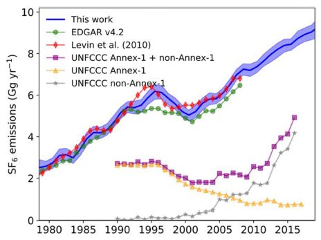
The figure shows emissions of SF6 into the atmosphere (in Gg per year; y axis) vs time (x-axis), over a 40-year period. (Gg? Gigagrams. 1 Gg = 109 grams = 1000 tonnes.)
There are two clusters of lines. We'll come back to the difference between the clusters later.
The top cluster is dominated by a thick blue line. That is the major output from the current work: the authors' best estimate of the total worldwide emissions. The thickness of the blue region shows the range of uncertainty.
There are also two sets of points (red and green), which come from specific other work. These other data sets largely agree with the blue line. That general agreement over the past may give us some confidence in the more recent part of the blue curve, where no direct support is available.
The lower cluster of lines are all from the UNFCCC (United Nations Framework Convention on Climate Change). The yellow data is for Annex-1 countries. The grey line is for non-Annex-1 countries. Annex-1 countries are "developed" countries; non-Annex-1 countries are "developing" countries. The top curve of the set is for the sum of those two sub-sets; that is, it is the total worldwide emissions.
You can see that the SF6 emissions from developed countries have decreased in recent years, but the emissions from developing countries have increased. The total emissions used to be dominated by those from developed countries, but are now dominated by those from developing countries.
This is Figure 2 from the article.
|
The figure and comments above lead to two questions...
- What's the deal with developing countries?
- What's the deal with the two clusters of lines in the figure? They are supposed to be for the same thing (total worldwide emissions), but they don't agree.
There are also two general questions, which provide context...
- What's all this SF6 used for?
- Does it matter? Is SF6 an important -- or emerging -- greenhouse gas?
Let's briefly address those two general questions...
SF6 is used for electrical insulation inside equipment. It is a gas -- a heavy gas. And it is very inert. Good properties for an easy-to-use insulator in large scale equipment. And it is famously used in wind energy systems, providing a connection between increasing use of this chemical and renewable energy.
Do SF6 emissions matter? SF6 is the most potent greenhouse gas normally considered, about 23,000 times stronger than CO2 (100-year basis). It's also near-permanent up there, with an estimated atmospheric lifetime of at least hundreds of years, perhaps a few thousand years. On the other hand, its concentration in the atmosphere is tiny, (much) less than a millionth that of CO2. The net result of those two points is that the current importance of SF6 as a greenhouse gas is small, about 0.2%. On the other hand, its concentration in the atmosphere is rising -- dramatically. If the increase continues, the contribution to the total load of greenhouse gases could become significant.
SF6 emissions are increasing -- in developing countries. Why? That's the "law". A United Nations agreement in 1998, called the Kyoto Protocol, sought to curb greenhouse gas emissions. But since the problem was primarily due to developed countries ("Annex-1") as defined in the agreement, that was the emphasis in the agreement. Developing countries were free to continue using SF6. Which they did -- to the point that they are now dominating the usage.
What about those two clusters of lines on the figure? The top cluster is all about worldwide emissions. The top line of the bottom cluster also is described as worldwide emissions. But they differ by about a factor of 2. Why? Different methodologies. The top cluster is based on measurements of SF6 in the atmosphere. The bottom cluster is based on reported usage. Top-down and bottom-up analyses. In principle they should agree, but they don't -- here and commonly. The article contains considerable discussion of the discrepancy. The good news is that both analyses show similar trends.
The article is an interesting story of trying to understand one particular atmospheric pollutant. It may not be a critical pollutant, at least for now, but many of the issues are general. It is a story grounded in science, but with political and economic implications. As you read individual items on the topic, be alert for biases.
News story: Potent GHG SF6 rapidly accumulating in atmosphere, driven by demand for SF6-insulated switchgear in developing countries. (Green Car Congress, July 6, 2020. Now archived.)
The following two news stories are not about the current article, but are general discussions of SF6. Both are from earlier this year, and both provide useful perspective on SF6.
* Why SF6 emissions from the renewable energy sector should not be considered a 'dirty secret'. (P Pickers et al, The Conversation, February 10, 2020.)
* Sulfur hexafluoride: The truths and myths of this greenhouse gas. (Phys.org (D Nikel, Norwegian University of Science and Technology), January 15, 2020.)
The article, which is freely available: The increasing atmospheric burden of the greenhouse gas sulfur hexafluoride (SF6). (P G Simmonds et al, Atmospheric Chemistry and Physics 20:7271, June 23, 2020.)
Other posts about top-down and bottom-up analyses of atmospheric gases...
* Global map of ammonia emissions, as measured from space (January 22, 2019).
* Methane leaks -- relevance to use of natural gas as a fuel (April 7, 2014).
More about electrical insulation: Using an electrical conductor as an insulator (September 12, 2021).
Can human lungs that are too damaged to be transplanted be fixed?
August 22, 2020
Apparently so, according to a recent article. Pigs can fix them.
Here's the set-up...
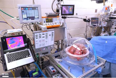
The human lungs are in the bubble, #5.
The pig? According to the figure legend, #8. I assume that means the pig is underneath the blue cloth. The pig is connected to the lungs. The pig's blood flows through the human lungs -- for about 24 hours. Not good if the pig moved around; it is anesthetized.
And a lot of equipment.
This is Figure 1d from the article.
|
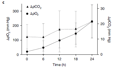
The scientists take various measurements. Here are some of them, summarized over six lungs...
The graph shows the effectiveness of the lungs in exchanging O2 and CO2. Each curve shows the difference in pressure, into the lung and out of it, for one gas. (For convenience, the absolute value is shown.)
Both curves increase over the 24-hour period of attachment to the pig. The initial values show poor performance; the lungs are not suitable for transplantation. The final values are approaching the normal range, approaching acceptability for transplantation.
The two curves have different y-axis scales. See the labeling, but it doesn't matter much. Each curve shows substantial improvement in lung function.
If you are concerned about the error bars... Results for individual lungs are in Extended Data (included in the pdf file, but not in the print edition of the journal). They actually look much better.
This is Figure 2c from the article.
|
The graph shows that 24 hr connected to a pig improves the functioning of the lungs. There is much more data in the article, at various levels including histological, immunological and biochemical. The general conclusion holds.
Perspective... It's actually known that damaged lungs can be improved by perfusion. The time between death of the donor and use of the lung is a time for decay. It's normal to attach a lung removed from a donor to a special device, pumping a blood-free solution through the lung. The procedure is known as ex vivo lung perfusion (EVLP). The development of EVLP devices, only a few years ago, provided a major improvement, allowing a few hours between donor death and lung use. But the devices have major limitations. Six hours of such machine-based perfusion is about all a lung can take. Even a donor lung in good condition from a fresh cadaver can't last much longer. The work here replaces a mechanical device using a lab-fluid with a biological one using real blood -- even if from a different species. A longer perfusion is practical, and the results are better. In fact, one of the lungs tested here had failed to improve on EVLP, but did improve to near-transplant quality after 24 hours attached to the pig.
No actual transplants have yet been done using organs repaired by the new procedure.
If a pig can do this, why not a human? In fact, at the end of the article, the authors suggest just that. If the person is already opened up, attaching an in-process lung would be possible. This avoids one extra step of immunological issues, but also raises its own concerns, in that it may be difficult to test the system.
The work here could lead to an increased supply of lungs for transplantation. Further, study of the system could lead to a better understanding of how the damaged lungs are repaired, and therefore to improvements in the mechanical perfusion devices.
News stories:
* Experiment Shows That Damaged Human Lungs Can Be Repaired By Attaching Them To Pigs. (A Shahab, MEDizzy Journal, July 23, 2020.)
* Severely Damaged Human Lungs Can Now Be Successfully Recovered -- Columbia Engineering and Vanderbilt researchers demonstrate that human lungs rejected for transplant can be recovered using cross-circulation, to provide much larger number of donor lungs to critically ill patients. (H Evarts, Columbia Engineering, July 13, 2020.) From one of the lead institutions.
* News story accompanying the article: Regenerative medicine: Ex vivo repair of human donor lungs for transplantation -- Injured human donor lungs deemed unsuitable for immediate transplantation may be successfully recovered by connection into the circulation of a porcine host with perfusion and ventilation ex vivo for 24 hours. (A J Fisher & J H Dark, Nature Medicine 26:1015, July 2020.)
* The article: Xenogeneic cross-circulation for extracorporeal recovery of injured human lungs. (A E Hozain et al, Nature Medicine 26:1102, July 2020.)
More about pigs and lungs:
* Making lungs in the lab -- and transplanting them into an animal (August 17, 2018).
* Pigs as organ donors for humans (February 16, 2010).
More about dealing with lung problems... If lungs fail, can you breathe with your intestines? (July 16, 2021).
A post about a similar issue: Using lab-grown organoids in medical treatment (May 3, 2021).
There is more about transplantation on my page Biotechnology in the News (BITN) for Cloning and stem cells. It includes an extensive list of related Musings posts.
More pigs... Oldest known picture of a pig (February 21, 2021).
August 19, 2020
Briefly noted...
August 19, 2020
Could a previous cold reduce the impact of a SARS-2 (COVID-19) infection? It's an interesting question. There is a possible connection... Among the 200 or so known cold viruses, four are coronaviruses. Is it possible that remaining immunity to a coronavirus from a previous cold could protect against the current coronavirus? That is, is there any useful cross-immunity among the coronaviruses? There is no basis for any prediction, one way or the other. However, many scientists are looking for actual evidence. And the evidence so far? Maybe. For example, there are many cases where people gave samples before the current virus was even known, and those samples have some immune response against SARS-2. Is there any direct evidence that those who have had a previous coronavirus infection are less likely to get COVID-19 (or that they get it with less severity)? No, and it would be hard to get good evidence on that point. So the original question remains, with perhaps some hint that there can be cross-protection among the coronaviruses. A recent feature in The Scientist gives a good overview of the evidence so far.
* News story: Does the Common Cold Protect You from COVID-19? -- There are emerging signs that some people might have heightened protection against SARS-CoV-2, perhaps thanks to recent infection by other coronaviruses. (C Baraniuk, The Scientist, August 4, 2020. Now archived.) It links to several articles, some of which have been published, and some of which are not yet peer-reviewed. All of the pre-prints at archive sites should be freely available. I suspect that most of the published articles are, too, at least temporarily.
A mosquito-like robot
August 18, 2020
I suggest you start by watching it -- a short video. Direct link: Quadcopter ground detection. (YouTube. Half minute. No important sound -- but it does sound like a mosquito, no?) (This video is in both news stories listed below.)
The point? The underlying robot is a common type of drone, a quadcopter. But this one has an unusual way of avoiding hitting surfaces -- a way it "learned" from mosquitoes.
Mosquitoes fly quite well in the dark -- and they don't hit things. Why not? The best understanding is that they sense the change in air pressure as they approach a surface. That is, they sense their self-induced air flows.
Self-induced air flows? Look...
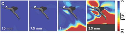
The figure shows the air pressure around a mosquito that is hovering (beating its wings, but with no net change in position). This is a theoretical mosquito; the results shown here are from computer simulations.
In the first (left-hand) frame, the mosquito is far from any solid surface. 10 mm, to be specific. The color is a uniform dark blue, indicating that the air pressure (P) is uniform. The scale bar at the right shows the color scale; it is in terms of ΔP, the difference from the normal pressure.
The next frame is for a distance of 7.5 mm from the surface. Results are the same.
The next frame is for a distance of 5 mm from the surface, which is at the bottom. Pressure differences are now evident. They are evident near the surface, but also very near the mosquito. Interestingly, P differences are evident above the head, where the main sensory receptors are, at the base of the antennae. (The mosquito wingspan is about 2 mm.)
The final frame is for 2.5 mm from the surface. Large P differences are now clear.
This is Figure 1C from the article.
|
It is not surprising that the mosquito affects the air pressure, and that a nearby surface matters. What is important is that the mosquito can detect the changes -- and act on them. In fact, there is neurophysiological work that documents the animal's sensitivity to such small changes.
What is even more important is that the engineers here have transplanted the idea into the design of their robot.
The drone has been engineered to detect changes in air pressure with exquisite sensitivity; it uses the air pressure as information about surfaces. The video noted at the start of the post shows the result.
The drone used here fits in a hand; it weighs less than 30 g. Implementation of the mosquito-inspired ground sensor was simple and effective.
The article represents an advance in our understanding of mosquitoes, as well as a practical improvement in drone technology.
News stories:
* Mosquitoes Inspires [sic] A Surface Detector. (UAV Expert News, May 22, 2020. Now archived.)
* Mosquito night navigation inspires new drone obstacle avoidance system. (D Szondy, New Atlas, May 8, 2020.)
* News story accompanying the article: Engineering: Drones become even more insect-like -- Mosquitoes' exceptional sensitivity to sound and airflow inspires new collision avoidance technology. (J Young & M Garratt, Science 368:586, May 8, 2020.)
* The article: Aerodynamic imaging by mosquitoes inspires a surface detector for autonomous flying vehicles. (T Nakata et al, Science 368:634, May 8, 2020.)
Also see:
* The smallest manmade flying devices (December 12, 2021).
* Crashworthy drones, wasp-inspired (October 16, 2017).
* How bumblebees detect the electric field (October 22, 2016).
* Science: Love songs (March 26, 2009).
For more about bio-inspiration, see my Biotechnology in the News (BITN) topic Bio-inspiration (biomimetics). It includes a listing of Musings posts in the area.
What's the connection: histones and copper ions?
August 15, 2020
The biology of copper is tricky. There are a few proteins that require Cu, but it is also quite toxic. Organisms manage their Cu carefully.
A recent article reports a new enzyme for reducing Cu(II) to Cu(I). Here are some data to demonstrate the enzyme...
|
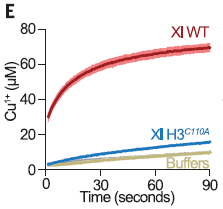
The graph shows the amount of Cu+ made (y-axis) vs time (x-axis). The Cu+ is measured by absorbance. Actually, the scientists measured a complex of the Cu+ ion, a more sensitive measurement.
The top curve, "Xl WT", shows the production of Cu+ in the presence of the wild type enzyme.
The bottom curve, "buffers", is for a control without the enzyme. There is a low background production of Cu+.
|
The middle curve, very near the bottom, is for a modified enzyme. The enzyme has been changed so that a particular amino acid thought to be important for the catalytic activity has been replaced by an "inert" amino acid. As expected, the modified enzyme does not work.
The label on the middle curve includes "C110A". That means that the amino acid C at position 110 has been changed to A. C = cysteine, A = alanine. We'll explain the rest of the name later.
This is Figure 2E from the article.
|
That graph provides good evidence that they have a copper(II) reductase enzyme. Both the buffer control and the intentionally-inactivated enzyme support the claim.
The reduction reaction requires a source of electrons --a reducing agent. In the work shown above, they add a separate reducing agent. That is, the enzyme catalyzes electron transfer from the added reducing agent to the Cu2+. The plateau in the top curve, above, seems to be due to depleting the reducing agent.
Where did they find this new enzyme? On your DNA. Or rather, on the DNA of a frog. Xl stands for Xenopus laevis, the African clawed toad, a common lab animal. The enzyme is one of the histones that are the major proteins binding to DNA. People had noticed that a site in the histone structure looked like it could bind copper. The work here builds on that observation. Not only does the histone bind Cu2+, it catalyzes its reduction.
The catalytic site is not simply in one protein, but is at the interface when the various histone proteins come together to make larger structures. More specifically, the site is formed at the interface between two H3 submits in the common histone tetramer (H3H4)2.
Cu(II) is the more common form of copper in the environment. Cu(I) is less toxic. Thus one can imagine that the reduction is a detox mechanism.
Work with yeast, where they can do genetic manipulations, allowed further testing, in vitro and in vivo. Interestingly, the enzymatic site is weak in the wild type yeast. That allowed them to make both better and worse versions of the enzyme. (One of the changes is essentially the opposite of the modification shown in the figure above.) In vivo, the changes affected copper metabolism, and enzyme activity correlated with ability to grow in the presence of Cu2+. Thus the yeast work shows that the Cu reductase activity of the histone is biologically relevant.
Humans? The gene sequence for the human histone H3 suggests that the active site for copper(II) reduction is intact. Beyond that, there is no information.
Intriguingly, the catalytic site appears intact in the histones of the most primitive organisms, the archaea. Is this a hint about the evolutionary importance of the enzyme activity? The authors speculate on this point.
Overall, the article shows that a well-known DNA-binding protein also has an enzymatic activity. The finding raises many interesting questions.
News stories:
* The secret double life of histone H3 as a copper reductase enzyme. (EurekAlert! (AAAS), July 2, 2020.)
* Histone H3-H4 tetramer found to be a copper reductase enzyme. (B Yirka, Phys.org, July 3, 2020.)
* News story accompanying the article: Molecular biology: The secret life of histones -- Histone H3 leads a double life as a copper reductase. (J Rudolph & K Luger, Science 369:33, July 3, 2020.)
* The article: The histone H3-H4 tetramer is a copper reductase enzyme. (N Attar et al, Science 369:59, July 3, 2020.)
More copper biology...
* Bacteria that make atomic copper (May 8, 2021).
* Copper ions in your nose: a key to smelling sulfur compounds (October 10, 2016).
A post that mentions histones... Using CRISPR to change cell fate (September 10, 2016).
More Xenopus: Designing reconfigurable organisms (January 19, 2020).
August 12, 2020
Briefly noted...
August 12, 2020
Retraction notice. The article that was the basis of a recent Musings post has been retracted. The article claimed the smallest known dinosaur. The post noted that there was some challenge to that claim. The authors, now with further evidence, acknowledge that the challenge is probably correct, and therefore retract the original article. (The fossil itself is still of interest; the scientists will presumably submit a new article about it at some point. It is the interpretation of the fossil that is of concern. The wonderful picture of it, shown in the post, remains.)
* News story: World's smallest dinosaur is probably a lizard -- Paper that reported the animal's discovery was retracted following new evidence from a similar fossil. (G Viglione, Nature, July 23, 2020. In print: Nature 583:665, July 30, 2020.)
* Direct link to the retraction notice at the journal web site: Retraction Note: Hummingbird-sized dinosaur from the Cretaceous period of Myanmar. (L Xing et al, Nature, July 22, 2020.)
* I have added this update to the original post, at the top, as a retraction box. That post is: A Cretaceous dinosaur the size of a tiny bird? (June 2, 2020).
A better catalytic sponge: degrading plastics, and more
August 11, 2020
Solid-state catalysts are of considerable interest in industrial chemistry, but they also have limitations.
As solids, they are less of an environmental hazard than liquid-based materials. On the other hand, getting pieces of a system to work together can be harder.
Some crystalline zeolite materials have strongly acidic groups, often important for catalysis. But they have limited surface area. Some amorphous aluminosilicates are highly porous, with high surface area, but they lack the more acidic groups and have weak catalytic properties.
The terminology here can be confusing. Zeolites are in fact aluminosilicates -- typically crystalline. The real distinction of interest is between crystalline and amorphous materials. The latter have the potential to be more porous -- more spongy.
Here are some results for a novel catalytic material, as described in a new article...
|
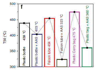
The graph shows T50 for various tests. T50 is the temperature (T) needed to get 50% degradation in a standard test procedure. The lower the better.
Three plastics were tested, each without and with the new catalyst.
Start with the two bars at the left. Plastic bottles. The first bar shows the result without catalyst. T50 (bar height, also shown on the bar) is 439 °C. The next bar shows the result for the same material, but now with the new catalyst, labeled here as AAS. T50 is reduced, to 403 °C. That is, the AAS catalyst improved the process.
|
The next two bars show a similar comparison for a different plastic (lab test tubes). The two bars at the right show a comparison for a third plastic (common single-use plastic grocery bags). In each case, the catalyst lowered T50. In the final two cases, the improvement was over 100 degrees.
This is part of Figure 8 from the article.
The line connecting the bars is meaningless.
|
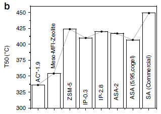
The new catalyst works. But how does it compare to other catalysts? The following figure shows a comparison...
The reaction here is the degradation of LDPE (low density polyethylene) -- the plastic bag stuff. Various catalysts were tested.
The graph is similar to the one above. Each bar is for one catalyst. The lower the bar height, the better (lower T50).
The first bar (at the left) is for the newly developed material, called AC*-1.9; it is the best.
This is Figure 9b from the article.
|
|
The general picture is that the new material works -- rather well.
The authors carry out several reactions, in each case showing that the new material has merit in catalyzing difficult transformations. Some are specific chemical syntheses. The one shown above is an example of a more general use, aiding in the recycling of plastics. They also test the material for the reduction of CO2 into a useful fuel.
What is the product from the reactions shown above, for degrading plastics? Hydrocarbons. There isn't much detail about the specifics, but presumably they are useful, as feedstock chemicals and/or fuels.
What is this stuff? AAS stands for acidic aluminosilicate. It is a material designed to have the catalytic advantages of a crystalline zeolite and the physical features of an amorphous aluminosilicate. The scientists made a variety of such materials; the one featured above was generally the best.
Here is what it looks like, with some numbers....
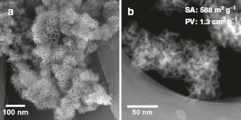
|
The two images are both electron micrographs of AC*-1.9.
SA = (accessible) surface area.
PV = pore volume.
This is part of Figure 1 from the article.
|
To put the numbers in perspective... Consider a cube with one gram of a material with the density of water (1 g/cm3). It's surface area consists of the six sides of the cube, for a total of 6 cm2. That is 0.0036 m2, using the units shown on the figure. The pore volume (empty space inside) is zero for an ordinary solid.
The bottom line is that the authors have produced a new type of catalytic material, with a combination of desirable properties. Their AAS AC*-1.9 has the strongly acidic catalytic sites typical of crystalline zeolites and the greater porosity and accessibility characteristic of amorphous materials.
Why is the material acidic? The acidity of aluminosilicates is due to silanol groups, ...Si-OH. The acidity of such groups depends on the details of the environment. It is easier to manipulate the local environment in a crystalline material than in an amorphous material. Both the procedures for making the more acidic material and the characterization seem fairly rough at this point.
News story: Nano-sponges of solid acid transform carbon dioxide to fuel and plastic waste to chemicals. (Phys.org (Tata Institute of Fundamental Research), July 31, 2020.)
The article, which is freely available: Catalytic nanosponges of acidic aluminosilicates for plastic degradation and CO2 to fuel conversion. (A Maity et al, Nature Communications 11:3828, July 31, 2020.)
Here are other posts about zeolites. Note that zeolite is a term for a broad group of chemicals, with diverse properties.
* Upgrading ethanol? (April 11, 2016).
* Upsalite: a novel porous material (September 6, 2013).
Another sponge... A sponge that will soak up phosphate pollution from water (August 14, 2021).
Among other posts on degradation of plastics... Good enzymatic degradation of polyesters, by manufacturing the plastic with the enzymes in it (May 4, 2021).
More about catalysis:
* Briefly noted... A Swiss army knife for catalysis (February 15, 2022).
* Low temperature treatment for auto exhaust? (February 18, 2018). Links to more.
A background post about plastics: History of plastic -- by the numbers (October 23, 2017). Links to more.
How exercise benefits the brain
August 9, 2020
Musings has noted that blood from a young mouse can improve brain function in an old mouse [link at the end]. A recent article from the same lab provides evidence for a specific enzyme that mediates the effect.
The effect of young blood on the brain is related to the beneficial effect of exercise on brain function. The effect of blood is mediated by the plasma -- the liquid part. In the current work, the scientists started by exploring how exercise affected the composition of blood. One factor they found of interest was the enzyme glycosylphosphatidylinositol (GPI)-specific phospholipase D1, Gpld1 for short. (We'll come back to the nature of the enzyme later.) The level of this enzyme increased with exercise, and correlated with the benefits of exercise to the brain. Of course, correlation does not mean there is a causal connection, but it does lead to a hypothesis.
To test the idea that Gpld1 is a player in the exercise-brain story, the scientists did a direct test. They added the enzyme, and looked at the brain response. In this case, they added the enzyme genetically, adding a gene that targeted to the liver, where the enzyme is normally made.
Here are some of the results, comparing what happened upon adding the gene for the enzyme vs adding a control gene...
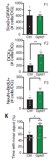
|
|
The first three graphs show the counts for one or another kind of cell. The top one (labeled F1) is for neural stem cells. The next two (F2 and F3) are for new neurons, measured by two methods.
Direct measurement of the enzyme level showed that adding the gene increased the level of the Gpld1 enzyme.
That is, increasing the enzyme level stimulated the formation of new neurons (with no effect on the number of stem cells).
The bottom graph (K) shows the performance of the mice on a behavioral test. The mice with the higher level of Gpld1 did better.
This is part of Figure 3 from the article. I have added labels for the individual graphs of part F (upper right of each graph). The full part F also contains photos showing stained cells; those photos are examples of the information underlying the graphs.
Parts D and E of Figure 3 in the article show data for the amount of enzyme. Results are shown for mRNA level in the liver and for protein in the plasma, measured by Western blot. Those two results show 6-and 2-fold increase, respectively, due to the added gene.
|
Those results are qualitatively similar to those obtained with exercise alone, or with use of blood plasma from exercised mice.
The conclusion, then, is that increasing the level of the enzyme Gpld1 leads to stimulation of growth of new neurons and to improved brain performance. In this case, the enzyme level was manipulated by the scientists, allowing a specific test of that enzyme. Exercise increases the level of this enzyme, too; plausibly, the effect of exercise on brain function is mediated, at least in part, by the effect of exercise on the level of this enzyme.
What does this enzyme do? The short answer is that we don't know. It appears that the enzyme itself does not make it to the brain. It is a lipase. It can remove lipid-linked proteins from cell surfaces -- and that can have a variety of metabolic effects. That's about all we know at this point. (One simple suggestion is that the enzyme leads to reduced general inflammation, and that is good for the brain.)
The study here is in mice. What is the relevance to humans? It is known that exercise does benefit the brain in older people. And the current article shows that exercise leads to elevated levels of the enzyme Gpld1. Beyond that, further work is needed.
We can easily understand that exercise increases muscles, but it is not so obvious why it would benefit the brain. The work on blood transfer, now extended in the current work to implicating a specific enzyme, is telling us something about how it happens.
News stories:
* Blood Transplants from Active Mice Give Brain Boost to Others -- The researchers behind the results propose that an exercise-induced protein in circulation is responsible for the benefits. (L Winter, The Scientist, July 12, 2020.) Now archived.
* Brain benefits of exercise can be gained with a single protein -- Findings open door to drugs that could help protect the aging brain. (Science Daily (University of California - San Francisco), July 9, 2020.)
* Liver Enzyme Levitates with Exercise, Spurs Learning in Old Mice. (M B Rogers, ALZFORUM, July 10, 2020.)
* News story accompanying the article: Physiology: Exercising your mind -- A circulating factor induced by exercise contributes to keeping the brain young in mice. (V A Ansere & W M Freeman, Science 369:144, July 10, 2020.)
* The article: Blood factors transfer beneficial effects of exercise on neurogenesis and cognition to the aged brain. (A M Horowitz et al, Science 369:167, July 10, 2020.)
Background post, from the same lab: Would young blood be good for your brain? (October 21, 2011).
More about exercise:
* Artificial exercise, using a robotic device glued to the muscle (May 2, 2023).
* Effect of exercise on developing ALS (July 27, 2021).
* High-performing athletes: might they have performance-enhancing microbes in their gut? (June 28, 2019).
A post exploring the role of a lipase in disease: Cataloging gene knockouts in humans (July 10, 2017).
My page for Biotechnology in the News (BITN) -- Other topics includes a section on Brain. It includes a list of brain-related posts.
August 5, 2020
Briefly noted...
August 5, 2020
Global Immunological Observatory (GIO). Astronomers have observatories, where they aim their telescopes to the skies, looking for things that might hit Earth and harm us. Perhaps public health people should have observatories where they aim their analytical tools at the world's blood samples, watching for signs of problems. Specifically in this proposal, watching for changes in the nature or level of antibodies found in the blood. Such changes could be an early warning of new pathogens. It's not a new idea, but the current COVID pandemic has led proponents to publish a new plea to get started.
* News story: Tracking disease spread through a global blood 'observatory'. (Harvard, June 16, 2020. Now archived.) Links to the article, which is freely available. The article is a "science forum", not a research article. This news story also links to another, somewhat longer one, at Science magazine.
A sniff test to see if a person is conscious
August 4, 2020
Patient in the hospital. Unresponsive. Brain injury. What is the prognosis? Are they conscious but uncommunicative, or quite unconscious?
Those are important questions, but hard to get at. A new article proposes a simple test to tell if a person is conscious: give them something to smell.
Here is the idea...
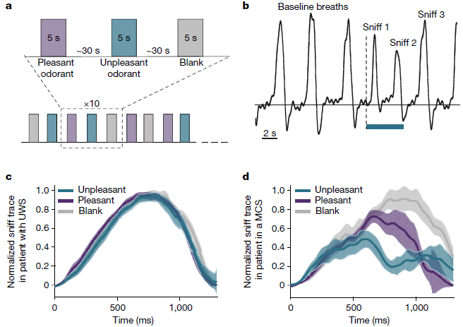
Let's start with part b (upper right). It shows the results from a single test. The y-axis is a measure of how the person is breathing. The first three peaks, which are similar, are "baseline" breaths. Then, at the vertical dashed line, a bottle is put to the person's nose. The person has been told to smell it. The colored bar at the bottom shows the time the bottle is at the person's nose. The breath trace shows three breaths, all of which are different; the third is back to about baseline. The person responded; further, there is more information available about the details of the response. (The bottle contained something with an unpleasant odor in this case.)
Back to part a (upper left). It shows the nature of a test session. The top shows three tests, each with a 5 second exposure, and 30 s between them. The three tests are with pleasant or unpleasant odor, or a blank. An actual session consists of many such tests, in random order, as outlined at the bottom of part a. (The color coding used here is used consistently throughout the article.)
The two lower graphs summarize many tests with two particular patients. For the person on the left (part c), the breath pattern is the same regardless of what is in the bottle. For the person on the right (part d), the breath pattern is different for each odor.
Parts b and d are for the same person.
This is Figure 1 from the article.
|
Clinical evaluation showed that the patient on the left was in a vegetative state, whereas the person on the right was minimally conscious. Tests with 43 patients showed that the sniff test was good at distinguishing the two states, as good as more complex tests. That is, the sniff test is a good simple way to distinguish whether or not the person is conscious.
Follow-up study shows that the people with positive responses in the sniff test had better outcomes: more likely to recover good function and more likely to survive for an extended period.
There are complexities beyond what is discussed above. Of particular interest, sometimes a person judged to be vegetative showed a positive sniff response. In each case, the person later was judged to be conscious. That is, gaining the sniff response was an early indicator of improvement.
We also note... There are two kinds of responses being measured. One is whether the person responds to being offered an odor. Another is whether they distinguish different odors. The two individuals whose results are shown in the figure differ on both points.
The sniff test is quick and easy. It does not require active participation by the patient. It shows promise as a useful diagnostic tool for a difficult situation.
News story: Unconscious: 'Sniff test' predicts recovery of consciousness. (Science Daily (Weizmann Institute), May 21, 2020.)
The article: Olfactory sniffing signals consciousness in unresponsive patients with brain injuries. (A Arzi et al, Nature 581:428, May 28, 2020.)
A recent post on brain injury: Traumatic brain injury: long term effects? (October 8, 2019).
A recent post on olfaction: Is it possible to have a normal sense of smell without olfactory bulbs? (January 28, 2020). Links to more.
My page for Biotechnology in the News (BITN) -- Other topics includes a section on Brain. It includes a list of brain-related posts.
The first known Vatira
August 3, 2020
The likely existence of Vatiras was suggested in 2012. Finally, one was found earlier this year. And now we know how big it is.
What's a Vatira? The simple answer is that it is a V-class Atira.
What's an Atira? It is an asteroid with an orbit entirely within that of Earth. A V-Atira, or Vatira, is one entirely within the orbit of Venus.
About 20 Atiras are now known. One Vatira. That's out of a million asteroids. It's not very hospitable for them close to the Sun. It's likely that many visit, but few survive for long. And they are hard to see; the viewing angle for the inner planets is limited, and these things are tiny.
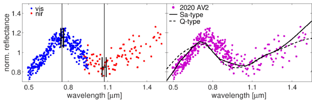
Scientists have now collected some data on this newly-discovered Vatira, called 2020 AV2, and estimated its size. Here are the data...
Spectra. Reflectance spectra in this case. Two instruments, one measuring in the visible region, and one measuring in the near infrared (NIR). The scientists combined the measurements from the two instruments into one overall spectrum by equating their results for the narrow region of overlap (where there are both blue and red dots).
The resulting spectrum is shown at the left. You can see that it does have a couple of features. You can also see that it is very noisy.
The spectrum is repeated at the right. Also shown there are standard spectra for two types of asteroids. The Vatira spectrum generally matches them.
This is part of Figure 5 from the article.
|
Further analysis suggests that 2020 AV2 is Type S -- with a lot of the mineral olivine.
Knowing the properties of olivine-rich bodies and how much light was harvested, they can estimate how big it is. About 1.5 kilometers across. With error bars, 0.8-2.6 km. And the temperature: about 330 (+/- 10) K -- at its aphelion (furthest distance from the Sun). It's hot.
Olivine? That's a major mineral of Earth's mantle. Is it possible that asteroids such as this Vatira played an important role in delivering olivine to the early Earth? Planetary scientists have differing opinions about that. After all, we have only speculation (and some computer simulations) to give us any idea how common they are or were. So, maybe.
Scientists began to take the idea of Vatiras seriously less than a decade ago. They now have a little data about one of them -- and a lot of ideas.
News stories:
* First asteroid found within Venus's orbit could be a clue to missing 'mantle' asteroids. (N Redd, Science magazine, July 1, 2020.)
* Meet 2020 AV2, the first asteroid found that stays inside Venus's orbit! (P Plait, SYFY WIRE, January 10, 2020.) Some background about the object, prior to the current article. Don't worry about the site name, or even the page being labeled Bad Astronomy. It's a light-hearted but quite good page.
The article: Physical characterization of 2020 AV2, the first known asteroid orbiting inside Venus orbit. (M Popescu et al, Monthly Notices of the Royal Astronomical Society 496:3572, August 2020.)
Posts about asteroids include...
* Why aren't asteroids considered planets? Implications for Pluto? (September 30, 2018).
* How the birds survived the extinction of the dinosaurs (June 6, 2014).
* Rings for Chariklo (May 9, 2014).
* What has six tails -- and is beyond Mars? (November 20, 2013).
Posts about Venus include...
* Who is perturbing the orbit of Halley's comet? (October 3, 2016).
* Venus flytrap: converting defense into offense (July 27, 2016).
Pancreatic cancer: another trick for immune evasion
August 1, 2020
Pancreatic cancer is a big problem. For one thing, it is often discovered rather late. Beyond that, we don't know much about its secrets.
A recent article may have uncovered one of those secrets.
Let's start with the bottom-line test...
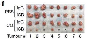
|
32 tumor samples were transplanted into mice. Four different treatment conditions, eight tumors per condition.
The final tumors are shown in the figure, one row per treatment condition.
It's clear... The tumors are smaller in the bottom row. (In fact, three tumors disappeared completely, denoted by x.)
|
This is Figure 4f from the article. (Part g of the full figure shows quantitative data for the experiment, with the weight of each tumor.)
|
What did the scientists do in the bottom-row-treatment? And how did they figure out to try it?
The labeling shows that there are two treatment variables, IgG vs ICB, and PBS vs CQ.
ICB stands for immune checkpoint blockade therapy, often called cancer immunotherapy. This is based on the recent finding that cancers turn off the immune response. Scientists then developed antibodies that turn it back on. ICB therapy has become a hot topic in cancer biology. It leads to a significant number of spectacular responses, even with advanced cancers. (The 2018 Nobel Prize in Physiology or Medicine was awarded for the work leading to this therapy.) IgG is a control antibody treatment, with no target.
However, ICB therapy often does nothing, as seen in the second row. There is more to the story of how cancers evade the immune system. Experience so far suggests that cancers have a variety of other tricks for evading the immune response.
In the bottom-row-treatment, they used not only ICB, but also CQ. That is chloroquine. (Yes, that CQ. But the recent news about CQ and its close relative HCQ has nothing to do with the current work.) PBS is a buffer control for the CQ.
CQ + ICB works, rather well in this model system. What's the CQ doing? It is inhibiting autophagy -- and autophagy is how the cancer is evading the immune response.
The heart of the new article is working out that story, and it is complicated. A short version is that the scientists did much work that revealed that autophagy seemed to be eliminating the immune response. That led to the hypothesis: inhibit autophagy, and that may restore the immune response. The experiment shown above tests that hypothesis, and supports it.
What is autophagy? It is a normal process for cleaning up unwanted cell materials. The word literally means self-eating. But the tumors here have hijacked the autophagy system for their own benefit. They have directed the autophagy system to remove the components that cells use to present tumor antigens to the immune system. The tumors are now invisible to the immune system; simply unblocking it (with ICB therapy) doesn't help. It is necessary to also unblock the presentation of tumor antigens, and that means blocking autophagy; that is what the CQ does.
The work here is with a model system: pieces of tumor implanted into mice. The work seems to have provided a clue about how these tumors work, and what might be done about them. But real tumors are different, and human cancer is often different than mouse cancer. There is no claim that the work offers a cure, but it does offer a clue that can be followed up.
There have already been hints that CQ is of some benefit in the treatment of pancreatic cancer. The current work provides a basis for testing that further, in the context of ICB.
News story: Pancreatic cancer cells hijack basic cell mechanism to evade immunotherapy. (Medical Xpress (NYU), April 23, 2020.)
* News story accompanying the article: Pancreatic cancer: Hidden in plain sight -- Pancreatic cancer does not respond to certain anticancer treatments that boost immune responses. A mechanism active in tumour cells that contributes to this evasion of immune targeting has been uncovered. (A Maitra, Nature 581:34, May 7, 2020.)
* The article: Autophagy promotes immune evasion of pancreatic cancer by degrading MHC-I. (K Yamamoto et al, Nature 581:100, May 7, 2020.)
Previous post on pancreatic cancer: Role of neoantigens in surviving pancreatic cancer? (February 4, 2018).
More on cancer immunotherapy:
* Can fecal transplantation be useful in treating cancer? (April 27, 2021).
* Predicting who will respond to cancer immunotherapy: role of high mutation rate? (October 6, 2017).
A post about autophagy: An "antidote" for Huntington's disease? (February 29, 2020). In this case, scientists made use of the autophagy system to remove a disease-causing protein.
More about the pancreas: Making a functional mouse pancreas in a rat (February 17, 2017).
My page for Biotechnology in the News (BITN) -- Other topics includes a section on Cancer. It includes an extensive list of relevant Musings posts.
July 29, 2020
Briefly noted...
July 29, 2020
Two-person fMRI (functional MRI, measuring brain activity). It's a little cramped in there, but you can do it. Modify the device so that there are two sets of coils, and you can take measurements on both individuals. You can now measure the effects of their interactions. (And it doubles your capacity.)
* News story: Social touching can "synchronize" our brain activity, a study on couples suggests. (A Micu, ZME Science, April 30, 2020.) Links to the article, which is freely available.
Rise of the Roman Empire: role of an Alaskan volcano?
July 28, 2020
This post is based on a recent scientific article about a volcano in the Aleutian Islands of Alaska. It starts by noting the assassination of Julius Caesar, in the year 44 BCE.
The first figure sets the stage...
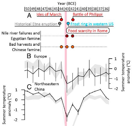
|
The date bar across the top is for all parts of the figure.
Part A shows some historical events, including the Ides of March in 44 BCE, the date of the assassination of Julius Caesar. It also notes one volcanic eruption and some food shortages and such shortly thereafter. Nothing important for us in Part A for now.
Parts B and C show summer temperature profiles for two regions of the world. The locations are quite far apart, but both show a distinct decline in about 43 BCE.
This is part of Figure 2 from the article.
|
That there is a distinct temperature dip at the same time in two regions that far apart suggests that there was a world-class catastrophe -- such as a major volcanic eruption. Any such catastrophe could have led to some of the other consequences shown.
The Etna eruption shown in Part A might have had local significance, but it was not a major eruption.
If we are looking for an eruption with worldwide consequences, we can look anywhere. Arctic sites are good, because of the availability of ice cores, which can be reliably dated and analyzed.
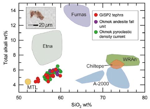
In the current work, the scientists examined six sites in the Arctic, mostly in Greenland. They looked for volcanic debris ("tephra"), and compared its composition to that from known volcanoes around the world. The following figure shows the findings from one such analysis...
The graph shows various materials, plotted by two measures of their composition: percent silica, SiO2, on the x-axis; total alkali (sodium and potassium oxides) on the y-axis.
The focus is on samples from a Greenland ice core, dated to 43 BCE. Red dots.
Most of the red dots cluster very close to green and purple dots, which are for authentic samples from the Okmok volcano in Alaska. The figure also shows the composition range expected for other volcanoes around the world, including Etna. The red dots from Greenland do not match any of them.
GISP? Greenland Ice Sheet Project.
The inset at the upper left shows a piece of the debris.
This is Figure 3 from the article.
|
|
That figure is the heart of the new work. (Most of what is in the top figure was previously known.) Modern analysis shows that there was a major volcanic eruption in the year 43 BCE, and identifies an Alaskan volcano as the source. It was one of the largest eruptions in the last 2500 years. Large enough to cause major and long-lasting climate change. Large enough to have social impact. And it occurred at what was already a time of upheaval in Rome.
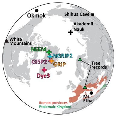
That's the story. But let's add one more figure. A map, to help you visualize the situation...
Two of the main volcanoes discussed are marked: Etna (in Italy) and Okmok (in Alaska).
The Arctic drilling sites are shown with +. Most of them are in Greenland; one is in Russia.
This is Figure 1 from the article.
|
News story: Alaska's volcano linked to period of extreme cold in ancient Rome -- The Okmok volcano erupted in 43 BCE. (Archaeology Wiki, June 24, 2020.)
* Commentary "accompanying" the article. (It was posted online the day after the article appeared in print, but appeared in the print journal three weeks later). The sun of Rome is set! Volcanic dust veils and their political fallout. (C Oppenheimer, PNAS 117:17470, July 28, 2020.)
* The article: Extreme climate after massive eruption of Alaska's Okmok volcano in 43 BCE and effects on the late Roman Republic and Ptolemaic Kingdom. (J R McConnell et al, PNAS 117:15443, July 7, 2020.)
Previous posts about Okmok or Julius Caesar: none (except for posts about C-section births).
Among posts about volcanoes:
* Predicting the "side-effects" of geoengineering? (September 23, 2018). Discusses effects of volcanoes on crops.
* How frequent are volcanic eruptions that are truly catastrophic? (April 10, 2018).
* VPOW (July 14, 2010).
More from Alaska: What if a seismometer was "pointed" to the skies? (January 4, 2021).
More about Arctic ice: The thorium anomaly: was the Arctic Ocean formerly a body of fresh water? (March 8, 2021).
More about the effect of dust clouds: The Great Dimming of Betelgeuse (July 24, 2021).
Solar hydrogen -- with near 100% efficiency?
July 26, 2020
Using solar energy to make hydrogen from water could be a good way to get renewable energy. In principle. Actually doing it in a practical way remains a challenge.
In a recent article, a team of scientists reports progress: making H2 from light-driven breakdown of water with near 100% efficiency. It's a model system, instructive but not practical.
The following figure shows some of the results...
|
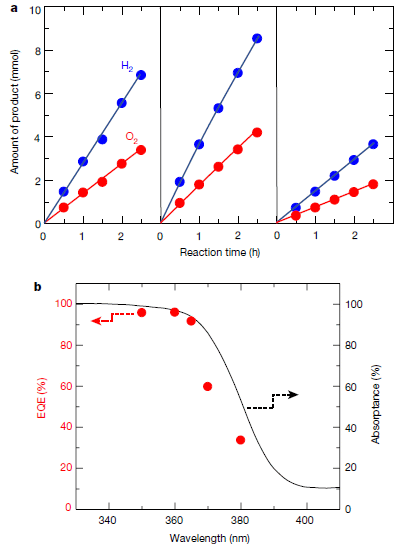
Part a (top) shows the production of H2 and O2 for three of their systems. The systems vary in the nature of the catalysts.
The graph at the right is for their base case. The left-hand and middle graphs are for improved catalysts. Both give improved rates of gas production.
The rate of H2 production is twice the rate of O2 production in each case, as expected.
Part b (bottom) shows further data from the best of those systems.
The solid black line shows the absorption spectrum of the material, based on measuring reflectance. Note that it is over a narrow range of wavelengths, near the UV-visible boundary. At the shorter wavelengths the absorbance is about 100% (right-hand y-axis). The material is effectively black at those wavelengths.
The red points show the efficiency of making H2 -- specifically the EQE (left-hand y-axis). You can see that the EQE follows the spectrum, and is near 100% at the shorter wavelengths.
What about those dashed lines with arrowheads? Those are just to direct you to the appropriate axis. (But it seems that the two y-axes are scaled the same.)
This is Figure 1 from the article.
|
What is EQE? External quantum efficiency. It is the ratio of useful electrons produced to photons reaching the cell. EQE combines two steps. One is the absorption of the photons; one is the efficiency of use of those photons that are absorbed.
That second part of the EQE is called the IQE -- the internal quantum efficiency.
An EQE near 100% requires that both of those steps be near 100% efficient. The absorption of the photons was measured; the graph shows that it is near 100%. It follows that the use of the absorbed photons, the IQE, is also near 100%.
Getting IQE anywhere near 100% is quite an achievement -- even if it is over a narrow range of the spectrum. What did the scientists do to get this improvement?
The system consists of an absorbing material plus catalysts. The three systems shown in part a vary both in how the catalysts were applied and in which catalysts were used.
The underlying photocatalyst is an aluminum-doped strontium titanate, SrTiO3:Al. For the right-hand system, co-catalysts rhodium and chromium(III) oxide (Rh/Cr2O3) were included in the material. For the left-hand system, the same catalysts were applied, but this time they were deposited sequentially on the SrTiO3:Al base. For the middle system, the best one, cobalt oxyhydroxide (CoOOH) was also deposited. The results in the top graph show that both the nature of the catalysts and how they were applied matter.
The titanate crystals used here lead to the electrons and holes migrating to different surfaces. The catalysts for the two individual reactions are at different sites. This separation of the two catalysts substantially prevents loss of electrons/holes anywhere else. The result: high efficiency use of the electrons/holes for the desired reactions.
The work here demonstrates that it is possible to efficiently use photons to make hydrogen gas from water. That establishes the principle; the reason(s) for the improvement are at least partially understood. However, this work uses only a narrow bit of the spectrum. Work must continue to extend this to the main part of the solar spectrum.
News stories:
* Solar hydrogen production: Splitting water with UV is now at almost 100% quantum efficiency. (Science Daily (Shinshu University), June 3, 2020.)
* A better way to split water molecules to produce hydrogen using sunlight. (B Yirka, Phys.org, May 28, 2020.)
* News story accompanying the article: Materials science: A model of perfection for light-activated catalysts -- Efforts to make hydrogen from water directly using sunlight have been hampered by the inefficiency of the catalysts that promote the process. A model system demonstrates that almost perfectly efficient catalysts can be made. (S Pokrant, Nature 581:386, May 28, 2020.) Recommended!
* The article: Photocatalytic water splitting with a quantum efficiency of almost unity. (T Takata et al, Nature 581:411, May 28, 2020.)
A recent post on increasing efficiency of using solar energy... Solar cells: a new record for efficiency (May 26, 2020).
More about using hydrogen as a fuel: Storing hydrogen in salts (such as potassium formate) (November 7, 2022).
There is more about energy issues on my page Internet Resources for Organic and Biochemistry under Energy resources. It includes a list of some related Musings posts.
July 22, 2020
Briefly noted...
July 22, 2020
Police issues. The July 19 post (just a bit below) on "Police training" discusses a test of a specific intervention to change police behavior. I note there that the overall issue is complex. Nature has recently provided a news feature with a useful overview of the police issues. Recommended, for perspective.
* News feature, which is freely available: What the data say about police brutality and racial bias - and which reforms might work -- Some interventions could help to reduce racism and rein in the use of unnecessary force in police work, but the evidence base is still evolving. (L Peeples, June 19, 2020. In print: Nature 583:22, July 2, 2020.) The article discussed in the post below is reference 15 of this news story.
* Direct link to that earlier post: Police training (July 19, 2020).
How long have Americans been eating corn?
July 21, 2020
Modern corn (= maize) was developed by domesticating the wild grass teosinte; that process occurred largely in what is now called Mexico. Musings has discussed parts of this story before [links at the end].
When did people actually start eating the stuff in large quantities? We have little information about that.
A recent article provides some evidence on when people started eating corn as a dietary staple.
The term America is used here in the broad sense, referring to the two American continents.
The new work is based on analyzing samples from unusually well-preserved skeletons found at two sites in Belize (adjacent to Mexico). The skeletons were dated to a range of dates over the last 10,000 years. The stable protein collagen was analyzed for its content of carbon isotopes; the ratio of isotopes can be related to diet.
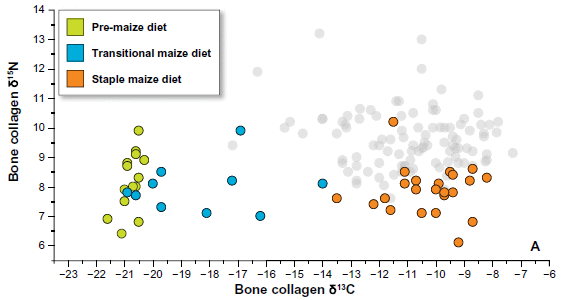
Here are the data...
The graph shows the isotope content of collagen samples from the skeletons. In particular, the content of C-13 is shown on the x-axis. As usual, it is shown relative to a reference material, δ13C, in parts per thousand.
The y-axis shows the content of another isotope, N-15, in the same samples. For our purposes, we can ignore that for now.
There is a wide range of C-13 values. But some of the points have been colored -- and that is interesting. (I suggest that you ignore the key for the moment.) The green points are all to the far left (with a value of about -21). The red points are to the right (-14 to -8).
This is the top graph of Figure 3 from the article.
|
What does that mean? Turns out that the green points are for samples older than 4700 years. And the red points are for samples younger than 4000 years.
The data above are measurements; they are facts. (That is true for both the isotope data in the graph and the dates.) At this point, the story turns to interpretation. And the bottom line from the authors' interpretation is that red-point people ate lots of corn.
What's the argument for the corn? It has three steps...
1. The C-13 content reflects diet.
2. The higher C-13 contents (on the right) reflect eating foods based on plants with so-called C4 metabolism. (Basic photosynthesis is "C3". The effect of the photosynthesis style on isotope content is something of an accident, not obvious from looking at the processes.)
3. The most likely C4 food is corn. (The authors spend time supporting this claim with other measurements.)
That is, corn has had a major role in the diet (in this area) for about 4000 years, but was minor prior to 4700 years ago.
There are two other point colors in the figure. The blue points are for samples between 4700 and 4000 years old. These range widely in C-13 content, And the gray points are controls, for relatively modern people known to have a diet rich in corn. They have high C-13 contents, too. (I think that is what the gray points are for. The article doesn't seem to say, but implies what I have said here.)
That leads to the labels shown in the key. The green is for people pre-maize. The graph shows they are low C-13, hence low-corn, and the known age is "old". Similarly, the red points are "staple maize" -- high-corn and recent. The blue points are transitional. The transition from low-corn to high-corn diets occurred in this region, near Mexico, between 4700 and 4000 years ago.
That conclusion fills in one more piece of the story of the domestication of teosinte to modern corn.
News stories:
* UNM researchers document the first use of maize in Mesoamerica. (M B King, University of New Mexico, June 3, 2020.) From one of the lead universities on the project.
* The Roots Of A Staple Crop. (Seed Today, June 8, 2020.)
The article, which is freely available: Early isotopic evidence for maize as a staple grain in the Americas. (D J Kennett et al, Science Advances 6:eaba3245, June 3, 2020.)
More about the history of corn...
* What can we learn from a five thousand year old corn cob? (March 21, 2017).
* Atmospheric CO2 and the origin of domesticated corn (February 14, 2014).
My page of Introductory Chemistry Internet resources includes a section on Nuclei; Isotopes; Atomic weights. The list of Musings posts includes some that involve isotope analysis.
Police training
July 19, 2020
Recent events in the United States have focused attention on how police work. That leads to questions such as...
- What could we do to improve the police system?
- How will we know if changes are beneficial?
Of course, the problems are not new, and there has been work addressing them. A recent article provides some data on the effectiveness of a particular training program for police.
The general idea of the work is that groups of police in a major (US) urban police department were given a training course in "procedural justice". Then, data were collected on indicators of police function.
The following figure summarizes some of the findings...
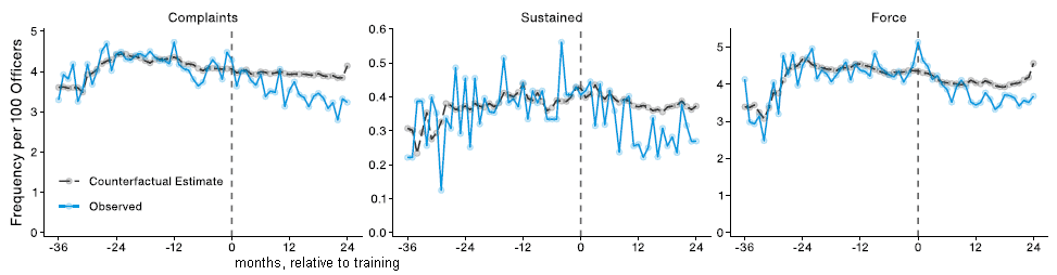
Start with the left-hand graph. It plots the frequency of complaints (per month) vs time. For the x-axis time scale, zero is the time when the newly-trained recruits took the field. That is, negative times are for the period before the new training; positive times are for the period after the training. The numbers are months before or after training.
The blue curve shows the actual results. The black curve shows predicted results, based on modeling; it is labeled "counterfactual estimate".
Before the training -- before time 0 -- the observed data agree with the prediction. After the training -- after time 0 -- the observed data are lower than predicted by extrapolation of past results using the model. That is, the training worked: complaints were lower than expected after the training.
The other two graphs are similar, but for other indicators; they are labeled at the top. The general point is that all three graphs show similar patterns. All of the improvements test as statistically significant.
Police were trained at various times, in small groups. The results are combined, by expressing the results relative to time 0, the time each group received the training. (That's why the "past" part of the graphs is not as simple as one might have expected.)
What does "sustained" mean (label for middle graph)? It is for the subset of complaints that were either officially recognized as reflecting a violation of rules or laws, or which resulted in a compensatory pay-out.
This is the top part of Figure 2 from the article.
|
The big picture from the results above, and from the article as a whole, is that the new training system led to beneficial effects. The authors note that the training program used here is practical to implement at a large scale; it involves a one-day session.
That's all good, but also leads to many questions.
What is this new training? It is called procedural justice. The idea is to emphasize the police working as part of the community. This contrasts with the common "command and control" approach. (The syllabus for the training is included in the Appendix available with the article.)
The effect seen here is small. What does that mean? Is that the best this approach can do? Or is this just the start of an implementation that can be developed further? Certainly it is reasonable that multiple changes are needed.
Are there downsides to the new training? None were reported and there is no discussion of this possibility in the article. Most things are not that simple.
And then there are the usual questions associated with any such work, questions that can only be answered by further work. For example... Is the effect seen here long-lasting? reproducible? How is at affected by local differences?
As always, one article does not lead to an answer. This article is noteworthy for its approach, and the results are encouraging. Such work should continue.
News stories. The first is from a conventional source, based on the university press release. Two are substantive analyses. And then there is even a view from across the pond.
* Police training reduced complaints and use of force against civilians. (Phys.org (Northwestern University), April 20, 2020.)
* Can Procedural Justice Training Reduce Officer Misconduct? (A Cipriano, Crime Report (Center on Media Crime and Justice, John Jay College), May 27, 2020. Now archived.)
* The 3 Largest Police Forces: What Training and Oversight Look Like Today -- Status Quo Under Fire. (J Gantz, Center for Illinois Politics, June 28, 2020. Now archived.)
* Procedural justice training reduces police-public conflict in Chicago. (Gazette (Law Society of Ireland), June 12, 2020.)
The article, which is freely available: Procedural justice training reduces police use of force and complaints against officers. (G Wood et al, PNAS 117:9815, May 5, 2020.)
Other posts about justice...
* Racial disparities in policing: a detailed analysis from one city (March 16, 2021).
* False memories in the courtroom (September 10, 2013).
* Justice should be blind -- and well fed (April 29, 2011).
* Truth and reconciliation (February 12, 2010).
July 15, 2020
Briefly noted...
July 15, 2020
Coronavirus history -- and a possible human CoV pandemic around 1890. This item has two purposes. First, it starts with a news feature story, for an interesting overview of the SARS-2 virus, with some historical perspective on coronaviruses. But it also raises a specific point that deserves note. Toward the end, the author talks about a possible major human coronavirus incident around 1890. I checked the 2005 article referred to. It reports the genome sequence of a well known human coronavirus, one that causes colds. Comparison of the sequence with that of other coronaviruses suggests it arose from a virus in cows about 1890. Interestingly, there was a major incident of respiratory disease about that time. It is commonly attributed to influenza; however, it predates the discovery of viruses, so there is no real information available about the cause. In the Discussion section of the article, the authors speculate that it might have been due to the emergent coronavirus, not yet adapted to humans. There is no evidence to support this speculation, just the coincidence of timing. Is it possible that evidence might be forthcoming? I don't know. I offer it here for fun; it is not "fact". It also illustrates how one needs to be careful with an intriguing point made in a secondary source.
* News feature: Profile of a killer: the complex biology powering the coronavirus pandemic. Scientists are piecing together how SARS-CoV-2 operates, where it came from and what it might do next -- but pressing questions remain about the source of COVID-19. (D Cyranoski, Nature, May 4, 2020. In print: Nature 581:22, May 7, 2020.) A good overview of the SARS-2 story. And it notes the possibility that an 1890 disease was due to an emerging human coronavirus.
* The article that is the source of the point that an 1890 event might have been due to a coronavirus; it is freely available: Complete Genomic Sequence of Human Coronavirus OC43: Molecular Clock Analysis Suggests a Relatively Recent Zoonotic Coronavirus Transmission Event. (L Vijgen et al, Journal of Virology 79:1595, February 2005.) This is reference 11 of the news feature listed above. It is fine to skip down to the Discussion section to read about their speculation about the 1890 outbreak.
* I have added this item to my BITN page section for SARS, MERS (coronaviruses).
A light-activated coating that can kill bacteria on surfaces
July 14, 2020
Much effort is spent cleaning surfaces to reduce the microbial load. What if the surfaces could clean themselves?
An approach to doing just that is to coat the surface with something that generates chemicals to kill bacteria. Light stimulates the production of the antibacterial agent. However, coatings developed so far require intense light to be effective.
A recent article reports an improvement. The coating developed here combines a dye and small clusters of gold combined with -SH groups; these active ingredients are incorporated into standard silicone material. This more complex coating kills bacteria even when exposed to ordinary room lighting.
The first figure shows the basic phenomenon...
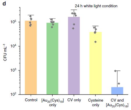
In this work, bacteria were applied to test surfaces with various coatings, and then exposed to ordinary white light. The live bacteria remaining on the surface were measured after 24 hours.
The complete coating is Au25(Cys)18 plus CV. Cys = cysteine, a standard amino acid; it includes a sulfhydryl group, -SH. CV = crystal violet, a dye.
The bar height (y-axis) shows the count of bacteria recovered from the surface after 24 hours of exposure to ordinary light. Note the log scale.
The bars are for various conditions. To start, look at the first and last bars. The first bar is the control, with none of the active ingredients added to the silicone coating applied to the surface. The last bar is for the final product applied to the surface. That treatment resulted in more than a hundred-fold reduction (two logs) in the bacterial count.
The other bars are for treatments with only some parts of the final product. These incomplete treatments worked poorly (it at all).
The bacteria used in this test were Escherichia coli.
This is Figure 3d from the article. The complete Figure 3 includes a part where there was no light (part c). That showed no killing, even with the complete product.
|
The following figure explores how the treated surface works...
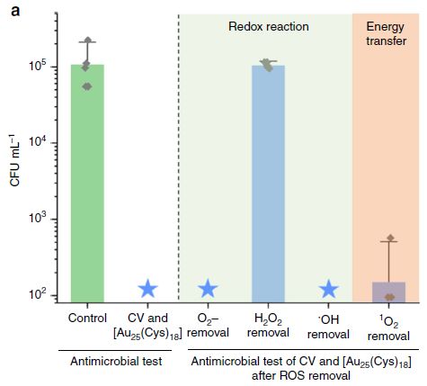
The first two bars are basically a repeat of what was shown in the first figure (though with some technical differences, which we will note later). In this case, no bacteria were found with the treatment; that is what the big blue star means. (The detection limit is 102/mL, the baseline on the graph.)
The remaining bars are for the complete treatment plus an inhibitor. Inhibitor of what? Of one possible pathway for how the coating works. For example, it is possible that it works by making O2-, the superoxide ion. To test this, they added something to remove superoxide. Adding the enzyme superoxide dismutase, to remove superoxide ion, had no effect. Therefore, superoxide is not the key to how the coating works.
In fact, three of four such tests had no effect. But removing H2O2 (hydrogen peroxide), by adding the enzyme catalase, eliminated the benefit of the coating.
The bacteria used in this test were Staphylococcus aureus. The measurement was made after six hours of light treatment. (S aureus is more sensitive to the treatment than the E coli used in the top experiment. The authors attribute this to the different membrane structures of Gram-positive and Gram-negative bacteria, respectively, but they do not directly test that.)
This is Figure 4a from the article.
|
That experiment shows that the coating works by making hydrogen peroxide, a known disinfectant. What is the peroxide made from? From moisture in the air.
It was known that the dye itself, crystal violet, could be photoactivated to kill bacteria, but it required very high light intensity. The gold compound, thiolated with -SH groups, apparently serves to stabilize the dye electrons excited by the light.
Overall, the scientists have developed a coating that helps reduce bacterial loads on surfaces. It seems more practical than previous suggested coatings, under ordinary conditions. (Cost of this gold device? Not an issue. The amount of gold is actually quite small.) One can imagine this coating being of value on surfaces in a doctor's waiting room. And maybe on things such as phones and keyboards, too.
News story: New bacteria-killing light-activated coating. (L Thomas, News-Medical.Net, March 5, 2020.)
The article, which is freely available: Photobactericidal activity activated by thiolated gold nanoclusters at low flux levels of white light. (G B Hwang et al, Nature Communications 11:1207, March 5, 2020.)
Previous post about an anti-microbial coating... An antiviral coating for medical textiles (July 12, 2020). The previous post, immediately below.
Among posts involving H2O2:
* A hydrogel tablet for rapid water purification (October 23, 2021).
* Transparent wood (March 6, 2021).
More gold chemistry: Air pollution: progress towards a process for ammonia oxidation (April 5, 2019).
An antiviral coating for medical textiles
July 12, 2020
A recent article reports a new way to modify textiles so that they adsorb less blood and viruses. The work is done with a type of polypropylene (PP) that is used for many garments worn by medical staff.
We'll start with some results showing what was accomplished by making the modification, and then note how the scientists did it.
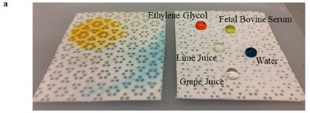
This figure shows two samples of the material. Untreated on the left, treated on the right.
Drops of various liquids were placed on the two materials. Some drops had an added coloring, for visibility.
On the right side, with the modified PP, the drops stayed where they were put. And they are labeled there.
On the left, with the original PP, all the liquids soaked in.
This is Figure 2a from the article.
|
The general point is that the modified PP is much less wettable than the original material.
Among the liquids tested was fetal bovine serum (FBS). It was chosen to represent blood.
The next figure shows some quantitative results about how the modified material binds protein from FBS (representing blood) or two viruses.
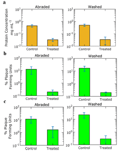
|
There are six graphs. Each shows the result for the control material (left) and the treated material (right).
In each case, the bar is considerably lower for the treated PP. That is, all the tests "worked": the modification reduced binding of things.
The top row of graphs (orange) is for FBS. What is measured here is binding of protein from this "blood".
The next two rows (green) are for two viruses. (The viruses are two strains of adenovirus. These are viruses with simple protein coats, with no lipids.)
What makes this experiment of particular interest is that the materials had experienced considerable "abuse" before the tests. The results in the left-hand column are for material that had been mechanically abraded. The results in the right-hand column are for material that had been washed. In both cases, the abuse was extensive.
This is Figure 5 from the article.
|
The results above show that the treated PP binds less blood protein or viruses, even after considerable abuse. That is, the material is not only effective but also robust. The authors emphasize this point, as a novel aspect of their work.
What is the modification that leads to these improved properties? Teflon-coating -- as with the pans in your kitchen, but this is Teflon coating of a plastic. They start with nanoparticles of polytetrafluoroethylene (commonly called Teflon), and bind them to the polypropylene by heat treatment.
The general appearance of the material is not changed, as you can tell from the top figure. But at high resolution...
Scanning electron microscopy (SEM) images: i (left) = untreated material, ii (right) = treated material.
Of course, you can't tell anything about the binding properties from the images, but you can see that the surface has been extensively roughened.
This is Figure 1b from the article.
|
The main claim of the article is that they have developed a way to make polypropylene fabrics, commonly used in the medical field, exceptionally repellent to water, blood and some viruses. In particular, the modified PP is robust, able to survive washing, even scrubbing. The modified material should play less role in transmitting infectious agents. And since it is robust, it would seem to have potential as a material for making reusable PPE. (PPE? That's personal protective equipment. Surely, everyone knows that by now.)
Is this really a good idea? The science seems good, as the results above illustrate. But a couple of cautions are in order. The wettability of polypropylene is a complex issue; it is common to make it more wettable. Balancing the various needs is an issue. Further, we note that the viruses studied here both have simple protein coats. Reducing the binding of such viruses is good, but we can not anticipate how other types of viruses will behave with this material.
News story: Durable, washable textile coating can repel viruses -- New research could lead to safely reusable PPE. (Science Daily (University of Pittsburgh), May 13, 2020.)
The article: Superhemophobic and Antivirofouling Coating for Mechanically Durable and Wash-Stable Medical Textiles. (A J Galante et al, ACS Applied Materials & Interfaces 12:22120, May 13, 2020.)
More about special surfaces in the medical context...
* A light-activated coating that can kill bacteria on surfaces (July 14, 2020). The next post, immediately above.
* An improved bandage, based on superhydrophobic carbon fibers (January 21, 2020).
* Using a plasma to kill norovirus (June 5, 2015).
* Shark skin inspires design of a new material to reduce bacterial growth (March 13, 2015).
Posts about anti-viral agents include... Inhibiting the TMPRSS in your nose to protect against respiratory viruses (COVID, flu) (July 11, 2022).
More polypropylene:
* Using old clothes as building materials? (February 5, 2019).
* Nanotechnology leads to the development of a superoleophobic polypropylene -- and a better shampoo bottle (November 6, 2016).
More Teflon: Purifying water using fluorinated nanopores (August 16, 2022).
July 8, 2020
Briefly noted...
July 8, 2020
What kind of music do cats prefer? They prefer music written for cats. That's according to a recent scientific article. Why would someone study cat-specific music, you wonder? Actually, for a very good reason. The work was done in the context of a veterinary clinic, to see what kind of music would lead to the cats behaving better during medical examinations or treatments.
* News story: The 'purrfect' music for calming cats. (Phys.org (from Sage, the journal publisher), February 24, 2020.) Links to the article, in the Journal of Feline Medicine and Surgery; it is freely available. It also links to the music (YouTube; 18 minutes). Suggest.. Listen to it with a cat, to increase the chance that someone likes it. Remember, it wasn't written for you.
* This item is noted on my page Internet resources: Miscellaneous in the section Art & Music (sub-section Science). It includes a list of related Musings posts.
What is folium?
July 7, 2020
For those who just want the answer... It is 6'-hydroxy-4,4'-dimethoxy-1,1'-dimethyl-5'{[3,4,5-trihydroxy-6-(hydroxymethyl)tetrahydro-2H-pyran-2-yl]oxy}-[3,3'-bipyridine]-2,2',5,6(1H,1'H)-tetraone.
For those who want more, there is an interesting story behind the recent article reporting the structure of folium. As a hint, the reference list includes items as far back as 1712; the text of the article refers to sources as far back as the first century.
Folium is a dye, common in medieval times for illustrating books (and also used for coloring cheese). It is isolated from the fruit of Chrozophora tinctoria, an herb often considered a weed. Much was written about folium in ancient times; it was quite a useful dye, but has fallen out of favor in modern times. It's no surprise that the ancient users knew nothing of its chemistry. What's more surprising is that the nature of folium has eluded modern chemists for decades.
A team of scientists in Portugal. a traditional source of folium, has tackled the problem. An interdisciplinary team, of chemists and botanists and scholars of the medieval period and more. It wasn't easy even to figure out how to get the stuff.
The following figure offers a useful overview...
The figure shows three parts of the story: some fruits, some dyed cloth, and some chemistry.
The three-lobed fruits, about an inch across, are interesting. For our purposes, the emphasis is on the color, and we note that it varies.
The dyes were prepared and used according to the 15th century manual, The book on how to make all the colour paints for illuminating books. That led to the two samples of dyed cloth shown above.
This is Figure 1 from the article.
|
And then there is the chemistry. The structure of the folium itself, now named chrozophoridin, is at the right. Three rings. The ring at the right is glucose. The other two rings are similar, and are related to the single-ring compound shown just to the left, hermidin. Folium -- or chrozophoridin -- is a glucosylated dimer of hermidin.
Folium is a novel blue dye, quite unlike common bio-blues, such as the anthocyanin in blueberries.
The hermidin dimer has multiple alternating single and double bonds. Such "conjugated" double bonds lead to the color. (Hermidin itself is colorless.)
The dye molecule has an unusual type of isomerism, hinted at by the curved arrow shown in the structure (between the first two rings). That arrow is at a single bond. Normally, single bonds allow free rotation. However, in this case that rotation is restricted because of the attached groups right near the bond. As a result, there are two isomers possible. If you focus on the -OCH3 groups, either one could be "on top". But the two forms, with the left-hand one on top or the right-hand one on top, are not easily interconverted, because of the barrier to rotation. They are isomers -- atropisomers. They have different properties, including different colors.
Folium, a dye of much interest centuries ago, has finally revealed its secrets to modern chemists. It is a novel dye, with some unusual features.
For those who want more on some of the historical points... Try the Wikipedia article on "illuminated manuscripts."
But the current article itself is fun reading, for the historical discussions. And it has some good chemistry, as some will guess from the structures shown above.
News stories:
* Researchers recreate mysterious medieval blue dye -- The vivid, purplish blue watercolor found in many medieval manuscripts has been recreated in a lab. (M Andrei, ZME Science, April 20, 2020.)
* Experts Solve 1000-Year-Old Mystery of Rare Medieval Blue Ink. (E Whelan, Ancient Origins, April 20, 2020.)
The article, which is freely available: A 1000-year-old mystery solved: Unlocking the molecular structure for the medieval blue from Chrozophora tinctoria, also known as folium. (P Nabais et al, Science Advances 6:eaaz7772, April 17, 2020.)
Previous posts with the characters {[ together like that: none.
More about ancient art materials... Revealing the alabaster sources of ancient artists (March 7, 2018).
Anthocyanin blue... pH and the color of petunias (March 26, 2014).
There is more about art on my page Internet resources: Miscellaneous in the section Art & Music. It includes a list of related Musings posts.
Another possibility for the origin of ribo- and deoxyribo- nucleosides
July 5, 2020
The common view is that RNA is the primordial nucleic acid, with DNA coming later. Correspondingly, ribose-based nucleosides came first, deoxyribose-based ones came later. In fact, making deoxyribose-based nucleosides in work intended to explore prebiotic chemistry has been difficult.
A recent article reports the development of lab chemistry, under reasonable prebiotic conditions, that leads to deoxyribose-based nucleosides. Interestingly, it leads to a mixture of the two kinds of nucleosides. And that leads to the idea that the first nucleic acids might have contained both ribose and deoxyribose.
It's complicated. After all, prebiotic chemistry occurred "out there" somewhere in Nature. But the following figure shows the key steps in getting to deoxynucleosides in this new lab chemistry work...
It may help to work through this figure backwards. Start at the right. That is a deoxyribonucleoside -- what we want to make.
It's actually two of them. The R group can be -NH2 or -OH. Those correspond to the nucleosides of adenine (A) or inosine (I), respectively. I is equivalent to the common base guanine (G). In the current article, deoxyadenosine (dA) is the primary product; some gets converted to deoxyinosine (dI).
Deoxy? That means an O is gone. I have labeled the 2 and 3 positions of the sugar. There is an -OH at position 3, but not at position 2. (Ribose has -OH at both 2 and 3.)
Working backwards... The chemical just to the left (#18) is similar, but with the two ring systems connected by a sulfur atom. The final step is removing that S. The general reaction is one already known to those in the field.
At the left is the reaction that gets things started here. The two reactants are labeled glycosyl donor and acceptor. The glycosyl group (sugar) is transferred. The donor is actually the sugar attached (in an unusual way) to a pyrimidine base. The acceptor is a purine: a modified adenine, modified by having an -SH group.
This is the bottom part of Figure 1 from the article, slightly modified. I added numbers for two positions on the sugar at the right.
|
The reaction scheme above makes deoxynucleosides equivalent to two of the modern deoxynucleosides -- the two purines, A and G.
The authors emphasize that the details are all correct: groups are at the right place and pointing in the right direction.
The big picture...
- This can be done under plausible prebiotic conditions.
- It leads to all four bases in nucleoside form, two with ribose and two with deoxyribose. dA and dI are shown above; C and U (both ribo) are already known to be made under these conditions.
That supports the idea that the first nucleic acids might have contained both ribose and deoxyribose.
What do we make of this? Well, it is all lab chemistry. We don't know how life got started. Lab work is done to explore conditions that seem plausible, given our understanding of the early Earth. The work here adds new reactions to the list of things that might plausibly have happened. Scientists can now debate whether there is any evidence to support one route over another.
News stories:
* Did Life Emerge in the "Primordial Soup" via DNA or RNA? Surprising Answer From New Research. (SciTechDaily (UK Research and Innovation), June 7, 2020.)
* Primitive genetic alphabet based on RNA and DNA -- New research suggests that early informational polymers might have been formed from DNA and RNA building blocks at the dawn of life. (Cambridge University, June 3, 2020.)
* News story accompanying the article: Origins of life: A plausible route to the first genetic alphabet -- Understanding the prebiotic origins of the nucleic acids is a long-standing challenge. The latest experiments support the idea that the first nucleic acid encoded information using a mixed 'alphabet' of RNA and DNA subunits. (K Le Vay & H Mutschler, Nature 582:33, June 4, 2020.)
* The article: Selective prebiotic formation of RNA pyrimidine and DNA purine nucleosides. (J Xu et al, Nature 582:60, June 4, 2020.)
A background post, about earlier work from the same lab: On the road to life? (May 18, 2009). The article discussed here is reference 6 of the current article.
More about getting to the first nucleic acids: A novel type of polymer -- and its possible relevance to the origin of life (March 15, 2013).
July 1, 2020
Briefly noted...
July 1, 2020
1. Dexamethasone: first drug shown to reduce mortality due to COVID-19 -- and an important caveat.
*** This item was originally posted based on a preprint, prior to peer review. The published article is now included below. Otherwise, the post is largely the original version. ***
It was headline news a few days ago, based simply on a press release. A preprint of the article is now available, prior to peer review. Let's note it. The key finding is that a common anti-inflammatory drug reduces deaths in people with severe COVID-19, especially those on ventilators.
* The caveat is that the drug is probably not appropriate for those with ordinary or mild COVID. The drug reduces the body's response to the virus. During an ordinary infection, that is bad, and the drug could be harmful. But severe COVID may be due to an excessive inflammatory response (a cytokine storm), and reducing the body response may be good. The current work actually shows a small increase in deaths for those with less severe infections who were given the drug. That did not test as significant here, but it is important for further work to dissect the effect of this drug by disease severity.
* Any single article has limitations, and this one is not even a published article at this point. Nevertheless, it appears to be an exciting result, which will get serious follow-up. But it is important to distinguish its effects on the two stages of COVID-19.
* News stories:
- Insight into Dexamethasone's Benefits in Severe COVID-19 -- The steroid's exceptional performance in early results from the RECOVERY clinical trial in the United Kingdom is a rational outcome of the drug's anti-inflammatory effects, experts say. (A Olena, The Scientist, June 19, 2020. Now archived.) Links to the article, which is freely available as a preprint (not peer-reviewed).
- Breakthrough Drug for Covid-19 May Be Risky for Mild Cases. (R C Rabin, New York Times, June 24, 2020. Link is now to Internet Archive.)
* The article has now been published, and is accompanied by two editorials. All should be freely available, at least temporarily.
- Editorial #1 accompanying the article: Research in the Context of a Pandemic. (H C Lane & A S Fauci, New England Journal of Medicine 384:755, February 25, 2021.)
- Editorial #2 accompanying the article: The RECOVERY Platform. (S-L T Normand, New England Journal of Medicine 384:757, February 25, 2021.)
- The article: Dexamethasone in Hospitalized Patients with Covid-19 -- Preliminary Report. (RECOVERY Collaborative Group, New England Journal of Medicine 384:693, February 25, 2021.) For a quick overview of the results, separated by disease severity, see Figure 3 (page 8 of the pdf).
* I have added this item to my BITN page section for SARS, MERS (coronaviruses).
* More about steroid drugs: Effect of corticosteroids on brain function (May 20, 2023).
2. Is barbecuing an important source of air pollution? On days of major football (soccer) telecasts in Santiago, Chile, yes -- according to a new article. Scientists noted unusual patterns of air pollution, and then were clued into Chilean culture. In fact, the pollution pattern fitted well with what would be expected from several hours of a hundred thousand charcoal barbecues. (The major pollutant is small particles, PM2.5, which are not good for the lungs.)
* News story: Pollution Spikes in Chile Tied to Soccer Fans' Barbecuing -- In Santiago, mysterious pollution spikes - tenfold above normal levels - occur during televised soccer matches and are caused by tens of thousands of barbecues, new results reveal. (K Kornei, Eos (American Geophysical Union), May 11, 2020.) Links to the article, which is freely available in the journal Atmospheric Chemistry and Physics.
* More soccer: Flow centrality: the key to a scientific analysis of the soccer game (July 11, 2010). Links to more.
There is now an extensive list of sports-related Musings posts on my page Internet resources: Miscellaneous under Sports.
Could we treat COVID by driving it to an error catastrophe?
June 30, 2020
A recent article presents results for a new antiviral agent. The agent may be widely applicable against RNA viruses, because it has an unusual mode of action. The agent causes a high mutation rate, thus leading to what is called an error catastrophe; effectively, the virus mutates itself to death.
The article focuses on the coronaviruses, with data for the three major ones. We'll start with some results on the effectiveness of the agent, in lab culture and in mice, then show some results on the mutation rate.
The first graph shows some basic lab results for the effectiveness of the agent, called NHC, against coronaviruses in lab culture.
Part A is for the MERS virus. Part B is for the SARS-2 virus (the one causing the current COVID-19 pandemic). The experiments are basically the same, and the results are very similar for the two viruses.
Two parameters are measured. One is viral inhibition (left-hand y-axis). The other is toxicity, as measured by killing of the cells (right-hand y-axis). Those are plotted against the drug concentration (x-axis; log scale).
In both cases, viral inhibition increases with drug dose, achieving near 100% inhibition at about 1 micromolar. Toxicity is low. (The number shown on the graphs, IC50, is the inhibitory concentration that gives 50% inhibition.)
This is part of Figure 1 from the article.
|
A good start.
The next graph tests the agent in a mouse infection.
|
The graph shows the weight of the mice after infection with the MERS virus at day 0.
The drug is given starting at various times, as shown in the key. They range from 2 hours prior to infection ("-2") to 48 hours after infection. The treatment called "vehicle" is a negative control. The mice got something, but there was no drug in it.
The graph may seem cluttered, but there are two general results. There is an "upper" set of points, at about 100% over time: no weight change. The other results show a steady decline, starting about 2 days after infection.
Sort out the color coding, and you will see that the mice given the drug 2 hours before infection (red) or 12 hours after infection (dark blue) did fine. Mice given the drug starting at later times showed about the same weight loss as the "vehicle" control.
|
The full figure shows a lot of measurements on these mice, including lung damage and virus production; the graph shown here is representative. Another figure shows a similar experiment with the SARS virus (SARS-1 in this case); again, the results are similar.
This is Figure 7A from the article.
|
Such experiments suggest that the drug is beneficial in coronavirus infections of mice. Benefit may occur if the drug is given prophylactically (before exposure) or early in the infection.
As we noted at the top, what makes this drug of particular interest is that it works by increasing the mutation rate. The next graph shows some results on that point.
The graphs show the error rate (y-axis) at three times (x-axis; hours) for a range of concentrations of two drugs: remdesivir and NHC (the current drug). The left-hand set is a "vehicle" control, with no drug.
A quick glance shows that the error rate was very low for the control and for all tests with remdesivir. It was higher with NHC. Look more closely, and you will see that, with NHC, the error rate increases with drug concentration.
Error rate is measured by direct sequencing of progeny viruses; it is shown here as number of mutations per 10,000 bases.
This is Figure 5C from the article.
|
Most mutations are harmful; many are immediately lethal. It is a real problem. DNA replication always has one or more error-correction mechanisms associated with it. Organisms with RNA genomes (some viruses) generally lack proofreading, and are limited to quite small genomes. The coronaviruses do have some proofreading, and indeed they have the largest genomes known for RNA viruses. The general picture is that organisms live close to the edge of how many mutations they can handle.
The drug NHC is a nucleoside used to make RNA. A sloppy nucleoside. It base pairs, but poorly, and that leads to a high mutation rate. Growing with this nucleoside, it doesn't take long before every virus genome contains a lethal mutation. That's what is meant by the genetic term "error catastrophe".
Comments...
There are two forms of the drug, both noted in the article. NHC (also called EIDD-1931) is the nucleoside itself. For use in animals (as in the second figure above), EIDD-2801 is used. That is a derivative of NHC, suitable for oral administration. Within the body, it is hydrolyzed to NHC.
NHC is β-D-N4-hydroxycytidine. EIDD-2801 is its 5'-isopropyl ester.
The second experiment above suggests that treatment must start very early. The details may be exaggerated by the way virus infections progress in mice. The authors suspect that treatment within the first week of a human infection would be useful. Note that NHC is a drug easily administered (oral pill); the hope is that it will be suitable for treatment of those who have been exposed to the virus, before symptoms. Of course, that remains to be tested.
Previous lab work with this drug has suggested it is widely effective against RNA viruses.
The drug will be entering into clinical trials in humans.
News stories:
* Experimental Drug Has Broad Spectrum Antiviral Activity against Multiple Coronaviruses. (Sci.News, April 9, 2020.)
* An orally bioavailable broad-spectrum antiviral inhibits SARS-CoV-2 in human airway epithelial cell cultures and multiple coronaviruses in mice. (AIRInforma, May 2, 2020. Now archived.) This site is also available in Italian.
The article, which may be freely available: An orally bioavailable broad-spectrum antiviral inhibits SARS-CoV-2 in human airway epithelial cell cultures and multiple coronaviruses in mice. (T P Sheahan et al, Science Translational Medicine 12:eabb5883, April 29, 2020.)
More about this drug: Briefly noted... The Merck drug for COVID (October 27, 2021).
Another way to disrupt the viral genome: Targeted degradation of the viral genome as a treatment for COVID? (March 13, 2022).
Other posts about anti-viral agents include...
* Inhibiting the TMPRSS in your nose to protect against respiratory viruses (COVID, flu) (July 11, 2022).
* Baloxavir marboxil: a new type of anti-influenza drug (September 14, 2018).
Previous post about catastrophes: How frequent are volcanic eruptions that are truly catastrophic? (April 10, 2018).
The page for BITN -- Other topics includes a section on SARS, MERS (coronaviruses). That section now includes COVID-19. It lists Musings posts on coronaviruses.
How tau gets around
June 28, 2020
Tau is a protein in the brain -- a protein involved in various neurodegenerative diseases, including Alzheimer's disease. There are various forms of tau. Normal tau is a normal part of the brain. Altered forms of tau -- in particular, aggregated forms -- are toxic, and may induce further aggregation. (In some ways, tau behaves like a prion.)
A recent article uncovers how altered forms of tau move between cells.
The first figure shows that a protein called LRP1 is important for uptake of tau by cells.
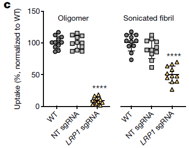
|
In each part, three types of cells were tested for their ability to take up one or another altered tau. One of the three cell types had been altered using CRISPR to eliminate functional LRP1. The others were WT (wild-type), and a control cell type, which had been given a mock treatment with CRISPR (NT = not targeted).
Each graph shows uptake (y-axis) of the tau for the three cell types (labeled at the bottom).
Start with the graph to the left, labeled "oligomer". The result for WT is set to 100%. The result for "LRP1 sgRNA", where LRP1 has been disrupted, is very low. (And the result for "NT sgRNA", the control that should be like WT, is like WT.)
|
The graph to the right is for a similar experiment, with a different form of aggregated tau, called "sonicated fibril". The results are qualitatively similar, though the effect of disrupting LRP1 is less dramatic.
sgRNA is the RNA used to guide CRISPR. LRP1 sgRNA is targeted to that gene. NT sgRNA gives a mock CRISPR treatment.
This is Figure 1c from the article.
|
The results above implicate LRP1 in the transport of these altered forms of tau into cells.
The next figure is logically similar, but in vivo, in mice.
Quick observation... The photo at the right is different. That is the one with LRP1 turned off. The photos show tau; turning off LRP1 reduces tau, to about zero.
So, what did the scientists do here?
The measurement is of tau, by staining brain slices -- cortex, in this case. The three photos are for mice with various treatments, analogous to those of the top figure. The key treatment is for the right-hand case; the mice were injected with an RNA designed to target and turn off the LRP1 gene.
For the left-hand case, the mice were injected with the buffer (PBS = phosphate-buffered saline). For the middle case, they were injected with a non-targeted RNA; "scrambled" means it has the same bases as the LRP1-targeted RNA, but in a random order.
The scale bars are 20 micrometers.
That is the essence of the experiment, but technically it was more complicated. For example... The intent was to measure tau that got into a cell by spreading from another cell, not tau that might be produced within the cell. The measurement of tau per se can't tell the difference. But... They designed the original tau gene so that it produced both tau and GFP (green fluorescent protein). Cells that contained tau that it made would also show GFP. Cells that got tau by spreading would be GFP-negative.
This is Figure 4i from the article.
|
Overall, the work shows that LRP1 has a role in the cellular uptake of altered (aggregated) forms of tau. This can be shown both in lab-grown cells and in mouse brains.
That represents progress in our understanding of tau, and perhaps therefore of tauopathies (diseases involving tau).
How did LRP1 come to the scientists' attention? They suspected that tau transport might be due to a member of the family of low-density-lipoprotein receptors; they tested them one-by-one.
The current work does not directly examine disease, and does not show that reduction of LRP1 is safe.
News stories:
* Understanding how protein tau moves between neurons yields insight into treatments for neurodegenerative diseases. (Medical Xpress (S Fernandez, University of California - Santa Barbara), April 2, 2020.)
* Tau Receptor Identified on Cell Surface. (T Fagan, Alzforum, March 7, 2020.) This is based on a presentation of the work at a conference in February, but it notes the article.
* News story accompanying the article: Neurodegeneration: Neuronal gatekeeper for dementia protein. (K Deinhardt, Nature 580:326, April 16, 2020.)
* The article: LRP1 is a master regulator of tau uptake and spread. (J N Rauch et al, Nature 580:381, April 16, 2020.)
Posts about tau include:
* Brain imaging to detect and distinguish tauopathies, including Alzheimer's disease (January 18, 2021).
* A mutation in ApoE that protects against Alzheimer's disease? (February 22, 2020). Is there any connection between the current work and this recent report of a mutation that seems to affect tau function? At this point, it is an open -- but intriguing -- question.
* Alzheimer's disease: a role for inflammation? (January 18, 2020).
* Traumatic brain injury: long term effects? (October 8, 2019). Yes, that is a tauopathy, too.
* Alzheimer's disease: What is the role of ApoE? (November 6, 2017). A post that includes the term tauopathy.
* Should τ replace π? (July 1, 2011). A different tau.
My page for Biotechnology in the News (BITN) -- Other topics includes a section on Alzheimer's disease. It includes a list of related Musings posts.
For some background on GFP: Nobel prizes (October 8, 2008). Links to more.
June 24, 2020
Briefly noted...
June 24, 2020
1. Contact tracing: ethical guidelines. Contact tracing can be a valuable tool for dealing with communicable diseases, and it is considered important for dealing with COVID-19. It's an old tool, but now with high-tech versions -- which offer improved coverage and raise more ethical questions. A recent "comment" article in Nature discusses this, and suggests some criteria.
* "Comment" story: Ethical guidelines for COVID-19 tracing apps -- Protect privacy, equality and fairness in digital contact tracing with these key questions. (J Morley et al, Nature, May 28, 2020. In print: Nature 582:29, June 4, 2020.)
2. COVID-19 in pets? A question of practical interest to many people. We have heard anecdotes, but there is little systematic data. Now we have a scientific article studying the replication and transmission of the SARS-2 virus in cats and dogs (and a few other animals). The short answer is that cats support the virus rather well (though they typically don't get sick from it). Transmission? Airborne transmission between cats was shown. Beyond that, there is little information; for now, it seems more likely that cats will get it from people than transmit it to people, but I'd take that as very preliminary. Dogs seem to support the virus poorly. (Beyond those... ferrets (common lab animal) support it well; chickens, ducks and pigs, not at all.) The news stories give a good sense of what was done and the limitations.
* News stories:
- How susceptible are domestic animals to SARS-CoV-2? (T Meštrović, News-Medical.Net, May 31 2020.)
- Review of "Susceptibility of ferrets, cats, dogs, and other domesticated animals to SARS-coronavirus 2" (pdf file). (Public Health Ontario, April 12, 2020. Now archive.) Links only to a preprint.
* Direct link to the article: Susceptibility of ferrets, cats, dogs, and other domesticated animals to SARS-coronavirus 2. (J Shi et al, Science 368:1016, May 29, 2020.)
If a bee visits a plant and there are no flowers, can the bee place an order?
June 23, 2020
That would seem to be the implication of a recent article.
Look...
A bumblebee placing an order at a flower-less plant.
Or maybe it is filing a complaint.
Just in case you ended up in a stare-down deadlock... Be sure to notice the bottom part of the figure. The bee has punctured the leaf, using its proboscis. The hole has a distinctive shape.
This is the main figure in the Sci-News.com story listed below. (Actually, it is reduced a little from their figure.) The figure credit is to Hannier Pulido (ETH Zurich), who is also acknowledged in the article for photography.
|
That puncturing leads to earlier flowering -- by about a month for tomato plants.
Here are some data behind that claim...
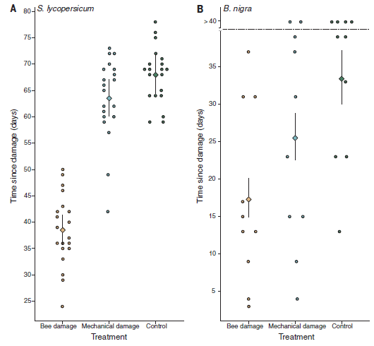
Start with part A (left). The figure shows the day of flowering (y-axis) for 20 plants in each of three treatment sets (labeled at the bottom). Each point is for one plant.
The data set to the right is for the control. You can see that the plants flowered between about days 60 and 80.
The data set to the left is for plants with bee damage. These plants flowered between about days 25 and 50.
The middle data set is for plants with "mechanical damage", that is, an artificial lab-inflicted damage, not from the bees. The distribution of flowering times here is similar to that for the control plants.
Part B (right) shows results of a similar experiment with a different plant species. In this case, there are 10 plants per set. The pattern for bee damage vs controls is qualitatively similar to that found in part A, though there is much more variation within each set.
The plants are Solanum lycopersicum (tomato; part A) and Brassica nigra (a mustard; part B).
The bees are Bombus terrestris, the common bumblebee.
This is Figure 2 from the article.
|
The main observation is that bee-damaged plants flower much earlier than the control plants. (The mechanically-damaged plants behave differently for the two plant species.)
There is one other experiment of particular interest... The scientists compared hungry vs well-fed bees. Only hungry bees caused the damage. (The experiment shown above was done with hungry bees.)
Various bumblebee species checked, including from the wild, showed this behavior. Honeybees did not.
What's going on? The scientists don't know. It is possible that the bee saliva contributes some signaling to the plant. It is also possible that the plants are responding to the stress of the damage, though the different effect of damage due to bees and lab techs argues against this in a simple form.
News stories:
* Bumblebees Bite Leaves of Flowerless Plants to Stimulate Earlier Flowering. (Sci.News, May 25, 2020.) Source for the top figure. Also includes a small video.
* Bumblebees speed up flowering. (Science Daily (ETH Zurich), May 26, 2020.)
* Bumblebees Bite Plants to Force Earlier Bloom. (M Reyes, Courthouse News, May 21, 2020.) Some general perspective.
* News story accompanying the article: Ecology: The secret lives of bees as horticulturists? (L Chittka, Science 368:824, May 22, 2020.) An interesting discussion of some possible reasons behind the behavior observed here. None of the reasons suggested so far are particularly plausible.
* The article: Bumble bees damage plant leaves and accelerate flower production when pollen is scarce. (F G Pashalidou et al, Science 368:881, May 22, 2020.)
Previous post about plant wounds: Electronic monitoring of plant health; it might even allow an injured plant to call a doctor (June 21, 2020). This is the previous post, immediately below.
A recent post about bumblebees, also presenting a complex interaction: Strawberries, bees, and their bacteria: a complex alliance (January 11, 2020).
More about bees:
* How to get bees to make better venom
(September 20, 2021).
* What should a plant do if it hears bees coming? (December 10, 2019). A caution... This post makes what may be a controversial claim.
Electronic monitoring of plant health; it might even allow an injured plant to call a doctor
June 21, 2020
People wear various devices to monitor their health. Whether it is blood sugar level or simply pulse, it's an area of increasing activity.
Use of such monitoring for plants is much less developed. A recent article reports progress.
The idea is that injured plants produce hydrogen peroxide, H2O2. Simple assays for H2O2 are common; the new work developed an H2O2-sensor suitable for wearing by a plant.
The sensor is based on a type of carbon nanotube, which has been modified so that the presence of H2O2 affects its spectrum, in this case its fluorescence spectrum.
The first figure shows the sensor response...
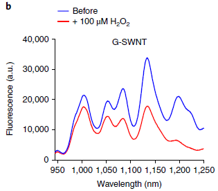
|
Two spectra are shown: with (red) and without (blue) H2O2. You can see that the peroxide reduced (quenched) the fluorescence.
The difference between the two curves is a measure of the amount of H2O2. Another part of the full figure (Figure 1c) shows a dose response curve; it is quite good.
SWNT = single-walled carbon nanotube. The prefix G is for guanine. Yes, the DNA base -- a key part of the sensor.
This is part of Figure 1b from the article.
|
The next figure shows an example of the use of the assay...
In this work, the sensor is attached to a plant. The sensor is observed using a laser; the signal is recorded with a camera. H2O2 is measured (y-axis) over time (x-axis).
In part b (top), you can see that the curve is flat over most of the time, but dips for one region. Why? Because the plant had been wounded, at the time marked with a black arrow. The wounding caused an increase in H2O2 -- and therefore a lower signal.
What is the y-axis scale here? It is based on the response shown in the top figure. It is the normalized response, where the baseline level of peroxide is set to 1. The presence of the peroxide leads to a lower signal; it's just shown differently in the two figures. The top figure shows the raw data; the bottom figure shows it in a way that makes it easier to see the peroxide level over time. Further, the top figure shows the spectral information; the bottom figure shows the overall camera response.
|
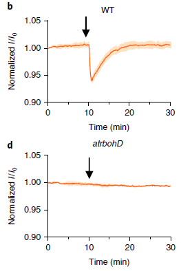
|
Part d (bottom)? Same idea, but the plant carried a mutation in the peroxide signaling system. No signal.
The plant tested is Arabidopsis thaliana. The top frame is labeled WT, for wild type. The bottom frame is labeled with the designation of the particular mutation used.
This is part of Figure 3 from the article.
|
So, the scientists can observe a response to wounding, using a "simple" device. And they have at least a general understanding of how it works, at the level of plant physiology.
Development of the sensor system, suitable for use with a plant, was a major achievement.
Several species of plants tested all gave responses. The details varied, reflecting different signaling parameters, but the general notion of remote detection of hydrogen peroxide seems widely applicable. Since the test does not require any special plant strains, it can be easily tried for any plant of interest.
Also note that what is measured is not the wounding itself, but a consequence of the wounding. Therefore, it works for other stresses that produce H2O2. In the article, the scientists report some testing with excessive heat and light; those stresses, too, generate responses that can be measured with their sensor.
The authors suggest that the sensor system they have developed could be useful in research. But they also note that, in principle, it could be used to monitor health of plants in the field. If it was automated properly, using a smartphone to record the signal, it could effectively allow a plant to call a doctor if it were sick.
Are the nanotube sensors safe for the plants? The authors have not found any problems, but note that effects of carbon nanotubes on plants have been found in other work.
News stories:
* SMART and MIT develop nanosensors for real-time plant health monitoring -- New nanobionic approach allows scientists to study the communication within plants, providing valuable insights to improve crop yields. (EurekAlert! (SMART), April 16, 2020.)
* Nanosensor can alert a smartphone when plants are stressed -- Carbon nanotubes embedded in leaves detect chemical signals that are produced when a plant is damaged. (Science Daily (MIT), April 15, 2020.)
The article: Real-time detection of wound-induced H2O2 signalling waves in plants with optical nanosensors. (T T S Lew et al, Nature Plants 6:404, April 2020.)
More about signaling in plants: Underground messaging between bean plants (July 29, 2013).
and maybe... The sounds that plants make (April 10, 2023).
Another measurement based on hydrogen peroxide... A simpler assay for detecting low levels of HIV, using gold nanoparticles (January 3, 2013).
Another monitoring device: A smart insulin patch that rapidly responds to glucose level (October 26, 2015).
Next post about plant wounds: If a bee visits a plant and there are no flowers, can the bee place an order? (June 23, 2020). The next post, immediately above.
More about fluorescence and quenching: How to get common fluorescent dyes to work in the solid state (September 4, 2020).
Among other posts about using Arabidopsis... Cauliflower math (July 26, 2021).
Posts about carbon nanotubes are listed on my page Introduction to Organic and Biochemistry -- Internet resources in the section on Aromatic compounds.
June 17, 2020
Briefly noted...
June 17, 2020
COVID article retractions (one on hydroxychloroquine). It was a big news story in late May... A big study, published in a top medical journal. Hydroxychloroquine is ineffective at treating COVID-19, and is dangerous. A few days later the article was retracted -- because of concerns about the data source used for the study. (Another article based on the same data source was also retracted.) It is a strange story. If there is any good news in this, it is that science is self-correcting -- even if awkwardly. Unfortunately, the article got broad attention upon publication, and its retraction got less attention. Treatment of COVID is a hot topic, politicized or not. There is considerable effort to expedite new findings being made available, to scientists and to the public. It is inevitable that some bad science will make its way through the system, but it is confusing.
* News story: Lancet, NEJM Retract Surgisphere Studies on COVID-19 Patients. (C Offord, The Scientist, June 4, 2020.) Now archived.
* I have added this item to my BITN page section for SARS, MERS (coronaviruses).
* There is no connection between the work noted here and the COVID-related trial in the post that is immediately below (June 16).
Does post-exposure administration of hydroxychloroquine prevent Covid-19? A clinical trial
June 16, 2020
It has become so politicized! Sometimes it is not even clear what the question is.
Is hydroxychloroquine (HCQ) useful against COVID-19? First, there are at least two questions one might ask here. One is whether it is useful for treating those in a hospital with severe COVID-19. Another is whether it is useful in preventing the disease in those who may have been exposed.
A new article addresses the second question. It reports what is apparently the first placebo-controlled clinical trial of HCQ for COVID prophylaxis. As so often, it quickly got headline coverage -- with a one line summary. But this is a real test; it has real data and real limitations. Let's look at some of it.
As I write this [original version], the article is "in press". That means it has undergone peer review, but not final editorial polishing. Peer review is a standard key step in publishing scientific articles, but by no means assures that the article is correct. (The final published article is indicated below. The article seems unchanged, at least for key points.)
Here is the main data summary from the article...
General plan... The trial enrolled about 800 people with likely exposure to someone who was infected with COVID. Half received the drug, and half received a placebo.
These people were followed for two weeks, and scored for whether or not they developed the disease.
The first row provides the main summary: 49 people in the drug group were scored as having COVID; that is 12%. That's a little less than in the placebo group; you can look at the numbers. Is the result statistically significant? The p value is shown as 0.35 -- not even close to the common criterion of 0.05.
Thus the headline summary: it didn't work.
The next group of results provides some insight into how good the test was -- and the challenge of testing anything against this disease. Only about 1/5 of the cases were actually confirmed by lab analysis, showing the virus. Most of the cases were determined merely by appearing COVID-like.
This is Table 2 from the article.
|
A few more numbers...
Another way to express the results is by the absolute change: the difference between the COVID incidence in the two groups. It is -2.4 percentage points. The minus sign shows that treatment group has lower incidence. The 95% confidence interval for that number is -7.0 to 2.2. That interval includes zero. This is just another way of saying that the result is not significant statistically.
Adverse events. 40% for the drug group; 17% for the placebo group. (Table 3 of the article lists them.) None were serious in either group, but some sound uncomfortable. If the drug were effective, the adverse events would probably not be a big concern.
What do we make of this?
The hypothesis underlying the trial was that the drug might prevent the development of disease in those with a significant exposure.
Do the trial results, some of which are shown above, support the use of HCQ for COVID prophylaxis? No.
Do the results disprove that there is a beneficial effect? No. The conclusions are statistical; they make benefit unlikely, but such a test cannot disprove benefit. (The test was planned to be large enough that it could show a 50% benefit. That is, they were not looking for smaller effects.)
Is it possible that the sample population tested here is heterogeneous, and that there was benefit for some sub-group? (Sub-groups of possible interest might be by sex, race, or a specific genetic feature.) To the extent examined, no such effect was seen. (And note that the sample size was even smaller for any sub-group.)
Is it possible that the drug would have provided benefit if used with a different dosage or treatment schedule? That wasn't tested.
Might it be reasonable for an individual, in consultation with their doctor and with appropriate medical supervision, take the drug for prophylaxis? That is a private matter for the individual and doctor.
The discussion here gives an idea of how one looks at the outcome of a clinical trial. There may appear to be a yes/no answer, but the reality is more complex. The current study has many limitations, as the authors note. It is a useful study, but cannot claim to be a final answer.
News stories:
* Hydroxychloroquine is Ineffective for Post-Exposure Prophylaxis. (A Swaminathan, REBEL EM, June 8, 2020.)
* Randomized trial finds hydroxychloroquine did not prevent COVID-19. (C Dall, CIDRAP, June 4, 2020.)
* Hydroxychloroquine as Postexposure Prophylaxis for COVID-19: Clinical Takeaways. (A Ward, ContagionLive, June 4, 2020.) Interview with one of the authors.
Both of the following are temporarily freely available at the journal web site.
* Editoiral accompanying the article: Hydroxychloroquine for the Prevention of Covid-19 - Searching for Evidence. (M S Cohen, New England Journal of Medicine 383:585, August 6, 2020.)
* The article: A Randomized Trial of Hydroxychloroquine as Postexposure Prophylaxis for Covid-19. (D R Boulware et al, New England Journal of Medicine 383:517, August 6, 2020.)
Previous COVID-related post: Speech droplets: Can you transmit an infection to someone by yelling "Stay healthy" at them? (June 14, 2020). This is the post immediately below.
For more about the drug:
* Briefly noted... Might the doctor's politics affect how they treat COVID? (June 7, 2023).
* Briefly noted... The infection process for the SARS-2 (COVID-19) virus (September 8, 2021).
The page for BITN -- Other topics includes a section on SARS, MERS (coronaviruses). That section includes COVID-19.
Speech droplets: Can you transmit an infection to someone by yelling "Stay healthy" at them?
June 14, 2020
When you cough or sneeze, you eject a range of droplets into the air. The bigger ones quickly fall to a surface below. The smaller ones, called aerosols, may remain in the air for extended periods, and may be carried considerable distance by air currents. And of course, these droplets may contain infectious agents.
Ordinary breathing and talking produce droplets, too. And may, therefore, transmit disease.
A pair of recent articles explores droplet production from speech.
There are no infectious agents in this work. It is about characterizing droplets. We assume that these droplets are capable of carrying infectious agents, but that is not directly addressed here.
The main experimental tool in this work was measuring light scattering. Particles, including liquid droplets, in the air scatter light; this can be measured. A person speaks, and the air in front of them is observed. There are some high-tech details, but the basic plan is simple.
The following figure shows the idea, and some results.
|
Start with part B, at the bottom. It is a photograph for one measurement. Each speck results from one droplet. (Some of them have moved during the exposure time, thus forming a streak in the image.)
Part A (top) shows some data. Measurements were made in front of a person.
The graph shows the number of flashes (droplets; y-axis) seen vs time (frame number; note x-axis labeling at both top and bottom).
At three times, the person spoke, saying the words "stay healthy". The curve is shown in green during speech.
The speaking led to an increase in droplets. The biggest increase came at the "th" of "healthy". (Say it; you'll see why.)
The three trials were with decreasing loudness.
Below the main curve is a second curve. The level is zero; the curve is offset a bit for clarity. Again, the person spoke at the times shown in green. But this time, they wore a mask -- a wet mask. No droplets.
The photograph in part B is for the time point marked with a red arrow in part A.
This is Figure 1 from article 1.
|
The next figure addresses the lifetime of the droplets in the air...
In this experiment, the person spoke for several seconds, leading to a build-up of droplets in the air. The person stopped speaking, and the droplet count was measured over time.
The red curve is for the brightest 25% of droplets. The green curve is for the rest (75%). (Brighter droplets are presumably larger, but there are some technical issues that make this more complicated.)
Both curves show loss of droplets over time; the big droplets are lost faster. Note the time scale: the green curve takes nearly an hour to decay to background.
The solid lines show best-fit lines for exponential decay. They start at the black arrow.
This is Figure 1A from article 2.
|
|
Overall, the work here shows that a person speaking releases droplets into the air. The details depend on what was said and how loudly. The droplets remain in the air for an extended period, on the order of minutes. Time and distance will depend on details. The droplets are, one presumes, capable of carrying infectious agents.
Comment/opinion... Seems to me this work strengthens the case for wearing a face covering (mask) -- to protect those around you. Your speech droplets linger for many minutes. It is likely that the common guidance of maintaining six feet (two meters) distancing is not sufficient.
It would also help to avoid words with 'th" in them.
News stories:
* Virus 'eminently capable' of spreading through speech: study. (Medical Xpress, May 14, 2020.)
* Droplets from Speech Can Float in Air for Eight Minutes: Study -- The experiments did not involve SARS-CoV-2, but researchers say the results support precautions to avoid possibly spreading COVID-19 by talking. (K Grens, The Scientist, May 15, 2020.) Now archived.
Two articles, from the same team of scientists...
1) Visualizing Speech-Generated Oral Fluid Droplets with Laser Light Scattering. (P Anfinrud et al, New England Journal of Medicine 382:2061, May 21, 2020.) (May be temporarily freely available.)
2) Freely available: The airborne lifetime of small speech droplets and their potential importance in SARS-CoV-2 transmission. (V Stadnytskyi et al, PNAS 117:11875, June 2, 2020.)
Videos. There is a video posted with article 1. For article 2... there are three videos available. They show the experimental set-up and some of the work. Click on reference 17 of the article. There, you probably want to check the videos in the reverse order. (The first video listed contains 85 minutes of observations!)
As a little bonus... Attached to the end of article #1 is a letter from Matthew Meselson. Yeah, the guy who showed that DNA replication is semi-conservative, back in 1958. He is still on the Harvard faculty -- has been since 1960. Last month he turned 90. Musings has discussed more recent work from Meselson's lab in the post Lesbian necrophiliacs (March 8, 2010).
Also see:
* Production of aerosols by the winds of the Philadelphia Orchestra (October 24, 2022).
* How water droplets damage hard surfaces (June 18, 2022).
* Spontaneous formation of hydrogen peroxide from water (October 26, 2019).
* Disease transmission by sneezing -- in wheat (July 29, 2019).
* What determines the size of liquid droplets from a sprayer? (September 21, 2018).
Previous COVID-related post: Spike D614G: An emerging mutant strain of the virus that causes COVID-19 (May 12, 2020).
Next: Does post-exposure administration of hydroxychloroquine prevent Covid-19? A clinical trial (June 16, 2020). The next post, immediately above.
The page for BITN -- Other topics includes a section on SARS, MERS (coronaviruses). That section now includes COVID-19.
June 10, 2020
Briefly noted...
June 10, 2020
How good were older climate models? A recent article looks back to a collection of climate models published since the 1970s. The big picture is that most of them had the physics about right, correctly predicting how greenhouse gases would affect the Earth temperature. They were less good at predicting the actual level of greenhouse gases; that involves human culture, not just physics. If nothing else, this is an interesting bit of history. But it is more. It tells us that the physics behind climate change predictions has been rather good dating back to 1970. And evaluation of the weaknesses of older models is informative.
* News story: Early climate modelers got global warming right, new report finds. (R Sanders, University of California, Berkeley, December 4, 2019.) The press release from the lead institution. Links to the article. If you want a range of stories about the article, try a search using the article title ("Evaluating the Performance of Past Climate Model Projections"). (The article itself may be freely available, though it is not clear why. As always, if you want a copy, a good approach is to put the title into Google Scholar, and see what comes up.)
The importance of HPMTF in the atmosphere
June 9, 2020
Chemicals containing sulfur are one important part of air pollution. And one source of S for air pollution is dimethyl sulfide (DMS; CH3-S-CH3). DMS is made by microbes in the oceans; some is released into the air, where it gets oxidized. How DMS is transformed in air is a complex story. A recent article adds a new piece to the story.
Let's start with the bottom line. The following figure outlines the story, including the newly discovered piece reported here.
DMS itself is at the lower left, coming from the ocean.
DMS undergoes a variety of reactions. We'll skip the details here. What matters for the moment is that there are three major products, which are shown in the middle column, each in a colored box.
The right side of the figure shows the fraction of DMS that goes to each of those three products. (That's called the product branching ratio.) The two bars are for two different analyses; for our purposes, they are about the same.
About half of the DMS goes to methanesulfonic acid (MSA), shown in green at the bottom. (There are two shades of green, for two different ways of making it.)
Most of the rest goes to HPMTF, shown at the top. (The full chemical name and structure are shown there.) A smaller amount goes to the familiar sulfur dioxide (SO2).
This is Figure 5 from the article.
|
Some of the chemical specifics there are rather exotic -- common in atmospheric chemistry. But the general idea is that DMS, made in the oceans, is one important source of S in the air; the figure shows the various things that can happen to it.
What makes the new article of interest is that it is the first report of atmospheric HPMTF. That is, the article uncovers a chemical that is actually a major part of the story.
Here are some of the measurements showing the presence of HPMTF...
The main graphs (A and B) show the level of HPMTF found in the air as a function of altitude (y-axis) and latitude (x-axis). The level of HPMTF is indicated by a color-coded dot. Briefly, high levels are shown with red dots, then lower levels are yellows and blues. The full color code is shown at the top of the graph. (ppt is parts per trillion.)
The other graphs (C-F) plot the average level of HPMTF and some other pollutants as a function of altitude. Note that these four graphs are "backwards": concentration is on the x-axis, and altitude is on the y-axis.
The main observation is that high levels of HPMTF are found at low altitudes at selected places -- just above the ocean surface.
This is Figure 2 from the article.
|
That HPMTF might be produced from DMS was proposed a few years ago, and recently shown in lab work. But there had been no evidence for it in the atmosphere.
Why wasn't atmospheric HPMTF uncovered previously? What did the scientists do here that revealed its presence? Part of the answer is that they used a new kind of detector.
The discovery of a new significant component of S pollution will allow improvements in modeling atmospheric chemistry.
Miscellaneous comments...
The graphs are labeled with the term ATom. That stands for Atmospheric Tomography, the name of a NASA mission. It uses an instrumented DC-8 research aircraft to monitor the atmosphere.
If you look closely, you may notice that the balance of chemicals is different in the two graphs. That is because they show different things. The top graph shows the immediate fates of the DMS. The bottom graph shows the levels found in the air.
News story: Dimethyl sulfide oxidation in marine atmosphere. (EurekAlert! (PNAS), February 17, 2020.) Very short, but to the point and helpful.
The article: Global airborne sampling reveals a previously unobserved dimethyl sulfide oxidation mechanism in the marine atmosphere. (P R Veres et al, PNAS 117:4505, March 3, 2020.)
Previous post about air pollution: Effect of lockdowns on air pollution: it's not simple (June 7, 2020). The previous post, immediately below.
Previous posts on sulfur pollutants have focused on SO2. An example: Aerosols and clouds and cooling? (August 27, 2017).
Also see:
* Atmospheric aerosols from passive (non-erupting) volcanoes -- a re-evaluation (February 13, 2023).
* ROOOH (July 5, 2022).
Effect of lockdowns on air pollution: it's not simple
June 7, 2020
It seems simple... Human activity causes air pollution. Reduce that activity, and we will have less air pollution. The COVID pandemic led to a reduction in human activity around the world. Indeed, people have noted reductions in air pollution.
A new article provides an interesting example -- one that shows it may not all be that simple. It is based on detailed analysis of a set of air pollutants over a region of northern China for the first two months of this year. The first month is just before the COVID-induced lockdown; the second month is just after the lockdown began.
Here are some of the data...
The figure shows the daily pattern of air pollution for three pollutants over the two time periods.
Each row of the figure is for one pollutant, which is labeled at the left.
Each column is for one time period, about a month long and labeled at the top. The left-hand graphs are for January 1-22, 2020. The right-hand graphs are for January 23 to February 29. For convenience, we can refer to the two time periods as January and February. The actual cutoff between the two is when the lockdown occurred.
Each graph shows the average level (y-axis) of the pollutant over the time period for 800 monitoring stations throughout the region as a function of the time of day (x-axis). That is, each point is the average at a particular time of day over the 800 monitoring stations and over the month or so covered by the graph. Each line shows the variation in pollutant level as a day progresses -- on average.
The major comparison of interest is between the left- and right-hand graphs for each pollutant. Start with the top row... It is clear, just by quick visual inspection, that the pollutant levels are lower in the right-hand graph -- for February. That also holds for the second row. Those two rows are for PM2.5 (particulate matter smaller than 2.5 micrometers) and NO2 (nitrogen dioxide).
It is also clear that the opposite is true for the third row, for O3 (ozone). Ozone levels are higher at the right, in February after the lockdown.
The x-axis is time of day, on a 24-hour clock.
The y-axis is concentration of the pollutant in the air. The y-axis scale is different for the different pollutants, but is the same for the two graphs for a given pollutant (row). Thus it is proper to make visual comparisons between the two sides of the figure (time periods).
This is part of Figure 5 from the article. The full figure includes results for two additional pollutants (CO and SO2). CO showed a reduction after the lockdown. The results for SO2 are more complex, probably because of the large contribution from burning fuel for home heating.
|
The big picture is that the levels of some pollutants decreased after the lockdown, but the level of one increased.
There is an explanation... Pollutants such as PM and NO2 are indeed enhanced by human activity; reduced human activity leads to lower levels. However, ozone is different. The major source of ozone is atmospheric chemistry, largely unrelated to human activity. But the destruction of ozone is enhanced by NO2. Therefore, reduced levels of NO2 lead to higher levels of ozone.
This effect of NO2 on ozone has been seen before. Success in reducing NO2 pollution has led to increased ozone levels.
Pollution can be complicated -- at various levels. Not all air pollution is caused by human activity. And pollutants interact.
Caution... Graphs such as those above show correlations. It is up to us to understand what the correlations mean. There is no certainty that the only cause of the observed effects is the lockdown. The authors discuss some of the possible confounding factors.
We also note that the connection between nitrogen oxides (collectively, NOx) and ozone is complex. Nitrogen oxides play roles in both the formation and destruction of O3, depending on the conditions. During colder weather, when this study was conducted, destruction is the major effect.
News story: COVID-19 lockdowns significantly impacting global air quality. (American Geophysical Union, May 11, 2020.) This news story is about two articles, including the one discussed in this post.
The article, which is freely available: The Response in Air Quality to the Reduction of Chinese Economic Activities during the COVID-19 Outbreak. (X Shi & G P Brasseur, Geophysical Research Letters 47:e2020GL088070, June 16, 2020.)
Among many posts on air pollution...
* The importance of HPMTF in the atmosphere (June 9, 2020). The next post, immediately above.
* Indoor air pollution: is ventilation effective? (March 24, 2020).
* Geoengineering: the advantage of putting limestone in the atmosphere (January 20, 2017).
* A major algal bloom associated with the dinosaur extinction event? (May 13, 2016).
June 3, 2020
Briefly noted...
June 3, 2020
Mount St Helens revisited. It was 40 years ago last month: the first major volcanic eruption in many decades in the "lower 48" of the United States. And now, a retired professor from the University of Washington, not far from the volcano, reports his ten years of work trying to reconstruct the seismograms from the area for the two months preceding the main event. The difficulty? Most of the data was on old analog tape. There was some digital data recorded, but that was so expensive in the day that it was triggered only by high magnitude earth movement. 1980, remember. The analysis so far has not yielded any great insights into the eruption. At least for now, it is mainly an interesting historical story -- and part of a feature section on Historical Seismograms in the journal Seismological Research Letters.
* News story: Pre-eruption seismograms recovered for 1980 Mount St. Helens event. (Science Daily (Seismological Society of America), January 30, 2020.) Links to the article.
* I have also noted this story on my page of Miscellaneous Internet Resources: Art & Music : Historic recordings. The methodology is similar!
* And just for fun... The previous major volcanic eruption in the US "lower 48"? Mount Lassen, in northern California, 1915. It is in the same mountain range as Mount St Helens. Both Alaska and Hawaii have a lot of volcanic activity, but these states, not part of the contiguous lower 48, are geologically distinct.
A Cretaceous dinosaur the size of a tiny bird?
June 2, 2020
Update August 12, 2020...
The article that was the basis of this post has been retracted.
The article claimed the smallest known dinosaur. The post notes that there was some challenge to that claim. The authors, now with further evidence, acknowledge that the challenge is probably correct, and therefore retract the original article.
* News story: World's smallest dinosaur is probably a lizard -- Paper that reported the animal's discovery was retracted following new evidence from a similar fossil. (G Viglione, Nature, July 23, 2020. In print: Nature 583:665, July 30, 2020.)
* Direct link to the retraction notice at the journal web site: Retraction Note: Hummingbird-sized dinosaur from the Cretaceous period of Myanmar. (L Xing et al, Nature, July 22, 2020.) If you link directly to the original article, the retraction is noted there.
The fossil itself is still of interest; the scientists will presumably submit a new article about it at some point. It is the interpretation of the fossil that is of concern. The wonderful picture of it, shown below, remains.
The post, below, remains as it was originally.
Here is the sample of interest, from a recent article...
It includes something that looks like the skull of a bird.
It is about 99 million years old.
The scale bar (upper right) is 5 millimeters.
This is Figure 1a from the article.
|
The scientists consider it a dinosaur, which they have named Oculudentavis khaungraae. It is the smallest known dinosaur. Aspects of the specimen, such as the presence of many teeth, indicate it is not like a modern bird.
The following figure helps put the size in context...
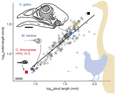
|
The graph plots the size of the eye ("orbit"; y-axis) vs the skull length (x-axis) for a collection of birds. Note the log-log scale, and remember that 1 on this scale means 101 = 10 millimeters (= 1 cm).
The red square at the lower left of the graph is for this newly discovered specimen. It fits the trend line for birds quite well.
There are also skull drawings for Mellisuga minima (vervain hummingbird) and Gallus gallus (chicken). The colors of the data points (squares for these) correspond to the colors of the labels on the skull. The scale bar at the lower left is for the three skull drawings; it is 10 mm.
This is Figure 2 from the article.
|
The sample, as you may guess from the top picture, is in amber. That has allowed for an unusual degree of preservation of detail.
Study of ancient remains found in amber is now common. The protective environment within the amber allows preservation of detail that would be lost in ordinary fossil formation. The amber pieces are typically small. Finding insects is perhaps most common. Finding a significant piece of a dinosaur is unusual.
It is now widely accepted that birds evolved from dinosaurs, but the story is quite incomplete. Finding a dinosaur of this size and age adds another piece of the puzzle.
Following publication, some experts have suggested that the specimen is not actually a dinosaur. It may, instead, be a lizard. This is noted in the Everything Dinosaur news story, listed below.
The specimen is of interest in any case. But whether it represents a miniaturized dinosaur is open for further work.
News stories:
* New Hummingbird-Sized Dinosaur Identified from Skull Trapped in Amber. (C Q Choi, Inside Science (from the American Institute of Physics), March 11, 2020. Now archived.)
* Hummingbird-sized Dinosaur from Burmese Amber -- Oculudentavis khaungraae - Tiny Fossil Skull Could Represent the Smallest Dinosaur. (Everything Dinosaur, March 11, 2020.) Includes extensive discussion of the possibility that the specimen is a lizard, not a dinosaur.
* News story accompanying the article: Palaeontology: Tiny fossil sheds light on miniaturization of birds -- A tiny skull trapped in 99-million-year-old amber suggests that some of the earliest birds evolved to become miniature. The fossil illustrates how ancient amber can act as a window into the distant past. (R B J Benson, Nature 579:199, March 12, 2020.)
* The article: Hummingbird-sized dinosaur from the Cretaceous period of Myanmar. (L Xing et al, Nature 579:245, March 12, 2020.)
A post on the bird-dinosaur connection: How the birds survived the extinction of the other dinosaurs, why birds don't have teeth, and how those two points are related (July 30, 2016). Links to more.
Another specimen from amber: Bacteria found in rectum of old flea (October 16, 2015).
Previous post analyzing a dinosaur fossil: A claim of finding dinosaur DNA (May 31, 2020). The preceding post, immediately below.
A claim of finding dinosaur DNA
May 31, 2020
Musings has noted claims of identifying proteins from ancient dinosaurs. The claims remain controversial, though there are intriguing articles about them.
We now have an article that hints of ancient dinosaur DNA.
Whether the dinosaur protein work is eventually validated or not, there is a general understanding that protein is more stable than DNA, and some proteins are very stable. Finding protein that is more than 60 million years old is unlikely; finding DNA of such age is clearly impossible.
So, what is the evidence for dinosaur DNA? It's quite straightforward, and is shown in the following figure...
In this figure, the top row is for a 75-million-year-old specimen of Hypacrosaurus, and the bottom row is for emu.
The left-hand photos (parts A, B, E) show some cells. The middle photos (C, F) show some cells stained with PI. The right-hand photos (D, G) show cells stained with DAPI.
Both PI and DAPI are commonly used to stain DNA.
Look at the middle set, for PI. The white arrows point to stained regions -- for both types of cells. I think that is a reasonable observation. For the right-hand set, stained with DAPI, the stained regions are marked with black arrows, but may be hard to see for either sample. For the sake of discussion, let's accept that the authors' claim that both show staining is correct.
PI = propidium iodide. DAPI = 4,6-diamidino-2-phenylindole dihydrochloride.
The cells are chondrocytes (collagen-forming cells).
This is Figure 4 from the article. I copied the figure from the pdf file at 200% size.
|
That's it. A sample from an ancient dinosaur and a sample from a modern bird show similar localized intracellular staining using two different stains commonly used to stain DNA.
What do we make of this?
First, the dinosaur sample is clearly an unusually well-preserved specimen. The study of the specimen is worthwhile.
But what gets attention is the evidence for DNA -- dinosaur DNA. The authors are fairly cautious in what they actually say, but the intent is clear. A positive result with two different stains commonly used for DNA suggests that they have DNA. And since this is a dinosaur sample, it suggests they have dinosaur DNA.
That is an extraordinary claim. The oldest DNA that has been sequenced is about 700,000 years old. A variety of data about the stability of DNA under various conditions leads scientists to expect only slightly older DNA to be found.
There are at least two important concerns about the finding. One is that the staining might be some kind of contamination, and not from the original dinosaur. The authors address this some. For example, the staining only occurs within what appear to be the cells of the original animal.
The second concern is the specificity of the two stains. Yes, they are commonly used to stain DNA. They do stain RNA, but not other biological materials. But beyond that, what is the true specificity? One possibility is that they can stain small pieces of highly degraded DNA, perhaps even with some chemical changes. I think we could agree that if the staining reported here is for material derived from bona fide dinosaur DNA, that would be quite exciting, even if the DNA is so degraded that we cannot get any sequence information from it. But for now, we do not know what the stains found.
A claim has been made -- an extraordinary claim. We'll see how it holds up as further work is done. For now, some healthy skepticism is appropriate.
The article itself is quite readable, and contains a variety of interesting, even provocative, findings. We've focused here on the most provocative finding. Even if you are skeptical on this point, the article may make interesting reading.
News story: Ancient Dinosaur Remains Contain Something That Looks And Acts Shockingly Like DNA. (C Cassella, Science Alert, March 4, 2020.)
The article, which is freely available: Evidence of proteins, chromosomes and chemical markers of DNA in exceptionally preserved dinosaur cartilage. (A M Bailleul et al, National Science Review 7:815, April 2020.)
The dinosaur fossils studied here were discovered by the legendary dinosaur explorer Jack Horner back in the 1980s. Horner is an author of the current article. The news stories tell of his role in the work.
The first Musings post on dinosaur proteins: Dinosaur proteins (July 6, 2009). Links to related posts, including a recent challenge. That challenge was also noted in Briefly noted...
(February 26, 2020).
The oldest DNA that has been sequenced so far... The oldest DNA: the genome sequence from a 700,000-year-old horse (August 4, 2013). The article discussed in this post is reference 32 of the current article.
More about old nuclei: Chromosomes -- 180 million years old? (April 18, 2014). The article discussed in this post is reference 7 of the current article.
There is more about genomes on my page Biotechnology in the News (BITN) - DNA and the genome. It includes an extensive list of related Musings posts. The word dinosaur had not previously appeared on this page.
Next post analyzing a dinosaur fossil: A Cretaceous dinosaur the size of a tiny bird? (June 2, 2020). The following post, immediately above.
Posts about cartilage include: Making new cartilage, using stem cells (January 5, 2022).
May 27, 2020
Briefly noted... X-chromosome inactivation -- more complex than it seems.
May 27, 2020
In humans (and in mammals generally), females have two X chromosomes, but males have only one. That raises the issue of whether females make twice as much products from X as males do. The basic answer has long been known: females inactivate one X chromosome in each cell. The inactive X can be easily distinguished in chromosome preparations, and the general mechanism of X-inactivation has become clear over recent decades. But the real world is more complicated than our simple idealized story. Turns out that X-inactivation is incomplete -- and varies, between individuals and over time. A recent news feature in The Scientist discusses the story of X-inactivation, with emphasis on the complexities. (Careful that you don't get bogged down with too many details. For most people, the big story is that X-inactivation is complex, and that may have implications, which are poorly understood at this point.)
* News story: Genes that Escape Silencing on the Second X Chromosome May Drive Disease -- When X-linked genes evade silencing on the "inactive" chromosome in XX cells, some protect women from diseases such as cancer, but others seem to promote conditions such as autoimmunity. (A Dance, The Scientist, March 1, 2020. In print: March issue, p 24.) Now archived.
* Also see: X-chromosome inactivation in males -- in cancer (February 6, 2023).
Solar cells: a new record for efficiency
May 26, 2020
The theoretical limit for the efficiency of a basic solar cell is about 30%. A recent article reports a solar cell with an efficiency of about 47%. They didn't violate any fundamental theory; they made it rather complex -- and interesting.
Efficiency here refers to the conversion of solar energy to electrical energy.
Here is a diagram of the cell -- simplified...
|
A key feature is that it has multiple layers. Now, it is not news that multi-layer solar cells have improved performance. The multi-layer structure provides multiple active sites, and allows capture of a greater portion of the solar spectrum. This cell has six active junctions.
What's new here is the refinement of the details. The heart of the article is developing materials with optimal absorption energies (bandgaps) as well as optimal physical size (lattice constant) to promote the layers efficiently integrating into a single functional unit.
Overall, there are 140 layers.
This is Figure 1b from the article.
|
Here are some results...
The graph shows efficiency vs light intensity for a range of experiments. The light source was artificial lights. Light intensity is shown here as "suns"; note the log scale.
For most of the graph, efficiency increased as light intensity increased. It then decreased at higher light intensity.
The highest efficiency was 47.1%, at 143 suns.
At "1 sun" of light, they obtained an efficiency of almost 40%. (39.2%.)
There are two lines on the graph. As noted in the key, they correspond to different degrees of resistance in the cell. The solid curve fits the data rather well. The dashed line is for 10-fold less resistance -- and predicts improved performance, with peak efficiency over 50%.
This is the bottom part of Figure 5b from the article.
|
Both efficiency numbers noted above, for one sun and overall (i.e., for any light intensity), are records -- by fairly small amounts. What is important is that the scientists sought and developed rational improvements. There is no claim here of a practical device. It would be expensive, with so many different materials and a complex assembly process.
(Perhaps it could be used in space applications, where small amounts could be useful and cost is not a controlling factor. Even small improvements in efficiency can lead to a lighter device, a key consideration in space.)
The work represents progress in our understanding of solar cells, and shows, in principle, how they can be developed further. The authors think that the lowering of resistance needed to get to 50% efficiency is achievable.
News stories:
* Six-junction solar cell sets two world records for efficiency. (Science Daily (DOE/NREL), April 14, 2020.)
* Six-junction III-V solar cell with 47.1% efficiency. (E Bellini, pv magazine, April 14, 2020.)
The article, which may be freely available (at least in the US): Six-junction III-V solar cells with 47.1% conversion efficiency under 143 Suns concentration. (J F Geisz et al, Nature Energy 5:326, April 2020.)
Among posts about solar cells...
* Solar hydrogen -- with near 100% efficiency? (July 26, 2020).
* Caffeine: is it good for solar cells? (May 13, 2019).
* Is solar energy a good idea, given the energy cost of making solar cells? (March 24, 2017).
* Could vibration (or loud music) improve the performance of a solar cell? (December 11, 2013).
There is more about energy issues on my page Internet Resources for Organic and Biochemistry under Energy resources. It includes a list of some related Musings posts. (You can browse or search that list for 'solar'.)
Communicating scientific uncertainty to the public
May 22, 2020
Uncertainty is fundamental. For example, if we measure something with a ruler, we might say that the length is 1.00 cm, meaning that it is closer to 1.00 than to 1.01 cm. But we don't know whether it is 1.001 cm or 1.002 cm. For scientists, recognizing -- and expressing -- the uncertainty is as important as stating the measured value. But that uncertainty can also be annoying or distracting.
When news media report measurements, they often omit the uncertainty. Is that acceptable? What if they did give the uncertainty? Would we trust the reporter (the news media) less if they told us about the uncertainty in the measurements? Would we trust the original source of the measurements less if uncertainty was (properly) reported?
A recent scientific article addresses the implications of reporting uncertainties.
The general plan is that groups of volunteers were asked to read one or another statement, then give their ratings on three criteria.
The following figure shows the ratings for one set of tests. In this case, the statements gave the number of unemployed people for the current reporting period. In some cases, the statement included a numeric range or a verbal statement that the value was approximate.
For each criterion, each person was asked to score it on a scale from 1-7 or such. The individual values are shown (a "jitter plot"). (In some cases, the score shown on the graph is the average response for two questions.) It should be sufficient for now to look at the bar heights and associated error bars (95% confidence intervals).
|
Part A shows how the respondents rated the uncertainty. About 4, on average, for the control statement, and about 5 or 6 for the statements that included an explicit statement about uncertainty. That is, the respondents noticed the explicit uncertainty.
Part B shows the rating for "trust in number". This value went down a little when uncertainty was stated explicitly. That would seem consistent with Part A.
Part C shows the rating for "trust in source". "Source" here would mean the source of the data -- in this case, the government agency producing the report. It also includes the journalists themselves. The results here show that there is little effect of stating uncertainty on our trust in the source. It does test as statistically significant for the verbal statement of uncertainty; even then, the effect is small.
As I write this, we are experiencing exceptional unemployment numbers, due to the COVID pandemic. That is not relevant to the results reported above; the study was done during a time of ordinary unemployment reports.
This is Figure 1 from the article.
|
That's the idea. The article includes more tests, with various types of data. The general message is that we don't blame the source for stated uncertainties. It is good to report uncertainty, as part of the full story.
It's an interesting article -- starting simply with the choice of topic. It's important. And the general message, that it is ok for the media to be upfront with uncertainties, is encouraging.
There are limitations to the study, and the authors discuss some of them. There are various kinds and levels of uncertainty, and they are not all equivalent. In the case discussed above, the control group rated the uncertainty as "4", which is medium. I would guess that most people recognized the control statement as approximate, and did not think it mattered much. If so, then adding explicit statements of uncertainty perhaps doesn't matter much. My point is that this article is a useful step, but should not be taken as a final general answer.
News stories:
* Uncertainty can be reported without damaging trust - and we need that more than ever. (M Andrei, ZME Science, March 25, 2020.)
* Uncertainty about facts can be reported without damaging public trust in news: study. (Phys.org (University of Cambridge), March 23, 2020.)
The article, which is freely available: The effects of communicating uncertainty on public trust in facts and numbers. (A M van der Bles et al, PNAS 117:7672, April 7, 2020.)
More about uncertainty... What does a p value mean? Statisticians make a statement (August 6, 2016).
May 13, 2020
Briefly noted...
May 13, 2020
Traffic flow -- how ants manage it. Rather well, thank you. A recent article explores the issue with an experimental investigation...
* News story: Study: Ants are "immune" to traffic jams. (J Ouellette, Ars Technica, October 23, 2019.) Links to the article, which is freely available.
* From the start of the "eLife digest", the journal's summary of why the article is interesting... "Humans and ants are among the few species that engage in two-way traffic.
Maintaining a smooth and efficient traffic flow while avoiding collisions is challenging for humans.
Yet ants seem to be masters of traffic management."
Spike D614G: An emerging mutant strain of the virus that causes COVID-19
May 12, 2020
Original post...This post is based on a paper posted a few days ago at a preprint server. It has not been peer-reviewed. However, the major finding seems robust -- and it may well be important. So, here it is -- and I'll watch for the article to appear in published form.
Update August 23, 2020...
The article has been published, in Cell. The general thrust of the article is not changed, but there is more data and more support. I have listed the Cell link below, in the usual place. Both figures shown below have been replaced with more extensive data. I have not made any substantive changes to the body of the post.
The main point of the article is that a mutant strain of the SARS-2 virus (which causes COVID-19) has appeared, and has become the predominant strain most everywhere over a few weeks. The new strain may be more easily transmitted, though that has not been shown directly. It may have other implications, too.
The mutation the scientists focus on is in the spike protein of the virus particle; that protein plays a key role in attaching the virus to the host cell. The mutation is D614G. That means that the amino acid D normally present at site 614 has been replaced by G. D = aspartic acid; G = glycine. That is, the mutation involves a significant change in both the charge and size of the amino acid side chain.
The following table is a simple, global summary. It is based on viral genome sequences that were reported at various times from labs around the world. The table shows the frequency of each amino acid at site 614 for four different dates. The final column (right-hand; blue) shows the fraction of G.
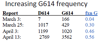
|
The table shows that the fraction ("fxn") of virus sequences reported with the mutant amino acid G increased over time. It is very low in the first report, and over half, globally, six weeks later.
There is an error in the first row of the table. The D and G values do not give the fraction of G that is shown. I am fairly sure that the fraction is correct. It may be simply that the two values were switched. (Another table shows, for pre-March: D = 640, G = 71; fxn G = 0.099. That is in Figure 2A.)
This is part of Figure 1 from the [preprint] article.
|
The following figure shows the results for two continents and selected areas within them.
Each graph shows the number of viral sequences with amino acid D or G at the site of interest (y-axis; numbers hard to read here) vs date (x-axis; labeled at lower left).
Some observations...
The mutant virus appeared in Europe (left side) in late February, and in North America (right side) a little later.
In Italy, only the mutant virus was found even at the earliest dates shown here. (Full data shows a few D sequences for Italy at earlier dates.) Recall that Italy was hit very hard by COVID-19. At the time, the impact on Italy was surprising; that Italy was infected mainly with a new strain -- and was perhaps the first country to feel its impact -- may offer an explanation.
In the US, the pattern is different for the states of New York and Washington. The new virus is more prevalent in New York, a state with a very high level of the disease. The difference in strains between these two states has been noted in some news reports as relating to the difference in the level of COVID-19 between the east and west coasts. Maybe so, but that seems an over-interpretation of the limited data from this article; we await more data on this point.
Some of the graphs here are based on fairly small numbers of sequences. The numbers are shown on the y-axis, but are hard to read there. Readable numbers are available in Figure 2 of the article.
This is part of Figure 3 from the [preprint] article. I have added some labeling.
|
Overall, the data show that a new virus strain has emerged, and become the major strain.
What does the mutation do? There is no actual data on what it does. However, the mutation is a significant amino acid change in a protein important for the infection process. Computer analysis of the protein structure suggests that the mutation could have a significant effect, but there is no direct evidence for now.
How strong is the conclusion that the mutation enhances virus transmission? At this point, it is a correlation. The mutation clearly has increased in frequency, and has done so as the disease intensity has increased. Further, the nature of the mutation makes an effect on transmission plausible. But there is no direct experimental evidence to show that it is the specific mutation studied that causes the effect seen. The article analyzes available genome data, and offers a hypothesis -- one that needs to be tested. The analysis tools used here are important in being able to reveal the mutation as a candidate, and the consequences in this case are potentially important. The analysis system will continue to monitor the virus.
Does the mutation affect severity of the disease (as well as its frequency)? The article contains limited data on this point. It includes an analysis from one large hospital system. The data show that the frequency of the mutation was about the same in patients who required hospitalization and those who did not. The frequency of the mutation was a little higher in those admitted to the ICU, but that effect did not test as significant. The authors suggest that the mutation increases the transmission of the virus and therefore the number of cases, but does not affect disease severity. This should be taken as very tentative.
When and where did the mutation arise? That cannot be resolved with the available data. It is likely that the specific mutation arose more than once, but that one specific occurrence is the one that is the basis of the new strain. There is some evidence that the mutation may have occurred in China, but it is also likely that the new strain arose in Europe, probably during February. That is, it may be that the mutation occurred in a virus strain in China, but that strain did not lead to the current mutant strain. There are various possibilities consistent with the data at hand.
Other implications? Since the spike protein is central to the infection process, it is a prime target for vaccines. Any change in the spike protein could have implications for a vaccine. There is no specific prediction beyond that; it just needs to be tested. Importantly, this point holds regardless of whether the mutation is making the virus more transmissible.
Similarly, the change in the virus could allow re-infection. A person immune to the original strain may not have immunity to the new strain. Again, the article does not show that this is a problem. Rather, it alerts us to a change that might be a problem.
The article documents a change in the virus that may well be important. That part of the work seems solid, even while we work out what the actual effects are. The article has been criticized for over-emphasizing claims about effects, but simply documenting the mutation is important. (In fact, within the main body of the article, the distinction between what is suggested as a possibility and what is shown is generally quite clear.)
News stories:
* Covid-19: Does Mutation Increase SARS-CoV-2 Transmissibility? (M Smith, Physician's Weekly, May 7, 2020. Now archived.)
* We don't know yet whether a mutation has made SARS-CoV-2 more infectious -- A mutation in the virus seems to be getting more common, but we don't know why. (J Timmer, Ars Technica, May 6, 2020.) A good news story, emphasizing the uncertainties. Science stories are always incomplete; discussing an article prior to peer review adds to that. Scientists -- and publishers -- are rushing to get information out about this important medical event. The article here provides evidence for a new form of the virus, one with a plausible connection to how the virus has behaved. The article opens the story, which needs to be followed up. But it is easy, in our enthusiasm or haste, to make hypotheses sound like conclusions.
The article, which is freely available -- as a preprint: Spike mutation pipeline reveals the emergence of a more transmissible form of SARS-CoV-2. (B Korber et al, BioRxiv, May 5, 2020 for version 2.) Check that you get the most recent version; watch for a note at the top that a more recent version is available. Some links, such as the one here, do not specify version number, and will take you to the most recent version available. But some sources do link to a specific version. (An error was corrected in version 2, though it did not impact the main conclusions.)
Update August 23, 2020... The article is now published. It is freely available: Tracking Changes in SARS-CoV-2 Spike: Evidence that D614G Increases Infectivity of the COVID-19 Virus. (B Korber et al, Cell 182:812, August 20, 2020.)
There is more about genomes on my page Biotechnology in the News (BITN) - DNA and the genome. It includes an extensive list of related Musings posts. (Coronaviruses have RNA genomes, but the idea is the same.)
The page for BITN -- Other topics includes a section on SARS, MERS (coronaviruses). That section now includes COVID-19. The current post is the first regular Musings post on COVID-19; most items that have been "briefly noted" here have also been noted there.
Next COVID-related post: Speech droplets: Can you transmit an infection to someone by yelling "Stay healthy" at them? (June 14, 2020). This post contains no work with viruses, but is done within the context of COVID transmission.
Also see: Briefly noted... How reliable are preprints? (October 26, 2022).
What if we just gently nudge old cells a little bit toward pluripotency?
May 9, 2020
In 2007, a scientific team led by Shinya Yamanaka developed a procedure to change body cells (differentiated cells, such as skin cells, from an adult) into cells that are approximately equivalent to embryonic stem cells. These lab-developed cells are known as iPSC (induced pluripotent stem cells). iPSC have played a central role in the study of stem cells ever since; Yamanaka won the Nobel prize in 2012 for the work.
We have come to understand that the induction of iPSC involves two somewhat distinct phases. One is the change in the identity of the cells, dedifferentiating them; one is the change in the "age" of the cells, reverting them to seeming young.
Is it possible to dissociate those two effects? In particular, is it possible to make old cells "younger" -- without changing their identity? For example, could we convert old skin cells to young skin cells?
In fact, work with mice has suggested that it might be possible, by using a very "mild" version of the procedure to make iPSC. And now... a recent article explores the issue with human cells.
Here is an example of what was done in the new work. This experiment uses cartilage-producing cells, called chondrocytes. In particular old chondrocytes, from people with osteoarthritis (OA).
Part a (left) outlines the experiment. Three groups of cells were tested for various properties. Two of the groups used old chondrocytes from people with OA; one group of cells was treated and one was not. A third group used healthy young chondrocytes.
Part b shows the results for the expression of a gene called RANKL. The first two bars show that the expression is low for healthy young cells, and high for OA cells. The third bar is for treated OA cells. The results show that RANKL expression is much lower than for untreated OA cells; it approaches the level seen for healthy young cells. (Caution... the color coding in part b and later parts showing results is not the same as used in part a for outlining the experiment.)
Part c shows the results of a similar test for another gene, iNOS2; the results are similar, though less dramatic.
Part d looks at the level of four inflammatory cytokines. The cytokines are listed along the x-axis; for each cytokine, there are three bars, corresponding to the same conditions as in parts b and c. In each case, OA cells show higher levels than healthy cells, and the treatment reduced the level to about that in healthy cells.
This is part of Figure 3 from the article.
|
Those results show that the treatment moves the aged cells toward improved function, as judged by the activity of specific genes and by the disease-relevant property of promoting inflammation.
What is the treatment? It involves the same type of treatment used to make iPSC, but for only a very brief time.
The treatment uses messenger RNAs coding for a collection of factors based on those used to make iPSC -- the Yamanaka factors. mRNA is not stable, so the effective treatment is brief.
Is this useful? Would a person with osteoarthritis benefit from such a treatment? This is very early stage work; it shows the possibility of improving aged cells by making them "younger". The work here with human cells is only at the level of lab culture of the cells. However, some work with mice models has shown promise at the whole-animal level.
It's an interesting development.
News stories:
* Turning Back the Clock on Aging Cells -- Researchers report that they can rejuvenate human cells by reprogramming them to a youthful state. (N Wade, New York Times, March 24, 2020. Link is now to Internet Archive.)
* iPSC Tech Rejuvenates Aging Muscle Cells to Give Mice Youthful Strength. (GEN, March 25, 2020.)
* Old human cells rejuvenated with stem cell technology -- Old human cells can become more youthful by coaxing them to briefly express proteins used to make induced pluripotent cells, Stanford researchers and their colleagues have found. The finding may have implications for aging research. (K Conger, Stanford University, March 24, 2020.) From the lead institution.
The article, which is freely available: Transient non-integrative expression of nuclear reprogramming factors promotes multifaceted amelioration of aging in human cells. (T J Sarkar et al, Nature Communications 11:1545, March 24, 2020.)
A recent post about cartilage and osteoarthritis: Humans may be more like salamanders than we had thought (limb regeneration) (February 11, 2020).
My page Biotechnology in the News (BITN) for Cloning and stem cells includes a list of related Musings posts.
The page for BITN -- Other topics includes a section on Aging. It includes a list of related Musings posts.
Top of page
The main page for current items is Musings.
The first archive page is Musings Archive.
E-mail announcements -- information and sign-up: e-mail announcements. The list is being used only occasionally.
Contact information
Site home page
Last update: April 6, 2026