Home
> Musings: Main
> Archive
> Archive for January-April 2014 (this page)
| Introduction
| e-mail announcements
| Contact
Musings: January-April 2014 (archive)
Musings is an informal newsletter mainly highlighting recent science. It is intended as both fun and instructive. Items are posted a few times each week. See the Introduction, listed below, for more information.
If you got here from a search engine... Do a simple text search of this page to find your topic. Searches for a single word (or root) are most likely to work.
Introduction (separate page).
This page:
2014 (January-April)
April 30
April 23
April 16
April 9
April 2
March 26
March 19
March 12
March 5
February 26
February 19
February 12
February 5
January 29
January 22
January 15
January 8
Also see the complete listing of Musings pages, immediately below.
All pages:
Most recent posts
2026
2025
2024
2023:
January-April
May-December
2022:
January-April
May-August
September-December
2021:
January-April
May-August
September-December
2020:
January-April
May-August
September-December
2019:
January-April
May-August
September-December
2018:
January-April
May-August
September-December
2017:
January-April
May-August
September-December
2016:
January-April
May-August
September-December
2015:
January-April
May-August
September-December
2014:
January-April: this page, see detail above
May-August
September-December
2013:
January-April
May-August
September-December
2012:
January-April
May-August
September-December
2011:
January-April
May-August
September-December
2010:
January-June
July-December
2009
2008
Links to external sites will open in a new window.
Archive items may be edited, to condense them a bit or to update links. Some links may require a subscription for full access, but I try to provide at least one useful open source for most items.
Please let me know of any broken links you find -- on my Musings pages or any of my regular web pages. Personal reports are often the first way I find out about such a problem.
April 30, 2014
3D printing for space: a titanium woov, and more
April 29, 2014
There have been several recent posts on the emerging technology of 3D printing, or additive manufacturing, as it is also called. A recent story caught my attention in this context. It's not a scientific journal article at all, but a feature web page from the European Space Agency (ESA), describing potential applications of the technology for the space program. The page is both fun and instructive.

|
A titanium woov, made by 3D printing. It has been used in space.
This is part of the figure accompanying point 6 on the web page. That figure also shows a regular woov.
|
The web page: Ten ways 3D printing could change space. (ESA, April 15, 2014.) There is a list of 10 points, with many pictures included. (My favorite picture is the one with point 4, but it has no obvious scientific value.) If you don't get 10 points, you may get a "Continue" button. If you still don't get 10, try another browser. Strange page.
Most recent post about 3D printing: 3D printing: simple inexpensive prosthetic arms (January 29, 2014).
More:
* 3D printing: Make yourself a model of the universe (December 19, 2016).
* Can you make a 777 by printing it? (May 9, 2015).
More titanium: The major source of positrons (antimatter) in our galaxy? (August 13, 2017).
Salmonella and food contamination; the biofilm problem
April 28, 2014
Salmonella is a common food poisoning bacterium. It's one you can easily bring home - with a whole chicken. A new article addresses the issue of established Salmonella infections in the environment. The main concern in this article is food processing plants, not the home, but the idea is the same. If allowed to stay, Salmonella grows on a surface in a complex structure called a biofilm. Importantly, the biofilm helps to protect the bacteria from antibiotics and disinfectants.
Here is an example of what the scientists did...
In this experiment, the scientists established model Salmonella biofilms on concrete surfaces. At two times during the development of the biofilms, they treated portions of the surface with various disinfectants, following standard food industry procedures. The table below shows how many bacteria were found after each treatment.
| Disinfectant
| 2 day biofilm
| 7 day biofilm
|
| none
| 4.3x10⁷
| 5.5x10⁹
|
| sodium hydroxide (1 M)
| 0
| 5.2x10⁷
|
| sodium hypochlorite (500 mg/liter)
| 3.3x10⁶
| 2.5x10⁹
|
| benzalkonium chloride (0.02%)
| 6.3x10⁶
| 4.4x10⁹
|
The data above are extracted from parts of Tables 3 & 4 from the article. The data shown here are for one strain and for 90 minutes of treatment, the longest time they used.
You can see that with the 2-day-old biofilm, only the 1 M sodium hydroxide was able to kill it. With the 7-day-old biofilm, no treatment was very effective.
It is a dramatic demonstration of how tenacious bacteria can be if they get established; the biofilm is their way to "get established". The implication is that if a small amount of Salmonella gets onto a surface, it will quickly establish itself in a form that is difficult to eradicate, but which can still shed infectious bacteria into the plant.
The article has some limitations. For example, the measurements here are for a concrete surface; that seems like something that would enhance bacteria sticking. The authors note that such surfaces are common in food processing plants, so are relevant. However, it would be nice to see what happens with smoother surfaces, such as stainless steel. (They do some work with such other surfaces, but don't do killing curves with them.) Second, they tested only one level of the disinfectants here, and it was chosen based on a quite different type of experiment. The level of bleach, for example, is quite low. We need to know whether higher levels could successfully penetrate the biofilm. These are difficult experiments to carry out, and what is reported is a useful contribution. The article adds to our appreciation of the difficulty of eradicating biofilms, but it is also known that biofilms vary.
News stories:
* Food processors beware: Salmonella biofilms incredibly resistant to powerful disinfectants. (Science Daily, January 15, 2014.)
* Salmonella Biofilms Extremely Resistant to Disinfectants. (Food Safety News, January 23, 2014.) This contains a photo showing biofilms on various kinds of surfaces. It shows that biofilms vary. (The source of the photo is not stated; it's not from the article.)
The article: Commonly Used Disinfectants Fail To Eradicate Salmonella enterica Biofilms from Food Contact Surface Materials. (M Corcoran et al, Applied and Environmental Microbiology 80:1507, February 2014.)
A post about food contamination, including Salmonella: Killer chickens (December 2, 2009). Links to several related posts, on a range of food contamination issues.
More about biofilms -- for better or worse...
* Does E coli grow in a multicellular form? (January 31, 2023).
* Shark skin inspires design of a new material to reduce bacterial growth (March 13, 2015).
* Killing persisters -- a new type of antibiotic (January 3, 2014).
* On sharing electrons -- II (June 9, 2013). Remember, biofilms are part of nature.
Also see: Perchlorate on Mars surface, irradiated by UV, is toxic (July 21, 2017).
My page for Biotechnology in the News (BITN) -- Other topics includes a section on Antibiotics. It includes a list of Musings posts on the topic, including disinfectants.
Do elephants suffer long term harm if their social groups are disrupted by human intervention?
April 27, 2014
Elephants live in complex societies. How well do the animals themselves understand their society? What happens if the social structure is disrupted? A recent article offers some interesting insights into such questions. Caution... The experiments and the results are interesting. The interpretation is less clear. There is considerable news hype about this work; it is not clear it is all justified at this point.
The basis of the work in the new article is comparing two populations of elephants -- comparing how they respond to socialization tests administered by the scientists. Here is an example...
The graph shows a behavioral response of two groups of elephants. Before we get to the details, note that the two graphs are different: one shows a trend, whereas the other does not. Something is going on. Let's look at what is being measured.
In this test, family groups of elephants were observed while recorded elephant calls were played to them. The calls were from elephants of different ages, representing different levels of social dominance. This is the "age" referred to along the x-axis. What's observed is how the family groups hearing the sounds bunched together, in what is considered a defensive response; the y-axis shows this as the "probability of bunching". The two groups of elephants studied here are in two national parks: Amboseli (Kenya) and Pilanesberg (South Africa); the labels at the top of the two frames identify the elephant populations.
You can see from the graphs that the elephants at Amboseli (frame A) behaved differently depending on the age of the elephants whose calls they heard. In particular, they bunched more in response to calls from older elephants; this is the expected behavior. In contrast, the elephants at Pilanesberg (frame B) did not distinguish the social significance of the elephants whose calls they heard.
This is Figure 2 Parts A & B from the article.
|
Why are the elephants at Pilanesberg less responsive to social cues? The authors interpret the work in terms of the history of the two elephant populations. Amboseli is considered a rather undisturbed park. In contrast, Pilanesberg was populated by orphan elephants during a cull of another park during the 1980s and 1990s. The authors suggest that the poor response of the Pilanesberg elephants is due to the severe social trauma that some of their members suffered 30 years ago.
The article used interesting methodology to probe elephant social structure, and the possible effect of social trauma caused by human intervention. Are there alternative ways to explain the results? What they claim is important if true, and it is "reasonable". However, I would be cautious about the interpretation; it's easy to think of other factors that might be involved. The scientists study two different populations of elephants, and assume that the key difference, the one responsible for the observed behavior, is the one they note. Perhaps, but that is an assumption. The authors do provide considerable discussion of other work that may be relevant, but it does not address this concern.
We need to distinguish how we might interpret this for immediate application to policy and how we understand it as science. There may well be enough here that we want to act with more caution in disturbing natural populations. That's fine. However, it is another matter to claim that we understand what is going on. This is a scientific paper; we should judge it by high scientific standards. We should distinguish whether an article provides conclusive proof of something, or whether it "merely" leads to an interesting hypothesis. We also have to accept that we make policy decisions on the basis of imperfect information.
News stories:
* Orphan Elephants Lack Social Knowledge Key for Survival -- Psychological impact from loss of family structure parallels PTSD in people. (Christy Ullrich Barcus, National Geographic Society, October 31, 2013.) Now archived.
* Mass Killings Can Haunt Elephants for Decades. (Science Now, November 1, 2013.)
The article, which is freely available: Effects of social disruption in elephants persist decades after culling. (G Shannon et al, Frontiers in Zoology 10:62, October 23, 2013.) A very readable article. I encourage you to look it over, especially the parts where they discuss the significance of the results.
Previous post about elephants... Was Linnaeus's original elephant African or Asian? (December 7, 2013).
Another psychology post: Can growing rice help keep you from becoming WEIRD? (July 22, 2014).
Another post about the effects of humans on other animals: Why male scientists may have trouble doing good science: the mice don't like how they smell (August 22, 2014).
The oldest known piece of cheese
April 25, 2014

|
The figure shows a mummy, about 3800 years old, from China. Around her neck are some pieces of cheese; some are marked with white arrowheads. The inset (lower right) shows an enlarged view of one piece of cheese.
This is from the abstract at the journal web site. It is probably equivalent to Figure 1D from the article. In the article, the scale bar for the inset has been partially cut off. There is a scale bar, 3 centimeters, for the main figure at the upper left; it's not easy to see, because of the colors.
|
It's the oldest known piece of cheese.
Why the interest in old cheese? Is there more to the story?
In a new article, scientists report that they can analyze some of the proteins in the cheeses from this archeological site. They are able to reconstruct a recipe for how the cheese was made. The protein analysis shows that the cheese was made by fermentation with bacteria and yeast; there is no evidence for the use of enzymes from animals.
The process used for making this cheese was probably similar to what is now known as kefir. The kefir process can give a milk product and a cheese, both low in lactose, a sugar that people in that part of the world digest poorly. Thus this cheese, found around the neck of a mummy, provides evidence that humans had learned to transform milk into a more digestible food 4,000 years ago. The authors even speculate how learning to make cheese might have driven the development of cattle farming.
There are many levels here. The find of the mummy with cheese was something of an accident, though it is also a tribute to the Chinese archaeologists. The ability to analyze the proteins in the old cheese reflects leading edge technology and leads to some understanding of the cheese. The data are limited, but they lead to a story. Much of the story is rough, even speculation, but it may guide further work.
News story: Researchers reconstruct a cheese recipe from the Early Bronze Age. (Phys.org, March 12, 2014.) Good overview.
The article: Proteomics evidence for kefir dairy in Early Bronze Age China. (Y Yang et al, Journal of Archaeological Science 45:178, May 2014.) It's a fun paper to browse, even if you skip over the more technical aspects of the analyses.
To be clear... There has been evidence for cheesemaking earlier than this cheese, by a few thousand years. What's new here is having the cheese -- and being able to analyze it.
Musings notes old things from time to time. Most recently... Chromosomes -- 180 million years old? (April 18, 2014).
and old proteins... Dinosaur proteins (July 6, 2009).
and old milk...
* Old baby bottles (November 11, 2019).
* Got milk? (October 13, 2008).
and more old food... The oldest known bread (August 28, 2018).
More about milk history... Barium, breast milk, and a Neandertal (June 17, 2013).
More cheese...
* Cheese-making and horizontal gene transfer in domesticated fungi (January 19, 2016).
* What's the connection: blue cheese, rotten coconuts, and the odorous house ant? (August 24, 2015).
More dairy... A clinical trial of ice cream (June 2, 2015).
More mummies: How to make a mummy (May 7, 2023).
April 23, 2014
The role of a government science adviser
April 22, 2014
I recently came across a delightful little "Comment" piece by the chief science adviser to the Prime Minister of New Zealand. What's it about? It's about what it means to be a science adviser to a government.
We have a science adviser to the President in the US. The role -- and the power -- of the adviser varies, depending on various circumstances, including the instincts of the President toward science. It was interesting to read the perspective of an equivalent in another country.
I encourage you to have a look.
The article, which is freely available: The art of science advice to government. (Peter Gluckman, Nature 507:163, March 13, 2014.) The subtitle: "Peter Gluckman, New Zealand's chief science adviser, offers his ten principles for building trust, influence, engagement and independence."
Another government science adviser: Science in the White House (June 11, 2009).
Also see: US Presidential candidates weigh in on science questions (October 18, 2016).
Targeting growth factors to where they are needed
April 21, 2014
Growth factors do what the name implies. One might think that using growth factors could be useful in promoting healing of wounds. However, it has proven difficult in practice, because it is hard to target the growth factors to where you want them to act.
A new article tries a new approach to targeting the growth factors, and reports some encouraging results.
Wounds are accompanied by exposed extracellular matrix (ECM). We can think of ECM as a type of structure that is around cells; it includes some common proteins, such as collagen. Growth factors typically work after binding to ECM. In the new work, scientists decided to try targeting the growth factors they wanted to use to the exposed ECM. More precisely, they wanted to enhance the binding to make it helpful during therapeutic use of growth factors.
The work had two phases. The first was to learn how to target things to the ECM. The second was to apply that to targeting growth factors in a wound-healing test.
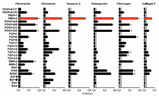
Here is an example of what they found in the first phase. They tested many proteins, listed along the left side of the following figure. (Many have GF, for growth factor, in their name.) They tested them to see how well they bound to various ECM proteins, listed across the top. The familiar collagen is one of those they tested. In the figure, the length of each bar is a measure of how well the protein at the left bound to the particular ECM protein.
There is no need to look at details. All we need is the general pattern.
You can see that the results vary: there are long bars and there are short bars. Of particular interest is PlGF-2, which they have highlighted with reddish bars. It binds well to all the ECM proteins tested. That's what they wanted. They chose to use PlGF-2 (placenta growth factor-2). They were then able to find a small portion of this protein that was responsible for the binding to ECM.
This is Figure 1 from the article.
|
Here is an example of trying to use PlGF-2 to target growth factors. The test involves looking for healing of controlled wounds made in the skin of mice. The mice used are mutant mice, with poor wound healing. The growth factor treatment is applied directly to the wound. The pictures in the following figure show what the wounds look like after 15 days of healing with various treatments.
|
In the bottom frame, the "treatment" is a control; only saline solution was applied. In the middle frame, two growth factors were applied. In the top frame, these same two growth factors were used, but in a modified form: both were engineered to include the part of PlGF-2 that provided targeting to the ECM.
The general pattern is clear... The growth factors (middle frame) promote more healing than does the saline, and the targeted growth factors (top frame) are even better.
This is Figure 2c from the article. The scale bar (lower right) is 1 millimeter.
|
So, the scientists proposed targeting growth factors to where they are needed, they worked out a way to do that, and they showed that it works in a simple mouse model. It's a long way to the clinic, but this is an interesting article, worth pursuing.
News stories:
* Engineered 'Glue' Called Growth Factors Helps Heal Wounds Faster. (Medical Daily, February 22, 2014.) This is a useful brief overview of the work. However, there may be some confusion about their term "glue". Growth factors are normal proteins. What is new here is to work out a way of attaching them where they are needed; that is the "glue" idea.
* Bioengineered growth factors lead to better wound healing. (MedicalXpress, February 20, 2014.)
The article: Growth Factors Engineered for Super-Affinity to the Extracellular Matrix Enhance Tissue Healing. (M M Martino et al, Science 343:885, February 21, 2014.)
More about growth factors: Is it possible that mental retardation could be prevented by a simple prenatal treatment? (January 14, 2013).
More about the ECM: Zebrafish reveal another clue about how to regenerate heart muscle (December 11, 2016).
More about wound healing...
* An improved bandage, based on superhydrophobic carbon fibers (January 21, 2020).
* Fixing the heart with some glue and light (July 27, 2014).
* Smart sutures (November 3, 2012).
* On a new method of treating compound fracture... (July 11, 2012).
* Print yourself new body parts (April 16, 2010).
And a wound that did not heal... To kill a mastodon (November 15, 2011).
Development of insects resistant to Bt toxin from "genetically modified" corn
April 19, 2014
Bt toxin is an insecticidal protein, originally from the bacterium Bacillus thuringiensis (nicknamed "Bt"). Plants have been genetically modified to contain Bt toxin. Such plants are resistant to certain insects; the use of the plants means that it is not necessary to apply insecticides against those insects. (There are actually various types of Bt toxin, but we won't worry about that here.)
The question at hand is whether insects will develop resistance to Bt toxin after exposure to plants with Bt toxin.
The following figure illustrates the phenomenon, as reported in a new paper.
|
The bars on the graph show the survival of western corn rootworm larvae when exposed to corn (maize).
There are four bars, representing all possible combinations of two types of worm larvae and two types of corn.
You can see that three of the four bars are relatively high (high survival), and one is low (low survival). The low bar is for "normal" worms on Bt corn; that is, Bt corn reduces the survival of normal worms. That's what Bt corn is supposed to do.
|
The high bars? Two of them are for corn without Bt. Those are controls; we expect that worm survival is high without Bt. But one high bar is with Bt corn... it tests worms that had been isolated off of a recent crop of Bt corn. This bar shows that these worms have developed resistance to Bt toxin.
If you want to work through the graph carefully... The two types of corn are labeled at the bottom. They differ in whether or not they contain a gene for Bt toxin. One corn has no Bt toxin; it is labeled "Bt absent". The other corn has a Bt toxin, it is labeled "mCry3A", for the particular Bt toxin.
The two types of worm are denoted by the two bar colors. The dark bars (at the left of each pair) are for worms from a recent population recovered from a Bt corn crop. The light bars (right of each pair) are for "control" (or "normal") worms.
The A at the top of the three high bars? It means that those three results are statistically the same.
This is Figure 2B from the article.
|
That insects are developing resistance to Bt corn is neither new nor surprising. (What is new here is that the resistance is expanding; worms developed as resistant to one form of Bt toxin are showing cross-resistance to another form.) In fact, there are precautions that are to be followed to reduce the chances of development of resistance. They aren't being followed. The problem was predictable; it's now in front of us. Perhaps it would be good to follow the precautions?
Lest we over-interpret that... There is no guarantee that we understand the problem completely or that the declared precautions are adequate. There certainly is room for further understanding, which will come with experience. The point is that we aren't fully using the understanding we do have.
News story: Pests worm their way into genetically modified maize. (Nature News, March 17, 2014.)
The article: Field-evolved resistance by western corn rootworm to multiple Bacillus thuringiensis toxins in transgenic maize. (A J Gassmann et al, PNAS 111:5141, April 8, 2014.)
Recent post about a genetically modified crop plant: Rotavirus: passive immunization via food (January 10, 2014).
More about resistance to Bt toxin:
* Alternative microbial sources of insecticidal proteins (December 9, 2016).
* Resistance to Bt toxin: What next? (July 15, 2016).
For more on GM crops, see my Biotechnology in the News (BITN) page Agricultural biotechnology (GM foods) and Gene therapy.
More about Bt toxin: How to administer Bt toxin to people? (May 16, 2016).
More about corn...
* What can we learn from a five thousand year old corn cob? (March 21, 2017).
* Atmospheric CO2 and the origin of domesticated corn (February 14, 2014).
More about worms... Extending lifespan -- five-fold (January 12, 2014).
Chromosomes -- 180 million years old?
April 18, 2014
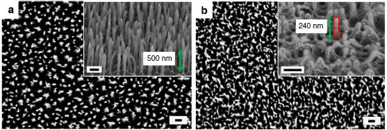
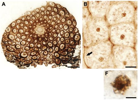
At the right are some pictures of part of a fern, from a recent article.
Part A (upper left) shows a cross section from the rhizome (root-like) structure. You can see individual cells. For example, there are two cells in the top "row", and six in the second row (depending on what you call a row there). There are small dark regions in most of the cells; these are nuclei. Scale bar = 500 µm.
Part B (upper right) shows a group of six cells at higher magnification. You can see cell walls, and even perhaps a cell membrane (at the arrow). You can see nuclei, and some have nucleoli visible within them. Scale bar = 20 µm.
|
|
Part F (lower right) shows the nucleus of one cell at even higher magnification. This cell seems to be in the process of mitosis; with some imagination, you can see the condensed chromatin. Scale bar = 5 µm.
This is part of Figure 1 from the article. The parts above are independent; they are not different magnifications of the same regions. The full figure contains more parts. In particular, there are several pictures of cells in various stages of mitosis.
|
The fern shown above is 180 million years old; this is a fossil fern. Aside from the beautiful pictures, what is interesting here is that this looks very much like a modern fern. That motivated the scientists to do an additional test. They measured the size of the nucleus in cells of this fossil fern and of a similar modern fern. The following figure shows the results.
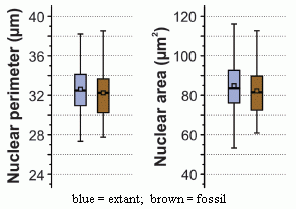
|
The graph shows the size distribution of nuclei found in the 180 million-year-old fossil fern (brown bars) and in the extant (modern) fern (blue bars).
Two properties of the nuclei are measured: perimeter (left) and area (right). (Of course, these are not independent features; the scientists are simply trying to measure what they see in two ways.)
This is part of Figure 2 from the article. I have added the labeling at the bottom.
|
The old and new ferns have the same size nuclei! Based on what is known about the size of nuclei of plant cells, it is likely that the old and new ferns have about the same amount of genetic material. For example... Genome duplications are common in plants; had there been a duplication between the old and new ferns, it should have been very obvious here.
There is no claim of finding DNA here, though there is a claim that we can see chromosomes. (If you look at many of the pictures, that's quite plausible.) Nevertheless, the scientists are able to offer some information about the genome of a 180 million year old fern. That's noteworthy.
News story: Spectacular fossil fern reveals Jurassic-era chromosomes -- Fern's genome appears to have been stable for at least 180 million years. (Ars Technica, March 21 2014.)
The article: Fossilized Nuclei and Chromosomes Reveal 180 Million Years of Genomic Stasis in Royal Ferns. (B Bomfleur et al, Science 343:1376, March 21, 2014.)
Previous post about a fern: A new organelle "in progress"? (September 13, 2010).
More... Hybrid formation between organisms that diverged 60 million years ago (May 8, 2015).
More about cell division... A gene that reduces the chance of successful pregnancy: is it advantageous? (May 18, 2015).
A post about an ancient DNA sequence: The oldest DNA: the genome sequence from a 700,000-year-old horse (August 4, 2013). At the time of posting, this was the oldest reported genome sequence; it may still be. The current post is from material that is 250 times older -- 180 million years older. It makes no claim to showing DNA, but it does make a claim about the nature of the genome.
And... A claim of finding dinosaur DNA (May 31, 2020).
There is more about genomes on my page Biotechnology in the News (BITN) - DNA and the genome. It includes an extensive list of Musings posts on sequencing and genomes.
Ancient proteins... Blood vessels from dinosaurs? (April 22, 2016).
More old things... The oldest known piece of cheese (April 25, 2014).
April 16, 2014
Can you see your hand in total darkness?
April 14, 2014
Try it. Go into an absolutely dark place (a closet, perhaps, with no light leaks). Close your eyes. Put on a perfect blindfold. Then move your hand in front of your face. Can you see it? The question is not whether you are aware of your hand in front of your face, but whether you think you see it. Some people say they can.
It's not easy to do that test just right. Perhaps there is a bit of light. One "control" is for two people to do this together. Move your hand in front of your face, then have your partner move his/her hand in front of your face. If you report that you can see your hand but not your partner's hand (even though it was in the same place doing the same thing), that is what we are talking about here.
What's going on? As noted, it is not a surprise that you know where your hand is. After all, it is your hand. What's a surprise is that you think you are seeing the hand. Your brain knows where the hand is; that's fine. However, for some reason it (your brain) reports to you that your eyes saw it. At least, that's what happens for some people.
Even with the control suggested above, this all seems quite subjective. Is it possible that someone could manipulate the results (consciously or otherwise)? A new article does further testing of the phenomenon, with that concern in mind.
In one set of experiments, two consecutive trials were done with the same people -- and with an attempt to trick them. In each trial, the participants were given a blindfold. However, they were told that one of the blindfolds would have small holes -- and that the other would give complete darkness. They were not told which was which. In fact, the two blindfolds were identical: both were light-tight. As a result, the experimental design might have created an expectation for Trial 2. For example, if the participants were somehow imagining hand motion in Trial 1, and thought that might be due to the light leak, they might report less in Trial 2.
Here are some of the results...
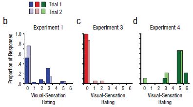
|
The basic design of the test is that a person was blindfolded and asked to move their hand in front of their face. (We'll note some variations of the basic design as we go.) They were then asked to tell what they "saw", which was coded on a scale from 0 to 6. This scale, called "Visual-sensation rating", is shown on the x-axis of the graphs. For example... 0 = no visual sensation at all, 3 = visual sensation of motion with direction, 6 = the visual shape looked like the outline of a moving hand.
The y-axis is the proportion of people who reported a particular score. A score of 3 is considered to be significant.
|
A key part of the testing here was the blindfold, as noted above. By telling the participants that there were two different kinds of blindfold, they built a deception into the test. The participants thought that they were using different blindfolds for the two trials, and this might have led to a difference between the two trials.
A quick glance at the results for the three experiments, above, shows very little difference between Trial 1 and Trial 2 within each experiment.
The three experiments? Experiment 1 (frame b of the figure) was the basic test. You can see that some of the participants, say about 20%, reported seeing their hand (score 3 or higher). The people who reported a positive response in the two trials were largely (though not entirely) the same people. (There is, in fact, some trend toward less positive response in Trial 2; this may be a clue that what is being studied is complex.)
Experiment 3 (frame c) was done differently in one key regard. Instead of the participant moving his or her own hand in front of their face, the experimenter moved his or her hand in front of the participant's face. You can see that this resulted in almost no response (none meeting the cut-off criterion of score 3).
The comparison of Experiments 1 & 3 makes the basic point of the phenomenon, and the difference between "my" hand and "your" hand. That general difference does not depend on the cutoff score used. Further, the deceptive test here helps to establish the validity of the phenomenon. Most participants reported the same visual sensation despite the attempt to deceive them.
This is Figure 1 parts b-d from the article.
|
What about Experiment 4 (frame d)? It's the same basic experimental design as with Experiment 1, but this time there is a huge positive response. Most of the people report a 5 or 6; those scores were rare in the other experiments. What's different with Experiment 4? The subjects of this experiment have synesthesia. People with synesthesia report unusual connections between the senses. For example, some may report associating a particular color with a particular number. It's intriguing that people with one type of unusual cross connections, in synesthesia, are likely to report the type of cross connection of the current work. It's intriguing -- but we have no idea what it means.
The article contains one very different kind of experiment, which also helps to establish that the phenomenon reported here is real. The scientists do eye-tracking experiments. The simple answer is that people who report seeing their hand move in total darkness are more likely to show eye-tracking of the moving hand than those who do not report seeing the hand. Apparently, the brain not only attributes vision to the eyes, but tells the eyes where to look -- even in total darkness.
News story: 'Kinesthesia' Lets Us See, Perceive Our Own Actions In The Dark Without Even Noticing. (Medical Daily, October 31, 2013.)
Video. There is a promotional video from the University of Rochester. It's called What Synesthesia Can Tell Us About Connections in the Brain. It is available directly at YouTube. (4 minutes)
The article: Kinesthesis Can Make an Invisible Hand Visible. (K C Dieter et al, Psychological Science 25:66, January 2014.) (Put the title into Google Scholar, and you may find a copy from the authors at Univ Rochester. At last check, there were multiple links there, with various outcomes. Look around; one is the final published article.)
More about synesthesia:
* Can people learn to be synesthetic? (January 7, 2015).
* Synesthesia: the good side? (January 14, 2012).
More on the interrelationships of the senses: Connecting the senses (April 26, 2011).
More about eye tracking: Signs of autism in 2-month-old babies (February 7, 2014).
Whales in the Chilean desert -- the oldest known case of a toxic algal bloom?
April 13, 2014
A construction crew working on a highway through the Chilean desert found a whale. Paleontologists have investigated the site, and it's rather interesting.
The photo above shows one of the observations.
It is reduced from the figure in the Science Daily news story.
|
Finding marine animal skeletons in the desert or in mountains is not novel. This is land that used to be oceanic or nearby; it has been uplifted over the eons. Chile is one of the most geologically active areas in the world, as the major earthquakes in early April reminded us. But there is much more to this particular story, as reported in a new article.
Among the striking observations...
- There were skeletons of many animals -- various types of whales and other marine animals.
- Collections of animals were found at four different elevations in the area, corresponding to four different dates.
- The arrangement of the fossils suggested that the animals had died at sea, and later were washed ashore.
A simple interpretation of the findings is that each layer of bones represents a mass stranding event. The multiple layers represent distinct mass stranding events, probably over several thousand years. Nothing like this had even been seen in the fossil record.
What caused the mass strandings? The scientists consider some possibilities, and end up suggesting that the mass strandings were due to blooms of toxic algae, much like what we now call red tides. We know such events occur now, and we know that whales can be the victims. The scientists take the assemblages of whales in the Chilean desert as evidence for algal blooms. The site is estimated to be 6-9 million years old -- older than any algal bloom previously known.
As you read this, be sure -- as always -- to distinguish what is fact from what is interpretation. The facts are collections of dated fossils, with the figure above an example. The algal bloom is an interpretation, one made after considering possible causes and the evidence at hand. However, interpretations are subject to change. In fact, one purpose of offering interpretations (which includes evidence against other interpretations) is to stimulate further work. The facts here are remarkable; the interpretation is quite tentative.
News stories:
* Mass strandings of marine mammals blamed on toxic algae: Clues unearthed in ancient whale graveyard. (Science Daily, February 25, 2014.)
* The Tiny Culprit Behind A Graveyard of Ancient Whales. (E Yong, Not Exactly Rocket Science (National Geographic blog), February 25, 2014. Now archived.) More pictures. And a good summary of the argument that the assemblages are due to algal blooms.
The article, which is freely available: Repeated mass strandings of Miocene marine mammals from Atacama Region of Chile point to sudden death at sea. (N D Pyenson et al, Proceedings of the Royal Society B 281:20133316, April 22, 2014.)
More about whale bones: A quasi-quiz: The fate of bone and wood on the Antarctic seafloor -- and the discovery of new bone-eating worms (August 20, 2013).
More about whales:
* If it quacks like a whale... (August 25, 2014).
* Effect of simulated sonar on whale behavior (March 16, 2014).
More from the Atacama desert of Chile: Life that thrives on hot air (September 5, 2009).
More algal blooms -- even older: A major algal bloom associated with the dinosaur extinction event? (May 13, 2016).
More about mountains being uplifted: Our mountains are growing (May 19, 2012).
More about highways and animals:
* The first Americans: Is it possible we have the date wrong by 100,000 years? (June 28, 2017).
* Why the bear used the overpass to cross the highway (May 11, 2014).
Google tracks the flu -- follow-up
April 11, 2014
Original post: Google tracks the flu (April 30, 2009).
In that post we noted that Google was using their records of what people searched for to predict the incidence of influenza. The idea is clear. The question is, how well have they done?
Here are some data...
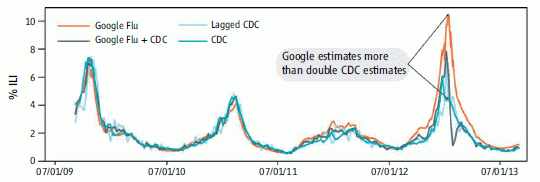
The graph shows the percent of doctor visits due to influenza-like illnesses (ILI) over time, as estimated by four methods.
Look at two of those curves. The dark blue line is the official estimate from the Centers for Disease Control (CDC), based on surveillance reports; the orange line is the Google Flu Trends prediction. (We will briefly note the other two curves at the end.)
For the first two years, the two curves are quite close. After that, the Google Flu curve is high; that is particularly obvious during the last peak (Winter 2013 flu season).
A recent article in Science, presented as a Policy Forum, addresses that discrepancy. What went wrong? It's an interesting read, with implications beyond this particular issue.
The figure above is the top part of the main figure from the article. (The bottom part of that figure plots the same data as a percent error from the CDC estimate.)
|
At the heart of the problem is the underlying philosophy: that we can generate useful information by simply collecting lots of numbers. This is the "Big Data" issue, though it is fair to note that not everyone means the same thing by that term.
Among the points the authors make... What Google does is not transparent; thus it is not subject to the usual scrutiny of scientific analyses. Further, Google has said that they have tuned their method, and they will presumably continue to do so. Importantly, this includes tuning of both the Google Flu algorithms, but also Google search, which provides the raw data. In one sense, that's fine, but it also reminds us of their lack of transparency. What Google Flu does is to give an answer, but with little explanation or understanding. Is that good? It might be if it was correct. But we now know it may not be correct.
It's an interesting story. I encourage people to read it, whether they care much about tracking the flu or not. The article comes down rather hard on Google. Perhaps they overdo that, so let's not get distracted by trying to judge Google. The bigger issue is how we learn to use Big Data. Google is a pioneer there; that in itself makes them open to criticism.
News story: When big isn't better: How the flu bug bit Google. (Terra Daily, March 18, 2014.)
The article: The Parable of Google Flu: Traps in Big Data Analysis. (D Lazer et al, Science 343:1203, March 14, 2014.) Check Google Scholar for a freely available copy of the final published article.
What about the other two curves in the graph? One, labeled "lagged CDC", is for making predictions based on the most recent CDC data available, which is typically about 2-3 weeks old. The curve labeled "Google Flu + CDC" is based on a combination of the lagged CDC numbers with the Google Flu numbers. The general pattern is that this combined indicator is better than the individual indicators. Using more information is good. See the lower graph in the article, where the data is plotted as errors.
* Previous post on the flu: Face masks and flu virus transmission on airplanes: an analysis of a flight (August 27, 2013).
* Next: Transparency of clinical trials -- Is the flu drug Tamiflu worthless? (May 4, 2014).
Many posts on various flu issues are listed on the supplementary page: Musings: Influenza.
More about Google:
* In what year was the word "slavery" most used in books? (February 23, 2011).
* elgooG (October 12, 2009).
April 9, 2014
When lightning strikes a tree...
April 8, 2014

|
What's left of a redwood tree in a residential neighborhood less than a mile from the UC Berkeley campus, after a lightning strike last week. It's now about 25 feet high -- about a third of what it had been.
|
News story: Lightning strikes Berkeley tree, sends wood chunks flying. (Berkeleyside, March 31, 2014.) Includes several nice photos of the area. The photo shown above is reduced from the top photo in this story.
Apparently there was some similar damage in the Sausalito area during the storm. No injuries or major property damage. It was a noisy time -- in an area where thunderstorms are not common.
More about lightning:
* What's the connection: ships and lightning? (October 14, 2017).
* A story of ball lightning and burning earth (February 4, 2014).
There is more about energy on my page Internet Resources for Organic and Biochemistry under Energy resources. It includes a list of some related Musings posts.
Methane leaks -- relevance to use of natural gas as a fuel
April 7, 2014
Methane (natural gas, CH4) is playing an interesting role in current discussions of fuels and greenhouse gases. Burning methane leads to much less greenhouse gas emission than does burning coal. That is because much of the fuel value of CH4 comes from burning the hydrogen in it. Therefore, there is less CO2 emitted for a given amount of energy released from the fuel. By this argument, switching from coal to natural gas is a good move. On the other hand, methane itself is a greenhouse gas -- a potent one, about 30 times more potent than CO2. Even fairly small leakages of unburnt methane to the atmosphere could more than negate its advantage as a clean fuel.
Terminology confusion...We often hear the term carbon emission. Of course, not all C is equal. As noted above, CO2 and CH4 are both greenhouse gases, of quite different potencies. The term carbon emission in common usage typically means emission of CO2. Emissions of other greenhouse gases are sometimes converted to the equivalent amount of CO2.
Comment... Above I framed the issue in terms of a trade-off between coal and natural gas. You might wonder if that is the proper question. The point here is that it is one relevant question. We do use natural gas; we need to learn how to use it as cleanly as possible. There is a choice between coal and natural gas for some people; we need to address it as best we can. Climate change is complex. Looking at one piece at a time is one way to approach it. A corollary is that we need to be clear what the question is. Simply asking if natural gas is good is a poorly framed question; the question should be, good compared to what?
It would thus seem desirable to have a good understanding of the nature and magnitude of methane emissions into the atmosphere. A recent article in Science discusses this; the article attempts to take everything that has been reported about methane emission and integrate it into a coherent picture. Adam Brandt, the lead author, visited UC Berkeley in late March and gave a talk on the subject.
The main conclusion from the article is that we have a very poor understanding of methane emissions. In fact, the major role of the article may well be to help define the question rather than to reach a conclusion.
Nevertheless, the data that is available does suggest some conclusions. Even though they may be tentative, it is worth noting some of them...
Current estimates of methane emissions by the US Environmental Protection Agency (EPA) are likely to be low, perhaps by 50% or so. Among possible reasons for that are some procedural biases, and not taking into account some biological sources of methane, such as livestock and wetlands.
Despite the uncertainties, it is unlikely that the magnitude of methane emissions from natural gas operations negates its clean-fuel advantage over coal. (We should caution that some of the news media accounts of this report mis-represent this point.)
An issue of much current concern is production of natural gas by hydraulic fracturing (fracking). They find that methane leaks from this process are not large. This seems plausible. It's a more modern industry, largely developed during a time of greater consciousness about the problem of methane leakage. Further, methane is the product. Those whose business is natural gas have an economic incentive to minimize methane leakage. (In contrast, the petroleum producer may not have that incentive.)
An important finding that comes from analyses of individual units is that most emissions come from a fairly small number of very leaky units. For example, they note (p 734 middle), " ... one study measured ~75,000 components and found that 58% of emissions came from 0.06% of possible sources." This is good news, in a sense. It suggests that the industry can operate with a fairly low methane leakage rate. Programs to find and fix what they call "super-emitters" would be worthwhile; there is effort to develop such monitoring.
An interesting concern is the role of abandoned wells (for either natural gas or oil). In the old days, wells that were no longer productive were simply abandoned. In many cases there is little or no record of where they are, much less any monitoring for possible leakage. (The number of dead wells is several times the number of active wells. p 29 of the Supplement.)
The analysis is about methane in North America. (The 16 authors are all in the USA and Canada.) The question of global methane emissions came up at the talk. It was beyond the scope of this report, but the questions would be the same.
How does one study methane emissions? There are two general approaches. One is to study what individual units (such as wells or associated processing equipment) emit; this is referred to as "bottom up". The other is to measure the CH4 in the atmosphere, and try to understand what affects it; this is "top down". Both of these are far more complex than they sound here. (Much of the talk was about the methodology.) For now, the two approaches do not agree well; the books don't balance!
This is an interesting and important topic. The new work is an admirable contribution. Getting the issues out on the table, with some preliminary suggestions, is good. But this needs more work. If you want more than my brief summary above, try the news story listed below. The article itself is rather dense, and is for those with a serious interest in either the policy or science sides.
News story: America's natural gas system is leaky and in need of a fix, new study finds. (Stanford University, February 13, 2014. Now archived.) From the lead institution. Good overview.
The article, which is presented as a Policy Forum: Methane Leaks from North American Natural Gas Systems. (A R Brandt et al, Science 343:733, February 14, 2014.) Check Google Scholar for a freely available copy. The Supplement is freely available at the journal web site.
Other posts on methane emissions include:
* Los Angeles leaked -- big time! (April 29, 2016).
* Boston is leaking (February 13, 2015).
* Space-based observation of atmospheric methane -- and the Four Corners methane hotspot (December 29, 2014).
* Quality of oil and gas wells -- fracking and conventional (August 18, 2014).
* Svalbard is leaking (March 7, 2014).
* Shale gas recovery using hydraulic fracturing (fracking) (October 7, 2013).
Related... Emissions from gas stoves, even when 'off' -- air pollution implications (February 21, 2023).
The following post addresses another aspect of the trade-off between CO2 and CH4: Climate change: Should we focus on methane? (March 24, 2012).
More on fracking... Fracking: Implications for energy usage and for greenhouse gases (October 26, 2014). This focuses on how less expensive gas might impact patterns of energy usage.
Also see:
* More about air pollution: The SF6 story: an emerging greenhouse gas? (August 25, 2020).
* National contributions to global warming (June 25, 2014).
There is more about energy on my page Internet Resources for Organic and Biochemistry under Energy resources. It includes a list of some related Musings posts.
Interfering with prion propagation?
April 5, 2014
There is no known method for preventing or treating prion diseases, such as bovine spongiform encephalopathy (BSE) in cows and Creutzfeldt-Jakob disease (CJD) in humans. A recent article hints at a lead.
Prion diseases involve misfolded proteins. A normal cellular protein takes on an abnormal shape, and induces other copies of the protein to do so, too. The abnormal protein, which aggregates, is toxic. Exactly how this all happens is not entirely clear. However, it is now possible to carry out this prion conversion in the lab. A team of scientists using that procedure found a substance that inhibits the prion conversion.
The following figure shows the results of a key experiment that demonstrates the inhibitor.
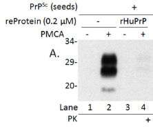
|
The general procedure here is to convert the prion in the lab, using a method called protein misfolding cyclic amplification (PMCA). (We use the terms convert and amplify interchangeably. The amount of abnormal protein is amplified, by converting normal protein to abnormal.) The product of the PMCA conversion is analyzed on an electrophoresis gel, to measure the amount of the abnormal protein that was made.
There are four lanes showing results. These differ in all possible combinations of two variables. One is whether the inhibitory substance (a protein) was added; this is labeled "reProtein 0.2 (µM)". The other is whether amplification was actually run; it is labeled "PMCA".
|
Lane 2 shows the result of a normal PMCA amplification. It is + for PMCA and - for the inhibitory protein. You can see that there is a big black band at about 29 on the scale. (The 29 means the molecular weight of the protein is about 29,000.)
Lane 1 is a control, in which amplification was not done. (Note the - for lane 1 in the row labeled PMCA.)
Lane 4 is the important one. In this case, the extra protein (called rHuPrP) was added -- and it inhibited amplification. That's the key point.
Lane 3 has the inhibitory protein but there is no amplification. Not surprisingly, there is no product.
This is part of Figure 1 from the article. (The full figure includes more controls.)
|
What is this magic stuff -- the inhibitory substance that inhibits prion conversion in the lab? It's actually a form of the normal human protein. The scientists show that it binds to the abnormal protein, apparently preventing it from doing its usual harm. Is this useful? They do one experiment with mouse cells, which suggests that it might be. I would be very cautious about this new finding; it's a long road from these novel findings to a useful treatment. However, for a serious disease with no mode of prevention or treatment, any lead is worth following up.
News story: Recombinant Human Prion Protein Inhibits Prion Propagation. (Science Daily, October 9, 2013.)
The article, which is freely available: Recombinant Human Prion Protein Inhibits Prion Propagation in vitro. (J Yuan et al, Scientific Reports 3:2911, October 9, 2013.)
Previous post on prions: Prion diseases -- a new concern? (March 19, 2012).
The assay used here to measure prion propagation has been adapted for use with Alzheimer's disease. An early-detection system for Alzheimer's disease? (June 28, 2014).
For more about prions, see my page Biotechnology in the News (BITN) - Prions (BSE, CJD, etc). It includes a list of related Musings posts.
Also see: A better way to un-boil an egg -- and why it might be useful (March 20, 2015).
YY in the mouth?
April 4, 2014
How appetite is controlled is the subject of much study. Appetite is one component of the broader topic of obesity. Understanding these is good basic science. Of course, there is also interest in the possible development of drugs, but let's emphasize the underlying science.
A hormone of interest is peptide YY (PYY). (The YY denotes that two consecutive amino acids are tyrosine; Y is the one-letter code for tyrosine.) PYY is a natural hormone; it's made in the gut, in response to digesting food, and circulates via the blood. It binds to receptors, inducing satiation -- the feeling of being full. That is, PYY suppresses appetite and leads to reduced food intake. It also induces what is called taste aversion; when given to humans systemically (by injection into the bloodstream), that manifests as a severe response politely called visceral sickness. Clinical trials of PYY as an appetite suppressant were short-lived.
A new article reports that giving PYY to mice directly in the mouth, as a spray, induces the desired appetite loss, without the taste aversion side effect. Of course, that has immediate implications for possible use as a drug, but it also raises the question of what is going on.
The scientists analyze what is going on by studying the receptors for PYY and what their effect is. Overall, what they find is a satisfying explanation for the observed results. The key point is that PYY receptors in the mouth selectively signal the region of the brain involved in satiety. In fact, it's now known that PYY is present in saliva as well as in the blood.
The article is quite detailed. But overall it offers some interesting results. We see that a hormone can have different effects depending on how it is administered, and we can understand that in terms of how the body is "wired". The article is part of our increasing understanding of what determines how much we eat -- a process not well controlled by many people.
News story: UF researchers use oral peptide spray to stimulate weight loss in animals. (University of Florida, December 19, 2013.) From the lead institution.
The article: Salivary Peptide Tyrosine-Tyrosine 3-36 Modulates Ingestive Behavior without Inducing Taste Aversion. (M D Hurtado et al, Journal of Neuroscience, 33:18368, November 20, 2013.)
More on appetite...
* What if one gave appetite-suppressing pills to mosquitoes? (March 15, 2019).
* Fructose and your brain (January 28, 2013).
Other parts of the obesity story...
* Could we treat obesity with probiotic bacteria? (August 5, 2014).
* Why exercise is good for you, BAIBA (March 10, 2014).
A post that is not relevant to the current topic... Y-Y: the first (May 5, 2019).
PYY is one of several hormones that affects, in one way or another, body weight. The long list of such hormones is confusing, but is perhaps to be expected. Body weight homeostasis is a big issue -- for your body; it shouldn't be surprising that multiple regulatory circuits are involved. Understanding them all opens the possibility of more specifically diagnosing why a particular person may not be controlling body weight satisfactorily. One of the very first of these hormones to be discovered was leptin, made by fat tissue. There is some information about leptin and some of the others in the section of my page Organic/Biochemistry Internet resources on Lipids.
April 2, 2014
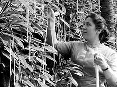
Agriculture: the Swiss spaghetti harvest
April 1, 2014
At the right... A Swiss lady harvests the spaghetti.
|
|
For more, see the video, which is from a BBC telecast: Spaghetti video, at YouTube. (3 minutes. There is sound, but it doesn't start for about a half minute.) You should, of course, not read any of the text material or labeling on the page.
What does the BBC have to say about this, in retrospect? On this date. (BBC, MMVIII.) The figure above is from this page; it is presumably a still from the video.
This is rather old, and I couldn't find any recent articles on the topic. But perhaps it is appropriate for the day.
Next pasta post: Briefly noted... Pasta that is stronger than steel (January 16, 2019).
Why chameleons change color (and get thin)
March 31, 2014
It may be common knowledge that chameleons change color as camouflage. However, that may be only part of the story. A new article provides evidence that one type of chameleon changes color to signal its status in a fight. The article is accompanied by a wonderful video; check it out regardless.
To set the stage -- literally...
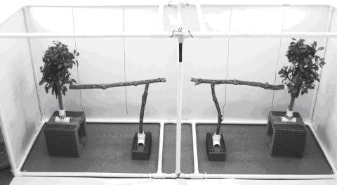
|
The arena.
For what? For a contest between two chameleons.
This is Figure 1 from the "Supplementary Information" posted at the journal web site for the article.
|
What did the scientists do? They staged "contests" between pairs of chameleons, and made video recordings. Using the videos, they then analyzed the color patterns of the contestants over time, and correlated the colorations with the outcome. In doing the analysis, they took into account how the chameleon visual system works; that is, they tried to see what the chameleons saw. The analysis allowed the scientists to reach some conclusions about the role of chameleons changing color.
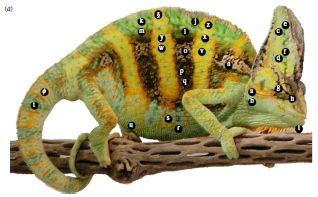
One of the animals used in the study.
The chameleons studied here are male veiled chameleons, Chameleon calyptratus.
The labels show the regions that the scientists measure.
This is reduced from Figure 1a from the article.
|
|
For example, brightness of body stripes was a good predictor of the willingness of a chameleon to fight. Interestingly, the animals turn sideways during the approach phase, as you can see in the video. On the other hand, brightness of the head was the best predictor of victory; the speed of changing head color was also predictive. Victory was generally recognized when the loser walked away; this usually occurred prior to much physical encounter. (The scientists intervened in one case, out of 45, where injury seemed likely.)
What do we learn from this? Animals -- including humans -- fight. Some aspects of the fighting have become ritualized, and fights are resolved during the preliminaries: the animal who knows he will lose walks away, with little or no physical damage. The current work gives some insight as to how these chameleons convey their status and resolve their disputes. We also learn that the color-changing ability of the chameleon is an active part of social communication, not simply about hiding.
Of course, many questions remain. For example.. What is the physiology of the signals to change color? Do some chameleons send deceptive signals? If this kind of color changing is so good at resolving fights, why isn't it more common in the animal kingdom?
Video. There is a short video available with the article (article web site; choose Supplementary Information). It is also available at YouTube. (2 minutes; no sound.) The video shows the activities of four chameleons, using the arena shown above. You can see color changes. Even more strikingly, look for the changes in thickness of an animal when you have an end-on view -- which is when they are displaying sideways. (Does this give new meaning to the term "flat panel display"?) You may want to focus on a single quadrant of the video; the upper left is a good place to start the first time you watch it. A must see!
News stories:
* Study shows male chameleons fighting prowess tied to color changing abilities. (Phys.org, December 11, 2013.)
* Chameleons Convey Different Info With Different Body Parts. (Ed Yong, Not Exactly Rocket Science (National Geographic blog), December 10, 2013.) Now archived.
The article, which is freely available: Chameleons communicate with complex colour changes during contests: different body regions convey different information. (R A Ligon & K J McGraw, Biology Letters 9(6):20130892, December 23, 2013.)
More about animals that change color... Deceiving a rival male (August 28, 2012).
More about lizards... When should the eggs hatch? (June 11, 2013).
The Heartland virus -- follow-up
March 30, 2014
Original post: The Heartland virus (October 2, 2012).
In that post we briefly noted reports of a new virus associated with disease in humans. Only two cases were known, but both were serious. What has happened since? Has the virus become common? Has it faded away? Neither, it seems.
We now have a new article that gives a brief update on the Heartland virus. Over the past two years, six additional cases have been reported. A vector for the virus has been identified -- a tick, as had been suspected. That's about it. It's a short article (two pages).
What's the point? A new disease is emerging. It might turn out to be important; it might not. How do we tell? What should we be doing? It's likely that new viruses are emerging regularly; some will turn out to be important. HIV and SARS are recent examples that did turn out to be important. (The jury is still out on MERS, which is a "cousin" of SARS.) A regular stream of new influenza viruses also belongs here. And what about Ebola? We have new tools to help us recognize and study new viruses, but we don't really know how to tell which are going to be important. Do we wait until a virus has killed some number of people before we pay attention to it? Or do we develop early-warning systems that reveal anything new, whether it will turn out to be important or not?
The article, which is freely available: Notes from the Field: Heartland Virus Disease - United States, 2012-2013. (D M Pastula et al, Morbidity and Mortality Weekly Report 63:270, March 28, 2014.) Includes a picture of the Lone Star tick, the likely vector for this virus.
More about emerging diseases is on my pages for Biotechnology in the News (BITN): Emerging diseases. That discusses some general issues, and also links to some specific diseases that have emerged in recent decades, including all those mentioned above.
Cooperation: a key to separating gases?
March 28, 2014
Separating chemicals that are very similar can be challenging. An example of industrial importance is separating the gases carbon monoxide, CO, and dinitrogen, N2. A new article offers some progress on separating these two gases.
The key is that the scientists develop a material that CO binds to cooperatively. That is, the more CO binds, the easier it is for more to bind. That is an unusual behavior. More commonly, one molecule does not know that another has bound. Or, perhaps, if there is a limited number of binding sites, then one molecule binding makes it harder for the next to bind; it's harder to find a vacant binding site if most are occupied -- just as with parking spots for the car. With cooperative binding, one molecule makes it easier for the next to bind. It's as if one molecule binding opens up new binding sites. In fact, that is exactly what the scientists think is happening. Think about... how might parking one car make more parking spots available?
A classic example of cooperative binding is in your body: the binding of dioxygen, O2, to hemoglobin in your blood cells. The first O2 that binds changes the shape of the hemoglobin so that it is now easier for a second O2 to bind. The cooperative binding of O2 promotes delivery of the gas to tissues and its release there.
Let's look at some of their results for how CO binds to the new material.
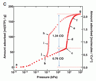
|
The graph shows how much CO binds to the material as a function of the CO pressure.
The x-axis shows the pressure of CO added, in kilopascals (kPa). Note the log scale. There are two y-axis scales -- two scales for showing the same thing: how much CO binds. Both scales say "amount absorbed"; it's expressed two ways. The left scale is the simpler one: volume of gas bound per gram of material. We'll leave the right scale for now.
|
Look at how the amount of CO bound (y-axis) increases as CO as added (x-axis). The first part of the curve is rather simple: add more CO, get more bound. And then... At about 10 (101) kPa, the curve dramatically changes; it turns upward. It gets easier to bind more CO! Much easier. That's the cooperativity.
Just look at the solid symbols. (The open symbols are for gas release; we'll skip that.)
This is Figure 2C from the article.
|
What about N2? They do the same kind of binding curve with N2. The whole curve for N2 looks like that first part for CO. Nothing special happens to the N2 curve as more N2 is added. That is, the binding curves for both CO and N2 are similar at low pressures. However, at high pressures, CO shows cooperative binding, but N2 does not.
The real test is what happens with mixtures. Here are their results...
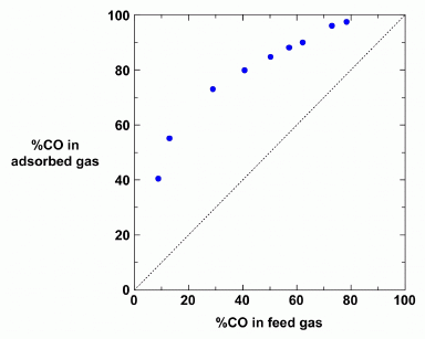
|
The graph summarizes the results for separating mixtures of CO and N2.
The x-axis shows the composition of the input ("feed") gas. The y-axis shows the composition of the output ("absorbed") gas. Both are labeled with the percentage of CO.
For example, the first point has 10% CO in the input. The output, based on absorption to the new material, is about 40% CO. That's a pretty good enrichment step. In fact, for all points, the output gas has higher CO than the input gas. (The dotted diagonal line shows what would happen if the output was the same as the input; all points are above the dotted line.)
This is Figure S12 from the Supplementary materials accompanying the article.
|
Earlier I suggested you think about how parking one car might make more parking spots available. We might imagine that parking one car knocks out a garage wall, revealing a new area that is available for parking. If you prefer a gentler scenario, the car might actuate a switch that opens a door to a new area for cars; that's more likely to be a reversible system. What's going on with the CO may be like that. The material includes copper ions, Cu2+. The CO binds to the copper ions; when enough are bound, the material changes shape -- revealing more binding sites. N2 does not bind to the copper ions, thus does not open up new spaces.
That explanation is not sufficient to explain why the separation works, but we'll stop here. The article has more about the nature of the cooperativity, and why it leads to separation.
The nanoporous polymer they develop here is an example of a metal-organic framework , or "MOF" material.
Back to the first figure for a moment... The right-hand scale, which we ignored earlier, is the ratio of CO bound to the Cu2+. You can see that the curve turns upward at a ratio of 0.76. For now, we simply note that this scale reflects the importance of the Cu2+ to the story.
Bottom line... A team of scientists has designed a new material to address a problem that is important to the chemical industry. In lab scale tests, it seems to work, and they have at least some understanding of why. Whether it is practical, either in its present form or as developed further, is open.
News story: Adaptable crystals allow quick, efficient separation of carbon monoxide from gas mixtures. (Nanowerk News, February 5, 2014.)
The article: Self-Accelerating CO Sorption in a Soft Nanoporous Crystal. (H Sato et al, Science 343:167, January 10, 2014.) Supplementary materials at the article web site include a short video (one minute; no sound; freely available), with a cartoon version of the separation process.
More about MOFs:
* Separating isotopes of hydrogen using a MOF (April 18, 2022).
* Capturing NO2 from polluted exhausts (December 7, 2019).
* A novel device for measuring fluoride in water (March 1, 2019).
* Harvesting water from "dry" air (July 1, 2017).
* Doing X-ray "crystallography" without crystals (September 18, 2016).
* Zhemchuzhnikovite: a natural MOF (August 19, 2016).
More about porous materials:
* Liquids with holes (January 30, 2016).
* Upsalite: a novel porous material (September 6, 2013).
Other posts that mention carbon monoxide...
* A treatment for carbon monoxide poisoning? (January 13, 2017).
* Garlic or rotten eggs? (February 8, 2010).
* Seeing molecules under a microscope (September 19, 2009).
March 26, 2014
pH and the color of petunias
March 26, 2014
The color of petunias is due to a type of pigment called an anthocyanin. The color of anthocyanin pigments depends on the acidity. In fact, it has long been known that the usual red color of petunias is due to the vacuole -- the cellular compartment where the pigment is -- being quite acidic. Blue petunias arise when that compartment is less acidic.
|
Blue and red petunias.
Explanation later.
This is Figure 1D from the article.
|
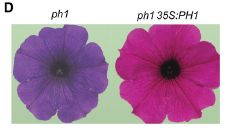
A recent article adds to our understanding of how acidity of a cellular compartment is controlled. It has been generally understood that there are proton pumps. The proton is the hydrogen ion, H+; acidity is the amount of that ion present. The pH is a number that represents the amount of H+; it is thus a measure of acidity. The new finding is that petunias have two proton pumps for the vacuole. Blue petunias arise when one of them is mutated, leading to vacuoles that are still acidic, but less so than "normal". Interestingly, this second proton pump seems to be a novel type.
In the figure above, the petunia on the left, the blue one, is labeled ph1. This means that this petunia carries a mutation in the ph1 gene; that's the new proton pump gene the scientists found. The right-hand petunia, the red one, is labeled ph1 35S:PH1. The first part of that, the lower case ph1, means it carries the same ph1 mutation as the left-hand petunia. However, the scientists have added to it a copy of the normal (wild type) PH1 allele, denoted by capital letters. Adding back the suspect gene is a good way to verify that a defect was actually due to what you thought it was.
To elaborate on that last point... The first petunia carries a ph1 mutation. The scientists think that the ph1 mutation is responsible for the color. However, it is hard to know for sure; perhaps there is some other problem with this strain. Adding back the suspect gene tests that. If the blue color were due to some other problem, rather than the ph1 gene, then adding back a good PH1 gene would not rescue it. This is a common approach to test that the cause of a genetic defect has been properly identified.
News story: Roses are red -- why some petunias are blue. (e! Science News, January 3, 2014.)
The article, which is freely available: Hyperacidification of Vacuoles by the Combined Action of Two Different P-ATPases in the Tonoplast Determines Flower Color. (M Faraco et al, Cell Reports 6:32, January 16, 2014.)
Among many posts on flowers...
* A "flower" that bites -- and eats -- its pollinator (December 27, 2013).
* Did the earliest dinosaurs like flowers? (October 14, 2013).
* Better enzymes through nanoflowers (July 7, 2012).
Another example of plants using these proton pumps: Why some citrus fruits are so sour (April 22, 2019).
Also see: Pumping tin (January 12, 2018).
More plant pigments: What is folium? (July 7, 2020).
Recovery of live, infectious virus from 30,000 year old permafrost
March 25, 2014
This is a story that has gotten considerable news attention.
A team of scientists has taken a sample of 30,000 year old arctic permafrost, thawed it out in the lab, and inoculated a portion into a culture of amoebae. Viruses grew. That is, they claim to have resurrected a virus that had been frozen away in the permafrost for 30,000 years.
Claims of resurrecting material that old are not new; Musings has noted a couple before [links at the end]. Viruses, being small and chemically simple, should be simpler to resurrect than more complex organisms. Further, proving that what was found really was as old as claimed is difficult. Perhaps the important test is whether others can replicate this type of work. Nevertheless, the claim is made, and at least catches attention.
It is of some interest that it is an amoebavirus -- of the general type of giant amoebaviruses that has been getting quite a bit of attention lately, including a Musing post [link at the end]. Interestingly, the permafrost-derived virus looks very similar to one of the modern viruses reported earlier. However, upon closer examination, it has an unusual combination of genome and life cycle properties. The whole story of these giant viruses is rather new and obviously quite incomplete.
So we note the story. The significance will become clearer with further work.
News story: 30,000-year-old virus from permafrost is reborn. (Phys.org, March 3, 2014.)
The article: Thirty-thousand-year-old distant relative of giant icosahedral DNA viruses with a pandoravirus morphology. (M Legendre et al, PNAS 111:4274, March 18, 2014.)
Background posts...
* A 30,000 year-old plant, with an assist from a squirrel (March 10, 2012).
* Life at age 34,000? (October 8, 2011).
* The largest known virus (August 5, 2013). The new virus looks similar to the one shown in this post.
Other Musings posts that start with permafrost...
* Mercury pollution from Arctic melting (February 19, 2019).
* Inuk, a 4000 year old Saqqaq from Qeqertasussuk (March 1, 2010). This one yields genome information, but not a living organism.
More about the Arctic: What if your compass pointed south? (October 24, 2014).
There is more about the large viruses of amoebae on my page Unusual microbes in the section A huge virus.
More about amoebae: Trogocytosis -- How an amoeba chews its food (May 16, 2014).
The mass of an electron
March 23, 2014
A new article presents the latest measurement. The scientists report that the mass of the electron is 0.000548579909067 atomic mass unit (amu). More precisely, they report the mass as 0.000548579909067(14)(9)(2) amu. And precision is indeed the issue. Those three terms in parentheses at the end are three types of uncertainties in their measurements; each number in parentheses is the uncertainty in the last digits of the reported measurement. The mass they found is quite similar to previous measurements, but the uncertainties here are much lower.
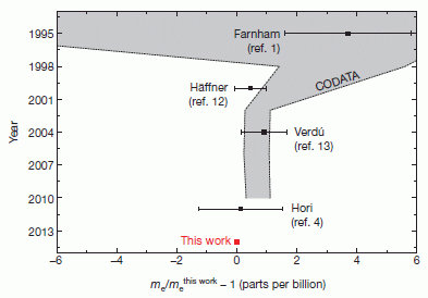
|
"History of electron mass measurements." That's their title for this figure, which is Figure 4 from the article. It summarizes measurements of the electron mass over the last 20 years.
The graph shows the electron mass vs year -- with the axes perhaps reversed from what you might expect.
Start at the bottom. The red square, plotted at year = 2014 and labeled "this work", shows their result. It is shown as zero. Why? They use an unusual mass scale for the x-axis. What they show is the difference between any particular measurement and theirs, in parts per billion. Of course, by definition, their measurement is zero on this scale.
|
Just above that is the previous measurement. It's about the same, but has a wider error bar. That may lead you to ask, where is the error bar for the red square? It's smaller than the symbol!
Above that are various other results over the last two decades. The shaded (gray) area shows the officially accepted ("CODATA") value at various times, with its uncertainty. Importantly, the uncertainty is 13-fold lower in the new work than in the current official value.
|
The electron is an elusive object. To help pin it down, the scientists attach it to a carbon (C) nucleus. That is, what they actually measure here is the ion C5+ -- a carbon nucleus with one electron. They know the mass of the C nucleus; they get the mass of the electron by comparison. What they measure are the magnetic properties of the object; they then relate this to the mass by complex calculations, carefully tracking uncertainties. It's interesting to read this progression, even if you don't follow exactly what each step means.
The mass of the electron is one of the "fundamental constants" of nature. Measuring it with ever-increasing precision has little effect on most of what we do day-to-day. However, for those pushing the limits of our understanding of the laws of physics, the more precisely each such constant is known, the better they can test theories. Thus, a 13-fold reduction in the uncertainty of the mass of the electron is a significant achievement. Further improvement is expected.
In their news release, listed below, the scientists illustrate the uncertainty in their measurement with the comment, "If we were to apply this to an Airbus A-380, we would be able to detect a mosquito as a stowaway just by weighing." I do not know how literally that is to be taken.
News stories:
* Most precise measurement of electron mass made. (Phys.org, February 19, 2014.)
* Electron on the scale. (Max Planck Institute for Nuclear Physics, Heidelberg, February 26, 2014.) From the lead institution. A quite good overview of the work, including some discussion of the experimental methods.
* News story accompanying the article: Fundamental constants: The teamwork of precision. (E G Myers, Nature 506:440, February 27, 2014.)
* The article: High-precision measurement of the atomic mass of the electron. (S Sturm et al, Nature 506:467, February 27, 2014.)
More about the properties of the electron:
* Are electrons "forever"? (February 9, 2016).
* How round are electrons? (June 24, 2011).
... and the anti-electron (positron) and such: What is the charge on atoms of anti-hydrogen? (July 15, 2014).
Other posts on the fundamental particles include: IceCube finds 28 neutrinos -- from beyond the solar system (June 8, 2014).
Another example of measuring a physical constant of nature: Does anyone know how strong gravity is? (September 16, 2014).
More carbon: How many atoms can one carbon atom bond to? (January 14, 2017).
A practical system for removing arsenic from water
March 21, 2014
A recent post featured the work of UC Berkeley professor Ashok Gadgil, who was honored for his invention of a system for disinfecting water [link at the end]. The day after posting that I came across a story about a new invention by Gadgil. This one is a system for removing arsenic (As) from water. It is intended for areas where there is an extremely high level of As in the groundwater, such as parts of South Asia; the As level there is as much as 50 times the common regulatory limit, and is of serious medical concern. As with his earlier inventions, it's not simply about developing a method in the lab, but about moving toward practical implementation.
There is a new article reporting a pilot test of the system in the field. Let's start with one of the results from that article.
In this trial, a 600 liter reactor was run for three months at a high school in India. The graph shows the results for part of this trial. The water source contained arsenic at a concentration of about 250 micrograms per liter (µg/L). The individual samples of treated water shown on the graph ranged from about 1-4 µg/L, all well below the World Health Organization (WHO) recommended maximum level of 10 µg/L (dashed line at the top).
This is Figure 3 from the article.
|
How does the system work? The following cartoon figure outlines the process.
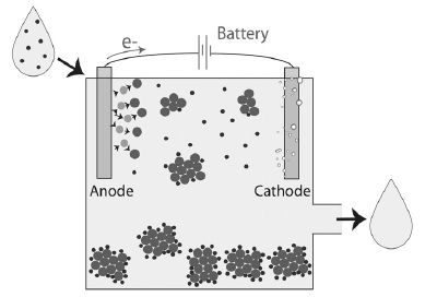
|
Start with the water drop at the upper left; it contains arsenic, shown as small dark dots. Then notice that the water emerging from the system at the lower right is clear: the dots -- the As -- have been removed.
How does that happen? Note that the system uses a battery (top). The anode (left) is made of iron (Fe) metal; the battery action ultimately produces Fe3+ ions, shown by the large dots. Fe3+ is quite insoluble; it precipitates as a complex hydrated iron oxide -- and carries the arsenic with it. The cartoon shows this as clusters of the large-dot Fe, with the small-dot As on the surface. The iron oxide precipitate is heavy, and settles to the bottom. The water above is now quite free of As (and of Fe).
This is Figure 1 from the article.
|
The process is called Electro-chemical Arsenic Remediation, or ECAR.
The process was developed in the lab. The test described above is a field test, intended to be close to real world conditions. The article contains an analysis of the cost of the treatment, which they think is acceptable. But success is ultimately measured by whether people make use of it. It's too early to judge that. However, the story that started me on this item was an announcement that a company in India has licensed the system, and plans to use it. That's a good sign.
News story: Indian Company Licenses Berkeley Lab Invention for Arsenic-free Water. (Lawrence Berkeley Lab, March 5, 2014.) This is how I learned of this topic. The story here is not about the article, but about the business development. It's a nice news story in how it emphasizes the implementation -- even if some of it reads as hype.
It's hype because it seems to assume that this is a successful project. That remains to be seen. But the message of this news story, as to how they plan a project and try to implement it, is good. In fact, this is a very good story about the project "big picture"; it is light on the details of the remediation process.
The news story also notes possible use of the method in some parts of California where there is a problem of As in the groundwater.
The article: Electro-chemical arsenic remediation: Field trials in West Bengal. (S E Amrose et al, Science of the Total Environment 488:539, August 1, 2014.)
Background post, about Gadgil... National Inventors Hall of Fame: 2014 inductees (March 11, 2014).
More about arsenic...
* Humans resistant to arsenic? (June 16, 2015).
* Rice and arsenic: rice syrup, baby food, and energy bars (April 23, 2012).
More about iron chemistry... 2 + 2 = 4: Chemists finally figure it out (October 9, 2015).
More about water in India... NASA weighs India, finds it deficient (October 2, 2009).
More about groundwater: Groundwater depletion in the nearby valley may be why California's mountains are rising (June 20, 2014).
March 19, 2014
Theonella's secret: Entotheonella
March 18, 2014
Theonella swinhoei makes polytheonamide. A new article reports that it does so by using Entotheonella.
With pictures...
Theonella swinhoei

makes polytheonamide
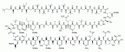
by using Entotheonella.
|
The first figure is trimmed from the news story in Nature. No scale is given, but these are macroscopic animals. I would guess that the individuals are a few centimeters across. The other two figures are from the article... The chemical is one of several shown in Figure 1. The Entotheonella are from Figure 2b; this picture is from an ordinary light microscope.
|
Why is this of interest? We get many chemicals of medical interest from microbes. Think of penicillin, from a fungus, and streptomycin, from a filamentous bacterium, as examples. There is interest in extending the search to more types of organisms, with the hope of finding novel classes of chemicals. Indeed, investigations of sponges, such as the Theonella shown above, have led to numerous novel chemicals. The compound shown above is just one; the full figure in the article shows several more.
Little is known about most such sponge-derived chemicals. It's hard to get enough of them to test.
A new article shows that this chemical, and many of the others, are actually made by bacteria that live in close association with the sponges. The role of bacteria has been suspected for some time. Now, improved cell separation techniques and modern genome analysis have finally allowed the genes to be identified and associated with particular bacteria. They are from a rather novel type of bacteria, which was discovered only recently. Interestingly, as you can see from the figure above, these Entotheonella bacteria are filamentous. The types of bacteria best known as producers of unusual chemicals are also filamentous -- though quite distinct; the new sponge-associated filamentous bacteria are tentatively considered a new phylum. These bacteria have not yet been cultivated in the lab. However, it may well be possible to move the genes of interest to more common and easily grown bacteria.
The article is of interest, then, for multiple reasons. It tells us more about the natural biology of the sponges and their associated bacteria. It moves us closer to being able to study some of the unusual chemicals found associated with sponges in nature. It reveals a new group of bacteria, whose role beyond these sponges is unknown.
News story: Unknown aquatic sponge bacteria, a chemical factory. (Science Daily, January 29, 2014.)
* Two short news stories, published together, accompanying the article: A talented genus. (One by M Jaspars and one by G Challis, Nature 506:38, February 6, 2014.)
* The article, which is freely available: An environmental bacterial taxon with a large and distinct metabolic repertoire. (M C Wilson et al, Nature 506:58, February 6, 2014.)
Among many posts on sponges...
* Quiz: What is it, and ... ? (July 7, 2015).
* Bending a rigid rod (May 17, 2013).
* Quiz: What is it? (October 31, 2012).
More about the simplest animals: A novel nervous system? (July 20, 2014).
Among many posts on the bacteria associated with humans...
Melamine toxicity: possible role of gut microbiota (April 21, 2013).
My page for Biotechnology in the News (BITN) -- Other topics includes a section on Antibiotics. It includes a list of Musings posts on the topic. (Musings has not had much discussion of sources of antibiotics.)
Polio-like disease without polio virus?
March 17, 2014
Musings has noted the global effort to eradicate polio -- more specifically, the polio virus. A current news story reminds us that the relationship between disease and agent is more complex than we might routinely imply.
The immediate finding is that several cases of polio-like illnesses have been found in California. The cause is unknown.
It's important to emphasize "polio-like". It's not polio; more specifically, these cases are not due to any known strain of poliovirus.
The announcement that led to the current news story is based on an upcoming meeting talk. There is little to go on for now. On the other hand, this is not entirely a new story. We have known for some time that rare cases of polio-like paralysis occur without poliovirus. As the background of poliovirus-induced disease approaches zero, these other rare cases are being noticed.
The point for now is to be aware of the questions; there are no answers yet. The current eradication effort is aimed at poliovirus, an important infectious cause of paralysis. Whether the remaining types of paralysis are due to an infectious agent at all is an important question; the information in the news story should be taken as incomplete. If there is a new infectious agent, will it become more prevalent? Should we vaccinate against it? If there is not an infectious agent, what is happening? And so forth.
News story: Puzzling polio-like illness reported in 5 California children. (CIDRAP, February 24, 2014.) This is a good summary of the current situation, from a reputable source that focuses on infectious diseases.
Follow-up: Polio-like disease without polio virus? Follow-up (February 11, 2015).
* Previous Musings post on polio: Polio eradication: And then there were three (March 27, 2012).
* Next: WHO certifies "South-East Asia" free of polio (November 1, 2014).
My page for Biotechnology in the News (BITN) -- Other topics includes a section on Polio. It includes a list of Musings posts on the topic.
Does this story indicate the emergence of a new disease? We don't know, but the question is on the table. More about emerging diseases is on my pages for Biotechnology in the News (BITN): Emerging diseases. That discusses some general issues, and also links to some specific diseases that have emerged in recent decades.
Effect of simulated sonar on whale behavior
March 16, 2014
Briefly noted...
This is a topic that gets into the mainstream news, since it has "political" implications. Military exercises may involve sending sound through the ocean. Animals live there. Does the noise bother them? Of particular concern is the possible effect of the military sonar on whales, some of which are endangered.
Two articles from mid-2013 report controlled experiments to test the effect of sound on whales. The work involves tagging whales and observing their behavior when sound is provided to their environment. The results are interesting.
The general answer is that the experimental sounds have noticeable effects on the whales, disrupting their feeding behavior. Many of the experimental sounds are at levels lower than the whales would experience from the military sonar testing.
One of the intriguing results is that a whale responded to an experimental sound but seemed to ignore a military sonar signal of similar intensity that happened to occur during the time of the observations. Does this mean the whale could tell the difference, and had acclimated to the military sonar?
Be cautious about reaching political conclusions from the results. There was a time when the military would deny there was any effect -- because none had been shown. We are beyond that, and there are now regulations. The work reported here shows that there can be effects on whales at sound levels that are considered acceptable by current regulations. How important the effects are and how they should be balanced against other factors may be complex and open questions. What's important here is that the questions remain -- and these articles show that it is possible to study them.
Both news stories listed below are good, and the articles themselves are freely available, for those who would like more.
News stories:
* Blue and beaked whales affected by simulated navy sonar. (BBC, July 2, 2013.)
* Military sonar could disrupt whale feeding behaviour. (Royal Society, July 3, 2013.)
There are two articles, both freely available:
* Blue whales respond to simulated mid-frequency military sonar. (J A Goldbogen et al, Proceedings of the Royal Society B 280:20130657, August 22, 2013.)
* First direct measurements of behavioural responses by Cuvier's beaked whales to mid-frequency active sonar. (S L DeRuiter et al, Biology Letters 9(4):20130223, August 23, 2013.)
More about ocean noise: Global warming, boric acid, and a noisier ocean (August 9, 2010).
More about cetaceans (whales and dolphins):
* A better way to collect a sample of whale blow (November 28, 2017).
* Whales in the Chilean desert -- the oldest known case of a toxic algal bloom? (April 13, 2014).
* On a similarity of bats and dolphins (September 15, 2013).
Also see: Effect of artificial lighting on the environment (September 3, 2015).
Self-powered micromotors for speeding up chemical reactions, such as destruction of chemical weapons
March 14, 2014
Degradation of toxic chemicals, such as pesticides or chemical weapons, must be done with great care; the degradation process itself might release toxic chemicals. A new article addresses one issue in such processes. The proposed solution is at least "cute"; we'll see whether anyone finds it useful.
The issue the scientists address is mixing the chemicals during the degradation process. Good mixing is important for complete timely degradation. Their solution builds on a phenomenon familiar to anyone who has taken a basic chemistry class: common hydrogen peroxide, H2O2, can break down to release oxygen gas, O2 -- bubbles of oxygen gas. H2O2 is already part of the degradation process in some cases; what they have done is to harness the O2 gas, and use it to provide effective mixing.
The following cartoon gives a sense of how they use the O2 to provide mixing. It's not the clearest figure, so be patient with it.
|
Look for a dark cone-shaped object. There are four of them, including one near the lower right. Each of them is a tiny tube, open at one end, closed at the other. The inner surface of the tube includes a catalyst (the Pt = platinum of the label "polymer/Pt") that promotes the breakdown of the H2O2. That releases O2. The bubbles can escape only through the open end of the tube; the cartoon shows the bubbles exiting at the big, open end of each tube. That causes the tube to react by going in the opposite direction. That is, producing the gas within the tube makes the tube act like a tiny rocket, because the gas can exit only in one direction. That's what mixes the solution.
This is Figure 1B from the article. The tubes are about 8 micrometers long -- not much longer than common bacteria.
|
Here is an example of using these little self-propelled mixing devices... In this test, the scientists measured the hydrolysis of the chemical methyl paraoxon (MP), a model for organophosphate agents. The MP has a para-nitrophenyl group; hydrolysis yields p-nitrophenol, which is yellow. That's what they measure; the yellow color of p-nitrophenol, as a measure of hydrolysis.
|
The graph shows the absorbance spectrum after various treatments. The top curve (thick solid line) shows the result when the reaction mix included the gas-driven motors. You can see that a substantial amount of color was produced. In the other two conditions, the motors were either absent or inactive; little color was produced.
The top curve corresponds to about 96% degradation in 20 minutes, using a low concentration of H2O2. This is considered very good. The 15 mL sample contained about 500,000 micromotors.
This is Figure 2a from the article.
|
Thus we see that the micromotors speed up the reaction. They do so, we presume, by providing mixing from within the solution. That's good. Whether this is useful will depend on comparison with other ways of mixing; the analysis will include practicality, safety and cost. There is some comparison with magnetic stirring in the article, but it is hard to draw any conclusions from that at this point.
News story: Stirred from within: Micromotors mix for more effective oxidative degradation of chemical weapons. (Phys.org, October 31, 2013.)
The article: Micromotor-Based High-Yielding Fast Oxidative Detoxification of Chemical Threats. (J Orozco et al, Angewandte Chemie International Edition 52:13276, December 9, 2013.)
Another post on degradation of pesticides: Developing improved degradation of organophosphate pesticides (September 7, 2010).
Another use of the propulsion system: Colloidal microswimmers: 3D printing a micro-boat (December 13, 2020).
More on hydrogen peroxide...
* A simpler assay for detecting low levels of HIV, using gold nanoparticles (January 3, 2013).
* Why are the bees dying? (January 26, 2010).
More on platinum: Breaking C-F bonds? (October 26, 2018).
March 12, 2014
National Inventors Hall of Fame: 2014 inductees
March 11, 2014
Above are two of the 15 inventors inducted into the (US) National Inventors Hall of Fame (NIHF) for 2014.
I first learned about this from the University of California (UC) Berkeley student newspaper a few days ago; one of the inductees is a Berkeley professor. Looking further, I found that others, or the work of others, had been noted in Musings.
The man on the left above is Ashok Gadgil, UC Berkeley engineering professor. Gadgil invented a system for disinfecting water in small communities. He did more than just invent it: he worked out a practical business model that has allowed its implementation in many places. He is not (to my knowledge) a movie star. News story: UC Berkeley professor inducted into National Inventors Hall of Fame. (Daily Cal, March 5, 2014.) That news story notes that Gadgil was also an inventor of the Darfur stove, a more-efficient wood-burning stove.
The lady on the right above is Hedy Keisler Markey, better known by her screen name of Hedy Lamarr. Lamarr and composer George Antheil were co-inventors of the "frequency hopping technique" that is used with wireless communications. Lamarr and Antheil were co-inductees -- and their story was the subject of a Musings post: Quiz: What's the connection... (February 14, 2012). (That post links to relevant music.)
Another of the inductees is Charles Hull, for his invention of stereolithography. That technique is better known today as 3D printing, and has been the subject of recent Musings posts, including: 3D printing: simple inexpensive prosthetic arms (January 29, 2014).
The following page, from the NIHF, lists the inductees for the current year: NIHF inductees, current year. The NIHF is associated with the US Patent Office. The nomination of each inductee is tied to a specific US patent, which is noted on this page. As you can see from the examples discussed above, those who are recognized have done more than just produce a piece of paper; they have made a difference. (The figures in this post are from the NIHF pages.)
You can find the list of inductees for 2014 by going to their search page, NIHF search page. Use "advanced search" for year; search by year for 2014. You can also find that list from the Wikipedia page, Wikipedia: NIHF inductees; click on the column header for year to sort the list by year.
Other posts about inventions include...
* A practical system for removing arsenic from water (March 21, 2014). More from Gadgil.
* A device for controlling the cursor on the computer screen (July 10, 2013).
* MIT invents a better bicycle wheel (April 24, 2010).
* Can genes be patented? The Myriad case (April 2, 2010).
* Nobel prize in physics for the rediscovery of fiber optics (October 12, 2009).
A book about inventing is listed on my page Books: Suggestions for general science reading. Kennedy, INVENTology -- How we dream up things that change the world (2016).
Why exercise is good for you, BAIBA
March 10, 2014
Exercise is good for you, and helps promote weight loss. Since exercise involves burning calories, one part of the explanation is clear enough: a direct loss of calories. However, the effects of exercise cannot be fully explained by simple loss of the calories expended. There are metabolic changes that provide further benefit.
A new article shows one part of how this happens, at least for mice. Interestingly, it involves brown fat, a tissue Musings has noted before. In brown fat, food is simply burned off; it gives off heat, with no other useful product to the animal. If we could stimulate brown fat, we could lose weight, because we would burn fat stores. According to the new article, exercise leads to a stimulation of brown fat. And the scientists think they have uncovered how that happens. One key part of the pathway is a small molecule called β-aminoisobutyric acid, or BAIBA.
Here are the results of one experiment...
The general plan here is that two groups of mice were tested. One group was given BAIBA (gray bars, at the right of each frame); the other served as a control.
Frame B (left) shows that the mice given BAIBA had less body fat than the controls. Frame F (right) shows that the two groups did not differ significantly in how much food they ate. Similarly, frame E (center) shows that they did not differ significantly in how much exercise they took (as measured by something called "beam breaks").
This is Figure 4 parts B, E & F from the article.
|
This experiment is obviously not the entire story. This experiment does not start by comparing exercise vs no exercise. It starts with BAIBA -- and shows that giving BAIBA reduces body fat, without side effects. In other experiments, the scientists show that exercise itself stimulates the production of BAIBA.
That's with mice. The story is: exercise leads to production of BAIBA; BAIBA activates brown fat; brown fat burns calories. BAIBA is made in the exercising muscles, and acts in fat cells; it is a messenger between tissues. There are more pieces, but that's the idea: a connection between muscle and fat tissues, between exercise and burning calories. An interesting finding.
Any relevance to humans? There are no controlled studies, but there is some evidence consistent with similar effects in humans. For example, analysis of results from an earlier study of exercise showed that BAIBA levels were increased by exercise.
It's tantalizing. Perhaps we are closer to understanding why exercise is good for you. What are the implications, if further work supports this? It's easy to jump and suggest that BAIBA might be a useful drug, to promote weight loss. But let's not go there. Let's emphasize that it would represent improved understanding. If there is a connection between exercise and weight loss, mediated by BAIBA, then we would expect people to differ in how well this works. Do people who have trouble losing weight make less BAIBA? Do they respond less well to it? Better understanding of how exercise works should lead to better understanding of personal variation. In the long run, that should be good.
News story: Exercise Molecule Gives Metabolism a Workout. (GEN, January 8, 2014.)
* News story accompanying the article: Come on BAIBA Light My Fire. (H L Kammoun & M A Febbraio, Cell Metabolism 19:1, January 7, 2014.)
* The article: β-Aminoisobutyric Acid Induces Browning of White Fat and Hepatic β-Oxidation and Is Inversely Correlated with Cardiometabolic Risk Factors. (L D Roberts et al, Cell Metabolism 19:96, January 7, 2014.) Not an easy paper!
Previous post about brown fat: Brown fat: different kinds respond differently to cold (September 20, 2013). The type of brown fat discussed in the new article is the so-called beige fat, within white fat.
And more:
* Measuring the level of a non-existent hormone (April 10, 2015).
* Cachexia: is it BAT run amok? (September 22, 2014).
More about obesity...
* YY in the mouth? (April 4, 2014).
* Antibiotics and obesity: Is there a causal connection? (October 15, 2012).
More about exercise:
* Sparing glucose for athletic endurance (August 21, 2017).
* Hormone from bone boosts muscles (October 4, 2016).
* Would wild mice use an exercise wheel? (July 11, 2014).
For more about lipids, see the section of my page Organic/Biochemistry Internet resources on Lipids.
There is now an extensive list of sports-related Musings posts on my page Internet resources: Miscellaneous under Sports.
Brain activity at the time of death: Do rats have "near-death experiences"?
March 8, 2014
An intriguing paper. The experimental aspects are straightforward. The scientists use a model system for a mammal dying. They use rats, and kill them with a defined procedure that causes cardiac arrest. They measure brain activity as the animal dies. They find something that is perhaps surprising; its significance is not known.
Here is an example of what they found...
|
The x-axis is time, in seconds. Time 0 is taken as the moment when cardiac arrest is induced.
The labeling across the top gives an idea of the timeline. Anesthesia, followed by induction of cardiac arrest. The various cardiac arrest "stages" (CAS) follow from their work.
|
The various wiggly lines across the graph are recordings of electrical activity. The bottom one, labeled EKG, is an electrocardiogram, measuring heart activity. Heart activity drops at the time of induced death.
The other lines, collectively labeled EEG, are parts of the electroencephalogram, measuring brain activity.
This is Figure 1 Part B from the article.
|
You can see that there is brain activity after the time of death. There is some immediately after the moment of death. And there is more, for example at about 10 seconds.
The graph here is for one animal. What's important is that certain aspects of the brain activity after death were reproducible. Further, more detailed analysis showed that there were very specific types of brain activities. Some of the brain signals following death -- strong signals -- were of a type thought to be associated with consciousness.
That's it. It is as if death initiates a consistent pattern of brain activity -- in rats, after this kind of induced death. There is no claim that it has any "purpose", only that it is consistent.
Does something like this happen to humans? Well, why not? But there is no evidence for it. Or is there? Is there a possible connection between the kind of brain activity observed here and reports of near-death experience in humans? It's that last question that explains why this paper is getting attention.
News stories:
* Electrical signatures of consciousness in the dying brain. (Kurzweil, August 15, 2013.)
* In Dying Brains, Signs of Heightened Consciousness. (Ed Yong, Not Exactly Rocket Science (National Geographic blog), August 12, 2013.) Now archived.
The article, which is freely available: Surge of neurophysiological coherence and connectivity in the dying brain. (J Borjigin et al, PNAS 110:14432, August 27, 2013.)
The article has, not surprisingly, stimulated debate. This includes two exchanges of letters to the journal. The letters and the authors' replies are available at the article web site; click on the "Related content" tab (or scroll down to it). They make for interesting reading. It's important to recognize that there are comments both about technical aspects of the measurements and about their interpretation. If you go away from all this with the feeling that more work needs to be done, that's fine. I think all the contributors would agree.
Previous post about near-death experiences: Near-death experiences: are the memories real? (August 11, 2013).
My page for Biotechnology in the News (BITN) -- Other topics includes a section on Brain (autism, schizophrenia). It includes an extensive list of brain-related Musings posts.
Svalbard is leaking
March 7, 2014
Musings has recently reported leaks in various parts of the Solar System. But this one is close to home, and potentially very important to us. Svalbard, a part of Norway, is a group of islands north of the Norwegian mainland. And the leak there is methane.
Musings has noted that methane, CH4, can form a complex with water called methane hydrate (or methane clathrate or methane ice). There are large quantities of methane hydrate below cold oceans. It's a potential energy source if we could figure out how to harvest it. On the other hand, there is fear that ocean warming could lead to release of methane from the hydrate. CH4 is a greenhouse gas -- one far more potent than CO2. Worst case, this could be a disaster. No one knows. [Links to background posts on both methane hydrate and solar system leaks are at the end.]
A few years ago, methane was found in the Arctic waters off Svalbard. What does this mean? Is this the first warning of a disaster?
In a new article, scientists have tried to analyze the methane emission from Svalbard. They show that this has probably been going on for thousands of years. They believe it is a stable situation, with intermittent gas due to seasonal variations. They caution, of course, that their conclusion can't be taken for granted for the future. An important part of their work is simply to establish a baseline.

|
Here is one piece of evidence. It's a carbonate formation at one seepage site they studied. The carbonate here is formed by the microbial oxidation of methane. The size of the carbonate structure suggests that it has been growing for several hundred years. Attempts to date the material suggest even older dates, in the range of a few thousand years.
Scale? They note that the larger of the two white worms at the right is about 15 cm long.
The white thing at the left is not an animal, but a piece of their equipment. I think.
This is Figure 2 from the article.
|
It's an interesting article, addressing an interesting -- and important -- problem. Analyzing the methane record deep below the surface of the Arctic Ocean is a difficult problem. The discussion with the figure above gives you an idea that they develop interesting, but incomplete, arguments. I did not find the article very reassuring. It's good that they have done what they have done, but it seems a very small step. It is one thing to say that methane seepage has been going on for thousands of years; it's not at all clear that the rate is constant over that time. If methane leakage is currently sensitive to seasonal variations, as they claim, doesn't that suggest it might also be sensitive to even small changes in average temperature? Overall, then, this article is worth noting as a step toward addressing an important question.
News story: Methane hydrates and global warming. (Science Daily, January 2, 2014.)
The article: Temporal Constraints on Hydrate-Controlled Methane Seepage off Svalbard. (C Berndt et al, Science 343:284, January 17, 2014.) Check Google Scholar for a freely available pdf.
Background posts...
* Ceres is leaking (February 18, 2014).
* Europa is leaking (February 10, 2014).
* Fire from ice: is it practical? (May 13, 2013). A first effort to harvest methane from hydrate deposits.
* Ice on fire (August 28, 2009). More posts about methane hydrates are linked here.
Also see:
* Methane hydrate: a model for pingo eruption
(August 4, 2017).
* Underwater "lost city" explained (July 25, 2016).
* Ancient forests of tropical Norway (April 19, 2016).
* Boston is leaking (February 13, 2015).
* Space-based observation of atmospheric methane -- and the Four Corners methane hotspot (December 29, 2014).
* Methane leaks -- relevance to use of natural gas as a fuel (April 7, 2014).
There is more about methane on my page Organic/Biochemistry Internet resources in the section on Alkanes.
March 5, 2014
How HIV destroys the immune system
March 3, 2014
HIV is the human immunodeficiency virus. It grows in cells of the immune system. After an extended period of infection, the result is substantial destruction of the immune system, a condition called AIDS: acquired immunodeficiency syndrome. Loss of the immune system makes the afflicted person more susceptible to other infections.
How does the virus, after an extended period, kill the immune system? It might seem simple enough: it grows in the immune system cells, and kills them. The problem with that simple view is that it just doesn't fit the facts. HIV actually grows in only a small percentage of the cells; the number of cells killed by productive HIV infection is small enough that the immune system can cope with it. Most of the time when HIV infects an immune system cell, the infection is aborted.
Therein may be the problem, according to new work. In most of the cells, the infection fails, but the immune system responds to the viral debris. That immune system response is so strong that it ends up killing the cells. That is, immune system death is due to an over-reaction to the virus. More specifically, it is due to an over-reaction to abortive infections, in which no virus would be made anyway. This idea has been emerging over recent years. It helps to explain many aspects of HIV infection.
A pair of new articles, from the same lab, extend our understanding of this immune system over-reaction. In addition to enhancing our understanding of HIV infection, the new findings may have therapeutic implications.
An important aspect of the new work is that it is done with fresh immune system tissue, in this case from tonsils. Often, HIV is studied in the lab with cultured cells; fresh tissue is more complex -- and apparently much more relevant.
The following figure provides an example of the new results.
|
The y-axis (bar height) shows the percent survival of a particular class of immune system cell -- the type that HIV kills. The first bar (gray, at the left) is a control with no virus infection. Of course, this gives 100% survival.
The next group of three bars provides some basic background. They all involve virus infections. The first of those bars, labeled "no drug", shows what happens in this test system if a virus infection is not treated: survival of these immune cells is low. The next two bars show the result of treatment with conventional anti-HIV drugs, which inhibit virus replication. Immune cell survival is high.
The next group of bars is the real test here. They are labeled VX-765; the wedge indicates that increasing levels of the drug were used. You can see that immune cell survival increased with increasing dose of VX-765.
(You can ignore for our purposes the final group of bars, at the right.)
This is Figure 5a from article #1 (Doitsh).
|
What is this drug VX-765? It's very different from the other drugs tested there -- and that's the point. It does not inhibit viral replication. It inhibits the immune system over-reaction. It's a long story, but here is a short version... HIV infection seems to take two routes. Infection of "activated" cells leads to virus production, and to death of the producing cells. Infection of non-activated cells -- the bulk of the cells in lymphoid (immune system) tissue -- leads to an abortive infection, with the production of viral debris. That viral debris activates a process called pyroptosis, leading to death of those cells. One of the early steps in that process requires an enzyme called caspase-1. VX-765 inhibits caspase-1; as a result, it inhibits the pyroptosis that causes cell death in the cells that were not producing virus.
The figure above shows that VX-765 promotes survival of the immune cells. It does so by a novel mechanism. The first inhibitors shown there promote survival by blocking viral replication. In contrast, VX-765 promotes survival by blocking the immune system over-reaction that kills cells that weren't going to make virus. VX-765 promotes immune cell survival -- without inhibiting viral replication.
There is one more point about VX-765. It's actually a well known drug. It's been through some clinical trials (not related to HIV). It wasn't particularly useful, but it seems safe and well tolerated. That's a big step. It makes sense to begin to see how well this drug might work in humans to prevent the progression of HIV infection to AIDS. It works, in the lab, by a novel mechanism, and is already known to be rather safe. It should be fairly straightforward to proceed to human testing. Further, VX-765 is a simple drug, and quite inexpensive. If it effectively prevents or delays immune system destruction, it could be an important practical tool.
This post is getting rather long, but there is more -- and the story is fascinating as well as perhaps important. Let's look briefly at one more point. So far we have noted that the immune system reacts -- over-reacts -- to viral debris and ends up killing cells that would not have produced virus. What is the step that starts the immune reaction? What is this about detecting viral debris? In paper #2 (Monroe), they show that a protein called IFI-16 is responsible for the initial sensing of viral debris. What does IFI-16 detect? Fragments of viral DNA. IFI-16 is a DNA sensor. It's useful in clearing some virus infections. But with HIV, IFI-16 responds to a non-problem (an abortive infection) and sets in motion a very bad reaction.
The discovery of IFI-16 as the DNA sensor that leads to immune system destruction after HIV infection may lead to another insight. There is an analogous virus of monkeys, called SIV (S for simian). SIV is common in natural populations of some types of monkeys. SIV grows as well in monkeys as HIV does in humans. However, these monkeys don't get sick. It has long tantalized researchers why the analogous infection in monkeys seems fairly harmless. IFI-16 may be the answer. The monkeys do not show the pyroptosis response, and apparently lack IFI-16 -- the DNA sensor. Since they lack the sensor, they don't carry out the immune system over-reaction. Virus infection and virus growth alone can be tolerated; the immune system reaction to abortive infections cannot. The pieces of the story seem to fit together. [Caution... The comments in this paragraph are based on what I heard the lead scientist say in a recent talk; see below. This information may not have been published yet.]
The history of HIV is full of apparent breakthroughs. They are often followed by disappointments. The new work in these two papers seems quite a breakthrough in understanding how HIV destroys the immune system. And it leads to testable predictions, including the possible usefulness of a new drug. The real story comes when we learn the results of those tests.
News stories:
* How HIV Destroys Immune Cells. (Dan Cossins, The Scientist, December 19, 2013.) Now archived.
* Scientists Discover How Immune Cells Die During HIV Infection; Identify Potential Drug to Block AIDS. (Science Daily, December 19, 2013.)
* The Noisy Mass Suicide That Leads to AIDS. (Ed Yong, Not Exactly Rocket Science (National Geographic blog), December 19, 2013.) Now archived.
There are two new articles, published at the same time from the same lab. One was accompanied by a news story in the journal...
News story accompanying the Science article: Immunology: The Fiery Side of HIV-Induced T Cell Death. (G D Gaiha & A L Brass, Science 343:383, January 24, 2014.) This discusses both new articles.
The articles:
1) Cell death by pyroptosis drives CD4 T-cell depletion in HIV-1 infection. (G Doitsh et al, Nature 505:509, January 23, 2014.)
2) IFI16 DNA Sensor Is Required for Death of Lymphoid CD4 T Cells Abortively Infected with HIV. (K M Monroe et al, Science 343:428, January 24, 2014.)
* Check Google Scholar for preliminary copies of these two articles. Remember that such copies may have some differences from the final published article. However, for casual reading to get the main ideas, they are usually fine.
I heard Warner Greene, senior author of both papers, talk at a meeting in January. It was a wonderful talk: a wonderful story well presented. I checked to see what might be published -- and found that the two papers discussed here were in press. They appeared in print a few days later. I might add that this work is from the Gladstone Institute, which is affiliated with the University of California, San Francisco.
Previous post on HIV: Infant cured of HIV? (April 15, 2013).
More on SIV: Genetic clues: Why some monkey species don't get "AIDS" upon infection with the immunodeficiency virus (March 26, 2018).
My page for Biotechnology in the News (BITN) -- Other topics includes a section on HIV
Also see: A cancer drug with a switch: it acts only in a cancer cell (September 26, 2010). This post discusses apoptosis, a cell death process. An important part of the new work is to make the distinction between various cell death processes.
More on the story of p
March 2, 2014
What does p = 0.05 mean? It's a question that recurs in science, because the statistical p value is used to evaluate how "good" the results are. However, few are clear what p means, and it often takes on a rigidity that is not helpful and was not originally intended.
A recent News Feature in Nature is a nice overview of the p story. It includes some of the history, which provides useful perspective. And it includes much humor. Well worth a browse for anyone who produces data or reads about it.
Bottom line... A p value cannot prove that a hypothesis is correct.
News feature, freely available: Scientific method: Statistical errors -- P values, the 'gold standard' of statistical validity, are not as reliable as many scientists assume. (R Nuzzo, Nature 506:150, February 12, 2014.)
A previous post on this topic is probably at: Mission Improbable (November 10, 2009).
More: What does a p value mean? Statisticians make a statement (August 6, 2016).
More about data presentation and analysis: How graphs can mislead (May 24, 2015).
More about mosquitoes: Malaria-infected mosquitoes have greater attraction for people (May 28, 2013). Read the current article, and you'll understand.
There is more about statistics on my page Internet resources: Miscellaneous in the section Mathematics; statistics. It includes a listing of related Musings posts.
Speeding up a chemical reaction by dividing up the container
February 28, 2014
Consider the following situation... Imagine a container, with two chemicals in it. Put a divider in the middle, dividing the original container into two smaller ones. Would you expect that to speed up the reaction between the two chemicals?
Here is an example of what was reported in a recent article for doing something very much like that.
|
The figure shows the results of carrying out a reaction under two conditions. It's a simple reaction, which makes a product that fluoresces. The color seen in the figure is fluorescence from the product. That is, color in the figure is a measure that the reaction worked.
It's clear... there is more product in the lower frame than in the upper frame. Why? What's the difference? The difference is the size of the container used. In fact, both reactions are done in tiny bubbles -- which you can see. The two frames are at the same scale; note the 50 µm scale bar (lower right of each frame), which is the same size for both. Each frame is labeled (upper right of each frame) with the volume per container (bubble): 160 picoliters (pL) at the top, 2.5 pL at the bottom.
This is Figure 3d from the article.
|
That result may be surprising. Think about the question I posed at the start. Dividing a container into smaller containers should not, by itself, affect the reaction speed. Unless... What if the surface of the divider was actually participating in some way? The smaller the container, the more wall surface there is. Perhaps that is how changing the container size could affect the reaction rate.
We'll come back to that possible reason below, but first let's look at some more data from the article. To understand this, we need an idea of what the reaction is. The reaction can be described as A + B ⇌ AB. That is, two chemicals A & B join to form a bigger chemical AB. As the double arrow suggests, this reaction can actually go both ways: it can go to the right, to make AB, and it can go backwards, to the left, to break AB back down to A + B. If the forward reaction is faster, we'll get more AB; if the backwards reaction is faster, we'll get less AB. Remember, it is the AB that we see in the figure above.
The scientists can measure the rates of those two reactions, forward and backward, separately. The following graph shows some of their results.
Let's start with a simple view of what these graphs show. They show the rate (y-axis) of each of those two reactions as a function of the bubble size (x-axis). You can see that one of the rates depends on the bubble size, whereas the other does not. The top graph (part b) is for the forward reaction, where joining occurs; that rate depends on the bubble size. The bottom graph (part c) is for the backward reaction, where AB splits into two; that rate is more or less independent of bubble size.
We'll give a bit more detail below, in the fine print; the graphs are somewhat confusing. The simple view above will serve us for the moment.
This is Figure 3 parts b and c from the article.
|
|
So, it seems that smaller bubbles promote the forward reaction. Why? Apparently because the two reactants, A and B, can bind to the bubble surface together -- making it more likely that they collide and react. The reverse reaction, which involves only one reactant, is not affected. Enhancing the forward reaction with much less effect on the reverse reaction shifts the balance to the right, to AB. That's what we saw in the top figure. The smaller bubbles have more bubble surface; that promotes the forward reaction and leads to more color.
This all seems reasonable enough. What's new is that they have shown that it matters. And why -- or where -- might it matter in the real world? One case they offer is reactions that occur in aerosols in the atmosphere; that is an area of chemistry we increasingly recognize as important, but which is still incompletely understood. Another case they point to is the origin of life. Is it possible that the effect they show here was relevant to getting those very first reactions started, by helping to bring the reactants together on bubble surfaces? Of course, that can only be speculation.
Some fine print about that second graph...
Part b is for the forward reaction; the y-axis says k1, which refers to the rate of the "forward" reaction. For part c, the graph y-axis says k-1 -- where the minus sign is a clever way of referring to the reverse of reaction 1.
The x-axis shows the bubble size -- in an unusual way. What is plotted is R-1. R is the radius of the bubble; they plot 1/R. As a result, small values here are for large bubbles; "0" means that R is infinite, and refers to what the rate would be in a large container. Why do they plot R-1 instead of R? Because it "works". It's common enough to take a data set and explore to see what kind of relationship "looks best." In this case, you can see that plotting k1 vs R-1 seems to give a linear relationship, over much of the range. In fact, they develop a theory why this should be so.
News story: Researchers find reactions occur faster in micro-droplets. (Phys.org, January 20, 2014.)
* News story, freely available, in a news magazine from the article publisher: Viewpoint: Chemical Synthesis in Small Spaces. (O Kuksenok, Physics, January 13, 2014.) This includes a link to a free version of the article pdf from the publisher; be sure to use the special "PDF (free)" link.
* The article, which is freely available -- but only if you use the journal's special "PDF (free)" link for this featured article: Enhanced Chemical Synthesis at Soft Interfaces: A Universal Reaction-Adsorption Mechanism in Microcompartments. (A Fallah-Araghi et al, Physical Review Letters 112:028301, January 17, 2014.)
Another case of droplet size affecting the rate of a chemical reaction: Spontaneous formation of hydrogen peroxide from water (October 26, 2019).
A post about atmospheric aerosols: Why isn't the temperature rising? (September 12, 2011). The effect discussed here is on physical properties, not chemical properties.
A recent post about origin of life chemistry: The magnesium dilemma: a step toward understanding how RNA might have been made in "protocells" (February 22, 2014).
Other posts dealing with small containers include... Making a small container that has an opening in it (September 10, 2019).
February 26, 2014
Berkeley RadWatch: Radiation in the environment
February 24, 2014
RadWatch is a project that monitors radiation levels in the environment. Since radiation stories are often in the news, their posts can be relevant to current events.
Here are a couple of recent examples. I'll just introduce the topics and some key points briefly; see their posts for the stories.
1) Radiation in North America from Fukushima. RadWatch scientists have measured the level of several radioactive isotopes in salmon caught in Alaska, at various times since the Fukushima disaster (March 2011). A few months after the event, they detected low levels of a cesium isotope that was likely from Fukushima. None has been detected since then. Importantly, the level of that isotope, while detectable, was tiny compared to natural radiation levels (as well as to levels permitted by regulations). It is useful to be able to measure very low levels of radiation. In this case, they can track dispersal from Fukushima -- at levels far below what is of immediate concern.
A picture... I suppose it is from their "Materials and Methods". picture [link opens in new window]. (It's from the web page for this story, listed below. Larger version available there. Much larger.)
2) The Half Moon Bay monster. Recently, someone using an ordinary Geiger counter found high readings at a particular site on a beach a few miles south of San Francisco. Somehow, the story was interpreted as representing contamination from Fukushima, and it was associated with radiation-induced monsters. RadWatch investigated. Indeed the claimed measurement was correct: Geiger counter readings were relatively high where claimed. However, Geiger counter readings do little to help identify the type or source of the radiation. RadWatch, of course, used proper instrumentation, and found that it was due to normal variation in rock composition. The level, while measurably high, was not particularly dangerous and had nothing to do with Fukushima. The story is a good lesson about natural radioactivity, and about the limitations of Geiger counters.
RadWatch is from the Department of Nuclear Engineering at University of California Berkeley. The RadWatch web site is something like a blog. The posts contain data and discussion, but the site is not peer-reviewed. The RadWatch scientists do publish papers. I have an "in press" version of one such paper, which relates to Fukushima (and Chernobyl) radiation in the San Francisco Bay Area. I'll watch for the final published version.
Two radiation issues that are not discussed by RadWatch (at least on the pages I have seen)... One is radiation near Fukushima. RadWatch is a California activity, focused on local issues. In a sense, that makes it of wide general interest, since we are all potentially concerned about dispersal of radioactivity from occasional distant disasters. Second, they do not deal much with the biological effects, or with issues where the biology is quite different for different kinds of radiation.
What I have read at RadWatch is good science, well-presented for the general public. I encourage you to have a look -- and ask questions if you'd like.
Home page: Berkeley RadWatch. Among other things, check out their FAQ.
The two stories noted above can be reached directly at:
1) Results of Red Salmon from Alaska caught in 2011, 2012, and 2013 -- Gamma-ray analysis of 2011, 2012, and 2013 Red Salmon Samples. (K Thomas, January 30, 2014. Now archived.)
2) Half Moon Bay Measurements -- Measurements at Miramar Surf (Surfer's Beach). (R Pavlovsky, January 22, 2014. Now archived.)
Follow-up: Berkeley RadWatch: Radiation in the environment -- Follow-up (May 6, 2014).
Other Musings posts about radiation include...
* How radioactive is your avocado (and some other common exposures)? (November 16, 2016).
* Radioactivity released into ocean from Fukushima nuclear accident reaches North America (March 23, 2015).
* Effect of radiation near Fukushima on local monkeys (August 10, 2014).
* Are birds adapting to the radiation at Chernobyl? (August 3, 2014).
* Should physicists be allowed to use lead from ancient Roman shipwrecks? (December 2, 2013).
* Measuring radiation: The banana standard (April 17, 2011). This is actually relevant. The reason for the "banana standard" is that it contains a high level of potassium, thus of the radioactive isotope K-40. That isotope gets discussed in the current work. K-40 is one of our major natural sources of exposure to radiation.
* Does radiation treatment of cancer cause new cancers? (April 8, 2011).
More salmon...
* How the rain and cars in Seattle are killing the fish (January 26, 2021).
* Why robo-turtles may be useful (April 25, 2020).
My page of Introductory Chemistry Internet resources includes a section on Nucleosynthesis; astrochemistry; nuclear energy; radioactivity. That section contains some resources on the effects of radiation.
The magnesium dilemma: a step toward understanding how RNA might have been made in "protocells"
February 22, 2014
One model for how life might have begun includes an early step involving some kind of RNA replication inside simple membrane-bounded vesicles. Such vesicles, sometimes called protocells, can form spontaneously from natural lipids. It is likely that early protocells were leaky. This is a nice situation: the protocell serves to constrain large molecules, such as RNA, but allow small ones to flow in and out.
The primitive RNA replication studied here is also spontaneous; it does not require enzymes. It does require an energy source, in the form of "activated" nucleotides. (In modern biology, nucleotide triphosphates such as ATP play this role.)
Studying spontaneous RNA replication inside spontaneous protocells has some appeal as a model. In testing it, one limitation became apparent. The RNA replication system requires magnesium ions, Mg2+; those same magnesium ions destroy the protocells.
A new article offers a possible solution to this problem. In the new work, the scientists found that supplying Mg2+ bound to certain other chemicals -- called chelators -- served to support RNA synthesis without degrading the protocells. Some chelators worked, some did not. One chelator they found that worked well is citric acid. That is, supplying magnesium in the form of magnesium citrate complexes offered a solution to the problem.
The following graph shows that magnesium citrate can support RNA synthesis. This is a simple, spontaneous RNA synthesis system -- studied here in solution, not in protocells.
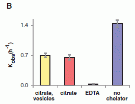
|
Each bar shows the rate of RNA synthesis under the specified conditions. In each case, Mg2+ was present.
The right hand bar, the big blue bar labeled "no chelator", is the control; this is the basic RNA synthesis reaction, with Mg2+ present. The (very small) bar labeled "EDTA" shows that adding that chelator eliminates RNA synthesis. That is, EDTA binds the magnesium ions in a way that effectively makes them unavailable to the reaction.
|
The two bars at the left (yellow and red) both have citrate. In both cases, the rate of RNA synthesis is substantial, though not as high as in the no-chelator control. That is, citrate binds the magnesium ions in a way that leaves those ions still able to participate in the RNA synthesis reaction. (One of the citrate tests also includes some lipid vesicles; they have no effect. Not shown here is that the citrate prevents the Mg2+ from destroying the lipid vesicles.)
It is interesting to note the rates of RNA synthesis: approximately 1 nucleotide per hour. Slow indeed. Enzymes come later.
This is Figure 2B from the article.
|
The following figure shows how the scientists measure RNA synthesis. It also shows that RNA synthesis can occur in the lipid vesicles.
In this work, the RNA size at various time points is analyzed by electrophoresis -- measuring how fast the RNA moves under the influence of an electric field.
In the figure, the dark horizontal bars show RNA of various lengths -- longer RNA at the top. There are columns for different time points. At time 0, there is only one bar, at the bottom -- very short. Over time, the amount of shorter RNA (near bottom) decreases and the amount of longer RNA (near top) increases.
The two parts shown are for RNA synthesis in solution (frame A, left) and RNA synthesis in membrane-bounded vesicles (frame B, right). The main observation is that the two frames are rather similar. This means that they have achieved RNA synthesis in the vesicles -- or protocells.
This is Figure 3 parts A and B from the article.
|
|
Work such as this is motivated and guided by trying to understand how life might have begun. Scientists propose a scheme, and note what questions the proposed scheme raises. There is an important caution in interpreting work such as this. There is no implication that what is discussed or shown has any particular relevance to how life actually began. The work shows some interesting chemistry -- motivated by thinking about one model of how life might have begun. The chemistry stands (subject, of course, to further testing and elaboration), but the implications remain unclear. What we can say is that the magnesium dilemma can be overcome; it does not in itself preclude the proposed model of RNA replication in protocells.
News story: Researchers Find Missing Component in Effort to Create Primitive, Synthetic Cells. (Science Daily, November 28, 2013.)
* News story accompanying the article: The Life Force. (R F Service, Science 342:1032, November 29, 2013.) Despite some hype, this is a useful introduction to studies of origin-of-life issues.
* The article: Nonenzymatic Template-Directed RNA Synthesis Inside Model Protocells. (K Adamala & J W Szostak, Science 342:1098, November 29, 2013.) Check Google Scholar for a freely available pdf of the article.
More about a possible primitive form of RNA replication: A novel type of polymer -- and its possible relevance to the origin of life (March 15, 2013).
The issue of the origin of activated nucleotides was addressed in the post The origin of reactive phosphorus on Earth? (July 5, 2013).
More about chelation: Chelation therapy -- a controversial clinical trial (December 13, 2013).
Other posts with possible implications for origin-of-life chemistry:
* An RNA replicator network (March 26, 2022).
* Is it possible that asteroids helped provide the energy needed to get life started on Earth? (January 26, 2015).
* Speeding up a chemical reaction by dividing up the container (February 28, 2014).
Color vision: The advantage of having twelve kinds of photoreceptors?
February 21, 2014
Humans have three kinds of photoreceptors for color vision: red, green and blue. We do rather well with that set; we can distinguish colors that differ by about 5 nanometers (nm) in wavelength. Some animals have four, including one that detects ultraviolet (UV) light.
Having more than four kinds of photoreceptors is uncommon. The champion is a group of organisms known as mantis shrimp. The species studied in a new article has 12 -- eight for what humans call visible light and four for UV; other species in the group may have as many as 21.
|
The figure at the left shows the spectra of 11 of the 12 photoreceptors of this mantis shrimp. (One of the UV receptors is not shown. I don't know why.)
These spectra are based on physiological measurements in the animal. They show the nerve response to light of various wavelengths. You can see that the receptors vary in their spectral response over the range of UV and visible light.
This is Figure 1A from the article.
|
So how good is their color vision? Not very good, according to the article -- at least by the criterion mentioned above. They can distinguish colors only if they differ by about 25 nm -- five times worse than we do.
How do you test the color vision of mantis shrimp? The same way you test the color vision of people. You show them something where distinguishing colors is necessary, and see how they respond. Mantis shrimp aren't very good at saying numbers, but they are interested in food. The idea of the test, then, is that the animals are trained to associate food with a particular color. They are then tested to see how well they choose between that color and one that is close.
The following figure shows an example of such a test. (Both axes on the graph are poorly labeled. For now, follow my discussion of the graph. I'll note the labeling problems later.)

|
In this test, the animals were trained to associate food with light of 570 nm wavelength. They were then offered two colors, one at that wavelength, and one at a nearby wavelength. The y-axis shows the fraction of the time that the shrimp got it right -- and chose the color that gave them some food.
For example... Look at the first (left-most) point, at about 470 nm; it says "100" just above the error bar, meaning that the trial is 100 nm from the training wavelength. In this case, the shrimp got it right about 70% of the time (shown here as 0.7, the probability of success) -- which seems to be about the best they can do.
Now look at the last (right-most) point, at 570 nm; it is labeled "0", meaning there is no separation from the training wavelength. A dotted line at 0.5 indicates that this is the line of random response, or "no effect".
|
If you look at the full set of data, you see a rather smooth curve. The further the trial wavelength is from the training wavelength, the more likely the shrimp are to distinguish the two colors. The two points discussed above are the extremes.
There is another dotted line at 0.6; they choose to use this as their cutoff. That's somewhat arbitrary but gives the idea. You can see that the shrimp can distinguish colors that differ by about 25 nm. Certainly, there is no sign that they can distinguish 5 nm -- as humans can.
This is Figure 2C from the article. I have modified the x-axis label. Their label is not really correct. The axis itself shows the wavelength of the trial; the separation is shown on the graph above each point. The y-axis is also mislabeled; the scale is in frequency, not percentage. That is, 0.5 here is the frequency of success; it corresponds to 50%.
|
In the article, the scientists report that they did several such experiments, with training wavelengths across the spectrum. The same general result was obtained.
What does this mean? Humans can distinguish colors that differ by 5 nm, despite having only 3 kinds of photoreceptors. Why? Because the human brain does some rather sophisticated processing of those three inputs, integrating them into one perceived color. That takes brainpower -- and time. The first conclusion is that the mantis shrimp apparently does not do this with its 12 inputs. Perhaps that is not a surprise. It doesn't have much of a brain; it may be that the "simple" approach whereby one receptor means one thing is good for them. By this hypothesis, making more photoreceptors is not a path to better color vision, at least as we know it; it is an alternative to using a brain.
It's also possible that this system has an advantage for these animals. It's faster, since the slow steps of neural processing are reduced. This may be good for the mantis shrimp, noted for its fast physical responses.
We must wonder what scientists will discover next about this unusual visual system.
There is one more part to the story. You don't need it to understand the current work, but it is a key part of what makes mantis shrimp interesting. That is what they look like. Here is a picture of Haptosquilla trispinosa [link opens in new window], the species used here.
Notes about the animal...
Adult animals are as long as 44 mm (about 2 inches).
The eyes are on the two white stalks near the right end of the animal.
The picture is from: Mantis Shrimp: Haptosquilla trispinosa. This is part of a site, now archived, on arthropods by researcher Michael Bok, at the University of Lund. (Bok is quoted in some of the news stories on this work.) The page has more information on this organism.
The particular species of mantis shrimp studied here is rather drab. The news stories show other kinds of mantis shrimp. There is also more at Bok's site, noted above; in particular, look for his page on the peacock mantis shrimp.
News stories:
* Study finds mantis shrimp process vision differently than other organisms (w/ video). (Phys.org, January 24, 2014.) Includes some interesting videos of how mantis shrimp use their eye stalks. The videos are not about the species used in the current work. Check out at least the first one, for fun.
* The Mantis Shrimp Sees Like A Satellite. (Ed Yong, Not Exactly Rocket Science (National Geographic blog), January 23, 2014.) Now archived.
* News story accompanying the article: Physiology: Extraordinary Color Vision. (M F Land & D Osorio, Science 343:381, January 24, 2014.)
* The article: A Different Form of Color Vision in Mantis Shrimp. (H H Thoen et al, Science 343:411, January 24, 2014.)
More about the visual system of the mantis shrimp: How can the mantis shrimp see so many colors of UV? They use filters (August 30, 2014).
Among many posts on animal vision...
* Chromatic aberration: is it how cephalopods see color with only one kind of photoreceptor? (October 14, 2016).
* Color vision: an overview (December 1, 2014).
* What if you had eyes on your tail? (July 27, 2013).
* An unusual eye? (June 6, 2012). From an even simpler animal.
* Where are the eyes? (August 19, 2011).
* With 24 eyes, can they see the trees? (June 11, 2011). Another example of eye complexity compensating for brain deficit.
And human vision... The limits of the human visual system: can humans detect single photons? (October 7, 2016).
Also see a section of my page Internet resources: Biology - Miscellaneous on Medicine: color vision and color blindness.
February 19, 2014
Ceres is leaking
February 18, 2014
Ceres is the largest body in the asteroid belt between Mars and Jupiter. In fact, it used to be called an asteroid. With the reclassification of solar system objects that focused on the status of Pluto, Ceres, like Pluto, became a "dwarf planet".
The asteroid belt was long assumed to be dry. Finding water there is of interest, and raises questions about how it got there. Hints of water on Ceres have been accumulating. New work, using the Herschel Space Observatory (European Space Agency), provides the best evidence yet.
What Herschel did was straightforward: it measured the absorption of "light" (electromagnetic radiation) in the thin atmosphere surrounding Ceres. Absorption at a particular (infra-red) wavelength is characteristic of water vapor. The following figure shows where the Herschel team found water on Ceres.
|
There are two parts to this figure; they share an x-axis, which shows the longitude on Ceres, as marked at the bottom.
The bottom frame is something of a map of Ceres -- actually a composite photograph. Think of the map as you would a simple world map of the Earth laid out flat. The x-axis, longitude, is like west-east. The y-axis for this frame is latitude, or north-south. Zero on the y scale is the equator. (The polar regions, beyond +/- 60°, are not shown.)
The upper frame shows the water measurement signal they got (y-axis) plotted vs the longitude (x-axis). There is a lot of noise, but there seems to be some pattern. Comparing that pattern with the map in the lower frame... they think the water signal may be associated with some of the darker spots on the map.
This is Figure 2 from the article.
|
The source of the water is not clear. It is possible that they are seeing water emissions that are something like volcanic. It is also possible that they are simply observing evaporation (more precisely, sublimation) of water from the surface when it gets heated. They think the latter is more likely. The greater water vapor above the dark spots could be due to them simply being a bit warmer; dark regions would absorb more sunlight. But the discussion is very tentative. Finding the water is the key point; explaining it will come later.
News stories:
* Herschel telescope detects water on dwarf planet in asteroid belt. (Science Daily, January 22, 2014.)
* Herschel discovers water vapour around dwarf planet Ceres. (European Space Agency, January 22, 2014.)
* News story accompanying the article: Solar system: Evaporating asteroid. (H Campins & C M Comfort, Nature 505:487, January 23, 2014.)
* The article: Localized sources of water vapour on the dwarf planet (1) Ceres. (M Küppers et al, Nature 505:525, January 23, 2014.)
As always, we would like to know more. In this case, we're in luck... The Dawn spacecraft, from NASA, is on its way to Ceres, and should be providing extensive information in early 2015.
* Previous leak report: Europa is leaking (February 10, 2014).
* Next: Svalbard is leaking (March 7, 2014).
More from the Herschel Space Telescope: Were comets the source of Earth's water? (February 3, 2012).
More on dwarfs...
* Underground hibernation in primates? (October 6, 2013).
* How many moons hath Pluto? Follow-up (March 26, 2013).
More about asteroids and such:
* Why aren't asteroids considered planets? Implications for Pluto? (September 30, 2018).
* Rings for Chariklo (May 9, 2014).
A plant virus that grows in bees: role in colony collapse?
February 17, 2014
It's a novel finding. Scientists looking at what they can find in bees have reported finding a plant virus.
What did they do? They analyzed the nucleic acids found in bees, and compared the results to the listings in genome databases. That is, using the latest in nucleic acid technologies, they looked at "everything". They found tobacco ringspot virus (TRSV), a well-known plant virus.
The scientists provide good evidence that the virus is actually growing in the bees. Bees visit plants -- and carry pollen; it's not surprising that they might have some plant material -- or plant virus material -- in them. Showing that the TRSV is not only present but actually growing in the bees is a significant step.
As a general biology point, finding a plant virus growing in an animal is interesting. The article is not entirely clear, but this may be the first documented example of a specific virus showing this trans-kingdom behavior. There is nothing "wrong" with this; there is no reason to be suspicious of the finding. (Of course, as a matter of principle, it needs to be confirmed.) Some viruses grow in diverse hosts. Some will grow in most any cell they can get into. In fact, getting in is often the key barrier. The inside of one cell is more or less like the inside of another. (Prokaryotic vs eukaryotic cells is a major exception.) It is not known at this point whether the virus growing in bees has genetic adaptations that promote its trans-kingdom behavior.
As noted, this may be the first documented example of a virus that grows in both plants and animals. But why would anyone notice? The scientists found this example by brute force. This kind of study would not have been practical even a few years ago. Before this type of work, it would have been something of an accident to find a virus growing in an unusual host -- unless it had a very clear effect on the host, or unless there was a reason to look for a specific virus. So perhaps this work opens a door. There will be more studies broadly looking for "anything". I wonder what they will find.
Colony collapse disorder (CCD) is a big issue for bees; inevitably, the scientists ask if this virus is associated with CCD. They show that the virus is more prevalent in unhealthy colonies than in healthy colonies. That's not evidence for a causal role. Lots of things are more prevalent in unhealthy colonies. There is no evidence here for any particular role of this virus in colony collapse; it simply joins the list of possibilities.
Bottom line... An interesting finding. Its implications remain to be worked out.
News story: Pathogenic plant virus jumps to honeybees. (Phys.org, January 21, 2014.)
The article, which is freely available: Systemic Spread and Propagation of a Plant-Pathogenic Virus in European Honeybees, Apis mellifera. (J L Li et al, mBio 5(1):e00898-13, January 2014.)
More about colony collapse disorder:
* Neonicotinoid pesticides and bee decline (July 12, 2014).
* A parasitic fly that causes hive abandonment in bees: Is this relevant to CCD? (January 27, 2012).
More about bees: Bees: Why pollen might be bad for them (November 4, 2013).
More about viruses: Bats and the origin of SARS (January 25, 2014). This, too, involves the issue of virus host range.
An example of coral growing well in a naturally acidified ocean environment
February 16, 2014
As the level of CO2 in the air increases, the acidity of the oceans increases. A prediction is that organisms that make a calcium carbonate (CaCO3) skeleton will have more difficulty doing so. That is, the general phenomenon of global warming, with increased CO2 and lower ocean pH, is predicted to be a threat to organisms that make CaCO3 skeletons.
The prediction is based on rather straightforward chemistry. To what extent does the real world follow this? Do organisms effectively adapt to lower ocean pH? If so, on what time scale? How? At what cost? We've noted this problem before, and we've noted experimental tests of lower pH (greater acidity) on various organisms. We have also noted an analysis of a natural environment where corals were found over a range of pH; they didn't do so well at lower pH. [Background links at the end.]
We now have a new article, with a similar analysis -- and a different result. In this case, near the island country of Palau in the Pacific Ocean, the corals thrive quite well in the acidified waters.
|
Here is an example of what the scientists found.
The graph shows two measures of the coral community (y-axis; different symbols and scales) vs the CO2 level (x-axis). The latter is shown as Ωar, a measure of the solubility of CaCO3. We have introduced the idea of Ωar before; briefly, low values (at the left) correspond to greater acidity (lower pH).
This is Figure 4b from the article.
|
You can see that there is little effect of pH (of Ωar) on these measures of coral health. If anything, the coral may be doing a bit better at the lower pH. Another measure, discussed in the article but not shown in a graph, shows even less effect. The main conclusion is that there is little effect of acidity in this study (not that there may be better growth at low pH).
In the earlier post on looking at corals over a range of pH in nature, we noted that the work had limitations. That's true with the new study, too. The point is not that one is right and the other is not. The point is that we don't understand the full story of how corals respond to pH. Getting different results, with no explanation at hand, tells us that we don't understand it.
If we can understand why some corals are doing well in acidic environments while others are not, this may be interesting and perhaps even useful. Can we find genetic factors that affect adaptation of coral to more acidic waters? Can we find environmental differences between the various sites that are important?
News story: Coral Reefs in Palau Surprisingly Resistant to Naturally Acidified Waters. (Woods Hole Oceanographic Institution, January 16, 2014.)
The article: Diverse coral communities in naturally acidified waters of a Western Pacific reef. (K E F Shamberger et al, Geophysical Research Letters 41:499, January 28, 2014.)
The previous article goes to lower pH than this one does. The effect there is greatest at the lowest pH. However, there was an effect over the entire pH range covered, including the range covered here. It would be interesting if the scientists of the new work could find more acidic sites in the region they study.
Background posts about CO2, ocean acidification, and CaCO3 skeletons. These posts include some discussion of the chemistry of the effect.
* Can a coral adapt to a more acidic ocean? (September 29, 2013).
* Increased CO2: effect on animals that make carbonate skeletons (January 11, 2010).
A different kind of CO2 study -- immediately below: Atmospheric CO2 and the origin of domesticated corn (February 14, 2014).
Also see:
* Coral history: evidence from old maps (December 12, 2017).
* Coral bleaching: how some symbionts prevent it (September 30, 2016).
* Using a pH meter to help you find dinner (July 8, 2014).
* National contributions to global warming (June 25, 2014).
Atmospheric CO2 and the origin of domesticated corn
February 14, 2014
Corn (maize), like most of our major foods, is a manmade creation. Over the last century, a strong case was developed that corn originated from a plant called teosinte, native to Mexico, the birthplace of corn. However, one part of the story seemed weak: teosinte, as we see it today, does not seem a very promising starting material. Why would ancient man choose teosinte for cultivation and subsequent breeding?
A new article offers an explanation, and they do it with a simple experiment making use of an idea that is current for other reasons. In the new work, the scientists grow teosinte under conditions likely to have been found ten thousand years ago. In particular, they use a lower concentration of carbon dioxide than found today; they use a level of CO2 they think is the level of several thousand years ago. It turns out that teosinte looks different when grown under these "paleontological" conditions -- and it looks much more promising.

|
Teosinte, growing under two controlled sets of conditions.
The growth chamber on the left was maintained under "modern" conditions. The growth chamber on the right was maintained under conditions they think mimic those of 10-12 thousand years ago, around the time man began to domesticate teosinte.
The details of the various conditions are in the paper. The key variables were CO2 level and temperature. There were multiple experiments, with different conditions. In general, the CO2 levels were about 150 ppm lower than modern, and the temperature was 3-5 degrees Celsius lower.
This is reduced from the second figure in the news story.
|
The key observation is that the teosinte grew quite differently under the two sets of conditions. You can see that in the picture above. More detailed analysis of plant features supported that, and showed that the teosinte looked more like corn under the old conditions than under modern conditions. Domesticating teosinte makes more sense if we look at what it was like at the time.
We often wonder hw global warming, with its increase of CO2, will affect organisms in the future. Turns out we can run that clock backwards, too -- and see how organisms might have behaved long ago.
News story: Greenhouse 'time machine' sheds light on corn domestication. (Phys.org, February 3, 2014.)
The article: Teosinte before domestication: Experimental study of growth and phenotypic variability in Late Pleistocene and early Holocene environments. (D R Piperno et al, Quaternary International 363:65, March 30, 2015.)
Example of testing how organisms might behave with high levels of CO2: Increased CO2: effect on animals that make carbonate skeletons (January 11, 2010).
More on corn:
* How long have Americans been eating corn? (July 21, 2020).
* What can we learn from a five thousand year old corn cob? (March 21, 2017).
* Alternative microbial sources of insecticidal proteins (December 9, 2016).
* Development of insects resistant to Bt toxin from "genetically modified" corn (April 19, 2014).
* Pink corn or blue? How do the monkeys decide? (June 9, 2013).
More about domestication... It's a dog-eat-starch world (April 23, 2013).
A different kind of CO2 study -- immediately above:
An example of coral growing well in a naturally acidified ocean environment (February 16, 2014).
February 12, 2014
A retraction
February 12, 2014
An article that was the basis of a Musings post has been retracted. The authors requested retraction when they found they could not reproduce key results. I have noted the retraction with the original post: Prejudice against outsiders -- in monkeys (May 10, 2011). See the retraction box, at the top. It includes some comments.
Why the lull in global warming?
February 11, 2014
The late twentieth century saw a rather clear trend of rising global temperature (T). The rise in T correlates with and is attributed to the increasing level of carbon dioxide in the atmosphere. However, the years since then have shown little or no increase. Why? Are there reasons why short term fluctuations over the past decade have masked the larger warming trend? Or is it possible that there is something fundamentally wrong with our understanding of the big trend?
Nature recently ran a "news feature" on the problem. It includes some data describing the temperature record. It discusses the alternative explanations that have been offered, with some emphasis on the role of the oceans as a short term effector. It's not easy reading, but if you find the topic of interest, at least give this a browse for an overview and update.
News story, which is freely available: The case of the missing heat -- Sixteen years into the mysterious 'global-warming hiatus', scientists are piecing together an explanation. (J Tollefson, Nature 505:276, January 16, 2014.)
One good place to start is the figure on the last page (p 278). The lower frame of that figure shows the global temperature over time. You can see the overall rising trend, plus some lulls -- including the current lull. The upper frame is a measure of the ocean effect that is the heart of the story here.
A previous Musings post on the lack of increased T in recent years: Why isn't the temperature rising? (September 12, 2011). This post, and the follow-up it refers to, focus on sulfur emissions as a short term effector. Both of these posts could be useful background for the current post.
And an update: Was there a significant slowdown in global warming in the previous decade? (May 30, 2017).
Other posts on global warming include...
* National contributions to global warming (June 25, 2014).
* When does global warming occur: day or night? (October 28, 2013).
Europa is leaking
February 10, 2014
|
The surface of Europa.
The icy surface is oddly marked; it is thought that some of the features are fracture lines.
This is an old image, taken by the Galileo spacecraft during a 1998 fly-by. The width of the image represents about 200 kilometers.
This figure is from Spencer's news story in Science accompanying the article.
|
A new article reports evidence that plumes of water are being emitted from Europa; the plumes may extend 100-200 kilometers above the moon's surface. This is based on some unusual measurements of far-ultraviolet light. The measurements were made -- by the Hubble Space Telescope -- in a region of Europa where the magnetic field of Jupiter was sufficient to split water into observable species. One might guess that the water is being emitted through fracture lines, such as those seen in the figure above.
Among the subtleties of the results... Water emission varies depending on the distance of Europa from Jupiter. A simple interpretation is that the tides -- the varying gravitational attraction of Jupiter -- may be opening and closing the leaking fractures.
Europa probably has oceans of liquid water -- underground. Those oceans are considered among the more likely places where life might exist beyond Earth. Scientists would love to visit Europa, and have a look. Is the water being emitted at the surface a sample of those underground oceans? If so, and if the oceans do contain life, is it possible that evidence for Europan life could be found at the surface? Oh, what tantalizing questions!
News story: Hubble discovers water vapor venting from Jupiter's moon Europa. (Phys.org, December 12, 2013.)
* News story accompanying the article: Planetary science: Glimpsing Eruptions on Europa. (J R Spencer, Science 343:148, January 10, 2014.) A nice introduction to Europa. Spencer emphasizes that the interpretation of the new results as water plumes must be considered tentative. As so often, this is a report of something new, and it requires confirmation.
* The article: Transient Water Vapor at Europa's South Pole. (L Roth et al, Science 343:171, January 10, 2014.) Check Google Scholar for a freely-available copy.
The next close-up observations of Europa are currently scheduled for 2031. The European Space Agency has a planned tour of the Jupiter region called the Jupiter Icy Moons Explorer (JUICE).
The following posts briefly note Europa -- and note features relevant to the current post...
* Steppenwolf: Life on a planet that does not have a sun? (July 2, 2011).
* Quiz: NASA's boat (June 29, 2011).
More about Europa:
* Does Europa glow? (May 10, 2021).
* Nuclear-powered bacteria: suitable for Europa? (March 27, 2018).
The Saturnian moon Enceladus is also emitting water: A water fountain for Saturn (October 23, 2011).
More leak reports...
* Los Angeles leaked -- big time! (April 29, 2016).
* Ceres is leaking (February 18, 2014).
* Svalbard is leaking (March 7, 2014).
More from the Hubble Space Telescope:
* Most Earth-like (habitable) planets haven't formed yet (October 27, 2015).
* What has six tails -- and is beyond Mars? (November 20, 2013).
An underground lake on Mars? ... A lake on Mars? (August 24, 2018).
The First Americans: the European connection
February 8, 2014
The conventional wisdom is that humans first reached the Americas by walking across a land bridge from Siberia to Alaska. These people were the ancestors of what we now call Native Americans (formerly, American Indians); they are also sometimes called the "First Americans." There is considerable evidence to support this view. However, bits and pieces of evidence for a European source have confused the picture in recent years. Some scientists have been quite skeptical of the reports, since the possibility of early peoples crossing the Atlantic seemed unlikely.
A new article -- one of the first scientific papers published in 2014 -- supports the contribution of European ancestry to Native Americans, and offers an intriguing explanation. What the scientists suggest is that Europeans migrated eastward -- to Asia, specifically to Siberia. There they mixed with the Asians of that era. It was these European-Asians who crossed into America, via that Siberia-Alaska land bridge often called Beringia. This offers an explanation for why western European characteristics are found in the Native Americans, without invoking the unlikely possibility of crossing the Atlantic.
What's the evidence? What's the new finding? Genetic analysis of a fossil human child from Siberia shows that his genes were largely "European". The fossil is about 24,000 years old; this puts it a few thousand years before the migration to America.
And that's about it. The rest is "story".
This is an exciting time for the study of human origins. It's made possible by the revolution in DNA sequencing -- not just the lowered costs, but the increasing ability to handle ancient DNA and get meaningful information about the genomes of our ancient ancestors. But be careful. Much of what we hear is based on the analysis of a single specimen. Scientists determine the genome of an ancient human, and then build a story around it. Each genome is a major accomplishment; the "story" offers some perspective. We've seen that in Musings posts, including the original report of Denisovan man; some of the interpretation in that first report was changed as more data became available. This is not a matter of errors in the work, but of over-interpretation. It is important here, as in all science, to try to understand what is fact, what is interpretation, and what is speculation. Many scientific papers contain all of those; that is fine, but we must make the distinction.
The new article presents the genome sequence of a new human ancestor specimen. The analysis suggests an alternative as to how European characteristics could have made their way to Native Americans. Is it right? Who knows. It's now a hypothesis on the table. Hopefully, more evidence will be brought to bear on the issue.
The new genome has implications beyond the story of the First Americans. It offers insight, more broadly, into early human migrations. There is some discussion of such further interpretations in the article and the surrounding news coverage. Again, that is mostly "story" for now -- very interesting story that we'll learn more about with more evidence.
News stories:
* Ancient Siberian genome reveals genetic origins of Native Americans. (Phys.org, November 20, 2013.) Excellent overview of a complex story; good pictures.
* DNA links Native Americans with Europeans. (ScienceNordic, November 22, 2013.) What's Nordic about the story? The lead institution is the University of Copenhagen -- the Centre for GeoGenetics there.
The article: Upper Palaeolithic Siberian genome reveals dual ancestry of Native Americans. (M Raghavan et al, Nature 505:87, January 2, 2014.)
There is more about genomes on my page Biotechnology in the News (BITN) - DNA and the genome. It includes an extensive list of Musings posts on sequencing and genomes. That list includes the work on Denisovan man, and other ancient humans.
The first of those posts on Denisovan man is: The Siberian finger: a new human species? (April 27, 2010).
The most recent post on ancient humans genomes is: DNA from a 400,000-year-old "human" (December 9, 2013).
More...
* Contributions of Neandertals and Denisovans to the genomes of modern humans (July 6, 2016).
* Genes that make us human: genes that affect what we eat (February 18, 2015).
More about the First Americans:
* How long ago did mankind arrive in the Americas? (March 18, 2016).
* Did the First Americans eat gomphothere? (July 29, 2014).
The idea of a "Centre for GeoGenetics" reminds me of the post: The Moon: might it be a child with only one parent? (April 13, 2012).
More about migrations: Magnetic turtles (July 5, 2015).
Signs of autism in 2-month-old babies
February 7, 2014
One feature of autism is that afflicted individuals are less likely (than those without autism) to look at the eyes of other people. A new article offers some insight into the development of this deficit.
Here are data for two babies, one of whom will later be diagnosed with autism and one of whom will not.
The graphs show the time spent looking at eyes (y-axis) vs age of the child (x-axis). Each graph is for one child. The one on the left, labeled ASD, is for a child who will be diagnosed with autism spectrum disorder. The one on the right, labeled TD (typical development), is for a child who will not be so diagnosed.
In the article, the y-axis scale is labeled "Fixation time, eyes (%)". The idea is simple enough -- even if technically complex. The child is shown a picture of a person, and an automatic tracking device records where the child looks. The graphs above are based on data from such controlled experiments.
The lines drawn through each data set show the average response over the many data points. You can see that the eye time remains approximately constant for the normal child. For the autistic child, the eye time starts high, and declines. Much of the decline occurs between the ages 2-6 months.
This is the lower half of Figure 1 parts d & e from the article. (Parts d and e in the article show results for two children of each type. I have shown here one of each.)
|
The graphs above are for individual children, one of each type -- autistic or not. The scientists measured many such children, and the above results are typical.
There are two features of the pattern for the autistic children that are significant. First, eye contact is normal until about 2 months of age. This was not known before this work. The deficit in eye contact involves loss of a capability, rather than lack of development. Second, the loss of eye contact observed here occurs well before the children have been diagnosed with autism, by standard procedures.
Both of those features deserve follow-up. The eye-attention measurements might be useful as a diagnostic tool, especially for children at higher risk of developing autism. Early diagnosis of autism may allow more aggressive early treatment. Caution will be needed; the reliability of the diagnosis is not clear for now. Second, this is an interesting research finding, which may offer a clue about how autism develops. Not only does it focus on early developmental steps, it shows that an ability is lost.
News story: New Study Identifies Signs of Autism in the First Months of Life. (Science Daily, November 6, 2013.)
The article: Attention to eyes is present but in decline in 2-6-month-old infants later diagnosed with autism. (W Jones & A Klin, Nature 504:427, December 19, 2013.) Check Google Scholar for a freely available copy.
* Previous post on autism: Suggested genes for autism challenged (November 18, 2013).
* Next: Can we make sense of the many genes involved in autism? (January 16, 2015).
More about autism is on my page Biotechnology in the News (BITN) -- Other topics under Autism. It includes an extensive list of related Musings posts.
More on eye-tracking: Can you see your hand in total darkness? (April 14, 2014).
February 5, 2014
A story of ball lightning and burning earth
February 4, 2014
Many readers are familiar with ordinary lightning. During a thunderstorm, you can stand at the window and see it. Ball lightning is another matter. It's unpredictable and rare; as with ordinary lightning, individual events are short-lived. A new article offers what may be the first scientific report, with data from sophisticated instruments, of a natural ball lightning event. Quite by accident, a team of scientists just happened to have high speed cameras on at the right time. Have a look at their video... We'll "explain" it below, but first have a look if you can.
Video. ball lightning video at YouTube (10 seconds; no sound). It's also included with some of the news stories.
The video shows two things. One is roundish and whitish, at the left. The other is a rather brightly colored horizontal region, in the center. The ball lightning is the round thing at the left. Ball lightning indeed looks something like a ball. If you didn't focus on that the first time, go back and look at the video again. The other point to realize is the time scale. The video is 10 seconds. It's slowed down from real time. The video records 1.3 seconds of action; that is, the video is slowed down about 8x. Ball lightning appears rather mysteriously, and doesn't last very long. That's why pictures are rare, and scientific observations are unprecedented. It just happened that these observers were there when this event occurred, with their high speed cameras -- and spectrograph.
The spectrograph measures what wavelengths of light are given off. The bright region in the video is the spectrograph output. You can't tell much from it, but it can be analyzed in detail. The analysis shows that the light is coming from silicon, iron and calcium. It appears, according to the authors' interpretation of the spectrogram, that the ball consists of burning earth.
There are many proposals about the nature of ball lightning. One is that ordinary lightning hits the ground, and vaporizes some soil. The hot ball of soil-vapor reacts with oxygen; what we see is the glowing ball of burning earth. The spectrographic evidence recorded here, as well as the circumstances, support this interpretation, at least for this ball lightning event.
The glowing region was as much as 5 meters in diameter. It was about 0.9 km from the observers. The entire ball lightning event lasted 1.64 seconds.
News story:
* Burning soil fuels ball lightning. (Physics World, January 9, 2014.)
* Focus: First Spectrum of Ball Lightning. (Physics, January 17, 2014.) This item is written by, appropriately enough, Philip Ball.
The article: Observation of the Optical and Spectral Characteristics of Ball Lightning. (J Cen et al, Physical Review Letters 112:035001, January 24, 2014.) Put the title in Google Scholar; you might find a freely available pdf of the article.
More about lightning:
* What's the connection: ships and lightning? (October 14, 2017).
* When lightning strikes a tree... (April 8, 2014).
Windows: independent control of light and heat transmission
February 3, 2014
On a hot day, do you want to open or close the window shades? How about opening the part that lets (visible) light through, and closing the part that lets heat (infrared) through?
A new article offers an approach to accomplishing just that -- without needing window shades. If it turns out to be practical, it will be as simple as throwing a switch on the windows. Literally.
Some of the ideas behind the work are simple enough...
* You know from common experience that different materials have different optical properties. Some, such as glass, transmit light -- and some do not. Further, you know that different kinds of glass may transmit different colors.
* You may know that electrical current can change the nature of things. Electrolysis of water, to produce hydrogen and oxygen gases, is an example. (Batteries make use of the same idea, in reverse: a chemical change results in an electrical current.)
The general approach is that the scientists use a low voltage electrical current to change the chemical nature of the window. This affects its optical properties. Their window material is actually a mixture of two materials. Each has its own optical properties; each changes in response to an applied voltage -- but they respond to different voltages. As a result, by controlling the voltage, they can control what the window transmits.
Here is an example...
|
This graph shows how the new window material transmits light across the spectrum as a function of the voltage applied.
The y-axis shows transmission. The x-axis shows the wavelength. As an approximation, the region between about 400-700 nanometers (nm), at the left, is for visible light. The rest is for infrared (IR) light, which we sense as heat.
There is a set of curves, for different voltages. Three of them are highlighted with color; the rest are gray. It doesn't matter if you figure out completely which is which; the pattern is clear.
|
Look at the top and bottom curves. The top curve (red) shows high transmission of light across the entire spectrum. The bottom curve (light blue or cyan) shows a major reduction in transmission in both the visible and IR ranges. These two curves are for high and low voltages, respectively.
Then look at the dark blue curve, labeled 2.3 V -- an intermediate voltage. It shows high transmission of the visible light (left side), and substantial reduction of the IR (right side). That's the point: visible light comes through, but the heat is substantially blocked.
This is Figure 4g from the article.
|
That's the idea, and they do have some success. These are more sophisticated electrochromic windows that any made previously, with independent control for two types of light. ("Electrochromic" refers to the ability to change the color using electricity.) It's not practical at this point: their window materials are rather exotic. With the idea validated, people can now explore what practical use may follow.
The windows are made of niobium oxide glass, with embedded nanocrystals of indium tin oxide. Coupling the two materials was an important part of the work.
News story: Raising the IQ of Smart Windows: Embedded Nanocrystals Provide Selective Control Over Visible Light and Heat-Producing Near-Infrared Light. (Science Daily, August 14, 2013.)
* News story accompanying the article: Materials science: Composite for smarter windows. (B A Korgel, Nature 500:278, August 15, 2013.)
* The article: Tunable near-infrared and visible-light transmittance in nanocrystal-in-glass composites. (A Llordés et al, Nature 500:323, August 15, 2013.) Check Google Scholar and you may find a copy freely available.
More about high-tech windows...
* Liquid-filled smart windows, inspired by squid (February 17, 2023).
* Making electricity in your windows: sharing the solar spectrum (July 5, 2011).
Related: Rewritable W-based paper and a disappearing panda (January 30, 2017).
More about controlling IR: A thermal management system, based on carbon nanotubes, for your jacket (May 3, 2019).
Among other posts on infrared light: Can rats touch infrared light? (February 25, 2013).
More about glass: Turning metal into glass (September 21, 2014).
More niobium: Air pollution: progress towards a process for ammonia oxidation (April 5, 2019).
Improving the efficiency of making induced pluripotent stem cells (iPSC)
February 1, 2014
Briefly noted...
The procedure for making induced pluripotent stem cells (iPSC) involves starting with differentiated cells, such as skin cells, and adding a small group of "factors", which induce the cells to de-differentiate back to the pluripotent state. (Pluripotent cells are those that can give rise to most any type of body cell.) Use of iPSC has become one of the major approaches to stem cell work in recent years; the scientist who led the original development of iPSC, Shinya Yamanaka, received the Nobel Prize in 2012.
A problem with making iPSC is that it is quite inefficient. Commonly, fewer than 1% of the treated cells become iPSC.
A recent article offers some insight into why the procedure for making iPSC is inefficient. The authors show that the procedure induces not only de-differentiation, but also inhibitors of de-differentiation. That is, the procedure induces both helpful and unhelpful processes -- which "fight" each other. They show that a particular protein, called Mbd3, is largely responsible for the low efficiency of making iPSC. Mutating out Mbd3 makes the process nearly 100% efficient.
Problem solved? Not so fast. It is an interesting finding, but it raises questions of its own. Removing the problem protein is not really a practical solution; its complete removal may have its own deleterious effects. Further, some question some aspects of the result, as well as the importance of the problem. For now, this is not so much an answer but a clue. People will be following up on this report. How general is what they found? Is there a practical way to implement it? Importantly, simply studying the role of Mbd3 should lead to better understanding of the process of making pluripotent stem cells. As so often... stay tuned.
News stories:
* Inducing Pluripotency Every Time. (The Scientist, September 18, 2013.)
* Scientists produce induced pluripotent stem cells by removing one protein. (Nanowerk News, September 23, 2013.)
* News story accompanying the article: Stem cells: Close encounters with full potential. (K M Loh & B Lim, Nature 502:41, October 3, 2013.)
* The article: Deterministic direct reprogramming of somatic cells to pluripotency. (Y Rais et al, Nature 502:65, October 3, 2013.) Check Google Scholar for a freely available copy.
A recent post involving the use of iPSC: Down syndrome: Could we turn off the extra chromosome? (November 15, 2013).
More...
* A test of a stem cell therapy based on iPSC, in monkeys (August 29, 2014).
* Making stem cells using brain tissue from dead people (June 2, 2014).
More about stem cells is on my page of Biotechnology in the News (BITN) for Cloning and stem cells. It includes an extensive list of Musings posts in the broad area of stem cells and regeneration.
Would a placebo work even if you knew?
January 31, 2014
Maybe, according to a new article.
Placebos are fascinating; we've discussed them before [link at the end]. The general idea is that if a doctor gives you a "sugar pill" (or some kind of "blank" medicine that lacks the active ingredient), you may show some benefit. The interpretation is that there is some psychological effect: thinking you are going to get better helps you get better. Placebos are commonly included in clinical trials of a new drug (or treatment), to try to compensate for the effect of simply being involved and getting something.
A new article reports a more complex experiment. Among the findings is that a placebo may work even if you know it is a placebo -- even if you know that it lacks active ingredients. There is more -- and it's rather intriguing. Let's look at the design and some key results.
Here is the general design of the trial... It involved treatment of people who get migraine headaches. Each participant was given an instruction set telling them what to do when they got a migraine. For the first migraine during the trial, they did nothing; a control. For the next six, they did one of six procedures -- the nature of which we will reveal as we go on. The order of these procedures varied among the participants; the idea was to eliminate the possible effect of order. The participants also reported the severity of their symptoms for each migraine.
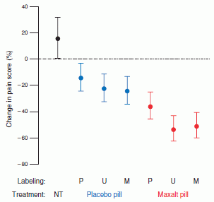
|
Here is a summary of the results.
This is Figure 3 from the article.
The graph shows the change in pain score found for the various procedures, averaged across all the participants. The pain score, measured by a standard questionnaire, is evaluated at two times. One is just before the treatment, and one is two hours later. Thus the change in pain score, which is shown on the y-axis, is a measure of the effectiveness of the treatment.
The change in pain score for the no-treatment (NT) control is at the left, in black. It is about +20%, meaning that the pain got worse.
|
The next three points are in blue; they are for procedures that use a placebo pill. These gave pain score changes of about -20%. That's considerably better than the no-treatment control; in fact, it is a significant benefit.
The final three points (to the right) are in red; they are for procedures that use a painkiller pill, called Maxalt. You can see that these give even better pain score changes than the placebo. (The lower the value, the better!)
Thus, at this point, it seems that painkiller is better than placebo, which is better than nothing. That's not news.
Let's look further. There are three points each for placebo and Maxalt. What are those three points for? Look at the text line near the bottom that says "Labeling". The various treatments have P, U, or M for labeling. P means that the pill was labeled placebo; M means that the pill was labeled Maxalt. (U -- for "unspecified" -- means that it was labeled that it might be either; the actual label said "Maxalt or placebo". We'll ignore this one for most of the discussion, for simplicity.) That is, the placebo might have been labeled P or M; P was true, M was deception (which is the usual way to give a placebo). Interestingly, the placebo works -- whether labeled P or M. The placebo -- the fake drug -- works even if you tell the patient that it is a fake drug. If a placebo works because you think you are going to get better, why does telling you it is fake lead to improvement?
Similarly, the Maxalt pill works whether the patient thinks it is a placebo or a drug pill.
The authors also make some points about differences between the labelings. They say that label M is better than label P for both placebo and Maxalt pills. That is, the label carries information, and the resulting effect is determined partly by that information. If you look at the graphs above, you may not be impressed on this point. Their statistics are more complex than the above graph. Still, I find this to be a very tentative point. It's certainly an intriguing idea; I think it is best to leave it for further -- and larger -- trials.
|
Bottom line... A lab noted for showing how effective placebos are provides evidence that they may work even if you are aware they are "fake". The authors also suggest that the effectiveness of a treatment may depend on both its "true" value and on what you are told about it. As with so much about placebos, these results need to be independently verified and extended. In any case, placebos have become a topic to be taken seriously, and they are not fully understood.
News story: The Powerful Placebo -- A new study suggests that sugar pills can reduce patients' self-reported symptoms -- even if they know it's a sham. (Jef Akst, The Scientist, January 13, 2014.) Now archived.
The article: Altered Placebo and Drug Labeling Changes the Outcome of Episodic Migraine Attacks. (S Kam-Hansen et al, Science Translational Medicine 6:218ra5, January 8, 2014.) There is also a copy at: pdf.
Background post: The placebo effect: a mutation that makes some people more likely to respond (October 30, 2012).
A post about the scientist responsible for the work in both the current post and the background post: The placebo guy (January 9, 2013).
More about placebo responses: Can we predict whether a person will respond to a placebo by looking at the brain? (February 21, 2017).
A post about a clinical trial, with comparison of treatment and placebo: Chelation therapy -- a controversial clinical trial (December 13, 2013). In this work, there is some concern about the nature of the placebo used, though the post did not go into that. It's a common issue. For example, if the treatment has some special feature, such as a color or an odor, it's not trivial to get a placebo that is just right.
More about pain:
* Alcohol consumption, an "ethnic" mutation, and a possible new drug (October 28, 2014).
* Why male scientists may have trouble doing good science: the mice don't like how they smell (August 22, 2014).
More about headaches... Why don't woodpeckers get headaches? Designing better shock absorbers (April 18, 2011).
January 29, 2014
3D printing: simple inexpensive prosthetic arms
January 29, 2014
Near the end of last year we had two posts on 3D printing [links at the end]. Both were on rather complex and exotic applications.
A few days ago there was a widely reported news story about an application of 3D printing. It immediately reminded me of those two recent posts. The contrast in the nature of the application was striking.
The news story stands on its own. Go read it. Here is one good version: How a 3D printer gave a teenage bomb victim a new arm - and a reason to live. (Guardian, January 19, 2014.)
The news story listed above links to the web site for the company behind this project. I found their web site to be complex and slow, and did not pursue it. There is a 4 minute video, which is also available at YouTube video. It gives an overview of the whole project. The video is too fast-paced to be effective, but you can see the final product, as well as evidence for the continuing effort.
Background posts on 3D printing:
* 3D printing: Sculplexity -- and a printed model of a forest fire (December 29, 2013).
* 3D printing: Neurosurgeons can practice on a printed model of a specific patient's head (December 16, 2013).
An earlier, simpler application: Print yourself new body parts (April 16, 2010).
More...
* 3D printing: Make yourself a model of the universe (December 19, 2016).
* 3D printing of human tissues: the ITOP (May 24, 2016).
* Can you make a 777 by printing it? (May 9, 2015).
* 3D printing for space: a titanium woov, and more (April 29, 2014).
* National Inventors Hall of Fame: 2014 inductees (March 11, 2014).
More on Prosthetic arms (September 16, 2009). Includes listing of related posts.
More about replacement body parts is on my page of Biotechnology in the News (BITN) for Cloning and stem cells. It includes an extensive list of related Musings posts.
Black silicon and dragonfly wings kill bacteria by punching holes in them
January 28, 2014
Look at the main parts of those two figures, ignoring the insets. One is a scanning electron microscope (SEM) image of the surface of a piece of black silicon. The other is an SEM image of the surface of a dragonfly wing. Can you tell which is which?
In fact, you probably can't tell the difference at that level. That's the point.
This is Figure 1 parts a & b from the article. The scale bars are 200 nanometers (nm).
|
Why is this of interest? In a recent article, scientists show that these materials -- both of them -- kill bacteria. How? Apparently, by simple physical force. The tiny projections attract and attach to bacteria -- and punch holes in them. No particular chemistry is involved; that's why materials as different as a special type of silicon and an insect wing do more or less the same thing.
|
Here is an example of what these materials do to bacteria. In this case dragonfly wing is tested with Staphylococcus aureus bacteria.
The upper frame (part b) is an SEM image showing how the bacteria attach to the surface. (The bacteria themselves are pretty much plain round.) Both scale bars in this frame are 200 nm.
The lower frame (part f) shows the results of staining such bacteria with two stains: a green dye that stains only live bacteria, and a red dye that stains only dead bacteria. They're all dead! Scale bar is 5 µm.
This is Figure 2 parts b & f from the article. Other parts of the figure show results with other bacteria, and using black silicon. The general picture is the same. There is no green stain to be seen.
|
Is this a practical approach to disinfection? That's not clear. Black silicon is expensive, and dragonfly wings are not standard industrial supply. What's important for now is the idea: surfaces with nano-points may be bactericidal. Perhaps the proper question is, what will be the next step in trying to make use of this finding? Another interesting question is whether bacteria will discover a way to develop resistance to this physical attack, just as they have done for chemical attacks from conventional antibiotics.
A little more about the materials... In the top figure above, the insets show the same materials, tilted. This lets you see the vertical structure. Now you can see that one has rather regular nano-scale protrusions -- or "nanopillars". The other is more irregular, but still has nano-scale protrusions -- apparently sharp enough, if the interpretation of what is happening is correct.
The regular material (left side of figure) is "black silicon". It's made by a special process to be that way; the rough surface makes it look black. The irregular material (on the right) is from the wing of a particular type of dragonfly.
This work is actually follow-up to some earlier work where the same scientists showed bactericidal effects of some cicada wings. The purpose here was to see if the effect is general. They predicted that the two materials tested here -- one synthetic and one natural -- would work.
News stories:
* Next Generation: Bactericidal Surface -- A synthetic material covered in nano-spikes resembling those found on insect wings is an effective killer of diverse microbes. (Jef Akst, The Scientist, November 26, 2013.) Now archived.
* Germ-killing black silicon, a synthetic nanomaterial, opens up new front in hygiene. (Nanowerk, November 26, 2013.)
The article, which is freely available: Bactericidal activity of black silicon. (E P Ivanova et al, Nature Communications 4:2838, November 26, 2013.)
* Previous post on antibiotics and such: Killing persisters -- a new type of antibiotic (January 3, 2014).
* Next: Does Triclosan in antibacterial soaps promote infection? (May 19, 2014).
Another post that tries to deal with bacteria by physical means: Shark skin inspires design of a new material to reduce bacterial growth (March 13, 2015).
More on antibiotics is on my page Biotechnology in the News (BITN) -- Other topics under Antibiotics. It includes a list of related Musings posts.
This work could be considered an example of biomimetics, designing artificial materials based on what we learn about natural materials. See my Biotechnology in the News (BITN) topic Bio-inspiration (biomimetics). It includes a listing of Musings posts in the area.
* Previous post on dragonflies: Eating frog legs -- and why the hind legs taste better (July 16, 2009).
* Next: What's the latest in the field of odonatology? (January 29, 2016).
More on wings: Introducing Supersonus -- it stridulates at 150,000 Hz (June 16, 2014).
More silicon: Carbon-silicon bonds: the first from biology (January 27, 2017).
The $1000 genome: we are there (maybe)
January 27, 2014
About three years ago we looked at the plummeting cost of DNA sequencing [link at the end]. That cost had declined by a factor of about 10,000 in less than a decade, since the original announcement of the human genome. Yet there was a goal, and it wasn't quite met. There was a declared goal of a "$1000 genome" -- being able to sequence a human genome for $1000. A round number of course, but it must have seemed a long way off when it was proposed in 2001.
We now have an announcement of the $1000 genome. It's a press release from a leading company that manufactures sequencing equipment. They are announcing a new piece of equipment -- scheduled for release some time this quarter. And there is some "fine print" -- see the "notes" below. So it's not quite real. Will the real world of peer-reviewed science support their claim? We'll see. Still, it seems worth noting.
The company announcement: Illumina Introduces the HiSeq XTM Ten Sequencing System -- Breaks Barriers with World's First $1,000 Genome, Enables 'Factory' Scale Sequencing for Population and Disease Studies. (Illumina, January 14, 2014.) (Original URL: http://investor.illumina.com/phoenix.zhtml?c=121127&p=irol-newsArticle&ID=1890696 )
- Update September 2019... The page is no longer available, and it is not archived. In fact, the sequencing model referred to has been discontinued. Perhaps that is symbolic of the progress in the field.
News stories:
* Science enters $1,000 genome era. (BBC, January 15, 2014.)
* $1,000 Genome at Last? (Tracy Vence, The Scientist, January 15, 2014.) Now archived.
Notes...
The estimated cost of $1000 per genome includes amortization of the cost of the machines. Achieving the indicated cost requires using the machines to full capacity --which would be a lot of genomes!
The announced machine has not yet shipped, as noted above. In mid-2012 we noted the announcement of a revolutionary new machine for genome sequencing -- due to be shipped later that year [link at the end]. It hasn't been shipped yet. That's a reminder to be cautious about the current announcement. However, it's probably fair to note that the current announcement is about incremental improvements in an established product, and is less likely to suffer major delays.
Background post: The $1000 genome: Are we there yet? (March 14, 2011). This post focuses on the plummeting cost of sequencing. It also notes such issues as demands on computers and our limited knowledge of what to do with the genome information.
The 2012 post about the new machine -- that has not yet shipped: Nanopores -- another revolution in DNA sequencing? (June 22, 2012).
Also see: Pangenomes and reference genomes: insight into the nature of species (February 7, 2017).
There is more about genomes and sequencing on my page Biotechnology in the News (BITN) - DNA and the genome. It includes an extensive list of related Musings posts.
Bats and the origin of SARS
January 25, 2014
|
A horseshoe bat, Rhinolophus sinicus.
Size? Interestingly, the first piece of information given in the description is the ear length, which is about 2 centimeters (or a bit less than one inch). These bats weigh about 10 grams.
This is reduced from the top figure at Chinese rufous Horseshoe Bat. This informative page is part of a collection Bats in China from the University of Bristol.
|
What brings this bat to Musings at this time -- other than the picture? New evidence makes the horseshoe bat the likely source of the 2003 epidemic of severe acute respiratory syndrome, commonly known as SARS.
SARS is caused by a type of virus called a coronavirus. Bats seem to be a major reservoir of coronaviruses in nature. Thus it was suspected from the start that bats might be the source for SARS. However, the evidence wasn't very supportive. In particular, no bat virus was known that used the same receptor as the SARS virus. (The receptor is the site on the host cell where the virus attaches, as prelude to entering the cell.) That doesn't disprove the bat origin, but it would suggest a more complex route from bat to humans, with perhaps an intermediate host. Mutations do occur from time to time that change how a virus recognizes its receptor; this is an issue with flu viruses.
In the new work, scientists do an extensive survey for viruses in a colony of horseshoe bats in the region of China where SARS probably originated. Among their findings... a virus that is more similar to SARS virus than any found so far -- and it uses the same receptor. At least in lab culture, this virus can infect both human and bat cells. Such a virus becomes a good candidate for the source of SARS.
What about civets? You've probably heard that these animals have been suspected of being the immediate source of SARS. That may be, but it no longer seems necessary to posit an obligatory role for them, as an intermediate host where key changes in virus host range occurred.
It is unlikely that we will ever have enough evidence to know for sure what actually happened. However, the new evidence makes more plausible the simple story that the SARS virus could have been transferred by some kind of direct contact between bat and human.
News stories:
* SARS May Have Originated In Chinese Horseshoe Bats; 'Clearest Evidence Yet' Finds Strains That Could Transfer To Humans With Direct Contact. (Medical Daily, October 31, 2013.)
* Close relative of SARS virus found in Chinese bats. (CIDRAP, October 30, 2013.)
The article: Isolation and characterization of a bat SARS-like coronavirus that uses the ACE2 receptor. (X-Y Ge et al, Nature 503:535, November 28, 2013.)
MERS is a new disease, also caused by a coronavirus and at least somewhat related to SARS. Its origin is still being worked out, but it, too, may be from bats. Where is the MERS virus coming from? (September 22, 2013).
There is a section of my page Biotechnology in the News (BITN) -- Other topics on SARS, MERS (coronaviruses). It includes links to Musings posts on both SARS and MERS.
More about bats as virus carriers: The tree where the West Africa Ebola outbreak began? (January 12, 2015).
More about bats:
* On a similarity of bats and dolphins (September 15, 2013).
More on viruses: A plant virus that grows in bees: role in colony collapse? (February 17, 2014).
Pop goes the hemozoin: the bubble test for malaria
January 24, 2014
If you are infected with the malaria parasite and we shine a laser at your finger tip, there will be a little explosion. That's the basis of a diagnostic test for malaria proposed in a new article. The authors think it could be a practical test; in any case, it is interesting.
What's exploding? Blood cells infected with malaria contain a little blob of pigment, called hemozoin. (The hemozoin is a by-product of the parasite degrading the host's hemoglobin.) The hemozoin pigment absorbs light -- a specific wavelength of light. Shine a lot of the correct light into the cell, with a laser, and the hemozoin absorbs so much energy that it literally blows up. An instrument can detect the hemozoin-induced bubbles, either acoustically or optically.
The following figure shows the idea. It's a simple lab version of the test, looking at individual cells -- infected or not.
Let's go through some parts of this figure.
The first frame, at the left, is an ordinary microscope image. You can see that there are two cells in row C and 1 cell in row D. You can also see the hemozoin blob in the lower cell of row C -- the dark spot near lower left of the cell; that cell is infected, but the other two cells are not. We follow these three cells across the figure.
The second frame shows the results of staining for the malaria parasite. You can see that the cell with the hemozoin stains green, for the parasite. The two cells without hemozoin do not stain; they are not infected (have no parasites).
Skip a frame, and look at the two graphs on each row. The scientists shine their laser on the cells, and the results are in these graphs. For row D, with only an uninfected cell, nothing happens. Row C includes an infected cell, and you can see there is a response in each graph. The left graph is the optical response; the right graph is the acoustical response. Both work. And both can detect a single infected cell.
The final frame, at the right, is another light microscope image, after the laser pulse. Compare it with the first image, at the left. The infected cell is gone. The test not only produces a signal, but destroys the infected cell.
This is Figure 2 parts C & D from the article. The blood cells are about 5-10 micrometers in diameter; there is a scale bar in part B of the full figure. Caution... the figure in the paper is hard to read. The x-axis scale for the graph of the optical response is labeled in nanoseconds (ns); for the acoustical response, it is microseconds (µs). In both cases, the relevant response occurs over less than a microsecond.
|
How do you carry out this test? Stick a drop of blood in the machine? It's even easier than that. The test shown above was done with isolated blood cells, but that's not necessary. Just stick the finger (or the mouse ear) in the machine. This is a non-invasive test -- no needles, no handling of blood. The laser light penetrates just fine, reaching blood vessels just below the skin; the response, too, is detected through the skin.
Sounds high tech, doesn't it? Indeed it requires instrumentation. Interestingly, the authors think it would work well "in the field", under low-tech conditions and with non-specialized operators. The non-invasive nature of the test, noted above, is one aspect of its simplicity. The authors think the instrument would be robust in the field, and the cost per test would be low. Those claims will have to be tested. Trials with humans are planned for this year.
News story: Vapor nanobubbles rapidly detect malaria through the skin. (Nanowerk News, December 31, 2013.)
The article: Hemozoin-generated vapor nanobubbles for transdermal reagent- and needle-free detection of malaria. (E Y Lukianova-Hleb et al, PNAS 111:900, January 21, 2014.)
Other posts about malaria include ...
* Malaria and bone loss (September 10, 2017).
* A novel drug candidate that is active against all stages of the malaria parasite (October 10, 2015).
* A vaccine against malaria -- with 100% efficacy? (October 20, 2013).
More on malaria is on my page Biotechnology in the News (BITN) -- Other topics under Malaria. It includes a listing of related Musings posts.
More hemoglobin: A treatment for carbon monoxide poisoning? (January 13, 2017).
More about things bursting: How balloons burst (December 20, 2015).
January 22, 2014
Windmills for your cell phone?
January 21, 2014
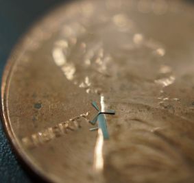
|
A new windmill, developed by scientists at the University of Texas at Arlington.
It's that bluish thing right after the letter Y of "liberty" on the US penny used as a background here.
This is reduced from the full version of the top figure in the press release.
|
It's a small windmill; they call it a microwindmill. It's less than 2 millimeters across. It would take a hundred or so of them to run a cell phone. And that's exactly what they envision: a hundred or so of the microwindmills glued onto the phone (or its case). A little wind, and your phone gets charged. Or you could wave it a bit.
We have little information -- just a press release from the University, and it has few real facts in it. Nevertheless this is fun and intriguing. So we note it briefly. Whether the particular application suggested here is worthwhile doesn't matter much. This is interesting microscale technology.
News story: Technology uses micro-windmills to recharge cell phones. (Phys.org (University of Texas at Arlington), January 10, 2014.) [Updated... The page given here originally is no longer available, but this is probably equivalent.]
Other posts about microscale technology:
* The Quake-Catcher Network: Using your computer to detect earthquakes (October 14, 2011).
* Smart dust: A central nervous system for the earth (July 20, 2010).
* There's plenty of room at the bottom (March 1, 2010).
More about wind energy: Planning (November 23, 2010).
More about cell phones:
* Effect of cell phone on your brain (April 11, 2011).
* Connecting a cell phone and a microscope (September 2, 2009).
There is more about energy on my page Internet Resources for Organic and Biochemistry under Energy resources. It includes a list of some related Musings posts.
Preserving the Apollo landing sites
January 20, 2014
Interesting topic. Do you think that the landing sites for the Apollo spacecraft on the Moon should be preserved as historical sites for posterity? Do you think they should be made US national parks?
There is in fact a bill before the US Congress to protect those sites as US national parks. If nothing else, the bill is bringing attention to a topic that deserves attention.
The news story listed below is a good discussion of what the issues are.
News story: The Moon Belongs to No One, but What About Its Artifacts? (L Laursen (blog, Smithsonian), December 13, 2013.)
More about the Moon: The Moon: might it be a child with only one parent? (April 13, 2012).
A clue about cancer from the naked mole rat?
January 18, 2014
Briefly noted...
Naked mole rats fascinate biologists. They're weird-looking -- if not downright ugly. Of interest at the moment... They are long-lived little rodents, and they don't get cancer.
Size? The animals are typically about 10 centimeters (4 inches) long.
The figure at the right is trimmed from the one in the Science Daily news story.
|
|
A recent article suggests a reason why naked mole rats don't get cancer. They have an unusual form of hyaluronic acid (HA; also called hyaluronan), a mucus-type polysaccharide that all animals have. In the naked mole rats, HA is unusually large.
What's the evidence that the large HA is related to cancer? In lab studies with cultured cells, the scientists show that it is very difficult to "transform" naked mole rat cells to become cancerous. However, if they disrupt the HA, the cells can be transformed to cancerous.
How does this work? Why does HA prevent cancer? They don't know. In fact, their evidence is indirect. They show a relationship in lab cell cultures. They do not know how it works, and it is only a guess that it is relevant in the animals.
What does this mean for humans? We have no idea. What the new work shows is that the naked mole rat has an unusual feature -- one that seems related to absence of cancer. The authors offer some speculation about how this might work; this can be studied further. Any relevance to other organisms is speculative at this point. However, it is also easy to test, at least in mice. I'm sure that someone will try to make mice that have these unusual genes from the naked mole rat, and see what the effect is.
Is this "step 1" of a breakthrough, or a curiosity of no general importance? Time will tell. In any case, it is an excuse to introduce a picture of the naked mole rat.
News stories:
* Chemical That Makes Naked Mole Rats Cancer-Proof Discovered. (Science Daily, June 19, 2013.)
* Why Naked Mole Rats Don't Get Cancer. (Ed Yong, Not Exactly Rocket Science (National Geographic blog), June 19, 2013.) Now archived.
The article: High-molecular-mass hyaluronan mediates the cancer resistance of the naked mole rat. (X Tian et al, Nature 499:346, July 18, 2013.) Check Google Scholar for a freely available copy.
Next post about cancer: Cachexia: is it BAT run amok? (September 22, 2014).
Another post about an animal with a low incidence of cancer: Why do elephants have a low incidence of cancer? (March 20, 2016).
More about the naked mole rat: Do naked mole rats get old? (April 20, 2018).
More mucus: Effectiveness of alcohol-based hand sanitizers? (September 28, 2019).
My page for Biotechnology in the News (BITN) -- Other topics includes a section on Cancer. It includes a list of some other Musings posts on cancer.
Update September 2023...
The same group has now genetically modified lab mice to have this feature of increased hyaluronan. The modified mice have reduced levels of cancer, and an increased healthspan (lifetime with good health). The effect is small (about 4%), but seems significant.
* News story: Longevity gene from naked mole rats extends lifespan of mice. (Lindsey Valich, University of Rochester, August 23, 2023.)
* The article: Increased hyaluronan by naked mole-rat Has2 improves healthspan in mice. (Zhihui Zhang et al, Nature 621:196 September 7, 2023.)
Novel forms of sodium chloride, such as NaCl3
January 17, 2014
What chemical reaction do you expect between common salt, NaCl, and molecular chlorine, Cl2? How about... NaCl + Cl2 --> NaCl3?
A new article reports theoretical calculations suggesting that the above reaction should be favorable. The scientists then go on to test their prediction: they make the proposed compound, NaCl3.
What's the catch? Pressure. The reaction occurs at a pressure of about 60 gigapascals (GPa); that's 600,000 atmospheres. The scientists carry out the reaction inside a high pressure device called a diamond anvil cell.
NaCl3 can be thought of as an ionic compound consisting of Na+ and Cl3- ions. The trichloride ion, Cl3-, is analogous to the well known triiodide ion, I3-. (In fact, Cl3- is known, but no stable salts of it are known, to my knowledge.)
So they have predicted and made a novel sodium chloride. But what's above is just the beginning. Take the structure of two NaCl3 units; that gives you Na2Cl6. Now replace one Na with another Cl; that would give NaCl7. They predict that NaCl7, too, will be stable -- at pressures above 142 GPa. Under such high pressure, Na and Cl are about the same size, allowing this replacement to occur without a significant change in the structure.
That's for reactions of NaCl with extra Cl2. What about NaCl + extra Na? They predict novel compounds at high pressure there, too -- and make one of them: Na3Cl. All in all, they predict five novel compounds of sodium and chlorine, and provide evidence that they have made two of them.
Here is a general outline of the work...
At the left is a cartoon of the experimental design. You can see the sample, represented by white circles, in the diamond anvil cell. For a sense of the scale, the tips of the diamonds are about 200 µm across. The material in the diamond anvil cell, that is, between the diamonds, is then pressed to very high pressures -- about 60 GPa. It is then heated with a laser.
Two reactions are outlined, one at the top and one at the bottom; these are the two reactions discussed above. Both start with the familiar NaCl, with its simple crystal structure. The figure then shows the structures of the two novel sodium chlorides they made. The larger purple balls are Na atoms; the smaller green balls are Cl atoms.
This is from the news story in Science by Ibáñez Insa.
|
Is this all just for fun? Does anyone care what happens at these high pressures? Indeed they do. Such pressures -- even higher -- are found inside the Earth. The chemistry of the Earth's interior is understood poorly, partly because of our poor knowledge of how chemicals behave under what we might consider extreme conditions.
News story: Salty surprise: Ordinary table salt turns into 'forbidden' forms. (Phys.org, December 19, 2013.)
* News story accompanying the article: Geochemistry: Reformulating Table Salt Under Pressure. (J Ibáñez Insa, Science 342:1459, December 20, 2013.) Good overview of what was done -- and what its implications might be for planetary science. The author of this news item is apparently an Earth scientist.
* The article: Unexpected Stable Stoichiometries of Sodium Chlorides. (W Zhang et al, Science 342:1502, December 20, 2013.) (If you can't access the article, there is a draft posted at arXiv: pdf of draft.)
Notes...
Units for pressure. It's easy to get confused; the article and the news stories use different units. A good place to start is the "atmosphere" (atm). One atm is the pressure of the atmosphere on Earth, at sea level. That makes sense. The official SI unit for pressure is the pascal (Pa). One Pa is 1 newton per square meter (1 Pa = 1 N/m2). That's very logical within the SI, but probably leaves you cold. In fact, a pascal is a very small amount of pressure: there are about 100,000 (105) Pa in 1 atm. (More precisely, 1 atm = 1.023x10⁵ Pa.) In the article, pressures are given in gigapascals: 1 GPa = 109 Pa. Thus 1 GPa = 10,000 (104) atm. 20 GPa, one of the "low" pressures in the work, is 200,000 atm.
Above we said that the scientists predict that a certain reaction should be favorable. That is, they predict that the product is more stable than the reactants. In other words, the product is the lowest energy form. If one has a mixture of 1 mole each of sodium chloride and chlorine at 60 Gpa pressure, calculations suggest that the lowest energy form of that mixture would be NaCl3.
Other posts about the effects of high pressure include:
* Briefly noted... Novel Fe-O compounds in the Earth's inner core? (April 26, 2023).
* How many atoms can one nitrogen atom bond to? (January 17, 2017).
* What's the connection: rotten eggs and high-temperature superconductivity? (June 8, 2015).
* Metallic hydrogen? (March 16, 2012).
* Lakes that explode (October 13, 2009).
More about crystals of sodium chloride: Life at age 34,000? (October 8, 2011).
More sodium chemistry: The explosive reaction of sodium metal with water (April 20, 2015).
More on exotic chemicals: Iridium(IX): the highest oxidation state (December 14, 2014).
January 15, 2014
Cubli: a little cube that can stand on one corner and can walk
January 14, 2014

|
This is Cubli, on tiptoe. Or rather, according to the figure legend, "balancing on a corner".
Cubli is about 15 centimeters (6 inches) on a side.
This is Figure 1 from the article.
|
Cubli's other talent is that it can walk. That's related to its ability to stand, as shown above. Imagine Cubli lying on a side. It can rise to balance on an edge. It can further rise to balance on a corner -- as shown above. It can then lower itself, to an edge or side. Successive motions of those types lead to its movement, or to "walking". The movie shows Cubli walking. Have a look!
Behind those talents is technology. The heart of the article is developing the technology that allows these controlled motions.
Movie. It's about three minutes, and includes a delightful narration. The movie is included with the news story at Kurzweil, listed below. It is also at YouTube.
News story: Cubli - a cube that can walk. (Kurzweil, December 23, 2013.) This news story lists three technical papers about Cubli. All seem to be meeting talks, from 2012-13. It's not obvious that any are peer-reviewed papers. All three are freely available; they also are very technical.
The current article, which is freely available from the authors. Direct link to pdf file: Nonlinear Analysis and Control of a Reaction Wheel-based 3D Inverted Pendulum. (M Muehlebach et al, Proceedings of Conference on Decision and Control, CDC 2013, December 2013.) This is the first -- and most recent -- item listed in the Kurzweil news story. (If link doesn't work, check Google Scholar.)
* A recent robotics post: Progress toward an artificial fly (December 6, 2013).
* Next: Quiz: What are they? And are they a threat to you? (October 20, 2014).
For a robot that seems to have more concern about its personal appearance (than Cubli does): Prosthetic arms, prosthetic head ... (September 26, 2009).
More about walking... "Moonwalkers" -- flies that walk backwards (May 28, 2014).
Extending lifespan -- five-fold
January 12, 2014
Let's be clear what the title of this post means. If this were for humans, it would be about humans living for 500 years.
It's not about humans, but rather about worms, Caenorhabditis elegans. These worms, widely studied in biology research, including aging, normally live about 20 days. A new article reports the development of mutant worms that live about 100 days.
In one sense, this was a rather simple development. What the scientists did was to combine two mutations, each of which was known to extend lifespan. The result for this double-mutant worm was surprising.
Let's look...
|
The graph shows survival curves for various C elegans worm strains.
Near the left is a black curve, for normal wild-type worms (labeled N2). You can see that all of these worms have died by day 20.
Just to the right of the black curve is a green curve, for worms with the rsks-1 mutation. These mutant worms live slightly longer than the wild type worms. (If you're not convinced by this curve, that's fine; there has been a lot of work showing it is true.) Then there is a red curve, for worms with the daf-2 mutation. These worms live 2-3 times longer than the wild-type worms.
|
What if we make a double-mutant worm, carrying both the rsks-1 and daf-2 mutations? That's the blue curve. These worms live about 5 times longer than the wild type worms. Their maximum lifespan is about 100 days, 5 times longer than for the wild type worms. If you look at the median survival, the time where half survive... it's nearly 80 days for the double-mutant worms, again about 5 times longer than for the wild type.
There is one more curve. This is the orange curve, listed last in the key. The worms used here contain the two mutations that give the extended lifespan (blue curve), plus a third mutation, one known to interfere with lifespan extension. It does interfere. These triple-mutant worms give about the same survival curve as the wild type.
This is Figure 1A from the article.
|
The double-mutant worms lived longer than either of the single-mutant worms. That's not surprising. The key point is that the double-mutant worms lived longer than one might expect from any simple combining of the effects seen for the two mutations individually. That is, the two mutations interacted synergistically, giving an effect greater than their sum.
Does this have any relevance to humans -- or to any "higher" animals? That will take further work. People study worms as simple model systems. The worm work offers clues that can be followed up. In this case, enough is understood about what the two mutations do that it may well be practical to study the effect of analogous treatments in mice.
This may also be a good time to remind readers that the goal of research on aging is not simply to extend lifespan, but to delay the effects of aging. That is, the goal is to extend the span of a healthy life.
News stories:
* Combining mutants results in five-fold lifespan extension in C. elegans. (Phys.org, December 12, 2013.)
* Life-Span Of Mutant Worms Increased To 500 Human Years: What Does This Mean For Aging Therapies? (Medical Daily, December 12, 2013.)
The article, which is freely available: Germline Signaling Mediates the Synergistically Prolonged Longevity Produced by Double Mutations in daf-2 and rsks-1 in C. elegans. (D Chen et al, Cell Reports 5:1600, December 12, 2013.)
A recent post on aging research... Premature aging: a treatment? (January 5, 2014). That post was about a disease that leads to premature aging; the current post is trying to understand what happens in normal aging.
More... Extending lifespan by dietary restriction: can we fake it? (August 10, 2016).
My page for Biotechnology in the News (BITN) -- Other topics includes a section on Aging. It includes a list of related Musings posts.
Other examples of research on C elegans:
* How to administer Bt toxin to people? (May 16, 2016).
* G (July 8, 2008).
More on worms... Development of insects resistant to Bt toxin from "genetically modified" corn (April 19, 2014).
Rotavirus: passive immunization via food
January 10, 2014
Rotavirus is a serious human pathogen. There are various approaches to dealing with rotavirus, including vaccines, which have proven to have their own problems.
One approach is to use a passive immunological treatment: treat with an antibody to the virus. (In contrast, a vaccine gives the recipient the antigen, which induces the person to make antibodies.) The current work uses rice that has been genetically modified to make an antibody to rotavirus.
A recent article reports testing the use of this rice that makes rotavirus antibody in treating a model system of rotavirus in mice. The following figure shows the results of one of the tests.
|
The graphs show the percentage of the mice with diarrhea vs time. Time zero is when the virus was given. The first dose of antibody was given 9 hr later; further doses were given over 4 days.
|
We'll give some details in the fine print below, but briefly...
* The first two frames, from the left and both labeled as RRV(-), show the results for mice that were not infected with the virus. As expected, uninfected mice do not get diarrhea.
* The next two frames show results for mice that were infected but not treated. They show that all of the mice got diarrhea.
* The final frame, at the right, shows the results for mice that were infected with the virus and then treated with the rice-based antibody. There is a major reduction in the number of animals with diarrhea.
Some details...
The first (top) label shown for each frame tells whether or not the mice for that part were infected with virus. RRV stands for rhesus rotavirus, the virus being used here; + or - tells whether it was or was not, respectively, used in that part.
Next, the labeling shows what treatment or sham treatment (placebo) was used. The treatment was "MucoRice-ARP1"; MucoRice is their name for the rice carrying the antibody, which itself is called ARP1. Controls included wild-type (WT) rice, lacking antibody, and PBS (phosphate-buffer saline), the buffer solution.
This is Figure 3C from the article.
|
The experiment above shows that the antibody produced in rice is a useful treatment against the virus, even when administered after infection. Other results show that it is also effective prophylactically (administered in advance), that it works in immune-deficient mice, and that it survives heat treatment rather well. The authors also note work suggesting that the antibody used here is effective in humans; those results are not yet published.
This is an interesting result. Rotavirus infections are a serious cause of morbidity of children, especially in developing countries. Rice is a staple food in many areas where rotavirus is of concern. Delivery of a drug (in this case, an antibody) via food has some appeal -- but is not without concern. Merits include that the drug is easily and routinely delivered; no special handling and, apparently, no special cooking are needed.
Among the questions that need to be addressed... the merits of passive antibody treatment vs active immunization; the possible long term effects if the rice-with-antibody is a routine part of the diet; the ability to respond to changes in the nature of the virus.
Is the use of rice-with-antibody a good idea? That will require further testing, and comparison with alternatives. However, it would seem to deserve serious consideration. For now, that is the point.
News stories:
* Antibody-producing rice. (Technology.org, August 19, 2013.)
* New GMO Rice Protects Against Rotavirus Infection. (Science 2.0, August 8, 2013.)
The article, which is freely available: Rice-based oral antibody fragment prophylaxis and therapy against rotavirus infection. (D Tokuhara et al, Journal of Clinical Investigation 123:3829, September 2013.)
A post on another rice modified to have a health benefit: Golden rice as a source of vitamin A: a clinical trial and a controversy (November 2, 2012).
More about rice:
* How rice leads to global warming, and what we might do about it (September 2, 2015).
* Can growing rice help keep you from becoming WEIRD? (July 22, 2014).
Another story of GMOs... Development of insects resistant to Bt toxin from "genetically modified" corn (April 19, 2014).
For more on GM crops, see my Biotechnology in the News (BITN) page Agricultural biotechnology (GM foods) and Gene therapy.
My page Biotechnology in the News (BITN) -- Other topics has a section on Vaccines (general).
More about antibodies as drugs: SyAMs: Synthetic drugs that act like antibodies (May 31, 2015).
January 8, 2014
A challenge to the story of photosynthetic sea slugs
January 7, 2014
In an earlier post we noted the finding that some sea slugs contain chloroplasts [link at the end]. The organelles come from the algal food that the animals eat. The chloroplasts are not digested; the resulting animals are green. Considerable evidence was accumulating that the chloroplasts contribute to the energy economy of the sea slugs. That is, the animals are, in effect, photosynthetic.
A new article casts doubt on the conclusion that the animals benefit from the photosynthesis by the chloroplasts.
The following graph shows the results of one key experiment.
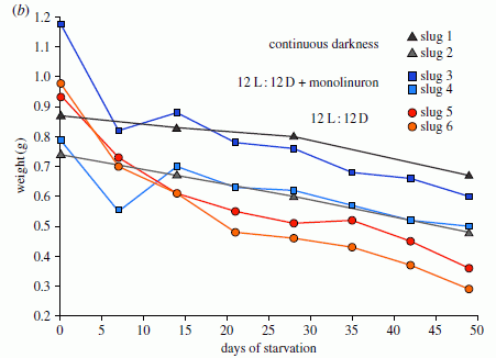
|
In this experiment, the weight of six individual animals was measured during an extended period of starvation. Each line shows the weight of one animal (y-axis) over time (x-axis).
There are three conditions, with two animals per condition:
* Continuous darkness -- the two curves with black triangles.
* Normal days (12 hr each of light and dark) -- the two curves with red circles.
* Normal days, but with an inhibitor of photosynthesis -- the two curves with blue squares.
This is Figure 4b from the article.
|
The basic observation is that all the animals lose weight at about the same rate during starvation, regardless of condition. Certainly there is no evidence here that the animals with active photosynthesis (the two curves with red circles) survive better.
Bottom line? I don't know. Since we noted the original claim, I thought it was important to note the challenge. There are points of agreement. The slugs contain chloroplasts, obtained from their algal food, but not ordinarily digested. These chloroplasts are capable of photosynthesis. What is in dispute is what role these chloroplasts and their photosynthesis may play in the life of the sea slugs. For now, we note the disagreement, and leave the issue open for further evidence.
News stories. Both include pictures of the animals.
* Study shows 'solar powered' sea slugs can survive long term in the dark. (Phys.org, November 20, 2013.)
* 'Solar-powered' sea slugs can survive in the dark -- The creatures may not rely on the photosynthetic ability of the chloroplasts that lend them their colour. (Nature News, November 20, 2013.)
The article, which may be freely available: Plastid-bearing sea slugs fix CO2 in the light but do not require photosynthesis to survive. (G Christa et al, Proceedings of the Royal Society B 281:20132493, January 7, 2014.)
Background post: COOL AS HELL! Sea slug that runs on solar power (Really) (November 30, 2008).
More on the issue...
* Photosynthetic sea slugs; species vary (June 9, 2015).
* More on photosynthetic sea slugs (February 20, 2015).
A simple way to make a supercapacitor with high energy storage?
January 6, 2014
Batteries are one well-known way to store electricity. In a battery, energy is stored in chemical compounds; a chemical reaction occurs resulting in a flow of electrons. An alternative is electrochemical capacitors (EC), sometimes called supercapacitors. These store energy by adsorption of ions on the electrode surface. Since no chemical reaction is involved, EC are fast and stable. However, they have a low energy capacity.
A new article offers a new approach to making such supercapacitors with high energy storage. The authors claim that the energy storage of their material is similar to that of the common lead-acid (automotive) battery.
Here's the idea... In the new work, the scientists make capacitors from graphene and a liquid electrolyte, such as sulfuric acid. The thin graphene provides lots of electrode surface area -- and mechanical strength. The liquid electrolyte not only plays its named role as an electrolyte, but serves as spacing between the graphene sheets. After making the basic graphene-electrolyte capacitor, they remove much of the electrolyte. How? By squeezing it. Simple. It works.
The following graph summarizes the basic finding, that collapse of the material by removal of excess liquid phase usefully increases the volumetric charge storage capacity of the device.
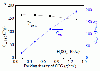
|
The x-axis shows the packing density of the electrode material -- the graphene (or "CCG"). That is, this is the amount of graphene per volume of the device. Removing the liquid electrolyte reduces the volume of the device, thus increasing the packing density of the graphene. Low density is for the original device; higher densities are for devices from which some of the liquid has been removed.
For each device, they measure the capacitance, and express it on either a weight basis or a volume basis. The weight-based capacitance, Cwt-C, is shown in black (symbols, line, and labeling), with the scale at the left. The volume-based capacitance, Cvol, is shown in blue, with the scale at the right.
|
You can see that the weight-based capacitance remains nearly constant as the packing density is increased. Remember that the capacitance is largely a surface phenomenon. The near-constant capacitance (weight basis) means that the available surface area of the graphene is not changed much during the collapse process; this is good. Of course, the volume-based capacitance increases markedly. This follows simply from making the volume smaller with little loss of capacitance. The highest values obtained for the volume-based capacitance resulted in energy storage similar to what is found with common automobile batteries.
This is part of Figure S13 from the Supplementary Materials with the article. This is the left side of the figure, for sulfuric acid as the electrolyte. The right side of the full figure is for another electrolyte, and shows similar results.
A comment on the graph... There are two scales, one on each side. Each runs from 0 to 200. However, the two scales are different. Why? That seems like an unnecessary complication in what could have been a simpler (easier to read) graph.
|
This represents a new development in making supercapacitors. The new work shows a major improvement in energy storage, on a volume basis. The authors suggest that their process for making these supercapacitors is practical. (It's very much like paper-making.)
An interesting issue here is the distinction between two ways of measuring the product; weight-based or volume-based. Which is most important? That depends on the application. Let's accept that this work represents progress toward better supercapacitors, as measured by one criterion.
News stories:
* Monash University team develops graphene-based supercapacitor with energy density of 60 Wh/L. (Green Car Congress, August 3, 2013. Now archived.)
* New graphene-based supercapacitors rival lead-acid batteries. (Kurzweil, August 5, 2013.)
The article: Liquid-Mediated Dense Integration of Graphene Materials for Compact Capacitive Energy Storage. (X Yang et al, Science 341:534, August 2, 2013.)
A previous post on graphene: Loudspeakers: From gold-coated pig intestine to graphene (April 27, 2013).
More... How do you get silkworms to make stronger silk, reinforced with graphene? (October 24, 2016).
More about supercapacitors:
* Butt batteries (December 16, 2014).
* Supercapacitors in the form of stretchable fibers -- suitable for clothing (May 2, 2014).
And batteries...
* Flow battery (January 4, 2016).
There is more about energy on my page Internet Resources for Organic and Biochemistry under Energy resources. It includes a list of some related Musings posts.
Another section of that page, Aromatic compounds, lists posts on graphene.
Premature aging: a treatment?
January 5, 2014
Briefly noted...
The following picture is quite dramatic. I suspect many readers will understand the main point even without explanation.
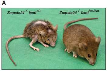
|
The mouse on the left has a disease of premature aging, due to a mutation. Humans with such a disease, called progeria, typically die in their teens -- of diseases of old age. The mouse on the right carries the same progeria mutation, but now also has a gene that provides treatment.
The mouse on the left shows the characteristic features of progeria. The mouse on the right seems normal; extensive data in the article supports that.
|
The mice shown above are 24 weeks old. In human terms, they are young adults.
The figure is labeled with the relevant genes of the mice. Both mice are Zmpste24-/-. That is, they both carry two copies of the - allele for the gene called Zmpste24; this causes the progeria. The other relevant gene is Icmt, a gene for methylation. The mouse on the left is +/+ (normal; wild type) for this; the mouse on the right is hm/hm for it, where hm indicates a low level of the enzyme. (hm = hypomethylation.) That is, it is the low level of the Icmt enzyme that is giving the benefit seen here.
This is Figure 1A from the article.
|
What's going on? The genetic defect behind progeria was characterized some years ago. It involves a protein called lamin. In those with progeria, the mutant lamin interferes with proper function of the nuclear membrane. The interaction of lamin with the nuclear membrane requires two modifications: the addition of a fatty acid and the addition of a methyl group onto the lamin. Scientists have already tried blocking the addition of fatty acid; this gives some, but limited, benefit. In the new work, they learn how to block the methylation step. It is remarkably effective.
What about humans? Most of the work in the article is with mice. The disease model in mice is rather similar to the progeria disease in humans. The scientists report one experiment with human cells: they inhibit the methylase enzyme in cell cultures. For normal cells this has no observed effect. For cells from progeria patients, inhibiting the methylase improved their growth. That's encouraging.
The relevance of progeria to normal aging is an open question.
Bottom line... The article shows an approach to treating the disease of premature aging called progeria. It may well be worth testing in humans.
News story: Accelerated Aging in Children: Promising Treatment for Progeria Within Reach. (Science Daily, May 16, 2013.) Good overview.
* News story accompanying the article: Cell biology: Rapid Aging Rescue? (T E Johnson, Science 340:1299, June 14, 2013.)
* The article: Targeting Isoprenylcysteine Methylation Ameliorates Disease in a Mouse Model of Progeria. (M X Ibrahim et al, Science 340:1330, June 14, 2013.)
More about progeria:
* Treating progeria by editing the gene (March 23, 2021).
* Drug may extend life in progeria patients (October 17, 2014).
Also see: Extending lifespan -- five-fold (January 12, 2014).
My page for Biotechnology in the News (BITN) -- Other topics includes a section on Aging. It includes a list of related Musings posts.
Killing persisters -- a new type of antibiotic
January 3, 2014
Antibiotics are a mainstay of our response to bacterial infections. However, they have limitations. One, which gets much attention, is the development of bacterial strains that are resistant to the antibiotics.
Another limitation is more subtle: bacteria that simply seem to ignore the antibiotics, even though they are not resistant. Here is the phenomenon... Treat a bacterial population with an antibiotic. Most die. Some survive. Some of the survivors are in fact resistant: grow them up, and their progeny are indeed resistant to the antibiotic. However, others that survived are, when grown up as a fresh culture, just as sensitive as the original bacteria.
What's the deal with these "persister" bacteria, as they are often called? And what might we do about them?
Persister bacteria are not well understood; it is quite likely that there are multiple phenomena. It's hard to study persisters; more or less by definition, once you isolate them, they don't have the property of interest any more. The general sense is that persisters are bacteria in some special physiological state. That is, they are physiologically resistant to the antibiotic -- not genetically resistant. Physiological resistance is lost as soon as the persisters are isolated. An example of how "persistence" might occur is based on the fact that many antibiotics act on bacteria during active growth; bacteria that, for whatever physiological reason, are inactive when the antibiotic arrives may survive the treatment -- and resume growth later.
A new article offers a possible approach to dealing with persisters. In addition to showing some promising results, the article explains how the approach works.
Here is an example of what the scientists found in this new work...
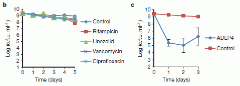
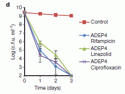
The graphs all show the survival of populations of Staphylococcus aureus bacteria over time, with various treatments. The y-axis shows the number of bacteria, on a log scale. That is, 9 on the scale means 109 bacteria per mL. (The scale is labeled in c.f.u. = colony forming units. In simple terms, 1 c.f.u. is 1 bacterium.) The x-axis shows time, in days.
Start with frame d, at the right. The control curve, with red squares, shows what happens with no treatment. The bacterial count remains approximately constant. These are non-growing bacteria. Then there are three treatment curves. Each involves a combination: something called ADEP4 plus a conventional antibiotic. Three such conventional antibiotics are tested here.
The results for the combination treatments in frame d are striking: all the bacterial cultures are killed completely by day 3. (The bottom of the graph is the detection limit.)
To understand the significance of those results, we need to look at the other graphs. Frame b, at the left, shows treatments with four conventional antibiotics (including the three used in frame d). Those antibiotics do little or nothing! This illustrates that these antibiotics have little effect on non-growing bacteria. Frame c (middle graph) shows treatment with ADEP4 alone. It does have an effect: in the first day it kills 99.99% of the bacteria (blue circles). But then its effect stops, and the remaining bacteria survive.
It's only the combination treatments, as shown in frame d, that are truly effective.
The graphs above are three frames of Figure 3 from the article.
|
So what do we have? A candidate drug with significant action against non-growing bacteria. It works some alone. In combination with ordinary antibiotics, it seems to completely eliminate the bacterial population.
How does this new drug work? One activity of any type of cell is removing proteins that are no longer wanted. This is done by somehow recognizing the unwanted proteins, and then degrading them. What the new drug seems to do is to alter the protease (protein-degrading enzyme) that degrades unwanted proteins -- so that it is over-active. More specifically, the drug seems to widen the opening of the protease, so that it accepts normal proteins, not just those already partly unfolded and ready for degradation. Thus the protease now degrades the proteins of the cell -- unwanted or not. That kills the cells.
The article provides some promising data suggesting the effectiveness of their new candidate drug; some of this is shown above. Questions remain about how well this will work in the real world; certainly, many candidate antibiotics fail upon further testing. However, the fact that they understand the novel mechanism of this drug enhances the chance that further drugs of this type could be developed. All in all, this is a story that is intriguing and promising -- even as we remember that the results so far are only a start.
News stories:
* Thwarting Persistence -- Researchers show that activating an endogenous protease can eliminate bacterial persisters. (Abby Olena, The Scientist, November 13, 2013.) Now archived.
* Killing Sleeper Cells and Superbugs with Assassin Janitors. (Ed Yong, Not Exactly Rocket Science (National Geographic blog), November 13, 2013.) Now archived.
* News story accompanying the article: Antibiotics: Killing the survivors. (K Gerdes & H Ingmer, Nature 503:347, November 21, 2013.)
* The article: Activated ClpP kills persisters and eradicates a chronic biofilm infection. (B P Conlon et al, Nature 503:365, November 21, 2013.)
A post on the problem of antibiotic resistance: Restricting excessive use of antibiotics on the farm (September 25, 2010). With follow-up posts listed there.
A post that may also be about getting at persisters: Antibiotic action: effect of hydrogen sulfide (July 9, 2021).
More about "Staph" infections: Can the Staph solve the Staph problem? (July 12, 2010).
Another approach to antibiotics... Black silicon and dragonfly wings kill bacteria by punching holes in them (January 28, 2014).
More on biofilms... Salmonella and food contamination; the biofilm problem (April 28, 2014).
Also see: Inhibiting the TMPRSS in your nose to protect against respiratory viruses (COVID, flu) (July 11, 2022).
More on antibiotics is on my page Biotechnology in the News (BITN) -- Other topics under Antibiotics. It includes a list of related Musings posts.
Top of page
The main page for current items is Musings.
The first archive page is Musings Archive.
E-mail announcements -- information and sign-up: e-mail announcements. The list is being used only occasionally.
Contact information
Site home page
Last update: April 14, 2026