Home
> Musings: Main
> Archive
> Archive for January-April 2020 (this page)
| Introduction
| e-mail announcements
| Contact
Musings: January - April 2020 (archive)
Musings is an informal newsletter mainly highlighting recent science. It is intended as both fun and instructive. Items are posted a few times each week. See the Introduction, listed below, for more information.
If you got here from a search engine... Do a simple text search of this page to find your topic. Searches for a single word (or root) are most likely to work.
Introduction (separate page).
This page:
2020 (January-April)
April 29
April 15
April 8
April 1
March 25
March 18
March 11
March 4
February 26
February 19
February 12
February 5
January 29
January 22
January 15
January 8
Also see the complete listing of Musings pages, immediately below.
All pages:
Most recent posts
2026
2025
2024
2023:
January-April
May-December
2022:
January-April
May-August
September-December
2021:
January-April
May-August
September-December
2020:
January-April: this page, see detail above
May-August
September-December
2019:
January-April
May-August
September-December
2018:
January-April
May-August
September-December
2017:
January-April
May-August
September-December
2016:
January-April
May-August
September-December
2015:
January-April
May-August
September-December
2014:
January-April
May-August
September-December
2013:
January-April
May-August
September-December
2012:
January-April
May-August
September-December
2011:
January-April
May-August
September-December
2010:
January-June
July-December
2009
2008
Links to external sites will open in a new window.
Archive items may be edited, to condense them a bit or to update links. Some links may require a subscription for full access, but I try to provide at least one useful open source for most items.
Please let me know of any broken links you find -- on my Musings pages or any of my web pages. Personal reports are often the first way I find out about such a problem.
April 29, 2020
Briefly noted...
April 29, 2020
The following two items are among several news stories in a feature section on COVID-19 in Nature two weeks ago. They give useful overviews of messy topics.
1. Why is COVID-19 severe in some people? This item relates to the Musings post immediately below, about cytokine storms. In that post we noted that the nature of severe COVID disease and the possible role of a cytokine storm are not clear. The item here discusses some of the ideas about severe COVID disease; it emphasizes that we don't know. (One cytokine discussed here is IL-6. It is one included in the figures in the cytokine storm post below, though not the one we focused on there.)
* News story: How does COVID-19 kill? Uncertainty is hampering doctors' ability to choose treatments. Doctors are reaching for drugs that dampen the immune response - but these also undermine the body's own fight against the coronavirus. (H Ledford, Nature, April 9, 2020. In print: Nature 580:311, April 16, 2020.)
* More about severe COVID: A senolytic treatment for severe COVID (August 21, 2021).
2. Modeling the pandemic. Models guide planning. You hear the answers -- and they are often contradictory. You usually don't hear what is behind the models. Modeling is an art, based on incomplete data and some "guesses" about what will happen. Modeling, like much scientific analysis, is typically tentative. Over time, we learn from the models, as we get better input data and learn which models work better. The following story gives the idea.
* News story: The simulations driving the world's response to COVID-19 -- How epidemiologists rushed to model the coronavirus pandemic. (D Adam, Nature, April 2, 2020. In print: Nature 580:316, April 16, 2020.)
How does "cytokine storm" work?
April 28, 2020
Cytokine storm. You have probably heard the term, and you may associate it with bad things happening. But what is it? How does it work? What triggers it?
The simple story is that a cytokine storm is an excessive response of the immune system. Instead of just attacking the invader and then subsiding, the immune response attacks the body; the result may be death. Cytokines are signaling molecules in the immune system. A cytokine storm involves an excess of pro-inflammatory cytokines. But little is known about the mechanistic details or why it happens in some cases.
A new article explores a model system, and offers a detailed description of the excessive response. It's a complex story; here we look at some of the pieces.
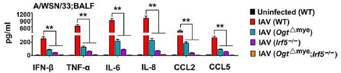
The following figure shows that a high level of glucosamine (GlcN) leads to high levels of the cytokines during an infection with the influenza A virus (IAV).

In these experiments, lab mice were tested with IAV infection. Some of the mice were given GlcN.
Start with the left-hand data set, for IFN-β; that is interferon-beta, one of the pro-inflammatory cytokines. There are four conditions; see the key at the upper left. The first bar, for the control, is so small you can't really see it. The next bar (red) is for IAV infection; the virus infection leads to more IFN-β. That's good; an inflammatory response is part of how you attack the virus. The next bar (blue) is for adding GlcN -- in uninfected mice; there is a small increase in IFN-β. The right-hand (orange) bar is for IAV-infected mice given GlcN. You can see that the level of IFN-β is increased dramatically.
The other five data sets are for five other specific cytokines -- all of them pro-inflammatory. The general pattern of results is the same: in mice infected with IAV, GlcN causes a major increase of each cytokine level.
BALF (in the y-axis label) = bronchoalveolar lavage fluid.
This is Figure 1J from the article.
|
The following figure identifies a specific step in how GlcN promotes cytokine production.
The general layout is the same as in the top figure. The main difference is the set of variables. As before, the set of graphs is for a set of cytokines, and the general pattern is the same for all of them. You can focus on one, such as IFN-β, at the left.
The first bar is for the control: uninfected mice. As before, this bar is very near zero. The other four bars are for mice infected with IAV. They differ in the kind of mice infected.
The first of those IAV bars (red) is for infection of wild type (WT) mice. That bar is high, as expected for IAV infection. The next two bars are for infection of mice carrying one of two specific mutations. And the final bar (orange, says the key) is for mice carrying both of those mutations.
You can see that all three of those bars for mice with mutations show low levels of the cytokines. And the mice carrying both mutations gave the lowest levels of all among the results for infected mice.
This is the right-hand side of Figure 5D from the article.
|
What are those two mutations? One is in an enzyme that uses GlcN (actually, a derivative of it) and the other is in a target of that enzyme. That target is a regulatory protein, which leads to enhanced cytokine production. The enzyme transfers GlcNAc to a specific site on the regulatory protein, making it more active. Blocking either the enzyme or the target reduces cytokine production; blocking both is even better.
For those who want a little more detail...
Glucose is the common sugar. In normal metabolism some glucose is converted to glucosamine (GlcN), where one -OH of the glucose is replaced by an -NH2 (amino) group. Some GlcN is acetylated, leading to N-acetylglucosamine (GlcNAc).
OGT is the enzyme that transfers GlcNAc. It transfers the GlcNAc to the protein IRF5; that modification activates IRF5 and promotes production of the cytokines.
OGT = O-GlcNAc transferase. IRF5 = interferon regulatory factor-5.
The first experiment presented here shows that high levels of glucosamine, a product from glucose, enhances the levels of pro-inflammatory cytokines during infection of mice with a common flu virus. The second provides evidence that a particular enzymatic step using a glucosamine derivative is involved in enhancing cytokine levels.
The article contains more, broadly showing how high levels of glucose or its product glucosamine can lead to high levels of pro-inflammatory cytokines during a viral infection.
Caution... If we, tentatively, accept that the basic findings are correct, we do not know the generality of the findings. The work here shows how one virus can lead to a cytokine storm in mice. Is that what happens with this virus in humans? We don't know. Is this what happens with other viruses? Again, we don't know. The current work gives us our best understanding of a cytokine storm. It will stimulate further work; over time, we will see how general it is.
The article does offer some limited data about humans. An exploratory analysis of people with the flu and some controls suggests that blood glucose level correlates with cytokine levels in flu-infected people. That is consistent with the main findings for mice.
People with severe COVID-19 may have a cytokine storm. For now, we don't know if that works like what is shown in the current article.
The current article offers a possible explanation for why diabetics may be at increased risk of severe COVID-19. A high glucose level may be a key factor. Logical, but for now it is only a hypothesis.
The findings here might suggest a therapeutic intervention. But it is important to recognize that a logical intervention may or may not work, or be safe, in the real world.
This is an interesting article, which offers the most detailed description of a cytokine storm to date. But its importance -- its generality and implications -- remains to be seen.
News stories:
* High glucose levels may explain why some flu patients have more severe symptoms. (B Yirka, Medical Xpress, April 16, 2020.)
* Discovered: Metabolic Mechanism of Cytokine Storms -- By studying influenza in mice and cells, researchers identify a glucose metabolism pathway critical to the dysregulated immune response that kills many infectious disease patients, including those with COVID-19. (R Williams, The Scientist, April 15, 2020.) Now archived.
The article, which is freely available: O-GlcNAc transferase promotes influenza A virus-induced cytokine storm by targeting interferon regulatory factor-5. (Q Wang et al, Science Advances 6:eaaz7086, April 15, 2020.)
More about cytokines and inflammation...
* Chronic fatigue syndrome: a clue about the role of inflammation? (October 27, 2017).
* How Ebola kills: a clue about a key protein (December 5, 2014).
Posts on flu are listed on the supplementary page Musings: Influenza (Swine flu).
Why robo-turtles may be useful
April 25, 2020
They keep the fish happy.
That's the gist of a recent scientific article.
Context? Fish-farming, sometimes called aquaculture. Specifically, farming of salmon in large sea-cages, which may hold 200,000 fish. It's important to monitor the cage. (Among the concerns... fish escaping through a hole in the cage, as well as the general well-being of the fish.) Monitoring can be done by human divers or by robotic devices.
Turns out that the fish don't like commonly used robots. The robots are clearly stressful to the fish, which are actually more likely to seek safety by fleeing. But the article reports a solution: robotic turtles stress the fish much less.
Look...
These are photos of a sea-cage of salmon. The three frames show the fish around various objects in the cage. Part a (left) focuses on a human diver; the other two parts focus on two types of robotic devices.
You can see that the fish avoided the device in part b, but were plentiful around the one in part c -- the one that really does look like a turtle. (The fish also avoided the human.)
This is Figure 5 from the article.
|
Here are some quantitative data on the matter...
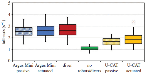
The bars show the number of tailbeats of the fish. (The center horizontal line shows the median of the measurements.) Tailbeats are normal, of course, but a high level of them is an indication of stress.
The green bar, labeled no robots/divers, shows the "normal" or background level of tailbeats.
The first two bars, at the left, are for the robot of part b, above; the one the fish avoid. That robot is called Argus Mini. The two bars for that robot are for when it is off or active. The next bar is for the presence of a diver. All three of those bars, for conditions where the fish avoid the intruder, are considerably higher than the control.
The two bars at the right are for the device that looks like a turtle. That robot is called U-CAT. There is some increase in tailbeats, but it is much smaller than for the other device. The fish are clearly aware of the robo-turtle, but, as shown in the top figure, they do not flee it.
The authors say that the small difference in results for passive vs actuated U-CAT is statistically significant. That is supported by another analysis of the fish behavior (Fig 7, not shown here).
This is Figure 6 from the article.
|
The general conclusion from the article is that the robo-turtle is the preferred type of robotic monitoring device, because it stresses the fish less.
Why does the robo-turtle stress the fish less? That is not at all clear. Since the results are similar for passive and active devices (second figure above), some possible explanations involving how it moves seem unlikely. It may be simply that the U-CAT device is considerably smaller than the Argus Mini -- and that the turtle-ness is not really an issue. For now, U-CAT works better than the Argus Mini; that is useful information. Further work might reveal why it works better, and lead to even better robotic monitors for fish cages.
Some of the news comments suggest that the slower speed of the U-CAT device may be good. It's not clear that the article itself supports that point, though it seems logical.
Overall, the article is an interesting exploration of fish behavior. But it is done in the context of a practical application. As a result, it is done under semi-natural conditions, more complex than common well-controlled lab conditions.
News stories:
* Biorobotics is the future of fish farming. (Phys.org (Estonian Research Council), April 16, 2020.)
* Robotic turtles cause minimal stress to fish while monitoring. (AZo LifeSciences (Norwegian University of Science and Technology), April 6 2020.)
The article, which is freely available: Salmon behavioural response to robots in an aquaculture sea cage. (M Kruusmaa et al, Royal Society Open Science 7:191220, March 1, 2020.)
More salmon (with a picture)... Berkeley RadWatch: Radiation in the environment (February 24, 2014).
... and more ... How the rain and cars in Seattle are killing the fish (January 26, 2021).
Previous post about turtles: Red color vision in dinosaurs? (October 17, 2016).
... and more ... Watching barnacles move (October 19, 2021).
Previous post about a robot: Designing reconfigurable organisms (January 19, 2020).
April 15, 2020
Briefly noted...
April 15, 2020
Why do so many pathogenic viruses come from bats? Evidence is accumulating that the immune system of the bats plays a role. The bat immune system is unusually strong, and puts a strong selective pressure on the viruses. Any virus that can thrive in the bats has a headstart when it moves to a host with a more ordinary immune system. A recent article discusses the evidence -- and the nuances. Much of the current article is modeling, and the core of the paper may be less interesting than the sections that explore the ideas (Introduction and Discussion).
* News stories. Both link to the article, which is freely available.
- Immune arms-race in bats may make their viruses deadly to people -- Strong immune system may save bats but make their germs harder for humans and others to survive. (E Garcia de Jesus, Science News Explores (formerly Science News for Students), February 12, 2020.)
- Coronavirus outbreak raises question: Why are bat viruses so deadly? (R Sanders, University of California - Berkeley, February 10, 2020.)
Also see: Bat viruses: a novel deadly bat virus -- misdiagnosed as Nipah (March 18, 2026). Added March 18, 2026.
I have noted this item on my page for Biotechnology in the News (BITN) -- Other topics in the section Emerging diseases (general).
Snake toxins: for offense or defense?
April 14, 2020
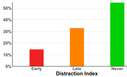
Snakes bite -- injecting venom -- for both offensive and defensive purposes. Is it possible to decide which came first, or might be considered most important?
A recent article addresses the issue, using a criterion suggested by the chemical ecologist Tom Eisner four decades ago... For defense, time matters; defensive toxins should act fast -- should cause acute pain fast. Slow-acting toxins may be fine for offense. In fact, it may be better if offensive toxins don't agitate the prey.
Data? The authors put up a questionnaire on Facebook (and sought and encouraged wide distribution). The questionnaire was aimed at snake experts -- people at risk for snake bites, and who would take the questionnaire seriously. The basic question was to describe the development of the pain over time. The respondents were also asked to indicate whether the pain was "distracting" -- serious enough to affect their activities. And they were asked to identify the type of snake, another task appropriate for the experts.
Responses for nearly 600 bites were received. The following graph summarizes the findings for the question of whether the pain was serious enough to affect their activities...
It's a simple graph, with a clear result. More than half the snake bites were not painful enough to distract the person from what they were doing. (And only about 15% caused a rapid distraction, within the first minute.)
This is Figure 2 from the article.
|
That's the basic idea. Most snake bites do not rapidly deter the victim. That suggests that defense is not the primary role.
The authors also analyze the pain trajectory of the bites on a family tree of snakes. The pattern suggests that the ability to give rapidly painful bites arose from time to time, and was often lost. There is nothing in the family tree to suggest that defense played a major role in the evolution of snake venoms.
Of course, snakes vary -- both at the species level and at the individual level. And victims may vary in their sensitivity. There is no question that some snakes have turned the venomous bite into an important defensive weapon. The spitting cobra is the authors' favorite example. But that is a derived trait, not fundamental to snakedom.
It's an interesting article. It starts with a question most people have probably never even thought about. One may question aspects of how they got their data, but the big conclusion seems rather strong. Fundamentally, snake venom is for offense -- to help the snakes catch food.
An unusual aspect of this work is that humans are used as the model organism. The authors discuss this; the major point is that pain sensitivity is likely to be highly conserved among vertebrates.
News stories:
* Snake venom evolved for prey not protection. (EurekAlert! (Swansea and Bangor Universities), March 25, 2020.)
* Why do snakes produce venom? Not for self-defence, study shows. (W Wüster & K Arbuckle, The Conversation, March 23, 2020.) A discussion of the work by two of the authors.
The article, which is freely available: Fangs for the Memories? A Survey of Pain in Snakebite Patients Does Not Support a Strong Role for Defense in the Evolution of Snake Venom Composition. (H Ward-Smith et al, Toxins 12:201, March 2020.) (Not sure I think much of the first part of the title.) Be sure to read the quotation that starts the Introduction.
A recent post about snake venoms: Snake venom gland organoids (March 17, 2020).
A book about venoms -- from snakes and more -- is listed on my page of Books: Suggestions for general science reading. Wilcox, Venomous -- How Earth's deadliest creatures mastered biochemistry (2016).
That Book Suggestions page also lists a couple of books by Tom Eisner, whose background idea was noted near the top of this post. The books are about insects, not snakes, but are fine books.
A prosthetic heart valve that can "grow" as a child grows
April 13, 2020
Prosthetic devices sometimes need to be replaced. For internal devices, this means opening the body for surgery. And for children, it can mean a succession of surgeries, simply because the child grows and needs a bigger device.
What if the prosthetic device could "grow" (or somehow adapt) as the child grows, so that surgeries needed only because of growth could be avoided? A recent article reports progress toward a prosthetic heart valve with just that property.
There are two issues here. One is how the device works. The other is the testing that shows it works.
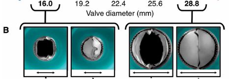
Let's focus on the second one, so we recognize that the scientists have accomplished something. The final testing reported in the article involved implanting the new valves in infant lambs, and monitoring them over several weeks of growth.
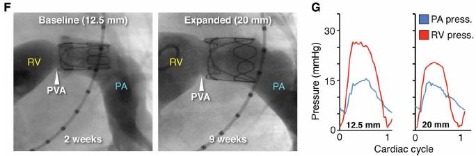
In part F, the dark tube is the artery. The wiry thing inside it at the top is the prosthetic valve. (The valve itself is not wiry; the imaging here is showing only its outline.)
Blood flow is from left to right.
RV = right ventricle; PA = pulmonary artery; PVA = native pulmonary valve annulus.
Images are shown for two times: 2 and 9 weeks after implanting the valve. (The lambs were about 2 months old at the time of implantation.)
The size of the artery has increased -- due to natural growth. The dimension shown (at the top) for each time is the artery diameter at the valve site.
You can see that the valve fits the artery in both cases. It is the same valve. (Caution... Don't assume you know why it is bigger at the second time. But you might note that, while the valve diameter has increased, its length has decreased.)
Part G shows the pressures during a cardiac cycle at two positions: before and after the valve. The pressure profiles are within the normal range; there is minimal backflow. The valve is working ok.
This is part of Figure 5 from the article.
|
The following figure shows the valve in a lab test...
In this test, using tubing of various diameters, the valve was adapted to fit. For two of the tubing sizes, the photos show the valve in its open and closed positions.
When the valve appears closed, the measured flow is zero (not shown here). The valve has successfully prevented backflow.
This is Figure 3B from the article. (The labeling at the top is actually the bottom part of Figure 3A. That is why there are more numbers there. That labeling bridges parts A and B of the figure.)
|
The figures above give an idea of the testing that suggests the device is promising.
How does the valve "grow" or "adapt" to different size vessels -- whether they be different sizes of tubing in the lab or a growing artery? It actually doesn't adapt at all on its own. It has to be pumped up, using a balloon. The balloon is inserted into a blood vessel that is easily accessible from the body surface, and threaded to where it is needed. It is an application of catheterization, a common medical procedure.
In the example shown here in the top figure, the valve had been expanded twice, from the original 12 mm to 16 mm, then to 20 mm.
Interestingly, the design of the prosthetic heart valve was inspired in part by looking at how venous valves work. Those valves naturally change size, as the volume flowing through the vein fluctuates.
That is, "growth" or "adaptation" of the valve as the child grows is still a medical procedure. But it is a much simpler one. It is not risk-free, but it is better than open heart surgery. Progress.
News stories:
* Heart valve that grows with the child lowers the need for risky multiple heart surgeries. (A B B Laguipo, News-Medical.Net, February 20, 2020.)
* Someday, this prosthetic heart valve might be the only one a child needs. (N Fliesler, Boston Children's Hospital, February 20, 2020.)
The article: A geometrically adaptable heart valve replacement. (S C Hofferberth et al, Science Translational Medicine 12:eaay4006, February 19, 2020.)
Video. There is a video posted with the article. (8 minutes; no sound.) It is a collection of well-labeled segments, showing various aspects of the work. The segment from 1:03 to 1:46 shows the basic idea of how the valve expands, and works at various expansions.
Heart valves were mentioned in the post Pigs as organ donors for humans (February 16, 2010).
A recent post about heart function: Stem cell treatment of heart damage: a new interpretation (March 31, 2020).
A post about using lambs in studies of early development... Lamb-in-a-bag (July 14, 2017).
There is more about replacement body parts on my page Biotechnology in the News (BITN) for Cloning and stem cells. It includes an extensive list of related Musings posts.
April 8, 2020
Briefly noted...
April 8, 2020
DARPA tackles reproducibility. DARPA (an agency of the US Defense Department) is known for promoting innovation. Now it is promoting studies of reproducibility within science, specifically within biology. A recent "Comment" item in Nature by people involved in the project tells the story. It's interesting, for its perspective on the problem as well as for what they have done. And the cartoon at the top deserves study.
* "Comment" story: A controlled trial for reproducibility -- For three years, part of DARPA has funded two teams for each project: one for research and one for reproducibility. The investment is paying off. (M P Raphael et al, Nature, March 10, 2020. In print: Nature 570:190, March 12, 2020.)
* A post about DARPA-funded work: Multi-organ lab "chips" (April 14, 2018).
Quality of lettuce grown on the Space Station
April 7, 2020

|
A lettuce-growing chamber on the International Space Station (ISS).
The lettuce tested here is red romaine lettuce, Lactuca sativa cv 'Outredgeous.'
The growth chamber is called Veggie.
This is part of Figure 1 from the article.
|
A recent article reports some characterization of three crops of lettuce grown on the ISS over three years.
One part of the analysis was to examine the microbes found on the lettuce. It's a complex story... The overall level of microbes was several times higher than for controlled crops grown in parallel back on Earth, but lower than common for field-grown crops. Describing and understanding the microbes may be interesting, but the important message is that no known pathogens were found.
Another part of the analysis was to examine the chemical composition. Again, the results are complex, but it seems unlikely that the differences found are important.
Here is an example of the findings...

The focus is on anti-oxidants. The first two rows are for two types of anti-oxidant chemicals. ORAC (Oxygen Radical Absorbance Capacity) is a measure of the total anti-oxidants.
Results are shown for a crop grown on the ISS ("Flight". on the right) and for a crop grown under generally similar conditions on the "Ground" (left).
For each row, the results are similar for the ground and flight crops.
This is part of Table 8 from the article.
The full table shows the data for two additional runs. In all cases, results for the flight crop and the ground crop run along with it were similar. The results for the three runs are broadly similar, except that the level of phenolics in run 3 was about 1/3 the amount shown above -- for both flight and ground crops. No explanation is offered for this difference.
"Ground" crops were grown in controlled-environment chambers, under approximately the same conditions as the current "Flight" crop. (The ground crop schedule was a day or so behind the ISS crop, so that it could make use of data for the ISS conditions.)
The ORAC results are shown in terms of TE, which stands for Trolox equivalents. Trolox is a particular anti-oxidant chemical used as a reference material here.
|
The overall conclusion from the article is that they are able to grow lettuce on the Space Station. Analysis of the product does not reveal any concerns about its use for food.
Portions of the ISS crop from the third run were consumed by the crew. However, no systematic testing of the lettuce as food for any animal was done.
It's a step toward learning how to grow food in space.
News stories:
* Space lettuce. (Nanowerk News (Frontiers, the journal publisher), March 6, 2020.)
* Lettuce grown in space is just as nutritious as that grown on Earth. (T Puiu, ZME Science, March 6, 2020.)
The article, which is freely available: Microbiological and Nutritional Analysis of Lettuce Crops Grown on the International Space Station. (C L M Khodadad et al, Frontiers in Plant Science 11:199, March 2020.)
Previous post about lettuce: Could a common food plant be used to make rubber? (March 27, 2015).
More from the space station: Which direction does blood flow in an astronaut? (January 7, 2020). Links to more.
Among the specific astronauts acknowledged for their help on the ISS is Scott Kelly. The article does not say whether his identical twin Mark was similarly involved with the "ground" crop. See item #1 at: Briefly noted... 1. The effect of space travel on humans: a study of identical twins. (November 13, 2019).
Mitochondria in the blood?
April 5, 2020
Mitochondria are intracellular organelles. They are found inside cells. Finding them outside cells is a bit odd. There have been reports that mitochondrial debris can be found in the blood following trauma, but that is a special case.
A recent article reports that free mitochondria are found in the blood of normal people. Functional mitochondria.
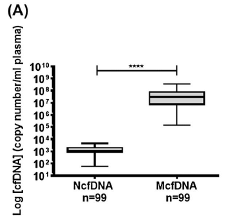
The following figure shows the first observation...
|
The graph shows the number of copies of certain genes found in the blood plasma from 99 healthy people. Two genes were tested, a nuclear gene (left side) and a mitochondrial gene (right side).
The amount of mitochondrial gene DNA was far higher than the amount of nuclear gene DNA. About 10,000 times higher, judging from the medians. (The result is shown as number of gene copies per milliliter of plasma. Note the log scale.)
You can also see that the amount of mitochondrial DNA varied widely among the individuals tested: about a thousand-fold range.
|
The left-hand bar is labeled NcfDNA. That stands for nuclear cell-free DNA. The right-hand bar label starts with M, for mitochondrial.
The operational description of blood "plasma" is that it is free of blood cells.
This is Figure 1a from the article.
|
Mitochondrial DNA in the blood plasma. The scientists went on to show that the DNA was intact. And then they showed the presence of mitochondria.
They also showed that growing cells in the lab, in cell culture, led to the presence of mitochondria in the culture medium.
Are the mitochondria functional? Here is a test...
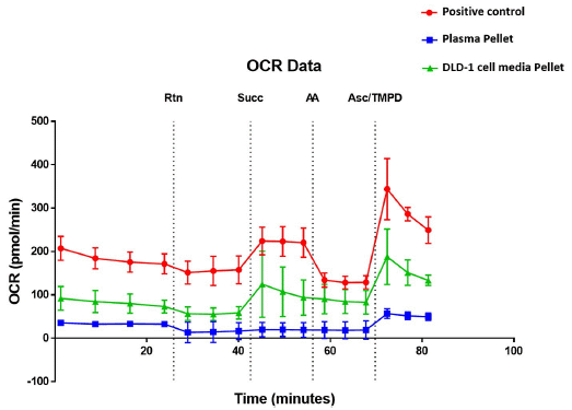
The graph shows the OCR (oxygen consumption rate) for three preparations over time. Consuming O2 reflects the basic function of mitochondria.
The three preparations are, in the order shown in the key:
- Positive control (red). That is, a bona fide mitochondrial preparation.
- The pellet from blood plasma (blue). That is, blood cells were first removed, to make plasma. The plasma was then centrifuged under conditions known to pellet mitochondria (but not soluble debris).
- A pellet prepared similarly from cell culture (green).
The vertical dotted lines are at times where something was added. (What they are is shown at the top with a cryptic abbreviation, but we'll leave that for now.)
You can see that the bona fide mitochondria (red curve) responded to each addition by increasing or decreasing OCR. Each such change was as expected for the addition.
The other two curves, for the pellets, responded similarly in most cases.
This is Figure 7 from the article.
|
From that last point, the authors concluded that the pellets contained functional mitochondria. That is, blood contains cell-free functional mitochondria, as does the growth medium from growing cells in the lab.
If you are not impressed with all the data there, so be it. It is what they have at this point, and the logic is good, even if the data seems weak.
It's a novel -- and intriguing -- finding. As so often, this is a scientific article that just raises more questions. Among them...
- How did the mitochondria get there? (Is it possible that cells actually "secrete" mitochondria across the cell membrane to the outside?)
- Are there any consequences of interest? (There have been occasional claims of mitochondria apparently being transferred from one cell to another. Is there any connection to the current claim?)
The authors speculate that mitochondria may be involved in communication between cells. and they suggest that the levels of free mitochondria might be useful for diagnostic purposes. Again, topics for further work.
News story: Researchers Find Cell-Free Mitochondria Floating in Human Blood -- The functional, respiring organelles appear to be present in the blood of healthy people, but their function is yet unclear. (K Zimmer, The Scientist, February 6, 2020.) Now archived.
The article, which is freely available: Blood contains circulating cell-free respiratory competent mitochondria. (Z Al Amir Dache et al, FASEB Journal 34:3616, March 2020.)
An earlier post on mitochondria in the blood. Can you die from an infection without being infected? (March 19, 2010). This earlier post is about mitochondria, probably as debris, in the blood after trauma. The current post suggests that some level of intact mitochondria in the blood is normal.
A post from a year ago with another controversial claim about mitochondria... Transmission of mitochondria from the father -- in humans (March 26, 2019). A challenge to the claim is noted near the end of the post.
April 1, 2020
Briefly noted...
April 1, 2020
What organisms carry genes for bacterial cell walls (peptidoglycan)? Bacteria, you say? But what else? No other organisms are known to have peptidoglycan. A recent article explores a complex symbiosis: an insect with an endosymbiotic bacterium inside its cells. And that endosymbiotic bacterium has another endosymbiotic bacterium within it. Turns out that the insect nuclear genome carries some of the genes needed for making bacterial cell walls -- and the resulting gene products are transferred to the inner symbiotic bacterium. The cell walls of that inner bacterium are made using genes from the bacterium itself (as expected) and from the animal cell host. It's an interesting story at many levels, from the basic description of the living arrangements to the speculation about the evolutionary significance.
* News stories. Both link to the article, which is freely available.
- When Is an Endosymbiont an Organelle? -- The finding that a bacterium within a bacterium within an animal cell cooperates with the host on a biosynthetic pathway suggests the endosymbiont is, practically speaking, an organelle. (R Williams, The Scientist, October 3, 2019.) Now archived.
- Cell-Bacteria Mergers Offer Clues to How Organelles Evolved. (V Callier, Quanta, October 3, 2019.)
* Also see: A purple-green protist, with an unusual set of endosymbionts (September 25, 2021).
Stem cell treatment of heart damage: a new interpretation
March 31, 2020
The use of stem cells to treat heart damage has been a contentious field for many years. It's not obvious why they should work, but there is substantial evidence that they do -- even if variably and usually to a limited degree. Attempts to figure out how they work have generally not been fruitful.
A recent article provides evidence for a new explanation: that the cells stimulate an inflammatory response, which in turn leads to improved heart repair -- and function. It's a complex article; we can only offer a couple of pieces of the evidence here.
The work is with mice.
The first figure shows that the cells result in an inflammatory response, via the innate immune system.
|
The graphs show a measure of the inflammatory response for four treatments. That measure is the frequency of cells that are CD68+, characteristic of activated macrophages. The three graphs are for three times; "d PI" means days post-injection.
|
The four treatments are, from left to right...
- sham. No treatment, a negative control. Note that there is only a single bar for the sham, at the far left. Days PI has no particular meaning if there was no injection.
- "sal", for saline solution. Another negative control, since the saline is expected to be non-inflammatory.
- MNC, for bone marrow mononuclear cells, a type of stem cell from the blood-forming system often used in such work.
- "zym", for zymosan, a material known to be inflammatory; a positive control. (Zymosan is a material, containing carbohydrate and protein, prepared from yeast cell walls.)
The results are clearest in the first graph, 3 days post-injection. The two negative controls (sham and saline) are low, as expected. The inflammatory responses resulting from the MNC and zymosan are high. (The exact numbers are not important; they will depend on dose. The graph here is just an example.)
The results at the two later times are largely consistent with that, but not as clean. For one thing, both of the inflammatory materials are being cleared in the mice.
This is Figure 1c from the article.
|
The general qualitative result from that experiment is that the cells are strongly inflammatory.
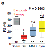
The next figure shows the effect of those same materials on the restoration of heart function following an injury.
|
The graph shows a measure of heart function eight weeks after treatment for an artificial heart attack. (More about the method in a moment.) Results are shown for "sham" -- control mice with no injury and no treatment. Then results are shown for the same three treatments as in the figure above.
|
|
The sham result is "high". That reflects "normal" heart function: these animals had received neither injury nor treatment.
The other results are for animals with the heart injury. Saline gave a low value for heart function. The cells and the zymosan gave higher values.
The method? Mice were given an artificial "heart attack". A week later they were treated with the indicated materials. Eight weeks after the treatment, heart function was measured. The y-axis is labeled FS. That stands for fractional shortening. It is a way to estimate the functionally relevant parameter, the ejection fraction, when using echocardiography.
This is Figure 3c from the article.
|
That is, the materials that gave an inflammatory response (first figure) stimulated improvement of heart function (second figure).
Of course, that is not proof of a causal connection. But the authors have much more evidence, not only showing the correlation, but also exploring the mechanism. Overall, the authors argue that the cells lead to improved heart function by stimulating an inflammatory response. Further work will build on this; over time, we'll see how the suggestion holds up.
Among the additional evidence...
Adding the immunosuppressive drug cyclosporine A substantially eliminates the gain of function shown above (Figure 3d of the article).
Cells that have been killed (by freezing) generate results similar to those with the live cells. This fits with the finding that the cells used for the treatment do not end up in the heart.
What is the significance of the finding, assuming it is correct? On the one hand, understanding the mechanism serves to validate the procedure. On the other hand, understanding the mechanism could lead to better ways to achieve the same effect. The news coverage of this work, including the stories listed below, presents both sides. Perhaps it is best for now to pursue a range of various possible implications, and see which ones end up being most helpful.
As noted at the outset, this has been a contentious field. It has suffered from a batch of papers that were not reproducible, and likely fraudulent. It has also been caught up in the political debates about stem cells (because "adult" stem cells are used in many cases, including the work here). The goal here is to discuss the science of the field; those other issues don't matter here.
News stories:
* Stem cells may trigger immune repair to mend hearts. (R Gilchrist, BioNews, December 2, 2019.)
* Stem cell therapy helps broken hearts heal in unexpected way. (Science Daily (Cincinnati Children's Hospital Medical Center), November 27, 2019.)
* Activation of the Immune System Underlies Cardiac Cell Therapies -- A study in mice reveals that stem cell transplants, currently in clinical trials, may not actually require the cells. (R Williams, The Scientist, November 27, 2019.) Now archived.
The article: An acute immune response underlies the benefit of cardiac stem-cell therapy. (R J Vagnozzi et al, Nature 577:405, January 16, 2020.)
A recent post about hearts and stem cells: Designing reconfigurable organisms (January 19, 2020).
More about heart function... A prosthetic heart valve that can "grow" as a child grows (April 13, 2020).
Use of stem cells to treat heart damage: Cardiac stem cells as a treatment for heart damage: preliminary results are "very encouraging" (November 29, 2011). The current paper uses this type of stem cell in some experiments; the results are similar.
More about the innate immune system: The immune response of cnidarians (e.g., corals) (November 1, 2021).
This post is listed on my Biotechnology in the News (BITN) page for Cloning and stem cells. It includes extensive lists of related Musings posts, for stem cells and the broader topic of regeneration.
Impact of shopping online on greenhouse gas emissions
March 28, 2020
It's more complicated than you might think, according to a new article.
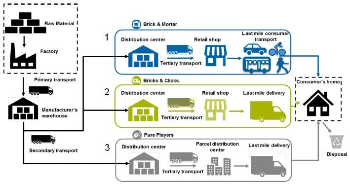
The authors examined the greenhouse gas emissions (GHG) for three scenarios. They are shown in the following figure...
The three scenarios are shown in the three boxes in the middle part of the figure; I have numbered them for convenience. They are...
1) Traditional... Go into a store and buy the stuff. "Brick & mortar". (I omitted one step in my summary statement there; it may be the most important step.)
2) Order online, with delivery to a local retail store, which then delivers the item to the consumer. "Bricks & clicks".
3) Order online, with direct delivery to the consumer. "Pure players"; this is simple online ordering.
This is slightly modified from Figure 1 from the article. I have added numbers for the three scenarios.
|
The authors analyze those three scenarios. You might think of others. In fact, it turns out that the results depend on many details.
The following figure summarizes the findings...
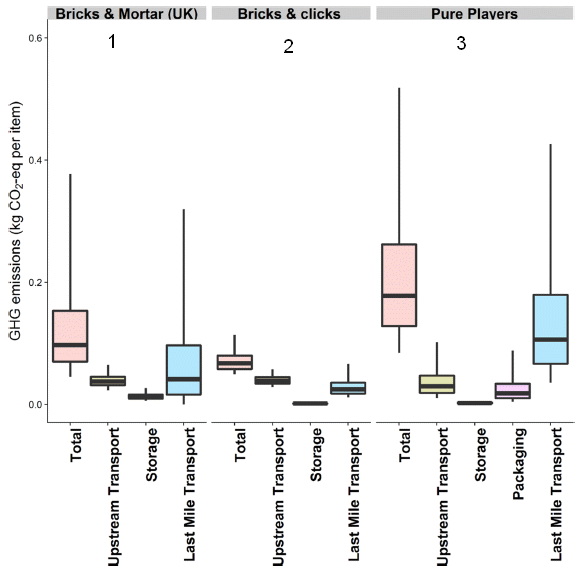
For each of the three scenarios from the top figure, this figure shows four bars for GHG emissions. The first bar (pink) is for the total. The others show specific components.
The bar heights are in "kg CO2 eq/item": kilograms of CO2 equivalents per item. That is a measure of the GHG emissions. For each bar, the horizontal line shows the median, the box shows the range for the middle 50%, and the vertical line (known as whiskers) shows the range for the middle 95%. The variability comes from the nature of the modeling, which explored a range of details, reflecting data from real-world commerce.
Start with the (pink) bars for the total for each scenario. You can see that the total GHG emission is different for the three scenarios. Looking at the means, you could rank them; #2, with online ordering and delivery via a retail store, is the best. But you can also see that the variability is quite high, especially for #1 and #3.
Look at the bars for the components, and you will see why the variability is high. The major contributor to the total is the "last-mile transport" (blue bar), getting the item to the consumer's home. You can get a hint why this step has high variability for #1 (brick & mortar) from the top figure. Look at the various methods shown for getting the item home. (Distance, too, is an important factor.)
This is slightly modified from Figure 2 from the article. Again, I have added numbers for the three scenarios.
|
It may be instructive to compare scenarios 1 & 2 for the last step. In both cases, the last step is getting the item from the retail store to the home. In #1, this is done by the consumer, and may be by any transportation method the consumer chooses. In #2, it is done by the retail store (or their agent), using a specific delivery method. That difference explains why the variabilities are so different.
Order size. The emissions are given there per item. For the last-mile delivery step, emissions are probably independent of order size. Thus emissions per item decrease dramatically with larger orders. (Driving to the grocery store to buy just a loaf of bread is not good.) The authors note this point, which further complicates reaching conclusions.
The authors address the variability for the final step in the following figure...
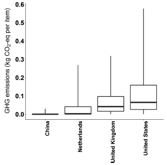
|
The figure shows the GHG for the "last-mile" step in scenario #1 (brick and mortar) for four countries.
They vary!
The difference in the medians for the countries is about a quarter of the distance between tic marks in the previous figure.
But the difference in variability within the four countries is huge.
There is a lot of room here for personal choice!
This is Figure 4 from the article.
|
Overall, the article sets out to compare online and traditional in-store shopping. The authors lay out three scenarios for their main analysis. But it is not that simple. There are many details, and the details that are not fundamental to the scenarios turn out to be most important. In particular, the key step has nothing directly to do with whether an order is initiated online, but with how the final step of delivery is done. This is the "last-mile" issue. Perhaps that should be the focus of further work, and of personal thinking when making such choices.
This is one of those articles that is probably most interesting for the issues it explores. General conclusions about online vs in-store shopping are not strong. However, the work reveals factors that affect the greenhouse gas emissions attributed to our shopping. Some of those are factors we can easily control.
Be sure to read the authors' own discussion in section "4.2. Study Limitations" (p 8 of the pdf).
News stories:
* Comparing greenhouse gas footprints of online versus traditional shopping. (Phys.org (American Chemical Society, the journal publisher), February 26, 2020.)
* Delivery from Local Store Is Greenest Shopping Method - Most of the Time. (S Bushwick, Scientific American, February 27, 2020.)
The article, which is freely available: Comparative Greenhouse Gas Footprinting of Online versus Traditional Shopping for Fast-Moving Consumer Goods: A Stochastic Approach. (S Shahmohammadi et al, Environmental Science & Technology 54:3499, March 17, 2020.)
Also see... Impact of watching movies on global warming (September 30, 2014). Links to a variety of posts that may be of interest.
There is more about energy issues on my page Internet Resources for Organic and Biochemistry under Energy resources. It includes a list of some related Musings posts.
March 25, 2020
Briefly noted...
March 25, 2020
Does chloroquine work against the virus that causes COVID-19? The question has been in the news (partly because some prominent but not necessarily well-informed people have voiced opinions). What's the real story? There are hints that it might work, but there is very little actual testing in humans at this point. Chloroquine is well-known as a drug against malaria. That means much is known about it, including its safety profile (which is not simple). But how it works against a coronavirus will be entirely different than how it works against malaria, so that part of the experience doesn't help. A news story from last week provides a good summary of this interesting but incomplete story.
* News story: Chloroquine for COVID-19: Cutting Through the Hype. (C Baraniuk, The Scientist, March 20, 2020. Now archived.) Links to some articles, but the big message is that the question remains open.
* I have added this item to my BITN page section for SARS, MERS (coronaviruses).
Indoor air pollution: is ventilation effective?
March 24, 2020
Polluted air in the house? (Maybe from some cleaning work, or even cooking.) Just open the doors and windows, and let the place air out. After all, there is a lot more air outside than inside.
The following figure shows some data on how well that works. The measurements were made in the kitchen of an "ordinary" house -- one that just happened to have a mass spectrometer in it. That allowed for rapid and sensitive measurements.
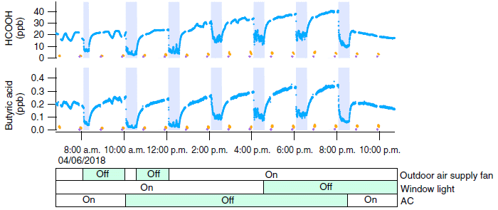
Each graph shows the level of one pollutant over time (over the course of one day).
The top graph is for HCOOH (formic acid). The blue line shows the results. It varies!
The vertical shaded bars show when the doors and windows were opened. Now you can see the pattern... The level of the pollutant dropped dramatically when the house was ventilated. And it increased again -- quite rapidly -- as soon as the doors and windows were closed. That general pattern was repeated over several ventilation events.
How was the outside air? The yellow dots show the measured pollutant levels outside; very near zero. (The purple dots are at zero.)
The lower graph shows the results for another pollutant, butyric acid. The pattern is similar.
A time scale is shown below the graphs.
Just below that are shown some other variables. None of them mattered much, so we'll skip them.
This is the bottom part of Figure 1 from a recent article. Other graphs in the figure are for other chemicals. There is also a graph showing the temperature and humidity.
|
Overall, the scientists examined 19 chemicals, of various chemical classes. All are considered common indoor pollutants. The results shown above are representative.
What's going on? Providing ventilation does reduce pollutant levels, as expected. But why do the pollutants soon return when the ventilation is stopped?
The authors suggest that the pollutants stick to surfaces inside the house. Chemicals bind to surfaces, with various affinities. There are many, and quite varied, available surfaces; most chemicals find something they like. The surfaces effectively serve as an indoor reservoir for a wide range of pollutants.
For pollutants with some solubility in water, reservoirs of water or even bound water may be important. Similarly, there may be significant nonpolar reservoirs, such as paint, for chemicals with minimal solubility in water.
The solution? Don't know. Maybe you shouldn't store things in the house. No furniture. No paint. Maybe, no walls. Or leave the windows open at all times. Or maybe for now it is just a scientific finding to note. The authors provide much background; some of the basic findings here are not entirely new, but with their technical advances they have made progress in measuring and understanding them.
News story: Opening the window in your home will not flush out the chemicals in the air. (B Yirka, Phys.org, February 21, 2020.) Note that the title (and opening sentence) can be understood various ways. The discussion that follows is fine: opening the windows does flush out the chemicals in the short term, but they are replenished.
The article, which is freely available: Surface reservoirs dominate dynamic gas-surface partitioning of many indoor air constituents. (C Wang et al, Science Advances 6:eaay8973, February 19, 2020.)
Who has a house with a mass spec in the kitchen? The University of Texas (Austin). More specifically, their Department of Civil, Architectural and Environmental Engineering. It is a test house, used for research.
More about air pollution:
* Air filters that can kill (March 19, 2022).
* Effect of lockdowns on air pollution: it's not simple (June 7, 2020).
* A recent "briefly noted" item on dealing with indoor air pollution: 1. Rabbit-assisted air purification by a houseplant. (March 4, 2020).
* Capturing NO2 from polluted exhausts (December 7, 2019).
* Deaths from air pollution: a global view (October 23, 2015).
Life -- and old carbon -- in a blue hole
March 22, 2020
What's a blue hole? It's something like a hole in the ocean. Better... It's something like a limestone cave -- but one in the ocean, and filled with water.
If that's not helping, here is a diagram of one, from a recent article.
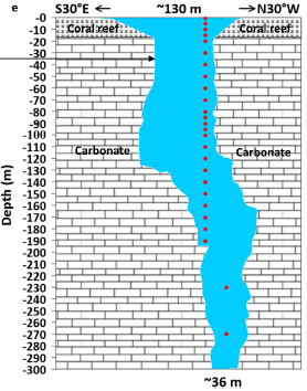
|
You can see that it is a hole in a carbonate rock structure (such as limestone). It's not a very wide hole, ranging from 130 meters (430 feet) at the top to 35 m (110 ft) at the bottom. But this one is quite deep, more than 300 m. The top may be open to the air, but the hole gets filled with sea water.
The red dots show the depths at which sampling was done in the new work.
The arrow towards the left at depth 35 m? Ignore it; it is for making a connection to another figure.
This is Figure 1e from the article.
|
A blue hole is a large marine cavern or sinkhole, which is open to the surface and has developed in a bank or island composed of a carbonate bedrock (limestone or coral reef). That's the opening sentence of Wikipedia: Blue Hole.
The blue hole here is the Yongle Blue Hole, in the Xisha Islands of the South China Sea. It was discovered in 2016, and is the deepest known blue hole.
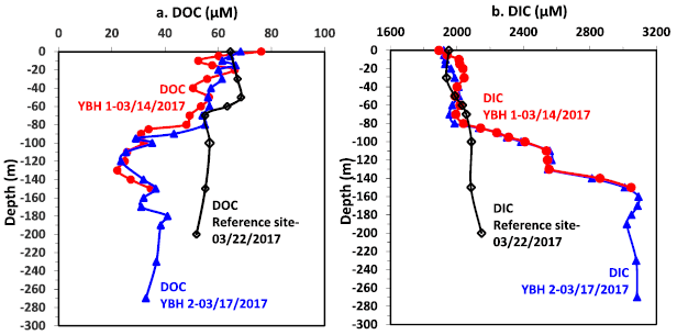
So, what is in it? The scientists collected samples at various depths. They did many analyses. The following figure shows some examples...
This figure shows the amounts of carbon at various depths within the hole. The red and blue data are for sets of measurements on different dates; they agree well. The black set is for a reference site within the free ocean.
Part a is for dissolved organic carbon (DOC). Part b is for dissolved inorganic carbon (DIC). DOC shows an "abrupt" transition to lower levels at about 100 m depth. DIC shows an "abrupt" transition to higher levels at about that depth. The reference site shows no such abrupt transition.
Don't worry about the numbers. What matters for now are the general shapes.
This is part of Figure 3 from the article.
|
Something is happening at about 100 m.
Another graph in the full figure shows dissolved oxygen (DO) levels vs depth. That, too, shows a transition at about 100 m. High DO towards the top; low DO below the transition.
The following graph is about biology...
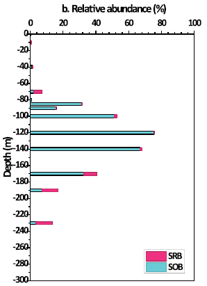
|
This graph show the abundance of two types of microbe in the blue hole vs depth. The blue bars are for sulfur-oxidizing bacteria (SOB). The red bars are for sulfate-reducing bacteria (SRB).
(Note that the S means different, though related, things in the two abbreviations. Also, S oxidation refers to soluble forms of reduced sulfur, such as HS-.)
Those two types of microbe are representative of respiration- and fermentation-based metabolism, respectively. The former, using oxygen, is more efficient, and leads to more biomass (thus more DOC).
There is a general trend. At shallow depths, respiring microbes dominate. At lower depths, fermenting microbes dominate. The transition between them is at about the depth we noted earlier for the types of dissolved C.
This is Figure 4b from the article.
|
No big lesson from all this. It's an exploration of an unusual type of natural environment.
But a picture begins to emerge. The blue hole is open at the top, but there is not much mixing below that. Oxygen gets depleted at a relatively shallow depth. That is reflected in the observed chemical and microbiological contents.
One more point, which is alluded to in the title of the post... The scientists dated the carbon, by measuring its content of C-14. It's old, about 7-8 thousand years old -- both the organic and inorganic C. That's another sign that the mixing is poor. And it also suggests that the microbial life that is observed just keeps recycling the same C over and over. In fact, the amount of DOC (which is related to the amount of life) in the deep part of the hole is unusually low. It is the special interest of the authors to study the carbon flow in this unusual system.
News story: Carbon as old as 8,000 years found in deepest blue hole -- Finding to help study carbon cycling and potential mechanisms controlling it. (Down To Earth, February 24, 2020.)
The article: Carbon Cycling in the World's Deepest Blue Hole. (P Yao et al, Journal of Geophysical Research: Biogeosciences 125:e2019jg005307, February 2020.)
More from limestone caverns: Antibiotic resistance genes in "ancient" bacteria (February 11, 2017).
March 18, 2020
Briefly noted...
March 18, 2020
Three items about the new coronavirus, which causes COVID-19.
1. Origin of the virus. This came up in a private discussion. Turns out that Nature just did a nice news summary of the current status of investigating that question (as of the end of February). The virus is apparently new to humans. It probably originated in bats, but got to humans via an intermediate host. Can we get more specific? The approach is to sequence the genomes for many viral samples, and compare them with what is in the databases. As of this news story, there is no clear answer, but the story is a nice overview of how things are done, as well as the current uncertainty.
* News story: Mystery deepens over animal source of coronavirus -- Pangolins are a prime suspect, but a slew of genetic analyses has yet to find conclusive proof. (D Cyranoski, Nature, February 26, 2020. In print: Nature 579:18, March 5, 2020.)
2. Survival of coronaviruses on surfaces; how to kill them. A new article summarizes what is known about how well coronaviruses survive on surfaces, and about methods for disinfection. The analysis, based on a literature review, includes a range of coronaviruses, but there is no specific data for the new virus (but see #3, immediately below). Not surprisingly, results vary; they depend on the type of surface as well as conditions such as temperature and humidity. In some cases, these viruses can survive for extended periods (several days) on surfaces. They are also easily killed by common disinfecting agents.
* For reference... A 12-hour half-life (in the range found under some conditions) means that the virus level is reduced only 16-fold after two days. It would take 5 days for the virus level to drop by 1000-fold, a common (but arbitrary) cut-off for cleaning. (Those estimates assume first-order (exponential) killing. Real data typically looks close to first-order.)
* A very short journal article, freely available, with a summary of the findings... Potential role of inanimate surfaces for the spread of coronaviruses and their inactivation with disinfectant agents. (G Kampf, Infection Prevention in Practice 2:100044, June 2020.) Reference 7 of this article is a more complete version, with tables and full references. You can link to it directly from the reference list; it may be freely available.
3. Survival of the COVID-19 virus on surfaces. As I was writing up these items I became aware of a preprint that provides some data specifically for the new virus. The general approach was to compare survival of the original SARS-1 and the new SARS-2 (COVID-19) viruses under various conditions. The general result is that they show similar survival.
* Preprint (my original source; not peer-reviewed): Aerosol and surface stability of HCoV-19 (SARS-CoV-6 2) compared to SARS-CoV-1. (N van Doremalen et al, March 13, 2020 -- date of posting preprint at medRxiv.)
* Published article: Aerosol and Surface Stability of SARS-CoV-2 as Compared with SARS-CoV-1. (N van Doremalen et al, New England Journal of Medicine 382:1564, April 16, 2020.) It is probably freely available, though that may be temporary.
I have added these three items to my BITN page section for SARS, MERS (coronaviruses). I have also re-worked the organization of that section, to better accommodate the new virus.
A reminder... Musings discusses recent scientific developments. It does not give medical advice.
Snake venom gland organoids
March 17, 2020
Organoids are miniature organs studied in the lab. In current usage, the term refers not to little pieces of an organ cut out for lab use, but to mini-organs made in the lab by differentiation of stem cells. That is, organoids can be used to study how organs develop as well as how they function.
Organoids for various human (or mammalian) organs are studied; those for the brain perhaps get the most attention.
We now have an article about organoids for snake venom glands. That may seem a little exotic, but snake venoms are interesting -- as well as medically important. Having organoids to study them may well be useful.
The following figure gives an idea of what the article shows...
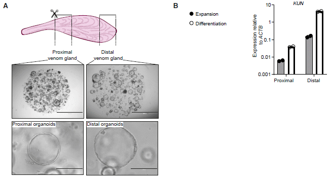
Part A shows a diagram of what was done, and some photos of the resulting organoids.
The top row shows a snake venom gland. It also shows the two regions -- proximal and distal -- that were sampled. Bits of tissue from each region were used to develop organoids.
The next two rows show some photos of the two lines of organoids, at two magnifications.
For the middle row (top photos), the scale bars are 2 millimeters; for the bottom row, they are 0.2 mm.
Part B shows an example of the functioning of the two types of organoids. What is measured here is the production of the RNA for one type of venom, called KUN. Two media were used. For each medium (each color of bar), there is much more venom RNA made in the organoids from the distal part of the gland. That agrees with how the glands themselves function.
(Note the log scale; the difference between proximal and distal organoids was more than ten-fold for each medium.)
This is part of Figure 6 from the article. I have included only one graph from part b, as an example.
The results for two other venoms, shown in the full part b, also agree with the production patterns in the original glands.
The work shown above was with the Cape coral snake, Aspidelaps lubricus cowlesi. The scientists succeeded in making venom gland organoids from several snake species.
|
That's progress toward developing venom gland organoids -- the first organoids from reptiles. They can be used to study how glands develop and how venoms are made. And they could become a convenient source of venoms for making the anitivenoms so needed for medical treatment.
The work here was done using small pieces of gland tissue, without isolating any particular cells. Since the organoids from different parts of the glands behave differently, it would seem that they developed from cells that were at least partially differentiated. Little is known about stem cells in reptiles, but it is presumed that the organoids developed from "adult stem cells", partially differentiated toward formation of specific gland regions.
The organoids contain a variety of cell types. They can also be propagated, suggesting that they still contain a population of stem cells.
Interestingly, the work was done largely using procedures and even media developed for work with mammalian organoids. The temperature was reduced to 32 °C, consistent with the typical lower body temperature of the snakes.
News stories:
* No Snake, No Problem -- Scientists Produce Venom in a Dish. (M Campbell, Technology Networks, January 23, 2020.)
* There's a Perfectly Good Reason to Mass-Produce Snake Venom -- Lab-grown glands can now produce realistic cocktails of toxins, which could help address one of the world's biggest and most neglected health crises. (E Yong, Atlantic, January 23, 2020.)
The article: Snake Venom Gland Organoids. (Y Post et al, Cell 180:233, January 23, 2020.)
Posts about poisonous snakes:
* Briefly noted... Are venoms sterile? (August 17, 2022). Snakes and spiders.
* Snake toxins: for offense or defense? (April 14, 2020).
* The snakebite problem (September 27, 2016).
* Poisonous snakes and their mimics (August 15, 2016).
Posts on organoids include...
* Human cortical organoids can survive -- and function -- in rat brains (October 22, 2022).
* Using lab-grown organoids in medical treatment (May 3, 2021).
* Brain development: comparing human and chimpanzee lab-grown brain organoids (November 5, 2019).
My page Biotechnology in the News (BITN) for Cloning and stem cells includes an extensive list of related Musings posts.
Posts about other venoms include:
* How to get bees to make better venom
(September 20, 2021).
* Scorpion venom: a source of a novel antibiotic? (August 3, 2012)
A book about venoms -- from snakes and more -- is listed on my page of Books: Suggestions for general science reading. Wilcox, Venomous -- How Earth's deadliest creatures mastered biochemistry (2016).
Ocean acidification and coral reef fishes: a controversy
March 16, 2020
Increasing carbon dioxide in the atmosphere leads to acidification of the oceans (lowering the pH). For organisms that make carbonate skeletons, this is of obvious concern. Otherwise, does it matter? That's not obvious.
In 2010 Musings noted an article suggesting that ocean acidification could have serious consequences for the fish around coral reefs [link at the end]. It would affect their behavior, perhaps by interfering with their sense of smell, and lead to greater predation of them. (That was an early Musings post, and did not include any specific data.)
A recent article challenges that work, and suggests that there would be little such effect.
Here is an example of the results from the new article...
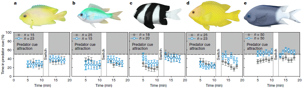
The experiments are complex, but here is the basic idea...
Each part of the figure is for one test with one type of fish. The basic plan is that the fish were pre-adapted to either "low" or "high" CO2. They were then tested under conditions where there was a scent of predators to one side -- a predator "cue". Which side did they go to? That is what was scored, and is shown on the y-axis. If they had no preference, they would spend 50% of their time on each side. If they were repelled by the predator scent, they would spend less than 50% on the predator-scent side. The overall preference (for the set of fish tested) is plotted vs time (x-axis).
The closed gray symbols are for fish adapted to low CO2; the open blue symbols are for fish adapted to high CO2.
Look at part a. At all time points, the preference for the predator-scent side was below 50%. The fish avoided the predator scent. And there is very little difference between the two groups of fish.
The results for parts b-d are similar.
The results for part e are somewhat different. In this case, the fish adapted to high CO2 showed a consistently greater tendency to go to the side with the predator scent. Even then, the preference score was only slightly above the 50% line.
Low CO2 here is about the current level. High CO2 is about double that, similar to what some scenarios predict for the end of this century.
What is most important is that the basic plan here was similar to what was done in the earlier work.
This is Figure 1 from the article.
|
The earlier work showed much larger effects, with the high-CO2 fish spending as much as 90% of their time apparently attracted to the predators.
Who is right? The short answer for now is that we don't know. The new article raises concerns about the earlier work; the authors of that work reportedly stand by it. We cannot resolve that here. Our point here is to note the difference, the controversy. Presumably, further work will clarify the issue. And that might turn out to be very interesting. For example, it may be that there are hidden variables, that the results obtained actually depend on things other than (or in addition to) the CO2 level, which was supposed to be the main variable. Sorting that out would increase our understanding of fish behavior. For now, we don't know. The issue remains open.
News stories. The first two stories both try to show the controversy, despite one-sided titles. That is, the titles are based on the current article, but the stories go beyond that and give context and balance. The third item listed here is from a source that routinely provides a range of "expert" opinions.
* Study Refutes Findings that Acidification Affects Fish Behavior -- The new experiments use standardized methods and video recordings, but some researchers stand by earlier evidence that ocean pH influences coral reef fish's response to predator cues. (E Yasinski, The Scientist, January 8, 2020.) Now archived.
* Ocean acidification a big problem - but not for coral reef fish behaviour. (N Bazilchuk, Norwegian SciTech News, January 8, 2020.)
* Expert reaction to study looking at ocean acidification and coral reef fish behaviour. (Science Media Centre, January 8, 2020.) Several diverse expert comments. The set of comments is more important than any one. But do at least read the first two, which give a fair overview.
The article: Ocean acidification does not impair the behaviour of coral reef fishes. (T D Clark et al, Nature 577:370, January 16, 2020.)
Background post: CO2 emissions threaten clowns (September 20, 2010). The article discussed in that post is reference 5 of the current article.
More about ocean acidification: Can a coral adapt to a more acidic ocean? (September 29, 2013).
An improved procedure for vaccination against tuberculosis?
March 13, 2020
BCG is a strain of Mycobacterium, related to the causal agent of tuberculosis (TB) but non-pathogenic. It has been used as a vaccine against TB -- with questionable effectiveness against pulmonary (lung) TB, the form of the disease found in adults.
A recent article may promote renewed interest in the BCG vaccine. Here are some results from the article...
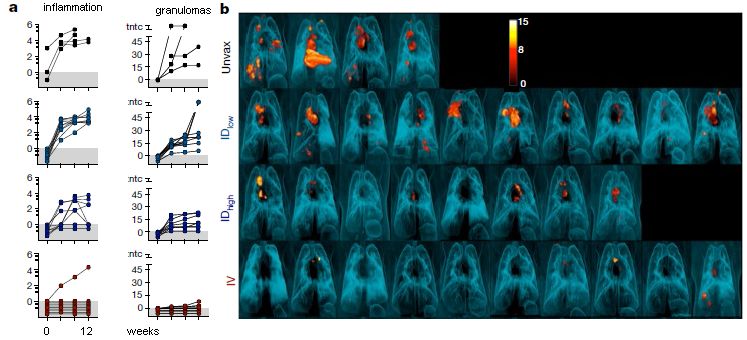
Start with part b (right). It shows PET scans of the lungs of individual monkeys following various BCG vaccination procedures and a challenge with TB. The lesions that are so evident are TB lesions.
The top and bottom rows are of particular interest. The top row is for unvaccinated ("Unvax") animals; the result was many lesions. The bottom row is for animals given the BCG vaccine intravenously ("IV"); few lesions.
The middle two rows are for BCG given by the traditional route: intradermal ("ID" -- into, or just under, the skin). Two different dosages, low and high. You can see that the two ID vaccinations did reduce the disease, and that the higher dose was better. But the benefit was limited -- and the IV vaccination (bottom) gave much better results.
That really makes the main point of the article: BCG given IV was more effective than ID -- and it was quite good.
Part a (left) has some quantitative data from these tests. The left-hand column of graphs is for a measure of inflammation (which is taken as a measure of TB disease). The right-hand column is a count of the TB lesions. Each curve is for a single monkey, with points every 4 weeks over 12 weeks. You can look over the data as you wish. The point is that both measures support the conclusions noted earlier from visual observation of the PET scans at the end.
The BCG used here was a commercial vaccine.
IV administration was tested at only one dose, corresponding to the high dose used for ID.
This is modified from part of Figure 2 from the article. It includes the top four rows of parts a and b, which are aligned side-by-side as shown above. In the article there are two more rows, for more routes of administration; the simple answer is that IV (bottom row shown here) is the best. I have added labeling for part a, to replace what I cut off.
|
The results are dramatic.
The argument for IV administration is that it leads to a better immune response in the lungs, the major site of the disease in adults. (However, aerosol administration didn't work well; not shown above.) The traditional ID administration pre-dates any significant understanding of the immune response.
The limitations of the study are also clear. What seems likely is that this work will stimulate renewed interest in studying the BCG vaccine. One line of work will be to see if IV administration of the BCG vaccine in humans is worthwhile. Another line of work will be to try to understand why it works, which may offer clues for further vaccine development.
News stories:
* Tuberculosis Vaccine Efficacy Boosted Dramatically by IV Administration. (GEN, January 3, 2020.)
* Intravenous Administration Could Improve TB Vaccine Efficacy. (M Fleming, Contagion, January 2, 2020.)
* New Way to Deliver Old Tuberculosis Vaccine Provides 'Incredible Protection' in Monkeys. (J L Flynn, Science Alert, January 5, 2020.) From a senior author of the article.
* News story accompanying the article; it may be freely available: Medical research: Tuberculosis vaccine finds an improved route -- A widely used vaccine against tuberculosis has now been shown to provide almost complete protection when injected intravenously. This is a striking improvement over vaccination through the typical intradermal route. (S M Behar & C Sassetti, Nature 577:31, January 2, 2020.)
* The article, which is freely available: Prevention of tuberculosis in macaques after intravenous BCG immunization. (P A Darrah et al, Nature 577:95, January 2, 2020.)
A previous post about a TB vaccine: A new vaccine against tuberculosis? (November 9, 2018). Mentions the BCG vaccine. Links to more about TB.
More on vaccines is on my page Biotechnology in the News (BITN) -- Other topics under Vaccines (general).
March 11, 2020
Imaging Re2 molecules
March 10, 2020
Re2? That is dirhenium. A free diatomic molecule of a metal. A small molecule held together by a "metallic" bond.
The following figure is from a recent article...
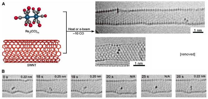
For fun, start with the photo at the top right. The big long tube-like object is indeed a tube: a single-wall carbon nanotube (SWNT). Look around inside and you will see two diatomic molecules. (One is at the upper left surface of the tube.) Re2. The image just below that tube shows another SWNT, with one Re2.
These are electron microscope images.
The procedure is outlined at the upper left. The starting material is a molecule containing Re-Re along with ten CO groups. Mix with some SWNT. Provide some energy (heat or an electron beam), and drive off the CO -- leaving behind the free Re2 in the SWNT.
Part B shows stills from a movie. You can see that the Re2 moves within the tube.
In some orientations, the bond length can be measured. This measurement, when available, is shown at the upper right of a still. The measurements are all about 0.2 nanometer. More about bond lengths below.
This is part of Figure 1 from the article. I have removed one image from part a; it is a second view of the molecule to the left. I have included only the first row of part B; the full figure goes on to 321 s.
|
What's the point? This is the first direct imaging of a discrete molecule containing only metallic bonds. Whether we should call the bond metallic or covalent is a subtlety perhaps best left for others.
In fact, studying the nature of the Re-Re bond is a major goal of the work. Re may not be a familiar element, but the details of its electrons are of interest; it is used as an industrial catalyst. We noted above that the bond length is about 0.2 nm. More specifically, it is 0.22 nm in many of the images; that is what is expected for a quadruple bond between the two Re atoms. Two other bond lengths are also observed (0.25 and 0.30 nm); these are thought to represent double- and single-bonded Re2. (Look at the image for 18 s for one example.) Thus the work provides evidence for the dynamics of dirhenium molecules.
Events of Re-Re bonds breaking and re-forming were also seen.
Still haven't found rhenium yet? Look right next to tungsten (wolfram).
The work made use of advanced electron microscopy technology to get those clear images shown above, with atom-level resolution.
The molecule shown in Part B of the figure above is the right-hand molecule from the top image. Its name is "Titan Re2 A". That's right, they name individual molecules. Titan refers to the EM system used here.
News story: Scientists Image Atomic Bonding Using Advanced Microscopy Techniques. (AZO Nano, January 20 2020.)
The article, which is freely available: Imaging an unsupported metal-metal bond in dirhenium molecules at the atomic scale. (K Cao et al, Science Advances 6:eaay5849 January 17, 2020.)
More about metals...
* Metallic hydrogen -- new evidence (March 7, 2020). Just two posts below.
* Y-Y: the first (May 5, 2019).
Among other posts on high-resolution electron microscopy: Visualizing atoms with electron ptychography -- approaching the theoretical resolution (June 5, 2021).
For more on electron microscopy at the atomic level, see a section of my page of Internet Resources for Introductory Chemistry: Atomic force microscopy and electron microscopy (AFM, EM). It includes a list of some related Musings posts.
What if the mosquitoes carried immunity to the dengue virus?
March 8, 2020
Mosquito-borne diseases are a serious -- and increasing -- problem. Controlling mosquitoes is difficult, but perhaps we can limit their ability to transmit some diseases.
One approach to limiting the ability of mosquitoes to transmit disease is the use of Wolbachia bacteria [link at the end].
A recent article explores another approach: making the mosquitoes immune to a specific disease agent. Dengue virus is the agent chosen for this work.
Here are some results...
In these graphs, the y-axis shows the yield of dengue virus in the saliva of an individual mosquito, for various types of mosquitoes. The four graphs are for the four strains of dengue (1-4, from left to right).
The first (left-hand) graph shows the idea. The first data set is for WT (wild type) mosquitoes. You can see that the viral yield for most mosquitoes was about 105. The next two data sets on the graph are labeled TADV-A. The results for these two data sets are much lower -- especially for the middle set.
What's TADV-A, and what are the two TADV-A data sets? TADV-A is an antibody against dengue. In the middle data set, the mosquitoes carry two copies of the gene for this antibody; this is labeled "Hm", for homozygous. For the right-hand data set, there is only one copy of the antibody gene; this is labeled "Ht", for heterozygous.
With one copy of the antibody gene, the virus yields were about 102; that is about a thousand-fold reduction from the WT. With two copies of the antibody gene, the virus yields were essentially zero.
The other three graphs are for the other three strains of dengue. The graphs are all about the same (one has one extra data set, which we will note in a moment). Note that the antibody is the same in all these tests; a single antibody is effective against all four dengue strains.
The second graph has one additional data set, labeled wMel. That is for mosquitoes carrying Wolbachia bacteria (the Mel strain). You can see that having one copy of the antibody gene is about as good as using the Wolbachia. Using two copies of the antibody gene is much better than the Wolbachia. (This part of the testing was done only for type 2 dengue.)
TADV stands for Transgenic Anti-DENV. The final -A denotes a particular isolate. (DENV is a standard abbreviation for dengue virus.)
TCID (on the y-axis scale) stands for tissue culture infective dose.
The mosquitoes here are Aedes aegypti, the major vector for dengue.
This is the bottom row of Figure 1B from the article.
|
These results suggest that the approach works. It is of interest that a single antibody is effective against all four dengue strains. And the level of viral reduction seen here is comparable or better than with Wolbachia, a system that has been tested in field trials, with success.
The antibody used here is a single chain derived from a known human antibody to dengue, one that is broadly neutralizing (effective against all four strains).
One issue the authors addressed in the article is whether making the antibody affects the general fitness of the mosquitoes. For the most part, the results suggest little effect on the mosquitoes. (The mosquitoes make the antibody only after a blood meal. That is, the blood triggers activation of the antibody gene. The antibody is not present during most of the mosquito life cycle.)
In principle, the work could be extended to combat other mosquito-borne diseases, though each case would need to be worked out individually. In contrast, Wolbachia seems to be effective against many viruses, though why and what its limits are remain open.
This is lab work. It is encouraging enough that follow-up is warranted.
News stories:
* Mosquitoes engineered to repel dengue virus. (Science Daily (University of California - San Diego), January 16, 2020.)
* Genetically Modified Mosquitos Neutralize Dengue Virus. (N P Dyal, Infectious Disease Advisor, January 20, 2020.)
The article, which is freely available: Broad dengue neutralization in mosquitoes expressing an engineered antibody. (A Buchman et al, PLoS Pathogens 16:e1008103, January 16, 2020.)
Recent post about dengue... A new dengue vaccine (November 16, 2019). This post also notes the unusual interaction between dengue strains and their antibodies; that interaction makes the broad multi-strain effectiveness seen in the new work particularly important.
A post about the use of Wolbachia bacteria: Can Wolbachia reduce transmission of mosquito-borne diseases? 3. A field trial, vs dengue (August 10, 2018).
More about dengue is on my page Biotechnology in the News (BITN) -- Other topics under Dengue virus (and miscellaneous flaviviruses). There is a list of related Musings posts.
Metallic hydrogen -- new evidence
March 7, 2020
Musings has presented a claim of making metallic hydrogen before [link at the end]. It remains unverified. We now have a new claim.
Evidence? Let's look...
The work involves measurements on hydrogen confined in a diamond anvil cell, where pressure (P) can be raised to very high levels.
The two parts of the figure show the same results. Part b shows the raw data. Part c shows a summary of the data in a form that is easier to explain.
Part b (left) shows infrared (IR) spectra over a range of pressures. Each curve is the spectrum for one P. The curves are in order by P, with about 10 GPa between successive curves. I have labeled the P for three of the curves.
You can see that the IR transmission gradually declines as P is increased -- until the last point, where it decreases dramatically.
Part c (right) shows the effect more clearly. The y-axis shows the IR transmission: a single number reflecting the transmission (T) over the entire spectral region (from part b). The x-axis is pressure. T declines gradually with P -- until the last point, where it drops to about zero.
Part c shows results for increasing and decreasing P. The point is, it doesn't matter. The results depend on P, not how you got there. That is, the effect is reversible.
For reference... 400 GPa is 4 million atmospheres.
The measurements were made at 80 K.
Both graphs show "(a.u.)" in the y-axis label. That stands for "arbitrary units". Both are graphs of transmission. (But if you read more in the article, some graphs show absorbance -- also in a.u.)
The x-axis of part b is labeled in "wavenumber." The wavenumber is the reciprocal of the wavelength; it is common on IR spectra. The x-axis scale runs from 5000 to 12500 nm wavelength -- right-to-left.
This is part of Figure 2 from the article. I have added labels in part b to show the pressure, in gigapascals, for three of the spectra. (The complete color code for the curves is shown in part a.)
|
That dramatic change in transmission between the last two points... That looks like a phase change. And the scientists suspect that it is the phase change to the metallic form of hydrogen. However, they do not measure conductivity.
There is much discussion, both in the article and in the news, about what this article means. It is certainly interesting. Simply making such measurements at pressures above 400 GPa makes the work of interest. As to what it means, we'll just have to wait.
The work here involved technical breakthroughs. Development of a novel type of diamond anvil cell, published in 2018, was an important part of the work, allowing use of higher pressures than possible in "conventional" cells. The small sample size in such cells is always a challenge for making measurements. The work here used an exceptionally bright IR light source, from a synchrotron, for the spectral measurements.
Interestingly, the authors suggest that the metallic hydrogen is molecular (H2), not atomic as often believed.
News stories:
* Metallic hydrogen reveals itself under mounting pressure. (A Extance, Chemistry World, January 29, 2020.)
* Metallic hydrogen observed for the first time ever. (CEA (French Alternative Energies and Atomic Energy Commission), February 3, 2020.) From the lead institution.
* News story accompanying the article: Condensed-matter physics: A milestone in the hunt for metallic hydrogen -- An optical study of cold solid hydrogen at extreme pressures indicates that electrons in the material are free to move like those in a metal. This suggests that the long-sought metallic phase of hydrogen might have been realized. (S Desgreniers, Nature 577:626, January 30, 2020.)
* The article: Synchrotron infrared spectroscopic evidence of the probable transition to metal hydrogen. (P Loubeyre et al, Nature 577:631, January 30, 2020.)
Background post, about a claim of making metallic hydrogen: Metallic hydrogen? (March 16, 2012). The article of this earlier post is reference 6 of the current article. The current article notes that this and other claims of metallic hydrogen remain unverified. This post also includes some background on the topic of metallic hydrogen, as well as discussion of the units used for pressure. The follow-up post linked here provides some general discussion and critique.
More from diamond anvil cells:
* How much hydrogen is in the Earth's core? (May 22, 2021).
* Superconductivity at room temperature -- at last (October 18, 2020).
* Superconductivity in lanthanum hydride: a new temperature record (June 8, 2019).
Also see: Metallic water (August 17, 2021).
More metals... Imaging Re2 molecules (March 10, 2020). Two posts above.
March 4, 2020
Briefly noted...
March 4, 2020
1. Rabbit-assisted air purification by a houseplant. Can a plant improve the air in your home, by metabolizing pollutants? To some extent. But it could do better.
* News story: New houseplant can clean your home's air. (Science Daily (University of Washington), December 19, 2018.) Links to the article.
2. Earth's second moon. A new moon was discovered last month. It is most likely a natural asteroid (not a man-made object), and was probably captured by Earth about three years ago. And it is likely to be gone in a few weeks. It's name is 2020 CD3 -- useful if you want to search for more information.
* News story: How scientists found Earth's new minimoon and why it won't stay here forever. (E Howell, Space.com, February 28, 2020.) There are no scientific articles about it at this point.
* The idea that Earth has small temporary moons from time to time was introduced in: Briefly noted... How many moons hath Earth? (September 5, 2018).
* Also see... Is Kamo'oalewa a piece of the Moon? (February 14, 2022).
A new brain study
March 3, 2020
A wonderful picture...
This is trimmed from the graphical abstract for a recent article.
The abstract shows that the scientists did MRI on a squid. From the data, they developed a map of the squid brain -- the "connectome".
The MRI is used here as a tool to explore the anatomy. The work is done on sections, stained by various methods.
|
And that's about it. No need to say much more for now. Except for one thing... The big conclusion is that the squid brain is about as complex as a dog brain. It's another testament to the complexity of some cephalopods, especially squid, cuttlefish, and octopus. Brain-wise, these are the most advanced invertebrates. And this is early work toward applying the latest tools to analysis of the brains of these fascinating animals.
The squid here is Sepioteuthis lessoniana, the bigfin reef squid.
News stories:
* First MRI mapping of a squid's brain reveals surprising complexity. (A Micu, ZME Science, January 31, 2020.)
* Squid Brains Are Nearly as Complex as Dog Brains, Researchers Claim. (M Starr, Science Alert, January 29, 2020.)
The article, which is freely available: Toward an MRI-Based Mesoscale Connectome of the Squid Brain. (W-S Chung et al, iScience 23:100816, January 24, 2020.)
Posts about cephalopod brains...
* Aging without memory loss in cuttlefish (October 4, 2021).
* Sleep stages in octopuses -- do they dream? (July 13, 2021).
* RNA editing is a major contributor to protein diversity in cephalopod brains (June 23, 2017).
More squid...
* Liquid-filled smart windows, inspired by squid (February 17, 2023).
* Quiz: What is it? (November 20, 2012).
Among Musings posts on MRI: Dog fMRI (June 8, 2012). MRI on live animals, trained to stay still in the machine.
My page for Biotechnology in the News (BITN) -- Other topics includes a section on Brain. It includes a list of brain-related posts.
How sand dunes communicate
March 2, 2020
Recent posts have included how children have a natural ability to invent language and how penguin communication follows laws of human language [links at the end]. But encountering a headline about how sand dunes communicate took me by surprise. Turns out, it is an interesting bit of physics -- and can be studied under controlled conditions in the lab.
The following figure shows the motions of two sand dunes...
The graph shows position (x-axis) vs time (y-axis). Note that the axes are reversed from what one might expect -- and that the position scale is a bit complex.
You can see that one dune moved in a simple path. The other did not; its path changed over time, with a key feature being that it moved away from the first dune.
As noted, the position scale is complicated. What is plotted is an angle. The key point is that the two dunes ended up moving away from each other in opposite directions. (At the top of the graph, their final separation is shown as π radians, which is 180°.)
This is Figure 2 from the article.
|
Qualitatively, the idea is that the front dune creates a wake behind it, which influences -- and repels -- the other dune. This feature of the interaction reduces the chance that dunes will collide.
The work here was done with lab dunes, weighing about 2 kilograms (5 pounds) each. The dunes are on a rotating table, with water flowing around them. The circular motion allows long-term observation. (Previous work with lab dunes involved linear motion; the experiment was over when the dune reached the end of the tank.)
Natural desert dunes are driven by wind; these lab dunes are driven by water -- and an electric motor. The authors suggest that the basic issues of how they move are the same. But they also discuss the differences in the systems; an important point is that their experimental system is simplified, making it easier to study in detail.
Further work may lead to a quantitative understanding, and to testing how well what is learned with lab dunes applies to real-world dunes.
News story: Sand dunes can 'communicate' with each other. (Science Daily (University of Cambridge), February 4, 2020.)
The article: Wake Induced Long Range Repulsion of Aqueous Dunes. (K A Bacik et al, Physical Review Letters 124:054501, February 7, 2020.)
Background posts about communication:
* Does penguin language conform to the laws of human language? (February 18, 2020).
* How long does it take to invent a new language? (February 9, 2020).
Previous post about dunes: Dunes on Pluto? (June 29, 2018).
More about geological-scale motions... How rocks travel (November 14, 2014).
An "antidote" for Huntington's disease?
February 29, 2020
Huntington's disease (HD) results from an unusual mutant form of the protein called huntingtin (HTT). The mutant HTT is itself toxic. (That is, the disease is dominant.)
A recent article offers an approach for treating HD, by targeting the mutant form of the HTT protein for degradation.
Here is the idea, in cartoon form...
Three neurons are shown above. Each contains some huntingtin...
- wtHTT, the wild type form, is in blue;
- mHTT, the mutant form, is in red.
In part a, the healthy neuron at the left, it's all good HTT. In part b, the diseased neuron in the middle, there is some of the mutant form. And in part c (at the right), the mutant form is degraded.
How did the mHTT get degraded? That's shown in the box at the lower right. Note the "linker compound". That is the new drug the scientists have developed. The linker-drug links the mutant HTT with LC3B. And LC3B is a protein that carries bad proteins to the autophagosome, for degradation.
This is Figure 1 from the news story (Zoghbi et al) in the journal accompanying the article.
|
That is, the scientists have developed a drug that tags the mutant HTT for degradation. The drug is effectively an antidote to the toxic mHTT.
To be useful, the drug must target the desired protein (mHTT) at a significant level, with minimal targeting of any other proteins. And that must lead to effective removal of the mutant protein.
Does it work? Here are some lab-scale results...
To start, look at the graph at the lower left.
The graph shows the degradation of two forms of HTT in a particular kind of test. The y-axis is the level of the protein, as a percentage of the control. The lower (black) curve is for mutant HTT; the upper (red) curve is for the wild-type protein. You can see that the mutant form is degraded considerably more than the wild type form. X-axis? It is the concentration of "AN1", one of those linker drugs mentioned above. The drug is effective even at the lowest concentration tested here, 10 nanomolar; that's an encouraging sign.
The graph to the right is the same idea, but for a different linker drug. (Caution... The scales are different for the two graphs.)
The color coding here is different than in the top figure. (The two figures are from different articles.)
Above the graphs are some of the raw data. They are "Western blots". Proteins are run on a gel, then the amounts determined by staining the gel with specific antibodies. The band labeled spectrin is for a protein unrelated to the current experiment. It is a control, expected to be constant.
DMSO is the solvent for the drug. The results labeled DMSO are a solvent control: solvent but zero drug.
The linker drugs themselves are small molecules (molecular weight of a few hundred) that are able to specifically bind to two proteins.
The test here is with mouse cells grown in lab culture. The mouse cells are heterozygous for wild type and mutant forms of human HTT. Those forms are labeled as Q7 and Q140, respectively; the Q number refers to the number of glutamine repeats in the proteins.
This is Figure 2d from the article.
|
That is, two different linker drugs tested here cause selective degradation of the mutant form of the HTT protein.
If the amount of degradation seen above seems small... HD is a disease that develops slowly. There is reason to believe that even small changes in the amount of mutant HTT could be significant to disease progression. Further -- and importantly -- this article is step 1: they propose an approach, and show progress.
That's a simple lab test, but it supports the approach. The scientists then went on, and did some preliminary testing in animal models of HD. The results were encouraging, both in flies and mice. For example, the linker drug reduced the behavioral deficits of mice carrying mutant human HTT.
The mutant form of HTT is characterized by a long stretch of glutamines (the so-called poly-Q repeat). The authors note that their approach here might work with other mutant proteins with long poly-Q regions. But this is all early-stage testing at this point.
News stories:
* Early Study Finds Huntingtin-lowering Compounds That Show Therapeutic Potential. (A Pena, Huntington's Disease News, November 21, 2019. Now archived.)
* Potential entry points for Huntington's disease drug discovery. (Medical Xpress (Fudan University), October 31, 2019.)
* News story accompanying the article: Neurodegeneration: Selective clearance of mutant huntingtin protein -- Compounds have been found that reduce levels of the harmful protein present in Huntington's disease, without affecting the normal version. The compounds interact with the mutated protein and the cell's protein-clearance machinery. (H Y Zoghbi et al, Nature 575:57, November 7, 2019.)
* The article: Allele-selective lowering of mutant HTT protein by HTT-LC3 linker compounds. (Z Li et al, Nature 575:203, November 7, 2019.)
A previous post about the HTT protein: Huntington's disease: Mutant human protein disrupts singing in birds (April 18, 2016). Links to more about HD.
More about autophagy:
* Pancreatic cancer: another trick for immune evasion (August 1, 2020).
* Heart damage: role of mitochondrial DNA (June 1, 2012).
My page for Biotechnology in the News (BITN) -- Other topics includes a section on Brain. It includes a list of brain-related posts.
Previous Musings post with a February 29 date: The collision of Theia with Earth: head-on? (February 29, 2016).
February 26, 2020
Briefly noted...
February 26, 2020
A challenge to the claim of finding dinosaur proteins. We have noted work claiming isolation and identification of proteins, such as collagen, from dinosaur fossils. We have also noted that there is skepticism in the scientific community about such claims; proteins should not last that long. We now have an article that offers an alternative view of the findings. In this work, the scientists take great care to avoid contamination during sample collection. They do not find dinosaur proteins, but they do find evidence for bacterial colonization of the fossils. It is an interesting article, but it is also very complex. The pdf of the article is 89 pages, including a 60-page appendix with 60 figures and 27 tables. The new article has implications for the published work claming such proteins, but does not specifically address the samples studied there. For now, it is best to take this article as an important challenge, but not as a proof that the other work is wrong.
* News story: Paleontologists Find Strange Microbes in Dinosaur Fossils. (Sci-News.com, June 20, 2019.) Links to the article, which is freely available.
* Background post: Dinosaur proteins (July 6, 2009). This is the first Musings post on the topic; links to more. I have added a note there about this new work.
Men are losing their Y chromosomes, and some men are losing them faster than others -- does it matter?
February 25, 2020
The background...
Examine the blood cells of a large number of men. Do all the white blood cells contain a Y chromosome? For many men, the Y chromosome is missing from some of the white blood cells. The general condition is called mosaicism: a mixture of different genotypes. Here we have mosaicism for the Y chromosome. (That is, there is a mixture of cells with and without Y.)
The graph shows the frequency of men with Y-mosaicism in the white blood cells vs age. You can see that it increases with age, ranging from about 2% to nearly half over the age range shown here.
To be clear... This is not the frequency of cells lacking Y. It is the frequency of men who have some (measurable) cells lacking Y.
The graph above is based on analysis of 205,011 men, from the UK Biobank database. The general phenomenon was recognized some years ago; this is the largest data set on the matter.
This is Figure 1 from the article.
|
Why does this happen? And does it matter?
The new article addresses the first point by analysis of the genomes, using the extensive data in the Biobank. The scientists find a statistical association between loss of Y (LOY) and about 150 mutations. Many of those mutations are in genes that affect cell cycle regulation; plausibly, they affect chromosome distribution during cell division. That is, they find mutations that are LOY-associated, and for some there is even a hint of why they might be important.
Previous work had suggested that men who lose their Y have an increased risk of cancer. Why? Does the loss of Y matter? Or is it possible that whatever is causing LOY is also causing cancer? The new findings allow a new test, as shown in the next figure...
The graph lists various classes of cancer along the left side. For each, there is a line showing the odds ratio for that cancer. The square shows the mean; the length of the line shows the 95% confidence range. We'll clarify what that odds ratio means in a moment, but first let's look at a couple of examples...
The first bar is for prostate cancer. Whatever the detail means, the line shows an increased risk for prostate cancer. Look down the list a bit, and you will see breast cancer. Again, there is a higher risk for breast cancer.
So what is the x-axis? What is causing the risks shown here? The axis label refers to "unit of LOY". What does that mean?
The risk factor examined here is not LOY itself, but the LOY-associated mutations. Only men have Y chromosomes; only men can show LOY. But the underlying mutations shown to be associated with LOY are in everyone, and their effect can be examined, statistically, across the entire population.
As a broad generality, the results show an increased risk for a wide variety of cancers. An increased risk of cancer due to the LOY-associated mutations.
This is Figure 2 from the article.
|
The big picture? Some people carry mutations that increase the rate of genetic instability. This may lead to loss of Y chromosomes, and it may lead to cancer. There is no evidence that LOY itself is of concern, but it may reflect an underlying predisposition to genetic instability and to cancer.
News stories:
* Understanding the causes and consequences of mosaic Y chromosome loss. (MRC Epidemiology Unit, University of Cambridge, November 21, 2019.)
* The Disappearing Y Chromosome -- It's surprisingly common for men to start losing entire chromosomes from blood cells as they age. (S Zhang, Atlantic, December 6, 2019.)
The article: Genetic predisposition to mosaic Y chromosome loss in blood. (D J Thompson et al, Nature 575:652, November 28, 2019.)
More posts about Y chromosomes...
* The lost Neandertal Y chromosome (August 13, 2016).
* Male DNA found in human female brains (October 8, 2012).
* On his right side, he is female (April 24, 2010).
Another case of genetic mosaicism: Games genes play -- Alzheimer genes, in your brain (January 4, 2019).
My page for Biotechnology in the News (BITN) -- Other topics includes a section on Cancer. It includes an extensive list of relevant Musings posts.
How to fill a small pipet
February 24, 2020
What's the problem? Look...
Part c, on the left... The scientists tried to fill the pipet. But there is an air bubble at the tip.
Part f, on the right... They made it. The air bubble is gone; the pipet is full.
The pictures above are photos from an ordinary optical microscope.
This is part of Figure 1 from the article.
|
That's the heart of a recent article. Why do we need a scientific article about getting an air bubble out of a pipet? And what did they do?
The first point is that this pipet is not just small. It is, well, very small; it is a "nanopipet". The big end here is about the size of the small end of common lab pipets. And the small end here? About 10 nanometers. (The work here uses pipets of various tip sizes, with the generality that they are about 10 nm, some considerably less.) That's a molecule-sized tip. (I made a quick estimate of the volume of the pipet. I get something under half a microliter.)
What do they do to get rid of the air bubble? They put the pipets on a hotplate -- with the tips sticking out. The resulting temperature gradient leads to the air bubble being lost, with the pipet ending up full of the liquid. (It's not clear how that works. But the authors suggest that warming the liquid region leads to water vapor being transported to the cooler tip, displacing the air bubble.) They can fill batches of pipets -- a hundred or so -- by putting them together on the hotplate. Takes about 20 minutes. Easy.
How do they know the pipets are full? In addition to the visual observation, as in the photo above, they measure the electrical conductivity from one end to the other. It's good, reflecting that the pipet is full of conductive solution, not air. In fact, given how nanopipets such as these are used, that continuity of conductivity is what is important; the exact volume of solution in the device is of less concern.
News story: Complete filling of batches of nanopipettes. (Nanowerk News (Kanazawa University), January 6, 2020.) (The news story mixes up conductivity and resistance.)
The article: Thermally Driven Approach To Fill Sub-10-nm Pipettes with Batch Production. (L Sun et al, Analytical Chemistry 91:14080, November 5, 2019.)
Another tiny pipet-like thing... The smallest tweezers -- for pulling single molecules out of cells (March 30, 2019).
A mutation in ApoE that protects against Alzheimer's disease?
February 22, 2020
There are known genetic risk factors for Alzheimer's disease (AD). Among them are mutations enhancing the enzyme that produces amyloid beta (AB), the protein so famously associated with AD. The gene for that enzyme is known as PSEN, for presenilin.
We now have a case report about a person with a major PSEN mutation who did not fit the pattern. The work involves a large cohort of people who carry a dominant PSEN mutation, invariably leading to severe early-onset AD.
(Case report? It is a type of medical article, which describes an individual case. There is no experiment, of course, just a description. The significance of a case report is often unclear.)
Here are some of the key data...
The red dot in the left-hand part shows the level of amyloid beta for this person. The other points are for various controls, which we will describe in a moment. You can see that the person has a very high level of AB.
The red dot in the right-hand part shows the level of tau, that other AD-related protein, which is getting more and more attention. The person has a "medium" level of tau.
The controls are other people carrying the same PSEN mutation. In each half of the figure, those to the left (dark dots) are for those who have already developed cognitive problems; the ones to the right (light dots) have not yet shown symptoms.
The person is quite old, and has begun to develop cognitive symptoms -- about three decades later than typical for those with the PSEN mutation.
The results shown above are based on brain imaging.
This is part of Figure 1c from the article.
|
So, we have a person with a major mutation promoting AD who remained AD-free for three decades more than expected.
The simple fact that she had high levels of AB but little cognitive decline shows that there must be more to developing Alzheimer's than just AB. The work suggests that AB is a step, but not the final one.
The scientists sequenced her genome. Among the findings... She is homozygous for an unusual mutation in APOE3.
And then they wonder... Are those unusual APOE3 mutations what protected her from AD?
And if so... If we understood how those mutations were protecting her, would we be able to protect others? It would seem that the APOE3 mutations are somehow blocking the production of (toxic forms of) tau, despite high levels of AD. If we understood how, perhaps we could develop a drug to delay AD onset.
There is a hint of how the protective allele might work, based on some lab chemistry. It seems to affect binding of APOE to certain structures involved in tau function. But there is little detail at this point, and no direct indication of the relevance of what is found in vitro.
Back to firm ground... Remember, the facts here are that we have a person with an unusual combination of traits, specifically including delayed onset of AD when early onset was expected. We have a hint of why that might have happened. Most anything beyond that is speculation at this point.
News stories:
* APOE Mutation Linked to Protection From Alzheimer's: Case Study -- A woman whose DNA suggested she'd develop early-onset dementia staved off cognitive decline for decades. (C Offord, The Scientist, November 5, 2019.) Now archived.
* Unique case of disease resistance reveals possible Alzheimer's treatment -- Study identifies gene variant as potential drug target. (Science Daily (NIH), November 4, 2019.)
* Can an ApoE Mutation Halt Alzheimer's Disease? (Alzforum, November 4, 2019.) A rather advanced level of analysis. It also includes several high-quality comments.
* News story accompanying the article: Neurodegeneration: An Alzheimer's-disease-protective APOE mutation -- Homozygous APOE3-Christchurch (R136S) mutation protects a presenilin 1 (PSEN1) mutation carrier from developing Alzheimer's disease until her seventies. (K A Zalocusky et al, Nature Medicine 25:1648, November 2019.)
* The article: Resistance to autosomal dominant Alzheimer's disease in an APOE3 Christchurch homozygote: a case report. (J F Arboleda-Velasquez et al, Nature Medicine 25:1680, November 2019.)
Previous post about AD: Alzheimer's disease: a role for inflammation? (January 18, 2020).
More AD...
* What's the connection: Alzheimer's disease and cancer? (October 31, 2022).
* How tau gets around (June 28, 2020). Related? Maybe.
* Alzheimer's disease: What is the role of ApoE? (November 6, 2017). Tau.
My page for Biotechnology in the News (BITN) -- Other topics includes a section on Alzheimer's disease. It includes a list of related Musings posts.
February 19, 2020
Briefly noted...
February 19, 2020
The (human) placenta microbiome? Is the placenta sterile? It's an interesting and potentially important issue. Studies over recent years have yielded contradictory results. We now have a recent study, which is perhaps the best yet. The answer? The scientists aren't quite sure, but sterility of the healthy placenta may be the norm. And an interesting technical point is finding low levels of DNA in commercial lab reagents; that makes rigorous answers difficult (but the level is low enough that it is unlikely to be important in most ordinary work). This item is for those who find the question to be of serious interest. The work is difficult and the conclusion is not entirely clear. Overall, it is a worthwhile step -- if you are interested.
* Two very good news stories. Both discuss the current work, and give an overview of the controversy. Both link to the article.
- Placental Microbiome's Existence Challenged -- The authors of a new study find no evidence for bacteria in the placenta, but others in the field question their interpretation of the data. (A Olena, The Scientist, July 31, 2019.) Now archived.
- Why the Placental Microbiome Should Be a Cautionary Tale -- A new study suggests that evidence for microbes found on placentas was the result of lab contamination. (E Yong, Atlantic, July 31, 2019.)
Does penguin language conform to the laws of human language?
February 18, 2020
Let's start with some data...
Analyze some penguin vocalizations (loosely, language). Note the length of each "sequence" (think "sentence", if you want), and the count of three particular "syllables" (acoustic elements) in each sequence. The syllables are called A, B, and C. The figure shows the number of each syllable as a function of the sequence length.
The big effect is that usage of syllable A increased dramatically with longer sequences. The other two syllables remained low. But if you look more closely, you will see that, as sequence length increased, the usage of C relative to B increased. That is, as sequence length increased, syllable usage was A > C > B.
Now, a bit more information... the length of the syllables. It is A > C > B.
The birds here are African penguins (Spheniscus demersus). They are also known as jackass penguins, because of how they sound.
The results are based on measurements of 28 birds, in three different colonies in zoos in Italy.
This is Figure 2a from the article.
|
That is, the two orders are the same... As sequence length increases, shorter syllables are used more.
It is just what Zipf's Law of Brevity predicts. Zipf's law was developed from analysis of human speech. The current work suggests that one kind of bird follows it, too. (The authors claim theirs is the first evidence for adherence to the law for any non-primate.)
More? You can go on to learn about the Menzerath-Altmann Law, in humans and penguins. It's pretty much the same story.
What is the significance of the findings? Of course, at this point, we have little sense of their breadth. Even for the penguins, we have just this one report.
The authors note one report that a particular small primate does not follow Zipf's Law. But the big picture is that there is very little information.
Let's assume that the findings are of some significant generality. Why? I doubt that penguins are taught Zipf's Law, either at home or in school. But humans aren't either, so that doesn't help.
Is there some biological reason for the Law? What reason? And where did it get started? Did it arise independently in birds and primates, or was it in our common ancestor? And why? Those common ancestors weren't very talkative.
If you're tempted to suggest that the law "makes sense", how do you get from that to the biological phenomenon?
The authors suggest that these laws are a matter of energy efficiency. Does this suggestion lead to anything testable?
At one level, the article here is just fun. But it also raises many questions.
News stories:
* Penguin speech follows human language rules. (S Rigby, BBC Science Focus, February 5, 2020.)
* Jackass penguin call shares traits of human speech, scientists say -- Researchers analysed 590 recordings taken in Italian zoos of birds' distinctive sound. (N Davis, Guardian, February 4, 2020.)
The article: Do penguins' vocal sequences conform to linguistic laws? (L Favaro et al, Biology Letters 16:20190589, February 2020.)
Zipf? Reference 4 of the article is... Zipf GK. 1949 Human behaviour and the principle of least effort. Addison-Wesley.
Recent post about the nature of language: How long does it take to invent a new language? (February 9, 2020).
An earlier language post, which links to much more: Mountains and human language? (June 28, 2013). It links to several other posts on language.
More about language: Deciphering the inscription on an old comb (November 27, 2022).
More penguin posts:
* Is it worthwhile to sleep for four seconds? (February 20, 2024).
* Why don't penguins fly? (August 24, 2013).
More about communication: How sand dunes communicate (March 2, 2020).
A handheld printer that can print cells onto a severe burn
February 16, 2020
Deep burns can be life-threatening. There are a variety of possible complications when the major barrier around the body is lost. That includes the risk of infection; after all, the skin is the first line of defense against invaders.
Skin grafts are a common approach to dealing with the loss of skin, but this procedure has its own limitations. For large burns, there may not be adequate skin available for grafting.
A new article offers a new way to provide replacement skin... Print some cells onto the burn area. The cells grow out over a few days to provide good coverage.
The current work is actually not the first to try this approach, but it seems to have come closer to practical success than any prior work.
Here is the device...

|
Briefly, it contains a reservoir of ink --- a cell suspension, in this case. And a printhead.
Run the printhead over the area lacking skin. That seeds the area with a small but significant number of cells.
Importantly, the device delivers cells quite uniformly over a wide range of surface topologies.
(If you prefer, you can also think of the device as something like a paint roller. But it is a little complex for that.)
The device is about 20 x 11 x 15 cm, and weighs 1.4 kg.
This is Figure 1b from the article.
|
The next figure gives an example of how this plays out, under idealized lab conditions...
The four frames are for the same site over time, from 0 to 7 days.
The cells are quite sparse at time 0 (just after seeding). After a week, the cells have replicated enough to provide good coverage of the site.
The scale bar is 0.1 millimeter.
This is Figure 3f from the article.
|
That's the idea. But this example is not a treatment of a burn; it is a test depositing the cells on a clean surface. It shows that the device delivers healthy cells.
The scientists go on and start large-animal testing. They treat deep burns on the backs of pigs using their device. The results are encouraging.
News stories:
* Handheld Bioprinter Treats Severe Burns by 'Printing' New Skins Cells Directly Onto Wound. (SciTech Daily (IOP Publishing), February 3, 2020.)
* Canadian researchers develop hand-held skin printer to treat burn patients -- An exciting, and compact, alternative to skin grafts. (A Micu, ZME Science, February 5, 2020.)
The article: Handheld instrument for wound-conformal delivery of skin precursor sheets improves healing in full-thickness burns. (R Y Cheng et al, Biofabrication 12:025002, April 2020.) The article starts with a nice overview of alternative approaches, including those under development, for treating burns.
A similar post... Print yourself new body parts (April 16, 2010). This post from a decade ago offers the same idea; the oringinal post provided little information. Technology, both for devices and stem cells, have advanced since then. (I have added some more information to that post, since it came up here.)
Another approach to making new skin: Gene therapy and stem cells: A child gets new skin (January 22, 2018). A special case.
A recent post about skin. At least, maybe it is about skin... Caterpillars can see color even if blindfolded (September 14, 2019).
My page Biotechnology in the News (BITN) for Cloning and stem cells includes an extensive list of related Musings posts. One part of the list focuses on regeneration.
February 12, 2020
Briefly noted...
February 12, 2020
1. Computer scientists determine that Earth revolves around Sun. It's an interesting story about how AI works.
* News story: Viewpoint: Physics Insights from Neural Networks. (M Krenn, Physics 13:2, January 8, 2020.) Links to the article.
2. Official names for the new coronavirus and its disease. The temporary name of the virus has been nCoV (for novel coronavirus). Now, officially... The virus is SARS-CoV-2. The disease is COVID-19; I suspect that COVID stands for COrona VIrus Disease.
* News story: Deaths from newly named coronavirus disease top 1,000. (L Schnirring, CIDRAP, February 11, 2020.) The daily CoV news from CIDRAP, with this story and more. The naming part notes the recent rules for naming such things, avoiding geographical or group references. The story includes a very nice picture of a coronavirus, clearly showing the crowns that give this group its name.
* I have added the new names to my BITN page section for SARS, MERS (coronaviruses).
Humans may be more like salamanders than we had thought (limb regeneration)
February 11, 2020
One thing salamanders can do that humans cannot is to regenerate limbs.
A recent article provides evidence that, in fact, we do regenerate cartilage to some extent, especially in the ankles. Further, the scientists suggest that regulation of regeneration occurs by similar pathways in humans and salamanders.
The two figures here give some of the evidence on each point.
First, humans do regenerate cartilage... The method used here may need some introduction. What the scientists do is to measure the age of the cartilage in some human joints. How do you measure the age of a protein? Two of the amino acids contain a group that is not very stable. The amide group of asparagine (Asn) and glutamine (Gln) is lost over time (forming aspartic acid and glutamic acid, respectively). Therefore, measuring the ratio of the deamidated and amidated forms of these amino acids gives a measure of the age of the protein. (For technical reasons, the work mainly uses deamidation of Asn.)
In this test, they measured the deamidation ratio for several proteins in the cartilage of human joints. The proteins are listed across the top. For each protein, the deamidation ratio was measured in three joints: hip, knee, ankle -- from left to right on the graph, and from top to bottom in the body (a point we will return to later).
The deamidation ratio is shown on the y-axis, compared to a reference. You can just take the y-axis scale as relative: a high value means more deamidation, which means older protein.
Look at the second set, as a good example. That's protein ACAN-G1. There is a clear trend... The highest value is for the hip; the lowest value is for the ankle. That means the protein is oldest in the hip (most deamidation), youngest in the ankle (least deamidation).
If we assume that the proteins were originally made at the same time, that means that the protein in the ankle must have been regenerated more recently.
The results for the full set of eight proteins vary, but for five of them, the authors show a statistically significant effect as noted here.
Not overwhelmed by the data? The point is that ankle seems to be one factor that affects degradation. There is no claim that it is the only factor. In fact, the article discusses more factors.
The cartilage samples were surgical waste, from standard medical care.
This is Figure 1A from the article.
|
The general suggestion from data such as shown above is that cartilage proteins are younger in the ankle, implying that there has been more regeneration there.
The following figure shows a possible reason. In this test, they measure the levels of three micro RNAs (miR). These are small RNAs different from the types of RNA most commonly mentioned. Micro RNAs regulate genes.
|
The bar heights show the levels of each miR found in the three types of cartilage.
To start, focus on the left-hand data set, for miR-21. It is much more abundant in ankle cartilage than in the others. (Beware the split y-axis scale!)
Similar, but smaller, effects are seen for the other miRs tested here.
This is Figure 3A from the article.
|
That is, the levels of these miRs correlate with the level of cartilage regeneration seen earlier.
And that's interesting. In salamanders -- and some other animals with good regeneration -- these particular miRs are known to stimulate limb regeneration.
Overall, the article provides evidence that there is some cartilage regeneration in humans, and that it might be due to a regulatory RNA known to play such a role in other animals. That leads to the question... Would RNAs such as these be useful drugs in treating diseases of cartilage damage, such as osteoarthritis?
What about the trend vs body position that we noted with the first figure? This actually agrees with what is found in animals such as salamanders: limb regeneration is best the further out on the limb you go.
News stories:
* Our 'inner salamander' could help treat arthritis, study finds -- Research links human ability to regrow cartilage to molecules that help amphibians sprout new limbs. (N Davis, Guardian, October 9, 2019.)
* Humans Have Salamander-Like Ability to Regrow Cartilage in Joints -- The process could be harnessed as a treatment for osteoarthritis. (S Avery, Duke University, October 8, 2019.) From the lead institution.
The article, which is freely available: Analysis of "old" proteins unmasks dynamic gradient of cartilage turnover in human limbs. (M-F Hsueh et al, Science Advances 5:eaax3203, October 9, 2019.)
Posts about cartilage, including damage, include...
* Silicates and gene expression -- a new way to induce making cartilage? (June 21, 2022).
* Making new cartilage, using stem cells (January 5, 2022).
* What if we just gently nudge old cells a little bit toward pluripotency? (May 9, 2020).
* The role of zinc in arthritis (July 18, 2014).
* Using your nose to fix knee damage (January 28, 2017).
More about regeneration, salamanders vs humans: Regenerating a leg (September 1, 2009).
Most recent post about salamanders: Look who's dining on baby salamander (November 3, 2019).
More about ankles: Personal optimization of an exoskeleton (September 22, 2017).
My page Biotechnology in the News (BITN) for Cloning and stem cells includes an extensive list of related Musings posts. One part of the list focuses on regeneration.
How long does it take to invent a new language?
February 9, 2020
About 30 minutes, according to a new scientific article, which tested the matter. It seems to come quite naturally to children.
A few years ago there was a report that a group of deaf children had invented a sign language on their own, without any instruction. The new language was remarkably "language-like". There was an implication that language -- and the nature of language -- was innate. However, there was no record of how the language was developed.
A new article attempts to study language development under controlled conditions. It's an intriguing article. The goal is clear, but the work here is just a small step.
Here is the stage -- almost literally.
Two children were in separate rooms. Their only communication was by video. You can see that the girl in green could see the girl in red on her screen.
The easel showed a set of pictures; both children saw the same set. One picture was chosen, and one child was asked to describe it to the other, who had to figure out which picture it was. It is a communication game -- which is what the children were told.
This is Figure 1 from the article.
|
The two children in a test were the same age, 4 or 6 years old in most tests, with normal verbal language skills. (Most were mono-lingual.) That is, they were used to communicating, using ordinary language. In the test they needed to communicate, but their normal means of communication was blocked. So they had to invent a new way to communicate.
They did. There is a lot of detail, but the big message is that the children did develop communication. Their communication built over time (multiple trials), and showed features of language. A tool (sign) used in one trial would be used, by either party, in subsequent trials. That is, a common vocabulary developed and grew. Over time, the children invented signs with more complex and abstract meanings. And they began to develop gesture sequences -- grammar -- to communicate more complex meaning. (Interestingly, their grammar did not simply follow their spoken language (German).)
Most of the 6-year-olds spontaneously initiated gesturing. The 4-year-olds needed some prompting to try gestures, but then built on the prompt on their own.
Is this really language? Did the children really invent a language? That's an overstatement, of course. The authors argue that the children developed a communication system -- to meet their immediate needs. It had features of language. And they did that over a very short time scale, in part in the first half-hour session.
The type of system used here should allow much further experimental testing of communication, including language development.
News stories:
* Children's ability to create language-like communication. (EurekAlert! (PNAS), December 2, 2019.) A short but useful overview of the project.
* Language forms spontaneously, and fast. (A Micu, ZME Science, December 5, 2019.) Includes good discussion of some of the experimental work.
* Children Create Foundation for New Language in Minutes. (S Nilsen, Science Connected, January 6, 2020.)
The article: Young children spontaneously recreate core properties of language in a new modality. (M Bohn et al, PNAS 116:26072, December 17, 2019.)
More on child development: Measuring development of humor in children (October 4, 2022).
Next post about language, just a few days later... Does penguin language conform to the laws of human language? (February 18, 2020).
Among many previous posts about language: Mountains and human language? (June 28, 2013). It links to several other posts on language.
More about communication: How sand dunes communicate (March 2, 2020).
Will a wolf puppy play ball with you?
February 7, 2020
Throw a ball in front of a young dog, and it is likely to chase it and return it to you -- especially if you ask it to.
Dogs are domesticated wolves. So we might wonder... would a wolf puppy, too, play "fetch" with you?
We now have a scientific article on the matter.
You can imagine what was done (and you can check some videos in a moment). 13 wolf puppies were tested three times each. Each trial was given a score... 1 means no cooperation; the wolf puppy ignored the ball. 5 means full cooperation; the puppy got the ball and returned it to the person who threw it, upon command. Intermediate scores were assigned for intermediate levels of response.
The following table shows the full scoring scheme, for reference. It's fine to skip it for now, and check it later as needed.
|
This is Table 1 from the article, with its legend.
|
Here are the results...
You can see that most of the wolf puppies (8 of 13) showed no response -- flat "1" for three trials.
More interestingly, some wolves did respond. In fact, three of them -- about 1/4 -- got a "5" for full cooperation on at least two of the three trials.
The ball-throwers were people unfamiliar to the wolves (i.e., strangers, not their regular handlers).
The three wolves with the strong responses were all from the same litter. The significance of this is unknown at this point.
This is Figure 1 from the article.
|
That's it for data.
What does this mean? It would suggest that "fetching" (as defined by such a test) is a trait found in some wolves, even if at a low level. The appearance of this trait in dogs, then, may well be selection for a higher frequency of an existing favorable trait. (The formal alternative is that it was selection for a new trait, requiring a mutation.)
The article is a step toward understanding what happened during domestication.
News stories:
* Scientists unexpectedly witness wolf puppies play fetch. (Phys.org (Cell Press), January 16, 2020.) Includes two of the videos that accompany the article. The wolves are identified; check them on the figure above.
* Fetching wolves, canine behavior documented. (K Wolk, Canine Hacking, January 23, 2020.)
The article, which is freely available: Intrinsic Ball Retrieving in Wolf Puppies Suggests Standing Ancestral Variation for Human-Directed Play Behavior. (C Hansen Wheat & H Temrin, iScience 23:100811, February 21, 2020.) A short and very readable article, with good discussion of domestication issues.
There are three videos posted with the article. However, they seem available there only as a zip file. Download the file of supplemental information; it comes as a zip file, which includes the three videos. Each video shows one trial. In order, they show full, intermediate, and no cooperation. The first two are available with the Phys.org news story, listed above.
More about wolves:
* How many species of wolf are there, and why does it matter? (October 16, 2016).
* It's a dog-eat-starch world (April 23, 2013). The article discussed in this earlier post is discussed in the new article (though listed with the wrong date, which is 2013, not 2014).
More about domestication:
* Domestication of rabbits (August 16, 2021).
* Domestication of the almond (August 26, 2019). Links to more.
More about playing ball: Bumblebees play ball (March 20, 2017).
February 5, 2020
An Asgard in culture
February 4, 2020
Last August, we "briefly noted" an intriguing article prior to it being accepted for publication. The claim in the article was such a major development that I wanted it to at least pass peer review before committing to it. It has now appeared, so we look at it more closely.
The topic: Asgard. An Asgard has now been cultured in the lab.
We have discussed Asgard before [links at the end], but the word still may not be familiar. Asgards are prokaryotic organisms of the archaea type. Their special claim to fame is that they have more features of eukaryotic cells than any other prokaryote known. Therefore, we wonder how close they are to organisms that gave rise to the eukaryotic lineage -- and eventually to us. The Asgard story has been inferred from complex indirect -- and controversial -- work, based on metagenomics (sampling DNA found in the environment). No actual Asgard cell -- dead or alive -- had ever been seen. Until now.
The topic Asgard is subject to hype. As the previous paragraph hints, big ideas are being suggested based on little hard evidence. But now we have a scientific article about actual Asgards; the goal here is to present that article -- with little hype.
A new microbe has been isolated. One early test is to measure its growth. It's Figure 1a of the new article...
Five growth curves, in fact. In part, there are different growth media. CA and PM are sources of amino acids (casamino acids (hydrolyzed casein) and powdered milk, respectively). "20 AAs" means a mixture of the twenty standard amino acids. Two of the curves start by diluting a previous culture.
The y-axis shows the amount of ribosomal RNA (rRNA) gene found; it is a measure of the amount of cells. That is plotted vs time (x-axis). Time is shown in days (rather than minutes, so often used for bacteria).
We can take the amount of rRNA gene found as an estimate of the number of cells. They would be equal if the number of rRNA gene copies per cell was one.
Growth is slow. The doubling time is about "14-25 days" (p 520, just under the figure legend). And the final cell density achieved is quite low.
This is part of Figure 1 from the article.
|
What do cells of this Asgard look like? Here are a couple of them...
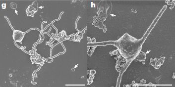
|
Each frame shows one cell.
These are SEM (scanning electron microscope) images.
There is also debris around, probably membrane fragments. Most of the debris pieces are marked with arrows. But the big thing in the middle, taking up most of the space, is one cell in each case.
|
What's striking is that each cell has projections, or "protrusions" as the authors call them. (People even refer to them as tentacles.) Multiple projections, sometimes straight, sometimes long, sometimes branched, sometimes tangled. The projections are shown to be outgrowths of the cell membrane.
The scale bars. in each frame, are 1 micrometer. That is, the diameter of the main cell body is about a half µm.
Neither the images above nor extensive examination by a variety of techniques show evidence for any eukaryotic-type structures inside the cells.
This is part of Figure 3 from the article.
|
Those protrusions are intriguing. And they might solve a problem.
In the standard model, the eukaryotic cell arose when an archaeon took up a bacterium. But prokaryotes don't take up other cells; they don't have "phagocytosis" (literally, cell eating). That is, the standard model for making the first eukaryotic cell requires a trait that the parents don't have -- so far as we know.
The projections perhaps offer an alternative. Maybe the archaeon did not take up the bacterium by engulfing it. Maybe, instead, the archaeon surrounded the bacterium with its membrane protrusions.
Another feature of this new microbe is that it grows in close association with other microbes, and almost certainly exchanges nutrients with them during its normal growth. One can imagine this as an early stage of a symbiotic relationship.
The following figure offers a cartoon of what this might have looked like.
|
The blue thing with gray protrusions is the Asgard. The red thing is a bacterium, perhaps on its way to becoming an organelle (a mitochondrion).
The figure shows some of the possible metabolic interactions.
This is Figure 5b from the article. The full figure shows several steps of the possible association. (There is a third cell in this association, at the lower left.)
|
This article has gotten a lot of attention. We noted it here when it was first posted on BioRxiv, even before it was accepted for publication. You might wonder then, what's the big deal? What have we learned from this "breakthrough" article? And the answer is, we don't know -- yet. The Asgard microbes have gotten attention in recent years because there are at least hints that they may have been involved in a major step in the development of life. Most of the evidence was indirect. Now, at last -- and after 12 years of effort by this lab to isolate this culture -- we have one Asgard in the lab, growing. What have we learned from it so far that helps us understand the origin of eukaryotic cells? Nothing, at this point. But we have an Asgard growing in the lab. That in itself is a big step.
That picture of the Asgard cell, above, is tantalizing. But remember, the middle figure above is a photo; the bottom figure is a drawing, using our imagination.
The authors have proposed the name Prometheoarchaeum syntrophicum for the newly discovered microbe.
News stories:
* Elusive Asgard Archaea Finally Cultured in Lab -- The 12-year-long endeavor reveals Prometheoarchaeum as a tentacled cell, living in a symbiotic relationship with methane-producing microbes. (N Lanese, The Scientist, August 12, 2019. Now archived.) This news story was listed in the earlier "briefly noted" post about the current article, then available only as a preprint.
* Incubated Prometheoarchaeum syntrophicum samples may provide clues about origin of eukaryotic cells. (B Yirka, Phys.org, January 16, 2020.)
* This Strange Microbe May Mark One of Life's Great Leaps -- An organism living in ocean muck offers clues to the origins of the complex cells of all animals and plants. (C Zimmer, New York Times, January 15, 2020. Link is now to Internet Archive.)
* News story accompanying the article; it may be freely available: Microbiology: Meet the relatives of our cellular ancestor. (C Schleper & F L Sousa, Nature 577:478, January 23, 2020.)
* The article, which is freely available: Isolation of an archaeon at the prokaryote-eukaryote interface. (H Imachi et al, Nature 577:519, January 23, 2020.)
You might check the journal cover photo.
Background posts about the Asgard include...
* #2 in Briefly noted... (August 21, 2019). A brief mention of this work when it was posted as a preprint, prior to being considered for publication.
* The Asgard superphylum: More progress toward understanding the origin of the eukaryotic cell (February 6, 2017).
* Our Loki ancestor? A possible missing link between prokaryotic and eukaryotic cells? (July 6, 2015). This post discusses the first article published about an Asgard -- just five years ago.
More -- an important next step: A second Asgard in culture, with an actin-based cytoskeleton (February 19, 2023).
More about the origin of eukaryotes:
* Briefly noted... Legionella bacteria and the origin of eukaryotes (August 9, 2022).
* What if a yeast cell contained a bacterial cell? A step toward understanding the evolution of mitochondria? (January 29, 2019). An artificial system.
* Origin of eukaryotic cells: a new hypothesis (February 24, 2015). The article of this older post is reference 39 of the current article. The model discussed above supports the proposal made in this earlier article for how the archaeon took up the bacterium.
* Are there really three domains of life? (January 12, 2013).
More about endosymbiotic bacteria in eukaryotes: A new energy-generating organelle (May 11, 2021).
Also see: The immune response of cnidarians (e.g., corals) (November 1, 2021).
Hückel at 40 -- that's n = 40: the largest known aromatic ring
February 1, 2020
Benzene, C6H6, is the classical example of a molecule that we call aromatic. It has nothing to do with its odor, but with how its electrons are distributed. Six of the electrons (one from each C) are in a loop, and can circulate around the molecule. Because they are circulating, or "delocalized", they are less reactive than one might have expected.
Are other things aromatic, in this sense? Well, fuse two benzene rings together, and you get naphthalene. It indeed behaves as aromatic, with ten of those circulating electrons.
There are other chemicals that behave as aromatic; some are along the lines of benzene and naphthalene and some are different. In 1931, the German scientist Erich Hückel developed a "rule": a molecule could behave as aromatic if the number of electrons available to circulate is 4n + 2, for any integer n, starting with zero. (Benzene and naphthalene have n = 1 and 2, respectively.)
The circulating electrons are all π electrons, in the language of quantum mechanics. Not all π electrons can circulate, but when discussing aromaticity, we will focus on the π electrons that do circulate.
Hückel's rule has worked well. A chemical with two π electrons circulating is aromatic; that is n = 0. Other chemicals with n as high as 5 fit the pattern.
I have a page on the general nature of aromaticity, as discussed above. That page is: What does "aromatic" really mean? It includes pictures of some of the other aromatic species beyond benzene. One of those shows how one can have a loop of two electrons.
What about larger molecules? In 2017, a team of chemists from Oxford University made a molecule with 78 π electrons, and showed that it behaved as aromatic, as expected from Hückel's rule (n = 19).
And now, more from the same team. Look at this molecule...
How many π electrons are there in its main loop?
Hard core chemists may be tempted to actually count them. If you do try... The "spokes" don't matter; just count the π electrons in the "wheel" (including those on one side of the porphyrin rings). But before you do, see the next point.
There is a little catch. The molecule shown here is neutral. It is actually an ion form of it that is aromatic. The molecule shown has a loop of 168 π electrons. Remove six of those π electrons, to form the 6+ cation, and you get 162. That is 4n + 2 for n = 40.
More about the structure of the chemical... One can think of it as a big wheel (the aromatic part), with spokes. We didn't mention it earlier, but the aromatic loop must be planar; here, the spokes hold the wheel in a plane. There are 12 spokes. Each is attached to a corner of a benzene ring at the center. But there are only six corners to a benzene ring. There are actually two benzene rings there, one behind the other, but rotated a bit. That gives 12 corners, on two benzenes. In the figure, the spokes alternate light and dark. The dark spokes attach to the upper benzene; the light spokes attach to the lower benzene -- which is not visible here.
This is reduced from the figure in the news story at Nature Research Chemistry Community. If you want more detail, see the full-size figure there. The figure is equivalent to Figure 4a of the article.
|
That's the chemical. Is it aromatic? Measuring reactivity is not practical in such a case, because of the complexity. But another feature of aromaticity can be measured. We noted that the π electrons in an aromatic chemical circulate; that creates a current -- and it can be measured. The scientists measure it by its effect on the magnetic field. The ring current from aromaticity affects the NMR spectrum; that is what they measure. Here is an example...
|
The top of the figure shows a small cartoon of the chemical; it is the same one shown above.
The important part is at the bottom... a few data points. The scale shows the chemical shift for particular atoms in the NMR spectrum, as a function of the number of π electrons in the loop (x-axis). More specifically, it shows the difference between two similar atoms in different places.
The open circle is for the neutral molecule, with 168 π electrons. It is the reference point, shown as zero.
Other points are for various oxidized forms of the molecule, with fewer π electrons. Of particular interest is the point at 162 π electrons. There is now a small negative difference between what were equivalent atoms. It is what is expected if the molecule (or ion, 6+, in this case) has a ring current as predicted for an aromatic species.
This is part of Figure 5 from the article. I have added some labeling at the right. The full figure shows similar results for various molecules they made in this work. The one shown here is the largest.
|
As noted, the team examined several large molecules in this work. The big observation is that aromaticity was detected, by ring current, in several cases -- all of which agree with Hückel's rule.
From this work, we now know that Hückel's rule holds out to n = 40, for a system with a loop of 162 π electrons. That's several times the size of readily available aromatic molecules, and about double the previous record -- set by the same group just three years ago.
News stories:
* Largest molecular wheel ever made pushes limits of aromaticity rules. (M Gross, Chemistry World, January 22, 2020.)
* Global aromaticity at the nanoscale -- The extraordinarily rich electrochemistry of porphyrin nanorings, in combination with the scope for using templates as scaffolding to control the conformations of these macrocycles, make them ideal systems for studying aromaticity at the nanoscale. (A Zakharova, SciGlow, January 20, 2020.
* Behind the paper -- Global Aromaticity at the Nanoscale. (H L Anderson, Nature Research Chemistry Community, January 21, 2020. Now archived.) From an author of the article; a little of the story of the work.
The article: Global aromaticity at the nanoscale. (M Rickhaus et al, Nature Chemistry 12:236, March 2020.) Reference 8 is their 2017 article with the previous record.
As noted above, I have a page on the general nature of aromaticity: What does "aromatic" really mean?
The molecule shown above is related to one in an earlier Musings post: A new approach to making large molecules, using a Vernier process (February 12, 2011). The work is from the same group.
A post about a molecule that, perhaps surprisingly, isn't aromatic: Making triangulene -- one molecule at a time (March 29, 2017).
This post is listed on my page Introduction to Organic and Biochemistry -- Internet resources in the section on Aromatic compounds. That section includes a list of related Musings posts.
January 29, 2020
Is it possible to have a normal sense of smell without olfactory bulbs?
January 28, 2020
Maybe so, according to a new article. A small percentage of women seem to have this trait. Especially left-handed women.
What's an olfactory bulb? It's a distinct brain structure. Primary responses from the olfactory receptors (in the nose) travel to olfactory bulbs in the brain, where they are processed. People lacking olfactory bulbs (one on each side) lack the sense of smell. The olfactory bulbs are an integral part of the olfactory system. Or so we thought.
The following figures show some of the evidence from the new article. The first figure shows measurements of the size of the olfactory bulbs in a collection of people.
|
The figure shows the volume of the olfactory bulbs (OB; y-axis), with separate data for the left and right OBs. (The volumes were measured by MRI.)
The main data set is for an ordinary population (controls). The blue dots show the means, and the vertical bars show the standard deviations.
Then there are three points at the bottom on each side; these show the results for three specific people. OB volume essentially zero, both left and right. These people lack olfactory bulbs. They are identified here with NAB names.
This is Figure 1E from the article.
|
The following figure shows measures of functional olfactory systems -- the sense of smell -- for these three people...
Part A shows one such test, and part B shows three parts of another test. We'll describe them briefly later; for now, the main point is that they are various measures of the olfactory sense.
The general plan for the results is the same as in the top figure. The blue dot summarizes the results for controls; the other three dots are for the three people lacking OBs.
Start with part A. Two of the three NAB points look quite normal; the third is very low.
The three scores in part B show the same pattern.
The controls are not the same people in the various tests; in fact, some of the controls shown are values from the literature. The NAB data is for specific individuals studied here by the current authors.
The test in part A is a person's own evaluation of the importance of odor to them. The x-axis label refers to a test called Subjective Importance of the Sense of Smell Questionnaire; it is referred to as both SISSQ and SSISQ in the article.
The test in part B is the Sniffin Sticks test. It is a standard test for measuring the sense of smell objectively. The three scores are for different aspects of that test.
This is part of Figure 3 from the article.
|
Taken together, the data above show that individuals NAB1 and NAB2 lack olfactory bulbs but have a normal sense of smell.
The third NAB individual, NAB-CA, was known to have congenital anosmia (CA), lacking a sense of smell.
The finding is a surprise, and the scientists have no explanation at this point. It will the basis of follow-up work -- which inevitably should lead to a better understanding of the olfactory system.
At the top of this post, I suggested some statistics. After uncovering the two people who lacked olfactory bulbs but had normal smell -- both women, the scientists went on to screen a substantial number of people (from a public database). They found more such people (normal olfaction, but lacking olfactory bulbs), all of them women. Overall, they found that about 0.6% of women have this trait; for left-handed women, it is about 4%. No men with the trait have been found. What does this mean? They don't know. There may be some interesting biological connection, or it might be just a statistical fluke; the numbers are not very big.
The authors note that there have been occasional reports of mammalian olfaction without olfactory bulbs in the past, mainly in rodents. These reports have not been well accepted. The current article provides the best evidence yet on the matter, with live human subjects available for testing.
News stories:
* Typical olfactory bulbs might not be necessary for smell, case study suggests. (EurekAlert! (Cell Press), November 6, 2019.)
* An exception to the rule: An intact sense of smell without a crucial olfactory brain structure. (Science Daily (Weizmann Institute), November 11, 2019.)
The article, which is freely available: Human Olfaction without Apparent Olfactory Bulbs. (T Weiss et al, Neuron 105:35, January 8, 2020.)
Posts on olfaction include:
* A sniff test to see if a person is conscious (August 4, 2020).
* Could smelling a piece of wood improve the growth of your hair? (November 5, 2018).
* Olfaction and obesity? (July 18, 2017).
* The chemistry of a tasty tomato (June 18, 2012).
* What does blue light smell like? (July 18, 2010).
More about handedness...
On handedness in humans (September 30, 2013). Links to more. Added April 30, 2026.
My page for Biotechnology in the News (BITN) -- Other topics includes a section on Brain. It includes a list of related posts.
A robust capsule for providing micronutrients
January 26, 2020
Many people don't get all the vitamins and minerals they need. What if one could just get them from a simple pill?
That suggestion may evoke various reactions. But in some parts of the world, delivery of such basic nutrients is a serious large-scale problem. Maybe we should at least consider the pill option, without judgment at this point.
A new article offers progress toward a basic nutrient pill or "capsule". It's an interesting story.
The following figure shows the idea and some results...
The particular testing shown here involves a capsule with four micronutrients, listed in the key at the right (in part G).
Part D (left) is a cartoon of the capsule. It looks a bit complicated. In fact, it is what the authors call a two-step capsule. By using a two-step process, they get good encapsulation of both water-soluble and fat-soluble nutrients.
The other three parts of the figure show the release of the four nutrients over time, under different conditions. In each part, there are four curves, one for each of the four nutrients. The curves for all four nutrients are similar; here we will just refer to them together.
What is more interesting are the three conditions. You can see that the nutrients are substantially released in about a half hour in part E, and only slightly released even over two hours in parts F and G.
Part E is for SGF at 37 °C. SGF? Simulated gastric fluid. That is, this condition represents your stomach -- where we want the nutrients to be released.
The other two parts are for water at RT (room temperature) and at boiling. The first represents simple storage; the second represents cooking. There is little loss of nutrients in either condition -- a good sign.
This is part of Figure 2 from the article.
The following comment is not needed for what is written above, but may be helpful if you check the full figure in the article... The figure legend there suggests a color code for part D. However, it does not agree with the figure; that's fine if you take the figure as a diagram or cartoon. The color coding suggested -- incorrectly -- for part D does in fact hold for the other parts, as shown in the key.
|
That's encouraging. A single capsule with four nutrients (two water-soluble and two fat-soluble) behaves well in this test. It releases the nutrients under stomach conditions, but not during storage or cooking.
Overall in the article, the scientists test eleven nutrients (vitamins and minerals), using various simple and more complex capsules, such as the two-step capsule shown above. All the simple tests are encouraging. The test above is with a four-nutrient capsule, the most complex they have tested so far.
The article includes testing in rodents, and some testing in humans. In one case, a problem identified during such testing (on the bioavailability of iron), led to further development of capsule composition.
Capsule production itself is simple and inexpensive, even for the two-step process. (The article includes some general discussion of the economic issues.) Importantly, the practical considerations were invoked at the start; the goal was to develop practical capsules for large scale delivery of essential micronutrients. The capsules, which are tiny (about 0.2 mm diameter), might be used in a pill, or they might be used to fortify current foods.
News stories:
* New strategy for encapsulating nutrients makes it easier to fortify foods with iron and vitamin A. (Medical Xpress (MIT), November 13, 2019.)
* Fighting malnutrition: Could new nutrient delivery strategy help billions of people? (N Gray, Nutraingredients, November 14, 2019.)
The article: A heat-stable microparticle platform for oral micronutrient delivery. (A C Anselmo et al, Science Translational Medicine 11:eaaw3680, November 13, 2019.)
The work is, in part, from the lab of Bob Langer at MIT. Langer is a chemical engineer well known for clever and useful ideas.
More about delivering things to the body: Self-boosting vaccines? (August 26, 2022). From the same lab.
My page Internet resources: Biology - Miscellaneous contains a section on Nutrition; Food safety. It includes a list of related Musings posts.
A Zika vaccine test: protection of the developing fetus?
January 24, 2020
A particular concern with Zika virus is that it can lead to fetal problems, collectively known as congenital Zika syndrome (CZS), if the mother is infected during pregnancy. (The best known of the problems is microcephaly, though it occurs at low frequency.)
A recent article reports a test, in macaque monkeys, of a vaccine against Zika. The big message is that vaccination of the mother helps protect the developing fetus.
The figures below show some data about the effectiveness of the vaccine. In the first figure, effectiveness is measured by virus replication or antibody level.
Part C (left). This graph shows the amount of viral RNA found in each monkey, for control and vaccinated animals. Each point shows the peak viral RNA (log scale) for one animal. The horizontal line in each data set shows the mean.
Part D is similar, but shows viral RNA by a different measure: the AUC (area under curve -- of virus level vs time), a measure of the total virus production.
By either measure, the levels of viral RNA are, in general, lower in the vaccinated animals. There is one vaccinated animal with high viral levels.
Part E shows the level of neutralizing antibodies (log scale) in the vaccinated animals. They are divided into two groups: those that did or did not develop measurable levels of virus ("viremia"). The results show that animals with the highest levels of antibody did not develop viremia.
This is part of Figure 3 from the article.
|
The general picture is that the vaccine is effective. In general, vaccinated animals have lower viral levels. And low viral levels correlate with high levels of antibodies.
The next figure looks at the vaccine effectiveness as judged by fetal pathology.
|
The top graph is for fetuses from control (unvaccinated) mothers; the bottom graph is for fetuses from vaccinated mothers.
In each case, there are two sets of points, based on the overall "pathology score" for the fetus. Fetuses with low pathology scores (<3) are in the left set; those with higher scores are at the right. (We'll describe the score more later.)
Each point shows the number of days that the mother had viremia.
Observations...
- A smaller percentage of the animals in the vaccinated group had high pathology scores.
- For unvaccinated animals, longer periods of maternal viremia correlate with higher pathology scores.
- Duration of maternal viremia is greatly reduced in the vaccine group.
This is part of Figure 7 from the article.
|
The first of those points is the key one. The vaccine, given to the mother prior to conception, reduced pathology in the fetus.
What are those pathology scores? The scientists looked for pathology in four regions of the fetus, and rated it from 0 to 4 (none to severe). The sum of those four region-scores is the pathology score for the fetus; it could range from 0 to 16. The cutoff of 3, used in the analysis above, means that any one case of "moderate" pathology or two cases of "mild" pathology put the fetus into the "bad" group.
Overall, the vaccine induced protective antibodies, and led to less virus production, as well as to reduced pathology in the fetus. That's all good. However, the study is quite small, with about ten animals in each group. And there are many details, such as the timing of vaccination and virus exposure, that might have complex effects. So this work is an encouraging step toward a useful vaccine that can reduce fetal pathology from Zika, but there is more to learn.
The vaccine is now being tested in humans. Interestingly, the incidence of Zika is now low enough that it will be hard to measure the vaccine's effect on fetal pathology. That's why these monkey tests, limited though they may be, are important.
News stories:
* NIH-developed Zika vaccine improves fetal outcomes in animal model. (National Institutes of Health, December 19, 2019.) NIH was a participating lab, as well as funding source.
* Zika vaccine protects fetus in pregnant monkeys . (Science Daily (University of California - Davis), December 18, 2019.)
The article, which may be freely available: DNA vaccination before conception protects Zika virus-exposed pregnant macaques against prolonged viremia and improves fetal outcomes. (K K A Van Rompay et al, Science Translational Medicine 11:eaay2736, December 18, 2019.)
Previous post about Zika: Asian Zika in Africa (October 12, 2019).
There is a section on my page Biotechnology in the News (BITN) -- Other topics on Zika. It includes a list of Musings post on Zika.
January 22, 2020
Briefly noted...
January 22, 2020
1. The new coronavirus. The big medical story of the new year. (The first cases were reported in late 2019.) It's too early for scientific articles, but there is a daily barrage of news, some straightforward, some confusing or even contradictory. The new virus, a coronavirus, is related to SARS and MERS. The disease is similar, and some of the news is eerily similar to the SARS story of two decades ago. The new disease probably got to humans via markets dealing in live animals, and it is being transmitted worldwide via airplanes.
* The US CDC (Centers for Disease Control and Prevention) has established a page for the new virus: COVID-19. An excellent official source of information, much of it intended for healthcare workers.
* For the latest, I recommend CIDRAP. They have an update almost every day. Their pages are well-written, and include links to their sources. Search on 'CIDRAP novel coronavirus' or such, check the CIDRAP web site, or even sign up for their daily e-mail. The CIDRAP home page is https://www.cidrap.umn.edu.
* My page Biotechnology in the News (BITN) -- Other topics has a section SARS, MERS (coronaviruses). I will start adding some basic information for the new virus.
2. An unusual bird song. The news from the fire scene in Australia is horrible. But in the middle of all that, something of some scientific interest happened -- and is noted in the video listed here.
* video. (1 minute; YouTube.)
An improved bandage, based on superhydrophobic carbon fibers
January 21, 2020
A team of scientists recently reported a better bandage. The following figure shows the story.

Caution... The layout of the figure is inconsistent, and some is not well-labeled.
The figure is about a test of the new bandage vs a traditional gauze bandage on a wound on the back of a rat.
Part a (left)... Immediately upon applying the bandage. Top photo is for the new bandage ("CNF gauze"); bottom photo is for the traditional bandage ("control"). Blood leakage through the control bandage is evident; there is no blood through the CNF bandage.
Part b... After 3 minutes, the bandages are peeled back. Top and bottom are for new and control bandages, as before. The wound under the new bandage is closed; the wound under the control bandage is not. The new bandage has promoted clotting.
Part c -- which does not follow the previous format... Part c is two images wide. The top two images are for the two types of bandages, peeled back after 2 hours. And the bottom two show what happens when the exposed wound is slightly stretched "by hand" (by the blue-gloved fingers); each bottom image goes with the bandage shown immediately above it. The performance of the new bandage is better in all respects.
Parts d and e show some data over several tests. Part d shows the blood recovered on the bandage; it is much lower for the new bandages. Part e shows the force required to remove the bandages; it, too, is much lower for the new bandages.
This is part of Figure 5 from the article.
|
The results show that the new bandages have several advantages over the traditional gauze bandages.
What is this new bandage? CNF stands for carbon nanofiber. The bandage is basically ordinary gauze coated with CNFs.
The CNFs make the bandage surface hydrophobic -- even superhydrophobic. Some of the advantages are clearly related to the hydrophobic nature of the new bandage. It doesn't absorb liquids; it repels them. But the new bandage promotes clotting. That came as a surprise to the scientists, too. It is what led to considering the use of the material for bandages -- rather than for blood flow machines.
The new bandages also seem to be anti-bacterial. In part, that is due to their hydrophobic nature; the bandages themselves do not serve as a substrate for bacteria. Further, that the new bandages do not disrupt the wound when removed helps keep the wound clean.
The authors emphasize that they have an approach, not a final product at this point.
News stories:
* This new bandage stops bleeding without sticking to wound -- Scientists have devised a new king of bandage that simultaniously [sic] repels blood and promotes clotting. (T Puiu, ZME Science, January 10, 2020.)
* Bandage material helps stop bleeding without adhering to the wound. (Phys.org (F Bergamin, ETH Zurich), January 9, 2020.)
The article, which is freely available: Superhydrophobic hemostatic nanofiber composites for fast clotting and minimal adhesion. (Z Li et al, Nature Communications 10:5562, December 5, 2019.)
There are several movie files posted with the article at the journal web site. No sound; most are 10-15 seconds. The last two show the removal of the two types of bandages from the rat wound, discussed in the figure above.
More things superhydrophobic...
* An antiviral coating for medical textiles (July 12, 2020).
* Disease transmission by sneezing -- in wheat (July 29, 2019). Links to more.
More about wound healing... Targeting growth factors to where they are needed (April 21, 2014). Links to more.
More blood: Mechanism of blood clotting: how the von Willebrand factor works (May 18, 2021).
Designing reconfigurable organisms
January 19, 2020

|
An example.
It is about a millimeter across.
(For figure credit, see next paragraph.)
|
I suggest you watch a little "movie" (animated gif) of "it": [link opens in new window]. (The movie is about 3 MB; no sound. It loops; you can tell when it loops, because the thing suddenly jumps back to the original position.) (The movie is from the news story in The Scientist, listed below. It comes from the authors of the article. The top figure in this post is trimmed from the first frame of this movie file.)
What is it? A little machine. Perhaps you would call it a robot.
It was designed by a computer scientist-roboticist at the University of Vermont, then "built" by folks at Tufts University.
Genetically, it is Xenopus laevis, the African clawed frog, a common organism for lab work.
The thing is made from skin stem cells and heart stem cells of the frog. What makes it special is that the cells are laid down in a particular pattern -- one that the computer modeling suggested would lead to a meaningful device.
The meaning of this particular meaningful device is quite simple. It is a coherent device, capable of moving in one direction. It does seem to be a machine, even if a simple one. And the design was chosen based on computer modeling. It is a machine designed by humans (and computer) -- and it has an ordinary biological genome.
Another device that the team predicted and built can carry cargo.
The current work used only two kinds of cells. That computer modeling showed some success in predicting how the cells will function in various configurations is just a start.
The authors call this thing a xenobot. The "xeno" there refers to the genus name of the frog -- so they say.
News stories:
* Algorithm Designs Robots Using Frog Cells. (E Yasinski, The Scientist, January 13, 2020.) Now archived.
* Living robots built using frog cells -- Tiny 'xenobots' assembled from cells promise advances from drug delivery to toxic waste clean-up. (Science Daily (University of Vermont), January 13, 2020.)
* Scientists use stem cells from frogs to build first living robots -- Researchers foresee myriad benefits for humanity, but also acknowledge ethical issues. (I Sample, Guardian, January 13, 2020.)
The article, which is freely available: A scalable pipeline for designing reconfigurable organisms. (S Kriegman et al, PNAS 117:1853, January 28, 2020.)
There are two movie files posted with the article. (About 3 minutes each; no sound.) The first describes the design process; you may find it helpful. The second shows some of the actual assembly. The videos are also available at YouTube: #1 and #2.
The article was posted online just a few days ago, and quickly attracted considerable attention. The news stories listed above all came out the day of posting of the article. More analytical stories will presumably appear over time. As always... If you want more about an article, I suggest putting the article title into a search engine.
There is a Wikipedia page for xenobots.
Previous posts using the term "reconfigurable organism": none.
More about Xenopus:
* What's the connection: histones and copper ions? (August 15, 2020).
* What if you had eyes on your tail? (July 27, 2013).
... and other amphibians: How to make yourself more transparent while you sleep (March 7, 2023).
Another post about hearts and stem cells: Stem cell treatment of heart damage: a new interpretation (March 31, 2020).
Next post about robots... Why robo-turtles may be useful (April 25, 2020).
My page Biotechnology in the News (BITN) for Cloning and stem cells includes an extensive list of related Musings posts.
Alzheimer's disease: a role for inflammation?
January 18, 2020
A leading model for Alzheimer's disease (AD) is based on the accumulation of a peptide commonly called amyloid-beta (Aβ or AB, often with a number, e.g., AB-42, indicating the number of amino acids). However, attempts at treatment based on that simple model have failed. There must be more to AD.
It is likely that a protein called tau is involved in AD -- and in other neurodegenerative diseases. And there may be a role for inflammation.
A recent article provides evidence for a positive feedback loop between tau and inflammation. It's a very complex article, much of it with a mouse model of tau-related neurodegeneration. All we can do here is to show a couple of pieces of the story.
The first figure shows that inflammation promotes tau pathology.
|
The figure shows staining of brain (hippocampus) slices from 11-month-old mice. The stain shows hyperphosphorylated tau, which is considered important in the pathology. The different images are from different mouse strains.
|
Start with the two images at the left. The top one is for normal (wild type; WT) mice. The bottom one is for mice that over-express a particular tau protein (Tau22), one that is commonly used in mouse models. You can see that there is considerable staining for hyperphosphorylated tau in the mouse with high levels of tau.
The middle and right sets of images are for mice with additional mutations that interfere with formation of inflammasomes. They are labeled Asc-/- (middle) and Nlrp3-/- (right). The -/- means that both copies of the indicated gene have been disrupted.
The images in the bottom row show that the additional mutations, blocking inflammasome production, reduce the staining for hyperphosphorylated tau. (Those mutations have no effect in the top row, where there is no staining evident in the control.)
This is Figure 2a from the article.
The adjacent figure in the article, 2b, shows quantification of these results over multiple mice. The overall data support the observations noted above, which are sample images of each type.
The scale bar (lower right) is 0.5 mm.
|
That test suggests that inflammasomes enhance the production of hyperphosphorylated tau, hence its pathology.
The following figure suggests that tau enhances inflammasomes.
This figure is actually for humans. It shows the levels of two proteins in the brains of people with frontotemporal dementia (FTD) and controls. FTD is another tau-dependent neurodegenerative disease. ASC (top row) is a protein of the inflammasome, as noted earlier.
You can see that the level of ASC is higher in each of the FTD people than in the controls.
This is Extended Data Figure 1a from the article. (Extended Data Figures are not in the print version of the article.) The adjacent Figure 1b shows the quantitative data over all the people tested.
|
|
Knowledge of that result leads the scientists here to test their system. They find that high levels of tau indeed lead to higher levels of inflammasomes in their mouse model.
The results discussed above suggest there is a positive feedback loop between tau and inflammasomes. But there is no clear answer as to what is important. Indeed, there is still no clear understanding of how AD develops. The work here just provides more clues.
A possible implication of such work is that drugs targeted to the inflammasome might interfere with tau-dependent pathology, including AD.
What happened to amyloid-β, which we used to say was key to the development of AD? As the story develops, Aβ is still important, but is an early stage. For example, it may well be that Aβ triggers tau pathology, perhaps acting via the inflammasome.
Stay tuned.
News stories:
* Direct link shown between inflammasome activation and Alzheimer's -- A new study has demonstrated that NLRP3 inflammasome directly drives tau pathology in neurodegenerative diseases and Alzheimer's disease. (R Harper, Drug Target Review, December 2, 2019.)
* In Alzheimer's, Inflammasome Drives Both Amyloid and Tau Pathology. (GEN (US National Institute on Aging), November 22, 2019.)
* Microglia Inflammasome Stokes Tau Phosphorylation, Tangles. (ALZFORUM, November 22, 2019.) A high-level discussion of the article and its implications.
The article: NLRP3 inflammasome activation drives tau pathology. (C Ising et al, Nature 575:669, November 28, 2019.)
Previous post about AD: Alzheimer's disease: The role of vascular damage? (August 13, 2019).
Previous post about tau: Traumatic brain injury: long term effects? (October 8, 2019).
Other posts about tau and AD include:
* How tau gets around (June 28, 2020).
* A mutation in ApoE that protects against Alzheimer's disease? (February 22, 2020).
* Alzheimer's disease: What is the role of ApoE? (November 6, 2017).
A post exploring a possible role for inflammation in another disease: Chronic fatigue syndrome: a clue about the role of inflammation? (October 27, 2017).
Added February 4, 2026.
More microglia: Anxiety. 2. An immune system connection (February 4, 2026).
My page for Biotechnology in the News (BITN) -- Other topics includes a section on Alzheimer's disease. It includes a list of related Musings posts.
January 15, 2020
Briefly noted...
January 15, 2020
Two -- very different -- items about CRISPR.
1. Early results from clinical trials of CRISPR for humans. Two recent news stories, one from last week, provide an overview. No big answers. Trials are in progress; some early observations are coming in. No big problems have emerged; evidence for benefit at this point is limited, but perhaps encouraging in some cases.
* News stories:
- Early Results Are Positive for Experimental CRISPR Therapies. Two clinical trial participants - one with β-thalassemia and one with sickle cell disease - appeared to benefit from the gene-editing treatments with minimal side effects, according to the companies. (J Akst, The Scientist, November 19, 2019. Now archived.) Links to the press release from the two companies, which has more details -- and disclaimers.
- Direct link to that press release: CRISPR Therapeutics and Vertex Announce Positive Safety and Efficacy Data From First Two Patients Treated With Investigational CRISPR/Cas9 Gene-Editing Therapy CTX001® for Severe Hemoglobinopathies. (Vertex Pharmaceuticals, November 19, 2019.)
- Quest to use CRISPR against disease gains ground -- As the first clinical-trial results trickle in, researchers look ahead to more sophisticated medical applications for genome editing. (H Ledford, Nature, January 6, 2020. In print, with a slightly different title: Nature 577:156, January 9, 2020.)
* Update on one of the clinical trials... Reactivating fetal hemoglobin production to treat β-hemoglobin problems - II (February 16, 2021).
2. Using CRISPR for controlled degradation of a gel. CRISPR is, most fundamentally, a way to make specific cuts in DNA. If you have a structure, such as a gel, that includes DNA, CRISPR could be useful for modifying the structure.
* News story: CRISPR-Based Tool Expands DNA-Hydrogel Versatility -- DNA-responsive polymer gels used for releasing drugs, encapsulating cells, and much more now have greater adaptability thanks to the Cas12a nuclease. (R Williams, The Scientist, December 1, 2019. Now archived.)
* News story accompanying the article: CRISPR propels a smart hydrogel. (Da Han et al, Science 365:754, August 23, 2019.)
* The article: Programmable CRISPR-responsive smart materials. (M A English et al, Science 365:780, August 23, 2019.)
This "Briefly noted" post is included in the complete list of posts on CRISPR at CRISPR: an overview (February 15, 2015).
Is it ok to eat while standing up?
January 14, 2020
Does eating standing up affect your perception of how the food tastes?
Let's look at a test, from a recent article...

The first two bars, to the left, are for a simple test -- the control, in this case. Groups of people were asked to rate the taste of a snack, on a scale of 0-7. Higher score means "more pleasant". One group did the test while sitting, one group while standing (dark and light bars, respectively; see key at the very bottom).
Bar heights show the average taste rating for each group, with error bars showing one standard deviation.
You can see that the taste rating was higher for the people who were sitting.
The other pairs of bars are for variations of that test. In the middle test, each participant had a physical stress imposed. (They had to hold a heavy bag.) The results for sitting and standing are now about the same. That is mainly because the sitting score is considerably lower than it was in the control test (without the stress).
In the right-hand test. a psychological stress was imposed. We'll skip that here.
This is Figure 1 from the article.
|
Further testing helped to distinguish two possible explanations for the effect of standing on perceived taste. One possibility is that standing leads to a lower rating of taste. Another is that standing makes us less sensitive to taste effects. It was found that unpleasant-tasting foods were rated less unpleasant when standing; this supports the second suggestion: standing reduces our perception of taste, whether good or bad.
What are we to make of all this? I don't know. Some of the effects are plausible; some are fairly small.
Our response to food is complex. We know that what we commonly call taste is influenced by smell. And visual appearance of food matters. The current work explores a different type of sensory perception.
What may be as interesting as anything is the purpose of the work. It is marketing research. Is it ok to eat standing up? That's up to you. Does it affect how you perceive the food? Maybe, a little. It may not matter much to you, but it might matter a lot to a company testing consumers for their preferences.
News stories:
* Posture impacts how you perceive your food. (Science Daily (University of South Florida), June 7, 2019.)
* Distracted Eating: Less Tasty, But More Filling? (C Dinerstein, American Council on Science and Health, June 12, 2019.)
The article: Extending the Boundaries of Sensory Marketing and Examining the Sixth Sensory System: Effects of Vestibular Sensations for Sitting versus Standing Postures on Food Taste Perception. (D Biswas et al, Journal of Consumer Research 46:708, December 2019.)
From the Abstract...
... This research extends the boundaries of sensory marketing by examining the effects of the vestibular system, often referred to as the "sixth sensory system," which is responsible for balance and posture. The results of six experiments show that vestibular sensations related to posture (i.e., sitting vs. standing) influence food taste perceptions. ... These findings have conceptual implications for broadening the frontiers of sensory marketing and for the effects of sensory systems on food taste perceptions. Given the increasing trend toward eating while standing, the findings also have practical implications for restaurant, retail, and other food-service environment designs.
More about testing consumer preferences...
* The chemistry of a tasty tomato (June 18, 2012).
* Should the music industry use MRI scans to predict the success of new songs? (June 28, 2011).
More about gravity and blood flow: Which direction does blood flow in an astronaut? (January 7, 2020).
Cross-linking unreactive polymers, using carbenes
January 12, 2020
Cross-linking polymers can make them stronger -- as discovered by Charles Goodyear over a century ago. But some polymers are hard to cross-link, because they don't have any reactive sites. Polyethylene is a good example: the polymer contains only C-C and C-H bonds.
A new article offers a way to cross-link such polymers. It involves an unusually reactive cross-linking agent. It's a two-headed cross-linking agent; that is the basis of it linking together two chains. But an unusually reactive agent raises a new problem: how do you control it?
The first figure describes the idea. The second offers an example.
The key is carbene.
|
Part A shows the chemistry. It starts (at the left) with a diazirine, a chemical with a three-membered ring containing -N=N-.
Diazirines are not very stable. Three-membered rings are highly strained, and that N=N is so close to the stable common form of nitrogen, N2, that it "wants" to pop out. In fact, many such chemicals are explosive, but here the scientists designed one that is stable enough to handle.
Importantly, the decay of that compound can be triggered, by heat or light (shown as Δ and hν, respectively). Decay leads to N2 being released. What is left? A carbene (middle of part A). A chemical with a C atom with only two bonds, and a lone pair of electrons.
The carbene is highly reactive, and can react with an ordinary C-H bond. That leads to the product shown at the right.
|
Part B is similar, but this time shows the two-headed cross-linking agent. It has two of those things we just talked about; it is a bis-diazirine. Activate it, and two molecules of N2 are released, and a molecule with two carbenes in it is left. That double-carbene can now react with two C-H bonds, so long as they are not too far apart (as restricted by the linker between the carbene groups). If those two C-H bonds are in different chains of the plastic, the result is cross-linking of the chains. Part B shows those two carbene reaction steps, one after the other, leading to cross-linking two chains at the right.
This is slightly modified from Figure 1 of the article. I edited out one reaction pathway, as noted near the top of the figure, for simplicity of presentation here.
|
The following figure shows an example of the effect of cross-linking on the properties of the plastic.
In this test, two samples of polyethylene fabric were treated with the cross-linking agent. The samples were subjected to a tearing test. The test is standard, and is not described in detail in this article. But it measures the energy required to tear the fabric.
Start with the left set of bars (labeled as 75 g/m2, a measure of the thread thickness (linear density)).
The first two bars (to the left) are controls: fabric that was not treated, or was mock-treated (solvent but none of the cross-linking agent). The next two bars are for low and high levels of the cross-linking agent. You can see that both cross-linking treatments led to more energy being required to tear the fabric. That is, cross-linking strengthened the fabric.
|
|
The next set of bars (to the right; labeled as 90 g/m2) shows results of similar tests for a fabric with a slightly thicker thread.
Start by skipping the middle (orange) bar... The tests are the same as before, and the results are similar.
That orange bar? It's another negative control. The label says "1 wt% 7"; all the other treatment bars say 3 at the end. Those are numbers for the chemicals. 3 is the active cross-linking agent. 7 is a similar chemical that cannot cross-link; it didn't.
This is Figure 3G from the article.
|
Bottom line... The scientists have made progress toward strengthening unreactive polymers such as polyethylene. They do this by making a very reactive cross-linking agent, and learning to control it.
They also show that their cross-linking method can work to bond two surfaces of otherwise-unreactive plastics. That's a task Super Glue cannot do.
News story: New 'hyper glue' formula -- Cross-linking technology tightly binds where commercial glues cannot. (Science Daily (University of British Columbia Okanagan), December 4, 2019.)
* News story accompanying the article: Polymer chemistry: Cross-linking polyethylene through carbenes -- A carbene-forming molecule can glue various polymers, even ones lacking functional groups. (F J de Zwart et al, Science 366:800, November 15, 2019.)
* The article: A broadly applicable cross-linker for aliphatic polymers containing C-H bonds. (M L Lepage et al, Science 366:875, November 15, 2019.)
Among posts about polyethylene: Degradable polyethylene isn't (October 17, 2011). Links to some other posts about plastics.
Strawberries, bees, and their bacteria: a complex alliance
January 11, 2020
Nature is complicated. Organisms interact with each other. Analyzing a complex biological system and trying to understand the interactions is difficult, but perhaps interesting.
A recent article explores a relatively simple system: strawberries growing in a greenhouse, with bees as pollinators. The scientists provide evidence that a particular bacterial strain, normally found in the soil, protects both the plants and the bees. We will note a couple pieces of the story.
The first figure shows evidence suggesting that the bacteria protect the strawberry plants from a fungal disease (gray mold disease).
The first two curves listed in the key show (a measure of) the number of a particular kind of Streptomyces bacteria found on the pollen or flowers (filled circles or open squares, respectively; left-hand y-axis scale) vs time (x-axis).
The last curve listed shows the disease incidence (open circles; right-hand y-axis scale).
The main observation is that there are plenty of bacteria around for about the first 12 weeks -- and minimal disease. Later, there is disease, but few bacteria. That pattern is what one might expect if the bacteria were preventing the disease. (Of course, this data set alone is hardly proof; it is simply one piece of evidence.)
This is Figure 1g from the article.
|
The next figure provides evidence that the bacteria also protect the bees.
|
Look at the top graph, the red one. The graph shows bee mortality (y-axis) for four conditions.
The right-hand bar is for bees infected with a particular pathogen. Over 75% mortality. The bar next to that is for similar bees, but now also with the protective bacteria (called SP6C4). You can see that the presence of the bacteria substantially reduced the mortality.
The first two bars, to the left, are controls: bees alone or with only the treatment bacteria.
The bottom (blue) graph is the same idea, but with a different pathogen. Again, the treatment bacteria provided significant protection to the bees.
|
The bacterial pathogens are Serratia marcescens (top) and Paenibacillus larvae (bottom). Those names are shown on the figure, vertically, at the far right; hard to read.
The bees in this experiment are bumblebees (Bombus). (Some experiments reported in the article used honeybees (Apis).)
This is Figure 5c from the article.
|
The results discussed above provide some evidence that the bacteria protect both plant and bees. The bacteria are Streptomyces, a type of bacteria known to make various anti-microbial agents. In fact, some of the strains isolated during this work were shown to do so. An interesting point is that these are normally soil bacteria, but are found here in the flower area of the plant. How did they get there? The article provides evidence that the bacteria distribute easily through the plant tissue. Further, the bees transfer the bacteria from one flower to another.
How convincing is all this? That varies. It may be best to think of this article as an exploration. It offers some insight into some of the interactions within this relatively simple system.
News story: Strawberry Fields Forever. (M Zambrano & R Kolter, Small Things Considered, October 28, 2019.)
The article, which is freely available: A mutualistic interaction between Streptomyces bacteria, strawberry plants and pollinating bees. (D-R Kim et al, Nature Communications 10:4802, October 22, 2019.)
Previous posts about strawberries: none.
A recent post about bees and plants: What should a plant do if it hears bees coming? (December 10, 2019).
More: If a bee visits a plant and there are no flowers, can the bee place an order? (June 23, 2020).
More on antibiotics is on my page Biotechnology in the News (BITN) -- Other topics under Antibiotics. It includes an extensive list of related Musings posts.
January 8, 2020
Briefly noted... Beethoven's dream.
January 8, 2020
On November 7, 2019, the scientific journal Nature published their 150th anniversary issue. Among the large and diverse collection in that special issue was an essay on Beethoven.
* Essay, chosen by competition. It is freely available: Beethoven's dream. (Y Ali, Nature, November 4, 2019. In print: Nature 575:53, November 7, 2019)
* This post is listed on my page Internet resources: Miscellaneous in the section Art & Music. There is a list of related Musings posts.
* More about Beethoven: Beethoven's metronome confusion (March 1, 2021).
Which direction does blood flow in an astronaut?
January 7, 2020
Humans on Earth spend about 2/3 of their time with a difference in gravitational potential between head and heart. Humans in the weightlessness of space lack this gravitational difference -- for extended periods. Does it matter?
A new article from NASA (and collaborating institutions) explores the question. The article reports measurements of the blood flow through the jugular veins, which return blood to the heart from the head. The measurements were made on eleven astronauts on the International Space Station (ISS), before, during and after extended periods in space.
The following figure shows some of the results...

|
Results are shown for some pre-flight measurements (first three columns, to the left), and at about day 50 of flight (right-hand column).
Results are shown as a "grade", based on Doppler ultrasound measurement of blood flow. Briefly, grade 1 is normal and 2 is probably ok. Grades 3 and 4 are not so good. We'll return to what the grades mean later.
The pre-flight grades are all 1 or 2. More specifically, they are all 1 when the person is seated (head above the heart). And they are mostly 2 when the person is supine (lying down; head and heart at same elevation), or HDT (head-down tilt).
|
The data at day 50 of flight show grade 3 or 4 for about half of the astronauts. Not so good. That's the main idea.
Two of the "crew number" entries have an "a" on them. The "a" means that these two crew members showed evidence of a thrombus -- a blood clot -- in the vein. Not so good. Both of these people scored a 3 at day 50. (The thrombi reported here were not associated with any symptoms during flight.)
This is part of Figure 3A from the article.
The full Figure 3A in the article has more. There are more columns of grades during flight, at days 50 and 150. The general pattern continues: lots of 3 & 4 grades. There are also some post-flight grades. These are mostly back to 1 and 2, but not quite as good as the pre-flight grades.
|
Let's look at what those blood flow grades mean.
- Grade 1 means that the flow is always downward, from head to heart. The top frame of the attached figure shows an example: Figure 1 from the article [link opens in new window]. The light horizontal line near the top is at flow = zero. The entire data set in the top frame is below that line. The sign convention is that flow downward is negative. (That is, in this case, negative flow is normal.)
- Grade 2 means that the blood flow was mostly normal (downward), though occasional brief periods of backward (upward) flow were seen.
- Grade 3 means that there was very little blood flow at all, with intermittent periods of both upward and downward flow. This is referred to as "stagnant" blood.
- Grade 4 means that the blood flow is mainly backward (upward).
* The y-axis scales are not the same for all frames. But they are close, and visual comparisons will not be far off.
It's a small study, but it raises concerns -- especially for long term space travel. About half the astronauts examined had unusual blood flow in the jugular vein, and about half of those showed signs of a blood clot.
News stories:
* Dangerous Health Risk to Human Spaceflight to Mars Revealed in New NASA Study. (Sputnik, November 18, 2019.)
* Long spaceflights found to lead to blood flowing in the wrong direction in some cases. (B Yirka, Phys.org, November 19, 2019.)
The article, which is freely available: Assessment of Jugular Venous Blood Flow Stasis and Thrombosis During Spaceflight. (K Marshall-Goebel et al, JAMA Network Open 2:e1915011, November 13, 2019.)
As I was finishing up this item, there was a story on the news about a medical problem that had come up on the Space Station. It was about a jugular vein blood clot, which required treatment. It is likely that this is one of the cases noted above. The short article has some details on the treatment.
News story: Ultimate Telemedicine: Expert helps treat astronaut's blood clot during NASA mission. (Science Daily (University of North Carolina), January 2, 2020.)
The article: Venous Thrombosis during Spaceflight. (S M Auñón-Chancellor et al, New England Journal of Medicine 382:89, January 2, 2020.) The authorship of this article overlaps with that of the one discussed above.
A post about genetic factors and blood clotting: Type O blood and survival after severe trauma? (July 7, 2018). (The current article does not mention genetics.)
More about astronauts:
* Photography from the space shuttle (June 4, 2012).
* One way trip to Mars (September 22, 2009).
More from the ISS:
* Quality of lettuce grown on the Space Station (April 7, 2020).
* European journal open to authors around the world -- and beyond (January 2, 2012).
For more about the biological effects of space...
* Fidelity of DNA replication in micro-gravity (January 11, 2022).
* Briefly noted... 1. The effect of space travel on humans: a study of identical twins (November 13, 2019).
More about gravity and blood flow: Is it ok to eat while standing up? (January 14, 2020).
More ultrasound: An ultrasound device you can wear (September 17, 2022).
Lesson from a worm: An endogenous anti-opioid system?
January 5, 2020
The biology of opioids is complicated. They are natural, and they are used as drugs. They have good effects -- and bad ones.
A recent article uncovers a new piece of the opioid story -- by testing a worm. What the scientists did is interesting. It may have implications for dealing with opioid use in people. Whether it turns out to be useful remains to be seen.
The work starts with some exploration. Add a gene for a mammalian opioid receptor to the worm, and see what the effect is. Then look for mutants (worm mutants) with altered behavior in response to the drug. Characterize mutants that arise, and see what we learn from the mutant worms.
The worm here is Caenorhabditis elegans, a workhorse model organism of biological research.
The first graph below shows the effect of fentanyl, an opioid, on the worms.
Each frame is a travel-log. That is, each line shows what the worm did. Most of them are about the same: the worms moved around a lot. There is one exception, at the lower right. That worm moved very little.
What is that condition, which stopped the worm from moving? That worm had the opioid receptor (called tgMOR). And fentanyl was added. At the 90-minute time point, that worm moved very little.
That is, the worm behavior is altered by the drug -- if they have a receptor for it.
The details...
- Two kinds of worms: wild type (wt) and the worm with the opioid receptor tgMOR (which stands for transgenic mu opioid receptor).
- Two additions: fentanyl, or a buffer as a control.
- And two time points, 0 and 90 minutes after adding the drug (or buffer control). More about time in a moment.
This is Figure 1C from the article.
|
With that background, the scientists looked for mutant worms that behaved differently, using that lower right frame above as the reference point. It was brute force. They made mutants, and watched.
The following graph shows what one of the mutants did. The graph is based on the same type of test done above, but with a different way of showing the results. Above, they showed a picture of the movement. Here, they use a movement score (y-axis), and plot it as a function of time (x-axis). The score is the number of "thrashings" per minute. High score = lots of movement, as seen in most frames above.
|
Start with the black curve. It is for the tgMOR worm, with the opioid receptor. The thrashing score starts high, reaches a minimum at 90 minutes (the time shown in the top figure), and then rises as the worms adapt to the drug.
Now, the red curve, labeled tgMOR bgg9. Same worm as before, but now with an additional mutation that came up during the screen. The "bgg9" mutation disrupts a gene. And these worms show the effect of fentanyl more rapidly.
The scientists infer that bgg9 is in an anti-opioid gene, eventually identified as frpr-13. Inactivate it, and the worms respond more quickly to the drug.
|
Finally, the gray curve, labeled tgMOR bgg9 + hGPR139. Same worm as for the red curve, but with a new gene added. Compared to the red curve, this worm has a delayed response to the drug. That is, the added gene seems to compensate for the bgg9 mutation. If we take bgg9 as disrupting an anti-opioid gene, then it would seem that this added gene is also an anti-opioid gene.
What is this added gene, and why did they choose it? It is a human gene; note the leading h. Why did the scientists choose it? Well, they know the sequence of the protein for the bgg9-disrupted gene (frpr-13); they looked for human proteins that were similar. GPR139 was a leading candidate, and the test here suggests that it, like frpr-13, has anti-opioid activity.
This is Figure 2F from the article.
|
Overall, the work shows that the worms respond to fentanyl if they are genetically modified to have a receptor. That finding allowed the scientists to uncover a native worm gene that seems to have anti-opioid activity: mutations in the gene enhance sensitivity to the opioid, implying that the gene normally reduces sensitivity to it. So what? At this point, the scientists examined the human genome and found that humans contain a gene that looks similar to the worm anti-opioid gene. The second test above provides evidence that the human look-alike gene indeed has anti-opioid activity -- in the worms.
The scientists went on to explore the role of the GPR139 gene in mice. The results suggest that the gene is indeed worth exploring further, and might be a possible drug target to modulate opioid activity. But that should all be taken as preliminary. The main point here is that a clever test in worms has uncovered an interesting candidate, one whose role was previously poorly understood. We await further work.
News stories:
* Anti-Opioid Pathway Discovered via Forward Genetics Approach with C. elegans. (GEN, August 20, 2019.)
* Genetic anti-opioid system: A protein that could make opioid use safer in the future. (B Yirka, Medical Xpress, August 16, 2019.)
* News story accompanying the article: Neuroscience: Countering opioid side effects -- A genetic screen in worms reveals a receptor target to battle opioid addiction. (N M Lindsay & G Scherrer, Science 365:1246, September 20, 2019.)
* The article: Genetic behavioral screen identifies an orphan anti-opioid system. (D Wang et al, Science 365:1267, September 20, 2019.)
Among posts about opioids:
* I feel your pain -- how does that work? (March 4, 2017).
* Do you make morphine? (May 18, 2010).
Among posts involving the use of C elegans as a model organism:
* Briefly noted... How and why worms spit (February 2, 2022).
* Extending lifespan by dietary restriction: can we fake it? (August 10, 2016). Links to more.
Is copernicium noble?
January 3, 2020
Chemical element #112, Cn.
Well, it certainly does not fit in the noble gas column of the periodic table (group 18). But neither does gold, and we often call it a noble metal. Actually, Cn is in group 12, a group that has already revealed a surprise. Mercury (Hg), the previous member of group 12, is a liquid. Chemically, it fits reasonably within its group, but that physical property is not what one expects for a heavy metal. That unusual property of Hg is attributed to relativistic effects: the inner electrons of Hg have such a high speed that relativity has a significant effect on the atomic (electronic) properties.
Spurred on by the unusual behavior of Hg, scientists have been trying to predict the properties of element 112 long before it was ever made. But now it does exist, and one isotope has a long enough lifetime to allow experimental work. So far, theory and experiment have led to a confusing picture about the nature of copernicium.
A new article presents a new analysis of Cn, mainly theoretical. The general conclusion is that Cn is expected to be a liquid (under ordinary conditions), but a very unreactive one -- less reactive than oganesson, the "noble gas" of its period.
Here are some parts of the new analysis.
The first figure shows theoretical predictions of the melting and boiling points for Cn...
It's a complex figure. Let's go through parts of it slowly.
Start with the steep orange line, on the right. That line, labeled "gas", shows the Gibbs free energy (G; y-axis) of Cn gas vs temperature (T; x-axis).
At 331 K, near the lower right, that orange line crosses a light blue line; the point of intersection is shown as an open circle. The light blue line is G vs T for Cn liquid. That is, at 331 K, the Gibbs free energy of liquid and gas Cn are equal. That's the boiling point (BP).
The orange line also crosses a dark blue line at another open circle, at 316 K. That dark blue line is another possible curve for G vs T for Cn liquid, and the 316 K intersection is another prediction of the BP.
Why are there two G vs T curves for the liquid? Two different models. The scientists don't know which is right, so they show the results for both cases.
In fact, they use more than two models. The labeling at the upper right has the BP predictions for the two curves shown. It also has a "final" BP prediction of 340 +/- 10 K; that summarizes their predictions over all their models, including those not shown here.
Similarly, they use the various models to predict the melting point (MP), where G is equal for the solid and liquid phases. G for those phases is shown by green and blue lines, respectively, as labeled on the lower set of curves. The intersection points are shown as filled diamonds. As before, two such points are shown, but the "final" value listed is based on all their work. The predicted MP is 283 +/- 11 K (about 10 °C).
For perspective... The figure includes a broad vertical yellow band. That shows an approximate range for "ambient" T. You can see that the predicted melting point for copernicium is a little below ambient, and the predicted boiling point is a little above ambient. That is, the scientists predict that under ambient conditions, Cn will be a liquid -- a volatile liquid (low BP and a high vapor pressure). The atoms are only loosely bound in the liquid.
This is Figure 2 from the article.
|
The next figure shows a prediction of how metallic Cn will be. The specific property shown is the band-gap, a measure of how tightly bound the highest-energy electrons in the atom are.
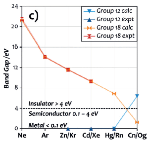
|
The graph shows the band gap energy (y-axis), calculated and/or measured, for elements of groups 12 (blue) and 18 (orange). The x-axis is labeled with the symbols for both elements.
We'll start by ignoring the elements at the extreme right side. That is, we will look at the basic pattern of the more common elements from these groups.
For group 12, the first three elements (Zn, Cd, Hg) have very low band gaps -- essentially zero on this scale, a sign they are metallic.
For group 18, the noble gases from Ne to Rn have high band gaps, above the dashed line that divides insulators from metals and semi-conductors.
|
And then those final two elements at the right, the superheavy elements Cn and Og. The curves cross! The group 12 "metal" Cn is predicted to be an insulator, whereas the group 18 "noble gas" Og is predicted to be near metallic.
This is Figure 3c from the article.
|
The common message from both properties discussed above is that Cn is predicted to hold its electrons tightly. Cn atoms will not interact much. That leads to a weakly bound liquid state (with only 60 kelvins between melting and boiling points), and to poor metallicity. We now await experimental tests; the relatively long lifetime of one Cn isotope offers hope that such tests will become practical.
For Hg and Cd, the difference between MP and BP is about 400 kelvins. For Rn, the difference is 9 kelvins; that's a little more than for the lighter noble gases.
Why is Cn so unusual? As with Hg, the unusual behavior is due to relativistic effects. If the scientists carry out similar calculations without including the relativistic effects, they find that non-relativistic Cn would be a metallic solid with a high MP.
News stories:
* Copernicium behaves like a volatile noble liquid, simulations suggest. (T Wogan, Chemistry World, October 23, 2019.)
* Copernicium Is A Strange Element Indeed. (D Lowe, In the Pipeline (blog at Science Translational Medicine), October 11, 2019.) A delightful essay.
The article, which is freely available: Copernicium: A Relativistic Noble Liquid. (J-M Mewes et al, Angewandte Chemie International Edition 58:17964, December 9, 2019.)
Previous post on copernicium: Element #112: Copernicium (July 15, 2009).
More about superheavy elements: The molecular shape of OgTs4 (June 29, 2021).
My page of Introductory Chemistry Internet resources includes a section on New chemical elements (112 and beyond). It includes a list of related Musings posts.
Top of page
The main page for current items is Musings.
The first archive page is Musings Archive.
E-mail announcements -- information and sign-up: e-mail announcements. The list is being used only occasionally.
Contact information
Site home page
Last update: April 30, 2026