Musings is an informal newsletter mainly highlighting recent science. It is intended as both fun and instructive. Items are posted a few times each week. See the Introduction, listed below, for more information.
If you got here from a search engine... Do a simple text search of this page to find your topic. Searches for a single word (or root) are most likely to work.
Introduction (separate page).
This page:
2014 (September-December)
December 29
December 17
December 10
December 3
November 19
November 12
November 5
October 29
October 22
October 15
October 8
October 1
September 24
September 17
September 10
Also see the complete listing of Musings pages, immediately below.
All pages:
Most recent posts
2026
2025
2024
2023:
January-April
May-December
2022:
January-April
May-August
September-December
2021:
January-April
May-August
September-December
2020:
January-April
May-August
September-December
2019:
January-April
May-August
September-December
2018:
January-April
May-August
September-December
2017:
January-April
May-August
September-December
2016:
January-April
May-August
September-December
2015:
January-April
May-August
September-December
2014:
January-April
May-August
September-December: this page, see detail above
2013:
January-April
May-August
September-December
2012:
January-April
May-August
September-December
2011:
January-April
May-August
September-December
2010:
January-June
July-December
2009
2008
Links to external sites will open in a new window.
Archive items may be edited, to condense them a bit or to update links. Some links may require a subscription for full access, but I try to provide at least one useful open source for most items.
Please let me know of any broken links you find -- on my Musings pages or any of my regular web pages. Personal reports are often the first way I find out about such a problem.
December 29, 2014
|
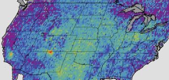
A map of the United States. One pixel is quite red. Can you find it? (There is some help below.) The map is colored to show the amount of methane in the atmosphere, as measured from space. Red is the highest level, followed by orange and yellow, and on down to purple, which is low. The one red pixel on the map is in the "Four Corners" region, near the lower left, where four states come together. The red pixel is a little to the east (right) of that; it is in northwestern New Mexico. Here is another, larger, version of that figure [link opens in new window]. It has a white box around the hotspot region -- in case you had trouble finding it. It also has a scale bar, showing what the color scale means in actual numbers. Zero on the scale is the national average; the map is showing local methane relative to the national average. (The dashed lines are map grid lines, which are labeled with latitude and longitude in some versions of the map you may find.) The measurements were made with the Scanning Imaging Absorption Spectrometer for Atmospheric Chartography (SCIAMACHY) from the European Space Agency (ESA). Both figures here are variations of the same basic figure, which is Figure 1a from the article. The figure shown above is from the WUWT news story. The larger, linked figure is the large figure available with the AGU press release. |
The first purpose here is to present the methodology. We can survey the atmospheric distribution of methane (and other gases) from space. It's not high resolution, and it's not the most sensitive method, but it is comprehensive.
Second, the map points to one area of special concern regarding the release of methane. This is a major gas-producing area. The study period largely predates the use of hydraulic fracturing (fracking), so this is not a fracking issue. There is nothing here to distinguish whether the observed high level of atmospheric methane is due to leakage from the traditional gas mining or is simply natural seepage. If it is the former, it points to a problem that may be correctable. In any case, the observation from space aims us to a region of concern; it needs to be checked more carefully on the local scale.
Methane is a potent greenhouse gas as well as an important article of commerce. We should try to understand how it gets to the atmosphere, and try to control the major sources. Our understanding of the Earth's methane budget is quite incomplete. Space-based observation is one useful tool toward doing better. Unfortunately, no such tool is currently operating.
News stories:
* The 'methane hotspot' identified in the Four Corners area of the U.S. Southwest can be fixed with some preventative maintenence. (WUWT (Watts Up With That?, a blog from a writer named Anthony Watts), October 11, 2014.)
* Space-based methane maps find largest U.S. signal in Southwest. (University of Michigan, October 9, 2014.) From one of the institutions involved in the work.
* Satellite data show U.S. methane 'hot spot' bigger than expected. (AGU (American Geophysical Union), October 9, 2014.) News release from the journal publisher.
The article: Four corners: The largest US methane anomaly viewed from space. (E A Kort et al, Geophysical Research Letters 41:6898, October 16, 2014.) Check Google Scholar for a copy of a preprint.
Other posts about methane leakage issues include:
* Boston is leaking (February 13, 2015).
* Quality of oil and gas wells -- fracking and conventional (August 18, 2014).
* Methane leaks -- relevance to use of natural gas as a fuel (April 7, 2014).
* Svalbard is leaking (March 7, 2014).
More about measuring methane from space: Cows on Mars? (November 7, 2012)
More atmospheric chemicals from space: Global map of ammonia emissions, as measured from space (January 22, 2019).
Methane (and ... ) from people: How much greenhouse gases do people emit? (January 31, 2024).
There is more about energy issues on my page Internet Resources for Organic and Biochemistry under Energy resources. It includes a list of some related Musings posts.
And there is more about methane in another section of that page, on Alkanes.
December 19, 2014
A new article provides an answer: they can't smell our sulcatone.
Let's backtrack and look at what is behind the question.
|
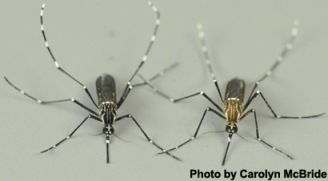
The figure shows two Aedes aegypti mosquitoes.
The one on the left, the black one, is Aedes aegypti formosus. The one on the right is Aedes aegypti aegypti. This is from the Entomology Today news story. (A similar figure is in the other news story.) |
Aedes aegypti mosquitoes are quite well known -- and important. They transmit diseases, including yellow fever and dengue fever.
But it's more complicated than that. The two kinds of Aedes aegypti mosquitoes shown above have distinct lifestyles, even when they live in the same area. The black ones live out "in the wild"; they will feed on various animals, but not humans. In lab tests, they will choose to bite a guinea pig rather than the arm of the scientist. The brown ones feed on humans, and they tend to live where humans are convenient. You can figure out what they are likely to do if offered a guinea pig and a human arm in the lab. (In fact, the test seems to work well if the mosquitoes are offered pieces of cloth that had contacted human or guinea pig.) It's the brown ones that transmit human disease. One might think of the brown mosquitoes as an offshoot that has become adapted to humans. The scientists refer to them as "domestic", in contrast to the black "forest" strain.
Although these two kinds of mosquitoes apparently live in nature as separate populations, they can interbreed, at least in the lab. They are considered sub-species, as shown in the labeling of the figure above. That ability to interbreed in the lab allowed a team of scientists to do an interesting study of these two types of mosquitoes.
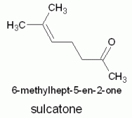
What the scientists did was logically simple: they did genetic crosses between these two types of mosquito, and looked for genes that affected their preference for humans. After finding candidate genes, they focused on one gene that seemed to be the major determinant of preference for humans. What does this gene do? It is an odor receptor, in the mosquito antennae. Receptor for what? For this chemical:
|
The figure is based on my drawing of the structure, using the free chemistry drawing program ChemSketch. The program gave the IUPAC name.
(If you would like to try ChemSketch, see my page ChemSketch - An Introductory Guide.) |
What's sulcatone? It's a chemical common in human sweat. It's made by the breakdown of fatty acids. The mosquitoes that prefer humans have a high level of this sulcatone receptor.
Somewhere, sometime, it would seem... An Aedes aegypti mosquito acquired the ability to smell humans. That mutation became the basis of a new lifestyle and a new sub-species -- and a new disease vector for humans.
What is the significance of the finding? Well, in part it is basic research: we now know more about why these mosquitoes like humans, and we can make a reasonable hypothesis about their history. It is also possible that the information could be put to use. Is it possible that sulcatone could be the basis of a system to reduce bites by these disease-carrying mosquitoes? For example, decoy traps might use sulcatone as an attractant.
News story:
* Researchers Find Gene that Makes Mosquitoes Prefer Humans over Animals. (Entomology Today, November 13, 2014.)
* Genetic tweak gave yellow fever mosquitoes a nose for human odor. (Science Daily, November 12, 2014.)
The article: Evolution of mosquito preference for humans linked to an odorant receptor. (C S McBride et al, Nature 515:222, November 13, 2014.)
You may be wondering about carbon dioxide, which is commonly said to attract mosquitoes. Yes. It probably general attracts mosquitoes to animals. The sulcatone appears to specifically attract them to humans. Are there other animals that make sulcatone? I don't know.
Also see:
* Making decoys that trap the SARS-2 virus (August 10, 2022).
* "Color vision" in mosquitoes? (February 12, 2022).
* Are non-African Aedes aegypti mosquitoes better at carrying Zika? (January 5, 2021).
* Making hydrocarbons -- with an enzyme that uses light energy (November 17, 2017).
* A mosquito map for the United States (October 3, 2017).
* Copper ions in your nose: a key to smelling sulfur compounds (October 10, 2016).
* Can chickens prevent malaria? (August 12, 2016). Sulcatone is among the chemicals tested here.
* What's the latest in the field of odonatology? (January 29, 2016).
* How an American weed might interfere with control of malaria in Africa (November 13, 2015).
* Chagas: the guinea pig connection (September 15, 2015).
* Dengue vaccine follow-up: Phase 3 trial (September 15, 2014).
* Malaria-infected mosquitoes have greater attraction for people (May 28, 2013). Mentions the possibility of trapping mosquitoes.
* Checking mosquito saliva (November 19, 2010). Uses a type of mosquito trap.
* Aedes aegypti mosquitoes do not respond to polarized light when trying to land on water (May 22, 2010).More on mosquitoes is on my page Biotechnology in the News (BITN) -- Other topics under Malaria. It includes a listing of related Musings posts, including posts on other mosquitoes that transmit disease.
December 16, 2014
Before you spend much time trying to develop a mental image of what this is going to be about, we need a clarification. They aren't exactly batteries; they are supercapacitors.
In fact, I think this is a case where the less I say, the better. It's good science, a fun story, and perhaps even useful. Just go look at the news stories.
News stories:
* Butt batteries: Scientists store energy in used cigarette filters. (Reuters, August 6, 2014.) I took my title for this post from this story.
* Cigarette butts offer energy storage solution. (IOP, August 5, 2014. Now archived.) From the journal publisher.
The article, which is freely available: Preparation of energy storage material derived from a used cigarette filter for a supercapacitor electrode. (M Lee et al, Nanotechnology 25:345601, August 29, 2014.)
More about supercapacitors: A simple way to make a supercapacitor with high energy storage? (January 6, 2014). This post notes the difference between batteries and supercapacitors.
More about butts: Of birds and butts (February 2, 2013).
There is more about energy on my page Internet Resources for Organic and Biochemistry under Energy resources. It includes a list of some related Musings posts.
December 15, 2014
The number of Ebola cases in the US is tiny so far. However, there has been a steady stream of suspect cases, especially after the Dallas events with the first confirmed US case. What happens to these suspect cases? What should happen?
A new article, from the US Centers for Disease Control and Prevention (CDC), summarizes the experience so far. It is about how the CDC dealt with 650 "clinical inquiries", from health personnel around the country, over a recent four-month period.
The general situation in the US is that Ebola has not over-taxed the system; we have the facilities to handle bona fide cases. So it would seem. Yet the Dallas case was handled poorly. And locally, nurses at leading hospitals claim that they have not been properly trained. Perhaps a fairer statement is that we have the luxury of dealing with a small stream of cases, suspected or real, allowing us to develop our responses.
A point made in the article is that excessive caution is interfering with the proper treatment of those who have something other than Ebola, but may be suspected of Ebola. That's interesting. Remember, the initial symptoms of Ebola are rather non-specific. Differential diagnosis is a problem in Africa, and it is a problem here.
I think the article is worth browsing for perspective. Ebola is a horrible disease, but the Ebola scene is also one where fear is a major element. The US is not immune from that fear. Perhaps it is good to look a bit deeper, and see how difficult it is.
The article, which is freely available: Clinical Inquiries Regarding Ebola Virus Disease Received by CDC -- United States, July 9-November 15, 2014. (M P Karwowski et al, Morbidity and Mortality Weekly Report (MMWR) 63:1175, December 12, 2014.) At least, read the introductory paragraph. If at some point you get bogged down in details, skip down to the Discussion section. Also note the summary box, below the References.
* Previous post about Ebola: How Ebola kills: a clue about a key protein (December 5, 2014).
* Next: The tree where the West Africa Ebola outbreak began? (January 12, 2015).There is more about Ebola on my page Biotechnology in the News (BITN) -- Other topics in the section Ebola and Marburg. That section links to related Musings posts, and to good sources of information and news.
December 14, 2014
The idea of oxidation state (OS) plays an interesting role in chemistry. It is something like charge, but more general. If nothing else, oxidation states are a bookkeeping device, helping us keep track of electrons. But OS is more than that: the chemical behavior of an element is different in different oxidation states.
What is the highest possible OS? If we survey the familiar oxidation states, they are numbers ≤8 (positive or negative). 8 itself is not common, but compounds such as osmium tetroxide and xenon tetroxide, OsO4 and XeO4, are examples.
For our purposes here, two simple rules will suffice.
- The total of all the OS in a chemical must be zero if it is a neutral compound -- or must equal the overall charge if there is one. This rule is fundamental.
- O is commonly -2. (We will revisit this later.)Consider, for example, XeO4. The four O total -8; the Xe must be +8 to balance.
We will use the terms oxidation state and oxidation number interchangeably.
Is it possible to get an OS above 8? A new article presents evidence for the +9 oxidation state of iridium (Ir). Ir is a good place to look. It is in group 9 of the periodic table. It has nine electrons in the outer orbitals most likely to be involved in chemical behavior (6s25d7). The scientists had recently shown that they could make iridium tetroxide, IrO4. That has Ir at +8. It has only one electron left in the bonding region that is not doing anything. Would it be possible to pull that lone electron off IrO4? That would give IrO4+, the iridium tetroxide cation. The Ir there would seem to have an OS of +9 -- or IX as we often write oxidation states. Theoretical calculations suggested to them that it might work.
In one experiment, the scientists reacted Ir and O2 under conditions that promoted ion formation. They measured the products, using a mass spectrometer. This gave them the molar mass (molecular weight) of each chemical they made. It's fairly easy to figure out what combination of Ir and O corresponds to each molar mass.
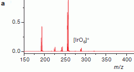
Here is what one of those "mass spec" analyses looked like:
|
Mass spectrum analysis of the products of the reaction. The reaction can be taken as Ir + O2, under conditions that promote ion formation.
The right-most set of peaks is labeled IrO6+. The peaks just before that, the big ones, are for IrO4+. The other peaks are for ions with even fewer oxygens. The left-most peak is plain Ir+. |
|
The x-axis of the graph is labeled m/z. That is mass/charge. The charge is most commonly 1, so we refer to this as a mass scale for convenience. The numbers, as masses, are in atomic mass units. The y-axis is "amount", on a relative scale. Look at the left-most peak, for Ir+. It's actually a doublet, two peaks close together. The exact positions and the relative amounts are what is expected for the two major isotopes of Ir. Also note that each peak has this same doublet pattern; that's evidence that each peak contains a chemical with one Ir in it. (You can't read the masses off this graph, but the scientists can read the machine output quite precisely.) This is trimmed from Figure 1a from the article. The big peak actually goes a bit higher -- right into part b of the figure. Strange. Also, I truncated the right side; there are no peaks out there for this part of the figure. | |
The figure above shows that they have made IrO4+. However, it does not prove that the Ir is in oxidation state +9. That might seem the simple conclusion, using the "rules" I gave above. However, since the purpose here is to demonstrate something that is entirely new, the scientists need to be cautious -- and rigorous. Multiple structures are possible for IrO4+, and they don't all have the same oxidation states. Oxygen is a little more complicated than the simple rules suggest.
The following figure shows two possible structures for IrO4+.
|
The structure on the left has an Ir atom with four O atoms (red) bonded to it. The structure on the right has a bond between two of the O. (The latter is something like IrO2+ with O2 attached; see their formula for it at the bottom.)
The left structure has Ir at oxidation state +9. However, in the right structure the Ir is only at +7. The two O atoms that are connected to each other have OS -1, rather than the usual -2. Therefore, the Ir is only +7. (We might say that since two of the O are bonded to each other, the central Ir bears less of the burden.) |
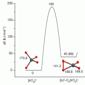
|
|
The figure also shows us something about the predicted energies of these two possible structures. The y-axis is an energy scale. The left structure is the lower energy structure; it is at zero on the energy scale, while the right-hand structure is at 40 kJ/mol. Thus their calculations predict that the left-hand structure is more likely. However, since the purpose is to show that they have made Ir(IX), it is important to provide some experimental evidence that the left structure is correct. This is trimmed from Figure 3 from the article. The full figure shows a third possible structure. The numbers on the structures show the predicted bond lengths, in picometers. | |
The scientists are able to distinguish these possible structures by measurements of the ions. The results support the left-hand structure. Thus the article provides evidence that they have made a chemical with an atom at oxidation state +9, the highest oxidation state ever seen.
News stories:
* Iridium forms compound in +9 oxidation state. (Chemistry World, October 23, 2014.) Short, but good as far as it goes.
* Iridium Dressed To The Nines. (Chemical & Engineering News, October 23, 2014.) Whoops. This is not freely available. Check it out if you can.
The article: Identification of an iridium-containing compound with a formal oxidation state of IX. (G Wang et al, Nature 514:475, October 23, 2014.)
Again, a reminder that oxidation state is not charge. The claim is that the Ir has an OS of +9, by the usual rules of electron bookkeeping. Their theoretical calculations suggest that the charge at the Ir is about 1.5.
What about the little peak of IrO6+ we noted in the top figure? What is the OS of the Ir there? The simple rules would suggest +13. Not likely! The article has nothing to say about this species, but I would suspect it is more like the right structure above, where O-O bonds reduce the contribution of the central Ir. Perhaps they will report on this in the future.* * * * *
Another novel oxidation state... Manganese(I) -- and better batteries? (March 21, 2018).
More on exotic chemicals: Novel forms of sodium chloride, such as NaCl3 (January 17, 2014).
More mass spectrometry:
* Hydride-in-a-cage: the H25- ion (January 22, 2017).
* Coupling the surgeon's knife to a mass spectrometer (August 13, 2013).
December 12, 2014
A new development in a continuing controversy.
A few years ago, some skeletons of small humans were discovered on the Indonesian island of Flores. Ever since, there has been an active debate: are these skeletons the remains of some novel human species, or of some diseased specimens of modern humans? The possibility that a line of humans may have become dwarfed in the restricted island environment is intriguing, but how do we show that is the proper interpretation? The remains are very limited, with only one good skull, and no molecular markers (such as DNA).
The little humans of Flores have become known as hobbits. A species name, Homo floresiensis, has been proposed. We have discussed the hobbit story in other Musings posts. [Link to a key background post is at the end.]
Several specific diseases have been proposed to account for the Flores remains. It is a reasonable summary of the controversy to say that most scientists think that none of the suggested diseases can explain the remains.
A pair of new articles, by overlapping groups of scientists, add a new candidate to the list of diseases that might explain the Flores specimens: Down syndrome.
Here is one of the arguments, one that is easily presented in a picture: the hobbit skull is asymmetric.

|
The figure shows the asymmetry of the hobbit skull -- with some help from a little trick.
The picture at the left shows the real thing -- the actual hobbit skull. Then, that image was split in two, and two new images were made, each based on one half of the original. For example, the middle image consists of the left half of the original, plus a flipped version of that left half. |
|
It's obvious that the middle and right images are different. If you look more carefully, you will see that these differences are in the two halves of the original (left). This is reduced from the figure in the Science Daily news story. | |
The authors suggest that the asymmetry seen is characteristic of Down syndrome. They go on to provide other data consistent with that.
This new claim is not getting a warm welcome. The rebuttal is not yet at the level of scientific publication, but some of it is in the news stories below. Interestingly, there is even controversy about how the new articles got published. The PNAS journal allows scientists who are members of the US National Academy of Sciences to publish papers with a relaxed review system. Regardless, the evidence must be addressed on its merit; it seems that the mainstream scientists in this field find the evidence unconvincing. We must also recognize that those mainstream scientists may have some bias; finding a new human species is a big deal. One way or the other, we need to read through the arguments and try to find out what is correct. The time is not yet ripe for that.
The news stories below include one with a critical analysis of the new work. Don't try to resolve this. It's still a controversy; at the heart of it is a single specimen, which we do not yet understand. The new articles offer interesting new data and interpretations, but the story must remain open.
News stories for the two new articles:
* The "hobbit" human not a separate species, say scientists. (Popular Archaeology, August 4, 2014.)
* Flores bones show features of Down syndrome, not a new 'Hobbit' human. (Science Daily, August 4, 2014.)
A news story that focuses on the opposition to the Down syndrome interpretation:
* Homo floresiensis: scientists clash over claims 'hobbit man' was modern human with Down's syndrome. (Guardian, August 16, 2014.)
There are two articles, published together. Both are freely available.
1) The article, which is freely available: Rare events in earth history include the LB1 human skeleton from Flores, Indonesia, as a developmental singularity, not a unique taxon. (R B Eckhardt et al, PNAS 111:11961, August 19, 2014.)
2) The article, which is freely available: Evolved developmental homeostasis disturbed in LB1 from Flores, Indonesia, denotes Down syndrome and not diagnostic traits of the invalid species Homo floresiensis. (M Henneberg et al, PNAS 111:11967, August 19, 2014.)
Background post: The little people of Indonesia (May 14, 2009). It links to other posts about the hobbits.
More about Down syndrome: Down syndrome: Could we turn off the extra chromosome? (November 15, 2013). More linked there.
December 9, 2014
Watch... Movie: Movie S1, accompanying the article. (One minute; no sound.)
In a recent post, we had something like a sheet of paper, which the user could cut and fold, and make a microscope -- for less than a dollar [link at the end]. We now have another sheet, one that will fold itself up and walk away. It's more expensive (about a hundred dollars), and even requires a couple motors. (The microscope, too, required that the user add some parts, such as a lens.)
Once again, the claim is not that this device is an answer to anything in particular. Rather, the work reported in the new article shows how aspects of robotics are being developed. In this case, we have an ability to make a simple compact device, which can later be triggered to take shape and act. The work builds on ideas from origami about how things can be folded, and develops an engineering solution to make a device.
The news story listed below walks you though the ideas quite well. It includes a good discussion of the background behind the work, including Shrinky Dinks. We'll leave it at that. At least, enjoy the movie.
News story: Robot folds itself up, walks away -- Sophisticated machines that build themselves, inspired by a child's toy and origami. (Kurzweil, August 10, 2014.) Excellent overview of the work, with plenty of pictures.
* News story accompanying the article: Materials design: Folding structures out of flat materials -- Reconfigurable machines and internally structured materials can be created through folding. (Z You, Science 345:623, August 8, 2014.) This news story is about two articles, including the one discussed here.
* The article: A method for building self-folding machines. (S Felton et al, Science 345:644, August 8, 2014.) Check Google Scholar for a copy. The movie listed at the top of the post is available here, under Supplementary Materials. There is also a movie S2, showing how the device is fabricated. I'm not sure how useful it is, but give it a try if you like. Perhaps it a good example of the abuse of time-lapse photography.
Background post: A ream of microscopes for $300? (June 22, 2014).
* Previous post about robots: How to climb a pile of sand (November 7, 2014).
* Next: Robots that can quickly adapt to disabilities (June 23, 2015).Previous post about assembling robots: Quiz: What are they? And are they a threat to you? (October 20, 2014).
Previous post about robots and folding: Folding towels (April 10, 2010).
More about folding and creases: How to fold a bag (May 13, 2011). The senior author of the article discussed there is the author of the news story in Science for the current article.
December 8, 2014
In one of the first Musings posts on polio, we noted that two of the four countries that had continuing polio transmission showed some good news. One of those, India, has since been declared polio-free. [Links at the end.]
A new article reports what could be major good news for another of those countries with "endemic" polio, Nigeria. The number of cases of "wild" poliovirus infections in Nigeria was 122 in 2012, and 53 in 2013. For 2014, only six cases have been reported through September.
That's a good trend. Further, there is a good story behind the numbers, in how the country is addressing the situation. As noted in the previous post, numbers fluctuate, and the only acceptable number is zero. So caution, but perhaps some optimism, too.
The article included here is, as with the background posts on the topic, from MMWR. It's short and quite readable; reading the introductory paragraphs gives you a good overview. MMWR articles are scientific articles, but the authors are often from governments or official organizations, so the articles are written with some delicacy.
The article, which is freely available: Progress Toward Poliomyelitis Eradication -- Nigeria, January 2013-September 2014. (A Etsano et al, Morbidity and Mortality Weekly Report (MMWR) 63:1059, November 21, 2014.)
For a site that has current numbers of polio cases by country (and virus type), for this year and last: Polio this week as of ... . From the Global Polio Eradication Initiative; updated weekly. As of December 10, the numbers given above for Nigeria still stand: 6 cases reported for 2014.
* * * * *
Background posts:
* WHO certifies "South-East Asia" free of polio (November 1, 2014).
* Poliovirus eradication: an update, with some good news and some bad news (May 22, 2011).More on polio and related diseases:
* Polio eradication: And then there were two (July 27, 2015).
* Polio-like disease without polio virus? Follow-up (February 11, 2015).My page for Biotechnology in the News (BITN) -- Other topics includes a section on Polio. It includes a list of Musings posts on the topic.
Also see: Chikungunya in the Americas -- are vaccines near? (March 17, 2015).
December 7, 2014
Artificial sweeteners are used to reduce caloric intake. However, when tested carefully, the picture of what they actually do is complex. It's not at all clear that they promote weight loss.
A new article makes a bold claim about common artificial sweeteners, such as saccharin. The claim, stated simply, is that they may raise blood sugar levels, and that this is mediated by the gut microbiota. It is an interesting and provocative article.
The following figure shows an example of the findings with mice. In this test, the mice had been fed either glucose or the artificial sweetener saccharin. The test itself is a glucose tolerance test: give the animal a spike of glucose, and then measure its blood glucose level.
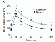
|
The graph shows blood glucose level vs time following the glucose spike. The upper curve (open symbols, blue) is for the mice that had been fed saccharin; the lower curve (closed symbols, black) is for the mice fed glucose.
The first striking result is found at time zero: the blood glucose level of the mice fed saccharin is considerably higher than for the mice fed glucose. This difference is then maintained throughout the measurements. This is Figure 1c from the article. |
Those results suggest that saccharin is not good for your blood sugar level.
Two other artificial sweeteners were also tested: sucralose and aspartame. To the extent tested, they gave results similar to those for saccharin. Most of the work in the article focused on saccharin.
As a follow-up, the scientists then explored whether the gut microbiome (the bacteria in the gut) are involved. They did a type of experiment that is becoming standard: change the gut microbiota, using fecal transplantation. A special feature of doing this with mice is that one can start with a blank slate: germ-free mice. These are mice born and raised without any bacteria in their gut; they can then be infected as desired.
What the scientists did, then, was to take germ-free mice, and give them the bacteria from mice that had been fed either saccharin or glucose. These mice were then tested for glucose tolerance. The result? You probably guessed: the animals responded based on the source of their new gut microbiota. That is, if the mice got bacteria from animals fed saccharin, they showed "poor" glucose tolerance, like the animals that had been fed saccharin.
That is... The first experiment (graph above) showed that mice fed saccharin had high blood glucose. The second experiment showed that if these saccharin-fed mice donated their gut bacteria to other mice, those recipient mice showed high blood glucose.
The simple summary of the results is that mice fed saccharin show poor glucose tolerance, and that the effect is mediated by their gut bacteria. The increased blood sugar level may lead to the pre-diabetic condition cause glucose intolerance.
The message, then, is that you shouldn't give your mice saccharin. What about humans? There is a brief mention at the end of some results that at least suggest that the finding may carry over to humans. They have some preliminary evidence that people who use saccharin have higher blood glucose levels than those who do not use saccharin.
That is where we stand. The finding is intriguing. The article is also very complex, with many technical details that may be important. It's easy to find "weaknesses" in the story. I've listed multiple news stories, with varying perspectives, below, for those who want more at this point. Otherwise, sit back and watch the story develop. This is a new finding. It should be taken as that: a lead that needs to be followed up.
News stories:
* Sugar Substitutes, Gut Bacteria, and Glucose Intolerance. (The Scientist, September 17, 2014. Now archived.)
* Artificial sweeteners may contribute to diabetes, controversial study finds. (Science, September 17, 2014.) A news story that emphasizes criticism of the new report.
* News story accompanying the article: Health: The weighty costs of non-caloric sweeteners. (T Feehley & C R Nagler, Nature 514:176, October 9, 2014.)
* The article: Artificial sweeteners induce glucose intolerance by altering the gut microbiota. (J Suez et al, Nature 514:181, October 9, 2014.)
Thanks to Aaron for alerting me to this article.
More on sweeteners...
* Is erythritol a toxic sweetener? (April 8, 2023).
* How can hummingbirds taste "sweet"? (September 26, 2014). The post is about taste receptors. The artificial sweetener sucralose is mentioned.
* Rice and arsenic: rice syrup, baby food, and energy bars (April 23, 2012).
* Fructose; soft drinks vs fruit juices (November 7, 2010).Antibiotics and obesity: Is there a causal connection? (October 15, 2012). Any connection to the current work?
A cautionary note about the flood of work implicating the gut microbiota in any effect: Our microbiome: a caution (August 26, 2014).
More about the microbiome: Fecal transplantation as a treatment for Clostridium difficile: progress towards a biochemical explanation (February 8, 2015).
More on diabetes is on my page Biotechnology in the News (BITN) -- Other topics under Diabetes. That includes a list of related Musings posts.
December 5, 2014
In the current Ebola outbreak in West Africa, the fatality rate is around 50%. However, we know little about how the virus kills. The Ebola virus is quite small, with only seven genes. Further, killing is not essential or inevitable. One strain seems to not kill humans at all, and the lethal strains we hear so much about apparently do little to the bats that may be their natural hosts.
A new article reports that one of the Ebola proteins raises havoc in the human body. The protein is called GP; it is on the viral surface, and is shed during infection. There is plenty of GP in the blood of a person with Ebola.
Here is an example of the results. The test here examines the effect of the Ebola GP protein on human macrophages, one type of immune system cell.
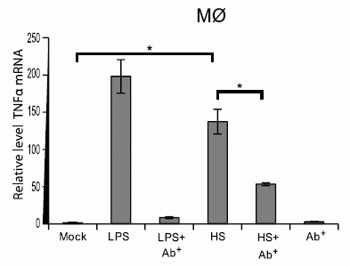
|
The graph shows the level of messenger RNA for TNFα, under various conditions. TNFα is an inflammatory cytokine; we will take the level of the mRNA as shown here as a measure of activating an inflammatory response.
The label M∅ at the top means this test is with macrophages. The first bar, labeled mock, sets the baseline. Other bars show the amount of the TNFα mRNA relative to that. |
|
The next two bars are controls. They show us how the test works with a known inflammatory agent. For the second bar, LPS was added; LPS is bacterial lipopolysaccharide, a known inflammatory agent (and responsible for some bacteria causing inflammation). You can see that LPS gives a huge increase in the TNFα mRNA. The next bar is LPS + Ab. Ab means antibody; specifically, it is an antibody to the receptor that senses LPS. The Ab reduces the stimulation of the LPS; this shows that the LPS is acting though that receptor. The next two bars are for something called HS and HS + Ab. They show that HS acts much like LPS: it stimulates the inflammatory response, and even acts through the same receptor as LPS. What is HS? It is the GP protein from the Ebola virus. (The final bar, at the right, is for the antibody alone. It does nothing.) This is the right half of Figure 3C from the article. Other parts of the figure show similar effects for other immune system signals. | |
In another part of the work, the scientists show that the same Ebola GP protein makes blood vessels leaky. This, of course, might relate to the tendency of Ebola patients to bleed.
The work discussed here offers interesting leads. This work is not in regular virus infections, but in lab work with an individual protein. It needs to be tested whether the effects seen here are relevant in virus infections.
An interesting aspect of the work is that the harm the virus does, at least as judged by this work, has no particular relationship to the virus growing. That's consistent with some of the comments earlier about Ebola virus infections that don't seem to do harm. It may be that Ebola does its damage accidentally.
News story: An Ebola virus protein can cause massive inflammation and leaky blood vessels. (Science Daily, November 20, 2014.)
The article, which is freely available: Shed GP of Ebola Virus Triggers Immune Activation and Increased Vascular Permeability. (B Escudero-Pérez et al, PLoS Pathogens 10:e1004509, November 20, 2014.)
* Previous post about Ebola: Ebola virus: ancient origins? (November 4, 2014).
* Next: Ebola in the United States: the "suspicion" factor (December 15, 2014).The receptor for LPS, noted in the discussion above, is TLR4, one of the toll-like receptors (TLR) of the innate immune system. Here is another post involving TLRs: Why mice don't get typhoid fever (November 26, 2012).
More about inflammation: How does "cytokine storm" work? (April 28, 2020).
There is more about Ebola on my page Biotechnology in the News (BITN) -- Other topics in the section Ebola and Marburg. That section links to related Musings posts, and to good sources of information and news.
December 2, 2014
This is another post on circadian rhythms. It is about people who do "shift work." That means that their work schedules involve working at different times of day on different days. For example, a person might work the "day shift" (say, 8 a.m. to 4 p.m.) for a month, then the evening shift (4 p.m. to midnight) for a month, then the "night shift" (midnight to 8 a.m.) for a month. There are many lines of work in which such shifting schedules are common, with many variations.
Any such arrangement is a challenge to our circadian clock, our natural body rhythm. Most of us know from experience that jet lag is unpleasant, even though we do adapt. Shift work involves such transitions on a regular basis.
Are such shifts harmful to us? We may know they are unpleasant, but that is different from being harmful. In fact, evidence has been accumulating that shift work seems to lead to health problems.
A new article suggests that shift work leads to declines in cognitive performance -- declines that are long term, not just while doing shift work. The article has received considerable news attention, so let's look...
Here is a summary of some of the findings.
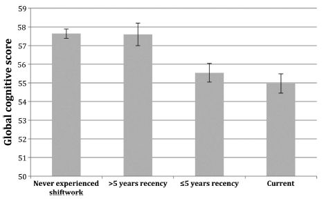
|
The y-axis shows the "global cognitive (performance) score" for four groups of people. This score is a composite of various tests of brain function, such as memory, that the scientists administered to the people. Start by comparing the left and right bars. The left bar is for people who never experienced shift work. The right bar is for those currently engaged in shift work. You can see that those without shift work score higher than those currently doing shift work. The two bars in the middle are for people who used to do shift work, but stopped. Those two groups differ in how long ago they stopped doing shift work, a parameter the authors call "recency". The bar ">5 years recency" is for those who stopped at least five years ago. The bar "<5 years recency" is for those who stopped more recently. You can see that those who stopped doing shift work many years ago are near normal in their score here. In contrast, those who stopped doing shift work only recently are more like those still doing it. This is Figure 3 from the article. |
How important is the size of the effect? You can't tell from the graph above since it is not clear what the score means. In the article, the authors take another example with a similar difference (left vs right), and say that the difference is "equivalent to 6.5 years of age-related cognitive decline" (p 4 of the article, right side).
Taken at face value, the results shown above suggest that those doing shift work have some cognitive impairment. Further, if a person stops doing shift work, there is a slow recovery, measured over a period of years.
Should we take this at face value? There are a number of limitations to the study. This is not a controlled trial, but rather an observational study, more like a survey. (For a controlled trial of the issue, we might imagine randomly assigning people to do or not do shift work.) People who do shift work may be different. The authors are well aware of the concern. They go to great lengths to examine many other variables that they think might confound the interpretation. For example, the legend for the figure shown above says that the score has been adjusted "for age, gender, socioeconomic position, sleep problems, perceived stress, alcohol and tobacco consumption, and measurement occasion." We can only wonder if all those adjustments were done properly, and whether any important variables were missed.
As so often, this is an article that raises an issue. It deserves to be followed up, but we should be cautious about accepting its conclusions for now. There is one more thing to think about, and that is the real world implications. Workers hear this result and want less shift work because of the risk shown here. It would be premature to accept what is shown here as fact. And it would be unfair to the workers to pretend these results did not exist. A dilemma!
News story: Long term shift work linked to impaired brain power. (Science Daily, November 3, 2014.)
The article: Chronic effects of shift work on cognition: findings from the VISAT longitudinal study. (J-C Marquié et al, Occupational and Environmental Medicine 72:258, April 2015.) Check Google Scholar for a copy.
Most recent post on circadian rhythms -- just two posts down: Melatonin and circadian rhythms -- in ocean plankton (November 24, 2014).
My page for Biotechnology in the News (BITN) -- Other topics includes a section on Ethical and social issues; the nature of science. It includes a list of related Musings posts.
December 1, 2014
Humans are trichromatic; we have three types of color vision receptors. How did we get that way? A recent feature article in The Scientist tells the story, as best we understand it.
The story is based on a general understanding that each type of color vision depends on a specific protein of the opsin family. Each protein "tunes" the wavelength sensitivity of the retinal, so that it absorbs only a certain frequency range of light. Our type of trichromatic vision is not common; it occurs only in certain primates. Investigating the opsin genes of a range of primates has led to a plausible model of how we acquired our trichromatic vision. The article discusses much of this story.
The article includes a survey of the diversity of color vision among animals. It also includes recent tests of adding an additional opsin to animals, and seeing whether they can make use of it. The simple answer is that they can, though our understanding of how is quite limited.
Remember, our current model is built on the evidence at hand, but that evidence remains incomplete. The model is our best explanation at this point, and serves as the base for further work.
Feature: The Rainbow Connection. (K Grens, The Scientist, October 2014, p 42. Now archived.) Good general reading.
Posts about color vision include:
* Can the naked human eye measure distance to nanometer accuracy? (July 20, 2015).
* Color vision: The advantage of having twelve kinds of photoreceptors? (February 21, 2014). Links to more about a very strange visual system.
* A better understanding of the basis of color vision (February 1, 2013). This post discusses the production of an artificial set of opsin-type proteins that absorb light over the spectrum of visible light.
* Butterflies and UV vision (June 29, 2010).Also see a section of my page Internet resources: Biology - Miscellaneous on Medicine: color vision and color blindness. It includes a list of Musings posts in the field.
November 24, 2014
People have a natural body rhythm. Body functions vary with the light-dark cycle of the day; jet lag is one manifestation of that daily rhythm. In fact, many organisms, including some bacteria, have such "circadian" rhythms.
In people -- in vertebrates in general -- the hormone melatonin plays a role in the circadian rhythm. Melatonin is known to occur in a wide range of organisms, including animals, plants and bacteria, but little is known about what it does except in vertebrates.
A new article provides evidence that melatonin plays a role in the circadian rhythm of a worm larva. The animal studied here is the annelid Platynereis dumerilii; its larvae are part of the zooplankton of the ocean. (Annelids? Think earthworm as the familiar example.)
Here are some pieces of the story... The first piece is at the level of gene function.
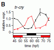
| This figure shows an example of a gene being expressed with a circadian rhythm. The activity of the gene is shown on the y-axis; time in hours is shown on the x-axis. (The y-axis is a relative scale. The x-axis is labeled in hpf; that is "hours post-fertilization".) |
|
There are two curves. Each shows that the activity of the gene varies with about a 24 hour cycle. What's the difference? The timing of the light-dark cycle. Look at the horizontal bars just above the x-axis. One is red and white; one is black and white. In each case, "white" shows the timing of the light phase, and red or black shows the timing of the dark phase; the colors there correspond to the colors of the two curves. You can see that both curves show that the gene is most active during the light phase. This is part of Figure 2B from the article. The full Part B shows the results for another gene with circadian expression. | |
The figure above shows an example of a gene of the larvae that is expressed with a circadian rhythm.
The next piece of the story is at the level of the behavior of the animal, and how that is determined. These larvae migrate: they rise and fall in the ocean on a day-night cycle. The purpose of this is not entirely clear; one purpose may be to avoid UV damage from the sun. Whatever the purpose, it is clear that this animal behavior has a circadian pattern.
How do they rise and fall? They swim upward, and fall downward. More specifically, they swim upward during the day, and fall during the night. Why do they not swim upward at night? Because the activity of their cilia is reduced. And that is where melatonin comes in.
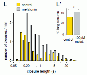
The following figure shows the effect of melatonin on the cilia. More specifically, it shows the effect of the hormone on a phenomenon called closure. Long closures represent a reduced activity of the cilia, which means less swimming.
|
Start with the inset (upper right; labeled L'); it summarizes the results.
The summary shows the percentage of closures that are long. The yellow bar is for the control, without melatonin. The gray bar is for animals treated with melatonin. You can see that the hormone results in a higher percentage of long closures. The main part of the figure shows the distribution of closure lengths found for the two cases. The x-axis is closure time, on a log scale. These are the data that are summarized in the inset. Qualitatively, you can see that the yellow bars (control) are toward the left and the gray bars (melatonin) are toward the right. |
|
|
A caret symbol ^ along the x-axis (at about 0.5 seconds -- just above the ur in closure) shows the cutoff they determined to be useful for short vs long closures. This is Figure 3 L (and L') from the article. I added the caret symbol ^ on the x-axis of the main figure here to show their dividing line between short and long closures. | |
The direct observation from this experiment is that melatonin increases the length of closures. This means the cilia are less active -- and the larva fall.
There are several parts to the story. Circadian rhythm can be observed at the level of the behavior of the animal, and at the level of function of certain genes. We can understand the circadian behavior of the animals in terms of ciliary function, and we see that melatonin plays a role in modulating that ciliary function. An important point made in the new article is that melatonin is made at night; that is when it inhibits the cilia, thus inhibiting upward migration. The pieces of the story seem to fit together rather well.
Is there any connection between what melatonin does with these larva and what it does for us? Certainly there is at the level of overall effect. Melatonin has been appropriated to affect circadian rhythms in at least two widely different animal groups. In both cases, melatonin is made in the dark. Is there any deeper connection? That remains open for further work.
News story: How plankton gets jet lagged: Hormone that govern [sic] sleep and jet lag in humans also drives mass migration of plankton. (Science Daily, September 26, 2014.)
The article, which is freely available: Melatonin Signaling Controls Circadian Swimming Behavior in Marine Zooplankton. (M A Tosches et al, Cell 159:46, September 25, 2014.)
More about circadian rhythms:
* Evening light: how it affects our sleep (July 30, 2019).
* How caffeine interferes with sleep (December 11, 2015).
* Do variable work schedules, such as shift work, affect cognitive performance? (December 2, 2014).
* Sleepy teenagers (July 23, 2010). It notes the problem of jet lag and the role of melatonin. It links to some other posts on circadian rhythms.Another study on these larvae: Determining depth in ocean by measuring light at two wavelengths (August 5, 2018).
More about annelids... A quasi-quiz: The fate of bone and wood on the Antarctic seafloor -- and the discovery of new bone-eating worms (August 20, 2013).
More about cilia: Scoliosis: an animal model (July 22, 2016).
A book about plankton, listed on my page Books: Suggestions for general science reading... Sardet, Plankton -- Wonders of the drifting world, 2015.
November 21, 2014
It is common wisdom that having high levels of triglycerides (simple fats) in the blood is bad, and is associated with higher rates of heart disease. What about unusually low levels of triglycerides? Two recent articles, published together, suggest that certain mutations leading to low levels of blood triglycerides are associated with lower levels of heart disease.
The articles are based on observational studies. The scientists examined the medical records of large numbers of people, and they sequenced the chosen gene for all of them. The conclusions are based on finding correlations.
Here is one example of what the scientists found...

| The graph shows the triglyceride levels for people carrying a particular mutation ("heterozygotes"). You can see that these carriers have about half the triglyceride level of those with wild type copies of the gene ("noncarriers"). |
|
The mutation is in a gene called APOC3. The particular mutation is called A43T; that means that the alanine (A) normally present at position 43 of the protein chain has been replaced by a threonine (T). There are only a few people carrying this particular mutation: N = 18, it says. However, the full figure shows data for other mutations in the same gene as well as the summary over all the mutations studied. The pattern is the same: mutations in the APOC3 gene seem to lead to low levels of blood triglycerides. This is the lower part of Figure 2 from article #2. | |
What about heart disease? The scientists present two analyses. One is a general correlation in the population between measured triglyceride levels and heart disease. It's a rather strong correlation: low triglyceride level correlates with low risk of heart disease. Second, they look at heart disease in those people who have any of the APOC3 mutations that reduce triglyceride levels. The numbers are small, even with the combined set covering all the mutations, but the people with APOC3 mutations seem to have a reduced risk of heart disease. The observed risk in this group was about what one might expect based on their triglyceride levels. (In fact, the observed risk was a bit lower than expected, though this was not statistically significant, given the small number.) Of course, the people with the APOC3 mutations presumably had lifelong reductions of triglycerides.
Interestingly, the scientists do not really understand how the APOC3 gene affects blood triglyceride levels. APOC3 has multiple effects; in part, it affects the level of the low density lipoproteins (LDL), commonly referred to as "bad cholesterol". That illustrates the complexity of the system, and highlights the problem of trying to understand what any correlations that are seen really mean. We should caution, then, that there is no certainty that people with low levels of blood triglycerides for different reasons will have similar results. Nevertheless, the results here suggest that lowering the level of the APOC3 enzyme is good for heart health.
A drug has recently become available that inhibits the APOC3 enzyme. One might predict, based on these articles, that it might lower both blood triglycerides and heart disease. Whether those predictions hold, and whether the drug may have any side effects, requires testing.
News story: Mutations Tied to Lower Heart Risk. (MedPage Today, June 18, 2014.) Now archived.
There are two articles, together in the same journal issue. I have focused on #2, but the two articles broadly agree.
1) Loss-of-Function Mutations in APOC3, Triglycerides, and Coronary Disease. (The TG and HDL Working Group of the Exome Sequencing Project, New England Journal of Medicine 371:22 July 3, 2014.)
2) Loss-of-Function Mutations in APOC3 and Risk of Ischemic Vascular Disease. (A B Jørgensen et al, New England Journal of Medicine 371:32 July 3, 2014.)
More on triglycerides... Heart health and python blood (December 28, 2011).
More about heart disease...
* Increased risk of congenital heart defects in offspring from older mothers: Why? and can we do anything about it? (July 18, 2015).
* Can we pinpoint a specific molecular explanation for tissue damage following a heart attack? (March 24, 2015).
* Alcohol consumption, an "ethnic" mutation, and a possible new drug (October 28, 2014).
* Red meat and heart disease: carnitine, your gut bacteria, and TMAO (May 21, 2013).
* How good is "good cholesterol" (HDL)? (September 21, 2012).Another mutation involving amino acids A and T: The autism-Angelman connection: a single enzyme involved in two brain disorders (November 9, 2015).
More about lipids is in the section of my page Organic/Biochemistry Internet resources on Lipids. That section contains a list of related Musings posts.
There is more about sequencing on my page Biotechnology in the News (BITN) - DNA and the genome. It includes an extensive list of Musings posts on sequencing and genomes.
November 18, 2014
In 2005, a 115-year-old woman died in The Netherlands. She had been the world's oldest person at the time of her death. She had been cooperating with scientists studying aging for several years, and she had agreed that her body could be used for science upon her death.
We now have an article presenting some of the analyses of the body of W115, as she is known in the article. There are some intriguing results.
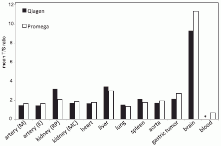
The figure below shows measurements of W115's telomeres, in various body tissues. The telomere is a special DNA structure at each end of each chromosome. The telomere structure is needed for normal chromosome stability, but telomeres become shorter each time the cell divides. In lab culture, growth of cells from higher organisms is limited by the amount of telomeres they have. Cells that can grow indefinitely, such as cancer cells, have regained the ability to rebuild their telomeres. Here are W115's telomeres at death:
|
The bars show the lengths of W115's telomeres for various tissues. For now, you can just look at the relative heights of bars.
The highest values are for the brain, a tissue where there is little cell division. The other body tissues tested gave much lower telomere lengths. The lowest values were for blood (at the far right). |
|
We can look further. The numbers tell us about the actual amount of telomere DNA. The y-axis scale is the "T/S ratio"; that means the amount of telomere DNA (T) divided by the amount of DNA found for an ordinary gene that should be present in a single (S) copy. What does that all mean? Simply put, the lowest ratio that should be allowed is 2, since there are two telomeres on each chromosome (one at each end). You can see that the T/S ratio for the brain is quite high. Most of the rest are close to 2; that result suggests that these tissues have essentially no reserve capacity of telomeres. Even worse, the T/S ratio for the blood is well under 2, suggesting that her hematopoietic system is quite exhausted. This system, where both red and white blood cells are made, has one of the highest rates of cell division in the body. The T/S numbers shown are the average found in the tissue. There is undoubtedly a mixture of cells with various lengths of telomeres. For example, the blood system may have a small percentage of cells that are still able to divide. There are two bars for most tissues. Two methods were used; they generally agreed reasonably, so we can ignore this. This is Figure 1 from the article. | |
The scientists did further work on W115's blood cells. They found that the genetic sequences in her white blood cells fell mainly into two clusters. The two clusters were recognized because they had accumulated different mutations during her long life -- and many many cell divisions. This pattern suggested that W115 had only two stem cells left that were forming white blood cells, the basis of her immune system. That's not much! (We start with about 10,000 such stem cells.) The low number of active hematopoietic stem cells seen here is consistent with the short telomeres found in the blood, noted above with the graph.
So what does this all mean? Of course, the simple statement is that it seems W115's immune system was quite depleted. Beyond that, we don't know. We have never measured the telomeres in a person 115 years old before; we have never measured how much immune system is left. W115 is now baseline for what it is like, blood-wise, to be 115 years old.
News story:
* Hundreds of genetic mutations found in healthy blood of a supercentenarian. (Science Daily, April 23, 2014.)
* In Old Blood -- The body of a supercentenarian expands science's appreciation for the physiological limits of aging. (J Akst, The Scientist, August 2014, p 19. Now archived.) A broad overview of the story of Hendrikje van Andel-Schipper, the lady who became formally known in the scientific literature as W115.
The article, which is freely available: Somatic mutations found in the healthy blood compartment of a 115-yr-old woman demonstrate oligoclonal hematopoiesis. (H Holstege et al, Genome Research. 24:733, May 2014.)
My page for Biotechnology in the News (BITN) -- Other topics includes a section on Aging. It includes a list of posts about "individuals who reached age 100".
The special nature of telomere DNA was noted in the post: G (July 8, 2008).
More about telomeres: What to do if your telomeres get too long (March 19, 2017).
More about blood-forming stem cells:
* Progress toward a universal source for red blood cells, avoiding the need to match blood type (February 23, 2021).
* A way to make more hematopoietic stem cells (August 20, 2019).There is more about genomes on my page Biotechnology in the News (BITN) - DNA and the genome. It includes an extensive list of Musings posts on sequencing and genomes.
November 17, 2014
An earthquake occurs, causing death and property damage. Is it possible that geologists (seismologists) could be convicted of manslaughter?
It happened, in the wake of a 2009 earthquake in L'Aquila, Italy.
Why were the geologists considered responsible? Because they, allegedly, gave bad advice to the people of the town. Residents failed to take precautions that would have reduced damage and protected life, based on what they considered learned advice.
The latest piece of the story is that the convictions of six of the geologists have been overturned on appeal. One remains convicted, and, as things stand, will go to jail.
The news story listed below is good, summarizing the events and the arguments. I suspect the story will make most people, especially most scientists, uncomfortable. It should. What is the responsibility of the scientists, in one scenario or another? Is it reasonable that scientists might be criminally responsible in such a situation?
It is probably not fruitful to try to judge the specific cases. You may well want to weigh specific arguments you read about, but it is hard to know how complete the story is we see here. I suggest you think more about the general issues.
News story: Updated: Appeals court overturns manslaughter convictions of six earthquake scientists. (Science Insider, November 10, 2014.)
More about earthquakes...
* How PBRs survive major earthquakes; why being near two faults may be safer than being near just one (September 22, 2015).
* Fracking: the earthquake connection (June 19, 2015).
* Could we block seismic waves from earthquakes? (June 23, 2014). Links to more.My page for Biotechnology in the News (BITN) -- Other topics includes a section on Ethical and social issues; the nature of science. It includes a list of related Musings posts.
November 15, 2014
Caution... This post may be disappointing.
The gene Foxp2 has something to do with language. We know that because people with defective Foxp2 have difficulties with language; it is their primary deficit. Foxp2 is the leading gene so far specifically associated with language, and thus is high on the list of human genes of interest.
What does Foxp2 do? At one level, we can say that it is a transcription factor (TF), required for the functioning of many genes. But what is the connection to language?
One way to explore what a human gene does is to put the gene into mice, and see how it affects the mice. For example, we might find that mice with the human Foxp2 gene converse with the scientists caring for them. Hm, what do we expect?
When we say we are putting the human Foxp2 gene into mice, what we really mean is that we are replacing the wild type mouse version of the gene with the human version (allele).
The Foxp2-humanized mice were then tested in learning tasks, with wild type mice as a control. The following figure shows some results.
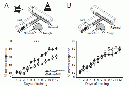
|
Look at the left side (Part A) for now. At the top is the test apparatus. It consists of a T-maze, with some external visual cues, the star and triangle shown at the top. Mice were tested to see whether they could learn where the reward was.
Below the apparatus are some results. The graph shows how well the mice did ("% correct response") vs days of training. There are two sets of data, and you can see they are different -- significantly different. The upper curve, with black symbols, is for the mice with humanized Foxp2; the lower curve, with open symbols, is for the wild type mice. (The two kinds of mice are described in the figure legend as Foxp2hum/hum and Foxp2wt/wt.) |
|
The results seem to show that the mice with the humanized Foxp2 learn the task better than the wild type mice. Now look at the right side of the figure (Part B). In this test, the T-maze is the same, but the external visual cues are absent. The results are very similar for both kinds of mice -- at least for about 8 days. (What happens after that is not clear; the apparent difference is not statistically significant. For simplicity, we'll ignore the results past day 8 here.) This is Figure 1 from the article. | |
At this point, it seems that the humanized gene makes a difference in one kind of test and not another. That's fine. But now look more closely. Look at the actual result on, say, day 8. It's about 70% for both mice in part B. In part A, it's 70% for the mice with the humanized gene vs about 60% for the wild type mice.
That is, it seems that the difference between the two parts is not that the human gene helped, but that the wild type mice did worse in the test with visual cues. Is this plausible? Maybe. The authors argue that the test in part A is a more complex test. The added visual cues make the process of deciding what to do more complex; it's not simply that having more information is better. The wild type mice are hindered by the additional information, but having the humanized gene allows the mice to better handle the more complex information.
Should you buy their interpretation? I do think you should see what their point is; it is logical, and it could be quite interesting. However, it is a stretch to get to that from the single experiment shown above. Even considering the rest of the article, I am not at all sure what this means. I'm more inclined to take the article as showing some interesting results, leading to an interesting hypothesis -- which needs further work. That makes it a useful and possibly important article, one that opens up new leads for further study.
I cautioned at the start that this post might be disappointing. It does not lead to a strong conclusion. But such is work with Foxp2 -- a gene of considerable interest. We would love to know what this language-giving gene does, but article after article on it seems to lead to as much confusion as anything. One problem is that Foxp2 affects many genes. Thus it may not be surprising that it has complex effects. Somehow, people working in the field need to move to the next level, and look at gene-specific effects.
News stories:
* Human speech gene can speed learning in mice. (Science, September 15, 2014.)
* Neuroscientists identify key role of language gene -- Mutation that arose long ago may be key to humans' unique ability to produce and understand speech. (MIT News, September 15, 2014.) From one of the institutions involved in the work.
The article: Humanized Foxp2 accelerates learning by enhancing transitions from declarative to procedural performance. (C Schreiweis et al, PNAS 111:14253, September 30, 2014.) Check Google Scholar for a freely available copy.
A recent post about language: Mountains and human language? (June 28, 2013). It links to several other posts on language.
Another example of studying mice that have been partly humanized, in this case with a particular type of tissue: A better mouse -- it has a humanized liver (August 12, 2014).
Another post about a maze... Can a plant learn to associate a cue and a reward? (March 3, 2017).
November 14, 2014
Watch... moving rock. (YouTube, 30 seconds, no sound.) If you don't see it at first... Focus on the first horizontal streak (from the bottom). Just to the right of center, there is a lighter object on it; that is a rock. Starting at about 3 seconds, it...
This was filmed at the Racetrack in Death Valley National Park (California) -- a site named for the behavior of its rocks. The name reflects a phenomenon that has been recognized for many decades, but not understood: mobile rocks. Big rocks, on flat surfaces. Sometimes, they just weren't where they used to be. Further, you could see their tracks. No one understood why. It didn't happen very often -- but it was certainly more often than one would have expected. Of course, people had hypotheses. The problem was getting any data.
Finally, a group of scientists installed a monitoring system. GPS systems on rocks, video, and a weather station. Two years later, the rocks moved -- and the scientists had a record not only of what the rocks did but of the weather. With good fortune, the scientists just happened to be there, on one of their regular maintenance visits, at the time of the event. The article includes not only what the instruments recorded, but also the direct observations of the scientists.
So how do the rocks move? Not surprisingly, it involved ice and wind. What was important was understanding the combination of conditions that allowed rocks to move. The secret was the occasional formation of floating ice. A rare rain, a cold night, and then a warm day; that's the basic recipe. Under appropriate conditions, gentle winds could move large sheets of floating ice, which would push the rocks.
A limitation of the work is that the scientists did not study the rocks present naturally at the Racetrack site. They were not allowed to handle those rocks. Instead, they brought in their own rocks, equipped with GPS systems. We might also caution that there is no certainty that what they found is the only way the rocks can move. Despite the limitations, the work shows how rocks move at the Death Valley Racetrack.
This work is an example of scientific investigation of an unusual natural phenomenon. Not a particularly important phenomenon in this case, but certainly fun -- as is the explanation. And it comes with beautiful pictures.
News story: Scientists Solve The Mystery Of The "Sailing Stones" At Death Valley National Park. (National Parks Traveler, September 4, 2014.) This story gives a nice overview of the work. It includes some beautiful pictures of Racetrack Playa, and the video (which is time lapse, but the details are not clear).
The article, which is freely available: Sliding Rocks on Racetrack Playa, Death Valley National Park: First Observation of Rocks in Motion. (R D Norris et al, PLoS ONE 9(8):e105948, August 27, 2014.)
More from Death Valley:
* Hottest temperature ever recorded on Earth? Libya or Death Valley (California)? (June 30, 2013).
* Life at age 34,000? (October 8, 2011).More use of GPS: Improved high altitude weather monitoring (July 18, 2016).
More about how things move:
* How sand dunes communicate (March 2, 2020).
* How to climb a pile of sand (November 7, 2014).More about traveling... Exoplanet Travel Bureau (February 21, 2015).
Other posts about ice include:
* Why is ice slippery? (September 9, 2018).
* IceCube finds 28 neutrinos -- from beyond the solar system (June 8, 2014).More intriguing rocks... How PBRs survive major earthquakes; why being near two faults may be safer than being near just one (September 22, 2015).
More about wind:
* At what wind speed do trees break? (April 2, 2016).
* What is the proper length for eyelashes -- and why? (March 16, 2015).
November 10, 2014
|
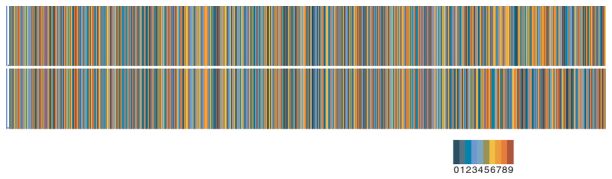
The upper frame of the figure shows the value of π to 707 decimal places. The lower frame shows a calculation of π that was started in 1850. You can see that it doesn't really agree, near the right hand end. You can see that simply by the visual comparison, even if you aren't sure what the figure means. In fact, the color of each bar represents a number, as shown in the key at the bottom of the figure. This is reduced from the first figure in the article noted below. (The "enlarged" figure at the web site is about twice this size.) I have removed a label that marks the region where the discrepancy is between the two values. Roughly, the discrepancy starts at the key and continues to the right. |
The figure caught my attention, as I browsed a recent issue of American Scientist. I found the article it highlights to be quite interesting. It's another by computer columnist Brian Hayes. It's not a scientific article in our usual sense; it's not an original report of new scientific research. It is more of an essay.
Hayes covers several things in the article. One is how to approach the problem of calculating π, with an emphasis on finding a formula that might be practical for hand calculation. Another is the story of William Shanks, who carried out this monumental calculation -- not entirely successfully. And yet another is an attempt to figure out exactly where Shanks went wrong. That last part has only limited success, but it is amusing to read how Hayes tries to figure out what Shanks probably did, and where he might have gone wrong.
Brian Hayes has a way of making things mathematical seem interesting, even fun. Have a look.
The article (or essay), which is freely available: Pencil, Paper, and Pi. (B Hayes, American Scientist 102:342, September 2014.)
More about π: Should τ replace π? (July 1, 2011). With music.
More from Brian Hayes: In what year was the word "slavery" most used in books? (February 23, 2011).
A book by Hayes, listed on my page Books: Suggestions for general science reading... Hayes, Foolproof -- and other mathematical meditations, 2017. The book includes a revised version of the essay discussed here -- and more.
And a post about another author who had that remarkable ability to make math fun: Hexaflexagon -- make one for yourself, to honor Martin Gardner (July 26, 2010).
* Previous history post... Does anyone know how strong gravity is? (September 16, 2014).
* Next: Chikungunya in the Americas, 1827 -- and the dengue confusion (April 3, 2015).There is more about math on my page Internet resources: Miscellaneous in the section Mathematics; statistics. It includes a listing of related Musings posts.
November 8, 2014
Physicists at the University of Maryland have developed a new type of optical fiber. Their new fibers may last for a few thousandths of a second (milliseconds). They are made out of air. Thin air.
The key step is making the air thin.
To understand that, we should step back and look at how a fiber optic cable works. It's rather like a pipe. Just as the wall of a pipe constrains the fluid to flow inside the pipe, so the wall of an individual optical fiber constrains the light to travel inside the fiber. The key property of the fiber wall is its refractive index, a measure of the speed of light in the material. The wall is a material of low refractive index (faster light speed); this serves to reflect any light that hits the wall back into the main flow.
In the new optical "fibers" -- or waveguides -- both the light pipe and the wall are made of air. The air has been heated to produce a region of high refractive index surrounded by a region of low refractive index.

|
The figure gives an idea how the device works.
Start with the "Filament quad". That's the set of four reddish circles near the left. It is a set of four lasers, at the four corners of a square. To make the waveguide, the four lasers are fired -- very briefly. The four green lines extending from the filament quad represent those four laser pulses. Each laser pulse heats the air around it. Together, the set of four pulses creates a region of higher air density in between them; high air density means high refractive index. In the figure, this is shown as the red streak, labeled "thermal waveguide". That is a region of high refractive index, surrounded by a region of lower air density, or low refractive index. That region of "thin" air serves as the wall of the waveguide. At that point, a subsequent laser pulse will tend to travel down that thermal waveguide. This is shown as a green "7 ns pulse" at the left, about to enter the device. This is the bottom part of Figure 1 from the Viewpoint story with the February article. |
Video. There is a short video available with the February article. You can get to it by choosing "Supplemental material" at the article web site, listed below. Direct link: video file. (10 seconds; no sound) This video is greatly slowed down from real time -- but probably not slowed down enough. The 10 seconds of video covers about 10 microseconds of action. After playing it through once to get the idea, you may well want to stop it from time to time and digest what it is showing.
The video shows the air density and refractive index over a few microseconds. By the end of the video, the difference between high and low density is blurred. However, some difference remains, and the waveguide remains useful for a millisecond or more.
It is straightforward that heating air leads to changes in its density (and thus of its refractive index). What the scientists have accomplished is working out a pattern for heating -- the array of four lasers -- that leads to a useful structure.
What could this be used for? For now, it is a technical development in the lab. One might imagine applications where one wants to send a pulse of data to a remote station. The device shown here could be used to create a waveguide; the data pulse could then be sent through it.
As noted, the current device makes a waveguide that lasts for about a millisecond. That is long enough for light to travel about 300 kilometers. Making a waveguide that long would require using more powerful lasers than what they used in this lab work; so far, they have demonstrated a waveguide of about 70 centimeters.
News story: Creating Optical Cables Out of Thin Air. (College of Computer, Mathematical, and Natural Sciences, University of Maryland, July 22, 2014.)
There are two articles listed here. The July article is what brought the topic to my attention. It builds on another from February; that article has a very nice "Viewpoint" article accompanying it. Both articles and the Viewpoint are freely available. I particularly encourage you to look at the Viewpoint story if you want more than what is above.
The July article, which is freely available: Collection of remote optical signals by air waveguides. (E W Rosenthal et al, Optica 1:5, July 2014.)
The February article...
* Viewpoint, a news story published in a news magazine by the article publisher; it is freely available: A Waveguide Made of Hot Air. (A Couairon & S Tzortzakis, Physics 7:21, February 26, 2014.) It links directly to the article.
* The article, which is freely available: Demonstration of Long-Lived High-Power Optical Waveguides in Air. (N Jhajj et al, Physical Review X 4:011027, February 26, 2014.) (Articles discussed in Viewpoint articles in Physics are made freely available by the publisher. However, the journal here is fully open access anyway.)
Thanks to Greg for comments on a draft of this post.
Also see:
* Bending a rigid rod (May 17, 2013).
* Nobel prize in physics for the rediscovery of fiber optics (October 12, 2009).
November 7, 2014
Nature has worked on this problem. Here is one of her solutions: Movie S1. (2 minutes; no sound. It's fine to just look at the first part for now, for the idea. There is a brief explanation below, though the labeling on the movie is sufficient.)
How well do we understand what is going on there? Can we make a device that can do it? Have a look: Movie S2. (1 minute; no sound.)
That second movie (S2) shows Elizabeth, an artificial rattlesnake, of the type known as sidewinder. Elizabeth has been around for a while, but wasn't very good at climbing sand -- as is clear from the first parts of the movie.
It's hard to describe in words alone how the sidewinders move. For our purpose here, the main point is that they lift small regions of the body; the remaining regions stay in contact with the ground. The lifted part moves along the body as a wave, resulting in motion.
A new article reports a careful study of how sidewinders move on sand. The scientists uncovered the secret of climbing sand: as the incline becomes steeper, the snake adjusts its motion so that smaller regions loop out and larger regions remain in contact with the ground.
Elizabeth is climbing better now -- as you saw above (Movie S2, starting at about 50 seconds).
You can go back to the movies, to finish or further digest them. S1 shows a sidewinder. Portions of the movie show snake travel on level sand, and on sand at 10° and 20° slopes, with various playback speeds. S2 shows Elizabeth, first failing, then succeeding in climbing the sloping sand.
The major emphasis in the article is learning about the mechanics of climbing sand, and implementing the knowledge in a human-made device. However, the work also raises an interesting biological question. The ability to climb sand is uncommon, even among related snakes. The authors suggest that the sidewinders have developed a novel neuromechanical control system that allows them to sense the slope and adapt to it.
News stories:
* Snake Robots! Slithering Machines Could Aid Search-and-Rescue Efforts. (Live Science, October 9, 2014.)
* Cave-Exploring Snake Robot Gets Inspiration From Sidewinders. (E Yong, Not Exactly Rocket Science (National Geographic blog), October 9, 2014. Now archived.)
* Secrets of the sidewinder. (The Why Files, October 9, 2014. Now archived.)
* News story accompanying the article: Applied physics: Of snakes and robots. (J J Socha, Science 346:160, October 10, 2014.)
* The article: Sidewinding with minimal slip: Snake and robot ascent of sandy slopes. (H Marvi et al, Science 346:224, October 10, 2014.) Check Google Scholar for a copy of the article. Both movie files at the start of this post are from the Supplementary Materials posted with the article. There are five movies there, described on the page of Supplementary Materials.
* Previous post about robots: Quiz: What are they? And are they a threat to you? (October 20, 2014).
* Next: A robot that can fold itself up (December 9, 2014).Others... Creepazoids and the Uncanny Valley (May 15, 2016).
Other posts about snakes include...
* Quiz: What is it? (August 17, 2015).
* Snakes and humans: who eats whom? (January 23, 2012).and about sand...
* Sandstorms and midair collisions (September 16, 2013).
* Playing in the sand (March 26, 2011).This is an example of bio-inspired design, in that the understanding of the snake was used in designing the robot. For more, see my Biotechnology in the News (BITN) topic Bio-inspiration (biomimetics). It includes a listing of some other Musings posts in the area.
More about how things move: How rocks travel (November 14, 2014).
Also see: Studying predation around the world: What can you do with 2,879 fake caterpillars? (July 28, 2017).
November 4, 2014
How old is the Ebola virus? Does it matter? If nothing else, we are curious about history. And perhaps understanding its history would help us understand the modern virus.
A new article looks at the history, not of the virus per se, but of a couple of its genes. Those genes, at least, have been around for millions of years.
The following figure shows the genealogy the scientists found for one of the Ebola genes.
|
This is a typical genealogy chart, based on looking at gene sequences. The genes are arranged in the simplest pattern possible: the more similar two versions of the gene are, the closer they are on the chart. Old things are to the left. Branches occur as we move to the right. In this case, there are two main types of organisms: those shown with red lines and those shown with blue lines. These are shown within the box outlined with gray. (I have cut off most of the rest of the chart at the bottom.) The "big picture" here is that there are two groups of red lines, and the blue lines branch off between them. What are these organisms? The red lines are filoviruses. That's the group of viruses that includes Ebola. Look at the lower group of red lines: most are labeled Ebola. The lines in the upper red group are labeled Marburg, the best known relative of Ebola. You can see where the Ebola and Marburg branches separated, very near the left (just inside the gray box). The blue lines? Hamsters. (The graph says "cricetid rodents"; the term hamsters will serve our purposes here.) Several types of hamsters carry related copies of this gene, which we now call an Ebola gene. You can see where the Ebola version of the gene split off from the hamster version of the gene. That's more recent than the split from Marburg! Importantly, these closely related copies of the viral gene are found only in certain hamsters, not in rodents in general. (There are various other animals shown in the full figure, below where I cut off the figure. Those animals contain a version of the gene, but a version not closely related to the ones in the cluster at the top.) This is the top part of Figure 1 from the article. |
In summary, analysis of this one particular gene suggests that the Ebola-Marburg split is older than the Ebola-hamster split. Are we saying that an Ebola virus became a hamster? No, we are saying that the gene found in the hamster is similar to the gene from Ebola. Genes jump from virus to host from time to time. Much debris from viral genomes is found in animal genomes, including ours.
It is likely that the event reflected in the genealogy chart is such a jump. And we can date when it got there by looking at which animals do and do not have it. From knowledge about the rodents that do and don't have this version of the viral gene, the scientists estimate that the gene jumped to hamsters about 20 million years ago. And that implies that the Ebola-Marburg split is even older.
These DNA genealogies are very logical, but not always correct. The general way to interpret them is to look for the simplest explanation that would explain the data at hand. Sometimes, things aren't simple. Sometimes the available data is not representative; cases are known where we reach different conclusions based on one or another gene.
The new article contains genealogy data for two Ebola genes; the general picture is the same for both. That lends some credence to the chart above. What we have is part of the story of Ebola: an apparent relationship in the history of Ebola, Marburg and some rodents. What does it mean?
News stories:
* Ebola's Family Tree: Disease May Have Existed For 23 Million Years, Much Longer Than Previously Believed. (Medical Daily, October 25, 2014.)
* Ebola's evolutionary roots more ancient than previously thought. (Science Daily, October 24, 2014.)
The article, which is freely available: Evidence that ebolaviruses and cuevaviruses have been diverging from marburgviruses since the Miocene. (D J Taylor et al, PeerJ 2:e556, September 2, 2014.)
An earlier post about the new Ebola virus strain: The new Ebola virus (August 19, 2014).
More Ebola... How Ebola kills: a clue about a key protein (December 5, 2014).
More Marburg... An antibody treatment for Marburg virus disease? (May 14, 2017).
There is more about Ebola on my page Biotechnology in the News (BITN) -- Other topics in the section Ebola and Marburg. That section links to related Musings posts, and to good sources of information and news.
Another post about viral genes in animal genomes: You are part Borna (January 31, 2010).
There is more about genomes on my page Biotechnology in the News (BITN) - DNA and the genome. It includes an extensive list of Musings posts on sequencing and genomes.
November 3, 2014
You set up a movie theater in a tree in the Brazilian jungle: a laptop computer showing videos in a viewing box. Do you think that monkeys would come watch the videos? Do you think they would learn from the videos?
A new article addresses those questions. It reports that the answers are yes and yes.

|
The figure shows part of the set-up.
You should be able to find three monkeys on the branch in front of the movie theater. This is trimmed and reduced from the first figure in the Phys.org news story. |
What's playing? Movies of monkeys opening a complex box and retrieving fruit from it. The monkeys in the video are the same kind of monkey, but are not familiar individuals. These teaching monkeys have been trained to open the box using one of two methods.
That's the general set-up. In an actual test, there is a box with fruit on the stand, right by the screen. The box is just like that in the video -- and can be opened in either of the two ways shown by one or another of the monkey teachers. The scientists recorded what the visiting monkeys did. Remember, this set-up is in a Brazilian jungle; the visitors are wild monkeys.
Only a few of the wild monkeys that were observed opened the box. There are two key observations about those that did. Almost all of them were monkeys that had seen a video. Further, almost all that did open the box used the method they had seen on the video. Together, those two observations -- supported by statistical analysis of the data -- suggested that the wild monkeys learned from the videos.
Go look at a video, from the authors. (Vimeo; 3 minutes; no sound, but reasonably well labeled.) The first parts record the monkeys exploring; later parts show the testing. Unfortunately, it is hard to tell what is going on during the testing. You can see what the test monkeys do with the box, but you can't really see if they are paying any attention to the video. I suspect that what the monkeys do is largely based on what they have already watched. In any case, the video itself is fun, and the conclusions are supported by data in the article.
The work is an interesting demonstration that wild animals can learn from a video. For some perspective... What is shown here had already been shown for captive animals. That is, the new article extends previous findings to show that the ability to learn from videos is not simply a lab-acquired skill, but is somehow inherent in the animals.
The authors note that using the videos has some complex social implications. In general, these monkeys are not tolerant of strangers. Apparently, the monkeys being tested were able to distinguish that the monkeys in the video were not a threat, but also that they were "relevant". It would be interesting to know if the monkeys would have learned had the teachers not been their kind. What if, for example, they had been cartoon figures?
News stories:
* Study shows wild monkeys can learn new tricks from watching training videos. (Phys.org, September 3, 2014.)
* Wild monkeys learn by watching TV. (University of St Andrews, September 5, 2014.) From one of the institutions where the work was done. This page links to the video noted above.
The article: Video demonstrations seed alternative problem-solving techniques in wild common marmosets. (T Gunhold et al, Biology Letters 10:20140439, September 2014.)
* A recent post on testing monkeys... Monkey math (June 1, 2014).
* Next: Learning to use a mirror (June 22, 2015).Also see...
* Do monkeys make stone tools? (December 18, 2016).
* How bumblebees learn to pull strings (November 27, 2016).
* If the elephant can't find its dinner, should you help by pointing to it? (October 18, 2013).
* Cultural transmission of fishing techniques among dolphins (September 13, 2011).
* Octopus will only pay attention to television if it is "high definition" (August 20, 2010).
November 1, 2014
Polio is caused by a virus that replicates only in humans. Partly because of that feature, it has been considered a prime candidate for eradication. The eradication effort has made considerable progress, though is still incomplete.
A milestone was the elimination of polio in India. The last case of polio there was reported in January 2011; continued surveillance since then has shown nothing.
The World Health Organization (WHO) organizes the world by regions. With the elimination of polio in India, WHO has now certified what they call the South-East Asia Region as polio-free. It is the fourth of their six regions to be declared free of endemic polio.
The article noted here is a short report from WHO about the announcement. You may enjoy looking it over, just for perspective.
The article, which is freely available: Polio-Free Certification and Lessons Learned -- South-East Asia Region, March 2014. (S Bahl et al, Morbidity and Mortality Weekly Report (MMWR) 63:941, October 24, 2014.)
If you find yourself surprised by the list of countries included in the WHO "South-East Asia region", go look up the WHO regions; it's rather amusing.
Previous post on polio in India: Polio eradication: And then there were three (March 27, 2012).
There are three types of polio virus. Interestingly, the vaccine against Type 2 polio was apparently interfering with the effectiveness of the vaccine against Type 1. With Type 2 gone several years ago, there has been a move toward omitting the Type 2 vaccine component. It is likely that the new vaccine strategy was an important part of India's success. This is noted in the article. This vaccine issue was discussed in the post Polio: progress toward eradication (November 5, 2010).
Polio: Another country may be getting close to eradication (December 8, 2014).
Is a new type of polio emerging? Polio-like disease without polio virus? (March 17, 2014).
Another eradication story: Another disease has been eradicated. GREP. (February 2, 2010).
My page for Biotechnology in the News (BITN) -- Other topics includes a section on Polio. It includes a list of Musings posts on the topic.
More from the WHO... What's in a (disease) name? (May 26, 2015).
October 31, 2014
Insects have an exoskeleton: the skeleton is outside the body. A disadvantage of using an exoskeleton is that it cannot grow to accommodate growth of the animal. As insects grow, they discard the current skeleton, and then form a new one on the larger body. That process of changing skeletons is called molting.
During molting, the animal is without a skeleton. What are the implications? A new article offers one example.
|
The figure shows oxygen consumption by two mayfly larvae.
Start with the curve with open circles. You can see that the breathing -- the oxygen consumption -- of this larva increased steadily over most of the observation time. By 14 hours (x-axis), the rate of oxygen consumption had increased by about 100% (y-axis); that means it was about twice the initial rate. We will discuss later why it increased. For now, this is just our baseline observation. |
|
Now look at the curve for the other mayfly larva, the curve with filled circles. This curve is very different: it is somewhat higher for the first few hours. Then, it drops abruptly, and just as abruptly jumps to a very high value. What's the difference? The second larva molted. The dramatic difference between the two larvae occurred at the time of molting. There are also differences before and after molting. This is Figure 1 from the article. | |
This is an interesting set of observations. Molting is a stress. One concern is breathing, which results in pressure changes inside the animal. Further, molting in these flies involves loss of parts of the respiratory system. The results here show that the animal breathes less during molting. Interestingly, it breathes more before molting, apparently in anticipation of being able to breath less during molting. Further, it shows recovery effects after molting.
This is more complex than the simple story noted above. The observations were made as part of an experiment on the effect of temperature (T) on the larvae. The time scale shown on the graph is also a T scale: the T was being increased by 1 degree Celsius per hour during the time shown. Now that they have found this phenomenon of respiratory distress during molting, it would be nice if they would show it during simple, constant-T events.
Nevertheless, the article reports an interesting feature of mayfly molting. It should be interesting to follow up.
News stories:
* Insect molting is 'like having your lungs ripped out'. (Science, August 29, 2014.) Includes a picture of a shed exoskeleton, the "exuvium".
* Molting Tougher on the Mayfly Than Previously Thought. (NC State News, September 25, 2014.) From the lead institution (North Carolina State University, Raleigh).
The article: A stressful shortness of breath: molting disrupts breathing in the mayfly Cloeon dipterum. (A A Camp et al, Freshwater Science 33:695, September 2014.)
Other posts about exoskeletons include:
* Personal optimization of an exoskeleton (September 22, 2017).
* An exoskeleton that assists with walking but does not require an external energy source (September 8, 2015).
* Berkeley Bionics: From HULC to eLEGS (October 22, 2010).
* Armor (February 5, 2010).More about breathing: Recovery of breathing following spinal cord injury (July 29, 2011).
October 28, 2014
Those who drink moderate amounts of alcohol tend to have less painful heart attacks than either non-drinkers or heavy drinkers.
Many people of Chinese descent have low tolerance for alcoholic beverages. Interestingly, these same people tend to suffer more pain in the event of a heart attack.
How are those observations, above, related?
In part, the mutation leading to alcohol intolerance has long been understood. It is a mutation in the gene ADH2, which codes for one of the enzymes needed to metabolize alcohol. The enzyme is aldehyde dehydrogenase; if it is deficient, acetaldehyde accumulates, and that leads to the nauseous response that make ingestion of alcohol unpleasant.
Caution... The abbreviation ADH is used in biology to refer both to alcohol dehydrogenase and aldehyde dehydrogenase. The first enzyme makes aldehydes (such as acetaldehyde); the second metabolizes the aldehyde further. In the current post, ADH is used only to refer to the latter enzyme.
A new article tells more about this story -- and leads to a candidate new drug.
The article contains a huge amount of data. Let's look at one piece; we can then summarize some of the rest.
|
Here is one of the experiments from the new article. It demonstrates, in mice, a drug that reduces accumulation of acetaldehyde.
General test design: inject the substances as indicated into the mouse paw. Measure what happens; in this case, measure the acetaldehyde near the injection site. There are two variables in this test. The variable in the first row (x-axis label) is either V or Car. Car stands for carrageenan. For our purposes, Car is an irritant, which causes pain in the mice in a standard test. (Carrageenan is a polysaccharide made by algae.) V stands for vehicle; it is the control: inject the solution just like the Car solution, but lacking the Car.) The second variable is Alda-1, seen only with the right-hand bar; we will return to it in a moment. |
|
The y-axis shows the amount of acetaldehyde made in the paw, near the site of Car injection. Look at the first two bars: one has Car injected, one is a control (V). You can see that the Car leads to a considerable increase in the amount of acetaldehyde found in the paw. Now look at that third bar, at the right. Car + Alda-1. The addition of Alda-1 along with the Car blocks the accumulation of acetaldehyde. This is Figure 5A from the article. | |
So what is Alda-1? It is a drug that activates the ADH2 enzyme. That is, it promotes the metabolism of acetaldehyde, so that that compound does not accumulate.
The scientists also show that the mice have less of a pain response when Alda-1 is given. The aldehyde is part of the pain mechanism; reduce aldehyde level, and there is less pain. Thus it seems that Alda-1 is an anti-pain drug.
In other parts of the work, the scientists study mice carrying the "Chinese" mutation that leads to lower ADH2 activity. These mice show more accumulation of acetaldehyde and greater pain in the same type of test. Further, both are reduced by the Alda-1 drug.
The pieces fit together. Aldehydes are associated with pain. This includes the aldehydes made during the abnormal events of a heart attack. (The aldehydes are made by abnormal fat breakdown during the heart attack.) The enzyme ADH2 is involved in removing the aldehydes, and thus reducing pain. Moderate drinkers have more of the enzyme (without adverse effects of high alcohol); they show less pain. The "Chinese" mutation reduces the activity of that enzyme, thus increasing pain. The drug Alda-1 increases the activity of that enzyme, reducing pain; it can do so even with the mutated Chinese enzyme.
Treatment of pain is an issue in modern medicine. We lack adequate pain killers; we even lack a good understanding of pain. The current article offers a candidate drug, with known mechanism of action. The work on the drug is all in rodents. It's intriguing; will it work in humans?
News story: New drug promises relief for inflammatory pain, scientists say. (Science Daily, August 27, 2014.)
The article: Aldehyde dehydrogenase-2 regulates nociception in rodent models of acute inflammatory pain. (V O Zambelli et al, Science Translational Medicine 6:251ra118, August 27, 2014.) Check Google Scholar to see if a copy is available.
Other posts about pain include:
* Chronic pain in flies? (October 6, 2019).
* Why male scientists may have trouble doing good science: the mice don't like how they smell (August 22, 2014).
* Would a placebo work even if you knew? (January 31, 2014).
* PAPupuncture -- an improved acupuncture (June 10, 2012).
* Do you make morphine? (May 18, 2010).More on heart disease... Mutations that lead to reduced risk for heart disease (November 21, 2014).
More about aldehydes is in the section of my page Organic/Biochemistry Internet resources on Aldehydes and ketones.
I have referred to the mutation studied here as an ethnic mutation or a Chinese mutation. Such terms sometimes bother people. The key point is that humans are not all the same. In some cases, a difference -- a mutation -- correlates with a geographical or ethnic group. That doesn't mean it defines the group. Sickle gene mutation is common in Africans, but not all Africans have it. In that case, we have a fairly good understanding of both the benefit and detriment of the mutation. The mutation discussed in the current post is found in about a third of ethnic Chinese (and rarely elsewhere). Again, it does not define the group, but it is more prevalent there. In this case, we do not understand why (so far as I know).
Other posts about "ethnic" mutations...
* Diagnosing diabetes in people of African ancestry: a race-dependent variable (January 3, 2018).
* Why African-Americans have a high rate of kidney disease: another gene that is both good and bad (August 17, 2010).
October 27, 2014
In 2010 Musings noted a story about a child who suffered serious medical problems that his doctors could not explain. They decided to sequence the child's genome, and that led to an effective treatment [link at the end].
That was a historic event, the first time that blind sequencing led to a medical diagnosis and treatment. (For the record, the sequencing was of the exome -- the coding regions -- not of the whole genome. The idea is the same.) Yet it was expensive and quite ad hoc. Scientists chose to try sequencing in this case just to see what they might do, given a bad situation. Arguably, it was even something of a stunt.
Now, four years later, genome sequencing for the diagnosis of mysterious conditions in children is close to becoming mainstream. Serious controlled trials are under development, so we can learn about the proper and efficient use of the method. It is, after all, still an expensive option. Sequencing per se is much lower cost than before, but learning how to use the genome information is still a work in progress.
Nature recently had a short news story on genome sequencing for children. It starts with noting one success story. But then, what really got my attention... It notes that the same lab has sequenced 44 genomes of infants (and, at least in some cases, the parents). In 28 of those, the rapid sequencing provided diagnostic information within about 1-3 days (details not clear in this short story). And in half of those, it provided useful guidance for treatment. That's not bad for the early days of a new technique for addressing what used to be complete mysteries.
News story, which is freely available: Fast sequencing saves newborns -- Rapid analysis of infant genomes is aiding diagnosis and treatment of inexplicably ill babies. (S Reardon, Nature 514:13, October 2, 2014.)
Background post: Genome sequencing to diagnose child with mystery syndrome (April 5, 2010). Links to an important follow-up post, as well as to some other relevant posts, including posts on the costs of genome sequencing.
One of the first Musings posts about personalized medicine: Personalized medicine: Getting your genes checked (October 27, 2009). This links to several others in the broad area.
There is more about genomes on my page Biotechnology in the News (BITN) - DNA and the genome. It includes an extensive list of Musings posts on sequencing and genomes.
October 26, 2014
Fracking -- hydraulic fracturing -- is the basis of a resurgence in the production of oil and natural gas. The method is controversial, for both scientific and political reasons. A new article makes an interesting contribution to the discussion, but also has the potential to be misinterpreted.
Headlines around the new article typically suggest that fracking could lead to an increase in carbon (C) emissions. This would seem contrary to one argument for its use: if fracking leads to more use of relatively clean fossil fuels, substituting for coal, then there should be less carbon emissions for the same amount of energy. One argument against this is concern about methane leakage associated with fracking. This is still open, since the magnitude of methane leakage is open. (Some of the background posts noted at the end relate to this point.)
So what's with the new article? A better -- and higher -- estimate of methane leakage? No, the new article actually makes a quite distinct point -- an economics point. The authors model energy usage, and show that if the market has its way, the lower price of fuel made possible by fracking could lead to an increase in fossil fuel use -- at the expense of renewables (assumed to be cleaner). That increase in fossil fuel use would lead to greater C emissions. Compare this with the statement above, that "if fracking leads to more use of relatively clean fossil fuels, substituting for coal, then there could be less carbon emissions for the same amount of energy". There is no contradiction.
Let's look at what they found...
|
The figure summarizes some of the findings. The information being shown is quite complex; let's look at the graph for general trends.
The y-axis shows the ratio of gas to renewables as energy sources. This can be taken as related to carbon emissions; more gas means more carbon emissions -- compared to use of renewables. That ratio is plotted vs time (x-axis). The graph makes a number of useful points... |
|
First, look at the two lines. The upper line (red) assumes that gas is "abundant"; that is, this curve assumes that fracking continues to help provide inexpensive gas. The lower line (blue) assumes that gas becomes expensive and in short supply; that is, this curve assumes no fracking, but rather that gas production remains "conventional". You can see that the red line is always higher. That is, the ratio of gas to renewables is higher if gas is abundant. The effect is small in the early years, larger in later years. The authors ran five models of energy consumption. The two lines show the median results of the five models. The shaded regions of the graph show the range of results from the models. The reddish shading is for "abundant" gas (with fracking); the bluish shading is for "conventional" gas (no fracking). (There is a substantial region in the middle that is both red and blue; that is, both kinds of models gave results within that region. There is only a tiny region of "pure" blue near the bottom.) The pattern is the same, but a much wider variability is seen. This is Figure 1 from the news story in Nature (Davis & Shearer). | |
The general trend, from both the lines and the shading, is that the results tend to be higher for "abundant" gas than for "conventional" gas. That is, fracking leads to more and cheaper gas, and that cheaper energy source may replace some renewable sources of energy. This is what one would expect from basic economics: greater availability at a low price means that more gas will be used. This is an important point
What is the limitation of the study? The modeling is about one issue: the price of natural gas. The authors are quite clear about this. In particular, they note that they do not include any public policy choices in their models. Their point is not that cheap gas is bad, but that cheap gas alone will not lead to reduced carbon emissions. If cheap gas replaces use of coal, that is good; if it replaces use of clean renewable energy sources, it is not so good.
Musings typically presents single scientific articles; we regularly note that a single article is one part of a larger story. That's how science proceeds. In this case, we are dealing with a topic with immediate political implications. There is a risk that people will quote individual articles from one side or the other of a controversy to support their case. Sometimes they even misrepresent the findings of an article, innocently or otherwise. It's important that we try to look at the big picture. The current article makes an important point about the economic implications of fracking; it should inform policy making. However, it is important to understand the limitations of the finding: what the model shows is based only on what the model included.
News stories:
* Fracking boom could mean up to 12% more carbon emissions. (The Conversation, October 15, 2014.) This is one of the first news stories I came across. When I actually read what was done, I came to realize that this story does a poor job of presenting the study. It does present the issues, but not the limitations of what was done. Take this as one story along a spectrum of politicized stories.
* A global natural gas boom alone won't slow climate change. (Pacific Northwest National Laboratory, October 15, 2014. Now archived.) From one of the institutions involved in the study. It provides a good summary of what the modellers did, and what they found.
* News story accompanying the article: Climate change: A crack in the natural-gas bridge. (S J Davis & C Shearer, Nature 514:436, October 23, 2014.)
* The article: Limited impact on decadal-scale climate change from increased use of natural gas. (H McJeon et al, Nature 514:482, October 23, 2014.) Check Google Scholar for a copy.
If you can't get a feel for what the y-axis of the graph above means, don't worry. I used this graph, from the accompanying news story, as a simple qualitative summary. The article itself contains much more detail from the models, including actual estimates of C emissions and the amount of climate forcing.
More about fracking:
* Fracking: one scientist's perspective (January 5, 2016).
* Quality of oil and gas wells -- fracking and conventional (August 18, 2014).
* Shale gas recovery using hydraulic fracturing (fracking) (October 7, 2013). Good introduction and overview of fracking.More about methane leakage: Methane leaks -- relevance to use of natural gas as a fuel (April 7, 2014). This is something of a side issue to the new work itself, but is broadly an issue with any mining for gas or oil.
There is more about energy issues on my page Internet Resources for Organic and Biochemistry under Energy resources. It includes a list of some related Musings posts.
October 24, 2014
A standard compass needle points to the north -- to the magnetic north pole. But sometimes it points south -- and it is possible that could occur during the lifetime of those living today.
The compass needle knows nothing about geography; it simply points to what we conveniently call the magnetic north pole, which is up near the geographic north pole. It has always been up there during recorded human history. However, geological records show that the magnetic field of the Earth flips (reverses direction) from time to time. Sometimes, what we call the magnetic north pole is down near the geographic south pole.
The last time the Earth's magnetic field flipped was about 786,000 years ago. A new article analyses that reversal in detail, and shows that it happened over a period of less than a hundred years. If a new magnetic field reversal started now, it could be complete within the lifetime of some who are living today.
The following figure summarizes what the scientists found.
|
The points (circles) show the location of the magnetic north pole at various dates. Start by looking at the general pattern. The first several points are near the bottom, in (or near) Antarctica; they are shown in blue. The later points, in red, are near the top of the map, in the Arctic region. Now look at the dates on the points, as labeled on the map. All of the points near the bottom are labeled 786.1 or higher. That number is the age of the finding, in thousands of years. For example, the point labeled 786.1 marks the location of the magnetic north pole 786,100 years ago. All of the points at the top of the map are 786.0 or lower. Finally, note the vertical line. It connects a point in the south at 786.1 to a point in the north at 786.0. That is, the magnetic north pole moved from the south to the north in less than 0.1 thousand years. That's a hundred years. There are no points in between. This is Figure 11a from the article. It is also in the news story. |
How do we know where the magnetic poles used to be? When magnetic rocks are laid down, they align themselves with the magnetic field. Thus, the Earth's magnetic field is imprinted into the rocks. Just measure the magnetic alignment of old rocks -- and date them -- and we have a record of the Earth's magnetic field. Scientists have been doing that for decades, and we have a general picture that the magnetic field has reversed direction many times. About every 300,000 years, on average. The current work is a refined set of measurements focused on the most recent reversal.
Why or how the magnetic field reverses direction is not understood. The speed of the event recorded here is a surprise to many geologists; we have no idea how typical this speed may be.
If you look carefully at the numbers presented above, you may have a concern... Reversals occur on average every 300,000 years; the last one was 786,000 years ago. Aren't we overdue? Statistically, it would seem so. In fact, scientists have observed a weakening of the Earth's magnetic field, and there is speculation that a reversal might be imminent. It's speculation, because we have no basis for saying anything more. But it could happen -- soon and fast.
There is another little question that intrigues people -- or worries people. Will anything bad happen during a magnetic field reversal? Addressing this, too, is largely speculation. But we should note that a 100 year reversal time, while fast on a geological time scale, is slow on a human time scale. Let's leave it at that.
News story: Earth's magnetic field could flip within a human lifetime. (Science Daily, October 14, 2014.)
The article: Extremely rapid directional change during Matuyama-Brunhes geomagnetic polarity reversal. (L Sagnotti et al, Geophysical Journal International, 199:1110, November 2014.)
Another post about changes in the Earth's magnetic field: Excursions of the earth's magnetic pole: the kauri story (April 6, 2021).
More about magnetic fields:
* The nature of a bio-compass? (June 10, 2016).
* Magnetic turtles (July 5, 2015).
* A human protein that can sense magnetic fields (July 15, 2011).* A recent post about the Antarctic: If it quacks like a whale... (August 25, 2014).
* Next: A bit of IPD -- found in Antarctica (January 13, 2015).And one about the Arctic: Recovery of live, infectious virus from 30,000 year old permafrost (March 25, 2014).
Previous post that included a map: We are all Laniakeans (October 21, 2014). This is the post immediately below.
Also see... Why does Santa Claus prefer the North Pole? (December 22, 2016).
October 21, 2014
A map, to get us oriented... Can you find where you are on this map?
|
To find yourself... Look at the two axes, and find the point (0,0) -- the graph origin. (Don't worry about what the axes mean for now.) There is a (dark) dot at that point. That's us. (There is a red arrow just to the right of the dot -- pointing away from it.) The dot at (0,0) shows the location of the Milky Way galaxy. In fact, (0,0), the origin of the graph, is set at the Milky Way. We are near the right hand edge of a region with a line around it. That region is Laniakea, This is Figure 2 from the article. |
Laniakea is a supercluster of galaxies. It contains about 100,000 galaxies -- including our own Milky Way galaxy. Laniakea is presented in a new article.
The graph axes need some explanation. They show distances, but in a way that might seem odd to anyone but an astronomer. The axes are labeled SGX and SGY. These are supergalactic (SG) coordinates: X and Y in a plane through the galactic supercluster. The distances are shown as speeds! The speeds are based on redshifts, spectral shifts that reflect how fast two things are moving apart. In this case, a coordinate shows how fast the point is moving away from the origin, which is our spot in the galactic supercluster. Astronomers know that redshift speeds are proportional to distances. Thus we can take the diameter of Laniakea, about 12,000 km/s on the graph, and convert it to a regular distance: 160 megaparsecs, as shown on the graph. Or 520 million light years. Or about 5x10²¹ kilometers, if you want out of astronomical units. (For the chemists... that's about 5x1034 Angstroms.)
The graph also shows the mass of Laniakea: about 1017 M☉, where M☉ is the symbol for the mass of our Sun. That's about 1047 kilograms. (For the chemists... If we take the mass of one atom of carbon-12 as 12, the mass of Laniakea is about 1074.)
Laniakea is not just a region with a line drawn around it. The scientists figure out where Laniakea is, by measuring the boundaries of the supercluster.
So, what is a galaxy supercluster? The term has been used loosely over the years. But here the authors suggest a rather rigorous definition of supercluster -- and set out to apply it. A supercluster is a set of galaxies who primary gravitational attraction is to each other.
How do you tell where the primary gravitational attraction is? By analyzing the motions -- the peculiar motions -- of the galaxies. A peculiar term, it might seem, but one with a fairly straightforward meaning to astronomers. When we look at an object moving across the sky, we see the result of many motions. For example, the universe is expanding, and galaxies are moving within their local region. To understand the local gravity, we need to dissect out the "local" motion; that is what astronomers call the peculiar motion.
An analogy... Imagine you are on a bus. The bus is traveling north at a speed of 20 kilometers per hour (kph). You walk south -- toward the back of the bus -- at 5 kph. Now, relative to the ground, you are moving north at 15 kph (20 kph N + 5 kph S). An observer on a distant mountain top, tracking only your cell phone signal, would see you moving at 15 kph N -- knowing nothing about the bus.
A more sophisticated analysis, by an observer who can track both you and the bus, would reveal the two separate motions. That observer could see that your motion on the bus is 5 kph S; that is your peculiar motion.
A key part of the article is sorting out the motions of the galaxies within their "bus" -- their local region. Of course, this is a huge computational problem, because they are dealing with thousands of galaxies.
By sorting out the motions of the galaxies, they are able to propose which ones form a supercluster, acting as a gravitational unit. That leads to the map shown above -- a map which further defines our place in the universe.
Movies. There are two movie files associated with this article. One was produced by the journal, and one was produced by the authors of the article. They are both worthwhile: useful narration describing how the work was done, with plenty of visuals -- stunning visuals. I suggest you start with the Nature movie, simply because it is shorter.
* Nature video (4 minutes). Available at the article link given below, or at: YouTube (Nature video).
* Authors' video (7 minutes). Available within the article, or at: YouTube (authors' video). The opening "title page" shows the basis of the name Laniakea.
News story: New Map Locates Milky Way in Neighborhood of 100,000 Galaxies -- Astronomers have defined a huge group of galaxies called a supercluster, now named Laniakea, with the Milky Way on its fringes. (Nadia Drake, National Geographic, September 3, 2014.) Now archived.
* News story accompanying the article: Cosmology: Meet the Laniakea supercluster. (E Tempel, Nature 513:41, September 4, 2014.)
* The article: The Laniakea supercluster of galaxies. (R B Tully et al, Nature 513:71, September 4, 2014.)
More about our galaxy:
* Dung beetles follow the Milky Way (February 24, 2013).
* Mayhem at the center of the Milky Way (August 23, 2011).Redshifts due to motion were discussed in the post A galaxy far, far away: the story of MACS 1149-JD (October 12, 2012).
Next post that includes a map: What if your compass pointed south? (October 24, 2014). This is the post immediately above.
More maps: A mosquito map for the United States (October 3, 2017).
Previous posts using supergalactic coordinates: none (so far as I can tell from a text search of my files).
October 20, 2014
|
There they are.
The questions... 1) What are they? 2) Are they a threat to you? More, including source, is below. But first, what do you think? |
Answer and discussion...
You may have wondered about the size. Each item in the picture is about 3-4 centimeters across.
So what is in the picture? It is a swarm of robots. There are a thousand of them, though not all visible here.
The robots have legs, as you can see. Three legs, spindly but rigid -- and an unusual motor system. They get around. Importantly, they are cooperative robots. They get their heads (?) together, and work things out.
At this point, I suggest that you watch one of the movie files associated with a new article. Go to the article web site listed below, and choose "Supplementary Materials". Try Movie S1 as a start. (Direct link: Movie S1; 40 seconds, no sound.) It shows a swarm of a thousand of these robots assembling themselves into the shape of a starfish. The 40 second video compresses nearly 12 hours of work by the robots.
It's important to emphasize that the construction project is worked out by the swarm of robots. They are, as a group, given a general command: form a starfish. The robots work out how to do it, as they go. An individual robot does not have a pre-determined role or position. If one gets a cramp (or short circuit), just pull it out and the swarm continues. In field use, a defective robot would be left behind, but the project would not suffer because of the failure of a few of its members.
Movies S2 and S3 show two more projects; they offer nothing fundamentally new. Movie S4 (2 minutes) shows some details of operation. at a more reasonable speed. None of the movies have sound.
What is the point? Of course, robots are often fun, and this type is no exception. Beyond that, we are learning various ways to use robots. Individual reports about robots are explorations and exercises, trying to see what we can do. One issue here is the use of robots that are individually quite simple (and inexpensive -- about $14 each), yet are capable of working out complex tasks together. That is, they have collective behavior. The article discusses some of the trade-offs that were made in designing the robots.
There was another question at the top of this post. Are they a threat to you? I don't know. They are called kilobots, or Kill-o-bots. Why? I don't know. Maybe they haven't decided yet.
News story: A Thousand Kilobots Self-Assemble Into Complex Shapes. (IEEE Spectrum, August 14, 2014.) The figure above is reduced from one in this story. Other figures there include a close-up of one, and a US one cent coin for size reference.
The article: Programmable self-assembly in a thousand-robot swarm. (M Rubenstein et al, Science 345:795, August 15, 2014.)
Previous posts about robots and robotics include the following, which are at very different levels of application:
* The brain-machine interface -- at the World Cup (July 2, 2014).
* Cubli: a little cube that can stand on one corner and can walk (January 14, 2014).More...
* Why air may inhibit the performance of small cars (August 26, 2016).
* A robot that can fold itself up (December 9, 2014).
* How to climb a pile of sand (November 7, 2014).An example of collective behavior in nature: How to survive flooding by making a waterproof raft (May 27, 2011).
* Previous quiz... Quiz: What is it? (September 23, 2014).
* Next: Quiz: What is it, and ... ? (July 7, 2015).More sea stars (starfish): Arm problems in the stars (June 6, 2016).
October 18, 2014
Briefly noted...
A feature of the Ebola situation is that we have drugs and vaccines under development, but they have not been tested at all in humans. One concern is whether any of them are active against the virus strain of the current outbreak. Even if an agent is active against the strain it was originally tested with, it is hard to know what it would do with other strains.
In that context the claim of a drug that has rather broad activity against many RNA viruses, including multiple strains of both Ebola and Marburg as well as MERS, is welcome. Being broad-spectrum does not guarantee that it will act against the current strain, but it certainly increases the chances.
The article listed below summarizes some of what is known about the drug, and includes testing that shows it works against Marburg virus in monkeys -- even if given 48 hours following infection.
The drug is one of those being considered for use in the current Ebola outbreak.
News story: Novel drug treatment protects primates from deadly Marburg virus. (Science Daily, March 4, 2014.)
The article: Protection against filovirus diseases by a novel broad-spectrum nucleoside analogue BCX4430. (T K Warren et al, Nature 508:402, April 17, 2014.) The filovirus group includes Ebola and Marburg.
The drug works by acting against a special enzyme used by some RNA viruses to replicate. The enzyme is the viral RNA polymerase, an RNA-dependent RNA replicase. The drug looks similar to the normal nucleic acid component adenosine (A), but after being incorporated it blocks further extension of the chain. There are many drugs that act in this manner. Although the general nature of such "chain-terminating" drugs is clear, there is usually little basis for predicting what they be effective against or if they will be toxic. That requires testing.
This article was written before the current Ebola outbreak was officially recognized as serious. Thus the article does not refer to this outbreak.
One way to track this drug would be to put its name, BCX4430, into PubMed. Doing that now (October 2014), gives a few hits, but no major developments related to Ebola.
* * * * *
There is more about some of the target viruses on my page Biotechnology in the News (BITN) -- Other topics in the sections Ebola and Marburg and SARS, MERS (coronaviruses). Those sections include links to good sources of information and news, as well as to related Musings posts.
Also see the post immediately following for an example of testing a drug under non-optimal conditions: Drug may extend life in progeria patients (October 17, 2014).
October 17, 2014
Progeria is a disease characterized by premature aging. A previous post discussed the disease, and the testing of a treatment in a mouse model [link at the end].
A recent article reports testing a drug in humans with progeria. The drug acts in the same biochemical pathway that was studied in the previous post.
The results are summarized in the following graph.
Caution... The following graph may be misleading.
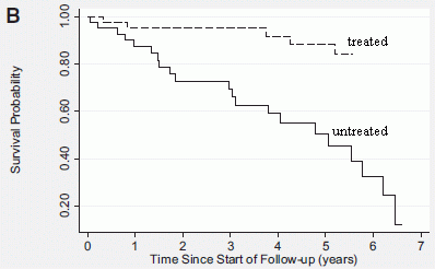
|
The graph shows survival curves for progeria patients, with and without drug treatment.
Look at the "treated" curve (upper; dashed line). It shows that about 80% of the treated patients have survived at the last time point, which is about 5 1/2 years. At that same time point, only about 40% of the untreated group (lower curve, solid line) have survived. This is Figure 2B from the article. (I added the labels on the curves.) |
The apparent conclusion is that the drug promotes survival. That is encouraging.
What's the "catch"? In a standard clinical trial, two groups of patients are tested together. One is the control, and one is treated. Patients are randomly assigned to one group or the other. The trial is "double-blind"; neither patient nor doctor knows which group they are in. Those in the control group receive a sham treatment, called a placebo; it is as close as possible to the real thing, but lacking the active ingredient or key treatment step. In the new work, that's not the case. Progeria is a rare disease. Doing a standard double-blind trial would be difficult. What is done here is that a number of people were given the experimental treatment (the drug). In fact, the "treated" curve combines data from multiple trials, with more than one drug. The authors then matched these people with previous progeria patients from the records, as best they could. Assembling this record about untreated progeria patients is the heart of the current article. (You will note that the two curves end at different times. That would not normally be the case in a standard clinical trial.)
The previous point is not a criticism of what the scientists did. What they did is due to a limitation of the system (the nature of progeria). They did the best they could given the reality of progeria. They deserve credit for trying to make the most of limited data. However, the conclusions are weaker than if the test had been standard. The test here is not as well controlled as a standard test. The results seem good enough that follow-up is warranted, but we need to remember what has been done.
The problem of doing ideally controlled clinical tests has reared its head again in the current Ebola situation. Doing controlled tests with Ebola would be difficult in the best of circumstances, and is essentially impossible in the current emergency. Yet we have the question of how we try using untested drugs in an emergency situation. People are scrambling to deal with this, in both medical and ethical terms.
In any case, both this test and the one discussed in the earlier post, in a mouse model, offer encouragement that useful drugs can be developed for progeria. The article also raises important issues about the nature of clinical trials.
News story: Study finds trial medications increase lifespan for children with progeria -- First-Ever Study of Progeria Children Drug Treatments Shows Protein Farnesylation Inhibition Increased Lifespan. (Progeria Research Foundation, May 6, 2014.) This is a press release from an organization promoting work on the disease, and which funded the trial.
* Editorial accompanying the article: An Encouraging Progress Report on the Treatment of Progeria and its Implications for Atherogenesis. (J Oshima et al, Circulation 130:4, July 1, 2014.)
* The article: Impact of Farnesylation Inhibitors on Survival in Hutchinson-Gilford Progeria Syndrome. (L B Gordon et al, Circulation 130:27, July 1, 2014.)
Background post on progeria: Premature aging: a treatment? (January 5, 2014). This post is about a mouse model of progeria. The two posts deal with the same pathway.
More... Treating progeria by editing the gene (March 23, 2021).
My page for Biotechnology in the News (BITN) -- Other topics includes a section on Aging. It includes a list of related Musings posts.
That BITN page also has a section on Ebola and Marburg. It includes links to good sources of information and news, as well as Musings posts (only one so far).
More about issues with clinical trials: Transparency of clinical trials -- Is the flu drug Tamiflu worthless? (May 4, 2014).
Also see the post immediately above for more about the challenge of testing drugs against Ebola: A broad-spectrum antiviral drug candidate that may be active against Ebola, MERS, and more (October 18, 2014).
October 14, 2014
Well, you know the cost.
However, one approach is to collect numbers. How many cases? What is the impact on the economy? The United States Department of Agriculture (USDA) has just released a dataset with detailed information on 15 major pathogens, thought to account for more than 95% of foodborne illnesses (in the US).
Interestingly, the agency has simply released a set of spreadsheets, without analysis. The news story listed below offers a summary.
The big five, each costing about $2-4 billion annually, are (in order): Salmonella, Toxoplasma, Listeria, Norovirus, and Campylobacter. The bottom of the list of 15 is Cyclospora (a protozoan), at a cost of about $2 million annually. Looking at one of the spreadsheets will give you an idea of what is behind these cost numbers.
The news story notes that estimates of both case and cost numbers have changed over the years, sometimes downward. These numbers have considerable uncertainty. The spreadsheet for Campylobacter has three separate pages. The page that comes up by default is their best estimate. However, the file also contains "sheets" for a high and a low estimate; the three estimates range over a factor of four. It is only by trying to collect the information that it might get better. Thus the presentation here is where we are at the moment, a current view into a large, complex, and important problem.
This post offers a list of the 15 major food pathogens, and opens the topic of estimating their cost -- both in human terms and to the economy. These costs may help guide the development of policy on food safety issues.
News story: USDA: U.S. Foodborne Illnesses Cost More Than $15.6 Billion Annually. (Food Safety News, October 9, 2014.) It links to the USDA page announcing the data release. That page has the spreadsheets, if you want to explore.
Musings has many posts about various food poisoning issues. Most are listed with the post Killer chickens (December 2, 2009). This is an early post about the chicken problem; it now includes links to a wide range of posts about food poisoning. These posts include three of the "big five" causes listed above, as well as toxin-producing E. coli (#9 on the list).
More posts on food poisoning issues:
* Using a plasma to kill norovirus (June 5, 2015).
* Food poisoning outbreak: Listeria infections from caramel apples and fresh apples (January 14, 2015).
* Fugu poisoning incident in the United States (January 5, 2015).Also see: Disease outbreaks: Trends and perspective (March 31, 2015).
Posts on Toxoplasma include: Cats, fats, and Toxoplasma. And mice. (October 21, 2019).
My page Internet resources: Biology - Miscellaneous contains a section on Nutrition; Food safety. It also includes a list of relevant Musings posts.
October 12, 2014
There have been several mass extinctions during the history of life on Earth. The extinction event 65 million years ago, which led to the extinction of the dinosaurs, was probably due, at least in part, to an asteroid hitting Earth. The causes of the other mass extinctions are not known.
A recent article suggests that the extinction event 252 million years ago was due to a burst of methane into the atmosphere -- methane made by microbes. That extinction event is known as the Permian extinction, and resulted in the loss of 90% of all species on earth -- the largest extinction.
The following figure shows some of the evidence.
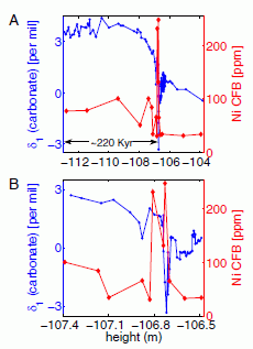
|
There are two frames; they are very similar, except for the x-axis scale.
The scientists measured two quantities in the sedimentary rock at a site in southern China, as a function of "height" (i.e., depth into the rock). The x-axis shows the rock depth, in meters; the depths are shown as negative numbers because they measure from 0 at the top. Depths in sedimentary rock correspond to time; an approximate time scale is also noted, where a region is marked as being about 220,000 years. The two measured quantities are plotted on two y-axis scales. The blue curve (and y-axis scale on the left) is for a characteristic of the carbonate in the rock; the red curve (and y-axis scale on the right) is for the amount of nickel. |
|
Look at frame A, at the top. Nickel. There is a burst of Ni in the sediments at about -107 meters. Carbonate. This is a more complex measurement. It is about the isotopes found in the carbonate. Without going into the details, you can see that there is a rather large and abrupt change in the carbonate value -- at very nearly the same time as the Ni increase. Something happened to the carbon cycle at this time. Now look at frame B. It's the same idea, but with an expanded scale on the x-axis. In fact, frame B is a close-up of a small depth (or time) interval -- right at the time of the changes in Ni and carbonate seen in frame A. You can see that frame B, too, shows a spike in Ni level, and a change in the carbonate measurement at about the same time. This is Figure 4 from the article. | |
In summary, the graphs above show some changes in the nature of the sediment at a particular depth -- or time. The amount of nickel changes; the nature of the carbonate changes, reflecting a change in the carbon cycle. Both changes seem large and abrupt. Importantly, the time of those changes is at the time of the Permian extinction.
That things happened at the same time does not mean there is any causal relationship between them. Indeed, nothing we have said so far offers any reason for a causal relationship. Three things (Ni, carbonate, extinction) happened at this time.
The scientists do propose a causal relationship. In doing so, they make use of the evidence presented above as well as more evidence in the new article, plus previous information and models about the Permian extinction. What do the scientists think happened? How do the measurements shown above relate to an extinction? There are several parts to the argument.
First, the burst of nickel might well have come from extreme volcanic activity known to occur at that time. In fact, people have long suggested a connection between the volcanoes and the extinction, but specific models were not convincing. Now we get to the methane... Nickel is what limits the production of methane by microbes. A burst of nickel could have allowed for a rapid burst of microbial methane production.
The carbonate? Of course, the carbonate in the rocks reflects the CO2 dissolved in the oceans. The measurements shown in the graph are the isotope composition, which varies with the history (or source) of the C. Skipping the details, the data show a rapid and major change in the carbon cycle at the time of the other events, as noted earlier. Not only would the volcanoes have contributed a lot of CO2, but microbial production of methane from organic matter in the oceans also would have added CO2.
Putting it all together... A volcanic eruption released a lot of nickel, which stimulated methane production by some microbes. That disrupted the carbon cycle -- and warmed the planet, causing a rapid mass extinction. A new model of the Permian extinction.
What do we make of all this? Take it in stride: science in progress. The scientists have made some difficult measurements, and uncovered some interesting results. Those are "facts". They have also put some ideas on the table suggesting how the results might connect. These ideas may guide further work, and stimulate discussion. They may be leading us toward a good explanation of the Permian mass extinction. However, for now, they are not much beyond speculation -- reasonable speculation. More evidence, anyone?
News stories:
* Ancient whodunit may be solved: Methane-producing microbes did it! (Science Daily, March 31, 2014.)
* MIT researchers propose massive bloom of methanogenic microbes may have triggered end-Permian extinction. (Green Car Congress, April 1, 2014. Now archived.)
The article, which is freely available: Methanogenic burst in the end-Permian carbon cycle. (D H Rothman et al, PNAS 111:5462, April 15, 2014.)
More about mass extinctions:
* Did selenium deficiency play a role in mass extinctions? (February 5, 2016).
* What caused the dinosaur extinction? Did volcanoes in India play a role? (April 13, 2015).
* How the birds survived the extinction of the dinosaurs (June 6, 2014).
* The 6th mass extinction? (April 4, 2011).More about methanogens...
* Life on 10 zeptowatts (September 13, 2020).
* Carl Woese and the archaea (January 12, 2013).More about methane in the context of climate change: Climate change: Should we focus on methane? (March 24, 2012).
October 10, 2014
About 4.5 billion years ago, a large body hit the Earth; ejecta from the collision included what we now call the Moon, as well as considerable debris. About two years ago, on October 17, 2012, a rock hit the roof of a garage in Novato, California (a few miles north of San Francisco); it bounced off, leaving a dent in the roof.

|
The dent in the garage roof.
This is trimmed from one of the figures in the io9 news story listed below. |
A new article makes a connection between those two events. Analysis of the rock that bounced off the roof in Novato suggests that the history of this rock -- a meteorite -- includes interaction with the debris from the formation of the Moon. The analysis includes the actual piece that hit the Novato roof, as well as other fragments recovered from the same meteor.
It's remarkable that we can relate a recent local event to the formation of the Moon. Further, the story of how the scientists make the connection is fascinating, though far too complex for anything more than some hints here.
There are two major parts to the story. The first is relatively simple: the scientists analyze the path of the meteor and suggest where it came from. They are able to analyze the path because there was an extensive photographic record of the incoming meteor. (Both news stories listed below include a spectacular set of photos of the last moments of the meteor.) Determining where the meteor came from, then, is simple: just run the incoming path backwards. The laws of physics that determine the path of moving bodies are well known. Of course, that gives us a path, but not a specific starting point. But when they saw the path of the incoming meteor, they realized that, working backwards, it came from a well known "nursery" of asteroids, out beyond Mars. From time to time out there bodies collide; one may get sent off -- sometimes on a path destined to hit Earth. This one seems to have left the asteroid belt about nine million years ago. It was possibly not yet destined to hit Earth, until another collision 100,000 years ago set it on course to Earth.
That's all nice -- and it is remarkable how much information they can tease out of the available evidence, which includes the rock and the photographs of its arrival trail, as well as our general understanding of the asteroid belt. However, none of that makes the connection to the Moon.
A feature of the Novato meteorite is that it is partially blackened. The scientists do further analysis, and suggest that the blackening came from the shock of a collision 4.472 billion years ago. Collision with what? With debris from the Moon-forming collision at the Earth. It's hard to follow all the argument, and it is not so clear what the alternatives are. But it is their preferred interpretation, based on what they know at this point: our local Novato meteorite, from 2012, was hit, over four billion years ago, by debris from the event that created the Moon.
News stories:
* Unraveling Billions of Years of History Hidden In A Rock. (io9, August 16, 2014.)
* NASA, Partners Reveal California Meteorite's Rough and Tumble Journey. (NASA, August 15, 2014. Now archived.)
The article: Records of the Moon-forming impact and the 470 Ma disruption of the L chondrite parent body in the asteroid belt from U-Pb apatite ages of Novato (L6). (Q-Z Yin et al, Meteoritics & Planetary Science 49:1426, August 2014.) There are actually two papers on the Novato meteorite there, published as consecutive papers. Check the Table of Contents if you would like to see the other one. (The io9 news story, above, links directly to both articles.)
This meteor strike was noted in the post Of disasters, asteroids and meteors (February 19, 2013). That post was primarily about the meteor strike in Russia, February 2013. I also noted there two recent meteor strikes in Northern California, including the one analyzed in this post.
For more about the formation of the Moon: The Moon: might it be a child with only one parent? (April 13, 2012). That post notes that our common story of how the Moon was formed is not well supported by evidence. That situation continues. The current post contains a lot of modeling, or even speculation. It should be taken as a proposal, not a well-documented fact.
and... Birth of the Moon: Is it possible that Theia was similar to Earth? (June 20, 2015).
More about meteorites: Discovery of a chemical of biological origin from Mars? (January 2, 2015).
Also see...
* Domestication of the almond (August 26, 2019).
* Treating senescent cells: an overview (November 29, 2017).
* Does the moon affect earthquakes? (October 21, 2016).
October 7, 2014
One goal of modern biomedical research is to correct conditions that are caused by mutations. One approach would be to actually correct the mutation within the patient, so that the person had a normal gene rather than the mutated gene. This approach is part of the broad area referred to as gene therapy.
A new article reports progress toward this goal. It's an incomplete story, and we just note it briefly.
Here is the general strategy...
1) isolate cells from the patient;
2) convert them to iPSC (induced pluripotent stem cells);
3) correct the mutation within those iPSC;
4) return the cells, properly differentiated as needed, to the patient.
In the new article, the scientists do the first three steps. Steps 1 and 2 are now more or less routine; the focus here is on step 3. They use the recently developed CRISPR system for correcting the mutation. Actually, two mutations. The patient they chose to study here has the blood disease β-thalassemia -- due to two mutations in the gene for the β chain of hemoglobin. The scientists show that they correctly fix the two mutations in one chromosome. Musings has discussed the CRISPR approach, which builds on the discovery of what seems to be something of an adaptive immune system in bacteria [link at the end].
Two features of the mutation correction are worth noting. First, the scientists take care to do the correction in a way that leaves no trace of the procedure in the genome. The mutation is corrected, but there is no other change. This is what they mean by referring to the correction as seamless. Second, they take care that no changes occur at other sites that the CRISPR system might have recognized. This is a risk with such a procedure, since the nucleic acid-based targeting sequence might recognize distinct but closely related sequences.
Overall, this is a significant step toward developing a gene therapy treatment. There is more to do -- learning how to do step 4 well.
News story: CRISPR Corrects Blood Disorder Gene. (Kerry Grens, The Scientist, August 5, 2014.) Now archived.
The article, which may be freely available: Seamless gene correction of β-thalassemia mutations in patient-specific iPSCs using CRISPR/Cas9 and piggyBac. (F Xie et al, Genome Research 24:1526, September 2014.)
Background post about CRISPR as a tool for gene editing: Exploiting the bacterial immune system as a tool for genetic engineering: The Caribou approach (May 4, 2013).
More CRISPR:
* CRISPR and editing of the human germline: the ethical line? (May 4, 2015).
* CRISPR: an overview (February 15, 2015). Includes a list of Musings post on CRISPR, which I will try to keep complete.More about gene therapy is on my Biotechnology in the News (BITN) page Agricultural biotechnology (GM foods) and Gene therapy.
Also see my Biotechnology in the News (BITN) page for Cloning and stem cells. It includes an extensive list of Musings posts in the field.
October 6, 2014
Perhaps if they had anxiety?
Here is a test...
In such tests, crayfish are allowed to explore a simple structure with light and dark regions. In general, the animals prefer the dark regions, but will explore everything. The following figure shows what the crayfish do if stressed -- and treated.
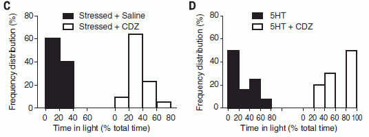
|
The histograms show what fraction of the time the crayfish spent in the "light" part of the apparatus. To take a specific example...The black bar at the very left (to be discussed below) shows that 60% (y-axis) of the animals spent 0-20% (x-axis) of their time in the light. Part C. In this part, the crayfish have been stressed by exposure to an electric field. At the left (set of dark bars), you see the response of these stressed animals. The first (left) bar shows that 60% of them spent 0-20% of their time in the light. All of them spent less than 40% of their time in the light. The right half of part C (light bars) shows the results for animals that had been stressed, but then given the drug CDZ. The results are now shifted to the right: stressed animals treated with the drug spend more time in the light than those without the drug. That is, the drug appears to relieve the stress. CDZ is chlordiazepoxide; it is marketed under various names, including Librium. It is an anti-anxiety drug. In the graph key, you will note "saline" for the black bars; this is the control: solvent without drug. (And for those not familiar with crayfish... They are not fish at all, but rather are crustaceans, related to lobsters.) Part D. This is similar to Part C. In this part, the black bars are for treatment with "5HT"; the light bars are for 5HT + CDZ. 5HT shows the stress response. Addition of the drug CDZ again shifts the results to the right: more time spent in the light. What is 5HT? That's 5-hydroxytryptamine -- the chemical name for the neurotransmitter serotonin, which leads to anxiety. The drug CDZ is known to act by interfering with the action of serotonin. Thus the result in part D directly implicates the serotonin pathway in the observed behavior. This is Figure 3 parts C & D from the article. |
The overall picture here is that a drug we know as an anti-anxiety drug alters the behavior of crayfish. It reduces the effect of a treatment we describe as stressful. Further, it acts through the biochemical pathway we recognize as the stress pathway.
What does this mean? Work such as this challenges us. We can describe what was done in terms of behavior, and we can describe some of the biochemistry. It turns out that the behavior and biochemistry are rather similar to phenomena in humans: stress mediated by serotonin, and relief of stress by a drug that interferes with serotonin.
Such findings inevitably raise the question: do the crayfish feel stress? Let's be cautious about that. What do we mean by "feel" stress? That seems to be an open question. Perhaps what is important here is that the work establishes the presence of certain biochemical pathways -- ones that are important parts of mental response for us. Let's not pretend we know what the crayfish "feel" -- one way or the other.
News stories:
* Crayfish may experience form of anxiety. (BBC, June 12, 2014.)
* Anxious crayfish, anxious people: Surprising similarities. (Why Files, June 12, 2014. Now archived.) Includes videos. This seems to have been written by a crayfish.
The article: Anxiety-like behavior in crayfish is controlled by serotonin. (P Fossat et al, Science 344:1293, June 13, 2014.)
Added January 28, 2026. More about anxiety: Anxiety. 1. A choline connection (January 28, 2026).
More about serotonin: A mouse carrying a serotonin-transport gene that contributes to human autism (May 18, 2012).
More about familiar neurotransmitters being involved in behavior in arthropods: Novelty-seeking behavior (May 26, 2012). Bees and crayfish are both arthropods.
My page for Biotechnology in the News (BITN) -- Other topics includes a section on Brain (autism, schizophrenia). It includes an extensive list of brain-related Musings posts.
More about crustaceans: The earliest known example of maternal care? (May 2, 2016).
October 4, 2014
Huntington's disease (HD) is a neurodegenerative disease, which is untreatable and fatal. It is caused by a mutation in the gene for a protein called huntingtin; how the mutated protein causes disease is unknown.
A new article provides evidence suggesting that HD might be treated by using the amino acid cysteine.
The following figure is an example of what the scientists found.
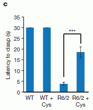
|
The y-axis shows a measure of disease progression. What is measured is the ability of the mouse to "hold on". The higher the value, the better. HD results in loss of muscle control.
The first two bars (to the left) are for "control" mice; they show what is expected for normal mice. ("WT" means wild type, or normal.) |
|
The third bar is for mutant mice, carrying a mutation in the gene for HD. These mice, called R6/2, serve as an animal model for HD. They show greatly reduced "latency"; they are unable to hold on. The fourth bar (right side) is for the HD mice treated with cysteine (Cys). The treatment leads to a major improvement. Now go back and look at the second bar: cysteine has no effect on the (wild type) control mice. (The mice were actually fed N-acetylcysteine, a more stable chemical that serves as a source of cysteine.) This is Figure 4c from the article. | |
Taken at face value, the results above show that the amino acid cysteine can be useful in treating an animal model of Huntington's disease.
What more do we know? In the article, the scientists show that the HD mutant mice show reduced levels of the enzyme needed to make cysteine (the enzyme named in the article title, below). That is, the benefit of the amino acid treatment correlates with a demonstrated deficiency in making it. Why the HD mutation leads to a loss of this particular enzyme is not clear. The scientists also show that in human HD patients the level of this enzyme is low, in a way that correlates with the disease.
Overall, then, this is a result worth following up. So far, there is no test of the amino acid in humans, and no clear understanding of the underlying basis. Further, there is no understanding of how complete the treatment may be, or how long its benefit may last. Nevertheless, it is a clue. Given the nature of neurodegenerative diseases such as HD, even treatments that simply ameliorate symptoms for a while could be good -- if they are safe.
This is an article that might turn out to be very important. But let's remember, for now, the evidence is limited.
News story: Brain degeneration in Huntington's disease caused by amino acid deficiency. (Science Daily, March 26, 2014.)
The article: Cystathionine γ-lyase deficiency mediates neurodegeneration in Huntington's disease. (B D Paul et al, Nature 509:96, May 1, 2014.)
Huntington's disease has been mentioned, without any specifics, in previous Musings posts, such as Is Alzheimer's disease transmissible? (February 4, 2011).
More HD... Huntington's disease: Mutant human protein disrupts singing in birds (April 18, 2016).
How the cysteine is acting is not resolved in this article. However, the authors note its role in dealing with oxidative stress, and the possible relevance of that to HD. One part of that story is that cysteine is used to make the anti-oxidant glutathione, which was noted in the post Are birds adapting to the radiation at Chernobyl? (August 3, 2014).
Another possibility is that cysteine acts via the production of hydrogen sulfide, H2S. The emerging biology of this compound was noted in the post Garlic or rotten eggs? (February 8, 2010).
My page for Biotechnology in the News (BITN) -- Other topics includes a section on Brain (autism, schizophrenia). It includes an extensive list of brain-related Musings posts.
October 3, 2014
The following figure shows that the American West is drying up. It also shows that if you look at the wrong data, you may not realize what is happening.
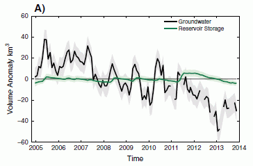
|
The two curves here show the amount of water in two major water sources in the American West; both are in the area of the Colorado River, and are collectively known as the Colorado River Basin.
The green curve shows the amount of water in the major reservoirs of the Basin (Lake Powell and Lake Mead). This amount, of course, is easily measured. Over the time period shown here (x-axis), that amount is fairly consistent, with little deviation from the expected value shown as zero on the y-axis. |
|
In contrast, the black curve shows a decline over this time period. This curve shows the amount of groundwater in the area. This is Figure 3A from the article. The shading on the curves is an estimate of uncertainty. Gaps in the black curve are due to gaps in the availability of the measuring equipment. | |
The point, then, is that most of the water loss in the Colorado River Basin is due to loss of groundwater -- even while reservoir levels remain little changed. That is, the reservoirs are being maintained, but at the expense of the groundwater reserve. The former is easily visible, the latter is not. We are maintaining the visible supply at the expense of the less visible underground supply. In the long run, that's not good.
How does one measure the groundwater? By measuring gravity. From space. Changes in the gravity in an area over time must be due to some change in the mass in that area. In work such as this, the mass change is interpreted as a change in the amount of water. The measurements here were taken with the GRACE instrument, which we have noted before.
Context... How important is the water loss shown above? In the article, the scientists quantify the black curve from the above graph: groundwater is being lost at an average rate of about 5.6 km3 per year over the period shown. This is about 30% of the annual water allocation from the Basin system.
News stories:
* Aquifers Depleted in Colorado River Basin. (Civil Engineering, August 5, 2014. Now archived.) This story shows a map of the current drought in the western and southwestern US.
* Satellite study reveals parched U.S. West using up underground water. (American Geophysical Union, July 24, 2014.) From the journal publisher. Includes a map of the Colorado River Basin.
The article, which is freely available: Groundwater depletion during drought threatens future water security of the Colorado River Basin. (S L Castle et al, Geophysical Research Letters 41:5904, August 28, 2014.)
More about using GRACE to measure the water supply:
* Evaluating the world's water resources (August 11, 2015).
* NASA weighs India, finds it deficient (October 2, 2009).A post about one of the places that depends on the Colorado River water: Water loss from irrigated lawns (June 21, 2017).
More about groundwater: Groundwater depletion in the nearby valley may be why California's mountains are rising (June 20, 2014).
A recent post about gravity: Does anyone know how strong gravity is? (September 16, 2014).
More about rivers: When rivers (or streams) join, what is the preferred angle between them? (April 18, 2017).
A recent book on the California water supply is listed on my page Books: Suggestions for general science reading: Ingram & Malamud-Roam, The West without Water -- What past floods, droughts, and other climatic clues tell us about tomorrow (2013). The Colorado River Basin, discussed in the current post, is part of the California water supply for parts of Southern California. In any case, this book is of general interest about water paleoclimatology.
Another book, this one about the Colorado River system... Books: Suggestions for general science reading: Owen, Where the Water Goes -- Life and death along the Colorado River (2017).
September 30, 2014
Watching movies at home contributes to global warming. After all, it takes energy to transmit the movie file and to operate your viewing device. If you use old-fashioned DVDs, it takes energy to make them. All that energy is associated with CO2 emission, and therefore with global warming.
How much energy? A recent article offers an analysis. The following figure shows the amount of energy, expressed here as CO2 emissions per hour, resulting from watching movies at home.
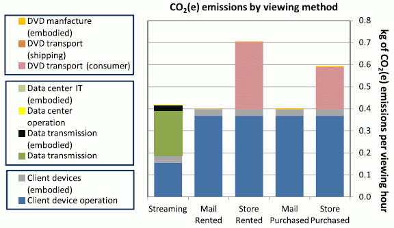
|
Five "viewing methods" are considered. At the left is "streaming", where the movie is obtained online. The other four bars are for use of DVDs, depending on whether they are rented or purchased, and obtained by mail or by your pickup at the video store. The total height of each bar shows the total amount of CO2 emitted (per hour) as a result of your movie. The parts of each bar show the amount attributed to particular steps along the way; the key for these steps is shown at the left. Let's look at some of the results... Three of the bars are about the same, and two are significantly higher. The two higher bars are due to a reddish segment labeled "DVD transport (consumer)". That's you driving to the store to pick up (and return) the DVD. That's a big issue; you shouldn't do that. The other three bars are about the same, but for different reasons. The blue part of each bar is energy usage of your device for watching the movie. Devices used for watching streamed movies (the bar at left) use about half as much energy as DVD devices. On the other hand, "data transmission" (green segment) of the movie over the Internet is quite an energy consumer. The pro and con of watching streaming video and DVD about balance out -- so long as you don't drive to the store. This is part of Figure 4 from the article. |
That's the idea. There is much more in the article, which is freely available, and is quite readable.
You may well object to some of the assumptions in their model. That's fine. The authors examined five scenarios here. There is no claim that these are the only five. What is most important is that they have done the analysis, and laid it out. Others can build on it and modify it as they wish. The big story is that we now have a better understanding of energy usage for these activities.
Should you do something as a result of this? Well, if you are doing that reddish activity at the top of the taller bars, then yes. However, the main target for this analysis may well be the engineers and manufacturers. Analyses such as this help guide people to make improvements in the process. What are the main energy consuming steps? What steps can we improve?
News stories:
* Berkeley Lab Study Highlights Growing Energy Impact of Internet Video Streaming -- New research finds data transmission is the most energy-intensive part of streaming movies. (Lawrence Berkeley National Laboratory (the lead institution), June 2, 2014.) This includes a diagram of their model for the steps in streaming. There are a lot of steps, but only a few end up being the major energy-consuming steps.
* Caught on video: is internet streaming greener than a DVD? (Environmental Research Web (from the journal publisher), May 29, 2014. Now archived.)
The article, which is freely available: The energy and greenhouse-gas implications of internet video streaming in the United States. (A Shehabi et al, Environmental Research Letters 9:054007, May 28, 2014.)
More about energy usage by your home electronics: Energy wastage: The set-top box (August 1, 2011).
How about shopping... Impact of shopping online on greenhouse gas emissions (March 28, 2020).
Another example of "life cycle analysis", in a different context... How to dispose of unused medicines (September 10, 2012).
A recent post about CO2 emissions: Might it be good if airplanes emitted more CO2? (September 5, 2014).
More about how we might affect climate change... Climate engineering: How should we proceed? (March 4, 2015).
More about data transmission: There is Mozart in the air -- encoded in orbital angular momentum (April 25, 2015).
There is more about energy issues on my page Internet Resources for Organic and Biochemistry under Energy resources. It includes a list of some related Musings posts.
September 29, 2014
Briefly noted...
The first news story listed here popped up last week. It is about programs of the type known as web-based password managers. A recent university report critically examined five of these programs, identifying security concerns. Program developers have already responded to some of the criticisms. So it goes with computer security.
The news story is a good overview. If you want more, try the report itself, which is freely available. Certainly, if you use one of these services (or have been thinking of doing so), you should be aware of the issues.
News stories:
* The real risk of using password managers -- After a UC Berkeley report found that five popular password managers all had critical vulnerabilities, are these services still worth it? (Tech Page One (Dell), September 22, 2014.) [Update... This page is no longer available. The original URL was: http://www.techpageone.co.uk/en/technology/real-risk-using-password-managers/. The following item is fine.]
* "Severe" password manager attacks steal digital keys and data en masse. (Ars Technica, July 14 2014.)
The report, which is freely available: The Emperor's New Password Manager: Security Analysis of Web-based Password Managers. (Z Li et al, Technical Report No. UCB/EECS-2014-138, Electrical Engineering and Computer Sciences, University of California at Berkeley, July 7, 2014.) Reading the Introduction (pages 1-2) will give you the idea. The content gets more technical as it goes on.
The report was presented at a meeting last month, the 23rd USENIX Security Symposium. The meeting page includes not only the article but also audio and video of the presentation. Meeting page for this article.
* * * * *
Musings posts about computer security include...
* Can computers talk to each other? Could it be a new type of security threat? (June 18, 2014).
* Using your brain waves to log on to the computer (April 29, 2013).
September 27, 2014

|
A concrete sewer pipe. Corroded.
This is reduced from the main figure in the Conversation news story listed below. |
How do sewer pipes get corroded? A simple part of the story is that sulfide ions (S2-) in the sewer water get oxidized by bacteria to sulfuric acid (H2SO4). The sulfide ions themselves come from the reduction of sulfate ions (SO42-) in the water. And where do those sulfate ions come from? In large part, they come from the water purification process for the water supply. A common step in water purification is to add aluminum sulfate to the water. The aluminum ions help to remove various things from the water; the sulfate ions are left in the water -- and they end up being a major contributor to corrosion of the sewage systems.
Did you get the impression that how we purify our water supply is contributing to corrosion of our sewer systems? That is exactly the point made by a new article.
Here are some data for one part of the story. The following graph summarizes the findings of how much sulfate is in the water supply. It shows the level of sulfate found in various water systems throughout Australia -- both before and after treatment.
|
The key comparison here is for the two blue bars. These show the amount of sulfate in the drinking water supply. (It is reported as milligrams of S per liter.)
One blue bar is for water systems where aluminum sulfate is not used, one is for water systems where it is used. You can see that use of aluminum sulfate increases the amount of sulfate in the water about three-fold. |
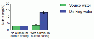
|
|
The two green bars are controls -- the source waters, before treatment; they are about the same. This is the inset from Figure 2 in the article. The full figure there shows the data for individual water systems; the little inset, shown here, is the average of all that data. | |
The conclusion... One of the common procedures used to treat our water supply is causing sewers to corrode. Alternatives are available, but are more expensive. The article argues that the use of such alternatives would be cost effective -- if one considers the cost of sewer system maintenance. In other words, the authors suggest that it would be good to have an integrated view of our water system, considering both how we prepare the water and how we dispose of it. Sounds like a good idea.
News stories:
* Reducing sewer corrosion: Water additive on the nose with concrete sewers. (Phys.org, August 15, 2014.) (This is a replacement story; the one posted originally is no longer available.)
* Crumbling sewers are linked to drinking water treatment. (The Conversation, August 14, 2014.) This news story is by two of the authors of the article.
* News story accompanying the article: Water treatment: Replace contamination, not the pipes. (W Rauch & M Kleidorfer, Science 345:734, August 15, 2014.)
* The article: Reducing sewer corrosion through integrated urban water management. (I Pikaar et al, Science 345:812, August 15, 2014.)
More about sewage:
* Turning sewage into profit -- via rocket fuel (September 15, 2010).
* Dr. Smith? (September 5, 2009).More about water treatment...
* Water desalination using graphene oxide membranes? (April 29, 2017).
* How to dispose of unused medicines (September 10, 2012).
September 26, 2014
The primary food of hummingbirds is nectar, which is largely a sugar solution. However, birds, as a group, do not have taste receptors for sweetness. A paradox. How is it that hummingbirds prefer a food that their kind typically cannot taste?
A new article resolves the paradox. Of course, hummingbirds do taste sweetness; the question is how. Using modern genomic analysis and our understanding of taste receptors, the scientists show that another taste receptor has been modified to become a receptor for sweetness.
Here is an example of the findings...
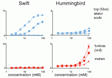
|
The graph shows the response of a particular taste receptor from two (closely related) birds to various stimuli.
The receptor tested here is one that usually serves as the umami receptor. It responds to amino acids (from proteins), with a taste response we sometimes call savory (or "meaty"). The y-axis shows the response. The upper curves (blue) are for three amino acids, over a range of concentration. The lower curves (red) are for three sugars. This is part of Figure 2C from the article. (Other parts of the figure show the same tests for mouse and chicken.) |
A simple observation is that the results are quite different for the two birds. Going beyond that... For the swift, the receptor responds to (some) amino acids but not to sugars. That is what is expected (and is also seen for the other animals tested). However, for the hummingbird, the results are the opposite. There is only slight response of the receptor to amino acids, but a good response to sugars.
The tests shown above are with isolated receptor proteins in lab culture. Tests of the taste response of birds confirm the findings. (One exception... The artificial sweetener sucralose tests as sweet in the lab culture assay with hummingbird receptors, but the birds do not respond to it as sweet. This discrepancy is not yet understood, but it is a reminder than animals are more complex than a single sub-system.) The lab culture system is much easier to study, and allows the scientists to study novel protein complexes that they make.
The conclusion: the common umami (amino acid) receptor has mutated in the hummingbird to become a sugar receptor. It is apparently the first known case of a novel sweet receptor in vertebrates.
News stories:
* How hummingbirds evolved to detect sweetness. (Science Daily, August 21, 2014.)
* How Hummingbirds Taste Nectar. (Ruth Williams, The Scientist, August 21, 2014.) Now archived.
Videos. There are two short videos posted with the article, as Supplementary Materials, at the article web site. (The movies are about two minutes and one minute, respectively. There is almost no sound, except for an occasional chirp in #2.) They show the birds responding to one or another test situation, as detailed in the listings.
* News story accompanying the article: Evolution: Sensing nectar's sweetness. (P Jiang & G K Beauchamp, Science 345:878, August 22, 2014.)
* The article: Evolution of sweet taste perception in hummingbirds by transformation of the ancestral umami receptor. (M W Baldwin et al, Science 345:929, August 22, 2014.)
More about sweetness and sweeteners...
* Artificial sweeteners: Saccharin and high blood sugar levels (December 7, 2014).
* The chemistry of a tasty tomato (June 18, 2012).
* Loss of ability to taste "sweet" in carnivores (April 6, 2012).More about taste receptors: Mice that try to drink the laser light -- a study of the taste of water (July 9, 2017).
More hummingbirds: What if a hummingbird's body temperature dropped to below 10 °C on a cold night? (September 29, 2020).
Previous post about birds... A bird nest (September 9, 2014).
September 23, 2014
|
That's "it". The question is: What is it?
Size? A few millimeters across. The only other information we will give at this point... At the bottom is an opening (barely visible in this view); it probably serves as a mouth and anus. More, including source, is below. But first, what do you think is it? |
Answer and discussion...
After posing a "quiz" question, I am supposed to provide an answer. However, I don't know what it is. In fact, the authors of a new article reporting this animal do not know what it is.
It does have a name. The authors assign the name Dendrogramma enigmata to the animal. Dendrogramma is new genus, which they created for this animal. (There is a second species, also reported in the same article.) But where does this animal fit in, in the big picture? They don't know. They even considered creating a new phylum -- the highest level of grouping within a kingdom. With some caution, they decided that is premature; they simply note it is incertae sedis -- of uncertain placement.
We can do a little better than that. The comment with the figure above gave one clue. The single opening to the body cavity serves as both mouth and anus. That's a feature of only a very few animal groups, the simplest animals. Further, the general nature of Dendrogramma shows similarities to "jellies" -- both the jellyfish (cnidarians) and comb jellies (ctenophores). Yet it lacks key features of both, so may well be a new group of organisms, deserving of its own phylum. Whatever the detail there, this newly discovered animal would appear to be one of the most primitive we know -- and perhaps a distinct type of primitive animal. In fact, the closest thing to it that the scientists have found are some 600 million year old fossils. Further study of this animal might well be useful in understanding the relationships between the most primitive animals.
There is a story about how these animals were found. Briefly, the animals were discovered while going through samples from a 1986 expedition combing the seafloor off the Australian coast. When the scientists realized they had something new, they went back to look for more -- and were unable to find more. The significance of this point is unclear -- as is most everything else about Dendrogramma enigmata. The story is now published; it will be interesting to see what follows for these unusual animals.
News story: New Deep-Sea Animal Species Look Like Mushrooms but Defy Classification. (Jennifer Frazer, National Geographic, September 3, 2014.) Now archived.
The article, which is freely available: Dendrogramma, New Genus, with Two New Non-Bilaterian Species from the Marine Bathyal of Southeastern Australia (Animalia, Metazoa incertae sedis) -- with Similarities to Some Medusoids from the Precambrian Ediacara. (J Just et al, PLoS ONE 9(9):e102976, September 3, 2014.)
* Previous quiz... Quiz: What are they? (September 27, 2013).
* Next: Quiz: What are they? And are they a threat to you? (October 20, 2014).More about this animal: Top 10 new species for 2015 (June 3, 2015).
More about the simplest animals: A novel nervous system? (July 20, 2014). This post is about comb jellies; it links to other posts about the simplest animals.
More old things... Claim of oldest fossilized cells refuted (May 3, 2015).
Also see... An antidote to the mushroom toxin α-amanitin (June 12, 2023).
September 22, 2014
Cachexia? Wasting disease. The person suffers extreme and continuing weight loss; food does not help. It's associated with many cases of cancer (and with some other diseases). The person just wastes away. It's not obviously directly connected to the cancer, but may well be the immediate cause of death.
BAT? Brown adipose tissue -- or brown fat. Musings has discussed fat colors before [link at the end]. White fat (white adipose tissue, or WAT) is storage fat; it fits with our traditional view of fat. In contrast, brown fat is fat to burn -- and make heat; the burning of brown fat is not coupled to the production of metabolic energy (e.g., ATP). It's useful if you are cold. It may also be useful if you want to lose weight: make more brown fat and burn it.
A new article connects cachexia to excessive burning of brown fat. What happens, it seems, is that the system for making and using brown fat gets out of control. The result is that the body burns away -- wastes away. Cancer may trigger cachexia via the immune system; the scientists provide some evidence that inhibiting the immune signal that turns on BAT may be useful in controlling cachexia.
It's a long complex article, with numerous experiments supporting various parts of that story. Let's look at one experiment.
|
In this experiment, two kinds of mouse tissue were tested. K5-SOS (right) is a cancer tissue. There is also a control tissue (left). What is measured is the amount of Ucp1 messenger RNA. Ucp1? That's the uncoupling protein -- the protein that is at the heart of how brown fat works.
For each tissue type, there are two bars. The white bar, labeled vehicle, is the control. The left bar, labeled Sulindac, is for an anti-inflammatory drug. (The "vehicle" is basically the solvent used for the drug.) |
|
The control bar for the control tissue is 1; that is by definition. The other bars are relative to this bar. For the control tissue, adding the drug made no difference in the amount of Ucp1. For the cancer tissue, the control bar (no drug) is much higher; this fits with the observation that cancer tissue has a high level of brown fat function, hence of Ucp1. The drug reduces that level of Ucp1 in the cancer tissue. This is Figure 6G from the article. | |
The key points from this experiment are:
* High level of brown fat, as measured by Ucp1, in the cancer tissue.
* Drug inhibits that. This result serves to suggest both how the brown fat is turned on and a treatment that might stop it. Remember that Sulindac is an anti-inflammatory drug. The Sulindac result, along with other evidence, suggests that the cancer induces an inflammatory response by the immune system; that is what stimulates the cachexia.
That's it. Cachexia involves excessive and uncontrolled function of brown fat. It may be triggered by an immune system (inflammatory) response. It's possible it could be treated -- by interfering with that triggering. It's all very preliminary, but it's a new lead.
Most of the work in this article, including the experiment discussed above, is with mice. Humans? The scientists looked at the adipose (fat) tissue from a small number of cachectic cancer patients. Most of those samples showed evidence of browning. That's a small step, but is a start toward showing the relevance of the finding in humans.
The work is also a reminder that we need to be careful about classifying things as good or bad. Brown fat may help keep you warm and may help you lose weight; it may also cause you to waste away when uncontrolled.
News story: Brown fat found to be at the root of cancer-related wasting syndrome. (Science Daily, July 17, 2014.)
The article: A Switch from White to Brown Fat Increases Energy Expenditure in Cancer-Associated Cachexia. (M Petruzzelli et al, Cell Metabolism 20:433, September 2, 2014.)
A background post on brown fat: Why exercise is good for you, BAIBA (March 10, 2014). Links to more.
A recent post about cancer: A clue about cancer from the naked mole rat? (January 18, 2014).
My page for Biotechnology in the News (BITN) -- Other topics includes a section on Cancer. It includes a list of some other Musings posts on cancer.
More about fats is in the section of my page Organic/Biochemistry Internet resources on Lipids. That section contains a list of related Musings posts.
September 21, 2014
The following figure shows a piece of tantalum metal undergoing conversion between metallic and glassy phases.
|
The part towards the upper left is highly ordered. This crystalline phase is the common state of the metal. The part towards the lower right is quite disordered. This amorphous phase is typical of a glass.
The scale bar is 2 nanometers (nm). A tantalum atom has a diameter of about 0.3 nm. That is, about seven Ta atoms would fit along the scale bar. Those dots you see in the image are individual atoms of tantalum. This is Figure 4e from a new article. The image was taken by electron microscopy. |
What is a glass? We commonly associate the term glass with the stuff windows are made of. That glass is made from silica (silicon dioxide). However, there is a more general meaning of the term glass. It is used to refer to solids with a highly disordered -- or amorphous -- structure, such as that shown above. In principle, one might make a glass out of anything.
How do you make a glass? The general idea is that if you cool a liquid slowly, its particles (molecules) will find an orderly arrangement; you'll get crystals. If you cool the same liquid rapidly, the sample may solidify before the particles get ordered; that's how a glass is made.
It almost follows from the above that it is easier to make a glass from something complex than from something simple. The simpler the substance, the easier it is for the particles to find the orderly arrangement. And single metal atoms are about as simple as you can get. Making glasses from simple metals has been a challenge. Now, some success. The secret? Cool it fast. There is no surprise to that idea; it's just a matter of doing it. 1014 Kelvins per second (K/s). That is an unprecedented cooling rate.
The cooling rate of 1014 K/s may suggest that they started with some spectacularly high T. Not so. All we really need to deal with is a "few" degrees above and below the melting point. In fact, the scientists cooled the tantalum melt about a thousand degrees -- in a few picoseconds (ps; 1 ps = 10-12 s). For example, one computer simulation in the article (Figure 3) shows T decreasing from about 3000 K to 300 K in 100 ps (10-10 s). That calculates to an average cooling rate of 3x10¹³ K/s.
How did the authors of this new article achieve this spectacular cooling rate? It's a surprisingly simple apparatus -- at the nano scale. The heat is simply dissipated by conduction through the apparatus.
The following figure diagrams the experimental apparatus.
|
The conical pieces labeled as "nano-tips" are about 100 nm wide. Only a small part in the middle actually melts and solidifies in the experiment.
The pulse generator heats the material. Cooling is spontaneous -- and fast. This is Figure 1a from the article. Further parts of the full figure show diagrams of stages of the heating and cooling cycle, with corresponding photos of the sample. |
Making a glass from a pure mono-atomic metal is new, as is the high cooling rate. The scientists achieve these results with an approach that is, in some ways, quite simple. It's an intriguing article.
News story: Scientists Turn Pure Metal into Glass. (Sci-News.com, August 14, 2014.) Includes a picture of a piece of glass made from vanadium metal.
* News story accompanying the article: Condensed-matter physics: Glasses made from pure metals. (J Schroers, Nature 512:142, August 14, 2014.)
* The article: Formation of monatomic metallic glasses through ultrafast liquid quenching. (L Zhong et al, Nature 512:177, August 14, 2014.)
More about glass and things glassy:
* A new ice, with the density of liquid water (May 23, 2023).
* How to mold glass (June 19, 2021).
* A new way to make impact-resistant glass (August 9, 2019).
* How the tardigrades resist desiccation (April 10, 2017).
* Windows: independent control of light and heat transmission (February 3, 2014).
* Long-term data storage in glass (August 14, 2013).More about cooling: Plants may be bad for Earth climate (April 17, 2012).
September 19, 2014
Cystic fibrosis (CF) is a genetic disease that results in various physiological problems. In particular, there are respiratory problems, which are enhanced by a bacterial infection. Somehow, the disease state enhances the bacterial infection. The bacteria make additional mucus-type material in the airways; this aggravates the respiratory problems. The primary genetic defect in CF is known: it involves a protein that transports chloride ions across membranes; the connection between that primary defect and the observed problems is not clear.
A new article suggests that one of the body's defense mechanisms may actually enhance the bacterial infection in CF.
The new work was stimulated by trying to understand the role of bacteria in CF, but much of the work is lab work that is quite independent of the disease. As a result, the scientists end up with some novel and interesting results, the significance of which is not entirely clear.
Let's jump in and look at one of the key experiments.
|
The figure shows the results of testing for mutagens.
The various bars are for different test bacteria and test conditions. The y-axis shows the frequency of mutations found. RifR stands for rifampicin resistance; it is a particular type of mutation that is easy to measure. |
|
Start with the first three bars (to the left). This group of bars is for bacteria strain PAO1, a strain of Pseudomonas aeruginosa -- a bacterium commonly associated with CF. The left (white) bar is for SPB. SPB = saline phosphate buffer; see the key for the bar markings at the bottom. This is a negative control, without any mutagen. The mutation frequency seen here is the background of spontaneous mutations. The third (gray) bar is for hydrogen peroxide, H2O2. This is a positive control, a known mutagen under these conditions. You can see that the H2O2 leads to a significant increase in the mutation frequency. The middle (dark) bar, labeled LL-37, leads to a result similar to that for H2O2. (The H2O2 bar looks bigger, but their marking shows that the difference is not statistically significant. That is not important here, one way or the other.) We'll come back to LL-37 in a moment. The next three bars, labeled UTI89, are for a strain of Escherichia coli bacteria. Same experimental design -- and the same basic result. This is Figure 3B from the article. | |
The important observation here is that LL-37 is a mutagen -- as tested in two kinds of bacteria. What is LL-37? It's part of your immune system. It is an antimicrobial peptide (AMP) -- a small protein we make to kill bacteria. AMPs are common in animals; there has even been interest in possibly developing them as antibiotics. The current work shows that LL-37, one of our natural antibiotics, is a mutagen. The scientists go on to investigate how it promotes mutations, by directly interacting with DNA.
What is the relevance of this finding? When Pseudomonas bacteria infect a CF patient, the bacteria must mutate to fully adapt. The authors show that LL-37 can promote the Pseudomonas mutations that lead to that adaptation. They take one step toward showing that this might be relevant: They show that sputum can promote the mutagenesis, and that this process is reduced if LL-37 is inactivated. All this is under lab conditions.
How or why does LL-37 promote mutations if it kills the bacteria? The authors show that its effect on mutagenesis occurs when it is present at low levels, too low to kill. Further, when the bacteria mutate to produce the mucus, they become resistant to the killing effect of LL-37. Thus the authors suggest that an initial exposure to low level of LL-37 enhances the bacterial infection -- by promoting both mucus and resistance. That is an interesting model. For now, the evidence is limited: what the new article really shows is that our defense peptide LL-37 can promote mutations. This is a story that needs to be continued.
News story: Low-dose natural antimicrobial exacerbates chronic lung infection in cystic fibrosis. (Science Daily, April 24, 2014.)
The article, which is freely available: Cationic Antimicrobial Peptides Promote Microbial Mutagenesis and Pathoadaptation in Chronic Infections. (D H Limoli et al, PLoS Pathogens 10(4):e1004083, April 24, 2014.)
More about cystic fibrosis:
* Restoring ion transport in cystic fibrosis patients -- using a pore-forming drug? (April 12, 2019).
* Cystic fibrosis: treating the underlying cause -- for some people (November 13, 2011).The current post might be an example of our body's defenses, including the immune system, acting against us. There are many such cases. The one discussed in Musings most recently: Dengue vaccine follow-up: Phase 3 trial (September 15, 2014).
More mucus: Effectiveness of alcohol-based hand sanitizers? (September 28, 2019).
Also see: Antibiotics and viruses: An example of effectiveness (May 5, 2018).
More on antibiotics is on my page Biotechnology in the News (BITN) -- Other topics under Antibiotics. It includes a list of related Musings posts.
September 16, 2014
Three centuries ago, Isaac Newton developed the idea of gravity. Any two masses attract each other; the magnitude of the attraction depends on the masses and on the square of the distance between them.
We commonly express the relationship as F = GM1M2/r2, where M1 and M2 are the two masses, and r is the distance between them. F is the gravitational force between the two objects at that distance. G? It's the gravitational constant -- the constant of proportionality between the measurements of the objects and the force. G is the measure of how strong gravity is.
So how strong is gravity? G has been measured. It's about 6.674 x 10⁻¹¹ cubic meters per kilogram per square second. (Don't worry about those odd units; that happens with constants sometimes.)
However, there is something odd about our knowledge of G. We have noted measurements of various physical constants [link at the end]. The general story is that our measurements are getting better and better. Some are known to an amazing precision. Not so for G. It's known only to four digits -- and that's not getting any better. Let's look...
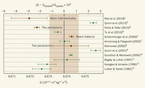
|
The graph summarizes various measurements of G over recent years. Start with the shaded area and the vertical line in the middle of it. That line is the officially accepted value of G, as maintained by an organization called CODATA; the shaded area represents one standard deviation around that value. What's striking is that the most recent three measurements -- the three at the top -- are all outside that shaded area. This is from the Phys.org news story. It is probably the same as Figure 1 in the news story in Nature. Figure 3 in the article is similar. |
What prompted this was a new measurement of G -- the top one in the figure above. It uses a new method, and it gives a result different from the accepted value as well as from other recent measurements. The story here has become not just the new measurement but these discrepancies.
When physicists try to measure something with the utmost accuracy, error analysis becomes a key part of the story. Each team analyzes the errors as best they can; that includes the systematic errors they think might be relevant. The disagreements between the measurements of G suggest there are some issues with these estimates of systematic errors. The authors of the new article note this, and the theme is continued by commentators. Perhaps it is time for all these groups, using various approaches to measure G, to sit down together and see if they can work out a way to determine where the errors are. That may be the key to getting a better handle on how strong gravity really is.
News story: Researchers use new method to calculate gravitational constant. (Phys.org, June 19, 2014.)
* News story accompanying the article: Fundamental constants: A cool way to measure big G. (S Schlamminger, Nature 510:478, June 26, 2014.)
* The article: Precision measurement of the Newtonian gravitational constant using cold atoms. (G Rosi et al, Nature 510:518, June 26, 2014.) Check Google Scholar for a copy of the article.
* * * * *
Greg read a draft of this post, and offered some comment on the early history of measuring G...
The first accurate quantitative measurement of G was done by the physicist Henry Cavendish in 1798. His goal was actually not G, but the mass -- and hence density -- of the Earth. The nice thing about the Cavendish experiment is that it is relatively simple: effectively, measure the force between some masses -- very, very carefully.
Cavendish measured the force between a large lead sphere and a small lead sphere by arranging the large spheres at each end of a rigid rod suspended by a thin metal wire, and measuring the torsion (twisting) of the rod as the large spheres were attracted towards the smaller spheres. He knew how much force was required for each degree of torsion, and so by measuring the angle through which the wire twisted he could determine the force. It is a tiny force (millions of times less than the weight of the small spheres) so he had to be careful to avoid any disturbance. The apparatus was placed in a wooden box inside a shed, and he observed it with a telescope poking through holes in the wall of the shed.
Calculated in terms of G, the result of Cavendish's experiment is G = 6.74x10⁻¹¹, which would be about 100 on the top scale of the figure above. That is, it was about 1% higher than the current accepted value.
A more accurate experiment to measure G wasn't carried out until 1895 (just under 100 years later) by Boys, who measured 6.658x10⁻¹¹; that would be around -25 on the top scale.
The following page provides some information about some of these early experiments on G: Background to Boys' experiment to determine G. (History Archive, University of Oxford Department of Physics.)
* * * * *
Background post... An example of measuring a physical constant of nature: The mass of an electron (March 23, 2014). Note that the value is reported to 12 digits (ignoring leading zeroes), with the last two uncertain. In contrast, in the current post we see that physicists do not know the fourth digit for G.
Posts about gravity include...
* Measuring a weak gravitational interaction (June 7, 2021).
* Which is older, the center of the Earth or the surface? (September 7, 2016).
* Gravitational waves (February 16, 2016).
* Groundwater depletion in the Colorado River Basin (October 3, 2014).
* Where is the dark matter? (May 11, 2012).
* The potato we call home: a study of the earth's gravity (May 3, 2011).
* Gravity tractor: protection from asteroid collisions (October 26, 2009).Also see... A new record: spinning speed (October 12, 2018).
Another post about G -- a different G: G (July 8, 2008).
* Previous history post... A device for controlling the cursor on the computer screen (July 10, 2013).
* Next: Pi (November 10, 2014).My page Internet resources: Miscellaneous contains a section on Science: history. It includes a list of related Musings posts.
* * * * *
An update... A 2018 article reports two new measurements of G. Both are high precision measurements, with extremely low uncertainties. What's interesting is that the two measurements do not agree with each other. There has long been suspicion that there are hidden systematic errors in measuring G. The work here may be a good place to study them, since we have the same group of scientists reporting two distinct results.
News stories:
* Two new ways to measure the gravitational constant. (B Yirka, Phys.org, August 30, 2018.) This story emphasizes the advances, not the disagreement.
* Gravitational-constant mystery deepens with new precision measurements. (H Johnston, Physics World, August 30, 2018.) Includes the disagreement.* News story accompanying the article: Fundamental constants: Gravity measured with record precision. (S Schlamminger, Nature 560:562, August 30, 2018.)
* The article: Measurements of the gravitational constant using two independent methods. (Q Li et al, Nature 560:582, August 30, 2018.)
September 15, 2014
Original post: A dengue vaccine trial (December 1, 2012). That post presents the findings from a phase 2 trial of a vaccine against dengue fever. We now have a phase 3 trial for the same vaccine.
Why so much interest in dengue? First, despite common ignorance of the disease in the US, it really is a major disease. Half of the world's population is probably at risk for dengue -- and it is spreading. About 100 million people suffer from dengue each year. Many recover just fine, but about 25,000 die from dengue each year.
In addition to its numerical importance, dengue is quite fascinating biologically. The features that make dengue fascinating have implications for vaccine development. There are four types of dengue virus; each requires its own vaccine. That is manageable. What makes dengue a challenge is that there is an unusual interaction between the four dengue types. It's not well understood, but a simple description is that if you get a second dengue infection with a different virus type than your first infection, you are more likely to suffer the severe form of dengue disease. (That severe form is also known as dengue hemorrhagic fever.) It is thought that this unusual interaction is somehow caused by the immune system. For example, it may be that an antibody to one type of dengue can somehow enhance infection by another type. This interaction poses a special concern about the vaccine: it is conceivable that a dengue vaccine could actually promote the severe form of dengue disease.
The phase 2 trial, discussed in an earlier post, showed that the vaccine had relatively poor activity against one of the dengue types. That is the kind of result that concerns the vaccine developers. The phase 2 trial did not show any increase in severe dengue, but the trial was too small for that to be significant.
Here are the basic overall results for the new trial:
| Person-years
at risk | Cases | Incidence | |
|---|---|---|---|
| Control group | 3227 | 133 | 4.1% |
| Vaccine group | 6526 | 117 | 1.8% |
In the table, "Person-years at risk" represents the size of the group. It is something like the number of people in the group, but also taking into account how long they were in. "Incidence" is cases per person-years at risk, expressed as a percentage.
The table above is condensed from Table 2 of the article.
Comparing the incidence in the vaccine group to that in the controls... the vaccine leads to a 56% reduction in disease. That is called the efficacy of the vaccine. Considering the statistics, the 95% confidence interval for that vaccine efficacy is 44-66%. In round numbers, the vaccine reduced disease incidence by half.
A vaccine with an efficacy of about 50% is not very good, but perhaps is a useful step.
Beyond that simple result of overall efficacy are some more specific questions. How did the vaccine do against the individual dengue types? And how did it do against the severe form of the disease?
For the individual dengue types, the vaccine showed efficacy of 35 to 78%. The higher numbers are getting to be rather good. The lowest number, for type 2, is not significantly different from zero, according to the statistical analysis; that's worrisome. (These results are from Table 3 of the article.)
As to the severe form of dengue, the results showed that the vaccine reduced incidence by 88% (95% confidence limits: 58-98%). That is certainly encouraging, but it is based on quite small numbers.
Overall, where are we? The vaccine has a significant effect on reducing disease, even though it is less effective than we might like. It is relatively ineffective against one virus type; we don't understand that. And we are still unsure of all the implications of the interactions between the virus types. Regulatory authorities will be faced with making a decision whether or not to approve this vaccine. Whatever the choice, we need to proceed with caution. To biologists, dengue still offers mysteries.
News stories:
* First Dengue Vaccine Shows Promise in Late-Stage Trial. (Viral Global News, July 11, 2014. Now archived.) If you don't like mosquitoes, be careful with this page.
* World's most advanced dengue vaccine candidate shows promise in phase 3 trial. (Science Daily, July 11, 2014.)
* News story accompanying the article: Dengue vaccines: dawning at last? (A Wilder-Smith, Lancet 384:1327, October 11, 2014.) Excellent overview, including the uncertainties.
* The article: Clinical efficacy and safety of a novel tetravalent dengue vaccine in healthy children in Asia: a phase 3, randomised, observer-masked, placebo-controlled trial. (M R Capeding et al, Lancet 384:1358, October 11, 2014.)
If you cannot access the article (and news) at the above links... you may be able to get them at the parent web site for The Lancet, with required free registration. News story; article. Also, check Google Scholar for access to a copy of the article.
Conflict of interest. The vaccine tested here is owned by a major drug company. The company funded the trial, and was involved in all aspects of the work. That's all disclosed, and is fine. But as you read about the trial, and how we should proceed, remember that it is natural for the company to take an optimistic position. It's important that people with a range of perspectives analyze the pro and con of the dengue vaccine, and debate how we should proceed. That is what the regulatory process is intended to provide.
* * * * *
A follow-up on the vaccine... Dengue vaccine: a step backwards? (December 6, 2017).
Other Musings posts about dengue:
* Chikungunya in the Americas, 1827 -- and the dengue confusion (April 3, 2015).
* Why don't black African mosquitoes bite humans? (December 19, 2014).
* A new type of dengue virus (October 27, 2013). This newly discovered virus type is not considered in any of the vaccine work.
* A dengue vaccine trial (December 1, 2012). This is the background post about the earlier trial; this post was noted at the top of the current post.
* Dengue fever: an overview (February 28, 2011).
* Dengue fever -- Two strikes and you're out (August 10, 2010). Some background about the interaction between dengue virus types.My page Biotechnology in the News (BITN) -- Other topics has a section on Vaccines (general). It includes a list of Musings posts in the field.
Another post with an example of the complexity of our body's defenses... How our immune system may enhance bacterial infection (September 19, 2014).
September 13, 2014
From time to time we hear claims that novel animals, including primates, have been sighted. Examples of such claimed animals include Bigfoot, Yeti, Sasquatch, or the abominable snowman. The claims are typically backed by little evidence beyond, perhaps, poor photographs. These claims are generally regarded skeptically by the scientific community because of the lack of good evidence.
Recently, a team of scientists put out an offer to the general public. They invited people to submit samples that they thought might be from "anomalous primates" such as Bigfoot; the scientists would attempt to extract and analyze DNA from the samples. They received 57 samples, from around the world; 30 of them yielded DNA that could be analyzed. The DNA test was simple: the scientists determined the sequence of a particular region of the mitochondrial DNA, a region considered diagnostic for a wide range of mammals.
The results are reported in a recent article. Results of the DNA analyses are summarized in a long table; here is the top part of that table.
|
For example...The first row is for sample #25 (25025). It was attributed to a yeti, but the DNA analysis shows a 100% match to polar bear. Several rows of the table are shown here. The general picture is the same: each sample matches the genome of a known animal. The full table in the article has 30 rows; the general pattern holds: each sample matches the genome of a known animal. (Most of the rest of the table is for Bigfoot samples from the U.S.) This is the top part of Table 1 from the article. |
The purpose of the study was to bring scientific analysis, using DNA, to bear on the question of documenting Bigfoot and such. It's important to state the conclusion with scientific rigor. The conclusion is that the study provides no evidence for any such anomalous primate. It does not disprove the existence of such creatures; it is hard to prove a negative. Instead, it shows, within the limitations of this particular test, that the samples tested can be explained without resorting to novel animals.
I used the word cryptozoology in the title. What does that term mean? It's not a formally defined term, but is used to describe the study of animals whose existence has not been proven -- especially the animals that are the subject of this study. The point of the current study is to introduce sound science to cryptozoology; let's take it in that spirit.
News stories:
* Bigfoot, Yeti? Hair Samples Match DNA from Paleolithic Polar Bear, Known Mammals. (Sci.News, July 7, 2014.)
* DNA analysis indicates Bigfoot may be a big fake -- New genetic analysis of 'yeti' hair samples reveals they actually originated from dogs, horses, bears or other known mammals. (Guardian, July 2, 2014.) A thorough discussion of the new article.
* Commentary accompanying the article: Molecular analysis of 'anomalous primate' hair samples: a commentary on Sykes et al. (N MacLeod, Proceedings of the Royal Society B 281:20140843, August 22, 2014.)
* The article, which is freely available: Genetic analysis of hair samples attributed to yeti, bigfoot and other anomalous primates. (B C Sykes et al, Proceedings of the Royal Society B 281:20140161, August 22, 2014.) It's a short, quite readable paper. There are a number of interesting details.
There is more about genomes on my page Biotechnology in the News (BITN) - DNA and the genome. It includes an extensive list of Musings posts on sequencing and genomes.
More hair: Could smelling a piece of wood improve the growth of your hair? (November 5, 2018).
September 12, 2014
Solar energy can be used to boil water. Boiling water is useful; it creates steam, which can be used to drive a turbine, for example. So why isn't solar boiling commonly used to make steam? It's not very efficient. Much of the heat is wasted -- heating the bulk of the water, not the part being boiled.
A new article offers an approach to making the use of direct solar radiation for boiling water more efficient. The goal is to heat only the top part of the water -- the part that will actually boil. That may seem like a simple idea; what matters is achieving it in a practical way.
The following figure is a diagram of the proposed device.
|
The figure shows a beaker of water. Near the top are two sponge-like materials. The top layer (shown as black, on the left side) absorbs solar radiation; the lower layer (white) is a thermal insulator. The result of these two added layers is that solar energy is collected near the top, and confined there.
The colors on the right side show what is expected. The upper layer, at the top of the water, is hot (red). The lower layer is cool (blue), like the bulk water below. This is Figure 1a from the article. |
Does it work? The following figure shows some results. The two parts of the figure show that the device is concentrating the solar energy into the water at the top.
|
Part b (top) shows how much water is lost under three different conditions. Water loss is plotted on the y-axis as change in mass; a negative change in mass is loss of water. Time is on the x-axis. (The experiments run for a little less than an hour; 3000 seconds is 50 minutes.) The solid blue line (near the top) is for water alone. The other two lines are for two variations of the device shown above. In each case, the amount of irradiation is the same. You can see that the devices (two lower lines) lose far more water than the control (upper line). That's good; the goal here is to boil water. Since the same amount of energy was used in each case, the devices shown by the lower lines are clearly more efficient at using the energy to boil water. Part d (bottom) shows the temperature (T) in the complete device. The T of the steam is 100 °C -- as expected. However, the T only slightly below the divider is much lower. This is Figure 2 parts b & d from the article. |
|
In summary, the scientists have developed a simple device to effectively concentrate solar energy for the simple application of boiling water. Is it useful? That's a more complicated question. That requires analysis of the device at large scale, including all aspects of the economics and comparison to alternatives. The current article puts this approach on the table as something to consider.
For those who want a little more detail...
In part b of Figure 2, above, there are two variations of the device. Both devices use the layer that absorbs the light (black). The device for the curve with the red-dashed line also contains the thermal insulation layer (white). (DLS, on the graph label, = double-layer structure.) The two give similar results; capturing the energy at the top where it is needed is most important. Adding the insulation layer makes it somewhat better.
What are these magic materials? Interestingly, both are forms of carbon. The upper layer consists of sheets of graphite. The lower layer is a carbon foam. Both materials have been modified to have hydrophilic surfaces. Both layers have pores, which promote water being sucked up through it as the top water boils. The overall result is that the upper graphite layer gets hot, heating the water at the top.
News stories:
* More-efficient solar-powered steam -- Can convert 85 percent of incoming solar energy into steam, eliminating need for complex, costly systems to highly concentrate sunlight. (Kurzweil, July 22, 2014.)
* Carbon Double Layers Improve Efficiency of Solar Steam Generation. (Materials Research Society, July 28, 2014. Now archived.)
There is a promotional video, narrated by the senior author, giving an overview of the work. Video at YouTube. (4 minutes.) The narration may be hard to follow, but the video is well labeled. If you choose to skip it, that's fine.
The article: Solar steam generation by heat localization. (H Ghasemi et al, Nature Communications 5:4449, July 21, 2014.) Check Google Scholar and you may find a copy.
Previous post on solar energy: Could vibration (or loud music) improve the performance of a solar cell? (December 11, 2013).
There is more about energy issues on my page Internet Resources for Organic and Biochemistry under Energy resources. It includes a list of some related Musings posts.
September 9, 2014
|
A social weaver nest.
"Social weavers build entrances to their nests at the bottom, which makes them more inaccessible to predators other than the dreaded tape-measure-handed human being." This is one of several pictures in the story listed below. The quote above is their figure legend. The birds themselves are not visible in this figure. |
I came across this a few days ago; it seems worth sharing, even without a formal recent article to go with it.
News story: Absurd Creature of the Week: The Bird That Builds Nests So Huge They Pull Down Trees. (Wired, August 22, 2014.) A good introduction to the birds -- and more pictures. One of the claims of the title seems unsupported at this point, as you will see if you look over the comments at the end of the page; I have no further information.
Previous post about bird nests: Of birds and butts (February 2, 2013).
More nests... How did a one-ton dinosaur incubate its eggs? (July 13, 2018).
Previous post about an apartment complex: Swirling tower (July 1, 2008).
Next post about birds... How can hummingbirds taste "sweet"? (September 26, 2014).
September 8, 2014
There are gullies on Mars: grooves that look as if they were carved by water. In fact, the presence of such gullies has been taken as evidence for flowing water in the Martian past.
Martian gullies are changing -- as we watch. Observations of the changes in Martian gullies over recent years lead to the suggestion that they are not made by water, but rather by carbon dioxide. There is no flowing water anywhere near these changing gullies. Further, the timing of the changes seems to correlate well with changes in the CO2.
The observations are reported in a new article. Here is an example of what the scientists found...
|
The figure shows two photographs of the same region of the Martian surface, taken about 2 Martian years apart. These are recent pictures; part B is from a year ago -- a Martian year of course. (A Martian year is about 1.88 Earth-years, or 687 Earth-days.)
You can see the gullies --and you can see that they changed in the region marked with the two arrows. Size. The scale bar at the lower left is 50 meters. I estimate that the letter "m" just above it is about 1/10 of that, or about 5 m. Clearly, we are seeing surface features here considerably smaller than 5 m. (The article notes that camera pixels may represent distances as small as 0.25 m.) This is Figure 6 from the article. |
Since the purpose here is to show changes in the surface, the authors chose two photos that were taken from about the same angle. This comparison says nothing about the timing, beyond that it happened within the two-year interval between these photos. Of course, the photos per se say nothing about the cause of the observed changes.
More detailed analysis of the pictures over time shows that the changes in many gullies, including the one shown above, occur during the winter. The changes seem associated with changes in the state of the CO2, which changes seasonally between being a gas and solid "dry ice".
Another small step in understanding Mars. A small step with some beautiful pictures.
Speaking of pictures... The authors have provided four animated gif files as Supplementary material, posted with the article at its web site (listed below). Each gif has two images, such as the pair shown above. That is, each has a before and after pair, from about the same angle. It's almost like seeing the two pictures superimposed, and makes it easy to see the changes. The first of those corresponds to the pictures shown above.
News story: NASA spacecraft observes further evidence of dry ice gullies on Mars. (Science Daily, July 10, 2014.)
The article: Long-term monitoring of martian gully formation and evolution with MRO/HiRISE. (C M Dundas et al, Icarus 251:244, May 1, 2015.)
Other posts about Mars include:
* Is Mars wetter than Earth -- underground? (February 9, 2018).
* Discovery of a chemical of biological origin from Mars? (January 2, 2015).
* Methane on Mars? Follow-up (November 11, 2013).
* Mars: craters (August 11, 2012).
* Water at the Martian surface? (August 27, 2011). The article discussed in this post is from the same team as the current work, and is based on photos from the same spacecraft. (MRO/HiRISE, in the title of the current article, stands for Mars Reconnaissance Orbiter / High Resolution Imaging Science Experiment) It does claim current effects of water on Mars. In the new article, they explicitly distinguish the two phenomena; it is quite possible that both are correct. However, it is also important to remember that all the conclusions are tentative.
September 6, 2014
Campylobacter is probably the major bacterium causing food poisoning. It's carried by chickens -- a very high frequency of commercial chickens. Campylobacter is easily transmitted from chicken to human. It is likely to be on the surface and in the "juices"; it often gets spread around the kitchen even before the chicken is cooked.
Campylobacter has been thought to be harmless to the chickens; that is, it has been considered a commensal -- just present, with no particular effect. A new article provides some evidence that this may not be true; it suggests that Campylobacter may be harmful to at least some kinds of chickens.
|
Here is one example of what the scientists found. The response studied here is an immune system protein that promotes inflammation.
The graph shows the level of this protein made after Campylobacter infection in four breeds (strains) of chicken. All four breeds tested here are among those used for commercial chicken production. |
|
The four breeds of chicken are listed across the bottom. The y-axis shows the level of the immune response protein, CXCLi2. Each point is for one infected chicken; the little rectangle is the mean. The value shown on the y-axis is the fold-increase compared to control (uninfected) chickens. That is, 10 on the y-axis scale means that the chicken made 10 times more of this protein than the controls. You can see that there is a lot of variation in the response among the chickens, even within a breed. However, the results do suggest that the breeds may show different responses, and that breed A1 shows the greatest response. This is one part of Figure 1 from the article. | |
The full figure contains data for three immune response proteins, each at three time points. That figure is somewhat confusing, so let's keep the conclusions modest. Perhaps the main point is that the chickens show a response to Campylobacter infection, and that the breeds vary.
So what? Are these responses of any significance to the chicken? The scientists go beyond those measurements of individual proteins. They look at the health of the chickens upon being infected with Campylobacter. They find that some breeds show increased diarrhea. The breed A1, which showed a high inflammatory response in the first experiment, is one of those with higher levels of diarrhea. That is, the scientists show a correlation between the health effects they find, such as the diarrhea, and the inflammatory response noted earlier.
The common view is that Campylobacter is a commensal, a resident of the chicken without effect. The new work suggests that may not be so, that it might be harmful. Does that increase our interest in learning how to eliminate this bug from the chickens -- for the benefit of the chickens as well as of us?
News story: Foodborne bacteria can cause disease in some breeds of chickens after all. (Science Daily, July 1, 2014.)
The article, which is freely available: Campylobacter jejuni Is Not Merely a Commensal in Commercial Broiler Chickens and Affects Bird Welfare. (S Humphrey et al, mBio 5(4):e01364-14, July 1, 2014.)
A post about Campylobacter: Killer chickens -- A clue to the underlying problem? (August 27, 2010).
And...
* Chefs' preferences can lead to food poisoning (June 28, 2016).
* How flippase works (September 25, 2015).Also see: Killer chickens (December 2, 2009). This is an early post about the chicken problem; it now includes links to a wide range of posts about food poisoning.
September 5, 2014
Reduce consumption of fossil fuels. It's a basic tenet of limiting the increase of carbon dioxide in the atmosphere; that increase promotes global warming. Why, then, do we consider the possibility that it might be good if airplanes consumed more fuel? Because airplanes may contribute to global warming in another way: the formation of the vapor trails known as contrails. Formation of contrails is affected by atmospheric conditions. It might be better for the planes to spend a little extra fuel and fly around contrail-forming regions, rather than go through them. This is the point made by a new article.
The following map illustrates this.
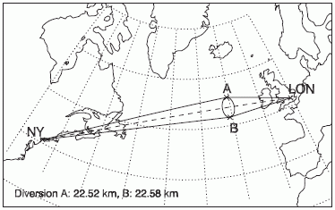
|
Imagine a flight from New York to London. The shortest route is the "great circle" route between the two airports, shown by the dashed line.
Now, imagine that the weather office says there is an area where contrails will form. This is the little ellipse; for our purposes, it is the region between points A and B. To avoid making contrails, the flight should be diverted -- a bit higher or lower (on the map), to the great circles that go through points A and B at the edge of the ellipse. This is Figure 1 from the article. |
In this case, the contrail-forming region is assumed to be two degrees (of latitude). The two longer routes shown add about 23 km to the flight; that is about 0.4%. But these numbers don't matter much for the moment. The point is that if we know where the contrail-forming region is, we can avoid it. That makes the flight a bit longer. So we now need to calculate the benefit of avoiding contrails and weigh that against the fuel cost of the longer flight. The heart of the new article is developing a model to make that trade-off.
Is this important? It's hard to know for now. Understanding of the formation of contrails and of their effects is incomplete. Even the idea that contrails contribute to warming should be taken as tentative. (It is thought that they reflect the heat from the Earth better than they reflect the direct solar radiation.) Perhaps the important role of this article is to motivate us to understand contrails better.
News story: Re-routing flights could reduce climate impact, research suggests. (Science Daily, June 18, 2014.)
The article, which is freely available: A simple framework for assessing the tradeoff between the climate impact of aviation carbon dioxide emissions and contrails for a single flight. (E A Irvine et al, Environmental Research Letters, 9:064021, June 2014.)
Related: Ice nucleation -- by airplanes (September 24, 2010).
Recent post about airplanes... Airport food: What do the birds eat? (May 24, 2014).
* Recent post about global warming: National contributions to global warming (June 25, 2014).
* Next: Impact of watching movies on global warming (September 30, 2014).More about flying... What is the proper shape for an egg? (September 18, 2017).
Older items are on the page Musings: May-August 2014 (archive).
The main page for current items is Musings.
The first archive page is Musings Archive.
E-mail announcements -- information and sign-up: e-mail announcements. The list is being used only occasionally.
Contact information Site home page
Last update: July 16, 2026