Home
> Musings: Main
> Archive
> Archive for September-December 2017 (this page)
| Introduction
| e-mail announcements
| Contact
Musings: September-December 2017 (archive)
Musings is an informal newsletter mainly highlighting recent science. It is intended as both fun and instructive. Items are posted a few times each week. See the Introduction, listed below, for more information.
If you got here from a search engine... Do a simple text search of this page to find your topic. Searches for a single word (or root) are most likely to work.
Introduction (separate page).
This page:
2017 (September-December)
December 18
December 13
December 6
November 29
November 15
November 8
November 1
October 25
October 18
October 11
October 4
September 27
September 20
September 13
September 6
Also see the complete listing of Musings pages, immediately below.
All pages:
Most recent posts
2026
2025
2024
2023:
January-April
May-December
2022:
January-April
May-August
September-December
2021:
January-April
May-August
September-December
2020:
January-April
May-August
September-December
2019:
January-April
May-August
September-December
2018:
January-April
May-August
September-December
2017:
January-April
May-August
September-December: this page, see detail above
2016:
January-April
May-August
September-December
2015:
January-April
May-August
September-December
2014:
January-April
May-August
September-December
2013:
January-April
May-August
September-December
2012:
January-April
May-August
September-December
2011:
January-April
May-August
September-December
2010:
January-June
July-December
2009
2008
Links to external sites will open in a new window.
Archive items may be edited, to condense them a bit or to update links. Some links may require a subscription for full access, but I try to provide at least one useful open source for most items.
Please let me know of any broken links you find -- on my Musings pages or any of my regular web pages. Personal reports are often the first way I find out about such a problem.
December 18, 2017
A bone from the original Santa Claus?
December 18, 2017
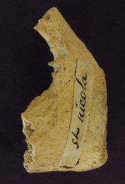
|
That's the bone in question.
This is reduced and trimmed from the figure in the news story.
|
The story of Santa Claus is based on the 4th century figure Saint Nicholas. Several places have bones that are claimed to be from St. Nicholas. In the new work, one of those bones was dated, by carbon-14. The date of the bone is consistent with the age of St. Nicholas.
That's about it. Still, it's all a fun story, at multiple levels; the news release listed below is good reading.
There is no published article on the work at this time, so we'll just provide the news story from the university that did the work... Could ancient bones suggest Santa was real? (Oxford University, December 5, 2017.) The story was posted on the eve of St Nicholas Feast Day.
Previous posts about Santa Claus:
* Why does Santa Claus prefer the North Pole? (December 22, 2016).
* A flu shot for Santa Claus? (December 5, 2009)
A recent post on C-14 dating... Carbon-14 dating of confiscated ivory: what does it tell us about elephant poaching? (February 10, 2017).
My page of Introductory Chemistry Internet resources includes a section on Nucleosynthesis; astrochemistry; nuclear energy; radioactivity. That section links to Musings posts on related topics, including dating using radioactive isotopes.
Ebola vaccines: two brief updates
December 15, 2017
We have two additional articles about vaccines against Ebola. One was a formal trial. The other was a real-world use -- the first such use of an Ebola vaccine beyond a planned trial. The latter used the same vaccine and ring-vaccination strategy discussed previously [links at the end]. The former also tested another candidate vaccine.
Both articles report successes. We note them briefly, partly because the development of Ebola vaccine is of interest. Further, they also remind us of the difficulties of testing Ebola vaccines in humans because of the sporadic nature of the disease.
There is no "big story" here. Both of these articles are steps in developing a response to a rare and sporadic -- but serious -- disease. Both articles discuss the logistical challenges.
Article 1
This article reports a formal trial with two vaccines. It was done in Liberia very near the end of the major outbreak -- so near the end that the trial had to be scaled back, because of a shortage of cases.
It was a relatively traditional trial, with unexposed adults being given one of two vaccines or a placebo. The main result was that most people (70-80%) developed anti-Ebola antibodies. There was some decline in antibody levels after a month, but most people maintained a good level over the course of the one year of observations.
There were no cases of Ebola in anyone in the trial during the year; by the time the trial was implemented, the Ebola outbreak had ended. (About 1% of the trial participants died during the year; no deaths were considered due to Ebola or to the vaccines.)
The authors discuss the importance -- and challenge -- of being able to rapidly implement testing, whether of drug or vaccine, for a disease such as Ebola.
News story: Liberia trial finds Ebola vaccines yield year-long immune response. (L Schnirring, CIDRAP, October 11, 2017.)
The article: Phase 2 Placebo-Controlled Trial of Two Vaccines to Prevent Ebola in Liberia. (S B Kennedy et al, New England Journal of Medicine 377:1438, October 12, 2017.)
Article 2
This article deals with a small flare-up in Guinea, shortly after that country had been declared Ebola-free from the major outbreak; the flare-up -- and the response -- extended into Liberia. Two new Ebola cases were reported. The ring-vaccination strategy was quickly implemented. No new cases were reported -- either in those who were vaccinated, or in the small number of people in the targeted rings who were not vaccinated (mainly small children, who were ineligible). (A total of about a dozen cases were ultimately reported for the flare-up.)
That's a success. No new cases in the targeted rings. Of course, the whole scenario was small, but it was a real-world use of the vaccine.
News story: News Scan for Oct 10, 2017. (CIDRAP, October 10, 2017.) Scroll down to the second story, Study ring vaccination strategy successful in rural settings.
* News story accompanying the article, freely available: An effective and safe vaccine will not be enough to prepare us for the next Ebola outbreak. (J S Schieffelin, Lancet Infectious Diseases 17:1224, December 2017.)
* The article, which is freely available: Ring vaccination with rVSV-ZEBOV under expanded access in response to an outbreak of Ebola virus disease in Guinea, 2016: an operational and vaccine safety report. (P Gsell et al, Lancet Infectious Diseases 17:1276, December 2017.)
Recent posts about Ebola vaccines:
* The new Ebola outbreak (June 6, 2017). The vaccine was approved for an outbreak earlier this year, but never used.
* Update: Ebola vaccine trial (January 24, 2017).
There is more about Ebola on my page Biotechnology in the News (BITN) -- Other topics in the section Ebola and Marburg (and Lassa). That section links to related Musings posts, and to good sources of information and news.
December 13, 2017
Is fluoride neurotoxic to the human fetus?
December 13, 2017
The biological effects of fluoride are complicated. On the one hand, it is clearly a metabolic poison. On the other, it clearly reduces dental cavities.
Fluoride is present naturally in many waters, at low levels -- and in some, at rather high levels. In areas with low natural fluoride levels, it is sometimes added, in order to enhance the protective dental effect. It is also added to products such as toothpaste.
Fluoride has become the subject of political controversy.
A new issue is emerging. Is fluoride toxic to the developing fetus? Is it neurotoxic? A recent article weighs in on these questions. It's interesting, but not very convincing. The purpose here is to introduce the issue.
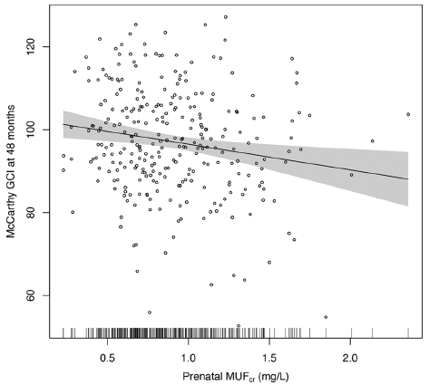
Here is one set of results...
The graph shows a measure of the neurological development of children vs a measure of their fluoride exposure in the mother.
The y-axis is the score the child got on a test called General Cognitive Index (GCI), given at age 4 years, (You can think of the test as something like an IQ test. In fact, the article also contains data from IQ tests.)
The x-axis is the mother's urinary fluoride level, measured during the pregnancy. MUF = maternal urinary fluoride; the subscript "cr" refers to an aspect of the specific test they used here.
The graph shows the results for 287 children. Each point is for one child.
The graph also shows a best-fit line, with its 95% confidence band. There seems to be a trend: the higher the mother's fluoride level, the lower the child's score on the test.
This is Figure 2 from the article.
|
That's the main point. The article also uses IQ scores from an older age; the big picture of the trend is similar, though perhaps the effect is smaller at low fluoride levels.
What are we to make of this? That's not clear. The graph shows wide ranges for both numbers. There is a lot of statistics involved in developing the final trend line. The authors do things that one is supposed to do, taking into account other possible variables. But all that raises questions about whether they have the key variables at hand. There are only three hundred kids here -- and the authors say this is the largest study ever on the issue.
As background, the authors note work on possible neurotoxicity in animal studies. It is not conclusive, but does raise concern; that is why they wanted to do this work. The work here suggests an effect.
The conclusion? Perhaps it is simply that the question remains, and further work is needed. That's often the case in science... an article with something new really needs follow-up more than anything else.
News stories:
* Higher levels of fluoride in pregnant woman linked to lower intelligence in their children. (N Bodnar, Medical Xpress, September 20, 2017.)
* High fluoride levels in pregnancy may lower offspring IQ. (H Whiteman, Medical News Today, September 24, 2017.)
* ADA responds to study suggesting association between lower IQ and fluoridation. (M Manchir, ADA (American Dental Association), September 20, 2017. Now archived.) As one might expect, the ADA doesn't like the article. They raise some useful points; those points should be framed as questions not conclusions. In particular... In their brief statement, the ADA does not address the analysis, but simply rejects the relevance of the study. Their objection seems arbitrary.
The article, which may be freely available: Prenatal Fluoride Exposure and Cognitive Outcomes in Children at 4 and 6-12 Years of Age in Mexico. (M Bashash et al, Environmental Health Perspectives 125:655, September 2017.) If you are interested in pursuing the topic, I suggest you read the Introduction in the article, for background. If you get into the meat, it's complicated.
Other posts on tooth decay...
* A clinical trial of ice cream (June 2, 2015).
* Bacteria on human teeth -- through the ages (March 24, 2013).
More fluoride: A novel device for measuring fluoride in water (March 1, 2019).
More fluorine: Breaking C-F bonds? (October 26, 2018).
Coral history: evidence from old maps
December 12, 2017
There has been a lot of interest in how the corals are doing. For example, modern climate change may be leading to coral bleaching, and ultimate loss of the coral. Ocean acidification may also be of concern for coral.
Long term records of coral habitat are rare. A new article provides some relief that is both interesting and important.
Here is an example...
The two frames show the same area off southern Florida, called the Florida Keys.
Frame A (left) is from 1774. Frame B (right) is from 2016.
Areas of coral reefs on the 1774 map are boxed. (In some cases, you can read the "coral" label on the map. One case is shown expanded in the inset at the bottom. Others are clearer in the larger version in the article.)
The same areas are boxed on the 2016 map. Black boxes if the coral are still there, red boxes if they are not.
There is a clear pattern... The coral reefs identified two centuries ago at the lower part of this map are still there. However, the coral in the upper area are gone; this wasn't even considered coral habitat by modern biologists.
This is Figure 2 from the article.
|
What are these map sources? The 1774 map is a nautical chart for navigators. The area south of Florida is quite an obstacle course for ships, and good maps were important. Showing the coral reefs was just part of that. The 2016 map is from Google Earth.
The old map was part of a project by the national government to chart their seas. The map was obtained through the archives of the British Admiralty.
The complete loss of coral in the area near Key West is a new finding. We had not known that coral used to be there, so did not appreciate that its current absence was a change.
There is data on coral habitat around, even if it wasn't collected by coral biologists.
News stories:
* Eighteenth century nautical charts reveal coral loss. (Phys.org, September 6, 2017.)
* Historical nautical maps show coral loss more extensive than previously believed. (M Gaworecki, Mongabay, September 20, 2017.)
The article, which is freely available: Ghost reefs: Nautical charts document large spatial scale of coral reef loss over 240 years. (L McClenachan et al, Science Advances 3:e1603155, September 6, 2017.)
Among other posts on corals...
* Coral bleaching: how some symbionts prevent it (September 30, 2016).
* An example of coral growing well in a naturally acidified ocean environment (February 16, 2014).
Previous post about Florida: What if two of the world's most destructive pests spent the evening together in Fort Lauderdale? (April 4, 2015).
Can you get sick from the street cleaning truck?
December 10, 2017
Briefly noted...
In 2015 a person who operated a street-cleaning truck, using high-pressure water, came down with Legionnaire's disease. It was the second such case in the area.
The case prompted public health authorities to inspect the trucks. Two of the four trucks were found to have Legionella pneumophila, the causative agent of Legionnaire's disease, in their tanks.
Further investigation of the trucks and their maintenance procedures suggested that the foam lining in the water tanks of the trucks was a home to the Legionella bacteria, and that the routine cleaning had little impact on the bacteria there.
The two trucks found to carry Legionella were disinfected, using chlorine bleach following the procedure in the law. (Such "disinfection" was done routinely once a year.) Testing of the foam in the trucks a few days later showed the continued presence of the bacteria.
No explicit connection was made between the bacteria in the patient and those in the truck, because key information was not available. Thus the case for transmission is circumstantial. However, the evidence about the trucks is compelling. Local authorities have implemented stricter truck cleaning procedures, and the users now wear protective masks.
News story: Street cleaning trucks pose risk for Legionnaires' disease. (Healio, October 12, 2017.)
The article, which is freely available: Street Cleaning Trucks as Potential Sources of Legionella pneumophila. (N Valero et al, Emerging Infectious Diseases (EID) 23:1880, November 2017.)
There are no previous posts on Legionnaire's disease.
Next... Briefly noted... Legionella bacteria and the origin of eukaryotes (August 9, 2022).
Various things can make you sick...
* Death by bagpipe (September 13, 2016).
* Skinny jeans: How tight is too tight? (July 8, 2015). This one is not about an infectious disease.
* Possible transmission of norovirus via reusable grocery bag (May 21, 2012).
* Playing music can make you sick (July 31, 2010).
Titanium oxide in the atmosphere?
December 9, 2017
Here's the evidence...
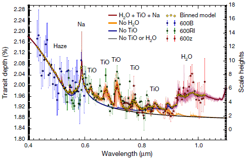
|
The graph shows a spectrum, with some peaks. Fortunately, the peaks are labeled. You can see that several of them are for TiO -- titanium(II) oxide.
This is Figure 2 from a recent article.
|
You may be getting suspicious... That graph is not exactly labeled like a spectrum (though the x-axis is wavelength). And what is this TiO? It's not what we normally think of as titanium oxide. And why would there be titanium in the atmosphere anyway?
This is an analysis of the atmosphere of the planet WASP-19b -- about 800 light-years away. It's part of the story of exoplanets. Recent years have seen an explosion in this field, with the Kepler spacecraft discovering thousands of planets beyond our Solar System. It's no longer news to find an exoplanet. The issue now is characterizing them.
A major approach is measuring transits. A transit causes a reduction in the light from the star as the planet passes in front. (Logically, a transit is just like an eclipse.) Many exoplanets were first found by discovering such light reductions, which occur on a regular basis as the planet orbits the star. Beyond the discovery phase, measurements of the transit provide more information about the planet.
For example, measuring the transits allows determination of the radius of the planet. It's actually a little more complex than that. Radius of what? We start by thinking of it as measuring the radius of the solid planet. But what if the atmosphere affected the light? All the telescope is detecting is light from the star. It doesn't matter whether a reduction of the light is due to a solid planet or an absorbing atmosphere.
Or does it?
What the scientists do in the current work is to measure the transits at various wavelengths. If the apparent radius of the planet varies depending on the light wavelength used, it is likely that the observed variation is due to something in the atmosphere affecting the light.
That is, by measuring the apparent radius of the planet during transits as a function of wavelength, the scientists are getting information on the composition of the planetary atmosphere.
That's the idea, but it is technically very complicated. In fact, they don't really "measure the spectra" in any simple direct way. The spectra they report are based on computer analysis of the transit observations. For the most part, it is about fitting the data to one or another proposed model for what is the atmosphere. And there are a lot of statistics!
What about that titanium? This is a hot planet! Its temperature is over 2000 K; it is so close to its star that it orbits it about every 19 hours. (Every day is New Year's Day on WASP-19b. That's every Earth-day, of course.) TiO is common in some types of stars; it has long been expected that it would be found in the atmosphere of hot planets. The current work is the first report of TiO in a planetary atmosphere. Many of us may be surprised to find Ti in the atmosphere. To the scientists, it is confirmation of a prediction.
News stories:
* Hot-Jupiter WASP-19b Has 'Titanium' Skies. (Sci.News, September 14, 2017.)
* Titanium oxide in the atmosphere of a 'hot Jupiter' exoplanet. (German Aerospace Center (DLR), September 13, 2017.) From the lead institution.
The article: Detection of titanium oxide in the atmosphere of a hot Jupiter. (E Sedaghati et al, Nature 549:238, September 14, 2017.)
Posts about exoplanets include:
* Planning a visit to the nearest star -- and to its "habitable" planet (February 22, 2017).
* Habitable planets very close to a star (June 19, 2016).
A post with an example of a light-curve during a transit... Rings for Chariklo (May 9, 2014). This example is not about an exoplanet, but about an asteroid in our Solar System.
A recent post about the more common titanium oxide: Photocatalytic paints: do they, on balance, reduce air pollution? (September 17, 2017).
A recent post about non-Earth titanium: The major source of positrons (antimatter) in our galaxy? (August 13, 2017).
December 6, 2017
Dengue vaccine: a step backwards?
December 6, 2017
The immunology of dengue virus infection is messy. There are four types of dengue virus, as distinguished by standard immunological tests. And there are two types of dengue disease: mild and severe. Interestingly, a person's second dengue infection is more likely to be severe than the first. It seems that happens when the second infection is with a different dengue viral type than the first infection. It seems that antibodies to one type of dengue can actually enhance infection with another type.
The phenomenon has a name: antibody-dependent enhancement (ADE), but what is actually happening is poorly understood.
ADE has implications for a dengue vaccine. Could an immunization against one dengue type increase a person's risk for severe infection with another? Vaccine testing included looking for possible enhancement of severe dengue cases.
Now, a dengue vaccine manufacturer has changed its labeling of an approved dengue vaccine to try to limit its use to those who have already had one dengue infection. Why? Apparently there has been an increase in severe dengue associated with use of the vaccine. The details are not clear at this point. It's an interesting development.
Is this a setback? In one sense, yes. The vaccine now has a smaller target than before. But in another sense, it is progress. Assuming there is a good explanation behind the change, it means we know more about the vaccine, and can use it more safely. That's good. Approval of vaccines (and drugs) is always based on the best information available. At the time of initial approval, there are data from some trials, but long term data is limited. It is normal that approved medicines continue to be evaluated.
News story: Sanofi restricts dengue vaccine but downplays antibody enhancement. (S Soucheray. CIDRAP, December 1, 2017.) Links to related news stories. Of particular interest may be the announcements from Sanofi (the company) and from the Department of Health in the Philippines (a country that is immediately affected by the change). There is no scientific article for this story at this point.
Previous post about the dengue vaccine: Dengue vaccine follow-up: Phase 3 trial (September 15, 2014). Links to some other posts on dengue.
A recent post on ADE, making the connection between dengue and Zika: Can antibodies to dengue enhance Zika infection -- in vivo? (April 15, 2017).
Let's try again... A new dengue vaccine (November 16, 2019).
More on vaccines is on my page Biotechnology in the News (BITN) -- Other topics under Vaccines (general).
That page also has a section on dengue: Dengue virus (and miscellaneous flaviviruses). There is a list of related Musings posts.
Identifying individuals from their genomes: a controversy
December 5, 2017
A recent article has provoked considerable controversy. It addresses an interesting issue, but many would say that the article -- or at least the surrounding buzz -- suggests far more than is really there. That the article is from a famous scientist with a reputation for pushing the limits helps to bring attention to the article. We note it, to get an idea of what the controversy is about.
The following figure shows some faces. To start, look at the ones labeled with "A" numbers, the one to the left in each pair.
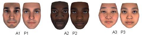
Can you tell the difference between the three faces?
If you were given their genomes, do you think you could match the genomes to the faces? Assume that you have the complete genome sequences, and appropriate computing power. For example, if the computer takes a genome and generates face P1, could you match it to one of the A-faces above?
Perhaps that is not hard. Perhaps the specific test here is not realistic. But the underlying question is important. After all, more and more people have genome information on computers. They typically assume that the information is private. In public collections, all personal identifying information has been removed from the genome records. All personal information except for the genome.
In the figure, the three A-series pictures are from photos of three individuals. The P-series pictures are the computer predictions of the faces, based on their genomes.
This is modified from Figure 2 from the article. I added the labels under each face, for ease of reference.
|
That's what the new article is about. What the authors did was logically straightforward. They trained a computer program on a collection of genomes and the corresponding faces. They then tested the program with some new genomes. It predicted the faces, which could be correctly matched with the actual faces -- sometimes.
The following statement from the abstract gives a sense of what the program could do... "Using this algorithm, we have reidentified an average of >8 of 10 held-out individuals in an ethnically mixed cohort and an average of 5 of either 10 African Americans or 10 Europeans." That is, they did rather well in one test, but not so well in another. The difference? Race (largely, skin color) was a factor in the first test. The program did not do well at distinguishing members of the same race.
The main thing the program has done, it seems, is to develop an average face for each race. That is, the program can identify a person's race, and that is a big step toward proposing a face. Several genes for race are known, and so are some genes for certain other facial features, such as eye color.
The program is a step. But it is a long way from any general ability to predict faces in sufficient detail to identify individuals from a large population. The small sample sizes used here just do not require much skill beyond what is already known.
Nevertheless, the underlying question remains. And we can see that programs to reveal identity based on genome information are being developed. The current results are modest, but what does the future hold?
The reaction to the article is affected by its source. A private company, one that wants to become a major holder of genome sequences -- outside of public view. A company founded and led by a scientist known for being aggressive and provocative, Craig Venter. Would the company benefit if they can convince people that public genomes are a bad idea?
Those comments give a sense of what is going on here. The article addresses the issue of predicting faces -- and thus identifying individuals -- from genomes. The actual results are modest. Some of the claims -- explicit or implied -- are less so. The real point may be the long term developments.
It is not for me to take sides here. The article is interesting and it has provoked controversy. The purpose here is to lay it out. You can read some of the news, even the article if you want the details, and think about the various issues for yourself.
News stories:
* Researchers from Human Longevity, Inc. Use Whole Genome Sequence Data and Machine Learning to Identify Individuals Through Face and Other Physical Trait Prediction. (Human Longevity, September 5, 2017. Now archived.) From the company.
* Does Your Genome Predict Your Face? Not Quite Yet -- Genomics pioneer J. Craig Venter says if he had your genome he could pick you out of a crowd. (A Regalado, MIT Technology Review, September 7, 2017.)
* Geneticists pan paper that claims to predict a person's face from their DNA -- Reviewers and a co-author of a paper by genomics entrepreneur Craig Venter claim that it misrepresents the risks of public access to genome data. (S Reardon, Nature News, September 8, 2017. In print, with a slightly different title: Nature 540:139, September 14, 2017.)
The article, which is freely available: Identification of individuals by trait prediction using whole-genome sequencing data. (C Lippert et al, PNAS 114:10166, September 19, 2017.)
The article has generated a pair of "preprints" posted at BioRxiv, The first is a critique of the article; the second is a reply to that critique from the original authors. Both items are freely available. Remember, these are not peer-reviewed; they are "discussion", probably not intended for formal publication.
* Major flaws in "Identification of individuals by trait prediction using whole-genome sequencing data". (Y Erlich, BioRxiv, September 6, 2017.) The figure on page 4 of the pdf shows a test similar to that of the figure above, but with three white males.
* No major flaws in "Identification of individuals by trait prediction using whole-genome sequencing data". (C Lippert et al, BioRxiv, September 11, 2017.)
Also see:
* Health care: Can the computer give racially biased advice? (November 30, 2019).
* Identifying people from public DNA databases -- even if they are not included (January 20, 2019).
* Are there genetic issues that we don't want to know about? (October 22, 2013).
* Inuk, a 4000 year old Saqqaq from Qeqertasussuk (March 1, 2010). A preview of face-prediction?
There is more about genomes on my page Biotechnology in the News (BITN) - DNA and the genome. It includes an extensive list of related Musings posts.
My page for Biotechnology in the News (BITN) -- Other topics includes a section on Ethical and social issues; the nature of science
Why bats fly into windows
December 3, 2017
Have you ever walked into a glass door or window? It was so clean that you couldn't see it?
Maybe you thought... If only I had echolocation, like bats.
But it doesn't work. Bats, too, run (or fly) into windows. A new article explores this, and explains why. (Admittedly, it might work better for people.)
The results suggest that the bats have trouble "seeing" a smooth vertical surface. Why? Well, it's actually basic physics. Imagine that a bat sends out a signal. If the signal arrives at the surface perpendicular to it, then the echo will come back to the bat. But if the signal hits the surface at any other angle, the reflection -- the echo -- goes away from the bat. That's a basic property of reflection.
Does it seem odd that bats have trouble detecting smooth vertical surfaces? Isn't the purpose of the echolocation system to help them find objects ahead, by reflecting back the signal? Perhaps, but... The authors suggest that smooth vertical surfaces are rare in nature; natural vertical surfaces are rough enough that reflections occur in multiple directions, and it is likely that the bat will receive an echo. A smooth vertical surface may not reflect back to the bat -- and that makes it look just like "thin air". Smooth vertical surfaces are an artifact of human construction; that's why bats have not developed the ability to detect them.
We've focused on vertical surfaces. Why? Smooth horizontal surface do exist naturally; the surface of still water in a lake would be an example. In the same kind of testing, but using horizontal surfaces, the bats did not collide. In fact, they tried to drink from it -- even if it was a sheet of metal. This was discussed in an earlier Musings post [link at the end].
Bottom line... If bats approach a smooth horizontal surface, they may try to drink from it; they think it is water. If bats approach a smooth vertical surface, they may run into it; they can't see it.
And it matters. Bats do tend to run into plate glass windows of buildings, and often get killed. The window appears to the bat as an open flyway.
You may wonder, then, whether the work here, involving planned collisions of bats, was ethical. In fact, the spatial constraints of the flight lab limited the bats to rather slow flying. No injuries were reported.
That's the story. Here is a small piece of the experimental work behind it...
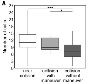
|
Bats were monitored in a flight chamber with a smooth vertical wall -- a piece of metal. In this experiment, their echolocation calls were counted.
The results are shown for three types of encounters with the wall. Let's focus on two...
- Some encounters were "near collisions", meaning that the bat was heading toward the wall but turned away before colliding. Data for this case is shown in the left (white) bar.
- At the other extreme, some encounters were simple collisions; the bat's flight path suggests it never saw the wall. Data for this case is shown in the right (darkest) bar.
|
The count of calls (y-axis) is significantly higher for the first case. The results for call-count suggest that the bats got a signal, called more to clarify it, and evaded the wall. On the other hand, the low call-count for the right-hand case suggests the bats never saw the wall.
The middle bar is for an intermediate case, where the bat seemed to maneuver some near the wall, but ended up colliding with it. In this case, the call count is intermediate.
This is Figure 3A from the article.
|
Videos. There are three short video files with the article, as Supplementary Materials. They are also included with the Phys.org news story. Each is about 1 minute; no sound. The first is perhaps the most useful. It shows the flight chamber, with examples of the three types of events discussed above.
News story: Bats fail to detect smooth, vertical surfaces when they are in a rush. (Phys.org, September 8, 2017.)
* News story accompanying the article: Echolocation: How glass fronts deceive bats. (P Stilz, Science 357:977, September 8, 2017.)
* The article: Acoustic mirrors as sensory traps for bats. (S Greif et al, Science 357:1045, September 8, 2017.)
A background post about how bats respond to a horizontal reflective surface: Water: a bat's view (December 3, 2010). From the same lab. The article of this earlier post is reference 9 of the current article.
Among other posts on echolocation by bats: Jamming of bat sonar, by bats (January 20, 2015).
Yeast may not run into glass doors, but... How to confuse a yeast -- a sensory illusion (January 15, 2016).
More illusions: How flies perceive optical illusions (November 30, 2020).
More glass: A new way to make impact-resistant glass (August 9, 2019).
A recent genetic change that enhanced the neurotoxicity of the Zika virus
December 1, 2017
A striking feature of Zika infections during the recent outbreak in Brazil has been the development of serious neurological complications, including microcephaly in babies born to Zika-infected mothers. That was unexpected. The Zika virus was discovered several decades ago, and it has not been associated with such problems. Have we just somehow missed them? Was there something special about the local situation in Brazil? Or did the virus change?
A recent article reports that the Zika virus recently acquired a mutation that enhances its neurovirulence. The mutation occurred in May 2013.
It's an interesting story. And it's quite simple and easy to understand; at least, the basic logic is.
The following figure lays the groundwork. It uses one of the key tools for characterizing the viruses, and provides some basic information about when the new mutation arose.

|
The test is a survival curve, following a specific infection protocol. In this case, newborn mice were infected with one or another Zika strain, and survival measured over time.
Four Zika strains were tested here. They are identified at the lower left. What really matters is the date that is shown in each name.
|
The top (black) curve shows relatively good survival of the mice: 100% out to about day 17, and still over 80% at the end. This curve is for the 2010 strain, an Asian Zika, which is considered the ancestor of the Zika that made it to French Polynesia and the Americas by mid-decade. (CAM in the name refers to Cambodia.)
The other three curves all show much poorer survival. Survival begins to decline by day 5; all the mice are dead by the last time point shown. These curves are for three strains isolated in the more recent outbreaks in 2015-16. They are from Venezuela, Samoa, and Martinique; they are intended to be representative of the strains in the Americas.
This is Figure 1A from the article.
|
The graph above shows that the recent Zika strains in the Americas are far more virulent than the ancestral Asian virus. The virus changed -- between 2010 and 2015.
Analysis of the larger collection of strains suggests that the mutation occurred about May 2013. There is an uncertainty of a few months in that estimate, but the analysis does put the mutation just before the outbreak in French Polynesia.
Comparison of the various viral genome sequences showed several differences. Some of them, which appeared to be in important positions, were tested one-by-one, by making new viral strains that differed from the control strain by only one of the mutations.
The following figure shows some results...

|
Both frames here show survival curve experiments, as in the previous figure.
Part A (top) shows survival curves for the same 2010 strain shown above, as a control, plus strains the scientists constructed, each carrying one of the candidate mutations.
The survival curve for the control strain (now labeled "WT"; black) is very much as before.
The other strains all show lower survival. However, one strain stands out as showing exceptionally poor survival: the strain with the mutation called S139N.
That is, frame A shows that the new mutation S139N has a major effect on survival of the infected mice. It also shows that other mutations have effects, but smaller ones.
[The mutation name S139N means that the amino acid at position 139 of the main viral protein has changed from S (serine) to N (asparagine).]
|
To confirm the importance of the S139N mutation, the scientists made yet another new strain. This one is based on one of the highly virulent American strains, from 2016. The new strain is the same, except that the S139N mutation has been removed. Part B (lower) shows the results.
The black curve is for the 2016 strain. It is similar to the curve for that strain shown earlier.
The blue curve is for the new strain -- the same, except that the S139N mutation has been removed. (It is cleverly labeled N139S, to indicate that the original mutation has been reversed.) There are two major observations:
1) Reversing the S139N mutation leads to a major improvement of survival.
2) That improvement is incomplete.
This is part of Figure 3 from the article.
|
In summary, these experiments show that the single mutation S139N is a major contributor to the increased virulence of Zika virus. They also show that other mutations contribute to the difference between the ancestral strain and the recent American strains.
The article goes on to show more, including that the S139N mutation leads to increased neurological effects in the mouse model, and to improved growth in human cells.
Overall, the article makes a major contribution toward identifying why the recent Zika outbreak is so different from previous ones. The virus has changed.
News stories:
* Zika virus mutated around 2013, leading to birth defects: study. (Medical Xpress, September 28, 2017.) (This news story incorrectly refers to the new amino acid of S139N as arginine, rather than asparagine.)
* A Single Mutation in Zika Led to Devastating Effects -- One amino acid change within a viral structural protein makes the difference between mild cases of brain damage and severe microcephaly in mice. (A Azvolinsky, The Scientist, September 28, 2017. Link is now to Internet Archive.) Includes discussion of the limitations of the current work.
* News story accompanying the article: Microbiology: Evolution of neurovirulent Zika virus -- A Zika virus mutation leads to increased neurovirulence. (G Screaton & J Mongkolsapaya, Science 358:863, November 17, 2017.)
* The article: A single mutation in the prM protein of Zika virus contributes to fetal microcephaly. (L Yuan et al, Science 358:933, November 17, 2017.)
A recent post about Zika growth in the developing brain: Why does Zika virus affect brain development? (August 11, 2017).
Next Zika post: Should we screen the blood supply for Zika virus? (May 20, 2018).
More about Zika and microcephaly: Asian Zika in Africa (October 12, 2019).
Also see: Are non-African Aedes aegypti mosquitoes better at carrying Zika? (January 5, 2021).
There is a section on my page Biotechnology in the News (BITN) -- Other topics on Zika. It includes a list of Musings post on Zika.
My page Biotechnology in the News (BITN) - DNA and the genome includes an extensive list of Musings posts on genomes (DNA or RNA).
November 29, 2017
Treating senescent cells: an overview
November 29, 2017
A few months ago Musings discussed an article on the treatment of senescent cells [link at the end]. That opened up a fascinating but confusing topic that is attracting considerable attention in the field of aging. I suggest you go back and read at least the introduction to that post, to set the stage here.
Nature has a recent news feature on the topic. It's a useful overview. It conveys both the excitement and uncertainty of the field. If you come away from it feeling you should be optimistic, but aren't sure what it is about, you've got it about right. In any case, people are moving -- however cautiously -- toward testing drugs against senescent cells in humans.
News feature: To stay young, kill zombie cells -- Killing off cells that refuse to die on their own has proved a powerful anti-ageing strategy in mice. Now it's about to be tested in humans. (M Scudellari, Nature News, October 24, 2017.) In print, with slightly different title: Nature 550:448, October 26, 2017.
The local angle... One of the leading scientists in this field is Judith Campisi, at the Buck Institute in nearby Novato. She has also been associated with the University and the Lawrence Berkeley Lab. Campisi is mentioned in the article, and is one of the scientists featured in the accompanying podcast.
Background post on senescent cells: A treatment for senescence? (June 4, 2017). The article of this recent post is reference 3 of the current news feature.
More: How about having your immune system remove senescent cells? (September 27, 2020).
My page for Biotechnology in the News (BITN) -- Other topics includes a section on Aging. It includes a list of related Musings posts.
More from Novato: Formation of the Moon: the California connection (October 10, 2014). I may have posted articles from the Buck Institute before, but this is the only item that shows up if I search Musings for Novato. It's still a good read.
A better way to collect a sample of whale blow
November 28, 2017
If you wanted to find the microbes that are released when a person exhales, you could hold a petri dish in front of their nose.
Now, extrapolate the idea to a whale...
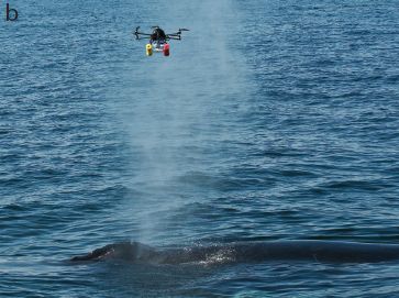
|
There is a humpback whale at the bottom, just slightly out of the water.
Towards the front of the whale (to the left), there is a "blow", (barely) visible here as a whitish cloud.
And at the top of the blow is the collection device. It is an aerial drone; it carries a petri dish to collect a sample.
This is Figure 1b from a new article.
|
It's not new to collect samples of whale exhalation by raising an open petri dish into the blow. What's "new" here is doing it without bothering the whale. The common method has been to extend a long pole with a petri dish at the top into the blow. The pole is held by someone on a boat, which is near the whale. The boat, which disturbs the whale, now has been replaced by a remote-controlled drone; the authors see no sign that it bothers the whale. (Collection of whale blow using a drone had been reported before; the current work is the first systematic use of the method.)
What did the scientists learn? They sampled whales from two populations, one each on the east and west coasts of North America. They found that the microbes in the blows of these two whale populations were quite similar -- and distinct from what is in the seawaters. It's limited data at this point, but it suggests that there is a distinctive whale blow microbiome. It presumably reflects the whale itself, most importantly, the lungs. Interestingly, the whale lung microbiome, as revealed here, seems rather similar to that from a dolphin species reported earlier.
Respiratory infections of whales are a significant issue. The current article offers an improved approach to capturing, and hence studying, the whale blow microbiome. For now, what is most important is that we can sample it without disturbing the whales.
News story: Study Identifies Whale Blow Microbiome -- Drone Collected Samples Provide New Tool for Health Monitoring. (Woods Hole Oceanographic Institution (WHOI), October 10, 2017.) From the lead institution.
Video: Whale blow microbiome. (Vimeo; 2 minutes.) A video of an actual sample capture event. The video is included in the news story listed above.
The article, which is freely available: Extensive Core Microbiome in Drone-Captured Whale Blow Supports a Framework for Health Monitoring. (A Apprill et al, mSystems 2:e00119, October 10, 2017.)
A recent post on drones: Crashworthy drones, wasp-inspired (October 16, 2017).
More... Using drones to count wildlife (May 15, 2018).
More about what bothers whales: Effect of simulated sonar on whale behavior (March 16, 2014).
Most recent post about whales: Animal communities around bone-eating worms (June 16, 2017).
More: Monitoring whales from space (June 23, 2019).
More about lung exams...
* What if there was a gorilla in the X-rays of your lungs? (July 26, 2013).
* A new approach for testing a Llullaillaco mummy for lung infection (August 17, 2012).
Predicting success in training guide dogs -- role of good mothering
November 27, 2017
Dogs that serve as guide dogs or service dogs for people with disabilities are carefully trained. Not all dogs pass the training course. Can we predict which dogs will graduate?
A recent article explores the question.
In the core of the study, the authors collected data on 98 dogs in a training program. Statistical analysis revealed three criteria that were most correlated with training success.
The following figure summarizes how dogs fared on those three criteria...
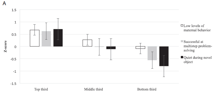
The three criteria are shown in the key, at the right. Just identifying what these criteria are is the main point for now.
The graph summarizes the scores on the criteria for the top, middle and bottom third of the dogs. (That grouping is based on the total scores for each dog. I think. The graph is not clearly explained, but I think we have the general idea here.)
For example, for the criterion "low levels of maternal behavior" (clear bars, at the left), the dogs in the top third had an average score of about 0.7; that dropped to about -0.1 in the bottom third.
About 85% of the dogs in the top third graduated; that number dropped to a little below 50% for the bottom group.
The purpose of the graph is to show a little information about these three criteria. It is not to show that they are the most important; that part conies from the statistical analysis, which precedes making this graph.
This is Figure 1A from the article.
|
What's interesting is that one of the criteria is about how the dogs were raised. The criterion is "low levels of maternal behavior". A high level of maternal involvement is bad. Dogs raised with very active mothers who looked after their pups "excessively" were less likely to develop the independence needed to serve as good guide dogs.
It's a finding that could be used to help choose dogs for the training program. One might also ask whether the finding could be used to modify the interaction between pup and mom.
Is it possible that the mothering differences are due to genetics? At this point, nothing is known about what underlies the maternal behavior.
The other two criteria found to be predictive are based on tests on the dogs as "young-adults". These tests are given a year or so after the mothering period, but still before formal training has begun.
The authors note some work that may be in disagreement regarding the role of maternal care. That work is not in the immediate context of training guide dogs. Such differences need to be worked out in future work. The authors note that maternal care is probably a complex variable, and the response may well not be monotonic.
News story: Successful guide dogs have 'tough love' moms, Penn study finds. (EurekAlert!, August 7, 2017.)
The article: Effects of maternal investment, temperament, and cognition on guide dog success. (E E Bray et al, PNAS 114:9128, August 22, 2017.)
There is a related article, published earlier in the year. It focuses on the maternal care part of the work. Since it is freely available, it seems worth noting it here explicitly... Characterizing Early Maternal Style in a Population of Guide Dogs. (E E Bray et al, Frontiers in Psychology 8:175, February 2017.) This is reference 36 of the current article. There is also a link to it, via PubMed, in the first news story listed above.
Other posts about dogs include...
* The oldest known dog leash? (January 23, 2018).
* Reducing asthma: Should the child have a pet, perhaps a cow? (November 28, 2015).
* Do dogs respond to their owner's yawns? (May 29, 2012).
Among posts on mothering...
* Barium, breast milk, and a Neandertal (June 17, 2013).
* Cannibalism in the uterus (May 31, 2013)
Making hydrocarbons -- with an enzyme that uses light energy
November 17, 2017
The common effect of light in chemistry is to excite an electron. That's how light adds energy to the system.
That's the general idea behind photosynthesis. Light energy is used to reduce carbon dioxide to sugar. What the light does, most directly, is to excite an electron.
Despite the prominence of photosynthesis, there are actually very few specific enzymes in biology that use light. A recent article reports a new example.
The following figure shows some of the evidence...
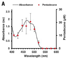
|
In this experiment, a solution of an enzyme is irradiated with light of various wavelengths.
There are two data sets on the graph, plotted against the wavelength of the light (x-axis).
The main black line is the absorption spectrum of the enzyme; see the y-axis on the left. The absorption spectrum looks like that of flavin, though the exact position is affected some by the protein partner. (Flavin? Recall the common vitamin riboflavin.)
The red points, with their error bars, show the "action spectrum" for the enzyme: its activity as a function of the light wavelength. This is shown on the y-axis on the right. That axis is labeled as pentadecane concentration; pentadecane is the product of the reaction.
|
The two curves are the same! The enzyme activity depends on the light that is absorbed.
This is Figure 3A from the article.
|
That graph provides some basic evidence that the enzyme uses light.
The scientists go on to show...
* Light is needed continuously for the enzyme to function. That is, the light does more than just activate a dormant enzyme; it is part of the enzyme action.
* The enzyme does indeed contain flavin, very close to the active site.
Here is a little more about the reaction...
The reaction catalyzed by the enzyme is decarboxylation of a fatty acid, to make a hydrocarbon.
A simple example to illustrate the reaction type is to take common acetic acid and decarboxylate it, to make methane.
CH3COOH --> CH4 + CO2.
The enzyme here doesn't act on things as small as acetic acid, but it does act on the common fatty acids found in cells. In this case, it is acting on palmitic acid (hexadecanoic acid) to make pentadecane.
CH3(CH2)14COOH --> C15H32 + CO2.
Why is this enzyme of interest? Well, first it is unusual. As we noted, there are not many light-driven enzymes.
Second, it's possible this could be useful. Pentadecane (and other such compounds) are useful fuels. Whether this enzyme reaction, using light, would be worthwhile is an economics question.
The third reason is perhaps the most intriguing. There are other enzymes known that will decarboxylate fatty acids. What's novel here is the use of light to drive the enzyme. The enzyme structure connects the flavin site to the decarboxylase site. Nature must have tried that, somehow, and it worked and was retained. Now, we might ask... Are there other such photoenzymes around that we have not noticed? Beyond that, what might we make? Would it be possible for biologists to make such photoenzymes by grafting a flavin site onto other enzymes, so that they, too, are now able to use light?
News stories:
* An algal photoenzyme that uses blue light to convert fatty acids to hydrocarbons. (B Yirka, Phys.org, September 1, 2017.)
* A photoenzyme allows microalgae to produce hydrocarbons. (European Synchrotron Radiation Facility, September 1, 2017.) From one of the institutions involved in the work.
* News story accompanying the article: Catalysis: Enzymes make light work of hydrocarbon production. (N S Scrutton, Science 357:872, September 1, 2017.)
* The article: An algal photoenzyme converts fatty acids to hydrocarbons. (D Sorigué et al, Science 357:903, September 1, 2017.)
A post about developing an enzyme that can use light energy: Using light energy to power the reduction of atmospheric nitrogen to ammonia (May 20, 2016).
More about fatty acids and alkanes: Oil in the oceans: made there by bacteria (January 3, 2016).
More about making things from fatty acids: Why don't black African mosquitoes bite humans? (December 19, 2014).
More about catalysts: Low temperature treatment for auto exhaust? (February 18, 2018).
I have listed this post on my page Internet Resources for Organic and Biochemistry under Energy resources. It includes a list of some related Musings posts.
November 15, 2017
Should we make antibodies to HIV in cows?
November 14, 2017
A problem in both preventing and treating HIV is that humans aren't very good at making antibodies that will act broadly against the range of HIV.
In contrast...
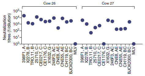
The graph shows what happens when cows are injected with a key HIV protein, to induce an immune response.
The data show the potency of the antibody response against 12 HIV strains, chosen to represent the antigenic diversity of HIV; they are listed along the bottom. There is also an unrelated virus, MLV (murine leukemia virus), at the right for each set as a negative control. Antibody potency is shown (y-axis) as the dilution that still allows the antibody preparation to neutralize the virus. For example, a value of 104 means that the serum can be diluted ten-thousand-fold, and still neutralize the virus.
Results are shown for two cows, at about a year after the initial immunization.
The big picture? Almost all the data points show that the antibody response was good. There are only three low points, and two of those are for the negative control.
This is part of Figure 1b from the article. The full Figure 1b shows data for four cows; the pattern is similar for all.
|
As follow-up, the scientists isolated individual antibodies. One of them neutralized 72% of a large set of HIV strains.
The general conclusion is that cows are good at making anti-HIV antibodies with broad specificity. Individual cows rapidly develop broad immunity to HIV, and individual antibodies show broad specificity against a collection of HIV strains. Such antibodies are called broadly neutralizing, or bn.
A couple of points, for proper perspective...
- The results discussed above give you an idea of what cows can do. Such breadth is unusual, but we have not shown any data to make that point. The conclusion that cows are better at making bn antibodies to HIV than humans are comes from general knowledge, not from anything actually shown here.
- This has nothing to do with cows getting HIV -- or not. HIV doesn't infect cows. The cows here are not infected with the virus, but are injected with a viral antigen, to see what their antibody response is.
Is there an explanation for why cows are better at making bn anti-HIV antibodies than we are? Indeed there is.
Antibodies are large and complex molecules. Importantly, certain regions of an antibody molecule are specifically involved in recognizing the antigen. In cow, one of the antibody-recognizing regions is considerably larger than in humans. That allows it to recognize larger antigens, or larger-scale features of an antigen. To test that here, the scientists grafted the large recognition region from a cow bn anti-HIV antibody to other antibodies; the broad recognition significantly carried over with the transfer.
What do we do with this new information? Certainly it is interesting to find that cows are better able to make bn antibodies against HIV, probably because of their larger antigen recognition regions. We're not likely to make therapeutic antibodies in cows. Perhaps the large recognition regions of these cow antibodies can be grafted onto other antibodies, to make novel hybrid antibodies.
News stories:
* Cows Have HIV-fighting Power. (K Kershner, How Stuff Works, July 28, 2017. Now archived.)
* Cow antibodies yield important clues for developing a broadly effective AIDS vaccine. (Science Daily, July 20, 2017.)
The article: Rapid elicitation of broadly neutralizing antibodies to HIV by immunization in cows. (D Sok et al, Nature 548:108, August 3, 2017.)
Previous post about HIV: It's CRISPR vs HIV -- and HIV might win (April 17, 2016).
A post about broadly neutralizing antibodies to HIV: A novel approach to providing immunity to HIV (March 12, 2012).
A post about broadly neutralizing antibodies to flu viruses: Using antibodies from llamas as the basis for a universal flu vaccine? (December 7, 2018).
The post SyAMs: Synthetic drugs that act like antibodies (May 31, 2015) includes a common diagram of an antibody molecule. The antibody-recognizing regions are at the bottom.
The post Lakes that explode (October 13, 2009) includes a picture of a cow.
My page for Biotechnology in the News (BITN) -- Other topics has a section on HIV. It includes a list of related posts.
Nanopore sequencing of DNA: How is it doing?
November 13, 2017
One reason for the dramatic cost reduction in genome sequencing has been the development of new technologies. Among those is nanopore sequencing. In this method, a single strand of DNA is threaded through a hole in a membrane; the resulting change in the electrical conductivity of the solution at the pore site varies with the base sequence. Measuring the conductivity across the pore as the length of DNA is threaded through gives the genome sequence.
Conceptually, it is simple -- if mind-boggling. In practice, it has proved challenging to implement. In fact, much of the Musings coverage of nanopore sequencing has been about its problems [links at the end].
Nanopore sequencing is now for real. It's not without problems, but there are now real machines, doing real sequencing.
A new "Technology feature" article gives an overview of the current state. It's certainly worth a look, if you've been following the ups and downs of nanopore sequencing.
Nanopore sequencing is now the method of choice for rapid sequencing in the field. It may well be the technology to bring us a genome from the planet Mars.
Technology feature, freely available: An ace in the hole for DNA sequencing -- Offering long reads and rapidly improving accuracy, nanopore sequencing has the potential to upend the DNA sequencing market. (M Eisenstein, Nature 550:285, October 12, 2017.)
Background posts on nanopore sequencing...
* Nanopores -- another revolution in DNA sequencing? (June 22, 2012). Good description of the method. Links to more.
* A DNA sequencing machine you can carry with you (April 14, 2015). The picture includes a couple of the devices; look carefully.
More: Nanopore sequencing of DNA using synthetic membranes (May 15, 2021).
Recent post on sequencing: DNA sequencing: the future? (November 7, 2017).
Also see:
* Is Mars wetter than Earth -- underground? (February 9, 2018).
* Genome from Mars (September 22, 2010).
My page Biotechnology in the News (BITN) - DNA and the genome includes an extensive list of Musings posts on the topic.
Heart regeneration? Role of MNDCMs
November 10, 2017
Mammalian hearts do not regenerate much after an injury.
A new article offers a new clue as to why heart regeneration doesn't work well in mammals.
Let's start with some data. We can then backtrack and explain what it is about.
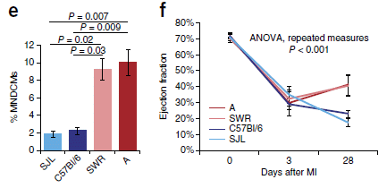
Start with frame f, at the right. It shows what happens when four strains of mice are given artificial myocardial infarctions (MI; heart attacks).
The y-axis shows the ejection fraction, a measure of heart function, at three time points: just before the heart attack (day 0), soon after (day 3), and a month later (day 28).
The four mouse strains are all about the same for the first two time points. Good heart function before the attack, greatly reduced function soon after.
What's important... Look at the results for day 28. Two of the strains got better (the two reds), two got worse (blues).
Now look at part e (left). This shows the same four strains, color coded the same way. The bar heights show the percent of MNDCMs for each strain. It's rather clear... The two strains that showed heart function improvement (red lines in part f) have high %MNDCMs (red bars in part e); the two strains that did not show improvement show low %MNDCMs (blues).
This is part of Figure 1 from the article.
|
The results above suggest that MNDCMs have something to do with recovery after a heart attack.
What are MNDCMs? Mononuclear diploid cardiomyocytes. In plain English, normal cells. "Cardiomyocytes" means heart muscle cells. "Mononuclear diploid" means one nucleus with two sets of chromosomes -- which is exactly the normal state of cells.
The issue here is that most mammalian cardiomyocytes aren't normal cells. They have double the content of chromosomes. (How mice and man do this is somewhat different, but we don't need that here.) It seems that these specialized heart muscle cells can't resume growth, but that the few normal cells -- the MNDCMs -- remaining can do so. The finding above can be restated... The more normal cells there are in the mouse heart, the better it can recover after a heart attack.
The authors examined many strains of mice, and found that they vary widely in how many MNDCMs they have. The four strains tested above sample that range. The scientists also found one gene that helps control the number of MNDCMs; it is called Tnni3k. Understanding the Tnni3k gene could be helpful in understanding the ability of adult mammalian hearts to regenerate.
As so often... This is in mice. Is it relevant to humans? We don't know. Both mice and man make unusual heart muscle cells, with more than the usual content of chromosomes. They do it differently, but it is possible that the initial steps, including the key signals, are similar.
If it does turn out to be relevant to humans, how do we use the information? Should we treat heart attack patients differently depending on their level of MNDCMs? The mouse work suggests that reducing the level of the Tnni3k gene product might lead to more MNDCMs. Should we try to reduce the activity of Tnni3k, in order to stimulate the production of MNDCMs? Should that be done prior to getting a heart attack?
As an example of why one needs to be cautious about predicting what will hold in humans... In mice, lack of function of the Tnni3k gene seems to be without ill effect. However, in humans it is known that mutations in that gene may lead to heart problems.
For now, it is all speculation. We have some clues about heart regeneration from mice; we need to follow them up in humans.
News story: Stem cell discovery refreshes the heart. (Science Daily, August 7, 2017.)
* News story accompanying the article: Genetic insights into mammalian heart regeneration. (A Vujic et al, Nature Genetics 49:1292, September 2017.)
* The article: Frequency of mononuclear diploid cardiomyocytes underlies natural variation in heart regeneration. (M Patterson et al, Nature Genetics 49:1346, September 2017.)
Among recent related posts...
* Human heart tissue grown in spinach (September 5, 2017). A novel approach to getting some heart tissue.
* Synthetic stem cells? (April 30, 2017). Uses the mouse model, with artificial heart attacks.
* Zebrafish reveal another clue about how to regenerate heart muscle (December 11, 2016). Zebrafish, a simple vertebrate, does regenerate heart tissue.
And more about hearts...
* Failure to regenerate heart tissue: role of thyroid hormone (May 14, 2019).
* A look at Chopin's heart (January 9, 2018).
My page Biotechnology in the News (BITN) for Cloning and stem cells includes an extensive list of related Musings posts, including on the related issue of regeneration.
November 8, 2017
DNA sequencing: the future?
November 7, 2017
There has been a revolution in DNA sequencing in recent years. Technical developments, including new approaches to sequencing, have resulted in dramatic cost reductions. That in turn has opened up new applications.
The following figure summarizes the overall cost numbers...
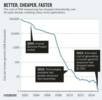
|
The cost of genome sequencing over the 14-year period 2001-2015.
The y-axis numbers show the estimated cost of sequencing the human genome (about 3 billion base pairs), in thousands of US dollars. That is, it starts near 100 million dollars, and ends near 1000 dollars.
The graph shows regions of gradual and rapid cost decline. The former is generally due to improvements in existing technologies; the latter is due to the introduction of new technologies.
Imagine a car or a house that cost $100,000 in 2001. Does such an item now cost $1? That is what it would be if it followed this curve.
This is the main figure from the Comment article listed below.
|
A new "comment" article in Nature offers some thoughts about the future. Not surprisingly, the basics of sequencing are now taken for granted. The big question is, what do we do with all the data?
"Comment" feature, freely available: The future of DNA sequencing. (E D Green et al, Nature News, October 11, 2017. In print: Nature 550:179, October 12, 2017.) A fun article, well worth a browse.
My page Biotechnology in the News (BITN) - DNA and the genome includes an extensive list of Musings posts on the topic.
Here are a few of those posts that strike me as particularly interesting in this context...
Two posts in the same journal during the same year. One is the formal report of the ninth human genome sequence. The other is a news report, just a few months later, suggesting that the number of sequenced human genomes is 2700.
* Inuk, a 4000 year old Saqqaq from Qeqertasussuk (March 1, 2010).
* How many human genomes have been sequenced? (November 30, 2010).
In 2010 we heard that a scientific team had taken the unprecedented step of sequencing the entire gene-coding region for a child whose illness baffled them. Three years later, the US National Institutes of Health (NIH) began to formally evaluate when such a step might be considered appropriate.
* Genome sequencing to diagnose child with mystery syndrome (April 5, 2010). Links to an update.
* More genome sequencing for newborns? (September 17, 2013).
Want to know the mutation rate in humans? Just measure it... compare the genome of a child with its parents' genomes, and see how many mutations the child has. The article discussed here reports that for 78 children and their parents; it is a single article based on doing 219 complete high-quality human genomes.
* Accumulation of mutations in the sperm of older fathers (November 19, 2012).
Sequencing old DNA has special challenges, but that field, too, has exploded in recent years. We now talk about the genetic relatedness of modern man and Neandertals -- based on actual genome information. The oldest DNA sequence reported so far is, I think, still...
* The oldest DNA: the genome sequence from a 700,000-year-old horse (August 4, 2013).
Next sequencing post... Nanopore sequencing of DNA: How is it doing? (November 13, 2017).
Also see: DNA synthesis: a new approach, using a consumable enzyme? (August 12, 2018).
Alzheimer's disease: What is the role of ApoE?
November 6, 2017
A major risk factor for Alzheimer's disease (AD) is having allele 4 of the ApoE gene, that is, ApoE4. However, little is known about what it does to enhance AD.
A new article, using a mouse model, offers a clue about how ApoE4 works to enhance AD.
Previous discussions of AD in Musings have focused mainly on the protein amyloid beta. Another important player is tau, which is also involved in other neurodegenerative diseases. How tau and amyloid beta together are involved in AD is complex and unclear. The current article focuses on tau.
Look at these brain slices...
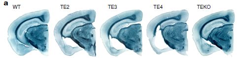
A couple look pretty good; some don't.
The brain slices are from five strains of mice. The one at the left is "normal" -- wild type (WT). The other four are from mice that have been modified to carry special genes relevant to AD.
All four of those modified mice strains have "T". That is the gene for the tau protein, known to be involved in AD. The version of tau used here is a mutant, which increases the level of tau lesions and the resulting brain degeneration. (Note that the T in the name for the first strain is for wild type; all the other T are for tau.)
The modified strains also have one or another allele of "E", the ApoE gene. The first three have human ApoE alleles 2, 3, or 4, as shown. The right-hand strain has a knockout of the ApoE gene; EKO means ApoE knockout.
You can see that the three middle brains, with ApoE alleles 2, 3 or 4, all show degeneration -- the white regions. ApoE4 is the worst. The brain from the ApoE knockout is near normal.
Those are pictures of single brains of each type. They are "representative" pictures. The article contains the data from many animals, and it supports the points mentioned.
Just to be clear... The WT mice have normal mouse tau and ApoE genes.
This is Figure 1a from the article. Other parts of the figure show the data summarized over many animals of each type.
|
The pictures above, along with the supporting data, suggest that ApoE promotes brain degeneration in this system, with the ApoE4 allele being the worst.
All the brains above, except for the WT control, have a mutant tau that is prone to lead to degeneration. This is important, but the data to show that is elsewhere.
What we need is a set of controls, with the various ApoE alleles as above -- but lacking that mutant tau. The scientists did those tests -- and all the brains looked normal. That is, the effect of ApoE, including the greater effect of ApoE4, works through tau.
In the article, the authors relegated that part of the experiment to the "Extended Data", which appears in the pdf file, but not in the print journal. Here is part of the relevant figure: part of Extended Data Figure 1 (page 8 of the pdf) [link opens in new window].
The top part of that figure shows five brain slices, similar to those above. The labels here lack "T"; these mouse strains are similar to those above, except that the mutant tau protein is absent. These brain slices all look normal. That is, the brain defects shown above are due to the ApoE protein interacting with the mutant tau protein.
The bottom part shows an example of the kind of data provided to support the "representative" images. In this case, the hippocampus volume was measured for about 10 animals of each type. You can see that the means, and even the entire distributions, are similar for all five strains of this figure. (In contrast, the corresponding bar graph of such data for the five brains shown above shows clear differences, in agreement with the single images shown there. The mean for the TE4 mice is about 7 mm3.)
In summary, the article shows that ApoE4, a known risk factor for AD, works via tau, enhancing tau-mediated neurodegeneration. Other common ApoE alleles also enhance tau pathology, though less so. Interestingly, knocking out ApoE protects against tau-mediated pathology.
That's in mice. Mice engineered to have human proteins relevant to AD. In this mouse system, neurodegeneration can be analyzed at age nine months. The mouse system allows studies that just could not be done with humans. What is the relevance of this work for humans? We don't know. The work shows some interesting interactions and effects, but we do not know whether they would hold in the natural system. All we can do with the mouse models is to generate leads that must be followed up in humans.
The article briefly notes some findings in humans that suggest a role for ApoE in tau pathology. It's limited, but suggestive.
One aspect of the work here is particularly intriguing, and might be relatively easy to follow up. It's striking that knockout of ApoE reduces tau pathology. That is, knockout of ApoE is protective. Does this mean that a drug targeted to inactivate ApoE could prevent or limit AD? The mouse model could be used during drug development and testing. A promising drug candidate could then be tested in humans.
News stories:
* Newly Identified Role of ApoE4 Suggests Possible Therapeutic Target for Alzheimer's. (Neuroscience News, September 20, 2017.) This story briefly discusses the normal role of ApoE in humans; this normal role would need to be considered when attempting to inhibit it.
* ApoE4 Makes All Things Tau Worse, From Beginning to End. (ALZFORUM, September 20, 2017.) A quite technical discussion of the article. It also includes an interesting interview with the senior author; you might skip down to this interview even if you find the main news story more detailed than you want.
The article: ApoE4 markedly exacerbates tau-mediated neurodegeneration in a mouse model of tauopathy. (Y Shi et al, Nature 549:523, September 28, 2017.)
A recent post on AD: Do chimpanzees get Alzheimer's disease? (October 17, 2017).
Next: Games genes play -- Alzheimer genes, in your brain (January 4, 2019).
More about AD and tau:
* A mutation in ApoE that protects against Alzheimer's disease? (February 22, 2020).
* Alzheimer's disease: a role for inflammation? (January 18, 2020).
More about tau...
* How tau gets around (June 28, 2020).
* Traumatic brain injury: long term effects? (October 8, 2019).
* Early detection of brain damage in football players? A breakthrough, or not? (September 14, 2015).
My page for Biotechnology in the News (BITN) -- Other topics includes a section on Alzheimer's disease. It includes a list of related Musings posts.
The downside of nitrogen fixation?
November 4, 2017
Nitrogen is often a limiting nutrient for growth of plants. That's why we add N-containing fertilizers.
We also consider the few plants that "fix" nitrogen to be good. To "fix" nitrogen means to convert atmospheric N2 to a form useful by plants, such as NH3. A few plants do this, making use of associated microbes that actually carry out the nitrogen fixation. Legumes, such as peas and alfalfa, are perhaps the best known nitrogen-fixing plants. There are also some N-fixing trees.
A new article questions whether N-fixing trees are good. The context is reforestation, in tropical rain forests. Should there be more N-fixing trees, in order to promote overall forest growth?
Here is a key figure...
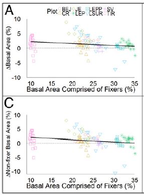
|
The x-axis shows the percentage of the area covered by N-fixing trees ("fixers").
The y-axis shows a measure of forest growth (per year). For part A (upper), that is the overall growth. For part C (lower), that is the growth of non-N-fixers.
The dark line in each part shows a best fit to the whole data set, assuming there is a linear relationship. The slope of each line is negative, as you can see. That is, the more N-fixing trees there are, the worse the overall forest did. The negative slope is statistically significant.
This is part of Figure 2 from the article.
The work here was done in rain forests of Costa Rica. The authors studied several forest plots, at various stages of regeneration. They did not, themselves, alter the plants growing there.
The symbols for the data points identify the various forest plots. This is shown in the key at the top -- which is hard to read. It doesn't matter for now; what matters is that there are many data points.
|
That's not what was expected. N-fixing was supposed to be good; the graphs above suggest otherwise. The authors explain the effect by suggesting -- and even showing -- that the N-fixing trees crowd out other trees; that is the basis of the observed negative trend.
Are you convinced? The data are shown in the graph. Obviously, there is a lot of variation. Maybe that is the point. The hypothesis was that N-fixing trees would be good, would promote forest growth. The results suggest it is not so simple.
Is it possible to sort this out -- to figure out the conditions where N-fixing trees are or are not good? That must remain for further work. For now, the message is... don't assume that N-fixing is good.
News story: Nitrogen-Fixing Trees Are Interfering With Rainforest Recovery. (S Luntz, IFLScience, August 1, 2017.)
The article: Nitrogen-fixing trees inhibit growth of regenerating Costa Rican rainforests. (B N Taylor et al, PNAS 114:8817, August 15, 2017.)
Recent post on nitrogen fixation: Fixing nitrogen -- can U help? (August 29, 2017).
More...
* How soybeans set up shop for fixing nitrogen -- and how we might do better (December 2, 2019).
* A new organelle "in progress"? (September 13, 2010).
Previous forest posts include...
* Who cleans up the forest floor? (November 3, 2017). The previous post.
* Ancient forests of tropical Norway (April 19, 2016).
* More from the artificial forest with artificial trees (August 31, 2015).
Who cleans up the forest floor?
November 3, 2017
A new article addresses the question, with some experiments that are simple and elegant.
The general approach... Take some well-defined areas of forest floor, put well-defined food in them, control who can get access -- and then measure how much of the food gets cleaned up.
Here are some results...
|
The y-axis shows what fraction of the food ("bait") was removed under each condition, in a 24-hour period.
Bar #4 (at the right) is for the reference or "control" condition. It shows what happened if all animals were allowed access. About 80% of the food was removed.
The conditions for the other bars were similar, except that certain animals were excluded.
Comparing bars 2 and 3 with the control bar (#4) makes the main point:
- For #2, ants were suppressed. Food removal was reduced to about 40%.
- For #3, vertebrates were excluded. Food removal was reduced to about 60%.
That is, suppressing ants was more effective in reducing food removal than was excluding vertebrates.
|
For bar #1, both vertebrates and ants were excluded. Food removal was reduced to about 25%. (Who is left after vertebrates and ants are excluded? "Other invertebrates.")
This is slightly modified from Figure 1 of the article. I added the numbers at the bottom of each bar, for ease of referring to them.
Vertebrates were reduced by putting a cage around the food bait.
Ants were reduced by using ant traps. Ants were suppressed by about 90%. Tests showed that they suppressed only the ants, but not other insects.
The bars are labeled with pictograms. I think my numbers are easier to follow, but for the record... The three pictograms are, from bottom to top: ants, other invertebrates, vertebrates. A diagonal line through a pictogram indicates that the group was blocked.
|
The main conclusion... the ants are the biggest contributors to cleaning up the forest floor.
One can undoubtedly think of reservations about the work. Remember, it is an attempt to make measurements under controlled conditions. That allows for trying alternative procedures to ask more questions. If you see limitations to the work, it is good to express them as suggested additional experiments.
The authors note that there seems to be no compensation when a group is missing. For example, vertebrates do not make up for the missing ants. I do wonder how that would look with longer term observations.
The work was done in a tropical rain forest, in Malaysia.
In such rain forests, ants may be a quarter of the animal biomass.
News stories:
* Ants Are Essential Ecosystem Engineers. (M Bates, PLOS Blogs, September 26, 2017.)
* Ants dominate waste management in tropical rainforests. (Phys.org, August 9, 2017.)
The article, which is freely available: Ants are the major agents of resource removal from tropical rainforests. (H M Griffiths et al, Journal of Animal Ecology 87:293, January 2018.) A quite readable article.
Among many posts about ants:
* The role of ants in agricultural pest control (September 12, 2022).
* Insulin: role in reproduction in ants (October 2, 2018).
* What's the connection: blue cheese, rotten coconuts, and the odorous house ant? (August 24, 2015).
* Why a tree cultivates ants (October 3, 2010).
More from Malaysia: Monitoring the wildlife: How do you tell black leopards apart? (August 10, 2015).
I don't see any previous posts about forest floors, but there have been many posts about sea floors, such as: Methane hydrate: a model for pingo eruption (August 4, 2017).
More floors: How does a robot know the floor is clean? (October 30, 2021).
Next post about forests: The downside of nitrogen fixation? (November 4, 2017). Next post; immediately above.
More biodiversity:
* On restoring ecosystems: priorities? (December 5, 2020).
* The ultimate census: the distribution of life on Earth (June 22, 2018).
November 1, 2017
Does using printer toner lead to carcinogens?
October 31, 2017
A new article raises a concern about possible hazards from the use of laser printers and copiers.
These devices use a toner, which consists of a variety of tiny particles. Over time, toners have been developed to provide better printing. One part of that is that they use smaller particles.
Some toner particles get emitted during normal use (including changing cartridges). These emissions are of some concern as general respiratory hazards. In fact, studies have shown increases in respiratory problems for those who work in copy shops -- that is, for those who spend extended time around such equipment.
The new work goes beyond the mere release of particulates from laser printers. It looks at chemical transformations that may be occurring during printing
Here are some results from the new article. The general plan is to take three samples, and measure the amounts of various aromatic chemicals in them.
|
The three samples are the original printer toner, and two types (sizes) of particulate matter emitted during printing. PEP = printer-emitted particles; PM = particulate matter, with the subscript number showing the size, in micrometers.
Results for the three samples are shown with shaded bars; see the key. For our purposes, it is fine to consider the two PM samples together. That is, compare the black bar for the toner to the two lighter bars for the emissions.
The x-axis shows the various chemicals tested. They are all polycyclic aromatic hydrocarbons (PAH). We'll list them in the fine print below, but the main point is that they go generally from simple to more complex, left to right. That corresponds to non-carcinogens at the left to carcinogens at the right.
|
The big picture... For the original toner (black bars), the aromatics are mainly those on the left, the simpler ones that are not carcinogens. For the particulates emitted during printing, the aromatics include more of those to the right, the more complex ones that may be carcinogens. That's the important observation... The aromatics that are considered to be carcinogenic -- those toward the right side -- are found only in the PM samples, not the original toner.
This is Figure 3 from the article.
The figure legend, including the list of chemicals: "Fig. 3 Relative distribution of PAHs in toner powder, PEPs PM2.5 and PEPs PM0.1 (Nap: naphthalene; Acy: acenaphthylene; Ace: acenaphthene; Flu: fluorene; Phe: phenanthrane; Ant: anthracene; Fla: fluoranthene; Pyr: pyrene; BaA: benzo[a]anthracene; Chr: chrysene, BbF: benzo[b/j]fluoranthene; BkF: benzo[k]fluoranthene; BaP: benzo[a]pyrene)."
|
That is, use of the printer toner changes the nature of the aromatic compounds; the emitted PM includes newly-formed carcinogens.
The figure above shows only relative amounts within each sample. However, the accompanying table in the article shows actual amounts, and includes a listing of how carcinogenic each chemical is. Those numbers show that the two PM samples are at least 1000-fold more carcinogenic than the original toner. (In fact, the carcinogenicity of the toner itself calculates to zero on this scale.)
Why are carcinogens formed during use of printer toner? The high temperature is part of the explanation. But also, the authors think that some of the other constituents may be acting as catalysts, promoting the formation of the more complex -- and carcinogenic -- aromatics.
Is this of concern? Well, in general the goal is to reduce exposure to carcinogens. In that sense, this is of concern. As always, dose matters. Those who work in print or copy shops may have substantial exposure to printer emissions. Those who use such equipment at home or in the office probably have much less exposure.
Importantly, the article identifies and defines a problem. That's a key step to solving it. If the findings here are confirmed, it may be that toner developers should incorporate some of the testing done here. That could lead to safer toners.
News story: Unexpected reactions during printing could have health implications. (S Sharp, Chemistry World, October 11, 2017.)
The article: Synergistic effects of engineered nanoparticles and organics released from laser printers using nano-enabled toners: potential health implications from exposures to the emitted organic aerosol. (M-C G Chalbot et al, Environmental Science: Nano 4:2144, November 2017.)
A recent post about effects of PM emissions: What's the connection: ships and lightning? (October 14, 2017).
I see no previous posts on laser printers, toner, or such. There have been posts about printing, some of them using modifications of common inkjet printing. An example: How do you know if you have been in the sun too long? (August 5, 2016).
A post about a related group of chemical pollutants: Fish may adapt to pollution by stealing genes from another species (July 21, 2019).
My page for Biotechnology in the News (BITN) -- Other topics includes a section on Cancer. It includes an extensive list of relevant Musings posts.
This post is listed on my page Introduction to Organic and Biochemistry -- Internet resources in the section on Aromatic compounds. That section includes a list of related Musings posts.
What if a fishing dock fell into the ocean off the east coast of Japan?
October 29, 2017
We actually have some data -- and an article -- on the matter.
Here is the data...
That's the Japanese fishing dock in question. It is on Agate Beach, near Newport, Oregon -- on the US west coast.
The dock is from the Port of Misawa, in Japan. It left there during the great earthquake-tsunami event of March 11, 2011. It landed on the Oregon coast June 5, 2012.
The dock is known as JTMD-BF-1. JTMD = Japanese tsunami marine debris. BF? I don't know.
This is Figure 1A from the article.
|
At one level, there is no mystery here. The ocean currents that carry things across the Pacific Ocean are well known. In fact, a lot of Japanese debris accumulated on the Pacific coast of North America after the 2011 quake.
What's of interest, and the reason for a scientific article, is the passenger list on all this stuff.
In the article, the scientists summarize their findings from over 600 pieces of debris found (mostly) in the US Northwest, and thought to be from the Japan quake of 2011. They found 289 species of living organisms, from 16 phyla. Mostly invertebrates, along with a few fish. The dock shown above, one of the largest objects, brought over 80 species with it.
About a third of the species found on the new debris already occur in the arrival area. For some, it has been suspected that they arrived via the ocean in earlier rafting events.
Will any of the new organisms that rafted to North America during this event establish themselves here? That remains to be seen.
Biologists have long assumed that organisms raft across oceans to reach new lands. However, such transport had not been directly observed. The fallout from the 2011 Japanese quake-tsunami includes the initiation of a major event in biogeography. The current article describes the first steps. We'll learn more over the coming decades about the long term fate of the invaders.
The authors note the role of non-biodegradable materials such as plastics (and fiberglass) in promoting long distance rafting. Not only was some of the debris common plastic waste, but the large objects had substantial plastic contributions, which increased their lifetime on the seas. The quake-tsunami was a natural disaster. Rafting is a natural process. However, these natural processes were modified by human interventions, including the nature of the material available for rafting.
News stories:
* Tsunami enabled hundreds of aquatic species to raft across Pacific -- Biologists detect longest transoceanic rafting voyage for coastal species. (Science Daily, September 28, 2017.)
* Long-Distance Life Rafts Transported Hundreds of Species Across the Pacific, Study Led by Williams-Mystic Director Emeritus Finds. (M Carroll, Williams-Mystic, October 5, 2017.) From one of the institutions involved. Mystic? Look up the Mystic Seaport or the town of Mystic, Connecticut.
* News story accompanying the article: Ecology: Tsunami debris spells trouble -- Human-made objects swept out to sea after the 2011 Tohoku earthquake carried over 300 species to new locations. (S L Chown et al, Science 357:1356, September 29, 2017.)
* The article: Tsunami-driven rafting: Transoceanic species dispersal and implications for marine biogeography. (J T Carlton et al, Science 357:1402, September 29, 2017.)
Previous posts about the 2011 Japan quake have focused on the resulting accident at the nuclear power plant. The most recent such post is: Did the Fukushima nuclear accident lead to a burst of thyroid cancer? (July 17, 2016).
More about tsunamis: Modeling the tsunami from the asteroid impact that caused the dinosaur extinction (October 16, 2022).
More about rafting: How to survive flooding by making a waterproof raft (May 27, 2011).
A recent post about those non-biodegradable plastics... History of plastic -- by the numbers (October 23, 2017).
More about invasive species...
* Fish may adapt to pollution by stealing genes from another species (July 21, 2019).
* A story of dirty toes: Why invading geckos are confined to a single building on Giraglia Island (November 12, 2016).
Chronic fatigue syndrome: a clue about the role of inflammation?
October 27, 2017
Chronic fatigue syndrome (CFS) is a human ailment characterized by, well, chronic fatigue. When the disease is active, affected people are excessively tired, and may be substantially unable to function normally. The disease has been hard to objectify, and has no accepted cause or treatment.
A new article may offer a clue to the nature of CFS. In the new work, scientists measured the level of numerous body signaling molecules (cytokines and such; loosely, hormones) in people with varying degrees of CFS. All of the hormones they studied have a connection to the immune system. The work was a technical advance, using a system that made it practical to measure 51 hormones from several hundred people.
The following figure shows examples of the results, for three of those hormones...
Each frame shows the level of one hormone (y-axis). The axis label MFI stands for median fluorescence intensity; you can just take that as a measure of the amount.
The x-axis groups the CFS patients as mild, moderate, or severe, according to a standard scoring system. The first (left-hand) data is for a control group, without CFS.
In each case, the level of hormone increases with the level of severity of the CFS. Perhaps oddly, the level for the control group is intermediate.
This is Figure 1 from the Komaroff commentary accompanying the article. The three graphs shown here are extracted from a set of 17 shown in Figure 2 of the article.
Here are some comments about the p values. They are in smaller print, because they aren't particularly important; the visible trend is fine for now.
The p value shown in the leptin frame is for the mild vs control data. Although "mild" is lower than the control for all three cases (and for all 17 in the full figure), it is only for leptin that this particular comparison tests as significant. (There is no explanation for this effect, significant or not.)
For the trend itself, all three trends test as significant. In fact, all 17 cases shown in the full figure have a p value below 0.05; the actual value is shown there for each case. (The p values are for the line through the three levels of severity, but not including the control. They have been corrected for the fact that many data sets are being measured in one experiment)
|
That's the idea and the main findings. The scientists examined 51 of those cytokines; 17 showed the effect seen above. (A few showed other effects.) Interestingly and importantly, simply looking at the cytokine levels of all CFS patients grouped together was not so helpful. On average, the cytokine levels were not significantly different in CFS patients and controls. Only when the CFS severity was taken into account was there a significant effect. That's the real novelty here, and it required the large scale assay system used.
What does it all mean? The authors suggest that the main theme may be inflammation. 13 of the 17 cytokines showing the trend are generally considered pro-inflammatory. What causes the inflammation is open; perhaps many things could be the trigger. (It must also be clear that even this explanation is not simple.)
Is the inflammation a direct part of the diseases process for CFS? If so, perhaps treating inflammation early in CFS would help. That's testable. That is, the work here leads to a fairly simple testable hypothesis -- as well as to many questions.
The CFS story has not had many successes. Perhaps the current work will ultimately not be an exception. But it seems to offer leads that are at least worth some follow-up.
News stories:
* Blood markers of chronic fatigue syndrome could pave the way to a diagnostic test. (C Caruso, STAT, July 31, 2017.)
* MEA Summary Review: Cytokine signature associated with disease severity in ME/CFS. (ME Association, August 18, 2017.) ME? That is myalgic encephalomyelitis, an alternative name for CFS. Caution... This item includes considerable discussion of possible interpretations; these go well beyond the current facts.
* Chronic fatigue syndrome: Biomarkers linked to severity identified. (Science Daily, August 1, 2017.)
* Commentary accompanying the article: Inflammation correlates with symptoms in chronic fatigue syndrome. (A L Komaroff, PNAS 114:8914, August 22, 2017.) Good overview of CFS; it integrates the new findings into previous work.
* The article, which is freely available: Cytokine signature associated with disease severity in chronic fatigue syndrome patients. (J G Montoya et al, PNAS 114:E7150, August 22, 2017.)
A previous CFS story... A virus that is or is not associated with chronic fatigue syndrome (February 12, 2010). That post links to follow-up posts on further developments -- and to the ultimate collapse of the story.
Inflammation is a complex issue. It is a normal part of our system for fighting disease. However, excessive inflammation may itself be harmful -- or it may just be a marker of something that is going on. Two recent posts have noted inflammation as a possible issue...
* Association of mother's sleep disorders with premature birth? (October 13, 2017).
* Malaria and bone loss (September 10, 2017).
And more...
* How does "cytokine storm" work? (April 28, 2020).
* Alzheimer's disease: a role for inflammation? (January 18, 2020).
October 25, 2017
What if zebrafish could get human cancer?
October 25, 2017
It could lead to improvements in treatment of human cancer.
It's part of the interest in personalizing treatments. Test a person's cancer, and give the patient a treatment based on their specific cancer, not just typical cancers. How to do such testing is still a new and open field. Lab tests on the cancer cells are one possibility. Some cancers are transplanted to mice for further testing, but that is a slow process.
A new article reports transplanting human cancers to zebrafish. The early work suggests that it works, and may allow rapid testing of the human cancers.
Here is an example of what the scientists did...
|
The test here uses the cancers from five patients who were undergoing treatment.
The cancers from the five patients were transplanted to zebrafish embryos -- and then tested for a drug response. The numbers across the top of frame A say zPDX; that stands for zebrafish patient-derived xenografts. Xenograft means that foreign tissue has been transplanted (grafted).
The test involves the use of a drug combination called FOLFOX. It is a supplementary drug, used (or not) along with the primary drug. The primary drug is a constant here; each test does or does not also include the FOLFOX. For each patient -- or, rather, for each patient's zPDX -- there are two bars: the control and then the result with FOLFOX.
|
What's measured (y-axis) is the activity of an enzyme called caspase 3. This enzyme is part of the process of apoptosis, and its activity correlates with treatment success -- the higher the better.
With luck, FOLFOX increases caspase 3, and leads to a better treatment outcome. The question is whether we can predict which patients will respond to FOLFOX.
The results -- with the zPDXs? In two of the five cases, the bar with FOLFOX is significantly higher than the control bar; these are marked with a * on the FOLFOX bar. In the other three cases, there is not a significant increase; these are marked ns.
And the patients? The data are limited, but frame B shows one key piece of information: whether the patients relapsed after the initial treatment. (Frames A and B don't quite line up, but the patients are in the same order.)
The two patients whose zPDX showed a response have not relapsed. For the three patients whose zPDX did not show a response... two of them have relapsed.
This is part of Figure 7 from the article. (For frame B, I have removed one row of results. They are supposed to be in agreement with what has been presented, but are confusing, partly because of a typo.)
|
The results above show that the tests in the zebrafish xenografts agreed with the patient responses in four out of five cases. The authors make no big claim from that. The main point for now is to show the potential of the system. Human cancers can be transplanted to zebrafish, and tested there. The early testing suggests that the system deserves further study.
Why zebrafish? Compared to mouse systems currently in use, the zebrafish system would be faster and cheaper. Also, it may not require special animals, though this point may need further work. In mice, special immuno-deficient strains must be used for the transplant. The zebrafish used here are normal, not immuno-deficient. The zebrafish larvae do not yet have much of an immune system; the foreign transplant is accepted. However, the authors do note some problems, and wonder whether it may be useful to use immune-deficient fish strains.
Zebrafish have become an important model system for studying vertebrates. The work here opens up the possibility of a new use: assisting with delivering personalized cancer treatment for human patients.
News stories:
* Zebrafish larvae could be used as 'avatars' to optimize personalized treatment of cancer. (Medical Xpress, August 21, 2017.)
* Zebrafish Avatars Predict Tumor Response to Therapy. (S Ktori, GEN, August 22, 2017.)
* Commentary accompanying the article: Fishing for answers in precision cancer medicine. (M Fazio & L I Zon, PNAS 114:10306, September 26, 2017.) An excellent overview of the topic, putting the current work into perspective along with competing technologies.
* The article: Single-cell functional and chemosensitive profiling of combinatorial colorectal therapy in zebrafish xenografts. (R Fior et al, PNAS 114:E8234, September 26, 2017.)
A recent cancer post, also about predicting treatment response... Predicting who will respond to cancer immunotherapy: role of high mutation rate? (October 6, 2017).
My page for Biotechnology in the News (BITN) -- Other topics includes a section on Cancer. It includes an extensive list of relevant Musings posts.
A post about personalized medicine... Personalized medicine: Getting your genes checked (October 27, 2009). This includes an extensive list of related posts. Note that the term "precision medicine" is replacing the earlier "personalized medicine".
A recent post on zebrafish: Zebrafish reveal another clue about how to regenerate heart muscle (December 11, 2016).
History of plastic -- by the numbers
October 23, 2017
Plastic. For better or worse.
The immediate question is... Can we account for all the plastic that has ever been made?
A recent article attempts to do just that. The following figure summarizes the big picture...
"Fig. 2. Global production, use, and fate of polymer resins, synthetic fibers, and additives (1950 to 2015; in million metric tons)." That's the figure legend from the article.
The total production of plastics is 8300; see the big blue arrow at upper left. That's 8300 Megatonnes (Mt), according to the figure legend.
Where did it all go?
- About 2600 Mt of it is in use. That includes 2500 Mt of the original (primary) plastic, plus 100 Mt recycled (secondary) plastic (green numbers above and below the buildings).
- 800 Mt has been incinerated.
- 4900 Mt has been discarded. That number includes what has been deposited in landfills -- and what has not.
This is Figure 2 from the article.
|
Are you surprised that one-third of the plastic is still in use? That's not the familiar part. Figure 1 of the article offers the explanation. Plastics have a wide range of uses. Some uses have short lifetimes, less than a year. But other uses have long lifetimes, measured in decades. That includes structural plastics, as the figure above might suggest.
There is no particular big message here. It's a bookkeeping article -- full of numbers, and many tidbits of information. The authors hope that their analysis will inform planning.
"Global production of resins and fibers increased from 2 Mt in 1950 to 380 Mt in 2015, a compound annual growth rate (CAGR) of 8.4% (table S1), roughly 2.5 times the CAGR of the global gross domestic product during that period (12, 13). " That's the opening sentence of the Results and Discussion section.
The article includes some projections out to 2050.
News stories:
* NEW Global study shows the production, use, and fate of all plastics ever made. (Plastic Pollution Coalition, July 20, 2017.)
* A Plastic Planet. (J Cohen, University of California Santa Barbara (UCSB), July 19, 2017.) From the lead institution.
The article, which is freely available: Production, use, and fate of all plastics ever made. (R Geyer et al, Science Advances 3:e1700782, July 19, 2017.) It's a short and readable article -- with much more data in the Supplementary Materials.
Posts about plastics include...
* Added April 29, 2026.
Can lab gloves contaminate measurements of microplastics? (April 29, 2026).
* Microplastics from glass bottles? (July 2, 2025).
* Building the bio into a biodegradable plastic (September 18, 2024).
* An edible food wrapper, based on bacterial cellulose (February 28, 2024).
* Plasticosis (June 18, 2023).
* Recycling poly(vinyl chloride) (March 28, 2023).
* Making better straws (February 11, 2023).
* Effect of water quality on the formation of microplastics (March 15, 2022).
* Could ships harvest plastic from the ocean -- and use it for fuel? (February 21, 2022).
* Briefly noted... Tiny plastics in the environment (September 21, 2021).
* A better catalytic sponge: degrading plastics, and more (August 11, 2020)
* Good enzymatic degradation of polyesters, by manufacturing the plastic with the enzymes in it (May 4, 2021).
* Briefly noted... Microplastics: the clam solution (October 2, 2019).
* Consumption of microplastics by humans: a report and review from WHO (September 23, 2019).
* Consumption of microplastics by humans: the bottled water problem (September 20, 2019).
* Turning waste plastic into fuel -- a solar-driven process? (October 9, 2018).
* A "greener" way to make acrylonitrile? (January 6, 2018).
* What if a fishing dock fell into the ocean off the east coast of Japan? (October 29, 2017).
* What if the caterpillars ate through the plastic grocery bag you put them in? (May 26, 2017).
* Nanotechnology leads to the development of a superoleophobic polypropylene -- and a better shampoo bottle (November 6, 2016).
* Discovery of bacteria that degrade PET plastic (April 3, 2016).
* A simpler way to make styrene (July 10, 2015).
* Degradable polyethylene isn't (October 17, 2011).
Musings has noted work on the possible biodegradation of some plastics. We emphasize that the level of such biodegradation in nature is thought to be negligible for most plastics. Whether meaningful biodegradation of plastics can be developed is an open question.
Laika, the first de-PERVed pig
October 22, 2017
|
That's Laika, the first pig lacking active PERVs. Age: two days.
This is Figure 3A from a new article.
|
This is part of a continuing story, the possible use of pigs as organ donors to humans. One concern is the presence of porcine endogenous retroviruses (PERVs) in the pig genome. It is possible that one of those viruses might become active in humans, with unknown consequences.
Nearly two years ago, Musings reported that scientists inactivated the PERVs from the pig genome, using CRISPR as a gene-editing tool [link at the end]. This was done in a cell line used for lab work. It was proof of principle, but did not lead to a pig.
The same scientific team has now taken the next step, and made a pig with no active PERVs. Laika, pictured above, is the result -- the first result.
The cell line used for the earlier work was not suitable for making a pig. So they effectively repeated that work with a line of primary (normal) cells. Then, a nucleus from such a de-PERVed cell was transplanted to an enucleated egg cell, leading in due course of a normal pregnancy to a de-PERVed pig.
They now have several such pigs. Presumably, ordinary breeding of de-PERVed pigs will occur at some point.
The immediate result tells us that de-PERVed pigs are viable. That in itself is new information. Some people may not be surprised at that, but it really was a question -- one that could only be answered by doing the experiment. The scientists will be alert for any possible problems as the pigs develop.
It seems clear that making a de-PERVed pig brings us closer to using a pig as an organ donor for humans. How much closer? This work has brought the discussion to the forefront. Interestingly, some think it may be time.
There may be some hype in that. It remains to be seen whether the immunological challenges can be met -- and, finally, whether pig organs really are effective in humans. But this work is a step, and it also shows the usefulness of CRISPR as a tool.
News stories:
* CRISPR breakthrough ignites hope of using pigs as organ donors. (Science Nordic, September 12, 2017.)
* Genetically Engineering Pigs to Grow Organs for People -- Scientists announce the birth of 37 pigs gene-edited to be better for human transplant. (S Zhang, The Atlantic, August 10, 2017.) A broad discussion of the topic, with much that is beyond the current article.
* Expert reaction to study on the use of genome editing to inactivate endogenous retroviruses in pigs. (Science Media Centre, August 10, 2017.) Only two contributions here, but the second in particular is a good discussion of issues in xenotransplantation.
* News story accompanying the article: Genetics: Advances in organ transplant from pigs -- Inactivation of PERVs in the pig genome increases the safety of xenotransplantation. (J Denner, Science 357:1238, September 22, 2017.) An excellent discussion of the current article, with context.
* The article: Inactivation of porcine endogenous retrovirus in pigs using CRISPR-Cas9. (D Niu et al, Science 357:1303, September 22, 2017.)
Background post: How to do 62 things at once -- and take a step towards making a pig that is better suited as an organ donor for humans
(January 17, 2016).
Previous CRISPR post: CRISPR: First clinical trial in humans (November 28, 2016).
Next: CRISPR: Making specific base changes -- at the RNA level (February 20, 2018).
A CRISPR post, which includes a complete list of all Musings posts on CRISPR (and other gene editing tools)... CRISPR: an overview (February 15, 2015).
Examples of use of pig donor:
* Pig hearts can sustain life in baboons for six months (January 7, 2019).
* Long term survival of a pig heart in a baboon (April 30, 2016).
Another approach... Human heart tissue grown in spinach (September 5, 2017).
There is more about replacement body parts on my page Biotechnology in the News (BITN) for Cloning and stem cells. It includes an extensive list of related Musings posts, including those on xenotransplantation.
A post about possible effects of human endogenous retroviruses: A connection: an endogenous retrovirus in the human genome and drug addiction? (October 29, 2018).
Would a probiotic reduce sepsis in newborn babies?
October 20, 2017
Start with a quick overview of the following bar graph...
|
Two groups of newborn infants. A placebo group and a treated group ("synbiotic").
Just over 200 cases in the placebo group. About half that in the treated group.
This is Figure 1 from the Tancredi news story accompanying the article in the journal.
|
That looks good. What's this about? Cases of what? Treated with what? What is a synbiotic?
The work here deals with sepsis (loosely, infections requiring treatment) in newborn babies. The treatment is bacteria: probiotic bacteria, intended to improve the newborn's gut microbiome. (It's a little more complex than that, but that's the key point, and will get us started.)
Each bar shows four sets of data, with various shades of blue. Fortunately, they are listed in the key in the same order they are used in the graph. The top three sets are for various classes of infection. Treatment leads to a reduction for each of those three classes. In the article, some of those classes are subdivided further; there is a reduction for each subclass examined -- statistically significant in most cases. That is, the reduction in infection seen as the big picture seems to hold for most classes of infection.
The fourth set -- the darkest blue, at the bottom? It is for deaths. The numbers... 4 deaths in the control group, 6 in the treatment group. Deaths were 50% higher with the treatment. That is not statistically significant, with those small numbers. The article lists the cause of death for each case, as is proper procedure for a clinical trial. A couple of the deaths in the treatment appear to be special cases, due to birth defects. It's not likely that the treatment increases deaths, but only further -- and larger scale -- testing can show that for sure.
The goal was to develop a simple and inexpensive treatment, suitable for use in low-resource settings. The results here show a 40% reduction in the official criterion: sepsis plus deaths. It's an encouraging result.
What's in the treatment? The main ingredient is the bacterium Lactobacillus plantarum, as a probiotic -- a good bacterium. There is also a special sugar, an oligosaccharide of fructose. That's called a prebiotic, something that feeds the probiotic. The combination is called a synbiotic, the term shown in the figure above.
The treatment was administered orally for seven consecutive days starting 2-4 days after birth. The trial followed the infants for two months.
Most of the babies were full-term. All were normal weight and being breast-fed.
The cost of the treatment is estimated at about one US dollar. That number can be a little misleading. First, that is the cost of the product, ignoring development costs. Second, healthy kids are treated. For example... Treat 100 kids, at a cost of $100. The control set had about 9 cases of sepsis, with about 5 cases in the treatment group. That is, the treatment prevented 4 cases of sepsis, at a total cost of $100. That's $25 per case saved. Still sounds good. And it is simple and safe.
Concerns and limitations? There is always some mystery about probiotics. What are they really doing? At least in this work, the desired outcome is short term, and the data provides good support for the probiotic treatment. But, to whom does it apply? Does it depend, for example, on the mother's microbiome? Would equally good results occur in a different place, with different food and culture? The authors discuss these limitations. Nevertheless, the work here provides encouragement to continue this line of work.
The reduction in respiratory infections was particularly striking and unexpected. As you can see from the figure above, this is the largest class of infections in the study, and the results were dramatic. But why a gut probiotic reduces respiratory infections is not clear. That's a nice problem to have -- that something worked better than expected. But it makes one wonder about how the results will transfer to other situations when we don't understand them here.
News stories:
* Probiotics can prevent sepsis in infants, study shows. (Science Daily, August 16, 2017.)
* Seeding the Gut Microbiome Prevents Sepsis in Infants -- An oral mix of a pre- and probiotic can decrease deaths from the condition, according to the results of a large clinical trial conducted in rural India. (A Azvolinsky, The Scientist, August 16, 2017. Link is now to Internet Archive.)
* News story accompanying the article: Global health: Probiotic prevents infections in newborns. (D J Tancredi, Nature 548:404, August 24, 2017.)
* The article: A randomized synbiotic trial to prevent sepsis among infants in rural India. (P Panigrahi et al, Nature 548:407, August 24, 2017.)
A recent post about pregnancy: Association of mother's sleep disorders with premature birth? (October 13, 2017).
Posts about probiotics include...
* Using bacteria to treat phenylketonuria? (September 16, 2018).
* Staph fighting Staph: a small clinical trial (April 8, 2017).
* A clinical trial of ice cream (June 2, 2015). Includes a Lactobacillus as one of the probiotics.
October 18, 2017
Do chimpanzees get Alzheimer's disease?
October 17, 2017
The figure shows a brain section stained for plaques of the amyloid-beta (Aβ, specifically Aβ-42) commonly associated with Alzheimer's disease (AD).
The sample here is from the brain of a 58-year-old chimpanzee.
The scale bar is 250 µm.
This is Figure 1D from a new article.
|
|
The article reports examination of brains from 20 chimpanzees, age 37-62. Over half had Aβ plaques, such as seen above.
It's not an entirely new finding. However, the new article provides more chimp evidence than before on various features found in human AD.
Here is another example...
|
The graph shows the "pretangle density" for two groups of chimps: those with lower and higher degrees of brain pathology called cerebral amyloid angiopathy (CAA).
It's clear that the pretangle density is higher in the chimps with the more severe CAA.
The pretangle density is a measure of abnormal forms of the protein tau. It is associated with AD, though the details are not clear. CAA is due to Aβ. The results here establish a correlation between tau and Aβ pathologies in chimps.
This is Figure 7B from the article.
|
So, do these chimps have AD? We can't answer that. AD is defined in part by behavior (dementia), and we have no record of the behavior (or mental state) of the chimps studied here. What we have are the most extensive brain exams yet for aged chimps, and they show many signs that are reminiscent of the brains from people who died with AD.
The observations in chimps do not entirely match those in humans. For example, in the chimps, Aβ is more commonly observed in the blood vessels. This serves to emphasize that we do not know how to interpret the new findings. Two proteins associated with disease in humans appear to be doing bad things in chimps. However, it is hard to say more at this point.
Common wisdom has been that Alzheimer's is a uniquely human disease. The big message from this new work is that we should seriously consider the possibility that is wrong.
Where is this going? It's hard to know. Will there be studies of dementia in chimps? Is it possible that we will find AD-like symptoms in other primates, perhaps including those more often used in lab research?
News story: Pathologic Hallmarks of Alzheimer's in Aged Chimpanzee Brains. (Neuroscience News, August 1, 2017.)
The article: Aged chimpanzees exhibit pathologic hallmarks of Alzheimer's disease. (M K Edler et al, Neurobiology of Aging 59:107, November 2017.)
The protein sequences for tau and amyloid beta are identical in human and chimp. The precursor protein for Aβ is about 99% identical between the species.
Chimp brains? Scientists have been collecting and storing them for a couple decades. They are all from chimps that died in captivity of natural causes.
Previous post about AD: An antibody to treat Alzheimer's disease: early clinical trial results (September 26, 2016). Includes a nice overview of how Aβ and tau are thought to relate to AD.
Next: Alzheimer's disease: What is the role of ApoE? (November 6, 2017).
More on the possibility of AD in a non-human animal: Features of Alzheimer's disease in dolphins? (April 24, 2023).
Previous post on chimpanzees... Is Bcbva anthrax a threat to wild populations of chimpanzees? (September 8, 2017).
My page for Biotechnology in the News (BITN) -- Other topics includes a section on Alzheimer's disease. It includes a list of related Musings posts.
Crashworthy drones, wasp-inspired
October 16, 2017
A new article addresses a well-known problem with drones. They don't survive crashes very well. (More formally, drones are called unmanned aerial vehicles (UAVs).)
The following figure shows the idea behind the authors' approach...
The drone consists of two main pieces. They are shown separately in part a (left side): a small "central case" and an "external frame".
In use, the case fits in the central region of the frame. It is held there by four "magnetic joints", one of which is labeled on the frame. The overall assembled unit is rigid and suitable for flight.
In the event of a collision, the case will pop loose -- if there is enough energy to overcome the magnetic joints.
Once the case is loose, the rest of the drone -- the frame -- is quite flexible. That's shown in part b (right). That flexibility allows the frame to survive the crash. Upon absorbing the energy of the collision, it bends, but doesn't break.
The case hasn't gone away; it is held by elastic bands. When the unit comes to rest, it is quickly reassembled by returning the case to the center position. In fact, it may well just snap itself back together.
This is part of Figure 4 from the article.
|
Those stills give the idea, but can't show what actually happens. I encourage you to check the video, listed below.
As a result of the two-part design, the drone can survive high impact crashes. The magnetic joints serve as a fuse; with a high energy input from a crash, the magnetic joints are broken, allowing the flexible part of the craft to dissipate the energy through bending. This impact resistance is achieved here with only a small impact on the weight or on the general aerodynamic properties.
What about the wasp referred to in the title? Are wasps held together by magnets? No, but their wings do have a "dual-stiffness frame". Upon high-impact collision, certain joints release (reversibly), allowing the wing to fold and dissipate the energy.
News stories:
* Insect-inspired mechanical resilience for multicopters. (L Seward, Robohub, February 27, 2017.)
* Drone approach to survive collision: Be flexible, be rigid, be insect. (N Owano, Tech Xplore, March 10, 2017.) (Tech Xplore is another spinoff of Phys.org.)
Video: There is a short video from the authors. It shows the design, but also shows the drone in operation. There are two tests; the second one (the drop test) is probably clearer. The video is included with the Tech Xplore news story. It is also available directly at YouTube. (1 minute; no narration, but the drone is noisy; well labeled. Caution... it's 36 MB; make sure you have a good connection.)
The article: Insect-Inspired Mechanical Resilience for Multicopters. (S Mintchev et al, IEEE Robotics and Automation Letters, 2:1248, July 2017.)
Previous post on drones: What if there weren't enough bees to pollinate the crops? (March 27, 2017).
More...
* A mosquito-like robot (August 18, 2020).
* Using drones to count wildlife (May 15, 2018).
* A better way to collect a sample of whale blow (November 28, 2017).
For more about bio-inspiration, see my Biotechnology in the News (BITN) topic Bio-inspiration (biomimetics). It includes a listing of Musings posts in the area, and has additional information.
What's the connection: ships and lightning?
October 14, 2017
There is more lightning near ocean shipping lanes than in nearby areas. Why? Is it possible that ships cause lightning?
A new article addresses the issue. It makes use of recently-implemented extensive tracking of lightning.
|
The figure shows two data sets plotted against latitude (x-axis; labeled at the very bottom), for a region of the Indian Ocean.
Part a (upper) shows the frequency of lightning strikes.
Part c (lower) shows air pollution, specifically PM2.5 (particles below 2.5 micrometers in diameter).
Both graphs show peaks at about the same latitude, 6° N.
To elaborate on the upper graph... Most of the curves are for a specific two-year period, as shown in the key. The wider line is a summary curve, for the entire 12-year period.
Abbreviations:
Part a... WWLLN: World Wide Lightning Location Network.
Part b... EDGAR: Emissions Database for Global Atmospheric Research.
NDJFMA. The peak lightning season. N = November.
This is part of Figure 3 from the article.
|
6° N. That's the region of a major shipping lane, between Sri Lanka and Sumatra.
The data shows that lightning strikes and pollution are both high in the same region -- the shipping lane. Those are correlations.
It's a separate question whether there might be a causal connection. However... Ships cause air pollution. (They burn carbon-based fuels.) Air pollution "causes", or at least enhances, lightning. (The particulate emissions make it to clouds, leading to more lightning events.) Those are the connections suggested in the article.
Analysis of another shipping lane, in the South China Sea, shows similar results.
A caution... The level of lightning strikes is not particularly high in either case. The comparison is lightning in the shipping lane vs lightning in the nearby region.
The authors examine some other possible reasons for the observations, but none fit the results shown above. They conclude that the most likely explanation for the increased lightning over the shipping lanes is the emissions from the ships themselves.
News stories:
* Ships' fumes a trigger for more lightning strikes. (K Ravilious, Guardian, September 19, 2017.)
* Ship exhaust makes oceanic thunderstorms more intense. (Phys.org, September 7, 2017.)
The article, which is freely available: Lightning enhancement over major oceanic shipping lanes. (J A Thornton et al, Geophysical Research Letters, 44:9102, September 16, 2017.)
The lightning pattern is clear from a simple map of lightning strikes. This is how the scientists got started on the issue. You can see the pattern in Figure 1a of the article, where there is a particularly clear line of lightning strikes in the Indian Ocean area. This figure is also shown in the Phys.org news story, but the pattern is even clearer in Figure 2a of the article, where the key regions are marked.
Other posts about lightning:
* Lightning and nuclear reactions? (January 28, 2018).
* When lightning strikes a tree... (April 8, 2014).
* A story of ball lightning and burning earth (February 4, 2014).
More about engine emissions:
* Reducing diesel emissions from ships (March 3, 2018).
* Low temperature treatment for auto exhaust? (February 18, 2018).
* Diesel emissions: how are we doing at cleaning up? (July 30, 2017).
More about emissions: Does using printer toner lead to carcinogens? (October 31, 2017).
Previous "What's the connection" post: What's the connection: Narcolepsy and the flu vaccine (or getting the flu)? (October 3, 2015).
Association of mother's sleep disorders with premature birth?
October 13, 2017
Briefly noted...
The bottom line... "Prevalence of preterm birth (before 37 weeks of gestation) was 10.9% in the referent group compared with 14.6% among women with a recorded sleep disorder diagnosis." That's from the Results section of the abstract of a new article.
That is, mothers with diagnosed sleep disorders were about 30% more likely to give birth prematurely.
Subdividing that, and looking at specific sleep disorders... The two major sleep disorders were sleep apnea and insomnia. Both showed significant effects.
Results for other sleep disorders did not show significant effects, but the numbers were small. Those other disorders included movement disorders and narcolepsy.
The primary conclusions are based on defining preterm as delivery before 37 weeks. The full data in the article is subdivided: before 34 weeks, and 34-36 weeks.
For both major conditions, the effect was larger for the earlier births (<34 weeks) than for the full set of preterm births (<37 weeks). In fact, the effect for the 34-36 week births alone did not quite meet the usual test for statistical significance.
Why is there an association? The work here does not address that. The work is based on mining existing medical records. The authors query the records, and find correlations. A lot of judgment is required even to get that far, as there are many possible variables to consider.
The authors note that sleep deprivation may lead to increased inflammation, which may lead to premature birth. But the importance of that suggested connection remains to be tested.
Would good treatment of the sleep disorder help the pregnancy? There is nothing in the data here to address that. If the connection is something like the possibility noted above, then it might be good. But it is also possible that the connection between sleep disorder and delivery time is indirect.
As so often, the work here is a small step. It raises some interesting questions, but doesn't have answers.
News stories:
* Could sleep disorders raise the risk of preterm birth? (H Nichols, Medical News Today, August 14, 2017. Now archived.)
* Insomnia linked to premature birth in study of 3 million mothers -- Women with sleep disorders were about twice as likely to deliver babies more than six weeks early. (A Maxmen, Nature News, August 8, 2017.)
The article: Sleep Disorder Diagnosis During Pregnancy and Risk of Preterm Birth. (J N Felder et al, Obstetrics & Gynecology 130:573, September 2017.)
Recent post about pregnancy problems: ELABELA deficiency and preeclampsia? (October 8, 2017).
Next, related... Would a probiotic reduce sepsis in newborn babies? (October 20, 2017).
More about premature birth:
* Kangaroo mother care for premature babies: start immediately (June 27, 2021).
* Using caffeine to treat premature babies: risk of neurological effects? (April 27, 2019).
Among many posts about sleep:
* A gene for insomnia? (February 4, 2023).
* Conversing with dreamers (July 6, 2021).
* When do jellyfish sleep? (September 29, 2017).
More inflammation: Chronic fatigue syndrome: a clue about the role of inflammation? (October 27, 2017).
October 11, 2017
Making lithium-ion batteries more elastic
October 10, 2017
Let's jump in and look at some data. The following graph compares the performance of two lithium-ion batteries. It makes an interesting point -- and the graph isn't as complicated as it looks.
|
Look at the bottom two curves. They show the capacity of two batteries, over repeated cycles of discharging and recharging.
The green line is for the "original" battery type. You can see that the capacity declines dramatically. The test was terminated after 50 cycles.
The black line shows the new "improved" battery. The capacity is stable over the entire course of the experiment, 150 cycles. The new battery is indeed improved, as judged by this criterion.
|
Abbreviations? We'll come back to them later.
Numbers? Capacity is shown on the left-hand axis. (The graph even has little arrows pointing from the curves to the correct axis.) This is capacity per unit area, in milliamp-hours per square centimeter.
The upper curve? It, along with its inset, shows the efficiency of the new battery; it's good. Right-hand axis. (Just follow the little arrows.)
This is Figure 3B from the article.
|
So the new battery works better, as judged by maintaining its capacity over 150 use cycles. What design problem did the scientists address and how did they make the improvement?
One factor leading to battery decline is that it, literally, falls apart. A battery uses chemistry to provide electricity. The battery contains different chemical substances at different stages of the charging cycle. And those different substances take up different amounts of space. Each cycle of charging stresses the battery physically; among other things, critical contacts get broken.
The battery here is a type of lithium ion battery, with a silicon anode. It has some promise, but it doesn't have a good lifetime. The Si undergoes huge volume changes during the use cycle, and that limits the lifetime, as shown by the green curve above. The scientists here have extended the lifetime of the silicon electrode.
The following figure gives an idea how they did this...
The figure shows what is happening at two levels. In each row, there are three frames. They show the original material, the stressed material, and the material after a completed cycle -- or many such cycles.
I think the bottom row may be easier to follow. Note that the material looks about the same in the first and third frames. That's the point; it recovered. In the middle frame, it stretched considerably, but it recovered in an orderly way. Why? Because the material was constrained -- by the blue thread with the red rings on it. That is a molecule called polyrotaxane. It consists of a series of rings that slide along the thread. And that polyrotaxane is also connected with the main binder material.
This is part of Figure 1B from the article.
|
If you want to follow the details, here are what some of the abbreviations mean...
In the top figure, the original battery (green curve) is labeled PAA-SiMP. SiMP stands for silicon microparticles; that is the anode material. PAA stands for polyacrylic acid; this is a binder material. The improved battery (black curve) also has PR in it. PR stands for polyrotaxane. PR is the novel addition here, as introduced in the figure above. It is a rings-on-a-thread structure, which allows constrained movement along the threads. That provides elasticity, and dissipates the strain from the volume change during battery operation.
If you don't find all the description too clear, don't worry too much. It's not entirely clear what is going on. They add the PR material, and the battery works better. You saw some data above to show that. And they have pictures to show that it retains physical integrity. They have a model for how the PR improves the battery integrity, but it is just a model.
Clear model or no, the battery seems improved. We'll see what else they can do with this approach. They say they are in discussion with a battery manufacturer.
News story: Stretching The Performance Of Silicon Batteries. (Asian Scientist, August 1, 2017.)
* News story accompanying the article: Batteries: Sliding chains keep particles together -- A polymeric pulley relieves stress as charging silicon particles expand inside a battery. (J Ryu & S Park, Science 357:250, July 21, 2017.)
* The article: Highly elastic binders integrating polyrotaxanes for silicon microparticle anodes in lithium ion batteries. (S Choi et al, Science 357:279, July 21, 2017.)
Previous post on lithium ion batteries: What happens when a lithium ion battery overheats? (February 19, 2016).
More...
* A lithium-ion battery that might be good for a million miles? (October 29, 2019).
* A low-temperature battery (July 29, 2018).
Other battery posts include...
* Manganese(I) -- and better batteries? (March 21, 2018).
* A flow battery that uses polymers as the redox-active materials (January 8, 2016).
* A battery for bacteria: How bacteria store electrons (May 2, 2015).
More rotaxanes and other interlocked molecules:
* Clippane (March 7, 2022).
* Molecular rings: little rings slip through big rings (July 17, 2018).
There is more about energy on my page Internet Resources for Organic and Biochemistry under Energy resources. It includes a list of some related Musings posts.
ELABELA deficiency and preeclampsia?
October 8, 2017
Preeclampsia is a disorder of pregnancy. Simplified, the blood pressure rises dramatically -- with possible serious consequences to both mother and fetus. The underlying cause is not known.
A recent article offers a new clue and even hope for a treatment -- at least for preeclampsia in mice.
The work started with routine studies of a recently discovered hormone, called ELABELA. As part of the exploration, the scientists made mice deficient in the hormone. Interestingly, this resulted in symptoms very similar to human preeclampsia.
The following graph shows how the ELABELA hormone affects blood pressure of pregnant mice.
|
The graph shows data for two kinds of mice under two conditions.
The mice are wild type (wt; black symbols), or ELABELA-deficient (red symbols). The latter are listed as ElaΔ/Δ; they lack both copies of the gene for the hormone.
The two conditions are with the mice being infused with the ELA hormone, or not. Those that do not get the hormone get a control infusion: PBS (phosphate-buffered saline).
The y-axis shows the (systolic) blood pressure. It is shown compared to that for the same mother before pregnancy. Each point is for one mouse.
The graph shows results for three time points, as shown along the x-axis: gestational days 14, 16, 18. (Birth occurs typically on day 19.)
|
A quick glance shows that most of the high values, showing elevated blood pressure, are for the ELA-deficient mice that are controls, not treated.
With a little more detail, the main observations are...
* The wild type mice show low blood pressure, regardless of whether the hormone or buffer is injected.
* The ELA-deficient mice have high blood pressure. Injection of these mice with exogenous ELA returns the blood pressure to a low value.
Those observations hold broadly for all three time points. However, on day 18, the effect of the hormone on the mutant mice was not significant. If you look at the data points, this seems to be because half of the untreated mice showed little effect of the hormone deficiency. Results such as this remind us of the problems with small amounts of data.
This is Figure 4F from the article.
|
The results seem clear... ELABELA deficiency leads to a condition very much like preeclampsia. Adding back the missing hormone ameliorates the symptoms.
That's in mice.
What is the relevance to humans? At this point, there is no information. Although the hormone has been found in humans, and it seems to be in about the same places, there is no information on how important it is. In particular, there is no evidence that the preeclampsia naturally found in some human pregnancies is caused by or related to ELABELA level. Clearly, this needs to be followed up in humans. The first step may be to simply measure the level of this hormone in pregnant women, and look for any correlation with the common preeclampsia condition.
At the top of the post, we said that this work offers a clue. The work here has shown a new factor involved in a preeclampsia-like condition in mice. We cannot assume it will be important in humans, but must check it.
News stories:
* Lack of a hormone in pregnant mice linked to preeclampsia. (B Yirka, Medical Xpress, June 30, 2017.)
* Anti-Preeclampsia Hormone Discovered -- A small, placenta-produced peptide fixes the pregnancy-related condition in mice. (R Williams, The Scientist, June 29, 2017. Link is now to Internet Archive.)
* News story accompanying the article: Developmental biology: Circulating peptide prevents preeclampsia. (R C Wirka & T Quertermous, Science 357:643, August 18, 2017.)
* The article: ELABELA deficiency promotes preeclampsia and cardiovascular malformations in mice. (L Ho et al, Science 357:707, August 18, 2017.)
An earlier post on blood pressure: Controlling blood pressure: a clue? (January 8, 2011). The authors of the article discussed here speculated that their findings might be relevant to preeclampsia.
Perhaps related... Peripartum cardiomyopathy -- a heart condition associated with pregnancy (June 30, 2012).
More about pregnancy:
* A gene from Neandertals that promotes human fertility (November 1, 2020).
* Association of mother's sleep disorders with premature birth? (October 13, 2017).
* Zika fallout: Should pregnant women receive immunizations? (September 30, 2017).
Predicting who will respond to cancer immunotherapy: role of high mutation rate?
October 6, 2017
An exciting development is in progress for treating cancer. It's called immunotherapy. The idea is to allow the person's own immune system to attack their cancer. Why doesn't it do that normally? It may be that it does, but that the response is limited. In fact, the cancer may even make factors to limit the immune response.
In recent years, scientists have learned how the immune response is limited. That knowledge has allowed them to develop drugs that turn the immune response back on.
The results seem, at times, almost miraculous: people with advanced cancers, who have failed conventional treatments, are given the new "immune checkpoint" drugs -- and within months are cured.
But there is a catch. It works spectacularly for a few patients, partially for some, and not at all for most. It's tantalizing -- and frustrating.
An explanation is starting to emerge. If the immune system is to work, there must be something to attack. The cancer must appear to be non-self (foreign). Since the cancer is indeed self, why would it appear to be non-self? One, seemingly puzzling, observation is that patients with the most advanced cancers are most likely to respond to the new immune checkpoint therapy. It may be that the more advanced cancers are more likely to have novel antigens, which the immune system considers non-self. Why? Cancer is characterized by excessive growth. More growth means more possibility of mutations, thus more possibility of novel antigens. That offers a possible explanation of why more advanced cancers might respond better than earlier cancers, contrary to all the usual rules of cancer treatment.
But there may be more to it... It's long been known that some people have mutations in DNA repair genes, leading to high mutation rates. These people are more likely to get certain types of cancer.
Is it possible that they are also more likely to respond to checkpoint immunotherapy -- because they are more likely to have new antigens in their tumors? There is already evidence for this with colorectal cancer. A new article extends the evidence to other cancer types.
Here is an example of the results...
Caution... The article does not actually make the point. What we will show here is some interesting results. So, keep your expectations modest for now.
The graph shows the results of a trial involving 86 cancer patients, with various types of cancer. They were treated with a checkpoint immunotherapy drug.
Importantly, all of the patients here have high mutation rates, because they have a defect in DNA repair. That was a screen done in advance, so the test could focus on patients with high mutation rates.
The y-axis shows what happened to their tumors over 20 weeks. The tumor response is shown by the change in the tumor size, as measured by radiography. (SLD is sum of longest diameters, a simple way to measure tumor size.) The patients are arranged in order by the magnitude of their response: worst responses to the left, best responses to the right. The bar color codes the type of cancer.
There is a wide range of results. For some patients, the tumors grew further (at the left; positive values on the y-axis). For most patients, the tumor became smaller. For some, it became 100% smaller (extreme right).
The drug used here is pembrolizumab (Keytruda). It is an antibody against PD-1. PD-1 is a checkpoint for the immune system. The antibody is a checkpoint inhibitor. Blocking PD-1, with the antibody, allows the immune system response to continue.
This is Figure 1B from the article.
|
That's a good response! Diverse types of cancer seem to be responding to the immune checkpoint therapy. What is common here is that the cancers are all deficient in DNA repair, presumably allowing them to accumulate novel mutant proteins, which the immune system can recognize as foreign. The implication is that cancer patients should be tested for these DNA repair deficiencies, and that information can guide the decision whether or not to try checkpoint therapy.
The problem is that there is no clear control within the article itself. We are to compare these results with historical results, and the article doesn't clearly present those. It's not that we don't know, it's more that the comparison results aren't reported here.
In fact, the US Food and Drug Administration (FDA) has used the trial reported here, along with all the background information, to approve the use of this drug in any patient with a demonstrated defect in the DNA repair genes, regardless of the specific type of cancer.
I suggest that you take this post, and even the article, as an introduction to an interesting approach to treating cancer. Perhaps you will recognize how good these results are. In any case, you'll probably be hearing more about this approach to cancer treatment. Stay tuned.
News stories:
* Genetic mutations predict patient response to immunotherapy. (Science Daily, June 8, 2017.)
* Flaws in a tumor's genetic mending kit drive treatment response to immunotherapy. (Medical Xpress, June 9, 2017.)
* News story accompanying the article: Cancer therapy: Genetic biomarker for cancer immunotherapy -- A tumor-associated defect can identify patients to receive immune checkpoint therapy. (S Goswami & P Sharma, Science 357:358, July 28, 2017.)
* The article: Mismatch repair deficiency predicts response of solid tumors to PD-1 blockade. (D T Le et al, Science 357:409, July 28, 2017.)
A recent post about cancer: Cancer and pain -- and immunotherapy (July 7, 2017). This post is also about PD-1, and notes its role in immunotherapy. However, it is about what seems to be a quite distinct role of PD-1.
Next... What if zebrafish could get human cancer? (October 25, 2017).
Another approach to using the immune system against cancer: Immunization of devils: a treatment for a transmissible cancer? (April 24, 2017).
More cancer immunology:
* Pancreatic cancer: another trick for immune evasion (August 1, 2020).
* Role of neoantigens in surviving pancreatic cancer? (February 4, 2018).
My page for Biotechnology in the News (BITN) -- Other topics includes a section on Cancer. It includes an extensive list of relevant Musings posts.
A book about cancer immunotherapy is listed on my page Books: Suggestions for general science reading. Graeber, The Breakthrough: Immunotherapy and the Race to Cure Cancer (2018).
October 4, 2017
A mosquito map for the United States
October 3, 2017
Briefly noted...
A new article projects where two species of Aedes mosquitoes would be able to survive in the United States. Both species are important carriers of pathogens.
The following map summarizes the predictions for one species, Aedes aegypti.
Regions that are shaded are predicted to be suitable for Aedes aegypti. The different levels of shading are for different levels of statistical prediction.
Regions that are unshaded are predicted to be inhospitable for this species.
(In the version of the map in the news story, below, the shadings are labeled with descriptive terms, from "very likely" for the darkest shading to "very unlikely" for the unshaded regions.)
The reddish dots mark where the mosquito has been found so far.
This is Figure 1A from the article. Part B of the full figure shows the corresponding map for Ae. albopictus.
|
Here is an example of the kind of information used to make that map:
|
This graph is for Aedes albopictus. It shows the likelihood that this species will survive based on the rainfall in the driest month.
You can see that this mosquito's likelihood of survival is critically dependent on rainfall.
This is Figure 2D from the article.
|
In general, winter temperature was the major factor affecting the probability of survival for both species. However, for Aedes albopictus rainfall was also a major contributor, as shown above.
One might wonder if this has much value. After all, aren't these trends easily predicted? Yes and no. Formalizing the predictions is important for policymakers, deciding how to allocate resources. For example, perhaps surveillance for mosquitoes should be stepped up in areas where survival is considered likely. Formalizing the predictions requires formalizing our understanding of the mosquitoes' lifestyles.
It's an ongoing process, understanding the mosquitoes better, and tuning our predictions for them.
News story: New US mosquito maps show potential hot spots for Zika, other diseases. (L Schnirring, CIDRAP, September 21, 2017.) Excellent overview.
The article, which may be freely available: Modeling the Environmental Suitability for Aedes (Stegomyia) aegypti and Aedes (Stegomyia) albopictus (Diptera: Culicidae) in the Contiguous United States. (T L Johnson et al, Journal of Medical Entomology 54:1605, November 7, 2017.)
Posts on Aedes mosquitoes include...
* Can Wolbachia reduce transmission of mosquito-borne diseases? 1. Introduction and Zika virus (June 14, 2016).
* Why don't black African mosquitoes bite humans? (December 19, 2014).
* Aedes aegypti mosquitoes do not respond to polarized light when trying to land on water (May 22, 2010).
There is a section of my page Biotechnology in the News (BITN) -- Other topics on Malaria. It includes a list of Musings posts on mosquitoes as well as on malaria.
A recent post featuring a map of the United States... Economic analysis of the damages (and benefits) from climate change (August 26, 2017). Hm, that map is eerily similar to the ones in this article, especially the one for Aedes albopictus.
Not all maps in Musings bring bad news. Here is one that helps you understand where you are: We are all Laniakeans (October 21, 2014).
Climate change and sea level
October 2, 2017
Sea level is rising. However, there is still much that is not clear. For example, is the rate of sea level rise changing? And, what are the contributions of the major processes leading to sea level change? Of course, one of the hardest things to do is to get a clear picture of complex global patterns over a short time period.
It is quite remarkable that modern instrumentation can provide sea level data at the millimeter level. However, there have been calibration errors in some of the reported results, and these are getting fixed.
A recent article offers a useful glimpse of the analysis that is possible. The following graph is their summary...
|
|
This is Figure 4 from the article. I have added numbers at the right to label the bands.
|
The graph show the rate of sea level rise, in millimeters per year, vs time.
Let's look at some aspects of this graph.
1) At the top are two sets of data points. The upper set ("unadjusted") shows the rates of sea level change that were originally reported for the years in question. The lower set ("adjusted") shows the same data after being corrected for some calibration errors during the earlier years.
You can see that the "adjusted" curve shows some evidence that the rate of sea level rise has increased during this time period. However, the error bars are large, and the authors note that the trend is not statistically significant.
2) The whole is equal to the sum of the parts. Five factors that contribute to the change in sea level are identified, and there is some estimate of the magnitude for each. These are all shown in the five colored bands that form the bulk of the graph. Below, we will talk about what some of these factors are. For now, the main point is that the sum of the five factors -- the top of the top band -- is rather close to the corrected data for the measured sea level rise. This is encouraging.
3) What are these contributing factors? Broadly, sea level change has two types of contributions. One is a change in the actual amount of water; there are multiple reasons possible for this. The other is that the density of water changes as the temperature (T) of the ocean changes. (For the most part, water occupies more space -- and sea level rises -- as T rises.)
The bottom band, #5, shows that last contribution. It is about 1 mm per year; its percentage contribution is decreasing because other factors are becoming more important.
Perhaps the most interesting contributor to the increasing amount of water in the oceans is shown in the top band, #1. This is the sea level rise from melting of the Greenland ice sheet. It has increased dramatically over the time period shown.
Band 2, just below the Greenland band, shows the sea level rise due to melting of the Antarctic ice sheet. It seems to have increased by about 40% over the time period shown, but remains a relatively small contributor.
Band 3 is for TWS; that is terrestrial water storage . It includes such things as groundwater extraction -- most of which ends up in the oceans. It may be interesting, but it is still a minor contributor to the overall sea level change.
Band 4 is for glaciers melting. It a substantial contributor, changing some.
For bands 3 and 4, data for recent years is not available. What the authors did was to assume that these values remained at the same level as the last year that has data; the assumed values are shown without color at the right end of the bands.
Overall, what do we have here? As so often with climate change work, we have lots of data -- and lots of error bars. But this article ties some things together. It is now plausible that the data support an increasing rate of sea level rise, even though it is not yet statistically significant. And we can see some of the major contributors to sea level rise, and how they are changing.
The current rate of sea level rise is about 3 millimeters per year. (That is 30 centimeters per century.) If the rate does rise as the curve above might suggest, it could easily be double that by the end of the century.
News stories:
* Greenland now a major driver of rising seas: study. (M Hood, Phys.org, June 26, 2017.)
* Satellite snafu masked true sea-level rise for decades. (J Tollefson, Nature News, July 17, 2017. In print: Nature 547:265, July 20, 2017.) The lead figure shows the Greenland ice sheet thawing. This news story focuses on the error in the early satellite measurements, and discusses several articles in addition to the one of this post.
* Expert reaction to research on rate of sea level rise. (Science Media Centre, June 27, 2017.) The opinions are diverse.
The article: The increasing rate of global mean sea-level rise during 1993-2014. (X Chen et al, Nature Climate Change 7:492, July 2017.)
An earlier post about sea level changes: Regional changes in sea level: evidence from gravity measurements (February 26, 2016). Links to more.
And more... Should we geoengineer glaciers to reduce their melting? (April 4, 2018).
A recent post about climate change: The Paris climate agreement: How are we all doing? (August 28, 2017).
Also see: Seismologists measure temperature changes in the ocean (October 6, 2020).
Zika fallout: Should pregnant women receive immunizations?
September 30, 2017
We generally don't test new medical treatments (including drugs or vaccines) on children. Why expose them to the risk? In the same vein, we don't test new treatments on pregnant women.
But what if the primary purpose of the treatment is to protect the child -- or the fetus?
It's not a new question, but the recent Zika outbreak in Brazil has brought it into focus. After all, perhaps the greatest risk from Zika is to a fetus.
An international group has recently addressed the issue, and issued a report. As one can imagine, it is all about balancing risks and benefits -- taking into account the best information that is available. In this case, that means bringing to the forefront that the greatest risk is to the fetus.
The broad conclusion is that pregnant women must be an integral part of the development and use of Zika vaccines.
It would be better to reduce transmission, avoiding the problem n the first place. And the current outbreak has probably peaked, as expected as the population gains immunity. Nevertheless, the general question remains, and sometimes the Zika question may be important. The report here focuses on Zika, but it is also a step toward an updated policy on testing treatments on children and pregnant women.
News story: Zika vaccine research: guidance for including pregnant women. (Wellcome Trust, June 29, 2017. Now archived.) From a major funding group. A brief but very good overview.
The report is at: Pregnant Women & the Zika Virus Vaccine Research Agenda: Ethics Guidance on Priorities, Inclusion, and Evidence Generation. (PREVENT (Pregnancy Research Ethics for Vaccines, Epidemics, and New Technologies), June 21, 2017. Now archived.) Links to the full report, and to an executive summary (9 pages, outlining three imperatives and 15 recommendations).
IMPERATIVE I
The global research and public health community should pursue and prioritize
development of ZIKV vaccines that will be acceptable for use by pregnant
women in the context of an outbreak.
From the executive summary, p 3 (of the pdf). (ZIKV = Zika Virus.)
Previous post on Zika: Why does Zika virus affect brain development? (August 11, 2017).
My page for Biotechnology in the News (BITN) -- Other topics includes sections on
* Ethical and social issues; the nature of science
* Vaccines (general)
* Zika.
- Each includes a list of related posts.
Next post about pregnancy: ELABELA deficiency and preeclampsia? (October 8, 2017).
When do jellyfish sleep?
September 29, 2017
At night, according to a new article.
But that's not really the big story here. The article is the first report that jellyfish sleep at all. Sleep is widespread in the animal kingdom, but had not been reported in jellyfish, which are from one of the simplest animal groups, the Cnidaria.
Here are some results that suggest the jellyfish Cassiopea sleeps at night...
Jellyfish pulsate, moving water in and out of their medusa (or "bell"). In this case, a single animal was watched carefully for two minutes each at day and night, and pulse events recorded. The graph shows the pulse events.
The day and night patterns are clearly different. The night pattern contains big gaps. Even when the pulsating is regular, it is less frequent at night.
This is Figure 2A from the article.
|
Being less active is a sign of sleeping. The behavior above is consistent with the jellyfish sleeping at night.
Two minutes of data on one animal? The scientists recorded pulsation of more than 20 animals, sometimes continuously over several days. The figure above is a simple graph, but the article contains a lot of data showing diminished pulsation at night.
Less active is the criterion for sleep? Well, it is one criterion. There are three standard criteria, and the authors provide evidence that the jellyfish meet all three criteria for sleeping. In addition to showing the reduced activity (above), they show that the jellyfish are less responsive to stimuli while sleeping, and that they will sleep early if they have been sleep-deprived.
The following figure provides some perspective...
The figure starts, at the left, with a simple phylogenetic tree of the animal kingdom
Two of the simplest types of animals are shown at the top: the sponges (Porifera) and jellyfish (Cnidaria). All the others, from mollusks to mammals, are "higher" animals, for our purposes here.
Between the tree and the names are two colored arcs. The light one shows the animals that have neurons, that is, a nervous system. The dark one shows the animals that have a central nervous system (CNS; loosely, a "brain"). The figure shows that all the animals here except the sponges have neurons. Of those, all but the jellyfish have a brain.
The right side shows animals that sleep. In general, sleep is widespread among the higher animals, those with brains. The top item here, with a question mark, is the Cassiopea jellyfish of the current study.
This is Figure 1A from the article.
|
The point, then, is that this is not only the first report of sleep in a jellyfish, it is the first report of sleep in an animal lacking a central nervous system.
What do we make of this? How is this sleep behavior in one kind of jellyfish related to sleep in higher animals? It is possible that it is indeed a type of physiological inactivity, but otherwise unrelated to anything in higher animals. Perhaps that would itself be interesting -- if we concluded that such rhythms arose independently in different animals. It is also possible that sleep emerged in the first animals to develop a nervous system. The authors are cautious: the article refers to a "sleep-like state" in the jellyfish.
There is plenty here for further work. In the meantime, if you come across a jellyfish pulsating irregularly, remember... Let sleeping jellyfish lie.
News stories:
* Jellyfish Don't Have Brains, But They Do Sleep. (S Pappas, Live Science, September 21, 2017.)
* Signs of Sleep Seen in Jellyfish. (Howard Hughes Medical Institute, September 21 2017.) From the funding agency. Includes two short videos about the animals.
The article: The Jellyfish Cassiopea Exhibits a Sleep-like State. (R D Nath et al, Current Biology 27:2984, October 9, 2017.)
For more about the nervous system of a jellyfish: With 24 eyes, can they see the trees? (June 11, 2011).
A recent post about another member of the same phylum, also about its nervous system... Restoring lost hearing: lessons from the sea anemone (November 15, 2016).
My page for Biotechnology in the News (BITN) -- Other topics includes a section on Brain (autism, schizophrenia). It includes a list of brain-related posts. Nervous systems, too.
Among many posts on sleep (with links to more)...
* Evidence for a REM stage of "sleep" in spiders? (October 11, 2022).
* Conversing with dreamers (July 6, 2021).
* Association of mother's sleep disorders with premature birth? (October 13, 2017).
* What if a lion came into your hotel room while you slept? (July 20, 2016).
* Sleep and the brain drain (November 17, 2013).
September 27, 2017
A tale of scientific reproducibility
September 27, 2017
It's an issue that comes up. Do the same thing, and get different results. Sometimes, it is an issue when multiple labs try to follow the same procedure, sometimes it happens within a lab. Perhaps it is a particular problem in biology and the social sciences, with more complex systems and factors that are not only uncontrolled but perhaps unrecognized.
Nature recently ran a short article by three scientists who dealt with such a problem, between their three labs. It involves the worm Caenorhabditis, and a simple question: how long do they live?
Biologists may particularly enjoy reading the article. It is the story of how the question came up, was studied, and partially resolved. There is no big message. Perhaps that is the big message: each instance of reproducibility must be studied.
"Comment" article, freely available: A long journey to reproducible results. (G J Lithgow et al, Nature 548:387, August 24, 2017.)
A post involving aging in C elegans: Extending lifespan by dietary restriction: can we fake it? (August 10, 2016).
An article presenting an alternative to the CRISPR editing system was recently retracted because it was deemed irreproducible. The retraction is noted is the post mentioning the original article: CRISPR notes (October 11, 2016).
My page for Biotechnology in the News (BITN) -- Other topics includes a section on Ethical and social issues; the nature of science. It includes a list of related Musings posts.
What if you pulled on the ends of a ladderene?
September 26, 2017
What's a ladderene? It's like a ladderane, but with a double bond.
The first chemical structure in the following figure, from a recent article, is a ladderene...
That's #13, at the left. The series of cyclobutane rings is known as a ladderane; in this case, there is a double bond in one ring, making this a ladderene.
Imagine pulling at the two ends, where the arrows are. You'll break the first rung of the ladder. That rung is a chemical bond in this case, so you'll end up with an electron (black dot) on each side. That's structure 14.
Pull more, break the next rung. You'll get two more electrons, but they will pair up with the first two, forming two new double bonds (one on each side). Structure 15. Take a moment, and make sure you see which two double bonds are the new ones; they are the ones just above what's left of the ladder.
Repeat those two steps, breaking the next two rungs. You'll get structure 16, then 17 -- which has another double bond on each side.
This is Figure 4A from the article.
|
The point of this? Is this just an exercise in breaking ladders?
Compound 17 has alternating single and double bonds (except at the very ends) -- a pattern we call conjugated double bonds. It is a polyacetylene. Polyacetylenes conduct electricity, and are useful.
The synthesis proposed above -- and that is a theoretical scheme -- offers a new approach to making polyacetylenes.
Where does compound 13, that starting material, come from? And how does one carry out this ladder destruction in a chemistry lab?
The article deals with those issues. In fact, much of the article is about the synthesis of ladderenes, such as compound 13. As to pulling the ladder apart... what the scientists actually do is to sonicate a solution of the ladderene -- a simple bulk treatment. It is a mechanochemical step; see their title. Sonication of the ladderene solution causes it to turn blue, a sign of those conjugated double bonds. At longer times, there is a precipitate: nanowires of the polyacetylenes.
|
Photograph of the reaction vessel at time zero and after 20 seconds of sonication.
This is Figure 3B from the article. (I have modified the label for the left frame.)
|
Is this practical? Probably not yet. What it does is to open the door to a new approach to making organic conducting materials.
News stories:
* Ladder polymer 'unzipped' with a pull. (M Lalloo, Chemistry World, August 8, 2017.)
* Ultrasonic vibrations force a polymer to be a semiconductor. (B Yirka, Phys.org, August 4, 2017.)
The article: Mechanochemical unzipping of insulating polyladderene to semiconducting polyacetylene. (Z Chen et al, Science 357:475, August 4, 2017.)
A post about ladderanes: Turning sewage into profit -- via rocket fuel (September 15, 2010). Ladderane lipids are found in the cell membranes of certain sewage bacteria; it is thought that these unusual lipids protect the bacteria from the highly toxic "rocket fuel" they make. The current authors say that their work was inspired by the natural ladderanes.
For more about bio-inspiration, see my Biotechnology in the News (BITN) topic Bio-inspiration (biomimetics). It includes a listing of Musings posts in the area, and has additional information.
More about conductive polymers: Using an electrical conductor as an insulator (September 12, 2021).
For more about alkenes and alkynes and their polymers, see the section of my page Introduction to Organic and Biochemistry -- Internet resources on Alkenes. Included there is a note about the 2000 Nobel Prize in Chemistry for the discovery of polyacetylenes as electrically conductive polymers.
Triplet-repeats: Do they act through the RNA?
September 24, 2017
Huntington's disease (HD) is a classic example of a "triplet-repeat" disease. People with the disease carry an unusual type of mutation: a particular 3-base sequence (triplet) is repeated, many times. The severity of the disease, including the age of onset, correlates with increasing number of repeats.
What's going on? In the case of HD, the result of the mutation is that the encoded protein, called huntingtin, contains many consecutive copies of the amino acid glutamine, as predicted by the genetic code. Long stretches of polyglutamine have been shown to have various toxic effects. It becomes plausible that the toxicity of the poly-Q (to use the standard symbol Q for the amino acid glutamine) is what causes HD. (However, it is also worth noting that the details of what is important are not clear.)
That is, the repeats in the genome lead to repeats in the messenger RNA sequence; that, in turn, leads to repeats in the protein, and that is toxic. Such an explanation is considered likely for many cases where the mutation is a triplet repeat or similar.
But not all. There are cases where this explanation for why a triplet-repeat mutation leads to disease cannot hold. In some cases, the mutation is in a region that is not translated into protein at all.
A recent article suggests that RNA containing triplet repeats may itself form aggregates.
The following figure shows the idea, with simple tests in vitro...
Consider the top row. It uses RNA molecules carrying repeats of the triplet sequence CAG. Ten repeats per molecule in the left frame, increasing to as many as 66 repeats at the right. The molecules carry a fluorescent tag.
You can see that the RNA molecules aggregate into clusters in the right-hand frames (≥ 31 repeats). There are few such aggregates when the number of repeats is smaller, at the left.
The second row shows the same kind of experiment, but using the triplet repeat CUG. The results are similar.
Controls using RNA of similar overall base composition, but lacking repeats showed no such effect.
This is Figure 1c from the article.
|
The results above show that RNA containing certain triplet repeats can aggregate in vitro. The effect occurs, rather distinctly, above some critical repeat length.
What is the nature of these RNA aggregates? The authors provide evidence that they may be either liquid droplets or near-solid gels.
That's in vitro. Does this happen in cells? Does the effect seen above have any actual biological relevance?
The next test shown here is in vivo, in cells. The repeat in this case is a hexamer, but the idea is the same. The particular hexamer repeat was chosen because it is associated with two diseases: GGGGCC, found in some people with amyotrophic lateral sclerosis (ALS) or frontotemporal dementia (FTD).
|
The left-hand frame shows a cell that made an RNA with 29 repeats of this disease-related hexamer. The white spots are RNA aggregates.
The right-hand frame shows a similar test, but using a control repeat. No white spots.
This is Figure 5d from the article.
|
The experiment shows that an RNA carrying a particular repeating sequence in its RNA can aggregate in cells. The particular repeat studied here is relevant to a known disease. The effect is sequence-specific: it does not occur for a different repeat.
The RNA repeat that aggregated here is a special case: it contains four consecutive G. It's known that GGGG can form an unusual structure, known as a G-quadruplex. That's presumably what happened here, probably involving many RNA stands.
This article provides an interesting development. It shows that small repeats in RNA can cause the RNA to aggregate. This can be shown and studied in a clean, in vitro system. The article also provides evidence that RNA repeats can have effects in vivo. At least, physical effects.
The authors note that they do not see any signs of toxicity due to the RNA aggregates in the cells (over the rather short time scale of their experiments). At this point, there is no evidence that the phenomena found here, aggregation of RNA containing repeats, is relevant to the disease process.
There is much more to be done here, but the article may open up a new approach to studying so-called triplet-repeat diseases.
News story: Not Just for Proteins -- Expanded RNA Repeats Form Gels, Too. (M B Rogers, ALZFORUM, June 3,2017.)
* News story accompanying the article: Neurodegenerative disease: RNA repeats put a freeze on cells. (D W Sanders & C P Brangwynne, Nature 546:215, June 8, 2017.)
* The article: RNA phase transitions in repeat expansion disorders. (A Jain & R D Vale, Nature 546:243, June 8, 2017.)
More HD... Huntington's disease: Mutant human protein disrupts singing in birds (April 18, 2016).
More ALS...
* Effect of exercise on developing ALS (July 27, 2021).
* Is a "dead" virus in the human genome contributing to the neurological disease ALS? (January 11, 2016).
A post about quadruplex DNA structures -- with some implication for disease: G (July 8, 2008).
More about phase transitions in biopolymers: How ticks stick (March 26, 2025).
My page for Biotechnology in the News (BITN) -- Other topics includes a section on Brain (autism, schizophrenia). It includes an extensive list of brain-related Musings posts.
Personal optimization of an exoskeleton
September 22, 2017
An exoskeleton, in this context, is a device one wears to enhance walking. The device may provide both support and energy; in general terms, it enhances strength. For example, the military is interested in exoskeletons because they may allow people to carry heavier loads. A disabled person might use an exoskeleton to compensate for deficiencies.
Although the general principles are clear enough, it is a technological challenge to make a practical device. Musings has presented work on exoskeletons [links at the end], but the big picture is that the devices have seen limited use.
A recent article takes another step: rapid customization of the exoskeleton device to meet an individual's needs.
The following figure summarizes one set of findings. Before you look at it, you might want to get up, take a few steps, and watch your ankles. The angle between ankle and leg varies during a step, in a regular (cyclic) way. The exoskeleton studied here provides torque to assist with that ankle twist. The question is, how much assist should be provided at each stage of the step cycle?
The figure shows the optimum torque cycle developed for 11 able-bodied people using the device.
|
Each curve shows the optimum torque pattern found for one person. The y-axis shows the amount of torque. The x-axis is a time scale, mapping out a single step.
The curves are similar in nature; that is by design. What is important is that each person's optimum is somewhat different.
This is Figure 3D from the article.
|
How do the scientists do this? It involves a series of rapid tests, which lead to optimizing the software that runs the exoskeleton.
They set four parameters: peak torque, timing of peak torque, rise time, and fall time.
The subject walks on a treadmill, wearing a mask that allows the scientists to monitor their respiratory gases, hence their metabolism. You can see the set-up, including the mask, in the news stories or video. It takes about two minutes to get a good measurement. The optimization software adjusts the operating parameters. After about an hour of testing, the person's optimal settings are established, leading to the most effective assist by the device for that person. Attempting to optimize further usually leads to little improvement.
The following figure summarizes some other tests, each with one person...
Frames A-E, all for one subject, compare the device for various types of walking. For each type, the person is tested with regular shoes, with the exoskeleton device, but not providing assist (labeled "zero torque"), and with the device providing optimized assist. The percentage shown in each frame is the metabolic savings due to turning the device on.
Frame A is for slow walking. The metabolic cost is similar -- and low -- under all conditions tested here. (Remember, this is with an able-bodied person.)
For the other walking modes (frames B-E)... There is a small penalty due to wearing the device. However, turning it on to assist more than makes up for that penalty.
Frame F shows similar tests for running. This test is with a different subject. The results are again similar.
Frame G shows results for an optimization done with measuring (calf) muscle activity rather than metabolic gases; the results, for a different subject, are similar. The details of how this was done are not in the article. The main point is that there are various ways to do the optimization.
Do you want to question whether the overall benefit, compared to ordinary shoes, is significant for frames E-F? There is no information to address that. Remember, the results in this figure are for one person. It's fine to take this figure as preliminary, and to question what is significant.
This is Figure 4 from the article.
|
The benefits seen here are generally better than in previous work. That comes mainly from improved -- and rapid -- customization of the device for each user. (It also comes, in part, from having a lightweight device.) It is a step toward making exoskeletons more practical.
News stories:
* Smart algorithm automatically adjusts exoskeletons for best walking performance. (Kurzweil, June 25, 2017.)
* Customizable 'Smart' Exoskeleton Learns from Your Steps. (T Staedter, Live Science, June 23, 2017.)
Video. There is a short promotional video from the publisher. It may help you visualize the system, but doesn't do much more than that. The video is at YouTube. (1 minute; narrated.) Each news story contains that video or a similar one.
* News story accompanying the article: Robotics: Fast exoskeleton optimization -- An algorithm optimizes exoskeleton walking assistance in 1 hour. (P Malcolm et al, Science 356:1230, June 23, 2017.)
* The article: Human-in-the-loop optimization of exoskeleton assistance during walking. (J Zhang et al, Science 356:1280, June 23, 2017.)
Background posts about exoskeletons for assisting humans include...
* An exoskeleton that assists with walking but does not require an external energy source (September 8, 2015).
* Another FDA approval: exoskeleton (August 11, 2014).
* Berkeley Bionics: From HULC to eLEGS (October 22, 2010).
And then... Exoskeletons: focus on assisting those with "small" impairments (April 16, 2018). Includes discussion of the article from this post.
Another exoskeleton issue: How do you breathe while changing your skeleton? (October 31, 2014).
More about walking... What is it? (March 8, 2011).
More about ankles... Humans may be more like salamanders than we had thought (limb regeneration) (February 11, 2020).
Also see my Biotechnology in the News (BITN) page for Cloning and stem cells. It includes an extensive list of Musings posts in the fields of stem cells and regeneration -- and, more broadly, replacement body parts, including prosthetics.
September 20, 2017
On completing the course of the antibiotic treatment
September 19, 2017
You've heard it... Complete the course of antibiotics. It doesn't matter how you feel, complete the antibiotics.
Why? Well, that's an interesting question. You usually don't ask. You just do as the prescription indicates; the doctor has followed standard procedures.
A recent article in the BMJ (British Medical Journal) questions the advice. In particular, it questions one of the reasons commonly given, that completing the course of antibiotics reduces the development of antibiotic resistance. That's actually not very logical: the continuing use of antibiotics might be expected to increase the pressure leading to resistance. Further, there is not much evidence for it. What little there might be is almost folklore, from an earlier era with little understanding of the microbiome and of antibiotic resistance. It is rarely from controlled tests.
Where does this lead? Unfortunately, it leads some to suggest that you can just stop the antibiotics when you want to, when you feel better. That's not really the point, though I must say that the article itself sends mixed messages. The best message is that we need to learn more about the proper use of antibiotics, to maximize effectiveness and minimize side effects, including development of resistance. Easier said than done.
A reminder... Musings is a place to explore scientific developments. Musings does not give medical advice. That's partly because I am not qualified to do so. But it is also important to realize that individual posts typically focus on one article, presenting one result or one view. We don't reach scientific or medical conclusions from hearing one presentation.
With that disclaimer, I can say that I find the article intriguing but incomplete. The authors argue that the justification for the current policy is weak; they make a good case. But to replace that, we need good data about what is the proper antibiotic course, and that data is usually lacking. The authors understand that. I think it is fair to say that their main case is to re-open the topic, with a plea for more data. It is not a suggestion that consumers should just stop their antibiotics when they feel better.
It's an interesting and provocative little article. It raises issues of concern. With luck, it will stimulate discussion -- and experiment -- in the medical research community. Just be careful about jumping to conclusions based on this article alone.
News story: That Age-Old Advice to Finish Your Antibiotics Might Do More Harm Than Good. (M McRae, Science Alert, July 27, 2017.) A quite complete presentation of the article.
The article is labeled as analysis; it is not a research article. It is: The antibiotic course has had its day. (M J Llewelyn et al, BMJ 358:j3418, July 26, 2017.) Check Google Scholar for a freely available copy. It's a short and readable article. If you are interested in the topic, either as a biologist or a consumer, give the article a try. The main part is 3 pages, but note the "Key messages" summary at the top of page 4.
A recent post on antibiotic resistance: Antibiotic resistance genes in "ancient" bacteria (February 11, 2017).
Another part of the problem of antibiotic overuse: Restricting excessive use of antibiotics on the farm (September 25, 2010).
Another possible reason for widespread use of antibiotics: Antibiotic prophylaxis: a useful tool to reduce childhood mortality? (July 9, 2018).
More on antibiotics is on my page Biotechnology in the News (BITN) -- Other topics under Antibiotics. It includes an extensive list of related Musings posts.
What is the proper shape for an egg?
September 18, 2017
Egg-shaped, you suggest? That's really not helpful. Look...
The figure shows pictures of several bird eggs.
There is a pattern to how those pictures are arranged, and that pattern is the basis of the graph.
At the lower left is the egg of the brown hawk-owl. It's pretty much round, nearly a sphere.
At the upper left is the egg of the maleo. It's ellipsoidal: quite elongated compared to the sphere, but symmetric from one end to the other.
At the upper right is the egg of the common murre. It's not only ellipsoidal (elongated), but also asymmetric: one end is blunt and the other end is pointy.
Those examples illustrate the bigger study. The scientists measured the eggs of 1400 bird species. (49,175 eggs!) They calculated the ellipticity (y-axis) and asymmetry (x-axis) of each egg. The graph shows the eggs of 1400 species plotted by their ellipticity and asymmetry, with a sampling of them illustrated.
This is Figure 1 from the article.
The x-axis (A) scale goes from 0 to 0.5; the y-axis (E) scale from 0.1 to a little over 0.7. The numbers are hard to read unless you blow up the pdf, and some of the numbers are covered by eggs. Anyway, you can get the idea from the numbers shown with the pictured eggs.
There is a 2 centimeter scale bar at the lower right.
One of the eggs illustrated is that of the red junglefowl, which is the ancestor of the modern domestic chicken. You can see that this egg is not particularly typical for bird eggs. Not only is the term egg-shaped ambiguous, but defining it in terms of the common chicken egg is misleading.
|
That's fun. But it leads to a question... Why? Is there some reason birds have different shaped eggs? Is there a reason why some birds have an egg with E over 0.6 and A over 0.4?
The authors tried to correlate the egg shape parameters with other things they know about the birds. On the grand scale, over all types of birds, egg shape was most correlated with flight ability. Birds with strong flight tend to have elongated or asymmetric eggs.
There is no explanation for the correlation at this point. This is a statistical work, not experimental. However, one can imagine how the adaptation to flight, which makes serious demands on both anatomy and physiology, might have affected egg shape. Very simply, elongated eggs may be consistent with the streamlined body shape associated with flight. The current work, finding a basic correlation, should lead to further work asking what is behind that correlation.
There are other ideas about why birds make eggs with various shapes. The current study does not disprove any of them. It just says that the biggest factor, over the entire range of birds, is flight ability.
News stories:
* Cracking the mystery of avian egg shape. (EurekAlert!, June 22, 2017.) Includes the picture from the journal cover.
* How eggs got their shapes -- Adaptations for flight may have driven egg-shape variety in birds. (Science Daily, June 22, 2017.)
* News story accompanying the article: Evolution: The most perfect thing, explained -- The requirements of flight best explain the evolution of different egg shapes. (C N Spottiswoode, Science 356:1234, June 23, 2017.)
* The article: Avian egg shape: Form, function, and evolution. (M C Stoddard et al, Science 356:1249, June 23, 2017.)
Where does one find eggs of 1400 bird species to measure? The Museum of Vertebrate Zoology, University of California, Berkeley. It's the largest egg collection in North America. The article itself is not from Berkeley, but from an international collaboration about as odd as the egg collection. The senior author alone is a Professor of Applied Mathematics, Organismic and Evolutionary Biology, and Physics.
Among many posts about flight...
* How to fly a beetle (April 27, 2015).
* Might it be good if airplanes emitted more CO2? (September 5, 2014).
* Why don't penguins fly? (August 24, 2013).
* Mosquitoes that can't fly (May 3, 2010).
Searching Musings files suggests that most posts about eggs are about human eggs, such as...
* Triparental embryos: the FDA and the regulatory dispute (September 12, 2017). An ongoing story, scientific and ethical.
* What are they? (September 14, 2011). It's interesting that we can connect an egg post to one about the Cassini spacecraft, which died last week.
But there are...
* On egg-dropping (June 25, 2025).
* Briefly noted... A mathematical analysis of egg shape (February 16, 2022).
* Blocking eggshell formation in mosquitoes? (February 8, 2019).
* How did a one-ton dinosaur incubate its eggs? (July 13, 2018).
* Bird lays egg (March 19, 2011).
Photocatalytic paints: do they, on balance, reduce air pollution?
September 17, 2017
Paint that removes air pollution? Sounds like a good idea, and it is based on good science. The question is whether currently available paints of that type are, on balance, beneficial. A new article provides evidence that they are not.
Such paints are based on titanium dioxide, TiO2. That chemical is activated by light, and then serves as a catalyst to oxidize various molecules it encounters. For example, if TiO2-containing paint is exposed to xylene, in the light, the xylene is degraded. That is good.
For this use, the TiO2 is in the form of nanoparticles. TiO2 is also used in paints as a white pigment, but that involves the use of larger particles.
However...
In this work, TiO2-containing paints were exposed to light, and the emissions measured. VOC = volatile organic carbon.
We'll fill in some details in a moment, but first... Note that in each pair of bars, the left-hand (reddish) bar is higher -- often much higher. Reddish bars? Those are the bars for "pristine" (fresh) paint. The accompanying gray bars are for paint that has been aged.
That is, the TiO2 is promoting degradation of the paint itself.
There are two kinds of paint in the study, PM2 in the top row and PM1 in the bottom row. (PM2 is the more effective at removing air pollution. It's also more effective in creating its own pollution, as seen here.)
Paints were aged in the lab with light. It's an accelerated aging, typical of how products are tested in the lab.
The four sets of data bars are shown as peak sizes from mass spectrometry. The peaks, from left to right, are for formaldehyde, methanol, acetaldehyde and formic acid. They are being made from paint materials They are made upon light irradiation of the paint with the catalyst -- the same procedure used to destroy pollutants such as xylene from the air. They are made until they are gone, when the paint is aged.
Further, with aged paint, there may be release of the TiO2 particles. That's probably not good, either.
This is Figure 7 from the article.
|
The authors suggest that the current state of characterizing such photocatalytic paints is inadequate. It is not enough to show some beneficial effects. As they show here, there may also be detrimental effects.
The authors are optimistic about the future of such paints. Identifying the problems is step one to solving them. They note that they are working on improvements, in collaboration with paint manufacturers.
News story: Smog eating paint does more harm than good. (H Fletcher, Chemistry World, September 4, 2017.)
The article: Characterization of photocatalytic paints: a relationship between the photocatalytic properties -- release of nanoparticles and volatile organic compounds. (D Truffier-Boutry et al, Environmental Science: Nano 4:1998, October 1, 2017.)
Added June 24, 2026.
More about VOCs: Can algae make the streets safer? (June 24, 2026).
A post on the use of TiO2 as a photocatalyst: How do you know if you have been in the sun too long? (August 5, 2016).
A recent post about titanium: The major source of positrons (antimatter) in our galaxy? (August 13, 2017).
and more...
* A "greener" way to make acrylonitrile? (January 6, 2018).
* Titanium oxide in the atmosphere? (December 9, 2017).
More about making paint: A better white paint, using BaSO4; it's cool (August 10, 2021).
More about paint degradation: Did the Pioneer spacecraft violate the law of gravity? (July 15, 2012).
More about catalysts: Low temperature treatment for auto exhaust? (February 18, 2018).
Inter-plant communication via the Cuscuta parasite
September 15, 2017
Communication of hazards is useful. If someone in the room is bitten, others might want to take precautions. That's true for animals and plants.
A new article shows one way that a plant can tell its neighbor that it was bitten.
The following figure illustrates the experimental plan, and the result...
Frame A is a cartoon of the set-up: two plants with a parasitic Cuscuta (or "dodder") plant wound around the stems of both. In this case, the two plants are different: Arabidopsis on the left, tobacco on the right.
In the experiment, the left-hand plant was subject to an attack, and the response of the right-hand plant was measured. The response was compared to that found in a control, where there had been no attack.
Frame B shows the response as measured by the amount of TPI in the right-hand plant. TPI is trypsin protease inhibitors -- known to be part of the defense system. It is about 8-fold higher when the plant's connected neighbor had been attacked ("herbivory pretreatment"). (The graph shows a relative response. The control value was set to 1.)
Frame C show the effect on a subsequent attack on the tobacco plant. What's measured is the growth of the attacking insect, Spodoptera litura larvae (tropical armyworm, a major agricultural pest). You can see that the insect grew significantly less when the neighboring plant had been attacked previously.
This is part of Figure 2 from the article.
|
Both of those measurements show that a signal had been transmitted from the left-hand plant, which was attacked originally, to the right-hand plant, which was tested to see how it responds.
The basic result was obtained whether the two plants were different types, as above, or the same type. The same result was also obtained when six plants were connected together in a chain, with a Cuscuta connecting each with its neighbors.
The implication is that the signal is being transmitted by the parasitic plant. The authors show that the transmission is not simply via the air.
It has long been known that the Cuscuta takes nutrients from its host. The current work suggests that it may provide a benefit, too.
There is no claim that the parasite is of net benefit to the host. The current work does not address what the net effect is; it only reveals that there is a positive contribution. The type of work here could be extended to measure the net effect on the host; the magnitude, of course, would depend on the insect load.
Biochemical work suggests that the nature of the signaling is via the usual plant defense system.
News stories:
* Dodder -- a parasite involved in the plant alarm system. (Max Planck Institute, July 24, 2017.) From one of the institutions involved. Includes a photo of a real pair of experimental plants, connected by the parasitic plant wound around their stems.
* Plant parasite dodder transmits signals among different hosts. (EurekAlert!, July 25, 2017.)
The article, which is freely available: Stem parasitic plant Cuscuta australis (dodder) transfers herbivory-induced signals among plants. (C Hettenhausen et al, PNAS 114:E6703, August 8, 2017.)
More Cuscuta ... How the tomato plant resists the Cuscuta (November 4, 2016). A useful introduction to the parasite.
Another example of inter-plant communication for defense: Underground messaging between bean plants (July 29, 2013).
and maybe... The sounds that plants make (April 10, 2023).
Among other posts about using Arabidopsis... Cauliflower math (July 26, 2021).
Other posts on parasites include...
* Malaria and bone loss (September 10, 2017).
* Silent crickets (June 30, 2014).
Also see: Inhibiting the TMPRSS in your nose to protect against respiratory viruses (COVID, flu) (July 11, 2022).
September 13, 2017
Triparental embryos: the FDA and the regulatory dispute
September 12, 2017
A triparental embryo is formed using a third donor to provide the mitochondria. The original intent is to allow mothers with defective mitochondria to have children using their own genetic material. The technique is new, and only allowed -- with restrictions -- in one country so far. In a recent case, a doctor in the US tried to circumvent the US prohibition of the method by doing the final steps in another country. Musings has noted parts of this story [link at the end].
The (US) Food and Drug Administration (FDA) recently issued a formal letter of disapproval to the doctor. The FDA is the key regulatory agency in the US. The FDA acts, of course, according to the laws passed by Congress. These laws establish the general regulatory framework. Sometimes -- wisely or not -- Congress legislates specific regulatory points; that is true in this case.
The FDA letter, and a couple of news stories, are linked below.
One can read these items at various levels. It is easy to pick on the particular doctor here, who may seem to be deliberately flouting the rules. But whatever you may think about the doctor, there is a very real issue of how complex new treatments get regulated. The FDA -- and their counterparts around the world -- are charged with promoting good advances and protecting us from bad ones. Yet both of those points can be hard to establish. The use of triparental embryos is logical, and there is evidence to support its use. However, there are questions about its long term effects. It may take decades before we understand the treatment. Unless we try it, we won't learn what the long term effects are. What is the appropriate regulatory framework?
The job of the regulatory agencies, such as the FDA, is not an easy one.
The FDA letter (pdf file). (M A Malarkey, FDA, August 4, 2017. Now archived.)
News stories:
* FDA Cracks Down on Pioneering Doctor Who Created a Three-Parent Baby. (E Mullin, MIT Technology Review, August 7, 2017.)
* The 'three-parent baby' fertility doctor needs to stop marketing the procedure, FDA says. (R Becker, Verge, August 5, 2017. Now archived.)
Background post: Tri-parental embryos: the first human birth (October 1, 2016). Links to more, including the publication of the doctor's work with that child.
My page for Biotechnology in the News (BITN) -- Other topics includes a section on Ethical and social issues; the nature of science. It includes a list of related Musings posts.
More about eggs... What is the proper shape for an egg? (September 18, 2017).
More about the role of the FDA: Purity of dietary supplements? (October 23, 2018).
Ravens: planning for the future?
September 11, 2017
Given a choice, would you choose some food or a key to the food cabinet? Some food, or a token that could be exchanged later for a larger amount of food?
Here are some results, from a recent article...
Each curve shows the results for a single subject. The x-axis shows the trial number.
Part A (left) shows the results for tests involving the "key" to the food cabinet. The authors call it a "tool".
Part B (right) shows the results for tests involving a token. This is a "bartering" test.
Each curve has T and F labels on its y-axis. The T stands for tool or token; the F, for food.
The results vary. Some subjects chose the delayed reward -- tool or token -- as many as 12 times out of 14. The worst case is the bartering test with the subject interestingly named "None"; she did 50% here. (And she was excluded from the tool test, because she figured out how to get into the food cabinet without a key, thus making the whole test pointless.)
This is Figure 1 from the article.
|
The test subjects here were ravens. These birds are known to show some planning behavior; they stash food. The significance has been questioned. Is this simply some innate focused behavior, or does it reflect a portable planning skill. The results here suggest the latter. The test involves behaviors that are not natural; nevertheless, the ravens are able to weigh their options, and choose the one with the better ultimate benefit.
The general design of the tests... The raven was offered a tray containing several items. They included some food, a tool or token (per the specific test), and some distractors. The bird's choice was recorded. Later (15 minutes or 17 hours later, in one test or another), the birds were given a chance to use their tool or token. In general, they did so at a high frequency; that is, they remembered why they had chosen the delayed-reward item. (Data on how often they did so are included in the article.)
The authors compare what the ravens did here with what other animals have done on similar tests. The ravens compare favorably with apes and do about as well as four-year-old children.
It is tempting to analyze and question the significance of work such as this. But perhaps it is best just to follow the story, and wonder. More experiments and more comparisons will undoubtedly follow. In the long run, it's not about comparing animal A and animal B, but about understanding each. It's also about the broader topic of how brains work.
News stories:
* Ravens Can Plan for the Future -- They join an elite group of animals that includes great apes, but not monkeys or 3-year-old human children. (E Yong, The Atlantic, July 13, 2017.) Excellent discussion of what the work might mean.
* Ravens parallel great apes in their planning abilities. (Lund University, July 14, 2017.) From the lead institution.
* News story accompanying the article: Cognition: A raven's memories are for the future -- Ravens can plan for expected future events based on past experiences. (M Boeckle & N S Clayton, Science 357:126, July 14, 2017.)
* The article: Ravens parallel great apes in flexible planning for tool-use and bartering. (C Kabadayi & M Osvath, Science 357:202, July 14, 2017.)
Posts on ravens and other birds in the corvid group, with some emphasis on their "intelligence" include...
* Briefly noted... How long can you track magpies fitted with a GPS device? (May 16, 2022).
* Bird brains -- better than mammalian brains? (June 24, 2016).
* Complex tool use by birds (May 28, 2010).
* Why is a raven like a writing desk? (February 17, 2009).
* Self (October 8, 2008).
My page for Biotechnology in the News (BITN) -- Other topics includes a section on Brain (autism, schizophrenia). It includes a list of brain-related posts.
Malaria and bone loss
September 10, 2017
Malaria is a complicated disease. There are two distinct causative agents of human malaria, leading to related but distinct diseases. The disease course is complicated, and even those who become free of the parasite may suffer continuing effects.
The following figure shows the effect of a malaria infection on bone growth in young mice, as reported in a recent article.
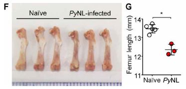
|
Frame F (left) shows pictures of representative femurs (leg bones), from uninfected (naive) and infected (PyNL) mice.
You can see that the infected mice have shorter leg bones.
Frame G (right) shows the numbers. It shows the measured femur lengths for the complete sets of the two groups of mice.
This is from Figure 1 of the article.
|
PyNL? That's Plasmodium yoelii nonlethal. That's a different species from those that infect humans. This is a mouse model of malaria. The scientists consider it a model close to P. vivax in humans.
The following figure explores how the malaria infection interferes with bone formation.
The figure shows a measure of bone volume for three groups of mice.
The left-hand data (white) is for uninfected (naive) mice.
The other sets of data are for two types of malaria infection. One, in the middle (red), is for malaria that we can consider as wild type or control. The other, on the right (green), is for a mutant malaria parasite, which cannot break down the host hemoglobin.
This is Figure 5D from the article.
|
|
The PbA (control) infection led to reduced bone volume, in agreement with the result in the first figure. However, the mutant parasite unable to break down the host hemoglobin allowed near-normal bone formation. (Other data show that the two infections were generally similar. That is, the smaller effect on bone formation was not due to reduced degree of infection.) The implication is that the hemoglobin breakdown products inhibit bone formation, probably by inducing an inflammatory response.
It's a complex story. It's in mice, with mouse strains of the parasite; at best, it can only offer clues about human malaria. But it does offer clues, and they can be followed up in human malaria.
Bone formation is a complex process. There are two competing processes, with both bone formation and resorption going on in a regulated balance. Malaria infection interferes with both of them, but tips the scale toward less bone.
One clue that might be easily tested... The scientists showed that a vitamin D treatment enhanced bone formation in malaria-infected mice. That's plausible, of course, given the known role of vitamin D. Perhaps that can be tested as a simple and inexpensive treatment in human malaria, even before the details are understood.
News stories:
* Malaria Linked to Long-term Bone Loss. (C I Villamil, Medical News Bulletin, August 8, 2017. Now archived.)
* Bone loss is another hidden pathology caused by malaria infection. (Science Daily, June 2, 2017.)
The article: Plasmodium products persist in the bone marrow and promote chronic bone loss. (M S J Lee et al, Science Immunology 2:eaam8093, June 2, 2017.)
Previous post on malaria: A highly effective malaria vaccine -- follow-up (May 3, 2017).
Next: Monkey malaria in humans? (January 19, 2018).
More on hemoglobin degradation as part of the malaria infection process: Pop goes the hemozoin: the bubble test for malaria (January 24, 2014).
Vitamin D... Vitamin D: How much is too much? (July 9, 2013).
More on malaria is on my page Biotechnology in the News (BITN) -- Other topics under Malaria. It includes a list of related Musings posts.
More parasites: Inter-plant communication via the Cuscuta parasite (September 15, 2017).
More inflammation: Chronic fatigue syndrome: a clue about the role of inflammation? (October 27, 2017).
Also see: Walter Clement Noel and his peculiar sickle-shaped blood cells (November 27, 2018).
Is Bcbva anthrax a threat to wild populations of chimpanzees?
September 8, 2017
Some data, from a new article...
|
The key point... The red dots represent animal carcasses that tested positive for anthrax; the black dots represent carcasses that tested negative. You can see that a substantial percentage of the dots are red. It's about 40%.
And the anthrax is widespread.
That should get your attention. Let's fill in the story.
The map shows a part of the Taï National Park in Côte d'Ivoire (Ivory Coast). The dotted line outlines the research area for the current work; the shaded area shows the chimpanzee habitat.
This is slightly edited from Figure 2a from the article. (I have removed an inset that seemed extraneous, and have included most of the key at the bottom.)
|
More about the results...
The carcasses referred to above were found during the scientists' surveillance of the research area over several years.
Finding anthrax on a carcass does not prove that the animal died of that disease. However, they tested a small sample of the carcasses, and found that all that tested positive for the anthrax showed pathology suggesting that the animal died of anthrax.
The study is about mammals. Many of the carcasses were of chimpanzees; the frequency of anthrax among the chimpanzee carcasses was about the same as noted above. (Actually, it was a little higher, but that may not be significant.)
Anthrax? The figure key above says Bcbva. That stands for Bacillus cereus biovar anthracis. That's a B. cereus with a plasmid carrying the anthrax genes. It's a variant anthrax. The disease is pretty much anthrax; the host is slightly different. ( B. cereus and B. anthracis are closely related bacteria.)
Perspective...
This is a study of anthrax in a rain forest. There are many studies of anthrax in arid lands, but much less is known about anthrax in rain forests, where the issues of disease transmission may be rather different.
The anthrax is novel. At least, it is being carried by a novel host, and that might reasonably affect the transmission. The importance of the novel host is unclear at this point.
The host range of the Bcbva anthrax seems to be wide -- wider than for traditional anthrax, and perhaps all mammals. Remember, the rain forest is species-rich.
All mammals? Does that include humans? There seems to be no information at this point, but the authors express their concern.
Carrion flies may be aiding in the transfer of anthrax. In particular, the flies may be transferring the bacteria, usually soil-borne, to animals in the trees. In any case, monitoring flies for anthrax DNA is a useful tool for the scientists.
Overall, Bcbva anthrax is a significant threat in the area.
A specific finding is that the chimpanzees are at risk. The novel anthrax is a major contributor to chimp deaths. Modeling of the next 150 years suggests that the anthrax may decimate the chimp population.
News stories:
* Mysterious Hybrid Strain of Anthrax Is Running Rampant in African Rainforests -- It's killing chimps and spreading to other species. (P Dockrill, Science Alert, August 7, 2017.)
* A Strange Type of Anthrax Is Killing Chimpanzees -- No one knows where it came from, how it spreads, or why it infects so many mammal species. (E Yong, The Atlantic, August 2, 2017.) Now archived.
* Anthrax: a hidden threat to wildlife in the tropics. (Robert Koch Institute, August 3, 2017. Now archived.) This is a "Joint press release by the Robert Koch Institute, the Max Planck Institute for Evolutionary Anthropology, the University of Glasgow and Laboratoire Central Vétérinaire de Bingerville, Ivory Coast".
* News story accompanying the article: Ecology: Chimps at risk from anthrax. (A Armstrong, Nature 548:38, August 3, 2017.)
* The article: Persistent anthrax as a major driver of wildlife mortality in a tropical rainforest. (C Hoffmann et al, Nature 548:82, August 3, 2017.)
Previous post on anthrax... Playing music can make you sick (July 31, 2010).
There is more about anthrax on my page for Biotechnology in the News (BITN), under Anthrax.
Recent posts about apes...
* Do apes have a "theory of mind"? (February 19, 2017).
* Age-related development of far-sightedness in bonobos (January 10, 2017).
And then... Do chimpanzees get Alzheimer's disease? (October 17, 2017).
September 6, 2017
The longest acene
September 6, 2017
That's it. Decacene. Ten benzene rings fused side-by-side.
Naphthalene, with two such rings, is probably the most familiar member of the family. The -acene ending is introduced with the next member, anthracene, with three rings. Those two are isolated from coal tar. Larger acenes are not found naturally, but some have been synthesized.
This is part of Figure 1 from the article. The full figure also shows heptacene, octacene, and nonacene -- all of which have recently been synthesized.
In a new article, a team of chemists reports making decacene. Here's a picture...
|
A molecule of decacene.
You can see the ten ring structures quite clearly. Count them.
It's sitting on a gold surface -- where it was made.
This is Figure 2a from the article.
|
They made the decacene by first making an oxygenated precursor with the desired carbon skeleton. Deposition on the gold surface led to reduction to the hydrocarbon. The details of the reduction are not entirely clear. The imaging, as shown above, was done by scanning tunneling microscopy.
Once again, this is a story of chemists stretching their tools to make new things. The amounts made in such work are small, but they are a start, and they do allow some study of the chemical. Acenes have interesting electronic properties, and may find use in electronic devices. But so far, the largest acene that has been isolated is heptacene. Perhaps the current work will lead to alternative syntheses of decacene -- and to larger amounts.
News stories:
* Researchers obtain decacene, the largest acene synthesised ever. (Nanowerk News, August 14, 2017.)
* Decacene takes title of longest acene. (K Krämer, Chemistry World, August 8, 2017.)
The article: Decacene: On-Surface Generation. (J Krüger et al, Angewandte Chemie International Edition 56:11945, September 18, 2017.)
Another difficult synthesis of a benzene-related molecule: Making triangulene -- one molecule at a time (March 29, 2017). The article of this recent post is reference 9b of the current article.
This post is listed on my page Introduction to Organic and Biochemistry -- Internet resources in the section on Aromatic compounds. That section includes a list of related Musings posts.
Human heart tissue grown in spinach
September 5, 2017
Need some new heart tissue? You might get a transplant from another human, or, at least in principle, a xenotransplant from a pig. Or perhaps a heart organoid grown in vitro. Or perhaps some heart tissue grown in spinach -- or on spinach.
That's a piece of spinach leaf, from which the cells -- the spinach cells -- have been removed.
The red things are human stem cells, growing on the surface. (The red is a dye. The label hMSC, upper right, stands for human mesenchymal stem cells.)
The black lines or streaks are veins. Leaf veins.
The main scale bar is 250 µm; 50 µm for the insert. (They are labeled, but hard to read.)
This is Figure 5B from the article.
|
Why? The decellularized spinach leaf could play two roles. At the simplest, it is a physical support. It's a cellulosic support; cellulose is a good human-compatible material. One can imagine transplanting a structure based on what you see in that picture above into a human. Further, providing nutrition to cells in 3D culture is a problem. Leaves have a good vascular system, which could be used to provide nutrients to the human tissue.
In the article, the scientists first describe how they decellularize the leaves. The vascular system is still in good condition; small particles, about the size of normal blood cells, can flow through it quite well.
They then examine various human cells in or on the decellularized leaves. Some cells may grow within the leaf vasculature, some on the leaf surface. They imagine being able to make more complex 3D tissues by using layers of leaves.
In one case, they used cardiomyocytes (heart muscle cells) that had been differentiated in the lab from pluripotent stem cells and then put on the surface of a decellularized spinach leaf.. Three weeks later, they had small pieces of heart tissue, which showed heart behavior, such as contractility. The tissue pieces weren't quite as good as when grown on a lab plastic, but the leaf support is potentially transplantable into a human.
Is this silliness, or a breakthrough? The scientists have tried something unusual, and they have some intriguing results. Many questions remain, but it seems worth pursuing. It certainly attracts attention, but it does deserve consideration as a serious approach.
News stories:
* Beating Human Heart Tissue Grown on Spinach. (Worldhealth.net Anti-Aging News, March 29, 2017.) From the American Academy of Anti-Aging Medicine.
* Beating human heart cells were grown on a spinach leaf. (E Motivans, ZME Science, March 24, 2017.)
* Scientists grow beating heart tissue on spinach leaves. (Kurzweil, March 31, 2017.) This is somewhat disorganized, but it does offer more detail than the other news stories. It includes a nice flow chart summarizing the work.
The article, which is freely available: Crossing kingdoms: Using decellularized plants as perfusable tissue engineering scaffolds. (J R Gershlak et al, Biomaterials 125:13, May 2017.) It is quite readable.
Also see:
* Briefly noted... Cultured meat -- using spinach. (May 26, 2021).
* Making lungs in the lab -- and transplanting them into an animal (August 17, 2018).
* Heart regeneration? Role of MNDCMs (November 10, 2017).
* Laika, the first de-PERVed pig (October 22, 2017).
* If an injured heart is short of oxygen, should you try photosynthesis? (June 25, 2017). This has nothing to do with the current post. Absolutely nothing. Except, of course, that it makes another connection -- a very different one -- between a heart and something photosynthetic.
* Human heart organoids show ability to regenerate (May 2, 2017).
* Long term survival of a pig heart in a baboon (April 30, 2016).
My Biotechnology in the News (BITN) page for Cloning and stem cells includes an extensive list of related Musings posts, including those on the broader topic of replacement body parts.
How much of the human genome is functional?
September 1, 2017
The human genome consists of about three billion base pairs (in the haploid set). How much of that is "functional", and how much is "junk"?
It's an interesting and surprisingly elusive question.
A recent article makes an argument that the percentage of functional DNA is at most about 25%, and is more likely half that or even less. It's an interesting argument. Let's look...
The argument is based on some basic ideas in genetics. In particular, it is based on the idea of genetic load. That is the number of deleterious mutations in the genome. Such harmful mutations are being continually produced by mutation. The higher the genetic load, the more children a couple must have in order to have two good healthy ones, who continue the species.
To estimate the genetic load, we need two key numbers. One is the mutation rate. More specifically, it is the rate of deleterious mutations.
The other key number is the genome size. The number of deleterious mutations depends on the mutation rate and the genome size. That's the effective genome size: the actual size times the percent that is functional.
In the new article, the author builds a mathematical model based on those basic points. Here are some examples of what he found...
rate of deleterious
mutations, µdel
| functional fraction
of genome:
| 0.05
| 0.10
| 0.25
| 0.50
| 0.80
| 1.00
|
| 4.0x10⁻¹⁰
|
| 1.1
| 1.3
| 1.8
| 3.4
| 7.1
| 12
|
| 1.0x10⁻⁹
|
| 1.4
| 1.8
| 4.6
| 22
| 136
| 466
|
| 4.0x10⁻⁹
|
| 3.4
| 12
| 466
| 2.2x10⁵
| 3.5x10⁸
| 4.7x10¹⁰
|
| 1.0x10⁻⁸
|
| 22
| 466
| 4.7x10⁶
| 2.2x10¹³
| 2.2x10²¹
| 4.8x1026
|
The numbers in the table are the fertility values needed to maintain the species (constant population), for a given mutation rate and genome size. The mutation rate is shown as the rate of deleterious mutations (left column); the genome size is shown as the fraction of functional DNA (top row).
µdel is in mutations per nucleotide site per generation.
The results, fertility values F, are number of children needed per person to maintain constant population size.
This small table is a subset of Table 1 from the article.
Here are some examples of how to read the table... Suppose that the rate of deleterious mutations, µdel, were 1.0x10⁻⁸, the highest value shown here (bottom row of the table). If the entire genome were functional (right-hand column), a person would need to have 4.8x1026 children in order to get one who would survive. Even if only 5% (0.05) of the genome were functional, a person would need to have 22 children. (44 children for a couple.)
Now look at the top row, for µdel = 4.0x10⁻¹⁰. That is 25-fold lower than the rate for the bottom row. If 100% of the genome were functional, a person would need to have 12 children; if 5% were functional, the person would need to have 1.1 children (2.2 for a couple).
There are two trends in the table. As either the rate of deleterious mutations or the fraction of functional-genome become lower, one can get by with fewer children to maintain the population. But as these numbers get bigger, the number of children needed to maintain the population becomes large -- astronomically large. It's all the idea of genetic load.
There are three kinds of numbers in the table: rate of deleterious mutations, fraction of functional-genome, and fertility needed. The table shows how they are interrelated.
If we knew any two of them, we could figure out the third, from the table -- assuming only that the model used here is correct. In particular, if we knew µdel and the fertility F, we could determine the fraction of functional-genome. That's the goal here.
The difficulty is that we have only estimates for the numbers we need; therefore, the conclusions are somewhat limited.
The author uses a fertility value of 1.8 as the limit. (3.6 for a couple.) That's a little arbitrary, but let's use it for now.
The total mutation rate is thought to be about 1x10⁻⁸, the highest number shown in my table above (bottom row). What's less clear is what fraction of the mutations are deleterious. The author discusses this at length, and argues that it is almost certainly at least 4%. 4% of 1x10⁻⁸ is 4x10⁻¹⁰, the lowest number in the table (top row). That is, he strongly believes that the rate of deleterious mutations is within the range shown in the table above.
Using those assumptions... F = 1.8 gives a functional-genome fraction of 0.25 or 0.10 for the two lowest µdel values in the table. That's the basis of the summary statement made at the top of the post; the author prefers the second mutation rate, and points to 0.10 as the most likely fraction of functional DNA.
It's all very interesting, and logical. It is worth trying to follow the ideas. However, getting to a number involves considerable uncertainty, so don't invest too much in that. The author discusses the various uncertainties, including more than we have noted here.
A little context...
A few years ago, a team known as the ENCODE consortium published work showing that as much as 80% of the genome was functional. Many people thought that 80% was unreasonably high, that only a few percent was likely to be functional. The current work is presented as something of an antidote to the ENCODE number.
The first point is that the two groups have taken very different approaches to defining what "functional" means. ENCODE called a region of DNA functional if an RNA was made from it -- even if they had no idea what the RNA did, or even any evidence that it did anything of interest. On the other hand, the current work focuses on function as doing something useful -- as judged by the possible interference by a deleterious mutation.
Over time, we'll learn more, and will be able to understand the two results. For now, it is more an interesting story in progress than choosing an answer.
News stories:
* 75 percent of human genome is junk DNA. (I Herlekar, BioNews, July 24, 2017. Now archived.)
* New Research Suggests at Least 75% of The Human Genome Is Junk DNA After All. (P Dockrill, Science Alert, July 18, 2017.)
* Only 10-25% of Human Genome is Functional, New Estimate Says. (Sci.News, July 19, 2017.)
The article, which is freely available: An upper limit on the functional fraction of the human genome. (D Graur, Genome Biology and Evolution 9:1880, July 2017.)
A post about the mutation rate in humans... Accumulation of mutations in the sperm of older fathers (November 19, 2012). The current article refers to the article discussed here, as giving one good measurement of the mutation rate.
More about junk DNA: Junk DNA: message from the bladderwort (June 4, 2013).
There is more about genomes and sequencing on my page Biotechnology in the News (BITN) - DNA and the genome. It includes an extensive list of Musings posts on the topics.
Top of page
The main page for current items is Musings.
The first archive page is Musings Archive.
E-mail announcements -- information and sign-up: e-mail announcements. The list is being used only occasionally.
Contact information
Site home page
Last update: July 21, 2026