Musings is an informal newsletter mainly highlighting recent science. It is intended as both fun and instructive. Items are posted a few times each week. See the Introduction, listed below, for more information.
If you got here from a search engine... Do a simple text search of this page to find your topic. Searches for a single word (or root) are most likely to work.
Introduction (separate page).
This page:
2019 (September-December)
December 11
December 4
November 20
November 13
November 6
October 30
October 23
October 16
October 9
October 2
September 25
September 18
September 11
Also see the complete listing of Musings pages, immediately below.
All pages:
Most recent posts
2026
2025
2024
2023:
January-April
May-December
2022:
January-April
May-August
September-December
2021:
January-April
May-August
September-December
2020:
January-April
May-August
September-December
2019:
January-April
May-August
September-December: this page, see detail above
2018:
January-April
May-August
September-December
2017:
January-April
May-August
September-December
2016:
January-April
May-August
September-December
2015:
January-April
May-August
September-December
2014:
January-April
May-August
September-December
2013:
January-April
May-August
September-December
2012:
January-April
May-August
September-December
2011:
January-April
May-August
September-December
2010:
January-June
July-December
2009
2008
Links to external sites will open in a new window.
Archive items may be edited, to condense them a bit or to update links. Some links may require a subscription for full access, but I try to provide at least one useful open source for most items.
Please let me know of any broken links you find -- on my Musings pages or any of my web pages. Personal reports are often the first way I find out about such a problem.
December 11, 2019
1. Visitors from beyond the solar system. Two years ago, 1I/'Oumuamua. A mysterious object, it looked to some like a flying cigar; some wondered if it carried surveillance equipment. Astronomers got just a glimpse of it as it left the solar system. Now, 2I/Borisov. At least, it looks like a comet, and -- having been noticed early -- it will be the subject of much scrutiny. A short news feature reflects on these I-things -- the first major visitors to the solar system from beyond, at least in the age of modern astronomy. (The new I catalog... The I in the designation means interstellar.)
* News feature: How two intruders from interstellar space are upending astronomy. (A Witze, Nature News, November 20, 2019. In print Nature 575:434, November 21, 2019)
* Also see: Briefly noted... A hydrogen-powered comet? (May 15, 2023).
2. A new 1980s-quality computer. It doesn't use silicon transistors. It is based entirely on CNT (carbon nanotube) transistors. The current article represents major progress in making a functional computer based on CNTs. The future? We'll just have to wait, but some think CNTs could be the way to go.
* News story: A Carbon Nanotube Microprocessor Mature Enough to Say Hello -- Three new breakthroughs make commercial nanotube processors possible. (S K Moore, IEEE Spectrum, August 28, 2019.) Links to the article. (The three brekthroughs are RINSE, DREAM, and MIXED.)
* This item is noted on my page Introduction to Organic and Biochemistry -- Internet resources in the section on Aromatic compounds. The section includes graphene and CNT.
* Also see: Wooden transistors (June 20, 2023).
3. Vaccine against African swine fever (ASF). ASF is a viral disease that has recently become of serious economic importance. We now have a preprint reporting a vaccine that is highly effective against the major strain in current Eurasian outbreaks. I suggest reading the abstract and introduction for an overview.
* Here is the preprint, which is freely available: Development of a highly effective African swine fever virus vaccine by deletion of the I177L gene results in sterile immunity against the current epidemic Eurasia strain. (M V Borca et al, BioRxiv, December 2, 2019.)
* I have noted this item on my page Biotechnology in the News (BITN) -- Other topics under Vaccines (general).
* A news story: Sterile immunity possible against ASFv, US scientists say. (V ter Beek, Pig Progress, December 9, 2019.)
* Here is the published article: Development of a Highly Effective African Swine Fever Virus Vaccine by Deletion of the I177L Gene Results in Sterile Immunity against the Current Epidemic Eurasia Strain. (M V Borca et al, Journal of Virology 94:e02017-19, April 2020.)
December 10, 2019
Maybe sweeten the nectar, so that the bees are well paid for their services.
But is that the main issue as you read the title of this post? How about the premise -- that plants can hear the bees coming?
A new article reports experiments showing that plants can indeed hear the bees coming, and that they do indeed sweeten the nectar. It's one more report on the sensory capabilities of plants -- a controversial field.
Here are some results...
|
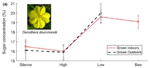
The graph shows the sugar concentration in the flower nectar (y-axis) under various conditions. All conditions involved playing a sound (except for the control).
The first and last conditions are for silence and the sound of bees, respectively. You can see that there is more sugar in the nectar when the bee sound is played. The other two conditions involve providing artificial sounds. Low frequency sound, similar to that from the bees, gives a high sugar concentration. High frequency sound, quite different from the bees, gives a low sugar concentration. The two types of symbols are for plants grown indoors or outdoors. There is no apparent difference. The plant tested here is the beach evening primrose, Oenothera drummondii. This is Figure 1a from the article. |
That is, the test shows that the sound of bees leads to an increase in sugar concentration -- and that the effect can be mimicked by artificial sounds of similar frequency. The plants, it would seem, respond to the sound of the bees. Surely, that means the plants "hear" the bees.
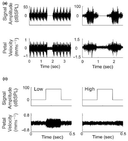
The following figure suggests how the plants hear the bees -- or other flying pollinators...
|
Look at part a, left side. The top frame shows the sound waves; the bottom frame shows the vibrations of the petals. In this test, the sound was a recording of a bee. The vibration of the petals matches the insect sound.
The right side shows another example, using the sound of a moth. It is a distinctly different sound, but, again, there is a match between sound and petal response. (The bees and moths tested in this work are normal pollinators for this plant.) Part c shows another example, but this time with two lab-generated sounds: low and high frequency. For the low frequency sound, the petals vibrate; for the high frequency sound, they do not. That matches what was seen in the top graph. This is part of Figure 2 from the article. |
Putting it together, the work suggests that the insect sound leads to a sympathetic vibration of the flower petals, which in turn leads to an increase in sugar concentration in the nectar.
Are we really supposed to accept all this? Well, the scientists have presented their evidence and made their case. This is, apparently, the first article to make such a claim. It is on the table, for others to critique, and to reproduce. The work is useful if it leads to further work in the field. Perhaps the work is not reproducible. Perhaps others will develop better interpretations of the results. Or perhaps this article is step one of a new understanding of plants. Keep an open mind; we'll see what happens.
If the basic claim is correct, it should be possible to find a mechanistic link between the sounds and the vibrating petals, as input, and the increased sugar level in the nectar, as output.
We should note that the work here is about the detection of airborne vibrations, i. e., of "sound". It is known that plants can respond to mechanical vibrations.
News stories. The early date of these news stories reflects that the authors posted two preprints on BioRxiv in December 2018. You will see both of them mentioned. One of them made it through to publication in September, and is discussed here. The other seems to not have been published yet. There is a newer version of it, with a different title, at BioRxiv, but that paper is more contentious than this one.
* Plants May Not Have Ears, But They Can 'Hear' Way Better Than We Thought. (D Nield, Science Alert, January 19, 2019.)
* Plants Can Hear Animals Using Their Flowers -- And they react to the buzzing of pollinators by sweetening their nectar. (E Yong, Atlantic, January 10, 2019.) Includes discussion of the preprint that has not yet been published. Excellent, in putting the work in context.
The article, which is freely available: Flowers respond to pollinator sound within minutes by increasing nectar sugar concentration. (M Veits et al, Ecology Letters 22:1483, September 2019.)
More about bees and flowers:
* If a bee visits a plant and there are no flowers, can the bee place an order? (June 23, 2020).
* Strawberries, bees, and their bacteria: a complex alliance (January 11, 2020).
* How bumblebees learn to pull strings (November 27, 2016).
* Bees and flowers: A 30-volt story (June 21, 2013).
* Caffeine boosts memory -- in bees (April 12, 2013).
* The traveling bumblebee problem (January 11, 2011).A book by one of the authors of the article is listed on my page of Book Suggestions: Chamovitz, What a Plant Knows -- A field guide to the senses (2012). In that book, Chamovitz notes that hearing has not been shown in plants. He is apparently now part of the team making the discovery -- if it holds up. (The book is also in the reference list of the article.)
More about the controversial field of what might be called plant neurobiology...
* The sounds that plants make (April 10, 2023). From the same lab.
* Can a plant learn to associate a cue and a reward? (March 3, 2017).More about hearing without ears: The ogre-faced spider, with massive eyes but no ears, detects the sound of prey using its legs (February 9, 2021).
Among posts about added sweeteners: Is erythritol a toxic sweetener? (April 8, 2023).
December 9, 2019
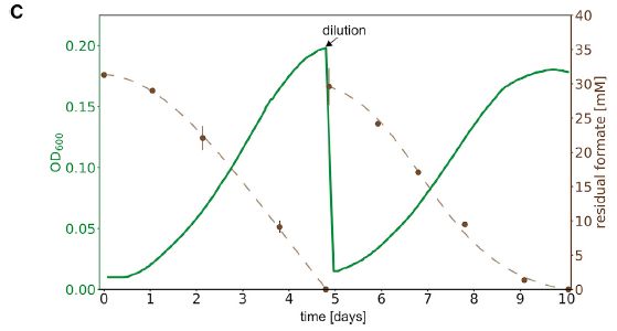
The following graph, from a new article, shows something impossible...
|
The solid green line is a growth curve for a strain of the common bacterium Escherichia coli. Growth is shown here as OD600 (left-hand y-axis) vs time (x-axis). OD stands for optical density; the subscript 600 indicates the wavelength of light (in nanometers) used for the measurement. OD is a common and simple lab measure of cell mass. (The culture was diluted back to a low density, with fresh growth medium, at day 5.)
What's the catch? Why did I say the graph shows something impossible? The only carbon source provided here for making new cell mass was carbon dioxide. And it is well known that E coli does not grow on CO2. We'll come back to the dashed curve later. This is Figure 2C from the article. |
Growth on CO2 as the sole carbon source -- a phenomenon called autotrophy -- is typical of plants. There are some autotrophic bacteria, but E coli is not one of them. At least, it wasn't one of them until now. The new article reports modifying E coli to make it autotrophic; the green growth curve shown above shows the result.
Growth on organic materials, as typical of animals and ordinary E coli, is called heterotrophy.
Autotrophic growth requires an energy source. (Ordinary E coli use sugar both for making cell mass and for energy. But CO2 is not an energy source.) For plants, the energy source is light. Autotrophic bacteria use various energy sources; some use light (photoautotrophs), others oxidize some chemical, such as hydrogen gas or Fe2+ ions, as an energy source (chemoautotrophs).
What is the energy source for the autotrophic E coli? Formic acid (HCOOH). But doesn't that count as a C-source? No, because the bacteria have been designed so that the formic acid is used only for energy, and none of its C enters into making cell mass.
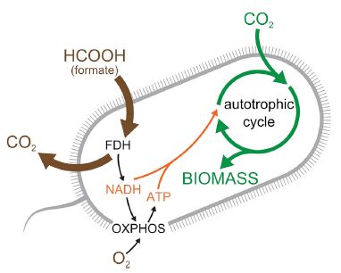
The following figure shows the idea of how this bacterial strain is designed...
|
There are three inputs to the cell. HCOOH (or its ionized form, formate, HCOO-) and oxygen to the left, for energy. CO2 at the right for the autotrophic production of biomass. The energy pathway makes NADH and ATP, which are used in making biomass.
FDH (formate dehydrogenase) is the enzyme for oxidizing formate. It releases CO2 from the formate. This is Figure 1 from the article. |
Now go back to the top graph... The dashed line there shows the utilization of formate (right-hand y-axis).
What does it take to make E coli autotrophic? The idea is to install a complete system for CO2 fixation, including Rubisco and a functioning Calvin-Benson cycle in the bacteria, just as in plants. The scientists knew which enzymes are in the normal E coli and which were needed. It's a logically straightforward (but technically complex) project to add the genes for the missing enzymes. Lab evolution then helped get it right; that is a major emphasis of the article.
What is the point of all this? For now, it is just a demonstration. They did it to see if they could. The strain grows rather slowly on CO2, and actually releases more CO2 (from the formate) than it consumes, so it is not suitable for using up CO2. If you read things that suggest a use for such a strain, it is speculation at this point (as the authors are well aware). But it is an autotrophic Escherichia coli -- the first success at turning a heterotroph into an autotroph.
News stories:
* Lab-Evolved E. coli Consume Carbon Dioxide -- Bacteria that take in inorganic carbon could have applications in sustainable biofuels. (E Makowski, The Scientist, November 27, 2019.) Now archived.
* Laboratory-evolved bacteria switch to consuming carbon dioxide for growth. (Science Daily (Cell Press), November 27, 2019.)
The article, which is freely available: Conversion of Escherichia coli to Generate All Biomass Carbon from CO2. (S Gleizer et al, Cell 179:1255, November 27, 2019.) Much of the article is very readable, discussing the issues, strategies, and limitations.
A few days ago, a preprint appeared reporting similar work in a yeast. Energy was based on oxidation of methanol (which proceeds via formate). The preprint is freely available: A synthetic Calvin cycle enables autotrophic growth in yeast. (T Gassler et al, BioRxiv, December 3, 2019.)
* The article has been published: The industrial yeast Pichia pastoris is converted from a heterotroph into an autotroph capable of growth on CO2. (T Gassler et al, Nature Biotechnology 38:210, February 2020.)* * * * *
More about chemoautotrophic bacteria:
* Growing on manganese ions as an energy source (September 15, 2020).
* Is photosynthesis the ultimate source of primary production in the food chain? (April 2, 2017).More about the Calvin-Benson cycle for CO2 fixation: Discovering how CO2 is captured during photosynthesis: The Andy Benson story (June 15, 2013).
Also see... A novel enzymatic pathway for carbon dioxide fixation (March 12, 2017).
December 7, 2019
Nitrogen oxides, collectively called NOx, are important air pollutants. Of particular importance is nitrogen dioxide, NO2. It's irritating and corrosive -- and brown.
A new article reports a new approach for collecting this pollutant, and actually turning it into something useful. It is another example of using metal-organic framework (MOF) chemicals.
The following figure illustrates the scheme. It's not a particularly clear figure, but we'll try to make it useful.
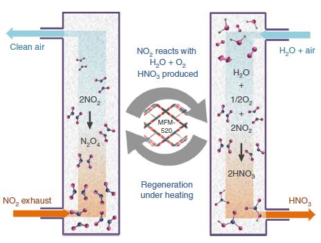
|
In the middle is the player at the heart of the scheme, the MOF (called MFM-520). The MOF binds NO2 -- reversibly. That's typical of how MOFs are used, but the details vary; more about this as we go on. The MOF is in the main chamber, shown at each side. The two big arrows in the middle indicate that the chamber with the MOF alternates between two functions. (But the labels in the middle do not correspond to those functions.)
Those two functions -- the two main phases of operation -- are: 1) capturing the NO2 (left side) and 2) using it and regenerating the free MOF (right side). On the left... Exhaust gas containing NO2 enters at the bottom. The NO2 is captured by the MOF. Clean air is released at the top. (The NO2 is actually bound to the MOF in the form of its dimer, N2O4. The reversible dimerization of NO2 is common chemistry, and is not particularly important here, until you get to the details of how the MOF binds its target. We also note that the downward arrow within that chamber is simply for showing the chemical reaction, and has nothing to do with the flow through the chamber.) On the right... Water and air enter the chamber. Together, they release the NO2 from the MOF, and oxidize it to nitric acid. A stream of nitric acid, an important industrial chemical, comes out of the chamber, and the MOF is ready for further use. This is Figure 5 from the article. |
That's the idea. How well does it work?
The following figure shows some of the evidence. It is about the selectivity and sensitivity of the MOF for NO2.
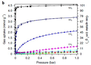
|
The graph shows tests of several gases, both normal components of air and some pollutants. The test is to see how much binds (y-axis) vs the pressure of that gas (x-axis). (There are two y-axis scales; they are just different ways of showing the same data. And we won't worry much about the numbers.)
Some of the curves are labeled on the graph. The ones at the bottom are not. They are for N2 (red), CO (cyan), H2 (purple), and O2 (green). |
|
The graph shows that NO2 is the gas that binds best to the MOF (top curve). But that qualitative statement isn't enough. Nitrogen (N2) is present in air at about 80% (about 0.8 bar). It is important that abundant gases, such as N2 (one of the curves at the bottom), do not bind well even at high pressure (P). That is, NO2 binds better at low P than N2 does at high P. At what low P does NO2 bind? The resolution on this graph doesn't show the low P range well. That information is on an accompanying graph. NO2 binds well at a millibar of P (about 0.1%); that is a level found in exhaust streams. The graph for NO2 has two lines, each with its own symbol. One line is for what was measured while increasing the pressure. The other line is for what was measured while decreasing the pressure. That the two lines are nearly the same shows that the binding is rapidly reversible. This holds for all the gases tested, though they show it here only for the top three gases. This is Figure 2b from the article. For the results at low P, see the inset of Figure 2a in the article. | |
The picture that emerges from this test and the related ones is that the MOF binds NO2 at the levels found in exhaust sources. That's good.
Further, the abundant components of air do not bind to the MOF. Some other pollutants may bind; that would depend on the material being treated.
The scientists also showed that the MOF is robust. There was no loss of performance through 125 cycles of operation.
Will this work for removing NO2 from ambient air? No. The level of NO2 even in quite polluted air is on the order of a part per million, a thousand-fold lower than what this MOF can bind. The scheme shown here is for collecting NO2 at exhaust sources, not for cleaning ambient polluted air.
The heart of the current work was the design of a MOF with suitable binding and stability characteristics. We'll see whether it can be developed into a practical process.
News stories:
* Metal-organic framework captures and converts toxic air pollutant into industrial chemical. (Nanowerk News (Oak Ridge National Laboratory), November 23, 2019.)
* Useful Chemical Made From Air Pollutant Gas. (Technology Networks (University of Manchester), November 25, 2019.)
The article: Capture of nitrogen dioxide and conversion to nitric acid in a porous metal-organic framework. (J Li et al, Nature Chemistry 11:1085, December 2019.)
Among posts about MOFs...
* Harvesting water from "dry" air -- an update (October 22, 2019).
* Cooperation: a key to separating gases? (March 28, 2014).More NOx: A major algal bloom associated with the dinosaur extinction event? (May 13, 2016).
More about pollution: Indoor air pollution: is ventilation effective? (March 24, 2020).
December 4, 2019
1. Quality of animal research. A short news-feature-type story about developments in the use of animals in medical research.
* Freely available... Fixing the Flaws in Animal Research -- Many preclinical studies carried out in vivo are poorly designed and generate irreproducible data, but efforts to address the problem are on the rise. (D Kwon, The Scientist, September 1, 2019. In print, with a slightly different title: p 63 of the September issue.) Now archived.
* One of the scientists discussed in this story is Thomas Hartung. He was the lead scientist behind the work described in the post Predicting the toxicity of chemicals (September 11, 2018). That work is noted in the current article.
2. Lesson from a comet: a new way to make oxygen gas? Throw something at a wall hard enough, and it may break. For example, throw a molecule of CO2 at a wall, and it may break into pieces, such as CO + O. Occasionally, a CO2 molecule may be bent enough that it forms a cyclic version of CO2, which then breaks into C + O2. The story starts with the unexpected finding of O2 on a comet, as the Rosetta spacecraft studied Comet 67P/Churyumov-Gerasimenko. Why would there be O2 on a comet? It was suggested that the O2 may be produced by collision of CO2 molecules with the comet surface. That led to lab work to show such a reaction, along with theoretical studies of what is happening. It works. Not very well, but it is a first step.
* News story: Comet-inspired reactor could create oxygen for astronauts. (J Strickler, ZME Science, May 29, 2019.) Links to the article, which is freely available.
* A post about the approach of Rosetta to Comet 67P... Twins? A ducky? Spacecraft may soon be able to tell (August 4, 2014).
December 2, 2019
Soybeans are legumes, a type of plant that can use ("fix") nitrogen from the air. They do this in a symbiosis with bacteria broadly known as rhizobia. The bacteria carry out the actual nitrogen fixation biochemistry; they share the fixed nitrogen with the plant host. The bacteria grow and fix nitrogen in special structures, called nodules, on the plant roots.
It is a special relationship. Most bacteria can't fix nitrogen; most plants can't support those that do.
How does it happen? How do plant and bacteria work out the symbiosis? A recent article explores the question, and uncovers some pieces of the story. The results lead to an idea for a possible way to improve soybean growth.
We'll start with a summary of the findings, then look at some of the evidence.
The bacteria make small RNA molecules, which are transferred to the plant host. These small RNAs stimulate nodule production, by blocking production of plant proteins that inhibit it.
The following graph shows how the bacterial infection affects some plant genes. The plant genes tested here were all suspected targets for specific bacterial small RNAs.
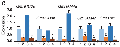
|
Look at the left-hand set of data. It is labeled GmRHD3a. Gm stands for Glycine max, the formal name for soybean. The rest of that label is the gene name, which we can ignore for now.
There are four bars of data, showing the (relative) level of expression of this gene under four conditions. The four conditions are... 1. 10 days: control. The expression level is set to 1. (Day 0 is when the plants in set 2 were inoculated with bacteria.) 2. 10 days: ordinary nodule formation, with bacteria-infected plants. Compare bars 1 & 2, and you see that the bacterial infection inhibited the expression of this plant gene. 3 & 4 are a pair as above, but at 20 days. Again, the infection inhibited gene expression. There are four more genes shown here, with the same set of tests. The results are similar for each case. The bacteria used here was Bradyrhizobium japonicum. This is Figure 1C from the article. |
The message from that experiment... Five soybean genes that are inhibited by the "infecting" nitrogen-fixing bacteria. As noted earlier, these genes are all likely targeted by small RNAs produced by the bacteria and transferred into the plant cells.
What do those five genes do? They are presumed to be inhibitors of nodule formation. Soybeans can make nodules, but when grown "alone" they don't; nodule formation is inhibited. The bacteria come along and send specific signals to the soybeans, effectively inhibiting the inhibitors, and thus allowing nodule formation to occur.
The next experiment provides direct evidence for the role of these specific genes in nodule formation. In this test, these same genes were inhibited a different way. Each was inactivated, one at a time, using CRISPR. The following figure shows some of the results...
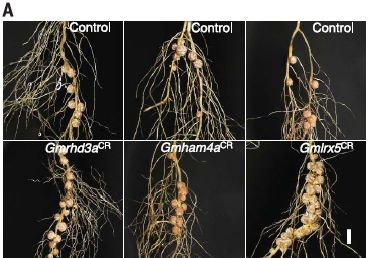
|
The left-hand pair of photos is for the test with the same gene we discussed above. The upper photo shows roots from the control plant. The lower photo shows roots from the plant with the gene inactivated by CRISPR (note the CR superscript on the gene name). You can see the root nodules. Inactivating the gene leads to more nodules.
Results for two more of those genes are also shown here. The scale bar (lower right) is 5 millimeters. This is part of Figure 2A from the article. (The full Figure 2A contains more examples. Another test there shows that over-expression of one of these genes reduced nodule formation. And another part of Figure 2 shows some numerical data for nodule counts; the roots shown in the figure are representative.) |
So, artificially inhibiting the nodule inhibitors leads to more nodules. And that inevitably leads to the question... Would this be useful? Despite their ability to fix nitrogen, soybeans are often limited by their nitrogen supply. Sometimes, farmers fertilize their soybeans. The current work suggests that mutant soybeans, with reduced levels of nodule inhibitors, might be improved plants.
That is for future work. In any case, the current article improves our understanding of the symbiosis between soybeans and nitrogen-fixing bacteria.
News story: Purdue scientists show how soybeans may get more nitrogen from atmosphere. (B Wallheimer, Purdue University, July 25, 2019.) From the university.
* News story accompanying the article: Plant biology: Bacteria send messages to colonize plant roots -- Bacteria-derived RNA fragments target host plant genes to promote root colonization. (P Baldrich & B C Meyers, Science 365:868, August 30, 2019.)
* The article: Rhizobial tRNA-derived small RNAs are signal molecules regulating plant nodulation. (B Ren et al, Science 365:919, August 30, 2019.)
Posts about nitrogen fixation include...
* The downside of nitrogen fixation? (November 4, 2017).
* Fixing nitrogen -- can U help? (August 29, 2017).Posts about soybeans include...
* A sticky pesticide (June 21, 2019).
* Improving soybean oil by gene editing (January 8, 2017).A post about small RNA molecules interfering with gene expression... Blocking eggshell formation in mosquitoes? (February 8, 2019). It is likely that the RNA action is similar in the current work and this earlier one, though we have not discussed how it works in either case.
November 30, 2019
It sure can. For example, what if you trained the computer on a set of data that was racially biased?
A recent article explores the issue, not with hypotheticals, but with an example of a major program used to guide medical care in the United States.
The following graph shows the basic finding...
|
A simple graph. Deceptively simple. It is for a study of about 50,000 people at one particular US hospital over three years.
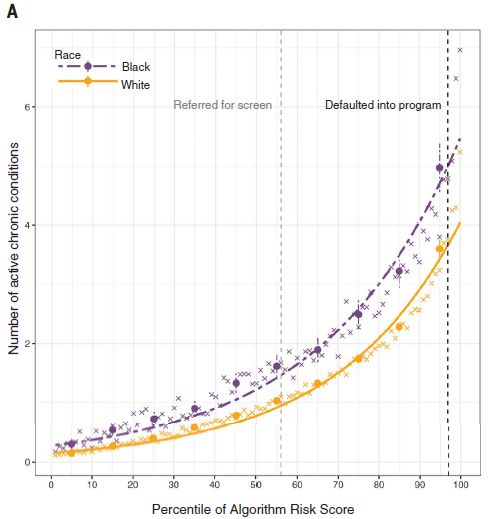
When a person enters the health care system, they are assigned a "risk score" by a computer program (an "algorithm"). That score plays a key role in determining how they are treated. The two vertical dashed lines are cutoffs that direct the patient to a particular class of care. Get a 97 (right-hand dashed line), and you are automatically directed to a special treatment program. Get about 55, and you get a screen. The details of what those lines mean don't matter much; the point is, the higher your risk score, the more aggressive your treatment plan. And the whole idea makes some sense. The computer helps evaluate patients, and directs them toward appropriate treatment. However... So far, we haven't said what is plotted there. The y-axis shows the number of active chronic conditions each person has. That number is plotted against their computer-generated risk score, as a percentile (x-axis). The authors divided the study population by race. The upper curve (dashed, purple) is for blacks; the lower curve (solid, yellow) is for whites. Key observation... For a given risk score, blacks have more active chronic conditions than whites. Where is the left-hand vertical line? The article repeatedly says it is at 55, even though it is obviously a bit above that. Doesn't matter much, but the discrepancy is obvious, so I have noted it. This is Figure 1A from the article. |
That is, for a given risk score, blacks are sicker than whites. But they are treated by their score, not by how sick they are. The computer has discriminated by race.
The article contains analyses comparing blacks and whites for several specific conditions; the general pattern holds. For example, for any specific risk score, blacks have higher blood pressure than do whites.
Why does this happen? Why does the computer discriminate by race?
The authors look into the origin of the algorithm, and find that it is based on health care costs paid in the past, not on medical status. For various reasons, blacks have historically spent less on health care, for any specific condition. The computer bases the patient's risk score on their previous medical costs (from insurance records), not medical condition. But previous costs do not properly measure medical condition, when applied across races; therefore, the computer program is racially biased, providing a lower standard of care to blacks for the same medical condition. (The computer does not record race per se.)
Study of the algorithm began when the scientists noticed that black patients seemed to have worse outcomes than white patients with the same risk score.
The article shows that treatment costs for the coming year are about equal for blacks and whites, for any given risk score (Figure 3A). This reinforces that the computer is predicting costs, not medical outcomes.
After the basic study was completed, the authors initiated contact with the company that wrote the algorithm. The company is collaborating with the authors to address the issues raised here. See the Discussion section of the article and also the Competing interests section of the Acknowledgments for more about the relationship.
News stories:
* How computer algorithms help spread racial bias in US healthcare, and how they can help fix it. (Tech Xplore (A Khan, Los Angeles Times), October 25, 2019.)
* Widely used health care prediction algorithm biased against black people. (K Manke, University of California Berkeley, October 24, 2019.) From one of the institutions carrying out the study.
* News story accompanying the article: Social science: Assessing risk, automating racism -- A health care algorithm reflects underlying racial bias in society. (R Benjamin, Science 366:421, October 25, 2019.)
* The article: Dissecting racial bias in an algorithm used to manage the health of populations. (Z Obermeyer et al, Science 366:447, October 25, 2019.)
Among earlier posts on health care: Healthcare costs (June 18, 2009). Links to more.
Also see: Identifying individuals from their genomes: a controversy (December 5, 2017).
November 20, 2019
Earthworm diversity. A recent post was about the worldwide distribution of nematodes (round worms). We now have a similar study for earthworms. We'll just leave it at that.
* News story: Mapping belowground biodiversity - first global earthworm maps. (EU Science Hub, October 25, 2019. Now archived.) Includes some maps.
* The article: Global distribution of earthworm diversity. (Helen R P Phillips et al, Science 366:480, October 25, 2019.)
* Background post: Worm count (August 27, 2019).
November 18, 2019
Musings has discussed fracking in several posts. It can be a controversial topic.
A new article reports that fracking is a normal part of life for mice. By extension, that probably holds for all mammals.
The term fracking is short for hydraulic fracturing. It involves the use of fluid pressure to break a structure. That structure might be a rock formation that is trapping oil or gas. Or it might be a cluster of cells in an early embryo.
Caution... The article discussed here is rather difficult. We have a bit of wordplay to strike up interest, and the biological problem addressed is interesting and important for understanding development. But the actual work, by a team of biologists and physicists, is complicated. If we can open up the idea of what this is about, that is fine for now.
The following figures show the role of fracking in the development of a mouse. The first is a diagram, with an overview. The second is an example of the experimental results from the article.
The diagram...
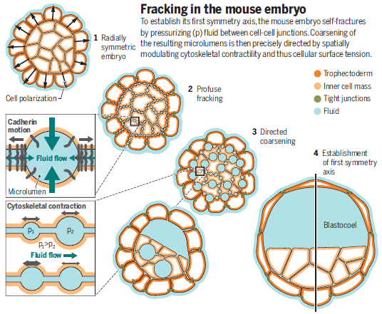
|
The main part of the figure shows four stages during the development of a mouse embryo. #1 (upper left) is, loosely, a spherical mass of cells at a very early stage. (The outer layer will become the placenta; the inner part will become a mouse.) #4 (lower right) is the blastocyst. It has recognizable structure: its characteristic blastocoel (a large cavity, or lumen) at one end. That is the first recognizable feature that takes the developing embryo a step beyond a symmetric mass of cells.
The question is, how does this first structure form? It is a fundamental question not only for the mouse but for all mammals. The two intermediate stages shown give an idea what the scientists found in the new work, and their interpretation of what is happening. Briefly, little bubbles, or "microlumens" form between cells. Over time, those microlumens coalesce into one large lumen, the blastocoel. (Coalescence occurs as fluid flows along paths of low resistance; lumen fusion is not a major contributor.) What drives bubble formation and enlargement, and breaking of contacts between cells? Fluid pressure. Fracking. The figure above is the figure in the news story accompanying the article in the journal. |
Some results...
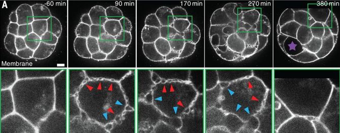
|
The top row of pictures shows part of a mouse embryo at five time points (labeled at upper right corner of each frame). The scale bar (lower right of first frame) is 10 µm.
Note the region marked by a green box in each frame of the top row. For each time point, that green box region is shown in the bottom row at 3-fold higher magnification. Some observations... - Look for microlumens. You can see them in both rows. They are widespread in the top row, where you see many cells at lower magnification. Of course, they are easier to see at the high magnification of the bottom row. There are no microlumens in the first frame. The number of microlumens increases, then decreases over further development. - Blastocoel. It is marked with a star in the right-hand frame, top row. A precursor is visible in the preceding frame. That is, the blastocoel forms as microlumens disappear. This is (part of) the first figure in the news story by the article author (in The Node). It is equivalent to Figure 1A from the article. |
That's an idea of what happens. Microlumens arise between cells in the early embryo. The microlumens effectively coalesce into one large lumen, the blastocoel, as fluids follow paths of low resistance. With the physicists and biologists collaborating, the team hypothesizes that the process of development of lumens, including coalescence, involves fluid pressure, arising from osmotic forces. That story of lumen life cycles is new to most biologists, but a well-understood process to physicists.
There is much more to be done to understand all the details, but the current article has given us a new perspective... A key step in the development of the mouse body (and presumably the body of any mammal) is a physical fracture -- mediated by fluid pressure.
News stories:
* Controlled hydraulic fracturing sculpts mammalian embryos into shape. (A Williamson, Phys.org, August 15, 2019.)
* Inflate your embryo. (M Le Verge-Serandour, The Node, September 17, 2019.) A short version of the story from one of the authors of the article.
* News story accompanying the article: Development: Embryonic self-fracking -- Mammalian embryos use controlled hydraulic fracturing to sculpt their shape. (M Arroyo & X Trepat, Science 365:442, August 2, 2019.) Excellent.
* The article: Hydraulic fracturing and active coarsening position the lumen of the mouse blastocyst. (J G Dumortier et al, Science 365:465, August 2, 2019.)
Previous post about fracking: Fracking and earthquakes: It's injection near the basement that matters (April 22, 2018).
Previous post about mice: Cats, fats, and Toxoplasma. And mice. (October 21, 2019).
November 16, 2019
Again.
Recent years have seen the development and implementation of a vaccine against dengue. The final step in that story is that the vaccine, which had passed early tests and was approved, is now understood to be dangerous in some cases. Its use is now limited.
A key problem with dengue is the unusual way the various strains of dengue interact. Briefly, in some cases, infection with one strain of dengue can make a subsequent infection worse -- if it is by a different strain. The phenomenon, called antibody-dependent enhancement (ADE) is not well understood, but has implications for a vaccine.
Both the vaccine and ADE have been discussed in Musings [link at the end].
A second dengue vaccine is under development. Here are some results, from a clinical trial reported in a new article. The trial is Phase III; the article reports preliminary findings, after about 18 months of observation.

|
The general form of the graphs is typical: cases (y-axis) vs time (x-axis). "Cases" is presented here as percentage of participants.
The main graph and the inset are the same, except for the y-axis scale. The main graph shows 100% of the participants, and is pretty much useless. The inset expands the y-scale, so we can see what happened. The lower two curves are for those who received the vaccine; the upper two curves are for those who received a placebo (i.e., they are unvaccinated). The first observation is that dengue is much less frequent in the vaccine group. To expand... This graph is for cases of dengue requiring hospitalization. That is, the graph shows that hospitalization due to dengue is dramatically reduced by the vaccine. (The reduction is about 95%, overall.) But there is more... The pair of curves for each vaccine-condition are for those who are seropositive for dengue (red) and those who are seronegative (blue). Being seropositive is evidence that the person has had prior exposure to dengue. It is hard to know what to make of this aspect of the results. There are not big differences, but there are differences. Part a of the full figure shows similar graphs for total dengue cases. The general picture is the same, with higher numbers of course. The reduction in the vaccine group was about 80%. This is Figure 2B from the article. |
There is more, including results by dengue type. But no matter, the big picture is that the vaccine looks pretty good. So far. The protection is a little better than for the first dengue vaccine. However, what really matters is the longer term results; we'll just have to wait. In fact, the trial will continue, to give five years of observation.
You'll hear about this new vaccine, sometimes with an encouraging tone. But we need to learn more about it. Dengue is tricky; our experience with the first vaccine reminds us of that. It is hard to know where we stand.
News stories:
* Dengue Vaccine Trial Results Show Promise, with Caveats -- TAK-003 appears to avoid the safety issues seen with an existing vaccine, but experts say a longer evaluation is needed. (S Williams, The Scientist, November 8, 2019.) Now archived.
* Initial reports suggest new dengue vaccine safer than prior vaccines. (B Yirka, Medical Xpress, November 7, 2019.)
The article: Efficacy of a Tetravalent Dengue Vaccine in Healthy Children and Adolescents. (S Biswal et al, New England Journal of Medicine 381:2009, November 21, 2019.)
The trial was sponsored by the company that developed the vaccine, and the article is, in part, from them. (That is all common procedure in the development of vaccines or drugs.)
You might wonder... Was the development of this vaccine influenced by the experience with the earlier dengue vaccine? Probably not. The previous vaccine experience is too recent to have affected at least the main part of the current vaccine's development. Of course, everyone is aware of what happened before. That may have affected the design of the trial, especially its length. Certainly it will affect how regulatory decisions are made.
* * * * *
Here is a background post that includes some information about both the first vaccine and ADE: Dengue vaccine: a step backwards? (December 6, 2017).
Another approach: What if the mosquitoes carried immunity to the dengue virus? (March 8, 2020).
More about dengue is on my page Biotechnology in the News (BITN) -- Other topics under Dengue virus (and miscellaneous flaviviruses). There is a list of related Musings posts.
November 13, 2019
1. The effect of space travel on humans: a study of identical twins. We need to learn more about the effects of space travel on humans. Of course, we collect much data, but how can we compare data from people in space with unrelated people who didn't go into space? The ideal answer is obvious, and NASA had a chance to do it, with the identical twin astronauts Scott and Mark Kelly. It's an interesting story, though going through the details of what was found is probably more than most people want. At least, look over the news story, which is by an expert biologist.
* News story: NASA twins study highlights key risks for long-term space travel: Cosmic rays and microgravity. (R Lewis, Genetic Literacy Project, April 16, 2019.) Links to the article.
* Related:
- Fidelity of DNA replication in micro-gravity (January 11, 2022).
- Which direction does blood flow in an astronaut? (January 7, 2020).
- Twins (April 30, 2009). Links to more about twins.
2. Beware the magnetic stir bar. They are called stir bars, not catalysis bars. But what if they are not clean? A recent article explores the problem, and shows that stir bars can easily accumulate enough firmly-bound contaminants to affect reactions. Routine cleaning is not sufficient to decontaminate them. Those who use stir bars should read the article behind this post. For others, it is a fun story.
* News story: Stir bar contamination may inadvertently catalyze reactions -- Traces of metal nanoparticles embedded in used magnetic stirrers can interfere with chemical reactions. (M Peplow, C&EN (Chemical & Engineering News), March 28, 2019.) Links to the article.
* The article: Phantom Reactivity in Organic and Catalytic Reactions as a Consequence of Microscale Destruction and Contamination-Trapping Effects of Magnetic Stir Bars. (Evgeniy O Pentsak et al, ACS Catalysis 9:3070, April 5, 2019.)
3. E-cigarettes and the issue of vitamin E acetate. This has been a big news story in recent days, so I will note the article here. It is very short and readable. Briefly, the scientists found vitamin E acetate in the lungs of people with damage from e-cigarettes, but they have no direct evidence at this point of a causal link. That chemical is one of several that have been under suspicion. As so often, this is science in progress.
* The article, which is freely available: Evaluation of Bronchoalveolar Lavage Fluid from Patients in an Outbreak of E-cigarette, or Vaping, Product Use - Associated Lung Injury -- 10 States, August-October 2019. (B C Blount et al, Morbidity and Mortality Weekly Report (MMWR) 68:1041, November 15, 2019.)
November 11, 2019
They have long been mysteries of the archeological record. Here are a couple of examples...

|
A couple of "them". They are each about 9 centimeters (3-4 inches) high. They are from about 1000 BC.
These particular objects are not the ones studied in the current work. This is Figure 1 from the news story accompanying the article in Nature. |
What are they? One suspicion is that they are for feeding little children, maybe even babies. That is, they might be baby bottles.
A new article provides some evidence. Here is an example of the new evidence...
|
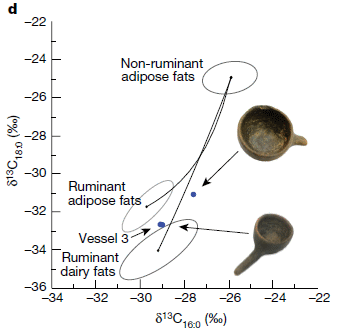
The tool here is isotope analysis. The scientists measured the amount of heavy carbon (C-13) in fats from various food sources, and from the food residues found in archeological artefacts.
The graph axes show a measure of the C-13 content of two specific fatty acids. They are stearic acid (labeled as 18:0; y-axis) and palmitic acid (16:0; x-axis). As so often with isotope analyses, the results are presented in a way that doesn't have any clear meaning to most of us. The numbers compare the sample to a reference sample, and present the difference as parts per thousand (o/oo). We don't relate to the reference material or the numbers. But comparing numbers within the graph is fine. |
|
|
First, look at the three ovals. Those ovals summarize what was found for three general types of food fat. The upper oval is for fat from non-ruminants. The two lower ovals are for ruminants (cow, sheep, goat); one is for dairy fat and one is for adipose fat (body fat). Then there are two blue points. They are very near the ovals for ruminants, not the oval for non-ruminants. One might suggest that the points show mixtures of the two types of ruminant fat. They are not far from what would be expected for cow milk. Those two points are for fat residues found in three vessels. Two are shown there; the third is labeled "vessel 3". (Why are there only two points? It's not clear, but I suspect that the lower point is for both the lower vessel shown and for vessel 3.) The two bowls shown are about 5 cm across. (That is estimated from Figure 1 of the article.) This is Figure 2d from the article. | |
Those things held cow milk (or similar).
The vessels are from grave sites. The two vessels shown are from a site dated to about 800-450 BC. Vessel 3 is somewhat older, and they have only a fragment. Each was found associated with a child. For two of them, the child is estimated to have died at about 1 year old. (For the third, the dating of child age was unclear, but consistent with it being a year old or so.)
That is all consistent with the idea that such vessels were used to feed babies -- feed them cow milk.
News stories:
* First evidence for early baby bottles used to feed animal milk to prehistoric babies. (Science Daily (University of Bristol), September 25, 2019.)
* Discovery of prehistoric baby bottles shows infants were fed cow's milk 5,000 years ago. (J Dunne, The Conversation, September 25, 2019.) By the lead author of the article.
* News story accompanying the article: Archaeology: Early European babies bottle-fed animal milk -- The foods used to supplement or replace breast milk in infants' diets in prehistoric times aren't fully understood. The finding that ancient feeding vessels from Europe had residues of animal milk offers a clue. (S E Halcrow et al, Nature 574:182, October 10, 2019.)
* The article: Milk of ruminants in ceramic baby bottles from prehistoric child graves. (J Dunne et al, Nature 574:246, October 10, 2019.)
More old dairy: The oldest known piece of cheese (April 25, 2014). Links to a lot of interesting stuff.
For more about lipids, see the section of my page Organic/Biochemistry Internet resources on Lipids. It includes a list of related Musings posts.
My page of Introductory Chemistry Internet resources includes a section on Nuclei; Isotopes; Atomic weights. The list of Musings posts includes some that involve isotope analysis.
November 9, 2019
The grape harvest was early in Beaune, in the Burgundy region of France, in 1393. In fact, 1393, 1413, and 1420 stand out in the historical record for having early grape harvests in the century from 1350-1450. That was, we might suspect, due to unusually warm weather those years.
Those comments are based on a new article about climate change. It offers some insight into French climate history. It's a particularly interesting story because of the data source.
Look...

|
The graph shows the day of the grape harvest (y-axis) vs year (x-axis). The grape harvest day is shown by a number for the day of the year: January 1 is day 1 of the year, February 1 is day 32, and so forth. July 1 would be (about) 182, the midpoint of the year. Note that the y-axis scale is upside-down: early grape harvests (low day numbers) are toward the top.
Some of the points are labeled, with the year. These mark most of the top 5% of points -- the earliest grape harvests. The first striking point is that there is such a record. More about this below; it's not quite as simple as it looks. At the left, you can see the three high points -- early grape harvests -- that we noted earlier. You may also notice some patterns. We'll leave that part of the story for now. This is Figure 10 from the article. |
Where did this record of grape harvest days (GHD) come from? From the records in Beaune, where GHD is an officially-established event. But as we cautioned above, it is not simple. The GHD records are well known, but have been incorrectly presented over the ages. The current work involved critical analysis of a variety of sources, including many original (contemporaneous) sources, and getting the best information possible for the GHD. Much of the article is about building the data set, and includes discussion of the uncertainties that remain. It is a work of historical scholarship.
We suggested that the grape harvest might be related to temperature. Data? Here it is....

|
The relationship between the grape harvest day (GHD), shown (x-axis) as the day of year (DOY), and a local temperature (T; y-axis).
This data set is not for the entire range of years shown in the top figure. But it is for an extended period. It's a pretty good relationship, and allows the scientists to predict what the T was over the entire time period. This is Figure 6 from the article. |
So this graph establishes that there is a good correlation between the local temperature and when the grapes are harvested. There is no T record back to 1350, but there is a record of when the grapes were harvested (to be picky, back to 1354). That grape harvest record, along with the correlation, allows us to estimate what the T was in the summer of 1393 in Burgundy.
Back to the top graph for a moment. As we noted, the top 5% of the points are labeled -- the earliest grape harvests. Visual inspection shows that the frequency of early harvests has varied over the centuries. For example, they were uncommon during the 1800s, a time associated with low T. More recently, there is a different pattern.
News stories; both contain good pictures.
* French wine grape records show accelerated warming over the past 30 year. (R Arthur, Beverage Daily, September 2, 2019.)
* Burgundy wine grapes tell climate story, show warming accelerated in past 30 years. (European Geosciences Union, August 29, 2019.) From the journal publisher. Note some pictures at the very bottom of the page, showing original archival data; one is from 1385.
The article, which is freely available: The longest homogeneous series of grape harvest dates, Beaune 1354-2018, and its significance for the understanding of past and present climate. (T Labbé et al, Climate of the Past, 15:1485, August 29, 2019.) From the University of Burgundy, among other places. One affiliation there is to the Institut Universitaire de la Vigne et du Vin; put that into Google with the word translate, if you need to. It's a generally readable article, with much interesting historical discussion.
Among wine-related posts...
* Improved ostracon analysis reveals 2600-year-old request for wine (July 23, 2017).
* Some shrimp in your wine? (August 27, 2016).More grapevines:
* What do we learn from the sulfur isotopes in the California vineyards? (June 28, 2022).
* Acne, grapevines, and Frank Zappa (August 1, 2014).Also see: What happens when the cork is removed from a bottle of champagne? (October 27, 2019). Another post where I noted the author affiliations, also from the French wine country.
November 6, 2019
Another resource shortage: vegetables. Eat your veggies. Now -- before the world runs out. A fun, and provocative, story.
* News story: We don't grow (or eat) enough fruits and veggies. (Global Food and Nutrition Security (CSIRO), July 18, 2019. Now archived.) Links to the article, which is freely available. This story and the article are both from the Australian research organization CSIRO. Although part of the story emphasizes Australia, the analysis is global, as is the problem.
November 5, 2019
Organoids. Pieces of organ-like tissue grown in the lab. Typically, from iPSC (induced pluripotent stem cells), differentiated in the lab to develop into something like primitive lab-grown organs. Organoids let us study how organs develop, under controlled lab conditions.
Cerebral organoids. A fancy term for brain organoids. Pieces of brain tissue differentiated and grown in the lab. Interesting stuff.
And now... A team of scientists reports growing monkey, chimp, and human brain organoids in the lab -- and comparing them.
The answer? They are different.
This article may be of interest simply because they did it. That's true with a lot of work on organoids, especially brain organoids. It's early days in the field. We're going to learn a lot from organoids. We may even find them useful as biological materials (e.g., for transplantation). But for now, we're just stepping in -- and that in itself is interesting.
The article is crammed with data. But don't expect a big answer; it's too early for that.
Here are a couple of graphs, comparing brain organoids from three primates...
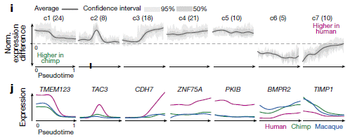
|
Both graphs look at gene expression patterns, for brain genes in organoids from humans and chimpanzees. Part j also includes macaque monkeys.
The general form of the graphs is gene expression (y-axis) vs time (or "pseudotime"; x-axis). Complicated and labeled cryptically, but all you need is the general pattern: gene expression vs time, for various genes. (In fact, you'll notice there are few numbers on the axes.) Part i (top)... This part compares the expression levels for several clusters of gene, human vs chimp brain organoids. "c1(24)" means cluster 1, with 24 genes. The y-axis here is the difference in expression, chimp brain organoids and human brain organoids. You can see that cluster c1 is more highly expressed in the chimp organoids than in the human organoids. Further, the expression difference varies over time. Some gene clusters show higher gene expression in chimp brain organoids, some show higher gene expression in human brain organoids. And the patterns vary over time, in various ways. Part j (bottom)... Same idea, but the results here are for specific genes, and the study also includes brain organoids for macaque monkeys. The general message is the same, too... Different gene expression patterns in developing brain organoids from different primates. And what is pseudotime? It is a modified time scale that facilitates comparison of the development for three different organisms. This is part of Figure 2 from the article. |
That's about it, for now. We are beginning to compare the development of brain tissue for humans and other primates under controlled lab conditions. The work makes use of the recent technologies of iPSC, organoid development, and nucleic acid sequencing. The authors use terms such as "gene-expression atlas" to denote that they have provided a chunk of data that underlies further work. Inevitably, such work will lead to better understanding of what make us human.
News stories:
* How human brain development diverged from that of great apes -- Cell atlas of great ape forebrain development illuminates dynamic gene-regulatory features that are unique to humans. (ScienceDaily (Max Planck Institute for Evolutionary Anthropology), October 16, 2019.)
* Human 'mini-brains' slow at developing among primates. (P Ghosh, BBC, October 16, 2019.)
The article: Organoid single-cell genomic atlas uncovers human-specific features of brain development. (S Kanton et al, Nature 574:418, October 17, 2019.)
An early post on brain organoids: Artificial brain-like structures grown from human stem cells in the lab (October 1, 2013). Links to more.
More... Briefly noted... Brain organoids grow eye precursor structures (March 2, 2022).
More about brains is on my page Biotechnology in the News (BITN) -- Other topics under Brain. There is a list of related Musings posts.
More organoids: Snake venom gland organoids (March 17, 2020).
My page Biotechnology in the News (BITN) for Cloning and stem cells includes an extensive list of related Musings posts.
November 3, 2019
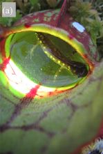
|
See the little salamander in there?
In where? In a pitcher -- as in a pitcher plant. This is Figure 1a from the article. |
Carnivorous plants fascinate us; they go against what we consider normal. These plants eat animals. (They live in nitrogen-deficient habitat; the animals provide their major nitrogen source.) But we do usually think of them as mainly eating insects (or other small arthropods, such as spiders).
Of course, the digestive fluids of carnivorous plants don't care much about where their meat comes from. It's more a matter of what animals are likely to get caught -- and the usual answer is insects.
There have been reports of carnivorous plants eating something bigger or more complex than an insect, but those have usually been taken as special cases.
What makes the current article of special interest... The authors suggest that these plants include these vertebrates as a normal and significant part of their diet. In one survey, they found that 20% of the pitchers had salamanders in them -- just after synchronous metamorphosis resulted in a burst of baby salamanders. Some were already dead, and in various states of (controlled) digestion or (uncontrolled) decay. Some were alive; one wonders what their fate would be.
A little data, and many questions. And an unusual picture.
The plants here are northern pitcher plants, Sarracenia purpurea purpurea.
The animals are spotted salamanders, Ambystoma maculatum. The average length of specimens found in pitchers was about 3 centimeters (a little over an inch). Their estimated dry weight was about 155 milligrams. The salamanders found in pitchers are almost all newly metamorphosed. The restricted time span of the interaction may account for the lack of previous observations.
The site is a bog in Algonquin Provincial Park, Ontario, Canada. No fish; a good place for amphibians to thrive.
News stories:
* Researchers find salamander-eating plants in Canadian provincial park. (A Micu, ZME Science, June 11, 2019.)
* Pitcher Plants with a Taste for Salamanders? (In Defense of Plants, June 10, 2019.) Includes the entire Figure 1 from the article, with more salamanders in pitchers.
The article: Nature's pitfall trap: salamanders as rich prey for carnivorous plants in a nutrient-poor northern bog ecosystem. (P D Moldowan et al, Ecology 100:e02770, October 2019.) A fun little (4-page) article.
Videos. There are two videos posted with the article, as "Supporting Information". (About 2 minutes total; no useful sound. Brief legends, not particularly helpful, are in separate pdf files posted along with the videos.) They include some good close-up shots. One includes two salamanders in the same pitcher. One includes some human fingers, which provide a sense of scale. These videos appear to be freely available, regardless of subscription access to the article itself.
Another post about a pitcher plant: Carnivorous plants: A blue glow (March 16, 2013). Links to more about carnivorous plants.
A post on the origin of carnivory in a plant: Venus flytrap: converting defense into offense (July 27, 2016).
More carnivory: A new type of carnivorous plant (August 24, 2021).
Another post about a salamander doing something unusual: A photosynthetic salamander? (August 24, 2010).
More salamander...
* Does the frog population affect the incidence of malaria? (October 17, 2022).
* Humans may be more like salamanders than we had thought (limb regeneration) (February 11, 2020).
November 2, 2019
Over recent years, we have developed some general ideas about the human gut microbiome...
- It is important for good health.
- It is first acquired during birth.
- Babies born by cesarean section ("C-section"), bypassing normal birth, have normal health.
Those three points do not fit together well. One can imagine what the missing pieces might be, but data are limited.
A new article provides perhaps the most comprehensive comparison yet of the microbiomes of babies born by normal vaginal birth and by cesarean section. It focuses on the first three weeks after birth, the "neonatal" period. It is an early report from the Baby Biome Project.
The following figure provides a useful visual summary of some of the major findings...
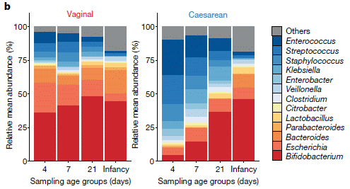
|
Each vertical bar shows the distribution of types of gut bacteria -- the gut microbiome -- at one time point for one birth type.
The total bar size is 100% in each case. Colors are used for the various bacterial types, with a key at the right side. (At the start, don't worry about what the bacteria are; just look at the color pattern.) The left side is for babies born by ordinary vaginal birth. The right side is for babies born by C-section. The time points are the same for both birth types. The first three points are during the first three weeks after birth. The final point, labeled "Infancy", was at 7-11 months.) Some observations, based on the "big" patterns (without worrying about which bacteria are involved)... - The patterns are different for the two birth types. - For cesarean birth, there are major changes in the distribution over time -- including major changes during the first three weeks. - For vaginal birth, there are only fairly small changes over the time studied here. - Over time, the bacterial pattern for babies born by cesarean section becomes more like that for babies from vaginal birth. (However, there are still significant differences at the end of the time period studied here.) There were about 300 babies in each birth-type group. However, there were only about 700 samples for each group; not every baby was tested at each time point. The analysis was based on sequencing of bulk DNA from fecal samples. Metagenomics. This is Figure 2b from the article. |
So, C-section babies have different gut microbiomes, though the difference declines substantially over the first few weeks and months. C-section babies get more of their early gut microbiome from "the environment", which, of course, is variable.
The testing also included the mother. For vaginal births, a baby's gut microbiome most closely corresponds to that of the mother's microbiome of the gut -- not the vagina.
For C-section births, many sources may contribute -- including the hospital environment.
Many questions remain. Perhaps most important... Does it matter? The authors do not have any health outcomes to report here. However, they can comment on the general reputation of some of the bacterial groups found. The red-coded bacteria, such as Bifidobacterium, are considered important for good health. And some of the blue-coded bacteria are potential pathogens. The patterns suggest that the C-section babies are relatively low in the good bugs and high in the bad bugs. Although the microbiome differences are reduced over time, it is possible that they have an early impact, including their effect on instructing the immune system.
The scientists will continue to follow these kids, even into adulthood.
News stories:
* Microbiome Affected by Babies' Delivery Method, but Long-Term Effects Remain Unknown. (GEN, September 19, 2019.)
* Babies born by C-section have different gut bacteria. (Neuroscience News (University College London), September 21, 2019.)
The article: Stunted microbiota and opportunistic pathogen colonization in caesarean-section birth. (Y Shao et al, Nature 574:117, October 3, 2019.)
The analysis also indicates significant effects of antibiotics given to the mother prior to the birth and of early breastfeeding in affecting the early gut microbiome. Those points are noted, but are smaller effects, and are not the focus of the current article.
* * * * *
The final half-paragraph of the article (with reference links omitted): The disrupted transmission of the maternal gastrointestinal bacteria (particularly pioneering Bacteroides species) through delivery by caesarean section and maternal intrapartum antibiotic prophylaxis predisposed newborn babies to colonization by clinically important opportunistic pathogens that circulate in the hospital environment. However, the clinical consequences of the perturbations of early-life microbiota and the carriage of immunogenic pathogens during this critical window of immune development remain to be determined. This highlights the need for large-scale, long-term cohort studies that also sample home births to better understand the consequence of the perinatal factors in hospital birth and establish whether perturbation of the neonatal microbiota negatively affects health outcomes in childhood and later life.
* * * * *
A previous post on the topic: Your gut bacteria: where do you get them? (July 30, 2010). The article of that earlier post is reference 1 of the current post.
More on C-sections: The rising rate of caesarean section births: an intriguing correlation (April 15, 2019).
There is more about genomes and sequencing on my page Biotechnology in the News (BITN) - DNA and the genome. It includes an extensive list of related Musings posts.
October 30, 2019
1. The influence of Neandertal genes on modern humans. A news feature offers a nice update on this developing topic. We caution, as does the author, that much is inference at this point.
* News feature article: Neanderthal DNA in Modern Human Genomes Is Not Silent -- From skin color to immunity, human biology is linked to our archaic ancestry. (J Akst, The Scientist, September 1, 2019. Now archived.)
* Background post: Contributions of Neandertals and Denisovans to the genomes of modern humans (July 6, 2016). I have noted this new news feature in that post.
2. Nobel Prize in chemistry, 2019. It's relevant to the topic of the post immediately below. We also note that one of recipients is the oldest Nobel recipient ever, for any prize category.
* Press release: The Nobel Prize in Chemistry 2019. (Nobel, October 9, 2019.)
October 29, 2019
A recent article makes a bold claim: a lithium-ion battery that could last for a million miles (1.6 million kilometers) of car use.
The specifics there are a little arbitrary, but the scientists have data. The following figure is a bottom-line comparison of their new battery with a common reference battery...
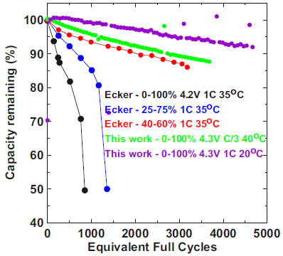
|
Each curve shows the remaining capacity (y-axis) as a function of the number of charging cycles (x-axis).
There are five curves. Three are for the reference battery (labeled as Ecker; 2014 article), with various testing conditions. Two are for the new battery ("this work"). Quick view... The top two curves (the best results) are for the new battery. Let's look at the three reference (Ecker) curves. The difference between them is how much of the capacity was used per cycle. The lowest curve (black) is for using the entire capacity (0-100%) each cycle. The highest Ecker curve (red) uses only 20% of the capacity each cycle (40-60%). The other Ecker curve is intermediate, both in extent of capacity usage and survival. That is, the less of the capacity one uses per cycle, the longer the battery lasts. This is a well-known phenomenon. (For heavy-duty uses, it really would be good to be able to use most of the battery capacity.) Note the x-axis label: Equivalent Full Cycles. If the battery is used for only half of its capacity in a cycle, that counts as a half of an "equivalent full cycle". How about the new battery? Both tests here were done using the full capacity. The two tests of the new battery were done at different temperatures (T) and currents (C). The best direct comparison is for the two batteries tested at full capacity and about the same T. That's the lowest curve (black) and the next-to-top curve (green). If we take battery life to be the number of cycles until it decays to below 70% of capacity... The Ecker battery lasts fewer than 1000 cycles; it looks like the new battery would last about 10,000 cycles. (The numbers there are my eye-balling the graphs.) This is Figure 1 from the article. |
Battery performance depends both on the chemistry and on the physical structure. The work here is done with batteries called NMC532/AG. That stands for LiNi0.5Mn0.3Co0.2O2/artificial graphite, with large single crystal NMC. These are batteries that have been extensively studied in the authors' lab. (Note that the letters and numbers in the name represent the composition.)
They discuss some of the failure modes for such batteries, and point to specific improvements they have made. However, they also acknowledge that they have no information about some failure modes, more characteristic of larger scale batteries.
There is much discussion of electrolytes, with their pro and con features -- and trade-offs. This is a complicated issue, which we won't go into here.
The million-mile claim? Charging cycles (under specified conditions) is a clear measure of battery lifetime. But then the authors add some assumptions, for perspective. They make assumptions about the usage level of the battery, in charging cycles per day and miles driven per day. That allows them to put forward estimates of battery lifetime in other terms, ones that people can relate to. The million-mile claim is of that type. The data shown in the figure above is real data. (The million-mile claim would represent about a doubling of battery life over what is now available.)
Another major application for such batteries is grid energy storage. The authors estimate a 20-year lifetime for their batteries in such use.
The article is provocative -- openly so. But it contains much data showing the improvements in the new battery, and explanations of how they did it. As always, one article does not a truth make. We'll see over time whether the work reported here leads to practical improvements -- ones that can be implemented at a large scale and economically. (We'll leave it to the news stories to speculate exactly where Tesla is on this development curve.) The authors challenge the community to implement what they have done, and to exceed their performance results. They suggest that their battery should be the reference standard for now.
News stories:
* Million-mile battery unveiled by ground-breaking research. (Tech Xplore (S Davies, Institute of Physics), September 27, 2019.)
* Tesla May Soon Have a Battery That Can Last a Million Miles -- Elon Musk promised Tesla would soon have a million-mile battery, more than double what drivers can expect today. A new paper suggests he wasn't exaggerating. (D Oberhaus, Wired, September 23, 2019.) Includes discussion of the relationship between the university lab (Dalhousie) behind this work and Tesla.
The article, which is freely available: A Wide Range of Testing Results on an Excellent Lithium-Ion Cell Chemistry to be used as Benchmarks for New Battery Technologies. (J E Harlow et al, Journal of The Electrochemical Society 166:A3031, September 6, 2019.) The article acknowledges the financial support of Tesla.
A post about improving lithium-ion batteries: Making lithium-ion batteries more elastic (October 10, 2017).
More... Briefly noted... Electronic structure of lithium atoms (March 8, 2022).
Among many posts about batteries... Using the walls of a building as a rechargeable battery? (May 24, 2021).
There is more about energy on my page Internet Resources for Organic and Biochemistry under Energy resources. It includes a list of some related Musings posts.
October 27, 2019
It goes "pop".
A new article reports a study of the "pop".
Here is a photo-shoot of what happens at the bottle top during the "pop"...
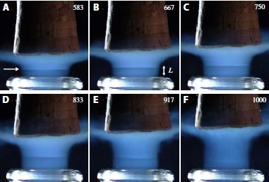
|
Near the bottom is a light (white/clear) ring; that is the rim of the bottle. (In part A, it is a little below the arrow.)
Above that is some blue stuff. That is a carbon dioxide-water haze, rising from the bottle. We'll refer to it as the CO2 layer, for simplicity. The blue is real; it is due to light scattering off the crystals. Crystals? CO2; it is cooled to about -90 °C by the expansion as it exits the bottle. That is below its freezing point. Above that CO2 layer is the cork, which is being removed. The main point... Look at part A (upper left). The blue (CO2) region has two parts, with a very distinct boundary between them; the white arrow points to the boundary. Look at the sequence of images: the boundary rises from parts A to D. By part F, there is no distinct boundary. There is a small white number in the upper right corner of each part. That is the time stamp for that image -- in microseconds. The last image is 1000 µs (or 1 ms). (You can be excused if you had never seen the lines, even if experienced opening such bottles.) This is Figure 4 from the article. |
What is that boundary line? For a clue, look at the following photograph...

|
Two fighter jets. You can see boundary lines in the exhaust trail (especially for the one in the foreground). What are those boundary lines? Well, the exhaust trail is supersonic. You are seeing the Mach disks, representing the shockwaves of the supersonic flow.
This is Figure 3 from the article. |
What's the connection? Are they claiming that the "exhaust" from the champagne bottle upon opening is supersonic? That is exactly the point. The authors calculate what happens when the champagne bottle is de-corked, and show that the exhaust is expected to be supersonic. Their videos of de-corking events (e.g., top figure) provide evidence that it actually happens. The fighter jet picture is not evidence about champagne bottles; it is just for a fun comparison.
The analysis involves some rather complex physical chemistry; the article has many equations!
News story: Uncorking champagne creates under-expanded supersonic carbon dioxide freezing jets. (B Yirka, Phys.org, September 23, 2019.)
Video. There is a short video posted with the article as supplementary material. It is 4 seconds. It probably shows about a millisecond of action. That is, it is slowed down more than a thousand-fold. Perhaps oddly, there is no sound. An animated gif version is part of the Phys.org news story listed above. It probably is the same content, but is a much smaller file; it runs as a loop.
The article, which is freely available: Under-expanded supersonic CO2 freezing jets during champagne cork popping. (G Liger-Belair et al, Science Advances 5:eaav5528, September 20, 2019.)
The main author affiliation listed is: Equipe Effervescence, Champagne et Applications, Université de Reims Champagne-Ardenne. I wonder, can one get a doctorate in Effervescence?
* * * * *
Champagne bottles were mentioned in the post Lakes that explode (October 13, 2009).
More from the French wine region, with author affiliations noted... A half-millennium record of climate change, from the grapes of Burgundy (November 9, 2019).
More things supersonic: Aerospace engineers develop explosive device for supersonic delivery of vaccines (August 2, 2011).
And for some supersonic confusion... Introducing Supersonus -- it stridulates at 150,000 Hz (June 16, 2014).
October 26, 2019
Is hydrogen peroxide (H2O2) made spontaneously in a bottle of water (H2O)?
If so, would we expect the reaction to be dependent on the oxygen (O2) in the air?
What if the water was aerosolized (turned into tiny droplets)?
And why am I asking these questions? That one is easy. A new article forces them on us.
Let's look at some results from the article...
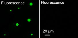
|
Two samples of water were examined, by fluorescence microscopy. They contained a chemical that can be oxidized by H2O2 to a chemical that fluoresces (fluorescein).
The sample on the left shows green fluorescent spots. The one on the right shows nothing. |
|
What's the difference? The water sample on the left was aerosolized. The green spots show fluorescein -- in water droplets. (The droplets vary in size. The largest are about 20 µm in diameter; see the white scale bar at the bottom.) The right-hand part is for bulk water, and includes an air-water interface. This is the bottom half of Figure 1C from the article. | |
Formation of the chemical that fluoresces green in the droplets indicates that the aerosolized water made H2O2. That peroxide oxidized the added chemical to produce the fluorescent product, which was observed.
The next figure shows the effect of droplet size...
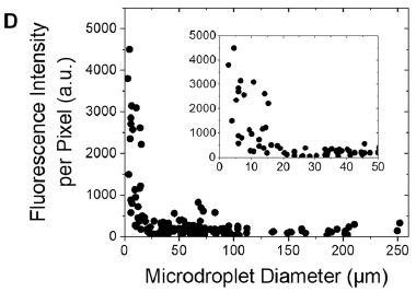
|
The graph shows the concentration of fluorescein product (as fluorescence intensity per pixel; y-axis) vs droplet size (x-axis).
It's clear that the product is increased at small droplet size. (The inset expands the left-hand side, for very small droplets. It ends up showing the same thing, but now with better size resolution.) This is Figure 2D from the article. |
Droplets matter. The smaller the better.
What about the need for molecular oxygen? Look...
|
For this test, the water was aerosolized with one of three gases. Peroxide production (y-axis) was expressed relative to the results for air.
O2 was slightly inhibitory! (Perhaps one would have expected it to stimulate H2O2 production.) N2 had no significant effect. This is Figure 4C from the article. |
|
On the basis of evidence such as presented above, the authors suggest that water can spontaneously make some hydrogen peroxide. The process requires tiny droplets, and does not require molecular oxygen.
It is an intriguing result, and quite unexpected. (How did they find it? It came up accidentally during other work on chemistry in microdroplets.)
The authors speculate how the peroxide is made. They note that the intense electric field at the surface of a tiny -- and highly curved -- droplet is strong enough to cause a hydroxide ion, OH-, to lose an electron. That leads to making the hydroxyl radical (OH). Two hydroxyl radicals can then join to make HOOH -- hydrogen peroxide. They have no direct evidence for this proposed mechanism, but it seems most likely for now.
If this holds up, it could be useful. H2O2 is useful in industrial processes. However, its synthesis is not fully satisfactory. The process described here is simple, inexpensive, and environmentally friendly. It produces only a low concentration of H2O2, but for many uses that is fine.
News stories:
* Water surprise: microdroplets have potential to produce hydrogen peroxide. (R Trager, Chemistry World, September 11, 2019.)
* In a Totally Unexpected Finding, Water Has Spontaneously Produced Hydrogen Peroxide. (P Dockrill, Science Alert, September 1, 2019.)
* News story accompanying the article: Production of hydrogen peroxide enabled by microdroplets. (C Zhu & J S Francisco, PNAS 116:19222, September 24, 2019.)
* The article: Spontaneous generation of hydrogen peroxide from aqueous microdroplets. (J K Lee et al, PNAS 116:19294, September 24, 2019.)
More about droplets affecting chemical reactions:
* The role of tiny droplets in driving unfavorable reactions -- such as those needed to get life started (January 17, 2023).
* Speeding up a chemical reaction by dividing up the container (February 28, 2014).Other posts involving the exotic hydroxyl radical include...
* Interaction of pollution sources: Can the whole be less than the sum of the parts? (March 9, 2019).
* Nuclear-powered bacteria: suitable for Europa? (March 27, 2018).
October 23, 2019
Bees on a treadmill in virtual reality. Ah, technology. A fun story, well-introduced by the news story.
* News story: Honeybees Enter Virtual Reality So Scientists Can Study Their Brains -- Researchers record neurological changes in a region called the mushroom body in the brains of bees completing a maze in a virtual environment. (J Romeo, The Scientist, February 14, 2019. Now archived.)
* The article, which is open access: Learning and Its Neural Correlates in a Virtual Environment for Honeybees. (Hanna Zwaka et al, Frontiers in Behavioral Neuroscience 12:279, January 2019.) Includes a video.
October 22, 2019
Two years ago, Musings reported on the development of a chemical that could be useful for harvesting drinkable water from "dry" air (that is, at low humidity) [link at the end]. It was a significant development, but the productivity was still too low for practical use. A new article reports a ten-fold improvement in productivity.
The new article reports an actual installation in a real-world desert (in California), with three days of continuous operation. Importantly, they collected the water from the chemical several times per day, rather than once a day, as done earlier.
The general idea is that the chemical collector binds water from the air. From time to time, the collector is heated, which drives the water off. The water is harvested, and the collector is ready for another round. This basic idea was presented in the background post, which I suggest you read again along with this one.
To allow water to be harvested from the collector chemical at any time of day, the new device includes a solar panel and a battery, to provide energy. The energy can also be used to run fans, which facilitate air movement through the collection device.
The following figure shows some data -- and some pictures.
|
Let's start with a picture, so we know what the system looks like. Part b (upper right). The dominant feature is the solar panel. The device itself is to the right side, and is quite small. It includes some batteries (bottom), the chemical collector, and a place for the product to accumulate.
Parts c & d show some parts. Part a shows the data, for four parameters over the 72 hours of operation. The top frame of part a shows the productivity, in grams of water per kg of collector chemical. Each blue bar is for one collection event. You can see that water was collected several times each day. (The first blue bar is high due to an experimental artifact.) The next two frames show the relative humidity (RH) and temperature (T). They fluctuate during the daily cycle as one would expect. Putting those together, one can see how the water collected varied as a function of RH and T. More water was collected at night, when T was low and RH was high -- as expected. The bottom frame shows the dew point. That is the T at which moisture would spontaneously condense out of the air given the water content. We only note that the entire work, collecting water from the air, was done above the T at which any water would have condensed spontaneously. This is Figure 5 from the article. |
The type of chemical used here as a collector is, as before, a MOF, or metal-organic framework. The current device uses a new MOF, which operates better than the previous one and is cheaper. In developing MOFs, attention has shifted some from the capacity to the speed of the exchange reactions. That is important for doing multiple cycles per day, as in the current work.
This real-world trial produced water at about ten times higher productivity than the previous device. Economics is complex. The article does not discuss the economics, but the authors are moving toward commercialization, as discussed in the news stories.
News stories:
* Water harvester makes it easy to drink water from thin air. (R Sanders, University of California Berkeley, August 29, 2019.) From the lead institution.
* Crystalline nets harvest water from desert air, turn carbon dioxide into liquid fuel. (R F Service, Science, September 3, 2019.) This story focuses on the current article, but includes some other things. (The two parts of the title are about two unrelated projects.) The general theme is the use of MOFs.
The article, which is freely available: Rapid Cycling and Exceptional Yield in a Metal-Organic Framework Water Harvester. (N Hanikel et al, ACS Central Science 5:1625, October 23, 2019.)
Background post: Harvesting water from "dry" air (July 1, 2017).
Next MOF post... Capturing NO2 from polluted exhausts (December 7, 2019).
October 21, 2019
Toxoplasma is a protozoan parasite that can infect a wide range of mammals. However, only cats transmit it to others. Why? Because the parasite can complete its life cycle only in cats. Until now.
There is much that is complicated about Toxoplasma. We don't want to get into most of that here, but just to note...
- It is the sexual part of the life cycle that requires cats. That produces infectious agents, called oocysts, for transmission.
- Infected cats transmit the parasite through the feces, not ordinary contact.
Some results, from a new article...
|
The graph shows the production of Toxoplasma under four different conditions.
Only the right-hand condition worked. The condition that worked is labeled "D6D inh. + LA". It is a combination of two treatments. "LA" stands for the fatty acid linoleic acid; LA itself was added. The first part of the label means that an inhibitor of the enzyme D6D was added; this is the enzyme that metabolizes LA. That is, this condition gave high levels of LA by both adding it directly and blocking its consumption. The condition next to that is LA alone. That was insufficient. The first two conditions were: no infection and no fatty acid (FA) added. Those were both negative, too. The results shown here are based on analyzing for genome copies. Follow-up work showed that infectious Toxoplasma oocysts were produced in the right-hand condition. D6D = delta-6-desaturase. It catalyzes the first step of the process for putting in a third double bond. This is Figure 6a from the article. |
That experiment was done with mice. The scientists have gotten Toxoplasma to complete its life cycle, and produce infectious progeny, in mice. They did this by drastically increasing the level of linoleic acid in the mice.
Why did the scientists do that? How did they work out that LA was the problem?
That story starts with a bit of knowledge about cats -- and then seems to be pursuing a hunch. Cats are unusual. They lack that enzyme D6D in their guts (where the parasite grows) -- and they have unusually high levels of LA, compared to other mammals. For some reason, the scientists suggested there might be a connection between the LA and the ability of Toxoplasma to reproduce. They did some experiments with cat tissue to explore the idea, and then moved on to mice. If high level of LA is the key to why Toxoplasma reproduces in cats, then artificially increasing the LA level in another animal might allow Toxoplasma to grow there. It worked.
Why does LA allow Toxoplasma to grow in mice? They don't know, but suspect that the fatty acid is playing a direct role, perhaps as a signaling molecule in the Toxoplasma life cycle.
Why is this interesting? Well, it provides at least a partial explanation for the oft-noted odd observation that Toxoplasma transmission depends on cats. And it may open up the possibility of using mice as the host for lab work on Toxoplasma. Using the drug reported above is not practical for large-scale work; however, it may well be possible to develop a mutant mouse strain that lacks the D6D enzyme. The team is working on that.
News stories:
* A Groundbreaking Study Is Good News for Cats-And People -- Researchers studying the cat-poop parasite, Toxoplasma gondii, made a breakthrough that will spare a lot of felines from research. (E Yong, Atlantic, July 11, 2019.)
* Thanks to science, parasite can have sex in mice, not just cats. (Phys.org (T Devitt, University of Wisconsin-Madison), July 30, 2019.)
The article, which is freely available: Intestinal delta-6-desaturase activity determines host range for Toxoplasma sexual reproduction. (B Martorelli Di Genova et al, PLoS Biology 17:e3000364, August 20, 2019.)
The "running title" for the article (the title that shows at the top of each page) is
"Turning a mouse into a cat: Inhibition of delta-6-desaturase allows Toxoplasma to have sex anywhere".* * * * *
Another odd observation about Toxoplasma was noted in the post Briefly noted... Does having a cat affect entrepreneurship? (February 13, 2019).
Other posts about Toxoplasma include: The cost of food poisoning (October 14, 2014).
More about linoleic acid: Improving soybean oil by gene editing (January 8, 2017). This post shows the structure of LA and related fatty acids.
More mice: Fracking by mice (November 18, 2019).
For more about lipids, see the section of my page Organic/Biochemistry Internet resources on Lipids. It includes a list of related Musings posts.
October 19, 2019
Consider a medical implant, such as a pacemaker. How do we get power to it? A recent article explores a new possibility: it uses ultrasound to transfer energy across the intact skin into the body, and a triboelectric generator implanted under the skin to change the form of the energy from sound to electricity.
What's a triboelectric generator? It's a device that converts movement into electricity. It's a well-known type of energy transformation. What's new here is trying to do it within the body.
The work here starts with the development of a generator that can work within the body. It is based on a membrane that vibrates in response to the ultrasound; the vibrations are coupled to electrode materials that generate electricity from the varying contact with the membrane (i.e., from movement).
TEG = triboelectric generator. The authors call their device a VI-TEG, for vibrating and implantable triboelectric generator.
Here are some results to show that the general idea works...
|
In this test, a small lithium-ion battery was charged using the ultrasound and a VI-TEG. This test was done with both ultrasound and VI-TEG in water, about 5 millimeters apart.
The two x-axis scales are perhaps of most interest here. The x-axis scale across the top shows the battery charge; the one at the bottom shows time. The battery went from no charge to full charge in about 4 1/2 hours. The scientists suggest that this is a useful charging rate for real implanted devices. This is Figure 3B from the article. |
That test shows that one can generate electricity from ultrasound. It is a simple test, without the complications of having living tissue around.
The following figure shows how this might be set up in a person. The actual test here is with a piece of pig tissue (which is similar to human tissue).
|
The tissue sample includes skin on top, fat, and muscle. (These are labeled, in yellow, but that may be hard to see.)
There are two VI-TEG devices, about 0.5 and 1 centimeter below the surface. The ultrasound probe is put against the skin, right above the VI-TEGs. The scientists report data from this system, using a piece of pig tissue in the lab ("ex vivo"). It works, though not as well as when there is no tissue between source and receiver. This is Figure 4C from the article. |
|
It's hard to tell how useful this will be. The numbers are fairly soft at this point, and there is no information about long term performance. For now, it's an interesting approach, worthy of further development. The prospect of being able to charge up a medical implant without breaking the skin provides a strong incentive.
News stories:
* An implantable device that produces energy using ultrasound. (B Yirka, Tech Xplore, August 2, 2019.)
* Ultrasound System to Charge Medical Implants. (Medgadget, August 5, 2019. Now archived.)
* Prof. Sangwoo KIM develops transcutaneous ultrasound energy harvesting using capacitive triboelectric technology. (SKKU News, August 5, 2019.) (SKKU? Sungkyunkwan University.) Includes Figures 1-3, in full, from the article (but without legends).
The article: Transcutaneous ultrasound energy harvesting using capacitive triboelectric technology. (R Hinchet et al, Science 365:491, August 2, 2019.)
A post that includes use of ultrasound as a visualization tool: Unusual twins: neither monozygotic nor dizygotic, but... (March 11, 2019).
More ultrasound: An ultrasound device you can wear (September 17, 2022).
Added December 10, 2025. Another triboelectric generator: What if your clothes could listen to what you say? (December 10, 2025).
In this post, the abbreviation TE is used for triboelectric. In a recent post, TE was used for thermoelectric. Beware. Both are interesting and somewhat unusual ways to generate electricity, but they are different. The thermoelectric post: An air-conditioner you can wear? (August 19, 2019).
There is more about energy on my page Internet Resources for Organic and Biochemistry under Energy resources. It includes a list of some related Musings posts.
October 16, 2019
Retraction notice. The article that was the basis of a recent Musings post has been retracted. The original article provided evidence that a mutation known to confer resistance to HIV reduces lifespan. That conclusion was based on statistical analysis from a major database. The article noted various reservations about the analysis. Indeed, follow-up has made it clear that the database used for the analysis contained a systematic bias, which impacted the conclusion. The original article has been retracted, and a new article submitted. The authors of the original article are among the authors of the new article.
* News story: Science journal retracts article linking CCR5 deletion to reduced life expectancy. (R Jefferys, HIV i-BASE, October 10, 2019.) Links to a preprint of the new article (ref 8; also shown below). Also links to the original article and the retraction notice.
* The new article, which is freely available as a preprint: No statistical evidence for an effect of CCR5-Δ32 on lifespan in the UK Biobank cohort. (R Maier et al, BioRxiv, October 2, 2019.) This is a preprint, posted here prior to peer review.
* The published article: No statistical evidence for an effect of CCR5-Δ32 on lifespan in the UK Biobank cohort. (R Maier et al, Nature Medicine 26:178, February 2020.)
* Background post: The CCR5 mutation that protects against HIV may be bad for people (June 17, 2019). I have added this update to the original post, at the top, as a retraction box.
October 15, 2019
Listen... call. (25 seconds; at YouTube.) The video is also posted with the article as supplementary material.
Armadillos are usually silent. However, this species of armadillo is well known to make noise, though the new article is apparently the fist scientific analysis of what that sound is. The animal here is Chaetophractus vellerosus, with the common name screaming hairy armadillo.
And they are solitary. To whom is this animal talking? In the current work, the scientists analyze the acoustic features of the armadillo call. They suggest that the call is typical of distress calls in diverse vertebrates. A distress call may startle a predator. For small predators, that may work. The distress call may also attract attention from others around, who may attack the perpetrator or aid the victim. That is, the distress call has a wide audience; it's not subtle.
An excerpt from the authors' Discussion section (first paragraph)...
The weeping call is a harsh, loud, broadband, and long sound composed of five note types: crying notes, inhaled notes, inhaled sobbing notes, exhaled sobbing notes, and grunt notes. The general arrangement and number of the note types were highly variable between individuals of both sexes; however, some predictable syntactic patterns between successive note types were evident. Crying notes were the most common, distinctive, and loudest sounds in the call, and there were no differences in acoustic parameters among sexes. The acoustic structure, probable lack of sexual dimorphism, and the behavioral contexts in which individuals of the screaming hairy armadillo produced the weeping call (hand-held disturbance and dog trapping) indicate that this is a distress call.
News story: Why the screaming hairy armadillo weeps. (Nature, August 6, 2019.) Very brief, but useful. Features a nice picture of the animal.
The article: The weeping vocalization of the screaming hairy armadillo (Chaetophractus vellerosus), a distress call. (J P Amaya et al, Journal of Mammalogy 100:1427, October 22, 2019.)
Previous post about armadillos: An armadillo the size of a beetle (April 8, 2016). Links to more.
October 14, 2019
The Sahel region of Africa, just south of the Sahara, is a semi-desert. It is quite desert-like much of the year, but there is a rainy season when the winds shift to bring moisture from the south. The mosquitoes that carry malaria depend on water for their life cycle. They -- and the malaria they carry -- are gone during the dry season, yet return promptly when the rains come.
How do the mosquitoes reappear so quickly when the rains return? It's not known. Some possibilities...
1) They actually remain in the area during the dry season, surviving somehow.
2) They fly in.
3 ) They are carried in by high-altitude winds.
The distinction between #2 and #3 is important. #2 involves active flight, powered by the mosquitoes; #3 is passive transport along with the wind.
There is evidence that one species does have substantial survival over the dry season. However, #1 is unlikely to be a major contributor overall. #2 is even less likely. Mosquitoes do not fly long distances.
#3 has been suggested before, but there has been little evidence. Now, a new article directly examines the possibility of wind-borne transport of mosquitoes. The experimental approach is logically simple: examine what is in the high-altitude winds during the beginning of the wet season. The following figure summarizes the findings...
|
The figure shows measures of how many mosquitoes were collected from the winds, as a function of altitude (y-axis). (The "panel" of "panel height", on the axis label, refers to the actual collecting device; see below.) Results are shown for five species of mosquito (x-axis), all of which can carry malaria.
Most of the points are big circles -- blue or red. The size of those circles reflects how many mosquitoes were caught. (Actual numbers are shown on or above/below the circles. However, the numbers at the far left are not mosquito counts, but the number of nights of observation at that height.) The two colors of circles are for different ways of expressing the data. A blue circle shows actual mosquito counts. An accompanying red circle shows an estimate of the density of mosquitoes in the air (based on the count and an estimate of how much air was sampled; in mosquitoes per 106 m3 of air). The big picture... All mosquito species examined are found in the high-altitude winds. This is Figure 1a from the article. |
How do you do that? Well, you hold a piece of sticky paper up there, and see how many mosquitoes get caught on it. That's the idea. The following figure shows an example of the actual apparatus...

|
There is a helium balloon at the top.
Below that is a sticky net. In this case, there are three pieces, each one meter square. It's netting, not paper; air flows through it. But it is sticky, to collect insects. And that is all on a rope -- a long rope, as long as 300 m. The helium balloon lets the sticky netting rise; it is pulled in with the rope at the end of the observation time. This is Extended Data Figure 3 from the article. (Extended Data figures are not in the print journal, but are in the pdf file of the article.) |
That's the idea. A relatively simple low-tech device was used to test the high-altitude winds for mosquitoes. They are there. Possibility 3 is a viable option for repopulating the Sahel with mosquitoes at the onset of the wet season. It is a type of mosquito migration, one that was not previously recognized.
Other data in the article include...
Mosquitoes were collected on the sticky nets only during the time of year when the prevailing winds were wet winds from the south. Essentially none were found at other times.
Mosquito counts were highest at the southern part of the Sahel.
The two patterns just noted are consistent with the meteorology... The Sahel becomes wet as winds from the wet south bring moisture. (You may need a map to follow that. The Wikipedia article on the Sahel offers one.)
The aerial mosquito counts were consistent over the three years studied, suggesting that transport by the winds is a regular phenomenon.
Control tests showed that almost no mosquitoes were collected if the netting was simply raised and lowered through the low altitude region. That is, the mosquitoes wee really captured over extended times at high altitudes. Also note that there is a general trend that there are more mosquitoes at higher altitudes. Again, that suggests that the results really reflect the presence of high-altitude mosquitoes in the winds.
One might wonder... Do these wind-borne mosquitoes carry the malaria parasite? The scientists tested them, and found none. They suggest that this is due to the relatively small number of mosquitoes examined. It would be nice if this part of the work was extended.
Nevertheless, the article provides evidence for long-distance migration of mosquitoes, by being carried on high-altitude winds. That's a new finding. It may help explain the seasonal pattern of malaria in the Sahel. And it may have broader implications for our understanding of mosquito ecology.
News stories:
* Wind transports malaria-carrying mosquitoes long distances. (S Dunphy, European Scientist, October 5, 2019.)
* Study: Mosquitoes carried across the Sahel by wind, possibly spreading malaria. (B Yirka, Phys.org, October 3, 2019.)
* News story accompanying the article: Infectious disease: Malaria mosquitoes go with the flow -- The rapid return of mosquitoes to African semi-desert regions when the dry season ends was an unsolved mystery. A surprising solution to the puzzle is the long-range migration of mosquitoes on high-altitude winds. (N J Besansky, Nature 574:340, October 17, 2019.)
* The article: Windborne long-distance migration of malaria mosquitoes in the Sahel. (D L Huestis et al, Nature 574:404, October 17, 2019.)
More about animals in the winds:
* The effect of hurricanes on lizards (August 14, 2018).
* Improved high altitude weather monitoring (July 18, 2016).More from the Sahel...
* Counting trees on Earth from space -- at one-tree resolution (January 12, 2021).
* Dust (February 19, 2011).There is a section of my page Biotechnology in the News (BITN) -- Other topics on Malaria. It includes a list of related Musings posts, as well as some posts more generally about mosquitoes.
October 12, 2019
Zika rose to fame a few years ago when it became associated with microcephaly. That association became clear during a major Zika outbreak in Brazil. The microcephaly association changed the status of Zika. Instead of just being another moderate -- and fairly obscure -- virus infection, it was now a significant cause of disability.
That association was something of a surprise. Though experience with Zika, mainly in Africa, was not extensive, there was no hint of an association with microcephaly.
Further study has revealed that there are two distinct types of Zika strains: Asian strains, which cause microcephaly, and African strains, which do not. Musings has discussed the origin of Asian Zika [link at the end].
Recently, microcephaly that is apparently related to Zika infection has appeared in Africa -- in particular, in Angola and Cape Verde. Why? A new article investigates the matter.
Here is one clue...
|
The figure shows a genealogy chart of the Zika strains recently found in Angola, along with the most closely related known strains. It is based on genome sequencing. That is, this is the genealogy inferred from the genomes.
The results are color-coded by region. Red is for Zika from Angola, as labeled. Blue is for South America; most of the strains shown are actually from Brazil. (Orange, near the top, is for the Caribbean.) This is a small piece of Figure 3 from the article. |
It's clear that the Zika recently found in Angola is most closely related to Brazilian Zika. Using best estimates of how fast such viruses change, the scientists calculate that the new Angolan Zika probably split off from Brazilian Zika in 2016.
Here is another clue...
|
This is an unusual and somewhat complicated figure, but it ends up making a simple point. It shows two pieces of information for selected countries.
The y-axis is for frequency of flights from the country to Angola. The x-axis is for the incidence of Zika in the country. (The data for both axes is specifically for 2016.) Let's just jump to the main point. The graph is divided into four quadrants by a pair of dashed lines. Look at the upper-right quadrant. Brazil. It is the country with the most flights to Angola (y-axis). And it has one of the highest infection rates for Zika (x-axis). The countries shown on the figure were chosen as those that rated the highest on either feature. Brazil, Angola and Cape Verde have historical cultural ties. This is Figure 4 from the article. |
That combination of features makes it plausible that a Zika virus caught a flight from Brazil to Angola, serving to establish a new line of Zika in Africa -- a line that causes microcephaly.
The article actually has very limited data; there is much discussion of what is not known. The conclusions are based on reasonable inference from what has been found so far; confirmation is needed. If the conclusions hold up, the article represents a good example of detecting a new disease (in a particular place) fairly early. Will knowing about it so early help people control the new Zika that has returned to Africa?
News stories:
* Study implicates Asian Zika strain in African microcephaly cases. (L Schnirring, CIDRAP, September 26, 2019.)
* Zika's Asian Genotype Impacting Women in Africa. (D W Hackett, Zika News, September 27, 2019. Now archived.) Also mentions some other recent Zika news.
The article, which is freely available: Emergence of the Asian lineage of Zika virus in Angola: an outbreak investigation. (S C Hill et al, Lancet Infectious Diseases 19:1138, October 2019.)
A background post about the origin of Asian Zika, the kind that causes microcephaly... A recent genetic change that enhanced the neurotoxicity of the Zika virus (December 1, 2017).
Also see: Are non-African Aedes aegypti mosquitoes better at carrying Zika? (January 5, 2021).
Next Zika post: A Zika vaccine test: protection of the developing fetus? (January 24, 2020).
There is a section on my page Biotechnology in the News (BITN) -- Other topics on Zika. It includes a list of Musings post on Zika.
October 9, 2019
A new isotope of potassium: it is surprisingly stable. K-31, with two fewer neutrons than any previously known isotope of K. 19 protons, but only 12 neutrons. Measured half life? A few trillionths of a second -- far more than expected for such an extremely neutron-deficient nucleus. K-31 decays by loss of three protons, to sulfur-28. The article discusses the methodology for recognizing such unstable nuclei. It opens the possibility of finding more of them.
* News story: A peculiar atom shakes up assumptions of nuclear structure -- Lopsided potassium isotope survives longer than predicted by theory. (Nature, September 6, 2019.) Very brief. Links to the article.
October 8, 2019
Football. Traumatic brain injury (TBI). The tau protein. Alzheimer's disease. They all seem related, but we have limited understanding of how. One difficulty is that it is a long-term story. Further, the individual points are hard to measure.
New advances in brain imaging are allowing observations of what was previously invisible. A new article uses a new type of brain imaging to explore the long-term consequences of even a single TBI. The findings are striking, though we should note that their significance is not clear at this point.
Here is a summary of the data...
|
The figure shows a score from PET (positron emission tomography) scans. We'll explain more about the score later, but for now... it is a measure of the level of tau protein in the brain. We might refer to these as "tau-PET scans". Remember, a high level of tau is probably a bad sign.
Start with the inset. It shows the individual scores for two groups of people. The right-hand set is for people who had one or more incidents of TBI -- two to five decades earlier (and mostly from car accidents). The left-hand set is for controls, with no reported TBI. It is clear that the TBI group has higher scores than the control group. Much higher. The scores are shown on a log scale. The highest score for a control is about 200. Most of the TBI group is above that, with values ranging to above 104. (Actual maximum values: 255 and 15,809, respectively.) The main graph shows the same information plotted another way. It shows the scores for the TBI individuals, plotted vs "participant number". That participant number is based on ranking them by their score. The dashed line near the bottom is the maximum value for the control group. This is Figure 2 from the article. |
What is being measured here? The immediate measurement is positrons; that is what a PET scan does. The "trick" is to couple the positron emitter to something of interest. In this case, it is a molecule, called Flortaucipir, that specifically binds to tau. The results are presented on a statistical basis... The brain scan yields a signal region-by-region. Computer analysis shows the score for each small region, or "voxel" (volumetric pixel).
Here is a figure that shows the brain scans for the 21 people with TBI. What's shown is not raw scan results, but the calculated results for tau, shown on a color scale. There is a color scale bar at the bottom. Briefly... bright colors (reds, yellows) are for high scores for tau. Darker colors, especially blues, are for lower scores. Remember, the participants are in order by overall score. So you can see that the scans are mostly bright (abnormal) at the top, ranging to mostly blue (normal) at the bottom. Figure 1 from the article [link opens in new window].
What do we learn from all this? New tools allow better observations. We can now see that people who received a head trauma even decades earlier show evidence of it that can be detected by a modern brain scan, reflecting unusual protein levels in the brain.
The tau-PET scans correlated with tau level in the cerebrospinal fluid. High levels of tau also correlated with apparent damage to white matter. However, the current work was not able to show a connection with cognitive decline; it is a small study group, with incomplete data.
The authors consider this a small pilot study, showing progress in monitoring tau in living people. More specifically, the results suggest that single TBI events can have effects on tau that can be detected decades later.
News stories:
* Tau Pathology Present Decades After a Single Brain Injury -- Patients who suffer a traumatic brain injury may exhibit abnormally abundant tau protein many years later, a new in vivo imaging technique reveals. (R Williams, The Scientist, September 9, 2019.) Now archived.
* PET Identifies Tangles Decades after a Single Traumatic Brain Injury. (ALZFORUM, September 7, 2019.)
* Expert reaction to study on single traumatic brain injury and protein tangles in the brain. (Science Media Centre, September 4, 2019.) A range of views, with much emphasis on the limitations of the study.
The article: In vivo detection of cerebral tau pathology in long-term survivors of traumatic brain injury. (N Gorgoraptis et al, Science Translational Medicine 11:eaaw1993, September 4, 2019.)
A post on using PET to measure brain injury... Early detection of brain damage in football players? A breakthrough, or not? (September 14, 2015). Includes useful general information about PET scans.
Posts about tau include:
* How tau gets around (June 28, 2020).
* Alzheimer's disease: a role for inflammation? (January 18, 2020).
* Alzheimer's disease: What is the role of ApoE? (November 6, 2017).More about brain injury:
* Briefly noted... Concussions in women athletes (August 18, 2021).
* A sniff test to see if a person is conscious (August 4, 2020).My page for Biotechnology in the News (BITN) -- Other topics includes a section on Brain. It includes a list of related Musings posts. There is also an "Alzheimer's disease" section on that page.
October 6, 2019
An injury leads to pain. Immediate pain, called acute pain. That is expected. But sometimes it leads to pain that continues long after the initial injury has healed. That is chronic pain. It seems to have no purpose, but can be debilitating -- and a serious medical problem.
The following figure shows an example in flies...
|
Look at part E (left). The graph shows the frequency of jumps (jumps per fly per minute) for two groups of flies. The jump events were induced by exposing the flies to a hot surface (38 °C); the jump is an attempt to escape from danger. One group of flies was given an injury at day 0. The other group was a control, with uninjured flies.
For the control flies (lower curve), the jumping was more or less constant over the 21 days of observation. However, jumping by the injured flies (upper curve) increased (tripled) over the first week, and remained at the high level thereafter. The injured flies have become hypersensitive as their injury heals. The next part puts this in better context. Part F (right) tells us a little more about the jumping. It shows the results for one time point at three different temperatures (T). At 35 °C, neither group of flies showed excessive jumping. At 42 °C, both groups showed excessive jumping. At 38 °C, the T used for part E, one group showed excessive jumping, as we saw in more detail in part E. Part F shows that excessive jumping is something normal flies can do under stress (of high T). The injured flies are sensitized; they show excessive jumping with less external stimulus. The flies here are Drosophila melanogaster. They were injured by having one leg amputated. This is part of Figure 1 from the article. |
What is the point? The authors suggest that they have a model system for studying chronic pain. It's a big issue in people, and poorly understood. Drosophila is a classic experimental system, with well-developed genetic tools. The current work suggests that the flies may be a useful experimental system for studying chronic pain.
In this fly model, one injury leads to heightened sensitivity to stimuli that might lead to further injury. Is it possible that this phenomenon is the precursor of chronic pain in humans?
The article goes on to start such an analysis. The scientists show that the sensitization is at the level of the animal, not the specific region that was injured. They show that the neurotransmitter GABA is involved in chronic pain in the flies. And they identify one specific transcription factor that plays a key role. Progress. Is it possible that inhibiting that transcription factor could alleviate chronic pain?
Only time will tell how much of what we learn from the flies applies to humans. But the experience studying acute pain has shown that the pain pathways are quite similar in man and fly.
News story: Insects feel persistent pain after injury, evidence suggests. (Science Daily (University of Sydney), July 12, 2019.)
The article, which is freely available: Nerve injury drives a heightened state of vigilance and neuropathic sensitization in Drosophila. (T M Khuong et al, Science Advances 5:eaaw4099, July 10, 2019.)
Among posts about pain...
* Cancer and pain -- and immunotherapy (July 7, 2017).
* I feel your pain -- how does that work? (March 4, 2017).
* Alcohol consumption, an "ethnic" mutation, and a possible new drug (October 28, 2014).Among posts about Drosophila...
* How flies perceive optical illusions (November 30, 2020).
* The nature of a bio-compass? (June 10, 2016).More about insects jumping: Jumping -- flea-style (February 21, 2011).
October 4, 2019
Dengue virus presents a strange phenomenon: infection with one strain of dengue can enhance the severity of subsequent infection with another strain. The phenomenon, commonly called antibody-dependent enhancement (ADE), is not well understood, but it obviously has practical implications.
If one strain of dengue can enhance the infection with another strain of dengue, what about related viruses? Dengue is a flavivrrus, a group with several important pathogens, including Zika and yellow fever (YF). These viruses are commonly transmitted by the same types of mosquitoes. The question of whether one of them enhances another member of the flavivrrus family is of concern.
Musings has noted articles exploring the possible interaction between dengue and Zika [link at the end]. A recent article explores the possible interaction between yellow fever and dengue. Specifically, the scientists ask whether vaccination against YF affects the likelihood of having the severe type of dengue.
The following figure summarizes the findings...
|
The graphs show the frequency of three classes of dengue disease vs age for two groups of people.
The key variable... The people summarized in part a (top) had been vaccinated against yellow fever. The people in part b (bottom) had not. Visual inspection of the graph suggests that there is no particular difference in dengue infection between the two groups. Statistical analysis of the complete data supports that observation. Of particular importance here is the right-hand graph in each part, for severe dengue (SD). That is the type of dengue that results from a second, enhanced infection. The results here suggest that vaccination against YF does not affect the frequency of severe dengue. The classes of dengue in the figure follow WHO guidelines: dengue without warning signs (DWS-); dengue with warning signs (DWS+); severe dengue (SD). It is the SD that is of concern here. The work was done in a region of Brazil where both diseases are endemic, and YF vaccination is common. This is Figure 1 from the article. |
It seems simple and reassuring: yellow fever vaccination does not impact on the severity of dengue disease.
Comment...
The article seems straightforward. But, perhaps to be a bit provocative, it is also somewhat disconcerting.
Underlying this work is a mystery: why strains of dengue virus, in some circumstances, enhance each other's infection. That in itself is an odd phenomenon, which is poorly understood. We now worry about possible interactions with other members of the dengue family (the flavivrruses). Results for Zika-dengue interactions have suggested there are some interactions, but the work is not at all clear.
So we now have a study of YF-dengue interactions. It is encouraging -- as far as it goes. How far is that? Are there other pieces of this story that have not yet been uncovered? With no real understanding of how ADE works, it is hard to know.
News stories:
* News Scan for May 08, 2019. (CIDRAP, May 8, 2019.) Scroll down to the second item... "Study: Yellow fever vaccine does not increase dengue severity".
* Yellow Fever Vaccination Does Not Increase Severe Dengue Risks. (D W Hackett, Vax Before Travel, May 8, 2019. Now archived.)
The article: Yellow fever (YF) vaccination does not increase dengue severity: A retrospective study based on 11,448 dengue notifications in a YF and dengue endemic region. (M J Luppe et al, Travel Medicine and Infectious Disease 30:25, July 2019.)
A recent post about the interaction of Zika and dengue viruses: The effect of prior dengue infection on Zika infection (April 20, 2019).
More about the viruses is on my page Biotechnology in the News (BITN) -- Other topics under Dengue virus (and miscellaneous flaviviruses). There is a list of related Musings posts. (There have been no previous posts about yellow fever, except for incidental mention of it.)
October 2, 2019
Microplastics: the clam solution. The Red Sea has a relatively low content of plastics. Why? Scientists have found that the giant clams in the Red Sea accumulate plastics. (Remember, clams are filter-feeders.) What do the clams do with the plastic? Apparently, they incorporate much of it into their shells. The news story listed here gives a nice overview of this intriguing result, which raises many questions. (I have not seen the full article -- because of the access dispute between the publisher and the University of California. But there is enough here to serve as a "Briefly noted" item, in the context of recent posts.)
* News story: Giant Clams vs. Small Plastics. (C Sartor, Oceanbites, September 16, 2019.) Refers to the article; here is the article link: Microplastic removal by Red Sea giant clam (Tridacna maxima). (S Arossa et al, Environmental Pollution 252B:1257, September 2019.)
* A recent post about microplastics: Consumption of microplastics by humans: a report and review from WHO (September 23, 2019).
* General background: History of plastic -- by the numbers (October 23, 2017). Links to more.
October 1, 2019
First... Distinguish two kinds of batteries that have similar names: lithium metal batteries and lithium ion batteries. The latter are the common rechargeable batteries found in many devices; they do not involve free elemental lithium. Lithium metal batteries have a lithium metal electrode. Current commercial lithium metal batteries are "primary" only (disposable); we will come back to this point in a moment. The history of the two types is intertwined -- as is their chemistry. It is reasonable to think of both of them as subclasses of lithium batteries. (Wikipedia has useful pages on both of them, if you want more.)
This post is about lithium metal batteries -- those with a lithium metal electrode. More specifically, it is about trying to recharge them.
Lithium metal batteries allow high energy storage -- due to the low mass of the lithium atom. However, attempts to make them rechargeable have failed. It is not clear why.
Two possible causes have gotten the most attention. One is that some of the metallic lithium (Li0) is inactive, probably because of some structural problem. The other is that some of the lithium ions are sequestered and are unavailable.
A new article reports work to distinguish the two proposals. The following figure shows some results; we'll describe what the scientists did below.
|
The two parts of the figure are for two properties. In each case, the property (y-axis) is plotted against the efficiency (x-axis) of a particular battery sample. (Coulombic efficiency is the current that is recovered from the battery relative to the current used to charge it.)
You can see that the property on the left correlates very well with battery efficiency. The property on the right does not. Further, the property on the right is relatively small, at least when there is a big efficiency problem The property on the left is unreacted lithium metal. The property on the right is unavailable lithium ions. (SEI? That means solid electrolyte interphase. The axis label says "SEI Li+", meaning Li+ within the SEI.) Each graph has two y-axis scales: two ways of labeling the same data. The scale on the left side shows the result as amount of electricity (in milliampere-hours, mAh). The one on the right shows it as mass of Li. This is part of Figure 1 from the article. |
The graphs make clear that the variable efficiency of these batteries relates to unavailable lithium metal, not sequestered lithium ions.
How did the scientists do this? They used a reaction known to most who have taken a chemistry class: lithium metal reacts with water to release hydrogen gas.
2 Li(s) + 2 H2O(l) --> 2 LiOH(aq) + H2(g)
The basic idea of what they did was to react the electrode sample with water and measure the hydrogen gas produced; that gave them the amount of Li metal in the material. The idea is simple, but implementing it in their context is not; development of this assay is one major issue in the article.
The hydrogen measurement directly gave them the data shown in part e, above. The results in part f were determined by difference, not by an independent measurement.
Having identified the main cause of the problem, the scientists go on and report observations on the nano-level structures. It seems likely that the problem is small pieces of Li breaking off the anode during the charging cycle. The extent of this breakage varies with the details of the battery, including the electrolyte, but no current design reduces it sufficiently. The scientists suggest what might be done about it. It will take further work to see whether these ideas are fruitful. The big point of the current work is to identify the problem.
News stories:
* What really weakens lithium battery efficiency? (I Paredes, Physics World, September 6, 2019.)
* Main culprit behind lithium metal battery failure. (Science Daily (University of California - San Diego), August 21, 2019.)
The article: Quantifying inactive lithium in lithium metal batteries. (C Fang et al, Nature 572:511, August 22, 2019.)
Previous post on batteries: A low-temperature battery (July 29, 2018). It is a type of lithium-ion battery.
There is more about energy issues on my page Internet Resources for Organic and Biochemistry under Energy resources. It includes a list of some related Musings posts.
September 28, 2019
Ethanol-based disinfectants (EBD; also referred to as sanitizers) are rubbed onto the hands, where the alcohol presumably inactivates biological materials. They are not washed off.
Do they work? It depends. A new article shows a situation where they do not work well, and provides evidence for why.
The following figure shows some key results...
|
The graph shows how one ethanol-based disinfectant inactivates influenza A virus (the most common "flu" virus) over time. The height of each bar shows the survival of the virus (y-axis; log scale).
Start with the set of big bars. Six bars, over time from left to right. The color key at the upper right shows the times. Survival declines over time. By the fourth bar (120 s = 2 min), survival is below 10-1 (10%). By the last bar (240 s = 4 min), it is about 10-4. (There is one more time point; the "bar" for it is labeled UD = undetectable.) That is for the condition labeled "mucus". |
|
The condition at the far-left is "saline" -- virus in a simple lab solution. At the first time point, survival is already below 10-4. All the other points are UD. And all the points for the two right-hand conditions are UD. They are for suspensions of the virus, in saline or mucus, that have been dried. This is Figure 5B from the article. | |
The conclusion is clear: mucus inhibits the action of the ethanol-based disinfectant.
Why doesn't the EBD work if mucus is present? The authors go on to investigate that question. Mucus increases the viscosity of the suspension; they measure the viscosity of mucus (of many samples of mucus). It takes longer for the alcohol to get to the virus; they measure that.
Upon drying, the gel structure of the mucus collapses. Thus dried mucus is no longer a barrier to the alcohol.
The inability of the alcohol to penetrate mucus limits it effectiveness. Official recommendations typically are to use the EBD for about 30 seconds. (At that point, a busy health-care worker may move on to the next patient.) But the current work shows that the alcohol may take four minutes to do its job in mucus. This may account for the inconsistency of the effectiveness of such ethanol-based disinfectants that has been reported in real use.
The work here is with a particular virus. However, the conclusion is more due to the disinfectant than to the virus. So, the conclusion is probably generally applicable. (Among viruses, flu virus is actually one of the easier ones to inactivate, because of its lipid envelope.)
What is one to do? Wash your hands. Reasonable hand washing, even without soap, is likely to remove mucus -- and virus.
Ethanol-based disinfectants should not be considered as substitutes for hand washing.
News stories:
* Hand sanitizer shown less effective than hand washing against flu. (S Soucheray, CIDRAP, September 19, 2019.)
* Towards Better Hand Hygiene for Flu Prevention. (ASM, September 18, 2019.) Press release from the American Society for Microbiology, the journal publisher.
The article, which is freely available: Situations Leading to Reduced Effectiveness of Current Hand Hygiene against Infectious Mucus from Influenza Virus-Infected Patients. (R Hirose et al, mSphere 4:e00474-19, September 2019.)
Other posts about mucus (and such) include...
- The term mucus is used in a general sense for slimy things, often polysaccharides.
* How our immune system may enhance bacterial infection (September 19, 2014).
* A clue about cancer from the naked mole rat? (January 18, 2014).
* A new approach for testing a Llullaillaco mummy for lung infection (August 17, 2012).Among posts about trying to reduce flu virus transmission...
* Is it worthwhile to require flu vaccination for health care workers? (March 6, 2017).
* Face masks and flu virus transmission on airplanes: an analysis of a flight (August 27, 2013).Posts on flu and flu vaccines are listed on the supplementary page Musings: Influenza (Swine flu).
September 25, 2019
Do humans perceive magnetic fields? There is no convincing evidence for it, but it is still a fascinating idea. In a recent article, a team of scientists looked for effects on brain waves. They used magnetic fields similar to those of Earth -- fields within normal human experience. The results are complicated. There were consistent effects on the brain waves -- for some people under certain conditions. There was no conscious response or recognition. It's intriguing. Let's see what happens next. Can others independently validate the basic findings? If they are real, do they have any practical effect in modern humans, or are they simply a vestigial response? Is it possible that some people, or even some cultures, do learn to make use of magnetic information?
* News story: First Neuroscientific Evidence that Humans Have Geomagnetic Sense. (E de Lazaro, Sci.News, March 19, 2019.) Links to the article, which is freely available. There was considerable news coverage. If you want more, put the article title into a search engine.
* A post on biological effects of magnetic fields: Looking for genes for animal magnetism (June 11, 2017).
September 24, 2019
The two common forms (or "allotropes") of pure carbon in nature are diamond and graphite. However, various new forms of C have become evident in recent decades, perhaps most famously the fullerenes (buckyballs). Others have been predicted, but not yet discovered or made.
A new article reports making a new form of carbon -- one that has long been predicted.
If you want to try your hand at working this out yourself, scroll down just enough to make the following figure (and the text at its side) visible. (The answer follows quite closely below it.)
|
That's the starting material.
To do: Remove six CO -- two from each four-membered ring. Discard (though we will see in a moment that the scientists were not entirely successful in doing that). What is left? There is lots of symmetry here. Focus on the four-membered ring at the top. Two of the C are part of the big ring. Remove the top two C, each with an O. Carbon monoxide; discard. Repeat at the other four-membered rings. This is part of Figure 2 from the article. |
If you're ready...
The following figure shows the structure of the product, and a couple of "photographs" of an actual molecule of it...
|
Part P (left) shows the product. It is, the scientists argue, C18: a ring of 18 carbon atoms, with alternating single and triple bonds.
Look at the starting material... Each CO that is removed leaves the C in the main ring with one "dangling" electron. Join those together for the two adjacent C that lose CO, and you get an additional bond -- converting the double bond between them to one more triple bond. The other two frames (parts Q and R) show pictures of a molecule of the product -- by atomic force microscopy (AFM). You can see the ring structure. Those AFM images also show two smaller white spots just below the C18. They are CO molecules that had not left the arena. This is part of Figure 3 from the article. Other parts of the figure show structures and images for intermediates along the way. They also show predicted ATM images, based on computer modeling. |
That gives the idea. But the story is more complicated. A C18 ring could reasonably have either of two structures. One involves alternating single and triple bonds, as shown above. The other involves entirely double bonds (each C having two double bonds).
The two structures differ in a feature that is, in principle, observable. With all double bonds, all bond lengths would be the same. (That is, all the bonds are equivalent.) With alternating single and triple bonds, bond lengths would alternate long vs short. They also alternate in brightness as observed with the AFM. The scientists argue that their images fit the latter case, but it is hard for the reader to tell.
If their interpretation is correct, this would be the first form of pure carbon with all sp-hybridized C atoms. (Diamond has sp3 C atoms; graphite and fullerenes and such have sp2 C atoms.) In any case, the C18 ring is a new form of pure C.
The actual synthesis here was done in the AFM, by atomic manipulation.
News stories:
* Cyclocarbon: New Form of Carbon Synthesized. (Sci.News, August 16, 2019.)
* Scientists make an 18-atom ring of pure carbon. (T Puiu, ZME Science, August 16, 2019.)
* News story accompanying the article: Materials science: An atomic-scale view of cyclocarbon synthesis. (S Maier, Science 365:1245, September 20, 2019.)
* The article: An sp-hybridized molecular carbon allotrope, cyclo[18]carbon. (K Kaiser et al, Science 365:1299, September 20, 2019.)
Another post about making molecules in the AFM: Making triangulene -- one molecule at a time (March 29, 2017).
A post about the fullerene allotrope of carbon: Y-Y: the first (May 5, 2019).
More about carbon:
* A new form of carbon -- hard enough to scratch diamond (March 1, 2022).
* Not graphene: a new flat form of carbon sheets (June 12, 2021).
* Making lonsdaleite -- with diamonds in it -- at room temperature (December 8, 2020).A post on an important triple bond not involving carbon: Fixing nitrogen -- can U help? (August 29, 2017).
For more on AFM and related techniques, see a section of my page of Internet Resources for Introductory Chemistry: Atomic force microscopy and electron microscopy (AFM, EM). It includes a list of some related Musings posts.
For more about alkenes and alkynes and their polymers, see the section of my page Introduction to Organic and Biochemistry -- Internet resources on Alkenes. It notes some other related Musings posts.
September 23, 2019
In the previous post, immediately below, we discussed a recent article that estimated the consumption of "microplastics" by humans. Two months after that article appeared, the World Health Organization (WHO) issued a report on the topic, focusing on drinking water. They also were involved in a review article that appeared a few months ago, with considerable detail.
The article discussed last time showed that bottled water was a major source of microplastics. Beyond that, the article is perhaps noteworthy for all the uncertainties it raises, including whether it matters.
The WHO report reinforces that last point.
The main thrust of the report is that there is no evidence suggesting any harm due to microplastics taken in via the GI system. (Inhaled plastics is another issue, not discussed in this report.)
Here are some of the possible types of harm the report discusses...
- Physical effects of the pieces.
- Effects of chemicals intrinsic to the plastics, such as monomers, additives, and degradation products.
- Effects of chemicals that absorb to the plastic.
- Role of plastic surfaces in encouraging growth of pathogenic microbes (e.g., biofilms).
That's quite a list of possible harms. The report makes clear how limited the information is at this point for many of them. It has extensive lists of recommendations -- questions that need further study.
Both parts of the message are important. To date, there is no evidence for harm from human oral consumption of plastics. But many aspects of the problem need more study. (The report does suggest that dealing with known problems, such as disease transmission via food and water, should be higher priority.)
The report is about 120 pages; it is written for the general audience. It is well-organized, with "boxes" highlighting key points along the way. Those wanting to explore a little should find it easy to browse. Those who want more of the technical background should check the review article.
Consumption of plastics is a fairly new issue. We have limited information at this time; that's a call for more work.
News stories:
* Microplastics in Drinking Water Don't Threaten Human Health: WHO -- A new report finds no evidence of a current danger from microplastics, but the World Health Organization urges further research. (A P Taylor, The Scientist, August 22, 2019.) Now archived.
* Microplastics in water: no proof yet they are harmful, says WHO -- Report calls for more research and warns against complacency over the issue. (J Watts, Guardian, August 21, 2019.)
* The Dangers of Microplastics in Drinking Water. (Multipure, September 19, 2019.) From a company that provides water purification systems for home use.
The report, Microplastics in drinking-water, is freely available. Go to the WHO news story WHO calls for more research into microplastics and a crackdown on plastic pollution. (WHO, August 22, 2019.) Links to the report and to related WHO pages.
The review article, which is freely available: Microplastics in freshwaters and drinking water: Critical review and assessment of data quality. (A A Koelmans et al, Water Research 155:410, May 15, 2019.)
Recent post on a specific article on human consumption of microplastics: Consumption of microplastics by humans: the bottled water problem (September 20, 2019). This is the preceding post, immediately below. It includes links to some related posts.
Also see: Plasticosis (June 18, 2023).
A general post on plastics, with links to much more: History of plastic -- by the numbers (October 23, 2017).
September 20, 2019
Plastic waste. It's all over the news. One part of the story is that animals may ingest plastic waste, usually in the form of tiny particles: "microplastics", or even "nanoplastics". What about humans? Do we ingest plastic waste? If so, how bad is it for us?
This post is about one recent article on ingestion of plastics by humans. An accompanying post, immediately above, presents a government report on the topic. The bottom line? It's not at all clear. More in the accompanying post.
The current article estimates the amount of plastic a typical American would ingest if they ate a recommended diet. It makes basic assumptions about the diet, and looks to the literature for reported measurements of how much plastic various things contain.
A lot of numbers. The following graph presents the more striking findings...
|
The graph shows the number of MPs (microplastic particles) an adult male would ingest per day. Several sources are examined -- those for which the authors had some data on the plastics content. (They examine foods that, together, are about 15% of our caloric intake.)
Note the error bars for many of the items. These show +/- one standard deviation. Some of the error bars are large; the full range of measurements is even larger. That variability may reflect actual variability of how much plastic a type of food contains, as well as measurement issues. The three points at the right are the highest; they dominate the picture of humans ingesting plastics. Let's look at them. The right-hand point is for air. Big, with a huge range. Air quality varies. We also note that this is inhalation, with the plastic entering the lungs. The other sources are taken orally, and enter the gut. So the consequences of ingestion of plastics from air may be distinct. The next point is for seafood. There is much plastic in the oceans, and we get that along with out seafood. The third point (from right) is the striking finding from this article. Bottled water. Compare with the point for tap water. Bottled water has a highly variable content of plastics. On average, it has more than tap water, and some bottled water has ten times more plastic than does tap water. This is Figure 2A from the article. This part is for adult males. The full figure shows results for males and females, adults and children. The pattern is the same; after all, the pattern depends on the sources. The actual numbers ingested vary by type of person, but the big picture is similar for all groups. |
It's probably not a surprise that seafood is a source of plastics. That bottled water is an important source may be more surprising. (Other studies have reported similar findings.)
Significance? This article says little about the significance of such plastics. More about significance in the accompanying post.
There is no explanation at this point for why the level of plastics in bottled water is high. It may be from failure to treat source waters, or from the bottling process.The big story here is uncertainty. Major food groups are excluded because of lack of data, and the data used has high uncertainty. Such is the state of the field.
News stories:
* Here's How at Least 74,000 Microplastic Particles End Up in Your Diet in a Single Year. (C Cassella, Science Alert, June 7, 2019.)
* Humans consuming thousands of microplastic particles in their food every year. (E Stoye, Chemistry World, June 10, 2019.)
The article: Human Consumption of Microplastics. (K D Cox et al, Environmental Science & Technology 53:7068, June 18, 2019.)
Accompanying post, immediately above: Consumption of microplastics by humans: a report and review from WHO (September 23, 2019).
More about microplastics in the home: Effect of water quality on the formation of microplastics (March 15, 2022).
Previous post on plastic waste: Turning waste plastic into fuel -- a solar-driven process? (October 9, 2018).
A broad view of plastics... History of plastic -- by the numbers (October 23, 2017). Links to more.
A recent post about water quality: A novel device for measuring fluoride in water (March 1, 2019). Includes some work with bottled water.
More bottled water.. The smallest water bottle (January 5, 2011).
September 18, 2019
Hurricane deaths? A major hurricane devastated Puerto Rico in 2017. However, there has been considerable disagreement about how many people were killed by hurricane Maria. Much of the public disagreement was political, but underlying that was a serious question: How do we determine the deaths from a disaster? It may be easy enough to count how many people were killed directly, but the effects are complicated and long-lasting. A Nature news feature earlier this year gives a nice overview of the topic. As usual for Musings, the goal here is to emphasize the underlying issues, not the politics.
* News feature, freely available: Death, statistics and a disaster zone: the struggle to count the dead after Hurricane Maria -- Intense controversies surround studies of how many people perish in conflicts and disasters, but researchers are developing new ways to measure mortality rates. (C Arnold, Nature News, February 5, 2019. In print, with a different title: Nature 566:22, February 7, 2019.)
September 17, 2019
People who receive blood that has A or B antigens make antibodies to them if they do not already have those antigens. That is, Type A blood can only be given to people who already have Type A blood. Only Type O blood, which lacks unique antigens, can be given to anyone.
If we could treat Type A blood to remove that special A antigen, it would become equivalent to Type O blood. There has been effort to work this out, but without practical success. A new article revisits the problem; it reports finding an enzyme system that may be up to the task.
There is often a shortage of the universal donor Type O blood. Type A is the next most common type. That is why there is particular interest in converting Type A blood to serve as a universal donor.
The following diagram provides background about the blood types...
|
A diagram of the key antigenic structures for the three major human blood types. There is a key just below the diagram, with names for the chemical structures. RBC = red blood cell.
The structure for Type O blood is in the middle. For the other blood types, there is one additional sugar. For Type A blood (left), it is N-acetyl-galactosamine, shown by a yellow square. That is the feature of interest here. This is Figure 1 from the article. |
The current project began by screening human gut microbes. Why? It's not that they eat human blood, but that the same antigens are found on gut surfaces. Screening of the human gut microbiome DNA led to genes for some candidate enzymes.
Here are some results...
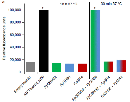
|
The figure shows the activity of various samples in removing the A antigen. The y-axis is a measure of that activity; it is based on testing with a model chemical that is expected to behave like A antigen. Reaction on that model substrate releases a fluorescent compound, which is what is measured here.
The enzymes being tested are provided here as genes on fosmids. Fosmid? It's like a plasmid, a piece of DNA that can be used to carry genes of interest. We'll just focus on the enzymes. The first two bars (to the left) lay the groundwork... The first bar is a negative control, with no enzyme. The height of the bar can be taken as "background". The second bar is for the enzymes from a gene cluster in the microbiome DNA. It worked! The next three bars are for the three enzymes from that gene cluster. Individually. None of them worked. The final group of bars is for tests with two of those enzymes at a time. The two colors of each bar correspond to the colors used earlier for the individual enzymes. You can see that one of the enzyme pairs worked very well. Also note that the tests on the right side, with enzyme pairs, were only 30 minutes. (The tests on the left were run for 18 hours.) This is Figure 3a from the article. |
The tests above suggest that the scientists have found a pair of enzymes that, together, can remove the A antigen. Further, they can do so rather quickly. Additional testing showed that the enzymes worked in actual blood.
It's an interesting lead.
News stories:
* Type A blood converted to universal donor blood with help from bacterial enzymes. (E Pennisi, Science, June 10, 2019.)
* Enzymes from gut bacteria can convert Type A blood to 'universal'. (S Dunphy, European Scientist, June 13, 2019.)
* News story accompanying the article: Applied microbiology: Towards universally acceptable blood -- Metagenomic screening of gut microbiomes led to the discovery of a new enzymatic process for the removal of group A antigens on red blood cells, providing new hope for the development of universal blood. (H Clausen & M L Olsson, Nature Microbiology 4:1426, September 2019.)
* The article: An enzymatic pathway in the human gut microbiome that converts A to universal O type blood. (P Rahfeld et al, Nature Microbiology 4:1475, September 2019.)
Also see:
* Type O blood and survival after severe trauma? (July 7, 2018).
* Inuk, a 4000 year old Saqqaq from Qeqertasussuk (March 1, 2010). Inuk was Type A.
September 16, 2019
In this case, as reported in a new article, we learn that the cat had worms.
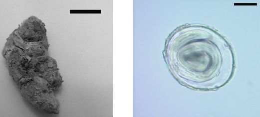
|
Left: The sample. It's called a coprolite. Scale bar: 20 millimeters.
Right: An egg that was found in the coprolite. Scale bar: 20 micrometers. These are Figures 1 and 2 from the article. |
Those are the basic observations. A macroscopic sample that is probably from a medium-sized carnivore. And an egg, seen under the microscope, that is tentatively identified as belonging to a common group of intestinal parasites.
DNA analysis extends the observations. The carnivore is a cat. A hefty cat -- a puma (perhaps 80 kg). The parasite is specifically identified as Toxascaris leonina.
Radiocarbon dating of the coprolite sample indicates it is about 17,000 years old. That is about 6,000 years younger than the surrounding material. The reason for the difference is not known, but the authors note the value of direct dating of the sample itself.
The worm here thus becomes the oldest example of an intestinal parasite confirmed by DNA analysis. And the coprolite sample is the oldest such sample to be directly dated using C-14.
In the Discussion, the authors note that these parasites came to the area (in Southern Argentina) before humans. That contradicts some ideas for how the worms were introduced.
News stories:
* Oldest Known Parasites Found in Ancient Puma Feces -- Researchers isolate roundworm DNA from animal excrement that is about 17,000 years old. (C-Y Hou, The Scientist, August 28, 2019.) Now archived.
* 16,000-year-old puma poop yields a sample of Ice Age parasites -- The Ice Age roundworm DNA is the oldest genetic sequence ever recovered from feces. (K N Smith, Ars Technica, August 28, 2019.)
The article: Ancient parasitic DNA reveals Toxascaris leonina presence in Final Pleistocene of South America. (R S Petrigh et al, Parasitology 146:1284, September 2019.)
More feces:
* What can we learn by looking at the DNA in vampire bat feces? (May 27, 2015).
* The effect of defecation by whales on global warming (August 2, 2010).More old things, with DNA analysis... The oldest known identical twins (December 7, 2020).
Previous post about nematodes: Worm count (August 27, 2019).
September 14, 2019
Camouflage. An animal changes to look more like its environment.
The following figure shows an example -- and an experiment...

|
Four caterpillars on sticks (artificial twigs). The caterpillars are all of the same type (perhaps siblings).
Two of the sticks are dark, and two are light. In each case, the caterpillar matches the stick. That's the camouflage phenomenon. But there is more here. In each pair, one of the caterpillars has been "blindfolded", by painting over the eyes (ocelli) with black paint. However, both caterpillars on the dark sticks become dark, regardless of the blindfold. (The * at the top of two columns shows the ones that were blindfolded.) This is Figure 2a from the article. I added the * at the top. |
Those results show the basic phenomenon of camouflage; they also show that it does not depend on using the eyes.
The camouflage phenomenon is not perfect. In practice, some caterpillars adjust to the twig and some do not. The article includes data on the frequency of proper camouflage; by that quantitative criterion, the blindfolding has no effect. That is, the figure above should be taken as examples, not proof; however, the "proof" follows in the article.
The article also contains a similar test with brown and green twigs. Results are similar.
If the caterpillars detect twig color without their eyes, how do they detect it? That is not resolved at this point, but the article offers one clue. Analysis of gene expression indicates that they express genes for photoreceptors in their skin. Thus it seems likely that the skin is carrying out part of eye function: detecting light and determining its color.
Aspects of vision beyond that from the eyes are known in other animals. Clever experiments in the nineteenth century hinted that some insects might perceive color by means beyond the head. The current work is now the best analysis of extra-ocular color sensing in insects (or any arthropods).
The caterpillar studied here is a larval stage of the peppered moth, Biston betularia.
News stories:
* These Caterpillars Can 'See' Colors With Their Skin -- Peppered-moth caterpillars can change their hue to match their surroundings without looking, a study has found. But how they do it remains a mystery. (C Giaimo, New York Times, August 26, 2019. Link is now to Internet Archive.)
* Caterpillars of the peppered moth perceive color through their skin -- Twig-mimicking caterpillars change their color depending on the background and move to color-matching backgrounds. (Science Daily (Max Planck Institute for Chemical Ecology), August 2, 2019.)
* Seeing through your skin to better blend in -- Extraocular photoreception guides colour change and behaviour in caterpillars of the peppered moth. (A Eacock, Nature Research Ecology & Evolution Community, August 2, 2019.) Nice discussion of the work by the lead author.
The article, which is freely available: Adaptive colour change and background choice behaviour in peppered moth caterpillars is mediated by extraocular photoreception. (A Eacock et al, Communications Biology 2:286, August 2, 2019.) Communications Biology is a new journal from Nature; like its parent, Nature Communications, it is open access.
Other camouflage stories include:
* Big blue sticks (July 19, 2019).
* A deceptive robot (September 4, 2012).
* The story of the peppered moth (July 9, 2012). This is about the same animal, but for a different phase of the life cycle. And it is a very different camouflage system.More skin: A handheld printer that can print cells onto a severe burn (February 16, 2020).
Another unusual type of vision... An unusual eye? (June 6, 2012).
Other caterpillar stories include: Effect of LED street lights on insects (September 4, 2021).
September 11, 2019
N = 1 trials. An N = 1 trial is a clinical trial with one person. A treatment is given, with variation, to one patient over an extended period. For example, each week might, randomly, be with or without the drug. People vary in their responses to drugs or other treatments. An N = 1 trial focuses on what happens with one person. In contrast, an ordinary clinical trial gets the average result for a study population. A recent news feature gives an interesting overview of N = 1 trials. It includes some history, and discusses various modern views on such trials.
* News feature: N-of-1 Trials Take on Challenges in Health Care -- From personalizing clinical practice to aiding biomedical research, individualized clinical trials have been heralded as a solution to several problems plaguing modern medicine. But they've yet to be widely adopted. (C Offord, The Scientist, July 15, 2019.) Now archived.
September 10, 2019
Containers are useful. Sometimes they are even more useful if they have an opening.
A recent article develops a novel way to provide an opening.
The following figure shows the plan, and some examples...
|
Part A (top) shows the plan. Note that there is a key, at the lower right of this part (just above part D).
The major steps are... - Start with a polystyrene (PS) bead, with a bit of gold at the surface. - Grow a silica (glass-like) shell on the PS. - Etch away the Au. - Dissolve the PS. The result? A glass container with a hole in it. The size of the container is determined by the size of the PS bead. The size of the hole is determined by the size of the gold piece. Parts C and D show pictures of the containers, at two stages. - Part C shows them after adding the glass shell, just before removing anything. The gold pieces are very dark. The silica shell is slightly lighter than the PS core; it may or may not be clear on your computer screen. - Part D shows the final containers. You can see that the gold is gone. The scale bars are 100 nanometers; that is 0.1 micrometer. That gives you an idea of the container size. The images are electron micrographs. This is part of Figure 1 from the article. I have added labels for two objects in part A, to indicate which of the following parts show actual examples. |
Why are we doing this? These containers are for drug delivery. The idea is to fill the containers with a drug in a droplet of fat. It's a well-defined fat, with a specific melting point. Solid in the container. A burst of energy from a laser melts the fat, thus allowing the drug to diffuse out over time.
The laser produces infrared (IR) light, which penetrates tissue rather well. The container includes a dye that absorbs the IR, thus leading to local heating. That melts the fat -- and opens the container.
Here is one test of drug release, under controlled lab conditions...
|
The graph shows the total amount of drug released (y-axis) vs time (x-axis). Results are shown for three types of container, with different size holes.
In this lab test, the filled containers were held in a water bath at a constant temperature of 42 °C. The top curve is for containers with 60 nm holes. You can see that drug release was rapid at the start, then declined. By the end of this test, about half of the drug was released; most of that was released within the first 2 hr. |
|
With smaller holes, drug release was slower and more limited (middle curve). Containers with no holes leaked a small amount of drug more or less continuously. This is Figure 2F from the article. | |
The results suggest that one can control the rate of drug delivery by controlling container design. (However, from the limited results shown here, it is not clear what the relationship is.)
It's a clever approach, and it leads to a product that might have medical application.
News stories:
* Nanoscale 'glass' bottles could enable targeted drug delivery. (Science Daily (Georgia Institute of Technology), August 15, 2019.)
* Nanoscale bottles protect fatty acid payloads. (L McDonald, American Ceramic Society, August 23, 2019.)
The article: Encapsulation of a Phase-Change Material in Nanocapsules with a Well-Defined Hole in the Wall for the Controlled Release of Drugs. (J Qiu et al, Angewandte Chemie International Edition 58:10606, July 29, 2019.)
A post on drug delivery: Treating obesity: A microneedle patch to induce local fat browning (January 5, 2018).
More small containers:
* Making a virus "from scratch"? (August 28, 2021).
* Speeding up a chemical reaction by dividing up the container (February 28, 2014).
* What is it? (May 25, 2011).
* The smallest water bottle (January 5, 2011). Much smaller than the current bottle.Also see: How to mold glass (June 19, 2021).
September 8, 2019
The following figure is featured in the abstract of a new article...

|
Two steps: Hydrogen cyanide (HCN) plus water (left) can form the chemicals shown in the center, and those can make life.
As noted, this is from the Abstract of the article. |
Now, the scientists did not actually carry out the second step. But they discuss it at considerable length. The chemicals in the center seem to be good precursors on the way to making protein and RNA, and that's a good step toward life.
They did not actually carry out the first step either. But what they did do was to carry out some rather complex computational chemistry simulating what might happen to a solution of HCN in water -- a solution that was likely present on the early, pre-biotic Earth. Their conclusion from the computational explorations: HCN + water could have yielded key chemicals needed to make life. It is even plausible that life could have arisen from HCN + water alone.
Conditions? The near-boiling water of the early oceans would have provided enough energy for these reactions, according to the simulations. (Some work, including the pioneering work of Miller and Urey, has involved the use of extreme energy sources, such as lightning.)
So? Well, it's fun. Origin-of-life stories are often fun. It proves nothing; we will probably never know what actually happened to start Earth life. However, it opens up new possibilities for experimental work. Can scientists test some of the predictions of this article? That's a good role for computer simulations.
There is a related figure in the article. We don't need any detail from it, but some may find it interesting, so here it is: Figure 1 [link opens in new window]. Part B (right side) is an expanded version of the middle part of the figure above; that is, it shows the chemicals made from HCN + water -- in their simulations. Part A (left side) is an interesting summary of actual lab work on pre-biotic synthesis, dating back to Miller and Urey.
News stories:
* New insights into the origin of life. (Science Daily (American Chemical Society), August 7, 2019.)
* Scientists uncover new insights into the origin of life. (T Puiu, ZME Science, August 7, 2019.)
The article, which is freely available: Insights Into the Origin of Life: Did It Begin from HCN and H2O? (T Das et al, ACS Central Science 5:1532, September 25, 2019.)
Posts about pre-biotic chemistry include:
* A special role for cyanide in the chemistry of early life? (April 25, 2022).
* Miller-Urey revisited: the role of the glass container (January 22, 2022).
* The origin of life's chemicals: making an almost-Krebs-cycle in the lab (June 10, 2019).Previous post about cyanide, in its more familiar role as a poison: Domestication of the almond (August 26, 2019).
September 6, 2019
We might be on the way to a new type of device for the detection of specific DNA sequences, rapidly at low cost.
The general idea of the device is straightforward: CRISPR detects the DNA, and graphene provides the signal. CRISPR recognizes specific DNA sequences. If the CRISPR is attached to a piece of graphene, then the binding of DNA to the CRISPR, at the graphene surface, affects the electrical properties of the graphene. An electrical measurement of the graphene reflects whether CRISPR has bound to DNA -- to the specific DNA being tested.
CRISPR is a general tool. Its specificity is due to an attached piece of RNA, called guide (or single-guide) RNA (sgRNA). As a result, the basic CRISPR-graphene device is universal; one adds a guide RNA as needed for a specific experiment.
DNA is highly charged. That's the property that affects the graphene -- affects the electric field around the graphene.
When CRISPR -- the Cas protein -- binds to DNA via its guide RNA, it usually cuts the DNA. For the current work, the catalytic function of Cas has been inactivated. All that Cas does here is to recognize the specific DNA, and bring it to the graphene.
The following figure shows, in cartoon from, the final steps of preparing the device...
|
The first (left-hand) frame shows the basic device. The gray ring system at the bottom represents the graphene; the blob at the upper right represents CRISPR (the folded Cas protein).
At the right is the final step: attachment of the guide RNA to the CRISPR. |
|
The CRISPR is attached to the graphene by a red zig-zag and a colored ring system. (Ignore the arrow fragment at the far left. Also ignore the piece it seems to point to (in both frames); that piece is a "dead-end".) This is part of Figure 2b from the article. The full Figure 2b includes the earlier steps, leading to these two frames. | |
Here is an example of some results...
|
This experiment involves an analysis of a particular mutation in the gene for Duchenne muscular dystrophy (DMD). The mutation is in exon 51. It is a deletion; the test is actually a test for the wild type allele (presence of the particular sequence that is deleted in the mutant form).
The graph shows the response of nine samples tested for this mutation. The horizontal dashed line represents the cut-off between positive and negative responses. You can see that six of the samples gave a response above the line; three gave a response below the line. |
|
|
The three low responses (samples D-F) are from people known to carry (two copies of) this particular mutation. Remember, the test is for the normal (wild type) DNA sequence at the site of the deletion; lacking that indicates the mutation. The first six responses are for people who do not carry this mutation. The first three (with H numbers) are from healthy controls. The next three (A-C) are from people who have DMD, but with a different mutation. This is Figure 6c from the article. | |
The results above show that the CRISPR-graphene device successfully distinguished who did and who did not have the mutation being tested. They establish that the device works.
How well does it work? After all, this is a first report. So we note some limitations, as of this article...
A second test, with another deletion mutation in the same gene, was not so good. The device missed the presence of the wild type gene in one of the six cases tested (and nearly missed it in another).
The tests here were with deletion mutations, not single base changes. The specificity of CRISPR is based on base pairing; the smaller the sequence difference, the more likely there will be problems of specificity.
Sensitivity. The work here suggests that the device can work with DNA in the femtomolar range, using a few microliters of sample. Specifically, the amount of DNA obtained in a common swab is sufficient. But that is still on the order of 105 molecules. Whether that is good enough depends on the application.
The authors suggest that the test is simple, rapid, and inexpensive. They suggest it may be suitable for use in the doctor's office. In particular, they note that it does not require a DNA amplification step. They are working on its commercialization.
News stories:
* New CRISPR-powered device detects genetic mutations in minutes. (Phys.org (University of California - Berkeley), March 25, 2019.)
* Fishing for Mutations Using CRISPR-Chip -- A novel graphene-based biosensor enables digital detection of genetic mutations from a patient's DNA sample. (J LeMieux, GEN, March 25, 2019.)
* CRISPR-Chip: A New Biosensor for Electronic Detection of Target Genes. (Bench Blog (Synthego), April 24, 2019.) This page is from a company that was the source of some materials used here (and which, therefore, may benefit from commercialization of the device). They were, apparently, not directly involved in the work per se (no authorship). In any case, this is a good presentation of the device, despite a little self-promotion.
* News story accompanying the article: Biosensors: Unamplified gene sensing via Cas9 on graphene -- An electrical biosensor that relies on the binding of target nucleic acid sequences to Cas9 immobilized on a graphene field-effect transistor enables the rapid detection of mutations in purified samples without the need for nucleic acid amplification. (R Bruch et al, Nature Biomedical Engineering 3:419, June 2019.)
* The article: Detection of unamplified target genes via CRISPR-Cas9 immobilized on a graphene field-effect transistor. (R Hajian et al, Nature Biomedical Engineering 3:427, June 2019.)
More about CRISPR: CRISPR: an overview (February 15, 2015). Includes a complete list of posts on CRISPR.
Among posts about graphene and such... Not graphene: a new flat form of carbon sheets (June 12, 2021).
Posts about graphene are listed on my page Introduction to Organic and Biochemistry -- Internet resources in the section on Aromatic compounds.
Older items are on the page Musings: May-August 2019 (archive).
The main page for current items is Musings.
The first archive page is Musings Archive.
E-mail announcements -- information and sign-up: e-mail announcements. The list is being used only occasionally.
Contact information Site home page
Last update: January 14, 2026