Home
> Musings: Main
> Archive
> Archive for May-August 2014 (this page)
| Introduction
| e-mail announcements
| Contact
Musings: May-August 2014 (archive)
Musings is an informal newsletter mainly highlighting recent science. It is intended as both fun and instructive. Items are posted a few times each week. See the Introduction, listed below, for more information.
If you got here from a search engine... Do a simple text search of this page to find your topic. Searches for a single word (or root) are most likely to work.
Introduction (separate page).
This page:
2014 (May-August)
August 30
August 27
August 20
August 13
August 6
July 30
July 23
July 16
July 9
July 2
June 25
June 18
June 11
June 4
May 28
May 21
May 14
May 7
Also see the complete listing of Musings pages, immediately below.
All pages:
Most recent posts
2026
2025
2024
2023:
January-April
May-December
2022:
January-April
May-August
September-December
2021:
January-April
May-August
September-December
2020:
January-April
May-August
September-December
2019:
January-April
May-August
September-December
2018:
January-April
May-August
September-December
2017:
January-April
May-August
September-December
2016:
January-April
May-August
September-December
2015:
January-April
May-August
September-December
2014:
January-April
May-August: this page, see detail above
September-December
2013:
January-April
May-August
September-December
2012:
January-April
May-August
September-December
2011:
January-April
May-August
September-December
2010:
January-June
July-December
2009
2008
Links to external sites will open in a new window.
Archive items may be edited, to condense them a bit or to update links. Some links may require a subscription for full access, but I try to provide at least one useful open source for most items.
Please let me know of any broken links you find -- on my Musings pages or any of my regular web pages. Personal reports are often the first way I find out about such a problem.
August 30, 2014
How can the mantis shrimp see so many colors of UV? They use filters.
August 30, 2014
The visual system of the mantis shrimp has long fascinated biologists. Not only does it have a complex eye structure, it has about a dozen types of color receptors -- several times more than we do. Musings noted recent work showing that these animals do not resolve colors very well, despite having so many distinct color receptors [link at the end].
A new article shows that the multiple color receptors for the ultraviolet (UV) range are made in an unusual way.
The usual way to make receptors for various colors is to use different photoreceptor proteins; these are proteins of the opsin family. Each protein is tuned to receive a particular part of the spectrum. Humans have three kinds of color receptors; they have genes for three types of opsin photoreceptor proteins.
Each photoreceptor has two parts: the opsin protein itself plus a small molecule called retinal, related to vitamin A. The retinal is what absorbs the light. Each opsin protein creates a slightly different chemical environment around the retinal, affecting which color it can receive; this is the "tuning" for color discussed above.
The mantis shrimp have six types of photoreceptors in the UV range. However, they have only two opsins for that range. How can that be? The discovery here is that the mantis shrimp uses filters. Five of those six UV receptors use the same opsin protein, but they use at least four different filters in front of it. The filters help determine which part of the spectrum the photoreceptors respond to.
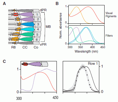
The following figure shows some of what the scientists found about the mantis shrimp visual system for UV.
|
Let's start with frame B (upper right).
The top half shows the spectral response of the UV visual pigments -- the opsins with their retinal attached. There are only two of these UV receptor pigments -- even though there are six UV receptors. These visual pigments have peaks at 334 nm (left; orange line) and 383 nm (right; red line).
The bottom half of B shows what the filters do. For example, the filter shown with a green line has a peak near 300 nm at the left. That means that this filter absorbs short UV wavelengths, blocking them from getting to the visual pigment.
|
Frame A shows the anatomy of the six UV receptors. "Rows" 1-6 are six photoreceptors. Imagine light coming from the right side. Near the far end of the row, to the left, is the visual pigment (the opsin-based receptor). You can see that this is either red or orange -- corresponding to the two receptors we saw in frame B. One is red, five are orange.
Then there is another colored region, in the middle, just before the receptor protein. That is the filter region. Rows 2-5 have different filters -- all with the same visual pigment. (Row 6 is about the same as #5. Indeed its spectral response is about the same.)
So, the scientists think that the spectral response of the receptor row is determined by both the receptor protein and the filter. To test this, they make a model: they calculate what they would expect for the various combinations they found. This calculation uses the spectrum of each receptor protein and of each filter, as shown in frame B. They then compare this predicted response with what has actually been measured for each intact photoreceptor.
Frame C shows an example of what the modeling showed. This is for "row 1" from frame A. At the left in C are the spectra for the specific protein and filter in that photoreceptor row. At the right are two curves. One is what they predicted (solid line) and the other is what was measured (dots). The agreement is not bad. (But the agreement is not perfect. Hm, perhaps there is another filter in there that they have not accounted for?)
If you want to imagine how this works... The red curve at the left is what the receptor protein can see. It is good all the way down to 300 nm. But the purple curve shows the filter. It doesn't allow any light through below about 350 nm (the left segment of that curve). So, the pigment actually only sees light from 350 to 400 nm. Overall, the sensitivity of the photoreceptor is tuned by both the receptor protein and the filter in front of it.
The full version of frame C, in the article, includes the modeling for all six photoreceptors. For four of them, the agreement is good. (The other two are discussed in the article; they need further work.)
This is part of Figure 3 from the article, slightly modified. It includes frames A and B and the top row of frame C from the full figure. I have edited the figure to show a partial x-axis scale for frame C. In fact, the labeling for both sides of frame C is the same as for frame B: the wavelength, from 300 nm to 450 nm.
|
In some ways none of this is new. The chemicals that the mantis shrimp uses to filter UV light in its eyes are well known. Other animals use them as "sunscreens" -- agents that protect the animal against UV exposure. What's unusual here is that the mantis shrimp has incorporated these same pigments into its eyes as filters. The use of such visual filters is not entirely new. Occasional examples have been found before. What's new is the complexity of the system with the mantis shrimp. The visual system of the mantis shrimp continues to amaze us.
News stories:
* With 'biological sunscreen,' mantis shrimp see the reef in a whole different light. (Science Daily, July 3, 2014.)
* Nature's Most Amazing Eyes Just Got A Bit Weirder. (E Yong, Not Exactly Rocket Science (National Geographic blog), July 3, 2014.) Now archived.
* News story from the journal (in a later issue): Vision: Two Plus Four Equals Six. (E R Loew, Current Biology 24:R753, August 18, 2014.)
* The article, which is freely available: Biological Sunscreens Tune Polychromatic Ultraviolet Vision in Mantis Shrimp. (M J Bok et al, Current Biology 24:1636, July 21, 2014.)
Background post about mantis shrimp color vision: Color vision: The advantage of having twelve kinds of photoreceptors? (February 21, 2014). This post notes a web site by Michael Bok, which includes information on various types of mantis shrimp. Bok is the lead author of the current article.
More about the opsins: A better understanding of the basis of color vision (February 1, 2013). This post discusses the production of an artificial set of opsin-type proteins that absorb light over the spectrum of visible light.
More about one of those chemicals used here as a filter: Fish make their own sunscreen (September 29, 2015).
Another example of filters in color vision: Red color vision in dinosaurs? (October 17, 2016).
More about UV filters and sunscreens and such... How do you know if you have been in the sun too long? (August 5, 2016).
More about UV vision: Butterflies and UV vision (June 29, 2010).
More about eyes: What is the proper length for eyelashes -- and why? (March 16, 2015).
Also see a section of my page Internet resources: Biology - Miscellaneous on Medicine: color vision and color blindness.
A test of a stem cell therapy based on iPSC, in monkeys
August 29, 2014
Briefly noted...
Ever since stem cells were discovered, there has been hope of using them therapeutically. Hope and hype. Little has been delivered. That should be no surprise; it typically takes a long time -- much longer than expected -- for a new development to become useful.
Of particular interest are the pluripotent stem cells -- the ones with the capacity to become anything. That does sound like a magic cure, doesn't it?
The new kid on the pluripotent-stem-cell block is the iPSC (induced pluripotent stem cells). They are much easier to make than the first type that was found, the embryonic stem cells. iPSC offer all the potential of stem cells that can do everything. And all the risk. Unfortunately, among the "everything" in their repertory is causing cancer. It almost goes with the territory: cells that have the potential to do everything may do just that. Indeed, testing cells for their ability to form teratomas is one way scientists show that cells are pluripotent. (A teratoma is a type of tumor that contains many types of cells.)
A recent article offers progress in showing that iPSC may be useful therapeutically. The scientists use iPSC to stimulate bone formation in monkeys. The stem cells themselves are derived from the animal that gets the treatment; this is important in avoiding an immune response, and is one of the advantages of using iPSC. If the scientists give the monkeys iPSC, they get bone formation, but also a significant frequency of tumors. However, if they induce bone formation in the lab before giving the cells to the monkeys, they get bone formation with no tumors.
This result is not too surprising. You can make use of pluripotent cells, but get them started on the right path before putting them into animals. This had been shown with rodents; the new work extends it to primates. It's encouraging.
News story: First test of pluripotent stem cell therapy in monkeys is a success. (Phys.org, May 15, 2014.) Good overview.
The article, which is freely available: Path to the Clinic: Assessment of iPSC-Based Cell Therapies In Vivo in a Nonhuman Primate Model. (S G Hong et al, Cell Reports 7:1298, May 22, 2014.)
A recent post on making iPSC: Improving the efficiency of making induced pluripotent stem cells (iPSC) (February 1, 2014).
A post on a clinical trial, in humans, of cells derived from embryonic stem cells: Therapy based on embryonic stem cells: the first clinical trial (October 23, 2010). The Geron trial. Links to follow-up posts.
More about bone formation... Need a new bone? Just print it out (November 13, 2016).
Also see my Biotechnology in the News (BITN) page for Cloning and stem cells. It includes an extensive list of Musings posts in the fields of stem cells and regeneration -- and, more broadly, replacement body parts, including prosthetics. Despite the slow progress in developing therapeutic use of iPSC, they are proving very useful in research.
August 27, 2014
Our microbiome: a caution
August 26, 2014
A hot topic of recent years has been work on the human microbiome, the microbes that live as part of the human body. The explosion of work in this field has been made possible by developments in nucleic acid technologies, including the dramatic reduction in cost of genome sequencing. We are now flooded with information about who lives within us, both in health and disease, and how they get there.
The problem is that information is coming in faster than we can digest it. The flood of information leads to hypotheses about what it all means. It's all too easy to forget that these hypotheses need testing.
A recent "Comment" story in Nature reminds us to be cautious. It's short and good. Look it over. Nothing here is meant to minimize the importance of developments in the field. It's merely to remind us to distinguish what is suspected from what is known. At this early stage, there is much more of the former than the latter.
"Comment" article, which is freely available: Microbiology: Microbiome science needs a healthy dose of scepticism -- To guard against hype, those interpreting research on the body's microscopic communities should ask five questions. (W P Hanage, Nature 512:247 (August 21, 2014.)
Posts on the microbiome include...
* Glyphosate and the gut microbiome of bees (October 16, 2018).
* Possible role of gut bacteria in Parkinson's disease? (March 17, 2017).
* Artificial sweeteners: Saccharin and high blood sugar levels (December 7, 2014).
* Could we treat obesity with probiotic bacteria? (August 5, 2014).
* Malnutrition: is more (or better) food the answer? (March 8, 2013).
Book. The following book is listed on my page of Books: Suggestions for general science reading. Blaser, Missing Microbes -- How the overuse of antibiotics is fueling our modern plagues (2014). The theme of Blaser's book is that we have changed our microbiota by our use of antibiotics, and that is causing problems. The current article is something of a response to Blaser. (In my opinion, Blaser himself is rather bold in proposing things, but cautious about reaching conclusions. Others are not always so cautious; the book is more in response to them. In any case, this book is highly recommended. And the listing on my Books page includes links to more Musings posts.)
If it quacks like a whale...
August 25, 2014
An odd story, with an article that is not very clear. However, it does seem to solve a mystery -- and it may even be useful.
For a half century observers have noted an unusual sound in the oceans near Antarctica. It's commonly characterized as a quack. The source has been unknown; people simply attributed it to an unidentified "bio-duck" -- a strange term in itself. Some people weren't even sure it was a biological sound at all.
Now a team of scientists report that the bio-duck is a whale -- an Antarctic minke whale.
How did they figure this out? They had tagged two Antarctic minke whales with microphones, and were recording them. They found the bio-duck sound, along with the better-known downsweep sound of the whales. Examination of the records showed that no other animals were around. The simplest conclusion? The whales quack.
Useful? The sound is common, and the Antarctic minke whales are hard to study. Following the quacks may be a new tool for following these creatures. Of course, attempts to do so will provide a chance to confirm the identification of the sound source.
News stories:
* Mystery of 'ocean quack sound' solved. (BBC, April 22, 2014.)
* What's Making Duck Sounds in the Ocean? Mystery Solved. (National Geographic, April 23, 2014.)
The sounds. (Sound track; no meaningful video; 4 minutes.) The file contains four segments. All but the first are labeled. The first two are perhaps most useful. (This composite file is based on some sound tracks posted as supplemental data at the article's web site. )
The article, which is freely available: Mysterious bio-duck sound attributed to the Antarctic minke whale (Balaenoptera bonaerensis). (D Risch et al, Biology Letters 10:20140175, April 2014.)
More about whales and the sounds they make... Tracking new songs as they cross the Pacific (June 21, 2011).
* A recent post about whales: Whales in the Chilean desert -- the oldest known case of a toxic algal bloom? (April 13, 2014).
* Next: The advantage of menopause: grandma knows where dinner is (June 15, 2015).
* A recent post about the Antarctic: IceCube finds 28 neutrinos -- from beyond the solar system (June 8, 2014).
* Next: What if your compass pointed south? (October 24, 2014).
Were dinosaurs cold-blooded or warm-blooded?
August 23, 2014
Maybe not -- according to a recent article.
Warm- vs cold-bloodedness relates to more than body temperature. It reflects basic patterns of energy use.
In the new article, the scientists collect data on the metabolic rates and growth rates of a wide range of vertebrates. (Vertebrates are animals with backbones. Loosely, that means fish and "up".)
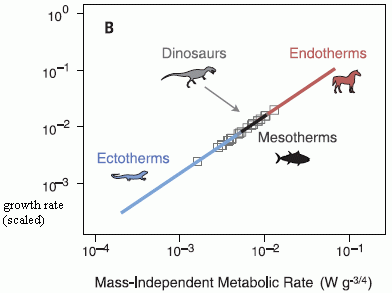
|
The figure summarizes, in a very compact form, what they found. It shows the growth rate (y-axis) vs metabolic rate (x-axis) for a wide range of vertebrates.
Both of these are "scaled", to take into account that the figure includes animals of very different sizes. The x-axis is labeled mass-independent metabolic rate to reflect this scaling; the y-axis is scaled similarly. (More about this scaling as we go on; don't worry much about it for now.)
|
There is a big diagonal line. It shows that there is a general trend: animals that have a higher metabolic rate grow faster. That should seem reasonable enough. The line is labeled -- showing that endotherms (warm-blooded animals) are near one end of the curve, and ectotherms (cold-blooded animals) are near the other end. That should also seem reasonable; we think of warm-blooded animals as being more metabolically active. (Remember, this is scaled for size. The line does not mean that bigger animals are more likely to be warm-blooded. It means that, at a given size, the warm-blooded ones are likely to be more active.)
In the middle is a region marked mesotherms. This may be a new term. What does it mean? It refers to animals that are intermediate between warm- and cold-blooded. They raise their body temperature (T) above the ambient T -- as warm-blooded animals do -- but they do not control it to any particular body T. The tuna is an example of a mesotherm. A few other examples are known. (Any echidna fans out there?)
Then there are some points shown as open squares. These are for dinosaurs. Of course, these are not measured directly, but have been estimated from measurements of dinosaur growth. Musings has discussed some of those estimates [links at the end]. Interestingly, the estimates for the dinosaurs put them in the middle region of this graph -- along with known mesotherms.
This is Figure 2B from the article.
|
The conclusion from this study, then, is that the dinosaurs may be intermediate. A key part of this is recognizing that being intermediate is "allowed". Dividing animals into two distinct categories, warm-and cold-blooded, is a simplification. We know of modern animals that are intermediate; the data for dinosaurs, such as it is, are consistent with the dinosaurs being intermediate, too.
This article won't resolve the question of whether dinosaurs are cold-blooded or warm-blooded. After all, the measurements are difficult, and people will continue to try to make better ones. But we now have a broader perspective. Maybe dinosaurs are intermediate; maybe they vary. Maybe it makes sense that dinosaurs, a group of organisms intermediate between the cold-blooded reptiles and the warm-blooded birds, have intermediate characteristics.
More about the scaling used in the figure above... As noted, the scaling allows the authors to condense a large amount of data into a single curve. The scaling takes size into account -- but it also hides size. The article itself has graphs showing unscaled data. For example, Figure 1 shows growth rate vs size; you can see that data for ectotherms, mesotherms, and endotherms seem to give different lines. There is more than one way to look at the data; the scaled graph is compact, and good as an overview.
News stories:
* Not too fast, not too slow: Researchers untangle energetics of extinct dinosaurs. (Phys.org, June 12, 2014.)
* Why Dinosaurs Were Like Tuna, Great Whites, and Echidnas. (E Yong, Not Exactly Rocket Science (National Geographic blog), June 12, 2014. Now archived.) Excellent.
* News story accompanying the article: Paleontology: Dinosaur metabolism neither hot nor cold, but just right -- Growth rates suggest answer to long debate: Dinosaurs were "mesothermic," like today's tuna and echidna. (M Balter, Science 344:1216, June 13, 2014.)
* The article: Evidence for mesothermy in dinosaurs. (J M Grady et al, Science 344:1268, June 13, 2014.)
Background posts on dinosaur growth:
* The oldest dinosaur embryos, with evidence for rapid growth (May 7, 2013).
* Do animal bones have something like annual growth rings? (August 7, 2012).
Also see...
* T rex census (May 25, 2021).
* Facultative endothermy: a lizard that is warm-blooded in October (February 1, 2016).
* The opah: a big comical fish with a warm heart (July 13, 2015).
* Underground hibernation in primates? (October 6, 2013).
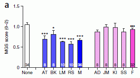
Why male scientists may have trouble doing good science: the mice don't like how they smell
August 22, 2014
It's something people joke about. Sometimes there are anecdotal reports. Now a team of scientists has done the test... It really does matter who does the experiment. More specifically, male and female experimenters may well get different results in experiments with mice. Why? Because the mice respond to the odors -- and they don't like having males around.
Some data from the recent article...
|
The figure summarizes results from one experiment.
The y-axis is a measure of the pain "reported" by the mice. In this test, the mice are injected with an inflammatory agent; their level of pain is judged by their grimace. MGS on the y-axis label means Mouse grimace scale. It is a standard test.
|
The x-axis shows the humans who were present; the labeling may be confusing.
The first bar (left) is the control, with no human present. It is labeled "none". None? The humans here were "observers", not experimenters. This was done during a phase of the test that did not require presence of a human.
Then there are five blue bars for males, and five pink bars for females. Caution... The scientists tested four people of each sex; the first four bars of each set are labeled with the person's initials. The fifth bar of each set is the average for those four; it is labeled M or F, and is darker than the other bars. (The number at the bottom of each bar is the number of trials; the number for the fifth bar is the sum of the numbers for the four individuals of the first four bars.)
That makes it easy now... Just look at the right bar of each set, the bar for the averages for M and F. Compare them to "none". You can see that the F average bar is close to that of the control, but the M average bar is considerably lower.
Their statistical testing confirms that, but they create further confusion in how they label the bars. They use two different symbols, asterisks and dots; they mean different things. The asterisks indicate that the result is significantly different from the "none" control. You can see that the male average (and three of the individual males) have three *** -- showing the highest level of significance (p < 0.001). None of the female data has any asterisks; none is significantly different from the control.
The bar for the female average has three dots. That means it is (highly) significantly different from the corresponding bar for the males -- the male average. (That test is applied only to the average.)
This is Figure 1a from the article.
|
In summary, the experiment described above shows that the presence of males vs females has a different effect on the results. In the particular case, males dampen the pain response of mice.
In further testing, they elaborate. The same result is obtained by using T-shirts that have been worn by the individuals; the presence of the person is not needed. In fact, the result can be obtained by the use of certain chemicals known to be part of the male odor. Further, they test bedding materials from several mammals. The response is general: samples from males block the pain response of the mice. The samples don't have be from humans: any "reproductively intact" male mammal will do.
The story here makes sense in terms of the biology of mice and the type of test. It's an interesting experiment. And it has real implications. People do tests like this, and it is typically not even reported who was in the room with the mice. It matters.
News stories:
* Men Trigger Mouse Stress -- Mice become stressed in the presence of male, but not female, experimenters, triggering a physiological response that dampens pain. (The Scientist, April 28, 2014. Now archived.)
* Male Experimenters Attenuate Pain Responses in Mice. (Pain Research Forum, May 2, 2014. Now archived.)
The article: Olfactory exposure to males, including men, causes stress and related analgesia in rodents. (R E Sorge et al, Nature Methods 11:629, June 2014.) Check Google Scholar and you may find a pdf of a preprint.
Among posts about mouse behavior:
* Male mice are stressed by the odor of bananas or pregnant females (June 14, 2022).
* Would wild mice use an exercise wheel? (July 11, 2014).
For more about M-F biochemical differences: Post-traumatic stress disorder (PTSD): a clue to its biochemistry (April 15, 2011).
Another post about the effects of humans on other animals: Do elephants suffer long term harm if their social groups are disrupted by human intervention? (April 27, 2014).
More about pain:
* I feel your pain -- how does that work? (March 4, 2017).
* Alcohol consumption, an "ethnic" mutation, and a possible new drug (October 28, 2014).
* Would a placebo work even if you knew? (January 31, 2014).
August 20, 2014
The new Ebola virus
August 19, 2014
We are experiencing the largest outbreak of Ebola virus ever recorded, and the outbreak is not under control. Ebola is a frightening disease: there is no established treatment, and half or more of those known to be infected may die. It is also quite rare: the virus was discovered only in 1976, and the total number of recorded cases -- prior to this outbreak -- is fewer than 3,000.
One issue of interest is the identification of the virus, and determining its relationship to other Ebola virus strains that are known. A new article studies the virus from 15 cases, with full genome sequencing for three of the viral isolates. The work makes clear that the patients do indeed have Ebola virus. The complete sequencing shows that it is closely related to what is known as the Zaire strain, but that it is distinct from previously known strains.
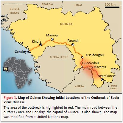
|
The figure shows the focus of the current outbreak.
This is Figure 1 from the article. Their figure legend is included.
A couple of notes...
* You can see where Guinea, the country where the outbreak started -- in the red region (lower right), is in relation to Sierra Leone and Liberia; those three countries are the heart of the current event.
* The map here is based on the findings in March 2014.
|
What do we conclude from identification and characterization of the current Ebola virus?
First, the fact that the virus is distinct suggests that the current outbreak is not due to simple transmission from the Zaire area to the Guinea area. (Zaire is now called the Democratic Republic of the Congo.) It is more likely that the Guinea outbreak began with a separate and recent transmission event from non-human hosts to humans in that area.
Second, it raises a question: how similar is the biology of this virus to that of other Ebola viruses? For example... Is it possible that the difficulty of dealing with this outbreak is, in part, due to it being a different virus? Is it possible that the virus transmission is different for this virus? We don't know, but can only ask. Strains of Ebola vary in their behavior. For example, the Reston strain does not seem to cause disease in humans at all. The current outbreak may have a lower frequency of the hemorrhaging that used to be considered a key feature of Ebola. Is this a reflection of a different virus, or of some environmental influence?
News story: Researchers identify a new variant of Ebola virus in Guinea. (Science Daily, April 22, 2014.)
The article, which is freely available: Emergence of Zaire Ebola Virus Disease in Guinea -- Preliminary Report. (S Baize et al, New England Journal of Medicine 371:1418, October 9, 2014.) The article includes a reconstruction of the likely transmission of the virus for the earliest cases, from December 2013 through March 2014 (Figure 2).
The following page is the source of the number I gave for previous Ebola outbreaks: Ebola virus disease. (WHO Fact sheet #103, updated April 2014.) The page also shows that the total number of reported Ebola cases in the previous five years (2009-2013) is fewer than 100 -- almost entirely in 2012. Remember that reported counts for any disease are likely to be low.
A news page from CIDRAP on Ebola -- from last Friday: West Africa Ebola outbreak tops 2,000 infections. (CIDRAP, August 15, 2014.)
More on the nature of the Ebola virus: Ebola virus: ancient origins? (November 4, 2014).
There is more about Ebola on my page Biotechnology in the News (BITN) -- Other topics in the section Ebola and Marburg. That section includes links to good sources of information and news.
More about emerging diseases in general is on that same BITN page in the section Emerging diseases. It includes links to some Musings posts on various emerging diseases.
There is more about genomes on my page Biotechnology in the News (BITN) - DNA and the genome. It includes an extensive list of Musings posts on sequencing and genomes.
Quality of oil and gas wells -- fracking and conventional
August 18, 2014
Hydraulic fracturing, or "fracking", is a new way to release gas (or oil) from rocks. It is controversial, partly because it is new and any new process has growing pains and partly for political reasons. I don't want to deal much with the political aspects, but they are there and color the debate; they can make it hard to deal with the substantive issues.
A new article reports on problems with gas wells in Pennsylvania -- fracking wells as well as conventional wells. (The study includes both oil and gas wells. We won't try to separate those in this post.) These are problems with the physical integrity of the well, which can lead to release of methane. Release of methane is bad, since it is a potent greenhouse gas.
What did the scientists do in this new article? They looked at the official state records for well inspections, and noted the frequency of problems. Doing that is more complex than it sounds, but let's accept the general intent. The data are quite objective; what they mean is open to interpretation.
The following table summarizes the findings. Each result is the percentage of wells with structural defects, as recorded by the state inspection.
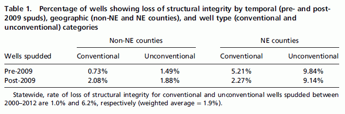
There are three variables: well date, location, and type of well. Let's look at some specifics...
The first variable is the well date -- the age of the well. It's shown in the left-hand column, "Wells spudded"; the spud date is the date drilling of the well started. Old wells (pre-2009) vs new wells (post-2009). The two halves of the table are for two geographic regions: NE counties (northeast part of Pennsylvania) at the right, and non-NE counties at the left. Why this distinction? The "NE counties" is the area of the state where there has been a recent boom in drilling, especially unconventional (fracking) wells.
So let's start with the non-NE data, at the left. Conventional vs unconventional wells, old vs new. All the data show about 1-2% of problems. The biggest effect is that new wells show more problems than old wells. Read that carefully. If you think you might expect old wells to show more problems, because they are old -- it's the other way around. Unconventional wells are worse among old wells, a bit better among new wells.
Now look at the right-hand set of data, for the NE counties. Everything is worse. Much worse, for the most part. Unconventional (fracking) wells have problem rates near 10%.
This is Table 1 from the article.
|
There are the data. Now what?
Various interpretations are possible. For example, it is possible that the data mean exactly what they say -- that unconventional wells in the NE counties have a 10% rate of problems, and that this is worse than for the other categories. It is also possible that there is sampling bias. Maybe wells are being inspected more carefully now than before. Or maybe they are inspected more carefully in the more active NE region, given the news coverage and controversy. And so forth.
Those with political bias favor one interpretation or another -- with little evidence. I don't want to resolve that here. Whatever the interpretation, there seems to be a problem with quality of wells. That means there is a potential for leakage. We can quibble over the numbers and who is worse, but the problem seems worthy of attention. Maybe we should just say that the results suggest there are problems with the quality of wells, and it needs further investigation -- with the goal of reducing methane leakage.
Since it is a political issue, one may wonder whether the authors have a political view. Indeed, the lead author, a professor at Cornell University, is head of an environmental group that opposes fracking; his university research is focused on showing technical problems with the process. His affiliation with the environmental group is quite open; the group is listed in the article as an author affiliation. (Another author also lists both a university affiliation, Berkeley, as well as the environmental group.) That is, they have what would easily be recognized as a "conflict of interest"; they are advocates for one side in a controversy. Does that mean we reject their work? No, it means we look at the quality of the work, just as we do with any science. And we are aware of what their bias is. Most people have bias; the current authors are quite open about theirs. Their study suggests that quality of wells needs attention.
Interestingly, the article records formally that "The authors declare no conflict of interest" (footnote on first page). That formal statement refers to hidden issues such as funding. Since the authors have declared their affiliation with the environmental group, which apparently funded the work, this is probably a proper statement. "Conflict of interest" means various things. People have biases and opinions; the purpose of the formal conflict of interest statement is typically more to disclose any financial conflicts that might otherwise be hidden.
News story: Fracking study finds new gas wells leak more. (Phys.org, June 30, 2014.)
* "Commentary" accompanying the article: The integrity of oil and gas wells. (R B Jackson et al, PNAS 111:10902, July 29, 2014.) Check Google Scholar for a preprint. If you can get hold of this item, it is quite worth reading.
* The article, which is freely available: Assessment and risk analysis of casing and cement impairment in oil and gas wells in Pennsylvania, 2000-2012. (A R Ingraffea et al, PNAS 111:10955, July 29, 2014.)
More about fracking:
* Fracking: the earthquake connection (June 19, 2015).
* Fracking: Implications for energy usage and for greenhouse gases (October 26, 2014).
* Shale gas recovery using hydraulic fracturing (fracking) (October 7, 2013). Useful overview of fracking.
More about methane leakage:
* Boston is leaking (February 13, 2015).
* Space-based observation of atmospheric methane -- and the Four Corners methane hotspot (December 29, 2014).
* Methane leaks -- relevance to use of natural gas as a fuel (April 7, 2014).
There is more about energy issues on my page Internet Resources for Organic and Biochemistry under Energy resources. It includes a list of some related Musings posts.
August 13, 2014
A better mouse -- it has a humanized liver
August 12, 2014
A recent article offers an intriguing development, which focuses our attention on the problem of how we test whether drugs are safe.
In our modern world, drugs are tested in various kinds of cells and then a variety of animals before they are given to humans. Despite that, some drugs go to testing in humans and turn out to be toxic. I'm not talking here about subtle or rare problems that would take years to detect, but major toxicities. In the case that is the focus of the current work, the drug fialuridine was being tested as a treatment for hepatitis B virus. The drug passed animal testing; it even passed preliminary short-term testing in humans. Then, 15 humans were given the drug: 7 suffered serious liver problems within a few weeks; 5 of them died.
How can that happen? How can major toxicity escape detection? The simple answer, stated somewhat flippantly, is that humans aren't mice. The toxicity of a drug depends on many things, including how it is metabolized and the nature of its targets. After all, we test drugs in several animals because we know animals vary in drug effects. There is no assurance that humans are like any of the animals used for drug testing -- as the fialuridine trial showed.
What are we to do? One answer is that we have learned to be quite cautious in trying a new drug in humans, regardless of the data in other animals.
A new article offers a little trick, which may also help. The drug at hand was active in the liver, where its purpose was to treat the liver virus hepatitis B. The toxicity that was found was liver toxicity. Further, the liver is often important in drug metabolism. What if we tested the drug in some other animal with a human liver?
What the new work does is to use a mouse strain with a "human liver". Indeed this chimeric mouse does reveal the toxicity.
We will look at how they made this mouse strain later, but first let's look at some results...
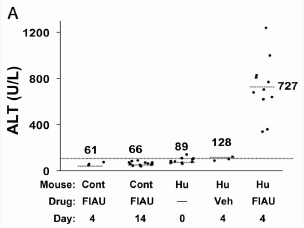
|
The graph shows the blood level of the enzyme ALT, which reflects liver damage. Results are shown for five conditions; each point shows the enzyme level found in one mouse.
Let's jump in and look at the two key conditions: the first and last sets of points. In both of these, the mice were given the drug ("FIAU") for four days; see the rows labeled drug and day. The difference? At the left, the mouse was a control ("Cont" in the row labeled mouse), and at the right the mouse had a humanized liver ("Hu").
|
You can see that the levels of the ALT enzyme, reflecting liver damage, were much higher in the Hu mice (at the right) than in the Cont mice (left). That is, the drug caused liver damage in the mice with the humanized liver, but not in control mice.
The other data sets are for various controls, and all showed low enzyme levels. The second condition is the control mice at a longer time; even at 14 days, there is no evidence of liver toxicity. The next two conditions were with Hu mice -- the mice with the humanized liver. These conditions lacked the drug; one used the "vehicle" the drug was delivered in. Neither of these showed an effect. The effect on mice with the humanized liver occurred only when the drug was delivered.
This is Figure 1A from the article.
|
The general conclusion from that experiment is that the mice with the humanized liver showed toxicity of the drug. That is, the test here with these humanized mice properly predicted what was found when the drug was tested in humans.
How does one make a mouse with a human liver? Logically, it's fairly straightforward. You inject human liver cells into the mouse. Well, that won't quite work, because the mouse immune system would reject them. So you knock out the mouse immune system. That's really it, in terms of basic logic: knock out the mouse immune system and give them human liver cells. It works. Immune-deficient mice are a staple of mouse research, and they are often given various kinds of human cells. In fact, this strain of mice with a humanized liver had been made a few years ago. What's new here is putting it to use for drug testing.
The authors suggest that it might be good to routinely test new drugs with a mouse strain such as this. It will be interesting to watch how this suggestion is received.
News stories:
* Mouse model would have predicted toxicity of drug that killed 5 in 1993 clinical trial. (Science Daily, April 15, 2014.)
* Mice with human livers would have saved lives if used in toxicology testing, study shows. (Stanford University School of Medicine, April 15, 2014.)
The article, which is freely available: Fialuridine Induces Acute Liver Failure in Chimeric TK-NOG Mice: A Model for Detecting Hepatic Drug Toxicity Prior to Human Testing. (D Xu et al, PLoS Med 11(4):e1001628, April 15, 2014.) There is a one page "Editors' Summary" at the end that serves as a news story from the journal. It is very good at summarizing the main points in something close to plain English.
A post that noted the monitoring of liver toxicity by measuring the ALT enzyme: Gene therapy: Could we now treat Queen Victoria's sons? The FIX Fix. (January 6, 2012).
Another example of a clinical trial that went bad because the animal testing did not reveal an important toxicity is noted on my page Biotechnology in the News (BITN) -- Other topics in the section TGN1412: The clinical trial disaster. That example is quite different from this one, and the test discussed here would not have helped.
Another example of studying mice that have been partly humanized, in this case with a particular gene: Mouse with human gene for language: is it smarter? (November 15, 2014).
More about toxicity testing: Predicting the toxicity of chemicals (September 11, 2018).
Also see: Using lab-grown organoids in medical treatment (May 3, 2021).
Another FDA approval: exoskeleton
August 11, 2014
The US Food and Drug Administration (FDA) recently approved a high-tech prosthetic arm. We now have FDA approval of an exoskeleton to help those with loss of lower limb function stand -- and walk. Musings posts have noted some of the background work behind these developments, as well as the arm approval [links at the end].
As the news stories make clear, these developments do not mean that the problems have been solved. The new devices are complex and expensive. But they are milestones; what used to be intractable problems now have solutions worth officially recognizing. Improvements will continue.
Musings presents scientific work at various stages of development. Some is very preliminary, sometimes so preliminary that the ideas are hard to accept; in fact, some turn out to be wrong. But some things progress to useful products or to accepted knowledge. Individual articles are steps along those pathways -- steps whose real value is not clear when they are published. The two posts about FDA approvals of prosthetic devices are examples of success stories.
News stories:
* FDA approves first ever personal exoskeleton. (ExtremeTech, July 3, 2014.)
* FDA Approves First Exoskeleton for the Disabled. But Who Will Pay for It? (Slate, July 2, 2014.)
FDA announcement: FDA allows marketing of first wearable, motorized device that helps people with certain spinal cord injuries to walk. (FDA, June 26, 2014. Now archived.) Also available in Spanish. Very informative.
Background posts...
* Recent FDA approval of a prosthetic device: FDA to fast-track prosthetic arm -- Follow-up #2: approval (June 9, 2014).
* Musings has posted on another exoskeleton product that is under development: Berkeley Bionics: From HULC to eLEGS (October 22, 2010). Berkeley Bionics is now called Ekso Bionics; it is referred to in some of the news stories.
More... Personal optimization of an exoskeleton (September 22, 2017).
Also see my Biotechnology in the News (BITN) page for Cloning and stem cells. It includes an extensive list of Musings posts in the fields of stem cells and regeneration -- and, more broadly, replacement body parts, including prosthetics.
Effect of radiation near Fukushima on local monkeys
August 10, 2014
A recent post was about birds in the region of the Chernobyl nuclear disaster; the message was that the birds are showing signs of adapting to the radiation [link at the end]. Now we have an article about monkeys in the region of the Fukushima nuclear disaster; the message is that the monkeys are showing signs of harm from the radiation. We'll come back to the "big picture" at the end, but first let's look at what the new article found.
In this new work, the scientists studied three populations of monkeys: two live near the Fukushima site (about 70 kilometers from the power plants), and the third lives further away (about 400 km away). The scientists collected blood samples, and measured many properties, such as the amount of hemoglobin and the number of white blood cells.
What did they find? For some properties, the monkeys that lived near Fukushima showed effects that were statistically significant. All the significant effects they found were in the direction that one might judge the monkeys near Fukushima to be below normal.
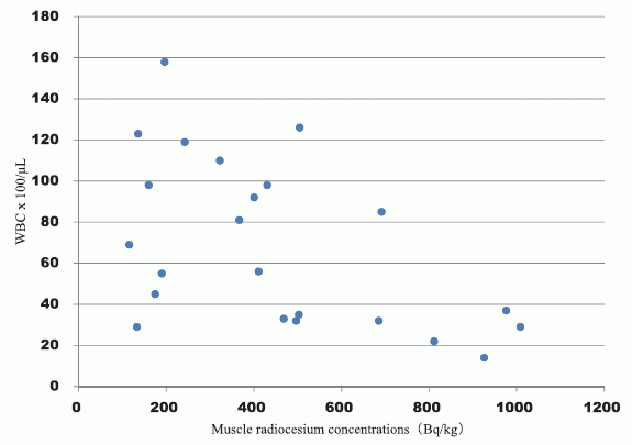
The following figure shows what may be the most important effect they found...
This graph shows the white blood cell counts (WBC; y-axis) for juvenile monkeys as a function of their level of radioactive cesium (x-axis).
There is lots of scatter, but there is also some trend: monkeys with the highest levels of radioactive cesium tend to have the lowest WBC.
This is Figure 2 from the article.
|
Is this important? It's hard to know. It is biologically reasonable that young monkeys might be more susceptible to the effects of the radiation than older monkeys. On the other hand, the numbers here are very limited. If it weren't for a few monkeys at the lower right, no trend would be evident. The conclusion? Here are the data at hand. This is what we have so far. It may not be good proof of a problem, but it would be reckless to ignore it.
The article has provoked a response -- not completely constructive. Some argue that the claims are exaggerated or unreasonable, given the amounts of radiation reported. We need to look carefully at what the article does and does not claim. Criticizing the article because it might be over-interpreted is unfair. It's a small report. Observations of Nature in the wake of a disaster are not ideal well-controlled studies.
So far I can tell (including some reading of the news coverage), the authors clearly describe what they did, and note its limitations. For example, they use the level of radioactive cesium as a marker; they quite explicitly do not claim it is the cesium that is the cause of the results. (It might be another radioactive material, one that came from the same source and may correlate with the cesium.) They have two study areas near Fukushima, with different levels of radioactive cesium; they explicitly note that they do not see any difference in the monkeys from those two areas. More generally, they make no claim that the monkeys have suffered any particular ill effect. With a small study such as this, the effects seen might or might not be important.
What this article does is to provide one window into what is happening in the wake of the Fukushima release. A good aspect is that it looks at an animal relatively closely related to us. It reports some data. The data suggest there are some things we want to know more about. In fact, it may be good to think about this work as setting a baseline. Measurements on the monkeys over coming years may help to clarify what the significance is. Be careful about saying much more from it.
In general terms, this report and the recent one about the birds at Chernobyl are similar. They both report what is found in Nature. It is interesting that the birds at Chernobyl are showing signs of adaptation; that does not mean the Chernobyl problem is over. The current work points to a possible problem near Fukushima; further work may help us understand how important it is. For now, people are reporting what they find.
News stories:
* Blood Cell Counts Low in Fukushima Monkeys. (The Scientist, July 29, 2014.) A brief overview.
* Japanese monkeys' abnormal blood linked to Fukushima disaster -- study. (Guardian, July 24, 2014.) This story does a reasonable job at presenting a balanced view of the work.
The article, which is freely available: Low blood cell counts in wild Japanese monkeys after the Fukushima Daiichi nuclear disaster. (K Ochiai et al, Scientific Reports 4:5793, July 24, 2014.)
Background post: Are birds adapting to the radiation at Chernobyl? (August 3, 2014).
The Berkeley RadWatch project has been looking at radiation from Fukushima -- across the ocean in California. We have noted some of that work... Berkeley RadWatch: Radiation in the environment (February 24, 2014). It's really important to distinguish that work and the current work. The effects of radiation depend on dose. The monkeys of the current study are tens or hundreds of kilometers from the Fukushima site. In California we are thousands of kilometers away; it is good to do monitoring, but it would be surprising if much Fukushima radiation were found here.
More from Fukushima:
* Did the Fukushima nuclear accident lead to a burst of thyroid cancer? (July 17, 2016).
* Radioactivity released into ocean from Fukushima nuclear accident reaches North America (March 23, 2015).
My page of Introductory Chemistry Internet resources includes a section on Nucleosynthesis; astrochemistry; nuclear energy; radioactivity. That section contains some resources on the effects of radiation. It also includes a list of related Musings posts.
The advantage of washing with formic acid
August 8, 2014
You might start by watching the following video. It has two segments. The first shows an event involving two kinds of ants. The second shows the smaller ants washing up after such an event. It would be good to watch at least part of each segment as an introduction here.
Video (2 minutes; no sound).
What's this all about? The event shown involves two types of ants, the famous fire ant and the crazy ant. Both are native to South America. Fire ants have established themselves in much of the southern United States. They seem to have few enemies, partly because they make a toxin. In general, other ants have learned to just avoid the fire ants. But not the little crazy ants. The crazy ants do well in the competition -- and they seem oblivious to the fire ant toxin. How can that be? Because the crazy ants wash it off after the battle; that's what you see in the second segment of the video.
A recent article documents all this for us; the video noted above accompanies the article. But the authors of this article do more. They show that the key to washing is the use of formic acid. That acid has long been associated with ants; the formal name for the ant family is Formicidae. It used to be that commercial production of formic acid was based on collecting it from ants. The crazy ants make formic acid; it is an offensive weapon for them -- its normal role in ants. But here the ants use it for defense. Go back to the second segment of that video. The crazy ants make formic acid in a gland in the abdomen. You can see that they transfer it from the abdomen to their mouth, and then they wash their legs. The effect is that they are inactivating the fire ant toxin by washing their legs with formic acid.
The following graph shows one of the experiments the scientists did to develop that story...
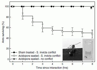
|
The graph shows survival curves for the crazy ants (Nylanderia fulva) under three conditions.
Two are controls, and give the same curve, at the top, with near 100% survival. We'll note the control conditions in a moment.
The third curve shows that survival declines substantially when the defense mechanism is blocked. That curve, with open circles, is for ants that have engaged in conflict with the fire
ants (Solenopsis invicta), but have had their acidopore -- where their acid defense is secreted -- blocked.
|
The two controls? One (dark circles) had a sham treatment that did not actually block acid secretion; one (triangles) had their acid secretion blocked, but did not engage in conflict. The second control shows that blocking the acid secretion per se is not harmful.
This is Figure 2 from the article.
|
That is, there are two variables in the treatment: acidopore sealed or not, conflict with fire ants or not. Sealing the acidopore alone or avoiding conflict alone allows survival. However, if there is a conflict, sealing the acidopore reduces survival. Thus, the results suggest that the acidopore is needed for survival after the fire ant conflict.
As noted above, it's known that the crazy ants make formic acid. Further work in the current article showed that formic acid alone could serve to detoxify the fire ant venom.
This article helps explain a specific example of chemical warfare between two competing insects. In the broader context, this competition happens to be one of great importance.
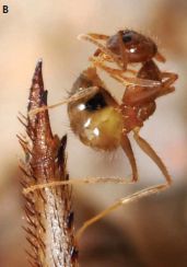
|
A crazy ant, washing itself. It is standing on a cricket leg. The cricket was probably the subject of the encounter between this ant and a fire ant.
This is part B of the figure from the news article by Kaspari & Weiser.
|
News story: Crazy ants dominate fire ants by neutralizing their venom. (Phys.org, February 13, 2014.) Good overview.
Videos. One video was listed near the start of this post. There is also a video with the Phys.org news story. It is similar to the first one, but with some useful narration, from the lead author of the article. This video is also available at Video, YouTube (1.3 minutes; narrated).
* News story accompanying the article: Ecology: Meet the New Boss, Same as the Old Boss. (M Kaspari & M D Weiser, Science 343:974, February 28, 2014.) Don't worry too much about the title.
* The article: Chemical Warfare Among Invaders: A Detoxification Interaction Facilitates an Ant Invasion. (E G LeBrun et al, Science 343:1014, February 28, 2014.)
Other posts on ants include...
* What's the connection: blue cheese, rotten coconuts, and the odorous house ant? (August 24, 2015).
* Ants: nurses, foragers, and cleaners (May 24, 2013).
* Death-grip scars from zombie ants, 48 million years ago (November 9, 2010).
The work discussed here is an example of chemical ecology. A key figure in the development of chemical ecology, especially in insects, was the late Tom Eisner. A delightful book of his is noted on my page of book suggestions: Eisner, For Love of Insects (2003).
More insect warfare...
* Bee wars (March 1, 2015).
* Origin of gas warfare (September 11, 2009).
This post is listed on my page Internet Resources for Organic and Biochemistry in the section for Carboxylic acids, etc.
August 6, 2014
Could we treat obesity with probiotic bacteria?
August 5, 2014
A team of scientists has developed a bacterial strain that can be used to combat obesity. They show the effectiveness of this probiotic strain in two test systems in mice.
The following figure shows the effect of their probiotic strain in one of the mouse systems.
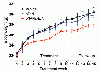
|
This experiment uses a strain of mice that is prone to obesity. It is fed normal mouse chow.
The graph shows the average weight of the mice over time, for three treatment conditions. The treatment is given over the first 11 weeks -- up to the vertical dashed line. Observations continue, labeled "Follow-up".
The red curve is for the mice treated with the probiotic. The other two curves are for two controls (details below).
This is Figure 13 from the article.
|
The basic observation: mice treated with the probiotic show less weight gain than the two controls (which are similar to each other). The effect continues beyond the treatment time.
What is this probiotic strain? It is based on a strain of the common gut bacterium Escherichia coli. The scientists have added to that strain a gene that leads to the production of certain lipids -- ones known to lead to weight loss. The bacteria were provided to the mice in the drinking water. (This brings us to the controls noted with the graph. One control uses the bacteria but without the added gene; the other control, labeled "vehicle", omits bacteria.)
As noted at the top, they tested two mouse models for obesity. The other system involved normal mice fed a high fat diet. The results there also showed that the probiotic strain reduced weight gain. This part of the study included other measurements; for example, the bacteria improved the insulin resistance of the mice.
What is the significance of this work? It is a "proof of principle" that modifying the bacteria in the gut, the gut microbiota, might usefully reduce obesity. It is not known if the probiotic strain they use is compensating for a problem with the resident microbiota -- or is simply acting on its own. Whether this strain would work in humans is, of course, unknown; the test here is in mice. There are multiple pathways to obesity -- in mice or in humans. It remains to be seen which types of obesity can be usefully treated with this probiotic -- or with improved or distinct probiotics, and how probiotic treatments would compare with other types of treatments.
Since the bacteria used here were designed to deliver a specific chemical, one might ask if we could deliver the chemical directly, say as a drug. That does work; that's why they chose the chemical. However, if the probiotic could get fully established so that it needed to be given only once, then that would be simpler than a drug taken regularly. They do not achieve full establishment in this work.
Bottom line... This work is an interesting step toward possibly treating obesity with bacteria.
News story: Study suggests probiotics could prevent obesity and insulin resistance. (Kurzweil, July 25, 2014.) (If you haven't seen an obese mouse, have a look at this story. But I don't think the mice shown here are the kind used in this study.)
The article, which is freely available: Incorporation of therapeutically modified bacteria into gut microbiota inhibits obesity. (Z Chen et al, Journal of Clinical Investigation 124:3391, August 2014.)
More about probiotics:
* A clinical trial of ice cream (June 2, 2015).
* How probiotics work: a clue? (October 11, 2010).
More about obesity:
* Olfaction and obesity? (July 18, 2017).
* YY in the mouth? (April 4, 2014).
More about the gut microbiota...
* Our microbiome: a caution (August 26, 2014). The hype of microbiome research.
* Red meat and heart disease: carnitine, your gut bacteria, and TMAO (May 21, 2013).
More about lipids is in the section of my page Organic/Biochemistry Internet resources on Lipids. That section contains a list of related Musings posts.
Book. The following book is listed on my page of Books: Suggestions for general science reading. Blaser, Missing Microbes -- How the overuse of antibiotics is fueling our modern plagues (2014). Blaser's theme is that we have changed our microbiota and that is causing problems. Whether the specific intervention suggested by the current work fits with Blaser is an open question. In any case, this is an excellent book.
Twins? A ducky? Spacecraft may soon be able to tell.
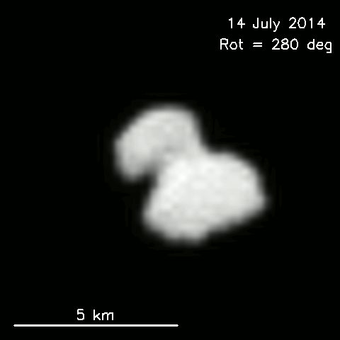
August 4, 2014
The Rosetta spacecraft, from the European Space Agency (ESA), passed the asteroid Lutetia in 2010. Two Musings posts presented pictures and scientific findings from that encounter [links at the end].
Rosetta kept going, aiming for an encounter with a comet, 67P/Churyumov-Gerasimenko (67P/C-G for short). Rosetta will go into orbit around 67P/C-G. Later, a probe from Rosetta will attempt to land on the comet.
Rosetta is getting close. It recently re-awoke, and started taking some advance pictures of its target. Surprise...
This is a quite irregular comet. Perhaps it is twins -- two comets joined together after a collision. Perhaps, perhaps.
The news story listed below is a good update and summary. It includes a raw picture, and an animation containing a set of processed pictures viewed at various angles; the picture above is one from that set. Beyond that, the story gives an overview of the interpretations. Importantly, the author cautions us to enjoy but not judge. There is too little information to allow a conclusion at this point -- and much more information will be coming.
Coming soon. The Rosetta spacecraft will go into orbit around 67P/C-G on August 6. It will then be able to take close-up pictures. A major task is for scientists to choose a landing site for the probe. Planned landing date: November 11.
Where would you like to land?
News story: The dual personality of comet 67P/C-G. (ESA blog, July 17, 2014. The author, identified as "emily" on the page, is presumably Emily Lakdawalla, a regular and quite expert commentator on planetary science.)
Update, as posted on the day of the rendezvous: Rosetta arrives at comet destination. (ESA, August 6, 2014.) It includes pictures from August 3; spectacular!
Background posts about the Rosetta encounter with Lutetia:
* Lutetia: a primordial planetesimal? (February 13, 2012).
* Rendezvous with Lutetia (August 14, 2010).
Compare the sizes of Rosetta's targets... Lutetia, as noted most explicitly in the 2010 post, is about 100 km across. Comet 67P/C-G is less than 5 km across; see the figure and scale bar above.
More from Rosetta: The universe -- as viewed from comet 67P/Churyumov-Gerasimenko (June 19, 2018).
Another "comet"... What has six tails -- and is beyond Mars? (November 20, 2013).
More about comets:
* Who is perturbing the orbit of Halley's comet? (October 3, 2016).
* A bit of IPD -- found in Antarctica (January 13, 2015).
More about twins:
* Unusual twins: neither monozygotic nor dizygotic, but... (March 11, 2019).
* A DNA test that can distinguish identical twins (July 17, 2015).
Another odd-looking thing out there: Quiz: what is it? (April 5, 2017).
Are birds adapting to the radiation at Chernobyl?
August 3, 2014
A new article reports that birds in the region of the 1986 Chernobyl nuclear disaster are adapting to the levels of radiation now present there. The birds are adapting to levels of radiation that are still considered too high for habitation by animals (including humans). That is, the birds have effectively become resistant to the radiation. In fact, they may now benefit from the radiation.
It's a fascinating (but difficult) paper. So we want to look at what they found and what the explanation is. We also want to note the limitations of the work.
The scientists focused on certain very specific -- and quantifiable -- measures. As a framework...
- Radiation creates oxidative stress, such as reactive oxygen species (ROS).
- ROS can damage cellular molecules, including DNA.
- Cells can counteract oxidative stress by making antioxidants -- chemicals that scavenge the ROS.
- A major such antioxidant is glutathione; it is often abbreviated GSH.
- So, one thing they did was to measure the amount of GSH (in the blood).
- Further, GSH comes in two forms: GSH itself, and the oxidized form GSSG.
- The ratio of GSSG to GSH is a measure of the oxidative stress, and is one more thing they measured.
A bit of the chemistry... The SH part of "GSH" indicates that it contains a sulfhydryl group, -SH. It is this group that is sensitive to oxidation. What happens is summarized by the equation: 2 GSH --> GSSG + 2 [H]. That is, two GSH come together; the H of each GSH is removed, and the two S join. This is the oxidation. Removing hydrogen atoms is a common sign that an oxidation has occurred. The H atoms that are removed are shown here as [H] for simplicity; in the case discussed here, they would be reducing the ROS, thus inactivating them as reactive species.
What did the scientists do in this study? They measured the level of GSH in individual birds; they measured both forms, which gave them measures of the amount of antioxidant and of the level of oxidative stress. The birds were captured from various sites in the Chernobyl region; the level of background radiation at each site was measured.
The article has a lot of numbers and complex statistics. Let's just look at a few summary points, with the caution that the data has a lot of variability.
The key finding was a trend: the higher the radiation dose of the bird, the higher its level of the antioxidant GSH, and the lower the ratio of GSSG to GSH. That is, the birds with higher radiation exposure had more protection and a lower level of oxidative stress. Further, additional measurements showed they had a lower level of DNA breaks, a measure of radiation-induced damage. Overall, then, the results suggest that there is some adaptation to the radiation. In fact, the lower levels of DNA damage as well as lower measure of oxidative stress even suggest that some of the birds have turned the radiation into a benefit.
There is a cost. The effects they found were reduced in birds with certain feather pigments. Why? Because those pigments, based on pheomelanin, require GSH for their production. The birds can make pheomelanin pigments or protect their DNA -- but these two processes compete; the birds can't do both at full level. Thus there is a cost to the radiation resistance of the birds.
All of the effects discussed above are perfectly reasonable. They have been found under lab conditions. What's novel here is finding them "in the wild", making use of the aftermath of the Chernobyl disaster as the basis for an experiment in Nature.
Be cautious about interpreting the significance of this article. Let's assume that everything it says is upheld by further work. We don't know the generality. We don't even know the entire picture for these birds; we know the specific points that were measured, but we do not know the overall long term effect on the birds. Further, the work here on birds does not tell us how other organisms respond. What the article does is to provide one window into how animals respond to low doses of radiation.
News story: Chernobyl's birds are adapting to ionising radiation. (Phys.org, April 28, 2014.)
The article: Chronic exposure to low-dose radiation at Chernobyl favours adaptation to oxidative stress in birds. (I Galván et al, Functional Ecology 28:1387, December 2014.) Check Google Scholar, and you may find a preprint.
More about animals at Chernobyl: Chernobyl exclusion zone: mammal populations (October 24, 2015).
More about Chernobyl: Effect of Chernobyl exposure on the rate of new mutations in the next generation (June 1, 2021).
A recent post about radiation: Berkeley RadWatch: Radiation in the environment (February 24, 2014).
More radiation... Effect of radiation near Fukushima on local monkeys (August 10, 2014).
Another example of an oxidation giving off [H]... Photosynthesis that gave off manganese dioxide? (July 21, 2013).
More about glutathione: Huntington's disease: Is it an amino acid deficiency? (October 4, 2014).
More about oxidants, anti-oxidants, and cancer:
* How vitamin C kills cancer (December 15, 2015).
* Anti-oxidants and cancer? (October 18, 2015).
More about stress responses: How to confuse a yeast -- a sensory illusion (January 15, 2016).
A recent post about birds: The relationship between birds and dinosaurs? (July 25, 2014).
More about feathers: The whitest feathers (March 11, 2023).
More about melanin: The story of the peppered moth (July 9, 2012).
Also see: Science myths (February 23, 2016).
My page of Introductory Chemistry Internet resources includes a section on Nucleosynthesis; astrochemistry; nuclear energy; radioactivity. That section contains some resources on the effects of radiation. It also includes a list of related Musings posts.
Acne, grapevines, and Frank Zappa
August 1, 2014
A new article reports that grapevines get infected with a strain of Propionibacterium acnes, the bacterium associated with human acne. Moreover, the scientists provide some evidence that the strain infecting the grapevines is derived from the human strain.
Frank Zappa would be proud -- especially since the scientists have named the new strain Propionibacterium acnes type Zappae.
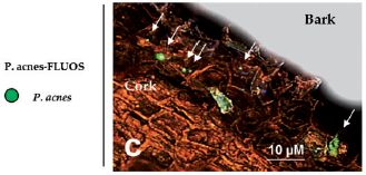
|
The figure shows Propionibacterium acnes in the bark of a grapevine.
Detection of P acnes is based on using a probe that is specific for its DNA. The probe is coupled to a dye that fluoresces green. Thus the green spots are evidence for P acnes.
This is Figure 1c from the article.
|
The scientists found P acnes in the grapevines during a general survey of the plants to see what microbes were present. They suggest that the strain is distinct, and that the bacterium is now growing intimately within the plant, and even has plant-specific adaptations. The report is quite preliminary and the evidence is thin at this point.
There is a lot to wonder about from this work. If it holds up, it would seem to be the first known case of a human pathogen adapting to a plant as its host. There is nothing at all wrong with that; it's just that there must be an interesting story here. The authors compare some gene sequences for the new strain with other known P acnes strains. This comparison, based on molecular clocks, suggests that the transfer from humans to plants was "recent" -- perhaps a few thousand years ago. That might be around the time that mankind began to cultivate grapes. That time estimate is very rough at this point, but it is intriguing.
News story: Scientists honor Frank Zappa, naming human zit-causing bacterium now infecting vineyards. (Science Daily, February 18, 2014.)
The article: Interkingdom Transfer of the Acne-Causing Agent, Propionibacterium acnes, from Human to Grapevine. (A Campisano et al, Molecular Biology and Evolution 31:1059, May 2014.)
More about acne bacteria:
* Propionibacterium acnes bacteria: good strains, bad strains? (April 1, 2013).
* A virus that could treat acne? (October 21, 2012)
More about grapevines:
* What do we learn from the sulfur isotopes in the California vineyards? (June 28, 2022).
* A half-millennium record of climate change, from the grapes of Burgundy (November 9, 2019).
July 30, 2014
Did the First Americans eat gomphothere?
July 29, 2014
A new article adds to our understanding of the large-animal fauna of early America.
The key finding is a bone, found in association with an early North American settlement. Here is the bone...
|
The figure at the right shows the key bone structure the scientists found.
It's a jaw. It's identified as the jaw of a gomphothere.
This is from the Phys.org news story. It is probably the same as Figure 6 in the article.
|
What is a gomphothere? Have a look... gomphothere [link opens in new window]. That figure is from the IBT news story; it shows models (statues) of gomphotheres.
A gomphothere is a type of elephant -- about the same size as the modern elephant (and much smaller than the mammoth).
What makes this story of particular interest is that the gomphothere was thought to be extinct in North America before the date of this settlement. That is, this is the most recent North American gomphothere identified. And it is the first example of gomphotheres being associated with North Americans.
The site studied here is in the state of Sonora, in northwestern Mexico. It is dated to about 13,390 years ago. From the dating and the tools found, it is considered a Clovis-type site. The Clovis culture, named after a town in the US state of New Mexico, was a widespread early American culture. From the way the tools were found associated with the bones, the scientists think it is likely that the humans killed the gomphotheres, probably for food.
Archeological work such as this often gets questioned. Datings and associations can both be controversial issues. For now, the finding of a gomphothere in association with a Clovis site represents a step in our characterization of both this lesser-known elephant and an early American culture. For now, this is North America's last gomphothere.
News stories:
* Meet the gomphothere: Archaeologists discover bones of elephant ancestor. (Phys.org, July 14, 2014.) Includes another beautiful work of art, comparing three ancient elephants: mastodon, mammoth and gomphothere.
* Gomphothere, Ancestor Of Modern Elephant, Likely Consumed By Early Humans In North America. (International Business Times, July 15, 2014.)
The article: Human (Clovis)-gomphothere (Cuvieronius sp.) association ~13,390 calibrated yBP in Sonora, Mexico. (G Sanchez et al, PNAS 111:10972, July 29, 2014.)
I used the term "First Americans" in the title of this post. It is approximately equivalent to the term Native Americans, but focuses on those who arrived here first, perhaps 15-20,000 years ago, and their descendants. The First Americans are the ancestors of the modern Native Americans.
Posts about the origins of the First Americans include...
* Man's migration from Asia to America? Did it really happen by land? (August 16, 2016).
* The First Americans: the European connection (February 8, 2014).
More about elephants and such in America:
* To kill a mastodon (November 15, 2011).
* Early American art: a 13,000 year old drawing of a mammoth (July 18, 2011).
More about elephants: Why do elephants have a low incidence of cancer? (March 20, 2016).
For a book on the earliest Americans, see my Book Suggestions page: Meltzer, First Peoples in a New World -- Colonizing Ice Age America (2009).
More statues: How to install a hat on a Rapa Nui (Easter Island) statue (February 1, 2019).
Also see... Genes that make us human: genes that affect what we eat (February 18, 2015).
Science in progress. Science in doubt. Is STAP the latest great advance in stem cells -- or not?
July 28, 2014
Not.
It's been a big news story in recent months. In January, we get a pair of papers claiming a new method for making pluripotent stem cells -- easier and better than previous methods. In July, the papers are retracted.
Nature has just run a "news feature" describing the incident. It's a good read about the process of science. A caution... It's not simple, and it's not entirely resolved.
The good news, I suppose, is that science, once again, shows how it is self-correcting. An article may report something, but initial reports are not always completely correct -- for one reason or another (and we should be cautious about assuming why). We accept what is new over time following confirmation and replication. It is also good news that the incident is causing all those involved to question how the process works. It does seem that this incident should not have happened.
STAP stands for stimulus-triggered acquisition of pluripotency.
News feature, which is freely available: Cell-induced stress -- As a much-hailed breakthrough in stem-cell science unravelled this year, many have been asking: 'Where were the safeguards?' (D Cyranoski, Nature 511:140, July 10, 2014.) This links to the two original articles, including the retraction notice.
More about stem cells on my page of Biotechnology in the News (BITN) for Cloning and stem cells. It includes an extensive list of Musings posts in the fields of stem cells and regeneration -- and, more broadly, replacement body parts.
My page for Biotechnology in the News (BITN) -- Other topics includes a section on Ethical and social issues. It includes a list of related Musings posts.
Fixing the heart with some glue and light
July 27, 2014
Repairing biological tissue is a challenge. Common sutures (or "stitches") are one approach, but they can be slow and difficult. Sometimes, the task is to plug a hole.
A recent article offers a better way to plug a hole. The idea is to apply a patch, and glue it in. The trick is the glue. Remember, in addition to the simple requirements you have all encountered with a bicycle patch, this patch must be non-toxic and able to function when wet. If the goal is patching a beating heart, the patch must withstand the mechanical stress from the heartbeat.
The key is HLAA. That's hydrophobic light-activated adhesive; it's the glue the scientists developed. They apply the glue, then shine (ultraviolet) light on it to activate it; that is, the glue is under their control. The H in the name, for "hydrophobic", tells you that the glue avoids water.
The following figure introduces the process -- and shows one test of how well it works...
The first (left hand) frame of part C shows how the patch is applied. The two horizontal disks are for the patch (smaller disk; orange) and tissue (larger disk; red). The rest here is artificial, for the test -- except for one thing: the key to applying the patch is to shine a light at it; the light causes the glue to "cure".
The third frame shows that the test they do is to pull off the patch; they measure the force required to pull off the patch. The graph (part D, at the right) shows the force required for various patches.
Look at the last four bars, all marked as HLAA (the glue). The four HLAA bars are for different times of light treatment, to apply the patch. You can see that 0 seconds isn't very good, and 1 s isn't much better. The last two bars, with 5-30 s of light treatment, are better.
The two bars at the left are for some materials currently in use, CA (cyanoacrylate) and fibrin. The strength of the HLAA patch is intermediate.
This is Figure 1 parts C & D from the article.
|
That's a lab test. Based on strength alone, HLAA is similar to currently used adhesives. The 5-second application time, to reach full strength, is good. Since the other adhesives have practical limitations, it is worth testing the HLAA further.
The scientists test their new HLAA adhesive on rat hearts and then pig hearts. The latter are similar in size and beating rate to human hearts. They also use the material to patch a hole in a major artery of the pig. The results of all these tests were satisfactory. The scientists are encouraged, and think it is appropriate to try the material in humans.
News stories:
* Next Generation: Strong Surgical Glue on Demand -- Researchers create a nature-inspired nontoxic polymer that, when activated by light, becomes tacky and can seal ruptured, torn blood vessels and patch up holes in a pig heart. (The Scientist, January 8, 2014. Now archived.) Excellent overview of the work.
* Bio-inspired glue keeps hearts securely sealed. (Science Daily, January 8, 2014.)
The article: A Blood-Resistant Surgical Glue for Minimally Invasive Repair of Vessels and Heart Defects. (N Lang et al, Science Translational Medicine 6:218ra6, January 8, 2014.) Check Google Scholar to see if a copy is freely available. The first page of the pdf file contains a plain-English "Editor's Summary" of the article.
Other posts on body repair issues include...
* Treating a heart attack using a microneedle patch (January 11, 2019).
* Zebrafish reveal another clue about how to regenerate heart muscle (December 11, 2016).
* Targeting growth factors to where they are needed (April 21, 2014).
* How porcupine quills work (January 5, 2013).
* Smart sutures (November 3, 2012).
I didn't make an issue of it above, but in designing the glue, the authors were guided by examples of adhesives that work under water in nature. Thus we can say that the new glue is bio-inspired. For more, see my Biotechnology in the News (BITN) topic Bio-inspiration (biomimetics). It includes a listing of some other Musings posts in the area.
Also see:
* A "greener" way to make acrylonitrile?
(January 6, 2018).
* Increased risk of congenital heart defects in offspring from older mothers: Why? and can we do anything about it? (July 18, 2015).
The relationship between birds and dinosaurs?
July 25, 2014
Birds derived from dinosaurs. Birds are the only surviving members of the dinosaur lineage.
It's becoming the dominant accepted view.
Maybe not, say the authors of a new article. They study a bird-like fossil, and argue that it is not derived from dinosaur. It's not a new fossil; the article presents a new, improved re-examination of an old fossil, one previously considered a dinosaur. The authors argue that the animal, which climbed trees, lacked dinosaur traits -- and had distinctive bird features including wings, which probably were for gliding. It's an interesting story, and a good example of why we need to be cautious about reaching conclusions about ancient genealogies. Their argument is not entirely new, but it reminds us that the dominant story may be incomplete.
|
Part of the fossil source for this animal, called Scansoriopteryx.
The inset at lower right shows a reconstruction of the fossil skeleton.
Scale bars are each 1 centimeter.
This is part of Figure 1 from the article. The full figure is also in the Sci-News story listed below.
|
The basis of the argument requires going into details about bones; I'm going to skip that here. The genealogy debate is a more general point of interest.
The following diagram shows the relationship proposed in the new article. In this diagram "Aves" is birds; it is the name of the taxonomic group.
|
This is the lower right part of Figure 5 from the article.
|
What's the key point? They show the dinosaurs and birds as sister groups. Both derive from a common ancestor, rather than one from the other. (You can ignore the Silesauridae.) The new work does not deny a close relationship between birds and dinosaurs. Rather, it changes the suggested relationship. Given that these proposed genealogies are based on limited data about events that happened 150 million years ago, the main point is that it is hard to tell the difference between the two models. That is, it is hard to get good data that distinguishes the two models.
What next? Two things will happen. One is that those in the field will debate this, and weigh the arguments, including the importance of the new observations. Perhaps they will agree that one chart is more likely than the other; more likely, they won't. Further, more evidence will appear over time. It will come from new fossils, and from improved analysis of old ones.
There is one specific part of the debate that deserves comment. Birds fly (in general). Did they get to the air from the ground or from the trees? There is evidence to support both sides of that. Some would argue that ground animals first developed wings to help them run up steep slopes. Others would argue that arboreal (tree-dwelling) animals developed wings for gliding. Powered flight could follow in either of those pathways. Simple answer: We don't know. We also note that although this issue is intertwined with the relationship issue discussed above, the two issues need to be considered separately on their own merits.
News stories:
* Birdlike fossil challenges notion that birds evolved from ground-dwelling dinosaurs. (Science Daily, July 9, 2014.)
* Scansoriopteryx Study Challenges Hypothesis that Birds Evolved from Dinosaurs. (Sci.News, July 10, 2014.)
The article: Jurassic archosaur is a non-dinosaurian bird. (S A Czerkas & A Feduccia, Journal of Ornithology 155:841, October 2014.)
Previous post about birds and dinosaurs: How the birds survived the extinction of the dinosaurs (June 6, 2014).
And more... How the birds survived the extinction of the other dinosaurs, why birds don't have teeth, and how those two points are related (July 30, 2016).
A recent post that deals in part with uncertain genealogies, again due to limited data: A novel nervous system? (July 20, 2014).
More birds... Are birds adapting to the radiation at Chernobyl? (August 3, 2014).
A book about flying is listed on my page Books: Suggestions for general science reading. Alexander, On the Wing -- Insects, pterosaurs, birds, bats and the evolution of animal flight (2015).
July 23, 2014
Can growing rice help keep you from becoming WEIRD?
July 22, 2014
It is generally recognized that some societies emphasize the role of individuals, whereas others emphasize the collective whole. It is also generally recognized that "western" societies tend to be more individualistic, whereas east Asian societies tend to be more collective. These are generalities, and real societies may not fit cleanly, but there does there appear to be something to the points. The question is what? There are many differences between modern western and eastern cultures; it is hard to sort out what causes -- or caused -- what.
A new article offers an interesting exploration of the question. It does so by comparing societies within a single large country. The hypothesis that helps frame the work is that it matters whether the society grows mostly rice or mostly wheat. Why might that relate to the emphasis on collective vs individual behavior? Because rice growing, by the traditional paddy method, is extremely labor intensive -- and may well require quite an emphasis on collective behavior. As a result, the authors suggest, the rice-growing society as a whole takes on a collectivist character. Now, some may react to such a hypothesis with amusement, but that misses the point. The hypothesis frames the study, and the study is interesting. It may be better to think about what the study shows than to focus on the hypothesis itself.
The big country, with rice-growing and wheat-growing regions, is China. Rice-growing to the south, wheat-growing to the north.
The following graph summarizes some of the results.
It's a complicated graph, so let's go through it slowly. You might note at the start that there does seem to be some trend, so let's ask... what is it that is trending?
The x-axis is the percentage of cultivated land devoted to rice. Low values, at the left, are for regions with wheat as a major crop; high values are for regions with rice as a major crop. Thus the x-axis distinguishes the wheat- and rice-growing regions.
The y-axis, labeled "percentage holistic categorizations" is a number they use to describe where the culture is on that scale of individualistic vs collective behavior. It is based on a standard psychological test. Higher values on this scale are typically found with societies that emphasize collectivism; lower values are found for more individualistic societies.
This is Figure 2 from the article.
|
So what is trending? The more rice (right side), the more "holistic categorizations" (top) -- the more collectivism.
At first pass, then, the results seem to be in agreement with the hypothesis. So let's look further.
Look at the circles on the graph above. I think you will agree that the wheat-region circles (left) tend to be larger than the rice-region circles (right).What do these circle sizes mean? They represent the divorce rate in the area, as shown in the inset key at the lower right. Wheat-regions have higher divorce rates than rice regions. High divorce rate is known to be associated with more individualistic societies. Again, the results here are in the direction predicted by the hypothesis.
A correlation does not mean that one variable causes the other; it simply means there seems to be some relationship. One concern is that there are confounding -- or hidden -- variables. For example, you may find that people who live in the mountains have some characteristic. Is that due to the terrain or to the lower oxygen level? In a single simple experiment, you probably can't tell. You may plot your data vs oxygen level, only to find later that it is really the terrain that matters. Oxygen is your variable, but terrain is the confounding variable -- hidden, but related to your variable.
Here is an example of the authors' attempt to explore if something else is behind their variable. The main variable used above is percent of area in rice vs wheat; that tends to have a geographic pattern, with rice growing regions to the south. Is it possible that some other variable that correlates with "south" is actually the important one. So they do an additional analysis. They look at regions very near the rice-wheat boundary area in China. They collect the data for border regions that grow rice and for border regions that grow wheat. Look at the graph above. You will see a point for "wheat border counties" -- right in the middle of the wheat region of the graph. And you'll see a point for "rice border counties" -- right in the middle of the rice region of the graph. These two points are for regions that are very close geographically, yet the same basic trend holds.
That's the idea. The authors hypothesize that the societal tendency toward individualism or collectivism might relate to the needs of the early agricultural society. This is reflected in whether they grew rice or wheat. The data are consistent with that. In fact, the data are more consistent with the "rice theory" than with some other theories that have been suggested. What does this mean? That's for the future.
The message title? We haven't explained that yet. It has long been found that societies that are more individualistic tend to be Western, Educated, Industrialized, Rich, and Democratic -- a series of adjectives summarized by the acronym WEIRD. The current article suggests that rice-growing societies are less likely to have the characteristics considered WEIRD.
News story: 'Rice theory' explains north-south China cultural differences. (Science Daily, May 8, 2014.)
* News story accompanying the article: Psychology: Rice, Psychology, and Innovation. (J Henrich, Science 344:593, May 9, 2014.) Check Google Scholar for an available pdf. This is a good overview of the work. It includes some examples of the questions the scientists asked of those they interviewed.
* The article: Large-Scale Psychological Differences Within China Explained by Rice Versus Wheat Agriculture. (T Talhelm et al, Science 344:603, May 9, 2014.) Check Google Scholar for an available pdf.
A related post, based on more from the same research group: Wheat, rice, and Starbucks (August 3, 2018).
Other posts about rice include...
* Rotavirus: passive immunization via food (January 10, 2014).
* DEEPER ROOTING leads to deeper rooting -- and to drought tolerance (August 16, 2013).
A supplementary Musings page on rice includes a resource comparing production of wheat and rice (and corn) worldwide. Rice -- supplement (December 12, 2010). Scroll down to "General resources".
Previous psychology post: Do elephants suffer long term harm if their social groups are disrupted by human intervention? (April 27, 2014).
Also see: Implementing improved agriculture (January 6, 2017).
Infant cured of HIV? Follow-up.
July 21, 2014
Original post: Infant cured of HIV? (April 15, 2013). In that post we noted a case, widely reported in the news media, of a baby who was born with the HIV infection, and treated aggressively immediately after birth. Treatment was interrupted after 18 months. A year later, the child appeared to be virus-free.
The follow-up news is not good. Now, a year later, the child is clearly infected.
We had limited information at the time of the initial post, and we have even less at this point on the update. Nevertheless, we should note the setback. I have added this update to the original post.
News story: HIV Returns in "Cured" Child -- A Mississippi girl who was thought to have been "functionally cured" of HIV as an infant once again harbors detectable levels of the virus. (The Scientist, July 11, 2014.)
Here is the article that was later published about the initial report: Absence of Detectable HIV-1 Viremia after Treatment Cessation in an Infant. (D Persaud et al, New England Journal of Medicine 369:1828, November 7, 2013.) Check Google Scholar for an available copy, including an author manuscript at PubMed Central.
My page for Biotechnology in the News (BITN) -- Other topics includes a section on HIV
A novel nervous system?
July 20, 2014
Scientists have recently reported finding a nervous system that is unlike any other that is known.
What gets attention, even before you get into the nervous system, is what its owner looks like...
|
At the left is the animal.
That is, the unusual nervous system belongs to an unusual animal.
This is a type of animal known as a comb jelly, or ctenophore. It is Pleurobrachia bachei, commonly known as a sea gooseberry.
No scale information is given, but the animal body may be about 2 centimeters (1 inch) long, and the tentacles several times that. Those comb-like tentacles are used for movement; each "tooth" on the comb is a block of cilia.
This is Figure 1a from the news story accompanying the article in Nature. (It is also in the article as Figure 1a. The article includes pictures of other ctenophores studied in the current work.)
|
What's so different about the comb jelly nervous system, and why do we care? First question first...
The article at hand is a genome article. The scientists sequenced the sea gooseberry genome, and then did some testing of the genomes of several other comb jellies. Their key observation is that the comb jelly lacks some features of nervous systems that we thought were common to all animals. For example, the comb jellies contain only two of the ten major neurotransmitters used by other animals. However, its nervous system is quite complex, as reflected by the animals' complex behavior.
"Complex" is a matter of judgment -- and context. Here it means, perhaps comparable to that of a jellyfish; comparison with the human nervous system is not intended.
In fact, there are other clues, too, that the comb jellies are quite different from other animals. They lack other molecular features thought to be universal among the animals.
So what does this mean? Well, that is speculation at this point, but the authors suggest that the comb jellies might be a distinct lineage of animals, one that branched off, from some unknown precursor, before the animals we usually consider. More specifically, the authors suggest that nervous systems arose twice in the early history of animals: once in the comb jellies, and once for the others. That could explain the distinct comb jelly nervous system.
The figure shows the proposed relationships between selected groups of animals, based in part on this work.
You can see that the first split is that leading to the ctenophores, with neurons and muscles (at the left, in red). The next splits lead to two groups without neurons and muscles (middle, blue). Finally, there are the cnidarians (jellyfish) and bilaterians (most animals as we know them), a distinct group with a separate development of neurons and muscles (right, green).
This is Figure 1 part f from the article.
|
|
In Extended Data Figure 10, in the Supplementary Information accompanying the article online, the authors show a possible alternative, with only one origin of the nervous system, followed by changes or loss in later groups. The authors prefer the version shown above.
Perspective... This article will get attention because of the provocative proposal about the relationships between the earliest animal groups. However, we should emphasize that it is a proposal, a hypothesis. The article presents groundbreaking genomic information about a relatively obscure group of animals. By examining several members of the group, the scientists are able to make statements about what seems to be general. Of course, we all want to know how we all got here, and they interpret their new information in that context. However, that's a stretch. Importantly, our view of the relationships will change as more information becomes available; in part, that will include information on animals we now know little about.
News story: Strange Findings on Comb Jellies Uproot Animal Family Tree. (National Geographic, May 21, 2014. Now archived.)
* News story accompanying the article: Evolutionary biology: Excitation over jelly nerves. (A Hejnol, Nature 510:38, June 5, 2014.)
* The article, which is freely available: The ctenophore genome and the evolutionary origins of neural systems. (L L Moroz et al, Nature 510:109, June 5, 2014.)
The article reports that the sea gooseberry genome contains 19,523 genes. The most recent analysis for the human genome shows that it probably contains about 19,000 genes. No comment.
Follow-up: The comb jelly nervous system -- more (April 17, 2015). This post presents a nice general-audience overview of the comb jelly story; there is no new work.
and more ... Briefly noted... Unusual nervous system in a comb jelly: implications for understanding the animal kingdom (June 13, 2023).
Other Musings posts about the "most primitive" animals...
* Briefly noted... Synapses in a sponge? (February 23, 2022).
* The function of Hox genes in cnidarians (November 16, 2018).
* Quiz: What is it, and ... ? (July 7, 2015).
* Quiz: What is it? (September 23, 2014).
* Theonella's secret: Entotheonella (March 18, 2014).
* Quiz: What is it? (October 31, 2012).
* Bacteria induce simple "pre-animal" to become colonial (September 8, 2012). This post is about the type of organism shown at the very lower right corner above, the choanoflagellates. They are not animals -- but they may be very close.
More about cilia: Scoliosis: an animal model (July 22, 2016).
More about combs: Deciphering the inscription on an old comb (November 27, 2022).
There is more about genomes on my page Biotechnology in the News (BITN) - DNA and the genome. It includes an extensive list of Musings posts on sequencing and genomes.
My page for Biotechnology in the News (BITN) -- Other topics includes a section on Brain (autism, schizophrenia). It includes an extensive list of Musings posts about brains and, more generally, nervous systems.
Another post that deals with uncertain genealogies, again due to limited data: The relationship between birds and dinosaurs? (July 25, 2014).
The role of zinc in arthritis
July 18, 2014
Arthritis refers to a family of diseases involving inflammation (-itis) of the joints (arthr-). One major form of arthritis is osteoarthritis, which is characterized by damage to cartilage, resulting in bones in the joints rubbing together. The molecular basis of osteoarthritis is unclear; it is often considered just a disease of old age -- of wear and tear.
A recent article points to a role for zinc in the disease process. It's a long complex article, and we focus here on one step.
For simplicity, we will use the term arthritis here to refer to the osteoarthritis that is the subject of this article. All discussion of zinc refers to the common zinc ion, Zn2+.
The first step is to look at what determines the amount of zinc in the chondrocytes -- the cells that make cartilage. As part of this, the scientists looked at the function of 24 genes involved in maintaining the level of Zn2+ in mammalian cells. 14 of them code for proteins that can transport Zn2+ into cells; 10 of them code for proteins that can transport it out of cells.
Here is part of what they found...
The figure above shows evidence that a particular zinc ion transporter might have a role in osteoarthritis.
In this test, the scientists test lab cultures of mouse chondrocytes for the function of the 24 genes for Zn transporters. They use two conditions. One is a control, and the other involves addition of interleukin (IL) 1β, which is involved in inflammation and is associated with arthritis. In the main part of the test, they measure the amount of messenger RNA (mRNA) for each of the genes.
The 24 Zn2+ transporters are shown across the x-axis. For each, there are two bars: mRNA level without and with IL1β (open and solid bars, respectively). The bar height is a measure of the particular mRNA; the y-axis label shows that this is given relative to a control.
Scan across the graph to ZIP8. This Zn2+ transporter stands out. The tallest bar is for ZIP8; further -- and most important -- ZIP8 is the one with the greatest change when IL1β is added. ZIP8 is a zinc ion importer, and it is much more prevalent under conditions of inflammation.
The inset is a small test to confirm the key part of what that bigger test showed. In the inset, they test the actual ZIP8 protein (not just its mRNA). They show that increasing levels of IL1β lead to increasing levels of ZIP8. (In contrast, the bands for a control protein do not change as IL1β is added.)
This is Figure 1A from the article.
|
The experiment described above implicates one particular Zn2+ transport protein in the disease process. Of course, that is just one clue. Further experiments in mice support this. For example, if the scientists genetically block ZIP8, the disease process is blocked. They also show how the Zn2+ likely acts, through a series of steps leading to greater activity of an enzyme that degrades cartilage. Thus they claim to have described a series of steps in the disease process for osteoarthritis. Most of the work here is with mice, and the conclusions need to be tested in humans. It is known that arthritic tissues have high levels of zinc ion.
If this story holds up, it is a significant step toward understanding a common and debilitating disease. The authors also note that ZIP8 might be an attractive target for a drug to act against osteoarthritis. Thus the identification of one key protein could have benefit even without full understanding of the pathway.
News story: Is zinc the missing link for osteoarthritis therapies? (Science Daily, February 13, 2014.)
The article: Regulation of the Catabolic Cascade in Osteoarthritis by the Zinc-ZIP8-MTF1 Axis. (J-H Kim et al, Cell 156:730, February 13, 2014.)
Previous posts on any form of arthritis: none.
More about bone diseases: A new, simple way to measure bone loss? (September 14, 2012).
More on the biology of zinc:
* Gene therapy: Curing an animal using a ZFN (August 9, 2011).
* Treating colds: Is zinc worthwhile? (June 13, 2011).
More cartilage:
* Making new cartilage, using stem cells (January 5, 2022).
* Humans may be more like salamanders than we had thought (limb regeneration) (February 11, 2020). Discusses arthritis.
* Using your nose to fix knee damage (January 28, 2017).
* Helicoprion -- a fish with 117 teeth, arranged in a spiral (March 9, 2013).
July 16, 2014
What is the charge on atoms of anti-hydrogen?
July 15, 2014
Anti-hydrogen is the anti-matter version of hydrogen.
A hydrogen atom consists of one proton and one electron. An anti-hydrogen atom consists of one anti-proton and one anti-electron. (The anti-electron is commonly called a positron.) In each case, the "anti" particle is just like the "regular" particle -- except that the charge is reversed.
In theory, then, the charge on an anti-hydrogen atom should be exactly the same as the charge on a hydrogen atom: zero. In theory. How do we know our theory is correct? We measure things theory predicts, and see how well we are doing.
A team of scientists at the famous CERN laboratory now reports a measurement of the charge on atoms of anti-hydrogen. It's quite a feat. The measurement itself is fairly straightforward: they measure how far the atoms are deflected in an electric field. The greater the charge, the more the particle would be deflected. But this is anti-hydrogen, and first you have to make it. And then you do the measurement -- right away, because it's hard to store. It's a basic feature of anti-matter that contact with regular matter leads to their mutual annihilation. CERN scientists have spent years working out procedures for making and storing anti-hydrogen atoms. They have made a few hundred of them over recent years; they store each one for a few milliseconds in a magnetic trap.
So they have done it. They measured the charge on their anti-hydrogen atoms -- 386 of them. The result? It's zero. Actually, they find a charge on the anti-hydrogen atom of about 1x10⁻⁸ e (where e is the common unit, the elementary charge, the magnitude of the charge on one electron or proton) -- with an error bar of about 1x10⁻⁸. That is, their experimental value is very very close to zero, and given the error bars, not significantly different from zero.
Their precise reported value is -(1.3 +/- 1.1 +/- 0.4) x 10-8 e. Two sources of uncertainties are shown there; the first is statistical, and the second is known systematic errors; in each case what is shown is one standard deviation.
The following graph summarizes their raw data...
|
To understand the graph, we need a basic description of the experimental set-up.
We can start at the stage where they have produced atoms of anti-H, and hold them in a magnetic trap. When the magnetic trap is turned off, the anti-H atoms are free, and they end up at the physical wall of the trap, where they are annihilated upon contacting regular matter. The annihilation events are what is detected.
The location of each annihilation event is recorded. That is shown on the x-axis of the graph; annihilation events are recorded out to about 150 millimeters on either side of the original trapped position. The y-axis shows the number of events recorded at each position.
There are two curves there: one is shown with a solid blue line and one with a dashed red line. These are for two different conditions. In these experiments, there is an electric field present. In one case, the electric field would cause any positively charged particles to go to the left; in the other case, it would cause those particles to go to the right. If the anti-H atoms have zero charge, the blue and red data sets should be the same. Within experimental error, they are.
(If you think you see a small difference... Yes, there is a small difference. Remember that the value they report, as noted above, is about 10-8 e. The point is that, upon considering the uncertainties, including counting statistics, this value is not significantly different from 0. Although you can try to judge the symmetry of the results in the figure, there is no way for you to judge the magnitude of the charge just by looking at that graph. It is a complex calculation to get from the observed apparent deflection to charge magnitude. The article contains simulations of what the data would look like if the charge were + or - 4 x 10⁻⁸ e. Those simulated curves are clearly very different from the curve expected for 0.)
This is Figure 1 part d from the article.
|
The result reported here is no surprise. The work reported here is of interest because they did it, not because of the answer they found. There is no anti-matter around. The current work is one early step in exploring the properties of anti-matter -- and testing our theories of physics.
News story: CERN experiment takes us one step closer to discovering where all the antimatter went. (Phys.org, June 3, 2014.)
The article, which is freely available: An experimental limit on the charge of antihydrogen. (C Amole et al, Nature Communications 5:3955, June 3, 2014.)
What about the charge on "neutral" particles of regular matter? The authors note that the charge on some small stable particles of regular matter, such as the He atom and the H2 molecule, has been measured... it is less than about 10-21 e.
More about anti-matter:
* The major source of positrons (antimatter) in our galaxy? (August 13, 2017).
* Is the speed of light really constant? (May 20, 2013).
Also see...
* Atoms within atoms? (May 25, 2018).
* The mass of an electron (March 23, 2014).
* The proton -- and a 40 attometer mystery (March 17, 2013).
* How round are electrons? (June 24, 2011). It is about the charge on an electron.
Should you take a vitamin (or mineral) supplement?
July 14, 2014
That is a surprisingly difficult question to answer. We would need to know how much of any particular vitamin you need and how much you are getting now. Neither of those questions is easily answered, except for the occasional case where a deficiency (or overdose) causes a common major effect. Tests of nutritional supplements are often done without considering those basics -- and they are often inconclusive or contradictory. Further complications include that people are undoubtedly different (genetically) in what they need, and that some vitamins may have toxic effects as well as beneficial effects.
In the United States, vitamin supplements are only minimally regulated. Marketing them does not require any evidence that they are useful.
The journal Nature has a recent "news feature" discussing the issue of testing vitamin supplements. It's good at laying out the issues. Recommended!
The "news feature" article, which is freely available: Vitamins on trial: After decades of study, researchers still can't agree on whether nutritional supplements actually improve health. (M W Moyer, Nature 510:462, June 26, 2014.) (If you want more... Reference 12, a recent article whose author is featured in the news story, is freely available; you can click through to it from the web page for this story.)
Related Musings posts include:
* Vitamin D: How much is too much? (July 9, 2013).
* Is folic acid good for you or bad for you? (April 10, 2010).
My page Internet resources: Biology - Miscellaneous contains a section on Nutrition; Food safety. It includes a list of relevant Musings posts.
Neonicotinoid pesticides and bee decline
July 12, 2014
The problem of loss of bee colonies, often called colony collapse disorder (CCD), has been discussed in previous posts [links at the end]. The cause is uncertain, and may be complex.
One factor that has been implicated in CCD is a group of pesticides known as neonicotinoids. However, how they result in colony loss has not been clear. A new article suggests that the pesticides may have a delayed effect. The article provides evidence that treatment with these pesticides may cause the colonies to fail to rebound after the winter cold.
In this work, the bees were fed sugar water. For the two test groups, the water contained one or another of the neonicotinoid pesticides during a 13-week period between July and September. The amount of pesticide was well below the amount considered to be toxic to the bees, and had no apparent harmful effect at the time; the observations of interest were taken in the following months.
Here are some results...
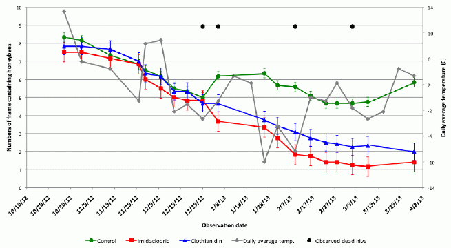
There are several curves here... Three of the curves are survival curves for the bees, with various treatments; these use the scale on the y-axis at the left, which is labeled with a measure of survival. One curve shows the temperature, and uses the scale on the y-axis at the right. The x-axis is time-- or rather, date, from October through April. Roughly, one can think of the x-axis as Autumn, Winter, and (early) Spring.
Let's look at those survival curves. These are the three curves that start near 8 (left scale). The green curve (round symbols) is for the control bees, not treated with a pesticide. The other two curves (red squares and blue triangles) are for bees treated with the two pesticides; these curves are similar enough that we can consider them together.
During the first few months (Autumn), all three of those survival curves are declining -- rather similarly. Then they diverge, near year-end. The control population rebounds: the number of bees increases. However, the treated populations continue to decline.
The gray curve shows the temperature (T) -- the average daily T, as recorded at a nearby airport. You can see that the rebound of the untreated colonies occurs at about the time T increases after a cold spell.
There may be a similar effect near late January and early February. There is another cold spell. The population declines, even for the control bees. But after it warms up, the control bees rebound.
This is Figure 1 from the article.
|
What about dead hives? The black dots across the top of the figure show the dates when dead hives were observed. There are four dots -- for seven hive deaths. The two early dots (near January 1) represent the loss of four of the pesticide-treated hives. Overall, six of the 12 treated hives were lost, but only one of six control hives.
Taken at face value, the results show that bee colonies previously treated with neonicotinoid pesticides fare more poorly during Winter; the treated colonies fail to rebound as Spring comes. The problem with work on CCD is that a wide range of results are obtained, and we need to learn what the generality is of the current result. For example... Does the feeding method matter? Is a cold winter required?
Regardless of these reservations, the article offers a new suggestion and deserves attention. Future work will have at least two directions. One is the immediate practical application: the current findings would support a moratorium on use of these pesticides. Beyond that, the question remains as to the mechanism: how do the pesticides cause CCD?
News story: Study strengthens link between neonicotinoids and collapse of honey bee colonies. (Harvard School of Public Health, May 9, 2014.) From the lead institution.
The article, which may be freely available: Sub-lethal exposure to neonicotinoids impaired honey bees winterization before proceeding to colony collapse disorder. (C Lu et al, Bulletin of Insectology 67:125, June 2014.) The journal web site has only a pdf. If it isn't freely available there, check Google Scholar.
Background posts about CCD include:
* A plant virus that grows in bees: role in colony collapse? (February 17, 2014).
* Should bees eat honey? (July 12, 2013). This addresses the issue of feeding bees sugar water rather than honey.
* A parasitic fly that causes hive abandonment in bees: Is this relevant to CCD? (January 27, 2012).
A major follow-up post: Largest field trials yet... Neonicotinoid pesticides may harm bees -- except in Germany; role of fungicide (August 20, 2017).
More about bees...
* Bee history (February 13, 2016).
* Bee wars (March 1, 2015).
Would wild mice use an exercise wheel?
July 11, 2014
It's common to provide lab mice an exercise wheel (or "running wheel"). It's part of providing the mice a good stimulating environment. The mice use it a lot, and seem to enjoy it. Or do they? Perhaps they use the wheel only out of frustration at the unnatural environment. Perhaps their use of the exercise wheel is a sign of neuroticism due to confinement, not enjoyment. If pressed on the matter, many biologists would probably admit we really don't know.
Could we find out? A new article takes a useful step towards finding out.
In the new work, scientists put an exercise wheel outside "in the wild", and they observe who visits it and what they do. (The first "wild" tested was the lead author's backyard.) The simple answer is that many mice visit it and spend time on the wheel. The authors interpret this as showing that mice find this a desirable activity, even in the wild.

|
The experimental set-up, to see if animals in the wild will use an exercise wheel.
The cage contains a plate of food, to get their attention, and an exercise wheel. Wheel motion is recorded electronically. The cage is monitored with a camera (activated by a motion detector, and including night vision), to allow identification of what caused the wheel to move.
The cage structure is designed to keep out large animals. Those smaller than a rat can access it freely.
This is (slightly trimmed from) Figure 1a from the article.
|
It's a nice experiment; the data are encouraging and certainly support their interpretation. However, I would prefer to take it as preliminary, with better follow-up work needed. Of particular concern is to understand how and why mice might use it. Are they exploring the environment? Do they actually like it?
The authors show that the time the wild mice spend on the wheel is similar to that spent by lab mice. However, the latter varies with age, and it's not clear they have accounted for that.
It would be nice to know if mice return to use the wheel. The authors have anecdotal observations that they have seen mice use the wheel, get off, and then get back on. That's encouraging, but limited. A key aspect of the experimental design is that it observes mice in the wild, but that is also a limitation. Is it possible the scientists could work out an identification (tagging?) system, so they could track return visits by individual mice? Any such intervention would have been inappropriate for the original experiments, but perhaps it is now time to think of how this could be done without too much distortion of the wildness aspect.
This is a fun paper. The scientists explore an interesting question with a novel approach. We learn something from the results. However, as so often, especially with something new, let's be cautious about the interpretation.
News stories:
* Even in the Wild, Mice Run on Wheels. (Science, May 20, 2014.)
* Animals in the wild found to use running wheel if given the choice (w/ Video). (Phys.org, May 21, 2014.)
Videos... There are three short videos posted with the article, as Data Supplement. One shows a wild mouse using the running wheel in the experimental set-up. Although mice were the focus of the work, a few other animals were found on the wheel. Videos of two of them are available: for a frog and a slug. Caution... the pictures are not very clear; that's the nature of the system. (And the slug is, well, rather sluggish.) All three videos are also at YouTube. The mouse video is at Video: mouse on running wheel. (YouTube, 36 seconds.) Similar videos are with the news stories; the mouse video at the Science site is higher quality and easier to follow.
The article, which is freely available: Wheel running in the wild. (J H Meijer & Y Robbers, Proceedings of the Royal Society B 281:20140210, July 7, 2014.)
A previous post about providing a good lab environment for mice: A good home -- for your mouse (October 15, 2009).
More about mouse behavior:
* Male mice are stressed by the odor of bananas or pregnant females (June 14, 2022).
* Why male scientists may have trouble doing good science: the mice don't like how they smell (August 22, 2014).
More about exercise:
* Sparing glucose for athletic endurance (August 21, 2017).
* Hormone from bone boosts muscles (October 4, 2016).
* Why exercise is good for you, BAIBA (March 10, 2014).
There is now an extensive list of sports-related Musings posts on my page Internet resources: Miscellaneous under Sports.
July 9, 2014
Using a pH meter to help you find dinner
July 8, 2014
Imagine that you are a carnivore living in the ocean. And imagine that it is hard to see, perhaps because the waters are muddy -- or perhaps because your favorite food tends to hide.
A general characteristic of animals is that they give off carbon dioxide. In water, CO2 dissolves to give carbonic acid -- thus lowering the pH of the water very near the respiring animal. If you had a pH meter, you might find your food by looking for local regions of low pH.
A new article shows that a fish seems to do something very much like that. It has sensors for hydrogen ions (H+) -- on its whiskers. It detects small decreases in the ocean pH, and then explores such areas for hidden worms.
Here is some of the evidence...
Frame B (upper left) shows the lab aquarium set-up used to measure the behavioral response. That's a fish at the bottom (of the blue water). It is a Japanese sea catfish Plotosus japonicus. Each side of the chamber has a U-tube, which the scientists can manipulate. In particular, the one at the left may (or may not) have a worm in it. The one at the right is connected to a supply of CO2.
The other two frames show some results. In each case, the fish was offered some choices. The bar height is the time the fish spent exploring a particular choice. That is, a high bar is a positive response: the fish found and explored that choice. The longer (higher bar), the better.
In frame F, a sequence of three tests was done. In the middle test, a worm was present in the U-tube. In the first and last tests, there was no worm. The graph shows the three tests in the order they were done, left to right. (The label "u-tube" means no worm.) The middle bar is clearly the high one. The fish spent more time around the tube when a worm was present.
In frame G, the experimental approach was similar. In this case, the middle test involved added CO2. That is, the three cases were normal, extra CO2 (thus low pH), and another normal control. (The label "SW" means sea water.) Again, the middle bar is the highest; the fish spent more time exploring the tube when the pH is low.
Some of the experimental details are not clear. For example, although the general nature of what the graphs show is clear enough, it is not clear how the internal control u-tube was used, if at all. Further, some of the labeling is cryptic. I think I've explained the parts that are relevant to what I discussed.
This is Figure 2 parts B, F & G from the article.
|
In summary, one test above shows that the fish finds regions with a worm; the other shows it finds regions of high CO2. Both "worm" and "high CO2" lead to low pH. Of course, this is not sufficient to show that the reason for both results is low pH. However, there are more experiments. For example, the scientists provide some evidence that the local pH changes near the worm are large enough to be detected by the fish. They also do electrophysiological measurements. Overall, the authors provide reasonable evidence that their interpretation deserves further consideration.
News story: LSU Biologist John Caprio, Japanese Colleagues Identify Unique Way Catfish Locate Prey. (Louisiana State University, June 5, 2014. Now archived.) From the lead institution.
The article: Marine teleost locates live prey through pH sensing. (J Caprio et al, Science 344:1154, June 6, 2014.)
The story above is about how CO2 from a respiring animal causes a small local pH drop. The chemistry behind that is the same as for the phenomenon of ocean acidification due to increased CO2 emissions. A post on that topic... An example of coral growing well in a naturally acidified ocean environment (February 16, 2014).
Previous post about fish: Electric fish: AC or DC? (October 12, 2013).
Other dinner stories include...
* How the price of oil might affect what seals eat for dinner (January 18, 2015).
* If the elephant can't find its dinner, should you help by pointing to it? (October 18, 2013).
Tracking food poisoning through online reviews
July 7, 2014
It's a simple story -- an intriguing one. Staff at the New York City Department of Health, in cooperation with Yelp, analyzed restaurant reviews posted online over a nine-month period. Automated searching of the reviews for key words, such as "sick", gave a subset that deserved more careful attention. Further analysis revealed patterns among reviews, which pointed to actual food poisoning incidents.
Public health authorities usually can't do much with a single report of food poisoning. After all, the affected person had many recent food experiences, and there is usually little that points to a particular one as being the culprit. However, if they get multiple reports, they can look for patterns -- for overlaps among the reports. Each individual reports a range of food experiences, but if two people report eating the same thing at the same place at the same time, that may be a big clue. These are general issues about tracking down food poisoning sources; the new work is just a way of getting more reports to examine.
The authors emphasize that what they did was quite laborious. However, one can easily imagine how it could be done more efficiently, starting with a form at the review site that asked for information about events that might be of interest to health and safety authorities. The form itself would ask for the key information that is needed. (Much of the authors' time in the current work was spent contacting those who had posted reviews that seemed of interest, and "manually" collecting the basic facts from them. That is, the posted reviews contained some clue that there was an event, but little of the information needed to analyze it.)
I think we can leave it at that for here. The authors have shown the potential of online reviews contributing to public health. The question is whether this can be turned into something practical.
News story: Yelp Helps NYC Health Department Track Foodborne Illnesses. (National Geographic, May 23, 2014. Now archived.) An excellent overview of the work.
The article, which is freely available: Using Online Reviews by Restaurant Patrons to Identify Unreported Cases of Foodborne Illness - New York City, 2012-2013. (C Harrison et al, Morbidity and Mortality Weekly Report (MMWR) 63:441, May 23, 2014.) As common for articles in MMWR, it contains a "plain-English" summary at the end, starting with a section "What is already known on this topic?".
A previous post about food poisoning is... Killer chickens (December 2, 2009). It includes an extensive list of related posts.
More... Should the results of restaurant inspections be posted by the door? (December 4, 2018).
Both this project and Google Flu Trends involve mining Internet data to track a health issue. The new project involves using a data set that is focused on the topic of interest: restaurant reviews. Google tracks the flu (April 30, 2009).
My page Internet resources: Biology - Miscellaneous contains a section on Nutrition; Food safety. It includes a list of related posts.
July 2, 2014
The brain-machine interface -- at the World Cup
July 2, 2014
We have discussed various developments in both prosthetics and in using information from the brain captured by instruments. One leading lab in the field is that of Dr Miguel Nicolelis of Duke University. For example, one post presented work from the Nicolelis lab in which a brain signal from one rat was used to direct an action by another rat [link at the end]. A stunt of course, but part of a serious story.
Some time ago, Nicolelis -- a Brazilian -- arranged that another demonstration of his developments would be done at the opening of the current World Cup in Brazil. A paralyzed individual would kick the ceremonial first ball -- using mind control, via a robotic device. That is, the paralyzed individual, unable to control his legs directly, would think the motions of the kick. The brain signals from his thinking the motions would be captured, and used to control a robotic device attached to his body and controlling his legs. Nicolelis's goal was to show off the technology to "billions", watching the event around the world.
It happened, and we simply note it here. We have no details, and seem to not even have a video.
News stories:
* 'We Did It!' Paralyzed Man Kicks Off World Cup Using Partially 3D Printed Exskeleton [sic]. (3DPrint.com, June 12, 2014.) This post contains a video -- except that the video is missing, apparently for copyright reasons. I don't know what is behind this, but I have not found a video of the event itself. (Why is this discussed at a 3D printing site? One part of the apparatus was printed, as described in the story. And their spelling error? It's just in the title; the word is fine in the story.)
* Paraplegic in robotic suit kicks off World Cup. (BBC, June 12, 2014.)
Background post of work from the Nicolelis lab: Can one rat know what another rat is thinking? (April 8, 2013)
A recent post on a prosthetic device: FDA to fast-track prosthetic arm -- Follow-up #2: approval (June 9, 2014).
Posts on some developments on prosthetics are listed on my page of Biotechnology in the News (BITN) for Cloning and stem cells. It includes an extensive list of Musings posts in the fields of stem cells and regeneration -- and, more broadly, replacement body parts.
Another post related to the World Cup: Flow centrality: the key to a scientific analysis of the soccer game (July 11, 2010).
More robotics: Quiz: What are they? And are they a threat to you? (October 20, 2014).
"Brain-machine interface" as used here is often abbreviated BMI. For another meaning of BMI, see Should obesity be redefined? (April 30, 2025).
There is now an extensive list of sports-related Musings posts on my page Internet resources: Miscellaneous under Sports.
How BMAA may cause motor neuron disease -- a clue?
July 1, 2014
Briefly noted...
We introduced this story in an earlier post -- one with one of the most complex Musings titles, reflecting the complexity of the story [link at the end]. The key part is that an unusual amino acid, called BMAA (β-methylamino-L-alanine), has been associated with motor neuron disease. As of that post, there was little known about what the causal connection might be; in fact, many doubted there was any. Nevertheless, it is known that some cyanobacteria make BMAA, and that clusters of motor neuron disease are sometimes associated with cyanobacteria. No smoking gun, but there is reason for concern.
A recent article offers a clue about how BMAA might work. In this new work, the scientists show that BMAA can be incorporated into proteins during protein synthesis. Apparently, BMAA gets incorporated where serine should be. They also show that proteins with BMAA in them tend to aggregate -- something of a hallmark of neurodegenerative diseases.
We should emphasize that the new work does not make a direct connection between BMAA and any neurodegenerative disease. They don't study any disease per se in this work. (The work is done with normal human cells in lab culture.) What they do is to study BMAA; they learn new things about how BMAA behaves. What they learn about BMAA suggests how it might cause neurodegeneration. It remains for further work to test the suggestion.
In the meantime, the advice remains... don't eat the bats that have eaten the cycad seeds that are contaminated with BMAA from cyanobacteria. In general, avoid exposure to cyanobacterial blooms.
News story: New Mechanism for Protein Misfolding May Link to ALS. (Science Daily, September 25, 2013.)
The article, which is freely available: The Non-Protein Amino Acid BMAA Is Misincorporated into Human Proteins in Place of L-Serine Causing Protein Misfolding and Aggregation. (R A Dunlop et al, PLoS ONE 8(9):e75376, September 25, 2013.)
Background post: Don't eat the bats.
or
An ALS story: Guam and New Hampshire; food chains and biomagnification; cyanobacteria, cycad trees, and flying foxes; pond scum; and BMAA.
(October 6, 2009).
More about ALS:
* Effect of exercise on developing ALS (July 27, 2021).
* Is a "dead" virus in the human genome contributing to the neurological disease ALS? (January 11, 2016).
Another story about a neurotoxic amino acid derivative... Is the lychee (litchi) a toxic food? (May 11, 2015). There is no connection between these stories, and no implication that the toxic amino acids work the same way.
My page for Biotechnology in the News (BITN) -- Other topics includes a section on Brain (autism, schizophrenia). It includes an extensive list of brain-related Musings posts.
Also see: A better way to un-boil an egg -- and why it might be useful (March 20, 2015).
Silent crickets
June 30, 2014
Crickets "chirp" by rubbing their wings together, a process called stridulation. Their close relatives, the katydids, do the same, though typically at a higher frequency. One role of the chirping is to attract mates. However, the noise can also attract those who might do harm, such as predators or parasites.
One can imagine that it might be beneficial for these insects to make less noise that others can hear. In fact, we discussed one possible example of this in a recent post [link at the end]. The animals discussed there are newly described species of katydids that "sing" at ultrahigh frequency. The reason for this is not clear, but it is possible that it reduces detection by bats.
Here we have another example: crickets that do not chirp at all.
The story comes from the Hawaiian Islands. A few years ago, it was found that many of the males in the cricket populations on two islands were silent. The silence apparently protects the crickets from parasitoid flies, which have decimated some cricket populations. The wings of the silent crickets lack the scraper that is part of the noise-making process; these crickets have "flat wings".
A new article looks at the nature of the two groups of flat-winged crickets. Biologists want to know how similar they are. Are the two populations of flat-winged crickets independent derivatives of the parental population, or are they closely related? The first part of the investigation was simply to carefully map out the various types of wings. That work is summarized in the following group of drawings.
|
The figure at the left shows the differences between the wings found on normal crickets and on the two types of silent crickets. A normal cricket wing is shown at the top (frame C), and a wing from each of the two types of silent crickets is shown at the bottom (frame D).
The red dots help orient you. The authors call these "landmarks". They define 16 wing positions, and then show where they are in each wing type. As an example, you can look at the "scraper"-- near the lower right of each wing. Look at the scraper and its two red dots in the normal wing, and then in the two silent wings. You can see that all three are different. It's an important part of the findings that the two silent wings are quite different from each other, as well as different from normal.
This is Figure 2 Parts C & D from the article.
|
The major conclusion is that the two types of silent crickets have different kinds of silent wings. The scientists also do genetic analyses of the three cricket populations, and again the results show that the two types of silent crickets are distinct. We learn, then, that these two populations developed independently. Thus, this is an example of "convergent evolution": a similar phenotype (in this case, silent wings) being reached by two different pathways.
An alternative model that might be considered... It is conceivable that one population of silent crickets developed, and then some of its members traveled to the other island to establish a second population of silent crickets. That includes the possibility that the silent crickets from the first island interbred with the resident crickets on the second island, transferring the gene for flat wings. The results here do not support that alternative.
If the purpose of chirping is to attract a mate, the silent males must make us wonder... how do they find a mate? (Their numbers are increasing.) It is likely that the females use other cues, even "collective" cues... if some males chirp, females are attracted to the area, but they may mate with any male in the immediate area. The authors even suggest that the silent males may be more aggressive in pursuing females. These are testable hypotheses. It's also been found that there is some parasitizing of silent males; some of the same kinds of suggestions can be offered as to why.
Many details remain to be elucidated. However, the story of silent, flat-wing crickets in Hawaii appears to be a good example of how a selective force -- parasitizing flies -- drives adaptations. Some aspects of the adaptations seem simple, such as the silent wings, but there may be further adaptations, such as in the mating behavior, to compensate for the wing change.
News story: For Some Male Crickets, Silence Means Survival. (The Scientist, May 29, 2014.)
The article: Rapid Convergent Evolution in Wild Crickets. (S Pascoal et al, Current Biology 24:1639, June 16, 2014.)
Background post, about katydids that may be evading predators with an unusual sound: Introducing Supersonus -- it stridulates at 150,000 Hz (June 16, 2014).
An earlier post about a parasitic fly, with a possible effect on its host population: A parasitic fly that causes hive abandonment in bees: Is this relevant to CCD? (January 27, 2012).
More parasites: Inter-plant communication via the Cuscuta parasite (September 15, 2017).
An early-detection system for Alzheimer's disease?
June 28, 2014
Diagnosis of Alzheimer's disease (AD) is a problem. Doctors can measure cognitive decline, but there are various possible reasons for that. A definitive diagnosis of AD comes only at autopsy. Even if cognitive decline is used as a marker, it is likely that by the time it is noticeable, the disease has been long developing, perhaps for decades. That is, the early stages of AD are invisible to us. Some feel that the reason drugs against AD have shown little effect is that we give them too late -- after the disease process is well under way and symptoms are apparent.
A new article offers a new approach to an assay for AD. It seems to have potential for detecting AD at an early stage, before symptoms are evident.
The new assay focuses on a particular protein that is associated with AD. That is the peptide called amyloid beta, or Aβ (sometimes with a number, such as Aβ-42). In particular, the assay aims to detect what is called the oligomer form of Aβ, where a small number of Aβ units are connected together. The oligomer is an intermediate between "free" (monomer) Aβ and the highly aggregated amyloid plaque that is found in AD patients. Many scientists now think that the Aβ oligomer is the most important form of Aβ in the disease process, with the plaque being a side effect.
The assay involves adding a sample containing Aβ oligomer, and measuring its conversion to amyloid (the plaque material). In actual use, that "sample" could be from a patient.
The following graph shows some results from a simple version of the assay.
|
In this test, amyloid is detected with a fluorescent dye (called ThT). The amount of amyloid made is plotted on the y-axis. The x-axis shows time.
For the black curve, no Aβ oligomer was added. Not surprisingly, no amyloid was made; the black curve is zero at all time points.
|
For the other three curves, increasing amounts of Aβ oligomer were added: yellow, blue and red. The yellow curve is still at zero; the assay could not detect this small amount. However, the other two curves show that amyloid increases over time. And the sample with the most Aβ oligomer (red curve) showed the greatest response.
This is Figure 1C from the article.
|
I've left out some details there; the point is that, from this graph, the assay looks promising. It can detect Aβ oligomer, and the more there is, the greater the response. Further, the assay takes only a few days. (The last time point is 125 hours, which is about 5 days.)
The scientists then go on to make some improvements in the assay, building on the basic design. The improved assay works even faster, and can detect even lower amounts.
An interesting aspect of the story is how the scientists developed the assay. It is analogous to an assay developed for prions, as noted in a recent post on prions [link at the end]. Prion diseases also involve the conversion of a protein from one form to another. The protein misfolding cyclic amplification (PMCA) assay provided a key demonstration that simple conversion created infectious prion material. The idea that AD is in some ways similar to prion diseases has been developing over recent years. Here, the scientists modify the prion assay into an assay for a key AD protein; the result is this Aβ-PMCA assay. It works. The authors of the current work include those who pioneered the original version of the PMCA assay for prions.
A little more about how the assay works... What is it that is being converted to amyloid in this Aβ-PMCA assay? It's free Aβ. The assay provides a supply of Aβ. The sample is then added. If the sample contains Aβ oligomer, the oligomer converts the free Aβ to amyloid, which is measured. It's that conversion of free Aβ to more complex forms that the assay measures -- and which is thought to be part of the disease process. And it is that conversion where there is a parallel between AD and the prion diseases, both in the assay and quite likely in the disease processes in the body.
The test above was done with a lab sample of Aβ. The authors also did some testing of real biological samples, and showed that the assay seemed to distinguish patients likely to have AD from those with other neurodegenerative and neurological diseases. That's all encouraging, though preliminary.
So far, the assay of real samples uses cerebrospinal fluid (CSF). That would make the assay impractical for routine screening. Nevertheless, it could be used for cases where AD is suspected. It will be interesting to see whether the assay can be adapted to make use of more accessible samples, such as blood. The Discussion section of the article compares the new assay to other assays, and previews their further work to test and develop the assay.
News story: Early detection of Alzheimer's disease made possible by analyzing spinal fluid. (Science Daily, March 20, 2014.)
The article, which is freely available: Detection of Misfolded Aβ Oligomers for Sensitive Biochemical Diagnosis of Alzheimer's Disease. (N Salvadores et al, Cell Reports 7:261, April 10, 2014.)
Background post, noting the similar assay for prions: Interfering with prion propagation? (April 5, 2014).
Previous post on Alzheimer's disease: Making stem cells using brain tissue from dead people (June 2, 2014).
Another way to measure misfolded Aβ: Alzheimer's disease: a blood test that might be used for people with some signs of cognitive decline (January 16, 2021).
My page for Biotechnology in the News (BITN) -- Other topics includes a section on Alzheimer's disease. It includes a list of related Musings posts.
There is also a BITN page for Prions (BSE, CJD, etc). It includes a list of related Musings posts.
June 25, 2014
National contributions to global warming
June 25, 2014
Total global warming from 1800 to 2005 is about 0.7 °C. The map above shows the contribution of the United States to that: it's about 0.15 °C -- more than 20% of the total. Of course, the US is a large country, so perhaps that is why we have a large contribution. The map further shows the US rather fat, and red. Countries on the map that are fat (compared to their actual size) and red have made contributions to global warming that are large when compared on the basis of country size (area).
That map and those statements are just examples of what is found in a new article that attempts to map out the sources of global warming since 1800.
This Figure is trimmed from the one in the io9 news story. It is equivalent to Figure 3 from the article, but better labeled.
|
The authors try to determine not only the total contribution of each country to global warming, but the reasons for that contribution. There has been a major effort to track down all the information; some of their numbers are based on estimates. They provide full information about what they did, including how they combined the numbers for different causes, for those who may want to challenge or extend the analysis.
As examples... For the US, fossil-fuel CO2 is the largest single contributor. However, for Brazil, land-use CO2 (e.g., deforestation) is the largest contributor. Other factors considered include the non-CO2 greenhouse gases (such as methane and nitrous oxide), and aerosols, which decrease temperature. Nigeria is an example of a country where non-CO2 greenhouse gases (generally from agriculture) have made a larger contribution than CO2. China is an example where emission of aerosols have substantially reduced the contribution to global warming.
The article provides an interesting and novel perspective on contributions to global warming. An important point is to recognize the differences between countries. That's not a new point, of course, but it is presented here in a useful way.
News stories:
* Map shows which countries are contributing the most to climate change. (Gizmodo (formerly io9), January 15, 2014.)
* Global warming's biggest offenders. (Phys.org, January 15, 2014.)
The article, which is freely available: National contributions to observed global warming. (H D Matthews et al, Environmental Research Letters 9:014010, January 15, 2014.)
Also see...
* Might it be good if airplanes emitted more CO2? (September 5, 2014).
* Methane leaks -- relevance to use of natural gas as a fuel (April 7, 2014).
* An example of coral growing well in a naturally acidified ocean environment (February 16, 2014).
* Why the lull in global warming? (February 11, 2014).
* When does global warming occur: day or night? (October 28, 2013).
* SO2 reduces global warming; where does it come from? (April 9, 2013).
* Global warming trend? Independent evidence (March 22, 2013).
Could we block seismic waves from earthquakes?
June 23, 2014
We can protect ourselves from light waves, by putting up a wall or mirror. The wall absorbs the light waves, preventing them from getting to us. The mirror reflects them back toward the source, again preventing them from getting to us. Similarly, we can prevent sound waves from getting to us. Why can't we do this for the seismic waves of earthquakes -- and prevent the destruction of buildings?
Perhaps we can. There is nothing wrong with the idea; it's just a matter of working out something practical for the specific type of wave. A new article reports a step toward designing a "mirror" that would reflect seismic waves.
The first figure is a photograph of the experimental set-up. Unfortunately, some of it is not too clear. If you don't follow it all, go on and look at the next figure. (You can also look at the listed movie at some point.)

|
The machine at the right side of the figure is a device to make "artificial earthquakes". It is the "source".
The important part is in the middle, in the region marked with a dashed blue line. This is the "seismic metamaterial", as the authors call it -- an array of holes.
|
The array of holes is designed to match the waves made by the earthquake machine. The machine makes seismic waves of a particular type; the array of holes is designed to reflect those waves.
In this case, there are three rows of holes. Each hole is 5 meters deep and 0.32 m in diameter. The holes are spaced 1.73 m apart; importantly, that spacing is close to the estimated wavelength of the seismic waves from this test earthquake in this soil. It's hard to see all the holes, but you should get the idea.
Also shown, mainly in the region marked by the green dashed lines, are sensors used to detect ground motion.
This is Figure 3 from the article.
|
The following figure shows some results. Note that the set-up is turned 90 degrees from what is shown above. The source is now in front, rather than at the right.
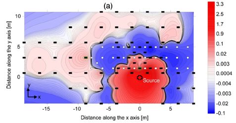
|
This figure shows the difference in energy recorded over the experimental plot, with and without the reflector.
The source -- where the quake waves are made -- is marked with a cross and is labeled "source"; it is at the point 0,0 in the red region. The holes, collectively making the reflector, are shown as white circles. The sensors are shown as black bars.
|
The color codes the energy difference. There is a scale at the right; briefly, red means higher energy with the reflector in place, and blue means less energy with the reflector in place.
A simple summary of the picture is that there is more red close to the source and more blue in and beyond the reflector. This means that, with the reflector in place, there is more energy near the source. That is, the reflector worked: it reflected the energy back toward the source, protecting the area beyond the reflector.
This is Figure 4a from the article.
|
So where are we on this? In principle, it might be possible to manipulate seismic waves, like other kinds of waves. However, it seems like an overwhelming practical problem. We now have a test, which supports the idea. It's in real soil, with real waves. It's small scale, but it is a start.
Some buildings are now built on "cushions" or rollers. The idea is that these structures absorb the seismic waves without transmitting the energy to the building itself. However, for existing buildings, the possibility of protecting them with a seismic wave reflector has appeal. Perhaps some day such a device can protect special buildings, such as hospitals or nuclear reactors or historic sites. A reflector need not be perfect; reflecting part of a quake's energy could be enough to allow a building to survive. What's the risk? The method used must not increase the energy to any sensitive region. That means the reflection method and the expected seismic waves must be understood well enough that we can predict where the reflected energy will go.
News stories:
* Field study shows possibility of deflecting seismic waves around desired geologic surface areas. (Phys.org, April 9, 2014.)
* Researchers Work to Create 'Seismic Cloaks'. (American Society of Civil Engineers, April 15, 2014. Now archived.)
Movies. There are two short movies posted with the article as "Supplemental Material". You may need subscription access to view them (but try anyway, even if the label says access is restricted). The more interesting one is the file prlfilm.mp4 (3 minutes; no useful sound -- just background noise). It shows the test scene, with some useful video of making the boreholes that constitute the reflector, and it shows the test itself.
* News story, freely available, in a news magazine from the article publisher: Viewpoint: A Step Towards a Seismic Cloak. (P Sheng, Physics 7:34, March 31, 2014.) This includes a link to a free version of the article pdf from the publisher; be sure to use the special "PDF (free)" link.
* The article, which is freely available -- but only if you use the journal's special link from their news story immediately above. The article is: Experiments on Seismic Metamaterials: Molding Surface Waves. (S Brûlé et al, Physical Review Letters 112:133901, March 31, 2014.)
More about earthquakes and such...
* How seismic waves travel through the Earth: effect of redox state (June 8, 2018).
* Fracking: the earthquake connection (June 19, 2015).
* Earthquake: Are the geologists responsible for the damage? (November 17, 2014).
* Groundwater depletion in the nearby valley may be why California's mountains are rising (June 20, 2014). Just a bit below.
* Are large earthquakes occurring non-randomly? (February 10, 2012).
* The Quake-Catcher Network: Using your computer to detect earthquakes (October 14, 2011).
* The great Tonga earthquake: how many quakes were there? (September 12, 2010).
* Chile earthquake caused the day to become shorter (March 8, 2010).
More about mirrors...
* An eye that forms an image using a mirror (February 13, 2018).
* A plant that communicates with bats (September 7, 2011).
* Teaching pigs to use a mirror (December 1, 2009).
A ream of microscopes for $300?
June 22, 2014
Suspicious? One buys paper by the ream, not microscopes. (A ream is 500 sheets.) And were the title true, that would mean the microscopes cost (US) $0.60 each. Not likely?
Let's look at a microscope described in a new article by a team of engineers from Stanford University.
When you buy one of these microscopes, what you get is a sheet of paper. How big? Standard A4 (or letter size) paper. It's shown in the figure at the right.
You cut it out and fold it up. And you insert a couple of other pieces that are provided: a lens and an LED light. Takes about 10 minutes.
And that's your microscope -- the Foldscope.
Since the microscope is distributed as a piece of paper, it might reasonably be packaged by the ream. (I do not know whether the authors intend to do that, but they are thinking about high volume; see below.)
This is Figure 1A from the article.
|
|
Cost? The authors list the cost of all the materials, and estimate that materials cost $0.58 per microscope. That's for lots of ten thousand, which would be 20 reams. (Table 1 of the article. The Table shows cost estimates for two microscopes, which differ only in the lens. The values shown are $0.58 and $0.97.)
So, we have met the claims made at the start. And now you wonder, is this a toy? That's not the intent. The problem the authors addressed was bringing practical low cost medical care to the developing world. Microscopy is a useful tool; microscopes are expensive. An earlier Musings post addressed another approach to the microscopy challenge [link at the end]. Now we have inexpensive microscopes -- inexpensive, but good enough for what is needed, and surprisingly robust.
In addition to the original application, another use of these microscopes has become apparent -- especially since they seem to be quite robust. Imagine giving each ten-year-old student a microscope that they can take home -- and keep.
Will this really work? They are about to find out. At this point, they have some microscopes they have made and worked with in the lab. And they have an article -- and a TED talk. They are now taking the next step. The Foldscope web site has been recruiting volunteers who want to test the Foldscope. Whether it ends up being as simple and inexpensive as currently claimed, it's an interesting development.
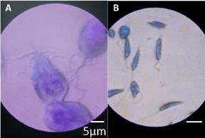
|
Examples of Foldscope images:
A. Giardia lamblia
B. Leishmania donovani
Both of these are unicellular eukaryotes of medical importance.
This is Figure 5AB from the article. The full figure has many more.
|
News stories:
* Ultra-cheap 'origami' microscope developed. (BBC, March 11, 2014.)
* The $1 Origami Microscope. (MIT Technology Review, March 11, 2014.) (This links to an advance version of the article at ArXiv. Since the article is now published, and is open access, it is better to use the journal link below.)
Videos:
* Manu Prakash: A 50-cent microscope that folds like origami. (10 minutes, June 2012.) A TED talk by Manu Prakash, the lead engineer of the project. Not much substance to it, but it gives the idea.
* There are two short videos included with the article, under Supporting Information. Most interesting is Video S1 - Foldscope Assembly (3 minutes; no sound). Even if you don't follow every step the person does, you get a good idea what it takes to assemble a Foldscope. This assembly is by an obvious expert, and is fast; the article says that assembly takes "under 10 minutes" (page 1 of the article).
The article, which is freely available: Foldscope: Origami-Based Paper Microscope. (J S Cybulski et al, PLoS ONE 9(6):e98781, June 18, 2014.)
Foldscope web site.
A Musings post about another development in simple microscopy (mentioned above): Connecting a cell phone and a microscope (September 2, 2009).
Another small -- but not simple -- microscope... A microscope small enough that a mouse can wear it on its head (November 12, 2011).
More advanced microscopy: Characterization of carbon nanotubes (December 3, 2013).
More... Expansion microscopy: making an object bigger can make it easier to see (February 23, 2015).
Also see a section of my page Internet resources: Biology - Miscellaneous on Microscopy.
Another simple device for medical use -- from the same lab: The paperfuge: a centrifuge that costs 20 cents (April 17, 2017).
More hand-held science... Using your smartphone to detect cosmic rays (April 7, 2015).
More about folding...
* A robot that can fold itself up (December 9, 2014).
* A box that will fold up upon command -- heat- or light-actuated switches (September 3, 2011).
More, January 11, 2017... In the Fall of 2016, project leader Manu Prakash was awarded a MacArthur Fellowship, often called a "genius grant". Here is the press release from his university: Stanford bioengineer Manu Prakash wins prestigious MacArthur grant. (Stanford University, September 21, 2016.)
Groundwater depletion in the nearby valley may be why California's mountains are rising
June 20, 2014
In an earlier post, we noted that the mountains in the great Sierra Nevada range of eastern California are rising [link at the end]. Simply the technical feat of making the measurements made the story of interest. The result was interpreted in terms of seismic shifts. We now have a new article that expands on the story. The new work focuses on the groundwater in the nearby San Joaquin Valley (sometimes called the Central Valley, or even just the Valley).
The figure at the right shows what has been happening.
It is a photo of a particular site in the Valley. Currently, ground level is, well, where you see the ground. However, in 1955, ground level was at the height marked by the sign labeled 1955. And so forth.
The point is, the Valley is settling.
This is trimmed from the figure in the UC Berkeley news story.
|

|
Why is the valley settling? Because the groundwater is being depleted. The Valley is an area of low rainfall, but it has high water use, due to agriculture and increasing population. In part, that water use comes from local groundwater, which is being used faster than it is being replenished.
As water is removed, the ground level falls; that is a direct effect. The figure above shows it.
But there is a second effect. The ground now weighs less, and presses down less on the Earth's crust below. Thus the crust rebounds -- rises a bit, due to less weight on it. The authors argue that the rise of the nearby mountains is due to the groundwater depletion in the Valley.
You can imagine the rebound effect with an analogy... Imagine a bucket of mud sitting on a foam cushion. As water is removed from the mud (say, by evaporation), the mud surface in the bucket is lowered; that's the direct effect of "water depletion". But the bucket now weighs less, and the cushion will rise a bit -- both under the bucket and nearby; that's the rebound effect. Put a "mountain" on the foam cushion by the bucket, and it will rise.
The earlier article showed that the mountains are rising. Nothing in the new article changes that observation. What is changed is the interpretation -- more specifically, the suggested explanation for why the mountains are rising. The earlier article suggested that seismic effects were raising the mountains. The new article suggests that groundwater depletion is raising the mountains, and that this explanation seems more likely.
There is still a seismic part to the story. If the ground is shifting due to our water usage, we must wonder whether this might have any effect on subsequent earthquakes. It is similar to the suggestion that hydraulic fracturing (fracking) used for oil and gas recovery may lead to quakes; there is evidence this actually happens. The authors' calculations suggest there may be small but significant effects of groundwater changes on the earthquake faults. These effects may even be seasonal, as water levels rise and fall throughout the year.
The article makes us think about how human activity -- simply getting water -- affects the Earth. We are causing the mountains to rise, and we may be affecting the possibility of earthquakes.
News story: Central Valley groundwater depletion raises Sierra and may trigger small earthquakes. (UC Berkeley, May 14, 2014.) From one of the universities reporting the work.
* News story accompanying the article: Earth science: Fertile fields for seismicity. (P Lundgren, Nature 509:436, May 22, 2014.)
* The article: Uplift and seismicity driven by groundwater depletion in central California. (C B Amos et al, Nature 509:483, May 22, 2014.)
Background post: Our mountains are growing (May 19, 2012).
More about groundwater and water supplies...
* What happens to a snow-based water supply as the climate warms? (April 2, 2019).
* A significant local earthquake: identifying a contributing "cause"? (July 31, 2018).
* Evaluating the world's water resources (August 11, 2015).
* Groundwater depletion in the Colorado River Basin (October 3, 2014).
* A practical system for removing arsenic from water (March 21, 2014).
* NASA weighs India, finds it deficient (October 2, 2009).
A post that notes the possible connection between fracking and earthquakes... Shale gas recovery using hydraulic fracturing (fracking) (October 7, 2013).
Next post on earthquakes...
Could we block seismic waves from earthquakes? (June 23, 2014). Just a bit above.
More... Does the moon affect earthquakes? (October 21, 2016).
More from the San Joaquin Valley, also water-related: Valley fever: effect of drought (October 29, 2022).
A recent book on the California water supply is listed on my page Books: Suggestions for general science reading: Ingram & Malamud-Roam, The West without Water -- What past floods, droughts, and other climatic clues tell us about tomorrow (2013). The Central Valley water gets considerable attention. This book is a must read for anyone in California, or even the American West. But it may also be relevant to others in areas where there is a water problem. It's a fine book.
Among other California-related posts... Domestication of the almond (August 26, 2019).
June 18, 2014
Can computers talk to each other? Could it be a new type of security threat?
June 18, 2014
Briefly noted...
Computers communicate with each other all the time, as we network them together. We may connect them with wires, or with standard wireless signals. But what if we eliminate all those common ways that we get computers to communicate? Could they still talk to each other?
It's common for computers to have microphones and speakers. You could speak into the microphone of one computer, perhaps softly. That computer could emit sound through its speakers, sound that could be heard by another computer. Ok, so you keep your mouth shut. Could they still talk to each other? Perhaps software on one generates sounds, which can be heard on another. Perhaps malware generates sounds, which could result in mal-behavior on other computers. (Of course, these sounds do not need to be audible to humans.)
In a recent article, scientists demonstrate the feasibility of such transmissions. They suggest that computer security people should consider this as a possible security issue.

|
The figure at the left shows one of their experimental setups. It includes their figure legend.
The figure shows five laptop computers (N1 through N5); they are in three rooms, and in the connecting hallway. There is no connection between the computers -- other than the "air gap". You can see that each computer has line-of-sight access to at least one other computer.
This is Figure 11 from the article. Fraunhofer FKIE is the Fraunhofer Forschungsinstitut für Kommunikation, Informationsverarbeitung und Ergonomie, Wachtberg, Germany. (I think they have dropped Forschungs from the name, but not the corresponding F from their initials.)
|
The distance between "adjacent" computers is from 3-6 meters. The total distance, end-to-end, is about 20 m.
(The distances are from Table I, on the same page of the article as the figure shown above.)
The authors show that information can be transmitted from one end of this chain to the other, hopping from one computer to the next, over the "air gap". This transmission uses the common hardware (microphones and speakers), and is directed by a piece of demonstration software. If a person walks between the computers, transmission is broken. This is low speed -- about 20 bits per second. That's enough to transmit important information, such as a password, under software control.
The authors specifically note that what they do uses a possible communication channel that current security systems do not consider. That's the point. It's common for computers to have speakers; they are "on" by default, and are not easy to turn off. (Maybe you want them on.) This is not a good start, if security is of concern.
News stories:
* Authors explore security threat of covert acoustical mesh networks in air. (Phys.org, December 3, 2013.)
* Scientist-developed malware prototype covertly jumps air gaps using inaudible sound. (Ars Technica, December 2, 2013.) Please read the "Update" at the end of this story. It's important to emphasize that the work reported here is about developing computer security.
The article, which is freely available: On Covert Acoustical Mesh Networks in Air. (M Hanspach & M Goetz, Journal of Communications 8:758, November 2013.)
Another post involving suspicious behavior of a computer: Eugene Goostman and his Turing test (June 17, 2014). Immediately below.
More about computer security:
* Computer security: web-based password managers (September 29, 2014).
* Using your brain waves to log on to the computer (April 29, 2013).
* Quiz: What's the connection... (February 14, 2012).
Also see: From WiFi to WiSee (June 18, 2013).
Eugene Goostman and his Turing test
June 17, 2014
Can a computer carry on a conversation with a human, and convince the human that it (the computer) is itself human? Earlier this month, a computer -- or more specifically, a computer program -- did just that, and it has received considerable news attention.
The test, to see if a computer can appear to be human, is called the Turing test. It was originally proposed, in 1950, by the British mathematician Alan Turing, a pioneer of computer science. Thus the headlines proclaim that the program, called Eugene Goostman, has passed the Turing test.
Not so fast. The idea of the Turing test may be clear, but the details of how it should be done are not so clear. Even from the beginning, some have expressed doubts about this particular test.
Below I list two news stories on the event. One is the press release from the university that sponsored the test. The other is a response to the announcement by engineer Ray Kurzweil. I encourage you to read both of them. However, most important is the general perspective of Kurzweil. It's fine to go directly to that story, which stands on its own.
What's important here is to raise the issues, not to resolve them or to reach a conclusion. Kurzweil is presented here not as an "authority" who has "the answer", but as one who has helped lay out the issues for us.
Announcement: Turing Test success marks milestone in computing history. (University of Reading, June 8, 2014.) Press release from the university that hosted the test.
A "reply": Response by Ray Kurzweil to the announcement of chatbot Eugene Goostman passing the Turing test. (Kurzweil, June 10, 2014.)
Other posts that mention the Turing test:
* Help design a new alphabet (March 1, 2016).
* Computer reads CAPTCHAs with 90% accuracy (November 25, 2013).
* Alan Turing, computable numbers, and the Turing machine (June 23, 2012).
Another post involving suspicious behavior of a computer: Can computers talk to each other? Could it be a new type of security threat? (June 18, 2014). Immediately above.
Introducing Supersonus -- it stridulates at 150,000 Hz
June 16, 2014
Katydids "sing" -- to potential mates -- by rubbing their wings together, a process called stridulation. It's similar to what their close relatives, the crickets, do.
Common katydids sing at frequencies in the range 5-30 kilohertz (kHz). Those are sounds we would consider high-pitched, and some are above the range of human hearing. (For comparison, the high note of a piano is 4186 Hz, or about 4 kHz.) Scientists now report finding three related species of katydids that sing at over 100 kHz (100,000 Hz). They name the genus for this group of ultrasonic (supersonic) singers Supersonus. (For usage of the terms ultrasonic and supersonic, see the terminology note below, after the article listing.)
Here is one of them...
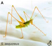
|
A male Supersonus aequoreus. The body is about 1 centimeter long.
This is the record-holder -- for now at least. It sings at near 150,000 Hz.
This is Figure 1A from the article.
|
As noted above, stridulation involves rubbing the wings together. Specifically, one wing has a structure that may remind you of a file; the other has a "scraper". Here is a Supersonics file...
The stridulatory file of Supersonus undulus. An SEM (scanning electron microscopy) image.
The teeth are about 15 micrometers (µm) apart.
This is the lower right frame of Figure 6 from the article. The picture is about 0.7 millimeters (700 µm) wide, based on a scale bar in another frame.
|
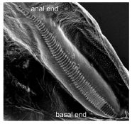
|
This wing file is for a different species than shown at the top. The species here sings at only 115 kHz. The full figure shows the file structures for all three of the new species. The higher the frequency of the song, the closer together the teeth are. The teeth are so close together for the other, higher-frequency, species that it is harder to see the teeth. So I chose the clearest picture for now -- from the animal that sings at only 115 kHz.
Singing is a specialized function of the wings. The wings are highly modified to produce sound. They are very tiny wings. The file is on the left wing; the right wing, with the scraper, folds to produce a resonant cavity that amplifies the sound. In fact, the wings are so highly modified for these supersonic katydids that they cannot fly.
There is mechanistic complexity as well as the anatomical complexity discussed above. The authors argue that the high sound frequencies observed here cannot be solely due to the ordinary wing motion. They suggest that energy is stored within the wing in elastic deformations; the release of these deformations adds to the wing motion to create the high speeds that are necessary.
What is the "purpose" of all this? That's hard to know. It is clear that members of the katydid group sing over a very wide frequency range; the extremes here are the result of accumulating many changes, thus allowing many niches to be filled. Not only do potential mates hear the songs, but potential predators do, too. Do the ultrasonic songs help protect the katydids from predators? Apparently, some bats can hear these high frequencies, but only over short distances. It remains for further work to define the benefit. For now, the authors simply note that we have a new record for high frequency insect songs, produced by stridulation at about 150,000 Hz.
News story: Newly discovered insect 'Supersonus' hits animal kingdom's highest-pitch love call. (Phys.org, June 6, 2014.)
The article, which is freely available: Shrinking Wings for Ultrasonic Pitch Production: Hyperintense Ultra-Short-Wavelength Calls in a New Genus of Neotropical Katydids (Orthoptera: Tettigoniidae). (F A Sarria-S et al, PLoS ONE 9(6):e98708, June 5, 2014.)
Terminology note... This post and the article it discusses raise an issue of terminology. What do the terms "supersonic" and "ultrasonic" mean? Many would use the term supersonic to mean that the speed of something is faster than the speed of sound, and ultrasonic to mean that the pitch of the sound is above what human can hear. By this usage, a supersonic insect would refer to one that flies faster than the speed of sound. However, the authors of the paper name the katydid they report Supersonus -- to refer not to how fast it flies but to the high pitch of its sound. They often refer to the insect as being ultrasonic; its song is ultrasonic (high-pitched). (They briefly explain their choice of name, but that is not very helpful.) In checking this word usage, we found that the dictionary does not make a clear distinction between the two terms. In fact, some dictionaries, including the Oxford English Dictionary, list the lead definition for supersonic as high-pitched. So, I've made some minor adjustments to the post, and added this little note.
There are other Musings posts about wings. Some discuss adaptations for other purposes. One is about love songs -- from mosquito wings, but by a different method. "Wing" posts include...
* Silent crickets (June 30, 2014). Closely related to the current post.
* Black silicon and dragonfly wings kill bacteria by punching holes in them (January 28, 2014).
* The effect of cars on birds (August 2, 2013).
* Wings for better walking (November 5, 2011).
* Ice nucleation -- by airplanes (September 24, 2010).
* Butterflies and UV vision (June 29, 2010).
* Science: Love songs (March 26, 2009).
A book about flying -- and therefore about wings -- is listed on my page Books: Suggestions for general science reading. Alexander, On the Wing -- Insects, pterosaurs, birds, bats and the evolution of animal flight (2015).
Other posts about song include...
* Tracking new songs as they cross the Pacific (June 21, 2011).
* The . song (July 18, 2010).
More about ultrasonic (supersonic) insects: Warfare: the tymbal (September 3, 2009).
Things supersonic, in the other sense...
* What happens when the cork is removed from a bottle of champagne? (October 27, 2019).
* Aerospace engineers develop explosive device for supersonic delivery of vaccines (August 2, 2011).
Why do koalas hug trees?
June 13, 2014
How do koalas stay cool -- in their hot dry homeland? They do pant, but that involves water loss, which is a concern.
In a new article, scientists offer a new suggestion as to how the koalas stay cool, and provide some evidence. It has long been observed that koalas tend to hug trees, a seemingly odd behavior. The scientists suggest that tree hugging is a way to stay cool.
The following graph summarizes some of their observations on the posture of the koalas as a function of the temperature. The observations were made "in the wild".
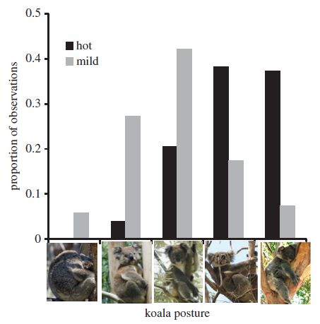
|
The x-axis of this graph is unusual: it is a series of pictures! The idea is that it reflects the amount of exposed surface area and the contact the koalas have with the tree. At the left is a koala curled up, with little contact with the tree; at the right is a koala hugging the tree.
The scientists scored how many koalas they found in each of these positions. They did that for two conditions: hot (>30 °C) and mild (<25 °C). The choice of cutoff was based on previous observations of when koalas seem to find it hot.
Look at the bars for the hot condition -- the dark bars. Compare them with the bars for the mild condition -- light bars. You can see that the dark bars show a distribution that is more to the right, reflecting more contact with the tree.
This is Figure 1 from the article.
|
It is hard to tell, from the pictures above or from the information in the article, how good their system is for categorizing the positions of the animals. Nevertheless, their main point seems supported by looking at just the last category: there are few animals closely hugging the tree under mild conditions, and many doing so under hot conditions.
Measurement of tree temperature showed that the surface near the base could be about 5 °C cooler than the ambient temperature. In hot weather, the koalas tended to be near the tree base; further, they chose the type of tree that showed the lowest temperatures. These observations support the suggestion that the koalas use conductive heat loss, with direct contact with a cooler object, as part of their thermoregulation.
Calculations of the heat loss due to this conductive process suggest it may reduce the need for evaporative cooling by more than 50%. That's significant when water is in short supply.
In ecological terms, the scientists describe the behavior by saying that the koalas respond to heat by seeking out cooler microclimates -- in this case, cool trees.
News story: Lazy? Koalas Are Just Chilling Out. (Asian Scientist, June 6, 2014.)
The article: Tree-hugging koalas demonstrate a novel thermoregulatory mechanism for arboreal mammals. (N J Briscoe et al, Biology Letters 10:20140235, June 2014.)
More about thermoregulation: What if dung beetles wore boots? (December 14, 2012).
Other posts on things distinctively Australian include... The origin of reactive phosphorus on Earth? (July 5, 2013).
More trees: At what wind speed do trees break? (April 2, 2016).
More hugs: How long is a hug? (March 29, 2011).
June 11, 2014
Why don't your arms get entangled or stuck together?
June 10, 2014
That's another problem you may not have thought about much. After all, you have only two arms, there is nothing particularly sticky about them, and you do a pretty good job of keeping them under control using your brain.
But what if you had eight of them, lined with suction cups that tended to stick to things? And what if the arms tended to do things on their own, independent of central control? And maybe you even like to eat the arms of your species -- but not your own, of course.
Before going on... If possible, watch the following movie file, which accompanies a new article. Movie 1. (1 minute; no sound.) If not much seems to happen for a while, be patient; watch the whole file.
What's going on there? The main object is an octopus arm -- free of its original owner. The two small blobs, which are manipulated with tweezers, are pieces of octopus arm; the lighter one has had the skin removed. The main observation is that the detached octopus arm will stick to the skinless piece, but not to the piece of arm with skin. This behavior would also be seen with a normal arm on an octopus. That is, the octopus arm, with its suction cups, is good at getting things -- but not another octopus arm. It is as if the skin of the arm prevents it from interacting with another arm.
The following figure shows results from a test to see how this works.
|
In this test, an amputated arm was allowed to attach to a plastic petri dish. The arm attaches well, as expected. The scientists then measured the force required to pull the arm away.
They did this under three conditions. In one, they washed the petri dish-arm connection with an extract from octopus skin. In another, they used a similar extract from fish skin. As a control, or "reference", they washed it with the solvent used to make the extracts; the force needed in this case is set to "100%".
|
The results seem clear. Adding octopus skin extract reduces the force needed to release the arm to only a few percent of the reference value. That is, octopus skin extract contains something that interferes with octopus arm sticking to an object. In contrast, the fish skin extract has little effect; it seems to increase the attachment, but the result is not statistically significant.
This is Figure 1B from the article.
|
The experiment described above suggests that octopus skin contains something that inhibits the action of the suckers on an octopus arm. Further work could identify what this is, and could further clarify how it works.
The article contains additional work, which is noted in the news story listed below. A caution, you may find some of it gross. Among the findings... if an octopus is offered a detached arm, it is less likely to eat it if it is its own arm.
News story: How the Octopus Keeps Its Arms Straight -- Researchers uncover a self-recognition mechanism that prevents octopus limbs from becoming entangled, despite their powerful suction. (The Scientist, May 15, 2014. Now archived.)
* News story accompanying the article: Neuroethology: Self-Recognition Helps Octopuses Avoid Entanglement. (R J Crook & E T Walters, Current Biology 24:R520, June 2, 2014.)
* The article: Self-Recognition Mechanism between Skin and Suckers Prevents Octopus Arms from Interfering with Each Other. (N Nesher et al, Current Biology 24:1271, June 2, 2014.)
The work described in this article involves the intentional mutilation of the octopuses, by removing an arm. The authors give detailed procedures, and discuss the ethics. It's not in the article itself, but is in the detailed methods in the "supplemental information", and is briefly noted in the news story in The Scientist.
Other posts about octopuses include...
* Sleep stages in octopuses -- do they dream? (July 13, 2021). Includes an extensive list of posts about octopuses and other cephalopods.
* Chromatic aberration: is it how cephalopods see color with only one kind of photoreceptor? (October 14, 2016).
* How an octopus adapts to the cold -- by RNA editing (March 5, 2012).
A post about squid, a close relative of the octopus... Captain Nemo anyone? -- Giant squid sighting (January 15, 2013).
More mollusks... Is clam cancer contagious? (April 21, 2015).
A book, listed on my page of Books: Suggestions for general science reading. Sy Montgomery, The Soul of an Octopus -- A surprising exploration into the wonder of consciousness (2015).
FDA to fast-track prosthetic arm -- Follow-up #2: approval
June 9, 2014
Original post: FDA to fast-track prosthetic arm (February 14, 2011)
The FDA has now approved the prosthetic arm discussed in the earlier post.
News story: FDA Approval for Robotic Arm Controlled by Muscle Activity -- An electromechanical limb developed by Segway maker DEKA now needs a manufacturer to mass-produce it. (MIT Technology Review, May 12, 2014.)
FDA press release: FDA allows marketing of first prosthetic arm that translates signals from person's muscles to perform complex tasks. (FDA, May 9, 2014. Now archived.)
I have added this information to the original post noted above.
The arm that has been approved here is noteworthy for its sophistication. It makes use of signals from muscles very near where the arm is attached to the body. Other prosthetic arms, both more and less sophisticated, are also of interest. Posts on some of these developments are listed on my page of Biotechnology in the News (BITN) for Cloning and stem cells. It includes an extensive list of Musings posts in the fields of stem cells and regeneration -- and, more broadly, replacement body parts.
Another FDA approval of a prosthetic device: Another FDA approval: exoskeleton (August 11, 2014).
More on prosthetics... The brain-machine interface -- at the World Cup (July 2, 2014).
IceCube finds 28 neutrinos -- from beyond the solar system
June 8, 2014
I wanted to post this -- for the picture. It's been sitting around -- without getting written. So let's post it -- for the picture.

|
The IceCube lab.
This is from the Phys.org news story.
|
Where is this lab? It's near the South Pole.
What is the lab doing? Its full name is a clue: the IceCube Neutrino Observatory. It's looking for neutrinos: elusive, lightweight, poorly-interacting particles. The detector itself is in the ice, about a cubic kilometer of ice. In fact, the neutrino detector is the ice. Occasionally a neutrino may interact with the ice, setting off a chain of events leading to a burst of light. The ice has been instrumented to detect the light; over 5000 light sensors have been embedded in the ice. It took seven years of construction to make this IceCube neutrino detector in the Antarctic ice.
The building shown above is where data from the sensors is collected. Some data processing occurs there, too; bandwidth limitations limit how much data can be immediately transmitted via satellite.
Where does IceCube look for neutrinos? Well, everywhere. But of particular interest, it looks to the north -- for neutrinos that have passed through the Earth to get to this South Pole detector. That is, the signal from the north has been "cleaned up" by having to pass through Earth; in contrast, the signal from the south is noisier, and includes other cosmic rays. And that brings us to the recent article that prompted this post: IceCube now reports finding 28 high-energy neutrinos, over two years, that are most likely from beyond the Solar System. That was its goal.
The physics of neutrinos is a complex subject. For now, the point is simply that IceCube, the largest neutrino detector ever built, is up and running -- and has detected 28 "cosmic" neutrinos. That's quite an accomplishment -- in and over the ice at the South Pole. IceCube -- and its even-larger successors -- will now be contributing to our understanding of the cosmos.
News story: World's largest particle detector IceCube detects first high-energy neutrinos from the cosmos. (Phys.org, November 21, 2013.)
* News story accompanying the article: Particle physics: Physicists Snare a Precious Few Neutrinos From the Cosmos. (A Cho, Science 340:920, November 22, 2013.)
* The article: Evidence for High-Energy Extraterrestrial Neutrinos at the IceCube Detector. (IceCube Collaboration, Science 342:1242856, November 22, 2013. Online only; not in print edition.) Check Google Scholar for a pdf of the article.
Other posts about detecting neutrinos...
* Added March 4, 2026.
An unusual neutrino, from a novel type of black hole? (March 4, 2026).
* Should physicists be allowed to use lead from ancient Roman shipwrecks? (December 2, 2013).
* What is the difference between a neutrino and a whale? (January 5, 2010).
Other posts on the fundamental particles include...
* Are electrons "forever"? (February 9, 2016). Involves a neutrino detector.
* The mass of an electron (March 23, 2014).
* Quark soup (August 15, 2011).
Cosmic rays... Using your smartphone to detect cosmic rays (April 7, 2015).
More from Antarctica:
* Why are some icebergs green? (May 11, 2019).
* What do microbes eat when there is nothing to eat in Antarctica? (April 2, 2018).
* If it quacks like a whale... (August 25, 2014).
* A quasi-quiz: The fate of bone and wood on the Antarctic seafloor -- and the discovery of new bone-eating worms (August 20, 2013). The picture there is not of a neutrino.
* How were the Gamburtsevs formed? (December 7, 2011).
And more ice... How rocks travel (November 14, 2014).
Also see:
* Why does Santa Claus prefer the North Pole? (December 22, 2016).
* Nobel notes (October 13, 2015).
How the birds survived the extinction of the dinosaurs
June 6, 2014
The following figure summarizes the sizes of various kinds of dinosaurs over the ages.
The y-axis shows the body weight, in kilograms, on a log scale. The x-axis shows the time; 250 at the left means 250 million years ago.
The first dinosaurs weighed 10-100 kilograms; see the extreme left of the figure. Over time, both larger and smaller dinosaurs evolved, presumably to take advantage of one or another niche. By the end of the Jurassic some dinosaurs were nearly 100,000 kg (100 tonnes), and some were as small as 1 kg. Evolution of smaller dinosaurs continued. By 130 million years ago, dinosaurs as small as 0.01 kg (10 grams) had evolved. That is, at that time, there were dinosaurs with a million-fold range of body weight.
This is Figure 1A from the article.
|
That is a rather remarkable graph. First, it's remarkable that someone could make it at all. It's based on measuring a huge number of dinosaur fossils -- and making assumptions about how the body weight is related to what is observed for the individual bones that survive.
Second, the graph tells a story of the diversification of dinosaurs.
One part of that story is the focus of a new article. We know that the dinosaurs faced a catastrophe 65 million years ago. The catastrophe is generally accepted to be due to an asteroid hitting Earth, in Mexico -- and causing a mass extinction. It's often said that the dinosaurs became extinct from that catastrophe. (We could say that the right edge of the graph above was determined by an asteroid.) However, one line of dinosaurs survived: the animals we now recognize as birds. In the graph above, that line of dinosaurs is marked with red symbols. The first member of that group that we know of appeared about 170 million years ago, at about 1 kg. Most of the small dinosaurs shown are from that group.
In the event of a catastrophe, smaller animals may have an advantage. One reason is that they may be more numerous. That increases the chances of some surviving; it also means there is more genetic variability.
We can interpret and speculate. In any case, the graph offers a little perspective on how the birds survived the extinction of the dinosaurs. The line that led to the birds began long before, and was diverse.
News story: How Birds Survived the Dinosaur Apocalypse. (Science Now, May 6, 2014.)
The article, which is freely available: Rates of Dinosaur Body Mass Evolution Indicate 170 Million Years of Sustained Ecological Innovation on the Avian Stem Lineage. (R B J Benson et al, PLoS Biology 12(5):e1001853, May 6, 2014.)
More about birds and dinosaurs...
* How the birds survived the extinction of the other dinosaurs, why birds don't have teeth, and how those two points are related (July 30, 2016).
* The relationship between birds and dinosaurs? (July 25, 2014).
Previous post about dinosaurs: Did the earliest dinosaurs like flowers? (October 14, 2013).
Previous post about flying dinosaurs (though one not on the line that led to birds): Microraptor was piscivorous (May 25, 2013).
More about the dinosaur extinction event:
* What caused the dinosaur extinction? Did volcanoes in India play a role? (April 13, 2015).
* The Obama lizard (March 20, 2013).
More about extinctions: What caused the mass extinction 252 million years ago? Methane-producing microbes? (October 12, 2014).
A recent post about birds... Airport food: What do the birds eat? (May 24, 2014).
More about asteroid collisions: Is it possible that asteroids helped provide the energy needed to get life started on Earth? (January 26, 2015).
Also see:
* The first known Vatira (August 3, 2020).
* The mystery of the first dinosaur found in the state of Washington (June 12, 2015).
June 4, 2014
Life's newest DNA base pair: 5SICS-NaM
June 4, 2014
A new article reports growing bacteria whose DNA contains three types of DNA base pairs. It contains A-T, G-C, and 5SICS-NaM base pairs. It contains about two million each of the A-T and G-C base pairs, and it contains one 5SICS-NaM base pair.
What is a 5SICS-NaM base pair? The figure at the right shows one (top), along with an ordinary C-G base pair (bottom) for comparison.
This is DNA. The sugar attached to the bases is deoxyribose, and things are labeled with d to indicate that (e.g., the dC-dG pair). For simplicity, I have omitted that d in my writing. It's not relevant to the base pairing.
The new base pair is also called an X-Y pair at some points in the article, and in the news. Caution... That is informal for now, not an official naming for these bases.
|
|
The new base pair has a striking feature: there are no hydrogen bonds. (You can see the three hydrogen bonds, shown with dashed lines, between G and C in the lower part. The base pair A-T has two hydrogen bonds.) The bases just fit together right, and recognize each other. This was found some years ago, and was rather startling at first. Apparently, hydrogen bonding per se is not the key feature of base pairs; it is merely an example of how base recognition can occur.
This is Figure 1a from the article.
|
This is the first case where a living organism has been grown with a functional base pair other than the usual G-C and A-T base pairs. Perhaps we should say... it is the first case we know about. We have no idea what organisms might have contained long long ago -- prior to the establishment of the modern standard base pairs.
Is this a big deal? The article has received media attention simply because it is the first such case. In one sense, it is a breakthrough -- an organism with a novel DNA base pair. The title of the article itself refers to a "semi-synthetic organism" -- whatever that might mean. (Isn't any organism that man has created in the lab "semi-synthetic"?)
On the other hand, it is but a small step, for two reasons. One is the background work that made it possible. People have been studying possible new base pairs in the lab for many years; the base pair used here is well known, and is known to be recognized and properly replicated by some DNA polymerases.
The second reason is that what they did here was, in a sense, rather minimal. Above, I described the new base pair as "functional". Its function -- its only function -- was to replicate. Now, even getting that much done required some technical developments. After all, an organism cannot incorporate the bases X and Y unless they have them. They can't make X and Y, so the scientists fed them to the bacteria. And that required some development work, so that the fed bases would be taken up by the cells; it worked, though the solution is not entirely satisfactory. But then what? The new organism, with its new base pair, replicated. A major part of the paper involves measuring that the new base pair replicated, with a reasonably high accuracy. That's good. But it did nothing else.
More will come. Now that scientists know how to make bacteria with a third base pair, they can start making use of that. For example, they may expand the genetic code, so that the new base pair helps code for amino acids. The general outline for how to do that is clear enough; many of the steps have been developed in the lab already.
Overall, then, this article represents a small step in a big story. It catches our attention because it crosses a line: it is the first organism man has made with an expanded DNA base pair set. But much serious work preceded this article, and much will follow it, with the possibility of something "really interesting" happening later. That's how science proceeds.
News stories:
* Scientists create new lifeform with added DNA base pair. (Kurzweil, May 9, 2014.)
* Scientists create first living organism that transmits added letters in DNA 'alphabet'. (Phys.org, May 7, 2014.)
* News story accompanying the article: Synthetic biology: New letters for life's alphabet. (R Thyer & J Ellefson, Nature 509:291, May 15, 2014.)
* The article: A semi-synthetic organism with an expanded genetic alphabet. (D A Malyshev et al, Nature 509:385, May 15, 2014.)
A recent post about DNA: Uptake of small pieces of ancient mammoth DNA by bacteria: What are the implications? (May 13, 2014).
More about genetic code expansion: Modifying bacteria, with help from a bird, so they can make and use an unusual amino acid (October 8, 2022).
More about hydrogen bonding: An unusual hydrogen bond, involving boron (March 26, 2016).
Making stem cells using brain tissue from dead people
June 2, 2014
Briefly noted...
The convergence of two major ideas leads to this work. One is the ability to make stem cells from body cells from an adult human. Specifically, this is about making induced pluripotent stem cells (iPSC), now a standard procedure. And it is about making iPSC from people with specific diseases, leading to patient-specific iPSC that can be studied in the lab. The other idea is that the only certain diagnosis for Alzheimer's disease (AD) is based on examining the brain tissue after death.
Thus the question is, to researchers on brain diseases... Can we make iPSC from samples of the brain of the dead AD patient? Apparently, there has already been some work showing successful isolation of iPSC from fresh autopsy material. The work in a recent article extends this: the scientists use tissue from tissue banks of autopsy material. Tissue that has been stored for several years. Stored without special precautions.
The work was successful: the scientists made iPSC from brain tissue of people who died with AD. The tissues used successfully were as old as 11 years; they had been stored frozen, but without the special protectants commonly used for cold storage when recovery is intended. Tissues were from patients with AD and other neurodegenerative diseases. About half of the tested samples yielded stem cell lines.
This work opens up the possibility of studying brain cell function in thousands of deceased Alzheimer's patients, for whom banked tissue samples -- and confirmed diagnosis -- are available.
The new work is, in some sense, a straightforward extension of what is already being done. It's so straightforward that it's reasonable to talk about it without going into any details of the data. It's also a little eerie.
News story: Creating living brain cells from deceased Alzheimer's patients biobanked brain tissue. (Kurzweil, January 9, 2014.) This news story is about two articles, only one of which is presented here.
The article, which is freely available: Generation of iPSC lines from archived noncryoprotected biobanked dura mater. (A A Sproul et al, Acta Neuropathologica Communications 2:4, January 7, 2014.)
A previous post on Alzheimer's disease...
* A mutation that reduces the chances of Alzheimer's disease (September 18, 2012).
* Next... An early-detection system for Alzheimer's disease? (June 28, 2014).
My page for Biotechnology in the News (BITN) -- Other topics includes a section on Alzheimer's disease. It includes a list of related Musings posts.
Previous post on iPSC: Improving the efficiency of making induced pluripotent stem cells (iPSC) (February 1, 2014).
More about stem cells is on my page of Biotechnology in the News (BITN) for Cloning and stem cells. It includes an extensive list of Musings posts in the broad area of stem cells and regeneration.
Monkey math
June 1, 2014
Monkeys at Harvard University have been learning math. Base-26, or "hexavigesimal" math.
In a base-26 number system, symbols represent the values 0-25 -- just as we use symbols for 0-9 in our common base-10 (decimal) number system. The monkeys learn that they can get more food if they choose the number with the higher value. Further, they learn to add two numbers together.
The following figure illustrates the basic system used for testing, as reported in a new article...
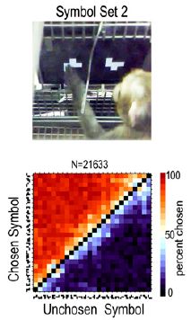
|
The upper frame shows a monkey making a choice. The monkey chooses the left symbol, which is worth 21 drops of food. The unchosen symbol, on the right, is worth only 3 drops. That is, the monkey chooses the symbol that is worth more food.
The lower frame shows how the scientists summarize the results of a huge number of tests. It is a "heat map" type of graph, with the symbol the monkey chose on the y-axis and the symbol not chosen on the x-axis. Each axis is labeled with the symbols in order, from 0 to 25.
The color shows the percentage of the time that the monkeys made a particular choice. Red means that the choice was made most of the time; blue means it was made a low percentage of the time. See the color scale at the right of the figure for the details.
The diagonal line (black squares) shows y = x. Points above the diagonal have y (chosen) > x (unchosen).
The pattern is clear. Above the diagonal, the graph is mostly red. That is, the monkeys are, overwhelmingly, choosing the number that gives the most food.
|
The results above are not surprising. The purpose of going through them was to present the test system.
Now let's look at a more complicated test...
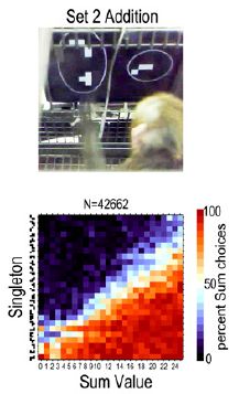
|
In this test the monkeys are again asked to choose the best food reward. However, one of the choices requires them to add two symbols together. The example in the figure has 9 and 13 on the left, versus 19 on the right.
The summary graph is again a heat-map. The x-axis shows the sum of the symbol pair; the y-axis shows the "singleton" symbol. The color shows the percentage of trials in which the monkey chose the sum. You can see that the red is mainly to the lower right of the graph. That is where the sum of the paired symbols is greater than the singleton symbol.
These results show that the monkeys were, as a generality, successfully adding the pair of symbols and comparing the value of the sum to the singleton.
Both figures above are parts of Figure 1 from the article.
|
That's the main conclusion: the monkeys, trained to use a symbol set and choose the greater reward, can add.
You may have questions about this, about how to interpret it. That's good. In fact, there is more in the article, so some of your questions may be answered there. The goal here is to try to understand what they did. Seeing limitations in the work is good. Do you have alternative interpretations? Can you suggest additional tests that would help us choose between the authors' interpretation and yours?
For those who want to get into some details... One issue the authors discuss in the article is how numbers are represented in the brain. They interpret some of the results here as favoring some models over others. They do that by looking at the errors the monkeys make. (You can see that the white region is bigger for the lower graph than for the upper graph. The white regions are regions where the monkeys weren't sure.) Not only is the big picture interesting, but so is the pattern of errors.
News stories:
* Study shows rhesus monkeys able to add numbers together for a reward. (Phys.org, April 22, 2014.)
* Monkeys Can Do Math. (Science NOW, April 21, 2014.) A longer story, with more detail. Recommended!
The article, which is freely available: Symbol addition by monkeys provides evidence for normalized quantity coding. (M S Livingstone et al, PNAS 111:6822, May 6, 2014.)
More on (non-human) animal math...
* Small numbers to the left? Chickens may agree (February 17, 2015).
* On the Evolution of Calculation Abilities (June 20, 2011).
* Previous post on monkeys... Pink corn or blue? How do the monkeys decide? (June 9, 2013).
* Next: Use of instructional videos -- in the wild (November 3, 2014).
There is more about math on my page Internet resources: Miscellaneous in the section Mathematics; statistics. It includes a listing of related Musings posts.
A plant that mimics the leaves of its host
May 30, 2014
Look at the leaves in the two parts of the following figure.
In each part, one leaf is labeled T and one is labeled V.
Do you think that the leaves labeled T in parts A and B are from the same kind of plant? How about the leaves labeled V? For now, emphasize the size and shape of the leaves. (You can assume that the two figures are at the same scale.)
How would you summarize the main observations from these two photos? Think about that a bit before reading on.
This is Figure 1 parts A and B from the article.
|
Each part shows a woody plant with a vine intertwined in it. Leaves from the "host" plant are labeled T (for tree); leaves from the vine are labeled V. It looks like the T and V leaves are about the same size and shape in part A, and again in part B. Certainly, the leaves are quite different in the two parts.
And the real answer is... The host plants T are different in the two parts. The vine V is the same. That is, the vine leaves mimic the leaves of the host plant.
Not convinced? Remember, there is no claim that the vine leaves are identical to those of the host, only that they tend to look like those of the host. That is, the vine leaves vary depending on its host tree, and they vary in a way that makes them more similar to those of the host.
The full Figure 1 in the article shows six more examples -- all with this one vine plant, Boquila trifoliolata. Further, the authors take measurements of several features of the leaves, and show that the features of the vine leaves correlate with the features of the host plant leaves.
How does this happen? They don't know. They just observed the effect in the field. It is the first case known of a plant that mimics the features of various hosts -- and without direct physiological attachment. They suspect the vine may be receiving signals from gases released by the host plant. That is a testable hypothesis.
One clue... What if the same individual vine grows partly around one tree and then crosses over and grows around another tree? The leaves are different in the two parts of the same individual. Each part of the vine mimics the host in its own region. Whatever the signaling is, it is local, not systemic through the vine.
And why does it happen? The scientists provide some data suggesting that the vine minimizes being eaten by mimicking its host. The evidence is limited at this point, but that seems a reasonable hypothesis.
News stories:
* Researchers discover vine that is able to mimic multiple hosts. (Phys.org, April 28, 2014.) A brief and useful overview, but it is a bit sloppy on details.
* The Most Versatile Impressionist In the Forest. (E Yong, Not Exactly Rocket Science (National Geographic blog), April 24, 2014. Now archived.) A longer and better discussion of the article. There is an interesting set of "comments" with this story.
* News story accompanying the article: Leaf Mimicry: Chameleon-like Leaves in a Patagonian Vine. (J R Pannell, Current Biology 24:R357, May 5, 2014.)
* The article: Leaf Mimicry in a Climbing Plant Protects against Herbivory. (E Gianoli & F Carrasco-Urra, Current Biology 24:984, May 5, 2014.)
More mimicry...
* Poisonous snakes and their mimics (August 15, 2016).
* A "flower" that bites -- and eats -- its pollinator (December 27, 2013).
* A plant that cheats (July 6, 2009). The article that is the subject of this post is noted in the current article, where it is reference 23.
More unusual leaves:
* Why would a plant have leaves underground? (January 21, 2012).
* A plant that communicates with bats (September 7, 2011).
May 28, 2014
"Moonwalkers" -- flies that walk backwards
May 28, 2014
If you can, start by looking at the following video: video. (15 seconds; no sound; it's movie #1 with the article.) What is the key difference between the two frames?
If you're not sure what's going on, think about... Which end of the fly is the head? As the video starts, with the fly at the bottom, the head is to the right, with front legs pointing out front. (It is not important that one fly left the circular track.)
The main point? The fly on the left is walking forward, whereas the fly on the right is walking backward.
Why? It's the same kind of fly. If you look at the labeling, most of it is the same (even if you don't know what it means). The difference is the temperature. The fly on the left is at room temperature (RT -- identified in the article as 24 °C); the fly on the right is at 30 °C.
We should note that walking backward is a proper activity. People do it, and so do flies -- under appropriate circumstances. But normally, we walk forward. Walking backward is not a simple reversal of walking forward, but it is something that each animal can do given the signal. Simply raising the temperature is not a signal to walk backward.
In a new article, scientists report making this mutant fly -- which walks forward or backward depending on the temperature. How did they do this? The mutant fly carries a mutation that makes a particular protein "temperature sensitive", commonly called ts. ts mutations allow the experimenter to turn a gene on and off by simply changing the temperature; such mutations have long been useful in working on the genetics of many organisms, from microbes on up. Of course, the interesting part is what happens when the gene is turned off.
In this case, the scientists used the ts protein to activate certain neurons. They put the gene for the ts protein into various neurons -- some 3400 different fly strains. They then tested to see what happened when they raised the temperature for each mutant fly strain. One strain in particular walked backward. Follow-up work showed that one particular neuron was key to switching from walking forward to walking backward. They refer to this neuron as the moonwalker descending neuron, or MDN. (A descending neuron is one that gives commands "down" from the brain.)
As discussed above (and shown in the movie), activating that MDN neuron causes the flies to walk backward when they should be walking forward. The scientists also show that inactivating this neuron prevents the fly from walking backward when it should, as when it encounters an obstacle. Together, the two lines of evidence strongly suggest that this MDN neuron plays a key role in the brain giving the command to walk backward.
Why did the scientists do this? The "big picture" is trying to understand how the nervous system works. Flies have small brains, and the well-studied Drosophila fruit flies used here provide a good model system for genetic studies. The current article is an example; they are able to pinpoint a specific function in the brain -- pinpoint it to a specific neuron.
News stories:
* Moonwalker flies backing up. (Science Daily, April 3, 2014.)
* How To Do The Moonwalk. (Knowing Neurons, April 23, 2014.)
* News story accompanying the article: Neuroscience: The Michael Jackson Fly. (R S Mann, Science 344:48, April 4, 2014.)
* The article: Neuronal Control of Drosophila Walking Direction. (S S Bidaye et al, Science 344:97, April 4, 2014.)
More about flies...
* Progress toward an artificial fly (December 6, 2013).
* The benefit of providing alcohol to the eggs (March 30, 2013).
More about walking...
* How horses learned to walk (September 21, 2016).
* An animal that walks on five legs (February 3, 2015).
* Cubli: a little cube that can stand on one corner and can walk (January 14, 2014).
* Berkeley Bionics: From HULC to eLEGS (October 22, 2010).
* How molecules walk: a movie (December 15, 2009).
More that is backwards... elgooG (October 12, 2009).
Another example of using temperature sensitive mutants: Do human genes function in yeast? Yeast-human hybrids. (August 21, 2015).
My page for Biotechnology in the News (BITN) -- Other topics includes a section on Brain (autism, schizophrenia). It includes an extensive list of brain-related Musings posts.
Video: Voyager and interstellar space, with Ed Stone
May 27, 2014
In an earlier post, At the edge of the solar system (September 28, 2012), we noted that the Voyager 1 spacecraft has apparently crossed out of the Solar System into interstellar space. We also noted the role of Project Scientist Ed Stone, who has led the Voyager science since project inception, in 1972.
Stone gave a talk to the UC Berkeley Physics Department this past March. A video of the talk is available. Although such departmental seminars are typically at a fairly technical level, Stone reviewed the project from the initial planning through current developments. If you are interested in the Voyager story, I think you will find much of the talk accessible and worthwhile.
Video: The Voyager Journey To Interstellar Space; talk by Ed Stone. (50 minutes.) (Physics Department, University of California Berkeley, March 3, 2014.)
I have added this information to the earlier post on Voyager.
Information about other local science talks is included at the end of the following post: CITRIS: Zettl; new energy series (November 1, 2009).
Airport food: What do the birds eat?
May 24, 2014
A recent article analyzes the stomach contents of birds found dead at an airport. It's an interesting story. It's even important, at least in the broad picture, regardless of the new results. We'll note it briefly.
Birds and airplanes both fly -- but they don't mix. Importantly, birds can be sucked into plane engines, causing accidents. The industry is quite aware of the problem, which costs them a billion (US) dollars a year -- and sometimes causes deaths. Airports have procedures to reduce the number of birds around, but the problem continues.
Why do birds visit airports? Food. At least, that is one part of the answer, perhaps the major part. The idea of the new article is to see what birds have been eating, by examining the stomach contents of dead birds collected from arriving airplanes at one airport. The authors examined a year's worth of dead birds from the Perth (Australia) airport, and analyzed the stomach contents by DNA sequencing. This isn't whole genome sequence; rather, it involves sequencing key genes that are useful for identification. They found DNA from mice, grasshoppers and grasses, as well as small fish from nearby waterways. The work leads to suggestions about how the local environment should be maintained to reduce the attractiveness to birds.
My first reaction to this work was that the approach seemed excessive. Did they learn anything that wasn't already known? Nevertheless, the article puts the topic on the table, and shows how science might help reduce costly bird-plane collisions. That's good. Further, it may be that the type of analysis done here is something that could be made routine; it does not require much biology expertise by those attending to the planes.
News stories:
* Air Traffic -- Scientists use DNA sequencing to identify what's attracting birds to airports, where midair collisions with planes can be devastating. (The Scientist, March 2014, p 22.) This story is how I learned of the work.
* Why making airport food less palatable may benefit passengers. (Phys.org, December 11, 2013.)
The article, which is freely available: Metabarcoding avian diets at airports: implications for birdstrike hazard management planning. (M L Coghlan et al, Investigative Genetics 4:27, December 11, 2013.)
More about the interactions of birds with modern human societies...
* Are urban dwellers smarter than rural dwellers? (August 2, 2016).
* The effect of cars on birds (August 2, 2013).
* Of birds and butts (February 2, 2013).
Beyond the birds... Trains, grains, and bears (May 24, 2017).
More about birds... How the birds survived the extinction of the dinosaurs (June 6, 2014).
More about airplanes:
* Might it be good if airplanes emitted more CO2? (September 5, 2014).
* Face masks and flu virus transmission on airplanes: an analysis of a flight (August 27, 2013).
There is more about DNA sequencing on my page Biotechnology in the News (BITN) - DNA and the genome. It includes an extensive list of Musings posts on sequencing and genomes.
In the beginning... It's Izumo1 + Juno
May 23, 2014
Almost everyone has done it, but we didn't know how. Now we know -- at least one key part of the story.
The following cartoon summarizes the key findings:
Part a of the figure (left) shows a sperm fertilizing an egg. In the top part, the sperm is seen interacting with the plasma membrane of the egg cell. The expanded view in the lower part shows a specific protein-protein interaction: the protein Izumo1 on the sperm (blue) interacting with the protein Juno (green) on the egg (red). That's how sperm recognizes egg, and is the key finding of a new article.
We'll come back to part b later.
That last character of the name Izumo1 is a "one".
This is Figure 1 from the news story in Nature accompanying the article.
|
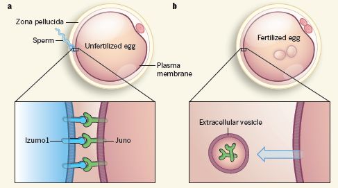
|
The Izumo part of the story was worked out some time ago. A new article reports finding the egg-cell partner for Izumo: it is the protein now called Juno.
How did the scientists find Juno? They went "fishing" -- using Izumo1 as the bait. That is, they looked for proteins that could bind Izumo. What did they catch? Juno. Logically, it is simple enough, but technically it was very challenging.
An important piece of evidence to support the proposal... Mice lacking Juno seem to be quite normal, except for one thing: the females are sterile. This shows that Juno has an essential role in reproduction -- in females. (Similarly, mice lacking Izumo1 are normal, except that the males are sterile.)
The scientists found something else about Juno... They found that the egg cell "expels" Juno after fertilization. Go back to the figure above, and look at part b (right). The egg is now fertilized. The Juno protein is no longer in the egg cell membrane, but instead is in a vesicle outside the cell. This may be why later sperm can no longer fertilize the egg.
All the work discussed above is with mice. What about us? The scientists do one experiment that suggests what they found with the mice is generally applicable for mammals.
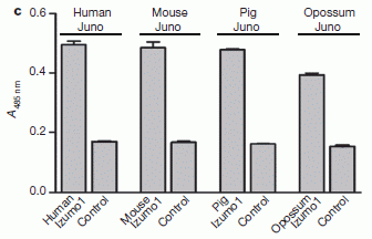
|
They test the interaction of Izumo1-like and Juno-like proteins for four mammals. The graph shows the results.
The first two bars are for human proteins. The left bar is for the human versions of Izumo1 and Juno; the bar next to it uses a control protein instead of Izumo1. The bar heights reflect the degree of interaction. The bar for Izumo1 interacting with Juno is higher than the bar for the control protein.
|
The next two bars are for mouse proteins. The results are very similar for the human proteins (first two bars) and the mouse proteins (next two bars).
The other pairs of bars show the results for similar experiments with proteins from pig and opossum. They, too, are similar. That is, all the mammals tested give similar results, suggesting that what was found in the work for the mouse proteins may well hold for all mammals.
This is Figure 2c from the article.
|
What now? An interesting question is whether some women are sterile because their eggs are defective in binding sperm. The new work allows us to ask a more specific question, which may be easier to test: are some women sterile because they lack a proper Juno?
News story: First vital step in fertilization between sperm and egg discovered. (Medical Xpress, April 16, 2014.)
* News story accompanying the article: Reproductive biology: Sperm protein finds its mate. (P M Wassarman, Nature 508:466, April 24, 2014.)
* The article: Juno is the egg Izumo receptor and is essential for mammalian fertilization. (E Bianchi et al, Nature 508:483, April 24, 2014.)
At the start of the post, I noted that most people have done this step. Most? Are there people who haven't? Yes. One procedure for lab-based fertilization is to inject a sperm directly into the egg. This bypasses the Izumo1-Juno interaction. It is a relatively new and uncommon procedure. It can be done even with sperm that have not fully developed.
Also see:
* How are mitochondria from the father eliminated? (September 20, 2016).
* In vitro fertilization: Will it suffice to transfer only one embryo? (May 19, 2013)
* What are they? (September 14, 2011).
* The sperm count problem (June 18, 2011).
* This could be you (July 8, 2008).
May 21, 2014
The difficulty of following current science
May 21, 2014
The main approach in Musings is to discuss individual science articles that are published. We repeatedly caution that a single article does not necessarily tell the whole story. Some articles are preliminary, and need verification. In many cases, there is frank dispute. Individual articles are the currency of science, but the big picture comes over time. Current science is fun, but it can also be confusing.
There is a special problem when dealing with articles that might be of immediate consequence to people, such as those on health and nutrition. We're really interested and want to act -- but the story is so often incomplete.
I've raised these concerns before. Now, a prominent science blogger has raised them. I encourage you to read what she wrote, emphasizing this general issue.
Her story: Resveratrol Redux, Or: Should I Just Stop Writing About Health? (V Hughes, Only Human (National Geographic blog), May 12, 2014.) Now archived.
I am not discussing the specific science content that she raises here, and there is no reason you need to read the links she provides -- except as you want to explore that topic. There are no Musings posts on resveratrol.
Does Triclosan in antibacterial soaps promote infection?
May 19, 2014
The bacterium Staphylococcus aureus is an important human pathogen. Many people carry the bacterium without ill effect, but having it is a risk factor for getting a serious infection.
Triclosan is a common disinfectant, used in many products for its antibacterial effects. It has become controversial, for various reasons. For example, the use of triclosan may promote the development of mutant bacteria resistant to it. Further, it is often used in situations where there is little risk of infection, such as simple antibacterial soaps for consumer use. In such cases, the harm done by triclosan may outweigh its benefit.
A new article suggests another problem with triclosan. It suggests that triclosan may actually promote "Staph" infections.
The study involved testing people for the level of triclosan in their nasal secretions, and whether they carried Staph in their nose. These are all "normal", healthy people. The basis of their triclosan accumulation is not known, and their Staph is benign.
The following figure summarizes the findings.
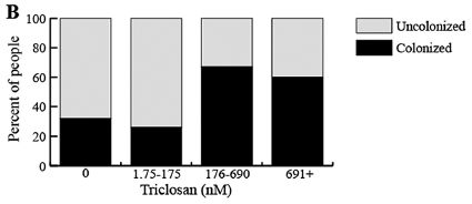
|
The graph divides the people into four groups, based on the level of triclosan in their nasal secretions. The triclosan levels are shown at the bottom for each bar.
The height of the black bar shows the percentage of people who were "colonized", that is, who tested positive for Staph in their nose.
|
The basic observation is that for the two lowest levels of triclosan (two bars to the left), about 1/3 of the people had Staph. For the two highest levels of triclosan (two bars to the right), about 2/3 of the people had Staph.
This is Figure 1B from the article.
|
Thus the experiment shows an association between having higher level of triclosan and having Staph. Taken alone, we wouldn't make too much of this. It's a small test. (The total number of people tested is 90. The number for the two highest levels of triclosan seems to be about 10 each.) But it offers a clue, and the scientists looked further.
As a follow-up, the scientists tested whether triclosan affects how the bacteria bound to various surfaces. They found that it enhanced binding, in a wide range of tests. The binding tests are thought to predict how well the bacteria can colonize.
The article presents some simple tests, and the number of samples is low. This can only be considered very preliminary. Nevertheless, the scientists provide evidence that suggests exposure to triclosan might actually promote Staph infections, and they offer an explanation for how this might happen. This needs to be followed-up, as one more part of the story of the pro and con of triclosan.
News story: Antimicrobial from soaps promotes bacteria buildup in human noses. (Science Daily, April 8, 2014.)
The article, which is freely available: Triclosan Promotes Staphylococcus aureus Nasal Colonization. (A K Syed et al, mBio 5(2):e01015-13, April 8, 2014.)
More about triclosan: Triclosan: an explanation for its gut toxicity (January 30, 2022).
More about Staph...
* Black silicon and dragonfly wings kill bacteria by punching holes in them (January 28, 2014).
* Can the Staph solve the Staph problem? (July 12, 2010). Includes some good background about Staph infections.
My page for Biotechnology in the News (BITN) -- Other topics includes a section on Antibiotics. It includes a list of Musings posts on the topic, including disinfectants.
MERS in the United States
May 18, 2014
MERS has reached the United States. MERS is Middle East Respiratory Syndrome, a new viral disease related to SARS of 2003. We have noted MERS before [link at the end].
About 500 people have so far been reported with MERS; about 30% of those have died. [As always with such numbers, there is a caution: we do not know how many people have been infected but not reported (perhaps because they had little or no symptoms).] Most cases of MERS have been from the Arabian peninsula region. All of the remaining cases have been connected with that region; that includes the two cases reported in the US, both of whom had recently been to Saudi Arabia.
The mode of transmission of MERS is not yet clear; both camels and bats are suspected. Limited transmission of MERS from one person to another has apparently occurred.
What are we to make of MERS? As the stories listed below make clear, US authorities want people to consider the risk small. In one sense, that is appropriate. Only two people in the US are known to have had the virus. One is apparently cured, the other is in the hospital -- doing well, and probably not going to infect anyone else. You are unlikely to contact someone with MERS; you are presumably also unlikely to contact an infected camel. On the other hand, the MERS virus did get to the United States, and we know how: it took commercial airline flights. Several hundred people were exposed to one or the other of those two MERS patients (over several flight segments). No one got the disease, so far as we know. However, we don't know why they didn't -- and we don't know whether the virus will mutate so that its next visit is more serious. We do remember that SARS also arrived by plane -- and caused serious outbreaks in Canada before being contained.
More broadly, the story of MERS is a story -- another story -- of an emerging disease. We are still learning how to deal with emerging diseases. Further, each new disease is a chance to learn. What we learn from MERS may help us, not only with MERS but with other diseases that will inevitably come along. Complacency about MERS is not good.
In April 2014, 200 new cases of MERS were reported in Saudi Arabia. That doubled the total number of cases ever reported. Is this the beginning of a major outbreak? Is it simply improved detection? Is it related to the camel birthing season? The answers are unknown.
News stories:
* Second Confirmed U.S. MERS Case. (The Scientist, May 12, 2014.)
* MERS reaches Netherlands; 2 Florida patients cleared. (CIDRAP, May 14, 2014.) More detailed -- and a couple days later. As always, CIDRAP is a good source of high quality information on infectious diseases. New information is posted regularly, and listed prominently (see bottom of their page). Lest the title confuse... the two patients who were cleared were two health care workers who had been exposed to the Florida MERS patient, and who were suspected of having MERS at one point; they have tested negative.
Announcement from the US Centers for Disease Control (CDC): CDC announces second imported case of Middle East Respiratory Syndrome (MERS) in the United States. (CDC, May 12, 2014.) Links to more CDC information.
Background post about MERS: A new SARS-related virus seems to be emerging -- and an "ethics" story (February 4, 2013).
Two sections of my page Biotechnology in the News (BITN) -- Other topics are relevant here. One is on the general topic of Emerging diseases (general). One is on SARS, MERS (coronaviruses).
Trogocytosis -- How an amoeba chews its food
May 16, 2014
If you have an idea how an amoeba eats, you probably imagine that the amoeba surrounds its food, taking it into the cell whole, and digesting it later. That's the conventional process.
A new article shows how an amoeba works on your cells. The amoeba here is Entamoeba histolytica, a serious human pathogen. The bottom line from the work is that the amoeba nibbles away.
The following figure summarizes the findings in cartoon form. The amoeba (or "parasite") is blue; the host cell -- that's you -- is red.
To start, look at the frames labeled Contact, Pinch, and Ingestion. The amoeba, almost literally, nibbles on the human cell, and ingests small pieces of it. You can see little red blobs from the host cell accumulate inside the blue amoeba. The final result, after multiple rounds of pinch and ingestion, is cell death. Some of the figure fills in some of the molecular details.
This is Figure 1 from the news story in Nature accompanying the article.
|
This process of nibbling is called trogocytosis. (The conventional process of ingesting whole cells is called phagocytosis.) It was known that some immune system cells use trogocytosis, but this article is the first time such behavior has been shown for an amoeba. The work depended on watching amoebae attack human cells that had been labeled with a fluorescent dye. It seems likely that trogocytosis is part of the disease process -- and thus perhaps a target for drug development. The generality of the process is not known.
News stories:
* Amoeba study puts bite on dysentery. (Phys.org, April 9, 2014.)
* Amoeba Eats Cells Alive -- The intestinal parasite Entamoeba histolytic kills host cells by tearing pieces from them, which it then eats. (The Scientist, April 9, 2014. Now archived.)
* News story accompanying the article: Infection biology: Nibbled to death. (N Guillén, Nature 508:462, April 24, 2014.)
* The article: Trogocytosis by Entamoeba histolytica contributes to cell killing and tissue invasion. (K S Ralston et al, Nature 508:526, April 24, 2014.)
More about amoebae:
* Recovery of live, infectious virus from 30,000 year old permafrost (March 25, 2014).
* Capsaspora owczarzaki and you
or
Where did animals come from?
(April 10, 2011).
More about chewing: A robot that can chew gum (March 30, 2021).
May 14, 2014
Uptake of small pieces of ancient mammoth DNA by bacteria: What are the implications?
May 13, 2014
Briefly noted...
Bacteria can take up DNA from the environment, and incorporate it into their genome. Study of this process, by Avery and colleagues in 1944, gave the first proof that DNA is the genetic material. The uptake and use of free DNA is an example of the broad phenomenon of horizontal gene transfer (HGT), which results in organisms getting genetic information from organisms other than their parent(s).
A recent article makes a "small" advance in our understanding of DNA use by bacteria -- one that may have important implications. The scientists show that bacteria can take up very small pieces of DNA -- highly degraded and damaged DNA. The test they use is genetic, and requires that the DNA actually be integrated into the host genome; this is not simply uptake and reuse of the subunits. To emphasize the point, they do a separate test to see whether bacteria can incorporate fragments of DNA isolated from a 40,000 year old mammoth. It worked.
How does this occur? The scientists provide some evidence that the process of using very short DNA is different from the commonly studied process of using foreign DNA. The process seen here does not require the usual enzymes for recombining DNA. That's novel -- and needs to be investigated further. Perhaps very short pieces of DNA simply set themselves down on the template during replication.
The implications of this are unclear. The efficiency of use of short DNA is quite low. However, small DNA is much more abundant in the environment than big DNA. If bacteria can incorporate small DNA, even if inefficiently, the role of exogenous DNA -- and of horizontal gene transfer -- may well be greater than we had appreciated. The work here with mammoth DNA has no particular point except to show that very old DNA can still be used.
News stories:
* Bacteria Can Integrate Degraded DNA -- In lab experiments, bacteria usurp small, damaged fragments of DNA, including those from a 43,000-year-old woolly mammoth. (The Scientist, November 18, 2013. Now archived.)
* Bacteria incorporate pieces of old DNA in their own genome, scientists discover -- What DNA fragments --- some thousands of years old --- from biological waste and wastewater have hospital bacteria incorporated? (Kurzweil, November 19, 2013.)
The article, which is freely available: Bacterial natural transformation by highly fragmented and damaged DNA. (S Overballe-Petersen et al, PNAS 110:19860, December 3, 2013.)
More about mammoth DNA:
* Comparing woolly mammoth genomes over time (June 1, 2015).
* A mammoth story (December 1, 2008).
More about mammoths: Early American art: a 13,000 year old drawing of a mammoth (July 18, 2011).
More about horizontal gene transfer: An extremist alga -- and how it got that way (May 3, 2013).
A post about the survival of DNA in the environment... How long does DNA survive? (October 23, 2012). It is likely that the report underestimates survival under "favorable" conditions.
Some DNA history... The original Watson-Crick paper on the structure of DNA (October 25, 2010).
A novel DNA: Life's newest DNA base pair: 5SICS-NaM (June 4, 2014).
Should you ask your doctor to go BBE?
May 12, 2014
Health care personnel can transmit disease; they can transfer infectious agents from one patient to another. It's a serious and well known problem. Considerable effort is spent to reduce disease transmission in the health care environment, but there is more to do.
A recent article addresses one part of the problem: what should health care personnel wear? One thing that is interesting is how little we actually know. The article considers many possible concerns, and comes up with a list of recommendations. However, the authors emphasize the limited knowledge that is behind the recommendations.
Do you want your doctor to dress formally, with a white lab coat? That may not be good for your health. One recommendation is that health care personnel should be BBE -- that's bare below the elbows. It's easy to wash the hands and forearms; long sleeves may promote disease transmission. Jewelry and neckties are also discouraged.
Browse the news story for the idea. The article itself is freely available for those who want more, but the basics are in the news story.
News story: Infectious Diseases Experts Issue Guidance on Healthcare Personnel Attire. (Infection Control Today, January 20, 2014.)
The article, which is freely available: Healthcare Personnel Attire in Non-Operating-Room Settings. (G Bearman et al, Infection Control and Hospital Epidemiology, 35:107, February 2014.) The article represents the recommendations of the Society for Healthcare Epidemiology of America. The primary focus is the acute care hospital, but the issues should be general.
Other posts on disease transmission include:
* Face masks and flu virus transmission on airplanes: an analysis of a flight (August 27, 2013).
* Malaria-infected mosquitoes have greater attraction for people (May 28, 2013).
* Sharing microbes within the family: kids and dogs (May 14, 2013).
* Possible transmission of norovirus via reusable grocery bag (May 21, 2012).
* A modified chicken that cannot transmit bird flu (March 26, 2011)
More about jewelry: Did the Neandertals make jewelry? Evidence from ancient proteins (February 26, 2017).
Why the bear used the overpass to cross the highway
May 11, 2014
To get to the other side -- and find a mate that is genetically substantially different. So suggests a recent article on the merits of providing bear crossings over a highway in the Canadian Rockies.
Despite the temptation to make a joke, it's a serious issue. Biologists have long been concerned that man is fragmenting natural habitats. Building roads through them is one way; the roads may prevent the animals from accessing their full natural range. Smaller, fragmented populations are likely to have reduced genetic variability.
Canada has spent millions of dollars providing wildlife crossings over the Trans-Canada highway.

|
A bear-crossing over the Trans-Canada Highway, in Banff National Park.
This is trimmed and reduced from a figure in the Phys.org news story.
|
Do such human-made crossings do any good? A new article explores the question of whether bears benefit from the crossings. The scientists measure usage of the crossings. More importantly, they identify the individual bears, and determine parentage.
How do they identify individual bears? From their DNA. They capture hair samples in hair traps at the crossings. It's then easy enough to test the DNA -- using procedures very much like those used to match samples from crime scenes and criminal suspects.
The key finding is that bears are crossing the highway and mating. That is, the crossing is helping to maintain genetic contact across the highway, leading to a single larger and more genetically diverse population.
There are numerous subtleties and limitations. For example, black bears use the crossings more than grizzly bears do. A key limitation is that the number of each type of bear studied was only about a hundred. Further, there are no true controls in such a study. Since this is the first study to look at the genetic effects of crossings, conclusions are soft. Nevertheless, the work does show that bears cross the highway using the crossings, and that they mate. This is encouraging, and at least serves as a baseline for further work.
This post addresses some scientific issues -- perhaps without clear answers. In any case, whatever facts we might get cannot answer the question of whether we should build such crossings. That includes our values as well as consideration of alternatives.
News story: Study proves that wildlife crossing structures promote 'gene flow' in Banff bears. (Phys.org, February 19, 2014.) As noted, the picture above is from this story, which includes more pictures, as well as a good overview of the project.
The article: Genetic connectivity for two bear species at wildlife crossing structures in Banff National Park. (M A Sawaya et al, Proceedings of the Royal Society B 281:20131705, April 7, 2014.)
Other posts on bears include:
* Trains, grains, and bears (May 24, 2017).
* Bear photography (June 19, 2012).
* A polar bear update (June 3, 2012).
More about the impact of man on wildlife: Security fences at national borders: implications for wildlife (August 29, 2016).
More about highways and animals: Whales in the Chilean desert -- the oldest known case of a toxic algal bloom? (April 13, 2014).
Added June 24, 2026.
More about roads: Can algae make the streets safer? (June 24, 2026).
Rings for Chariklo
May 9, 2014
The idea of an eclipse is familiar and simple. We view an object. Another object passes in front, obscuring -- or eclipsing -- our view. A fan walks by in front of us, eclipsing our view of the action on the field. The moon passes in front of the sun, eclipsing our view of the sun. We know about such events. The Kepler telescope looked for new planets using this principle. Kepler watched stars, and watched for brief dimming of the light; that could be due to a planet moving in "front" of the star (from Kepler's perspective).
The terms occultation and transit are also used for eclipse-like events; both of these terms are used in the sources listed here. The principle is the same for all.
Here are some observations of a transit event reported in a recent article.
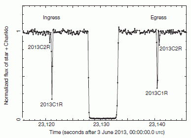
|
We are observing the light from a star. The observed brightness is plotted on the y-axis, normalized to 1 for the normal brightness. Time is plotted along the x-axis, in seconds. (The entire graph covers about 30 seconds.)
At 23,128 seconds, Chariklo passes in front of the star. The observed brightness falls to nearly zero, for about 5 seconds. It's a big deal. This was an expected event; it was the reason for making the observations.
|
Now look further... There is a smaller and very brief reduction of light a few seconds before the main event. And there is a similar little event a few seconds after the main event.
If you look very carefully, you can see that each of those little events is actually a double peak. On each side, the bigger of the double peaks is labeled 2013C1R; the smaller peak is labeled 2013C2R.
This is Figure 1 from the article.
|
The main event was expected, as noted. The little side shows were not. What's going on? The scientists interpret the little eclipses as evidence for rings around Chariklo -- two rings, explaining the double peak. The two rings passed in front of the star before Chariklo, with the smaller outer ring first. They passed in front of the star again after Chariklo, with the smaller outer one last.
It is the fifth ring system found in the Solar System. Mankind has known about the rings at Saturn since the 17th century. (Galileo saw the rings in 1610, but did not recognize their nature. It was Huygens, in 1655, who described the rings.) The modern era of space exploration of the late 20th century revealed smaller ring systems around Jupiter, Uranus and Neptune. All the large outer planets have some kind of ring system. And now, rings at Chariklo.
Chariklo? You know... Jupiter, Saturn, Chariklo, Uranus, Neptune. Chariklo is perhaps an asteroid, out in the region of the giant planets. It was discovered only in 1997, and little is known about it. The new work adds to our scant knowledge of Chariklo; it adds two rings.
The following picture illustrates the ring system at Chariklo. Caution...This is an artist's conception. No part of it is a photograph. The picture also provides some more information about the measurements.
Chariklo itself is a small irregular object; we sometimes call such objects potatoes. It is about 250 kilometers across.
There are two thin rings about 270 km from the surface.
Look at the (near) horizontal dotted line, labeled La Silla. This shows the light path that was sampled in the figure at the top. You can see that this light path gets interrupted both by the potato itself, and by the rings. There are four interruptions by the rings, two before and two after the main event.
|
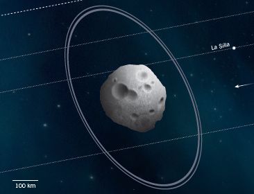
|
In fact, the astronomers had several telescopes aimed at Chariklo. Remember, this was a scheduled observation of the main event. Each telescope recorded the event, but with a slightly different angle. The other dotted and dashed lines show what some of them saw. For example, the one at the very top saw nothing. The figure at the top of this post showed evidence for two rings based on what one telescope saw, but the detailed model is based on all the data from the various telescopes.
This is trimmed and reduced from Figure 1 of the news story accompanying the article in Nature. Figure 2 of the article itself is similar, but shows the paths observed by more telescopes.
|
How sure are the scientists that the observations are due to rings? In the article they discuss some possible alternative interpretations of the occultations (the light-dimming events). They suggest that rings are most likely. For example, the consistency of the effects before and after the asteroid itself show that it is symmetric, and not likely due to transient plumes. Nevertheless, these first observations of what appear to be rings at Chariklo await independent confirmation.
News story: Chariklo: An Asteroid with Rings. (Sky & Telescope, March 27, 2014.)
* News story accompanying the article: Solar system: Ring in the new. (J A Burns, Nature 508:48, April 3, 2014.)
* The article: A ring system detected around the Centaur (10199) Chariklo. (F Braga-Ribas et al, Nature 508:72, April 3, 2014.)
More about rings in the Solar System:
* A ring for Earth? (February 19, 2025).
* Briefly noted... Neptune and its rings (September 26, 2022).
* Venus: an unusual view (March 18, 2013).
* The Lord has a new ring (October 12, 2009).
Why doesn't this count? A water fountain for Saturn (October 23, 2011).
More rings: The largest -- and most distant -- planetary ring system (February 9, 2015).
A post about the Kepler telescope, and its search for planets by looking for transits... A new trick for the Kepler planet-hunters (June 25, 2012).
Chariklo is described here as an asteroid. However, with the increasing ambiguity of what terms such as asteroid and comet mean, we note that it is actually an asteroid-like body, which may have features of a comet. Others posts about asteroids and such...
* The first known Vatira (August 3, 2020).
* Ceres is leaking (February 18, 2014).
* What has six tails -- and is beyond Mars? (November 20, 2013).
Also see...
* Briefly noted... Possible detection of a planet beyond our galaxy (January 12, 2022).
* Titanium oxide in the atmosphere? (December 9, 2017).
May 7, 2014
Berkeley RadWatch: Radiation in the environment -- Follow-up
May 6, 2014
Original post: Berkeley RadWatch: Radiation in the environment (February 24, 2014).
In that post we looked at the work of the Berkeley RadWatch project, and noted a couple of their stories about monitoring the local environment for radiation. The focus there was on stories posted at their web site. I noted that I had a copy of a new scientific article from them, then "in press". It is now published, and is the basis of this post.
RadWatch is a long term monitoring project. Monitor the local environment; see what typical levels of radiation are, and be alert for changes. Fukushima was not the purpose of the overall project, but it was an event as RadWatch collected data. The Fukushima event gave them an immediate focus, and they made measurements directly aimed at watching for radioactivity from the event.
A couple of points about methodology are worth noting. First, sample collection. They want a steady supply of samples from around the area. Turns out that collecting the air filters from police cars is one good way to do that. Second, the actual measurements are made with high tech gamma ray counters back in the lab.
The following figure is an example of what they see.

An example of a gamma ray spectrum analysis. The graph shows the number of counts (y-axis; log scale) versus the gamma ray energy (x-axis). Several peaks are marked, including some that are quite small. For example, the left-most labeled peak is barely above the background. It's a peak at an energy of 284 keV (kiloelectronvolts), a known energy for I-131 (the isotope of iodine with mass number 131).
The sample here is from an air filter that had been on a Berkeley Police Department patrol car. At least in principle, there are records with information about miles traveled, from odometer readings and fuel logs, and there may even be information about where the car was, from police logs. These filters are typically showing nothing above background. The date of the sample here was April 7, 2011, about a month after the Fukushima event. All the peaks shown are probably due to fission products from that event.
Don't panic when you see the numbers for the counts. They are total counts, not counts per minute. The counting time for this filter is not shown, but another filter (with similar background) was counted for 1250 minutes (about 21 hours). Thus the highest counts seen here (and almost all elsewhere in the article) are probably below one count per minute (cpm). This is a very sensitive system.
This is Figure 3 from the article.
|
The article includes several other measurements by the RadWatch group, using various methods. These include measurements on dedicated high quality air filters, rainwater sampling, and some testing of food samples. It's an interesting article to look over, not because of any findings, but as an example of how we can monitor the environment for radioactivity. The goal is to develop a system that is practical for routine large scale monitoring. RadWatch seems to be on a useful track. The proper balance between sensitivity, speed, simplicity, and cost will be subject to discussion and development.
We should caution that what RadWatch collects is data: the level of radioactivity in the environment, and how it changes. The data by itself does not tell us what the hazard is. That's a whole 'nother topic. We can only note here that the effects of low level radiation are debated -- partly because the effects are too small to measure. Harm is related to both the dose rate and the time of exposure. Low doses will have little effect over short times; we still have much to learn about any possible long term effects. In any case, the data show that the Berkeley area received measurable but low amounts of radiation from Fukushima. It's unlikely there is any harm here. But let's not gloat. We still need to learn what to do in the event of larger releases -- and we need to learn how to reduce the chances of any such larger releases.
The article, which is freely available: Measurements of Fission Products from the Fukushima Daiichi Incident in San Francisco Bay Area Air Filters, Automobile Filters, Rainwater, and Food. (A R Smith et al, Journal of Environmental Protection 5:207, February 2014.) Very readable; have a look.
The background post for this item is listed at the very top. That post links to other Musings posts about radiation.
Also see: Radioactivity released into ocean from Fukushima nuclear accident reaches North America (March 23, 2015).
More about measuring fission products: Analysis of uranium samples from World War II Germany (November 7, 2015).
My page of Introductory Chemistry Internet resources includes a section on Nucleosynthesis; astrochemistry; nuclear energy; radioactivity. That section contains some resources on the effects of radiation.
Transparency of clinical trials -- Is the flu drug Tamiflu worthless?
May 4, 2014
Tamiflu is a drug that interferes with part of the life cycle of the influenza virus. If a person is treated early, Tamiflu may reduce the infection. It may also be useful prophylactically; thus it might be useful in the event of a large scale flu epidemic, especially with a strain that has a high frequency of complications or death. In fact, governments have spent billions of dollars stockpiling Tamiflu for just such a possible use.
Tamiflu is essentially worthless, and may even be harmful on balance.
Well, that frames the debate, doesn't it?
The first paragraph is more or less the conventional view that has developed over recent years. The second, short, paragraph is what is claimed in a new study of the drug. The first view is based on the accumulated data from clinical trials over the years on the effectiveness of Tamiflu. The second view is based on a re-analysis of the clinical trials. Confused? If you're not confused, read that again.
That second analysis was published recently. It is the basis of this post. It's an interesting story, with a number of developments. As you try to follow this, be sure to separate the issues. And be forewarned that some answers are less clear than one would like.
Issue 1... The new study had access to more information than ever before. And therein lies the real story here. The new study is the culmination of a multi-year effort to get data that was previously known only to the drug manufacturer, who had sponsored the clinical trials. Only condensed versions had been available to others, either in publications or submissions to regulatory agencies. The British Medical Journal (BMJ) and the independent Cochrane Library succeeded in getting the manufacturer to release their internal case reports with full details of all clinical trials. These documents will all be made public. Further, and perhaps even more important, the project has resulted in establishing improved standards for transparency of future clinical trials. It is this point that makes the new study important. New standards have been established for the availability of clinical trial data.
Issue 2... The merits of Tamiflu. This is where things get messy, and I don't want to get into it much here. Briefly, the new report analyzes the data, and concludes that Tamiflu has less benefit and more side effects than generally claimed. That's the basis of the headlines, fueled by publicity from the journal.
Not everyone agrees with the conclusions. The drug company does not; that is to be expected. Some doctors do not. They don't question the analysis, but instead suggest that the new analysis asked the wrong question. They claim that it provides little guidance about whether stockpiling Tamiflu for emergency use is worthwhile. That's not the fault of the analysis; it's not what the trials tested.
There is no claim that the drug company did anything wrong. At least, that's not the big issue. We may not like how they behaved; however, they operated, I think, within the rules. They obviously showed bias, but that is normal enough. Everyone has biases -- including, perhaps, the authors of the new study. The solution to bias is openness. The solution to the drug companies operating with secrecy is to change the "rules". That is why I think the main point here is the release of the information, and the commitment to move toward such openness for future work. One can still debate the merits of Tamiflu; at least the data that has been collected is now available to all who wish to look.
There is (as always) too much to read listed below. (I don't assume people read what is listed. I try to provide some variety of sources, as well as the underlying article for documentation.) If you want to read just one brief story, I suggest you start with the follow-up from Nature News. Unless you want to get into the detail of the analysis, that is probably enough. By the way, it is interesting to read the authors' conflict of interest statements for any of the items, including the editorials.
News stories.
The first two items here replace an item that is no longer available (update May 2022).
* Tamiflu and Relenza: How effective are they? (Centre for Evidence-Based Medicine, University of Oxford, April 10, 2014.)
* Tamiflu and Relenza for treatment and prevention of influenza. (Science Media Centre, April 10, 2014.) This is a single (and detailed) analysis, not the usual SMC collection of opinions.
* Report disputes benefit of stockpiling Tamiflu -- Medical panel suggests bulk purchase of influenza drug was a waste of money, but others caution against dropping anti-pandemic strategy. (R Van Noorden, Nature News, April 10, 2014.)
A follow-up news story from Nature, two weeks later, with some attempt to digest what has been said about the report. Tamiflu report comes under fire -- Conclusions on stockpiling of antiviral drugs challenged. (D Butler, Nature News, April 22, 2014.) Highly recommended, for perspective.
The new study is published as a Cochrane report and in shorter form as an article in the BMJ. The BMJ article is accompanied by a second, related article and two editorials. The article itself is freely available from the journal; the editorials are not. Anyway, here is the link to the main article on Tamiflu. If you want more, click on the tab for Related Content, and look around. (If you put the title of an editorial into Google Scholar, you may find an available copy of each of them.)
The article, which is freely available: Oseltamivir for influenza in adults and children: systematic review of clinical study reports and summary of regulatory comments. (T Jefferson et al, BMJ 348:g2545, April 9, 2014.)
Tamiflu is the trade name of a drug, known in the industry as oseltamivir. There is a second drug, Relenza (zanamivir), from a different company. Relenza is a distinct drug but shares a target with Tamiflu. It is also a subject of this work. The 2nd article, noted above, focuses on Relenza. The conclusions are not very different for the two drugs, but if you want the nitty-gritty of what the drugs do, keep them separate.
Follow-up: Tamiflu revisited (March 22, 2015).
Other Musings posts on the nature of clinical trials include...
* Drug may extend life in progeria patients (October 17, 2014).
* The missing clinical trials data: it's time to RIAT (July 22, 2013).
Previous flu post: Google tracks the flu -- follow-up (April 11, 2014).
More about anti-flu drugs: Baloxavir marboxil: a new type of anti-influenza drug (September 14, 2018).
More about transparency: How to make yourself more transparent while you sleep (March 7, 2023).
Many posts on various flu issues are listed on the supplementary page: Musings: Influenza.
Supercapacitors in the form of stretchable fibers -- suitable for clothing
May 2, 2014
Integrating your electronic equipment into your clothing is, I suppose, inevitable. A recent article reports progress on one of the challenges: electronics in clothing should be stretchable.
The key idea is to build a device around a stretchable fiber -- a piece of rubber or elastic. Further, the electrolyte gel layers can stretch. Aligned carbon nanotubes form the electrodes of the device, which is a supercapacitor for energy storage.
The following figure outlines the plan...
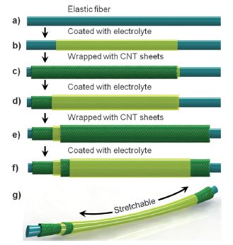
|
Stretchable supercapacitor fibers. The plan.
CNT = carbon nanotubes.
The actual devices are about 2/3 millimeter in diameter. (You can see one in the movie file listed below with the article.)
This is Figure 1 from the article.
|
Does it work? The article presents data showing that the performance (energy storage) is about what is expected for the material. Further, the performance is stable over repeated cycles of stretching. These are the kinds of basic measurements that suggest the system is worth further study. Will it be practical? Who knows. This is step 1.
News story: Highly stretchable fiber-shaped supercapacitor based on carbon nanotubes. (Phys.org, November 25, 2013.)
The article: A Highly Stretchable, Fiber-Shaped Supercapacitor. (Z Yang et al, Angewandte Chemie International Edition 52:13453, December 9, 2013.) There is a short movie file listed with the article, under "Supporting Information" (23 seconds; no sound). It shows the reversible stretching of such a device.
More on supercapacitors: A simple way to make a supercapacitor with high energy storage? (January 6, 2014).
More on stretchable or flexible electronics:
* An air-conditioner you can wear? (August 19, 2019).
* Stretchable electric wires (January 22, 2013).
More about carbon nanotubes:
* Making carbon nanotubes from captured carbon dioxide (June 3, 2018).
* Characterization of carbon nanotubes (December 3, 2013).
There is more about energy on my page Internet Resources for Organic and Biochemistry under Energy resources. It includes a list of some related Musings posts.
Another section of that page, Aromatic compounds, lists posts on graphene and carbon nanotubes.
Top of page
The main page for current items is Musings.
The first archive page is Musings Archive.
E-mail announcements -- information and sign-up: e-mail announcements. The list is being used only occasionally.
Contact information
Site home page
Last update: July 24, 2026