Home
> Musings: Main
> Archive
> Archive for May-August 2016 (this page)
| Introduction
| e-mail announcements
| Contact
Musings: May-August 2016 (archive)
Musings is an informal newsletter mainly highlighting recent science. It is intended as both fun and instructive. Items are posted a few times each week. See the Introduction, listed below, for more information.
If you got here from a search engine... Do a simple text search of this page to find your topic. Searches for a single word (or root) are most likely to work.
Introduction (separate page).
This page:
2016 (May-August)
August 31
August 24
August 17
August 10
August 3
July 27
July 20
July 13
July 6
June 29
June 22
June 15
June 8
June 1
May 25
May 18
May 11
May 4
Also see the complete listing of Musings pages, immediately below.
All pages:
Most recent posts
2026
2025
2024
2023:
January-April
May-December
2022:
January-April
May-August
September-December
2021:
January-April
May-August
September-December
2020:
January-April
May-August
September-December
2019:
January-April
May-August
September-December
2018:
January-April
May-August
September-December
2017:
January-April
May-August
September-December
2016:
January-April
May-August: this page, see detail above
September-December
2015:
January-April
May-August
September-December
2014:
January-April
May-August
September-December
2013:
January-April
May-August
September-December
2012:
January-April
May-August
September-December
2011:
January-April
May-August
September-December
2010:
January-June
July-December
2009
2008
Links to external sites will open in a new window.
Archive items may be edited, to condense them a bit or to update links. Some links may require a subscription for full access, but I try to provide at least one useful open source for most items.
Please let me know of any broken links you find -- on my Musings pages or any of my regular web pages. Personal reports are often the first way I find out about such a problem.
August 31, 2016
The Berkeley soda tax: does a "fat tax" work?
August 30, 2016
In 2009 Musings discussed the possibility of a "fat tax" to decrease obesity [link at the end]. The idea is to make the price of "junk foods" more expensive in order to discourage consumption. People have political opinions on whether such a tax is a good idea. We won't deal with that. However, we can ask whether such a tax actually works to achieve its goal.
In 2014 the city of Berkeley passed such a tax, on all sugar-sweetened beverages (SSB). It was the first such tax in the United Sates. The tax is on a range of sweetened beverages, but is popularly known as a "soda tax".
We now have a new article evaluating how well the Berkeley soda tax worked during its first months. The study is based on asking people on the street how often they consumed certain beverages.
We start with a summary of the results from the article. But a caution... There are many details to the story. We'll note some of them below, but even then be careful about reaching firm conclusions from this study.
|
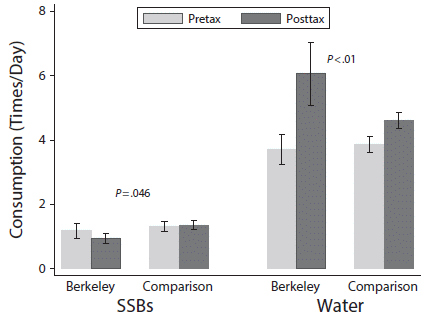
The graph shows results for consumption of two types of drinks, for two regions for two time periods.
Consumption (y-axis) is given as how many times a day the person said they consumed each type of drink.
The two types of drinks are SSB (left side) and water (right side).
The two time periods are pretax (prior to the Berkeley SSB tax; light bars) and posttax (about four months into the tax; dark bars).
The two regions are Berkeley, with the tax, and two nearby comparison cities without the tax.
|
Look first at the results for water, since it is easier to read that side of the graph.
For Berkeley, water consumption increased from about 4 to about 6 times per day. For the comparison sites, it also increased, but by a smaller amount. The p value shown (at the top) compares the two increases: the increase in water consumption for Berkeley is significantly more than the increase for the comparison sites.
For the SSB, there was a decrease in consumption for Berkeley, and a small increase for the comparison sites. Again, the p value tests those two changes -- and they are significantly different.
This is Figure 2 from the article.
|
Taken at face value, the results shown here support the suggestion that the SSB tax reduced SSB consumption. However, as we have cautioned so many times, they do not prove it. There are many questions one might have -- questions that are not resolved by looking at a p value. Some of the questions are raised in the article. Methodology for such a survey is important. The authors argue that their methodology is good, but there is always a question. The NPR news story notes some possible alternative interpretations of the results. For example, decreased SSB consumption might be a response to the vigorous election campaign about the tax, not to the increased price.
Over time, further information will help us understand the effect of a "fat tax". For now, this article is a start, as is the Berkeley soda tax.
Some details...
* The tax is on various sugar-sweetened beverages, including soda, energy drinks, sports drinks, fruit drinks, and sweetened coffee or tea. The article contains data for the individual types of drinks.
* Water consumption refers to either tap or bottled water.
* The tax is 1 cent (0.01 USD) per ounce. It is implemented as an excise tax, paid by the distributor. Apparently, about half of the tax was actually passed on as an increased retail price.
* The two "comparison" cities without the tax are Oakland and San Francisco, both very near Berkeley.
* The study focused on low-income neighborhoods, where it might be expected that a tax would have the greatest impact.
* The survey was limited to people at least 18 years old.
News stories:
* Berkeley's Soda Tax Appears To Cut Consumption Of Sugary Drinks. (D Charles, NPR (National Public Radio), August 23, 2016.) Good discussion of what it may mean.
* Soda tax linked to drop in sugary beverage drinking in Berkeley. (Y Anwar, UC Berkeley News, August 23, 2016.) From the lead university.
The article: Impact of the Berkeley Excise Tax on Sugar-Sweetened Beverage Consumption. (J Falbe et al, American Journal of Public Health 106:1865, October 2016.) The main group of authors is from the School of Public Health, University of California, Berkeley.
Background post: Fat tax? (September 9, 2009). Links to more.
Also see: Briefly noted... Soda tax: effect on obesity rate (April 19, 2023).
More about soda consumption and such...
* Soft drinks (sugar) and blood pressure (April 1, 2011).
* Fructose; soft drinks vs fruit juices (November 7, 2010).
A reminder about interpreting statistics... What does a p value mean? Statisticians make a statement (August 6, 2016).
More about obesity: Olfaction and obesity? (July 18, 2017).
My page for Biotechnology in the News (BITN) -- Other topics includes a section on Ethical and social issues; the nature of science. It includes a list of related Musings posts.
Security fences at national borders: implications for wildlife
August 29, 2016
Here is one of the implications...
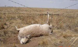
|
This is reduced from the top figure in the Phys.org news story.
|
That fence? It marks the border between two countries (Russia and Mongolia, in this case, but the situation is common).
The issue? Broadly, it's how man makes barriers for wildlife -- inadvertently. (That is, it is not about fences whose purpose is to deal with wildlife.)
You can almost guess where this is going. The article that prompted it is in a scientific journal, but is an opinion piece, not a research article. We'll just note it and you can read as you wish. Either news story listed provides a good sense of the message. Note that one of them is by the article's lead author.
News stories:
* The rise of border security fences forces reconsideration of wildlife conservation strategies in Eurasia. (Phys.org, June 23, 2016.)
* OPINION: Increasing border security fences are a lethal problem for wildlife. (J D Linnell, ScienceNordic, July 10, 2016.) This is by the lead author of the article, who is at the Norwegian Institute for Nature Research.
The article, which is freely available: Border Security Fencing and Wildlife: The End of the Transboundary Paradigm in Eurasia? (J D C Linnell et al, PLoS Biology 14(6):e1002483, June 22, 2016.) The article is labeled "perspective"; that is, it is not a research article. It includes a set of recommendations. The authors are from several countries around Europe, plus Kazakhstan and Mongolia.
More about wildlife and humans...
* Human-wildlife conflict -- what is the proper way to get rid of a pest? (July 12, 2017).
* Trains, grains, and bears (May 24, 2017).
* Why the bear used the overpass to cross the highway (May 11, 2014).
More about fences... A laser-based missile-defense system to bring down mosquitoes (May 18, 2010).
My page for Biotechnology in the News (BITN) -- Other topics includes a section on Ethical and social issues; the nature of science. It includes a list of related Musings posts.
Some shrimp in your wine?
August 27, 2016
Wine is chemically complex. It continues to change upon storage, for better or worse. Sulfur dioxide, SO2, is added to some wine as a preservative. It works, but has its own problems. For example, some people are allergic to it (or to its dissolved form, called sulfite); SO2 is also an important air pollutant.
A new article offers an alternative to using SO2: shrimp. No, you won't find a shrimp swimming in your wine. The scientists use material from the waste shell.
What they use is a polymer called chitosan, which is easily prepared from the chitin of the shell. (Chemically, chitosan is related to cellulose, with one of the -OH groups of each sugar being replaced by an amino group, -NH2.)
Here is an example of what they found...
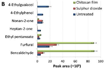
|
The graph shows the amounts of several chemicals in three portions of a particular white wine, after 8 months storage. The three batches: treatment with SO2 (red) or with the new chitosan film (green), and an untreated control (blue).
The x-axis shows the amounts, in arbitrary units.
Many things were analyzed. This particular graph focuses on some where significant differences were found. Let's look at some of them...
|
The first two chemicals are associated with an off-taste. You can see that they accumulate in the untreated wine. However, both the SO2 and chitosan prevent their accumulation.
The last two (furfural and benzaldehyde) are low in the untreated wine, a little higher with SO2, and even higher with chitosan. These are considered good flavor constituents of the wine, so the chitosan effect may be considered good.
This is Figure 3B from the article.
|
Those are encouraging results. That's the general picture that emerges from the article.
The shrimp-chitosan preservative has some appeal. It is environmentally friendly, as it uses an abundant waste material. It avoids the current SO2, which has some problems.
Wine chemistry is complex, and the effect of any additive may be complex. Preliminary analysis suggests that the chitosan film acts in part by removing iron from the wine.
The proposed chitosan process seems worthy of further attention. It will require further analysis, of the full process, including economics and acceptability of the product.
News story: Shrimp shells keep wine fresh. (S May, Chemistry World, August 10, 2016.)
The article: Chitosan-genipin film, a sustainable methodology for wine preservation. (C Nunes et al, Green Chemistry 18:5331, October 7, 2016.)
More about wine flavor: How a cork causes an off-flavor in a beverage (October 21, 2013).
More about wine:
* A half-millennium record of climate change, from the grapes of Burgundy (November 9, 2019).
* The history of brewing yeasts (October 28, 2016).
More chitin:
* Acholetin: a new polymer from bacteria (June 4, 2022).
* Cellulose: improved processing (February 25, 2011).
My page Organic/Biochemistry Internet resources has a section on Carbohydrates. It includes a list of related Musings posts.
Why air may inhibit the performance of small cars
August 26, 2016
The following figure shows the problem...
Look at the right side. There is a small car; you can see its track. But it has hit a barrier, one of those yellow blobs. The yellow blobs are, the authors suggest, molecules that landed from the air onto the field.
The left side shows the chemical structure of the car. In particular, note the four wheels. Each wheel is based on the diamond-like structure called adamantane.
This is from the graphical abstract with the article.
|
Development of such molecule-size cars, commonly called nanocars, is an active field of nanotechnology. As an example, adamantane is used for the wheels to eliminate hydrogen bonding between the car and the glass surface often used to test the cars.
The nanocars are too small to see directly; they are about 5 nanometers across. However, the ring structure is fluorescent, so the scientists can follow the cars with a fluorescence microscope.
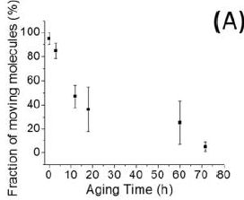
Here are some results...
|
In this experiment, the scientists measured the fraction of cars (molecules) still moving after various times. The times are referred to as "aging times"; during this time, the coated microscope slide that serves as the platform for the cars is exposed to air.
You can see that most of the cars are active initially, but that the fraction of cars still active declines over time.
The experiment starts... "The synthesized nanocars were dissolved in methanol as the stock solution (~65 µM)." From the "Experimental section" of the article.
This is Figure 4A from the article.
|
The authors don't have any direct evidence for why the cars are lost. However, the loss is not observed when similar cars are studied in a vacuum. They consider it most likely that the cars are lost as they run into obstacles that accumulate on the slides over time -- from the air.
What's the point of all this? Adults playing with toys? It's part of learning how tiny things, the objects of nanotechnology, interact with their environment. Several kinds of nano-robots, some self-powered, are on the way. Why not have fun while figuring them out?
News story: Single-molecule nanocars taken for a rough ride. (Nanowerk News, June 1, 2016.)
The article: Moving Kinetics of Nanocars with Hydrophobic Wheels on Solid Surfaces at Ambient Conditions. (F Chen et al, Journal of Physical Chemistry C 120:10887, May 26, 2016.) Co-author Jim Tour, at Rice University, is credited with originally developing nanocars.
Looking ahead... Nanocar Race -- The first-ever race of molecule-cars - Toulouse (France), 2016. (Centre d'Élaboration de Matériaux et d'Etudes Structurales, CNRS. Now archived.) The race is in mid-October.
* Well, the race was a bit late, but soon after it happened, that same page was revised to discuss what happened: Nanocar Race -- The first-ever race of molecule-cars - Toulouse (France), 28-29 April 2017.
* Note that both links here use the same original URL. The first one is from before the race; the second is from after the race. Both are available from the Internet Archive, depending on which save date you call. Both are also available in French.
Previous post about cars: The moral car: when is it ok for your car to kill you? (July 23, 2016).
Previous post about robots: Creepazoids and the Uncanny Valley (May 15, 2016).
More molecular robots: Nanorobots: Getting DNA to walk and to carry cargo (August 7, 2010).
More small robots: Quiz: What are they? And are they a threat to you? (October 20, 2014).
August 24, 2016
Ten years of iPSC
August 24, 2016
How long does it take for an article to become recognized as a classic, a historic article? We note here a historic article that was published ten years ago (as of tomorrow). When the article was published, it was quickly realized that the work probably would be recognized with a Nobel Prize.
The article reported a new way to make stem cells. These new stem cells had, at least approximately, the general characteristics of embryonic stem cells. However, they were easier to make, and they were free of many of the limitations of embryonic stem cells. The authors called these induced pluripotent stem cells, or iPS cells, or iPSC. iPSC, and variations, have been a central part of stem cell work ever since.
The Nobel prize came in 2012. The award was to Shinya Yamanaka, the senior author of that initial article, and to John Gurdon, who did pioneering work four decades earlier that helped to establish the background.
News feature: How iPS cells changed the world -- Induced pluripotent stem cells were supposed to herald a medical revolution. But ten years after their discovery, they are transforming biological research instead. (M Scudellari, Nature News, June 15, 2016. In print: Nature 534:310, June 16, 2016.) An excellent perspective. Medical applications of stem cells, of any kind, have developed more slowly than some anticipated -- or as was hyped. But the role of stem cells in research has been huge.
Here is the original article, with its original commentary in the journal. Both are freely available through the Cell web site.
* News story accompanying the article; freely available: A Transcriptional Logic for Nuclear Reprogramming. (K T Rodolfa & K Eggan, Cell 126:652, August 25, 2006.)
* The article, freely available: Induction of Pluripotent Stem Cells from Mouse Embryonic and Adult Fibroblast Cultures by Defined Factors. (K Takahashi & S Yamanaka, Cell 126:663, August 25, 2006.)
Earlier this week, I put the search term "induced pluripotent stem cells" into PubMed. 10,460 hits.
Next post building on the iPSC story... Using CRISPR to change cell fate (September 10, 2016).
My page Internet resources: Miscellaneous contains a section on Science: history. It includes a list of related Musings posts.
I have a Biotechnology in the News (BITN) page for Cloning and stem cells. It includes an extensive list of related Musings posts. The page includes a section on iPSC, which notes some of the early work. It also notes a review by Gurdon on nuclear transplantation work, from a bit before the iPSC discovery.
A better way to make chocolate, inspired by brake fluid
August 23, 2016
A fascinating story, regardless of whether it leads to a useful product.
A team of physicists has come up with a new way to make low fat chocolate. It is based on understanding the physics of chocolate -- and of brake fluid.
Although we usually think of chocolate as a solid, it is handled as a liquid during processing. Liquid chocolate is a suspension of cocoa solids in molten fat. That is, the fat of chocolate is the liquid phase during the production process.
What if you try to make low-fat chocolate? That makes the ratio of solids to liquid even higher. Low-fat chocolate clogs the pipes. It is too viscous (too thick) to flow through the processing equipment.
What does a physicist do when faced with such a problem? A chemist might try adding something to change the viscosity of the suspension. However, a physicist changes the conditions. How about putting an electric field around the pipe? If the electric field is parallel to the pipe, it causes particles of the solid to align with the pipe, thus reducing the viscosity. (We'll see those particles, and clarify the description, in a moment.) That is, chocolate flows better in an electric field. Enough better that, the physicists report, chocolate with 10-20% less fat will now flow through the processing equipment satisfactorily.
Here are some data...
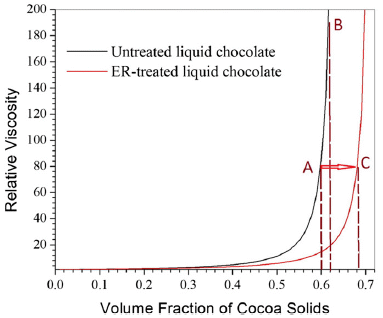
|
The graph shows the viscosity of the chocolate vs the amount of solids in it. 0.6 on the x-axis scale means that the solids content is 60%.
There are two curves. In each case, the viscosity is low if the solids content is low; then, at some point, the viscosity rises rapidly as the solids content increases.
One curve rises rapidly at solids about 0.6; the other rises rapidly at solids about 0.7. The difference? The first curve (black, to the left) is for regular chocolate. The second curve (red, to the right) is for the same chocolate, with the electric field in place during the measurement. This second curve is labeled ER-treated; ER stands for electrorheology.
|
One way to look at this... Imagine that a viscosity of 80 is acceptable. For the regular chocolate, this occurs at solids = 0.6; that is point A on the graph. For the ER-chocolate, it occurs at solids = 0.7; point C.
That comparison shows that the electric field allows one to increase the solids content, from about 60% to about 70%. How does one increase the solids? By reducing the fat -- the liquid phase. That is, ER-treatment allows one to make chocolate with a lower fat content.
This is Figure 2 from the article.
|
Here is what the chocolate looks like, as observed with a microscope...
Frame A (left) shows the regular chocolate. You can see round globs of solids (presumably spherical in three dimensions).
The diameter of the particles is about 2 micrometers.
|
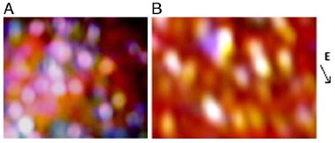
|
Frame B (right) shows the chocolate in an electric field. The arrow at the right, labeled E, shows the direction of the electric field. Instead of round globs of solids, there are now elongated globs, aligned with the electric field. It's a little more complicated than we suggested earlier. There seem to be two things going on. First, the round globs aggregate; then those elongate aggregates align. The reduction in viscosity is partly due to the reduced number of particles, and partly due to the elongated aggregates being aligned.
This is Figure 1 from the article.
|
The process is an example of electrorheology (ER, as introduced on the first figure above), the use of an electric field to affect the flow of a material. There is a lot of work in the field; one example is the use of an electric field perpendicular to the flow to increase the viscosity of brake fluid, and thus to enhance braking. The first story I saw about the new work mentioned this as background, though the authors do not themselves make the connection from brake fluid to chocolate.
Is the proposed process useful? As noted, it seems to allow for a significant reduction in fat content of the chocolate. That's about as far as the physicists can take this. Well, they did a little more. They apparently passed the product around the lab, and people said it tasted good. An informal taste test by a biased panel. However, the work was funded, in part, by Mars (the chocolate company), and the scientists say they are in discussion with various chocolate companies to develop this further.
News stories:
* Shockwaves for healthy chocolate? Researchers claim 10-20% fat reduction using electric field tech. (D Yu, Confectionery News, June 22, 2016.) A story from the industry. Nice picture! And this story says the work was inspired by crude oil transport.
* Electric choc treatment promises lower fat chocolate. (J Urquhart, Chemistry World, June 22, 2016.)
* Chocolate that melts in your mouth, but not on your hips -- Temple University scientists apply an electric field to successfully reduce fat in chocolate. (E Jelesiewicz, Temple University, June 20, 2016.) From the university. Includes a short promotional video (1 minute). Not much there, but you can see the scientists, the apparatus, and the product.)
The article: Electrorheology leads to healthier and tastier chocolate. (R Tao et al, PNAS 113:7399, July 5, 2016.) The article is written much more informally than usual for scientific articles. However, it also includes some theory, with equations, for the viscosity of particulate suspensions.
More about improving chocolate: Better chocolate? Use better yeast? (May 3, 2016).
More from that chocolate company: Genome from Mars (September 22, 2010).
More about chocolate:
* Chocolate: 1200 years old (February 18, 2013).
* Rats will free prisoners, and share their chocolate with them (January 18, 2012).
More about viscosity... A flow battery that uses polymers as the redox-active materials (January 8, 2016).
More about brakes: MIT invents a better bicycle wheel (April 24, 2010).
Cockroach milk
August 21, 2016
That title may lead to some questions. Like... How does one milk a cockroach? Look... Supplementary Movie S1. (8 seconds, no sound.) We should note that this is a lab process, not what the animals do in nature. But it does let you see some cockroach milk.
Or perhaps you have a more basic question. Like...What are cockroaches doing making milk?
These are unusual cockroaches. Diploptera punctata, the Pacific beetle cockroach. They are among the few insects that give birth to live young. Mother roach releases the young ones into a brood sac. There is no direct connection from mother to baby, but the mother releases a food into the brood sac for her babies to eat. That food is, at least loosely, a "milk". But it is very different from mammalian milk; it is a crystalline solid, as you saw in the movie above.
In the movie, milk crystals are extruded from the midgut of a partially dissected cockroach by gentle pressure.
It's an interesting crystalline material, containing a range of nutrients: protein, carb, and fats. Crystals are ordered structures. The crystals we usually consider are simple, containing one or very few chemicals. The complex composition of cockroach milk crystals makes them of interest to the crystallographer.
And that's how we get to the new article that is the impetus for this post. What the scientists did here was to determine the structure of cockroach milk crystals. It is a feat of X-ray crystallography.
The work is accompanied by much hype, fueled in part by the authors themselves. They note that this is the most calorie-dense milk known. That's based on the common estimation of calories given how much protein and fat, and such, it contains. Why is cockroach milk more calorie-dense than cow milk? Because it has a low water content. Not a big deal. One of the news stories notes that the protein of cockroach milk is not a particularly good protein for humans, because it is low in some essential amino acids.
The authors also suggest it might be developed into a slow-release drug-delivery vehicle. Perhaps. That's an interesting idea, which would take some work. And making cockroach milk using genetically engineered yeast is certainly a possibility. However, the milk is so complex that it would not be trivial to move the entire system to another organism.
There are a number of things that make the article of interest. The unusual nature of the particular cockroach may well be new to many. The milk crystals are unusually complex natural crystals, and they deserve study. But do be careful with the accompanying hype.
News stories:
* Roach proteins show way to superfood. (C Kumar, Times of India, July 19, 2016.)
* Cockroach milk is not the next superfood. It could be a lot more important than that. (J Ballenger, Ask an Entomologist, July 31, 2016.)
The article, which is freely available: Structure of a heterogeneous, glycosylated, lipid-bound, in vivo-grown protein crystal at atomic resolution from the viviparous cockroach Diploptera punctata. (S Banerjee et al, IUCrJ 3:282, July 2016.) The movie listed near the top of this post is from the supplementary materials posted with the article. (The journal title means that it is the International Union of Crystallography Journal, but IUCrJ is apparently the official title.)
More about cockroaches...
Why and how some cockroaches avoid glucose (October 11, 2013). Links to more.
More about milk...
* Provision of milk and maternal care in a spider (January 13, 2019).
* Does it matter what time of day you milk the cow? (December 28, 2015). Links to more.
Developments in X-ray crystallography: Doing X-ray "crystallography" without crystals (September 18, 2016).
My page Internet resources: Biology - Miscellaneous contains a section on Nutrition; Food safety. It includes a list of relevant Musings posts.
Zhemchuzhnikovite: a natural MOF
August 19, 2016
Let's make that zhemchuzhnikovite and stepanovite. The story is similar for both of them. I like the former as a title word, but we have a better picture for the latter...
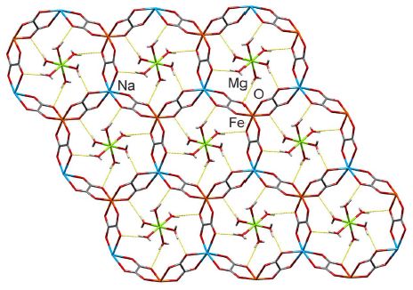
|
Stepanovite. Chemical structure. One layer.
The major structural feature is a series of large rings. The rings consist of metal ions, along with C and O atoms.
The places where the rings seem to join really are junctions. That is, they aren't like chain links (or Olympic rings). The rings are joined into a fairly rigid structure.
|
There's more. There is something inside those rings. But let's leave that for the moment.
The diameter of the rings is approximately 1 nanometer.
This is Figure 1E from the article.
|
That basic structure, the big rings based on metal ions and some organic parts, is known as a metal organic framework, or MOF. Chemists invented MOFs in the 1990s -- or so they thought.
Stepanovite (shown above) and zhemchuzhnikovite were found in a coal mine in the Soviet Union (now Russia) a half century earlier. The original structural information was incomplete -- and was buried in an obscure journal. The new work rediscovers it and extends it. The Russian minerals certainly seem to qualify as MOFs. Natural MOFs. That's the "news" here: finding MOFs in nature.
Why do chemists make MOFs? It's that cavity inside the big rings. It's big enough to hold things. And by adjusting the structural details of synthetic MOFs, chemists can tune MOFs to hold various chemicals, perhaps doing useful separations.
The rings of the stepanovite shown above indeed have something inside them. The "guests" (as chemists often call them) are hydrated magnesium ions, Mg(H2O)62+. (In the figure above... The Mg2+ is shown in green, with six "legs". Each of those legs leads to a water molecule, shown in red. One O of each H2O is making a specific interaction with the MOF ring.)
News story: Metal-organic frameworks found to exist in nature. (Nanowerk, August 5, 2016.) Includes the story of the rediscovery.
The article, which is freely available: Minerals with metal-organic framework structures. (I Huskić et al, Science Advances 2:e1600621, August 5, 2016.)
Posts on MOFs and their use:
* Doing X-ray "crystallography" without crystals (September 18, 2016).
* Cooperation: a key to separating gases? (March 28, 2014).
Another example of finding that a "great discovery" was already being used by Nature: Nobel prize in physics for the rediscovery of fiber optics (October 12, 2009).
If you are having trouble pronouncing the title of the current post, try this one.
More about the Olympic rings: Nanolympiadane: chemical synthesis of the Olympic rings (October 11, 2020).
August 17, 2016
Man's migration from Asia to America? Did it really happen by land?
August 16, 2016
We've noted the story before... Mankind arrived in the Americas from Asia, by walking across a land bridge that connected Siberia and Alaska several thousand years ago. The migrants then walked across Alaska and northwestern Canada, using an ice-free corridor that was briefly available between the melting of the ice age glaciers and subsequent submersion into lakes. In a recent post, we noted new findings about possible earliest arrivals, and noted that the pieces of the story do not fit together well [link at the end].
We now have a new article, which complicates matters even further. The article provides good evidence that this route was not passable until at least a couple thousand years after man was known to have arrived in the Americas.
The following figure summarizes some of the numbers, and shows the problem...
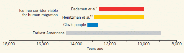
The figure shows four bars on a time scale. The first two bars show estimates of when the ice-free corridor might have been usable. The next two bars show estimates of when early populations were already present in the Americas.
More specifically...
* The top bar summarizes the findings from the new article. The left end of the bar is at about 12,600 years ago; that is when they think the ice-free corridor became available.
* The bottom bar summarizes the findings for all groups of early Americans. It shows that there were human populations in the Americas 14,700 years ago.
* That is, there were people here 2,000 years before the proposed pathway became available.
What about the other two bars? The second bar (yellow) is another recent estimate for when the pathway was available. For our purposes here, it's not very different from the top bar, from the current work. The third bar (blue) is for the Clovis people. That's a specific population -- one that was long thought to be among the first. You can see that the discrepancy is fairly small for the Clovis population. So long as the focus was on Clovis, and the dates weren't well determined, the ice-free corridor was a plausible idea.
This is Figure 1 from the McGowan news story in Nature.
|
What did the authors of the new article do? They went to an area that is considered a critical part of the ice-free corridor, one that was least likely to be a usable path. They drilled and took samples containing material from various depths. The samples were dated and analyzed for remnants of biological materials, including pollen and DNA. That analysis allowed them to develop a model for the ecological succession in the area. And that model suggests when the corridor would have been able to support a human migration. Their conclusions are summarized by the top bar, above.
Where does this leave us? The simple answer is "in confusion". The story we have told for so long just doesn't hold up as we get better details.
As the story that the first Americans walked here from Siberia decays, the preferred alternative has become that they came by boat. That is, they came by water, rather than by land -- along the coast rather than inland. A big caution...There is little evidence for this new story. It's just a convenient and plausible hypothesis. And look what happened to the last such plausible hypothesis.
There is more to be done.
News stories:
* Time to scrap the idea that humans arrived in the Americas by land bridge -- Fossils near the Bering Land Bridge show a lifeless area until long after humans hit the Americas. (A Newitz, Ars Technica, August 14, 2016.)
* Did the earliest Americans walk on ice or cross on water? New study sparks debate. (M Andrei, ZME Science, August 11, 2016.)
* Textbook story of how humans populated America is "biologically unviable", study finds. (University of Copenhagen, August 10, 2016. Now archived.) From the lead institution. It's an excellent description of the work and its context.
* News story accompanying the article: Ancient DNA: Muddy messages about American migration. (S McGowan, Nature Nature 537:43, September 1, 2016.)
* The article: Postglacial viability and colonization in North America's ice-free corridor. (M W Pedersen et al, Nature 537:45, September 1, 2016.)
A background post: How long ago did mankind arrive in the Americas? (March 18, 2016). This post suggests an even earlier date for arrival of human into the Americas than was used above. (The article discussed here is noted by the current authors; their reference 8. However, it is not reflected -- and is not needed -- in the main discussion )
More from a Clovis-type site... Did the First Americans eat gomphothere? (July 29, 2014). The site here is dated to very near the left end of the Clovis (blue) bar, above.
A new development: The first Americans: Is it possible we have the date wrong by 100,000 years? (June 28, 2017).
For a book on the earliest Americans, see my Book Suggestions page: Meltzer, First Peoples in a New World -- Colonizing Ice Age America (2009). The book's author, David Meltzer, is a co-author of the current article.
More migrations... Anne's journey across the Pacific (July 6, 2018).
Poisonous snakes and their mimics
August 15, 2016
One of the following two snakes is highly poisonous, and must be avoided. The other is harmless. Which should you avoid?
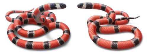
|
This is the first figure in the news story at Phys.org, listed below. The figure shows drawings of two snakes; the figure legend at the news story gives the details.
|
If you aren't sure, perhaps it would be best to avoid both of them.
That previous statement illustrates an important biological idea: the role of mimicry. The non-poisonous snake benefits from simply looking like a poisonous snake. Mimicry has survival value.
But is it really true? Or is that just a good story? A new article analyzes the story of coral snakes and their mimics, and concludes that there has indeed been selection for mimicry.
To understand what the scientists did, we need to note what the specific concerns were that they addressed. A simple theory of mimicry predicts that mimics should be found only where there are "models" (the original that is being mimicked). For coral snakes and their mimics, this seems not to be true. Mimics are widespread.
In the new work, the scientists made use of a major resource: records of the distribution of 299,376 specimens of 1,081 snake species in the Americas. This data resource is largely due to extensive digitization of records by museums.
This data set gives the authors an unprecedented view of the biogeography of snakes in the Americas. The following figure summarizes the findings...
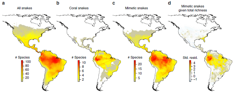
The figure shows four maps of the Americas, each colored to show the distribution of species of snakes. In each case, red colors mean more species of snakes, and yellows mean fewer. (However, the numbers corresponding to the colors are different for each part; if you want numbers, be sure to see the color key for the correct part of the figure.)
The first three maps are straightforward: From the left...
a. all snakes
b. venomous coral snakes
c. non-poisonous mimetic snakes.
You can see that snakes are widespread, with a peak in northern South America. Corals are found largely in northern South America. And the distribution of mimics perhaps seems similar to that of the total collection of snakes.
But now the authors do something clever. They do a statistical analysis, and adjust the distribution of the mimics for the distribution of total snakes. In effect, they subtract out the total distribution from the mimics distribution. What's left? Map d, on the right.
And what does map d show? It is similar to the distribution of corals.
This is Figure 1 from the article.
|
What does this mean? Remember the basic question... Did the snakes we call coral mimics really arise as mimics of coral snakes? If so, their distribution might be expected to reflect that of their models, the corals. If not, their distribution might be very different, perhaps similar to that of total snakes.
The map of part d makes clear that the distribution of coral mimics does indeed reflect that of the corals.
The work also turned up surprises. For example, coloration patterns seem to change frequently in these snakes, and mimicry can be lost as well as gained. As so often, a project answers one question but reveals others. All in all, it's an interesting -- and colorful -- study that extends our understanding of mimicry.
News stories:
* New World snakes are "mimics until proven otherwise". (R Denton, Molecular Ecologist, June 6, 2016.)
* Deadly snakes or just pretending? The evolution of mimicry. (J Erickson, Phys.org, May 6, 2016.)
The article, which is freely available: Coral snakes predict the evolution of mimicry across New World snakes. (A R Davis Rabosky et al, Nature Communications 7:11484, May 5, 2016.)
More mimicry... A plant that mimics the leaves of its host (May 30, 2014). Links to more.
More on snakes...
* Snake venom gland organoids (March 17, 2020).
* The snakebite problem (September 27, 2016).
* Quiz: What is it? (August 17, 2015).
More corals... Coral bleaching: how some symbionts prevent it (September 30, 2016).
The lost Neandertal Y chromosome
August 13, 2016
Briefly noted...
Analysis of Neandertal DNA has provided intriguing findings about the fate of Neandertal genes. A recent post noted some of the findings -- and speculations [link at the end].
One specific issue is the Y chromosome. A recent article offers the first analysis of a Neandertal Y sequence; it leads to some interesting speculation.
Interestingly, little from the Y chromosome of the Neandertal seems to have survived in modern humans. The sequence data shows that the Neandertal Y chromosome contained variants in genes known to provide male-specific antigens. These genes have the potential to interfere with normal fetal gestation if their proteins elicit maternal antibodies. Thus the authors speculate that the Neandertal Y may have been immunologically incompatible with "modern" females.
The evidence is limited at this point, as it is with most Neandertal issues. It is based on one Neandertal Y sequence, and the incompatibility it proposes is speculation. But it is a plausible explanation for why we see so little of the Neandertal Y chromosome.
News stories:
* Modern men lack Y chromosome genes from Neanderthals, researchers say. (Phys.org, April 7, 2016.)
* Genetic Scientists Complete First Analysis of Neanderthal Y Chromosome. (N Anderson, Sci.News, April 8, 2016.)
The article, which is freely available: The Divergence of Neandertal and Modern Human Y Chromosomes. (F L Mendez et al, American Journal of Human Genetics 98:728, April 7, 2016.)
Background post with an overview of the contribution of Neandertal DNA... Contributions of Neandertals and Denisovans to the genomes of modern humans (July 6, 2016). The article does not mention the Y chromosome.
Next post about Neandertals: Did the Neandertals make jewelry? Evidence from ancient proteins (February 26, 2017).
More about Y chromosomes: Men are losing their Y chromosomes, and some men are losing them faster than others -- does it matter? (February 25, 2020).
There is more about genomes and sequencing on my page Biotechnology in the News (BITN) - DNA and the genome. It includes an extensive list of related Musings posts, including posts on human genomes.
Can chickens prevent malaria?
August 12, 2016
A new article suggests that sleeping with a chicken could reduce your chances of getting malaria.
Bed nets, impregnated with insecticide, are a major weapon in the war against malaria in endemic areas. However, mosquitoes are developing resistance to the insecticides, thus raising questions about the long term effectiveness of the method.
We could use new ways of dealing with mosquitoes. Maybe we could learn something by observing the behavior of mosquitoes in nature.
In the first part of the new work, the scientists collected mosquitoes in an area endemic for malaria. They tested the blood they found in the mosquitoes, to identify what animals the mosquitoes had fed on. A striking result was that there was almost no chicken blood. This result suggests that the mosquitoes avoid chickens.
The scientists directly tested that suggestion by comparing the number of mosquitoes caught in a trap depending on whether or not a chicken was nearby. The following figure shows the set-up for the test...
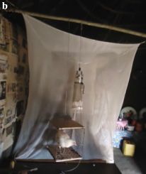
|
The "curtain" there is the end of a bed net. For this test, an untreated bed net was used. (There is a bed on the other side.)
The vertical tube-like structure in front of the bed net is a sampling device, to trap mosquitoes.
Below the sampling device is the mosquito repellent being tested. In this case, a chicken.
This is Figure 1b from the article.
|
Indeed, fewer mosquitoes were collected when a chicken was present. We'll see some data in a moment.
How does a chicken repel mosquitoes? We might guess that specific chemicals from the chicken are repellent to the mosquito. The scientists analyzed chemicals in the air around chickens, and came up with a list of candidate chemicals. They were tested in the above apparatus, with a vial of the test chemical in place of the chicken.
The following figure shows some results...
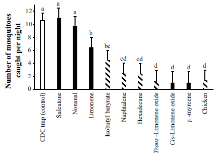
|
The bars show the number of mosquitoes caught in the trap, under various conditions.
The left-hand bar is the control; the trap gets about 10 mosquitoes per night.
The right-hand bar is for the case shown in the top figure, with a chicken under the trap. You can see that the number of mosquitoes caught is drastically reduced -- to about 2 per night.
|
The other bars test the effect of specific chemicals. These bars are in order, least effect at the left to most effect at the right. The chemicals vary widely in effectiveness; the best ones are about as good as the chicken.
The striped bars are for chemicals that were found to be specific for chickens (as well as for the chicken test itself). (Other animals tested here included cattle, goats and sheep.)
Those letters above the bars? They indicate groups of bars that, statistically, are not different from each other. For example, the several bars labeled d are not significantly different.
This is Figure 2 from the article.
|
The simple interpretation of the chicken test is that the chicken repels the mosquitoes. Further, the experiment suggests that some chemicals, which we learned about because of the chicken effect, might be useful as mosquito repellents. Some of the most potent mosquito repellents found are chemicals found only in the chickens.
We should note some limitations of the study, for the record. They don't affect the basic conclusions stated above.
* The work here was done with a particular species of mosquito, Anopheles arabiensis. It is one that is a major carrier of malaria in the area where the work was done, in Ethiopia. We have no information on the generality of the effect.
* The testing here shows that the chicken (or its volatiles) reduces the number of mosquitoes caught in a nearby trap. From that, we infer that there would be reductions in mosquito biting and in transmission of the malaria parasite, but those steps have not been tested directly.
* The experiment testing chemicals was done without a dose response curve, so provides only an initial hint about which chemicals are worth pursuing.
News stories:
* Chicken odour 'prevents' malaria, shows new study -- Malaria-carrying mosquitoes (anopheles mosquito) are put off by the smell of certain species, including chicken. (E Merab, Daily Nation (Kenya), July 25, 2016.)
* To protect yourself from malaria sleep with a chicken next to your bed. (Science Daily, July 20, 2016.)
The article, which is freely available: Chicken volatiles repel host-seeking malaria mosquitoes. (K T Jaleta et al, Malaria Journal 15:354, July 21, 2016.) Very readable, with interesting discussion of factors involved in the choice of host for a mosquito.
A recent post about mosquito control... Can Wolbachia reduce transmission of mosquito-borne diseases? 2. Malaria (June 17, 2016).
More...
* Could we repel mosquitoes by playing loud music they don't like? (May 18, 2019).
* A mammalian device for repelling mosquitoes (December 10, 2018).
A post about controlling the pathogen itself: What if we gave mosquitoes anti-malarial drugs? (April 7, 2019).
A post that reminds us that similar mosquitoes can behave quite differently: Why don't black African mosquitoes bite humans? (December 19, 2014). This post focuses on sulcatone, which is one of the chemicals tested above.
A novel mosquito virus... Guaico Culex virus: the first example of an animal virus that packages segments of its genome in different particles (November 21, 2016).
Next malaria post: Malaria history (January 18, 2017).
More on malaria is on my page Biotechnology in the News (BITN) -- Other topics under Malaria. It includes a list of Musings posts on malaria and more generally on mosquitoes.
Other posts about chickens include...
* Chefs' preferences can lead to food poisoning (June 28, 2016).
* Small numbers to the left? Chickens may agree (February 17, 2015).
* On his right side, he is female (April 24, 2010).
August 10, 2016
Extending lifespan by dietary restriction: can we fake it?
August 10, 2016
Animals fed a diet with a very low calorie content may live longer. This has been found for a wide range of experimental animals. Whether it works in humans is unclear, though some people have adopted a diet of dietary restriction (DR) as a matter of personal choice. How DR works is poorly understood.
DR diets are designed to make sure that the animal receives all known required nutrients.
It is understood that the goal is to extend the lifespan with good health.
DR is also known as caloric restriction (CR).
If DR works, could we fake it? Could we somehow trick an animal into "thinking" (biochemically) it is short of calories? The result could be an extended lifespan without the discomfort of a near-starvation diet. More importantly, such work could lead to a better understanding of DR -- and of aging.
A new article explores this possibility. The scientists looked for drugs that extend lifespan when the diet is normal; they then did some characterization of a leading candidate.
The work here is with the worm Caenorhabditis elegans. This worm is a workhorse of aging work; the findings then guide work on other organisms, and often carry over.
The screen led to three candidate drugs with related structures. Here are some results for the most effective of them, NP1. The test here is with worms grown on a normal diet.
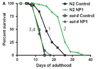
|
These are survival curves -- lifespan curves, in this case: what percent of the animals survived (y-axis) as a function of time, shown here as days of adulthood (x-axis).
Curve 1 is the control. ("N2 control". N2 is the name of the worm strain used.)
Curve 2 is for worms given the drug NP1. ("N2 NP1".) You can see that the survival curve is shifted to the right. That is, the drug extends life -- by about 6 days. (That 6 day extension is about 1/3 of the normal adult lifespan.)
|
Curves 3 & 4 explore how the drug works. In this case, the worms have a mutation, called eat-4. This mutation is known to interfere with DR; in fact, it even reduces lifespan a little. The drug NP1 doesn't work with these worms. Whatever the drug does, it can't do it if the eat-4 mutation is present. We'll come back to this below.
This is modified from Figure 4A of the article. I have added the numbers on the curves, to make it easier to refer to them. They are numbered in the order listed in the key.
|
The first conclusion is that the scientists have a drug that extends the lifespan of normal animals on a normal diet.
What is the drug doing? The authors propose a model. Briefly, food deprivation activates the DR response. A sensory response to food prevents that activation. The drug NP1 acts in this pathway, activating the DR response even when food is being detected.
Why do they propose that a sensory response is central here? Among the evidence...
* The feeding behavior of the worms seems substantially normal in the presence of the drug and normal levels of food.
* They study the effects of several mutations on the drug response. The eat-4 mutation shown above is an example. The drug effects can be interpreted in the context of what is known about the mutations.
* They make electrophysiological measurements, and examine the effects of drug and mutations.
What about those eat-4 mutants? They are defective in a glutamate transporter that acts at a late step in activating DR. Thus, eat-4 mutants cannot activate DR. The effect of the mutation points to the drug acting through the same pathway: the drug fails, because DR activation is blocked. This is just one example of how work with mutants is interpreted.
It's an interesting finding. The worms have food (and eat normally), but a sensory pathway for detecting that food is blocked by the drug -- and the worms invoke a pathway responding to apparent dietary restriction, and live longer.
Is there such a sensory response involved in DR in mammals?
News stories:
* Can we extend healthspan by altering the perception of food? (Medical Xpress, May 26, 2016.)
* Tricking Body To Cutting Calories Leads To 50% Longer Life; Altering Food Perception May Extend Health And Lifespan. (S Olson, Medical Daily, May 29, 2016.)
The article, which is freely available: Chemical activation of a food deprivation signal extends lifespan. (M Lucanic et al, Aging Cell 15:832, October 2016.)
A previous post on extending lifespan in C elegans. Extending lifespan -- five-fold (January 12, 2014).
Posts about DR include: A drug that delays neurodegeneration? (June 14, 2013).
More on C elegans as a model organism:
* Fidelity of protein synthesis: a factor in aging? (November 13, 2021).
* Lesson from a worm: An endogenous anti-opioid system? (January 5, 2020).
* A tale of scientific reproducibility (September 27, 2017).
* How are mitochondria from the father eliminated? (September 20, 2016).
* How to administer Bt toxin to people? (May 16, 2016).
More worms...
* Worm count (August 27, 2019).
* How to avoid cannibalism (May 25, 2019).
Human lifespan... How long can humans live? (November 29, 2016).
More about understanding and intervening in aging: A treatment for senescence? (June 4, 2017).
My page for Biotechnology in the News (BITN) -- Other topics includes a section on Aging. It includes a list of related Musings posts.
Finding host genes that are required for growth of Zika virus (and related viruses)
August 8, 2016
Zika is the virus of the day. It is one of a family of related viruses, called flaviviruses. Dengue, West Nile, yellow fever and hepatitis C are others of that group. Treatments and preventive vaccines are limited.
It's an interesting question to ask what host genes are required by these viruses. It is possible that we might develop a drug to inhibit a gene required by the virus.
Two new articles address the question. The two articles broadly complement; we'll focus on some experiments from article #2.
In the first part of the work, the scientists did a large scale screen of the entire human genome to see which genes were needed for growth of the chosen virus. This gave them a list of candidate genes. Follow-up work tested those candidate genes more carefully, and also tested their role for other members of the flavivirus family.
Large scale screen of human genome to find genes the virus needs. The logic is to make a large set of cells, each with one gene knocked out. Infect them with the virus, allow time for the virus to grow and to kill the cells, and then look at the surviving cells. Cells that survive should be those in which a gene the virus needs has been knocked out. So, check each of the surviving cells to see which gene was knocked out.
How did they knock out individual genes? They used CRISPR. There are two key parts to using CRISPR. One is the cutting enzyme, commonly Cas9. The other is the guide RNA that aims Cas9 to a specific site. In this work, the scientists used a cell strain to which they had added the gene for Cas9. They then have a library of guide RNAs, in a form that makes it easy to infect cells. Each cell gets one guide RNA, thus knocking out one gene.
Since Cas9 acts on sites based on the guide RNA, it knocks out both copies of the gene in a diploid cell.
Note that a cell won't survive if a gene that is needed for cell growth is knocked out. So the screen actually gives cells with a gene that is needed for the virus -- but not for the host (under these conditions).
There are many reasons why such a screen does not work entirely as desired. That's why we say it generates a list of candidate genes, rather than "the answer".
The scientists used West Nile virus (WNV) for the initial screen. The screen generated 12 candidate genes -- out of 19,050 human genes tested.
Follow-up. Role of some candidate genes in Zika infection. Among the follow-up work was to test how various members of the virus family grew on cells lacking a specific gene. The following graph shows an example of such a test. It shows results for testing the role of nine of the candidate genes on Zika infection...
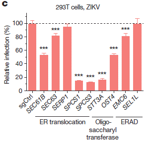
|
In this experiment, Zika virus growth was measured in ten types of cells. One was a control; the other nine each lacked one of the genes previously found to be needed for growth of WNV. (A cell line lacked one gene because it carried the guide RNA that targeted Cas9 to inactivate that gene.)
The height of each bar shows the amount of virus made, compared to the control, set at 100% -- and shown as the left-hand bar.
Many of the other strains showed reduced production of Zika virus. For seven of the nine tested, the Zika virus production was significantly lower, denoted by ***. Three of the strains reduced virus production to below 20% of the control level.
This is Figure 1c from article #2.
|
These results suggest some conclusions...
* We can identify (human) genes required by flaviviruses.
* Some of these, but not all, are used by multiple members of the flavivirus family.
* In some cases, inactivation of a host gene leads to a major reduction in virus growth. These genes should be considered as possible drug targets.
Those conclusions are broadly supported by the big picture from both articles.
There are a couple other tidbits worth noting...
* The labeling at the bottom of the figure describes the class of gene function. All of these genes are involved in some aspect of processing proteins. They appear to be involved in the assembly of the virus particle. (Article 1 disagrees on this point.)
* For some of these genes, there is evidence that the related gene in insects is also required for virus growth. Remember, these viruses are not only transmitted by insects (usually mosquitoes), but actively replicate within the insect host. It's interesting that genes found to be important for the virus in one host may be important in the other.
In summary, the current work adds to our understanding of how flaviviruses, including Zika virus, grow. The work may offer some targets for drug development. It's also a good example of the usefulness of CRISPR in lab research.
News stories. Both of the following focus on article 2.
* CRISPR Screen Identifies Potential Drug Target for Mosquito-Borne Virus. (GEN, June 20, 2016.)
* Zika's achilles heel spotted with help from CRISPR. (L Tierney, BioNews, June 27, 2016.)
There are two articles, published together:
1) Genetic dissection of Flaviviridae host factors through genome-scale CRISPR screens. (C D Marceau et al, Nature 535:159, July 7, 2016.) This article, which we do not discuss here, focuses on dengue and hepatitis C viruses.
2) A CRISPR screen defines a signal peptide processing pathway required by flaviviruses. (R Zhang et al, Nature 535:164, July 7, 2016.)
There are similarities between this work and What is the minimal set of genes needed to make a bacterial cell? (July 9, 2016). Both involve large scale screening to find which genes are or are not needed for some purpose. The current post used the latest in technology. It's so much easier using CRISPR, especially now that someone has prepared a library that makes it easy to deliver a set of CRISPR guide RNAs covering the entire genome.
A post studying the role of a host gene in Zika infection: Why does Zika virus affect brain development? (August 11, 2017). This work seems unrelated to the findings of the current post.
The post CRISPR: an overview (February 15, 2015) includes a complete list of Musings posts on CRISPR (and other gene-editing tools).
A post about a new virus that seems related to the flaviviruses: Guaico Culex virus: the first example of an animal virus that packages segments of its genome in different particles (November 21, 2016).
There is a section on my page Biotechnology in the News (BITN) -- Other topics on Zika. It includes a list of Musings post on Zika. That page also includes a section on West Nile virus.
What does a p value mean? Statisticians make a statement
August 6, 2016
You've read it... p < 0.05, and therefore I'm right. Something like that. Many scientists throw around p values with little thought, and sometimes it causes problems.
Recently, the American Statistical Association, composed of people who should know, released a statement. It's intended to help users understand what p does -- and does not -- mean. The statement was released several months before the formal publication, and has gotten lots of attention from a range of media.
If you use statistics, I encourage you to read the article with some care. Other than that, at least look over the news stories for the general picture, and a little fun.
News story: Statistical significance and p-values -- Provides principles to improve the conduct and interpretation of quantitative science. (Science Daily, March 7, 2016.)
News stories -- the views of a couple of users from the sciences:
* A statement on p-values that approaches significance. (N Snyder-Mackler, Molecular Ecologist, March 8, 2016.)
* Statistical Association Takes on Use, Abuse of P-values. (Social Science Space, March 7, 2016.)
The article, which may be freely available: The ASA's statement on p-values: context, process, and purpose. (R L Wasserstein & N A Lazar, American Statistician 70:129, June 2016.) The pdf file contains two parts: an editorial introducing the "statement", and then the "ASA Statement on Statistical Significance and P-Values", which starts on page 4 of the pdf. The online version also includes comments from some of the team behind the article.
The "principles" from the article include... "3. Scientific conclusions and business or policy decisions should not be based only on whether a p-value passes a specific threshold."
The meaning of p has been discussed in other posts, including...
* More on the story of p (March 2, 2014). Includes some history. The current article notes the "news feature" article of this 2014 post (as does Snyder-Mackler in his news story listed above), suggesting it has been an important part of the discussion. The author of that earlier article was on the team that developed the current ASA statement.
* Mission Improbable (November 10, 2009). Links to some other posts where interpretation of statistics was an issue.
Applications...
* Comparing the death rates of American football and baseball players (July 2, 2019).
* The Berkeley soda tax: does a "fat tax" work? (August 30, 2016).
A post about communicating uncertainty: Communicating scientific uncertainty to the public (May 22, 2020).
There is more about statistics on my page Internet resources: Miscellaneous in the section Mathematics; statistics. It includes a listing of related Musings posts.
How do you know if you have been in the sun too long?
August 5, 2016
Well, you'll turn color. But by then, it is too late. What if you had a piece of paper that would turn color before you do, as a warning?
A recent article offers such a sensor. It's simple... Put some food coloring in your inkjet printer cartridge, and print it out on some paper. The food coloring bleaches (becomes colorless) upon exposure to the sun. The sensitivity of the sensor is easily adjusted. There are some technical issues, but that's the idea.
The following figure outlines the plan, and shows some results...
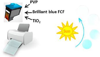
|
The cartridge is filled with a mixture of three chemicals, dissolved or suspended in water:
* Brilliant Blue FCF, a food dye, which is the sensor per se.
* Polyvinylpyrrolidone (PVP), a polymer that helps it stick to the paper.
* Titanium dioxide, TiO2, which absorbs the UV part of the sunlight and catalyzes the dye bleaching. (TiO2 is widely used in sunscreens to absorb the UV light.)
|
These are all chemicals generally considered safe, and they are fairly inexpensive.
The suspension is printed onto glossy photo paper.
On the right side are four discs of the dyed paper. The first one, towards the bottom, is the original color. With increasing exposure to UV light (follow the arrow by the Sun), the color becomes fainter and fainter. (Do you see all four discs?)
This is the figure in the abstract for the article.
|
The article contains extensive technical data on how the appearance of the paper changes with increasing UV exposure. However, the point is that the sensor can be read "by eye".
The authors address the issue that different people can tolerate different amounts of sunlight. They show how to make sensors of various sensitivities, by adding a filter.
Table 1 of the article shows a large collection of discs, with various filters, after a range of UV exposures. It's a nice figure. As with the one above, your computer screen may determine how well you can see the effects.
Why do we need a printer? Why not just dip the paper in the ink, or such? The authors say that the thin and uniform films achieved with the printer are important.
Is this useful? I don't know. For now, it's "cute"; it's elegant in its simplicity. But one can imagine large scale production of small sensors that are little more than a piece of colored paper, perhaps protected in some plastic (transparent to the UV!).
News story: Portable Paper-Sensor Device Helps Monitor Sun Exposure. (N Emmino, Electronics360 (IEEE), May 25, 2016.)
The article, which is freely available: Paper-Based Sensor for Monitoring Sun Exposure. (P S Khiabani et al, ACS Sensors 1:775, June 24, 2016.)
More about sunscreens:
* Fish make their own sunscreen (September 29, 2015).
* How can the mantis shrimp see so many colors of UV? They use filters (August 30, 2014).
* Geoengineering: a sunscreen for the earth? (February 20, 2010).
More TiO2: Photocatalytic paints: do they, on balance, reduce air pollution? (September 17, 2017).
More about printers: Does using printer toner lead to carcinogens? (October 31, 2017).
August 3, 2016
Are urban dwellers smarter than rural dwellers?
August 2, 2016
Briefly noted...
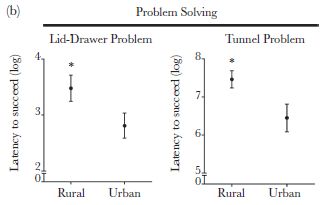
|
Each frame compares the time needed to solve a problem for rural vs urban dwellers.
In each case, the urban dwellers solve the problem significantly faster.
This is Figure 1b from the article.
We'll note a little problem with the figure later.
|
Who are these rural and urban dwellers? They are bullfinches, Loxigilla barbadensis, caught at various sites in Barbados. Birds caught in more urban environments are "smarter" than the birds from more rural environments, as judged by tests such as the ones shown above.
The article contains more tests, and the big message is that the two sets of birds are different. For example, the birds also showed differences in temperament and immune system function.
The interesting question is why. Are the birds genetically different? Do smarter birds tend to go to the city, or do birds become smarter as they adapt to city life? The authors note these questions, but have little to go on. Because the rural and urban sites are fairly close, they doubt that the populations are genetically isolated.
It's an intriguing little article, and perhaps best noted for the questions it raises.
A little mystery... It is not clear what the numbers on the y-axis of the figure mean. The label says they are logs. 8? The data is 108? 108 what? 108 seconds is a long time; the tests took 5 minutes, which is 300 seconds. Despite this point, I choose to accept that the graphs show differences, even though it is not clear what is shown. Update August 10, 2016... In response to my inquiry, the author says that the numbers on the y-axis are natural logs. That is, the low value, 2, means e2, which is about 7. The high value, 8, means e8, or about 3000. It's still not clear what those numbers mean; perhaps they are the sum over multiple tests. Anyway, presumably the visual comparison from the figure holds.
News story: City birds are smarter than country birds -- Life in the city changes cognition, behavior and physiology of birds to their advantage. (Science Daily, March 21, 2016.)
The article: The town bird and the country bird: problem solving and immunocompetence vary with urbanization. (J-N Audet et al, Behavioral Ecology 27:637, March 2016.) Check Google Scholar for a preprint from the authors.
More about city living... The advantage of living in the city (July 27, 2018).
More about birds and special environments...
* Airport food: What do the birds eat? (May 24, 2014).
* Of birds and butts (February 2, 2013).
More finches...
* Huntington's disease: Mutant human protein disrupts singing in birds (April 18, 2016).
* Finding a gene behind the beak diversity of Darwin's finches (July 14, 2015).
Barbados was mentioned in the post What is the proper use of crop land? (August 23, 2013).
More about wildlife... Human-wildlife conflict -- what is the proper way to get rid of a pest? (July 12, 2017).
The metabolic rate of humans vs the great apes: some data
August 1, 2016
Brains are energy-intensive. Humans have large brains; somehow we must pay for them.
It's often said that the energy consumption of humans is similar to that of the apes. Then, the argument goes... since our brains are larger, we must somehow compensate, by spending less energy on something else. Digestion is one candidate commonly offered. This hypothesis was noted in a recent Musings post [link at the end]. However, this explanation is not completely accepted. The numbers behind it are not very solid, and don't fit the hypothesis very well.
A new article reports measurements of the metabolic rates for four genera of primates: Homo, Pan (chimpanzees, bonobos), Gorilla, Pongo (orangutans). The following figure summarizes the findings...
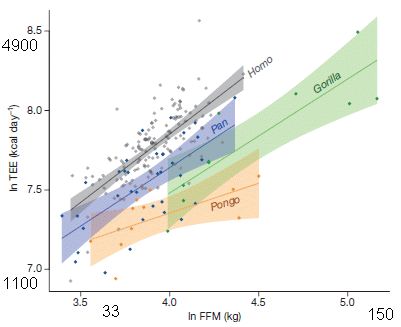
|
The graph shows the total energy expenditure (TEE, y-axis) vs fat-free mass (FFM, x-axis) for all the animals tested.
Both scales are log scales. Perhaps oddly, they are labeled as natural logs. I have converted the high and low ln numbers shown on each axis to the actual data value, rounded to two digits. That is, the label 3.5 on the x-axis corresponds to 33 kg, and the label 5.0 is 150 kg.
|
There is a best-fit line through the data for each genus. The colored bands show the 95% confidence intervals.
The key finding... The energy consumption for humans is higher than for any of the other ape genera.
This is modified from Figure 1 of the article. I have added some labeling along both axes, as noted above.
A reminder for some who may be used to hearing human energy needs as something like 2000 Calories per day. Note the capital C on Cal. A capital-C Cal is actually a kilocalorie (kcal). Why the world of nutrition does this, I don't know. (2000 kcal/day, or 200 Cal/day, would be 7.6 on the y-axis scale.)
|
With these results, we now have another option... The human brain may be supported by a higher metabolic rate. Perhaps multiple factors contribute, the higher metabolic rate as well as some reduction in alternative energy uses.
News stories:
* Humans have faster metabolism than closely related primates, enabling larger brains. (Science Daily, May 4, 2016.)
* Humans' unique metabolism allows fat storage and use of great amounts of energy. (K Wentworth, University of New Mexico, May 4, 2016.)
The article: Metabolic acceleration and the evolution of human brain size and life history. (H Pontzer et al, Nature 533:390, May 19, 2016.)
A background post that introduces the issue of human metabolic rate, and the factors that allow our large brain size. Sliced meat: implications for size of human mouth and brain? (March 23, 2016).
Previous post about apes... Re-introducing captive animals into the wild: an orang-utan mix-up (June 27, 2016).
and more... Age-related development of far-sightedness in bonobos (January 10, 2017).
How the birds survived the extinction of the other dinosaurs, why birds don't have teeth, and how those two points are related
July 30, 2016
We have a new article with some interesting new data -- and a bold hypothesis.
The only group of dinosaurs to survive the mass extinction 66 million years ago was the group that became the modern birds. Why this one group survived is an interesting question, but we don't know. Both small size and flight might be advantageous in the wake of a mass extinction. However, there were multiple groups of small flying dinosaurs. Why did this one group survive?
One distinction between those groups of dinosaurs was their teeth. And there are a lot of fossil teeth around. A team of scientists has studied dinosaur teeth, especially for the flying dinosaurs, and used them to put together a story.
The main finding from analyzing 3,104 teeth was that the various groups of flying dinosaurs seemed stable as the extinction event approached. Some people have proposed that dinosaur populations were already declining, and that the extinction causes we usually note (asteroid, volcanoes) were simply the final blow. But that's not what the scientists found, at least for these groups.
Then... Three of the four groups of flying dinosaurs they studied disappeared abruptly 66 million years ago; the fourth group continued.
That fourth group was characterized by hard beaks, without teeth. Sounds like birds. So it fits; the right group survived.
The authors go further, and suggest why this particular group survived.
Here is the argument... After the extinction, Earth was a mess. Food was scarce. Anyone with a particularly good strategy for getting food from a scorched and dark Earth really had an advantage. What would be a good strategy? In fact, we know a little about that. We know what works after, say, a fire. Plants can't grow. There is nothing for herbivorous animals to eat. But seeds survive, quite well. Seed-eating birds are among the first to reappear in an area cleared by fire. Perhaps seeds were one of the surviving food sources 66 million years ago, too.
What's the connection to beaks? Seeds are hard, literally. Teeth don't help much. A hard beak does. Maybe that's why the small flying dinosaurs with the beaks are the ones that survived the mass extinction. And that would explain why modern birds have beaks, and not teeth.
That is... Seeds may have been a good food source following the extinction event. The group of dinosaurs that survived is the group well-suited to eat seeds. They had beaks, without teeth. And they became our modern birds.
Remember, this starts with a scientific study of dinosaur teeth. The rest is largely speculation. Interesting speculation. We'll see what people do with these arguments.
News stories:
* Seed clue to how birds survived mass extinction. (H Briggs, BBC, April 22, 2016.)
* Fossil teeth suggest that seeds saved bird ancestors from extinction. (Science Daily, April 21, 2016.)
The article: Dental Disparity and Ecological Stability in Bird-like Dinosaurs prior to the End-Cretaceous Mass Extinction. (D W Larson et al, Current Biology 26:1325, May 23, 2016.)
Posts about the dinosaur-bird connection...
* The relationship between birds and dinosaurs? (July 25, 2014).
* How the birds survived the extinction of the dinosaurs (June 6, 2014).
Recent posts about the dinosaur extinction include...
* A major algal bloom associated with the dinosaur extinction event? (May 13, 2016).
* What caused the extinction of the dinosaurs: Another new twist? (January 26, 2016).
Also see:
* A Cretaceous dinosaur the size of a tiny bird? (June 2, 2020).
* When did mammals take on daylight? (February 11, 2018).
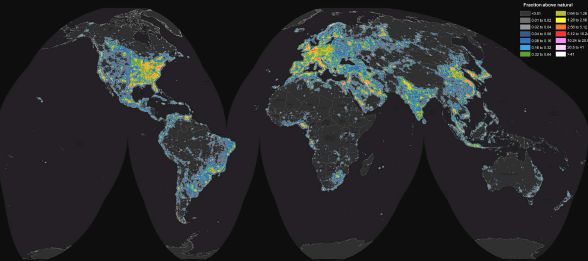
A world atlas of darkness
July 29, 2016
If you live in the Cocos Islands, the contribution of artificial (manmade) lighting to the night sky is less than 2 microcandelas per square meter (µcd/m2). That's good. It means that the 600 residents of that island group can see the stars. Their level of light pollution is less than 1% of the average natural brightness of the night sky.
Only 8% of the world's population has such pristine night skies. Over 80% have significant light pollution over the entire sky. For 14%, the night sky is so bright from artificial lighting that they cannot "dark adapt".
That information is from a new article, which presents a worldwide picture of the darkness of the night sky -- and the pollution due to artificial lighting. Here is the big picture...
That's us. Color-coded by the amount of light pollution in the night sky.
The color key is at the upper right. You can't read it here, but you can see the general idea. Dark colors indicate darkness; bright colors indicate a high level of manmade light pollution in the night sky. Pink and white are the brightest.
This is Figure 2 from the article. You can't read the key in the original of this figure, either, but full detail of the color coding is shown in Table 1 of the article.
In the article, this figure is followed by a set of figures showing the results by continent. That gives you a much higher resolution view of your favorite territory.
Those figures are followed by a multi-page table listing a huge number of countries and territories.
|
The article presents the data on both a population basis and an area basis. Not surprisingly, that makes a huge difference. In fact, the figure above may look like a population map. Population makes light pollution.
Example... Figure 11 in the article shows the light pollution in the G20 countries on a population basis. Saudi Arabia is the worst, with over 80% of its population in the "most polluted" category. The very next figure shows the same countries ranked by pollution on an area basis; over 60% of the area of Saudi Arabia is in the two darkest categories, and only a tiny sliver of area is coded "worst". We might conclude that Saudi Arabia has most of its population in very bright cities, with huge areas that have few people and are dark. That's probably about right, and in general terms, holds worldwide.
What's the point? Astronomers are particularly concerned about light pollution. They don't build telescopes in big cities, but expanding populations are affecting the operation of telescopes that used to enjoy dark skies. Light pollution is also energy wastage, something that should concern us all. Of course, using more efficient lighting helps some. But why do we need to provide bright lights in empty parking lots throughout the night? Greatly reduced lighting, with the brighter lights actuated by motion sensors, reduce energy consumption as well as improve viewing at the nearby telescope. Covering outdoor lights with reflectors that aim the light downward is also a good step. On the other hand, the transition to full-spectrum LED lighting may well make things worse, unless there is careful planning.
The work here uses the latest in satellite technology as well as input from citizen scientists around the world. It is a significant technical achievement to put together this detailed data set. Much of the content of the article may seem straightforward and obvious. With this article, it's now formalized, with numbers. Maybe we'll pay more attention to the problem.
News stories:
* New world atlas of light pollution reveals extent of artificial night sky brightness. (Astronomy Now, June 11, 2016.) The first figure shows the night sky from an urban area -- and how it changes during a power failure.
* 80% of World Population Lives Under Skyglow, New Study Finds. (International Dark-Sky Association (IDA), June 10, 2016.)
The article, which is freely available: The new world atlas of artificial night sky brightness. (F Falchi et al, Science Advances 2:e1600377, June 10, 2016.) Fun to browse.
Light pollution is of obvious concern to astronomers. However, its effects may extend beyond that. The following posts raise other concerns...
* Effect of artificial lighting on the environment (September 3, 2015).
* Does it matter when you eat? Or whether you leave a light on at night? (December 1, 2010).
More on pollution... Deaths from air pollution: a global view (October 23, 2015).
More citizen science... Finding Planet 9: You can help (March 13, 2017).
My page of Introductory Chemistry Internet resources includes a section on Lighting: halogen lamps, etc.
Next post with a world map: Earth: RSSA (September 18, 2018).
A news feature, with a good overview... The Vanishing Night: Light Pollution Threatens Ecosystems -- The loss of darkness can harm individual organisms and perturb interspecies interactions, potentially causing lasting damage to life on our planet. (D Kwon, The Scientist, October 2018, page 36.) Now archived.
July 27, 2016
Venus flytrap: converting defense into offense
July 27, 2016
The Venus flytrap is a plant that eats insects. In contrast, common plants repel insects that attack its leaves.
How did carnivory -- eating meat -- evolve? A new article examines patterns of gene activity in the Venus flytrap, Dionaea muscipula. The authors look at gene activity in various organs, including leaf and root, and the trap both inactive and active. They build a story of how the usual defense mechanisms of a plant against insects have been modified to become an offense, so that the plant eats the insect.
The following figure outlines the framework...
|
The chart has three columns.
The middle column shows general steps in the plant-insect interaction.
The other two columns give a little information about what happens at each step in the two situations:
* herbivory, where the insect wants to eat the plant, and the plant defends (on the left);
* carnivory, where the plant eats the insect (right).
This is Figure 7 from the article.
|
In general terms, then, both processes follow what is shown in the middle: the insect touches the leaf; the leaf detects that, and responds. It responds with an electrical excitation at a cell membrane (just as with a nerve cell); that leads to signaling, and a response to the insect. The response can be described at the molecular level, or by the end result: repel the insect (defense), or eat it (offense). (The last dark item in the middle column says "Global response"; it's hard to read even in the original.)
The same signaling molecules are used in both cases. However, the responses that follow are different, directed to the two different tasks. That is, development of the offense uses much of the general defensive response, but with changes in the specific steps of the response directed to the insect.
In fact, the triggered trap has gene activity patterns reminiscent of those in roots, the plant organ more commonly associated with nutrient uptake.
The article notes a recent finding, published by the same labs just a few months ago, about how the Venus flytrap detects an insect. As the chart above shows, the contact of the insect sets off an action potential (AP). Interestingly, the plant counts the APs. A single AP may well be "noise", but two in close succession is more likely to be a meal. Analysis of the responses suggests that this plant is able to count to five or so, as it judges the size of its meal -- and adjusts its response to match.
The Venus flytrap is adapted to growing in situations with a poor supply of nitrogen (and some other nutrients). Meat is a good source of nitrogen. Thus we can look at the evolution of the Venus flytrap as an adaptation to the use of annoying insects as a nitrogen source, allowing the plant to thrive in places where it otherwise could not. The present work helps us to see the origin of that new ability -- as a variation of an old one. It seems to be the first work of this type.
News stories:
* The Venus flytrap: From prey to predator. (EurekAlert!, May 4, 2016.)
* Venus flytrap exploits plant defenses in carnivorous lifestyle. (Science Daily, May 4, 2016.) Don't touch the figure.
The article, which is freely available: Venus flytrap carnivorous lifestyle builds on herbivore defense strategies. (F Bemm et al, Genome Research 26:812, June 2016.)
Other posts about carnivorous plants include...
* Look who's dining on baby salamander (November 3, 2019).
* Carnivorous plants: A blue glow (March 16, 2013).
* How fast can a plant eat? (March 23, 2011).
Another way plants get nitrogen is by associating with bacteria that can "fix" N2 from the atmosphere. For example... A new organelle "in progress"? (September 13, 2010).
More about predation: Studying predation around the world: What can you do with 2,879 fake caterpillars? (July 28, 2017).
Also see:
* Carnivory in human ancestors: when did it start? (April 2, 2022).
* The first known Vatira (August 3, 2020).
Update added November 3, 2023...
Scientists have mutated out two genes that are thought be involved in the leaf-closing response when an insect lands. Inactivating both genes reduces, but does not eliminate, the response. It is an interesting experimental system, using CRISPR. As so often, the work reveals that the system is more complex than we thought.
* News story: Scientists Gene Edit Venus Flytraps to Study Prey Detection. ("Dale Maylea", Botany One, September 18, 2023.) (Why is the author's "name" in quotes? See the author information at the end of the news story, with a bit more at the bottom.)
* The article, which is open access: Mutational analysis of mechanosensitive ion channels in the carnivorous Venus flytrap plant. (Carl Procko et al, Current Biology 33:3257, August 7, 2023.)
Underwater "lost city" explained
July 25, 2016
Two years ago divers off the Greek island of Zakynthos found a variety of interesting structures, such as columns and walkways. The structures are plausibly ancient Greek
stonework, perhaps suggestive of a "lost city". The following figure is an example...
|
The stick in the foreground is 30 centimeters long. (I think. At least, the one that looks just like it in the article is 30 cm.)
This is from the ZME news story listed below.
|
The find was of interest to experts in antiquities, but thorough investigation did not yield evidence to support the suggestion that the structures are of human origin. For example, no human artifacts such as pottery were found.
If humans didn't make these things, then who did? Bacteria, according to a new article. At least, bacteria played a key role in a complex geological process. The bacteria provided the raw material for the structures.
What happened? There was a methane seep in the area. Bacteria grew on the methane, making carbon dioxide. The CO2 encountered mineral ions, such as Ca2+. Carbonate minerals, CaCO3 and more, precipitated out -- slowly allowing regular structures to form over the ages.
What's the evidence? After the archeologists failed to find evidence for human origins for the structures, the geologists moved in. Their analysis showed that the structures were typical of concretions formed by the mechanism suggested above. And the age suggested by the isotope analysis, 3-4 million years, is long before humans were there.
It's a fun story, with beautiful pictures. It's interesting how the subject moved from archeology to geology, with a big assist from microbiology. The bacterial process, involving undersea oxidation of methane without oxygen, has been understood only recently; it is an interesting part of the global carbon cycle.
News stories:
* Underwater 'lost city' turns out to be a geological formation. (M Andrei, ZME Science, June 6, 2016.)
* Underwater 'lost city' found to be geological formation. (University of East Anglia, June 3, 2016. Now archived.)
The article: Exhumed hydrocarbon-seep authigenic carbonates from Zakynthos Island (Greece): Concretions not archaeological remains. (J E Andrews et al, Marine and Petroleum Geology 76:16, September 2016.)
Last sentence of the Introduction in the article... "We summarise our findings with the maxim 'all that glistens is not gold' or in this case 'columns and pavements in the sea, not always antiquities will be'."
Authigenic? The word in the article title. It means that the minerals formed where they are found, without further transport.
Musings has noted various methane leaks, large and small, natural and not. Some of the natural leaks in the oceans might lead to rock formation, such as seen in the present work. Leak examples include...
* Los Angeles leaked -- big time! (April 29, 2016).
* Svalbard is leaking (March 7, 2014). Includes a carbonate rock, presumably made by the same processes as in the current post.
A post about making use of carbonate formation... Capturing CO2 -- and converting it to stone (July 11, 2016).
More from the Greek seas: The Antikythera device: a 2000-year-old computer (August 31, 2011). This one is archeological.
Also see...
* Geoengineering: the advantage of putting limestone in the atmosphere (January 20, 2017).
* Oil in the oceans: made there by bacteria (January 3, 2016).
The moral car: when is it ok for your car to kill you?
July 23, 2016
There is an emergency, and you must act. You have two options... Option 1 will kill ten people; option 2 will kill one person. Which do you choose? It seems easy enough, as an abstract question. But we can make it harder... What if the one person who would be killed in option 2 is your child? Questions such as these have long been used to explore people's views of moral actions.
A new article explores a new variation of the question. What if... It's not you that is making the choice, but your car. It's a question we must face. As we near the age of autonomous (self-driving) vehicles, cars will be making such choices.
The scientists asked panels of volunteers what they thought about the new situation. Here is one of the studies from the article.
|
In this study, the panelists were asked about three options, which are listed across the top:
* kill pedestrian to save ten lives (coded green);
* kill passenger to save ten (blue);
* kill pedestrian to save one (red);
Note that the first two differ only in who is killed.
The panelists were asked three questions about each option; the questions are shown along the bottom. The scores are shown as box plots, using the y-axis scale, labeled "Budget share". That is, the position of the box indicates the score. We won't worry how the score is derived, as we will just look at relative scores.
|
The first question was about the morality of the option (left-hand set of results). The first two options -- the ones of interest -- got scores about 50-60.
The next two questions were about whether each person thought this option should be the car's choice. One question (middle set of results) is what the person wants for the cars of other people. The final question (right-hand set) is what the person wants for their own car.
As you look at the results for those last two questions, notice that the issue of who gets killed becomes important. The first two options scored about the same for morality, but when it comes to what people think should be the car's choice, they are not so sure that the passenger should be the one who is killed. That point becomes even stronger for the person's own car.
This is Figure 3B from the article.
|
One way to summarize the findings is that people think others should have the moral car, which would kill the passenger, but they do not think their own car should do that. Remember, this is a driver-less car; that one "passenger" is the owner, or you.
That is what the authors want to emphasize. We could even say that people want cars to be moral, but they wouldn't buy one if it were. That's a dilemma. It is likely that autonomous cars will, overall, save lives. But if people won't buy them because of how they make certain choices, it could defeat the purpose.
Society needs to think about the issue. Someone is going to decide how autonomous cars make such choices.
News stories:
* The Moral Science Behind Self-Driving Cars. (Association for Psychological Science, July 7, 2016.)
* Why Self-Driving Cars Must Be Programmed to Kill. (MIT Technology Review, October 22, 2015.)
* News story accompanying the article: Ethics: Our driverless dilemma -- When should your car be willing to kill you? (J D Greene, Science 352:1514, June 24, 2016.)
* The article: The social dilemma of autonomous vehicles. (J-F Bonnefon et al, Science 352:1573, June 24, 2016.) Check Google Scholar for a copy.
Be sure to distinguish... The question here is not about malfunction. It is about how the car will be programmed to respond, in the event of an emergency. Whether the emergency arose as a result of a malfunction or some external event is not an issue here.
More about autonomous cars: What if the cars controlled the traffic lights? (May 17, 2016).
More cars... Why air may inhibit the performance of small cars (August 26, 2016).
My page for Biotechnology in the News (BITN) -- Other topics includes a section on Ethical and social issues; the nature of science. It includes a list of related Musings posts.
Scoliosis: an animal model
July 22, 2016
Some fish, from a recent article...
Part D shows a fish with a curved spine -- to state the obvious. The top frame, D, shows a picture of the fish; the second frame, D', shows the skeleton, based on CT scans.
The fish in Part E is similar, but has been "treated". E & E' are as above. This fish is near normal.
The scale bar is 5 millimeters.
The fish are zebrafish, a common model organism for research.
This is Figure 1 parts D & E from the article.
|
|
In humans, curvature of the spine is called scoliosis. It afflicts about 3% of people, mainly during the adolescent growth spurt. It's not well understood.
A new article offers an animal model for scoliosis, as you can see above.
The model is due to a particular gene being mutated. And we know something about what that gene does.
The fish in Part D above carries a mutation in the ptk7 gene. We'll come back to what that gene does in a moment.
The fish in Part E carries that same ptk7 mutation, but a copy of the normal ptk7 gene has been added. This fish is near normal. Adding back a normal copy of the mutated gene helps to show that the original effect is due to the mutation being studied (rather than due to some other, undefined problem).
The ptk7 mutation affects the flow of cerebrospinal fluid (CSF). That flow is determined by cilia, hair-like projections on cell surfaces. Putting the pieces together, the scientists propose the following causal sequence for scoliosis...
The ptk7 mutation affects the cilia (among other things),
and that affects the CSF flow,
and that affects spinal curvature.
The role of the ptk7 mutation in causing scoliosis was originally found by accident; that gene -- and cilia -- have complex effects in development. The scientists now show that mutations in various genes that affect cilia lead to spinal curvature.
Importantly, in one case the scientists were able to turn gene function on and off; spinal curvature occurred when the gene was turned off, but stopped when the gene was turned on. This result suggests that treatment of scoliosis might be possible when it is detected early. (The reversal experiment was done by using a form of the gene that was temperature sensitive. Thus they could turn it on or off by changing the temperature of the water in the fish tank.)
How relevant is this fish model to human scoliosis? We don't know at this point. It is a new lead to suggest that cilia -- and CSF flow -- might be a key to scoliosis. There are bits of evidence from humans consistent with this, though the idea had not gained much attention before. Scientists will undoubtedly now look very carefully to see if people with scoliosis have defects in cilia function or CSF flow.
News stories:
* Fish With Creepy Curved Backbones Could Help Explain Scoliosis. (S Zhang, Wired, July 8, 2016.)
* Scoliosis linked to disruptions in spinal fluid flow. (C Zandonella, Princeton University, June 10, 2016.)
The article: Zebrafish models of idiopathic scoliosis link cerebrospinal fluid flow defects to spine curvature. (D T Grimes et al, Science 352:1341, June 10, 2016.)
Other posts about cilia include:
* Melatonin and circadian rhythms -- in ocean plankton (November 24, 2014).
* A novel nervous system? (July 20, 2014).
Other posts using zebrafish include:
* Zebrafish reveal another clue about how to regenerate heart muscle (December 11, 2016).
* Metastasis: How clusters of tumor cells get through narrow capillaries (June 3, 2016).
* Fish make their own sunscreen (September 29, 2015).
* The answer is cereblon (March 16, 2010).
July 20, 2016
What if a lion came into your hotel room while you slept?
July 20, 2016
Animals are vulnerable while they sleep. Perhaps they are more vulnerable when they sleep in an unfamiliar place.
Some animals sleep with one eye open, as a precaution. Some may keep the brain, or at least part of it, alert.
What about humans? Do we take precautions to protect ourselves while sleeping?
Apparently, many people have trouble sleeping their first night in an unfamiliar place. A new article does brain studies of people sleeping in an unfamiliar place. It uncovers some clues about how our brain tries to protect us in such situations.
Here is an example of the findings. In this experiment, volunteers were monitored while sleeping in an unfamiliar place for two sessions. They were exposed to various sounds, and the brain response was measured. The main sound was a regular beep, which the subjects knew about in advance; amidst the regular beeps were occasional "deviant" beeps.
|
Part A (left frame) shows the responses to the "deviant" beeps. On day 1, the people responded to such a sound on the left side of the brain, but there was only a slight response on the right side.
In the second session, there was only a low level response to the same sound, with no significant difference between sides.
|
Part B (right side) shows the results for the standard sound. There was minimal response in both sessions.
This is Figure 2 from the article.
|
The scientists made other measurements that are in general agreement with what is shown above: one side of the brain stays alert for unusual sounds during the first night in an unfamiliar place.
Perhaps it is encouraging that modern humans do not fear being eaten the second night out.
There are a lot of technical details, many of which are made clear only in the Supplemental Information. If you question some of what they did, good. But remember, the main point is that it shows some asymmetry of brain response to "alarm" signals during sleep. What it all means remains for further work.
One question is why the alarm is received on the left side. Does this mean the left side sleeps more poorly for the night? A possible alternative is that the alarm response shifts between sides. Since the measurements were made only during the first sleep cycle, they have no information on this for now.
News story: Brain Keeps Watch During Sleep. (T Lewis, The Scientist, April 21, 2016.) Now archived.
* News story accompanying the article: Sleep: Keeping One Eye Open. (D S Manoach & R Stickgold, Current Biology 26:R360, May 9, 2016.)
* The article: Night Watch in One Brain Hemisphere during Sleep Associated with the First-Night Effect in Humans. (M Tamaki et al, Current Biology 26:1190, May 9, 2016.)
Among other posts on sleep (each links to more)...
* Conversing with dreamers (July 6, 2021).
* When do jellyfish sleep? (September 29, 2017).
* The genetics of being a "morning person"? (April 15, 2016).
* Sleep and the brain drain (November 17, 2013).
Improved high altitude weather monitoring
July 18, 2016
A recent article offers an advance in measuring winds well above ground level.
The figure shows the location of a device tracked over time from its GPS signals.
The scientists understand the whole thing well enough that they are able to extract useful information about the weather from such records. For example, the wind direction they infer from this particular record is shown.
This is Figure 1 from the article.
|
|
Here is the device [link opens in new window]. You can see the electronics box on its back. This is from the lead page of the article.
Until permanent instrumentation is installed up there, perhaps this will help. Unfortunately, the device refuses to fly when it is raining.
News story: Griffon vultures measure the weather. (University of Amsterdam, October 15, 2015. Now archived.) From the lead university. A good overview of this collaboration between UvA-BiTS and IBED.
The article, freely available: Using high resolution GPS tracking data of bird flight for meteorological observations. (J Treep et al, Bulletin of the American Meteorological Society 97:951, June 2016.)
Another use of GPS: How rocks travel (November 14, 2014).
More on inferring wind direction Lyell on fossil rain-prints (May 6, 2012).
More wind...
* Wind-borne mosquitoes repopulate the Sahel semi-desert after the dry season (October 14, 2019).
* Wind energy: effect of climate change? (January 30, 2018).
More tracking of individual animals... Anne's journey across the Pacific (July 6, 2018).
More vultures: Briefly noted... Bees that eat chicken (December 15, 2021).
Also see:
* Would weather forecasting be improved by considering the isotopes in atmospheric moisture? (May 2, 2021).
* Monitoring whales from space (June 23, 2019).
Did the Fukushima nuclear accident lead to a burst of thyroid cancer?
July 17, 2016
The idea behind this issue is simple. Nuclear fission leads to the release of radioactive iodine, which can cause thyroid cancer. The Fukushima event released iodine. Did it cause an increase in thyroid cancer? Of course, the issue is quantitative: how large an increase in thyroid cancer was there, and how does that relate to the amount of iodine released?
We now have some extensive data on the matter. The answer? We don't know. Why we don't know is an interesting story, and our focus here.
The story starts with an article posted last fall, claiming a 30-fold increase in thyroid cancer. (The article is listed below with its final publication date of May 2016. As so common now, articles are available long before the cover date of the journal issue in which they finally appear. Thus, news stories and discussions may have dates long before the cover date.)
Other scientists quickly responded that the claim of a 30x increase is questionable. Why? Because the claim is based on comparing the new results with old results that had been acquired by different testing.
What the authors of the new study did was to systematically examine all children living near the Fukushima accident. A modern test was used as a quick screen for thyroid abnormalities, which could then be followed up. The study itself was an appropriate response to the accident, and has generally received praise.
The problem is not the study, but what to compare it against. There is no previous study in which all children were screened in this way. The new study ensures that all children who lived near the accident received good follow-up care for possible thyroid problems. However, if we want to know whether the accident increased the rate of thyroid problems, we need to compare the new results to some reference study -- and there is none. The authors of the new study are aware of the limitation. They attempted to make a comparison, by taking into account differences in studies, but any such comparison is only a "guess".
There are more pieces to this story, some of which are noted below. But the big message is confusion, resulting from the attempt to compare one measurement of cancer rates with another. I've linked to more than the usual number of readings below. Those who want a deeper analysis of this story can work through some of them. It won't resolve the question, but it can lead to a better appreciation of the problem. As so often, we'll learn more over time. But we must always be cautious when we hear the results of single articles.
News stories:
* New report links thyroid cancer rise to Fukushima nuclear crisis. (Japan Times, October 7, 2015. Now archived.)
* Professor Toshihide Tsuda's Press Conference on "Pediatric Thyroid Cancer After the Fukushima Accident". (Y Hiranuma, Fukushima Voice, October 9, 2015.) Includes video of the press conference, which is in Japanese, with English added. This web site is also available in Japanese.
* Nope - There's No Thyroid Cancer Epidemic in Fukushima -- A New Study on Child Thyroid Cancer Gets Widespread Attention From the Media - While Another Study Proving It's Wrong Gets None. (W Boisvert, The Breakthrough Institute, October 18, 2015. Now archived.) This does not read like a calm, unbiased analysis. Nevertheless, the issues it raises are good; that should be the main focus for reading this. Whether they got the answer right remains to be seen, though it does agree with the thrust of the comments in response to the original article. (Some of the numbers quoted here are too small to be convincing, as the author notes.)
* How overdiagnosis produced a nonexistent "epidemic" of thyroid cancer in Fukushima. (Respectful Insolence, March 21, 2016.) Again, this page is most important for its discussion of the issue of overdiagnosis. It is fine to be confused about the current story of Fukushima thyroid cancer, and want to wait for more data before reaching a conclusion. People disagree on how important overdiagnosis is, but most would agree it is an issue worth discussing.
* Commentary accompanying the article: Screening for Thyroid Cancer After the Fukushima Disaster -- What Do We Learn From Such an Effort? (S Davis, Epidemiology 27:323, May 2016.)
* The article, which is freely available: Thyroid Cancer Detection by Ultrasound Among Residents Ages 18 Years and Younger in Fukushima, Japan: 2011 to 2014. (T Tsuda et al, Epidemiology 27:316, May 2016.)
Publication of the article led to several short "letters" in response. These are listed under "Related articles", at the lower right of the web page for the article. They are also listed on the Table of Contents page for the journal issue, near the end. Perhaps the "best" are the ones by Takamura and by Wakeford et al. There is also now a reply from the original authors. All are freely available; you can browse as you wish. Here are direct links to the ones I mentioned...
* Takamura.
* Wakeford et al.
* Authors' reply.
There are a couple more interesting tidbits that are part of the story, but not yet definitive. These points should be considered as predictions, which need to be tested.
* Expected incidence of thyroid cancer after Fukushima... There are estimates of the exposure in the area near the accident. There are various predictions based on that, generally predicting small increases in thyroid cancer, perhaps 2-fold or even less.
* Many feel that it is still too early to know. If there is thyroid cancer as a result of the Fukushima accident, most of it will appear later.
More about thyroid function... How the giant panda survives on a poor diet (August 2, 2015).
A post on the biological effects form the Fukushima accident... Effect of radiation near Fukushima on local monkeys (August 10, 2014).
More fallout from the quake-tsunami: What if a fishing dock fell into the ocean off the east coast of Japan? (October 29, 2017).
More about thyroid cancer following a nuclear accident: Effect of Chernobyl exposure on the rate of new mutations in the next generation (June 1, 2021). (Thyroid cancer is not part of the main post; see the second article, noted near the end.)
My page for Biotechnology in the News (BITN) -- Other topics includes a section on Cancer. It includes a list of related posts.
My page of Introductory Chemistry Internet resources includes a section on Nucleosynthesis; astrochemistry; nuclear energy; radioactivity. That section contains some resources on the effects of radiation. It also includes a list of related Musings posts, including posts on Fukushima and Chernobyl.
More iodine: An iodine-based propulsion system tested in space (January 3, 2022).
Resistance to Bt toxin: What next?
July 15, 2016
Bt toxin is a protein from the bacterium Bacillus thuringiensis, used as an insecticide. Its use is increasing, since the gene for Bt toxin has been incorporated into the genome of some plants used in agriculture. With increasing use comes the development of resistance.
What next? With antibiotics, the target organisms develop resistance, and then we come along with new antibiotics, often variants of the original, to which the targets are sensitive. Of course, there are limitations to how well this works, especially since it has generally been done with little foresight.
A new article reports an approach for making new variants of Bt toxin, with the goal of putting them into use when target organisms become resistant to the original Bt toxin.
Let's start with some of the results. We can then go back and see how the new toxins were obtained.
The following figure shows results of testing several Bt toxins against an insect that was resistant to the wild type toxin. The toxins tested here are a wild type toxin, and several variants (mutants) of it that were developed in the current work. The insect tested here is Trichoplusia ni, the cabbage looper, an important insect pest in agriculture.
|
Each curve shows the killing of the insect larvae (y-axis) vs dose (x-axis; log scale) for one toxin.
The general result for each toxin is that killing increases with dose, as expected.
Curves toward the left are for toxins that act at low doses, such as 10-1 (0.1) ppm. Curves toward the right are for toxins that act at high doses, such as 102 (100) ppm. That is, curves to the left are for more potent toxins, which act at lower doses.
|
Since all the curves have about the same shape, it's convenient to summarize a curve with a single number: the LD50 is the dose for 50% killing. (LD stands for lethal dose.)
So what are all these toxins? The black curve is for WT Cry1Ac. That's WT for wild-type. (Cry1Ac is the name of this particular toxin.) It has an LD50 of about 101. That's not very good; this insect strain is resistant to this WT toxin.
The other curves are for the variant toxins. You can see that three of them give curves to the left of wild type; that is, they are more active than the wild type. The best one has an LD50 of about 10-1; that is, it is about 100-fold better than the wild type.
This is Figure 5e from the article.
|
That gives an indication of what their system can do. They test a small number of candidates, and get toxins that are significantly improved for the desired trait, activity against a resistant insect.
What is this "system" for finding new toxins? It involves an artificial selection designed so that better toxins allow better growth. It's a type of system that is often used to developed desired mutants. It takes some work to tune it for a particular application.
Doing that tuning requires some understanding of how the Bt toxin protein works. This lets the scientists choose a binding partner, or receptor, for the toxin. What they do is to insert the Bt toxin gene into a virus -- a bacterial virus (or "phage"). They do it in a special bacterial host that also contains the gene for the receptor. The system is designed so that there is a positive feedback loop: as the toxin gene in the phage mutates to bind better to the receptor, the phage grows better. Over time, the phages that make better-binding toxin make more progeny phage. Those are the ones they want. Isolate the phage that grew best, and test their toxin genes further.
All that screening is done using the convenience and rapid growth of bacteria and their phages. In this case, they achieved about 500 generations of selection pressure over three weeks. The products must then be tested under the relevant conditions, with the insect. The test shown above shows the activity of the selected toxins against an insect of interest; they worked (at least, some of them did).
The current article is a proof-of-principle. The scientists do not get to the stage of a useful product here, but the point is to show that the approach seems promising. It may be a way to develop second generation Bt toxins. Further, if it works, it would probably be equally applicable to developing further generations.
News story: Researchers create natural insecticidal proteins to target resistant bugs. (P Reuell, Phys.org, April 28, 2016.)
* News story accompanying the article: Bioengineering: Evolved to overcome Bt-toxin resistance. (D Dovrat & A Aharoni, Nature 533:39, May 5, 2016.)
* The article: Continuous evolution of Bacillus thuringiensis toxins overcomes insect resistance. (A H Badran et al, Nature 533:58, May 5, 2016.)
Another approach... Alternative microbial sources of insecticidal proteins (December 9, 2016).
A post on resistance to Bt toxins: Development of insects resistant to Bt toxin from "genetically modified" corn (April 19, 2014).
More about Bt toxin: How to administer Bt toxin to people? (May 16, 2016).
My page Biotechnology in the News (BITN) -- Other topics has a section on Antibiotics. It includes a list of related Musings posts; some are on resistance issues.
More about the field that includes making plants carrying the Bt toxin gene: my Biotechnology in the News (BITN) page Agricultural biotechnology (GM foods) and Gene therapy. It includes a list of related Musings posts.
July 13, 2016
Gravitational waves: II
July 12, 2016
Briefly noted...
Earlier this year we noted the first report of gravitational waves, as detected by the new Laser Interferometer Gravitational-Wave Observatory (LIGO) [link at the end].
There is always some concern that a single report is some kind of a fluke. On that count, we can now relax. Three months following the initial event, LIGO recorded another. It, too, is attributed to a merger of black holes.
So now we have two detections of gravitational waves, three months apart. Does that establish a rate -- and suggest that we might see another in a few months? Yes and no. We won't get any more detections for a while, because LIGO has been shut down for maintenance and upgrading. (It should be back late this year; a third detector, in Italy, should come online during its next run.) However, estimates of the frequency of black hole mergers that might be detectable are appearing. One estimate is that there might be a thousand events a year (three per day) within the range of detectability of an optimized LIGO. Having two events in three months is just the tip of a black-hole iceberg.
News story: Gravitational waves detected from second pair of colliding black holes. (Phys.org, June 15, 2016.)
* News story from the publisher's news magazine; freely available: Focus: LIGO Bags Another Black Hole Merger. (P Ball, Physics 9:68, June 15, 2016.) The magazine Physics is a good source of high-quality stories in the field. Check out the links on this page if you want to explore the topic.
* The article, freely available: GW151226: Observation of Gravitational Waves from a 22-Solar-Mass Binary Black Hole Coalescence. (B P Abbott et al, Physical Review Letters 116:241103, June 17, 2016.)
Background post: Gravitational waves (February 16, 2016).
Capturing CO2 -- and converting it to stone
July 11, 2016
One approach to reducing the level of carbon dioxide in the atmosphere is to remove it. Then what? What do we do with the CO2 we capture, perhaps at an industrial emission site? It is possible to inject it underground, for example, into depleted oil or gas fields. The overall process is called carbon capture and storage (CCS). However, there is a concern that the CO2 may leak from such deposits.
A new article tries a variation of that approach -- one that won't leak. The scientists inject the CO2, dissolved in water, into underground geological formations where it will be converted into rock, irreversibly.
The following figure shows some of the evidence that the injected CO2 is no longer free...
As background, the CO2 that was injected had a little radioactivity added to it, in the form of 14C-labeled CO2. That labeled CO2 served as a tracer.
The scientists then measured the radioactivity that was still in solution at a monitoring well near the injection site. That is plotted on this graph over time.
There are two curves. The dark circles (upper curve) show the amount of label they expected to find, based on the injection. The open squares (lower curve) show what they actually found.
They interpret the difference between the two curves as the amount of CO2 that came out of solution, and became "mineralized". That is, the CO2, injected in aqueous solution, had precipitated out of solution to form insoluble carbonates. And it happened rather quickly, within a year or so. That's faster than most scientists had expected.
This is Figure 3B from the article.
|
Why did the injected CO2 precipitate out in their case, rather than remain free? They injected into the mineral basalt, which contains a high level of ions that will precipitate carbonate.
Common injection of CO2 underground is into porous sandstones, which contain few ions available to precipitate the carbonate. Thus the CO2 remains free, and has the potential to escape. In the current work, the injected CO2 precipitates out as a solid, such as calcium carbonate, and becomes part of the rock. As a practical matter, this should be irreversible.
This is a first experiment, so there is much more to learn about the system. The authors note that basalts are widely distributed, so that many places would be able to use the method.
News story: In a first, Iceland power plant turns carbon emissions to stone. (Phys.org, June 9, 2016.)
* News story accompanying the article: Geochemistry: New solution to carbon pollution? (E Kintisch, Science 352:1262, June 10, 2016.)
* The article: Rapid carbon mineralization for permanent disposal of anthropogenic carbon dioxide emissions. (J M Matter et al, Science 352:1312, June 10, 2016.)
In one of the injections, the scientists used CO2 that had a substantial amount of sulfur in it, as hydrogen sulfide, H2S. The burial worked fine. This is good, since industrial CO2 emissions often contain H2S. If the CO2 has to be purified before injection, that is an extra cost. (They don't address it, but it may well be that the S, too, became mineralized.)
The work was done in Iceland, which is noted for its use of geothermal energy. Indeed, the site for this test was a geothermal power plant. Why, then, is there CO2 emission? Because the process for harvesting the geothermal energy brings up volcanic gases, containing a high level of CO2, as well as H2S. There is less CO2 than with a fossil fuel-based plant, but it is still a concern.
Posts on the possibility of making use of captured CO2...
* Making carbon nanotubes from captured carbon dioxide (June 3, 2018).
* Making use of CO2 (November 10, 2015).
Also see...
* Treating croplands so they take up more CO2 from the air (September 8, 2020).
* Geoengineering: the advantage of putting limestone in the atmosphere (January 20, 2017).
* Underwater "lost city" explained (July 25, 2016).
* Climate engineering: How should we proceed? (March 4, 2015).
There is a section of my page Internet Resources for Organic and Biochemistry on Energy resources. It includes a list of some related Musings posts.
What is the minimal set of genes needed to make a bacterial cell?
July 9, 2016
How many genes can one remove from a bacterial genome while still retaining a good healthy organism? In a recent article, scientists report that they have removed about half the genes from the genome of one bacterial strain. The resulting reduced bacterium appears to contain a minimal gene set: a set of genes that represents the basic requirements for life.
Here are some numbers...
| strain
| name
| number of genes
| doubling time (minutes)
|
| parent
| syn1
| 901
| 60
|
| minimal
| syn3
| 473
| 180
|
The data shown above is from Table 2 of the article.
So we have an organism with only 473 genes. It has the smallest genome of any free-living organism. What do those genes do? Analyzing the genes of a minimal organism should help us understand the requirements for life.
Let's look. What happened to the genes from the parent strain as the scientists reduced the gene set? Which genes were successfully deleted, which had to be kept? The following table shows some of what the scientists found, grouped by categories of gene function.
| row
| category
| kept
| deleted
|
| 1
| Glucose transport and glycolysis
| 15
| 0
|
| 2
| Transport and catabolism of non-glucose carbon sources
| 2
| 34
|
| 3
| DNA replication
| 16
| 2
|
| 4
| Mobile elements and DNA restriction
| 0
| 73
|
| 5
| Unassigned
| 79
| 134
|
The table above contains selected rows from Table 1 of the article.
Look at rows 1-2. All genes involved in glucose metabolism have been kept; most genes involved in the use of other sugars have been lost. This is consistent with glucose being the major sugar in the growth medium used here. Use of other sugars would have led to a different gene set being considered minimal.
Row 3 shows that most genes involved in DNA replication have been kept. DNA replication is an essential function; it makes sense that most genes for that process are essential.
Row 4 shows that genes involved in mobile elements and DNA restriction have been lost. That may make sense; those sound like non-essential functions. However, restriction enzymes may be part of the bacterial defense system; perhaps the minimal bacterium will be less able to defend itself against certain kinds of attacks.
The last row is perhaps most interesting. The parent contained about 200 genes of unknown functional category ("unassigned"). 79 of them are retained in the minimal genome.
Beyond what is shown in the table, there are additional genes whose category is known, but whose specific function is not. The overall analysis is that the scientists don't know the function of 149 genes in the minimal genome. That is about a third of the genome.
Bottom line... About a third of the minimal genome is not understood. Our understanding of what is needed for life is quite incomplete!
The concept of a minimal genome seems clear. It is the smallest gene set that supports good growth of the cell. Essential genes have been kept; non-essential genes have been deleted. However, we should note that is, in practice, defined operationally. We hinted at this above by noting that certain genes were necessary here because glucose was the major sugar used. Some genes may enhance growth rate, though not be fundamentally required. The authors refer to these as quasi-essential; it is a judgment call as to which are kept and which are deleted. None of this detracts from the usefulness of work such as this. We have one example of a minimal genome; analysis of its gene set gives one view of the requirements for life. And we don't know what a third of it is doing. That's the point.
News stories.
* First minimal synthetic bacterial cell designed and constructed by scientists at Venter Institute and Synthetic Genomics; 473 genes. (Green Car Congress, March 25, 2016.)
* In Newly Created Life-Form, a Major Mystery -- Scientists have created a synthetic organism that possesses only the genes it needs to survive. But they have no idea what roughly a third of those genes do. (E Singer, Quanta, March 24, 2016.) A long discussion of the mystery of the unknown genes.
The article: Design and synthesis of a minimal bacterial genome. (C A Hutchison III et al, Science 351:aad6253, March 25, 2016; not in the print journal, except for a one-page summary.) Check Google Scholar for a freely available copy.
Further work with the minimal bacteria: Briefly noted... The simplest motile cell: a modification of the synthetic cell (December 14, 2022).
My page for Biotechnology in the News (BITN) -- Other topics includes a section on Synthetic biology. That section notes work from the J Craig Venter Institute, where the current work was done; it links to some of the earlier work from the Institute.
Another post involving a large scale screen for essential genes: Finding host genes that are required for growth of Zika virus (and related viruses) (August 8, 2016).
Also see: DNA synthesis: a new approach, using a consumable enzyme? (August 12, 2018).
There is more about genomes on my page Biotechnology in the News (BITN) - DNA and the genome. It includes an extensive list of related Musings posts.
Polled cattle -- by gene editing
July 8, 2016
|
That's Spotigy, at age two months.
Notice the horns, typical of this breed of cow.
This is Figure 1c from the article.
|
Well, there is a big black spot by the ear, just where a horn should be. (That spot is the basis of the cow's name.)
What's the story here? Many breeds of cows, including most dairy cows, have horns. Farmers don't like horned cows, and they remove the horns, or the underlying tissue that would develop into horns. That's not a pleasant procedure, for man or cow.
Some cow breeds don't have horns. A gene for horns is known; it's called POLLED, and cows without horns, for whatever reason, are called polled cows.
One might imagine breeding the POLLED gene into dairy cows. But it would be a lengthy affair, with a high risk of side-effects. Fact is, it hasn't been done.
What do we have here? A cow that is polled due to gene editing. Think CRISPR if you want, though an older technique, called TALEN, was used in this case.
The procedure is not gene-editing this cow; that is not a practical route to develop a new strain. What was done? Cells were edited to insert the desired POLLED allele. This produces cell lines with the desired gene; the cell lines can be characterized as needed. Cells were then cloned, using the somatic cell nuclear transfer procedure; this leads to animals carrying the desired allele. Two such cloned polled animals were obtained; one is Spotigy, shown above. There is nothing novel about any of the steps; what's new here is using all these technologies to develop a new breed with a specific desired feature.
So far as the scientists know, there were no side effects. In particular, they have sequenced the genomes, and found no changes that can be attributed to "off-target" effects of the editing treatment. Further, the animals appear fine. But it is early. (As of the article, the two clones are ten months old.)
Spotigy is part of the first generation, produced by cloning. The mutation can now be propagated by normal breeding. The scientists can get more data and experience. If the idea of Spotigy holds up, we will then see how regulatory agencies react to the development.
News stories:
* Gene edited hornless cow improve animal welfare but regulatory fate unclear. (N Staropoli, Genetic Literacy Project, May 11, 2016. Now archived.) Includes considerable discussion of the possible regulatory issues.
* Cows made hornless through gene-editing, with no off-target effects. (Genetic Expert News Service (GENeS), May 10, 2016. Now archived.) Consists of comments from some experts.
The article: Production of hornless dairy cattle from genome-edited cell lines. (D Carroll et al, Nature Biotechnology 34:479, May 2016.)
What does the POLLED gene do? We don't know. Interestingly, the mutation leading to the polled phenotype is in a chromosome region of unknown function, and does not appear to code for protein.
Posts about cows include:
* Does it matter what time of day you milk the cow? (December 28, 2015).
* Reducing asthma: Should the child have a pet, perhaps a cow? (November 28, 2015).
* Lakes that explode (October 13, 2009).
Another use of TALEN: Improving soybean oil by gene editing (January 8, 2017).
A post about the gene-editing tool CRISPR: CRISPR: an overview (February 15, 2015). It includes a complete list of Musings posts on CRISPR. I have expanded it to include the other gene-editing tools, such as transcription activator-like effector nucleases (TALENs) and zinc finger nucleases (ZFNs).
The procedure to make Spotigy by cloning is the procedure made famous by Dolly the sheep -- born twenty years ago this week (July 5, 1996). I have a Biotechnology in the News (BITN) page for Cloning and stem cells. It includes an extensive list of Musings posts in those broad areas.
More about horns... Atomic bombs and elephant poaching (October 25, 2013).
July 6, 2016
Contributions of Neandertals and Denisovans to the genomes of modern humans
July 6, 2016
Just seven years ago the genome of a Neandertal was reported. Now, multiple genomes of ancient humans -- those other than our modern Homo sapiens -- are available, including both Neandertals and Denisovans.
The field has advanced. No longer do we get just another genome. There must be a story. The story for ancient human genome sequences is their role in modern humans.
We now know that bits of genome sequences from those ancient humans are in modern human genomes. This provides evidence that ancient and modern humans interbred; that's an issue that had been hotly debated for ages, but which could not be resolved from ordinary archeological evidence alone.
More recently, scientists have begun to look at how those bits of ancient genome sequences affect our modern biology. Do modern humans have a random sample of the Neandertal genome? Or, have we retained certain Neandertal sequences because they provide benefit? Do some have detrimental effects?
The basic tool is looking for patterns. If a particular Neandertal sequence is relatively common in modern genomes, that would suggest it has an advantage. Maybe we can guess what it is, from our understanding of the gene; maybe we have no idea what a particular Neandertal contribution to the modern human genome is doing for us. There has been a flurry of articles of this type recently, and some are on my pile of things I might write about. However, they are difficult articles, since the key findings come from statistical analyses of genome sequences.
Quanta magazine to the rescue... a recent "news feature" article summarizing the findings. It's a nice overview of the field -- an emerging field.
Scientists have noticed one pattern about genes from ancient humans that seem to have an advantage in modern humans. They are genes for dealing with the environment, such as the cold of northern Europe. This may make some sense. Modern humans migrated out of Africa, say 50,000 years ago. They met up with ancient humans who had been there for a few hundred thousand years -- and had presumably acquired genes for dealing with the northern environment. It makes sense that those genes would tend to survive among the descendants of interbreeding between ancient and modern humans.
This is a new field. The first systematic work on possible roles for ancient human genes in modern human genomes came in 2014. So the field is two years old. A decade ago we couldn't have imagined such work. It's difficult work. We don't understand all the observations, and some may even turn out to be wrong as more data become available. But it's fascinating, an insight into our genetic history. The Quanta article is a good place to start.
News feature: How Neanderthal DNA Helps Humanity -- Neanderthals and Denisovans may have supplied modern humans with genetic variants that let them thrive in new environments. (E Singer, Quanta, May 26, 2016.)
The article includes two maps, showing the percentage of Neandertal and Denisovan DNA in modern human genomes from various places around the world. Caution... On the Denisovan map, most of the points are gray; those are "zero". The only non-zero points on the Denisovan map are near the lower right. That map illustrates very simply how scientists use the ancient genes as markers to help trace migration routes.
A 2019 news feature offers a nice update on this developing topic. We caution, as does the author, that much is inference at this point.
* News feature article: Neanderthal DNA in Modern Human Genomes Is Not Silent -- From skin color to immunity, human biology is linked to our archaic ancestry. (J Akst, The Scientist, September 1, 2019.) Now archived.
More...
* A gene from Neandertals that promotes human fertility (November 1, 2020).
* The lost Neandertal Y chromosome (August 13, 2016).
The first Musings post comparing ancient and modern human genes: Did Neandertal children hate broccoli? (November 22, 2009).
An example of tracing human migrations by looking at the ancient DNA contributions... The First Americans: the European connection (February 8, 2014).
Also see:
* Briefly noted... Human origins -- more complexity (June 21, 2023).
* Denisovan man: beyond Denisova Cave (May 7, 2019).
There is more about genomes and sequencing on my page Biotechnology in the News (BITN) - DNA and the genome. It includes an extensive list of related Musings posts, including posts on human genomes. The page also notes the original report of the Neandertal genome, in the section "The human genome".
Evidence for early Homo floresiensis
July 5, 2016
Musings has noted the story of Homo floresiensis, the small hominins -- commonly known as hobbits -- from Flores Island in Indonesia [links at the end]. A pair of new articles offer what might be a major advance in the story.
The new articles report the discovery of fossils that may well be Homo floresiensis at a different site on Flores Island. Importantly, the site is dated to about 700,000 years.
If the new finding is accepted, it means we have evidence for Homo floresiensis at two sites on the same island over a period of a half million years. This larger collection makes unlikely any explanation of the hobbits as being some kind of diseased human. It also guides possible scenarios for the origin of these dwarfed hominins.
The following figure offers two possible origins of Homo floresiensis...
At the right is Homo floresiensis, on Flores Island.
The other specimens are considered possible ancestors of Homo floresiensis. One is Homo habilis, in eastern Africa. The other is Homo erectus, known to be on islands near Flores.
This is Figure 1 from the news story by Gómez-Robles in the journal.
|
Both of those are considered possible ancestors of Homo floresiensis. Homo habilis is a rather small hominin, but there is no evidence for it being outside of Africa. Homo erectus is near Flores, but is quite large (similar to modern humans).
There is no definitive argument one way or the other. Absence of fossils is not strong evidence. Nevertheless, the presence of Homo erectus near Flores is commonly taken as a clue. Further, some of the properties of Homo floresiensis more closely match those of Homo erectus. Again, it is not strong evidence; we rarely have strong evidence in issues of human ancestry. But it is perhaps the preferred model at this point.
If the current samples, considered Homo floresiensis or something similar, arose from Homo erectus, we can make another point... Homo erectus arrived on Flores, as best we know, about a million years ago. The current samples of Homo floresiensis are from about 700,000 years ago. If both of those statements are really true, and one derived from the other, then it implies that the dwarfing occurred over a period of 300,000 years -- or less. Possible? Yes, but it certainly would be an interesting finding.
The limitations of the new work are clear. The actual samples obtained are very limited: a single jaw bone and several teeth. It is remarkable how much paleoanthropologists can learn from these, but it is also important to distinguish what is clear fact and what is a reasonable interpretation. Scientists have long argued that resolution of the story of the hobbits requires more samples. The new work provides some, and it helps. But we still want more. We want more complete material from the new site. And we want more sites, with a range of dates. The current work is just one step in working out the story of the hobbits.
News stories:
* Scientists Find 700,000-Year-Old Remains of Proto-Homo floresiensis. (Sci.News, June 9, 2016.)
* Oldest-Known "Hobbit"-like Fossils Found -- The 700,000-year-old teeth and jawbones of small hominins may be the oldest remnants of Homo floresiensis. (T Lewis, The Scientist, June 8, 2016.) Now archived.
* News story accompanying the articles: Palaeoanthropology: The dawn of Homo floresiensis. (A Gómez-Robles, Nature 534:188, June 9, 2016.)
* Article 1 (primarily about characterizing the fossils): Homo floresiensis-like fossils from the early Middle Pleistocene of Flores. (G D van den Bergh et al, Nature 534:245, June 9, 2016.)
* Article 2 (primarily about characterizing the site and the tools found there, including dating): Age and context of the oldest known hominin fossils from Flores. (A Brumm et al, Nature 534:249, June 9, 2016.)
Previous posts on the hobbits include...
* Homo floresiensis -- revised dating of the original "hobbit" site (June 25, 2016). Most recent post.
* The little people of Indonesia (May 14, 2009). Includes a complete list of hobbit posts -- and a book.
For more about Homo erectus... Carnivory in human ancestors: when did it start? (April 2, 2022).
Is clam cancer contagious? Follow-up
July 2, 2016
Briefly noted...
A year ago Musings noted a report of a cancer in clams that appeared to be contagious [link at the end]. Transmissible cancers are uncommon. This one has an additional mystery: how would a sessile clam transmit anything to another?
A new article offers more examples, in clams and related organisms. They are from geographical regions around the world.
The key evidence in each case is that the genetic signature of the cancer is the same in various individuals with the cancer. In general, that means that the cancer does not match the host genetically.
One of the new examples is particularly intriguing: the cancer is from a different species of clam. Further, the cancer is not found in individuals of the "donor" species, even though they are living near cancer-infected individuals of the "recipient" species. That is, we seem to have not only transmission but also resistance.
The article should make clear that the phenomenon of transmissible cancers in clams (mollusks) is real. How it occurs is unknown. There is much to be done with this system.
News stories:
* Transmissible Cancers Plague Mollusks -- Researchers identify three new examples of infectious cancers affecting these invertebrates. (A Azvolinsky, The Scientist, June 22, 2016.) Now archived.
* Unhappy as a clam: contagious cancer is widespread in bivalves. (A El Gamal, oceanbites, June 24, 2016.)
* News story accompanying the article: Cancer: Transmissible tumours under the sea. (E P Murchison, Nature 534:628, June 30, 2016.)
* The article: Widespread transmission of independent cancer lineages within multiple bivalve species. (M J Metzger et al, Nature 534:705, June 30, 2016.) It is from the same group as the earlier report.
Background post: Is clam cancer contagious? (April 21, 2015).
A possible case of transmission of cancer from one species to another... Could a tapeworm with cancer transmit the cancer to its human host? (November 16, 2015). Emphasize that this is a novel report, and it is not at all clear what happened.
Next post on transmissible cancer: Tasmanian devils: Are they developing resistance to the contagious cancer? (September 6, 2016).
My page for Biotechnology in the News (BITN) -- Other topics includes a section on Cancer. It includes a list of related posts.
WAK: Early clinical trial is encouraging
July 1, 2016

|
A person with a WAK.
This is reduced from the first figure in the Kurzweil news story.
|
What's a WAK? It's a wearable artificial kidney.
The function of our kidneys can be carried out by an external machine. However, the machines used now are big. A person needing artificial kidney treatment must go to a place where such machines are available, must do so every 2-3 days, and must remain there attached to the machine for a few hours.
The WAK is a device the person can carry, or wear, to perform the needed kidney functions. The device shown above is a prototype. It is worn slung over the neck, something like a duffel bag. It weighs about 5 kilograms (10 pounds), well within the range many people now carry routinely.
A new article reports a clinical trial of the device on seven patients, each of whom used it for up to 24 hours.
The following figure shows an example of the results obtained with the WAK, compared to the conventional artificial kidney machine. The results here are for removal of the waste product urea.
The graph shows the concentration of urea in the blood over time. Actually, what is plotted on the y-axis is the amount of nitrogen in the urea; the blood urea nitrogen is often called BUN.
The two sides of the figure are for separate tests.
The left side is for the conventional artificial kidney treatment; that is labeled here HD, for hemodialysis. You can see that the patients typically had urea nitrogen level near 60 mg/dL before treatment. It dropped to about 20 with HD, then rose back to 60 after HD.
The test on the right side is for the WAK. The patients were given the HD treatment, followed by a brief rest period, before connecting to the WAK. The results during the 24 hours of wearing the WAK showed that the urea nitrogen level stayed near 20 the entire time. Upon removal of the WAK, the level shot up to the 60 typical of lack of treatment. (During the 24 hour WAK treatment, there is an upward trend, especially during the second half. The authors note this for other parameters, too. This might be a possible limitation to be dealt with.)
This is Figure 2A from the article.
|
Looks pretty good!
Potential advantages of the device include...
* Improved results based on continuous dialysis. The graph above illustrates this, along with a hint of its limitations at this point.
* Freedom of mobility during treatment. (The current trial was conducted in the hospital to allow the near-continuous monitoring. However, the subjects had considerable freedom to move around. They were limited only by the need for monitoring, not by the device itself.)
* Relaxation of the dietary restrictions that are commonly imposed on people undergoing dialysis.
It's early work. This is the first time the device was used on real patients for as long as 24 hours. The big message from the trial is that the device worked rather well, and was well tolerated by the subjects. The trial revealed some technical problems, which are detailed in the article; the scientists will fix these before further testing in people. The authors refer to the current test as "proof of concept".
News stories:
* Patient trial confirms Wearable Artificial Kidney proof of concept. (Medical Xpress, June 2, 2016.)
* Wearable artificial kidney prototype successfully tested. (Kurzweil, June 14, 2016.)
The article, which is freely available: A wearable artificial kidney for patients with end-stage renal disease. (V Gura et al, JCI Insight 1:e86397, June 2, 2016.)
Some of the authors are involved in the commercial development of the WAK. See the "Conflict of interest" statement in the article.
More about kidneys...
* Kidney regeneration in small rodents (December 14, 2021).
* Is AI ready to predict imminent kidney failure? (August 24, 2019).
* Why African-Americans have a high rate of kidney disease: another gene that is both good and bad (August 17, 2010).
* Pigs as organ donors for humans -- follow-up (February 23, 2010). Mentions kidney transplantation. Broadly, transplantation, from human or other animal, and the use of an artificial device, internal or external, are alternative approaches to solving the same problem.
Posts about other wearables include... An ultrasound device you can wear (September 17, 2022).
I have a Biotechnology in the News (BITN) page for Cloning and stem cells. It includes an extensive list of Musings posts in those broad areas, including replacement body parts.
June 29, 2016
Chefs' preferences can lead to food poisoning
June 28, 2016
|
That's a meal with a good chance of giving you food poisoning.
This is part of Figure 1 from the article. The full figure shows all seven samples used in the work.
|
The meat there is chicken liver. The important feature is the color, which reflects the cooking temperature (T). The sample above is #3 of a series of seven samples, cooked to various T.
A new article explores two aspects of chicken liver. One is the T needed to kill the food poisoning bacterium, Campylobacter. The other is the cooking T that chefs -- and the general public -- say they prefer.
The following figure shows some of what the scientists found...
|
In one part of this experiment, samples of chicken liver were inoculated with a standardized dose of Campylobacter. The samples were then cooked to the intended T values, and tested to see whether the bacteria survived.
The graph shows the bacterial survival (y-axis) vs the cooking T (x-axis). This measurement is shown with the thick black line -- the one that declines with increasing T.
|
Separately, a group of chefs was asked what T they preferred for their chicken liver. This was done by asking them to choose from pictures such as the one shown above. Which one shows the meat at the color they prefer? This result is plotted as a cumulative score. That is, the value shown for a T is the percent of chefs who prefer that T or any lower T. The thin solid black line shows this result.
For example... Look at the results for Liver 3 (the one pictured above) as an example. Killing of the Campylobacter is not very good. 50% by the graph. But about 50% of the chefs like their chicken liver cooked that way (or less). That is, if the chefs did what they prefer, they would not be heating the meat enough to kill the bacteria.
There is a third curve. That is for what the chefs think customers would prefer. That's the dashed line. It shows that the chefs realize they prefer the meat cooked less than the customers do. But the main point still holds: Killing the Campylobacter requires higher T than most people prefer.
This is Figure 6 from the article.
|
In the survey shown above, the chefs were not specifically asked to consider food safety. However, one would expect that to be part of their professional judgment. Another part of the study showed that the chefs were aware of the safety problem, but underestimated it.
Of course, it is not the chefs who create the bacterial contamination. But the reason the authors did the study is that the incidence of food poisoning attributed to undercooked chicken is increasing. The article shows that professional chefs are resisting following established guidelines for preparing the meat safely.
News story... I did not find any useful news story for this article. Given the importance of the issue, and the fact that the article is freely available and quite readable, I have chosen to present it, contrary to "usual policy".
The article, which is freely available: Restaurant Cooking Trends and Increased Risk for Campylobacter Infection. (A K Jones et al, Emerging Infectious Diseases (EID) 22:1208, July 2016.)
From the abstract... "In the United Kingdom, outbreaks of Campylobacter infection are increasingly attributed to undercooked chicken livers, yet many recipes, including those of top chefs, advocate short cooking times and serving livers pink. ... We estimated that 19%-52% of livers served commercially in the United Kingdom fail to reach 70 °C and that predicted Campylobacter survival rates are 48%-98%. These findings indicate that cooking trends are linked to increasing Campylobacter infections."
Posts about Campylobacter include...
* Campylobacter -- how do the chickens feel? (September 6, 2014).
* Killer chickens (December 2, 2009). Includes an extensive list of related posts, on a variety of food safety issues.
More chickens... Can chickens prevent malaria? (August 12, 2016).
My page Internet resources: Biology - Miscellaneous contains a section on Nutrition; Food safety. It includes a list of relevant Musings posts.
Re-introducing captive animals into the wild: an orang-utan mix-up
June 27, 2016
At the right is a map of Borneo.
The coloring shows the distribution of three sub-species of orang-utan, Pongo pygmaeus. The names of the sub-species are shown in the key, but it should be sufficient to refer to them by color.
At the bottom is a national park. It includes a sanctuary and research site, called Camp Leakey, established in 1971. As you can see, the park is in the region of "red" orang-utans.
I am following the authors' convention for the name of the animal, with a hyphen in orang-utan.
This is Figure 1 from the article.
|
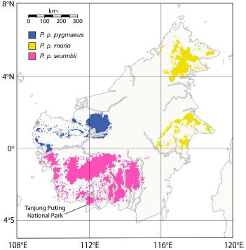
|
Scientists have recently gone to Camp Leakey, and carried out DNA analysis of the orang-utans there. That information, along with the available records about the animals, allowed them to deduce how certain organ-utans are related, and what sub-species they are. The following figure shows one family group they analyzed.
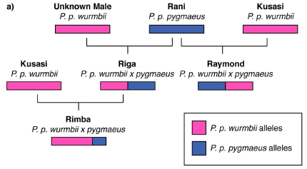
|
Start with Rani, in the middle of the top row. Rani is a female, of the blue sub-species. The bar below her name is a simple diagram of her genome, showing that she is "blue".
That top row shows that Rani has mated with two males, one known specifically and one not. They are both "red".
The next row shows two of the offspring, Riga and Raymond. They are hybrids, half red and half blue.
This is Figure 3a from the article.
|
Rani is from a non-local sub-species (blue); she bred with local (red) males, probably after being re-introduced into the wild near the Camp.
That is, the subspecies have interbred at the Camp, or as a result of being at the Camp. They are, we think, separated in Nature, but they have come together at the Camp. As a result, combinations not likely to occur in Nature have arisen at the Camp.
Thus it would seem that the Camp, intended as a site to promote Nature -- their conservation role -- has acted to disturb it. Why? Well, for one thing, when the Camp was established, it was not known that there were three distinct sub-species. It wasn't even known that the orang-utans on Borneo were a different species than the ones on Sumatra. Recognition of the types of orang-utans came only later, from DNA analysis.
The work raises a lot of questions. Some are perhaps about what the Camp should have done. More importantly, what do we do in such situations in the future?
There is no evidence that anything bad has happened because of the matings that we now wish hadn't happened. We should also note that we are not sure how well separated the sub-species really are; there is not complete agreement on the groupings. It would be something of a distraction to get too worried about those points here. The big issue, once again... What is the message for future work? The authors note the increasing importance of genome analysis in conservation work.
News story: Reintroduction of genetically distinct orangutan subspecies has led to hybridization in an endangered wild population. (Phys.org, February 25, 2016.) Excellent overview.
The article, which is freely available: Reintroduction of confiscated and displaced mammals risks outbreeding and introgression in natural populations, as evidenced by orang-utans of divergent subspecies. (G L Banes et al, Scientific Reports 6:22026, February 25, 2016.)
One of the authors (BMFG) is one of the founders of Camp Leakey. In fact, she is still active -- and draws a salary from an orang-utan conservation organization, a point listed in the conflict of interest statement.
More about orang-utans...
* A new species of orangutan? (January 16, 2018).
* Mid-life crisis (December 10, 2012).
* Appendix. Yours. (December 11, 2009)
And then... The metabolic rate of humans vs the great apes: some data (August 1, 2016).
More from Borneo... SquarePants on Borneo (September 24, 2011)
Other posts on conservation biology include...
* How many species of wolf are there, and why does it matter? (October 16, 2016).
* Monitoring the wildlife: How do you tell black leopards apart? (August 10, 2015).
* How the price of oil might affect what seals eat for dinner (January 18, 2015).
There is more about genomes and sequencing on my page Biotechnology in the News (BITN) - DNA and the genome. It includes an extensive list of related Musings posts.
Homo floresiensis -- revised dating of the original "hobbit" site
June 25, 2016
Briefly noted...
Homo floresiensis is the proposed species name for a type of hominin (human) found at Liang Bua on Flores Island in Indonesia. A distinctive feature of the species is the small size, only about one meter tall. Because of the size, these humans are commonly referred to as hobbits.
Another interesting feature of the specimens from Liang Bua is the age. Various ages have been reported, ranging from about 12,000 to 100,000 years. That the hobbits might be as recent as 12,000 years is particularly intriguing. That's getting close to "recorded history", and we've never had any sense that there was any type of human besides us present during recorded history.
A new article reports improved dating of the site. It addresses the confusion from the earlier reported datings; this required clarifying which layer of the site the hominin bones were from. The simple conclusion is that the Liang Bua hobbits are at least 50,000 years old. This makes no difference to the main issues about the hobbits, but does eliminate the "evidence" that they might be very recent.
Another new article does impact the central issues about the hobbits. A post about that article is in progress and will appear in a few days. [See July 5 post; a link is below.]
News story: Homo floresiensis May Have Disappeared Earlier than Thought. (E de Lazaro, Sci.News, March 30, 2016.)
The article: Revised stratigraphy and chronology for Homo floresiensis at Liang Bua in Indonesia. (T Sutikna et al, Nature 532:366, April 21, 2016.)
Previous posts on the hobbits include...
* The "hobbits": dentition suggests they were a distinct, dwarfed human species (November 30, 2015). Most recent post.
* The little people of Indonesia (May 14, 2009). Includes a complete list of hobbit posts -- and a book.
Next... Evidence for early Homo floresiensis (July 5, 2016).
Bird brains -- better than mammalian brains?
June 24, 2016
Bird brains don't have the best of reputations. On the other hand, recent work has shown that some birds have rather remarkable abilities to use tools and solve problems; these include birds of the crow family (the corvids) and some parrots. Further, the skills of the songbirds would seem to require more brain than we might attribute to them.
A new article re-examines the anatomy of bird brains, and offers some evidence for how capable they may be, despite their small size.
The following figure shows part of the story...
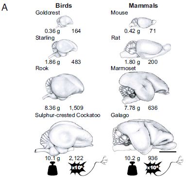
|
Look at the top row. Goldcrest -- a songbird -- on the left side; mouse -- a mammal -- on the right.
Under the little drawing of each one's brain are two numbers. On the left for each is the mass of the brain. On the right for each is the number of neurons (in millions).
You can see that the two animals have brains of similar mass (0.36 vs 0.42 grams). However, the bird has twice as many neurons (164 vs 71, in millions).
Each of the four rows of the figure shows a similar comparison -- with a similar answer.
|
That is, for a given brain mass, birds have twice as many neurons.
The first three birds are songbirds; the last is a parrot. The first two mammals are rodents; the next two are primates.
All the brains are shown to the same scale. The scale bar (lower right, under the galago brain) is 10 millimeters (1 cm).
This is Figure 1A from the article.
|
That's the idea. The article is full of measurements -- and graphs. Overall, the authors conclude that birds have denser brains, with smaller neurons. That is, they pack more neurons in the same space than mammals do. That applies particularly to the forebrain regions associated with cognitive skills -- regions that are well developed in the "smart" birds.
The article does not report any testing of function. The point of the article is anatomy: the bird brain is constructed differently. That means we cannot judge bird brains by our mammal-based criteria. The anatomy certainly allows that birds may be smarter than we expected. Those who work on songbirds and corvids should find this article satisfying.
Denser brains might even "make sense" for an animal that flies, for which weight is a big issue. It will be interesting to extend these studies to other animals, especially to the reptiles, which reflect the common ancestor of bird and mammal.
News story: Are you smarter than a macaw? -- Ounce for ounce, bird brains have significantly more neurons than mammal or primate brains. (Kurzweil, June 13, 2016. Now archived.)
The article, which is freely available: Birds have primate-like numbers of neurons in the forebrain. (S Olkowicz et al, PNAS 113:7255, June 28, 2016.) The Introduction provides good background, and is very readable.
"Avian brains thus have the potential to provide much higher "cognitive power" per unit mass than do mammalian brains." That's the final sentence of the "Significance" box in the article.
A post about tool use by a corvid: Complex tool use by birds (May 28, 2010).
and... Ravens: planning for the future? (September 11, 2017).
More about parrots, including the cockatoo...
* The genetic basis of why parrots seem so human (March 31, 2019).
* On being ambidextrous (January 24, 2010).
* A pair of related posts, grouped together on a Musings supplementary page: Dancing birds. (May 2009.)
More songbirds...
* The oldest known syrinx (December 4, 2016).
* Huntington's disease: Mutant human protein disrupts singing in birds (April 18, 2016).
More birds... Sharing resources: How to get a bird to help you find honey (September 4, 2016).
More brains: A possible genetic cause for the large human brain (March 25, 2017).
My page for Biotechnology in the News (BITN) -- Other topics includes a section on Brain (autism, schizophrenia). It includes a list of brain-related posts.
The book Marzluff & Angell, Gifts of the Crow -- How perception, emotion, and thought allow smart birds to behave like humans (2012), is a delightful introduction to the corvids. For more about the book, see my page Books: Suggestions for general science reading, for Marzluff & Angell, Gifts of the Crow.
June 22, 2016
Why human egg cells become increasingly defective as the mother ages
June 21, 2016
Many people know that the incidence of Down syndrome increases with the age of the mother. Down syndrome is due to trisomy 21, that is, to having three copies of chromosome 21. In fact, older mothers are more likely to have eggs with various errors of chromosome number; most are not viable.
Egg formation involves an unusual cell division. It starts during fetal development of the woman, but is completed only as an adult. That is, cell division is arrested at an intermediate stage -- for decades. The arrested cell must keep track of which chromosomes are paired with which. Failure of that process is, presumably, the reason many eggs from older mothers have a defective set of chromosomes. How is the arrested cell division maintained for so long? What finally goes wrong? That is the subject of much work.
The Scientist (magazine) had a recent cover story discussing what is known about the problem. It's probably a little more technical than many of the news features I post, but it is a news story, not a research article. It gives an overview of ideas in the field, rather than focusing on one article, as typical in Musings posts. Give it a try if you'd like to explore the topic.
News feature, freely available: A Scrambled Mess -- Why do so many human eggs have the wrong number of chromosomes? (K Schindler, The Scientist, May 1, 2016.) Now archived.
A post on one specific finding in this field: A gene that reduces the chance of successful pregnancy: is it advantageous? (May 18, 2015). The article discussed here is noted in the current news story. (It is in the separate section, "In the genes", by Jacob Ohring; at the web site, it is right after the main text, just before the references.)
And for some confusion... This post deals with a case where the age of the mother causes a problem, but it seems not to be due to the age of the egg... Increased risk of congenital heart defects in offspring from older mothers: Why? and can we do anything about it? (July 18, 2015).
Fathers... Accumulation of mutations in the sperm of older fathers (November 19, 2012). Mom and Dad have different strategies for making gametes; they lead to different effects of aging. Fathers make a huge number of gametes; this leads to an accumulation of replication errors, many of which are found as ordinary mutations. Mothers make a small number of gametes and store them for decades; this leads to problems with storing the chromosomes properly.
More about Down syndrome: Down syndrome: Could we turn off the extra chromosome? (November 15, 2013).
Also see...
* Tri-parental embryos for preventing mitochondrial diseases (September 23, 2016).
Nerves a half billion years old
June 20, 2016
The figure shows the ventral nerve cord (VNC) of an arthropod. It is a Chengjiangocaris kunmingensis, a tiny crustacean, or shrimp-like animal. The VNC is to this animal the equivalent of a spinal cord. The figure is from a recent article.
The alternating dark and light sections are labeled "ga" and "cn", for ganglia and longitudinal connectives, respectively.
The ganglia of the VNC match up with the walking legs (wl). However, this is hard to see. More detailed analysis of the ganglia leads to the apparent identification of individual nerves.
The sample is from the Cambrian period, over a half billion years ago. We called the animal a crustacean, but it would be better to say it is crustacean-like, an ancestor of modern crustaceans.
This is Figure 1C from the article. Note the 0.5 millimeter scale bar at the lower right.
|
|
It's another remarkable fossil find. The authors specifically claim it is the first time one can see individual nerves in such an old sample. Their analysis, including comparison with modern arthropod nervous systems, suggests that the nervous system here is quite complex. Much development of more modern organisms involved simplification of the nervous system.
The work raises many of the same questions as other fossil work, especially about interpretation. Such questions can only be answered by further work and debate. However, it may be good to note one distinction between this work and the work discussed in a recent post, claming macroscopic eukaryotes 1.6 billion years ago.
In the previous case, the heart of the claim is subject to question; the common view is that such organisms did not exist for, say, another billion years. In the current case, there is no question that the organisms existed, and one presumes they had a nervous system. It is surprising that we are finding samples with such good preservation that we can see these details, but the findings themselves are not suspect. In fact, there has been quite a flurry of claims of fossils showing preservation of arthropod nervous systems, even brains, in recent years.
News stories:
* Paleontologists Find 520 Million-Year-Old Fossilized Central Nervous System. (Sci.News, February 29, 2016.)
* 520-million-year-old fossilized nervous system is most detailed example yet found. (Science Daily, February 29, 2016.)
The article: Fuxianhuiid ventral nerve cord and early nervous system evolution in Panarthropoda. (J Yang et al, PNAS 113:2988, March 15, 2016.)
A recent post on old fossils: A 1.6 billion-year-old macroscopic multicellular eukaryote? (June 13, 2016). Links to more.
My page for Biotechnology in the News (BITN) -- Other topics includes a section on Brain (autism, schizophrenia). It includes a list of posts about brains and, more generally, nervous systems.
Habitable planets very close to a star
June 19, 2016
A major scientific development of the past decade has been the discovery of planets beyond our Solar System -- so-called exoplanets. A few thousand are now known.
There are now so many known exoplanets that we classify them. Hot Jupiters, super Earths, and more. A category of special interest: habitable planets. There is a lot of guessing there, for we usually don't have any real data. So we make a simple assumption: a planet should have liquid water in order to be habitable. That means estimating, as best we can from limited information, what the temperature (T) might be on a newly discovered planet.
A new article explores a new question... How close could we be to a star, and find the site "habitable"? Around here, 93 million miles from the star works well. The new article reports discovery of three planets that are within 15 million miles of their star, and which may be in the habitable region.
How can that be? Well, it's a rather wimpy star. The star is what is called an ultracool dwarf. It's very near the borderline of not being a star at all. It's big enough to make a little heat, but not much. (Its effective temperature, based on the spectrum of its light, is only about 2700 Kelvin. That's less than half of the T of our Sun.) We now learn that this ultracool dwarf star has planets.
The three planets discovered here are all close to the star, with estimated orbits of 1.5 to 18 days. (The high end has a huge uncertainty; I have used their "most likely" number.) Because the star is ultracool, these three close planets may have T not too different from that of Earth.
The following figure gives some perspective to the new findings...
|
The graph plots the T of a planet (x-axis) vs the mass of its star (y-axis). (Both scales are logarithmic.) It also codes more information into coloring and other features.
The star mass is given in solar masses. That is, our sun is taken as 1 M☉.
Each dot is for one exoplanet, showing its T and the size of its star. The size of the dot is proportional to the size (diameter) of the planet.
There are vertical dashed lines at the T for the four inner planets of our Solar System. Those lines give you an idea where the habitable region is.
|
The smallest star represented on the graph is the one from the current work, called TRAPPIST-1. Its mass is a little below 0.1 M☉. It is right on the borderline between red dwarfs and brown dwarfs; that borderline is essentially between just-barely-stars and not-really-stars.
Three planets are shown for this star, as reported in the current article. The two right-most dots (between the lines for Venus and Mercury) are for the two inner planets; they may be a little warm. The third planet, to the left, has a huge error bar on it for now. It may be a little cool -- but maybe not. Remember, these estimates of T are very rough. Maybe one of these planets is in the habitable range. Even if none of these are, one can easily imagine a habitable planet around such a star.
This is Figure 2 from the article.
|
Summing it up... The article shows that ultracool dwarf stars have planets. They may have planets in the habitable region, which would be very close to the star.
There are many ultracool dwarf stars. Studying their planets has some advantages... The stars are so dim that they don't interfere so much with observations of the planets. It may be possible to observe the planetary atmospheres -- and see if they contain oxygen gas.
We can expect more from this ultracool scientific team.
News stories:
* Astronomers discover potentially habitable planets just 40 light years from Earth. (Kurzweil, May 3, 2016.)
* Three Potentially Habitable Worlds Found Around Nearby Ultracool Dwarf Star -- Currently the best place to search for life beyond the Solar System. (European Southern Observatory (ESO), May 2, 2016. Now archived.) (By the way, the European Southern Observatory is in Chile.)
* 'Ultracool' dwarf star hosts three potentially habitable Earth-sized planets just 40 light-years away. (A Burgasser, The Conversation, May 2, 2016.) A news story-type presentation by one of the authors of the article, a professor at University of California San Diego.
The article: Temperate Earth-sized planets transiting a nearby ultracool dwarf star. (M Gillon et al, Nature 533:221, May 12, 2016.) Check Google Scholar for a preprint at ArXiv.
Another planet from a dwarf star... GJ 1132b: "the most important planet ever found..." (December 18, 2015). Some of the issues raised here are similar to those in the current article, though there is little about habitability, since the planet is too hot. The planet is shown on the figure above. The article discussed here is not referred to in the current article, but the authorship teams overlap.
Posts about habitable planets include...
* Planning a visit to the nearest star -- and to its "habitable" planet (February 22, 2017).
* Habitable Exoplanets Catalog (July 27, 2012). All five of them, at that time.
* The first truly habitable exoplanet? (October 12, 2010).
* Atmosphere suggests planet might harbor life (August 30, 2010).
Other posts about exoplanets include...
* Titanium oxide in the atmosphere? (December 9, 2017).
* Exoplanet Travel Bureau (February 21, 2015).
* The Kepler Orrery (June 3, 2011).
* Extrasolar planets (December 8, 2009). Only seven years ago!
Can Wolbachia reduce transmission of mosquito-borne diseases? 2. Malaria
June 17, 2016
The previous post has a brief introduction to Wolbachia bacteria, and to its interaction with insects and pathogens. [Immediately below; link at the end.]
The article discussed in the current post is about a natural population of mosquitoes in an area with a high incidence of malaria. There is Wolbachia in the population. The mosquitoes in this case are Anopheles coluzzii, which carry the protozoan Plasmodium falciparum, the causal agent of malaria. The scientists explored whether the bacteria affected malaria transmission.
Here are two parts of their story...
Frame a (left side) shows the percentage of female mosquitoes that carry malaria parasites as a function of whether or not they (the mosquitoes) carry Wolbachia. The mosquitoes tested here were a random sample from the study area, houses in Burkina Faso.
The left-hand bar is for W- (that is, for mosquitoes without Wolbachia); the right-hand bar is for W+. The red part of the bar is the percentage carrying the malaria parasite (P+).
The N values, near the bottom, show that about half the sample was W+.
You can see that the percentage of mosquitoes carrying the malaria parasite (P+; red bar) is about ten times higher for those that lack Wolbachia (W-; left bar). That is, Wolbachia infection correlates with a lower probability of carrying malaria parasite.
Frame b (right side) shows how the Wolbachia level in the mosquito population may affect transmission of malaria to humans. This is based on mathematical modeling, and uses some assumptions. Nevertheless, the general idea is of interest. The y-axis shows the fraction of people who will become infected with malaria as a function of the level of the Wolbachia infection in the mosquitoes (x-axis). The more Wolbachia, the less malaria parasite in the mosquitoes (as shown in frame a) -- and therefore the less malaria in people. (There are two curves, for somewhat different assumptions. For our purposes, it doesn't matter; the general shape is the same.)
The gray region of frame b shows the range of levels of Wolbachia they have found in natural populations in the study region. You can see that the level of Wolbachia infection is low enough that it has only a small effect on malaria transmission.
This is Figure 3 from the article. I have added the labels W- and W+ for clarity (near bottom of frame a).
|
Let's summarize the key findings noted above...
* Mosquitoes infected with Wolbachia are less likely to carry the malaria parasite.
* Modeling shows that that effect could reduce malaria transmission to humans.
* The levels of Wolbachia infection currently found are too low to have much effect.
So where does that leave us? That's not obvious. Remember, the big issue is whether we can use Wolbachia to control diseases. The current work is about a natural situation, and it seems the Wolbachia might control the disease in principle, but is having a limited effect in practice.
The authors suggest that what they observe is the early stage of the Wolbachia infection, and that the level of infection will increase. That would enhance its effect on reducing malaria transmission. It is possible that the Wolbachia will do that; it's well known that it can enhance its own transmission and essentially ensure that the entire population carries it. However, we do not know how that gets established, and it seems speculation to suggest that will happen here.
Another interesting question is whether other populations of malaria-transmitting mosquitoes are infected with Wolbachia. Is it possible that some of the variation in malaria rates is due to Wolbachia? That the population studied here is infected was discovered only two years ago. Apparently, it's generally not known whether natural populations of mosquitoes are infected.
Once again, we are left with some interesting results, the significance of which we don't really understand. Such is the current state of much work with Wolbachia.
News stories:
* Common bacteria may help curb mosquito-borne diseases. (Harvard School of Public Health, undated.) A brief note about the current article.
* Malaria, Zika and Dengue Could Meet Their Match in Mosquito-Borne Bacteria -- A common bacteria that infects mosquitoes seems to prevent them from carrying more deadly diseases. (B Handwerk, Smithsonian, May 31, 2016.) A broader discussion of Wolbachia in mosquitoes. Includes mention of the Zika article that was the subject of the background post, and field work against dengue.
The article, which is freely available: Wolbachia infections in natural Anopheles populations affect egg laying and negatively correlate with Plasmodium development. (W R Shaw et al, Nature Communications 7:11772, May 31, 2016.) Very readable.
Background post, including an introduction to Wolbachia ... Can Wolbachia reduce transmission of mosquito-borne diseases? 1. Introduction and Zika virus (June 14, 2016). This is the post immediately below.
And then... Can Wolbachia reduce transmission of mosquito-borne diseases? 3. A field trial, vs dengue (August 10, 2018).
Previous malaria post... How an American weed might interfere with control of malaria in Africa (November 13, 2015).
Next... Can chickens prevent malaria? (August 12, 2016).
Also see... What does "Anopheles" mean? (August 27, 2012).
More on malaria is on my page Biotechnology in the News (BITN) -- Other topics under Malaria. It includes a list of related Musings posts.
June 15, 2016
Can Wolbachia reduce transmission of mosquito-borne diseases? 1. Introduction and Zika virus
June 14, 2016
Introduction to Wolbachia
Wolbachia bacteria can infect many insects. The manifestations of Wolbachia infections are varied; some are detrimental to the insect, but some are beneficial. We are interested here in one particular role of Wolbachia: reducing human pathogens. So we will consider only a subset of possible Wolbachia effects.
Once Wolbachia infection is established, it is typically maintained by direct transmission from mother to offspring. In many cases, infection with Wolbachia reduces the growth of viruses or other infectious agents within the insects. This is one way Wolbachia might reduce transmission of pathogens by insects.
Unfortunately, we don't understand how Wolbachia works, it is not common in some important mosquitoes, and we know little about manipulating it.
A couple of recent papers add to our experience with Wolbachia in mosquitoes. They involve different kinds of mosquitoes and different pathogens. One shows that Wolbachia might reduce transmission of Zika virus. That is the subject of this post. The other explores a case where some mosquitoes in an area with a high incidence of malaria carry Wolbachia. That will be the subject of an upcoming post (which is immediately above).
Zika
A new article provides some encouraging news about a possible way to reduce the transmission of Zika virus by mosquitoes. This is a lab study, in which mosquitoes with and without Wolbachia were compared for their ability to support and transmit Zika virus.
Here's the idea...
|
There are two mosquitoes, both Aedes aegypti. This is a species of mosquito that carries Zika virus, and others.
The mosquito on the left is labeled Wolb- (and has a red abdomen); it lacks Wolbachia bacteria. The one on the right is Wolb+ (blue abdomen); it carries Wolbachia.
Both feed on a blood meal, one infected with Zika virus. The blood meal is shown here in a red can. More commonly, it is in a person.
|
Below the blood are some results...
* for the percentage of mosquitoes that appear to have a general (disseminated) infection with the virus
* and for the percentage that have the virus in their saliva.
The Wolb- mosquitoes give high numbers. The Wolb+ mosquitoes give low numbers.
This is the "graphical abstract" with the article.
|
The results above show that Wolb+ mosquitoes have less Zika virus than do Wolb- mosquitoes. The result for saliva is particularly important; that is what the mosquito injects into the red can -- or into you. That is, from these results, we expect that Wolbachia could reduce transmission of Zika.
The specific strains of Zika virus used in this work are two strains that are circulating in Brazil. The mosquitoes are also "local" strains, and the Wolbachia is a strain already being used there in an effort to control dengue.
The result is not a big surprise; It had previously been shown that Wolbachia reduces transmission of dengue virus, which is related to Zika, and chikungunya virus.
The big question is whether we can learn to make use of Wolbachia to control mosquito-borne infections. Aedes mosquitoes do not commonly carry Wolbachia. There is work on developing Wolb+ mosquitoes, but it is still early.
News stories:
* Bacteria shown to curb mosquitoes' ability to spread Zika. (L Schnirring, CIDRAP, May 5, 2016.)
* US reviews plan to infect mosquitoes with bacteria to stop disease -- Biotech firm seeks government approval to market mosquitoes as a pesticide to prevent spread of Zika and dengue viruses. (E Waltz, Nature News, May 24, 2016. In the print journal... Nature 533:450, May 26, 2016.) This story is not primarily about the current article, or even its approach. It focuses on possible regulatory approval in the US of a Wolbachia product intended to reduce the population of Aedes mosquitoes in the US.
The article, which is freely available: Wolbachia Blocks Currently Circulating Zika Virus Isolates in Brazilian Aedes aegypti Mosquitoes. (H L C Dutra et al, Cell Host & Microbe 19:771, June 8, 2016.)
Accompanying post on Wolbachia: Can Wolbachia reduce transmission of mosquito-borne diseases? 2. Malaria (June 17, 2016). This is the post immediately above.
And then... Can Wolbachia reduce transmission of mosquito-borne diseases? 3. A field trial, vs dengue (August 10, 2018).
Previous post on Zika: A Zika-dengue connection: Might prior infection with dengue make a Zika infection worse? (May 7, 2016).
There is a section on my page Biotechnology in the News (BITN) -- Other topics on Zika. It includes a list of Musings post on Zika.
Other ways to deal with mosquitoes...
* A laser-based missile-defense system to bring down mosquitoes (May 18, 2010).
* Mosquitoes that can't fly (May 3, 2010).
Another bacteria-insect symbiosis: The aphid-bacterium symbiosis: a step toward manipulating it (May 15, 2015).
Another symbiosis: Are yeasts important partners in lichens? (September 12, 2016).
Also see: A mosquito map for the United States (October 3, 2017).
A 1.6 billion-year-old macroscopic multicellular eukaryote?
June 13, 2016
|
That's a rock.
There are two "impressions" on the rock; they are marked with arrows (and numbered).
The authors of a new article argue that the impressions are fossils. That is, the impressions were left by the remains of organisms.
The ruler at the bottom is labeled in centimeters.
This is Figure 3a from the article.
|
What organisms left those impressions? They are "big" -- several centimeters long. The scientists suggest that they are from macroscopic multicellular eukaryotes. They aren't too specific, but you might think in terms of seaweeds.
That is a remarkable claim. Why? Because the rock is thought to be about 1.6 billion years old. The scientists are claiming they have macroscopic multicellular eukaryotes 1.6 billion years old. That's about a billion years older than any such fossils that are generally accepted.
What is their argument to support such a claim? Not much. A major point... the authors think the impressions are too regular to be bacterial mats. (That's based on their analysis of their collection, not on the appearance of any individual impression.)
There are more nice pictures, but they don't really resolve anything. Here is one...
"Organic fragments showing cellular structure". So says the figure legend.
The scale bar is 20 micrometers. That is, the "cells" are approximately 10 µm across.
It is certainly an interesting picture, but what it shows is open. The authors note that they cannot be sure that these cells are related to the macroscopic structures shown above.
This is Figure 7c from the article.
|
|
What do we make of all this? I've noted some reservations above. The news story listed below notes skepticism about the claims of this article. It's important to distinguish... This is not a criticism of the article per se. The scientists have a new finding. They present it, and they say what they think about it. That's all fine. They are pretty good at making clear the distinction between the facts and the interpretation. The point is that their interpretation is "soft" -- and the claim is quite extraordinary. Scientists will now debate the meaning of this work. Others will examine the specimens, using various methods. Of particular importance in the long term, we await further discoveries representing the time period between the new claim and others now available. The article represents good science: a novel finding, and a bold claim of uncertain importance.
News story: Chinese scientist finds earliest known fossil of complex life, paper met with heavy criticism. (A Micu, ZME Science, May 18, 2016.)
The article, which is freely available: Decimetre-scale multicellular eukaryotes from the 1.56-billion-year-old Gaoyuzhuang Formation in North China. (S Zhu et al, Nature Communications 7:11500, May 17, 2016.)
Thanks to Borislav for suggesting this item.
Other posts that raise similar questions about what ancient fossils mean include:
* Claim of oldest fossilized cells refuted (May 3, 2015). 3.5 billion years old.
* The oldest known multicellular organisms? (August 21, 2010). 2.1 billion years old.
Or ancient proteins... Dinosaur proteins (July 6, 2009).
More old fossils: Nerves a half billion years old (June 20, 2016).
Nihonium, moscovium, tennessine, and oganesson
June 11, 2016
IUPAC has announced proposed names for the four chemical elements they recently officially recognized: 113, 115, 117, 118. These names will be open for comment until mid-November; after that, IUPAC will make a final decision.
The lower right corner of the main part of the periodic table. I have highlighted the four new elements in yellow. The proposed names and symbols are shown.
This is the same figure I showed in the background post, except that I have added the proposed names and symbols for the four new elements. (The previous version showed the provisional names, such as ununoctium for 118.)
|
The announcement listed below gives the proposed names and symbols, with a brief statement about each. It also includes a brief version of the rules for element names, and the process for assigning them.
Announcement: IUPAC is naming the four new elements nihonium, moscovium, tennessine, and oganesson. (IUPAC, June 8, 2016.)
Background post on the new elements: Four new chemical elements officially recognized (January 12, 2016).
More about Nh and Mc: Measurement of atomic mass of superheavy atoms (February 24, 2019).
More about Ts and Og: The molecular shape of OgTs4 (June 29, 2021).
More about the periodic table: The new IUPAC periodic table; atomic weight ranges (August 1, 2017).
I have noted this development on my page of Internet Resources for Introductory Chemistry under Names of elements.
The nature of a bio-compass?
June 10, 2016
Animals may respond to magnetic fields, but how is still poorly understood. The protein cryptochrome has been implicated, but how it works is unclear.
A recent article reports the isolation of a protein complex that responds to magnetic fields. The complex includes cryptochrome. It's an intriguing article.
Here is some of the evidence that the protein complex aligns to a magnetic field...
Caution... The figure is hampered by some bad terminology. I'll try to describe it correctly, then explain their terminology.
Start with frame a (left), the actual image, from electron microscopy. Note the red boxes. Each red box contains a rod-like particle, oriented approximately vertically on the page. The rod-like particle is the protein complex. In this image, the sample was exposed to a magnetic field that was "vertical". We see, then, that the rod-like particles in the red boxes are aligned parallel to the magnetic field. That's a key idea.
Some particles are in blue boxes. These are approximately horizontal; that means they are perpendicular to the magnetic field.
Some particles are in yellow circles. These are at some odd angle, neither horizontal or vertical. We call them "other".
Next, the authors count how many of the particles -- protein complexes -- are oriented in each "direction". They classify the particles into the three categories noted above (shown with different colored symbols). Each category accounts for 1/3 of the possible directions, or 120 degrees. If the particles orient randomly, we would expect that 1/3 of the complexes would be in each category.
What do we see? Look at the middle frame above. You can see that about half of the protein complexes are oriented "parallel" to the magnetic field. The other two categories have fewer complexes.
The figure above includes parts a and b of Figure 5 from the article. Note that part b has two frames.
|
That bar graph provides the key evidence... The results are non-random. The protein complex tends to align parallel with the magnetic field.
Terminology problem... Above, I noted that the complexes marked with blue boxes are horizontal, and perpendicular to the magnetic field. Unfortunately, in the bar graph, they are referred to as being "vertical"... the first two categories are labeled "parallel" and "vertical". That doesn't make sense; what the authors meant was parallel and perpendicular.
The right-hand frame above defines the three categories. This makes clear what they meant by the category they call "vertical".
The right-hand frame also shows that each of the three categories includes 120 degrees.
There is another hint of an effect in the figure. The scientists did experiments with two different magnetic fields. In the middle frame, there are two bars for each category. These are for two magnetic fields: 0.04 and 1.0 mT (milliteslas). (The lower field is the natural geomagnetic field; the higher field was obtained by applying an external magnetic field.) You can see that the bar for parallel complexes is higher with the higher magnetic field. (Their error bars suggest this is statistically significant.) That is, the graph shows that the higher magnetic field aligned more complexes, as one might expect.
Overall, the scientists claim they have a protein complex that aligns with magnetic fields. That is, the protein is itself a magnet. What is in the complex? Cryptochrome, Cry, a protein already implicated in magnetoreception. What is it complexed with? Well, they call it a receptor -- MagR. That is, they claim to have identified the molecular structure, a MagR/Cry complex, that is at the heart of magnetoreception.
Of course, there is more than the results I have shown above. Nevertheless, the scientific community is reacting to this cautiously. There is a lot that is new here, and the full biology story is not yet clear. Time will tell. If they are right, further work will confirm and build on it. If it is not right, it will fall by the wayside. Pioneering work sometimes starts with uncertain steps.
News stories:
* Magnetic 'compass' protein found in fruit flies. (E Stoye, Chemistry World (RSC), November 17, 2015.)
* Biological Compass -- A protein complex discovered in Drosophila may be capable of sensing magnetism and serves as a clue to how some animal species navigate using the Earth's magnetic field. (B Grant, The Scientist, November 16, 2015.) Now archived.
* News story accompanying the article: Protein complexes: A candidate magnetoreceptor -- A protein complex found to align with the direction of a magnetic field could be a key piece in the puzzle of how animals detect magnetic fields. (K J Lohmann, Nature Materials 15:136, February 2016.)
* The article: A magnetic protein biocompass. (S Qin et al, Nature Materials 15:217, February 2016.) Check Google Scholar for a copy of a preprint.
More about animals and magnetism:
* Looking for genes for animal magnetism (June 11, 2017).
* Magnetic turtles (July 5, 2015).
* Can blind rats learn to use a geomagnetic compass? (June 29, 2015).
* A human protein that can sense magnetic fields (July 15, 2011). The work in this post is at the level of the animal. The current post is at the level of the protein complex.
* Magnetic field perception (June 16, 2010).
More about magnetic fields:
* Information storage: One atom, one bit (May 15, 2017).
* What if your compass pointed south? (October 24, 2014).
Other posts about Drosophila include... Chronic pain in flies? (October 6, 2019).
June 8, 2016
Is glyphosate (Roundup) a carcinogen? Follow-up
June 7, 2016
Original post: Is glyphosate (Roundup) a carcinogen? (March 6, 2016).
In that post we noted two recent reports -- which appeared to reach opposite conclusions. We did not try to resolve the contradiction, but did look at some of the issues.
What's new? Two organizations got together and talked about the discrepancy. Not exactly the two organizations that issued the original reports, but a useful two: the Food and Agriculture Organization (FAO) and the World Health Organization (WHO). Both are part of the United Nations.
The conclusion? "Glyphosate, a broad-spectrum systemic herbicide, is unlikely to pose a carcinogenic risk to humans exposed via the diet." (From near the end of the announcement below.)
It was the WHO that had declared glyphosate to be a probable carcinogen in the report noted last time; WHO now says it is unlikely to be a risk to humans via diet. It's important to understand the difference between those two statements.
One can question the nature or quality of the available data, or how either of the analyses is done. Those are proper but huge and complex issues beyond our scope here. The point is... the expert panels, examining the data that is available, conclude that glyphosate may be inherently carcinogenic, but that human exposure through diet is minimal. Those are both useful statements, two parts of the big story.
* A brief announcement: Results of joint FAO/WHO Meeting on Pesticide Residues (JMPR). (FAO & WHO, May 24, 2016. Now archived) The link at the end no longer works; see...
* A page with a link to the Summary Report from the Joint FAO/WHO Meeting on Pesticide Residues. (FAO & WHO, May 16, 2016.)
The report is on three agents: glyphosate, diazinon and malathion. The situation is similar for the other two.
My page for Biotechnology in the News (BITN) -- Other topics includes a section on Cancer. It includes a list of related posts.
Arm problems in the stars
June 6, 2016
Examples of the problems are shown at the right.
These were ordinary sea stars before becoming afflicted with sea star wasting disease (SSWD).
We used to call sea stars "starfish", but they aren't fish. "Sea stars" is now the preferred term.
This is part of the top figure in the Blair news story. That figure is probably the same as Figure 1 from the article.
|
|
SSWD is a big problem around here. A recent outbreak devastated populations of 20 species of sea stars all along the west coast of North America, from northern Mexico to Alaska.
The cause of SSWD is not known. Infectious agents, including a virus, have been suggested; perhaps they are part of the story.
A new article makes a small contribution to our understanding of SSWD. Very small. Why do we note it? It's another example of trying to figure out a mysterious disease. We could discuss Zika, or we could discuss SSWD. Anyway, it is a short and readable article, with a good overview of the story of SSWD. Some may not even be aware of SSWD.
The new article builds on observations suggesting that water temperature (T) has something to do with SSWD.
The scientists collected sea stars during low tide, and maintained them in the lab at either a low T or a high T. The temperatures used, 9 or 12 °C, are typical winter and summer water T for the area, off the coast of northern Washington. Many of the animals already showed signs of SSWD when collected; the others were presumed to be infected, but not yet symptomatic.
The basic finding was that animals maintained at the low T progressed more slowly through the disease, but ultimately all of them died. The results, taken along with earlier work, suggest that it is T itself, and not any T shock upon being moved from the ocean, that affects the rate of disease progression. The disease process is faster in warmer animals.
That's about it. A small but useful piece of information. There is nothing here that addresses whether T might be relevant to the initial establishment of the disease.
SSWD will continue to periodically devastate the sea stars off our coast. We still know almost nothing about the disease or what we might do about it.
The authors note that they observed some healing of wounds at the lower T, though the animals eventually died. Is this a clue to something important? There is too little information here to tell.
News stories. These are both at the same site, but are independent posts. The oceanbites site is a blog from the University of Rhode Island Graduate School of Oceanography. The posts are mostly from students in various marine sciences. I've been impressed with the site, and now get the announcements of new posts, typically a few each week.
* Wasting Away in Virus-ville. (A Blair, oceanbites, May 12, 2016.) This story notes a virus that has been associated with the disease. However, it is not clear what role the virus plays. This is discussed more in the article itself.
* Bringing Down the Fever: Sea Star Wasting Disease. (A Schlunk, oceanbites, May 25, 2016.)
The article, which is freely available: Decreased Temperature Facilitates Short-Term Sea Star Wasting Disease Survival in the Keystone Intertidal Sea Star Pisaster ochraceus. (W T Kohl et al, PLOS One 11:e0153670, April 29, 2016.)
More about sea stars (starfish):
* Quiz: What are they? And are they a threat to you? (October 20, 2014).
* Where is the front of the circle? How a brittle star moves (July 3, 2012).
Ebola survivors: are they a risk to others?
June 5, 2016
The recent Ebola outbreak in West Africa brought us more Ebola deaths than the total of all previous known outbreaks. It also brought us more Ebola survivors than ever known. Ebola survivors are an interesting new topic.
Ebola survivors may still carry the virus, and may relapse. There must, then, be concern about whether they can transmit the virus to others.
A new article reports a study of 112 Ebola survivors at one clinic. The purpose of the clinic is to monitor survivors, and help them deal with possible problems. But the current study was specifically concerned with the possible risk to others.
In this study, samples from various body sites of the survivors were tested for Ebola virus RNA. That is a sensitive test for the possibility of there being virus. (It's possible to have viral RNA without having infectious virus, but it is much easier to test for the RNA.)
The short summary is that almost all samples tested negative for viral RNA. One semen sample was positive; all other samples from that individual were negative.
Only one participant provided a semen sample, so that part of the study is very limited. However, the possible transmission of Ebola through semen from survivors has already been established from other work.
The general conclusion is that Ebola survivors do not seem to be a source of infectious virus. In the course of an ordinary Ebola infection, people are generally not able to transmit virus until they are very sick. Thus the results for survivors agree with what is known for those with early-stage disease, with few symptoms. That's all encouraging. Health care workers who need to deal with body sites known to harbor residual virus need to take special care; otherwise, perhaps they do not need special precautions.
The article is interesting simply because of the question that was asked. How different a question it is from what we were asking a year ago! Let's hope that the answer holds up as substantially correct as we learn more.
News story: Study: Casual healthcare contact with Ebola survivors poses low risk. (N Vestin, CIDRAP, May 17, 2016.)
Both of the following appear to be freely available if you access them via the Lancet web site (registration required), but not at Science Direct.
* Comment story accompanying the article: The crucial importance of long-term follow-up for Ebola virus survivors. (R Fowler et al, Lancet Infectious Diseases 16:987, September 2016.) A nice one-page overview of the importance -- and limitations -- of this work. Recommended.
* The article: Viraemia and Ebola virus secretion in survivors of Ebola virus disease in Sierra Leone: a cross-sectional cohort study. (E Green et al, Lancet Infectious Diseases 16:1052, September 2016.)
Recent Ebola posts include: After Ebola, what next? and how will we react? (September 5, 2015).
Next: Update: Ebola vaccine trial (January 24, 2017).
There is a section on my page Biotechnology in the News (BITN) -- Other topics for Ebola and Marburg (and Lassa). That section links to related Musings posts, and to good sources of information and news.
Metastasis: How clusters of tumor cells get through narrow capillaries
June 3, 2016
Metastasis is an important part of the cancer process. Most cancer deaths are due to metastasis, in which parts of the original cancer take up residence at other sites in the body.
Metastasis presumably requires cells from the original tumor to travel to the new site through the blood. There is considerable interest in the possibility that it is clusters of such cells that are important; certainly such clusters of circulating tumor cells are often found in the blood of a person with cancer. However, if they must travel through narrow blood capillaries, that seems difficult. Blood cells can only get through the capillaries single file; how could a cluster of cancer cells get through? A new article offers a possible resolution of this dilemma.
Here is part of the story...
The two parts of the figure are two images of the same scene. The scene is that eight cells -- cancer cells -- are moving through a capillary tube. The flow is from left to right. One cell. at the left, has not yet entered the narrow part of the capillary; another is just starting to enter the narrow part.
The cells have been stained with a dye that binds to DNA. The dye makes the nuclei appear blue in ordinary light; it is also fluorescent.
The left frame is an ordinary light microscope image. You can see the outline of some cells, and the nuclei.
The right frame is a fluorescence image. You are mainly seeing the cell nuclei here.
The two frames lead to the same general conclusion... The cell not yet in the narrow part is approximately round, as is its nucleus. The cells in the narrow part are flattened (or elongated), as are their nuclei. And the cell that is about to enter the narrow part appears intermediate.
The capillary has a diameter of 5 µm. The scale bar is 50 µm.
This is Figure 3D from the article.
|
Nice pictures. They show that cells -- and specifically the nuclei -- deform in order to pass through capillaries. That's what happens in the capillaries of the circulatory system.
What that static scene doesn't show is even more important... The eight cells there were added as a single cluster. Somehow, a cluster of cells "figured out" that the way to get through the capillary was to rearrange and pass through single file.
To see that, look at some of the movie files included as Supporting Information (SI) with the article. There are 17 of them. Go to the article web site, listed below, and click on the SI tab. You can browse as you wish, but I suggest you start with the ones listed here as good examples of how a cluster of cells enters the capillary.
* Details vary, such as cell types, stains, and capillary size. That doesn't matter for the main goal of simply seeing the cells enter and go through the capillary. The movie files are short (most are less than a minute), and have no sound. There is a caption in the list of movie files, but the movies themselves are (usually) not labeled. You may need to watch one more than once in order to get the point.
* Movie S5. A good choice to watch first. (This is probably the same as the animated figure featured at the top of the news story in The Scientist, listed below.)
* Movie S4.
* Movie S12.
* Movie S13. Complicated. (3 minutes.)
It's hard to tell from individual pictures or movies, but the cells in a cluster usually remain attached as they pass through the capillary single file. They remain as a cluster upon exiting the capillary.
Those movie files are perhaps the focus of this post. We also gain a little insight into part of the process of metastasis.
News stories:
* Circulating Tumor Cells Traverse Tiny Vasculature -- Clusters of tumor-derived cells can pass through narrow channels that mimic human capillaries, scientists show in vitro and in zebrafish. (T Lewis, The Scientist, April 18, 2016.) Good overview, and good figures, including some of the movie files. Now archived.
* Metastasis-promoting circulating tumor cell clusters pass through capillary-sized vessels. (Science Daily, April 18, 2016.)
The article, which is freely available: Clusters of circulating tumor cells traverse capillary-sized vessels. (S H Au et al, PNAS 113:4947, May 3, 2016.)
Recent posts on metastasis:
* Cancer metastasis: An early detection system? (October 20, 2015). This is about circulating tumor cells.
* Anti-oxidants and cancer? (October 18, 2015).
More zebrafish: Scoliosis: an animal model (July 22, 2016).
My page for Biotechnology in the News (BITN) -- Other topics includes a section on Cancer. It includes a list of related posts.
June 1, 2016
Transmissibility of Alzheimer's disease?
June 1, 2016
Musings has noted developments suggesting that Alzheimer's disease (AD) might be transmissible [links at the end]. Nature recently ran a news feature discussing the topic, including its uncertainties and implications. It's a good overview, worth browsing if you are interested in the subject.
Reminder and caution... The issue is very interesting in terms of understanding AD (and possibly other neurodegenerative diseases). In particular, it makes some connection between AD and prion diseases: both involve misfolded proteins. That immediately raises the question of whether AD might be transmissible, as are some prion diseases under some conditions. It might have some practical implications for transmission, but almost certainly only in medical procedures where unhealthy tissue might be transferred. There is no suggestion that AD is ordinarily transmitted from person to person.
News feature, which is freely available: The red-hot debate about transmissible Alzheimer's. (A Abbott, Nature 531:294, March 17, 2016.)
Background posts:
* Transmission of Alzheimer's disease in humans? (September 27, 2015). The article discussed in this post is the starting pint for the new feature.
* Is Alzheimer's disease transmissible? (February 4, 2011).
More about AD: An antibody to treat Alzheimer's disease: early clinical trial results (September 26, 2016).
My page for Biotechnology in the News (BITN) -- Other topics includes a section on Alzheimer's disease. It includes a list of related Musings posts.
For more about prions, see my page Biotechnology in the News (BITN) - Prions (BSE, CJD, etc). It includes a list of related Musings posts.
What can the mites on your face tell us about your ancestry?
May 31, 2016
Humans live in close association with other organisms. Examples include the bacteria of our gut; the study of those organisms has become a major field of study. The first question is simply, who is there? We soon go beyond that to ask why are they there? or why does it matter? Broadly, what is the role of our gut microbiota in health and disease?
A recent article begins to explore another type of organism that lives with us intimately: the mites in our hair follicles. Demodex folliculorum. Mites are associated with hair follicles in all mammals. We have less hair, but we still have hair mites. We can ask the same types of questions, ultimately wanting to know: what is the role of our miteota (?) in health and disease?
In the new work, mites were collected from the faces of 70 people in the United States. The mites were classified by their mitochondrial DNA (mtDNA) sequence. Their human hosts were classified by their region of ancestry.
Here is a summary of some of the findings from the new work.
First, the mites fell into four classes, called clades, based on the similarity of their mtDNA. These are called A through D, and are color-coded as shown in the key at the bottom.
Then there are pie charts around the map. Each pie chart shows the frequency of the four types of mites for hosts whose ancestry was from that continent. (Remember, everyone tested was in the US.)
For example... People of African ancestry had all four types of mites. However, people of European ancestry had mainly one type (blue, clade D).
The main observation is that the four groups of people, by ancestry, had distinct populations of face mites.
This is Figure 2 from the article.
|
So, the mites on our faces reflect our ancestry. That leads to many questions, and the authors have only a little more information. For example, a person's mites seem to reflect their ancestry -- even if the person and their ancestors have been in the US for several generations. That's intriguing.
There are two broad types of questions we want to know more about. One is how mites are transmitted. What kind of contact is needed for us to get a mite from someone? How much contact? It certainly seems that transmission is not casual. If mites were casually transmitted in society, we would expect that most people in the country would have the same types of mites. They don't. Why not?
The other type of question is why we carry different kinds of mites. Do people of different ancestries have different kinds of hair follicles, perhaps supplying different nutrients to the mites? Do these patterns lead us to any understanding of possible relationships between mites and diseases?
A caution... The numbers here are very small. Only about 70 people, and only a few mites from each. The authors tend to over-interpret their results, perhaps suggesting conclusions when making hypotheses would be more appropriate. Take the article as opening up a subject you probably hadn't thought about. It raises interesting questions, but has limited answers.
News stories:
* Scientists say face mites evolved alongside humans since the dawn of human origins. (Phys.org, December 14, 2015.)
* Facial mites reveal where you come from. (R K Jakobsen, ScienceNordic, January 7, 2016.) Also available in Danish.
The article, which is freely available: Global divergence of the human follicle mite Demodex folliculorum: Persistent associations between host ancestry and mite lineages. (M F Palopoli et al, PNAS 112:15958, December 29, 2015.)
A recent post on the gut microbiome... How intestinal worms benefit the host immune system (February 27, 2016). This post also introduces mites: house dust mites, used as an allergen in the experimental work.
More about mitochondrial DNA... How are mitochondria from the father eliminated? (September 20, 2016).
Why you should freeze the coffee beans before grinding them
May 29, 2016
In a recent article, a team of scientists, led by a member of the Chemistry Department at the Massachusetts Institute of Technology (MIT), reported a study of how to grind coffee.
In one experiment, the key variable was the temperature of the beans before grinding. Here are some results...
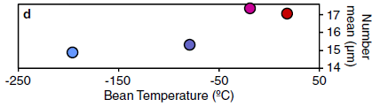
|
Average (mean) particle size in the ground coffee as a function of bean temperature.
This is Figure 4d from the article.
|
It's clear... The colder the beans, the smaller the particles in the ground coffee. And that should translate to better extraction of the flavor chemicals.
Other measurements support the conclusion. For example, the particles are more uniform at lower temperatures. That should promote more uniform extraction.
The authors note that grinding produces heat. One should be careful to limit that. Using a grinder that is already hot is not a good idea.
The authors do not provide any useful advice for those who do not have access at home to the lower temperatures used here. They used liquid nitrogen and a dry ice bath for the two coldest temperatures. However, the coffee industry is interested in the work.
News stories:
* Specialty Coffee's Resident Scientist -- A computational chemist is changing the way coffee makers think about water. (S Kollmorgen, Atlantic, April 28, 2016.) A broad introduction to the collaboration between scientists and the coffee folks.
* The Grinder Paper: Explained. (M Perger, Barista Hustle, April 24, 2016.) One of the authors of the article explains it -- making it accessible to the readers on a coffee blog site.
The article, which is freely available: The effect of bean origin and temperature on grinding roasted coffee. (E Uman et al, Scientific Reports 6:24483, April 18, 2016.) Some of the data presentation is not very clear, but if you are interested in coffee, especially in grinding, the article has a lot of interesting information.
The first sentence of the article: "Second only to oil, coffee is the most valuable legally traded commodity."
Posts on coffee include...
* A thermotolerant coffee plant, with high quality beans (June 8, 2021).
* Good news on the coffee front: Coffee is good for you (March 15, 2016).
* Robot uses coffee as a picker-upper (December 17, 2010).
* More milk (October 16, 2008).
Genetics of the giraffe neck
May 27, 2016
|
Most of a giraffe.
This is trimmed from Figure 1 of the article, which also shows an okapi.
|
Of course, it is the part not shown there that intrigues us. How did the giraffe develop such a long neck, and the circulatory system needed to support it?
The giraffe needs an unusually strong circulatory system in order to pump blood to the brain two meters above the heart. The giraffe blood pressure is twice ours.
A scientific team has now sequenced the genomes of the giraffe and its closest known living relative, the okapi. Comparison of those genomes offers some clues. We briefly note the new article reporting the genomes.
From the genomes we now have a list of differences. About 70 genes "light up" as of particular interest. We can look up the known roles of many of the genes that differ between giraffe and okapi. Some are genes involved in controlling the skeleton and the cardiovascular system. We would expect mutations in those systems. Of course, many of the genes are of unknown function.
That's more than we knew, but is not much -- yet, We now have a list of genetic differences between two closely related organisms. We see how some of the genes on that list might well be relevant, but we do not understand the role of any of the differences for now. The genome sequences offer clues, which must be followed up.
News story: How did the giraffe get its long neck? Clues now revealed by new genome sequencing. (Phys.org, May 17, 2016.) Briefly discusses some of the specific genetic differences found.
The article, which is freely available: Giraffe genome sequence reveals clues to its unique morphology and physiology. (M Agaba et al, Nature Communications 7:11519, May 17, 2016.) The lead author of the tri-continental team is from the African Institute of Science and Technology in Tanzania. Much of the article is very readable.
A follow-up: Giraffe physiology: studying a giraffe gene in mice (March 28, 2021).
More about giraffes:
* Can giraffes swim? (August 6, 2010). Includes another picture of a giraffe; top, side, and front views.
* How long is a hug? (March 29, 2011). Okapis, too.
There is more about genomes and sequencing on my page Biotechnology in the News (BITN) - DNA and the genome. It includes an extensive list of Musings posts on the topics.
May 25, 2016
3D printing of human tissues: the ITOP
May 24, 2016
The development of 3D printing continues. A recent article reports progress in making large tissue structures that may be suitable for transplantation to humans.
|
An ear structure, made by ITOP, the integrated tissue-organ printer.
This is reduced from a Figure in the Medical Xpress news story. It is from the authors, and is associated with many news stories about the work.
|
ITOP has also made bones and muscles (but the picture of the ear is what gets attention).
This is a complex operation; the scientists behind ITOP have moved well beyond 3D printers being just a glorified version of your inkjet printer. Remember the core idea, reflected in the other name of the process: additive manufacturing. 3D printing involves building a product by adding things to it, one layer at a time. The choice of materials to add, the technology for adding them, and the software for controlling it are all open for the developer.
Here is the idea of ITOP... The product consists in part of biodegradable plastics. These provide shape and integrity to the product, but will ultimately be degraded in the body. Hydrogels serve as porous compartments for cells. And, importantly, there are microchannels to allow circulation of nutrients.
Implanting of the printed products in lab animals showed that they retained their shape and that vascularization (development of blood circulation) began.
One can imagine these printed products replacing structures in the human body. A missing ear or jawbone, as examples. The products would be customized to the individual recipient, based on computer imaging of the person. That's for the future, but the work is encouraging so far. 3D printing allows complex things to be made; it is the understanding of the biology that guides what to make.
News stories:
* Regenerative medicine scientists 'print' replacement tissue. (Kurzweil, February 24, 2016.)
* Scientists prove feasibility of 'printing' replacement tissue. (Medical Xpress, February 15, 2016.) Includes a picture of the printer, and a video showing it in use.
The article: A 3D bioprinting system to produce human-scale tissue constructs with structural integrity. (H-W Kang et al, Nature Biotechnology 34:312, March 2016.) A very readable article.
Posts about 3D printing for medical applications include:
* Added July 9, 2025.
"3D printing" inside the body, using ultrasound (July 9, 2025).
* Need a new bone? Just print it out (November 13, 2016).
* 3D printing: simple inexpensive prosthetic arms (January 29, 2014). The product is not integrated biologically into the person.
* 3D printing: Neurosurgeons can practice on a printed model of a specific patient's head (December 16, 2013).
* Print yourself new body parts (April 16, 2010). Involved only thin tissue, so circulation was not an issue.
More about replacement body parts is on my page of Biotechnology in the News (BITN) for Cloning and stem cells. It includes an extensive list of related Musings posts.
Another artificial ear: The golden ear: A nano-ear based on optical tweezers (July 13, 2012).
Is the weather getting better or worse?
May 23, 2016
Climate change is a political issue as well as a scientific one. What people think about climate change matters.
How do we find out what people think? We ask them -- poll them. Or perhaps we can calculate what they should think.
A new article develops a model of how weather is perceived. It applies the model to how the weather has changed over the last 40 years -- and concludes that the weather has gotten better (in the US).
The study makes use of something called the weather preference index (WPI). For now, let's not worry about exactly what the WPI is; just assume that, somehow, it is based on what kind of weather people prefer.
The following graph summarizes what the authors found. It shows the WPI vs time -- past and future.
|
The left side of the graph (the black part) plots this for the past 40 years. This is based on actual weather records. You can see that the WPI has increased a little during this time, though there is a lot of variability, as one would expect for an analysis of real weather. The line shows the best (straight line) fit to the data; the gray region is the 95% confidence interval for the line.
The right side shows various projections for the future, out to the end of the century. Calculations are shown for two models of how climate change will affect the US. The general trend is that the WPI will decrease. That is, people's perception will be that the weather is worse.
This is Figure 3b from the article.
|
That's the idea. The weather has been getting better over recent years, but it will start getting worse over the coming decades.
The analysis shows that the reason for the WPI increasing in recent years is that winters have been somewhat milder, but summers not much changed.
One might wonder -- or even quibble -- about some of the analysis, but the broad conclusions make some sense. First, the effects of climate change vary with location. One can easily imagine that areas near the polar regions might welcome warming. The current article analyzes the US, and shows results across the country. There are distinct differences in how the WPI behaves in different regions within this one country.
At the start of this post we noted that it matters what people think about climate change. It's not just their understanding of what may happen, but their perception of what is happening. If people say they don't see a problem, it may just be that their weather really has been getting better.
So what is this weather preference index? It is based on statistics about where people move, correcting them for other influences. The details aren't clear from this article. It's probably not worth much effort worrying about this detail at the moment, though one might hope that it gets clarified and developed in the long run. Take the article for raising the question and offering a reasonable idea. Don't worry about specific numbers.
News stories:
* Recent warmer winters may be cooling climate change concern. (Science Daily, April 20, 2016.)
* US weather 'preferable' for most thanks to climate change; but there's a catch. (O Milman, Guardian, April 20, 2016.)
* News story accompanying the article: Climate science: Misconceptions of global catastrophe. (J Rocklöv, Nature 532:317, April 21, 2016.) Excellent overview of the work.
* The article: Recent improvement and projected worsening of weather in the United States. (P J Egan & M Mullin, Nature 532:357, April 21, 2016.)
Among Musings post on various aspects of climate change, including its implications and related issues...
* Would weather forecasting be improved by considering the isotopes in atmospheric moisture? (May 2, 2021).
* Regional changes in sea level: evidence from gravity measurements (February 26, 2016).
* Twenty percent of the females are genetic males (October 6, 2015).
* How rice leads to global warming, and what we might do about it (September 2, 2015).
* Global warming (August 3, 2008).
Are lab mice too clean to be good models for human immunology?
May 21, 2016
Let's start with an experiment, reported in a new article...
In this experiment, scientists infected mice with bacteria, Listeria monocytogenes. Three days later, they measured the number of bacteria in the liver. The key variable was the nature of the mice.
Here are the results...
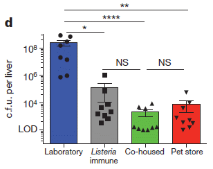
|
Start with the left-hand bar -- the biggest one, labeled "Laboratory". This is the reference point for the study, using ordinary lab mice. The bar height shows that the livers contained more than 108 bacteria.
(The y-axis scale for bar height is labeled "c.f.u. per liver". "c.f.u." stands for colony-forming units. We can take that to mean the number of bacteria.)
A quick glance... All the other bars are much lower, below 106 bacteria per liver. That is, all the other mice had a bacterial count that was at least 100-fold lower.
|
How did all these other mice fend off the bacterial infection? One bar (gray, second-from-left) is labeled "Listeria immune". That's easy enough.
The other two bars are the focus of the work. One is labeled "Pet store" (red; right-hand bar). Mice bought at a local pet store. They show a better immune response to the infecting bacteria than do the lab mice.
And then the bar labeled "Co-housed" (green; second-from-right). This means that the lab mice and the pet store mice were housed together in the lab; the lab mice were measured. The lab mice now had a good immune response; it would seem that they acquired it from their "roommates", the pet store mice.
This is Figure 4d from the article.
|
There are several experiments reported. The general theme is that pet-store mice have "better" immune systems than lab mice. Co-housing of lab mice with the pet store mice boosts the immune system of the lab mice, as seen above.
The results presumably reflect the differing exposure to microbes. Analyses of the mice show that the cleaner mice lack certain memory cells of the immune system.
The authors refer to the lab mice as clean mice, and mice exposed to the real world as dirty mice.
Some implications of the work...
First, the work is consistent with the "hygiene hypothesis". We usually invoke the hygiene hypothesis in the context of some humans being too clean and, as a result, having immune system problems. The current work carries the same basic idea over to mice. The immune system develops during youth; it develops normally if the animals -- mice or humans -- are under conditions that are historically normal for them.
Second, the work has practical implications for the use of mice in research. In fact, scientists have often observed that immunological work in lab mice leads to results that do not carry over to humans. We now see that common lab mice are immunologically different than pet store mice, which we take as being "normal" mice. We don't want to interpret this as good vs bad, but rather it is about better understanding the experimental system. There will be times when clean lab mice are appropriate, and times when pet store mice are appropriate. What's important is to recognize the difference, so we can choose. It may be particularly of interest to test proposed treatments in dirty mice as well as in clean mice, before trying them in humans.
News story: 'Dirty mice' could clean up immune system research, study suggests. (Medical Xpress, April 20, 2016.)
* News story in the journal issue preceding the article. It may be freely available. Dirty room-mates make lab mice more useful -- Housing lab mice with pet-shop mice gives them more human-like immune systems. (S Reardon, Nature 532:294, April 21, 2016.)
* The article: Normalizing the environment recapitulates adult human immune traits in laboratory mice. (L K Beura et al, Nature 532:512, April 28, 2016.)
A recent post on the hygiene hypothesis... How intestinal worms benefit the host immune system (February 27, 2016).
One might infer from this work that babies should be co-housed with acquisitions from the pet store, or something like that. In fact, that may be the point made by the post Reducing asthma: Should the child have a pet, perhaps a cow? (November 28, 2015).
Also see: Are girls too clean? (February 26, 2011).
Using light energy to power the reduction of atmospheric nitrogen to ammonia
May 20, 2016
The following figure shows a new way to make ammonia, as reported in a recent article. The figure may look complicated at first glance, but...
|
Part A (top) shows how bacteria make ammonia, by reducing atmospheric nitrogen, N2. Part B (bottom) shows the new process. The two parts are similar; in fact, what we want to focus on is one difference.
For reference, look at the purple-and-gray blob at the right side of each part; it is labeled "MoFe protein". This is the heart of the enzyme that reduces nitrogen to ammonia. (It is named for two metal ions in it, molybdenum and iron.)
|
The MoFe protein makes the ammonia, but it needs energy, to break the very stable N2 bond. The energy source is shown just to the left of MoFe -- and that is where the difference is. In part A, the bacterial process, there is a "Fe protein" (green); it uses ATP (shown to the left), and provides electrons (shown as e- on the right) to the MoFe protein. In part B, there is a "CdS nanorod" (orange); it uses light (shown as hν) and provides electrons.
That is, instead of using ATP as the energy source, the new process uses light. That's the point.
The scientists have succeeded in coupling an inorganic light receptor to an enzyme. It worked well; the rate of the light-driven enzyme was close to that of the natural ATP-driven enzyme. The role of the CdS is, somehow, specific. Most light-absorbing materials they tried did not work well.
The difference is also reflected in the chemical equation at the top of each part, summarizing the processes. Each shows N2 being converted to NH3. The equation in part A shows the use of ATP; the equation in part B shows hν.
The bacterial enzyme that reduces nitrogen to ammonia is a complex of the two proteins shown above in part A; that complex is known as nitrogenase.
This is Figure 1 from the article.
|
Why is this of interest? First, it's a neat experiment!
Beyond that, it's hard to know at this point. Nitrogen fixation, as the bacterial process is called, is fundamental to life -- though only a few organisms can do it. (Most just use the NH3 or equivalent, such as protein, from other organisms.) Further, the industrial process of making NH3 from atmospheric N2 is also done on a large scale; The biological process, using those MoFe and Fe proteins and ATP, is still incompletely understood. Perhaps finding how an alternative energy source can be installed will help in elucidating how the complex enzyme works.
Is there any chance that the finding here could impact on the industrial process for making ammonia? That process has to run at a high temperature in order to break the N2 bond. That leads to a loss in yield. Could one find a way to light-activate the N2 in the industrial synthesis of NH3? That may be hard, but scientists will give it some serious thought.
News stories. These both hype the possibility of using this finding in a practical process. That is certainly a proper direction for research work, but we should emphasize that it is speculative at this point.
* Chemists shed new light on global energy, food supply challenge. (Science Daily, April 21, 2016.)
* NREL Demonstrates Light-Driven Process for Enzymatic Ammonia Production. (NREL, April 21, 2016.) From the National Renewable Energy Laboratory (NREL), the (US) government lab involved in the work.
The article: Light-driven dinitrogen reduction catalyzed by a CdS:nitrogenase MoFe protein biohybrid. (K A Brown et al, Science 352:448, April 22, 2016.)
More on nitrogen fixation:
* A better way to make ammonia, using lithium? (July 19, 2021).
* Fixing nitrogen -- can U help? (August 29, 2017).
* Plants need bacteria, too (October 9, 2010).
* A new organelle "in progress"? (September 13, 2010).
* An unusual cyanobacterium (December 11, 2008).
A post about the reverse reaction: Air pollution: progress towards a process for ammonia oxidation (April 5, 2019).
More about cadmium-based nanoparticles...
* Turning waste plastic into fuel -- a solar-driven process? (October 9, 2018).
* Unusual synthesis of cadmium telluride quantum dots (February 15, 2013).
More about enzymes and light: Making hydrocarbons -- with an enzyme that uses light energy (November 17, 2017).
More ammonia: Global map of ammonia emissions, as measured from space (January 22, 2019).
May 18, 2016
What if the cars controlled the traffic lights?
May 17, 2016
The primary purpose of traffic lights is to prevent collisions at intersections. It is an interesting question what the optimal strategy is for doing this while maintaining efficient traffic flow.
A new article offers a way to "control the lights" that is better than the traditional way.
Go watch the authors' movie. It's rather slick -- nearly 90 MB for a 1.5 minute video. But it makes the point very well, after a few seconds of fluff introduction. The movie file is posted as "S1 Video" in the Supporting Information with the article. Here is a direct link: S1 Video. (1.5 minutes; well-labeled; no narration, just strange background "music".)
You may want to replay it to be sure you got the point. Double check that no collisions occurred.
The comparison in the movie is between two methods of controlling the intersection. One is the traditional use of traffic lights. For simplicity, they model traffic lights with fixed cycles. The proposed method involves calling ahead and reserving a "slot" at the intersection. It's basically an appointment system. If everyone calls ahead, the coordinator can plan ahead and optimize the use of the intersection. Cars approaching the intersection can adjust their speed so they reach the intersection at their assigned time slots. There is no mass stopping and waiting at the intersection.
Of course, all this calling ahead and planning would be done electronically and continuously by the car's computer, communicating with the controller for the intersection.
The article presents computer modeling of these two methods, and some variations. It serves to define some of the key features that promote efficient traffic flow. Data in the article show that traffic flow can be doubled by the slot method. That is, twice as many cars can use the intersection using the slot method compared to traditional traffic lights. Delays are greatly reduced. It follows that gas mileage is improved, and pollution is reduced.
There are other ways to determine how to control the traffic lights; the analysis here just serves to illustrate one issue. It is particularly timely as we witness the development of autonomous cars. Perhaps they will not only drive themselves, but control the traffic flow through intersections. That is, they may not just observe the traffic lights, but effectively control them. At least with computer modeling, this works well.
News story: When slower is faster: how to get rid of traffic lights. (Kurzweil, March 18, 2016.)
The article, which is freely available: Revisiting Street Intersections Using Slot-Based Systems. (R Tachet et al, PLoS ONE 11(3):e0149607, March 16, 2016.) It is from, in part, the Senseable City Lab at MIT.
More about autonomous cars: The moral car: when is it ok for your car to kill you? (July 23, 2016).
For more on traffic analysis... Traffic congestion patterns analyzed from cell phone records (July 7, 2013).
How to administer Bt toxin to people?
May 16, 2016
Bt stands for the bacterial species Bacillus thuringiensis. It famously makes proteins that are toxic to certain insects. The Bt toxins are used as insecticides in the field. Recombinant DNA technology has allowed the development of plants that carry a Bt toxin gene, so that the plants make their own Bt toxin.
A recent article explores how one might give Bt toxin to humans.
Why to humans?
Here's why...
|
The figure shows two samples of worms. The sample on the left (B) is the control; the sample on the right (C) has been treated with extracts from bacteria modified to make a Bt toxin.
(The control is based on the same bacteria, but lacking the Bt toxin gene.)
This is Figure 7 Parts B and C from the article.
|
There are two main issues. One is that the Bt toxin inhibits the worms; you can see that from the figure above. The worms used here are common lab worms, Caenorhabditis elegans, but there is considerable evidence suggesting that Bt toxin may be effective against a variety of roundworms, including medically important intestinal (helminth) worms.
The second issue is the focus here. The bacterial species used is Lactococcus lactis, an organism considered safe to feed to people, and to consider for use as a probiotic.
The overall plan... Develop a probiotic bacterial strain, able to make Bt toxin in the gut, as a simple and inexpensive way to treat worms in humans.
The work reported here is early, lab-stage work. The scientists experiment with various genetic constructs of the probiotic bacteria, to see which effectively produce the toxin. There is no testing on humans, or even on mice. There is no testing on medically important worms. The article represents a step toward the development of a worm-inhibiting probiotic. It's encouraging.
News story: Bacterium carrying a cloned Bt-gene could help millions infected with roundworms. (Science Daily, December 18, 2015.)
The article, which is freely available: Intracellular and Extracellular Expression of Bacillus thuringiensis Crystal Protein Cry5B in Lactococcus lactis for Use as an Anthelminthic. (E Durmaz et al, Applied and Environmental Microbiology 82:1286, February 2016.)
There are other posts about probiotics. Both of the following include lactic acid bacteria, and they link to more on probiotics.
* A clinical trial of ice cream (June 2, 2015).
* How probiotics work: a clue? (October 11, 2010).
More about intestinal worms: How intestinal worms benefit the host immune system (February 27, 2016). This post deals with a possible good side of such worms. Remember, worms vary widely in their medical importance.
Other examples of research on the model-system worm C elegans:
* Extending lifespan by dietary restriction: can we fake it? (August 10, 2016).
* Extending lifespan -- five-fold (January 12, 2014).
Posts about Bt toxins:
* Resistance to Bt toxin: What next? (July 15, 2016).
* Development of insects resistant to Bt toxin from "genetically modified" corn (April 19, 2014).
More about the field that includes making plants carrying the Bt toxin gene: my Biotechnology in the News (BITN) page Agricultural biotechnology (GM foods) and Gene therapy. It includes a list of related Musings posts. We should note that the work discussed in the current post involves moving the toxin gene from one bacterial species to another.
Creepazoids and the Uncanny Valley
May 15, 2016
Let's just get to work... Which of the following do you like? trust? dislike? distrust?
Like? Trust? But some of these are machines, you may protest.
Actually, all of them are machines. Robots. Humanoid (or "android") robots, with faces intended to look at least somewhat human.
But still, what do you think of them? You do have reactions to humanoid robots just as you have reactions to humans, don't you? Don't you?
|
After you have made your judgments, or not, look at the following figure. It is the full figure that the frame above is from. The full figure, from a recent article, shows the robots and shows the results that were obtained in tests with many observers.
Full figure [link opens in new window].
The linked figure is Figure 4 from the article. The small figure shown above is part A of that figure.
That figure has three parts: the pictures of the robots (A), the results for likeability (B), and the results for trust (C).
What did the scientists actually do? They first asked a group of people to score each picture of a robot on a scale of how machine-like vs human-like it was. They then asked different sets of people to score each picture for likeability and trust.
The seven robots in the current picture are just a small subset of what they studied. They are shown in order, left to right, from most machine-like to most human-like.
The three parts of the figure, then, reflect ratings of the same robots by three separate teams of observers.
A couple of observations...
* There is considerable correlation between the ratings for likeability and trust. Interesting, but perhaps not surprising. (There are also some differences.)
* More importantly, the lowest scores may occur for a robot that looks like a human with negative ratings. That is, we can accept robots that look like machines, and we like nice-looking humanoid robots. But as robots begin to move toward looking human, there is a danger zone where a robot that strikes us as a "bad" human gets our lowest rating.
That last idea has long been proposed; the danger zone has been called the uncanny valley. The current work provides some evidence for it.
I used one more unusual term in the title of this post. I suspect you can figure out what it means by now. The news story will reveal all, if needed.
It is not important that you agree with the results shown for these robots. The panels had widely varying responses to the faces, as you can see from the error bars. There is plenty of room for personal opinion on the individual robots.
The work addresses the topic of how humans interact socially with robots. It's interesting that there is such a topic. The findings are intriguing, whether surprising or not. People undoubtedly vary widely in how they deal with the issue, so we take all this for now as simply raising some interesting ideas. It's not important that you accept the authors' conclusions, even after reading the details. However, it would be good to try to understand the question they addressed.
News story: When Does an Android Become a Creepazoid? (E Preston, Inkfish (blog, Discover), November 6, 2015.) The source of part of my title. And a very good overview of the new work.
The article, which is freely available: Navigating a social world with robot partners: A quantitative cartography of the Uncanny Valley. (M B Mathur & D B Reichling, Cognition 146:22, January 2016.)
The topic of what robots should look like reminds me, first and foremost, of iCub: Prosthetic arms, prosthetic head ... (September 26, 2009).
Some robots get human names, if not faces... How to climb a pile of sand (November 7, 2014). Elizabeth. Check her out in Movie S2 there.
* Most recent post about robots: Robots that can quickly adapt to disabilities (June 23, 2015).
* Next: Why air may inhibit the performance of small cars (August 26, 2016).
A major algal bloom associated with the dinosaur extinction event?
May 13, 2016
The story of the extinction of the dinosaurs fascinates us... dinosaurs, meteorites, volcanoes. Even iridium. And we are still learning about the extinction story, as noted in recent Musings posts [link at the end].
The event affected more than just the dinosaurs. It was a mass extinction: much of life on Earth was wiped out. Organisms in the sea fared better, but many of them became extinct. A recent article suggests another piece of the story, one that may have affected marine organisms. Briefly, the authors suggest that the meteorite impact caused a massive algal bloom, which poisoned life in the seas.
How could that happen? The impact created a huge cloud of debris, which became distributed around the Earth. As hot material from the debris descended through the atmosphere, it led to the production of large amounts of nitrogen oxides (commonly called NOx) from atmospheric nitrogen. The NOx was deposited in the oceans, over the course of a few years. NOx in water means nitric acid. Was it enough to make the oceans too acidic for life? No, but what was more likely was that there was enough nitrate to stimulate massive algal growth. That global algal bloom poisoned the seas, by nutrient depletion and possibly toxin production.
How did the scientists develop this scenario? The work is mostly modeling, doing calculations of what probably happened both in the atmosphere and in the oceans. They do have one clue from the data: samples from the time of the event show unusual ratios of the isotopes of nitrogen, which could be accounted for by a massive deposition.
Here is an example of their modeling results...
|
The y-axis shows the flux -- the rate at which nitrate would be added to the oceans: number of nitrates per square meter of surface per second. That is plotted vs time (x-axis).
They plot what their models show for three different cases. In each case, the nitrate flux rises rapidly, peaks within the first year, then declines.
The green band shows nitrate flux rates that should support algal blooms. You can see that two of the three curves they show, for different models, give nitrate fluxes within that range.
|
The figure also contains two horizontal dashed lines, for reference. The upper one is the nitrate flux from typical US farming. The lower one is a modern global average nitrate flux.
This is Figure 13b from the article.
There is more in the full figure in the article...
Part a of the figure shows the nitrate concentrations that would result in the upper oceans. They are nearly 3 micromolar -- more than ten times the natural levels.
Part c shows the effect of the nitrate deposition on the pH. The effect is minimal, perhaps 0.01 pH unit. (However, there is concern that deposition of sulfur oxides could have caused larger pH drops.)
|
The figure above shows that it is plausible that the meteorite event we associate with the dinosaur extinction might have led to an algal bloom, because of NOx formed in the atmosphere and then deposited in the oceans. Plausible. There are many assumptions in the modeling; the differences between the three curves shown above reflect that. It's a fun story, which raises some new ideas. We'll see where it leads.
News story: Dinosaur-killing asteroid may have caused global algal bloom, marine extinction. (L S Hwang, GeoSpace (AGU), December 4, 2015.)
The article: NOx production and rainout from Chicxulub impact ejecta reentry. (D Parkos et al, Journal of Geophysical Research: Planets 120:2152, December 2015.) Given the technical complexity of the modeling, this is a surprisingly readable article. The authors do a nice job of describing what they do and what the main results are. You can get a good idea of what they did by browsing this article. (Hm, there are typos in carbonate chemistry, such as equation 22.)
Background post about the dinosaur extinction... What caused the extinction of the dinosaurs: Another new twist? (January 26, 2016). Links to more.
And more... How the birds survived the extinction of the other dinosaurs, why birds don't have teeth, and how those two points are related (July 30, 2016).
More algal blooms:
* Added February 11, 2026.
Do earthquakes enhance algal blooms?(February 11, 2026).
* Whales in the Chilean desert -- the oldest known case of a toxic algal bloom? (April 13, 2014).
More NOx:
* Effect of lockdowns on air pollution: it's not simple (June 7, 2020).
* Capturing NO2 from polluted exhausts (December 7, 2019).
* Diesel emissions: how are we doing at cleaning up? (July 30, 2017).
May 11, 2016
Cuttlefish vs shark: the role of bioelectric crypsis
May 10, 2016
What does that mean? It means that a cuttlefish turns down its electric field when threatened by a shark.
Here is some of the evidence...
As background... when cuttlefish sense a shark -- but not a crab -- they engage in one or another behaviors, which are thought to be defensive. Some of the behaviors are some form of hiding: they close or cover body openings, or they "freeze" entirely. Occasionally, one takes an active approach, inking and trying to jet away.
How does one observe the interaction of cuttlefish and shark in the lab? Well, most of the work discussed here was simulated. What the scientists really did was to show the cuttlefish videos of sharks -- on an iPad. That the cuttlefish behaved appropriately to sharks vs crabs suggests that they accepted the simulation as real.
A recent article looks at how those behaviors affect the electric field around cuttlefish. The following figure shows some of the results.
The first two parts of the figure, from the left, show what happens to the local electric field when the animal closes its funnel. Those two parts of the figure are shown in green, and correspond to the green funnel on the diagram of the animal at the top. Compare those two parts, and you can see that closing the funnel lowers the electric field.
The next two parts are a similar comparison for the siphon, coded in blue. Again, closing the siphon lowers the local electric field.
There's more, but that's enough for now.
This is Figure 1 from the article.
|
The figure above shows that closing certain body openings lowers the local electric field. Does that matter?
Here is the sharks' side of the story...
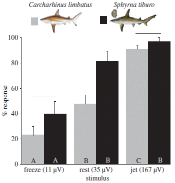
|
The figure shows how sharks respond to electric fields typical of what a cuttlefish might present. Various voltages are tested, as shown across the x-axis. The y-axis shows how often the sharks respond.
"Respond" means "bite", at least if there was a real prey present. The testing here was done with isolated electric fields chosen to simulate one or another cuttlefish behavior.
There are results for two shark species, identified at the top. The results are similar.
The middle condition uses a voltage that is typical of a cuttlefish at "rest".
If the voltage is typical of a cuttlefish with the "freeze" response, the shark response is less. If the voltage is typical of a cuttlefish that tried the "jet" response, the shark response is greater.
This is Figure 5 from the article.
|
Putting it all together, the pieces fit. Cuttlefish senses shark, freezes and lowers its electric field. The lower electric field reduces the response of the shark to the cuttlefish. That's the idea of bioelectric crypsis: a cuttlefish becomes cryptic (less detectable) by lowering its electric field.
One can think of many limitations of the experiments reported here, even after reading the full article. Nevertheless, the results are certainly suggestive that the electric field is important. There is no claim that it is the only way sharks sense the cuttlefish.
The results for the jet response show that it is an inappropriate response, at least under the conditions tested here. Perhaps it is good under certain conditions.
News stories:
* Zoology Notes 10: Cuttlefish can hide their electrical signals. (H Nicholls, Guardian, December 3, 2015.)
* Cuttlefish "freeze-out" their predators. (S Anderson, oceanbites (University of Rhode Island Graduate School of Oceanography), December 28, 2015.)
The article: Freezing behaviour facilitates bioelectric crypsis in cuttlefish faced with predation risk. (C N Bedore et al, Proceedings of the Royal Society B 282:20151886, December 2015.) Check Google Scholar for a preprint.
More cuttlefish trickery... Deceiving a rival male (August 28, 2012).
More cuttlefish... Aging without memory loss in cuttlefish (October 4, 2021).
More cephalopods... Sleep stages in octopuses -- do they dream? (July 13, 2021). Includes an extensive list of posts about octopuses and other cephalopods.
Previous shark post: Shark skin inspires design of a new material to reduce bacterial growth (March 13, 2015).
More sharks...
* Anne's journey across the Pacific (July 6, 2018).
* Eye analysis: a 400-year-old shark (September 3, 2016).
More about biological electric fields:
* How bumblebees detect the electric field (October 22, 2016).
* Electric fish: AC or DC? (October 12, 2013).
* Bees and flowers: A 30-volt story (June 21, 2013).
A tiny titan
May 9, 2016
The word titanosaur invokes images of things big -- say, 6 meters (20 feet) tall. Thus the latest report of a titanosaur is of particular interest.
Here is a figure from that report:
|
The figure shows the relative heights of various things.
The new findings included a leg bone, shown as #4 in the figure. The bone is a femur, or thigh bone.
The scientists inferred the height of the animal, shown as #3.
The estimated size of the animal at hatching is shown as #1.
For reference, a human is shown as #2. (An adult?)
|
Items 5-7 are other femur specimens, from other studies. #7 is adult size.
The scale bar, under #7, is 20 centimeters.
This is Figure 1A from the article. I added the numbers across the bottom, to make it easier to refer to the items in the figure.
|
That's cute, but there is also some interesting science.
What we have here is a fossil of a young titanosaur. The scientists estimate that it died at about age 9 (+/- 2) weeks; it weighed about 40 kg, and was about 35 cm high (at the hip -- ignoring the neck).
The fossil also contained marks that provided information about its size at hatching. The scientists estimate that, at hatching, it weighed about 3 kg, and was about 20 cm high.
From the various measurements available on titanosaur specimens, the scientists think that the animal grew proportionately. That is, they think it had adult proportions even at "birth" (hatching), and just got bigger as it got older. With that perspective, they can estimate what the entire animal looked like based on the size of a single bone. And that lets them draw a newly hatched titanosaur that looks just like the familiar monster -- except for being only 20 cm tall.
There is another implication of their understanding of how the animal grew. If the newly hatched titanosaur looked like an adult, maybe it behaved like one. Maybe the newly hatched titanosaur was fully able to care for itself. Maybe it was "precocial", to use the animal development word. Animals vary widely in how much parental care they need. Accumulating evidence suggests that dinosaurs varied, too. Some got considerable parental care. Some, like the titanosaurs, apparently were precocial, and independent from the beginning.
Despite the rapid growth of this young animal, the bones indicate that growth had stopped. The scientists suggest that it died of starvation, consistent with what is known about when and where it lived.
That's a lot of interpretation from a small amount of bone. That's typical with paleontology. Take the ideas as tentative; who knows what further data will tell us.
News stories -- news releases from two of the universities involved in the work:
* Tales of a Baby Dinosaur. (Macalester College, April 21, 2016. Now archived.)
* New Research on Baby Dinosaur Fossil Shows Some Dinosaurs May Have Matured Independent of Their Parents. (Adelphi University, April 25, 2016.)
* News story accompanying the article: The tiniest titan -- Fossil of a baby titanosaur shows that even the youngest of these giant dinosaurs were ready to take on the world. (P Monahan, Science 352:395, April 22, 2016.)
* The article: Precocity in a tiny titanosaur from the Cretaceous of Madagascar. (K C Rogers et al, Science 352:450, April 22, 2016.)
The specimen is a Rapetosaurus krausei. It is estimated to be about 67 million years old. The individual is named UA 9998. UA stands for the Université d'Antananarivo, in Madagascar.
More about dinosaur growth...
* The oldest dinosaur embryos, with evidence for rapid growth (May 7, 2013).
* Do animal bones have something like annual growth rings? (August 7, 2012).
A recent post about parental care: The earliest known example of maternal care? (May 2, 2016).
Another Titan: Titan: tides, and the possibility of a sub-surface water ocean (August 4, 2012).
Another femur: Need a new bone? Just print it out (November 13, 2016).
More from Madagascar: New evidence on the human colonization of Madagascar (September 16, 2016).
A Zika-dengue connection: Might prior infection with dengue make a Zika infection worse?
May 7, 2016
Some background points behind the current work...
* In the current outbreak, Zika virus is not behaving entirely as expected.
* Zika and dengue viruses are related.
* It is known that a prior infection with one strain of dengue can make a subsequent infection with another strain worse. It appears that antibodies to one strain can actually enhance the infection of another strain, a phenomenon called antibody-dependent enhancement (ADE). Musings has noted this somewhat unusual behavior [link at the end].
* Dengue is already established in areas experiencing the current Zika outbreak.
It is inevitable, then, that people have been wondering whether there is any interaction between dengue and Zika. In particular, does prior infection with dengue make one more susceptible to Zika? Does ADE occur between these two related viruses?
We now have a report testing the possibility of such interaction, under lab conditions.
The new work uses two monoclonal antibodies against dengue. In the early part of the work, the scientists showed that these antibodies bind to Zika virus, but do not neutralize it. That leads to the following experiment...
In this experiment, two of those monoclonal antibodies to dengue virus are tested for their effect on Zika infections of cell cultures in the lab. The cells used here are a type that is normally not easily infected with Zika; that makes it easier to see the enhancement.
The graph shows the enhancement of virus production (y-axis) vs amount of antibody used (x-axis). The results for the two antibodies are shown by the two lines.
The results are clear... Addition of more and more anti-dengue antibody enhances the Zika infection. For example, antibody 1.6D (red line) increases the infection by more than 100-fold.
This is Figure 3 from the article. It is from page 33 of the BioRxiv pdf file, in which the figures are not numbered. (I added the figure number at the top.) The figure legend is in the main text, on page 17 of the pdf, at line 377.
|
The experiment shows that dengue and Zika do interact, in the same way shown previously for strains of dengue. In fact, the specific conditions used here were those used for such experiments with dengue strains. That is, there appears to be ADE between dengue and Zika.
The authors also test some immune sera from people who have had dengue. The results vary, but also show evidence for the stimulation of Zika infection.
It's a simple experiment, under lab conditions. It's a small part of our developing understanding of Zika. We should explicitly note that the work discussed here does not address why Zika causes the pathological effects being reported.
News story: Lab findings hint that dengue antibodies intensify Zika infection. (L Schnirring, CIDRAP, April 26, 2016.)
The article, which is freely available: Dengue Virus Antibodies Enhance Zika Virus Infection. (L M Paul et al, bioRxiv preprint, posted April 25, 2016.) Publication status unknown; not peer-reviewed. [Update... see below.]
Why are we noting an article that has not yet been peer-reviewed? ArXiv and its younger cousin BioRxiv are preprint servers. They host articles that authors submit. Some articles are posted at the time the article is submitted to a journal, and some are posted when the article is accepted, after review. Occasionally authors just post an item on the preprint server without any intent to formally publish it. Unfortunately, it is usually hard to tell the status from the preprint server. Peer review isn't magic; it's one part of the publication process. Articles prior to peer review have information; it hasn't been critiqued as much, but posting it expedites the flow of information. In the current Zika situation, scientists and their affiliated institutions (including journals) have agreed to expedite information flow.
The article has been published. It is freely available: Dengue virus antibodies enhance Zika virus infection. (L M Paul et al, Clinical & Translational Immunology 5:e117, December 16, 2016.) Note that the article, now peer reviewed, may well be somewhat different from the one posted at bioRxiv. I did check the figure shown above; it seems to be the same.
Background post about how subsequent infections with dengue can be more serious than the first: Dengue fever -- Two strikes and you're out (August 10, 2010).
More on the same issue... Can antibodies to dengue enhance Zika infection -- in vivo? (April 15, 2017).
Next Zika post... Can Wolbachia reduce transmission of mosquito-borne diseases? 1. Introduction and Zika virus (June 14, 2016).
There is a section on my page Biotechnology in the News (BITN) -- Other topics on Zika. It includes a list of Musings post on Zika.
Better nanopore DNA sequencing by using better nucleotides
May 6, 2016
Nanopore DNA sequencing involves moving a DNA molecule through a tiny pore, and measuring the changes in electrical conductivity in the pore. The nucleotides differ in how they affect the conductivity. Therefore, the change in conductivity reflects the nucleotide sequence of the DNA. Musings has noted developments in nanopore sequencing [link at the end]. It's an interesting and potentially important development, but it has shown limitations. The effects of the different nucleotides are tiny, and the accuracy of inferring the DNA sequence from those changes has often been disappointing.
What if we used better DNA nucleotides? What if we used nucleotides chosen to have larger differences in their effect on conductivity?
For example, instead of using the usual dATP, let's use the following nucleotide:
|
The red part of the structure, at the upper right, is almost dATP. It's like dATP, except that it has six phosphates.
Then there is a green region to the left. And then there is a big black region below. We'll discuss what these regions do as we go on.
That is, this nucleotide is a variation of the normal nucleotide dATP. The upper right part is the same as dATP. Specifically, the base is normal adenine; that is the part that determines the basic biological function, by base pairing. The rest is a "tag", chosen to make the base easier to see -- by its effect on electrical conductivity.
This is part of Figure 2 from the article.
|
There are, of course, four such tagged nucleotides, corresponding to the four normal nucleotides. Each has the six phosphates. Each has a tag -- its own distinctive tag, in the black region. (The green region is a linker, chosen to facilitate doing the work; it is the same for all the tagged nucleotides.) The full figure shows the full set of tagged nucleotides.
The point is that the tags have been developed so that it is easy to tell the four nucleotides apart in the context of nanopore sequencing.
By the way, the tags are bigger than it might seem. Look carefully at the lower right part of the tag. You will note a set of square brackets, with the subscript 22; that unit is repeated 22 times.
The description above should raise a question -- a major question. How does one replace standard nucleotides with these new, tagged -- and monstrous -- nucleotides? More cleverness. The scientists use these tagged nucleotides at only one step. Here is the idea...
* Sequencing is coupled to DNA synthesis. As the original DNA goes through the pore, a new nucleotide is added to one strand. That is a tagged nucleotide, and its effect is measured.
* The tag is then removed, and the process continues.
A little detail how that works... The polymerase is attached at the pore. As the DNA goes through the pore, an incoming tagged nucleotide comes up and binds. It binds to the polymerase and DNA, in a base-specific manner (guided by the usual base pairing). This is a complex with the incoming nucleotide, with its tag, prior to actual incorporation. This is when the conductivity measurement is made. Then, the polymerase incorporates the incoming nucleotide. The incorporation step releases the tag, which is attached to the phosphates. (Release of the extra phosphates is a normal part of the polymerase reaction.)
Here is a sample of results...
A small sample. Just four nucleotides long, with one of each nucleotide.
The graph shows the current through the pore as each nucleotide goes by. You can see that the four nucleotides differ.
This is the top part of Figure 5 from the article. The bottom part of the full figure shows an example of the results from sequencing a 20-nucleotide long piece of DNA.
|
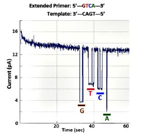
|
It's a very clever development. Will it be useful in practice? It's more complicated than the basic nanopore sequencing. Is it worth it? We'll see. We note that the authors have a company to develop it.
News story: Nanopore array advances single molecule electronic DNA sequencing. (Nanowerk News, April 21, 2016.)
The article, which is freely available: Real-time single-molecule electronic DNA sequencing by synthesis using polymer-tagged nucleotides on a nanopore array. (C W Fuller et al, PNAS 113:5233, May 10, 2016.)
A background post on nanopore sequencing: Nanopores -- another revolution in DNA sequencing? (June 22, 2012). Links to more.
More: Nanopore sequencing of DNA using synthetic membranes (May 15, 2021).
There is more about genomes and sequencing on my page Biotechnology in the News (BITN) - DNA and the genome. It includes an extensive list of Musings posts on the topics.
May 4, 2016
Better chocolate? Use better yeast?
May 3, 2016
Chocolate is derived from the cocoa bean. It is made by fermentation, much as beer is made. In fact, the chocolate fermentation includes yeasts of the same species used for beer: Saccharomyces cerevisiae.
In a recent article, scientists suggest that we could make better chocolate by using better yeasts. It's an interesting story, even if preliminary. Let's look.
What does "better chocolate" mean? The authors note that there are many types of chocolate, often distinguished by their flavors. Many of the flavor components come from the fermentation. Since the traditional chocolate fermentation tends to use the yeasts that are found on the beans naturally, it is not well controlled. Simply defining the yeast used might be a step forward in quality control. But then we also have the option of choosing which yeast to use, based, in part, on what flavors it imparts.
In the new work, the authors focus on a class of flavor compounds called acetate esters. As a group, they tend to have a fruity flavor, which is often a desirable characteristic with chocolate. More specifically, they focus on isoamyl acetate.
The following figure shows some results for various yeasts that might be used to make chocolate. All the yeasts shown here are S cerevisiae. For each strain, the scientists made two measurements.
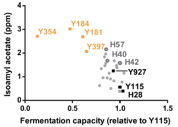
|
One is the amount of this flavor compound, isoamyl acetate, it makes. This is shown on the y-axis, in parts per million (ppm).
The other is its ability to grow in the complex environment of cocoa pulp. This is tested at 41 °C, a fairly high temperature, which is considered desirable. This is shown on the x-axis, somewhat awkwardly labeled "fermentation capacity".
Each point is for one strain. You can see that strains vary widely. Let's look at a few of them.
|
Y115, shown near the lower right. is a reference yeast. In fact, the x-axis scale is shown relative to this strain, which has been set at 1. It doesn't make much isoamyl acetate.
Y397 is another yeast, one used in the brewing industry. It is shown by one of the yellow points near the top. Compared to Y115, it makes a lot of isoamyl acetate, but does not grow well.
H42 is a yeast strain that was made in the new work; it is a hybrid of the two strains just discussed. Find the point for H42: it is a gray dot with a dark circle around it. H42 grows almost as well as Y115, but makes much more isoamyl acetate.
This is Figure 2 from the article.
|
That is, the hybrid strain H42 combines features from its two parents. The scientists chose H42 to test further for use in a chocolate fermentation. Preliminary tests with this hybrid, and a couple others, were encouraging.
What the scientists have done here is very much like traditional breeding, where one makes hybrids and looks for those with the desired combination of traits. Not everything works, but it is an approach with a good track record.
News stories:
* Scientists Have Figured Out How to Make Chocolate Taste as Complex as Wine -- Scientists at Belgium's University of Leuven have developed a new hybrid yeast strain that can be used to ferment cocoa beans, giving them as varied a flavour profile as that of wine or coffee. (Phoebe Hurst, Vice, November 23, 2015.)
* Better chocolate with microbes: Same yeast used in beer, wine and bread. (Science Daily, July 15, 2015.)
The article: Tuning Chocolate Flavor through Development of Thermotolerant Saccharomyces cerevisiae Starter Cultures with Increased Acetate Ester Production. (E Meersman et al, Applied and Environmental Microbiology 82:732, January 2016.) The work was done in collaboration with a chocolate company.
For more about chocolate...
* Added September 30, 2025.
A defined fermentation process that could improve quality control in making chocolate (September 30, 2025).
* A better way to make chocolate, inspired by brake fluid (August 23, 2016).
* Chocolate: 1200 years old (February 18, 2013).
* Rats will free prisoners, and share their chocolate with them (January 18, 2012).
* Genome from Mars (September 22, 2010).
More about the concept of "flavor", which combines taste and odor: The chemistry of a tasty tomato (June 18, 2012).
More about yeasts: The history of brewing yeasts (October 28, 2016).
This post is listed on my page Internet Resources for Organic and Biochemistry in the section for Carboxylic acids, etc.
The earliest known example of maternal care?
May 2, 2016
Animals vary widely in how much they take care of their offspring. Some just spew their gametes into the ocean and hope for the best. If they make enough gametes, a few survive. At the other end of the spectrum, some animals carefully nurture their young -- before and after they emerge. With some luck, most may survive.
A recent article gives a glimpse into what one animal species did 508 million years ago. The animal is a little shrimp-like crustacean, Waptia fieldensis. Here is the glimpse...
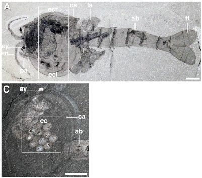
|
Look at the boxed region in Part A (top). At the top is an egg cluster; another is at the bottom. They are labeled "ec", with r or l for the right or left sides of the animal. "ca" marks the carapace, or shell.
There is a better view of the ec itself in Part C (bottom).
The scale bars are 5 millimeters. From Part C, you can see that the eggs are about 1 mm across.
This is Figure 2 parts A and C from the article. Part A is apparently a composite of two images, electronically superimposed.
|
There it is. A cluster of eggs being protected inside mom's skeleton. (Well, they suspect that the animal is mom.) Such clusters were found in five specimens, in a consistent location within the animal; the consistency suggests that what is observed reflects the original biology. The egg clusters contained only a few eggs (12, at most), and they were quite large. (The specimens are so well preserved that embryos are evident in many of the eggs.) This is all consistent with this animal devoting its energy to protecting a small number of well-developed eggs, rather than making many and leaving them unprotected.
It's hard to give much context. This animal dates back to the early days of complex animals, and we know little. The article notes a few other examples of maternal care that have been found in arthropods of this era; this is certainly one of the earliest known cases. The authors specifically claim that this is the oldest known case of eggs being preserved, within the animal, with visible embryos.
News story: Burgess Shale fossil site gives up oldest evidence of brood care. (Phys.org, December 17, 2015.)
The article: Waptia and the Diversification of Brood Care in Early Arthropods. (J-B Caron & J Vannier, Current Biology 26:69, January 11, 2016.)
More about parental care...
* Provision of milk and maternal care in a spider (January 13, 2019).
* A tiny titan (May 9, 2016).
* An advanced placenta -- in Trachylepis ivensi (October 18, 2011).
* The kangaroo family tree: the American ancestry of kangaroos (August 13, 2010).
* Maternal mortality (May 7, 2010).
More about crustaceans: Should you give Librium -- an anti-anxiety drug -- to crayfish? (October 6, 2014).
Top of page
The main page for current items is Musings.
The first archive page is Musings Archive.
E-mail announcements -- information and sign-up: e-mail announcements. The list is being used only occasionally.
Contact information
Site home page
Last update: February 11, 2026